Guest Post by Bob Tisdale
Quick answer: Over the long term, the answer is yes, but for shorter terms it depends on the sea surface temperature dataset and time period. And in recent years, as most people understand, the adjustments increase global warming trends.
INTRODUCTION
When discussing global surface warming, we often read comments around the blogosphere to the effect of We need to examine the “raw” sea surface temperature data before all of the adjustments. Typically, someone else will reply, The “raw” sea surface temperature data have a higher warming rate than the “adjusted” data, or written another way, The adjustments lower the sea surface temperature trends. While that is true for the long term, it is not necessarily true for shorter time periods. It depends on the dataset and timeframe.
This is the first in a series of posts about adjustments to global surface temperature data. In the second, we’ll present the impacts of the adjustments to land surface air temperature data.
DATA
For the following illustrations, we’ll compare the linear trends of the “raw” sea surface temperature data to the warming rates of the “adjusted” datasets that are or had been used in global land+ocean surface temperature products and that are still being updated.
ICOADS – This is the source sea surface temperature data for the NOAA and UKMO sea surface temperature products. It will serve as the “raw” data.
The others are the “adjusted” data. The adjustments are said to be corrections to account for biases attributed to different types of temperature sampling methods:
- wooden, canvas and insulated buckets tossed overboard and hauled back on deck where thermometers are placed within the buckets,
- engine room inlets from differing depths
- moored and drifting buoys
- satellite measurements (limited to HADISST and Reynolds OI.v2 starting in the early 1980s)
Another type of adjustment is infilling…assigning temperature values to ocean grids without source data. That is, during any given month, an ocean grid may not include observations-based data. That lack of data grows worse as we travel back in time. If an ocean grid does not contain data, the data supplier can leave that grid without data (as the UKMO does with its HADSST3 data), or the supplier can fill in that grid with make-believe data that is based on a variety of statistical methods. The UKMO infills its HADISST data and NOAA infills its ERSST.v3b, ERSST.v4 and Reynolds OI.v2 data…though the Reynolds OI.v2 data also include satellite-based observations, which drastically reduces the amount of infilling. However, for the not-infilled HADSST3 data from the UKMO, when the monthly data for a hemisphere are later averaged by UKMO (it’s a weighted average that considers latitude), the average is indirectly assigned to the grids without data.
The “adjusted” data presented in this post are:
ERSST.v4 – This is NOAA’s “pause buster” sea surface temperature dataset. NOAA/NCEI and NASA/GISS have been using it in the global land+ocean surface temperature products since mid-2015. The NOAA ERSST.v4 data have been adjusted for ship-buoy biases. Those ship-buoy bias adjustments have their greatest impacts after the early 2000s. We discussed the numerous oddities in the ERSST.v4 data in the posts here and here. The ERSST.v4 data are infilled and rely on in situ data only (no satellite-based data).
HADISST/Reynolds – GISS used to merge two sea surface temperatures datasets (UKMO’s HADISST and NOAA’s Reynolds OI.v2) for their Land-Ocean Temperature Index (LOTI). (GISS switched to NOAA’s ERSST.v3b data for their “official” sea surface temperature dataset in early 2013 and then switched again to NOAA’s ERSST.v4 data in mid-2015.) Basically, for the merged dataset, the HADISST data were used from 1880 to 1981 and Reynolds OI.v2 from 1982 to present. See the GISS Surface Temperature Analysis webpage under the heading of Step 4 : Reformat sea surface temperature anomalies. The merged HADISST/Reynolds sea surface temperature data are still an option for the GISS LOTI data.
Note 1: The NOAA Reynolds OI.v2 (and UKMO HADISST) data also use satellite-derived data from the early 1980s to present. Of the datasets presented in this post, the Reynolds OI.v2 portion of the HADISST/Reynolds data is the only one to use satellite-based data.
Note 2: To confuse matters more for those new to sea surface temperature data, NOAA produces two versions of the satellite-enhanced Reynolds OI.v2 sea surface temperature data. The original, used by GISS until early 2013, is prepared monthly and weekly with a 1-degree spatial resolution. This original version was not corrected for ship-buoy biases.
The other version of the Reynolds OI.v2 data is the high-resolution (1/4-degree) daily version, which is preferred by alarmists. It has been corrected for ship-buoy biases, but NOAA’s corrections are so heavy-handed that the warming rate of the high-resolution daily Reynolds OI.v2 data during a NOAA-selected “hiatus” period is far above the parametric uncertainty range of NOAA’s ERSST.v4 “pause-buster” data. See the discussion of Figure 6 from the post On the Monumental Differences in Warming Rates between Global Sea Surface Temperature Datasets during the NOAA-Picked Global-Warming Hiatus Period of 2000 to 2014.
[End notes.]
HADSST3 – This is the sea surface temperature dataset used by the UK Met Office for their HadCRUT4 land+ocean surface temperature dataset. Like the NOAA ERSST.v4 data, HADSST3 has been corrected for ship-buoys biases. And as noted earlier, the ship-buoy bias adjustments have their greatest impacts after the early 2000s. Where the NOAA ERSST.v4 data (and the HADISST, Reynolds OI.v2 and ERSST.v3b data) are infilled, the HADSST3 data are not. HADSST3 data also exclude satellite-based data.
As an afterthought, I’ve listed the trends of NOAA’s ERSST.v3b data on the graphs but did not include their curves. The ERSST.v3b was the predecessor to NOAA’s pause buster data. It was used by NOAA for their combined land+ocean surface temperature data from 2009 to mid-2015. ERSST.v3b was also used by GISS starting in early 2013 and ending in mid-2015. Curiously, NOAA is still updating ERSST.v3b even though it was replaced by the ERSST.v4 “pause-buster” data, and, as a result, ERSST.v3b is still available as an option for the GISS LOTI dataset. The ERSST.v3b data are infilled and in situ only (no satellite-based data).
The base years for anomalies for all of the graphs are 1981-2010. The top graphs include the trend lines. I’ve excluded them in the bottom graph for those who want a clearer view of the curves of the individual datasets.
The “global” oceans are limited to the latitudes of 60S-60N, because the suppliers account for sea ice differently. Excluding the polar oceans is commonly done in scientific studies that compare sea surface temperature data.
The source of data used in the post is the KNMI Climate Explorer.
LONG-TERM COMPARISON
Figure 1 includes the “raw” and “adjusted” global sea surface temperature data for the period of 1880 to 2015. (The sea surface temperature data extend farther back in time, but I’ve used 1880 as the start year, because the global land+ocean surface temperature products from NOAA and GISS start then.)
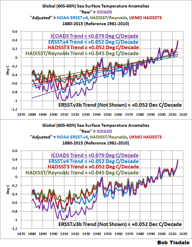
Figure 1
As shown, the “raw” sea surface temperature data have a higher warming rate than the “adjusted” data, because the “raw” data are biased cool prior to about 1940. That “cool” bias is said to result from changes in methods used to sample ocean surface temperatures before World War II.
Note: The excessive warming of the “raw” data from the early 1900s to the mid-1940s presented a problem for climate models. Most of the warming then was not caused by man-made greenhouse gases (according to the models), but the warming trend of the “raw” data from the early 1900s to the mid-1940s was much higher than their recent warming rates. For confirmation, see the graph of 30-year running trends here. The bias corrections for the data prior to 1940 reduced those problems for the models, but did not eliminate them. That is, the models still cannot explain the initial cooling of global sea surface temperatures from 1880 to about 1910, and, as a result, the models cannot explain the warming from about 1910 to the mid-1940s. And you’ll note for all of the “adjusted” sea surface temperature datasets, the 30-year trends ending about 1945 are higher than the most recent 30-year trends. [End note.]
The UKMO HADSST3 and the two ERSST from NOAA show the same warming rates from 1880 to 2015. The outlier of the adjusted data for the long-term is HADISST/Reynolds. The HADISST portion shows less initial cooling from 1880 to about 1910.
TRENDS FROM 1950 TO 2015
For the first of the shorter-term periods, we’ll use one of the start years used by NOAA in Karl et al (2015) Possible artifacts of data biases in the recent global surface warming hiatus. That start year is 1950. (See Figure 1 from Karl et al (2015).) And we’ll end the data with the most-recent full year, 2015.
For the period 1950 to 2015, Figure 2, the two NOAA ERSST reconstructions (ERSST.v3b and ERSST.v4 “pause buster”) have higher warming rates than the “raw” data from ICOADS. In other words, for those two datasets, the adjustments increased the warming rates versus the “raw” data. Why? Neither of those two datasets from NOAA have been adjusted for the 1945 discontinuity (and trailing biases) presented in Thompson et al. (2008) A large discontinuity in the mid-twentieth century in observed global-mean surface temperature. For a more-detailed discussion of NOAA’s failure to account for those biases with their ERSST.v4 “pause-buster” data, see the post Busting (or not) the mid-20th century global-warming hiatus, which was also cross posted at Judith Curry’s ClimateEtc here and at WattsUpWithThat here.

Figure 2
On the other hand, the HADSST3 data from the UKMO have been corrected for the 1945 discontinuity and trailing biases presented in Thompson et al. (2008), and as a result, the HADSST3 data have a lower warming rate than the “raw” data from 1950 to 2015. Curiously, the merged HADISST/Reynolds OI.v2 data also have not been adjusted for the 1945 discontinuity, yet they too have a lower warming rate than the “raw” source data.
Note: For those interested in a comparison for the period of 1945 (start of the discontinuity period) to 1975 (commonly used as the breakpoint between recent warming period and mid-20th Century slowdown) see the supplemental graph here. [End note.]
TRENDS FROM 1975 TO 2015
As noted immediately above, the year 1975 is commonly used as a breakpoint between recent warming period and mid-20th Century slowdown in global surface warming.
Figure 3 presents the trends from the 1975 start of the recent warming period to 2015. Only the UKMO’s HADSST3 data have a higher warming rate than the “raw” data during this period. The warming rates of the “adjusted” data during this period range from about 0.10 deg C/decade to about 0.14 deg C/decade.

Figure 3
Note: 1979 is an often-used start year for surface temperature data, especially when compared to lower troposphere temperature data, which begin then. If we were to start Figure 3 in 1979, we’d get similar results, inasmuch as HADSST3 is the only dataset with a warming rate that’s higher than the “raw” data. [End note.]
TRENDS FROM 1998 TO 2015
1998 is often used as the start year in presentations of the slowdown in global warming. 1998 was also used by Karl et al. (2015) as a start year for trend comparisons. (Again refer to Figure 1 from Karl et al. (2015).) During the period of 1998 to 2015, with the exception of the NOAA ERSST.v3b data (curve not shown), all “adjusted” sea surface temperature datasets show higher warming rates than the “raw” data. See Figure 4. One curiosity is that the warming rate of the HADSST3 data (which have been adjusted for ship-buoy biases) is comparable to the trend of the satellite-enhanced Reynolds OI.v2 portion of the HADISST/Reynolds data (which have not been adjusted for ship-buoy biases).

Figure 4
But the real oddity exists when we compare the trends of the two datasets that have been corrected for ship-buoy biases and they are the UKMO HADSST3 and NOAA’s “pause-buster” ERSST.v4. Recall that the ship-buoy bias is said to have its greatest impact after the early 2000s. For the HADSST3 data, that correction only added about +0.01 deg C/decade to the warming rate from 1998 to 2015, but for NOAA’s ERSST.v4 “pause buster” data, the ship-buoy bias corrections added about +0.05 deg C/decade to the warming rate. That additional warming in the ERSST.v4 data, of course, was caused by NOAA tweaking all of the tuning knobs (parameters) in their sea surface temperature model so that the hiatus warming rate was near to the high end of the parametric uncertainty range. (See the post The Oddities in NOAA’s New “Pause-Buster” Sea Surface Temperature Product – An Overview of Past Posts and the posts linked therein for further information.)
As seems to be the fad recently, I’m sure that someone’s going to compare the trends for the period of 1975 to 2015 (Figure 3) to those of the period of 1998 to 2015 (Figure 4) and say a slowdown in global warming didn’t exist. As with everything else, that depends on the sea surface temperature dataset. One problem with that comparison is that any slowdown from 1998 to 2015 is included in the data from 1975 to 2015. Another problem is that the period of 1998 to 2015 includes naturally caused upticks in 2014 and 2015. So as a reminder…
WAS THERE A HIATUS OR SLOWDOWN IN GLOBAL WARMING IN SEA SURFACE TEMPERATURE DATA?
Of course there was, but the extent of the slowdown depends on the sea surface temperature dataset and the period to which the slowdown is compared. For example, Figure 5 includes the “raw” and “adjusted” global sea surface temperature anomalies for the period of 1998 to 2013. We ended the data in 2013, because:
- 2013 was an ENSO neutral year…that is there no El Niño or La Niña. (See NOAA’s Oceanic NINO Index here.)
- The Blob and the weak El Niño conditions were the primary causes of the naturally occurring uptick in global sea surface temperatures in 2014 and,
- The continuation of The Blob and the strong El Niño conditions were the primary causes of the naturally occurring uptick in global sea surface temperatures in 2015.
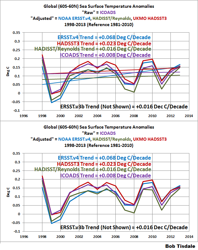
Figure 5
Note 1: To confirm the second and third bullet points, we discussed and illustrated the natural causes of the 2014 “record high” surface temperatures in General Discussion 2 of my free ebook On Global Warming and the Illusion of Control (25 MB). And we discussed the naturally caused reasons for the record highs in 2015 in General Discussion 3.
Note 2: Some may claim the start year of 1998 is cherry-picked because it’s an El Niño decay year. That’s easily countered by noting that the 1997/98 El Niño was followed by the 1998 to 2001 La Niña. (Once again, see NOAA’s Oceanic NINO Index here.) Also, 1998 was used as a start year by Karl et al. (2015).
[End notes.]
Karl et al. (2015) also used a sleight of hand in their trend comparisons by using 1950 as the start year of the recent warming period. The IPCC did the same thing in their analyses of it in Chapter 9 of their Fifth Assessment Report (See their Box 9.2). Both groups referenced the hiatus warming rates to the warming rate of periods starting in 1950 or 1951. Why does that indicate they were using smoke and mirrors? The trends from those periods with 1950 or 1951 start dates include the slowdown or cooling of ocean surfaces that occurred from the mid-1940s to about 1975. (See the supplemental graph here for the trends from 1950 to 1975). The only datasets where it makes little difference are the NOAA ERSST data; then again, that’s caused by NOAA failing to correct for the 1945 discontinuity and trailing biases. So, let’s present the trends from the start of the recent warming period (1975) to the end of the 20th Century (1999) solely as an example. See Figure 6.
Note: I am not suggesting in any way that 1999 is the breakpoint between the late-20th Century warming period and the slowdown. I am simply using the year 1999 because it was used by NOAA in Karl et al. (2015). (Again refer to Figure 1 from Karl et al. (2015).) [End note.]

Figure 6
Only the UKMO’s HADSST3 data have a higher warming rate than the “raw” data during this period.
Now let’s compare the trends for the periods of 1975 to 1999 (Figure 6) and 1998 to 2013 (Figure 5). Of the adjusted datasets, the greatest slowdown occurs with the HADSST3 data, with the trend for 1998 to 2013 being almost 0.14 deg C/decade lower than the 0.16 deg C/decade trend for the period of 1975 to 1999. (Part of that decline in the HADSST3 data was caused by its relatively high warming rate from 1975 to 1999.) The obsolete ERSST.v3b data is next with a drop in the warming rates between the two periods of roughly 0.12 deg C/decade. The HADISST/Reynolds data showed the least warming for 1975 to 1999 so its decline in trend is about 0.09 deg C/decade. Then there’s the NOAA ERSST.v4 “pause-buster” data, which shows the smallest slowdown, with the trend for 1998 to 2013 only being 0.06 deg C/decade lower than the 0.13 deg C/decade trend for the period of 1975 to 1999.
The “raw” data show a slowdown of about 0.14 deg C, which is the same as the slowdown in the HADSST3 data.
CLOSING
The title question of the post was Do the Adjustments to Sea Surface Temperature Data Lower the Global Warming Rate?
For the period of 1880 to 2015 (or for any period ending in recent times that starts well before the 1940s) the answer is yes. As shown in Figure 1, all “adjusted” sea surface temperature datasets have lower warming rates than the “raw” data.
For the period of 1950 to 2015, Figure 2, only the NOAA ERSST datasets have higher warming rates than the “raw” source data, because they were not adjusted for the 1945 discontinuity and trailing biases presented in Thompson et al. (2008). The NOAA ERSST.v3b data were published about the same time as Thompson et al. so we would not have expected NOAA to include those adjustments. On the other hand, the NOAA ERSST.v4 data were published well after Thompson et al., but NOAA failed to account for the biases documented in that paper.
For the period of 1975 to 2015, Figure 3, only the UKMO HADSST3 data have a higher warming rate than the “raw” source data from ICOADS. Why? Dunno.
Then for the period of 1998 to 2015, with the exception of the ERSST.v3b data (not the “pause-buster” ERSST.v4 data), the warming rates of all “adjusted” sea surface temperature datasets exceed the trend of “raw” source data.
So the next time someone claims, without defining the timeframe, that the adjustments to sea surface temperature decreases global warming, you can answer:
Over the long term, that’s correct, but for shorter terms it depends on the sea surface temperature dataset and time period. And for the period after 1998, it’s wrong. The adjustments definitely increase the global warming rate, with the “pause-buster” ERSST.v4 sea surface temperature data having the greatest increase.
Next, we’ll look at the land surface air temperature data.
Good to know Bob T, I’ve had that one thrown at me so often, from so called “scientists”.
ICOADS: http://icoads.noaa.gov/r2.5slp.html very trustfull 🙂
I think everyone is missing the point with this issue. The real question is can changing CO2 from 280 ppm to 400ppm provide enough energy to warm the oceans? The fact that we are warming isn’t the question. The question is can the marginal energy trapped by additional CO2 cause the warming? CO2’s only relevant energy contribution is the energy “trapped” between the 13µ and 18µ range in the IR spectrum. First, 13µ and 18µ IR doesn’t penetrate the oceans, in fact what I’ve read it causes mild cooling due to surface evaporation. The fact that this isn’t the first question answered pretty much proves Climate “Science” isn’t a real science. The second point is that changing CO2 from 280 ppm to 400ppm only “traps” an additional 1.32 W/^M^ (308.61 to 307.029, 10k Looking Down Tropical), and traps a little more for mid-latitude summer. The point being, CO2 only traps so much energy, even less of the energy that can warm water. The question that needs to be asked is that if 100% of all energy trapped by CO2 is transferred to the oceans from the atmosphere, can that energy warm the vast oceans. Assume that IR between 13µ and 18µ can in fact warm H2O, is there enough energy between 13µ and 18µ at 1.32W/M^2 over 50 years 24/7/365 to warm the oceans? That is the question that needs to be asked. The oceans are warming due to visible light, and has nothing to do with atmospheric CO2. The cleaner the air, the fewer the clouds, the warmer the oceans will get. Arguing over the trend in the temperature of the oceans simply allows the leftists to keep the opposition chasing their tails, disproving what they already know is a lie. Real scientists need to start using science to make the case against it, and quit playing defense. There are countless lies the left can produce and we can’t waste time debunking them all. Simply ask the question “How Can CO2 Warm The Oceans, when IR between 13µ and 18µ Won’t Warm Water?” If they can’t answer that question, the game is won. There is no more need to argue over the trend in ocean warming, it can’t be due to CO2. Stay focused on CO2 and its mechanism to cause warming and climate change, and all their arguments crumble.
First they make you believe the LIA ended in 1850…then they convince you that 280 to 400 is a HUGE increase…
280 to 400 is HUGE !
And the green plants on this planet thank the humans here for adding more CO2 to the air (I speak for them) because 280 was too low — possibly the lowest CO2 level ever on our planet.
The plants are requesting 2,000 ppm (once again. I speak for them)
If one loves the Earth, one must love all the plants growing on it.
How can we be happy if the growth rate of plants is stunted by low CO2 levels?
(1) Adding more CO2 into the air was, inadvertently, the best thing humans have ever done to improve life on our planet.
(2) The pollution in China, India, etc. is one of the worst things humans have done.
Is it not interesting that “environmentalists” hate (1), and don’t seem to care about (2)
By their unforced choices of what to focus on, it appears that “environmentalists” hate the Earth !
Changing CO2 from 280 to 400 may be a “huge” % increase, but it isn’t a huge increase in energy being trapped by the atmosphere. It is in the range of 1.6W/M^2, a fraction of the energy change due to a simple cloud layer. Increasing CO2 greatly improves crop yields and plant growth, so the benefits of increased CO2 are astronomical. The costs are a negligible change in the energy being “trapped” by the atmosphere.
120 is not HUGE………..
There is a lot of uncertainty but ocean (and atmospheric) warming is more or less consistent with ghg forcing. However, the uncertainty does mean actual sensitivity is up for debate.
Globally, CO2 forcing since pre-industrial times is about 2 w/m2. The “warmists” will argue that the warming from ~1.4 w/m2 of that forcing has been realised leaving an TOA imbalance of ~0.6 w/m2. Actually a few of them argue the ratio is nearer 1:1, These numbers are key in determining if CO2 is likely to be a problem or not in the future. Ocean warming at depth (rather than sea surface) does support an imbalance of ~0.5 w/m2.
Can CO2 warm the ocean? Probably – in a similar way that it warms the surface, i.e. it slows the rate of cooling. The earth receives, on average, about 240 w/m2 from the sun. In order to maintain a stable temperature it needs to emit 240 w/m2 to space. If CO2 is added to the atmosphere then the flow of outgoing energy will be impeded – particularly in the colder,drier regions of the atmosphere. There’s no real debate about this. The effect of CO2 can clearly be seen from emission spectra.
If the concentration of CO2 is doubled then it’s estimated that the forcing (reduced outgoing energy) will be about 4 w/m2 so there’ll be more energy entering the system than leaving – which means the earth (and its atmosphere) will warm. It will continue to warm until the outgoing energy matches the incoming solar energy.
Too many on this blog make the mistake of arguing against the basic thermodynamics rather than on the issues of feedback and climate sensitivity.
….and then they claim to fully understand the “basic thermodynamics”
How? The very fact that this question can’t be answered for a “settled science” pretty much proves this climate science is a joke. That is the first question to be answered. Anyway, IR between 13 and 18µ won’t warm water. If it did, every high school classroom would be doing the experiment. There is 2,000x the energy in the atmosphere in the oceans. The atmosphere simply can’t warm the oceans, there isn’t enough energy. Visible light warms the oceans. Visible light causes record high day time temperatures. Global warming is due to more light reaching the earth, not more radiation being trapped going back out.
Soory wrong link: http://icoads.noaa.gov/r2.5sst.html
Here is the point I’m trying to make. The fact that we are warming is irrelevant, the relevant question is “is CO2 the cause of the warming.” Here is a video used by the warmists to stoke the fears of global warming. You can try an egg in the heat of Death Valley. That is very very scary, but has absolutely nothing to do with CO2 and 100% with incoming radiation. No one bothers to ask, “how did CO2 cause that pan to warm?” That is the relevant question. If CO2 was the cause of the warming, you would be able to do the exact same experiment in the shade of a tree during the day, but you can’t. The reason being, visible light is providing the energy to warm the pan, not CO2. If you isolate the impact of CO2 by removing direct sunlight, there is 0% chance of being able to fry an egg in death valley. The question shouldn’t be are we warming, the question needs to be “how can CO2 possibly cause that warming” and then create an experiment like doing this in the shade, that proves it can’t be CO2. CO2 between 13 and 18µ won’t warm water, it won’t warm a frying pan, it simply won’t do what the warmists claim it will. That needs to be the focus. Force warmits to explain “how” CO2 can be the cause.
https://youtu.be/3zVtasUPZPc
Never in the geologic history of the earth has CO2 caused catastrophic warming, not even when it was 7,000ppm. Why is this time different? That needs to be the question. Has the physics of the CO2 molecule changed? Why didn’t 7,000ppm not cause catastrophic warming, but 400ppm will?
http://www.paulmacrae.com/wp-content/uploads/2008/06/co2-levels-over-time1.jpg
“has (sic) the physics of the CO2 molecule changed?”
No, of course not. But two opposing effects through geologic time have likely changed.
1. Solar output has steadily increased over 4.5 Billion years.
2. Atmospheric pressure was likely higher, and steadily fallen. Due both H2 escape and sequestration of other heavier gases into minerals, then further deeply buried by tectonics.
1. If solar output has steadily increased over the past 600 million years why does temperature always peak at 22°C, and why would we ever cool and fall into an ice age?
2) How would atmospheric pressure impact the physics of the CO2 molecule? At a greater atmospheric pressure, 7,000ppm would be much higher in CO2 molecules than today’s thinner atmosphere. That argument works against CO2 in a big way.
Facts are, we have 600 million years of geologic record, and CO2 has never had a catastrophic warming impact, not even when it was 7,000 ppm in a more dense atmosphere.
How do you know it was 7000ppm – its a model afterall
how many cities were there 550M years ago?
were the continents in the same place 200M years ago?
were things perhaps slightly different to today?
Proxies lad, not model output.
Yep, that data is from proxies taken from the geologic record.
When will that intentionally misleading graph nonsense ever die? It’s like graphing a joint checking account balance against only one account holder’s activity. Misleading & worthless … but it will never die in some circles … because it’s useful.
http://tinyurl.com/geocarb3
Climate science is probably the only field of science (that I have observed) that can publish papers in scientific journals and not display measurement error bars on graphs of measured parameters.
Are there others fields of science where this not just permitted but is SOP?
Does this “exemption” from scientific norms stem from the climate change dogma to never admit uncertainty in CO2 GHG theory?
Climate science is probably the only field of science where the past average temperature is constantly changing (from arbitrary “adjustments”) while the future climate is always “known” with great certainty (runaway warming).
And where hindcasting is passed off as forecasting.
So much science these days is purely mathematical constructs, and as long as the maths is correct, even if not logical, it gets peer reviewed in “distinguished” journals.
Using mathematics to take potshot guesses at the earth 100 years from now is not science, it’s faffing about.
There is something to be said for empirical science, climate predictions are not based on the real world, they are based on a mathematician’s constructed world, a world of assumptions and fudges.
To act on such instances of scientific abuse is insanity, but only if you think it is about “saving the planet”. If you want to micromanage societies and reshape economies, then it does make sense.
I looks at this from a wider perspective.
Basic Claim: Climageddon is a certainty and an aggressive policy response is required.
Claim supported by: Accumulated science, appeal to authority.
Counter Claim: In 2015 Karl et al. rewrote our perspective of recent historical temperatures. This is our highest quality data set available yet clearly it can be changed radically based on new science.
Question? How can you continue to support your claims when our most reliable data can be changed so much?
Reasonable,
My Answer: Because the vast majority of the population is scientifically illiterate and/or has been indoctrinated going on 25 years in college and grade school texts that “AGW is happening, take our word for it” dogmatics.
True, if NOAA have had to adjust their temperature data so much in the past 15 years, then the total adjustment is the uncertainty, because you had to manually change data, that change is the range of uncertainty surely.
So most warming since 1950? has come from adjustments, meaning the certainty in the data was, at least, most of the warming since 1950.
Given the infilling and homogenisation, surely the result is that given everything, you cant tell if the planet warmed or not with surface data, and sats only have a short dataset. We therefor have no real clue bar thermometer readings to go on, raw data, and huge gaps in time and area.
It’s a man made fiction, Satellite data is the only actual measurement of global temperature we have, GISS HADCRUT and so on are creations, not measurements
It isn’t about homogenization or infilling or anything like that. It is the simple fact that the very best data that makes up the settled science can be so open to new interpretation by science. That is an indisputable fact. The science changed the interpretation.
I did not agree with the author. My answer is big “NO”. Prior to 90s, where the deviations are from method to methos represent isolated data points — ships path and the condition at that time — and nor systematic measurements. This type of presentations are wasteful of time. I am sorry to say.
Dr. S. Jeevananda Reddy
And yet reconstruction say we should be warmer. Are you saying we should be cold? It looks to me like we should be warm and near, if not at, the peak of warm.
http://arcticjournal.com/climate/2234/chasing-ice
Are you saying that you don’t believe sea surface temperature can be measured to the nearest 0.1 degree C, as shown on many charts in the article ?
I suppose you also think the average temperature of our planet should not be reported by NASA / NOAA to the nearest hundredth of a degree C., with a +/- 0.1 degree C. margin of error? That is NEW math — by the way — maybe you are OLD, like me, and have not learned the NEW math?
You also show too little respect for the beloved sailors, their thermometers, and their buckets of seawater — in my opinion that measurement methodology could be accurate to two or three decimal places, maybe four … unless the sailor smokes a cigarette before he dips the thermometer in the bucket of water — however, we have goobermint scientists to “adjust” the raw data for whether or not the sailor smoked before measuring. These scientists have PhDs — they don’t miss anything.
You seem to dismiss changes in the average sea temperature of a few tenths of a degree as if they are not important. But they are important. There is a whole “green” industry built around tiny temperature changes. A highly government subsidized industry.
But seriously now.
Mr. Tisdale is obviously a bright man, and I learned a lot from his free e-book,
but it’s always hard to believe that skeptics would care about:
(1) Tiny 0.1 degree C. changes,
(2) to very rough estimates,
(3) of the average temperature.
(4) over a tiny period of 40 years,
(5) with very little historical data for comparisons !
(99.999% of Earth’s historical climate is not known with enough accuracy for comparisons)
When the warmunists get skeptics focusing on 0.1 degree temperature changes, and small adjustments, the skeptics will be distracted from the needed task of refuting the overall CO2 is evil fantasy.
Richard Greene,
Good points, all. The only honest way to compare past temperatures, which were measured in whole degree increments in the past, is to continue to measure in whole degree increments.
The B-91 forms used (in surface stations) were not as accurate as today’s satellites. But they clearly showed the global trend, where you do not need 10th and hundredth of a degree accuracy and precision. If the trend is up or down, it will be apparent in the temperature record.
So, what do we get when we stick with whole degree measurements? We get this:
http://i1.wp.com/www.powerlineblog.com/ed-assets/2015/10/Global-2-copy.jpg
But that doesn’t alarm the public. So they show what is actually just natural temperature variability, but in tiny increments like tenth and hundredth of a degree divisions which greatly magnifies the tiny fluctuations. And of course, they cherry-pick their start times, avoiding pesky problems like major volcano eruptions.
As always, it is the trend that matters. But there is no change in trend between the time prior to human CO2 emissions ramping up, and afterward. Thus, CO2 is not causing the predicted acceleration in global warming. QED
Agree, Global Average temperature is meaningless. A distraction. It’s just a residue of a system we dont come close to fully understanding, it is not a metric of anything
Many global temperature providers, including UAH satellite, state monthly and annual temperature anomaly values to 1,000th of a degree precision.
This isn’t because they’re claiming instrument accuracy to that level of precision. It’s the ‘average’ anomaly derived from data from thousands of sample points and rounded to 3 decimal places.
How can you have 100% complete certainty in a conclusion, and then adjust the data on which that 100% conclusion was reached, and keep that 100% certainty? Climate “science” is a joke. Clearly data integrity doesn’t matter. GIGO seems to work as long as the garbage supports the desired outcome.
The IPCC confidence level is currently 95%, not 100%.
I have been tracking the IPCC “confidence trend”.
My forecast for the next IPCC Report is they will have a vote to establish the “confidence” level, and it will be 105%.
At 105% confidence, 5% of scientists could later change their minds. lose confidence, and they would still be at 100%.
The best way to tell a lie is to be 100% confident.
The IPCC are a funny lot, Models at 90% confidence, models fail epically, IPCC raise confidence to 95% in next report. 😀
The political left attacked Hillary for using the term “unborn child.” The extremism of leftist dogma knows no bounds.
Thank you Arno for giving us the exact sea level rise rate to the nearest hundredth of a mm. I will plan accordingly.
Umm ……. A.A. ……… ENSO …..temperature , not sea level ?
I see no error . Elucidate , please .
SOB,
I believe Arno is referring to expansion of seawater as it warms. The simple argument is if the oceans’s temp increase is accelerating, then so must its volume, and thus SLR, also be accelerating. And then (as Arno points out) if SLR is not changing drastically, then neither are ocean temperatures. The problem though is quite complex, the most significant being the sheer mass and depth of the world’s ocean which limits any thought of uniform mixing during the short time scales of the measurement period. And as I’m sure you know, the depth of the oceans also creates much vertical stratification along salt and temperature gradients, which means one layer could be warming while another is cooling, or they could be warming at different rates in the different oceans at different latitudes.
The temp datasets Bob presents are surface water temps. The ships are the top 10 meters that is at the ocean-atmospere interface. So volume wise, that is just a small fraction of the total ocean seawater volume.
This discussion veers off into Ocean Heat Content measures and estimates exist down to 2000 meters from Argo data (not in these surface data sets) that Bob has discussed in past threads.
The real problem in both the rate of change in ocean temps and SLR accleration/deceleration is that measurement uncertainties are larger than the differences being recorded. This make all the values not much more than measurement noise due to the short time intervals involved.
This of course leaves much room for the temp and SLR data fiddling by politically motivated agencies.
This, arguments aside, is a very good top-down view.
For the period of 1880 to 2015 (or for any period ending in recent times that starts well before the 1940s) the answer is yes. As shown in Figure 1, all “adjusted” sea surface temperature datasets have lower warming rates than the “raw” data.
############
And now for the kicker.
1. How many times have you heard the argument that adjustments must be wrong because they all ‘go the same way?’ they don’t. A smart skeptic will drop that argument.
2. What is the most important question? How much warming will co2 cause in the future? Answer it depends on the sensitivity. Next how is sensitivity estimated? Answer by using the long term trend in temperature.. Which is adjusted downward!
Again. Skeptics will do better if they join the debate over how much co2 will warm the planet. Clamoring for raw data and no adjustments means that you are arguing for a higher sensivity. So be smart and follow nic Lewis and Judy curry.
The higher the sensitivity the colder we would now be without man’s efforts. If sensitivity is high enough to be scary, we’ve already averted even scarier cooling.
From observations, sensitivity is turning out to be low enough that we cannot cause warming that is net detrimental. It will be a long time unveiling itself, but the truth is that burning fossil fuels have been, and will continue to be, a long term massive benefit to human society and the whole biome.
The alarmists are beween a rock and a cold place. This extraordinary popular delusion of climate catastrophism is losing popularity.
=========================
more settled science from skeptics.
Is sensitivity uncertain and unsettled? 1.5-4.5 as AGW claims
Or
Is the science settled and ECS is low??
According to kim, the science is settled. Sensitivity is low.
Is more warming good? or good up to a point?
Whats AGW say.. well, Tol and others suggest there is a benefit for some additional warming, but too
much warming could bring damages. It’s uncertain how much warming we can tolerate.. a good guess
is 2C. Its uncertain.
What does kim say? he is far more certain.
More settled science from skeptics..
Its far better to grasp the uncertainty in the science and focus on that.
Well, certainly it’s certain. Look at the board.
====================
moshe’s ‘most important question’, is overshadowed by the question of just where we are in the lifespan of this current interglacial. Given that any anthropogenic warming, of little or greater moment, will add to the buffer we have against the inevitable coming cooling, it is virtually senseless to awkwardly and ignorantly inhibit our use of fossil fuels.
If, in fact, sensitivity is high enough to abrupt glaciation, we may well be wasting our pitiful effort now, and a case could be made for delay until we are more sure of its onset. But with the apparent low sensitivity, it is far preferable to build our infrastructure, hard and soft ware, and increase our wealth to allow adaptability to whatever comes.
I’m firmly convinced that we’ve little enough fossil fuel to cause net harm, and we’ve already been shown the benefits of its use, both to human society and to the biome, so that it would be foolish to artificially curtail our uses of fossil fuels, particularly given the hardships obviously inherent in a too rapid weaning from them.
We shall/may see, and those who come after us will see.
=========
.. Which is adjusted downward!
—————-
And in recent years, as most people understand, the adjustments increase global warming trends.
yes. In recent years there is a minor adjustment upwards.
The work of Nic Lewis and Judith Curry suggests that this minor uptick is INCONSEQUENTIAL.
what matter to the science is the change over long periods.
That’s why when nic and Judith calcualte sensitivity, they use the longest record possible.
That what you need to focus on to make a strong case.
Skeptics have been duped into looking at the last 20 years.. It’s actually quite funny.
Ya, and too much of the rest of the world has been duped into only looking at an exaggerated role for CO2.
==================
That part’s not very funny, not anymore.
===========
Mosh says >”yes. In recent years there is a minor adjustment upwards.”………..”what matter to the science is the change over long periods.”
adds .05 degree a decade (1/2 degree a century if it were a static adjustment)
but it’s not, the adjustment is cumulative
“but for NOAA’s ERSST.v4 “pause buster” data, the ship-buoy bias corrections added about +0.05 deg C/decade to the warming rate. That additional warming in the ERSST.v4 data, of course, was caused by NOAA tweaking all of the tuning knobs (parameters) in their sea surface temperature model so that the hiatus warming rate was near to the high end of the parametric uncertainty range.”
Mosher,
Fundamentally, I agree that the focus should be on the long-term trends. However, the propaganda that the general public is exposed to focuses on extremely small changes in the last 20 years, and they are used as a bludgeon to convince everyone that we are literally going to Hell in a dip bucket because there are claimed increases in averages that are too small to actually measure reliably. When you have claims that a particular year or month is the hottest average ever recorded (by an amount that is less than the finest graduations on a thermometer), that is simply a scare tactic. Also, it is disingenuous to quote average global temperature increases when most of the warming is in the Arctic and in the diurnal low air temperatures at mid-latitudes.
YOU WROTE:
“1. How many times have you heard the argument that adjustments must be wrong because they all ‘go the same way?’ they don’t. A smart skeptic will drop that argument”
MY COMMENT:
What percentage of “adjustments” hurt the ‘case’ for CAWG?
That would be worth knowing before lecturing others on this subject.
I’d guess the number is less than 50% — and probably closer to zero than to 50%
Do you have any data?
.
How about adjustments that should have been made, but were not?
What percentage of “missed” adjustments hurt the ‘case’ for CAGW?
Do you have any data?
There have been a lot of adjustments to historical data.
In the US, for example, the 1930s used to be warmer in the data.
The people making the computer game forecasts own the actuals, and do the adjustments.
Are you suggesting these very biased “CO2 is evil” bureaucrats are being fair with their adjustments?
That would be hard for me to believe.
YOU ALSO WROTE:
“2. What is the most important question? How much warming will co2 cause in the future? Answer it depends on the sensitivity. Next how is sensitivity estimated? Answer by using the long term trend in temperature.. Which is adjusted downward! ”
MY COMMENT:
The most important question is what causes climate change.
The next important question is whether or not CO2 had a meaningful effect on the past climate.
Your question is irrelevant until the two questions above are answered well.
Skeptics are not trying to “do better” — this is not a debate — leftists do not debate — they character attack.
We trying to keep skepticism alive by questioning the most basic assumptions behind the CO2 is evil / global warming boogeyman.
We have been hearing about environmental “catastrophes” since DDT in the 1960s, and we don’t believe the leftist scaremongering any more, for good reason — their “batting average” is .000
Steven Mosher says:
1. How many times have you heard the argument that adjustments must be wrong because they all ‘go the same way?’ they don’t.
My reply: Most of them do go in the same direction: showing alarming global warming. If you disagree, please post the ratio, and the source.
Next:
2. What is the most important question? How much warming will co2 cause in the future? Answer it depends on the sensitivity. Next how is sensitivity estimated? Answer by using the long term trend in temperature.. Which is adjusted downward!
I’m glad you said “estimated”. Because the guesstimates of 2xCO2 range from the IPCC’s high of 6+ºC, to 3ºC, down to quite a few around 1ºC, to ≈0.5ºC, and to 0.00ºC (Miskolczi). Some scientists even say that more CO2 has a cooling effect.
So, part of your #2 is correct. But if I had written it, I wouldn’t say “how much warming” because that shows a conclusion arrived at, rather than where the data leads you.
Finally:
Skeptics will do better if they join the debate over how much co2 will warm the planet.
That debate has been going on for years. The real question is: what does the planet say? After many years of no global warming, both recently and in the 1940’s – 1970’s, the answer seems to be: CO2 doesn’t have much effect at all. As Willis says, it’s only a 3rd-order forcing, which is swamped by 2nd-order forcings. Those, in turn, are swamped by 1st-order forcings.
Thus, the rise in CO2 is a non-problem — and that’s exactly what our planet is telling us..
nice inaccurate paraphrasing there Mosher, a generalization “all adjustments are wrong because they go the same way”
Well NOAA and NASA did both to surface data, adjusted it down prior to 1960 and up after 1960, this axis of adjustment increases the trend by the cooling adjustments pre 1960 and increase the trend adjusting up post 1960.
That is entirely different to the straw man you offered.
How many times have you heard an alarmist say the adjustments balance out warming and cooling, thus completely ignoring the cooling of the past and warming of the present. The surface record is again, not for the first time, outside their own error bars. Indeed, it is FUBAR.
Ah, that moshe; what a kidder.
===========
kim, a comment by Mosher on a recent thread prompted this post.
Cheers
Heh, moshe’s long been in the ‘lukewarming and do something about it’ camp. It’s not an irrational band; but much of the proposed ‘do somethings’ are unnecessary, and damaging. This is not to blame moshe for the wreckage; he’s not deluded.
===================
This is still an argument over changes in temperature that are less than the probable errors (particularly with older measurements). I have not seen a standard deviation on these temperatures, so I cannot guess the reliability of the measurements.
Anyone REALLY believes those sea surface temperature values, prior to ARGO? I got a bridge to sell you..in NYC
ya, the planet hasnt warmed. there was no LIA
@ half precession, @ average age for recent interglacials. We face a precipice of icy downfall, or a mild and beneficial warming. Choose wisely, my friends, as if you actually had anything to say about it.
==================
Mosh….when did the LIA end?
To paraphrase Phil Jones “we just make that sht up” 😀
Would somebody PLEASE look at this. It is a full professoral presentation, complete w graphs & results for aerosols on global warming. Effects on the Arctic ice, perturbations on precipitation in South America, etc. Please copy it in case it’s taken down.
Professor Penner at MIT presenting.
Doesn’t the ability to model ECS depend on an accurate model of the earth’s climate? Given data from the Greenland ice cores that shows significant variability that we can match to the written record, I am constantly amazed that the modelling community can’t come close to generating a model that produces anything like what the historic record shows for the North Atlantic. If models cannot explain the Little Ice Age, the Medieval Warm Period, etc why should we think that the current generation of models is anything other than intelluctual masturbation . Don’t get me wrong, I fully support the efforts of trying to figure it all out. My problem is the hubris of the modleing community. Their willingness to back major societal changes when there is no data that I know of that shows the current generation of models can explain the climate we have observed over the last 2K years is breathtakingly arrogant.
Nemesis cures hubris.
============
Regarding the Blob’s contribution to global temperature: It covered only about half a percent of the world’s surface. That means the anomaloua warmth of its area raised global temperature by .02 degree C. And it did not have massive grat convection to the middle and upper troposphere like a major El Nino does.
🙂 +1 Vine & Matthews
To that level of accuracy huh? ROFL
Adding to sea level by adding total stored sources is a fiction. There is not a fixed amount of water, water is also created when electrically charged particles, as in Hydrogen hits the atmosphere and bonds with oxygen. Is this even quantified I wonder?
For example, vapor concentration since 1900 matters, tectonic activity, large oceanic volcanic activity, ocean temperature since 1900 ocean levels since 1900
So tide gauges must have been used at some point for this calculation, NOAA tide gauges show 1.14mm/yr
But a fair assessment is 1.69mm/yr
http://www.lwhancock.com/images/Screen%20Shot%202013-10-04%20at%2010.27.19%20PM.png
There are 2 ways to look at these charts: trends, or periods of little change intersected by rapid change. Refer to Fig 1:
1870 – 1930 (60 yrs) zero change
1930 – 1945 (15 yrs) + 0.4 C approx
1945 – 1975 (20 yrs) zero change
1975 – 2015 (40 yrs) + 0.4 C approx
If we discount the 2015 El Nino data there was virtually no change since 1998
By definition this pattern casts great doubt over the whole record. Why? :
While it may be accurate in relation to SST it cannot be used as evidence of global warming. It only substantiates that SST is a poor measure of mean sea temperature. We know that the sea has huge heat capacity. There is no way it can change at the rates shown in these charts
The concept that temperature increase stays hidden for periods of 15 – 60 yrs then suddenly pops up by 0.4 C over periods of 15 – 20 yrs does no wash with me. If sea temperature is increasing it will be gradual and persistent due to its heat capacity
There are great flaws in the exercise IMO
Michael Carter
“If we discount the 2015 El Nino data there was virtually no change since 1998”
__________________
Any particular reason why you want to include the impact of the earlier El Nino but not the latter one?
We don’t need to. Look at the chart
What I mean is that given the heat capacity of the ocean any spike through El Nino etc in the surface temperature record is not reflecting a similar change in mean oceanic temperature. I was looking purely at periods of rapid change and no change in the chart. Snakes and ladders as found in the SST wont apply to mean oceanic temperature. It will be hidden within. Long term trends over 100 years are worth considering but we need to be fully confident in the early data. I am not. Bad data is worse than no data
“…. any spike through El Nino etc in the surface temperature record is not reflecting a similar change in mean oceanic temperature.”
__________________
I’m not aware of anyone who’s claiming it is. Ocean heat content is measured separately from surface temperature.
NOAA Tide Gauges say 1.14mm.yr
This is probably more accurate, 1.69mm/yr, and the same curve as the 1950s rise due to a warming curve very VERY similar to 1980 2010.
So warming and sea level rise seem to be telling us something, unless you go and alter the data that is.
Beenstock et. al.
“Although mean sea levels are rising by 1mm/year, sea level rise is local rather than global, and is concentrated in the Baltic and Adriatic seas, South East Asia and the Atlantic coast of the United States. In these locations, covering 35 percent of tide gauges, sea levels rose on average by 3.8mm/year. Sea levels were stable in locations covered by 61 percent of tide gauges, and sea levels fell in locations covered by 4 percent of tide gauges. In these locations sea levels fell on average by almost 6mm/year.”
http://www.lwhancock.com/Blog_131005.aspx
Arno Arrak says, “None of Bob’s “trends” can be believed. All of them fall in the range of half a degree to one degree Celsius per year. The correct annual sea level rise is 2.46 millimeters per year, as determined by Chao, Yu and Li….”
Arno, first, they aren’t “Bob’s ‘trends'”. They are the trends presented by data. Second, apparently you aren’t aware that changes in sea level reflect much more than the changes in ocean surface temperatures. You have once again displayed your limited grasp of reality for all who bother to read your comments.
Ugh. Fly poo & pepper. Instrument error and perception. Why.
“The Guilty Fell When No One Pursues.” Understand that proverb, and you understand climate science. The reason they don’t include error bars is because they are knowingly perpetrating a fraud. Error bars are a basic foundation of science and the scientific method. Everyone with a 1st grade education in science knows that. When a “scientist” doesn’t include an error bar they are knowingly violating a foundational principle of science. The fact that they are trying to obfuscate the issue pretty much proves they aren’t about the truth, they are about producing a desired result. Transparency and reproducibility are cornerstones to science. We need to demand climate science respects those principles. Demand open source temperature reconstructions and climate models. Sunlight is the best disinfectant for exposing the lies of the climate scientists. We don’t need to refute every nonsensical claim the climate scientists make, that will simply be chasing our tails, we simply have to force them to expose their practices to the public and we win. All it took was Toto to look behind the curtain and the Wizard suddenly became just a man. All it took was a little boy to state the obvious, that the emperor had no clothes.
This is how to defete the Warmists. Shed sunlight on what they are doing.
Apply Sunlight.
State the obvious.
http://www.trinitylectures.org/images/Emperor%20front%20cover.bmp
[Delete dupe? .mod]