Guest Post by Werner Brozek, Comment Included From David Hoffer, Edited by Just The Facts:

In the above graphic, the green line is the slope since May 1993 without consideration of error bars. When including error bars, the range could be as low as zero as indicated by the blue line. It could also be an equal amount above the green line as indicated by the purple line.
The numbers that were used to generate the above graphic are from Nick Stokes’ Temperature Trend Viewer site.
For RSS, the numbers are as follows:
Temperature Anomaly trend
May 1993 to Feb 2016
Rate: 0.871°C/Century;
CI from -0.022 to 1.764;
t-statistic 1.912;
Temp range 0.118°C to 0.316°C
So in other words, for 22 years and 10 months, since May 1993, there is a very small chance that the slope is negative.
For UAH6.0beta5, the numbers are as follows:
Temperature Anomaly trend
Jan 1993 to Feb 2016
Rate: 0.911°C/Century;
CI from -0.009 to 1.830;
t-statistic 1.941;
Temp range -0.001°C to 0.210°C
So in other words, for 23 years and 2 months, since January 1993, there is a very small chance that the slope is negative.
As mentioned in my January post, there is now no period of time going back from February 2016 where the slope is negative for any period worth mentioning on any of the five data sets I am analyzing.
As a result, my former Section 1 will not be shown for the foreseeable future.
My last post had an excellent comment by David Hoffer that I would like to share to give it wider exposure and for you to give your thoughts:
davidmhoffer
March 2, 2016 at 10:11 am
1. The “Pause” hasn’t disappeared. It now just has a beginning and an end. But it is right there in the data where it always was, and it doesn’t cease to exist merely because we can’t calculate one starting from the present and working backwards.
2. The “Pause” was never significant in terms of showing the CO2 doesn’t heat up the earth. It only became significant because the warmist community (Jones, Santer, etc) said that natural variability was too small to cancel the warming of CO2 for more than a period of 10 years…er 15…er 17 and made a big deal out of it.
So regardless of the “Pause” having ended or not, what we have is conclusive evidence that the models either:
a) grossly under estimated natural variability or
b) grossly over estimated CO2 sensitivity or
c) both
In all three scenarios above, natural variability dominates in terms of any risk associated with a changing global temperature. That’s what we should be studying first and foremost. Once we understand it, then we can determine how much CO2 changes natural variability. Trying to determine CO2 sensitivity without first understanding the natural variability baseline that it runs on top of is a fool’s errand. Unfortunately, fools seem determined and well funded, and so they continue to try and do just that.
The world has been warming for 400 years, almost all of it due to natural variability. It will continue to warm (I expect) and most of the warming will be due to natural variability, which we just learned from this last 20 years of data is a lot bigger deal than CO2.
(End of David’s post)
In the sections below, we will present you with the latest facts. The information will be presented in two sections and an appendix. The first section will show for how long there has been no statistically significant warming on several data sets. The second section will show how 2016 so far compares with 2015 and the warmest years and months on record so far. For three of the data sets, 2015 also happens to be the warmest year. The appendix will illustrate sections 1 and 2 in a different way. Graphs and a table will be used to illustrate the data.
Section 1
For this analysis, data was retrieved from Nick Stokes’ Trendviewer available on his website. This analysis indicates for how long there has not been statistically significant warming according to Nick’s criteria. Data go to their latest update for each set. In every case, note that the lower error bar is negative so a slope of 0 cannot be ruled out from the month indicated.
On several different data sets, there has been no statistically significant warming for between 11 and 23 years according to Nick’s criteria. Cl stands for the confidence limits at the 95% level.
The details for several sets are below.
For UAH6.0: Since January 1993: Cl from -0.009 to 1.830
This is 23 years and 2 months.
For RSS: Since May 1993: Cl from -0.022 to 1.764
This is 22 years and 10 months.
For Hadcrut4.4: Since October 2001: Cl from -0.016 to 1.812 (Goes to January)
This is 14 years and 4 months.
For Hadsst3: Since May 1996: Cl from -0.002 to 2.089
This is 19 years and 10 months.
For GISS: Since March 2005: Cl from -0.004 to 3.688
This is exactly 11 years.
Section 2
This section shows data about 2016 and other information in the form of a table. The table shows the five data sources along the top and other places so they should be visible at all times. The sources are UAH, RSS, Hadcrut4, Hadsst3, and GISS.
Down the column, are the following:
1. 15ra: This is the final ranking for 2015 on each data set.
2. 15a: Here I give the average anomaly for 2015.
3. year: This indicates the warmest year on record so far for that particular data set. Note that the satellite data sets have 1998 as the warmest year and the others have 2015 as the warmest year.
4. ano: This is the average of the monthly anomalies of the warmest year just above.
5. mon: This is the month where that particular data set showed the highest anomaly. The months are identified by the first three letters of the month and the last two numbers of the year. The 2016 records are not included here.
6. ano: This is the anomaly of the month just above.
7. sig: This the first month for which warming is not statistically significant according to Nick’s criteria. The first three letters of the month are followed by the last two numbers of the year.
8. sy/m: This is the years and months for row 7.
9. Jan: This is the January 2016 anomaly for that particular data set.
10. Feb: This is the February 2016 anomaly for that particular data set.
11. ave: This is the average anomaly of all months to date taken by adding all numbers and dividing by the number of months.
12. rnk: This is the rank that each particular data set would have for 2016 without regards to error bars and assuming no changes. Think of it as an update 10 minutes into a game.
| Source | UAH | RSS | Had4 | Sst3 | GISS |
|---|---|---|---|---|---|
| 1.15ra | 3rd | 3rd | 1st | 1st | 1st |
| 2.15a | 0.263 | 0.358 | 0.745 | 0.592 | 0.86 |
| 3.year | 1998 | 1998 | 2015 | 2015 | 2015 |
| 4.ano | 0.484 | 0.550 | 0.745 | 0.592 | 0.86 |
| 5.mon | Apr98 | Apr98 | Dec15 | Sep15 | Dec15 |
| 6.ano | 0.743 | 0.857 | 1.009 | 0.725 | 1.10 |
| 7.sig | Jan93 | May93 | Oct01 | May96 | Mar05 |
| 8.sy/m | 23/2 | 22/10 | 14/4 | 19/10 | 11/0 |
| 9.Jan | 0.542 | 0.663 | 0.899 | 0.732 | 1.14 |
| 10.Feb | 0.834 | 0.974 | 1.057 | 0.604 | 1.35 |
| 11.ave | 0.688 | 0.819 | 0.978 | 0.668 | 1.25 |
| 12.rnk | 1st | 1st | 1st | 1st | 1st | Source | UAH | RSS | Had4 | Sst3 | GISS |
If you wish to verify all of the latest anomalies, go to the following:
For UAH, version 6.0beta5 was used. Note that WFT uses version 5.6. So to verify the length of the pause on version 6.0, you need to use Nick’s program.
http://vortex.nsstc.uah.edu/data/msu/v6.0beta/tlt/tltglhmam_6.0beta5.txt
For RSS, see: ftp://ftp.ssmi.com/msu/monthly_time_series/rss_monthly_msu_amsu_channel_tlt_anomalies_land_and_ocean_v03_3.txt
For Hadcrut4, see: http://www.metoffice.gov.uk/hadobs/hadcrut4/data/current/time_series/HadCRUT.4.4.0.0.monthly_ns_avg.txt
For Hadsst3, see: http://www.cru.uea.ac.uk/cru/data/temperature/HadSST3-gl.dat
For GISS, see:
http://data.giss.nasa.gov/gistemp/tabledata_v3/GLB.Ts+dSST.txt
To see all points since January 2015 in the form of a graph, see the WFT graph below. Note that UAH version 5.6 is shown. WFT does not show version 6.0 yet. Also note that Hadcrut4.3 is shown and not Hadcrut4.4, which is why many months are missing for Hadcrut.

As you can see, all lines have been offset so they all start at the same place in January 2015. This makes it easy to compare January 2015 with the latest anomaly.
Appendix
In this part, we are summarizing data for each set separately.
UAH6.0beta5
For UAH: There is no statistically significant warming since January 1993: Cl from -0.009 to 1.830. (This is using version 6.0 according to Nick’s program.)
The UAH average anomaly so far for 2016 is 0.688. This would set a record if it stayed this way. 1998 was the warmest at 0.484. The highest ever monthly anomaly was in April of 1998 when it reached 0.743. This is prior to 2016. The average anomaly in 2015 was 0.263 and it was ranked 3rd.
RSS
For RSS: There is no statistically significant warming since May 1993: Cl from -0.022 to 1.764.
The RSS average anomaly so far for 2016 is 0.819. This would set a record if it stayed this way. 1998 was the warmest at 0.550. The highest ever monthly anomaly was in April of 1998 when it reached 0.857. This is prior to 2016. The average anomaly in 2015 was 0.358 and it was ranked 3rd.
Hadcrut4.4
For Hadcrut4: There is no statistically significant warming since October 2001: Cl from -0.016 to 1.812. (Goes to January)
The Hadcrut4 average anomaly so far is 0.978. This would set a record if it stayed this way. The highest ever monthly anomaly was in December of 2015 when it reached 1.009. This is prior to 2016. The average anomaly in 2015 was 0.745 and this set a new record.
Hadsst3
For Hadsst3: There is no statistically significant warming since May 1996: Cl from -0.002 to 2.089.
The Hadsst3 average anomaly so far for 2016 is 0.668. This would set a record if it stayed this way. The highest ever monthly anomaly was in September of 2015 when it reached 0.725. This is prior to 2016. The average anomaly in 2015 was 0.592 and this set a new record.
GISS
For GISS: There is no statistically significant warming since March 2005: Cl from -0.004 to 3.688.
The GISS average anomaly so far for 2016 is 1.25. This would set a record if it stayed this way. The highest ever monthly anomaly was in December of 2015 when it reached 1.10. This is prior to 2016. The average anomaly in 2015 was 0.86 and it set a new record.
Conclusion
Warming does not become catastrophic just because we cannot go back from February 2016 and find a negative slope. This is especially true since it was a very strong El Nino and not CO2 that was mainly responsible for the negative slope disappearing for now.
My goodness. The “pause” should have graduated college by now. 23 years! ( I graduated at 22 years old)
And yet with no warming or very, very little warming; we see alarmism ramped up to all time high levels. Is there any doubt the whole charade is a political movement to increase the government’s control over the people?
“The “pause” should have graduated college by now”
Maybe like Bluto, its in the 23rd year of a four year degree.
Fear of Zombies is also at an all time high 😀
Perhaps the pause is Piling it Higher and Deeper?
Why do climate change believers quote the NOAA data and Climate Change skeptics quote RSS? Why is the actual Global temperature never mentioned? If 2015 was the hottest year on record, what was the temperature? Why do I never see climatologists on TV warning about AGW? What is the difference between climatologists and climate scientists? What was the pre-industrial temperature that we are trying to prevent going over by 2 degrees C? What is the average ice coverage of the Artic in square miles or kilometers? What was it last year and last decade? Why does the media not answer these questions? Why does the public not ask them?
The pause hasn’t necessarily ended, as a strong La Niña will soon bring the mean back down.
To right mate, no one should pay much attention to ternds that include a high point that is clearly part of an El Nino cyclic peak and a data set that starts at a clear low relative to the rest of the set.
I once saw a truly risible paper of sea level rise that had a clear, cyclical signal from the PDO. The data started on a trough and ended on a crest and then they calculated a trend line!! LOL You would get the same if you did that with a pure sine wave signal. It demonstrated absolutely nothing about sea level change but did demonstrate with crystal clarity the utter incompetence or pure unadulterated dishonesty of the authors.
” Statistically significant ” is an oxymoron.
Statistics is simply following the rules of some algorithm or other, in relation to a ‘ data set ‘ ; which is simply a finite set of finite real numbers.
For example suppose I had a data set of integers (one form of a ‘real’ number); specifically the set >> 5, 1, 9, 0, 4, 2, 7, 3, 8, 6 <<
Doesn't matter where I got these integers from; they just comprise a set I have an interest in.
Just for doodling, I take note of the fact that there are ten (10) elements in my data set. Lucky for me, that is a finite number of integers.
While doodling some more, I simply sum all of the elements in the set, and I get a sum of 45.
I start making a list of labels relating to my set. I decide to call the number (10) of elements in my set … n … (see how clever that is; n for 'number '.
Then I decide to call the number (45) for the total sum, of the elements … s …
I should write a text book about these doodlings.
Then in a fit of creativity, I ponder what would happen if I divided s by n as in s/n .
I try that and I get the number 4.5 or 4 1/2 in a different form.
Now that is interesting; the remarkable result of my doodling is that I have found a new number (4.5) which isn't even a valid member of my set, because 4.5 is NOT an integer.
Well that must be an important result, that doodling with the elements of a data set, can give you new numbers which don't have any business being involved with the set.
I'll call that number (4.5) the " average " of my data set, and give it the symbol ' a '.
I can't really use 'a' for anything useful, because it isn't even an integer, so If I tried to use it to count sheep (so I could get to sleep), there won't even be a sheep with the number 4.5 on its fleece anywhere.
But it is a number that I got by applying my algorithm a = s / n to my data set of integers, so I should tell people about it, as if it is something important; that's like saying it is
" significant ".
Well my data set of integers could care less about 4.5 or any other number that isn't an integer. The ONLY significance that ' a ' has is all in my head. I'm the one that thinks it's important, even though I can't even use it to count sheep !!
Human beings are the only entities in the entire universe, that think that an average; a , or ANY other statistical algorithmic result is significant. It's all in our head. The real universe pays NO attention at all to ANY result of statistical doodling.
G
Do not tell this to CNN viewers on election night.
@ George
The butcher down at the neighborhood grocery store has no problem with 4.5 sheep, or any fractional animal. Maybe you just need a more expansive view of things.
@george,
You point is well taken, but sometimes the average is very, very useful, and even predictable.
I got dragged to the dog track once by a brother-in-law with a gambling habit. Fortunately, the food was good, so I settled in with a nice lunch and a drink to watch several thousand people throw their money away. After some careful study of what was going on, and applying what math I had learned in my game theory, probability, and statistics classes, I was able to determine that most of the bets were horrible, as the expected (average) payoff of the day’s races expressed as a ratio of winnings divided by the wager amount when multiplied by the odds of winning was significantly less than one. This was true of all of the bets in the win, place, and show pool, and was even worse for the quinella and the trifecta pools.
But I did notice that unlike the horse track, the dog track always raced eight dogs at a time (ignoring the occasional scratch for a sick contestant), and the schedule was usually 13 to 15 races in a set (matinee or evening). Hmmm. Thirty roughly identical events might be enough to be statistically pliable. So we spent the entire day and night, collecting odds of winning and the average payoffs from 30 races and discovered an interesting fact – that it was possible to place a “to win” bet in the trifecta pool with a fancy and expensive box bet where the expected (average) trifecta payoff when multiplied by the blind odds “to win” yielded a ratio very nearly equal to one.
So all we had to do, based on the actual measured averages, was to improve our ability to pick the winning dog from the blind one-in-eight chance to a little better than one-in-seven, and we would make money. I am not stupid enough to believe that I can do that, as I know nothing about the dogs; not so much for the brother-in-law. Fortunately, I had noticed that there was a track affiliate selling a tip sheet for a dollar, and their prognostications were good enough to significantly improve the odds, somewhere between one-in-five and one-in-three depending on the day.
So now we have two averages (average odds, and average payout), which turned out to be very useful, and with the addition of some capital of our own, produced a third average; namely our winnings for the afternoon, usually about 150% in excess of what was wagered. Wow. The averages were worth real money … well, not enough to quit my day job of building advanced compute infrastructure platforms to perform computational studies in mapping electron fields from magnetic nuclear resonance and x-ray crystallography data to discover useful compounds for a big pharma company … but enough on average to get back every penny I paid for those fancy University degrees I studied for.
Cheers
By the way. Nobody should take my slapstick pokes at statistical mathematics, as ANY criticism of any of the data munching processes that go on in the various groups studying ‘climate data.’.
Whether it is Lord M of B’s Pause Algorithm, or the processes that RSS, or UAH follow; not even GISS or HADCrud.
I do respect the work these groups put into trying to consistently follow a process, in the hope of unlocking some secrets of what variables actually do make the climate tick.
My comic approach is merely a warning, that readers (and researchers) should be aware, that the real physical universe pays no attention whatsoever to either the graphs or the information they portray.
The first wood for trees graph in the present essay, conjures up all sorts of thoughts when humans look at it, even me.
It is a mistake to think that the real universe does anything of note in response to any of those squiggles. Some features clearly indicate something is happening.
There’s no possible way to say what the end result for the earth’s climate will be as a result of what is shown to have been calculated for that graph or others like it.
The probability rules that go along with statistics, are largely derived from nothing more than rational thinking. No experiment is needed to validate them.
If you THINK about flipping a coin (rather than actually doing it) it is quite rational to presume that the coin is quite symmetrical, so it is just as likely to fall heads up as tails up. From that we can deduce purely as a mind exercise, that any pattern of heads or tails that we get from tossing one coin ten times, has about one chance in 1024 of occurring, including ten heads in a row.
So you can shock your friends by telling them that if you put the 366 dates of the leap year on identical balls in a shuffler, and draw them out one at a time, that the MOST PROBABLE pattern you will get, is simply Jan1, Jan2, Jan3, …… Dec 29, Dec, 30, Dec31, In strict calendar order.
You might as well bet them a beer on it.
Well the chance of getting a strict calendar order draw is 1 in 366 !
One in factorial 366; a totally astronomical number.
So of course they will say bull bleep to that and take your beer bet.
Well of course, any possible drawing of 366 numbers one at a time, has exactly the same probability of occurrence, so even though it is only one chance in factorial 366, the calendar order drawing is indeed the highest probability drawing to come up.
So remember that the statistical machinations, are things that you do with the numbers that you or somebody else has observed.
But you start skating on thin ice, when you try to endow the results with some magical predictive properties. They have none, and it is all on you and your faith in what you expect might happen next as a result of what the numbers you already have, con you into believing might lead to in the future.
Now yes I firmly believe that the sun will rise in the East tomorrow morning, like it has always done in the recorded human history; at least on the surface of this planet.
But I have a theoretical model of the sun’s planetary system, that is a darn side more concrete, and has far fewer known or unknown variables that could likely affect the outcome; than does the RSS or UAH data set and the climate variables that affect it.
The rules of probability really apply to the distributions of results in a large number of trials.
The problem that creates in the game of life is that this is NOT a dress rehearsal. Nothing actually will ever happen again. Something similar in some way, may happen, but after something has happened the starting point for what will happen next is no longer the same, so the same outcome cannot occur again.
Anything that can happen, will happen; just as soon as it can happen. Nothing will happen before it can happen, and once it can happen, it won’t wait for instructions on when to do it.
So the rules of probability may be quite rational in a mental exercise; but we will never ever get to test whether a predicted probability event will actually happen at the calculate frequency, because it will never happen again.
G
You are right, La Niña is pretty good in preparation! But nevertheless the mean temperature though keeping a similar trend gets higher and higher:
http://www.moyhu.org.s3.amazonaws.com/2016/2/1998_0.png
(Do not hesitate to subtract 0.43 °C from the values you see on the plot: GISS’ baseline is at 1951-1980 as opposed to UAH which has 1981-2010.)
For example, when you compare the 1997/98 El Niño with the actual one, you see for RSS3.3
– the down peak in Apr 1997 at -0.304 °C, and at +0.076 in 2015;
– the up peak in Feb 1998 at 0.723 °C, and at 0.866 °C in 2016.
So for the down peak you have 0.380 °C elevation in 18 years, i.e. 0.211 °C / decade.
Not bad, hu?
GISS is worthless. Why do you bother with that nonsense? If their past history is any measure the current values will eventually be corrected downward to make future temperatures look warmer.
A better comparison of the current state of affairs for El Nino is to use the satellite data from the Tropics. That is, the only real way to get apples to apples is to limit the comparison to where the effect is the strongest.
For the 3 months (the El Nino peak). The anomalies were
2016……….1998
.911………..1.134
1,089………1.314
1.115………1.116
Sure doesn’t look to me like there’s been much change over the past 18 years.
I got a great idea. Lets start the graph at , say, 1930 and see if it still shows much of an upward trend. Interesting how we now base our “trend ” on the satellite data because it is helpful as opposed to the long range trend from the little ice age, as it was previously. And during “the pause,” the satellite data was useless. There is so much dishonesty in the presentation in science now that I don’t think anyone will ever believe it again. It has placed itself along side of politicians, the media, and prostitutes, all servicing the public in different ways for profit.
Tom O
The reason why I have baselined (or normalised) all my temp data @ home wrt the satellite era (1981-2010) simply is due to the fact that
– we need a range to create deltas wrt the range’s mean in order to properly compare these deltas;
– satellite data didn’t exist before 1979.
Where is the problem? It is just no more than a shift upwards / downwards. What is important are the deltas we compare alltogether. here’s a plot with 5 surface and 3 lower troposphere datasets:
http://fs5.directupload.net/images/160407/mpldxv5e.jpg
together with the same info as pdf you may scale by many 100%:
http://fs5.directupload.net/images/160407/gpyzqmz3.pdf
The “white” data is the mean of all eight.
Moreover: if you look at data starting around 1900, who cares about what the deltas are relative to?
During a “pause” all data is useless as long as the “pause” is kept sufficiently small: the uncertainty then mostly is higher than the trend itself.
Richard M
„GISS is worthless. Why do you bother with that nonsense?“
Do you really know enough about temperature measurement to write that?
Here is a plot of all the stuff:UAH 6.0beta5, RSS3.3, GISS for both periods ranging from
– jan 1997 to feb 1998
– jan 2015 to feb 2016.
http://fs5.directupload.net/images/160407/naigkfha.jpg
What you immediately can see is that between the two editions, there is an increase of about 0.4 °C. Within only 17 years. The rest: nearly all similar indeed…
Sure doesn’t look to me like there’s been much change over the past 18 years.
Sure, really? I would rather appreciate the two events having kept at the same temperature level!
Bindidon,
According to GISS itself, there is nothing either unusual or unprecedented happening. Your attempted scares are factoids produced by magnifying the axes to show something as scary, when it’s not.
Here is the normal and natural state of affairs, straight from GISS:
“Since 1993 there is a very small chance that the slope is negative” – But the alarmists don’t understand statistics, it seems.
Would you like to explain it?
It’s fun with numbers ! No need to explain having fun with numbers. Or just having fun.
G
That’s simple, Nick Stokes : If there is a small chance that the slope is negative, that means that everything is too close to call – and it is stupid even to start worrying, let alone thowing billions of dollars towards a problem which statistically (i.e. realistically) isn’t even there.
Wassup Nick?
Can’t you handle the truth?
“natural variability was too small to cancel the warming of CO2 for more than a period of 10 years…er 15…er 17 and made a big deal out of it”.
How long do they think they can continue to move the goalposts, “adjust” the data and attempt to make criminals out of those who dispute the “settled science”?
I liken it to a piece of chamber music.. mono-volume.
Then there is a loud clap of thunder.. (El Nino)
But the chamber music is still going on its steady way, you just can’t hear it for short time.
“It only became significant because the warmist community (Jones, Santer, etc) said that natural variability was too small to cancel the warming of CO2 for more than a period of 10 years…er 15…er 17 and made a big deal out of it.”
No, they didn’t make a big deal out of it. They didn’t even say it. I’ve never seen what they actually said properly quoted here. The pause was not out of range relative to any of the statements that they in fact made.
So
“we have is conclusive evidence “
No, you don’t. Actually, the pause, insofar as it existed, was only significant in that it might have been a prelude to a downturn. But it wasn’t.
“But it wasn’t.”
Yet !
Yeah, yet. Nick heaves a sigh of relief, for now the future is certain.
===========
“Actually, the pause, insofar as it existed, was only significant in that it might have been a prelude to a downturn. But it wasn’t.”
Heh!
You keep right on telling yourself that so long as it makes you feel good.
Hello Nick,
What do you think will happen to global temperature (using UAH Lower Tropospheric measurements) in the next few years?
I expect the current El Nino warm spike will be largely reversed back to about 0.2C by end 2017 (or early 2018). I expect that natural cooling trend to continue, similar to the global cooling experienced from ~1940 to 1975 (or colder).
I suggest this cooling will demonstrate, like the natural cooling trend from 1940 to 1975, that climate sensitivity to atmospheric CO2 is less than 1C and probably much less.
I hope to be wrong about this global cooling prediction, because a warmer world is a gentler world, and a colder world leads to more human suffering and increased winter mortality.
Regards to all, Allan
Allan,
Well, the first thing I expect is that TLT measures, like UAH’s, will be phased out. They are too unreliable. I see that John Christy is already mostly quoting (eg to the Senate) TMT (mid-trop). The new RSS so far has TMT only. NOAA STAR produces TMT, but no TLT.
I see temperatures in the conventional way as being the sum of a forced trend and natural variation, including ENSO etc. So when we get a succession of La Nina years (which we can’t currently predict longterm), there will be a slowdown. But mostly rising.
TMT will rise more slowly. In GHE terms, heat flow is impeded there from below, and there is less radiative forcing from above. An extension of that is why stratospheric cooling is expected, and in fact it is hard to separate TMT from TLS.
We don’t know the cause for the recovery from the LIA; we don’t know when that cause will cease.
=========
Thank you Nick for reply.
I say it will become net colder post-end-2017, and you say it will become net warmer – Is that correct?
I hope you are right.
Within reasonable limits, warmer is good, but colder is harmful to humanity.
Regards, Allan
Allan said” “Within reasonable limits, warmer is good, but colder is harmful to humanity.”
No, that is not true. Well over half the world’s population lives in the tropics, between +30 and -30 latitude.Those regions already are suffering from extremes of heat.
chris ,could you provide some evidence for that ?
Sorry Chris but I’m pretty sure you are wrong.
Here is the evidence:
“Cold Weather Kills 20 Times as Many People as Hot Weather”
September 4, 2015
By Joseph D’Aleo and Allan MacRae
https://friendsofsciencecalgary.files.wordpress.com/2015/09/cold-weather-kills-macrae-daleo-4sept2015-final.pdf
[excerpts]
Cold weather kills. Throughout history and in modern times, many more people succumb to cold exposure than to hot weather, as evidenced in a wide range of cold and warm climates.
Evidence is provided from a study of 74 million deaths in thirteen cold and warm countries including Thailand and Brazil, and studies of the United Kingdom, Europe, the USA, Australia and Canada.
Contrary to popular belief, Earth is colder-than-optimum for human survival. A warmer world, such as was experienced during the Roman Warm Period and the Medieval Warm Period, is expected to lower winter deaths and a colder world like the Little Ice Age will increase winter mortality, absent adaptive measures. These conclusions have been known for many decades, based on national mortality statistics.
…
Canada has lower Excess Winter Mortality Rates than the USA (~100,000 Excess Winter Deaths per year) and much lower than the UK (up to ~50,000 Excess Winter Deaths per year). This is attributed to our better adaptation to cold weather, including better home insulation and home heating systems, and much lower energy costs than the UK, as a result of low-cost natural gas due to shale fracking and our lower implementation of inefficient and costly green energy schemes.
…
When misinformed politicians fool with energy systems, innocent people suffer and die.
****************
Are they really?
It is notable that man came from this area has been around for circa 4 million years, and modern man for circa 200,0000 and yet almost all major human advance has come in the Holocene, with the majority post the Holocene Optimum.
Everything we know about life on planet Earth, the development of man suggests that warm is good and cold is bad and it would be a god send for the planet to be about 3 to 5 degrees warmer than it is today. A return to the Holocene Optimum is likely to be a very good thing. Unfortunately, that appears unlikely and the trend (Holocene Optimum, Minoan Warm Period, Roman Warm Period, MWP with each peak being slightly less than the forerunner) appears downwards back into the throes of the ice age from when this inter-glacial came.
Bit Chilly, here’s the paper: http://www.academia.edu/2289822/The_world_by_latitudes_A_global_analysis_of_human_population_development_level_and_environment_across_the_north-south_axis_over_the_past_half_century
I had to register for it, so to save you the trouble, as of 2005, 40.8% of the world’s population lived at 30N or higher northerly latitudes. 46.7% lived between the equator and 30N. 11.2% live between the equator and 30S. So a total of 56.9% live between -30 and +30. The data cited is from 2005, given the low birth rates in the 30N+ countries – especially Russia but also many European countries – the imbalance will only grow over time. I am sure 30N is now below 40% and declining. Africa has high birth rates, as do parts of Asia (Philippines & Indonesia in particular).
Only an idiot would claim that cold is good, and warmth is bad.
This comment is for the benefit of Chris, who actually believes that nonsense.
Just keep this in mind , Nick.
If you want to pretend that the current El Nino alters the 18+ year zero trend, then you are going to look almost as stupid as Michael Mann (who blamed it on CO2) once the following La Nina cancels it out.
Think ahead to what small reputation you have left.
“If you want to pretend that the current El Nino alters the 18+ year zero trend”
No pretence. It does. That is a matter of simple arithmetic. I’ll quote Werner:
“As mentioned in my January post, there is now no period of time going back from February 2016 where the slope is negative for any period worth mentioning on any of the five data sets I am analyzing.”
The pause, in RSS etc, was mainly due to the 1998 pulse, and to a lesser extent the warm years of 2001-5. This ENSO will at least neutralise the 1998 pulse. Of course, it may crate a new series of pauses starting in 2015.
At repause, greater length.
=========
This is descending into a yes-no contest with near-missed ad homs.
To Nick S and others: only two things are important:
1] that we an increasing body of data that incontrovertibly shows the 170+ climate models held up as evidence, not so much of warming but N.B. of man-made warming, to be off-the-charts wrong and;
2] that it’s precisely those models -which wouldn’t last more than a couple of minutes in a normal due diligence environment- that are used by the green-infested political establishment to keep climate alarmism alive, brain wash the plebs, and provide the “justification” for obscenely expensive energy policies that are wrecking our economies [anyone who still doubts that, have a look at what’s unfolding in Germany and the UK].
Diverting the discussion to anything else – having intercourse with flies over this, that or the other- is tantamount to playing the ball into the long grass straw man.
Science 101: if the ensemble of best available, verifiable, data does not support the model [hypothesis], the model [hypothesis], not the data, is wrong. The rest is deliberate hand waving.
I don’t know which planet Nick inhabits (a warming one, apparently) but I heard (many times) the claim by warmists about pauses and their supposed non-significance way before I had any interest in global warming theory. One can say, for certain, that human generated carbon emissions are not coming close to
having the effect prophesized by the warming crowd. One can also see the utter transparency of their
behavior – one warm summer and suddenly global warming will shortly doom the planet, but 20 years of
mostly nothing is met with total silence and silly claims about the utter insignificance of the tiny yearly
increase (“Hottest year on record [short record]”).
BUT, as implausible as the warmist crowd is about a future of much higer CO2 concentrations, they are
put forth an even more implausible solution in terms o pathetic alternative energy sources that have no possible hope of providing the reliable energy the planet requires at a reasonable price. Any semi-energy literate folk can see that molten salt reactors can easily replace FF’s at even .lower rates and greater safety, etc etc and burn upour nuclear waste problems in the process. To me, THAT warmist-alternative-energy-source-claims are indications of the sheer, utter stupidity of the warmist crowd. One can easily argue in favor of molten salt reactors without ever mentioning their ability to reduce carbon emissions,
a side benefit to their superior cost, safety, and superior renewability over wind/solar/hydro. We also
must wonder what these warmists think will happen if those potent carbon levels in fact are reduced significantly as a result of moving away from FFs. SInce they believe carbon levels so important, they must believe that a lowering (and continued lowering) of carbon levels will doom the planet to an even greater extent than high carbon levels. So what do these shallow-thinking warmists have as a Plan B? (Hint : they haven’t even considered the need for a Plan B). Warmists are, as we can see, stupid all over.
Getting ahead of yourself Nick, El Nino hardly ends a natural variability leveling off. The downturn is still possible because the looking at the past has 0 predictive power
You’ve never seen Trenverth, Jones or Santer, et al, on the Plateau quoted here? I have.
Nature has already run an experiment on the temperature effect of monotonously rising CO2 for 32 years, 1945 to 1977. The conclusion is that it’s insignificant because the world cooled dramatically during those postwar decades, despite rapidly rising CO2. So dramatically in fact that climate scientists feared a return to glacial conditions, including some now touting CAGW alarmism.
The catastrophic cooling fears were squelched by the flip in the PDO of 1977. That oscillation wasn’t discovered for another 20 years, and by a PNW fisheries guy, not a climatologist.
CACA was born falsified. Or should I say hatched? Pray for a President Cruz to shut down this multi-trillion dollar, murderous organized criminal computerized activity.
Nick,
How did you miss this one, for instance?
http://wattsupwiththat.com/2013/05/22/kevin-trenberth-struggles-mightily-to-explain-the-lack-of-global-warming/
The whole corrupt enterprise is a travesty of science.
Even before having read your comment down till end: I already know you will refute the incredible amounts of aerosols produced before, during and after WW II as the origin of that 1945-1977 cooling period.
I’m sure 🙂
Bindion,
Thanks for yet another laugh!
You seriously imagine that WWII particulates influenced climate until 1977, then magically stopped doing so? Did you get that howler from the Potsdam Gestapo, too?
Explain then please the similar warm and cool cycles during the Modern Warm Period and prior cool and warm cycles of cold and hot periods. Did the Crimean War, US Civil War and Franco-Prussian Wars cause the end of the LIA? Or was it the Carrington Event?
As mentioned, the recovery from the depths of the Maunder Minimum in the early 18th century was a far more impressive warm cycle than the late 20th century warming. It was followed by a cooler phase, but not as cold as during the Maunder, then by a less pronounced warming, followed by the Dalton Minimum cooling, aided I’ll grant for a year by Tambora. This was followed by a mild warming, which led into the Modern Warm Period at mid-19th century.
The Modern Warm Period had its initial warm phase, followed by a cold cycle from roughly the 1880s to 1910s. Maybe WWI ended that somehow. Then there was the powerful warming of the 1920s to ’40s, followed by the natural cooling cycle until the late 1970s, followed by the natural warming until the late ’90s or ’00s. Clear skies from anti-pollution efforts contributed more to the late 20th century warming than did man-made CO2.
It’s obvious to all that you’re a CACA troll pretending not to be a Warmunista.
“I’ve never seen what they actually said properly quoted here.”
Just out of curiosity, would it be possible for you to write a summary of what YOU would consider to be “properly” quoting what they actually said on this subject ?
“Just out of curiosity, would it be possible for you to write a summary of what YOU would consider to be “properly” quoting what they actually said on this subject”
The first requirement is to quote what they actually said. Aphan has given various bits below. See if you can find where someone
“said that natural variability was too small to cancel the warming of CO2 for more than a period of 10 years…er 15…er 17”
Then you have to say what they were actually talking about. Was it surface? Troposphere? And importantly, were they talking about data that had been filtered in some way, as in ENSO-corrected? Agin you might like to look through Aphan’s material to see what Jones was actually talking about.
And if you want to advance an argument about it, you need to match them up. It’s no use saying “Look, 18 years of RSS” and “NOAA said 15 years”. WAs NOAA talking about RSS or some other situation (and again, ENSO-corrected?). And what did NOAA actually say would be the implication of 15 years?
Separate Point 1 (to Nick Stokes)
I have no idea who you had in mind when you wrote the word “they” originally (on April 7, 2016 at 3:34 am) !
The extract you chose from the article included “… the warmist community (Jones, Santer, etc) …”.
You reacted with : “I’ve never seen what they actually said properly quoted here”.
When you wrote “they” who, exactly, were YOU thinking of :
1) Jones ?
2) Santer ?
3) “etc” ?
4) Some combination of the above ?
What specific example(s) did you have in mind when you wrote your original comment, and what would YOU consider to be a “proper” summary of “what they actually said” in that case (/ those cases) ?
Separate Point 2 (to Nick Stokes)
As with many issues in the climate change “debate”, there is a real problem with different people using the exact same phrase to mean completely different things.
In this particular case, the phrase is “statistically significant trend”, which can be used to mean EITHER
A) I am 95% confident that there IS a trend, OR
B) I am 95% confident that there is NO trend (/ that the trend is ZERO)
For case A, one of the criteria often used is that the “(95%) Confidence Interval” does NOT include the zero value (or something equivalent, e.g. “the 2.5% and 97.5% trend value limits have the same sign”).
Note that using this criterion means that you can NEVER declare a zero trend, i.e. case B, as “statistically significant” !
Other people on this thread have noted that the “15 years” comes from Phil Jones’ “Climategate” E-mail from 2009 (talking about surface datasets), while the “17 years” comes from Santer et al (2011, talking about lower troposphere datasets).
The “10 years” comes from the period just before AR4, 2005/6/7, when people on (mostly) “sceptic” blogs noted that surface temperatures since 2001/2 had flattened remarkably, and the typical response was something along the lines of : “Much too short a timescale, what’s important are the decadal trends“.
The 10, 15 and 17 year numbers come from 3 different sources, no ONE person “said that natural variability was too small to cancel the warming of CO2 for more than a period of 10 years…er 15…er 17”.
The “real” question being asked is : “How long does a zero trend in a given temperature dataset need to be in order to be ‘statistically significant’ ?”, because that would falsify the (C)AGW hypothesis and/or the climate models.
In 2005/6/7 the answer (from anonymous Internet posters …) was “decadal trends”, i.e. 10 years.
In 2009 Phil Jones said climate scientists only needed to “get worried” if a (surface) zero trend of 15 years occurred.
In 2011 Santer (et al) said “that temperature records of at least 17 years in length are required for identifying human effects on global-mean tropospheric temperature”, which was widely interpreted as saying that if a zero trend in the satellite data occurred lasting 17 (or more) years then it COULD BE argued that “human effects = ZERO” was actually a scientifically viable point of view.
NB : The current “consensus” is that tropospheric datasets have wider error bars than surface temperature datasets, which would imply that the length of records “required for identifying human effects on global-mean surface temperature” is less than 17 years.
“which was widely interpreted as saying”
by people who aren’t very good at interpreting. But the thing is, he didn’t say it. You need to quote what he said, not what people like to interpret.
“Phil Jones said climate scientists only needed to “get worried” if a (surface) zero trend of 15 years occurred.”
This was actually just some chat from an email to a colleague. A fuller quote goes
“Bottom line – the no upward trend has to continue for a total of 15 years before we get worried. We’re really counting this from about 2004/5 and not 1998. 1998 was warm due to the El Nino.”
They never tell you that bit, do they? So he’s excluding El Nino years, and the downtrend that follows. And of course, the fact is that surface sets did not have a 15 year no upward trend anyway. In fact, he’s talking about the upcoming NOAA statement, which was about ENSO-adjusted data.
“The “real” question being asked is : “How long does a zero trend in a given temperature dataset need to be in order to be ‘statistically significant’ ?”, because that would falsify the (C)AGW hypothesis and/or the climate models.”
No, statistically significant never tells you anything like that. It just tells you that there is something worth investigating. You may find, for example, that it was due to an ENSO peak, and ENSO was not included in your stochastic model.
http://www.bbc.com/news/science-environment-13719510
“The trend over the period 1995-2009 was significant at the 90% level, but wasn’t significant at the standard 95% level that people use,” Professor Jones told BBC News.
“Basically what’s changed is one more year [of data]. That period 1995-2009 was just 15 years – and because of the uncertainty in estimating trends over short periods, an extra year has made that trend significant at the 95% level which is the traditional threshold that statisticians have used for many years.
“It just shows the difficulty of achieving significance with a short time series, and that’s why longer series – 20 or 30 years – would be a much better way of estimating trends and getting significance on a consistent basis.”
So Jones thinks that the longer a pause remains, the greater significance it has. He said that the one year from 15 years to 16 years increased the significance of that trend by 5%=95%. How significant then is the trend if it’s lasted another 6 years (from his 2011 statement above)?=22 years at 120%??
http://onlinelibrary.wiley.com/doi/10.1029/2011JD016263/abstract
Santer et al 2011-
“Our results show that temperature records of at least 17 years in length are required for identifying human effects on global-mean tropospheric temperature.”
We can argue all day about what defines “making a big deal” about something, or whether or not we have “conclusive evidence that the models either:
a) grossly under estimated natural variability or
b) grossly over estimated CO2 sensitivity or
c) both”
Those are merely davidmhoffer’s personal opinions, but I find them both to be reasonable, logical opinions based upon the existing statements to the press and others that were made by “experts” prior. This one is not reasonable however-
“Actually, the pause, insofar as it existed, was only significant in that it might have been a prelude to a downturn. ”
NONE of the “experts” I know of added the qualifier that the “pause” would only be significant if it preceded a temperature downturn. NONE of them. They were all insistent, as were the models, that the LENGTH of the pause determined whether or not it was significant…and Phil Jones determined that it became significant at the 95% level in 2011.
Unless you can provide evidence to support YOUR OPINION here regarding the significance being based upon a following downturn-I find your opinion unreasonable and illogical
“They were all insistent, as were the models, that the LENGTH of the pause determined whether or not it was significant…and Phil Jones determined that it became significant at the 95% level in 2011.”
No. Jones said that the positive trend became significant in 2011. That is, significantly different from zero. An anti-pause. Look at the headline
“Global warming since 1995 ‘now significant'”
And Jones’ change of mind (I won’t speculate as to what prompted it, since it clearly wasn’t statistical analysis) was properly quoted here, which you claim never to have seen:
http://wattsupwiththat.com/2011/06/11/phil-jones-does-an-about-face-on-statistically-significant-warming/
I would not call it a change of mind. The answer is actually very simple. 2010 was an El Nino year. And since 1995 to 2009 was almost significant, then the El Nino of 2010 simply pushed it over the 95% mark. And it WAS statistical analysis that allowed Jones to say what he did.
“And Jones’ change of mind (I won’t speculate as to what prompted it, since it clearly wasn’t statistical analysis) was properly quoted here”
The headline and intro of the WUWT post has it all wrong. But the text does quote it properly:
“But another year of data has pushed the trend past the threshold usually used to assess whether trends are “real”. Dr Jones says this shows the importance of using longer records for analysis.”
As Werner says, it is simple and proper statistics, not a “change of mind”. Another year of data increases the confidence, and takes it past the designated level of 95%.
Werner and Nick,
If so, then he should have changed his opinion back again when 2010 was followed by cool years. But he didn’t.
Thus his change of mind was purely politically motivated. My speculation, but what other reason could there be for his not altering his conclusion again in subsequent years, as, based upon statistical analysis, the “Pause” continued in force?
Nick,
Please elaborate on why you imagine that the post has it all wrong.
Thanks.
I do not know whether he did or did not. Nor do I know if he was even asked about it later. Another thing that I do not know is whether 1995 to 2011 even had statistically significant warming due to changes to data sets over time. Hadcrut3 has been replaced by Hadcrut4 and Hadcrut4 has had at least 3 adjustments over the years.
Werner,
HadCRU is as much a work of science fiction as GISS or NOAA. As you may very well know.
Jones may or may not have provided annual updates after 2010, but it doesn’t matter. If he changed his mind back, as statistical analysis would have required, then good for him. If he didn’t, then my worst suspicions are confirmed.
GM,
“Please elaborate on why you imagine that the post has it all wrong.”
The post was headed:
“Phil Jones does an about face on “statistically significant” warming”.
and says
“From the “make up your mind” department:”,/i>
Werner has properly explained how there is no “make up your mind” issue. Stat significance is just an arithmetic calc, and depends on both the trend and the amount of data you have. From the trend viewer, you can create this plot:
http://www.moyhu.org.s3.amazonaws.com/2016/4/had1995.png
It shows trends from start year on the y axis to end year on the left. But trends that are not significantly above 0 are paled out (similar criterion as Werner is using). I’ve marked a black line that shows trends of periods starting in 1995. You’ll notice that at any level except the most recent, as you go forward in end time (right), the trends eventually become significant.
I’m showing HADCRUT 4, so it doesn’t give the same as HADCRUT 3, which Jones was using in 2011. But as you follow the line right, it first becomes significant about 1998. That is the effect of the Nino pulse. The trend gets so large that it is significantly above zero even with short data period. But then it goes down again, and as more months are in, becomes significant about 2002. This is always going to happen at some time.
Jones was asked in 2010 about trend since 1995 because that was the longest you could go without significance. It was on the verge. The boundary of that pale region. When they asked again in 2011, there was now enough data to tip over into significance. It crossed the boundary.
As a follow-up, I see that I have a version of HADCRUT 3 from late 2011 here. So we can see exactly what the situation Jones was calculating is. Or almost exactly – Jones was probably using annual data, similar but not identical. Jones said:
“Last year’s analysis, which went to 2009, did not reach this threshold; but adding data for 2010 takes it over the line.”
So here is the picture. Again trends starting in 1995 are shown in black. Trends ending in 2009 are shown in blue, and in 2010 in red. So you can see looking down the blue line why he was asked about 1995 in 2010. It’s the last year in the pale insignificant region. And so Jones said, when asked, no, the trend since 1995 is not significant. That’s where the blue and black intersect.
But next year, on the red line, it’s in the significant area. This isn’t Jones not making up his mind. It’s reality. He just calculates it. To add to the fun, a year later he may well have had to say it was insignificant again. If you push up against the borders of anything, this is what you get.
http://www.moyhu.org.s3.amazonaws.com/2016/4/had2011.png
To Nick Stokes: ” The swimming pool is a good analogy. Imagine adding 400 ppm of ink. Then you can’t see the bottom. In the IR range, in the air, CO2 is ink. And radiant heat needs a clear view to emerge. Otherwise less efficient modes of heat transfer are used. ”
CO2 contains LESS specific heat than most atmospheric air mix. So you struck out, at the middle grade school level there.
More CO2 means emissions at a LOWER temperature than the standard atmosphere. Air with more CO2 can hold LESS energy before it emits energy.
Nick says,
==================
“…Actually, the pause, insofar as it existed, was only significant in that it might have been a prelude to a downturn. But it wasn’t.
==================
Two things. First it was very significant as it was not in any of the IPCC models, and demonstrates that those same models over predict by two to three hundred percent the warming that has occurred. Yet in your mind this is not significant!
Additionally the satellite warming happened due to warm ocean surfaces; a positive PDO, AMO, strong El Nino, and the Pacific Blob. All appear to be reversing now in sync, while the cooling of the SH oceans continue. If the trend continues a downturn is likely!
Thanks Werner Brozek for this material.
Well, I’m no warmist at all, but some statements I do not fully understand, e.g. “There is no statistically significant warming since…”.
1. Moyhu aka Nick Stokes, for example, shows for RSS3.3 the following trends till Feb 2016 when starting from:
– Aug 1993: 0.825 °C / century
– Apr 1993: 0.904 °C ”
– Dec 1992: 1.023 °C ”
Kevin Cowtan’s trend computer (http://www.ysbl.york.ac.uk/~cowtan/applets/trend/trend.html) produces very similar results.
As does within Excel the simple linest function – all data baselined wrt UAH (1981-2010):
– Jan 1993: 0.112 ± 0.018 °C / decade.
2. For HadCRUT4 since Jan 2001:
– 1.032 °C / century @ moyu;
– 0.103 ±0.139 °C / decade @ Cowtan
– 0.103 0.021 °C / decade @ Excel’s linest
Etc etc.
So my question: what do you mean with statistically significant?
Bindidon,
LINEST gives the OLS trend uncertainties, assuming the random variation is white noise. That gives much lower uncertainty. Most serious models of monthly temperature allow for autocorrelation. Hot/cold months tend to come in runs. That means larger trend variation is likely.
But your question of what is meant by statistically significant is a good one. A statistical model of observations is created consisting of a trend with random variations, with a fitted distribution. It is loosely said that there is x chance that the trend could have been zero, but strictly what the test says is that, if the model were replaced by one with zero trend but same fluctuation distribution, the chance of the observed trend or greater would be x.
But the key thing is that it is supposed that the distribution (of fluctuations) could be resampled. That means, basically, rerunning the weather. It doesn’t mean we are uncertain (to that extent) of the trend that happened. We are uncertain of what the trend might have been if we could do it all again ( which of course we can’t, except in models).
Understood, many thanks. I have seen that Kevin Cowtan’s standard deviation is much higher than that of linest.
Put very, very simply, in statistics, you are looking at the “odds”, the probability of something (an event, or relationship, or correlation between things) happening, occurring, existing.
Statistically insignificant results are things that have low probability of occurring. If the results are statistically insignificant, it means that there is just as much, or more of, a chance that you got your results by sheer chance, flukes, coincidence or data error, than because they are accurate, real, and dependable.
Statistically significant results are things that have high odds ..It means that the odds of that thing happening or existing by mere chance/fluke/error/coincidence are LOW. It means that you are at least 95% confident that your results are real, accurate, and repeatable.
Like the quote I supplied from Jones above, the longer the time series is, the more data you have, the bigger your sample is…the more confident you become in the “significance” of your results. Jones suggests that the “traditional threshold that statisticians have used for many years”, between a statistically insignificant trend and a statistically significant one is 95% confidence. And to Jones, the “pause” became a statistically significant trend in 2011.
BUT-
“Statistical significance does not mean practical significance.
The word “significance” in everyday usage connotes consequence and noteworthiness.
Just because you get a low p-value and conclude a difference is statistically significant, doesn’t mean the difference will automatically be important. It’s an unfortunate consequence of the words Sir Ronald Fisher used when describing the method of statistical testing.”
(http://www.measuringu.com/blog/statistically-significant.php)
So something can be “statistically significant” but completely irrelevant or unimportant in any other way outside of statistics.
To clarify- the phrase “statistically significant warming for the past X years”, means that (only) statistically speaking, there is at least a 10% chance, (could be even greater) that any warming trend calculated could merely be the result of data error or faulty algorithms or processing methods. It means that it cannot be said…statistically… with at least 95% confidence… that there is a real, accurate, provable trend.
Aphan:
This is completely wrong. Statistically insignificant results are results that have not passed an arbitrary level of significance, say 5%. If a result is insignificant at the 5% level, it means that if whatever you were trying to measure had no effect then there was at least a 5% chance that you would have got the same result or better.
It does not mean there is just as much likelihood you got the results by chance – there might be only a slim probability (e.g. 1 in 20) that if the results were happening by chance you would have seen those results.
Moreover you cannot say what the likelihood that the results were obtained by chance by looking at the significance, though that’s a common misunderstanding. It’s an important distinction between and .
Jones did not say that. It’s meaningless.
I said your graph was a “nonsense” trend graph for the exact same reason you said the one from WFT was one…you failed to note the degree of “uncertainties” in the data you used, on your chart-and published it anyway. You gave observers no more reason to have confidence in your graph than they should have in the WFT graph. You also don’t indicate reference points on any axis for the “temperature” trend you included on the graph, or indicate where you got your “CO2 concentration delta” data from either. You add (after the fact) but not on the graph itself:
“The concentration’s ln has been scaled here as well, by a factor of 10 (JMA’s anomalies were by 15).
Only a math & physics specialist anyway would be able to scale all that stuff correctly, it’s just for optics here.
Moreover, we should keep in mind that Arrhenius’ ln formula in fact gives as result Watt/m², and not K or °C anomalies! The two do not correlate per definitionem”.
So basically-you are not a math or physics specialist, your graph is not scaled correctly, it’s pure optics, and your Arrhenius In formula doesn’t really correlate well with basic temperature anomalies anyway.
It that doesn’t render your chart not much more than useless (which seems to be your definition of nonsense) I must have really missed something.
The argument that rising concentrations of CO2 in the atmosphere will cause global temperatures to rise dangerously is a CAGW argument, not that of skeptics. Skeptics tend to disagree with that, and while it’s boring as crap to talk about, the fact that rising CO2 has not correlated with rising temps in the manner predicted is the most obvious flaw in the AGW argument (they set the standards on that one…not us) and so it obviously comes up a lot.
We can always wait until this time next year and see where temperatures are and whether a La Niña develops over the coming year. It is not easy to measure a temperature trend when your end-point is the peak of a Super El Niño.
That is very true! So how is this attempt?
I feel that a comparison for January to March of 1998 versus 2016 is more meaningful for UAH.
The January to March average in 1998 was 0.536.
The January to March average in 2016 was 0.702.
This is a difference of 0.166 C over 18 years or 0.922 C per century.
Three months of weather during an El Nino periodic anomaly compared to three months of weather during a different El Nino periodic anomaly?
How scientific!
The most amazing thing is how little shame such comparisons bring.
W. B. says…
==================================
“I feel that a comparison for January to March of 1998 versus 2016 is more meaningful for UAH.
The January to March average in 1998 was 0.536.”
The January to March average in 2016 was 0.702.
This is a difference of 0.166 C over 18 years or 0.922 C per century.
=====================================
First a question. Was January to March 1998 the warmest three months of the 98 El Nino?
Let us see what happens as the 2015-16 event also had the Pacific Blob. If the AMO turns down, and we get a strong La Nina, and the blob continues to dissipate, and the SH oceans continue to cool (all this appears to be happening) we may well end up near the 1979 satellite GMT.
My best guess is that we will have about .166 degrees over 37 years at that point. IMV, the oceans (with 1000 times the energy of the atmosphere) wag the atmospheres tail, and TOA changes control input into the oceans, and solar spectrum changes in solar cycles control TOA changes. http://joannenova.com.au/2015/01/is-the-sun-driving-ozone-and-changing-the-climate/
No, since April 1998 was a record that lasted until February 2016. Unfortunately, we do not have April 2016 yet, but when we do, a comparison of January to April would be much more meaningful. In the meantime, I do the best with what we have.
On a different post, all of 2015 was compared with 1997, but I do not agree with that since 2015 had higher ENSO numbers.
Below is an earlier comment I made on April 1:
I do not believe that is a fair comparison since apparently all of 2015 at one time would have been an official El Nino, but missed out when one of the numbers was downgraded from a 0.5 to 0.4. See:
http://www.cpc.noaa.gov/products/analysis_monitoring/ensostuff/ensoyears.shtml
However using the numbers in the above site, the average for 1997 was 1.04, but the average for 2015 was 1.26.
As a result, I feel that a comparison for January to March of 1998 versus 2016 is more meaningful.
The January to March average in 1998 was 0.536.
The January to March average in 2016 was 0.702.
This is a difference of 0.166 C over 18 years or 0.922 C per century.
Sometimes I really don’t understand why some comments simply are refused… and if you forget to save them before, 20 minutes of patient work simply get lost…
Depends on the dormancy rates, of the site and other programs. Basically, you’re typing on your computer keyboard, but the connection between your computer and the site “dies” or terminates due to no actual “online” activity occurring between them. Kind of like how your ipad goes into hibernation after a certain period of time…your link to the site can do the same thing even if your screen is active on YOUR end of things.
If your link died before you hit send, and you didn’t “save” your comment to anything, it just disappears into the vapor. Nature of the beast. If you put great effort into something or just want to be sure, highlight everything you types into the box and click “copy” before you hit send. Then you can just paste it back in if it’s gone. Or like Johann said, type your comments in Word or Notepad or something and then just copy and paste them in here.
On this site, I often have comments vanish when I click “post”, only to appear some minutes later.
No Aphan: the problem was completely different, I just understood what it is due to.
It seems to me that as opposed to all sites I sometimes publish little comments (Roy Spencer, Judith Curry, fench newspapers, …) this site http://wattsupwiththat.com keeps track of the IPs you use to communicate.
When you publish from 2 corners (work, private) you have 2 different dynamic IP addresses, possibly even changing over day or night.
And that’s the reason my comments were not published immediately.
Been there, done that, got the T-shirt. Sometimes I think that is literally it. If you take too long to comment, that seems to be when your comment isn’t saved.
Type and save your comment in Word. ; copy paste from there to comment space
Brief commenting is a race against time, and I lose too.
=============
The natural variability with or without adjustment of raw data, has a 60-year cycle [even simple moving average analysis showed 60-year cycle is valid] vary between – 0.3 to +0.3 oC, sine curve. Through extrapolation, this can be shown on the 23 years data series — it need not be more than 10 years.
In 1880, the value 0.0 oC. By 2000 two cycles are completed. From 2001 onwards it is on the rising side reaching 0.3 oC by around 2015 and there onwards it comes down to 0.0 oC by 2030. By 2045 it reaches minimum of -0.3 oC and by 2060 it again reaches to 0.0 oC.
Dr. S. Jeevananda Reddy
Dr. S. Jeevananda Reddy
And now, the 4 trillion dollar question: Does today’s 2000-2015 “peak” of the 60 year natural short cycle mean we have reached the “peak” of the longer 900-1000 warming cycle? Does the Modern Warming Period – irritatingly abbreviated the same as the Medieval Warming Period – peak now (2000-2010) or does it peak one short cycle later in 2060, or two short cycles later in 2120-2130?
When does the Modern/Modest Ice Age show up? 2400 AD? 2460?
Half of an average Bond Cycle is about 735 years. Thus the warm period beginning around 1850 should last until 2585.
In the year 2525, if Man is still alive…
But could also end a lot sooner. The Medieval WP lasted only at most from AD 800 to 1400 and probably less, i.e. 950 to 1350.
Gloateus,the warming actually started in the late 1600’s.
Tommy,
The depths of the LIA were in the coldest part of the Maunder, ie the 1690s, as you suggest, but there was a last blast in the first decade of the 18th century. The horrific Great Frost of 1708/9 was the end of the trough of the LIA.
There has probably not been anything like that winter since and rarely before in the Holocene. Even royalty suffered. History was affected by the testicles of Swedish soldiers actually freezing off in the Ukraine, leading to the disaster of Poltava and rise of Peter the Great and Russia. Not to mention the poor peasants and birds of the air and beasts of the fields.
>…The “Pause” … only became significant because the warmist community (Jones, Santer, etc) said that natural variability was too small to cancel the warming of CO2 for more than a period of 10 years…er 15…er 17 and made a big deal out of it….
We have to rely on “because they said” only because there was no pre-1988 peer-reviewed scientific paper that described the mechanism/equations for CO2 controling earth’s temperature to justify Al Gore’s congressional stunt that led to the IPCC and all of the rest of it.
All statistics done since then are post hoc dredging for correlations. Future history books are so going to mock…
“there was no pre-1988 peer-reviewed scientific paper that described the mechanism/equations for CO2 controling earth’s temperature”
Now, Arrhenius was around before peer review was the norm, but he did exactly what you describe. I find it hard to believe that there were no papers describing this before 1988.
Indeed, a quick check shows there were indeed peer reviewed papers calculating global warming with CO2 before 1988. In 1956 Gilbert Plass calculated that doubling the level of CO2 would lead to a 3-4C rise in global temperatures. However, before 1970 there was no clear consensus that human produced CO2 could affect the climate. It was during the 1970’s that the field proliferated.
seaice1 says:
In 1956 Gilbert Plass calculated that doubling the level of CO2 would lead to a 3-4C rise in global temperatures.
That’s the kind of repeatedly falsified nonsense that ‘seaice1’ and the rest of the alarmist crowd relies on. Also, Arrhenius recanted his original hypothesis, and wrote a later paper that hypothesizes that 2xCO2 would result in well below 2ºC of warming. They always conveniently forget to mention that part. And real world observations are showing even that number is probably far too high.
To paraphrase Prof. Richard Feynman, if your theory is contradicted by observations, it’s WRONG. That’s all there is to it.
Observations show conclusively that the rise in CO2 is not causing a 3 – 4ºC rise in global T. In fact, observations show that there is no difference between the natural rise in global T before or after the 1940’s – 1950’s time frame, when industrial CO2 emissions really began to rise.
Therefore, the CO2-cAGW conjecture is falsified. It is wrong. But instead of doing what science demands — defenestrating that failed conjecture, then trying to figure out why its “calculations” were totally wrong, and then trying to come up with a new hypothesis that actually works — the climate alarmist club digs in its collective heels and tries to ‘explain’ why empirical obervations are wrong.
The way they do this now is to fabricate what they laughingly refer to as “data”, and try to convince the public that a climate catastrophe is still in the works.
That’s called ‘fraud’, and it gets worse every day. But since the alternative is to admit that skeptics of their falsified conjecture were right all along, and since big money is involved, they’ve made the decision to sell their souls.
Because they just cannot stand the thought of admitting that skeptics, whom they hate and fear, were right to be skeptical of the claims that the rise in CO2 by only one part in 10,000 will cause all the scary disasters that they’ve been predicting, teaching and preaching to each other for the past several decades. They just cannot admit that they were wrong — even though Planet Earth is busy showing everyone that their claims are ridiculous.
Something can be peer reviewed and still turn out to be utter poppycock. Peer review is not proof. It’s not validation. It’s simply “nice hypothesis, data and methods seem ok, well written, we’ll publish it so others can read it and test your results”. PERIOD. And as far as I know, Arrhenius never claimed that CO2 alone could “control earth’s temperature”. I’d love a reference if you have one.
As dbstealey notes, Arrhenius DID recant his prior estimations and brought his expectations for warming due to a doubling of CO2 down below 2C.
dbstealey:
“Also, Arrhenius recanted his original hypothesis, and wrote a later paper that hypothesizes that 2xCO2 would result in well below 2ºC of warming. They always conveniently forget to mention that part. ”
OK, in the “real” world, would you like to find and link evidence for this.
I cannot find anything but confirmation of his original ideas.
http://ponce.sdsu.edu/global_warming_science.html
http://www.rsc.org/images/Arrhenius1896_tcm18-173546.pdf
“Observations show conclusively that the rise in CO2 is not causing a 3 – 4ºC rise in global T.”
And no they don’t.
We have ha a 1C rise now for a ~40% rise with another 1C in the pipeline due thermal inertia.
No, what observations show this last 18 years is how much the PDO/ENSO cycle affects GMT.
That GCM’s missed it is no surprise as they are an amalgam of runs and so average out climate cycles and currently the most important cycle cannot be forecast anyway.
The cycle SHOULD cancel out in the long term – the fact that the cool cycle has not resulted in a GMT drop is WHY the models have shown us we are correct.
“Therefore, the CO2-cAGW conjecture is falsified”
Only down the rabbit-hole is it.
Thereafter follows typical db evidence-lacking rambling hand-waving.
The only answer to that is (apart from the obvious if one knows the science).
Is to say “if you say so” … because you are just expecting us to believe your word and not a JOT of science (peer-reviewed and in the case of the GHE – empirical) is offered in evidence.
Toneb
1. To date, we have around half the forcing expected from a doubling of CO2 (for an estimate – use Myhre et al formula, i.e. Forcing = 5.35* ln(C1/C0) where C0= initial CO2 reading in pre-industrial era ; C1= final/current CO2 reading).
2. Current forcing is actually more than half 2xCO2 forcing because of other ghg, e.g.methane, increases.
3. There isn’t 1 deg C in the pipeline. Even if we accept the claimed (not measured) 0.6 w/m2 TOA imbalance there is no way that could realise a further 1 degree of warming.
“In 1956 Gilbert Plass calculated that doubling the level of CO2 would lead to a 3-4C rise in global temperatures. “
And in 1971 Schneider and Rasool had this to say:
We report here on the first results of a calculation in which separate estimates were made of the effects on global temperature of large increases in the amount of CO2 and dust in the atmosphere. It is found that even an increase by a factor of 8 in the amount of CO2, which is highly unlikely in the next several thousand years, will produce an increase in the surface temperature of less than 2 deg. K.
Schneider S. & Rasool S., “Atmospheric Carbon Dioxide and Aerosols – Effects of Large Increases on Global Climate”, Science, vol.173, 9 July 1971, p.138-141
Those results were bases on a climate model developed by none other than James Hansen, incidentally.
Toneb –
“We have ha a 1C rise now…”
Half of which occurred naturally before CO2 concentration had risen appreciably. There is no basis to conclude that the other half was not natural.
“No, what observations show this last 18 years is how much the PDO/ENSO cycle affects GMT.”
If those cycles were able to produce the “pause”, then they also were capable of producing the rise from about 1970-2000, upon which the entire anthropogenic attribution hypothesis depends.
“…with another 1C in the pipeline due thermal inertia.”
Or, not. There is no actual evidence that there is any significant anthropogenic impact globally on surface temperatures at all.
Bartemis:
“Half of which occurred naturally before CO2 concentration had risen appreciably. There is no basis to conclude that the other half was not natural.”
And what accounted for the “natural” 0.5C?
TSI?- which has overall been falling since ~1975….
http://amptoons.com/blog/wp-content/uploads/2011/03/Solar_vs_Temp_basic.gif
“If those cycles were able to produce the “pause”, then they also were capable of producing the rise from about 1970-2000”
No, as any natural warming has been cancelled by natural cooling. It has to in the long term. SW absorbed Must equal LWIR emitted so a warming exceeding that will come down to the balance point and vice versa to match TSI.
Yes the +ve PDO enso phase until ~1975 upped GMT but since then apart from 97/98, 09/10 and 15/16 we have seen a mostly -ve Pacific.
The “natural” warming is cyclic followed by a “natural” cooling in the (mostly) -ve PDO/ENSO phase which we have had since circa 97/98.
The +ve forcing of GHG concentration only overtook the -ve forcing of aerosol in the atmosphere ~1960 and therefore total forcing did not go +ve until then.
Here we see that since then (1960)….
http://woodfortrees.org/graph/gistemp/from:1960/to:2016/plot/gistemp/from:1960/to:2016/trend/plot/hadcrut4gl/from:1960/to:2016/plot/hadcrut4gl/from:1960/to:2016/trend/plot/none
That for GISS there has been ~1C warming
For Hadcrut ~0.8C warming.
Toneb-
http://www.friendsofscience.org/assets/documents/Arrhenius%201906,%20final.pdf
“In a similar way, I calculate that a reduction in the amount of CO2 by half, or a gain to twice the amount, would cause a temperature change of –1.5 degrees C, or + 1.6 degrees C, respectively. “
“And what accounted for the “natural” 0.5C?”
Many things could have. Natural modes of oscillation within the planetary climate system stretch for 100’s, even thousands of years. Just because you cannot pinpoint a particular root cause does not mean there isn’t one.
“It has to in the long term.”
And, that long term can be very long indeed. There is no definite limit on it.
“The +ve forcing of GHG concentration only overtook the -ve forcing of aerosol in the atmosphere ~1960…”
Sure, it did. It certainly helps that you can dial in any aerosol impact you like to make things look nice.
“Here we see that since then (1960)….”
Why stop there? Here
http://woodfortrees.org/graph/hadcrut4gl/from:1900/plot/hadcrut4gl/from:1910/to:1945/trend/plot/hadcrut4gl/from:1970/to:2005/trend
we see that there was comparable warming earlier in the century, well before CO2 could have been causing it. It is of essentially the precise same magnitude, which makes it folly to insist that the earlier warming episode and the later one had separate drivers, conveniently rendered equal by arbitrary selection of aerosol forcing.
You seem to be trying to talk yourself into a conclusion. Stop rationalizing, and start delineating what you truly know from what you are just guessing at. There is no evidence here of any appreciable CO2 sensitivity whatsoever.
“The +ve forcing of GHG concentration only overtook the -ve forcing of aerosol in the atmosphere ~1960…”
Sure, it did. It certainly helps that you can dial in any aerosol impact you like to make things look nice.
_______________________
Agreed Bart – the fraudulent use of fabricated aerosol data to force the climate models to hindcast the natural global cooling that occurred from about 1940 to 1975 is discussed here:
http://wattsupwiththat.com/2016/02/24/new-paper-shows-global-warming-hiatus-real-after-all/comment-page-1/#comment-2152998
I contest the frequent modelers’ claims that manmade aerosols cause the global cooling that occurred from ~1940 to 1975. This aerosol data was fabricated to force the climate models to hindcast the global cooling that occurred from 1940 to 1975, and is used to allow a greatly inflated model input value for climate sensitivity to atmospheric CO2 (ECS).
The climate models cited by the IPCC typically use ECS values far above 1C, which must assume strong positive feedbacks for which there is no evidence. If anything, feedbacks are negative and ECS is less than 1C. This is the key reason why the IPCC’s climate models greatly over-predict global warming, imo.
Some history on this subject follows:
http://wattsupwiththat.com/2009/06/27/new-paper-global-dimming-and-brightening-a-review/#comment-151040
Allan MacRae (03:23:07) 28/06/2009 [excerpt]
Repeating Hoyt : “In none of these studies were any long-term trends found in aerosols, although volcanic events show up quite clearly.”
___________________________
Here is an email just received from Douglas Hoyt [in 2009 – my comments in square brackets]:
It [aerosol numbers used in climate models] comes from the modelling work of Charlson where total aerosol optical depth is modeled as being proportional to industrial activity.
[For example, the 1992 paper in Science by Charlson, Hansen et al]
http://www.sciencemag.org/cgi/content/abstract/255/5043/423
or [the 2000 letter report to James Baker from Hansen and Ramaswamy]
http://74.125.95.132/search?q=cache:DjVCJ3s0PeYJ:www-nacip.ucsd.edu/Ltr-Baker.pdf+%22aerosol+optical+depth%22+time+dependence&cd=4&hl=en&ct=clnk&gl=us
where it says [para 2 of covering letter] “aerosols are not measured with an accuracy that allows determination of even the sign of annual or decadal trends of aerosol climate forcing.”
Let’s turn the question on its head and ask to see the raw measurements of atmospheric transmission that support Charlson.
Hint: There aren’t any, as the statement from the workshop above confirms.
__________________________
IN SUMMARY
There are actual measurements by Hoyt and others that show NO trends in atmospheric aerosols, but volcanic events are clearly evident.
So Charlson, Hansen et al ignored these inconvenient aerosol measurements and “cooked up” (fabricated) aerosol data that forced their climate models to better conform to the global cooling that was observed pre~1975.
Voila! Their models could hindcast (model the past) better using this fabricated aerosol data, and therefore must predict the future with accuracy. (NOT)
That is the evidence of fabrication of the aerosol data used in climate models that (falsely) predict catastrophic humanmade global warming.
And we are going to spend trillions and cripple our Western economies based on this fabrication of false data, this model cooking, this nonsense?
*************************************************
Allan MacRae
September 28, 2015 at 10:34 am
More from Doug Hoyt in 2006:
http://wattsupwiththat.com/2009/03/02/cooler-heads-at-noaa-coming-around-to-natural-variability/#comments
[excerpt]
Answer: Probably no. Please see Douglas Hoyt’s post below. He is the same D.V. Hoyt who authored/co-authored the four papers referenced below.
http://www.climateaudit.org/?p=755
Douglas Hoyt:
July 22nd, 2006 at 5:37 am
Measurements of aerosols did not begin in the 1970s. There were measurements before then, but not so well organized. However, there were a number of pyrheliometric measurements made and it is possible to extract aerosol information from them by the method described in:
Hoyt, D. V., 1979. The apparent atmospheric transmission using the pyrheliometric ratioing techniques. Appl. Optics, 18, 2530-2531.
The pyrheliometric ratioing technique is very insensitive to any changes in calibration of the instruments and very sensitive to aerosol changes.
Here are three papers using the technique:
Hoyt, D. V. and C. Frohlich, 1983. Atmospheric transmission at Davos, Switzerland, 1909-1979. Climatic Change, 5, 61-72.
Hoyt, D. V., C. P. Turner, and R. D. Evans, 1980. Trends in atmospheric transmission at three locations in the United States from 1940 to 1977. Mon. Wea. Rev., 108, 1430-1439.
Hoyt, D. V., 1979. Pyrheliometric and circumsolar sky radiation measurements by the Smithsonian Astrophysical Observatory from 1923 to 1954. Tellus, 31, 217-229.
In none of these studies were any long-term trends found in aerosols, although volcanic events show up quite clearly. There are other studies from Belgium, Ireland, and Hawaii that reach the same conclusions. It is significant that Davos shows no trend whereas the IPCC models show it in the area where the greatest changes in aerosols were occurring.
There are earlier aerosol studies by Hand and in other in Monthly Weather Review going back to the 1880s and these studies also show no trends.
So when MacRae (#321) says: “I suspect that both the climate computer models and the input assumptions are not only inadequate, but in some cases key data is completely fabricated – for example, the alleged aerosol data that forces models to show cooling from ~1940 to ~1975. Isn’t it true that there was little or no quality aerosol data collected during 1940-1975, and the modelers simply invented data to force their models to history-match; then they claimed that their models actually reproduced past climate change quite well; and then they claimed they could therefore understand climate systems well enough to confidently predict future catastrophic warming?”, he close to the truth.
________________________________________________________
Douglas Hoyt:
July 22nd, 2006 at 10:37 am
Re #328
“Are you the same D.V. Hoyt who wrote the three referenced papers?” Yes.
“Can you please briefly describe the pyrheliometric technique, and how the historic data samples are obtained?”
The technique uses pyrheliometers to look at the sun on clear days. Measurements are made at air mass 5, 4, 3, and 2. The ratios 4/5, 3/4, and 2/3 are found and averaged. The number gives a relative measure of atmospheric transmission and is insensitive to water vapor amount, ozone, solar extraterrestrial irradiance changes, etc. It is also insensitive to any changes in the calibration of the instruments. The ratioing minimizes the spurious responses leaving only the responses to aerosols.
I have data for about 30 locations worldwide going back to the turn of the century. Preliminary analysis shows no trend anywhere, except maybe Japan. There is no funding to do complete checks.
I take it that if you say there has been no statistically significant warming since May 1993, you mean there has been statistically significant warming since April 1993.
It really doesn’t make sense to specifically choose a start date just because it doesn’t show significance.
Bellman
I am surprised you do not understand: The “start date” of the analysis of “the pause” is “today.”
The analysis – as it does every month – starts at “today” date and “today’s” temperature data.
THEN, the analysis goes backwards in time until a statistically significant change is detected. That change (for this month) happens to become May 1993. So, yes, April 1993 was statistically cooler than March 2016.
The “end date” of the report is NEVER chosen by the reporter, but by the data trend itself.
RACookPE1978:
Sorry, I assumed that when the article said the trend was from “May 1993 to Feb 2016” it meant the trend starting in May. But if you prefer I’ll change my statement to
“It really doesn’t make sense to specifically choose an end date just because it doesn’t show significance.”
Bellman
You still don’t get it, do you?
No. Exactly the opposite of the second statement. Nobody “choses” an end date. The analysis “chooses” a statistically significant flat line. Then, the “flat line” is run backwards from today’s date (using February 2016 temperature data in this report). Whenever the two lines (temperature vs time and a flat line vs time) intersection is, becomes the “end date”.
An analogy might help. Say I want to test if a particular drug improves the recovery rate for some hypothetical disease. I test the drug on 30 patients and find the recovery rate is significantly improved.
But then I remove one patient at random from the group and see if the recovery rate is still significant. If it is I remove another patient and so on until I find a small enough group for which the results are no longer significant. Say this happens when there are only 23 patients in the group.
Is it sensible to draw any conclusions from the fact that for a group of 23 patients the results were not statistically significant?
RACookPE1978.
“The “end date” of the report is NEVER chosen by the reporter,”
We agree about this at least, if about little else. If the pause is no more, it is no more. We cannot go back into the data, pick the end date, and say “there was a pause from date A to date B.”
At least, this is not the same as “the pause”.
Sea ice
“The “end date” of the report is NEVER chosen by the reporter,”
We agree about this at least, if about little else. If the pause is no more, it is no more. We cannot go back into the data, pick the end date, and say “there was a pause from date A to date B.”
At least, this is not the same as “the pause”.”
Strange, you seem fine with Cherry picking that agrees with your outlook. Tree rings, Ice volume in the arctic from 79 when there is data from earlier that decade that shows Arctic sea ice lower than today.
Worse still, when the cheery pick is not good enough, attempts to re write history have been employed, Hansen essentially dismissing the work of meteorologists in their thousands by re writing the historical temp record for half the planet and the US. Schmidt has oversaw even bigger changes and the attempts to erase the LIA and MWP and even RWP.
Funny how you only see these things when it suits.
Anyhow in the context of CO2 induced warming, being a supposed greater force than natural variability then yes statistical pauses of over 10 years are significant in that context.
But you like others try separate the statistical analysis from the AGW theory when making your point about cherry picking pauses.
“Ice volume in the arctic from 79 when there is data from earlier that decade that shows Arctic sea ice lower than today.” Ice extent, I think you mean. The data before 1979 used a different satellite with a single transmitter, which means the data are not directly comparable. There are good reasons for picking 1979 that have nothing at all to do with the data generated.
“But you like others try separate the statistical analysis from the AGW theory when making your point about cherry picking pauses.”
One thing at a time, otherwise they get muddled.
RACookPE1978
No I don’t get what you are trying to explain.
By flat line, I presume you mean one with no trend. If so, what do you mean by it being statistically significant?
You’ve completely lost me. Isn’t temperature vs time the same as the flat line?
See the quote above:
“CI from -0.022 to 1.764”
So the range from -0.022 to 1.764 clearly includes zero. So if a slope of zero is possible since May 1993 at the 95% level, the warming since May 1993 is not statistically significant.
I agree, but that doesn’t mean the zero slope is statistically significant.
Bellman:
You ‘reduce’ a starting sample till you find a trend you desire??
Ah, the classic method of the “Xx% of scientists believe in AGW” falsehood.
–a) Done specifically for finding a tailored result.
–b) Direct evidence of confirmation bias where one searches data till they find the result they prefer.
Never is such a method sensible.
To begin with, starting with a sample of 23 or 25 is too small to seriously consider statistical significance. As you yourself point out, just a change of one sample can seriously change any/all derived analysis. Making any small sample derivations impossible to reliably replicate without additional sample fiddling.
Yes, 23 or 25 years is a small sample; but that is not the sample. The sample is since temperature recording began. What is derived is a trend of years of ‘X.x’ change with a statistical significance.
A person looking at all of the years recorded may decide to ‘check’ trend beginning at ‘X’, but that accomplishes very little when considering current temperature impacts.
Examples are trends from 1900 to 1940, or 1940 to 1960. These are trends that allow scientists to evaluate question considering cycles, natural or unnatural.
Such small trends are illusory in that scientists, even today, do not know just how global weather truly works.
Sure scientists may have ideas about some parts of the pictures, but it will require decades of observations tracking specific intricately detailed climate inputs to build and prove those simple concepts.
What drives what? When? and Why?
Current means impacts to today! Start with today and reach back.
That brings up trends like, 1850 to today; 1900 to today or 1998 to today.
Following the CAGW scam con-artists claiming catastrophic or even dangerous warming from CO2; as CO2 increases in the atmosphere, temperature should also increase, in near lockstep.
When the trend beginning today reaches back 18 to 23 years in the past without significant statistical warming, the whole CO2 – CAGW destructive warming concept is toast.
Statistical significance is unwieldy when discussing temperatures.
While the satellite temperatures are truly global and precise, accuracy is still being vetted and the seriously well tracked timeframe is very short.
Satellite temperature history can not be derived prior to satellites, and even then should only be derived from the latest deployed satellite equipment. Change of equipment means a change in input.
Accuracy depends upon know the error rates for every data handling from satellite pickup to final number. Every time data is collected, calculated, converted, handled (e.g. transmitted, received, stored, retrieved) there is a chance of error. Properly attended to, these errors are identified, tested and quantified before initial data is collected!
Engineers, well know how to aggregate errors into a final sum as their careers and social responsibilities will charge them with malfeasance for miscalculations that cause loss of life, profit or money.
Land temperatures are very suspect.
–a) There is no error rates for data collection, storage, handling or adjustments.
–b) Some folks believe that error rates can be averaged, e.g. high errors are offset by low errors.
–c) Claiming to ‘correct’ data errors has allowed and currently allows temperature data handles unlimited license to adjust historical data!
In the engineering sense, every adjustment add additional handling errors for all data handlings! e.g. retrieval, adjustment, storage.
In a scientific sense, any ‘adjustment’ entails a handling error equal to the adjustment! After all, why make a change unless there was an assumed error?
Worse, are assumed errors where data is changed without knowing the actual specific error. e.g. ‘Time of observation’ or ‘time of day’, (TOB, TOD) corrections where temperatures are adjusted without explicit knowledge of actual error.
There have been prior WUWT discussions regarding what compromises proper error tracking and calculations for land temperatures. It is worth searching them out and following their discussion.
Check out Anthony’s Surface Stations project for just a simple overview of the horrors used for temperature calculations. What is especially significant is that none of the errors identified are quantified into error bars by NOAA for incorporation into their ‘global temperature’ anomalies.
It is quite likely that NOAA’s temperature claims would be completely swamped by known but ignored errors, making any claim to global land temperature averages impossibly confused. That global temperature trend since 1850 with a result of ‘X.x’ may well have an attached error rate of ‘Xⁿ’
Bellman-
Wow…just….wow.
The flaws in your analogy…
1) in your scenario, you claimed a “significant recovery” result…which is the antithesis/opposite of “no significant recovery” (so your scenario does not reflect or represent the actual situation at all…it’s the opposite of it)
2) If your scenario was accurate, then all 30 of your patients showed a statistically INsignificant improvement after using your drug. So you cannot remove 7 of them (or any number of years) and come up with a group that is statistically different from the original group!!!
“I take it that if you say there has been no statistically significant warming since May 1993, you mean there has been statistically significant warming since April 1993. ”
Huh? No, that makes no sense. What he means is that statistically significant warming was occurring through April of 1993, but then stopped in May, one month later. There has been no statistically significant warming since then.
“It really doesn’t make sense to specifically choose an end date just because it doesn’t show significance.”
*bangs head on desk*
The end date is the termination line between statistically insignificant and statistically significant. That date is specific BECAUSE it marks the change between the two things.
When determining how long a “trend” has lasted, one can only include the data that matches that trend. For example…I want to determine how long UncleJoe has been dead. I must go backwards in time to the last time we know he was ALIVE. Let’s say that date was in May of 1993. The date that his life “ended” is SIGNIFICANT to determining how long his death trend is relative to today’s date. (no pun intended) Now, I can say it one of two ways and be accurate either way. I could state that in May of 1993, Uncle Joe STARTED a “death trend” or a “non-living trend”, OR I could say that his former “LIFE trend” ENDED on that date. It’s the same thing either way.
Should Uncle Joe suddenly rise from the dead tomorrow as if nothing happened between 1993 and tomorrow, I could then say something like “His life trend “paused” in 1993 and that pause continued until April 8th, 2016, upon which his former life trend resumed again” with perfect accuracy. OR I could say that his former life trend ENDED in 1993 and he STARTED a death trend at the same time which continued until April 2016, at which point his death trend ended and he began a new life trend.
Don’t confuse statistical significance with regular old significance as in “important” outside of statistics.
What it means is that there is a greater than 2.5% chance that the actual slope is negative.
Aphan
Aphan
Maybe my analogy wasn’t as clear as it could have been.
By “significant recovery” with 30 patients I meant a statistically significant result,
which is analogous to 30 years of statistically significant warming to the current month.
By removing patient’s from the group until the result was not significant, I was alluding to the technique of removing months from the start of the trend period until you find the trend has become statistically insignificant.
Yes you can. Thats effectively whats happening in the following statement:
If the period from April 1993 – February 2016 shows statistically significant warming than that’s a statement about the entire period, not just about the first month. If you remove the first month and the rise is no longer significant that does not mean anything has changed in the remaining 23 years, it could just mean you no longer have enough data. The trend line might go up, but the confidence interval increases.
It’s the same with the patients. The recovery rate might be identical for each patient, but having a smaller sample size increases the confidence intervals and so reduces the likelihood of a statistically significant result.
You could have saved a lot of time by just admitting you don’t understand how statistical significance works.
“1. The “Pause” hasn’t disappeared. It now just has a beginning and an end. But it is right there in the data where it always was, and it doesn’t cease to exist merely because we can’t calculate one starting from the present and working backwards.”
Here is how I see it. The pause as defined by Monckton and widely quoted as “the pause” is either there or it is not. The data still exist, and there will always be two dates 18 yrs an 3 months apart that you can draw a line between and find zero slope. However – unless you go back from today that is not “the pause”
You can go back to the start and end dates of the flat bit and you will find they start with one very large El Nino and end with another very large El Nino. If we were to pick these dates from the record to make any sort of claim about the longer term trend it would be cherry picking. Why should we choose this particular dates? The Monckton pause gave the illusion of not cherry picking by using todays date as a a start point, which can be argued to be non-arbitrary.
“In all three scenarios above, natural variability dominates in terms of any risk associated with a changing global temperature. That’s what we should be studying first and foremost.”
yesterdays post about the IPCC definition of climate change pointed out that they refer to all causes of climate change – natural and man-made. We are studying natural variation. Why this should have been seen as a problem yesterday I could not see at the time, and still do not see.
“The world has been warming for 400 years, almost all of it due to natural variability.” Natural variability is not a cause. The worlkd has been getting dark and light every 24 hours due to natural variability. If we want to understand why this happens we must look for the cause. No longer do we think a chariot pulls the sun through the sky. We understand the causes of the variability. Similarly with climate. We cannot say “natural variability” and leave it at that, for this is not an explanation.
“We cannot say “natural variability” and leave it at that, for this is not an explanation.”
Sure, it’s an explanation, just not a very detailed one. But, lack of a detailed alternative hypothesis is not evidence in favor of accepting a given hypothesis. Just because a primitive villager does not know about the germ theory of disease is no reason for him to accept the shaman’s theory that the gods are punishing him.
seaice1
“Here is how I see it. The pause as defined by Monckton and widely quoted as “the pause” is either there or it is not. The data still exist, and there will always be two dates 18 yrs an 3 months apart that you can draw a line between and find zero slope. However – unless you go back from today that is not “the pause”
Stop right there. What the heck? That makes no sense. If there will “always be two dates 18 years and 3 months apart that you can draw a line between and find a zero slope” then that range can logically and rationally “always” be referred to as “the pause” until ANOTHER pause comes into existence at which point it becomes necessary to distinguish between them!! When we talk about the “Great Depression” does it mean that it is “either there or it is not”? Unless we go back from today, is it not “the depression”?
In the past, if Monckton was talking about a pause while that pause was occurring, then of course he’d call it “the pause”. Because it was “the” only pause he was talking about it. He didn’t have to refer to it as “the current pause” because no one in the current climate change debate had ever referred to a “former pause”. If it has ended, no one today has to refer to it as “the old pause” or “the former pause” until there is another “pause” because no one here is going to be confused about WHICH PAUSE (and it’s exact time frame) is be talking about! (no matter what you say about it Captain Semantics)
“The world has been warming for 400 years, almost all of it due to natural variability.” Natural variability is not a cause. ”
You are 100% correct. Natural variability is defined as- variations that occur (are caused by) from natural factors. Those natural FACTORS are the cause….natural variability is WHAT they cause. So let’s insert that into his sentence-
“The world has been warming for 400 years, almost all of it due to… variations from (or caused by) natural factors.”
See how easy it was to determine that maybe, just maybe, he wasn’t even remotely saying what you just had to insinuate that he was? Did it occur to you that maybe Werner Brozak didn’t READ yesterday’s post here at WUWT, or that he might see a real difference between the “IPCC referring to all causes of climate change” and actually STUDYING the natural variations?
If the ‘start’ date is today, and the ‘end’ date is last month (yes you only have two data points), then a straight line joining today’s temperature, and last month’s temperature , could have a sizeable slope, either positive or negative. And each temperature has some error bar, based on the ability to measure it accurately.
From your set of data points (in this case only two), you calculate the standard deviation, and using the ordinary rules of statistics, you can calculate the significance or insignificance of that line slope. With only two points close together it would take quite a large slope to be considered significant. Notice the planet could care less about the slope, it is the reporter who thinks it is significant or not to some often accepted standard.
As the ‘end’ date moves back in time giving more data points the standard deviation changes, and the amount of slope that is still regarded as insignificant, will get smaller and smaller, so we regard it as for all practical purposes to be zero.
Eventually this process of backing up the ‘end’ date will lead a statistically best line that no longer has a slope that is statistically zero or near enough.
I forget what level of significance M of B uses but I think it is 95% confidence level or something like that.
I don’t pay attention to that because I trust that Christopher knows what he is doing.
Others might be looking for a calculated slope accurate to eight significant digits. So they wouldn’t consider the near zero slope to be insignificant. The level of significance that matters, is chosen by the reporter.
The planet could care less what the reporter thinks; it doesn’t pay any attention at all to the data. It is all in the past anyhow, so nothing is going to happen as a result of computing this month’s trend line; it is already too late for the planet to do anything about it, even if it could.
The planet acted in real time as temperatures changed, and it isn’t going to do anything different, just because somebody calculated a trend line from the numbers. The planet cannot and will not follow any trend line that somebody calculated. Nor will it give ANY clues as to what it will do next, but it will do whatever it is that can happen next and nothing else.
G
For his pauses, he did not consider any %. He just went by the furthest back you can go and get a negative slope.
Werner:
Oh, isn’t that fascinating the “pause ” actually extends in length even after the hottest year in the instrumental record and the hottest month ever in the RSS record!
Please give it even I am embarrassed for you.
As Nick says TLT is on the way out or at least will be “adjusted” up in RSS v4.0.
Also – do you not agree that if the last 19 years since the 97/98 nino is valid as a trend.
Then so is the 19 year period up to it ?
Obviously.
So look here please….
http://woodfortrees.org/graph/rss/from:1978/to:1997/trend/plot/rss/plot/rss/from:1997/to:2015.8/trend/plot/rss/trend
Drawing a trend-line through the whole period we have the purple one.
Drawing a trend line through the 1st 19 years we have the red one
Drawing a trend line through the last 19 years we have the blue one.
Notice anything?
I’ll explain if not…..
Extend the red line to the right.
Where does it cross the blue line.
Somewhere around 2025 is where.
SO what does that tell us?
That in order that there to have been a “pause” – the blue line should have been BELOW the (extended) red one at all times.
What is shown there is a STEP-UP in temps that will not fall back to the initial trend for another 9 years.
Of course there is NO step-up…. just as there is NO “pause”.
BOTH are just an artifact of curve-fitting cherry-picking.
And that analysis makes a nonsense of your ( and Moncktons ) claims.
[??? .mod]
[Another mod here, also wondering why that comment makes no sense. -mod.]
Given that
i) a system that hasn’t reached thermal equilibrium doesn’t have a meaningful temperature, and that
ii) temperature is a poor measure of heat content anyway, and that
iii) the mathematical abstraction called “global average temperature” has no value in predicting the kind of weather we experience…
* * * * * *
Apr 6, 2016
KAMLOOPS, B.C. – Predictions of slushy, El Nino-dampened ski seasons were snowed under across British Columbia this winter as many resorts celebrated one of their most successful years.
http://www.680news.com/2016/04/06/b-c-ski-resorts-sidestep-el-nino-knockout-celebrate-remarkable-seasons/
* * * * * *
Why should we worry about it?
Is the abstraction useful for anything?
Only in attracting grant money.
If CO2 is supposed to have an effect of a greater order than natural variability then there should be no statistical flat trends for 18 or 20 years in data.
So while you try take it out of context, there is must remain in the context of the claims that CO2 is driving temperatures up.
Or more accurately, your post if full of fail
No, it does not and here is why. Suppose we measured the height of a 40 year old man every year on his birthday and plotted the results. Now suppose he stopped growing on his 20th birthday. A line from his 20th birthday would be horizontal with no slope, but a line from age 0 to age 40 would be positive. But that would not mean he continued growing after the age of 20.
This is why I just love to watch the CAGW extremists tying themselves in logical knots with obviously stupid statistics. It is also why Ross McKitrick and colleagues have lifetimes of debunking fun ahead of them. You could make a whole sub-discipline out of correcting climate pseudoscience statistical howlers.
That would be great analogy if temperature increased monotonically year on year at a steady rate. If your 40 year old man had changed height in the same way temperature does I’d be very worried for him.
When you have noisy data like temperature you simply cannot work out when or if a change in growth took place without doing some serious statistics.
When you have noisy data like temperature you simply cannot work out when or if a change in growth took place without doing some serious statistics.
And since people like Mann, Jones and Trenberth have demonstrated that they don’t understand basic statistics, what they’re left with is “noisy data” that is magnified by an axis that shows tenth and hundredth of a degree divisions.
It’s all bogus. But if they used one degree divisions, the whole world would see something so mundane and un-alarming that it would cause a mass yawning event:
http://i1.wp.com/www.powerlineblog.com/ed-assets/2015/10/Global-2-copy.jpg
That’s funny, but you should really display the graph in Kelvin for maximum effect.
Serious statistics may have given a slightly different pause in January, but my guess is that it would still have been at least 15 years if not 18 years.
How clever and hilariously amusing
dbstealey posts a graph that flattens the y-axix for an ave global temp v time plot and therefore (down the rabbit-hole) falsifies AGW.
OK, then I expect you’d appreciate the BP/heart rate monitor on your in resus having a squashed y-axis, eh? (no offence – a dramatic example is all)
And irony of ironies that that graph was first posted by Brandon Gates as a tongue in cheek wind-up of denizens on here.
The anonymous Toneb says:


…how amusing…&blah, blah, etc.
No matter what chart I post, the ignoratii can find something to oject to. In fact, I’ll bet that anonymous ignoramus can find something to panic about here:
And for a much longer time period, we see that global T is right at its lowest point in billions of years:
http://www.kogagrove.org/sams/agw/images/paleomap.png
(click in charts to embiggen)
And we would expect an ignoramus to complain about a Kelvin chart. So here’s a NASA/Giss chart showing the same thing, except in ºF:
Next, here’s a chart showing that our planet is currently at the cold end of historical temperatures:
http://www.newscientist.com/data/images/archive/2839/28392301.jpg
Global T has been more than 10ºC WARMER than now — with no adverse effects.
And this chart puts all the wild-eyed, Chicken Little clucking in perspective:
We see why the deceptive alarmist crowd uses tenth and hundredth of a degree divisions: those tiny divisions magnify what is simply natural climate variability:
Here’s another geologic chart, showing that the Earth is currently at the cold end of its natural temperature range:
http://whatreallyhappened.com/IMAGES/GeoColumn.gif
Even during the Holocene, the planet has been much warmer than now:
http://snag.gy/BztF1.jpg
During the past century, temperatures have also been much warmer than now:
http://2.bp.blogspot.com/_b5jZxTCSlm0/Sv31ZY99ioI/AAAAAAAAD38/zHZkCLYg590/s1600-h/image017.png
(click in icon to embiggen)
Finally, here is a chart of global temperature changes since the mid-1800’s:
http://catallaxyfiles.com/files/2012/05/Mean-Temp-1.jpg
That one is in ºC. It shows that global T is simply not changing, despite the endless predictions of the alarmist cult.
They got their basic premise wrong: CO2 does not measurably raise global T.
So who are we gonna believe? The alarmist cult?
Or Planet Earth?
Because only one of them is right.
Werner:
As someone has said Werner – height, we can be sure, increases in one direction ONLY (up) incrementally. GMT does not.
Answer my critique of why it is a step-up as the “pause£ (~zero) trend-line does not cross the trend leine for the first 19 years of the RSS series until 2025.
It is a nonsense and you should be embarrassing “true” sceptics .
“As someone has said Werner – height, we can be sure, increases in one direction ONLY (up) incrementally. GMT does not.”
Actually, my height took a quick step up somewhere in the early teens, then leveled off, and stopped completely around 20 or so. Lately, it has been declining. Eventually, I expect it to end about 6 feet below the moment-of-birth baseline.
Why did you end your red line where you did? Ending it 18 months later would have given a completely different picture as you can see below by comparing the green and blue lines.
http://www.woodfortrees.org/plot/rss/from:1978/plot/rss/from:1978/to:1997.5/trend/plot/rss/from:1978/to:1999/trend
Bellman-
“When you have noisy data like temperature you simply cannot work out when or if a change in growth took place without doing some serious statistics.”
Serious statisticians doing serious statistics have determined that there has been NO statistically significant increase in global temperatures since 1993! And yet, you seem to be a global statistics denier. Why?
Bellman-
“That’s funny, but you should really display the graph in Kelvin for maximum effect.”
Like this?
http://s27.postimg.org/68cs7z8wj/Hadcrut4_Kelvin_1850_to_2013.png
Aphan:
You don’t need to be a serious statistician to check that there’s been no statistically significant warming since 1993. In fact using the Cowtan tool I’d say it could be pushed back to mid 1992.
What that doesn’t tell you is if there has been a change in trend, or when that occurred.
Yes, that’s the joke.
Correct me if I am wrong, but I believe Cowtan uses 2 sigma which is 95.45% but Nick uses 95%.
Werner Brozek
That’s correct, but I don’t think that would account for most of the difference.
I assume the differences are more due to what techniques are used to correct for autocorrelation.
I think this analogy would make more sense if people grew in some years, but shrunk in others with an upward trend until the 20s.
BOTH are just an artifact of curve-fitting cherry-picking.
Pure projection, from the same crowd that’s trying to explain why Planet Earth is debunking their fantastic scares.
And regarding RACook, it’s at least somewhat satisfying that they still admit they don’t get how a (so-called) ‘pause’ is calculated.
I suspect they do get it — but if they admitted that, what follows is too uncomfortable for them to bear. They would have to climb down from their new talking points; that satellite data is NFG, and that there was never any ‘pause’.
Which so called “pause” are you talking about?
Is it Moncktons so called Great Pause, based on finding the longest negative trend from the current date?
Is it the pause described in this post that “hasn’t disappeared. It now just has a beginning and an end”?
Is it the longest period you can find that has a non-significant trend?
Or is it what RACook describes which involves finding the intercept between a flat line a temperature trend?
I think I know how all of these are calculated except the last one.
dbstealey:
“BOTH are just an artifact of curve-fitting cherry-picking.
Pure projection, from the same crowd that’s trying to explain why Planet Earth is debunking their fantastic scares.”
If you are referring to my posted demonstration of the stupidity of both what Werner and Monckton (and me re a step-up) say – would you care to say something intelligent instead of another hand-wave dismissal.
Bellman April 7, 2016 at 12:15 pm
“And regarding RACook, it’s at least somewhat satisfying that they still admit they don’t get how a (so-called) ‘pause’ is calculated.
Which so-called “pause” are you talking about?
The pause that all these eminent climate scientists tied themselves in knots trying to explain?
Here are a few quotes for the ‘pause/hiatus’ deniers who always drip their anti-scientific nonsense on any climate change blog.
So tell us Bellman, what do you THINK YOU know that Dr. Phil Jones. Dr. Judith L. Lean, Dr. Kevin Trenberth, Dr. Mojib Latif, Dr. Jochem Marotzke, Prof. Shaowu Wang, Dr. B. G. Hunt, Dr. Robert K. Kaufmann, Dr. Gerald A. Meehl, Dave Britton, Dr. James Hansen, Dr Doug Smith, Dr. Virginie Guemas, Dr. Judith Curry, Dr. Hans von Storch, Professor Masahiro Watanabe, Professor Rowan Sutton, Dr. Yu Kosaka, Professor Anastasios Tsonis, Dr. Gabriel Vecchi, Professor Matthew England, Dr. Jana Sillmann and Dr. Young-Heon Jo Don’t?
catweazle666:
Are good, argument by authority. You’ll be calling me a pause denier next.
Seriously though, I’m quite prepared to believe there’s been a pause, I just think it needs to be determined exactly what people mean when they say there has been a pause, and then provide evidence that this is statistically significant – just as I’d want to see statistically significant evidence that there’s been warming.
As to that very long list, some I probably would disagree with, others are agreeing that there hasn’t been a statistically significant change. Most I’d guess are using word like haitus to describe apparent changes in trends without claiming this is a proven change in the underlying warming.
Bellman: “Are good, argument by authority.”
What do you base your arguments on if not from authority?
Certainly not from any understanding of the science, that’s certain.
catweazle666
I agree with that, sorry if my sarcasm wasn’t obvious. I try to avoid commenting on matters of science as I would happily defer to the expertise of actual authorities.
But the pause is more about statistics and semantics than science. What do you actually mean by a pause or hiatus, and can you show that there exists a statistically significant pause using your definition.
In any event, your list is not exactly a list of peer reviewed papers proving the existence of the pause. It’s just quote mining, and I cannot see any reference to the sorts of pause described by Monckton or RACook.
Toneb,
You go all ad hom on people who have written numerous articles here, under their own name. You could write an article yourself. But you won’t.
Why not?
First, if you did, your fuzzy-headed, confused thinking about the so-called ‘pause’ would be demolished in short order, by the same people you’re trying to denigrate.
And second, you would have to man up and idfentify yourself. The opinions of an anonymous coward carrly little weight here. So you have a choice:
Come down out of the shadows of the peanut gallery, and state your position in an article posted under an identifiable name. Or, continue with your amusing but lame pot shots from the safety of your ‘toneb’ anonymous screen name. One way you get much respect. The other way, you get much deserved derision, but no respect.
Next. I note that catweazel666 has taken up Bellman’s schoolyard challenge, and rammed it so far up his fundament he’ll have to gargle to get it out. Bellman’s responses to that long list were so lame they’re not worth commenting on; he’s just tap-dancing.
Good job, cat.
How is a global mean temperature measured? I had a look at 65 years of temperature measurements in the Pacific El Nino area and (a) there’s the question of methodology and then (b) interpretation – depending on the sample period the current upper ocean temperature there is either an historic high or a correction from a longer-term low period!
Can anything else be measured more reliably, e.g. sea levels (since some Pacific islands are said to be in danger of eventual submersion)?
http://polynesiantimes.blogspot.co.uk/2016/04/pacific-weather-weirding-and.html
I agree with David. The Pause doesn’t mean CO2 doesn’t have an effect on climate (as some would assume), but it does probably mean one of those two things. There are papers supporting both of those assertions, see here and here.
Or, I should’ve said that it probably means one of those things to a lesser extent (perhaps not quite grossly overestimated or underestimated.)
So here we are again discussing the temperatures over the last 23, 25, 50 years – whatever – and plotting all sorts of lines through (massaged? or not? ) data and calculating R values, t values, etc.
Meanwhile , the Medieval Warm Period – which lasted several hundred years is totally ignored and remains unexplained.
So, what caused the MWP?
Was it caused by “excess” CO2 in the atmosphere?
If so, from where did the CO2 originate?
What caused the MWP to end and what caused the subsequent Little Ice Age?
If the MWP was caused by “too much” CO2, where did it all go thus permitting the onset of the LIA?
Did not eventually the LIA come to an end?
Did it end because CO2 become more abundant?
And during lengthy periods of “abnormally” cold weather, how is it possible that CO2 can become more abundant?
If so, where did all this “excess” CO2 originate such that it caused the LIA to end?
Is not the science settled? Is not the AGW thesis based on first principles ?
If so, WHERE ARE THE EXPLANATIONS FOR THE ABOVE QUESTIONS?
Pray tell, if the historic climate cannot be explained, how can anyone presume to predict the future climate?
If the AGW thesis is based on first principles, why are weather forecasts just 10 days into the future unreliable?
Why is no one asking any of these sorts of questions??
Why is time being spent on statistical analyses of time periods that are incredibly short and meaningless?
And I thought listening to Bernie Sanders talking up the benefits of a “new” form of Marxist-Leninist government, despite a PERFECT, 75 year, 100% record of its failure, was bizarre.
Sweet comment. Thanks.
Meanwhile , the Medieval Warm Period – which lasted several hundred years is totally ignored and remains unexplained.
That’s your private meaning…
So, what caused the MWP?
Maybe this helps: ‘http://www.nap.edu/read/11676/chapter/1’
The leading author is no warmist 🙂
Was it caused by “excess” CO2 in the atmosphere?
No. If that poor CO2 had been the source of it, we would see some traces in the ice cores on Antarctica and Greenland.
One possible explanation for the LIA is a long sequence of huge volcano eruptions, starting around 1257 with the Samalas volcano on Lombok Island, indonesia (the strongest one since thousands of years, dark sky during decades; Laki on Iceland around 1783 was a toy in comparison).
The LIA, like all the prior cold periods in the Holocene and previous interglacials, was caused by solar variation. It was defined by three or four solar minima, the last two of which were the strong Maunder and Dalton, with warmer counter trend cycles in between.
It could not have been caused by volcanic activity alone, since there has been just as much if not more volcanism during the Modern WP as during the LIA. Krakatoa and Pinatubo spring to mind, but lots of lesser eruptions too. The temperature effects of even the biggest eruptions are short-lived.
The LIA and Modern Warm Period are caused by the same forces as the Dark Ages and Greek Dark Ages Cold Periods of 1500 and 2500 years ago (plus older others back to the 8200 BP Event) and the Medieval, Roman, Minoan, Egyptian and Holocene Optimum WPs of 1000, 2000, 3000, 4000 and 5000 years ago.
CO2 has precious little to do with it. Nothing the least bit out of the ordinary is happening now or has in the past century. If you want to see impressive rapid and prolonged warming, look not at 1977 to 1998, but at the early 18th century recovery cycle from the depths of the Maunder Minimum during the LIA.
Actually, Gerald North is an alarmist. See here and here.
Woops, those links were for Dr. Robert Dickinson, but I have some here and here.
Gloateus Maximus
Slowly but surely it gets really boring all the time to read “CO2 has precious little to do with it. ”
Why do people like you ALWAYS speak about this poor CO2? Did I?
Your assumptions:
– LIA caused by sun minima (Maunder, Koch, Dalton etc etc etc) simply is wrong, as scientists at the Potsdam Climate Institute in Germany have computed their sum causes at best a cooling by 0.3 °C / century;
– There were as many HUGE eruptions during MWP as during LIA is wrong too.
Look at htis list:
http://www.livescience.com/30507-volcanoes-biggest-history.html
And even there you won’t find the Samalas.
Here it is:
http://www.pnas.org/content/110/42/16742.full
A good guy indeed, something like the better known Ilopango 1500 years ago.
Bindion,
You seriously consider the Potsdam Mafia to be scientists? Thanks for the laugh.
If you had bothered to look at total particulates and sulfates in the ice cores, you’d see that over the centuries of the LIA, they differ little from the two MWPs before and after it. There was a big one in the MWP, in the mid-13th century, but well before the LIA. It was followed by another century of warmth.
As I said, volcanic effects are short-lived, on the scale of years at most, not decades, let alone centuries.
Bindidon-
Pretty much a public meaning-the MWP has been totally ignored in this discussion.
And as far as the question “what caused the MWP” goes, your link demonstrates a whole lot of “it could have been” and absolutely zero “we know exactly what caused it”. There’s been 10 years worth of studies done since that report too that conclude that the MWP was worldwide and warmer than today.
“No. If that poor CO2 had been the source of it, we would see some traces in the ice cores on Antarctica and Greenland.”
And THAT is the rub. All that warming and abrupt climate change without any CO2 surges. And bringing up the LIA does nothing at all to explain the MWP.
You are on the wrong post.
Bindidon says:

One possible explanation for the LIA is a long sequence of huge volcano eruptions, starting around 1257…&etc.
Next question: What caused the Roman Warming Period?
Follow-up to however you wing that one:
What caused the Minoan Warming?
When you’ve fabricated some sort of answer, next question: What caused the Holocene Climate Optimum? Or the Eemian?
Yet the alarmist crowd still aserts that human CO2 emissions are the primary cause of the current warming.
In any branch of the hard sciences, lame arguments like that would have been laughed out of the room by the adults present. But after a century of being unable to back their ‘human CO2’ conjecture with any credible measurements, they’re still trying to convince people they have the answers. They don’t.
And there is nothing either unusual, or unprecedented happening despite all their ridiculous Chicken Little pronouncements:
JohnTyler
Your questions ARE legitimate, and have been asked before.
And – every time they are asked, they are ignored as “An Inconvenient Question” in search of the Truth. Your questions are WHY the Medieval Warming Period was removed with such fanfare and promotion by the IPCC and its allies when Mann published his travesties of the smoothed “hockey stick” temperature record.
+ 1
John Tyler,
I don’t think you understand the tactics of the climate alarmist crowd. They ask questions; skeptics answer them. Then skeptics ask questions, but the alarmist crowd either deflects the questions, or ignores them, or goes off on another tangent. But they don’t answer questions.
But as we see, there is nothing out of the ordinary happening:
http://vortex.accuweather.com/adc2004/pub/includes/columns/climatechange/2011/590x189_12100149_sc_rss_compare_ts_channel_tlt_v03_3.png
The natural rise in global T has remained well within past parameters, when human CO2 emissions were not a factor:
The natural rise in global T is seen in other databases.
The alarmist crowd refuses to use whole degrees, even though that is much more honest than using the magnifying effect of tenth and hundredth of a degree axes. Those tiny divisions are negated by the error bars.
This is what all the wild-eyed hand waving has been about:
http://4.bp.blogspot.com/-lPGChYUUeuc/VLhzJqwRhtI/AAAAAAAAAS4/ehDtihKNKIw/s1600/GISTemp%2BKelvin%2B01.png
The same alarmist clique is incapable of identifying any “fingerprint of AGW” in current temperatures, since there is nothing unprecedented or unusual compared with past temperature records:
http://jonova.s3.amazonaws.com/graphs/hadley/Hadley-global-temps-1850-2010-web.jpg
The entire “carbon” scare is based on assertions that CO2 will cause runaway global warming. But that crowd has NO verifiable, testable measurments showing any “fingerprint of AGW”. All they have ever had are their opinions, nothing more. AGW has never been measured. It is simply too small. Therefore, the global warming scare is a non-problem.
I’m still waiting for one of them to man up and acknowledge that there is no evidence of any global harm or damage from the rise in CO2. Where is the problem? Since they can’t produce any examples of global harm, then CO2 must be considered “harmless”.
Skeptics of the “dangerous AGW” scare won the scientific debate a long time ago. Every alarmist argument has been demolished, based on the fact that they cannot produce any credible measurements quantifying of their assertions. So now it’s all politics, all the time.The alarmist propagandists can’t produce any science-based measurements of what they claim is happening. They expect the public to trust them. But there is no basis for trust. From the President on down they’re lying to the public, like Elmer Gantry claiming he can make it rain.
Some of your arguments are a tad embarrassing to serious sceptics. The invitation to post the mean global temperature on the Kelvin scale by a previous commenter was a wind-up. You might note that if you plot the temperature back 20,000 years any trend would be barely discernible – yet this period includes the Last Glacial Maximum when mile high ice sheets spread across much of the northern hemisphere.
It’s good to now that you can make the case that any future glacial advance on that scale should be of no concern to us.
Also: We do know what caused the Holocene climate Optimum – it was orbital forcing
There are several other points but I can’t be bothered.
John Finn,
First off, you are no skeptic, and never have been. Like the other True Believers in ‘dangerous AGW’, you don’t have a skeptical bone in your body. Your belief makes you certain, and that’s enough for you.
Next, the best response you can come up with is that the chart I posted is in Kelvin. Of course, you disregarded the chart in ºF, which shows the same exact thing. You’re just looking to argue. But all you have is your baseless opinion, while I post verifiable facts.
But hey, if the Kelvin chart bothers you so much, here’s a NASA/GISS chart in ºF:
The rest of your opinions are similar. They’re just hit ‘n’ run nonsense, such as your certainty that unlike many other scientists, you know the cause of the HCO. Since you’re so smart (*snicker*), maybe you’d like to give us your very certain opinion about the causes of each of the other Holocene warming events… oh, I almost forgot: you “can’t be bothered”.
The real fact is that like alarmists in general, you have much certainty, but zero honest skepticism. So it provides lots of amusement for skeptics, who note that not one scary prediction you’ve ever made has come true — even while you post about things you insist you “know” — but which are still being debated by thousands of scientists.
Enjoy your certainty, John. You’ve probably never heard the quote that fools are certain, while wise men are never sure…
Funny that – since Roy Spencer, Richard Lindzen, Jack Barrett and most others who have scientific credibility AND are sceptical of Catastrophic AGW tend to accept that some warming is inevitable from increased CO2 concentrations. There is a broad agreement that sensitivity is around 1.2 degrees per 2xCO2. Steve McIntyre has considered the claims that CO2 is irrelevant and dismissed them in 2008 when he analysed emission spectra in one of his blog posts.
I am, therefore, wondering who it is that agrees with you. Which particular amateur blogger with his or her own crackpot theory has your support or do you simply stick to posting outdated and irrelevant nonsense to support your case?
John Finn,
I’m sorry….dbstealey has never said, as far as I know or have paid attention, that CO2 does not or will not have an effect on global temperatures. His point is always that WE DON’T and CANNOT possibly claim to KNOW that it has or will or does because we at this point cannot subtract the influence of all of the natural factors involved in the climate to prove 1) that it IS influencing temp rises AND 2) how much of any influence we might find can we directly and unquestionably attribute to HUMAN emissions of CO2.
So, it’s really “funny” that you bring up “Roy Spencer, Richard Lindzen, Jack Barrett and most others who have scientific credibility AND are sceptical of Catastrophic AGW tend to accept that some warming is inevitable from increased CO2 concentrations” because as far as I can tell, dbstealey has never claimed to disagree with them on that.
He says above-“The entire “carbon” scare is based on assertions that CO2 will cause runaway global warming. But that crowd has NO verifiable, testable measurments showing any “fingerprint of AGW”. All they have ever had are their opinions, nothing more. AGW has never been measured. It is simply too small. Therefore, the global warming scare is a non-problem.”
Notice, he does NOT say “AGW” does not exist. He says “it’s simply too small to be measured”. He is skeptical of “runaway global warming” just like Spencer and Lindzen and Barrett etc. And like most of us, he’s sick and tired of people screaming that global warming is a BAD thing when there is no absolute proof that it has done ANYTHING except make things more livable for humanity.
I would logically assume that dbstealey wouldn’t be too thrilled with a “future glacial advance” on the scale of the LGM at all. No one would be. So your snippy remark was just petty. But I think he’d tell you that humans probably cannot affect or change that either.
Aphan says:
dbstealey has never said, as far as I know or have paid attention, that CO2 does not or will not have an effect on global temperatures.
As usual, a very logical and accurate response that cuts to the chase. People like John Finn just love to set up their strawman arguments, then demolish them as if they were my arguments.
They aren’t. And like Willis Eschenbach constantly asks, please quote my words. You know, like I quote yours, John.
But if you quoted me verbatim, your strawman arguments would go up in smoke.
So you misrepresent in order to try and get a leg up. But really, John, you’re just not clever enough to do that.
It still looks like a El Niño pattern superimposed over a slight warming trend–with El Niño not explained by the IPCC models.
It’s important to note that it’s not enough for the warmists to detect ‘statistically significant’ warming.
We are coming out of an Ice Age. So there ought to be a continual base warming signal in the data. For the CO2 AGW hypothesis to hold, there should be an EXTRA warming signal due to the CO2, over and above the natural base warming.
I’m not too sure what this base warming rate is, but it certainly exists, and should be subtracted from the observed data before any assertion is made about climate change. If we have had essentially no variation in 23 years, that indicates that there has been a FALL in temperatures in real terms…
The Earth’s been cooling since the Holocene Optimum around 5,000 years ago. Our Modern Warm Period is one of the warming excursions from this long trend and we’ve not reached the peak of the Medieval, the Roman, or the Minoan Optima.
You had better hope that the recovery from the Little Ice Age, the coldest depths of the Holocene, has been predominantly natural warming, for if man has done the heavy lifting of warming, we can’t keep it up much longer.
The higher the sensitivity of temp to CO2, the colder we would now be without AnthroCO2. However much man has contributed to recent warming, by just that much would we now be colder. At the range of sensitivities that alarmists would like to scare us with, those above 2-3 degrees C. we have already prevented cooling.
So far, as a species, our perspective on this whole climate thing has been extremely blinkered.
=====================
Reminds me of “How to Lie with Statistics” from my college classes. Different beginning and ending points always yield different outcomes used as they are in climate modeling. Which temperature records to use? I guess technically, one should include the entire instrumental record, since any other choice could be called cherry-picking. Even then, one could argue that if we had more data, the answer would be different. It certainly could be. All any of this proves is statistics can give you whatever you want within reason. What statistics cannot do is predict the future with any certainty nor produce models that predict with certainty. We just don’t know what the climate will do. It’s all smoke and mirrors.
I still think the discrepancy between predictions and data is more important. The actual trend only becomes important if it measures significant cooling, in which the whole CAGW hype-train will be derailed. Assuming the public hasn’t been dumbed down enough to accept a 1984-esque rewriting of history.
Hansen hired Winston Smith Years ago.
@davidmhoffer – thanks for comments regarding the pause.
I would prefer the trend be computed with ENSO corrections. This would eliminate the problems of when an El Nino or La Nina occurs which would eliminate the silly comments like Stokes made above. Since this work has been done, why not use it? Just extend the work done in this diagram to the current date and compute the trend.
http://www.nature.com/ngeo/journal/v7/n3/images/ngeo2098-f1.jpg
Looks good for me (I try to keep aequidistant from warmists and ‘coolists’). Plot (c) probably would give the traditional 1.2 °C / century for RSS 3.3…
But care! Skeptics do not at all appreciate these ENSO and volcalno removals, as you can see e.g. here:
https://bobtisdale.wordpress.com/2012/01/14/revised-post-on-foster-and-rahmstorf-2011/
Richard M April 7, 2016 at 7:04 am:
You have no idea what you do when you say “ENSO remove.” ENSO is an integral part of every temperature graph there is, from start to finish, and can’t be removed. It can be suppressed on paper only but when you do that you destroy information and create errors. Look at any temperature curve and you see a saw tooth pattern. All these teeth are El Nino peaks and the valleys in between are La Ninas. There is an equal number of them because they are created in pairs. Together they cover the entire temperature curve with no even segments anywhere. None of them are caused by volcanic cooling because volcanic cooling does not exist in the troposphere. Those so-called “volcanic cooling valleys” thrust upon us are just misidentified La Ninas. An example is the La Nina of 1992/93 that follows Pinatubo eruption which was assigned to it because by chance it was in a place where volcanic cooling was expected. The reverse can also happen as with El Chichon where the eruption is followed by an El Nino peak, not by any La Nina valley that can be used as phony volcanic cooling.
Remove ENSO variations?
Which ones?
The ones whose effects you can see or the ones you surmise are there?
ENSO is cyclic, but is currently unpredictable.
Or are you suggesting that all outliers be discarded?
Ohhhhh! Now take out all of these eruptions too!
https://en.wikipedia.org/wiki/List_of_large_volcanic_eruptions_of_the_19th_century
Let’s see exactly how warm the globe would be today without ALL of the eruptions since 1800!!!
“Since this work has been done, why not use it?”
Because it’s complete and utter fabricated cobblers, not to put too fine a point on it.
Aw man..AJB…you ruin ALL the fun! 🙂
A better illustration of the current situation is shown below.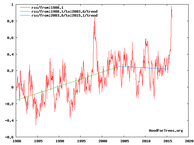
See figs 1, 3,4 and 8 at
http://climatesense-norpag.blogspot.com/2016/03/the-imminent-collapse-of-cagw-delusion.html
The millennial temperature peak is seen at about 2003.This corresponds to the solar activity peak at about 1991 Fig 8 .The previous temperature peak was at 990 +/- Fig 4
The El Nino peak is temporary aberration from the cooling trend (blue line) which will continue with various ups and downs until about 2650 +/- . Fig 4
Has anyone noticed the desperation of some to try isolate selecting a pause in warming from data, from AGW theory.
They will attack the claimed cherry picking while forgetting the very theory they are pushing makes 10 year or more pauses in warming makes those statistical pauses relevant.
CO2 in the atmosphere is causing warming of a greater order than natural variability they say, so when CO2 goes up and up, and there is a longer than 10 year pause in increasing temperatures, they attempt to isolate the statistics from the theory, and claim cherry picking.
The start data for ice levels is the biggest cherry pick in the field. But it’s apparently OK to do that
Plus temperature is following Hansen’s original C scenario (draconian cuts).
Now he’s back again claiming waterworld is on the horizon. The guy has a few screws loose
It appears from your comment that you don’t understand Scenario C or other aspects of Hansen’s paper.
You’re in good company, Steve mcIntyre made a similar error until I corrected him several years ago.
[Link, please? -mod]
Why does everyone put so much into charts , graphs, trend lines and on and on. I’m no scientist but I am a business owner for 40 years. Critical thinking skills and logic would seem appropriate. Nick wants me to believe that the 33 or so molecules in 85000 parts of our atmosphere is causing runaway heating. As silly as that seems to me, he then wants me to believe that tha ONE molecule that is human caused is the main driver of this run away climate change. Since we obviously can’t anytime soon eliminate all of this one human molecule added, what percentage does anyone think we can eliminate? And then I’m expected to believe this tiny percent change at a tremendous cost in money and possibly lives in developing countries, is worth it. Hubris falls short in defining this belief. Why don’t we invest in better preparing for what nature throws at us whether it’s hot or cold and stop goofing around trying to control it with some trumped up idea that co2 is poison.
Also that the Pause ‘insofar as it existed’ – upwards of two decades – is not significant if it doesn’t precede cooling, as opposed to demonstrating the lack of warming in the face of increasing C02 predicted by models . Not to mention the absence all the supposed consequences that are supposed to result.
Concur; once the EPA decided this low level gas was a pollutant, I knew Big Brother was here. If you want to claim its anthropogenic why not look at water vapor, SOx, NOx, etc?
John C: The way I had it put to me goes something like this: You have a v large swimming pool into which you have dumped 99,962 white ping-pong balls (which keep the water temperature fairly stable and very comfortable). You then add 38 blue balls which, as well as keeping the water healthy, have the (claimed) ability to raise the temperature by a very, very small amount – that cannot be verified with a thermometer (or by dipping a toe in the water!). You then add two more blue balls, which, although being man-made have a similar tendency to warming (it is believed). Now, do you think it would be safe to enter the water, or will it be too hot?
That’s my point. Illogical at best. Outright propaganda that too many believe. I suppose the mass of the co2 molecule can factor in but even that comparison falls short of making me fall for the tiny amount my tailpipe emits and the electricity for my house and business is doing anything. Sorry AGW promoters, I need a bigger problem to stay awake at night worrying about. I truly believe after pollution control greatly improved the air we breath, as it needed to, they needed another problem to attack business and capitalism. So they found co2. A naturally occurring gas that is great for greening of the planet and they called it a controlled substance and poison. And this came from educated pinheads. Sad state we find ourselves in today.
John C,
Why? Because…physics. Increasing the CO2 concentration in the Earth’s atmosphere will cause the temperature of the atmosphere to rise. Anyone who doubts that is simply mistaken, no matter how fervently they believe otherwise. The question is how much rise and what are the consequences. You mentioned costs; what are the costs if the majority of the science community is right about the effect of CO2 at projected concentrations?
Harry Passfield, if your analogy is meant to represent the current conditions in the Earth’s atmosphere, the number of blue balls should be continuously increasing. Also, how small is very, very? The atmospheric temperature change necessary to have a deleterious effect on the climate is many times smaller than that necessary to make a comfortable swimming pool too hot for safety.
Slipstick: Is it meant to represent the current conditions, etc? Of course not. It’s a load of balls. Oh, hang on… (And there’s always one.)
Slipstick: Let’s ignore the FACTS presented to you. Let’s also ignore the sun, water vapor, ocean cycles and all the other things we don’t understand. The agreed FACT is only one molecule in 33 is human caused. This is in 85,000 molecules of air. Let’s assume, and you seem to like assumptions as opposed to facts, that we can magically stop adding that one molecule. What affect do you think it would have? Not to mention that all the efforts the greens and government propose and are doing will have very little reduction overall. Waste of time, resources, and dangerous. Answer my question. Why don’t we put our efforts into coping with climate instead of trying to control it? logic doesn’t seem to apply only emotion and agenda. The agenda is the part I haven’t figured out yet. It’s so crazy there must be something I’m missing.
And if all you have are platitudes and Algore propaganda, don’t waste my time.
Slipstick:
‘Anyone who doubts that is simply mistaken, no matter how fervently they believe otherwise.’
Wow! You seem pretty sure about your opinion. In fact it sounds like you fervently believe it.
A rise in the equilibrium temperature of a gaseous system with an increasing proportion of CO2 exposed to infrared energy is not an opinion, it’s physics, and yes, I fervently believe in physics.
“You have a v large swimming pool”
The swimming pool is a good analogy. Imagine adding 400 ppm of ink. Then you can’t see the bottom. In the IR range, in the air, CO2 is ink. And radiant heat needs a clear view to emerge. Otherwise less efficient modes of heat transfer are used.
Nick Stokes: “The swimming pool is a good analogy. Imagine adding 400 ppm of ink. Then you can’t see the bottom.”
Totally wrong.
Stop making stuff up.
Wasn’t it Angstrom’s assistant who showed all the IR to be absorbed by CO2 was already. Adding more CO2 makes no difference unless the sun outputs more IR.
“Totally wrong.”
Your evidence?
According to Beer’s law, the total absorption of light (or IR) by a solute depends on the amount of it in the light path. If you dilute it so that the column is deeper (but same cross-section) the total absorbed is the same.
400 ppmv of ink in a 2.5m deep pool is equivalent to adding a 1mm layer and stirring. And 1 mm of ink is quite opaque.
“And radiant heat needs a clear view to emerge. Otherwise less efficient modes of heat transfer are used.”
Less efficient? The troposphere is dominated by convection; a water driven heat pump with a staggeringly large throughput running on idle most of the time. Diffusion confusion yet again. You cannot use fag packet fizzicz to calculate net radiative transfer in isolation, much less attempt it in only two dimensions assuming magic partial mirrors mounted on some toy story spherical Rubik’s cube.
All forms of energy diffusion are integrated all of the time in all directions. The usual cartoon and confusion of colour temperature with actual energy transfer are sheer stupidity and the very root of this entire nonsense.
“Less efficient?”
Yes. Upward infrared through a transparent atmosphere is efficient enough to emit all absorbed solar radiation at the snowball Earth temperature of 255K. The fact that we are at about 288K shows that all operating mechanisms including convection are far less efficient, and require a much larger driving temperature difference.
Nick , Harry et al
You don’t need ink or swimming pools.
Milk is 87% water. If you add a teaspoon of milk to a glass of clear water (about half a litre) you will not be able to see the bottom of the glass. Much of the visible light will have been reflected – yet the reflective constituents (fats and casein) only represent about 0.06% (600 ppm) of the liquid.
Try it.
John C. April 7, 2016 at 10:36 am
Slipstick: Let’s ignore the FACTS presented to you. Let’s also ignore the sun, water vapor, ocean cycles and all the other things we don’t understand. The agreed FACT is only one molecule in 33 is human caused.
That is not a FACT of any sort.
Nick,
Your ink analogy is faulty.
In the first place, the “pool” with a million balls is already inky from 30,000 H2O molecules. Second, we’re not adding 400 extra CO2 molecules, but only 115. How much inkier will 115 extra molecules out of 30,285 make the pool? To say nothing of the other GHGs at even lower concentrations.
One extra CO2 molecule per 10,000 might have a measurable effect in parts of the atmosphere with low H2O concentrations, but in most places H2O totally swamps the radiative effect of CO2, above the level required for life. Adding more CO2 generally has a negligible effect, as in fact has been observed over the past century or more of rising CO2.
The effect is so slight that Callendar, proponent of (beneficial) man-made GW during the 1930s, considered his hypothesis shown false by the 1960s, more frigid despite much more CO2 than in the ’30s. And he was right.
Under yet more CO2, the ’70s were still cold. Then the PDO flipped and the planet warmed slightly from the late ’70s to late ’90s. Since then, GASTA has stayed flat to declined. The long-awaited super El Nino has finally occurred, producing a probably temporary ever so slight uptrend since the super El Nino of 1997/8, but in all likelihood we’re headed back down in coming decades, thanks to the PDO and AMO oceanic oscillations.
Nick Stokes says:
400 ppmv of ink in a 2.5m deep pool is equivalent to adding a 1mm layer and stirring. And 1 mm of ink is quite opaque.
Fuzzy thinking. You’re just making things up and asserting them as fact. The depth of the pool is not your argument, and it also disregards the area of the pool. What matters is 400 ppm.
When I was a kid my aunt used to add what was called “bluing” to her clothes washer. It was supposed to make ‘whites whiter’.
The bluing was in a bottle, and it was as dense and dark as any India ink. She would pour a few tablespoons into the water, and my cousins and I would watch amazed as the bluing disappeared. It did not visibly change the transparency of the water at all.
Every argument made about the dangers of more CO2 amounts to evidence-free hand waving. Those arguments have remained unchanged for decades. But since hand waving is all you’ve got, that’s what you use.
If you were an honest skeptic, you would have more options.
Gloateus Maximus April 8, 2016 at 9:56 am
Nick,
Your ink analogy is faulty.
In the first place, the “pool” with a million balls is already inky from 30,000 H2O molecules. Second, we’re not adding 400 extra CO2 molecules, but only 115. How much inkier will 115 extra molecules out of 30,285 make the pool? To say nothing of the other GHGs at even lower concentrations.
Wrong, in the 15 micron band H2O does not significantly absorb compared with CO2:
http://i302.photobucket.com/albums/nn107/Sprintstar400/H2OCO2.gif
dbstealey April 8, 2016 at 10:38 am
Nick Stokes says:
400 ppmv of ink in a 2.5m deep pool is equivalent to adding a 1mm layer and stirring. And 1 mm of ink is quite opaque.
Fuzzy thinking. You’re just making things up and asserting them as fact. The depth of the pool has nothing to do with your argument, which also disregards the area of the pool. The only thing that matters is 400 ppm.
Yes your thinking is indeed fuzzy stealey. The depth of the pool is indeed critical, look up Beer’s law, absorption is proportional to concentration X path length.
When I was a kid my aunt used to add what was called “bluing” to her clothes washer. It was supposed to make ‘whites whiter’.
The bluing was in a bottle, and it was as dense and dark as any India ink. She would pour a few tablespoons into the water, and my cousins and I would watch amazed as the bluing disappeared. It did not visibly change the transparency of the water at all.
Perhaps you should have asked your aunt how laundry blue works. The dye, say Prussian Blue, is absorbed onto the clothes and therefore removed from solution, what you’ve done is to dye the clothes blue (v slightly). The slight blue color added to the clothes counteracts the dingy yellow color of the old clothes and makes them appear white.
Nick Stokes is right here. Depth has everything to do with it and area has nothing to do with it.
As far as depth is concerned, you need to take the ratios of the depths and the 400 ppm to million ppm. 400/1 000 000 has the same ratio as 1 mm/2500 mm. So if the pool were 25 m or 25 000 mm deep, you would need 10 times as much ink, or 10 mm of ink.
As for area, that does not matter. If you had a 2.5 m long straw or a 2.5 m pool the size of a city, it would still take enough ink to cover the top with 1 mm.
(On the best science site, we cannot let slip ups go unchallenged. ☺ Agreed?)
Werner,
I’ll agree that the 400 ppm is the relevant metric. Neither depth nor area have anything to do with Nick’s claim of making the water opaque, because that wasn’t his argument.
It doesn’t matter if the pool is 2.5 cm deep, or 2.5 metres, or 2.5 miles deep. Or wide. The 400 ppm (or as you say, the one molecude in 10,000) is what matters.
Also, from personal observation I don’t accept Nick’s belief that one molecule of ink in 10,000 of water will make the water opaque.
(On the best science site, we cannot let slip ups go unchallenged. Agreed? ☺)
Actually, Nick said that 4 molecules in 10,000 will make it opaque. Now turning to CO2, what was not directly addressed was the fact that nature already had 2.8 molecules of CO2 in 10,000 in 1750. Does man’s additional 1.2 molecules of CO2 in 10,000 make a further difference? And most would agree that due to the logarithmic affect, this further addition by man makes very little difference to temperature.
“Upward infrared through a transparent atmosphere is efficient enough to emit all absorbed solar radiation at the snowball Earth temperature of 255K. The fact that we are at about 288K shows that all operating mechanisms including convection are far less efficient, and require a much larger driving temperature difference.”
Absolute rubbish, we are not talking about an idealised transparent atmosphere and you’re still thinking in terms of isolated transfer mechanisms. Take a look at the temperature gradient through the entire atmosphere. Aggregate diffusion is heavily skewed by convection, which is in large part why earth has an enormous stratospheric temperature inversion (and Venus does not). The tropospheric lapse rate is linear due entirely to convection within reducing density. The assumption from colour temperatures that CO2’s effective radiative altitude for 2-dimensional SB calculation purposes is below the tropopause is not only wrong, it’s ludicrous. It confuses energy flux with temperature. Mixed gases with condensing components do not behave like black bodies or even grey bodies. Point a pyrometer anywhere you like, it cannot tell you anything about net aggregate energy transfer. Doing the physics properly requires integration of all forms of transfer in three dimensions at the micro scale, particularly the latent heat component inherent to cloud evolution. Back of a fag packet shell games in isolation are not even wrong.
A recent study showed an increase in atmospheric CO2 of 22 ppm during the period 2000-2010 produced an increase in radiative forcing of 0.2 W/m^2. That’s close to the predicted value, and evidence that added CO2 produces warming.
http://www.iflscience.com/environment/scientists-find-direct-evidence-atmospheric-co2-heats-earth-s-crust
http://www.nature.com/nature/journal/vaop/ncurrent/full/nature14240.html
The first link does not work and they want money to see the second. However the dates could not be worse to prove a point! 2000 had a La Nina and 2010 had an El Nino.
Werner, both links work on my machine. The bottom link is to an abstract where you can find the information I provided. Finally, the study shows an increase in radiative forcing and does not measure surface temperature.
“Why don’t we invest in better preparing for what nature throws at us whether it’s hot or cold and stop goofing around trying to control it with some trumped up idea that co2 is poison.”
Such a relevant, intelligent, logical question. And you know what….I cannot think of ONE logical, intelligent, relevant reason except one (but the idea itself is insane mind you)…if you wanted to control the world’s money for any reason…play with it, make buildings out of it, redistribute it, undermine your enemies….economy, people…you’d have to attack at the very root of prosperity. Which for the Western world has been the increasing ability to move freely about, and live in relative comfort, relatively inexpensively. Fossil fuels. Movers and shakers can only move and shake because of them.
Having so many powerful industrial giants sucks away vast amounts of power (money) from ever being focused one centralized place. (one world government) You gotta stop the diffusion….close down access from a lot to a few. But it would be easy to see that such an agenda was mindbogglingly dangerous and that those who believe in it were absolutely bonkers…that is… if they went after powerful and necessary business men and women and investors outright. So what would be a very clever way of bringing them down without looking like bat crap crazy, jealous, power hungry hyenas? Attack using a “scientific hypothesis” that all those evil, nasty emissions that can only be attributed to one source—fossil fuels….break down their profit margins with taxes, ruin their reputations with accusations and make the whole world believe that they are KILLING THE PLANET, and they couldn’t give a rat’s behind about it either.
Invite all the little, pathetic, powerless people of the world to become superheros for Earth….first, tell them how marginalized they really are….teach them that there’s 97% of them and only 3% of the big, bad enemy….stoke class warfare…and movements like Occupy Everything….pretend you are supporting their progress while squeezing them in subtle ways to make their suffering even more acute. You gotta keep them down so you can point out how down they are all the time! Make them angry. And scared. And feed them propaganda 24/7 from every angle. And hope with all you have in you that the climate doesn’t do what it most likely and naturally will….reach a certain point and start to cool off……BEFORE your plan is successful. After all, it would look stupid if the world starts to cool off like it always has and you haven’t implemented any of your “world saving strategies” before it does! In fact….the closer it gets to that actually happening…the more shrill and panicked and terrifying you might have to become in order to push it all past the tipping point.
And the best part is….between the advances of technology and the age old fact that some people are so stupid, so gullible, soooooo incredibly weak in the face of even basic suggestions… you wouldn’t even have to form an old fashioned physical conspiracy! No meetings….no secret handshakes….no overhead..no heads on spikes. Nothing. Just hit the public over and over and over again in their emotional soft spots….home….family….hopes….dreams….their religion….their futures….their darkest fears…..death…..destruction….insecurity….loss.
You don’t need to crest a hill with an overwhelmingly large army arrayed in shining battle gear anymore to bring your foes to their knees! Silly! Just make them feel like something that bad and that awful is coming for them if they don’t do something.
(Hint…if you spend money on preparations and adaptations for future natural disasters…they’ll realize doing so is much easier, productive, and visibly reassuring. It would give people hope and comfort and peace….and you can’t do a d@mned thing to push an agenda on hopeful, comfortable, peaceful people!)
Yes thanks
It will be interesting to see how the Satellites and NOAA/GIIS deal with the sudden drop in Sea Temps.
Will they ignore it, adjust it out or what?
See
http://notrickszone.com/2016/04/06/global-sea-surface-temperatures-have-fallen-sharply-cooled-surprisingly-negative-global-temperature-anomaly-by-end-of-2016/#sthash.vdno3ipL.dpbs
Or ignore it until they can adjust it, or simply claim that it all proves their point anyway.
Re: “effect”
The phrase “CO2 has an effect” describes something very small (if indeed it exists at all), but it has great potential to mislead. This hyper-technical phrase evokes in the average reader’s mind the false implication that CO2 has a controlling effect. In tort law, when a potential, very small, cause is OVERWHELMED by another controlling cause, the controlling cause is called a supervening causation. Here, the effect of natural drivers is the supervening cause of climate change.
To mention human CO2 emissions is unhelpful at best, damaging to the truth about causation at worst.
If an effect is obliterated by another cause, here natural climate drivers, it is accurate and wise (we are in a WAR for science realism where word-twisting by the likes of St0kes can easily fool the uninformed) to leave the conjecture about human CO2 emissions’ potential “effect” completely aside.
************************************************************
Remember Major Burns on M.A.S.H.? If he were made a general, he would lose the war, getting bogged down in bickering over hyper-technical nit-picking: winning wars takes strategy as well as technical expertise. Wisdom must guide knowledge.
*****************************************************
The STOP in warming, so far as meaningful measurement goes, IS. It has no “end” at this point.
*****************************************
ANOTHER GREAT ARTICLE, MR. BROZEK — THANK YOU!
You are welcome! But do not ignore the giants who directly or indirectly contributed, namely David Hoffer and Nick Stokes.
Maybe I’ve missed some posts but the last I read the ‘pause’ was somewhere around 18 years. What caused the sudden jump to 23? What did I miss?
Looks like you missed THIS post, Mr. G.:
2016 -1993 = 23
We are talking about two different things. See an earlier post of mine that clearly describes the differences here:
http://wattsupwiththat.com/2014/12/02/on-the-difference-between-lord-moncktons-18-years-for-rss-and-dr-mckitricks-26-years-now-includes-october-data/
In short, the 18 years had a slight negative slope. The present 23 years has a positive slope, but it is not statistically significant enough for climate scientists to be sure we really do have warming over the 23 years.
As an analogy, suppose we have a political poll that says one candidate has 40% and the other has 38%. But then they say the margin of error is 3% 19 times out of 20. So with the margin of error considered, we really cannot be sure the one candidate is favored by a majority.
Ok that makes sense now. I knew there was something fairly obvious I was missing. Thanks for clarifying.
“it is not statistically significant enough for climate scientists to be sure”
But the 23 trend observed was actually 0.92°C/Century. And while with different weather it just might have been as low as zero, it might equally have been as high as 1.84 °C/cen. This does not really have the attributes of a pause.
True, but Phil Jones and the rest of the climate science community, rightly or wrongly, use that yardstick for certain conclusions. Is that not correct?
“use that yardstick for certain conclusions”
People use the existence of statistical significance (SS, at 95%) as a yardstick. They don’t use the non-existence of SS. Lack of SS just means you don’t have enough data to be sure.
The trend of RSS since Aug 2010 had a lower CI of -0.852. Not SS (relative to 0). But the trend itself was 5.29°C/Cen. That isn’t a pause. Actually, there is an interesting paradox here. To Jan, from 8/2010, the lower CI was -0.751 – higher than Mar. But we’ve had two very hot months, and we’re less certain of positive trend? The reason is that the sudden rise increased the estimate of variability more than the rise in trend.
Thank you! That explains a puzzle I had with respect to Hadcrut4. I wrote:
For Hadcrut4.4: Since October 2001: Cl from -0.016 to 1.812 (Goes to January)
But with a high February anomaly, it got extended back to August as follows.
Temperature Anomaly trend
Aug 2001 to Feb 2016
Rate: 1.007°C/Century;
CI from -0.003 to 2.018;
t-statistic 1.954;
Temp range 0.443°C to 0.589°C
The Pause numbers for 18 years (or 18 years, X months) is based on the definition of a regression line with a slope less than 0.0
The 23 year numbers use the definition of a regression line with a slope not statistically significantly different from 0.0
The issue of statistical significance is very important, as it takes into account, in some fashion, the natural variability of the data.
The error bars on RSS are actually worse than that.
They are so big that its really pointless to compare Satellite temperatures with land temperatures
or to compare satellite temperatures with GCMs.
As to the pause..
when can we see the goofy approach of starting with today and going back in time to measure a pause?
That could take quite a while. See Nick Stokes’ excellent comment here on this point:
http://wattsupwiththat.com/2016/04/04/march-was-3rd-warmest-month-in-satellite-record/#comment-2182271
When the La Nina takes effect of course. Then you will be able to read on wuwt that the pause has lengthened.
Slipstick, you just did the propaganda response. Make a statement without any facts. You didn’t explain how this one human caused molecule in 85000 was going to have the effect you believe. And what percent reduction do you think will stop what you believe? You might need to figure out an economical method to remove as much co2 as possible to save the planet. Of coarse this will needlessly kill off many plants and cause much human and animal deaths. But you may be OK with that.
John C,
Before I can respond, to what does 85000 refer?
Molecules of what we call air in a specific volume. 400 parts per 1,000,000 is a FACT we all agree on. Do the math with some rounding of course. Of the approximately 33 molecules in 85,000 parts, only one is attributed to humans. There is some difference in mass but not enough to really make a difference in basic physics. The re radiation of absorbed heat is well known. I am only concerned with quantity because I’m applying critical thinking. I can’t see how what is claimed is possible. If co2 was at a much higher level, and I mean much higher, you may have a point. The fact that so little of co2 is human caused and our ability to reduce it and maintain a livable planet, defies logic without some very big changes.
John C.,
You’re misunderstanding two things. First, a single CO2 molecule can interact repeatedly with photons, redistributing their energy without ever using up the CO2. Second, concentration is only part of the equation, the other is the shear scale of the atmospheric air column. Here’s an analogy I wrote a long time ago to try and illustrate:
Assume a square glass jar that is 10 grains on a side. That’s 100 grains in a single layer. Now imagine the jar is 100 grains tall. 10,000 grains in all. Make 99,996 white and just 4 red, same ratio as your example above. Suppose the jar is about 10 cm tall. Now, instantly make all the white grains invisible. What would you see?
Well, you’d see a 10 cm tall jar that is mostly empty, with a fleck of red here and there. You could easily draw a vertical line from the bottom of the jar to the top without hitting any of those red flecks. In fact, you could draw a lot of them.
Now, stack thousands of those jars on top of each other in a tower 14 kilometers high. You’ll need a stack of 140 thousand jars. Now try drawing a line from bottom to top without hitting a red grain. You can’t. In fact, not only that, you can’t even do it without hitting thousands of red grains.
I’m a confirmed skeptic, but radiative physics is a bit more complex than simply drawing conclusions from concentration ratios.
John C: I hadn’t refreshed when I posted below. I figured it out …3%? Guess I was close….
Only one is attributed to humans? Using your scale, the current concentration is 34/85000 and since ~1960 the concentration has risen from ~26 to 34. Are you attributing that increase to something other than human activity? If so, what?
Perhaps it’s the ratio of CO2 that is man-made? (As opposed to natural CO2 in the atmosphere) Just guessing here.
There have been many posts on this and I am certainly not going to get into it in this post. As well, there is strong disagreement. Here is my understanding:
Out of 100 CO2 molecules that enter the atmosphere each year, 3 are due to man and 97 due to natural sources. However these 3 due to man added up over the last 250 years so that of the present 400 parts per million, 120 parts per million is the cumulative total due to man. So we caused a 40% increase in CO2. But so what? The important thing is that this has not contributed to CATASTROPHIC warming, nor will it in the future.
davidmhoffer: Thank you for the analogy with the glass jars (14km high).
I’m a confirmed skeptic, too (does it show?), but our warmist politicians – who make the carbon laws) are themselves “drawing conclusions from concentration ratios”.
I guess the thing we need to take notice of is that little bit in “ppmbv” (I’m assuming your glass jars are the “bv” bit).
I take issue with this phrase only.
The truth is we are not sure what caused the LIA and therefore we don’t know what is causing the post-LIA warming. The most popular theory is that LIA was caused by low solar activity helped by unusual volcanic activity, specially at the beginning (13th century) and at the end (1815).
We do know that on a millennial scale the planet is cooling due to lower obliquity (axial tilt) and low summer insolation in the Northern Hemisphere due to unfavorable precession.
The most reasonable explanation is that LIA was an anomalous cold period caused by unusual conditions and the planet has naturally and gradually warmed to the level that corresponds to its present orbital configuration and perhaps a bit more due to a rebound effect and helped by the increase in GHGs.
The most reasonable expectation is that after this warming period the world should resume its progressive cooling. The more we warm, the stronger the opposing cooling forces get. Paleovclimatology shows that GHGs are not a strong driver of temperatures by themselves, since the second half of the Holocene showed progressive cooling despite increasing GHGs concentration.
Most people assume that in the absence of warming forcings global average temperatures should remain more or less levelled, and that in the presence of indefinitely increasing levels of CO2 in the atmosphere temperatures should indefinitely increase. Both assumptions are wrong. Global temperatures work like a roller coaster: Once the highest point was reached in the present interglacial the only way is down, even if the fall is made of ups and downs. As high levels of CO2 did not prevent the planet from entering glacial conditions previously, and they did not prevent the cooling in the 1945-1975 period, we should not expect them from preventing a global cooling in the near future.
In conclusion you should not expect that it will continue to warm. It might continue to warm for some more time or not, but a peak warmth should be reached at some point and then global cooling should resume. Let’s hope that peak warmth was not 2015. I hope we continue getting more record warm years in the future, because it beats the alternative.
Earth has been in a long-term cooling trend for 3000 years, ie since the end of the Minoan Warm Period. The East Antarctic Ice Sheet quit retreating at that time, for instance.
Peak warmth of the Minoan WP was a little less than the Holocene Optimum, but lasted less time. The peaks of the Roman, Medieval and so far Modern WPs have each been lower than for the preceding WP. The trend is down and not our friend.
We may however be in another of the super interglacials which, based upon the orbital eccentricity cycle, occur at roughly 400K year intervals, in which case “catastrophic” warming could occur naturally over the next 20,000 years or so, ie partial melting of the Southern Dome of the Greenland Ice Sheet.
Earth has been in a long-term cooling trend for 5200 years, when the Neoglacial subperiod of the Holocene started. See Thompson, Lonnie G., et al. “Abrupt tropical climate change: Past and present.” Proceedings of the National Academy of Sciences 103.28 (2006): 10536-10543.
There is no super interglacials which occur at roughly 400K year intervals. MIS19 took place 800K years ago and was about 12,000 years long, slightly more than the Holocene so far. The astronomical signature of MIS19 is almost identical to the Holocene. The closest of all interglacials for the past million years.
Yes, you could argue that the cooling trend started at the end of the HCO c. 5 Ka, but the Minoan was as warm, briefly, as the HCO.
Dunno what data you rely upon, but the fact is that the Southern Dome of the GIS melted completely or almost so during the interglacials of c. 800 and 400 Ka. During the warmer and longer than now Eemian, it partially melted.
I can’t link to studies on the length of MISes 19 and 11, since they’re paywalled, but both interglacials were warmer and longer than the Eemian, up to 30,000 years in duration (or more, depending upon how you count).
I don’t know what you are talking about. Antarctica has been frozen for millions of years. The Antarctic ice cores do not extend further into the past because the bottom melts away due to geothermal heating, or the bottom layers get messed by horizontal shearing. They are now looking for places that could have older ice, up to 1,5 million years, because they accumulate less ice, not more.
https://www.sciencedaily.com/releases/2013/11/131105081228.htm
MIS 11 is longer than MIS 1 (Holocene), probably because the precession peak (Northern summer insolation) and the obliquity peak are separated by a little less than 10,000 years so the rise in insolation from precession compensates the fall in insolation from obliquity. But in MIS 1 the peaks are coincident, so the next peak in precession is almost 20,000 years apart with plenty of time for obliquity to fall almost to the bottom of its cycle without significant northern summer insolation from precession.
MIS 19 800k years ago was not longer than MIS 1. Nor was it warmer. Probably about the same or slightly cooler judging from deuterium levels.
The following figure is from Pol, K., et al. “New MIS 19 EPICA Dome C high resolution deuterium data: Hints for a problematic preservation of climate variability at sub-millennial scale in the “oldest ice”.” Earth and Planetary Science Letters 298 (2010): 95-103.
http://i1039.photobucket.com/albums/a475/Knownuthing/Figure%209_zpsl52xhrtm.png
MIS 1 is in red and MIS 19 in black. From highest deuterium level to the end of the plateau phase MIS 19 was about 11,000 years, and MIS 1 has already extended to 10,500 years. The accelerated cooling starts at about half way down in the obliquity cycle despite rising summer insolation from precession.
There is no basis to say that the lows in the eccentricity 400k years cycle produce longer interglacials, quite the contrary, the lower the eccentricity, the lower the northern insolation from precession and the lower the forcing to warm during precession peaks. If you check the 65°N summer insolation curves you can quickly see that the highest values are reached during eccentricity highs like the one that took place at MIS 15 200k years ago.
MIS 11 and MIS 1 are really very different astronomically so we should not expect them to behave similarly in terms of temperatures or duration. This figure shows that they can be aligned by precession or by obliquity, but not by both since the peaks are displaced. MIS 1 in red and MIS 11 in black.
http://i1039.photobucket.com/albums/a475/Knownuthing/MIS11Tzedakis_zps4fubj4yy.png
GIS means Greenland Ice Sheet. I should have spelled it out.
Here is an old link on the melting of the Southern Dome of the GIS:
http://www.livescience.com/7331-ancient-greenland-green.html
Data from Antarctica might differ, but it now appears that the Southern Dome melted twice, once during MIS 19 and again during MIS 11. As I mentioned, it partially melted during MIS 5, ie the Eemian Interglacial.
I think you got it wrong because you didn’t actually read the paper, Gloateus. The paper you are referring is this one:
http://www.ncbi.nlm.nih.gov/pmc/articles/PMC2694912/
And about the dating of the material found in the ice cores they say:
All four dating methods suggest that the Dye 3 silty ice and its forest community predate the Last Interglacial (LIG, ~130-116Ka) (Fig 2), which contrasts with the results of recent models suggesting that Dye 3 was ice-free during this period (27, 28). Indeed, all four dating methods give overlapping dates for the silty ice between 450Ka and 800Ka (Fig. 2), exceeding the current record of long-term DNA survival from Siberian permafrost of 300-400Ka (9). However, due to the many assumptions and uncertainties connected with the interpretation of the age estimates (7), we cannot rule out the possibility of a LIG age for the Dye 3 basal ice.
In plain words they think is older than 450k years and younger than 800k years. That rules out MIS 11 that took place 425k years ago, so it should be MIS 13, MIS 15, MIS 17 or MIS 19. However not all is lost, because since the dating methods are so uncertain the biological material could actually be from the Eemian, so any interglacial is a candidate.
There is simply no support for any theory about periodic super interglacials. The Holocene is just like any interglacial, about to end in one or two millennia at most.
Javier,
I read that paper and subsequent ones which found material from 800 Ka.
The Holocene might well last another 50,000 years. Or not. But the fact is that super interglacials have happened and could again.
Even is the organic material from Greenland is only 400,000 years old, it shows that the Southern Dome melted then, in a very long interglacial.
Please see comment by Bill Illis:
https://wattsupwiththat.com/2014/06/25/study-the-greenland-ice-sheet-collapsed-400000-years-ago/
Why can’t we quantify how much global warming is due to step inputs from El Nino, presumably each La Nina doesn’t fully undo each El Nino. Any remaining trend may then be attributed to third world co2 since northern hemisphere co2 consumption by farm crops exceeds northern hemisphere production if co2.
Of course each La Nina should “fully undo” each El Nino. IN THE LONG TERM.
Otherwise GMT would be set in stone on a rising trend from millenia ago.
ENSO redistributes heat in the climate system (~93% of which resides in the oceans) into the atmosphere. It all comes from the Sun ultimately.
Without an internal source of heat from the ocean bed then PDO/ENSO should cancel.
That it no longer does is due to the GHE of CO2 – up 40% due to anthro emissions.
CO2 is a tiny portion (400 ppm) of total GHG, although a very distant second to H2O (perhaps 30,000 ppm on a global average basis).
Over the past 150 years, the naturally warming Earth has benefited from having about one more CO2 molecule per 10,000 dry air molecules, ie up from around three to four. Two more such molecules would be even better for plants and other living things.
Toneb. Co2 produces downwelling infrared which only penetrates one micrometre so cannot warm the ocean, nor concentrate it’s force in such a localised part of the ocean. There is good satellite imagery which points at an ocean bed contribution. Also there is a 60 year cycle which would seem to rule out co2. There may be proxy evidence for El Nino going back centuries, further reducing the role of co2 in El Nino. If co2 plays a role in El Nino, then what role does it play in La Nina ?
The amateurish practice of fitting linear regression lines to woefully short stretches of record and then computing “the confidence intervals” based upon unverified models (e.g. “red noise”) of global temperature variability yield highly arbitrary estimates of physically meaningless “trend.” If an unequivocal indication of actual low-frequency variability is desired, a well-designed low-pass filter with a cutoff near one cycle per decade has to be employed. The results of such filtering are exact.
“a well-designed low-pass filter with a cutoff near one cycle per decade has to be employed. The results of such filtering are exact.”
Linear regression is a filter. It is a Welch filter on the differences. Or a differencing of Welch filtered.
The slope of linear regression–which is the metric used in this article–is a very crude BAND-bass filter and does NOT completely display the low-frequency content of the data series, as would a well-designed low-pass filter.
J Martin, the oceans could also presumably be assumed to have a nice layer of Water vapour hanging over it, which would swamp any effect CO2 is supposed to have
Apparently Brozek has used a test with low statistical power. The standard regression analysis shows statistical significance at the 99.9999% confidence level (p=1.21e-7). The slope of the regression line is 0.0881°C/decade, with a 95% confidence interval of 0.056-0.120°C/decade. Data source for UAH version 6 beta 5: http://vortex.nsstc.uah.edu/data/msu/v6.0beta/tlt/tltglhmam_6.0beta5.txt
The statistical significance of “standard regression analysis” is predicated upon entirely independent trials of linear relationship (i.e., “white noise” plus trend), instead of serially autocorrelated data, such as found in a geophysical setting.
Brozek’s conclusions do not take into account serial autocorrelation. If that is an issue, the evidence for that needs to be presented here. A previous study demonstrates the major global temperature trends are positive, even when controlled for serial autocorrelation.
jpaullanier,
In other words, satellite measurements are very accurate. That contradicts the alarmist talking point that satellite data is NFG.
“Brozek’s conclusions do not take into account serial autocorrelation.”
They certainly do. Ar(1). There is a discussion here. Autocorrelation has small effect on trend, but greatly increases uncertainty.
Nick, I performed a Durbin-Watson test for autocorrelation on the regression I mentioned. The Durbin-Watson statistic is 2.186. At the 1% level of significance, UL=1.637. So there is no reason to suspect autocorrelation. This is consistent with what was found earlier for major global temperature trends.
“Global temperature series have positive trends that are statistically significant even when controlling for the possibility of strong serial correlation.”
http://journals.ametsoc.org/doi/full/10.1175/1520-0442%282002%29015%3C0117%3ATAOSRT%3E2.0.CO%3B2
JPL,
“So there is no reason to suspect autocorrelation. This is consistent with what was found earlier for major global temperature trends.”
The paper you cite is using annual data. Then there is not much autocorrelation. But if you use monthly data, there is much more, and you must allow for it. Here is a post at Climate Audit where Hu McCulloch correctly criticises Steig et al for not allowing for autocorrelation with Antarctic monthly data. Steig published a corrigendum.
Of course, the extra uncertainty of monthly data with autocorrelation is compensated by the greater number of data points.
“In other words, satellite measurements are very accurate. That contradicts the alarmist talking point that satellite data is NFG.”
No they are not .. no more accurate than a GCM for temp, as they employ complex algorithms to extract the temperatature, with paparmeterisations included.
V’s 1 to 4 for RSS and v’s 1 to 6 for UAH show that.
And your “darling” dataset, or is it was since v4.0 – RSS’s chief Carl Mears says….
“A similar, but stronger case can be made using surface temperature datasets, which I consider to be more reliable than satellite datasets (they certainly agree with each other better than the various satellite datasets do!)”
Toneb, supreme expert at conflating apples with oranges, says that satellite data is…
…no more accurate than a GCM for temp…
So now a computer model output is considered “data”, equivalent to satellite data?
Admit it, you’re just winging it; a know-nothing using the alarmist tactic of ‘Say Anything’.
jpaullanier:
Durbin-Watson is a notoriously weak metric for detecting serial autocorrelation, which doesn’t conform to the AR(1) model used by Brozek in accounting for it. And the corresponding power density shows a very strong spectral peak at multi-decadal periods, a feature totally at odds with your presumed uncorrelated white noise.
dbstealey April 8, 2016 at 10:51 am
Toneb, supreme expert at conflating apples with oranges, says that satellite data is…
…no more accurate than a GCM for temp…
So now a computer model output is considered “data”, equivalent to satellite data?
The satellite data is fine it’s the angular distribution of a certain frequency range of microwave radiation due to emission by O2 (although some other sources such as ice have to be eliminated). This radiation has to be modeled to convert it into a temperature and at this time there have been difficulties in doing this accurately (hence the multiple versions of the software). In fact the difficulty in dealing with the radiation from near the surface has proved to be too difficult and the TLT product appears to be in the process of being abandoned.
1sky1:
I’m confused about where AR(1) is used. I don’t see where Brozek says he uses it, and I don’t see in the Temperature Trend Viewer site where it is used, either. Maybe I have missed something. It seems to me that Brozek needs to address this in his article. I am also wondering, if AR(1) is employed by Nick, does this allow a correction for the p-value for correlation?
GCMs (models) vs Reality:
http://i2.wp.com/poorrichardsnews.com/wp-content/uploads/2016/03/climate.jpg
jpaullanier:
Although Brozek doesn’t mention it explicitly, AR(1) variability is the (unwarranted) default assumption in “climate science.” From his comment, I suspect Nick Stokes resorts to it.
“I don’t see in the Temperature Trend Viewer site where it is used”
It’s used in the calculation of CI’s (which Werner quotes), in the significance shading, and in the plot of t-values. The original post is here. There is discussion here, here, and here.
Nick, I provided the Durbin-Watson statistic for the monthly series I used. It provides no reason to suspect autocorrelation. If there is any further calculation that needs to be performed, that must be documented in a study published in a peer reviewed scientific journal so that anyone can check it.
“Nick, I provided the Durbin-Watson statistic for the monthly series I used.”
Well, I don’t think it is right. The statistic should be about 2*(1-r) where r is the sample autocorrelation, which is positive. And r for monthly residuals is typically about 0.6 or so. See my acfs here. As for published literature, there is plenty. Here is Santer et al, where they use a Quenouille method even for seasonal (see Table 3). Here is Foster and Rahmstorf, where they contend that even Ar(1) isn’t enough.
Nick, I used the standard method for calculating the Durbin-Watson statistic. You may check it yourself. We’ll just have to leave it at that.
By the way, thanks for your comments and the sources you provided, Nick. From your acfs it does look like I have made a mistake, although I don’t see it! So thanks for taking the time to point that out. I need to learn more about autocorrelation anyway, since it applies to temperature anomalies. I’ll be studying that.
Now I see my mistake. I switched Sum of Squared Differences of Residuals and Sum of Squared Residuals. The correct value for the Durbin-Watson statistic from this method is 0.464. Using ACF, the value is 0.514. Both are less than dL, so autocorrelation is significant at both the 0.05 and 0.01 significance levels. My apologies, and thanks again, Nick.
Davidmhoffer: Actually I do understand. All the analogies we all can come up with still can’t explain how only 3% of the co2 we are responsible for can be so catastrophic to climate. There is only so much energy this little molecule can absorb and radiate. When the sun doesn’t shine, it cools very rapidly. Unless there is a lot of water vapor….curious. I, using my critical thinking for questions, would be much more worried about the 97% I have no control over. This doesn’t address the fact that we will not be able in any practical way in any reasonable time, be able to eliminate more than a small portion of what we are responsible. This ignores the fact that co2 has been much higher in the past and yet here we are arguing about tiny amounts. Seems to me that there are likely other very important drivers of climate such as the sun, oceans, and possibly cosmic rays affecting cloud cover. The fixation on co2 seems a waste of time and very political.
John C. April 7, 2016 at 4:42 pm
Davidmhoffer: Actually I do understand. All the analogies we all can come up with still can’t explain how only 3% of the co2 we are responsible for can be so catastrophic to climate.
As was explained upthread, we’re responsible for a 40% increase over background levels to date. 3% year over year adds up.
When the sun doesn’t shine, it cools very rapidly. Unless there is a lot of water vapor
And would cool even more if there were no CO2. Plus, you have to keep in mind that water vapour concentrations decline with temperature, which in turn declines with altitude. So even at the equator, over the ocean, where water vapour sits at 40,000 ppm, once you get to a certain altitude, water vapour drops off to nearly zero. CO2 on the other hand remains relatively constant to the top of the troposphere. So total effect of CO2 is outsized compared to concentration versus water vapour.
The balance of your argument I would agree with. But start with the proper physics, so that the balance of your argument has more credibility.
Can you prove humans caused all the increase? Based on your data, once co2 is in the atmosphere it never leaves. How did it come down from the much higher levels In the past? Is it hiding with the warming along with the 20 or so year pause in temperature? Which by the way doesn’t support the additive theory you want me to accept. I see ocean cycles along with sun cycles much more likely to be the driver of climate. We shall soon see as cycle 24 ramps down. By the way, cycle 24 has been very weak compared to 22 and 23. We may all wish there was much more co2 in the air if cycle 25 is also weak or even less active. All this focus on co2 in just a smoke screen. I can’t say the purpose but something isn’t logical.
Based on your data, once co2 is in the atmosphere it never leaves.
That is absolute nonsense. I never said any such thing. But I see your uninterested in learning anything.
You may wish to read:
http://wattsupwiththat.com/2010/09/24/engelbeen-on-why-he-thinks-the-co2-increase-is-man-made-part-4/
Davidm: On my interest in learning…I have read about all the beliefs you have in the boogieman co2. I just come to different conclusions. And reading the posts all the way down from here, It seems I’m not alone. So unless you have information to better support you’re position, don’t even try to infer I lack interest in learning. I just chose to apply this knowledge with logic and observation. Like I said, I have been a business owner for forty years. I grew up during the sky is falling immanent coming ice age. Didn’t buy that one either. You don’t address the sun, ocean cycles, cloud cover and cosmic radiation. You seem to be fixed on co2 even though it’s affect as a driver of climate diminishes above 400 PPM. My main point is the amount humans are adding is small. Very small. A total ban on co2 emissions across the globe would have little impact in temperature. Just look back to when co2 was 300 PPM and unless you subscribe to ALGORE fake movies and overly adjusted data, there is no there there. But I digress.
John C. April 8, 2016 at 9:15 am
I have read about all the beliefs you have in the boogieman co2.
You’ve no idea what my beliefs are. Your statement is insulting.
You’ve drawn a lot of conclusions that I agree with, but they are based on a very poor understanding of the facts. When I point out things that you could learn in order to make your own articulation of the issue stronger, you change the subject and yammer on about different issues.
David, speaking of proper physics, davidmhoffer said:
I read this comment a couple of days ago and didn’t continue reading the thread beyond it. The analogy annoyed me and has been bothering me ever since.
There are a couple of things that are quite wrong and if I understand your mind experiment correctly, then your analogy is way off track.
Parts per million (PPM) in climate science is taken to mean PPM by volume (PPMV). It is a mass ratio of the relative volumes of gasses.
Changing the temperature and pressure will not effect the mass ratio, only the volume of the mixture, which is why PPMV is a useful and handy metric.
The absolute amount of stuff (Number of molecules and their total mass.) will change but not the relative ratio of the mix.
To be clear, to prepare a PPMV mixture, you simply choose any VOLUME of a gas (Such as CO2 at any T or P, it doesn’t matter!) and you add it to a million equivalent volumes of air!
The volume of a gas (Such as CO2) includes the molecules and the empty space they move in. What you fail to demonstrate is the very tiny size of molecules and the massive amount of empty space. Even at standard temperatures and pressures (STP) your 10cm cube is 99.9% empty space.
All the “grains” (Molecules or parts.) would occupy just 0.0726% of the volume in the real world. But the volume is far smaller in the experiment because the number of parts (grains) are limited to 10,000 in your cube.
In the real case there would be about 2.5×10^19 parts/grains/molecules and of that, CO2 would occupy just one hundred millionth of the volume.
The grains analogy in a 10cm cube makes no sense in a rational world. Even to get 10,000 molecules this closely packed or their movements constrained to orbits this tight would require a tiny volume at impossible pressures.
Maybe I’m wrong about what you mean by grains/parts/volume and I will stand to be corrected, if so. However those are probably the least of the problems with the analogy!
You then stack 14 km of “cubed” jars to represent the atmosphere but the problem with that is that the density of the real atmosphere lowers with altitude.
At just 5km half the mass of the atmosphere has gone. The volume has doubled and those grains have a lot more empty space to be alone in!
Forget 14km, at 11km, only 25% of the total mass remains (The PPMV is unchanged but the volume is now huge and the number of molecules is low).
To be honest, the effect is actually worse in reality because CO2 is heavier than air and the PPMV does actually change, leading to even less CO2 at altitude.
Oddly, your model succeeds in inverting reality! It represents the exact opposite of what actually happens.
Starting with a cube of sample “stuff” that could only really exist in an impossibly compressed and unimaginably tiny space you then extrapolated. The result exposes how massively opposite reality actually is. There is much more empty space, the parts are actually vanishingly small and when you add on 14 km of additional atmosphere, an analogy that started badly only gets worse as it is sucked into the emptiness of its own vacuity* 😉
*Sorry couldn’t resist the vacuum pun!
I’m sorry that you have totally and completely missed the point of the analogy.
Not to mention that actual measurements of radiated spectrum escaping from the atmosphere back up my analogy 100%. If it is wrong, it is wrong for other reasons than you propose and certainly is not an inversion of reality as you claim. It is consistent with observational data.
Searching for a pause through noisy data is not a very reliable form of linear trend analysis. If this were my investigation, I would have to say very little about what I have found. Like when my children would bring a picture of something they have created with a crayon. Whatever they said it was, I would agree but I had not a clue as to what it really was. Your graph seems to be of the same cloth. You say it is one thing. I haven’t a clue as to what it really is.
The middle line is the slope when ignoring error bars. The region between the flat line and the steep line represent a 95% probability that the real slope is between these two lines. There is a 2.5% chance the real slope is above the highest line and also a 2.5% chance the real slope is actually negative. And that 2.5% is good enough for climate scientists to say the warming is NOT statistically significant.
Actually the opposite, the usual standard is the 0.05 level for significance, at that level the results you present show that warming is significant at the 0.05 level.
Phil, only if the degrees of freedom allows that statement. Not that I argue against warming. I have no problem saying the long term slope is a warming slope. You and I likely differ on the cause. However, in this case, my issue with this post is this: Taking such a short segment of that slope and trying to say something significant is fraught with all kinds of statistical limits. The author appears weak in dealing with noisy data and uses an inappropriate statistical method on the short string of data used.
Which opens the door to this discussion: If you have less than graduate level work in statistical analysis, you run the risk of leading your followers down a primrose path. Statistical analysis, applied carefully and within the limits of your raw data and research design, has kept many hairbrained ideas away from the general public, where if released, could do great harm. The author of this current post stands squarely in that primrose path and thus his work is easily dismissed by experienced researchers with sound statistical analysis knowledge.
A year ago, when Nick Stokes had a value of 22 years for RSS, Dr. Ross McKitrick came up with 26 years.
Hopefully Nick will address all of the above points.
Pamela Gray April 8, 2016 at 6:31 am
Phil, only if the degrees of freedom allows that statement. Not that I argue against warming. I have no problem saying the long term slope is a warming slope. You and I likely differ on the cause. However, in this case, my issue with this post is this: Taking such a short segment of that slope and trying to say something significant is fraught with all kinds of statistical limits. The author appears weak in dealing with noisy data and uses an inappropriate statistical method on the short string of data used.
No argument with that, but the statement made re warning requires a one-tailed test, doing a two-tailed test incorporates the probability of warming faster than mean + 2 σ into the probability of the slope being less than 0, which makes no sense.
I use linear trend in educational matters (but carefully is student performance is noisy). The use of linear trend when data is noisy, like it is with temperature, is a good topic to discuss. Might we begin here?
http://nimbus.cos.uidaho.edu/abatz/PDF/sap1717draft37appA.pdf
John C is onto something. First, there’s the log effect of adding more CO2:

(click in charts to embiggen)
As we see, most of the warming took place in the first few dozen ppm. At current concentrations of ≈400 ppm, any warming from more CO2 is simply too minuscule to measure.
Next, before industrial CO2 emissions began, that trace gas was 15 – 20 times higher than now:
http://2.bp.blogspot.com/_cHhMa7ARDDg/SoxiDu0taDI/AAAAAAAABFI/Z2yuZCWtzvc/s1600/Geocarb%2BIII-Mine-03.jpg
That much more CO2 did not cause any runaway global warming — or any global warming for that matter. The only verifiable correlation shows that ∆CO2 is caused by ∆temperature.
Radiative physics argues that at current concentrations, a rise in CO2 will have some small effect on global T. But then we’re back to the first chart above. Extrapolate from 400 ppm to 800 ppm. Doubling atmospheric CO2 would still not cause any measurable rise in global T. And that is what empirical observations support. But after almost twenty years of a steady rise in CO2, global T has been in stasis. That falsifies the CO2=cAGW conjecture.
And as John C points out, human CO2 emissions have been quite negligible. It is true that those emissions have brought about a rise in that trace gas. But there is no credible evidence showing that more CO2 has caused any global harm. Thus, we can state that the rise in CO2 has been “harmless”. There are peer reviewed papers that agree, and which state that the CO2=AGW predictions have been wrong by more than an order of magnitude.
And on the other hand, there is ample evidence showing that the added CO2 has been very beneficial. Agricultural productivity has measurably risen:
Plants can easily tell the difference between 300 ppm and 400 ppm. But humans cannot; it is only by using very sensitive instruments that we even know about the rise. And to put John C’s numbers another way: over the past century, CO2 has risen by just one part in 10,000. Based on the informed skepticism here, it seems preposterous that going from a natural 9,999 molecules, to one more molecule in 10,000 is the proximate cause of the predicted global warming — which anyway has failed to happen.
As Prof Richard Feynman pointed out: if your theory is contradicted by observations, then your theory is wrong. “That’s all there is to it,” explained the Prof.
If CO2 has caused some minuscule warming, it has been entirely harmless, and beneficial to the biosphere. The IPCC has been so far off base that it’s obvious they are wrong. The real world is not cooperating with their version of political science.
dbstealey;
You can’t claim that CO2 is logarithmic AND that what amounts to a 40% increase (+1 in 10k) in concentration is insignificant. You can have one or the other, but not both.
Sensitivity, feedbacks, and net impacts are matters separate and distinct which observations suggest the IPCC is dead wrong in regard to.
davidmhoffer says:
You can’t claim that CO2 is logarithmic AND that what amounts to a 40% increase (+1 in 10k) in concentration is insignificant.
Of course I can. And as I explained, it is significant to plants. The insignificant part refers to forcing global T to measurably rise. That has been endlessly predicted, but never conclusively observed.
Davidmhoffer,
“dbstealey;
You can’t claim that CO2 is logarithmic AND that what amounts to a 40% increase (+1 in 10k) in concentration is insignificant. You can have one or the other, but not both.”
Where did he claim that? What he actually said was:
“At current concentrations of ≈400 ppm, any warming from more CO2 is simply too minuscule to measure.”
In other words, the 40% concentration increase in the total amount of CO2 (from 280 ppm in 1880 to 400 ppm today = 120 ppm) can be viewed as a “significant increase in the amount of CO2,” but because of its logarithmic nature, it will take an additional 240 ppm increase over today’s 400 to get the same degree of warming that we got from the prior 120! Making each increase in CO2 less significant as far as it’s ability to increase temperatures. It’s logarithmic nature is what allows one to “have both” so to speak.
So how is he wrong? 120 ppm= 0.8C increase. Not dividing logarithmically (too lazy) 0.8 / 120= 0.007 degrees increase per 1 ppm. Too miniscule to measure. And 0.8/240= 0.003 C per each additional ppm!
Aphan April 8, 2016 at 11:21 am
Where did he claim that?
He said, and I quote:
over the past century, CO2 has risen by just one part in 10,000. Based on the informed skepticism here, it seems preposterous that going from a natural 9,999 molecules, to one more molecule in 10,000 is the proximate cause of the predicted global warming
You can’t make the “one in 10,000” argument and the logarithmic argument at the same time. CO2’s effects (be they big or small) can’t be expressed both ways. One quantifies a logarithmic relationship and the other quantifies a linear relationship. It can’t be both at the same time.
CO2’s effects (be they big or small) are logarithmic.
“You can’t make the “one in 10,000” argument and the logarithmic argument at the same time. CO2’s effects (be they big or small) can’t be expressed both ways. One quantifies a logarithmic relationship and the other quantifies a linear relationship. It can’t be both at the same time.”
What are you smoking? He didn’t express the EFFECT of CO2 in two ways! The “one in 10,000” statement is a numerical fact. It indicates a mathematical increase in number of CO2 molecules in the atmosphere. The logarithmic statement indicates the EFFECT that those molecules have on TEMPERATURE.
You might need to read up on something because what I’m saying is accurate and extremely basic scientific fact!
Aphan April 8, 2016 at 5:56 pm
The “one in 10,000” statement is a numerical fact. It indicates a mathematical increase in number of CO2 molecules in the atmosphere.
On the contrary the “over the past century, CO2 has risen by just one part in 10,000” is nonsense and misuse of the terminology (deliberately so). Over the last century CO2 has risen by ~120 parts in 400 is a more accurate statement.
If you have an increase in humidity from 3% to 4%, that’s a 33% increase in humidity not a 1% increase in humidity, that’s the same ‘error’ as the one stealey has made!
Wrong. CO2 rising from 300 ppm to 400 ppm is exactly the same as CO2 rising from 3 parts in 10,000 to 4 parts in 10,000.
The change is one part in 10,000. Basic arithmetic.
Phil:
David Hoffer:
dbstealey
Robert McCloskey
I think I understand where you are all coming from, and I more or less agree with all of you! However some things could definitely have been worded better to avoid confusion.
I will start with dbstealey. Are you suggesting we had 9999 natural molecules in 1750 and now we have 9999 natural and 1 unnatural molecule? I would not have phrased it this way. With the exception of many rare man made molecules that did not even exist in 1750 and that may be in the air in the parts per billion or parts per trillion range, what has more or less happened since 1750 is that oxygen went down from 2096 molecules per ten thousand to 2095 molecules per ten thousand. Carbon dioxide went up from (a rounded) 3 per ten thousand to 4 per ten thousand.
David Hoffer can correct me if I am wrong, but it seems to me that his thinking was that logarithmic increases can be applied to 3 and 4 but not to 9,999 and 10,000. A 40% increase is one thing, but a 0.01% increase is another. Granted, dbstealey did not say logs could be applied to 9,999. Nor did he say that logs can be applied to any increase of 1 in 10,000 without knowing whether you went from 3 to 4 or 2095 to 2096 for example. Was David Hoffer trying to connect dots that dbstealey did not intend to be connected?
I understand where Phil is coming from. Of course we all know that dbstealey meant we went from (a rounded) 3 CO2 molecules per ten thousand other dry air molecules to 4 CO2 molecules per ten thousand other dry air molecules. However it was phrased awkwardly. The way it was phrased, the conclusion to be drawn could have been that for every 10,000 CO2 molecules in 1750, there are now 10,001 molecules of CO2.
dbstealey April 8, 2016 at 7:40 pm
Wrong. CO2 rising from 300 ppm to 400 ppm is exactly the same as CO2 rising from 3 parts in 10,000 to 4 parts in 10,000.
The change is one part in 10,000. Basic arithmetic.
Indeed, but as pointed out above it is wrong, it is incorrect to express it in that way. It is an error that is often seen when referring to percentages. You of course misuse the description because you wish to diminish the increase in CO2 and can’t bear to describe it honestly, such as ‘an increase of 120 µatm’ or ‘increased by 42%’
A 40% increase is one thing, but a 0.01% increase is another.
Correct. As Nick Stokes tried to explain with his ink and a pool analogy, and as I explained in my analogy using glass jars, the shear scale of the atmospheric air column requires that even tiny concentrations make the atmosphere opaque to IR. If we agree that the effect (however large or small) is logarithmic, then it matters not if the concentration is 1 in ten thousand or 1 in ten million. All that matters is what the initial and end concentrations as a ratio to each other.
Was David Hoffer trying to connect dots that dbstealey did not intend to be connected?
I was responding to comments by John C and others to the effect (I’m paraphrasing) that a change in concentration of 1 in ten thousand could not possibly be significant on that basis alone. dbstealey spoke in support of John C, so the dots were already connected, so to speak.
I shall now retire from this thread.
Werner said:
Are you suggesting we had 9999 natural molecules in 1750 and now we have 9999 natural and 1 unnatural molecule?
No. But I agree with the rest of your comment. Mainly I was responding to this statement:
“…the ‘over the past century, CO2 has risen by just one part in 10,000’ is nonsense and misuse of the terminology (deliberately so).”
My point was as clear as it needed to be: a change of one part in 10,000 is exactly the same as a change from 300 parts per million, to 400 parts per million.
But some folks have a need, based on their insecurity, to set up strawman arguments and attack that strawman. I wrote that CO2 has risen by 1 part in 10,000 over the past century to make the point that it didn’t happen abruptly. It has been an ongoing process that is not reflected in a temperature corellation. Since I gave no beginning or ending date for that 100 years, and since it was my comment, I get to pick a start of 300 ppm and an end of 400 ppm. It was intended to make my point.
Not only was I correct as usual, but anyone who adds “deliberately so” is saying he’s a mind reader.
That chihuahua has been nipping at my heels after several of my comments in this thread. Up to now I’ve ignored the anonymous coward’s nitpicking. But I enjoy a little schadenfreude now and then, and in this case I am right and he is wrong: a change from 300 ppm to 400 ppm is exactly the same as a change of one part in 10,000. It is not “nonsense”, nor a “change in terminology”. It’s basic arithmetic.
Thank you!
I prefer to deal with numbers rather than semantics or motivations of people.
dbstealey April 9, 2016 at 8:06 pm
Werner said:
Are you suggesting we had 9999 natural molecules in 1750 and now we have 9999 natural and 1 unnatural molecule?
No. But I agree with the rest of your comment. Mainly I was responding to this statement:
“…the ‘over the past century, CO2 has risen by just one part in 10,000’ is nonsense and misuse of the terminology (deliberately so).”
My point was as clear as it needed to be: a change of one part in 10,000 is exactly the same as a change from 300 parts per million, to 400 parts per million.
No it isn’t. Percent, part per 10,000, part per million etc are all ratios. When saying that a quantity has changed by x percent it means:
the final amount is (1+0.01x) times the initial amount
similarly a change of 1 part/10,000 is:
(1+ 0.0001x) times the initial amount.
Therefore an increase in CO2 from 300ppm to 400ppm is an increase of 33%, a change of one part in 10,000 would result in a final value of 300.03ppm.
You could also use units i.e. a change of 100µatm.
Werner Brozek said:
Thank you! I prefer to deal with numbers rather than semantics or motivations of people.
Numbers are what matters, Werner. Data is what matters, and data is expressed in numbers. And of course, measurements are also expressed in numbers.
There’s a lot of defensive tap-dancing on this site, for the simple reason that those promoting the “dangeous AGW” (DAGW) scare lack the numbers to make their case. So they deflect.
I also appreciate your collaboration in these articles with “Just The Facts”. You two make a great team.
The only concern I have with the monthly reports is the magnifying effect of relying on tenth- and hundredth-degree divisions. We simply do not have instruments or coverage sufficient to create an accurate record of global temperatures (T). Further, those who preceded us did not have instruments nearly that accurate.
We have records extending back hundreds of years. To splice the latest 10th (or hundredth) of a degree measurements onto those records cannot provide an accurate trend, or an accurate comparison with past centuries.
I don’t mind using those tiny divisions. But alongside your current reports, I would suggest also using whole degrees, as our predecessors did. That way we could see if global T is rising, falling, accelerating, or if it remains pretty much on the same gentle upward trend it has been on for the past few centuries.
The implication is always that any global warming is caused by human emissions. That is an assertion without verifiable, measurable evidence. We are observing warming (or not). But the cause has not been established. No matter what the alarmist contingent asserts.
The planet is a very big place. But every human on earth could fit into a sphere one-kilometer in diameter, with room left over. It’s the same debate as adding a molecule of CO2 per X molecules of air: the human component is very small.
The problem is money — and lots of it. The federal government grants more than $1 billion every year to ‘study climate change’, and that money isn’t handed out to skeptical scientists, who point out that there is nothing unprecedented happening. The overwhelming pile of that loot goes to scientists who assert that “climate change” is a serious problem.
Several decades ago there may have been some real concern about the extra CO2 being emitted by industry. But since then, the evidence shows that the added CO2 is entirely harmless, and very beneficial to the biosphere. At this point, we should be discussing a cost/benefit analysis — not wringing our hands over re-emitting previously sequestered CO2.
Money and politics have always been a toxic combination. It’s clear that the alarmist side has decisively lost the science debate. There is no doubt. So they shifted their emphasis to a political argument, covered by a thin veneer of science. Because they want that money. And it’s never enough.
So we may not win the political debate. But the fact that the alarmists side hides out from debating their position shows that they don’t have the science on their side. Skeptics do.
@dbstealey: Thank you for your clear explanations, they are helpful to one who is not deeply into atmospheric physics PLUS they make logical sense and accord with my own reasoning and critical thinking. I have had similar doubts to those of John C.
This has been a very entertaining and enlightening thread (I wish it hadn’t come to an end) and has taken me hours refreshing and reading new comments – to the detriment of several other new posts.
Sigh! Now I’ll never catch up.
I doubt if anyone will read this comment now but I shall go ahead and ask my question anyway.
This whole question/topic of CO2 content in the atmosphere (NOT that I think it matters one iota to the global temperature) from what I have just read above seems to me to be very contentious. I have been for a long time of the mind, having read somewhere, that human contribution is of the order of 5% of the total CO2 content. But I read upthread that davidmhoffer stated this at 5.47pm: As was explained upthread, we’re responsible for a 40% increase over background levels to date. 3% year over year adds up. That, surely, indicates that there is no loss of CO2, even in 250 years, either by natural decay or loss to the stratosphere? So until we know precisely what the life of CO2 molecules are in the atmosphere (which, afaik we don’t), how can we accurately gauge the overall, nevermind the annual, contribution and total?
About half of the CO2 that humans emit stays in the atmosphere. Initially, all goes there, but since the previous equilibrium with the ocean is upset with our additions, a good portion, perhaps 40%, ends up in oceans. And a lot of the additional CO2 goes into plants undergoing photosynthesis. If all of our CO2 ended up in the atmosphere, the concentration would be 520 parts per million now instead of 400 parts per million.
Thanks for your reply, Werner.
In the figure the steady increase in coarse grains appears not to be a realistic estimate. With green revolution chemical input technology, monocrop with commercial interests [like rice, wheat, cotton, etc] have surpassed the production levels as well area under cultivation; and coase grans fall drastically as the area under these crops was replaced by commercial crops. The former group is using chemical inputs and as well irrigation potential after 1960s; and coarse grain are mostly rainfed and chemcl inputs are used rarely.
Dr. S. Jeevananda Reddy
Bindidon,
Let’s review…you state that you don’t understand why so many people feel the need to publish nonsense graphs, then link to an example of one (and 1 is not many) and then you posted a nonsense graph of your own making.
Perhaps you should ask yourself why you did that, you know, answer your own question? 🙂
Sometimes I ask me why so many people always feel the need to publish nonsense temperature trends like that of RSS’ TLT brightness measure since 1997:
http://www.woodfortrees.org/graph/rss/from:1997/plot/rss/from:1997.9/trend/plot/esrl-co2/from:1997.9/normalise/offset:0.68/plot/esrl-co2/from:1997.9/normalise/offset:0.68/trend
A simple look at Kevin Cowtans trend computer
http://www.ysbl.york.ac.uk/~cowtan/applets/trend/trend.html
before publishing would give them for that period a trend of 0.034 ± 0.174 °C / decade, where the uncertainty is about 5 times the trend, what makes it not much more than useless.
I agree: it’s boring as well to read from people insisting about CO2’s major role in climate and temperature increase.
BUT: is this a reason to always compare a pause in temperature during about twenty years with a continuous increase in CO2 atmospheric concentration during one and a half century?
The only way to make that comparison have sense is imho to start it by e.g. around 1900, and to check wether or not at least Arrhenius’ ln(CO2-today / CO2-1850) gives a match with a running mean over temperature deltas, e.g. those of HadCRUT4, GISS, NOAA or JMA.
Here is a little layman’s (!!!) plot using Excel:
http://fs5.directupload.net/images/160408/m39ab6xw.jpg
What the WFT graph above didn’t tell us you see here: the CO2 concentration (obtained from the CDIAC corner, relative to 1891) is not linear but exponential, even its logarithm stopped keeping linear.
And a look at JMA’s yearly anomalies since 1891 – scaled up to have them in acceptable relation to the CO2 concentration’s logarithm – shows us that their polynomial trend keeps far below this curve.
Maybe a specialist has time to inspect that and to explain what I did wrong here 🙁
Apologies for inconsistency :-((
The concentration’s ln has been scaled here as well, by a factor of 10 (JMA’s anomalies were by 15).
Only a math & physics specialist anyway would be able to scale all that stuff correctly, it’s just for optics here.
Moreover, we should keep in mind that Arrhenius’ ln formula in fact gives as result Watt/m², and not K or °C anomalies! The two do not correlate per definitionem I guess…
Bindidon,
Before you assign any credence to Kevin Cowtan, put ‘cowtan and way’ into the search box. You will learn a lot — not the least of which is that C&W’s paper is pseudo-scientific grant trolling.
Also, you ask why there are no charts showing Watts (power) per unit area. Here’s one:
http://s30.postimg.org/40mvrxtld/Earth_Surface_Temp_Watts_m2.png
“pseudo-scientific grant trolling”
A particularly bizarre claim. Their Acknowledgements section begins:
“This work was produced without funding in the authors’ own time; however, KC is grateful to the University of York for providing computing facilities and to the organizers of the 2013 EarthTemp network meeting (NERC Grant NE/I030127/1) for enabling him to benefit from the expertise of the other attendees.”
Nick Stokes,
Just going by the language and conclusions, it’s obvious to me, at least, that they’ve baited the hook and cast it into the grant stream…
It seems to me that I got an answer exactly at the opposite of what I expected, probably posted at a wrong corner:
Aphan April 8, 2016 at 12:09 pm
This is exactly typical of these “teachers” telling you that a plot you posted be nonsense, but of course without explaining you (or simply being unable to clearly explain) what they found ill in it. That’s exactly the contrary of my own behaviour.
Is there any chance you could provide a link to the source of your graphs?
The CO2/Temperature response graph looks a bit dodgy to me.
[Reply: You are not making it clear to whom you are replying. -mod]
First: please don’t forget my apologies about an incorrect representation of the CO2 concentration’s logarithm!
You must understand that if I try to plot, within a graph representing differential CO2 concentration starting at 0 in 1891 and ending at about 105 ppmv in 2015,
– the function “ln(Co2 now / CO2 in 1891) and
– the global temperature anomalies wrt a baseline at 1981-2010
the latter two will appear as a flat line if I don’t scale them up, because:
– the ln ranges fron 0.12 in 1891 up to 1.95 in 2015
– the anomalies do from -0.63 °C in 1891 up to +0.42 °C in 2015, thus covering a range as small as 1.05 °C.
Second: I’ll try to reconstruct the link between my txt file and the Internet sources. Two of them are:
– ftp://ftp.ncdc.noaa.gov/pub/data/paleo/icecore/antarctica/law/law_co2.txt
– ftp://ftp.cmdl.noaa.gov/ccg/co2/trends/co2_annmean_gl.txt
Third: the temp anomalies I downloaded from here:
http://ds.data.jma.go.jp/tcc/tcc/products/gwp/temp/map/grid/gst_ann_1891_last.gz
Normally I use their monthly data, but I needed an annual variant to cope with the annual CO2 data.
It wasn’t a good idea to plot CO2 concentration together with its logarithm à la Arrhenius and the temp anomalies within one graph. Mea culpa…
http://fs5.directupload.net/images/160408/7svelalx.jpg
might be a better choice… But the message keeps the same: the log stays far above the temperature deltas.
Thus even if Arrhenius certainly did good work (a Nobel prized guy usually does), the last 125 years of warming kept quite a bit lower than his computations published in 1896 (I read all of it, thanks here to Robert A. Rohde who made this precious document public).
Bindidon April 8, 2016 at 1:57 pm
First: please don’t forget my apologies about an incorrect representation of the CO2 concentration’s logarithm!
My comment was intended for dbstealey who has a history of posting misleading drivel – not you.
Thank you for admitting your first graph was nonsense.
“Thus even if Arrhenius certainly did good work (a Nobel prized guy usually does), the last 125 years of warming kept quite a bit lower than his computations published in 1896 (I read all of it, thanks here to Robert A. Rohde who made this precious document public).”
Arrhenius also recanted his 1896 computations on atmospheric sensitivity to a doubling of CO2 in 1906:
http://www.friendsofscience.org/assets/documents/Arrhenius%201906,%20final.pdf
“In a similar way, I calculate that a reduction in the amount of CO2 by half, or a gain to twice the amount, would cause a temperature change of –1.5 degrees C, or + 1.6 degrees C, respectively. “
John Finn says:
My comment was intended for dbstealey who has a history of posting misleading drivel
Please document that putative history. I look forward to correcting your lack of knowledge.
I note that more than two days after John Finn wrote his fact-free personal attack, he has yet to respond to my request for sources.
Finn must be getting his chihuahua lessons from the King of the Cut ‘n’ Paste Google-fu internet searchers; the anonymous coward who tries to convince everyone he’s a know it all. heh
dbstealey April 10, 2016 at 6:43 pm
I note that more than two days after John Finn wrote his fact-free personal attack, he has yet to respond to my request for sources.
Finn must be getting his chihuahua lessons from the King of the Cut ‘n’ Paste Google-fu internet searchers; the anonymous coward who tries to convince everyone he’s a know it all. heh
You appear to be suggesting that he follows your tactics?
We’re still waiting for you to admit your error concerning Beer’s law made over three days ago.
dbstealey:
May i suggest you study the Beer Lambert law, and in particular the importance of path-length in AGW physics (I am certain you will not)….
https://en.wikipedia.org/wiki/Beer%E2%80%93Lambert_law
This from…
http://www.realclimate.org/index.php/archives/2007/06/a-saturated-gassy-argument/
“Nobody was interested in thinking about the matter deeply enough to notice the flaw in the argument. The scientists were looking at warming from ground level, so to speak, asking about the radiation that reaches and leaves the surface of the Earth. Like Ångström, they tended to treat the atmosphere overhead as a unit, as if it were a single sheet of glass. (Thus the “greenhouse” analogy.) But this is not how global warming actually works.
What happens to infrared radiation emitted by the Earth’s surface? As it moves up layer by layer through the atmosphere, some is stopped in each layer. To be specific: a molecule of carbon dioxide, water vapor or some other greenhouse gas absorbs a bit of energy from the radiation. The molecule may radiate the energy back out again in a random direction. Or it may transfer the energy into velocity in collisions with other air molecules, so that the layer of air where it sits gets warmer. The layer of air radiates some of the energy it has absorbed back toward the ground, and some upwards to higher layers. As you go higher, the atmosphere gets thinner and colder. Eventually the energy reaches a layer so thin that radiation can escape into space.
What happens if we add more carbon dioxide? In the layers so high and thin that much of the heat radiation from lower down slips through, adding more greenhouse gas molecules means the layer will absorb more of the rays. So the place from which most of the heat energy finally leaves the Earth will shift to higher layers. Those are colder layers, so they do not radiate heat as well. The planet as a whole is now taking in more energy than it radiates (which is in fact our current situation). As the higher levels radiate some of the excess downwards, all the lower levels down to the surface warm up. The imbalance must continue until the high levels get hot enough to radiate as much energy back out as the planet is receiving.
Any saturation at lower levels would not change this, since it is the layers from which radiation does escape that determine the planet’s heat balance. The basic logic was neatly explained by John Tyndall back in 1862: “As a dam built across a river causes a local deepening of the stream, so our atmosphere, thrown as a barrier across the terrestrial [infrared] rays, produces a local heightening of the temperature at the Earth’s surface.”
…………………………………………………..
“And as John C points out, human CO2 emissions have been quite negligible.”
If you say so db, yes a 40% rise due anthropic emissions is indeed “negligible”.
In short more hand-waving science from dbstealey for the delectation of the denizens.
Toneb says:
If you say so db, yes a 40% rise due anthropic emissions is indeed “negligible”.
In short more hand-waving science from dbstealey for the delectation of the denizens.
So now we have it in black and white: Toneb doesn’t understand the difference between efolding time and the annual fraction of CO2 emitted by human activity, versus the overwhelming fraction emitted by natural processes. Nor does he understand that there is something drastically wrong with the simpleminded explanation he cut and pasted. That is proven by the real world, which is not acting at all in accordance with the way he supposes it should.
And quoting from Michael Mann’s realclimate blog is pretty amusing. That thinly trafficked blog almost went out of business. It is no more credible than Skepticalscience, so when someone uses it as their fallback ‘authority’ argument, we know they’re on thin ice. But then, it’s clear that Toneb is an amateur here.
Next, John Finn is unable to refute what I posted, so he wants to know where my graph came from. I suppose “NCDC” in the graph is too esoteric for him to figure it out.
Next, Luc Ozade says:
dbstealey: Thank you for your clear explanations, they are helpful to one who is not deeply into atmospheric physics PLUS they make logical sense and accord with my own reasoning and critical thinking.
As you point out, all it takes is critical thinking, logic and reasoning — attributes generally lacking among the climate alarmist contingent.
When one looks at the endless alarming predictions made, and observes that not a single scary prediction has ever come true, they would do well to remember Prof. Feynman’s dictum: if observations contradict your theroy, your theory is wrong. As Prof Feynman sais, “That’s all there is to it.”
The CO2=cAGW ‘theory’ is wrong. They just can’t admit it, even though everyone here can see it’s wrong.
Finally, although Bindidon is the latest in a long line of pretend skeptics, his comment that he wants to see both sides of the argument makes that claim ridiculous. Scientists should always come from the position of skepticism of claims — especially when those claims are as outlandish as “CO2 causes runanway global warming and climate catastrophe”. There is not a shred of credible evidence showing that is happening.
Aphen has ably deconstructed Bindidon’s chameleon alarmism. But this is a scientific skeptics’ site. All honest scientists are skeptics, first and foremost. But the alarmist crowd is, well, trying to alarm the public. They have no real skepticism. They are promoting a narrative, and there is no room for any skepticism in their narrative.
After a century of searching, there is still not a single verifiable, testable, empirical measurement quantifying the fraction of AGW out of all global warming. If AGW exists (I think it probably does), then it must be so minuscule that it can’t be measured. It’s down in the noise. Therefore, it is a non-problem.
All the hand-waving over cherry-picked factoids are nothing but confirmation bias. If AGW is a problem, then show us. Demonstrate with measurements and quantifiable examples of global damage and harm that CO2 is a serious problem. Produce evidence — if you can.
But so far, the alarmist clique has failed miserably. They cannot identify any global harm from the rise in CO2 — while skeptics can easily identify benefits.
It probably seems unfair to the handful of alarmists here that skeptics are saying, “Show us.” But that’s the Scientific Method for you. If you can’t support your conjecture (and it’s clear that you can’t), then your conjecture fails. You just can’t bear to admit that skeptics of your ‘dangerous AGW’ scare were right all along.
You’re right he won’t. He will either ignore your comment or try to shift the discussion.
John Finn,
Your deflection is getting tedious. Your arguments amount to baseless assertions. The planet is simply not doing as predicted, which falsifies the conjecture that the predictions are predicated upon…
…and still no measurements of AGW! But you still BELIEVE.
Wake me when you agree to honestly answer a series of questions I have ready for you. Until then, you’re just projecting.
dbstealey:
John and I are waiting for your science that contradicts the empirical stated via the B-L law re the importance of path-length in the physics of radiative emission from Earth.
Also would you care to peruse the importance of pressure broadening (or narrowing at altitude) in the passage of LWIR photons to greater height making the atmosphere far from saturated in CO2.
See (I know you wont – but for those who do )…..
http://climatemodels.uchicago.edu/modtran/
Change the altitude setting to see that effect.
At 0 km the bands are smeared out.
At 100 km discrete “windows” appear.
Toneb,
As this very subject has been discussed endlessly here over the past 7 – 8 years, you must be a newbie to have missed it. I would normally have no problem discussing it once again, but it would have to be with a rational reader, meaning a skeptic of the “dangerous AGW” (DAGW) scare.
But you are no skeptic. No climate alarmist is a skeptic going by the classical definition of skepticism. You have made up your mind that DAGW is a fact, and now your mind is closed tighter than a submarine hatch.
I keep repeating that there is nothing unusual or unprecedented happening with global temperatures, and that every alarming prediction ever made by the alarmist cult has been a miserable failure, but it’s like a duck in a rainstorm with the handful of true believers here. When you can’t refute those plain facts, you fall back on your nitpicking B-L arguments, as if they prove anything. They don’t. They’re just typical deflection.
The only Authority that matters is what Planet Earth is saying, and she’s saying your DAGW scare is nonsense. It’s a giant head fake, with no basis in the real world.
If you’re not a skeptic you’re a fake scientist. You’re pushing an agenda, that’s all. And as everyone here knows, the climate alarmist crowd has zero skepticism regarding their eco-religious beliefs. You are incapable of questioning the ongoing Narrative, and you constantly repeat the latest talking points.
I suggest Hotwhopper for you. They just love fake skeptics. But here, we prefer Popper- and Feynman-type skepticism of baseless conjectures like DAGW. For you, skepticism is just an inconvenience.
dbstealey: “The only Authority that matters is what Planet Earth is saying, and she’s saying your DAGW scare is nonsense. It’s a giant head fake with no basis in the real world.”
Indeed.
Stealey was taken to task by me for this erroneous statement:
dbstealey April 8, 2016 at 10:38 am
Nick Stokes says:
“400 ppmv of ink in a 2.5m deep pool is equivalent to adding a 1mm layer and stirring. And 1 mm of ink is quite opaque.”
Fuzzy thinking. You’re just making things up and asserting them as fact. The depth of the pool has nothing to do with your argument, which also disregards the area of the pool. The only thing that matters is 400 ppm.
To which I responded
Yes your thinking is indeed fuzzy stealey. The depth of the pool is indeed critical, look up Beer’s law, absorption is proportional to concentration X path length.
Toneb and Werner both agreed and also referred stealey to Beer’s law.
To which stealey just repeated his mistake:
dbstealey April 8, 2016 at 12:30 pm
Werner,
I’ll agree that the 400 ppm is the only relevant metric. Neither depth nor area have anything to do with Nick’s claim of making the water opaque
It doesn’t matter if the pool is 2.5 cm deep, or 2.5 metres, or 2.5 miles deep. Or wide. The 400 ppm (or as you say, the one molecude in 10,000) is what matters..
This from a man who claims to always acknowledge his mistakes!
John C says:
“You’re right he won’t. He will either ignore your comment or try to shift the discussion.”
Clearly John is right, but that won’t be news to regulars here.
So stealey your usual deflection is indeed tedious, admit you made an error about absorption, the ‘baseless assertions’ are those made by you.
Stealey was taken to task by me…
In other words, I didn’t fall for the bluster constantly being emitted by an anonymous internet coward.
Post your full name and occupation, and you will begin to get some respect.
And as Werner wrote above:
Nick Stokes is right here. Depth has everything to do with it and area has nothing to do with it.
As far as depth is concerned, you need to take the ratios of the depths and the 400 ppm to million ppm. 400/1 000 000 has the same ratio as 1 mm/2500 mm. So if the pool were 25 m or 25 000 mm deep, you would need 10 times as much ink, or 10 mm of ink.
As for area, that does not matter. If you had a 2.5 m long straw or a 2.5 m pool the size of a city, it would still take enough ink to cover the top with 1 mm.
Everyone should challenge Nick Stokes to prove he can even calculate the temperature of a volume of gas or atmospheric air. He can’t, or he’d know there is no green house effect to refer to in doing that.
The law of thermodynamics written for calculation of atmospheric chemistry doesn’t have a green house effect in it. Because there’s no such thing.
No matter how many anti scientific trolls try to claim there could be, or should be.
It doesn’t exist.
That’s all there is to that.
“It doesn’t exist.
That’s all there is to that.”
It’s not science but ……
If you say so.
Toneb as usual forgets how science works: skeptics of a conjecture have nothing to prove.
The onus is entirely on you to show that human CO2 emissions are the cause of dangerous global warming.
But you’ve failed so miserably that all you can do is to try to turn the scientific method upside down, and insist that skeptics must, in effect, prove a negative.
No wonder you lost the science debate.
dbstealey, it is important to note that adherents of a scientific theory have a responsibility to provide evidence, not proof. Absolute proof is beyond the scientific approach. It is beyond any approach. A scientific theory is the simplest explanation of evidence. When contradictory evidence is established, a theory is modified or discarded. For example, Dalton’s atomic theory defined the atom as the smallest indivisible unit of matter. When splitting of atoms was observed, the theory was modified.
It is also vital to note that it is not the responsibility of adherents of a scientific theory to convince. As the saying goes, you can lead a horse to water, but you cannot make him drink.
HadCRU is as much a work of science fiction as GISS or NOAA. As you may very well know.
Let us compare these three works of science fiction together with two others of their lamentable companions, of course all five normalised to one and the same baseline: that of UAH’s TLT brightness measurements (1981-2010).
Here is a plot with their 37 month running mean together with the corresponding OLS trends (the monthly anomalies were kept hidden to avoid overload):
http://fs5.directupload.net/images/160409/dig36ta5.jpg
To have a deeper look at these science fiction products, download the highly scalable pdf image with all the bare, smoothless monthly data:
http://fs5.directupload.net/images/160409/67rtu2n7.pdf
The trends of all five surface data for this 1891-2015 period:
– Berkeley Earth: 0,789 ± 0,012 °C /decade
– HadCRUT4: 0,723 ± 0,012 °C /decade
– Japans JMA: 0,735 ± 0,013 °C /decade
– NASA / GISS: 0,772 ± 0,013 °C /decade
– NOAA: 0,762 ± 0,012 °C /decade
Thus either science fiction is a really accurate tool in surface temperature measurements, or there is some giant conspiracy working silently in the background, where all five share the same manipulated data.
I’m sure Gloateus Maximus will prefer the latter choice.
Bindidon,
Since 1891 was well before any serious ramping up of human CO2 emissions, it is clear that what is being observed is the planet’s natural recovery from the LIA.
If you were right that the rise in CO2 causes accelerating global warming, then we would have been observing that acceleration over the past couple of decades. But instead, there has been essentially NO global warming. None. Lots more CO2 did not result in any global warming, much less accelerating (runaway) global warming.
Sorry to bust your bubble. You probably believe, like Trenberth, that the missing heat is lurking at the bottom of the oceans. Or something.
The one thing that you cannot admit, but which is obvious to scientific skeptics, is that your conjecture is simply wrong. That’s what Bill Ockham would tell you, because it’s the simplest answer. And the simplest answer is almost always the correct answer.
I don’t know where you are from, but you need to translate your charts for the masses here. Your x axis is in the middle of your graph….why? And your left “Y” axis numbers make no sense because you have given them no definition. The are listed in “thousands” but thousands of what? Degrees F, or C or K? In number of books read, or populations? If you are referring to temperature changes, you must indicate the TYPE of temperature you are talking about (Celsius, F?) and what the numbers represent….since most charts here use standard decimal point increments, your posting in “thousands of whole numbers” makes them hard to read.
For example, I THINK (but cannot be sure) that when you say Berkeley Earth: 0,789 +/- 0,012C/decade what you MEAN is 0.789 +/- 0.012C/decade. Writing them the way YOU are doing it changes them from 10ths and hundredths of degrees (fractions of degrees) into full on hundreds of degrees. 0,789 could be viewed as seven hundred and eighty nine degrees….instead of 0.789 which is seven tenths of one degree+8 one hundredths +9 one thousandths.
And you keep referring to “UAH’s TLT brightness measurements” as if we don’t know how UAH calculates temperatures. Satellites don’t actually MEASURE ground temperatures, and cannot for obvious reasons. They measure the intensity of upwelling radiation from the oxygen in the atmosphere and then run calculations that turn those numbers into temperature. Its not perfectly accurate, but neither is the land based network at the moment. So there will be discrepancies between them all. What is your point exactly?
Using commas instead of decimals is a European custom.
Aphan
I did not walk all the time up and down to look for replies to ALL my comments.
1. The X axis is indeed in the plot’s middle: this is due to the fact that in my database, ALL data basically were baselined wrt UAH’s (1981-2010).
2. The Y axis is like for WFT and others in tenths of °C.
3. What is your point exactly? Simply to give a graphic answer to
HadCRU is as much a work of science fiction as GISS or NOAA. As you may very well know.
Your x axis is in the middle of your graph….why?
That’s due to the normalization of the datasets wrt UAH’s 1981-2010 baseline. Look at WFT:
http://www.woodfortrees.org/plot/gistemp/from:1891/mean:60/offset:-0.428/plot/hadcrut4gl/from:1891/mean:60/offset:-0.294/plot/uah/from:1981/mean:60
(All my surface data begins with 1891: that’s the starting year of Tokyo Climate Center’s temp data series, so all five begin at the same point. Plots with BEST/HadCRUT from 1850, NOAA/NASA from 1880 are imho not so good.)
Moreover
– Excel is customized with all language-dependent features at installation time so I can’t simply produce a plot dedicated to the anglo-saxon context (Werner’s appreciation is correct);
– the Y axis keeps undocumented (it’s in °C – for anomalies a bit secondary); but WFT lacks it too.
I’ll switch to gnuplot when I have time to do.
Bindidon
Sigh…I meant your X axis was PRINTED in the middle of the chart…which is odd visually and not how it’s done by “scientists”. It was just one more way that the “quality” of your graph was lacking as opposed to the WFT graph…which is just a tool that helps people like you and I make graphs that are “correct”.
Yes, I am an experienced scientist, as it’s clear that you are not.
Were you not a Warmunista shill, it would have been obvious that the fictive elements in the supposed “surface data” sets are more pronounced for prior decades than since 1979. The fiction authors are constrained since then by the fact that the satellites and balloons are watching. Thus their flights of fantasy can’t soar as unrestrained by reality as for the period 1850 to 1980.
Gloateus Maximus, you pretend to be an ‘experienced scientist’ but can’t even manage to grasp such a simple plot, and prefer to pretend the plot to be a fiction, what you hardly could proof?
Aren’t you really not able to compare the surface datasets’ accuracy before and after 1979?
fs5.directupload.net/images/160411/rti8czjt.pdf
This stems exactly from the same data I downloaded from 8 providers…
Again I respectfully contemplate this evidence: ‘HadCRU is as much a work of science fiction as GISS or NOAA. As you may very well know‘
This time however I feel motivated to scrutinize what the highly experienced author of this statement might view as an alternative to this science fiction.
Maybe the author thought of e.g. lower troposphere brightness measurement by satellites?
Good idea! These measurements are of unbeatable accuracy, aren’t they?
A few months ago I read an excellent home post on Nick Stokes’ moyhu
http://moyhu.blogspot.de/2015/12/big-uah-adjustments.html
where I really stunned about a plot showing the differences, month by month over UAH’s lifespan, between the two most recent UAH revisions (5.6 and 6.0beta5). Even more amazing was the comparison of these “big UAH adjustments” with the two adjustments made by GISS in the last ten years which suddenly appeared somewhat ridiculous:
http://www.moyhu.org.s3.amazonaws.com/2015/12/uahadj1.png
what clearly differs from Roy Spencer’s nice difference plot
http://www.drroyspencer.com/wp-content/uploads/V6-vs-v5.6-LT-1979-Mar2015.gif
That’s of course due to the fact that in order to make the GISS revision differences clearly visible, you have to scale up Roy’s plot by 100%.
Well, everybody interested is free to download these UAH datasets e.g. into good ol’ Excel, and to let it compute and plot the differences between the two. Ypou obtain exactly the same as what Nick Stokes presented.
Not less interesting is to plot other comparisons (UAH has 27 different temperatures at different latitude zones: Tropics, North and South Pole etc etc).
But, more by accident than by intention, one day I mixed the anomaly differences for the Globe and the two Poles into one single plot. That was a schocking experience!
http://fs5.directupload.net/images/160409/npuhgte5.jpg
What appeared to you in a solo plot as a curve with rather huge ups and downs suddenly vanished to nearly nothing… when compared with these really huge anomaly differences especially in the North Pole region.
No, no: that’s no science fiction! That’s bare reality.
No idea how one would be able to trust in such a statistical disaster if I all the data as UAH was not managed by a scientist far above any kind of suspicion: Roy Spencer…
Granted, the adjustments were large, but were they justified? Keep in mind that before the adjustments, version 5.6 was running much hotter than RSS, but after the adjustments. 6.0beta5 was much closer to RSS.
Had they been close before but diverged afterwards, something like NOAA and GISS right after the pause buster by NOAA, that would have been highly suspicious.
Werner Brozek April 9, 2016 at 7:06 am
Thanks for the reply, though it is not satisfying: you managed to circumvent
– all what Nick Stokes pointed out, i.e. the incredible difference between the two UAH revisions and those of GISS (which led to harsh polemics in comparison with the silence concerning UAH);
– the increment I added, i.e. the even more incredible differences between the two revisions at the poles (which are often bigger than the anomalies themselves).
And sorry, but placing UAH6.0beta5 “much closer to RSS” might soon become a blind-alley, when Carl Mears & alii publish their RSS4.0 for TLT.
You are right! And do you want to know what scares me about this? On this post from February 6, Lord Monckton predicted exactly that!
https://wattsupwiththat.com/2016/02/06/the-pause-hangs-on-by-its-fingernails/
He says:
“I am not the only one to sense that Dr Mears, the keeper of the RSS satellite dataset, who labels all who ask questions about the Party Line as “denialists” and in early 2016 took shameful part in a gravely prejudiced video about global temperature change, may be about to revise his dataset sharply to ensure that the remarkable absence of predicted warming that it demonstrates is sent down the memory hole.”
I am certainly not in a position to judge why Dr. Mears is changing things now, but I do find it very disturbing that Lord Monckton called it two months ago. Was it just a coincidence or is something more sinister going on?
Werner says:
Actually, Nick said that 4 molecules in 10,000 will make it opaque. Now turning to CO2, what was not directly addressed was the fact that nature already had 2.8 molecules of CO2 in 10,000 in 1750. Does man’s additional 1.2 molecules of CO2 in 10,000 make a further difference? And most would agree that due to the logarithmic affect, this further addition by man makes very little difference to temperature.
Thanks, Werner, I agree. My comparison was arbitrary, from 300 ppm to 400 ppm (not back to 1750). That is the same ratio as rising one part in 10,000. As for being “taken to task”, that’s simply bluster. I was right.
Next, Aphan is correct as usual. My comment about adding bluing to water is based on personal observations. My two cousins and I were probably 7 or 8 at the time, and their mom used to pour the bluing into clear wash water, before any clothes were added. She made it a regular game with us, saying “Where did it go? It’s magic!” That’s because the inky blue liquid seemed to disappear.
The bottom of the porcelain washer was just as visible before and after the bluing liquid was added — and that was far more than 400 ppm. But Nick Stokes weighs in with his speculation, claiming that “adding 400 ppm of ink” to a swimming pool… “you can’t see the bottom.” If I was at all convinced that Nick was right, and if I had a swimming pool, I would do that experiment. As it is, I would bet good folding money that I could still see the bottom of the pool if I added one molecule of ink to every 10,000 water molecules.
To Popper, to Feynman, to me, and to all other honest skeptics, empirical observations always trump speculation. It is only the climate alarmist contingent that believes that conclusions should be arrived at, and then factoids should be assembled to support their conclusions. That’s no more science than Scientology.
Next, the important metric is the ratio: the one part in 10,000 change. That is a constant, whether it’s a washing machine or Lake Superior. Unless we know the size of the IR photon in question, the argument about depth is speculation.
It is not only fuzzy-headed thinking that makes people look at the current global temperature and see a climate catastrophe brewing. It is also human nature: when some people take a position early on, before they have enough information to make a well-informed decision, they can never admit afterward that they were wrong, even when it’s crystal clear that empirical observations are falsifying their original conjecture. It isn’t easy admitting you were wrong. But it’s necessary for skepticism in science — and it’s something that climate alarmists never seem to do. Their motivation is the same as martyrs have. Martyrs will die to be right.
That’s why honest skeptics are so important to the scientific process: if the facts change, we force ourselves to change our minds. If global T began to accelerate upward, then I, like most skeptics, would begin to revise my thinking. If it continued to accelerate upward along with the rise in CO2, I would accept the data and seriously consider that CO2 was the probable cause.
There was a time in the mid to late ’90’s when I thought that was the case. But since the real world has contradicted that assumption, I began to change my mind. I recall being one of the first here, if not the first commenter, to state unequivocally that the rise in CO2 was not causing global warming and other predicted scares. Before that, it was treated as a given that CO2 was the primary cause of global warming. But now it is obvious to anyone without a closed mind that CO2 is, as Willis E says, only a tiny, 3rd-order forcing. It is too small to even measure its effect in the real world.
But alarmist commenters here all share the same characteristic: they cannot admit that the real world has falsified their belief system; despite the steady rise in CO2, global T has not acted as they predicted it would. Thus, their ‘theory’ is wrong. There is nothing unprecedented or unusual happening with global T. Nothing. The alarmist cult was flat wrong. But they will not admit it, even though the overwhelming preponderance of readers here know they were wrong.
Alarmists persist in trying to argue, nitpick, deflect, cherry-pick, and misrepresent, rather than manning up and admitting that their conjecture is being falsified by the only Authority that really matters: Planet Earth.
We have just been through the most flat, benign, century-long global temperature range in all of recorded history. It is more flat and unchanging than any other time in the geologic record: ±0.7ºC.
That is nothing! It is a tiny wiggle in global T — and the only way the alarmist crowd can make it appear at all scary is by magnifying it by 10X or 100X — or sometimes even by 1,000X!
They’re lying with graphs. If they honestly compared current global T with past temperatures, it would look like this:
http://i1.wp.com/www.powerlineblog.com/ed-assets/2015/10/Global-2-copy.jpg
But you can’t scare people with a graph like that. So, like showing a caveman a microscope image of a flea, the flea looks like a terrifying monster. But it’s only a flea.
Same-same.
I assume you will agree that if you had 1 mm of ink on a plate, that you could not see the bottom of the plate. Right? So if you want to, why not take a pop bottle and partially fill it with water. Then add enough ink so it would equal 1 mm at the surface if it did not mix. Then see if you can see the bottom after the ink was mixed.
I realize the pop bottle is not 2.5 m high. However the ratio of 1 mm to 2.5 m is the same as 400 to a million. But would it make a difference if you had 1 mm of ink with no water at all or with 2.5 kilometres of water? Of course, if you had 2.5 kilometres of water, you could clearly see for several metres, but could you still see the bottom?
Werner,
Exactly. You could just use a glass cylinder. Put 1 mm of ink in the bottom. It’s opaque. Then start adding water. The total opacity is unchanged. There is the same amount of ink between your eye and the bottom.
Werner,
You’re not arriving at a conclusion, then arranging facts to support it, are you?
That sounds like an interesting experiment. How tall is the bottle, etc?
However, my original point was that I’ve observed the equivalent of that experiment, and I could see the bottom of the washer.
In fact, my central point was that going from 300 ppm to 400 ppm is equivalent to a change of one part in 10,000. I was told that was wrong. What do you think?
Finally, Planet Earth is speaking loud and clear about the effect of more CO2. Some folks just don’t want to hear it (not referring to you).
I know exactly what you mean, but the way it is written, if someone was totally new to everything, they could possibly interpret it two different ways.
Let us suppose it went from 200 ppm to 400 ppm. The most logical way to express this change is to say the concentration doubled. Right?
However you could also say that the CO2 was initially at 1 part CO2 in 5000 parts of dry air. But afterwards, it was at 2 parts CO2 in 5000 parts of dry air. However if you do not mention the “dry air”, and just say CO2 increased by 1 part in 5000, that could be interpreted as going from 5000 parts to 5001 parts of a billion or whatever number of parts you may or may not have had in mind.
P.S. Did you see Nick’s response who wrote at the same time you did?
Someone can correct me if I am wrong. But my conclusion would be that IF you have enough ink to be opaque on its own, such as 1 mm, then the depth of water does not matter any more. Is that correct?
That brings up an interesting point! If we had 1 mm solid sugar or 1 mm solid salt, they would also be opaque. But when dissolved in water, we either have individual sugar molecules or sodium and chloride ions surrounded by water molecules and the solution would no longer be opaque.
Nick Stokes,
I don’t know what type of science you are using, but it’s the weirdest form I’ve ever seen.
Something is “opaque”, by definition is not “transparent or translucent; impenetrable to light; not allowing light to pass through.”
1mm of ink at the bottom of a jar might be opaque, but the moment you start adding water to the ink, you start spreading those ink molecules apart and putting molecules of water and air in between and around them. You DILUTE the previous “concentrated opacity” the ink had when it was all together. Diluting the ink with water causes the whole mixture to become “translucent”, not opaque, which means that light is capable of penetrating it… between the surface of the mixture and the bottom of the glass cylinder and through the sides of the glass. Sure, there is the same amount of ink between my eye and the bottom, but now those molecules are spread out and interspersed with molecules I CAN See through very well.
But why are we comparing the amount of visible light viewable by the “naked human eye” to ANYTHING remotely related to infrared light absorbed and emitted by CO2 molecules? What’s next….999,600 brown cows in a barn + 400 white ones and a long discussion about how opaque the brown ones are vs the white?
(data below taken from: http://www.justfacts.com/globalwarming.asp#_ftn36 )
Fact- it is estimated that 37.5 billion tons of anthropogenic CO2 emitted per year and 770 billion tons of natural CO2 is emitted per year from land, oceans and plants. Together that = 807.5 gigatons of C02 being emitted into our atmosphere (and cycled) through Earths systems yearly. That makes the “human” contribution to the total amount of CO2 being emitted into our atmosphere a whopping 4.6 %of the total! (807.5 x 4.6%= 37.1) Let’s round up to 5% for ease of calculations.
(we’ll ignore the fact that the “estimates” for the amount of CO2 contributed by natural sources such as land, ocean and plants has error margins wide enough to put the “human” estimate inside of them several times..AND that we have absolutely no idea what amount of “natural CO2” was being emitted yearly prior to our industrial age….because if you both to stop and think about them, it makes you realize how incredibly futile and stupid the entire CO2 argument really is….and I want to pour salt in another wound instead)
Now….we’re told that since 1880 (135 years) the amount of CO2 in the atmosphere has increased from 280 ppm to 400 ppm….or 120 ppm increase. And that increase caused an increase in global average temperatures of 0.8C. If we divide the LAZY way (and make all of those CO2 molecules equally evil and heat causing-which they are not due to their logarithmic nature) and we divide 0.8C by 120 =0.00666 C warming per 1ppm (see? 666! sign of the beast…evil CO2! evil I tell you!) So, if all CO2 warming was equal (and it’s not) each and every additional part per million of CO2 warmed the planet up by 0.007 C. And if that was true, then the total of 400 ppm in our atmosphere keeps the planet 2.8 C warmer than it would be without any CO2 in the air. (obviously problems with this lazy non-logarithmic math are starting to creep up ain’t they?)
So lets go back to the logarithmic math (more or less) and our 1880 onward scenario. In reality it’s more like the first half of those 120 ppm “new human emitted CO2 molecules”…the first 60ppm, WOULD have had twice the impact on temperatures that the second 60ppm had, due to logarithmic affects. SO perhaps the first 60 molecules added to the 280 ppm caused 0.55C of warming…and the second 60 molecules only caused 0.25 C warming. Right? Now keep thinking forward……drum roll….that means that the NEXT 60 will only cause 0.125C warming!!!!!! And the 60 ppm after that????? 0.0625…which, I believe dbstealey and I both agree is an “insignificant amount of warming”.
It is this glorious logarithmic principle that assures us that CO2 has never, and will never, cause “runaway” global warming….because it simply cannot.
Aphan April 9, 2016 at 2:52 pm
Nick Stokes,
I don’t know what type of science you are using, but it’s the weirdest form I’ve ever seen.
Something is “opaque”, by definition is not “transparent or translucent; impenetrable to light; not allowing light to pass through.”
It’s called Beer’s law and states that the absorption is proportional to the product of concentration and path length. As Nick correctly stated if you poured a dye solution into a cylinder so that you could no longer see the bottom of the cylinder, then added sufficient water to double the depth (and hence half the concentration) the view through the dye would not change.
1mm of ink at the bottom of a jar might be opaque, but the moment you start adding water to the ink, you start spreading those ink molecules apart and putting molecules of water and air in between and around them. You DILUTE the previous “concentrated opacity” the ink had when it was all together. Diluting the ink with water causes the whole mixture to become “translucent”, not opaque, which means that light is capable of penetrating it… between the surface of the mixture and the bottom of the glass cylinder and through the sides of the glass. Sure, there is the same amount of ink between my eye and the bottom, but now those molecules are spread out and interspersed with molecules I CAN See through very well.
No, it doesn’t work that way, try it.
Werner says:
I know exactly what you mean,
But apparently there are mind-readers here who can’t understand.
A pretty amusing conundrum for a mind-reader, wouldn’t you say?
dbstealey April 11, 2016 at 6:49 am
Werner says:
“I know exactly what you mean,”
But apparently there are mind-readers here who can’t understand.
A pretty amusing conundrum for a mind-reader, wouldn’t you say?
Of course typical stealey to omit the context of the statement, which I have included below:
but the way it is written, if someone was totally new to everything, they could possibly interpret it two different ways.
Let us suppose it went from 200 ppm to 400 ppm. The most logical way to express this change is to say the concentration doubled. Right?
However you could also say that the CO2 was initially at 1 part CO2 in 5000 parts of dry air. But afterwards, it was at 2 parts CO2 in 5000 parts of dry air. However if you do not mention the “dry air”, and just say CO2 increased by 1 part in 5000, that could be interpreted as going from 5000 parts to 5001 parts of a billion or whatever number of parts you may or may not have had in mind.
Clearly the remainder of the statement illustrates why your use of ‘1 part in 10,000’ in your statement is improper, exactly as I said.
dbstealey April 9, 2016 at 11:16 am
As for being “taken to task”, that’s simply bluster. I was right.
No you were flat out wrong, you claimed that absorption only depended on concentration and not on the path length. Despite being referred to Beer’s law you continued to make the claim and as expected you try to change the subject. How you can try to portray yourself as a ‘honest sceptic’ and keep a straight face is beyond me.
“BEER’S LAW, sometimes also referred to as the Beer-Lambert law is a physical law stating that the quantity of light absorbed by a substance dissolved in a nonabsorbing solvent is directly proportional to the concentration of the substance and the path length of the light through the solution”
In other words, if you DISSOLVE a substance (1 mm of ink) in a nonabsorbing solvent (water) the amount of light it will absorb is directly proportional to the concentration of the substance and the path length of the light through the solution.
1 mm of ink in the bottom of a plate or glass jar etc without ANY OTHER thing added to it, makes that 1mm of ink “100% concentrated ink”. And let’s say that the path length of the light shining on it is 15 feet.
Now, let’s say that the 1mm ink is at the bottom of a glass jar that holds 2 gallons of water. We add water to the top of the jar, without moving the jar’s position. NOW…the concentration of the ink went from 100% concentrated to extremely diluted. “the concentration of the substance” CHANGED even though the “path length of the light through it” did not. And the amount of light that the substance will now absorb is now directly proportional to it’s new LOWER concentration, dissolved in the solvent (water).
Now, CO2 is a gas. It is not dissolved in a nonabsorbing solvent..it is MIXED with other molecules in our atmosphere. It does not absorb visible light, nor does the “length” of the path of light through the atmosphere have anything to do with it and global warming!!! CO2 ONLY absorbs, and instantly re-emits long wave radiation. This whole swimming pool, ink, plate, Beer’s Law tangent is just idiotic waste of time, and everyone taking issue with dbstealey and arriving at this junction had to twist and misinterpret his exact words in order to do so. So you have no business throwing stones at someone else’s honesty at all. You’re all like cats with a laser pointer. Fun to watch for a while, but completely irrelevant to anything important at all.
Mr Chihuahua, the mind-reader says:
No you were flat out wrong, you claimed that absorption only depended on concentration and not on the path length.
I’ve already explained the point I was making. Maybe I could have made it better, but in what amounts to a real world experiment, adding an opaque liquid to clear water did not make the water opaque. Bluster vs observation. Which wins?
And does it matter? A small handful of alarmists are still trying to convince the real scientific skeptics here that CO2 matters. Based on empirical observations, there is no measurable effect. So according to the Null Hypothesis, it does not matter.
The rise in (harmless, beneficial) CO2 has caused no global harm. There is nothing that can be identified that caused global effects regarding more CO2. The rise in CO2, by one part in 10,000 over a century has caused no measurable difference in global T.
But if the alarmist clique admitted that fact, their entire ‘dangerous AGW’ scare would no longer scare anyone. The rise in CO2 has been a non-problem. That fact resolves the debate in favor of skeptics.
So thealarmist losers deflect, and nitpick, and misrepresent, and argue incessantly, trying to convince rational folks that War is Peace, Ignorance is Strength… and CO2 is gonna getcha.
Thanx for the laffs.
dbstealey April 10, 2016 at 2:14 pm
Phil. says (Phil’s “mind reader” ad hom. deleted -mod.):
“No you were flat out wrong, you claimed that absorption only depended on concentration and not on the path length.”
I’ve already explained the point I was making. Maybe I could have made it better, but in what amounts to a real world experiment, adding an opaque liquid to clear water did not make the water opaque. Bluster vs observation. Which wins?
Actually your bluster loses against the real world experience of those of us who use Beer’s law on daily basis.
You actually recounted an anecdote from over 50 years ago and made some false assertions about it and claim it as the truth. I would be very surprised if your aunt covered the bottom of the washer with a depth of 1mm of blue, if she followed the instructions on the packet she would have added ~1ml (10 sq cm x 1mm). She would have added ~100l of water which would have diluted it to 1 part in 100,000 (10ppm), not to “far more than 400 ppm”.
As you say “when some people take a position early on, before they have enough information to make a well-informed decision, they can never admit afterward that they were wrong, even when it’s crystal clear that empirical observations are falsifying their original conjecture. It isn’t easy admitting you were wrong.”
Well you were wrong when you said “I’ll agree that the 400 ppm is the only relevant metric. Neither depth nor area have anything to do with Nick’s claim of making the water opaque
It doesn’t matter if the pool is 2.5 cm deep, or 2.5 metres, or 2.5 miles deep.”
So why don’t you man up and admit your error?
why don’t you man up and admit your error?
I was wrong.
Now, why don’t you man up and admit you’re wrong that CO2=AGW is simply a failed conjecture that cannot falsify the Null Hypothesis.
In case you’re inclined to nitpick and deflect as usual, I can re-phrase that in about a dozen different ways.
And who am I discussing this with, anyway? ‘Phil’ could be any one of a million different people. As Anthony says, when you identify yourself you get respect…
The “real world experience”??
Real world observations falsify the conjecture that rising CO2 will cause global warming.
For several decades beginning in the ’40’s, and for most of the past two decades, observations showed that conjecture was false.
Nobel prize winner (a real one, not a fake one like Mann) Richard Feynman made it crystal clear when he said if your ‘theory’ is contradicted by observation… “…it’s wrong.
It doesn’t matter how beautiful your ‘theory’ is, what his name is, etc. If it doesn’t agree with observations, it’s wrong. “That’s all there is to it,” Feynman concluded.
CO2=AGW is wrong, falsified by real world observations.
That’s all there is to it.
dbstealey April 11, 2016 at 3:58 pm
“why don’t you man up and admit your error?”
I was wrong.
There you go that didn’t hurt too much did it?
Now, why don’t you man up and admit you’re wrong that CO2=AGW is simply a failed conjecture that cannot falsify the Null Hypothesis.
You might want to rephrase that since I’m sure it doesn’t mean what you intended.
It’s certainly not a view I’ve ever put forward.
Then a Yes/No question:
Is human emitted CO2 a problem?
The difference between an anonymous coward and a stand up guy is that the stand up guy admits it when he’s wrong.
EVERYONE is wrong on occasion, for whatever reason: lack of sleep, not paying attention, etc.
But ‘Phil.’ never admits it when he’s wrong. He pretends he’s never wrong. As if.
And he still hides behind an anonymous screen name.
…and still no answer to my simple Yes/No question.
Perfect Logical Fallacies-false dichotomies Toneb!-
“1)All climate scientists are incompetent.”
False choice. Some climate scientists may be very competent, and others, not so competent. There are a million shades of competency between ALL being totally incompetent and ALL being freaking geniuses. The odds that “all” of them are the exact same degree of competent are very small. In fact, when actual scientists are ASKED directly how they feel and believe about different aspects of global warming, it results in a range with lots of combinations!
“2)All climate scientists are in on a conspiracy.”
Another false choice just like the one above. NOT agreeing with YOU or them does NOT come down to these three idiotic choices you offered up. Group think is most likely and it doesn’t have to involve actual “conspiratorial” motivations or behavior. Herd mentality affects all IQ levels.
3)Climate scientists know more than you.
Again, assumption. What percentage of them? Know more (or less) about what specifically? Being a “climate scientist” means that your daily work involves aspects of the climate….it does not mean knows everything there is to know about the climate, all of it’s physical properties, every single way it can or will interact with every other natural system ….etc. The “title” of Climate Scientist is only a title. YOU cannot know what every climate scientist knows, nor can you know what every poster here knows, so making a statement like that is illogical at it’s roots.
Why is it that Climate Skeptics only refer to UAH and RSS data and Climate believers only refer to NOAA data?
If 2015 is the hottest year on record, then what was the temperature for 2015? What was it for 2014 and 2010 and 1998? What was the pre-industrial temperature that we are trying to avoid going over by 2 degrees C? Why are their no climatologists on TV espousing AGW?
What was the square miles of ice coverage in the Artic last year and the year before and in 2010 and 2000? Is it increasing or decreasing overall over the last decade? Was it retreating and now growing back?
Why does the media not answer these questions? Why does the public not ask them?
That is a very good question! If they would have said 1970 for example, it would have made more sense. But to base it on a temperature where we know it with the least amount of accuracy seems strange.
Below are some other answers where I had the answers handy.
The average is 13.9 C. See:
http://theinconvenientskeptic.com/2013/03/misunderstanding-of-the-global-temperature-anomaly/
My December post here gives the top 10 years for 5 data sets:
http://wattsupwiththat.com/2016/01/27/final-2015-statistics-now-includes-december-data/
Add the anomaly for each year to 13.9 C to get the actual temperature. However this may not be totally accurate since there has been some dispute over the actual temperature. Furthermore, this only applies to the surface data sets, not the satellite data sets.
As for not trusting NOAA, compare GIS5 with GIS6. Check out all adjustments over a single year. GISS and NOAA were similar here.
For sea ice data, see:
https://wattsupwiththat.com/reference-pages/sea-ice-page/
Phil T April 9, 2016 at 7:18 pm
Maybe you should not solely focus on climate change skeptics nor on its believers: there are lots of people keeping between the two. For many skeptics, you are automatically a “warmista” if you don’t fully share their position; I imagine the same is true for “the other side” (I never experienced).
1. The main problem isn’t RSS/UAH vs. NOAA (nor GISSTEMP if you would prefer).
It is rather the difference between
– measurement of the troposphere’s brightness (due to oygen’s microwave emission) by satellites from which temperatures are derived;
– traditional, thermometric measurement of land and sea surface temperatures.
Both have advantages, both have drawbacks. The best for us lay(wo)men is probably to build a mean of all.
2.a (surface) The probably most accurate measurement of the actual absolute surface temperature on Earth is made by the BEST group (“Berkeley Earth Surface Temperature”).
They even have two different ones, due to two different ways to interpret temperature near sea ice.
Here is an exerpt of their data file:
http://berkeleyearth.lbl.gov/auto/Global/Land_and_Ocean_complete.txt
Estimated Jan 1951-Dec 1980 global mean temperature (C)
Using air temperature above sea ice: 14.762 +/- 0.049
Using water temperature below sea ice: 15.299 +/- 0.049
Even this yearly global temperature is a mean over the twelve months, since it differs from month to month (only one of the two variants shown here):
Estimated Jan 1951-Dec 1980 monthly absolute temperature (C):
. Jan Feb Mar Apr May Jun Jul Aug Sep Oct Nov Dec
12.86 13.09 13.72 14.65 15.63 16.34 16.61 16.43 15.84 14.89 13.86 13.11
2.b (troposphere) The troposphere (even its lower part at about 5 km above surface) is by far cooler than the land and sea surfaces (UAH6.0 mean in 2015: 263.95 K, i.e. -9.04 °C).
. Jan Feb Mar Apr May Jun Jul Aug Sep Oct Nov Dec
-10.11 -10.04 -9.85 -9.43 -8.83 -8.18 -7.86 -8.04 -8.68 -9.36 -9.88 -10.08
Here you may understand why scientists use deltas rather than absolutes: when needing a plot for comparison of surface and troposphere temperatures, they wouldn’t see more than two desperately flat lines distant by around 24 °C, when using absolute data. (Deltas of course are used for many other purposes.)
Some highly intelligent commenters think it’s intended for manipulation, in order to make all more dramatic.
Here is a plot of such a comparison between troposphere and surfaces for jan-dec 2015:
http://fs5.directupload.net/images/160410/rpap6gpb.jpg
3. The best source for Arctic sea ice extent is the Danish Institude DMI, true professionals who keep away from polemics and manipulation:
http://ocean.dmi.dk/arctic/icecover.uk.php
http://ocean.dmi.dk/arctic/icecover_30y.uk.php
Below the upper plot you see a month bar on which you may run with the mouse pointer.
There has been an uptick phase of ice reconstruction a few years ago.
Thank you very much for that!
Are you sure it was me and not Bindidon?
(After 368 comments, things get harder to check and track.)
[Reply: Try being a moderator. Keeping up is more than a full time job. Fortunately, Anthony generously gives mods a cut of the Big Oil money he gets for running this site -mod]
[Just in case anyone actually believes ^that^… {/sarc}. ~mod.]
Wow. A source is missing here, concerning the absolute TLT values!
http://www.drroyspencer.com/2016/03/uah-v6-lt-global-temperatures-with-annual-cycle/
Werner,
Thanks for the links. I just got around to reading them. From the first one:
In January of 2013 (CO2) was 395 ppm and in 1985 it was 50 points lower at 345 ppm. So despite the fact that CO2 was higher, the Earth was losing energy at a higher rate to space. CO2 was not blocking the energy from escaping despite all the claims that increased CO2 prevents heat from escaping the Earth. The Earth 30 years later was losing a significantly larger amount of energy to space than it was in the past.
If CO2 kept energy from escaping, then accelerating global warming would be observed, no? But just the opposite is happening. Despite the rise in CO2, global warming (*ahem*) “paused” for many years. The same thing happened beginning in the ’40’s.
The more facts that come out regarding the claim that CO2 causes AGW, the more false that conjecture appears to be.
Any significant warming from CO2 happened within the first few dozen ppm. After that, any warming from more CO2 is simply too minuscule to measure. That is what’s being observed in the real world.
Who should we believe? The real world? Or the climate alarmist contingent?
One of them is right; the other is wrong. Take your pick.
Law of physics…the warmer something gets, the more it radiates away from itself, up to the 4th power of it’s temperature increase. Right?
And the effect of CO2 is logarithmic rather than exponential.SO:
Unless the power of CO2 to absorb and or slow down only a very specific spectrum of IR ALSO increases up to the 4th power of it’s previous level for some unknown, undiscovered reason, then there will always be more increasing radiating energy than there is increasing CO2 molecules in the atmosphere to slow down that radiation! You can’t make a certain volume of CO2 react to more energy than it has the natural ability to react to! All that “extra” energy just sails right past it cause it’s already busy with other photons.:)
Aphan April 10, 2016 at 3:08 pm
Law of physics…the warmer something gets, the more it radiates away from itself, up to the 4th power of it’s temperature increase. Right?
And the effect of CO2 is logarithmic rather than exponential.SO:
Unless the power of CO2 to absorb and or slow down only a very specific spectrum of IR ALSO increases up to the 4th power of it’s previous level for some unknown, undiscovered reason, then there will always be more increasing radiating energy than there is increasing CO2 molecules in the atmosphere to slow down that radiation! You can’t make a certain volume of CO2 react to more energy than it has the natural ability to react to! All that “extra” energy just sails right past it cause it’s already busy with other photons.:)
You have a misunderstanding about how the Physical Chemistry works.
In any case over the last century pCO2 has increased by about 30% whereas the surface temperature has increased by ~1K or ~0.3% so T^4 has increased by ~1%, so your hypothesis isn’t borne out by the facts.
Phil. said-“You have a misunderstanding about how the Physical Chemistry works.
In any case over the last century pCO2 has increased by about 30% whereas the surface temperature has increased by ~1K or ~0.3% so T^4 has increased by ~1%, so your hypothesis isn’t borne out by the facts.”
You misunderstand my smiley face at the end of my comment to dbstealey indicating humor.
Again, everything you are arguing with dbstealey about regarding CO2 and how he expressed himself is SEMANTICS. YOU don’t get to decide what he meant by saying it a certain way and THEN declare him a moron for the meaning YOU assigned to him. He’s already demonstrated (for years here) that he DOES know what he’s talking about and he’s stated repeatedly in this thread that he “could have stated it better” or more clearly than he did. But YOU just keep smacking that dead horse carcass over and over again as if each additional blow makes you more manly or more correct or more…..something. Walk away from the corpse man….it’s starting to get creepy.
dbstealey said something poorly in this thread!!! Phil. has never, and will never, EVER say something poorly and therefore has the moral authority to declare dbstealey’s public execution at dawn!
Let’s review-
What does it mean when people say “ppm” when it comes to CO2 and our atmosphere?
From NASA’s Climate Kids-
“This number tells how many parts of carbon dioxide there are in one million parts of air. So, if carbon dioxide is at 390 parts per million (or ppm), that means in one million pounds of air there are 390 pounds of carbon dioxide.”
(Now, I realize it’s Climate Kids, but NASA doesn’t use the term “dry air”. It just uses regular old air. So I’m going to too.)
100 years ago, in every 1 million pounds of air, there was roughly 280 pounds of carbon dioxide. That means that carbon dioxide was roughly 0.028% of the total atmosphere at the time.
Today, in every 1 million pounds of air, there is roughly 400 pounds of carbon dioxide. That means that carbon dioxide is roughly 0.040% of the total atmosphere today.
Now, it is just as perfectly logical and accurate to say that in the past 100 years, the concentration of CO2 in our atmosphere has increased by 0.012 % (relative to our atmosphere as a whole) as it is that pCO2 has increased about 30%.(relative to just the amount of CO2 as a whole). It depends entirely upon what your mathematical reference points are. If you are considering JUST the amount of C02, and 400 ppm =100%, then sure, an increase of 120 ppm= a 30% in the total amount of CO2. If you are considering the amount of CO2 relative to the atmosphere, in which the total atmosphere is 100%-then and increase of 120 ppm= 0.012% increase in the ratio of CO2 to the rest of the atmosphere.
0.012 is mathematically stated as being “12 one thousandths” of something. If I want to recalculate that into “ten thousandths”, I merely divide it by 10….giving me 1.2 “ten thousandths”. Thus, dbstealey’s thinking might not be YOURS, but he is not INaccurate in stating that the increase can equal 1 in 10,000 (if he rounds the number down from 1.2 to 1).
It should be clear to every rational, logical human being that this issue can be stated in a number of ways and be accurate/correct in ALL of them depending upon the context the author of the statement is referring to. YOU don’t get to declare what dbstealey’s context is any more than HE gets to declare what yours is.
As far as what I said to dbstealey (not you) above- In the comment from dbstealey (not you) that I was commenting on, my comment ONLY APPLIES to HIS comment on the specific study in question. And ONLY specifically to the SB law, all other factors remaining equal and constant. Which is impossible, thus the smiley face indicating the idea was funny to me.
The Earth losing MORE energy to space can be explained by the SB Law…as the temperature of Earth increases, the amount of radiation it emits increases exponentially to the 4th power. But the amount of CO2 HAS NOT been increasing exponentially to the 4th power as well has it? But even if it had been… its AFFECT on temperatures would STILL BE logarithmic, not exponential. Thus it would have to increase TWICE as exponentially to the 4th power in order to even keep up (absorb and trap all or most of) the rate of increase in radiation being emitted by the Earth, just to keep temps steady!
Now, the Stefan-Boltzmann law does not ONLY apply to the 1K increase in average global temperature, or global mean temperature, of the entire planet since 1880 Phil. It applies to EVERY increase in temperature anywhere at any time of any black body/object/surface! For example, let’s say that it was 30F outside my house at 8:00 am this morning when the Sun rose, and let’s say that it warms up to 70 degrees F during the day. There has been an increase of 40F today, and the SB law applies to every single degree of that warming! What the global average today is, is completely irrelevant to what happens to the temps and atmosphere in my location.
The more the temperature where I am increases during the day, the more the amount of radiation being given off increases, in direct proportion to the 4th power of EACH temperature increase. Right? It’s not linear, it’s exponential!
Now, when I woke up today, lets say that the level of CO2 in the atmosphere where I live is 390 ppm, and at the peak of temperature increase today, it is still 390ppm. (it could be less, or more, depending on weather situations/fluctuations, but for my example, it doesn’t change today) So…at 8:00 am, for every million pounds of “air” where I live, there is 390 pounds of CO2 molecules and we start at 30F. Over the course of 20 minutes-from 8:00am to 8:20 am…the temperature rises by 1 degree. According to SB…that means that radiation being emitted from the Earth rose to the 4th power of that 1F increase.
BUT…the amount of CO2 in the air did not change. There’s still the exact same number of CO2 molecules in the atmosphere where live AFTER the increase in temps, as there was BEFORE it. Another 20 minutes goes by…and another 1F increase in temps occurs. Another exponential increase in radiation being emitted FROM the planet. Still the same amount of CO2 molecules. Over and over again, the amount of radiation being emitted into the atmosphere where I live increases…and not just a little….a lot….until a 40 F temperature increase has occurred. Do the math for me Phil….what’s the difference between the amount of radiation that was being emitted at 30F and the amount being emitted at 70F?
And if the number of CO2 molecules remains constant, and thus, their ability to absorb a certain spectrum of the increasing radiation remains constant, what happens to all of the additional radiation being emitted in that certain spectrum….does it hang out…hover under the extinction height for a CO2 molecule to become open and available to grab it? Or does it just simply move past all of existing CO2 molecules in it’s trajectory (cause they are already occupied with absorbing and convecting and conducting as much as they possibly can) and head directly for space?
I want to learn. Teach me!
dbstealey April 10, 2016 at 2:29 pm
Werner,
Thanks for the links. I just got around to reading them. From the first one:
“In January of 2013 (CO2) was 395 ppm and in 1985 it was 50 points lower at 345 ppm. So despite the fact that CO2 was higher, the Earth was losing energy at a higher rate to space. CO2 was not blocking the energy from escaping despite all the claims that increased CO2 prevents heat from escaping the Earth. The Earth 30 years later was losing a significantly larger amount of energy to space than it was in the past.”
If CO2 kept energy from escaping, then accelerating global warming would be observed, no? But just the opposite is happening. Despite the rise in CO2, global warming (*ahem*) “paused” for many years. The same thing happened beginning in the ’40’s.
You and the poster of the referenced article both seem to have a misunderstanding about how the energy transfer of the planet works.
The original poster was apparently comparing the increase in temperature (LTL) between 1985 and 2013 of ~0.5ºC and the increase in pCO2 of ~50ppm.
He seems to think this means that the Earth was losing energy at a higher rate to space.
Increase in pCO2 blocks more IR in the 15micron band causing the surface temperature to increase thereby allowing more IR to exit to space in the ‘window’ regions, causing the energy exchange to balance.
“Phil.” says:
…over the last century pCO2 has increased by about 30% whereas the surface temperature has increased by ~1K or ~0.3%…
Therefore, the conjecture that a rise in CO2 will cause global warming is falsified.
The steady rise in CO2 from the 1940s to ’70s did not cause a rise in temperature. The world cooled dramatically during those decades.
Rising T and CO2 did more or less correlate from the late ’70s to ’90s, but that now appears to have been coincidental, as CO2 continued to climb over the next two decades without much if any increase in T. Now we have another super El Nino, as in the late ’90s and ’80s, so there has been a warmth spike again, but it won’t last.
Thus, CO2 is not correlated with T. You are right that CO2 warms the earth for its first 100 or 200 ppm, but there is no obvious correlation between c. 315 ppm in 1900 and 400 ppm now.
Radiative physics suggest that doubling CO2 should raise T about one degree C, but it appears that negative feedbacks limit or might even cancel out this effect. To be sure, the positive feedbacks imagined by IPCC and assumed in the GIGO computer models are decidedly not in evidence.
See: http://www.esrl.noaa.gov/gmd/ccgg/trends/weekly.html
“Data are reported as a dry air mole fraction defined as the number of molecules of carbon dioxide divided by the number of all molecules in air, including CO2 itself, after water vapor has been removed. The mole fraction is expressed as parts per million (ppm). Example: 0.000400 is expressed as 400 ppm.”
Oh…and just a couple of small things Phil.
You said: “You have a misunderstanding about how the Physical Chemistry works.
In any case over the last century pCO2 has increased by about 30% whereas the surface temperature has increased by ~1K or ~0.3% so T^4 has increased by ~1%, so your hypothesis isn’t borne out by the facts.”
Um…I hate to be the one to tell you this…but you stated this poorly. And extremely inaccurately.
1) We don’t actually measure the surface temperature of the entire Earth. The “surface temperature increase” you speak of is really just the average of temperature “anomalies” that have occurred over the last century. If you need help understanding the difference between an actual measured temperature and an “anomaly”, here’s a helpful link:
https://wattsupwiththat.com/2012/02/07/how-reliable-are-global-temperature-anomalies/
2) you’re so right that I don’t understand how the Physical Chemistry works….but apparently YOU have a misunderstanding about how MATH and exponents and and powers works.
According to the Stefan Boltzmann Law, as a body’s temperature increases, the amount of radiation it EMITS is directly proportional to that increase to the 4th power. According to your math, you took the percentage increase of Earth’s temperature in Kelvin (0.3%) and multiplied it BY 4 (0.3 x 4= 1.2%)…you did not multiply those radiated energy units out to the 4th power (which is very different from simply multiplying by 4) Tsk tsk. And you “work with this stuff every day”???
As of today, Earth’s temperature in Kelvin is roughly 288K, but in Celsius it’s 15C and in F it’s 49 F. And you gotta do some funky math first (before you compare them) because 0 C= 273.15 K right off the bat. After THAT every 1K= 1C. But you have to consider ALL the Kelvins in your math…not just the ones that match the positive C numbers. (you know this right?)
So if 0C= 273.15, then 1C is = 274.15 degrees K, and 2C is 275.15 and so on.
Reportedly Earth’s temperature has risen 0.8C since 1880 (I’ll give you a whole 1 C for ease here) And while a 1K rise is a 0.3% in total Kelvin, you gotta subtract out that first 273.15 K first, in order to compare the rise in temps Kelvin to a rise in temps C since 1880!!
Zeroing out the Kelvins to match the Celsius, gives us a 1C increase from 14 C to 15C since 1880. That is a 7% increase right there buddy! ( A 0.3% increase in Celsius would only be 0.042 C!!!) And that is a LOT scarier amount to tell people that the planet it warming….0.3% vs 7 percent??? Why would you ever want to tell them 0.3%? (its not scary and its also wildly wrong)
But… NOW we have to do the “to the 4th power thing” (instead of something like 7×4=28). silliness!
7= base number (1st power) 7×7=49 (2nd power) 49×7= 343 and 343 x 7=2401 (4th power)
WOW…7 to the 4th power (2401) is a much higher number than 7×4 (28) isn’t it?
And while a 7% increase in Earth’s surface temp is certainly a scary idea (if you really don’t understand things) it comes along with an almost 350% increase in the amount of radiation that the Earth GETS RID OF at the same time. Whew! Lucky us right?
NOW do you begin to understand why I was laughing about a 120 ppm increase in CO2 (a mere 30% increase with an ever diminishing effect on temps=logarithmic) having ANY ability to capture/absorb/affect an exponentially increasing amount of radiation (350%) being emitted from the planet for every increase in temperature??????
You have to use K.
See:
https://simple.wikipedia.org/wiki/Stefan%E2%80%93Boltzmann_law
“In quantum physics, the Stefan-Boltzmann law (sometimes called Stefan’s Law) states that the black-body radiation energy emitted by a given object is directly proportional to the temperature of the object raised to the fourth power. The equation for this law is:
R=σT4
where σ is the Stefan-Boltzmann constant, which is equal to 5.670 373(21) x 10-8 W m-2 K-4, and where R is the energy radiated per unit surface area and per unit time. T is temperature, which is measured in Kelvin scale. Although this law is accurate and helpful, it is only usable for the energy radiated by blackbodies.”
Werner,
“You have to use K.”
No you don’t. You simply convert the absolute temperature into Celsius:
https://simple.wikipedia.org/wiki/Kelvin
“The absolute temperature scale was designed so that a change in temperature of 1 kelvin is equal to a change of 1 degree Celsius. This means that it is easy to convert a temperature from degrees Celsius to kelvin.
To convert a temperature originally expressed in degrees Celsius into kelvins you must add 273.15 units. For example 0 degrees Celsius (0 °C), which is the temperature at which water freezes, is 273.15 kelvins (273.15 K).
To convert a temperature originally expressed in kelvins into degrees Celsius you must subtract 273.15 units. For example 310 kelvins is 36.85 degrees Celsius, which is roughly the normal temperature of a human body.”
But even if you DID “have to use K”, Phil. still multiplied the increase by 4, he did not calculate that increase out to the 4th power. THAT is a huge problem, and a weird mistake for a professional in the physical chemistry field to me.
If that is the case, then what is the change when going from -16 C to + 16 C? Or what is the change when going from -16 C to 0 C? That just makes no sense in the formula R=σT4.
Aphan April 11, 2016 at 9:49 pm
Werner,
“You have to use K.”
No you don’t. You simply convert the absolute temperature into Celsius:
https://simple.wikipedia.org/wiki/Kelvin
No, as Werner and I have tried to tell you must use an absolute temperature scale (Kelvin or Rankine) not a scale with an arbitrary zero like ºC or ºF otherwise the increase in emission depends on which scale you use which makes no sense.
But even if you DID “have to use K”, Phil. still multiplied the increase by 4, he did not calculate that increase out to the 4th power. THAT is a huge problem, and a weird mistake for a professional in the physical chemistry field to me.
Try using your calculator.
1.003 is the result of a 0.3% increase in a quantity
(1.003)^4 is therefore 1.01205
However a quick approximation is as follows:
(1 + 0.003)^4 ≣ (1+x)^4 can be expanded to give you 1+4x+6x^2+4x^3+x^4
If x is small compared to 1 then all terms with a higher power than unity can be dropped giving:
1+4x as a first approximation.
In the case above we get 1.012 (an error of only 0.005%)
Using that approximation is something you’ll see professionals in the physical sciences do all the time, especially those who grew up in the era before calculators. (It’s quicker to use that approximation than log tables or slide rules and just as accurate).
Phil. (And to dbstealey….Houston, I think we found his problem!)
You OBVIOUSLY do not understand the difference between AN absolute temperature measurement system, or scale, “like Kelvine and Rankine” and The Absolute Temperature SCALE! You must have missed that I actually QUOTED it in my post (using quotation marks) along with posting the link to where it came from.I will do it again:
“The absolute temperature scale was designed so that a change in temperature of 1 kelvin is equal to a change of 1 degree Celsius. This means that it is easy to convert a temperature from degrees Celsius to kelvin.” I included that quote in my post…used quotation marks and everything.
The “absolute temperature scale” is a TOOL that allows the perfect conversion from Kelvin INTO Celsius IF you use the formulation of the “absolute temperature scale”, which I ALSO included in my post using quotation marks!
WE-as in every person on the planet who talks about climate change/global warming- discuss the Earth’s temperature increase since 1880 IN DEGREES CELSIUS! 0.8C. How can we logically and scientifically, rationally do that ? Because of the “absolute temperature scale! (Which is something entirely different from “a range or scale in absolute temperature=Kelvin/Randine!)
You (and now Werner) are the first and ONLY people that I have ever seen refer to the change of temperature since 1880 as “1K” that actually mean “in absolute Kelvin” (as opposed to 1K being relatively scaled to= 1 C! ) while ALSO invoking The Absolute Temperature SCALE in the breath! For example, invoking TATS, we say temps increased by 0.8C or…almost 1C. And to us, 1C=1K.
You cannot talk in absolute Kelvin one moment, and be referring to a number calculated using TATS the next without clarifying.
The increase in temperature since 1880 is equivalent to 1C.
You multiplied a percentage of the TOTAL temperature today (0.3% of 288k), and multiplied it (the percentage)to it’s 4th power. You did not take the actual increase in temp (1K or 1C), calculate what that increase in temp equates to in radiated energy, and THEN calculate that increase in radiated energy out to its fourth power!
Multiplying decimals by decimals results in small differences. Multiplying whole digits of temperature increased radiation to their 4th power results in large differences.
Aphan April 11, 2016 at 12:54 pm
I actually thought you were joking until I saw this:
I want to learn. Teach me!
So I’ll take you at your word.
Again, everything you are arguing with dbstealey about regarding CO2 and how he expressed himself is SEMANTICS. YOU don’t get to decide what he meant by saying it a certain way and THEN declare him a moron for the meaning YOU assigned to him. He’s already demonstrated (for years here) that he DOES know what he’s talking about and he’s stated repeatedly in this thread that he “could have stated it better” or more clearly than he did. But YOU just keep smacking that dead horse carcass over and over again as if each additional blow makes you more manly or more correct or more…..something. Walk away from the corpse man….it’s starting to get creepy.
Firstly, I never called stealey a ‘moron’ despite his personal attacks on me (he’s been asked to stop doing this in the past by the Mods but it has no effect).
********
[Reply: You were both recently asked to stop the bun fight. Since that moderator comment, dbstealey never replied to a comment of yours, until you personally goaded him by name three or four times, for no good reason. -mod.]
********
Secondly, science uses the terms %, ppm etc. in a particular way, the US SAT tests even has questions in it in their exams, stealey’s version is one of the wrong answers in the multi choice set!
100 years ago, in every 1 million pounds of air, there was roughly 280 pounds of carbon dioxide. That means that carbon dioxide was roughly 0.028% of the total atmosphere at the time.
Today, in every 1 million pounds of air, there is roughly 400 pounds of carbon dioxide. That means that carbon dioxide is roughly 0.040% of the total atmosphere today.
Now, it is just as perfectly logical and accurate to say that in the past 100 years, the concentration of CO2 in our atmosphere has increased by 0.012 % (relative to our atmosphere as a whole) as it is that pCO2 has increased about 30%.(relative to just the amount of CO2 as a whole). It depends entirely upon what your mathematical reference points are. If you are considering JUST the amount of C02, and 400 ppm =100%, then sure, an increase of 120 ppm= a 30% in the total amount of CO2. If you are considering the amount of CO2 relative to the atmosphere, in which the total atmosphere is 100%-then and increase of 120 ppm= 0.012% increase in the ratio of CO2 to the rest of the atmosphere.
That’s the problem those two ways of expressing it are not equivalent.
The percentage change in a quantity is given by:
100x(Newvalue-Oldvalue)/Oldvalue
To avoid ambiguity the way of representing the change in the percentage value of two quantities expressed in percentages is to refer to them as ‘percentage points’. For example if the interest rate on a loan goes up from 3% to 4% you might see it reported as an ‘increase of 1 percentage point’, however the interest on your loan just increased by 33%!
0.012 is mathematically stated as being “12 one thousandths” of something. If I want to recalculate that into “ten thousandths”, I merely divide it by 10….giving me 1.2 “ten thousandths”. Thus, dbstealey’s thinking might not be YOURS, but he is not INaccurate in stating that the increase can equal 1 in 10,000 (if he rounds the number down from 1.2 to 1).
See above but also you’d multiply by 10 not divide by 10 so 0.012 is stated as ‘120 ten thousandths’.
It should be clear to every rational, logical human being that this issue can be stated in a number of ways and be accurate/correct in ALL of them depending upon the context the author of the statement is referring to. YOU don’t get to declare what dbstealey’s context is any more than HE gets to declare what yours is.
This is supposed to be a Science blog, as such correct scientific usage is appropriate.
The Earth losing MORE energy to space can be explained by the SB Law…as the temperature of Earth increases, the amount of radiation it emits increases exponentially to the 4th power. But the amount of CO2 HAS NOT been increasing exponentially to the 4th power as well has it? But even if it had been… its AFFECT on temperatures would STILL BE logarithmic, not exponential. Thus it would have to increase TWICE as exponentially to the 4th power in order to even keep up (absorb and trap all or most of) the rate of increase in radiation being emitted by the Earth, just to keep temps steady!
The idea that the CO2 in the atmosphere is limited in its ability to absorb the IR in the 15micron band is flawed.
Now, the Stefan-Boltzmann law does not ONLY apply to the 1K increase in average global temperature, or global mean temperature, of the entire planet since 1880 Phil. It applies to EVERY increase in temperature anywhere at any time of any black body/object/surface! For example, let’s say that it was 30F outside my house at 8:00 am this morning when the Sun rose, and let’s say that it warms up to 70 degrees F during the day. There has been an increase of 40F today, and the SB law applies to every single degree of that warming! What the global average today is, is completely irrelevant to what happens to the temps and atmosphere in my location.
The more the temperature where I am increases during the day, the more the amount of radiation being given off increases, in direct proportion to the 4th power of EACH temperature increase.
Ok so far
Right? It’s not linear, it’s
exponentialquartic!Now, when I woke up today, lets say that the level of CO2 in the atmosphere where I live is 390 ppm, and at the peak of temperature increase today, it is still 390ppm. (it could be less, or more, depending on weather situations/fluctuations, but for my example, it doesn’t change today) So…at 8:00 am, for every million pounds of “air” where I live, there is 390 pounds of CO2 molecules and we start at 30F. Over the course of 20 minutes-from 8:00am to 8:20 am…the temperature rises by 1 degree. According to SB…that means that radiation being emitted from the Earth rose to the 4th power of that 1F increase.
BUT…the amount of CO2 in the air did not change. There’s still the exact same number of CO2 molecules in the atmosphere where live AFTER the increase in temps, as there was BEFORE it. Another 20 minutes goes by…and another 1F increase in temps occurs. Another exponential increase in radiation being emitted FROM the planet. Still the same amount of CO2 molecules. Over and over again, the amount of radiation being emitted into the atmosphere where I live increases…and not just a little….a lot….until a 40 F temperature increase has occurred. Do the math for me Phil….what’s the difference between the amount of radiation that was being emitted at 30F and the amount being emitted at 70F?
That’s about an 8% increase in T so 1.08^4 = 1.36 times more radiation emitted (36% more)
And if the number of CO2 molecules remains constant, and thus, their ability to absorb a certain spectrum of the increasing radiation remains constant, what happens to all of the additional radiation being emitted in that certain spectrum….does it hang out…hover under the extinction height for a CO2 molecule to become open and available to grab it? Or does it just simply move past all of existing CO2 molecules in it’s trajectory (cause they are already occupied with absorbing and convecting and conducting as much as they possibly can) and head directly for space?
That’s where you go wrong, the absorption capabilities of the CO2 have not been exhausted, even if the first few meters were saturated then the additional radiation would be absorbed in the next few meters.
HTH
Like Bindidon, I have to ask you to STOP pretending to know what Im thinking or how I “might be” applying a specific discussion or statement. I never said ANYTHING about radiation bands or absorption etc, so you bringing them up is irrelevant to what I am specifically trying to express. I also didn’t quote you as calling dbstealey a moron….no quotation marks….You just implied it.
When WE…as in the general public and laypeople who discuss climate science etc, oh…and NASA and NOAA and the EPA etc- we speak of the increase in global temps as 0.8C. Sorry if you don’t like that or approve of it, or it makes your little old fashioned calculator seize up. Just how it is.
We can DO that, again, perfectly logically because of The Absolute Temperature Scale….its a SCALE that makes it possible to talk about that increase in the past 135 years IN CELSIUS!!! It also makes it possible to apply the Stefan Boltzmann principle to changes in degrees Celsius or Farenheight or Klingon (if someone wants to work out the relativity of the Klingon numerical system to the freaking scale!)
It doesn’t really matter how many molecules of CO2 are in our atmosphere, it matters if those molecules are available at the exact moment that a photon of energy they are capable of absorbing approaches them. Each one can only absorb, hold, transfer, emit a specific amount of photon energy. If the amount of radiation flowing through them doubles, their ability to absorb and emit and transfer does not. It remains the same.
Imagine a football stadium filled with 60,000 fans. Imagine all members of a professional football team (53) standing on the field and each one of them throwing a football into the crowd at the same time. Odds are that all or most of the footballs would be caught due the number of throwers in relation to the number of catchers. Right? And the 53 people in the crowd could then toss those 53 footballs in any direction and they would most likely be caught by someone else on and on for quite a while before those footballs “escaped” being caught. Right?
Now, reverse it.
Have every single fan in the stadium, throw one football each at the 53 players on the ground at the same time. There is no possible way for those 53 players to catch every single football coming at them at once. Even if every single player catches TWO, that’s 106 out of 60,000!!! MOST of them are going to “escape being caught”. Right?
Well, the odds are even worse in the atmosphere. There is only ONE football player for every 10,000 fans. (yes, I’m going all dbstealey on you!) So if we were trying to be accurate (as well as silly) there would only have been six players on the field in our example above. Not 53. SIX. And to be even more accurate, let’s fill the field up completely with other people, but strap their arms to their sides so that ONLY the SIX football players among them can attempt to catch ANY of the 60,000 footballs thrown at the same time. Oh, and tell all of the people on the field, including the players, that they can move anywhere in any random way they want to around and with the six players, but those six players MUST remain equidistant from each other at all times. (if CO2 really is a well mixed gas….OCO 2 shows differently…but whatever) Do you see how incredibly overwhelmed those poor CO2 molecules…er…players are?
But wait! The temperature in the stadium doubles…and now the 60,000 fans aren’t just throwing 60,000 footballs at the field….the number of footballs they are throwing increases by a factor of 16!! (2 to the 4th power) But the number of players that can catch those footballs remains the same! I might be inclined to be a benevolent science God and give you BACK all 53 players (which would be like C02 going from 400 ppm to 3600 ppm) but you’re STILL going to have to deal with the number of footballs being thrown being 60,000 x a factor of 16…and increasing all the time.
The Stefan Boltzmann principle applies NO MATTER WHAT temperature system I’m using. It does NOT matter if I’m using Kelvin or Celsius or F to measure the temperature in that formula because TATS allows me to “scale” the “absolute temperature of Kelvin” to make it relative to all of the other temperature measurements we currently use. Thus I could, and DID logically read your 1K increase since 1880 as =1 C because that is how the current climate science community DISCUSSES it.
Your 0.3% increase in Kelvin ONLY WORKS if you are talking about the increase in Kelvin from 1880-2016 being from 287K to 288K (because only then does 1K=.03% of 288). In the real world today, that increase in 1K is relative to 1C and an increase of 0.8C=….what Phil.? And how does that relate to an increase in radiation proportional to the 4th power of that increase? And how many players are on the field to catch all those increasingly numerous footballs?
Please see my comment at the very end. This thread is getting extremely long.
Your 0.3% increase in Kelvin ONLY WORKS if you are talking about the increase in Kelvin from 1880-2016 being from 287K to 288K (because only then does 1K=.03% of 288). In the real world today, that increase in 1K is relative to 1C and an increase of 0.8C=….what Phil.? And how does that relate to an increase in radiation proportional to the 4th power of that increase? And how many players are on the field to catch all those increasingly numerous footballs?
An increase of 0.8ºC results in an increase of 1.1% in the radiant emittance of a blackbody.
The CO2 absorbs IR in the 15µm band so we should consider emission in that band so lets take a 1µm wide band at 15µm. At 288K the spectral emission in that band is ~5.8W/m^2/sr/µm so 1m^2 will emit 5.8 W into a steradian above it which is about 44×10^19 photons/sec.
In the 10m above that 1m^2 there are ~1.1×10^23 molecules of CO2, so just in that 10m CO2 molecules outnumber the photons emitted by a factor of 1000 or so. The energy absorbed by CO2 from a photon is lost to the surroundings in less than a second so your concern about there being too few CO2 molecules is misplaced. In any case a molecule isn’t limited to absorbing one photon at a time.
You multiplied a percentage of the TOTAL temperature today (0.3% of 288k), and multiplied it (the percentage)to it’s 4th power. You did not take the actual increase in temp (1K or 1C), calculate what that increase in temp equates to in radiated energy, and THEN calculate that increase in radiated energy out to its fourth power!
It makes no difference.
288^4/287^4 = 6879707136/6784652161 = 1.014
(1.0035)^4 = 1.014
Do you mean from 288 K to 576 K? Or do you mean from 15 C to 30 C? And if the latter, are you suggesting that a change from 15 C to 30 C has the same effect as going from 1 C to 2 C?
Aphan April 12, 2016 at 5:31 pm
Like Bindidon, I have to ask you to STOP pretending to know what Im thinking or how I “might be” applying a specific discussion or statement. I never said ANYTHING about radiation bands or absorption etc, so you bringing them up is irrelevant to what I am specifically trying to express.
Then what are you talking about here then?
And if the number of CO2 molecules remains constant, and thus, their ability to absorb a certain spectrum of the increasing radiation remains constant, what happens to all of the additional radiation being emitted in that certain spectrum
Aphan
In response to our little ‘thread in the thread’
– my first comment (April 8, 2016 at 4:30 am) trying to explain exactly the contrary of what all ‘honest skeptics’ à la dbstealey automatically imagine;
– your unluckily misplaced comment (April 8, 2016 at 2:49 pm) I first got to read right now;
– my second trial (April 8, 2016 at 2:30 pm) to explain more accurately my meaning that actually, temperature increase is far away from Arrhenius’ ln level, and therefore the idea of its CO2-based forcing is inacceptable;
– your answer to the latter (April 8, 2016 at 4:11 pm)
1. I’m really disappointed by your reaction on my first graph. Simply because already there it was visible that I tried to show how far the temperature curve (in this case: JMA’s) still is from the CO2 concentrations’ logarithm. I was sure everybody (able to concentrate on a piece of text, some are not) would understand the message:
– that CO2 increase certainly is manmade, but
– that it actually hardly can be the major source of temperature increase.
2. In your last answer you wrote
‘Thank you for admitting your first graph was nonsense.’
But it was no nonsense! Due to the arbitrary scaling it was certainly not accurate, but the corrected plot had by no means more sense than the first one.
Simply because having the values for ln(CO2-now/CO2-1891) and the temperature anomalies at the same scale (with values ranging from -2 up to +5) is exactly as arbitrary as scaling them at some factor to have them visible together with a CO2 concentration delta curve with values ranging from 0 to up to 120.
So I repeat: only a professional scientist will be able to explain us how to bring Arrhenius’ formula and temperature anomalies in a correct and accurate relation to eachanother.
3. Thanks for the 1906 link. I should have the file somewhere, but it seems that Google Desktop Search sometimes is quite a bit asleep and misses file arrivals. But first I’ll reread the 1901 document (only in german as appendix to a 1896 translation.
“3. Thanks for the 1906 link. I should have the file somewhere, but it seems that Google Desktop Search sometimes is quite a bit asleep and misses file arrivals. But first I’ll reread the 1901 document (only in german as appendix to a 1896 translation.”
I want to clarify. Arrhenius LOWERED his previous climate sensitivity estimates from 4-5 C increase in temps from a doubling of CO2, to a1-2 C increase in a speech he gave in 1901. That speech was documented in German, and most people today have no idea he ever changed his calculations. That speech has been translated into English and can be read at the link I posted.
So, the 1901 document is NOT an “appendix” to anything written in 1896, nor anything translated in 1896. It is a stand alone, completely different document of a speech that didn’t even occur until 1901! Arrhenius changed his mind, and admitted that his previous calculations on climate sensitivity were too high.
Thus current estimates on climate sensitivity, that are much lower than Arrhenius’s FIRST calculations, actually ARE almost perfectly in line with Arrhenius’s LATER calculations on CO2 based forcings.
Clarifying my comments on your graphs. YOU started the whole thing by taking a swipe at a WFT graph and saying that you ask yourself why people publish graphs that are “nonsense”…= make very little, if any, sense. AND THEN YOU published a graph that could ALSO be viewed as making very little sense! You admit it wasn’t accurate. You admit it wasn’t professional, or scientific etc, and that it was erroneous to try to graph those elements together.
Now, I wouldn’t have been harsh with YOUR graph, at all, but YOU had been harsh with someone else’s graph FIRST, so I was merely giving you a taste of what you so eagerly seemed to dish out. Put simply, YOU have NO IDEA what all skeptics “automatically imagine”. YOU are not an authority on whether someone is an “honest skeptic” a la ANYONE here, or not. So it is nothing but either arrogant or stupid to presume to “explain exactly the contrary” of something you cannot possibly know in the first place.
If what I said isn’t perfectly clear to you, ASK me to explain further. Do not ASSUME to know what I think or feel.
1. Sorry: I definitely see a great difference between publishing a nonsense like
http://www.woodfortrees.org/graph/rss/from:1997/plot/rss/from:1997.9/trend/plot/esrl-co2/from:1997.9/normalise/offset:0.68/plot/esrl-co2/from:1997.9/normalise/offset:0.68/trend
and trying to make things visible which otherwise wouldn’t be.
See e.g.
http://fs5.directupload.net/images/160411/7ukphjhm.pdf
and
http://fs5.directupload.net/images/160411/qjayx8vy.pdf
The text in my comment had made clear: the main aspect here is that the global mean temperature still is far below Arrhenius assumptions (of 1896! You are the VERY FIRST person who also knows about the 1901 and 1906 papers).
Dropping the CO2 concentration curve made the plot technically more accurate, but let disappear the more important aspect: how many people know about Arrhenius’ ln formula?
And I personally miss in the same plot also a curve showing the CO2 emissions, what makes bringing the four meaningfully together even more difficult.
2. ‘So, the 1901 document is NOT an “appendix” to anything written in 1896’
Nobody told that. But my german translation of it IS an appendix to that of his 1896 publication.
3. ‘If what I said isn’t perfectly clear to you, ASK me to explain further. Do not ASSUME to know what I think or feel.’
Kindly returned to you… and this is my last comment in your direction. I don’t like to communicate with people pretending I’m arrogant.
Bindidon-
1.-you never defined clearly what made the WFT graph “nonsense” to you. The WFT graph CLEARLY demonstrates what the data on the chart represents (in the box) and CLEARLY shows that despite an ever increasing amount of CO2 in the air, the temperature trend in the rss data has been flat. If I align YOUR graph’s results from 1996-2016 with the WFT graph (which only involves data from that date range) the exact same thing is “visible” to me in both graphs. Your chart can’t really be “compared specifically to” the WFT graph equally because-
A- you use a different temp data source
B-you include 101 years worth of data that is NOT included on the WFT graph
C- you include an Arrhenius equation (which even you admit doesn’t work well in this scenario)
In other words, you had to post 100+ more years, to illustrate your point, but if the WFT chart had included that same 100+ years, it would most likely look pretty much like YOUR chart! It doesn’t make the WFT chart “nonsense” to anyone except you. Maybe the person who used that chart was only focused on the time frame between 1996 and 2016, which makes that chart perfectly relevant and useful!
You said: “the main aspect here is that the global mean temperature still is far below Arrhenius assumptions (of 1896! You are the VERY FIRST person who also knows about the 1901 and 1906 papers). ”
Wow…if THAT was the main aspect you wanted to show on you chart, just chart where the temps SHOULD have been according to Arrhenius’s 1896 calculations, vs where they actually are today! How simple is that?
And NO, I’m NOT the “very first person” here at WUWT who also knows about the 1901 and 1906 papers. They are mentioned by commenters on this WUWT thread in 2009- starting with “Sam the Skeptic June 27, 2009 at 3:05 pm”
https://wattsupwiththat.com/2009/06/27/warmists-deny-copenhagen-access-to-polar-bear-scientist/
But that brings me to ask you, if 1) you KNEW that Arrhenius recanted his earlier calculations and lowered them significantly, AND 2) you suspected that no one else here knows that-why on earth didn’t you feel the urge to SHARE that information with us? Why didn’t you bring it up and THEN calculate your charts? Why did you try to calculate them using the “old” Arrhenius calculations, which were inaccurate, rather than his newer, more accurate ones?
3.-You said “Kindly returned to you… and this is my last comment in your direction. I don’t like to communicate with people pretending I’m arrogant.”
See, there you go again. You ASSUME that I’m “pretending you are arrogant”. I say assume, because you couldn’t possibly KNOW what I am, or am not pretending, or even believing…unless you ASK me personally. For the record, I’m not pretending you are arrogant. I have no idea what you are, or are not, so pretending you are anything would be irrational and illogical. I’m pointing out WHY I responded to your exact words/comments in the manner I did, based upon nothing more than what they actually said. (I don’t try to pretend to know exactly what you MEANT so if you don’t say exactly what you mean…I’m going to naturally read your words differently than you intended them) Obviously there is a small language/communication issue here as you have said things (such as about the “appendix” issue) that can be taken any number of ways, and only upon you adding more clarification do I see that you mean something different.
You are under no obligation to respond, or not respond to me, or anyone else on this site. But when you post things I disagree with, I’ll probably say something if I see it.
Aphan
1. I couldn’t imagine you would accept this graph as accurate. We live in 2 different worlds, I guess.
It is nonsense for me because:
(1) – it makes – for me – no sense to put CO2 emissions and hence its atmospheric concentration together with temperature measurement within such a small time scale;
(2) – it makes – for me – no sense as well to plot temperature measurements over such a small time scale, especially for those measurements subject to higher statistical uncertainty, like those of the lower troposphere.
When I see at Kevin Cowtan’s trend computer within York University the trend for RSS with 2σ (i.e. 95% CI) for the period 1997-now: 0.034 ± 0.174 °C/decade, I ask me what that does mean to publish a flat curve with a 2σ 5 times higher than the trend itself, and I ask me further why to put it in relation with by far more accurate data like Mauna Loa’s.
Look at these fluctuations of RSS’ trend/2σ data (all in °C/decade):
Start 1991
0.126 ± 0.118
0.130 ± 0.126
0.104 ± 0.131
0.077 ± 0.137
0.060 ± 0.147
0.058 ± 0.161
0.034 ± 0.174
0.011 ± 0.188
0.076 ± 0.183
0.057 ± 0.202
0.026 ± 0.223
0.026 ± 0.252
0.053 ± 0.285
0.093 ± 0.325
0.095 ± 0.377
0.174 ± 0.434
0.222 ± 0.524
0.320 ± 0.624
0.189 ± 0.767
0.175 ± 1.003
0.773 ± 0.974
As a comparison: all surface temp data have for the period from 1891 till 2015 far more accurate trend values with far less uncertainty ranging within [0.071 – 0.077] ± 0.008 °C / decade (2σ).
Even over the statellite era, they range within [0.158 – 0.172] ± 0.040 °C / decade (2σ).
That’s what I can manage to trust in. When you write
‘Maybe the person who used that chart was only focused on the time frame between 1996 and 2016, which makes that chart perfectly relevant and useful!’
you probably will have a completely different view of that: OK!
But that doesn’t change my mind.
2. I wrote indeed:
‘You are the VERY FIRST person who also knows about the 1901 and 1906 papers’
You are right, but… what else than
‘You are for me the VERY FIRST person who also knows about the 1901 and 1906 papers’
could I have meant? Is that not evident? There will be thousands of persons knowing of these papers, especially outside of WUWT. But I don’t know them!
So it’s evident to me that I keep on the 1896 line. I reread the 2006 paper together with that dated 2001 and was disappointed by both: the 1896 paper possibly was based on wrong assumptions but had – in my opinion, that’s evident! – far more clarity and strength.
Bindidon,
“1. I couldn’t imagine you would accept this graph as accurate. We live in 2 different worlds, I guess.”
Nope. We live in the same world. It makes perfect sense to put CO2 emissions, and hence atmospheric concentrations together with temperature measurements for ANY time period you wish to discuss, focus on, point something out. Small time scale discussion-small time scale chart. Long time scale discussion, long time scale chart. See? This particular discussion covers the past 23 years. 2016-23= 1993 on. If you want to drag the discussion of a small time scale issue OFF TOPIC and into a discussion related to LONG TIME scales, (going off topic is frowned upon in the first place) maybe next time try not stooping to illogical insults or references to material that was never intended to be applied to a long time scale?
Bindidon said-“As a comparison: all surface temp data have for the period from 1891 till 2015 far more accurate trend values with far less uncertainty ranging within [0.071 – 0.077] ± 0.008 °C / decade (2σ).”
Read this slowly: This thread is NOT about the trend from 1891 until 2015. It is a discussion about a 23 year trend, of very little to no warming, WITHIN the 1891-2015 time frame. Read those two sentences again and again until you grasp and accept their meaning. Then maybe you’ll understand why it was so ODD for you to criticize a perfectly logical and accurate chart that was completely and totally relevant to that 23 year trend-specifically-and then introduce a chart/graph NOT specific to the topic that had all kinds of problems with it’s construction!!!
Bindidon said” it makes no sense as well to plot temperature measurements over such a small time scale, especially for those measurements subject to higher statistical uncertainty, like those of the lower troposphere.”
HAHAHAHAHA! You DO realize that the temperature measurements since 1993 are MUCH, MUCH more statistically certain than those going backwards in time? The further back you go, the more those “measurements are subject to higher statistical uncertainty”! And yet you apparently thought it made “perfect sense” to plot those temperatures AND introduce them into a conversation about a small time scale. In my view, you just contradicted your own chart’s credibility due to the “higher statistical uncertainty” of the data in it.
You think fluctuations in trends are bad? Cowtan’s trend computer in New York City-
UAH starting in 1991
-3.269 +/-10.578 C/decade
-2.005 +/- 8.224 C/decade
2.626 +/- 9.197 C/decade
1.774 ±7.588 °C/decade (2σ)
I’d keep going but I’m sure your trust in everything outside of RSS is perfectly justified. 🙂
“You are for me the VERY FIRST person who also knows about the 1901 and 1906 papers’
could I have meant? Is that not evident? There will be thousands of persons knowing of these papers, especially outside of WUWT. But I don’t know them!”
Of course I KNOW you meant this! But you still posted here based on the assumption that NO ONE-not even ME-knows the truth. It shouldn’t matter if all of us, or none of us “knows the truth”, you should always discuss THE TRUTH and not make ASSUMPTIONS about everyone else. If you use incorrect calculations, when you KNOW they are incorrect, it makes you a LIAR and a hypocrite if you are talking about whether or not others are “honest skeptics”!
“So it’s evident to me that I keep on the 1896 line. I reread the 2006 paper together with that dated 2001 and was disappointed by both: the 1896 paper possibly was based on wrong assumptions but had – in my opinion, that’s evident! – far more clarity and strength.”
What 2006 and 2001 papers are you talking about? I’d assume you meant 1901 and 1906, but that’s not what you actually SAID, and I already told you, I don’t like to ASSUME what people are thinking.
So, if I have to CHOOSE between what YOU personally think (your opinion) regarding Arrhenius’s papers, and WHAT HE SAID about his own previous calculations in 1901, you’ll have to forgive me for choosing Arrhenius’s own words as “what I can manage to trust in.”
Bindidon is from Germany, therefore he has been infected with the ‘Green’ narrative. The eco-green nonsense is such a monumental pile of horse manure that rational folks here in America rejected it long ago.
But Germans are used to taking orders from whoever is their current führer — and today that is the green contingent. They give the orders, and Bindidon, being a ‘good German’, parrots their talking points.
Next, Aphan says:
Arrhenius LOWERED his previous climate sensitivity estimates from 4-5 ºC increase in temps from a doubling of CO2, to a 1-2 ºC increase…
I’ve commented on that same fact for years here. It is nothing new or obscure. Well, maybe to some folks it’s new information.
Arrhenius recanted his original estimate, and replaced it with what is currently at the high end of sensitivity estimates. But recent observational evidence indicates that Arrhenius’ later estimate is still too high.
Finally, Bindidon says:
I definitely see a great difference between publishing a nonsense like
http://www.woodfortrees.org/graph/rss/from:1997/plot/rss/from:1997.9/trend/plot/esrl-co2/from:1997.9/normalise/offset:0.68/plot/esrl-
So posting a graph based on data from the WoodForTrees database is “nonsense”??
What ‘Bindidon’ is saying is this:
“Since I can’t refute reality, I will label it ‘nonsense’ and hope that readers accept that.
Wrong, bindidon. It is you posting nonsense. A total non-skeptic (bindidon) is incapable of coming up with anything credible that supports his belief in ‘dangerous man-made global warming’ — proving once again that alarmists like bindidon have lost the science argument.
Typical skeptic blah blah written by one of these many many persons thinking: “Who is not skeptic is a desperate green warmista”.
Your own words:
But Germans are used to taking orders from whoever is their current führer — and today that is the green contingent. They give the orders, and Bindidon, being a ‘good German’, parrots their talking points.
One more clear proof that skeptics like you are unable to avoid unnecessary polemics. Compare that what you write with Aphan’s well-balanced crticisms, and you’ll measure your own incredibly low level.
Look at my last answer to Aphan (April 11, 2016 at 1:39 pm), maybe you understand what I mean with nonsense.
WFT is one among many! Like all other sites of that kind, Paul Clark fetches data from several providers (Kevin Cowtan at York University, Nick Stokes at moyhu, for example). Paul unfortunately seems to slowly shutdown, what a pity.
I do the same job as hobby, have downloaded some known data, with in addition the 5×5°-gridded data from JMA’s Tokio Climate Center. This is the ideal surface dataset for skeptics, quite a lot cooler than the warmistas’ products 🙂
So I can compare 5 surface (BEST, JMA, GISS, HadCRUT4, NOAA) and 3 satellite datasets (UAH5.6, 6.0beta5, RSS3.3); when I get time to do, I’ll add some radiosonde providers (RATPAC, RAOBCORE, etc).
Here is a plot of all of the eight, together with the mean I computed out of them:
http://fs5.directupload.net/images/160411/rti8czjt.pdf
That’s accurate data, with valuable trends and uncertainties: all the inverse of what you do when plotting RSS from 1997 till now… Feel free to scale the pdf up to 200% or more, and look at the data.
What about you doing the same job, instead of all the time keeping just above your counterproductive insulting niveau?
*
P.S. The green people are in Germany simply inaudible and uninteresting. All what happens here is done under the direction of Angela Merkel and the parties located at the center/right of the political spectrum.
You have no idea of what happens in Germany… no idea!
Bindidon-
“One more clear proof that skeptics like you are unable to avoid unnecessary polemics. Compare that what you write with Aphan’s well-balanced crticisms, and you’ll measure your own incredibly low level.”
What do you mean when you say “skeptics like you”? dbstealey usually DOES avoid unnecessary polemics, and I respect him for that, but he also gets very tired of dealing with overt attacks from multiple sources at once…and I can respect that as well.
I’m TRYING to be well balanced and avoid unnecessary polemics right now. But that doesn’t mean I ALWAYS avoid them or act in a well balanced manner. I can get pissy and mean and impatient too. And I can enjoy it immensely. But “how” I act at any given moment has ZERO bearing upon my level of intelligence or knowledge, it rarely affects the logical foundation of my arguments, and it certainly doesn’t put me in any category of “skeptics like me that are unable to do something”…other than being “unable” to perfectly and politely speak to every other human being 24 hours a day 7 days a week!
I believe they call that “being human” in almost every place in the world, even Germany 🙂
In other words, you are being just as unreasonable and judgemental about dbstealey’s type of “skeptic”, as he is being about you being “German”. It’s ridiculous and immature coming from both of you. But like all other human beings, my fondness for dbstealey (as well as my knowledge/ wariness of his razor sharp retorts) makes me biased when it comes to snarking at him for it, whereas I have no such bias concerning you…yet. As you can see, I am perfectly willing to openly admit and embrace my biases, especially when they are completely irrelevant to “the science” or the “data” being discussed.
I don’t care where you are from, or what you are, or what your IQ is, or whether you come from a long line of distinguished professors or a long line of inbred, moonshine running, back woods lunatics. Unless of course I can trace every flaw in every argument back to that as a direct cause with empirical evidence…in which case I will print t shirts and bumper stickers and hound you with it until the end of time. 🙂
Bindidon,
You fabricate a plot of eight different opinions, put them together, and call it “good data”?
You’re in the wrong place. This is a science site.
And you say WoodForTrees is “one among many”.
WFT uses publicly available databases to automatically construct charts. And that’s the best argument you have?
You lost the science debate many years ago. You’re just another climate alarmist who is mystefied that the planet isn’t doing what you expected. The planet is decisively falsifying your CO2 scare.
You’re certainly no skeptic — and that is no complement. All honest scientists are skeptics, first and foremost. You’re just parroting the Narrative.
Finally, you call (self-described) ex-Communist Angela Merkel as “center/right”??
You really are clueless. Merkel is a dictator, ignoring German voters in favor of the foreign illegals she is flooding into the country. Who does she represent, anyway? Young Syrian rapists? Or Germans?
The answer is crystal clear: she represents the flood of foreign illegals. That isn’t just being a dictator — that is being a traitor.
And it shows that you don’t have a clue.
I understand your concern but that simply is not practical and my table would be meaningless. We just have to accept the fact that the numbers are what they are along with +/- 0.1 or something like that. Look at the table for example. If I did as you suggest, I would have 3 zeros and 27 ones. How meaningful would that be? And when I gave the yearly summary with the December data, all 12 UAH months would have been a 0. And all 12 GISS months would have been a 1. Furthermore, the cold base period that GISS uses would have been responsible for those ones.
Here in Canada, we are up the creek now. But if you in the United Stated vote in Trump or Cruz, you will have won the political debate. I know that Cruz has an aid that follows WUWT and informs him of important things. For example, he at one point held up one of Lord Monckton’s graph with a long pause.
Prominent Senate CACA skeptic Inhofe of OK supported Rubio, but I suppose now might be backing his neighbor Cruz.
I should add that Inhofe is a friend to WUWT and its host.
‘Phil.’ is clearly fixated on me.
I ignored his first several personal digs. But I’m as human as the next guy, and I finally replied to one of them. Of course, ‘Phil.’ ratcheted it up from there. A classic case of insecurity; he has to be right, even when he’s wrong.
I would much prefer to keep the discussion on the fact that there has been no statistically significant global warming. But the alarmists in this debate don’t want that, because that falsifies their claim that CO2 is the control knob of global temperatures.
They lost the science debate a long time ago, so their fall-back position is to nitpick, to set up strawmen and knock ’em down, to deflect, to misrepresent what others have written… anything except to admit that Planet Earth is busy falsifying the central tenet of their climate alarmism.
For example, I had written that CO2 has risen by just one part in 10,000; a true statement, no?
‘Phil.’ replied:
…your use of ‘1 part in 10,000’ in your statement is improper, exactly as I said.
Introducing things like “dry air” and other typical forms of deflection and misdirection are done because the basic debate is whether a rise in CO2 will cause global warming. Observations contradict that assumption. There are many decades over the past century that falsify that conjecture. And as Einstein said, it only takes one.
The simple fact that the change from 300 ppm to 400 ppm, is exactly the same as a change of one part in 10,000, makes the “carbon” scare not so scary at all. Thus, the insecure losers of the basic ‘dangerous AGW’ debate feel compelled to nitpick and argue.
In this case, the anonymous ‘Phil.’ goes into a long-winded series of strawman arguments in an attempt to muddy the waters, concluding with:
Clearly the remainder of the statement illustrates why your use of ‘1 part in 10,000’ in your statement is improper, exactly as I said.
So there you have it: the rise in CO2, by only one part in 10,000, is “improper”. Not only is it “improper”, but ‘Phil.’ feels it necessary to add: exactly as I said.
Well, exactly as your strawman said.
However, if ‘Phil.’ wishes to continue to argue that there is something “improper” with pointing out that CO2 has risen by only one part in 10,000, I am happy to oblige. That objection is so preposterous that it shows ‘Phil.’ — whomever he is — to be an insecure, nitpicking, Google-searching cut ‘n’ paster, who desperately tries to impress upon everyone how smart he is. I think it’s all phony, or he would use a uniquely identifiable screen name. Heck, Aphan knows at least as much about the subject as ‘Phil.’ Maybe more.
As stated above, I turned the other cheek several times before I took the bait. Why else would ‘Phil.’ be so fixated on little old me? The reason is insecurity. Anyone who disagrees with ‘Phil.’ is wrong — and he’ll prove it with a fast Google search, pretending he knew it all along.
The alarmist crowd has lost the basic science argument: Planet Earth is simply not doing what was repeated incessantly — until it became clear that global warming stopped for many years. Then, “global warming” became “climate change”.
So now they deflect, nitpick, change the subject, misrepresent, use the strawman fallacy… anything except to admit that the hated skeptics were right all along.
And yes, a change from 300 ppm to 400 ppm is exactly the same as a change of one part in 10,000. No matter what the anonymous ‘Phil.’ says.
Hey db,
Maybe Phil has a little man crush on you. I mean, I’m a woman and you could just as easily think I am “fixated” on you as well, but in my case it would be a flattering thing….(I would HOPE….it might be really stalkerish to you…muhuhahahaha). 🙂 <—– indicates humor, teasing, lightheartedness
Honestly db, you are BEYOND patient in my estimation considering the number of AGW clown cars that pull up in here, spit out numerous passengers that run around honking for a while, and then disappear as quickly as they arrived. ANYONE who has been around WUWT for more than a week or two has seen the pattern, and anyone with any integrity knows exactly how little the clowns bring to the table or the quality of the discussion. That it takes as many jabs to get you snark back as it does, really IS a testament to YOU db. And all their antics do is just prove it again and again.
(Hey…waddayamean I "know at least as much as Phil"???? The man cannot even calculate to the 4th power correctly! I resent your insinuation! hehehehe *grin I mean seriously, the man puts a period at the end of his own name for crying out loud!)
No one ever goes to battle in public against a "nobody" like dbstealey. People only exert that much effort against something they feel threatened by, or that scares or intimidates them. It's like watching a dragon get fired on by tiny little villagers with Qtips for arrows….not painful, but after a while, annoying as h^%$!!! I'm evil enough to enjoy the moments with the dragon turns around and eats a villager or two. Kind of makes life worth living.
Fixatedly yours….
Aphan April 11, 2016 at 9:21 pm
(Hey…waddayamean I “know at least as much as Phil”???? The man cannot even calculate to the 4th power correctly! I resent your insinuation! hehehehe *grin I mean seriously, the man puts a period at the end of his own name for crying out loud!)
Tutorial about calculating x^n given above. 🙂
Regarding the use of a period at the end of an abbreviation, it’s the habit of a lifetime having been taught the ‘correct’ way to do so many years ago.
http://www.oxforddictionaries.com/us/words/punctuation-in-abbreviations-american
dbstealey April 11, 2016 at 7:48 pm
‘Phil.’ is clearly fixated on me.
Nope, as a scientist I correct errors which I see here, you make more than most and generally refuse to acknowledge them, so you get more attention.
I ignored his first several personal digs. But I’m as human as the next guy, and I finally replied to one of them. Of course, ‘Phil.’ ratcheted it up from there. A classic case of insecurity; he has to be right, even when he’s wrong.
I made no personal digs, you’re the one who made those.
They lost the science debate a long time ago, so their fall-back position is to nitpick, to set up strawmen and knock ’em down, to deflect, to misrepresent what others have written… anything except to admit that Planet Earth is busy falsifying the central tenet of their climate alarmism.
For example, I had written that CO2 has risen by just one part in 10,000; a true statement, no?
‘Phil.’ replied:
…your use of ‘1 part in 10,000’ in your statement is improper, exactly as I said.
As I pointed out that is not correct usage of that terminology, there were no ‘strawmen’
Introducing things like “dry air” and other typical forms of deflection and misdirection are done because the basic debate is whether a rise in CO2 will cause global warming. Observations contradict that assumption. There are many decades over the past century that falsify that conjecture. And as Einstein said, it only takes one.
I didn’t mention that at all.
The simple fact that the change from 300 ppm to 400 ppm, is exactly the same as a change of one part in 10,000, makes the “carbon” scare not so scary at all. Thus, the insecure losers of the basic ‘dangerous AGW’ debate feel compelled to nitpick and argue.
In this case, the anonymous ‘Phil.’ goes into a long-winded series of strawman arguments in an attempt to muddy the waters, concluding with:
Clearly the remainder of the statement illustrates why your use of ‘1 part in 10,000’ in your statement is improper, exactly as I said.
I made no ‘strawman’ arguments, longwinded or otherwise.
However, if ‘Phil.’ wishes to continue to argue that there is something “improper” with pointing out that CO2 has risen by only one part in 10,000, I am happy to oblige.
It’s just correct scientific usage.
Here’s an example the EPA sets the safety level for lead in drinking water as 15ppb, suppose your local council tests your local supply and finds it is 30ppb. Which would you regard as a more accurate statement, “it’s only over by 15 parts in a billion” or “the limit was exceeded by 100%”?
“Here’s an example the EPA sets the safety level for lead in drinking water as 15ppb, suppose your local council tests your local supply and finds it is 30ppb. Which would you regard as a more accurate statement, “it’s only over by 15 parts in a billion” or “the limit was exceeded by 100%”?”
“Its over by 15 ppb” is JUST as accurate as “the limit was exceeded by 100%” as is “the level of lead in your drinking water is twice the safe level set by the EPA”. But you aren’t really concerned with “accuracy” or you’d be perfectly FINE with every single way it can be expressed accurately. Which is why you had to include “weasel words” in your two examples above.
YOU wanted to draw an emotional distinction so you used it’s “ONLY over by” ( a small amount) in the first one, and “limit” “exceeded” and “100%” . It’s obvious to every reader here that your insistence all this time on “saying it your way rather than how dbstealey said it” has had more to do with emotional manipulation and urgency than it has scientific neutrality and accuracy. This whole thing is about semantics…NOT science.
Aphan April 12, 2016 at 3:07 pm
“Here’s an example the EPA sets the safety level for lead in drinking water as 15ppb, suppose your local council tests your local supply and finds it is 30ppb. Which would you regard as a more accurate statement, “it’s only over by 15 parts in a billion” or “the limit was exceeded by 100%”?”
“Its over by 15 ppb” is JUST as accurate as “the limit was exceeded by 100%” as is “the level of lead in your drinking water is twice the safe level set by the EPA”. But you aren’t really concerned with “accuracy” or you’d be perfectly FINE with every single way it can be expressed accurately. Which is why you had to include “weasel words” in your two examples above.
YOU wanted to draw an emotional distinction so you used it’s “ONLY over by” ( a small amount) in the first one, and “limit” “exceeded” and “100%” .
So you infer that my use of ‘only’ (you capitalized it) was “to draw an emotional distinction”?
That’s interesting because the poster to whom I was responding used:
“CO2 has risen by just one part in 10,000″
and
“CO2 has risen by only one part in 10,000″
“the rise in CO2, by only one part in 10,000″
Do you believe that the original poster was attempting to make ‘an emotional distinction’?
Phil.
It’s entirely possible the other poster was attempting an emotional appeal, but your argument this whole time has APPEARED to be that his comment was not “scientifically accurate”. Since it has been pointed out that it IS mathematically equivalent, and thus accurate, now YOU seem to have changed tactics and want to argue about what YOU see as a personally inappropriate response, rather than a “scientifically accurate” one.
Pick one. If dbstealey’s comment really was accurate, but you don’t like his using “only” for emotional appeal reasons, then you should have addressed THAT instead of arguing the “accurate” angle.
You keep repeating the statement that “this is a science blog”, as if that statement means something so universally specific that invoking it automatically makes all of your behavior, logic, and arguments scientifically sound and perfect. They aren’t. This is Anthony Watt’s PERSONAL BLOG. On the “About page” it says-
“About Watts Up With That? News and commentary on puzzling things in life, nature, science, weather, climate change, technology, and recent news by Anthony Watts”
We discuss science here, but no one here thinks or expects that any one person, or group of people, is a Supreme Authority on Science, nor that invoking the word “science” results in some kind of exacting, definitive, absolute criteria response.
So please, for the sake of understanding, define for all of us exactly what YOU personally mean, or insinuate, or expect when you use that statement, so responders can try to address your personal expectations.
Aphan April 14, 2016 at 12:38 pm
Phil.
It’s entirely possible the other poster was attempting an emotional appeal, but your argument this whole time has APPEARED to be that his comment was not “scientifically accurate”.
Correct.
Since it has been pointed out that it IS mathematically equivalent, and thus accurate, now YOU seem to have changed tactics and want to argue about what YOU see as a personally inappropriate response, rather than a “scientifically accurate” one.
No, it isn’t accurate as I have pointed out repeatedly above. When I gave an example using the same wording that stealey used you objected claiming that : “YOU wanted to draw an emotional distinction so you used it’s “ONLY over by” ( a small amount) in the first one,”
Pick one. If dbstealey’s comment really was accurate, but you don’t like his using “only” for emotional appeal reasons, then you should have addressed THAT instead of arguing the “accurate” angle.
It’s you who raised the “emotional appeal” argument, not I. You appear to think that stealey uses the language he does for emotional appeal reasons.
You keep repeating the statement that “this is a science blog”, as if that statement means something so universally specific that invoking it automatically makes all of your behavior, logic, and arguments scientifically sound and perfect. They aren’t. This is Anthony Watt’s PERSONAL BLOG. On the “About page” it says-
“About Watts Up With That? News and commentary on puzzling things in life, nature, science, weather, climate change, technology, and recent news by Anthony Watts”
If people want to discuss the science here that’s fine but it should be correct and use the proper terminology etc. For example knowing when absolute temperatures should be used, knowing how to properly calculate the increase in a quantity raised to a power, knowing certain scientific relationships such as Beer’s Law, Stefan-Boltzmann and not mis-stating them, using proper scientific terminology etc.
Stealey frequently says: “This is a science site”
Phil.
Equivalence-
Mathematically, dbstealy’s numbers/ratios are equivalent to yours. Period.
Emotionally, dbstealey using “only” to represent his view of something being small and/or insignificant is equivalent to you stating a “100%” increase to represent your view that the same thing is significant and scary!
I’m trying to get it through your head that it is entirely possible for people to disagree with your positions and still be thinking logically and rationally. In a debate involving so many factors, so many estimates, so many opinions (even amongst prominent scientists) so much conflicting research, and so much still unknown, the idea that everything posted or discussed here must meet YOUR personal standards or satisfaction level or be deemed “wrong” is not only arrogant, but illogical.
How you think the “science” should be discussed here is your opinion and you are entitled to it. How others think it can and should be discussed is their opinion and they are just as entitled. Anthony’s site is number one because it doesn’t restrict discussion to academics or scientists. There are forums that do, and you can see for yourself how their traffic and participation compares to WUWT. If that is what you want to participate in, GREAT! GO!! But trying to change how other people communicate and discuss and learn and share successfully here, will leave you frustrated and most likely ignored by those who aren’t exactly like you.
Aphan is correct. As Karl Popper wrote:
“It is impossible to speak in such a way that you cannot be misunderstood.”
Phil. argues largely based on the strawmen he erects. He re-frames what others write, then proceeds to argue with his strawman.
That’s what most of the alarmist crowd does, for the simple reason that they were wrong in their scary predictions. Their basic premise was that rising CO2 would cause runaway global warming and climate catastrophe, with all the concomitant disasters — none of which have ever came true.
As Prof Richard Feynman pointed out: if your hypothesis is contradicted by observations, “it’s wrong.” Feynman concluded with, “That’s all there is to it.”
None of the alarming predictions ever happened. In honest science, the climate alarmists’ hypothesis should have been discarded. It was wrong. They should try to understand why and where they were wrong, and formulate a new hypothesis, taking into account new informatioin — like the fact that all of their alarming predictions were wrong (and as Einstiein pointed out, all it takes is one).
But the ‘carbon’ scare is all politics now. Skeptics have won the science debate. But rather than admit that the hated skeptics were right in falsifying the CO2=cAGW hypothesis, the alarmist clique has switched to politics.
They may win the political argument. But they lost the scientific debate long ago.
dbstealey April 12, 2016 at 12:23 am
Firstly, please keep off naming a courageous woman like Angela Merkel a “dictator”. I repeat: your political extremism is by no means relevant for a discussion about Germany’s politics.
I’m sorry: your way of describing the german situation is far nearer to Germany’s absolutely insignificant neonazis than to the democratic parties of that country which we elect with a great majority all the time.
If you consider your opinion be the right one: that’s your choice, not mine.
*
What now concerns your appreciation of the plot
http://fs5.directupload.net/images/160411/rti8czjt.pdf
in my comment dated April 11, 2016 at 2:22 pm
What exactly do you mean with
1. You fabricate a plot of eight different opinions, put them together, and call it “good data”?
What do you understand under these “eight different opinions” ?
2. And you say WoodForTrees is “one among many”.
WFT uses publicly available databases to automatically construct charts. And that’s the best argument you have?
Please help me to understand you. What does WFT else than do e.g. Nick Stokes’ trend viewer or Kevin Cowtan’s trend computer (there will be more of them doing the same job, but I don’t know them all) ?
All these sites load their data (I restrict them here to surface and TLT anomalies) from e.g.
– UAH6.0beta5 tlt: http://vortex.nsstc.uah.edu/data/msu/v6.0beta/tlt/uahncdc_lt_6.0beta5.txt
– UAH5.6 tlt: http://www.nsstc.uah.edu/data/msu/t2lt/uahncdc_lt_5.6.txt
– RSS3.3 tlt: http://data.remss.com/msu/monthly_time_series/RSS_Monthly_MSU_AMSU_Channel_TTT_Anomalies_Land_and_Ocean_v03_3.txt
– Berkeley Earth: http://berkeleyearth.lbl.gov/auto/Global/Land_and_Ocean_complete.txt
– HadCRUT4: http://www.metoffice.gov.uk/hadobs/hadcrut4/data/current/time_series/HadCRUT.4.4.0.0.monthly_ns_avg.txt
– NASA/GISSTEMP: http://data.giss.nasa.gov/gistemp/tabledata_v3/GLB.Ts+dSST.txt
– NOAA (baselined 1901-2000): https://www.ncdc.noaa.gov/cag/time-series/global/globe/land_ocean/p12/12/1880-2016.csv
– NOAA (baselined 1971-2000): http://www1.ncdc.noaa.gov/pub/data/noaaglobaltemp/operational/timeseries/aravg.mon.land.90S.90N.v4.0.1.201602.asc
None of the three mentioned (WFT, Stokes, Cowtan) plot JMA’s data, so I added that source
– Japan’s JMA: http://ds.data.jma.go.jp/tcc/tcc/products/gwp/temp/map/grid/gst_mon_1891_last.gz
to the seven I had. (There was some little work to transform their stuff from 72×36 long/lat grids into monthly data.)
Please have a look at all these sources, so you can convince yourself that I use these datasets, and not “different opinions”. Why should I do that?
All data I plot is “baselined” (i.e. normalised, a more accurate term used by Bob Tisdale) w.r.t. the baseline of UAH (1981-2010). This is necessary when you plot them alltogether, since all of them have their own baselines:
– RSS3.3: 1979-1998
– Berkeley Earth: 1951-2000
– HadCRUT4: 1961-1990
– JMA: 1971-2000
– NASA: 1951-2000
– NOAA: 1901-2000 / 1971-2000
That’s after all the same we all do in WFT when using the offset attribute according to Paul’s notes (http://www.woodfortrees.org/notes). Without normalizing the 8 sets, you obtain this:
http://fs5.directupload.net/images/160412/fu37igup.pdf
Due to their baselining at earlier (and cooler) periods, BEST, NASA and NOAA are litterally pushed up. Compare the two plots around 1998…
(The Y axis denotes °C; Excel unfortunately is made language dependent at installation time, so comma’s are in fact dots. I’ll use gnuplot instead when i have time to switch.)
*
What now concerns my degree of skepticism/warmism: feel free to keep your estimation, I won’t care.
I share the ideas of e.g. Willis Eschenbach, Ferdinand Engelbeen, Roy Spencer concerning both man-made CO2, greenhouse warming through H2O/CO2, and also the uncertainty about CO2 be the major cause of warming (what I tried to make visible in a plot showing that temperature increase keeps below the logarithm of CO2’s atmospheric concentration over the last 125 years).
I apologize for having depicted your WFT comparison of CO2 and temp as “nonsense”: that term clearly was exaggerated. Nevertheless, even if Aphan and you consider your plot be accurate, I do not, due to the uncertainty of RSS’s trend having a confidence interval five times bigger then the trend’s value.
That’s all.
Bindidon said (to dbstealey) “I apologize for having depicted your WFT comparison of CO2 and temp as “nonsense”: that term clearly was exaggerated. Nevertheless, even if Aphan and you consider your plot be accurate, I do not, due to the uncertainty of RSS’s trend having a confidence interval five times bigger then the trend’s value.”
1-thank you for admitting the term was clearly exaggerated. It only took 4 whole days of bickering to get you to admit that. (endless bickering gets tiresome and makes people not want to respond nicely, or at all, to you)
2- “Even if Aphan and you consider your plot to be accurate….”
You need to STOP wondering what other people think, and responding based upon what you THINK people think.
Here’s what I mean- db posted a graph of RSS data. If you want to be scientific and unbiased, YOU don’t get to assume ANYTHING about dbstealey, or his intelligence, or his motives for posting it. If you DO-we call you illogical and irrational, because you simply do not have super powers or the ability to know or determine any of those things on your own over the internet. All you get to do logically and reasonably is view the chart and the data source of that chart and determine if that chart supports or undermines the point that db was trying to make when he posted it. PERIOD. You can ASSUME all kinds of things like “Well, db posted an RSS data plot instead of a UAH data plot. Why? Does db not LIKE UAH? Does db prefer to use data with huge error margins for some reason? Does he honestly think that chart with that data is more “accurate” than another chart with different data?” But if you do, you’ll get called on your magical thinking. 🙂
YOU formed the opinion that original chart was “nonsense” based your responses to dbstealey based upon that (your opinion) You could have EASILY said “I find that X data is more reliable” and posted another chart of the exact same time period regarding CO2 increases and temp increases for comparison. But you didn’t. You insulted the first graph’s usefulness, and then invented your own graphs that looked odd and weren’t easy to read or understand, that contained data that you admitted didn’t really correlate well, AND compared an entirely different period of time, and thus a different trend, and took the entire discussion off topic for days. It was the equivalent of saying “Well you eat your own boogers!” and then immediately picking your nose and eating it in front of everyone. (silly comparison but accurate nonetheless)
POINT-RSS’s data might produce a trend with a higher confidence interval than UAH’s. BUT….that does not mean that the degree of those trend slopes are different in any significant way outside of statistics. Maybe YOU think a perfectly calculated trend of 0.20C is WAY MORE significant than a 0.25C trend calculated with far less accuracy. But that is your OPINION….based upon factors that are unique only to you. You might think that a difference of 0.05 C between the two trends is ENORMOUS, while I might think that it’s small and unimportant. It might be “statistically significant” while at the exact same time being completely irrelevant and INsignificant to anything else. It really all depends on WHAT that 0.05C difference in that particular trend means to each individual person here, when it’s applied to the real world.
Oh…and you seem to PREFER using Cowtan’s charty thing more than WFT charty thing…which is fine. BUT your preference for Cowtan’s system IN NO WAY makes the WFT graphing tool wrong, or incorrect, or flawed etc. When they are comparing the exact same data sources and the exact same time frames, using the exact same parameters, their results should be IDENTICAL or pretty darn close. If you decide you want a chart with a wider variety of apples on it, great. But that doesn’t make the chart results from a vendor that uses a more narrow selection of apples WRONG.
This has absolutely nothing to do with the issue we were discussing. We were discussing the formula R=σT4.
And for T, you have to put in the K value (or Rankine) and not the C value (or Fahrenheit). So if you want to compare a body at 0 C (273.15 K) versus the affect at 1 C (274.15 K), you have to plug in 273.15 for T and raise it to the fourth power and then compare it to 274.15 raised to the fourth power. You do NOT raise 0 to the fourth power and compare that to raising 1 to the fourth power.
One of the most highly ranked Physics textbooks for Engineering students by Halliday and Resnick and Walker, has this quote: “No distinction in nomenclature is made between temperature and temperature differences. Thus we can say, “the boiling point of sulfur is 717.8 K” and “the temperature of this water bath was raised by 8.5 K.”
(In case you are wondering, I have an engineering degree.)
To be neither skeptic nor the inverse sometimes has a little advantage: instead of proudly repeating what your chief thinkers say („Look! There is / has been a big pause!“ or „Look! No pause has ever occured!“) you rather try to construct your private meaning out of available information.
It’s not very professional, but it’s yours.
Here is a plot of a virtual temperature dataset (let’s call it „Mean“) I built as the mean of 5 surface and 3 TLT datasets:
– Berkeley Earth, HadCRUT4, JMA (Tokyo Climate Center), NASA/GISSTEMP, NOAA;
– UAH5.6, UAH6.0beta5, RSS3.3.
http://fs5.directupload.net/images/160412/df6ykndk.jpg
This Mean looks a bit as if I had obtained from Grant Foster and Michael Rahmstorf a software able to extirpate ENSO bursts out of RSS‘ data :-))
*
Since Werner Brozek’s guest post is entitled as No Statistically Significant Satellite Warming For 23 Years, the plot’s data source was reduced for this comment down to the interval 1993-2015.
In the background we see, as comparison to the Mean it is an element of, the RSS monthly data plotted in thin white.
Mean’s monthly is plotted together with its linear trend in turquoise blue.
In middle blue a 12 month running mean, in dark blue one over 60, and in red one over 120 months.
The linear trend for RSS clearly speaks about a possible long term warming: see
http://www.moyhu.blogspot.com.au/p/temperature-trend-viewer.html?Xxdat=%5B0,1,4,1,279%5D
From Cowtans‘ trend computer similar data for confirmation: 0.104 ±0.131 °C/decade (2σ)
Thus nobody will wonder about my Mean’s trend be even higher: 0.151 ± 0.011 °C /decade.
BUT… though I lack the technical competence to interpret them correctly, the running means over 60 resp. 120 months look quite a bit pausy, don’t they?
*
The idea to show this mean of several datasets with trend and associated running means came from a nice page located in the Nederlands (in dutch, translate.google.com might help):
http://wxgr.nl/index.htm?Clim/world_temp.htm
Thank you for that! Are you aware of the fact that Lord Monckton regularly did this combining of data sets? For his latest post with the January data, see:
https://wattsupwiththat.com/2016/02/06/the-pause-hangs-on-by-its-fingernails/
You obviously have talents that I do not have! Would you be willing to do me a favour and do the following plot that I may want to use in my next report? Naturally, I will give you credit for it as I did for Nick Stokes and David Hoffer with this report.
I can do whatever WFT allows me to do, but as you know, it does not have the latest UAH6.0beta5 and Hadcrut4.4. And it never did have NOAA.
So only if you are willing and able, I would like a graph of the following 5 data sets: RSS, UAH6.0beta5, GISS, Hadcrut4.4 and NOAA.
I would like all 5 to start in January of 1998 and go to the latest date available which would of course be February or March 2016, depending on the data set.
I would like RSS and UAH6.0beta5 plotted together and and centered with the best fit slope line for the two combined. Please give that combined slope on the graph.
Then on the same graph if possible, plot the other three, namely GISS, Hadcrut4.4 and NOAA in such a way that they are centered and with a combined slope for only these three that touches the slope line for RSS and UAH6.0beta5 on the left. Then give that combined slope as well.
If a single graph does not want to work well, two graphs would also be fine with me: one with a combination of RSS and UAH6.0beta5 and then the other with a combination of GISS, Hadcrut4.4 and NOAA.
Thank you very much for your consideration!
Bindidon says:
To be neither skeptic nor the inverse sometimes has a little advantage…
Yes, the advantage is that you can be a fake skeptic.
All honest scientists are skeptics, first and foremost. Skepticism is the basis of the Scientific Method.
To be a “neither skeptic” discredits you.
And you say:
Firstly, please keep off naming a courageous woman like Angela Merkel a “dictator”.
You forgot “traitor.” She’s that, too.
Next, do a search here for cowtan and way. You will find out how thoroughly discredited they are. You have several hours’ reading ahead of you. Don’t neglect the comments.
And you are no scientific skeptic.
For interested people: I just discovered that Kevin Cowtan added 2 new datasets to his trend computer: the TTT (Temperature Total Troposphere) for RSS 3.3 and 4.0.
http://www.ysbl.york.ac.uk/~cowtan/applets/trend/trend.html
Maybe Mr Cowtan finds some time to include the complete set for UAH 6.0beta5 as well.
If an alien scientist arrived on Earth and said, “Take me to your leader,” who would that be? The Royal Society, US National Academy of Sciences, American Association for the Advancement of Science, American Physical Society, American Chemical Society, American Meteorological Society …
Yes, not WUWT with dbstealey and company.
Dennis Horne,
That’s just a simple-minded ad-hom, showig you’ve got nothing else. With a dash of the old ‘Appeal to Authority’ fallacy thown in.
The fact you hate is that WUWT is the internet’s “Best Science” site. So what are you doing here?
This site has more traffic than every alarmist blog combined.
So yes, I think your alien would visit here.
Final question: is bindidon your alien?
dbstealey. Oh, so considering the consensus of every scientific society and institution on the planet is a fallacy but visiting WUWT is advised. Because it’s an authority…
dbstealey will explain that an increase in CO2 from 280 to 400ppm is better described, not as a 40% increase, but as an an increase of a few parts per 10,000. That way it’s not so scary…
Why am I here? To watch the way you talk to people: bindidon follows his Fuhrer… What’s up with that!
I don’t need argumentum ad hominem because the science is clear and incontrovertible. The balance of informed opinion is that increasing the CO2 massively is increasing the energy retained by Earth substantially, causing climate change: global warming, ocean acidification and loss of ice.
Dennis Horne-
Its so cute how you said “I don’t need argumentum ad hominem because the science is clear and incontrovertible” but you did “need” to engage in any number of the following fallacies:
Appeal to ridicule – an argument is made by presenting the opponent’s argument in a way that makes it appear ridiculous. (like having dbstealey trying not to “scare” a non-existent alien?)
Appeal to tradition- a conclusion supported solely because it has long been held to be true
OR
Appeal to authority-where an assertion is deemed true because of the position or authority of the person asserting it
OR
Argumentum ad populum- where a proposition is claimed to be true or good solely because many people believe it to be so (naming every society on the planet won’t make AGW theory “true”)
Or Cognitive Biases-
Availability cascade-repeat something long enough and it will become true
Group think/Herd behavior
Exaggerated Expectations-“Based on the estimates, real-world evidence turns out to be less extreme than our expectations”
Framing Effect-“Drawing different conclusions from the same information, depending on how that information is presented”
Stereotyping- surely everyone at WUWT thinks, feels, acts and believes the exact same things…
If the science is so clear and incontrovertible, why didn’t you bring it to the table instead of a bad sci-fi movie quoting alien scientist and a list of societies? If the science is so clear and incontrovertible, present it here for discussion instead of making silly presumptions about alien scientists, or insinuating “because they said so”?
Horne says:
…so considering the consensus of every scientific society and institution on the planet…
Aphan, isn’t he amusing? He just can’t help it. But then, it’s all he’s got. He certainly has no credible measurements.
And:
The balance of informed opinion is that increasing the CO2 massively is increasing the energy retained by Earth substantially, causing climate change: global warming, ocean acidification and loss of ice.
But never a measurement quantifying AGW. Just all assertions, all the time.
Horne, you’re in this way over your head. Put your dunce cap on and go stand in the corner, until you can produce an empirical, testable measurement of AGW.
Thanks for the laugh, guys. The consensus is the accepted view of reality. But hey, keep the abuse coming. Love it.
“The consensus is the accepted view of reality.”
So….that’s all you got? An “accepted view of reality”? I’m sure that in YOUR mind that more than makes up for:
No actual scientific, empirical evidence
No demonstrable facts
No duplicated measurements
No accurate models
No actual evidence demonstrating that “all” of the experts in relevant scientific fields were ASKED and incontrovertibly agreed with a specific statement or definition or even meme
No accurate predictions
No empirical evidence of ethical or mathematical credibility demonstrated by social scientists who write papers about “consensus”-
*2009 study by University of Illinois Kendall Zimmerman/Peter Doran:
–5 percent of respondents, 160 scientists, were climate scientists. 79 respondents were both self-reported climate scientists and had “published more than 50% of their recent peer-reviewed papers on the subject of climate change.” 77 of the 79 agreed that global temperatures had generally risen since 1800, and that human activity is a “significant contributing factor. Doran/Zimmerman declared their results showed a “97% consensus”.
*2010-William R. Love Anderegg, a student at Stanford University-
“used Google Scholar to determine that “97–98% of the climate researchers most actively publishing in the field surveyed here support the tenets of ACC [anthropogenic climate change] outlined by the Intergovernmental Panel on Climate Change.” The sample size did not much improve on Zimmerman and Doran’s: Anderegg surveyed about 200 scientists.”
*2013 Cook et al-
“Only 34 percent of the papers Cook examined expressed any opinion about anthropogenic climate change at all. Since 33 percent appeared to endorse anthropogenic climate change, he divided 33 by 34 and — voilà — 97 percent! When David Legates, a University of Delaware professor who formerly headed the university’s Center for Climatic Research, recreated Cook’s study, he found that “only 41 papers — 0.3 percent of all 11,944 abstracts or 1.0 percent of the 4,014 expressing an opinion, and not 97.1 percent,” endorsed what Cook claimed.”
(Read more at: http://www.nationalreview.com/article/425232/climate-change-no-its-not-97-percent-consensus-ian-tuttle)
Trust me, if anyone deserves to be laughed at when it comes to pretending that there is ANY “science” behind some declared “consensus”, it is people like you Dennis. But thank you for giving us reasons to post the EVIDENCE that supports our laughter over and over again.
But again, if you want to any actual aspects of “science” here, BRING SOME.
I posted this on the other site about the 97%, but it fits here perfectly in answer to the above quote. See the following where Aaron Mair mentioned the 97% for the last 5 or 6 questions Cruz asked him:
(Regulars may have seen this here several weeks ago.)
Senator Cruz asked about the pause of over 18 years on the satellite record. Aaron Mair denied the pause existed and used the phrase “preponderance of data” and he repeatedly referred to the 97%. But facts are facts and it does not matter if 100 societies deny them!!
See Lord Monckton’s article from February 6 here:
https://wattsupwiththat.com/2016/02/06/the-pause-hangs-on-by-its-fingernails/
Now I know that since then, as of the February data, the negative slope is now gone. However Senator Cruz also talked about no significant warming for 18 years. As this article points out, both satellite data show no statistical significant warming for 23 years. So 18 years is still way too low. But Mair points to learned societies who, according to him, apparently deny plain facts.
So the world’s most eminent scientists are wrong. It takes a politician to get to the truth.
Goodness. What a strange world we live in. Well, some of us, anyway.
That is for sure! And where do you suppose this politician learned the truth? I am told that one of his aids follows WUWT.
“The world’s most eminent scientists”???? Was there a contest? An election? Who voted?
Eminent- “famous and respected within a particular sphere or profession.”
Freeman Dyson. Myron Ebell, Kiminori Itoh, Ivar Giaever, Will Happer, Ian Plimer, Patrick Michaels, Fred Singer, Svensmark, Spencer, Shaviv, Scafetta, Plimer, Taylor, Ball, Gray, Easterbrook, Lindzen, Moore, Stott, Tennekes, Vahrenholt, Corbin, Loehl, on and on and on.
NOT ONE of the “authors” of the “consensus” studies is an EMINENT CLIMATE SCIENTIST of any kind!!!!!
Aaron Mair….NOT a climate scientist and his name (and position with the Sierra Club) are only known because he makes an idiot of himself on camera like he did with Cruz, all the time.
Michael Mann is “so respected” that NOT ONE SINGLE PERSON or organization filed an amicus brief on his behalf in his “famous” court case with Mark Steyn.
Oh, the majority of geoscientists and engineers (who are actually ASKED for their opinions rather than having them assumed FOR them by someone else) also agree with meteorologists and are “skeptical” about global warming being man caused OR dangerous-
(http://www.forbes.com/sites/jamestaylor/2013/02/13/peer-reviewed-survey-finds-majority-of-scientists-skeptical-of-global-warming-crisis/#724dce8f171b)
You wouldn’t know “the truth” if it bit you on the nose! But if 41 papers out of 11,994 “implied or expressed” that it might be “the truth” that bit you, THEN you’d know for sure….right?
No, they are right! But if not in public, then in private. If you do not believe me, see this comment upthread:
https://wattsupwiththat.com/2016/04/07/no-statistically-significant-satellite-warming-for-23-years-now-includes-february-data/#comment-2184481
Dennis Horne is getting his head handed to him by Werner Brozek and Aphan. And his appeals to corrupted authorities is a logical fallacy.
I might add that among the most eminent of all climate scientists is Prof. Richard Lindzen. So by Horne’s “logic” Horne must accept Lindzen’s views.
But of course, Horne is just trolling. He’s about as knowledgeable regarding this subject as benbenben.
dbstealey: I might add that among the most eminent of all climate scientists is Prof. Richard Lindzen. So by Horne’s “logic” Horne must accept Lindzen’s views.
Really? I can see how that works for you. For rational people it’s the balance of informed opinion that’s important. Lindzen is one man amongst thousands; the odd man out. Quite bluntly, he’s wrong. And ignored now.
Prof Lindzen is supported by tens of thousands of professionals in the hard sciences, so your ridiculous “consensus” argument falls flat on its face.
The alarmist crowd NEVER had a consensus; that has always been heavily on the side of skeptics. You are incapable of producing even one percent of the OISM’s numbers refuting their statement.
Take your eco-lemming assertions elsewhere. This is a science site, and it’s clear you’re out of your depth here.
“For rational people”??
That leaves you out.
[Deleted. ‘Deniers’ is a pejorative. -mod.]
[Deleted. Strike two. One more comment with “denier”, “denial”, denialist”, etc., and your comments will be put in the bit bin. -mod]
In Stealey’s defense, he’s been in the hospital with internal bleeding, so don’t always assume people are simply ignoring you. He’s back home now.
That said, I agree on the policy issue and will speak to him about it once he’s recovered.
Thank you Anthony, sorry to hear that Stealey’s been ill, I hope he makes a speedy recovery.
The Remote Sensing System temperature data, promoted by many who reject mainstream climate science and especially most recently by Sen. Ted Cruz, now shows a slight warming of about 0.18 degrees Fahrenheit since 1998. Ground temperature measurements, which many scientists call more accurate, all show warming in the past 18 years.
“There are people that like to claim there was no warming; they really can’t claim that anymore,” said Carl Mears, the scientist who runs the Remote Sensing System temperature data tracking.
Read more at: http://phys.org/news/2016-03-revamped-satellite-global.html#jCp
True.
And from the article you referred to, there is this quote:
And that is exactly what Cruz did in October. As I showed in this post, there has been no statistically significant warming for 23 years. However without getting into the semantics as to exactly what is meant by “ statistically significant warming”, I am sure that most would agree that the 0.18 F (or 0.10 C) over 18 years is not significant. That amounts to 0.10 x 100/18 = 0.56 C/century.
The difference between “statistically significant” and “significant” is not semantics. You could have massively significant warming but inadequate data to show it.
Actually Werner your head post shows that there has been statistically significant warming over the last 23 years at the 0.05 level. (I assume you’re reporting 2σ statistics).
Let me put it this way: The satellite warming since 1998 is NEITHER significant NOR statistically significant. Do you agree?
I was using Nick Stokes’ numbers which are at the 95% level. With the February numbers, RSS was at 22 years and 10 months and UAH at 23 years and 2 months. The March data shortened RSS by one month but did not affect UAH.
P.S. Are you alluding to the “zero” line with a slight up tick? I had to manually detrend that line and I did it with the February data. It looked good then. However by the time it was edited, the March data appeared and it was a bit off, but I decided to let that go. I had given the exact numbers earlier.
Werner Brozek April 14, 2016 at 12:24 pm
“Actually Werner your head post shows that there has been statistically significant warming over the last 23 years at the 0.05 level. (I assume you’re reporting 2σ statistics).”
I was using Nick Stokes’ numbers which are at the 95% level. With the February numbers, RSS was at 22 years and 10 months and UAH at 23 years and 2 months. The March data shortened RSS by one month but did not affect UAH.
‘Warming’ means that the trend is positive (i.e. nonnegative), the statistics you present indicate that the probability of that is more than 95%. So warming is statistically significant since the probability that the trend is negative is less than 5% (it’s called a one-tailed test).
I am comfortable discussing many things, but how Nick comes up with his numbers is not one of them. That is why I sent him an email prior to this posting and asked that he respond to any statistics questions. And he has kindly done so. I do not know if he has addressed your question. He may not be following this post any more, but if you have a statistics question he has not answered, I would be more than happy to send him an email and ask that he discuss further things with you.
My understanding is that it is something like 97.4%.
My original post describing what is now on the trend viewer page is here. A more detailed discussion of autocorrelation is here. I do use a two-tailed test – a cut-off t-value of 1.96, so it is really a 2.5% probability of being out of range on that side. I quote the CI values, being those for which 95% of instances should lie between, so significance corresponds to being outside CI.
Thank you very much! Could I also ask you to weigh in on the following by barry:
https://wattsupwiththat.com/2016/04/07/no-statistically-significant-satellite-warming-for-23-years-now-includes-february-data/#comment-2191784
Thank you!
Nick Stokes April 17, 2016 at 2:37 pm
I do use a two-tailed test – a cut-off t-value of 1.96, so it is really a 2.5% probability of being out of range on that side. I quote the CI values, being those for which 95% of instances should lie between, so significance corresponds to being outside CI.
So as I said Werner the probability of Warming is about 97.5% so that is definitely statistically significant at the 0.05 level.
Fair enough. I am assuming that Nick Stokes knows what climate scientists regard as “statistically significant warming”.
What? They are talking about satellites. And 2014 and 2015 did NOT break any satellite records.
Here are the top 14 UAH6.0beta5 years:
UAH6.0beta5
Here are the top 14 RSS years:
RSS 2016 as of April 10, 2016
As for 2016, that could set a new record. It is on a record pace so far to break the 1998 record but we will have to wait and see.
Clearly not talking about satellites with the statement “2014 became the hottest year on record — and again when 2015 blew away the 2014 record.” That would be the thermometers measuring temperatures near the surface. Wouldn’t it. Not satellites counting photons emitted by oxygen molecules up in the air.
Don’t you love the word “stunning” in there? So we have an extremely strong El Nino now. This 0.833 in February 2016 breaks the previous all time high monthly anomaly of 0.743 set in April of 1998 by 0.090 C. That is not much after 18 years. Furthermore, March dropped to 0.734.
Oh, so the “No Warming” has gone now…
Yes, in my opinion, but Ken does not agree. See:
https://kenskingdom.wordpress.com/2016/04/02/the-pause-update-march-2016-preliminary/
[Please, no more ‘Koch Brothers’ articles. -mod.]
Okay, no references. A study by Drexel University’s environmental sociologist Robert J. Brulle while at Stanford University’s Center for Advanced Study in the Behavioral Sciences asserts some funding for climate change is now hidden (not disclosed). Peer-reviewed paper but you shouldn’t read the article.
News flash! Drexel University social scientist learns in 2013 what everyone else familiar with 501C organizations has known for decades- US law only requires certain types and amounts of funding to 501 C groups to include the name/source from which those certain types of funds/amounts originate!!!
Three years later, Dennis Horne mentions this study here and claims said study asserts that “some funding for climate change is now hidden (not disclosed).”
1)Not disclosing FUNDING is illegal. Not disclosing sources of funding is not. Two different things.
2) Apparently someone is funding climate change! These people must be stopped so that the climate does not change!
Reference to the paper was deleted. Article must have been unimportant and irrelevant. The level of disclosed funding has decreased and non-disclosed increased substantially. Not because certain people no longer want to be associated with alternative science…
I R smart. Me find article online. Use letter keys. Hit enter. Me read. Mod right. Article unimportant and irrelevant to thread. Me no read minds like Mr. Horne or Mr. Brulle. No idea what “certain people” want. Refuse make illogic assumptions pretending such. Correlate no Causate.
Aphan: I R smart.
If you say so. What is your expertise in
1. Science
2. Climate science
“If you say so. What is your expertise in 1. Science 2. Climate science?”
I’m sorry, where it is written that it is necessary to be an “expert” in anything in order to read a paper written in basic English and understand that it reeks of agenda driven, completely illogical cow cookies rather than unbiased scientific data crunching/analysis?
Using your logic…you MUST be an expert in Science and Climate Science (because you’re here talking about them) but your “expertise” didn’t help you distinguish the obvious flaws, assumptions, and unproven foundation of every argument made in the paper you mentioned.
Your desperate clinging to appeals to authority are really pathetic and sad.
Horne says:
Lindzen is one man amongst thousands…
Several basic fallacies there, by someone who can’t argue without using logical fallacies.
…the odd man out.
And what is Horne’s CV? Who is he to judge his betters? What is Horne’s education in this subject? So far, all he has are personal ad-hom attacks, with zero credible science. I think he has no background that would qualify him to give a credible opinion, as I and many others here do.
Next, Horne asserts this of Prof. Lindzen:
Quite bluntly, he’s wrong.
Quite bluntly, Horne is full of carp. Horne gives no examples. In fact, it is Horne’s alarmist crowd that has been 100.0% wrong. Not a single scary prediction any of them have ever made has happened. They were wrong. All of them.
On the other hand, Prof Lindzen is exactly right when he writes:
“Future generations will wonder in bemused amazement that the early 21st century’s developed world went into hysterical panic over a globally averaged temperature increase of a few tenths of a degree, and, on the basis of gross exaggerations of highly uncertain computer projections combined into implausible chains of inference, proceeded to contemplate a roll-back of the industrial age”
Lindzen’s prediction is right on course.
Next, Mr Ignorant says that Prof Lindzen is…
…ignored now.
Horne certainly isn’t ignoring Prof Lindzen, is he?
With Lindzen’s more than 240 published, peer reviewed papers — more than any alarmist scientist — and which are regularly cited in the literature, it’s clear that all Horne has are his pathetic, ad hominem attacks based on desperation and delusion.
If Mr. Horne wants any credibility, he will stop his incessant cut ‘n’ pasting from alarmist blogs, and his ignorance-based ad hom attacks, and begin to make some logical sense here. So far, he hasn’t even started.
Here’s where Horne can start, if he wants to honestly discuss these issues (courtesy of Jo Nova):
Step 1 – Stop making predictions that don’t come true.
Step 2 – When you make a prediction, don’t just say something “might” happen.
Step 3 – Don’t live your life like you don’t believe a word you’re saying.
Step 4 – Stop the hate.
Step 5 – Stop avoiding debate.
Step 6 – Answer questions.
Step 7 – Stop enjoying catastrophes.
Step 8 – Don’t use invalid arguments.
Step 9 – When you are wrong, admit it and apologise.
Step 10 – Stop claiming your 97% nonsense. It’s based on a lie.
Step 11 – Stop lying. If you think it is OK to lie if it’s for a good cause, you are wrong.
Step 12 – Rebuke your fellow Warmists if they act in an unscientific way.
Step 13 – Stop blaming everything on man-made global warming.
Step 14 – The only solutions are not big-government policies.
Horne should start with #11.
db-
Just a side note. I’m sorry to hear you weren’t/ aren’t feeling well and I hope you are feeling better soon. All good thoughts to your complete recovery. 🙂
As I don’t have a Nobel Prize in Physics or Chemistry I’ll go with the consensus. I guess that’s the value of having professional qualifications and an MSc – you learn and understand what the balance of informed opinion means.
Dennis-
“As I don’t have a Nobel Prize in Physics or Chemistry I’ll go with the consensus. I guess that’s the value of having professional qualifications and an MSc – you learn and understand what the balance of informed opinion means.”
Wow…an MSc and yet you don’t have the slightest notion how to examine the data/evidence in any given instance for yourself and draw accurate, scientific conclusions on your own? That’s really sad.
I mean, how embarrassing to admit that you would most likely agree completely with the following completely imaginary scenario/conclusion:
“Well, ok….so only 41 papers out of 11,994 actually imply, or specifically state, that if an alien scientist landed on Earth, it would say “Take me to your leader”…(and it would of course be referring to one of the world’s Scientific Institutions) but everyone KNOWS that it WOULD so the fact that 11,994 papers DO NOT imply or state anything remotely close to the “alien consensus” can logically be ASSUMED to mean that the “consensus on alien introductory messages” is so completely taken for granted that the authors of those 11,994 papers didn’t feel the NEED to express or quantify it in their abstracts.”
Using your logic, since you’ve never been declared a Saint and you’re not the Pope, you must also “go with the consensus” that God exists! Right?
Can I ask where you obtained your college degree from so that I can avoid sending any of my children there for an education?
One limitation of linear regressions is that they cannot confirm a lack of trend.
It’s good to see that finally people are getting interested in confidence intervals. Now that this is a factor, we can use them to test the proposition of a pause. Obviously, ‘pause’ implies that something was going on before the pause. A pause from what? A pause from warming.
So let’s compare the confidence intervals of the alleged pause period with the previous warming period.
May as well start with the classic “pause since 1998.” The same results will be found no matter what period one uses.
Using RSS, which has been the most prominent source (cf Monckton), and in trend per decade:
Jan 1979 – Dec 1997 = 0.082 C (+/- 0.156)
The trend is anywhere from -0.074 to 0.238 C (95% confidence interval)
In order for the trend since 1998 to be statistically distinct from the previous trend, there should be no overlap in the confidence intervals.
Jan 1979 – Mar 2016 = 0.011 C (+/- 0.188)
The trend is anywhere from -0.177 to 0.199 C (95% confidence interval)
The two trend lines are statistically indistinct. The uncertainty intervals not only overlap, they overlap with the mean estimate.
There is no statistically significant change in trend from pre to post 1998.
There is no pause.
This works for all the data sets. Same results. Doesn’t matter if you start 23 years ago or 11. The confidence intervals overlap – not statistically significant change in trend.
One could try to say that the two periods are both pauses – they are after all, statistically non-significant. The uncertainty includes zero trend.
However, linear regression cannot be used to determine a ‘no pause’ scenario. Or one could easily end up with a series of ‘pauses,’ each higher than the last, even while the underlying trend is warming (or cooling). Saying that the time series shows no trend in this case would, of course, be spurious.
Final test for RSS would be to obtain a trend for the whole period.
Jan 1979 – Mar 2016 = 0.128 C (+/- 0.064)
That’s a statistically significant warming trend. Segmenting the full time period gave us two statistically non-significant time periods. That should indicate some thinking is required before one claims a pause.
Examining the confidence intervals is fundamental to trend analysis (at last!). Doing so with the ‘pause’ notion puts it to bed.
barry,
Step back a bit.
All you’re doing is the usual nitpicking, while avoiding the fact that every alarming prediction has failed.
As it turns out, CO2 is entirely beneficial, with no observed downside. Global warming is good, not bad — but even so, there’s been essentially no global warming in almost half the decades of the preceding century.
As Albert Einstein, Richard Feynman, Karl Popper, and others have pointed out, all it takes is one (1) prediction that is contradicted by real world observations, and your “theory” is falsified.
Since not one scary prediction ever made by the eco-lemmings parroting ‘dangerous AGW’ has ever come true, your “theory” is nonsense. So you try to cover up that abject failure with endless parsing, like you’re doing here.
Give it up, barry. You lost the scientific argument years ago. Now all you’re doing is backing and filling, because you’re afraid of it being pointed out that it’s nothing but a climb-down by you and your side.
Once more for the slow learners here: there is nothing either unprecedented, or unusual happening. Everything being observed now has happened naturally, repeatedly, and to a greater degree, before human CO2 emissions mattered.
You lost the debate. Now you’re just flogging a dead horse.
dbstealy,
Nothing you wrote in reply to me has anything to do with my comment.
Once you get into statistical analysis and observe the uncertainty intervals in the data, claims of a pause or indeed warming or cooling for these shorter time-periods, are revealed as bogus.
essentially no global warming in almost half the decades of the preceding century.
Already covered that.
one could easily end up with a series of ‘pauses,’ each higher than the last, even while the underlying trend is warming (or cooling). Saying that the time series shows no trend in this case would, of course, be spurious.
Using HadCRU4 data for the last 45 years I can get 95% of all the data showing either cooling or very slight (statistically non-significant) warming periods, just by choosing my time periods carefully. Here’s how it looks.
http://www.woodfortrees.org/graph/hadcrut4gl/from:1970/mean:12/plot/hadcrut4gl/from:1970/to:1979/trend/plot/hadcrut4gl/from:1979/to:1988/trend/plot/hadcrut4gl/from:1988/to:1997/trend/plot/hadcrut4gl/from:1998/to:2014/trend
If I was ignorant or mendacious about statistics I could say this ‘proves’ there has been virtually no warming since 1970. But a glance at the graph shows this to be absolute nonsense.
If the last decade of the 20th century is significantly warmer than the first, then you have global warming, even if ‘half’ the decades had non-warming slopes. If I selected really carefully, I reckon I could do better than your ‘half the decades’.
Viola, my best effort was 66% of the period in the previous century had no warming and included periods of cooling. Here it is.
http://www.woodfortrees.org/graph/hadcrut4gl/from:1900/to:2000/mean:12/plot/hadcrut4gl/from:1900/to:1919/trend/plot/hadcrut4gl/from:1938/to:1985/trend
To the statistically illiterate I could probably persuade them that 66 years of the 20th century showing no warming or showing cooling means virtually no warming had occurred. I would have to be careful not to show them all the data, though. Alternatively I could scale the Y-axis to some outlandishly high number in order to hide variation and trends. If I wanted to fool them without resorting to Y-axis shenanigans I would just show the segments. Like this.
(1) http://www.woodfortrees.org/graph/hadcrut4gl/from:1900/to:1919/mean:12/plot/hadcrut4gl/from:1900/to:1919/trend
(2) http://www.woodfortrees.org/graph/hadcrut4gl/from:1938/to:1985/mean:12/plot/hadcrut4gl/from:1938/to:1985/trend
Add up the periods and you get 66 years with no or virtually no warming. Wow! Surface temperatures barely warmed in the 20th century!
I would have to avoid showing them the full data set. I wouldn’t want them to get context – like this.
http://www.woodfortrees.org/graph/hadcrut4gl/from:1900/to:2000/mean:12/plot/hadcrut4gl/from:1900/to:1919/trend/plot/hadcrut4gl/from:1938/to:1985/trend/plot/hadcrut4gl/from:1900/to:2000/trend
Nowhere has this segmenting trick been played more often than with the “no warming since 1998” meme. Despite claiming a pause, it was rare to see the ‘pause’ in the context from which the so-called pause occurred (the previous warming). Graphs almost always started in 1998 (or some month in 1997). I have even asked “a pause in what?” and been amazed at how people contorted to avoid saying the obvious – a pause in warming.
They never wanted to say the word “warming.”
I knew it was only a matter of time before skeptics ‘discovered’ statistical significance after the mean trend from RSS went positive last month – so that they could say “no statistically significant warming since X.”
And I’ve been waiting for statistical significance – confidence intervals – to be ‘discovered’ by skeptics so that I could finally have this conversation where the basis is agreed on.
There was no pause, demonstrated using the same statistical premise used to claim no statistically significant warming from ‘X.’ The uncertainty includes zero trend, therefore there is a chance no warming has occurred. The uncertainty in the data from 1988 also includes the previous mean warming trend. Therefore there has been no statistically significant deviation from the prior warming trend.
Warming is not statistically significant since ‘X’? Fair enough. The ‘pause’ is not statistically significant either. On the same premise.
If you’re interested in taking up the point, refer to my previous post. Otherwise, carry on with whatever you’re doing.
barry me boi,
You say:
Already covered that.
Meaning:
dbstealey was right, there’s nothing unusual or unprecedented happening. Global warming is the natural recovery from the LIA.
And if you want to learn some statistics, click on Dr. Briggs link on the sidebar. That way you won’t be such an amateur, like Mann and Jones.
The alarmist cult lost the science debate when every one of your scary predictions failed. Now you’re just doing a climb-down.
Was this a typo? If not, which data set is this for?
You bring out a good point as to exactly what is required for something to be defined as a pause. It seems as if no one has really defined what is really meant by a pause or even an hiatus. Lord Monckton and I have been using one definition for pause.
I discussed this point about a definition of an hiatus on a post here:
http://wattsupwiththat.com/2015/07/08/is-noaas-hiatus-gone-now-includes-may-data/
The following is part of what I wrote:
“We need to know how long the recent period is that we are comparing things to. Then we need to know how long the previous period can be that we are using for a comparison. Then we need to know how much higher the previous period needs to be in order for us to have a hiatus. For example, does the previous slope need to be at least 10% or 20% or 30% higher than the most recent slope in order to claim that we have a hiatus?”
Werner,
I would also note that the climate debate on both sides acknowledged that global warming had stopped. The number of reasons (excuses) exceeded sixty by the time the alarmist Narrative changed, and the new talking point became: global warming never stopped.
Since the same data was available for the entire 18+ years of the so-called ‘pause’, anyone could have used it to claim that warming never stopped.
But they didn’t. Even the IPCC’s scientists admitted that global warming was in a ‘hiatus’. Numerous alarmist scientists are on record as admitting that global warming was in a long-term ‘pause’. Numerous articles on this site record their statements.
So now they’re repudiating what they admitted as recently as last year. One thing we know for certain about the alarmist crowd: the truth is not in them.
And once the dust settles from the present very strong El Nino, they will have to agree that the slight warming that may be occurring is definitely not catastrophic.
Werner,
Yes, a typo. From 1998 to present, not from 1979.
Why don’t you apply the same statistical test to the so-named pause period that you have applied in the OP to determine if a trend is statistically significant from zero?
A warming trend must be statistically distinct from a zero trend.
A ‘pause’ must be statistically distinct from the previous trend.
There is a statistically distinct ‘pause’ in surface temperatures between the 1940s and the late 70s or early 80s in the longer term instrumental records. The confidence intervals don’t over lap for the 3 trend segments.
HadCRU4
1900 – 1940 = 0.096 C (+/- 0.040) : [ 0.056 to 0.136 ]
1940 – 1977 = -0.035 C (+/- 0.041): [ – 0.076 to 0.006 ]
1977 – 2016 = 0.165 C (+/- 0.035) : [ 0.130 to 0.2 ]
You can find pauses and cooling and warming in short segments after 1975, but none are statistically distinct (large overlapping CIs).
And once the dust settles from the present very strong El Nino, they will have to agree that the slight warming that may be occurring is definitely not catastrophic.
One might be tempted to say that after every strong el Nino. But one would not be talking about long-term climate.
Werner,
barry presumes to know what the ‘long term climate’ will be. But since his alarmist clique got every alarming prediction that they ever made wrong, only the anti-science crowd would listen to him now.
Barry,
I am an AGW Skeptic, not a global warming skeptic. I totally expect the globe to warm and cool, as it has for tens of millions of years in the past, the overwhelming majority of it without human influence.
I have no problem stating that if there’s been a pause for the last 18 years, or 18 minutes, that it would of necessity be referring to a pause in a warming trend that started when this interglacial period began.
When people say “trend” they need to define the time period they are referring to, specifically. For example, the Earth has been in a cooling trend since the mantle solidified billions of years ago. And no matter how “warm” it is now, or will be in the future, unless the planet returns to it’s billion year old pre-cooling temp, the longest, long term trend is cooling. Right?
People are also sloppy with the terminology they use themselves, and in how they interpret terminology used by others. For example, there is a difference between there being ” no statistically significant warming during X period” and “no statistically significant change in a trend, which is based on time period that “Xperiod” is only part of. ”
In the end, whether or not there’s a pause, and whether it is “statistically significant” or not, it is not ” real world SIGNIFICANT” to anything outside of statistical analysis. It’s not significant to the world. Or the general public, or really anything or anyone outside of a discussion about statistics. I believe THAT is what dbstealey keeps trying to remind everyone of.
Werner,
Just as I must clarify that my skepticism: that I have serious problems with AGW theory, but I do believe the globe is warming, I believe it must be said that there are many people who you might describe a “alarmists” or opponents to skeptics, who have never believed that the warming will be catastrophic. And you can add and plot and apply all the analysis you wish, and arrive at almost flawless (in your opinion) conclusions about the pause, or trends etc and still not change anyone’s mind because the climate debate involves so much more than that. Plus or minus tenths/hundredths of a degree in a slope/trend that covers less than 0.0000000000000000001% of Earth’s history matters no more in the end than the number of angels that can dance on the head of a pin!!! (I randomly typed 0’s because I just don’t care and my point is obvious whether my math is accurate or not Phil.)
I mean, I wish you well, and if it satisfies your curiosity and concludes something solidly, great. But don’t expect opinions that SHOULD involve examining all aspects of the issue to hinge on just this one tiny aspect of it.
O.K. Let us talk about long-term climate. Over the last 80 years, the slope for GISS is 0.010/year or 1.0/century. See:
http://www.woodfortrees.org/plot/gistemp/last:960/plot/gistemp/last:960/trend
That is not alarming by any stretch of the imagination. Or did you have a longer period in mind?
Thank you! Since it sounds reasonable, I will take your word for it.
Granted, there are many people’s minds that no one will ever change. But many are neutral right now and are looking for answers that make sense to them.
I agree there are many neutral people. I disagree that something this small, this microscopic in relation to the scope of climate, will sway, or even should sway, anyone. 🙂
We are all different, and I mean that in a positive way and not a negative way. What is important to one person may be totally unimportant to the next person. I give a “tiny aspect” of the reason to doubt CAGW. Other writers and commentators give other “tiny aspect(s)”. That is the beauty of a site like WUWT. Many different people with many different areas of expertise write posts and comments which cover huge areas that no single person could hope to understand.
Speaking for myself, I know high school physics and chemistry cold. I have proofread high school physics texts, but when it comes to statistics at a certain level, I defer to Nick Stokes.
Werner, In deferring to Nick Stokes, I would be much happier if Nick Stokes deferred to Dr. William Briggs, a PhD Statistician.
I suspect that Nick would learn where he’s off-base statistically. If he wants to learn, that is…
If you think Nick is off-base, have Dr. William Briggs or anyone else for that matter comment here if you can. Are any numbers that I am quoting from Nick’s site actually wrong?
Werner,
Since it sounds reasonable, I will take your word for it.
I’d be happy with “trust but verify.” But thanks for crediting me with honesty.
The point is, there are no pause or cooling periods after 1975 that are statistically distinct from the previous trend.
There has been no statistically significant pause in global warming since 1975.
Plenty of opportunity to discuss climate sensitivity or what have you, but the ‘pause’ is a bit of a myth – statistically speaking.
barry says:
There has been no statistically significant pause in global warming since 1975.
barry might have some credibility — if practically the entire scientific establishment had not acknowledged the “pause” (AKA: the “hiatus”) throughout most of the past 18+ years. That included scientists onall sides of the debate. They all admitted that global warming had stopped.
All the same data was available then. But even most alarmist scientists were trying to come up with explanations of why global warming had stopped. At last count, they had more than 60 possible reasons.
BUT… now the talking point has changed, and barry is parroting it: ‘Global warming never stopped!!’
barry is just another eco-lemming who made up his mind early on, before there was sufficient evidence. And now he just cannot admit that he was so wrong.
So now barry is into his personal brand of ‘statistics’. Never mind that Dr. William Briggs, PhD Statistician, flatly disagrees. barry just cannot admit that he was so wrong. So he nitpicks, deflects, prevaricates — and parrots the new alarmist Narrative.
Planet Earth says barry is flat wrong. Which one should we believe? Planet Earth, or barry?
Because one of them is wrong.
BUT… now the talking point has changed, and barry is parroting it: ‘Global warming never stopped!!’
I’ve consistently maintained that the pause is statistically non-significant. Because it has been the whole time. Papers or pundits that talked about a change in trend without performing statistical analysis never convinced me, no matter who was doing the talking.
If you can stick to the point, and refrain from lumping me in with whatever group you think soils me by association, we may get somewhere.
barry,
You think you understand statistics, but you always hide out when it’s suggested that either you or PhD Statistician William Briggs is wrong. One of you is right; the other is wrong.
Do you have a Doctorate in statistics? Or are you just trying to deflect from the fact that global warming stopped for so many years? Because it did, no matter what you assert.
That’s the point. Why are you avoiding it?
Actually, Barry is not saying it never stopped. He is saying:
Lord Monckton and I have never discussed the statistical significance of any pause. We simply defined the pause to be a period of time with a negative slope. And presently, no data set shows a half decent period with a negative slope.
I have never read of anyone claiming that there is a 95% or more certainty that any pause at any time on any data set was statistically significant. I did not even think it was possible on the basis of my understanding of what Dr. McKitrick said. But if Dr. William Briggs actually gave a high percent for the statistical significance of any pause, could you please give a link to it? Thanks!
“Werner, In deferring to Nick Stokes, I would be much happier if Nick Stokes deferred to Dr. William Briggs, a PhD Statistician.”
Well, he has a PhD in Mathematical Statistics. I have a PhD in Mathematics, and forty years in a research division of mathematiucs and statistics, and its successors.
But anyway, so what does Briggs have to say about statistical significance and p-values? He wants none of it.
Aphan: Using your logic, since you’ve never been declared a Saint and you’re not the Pope, you must also “go with the consensus” that God exists! Right?
I think I’ve been expecting too much of you. Sorry.
“I think I’ve been expecting too much of you. Sorry.”
That’s why logic is so important. It helps you realize that having any “expectations” of total strangers is irrational and irrelevant to the topic. Now I understand why you’d rather have other people do all of the thinking for you. 🙂
Aphan: It helps you realize that having any “expectations” of total strangers is irrational and irrelevant to the topic.
I don’t know many members of the Royal Society, US National Academy of Sciences, American Association for the Advancement of Science, American Physical Society, American Chemical Society, or all the other learned societies that accept the science, but I don’t need to.
I’m not going to challenge their collective wisdom on climate science or any science. When I don’t understand I ask and learn, because I accept I’m wrong.
Dennis,
It is OBVIOUS that you don’t personally KNOW many members of those societies, and there’s the problem. You seem to think that the “public statements” issued by boards of directors over those organizations = “the science”. You actually view “the consensus”…imaginary or not, as “the science”!!! And, even worse, you seem to think that every single member of those associations agrees 100% with every single declaration from their boards!
What “science” Dennis??? Specifically….name and define “the science” which has used the Scientific Method, to conclude that human emissions are directly and solely responsible for increase in global mean temps since 1950!!! Show me. Link to it. Surely that “collective wisdom” is in one place, easily found, and indisputable. Because unless it exists in one easy to find, easy to read form that you can prove that 100% of scientists have personally examined and declared their agreement with, the 97% statement is nothing more than a lie, a fabrication, a distortion, a unicorn that you keep insisting is real!
I state that it is completely irrational, based on real world observable evidence, to assume or conclude that every member of any given group agrees completely with every single statement uttered by those who direct it. Please provide empirical evidence to support any counter argument you might have to my statement.
You’re absolute trust in authority, rather than your own analysis, experiments, studies indicates to me that you will most likely be a mediocre, average scientist in your field, because you aren’t even willing to discuss, or curious enough, or perhaps don’t have the skills to, validate what is said by those you consider to be “experts”.
You’re inability to think or speak with logical consistency is another strike against you. Of every profession in the world, SCIENCE is the one field in which LOGIC is crucial. The ability to separate opinion from fact. To declare things based on empirically observed evidence, not popular vote. To spend one’s career trying to FALSIFY hypothesis and theory, not cheerlead for those who do the opposite.
Society has terms for people who behave in the manner that you have here…blind sheep, groupthink, useful idiots. Sadly, because of people like you, the word “scientist” is becoming synonymous with those.
dbstealey: As it turns out, CO2 is entirely beneficial, with no observed downside.
So where was the sea level when CO2 was very high?
Since you’re deflecting as usual from my comment, maybe you can produce a verifiable, empirical and testable corellation between geologic sea levels and CO2?
Didn’t think so.
Continue with your deflection, it’s all you’ve got.
dbstealey-
dbstealey said to Dennis- “Since you’re deflecting as usual from my comment, maybe you can produce a verifiable, empirical and testable corellation between geologic sea levels and CO2? Didn’t think so.
Continue with your deflection, it’s all you’ve got.”
Cut him some slack db. When the “Committees on Collective Wisdom” get all that verifiable, empirical and testable stuff done, he’ll bring it in here with bells on!! But as he must rely upon them for all of his “science”, there’s nothing he can do until the Gods provide. Ya know? It’s not like he’s willing to collect a dog, a tin man, a scarecrow and a lion and actually face the Great and Powerful Consensus on his own. 🙂
Aphan,
You’ve got D. Horne pegged. He’s a parrot, nothing more.
dbstealey: Once more for the slow learners here: there is nothing either unprecedented, or unusual happening. Everything being observed now has happened naturally, repeatedly, and to a greater degree, before human CO2 emissions mattered.
You know what, I think you really believe that.
Slow Learner:
I can support my statement with plenty of empirical evidence. But all you have are your baseless assertions. Better trot on back to SkS or wherever you’re getting your misinformation from. You need some new talking points.
Why wouldn’t he believe that? The EVIDENCE proves it. The question is, why don’t YOU believe the evidence?
NOAA’s evidence charted– http://www.c3headlines.com/2016/02/unexpected-noaa-debunks-factchecks-myths-about-modern-global-warming.html
Historic data-http://c3headlines.typepad.com/.a/6a010536b58035970c017c37fa9895970b-pi
Ice Core data proves it-http://notrickszone.com/2015/06/24/current-warming-is-not-unprecedented-it-is-not-even-unusual/#sthash.wtxqr1F7.nWlogdgC.dpbs
From the Ice Core Data linked to above-
In the past 100 years, “the highest warming took place in the six year period between 1975 and 1981- a rate of 0.27C/decade. There were two periods in the ice core data with higher warming rates, one was in 1370 BCE where in a 12 year period the warming rate was 0.357°C/decade. This period was bracketed by similar length periods with 0.25 and 0.16°C/decade warming periods. This 34-year period saw a warming of nearly a degree (0.98°C) far exceeding the warming in the late Twentieth Century. ”
For something to be “unprecedented”, there can be no prior precedent, or instance of it happening before. As you can SEE, there is absolutely NO empirical evidence that the “rapid increase” in CO2 over the past 120 years has caused an “unprecedented or unusual” rate in warming. PERIOD.
I get statistically non-significant warming in the RSS data set from the beginning of March 1992.
Use this link and choose 1992.2 in the start date box. Hit ‘Calculate.’
The trend is 0.128 C (+/- 0.128).
(App uses ARMA(1,1) regression model)
Thank you. I believe this came up before. They use 2 sigma which is 95.45% and not 95% as Nick uses. I am happy that this extends my point about the 23 years by a year rather than totally contradicting it.
Thanks Nick.
Werner,
I think they get higher CIs because of using AMRA(1,1) regression model, in order to deal with autocorrelation. Accounting for autocorrelation increases the CIs. I’m not sure, but would guess woodfortrees uses an AR(1) regression model, which does not account for autocorrelation, treating data as ‘white noise’ (ie, random/uncorrelated), and thus giving narrower CIs.
I don’t know what regression model Nick Stokes is using. I’ve posted to ask him.
I’ve responded there. I think the reason for he discrepancy here is that I use AR(1) model for autocorrelation, and SkS uses ARMA(1,1), also used by Foster and Rahmstorf. This is slightly harder to meet, and so gives slightly longer periods without significance. I have set out here a study of the difference, and why I stick with the more commonly used AR(1).
AR(1) does allow for autocorrelation; it is the simplest model that does so. WFT is probably using OLS – that is the “white noise” model.
barry: Warming is not statistically significant since ‘X’ … The ‘pause’ is not statistically significant either.
If you’re interested … Otherwise, carry on with whatever you’re doing.
dbstealey: Now you’re just doing a climb-down. And, earlier: You lost the debate. Now you’re just flogging a dead horse.
Never mind drawing a conclusion, what about a cartoon? Would have water trough in it somewhere…
As usual, the analogy I posted flew right over D. Horne’s head.
As I recall, Dr. Ross McKitrick said that we can calculate statistical significances of warming, but we cannot calculate statistical significances of pauses.
And that makes sense to me since we can have a slope of 0.3 +/- 0.2 for example. That would mean statistically significant warming. But what if we had a slope of 0.0 +/- 0.2 or even 0.0 +/- 5.0. At what point would the pause be 95% significant?
Science? Let’s start at the beginning and see how we go. The level of CO2, an important greenhouse gas, has increased 40% from 280 to 400 ppm, since industrialisation.
So. We would expect Earth to retain more energy, and it has. Temperatures in the Arctic have soared and the mean global temperature has risen about 1 degree Celsius. Much of the heat has gone into the oceans, but they have also absorbed about half the CO2 emitted by man, making them more acidic. Ice is being lost not only from the Greenland Ice Sheet but also in the Antarctic.
Of course it would take thousands of years for the Western Antarctic Ice Sheet to melt, but there is enough ice there to cause the sea level to rise over 50 metres.
It’s happened in the past when the CO2 was high.
But, unless you break the law, there’s no requirement to face reality. Carry on.
19april,
Thanx for your assertions. While generally correct (some of them, anyway), please note that not one scary prediction made by the alarmist cult has come true.
When predictions are contradicted by observations, the hypothesis is falsified. In this case, “dangerous AGW” has been falsified by the ultimate Authority: Planet Earth.
The alarmists were flat wrong. Carry on.
Toneb: “The answer lies in these choices my friend to engender the razor.
1)All climate scientists are incompetent.
2)All clmate scientists are in on a conspiracy.
3)Climate scientists know more than you.
The answer is obvious.”
You missed one.
4)Most climate “scientists” are not scientist at all.
Which is of course the correct answer.
When it’s this bad, who needs a conspiracy?http://theweek.com/articles/618141/big-science-broken
Carrie: “Stealey is ignorant of the scientific method. If you are skeptical of a conjecture you must falsify it. You must PROVE the conjecture false.”
Oh dear, where to begin…
“Rubbish!” will have to do.
cat,
I don’t think ‘Carrie’ understands how science works:
Skeptics of a hypothesis have nothing to prove.
The onus is entirely on those putting forth their hypothesis.
In the case of CO2=cAGW, the alarmist clique has failed to produce any verifiable, testable, empirical measurements quantifying AGW. All they have is their opinion; their conjecture.
That is not to say that AGW doesn’t exist. I happen to think it does. But since it is too minuscule to even measure, then it does not follow that there is anything catastrophic happening as a result of that tiny rise in CO2 (actually, by just one part in 10,000 — over more than a century).
Furthermore, everything currently being observed regarding global temperatures has been exceeded repeatedly in the past, and by a large degree — and before human CO2 emissions could have had any influence.
Thus, the alarmist hypothesis has been falsified by the only Authority that matters: Planet Earth.
“The last time we had a major climate change on this planet, the surface warmed by about 5C over 5000 years. That’s 0.001C per year, or 0.1C /century. This amount of warming included the removal of kilometers thick ice sheets from Northern America and Europe and a 100 meter rise in sea level. That is significant change from a few degrees of surface warming.”
Really Barry? You call a 5C increase over 5,000 years “a major climate change”???? Naw, let’s see what the experts say about abrupt, extreme, “major” changes in climate. In 2002, a 244 page report containing over 500 references, was written by a team of 59 of the top researchers in climate was prepared for the National Research Council, and published by the National Academies Press:
Abrupt Climate Change-Inevitable Surprises 2002– http://www.nap.edu/catalog/10136/abrupt-climate-change-inevitable-surprises
“The climate record for the past 100,000 years clearly indicates that the climate system has undergone periodic–and often extreme–shifts, sometimes in as little as a decade or less. The causes of abrupt climate changes have not been clearly established, but the triggering of events is likely to be the result of multiple natural processes.”
From the Weather Underground regarding the above report- https://www.wunderground.com/resources/climate/abruptclimate.asp
Jeffrey Masters-PhD- Director of Meteorology, Weather Underground, Inc.
“The 244-page report, which contains over 500 references, was written by a team of 59 of the top researchers in climate, and represents the most authoritative source of information about abrupt climate change available.”
“Ocean and lake sediment data from places such as California, Venezuela, and Antarctica have confirmed that these sudden climate changes affected not just Greenland, but the entire world. During the past 110,000 years, there have been at least 20 such abrupt climate changes. Only one period of stable climate has existed during the past 110,000 years–the 11,000 years of modern climate (the “Holocene” era). “Normal” climate for Earth is the climate of sudden extreme jumps–like a light switch flicking on and off. ”
“As seen in Figure 1, the ice core record showed frequent sudden warmings and coolings of 15°F (8°C) or more. Many of these changes happened in less than 10 years. In one case 11,600 years ago, when Earth emerged from the final phase of the most recent ice age (an event called the Younger Dryas), the Greenland ice core data showed that a 15°F (8°C) warming occurred in less than a decade, accompanied by a doubling of snow accumulation in 3 years. Most of this doubling occurred in a single year.”
“Conclusion
The historical records shows us that abrupt climate change is not only possible–it is the normal state of affairs. The present warm, stable climate is a rare anomaly.”
Aphan, the second report:
Describes shutdown of AMOC bringing abrupt CC to NH, measured as a local change of 15C at Greenland in a decade. Speaks of tipping points where change happens suddenly.
Greenland (and both poles with big jumps, ie ice age transitions) warms more than the globe, and can do abruptly. I was, of course, talking about global warming.
I didn’t want to spread ‘alarmism’, so avoided mentioning tipping points. But here you’ve gone and brought it up.
Conditions are heading towards those possible for an AMOC stop – freshwater pulse to the Atlantic. The report points that out.
Your cited reference warns of abrupt climate change. We *know* it’s possible. You sure you want to flourish this ‘alarmism’?
Regardless of tipping points (if any), we’re still warming at 10 times the rate that we did during the last global climate change 15-10 k years ago, which was a period that saw huge climate changes in ice cover, sea level, and global surface temps (the poles warmed by 10 – 12 C in that period, the tropics 2 – 3C, the global average 5 – 6C).
No alarmism from me, just facts and figures, and a neutral approach to uncertainty. Uncertainty cuts both ways, despite spin to persuade otherwise.
barry,
“Describes shutdown of AMOC bringing abrupt CC to NH, measured as a local change of 15C at Greenland in a decade. Speaks of tipping points where change happens suddenly.”
That one particular quote speaks of ONE particular tipping point among many, that prove that climate change happening suddenly is the NORM for planet Earth. That is not “alarmism”, it’s just fact to anyone who studies Earth’s entire history rather than just a 135 year part of it. If the history of Earth alarms people, nothing I can do about that. People who study history know that CO2 has never, ever preceded or caused a “tipping point” shift in Earth’s climate.
But it is weird. You mention that event above as if it only caused a “local change” but then bring it up again later along WITH its world wide global effect:
“Regardless of tipping points (if any), we’re still warming at 10 times the rate that we did during the last global climate change 15-10 k years ago, which was a period that saw huge climate changes in ice cover, sea level, and global surface temps (the poles warmed by 10 – 12 C in that period, the tropics 2 – 3C, the global average 5 – 6C).”
Are you using Common Core Math? Let’s see….a global average of 5-6C increasing in just “a decade” compared to 0.8 C of “global average warming” occurring in 135+ years…..please, do that math for me and show you work, because I’m dividing 0.8C by 13 (13.6 decades) and getting 0.065C per decade which is close to 1/10th the rate of warming we had “during the last global climate change 15-10k years ago”.
You were talking about global warming; the entire actual report (not the article) was too. That was ONE example. Let me post the same quote for you AGAIN, with different emphasis:
“Ocean and lake sediment data from places such as California, Venezuela, and Antarctica have confirmed that these sudden climate changes affected not just Greenland, but the entire world. During the past 110,000 years, there have been at least 20 such abrupt climate changes. Only one period of stable climate has existed during the past 110,000 years–the 11,000 years of modern climate (the “Holocene” era). “Normal” climate for Earth is the climate of sudden extreme jumps–like a light switch flicking on and off. “
We don’t just KNOW that “it’s possible”. We know it HAPPENED over and over and over again. The report’s title states the fact….it’s INEVITABLE. Pretending that increased CO2 in the atmosphere is going to cause or precede an abrupt change in temperature in the future, something is has never, EVER, been proven to do in the past, is idiotic… but is used intentionally to cause alarm. Why?
Based on the empirical evidence contained on and in this planet, that abrupt climate changes are the norm, and have NEVER been the result of increased CO2, give me ONE logical reason why the “scientific community” would even want to form a “consensus” that CO2 is responsible for driving Earth’s climate??? I cannot think of a single logical reason why any intelligent person would think that it does, let alone accuse “ALL OF the experts” of being stupid enough to think that!
Aphan,
You mention that event above as if it only caused a “local change” but then bring it up again later along WITH its world wide global effect
First mention is regional effect of AMOC shutdown, second one is the ice age transition. Your calcs are in error due to conflating two different climate changes. (Global warming of 5-6C occurred during ice age transition over 5000 years, not one decade: Greenland temp changed by 8C in a decade during Dryas event, by 10-12C during ice age transition).
AMOC shutdown would have opposite temp effects for both hemispheres.
* Annual average temperatures would drop up to 5° F in North America, and up to 6° F in northern Europe. This is not sufficient to trigger an ice age, which requires about a 10° F drop in temperature world-wide, but could bring about conditions like experienced in 1816–the famed “year without a summer”. In that year, volcanic ash from the mighty Tambora volcanic eruption in Indonesia blocked the sun’s rays, significantly cooling the globe. Snow fell in New England in June, and killing frosts in July and August caused widespread crop failures and famine in New England and northern Europe.
* Annual average temperatures would warm up to 4° F in many areas of the Southern Hemisphere.
* Multi-year droughts in regions unaccustomed to drought would affect critical agricultural and water
resource regions world-wide, greatly straining food and water supplies.
* Winter storms and winds would strengthen over North America and Europe.
Obviously, this is not what is happening now. Both hemispheres are warming. The global warming underway is 10 times faster than during the last ice age transition (warming @ 1C per century current). If you wish to go with the 20th century trend, warming now is 6.5 times faster now than then.
Shutdown of the AMOC would have a significantly deleterious effect for us. Shutdown of the AMOC last occurred at the peak of the last ice age transition to interglacial, whereafter surface temps have been relatively steady. Report mentions the possibility of AMOC shutdown occurring under AGW.
Pretending that increased CO2 in the atmosphere is going to cause or precede an abrupt change in temperature in the future, something is has never, EVER, been proven to do in the past, is idiotic… but is used intentionally to cause alarm. Why?
The report raises just that possibility. Was it your intention to cite an ‘alarmist’ reference?
An AMOC shutdown – several degrees temp change in each hemisphere (cold NH, warm SH) would strain water supply and agriculture (also mentioned in report). It seems your need to prove bigger climate changes in the past has made you blind to that part of the report. Worth mentioning that the last time AMOC shutdown occurred, there were no civilizations dependent on stable food supply and water.
AMOC shutdown is considered unlikely by 2100. From where I’m standing you look like the alarmist here.
barry says:
The global warming underway is 10 times faster than during the last ice age transition (warming @ 1C per century current).
That’s wrong. Check the Alley link downthread. He shows that temperatures fluctuated by tens of whole degrees, within only a decade or two. Now, that’s scary!
What we’ve observed over the past century is a true “Goldilocks” global temperature. It couldn’t be more benign.
But if you’re a climate alarmist, you look for factoids that feed your confirmation bias.
For everyone else, this is what all the alarmist hand-waving is about:
http://4.bp.blogspot.com/-lPGChYUUeuc/VLhzJqwRhtI/AAAAAAAAAS4/ehDtihKNKIw/s1600/GISTemp%2BKelvin%2B01.png
A century and a third, without more than a ±0.7ºC wiggle. And they’re trying to alarm the public with that. As if.
“That’s wrong. Check the Alley link downthread. He shows that temperatures fluctuated by tens of whole degrees, within only a decade or two. Now, that’s scary!”
You are so wrong. (DB-style explanation!)
db,
Of course there have been abrupt regional changes. What is happening now is not an AMOC shutdown, which has differentiated regional effects. For current global warming, the closest analog – where both hemispheres warmed – was the last transition from ice age to interglacial.
An AMOC shutdown or other trigger for an abrupt change like the Dryas events would be cause for great concern. Do you expect that to happen any time soon? Or are you about to suggest – as the authors of Aphan’s cite do – that a shutdown is possible in the future with current global warming?
I think such a position is alarmist. We survived such events when we were wearing goat skins. A warming of 6C in a decade across the Northern Hemisphere now would wreak havoc on civilizational infrastructure (agriculture, water supply). But I’m not selling that idea. It’s a much less certain proposition than the basic GHG physics.
The example here is of a ‘tipping point’ – relative to the stability of the Holocene, a cataclysmic event. It’s pretty odd that skeptics would be pushing the notion of a potential rapid change of such magnitude. I guess the eagerness to ‘disprove’ my argument caused that.
You think this could happen any time soon or what?
Aphan. You told me you could read. Why did you misquote the conclusion in the article you linked?
https://www.wunderground.com/resources/climate/abruptclimate.asp?MR=1
Conclusion
The historical records shows us that abrupt climate change is not only possible–it is the normal state of affairs. The present warm, stable climate is a rare anomaly. It behoves us to learn as much as we can about the climate system so that we may be able to predict when the next abrupt shift in climate will come. Until we know better when this might happen, it would be wise to stop pouring so much carbon dioxide into the air. A nasty surprise might be lurking just around the corner. In the words of Dr. Wally Broecker, “the climate system is an angry beast, and we are poking it.”
It behoves (sic) us to learn as much as we can about the climate system so that we may be able to predict when the next abrupt shift in climate will come. Until we know better when this might happen, it would be wise to stop pouring so much carbon dioxide into the air.
That is a text book example of an illogical conclusion; a non sequitur. It is a logical fallacy that the authors are using to troll for grants.
Nope. I didn’t misquote anything. I quoted the known, understood facts gathered from empirical evidence. The rest was the personal opinion of the author and a personal quote from someone else who refers to climate as if it has the traits of an animal or sentient creature. The whole point was to refer to facts and data, not personal opinions.
Indeed, the logic used by the Author cuts both ways…Since all the evidence demonstrates nature changes climate bigger and badder and faster on her own, until we know better what causes abrupt climate changes, it would be wise to hold off calling anything that has occurred in the past two hundred years “abrupt” or even “climate change,” or blaming any future changes that might come on human CO2.
So, Dennis, if you actually read the report, (and not just the last sentence or two of an article that reviewed the report, would you agree that the “expert” witness of all of the evidence in it, testifies that:
*nothing in human history in the past two hundred years has caused or led to, the kinds of dramatic, dangerous, FAST changes that make up the vast majority of Earth’s history.
*rapid, significant increases in CO2 have never, EVER, proceeded ANY of the Earth’s climate shifts….Ever. So suspecting such events to start doing so NOW, is illogical and unreasonable. Especially with zero proof upon which to base that suspicion other than how CO2 in a sealed environment with none of the other atmospheric factors involved behaves?
*the odds that Earth would undergo another, perfectly natural climate upheaval WITHOUT human CO2 influence are far greater than the next climate upheaval being caused by, or related to, increasing CO2? (Especially given the FACT that increases in CO2 have less and less effect?)
It’s perfect dbstealey, Dennis clearly values opinions that match his, over scientific evidence. It’s the only thing he bothered to comment on. 🙂
barry,
Aphan is right. Abrupt climate change (meaning abrupt change in global temperatures) has happened as 11,600 ybp; just prior to the current Holocene. Temperatures fluctuated by TENS of degrees — within only a decade or two:
http://oi43.tinypic.com/1zoanbc.jpg
Contrast that with the past century, in which humanity and the biosphere enjoyed the most benign global temperatures of any similar time frame in the entire temperature record.
Despite a double digit rise in (harmless, beneficial) CO2, global T has fluctuated by only ±0.7ºC. As we see from the chart above, that is nothing.
As usual, the alarmist crowd was flat wrong.
dbstealey. Whatever. Still a thoroughly misleading quote. Whether you agree or not. Dishonesty or second thoughts?
By the way, behove is an English word. You can spell it like hoover if you like.
Then IGNORE the freaking quote I gave from the conclusion. Let’s talk about the SCIENCE….the evidence…the facts produced in the report done by EXPERTS in 2002. The entire point is that Earth’s climate changes rapidly and shockingly on it’s own, without human influence. In fact, the period of human civilization on this planet has been the most NON active climate in Earths history. Did they cause THAT too?
Yes, the climate does change for various reasons and right now the accumulation of much more energy (heat) is being driven by much more CO2.
The fact you give half a quote and chop off the bit you don’t like shows you up.
Just to illustrate this point, supposedly Earth’s temperature went up by 0.8 C since 1750. I do not know how much of this 0.8 C is due to our CO2. I am guessing perhaps a third to a half. But whatever it is, from January to February, only one month, GISS went up by 0.21, from 1.13 to 1.34. This was due to the El Nino and had nothing to do with us.
Then think of the asteroid that supposedly killed the dinosaurs. Or think of the woolly mammoths that still had food in their stomachs. See:
http://creation.com/the-extinction-of-the-woolly-mammoth-was-it-a-quick-freeze
Dennis-
“Yes, the climate does change for various reasons and right now the accumulation of much more energy (heat) is being driven by much more CO2. The fact you give half a quote and chop off the bit you don’t like shows you up.”
And the fact that you refuse to actually discuss the actual science of rapid climate change, and would rather focus on opinions, shows you up too. Not ONCE in Earth’s history have scientists proven that CO2 in our atmosphere affects temperatures in the same way contained CO2 in a lab does. Not ONCE in Earth’s history have scientists proven that an increase of CO2 PRECEDED an increase in temperatures. NOT ONCE. And yet here you are…..just certain that energy is accumulating in our system….despite the fact that the “experts” cannot seem to FIND that unaccounted for heat accumulating anywhere.
In fact, CO2 can’t cause heat to accumulate anywhere except inside of a sealed container! (and then at MUCH higher levels than are currently in our atmosphere) In our atmosphere, it can only slow down it’s rate of escape to space…which….shockingly….the experts admit it still does!
But you just keep talking about me cutting off a quote right where it became opinion instead of fact. If that’s the best you can do, then by all means, present it.
Werner-
“Just to illustrate this point, supposedly Earth’s temperature went up by 0.8 C since 1750.”
0.8C since 1750? I don’t think so….but whatever.
But in the 150 years between 800 and 950 AD, the globe warmed almost the exact same amount as it has in the past 200 years. (Even though barry will tell you that today’s rate of warming is unprecedented. :)) And in the 300 years between 950 AD and 1250 AD, it DROPPED more than it had risen in the previous 150 years despite the amount of CO2 in the atmosphere staying fairly constant!
http://www.biocab.org/GWMA-002_op_987x740.jpg
D. Horne,
Hey, I learned something new! I always like that. ‘Behove’ is the Old English spelling of ‘behoove’. We don’t use it in America, but thanks for that. I like accurate language as much as Aphan and Willis do.
However, I was absolutely correct about the non sequitur.
The author wrote:
It *ahem* ‘behoves’ us to learn as much as we can about the climate system so that we may be able to predict when the next abrupt shift in climate will come. Until we know better when this might happen, it would be wise to stop pouring so much carbon dioxide into the air. (My emphasis)
It would be the same kind of non sequitur (eg: logical fallacy) if they had written:
…Until we know better when the next Ice Age might happen, it would be wise to keep pouring so much carbon dioxide into the air.
It is gratuitous grant-trolling, and if you can’t see that it’s because you’ve closed your mind to what’s happening in acedemia.
Aphan. No sure which expert you quote/misquote.
Dr. Wally Broecker of Columbia University, the scientist who first pointed out the link between the Atlantic’s conveyor circulation and abrupt climate change, wrote a letter in March 2004 to Science magazine, accusing the authors of the study of making exaggerated claims that “only intensify the existing polarization over global warming”. Broecker argued that a global-warming induced abrupt climate change is not likely to occur until 100 years or so into the future, by which time Earth’s temperature will have warmed sufficiently to offset much of the abrupt cooling a Meridional overturning circulation shut down would trigger. Broecker added: “What is needed is not more words but rather a means to shut down carbon dioxide emissions.”
Note that was 12 years ago and there’s been a lot more energy retained by Earth since with soaring temperature increases in the Arctic and worrying signs the Antarctic ice shelves are being undermined by warm water.
Or, as dbstealey keeps telling us, it’s all a vast global conspiracy to get grants.
Aphan provides verifiable links, while Horne provides… his opinion.
And twelve years ago? Global temperatures rose during that time by how much? Nada. Except for El Nino, global T rose too little to even measure within the error bars. Therefore, that vast increase in absorbed energy is… hiding!
Where is it hiding? In the deep oceans, as Trenberth speculates? But that presumes that warmer water didn’t rise in 12 years. So forget that nonsense, Planet Earth has falsified it. The deep oceans are not warming, according to ARGO data (I’ll post it on request).
Next, why is the Arctic always cherry-picked? The original scare was that ‘polar ice’ would disappear. But since rising Antarctic ice has debunked that claim, no alarmist wants to discuss the Antarctic. And the Antarctic contains 10X more ice volume than the Arctic. That’s why global ice cover isn’t changing. The global ice trend is flat.
Finally, Horne doesn’t understand the difference between a ‘conspiracy’ and a ‘bandwagon’. I’ll explain, even though it’s been explained before, repeatedly, by others here:
A conspiracy is a secret agreement to defraud someone. Sure, that’s a part of it. But the biggest part is the bandwagon effect.
In a ‘bandwagon’, everyone with a common interest jumps aboard, so long as the bandwagon is rolling in a direction that benefits the riders. The bandwagon here is the “carbon” scare, and the “dangerous man-made global warming” alarmism. With more than $1 BILLION in grants being handed out every year to “study climate change”, the bandwagon is clear: you get on board, and get rewarded, by parroting the Narrative. There is nothing secret happening. Every postdoc in ‘climatology’ clearly understands what must be said, and done, and written, to get ahead. You can hardly blame them for helping to perpetuate the CAGW scare. But it’s not science.
As I’ve said for many years: take away the easy money, and the cAGW scare would collapse overnight. Money — and lots of it — is the only reason that the DAGW alarmism isn’t constantly ridiculed. Except for the taxpayer loot, the scare would have evaporated long ago.
But there’s more to it than mean global temperature, there’s heat, and there is a difference between heat — which is energy — and temperature. Temperatures can be very high with inconsequential heat. Like a neon tube.
Surface temperatures can soar in one place because energy/heat is transferred by, for example, ocean currents. That’s what’s happening in the polar regions.
El Nino doesn’t account for any energy/heat added to the Earth system since we added CO2, it just shifts it around. CO2 does. ALL the increase in accumulated energy we see comes from the increase in CO2. We have added twice as much CO2 as is required to account for the added energy. Half the CO2 has dissolved in the oceans. Of course as the oceans warm it comes out again.
You are correct here. But why would you bring that point up since it weakens your own arguments? As you know, February smashed records on almost all data sets. And where do you suppose the anomalies were highest? It was in the Arctic as can be seen here:
https://wattsupwiththat.com/reference-pages/sea-ice-page/
It takes very little energy to raise the temperature of air at -30 C to -20 C with its low absolute humidity. So although the temperatures were much higher in the far north, the corresponding energy was not nearly as high in proportion.
“But there’s more to it than mean global temperature, there’s heat, and there is a difference between heat — which is energy — and temperature. Temperatures can be very high with inconsequential heat. Like a neon tube. ”
Why YES…there IS more to it than global mean temperatures! But Earth is not like a neon tube is it? But the entire AGW argument is that elevated levels of human emitted CO2 are directly responsible for increases in Earth’s global temperatures. Easy peasy right?
“ALL the increase in accumulated energy we see comes from the increase in CO2.”
Based upon WHAT evidence? Where exactly is this “accumulated energy”? In order to validate that AGW hypothesis, you have to falsify every other available factor that could have caused, or be part of causing, the supposed increase/accumulation. Where/when was that done?
“We have added twice as much CO2 as is required to account for the added energy.”
We have? Because Arrhenius stated in 1906 that a doubling of CO2 from 300ppm to 600ppm would result in pretty much a 1.5 C increase, and we’ve supposedly added 120 ppm since 1880 and temps increased 0.8C…so isn’t that much C02 almost exactly required?
“Half the CO2 has dissolved in the oceans. Of course as the oceans warm it comes out again.”
That’s so weird….because warming oceans don’t absorb as much CO2…but the oceans just keep sucking it up. So…when the oceans warm up, which they NATURALLY DO during inter glacial periods…right?…which CO2 comes back out? The most recent amounts of CO2 it has absorbed…like ours? Or the CO2 that has been buried in the depths of the oceans for thousands/millions of years and enriched by the ocean floor with more CO2 (cold water holds more CO2 than warm water does) and then brought to the surface to be warmed (and thus release that CO2)? And there seems to be a LOT (a freaking lot) of dissolved CO2 on the deep oceans…..which mammals were responsible for putting all of THAT “additional CO2” in the atmosphere thousands, billions of years before humans came around?
As far as CO2 being the ONLY thing that could possibly be responsible for the temp increases since 1880, here are links to just 631 peer reviewed papers published since 2014 that say otherwise…. (Cook et al 2013 only found 41 papers out of 11,994 that explicitly agreed with AGW theory.)
248 peer reviewed papers published in 2014
http://notrickszone.com/248-skeptical-papers-from-2014/#sthash.HXwA9xsA.dpbs-
250 published in 2015
http://notrickszone.com/250-skeptic-papers-from-2015/#sthash.iGT3gMHB.dpbs
and 133 papers published between January and March of THIS YEAR ALREADY-
http://notrickszone.com/skeptic-papers-2016/#sthash.2k3mmvcz.dpbs
Aphan. Jeffrey Masters wrote a conclusion at the end of his article: Stop pumping CO2 into the atmosphere.
You read the article and decided CO2 was irrelevant. Okay. You’ve come to different conclusions.
You can’t both be right. So don’t try and tell me you can.
Oh NOW who is misquoting who??? Jeffrey Masters SAID-
“The historical records shows us that abrupt climate change is not only possible–it is the normal state of affairs. The present warm, stable climate is a rare anomaly. It behooves us to learn as much as we can about the climate system so that we may be able to predict when the next abrupt shift in climate will come. Until we know better when this might happen, it would be wise to stop pouring so much carbon dioxide into the air. A nasty surprise might be lurking just around the corner.”
He said “until we know better when this (the next abrupt climate change) might happen, it would be wise to stop pouring so much carbon dioxide into the air”. A nasty surprise MIGHT be lurking just around the corner.”
He didn’t say stop pumping CO2 into the air, he said it would be wise to stop pouring so MUCH CO2 into the air. He also speaks as if climate change is sentient and capable of “lurking” around the next corner, and quoted a man who describes the climate as a creature that is capable of being “angered and poked” by humans!!! I’ll HAPPILY add those direct quotes in here as an example of the kind of professional “experts” you happen to agree with.
If YOU actually read the REPORT upon which Dr Masters bases his article (not a peer reviewed paper…an article that summarized the facts in the report well…which is why I included his summary and linked to it even KNOWING what he said at the end) you would ALSO have to admit that the report concludes that the evidence proves that CO2 increases have never, ever caused abrupt climate change in the past-making HUMAN CO2-irrelevant to the report, since human CO2 has risen during the most benign and quiet, LEAST changing climate in Earth’s history.
Dr Master’s personal conclusions, as well as mine, are IRRELEVANT because they are nothing more than our personal opinions. I explained perfectly to you prior, that I wasn’t interested in his opinion, which is why I only included the FACTUAL statement that was part of the conclusion.
The FACTS are the FACTS.
Opinions are opinions.
Do you need someone to define them both for you and point out the differences or are you just so freaked out by actual scientific experts reporting on actual scientific evidence in a way that doesn’t support your OWN OPINION, that your natural, human response is just to hyper focus on something inane and spew logical fallacies and cognitive biases?
I mean, you posted this to argue that I “misquoted” Jeffrey Masters, and then YOU misquoted Jeffrey Masters doing it….really? Math might be your strong point, but logic is mine.
Horne says:
Jeffrey Masters wrote a conclusion at the end of his article: Stop pumping CO2 into the atmosphere.
Horne also calls that a “conclusion”. I call it an opinion, based on a non sequitur.
Maybe twenty or thirty years ago there might have been some legitimate concern over the additional CO2. But we’ve learned a lot in those decades. Here’s what we have learned:
The rise in CO2 has been completely harmless. You would not even be able to tell, except by using very sensitive instruments.
But the biosphere can tell. Plants can tell. Agricultural productivity is rising in lockstep with rising CO2. Therefore, the rise in CO2 has been very beneficial. Food costs are being kept down, and for the one-third of humanity subsisting on less than $2 a day, that is critical.
Since there is no observed global damage, or harm, resulting from the rise in CO2, the true ‘conclusion’ is that CO2 is “harmless”. QED
So on balance: the rise in CO2 is a net benefit, with no observed downside. More is better.
Masters is giving his baseless opinion because he’s riding the bandwagon; it benefits him. But he has no measurable evidence to support his beliefs. If he was being honest, he would admit that the “carbon” scare has been debunked by the Real World.
Sure, we’ll all keep an eye on things, and if there’s any change that looks threatening, no doubt the UN will be there with its hand out, beggig for $Billions to do more “studies”.
But so far there is not a scintilla of evidence showing that the rise in CO2 is anything but beneficial.
Seas are now rising faster than they have in 2,800 years, scientists say
https://www.washingtonpost.com/news/energy-environment/wp/2016/02/22/seas-are-now-rising-faster-than-they-have-in-2800-years-scientists-say/?postshare=421456172051268&tid=ss_tw
Well, that’s it from me. I would like to thank the moderator. It can’t be easy.
That’s it? OK then, we’ll see…
Of course that’s all for you Dennis. Because when we got right down to the science and evidence, you had nothing left to say. Our Mods are great, and they speak for themselves.
Strange nobody was accused of thread bombing here 😀
Phil: 96 matches
Aphan: +100
DB: +100
[Reply: There’s a difference between giving a personal opinion after every comment another person posts, and posting science. Moderators make the call. If you’re unhappy, there are many other blogs that would be happy to add your comments to their traffic. -mod.]
Strange that only you seems to think this is “thread bombing”. 😀
Well, you were blowing up the bad information being posted.
/grin
Hugs to you JW 🙂
http://www.bloomberg.com/news/features/2016-04-19/earth-s-temperature-just-shattered-the-thermometer
Only three months in, and 2016 will almost certainly be the hottest year on record.
This is how they “shatter” the record:
http://4.bp.blogspot.com/_PxZyE6Jgabo/Sw6YAcxWi_I/AAAAAAAAMJA/axWcg5GpFI8/s1600/theo2.gif
dbstealey. Yeah, I reckon that sums up your position.
Dennis Horne April 19, 2016 at 3:29 pm
“Well, that’s it from me.”
And I have an honesty/accuracy problem? You’re still here posting….
Horne,
Read Dr. Pat Frank’s total deconstruction of the “adjustments” that fabricate alarming global warming.
On second thoght, don’t bother. You wouldn’t understand it.
“Christy’s February 2016 presentation explained this common origin as the most appropriate reference period, using the start of a race as a metaphor:”
https://climateaudit.org/2016/04/19/gavin-schmidt-and-reference-period-trickery/
http://docs.house.gov/meetings/SY/SY00/20160202/104399/HHRG-114-SY00-Wstate-ChristyJ-20160202.pdf
U.S. House Committee on Science, Space & Technology. 2 Feb 2016. Testimony of John R. Christy
Summary of Extract
The messages of the two points outlined in the extract above are: (1) the claims about
increases in frequency and intensity of extreme events are generally not supported by
actual observations and, (2) official information about climate science is largely
controlled by agencies through (a) funding choices for research and (b) by the carefully selected
(i.e. biased) authorship of reports such as the EPA Endangerment Finding and
the National Climate Assessment.
“… official information about climate science is largely controlled by agencies through (a) funding choices for research and (b) by the carefully selected (i.e. biased) authorship of reports …”
Ah, I see the problem!
dbstealey: The rise in CO2 has been completely harmless … the rise in CO2 has been very beneficial.
http://www.telegraph.co.uk/news/2016/04/19/great-barrier-reef-damage-weve-never-seen-anything-like-this-bef/
Scientists in Australia have revealed the “tragic” extent of coral bleaching across the Great Barrier Reef, releasing maps which show damage to 93 per cent of the famous 1,500-mile stretch of reefs following a recent underwater heatwave.
Scientists believe the bleaching was caused by an El Nino weather pattern, combined with rising water temperatures due to global warming.
It is believed that Cyclone Winston, a severe tropical storm which killed more than 40 people in Fiji in February and was the Pacific island’s worst cyclone, actually helped to prevent widespread coral bleaching in the lower parts of the reef because it brought a surge of cooler water.
http://www.independent.co.uk/news/science/great-barrier-reef-half-of-natural-wonder-is-dead-or-dying-and-it-is-on-the-brink-of-extinction-a6992411.html
US President Barack Obama embarrassed Australia 18 months ago by warning of the risk of climate change to the reef during a G20 meeting.
Australia is one of the largest carbon emitters per capita because of its reliance on coal-fired power plants for electricity. Despite pledging to cut carbon emissions, Australia has continued to support fossil fuel projects…
Dennis Horne said:
April 19, 2016 at 3:29 pm
Well, that’s it from me…
Had your fingers crossed, did you?
dbstealey. Fingers crossed? No, you’e got your wires crossed. I know my comments upset you, but hey, you’re a skeptic and skeptics change their minds when the facts change. So I don’t want to give up on you yet.
Attributed to Keynes:
“When the facts change, I change my mind. What do you do, sir?”
D. Horne,
Your comments don’t upset me nearly as much as the anti-science ignorance expressed in them.
And yes, you’re right: skeptics change their minds if new facts warrant it. That’s what makes scientific skeptics the polar opposites of climate alarmists: the alarmist crowd never changes its mind. Mile-thick glaciers could once again cover the US midwest, but you would still be fabricating conjectures claiming that it is all due to man-made global warming.
The one thing that sets skeptics apart from alarmists is that no climate alarmist is ever the least bit skeptical. So thanx for pointing that out. You are as certain of your beliefs as any Jehovah’s Witness. Alarmists are often wrong, but never in doubt.
Skeptics are always in doubt. We look for evidence that we are wrong. If we find it, we are always ready to change our views.
As I’ve often stated, all you need to do to convince skeptics that there’s a problem is to produce verifiable, testable, empirical measurements quantifying AGW. But despite more than a century of searching, no one has been able to convincingly measure AGW. That is obviously because AGW is simply too small to measure with current instruments.
As always, the onus is on you to provide convincing, credible, measurable data showing that the rise in human CO2 emissions is causing unusual or unprecedented global warming. But again, no one has ever produced any credible measurements.
Thus, the cAGW scare is nothing more than a conjecture. An opinion. Conjectures are fine in science. They are the bottom tier in ‘Conjecture, Hypothesis, Theory, Law’. Conjectures are the starting point.
But a conjecture must rise to the same standard as the others: a conjecture, like a theory, must be capable of producing repeated, accurate predictions, or the conjecture is falsified. The CO2=cAGW conjecture has never made repeated, accurate predictions. In fact, no one was able to predict the most significant global temperature event of the past century: the fact that global warming stopped for almost 20 years.
As Einstein, Langmuir, Popper, and Feynman all pointed out, all it takes is one contradiction between your conjecture and empirical observations, and your ‘theory’ has been falsified. Therefore, since the CO2=cAGW conjecture has never made any correct predictions, the science debate has been won by skeptics. QED
“I know my comments upset you”
It’s not your comments that are upsetting, Horney old chap, but the cloak of invincible ignorance and scientific illiteracy that you wear as though it were a badge of honour, not to mention your patronising and obnoxious passive-aggressive debating style.
catweazle666-
Dennis said “Well, that’s it from me.” yesterday and he’s still here. So add liar to all those other accurate things you said so eloquently. (Your comments always make me smile.)
Perhaps he really did not intend to say more when he made that statement. However he may have been prompted to do so by other statements. So let us be charitable and say he made what turned out to be an erroneous statement. ☺
…let us be charitable and say he made what turned out to be an erroneous statement.
Sure. On top of lots of other erroneous statements. ☺
Werner,
You seem to be a fair and good man. And you may be as charitable to him as you see fit. After being the recipient of his repeated uncharitable declarations, when I called him a liar, I was being charitable. 🙂
A commentator half quotes a conclusion leaving the impression the writer wrote something exactly opposite to what he actually did write, and when attention is drawn to it she defends doing it. Then calls another commentator who changes his mind about going away for a few days — and continues to comment — a liar.