Guest Post by Bob Tisdale
The post Controversy over comparing models with observations at Judith Curry’s Climate Etc. prompted this post. Judith’s post includes a Twitter exchange and a couple of model-data comparison graphs furnished by Dr. Gavin Schmidt, the director of the Goddard Institute of Space Studies. The one from Gavin for the global mid-troposphere temperature anomalies is included below as my Figure 1. The comparison includes of number datasets and the 95% model spread along with the model mean.

Figure 1
We have to look to Dr. Schmidt’s model-data comparison posts at RealClimate to see what he means by “95% spread”. In his past annual (2009, 2010, 2011 and 2012) model-data comparisons at RealClimate, Dr. Schmidt states that the 95% range or 95% spread captures 95% of the model runs (my boldface):
Everything has been baselined to 1980-1999 (as in the 2007 IPCC report) and the envelope in grey encloses 95% of the model runs.
So, by using that 95% range or 95% spread, he’s limiting his leeway a tiny bit compared to the full ensemble.
That graph reminded me of the discussions of the illusions provided by the model spreads and ensembles from Chapter 2.11 – Different Ways to Present Climate Model Outputs in Time-Series Graphs: The Pros, the Cons and the Smoke and Mirrors of my free ebook On Global Warming and the Illusion of Control – Part 1. The following is a portion of that chapter. Please see the full chapter for any clarifications on the models and data. The figure numbers are as they are in the book. Also, in those discussions I used global surface temperatures, not mid-troposphere temperatures, the latter which was the subject of Judith Curry’s post, but the illusions created by the model ensemble or model spread are similar. The data and model outputs ended in 2005 because this was a discussion of model hindcasts. After 2005, the discussion turns to projections.
Start of Reprint from On Global Warming and the Illusion of Control – Part 1.
THE ILLUSION PROVIDED BY THE ENSEMBLE – LONG TERM
An ensemble of climate models (and a model envelope) gives the misleading illusion that all of the models provide the same basic warming rate, because we focus on the range of the upper and lower values. For Figure 2.11-6, I’ve plotted the annual minimum and maximum anomalies from the ensemble, along with the trends of those high and low values. I’ve also included the data as a reference.

As shown, the trend of the annual highs is somewhat similar to the data and the annual lows have the same trend of the data. Your eyes are drawn to those similarities in the ensemble…or the envelope when it’s used.
THE REALITIES OF THE MODELS CONTAINED IN THE ENSEMBLE – LONG TERM
Figure 2.11-7 presents the ensemble members with the highest and lowest long-term (1861-2005) warming rates. I’ve also furnished the annual high and low values of the ensemble as a reference.
The ensemble member with the lowest warming rate from 1861 to 2005 has a very low linear trend of about 0.01 deg C/decade, while the model run with the highest trend shows global surface temperatures warming at a very fast rate of 0.082 deg C/decade, noticeably higher than the observed warming rate of 0.055 deg C/decade.
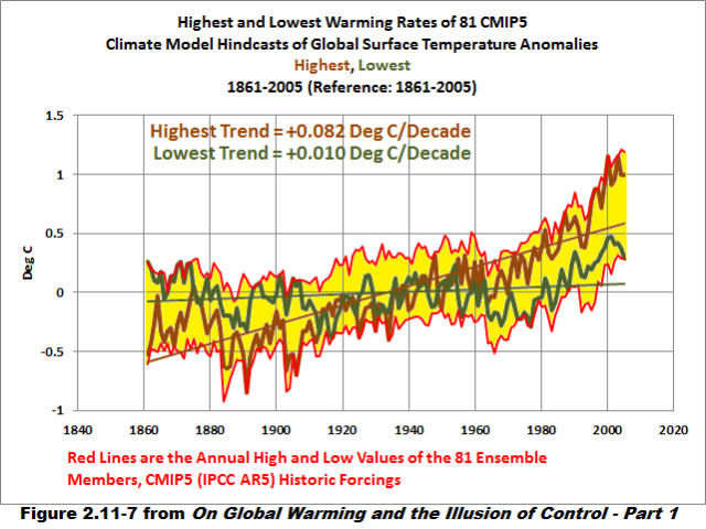
As noted earlier, the ensemble is made up of climate models that provide the wrong answers.
INTRODUCTION TO THE DISCUSSIONS OF CLIMATE MODEL HINDCASTS – SHORT TERM, RECENT WARMING PERIOD
We’ll run through the same sequence of graphs, with the same 81 model hindcasts, using the same base years of 1861-2005 so that I can’t be accused of cherry-picking. But in these graphs, we’ll only cover the recent warming period, which we’ll consider to have started in 1975. Bottom line, the model-data comparisons will run from 1975 to 2005.
We’re also going to point out a few things that become obvious over this shorter term.

Figure 2.11-8 presents the 81 simulations of global surface temperature anomalies, along with the ensemble member mean and the Berkeley Earth surface temperature data. The modelers claim victory because the data fall within the range of the models.
THE ILLUSION PROVIDED BY THE ENSEMBLE – SHORT TERM, RECENT WARMING PERIOD
The same illusion exists when we look at a model ensemble (or a model envelope) over the shorter term…during the hindcast warming period of 1975 to 2005. See Figure 2.11-9. The annual lows warm at a rate that’s a bit less than the data, and the annual highs show a trend that’s a bit higher.

As I noted earlier, your eyes are drawn to those similarities in trends of the upper and lower values in the ensemble…or the envelope when it’s used.
THE REALITIES OF THE MODELS CONTAINED IN THE ENSEMBLE – SHORT TERM, RECENT WARMING PERIOD
But the realities of the models are much different. As shown in Figure 2.11-10, the lowest warming rate of an ensemble member is about +0.06 deg C/decade, while the highest trend of a model run is more than 5 times higher at about +0.33 deg C/decade.

Bottom line, the climate model ensemble (and the envelope) gives the illusion of much-better model performance.
End of Reprint from On Global Warming and the Illusion of Control – Part 1.
BACK TO JUDITH CURRY’S POST
There was a discussion of trends in the Twitter exchange, and Gavin Schmidt furnished a histogram of the trends of model outputs versus the trends of a number of datasets with their uncertainties. See my Figure 2.

Figure 2
The histogram in Figure 2 confirms the illusion created the model spread in Figure 1. It clearly shows that there is a wide range of modeled warming rates of mid-troposphere temperatures: from roughly +0.008 deg C/year (+0.08 deg C/decade) to about +0.035 deg C/year (+0.35 deg C/decade).
And Figure 2 also shows there is little agreement between the datasets on how much the mid-troposphere has warmed and great uncertainties in their warming rates.
The histogram also shows the peak trends of the bell-shape are greater than the trends of many of the datasets even considering their uncertainties.
Personally, I believe Judith Curry should present both of Gavin Schmidt’s graphs, Figure 1 for the illusion (models performing well) and Figure 2 for the reality (models performing not-so-well and the uncertainties of the data). I think she underestimates her audience.
Bob,
I am not part of the data set circle of experts. Regarding your first plot: Is the grey area plot with the black line the envelope for the models and the black line representative of the average of the models? Whereas the colored curves the data sets of observed?
Paul, yes and yes.
Yes, Ok Thanks. I see the confusion then.
Figure 2.11-10 does a better job illustrating the differences between the models and the observed. (despite the eye-shocking yellow) That is, of course, if you indeed WANT to illustrate the differences. My question, arose from the absence of clarifying art and text in the Curry plot.
Bottom line: The models suck.
Basing the spread on the ensembles means that you can include a garbage run that runs unrealistically high which would widen the spread of the ensemble, thus encapsulating the real data in the widened confidence interval. Thus you can make the garbage claim (output) that the ensemble has value.
GIGO.
And they know when they are doing that, but won’t admit it.
This is related to the question about why they don’t discard the poorly performing models. They are needed to camouflage the results. It is very difficult to isolate the real data from the background noise.
In this case, the garbage run has to be on the low side. Same principle.
RE: Figure 2.11-8 — Data: Berkeley Earth
Good Grief! That’s the DATA?
Berkeley cut away all the low frequency signal, processed the high frequency noise, and magically arrives at a sliced and diced Cuisinart homogenized mush of high frequency temperature trends that has no climate science. Value to Political science, yes, Climate science, No.
errata: homogenized mush of high frequency temperature trends that has no value to climate science.
At least they (Berkeley) retain the original data and compute corrections rather than continually tinkering with their “raw” data. … At least I think that’s what they do.
They may retain the original data, but they ultimately ignore it.
The first premise of BEST is that the absolute temperatures are not as trust worthy as the trend of temperature at a station.
The second premise of BEST is that they can homogenize different trends from “nearby” stations and get a better answer at each station. “Nearby” being a loose concept that can include thermometers 1200 km away.
The third premise of BEST is that the “improved” trends via homogenization allows them to identify undocumented station moves and instrument changes which then allows them to, without any other information, slice the LONG temperature record from one physical station into N sequential, SHORTER !!! temperature records of N virtual stations, each with their own, now different temperature trends.
Rinse and repeat.
By the time they are done, low frequency climate signal in the original data has been filtered out and washed away — Ignored. What is left is highly processed noise. Counterfeit data.
MJW from a post at Climate Audit
I object to all of the BEST premises.
TNX for MJW reprise. That one is very alert.
=================
Wow, surprised I hadn’t seen this before. Good analysis. I would greatly appreciate a summary writeup of this.
I’ve been chasing “low frequency information content” issues in natural phenomena measurements for a while now. I’ll have to add this to the list of gotchas, and do some Monte Carlo simulations of this.
BTW you should also know that BEST has a lot of false positives and does unneeded slicing and dicing, because they used statistical methods in their changepoint analysis that don’t take into account the auto-correlative nature of temperatures. How do I know this? They don’t cite http://journals.ametsoc.org/doi/pdf/10.1175/JCLI4291.1
My most complete write up is at
http://stephenrasey.com/2012/08/cut-away-the-signal-analyze-the-noise/
This post by Willis to Zeke about questions Bob Dedekind and I raised some issues about how the BEST scalpel will bake in instrument drift as climate signal in between recalibrations of any given weather station. The shift that happens at a point of recalibration is a point were BEST could place a scalpel cut. There is an implicit assumption that both sides of a scalpel cut are of equal uncertainty. Nothing could be further from the truth. The point the thermometers are must trustworthy are the tools-down moment after a recalibration. they are least trustworthy prior to the recalibration. The scalpel removes vital recalibration information.
http://wattsupwiththat.com/2014/06/28/problems-with-the-scalpel-method/
In comments in this post, there are several comments of mine that explore the scalpel slices at Denver Stapleton Airport. I grew up around there. I noted that the slices were independent of airport expansions. But there were no slices at the opening and closing of the airport. Go figure!
Take a look at how BEST sliced Tokyo.
http://wattsupwiththat.com/2014/06/28/problems-with-the-scalpel-method/#comment-1672999
There were 7 slices in a 130 year record. In the process, BEST baked in UHI known to be happening from cherry blossom historical dates within cities compared to outskirts.
But in my mind the stake through the heart of BEST is the scalpel slice it isn’t there: March 9-10, 1945 — Operation Meetinghouse. BEST claims to tease out 20 breakpoints for poor old Lulling, TX. But BEST completely misses the fire-bombing of Tokyo.
So why doesn’t the IPCC drop models that clearly haven’t followed observations over the past 28 years, both on the low and the high ends? Do certain models allow a step change from one trend to another that justify keeping both a low and high temperature outcome?
What is worse, all models are treated as equally likely, regardless of how far they have departed from measured (and adjusted, and readjusted, and beaten-until-confession) surface temperature data.
It is part and parcel to their (mis)-use of Bayesian uniform prior distributions to place a heavy “uninformative” thumb on the scale of confidence intervals.
” all models are treated as equally likely, regardless of how far they have departed”
Its almost as if they are treating models like schools teach students now (from kindergarten to university): everyone is equal, so everyone’s outcomes (i.e. marks) should be equal. Sort of a “moral equivalency” is that a D- is as good as an A+ because THEY TRIED.
Models that most closely follow the measured temperature trend(s) do not necessarily follow other measured climate factors (precipitation) accurately. So are these models necessarily more “realistic” than those that get the temperature trend wrong?
As I recall, climate scientists had no trouble accepting different weights on trees for tree ring analysis. Why should multi-component analysis not be employed here?
See: http://wattsupwiththat.com/2012/05/24/the-sum-of-yamal-of-greater-than-its-parts/#comment-993439
A model that claims to predict the future should specify how it is to be validated.
Uugh, our climatic system does not progress from a set of initial conditions, conditions right now do not dictate conditions in 5 years or 10 years.
What we see as climate is a residue of processes we still do not understand, we can figure out how some the residues influence each other over short term, hence pretty decent months ahead forecasting by some like Marohasey and Corbyn
So running a model for 100 years, is useless and the outcome is utterly dependent on the initial parameter settings and fudges.
Our climates today have no bearing on climates 100 years from now
Depends on what time frames. Long term there are trends….LIA, MWP, etc.
How do the model runs look when compared to UAH or RSS, rather than Berkeley Earth?
TH, Gavins second chart. Bobs last. The histogram is all 102 CMIP5 runs. The colored dots are UAH and RSS and STAR. The bars are Gavins overstated interpretation of observational uncertainty in the sat records. Discussed in more detail over at Judiths.
Short answer, they do not compare well. And remember the model parameters were tuned to best hindcast from ye2005 back to 1975, so their performance is actually much worse than this chart shows.
Rud, thank you for your explanation here and at JC’s (ristvan | April 5, 2016 at 4:05 pm). Well done!
Yes, an admission against interest. Inevitable.
=========
I believe the technical term is like crap
Is there any statistical relevance – let alone physical relevance – to the ensemble (and ensemble mean)?
Any correlation with observations would seem to me to be a result of fortuitous coincidence rather than
any ability of the models in question. For instance, if I have two models which ‘predict’ the freezing point
of distilled water at 1atm – one predicts +100 deg. C the other -100 deg. C – do I have good models? (
even though the ensemble in this (absurd) simple 1D example would sit ~0 deg. C)
Thank you for this comment. A simple explanation a non-scientist can use.
There is not. RGBatDuke makes this point eloquently and frequently. The ensemble mean anomaly is meaningless. And the anomaly hides how bad the models actually are. For any year, even hindcasting, the actual temperature spreads are about +/- 2C. So they don’t even get water phase changes right.
If anyone hasn’t read RGBatDuke’s most complete post on this, it is here (with illustrations):
https://rclutz.wordpress.com/2015/06/11/climate-models-explained/
One vital parameter is missing from both the time series and the histogram: WHAT YEAR THE CMIP5 SIMULATION PROJECTIONS WERE ACTUALLY LOCKED/FROZEN. It could be depicted as a break-point vertical line on the time series, with a note stating what it is, and as an explicit note on the histogram. Otherwise the casual reader would interpret these comparisons as projections vs reality since 1978-ish, which is far from the case. Much of this time is actually a comparison with simulations run vs. known data, and only at a certain point did it become a true projection vs. reality comparison. This is key since we are ultimately interested in whether the models’ projections are useful moving forward.
Ye2005. 2006 is the first year of ‘projections’. The model parameters were, by published CMIP5 experimental design, tuned to best hindcast 30 years back to 1975. Two separate tuning methods were used. Short term deviation from ‘weather’, e.g. ITCZ bifurcation within 4 days. And general longer term deviation from macrofeatures, e.g. clouds and cloud structure, or hindcasting hot (cooled by upping aerosol parameters).
I wonder what the trends histogram looks like only using data from that time? That’s what I want to see most.
Little doubt to me that the “95% spread” is supposed to evoke thoughts of something along the lines of a 95% confidence interval and be extremely misleading.
Thanks for that. I saw “95% spread” and read “95% confidence”.
Sheeh! They might as well used 97%.
Has anyone noticed the growing similarity between multiple model runs and popular internet memes?
http://www.ifunny.com/pictures/what-hell-oh-just-my-mind/
Seems like the mean data looks relatively representative if the Berkley Earth data is accurate. Some above challenge the Berkley earth data, which seems reasonable based upon the assertions. Why not calculate the mean of the “real” data sets i.e. – Berkley Earth data and whatever actual data is believed to at least be a serious attempt at actual records and compare the mean of that data to the model mean? I know that the statistician cognoscenti and various mathematicians can and will object, but if we’re looking for overall performance, that should perform that job adequately. If they agree, then until the impossible “accurate” model is devised, at least it gives some semblance of informed prognostication to base expensive decisions on. If any are even warranted…
I’m hoping that “data” is used in this tread solely to mean instrument based output, and never to mean model output.
l think this all points out just how rather meaningless a “global average temperature” is to climate.
Just to take a extreme example, if the NH fell 3c below the average but the SH rises 3c above the average. Then the average would be the same but it would make a big difference in climate.
Cause it would never happen like that but it makes a point.
+1
INM-CM4. I can see Russia through the water vapour over the oceans. H/t to RC.
As for Gavin, it’s always the same question, the same question.
===============
Hindcasts for the 21st century through 2005 seem to diverge significantly from the data, whereas hindcasts for late 20th century from 1970’s seem to trend better with the data. The modelers know the 21st century data just the same as they know the 20th century data. If the models can be “tuned” to track late 20th century data, I assume they can be “tuned” to better track early 21st century data. Why aren’t the 21st century modeled temperatures better “tuned?”
Pure speculation: Maybe that updated “tuning” would result in fundamental contradictions between what the models presented as a logical progression of temperatures in the past and what the models would have to show based on such updated “tuning.” It must be “wicked” hard to balance aerosols, etc. with different assumptions about other CO2 equivalent forcings. It might not be possible to hand-wave away possible resulting divergences as now is the practice for early 20th century warming and mid-century cooling divergences from modeled results.
Dave Fair
“Wickedness” is involved, you may be certain.
Bob, thanks for that post. See:-
http://www.wmbriggs.com
for posts on why you should NEVER average a time series.
IPCC have kept the temp projections at 1.5C-4.5C. With a spread like that one has to question why they seem so sure that anything is correct. Given the slow rate of actual change over the past 150 years, it would be difficult not to be “right” with that spread. I don’t think it is a coincidence that the politicos dropped the allowable increase to 1.5C in Paris. They also might have thought that achieving the 2.0C magic number may not occur owing to the the hiatus since 2000. The spaghetti charts tell us all we need to know. If they knew what actually matters these graphs couldn’t occur. Something like shotguns on moving targets?
“Personally, I believe Judith Curry should present both of Gavin Schmidt’s graphs, Figure 1 for the illusion (models performing well) and Figure 2 for the reality (models performing not-so-well and the uncertainties of the data). I think she underestimates her audience.”
Agree! These two together tells a lot. I also think most people, having various types of education, will be able to grasp the message.
The IPCC itself needs “retuning.” From the start and, as it was set up with an emphasis on precautionary judgment framework, has doomed climate change discussions and damaged climate science to become believer versus non believer… . Resembling the discussing period in British Parliament with members name calling and slinging insults.
Intellectually dishonest tactics include (how many of these describe Mr. Schmidt):
1.Name calling
2.Changing the subject
3.Questioning the motives of the opponent
4.Citing irrelevant facts or logic; another form of Number 2
5.False premise
6.Hearsay
7.Unqualified expert opinion
8. Sloganeering: using slogans rather than facts or logic.
9.Motivation end justifies dishonest means
10.Cult of personality
11.Vagueness
12.Playing on widely held fantasies rather than truth and logic
13.Claiming privacy with regard to claims about self
14.Stereotyping
15.Scapegoating
16.Arousing envy
17.Redefining words
18.Citing over-valued credentials
19.Claiming membership in a group affiliated with audience members
20. Use of self serving self elevating rhetoric such as “as any right minded person believes;” “we want to do the ‘right thing'”; “as a nation doing xyz and not zyx is not ‘who we are’.” Not only is it talking down to you with arrogance it projects that the speaker is all knowing god of truth (commonly used by Barack Obama).
21. Accusation of taking a quote out of context
22.Straw man
23.Rejecting facts or logic as opinion
24.Argument from intimidation
25.Theatrical fake laughter or sighs