Guest Post by Bob Tisdale
UPDATE: I used the phrase “may or may not” with respect to February 2016 being the warmest on record in the title and text of this post. Nick Stokes on the thread of the cross post at WUWT advises that based on his analysis “98.7% of the time, Feb 2016 is higher” than January 2007. Or to put that in the terms NOAA uses for their SOTC, it is “very likely” February 2016 is warmest.
Once again, when presented with evidence that I’ve presented something incorrectly in a post, I am more than happy to acknowledge and correct it. Unfortunately, that cannot be said for many alarmists.
Additionally, that does not change the remainder of the post which notes that the uptick in global surface temperatures in response to the 2015/16 El Niño is comparable to that of the 1997/98 El Niño. That has been evident in all of the surface temperature datasets examined so far.
[End update.]
With the publications of the NASA/GISS and NOAA/NCEI global surface temperature anomaly data over the past few weeks, alarmists have been touting “record high” February 2016 global surface temperature anomalies. See the posts Alarmism Cranked Up to Absurd Level and More Alarmist Nonsense with the Release of the Redundant* NOAA Global Temperature Data for February 2016.
Yesterday, the UK Met Office published their global data for last month and so far the alarmists have been quiet.
Why?
See UPDATE above.
One possible reason: Of the three primary suppliers of global land+ocean surface temperature data, the UK Met Office is the only one to include uncertainties on their data webpage. (See the HadCRUT4 data page here and the format page here.) Figure 1 includes the monthly UKMO HadCRUT4 global (near land & ocean) surface temperature anomalies from January 1979 to February 2016 (black curve). Also included are upper and lower bounds of the total uncertainties of their data (maroon and light blue curves). The upper and lower bounds of the 95% confidence intervals include the combined effects of the measurement and sampling uncertainties and the bias and coverage uncertainties.

Figure 1 (Click illustration to enlarge.)
See UPDATE above.
As shown, the lower February 2016 value for the global temperature anomaly is +0.92 deg C referenced to the years of 1961-1990. This was exceeded by the upper January 2007 value of +0.98 deg C. Just in case you’re having trouble seeing that in Figure 1, see the graph here, which starts the data in January 1997. So the best the alarmists could claim, according to the HadCRUT4 data, is that the February 2016 global surface temperature anomalies may or may not have been the highest on record when considering the uncertainties of the data.
NOTHING UNUSUAL ABOUT THE RECENT UPTICKS
In the prior two posts, to combat the nonsense about the recent upticks being unusual, I’ve included comparisons of the evolutions in global surface temperature responses to the 1997/98 and 2015/16 El Niños. The data have been normalized to the first 3 months of their respective first years. The normalization was done so that we can easily compare, visually, the responses of global surface temperatures to the two comparably sized, strong El Niño events. Figure 2 provides a side-by-side comparison with the HadCRUT4 data.
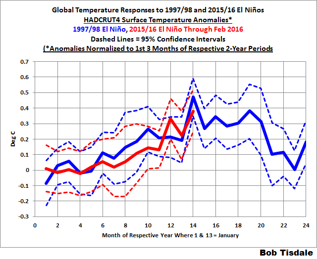
Figure 2
Considering the uncertainties of the data, the best we can say is that there were comparable responses in global surface temperatures to the strong 1997/98 and 2015/16 El Niños.
Note: Contrary to the nonsensical rants of alarmists who have trouble grasping reality and who apparently have difficulty reading time series graphs (sample posts archived here and here) the normalization of the data in the graphs (similar to Figure 2 above) in my two earlier posts (here and here) was not an attempt on my part to hide the fact that global warming has occurred between 1997/98 and 2015/16. As you’ll recall, those earlier posts were about the GISS and NCEI data, which include the curiosity-filled Karl-ized ERSST.v4 “pause-buster” sea surface temperature data from NOAA. (For more on those ERSST.v4 abnormalities see the posts here and here). Those increases between 1997/98 and 2015/16 were clearly shown in the time series graphs included in those earlier posts. The data were normalized in the graphs similar to Figure 2 to make the visual comparisons easier.
For example, Figure 3 is similar to Figure 2, but in Figure 3, the HadCRUT4 data have not been normalized. That is, the anomalies are referenced to the UKMO-preferred period of 1961-1990.

Figure 3
If you’re an alarmist and have trouble reading time-series graphs, and you want to confirm that 2015/16 was warmer than 1997/98, you’d present Figure 3. In Figure 3, the evolutions appear to run somewhat in parallel, but the similarities in those evolutions are better shown when the data have been normalized, Figure 2. Thus my use of the normalization.
[End note.]
CLOSING
With the publication of the February 2016 UKMO HadCRUT4 data, I suspect we’ll see a few more alarmist articles about “record high” global surface temperatures in February 2016. As shown in Figure 2, the responses of global surface temperatures in 2015/16 are as we would expect from a strong El Niño. And as shown in Figure 1, the February 2016 global temperature anomaly may or may not have been the highest on record when we consider the uncertainties of the data. See UPDATE above.
FOR THOSE NEW TO DISCUSSIONS OF EL NIÑO EVENTS AND THE REASONS FOR THE RECENT REPORTS OF RECORD HIGH SURFACE TEMPERATURES
I discussed in detail the naturally occurring and naturally fueled processes that cause El Niño events (and their long-term aftereffects) in Chapter 3.7 of my recently published free ebook On Global Warming and the Illusion of Control (25 MB). For those wanting even more detail, see my earlier ebook Who Turned on the Heat? – The Unsuspected Global Warming Culprit: El Niño-Southern Oscillation. Who Turned on the Heat? only costs $5.00 (US).
We discussed and illustrated the natural causes of the 2014 “record high” surface temperatures in General Discussion 2 of my free ebook On Global Warming and the Illusion of Control (700+ page, 25 MB .pdf). And we discussed the naturally caused reasons for the record highs in 2015 in General Discussion 3.
Bob T, when Trump or Cruz is elected as POTUS, I will put my vote in for you as nominee for Science Advisor to the president ! I am sure your vast knowledge will be needed to rid the U.S. of all the $#^& Holdren has covered the White House in…. ( Just because I’m half Canadian does not make me bias in my choice )..Never stop !
You coud choose your Canadian champion.
Mr Steven ‘statistic’ McIntyre. The father of climate science
Or David Motorcycle/Automobile!
Since Cruz seems to be a Canadian, a Canadian science advisor would be appropriate.
So you are saying that there is a very slight chance (if we take the lower 5% for 2016 and the higher 5% for 2007) that it might have been 2007 had the hottest month on record? This sounds rather desparate. Either 2007 or 2016 was hotter than 1998, yet there were several posts explaining to us that the latest El Nino was nothing exceptional, and 2007 El Nino was weak.
There is nothing unusual in there being an uptick in an El Nino year. What is unusual is that this uptick is very likely to be the highest uptick in the record so far.
…If you torture the data long enough, it will confess to anything !
..Would have….D’oh !
Marcus
“…If you torture the data long enough, it will confess to anything !”
I think you have just confirmed seaice1’s point.
Hi Marcus
Lot of this discussion is waste of time and many comments just don’t make sense.
http://www.vukcevic.talktalk.net/CruTempNH.gif
As it can be seen the last 66 years are just simple repeat of previous 66 years with one off 0.35C uplift and the exception of 2016 as an outlier. Further more it questions the role of CO2.
seaice1 says, “Either 2007 or 2016 was hotter than 1998, yet there were several posts explaining to us that the latest El Nino was nothing exceptional, and 2007 El Nino was weak.”
That 2007 peaked “hotter than 1998” has been evident in the surface temperature records for years. Or is that something new to you?
With respect to your claim that “there were several posts explaining to us that the latest El Nino was nothing exceptional”, I suspect you’re misrepresenting what was written, which is typical of a troll with an agenda or financial interest. I believe my earlier statements, like in this post, were that the global temperature response to this El Nino were not unusual, not that this El Nino wasn’t unusual. The 2015/26 was a strong El Nino, comparable to the strengths of the 1997/98 and 1982/83 El Ninos.
https://bobtisdale.wordpress.com/2015/11/21/the-differences-between-sea-surface-temperature-datasets-prevent-us-from-knowing-which-el-nino-was-strongest-according-nino3-4-region-temperature-data/
sea ice says: “So you are saying that there is a very slight chance (if we take the lower 5% for 2016 and the higher 5% for 2007) that it might have been 2007 had the hottest month on record? This sounds rather desparate [sic].”
No desperation involved. Simply stating a fact.
seaice1 says, “There is nothing unusual in there being an uptick in an El Nino year. What is unusual is that this uptick is very likely to be the highest uptick in the record so far.”
Regardless of whether the warming has been natural or human-induced, everyone should have expected the uptick. Yet we hear claims that it’s unusual.
Adios, seaice1. I try not to waste time with trolls, but I made an exception today.
..Thank you for your very calm and explanatory reply to the troll !! I, on the other hand, would have been excommunicated if I had expressed my opinion of said troll !
Oh my God! It’s going to last until 2026? 🙂
“No desperation involved. Simply stating a fact.”
It is a fact that the error bars overlap, but the headline is misleading. “May or may not” suggests a roughly equal chance. One person describes it thus “”May or may not” is used to indicate that the point is under thought or scrutiny. It’s not meant to give a clear indication that one option is more likely than the other.” That seems a reasonable description to me. In fact, it is much more likely that 2016 is hotter than it is not. So whilst you can argue that it is factually accurate it is still misleading.
“Regardless of whether the warming has been natural or human-induced, everyone should have expected the uptick. Yet we hear claims that it’s unusual.”
There are claims that this is unusual. Partly it is becasue a lot of the warming was in the Arctic, where much of it cannot be explained by El Nino.
http://rack.1.mshcdn.com/media/ZgkyMDE2LzAzLzI2LzUyL1RlbXBBbm9tRmViLjA2MmRkLnBuZwpwCXRodW1iCTk1MHg1MzQjCmUJanBn/f71e75cf/a48/TempAnomFebNASA.jpg
I think this is unusual.
“I believe my earlier statements, like in this post, were that the global temperature response to this El Nino were not unusual, not that this El Nino wasn’t unusual.”
The title of one of the posts was “Is the Current El Niño Stronger Than the One in 1997/98? In a word, ‘no’” and you conclude “Contrary to all of the alarmism, the 2015/16 El Niño is simply is not as strong as the 1997/98 El Niño based on the sea surface temperature anomalies of the eastern Pacific, east of the NINO3.4 region.”
This is discussing the El Nino, not the temperature response.
“I think this is unusual.”
Wow, astounding argument! You can rest your case after providing such an opinion.
“It is a fact that the error bars overlap, but the headline is misleading.”
seaice1 is right there. Once you take account of an error distribution, you can always say any two numbers “may or may not” have a different order. You can’t be certain of anything, anywhere. But the probability can be very lop-sided, as here.
Just saying the 95% CI’s overlap doesn’t say much. There is, let’s say, a 2.5% chance that 1/2007 was over 0.98. And a 2.5% chance that 2/2016 was under 0.92. Those are both unlikely events, and if independent, the chance of both happening is 0.0625%. The probability of order change would be higher because there is a small overlap in the range, but you’d have to figure out how much higher, which is not done here. And dependence, if any, will reduce that further.
That map makes me laugh, point of data is smeared over 1200km/sq.
50% of that map seaice posted has no data, it is made up, that is not even disputed. It therefor us useless as evidence as it is an artifact created by human mathematics, not an empirical measurement. It’s 50% guess that holds so much human alteration as to be utterly meaningless
seaice1 says: “There are claims that this is unusual. Partly it is becasue a lot of the warming was in the Arctic, where much of it cannot be explained by El Nino.” And you provided an undefined map from GISS. Do we assume it’s for February 2016 referenced to the standard GISS base years of 1951-1980?

seaice1, that’s one of the most foolish arguments I’ve ever seen here at WUWT. The map you presented is not showing the change in response to this El Niño, which is the topic of discussion.
According to what you quoted from my earlier comment (“Regardless of whether the warming has been natural or human-induced, everyone should have expected the uptick. Yet we hear claims that it’s unusual.”), the topic of discussion was the change (the uptick) in global temperatures in response to 2015/16 El Nino. Yet, for a reason only you and the likes of Miriam O’Brien at Hot Whopper can comprehend (she tried the same foolish argument in one of her recent posts), you presented an undefined map of the GISS global temperature anomalies…assumedly referenced to the period of 1951-1980.
To illustrate the uptick from 2015 to February 2016 (the topic of discussion), you could have presented the anomaly map for February 2016 referenced to the base year of 2015:
Then you could have compared it with the anomaly map for February 1998 referenced to the base year of 1997 to capture the uptick from 1997 to February 1998:
Note that the two uptick anomalies are comparable, though the spatial patterns of the changes are different. Are you aware that outside of the tropical Pacific global surface temperatures warm in response to changes in atmospheric circulation caused by the El Niño?
seaice1, says, “The title of one of the posts was “Is the Current El Niño Stronger Than the One in 1997/98? In a word, ‘no’” and you conclude “Contrary to all of the alarmism, the 2015/16 El Niño is simply is not as strong as the 1997/98 El Niño based on the sea surface temperature anomalies of the eastern Pacific, east of the NINO3.4 region.”
The post you’re quoting is here:
http://wattsupwiththat.com/2015/11/17/is-the-current-el-nino-stronger-than-the-one-in-199798/
Thank you quoting me out of context and misrepresenting what was written in your earlier comment. Did I write anywhere in the post you quoted that “the latest El Nino was nothing exceptional”? No, I did not.
Maybe you overlooked the closing to the post. It read, “Please do not misinterpret what I’ve presented in this post. I am not saying that the 2015/16 El Niño is not a strong event. By all measures, we are in the midst of a strong El Niño. I’ll provide a full ENSO update next week.”
You should hang out at HotWhopper. Your nonsense would be appreciated there. Here at WUWT, you’re wasting your time unless your intent is to be a nuisance and waste the time of others.
Good-bye, seaice1. I will not waste any additional time with you.
seaice1: seaice1 says, “There is nothing unusual in there being an uptick in an El Nino year. What is unusual is that this uptick is very likely to be the highest uptick in the record so far.”
Bob Tisdale: Regardless of whether the warming has been natural or human-induced, everyone should have expected the uptick. Yet we hear claims that it’s unusual.
If Feb 2016 is the hottest Feb on record (your updates agree that it probably is), then it is unusual. If it is the result of an unusually large el Nino (comparable to the unusually large 1997/1998) occurring after a previous “step change” that raised the global average temperature, then it is unusual.
What will be of interest (well, one of the things that will be of interest) will be the record over the next 10 years, to show whether the 2015/2016 el Nino was followed by an apparent step change, as the 1997/1998 el Nino was.
Bob Tisdale: Thank you quoting me out of context and misrepresenting what was written in your earlier comment. Did I write anywhere in the post you quoted that “the latest El Nino was nothing exceptional”? No, I did not.
In that case, two things are unusual about the 2015/2016 el Nino: (1) it was among the strongest el Ninos (2) it came after the warmest decade on record. That unusual conjunction produced the hottest February on record.
I think your responses to seaice1 clarified your meaning.
Speaking of desperation, remember what the HADCRUT and other global average temperature guesses looked like prior to the panicked re-imagining of the data from the alarmists in 2007?
*2009, not 2007
Yup the “re-doing” of the data is often forgotten in the discussion of present temperatures.
[snip show your work – drive by accusations with no references or whys don’t cut it anymore Mr. Mosher – Anthony]
seaice1,
The map you provided has an interesting anomaly (used in the more traditional sense than what climatologists seem to like). That is, the Arctic is experiencing warming at a rate that is at least 2X the global average. Considering that the high-northern latitudes are infamous for cloudiness, and that the area above the Arctic Circle has a nominal period of six-months of darkness, or at least very low sun elevations (leading to the flux being spread out over a large footprint compared to the tropics) that warming would seem to be begging for an explanation.
One often reads that the melting sea ice is creating “black water” that absorbs more light than snow and ice. The reason the water looks black is because it reflects specularly instead of having an approximate Labertian reflection like snow. At very low sun angles (i.e. high angles of incidence) the specular reflection can approach unity. So, with only a fraction of the snow/ice converted to water, and that only exposed to sunlight for a fraction of the year, and that water exposed only when it isn’t cloudy, and specular reflections approaching unity when the sun is high but the water is on the the side of the North Pole opposite the sun, it would seem that the opportunity for heating is only the product of all of those fractions. Perhaps you can shed some light (if you will pardon the pun) on just why the Arctic is warming so much. In your explanation, please keep in mind that your explanation should take into account that the Antarctic isn’t experiencing similar warming. In anticipation of your, response, if you are going to blame CO2, then you do have a problem with Antarctica.
Anxiously awaiting your educated elucidation.
A discussion of uncertainty and an acknowledgement that the presented anomalies are generated
from a convenience sample would also be appreciated. Thanks.
Yeah, the hottest year ever on a very limited timescale.
Bob…love your work. I hope I am asking the right question here….so, given the uncertainties what is the probability that February 2016 was the warmest on record. In 2014 both NOAA and NASA included probabilities in their annual assessments. That was missing from their 2015 analyses.
Just where does the 95% confidence level come from??
Based on station siting, normalization, homogenization, fabrication, fudging and who knows what else, I’m putting the 95% at 70%.. knowing 62.13% of all statistics are made up anyway.
But maybe since we are displaying these temperatures to the nearest hundredth of a degree, I may be wrong.
“displaying these temperatures to the nearest hundredth of a degree” there’s a clue to how ridiculous “average global temp” claims are.
Another might be the fact half the planet has no data, NOAA anomaly maps smear data over huge areas that have no data. The map is meaningless junk
A triple point of water cell painstakingly prepared in a laboratory can produce a 273.16 K +/- 0.01 K temperature environment. Measuring the average temperature of the planet to that accuracy is ludicrous.
So the most that can be reasonably claimed is that temperatures continue to recover from the last ice age, and that we haven’t entered a new one, yet.
…+ 3,200 smilies !
For the last 10.000 years, 5000 years 2000 years and 1000 year trends to today, the earth is cooling, you have to go as far as the LIA and start from there to show a tiny warming trend.
Belief trumps data. A person can even lose jobs over this established human trait. The data can demonstrate completely the opposite case, yet belief will triumph over it more often than not. Those who show data with detached examination are rare and often not well-liked. And frequently unemployed.
Volo ergo est.
I wish therefore it is? Try this: “Volo non ita.” Say it like this: Volo no neetah. English: I wish it not so. Rusty Catholic Latin so my apologies to academia. Critique gladly received.
When I eyeball the first chart it looks to me that the charted values are +- 3/4 of .2 degrees, or +-.075 C. Am I reading this right?
..Per 100 years !
If only we could do the comparisons with the raw accurate data rather than +0.5C adjusted ones.
One could also include the temperature changes from the 1877-78 Super El Nino temperature changes for another comparison.
Raw data will give you higher trends.
Global average temperature is meaningless. It’s propaganda, a measurement of global average temperature has no scientific value unless accurately knowing the global average temperature is the scientific goal. Other than that it is a useless value.
A few things spring to mind that we should ignore.
Global average temp
Political leaning and other partisan rubbish
Using the term alarmists, and even more so Sceptics, labels is a political game.
The more we get dragged into the mud slinging, the more it suits those who side with the CAGW hypothesis.
There appears the intention to turn this into a right v left thing, the best we can do is ignore the politics, stick to searching for evidence.
I forget myself at times but it is worth it to keep it all personally and politically inert, lest we actually help those that have the political agenda.
All the alarmists need is 12 data sets/analysis. Then they can claim one record for each month as they show it to be warmer than the prior year.
After all, the perception of reality is reality.
February 2016 was only the 6th warmest February for Contiguous US, 3rd warmest for all ASIA and 4th warmest for North America according to NOAA CLIMATE AT A GLANCE data . These represent 48.5 % of all global land . So considering that this was an El Nino February, a spike in temperatures is expected in some areas but not globe wide.. Remember this spike comes after the tampering of ocean SST data to raise these higher than previous data.. The alarmist constantly point out that one cannot look at short term data for any trend and yet month after month they alarm the media and the public about single month data while completely ignoring the fact that North America and Asian land areas have been cooling for some 18 years . Prior to 2015 , an El Nino year, Global land area temperatures were in a pause for 10 years since 2005 ( -0.02C/decade)
To put the record February 2016 global temperature anomaly in proper longer term perspective rather than focus on one month only as the alarmists do. . Global Land and Ocean temperature anomaly trend 2000-20014 or for the 15 years prior to the 2015- 2016 EL NINO years and the “blob” in the North PCIFIC was 0-0.04 / DECADE or really completely flat. Matter of fact, a similar figure for Global Land only was-0.32 C or really cooling . No alarming warming trend . So a warm upward tick during two El Nino years is very normal, not unexpected and nothing to get alarmed over. To call 2016 February anomaly as “ astronomical” , “staggering “, and “strange” as some alarmists have suggested seems pure exaggeration to me..
http://www.cpc.ncep.noaa.gov/products/analysis_monitoring/ensostuff/ensoyears_ERSSTv3b.shtml
I just wonder how much of the global average temperature rise is due to “corrected” sea-surface temps and infilled third-world recording sites.
Tom Halla
I wonder too. Even land surface data of previous years going back to 1900 was lowered in US to make it appear that there is greater warming today than in the past . Steve Goddard has documented this well.
https://stevengoddard.wordpress.com/2016/03/09/all-things-are-possible-with-data-tampering/
Using raw data will give you higher trends for sst and slightly lower trends for Sat.
Combined raw data will give you higher trends than adjusted data.
In the US which has the worst practices raw sat data gives you lower trends. But the US isn’t the world.
Steven Mosher says, “Using raw data will give you higher trends for sst…”
Depends on the time period and SST dataset. Since 1979, which was presented in this post, the source ICOADS SST data have the lower trend.
Careful, Mr. Tisdale. The RICO Squad will be coming for you soon.
If they do, let me know if you need anyone to watch your back. I’ll bet there will be plenty other volunteers as well.
Why? Is he part of a publicly traded company who has deliberated lied in information report for investors?
You referring to any of these companies that misled investors?
http://www.greentechmedia.com/articles/read/Rest-in-Peace-The-List-of-Deceased-Solar-Companies
2PetitsVerres: Perhaps you haven’t heard, but the powers that be are threatening to use RICO statutes to prosecute those who question the “overwhelming consensus of science” /sarc
http://wattsupwiththat.com/2016/03/10/deposition-sheds-troubling-new-light-on-the-rico20doj-potential-investigation-of-climate-deniers/
@kamikazedave (Brulle 2013 is there: http://link.springer.com/article/10.1007%2Fs10584-013-1018-7 )
Oh, I though you were refering to the Exxon case. So in fact you are accusing Bob Tisdale of being part to “an active campaign tomanipulate and mislead the public over the nature of climate science and the threat posed by climate change” ? You’re not very kind.
You may not have know this, but it’s the conclusion of the paper refered as [Brulle 2013] cited in the screencapture of the letter in
.. 2PetitsVerres ..you obviously have a reading comprehension problem ! kamikazedave did not, at any time, ACCUSE Mr. Tisdale of anything..he simply offered his support !
2PetitsVerres: How do you believe the climate is changing that has you so concerned? What do you believe Exxon, Mr.Tisdale and I are hiding that justifies a RICO prosecution?
Marcus
You must have a reading comprehension problem. Some AG have announced that they wanted to sue “an active campaign to manipulate and mislead the public”. And here we have kamikazedave who is worry that Bob Tisdale may be sued. (see http://wattsupwiththat.com/2016/03/30/february-2016-global-surface-temperature-anomalies-may-or-may-not-have-been-highest-on-record-according-to-the-ukmo/#comment-2178430 ), not me. So he must thing that Bob is part of the people in this active campaign. There is no other possible conclusion.
I think that it may be important to remind observers (especially seaice) that these upticks sit on the back of an overall trend which, according to the “consensus” sources, is equivalent to that trend seen between 1915 and 1945.
In other words, had this alarmist global temp. obsession arisen during that period of “natural variability” then we would have been gazing at an almost identical set of graphs of rising trends and repeating El Nino upticks.
Except that in that instance, CO2 is not held to be to blame.
This time, we are told that all of the perceived warming is all CO2 driven.
But, with no clear reason why we would assume that it is driven by forces different to those which drove the same trend earlier last century.
No reason, beyond, personal preference for climate drivers, apocalyptic fantasies and political agendas.
Bob T: just out of curiosity, do you have a graphed time series that goes all the way back to the beginning of the data in 1850? I know it is not your purpose in this post, but you piqued my interest in the longer term view, especially how the uncertainty may trend.
Steve, per your request: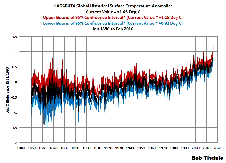
Nice graph. May I borrow it for use in class?
Kind regards,
Ben
When you have the small data set, even if they are very accurate, present high variations around the mean and when you have large data set, even if they are very inaccurate or biassed by local changes, present low variations around the mean. I presented an article on this in 1995 TROPMET and published in 1999 [a book, I am a co-editor of the book].
On oneside we are taking that earlier data was lowered and current data was raised, what purpose such data will provide to readers. It is better to dscuss the data after removing the adjustments. Otherwise we are legitamising the adjustments to global temperature series.
Dr. S. Jeevananda Reddy
Yes Dr.
If you remove all adjustments from all data the trend is higher.
“So the best the alarmists could claim, according to the HadCRUT4 data, is that the February 2016 global surface temperature anomalies may or may not have been the highest on record when considering the uncertainties of the data.”
– Tisdale –
Nonsense. Not that it matters to you in conveying your message, but there are degrees of likelihood within the confidence intervals in both series.
No, there are not degrees of likely-hood within the 95% confidence intervals that you can determine from the graphs. It just simply means there is a 5% chance that the actual temperature is outside those bounds. It says nothing about the chances of being at any particular temperature within those bounds. In fact, the confidence that the actual temperature being within say 1 degree of the central line could be very low – say 10% confidence rather than 95% confidence.
If you wanted to have 99% confidence, the bounds would be much wider of course, making Bob Tisdale’s point even more strongly.
I taught statistics for years. I would use virtually all climate temperature data (given all the manipulations) as a class example of applying Cadillac methods to horse and buggy data. What a game!
True, but December 2015 set a new high mark of 1.009. So its upper bound makes it even less likely that February 2016 at 1.057 set a new record.
Whoa whoa.. we are now expressing these values to the thousandth of a degree?? My car thermometer only does whole degrees and it takes about 5 minutes to get regular since the sensor is near the engine compartment. They must have some unbelievable equipment.
Nah, only ‘scientists’ are concerned with such technicalities like significant figures.
Too funny. To input data into a mathematical algorithm and then quote the output to a higher degree of precision than the input – thus implying that your algorithm has mystically amplified the instrumental accuracy – is nothing short of scientific illiteracy. If you did something like that in an undergrad physics lab class you’d flunk the module and yet it now seems to be almost standard practice in much of climate science.
Thanks Bob for the well done update. I especially like the El Niño comparison graphs.
However, the UK Met Office claim that the HADCRUT4 estimate of global temperature anomaly for February was accurate to within a plus or minus 0.14C range to 95% confidence seems absurdly low to me considering all the various uncertainties in trying to make this estimate. My best guess is that the uncertainty is more like *at least* plus or minus 0.3C to 0.5C and possibly more. Multiplying their uncertainty by 3 yields what I suspect is a better assessment of the uncertainty at about plus or minus 0.4C.
I made a list of some of the uncertainties involved just for the land portion here:
https://oz4caster.wordpress.com/2015/02/16/uncertainty-in-global-temperature-assessments/
And I probably have missed a few things and did not cover the uncertainties in the ocean portion.
oz4caster: thanks for the link. You have a graph there of the full Hadley series.
Indeed; they seem to treat systemic error in measurements to be constant and thus ignorable when
looking at trends (i.e. anomalies) over time. They then feel free to use 1/sqrt(n) to increase precision.
I tend to strongly agree with the published articles of Pat Frank on this subject. I believe those
presenting this data should be more honest wrt. the true uncertainty of measurement.
I demand that I may or may not be Vroomfondel.
” … May or May Not Have Been Highest on Record,”
Well, the depends on how long the record is, who is keeping the record, and how adjusted the record is. If the record is honest and covers the last 1,000 years, which would be reasonable for climate, then this past year was nothing to write home about even with the massive “adjustments” that were made due to the need of scientists to get grant funding.
Taking the ‘best estimate’ value reported by HadCRUT4 for February 2016 now makes the warming trend in their data set since January 1998 statistically significant, but only just. Enter ‘1998’ in the Start Date box here: http://www.ysbl.york.ac.uk/~cowtan/applets/trend/trend.html
The HadCRUT4 trend since 1998 is now 0.114 ±0.113 °C/decade (2σ). The best estimate figure is fractionally wider than the margin of error. That is, even if the best estimate is wrong by the full 2 sigma error margin, we would still be left with a trend that is warmer than zero; hence ‘statistical significance’.
NOAA and GISS both satisfied the statistical significance test since January 1998 some time during 2014. The satellites both now show best estimate warming since 1998 but are well short of statistical significance.
That should be ‘some time during 2015’ (not 2014) for NOAA and GISS. Sorry.
Unwise to use incomplete years in case there is a residual annual cycle despite anomalising. Always use twelvemonth start/end dates. In which regard, HadCRU4 is not yet statistically significant since 1998.
However, neither is the “pause” a statistically significant event. The alleged change in trend post 97/98 is not statistically distinguishable from the prior, regardless of which data set is used.
“The satellites both now show best estimate warming since 1998”
I see no convincing reason to give the satellite records special status over surface. The pros and cons of each have been discussed ad nauseum (it’s a huge list of factors/adjustments all round), and none of it makes me favour one data set over another.
no sane person would give a flying about a half of a degree…
…but then, no sane person would assume that slope would continue either
a whole science has been taken over by drama queens
And “no sane” person is, it is just a “canary in the mine” – an indicator of the way things are heading.
Nothing more nothing less.
…when the only way you can get that half of a degree…..is with math…not measurements
When Bernie is in, and all study grants are equal and distributed universally, thus de-politicising research, THEN we’ll know the truth!!
So after combing through the 1993 (one thousand nine hundred ninety-three) other months in the Jan. 1880-Feb. 2016 HADCRUT4 series, Mr. Tisdale identified a single month with a 5.4% statistical chance of having a higher temperature anomaly than February 2016 (and with that month occurring just nine years ago).
Talk about grasping at a very, very thin straw.
Re-read your post, it’s spiteful childish meaningless nonsense.
NOAA were pretty certain that it was a record, but we do know that NOAA has been making these claims based on lower than 40% certainty, GISS too, though they wisper that bit and the media and politicians don’t seem to pick it up, which is weird given NASA are a government institute.
It turns out it may, or may not (uncertainty is far higher if half the planet’s temp is guessed) be the warmest even by the data we have, compared to a decade ago… in a strong El Nino year
You are actually clutching at straws, because maybe you don’t want to accept that there is far more uncertainty than claimed, given as I said, artifacts are not empirical measurement, they are made by humans, in this case, mathematical artifacts, that may resemble what might be empirical measurement, but we dont know, because 1 the NH is not the planet, and 2 We just do not have enough reliable data, we have 20% of the data we need in land and ocean measurement AT BEST.
So making absolute claims off the back of all this (without getting into the complete corruption of the temp record by alterations) is just pointless and only sews mistrust, remember there are many not convinced, not because of Exxon lol, but because of the actions of those determined to browbeat everyone into following suit, and shaky science of course.
Oh my, you are bitter 😉
Let’s see if I can work through your muddled word salad… so not only are “the combined effects of all the uncertainties described in the HadCRUT4 error model (measurement and sampling, bias and coverage uncertainties)” meaningless, so are the temperature measurements themselves?
Gotcha.
“We just do not have enough reliable data, we have 20% of the data we need in land and ocean measurement AT BEST.”
On the contrary. The planet is OVERSAMPLED by an order of magnitude.
There are about 15K Active land stations. That’s over 10x what you need to determine the trend in the data.
Put another way. Take a random sample ( say 1000) of those 15K and use them to predict
what you will find at the other 14K. Answer. Your prediction will be damn good.
You can test this. Go get the data and try
Steven,
Those are all assertions. But they’re meaningless. The surface station network is so corrupted that it’s completely useless. Taking a random sample of temperatures that are up to 5º — and more — out of tolerance, and then pretending that you can accurately measure tenths and hundredths of a degree is simply unbelievable. Your ‘data’ is no good. It’s a clasic case of GIGO.
Steven Mosher: “On the contrary. The planet is OVERSAMPLED by an order of magnitude.”
Utter drivel.
Around half the planet ISN’T SAMPLED AT ALL.
http://appinsys.com/globalwarming/GW_Part2_GlobalTempMeasure_files/image001.gif
Steven Mosher: The planet is OVERSAMPLED by an order of magnitude.
To support that we would have to know the true temperatures entailed in all the regional variation, and we do not. The sampling is biased, and clearly inadequate for the water surface and large land regions.
Better to grasp at a straw, Magma, than to suck KoolAid through your straw 🙂
However, I don’t know why you (or Bob) for that matter would be surprised that the potentially higher temperature would be nine years ago, given the reasonably steady warming since the end of the Little Ice Age some 160 years ago. Given that the 1930’s have been cooled (where there is a lot of anecdotal evidence of warmer conditions, but little data that hasn’t been adjusted), one would expect that the early part of this century would contain some (slightly) warmer conditions. However, if you want to go back about 800 years or so, I think you’d find a different story, with recent temperatures that pale by comparison. Of course with no data that you will likely accept from that period, we are left with our current period, the “slightly warmer than ever (in the last 35 years) triumph of the current generation of what passes for climate scientists.
Taylor
“Mr. Tisdale identified a single month with a 5.4% statistical chance of having a higher temperature anomaly than February 2016 “
It’s much less than that. It’s the chance that both Jan 2007 was greatly underestimated, and Feb 2016 was greatly overestimated. To get the chance of both happening, you have to (roughly) multiply those small probabilities.
Exactly. I attempted make that point in a followup post but the mod threw it in the trash. I’m now in moderation, for whatever reason.
{no, your comment at March 30, 2016 at 8:19 am is there and was never in the trash -mod}
{no, your comment at March 30, 2016 at 8:19 am is there and was never in the trash -mod}
I posted after that urging Tisdale to post the probability that Jan ’07 temp was greater than Feb ’16, having do a thumbnail calc and knowing it was minuscule … that post never made it thru. Before today, I wasn’t in moderation – I am now, for some reason.
[Reply: You aren’t that special. ~mod]
I agree, I don’t think it does skeptics any good to cling to a highly improbably hope that Feb was not the warmest, by the very limited definition of that term in this context, and subject to my comments above. Since is it is clearly not the warmest of all time, and not very much warmer than recent, and not dangerous, and not unexpected (given the El Nino), why not just say “You’re right, but who (concerned about climate vs. weather) cares?”
[Reply: You aren’t that special. ~mod]
Evidently special enough to suddenly be placed in moderation, and un-special enough so as to receive no explanation why my earlier post was disappeared.
I’ve checked your handle, email address, and IP. None of these are in our spam list, and none of your comments have been disappeared. Whatever it is, it is the WordPress.com system wide filter, which we have no control over. The history log says:
“11 mins ago – Akismet caught this comment as spam.”
It might have something to do with the John@EF handle. Try something like “John at EF” and see if that helps. It could also be that your IP address is on some blacklist of IP’s that Akismet uses. Don’t know but it is nothing we are doing or imposing.
Of course it might just as well go the other way. There is exactly the same small chance that Jan 2007 was greatly overestimated (and really was, say, +0.689) and that Feb 2016 was greatly underestimated (and really was, say, +1.193)
I’m getting tired of this fixation on a global temperature anomaly number for a given month, and agree that it’s meaningless. However, given its current wide acceptance, I think it necessary to prove that point, not just state it. Therefore, I propose the following “thought experiment”, which some grad student somewhere might make a publishable article:
Take this February and imagine that next February the planet has EXACTLY the same temperature, everywhere on earth – not just measured the same, but physically the same (told you it was a thought experiment). Now take the measured station data from this February, together with all other measurements that go into the global temperature anomaly calculation, and subject those values to measurement randomization within the boundaries of the accuracy of the measurements (say within one standard deviation, just to be fair). Now drop out some of the values according to historical data (station not available/not functioning, etc.). Now subject that data to the standard algorithms used for infilling, etc. and then whatever algorithms are standard for combining all those measurements into a final “monthly anomaly” number.
Remember that we are starting with the assumption that the physical temperature for the two months is exactly the same everywhere. So now we can compare the two anomaly figures, the one from this February, and the one from our hypothetical February a year from now. What are the odds that the anomalies are exactly the same? What are the odds that they are within .1 degree of each other? I’m no statistician, and certainly not a climate scientist, but I’d guess that the figures will be off, and repeated exercises will likely produce scattered values within the ranges indicated by the UKMO figures. If that experiment wouldn’t convince some of the faithful in the warmist community, I’m not sure if anything would. However, it might just convince a lot of the undecideds.
“Now take the measured station data from this February, together with all other measurements that go into the global temperature anomaly calculation, and subject those values to measurement randomization within the boundaries of the accuracy of the measurements (say within one standard deviation, just to be fair).”
That is essentially what HADCRUT’s ensemble procedure does. It does it 100 times, and the spread is the basis of the quoted CI’s.
Thanks, Nick, Makes sense – do they then take the average of all those scenarios to come up with their quoted number? Or some other process?
Additionally that means if you do the “dropouts” and infilling of pseudo-missing stations, as I suggested in the simulation, then the result will have even more variability/uncertainty, as is the case from year to year with actual station data. Net, net, not sure how anybody says one month is the “warmest” unless overwhelmingly so. That reality seems to be missing from the newspapers…
Taylor
Taylor,
“do they then take the average of all those scenarios “
They quote the median value.
Has anyone been able to check the how powerful the Polar jet stream in the NH has been this winter.
Because with the warming in the Arctic then it should have weakened this winter. But l have say that l have not seen any noticeable weakening of the Polar jet this winter. Which is odd given the warming in the Arctic. Just wondering if there is any data to back this up.
No it was just as, if not more powerful than normal – the EN saw to that. In wintertime there is a disconnect between surface and upper trop temps (no convection). It’s night in the Arctic and warmth comes from advected air from warm seas (Pacific/Atlantic) in stable surface layers.
Strong El Nino. Weather. Nothing to see here.
Temps will be back below 0.5 in less than a year.
The pause will live on.
wallensworth l think you maybe right. l take a interest in the weather and its giving me doubts about just how long term this current warming will be.
Agree. No different than any other strong El Nino years. Just watch and wait though for La Nina….let’s see how they respond to that one. 🙂
It is enough to give any marine biologist a migraine….better go stock up on ibuprofen now or maybe popcorn, then I can sit back and watch the train wreck from afar.
Hi wallensworth,
Even using the UAHV6beta5 product, and starting with the 1997/1998 el Nino, you would need some extremely low anomalies to produce a non-positive linear trend in the next year. In fact, assuming next month drops down to +0.45, or the next 2 months drop down to +0.22 each, then every month for the rest of the year could drop down to anomalies of 0.0 and the linear trend would still be positive. If the anomaly drops down to +0.33 for the next 3 months, then anomalies for the rest of the year could drop to -0.18 and still not remove the positive trend.
ENSO projections for the next few months show us returning to ENSO-neutral in the June/July timeframe, so it seems highly unlikely that we will see anything approaching such precipitous drops by August, never mind before then. La Nina conditions may begin in the August/September timeframes, but even if a resulting La Nina is deep, it is unlikely to be _that_ deep: for some context, there have only been 22 months with zero or negative anomalies in the past 10 years. There have only been 5 months with anomalies of -0.18 or less in the past 10 years. Having 7 of them line up in a row would be… improbable.
Thanks for the reply. l have been stuck by just how powerful the jet has been at times. Which seemed a little at odds with a warming climate. lt will be interesting to see what happens during the summer.
the north sea temperatures during last summer were at one point 6 c below the same period as the year before. they peaked 3 c below the previous year. for me the north sea temperatures are the first indicator of atlantic cooling as the predominant flow of water into the north sea is from the north east atlantic. a la nina with the amo heading into the cool phase should provoke some interesting debate.
It is clear that the likes of the UKMO HAVE to calculate an optimistic margin of error. Otherwise, their reporting becomes useless
If you really want to put pressure on these institutions keep asking the question, “How do your calculate margin of error?” Here is something you statisticians can really get your teeth into
I would not bet one cent that their published range is accurate – or their mean, within 0.5 C
Michael,
“How do your calculate margin of error?” Here is something you statisticians can really get your teeth into”
See my post above and Nick Stokes replies. That pretty well defines how they do it – the median of 100 runs with varying assumptions about measurement accuracy, is the final number, and the range of deviations in those runs defines the confidence interval – learn something new every day. However, that also implies that the answer to “what is the actual quoted anomaly?” is the result of a simulation – also an interesting fact.
Nick, have I got that right?
Taylor
Taylor,
“However, that also implies that the answer to “what is the actual quoted anomaly?” is the result of a simulation – also an interesting fact.”
Well, I think that may overstate the distinction. The normal calculation of global temperature combines a whole lot of best estimates, as most scientific calculations do. The Hadley approach is to do 100 calcs using estimates that aren’t the best, but in the reasonable range, probably chosen from a normal distribution. Each individual calc is done in much the same way with those varied numbers.
Nick: have the original data been checked for normality? If not, any further statistical manipulation is useless for using parametric statistics unless the data is transformed by log/log10 or something.
“Nick: have the original data been checked for normality?”
It’s not an issue of whether the data are normal. We’re talking about multiple runs in which HADCRUT let the parameters vary subject to distributions. I would expect those were normal, but even if not, the combined effect of several factors (listed by Bob) would tend to normal by the law of large numbers.
I see Tamino has done the relevant calculation . I did it too, and got a similar answer, which is about 1.3%. That is, if you did many ensemble calcs in HADCRUT style, you would expect Jan 2007 to exceed Feb 2016 in just 1.3% of cases. 98.7% of the time, Feb 2016 is higher.
So I guess you could say “may or may not”. You could say on that basis that Feb 2016 may or may not have been the coldest in the record. You could say anything.
Nick Stokes, see the update at the top of the post.
Taylor Pohlman
March 30, 2016 at 11:20 am wrote:
“Better to grasp at a straw, Magma, than to suck KoolAid through your straw 🙂
However, I don’t know why you (or Bob) for that matter would be surprised that the potentially higher temperature would be nine years ago, given the reasonably steady warming since the end of the Little Ice Age some 160 years ago. Given that the 1930’s have been [falsely] cooled (where there is a lot of anecdotal evidence of warmer conditions, but little data that hasn’t been adjusted),”
Here’s some anecdotal newspaper headline evidence about the climate during the 1930’s:
Below, you can read a little bit about what it was like weatherwise
during the middle part of the 1930’s. See if you think it sounds like
the weather we are having today.
1933: West Australian Heat Wave – “Severest In History”
1933: Heat Waves, Floods, Droughts, Famines Plague China
1933: Spain’s Heat Wave: 130 Degrees In Shade
1933: Heat Wave Causes New Jersey Road To “Explode”
1933: Hottest June In U.S. History – Heat Wave & Drought
1933: 21 Perish During Texas, Louisiana Tornado & Hail Storms
1933: Drought In South Africa – “Worst Outlook For 50 Years”
1933: Flooding In China Kills 50,000
1933: India’s Ganges River Bursts Its Banks – Widespread Flood Damage
& Fatalities
1934: 80% of U.S. Suffers From Drought Conditions
1934: “Heat Wave In China Kills One In Every Thousand”
1934: Antarctic Has Incredible Heat Wave – 25 Degrees Over Zero
1934: February Tornado Strikes Several U.S. States
1934: World Wide Drought & Heat Causes Vast Majority of Alps’ Glaciers
To Melt
1934: Iowa Heat Wave In May – Pushes Temps Over 110 Degrees
1934: All 48 U.S. States Over 100 Degrees During June
1934: 14 Days of Above 100°F Temps Kill Over 600 Americans
1934: South African Drought Severely Hits Farmers
1934: Nebraska Temperatures Soar To 117 Degrees
1934: Drought, Heat, Floods, Cyclones, & Forest Fires Hit Europe
1934: British Drought Stunts Hay Growth
1934: Worst Drought In England For 100 Years
1934: 7 Days of Incessant, Torrential Rains Cause Massive Flooding In
Eastern Bengal
1934: Global Warming Causes 81% Of Swiss Glaciers To Retreat
1934: Canadian Crops Blasted By Intense Heat Wave
1934: “South African Floods Are Unprecedented”
1934: Typhoon Hits Japan Followed By A Massive Tsunami
1934: Record Heat And Drought Across The Midwest
1934: China’s Fall Crops Burning Up During Drought & Heat
1934: Five Million Americans Face Starvation From Drought
1934: Adelaide, Australia Has Record Dry Spell
1934: Gigantic Hailstorm Blankets South African Drought Region
1934: Drought And Sweltering Heat In England
1934: Record Heat Bakes Wisconsin – 104°F
1934: 20 Nebraskans Succumb To Unprecedented 117 Degree Heat
1934: Poland Swamped By Floods – Hundreds Perish
1934: 115 Degrees In Iowa Breaks Record
1934: 115 Degrees Reached In China In The Shade – Heat Wave Ruining
Crops
1934: Majority of Continental U.S. Suffers From Drought Conditions
1934: Severe Northern Hemisphere Drought Causes Wheat Prices To
“Skyrocket”
1934: Extreme U.S. Winter Weather Leaves 60 Dead In Its Path
1935: Severe Wind Storm Lashes Western States With 60 MPH Gusts
1935: Florida Burns Its Dead After The Most Powerful Hurricane In US
History
1935: “The Worst Dust Storm In History” – Kansas City
1935: Worst Drought Since 1902 Has Queensland, Australia In Its Grip
1935: “50 Dust Storms In 104 Days
1935: France Cooked By Heat Wave
1935: Tropical Windstorm Strikes Texas With 85 MPH Gusts
1935: ‘Black Dusters’ Strike Again In The Texas Dust Bowl
1935: India Hit With Extreme Heat Wave – 124 Degrees
1935: Heat Wave, Drought & Torrential Rains Cause Misery In Europe
1936: “Niagara Falls Freezes Into One Giant Icicle”
1936: February Was Coldest In U.S. History
1936: Italian Alps Glacier Shrinks: WWI Army Bodies Uncovered By
Melting
1936: Ice Bridge In Iceland Collapses From Heat Wave & Glacier Melt
1936: Violent Tornadoes Pummel The South – 300 Dead
1936: Dust, Snow & Wind Storm Hit Kansas Region In Same Day
1936: Unprecedented Heat Wave In Moscow
1936: Ukraine Wheat Harvest Threatened By Heat Wave
1936: 780 Canadians Die From Heat Wave
1936: Iowa Heat Wave Has 12 Days of Temperatures Over 100 Degrees
1936: Heat Wave Deaths In Just One Small U.S. City: 50 Die In
Springfield, IL
1936: Missouri Heat Wave: 118 Degrees & 311 Deaths
1936: Ontario, Canada Suffers 106 Degree Temps During Heat Wave
1936: Alaska’s 10-Day Heat Wave Tops Out At 108 Degrees
1936 : Record Heat Wave Bakes Midwest; “Condition of Crops Critical”
1936: Midwest Climate So Bad That Climate Scientist Recommends
Evacuation of Central U.S.
1936: 12,000 Perish In U.S. Heat Wave – Murderous Week
1936: Single Day Death Toll From Heat Wave – 1,000 Die
1936: Iceland Hurricane Sinks Polar Research Ship Filled With
Scientists
1936: Severe Drought & Disastrous Floods In Southern Texas
1936: 20,000 Homeless In Flame Ravaged Forests of Oregon
1936: Northern California Seared By Forest Fires Over 400-Mile Front
1936: Tremendous Gale & Mountainous Waves Pound S. California – 7
Persons Missing
1936: Glacier Park Hotel Guests Flee As Forest Fire Advances – Worst
Fire In Years
1936: Iowa Christmas Season Heat Wave Sets Temperature Records – 58
Degrees
end
Now, I don’t recall reading many such weather headlines during the last ten or 15 years. You? I think if you compared newspaper clippings, the 1930’s would win the “hottest evah! award, hands down.
Can you imagine what the Alarmists would be doing if we were currently having weather headlines like the ones in the 1930’s!
And of course, I have to mention that Hansen said 1934, was hotter than 1998, before he changed his mind and the chart.
So this “hottest year evah! bs just depends on how far back you go in time.
This is especially funny considering that global temperatures were depressed due to volcanic ash from a series of 4 intense eruptions from 1931-1934. If you look at the multitudinous graphs we see here, you can usually see a mini-pause around that time, before the temperatures continue to rise into 1940-1945.
Makes you think about the conditions WWII was fought under.
Before speaking so superficially about alarmists, you should try to understand your basic mistake: a sum of locally hot events doesn’t result in a globally hot year.
Below you see a worldwide representation of surface temperature anomalies in a grid of 72×36 cells, produced by Japan’s Meteorology Agency. It starts with February 2016.
http://ds.data.jma.go.jp/tcc/tcc/products/gwp/temp/map/temp_map.html
Select the year 1934, switch to “annual”, and maybe you get it…
Only small parts of the globe were as warm as you suppose: nearly all sea surfaces are far below the 1981-2010 average temperature.
By switching back to “monthly”, move from january till december, and you will see what happened here and there.
Sorry: what we’re talking about all the time is the global average temperature. The huge difference between global and local you best detect when accessing the data at
http://vortex.nsstc.uah.edu/data/msu/v6.0beta/tlt/uahncdc_lt_6.0beta5.txt
and comparing e.g. the columns “Global” and “USA48”.
Bindidon
March 30, 2016 at 5:36 pm wrote:
“Before speaking so superficially about alarmists,”
You deny that alarmists wouldn’t be shouting from the rooftops, if we had weather headlines today, like we had in the 1930’s? Tell me you wouldn’t be ringing the alarm bells over a headline like this, if it were to occur today instead of in 1934: “1934: 14 Days of Above 100°F Temps Kill Over 600 Americans”. Alarmists would be claiming this was confirmation that humans have adversely affected the climate. I would bet money on it. I would win, too.
“you should try to understand your basic mistake: a sum of locally hot events doesn’t result in a globally hot year.”
Well, those headlines show the heatwave was a global phenonenon, IMHO.
“Below you see a worldwide representation of surface temperature anomalies in a grid of 72×36 cells, produced by Japan’s Meteorology Agency. It starts with February 2016.”
You know what, I’m a little skeptical of these official surface temperature figures. Where did the Japanese meteorological Agency get their figures? From NASA and NOAA?
“http://ds.data.jma.go.jp/tcc/tcc/products/gwp/temp/map/temp_map.html
Select the year 1934, switch to “annual”, and maybe you get it…”
No, I don’t get it. I would trust newpaper headlines more. They didn’t have a climate change agenda way back when.
“Only small parts of the globe were as warm as you suppose:”
The newspaper headlines included the entire globe, NH and SH. The same type of extremely hot weather was happening over the entire globe, over a very short period of time.
“nearly all sea surfaces are far below the 1981-2010 average temperature.”
According to who?
“By switching back to “monthly”, move from january till december, and you will see what happened here and there.”
I have no confidence in the data you are offering.
“Sorry: what we’re talking about all the time is the global average temperature.”
I think the newspaper headlines were describing a global temperature. A *high* global temperature.
“The huge difference between global and local you best detect when accessing the data at
http://vortex.nsstc.uah.edu/data/msu/v6.0beta/tlt/uahncdc_lt_6.0beta5.txt
and comparing e.g. the columns “Global” and “USA48”.”
Sorry, but I don’t trust the data you are offering. That’s why I offer newspaper headlines as a counter-argument to the bogus data being put out by the climate science charlatans at NASA and NOAA and their followers and fans.
If the data doesn’t show the 1930’s being hotter than 1998, then the data is a BIG LIE.
TA, I’m afraid that if you think the University of Alabama be a follower of NASA/NOAA, than some kind of persecution mania has reached you and won’t leave you anymore.
I wish you all the best!
This is truly interesting. The dust bowl in the US was starting about this time. As I have seen in the past, the jet stream circulation continued for 7 years in most areas and 11 years for some isolated areas. Looking through the drier patterns that started in 2006 here in Texas, you will see that this jet stream pattern occurred again. It is difficult to gather this information because most is written in different description from those who actually lived through this time. Approximately 58-66 year interval. Is there then a 60 year trend?
TA, Iow, I don’t recall reading many such weather headlines during the last ten or 15 years. You? I think if you compared newspaper clippings, the 1930’s would win the “hottest evah! award, hands down.
If you google ‘heatwave,’ ‘drought’, forest fire,’ or any of the other widely used weather descriptor in your list, and filter by ‘News,’ you’ll get a few million hits for each. The vast majority will be post-2000, if not all of them.
That’s not to say there are vastly more headlines of the ilk in the last 15 years than through the 1930s, just to indicate that the above claim may be way off-base.
Bit I’m curious, TA. How did you form your list of headlines of the 1930s, and can you perform the same search for the most recent decade?
If the ‘hottest year evah’ world wide is anything like our ‘hottest year evah’ here in UK, then it would be a misnomer. Our so-called hottest year could be better described as our mildest year ever – because although the summer of was not especially hot, the winter was exceptionally mild (and rainy).
It would have been quite pleasant really – if it hadn’t been for all the rain!
yep, it is only forecast to get down to -1 in the early hours in inverness at sea level, real scorcher for the time of year 😉
I wanted to see how small-town USA fared in the “hottest February evah!” I picked four stations from the GHCN inventory based on long-term continuous operation: Fairhope, Alabama (pop. 15,326), Jerome, Arizona (pop. 448), Aberdeen, Idaho (pop. 1,994), and Ridgway, Pennsylvania (pop. 4,078). I plotted extreme highs, extreme lows, and monthly averages for February (°F). Here’s the result:


If you are going to pick any one month in history to compare with the most recent, Jan 2007 seems an odd choice, given that it is itself a relatively recent year in the HadCRUT4 data set and smack in the middle of the pause in warming claimed by some. Indeed, there is a greater degree of overlap in the error range of the Feb 2016 value with the two months immediately preceding it. Of course you can always drill down into noisy time series to ever shorter intervals if you seek sufficient statistical uncertainty to allow you to make what statisticians refer to as a “Type II” error. But I wonder what might happen if you were to be a little more objective and instead do the opposite by comparing the 3 months centred on Jan 2016 with those centred on Jan 2007?
Based on your comments and a comparison of your fig 2 & 3 it appears you agree with this earlier comment by NOAA:
Was El Niño solely responsible for the record warm winter for the contiguous United States? No, but for some areas, like the northern U.S., the El Niño likely played a role. We know that other factors including climate patterns in the north Atlantic, Pacific, and tropics also influenced our weather during winter. Longer-term climate change was also a player, similar to Alice, the Brady family’s housekeeper—an ever-present force influencing outcomes to varying degrees.
Fig 2 implies an El Nino contribution of ~0.4ºC and fig 3 shows a longterm contribution of ~0.4ºC with possibly a fallback of ~0.2ºC over the next 12 months.
Bob, I’m neither an ‘alamist’ or a ‘denier’ although I see that the two sides of this debate seem to feel a need to label the others. But like many other educated folk, I’ve been looking to the internet for evidence for or against all the alternative hypotheses that explain what is (by every obective measure I’ve been able to ascertain) a recent period of record or near record temperatures by a substantial margin, despite this El Nino being ‘only’ (by your own account) similar to the one 18 years ago and despite the claims by some that the world hasn’t really warmed in that time. As such I’ve been reading info posted here as well as on sites that you would label ‘alarmist’, since at least folk like you are attempting to interpret primary data and help the rest of us digest it. I just want you to know that I’m heartened by your update to your own original post here. As a scientist (albeit not a climate scientist) I had felt that your original argument based on a slight overlap in 95% confidence intervals was skating on very thin ice (please excuse my ‘alarmist’ pun) in a statistical sense. But the fact that you are not only prepared to acknowledge that you may have overstated your original idea (it was a blog post after all, not a research paper) gives me some hope that at least the rational people on both sides of this debate might eventually come to some reasonable consensus. I hope I’m not proven wrong on this point at least……
Dave, thanks for acknowledging my correction. With the amount of posts I publish, I do occasionally make mistakes. The only proper thing to do is correct them and move on.
There are rational people on both sides of this debate. Unfortunately climate science is global politics at its worst, so the rational people rarely get heard. Or to phrase that another way, the irrational people are loudest and have the greatest audiences.
Cheers.
I’m nominally on the “other side” and I endorse these remarks. Seeing someone say “I was wrong on that” makes me trust and respect that person more.
For the rationals on either side, it’s encumbent on us to speak up to our own irrationals. Dispatching nonsense is likelier and more efficient if led by familiars. Unless you want the noise to overcome the signal in these debates (and some do want that – the political animals), it’s well to correct your own while engaging your opponents. And you can see some do that on both sides.
(Frankly, the notion of ‘two sides’ always seems a little false to me – another political construct – but I defer to it for the sake of brevity)
If you’re an alarmist and have trouble reading time-series graphs, and you want to confirm that 2015/16 was warmer than 1997/98, you’d present Figure 3.
I for one am glad that you presented both figures 2 and 3. When viewing figure 2 on first reading, I mentally adjusted the 2015/16 graph upward, but I was not sure how much upward adjustment was accurate..
No sarcasm at all here: sincere congratulations to Bob Tisdale for acknowledging Nick Stokes, a person so many deniers call an irreductible warmist.
NS’ comment seems somewhat surprising if I look at all the El Niño comparisons here
http://fs5.directupload.net/images/160405/c57z3kwm.jpg
(normalised Jan x- Feb x+1, somewhat like you did, and to which I added their big brother of 1877/78), here
http://fs5.directupload.net/images/160405/9c4jtmnw.jpg
and here
http://fs5.directupload.net/images/160405/j66jlbs6.jpg
because on all images, the 2015/16 edition really looks a bit weaker than the 1997/98 event, as show anomaly levels and OLS trends.
But NS has more knowledge, experience, tools and data than I could ever accumulate.
Trusting Nick Stokes can be dangerous for skeptics! Because if you were told that the two images below represent (1)
http://fs5.directupload.net/images/160405/t42p628a.jpg
the difference between two consecutive revisions of a surface temperature dataset, and (2)
http://fs5.directupload.net/images/160405/z55ew37x.jpg
the same data, but with in addition the differences in the North Pole (blue) and South Pole (green), you probably would unconditionally agree.
Look how the global differences scale down within the second plot, when compared with the much bigger differences in the polar regions!
But… it’s no surface data! The two plots I have made in Excel out of the differences between UAH6.0beta5 and UAH5.6. It was amazing to see that some differences between anomalies were, in absolute value, even bigger than the anomalies themselves.
Here is the original plot by NS, with in addition the differences between two GISS revisions:
http://www.moyhu.org.s3.amazonaws.com/2015/12/uahadj1.png
It’s a bit hard to accept, but I’m afraid he is right… and I must add that I wouldn’t trust that UAH6.0 dataset if UAH’s manager was not Roy Spencer.