Guest Post by Bob Tisdale
Alternate Title: Just in Case You Thought Sea Surface Temperatures around the Globe Responded Similarly to Strong El Niños
This post will illustrate quite clearly that the responses of ocean surface temperatures differ noticeably with El Niño events of similar strength—those in 1997/98 and 2015/16.
INTRODUCTION
Climate scientists use statistical tools to determine how global surface temperatures and precipitation typically respond to El Niño events. A classic example of such a paper is Trenberth et al. (2002) Evolution of El Niño–Southern Oscillation and global atmospheric surface temperatures. But as you’ll see, there are noticeable differences in the responses of the sea surface temperatures of many of the individual ocean basins to the comparably sized El Niño events of 1997/98 and 2015/16.
Please note that this post is in no way intended to contradict studies like Trenberth et al. (2002). The results of those papers basically tell us how weather around the globe typically responds to ENSO events, not how it will actually respond in any given month or year.
Additionally, of course, we now understand that the “ENSO residuals” mentioned in Trenberth et al. (2002) contribute to long-term global warming. See the discussion under the heading of BIG JUMPS in the post Open Letter to Kevin Trenberth – UCAR. But I’m digressing from the intent of the post, which is to show that the responses of surface temperatures of the oceans can differ noticeably from one strong El Niño to the next.
The sea surface temperature anomalies of the NINO3.4 region of the east-central equatorial Pacific are a commonly used reference for the strength, frequency and duration of El Niño events. In fact, they were used by Trenberth et al. (2002) for their analyses (referred to as N3.4). Figure 1 includes the sea surface temperature anomaly data for the NINO3.4 region from various datasets, all using the same base years for the anomalies (1981-2010). It compares the evolutions of the 1997/98 and 2015/16 El Niño events. Due to the differences between sea surface temperature datasets and their uncertainties (not illustrated), we don’t know exactly which El Niño may have been stronger. All we can say is that they were comparably strong events…based on the sea surface temperature anomalies of the NINO3.4 region.

Figure 1
Because the 1997/98 and 2015/16 El Niños were of comparable strength, we might expect the responses of the sea surface temperatures around the globe to be similar. But as you’ll see, there can be great differences.
SEA SURFACE TEMPERATURE DATASETS
Due to the noticeable differences between sea surface temperature datasets over the short-term periods discussed in this post, I’ve included 5 sea surface temperature products, and then averaged them. Three are from NOAA and two are from the UK Met Office.
ERSST.v4 – Also known as the NOAA “pause buster” sea surface temperature dataset. It has had its parameters (tuning knobs) tweaked so that its short-term (2000-2014) trend is at the high end (not mid-range) of the parameterization uncertainties. See the posts The Oddities in NOAA’s New “Pause-Buster” Sea Surface Temperature Product – An Overview of Past Posts and On the Monumental Differences in Warming Rates between Global Sea Surface Temperature Datasets during the NOAA-Picked Global-Warming Hiatus Period of 2000 to 2014. NOAA’s ERSST.v4 “pause buster” data is presently used in the NOAA/NCEI and GISS global land+ocean surface temperature products.
ERSST.v3b – This is the predecessor to the ERSST.v4 “pause buster” data. Oddly, NOAA is still updating it even though NOAA replaced it in mid-2015. The ERSST.v3b data is still an option for the sea surface temperature portion of the GISS Land-Ocean Temperature Index. In fact, as far as I can tell, KNMI still uses ERSST.v3b sea surface temperature for the GISS LOTI data at their Climate Explorer…even though GISS switched to ERSST.v4 for their “official” product back in the middle of last year.
Reynolds OI.v2 (Original version) – This is the original version of the satellite-enhanced NOAA Optimum Interpolation sea surface temperature (a.k.a. Reynolds OI.v2). The Reynolds OI.v2 data was called “a good estimate of the truth” by Smith and Reynolds in their (2004) paper Improved Extended Reconstruction of SST (1854-1997). It was originally used by GISS for their Land-Ocean Temperature Index from 1982 to present, and it is still an option for that GISS product. The Reynolds OI.v2 data used in this post is NOT the higher resolution version of the Reynolds OI.v2 data, because the high resolution version has been tweaked so much by NOAA that its short-term (2000-2014) trend is far higher than the maximum of the parametric uncertainty range of the NOAA’s ERSST.v4 “pause buster” data. See the discussion of Figure 6 in the post On the Monumental Differences in Warming Rates between Global Sea Surface Temperature Datasets during the NOAA-Picked Global-Warming Hiatus Period of 2000 to 2014.
HADSST3 – This is the sea surface temperature dataset used in the UKMO HADCRUT4 global land+ocean surface temperature product. It is the only sea surface temperature dataset included in this post that has not been infilled. That is, a 5-degree latitude by 5-degree longitude grid without observations-based data in a month remains without data, while the other datasets use statistical methods (or satellite-based measurements) to infill those data-free grids.
HADISST – This is the infilled long-term dataset from the UK Met Office, using satellite-enhanced observations since 1982. In the first version of the Land-Ocean Temperature Index, GISS used HADISST sea surface temperature data prior to 1982, and it, combined with the Reynolds OI.v2 data, is still an option for the GISS LOTI data.
DATA SOURCE: All data presented in this post are available at the KNMI Climate Explorer.
IMPORTANT NOTES:
Only Figure 1 presents the anomalies referenced to the period of 1981 to 2010. For the remaining illustrations, the data were downloaded using the WMO-preferred base years of 1981 to 2010. Then the data were normalized by zeroing the anomalies to the averages of the first 3-months of the respective 2-year periods. Yes, the sea surface temperatures in all ocean basins presented in this post have risen from 1997/98 to 2015/16. I’m not hiding that fact. See the most recent monthly sea surface temperature update. (And, of course, global sea surfaces have not warmed as predicted by climate models, as shown in the most recent model-data comparison.) The intent of this post, however, is to compare, for two comparably sized El Niño events, the evolutions of the responses of the sea surface temperature anomalies globally and for the ocean basins. Thus the data have been normalized for comparison purposes.
Because the datasets can account for sea ice differently, the polar oceans have been excluded. That is, data are limited to the latitudes of 60S-60N, which is commonly done in scientific studies.
The top graphs present the monthly data, and the bottom graphs present the monthly data smoothed with 3-month running-mean filters to reduce any monthly volatility.
Above, I linked the post On the Monumental Differences in Warming Rates between Global Sea Surface Temperature Datasets during the NOAA-Picked Global-Warming Hiatus Period of 2000 to 2014. While that problem exists, we’re only examining data over, at most, a 2-year period in this post. Those differences do not likely have noticeable impacts on the results presented in the following.
As of this writing, with the exceptions of the HADSST3 and HADISST data, the 2015/16 data run through February 2016. The HADSST3 data lag by one month (available through January 2016) and the HADISST lag by 2 months (to December 2015).
There are seasonal components to the curves that depend on the base years used for anomalies. I’ve used the WMO-preferred base years on 1981-2010. If you were to use different base years, the curves would differ from what’s shown but the disparities between the 1997/98 and 2015/16 curves would be similar. See Animation 1 here, which compares the illustrations for the North Atlantic with the base years of 1981-2010 in one cell and 1997-2015 in the other.
My narrative will focus on the averages of the sea surface temperature datasets, but as you’ll see, there can be large differences between the datasets for each ocean basin over these short-term periods.
Let’s start with the data globally…get your feet wet, so to speak.
GLOBAL SEA SURFACE TEMPERATURE ANOMALY RESPONSES TO THE EL NIÑO EVENTS OF 1997/98 AND 2015/16
Using the five sea surface temperature datasets discussed above, Figure 2 presents the global (60S-60N) sea surface temperature anomaly responses to the 1997/98 and 2015/16 El Niño events. The warming of the surfaces of the global oceans in response to the 2015/16 El Niño is lagging behind the response to the 1997/98 event. We’ll discuss possible reasons for that later in the post. Also note the unexpected drop-off from January to February 2016.

Figure 2
If you believed the climate science community knows what global sea surface temperatures are in any given month, see Animation 2. Each cell includes the individual sea surface temperature datasets used in Figure 2. That will also give you an idea of why I presented the average and used it for the narrative.

Animation 2
So let’s take a look at the individual ocean basins to see where the shortfalls lie and where that recent drop-off originates.
PACIFIC OCEAN RESPONSES
So far, compared to the 1997/98 event, the El Niño of 2015/16 has had less of an effect on the sea surface temperatures of the Pacific Ocean (60S-60N, 120E-80W). See Figure 3. The response in 2015 was slower than in 1997, and the peak response was noticeably less for the 2015/16 event. El Niño events take place in the Pacific, so these results suggest that the 2015/16 El Niño was weaker than the event in 1997/98.

Figure 3
For the North Pacific (0-60N, 100E-90W), Figure 4, the sea surface temperatures responded similarly during the first 6 months of 1997 and 2015. The sea surface temperatures of the North Pacific peaked later and higher in 2015/16, but they are also dropping much more rapidly in recent months. So the North Pacific is one of the basins that are primarily responsible for the noticeable decline in global sea surface temperatures between January and February 2016. That drop off there could be attributed to the dissipation of The Blob in the eastern extratropical North Pacific.

Figure 4
On the other hand, in the South Pacific (60S-0, 120E-70W), sea surface temperatures initially responded slower in 2015 than they did in 1997, but they have recently caught up. See Figure 5. The questions now are, when and how high will they peak? So far, they have not warmed as much in 2015/16 as they did in 2015/16 (oops, typo) 1997/98. Will they peak higher, later in the year?

Figure 5
The South Pacific is also the only basin that doesn’t show a downtick from January to February 2016.
INDIAN OCEAN RESPONSES
As shown in Figure 6, the sea surface temperature anomalies of the Indian Ocean (60S-30N, 20E-120E) responded sooner and peaked earlier than they did in 1997. However, the lower graph shows the 3-month averages peaking slightly less in 2015/16 than in 1997/98. Then again, the differences between the datasets and their uncertainties (not shown) really prevent us from knowing how high they peaked.

Figure 6
There was a major decline in the sea surface temperature anomalies of the Indian Ocean from January to February 2016, so it, too, is one of the basins primarily responsible for the downtick in the global data from January to February 2016.
ATLANTIC OCEAN RESPONSES
Figure 7 presents the evolutions of the Atlantic Ocean (60S-60N, 70W-20E) sea surface temperatures in response to the El Niño events of 1997/98 and 2015/16. So far, the response in 2015/16 has lagged far behind those in 1997/98.

Figure 7
Some of you are likely thinking, as did I initially, the Atlantic Multidecadal Oscillation has something to do with that. However, the Atlantic Multidecadal Oscillation impacts, primarily, the sea surface temperatures of the North Atlantic. And as we can see in Figure 8, the North Atlantic (0-60N, 80W-0) responded sooner to the El Niño in 2015 than it did in 1997, and it also peaked (for now) where we might expect.

Figure 8
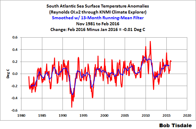
It’s the South Atlantic that’s causing the noticeable shortfall in 2015 for the Atlantic basin. As shown in Figure 9, the sea surface temperatures of the South Atlantic (60S-0, 70W-20E) have not warmed (so far) in response to the 2015/16 El Niño, while they warmed quite a bit for the 1997/98 El Niño. Curious.

Figure 9
HEMISPHERIC OCEAN RESPONSES
The following are the comparisons for the Northern and Southern Hemispheres. As shown in Figure 10, the response of the Northern Hemisphere (0-60N) peaked higher in 2015/16 than in 1997/98. On the other hand, it is, so far, decaying much more quickly in recent months.

Figure 10
Conversely, the sea surface temperatures of the Southern Hemisphere (60S-0) in 2015/16 have lagged well behind those in 1997/98. See Figure 11.

Figure 11
If we assume hemispheric land surface temperatures vary in response to hemispheric sea surface temperature changes, then the higher peak in the Northern Hemisphere sea surfaces may result in greater global land surface temperature responses to the current El Niño…especially when we consider that the land surface area of the Northern Hemisphere (approximately 100 million km^2) doubles that of the Southern Hemisphere (about 49 million km^2). Reference for surface areas here.
Also, the downtick from January to February 2016 is larger in the Northern Hemisphere than the Southern.
WHY ARE GLOBAL SEA SURFACE TEMPERATURES IN 2015/16 LAGGING BEHIND THOSE IN 1997/98?
Refer to Figure 1 again, please. I suspect one reason is that the tropical Pacific started at the threshold of weak La Niña conditions in 1997/98, while in 2015/16, the tropical Pacific was at the threshold of weak El Niño conditions. So, even though the sea surface temperature anomalies for the NINO3.4 region peaked at comparable values, the change in the sea surface temperatures of the equatorial Pacific was greater in 1997/98 because it started near La Niña conditions. We can help to show this by normalizing the NINO3.4 region to the averages of the first three months of the respective periods. See Figure 12. The change in the sea surface temperatures of the east-central equatorial Pacific was noticeably greater in 1997/98 than in 2015/16.

Figure 12
Another way to consider that: In 2015, the global atmospheric conditions were already in weak El Niño conditions, so globally the atmosphere was already primed toward El Niño circulation. On the other hand, in 1997/98, the atmospheric conditions began in weak La Niña conditions, so there were greater changes then in atmospheric circulation, which caused the greater increases in sea surface temperatures outside of the tropical Pacific.
Another reason: The 1997/98 El Niño was a strong East Pacific El Niño, while the 2015/16 El Niño was a strong Central Pacific El Niño. That is, the sea surfaces east of the NINO3.4 region were warmer in 1997/98 than in 2015/16. We’ve been illustrating this fact in the 2015/16 ENSO updates. See Figure 2 from the most recent update here. We also discussed and illustrated it using the El Niño Modoki Index in the post Is the 2015/16 El Niño an El Niño Modoki?
EAST PACIFIC VERSUS THE REST-OF-THE-WORLD’S OCEANS
Another logical way to divide the global oceans when studying ENSO is to break them down into the East Pacific (60S-60N, 180-80W) versus the rest of the global oceans, where the rest is the Atlantic, Indian and West Pacific oceans (60S-60N, 80W-180). The surface temperatures of the East Pacific are directly impacted by the El Niño, while the surface temperatures of the rest of the oceans vary due to the aftereffects of the El Niño and due to changes in atmospheric circulation caused by the El Niño.
During an El Niño, warm water, mostly from below the surface of the western tropical Pacific, migrates eastward into the eastern tropical Pacific, primarily along the equator. Ocean processes cause much of the additional warm subsurface waters to be upwelled to the surface of the eastern tropical Pacific during an El Nino. Because the surface and subsurface waters in the western tropical Pacific are warmer (in absolute terms) than those in the eastern tropical Pacific, the surfaces of the eastern tropical Pacific warm. Additionally, the warm water was below the surface of the western tropical Pacific (excluded from the surface temperature record) prior to the El Niño, and the warm water is on the surface during the El Niño (included in the surface temperature record). As a result, the surface temperatures of the eastern tropical Pacific warm in response to an El Niño.
Ocean dynamics such as coastally trapped Kelvin waves and changes in atmospheric circulation caused by the El Niño also cause portions of the surfaces of the eastern Pacific to warm outside of the tropics.
The result is the East Pacific (60S-60N, 180-80W) as a whole warms in response to the El Niño. See Figure 13. Clearly, the East Pacific warmed much more during the 1997/98 El Niño than during the recent event. For the East Pacific, the 2015/16 El Niño has peaked later than in 1997/98.

Figure 13
Something else to keep in mind: The East Pacific covers about 33% of the surfaces of the global oceans. So let’s take a look at the response of the other two-thirds.
The sea surfaces of the rest of the world—the Atlantic, Indian and West Pacific Oceans—warm in response to changes in atmospheric circulation and as a result of the leftover warm waters from the El Niño, both surface and subsurface. (See Chapter 3.7 of my free ebook On Global Warming and the Illusion of Control.) All of the warm water released by the El Niño doesn’t simply disappear at its end, which is what the climate science community would like you to believe. Those leftover warm waters are relocated initially to the West Pacific and East Indian Oceans, then, over time, carried throughout the rest of the oceans by ocean currents.
Figure 14 presents the sea surface temperature responses to the 1997/98 and 2015/16 El Niños for the Atlantic, Indian and West Pacific Oceans (60S-60N, 80W-180), a.k.a. the Rest of the World. Until recently, the sea surface temperature response of the Rest of the World to the 2015/16 El Niño basically tracked that of the 1997/98 El Niño…may have responded a little earlier in the first few months. The surface temperatures there then dropped noticeably from January to February 2016. Please don’t consider that recent drop as an indicator of things to come, though. There should be a monumental amount of leftover warm water from the 2015/16 El Niño (and The Blob) and those leftovers should once again find their way initially to the East Indian and West Pacific over the next year.

Figure 14
CLOSING
Every El Niño is different. We’ve shown that fact in many of the posts presented in the 2014/15 El Niño series and those about the 2015/16 El Niño. Weather around the globe is chaotic, so the background state globally in which each El Niño forms will be different. As a result, the responses of ocean basin surface temperatures to El Niños will vary from event to event, even strong El Niños.
The sea surface temperature anomalies of the NINO3.4 region are a commonly used indicator of the strength, frequency and duration of ENSO events. But they only reflect the impacts of an El Niño on that small portion of the globe. They cannot tell us if the El Niño was an East Pacific event or a Central Pacific El Niño (a.k.a. El Niño Modoki). The sea surface temperatures of the NINO3.4 region also do not tell us the background state of the weather in the tropical Pacific or around the globe or how regional weather will impact the responses. As noted in the most recent ENSO update, many other indices show the 2015/16 El Niño to be weaker than the event in 1997/98. And, of course, the sea surface temperatures of the NINO3.4 region cannot tell us what happened to the warm water after the El Niño.
So far, the responses of global sea surface temperatures to the 2015/16 El Niño have fallen short of those experienced during the 1997/98 El Niño. See Figure 2. There has also been a recent downtick in many basins that did not occur in 1997/98. I wouldn’t take those downticks as indicators of things to come, though. The 2015/16 El Niño released a tremendous about of warm water from below the surface of the western tropical Pacific, and all of that warm water is going to end up somewhere.
For this El Nino, the most unusual response, or lack thereof, has occurred in the South Atlantic. The South Atlantic covers about 11% of the surface of the global oceans, according to the NOAA/NCEI webpage here. The surfaces of the South Atlantic warmed noticeably in response to the 1997/98 El Niño, but show no warming in 2015/16. Why? Dunno. Compared to the rest of the ocean basins, there is very little scientific literature about the causes of the variations in the surface temperatures of the South Atlantic. In fact, I have yet to find a paper that provides an explanation for the temporary 2+ year uptick in the surface temperatures of the South Atlantic starting in 2009 after decades of no warming.
Next, we’ll take a look at land surface temperature anomalies.
Bob,
Still wading through it, but, under the title “Fig 4″, that paragraph has ” So far, they have not warmed as much in 2015/16 as they did in 2015/16.” ……..97/98 ?
I had better get some sleep.
Thanks, Keith. I’ve fixed it.
Looks to me that the el Nino is nearly totally dead in the water now. A fast decline! They were saying in the mainstream media just last month that it would roll on and on for six more months. This site has the most comprehensive data about all this for which we are all grateful. Very educational indeed.
Compare WUWT coverage with the official NOAH website. Virtually no information there, little in the way of graphs, etc. Very parsimonious.
NOAA, heh. Though with their continuous ‘we are all going to drown!’ predictions, they should change their name.
There is a lag between ocean temperatures and atmospheric effects. The consequences of this strong el Nino will indeed “roll on for six more months”.
I notice there’s still plenty of warm water against Peru, not much sign of it going away yet.
http://earth.nullschool.net/#current/ocean/surface/currents/overlay=sea_surface_temp_anomaly/orthographic=-88.50,-0.79,536
This El Nino had better be the cause of our absolute worst winter ever here in New England. As a skier, I cannot put up with another year like this. We are about to set records for lowest snowfall in a year and my ski area (all natural snow) closed before March – unheard of. Is this mostly because of El Nino? I know it is weather but this winter ( or entire lack of) has been absolutely crazy. I used to be able to tell people, it has happened before – can’t say that this year.
About the South Pacific Ocean: perhaps it operates the opposite of the Northern Hemisphere’s polar cycle, no? And perhaps ice Ages occur when both poles have the same cycle? There is so little we really know about all this.
Bob,
Excellent, as usual.
However, I will object again to referring to any collection of data which have been “adjusted” as a “dataset”. A set of estimated temperatures or estimated temperature anomalies, perhaps, but no longer a “dataset” because the components are no longer “data”.
I totally agree firetoice2014. If I’m ever going to take any of this seriously, climate science is going to have to start treating data seriously.
Andrew
+1
“As noted in the most recent ENSO update, many other indices show the 2015/16 El Niño to be weaker than the event in 1997/98.”
From comments:
“Looks to me that the el Nino is nearly totally dead in the water now. A fast decline!”
With the current weak solar cycle underway, why then has the most recent anomly/s in all the surface/TLT records been higher than 1997/98 if this el Nino is weaker than 1997/98?
Because there is so much less AMO driven Arctic sea ice extent. This releases lots of energy from the North Atlantic which is then carried over Europe and Russia (look at where the warmest anomalies occurred). During the 97-98 El Nino there was still a lot of sea ice. Add to that the energy from the dissipation of the blob and all it easily understood. Simply a combination of multiple separate weather events.
Nice post. I second the earlier commenters on the variation in data sets due to “correction”–one has doubts as to what is really going on.
There are some unusual atmospheric events happening that may account for the strange behaviour of 2015/2016 El Nino. The Arctic Polar vortex is in three parts and the Antarctic Polar vortex is just south of the equator. There are SSW events happening . Some parts of the globe are in for some cold weather.
http://earth.nullschool.net/#current/wind/isobaric/10hPa/orthographic
herkimer
NE europe will be the place to watch for the cold weather event over the next few days. Because as l commented a week ago on other tread. What l believe to be a “classic age weather pattern” sett up is about to pay this part of the world a little visit. My ideas about how a ice age forms is about to get tested in the real world
l mean “classic ice age weather pattern”
The ocean around Europe is colder, not warmer. The balance of cold/warm oceans is disrupted by the el Nino. The weather may continue to be ‘unusual’ as the el Nino’s fading power still propels events but it is ending faster than the 1998 el Nino which was longer than the present one.
Here is some further data about what is happening to our global weather
https://www.aer.com/science-research/climate-weather/arctic-oscillation
Mr T, I’m sure you meant to say something different here “So far, they have not warmed as much in 2015/16 as they did in 2015/16.”
Otherwise another fine informative post!
As far as I understood it, this winter global temps ‘exceptional’ rise was attributed to the el Nino. According to the GISS data, the way I look at, nothing exceptional in there, but as usual not many people may agree.
http://www.vukcevic.talktalk.net/GISS-tmp.gif
The two most prominent periodicities in the ‘delta’ data are 3.6 and 9.1 years.
What is the DC average of the delta data? Does it integrate to match the temperature rise?
If I understood you correctly, March 1881-February 2016, inclusive, DC average is zero or to be more precise = 0.008 C.
Wouldn’t the melting of the sea ice in the Antarctic lead to a less strong response in the southern ocean basins?
But, but, but…according to MSN and The Guardian, February broke temperature records by a ‘Shockng’ amount. They claim we are in a climate emergency!
http://www.msn.com/en-us/weather/topstories/february-breaks-global-temperature-records-by-shocking-amount/ar-AAgKgyE?ocid=spartanntp
SMC
Global temperature records are rarely “globe wide” records . February 2016 was not a record for Contiguous US . There were at least 6 years where February was warmer going back to1930. . I have not checked North America but I doubt if it was even a record for North America.
One or two month record temperatures in an El Nino period are not alarming They are just short term anomalies . The trend over the last 10 years tells a much different picture .
The trend of annual global land temperature anomalies since 2005 or the last 10 years has been flat or in a pause, but regionally there is cooling in Asia and North America and warming in Europe
• Global -0.02 C/decade (flat)
• Northern Hemisphere -0.05 C/decade (flat)
• Southern Hemisphere +0.06 C/decade (flat)
• North America -0.41 C/decade (cooling)
• Asia -0.31 C/decade (cooling)
• Europe + 0.39 C /decade (warming)*
• Africa + 0.08 C/decade (flat)
• Oceania + 0.07C /decade (flat)
*The European warming is due to warming of one year only(2014) The temperature anomalies for the period 2005-2013 were also flat (- 0.02 C/decade)
Data per NOAA CLIMATE AT A GLANCE web page
Plot realistic uncertainty bands on these graphs & the differences would simply vanish in the wide expanse of the data cloud.
WUWT has become almost unusable due to prolonged holdups with advertisements. This has already taken about 5 minutes to type.I have read WUWT since it started but am going to have to go away.
RobinEdwards
robin, you mentioned this before – did you install the ‘adblock plus’ add-on? I was having the same issue with Firefox until I installed the add-on – it works.
Ad-block works great. I put it off for ages until I found my Internet access allowance for a month was being used up in a week. I downloaded Ad-block and everything is excellent now for speed and no ads!
I should also point out to you that WUWT has no control over the number of ads that show here. WordPress offers a free site to bloggers and has them “pay” for it through ad space that WordPress sells to advertisers.
If you want help with getting rid of ads, I and others have told you how. If you are hoping that WUWT will do something about the ads for you – they cannot.
That is odd, here in the UK, I get only one ad per thread, this one happens to be for newest mobile phone.
I haven’t seen an ad on a website in 5 years…AdBlock Plus is 100% FREE
After looking at this data it is quite obvious why last month was the warmest ever measured temperature of the lower troposphere. All that surface heat turned to latent heat and is now heating the lower atmosphere as the water vapor condenses.
Will there be so much infrared radiation trapped as this water condenses by the extra 100 ppm CO2 that we will all bake, fry, and broil? Chicken Little thinks so.
I have thought this, too. But do you have any guestimates as to the likely extent or duration of the heating effect due to water condensation?
This further demonstrates that the Atlantic and the AMO deserve a lot more study and attention for global temps, sea ice gain/loss patterns, and generally for better appreciation of long term cycles.
Few points to ponder upon:
Do we have the data as that of NIno3.4 area all over the globe — only after 90s the network started but the curve starts around 1980s;
The peak in terms of magnitude and time are highly variable over different parts of the globe — in some cases it is around 12th month and at others it is around 20th month and so on & magnitude is around 0.2 at some places and around 0.4 around some others.;
All the localized conditions change with several local conditions irrespective of, whether there is a El Nino or ENSO or not. El Nino has no global impact as it is regional factor.
Dr. S. Jeevananda Reddy