From the University of Alabama, Huntsville, and courtesy of the current El Niño here’s something climate advocates will probably like, even though they wrongly say the satellite record is no good.
Notes on data released Feb. 4, 2016:
As widely anticipated, global temperatures in January set a record for the month, eclipsing January 1998 as the warmest January in the satellite temperature dataset, according to Dr. John Christy, director of the Earth System Science Center at The University of Alabama in Huntsville. In a sense, that could mean 2016 is in a “race” to see if it will pass 1998 as the warmest year on record. In addition to a major El Niño Pacific Ocean warming event, 2016 has 17 years of warming to raise the base temperature from which the El Niño begins.

While the global temperature in January was a record setter, in the tropics January 2016 fell significantly (more than 0.25 C) short of the 1998 record. It could mean less energy is available to be transferred from the ocean into the atmosphere. It could mean the heat transfer might peak later this year than in previous El Niño years or might already be near its peak. What we know is that under the best of circumstances the climate system is complex and difficult to forecast. It will be interesting to see how this plays out in the coming months.

Global Temperature Report: January 2016
Global climate trend since Nov. 16, 1978: +0.12 C per decade
January temperatures (preliminary)
Global composite temp.: +0.54 C (about 0.98 degrees Fahrenheit) above 30-year average for January.
Northern Hemisphere: +0.70 C (about 1.25 degrees Fahrenheit) above 30-year average for January.
Southern Hemisphere: +0.39 C (about 0.70 degrees Fahrenheit) above 30-year average for January.
Tropics: +0.85 C (about 1.52 degrees Fahrenheit) above 30-year average for January.
December temperatures (revised):
Global Composite: +0.43 C above 30-year average
Northern Hemisphere: +0.53 C above 30-year average
Southern Hemisphere: +0.37 C above 30-year average
Tropics: +0.61 C above 30-year average
(All temperature anomalies are based on a 30-year average (1981-2010) for the month reported.)
The warmest Januaries in the satellite temperature record are:
Warmest Januaries
How much warmer than seasonal norms
2016 0.54 C
1998 0.49 C
2010 0.48 C
2013 0.43 C
2007 0.41 C
2003 0.31 C
2005 0.27 C
2015 0.27 C
2002 0.21 C
2004 0.18 C
Warmest NH Januaries
2016 0.70 C
2010 0.55 C
2007 0.48 C
2003 0.41 C
1998 0.40 C
2015 0.39 C
2013 0.34 C
2002 0.31 C
2005 0.30 C
1995 0.23 C
Warmest SH Januaries
1998 0.58 C
2013 0.51 C
2010 0.41 C
2016 0.39 C
2007 0.33 C
2004 0.30 C
2005 0.24 C
2003 0.21 C
2006 0.20 C
2014 0.17 C
Warmest Januaries in the tropics
1998 1.13 C
2016 0.85 C
2010 0.60 C
2007 0.55 C
1983 0.51 C
2013 0.42 C
2003 0.42 C
2004 0.32 C
1988 0.32 C
2005 0.29 C
Compared to seasonal norms, the warmest average temperature anomaly on Earth in January was over north central Russia, near the small town of Volochanka. January temperatures there averaged 7.20 C (almost 13 degrees F) warmer than seasonal norms. Compared to seasonal norms, the coolest average temperature on Earth in January was over the northern Pacific Ocean, where the average January 2016 temperature was 2.78 C (just over 5 degrees F) cooler than normal.
The long-term climate trend ticked up over the rounding margin this month, so the global climate trend since December 1978 is now 0.12 C per decade.
In other news, the 6.0beta5 version of the satellite temperature record, which has been available online for public comment for about eight months, is now complete and should soon be submitted for peer review in the scientific literature. The newest version of the dataset provides a more consistent transition between earlier MSU Channel 2 data and the new AMSU Channel 5. The new code causes no change in the long-term global temperature trend.
The complete version 6 beta lower troposphere dataset is still available here:
http://vortex.nsstc.uah.edu/data/msu/v6.0beta/tlt/uahncdc_lt_6.0beta4.txt
Archived color maps of local temperature anomalies are available on-line at:
As part of an ongoing joint project between UAHuntsville, NOAA and NASA, Christy and Dr. Roy Spencer, an ESSC principal scientist, use data gathered by advanced microwave sounding units on NOAA and NASA satellites to get accurate temperature readings for almost all regions of the Earth. This includes remote desert, ocean and rain forest areas where reliable climate data are not otherwise available.
The satellite-based instruments measure the temperature of the atmosphere from the surface up to an altitude of about eight kilometers above sea level. Once the monthly temperature data are collected and processed, they are placed in a “public” computer file for immediate access by atmospheric scientists in the U.S. and abroad.
Neither Christy nor Spencer receives any research support or funding from oil, coal or industrial companies or organizations, or from any private or special interest groups. All of their climate research funding comes from federal and state grants or contracts.
— 30 —
Anthony: Climate advocates don’t say the satellite record is no good, they say it underestimates the long-term warming trend.
…which is good?
What the @!#% is them difference ??
…only becuase the satellite record disagrees with that they think the warming trend should be.
Anything that agrees with them is right, and anything that disagrees with them is wrong, because they *know* what is right. They are the final arbiters of Truth.
“Measurements? We don’t need no steenking measurements!” (apologies to Mel Brooks)
Which in itself is s nonsensical statement for more reasons than one.
When you have three long term independently sourced and independently analyzed data series from the very atmospheric layer that the alarmists have been telling us is the canary in the coalmine, that all three fundamentally contradict the 150+ global climate models based on often poorly sourced, extrapolated and regularly adjusted data, anyone with a background in data analysis or R&D due diligence knows there is an incontrovertible problem.
The prima facia probability in fact is that based on the questionable quality of its sources and the assumptions built into the models, the surface derived conclusions are systemically biased towards overestimating things.
The recent Karl, et.al. attempt to recast data sources to fit the CACG/CACC hypothesis only serves to underscore the biases that has been the norm in the climate establishment for the past three of decades.
Independently verifiable data always trumps assumptions and hypotheses.
tetris,
“When you have three long term independently sourced and independently analyzed data series from the very atmospheric layer that the alarmists have been telling us is the canary in the coalmine, that all three fundamentally contradict the 150+ global climate models based on often poorly sourced, extrapolated and regularly adjusted data, anyone with a background in data analysis or R&D due diligence knows there is an incontrovertible problem.”
Yes.
Indeed – anyone with common sense would tell them they have a 2000 pound gorilla in the room problem.
Auto.
If the bulk atmosphere should contain the largest signal but has the smallest, and the deep ocean should contain the smallest signal but has the largest, what does that tell you about the validity of the underlying hypothesis?
“By denying scientific principles, one may maintain any paradox.”
-Galileo Galilei
A temperature record (satellite or other) is not a future estimate in any sense of the word. It does validate or disprove a past prediction. It is the warmists with their agenda driven tarot cards, making wild predictions in the past, that have been disproved by current satellite data.
Or THEY overestimate the long-term warming trend.
Now we are a the peak – from now on its global cooling!
What are they cooking with up there in Siberia ?? Those are some serious anomaly colors up there.
They better not use that stuff at Vostok Station or else the Antarctic highlands will be a big lake.
g
Let me guess. Reindeer?
Even though there is a spot with a 7 degree anomaly, I can assure you by the temperatures they usually have there, it is a small and beneficial anomaly.
That area coincides with the area that is causing the current Arctic Sea Ice extent to be so low. Surely they are suffering from the -1 C temperatures rather than their usual -8 C temperatures.
true, i have no idea where they come up with this stuff. I dont buy any overall data put together anymore. All of china and most of africa were well below noms the entire month…
“Anthony: Climate advocates don’t say the satellite record is no good, they say it underestimates the long-term warming trend.”
Daniel, there’s a link in the first sentence, follow and read.
Here is the lower troposphere temperature record – the satellite and extended back to 1958 using the weather balloon data-radiosondes – versus the ENSO.
Points to make:
– yeah, the ENSO is a huge controller of the lower troposphere temps;
– sorry, there is very little global warming in this scenario of 57 years (when it is supposed to be increasing at 1.3 times faster that the surface at this level of the atmosphere – the surface records only show you an unreliable record if you want an unreliable record);
– there is a lag of 3 months from the Nino 3.4 to when the lower troposphere is impacted and this operates on a continuous on-going basis every month;
– one can see the volcanoes certainly do get it the way and the straight one-to-one relationship but if you made adjustments for the volcanoes (which is not hard to do, I have done it), the relationship would be very clear; and,
– the temp anomalies are not going to peak until next month – February, 2016 – global lower troposphere temps will approach 0.7C and the tropics may exceed 1.0C. Then it will drop slowly as the ENSO has dropped slowly since November, 2015.
http://s12.postimg.org/4o3rgglil/RSS_UAH_Had_AT_ENSO_1958_Jan16.png
+1
NASA has produced an accelerated warming trend by manipulating past surface data to the point its weather and climate products are now works of fiction. I would say the truth of the satellite data certainly disagrees with the works of fiction being produced elsewhere in NASA.
Look at the real residuals of the surface temperatures compared to that of the satellite temperatures and get back to us.
Warmest year, warmest month, I’m soon expecting for warmest day, then hour to be declared. Any advances?
Warmist (sic)minute?
Auto – exaspersatedly . . . .
https://youtu.be/sDSud7vAH_0
I like it ! Warmest day since yesterday !
The warmest minute, of the warmest hour, of the wamest day, of the Warmist religion!
How can the world 2016 average come to a higher value than the 1998 average?
There must be some seriously wierd biasing of the data, or is there more than NH, Tropic & SH?
1998 = 0.4 + 0.58 + 1.13 = 2.11
2016 = 0.7 + 0.39 + 0.85 = 1.94
Wouldn’t there only be NH and SH, with the Tropic area portions of both?
That would give
1998 = 0.4 + 0.58 = 1.06
2016 = 0.7 + 0.39 = 1.09
So 2016 would be slightly higher.
But why doesn’t the massive temp in the Tropics show up more in 1998?
I think we are seeing the Heat from the tropics being lost to northern hemisphere and staright to space.
ie. Cooling, hence the very cold Asian areas.
@A C Osborn – This line “1998 = 0.4 + 0.58 = 1.06” is wrong; 0.4 + 0.58 = 0.98.
And there we have it: The difference between 1.06 and 1.09 is 3 hudredths of a degree.
For bragging rights,OK. But for reality, it’s nonsense.
There is nothing unusual or unprecedented happening. The current pattern is the same as the late ’90’s El Niño.
Our planet continues to recover from the Little Ice Age — the [third] coldest episode of the 10,000 year long Holocene that we’re still in. And we had better hope it continues.
When I look at the graphic, Monthly Global . . Anomaly, I see two trend lines; both are flat lines, one is on the left 1/2, and it is below normal, and the other is on the right 1/2, and it is above normal.
The satellite record is acknowledged when it conforms to orthodoxy. Otherwise it’s back to the UHI and box o proxies.
Relatives of the 58 Taiwanese who perished in freezing conditions on 28 January and the Mites50 year record snowfall might wonder about some of these statements.
My friends in South America and South Africa have not commented on abnormal weather in their parts of the world..
Mid December to mid January in South Africa was unbelievably hot. Many towns set all time highs in records going back over 100 years, including Johannesburg, with hit 38 deg C, and Pretoria, which exceeded its previous record by a massive 1.7 degrees, at 42.7.
There was also a once-in-a generation drought across the summer rainfall area, which meant that barely 50 per cent of the usual maize plantings were able to take place. As a result South Africa will have to import several million tonnes of maize (corn to you US guys), putting its transport infrastructure under great strain.
Meanwhile in the SW of Australia, weather was much cooler than normal. Doona weather, with rain
YAY!
I hate cold winters so I’m a strong supporter of global warming. Sahel greening… warmer winters… some Viking farms on Greenland emerging from permafrost… how anyone can see this as anything but good news is beyond my ken.
.
.
.
(Memo to self: need to buy M4GW t-shirt. Check to see if Elmer is peddling them. If not, order custom H.R.4GW t-shirt.)
If the surface temps are higher than the lower troposphere, then wouldn’t the GW signal mostly be the result of UHIs and land use and not so much GHGs?
We’re still nowhere close to the ‘Climactic Optimum’, but I remain hopeful we will get there eventually.
https://en.wikipedia.org/wiki/Holocene_climatic_optimum
The last couple of years remind me of 2009 and 2010 when the warmists were crowing that The Pause was over. By the end of 2017 The Pause will likely exceed 20 years.
If you believe the MET office predictions, temps will be flat to down for the next 5 years, extending the pause to 24 years or more.
Nonsense. The MET predicted warmer temps over the next five years. Go read what they said, not what some blogger wishes they said…
The Met’s record isn’t very good, so if they’re predicting cooling I’m worried.
I used to love going up a mountain – because the only way was down. But then the vile ecos destroyed the environment by polluting it with windmills. Now all one sees from the top of the evil is the stupidity of our leaders. Still that doesn’t stop the only way being down!
Good post.
Lower tropospheric temperature and surface temperature are different things. It is clear to anybody looking at the data that very strong El Niño produce more atmospheric warming that surface warming. This is due to the nature of El Niño, that transfers directly heat from the Pacific surface to the atmosphere. La Niña appears to have the opposite effect and strong La Niña years appear to show more atmospheric cooling than surface cooling. These differences are important and should be taken into account because we are comparing different things.
Sample validation is a solid engineering practice.
There is only ONE pristine surface data set in the world.
Here is the comparison of that surface data set against the regional satellite data.
http://s19.postimg.org/uuy2ft3jn/Combined_USA_temperatures.png
Given that these sets are so close, but the surface data appears to be “peakier” in both directions, I see no reason at all to doubt the global satellite data.
And PLENTY of reasons to doubt the sparse, irregular, much fabricated GISS and HadCrud.
It’s HadCRUFT actually 😉
The main problem with GISS LOTI and HadCRUFT is that you cannot meaningfully “average” land and sea data. They are vastly different media. Radiosonde and satellites are measuring one consistent medium on a global scale.
+10
Brilliant. Thank you.
Looking a the map, where people live,on land, it appears to have cooled or not warmed.
Since the “warm” parts appear to be in the Arctic, we should look at the position of the AMO.
The “30 year ” period on which the “mean” is based is shaded blue.
http://s19.postimg.org/7c5hbcs6r/amomean.jpg
Look where the AMO is heading.
fascinating. There’s no long term trend in the AMO. It looks like it is zero.
what’s the source?
Come on Peter, AMO is a DETRENDED north Atlantic SST. Hence by definition there is no trend.
That is nonsense anyway since it implicitly assumes that there is an independant “trend” to be subtracted. ie you start with the assumption that there is a long AGW trend and the rest is net zero “internal oscillation”. They impose their preconceived ideas on the data before they start.
Peter, I can’t find the original source of that particular AMO graph.. but there are plenty similar . search for Atlantic Multidecadal Oscillation images.
Mike, while there may have been a trend in AMO as we climbed out of the LIA, matching with Reykjavik temperatures show that very little trend removal.
http://s19.postimg.org/5vfcwbc8j/amoreyk.jpg
If you look at the pre 1910 temps from 8 Iceland temps you can see that they are below the pre-1910 AMO pattern …but after that, it is almost a perfect match. Maybe there is just no real trend anymore (just like the satellite data shows)
http://s19.postimg.org/45zuayng3/iceland.jpg
Its also very obvious why the alarmista ALWAYS like to start the Arctic sea ice graphs in 1979.
The match is again quite uncanny. Here I have taken the November NH sea ice levels, inverted and put against the AMO.
http://s19.postimg.org/4crolmgmr/amo_vs_NHice.jpg
As we know, Arctic sea ice levels have leveled off the last few years.. exactly as the AMO would predict, and if you look at the first AMO graph you will see a blue dot. top right, which represents ‘now’.
That dot is a bit more than 1sd from the mean of the shaded blue area…just like the current level of Arctic sea ice is.
In other words, there is absolutely NOTHING unusual about the current level of Arctic sea ice. Its almost exactly where it “should ” be.
AndyG55,
You can get the AMO data from here. The link at the bottom under “Method” gives you the SST averages, unsmoothed & not detrended. If you deseasonalise rather than detrend these you’ll get the following, which is far closer to reality:
http://s23.postimg.org/800bfnr95/Amo_Deseasoned.png
Come on Peter, AMO is a DETRENDED north Atlantic SST. Hence by definition there is no trend.
Actually I had no idea it was detrended. Source?
And no need to be sarcastic.
Peter
Check out Hadcrut4 versus the Raw Undetrended AMO figures. They are almost exactly the same. (this chart is about a year old now).
http://s8.postimg.org/7vabnd979/Hadcrut4_vs_Raw_AMO_Feb14.png
The Atlantic Multidecadal Oscillation (AMO)
The Atlantic Multi-Decadal Oscillation (AMO) is a fluctuation in de-trended sea surface temperatures in the North Atlantic Ocean. It was identified in 2000 and the AMO index was defined in 2001 as the 10-year running mean of the detrended Atlantic SST anomalies north of the equator. There is a significant negative correlation with US continental rainfall with less rain during a positive AMO index. (H.A. Dijkstra, “On the physics of the Atlantic Multidecadal Oscillation”, Institue for Marine and Atmospheric Research, Netherlands, 2005) [http://www.knmi.nl/publications/fulltexts/drsg2006.pdf]
http://appinsys.com/globalwarming/amo.htm
When I did my analysis of global temperatures, the nearest I got to significant trend was over a period of around 60 years. At least within the data I was checking, this is the only “abnormal” effect (the trend varies more than would be expected given the variability of the rest of the data.
That graph is the clearest indication yet, that the one “abnormal” effect on climate is indeed part of natural trends.
Global climate trend since Nov. 16, 1978: +0.12 C per decade
Which means in about 1,000 years Canada will be about 10 C warmer. SO have a way to go yet, wouldn’t throw out those winter coats yet.
Of course at the current rate of technology advancement, in a thousand years we’ll be controlling the weather by democratic vote and genetically engineering humans that can live under the sea. The winter coats may be a moot point by then.
“1,000 years Canada will be about 10 C warmer”
And that warming would be in winter….. like it is now.
do any Canadians really have a problem with that?
Lol. Can’t speak for Canadians, but as a survivor in upstate NY, no, I’m not complaining.
“Of course at the current rate of technology advancement, in a thousand years we’ll be controlling the weather by democratic vote and genetically engineering humans that can live under the sea.”
Nah. we will all be distributed consciousnesses in a quantum computer simulation of reality.
Oh hang on, according to latest particle physics, we already are…
What should we expect merely from tiny variations in solar output. Not much in 11 years or even 22 years, but 100 years or 200 years?
In my opinion, solar output is a neglected factor in climate studies and sunspots are only one dataset. Several other lines of evidence implicate solar variations as drivers of climate change.
https://geoscienceenvironment.wordpress.com/2015/11/01/the-gleissberg-cycle-part-2/
Buying some property in Canada for my kids, I am still freezing my butt of in Alabama…….
Thanks, Dr. Christy.
I think it is possible that El Niño peaked in November 2015, this is what I read in the MEI index, at http://www.esrl.noaa.gov/psd/enso/mei/
In that case, then it is possible that the global temperature has peaked on January 2016.
But if El Niño does not subside we might see a February 2016 warmer than January 2016.
I have prepared a 247KB .gif version of 012016globalmap.png (737KB) that I will publish in 8 pages at Observatorio ARVAL.
This I will do as soon as http://nsstc.uah.edu/climate/ is updated.
this how i see the situation as well andres . the good thing is we will find out very soon.
2016 0.54 C
1998 0.49 C
2010 0.48 C
2013 0.43 C
That looks like a statistical 4 way tie to me. Possibly 5 or 6 way.
The metrologist in me (sic, that is not meteorology, it’s the science and art of making and reporting measurements) says that Jan 2016 is tied for the highest recorded temperature in the satellite record.
Peter
And as a reminder to newer readers, the satellite record is very new.
For further information, ask Dr. Google about:
Medieval Warming Period
Roman Warming Period
Minoan Warming Period
Holocene Optimum
For extra credit, formulate your own search phrases that will compare the above with the last Glacial Maximum.
For extra extra credit, expand your searches to include the Eemian.
Both satellite data sets show a record high January, even above 1998. And in 1998, the final average was very close to the January anomaly. Will it happen this year? I do not know, but with similar ENSO numbers for 1997 and 2015 since May of each year, it certainly cannot be ruled out.
RSS came in at 0.663, a new January record. Its pause is still 18 years and 8 months, however it will disappear in February if February is 0.88 or higher. Should February not be above 0.88, then it will disappear in March based on Nick’s work here:
http://moyhu.blogspot.com.au/2016/01/the-fleeting-pause.html
(If the January anomaly exceeds about 1.3°C, the Pause is gone. This is unlikely.
If the Jan and Feb anomalies exceed on average about 0.77°C, the curve will be above the axis. For reference, the Dec anomaly was 0.543°C. I think this is quite likely.
If the first three months exceed 0.59°C on average, that would suffice to extinguish the pause. That is barely above the December value, and I think very likely indeed.
If Jan-April exceed 0.5°C, that will also suffice.)
The UAH pause is too close to call before the complete beta5 version is out. The pause is either gone, or it will hang on by the skin of its teeth from December 1997. However barring a huge volcanic eruption near the equator very shortly, the UAH pause will be gone when the February numbers come out.
It’s not gone… just hiding waiting for La Nina.
To be a truly impressive nino, a boy child needs to exceed not only in mathematics, which might be thought of as the 3.4 region, but also philosophy and logic, which could be thought of as the other two nino “regions”.
The reality is that the nino “regions” are themselves crude approximations based on ad hoc judgements. The three official “regions” all ignore the SOI, the first ad hoc judgement and hypothesis, which to this day correlates better with SW American rainfall than any of the official “regions” except the 1+2.
In my opinion we need a NOI, a northern index from Hawaii to Vietnam or wherever, just to be consistent.
Interestingly, if you grab RSS for January, (now available)
http://data.remss.com/msu/monthly_time_series/RSS_Monthly_MSU_AMSU_Channel_TLT_Anomalies_Land_and_Ocean_v03_3.txt
USA is actually negative. But the rest of the NH was rather warm (relative to “average”)
and 60-82.5N had an almost pleasant winter !! 🙂
Werner, didn’t you get the memo? The “pause” never happened, so it can’t end.
Some sources are more believable than others. Perhaps the pause will be hiding in the deep ocean.
An anomaly of 0.57 for the next 2 months in RSS will see that Pause gone by March – so it can even be cooler than January and the Pause will still disappear.
I suspect it will soon be re-chistened – perhaps as the Slowdown ???
And once the El Nino is over and the temperatures start to drop, the “pause” will re-establish and lengthen considerably. Could even reach out to the whole of the satellite record. 🙂
“the warmest average temperature anomaly on Earth in January was over north central Russia, near the small town of Volochanka. January temperatures there averaged 7.20 C (almost 13 degrees F) warmer than seasonal norms.”
Here’s a funding-proposal some joker should submit to the NSF, just to get its bias on the record when it rejects it. Ask for money to investigate how much the seasonal norm in Siberia was distorted by under-reporting of temperatures under the XSSR. And further to calculate how much a correction for that under-reporting would reduce the amount and trend of global warming.
Don’t be too concerned about that Siberian anomaly – when you look at absolute temp vs. the scary looking red blotch, it’s still pretty darn cold, and I’m sure they’re grateful for a little break.
” In addition to a major El Niño Pacific Ocean warming event, 2016 has 17 years of warming to raise the base temperature from which the El Niño begins.”
17 years of warming during the ‘pause’? That sounds awfully warmist of Dr. Christy.
The “planet” has continued to warm, however statistically insignificantly during the crawl, just not very much. The increment of “the warmest year ever” is equally small.
“17 years of warming during the ‘pause’? That sounds awfully warmist of Dr. Christy …”.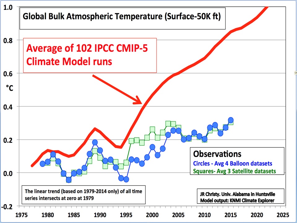
==========================================
Pause or no pause is a very silly, very childish, red herring in the great climate change™ kerfuffle.
Any material anthropogenic warming signal should be well and truly apparent in the data for the bulk of the atmosphere by now and it simply isn’t happening.
That’s good news, isn’t it?
I would love to see a lot more warming, global temperatures somewhere near the Holocene Optimum seems more.. “optimal” to me.
The graph’s circles and squares don’t show the 1998 spike. Kind of curious about that.
I believe they are based on a 5 year average so since 1998 was surrounded by La Ninas, 1998 would not stand out.
Come on man. Move this story ahead a year. There is a reason why the MET’s ‘weather’ long range super doper sophisticated weather model running on a massive super computer is not able to ‘predict’ whether the planet will warm or cool, this year. The climate ‘scientists’ nincompoops are aware of the first unexplained signs of the onset of cooling and have decided to keep that information to themselves. Who would be interested?
Noun: nincompoop (plural nincompoops)
1.A silly or foolish person (William: The epitome of nincompoopry, Trying to hide a drop in planetary temperature to push a CAGW agenda when there are piles of observational evidence that the planet is about to abruptly cool and all of the past warming was due to solar cycle changes as opposed to the increase in atmospheric CO2.)
Adjective: From the Latin non compos mentis (“not of sound mind”).
non compos mentis (not comparable)
(law, but also seeing wider use) Insane; not of sound mind; not in control of one’s self.
We are going to experience the fastest drop in planetary temperature in ‘recorded’ history. There will initially be media calls for firing of key climate scientists that created this madness. As the cooling worsens there will be calls for criminal prosecution of key players and there will be public panic.
Can you see the first signs of the end of global warming and the start of scary in your face unexpected global cooling? Anything amiss?
http://www.ospo.noaa.gov/data/sst/anomaly/2016/anomnight.2.4.2016.gif
Big surprise as to what will happen next. Look at the dang sun. Can you see the change?
There are cycles of warming and cooling in the paleo record that correlate with solar cycle changes. Some of the cooling cycles are abrupt cooling cycles. The problem this time around is the solar cycle is not slowing done, it has been interrupted.
There used to be large long lasting sunspots that were visible in single frequency. Now there is nothing, as the magnetic field strength of newly formed sunspots has decreased sunspots have become dimmer and then the magnetic flux tubes that rise up from deep within the sun to form sunspots on the surface of the sun started be torn apart by convection forces in the sun. At that point what is formed on the surface of the sun sunspot groups made up of tiny short lived sunspots which are called ‘pores’.
The next step in the physical process of what is happening to the sun is the magnetic field strength of magnetic flux tubes continues to decay, so it is completely shredded in the convection zone.
This is single frequency
http://sdo.gsfc.nasa.gov/assets/img/latest/latest_4096_4500.jpg
This is an enhanced view of the sun which shows sunspots and sunspots groups that are no longer visible in single frequency. The official NOAAs sunspot count has six sunspot groups (the official sunspot counting method is multiple each sunspot group by 10 then count the big long lasting sunspot except now there are only tiny short lived pores). The idiots are trying to prop up the sunspot count for some imbecilic reason related to the climate wars.
http://sdo.gsfc.nasa.gov/assets/img/latest/latest_4096_HMII.jpg
Can you see the first signs of the end of global warming and the start of scary in your face unexpected global cooling?
No – to both questions. You are spouting the same nonsense that a certain group of sceptics have been peddling for the past 15 years. It’s not happening. Archibald,, David, Evans, Tallbloke, Easterbrook and even Pat Michaels (post 1998) have all promised significant imminent cooling.
I’m sorry – but all I see is steady, but not catastrophic warming with perhaps occasional pauses or very brief short term cooling spells which is totally consistent with a CO2 sensitivity of around 1.2 deg C per doubling.
Stop the desperate attempts to show it’s all down to the sun or the AMO or some magical force which “we don’t quite understand yet”.
Hansen et al predicted warming in the 1980s. We’ve had warming. On that they’ve been proved correct. They might be wrong about the magnitude of the warming but they’ve correctly identified that CO2 is a greenhouse gas and increasing its concentration in the atmosphere will result in an warmer world. Compare their predictions with the the numerous failed solar predictions. They, at least, got the direction of temperature change right.
@John Finn….”They might be wrong about the magnitude of the warming …..”
I think that is what has always made me “sceptical”. Ok…so we are in a warming trend…No big deal. And CO2 may play a role in that warming….I can agree with that. But it’s the gloom and doom and “we’re all gonna die” headlines that make me laugh. I have often wondered….If we removed mans signature from the earth….What would the temps be right now? Just a thought….
It would have been fine if Hansen predicted warming, but he didn’t predict just warming. He predicted catastrophic warming. He still predicts it. T(2xCO2) of 1.2 K is mild and beneficial change for a long time. And if we didn’t have greens stopping us, we could build nuclear power to reduce carbon use.
Trust me, we do not want CO2 back to 280, or even 350. 400 is better.
Kenny and Hugs
You are more or less agreeing with my general points. The sceptic (skeptic if you’re in the US) argument should focus on the modest nature of the warming and the lack of threat it poses. Silly predictions about deep solar driven cooling are not helpful. As each one fails the credibility of the sceptic side of the argument suffers. I’m sure it’s not just me who’s getting cheesed off with being linked to crackpot nonsense.
John Finn says:
… all I see is steady, but not catastrophic warming with perhaps occasional pauses or very brief short term cooling spells…
So far, we agree. The planet is recovering from the LIA; a very cold episode during the current Holocene. What we’re observing is natural, and neither unusual nor unprecedented. So Mr. Finn presumes far too much when he continues:
…with a CO2 sensitivity of around 1.2 deg C per doubling.
That assertion has no credible measurements to support it. It is your belief, nothing more.
While it may be true, it may also be true that the sensitivity number is 0.5ºC, or any other number I could pull out. (Dr. F. Miscolczi says it’s 0.00ºC; go argue with him.) Your number is speculation, because you cannot produce a measurement of AGW.
That failure goes to the heart of the climate alarmists’ debunking by skeptics of the ‘dangerous AGW’ scare. (It must be dangerous, or the grant gravy train will be threatened).
Since you are unable to measure something that you are certain must exist, your assumption is not much different from a religious belief.
After a century of searching, no one has been able to measure AGW. Therefore, AGW cannot be significant. It is a non-problem, and the more time that passes without being able to produce measurements of AGW, the more ridiculous your climate alarmism belief looks to rational folks.
Ah – of course – the LIA and the “recovery” from it. The uncertainty over the LIA and the MWP, for that matter, is far greater than the uncertainty over CO2. I’ve seen no clear evidence that the LIA was any colder than many other periods throughout history.
When was the LIA exactly, by the way?
Here, John, I’m sure you can figure it out:
http://i.snag.gy/BztF1.jpg
Here’s a clearer view for MWP and LIA denialists:
http://jonova.s3.amazonaws.com/graphs/lappi/gisp-last-10000-new.png
I think this whole sunspot idea is overblown. Its not a magic bullet and has some doubts intuitively. If you are to assume that the reduced sunspot activity will lead to cooling, this negates 200 years of positive activity in 3 cycles? If its a such a big deal, that heat has to be somewhere. Dr. Trenberth thinks co2 has made the oceans warmer, I dont agree, but they are warmer. So could it be that 200 years of high activity has lead to that? I dont know. But the oceans are warmer. Now if you want to pull the reduced radiation card, then this would have the greatest effects % wise over the tropics. Why? the polar regions have less sun anyway. So the problem is that reduced radiation in the tropics can set off el ninos, since the implications is that it would lead to weakening easterlies. So all that stored heat from your 200 years of strong cycles, or if you are Dr Trenberth, co2 is waiting. Over many decades, centuries I agree. And in shorter term, there is linkage with more blocking, But I think that the cooling coming the next 15-20 if I am right ( forecast was made in 007 that by 2030 we are back to late 70s levels as per NCEP temps) will have to be because I would be right about the PDO and AMO. of course if wrong there, then my whole idea is shot. Cheers
i know where my money is joe, and it ain’t with trenberth.
If you are to assume that the reduced sunspot activity will lead to cooling, this negates 200 years of positive activity in 3 cycles?
You wouldn’t be saying that if you knew the solar record like you do the hurricane record.
The coldest years of the solar Dalton minimum, when SSTs dropped to the lowest levels recorded yet since 1800, when the sunspot number was zero for the whole year of 1810, during a very low solar cycle #5, that followed several higher solar activity cycles. The ocean heat content disappeared rather quick.
So could it be that 200 years of high activity has lead to that? I dont know. But the oceans are warmer.
Yes. Solar accumulation happened… Over many decades, centuries I agree. Yes.
Why do you suppose 2014-15 were warm years and 2008-09 weren’t in UAH? From http://lasp.colorado.edu/data/sorce/tsi_data/daily/sorce_tsi_L3_c24h_latest.txt
Year TSI
2015 1361.4321
2014 1361.3966
2013 1361.3587
2016 1361.3094
2012 1361.2413
2011 1361.0752
2003 1361.0292
2004 1360.9192
2010 1360.8027
2005 1360.7518
2006 1360.6735
2007 1360.5710
2009 1360.5565
2008 1360.5382
If the sun during the weakest solar cycle in 100 years can bring temps up like that from the solar minimum to the maximum in seven years, what do people suppose two strong cycles #21 & #22 did post-1980? SC#23 was no slouch either.
The sun caused global warming post-1980 during the end of the modern maximum in solar activity.
I’ll repeat the same prediction I made last year: 2016 will not be a record year as inevitably lower TSI in 2016 will not support record high temps like higher TSI did in 2014-15.
OHC is now being exhausted at the same time solar activity is now becoming low enough for insufficient ocean warming, and therefore we will cool overall until solar activity picks up again, in the early 2020s.
Conclusions are based on my solar supersensitivity-accumulation model.
Sunspot count as a comparison may not be the greatest measurement because we are comparing with all sensitive equipment available today, But the previous 90’s can be noticed as a particularly extreme high in overall solar activity. As the main generator I don’t discount the Sun itself having major effects on upper level atmosphere that eventually transfers into lower level atmosphere. A continued discharge to lower levels will have reached effects.
dbStealey
GISS extrapolate across the arctic using a handful of weather stations but they’ve got nothing on you. You’ve managed to extrapolate across the entire world from Greenland ice cores.
Yep – I think I can figure it out.
John Finn,
It’s really too bad that Planet Earth isn’t playing along with the ‘dangerous man-made global warming’ hoax, isn’t it?
I can post lots of charts showing exactly the same thing happening concurrenly, in both hemispheres. Ask and you shall receive.
But maybe it’s just a giant coincidence that temperatures in both hemispheres rise and fall together. Or that changes in CO2 always happen after changes in temperature.
Bob Weber
2008 was a La Nina year, perhaps?
Notice in UAH from 2000-on, that temps were able to easily stay in the positive anomaly range only during the solar maximum years. In between solar max years of SC23 & SC24, there were a couple of ENSO event spikes, but the overall temp trend from SC23 max to 2008-09 was negative, after which the trend turned direction into the positive as solar activity increased, from higher TSI.
http://www.drroyspencer.com/wp-content/uploads/UAH_LT_1979_thru_January_2016_v6-768×443.png
There appear to be two types of ENSO event timings: those that occur right after high TSI periods such as the recent solar maximum, and those that occur just as TSI starts climbing again after the preceding solar minimum. Each solar cycle exhibits both ‘types’:
http://climate4you.com/images/SunspotsMonthlySIDC%20and%20HadSST3%20GlobalMonthlyTempSince1960%20WithSunspotPeriodNumber.gif
The 1960-70’s cooled from insufficient solar activity during SC#20 to warm it, until sufficiently high solar activity during the next three cycles deposited enough accumulating energy in the ocean again to warm it to higher levels of ‘ocean heat content’, with subsequently higher SSTs, and higher sea levels due to thermosteric expansion.
The ‘pause’ resulted from the overall solar slowdown post-SC23 maximum, with recent temps driven by higher solar energy from the rising and maximum phase of the present cycle #24, now on the decline.
That’s the thumbnail view. The math is in my model. Enjoy the heat while it lasts.
to easily stay in the positive anomaly range only during the solar maximum years – with the exception of the El Ninos.
Interestingly, all this warmth does not seem to bother Arctic sea ice, quite the contrary seems to be the case:
http://web.archive.org/web/20160205082846/http://ocean.dmi.dk/arctic/plots/icecover/icecover_current.png
I was wondering where the ice was at. I read some idiot claiming “this year is a record melt” – looks as if I was right to be sceptical of that claim.
Well, the alarmists prefer to follow the 15 % ice coverage data, which seem to be an ideologically motivated choice since it seems to measure Arctic wind and sea current conditions more than sea ice coverage. The chart above follows the 30 % ice coverage which is less prone to wind etc. Unsurprisingly, this data has become so inconvenient that the DMI who produces the chart, has chosen to hide it, by removing all links to the chart from their website.
Pethefin, can you enlighten more about the reasons, conditions, why this new method below and the icecover_current.png differ so much at the moment?
http://ocean.dmi.dk/arctic/plots/icecover/icecover_current_new.png
It makes me cynical to realise how you can cherry pick a statistics for you purpose, or even that the parties that produce the series may cherry-pick a method that provides the results they want to present.
On the Danish Met Institute from which the figures come it says of the 30% graph
http://ocean.dmi.dk/arctic/plots/icecover/icecover_current.png
“However, the total estimated ice area is underestimated due to unclassified coastal regions where mixed land/sea pixels confuse the applied ice type algorithm. The shown sea ice extent values are therefore recommended be used qualitatively in relation to ice extent values from other years shown in the figure…Please notice, that the sea ice extent in this plot is calculated with the coastal zones masked out. To see the absolute extent, go to this page.”:
http://ocean.dmi.dk/arctic/plots/icecover/icecover_current_new.png
In other words, the 15% graph is the reliable one showing absoulte extent and without underestimates due to coastal masks.
Most of the discussion on this website in the past has centred on the figures provided by Cryosphere Today, and these are showing Arctic ice at an all-time low for the date, so perhaps you should not have been so sceptical. All-time,of course means since 1979, when the satellites started providing daily measurements, but that’s still 37 years.
Pethefin,
Your explanation makes complete sense. It’s also questionable why DMI would try to hide the 30% graph. They’re trying to control what the public sees.
There has been a concerted effort to influence and control organizations like DMI. Just look at all the professional organizations that march in lockstep, and all announcing the same thing: that global warming is man-made, and a serious concern. If they were free to represent the views of their memberhip, there would be a cross-section of diverse opinions.
But there isn’t. Every organization that takes a position on AGW takes essentially the same position. Most of those organizations are controlled by six member boards. They do not allow their members to have a mutual contact list. All it takes is a simple majority to issue a statement, and those statements can be bought, or obtained by vote trading.
The ‘appeal to authority’ argument is an effective tactic. But anyone who believes that it isn’t manufactured with an agenda behind it is simply naive and credulous.
Seaice1, where did you find the (politically correct) excuse previously provided by the DMI? I am unable to find it on the DMI website, after they discontinued the publication of the 30 % coverage by removing the links to it from their 15 % coverage product.
Hugs, I am no expert on sea ice so I am purely guessing that the sea ice has been piling up due to the prevailing wind and sea current conditions. That would easily explain why the 15 % coverage is below 30 year mean, while the 30 % coverage is at (minimum) 10 year high (the data goes back to 2005 so there is no way to compare further than that). However, this is only one possible explanation, another could be that the trend has changed and that the Arctic and Antarctic will head towards opposite directions as they have in back in time.
Richard, you need to dig into the satellite history of sea ice, since it is not what you believe it to be:
http://realclimatescience.com/wp-content/uploads/2015/11/2015-11-30-14-25-19.png
the figure was published by the IPCC in their 1990 report, but somehow forgotten afterwards.
Richard, I forgot the add that the figure is found on IPCC SAR 1990 WG 1 page 150, where the figure is presented in the following manner:
“3.2.5.3 Sea ice extent and mass
Neither hemisphere has exhibited significant trends in sea ice extent since 1973 when satellite measurements began (Figure 3.8).”
Richard, sorry for the imprecise communication above, here’s a correction/clarification:
The 1990 IPCC WG1 Report page 224, introduced the figure 7.20 (above) in the following manner:
“Sea-ice conditions are now reported regularly in marine synoptic observations, as well as by special reconnaissance flights, and coastal radar. Especially importantly, satellite observations have been used to map sea-ice extent routinely since the early 1970s. The American Navy Joint Ice Center has produced weekly charts which have been digitised by NOAA. These data are summarized in Figure 7.20 which is based on analyses carried out on a 1° latitude x 2.5° longitude grid. Sea-ice is defined to be present when
its concentration exceeds 10% (Ropelewski, 1983). Since about 1976 the areal extent of sea-ice in the Northern Hemisphere has varied about a constant climatological level but in 1972-1975 sea-ice extent was significantly less.”
In the 1996 IPCC SAR WG1 Report, a similar but updated figure was presented on page 150, with the following introduction:
“3.2.5.3 Sea ice extent and mass
Neither hemisphere has exhibited significant trends in sea ice extent since 1973 when satellite measurements began (Figure 3.8).”
By 2001, the data had been “reinterpreted” and the corresponding figure found here:
http://ipcc.ch/ipccreports/tar/wg1/062.htm
looks dramatically different compared with the two previous figures (7.20 from 1990 and 3,8 from 1996)
In other words, we do have satellite records from 1973 onwards but the interpretation of the data between 1973-1979 has dramatically changed through time.
I finally managed to find an archived version of the discontinued explanation by DMI of their “new” 15 % coverage vs. 30 % coverage (see text in red):
http://web.archive.org/web/20150402013827/http://ocean.dmi.dk/arctic/icecover.uk.php
and here’s an archived version of the now discontinued webpage for the DMI 30 % coverage (which currently only available as a graph in a png-file e.g. through WUWT Reference pages):
http://web.archive.org/web/20150323133546/http://ocean.dmi.dk/arctic/old_icecover.php
however you leave out extent, which is less http://ocean.dmi.dk/arctic/plots/icecover/icecover_current_new.png Total global sea ice is AREA IS well under normal
http://arctic.atmos.uiuc.edu/cryosphere/iphone/images/iphone.anomaly.global.png and this is just flat out ugly as far as extent http://nsidc.org/data/seaice_index/images/daily_images/N_stddev_timeseries.png We need to look at big picture. The good news is that the PDO and AMO will reverse in coming years. I think that by 2020 to 2025, this whole thing will be a moot point
Why is the possible reversal of the PDO and AMO a “good” thing?
@richard – he meant that for skeptics who hang on every word that suggests cooling is coming. Looking at what’s happening in the Middle East, India, and the entire Far East I don’t think we will have to wait until 2020 to notice winters in the NH are getting worse with regards to temperature and snow accumulation. It seems now that children and their great-grandparents in part of the tropics suddenly do know what snow looks like while they are freezing in it.
I’m going to carry the picture of a Vietnamese farmer building a fire under his water buffalo to keep it alive in my mind for a long time. Vietnam lost an estimated 9,000 livestock and 42,000 fowl to the global warming snow and freezing cold, not to mention crop losses.
Joe, I do think that we need to look at the HOLISTIC picture, which includes BOTH of the DMI products – the 15 % coverage and the 30 % coverage. If you at only the 15 %, your view is bound to be affected by wind, currents etc, True scientists would ask themselves, why such a difference between these two products at this very moment, rather than hiding the fact and the related data. Denying that there is an amazing change in the 30 % coverage is not too scientific, is it?
http://3.bp.blogspot.com/-ff6wqmoRCuA/UKqNi2-ZBSI/AAAAAAAAAsE/ObyADEjAcGE/s1600/solarcyclethru2012.jpg
Yes, it is the warmest January according to “human” satellite records which only go back a few years – but according to “Progenitor” satellite records, which cover the entire 4.54 billion years of the Earth’s existence, it is only the 1,865,394,226th warmest January.
Freedom Monger
Forgive a dummy, but what are “Progenitor” satellite records?
It is a Star Trek Next Generation reference.
The point is that we shouldn’t be impressed with anything that claims to set a temperature record when we’ve only been tracking the temperature for an extremely short time.
The first year of the satellite record set the record as both the warmest and the coolest year in the satellite record. Logic dictates that the second year had to set the record for either the warmest or coolest year in the satellite record, unless it was exactly the same as the first year.
Breaking or setting records in such a short time is nothing to be excited about.
Ahh!
Got it now…Thanks for the reply
“Compared to seasonal norms, the warmest average temperature anomaly on Earth in January was over north central Russia, near the small town of Volochanka. January temperatures there averaged 7.20 C (almost 13 degrees F) warmer than seasonal norms”
More hype,the ‘Seasonal Norms’ must be very Brrr over there.
The last 30 days the temperature ranged from minus 6.2C to minus 36.2C. Data here.
http://rp5.co.uk/Weather_archive_in_Volochanka
“While the global temperature in January was a record setter, in the tropics January 2016 fell significantly (more than 0.25 C) short of the 1998 record. It could mean less energy is available to be transferred from the ocean into the atmosphere.”
____________________________
It probably does mean that less heat is being transferred to the atmosphere from its source in the central Pacific. The BoM weekly data show that the current el Nino probably peaked in mid November 2015.
The heat is now being distributed more widely to higher latitudes of the global lower troposphere. It takes a while for the excess heat to become more widely distributed, even as temperatures at its source fall back.
4-6 months as the typical lag period cited for global TLT to follow el Nino fluctuations. Taking the bottom of this range, then the satellite peak could be mid-March. This would mean that either February or March would set the highest peak in the satellite data for 2016; May or June if the lag is nearer 6 months.
After that it depends on how slowly or quickly the el Nino dissipates. As of late January, BoM weekly ENSO3.4 figures were still >2.0C above average. The BoM el Nino threshold is 0.80C for 3 months. This suggests that global satellite temperatures will likely remain high throughout the first half of 2016 at least; well into late 2016 if the lag is closer to 6 months.
The major anomalies are in the Arctic. That’s a problem? Let’s ask the people living there.
NCEP CFSV2 fell just short at .553 ( .555) its record. Both methods pretty darn close ( NCEP records last 35 years)
All this argument over 0,03 degree of temperature may sound scientific, but it isn’t. Surely nobody here thinks even the satellite instruments are resolving actual temperatures to that degree of accuracy. Before I retired I was operating a tracking instrument that could resolve angular motion to a precise thousandth of a degree. Nobody obtaining or using the data thought that they were getting that much accuracy of measurement.
Ernest Bush,
Exactamundo. It’s nonsense to think that a change of 0.03ºC can be accurately measured. What are the tolerances? Where are the error bars? If they are more than 0.03º, then global T could be going in the opposite direction. We just don’t know from these minuscule wiggles.
If AGW was being caused by rising CO2 (the central alarmist claim), then termperatures would be accelerating upward. And indeed that was endlessly predicted in the late ’90’s, when it did look to be the case. So what’s the lesson?
I think it is that we can’t infer what’s happening by observing these short term fluctuations. They don’t show accelerating warming, so the unquestionably rising CO2 levels cannot be doing as claimed. The CO2=AGW hypothesis was wrong. That falsifies it.
The correct thing to do is first, to admit the hypothesis has been falsified, and then go back and try to understand why. But they’re stuck at #1. They just cannot admit they were wrong. That inability is due to various reasons, but one thing is certain: because they can’t admit they were wrong, that takes their hypothesis out of the science realm, and makes the question entirely political.
But they can’t admit that, either…
I find it funny that they HAVE to rely on these El Ninos to show any warming at all.
El Ninos are not a CO2 warming event.
This current one is probably the energy release as the oceans try to balance themselves from the series of strong solar cycles in the second half of last century.
Reduction in temperature in the tropics is consistent with the concept that El Nino shuffles heat from the tropics to higher latitudes where cooling (transfer of heat into the atmosphere) is more rapid.
While measured temperatures are elevated during El Nino, it is overall a cooling process. In the wider scheme of things it only noise
You could have said the same about the 1997/98 El Nino but once the dust had settled after the compensatory La Nina global temperatures stabilised at a level which was around 0.2 degrees higher than pre-1998.
but but but, don’t the models say CO2 warming is to be accelerating madly, this can’t be, only a tiny fraction of a degree warmer in one month during 2016’s Super El Nino than the Super El Nino 18 years ago ???
but but but .. aren’t we supposed to be cooling madly because of the slump in solar activity. Maybe we are but perhaps the accumulated CO2 affect is starting to win out.
http://www.temperature.global/
Can anyone tell me if these temperatures are correct and if so shouldn’t we be worrying about an ice age?
dbstealey
Go on then. Your GISP2 chart is misleading but we can come back to that later.
John Finn,

You asked. Observe the evidence:
Here is a Greenland/Antarctica ice core chart:
Notice the strong corellation. Here are two different locations, showing the same strong corellation:
Next, here is a Wikipedia chart showing the strong corellation between both hemispheres:
Major temperature changes happen concurrently in both hemispheres. Therefore, they are an excellent proxy for global changes. Here’s another overlay from different locations:
http://www.gisp2.sr.unh.edu/IMAGESGISP2/Bender-NSF.GIF
Greenland and Antarctica. They move together.
You’ve simply shown that the previous glacial maxima were concurrent in the 2 hemispheres. We know this. None of the charts have sufficient temporal resolution to show that the LIA or MWP was concurrent in both hemispheres.
John Finn,
Mile thick glaciers could once again descend on Europe and the Midwest, and you would still be giving your reaction.
But thanx for your assertion. Disregard the evidence, and stay comfortable in your belief. No critical thinking required.
You haven’t provided any evidence. We were discussing the LIA and it’s extent. Nothing you’ve provided shows this. I thought you were a sceptic. You don’t seem like one to me. You just seem prepared to believe any old crap if it contradicts the AGW argument.
John Finn says:
You haven’t provided any evidence.
Earth to John: Ice core data is evidence, John. Whether you like it or not:
http://jonova.s3.amazonaws.com/graphs/lappi/gisp-last-10000-new.png
There is no evidence that the LIA was concurrent in both hemispheres – or none in the charts you have provided. I’ve told you that the temporal resolution is too coarse to identify periods as short as the LIA.
[Comment deleted. Sockpuppet/identity thief. ~mod]
John Finn,
All you have are your assertions. You claim there is “no evidence“ of the MWP in the SH.
You won’t look at this EVIDENCE because your mind is made up and closed tight. But for folks who want to see how widespread the MWP was in both hemispheres, this interactive chart is helpful.
I have much more evidence, but John isn’t interested. His mind is already made up. Facts just get in the way.
Let me get this straight. The Satellite Data algorithm is made available for public scrutiny, comments and criticism? Anyone can download it from the internet and analyze it themselves? Are you telling me the people in charge of the Satellite Data actually follow proper scientific practices and procedures? Does NOAA do that with ground measurements? Does NASA do that with ground measurements? Did Michael Mann do that with the HockeyStick? Does Dr Thompson do that with his data? Did the IPCC do this before they removed their 1990 chart? If no, how and why do we hold one group accountable to proper scientific practices and give another group a pass? Also, if there is a problem with satellite data, why aren’t those critics working to fix any issues? They clearly have an opportunity to do so. Why the double standard?
https://youtu.be/QowL2BiGK7o?t=53m55s
“January 2016 fell significantly (more than 0.25 C) short of the 1998 record.”
A whole quarter of a degree? My gosh and begolly! Who would have thought?
What sort of patent nonsense is this? Do you seriously believe anyone has been able to measure Average Global Temperature with a precision of .25 degrees Celsius ever in the recorded history of humans? Any tangible proof of that claim? Anywhere?