Guest Post by Bob Tisdale
This post will serve as part 1 of the 2015 update of the model-data comparisons of satellite-era sea surface temperatures. The 2014 update is here. I’ve broken the update into two parts this year.
INTRODUCTION
The locations, the timings and the magnitudes of the naturally occurring variations in the surface temperatures of our oceans are primary factors that drive weather and, in turn, climate on Earth. In other words, where and when the surfaces of the oceans warm, or cool naturally and by how much—along with other naturally occurring factors—dictate where and when land surface air temperatures warm and cool and where precipitation increases or decreases…on annual, decadal and multidecadal time frames.
Unfortunately for the climate science community, the spatial patterns of the modeled warming rates for the global ocean surfaces from 1982 to 2015 (the era of satellite-enhanced sea surface temperature observations) show no similarities to the spatial patterns of the observed warming and cooling…no similarities whatsoever. This is blatantly obvious in Figure 1. The map on the left includes the simulated sea surface temperature trends from 1982 to 2015 based on the average (multi-model mean) of the climate models stored in the Coupled Model Intercomparison Project Phase 5 (CMIP5) archive. Those models were used by the IPCC for their 5th Assessment Report. The multi-model mean basically represents the consensus of the climate modeling groups for how the surfaces of the oceans should warm if they were warmed by the factors (primarily manmade greenhouse gases) that drive the climate models. (For more information on the use of the multi-model mean, see the post here.)

Figure 1
The map to the right shows the observed warming and cooling rates of the ocean surfaces from 1982 to 2015 based on NOAA’s satellite-enhanced Optimum Interpolation (Version 2) sea surface temperature data (a.k.a. Reynolds OI.v2). This is the standard 1-deg resolution (weekly, monthly) version of the Reynolds OI.v2 data…not the (over-inflated, out-of-the-ballpark, extremely high warming rate) high-resolution, daily version of NOAA’s Reynolds OI.v2 data, which we illustrated and discussed in the recent post On the Monumental Differences in Warming Rates between Global Sea Surface Temperature Datasets during the NOAA-Picked Global-Warming Hiatus Period of 2000 to 2014.
Figure 1 is one of the best examples of a simple reality: that climate models are not simulating Earth’s climate as it exists. The models show the greatest warming near the equator and at mid-latitudes of the Northern Hemisphere, while in the real world, the greatest warming has occurred at mid and high latitudes, with little warming for much of the eastern Pacific Ocean. The models show warming at the high latitudes of the Southern Hemisphere, where the data show cooling.
The North Atlantic in the real world warmed at the highest rate. That warming of the North Atlantic is associated with the Atlantic Multidecadal Oscillation. The model mean does not present that additional warming in the North Atlantic, which indicates that the recent additional warming of the North Atlantic has occurred naturally; that is, the Atlantic Multidecadal Oscillation is not a process forced by factors that are used to make the oceans warm in the models. We’ll discuss and illustrate this further in Part 2 this post.
The observed “C-shaped” pattern of warming in the Pacific is the result of the dominance of El Niño events during this period. El Niño events release sunlight-created warm water from below the surface of the western tropical Pacific. That warm water temporarily floods into the eastern tropical Pacific, primarily along the equator, during El Niño events. At the end of the El Niños, the leftover warm water is driven west by the renewed trade winds and by other ocean processes. Ocean currents carry the leftover warm water poleward to the Kuroshio-Oyashio Extension (east of Japan) and along the South Pacific Convergence Zone (east of Australia and New Zealand). As a result of those processes, the observed sea surface temperatures of the East Pacific Ocean (from the dateline to Panama) and of the tropical Pacific (24S-24N, 120E-80W) show little warming in 34 years. Because the climate models do not properly simulate El Niño and La Niña processes, they do not create the spatial patterns of warming and cooling in the Pacific. Keep in mind, the Pacific Ocean covers more of the surface of the Earth than all of the continental land masses combined, and the modelers show no skill at simulating how and where or why the surface of the Pacific Ocean warmed.
Phrased differently, the observed warming pattern in the Pacific is one associated with El Niño and La Niña events (a.k.a. El Niño-Southern Oscillation or ENSO). ENSO helps the Pacific distribute heat (created by sunlight) from the tropics to the mid latitudes, and into adjoining ocean basins. The differences between the modeled and observed warming patterns should be caused by the failures of the models to properly simulate basic ENSO processes. Those failings are well known to the climate science community. Two papers that present model failings at simulating ENSO are:
- Guilyardi et al. (2009) Understanding El Niño in Ocean-Atmosphere General Circulation Models, and
- Bellenger et al (2012) ENSO representation in climate models: from CMIP3 to CMIP5
ALL SEA SURFACE TEMPERATURE DATASETS SHOW SIMILAR SPATIAL PATTERNS
There, of course, will be persons who believe I cherry-picked the standard version of the NOAA Reynolds OI.v2 sea surface temperature data for the trend map in Figure 1. Figure 2 shows the trend maps for three NOAA and one UKMO sea surface temperature products for the period of 1982 to 2014. (The HadISST data have not been updated through December 2015, so I’ve ended those trend maps in 2014.) All four datasets show the same basic warming and cooling spatial patterns.
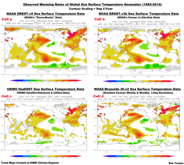
Figure 2
Datasets included:
- NOAA ERSST.v4 (NOAA’s recently introduced “pause buster” data, infilled, in situ only, adjusted for ship-buoy biases), Cell a
- NOAA ERSST.v3b (NOAA’s former dataset, infilled, in situ only, not adjusted for ship-buoy biases), Cell b
- UKMO HADISST (UKMO’s interpolated/infilled product, satellite-enhanced, not adjusted for ship-buoy biases), Cell c
- NOAA Optimum Interpolation/Reynolds OI.v2 – “Original” (NOAA’s original satellite-enhanced data, 1-deg resolution, infilled, presented weekly and monthly, not adjusted for ship-buoy biases), Cell d
Notes: The notation “in situ only” means the dataset includes only observations from ships (buckets and ship inlets) and from buoys (moored and drifting). The “satellite-enhanced” datasets also include in situ observations and the satellite-based data are also bias adjusted with the in situ data. “Infilled” means that data suppliers use statistical devices to create data for ocean grids without observations. [End notes.]
TRENDS ON A ZONAL-MEAN (LATITUDE-AVERAGE) BASIS
Another way to illustrate how poorly models simulate the warming and cooling rates of ocean surfaces is using graphs that show the 1982-2015 trends on a latitude-average basis. And we’ll return to the original (weekly, monthly) 1-deg resolution version of NOAA’s Reynolds OI.v2 sea surface temperature data for these graphs.
Figures 3 through 7 are model-data trend (warming and cooling rate) comparisons of sea surface temperatures for the global oceans and for the Pacific, Atlantic, and Indian Oceans. But they aren’t time-series graphs. The horizontal (x) axis is latitude. The South Pole (“-90”) is to the left, the equator (“0” latitude) is center, and the North Pole (“90”) is to the right. The units of the vertical (y) axis are degrees C per decade—based on the calculated linear trends. Each data point represents the linear trend (warming or cooling rate) in degrees C per decade for a 5-degree latitude band. For example, the data point at -82.5 (82.5S) latitude represents the linear trend of the high latitudes of the Southern Ocean surrounding Antarctica (85S-80S). The data points representing the trends then work northward (left to right) in 5-degree increments through each of the ocean basins (80S-75S, then 75S-70S, then 70S-65S, and so on) using the longitudes for each ocean basin. The average temperatures of latitude bands are called the “zonal mean” temperatures by climate scientists; thus the use of that term in the title blocks.
I’ve highlighted zero deg C/decade on the trend graphs. Above zero deg C/decade, the trends are positive, indicating warming ocean surfaces, and below zero deg C/decade, the trends are negative, indicating cooling. The greater the positive (negative) values, the faster the ocean surfaces have warmed (cooled) at those latitudes for 1982 to 2015.
Figure 3 presents the modeled and observed warming and cooling rates of the global oceans on a latitude-average (zonal-means) basis. For the period of 1982-2015, the climate models underestimate the observed warming at high latitudes of the Northern Hemisphere, but they overestimate the warming in the tropics and in the mid-to-high latitudes of the Southern Hemisphere. And the models do not capture the cooling of ocean surfaces at the high latitudes of the Southern Hemisphere. There should be little wonder why models cannot simulate sea ice losses in the Arctic Ocean and sea ice gains in the Southern Ocean surrounding Antarctica.

Figure 3
Figure 4 shows the observed and modeled sea surface temperature trends for the Pacific Ocean (longitudes of 125E-90W) on a zonal-mean basis. At and just south of the equator in the Pacific, sea surfaces show almost no warming since January 1982. And the highest observed warming occurred at the mid-latitudes of the North and South Pacific. The models, unfortunately, do not create that spatial pattern. The models show much more warming in the tropics than observed. The models also overestimate the warming at the high latitudes of the North Pacific, and they show warming in the Pacific portion of the Southern Ocean, while the observations show cooling there over the past 34 years.

Figure 4
Figure 5 shows the modeled and observed trends in sea surface temperature anomalies for the Atlantic Ocean (longitudes 70W-20E) from Jan 1982 to December 2015. The models overestimate the warming in the South Atlantic and underestimate it North Atlantic, especially toward the high latitudes. In fact, the models show just about the same warming trends from 40S to 70N—that is, the models show the Atlantic Ocean should have warmed at about 0.15 to 0.2 deg C/decade for the last 34 years for the latitudes of 40S to 70N—while the observed trends vary greatly over those latitudes. Again, how can the climate scientists/modelers hope to create the warming and precipitation patterns on adjoining land masses when they can’t simulate the warming pattern of the surface of the Atlantic?

Figure 5
The last of the trend graphs on a zonal-mean basis is for the Indian Ocean, Figure 6. The models, basically, show way too much warming at most latitudes. As a result, the same problem problems exist in the models for the warming and precipitation patterns on land masses adjacent to the Indian Ocean.

Figure 6
Figure 7 includes two comparisons. The top graph includes the model-simulated trends for the period of 1982 to 2015, on a zonal-mean basis, for the Atlantic, Indian and Pacific basins, and the bottom graph includes the observed trends for those ocean basins.

Figure 7
The modelers apparently believe the ocean basins should show similar warming rates as we progress from the Southern Ocean toward the high latitudes of the Northern Hemisphere. But, because there are different well-known coupled ocean-atmosphere processes taking place in the ocean basins in the real world (like the Atlantic Multidecadal Oscillation in the North Atlantic, like El Niño-Southern Oscillation or ENSO in the Pacific), the observed warming rates show few similarities north of the mid-latitudes of the Southern Hemisphere.
PART 2
The next post in this series will present time-series graphs of the model simulations of sea surface temperatures and data in absolute form (not anomalies) for 1982 to 2015, the satellite era of sea surface temperature data. For a preview, refer to last year’s post here.
ADDITIONAL READING
This post presented evidence that the climate models that serve as the foundation for the hypothesis of human-induced global warming are flawed…fatally flawed. You can find much more evidence of climate-model flaws in my free ebook On Global Warming and the Illusion of Control (25MB, .pdf).
CLOSING
The differences between modeled and observed warming and cooling rates of the surfaces of the global oceans strongly suggest two things: (1) that ocean circulation processes in climate models are flawed and (2) that the sensitivity of climate models to carbon dioxide and other forcings is too high.
The spatial patterns of the warming of the ocean surfaces dictate the spatial patterns of warming of the surface air over land, and those patterns of ocean warming and cooling contribute to the precipitation patterns on the continents. Because the climate models cannot simulate the spatial patterns of the warming of sea surfaces, one wonders how the modelers could hope to properly simulate the warming of land surface air or the precipitation that occurs there.
For almost two decades, the IPCC has claimed that they have found the “fingerprints” of human-induced global warming. Because they’re using climate models as the basis for those claims, it looks like they need a new method of fingerprint analysis. There are no similarities between the modeled and observed fingerprints shown in this post.
SOURCE
The maps, data and climate-model outputs presented in this post are available through the KNMI Climate Explorer.
Land based weather(and therefore surface temperatures) is driven by ocean surface temps, which alter the path of the jet stream, which controls both the storm path, and the dividing line between warm tropical air, and polar air. This winter is an example of this effect, In this case by the El Nino. This explains most if not all of the surface temperature record labeled as “global warming “.
Good post Bob.
Since you mention jet streams:
http://joannenova.com.au/2015/01/is-the-sun-driving-ozone-and-changing-the-climate/
The ocean oscillations alter jet stream tracks from below.
Solar effects in the stratosphere and mesosphere alter jet stream tracks from above.
The interplay between the two leads to latitudinal climate zone shifting and changes in the amount of solar energy entering the oceans.
The meridonal flow also effect the ratio of tropical to polar air masses, in NE Ohio it makes a 15F or so swing in temperatures. So just a change in the location of the continental meridonal flow would alter the average surface temperature, and long term movements, such as from the ocean decadal cycles, could just shift the base line average temp.
Steven Wilde –
“Since you mention jet streams” I have a friend that is a “sw listener” that told me what he believes to be a excertive use by jets to change, calibrate, or seed our atmosphere, but have put it away as “kookery”
I have recently observed those strange circular jetstreams here in Texas. While on our way back from breakfast a couple of weeks ago, my friend and I saw them really high in the sky. My comment was (it looks like crop circles in the sky or at least a very well timed computer model. They only appeared in a patch of sky between Utopia and Kerrville. We stopped to see the jet making them ,but none was visable. The trails were very skinny and the diameter of the circles were perfect, overlapping each other within a larger circle. They were not wind-blown, and since the jet was long gone to the west, the circles had been there a long time before we saw them. So they must have been in a layer that was very cold and calm.
Personally, I believe it is our Air Force at work calibrating their newest satelites to monitor AGC. That means for sure it is not dangerous. sic/
Lee, jet streams are not contrails 🙂
Stephen-
I know that. The word c-trails seem to attract responses. That is why I used “jetstreams” instead. Sorry to be off topic.
Problem with models is that they grossly underestimate effect of solar activity. Sun was warming and cooling Earth’s oceans for a billion or three of years, so it didn’t stop in 1950.
Solar activity is heading for downturn, thus climate reached a plateau (or pause) and cooling is on the cards, UK Met Office is starting to realise the fact, as it is pointed on the other thread.
So what sun might do in the next 50 years?
http://www.vukcevic.talktalk.net/SSN-O&N.gif
So the red line correlates with something? And you say how many free parameters you used?
You post these graph once a while and I’ve understood what’s the point in them.
*never* understood. Sorry.
It’s “wiggle-matching,” Hugs. Vuk’s curiosity at work. Interesting, but not very meaningful without a hypothetical physical cause. It’s science at the lowest level, looking for possible relationships. Extrapolation is always shaky. Extrapolation based on wiggle-matching, even more so. Not worth anyone getting his knickers in a twist over.
just two variables (derived from solar system orbital constants), ‘1941’ is a phase timing constant (essential for plotting harmonic osculations) and ’60’ amplitude normalising constant so that variables can be plotted in the same graph. Point of graph is to show that major cooling in early 1800s and 1900s may be repeated in the next 2-3 decades. As I said above “Problem with models is that they grossly underestimate effect of solar activity”, there are of course other factors, which may add or reduce and delay onset of a rise or the fall in the global temperatures .It is your choose how to approach the subject, consider or totally ignore it.
your choice
Brian
A bit of sloppy editing from ‘you can choose …’ to ‘it is your choice…’ and hit ‘post comment’ too soon.
I agree with your premise that models underestimate solar activity. But what is the significance of your formula? Is there a fundamental process at work likely to repeat with the same period and amplitude during the next time period?
Sunspots are visually observed consequence of sun’s magnetic activity driven by solar dynamo.
I can do no better than quote the recent NASA statement:
“We’re not sure exactly where in the sun the magnetic field is created,” said Dean Pesnell, a space scientist at NASA’s Goddard Space Flight Center in Greenbelt, Maryland. “It could be close to the solar surface or deep inside the sun – or over a wide range of depths.” , basically they don’t know what drives solar cycles and regulates the amplitude.
In 2003 (looking at my daughter’s homework, something to do with the sun) I realize there is some kind of cross-modulation taking place and worked out couple of equations based on numbers explained above.
Since than I am happy to report that my daughter had graduated from University of Oxford, and for the last three or four years is working for well known company, the world’s leader in its field. If it wasn’t for her homework, you would never hear of me or my graphs, but to dismay of some readers I am still at it.
Or should I have said: ‘by Jove, how could I know’
Human sight is designed to see patterns in our surroundings, e.g., human shapes in the shrubbery around us. There’s a tendency to see patterns where they don’t exist. This is a survival mechanism, it being safer to imagine you see a tiger when there isn’t one, than to not recognize a tiger when there is one. Vuk observed an envelope pattern. I see the pattern; it’s two humps. Is it a camel? Or a tiger? A snake? Or two wombats? It’s too soon to say. It’s interesting, though. Especially the first time. Not as much, now. But Vuk’s okay.
Vuc, that is nonsense and you know it. They have lots of good information about what drives the solar cycle and regulates the amplitude. The details need to be worked out. But the basic premise is known.
Pamela,
” They have lots of good information about what drives the solar cycle and regulates the amplitude.”
Don’t you mean what they currently believe drives the solar cycle and regulates the amplitude? You’re not claiming this is “settled science” are you?
“We’re not sure exactly where in the sun the magnetic field is created”
said Dean Pesnell while the boss Dr. Hathaway murmured into his beard: “Zeus gave Helios monopoly of celestial light”
8/01/2004, SC24 peaks in 2014, there is something about validation of prediction, but by Jove, how could I know? Go ask the experts.
Another good post, thanks Bob.
conclusion, models wrong, observation correct..
Bob Tisdale:
Thankyou for another of your excellent analyses.
It seems there has been no significant improvement in model performance since 1999. Your analysis states
That statement concurs with my report of the Hadley Centre model which I published in 1999; i.e. I then reported that model showed “the greatest warming near the equator and at mid-latitudes of the Northern Hemisphere, while in the real world, the greatest warming has occurred at mid and high latitudes, with little warming for much of the eastern Pacific Ocean. The models show warming at the high latitudes of the Southern Hemisphere, where the data show cooling.”
Importantly, the papers by me and by Kiehl explain WHY “climate models are not simulating Earth’s climate as it exists”; i.e. each climate model emulates a different climate system. Hence, at most only one of them emulates the climate system of the real Earth because there is only one Earth. And the fact that they each ‘run hot’ unless fiddled by use of a completely arbitrary ‘aerosol cooling’ strongly suggests that none of them emulates the climate system of the real Earth.
For the benefit of any who have not seen the explanation of that, I again post it here.
None of the models – not one of them – could match the change in mean global temperature over the past century if it did not utilise a unique value of assumed cooling from aerosols. So, inputting actual values of the cooling effect (such as the determination by Penner et al.
http://www.pnas.org/content/early/2011/07/25/1018526108.full.pdf?with-ds=yes )
would make every climate model provide a mismatch of the global warming it hindcasts and the observed global warming for the twentieth century.
This mismatch would occur because all the global climate models and energy balance models are known to provide indications which are based on
1.
the assumed degree of forcings resulting from human activity that produce warming
and
2.
the assumed degree of anthropogenic aerosol cooling input to each model as a ‘fiddle factor’ to obtain agreement between past average global temperature and the model’s indications of average global temperature.
Nearly two decades ago I published a peer-reviewed paper that showed the UK’s Hadley Centre general circulation model (GCM) could not model climate and only obtained agreement between past average global temperature and the model’s indications of average global temperature by forcing the agreement with an input of assumed anthropogenic aerosol cooling.
The input of assumed anthropogenic aerosol cooling is needed because the model ‘ran hot’; i.e. it showed an amount and a rate of global warming which were greater than observed over the twentieth century. This failure of the model was compensated by the input of assumed anthropogenic aerosol cooling.
And my paper 1999 demonstrated that the assumption of aerosol effects being responsible for the model’s failure was incorrect.
(ref. Courtney RS An assessment of validation experiments conducted on computer models of global climate using the general circulation model of the UK’s Hadley Centre Energy & Environment, Volume 10, Number 5, pp. 491-502, September 1999).
More recently, in 2007, Kiehle published a paper that assessed 9 GCMs and two energy balance models.
(ref. Kiehl JT,Twentieth century climate model response and climate sensitivity. GRL vol.. 34, L22710, doi:10.1029/2007GL031383, 2007).
Kiehl found the same as my paper except that each model he assessed used a different aerosol ‘fix’ from every other model. This is because they all ‘run hot’ but they each ‘run hot’ to a different degree.
He says in his paper:
And, importantly, Kiehl’s paper says:
And the “magnitude of applied anthropogenic total forcing” is fixed in each model by the input value of aerosol forcing.
Kiehl’s Figure 2 can be seen here.
Please note that the Figure is for 9 GCMs and 2 energy balance models, and its title is:
It shows that
(a) each model uses a different value for “Total anthropogenic forcing” that is in the range 0.80 W/m^2 to 2.02 W/m^2
but
(b) each model is forced to agree with the rate of past warming by using a different value for “Aerosol forcing” that is in the range -1.42 W/m^2 to -0.60 W/m^2.
In other words the models use values of “Total anthropogenic forcing” that differ by a factor of more than 2.5 and they are ‘adjusted’ by using values of assumed “Aerosol forcing” that differ by a factor of 2.4.
So, each climate model emulates a different climate system. Hence, at most only one of them emulates the climate system of the real Earth because there is only one Earth. And the fact that they each ‘run hot’ unless fiddled by use of a completely arbitrary ‘aerosol cooling’ strongly suggests that none of them emulates the climate system of the real Earth.
Richard
Are the aerosol forcings for a particular model of fixed magnitude across the time span of the run (a simple offset), or do they have to bin the aerosol forcings, say from t0 to t1 it’s “x”, from t1 to t2 it’s “y”, etc (a strapping table)?
D. J. Hawkins:
You ask me:
In each model a 2d pattern of aerosol distribution is fed to the model to match estimated aerosol (mostly sulphate) emissions from industrial activity and the removal from the atmosphere of those aerosols by precipitation.
The total magnitude of aerosol cooling is not known but could be anything from slightly negative to large positive; IPCC AR5, Chapter 7, 2013. However, the excess warming which provides the degree of ‘run-hot’ of a model is observed, and the aerosol forcing (in W/m^2) in the model is adjusted to compensate for the excess warming.
Simply, the climate models are exercises in curve matching that ‘make John von Neuman’s elephant wiggle his trunk’.
Richard
Nice comment, Richard.
Blast! That is my second post today that has ‘vanished’.
Mods.. please let me know if it is not in the ‘bin’ so I can resubmit it.
Thanking you in anticipation.
Richard
if you use four or more web links your comment would automatically end in the mod’s bin.
m.v.
How can aerosol cooling be either positive or negative? After volcanic eruptions, temperatures consistently cool. There must be positive aerosols and negative aerosols resulting from different sources. What potential for curve matching!
Posting this here because I think it off topic from D. J. Hawkin’s question which I didn’t understand.
Chic
They are positive or negative according to the needs of the modeller to compensate for overheating from high CO2 sensitivity. When the temperature measurements ‘lie’ and give a low reading, the sulphate cooling is increased to explain why the CO2 didn’t work its charm.
That in a nutshell is Richard SC’s complaint above. It is actually quite simple.
Soon there will be a disturbance in the farce when the issue of Black Carbon (BC) gets more attention. Certain groups are planning to make a big health deal out of BC and one of the excuses to do so will be the huge climate impact the modellers say it has. Traditional modellers have discounted BC as a major forcing saying (repeatedly) that the effect is local and brief, though they agree it is 640 times stronger (or more) than CO2 per kg yatta-yatta-yatta.
But other modellers have other plans. They plan to explain a lot of warming be saying it was the BC wot dunnit. That provides additional problems for the old modellers because if the BC is given far more forcing than admitted, for much longer suspension times and distributed all over the atmosphere (which is confirmed by measurements) they will have to add more and more sulphate cooling to make the BC+CO2 balance at least some of the temperatures, even the fiddled ones.
A fight will develop between the modellers each saying the other’s favourite fairy dust is not working as well as claimed. Because CO2 is obviously not a health issue save through the most arcane claims to ‘break the climate’ and cause storms, the upper hand in the pleading department will go to the promoters of BC. They smell money and position, which is followed by influence and more money. Careers will be built on it. Piffling CO2 is doomed. Black carbon is real, is somehow dangerous (they are still working on how) and if they can turn BC into the new asbestos, just think of the insurance revenues! Like shooting fish in a barrel. All they have to do is push CO2 aside.
Making money is a lot easier than it used to be. You used to have to actually catch snakes and squeeze out the oil. That’s icky!
Bob, very interesting information and analysis. What does the variance between the modeled and observed equatorial sea surfaces imply in terms of heat balance? Is more energy being emitted to space, or moving deeper into the ocean, are clouds limiting incoming solar energy more than anticipated in the models, and/or is thermal energy being shifted primarily northward?
BLISS, you’re asking questions that can’t be answered even by the climate science community due to the limitations of satellite measurement technologies and the unknowns of cloud feedback.
I’ve been looking up science papers on the climate of the geological past. I was floored to see so many of these papers are based on simulations using current General Circulation Models. I didnt know that playing computer games had become a science…
I like your job.
Only the title seems no good, because we actually have an alternative :
either
* “Climate Models Are NOT to be trusted”.
or
* “Climate Models Are INDEED to be trusted”, so we may and must use “reductio ad absurdum”, meaning GHG play minor to no part in climate.
In both case … the title should be something like
“models prove GHG theory to be wrong”
An extremely powerful post Bob.
The mainstream scientific community would have the world turn somersaults on the basis of a hypothetical catastrophe based predominantly on models. IMHO you have irrefutably driven a coach and horses through the credibility of the models with this post.
Many thanks for your tireless efforts, from an inquisitive layman who has been around long enough to learn the value of healthy scepticism.
Sorry Bob, I know it may sound pedantic yet I can’t resist making this comment.
You write: “dictate where and when land surface air temperatures warm and cool”. You mean to say that “the air cools and warms” and as a result the temperatures go down or up.
Yup, Chris, I have a bad habit of writing that temperatures warm or cool. I try to catch it in my proofreading but often miss it.
Bob, most of your graphs comparing observations and models aren’t complete throw-aways. They got the grosser trends right. The trouble with this stuff is that NOAA and friends are in the background jiggering the “observations”. Is there any way to illustrate this? Maybe using satellite observations? I fear they will always be within some half-A55ed ballpark with their models because they keep adjusting the “obs” to match the models.
Gary, I don’t have access to satellite-based air temperature measurements immediately above the ocean surfaces (not lower troposphere temperature data) like those used by John Christy in his recent congressional testimony.
Bob, thanks for all the work you have done to “find” this major flaw in all the models. I am sure that sooner or later, the mechanics of our sun and the interaction it has to our atmosphere will be much clearer. However, I have noticed that when a “truth” is placed in the public arena, it is picked up and reports start showing up on websites that are aimed to discredit anything that can be used to prove their hypothesis’s are false. I am sure that there have many really good researchers just given up for fear that their careers could be destroyed.
We all need to encourage more people (common like me and most of those that follow WUWT) to do their own private study and report observations. After all we are the only thing that can see from the ground level how the sun warms the earth and how quickly it cools each day. Without these observations, daily records mean very little without verifications by us humans…
Proving once and for all that the global average temperature anomaly is a worthless metric. Not only do no physical, chemical, or biological processes depend on it, it covers up the gross mismatch between the data and the models. While the models aren’t so bad that there are polar bears at the equator and alligators at the poles, any number of models can get the anomaly right and the temperature map wrong.
I fully agree with you. Nevertheless, Bob has done a good job. What’s missing: a graph of the difference between the modelled and the measured temperature field (residual) and its standard deviation.
This spacial analysis is very revealing, but I do wonder about applying the average. It would be cool to do a 2d least squares kind of comparison to see if any of the models are getting close to reality, and see what can be inferred from scrutinizing those.
“The next post in this series will present time-series graphs of the model simulations of sea surface temperatures and data in absolute form (not anomalies) for 1982 to 2015, the satellite era of sea surface temperature data. ”
Look forward to this, thanks Bob, this post seems to be getting traction on twitter.
Hi Keith: Gotta link to that discussion on twitter?
Mostly from Roger Pielke Sr, but just search your name.
There are a plethora of models which indicates that a lot of guess work has been involved otherwise only a single model would have been produced. If the models do not reasonably provide what has actually happened then they must be wrong. All work based on such wrong models must be, at the very least, suspect. All published papers that have made use of these wrong models must be withdrawn. Peer reviewers and professional societies should demand it. If these models are evidence of anything it is that there is something wrong with the AGW conjecture.
Bob, a question about SST.
According to NOAA ( http://cpo.noaa.gov/AboutCPO/Glossary.aspx ) SST means “The temperature of the layer of seawater (approximately 0.5 m deep) nearest the atmosphere.”
The surface and half a meter deep might make a difference. Furthermore, our land temperatures are measured at 1.50 m high in the air – no bottom temperatures. How does the temperature of the air at 1.50 m above sea level correspond to the temperature ‘somewhere in between the surface and -0,50 m? Do you know? Think about a warm wind from the tropics flowing over a cold sea current.
And one more question: can you put sea water temperatures and land air temperatures in one and the same model?
Wim Röst, NOAA’s definition of SST in their glossary likely applies to bucket- and buoy-based temperature measurements. It does not apply to ship inlets (which can be much deeper) or satellite-based measurements (which measure the skin temperature).
NOAA uses an outdated climate model to justify their use of marine air temperature as a reference for sea surface temperature. I discussed that in the post here:
https://bobtisdale.wordpress.com/2015/11/30/pause-buster-sst-data-has-noaa-adjusted-away-a-relationship-between-nmat-and-sst-that-the-consensus-of-cmip5-climate-models-indicate-should-exist/
Your final question: “can you put sea water temperatures and land air temperatures in one and the same model?”
Not sure if this addresses your question: By the nature of their design, coupled ocean-atmosphere climate models include a sea surface that varies in temperature and a layer of atmosphere directly above the land and ocean surfaces that also vary in temperature.
Bob, thank you for your answers.
I first wandered whether the SST could have been used to estimate marine air temperatures. So, reversely. Because on land, we use the temperature of the air at 1.50m. Talking about ‘global temperatures’ should imply – I think- that we should be talking about both land air and sea air temperatures at 1.50m when we speak about ‘global surface temperatures’.
Or we should measure bottom temperatures on land and add the sea surface temperatures of the oceans.
When ‘global temperature’ should have risen in a certain period with (let’s say) 0,8 ºC and the surface water temperature in the ocean was only rising with 0.1 ºC and 2/3 of the globe is sea, than land temperatures should have been rising with (3×0,8 = ) 2,4 – 0,1 = 2,3 ºC? I suppose this is not how global temperatures ‘are made’.
Can you give us some more insight in about how global temperatures consisting of both water data and air data are made? Thanks in advance.
Another fine post, Bob. Thank you for all your efforts.
Thanks, Bob, for presenting facts. As you always do.
The remit of the modellers seems to be to make the models look good, not make them accurate.
“climate models are not simulating Earth’s climate as it exists. ”
Gosh! Imagine how shocked and disappointed I am.