Guest essay by Quang M. Nguyen, P.E.

Summary
As suggested monthly by the mainstream media since April 2015, NOAA and NASA officially declared that 2015 surpassed the 2014 record to become the new hottest year on record and that 2016 could be hotter than 2015! The average global temperatures calculated by NOAA and NASA, however, appear to be inaccurate and unreliable for the following reasons:
- According to data on the NOAA website, 1997 was truly the hottest year on record at 62.45 oF. The average global temperature in 2015 was 58.62 oF or 3.83 oF below the 1997 temperature.
- According to data on the NOAA website, the temperatures such as the 20th century average temperature and annual temperature anomalies, which must be fixed, have different values in the annual global analyses.
- NOAA and NASA corrected historical temperature data and fabricated temperature data in areas without temperature record systematically, widely, and uni-directionally to “cool” the past in an attempt to prove the soaring temperature trend.
- NOAA and NASA made efforts to discredit their own satellite data – which is consistent with the balloon data – because it suggests a global warming hiatus since 1998 contradicting with the NOAA and NASA preferred narrative.
- NOAA and NASA refused to give data and information requested by the US House of Representatives Science, Space and Technology committee. There is no reason for them to withhold the data and information, which are public domain, unless they have something to hide.
The headline “last year was the hottest year on record, this year is hotter than last year, and next year could be hotter than this year” is likely to be repeated years after years until funding for climate change is stopped!
INTRODUCTION
As suggested monthly since April 2015 [1-9], the mainstream media today announces that: “It’s official: 2015 was the hottest year on record” [10-13]. This “hot news” was delivered immediately after the National Centers for Environmental Information (NCEI) of the National Oceanic and Atmospheric Administration (NOAA) issued its “Global Analysis – Annual 2015” [14]. According to this 2015 global analysis, “… the average global temperature across land and ocean surface areas for 2015 was 0.90°C (1.62°F) above the 20th century average of 13.9°C (57.0°F), beating the previous record warmth of 2014 by 0.16°C (0.29°F)” to become the hottest year on record. “We’re really looking at a long-term trend, and this is just a symptom of a long-term trend,” and “if 2016 turns out to be as warm as we anticipate, that would be unprecedented in our record book,” said Gavin Schmidt, director of the Goddard Institute for Space Studies (GISS) of the National Aeronautics and Space Administration (NASA) [10,15]. That is not surprised because a report published previously by the British Met Office suggested that “next year [2016] will likely be the warmest on record thanks to El Niño and ongoing climate change” [16].
However, there are evidences indicating that the average global temperatures calculated by NOAA and NASA appear to be inaccurate, unreliable, and especially inconsistent with the satellite temperature data. This paper is an attempt to understand why, for a long time, the average global temperatures calculated by NOAA and NASA have been considered by “skeptical” scientists and meteorologists as a fraud, or diplomatically, unscientific!
UNDENIABLE EVIDENCES
Concerns regarding the accuracy and reliability of the average global temperatures calculated by NOAA and NASA were not given close and thoughtful attention until NASA declared that: “The planet’s temperature departure from the long-term average of 1.04 Celsius in October [2015] is the greatest of any month ever recorded by NASA. It marked the first time a monthly temperature anomaly exceeded 1 degrees Celsius in records dating back to 1880. The previous largest anomaly was 0.97 Celsius from January, 2007.” [17] Since then, many evidences have been discovered and posted on the internet.
Which year was the hottest year on record?
The NOAA’s Global Analysis – Annual 2015 [14] states that, “… the average global temperature across land and ocean surface areas for 2015 was 0.90°C (1.62°F) above the 20th century average of 13.9°C (57.0°F), beating the previous record warmth of 2014 by 0.16°C (0.29°F).” As a result, the average global temperature across land and ocean surface areas for 2015 was 14.8 oC or 58.62 oF. The NOAA’s Global Analysis – Annual 1997 [18] states that, “The global average temperature of 62.45 degrees Fahrenheit for 1997 was the warmest year on record, surpassing the previous record set in 1995 by 0.15 degrees Fahrenheit.”
Based on these NOAA’s global analyses, the average global temperature for 1997, i.e. 16.92 oC or 62.45 oF, was higher than that for 2015, i.e. 14.80 oC or 58.62 oF by 2.12 oC or 3.83 oF. Therefore, 1997 was actually the hottest year on record, surpassing all subsequent years including 2015!
Constant parameters with varying values
A few temperature parameters that must be constants are shown with varying values in the NOAA global analyses. Without close attention, it is difficult to recognize because they are located in individual analyses.
The first parameter that has direct effects on the NOAA assessment is the 20th century average. In the annual global analyses prior to 2010, the 20th century average is shown as 56.9 oF or 13.9 oC (actually, it should be 13.83 oC. Its value is shown as 57.0 oF or 13.9 oC from 2010 to present [19].
Additionally, in the Global Analysis – August 2015 [20], NOAA reported: “The combined average temperature over global land and ocean surfaces for August 2015 was 0.88°C (1.58°F) above the 20th century average of 15.6°C (60.1°F) and the highest August in the 136-year record.” The variation of the value for the 20th century average has not been explained by NOAA or NASA.

Table 1 – Varying values of annual anomalies
The second parameter is the annual anomaly, i.e. the difference between the annual average global temperature and the 20th century average. The value of this parameter, which must be a constant, varies from analyses to analyses. For example, the 2010 anomaly – which is shown as 1.12 oF in the Global Analysis – Annual 2010 – increases to 1.15 oF in the 2011 Analysis and to 1.19 oF in the 2012 and 2013 Analyses, decreases to 1.17 oF in the 2014 Analysis and then increases again in the 2015 Analysis, as shown in Table 1.
Correct and fabricated temperature data
Questions regarding the reliability, accuracy, and adequacy of the temperature data used by NOAA and NASA to calculate the average global temperature were raised by Joseph D’Aleo, the first Director of Meteorology and co-founder of the cable TV Weather Channel, and Anthony Watts, a 25-year broadcast meteorology veteran and currently a meteorologist for KPAY-AM radio and the report published by the Science & Public Policy Institute (SPPI) in 2010 [21].
Following an inclusive assessment of the surface temperature record of Climatic Research Unit (CRU) of the East Anglia University in United Kingdom, NASA’s GISS, and NOAA’s National Climatic Data Center (NCDC), the authors concluded that: “Instrumental temperature data for the pre-satellite era (1850-1980) have been so widely, systematically, and uni-directionally tampered with that it cannot be credibly asserted there has been any significant ‘global warming’ in the 20th century… Global terrestrial temperature data are compromised because more than three quarters of the 6,000 stations that once reported are no longer being used in data trend analyses… In the oceans, data are missing and uncertainties are substantial. Changes in data sets introduced a step warming in 2009.”
The D’Aleo and Watts report encouraged additional assessments by other scientist around the word to scrutinize adjustments or fabrication of temperature data in the NCDC and CRU databases. These additional assessments confirm that NOAA and NASA, systematically and widely, adjusted historic data and fabricated temperature data in areas with no measurements [22-35] to “cool the past” in order to show the increasing global temperature trend as interpreted by NOAA and NASA (See Figure 1).

Figure 1 – NASA “cools” the past to the prove global warming trends [22]
Discredit the satellite data
Since 1978, NOAA has used weather satellites to monitor the temperature of the earth atmospheric. According to a study conducted by NASA in 1990 [36], “while several government and university meteorologists around the world have concluded that average surface temperature have increased significantly in recent years, the report’s author said that their satellite analysis of the upper atmosphere is more accurate, and should be adopted as the standard way to monitor global temperature change.”

Figure 2 – Satellite’s temperature anomalies of the global lower atmosphere [37]

Figure 3 – NASA’s global land-ocean temperature anomalies [38]
Satellite data from 1979 (Figure 2) shows that the temperature of the global lower atmosphere has not risen since 1998, contradicting with the NASA’s soaring trend, as shown in Figure 3. For that reason, NOAA and NASA have made efforts to discredit the temperature data collected by their own satellites.
The first effort was a study conducted by Thomas R. Karl, director of NOAA’s National Centers for Environmental Information (NCEI), and his NOAA colleagues. The study, which was published online in the journal Science [39], concludes that: “Much study has been devoted to the possible causes on an apparent decrease in the upward trend of global surface temperature since 1998, a phenomenon that has been dubbed the global warming ‘hiatus.’ Here, we present an updated global surface temperature analysis that reveals that global trends are higher than those reported by the Intergovernmental Panel on Climate Change, especially in recent decades, and that the central estimate for the rate of warming during the first 15 years of the 21st century is at least as great as the last half of the 20th century [Figure 4]. These results do to support the notion of a ‘slowdown’ in the increase of global surface temperature.”

Figure 4 – NOAA’s global temperature trend analyses [Internet]
The second effort was a propaganda video, which was participated by the “famous climate scientists” such as Michael Mann (the author of “The Hockey Stick”), Kevin Trenberth (admitting that “it’s a travesty that we can’t account for the lack of warming at the moment”), and Ben Santer. The video was funded by a climate activist foundation to cast doubt on the satellite data [40]. But this video appears to be a slap in their face because (1) the satellite data is verified by the independent balloon data (Figure 5) while the temperature data calculated by NOAA and NASA is not verified, (2) the use of satellite for monitoring the global temperature changes was recommended by NASA, and (3) Jason-3 – the latest weather satellite launched into orbit – is an international mission in which NOAA is partnering with NASA, the Centre Nationale d’Études Spatiales (CNES), the French Space Agency, and the European Organisation for the Exploitation of Meteorological Satellite (EUMETSAT)) [41].

Figure 5 – Satellite data verified by balloon data [40]
Hide data and methods used for scientific investigations
In July 2015, concerning the scientific integrity of the NOAA study to prove “no pause in global warming,” Rep. Lamar Smith (R-Texas), the US House of Representatives Science, Space and Technology committee Chairman, asked NOAA for both data and documents related to the study. Although Rep. Smith request was legitimate and the requested information is public domain, NOAA refused to give the committee the requested dada and information because “it is a long-standing practice in the scientific community to protect the confidentiality of deliberative scientific discussions” [42]. Why did NOAA refuse the request? “There is absolutely no reason for the NOAA to withhold their information unless they have something to hide. And as a federal agency it is their obligation to cooperate with Congressional oversight” [42].
NOAA continued to withhold the requested data and information until Judicial Watch filed a lawsuit, on December 2, 2015, seeking the same documents subpoenaed by the House committee. The lawsuit sued the Department of Commerce (DOC) for failing to respond a Freedom of Information Act (FOIA) request because NOAA is a component of the DOC. On December 15, 2015, NOAA began to turn over the requested documents to Congress [43].
The depth of problems in NOAA’s data practices was probably revealed for the first time in 2007 when climatologist Roger Pielke and meteorologist Anthony Watts found serious problems with the US surface temperature monitoring network, which was administered by the National Climatic Data Center (NCDC), a branch of the NOAA. They made an effort to validate this network, but “the NCDC removed all website access to station site locations, citing ‘privacy concerns.’ Without this data (which had been public for years), the validation effort was blocked” [44].
CONCLUSIONS
As repeated frequently by the mainstream media since April 2015, NOAA and NASA officially declared that 2015 was hotter than 2014, the old hottest year on record and “promised” that 2016 could be hotter than 2015! However, the are undeniable evidences indicating that the average global temperatures calculated by NOAA and NASA appear to be inaccurate, unreliable and inconsistent with the satellite data.
According to data on the NOAA website, 1997 was truly the hottest year on record at 62.45 oF. The average global temperature in 2015 was 58.62 oF or 3.83 oF below the 1997 temperature.
According to data on the NOAA website, the parameters such as the 20th century average temperature and the annual temperature anomalies, which must be constants, have varying values in the annual global analyses.
NOAA and NASA corrected historical temperature data and fabricated temperature data in areas without temperature record systematically, widely, and uni-directionally to “cool” the past in an attempt to prove the soaring temperature trend.
NOAA and NASA made efforts to discredit their own satellite data – which is consistent with the balloon data – because it suggests a global warming hiatus since 1998 contradicting with the NOAA and NASA preferred narrative.
NOAA and NASA refused to give data and information requested by the US House of Representatives Science, Space and Technology committee. There is no reason for them to withhold the data and information, which are public domain, unless they have something to hide.
The headline “last year was the hottest year on record, this year is hotter than last year, and next year could be hotter than this year” is likely to be repeated years after years by the mainstream media until funding for climate change is stopped!
REFERENCES
[1] Andrea Thompson. April 17, 2015. “2015 Hottest Year to Date, Could Top 2014 Record.” Climate Central. http://www.climatecentral.org/news/2015-hottest-year-to-date-18895
[2] Jay Michaelson. May 16, 2015. “2015 Is the Hottest Year On Record.” The Daily Beast. http://www.thedailybeast.com/articles/2015/05/16/2015-is-the-hottest-year-on-record.html
[3] Jon Edrman. Jun 18, 2015. “2015 Still On Pace as Hottest Year On Record.” The Weather Channel. http://www.weather.com/news/climate/news/earth-warmest-january-may-2015
[4] Brian Clark Howard. July 24, 2015. “See Why 2015 May Be the Hottest Year Ever.” National Geographic. http://news.nationalgeographic.com/2015/07/071524-this-year-may-be-hottest-ever/
[5] Andrea Thompson. August 20, 2015. “2015 May Just Be Hottest Year on record.” Scientific American. http://www.scientificamerican.com/article/2015-may-just-be-hottest-year-on-record/
[6] Adam Vaughan. September 17, 2015. “US science agency says 2015 is 97% likely to be the hottest year on record.” The Guardian. http://www.theguardian.com/us-news/2015/sep/17/2015-hottest-year-on-record-noaa
[7] Justin Gillis. October 21, 2015. “2015 Likely to Be Hottest Year Ever Recorded.” The New York Times. http://www.nytimes.com/2015/10/22/science/2015-likely-to-be-hottest-year-ever-recorded.html?_r=0
[8] WMO. 25 November 2015. “WMO: 2015 likely to be Warmest on Record, 2011-2015 Warmest Five Year Period.” WMO. https://www.wmo.int/media/content/wmo-2015-likely-be-warmest-record-2011-2015-warmest-five-year-period
[9] Tom Randall. December 17, 2015. « A White-Hot Christmas Wraps Up Earth’s Hottest Year on Record.” Bloomberg Business. http://www.bloomberg.com/news/features/2015-12-17/a-white-hot-christmas-wraps-up-earth-s-hottest-year-on-record
[10] Jason Plautz. January 20, 2016. “It’s Official: 2015 Was Hottest Year on Record.” National Journal. http://www.nationaljournal.com/s/399249/its-official-2015-was-hottest-year-record?mref=scroll
[11] Brandon Miller. January 20, 2016. “2015 is warmest year on record, NOAA and NASA say.” CNN. http://www.cnn.com/2016/01/20/us/noaa-2015-warmest-year/
[12] Alyssa Newcomb. January 20, 2016. “Earth Had Its Hottest Year on Record in 2015, Says NASA, NOAA.” ABC News. http://abcnews.go.com/Technology/earth-hottest-year-record-2015-nasa-noaa/story?id=36400929
[13] Justin Gillis. January 20, 2016. “2015 Was Hottest Year in Historical Record, Scientists Say.” The New York Times. http://www.nytimes.com/2016/01/21/science/earth/2015-hottest-year-global-warming.html
[14] National Centers for Environmental Information. Retrieved January 20, 2016. “Global Analysis – Annual 2015.” NOAA. http://www.ncdc.noaa.gov/sotc/global/201513
[15] Deborah Netburn. January 20, 2016. “2015 was the hottest year on record, and the forecast for 2016 is warmer yet.” The Los Angeles Times. http://www.latimes.com/science/sciencenow/la-sci-sn-2015-hottest-year-20160119-story.html
[16] Justin Worland. December 17, 2015. “2016 Expected to Be the Warmest Year on record, Report Says.” Time. http://time.com/4154331/warmest-year-2016-climate-change-el-nino/
[17] Jason Samenow. November 17, 2015. “Record-crushing October keeps Earth on track for hottest year in 2015.” The Washington Post. https://www.washingtonpost.com/news/capital-weather-gang/wp/2015/11/17/record-crushing-october-keeps-earth-on-track-for-hottest-year-in-2015/
[18] NOAA National Climatic Data Center, State of the Climate: Global Analysis for Annual 1997, published online January 1998, retrieved on May 4, 2015 from http://www.ncdc.noaa.gov/sotc/global/199713
[19] National Centers for Environmental Information. “State of the Climate: Global Analysis.” NOAA. http://www.ncdc.noaa.gov/sotc
[20] NOAA National Centers for Environmental Information, State of the Climate: Global Analysis for August 2015, published online September 2015, retrieved on January 22, 2016. http://www.ncdc.noaa.gov/sotc/global/201508
[21] Joseph D’Aleo and Anthony Watts. August 27, 2010. Surface Temperature Records: Policy-Driven Deception? Science & Public Policy Institute.http://scienceandpublicpolicy.org/images/stories/papers/originals/surface_temp.pdf
[22] Paul Homewood. January 29, 2015. “Temperature Adjustments Around the World.” Not A Lot of People Know That. https://notalotofpeopleknowthat.wordpress.com/2015/01/29/temperature-adjustments-around-the-world/
[23] Christopher Booker. February 7, 2015. “The fiddling with temperature data is the biggest science scandal ever.” The Telegraph. http://www.telegraph.co.uk/news/earth/environment/globalwarming/11395516/The-fiddling-with-temperature-data-is-the-biggest-science-scandal-ever.html
[24] Selwyn Duke. February 9, 2015. “Global Conning: temperature Data Cooked in ‘Biggest Science Scandal Ever’.” The New American. http://www.thenewamerican.com/usnews/item/20081-global-conning-temperature-data-cooked-in-biggest-science-scandal-ever?utm_source=Newsletter&utm_campaign=d162567509-The_Editors_Top_Picks_3_12_143_12_2014&utm_medium=email&utm_term=0_8ca494f2d2-d162567509-289802733
[25] James Delingpole. February 7, 2015. “’Breathtaking’ Adjustments to Arctic Temperature Record. Is There Any ‘Global Warming’ We Can Trust?” Breitbart. http://www.breitbart.com/london/2015/02/07/breathtaking-adjustments-to-arctic-temperature-record-is-there-any-global-warming-we-can-trust/
[26] John Hinderaker. May 5, 2015. “NOAA Caught Rewriting US Temperature History (Again).” Powerline. http://www.powerlineblog.com/archives/2015/05/noaa-caught-rewriting-us-temperature-history-again.php
[27] Paul Homewood. July 20, 2015. “NOAA Tampering Exposed.” Not A Lot of People Know That. https://notalotofpeopleknowthat.wordpress.com/2015/07/20/noaa-tampering-exposed/
[28] John Hinderaker. September 27, 2015. “Almost All US Temperature Data used in Global Warming Models Is Estimated or Altered.” Powerline. http://www.powerlineblog.com/archives/2015/09/almost-all-us-temperature-data-used-in-global-warming-models-is-estimated-or-altered.php
[29] John Goetz. September 27, 2015. “Approximately 92% (or 99%) of USHCN surface temperature data consists of estimated values.” Watts Up With That. http://wattsupwiththat.com/2015/09/27/approximately-92-or-99-of-ushcn-surface-temperature-data-consists-of-estimated-values/
[30] Larry Bell. November 17, 2015. “Data Tweaking heats up climate hype.” CFACT. http://www.cfact.org/2015/11/17/data-tweaking-heats-up-climate-hype/
[31] Tony Heller. November 19, 2015. “Record Crushing Fraud From NOAA And NASA Ahead of Paris.” The Real Climate Science. http://realclimatescience.com/2015/11/record-crushing-fraud-from-noaa-and-nasa-ahead-of-paris/
[32] Judith Curry. November 5, 2015. “Is the government tinkering with global warming data?” Fox News. http://www.foxnews.com/opinion/2015/11/05/is-government-tinkering-with-global-warming-data.html
[33] Paul Homewood. November 21, 2015. “NOAA’s Fabricated ‘Record Temperatures’.” Not A Lot People Know That. https://notalotofpeopleknowthat.wordpress.com/2015/11/21/noaas-fabricated-record-temperatures/
[34] P Gosselin. November 20, 2015. “’Massive Altered’… German Professor Examines NASA GISS Temperature Datasets.” NoTricksZone. http://notrickszone.com/2015/11/20/german-professor-examines-nasa-giss-temperature-datasets-finds-they-have-been-massively-altered/#sthash.lEDY4hkl.TeBUOeAB.dpbs
[35] Steven Goddard. November 22, 2015. “NOAA Data Tampering – Much Worse Than It Seems.” Real Science. https://stevengoddard.wordpress.com/2015/11/22/noaa-data-tampering-much-worse-than-it-seems/
[36] Steven Goddard. January 7, 2014. “NASA 1990: No Global Warming – Surface Temperature Record Should Be Replaced by More Accurate Satellites.” Real Science. https://stevengoddard.wordpress.com/2014/01/07/nasa-1990-no-global-warming-surface-temperature-record-should-be-replaced-by-more-accurate-satellites/
[37] Barbara Hollingsworth. January 21, 2016. “NASA/NOAA: 2015 ‘Warmest Year on Record’ – Except Earth’s Lower Atmosphere.” CNSNews. http://www.cnsnews.com/news/article/barbara-hollingsworth/nasanoaa-2015-warmest-year-record-except-earths-lower-atmosphere
[38] Goddard Institute for Space Studies. Retrieved on January 23, 2016. “GISS Surface temperature Analysis.” NOAA. http://data.giss.nasa.gov/gistemp/graphs_v3/
[39] Thomas R. Karl, et al. June 26, 2015. ”Possible artifacts of data biases in the recent global surface warming hiatus.” Science, Vol. 348, Issue 6242. http://science.sciencemag.org/content/sci/348/6242/1469.full.pdf
[40] Ronald Bailey. January 15, 2016. “Global Temperature Trend Propaganda Video: Who Needs Pier Review?” Reason.com. http://reason.com/blog/2016/01/15/global-temperature-trend-propaganda-vide
[41] Satellite and Information Service. January 17, 2016. “Jason-3 Officially Reaches Orbit!” NOAA. http://www.nesdis.noaa.gov/jason-3/
[42] Jeff Dunetz. October 28, 2015. “Why Is NOAA Hiding its Climate Data from Congress?” The Lid. http://lidblog.com/why-is-noaa-hiding-its-climate-data-from-congress/#
[43] Judicial Watch. December 22, 2015. “Judicial Watch Sues for Documents Withheld From Congress in New Climate Data Scandal.” Judicial Watch. http://www.judicialwatch.org/press-room/press-releases/judicial-watch-sues-for-documents-withheld-from-congress-in-new-climate-data-scandal/
[44] Michael Asher. August 7, 2007. “New Scandal Erupts over NOAA Climate Data.” Daily Tech. http://www.dailytech.com/New+Scandal+Erupts+over+NOAA+Climate+Data/article8347.htm
Not here (CET), the last 10 years are all over the place
2005 10.48
2006 10.87
2007 10.5
2008 9.97
2009 10.14
2010 8.86
2011 10.72
2012 9.72
2013 9.61
2014 10.95
2015 10.31
They are the adjusted temps. No better than NOAA NASA Giss
Met office adjusted mainly second decimal place last January, when it was pointed to them (by myself) how to correctly calculate annual numbers.
Take a good look at the numbers, 2014 and 2006 were ‘catastrophic 2C’ above 2010, I would expect if the MO ‘cooks’ temperatures it would have ‘warmed-up’ 2010.
For about 4-5 years now I’ve kept an eye on their monthly numbers and have not noticed any major changes as the year goes along to boost the final annual number.
Don’t think much of their medium and long range forecasts, but I think you might be a bit unfair in comparing MO’s CET to the NOAA and GISS artistry.
Yeah, adjusted like this:
Of course, NOAA has perfected time travel and they can go back with modern instruments and measure past temperature ever so much more accurately than the folks who had the thermometers in front of their noses…
not down here either (Australia)
2005 0.645
1998 0.641
2013 0.613
2002 0.595
2009 0.515
2014 0.459
2007 0.428
2004 0.387
2006 0.364
2003 0.347
2015 0.185
And for the Antarctic… 35th out of the last 37 years
Is you ask the question “What is the warmest consecutive 12 month period”, you get different results.
With the speed they cool the past the glacies must have grown a lot at that time. Especially when the poles should warm the most, ie. they must have been very cold in the past.
Saying an increase in the average temperature is “hotter” is like saying when you unplug your freezer and let it thaw it gets “hotter” inside. This is such BS, as average temperature means nothing. What is important is what is physically happening. And what is actually happening is summer TMAX is either flat since the 1930s, or, as in Canada, is dropping. What is driving up the average is that winters are becoming less cold. In the 1930s we had long deep cold winters with short hot summers. Today we have shorter milder winters with longer but cooler summers. And this is bad how????
And how much of that “less cold” is increased UHI or any one of a dozen other possibilities? Central heating “leakage” even outwith urban areas as one possible example. Anthropogenic maybe, but nothing to get excited about, unless it might affect next year’s research grant of course!
Newminster
Wash your mouth out!
Nothing – but nothing at all – may be permitted to come between a ‘Climate Researcher’ & her/his/their grant.
Absolutely criminally impossible.
Please fling funds.
Auto – not sure if this is /sarc. Or not. Please fling funds. Please fling funds.
As we know, both satellites had 2015 in third place, well behind 2010 and 1998. However January 2016 is out for UAH6.0beta5 here:
http://www.drroyspencer.com/2016/02/uah-v6-global-temperature-update-for-january-2016-0-54-deg-c/
It shows the warmest January on record at 0.54 C. It happens to be a very interesting coincidence for both RSS and UAH that the January anomaly for 1998 was virtually the same as the 1998 average.
Within the 0.3 C error bar for ENSO, 2015 and 1997 have been the same since May through December. So should the pattern with regards to January hold for 2016, then 2016 could set a new record for UAH by about 0.06 C, however we will have to wait and see.
Maybe. But, it’s just an El Nino blip, not a long term trend.
And, it’s still smaller than the 1998 blip.
“the January anomaly”
I wish that people would stop using the word “anomaly”. That is a term created by warmistas to scare ignorant people. We need a better term, such as “index”. The stock market has used index for so long, most people have even forgotten what it means. It is a very simple description of a comparison to a past reference point without the scary implications that are used to bluff and bully the ignorant into rash and self-destructive actions.
I don’t understand 🙁 If the global temperature isn’t rising, why is the sea level? Where is all that water coming from?
http://climate.nasa.gov/vital-signs/sea-level/
Please, spare me the conspiracy theories about NASA massaging those figures too!
We know you don’t understand. Let me help…
The *claim* is that sea level rise will accelerate. But as your linked graph shows, there is no acceleration.
Conjecture falsified. See how easy that was?
You put up the evidence of a conspiracy. Sea level data is in a folder called “vital-signs”. Only a nut case Gaia believer would be so melodramatic.
At least you named yourself properly.
Further to db’s comment, here is a simple physical experiment that you can perform at home:
1. Take some ice cubes from your freezer and place in a cup.
2. Place cup on kitchen table next to thermometer.
3. Watch ice cubes melt, and fluid level rise, even while thermometer remains at same temperature.
4. Advanced, and optional: Invent conspiracy theory to account for this amazing observation.
Michael Palmer
OK. SO, how many tons of ice are required to melt to account for the 18 year-long “pause” in global average temperature?
See, if the global average temeprature “did rise” from the mid-1970’s until 1997, there represents an increase in the thermal energy of the mass of everything that was heated, right?
So, your choice: All of the atmosphere was heated, all of the land mass + atmosphere was heated, or all of the ocean mass, land mass and atmosphere was heating up between 1976 and 1997 (21 years, for those of you in Rio Linda) but – for some reason VERY LITTLE of the Greenland and Arctic ice was melted between 1976 and 1997; except now that ice IS being melted now and is no longer heating up the atmosphere or land and atmosphere or land and sea and atmosphere and the land and atmosphere records are not going up.
You claim on your “science” site that climate forcing is proportional to CO2 levels.
Thus, the CO2 “forcing” from 1997 through 2016 is much larger than that CO2 forcing between 1976 and 1997.
However, since ALL of that 21 years of heat energy that used to be absorbed by the atmosphere, or land and atmosphere, or sea and land and atmosphere between 1976 and 1997 must now be going into the ice => Melting the ice, causing sea level to rise at the same rate that it was between 1915 and 1945, and causing the same pause that we saw between 1935 and 1950!
RA Cook, you seem to have misunderstood my intention. I was trying to point out to VI that ice may melt continually at constant environmental temperature. I did not mean to present a comprehensive explanation for the world’s climate. Nor does my website contain any information on the effect of CO2 on the climate.
It’s quite simple. The sea level has been rising since the glaciers retreated. It has been going on at a constant rate for millennia.
The threat is that global warming will cause it to accelerate, flooding the world like Noah’s flood unless we impoverish ourselves. It is easily disproved by inspecting the sea level record for the last few hundred years.
Biggest load of BS I’ve ever read.
Where, oh where, oh where, oh WHERE was it even warm?!
Not the two places where I was last summer (east coast and Midwest).
Liars should turn into pillars of fires.
What interested me so far this year is the noticeable warming of the Arctic. Its clear there has been a large movement of air mass between the Arctic and the Mid Latitudes. As shown by the bitter cold in eastern Asia. Its got me wondering if this became a increasing trend over the long term. Could it be a trigger for the climate to slowly move into a ice age?.
A very muddled post. I’ll just pick up on this
“The second parameter is the annual anomaly, i.e. the difference between the annual average global temperature and the 20th century average.”
The error here is somewhat subtle but important. What is shown in table 1 is the annual average anomaly. Anomalies are formed locally, by subtracting some long term mean estimate (eg 20thCen) from each point measure. You must do this before averaging. This is explained by NOAA here and GISS here. Calculating average temperature without anomaly is simply unreliable, as they explain. GISS doesn’t calculate an average global temperature at all; NOAA for some reason occasionally gets suckered into it, despite its advice.
Change the numbers before averaging? Why?
If “Global Warming” is part of the issue (The other part being is or how much is Man causing.), then give a Global Average Temperature. Change the scale on the graph if you like but tell us the Global Temperatures! (Or, just maybe, nobody really knows?)
From the NOAA link:
“Some regions have few temperature measurement stations (e.g., the Sahara Desert) and interpolation must be made over large, data-sparse regions.”
Does anyone know what percentage of the global data sets are actual direct temperature measurements and what percentage are “Interpolated” data points. Is this published anywhere?
Excellent question from a mere mortal. But the models’ output say actual, direct (and well-sited) temperature measurements don’t matter.
The global data sets, like GHCN-M and ISTI, are monthly averages of actual measurements at named stations. GHCN also publishes a homogenised version. Interpolation is part of the actual global averaging – after anomaly calculation.
What’s the point if its not meant to be an accurate estimate of what the difference between that years average and the base periods average temperature was?
The author is merely pointing out how the calculations aren’t a simple average of thermometer readings and somehow, after a multitude of minor corrections, the activist-minded researchers get the result that they wanted to get – early 20th C anomalies just lowered by a constant, 1950-70 cooling erased, late 20thC warming rate increased to look exceptional compared to the early 20thC warming and the 21stC pause erased.
There is no doubt that the thermometer record is such a dog’s breakfast that simply averaging all the temperatures would not give you anything meaningful (as it would if there were no changes to stations or surroundings and that were evenly spread around the globe). Using anomalies is to avoid a bias from having more stations in colder or warmer regions in more recent years, something that would have been done by NOAA in its calculation of the global average temperature. That they come out different shows how off either or both could be.
Please note that, in this day of political correctness, that “dog’s breakfast” re-emerges as something that can be picked up by its clean end. 😉
This is exactly right. Even for NOAA, the 20th century baseline average actual global temperature is based on the comprehensive Jones, et. al study in 1999. While they get suckered into posting the global absolute average temp estimate, they base it on anomalies against the Jones study, not on brand new calculations of absolute global average temp. The anomalies are where the significantly greater accuracy is. The whole 1997 nonsense was based on some other largely irrelevant absolute global average temperature estimate in addition to having a completely different baseline period.
“You were saying?”
NOAA was saying:
“Using reference values computed on smaller [more local] scales over the same time period establishes a baseline from which anomalies are calculated. This effectively normalizes the data so they can be compared and combined to more accurately represent temperature patterns with respect to what is normal for different places within a region.
For these reasons, large-area summaries incorporate anomalies, not the temperature itself. Anomalies more accurately describe climate variability over larger areas than absolute temperatures do, and they give a frame of reference that allows more meaningful comparisons between locations and more accurate calculations of temperature trends.”
And yes, the average anomaly provides a big picture overview.
But why do it this way at all? Average global temperature is a meaningless metric. It can tell you nothing
about the climate that wouldn’t be bleedingly obvious by any other method. It allows enormous room for fiddling the books because it is a very poor choice of tool. It is therefore, IMHO a political construct pure and simple!
‘Averaging’ is blurring information in any rational world. You lose signal by smearing it you don’t gain it.
It is the detail in any system that really matters. The actual temperature gradients and strengths are vital to understanding real dynamics. But yet, climate science insists on losing the detail by smoothing it into a meaningless mashup of dodgy baselines and anomalies.
We are happy to use proxies from single locations to look deep into the past and right or wrong, some proxies like trees and ice cores are almost the gold standard for climate fact! If I really wanted to know what was happening, I would start treating weather station records as preciously as we now treat proxies.
I would look at the absolute temperature of a small number of high quality stations with great spatial separation, varying in altitude, latitude and landform type and I would ignore the ocean and the upper atmosphere. The question I would then ask is, is there anything happening at all!! Is there any long or short term trend and in what direction (Daily, seasonaly and annually). Are alpine, valley, plain or seaside location etc showing any common or individual changes (With reference only to temporality and absolute temperature).
This is what really matters to human beings whose lives will be deeply affected by any resulting policy. It is meaningless for agencies to bleat on an on about the deeply absurdist notion of global average temperature, predicated as it is, on the use of dubious baselines and averaging; anomalies or otherwise.
We have several fine examples in Australia and New Zealand of high quality long term station records. Even those that show cooling have been dicked with (‘Homogenised’), to show a warming by smearing them across hundreds of miles and across different climate zones.
The silliness is obvious when the current paradigm is viewed without the distorted lens of globalism.
they have really blown it now. having forecast 2016 to be even warmer, we are all guaranteed to be freezing our arses off. we have had another mild scottish winter so far, though far more days with temps below zero and snow at sea level than the last two years. looking at the rapid cooling of the north east atlantic it may well be the last mild winter we have for a while. note the climate science term “may well” . i am a slow learner, but getting there 😉 .
Well done, have a cookie! Lol
But note that massive cooling “is not inconsistent with” global warming caused by man made CO2 emissions.
In fact, nothing is.
this is to do with something about measurement. and I know calibration is such a difficult thing to understand.
But my question is about humans comprehension.
question:
do you think that the machines that we make sense all the things that are outside human sensing or do you think we cannot make a machine to sense all and everything because we cannot comprehend what we have not measured ?
How can they compare the global temperatures of today with temperatures of 50, 100 and 150 years ago? Climate scientists can, at best, only guess the temperatures over the ocean before the age of satellites.
They are comparing apples with orange. — the first sin of statistics.
The average temperature gets warmer for a few hundred years,
then it gets cooler for a few hundred years.
That’s what ice cores tell us.
There’s been a warming trend since the 1700s.
All real time average temperature measurements are during that warming trend.
So, based on common sense, we should EXPECT to see new highs until that warming trend stops and a new cooling trend begins.
Whether our planet is warming or cooling depends mainly on the start and end points of the measurements (or estimates).
We are cooling compared to when our planet was first formed.
We are warming since the peak glaciation about 15,000 to 20,000 years ago.
We were warming from 1976 to 1998 … then cooling since 1998 (since there have been no years hotter than 1998 so far, based on satellite data, which at least is global, unlike surface data)
The leftists are so busy “adjusting” data, they have focused skeptics attention on meaningless arguments about tenths of a degree Centigrade.
None of this infighting matters.
It was cool from 1300 through the 1700s.
We should all be thrilled about the slight warming since then … and want more warming.
Since no reputable scientist has ever found CO2 to be the “climate controller” before 1975, it’s nearly impossible that natural causes of climate change suddenly stopped in 1975 and then by some miracle, CO2 took over the job as “climate controller”. Didn’t happen.
Climate blog for non-scientists:
No ads
No money for me.
A public service.
http://www.elOnionBloggle.blogspot.com
Hi Richard.
Your blog is a great resource, keep on peeling them there Onions, good work.
Thank You
Many of the articles here are too complicated for people who are not scientists,
or not concisely written with an “executive summary” for people with little spare time.
.
The “warmunists” keep it simple.
Too many skeptics do not.
Climate scientists from NASA using common core math say we can determine which year was hotter by a coin toss. Head’s 2015 was warmer, tail’s 1997 was cooler.
Well it works just fine in the Iowa Caucus.
NOAA and NASA corrected historical temperature data and fabricated temperature data in areas without temperature record systematically, widely, and uni-directionally to “cool” the past in an attempt to prove the soaring temperature trend.
So clearly this author believes there is a con spiracy to mislead the public. I wonder how many other readers of this blog also believe there is a con spiracy to fabricate data and mislead the public? Do people also think that the Japanese and the British are in on this worldwide con spiracy?
The Climategate emails revealed the conspiracy in the scientists own words. How could you not believe it? The emails were genuine, no one, including the authors denied that they weren’t. It’s not a conspiracy theory, it’s a conspiracy fact. Jones, Hansen, Trenbryth (sp?), Mann and other “leading” climate scientists conspired to promote global warming despite the fact they knew it wasn’t. The term the coined for this con was “the cause”.
+1
Good question, Mr. Nelson. Mr. David Sanger regularly appears here to defend NOAA’s data manufacturing division. His loaded question is hardly worth responding to. YOU ask the interesting question. It might tell us the answer to why he continually appears here to defend the data twisters.
It doesn’t require a “con spiracy” to motivate a given country’s government to put pressure on its scientists to lie. It only takes a common denominator: here, membership in the U.N.. Using economic threats and rewards, taking advantage of (and egged on by) ever-present, eternal, enviroprofiteer greed, the U.N. provides the framework for this international science disgrace.
You don’t need a conspiracy, you just need to have 2 things in common:
1. a motivation
2. membership in a sympathetic organization
David,
Redundancy and diversity are the hallmarks of a robust system. Overlapping satellite orbits provide redundancy. UAH and RSS calculations provide diversity in calculational methods (and in some interpretation of measurements). Radiosondes provide measurement diversity.
Please address the drift between these measures and the over-manipulated surface temperature data. Also address how Argo data was used or ignored in the latest HADCRUT-4 numbers. Finally address how UHI is or is not corrected in HADCRUT-4 (I believe it is ignored, please advise).
Robert: You expect David Sanger to reply…don’t hold your breath. He’s in the pay of big wind mills. lol
Hi Richard. My question actually concerned the suggestion that the scientists are conspiring to mislead the public (colluding or lying) in producing the surface temperature dataset. Reg and Janice made their points of view clear, but I suspect there’s actually a broader range of opinions among WUWT readers.
sorry.. .Robert it is..(typo)
Yes!
“Environmentalists” have been grossly exaggerating “coming” ENVIRONMENTAL DISASTERS since they demonized DDT in the 1960s.
That led to million of unnecessary deaths from malaria.
No apology ever came.
No admission of error.
Then we had scaremongering over the hole in the ozone layer, acid rain, and silicone breast implants (okay, THAT was a potential disaster).
But seriously now, 100% of the scares since the 1960s have been wrong.
100 of the predictions of life on Earth ending as we know it, have been wrong.
There is a conspiracy to EXAGGERATE potential threats and IGNORE contrary data created by central government funding of “climate modelers”.
Governments get the “science” they pay for.
The rewards (goobermint grants) go to scientists who “believe” in the “right” conclusions about CO2, and that makes their science as trustworthy as promises of used car salesmen!
Not that climate modelling and grossly inaccurate predictions (“projections”) of the future climate (for 40 years so far!), based on an incorrect climate physics model, has anything to do with real science — it is climate astrology.
The claim that humans can predict the climate 100 years in the future, and that in 1975 CO2 suddenly became the “climate controller”, are a hoax created by people who make money and gain political power from that hoax:
– Politicians eager to spend money gained from a coming tax on corporate energy use,
– The highly subsidized green industry,
– Climate modelers playing computer games on the government dole.
– Grants for “climate research” (only for people who agree on a coming man made global warming disaster)
David Sanger is a writer with a strong leftist bias — he knows next to nothing about climate science — he just rewrites press releases from fellow leftists in the government — his newspaper is so biased the best use for it is to line the floor of your bird cage — the second best use is to roll it up to swat leftists upside the head each time they blame the world’s problems on billionaires.
Indeed. See: One satellite data set is underestimating global warming
Of course, it is not true. 37 year (1979-2015) trend of UAH 6.0 beta 4 in the tropics for lower troposphere is 0.103 °C/decade, middle troposphere is 0.066 °C/decade, while the same for RSS is 0.107 °C/decade and 0.094 °C/decade respectively.
0.094 °C/decade does not differ from 0.066 °C/decade “by a factor of three”, right?
What is more, mid-tropospheric trends are consistently lower than lower tropospheric ones, and both are lower than surface trends (0.121 °C/decade in GISTEMP for the tropics.
However, tropical troposphere is supposed to warm some 40% faster than the surface, that is, at a rate of 0.169 °C/decade or something like that. Which is not the case. Except in the world of Stephen Po-Chedley, Tyler J. Thorsen and Qiang Fu.
So. Folks are trying really hard. In the meantime meet a bunch of d3n13rs.
Paper @ http://www.atmos.uw.edu/~qfu/Publications/jtech.pochedley.2015.pdf
Seems to be where the “factor of three” comes from. If so, perhaps Abraham would like to correct what appears to be misrepresented in the Grauniad.
http://s28.postimg.org/s6uqph9tp/Vert_Obs.jpg
But radiosondes over oceans? You can see where this is heading.
“Of course, it is not true. 37 year (1979-2015) trend of UAH 6.0 beta 4 in the tropics…”
It was true. That article was written in March 2015, before ver 6 appeared. There was a very large change from V5.6 to V6, and there has been further change through the beta versions.
Yep, and RSS tmt decreased a lot in the same timeframe, they seem to be converging below 0.1 °C/decade in the tropics, at about half the value purported by UW. Adjusting measurements until they match expectations, that’s what they do. Completely unscientific.
[youtube https://www.youtube.com/watch?v=zdDPjorVTUQ&w=420&h=315%5D
And so it shall be in 2017, 2018… for ever and evr Amen
It will be (and is) fun watching them claim it’s both warming and cooling, both (apparently) in line with “man dun it”. I wonder what the in-fighting is like behind closed doors as one side sticks with the old meme and the other tries for the new. They were stressed before, it must be worse now. Popcorn, anyone?
More proof that warming is man made.
the interest in these matters exists only as a rationale for the dictum to reduce fossil fuel emissions. therefore the real question is not what the temperature record is but whether it is related to fossil fuel emissions and whether reducing fossil fuel emissions will change the temperature trajectory. the empirical evidence for that relationship is presented by the IPCC in “the physical science basis” of ar5 as a correlation between cumulative emissions and surface temperature.
this correlation is spurious.
http://papers.ssrn.com/sol3/papers.cfm?abstract_id=2725743
I have to say it yet again: If the ground warms faster than the troposphere, the theory is DISproved. Even if true, presenting this to the public as if it confirms all their worst alarms is yet another level of dishonesty (on top of the corruption of the temperature record).
Dear Mr. Nguyen,
Thank you for the well-organized, lucidly written, thorough analysis and reporting above. Your conscientious, careful, well-chosen, cites to your sources are a stellar example for us all. You would make an excellent teacher!
Your grateful student,
Janice (in the back… behind the post…. sometimes writing notes to my friends, but still listening…)
#(: ))
P.S. I know there are a lot of Nguyens in the U.S., but, I wonder… given how obviously bright you are, if you are related to a truly exceptional family who emigrated after a terrible ~ 2-year ordeal (after South Vietnam fell to the communists) and ended up settling c. 1980 in the Seattle area. Two (at least) of the children graduated at an exceptionally young age from the Univ. of Wash. with phenomenal levels of achievement in the sciences. One of the children is a fine eye surgeon in Seattle, now; others moved to California to start an import-export business (spices). Well. To be even distantly related to that courageous, intelligent, loving, family would be an honor. And, no matter what, so glad you shared your fine essay with us!
*******************
FYI: almost certainly, the author pronounces his last name “Win.”
Like all liars, they will continue to lie to support the previous lies. They know the truth will literally be the end of them. Like all liars, they will induce and coerce you in to saying you believe them and use this against any dissent. As the narrative starts to unravel, the lies get bigger and out come the threats and intimidation. Already we see Suzuki calling for Stephen Harper to be jailed. They will stop at nothing to keep the lies going, even though they could so easily back away from the climate rubbish. This is a sign there is a deep concealed treachery involved that they continue the lie when they could easily let the whole climate thing evaporate(like the so-called hole in the ozone layer.)
“My interlocutor at their Australian ABC says he will write to NOAA.”
You could just read what they say. In your 1997 link:
“Please note: the estimate for the baseline global temperature used in this study differed, and was warmer than, the baseline estimate (Jones et al., 1999) used currently. This report has been superseded by subsequent analyses. However, as with all climate monitoring reports, it is left online as it was written at the time.”
The NOAA calculates, by proper means, a global average anomaly. Then it gets, from the literature, an estimate of the global average temperature during the base period and adds them. The 1997 estimate was from an earlier paper; Phil Jones published an estimate in 1999, which they switched to.
The anomaly is accurately known, the average absolute very poorly. I think it is very foolish of the NOAA to add the two in these reports. No-one else would do that.
Nick S.:
You boldly assert
NO! Any claim that “a global average anomaly” is “accurately known” is a falsehood!
There is no temperature measurement standard – and no possibility of a temperature measurement standard – for “a global average anomaly” and, therefore, the accuracy of the anomaly cannot be known.
Also, and importantly, there is no agreed definition of “the global average temperature” (GAT) or of global average temperature anomaly (GATA). Each team that provides a time series of GATA uses its own definition which it changes most months. These changes to used definitions of GATA provide the cooling of the distant past and the warming of the recent past in the teams successive published time series of GATA.
The above essay is true and accurate. Published values of GATA are not.
Richard
“richardscourtney
February 3, 2016 at 12:36 am”
Quite right. But not only that Nick S. believes NOAA actually knows what a global average was in 1880. Too funny!
Nick: You must excel at ‘fun with numbers’. Totally meaningless but fun to do!
Forrest Gardener,
The point I originally picked up was the common misconception that an anomaly average is just average temp – average mean. It isn’t, because you can’t calculate either of those accurately, as my links say. But you can calculate the anomaly average. Here’s why.
Sampling and averaging is a very common statistical practice. You do it in the expectation that the sample average will represent a population average. But how well it does depends on homogeneity.
Think of tossing a coin to see what is the probability of heads. The average of an infinite population of possible tosses. You toss and count the first 100. That’s OK because you believe all tosses are equally likely to come up heads (whatever the probability). That’s a homogeneous population.
But think of a political poll, A vs B. Pollster wants to know the probability of a voter choosing A, so he asks. Just like a toss. But now, there is inhomogeneity. Men and women, old and young, rural and urban. They are likely to be different, so you have to sample carefully.
Global temperature is also sampled. And it is very inhomogeneous. Arctic, island, mountain, desert. You would have to sample very carefully indeed. But there is no freedom to do so, historically. We have what we have.
But the inhomogeneity is in what we already know. And we can quantify that with long term averages, for each site. If you subtract that, the anomalies are much more homogeneous. They have mean close to zero. If you get a single anomaly number, there’s no way to tell (or not much) whether it is Arctic or tropic. And they are (mostly) continuous. . Stations represent regions. You can interpolate.
That’s why an average of anomalies is meaningful, when the average of temperatures is not.
Forrest Gardener,
“I really do want to see the source of your statement that NOAA “gets from the literature, an estimate of the global average temperature during the base period and adds them”. I’ve searched but found nothing. Do you have a link?”
The link is basically that caveat in the 1997 report, where they say
“Please note: the estimate for the baseline global temperature used in this study differed, and was warmer than, the baseline estimate (Jones et al., 1999) used currently”. The Jones paper is here. It’s mainly about anomalies, but in Sec 6.5 hey derive a global 14.0°C, suggesting an uncertainty of about 0.5°C. I don’t know what they actually did use for the 1997 estimate, which incidentally was their first online report.
As to how I know that they calculate anomaly first, well, they say so:
”
How is the average global temperature anomaly time-series calculated?
The global time series is produced from the Smith and Reynolds blended land and ocean data set (Smith et al., 2008). This data set consists of monthly average temperature anomalies on a 5° x 5° grid across land and ocean surfaces. These grid boxes are then averaged to provide an average global temperature anomaly.”
That spells it out. They calculate the anomalies locally (on grid) and average. That average is what they almost always talk about. Occasionally someone like Lamar Smith demands a “real” global temp, and that is what they do.
I have one other way of knowing that they calculate the anomaly directly. I calculate them myself, and post them well in advance. And using the method most like NOAA’s, I get almost identical results, by averaging anomalies
The objective of all this is to produce a unified golem-graph of global average temperature that incites guilt and alarm with a damming anthropomorphic incline, to burn into public perception. To become the singular icon for future generations.
Do you remember as a child browsing National Geographic and coming across a topic that piqued your interest and among the stunning visuals and wordy essay there was but a single graph or graph-like illustration that revealed a measurable trend over time or placed iconic historical events onto it as points? It could be the Earth cored like an apple or epochs or life-trees or population or heights of rockets or spans of railroad but my point is, you have forgotten the words and vaguely remember the photos, but those illustrations remain clear in your mind. You gazed at them the most and were looking at them the moment it all settled in your mind.
Every one of those illustrations was created to bring important or interesting facts into focus and represented the best-known data at the time. As you pursue the science behind it you may begin to perceive that corners of complexity were trimmed to produce it, and new discoveries over time may affect it (Mr. Hadrosaur, please take one step to the left)… but hardly if ever would you take a step back and exclaim to yourself some day, “I’ve been bamboozled! The very premise of this approach and the motive behind its presentation was… grossly manipulative and incorrect… there should have been a general outcry!” Well we are being bamboozled right now.
The race is on to produce that golem graph that will become the singular illustration of its time and topic, the first and only thing children of the future remember from the pages of National Geographic. Corners of complexity are being trimmed off and (alarmingly!) observational data is being retro-fit to support this smooth trend line, but not for brevity’s sake — the purpose behind it is as naked and ugly as Chairman Mao’s fudging of agricultural figures to produce graphs showing surplus and prosperity as his country was full of famine and death. But Mao was simply lying. This is far more insidious.
There is a certain knowing complicity in all this: failing to show, consider or explain the effect of error bars or cumulative uncertainty; the light weighting of more stable satellite data; the presumption that average global temperature to a hundredth of a degree is even relevant except in disciplines that deal in geologic time scales; the arrogant confidence with which that ‘natural signal’ has been ‘removed’ to reveal the anthropomorphic one; presenting graphed output of iterative computer models in ways that the public confuses them with graphs built from actual observation; I’m sure you all could add a hundred more.
Many people consider themselves as cautious to ascribe human nature and motive as they are to any committed approach in hard science — and they are the first to suggest, “Well no, it’s not a naked conspiracy of individuals per se… it’s more of a mass delusion.”
A whole lot of effort is going into the creation of the golem-graph. Once it reached critical mass It would be like one of those dodgy judicial decisions that stay on the law books for years, cited again and again by unscrupulous attorneys to push overworked judges into submission… attorneys who know that justice is not being served but here and now the opposing side lacks the resources too take it to the supreme to be overturned.
How do you fight such a thing?
Ideas welcome.
I cancelled my subscription to NG 24 years ago.
Gosh, that beautiful red sunset makes me yearn for summer….
When you have the first sleet in subtropical Okinawa since weather records began there in the 1600’s
https://en.wikipedia.org/wiki/January_2016_East_Asia_cold_wave
In late January 2016, a cold wave struck much of East Asia, parts of mainland Southeast Asia and parts of northern South Asia, bringing record cold temperatures and snowfall to many regions. sleet was reported in Okinawa for the first time on record, and many other regions saw their coldest temperatures in decades
And sub-tropical Amami-Oshima island ~150 miles north east of Okinawa gets snow —
http://www.japantimes.co.jp/news/2016/01/24/national/heavy-snow-hits-western-central-japan/#.VrIYxjZf2cx
Heavy snow clobbers central, western Japan
The first snowfall in almost 115 years was recorded on Amami-Oshima island, a subtropical island located some 380 km (235 miles) southwest of the city of Kagoshima, while temperatures fell to record lows in western and southern Japan.
There is a problem with Global warming models.
Frankly, there is accumulating evidence — like snow! — that were are in an emerging, solar inactivity driven, mini-ice age cooling period, not human caused period of warming.
I am in awe of these “scientists” who can predict where 2016 will be one month into the year
Both satellite data sets show a record high January, even above 1998. And in 1998, the final average was very close to the January anomaly. Will it happen this year? I do not know, but with similar ENSO numbers for 1997 and 2015, it certainly cannot be ruled out.
Early last year I spent quite a lot of time trying to understand the outputs of homogenization processes. I do not think that there is deliberate manipulation of the data. Rather there are very strong biases in how data output is analyzed – or rather it is not analyzed. I like to quote one very articulate blogger explaining the homogenization process.
That is, if something is outside our capacity to explain and understand, then we should reject it. If you believe that warming should be happening and there are thermometers that find cooling, then you reject it. If on the other hand there is a genuine, but slight, UHI bias (and many of the thermometers are in cities) then you will accept it.
As an example of the bias, the climate experts are left scratching their heads about the pause. The theory says if the rate of emissions increases accelerates to the extent they have, so should the warming rates. It is the same biases on temperature data that cause the multiple (and often contradictory) explanations for the pause. Over 50 are listed at the WUWT excuses page.
With normal science, we try to understand the real world by rigorously testing out hypotheses against the data. If there is a conflict the hypotheses are modified or rejected. But in climatology, if the real world data does not conform to our collective understanding, then the data must be biased and gets amended.
“NOAA and NASA made efforts to discredit their own satellite data – which is consistent with the balloon data – because it suggests a global warming hiatus since 1998 contradicting with the NOAA and NASA preferred narrative.”
No, they do not discredit their own data.
An example of the biases in temperature data (and not I believe of deliberate tampering) is the Gistemp breakdown of temperature anomalies by eight bands of latitude.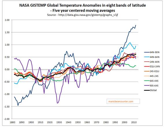 ?w=600
The most surprising is the most southerly, covering 5% of the earth’s surface and covering an area slightly bigger than Antarctica. There is massive cooling to 1930, going against (and helping to cancel) the warming trend in the Arctic. But how did they manage to get temperature data for Antarctica before the late 1950s when the first permanent bases were established? They used as a proxy a small island with its own micro climate that is quite different from anywhere else.
https://manicbeancounter.com/2015/05/24/base-orcadas-as-a-proxy-for-early-twentieth-century-antarctic-temperature-trends/
Thanks, Quang M. Nguyen.
It will be warmer, we pay them to make it so.
Very nice summary about moving average temperatures – ie average temperatures which keep moving. It is interesting that we were still in the ice ages during the 20th century – at 13.9 o C global mean temperature… What happened to the Planets anticipated temperature of 288 K by the solar insolence 1342 watts per square meter… Forget about radiative forcing – we can calculate the hot air see https://www.academia.edu/21176248/21st_Century_Global_Anthropogenic_Warming_Convective_Model [one typo in page 5 col 2 line 24 — 0.066 oC should have been 0.66 oC] –