Guest Post by Bob Tisdale
This post provides an update of many of the ENSO-related variables we presented as part of last year’s 2014-15 El Niño Series. For the series about the 2015/16 El Niño, we’ve used the evolution years of different El Niños as references to the goings-on in 2015. This month we’re including the 1997/98 El Niño because it was the strongest El Niño in our short instrument temperature record. For the other reference, we’re using 1982, which was the second strongest El Niño.
INTRODUCTION
There are a number of notable things this month. First, sea surface temperature-based indices and the Southern Oscillation Index indicate the El Niño has peaked. And we discussed in the December update the upwelling Kelvin wave that will be effecting (decreasing) El Niño conditions. Those indicators do not mean the El Niño will immediately stop impacting weather conditions around the globe. Strong El Niño conditions still exist in the tropical Pacific, and there is still a large volume of El Niño-related warmer-than-normal waters below the central and eastern equatorial Pacific (see animation from GODAS website here). Strong El Niño conditions are likely to exist through February to April and weak El Niño conditions might last until June. See Figure Supplement-1. Expect unusual El Niño-caused weather anomalies for many months to come…some bad, some good.

Figure Supplement-1
Second, there are many persons and government agencies around the globe claiming that precipitation-based weather events are worse than ever during this El Niño due to human-induced global warming. One wonders how they can make that claim when the consensus (the average) of the climate models used by the IPCC for their 5th Assessment Report shows no long-term increase in global precipitation from 1861 (the start year of the mean of the climate model outputs) to 1999 (the end of the 20th Century)…just some volcano-related dips and rebounds. See Figure Supplement 2, which is Figure Intro-15 from my recently published (free) ebook On Global Warming and the Illusion of Control – Part 1 (25MB). That illustration is discussed further on page 29 (pdf page 30) of the ebook.

Figure Supplement 2
That is, data indicate Earth’s surfaces have warmed from 1861-1999, but the climate models used by the IPCC show no long-term increase in precipitation in that time. Alarmists defy common sense when they claim precipitation around the globe is increasing in response to global warming, when the climate models used by the IPCC show no increase from 1861 to 1999. Then again, I don’t believe anyone has ever claimed that alarmists display common sense.
Third, as discussed last month, NOAA uses the sea surface temperature anomalies of the NINO3.4 region as their primary metric for determining the strength of an El Niño. Based on the weekly and monthly Reynolds OI.v2 data, NINO3.4 region sea surface temperature anomalies had been running slightly ahead of the 1997/98 El Niño. Of course, alarmists have been proclaiming “worst ever” and other such nonsense. However, as we discussed in the post Is the Current El Niño Stronger Than the One in 1997/98?, the 1997/98 El Niño was a stronger East Pacific El Niño than the one taking place now. Also see the post The Differences between Sea Surface Temperature Datasets Prevent Us from Knowing Which El Niño Was Strongest According NINO3.4 Region Temperature Data, because the results vary depending on the sea surface temperature dataset. I’ve updated the comparison graph with the different sea surface temperature datasets (end products) in Figure Supplement 1 above.
And if you still want to argue that the El Niño this year is stronger than the 1997/98 event, see the post Exactly the same, but completely different: why we have so many different ways of looking at sea surface temperature at the NOAA ENSO Blog.
Fourth, there are new looks for many of the graphs and Hovmoller diagrams. For the transition to La Niña (assuming one will form in 2016), I’ve extended the x-axis (horizontal axis) of the evolution graphs to include 24 months of data (100 weeks for the weekly data). I’ve also spliced on the transition years from El Niño to La Niña (1983, 1998 and 2016) onto the Hovmoller diagrams that have been presented in this series.
Fifth, the Southern Oscillation Index for December 2015 has returned to El Niño conditions after a drop into ENSO neutral conditions in November.
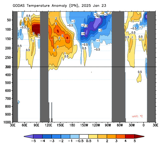
Sixth, I have not included maps or equatorial subsurface temperature anomalies from the GODAS website in this update. Scroll down to the bottom of the linked webpage for the most recent illustrations and animations.
ENSO METRIC UPDATES
This post provides an update on the progress of the evolution of the 2015/16 El Niño with monthly data through the end of December 2015, and for the weekly data through early-January, 2016. The post is similar in layout to the updates that were part of the 2014/15 El Niño series of posts here. (The series of posts about the 2015/16 El Niño is here.) The remainder of the post includes 17 illustrations so it might take a few moments to load on your browser. Please click on the illustrations to enlarge them.
Included are updates of the weekly (and monthly) sea surface temperature anomalies for the four most-often-used NINO regions. Also included are a couple of graphs of the monthly BOM Southern-Oscillation Index (SOI) and the NOAA Multivariate ENSO Index (MEI).
For the comparison graphs we’re using the El Niño events of 1997/98 and 1982/83 (the two strongest El Niño events during recent decades) as references for 2015/16.
Also included in this post are evolution comparisons using warm water volume anomalies and depth-averaged temperature anomalies from the NOAA TOA project website.
Then, we’ll take a look at a number of Hovmoller diagrams comparing the progress so far for the 2015/16 El Niño to the El Niños of 1982/83 and 1997/98.
NINO REGION TIME-SERIES GRAPHS
Note: The weekly NINO region sea surface temperature anomaly data for Figure 1 are from the NOAA/CPC Monthly Atmospheric & SST Indices webpage, specifically the data here. The anomalies for the NOAA/CPC data are referenced to the base years of 1981-2010.
Figure 1 includes the weekly sea surface temperature anomalies of the 4 most-often-used NINO regions of the equatorial Pacific. From west to east they include:
- NINO4 (5S-5N, 160E-150W)
- NINO3.4 (5S-5N, 170W-120W)
- NINO3 (5S-5N, 150W-90W)
- NINO1+2 (10S-0, 90W-80W)

Figure 1
Note that the horizontal red lines in the graphs are the present readings, not the trends.
EL NIÑO EVOLUTION COMPARISONS FOR NINO REGION SEA SURFACE TEMPERATURE ANOMALIES
Using weekly sea surface temperature anomalies for the four NINO regions, Figure 2 compares the goings on this year with the 1997/98 event. While sea surface temperature anomalies in the NINO4 and NINO3.4 regions peaked higher than in 1997, the NINO1+2 and NINO3 regions lagged well behind the 1997/98 El Niño. In other words, the 1997/98 El Niño was a stronger East Pacific El Niño than the 2015/16 El Niño.
Note how the NINO3.4 sea surface temperature anomalies are showing a decline over the past 7 weeks. The weekly data are impacted by “weather noise” so we could see another uptick, but I suspect we’ve reached the peak of this El Niño. El Niños are tied to the seasonal cycle and typically peak in November to January. See the post here.

Figure 2
The weekly Reynolds OI.v2-based NINO-region data start in 1990 at the NOAA/CPC Monthly Atmospheric & SST Indices webpage. Thus the absence of the 1982/83 event in Figure 2.
THE MULTIVARIATE ENSO INDEX
The Multivariate ENSO Index (MEI) is another ENSO index published by NOAA. It was created and is maintained by NOAA’s Klaus Wolter. The Multivariate ENSO Index uses the sea surface temperatures of the NINO3 region of the equatorial Pacific, along with a plethora of atmospheric variables…thus “multivariate”.
According to the most recent Multivariate ENSO Index update discussion, strong El Niño conditions exist, but they are lagging behind the events of 1982/83 and 1997/98:
Compared to last month, the updated (November-December) MEI has dropped slightly (by 0.19) to +2.12, continuing at the 3rd highest ranking, and about 0.3 sigma behind 1982 and 1997 for this season. The August-September 2015 value of +2.53 remains the third highest overall at any time of year since 1950. The evolution of the 2015 El Niño remains very similar to 1997, as monitored by the MEI, including a first peak in August-September and subsequent weakening during the remainder of the calendar year. In 1998, this was followed by a fairly strong rebound that peaked in late boreal winter 0.4 sigma higher than in Novemeber-December.
There’s something else to consider about the MEI. El Niño and La Niña rankings according to the MEI aren’t based on fixed threshold values such as +0.5 for El Niño and -0.5 for La Niña. The MEI El Niño and La Niña rankings are based on percentiles, top 30% for the weak to strong El Niños and the bottom 30% for the weak to strong La Niñas. This is difficult to track, because, when using the percentile method, the thresholds of El Niño and La Niña conditions vary from one bimonthly period to the next, and they can change from year to year.
The Multivariate ENSO Index update discussion and data for November/December were posted on January 5th. Figure 3 presents a graph of the MEI time series starting in Dec/Jan 1979. And Figure 4 compares the evolution this year to the reference El Niño-formation years of 1982 and 1997.

Figure 3
# # #

Figure 4
Obviously, according to the NOAA Multivariate ENSO Index (MEI), the 1997/98 event was stronger than the one in 2015/16.
EL NIÑO EVOLUTION COMPARISONS WITH TAO PROJECT SUBSURFACE DATA
IMPORTANT NOTE: The 1982 values of the TAO Project subsurface data have to be taken with a grain of salt. The deployment of the TOA project buoys started in the late 1980s and was not compete until the early 1990s. Also keep in mind that these values are the output of a reanalysis, not observations-only-based data.
The NOAA Tropical Atmosphere-Ocean (TAO) Project website includes the outputs of a reanalysis for two temperature-related datasets for the waters below the equatorial Pacific. See their Upper Ocean Heat Content and ENSO webpage for descriptions of the datasets. The two datasets are Warm Water Volume (above the 20 deg C isotherm) and the Depth-Averaged Temperatures for the top 300 meters (aka T300). Both are available for the:
- Western Equatorial Pacific (5S-5N, 120E-155W)
- Eastern Equatorial Pacific (5S-5N, 155W-80W)
- Total Equatorial Pacific (5S-5N, 120E-80W)
Keep in mind that the longitudes of 120E-80W stretch 160 deg, almost halfway around the globe. For a reminder of width of the equatorial Pacific, see the protractor-based illustration here. Notice also that the eastern and western data are divided at 155W, which means the “western” data extend quite a ways past the dateline into the eastern equatorial Pacific.
In the following three illustrations, we’re comparing reanalysis outputs for the evolution of the 2015/16 El Niño so far (through month-to-date December 2015) with the outputs for the evolutions of the 1982/83 and 1997/98 El Niños. The Warm Water Volume outputs are the top graphs and the depth-averaged temperature outputs are the bottom graphs. As you’ll see, the curves of two datasets are similar, but not necessarily the same.
Let’s start with the Western Equatorial Pacific (5S-5N, 120E-155W), Figure 5. The warm water volume and depth-averaged temperature anomalies show the Western Equatorial Pacific began 2015 with noticeably less warm water than during the opening months of 1997. The warm water volume in 1982 was comparable at the start of this year but depth-averaged temperature anomalies started off higher in 2015 than in 1982. Both western equatorial datasets now, though, are higher than in both 1982 and 1997.

Figure 5
Both warm water volume and depth-averaged temperature anomalies in the Eastern equatorial Pacific (5S-5N, 155W-80W) in 2015 never reached values seen 1997, but have been greater than the 1982 values for most of the year. See Figure 6.

Figure 6
The total of the TAO project eastern and western equatorial subsurface temperature-related reanalysis outputs, Figure 7, are as one would expect looking at the subsets.

Figure 7
SOUTHERN OSCILLATION INDEX (SOI)
The Southern Oscillation Index (SOI) from Australia’s Bureau of Meteorology is another widely used reference for the strength, frequency and duration of El Niño and La Niña events. We discussed the Southern Oscillation Index in Part 8 of the 2014/15 El Niño series. It is derived from the sea level pressures of Tahiti and Darwin, Australia, and as such it reflects the wind patterns off the equator in the southern tropical Pacific. With the Southern Oscillation Index, El Niño events are strong negative values and La Niñas are strong positive values, which is the reverse of what we see with sea surface temperatures. The December 2015 Southern Oscillation Index value is -9.1, which is a greater negative value than the threshold of El Niño conditions. (The BOM threshold for El Niño conditions is an SOI value of -8.0.) Figure 8 presents a time-series graph of the SOI data. Note that the horizontal red line is the present monthly value, not a trend line.

Figure 8
The graphs in Figure 9 compare the evolution of the SOI values this year to those in 1982 and 1997…the development years of the 1982/83 El Niño and the 1997/98 El Niño. The top graph shows the raw data. Because the SOI data are so volatile, I’ve smoothed them with 3-month filters in the bottom graph. Referring to the smoothed data, the Southern Oscillation Index has recently surpassed the values in 1997 but is still lagging behind the values in 1982.

Figure 9
Also see the BOM Recent (preliminary) Southern Oscillation Index (SOI) values webpage. The current 30-day running average and the 90-day average is still in El Niño conditions. Note, however, in the daily data, the recent return of strong El Niño values (high negative numbers) during the past two weeks or so.
COMPARISONS OF HOVMOLLER DIAGRAMS OF THIS EL NIÑO (TO DATE) WITH 1982/83 AND 1997/98 EVENTS
NOTE: The NOAA GODAS website has not yet added 2015 to their drop-down menu for Hovmoller diagrams. For the following illustrations, I’ve used the Hovmoller diagrams available for the past 12 months, deleted the 2014 data and aligned the 2015 data with the other 2 years.
Also note that I’ve extended the Hovmoller diagrams by splicing the second years onto the first years so that we can compare the evolutions and decays of the El Niños and the transitions to La Niña, assuming a La Niña forms in 2016.
[End notes.]
Hovmoller diagrams are a great way to display data. If they’re new to you, there’s no reason to be intimidated by them. Let’s take a look at Figure 10. It presents the Hovmoller diagrams of thermocline depth anomalies (the depth of the isotherm at 20 deg C. Water warmer than 20 deg C is above the 20 deg C isotherm and below it the water is cooler). 2015 is in the center, 1997 on the left and 1982 to the right. (Sorry about the different sizes of the Hovmollers, but somewhere along the line NOAA GODAS changed them, but they are scaled, color-coded, the same.)
The vertical (y) axis in all the Hovmollers shown in this post is time with the Januarys at the tops and Decembers at the bottoms. The red horizontal lines separate the evolution years from the decay (transition) years. The horizontal (x) axis is longitude, so, moving from left to right in each of the three Hovmoller diagrams, we’re going from west to east…with the Indian Ocean in the left-hand portion, the Pacific in the center and the Atlantic in the right-hand portion. We’re interested in the Pacific. The data are color-coded according to the scales below the Hovmollers.

Figure 10
Figure 10 is presenting the depth of the 20 deg C isotherm (which separates the warmer water above from the cooler water below) along a band from 2S to 2N. The positive anomalies, working their way eastward early in 1982, 1997 and 2015, were caused by downwelling Kelvin waves, which push down on the thermocline (the 20 deg C isotherm). You’ll note how the anomalies grew in strength as the Kelvin wave migrated east. That does not mean the Kelvin wave is getting stronger as it traveled east; that simply indicates that the thermocline is normally closer to the surface in the eastern equatorial Pacific than it is in the western portion. In this illustration, we’re looking at anomalies, not absolute values.
Based on thermocline depth anomalies, the El Niño conditions were much stronger in 1997 than they were in 1982 and in 2015.
Figure 11 presents the Hovmollers for wind stress (not anomalies) along the equator. The simplest way to explain them is that they’re presenting the impacts of the strengths and directions of the trade winds on the surfaces of the equatorial oceans. In this presentation, the effects of the east to west trade winds at various strengths are shown in blues, and the reversals of the trade winds into westerlies are shown in yellows, oranges and reds. To explain the color coding, the trade winds normally blow from east to west; thus the cooler colors for stronger east to west trade winds. The reversals of the trade winds (the yellows, oranges and reds) are the unusual events and they’re associated with El Niños, which are the abnormal state of the tropical Pacific. (A La Niña is simply an exaggerated normal state.)

Figure 11
The two westerly wind bursts shown in red in the western equatorial Pacific in 1997 are associated with the strong downwelling Kelvin wave that formed at the time. (See the post ENSO Basics: Westerly Wind Bursts Initiate an El Niño.) Same thing with the three westerly wind bursts early in 2015, January through March: they initiated the Kelvin wave this year. Throughout 1997, there was a series of westerly wind bursts in the western equatorial Pacific. Same thing occurred in 2015. There were comparatively few westerly wind bursts early in 1982 and they appear early that year to have been weaker than those in 1997 and 2015, according to this GODAS reanalysis. But there was a strong westerly wind burst later in 1982. Returning to this year, the most recent westerly wind burst happened in late December 2015/early January 2016.
Figure 12 presents the Hovmollers of wind stress anomalies…just a different perspective. But positive wind stress anomalies, at the low end of the color-coded scale, are actually a weakening of the trade winds, not necessarily a reversal.

Figure 12
NOTE: There are a number of wind stress-related images on meteorological websites. Always check to see if they’re presenting absolute values or anomalies.
And Figure 13 presents the Hovmollers of sea surface temperature anomalies along the equator.

Figure 13
Notice how warm the eastern equatorial Pacific got during the evolution of the 1997/98 El Niño. While the sea surface temperatures this year have reached well above threshold of a strong El Niño, they’ve still well behind those of the 1997/98 El Niño…especially east of 120W (to about 90W), where sea surface temperature anomalies were more than 4.0 deg C at this time. In 1982, sea surface temperature anomalies also reached 4.0 deg C, but we did not see those values in 2015.
That is, as noted earlier, the 1997/98 was a stronger East Pacific El Niño than the one taking place in 2015.
ANIMATIONS OF GODAS MAPS AND CROSS SECTIONS – JANUARY 2015 TO PRESENT
I have not included maps or cross sections from the GODAS website in this post. Again, scroll down to the bottom of the linked webpage for the most recent illustrations and animations.
EL NIÑO REFERENCE POSTS
For additional introductory discussions of El Niño processes see:
- An Illustrated Introduction to the Basic Processes that Drive El Niño and La Niña Events
- El Niño and La Niña Basics: Introduction to the Pacific Trade Winds
- La Niñas Do NOT Suck Heat from the Atmosphere
- ENSO Basics: Westerly Wind Bursts Initiate an El Niño
Also see the entire 2014-15 El Niño series. We discussed a wide-range of topics in those posts.
WANT TO LEARN MORE ABOUT EL NIÑO EVENTS AND THEIR AFTEREFFECTS?
My ebook Who Turned on the Heat? goes into a tremendous amount of detail to explain El Niño and La Niña processes and the long-term aftereffects of strong El Niño events. Who Turned on the Heat? weighs in at a whopping 550+ pages, about 110,000+ words. It contains somewhere in the neighborhood of 380 color illustrations. In pdf form, it’s about 23MB. It includes links to more than a dozen animations, which allow the reader to view ENSO processes and the interactions between variables.
Last year, I lowered the price of Who Turned on the Heat? from U.S.$8.00 to U.S.$5.00. And the book sold well. It continues to do so this year.
A free preview in pdf format is here. The preview includes the Table of Contents, the Introduction, the first half of section 1 (which was provided complete in the post here), a discussion of the cover, and the Closing. Take a run through the Table of Contents. It is a very-detailed and well-illustrated book—using data from the real world, not models of a virtual world. Who Turned on the Heat? is only available in pdf format…and will only be available in that format. Click here to purchase a copy.
My sincerest thanks to everyone who has purchased a copy of Who Turned on the Heat? as a result of the El Niño posts in 2014 and from this year’s El Nino series.
A NEW BOOK AND IT’S FREE
I also published On Global Warming and the Illusion of Control (25MB .pdf) back in November. The introductory post is here. It also includes detailed discussions of El Niño events and their aftereffects…though not as detailed as in Who Turned on the Heat?
And for those interested, today I also posted the sea surface temperature anomaly update for December 2015:
https://bobtisdale.wordpress.com/2016/01/12/december-2015-sea-surface-temperature-sst-anomaly-update/
Cheers
but wait……this is the mega super colossal armageddon El Nino
Are you sure that wasn’t the last one.
just going by what they tell me….
Thank goodness it was or we’d be buried under 100m of ice by now …. yeah, some people always have their noses buried in ice, just ask the ‘pundits’ at NOAA and NASA!
Bob Tisdale:
This is another report of the superb kind expected from you. And this one contains the news many of us have been awaiting.
Thankyou.
Richard
Right! Nicely done.
The excellent sidebar el Nino gage on this very site has shown clearly that the data is correct: the el Nino is now out of the cradle and paddling away and will see his sister, la Nina, take over next. This site has been very good about providing us with the raw data.
Thank you very much.
http://www.elnino.noaa.gov/ site on the other hand, has very poor data, not one tenth the data here at WUWT. For example, the NOAA ‘forecast’ site has this: DECEMBER 10! as the last posting!!! Insane. Over a month old, no less.
There is no mention anywhere that the el Nino is weakening at that stupid site.
emsnews .. the Federal government takes the entire month of December off and then takes another week to catch up on everyone’s holiday experiences. Patience grasshopper ….
Wow, thanks Bob! I can now sleep better at night knowing the worst is now over. So many sleepless nights worrying.
Lol! I know! God forbid that we have climate extremes! Must sacrifice virgin, must sacrifice virgin.
Lol — “But! Have we got a deal for you!! You can purchase this Indulgence instead! For the low, low, price of just 69 windmills, 2 electric cars, and six pairs of bamboo underwear!”
Everyone complains about the weather, but only the Obama administration will sacrifice virgins to change.
Bob,
Thanks for another great update!
You might find this of interest — about the margin of error for measurements of SST by NOAA’s Anthony Barnston. It is a comment to their “December El Niño update“. Bold emphasis added.
“The accuracy for a single SST-measuring thermometer is on the order of 0.1C.
“… We’re trying to measure the Nino3.4 region, which extends over an enormous area. There are vast portions of that area where no measurements are taken directly (called in-situ). The uncertainty comes about because of these holes in coverage. Satellite measurements help tremendously with this problem. But they are not as reliable as in-situ measurements, because they are indirect (remote sensed) measurements. We’ve come a long way with them, but there are still biases that vary in space and from one day to another, and are partially unpredictable. These can cause errors of over a full degree in some cases. We hope that these errors cancel one another out, but it’s not always the case, because they are sometimes non-random, and large areas have the same direction of error (no cancellation).
“Because of this problem of having large portions of the Nino3.4 area not measured directly, and relying on very helpful but far-from-perfect satellite measurements, the SST in the Nino3.4 region has a typical uncertainty of 0.3C or even more sometimes.
“That’s part of why the ERSSv4 and the OISSTv2 SST data sets, the two most commonly used ones in this country, can disagree by several tenths of a degree. So, while the accuracy of a single thermometer may be a tenth or a hundredth of a degree, the accuracy of our estimates of the entire Nino3.4 region is only about plus or minus 0.3C.“
THANK YOU, Editor of the Fabius Maximus website. I missed that comment.
FYI, I’ve prepared graphs showing the spread of NINO3.4 region SST anomalies from 1870 to present. When Anthony Barnston is talking +/- 0.3 deg C, that’s in recent times. I’ll try to publish that post this week.
Cheers.
Bob,
I find it odd but typical that one of the few detailed discussions of resolution and error bars for weather data is found in the comments of a relative little-known NOAA article written for a general audience.
Also revealing is that these NOAA articles are little-known despite being so well-done. Journalists prefer to get their info from, as does a recent Guardian article, activist scientists — and even hysterical activist amateurs such as Robert Scribber.
“We’ve come a long way with them [satellites], but there are still biases that vary in space and from one day to another, and are partially unpredictable. These can cause errors of over a full degree in some cases. We hope that these errors cancel one another out, but it’s not always the case, because they are sometimes non-random, and large areas have the same direction of error (no cancellation).”
How do we interpret this statement with regard to the RSS and UAH data? Do these satellites exhibit “… errors of over a full degree …” and the errors “… are sometimes non-random, and large areas have the same direction of error (no cancellation).”
Retried Engineer Jim:
Individual temperature measurements of microwave sounding units (MSUs) mounted on satellites show good agreement with temperature measurements of radiosondes mounted on balloons. It is unlikely – but possible – that MSU and radiosonde measurements have very similar errors.
It is not possible to know the answers to your questions as they pertain to global and hemispheric temperatures because there are no calibration standards for these metrics.
Richard
Engineer,
Karl Mears, a senior scientist at RSS, has long held that the satellite temperature datasets have larger structural errors than the major global surface temp datasets.
He has given numbers about this in his publications and other work, such as his December presentation at the AGU Fall meeting. He is one of the top experts in this area.
Perhaps John Christy or someone else familiar with this can provide more information.
Thanks so much for this comment !
Peak El Nino roughly corresponds with peak hype in Paris. Next up the declining AMO and solar cycles will rock you.
The current data continues to support the lack of a big “slosh” eastward during this El Nino. It has been fueled by the big warm undercurrent which, after surfacing, gets caught up in the trade winds that haven’t weakened all that much.
The lower loss of energy (higher temperature) in the PWP indicates that not as much energy has been removed which should mean we won’t see as much warming on the backside of the El Nino. If this continues to progress without a significant change then the coming La Nina is not likely to be as strong either. Those hoping for a big cooling might be disappointed.
Keep in mind that we did have the weak 2014-15 El Nino that may have sapped some energy but can not be seen in these diagrams. That could add a little more room for cooling.
If my alternate hypothesis of the La Nina being the real cause of the step up in temperature after El Nino/La Nina pairs, then a weaker La Nina might also mean we see no step up at all and just a resumption of the general cooling trend over the past decade.
Thank you very much, Bob. This update shows a lot of what is happening in the Pacific Ocean for the beginning of the end of the 2015-2016 El Niño.
Long randy for cast says no rain . What happened to a wet California ?
W.A.S.S.
Just for a bit of perspective and relief from looking at that nasty red tongue of anomaly surely symptomatic of a dreadful disease, this is what el meanyo looks like these days in actual temperature. Not much cloud cover today. Lots and lots of photons going straight out the atmospheric window.
Energy in versus energy out is a wicked problem. Energy in is best measured, I think, by a set of equatorial band tools that measure shortwave infrared irradiance at the ocean’s surface when the Sun is perpendicular to the equator (how wide that band should be is a question). Measuring energy out, which will be in longwave lengths, is anybody’s guess. Why? Because it migrates around and escapes in far away places as well as equatorial places.
The question that physics seems to struggle with is absorption/radiation which is theoretically limited to the same wave lengths, and thermalization, which is when these just absorbed a photon jiggy molecules collide with neighbors on the dance floor.
The theory is that short wave high energy solar radiation is converted to long wave low energy earth radiation.
This seems to me a wicked process. Water may be uniquely appropriate for this as it resonates substantially across both solar and earth spectra, but liquid water does not resonate much in the visible spectrum (~.5 microns). This is why visible light penetrates water so deeply ~100 meters. Where water resonates strongly in the L2 rotational bands around 15 microns, radiation only penetrates the thickness of the tiniest human hair.
Notice how water vapor (green) is not an impressive absorber compared with liquid water (red) and ice (blue).
Visible radiation is the most intense part of the solar spectrum and these photons are going down into the ocean 80 meters or so without sending any electrons to a higher orbit. So what DO they do? How is .5 micron energy from the sun converted such that electrons in water can drop a quantum and emit ~12 micron photons from the surface?
We typically write this off as a “property” of water and move on.
Liquid water absorption is essentially the inverse of solar spectrum intensity. Electrons in water jump quanta and do not allow penetration in the UV and IR where solar intensity is lower; they are uninterested and allow deep penetration where solar intensity is highest. So you have solar UV and IR weakly heating the ocean skin, and visible light intensely doing whatever it does deep down.
It will be interesting to watch the evolution of UAH and RSS as this El Nino continues to fade. We all know there is a few months lag. But it is the end atmospheric amplitude that will say whether other ocean cycles (PDO, AMO) also affect the Nino induced warming spike, and whether it ‘staircases up’ as others hypothesis. I predict the amplitude will be noyably less than 1998 because of the current state ofmother ocean cycles, and that there will be no ‘staircase’ effect. If that prediction bears out, this episode will be a huge problem for AR6 in 2019. Just like Arctic ice recovery likely will be, for the same ocean cycle reasons.
Ristvan I think the PDO has drifted back to warm phase nearly 2 years ago, so will this have an impact on your analysis? I suppose we’ll just have to wait to see what happens month by month.
True, but the RRR appears to be dead, exiled at a minimum, so the blob is not likely to strengthen, and may well regress, and the AMO, a crucial factor i, both GMT and arctic sea ice, appears to be moving negative.
However, I am biased in a wish for some cooling to stifle the alarmists.
The index value is positive, this is different from a phase change. The PDO index is positive because of the failed out of season 2014 el Nino dynamics and the current el nino. Brief positive and negative spikes are common during phases the presumed PDO cycles.
We won’t know if there’s been an early shift for several years.
See the late 50s early 60s. Similar warm blob and +PDO spike before cooling and likely arctic sea ice surge in 60s/70s.
Marvelous and as informative as ever. Thank you
Your posts look very through and honest but the science is above my head, my question is………..we know there is a lag between El Nino developing and a global warming signature? Will we still see a big upturn in global temperature over 2016, and how long before that signature has dissipated?
Does the lack of a signature so far indicate that the world might actually be cooling a little, could El Nino have been masking a gradual cooling trend?
Julian Williams in Wales, for the surface temperature datasets, there has been a noticeable uptick in 2015 in response to the El Nino. There may be another uptick in 2016 as a lagged response. Then, in 2017, there would be a noticeable drop in surface temperatures in response to the 2016/17 La Nina, assuming one forms later this year.
For the lower troposphere temperature datasets, the upticks (big upticks) typically occur in the decay year of the El Nino. So for this 2015/16 El Nino, there should be a spike in lower troposphere temperatures this year. And that should be followed by a sizable down-tick in 2017 in response to the trailing La Nina.
See the post:
https://bobtisdale.wordpress.com/2015/09/28/tired-of-the-claims-of-warmest-ever-month-and-year-they-will-likely-continue-next-year/
Julian, you also stated that the science was above your head. Try my new free ebook:
https://bobtisdale.files.wordpress.com/2015/11/tisdale-on-global-warming-and-the-illusion-of-control-part-1.pdf
It was written for newcomers.
Cheers.
Thank you Bob Tisdale, you are a gentleman. I have been meaning to download your book for a while, from how you describe the book in your original post it sounds as if you have produced a bible for us non scientists to use as a reference. Often I try to answer some of the hype in comments under Guardian (and other media) stories and I am always looking for source material to check that I am not answering garbage with garbage. My understanding is often fuzzy and I need your book as an all in one answer, it is only my laziness that has delayed me not already having a copy computer my desktop.
Thank you and good luck, alongside Anthony you are doing really important work, and you are making an difference.
In late 2014 the NOAA gleefully announced that 2014 was the warmest year on record about a month before the year was actually over. This year they have been strangely silent about 2015.
Funny about that, huh?
“Common conditions occur commonly” this from a doctor in relation to diagnosis in the patient . I have never forgotten it.
According to my licked thumb in the air this El Nino started to wain 4 weeks ago. 82 most definitely carried on right through Jan and Feb. Whats the bet it dies with a whimper and that there will be no great heat lag this year
As data collection improves they are just finding ‘new’ common conditions: “2015 stronger than 98, stronger than 82”
Just noticed, it looks to me that the resulting temperature spike won’t be near as high, because the peaks on the UAH seem to correlate more closely with the Nino 1+2 regions more than any other area (which is especially apparent with the 1998 readings).
So in a sense, it might lower the chances of 2016 being considered the warmest year ever in the dataset (or completely eliminate it if we start seeing a lot of cooling or the peak ends up being fairly low for an event this size).
@ Bob Tisdale, thanks for the (way above my head report) but I do get the drift
What is the time frame called between the El Nino and La Nina
El NADA?
El Nado, Neutral, and La Nada. Then there is something-Mordaci or whatever the hell that title is.
MordecaiMotorheadModokitobias smit, “ENSO neutral” has over 800 returns at Google Scholar”:
http://scholar.google.com/scholar?hl=en&q=%22ENSO+neutral%22&btnG=&as_sdt=1%2C7&as_sdtp=
PamelaGrey/Alan Robertson, “Modoki”, as in El Nino Modoki, refers to a central Pacific El Nino.
Cheers.
We breathe a sigh of relief as the latest mega-hot super-human armageddon-inducing El Nino departs and the sun sets slowly in the west.
I’m having a hard time linking the SOI values to the El Niño. Darwin had a boxing day Cyclone (which drops local pressure, turning the SOI more positive) and the region around Tahiti has had a January tropical depression and two cyclones (which makes the SOI turn more negative).
The NSW coastal regions are those most affected by El Niño conditions in Australia (at least when it comes to summer temperatures and rainfall) and this summer has been acting like a La Nina year, with some areas breaking all time January rainfall totals in the space of 24hrs.
So while an El Niño is clearly happening, the weather phenomena usually associated with one is not, at least in Australia. I don’t know why, but I have an inkling that the Indian Ocean anomalies are different (much warmer) than previous events and that the Indian Ocean needs to be factored into the development of the events.
One other possibility to check, which I haven’t done yet, is the Antarctic sea ice extents. It’s also possible that since so much cold water has been locked up in the southern ocean it has been unable to come north up around Australia to back-fill behind the warm water that has moved across the Pacific, reducing the local impact of the El Niño event.
Hi, Professor Tisdale – a de facto “Dr.” — yes, yes, YES, don’t you shake your head at me! 🙂
While your science is far above my educational attainments, I have learned that your work is highly reliable (i.e., it is prove out over time by data) and substantiated by many other reputable scientists of integrity. I am writing here mainly to give you the opportunity to correct/clarify/affirm what I write below for other readers who might be scratching their heads a bit over the following…
1.
AND
2.
HOWEVER,
the 2015/16 El Niño is not likely to become a “monster” El Niño
BECAUSE
of this iteration of the oscillation’s relatively weaker westerly tradewind “bursts” (re: figures 10-13).
****************************
That is, there is a bunch of warm water, more than at this time in 1998, sitting over in the western Pacific, but, it won’t be making any kind of a beeline toward the west coast of North America, for the westerlies have largely pooped out.
**************************
Thus, Dr. Tisdale’s analysis:
is likely correct.
**************************************
*************************************
READ BOB’S BOOKS! I understand ENSO pretty good (in a rudimentary fashion, I mean) now — thanks — to — Bob Tisdale! 🙂
*******READ BOB’S BOOKS!********

1. Who Turned on the Heat?
2. Climate Models FAIL
3. On Global Warming and the Illusion of Control — Part 1 (free)
Available here!: https://bobtisdale.wordpress.com/2013/10/16/ebooks-by-bob-tisdale/
{And see WUWT posts about them for content and for “reviews” via reader comments in accompanying threads — use the “Search WUWT” box with term “Bob Tisdale” (located in this page, upper right, below “Paypal…”)}
Thanks for plugging my books, Janice. People are going to think you’re on my payroll. Wish I had one…a payroll that is.
Cheers.
Hi, Bob,
Heh. Wish I was on it (or anyone’s!), lol.
My pleasure.
With admiration,
Janice
I do hope the indicators are right. 2014 was so dry here and 2015 only 225mm of rainfall.
We need a very big La Niña in Australia. Farming with no subsoil moisture at the start of the season is Russian roulette with money. I don’t think we can spend another half million dollars on a weather bet.
How far west are you? I made it out to the central western planes of NEW over Christmas and I’ve never seen it so green in my 30 years of travelling.
Northwest Victoria.
It’s a classic El Niño for most parts away from Eastern NSW. We have had well below average rainfall for four years running. California is not alone in rainfall deficits.
Interannual variations in Length of Day (LOD) track ENSO immediately – no lag or lead:
http://lh5.googleusercontent.com/-Z7oqT0Wm3HE/VI11FCPzRSI/AAAAAAAAAj8/ZSBUiI0Iexs/s800/LOD-vs-ENSO_II.png
The 83 and 98 El Ninos caused the most dramatic changes on record. In contrast, the flaccid Nino of 2010 didn’t register.
If the current Nino is similar in magnitude to ’98 it should produce a comparable change in LOD – now.
Here is something that may be worth looking into. Miles of highways built per year. Temperatrues seem to follow them pretty well. Both CO2 and miles of highway have increased since 1950, which one do you think would impact temperature more? A trace gas, or a giant black body made or extreme efficient heat absorbing material? Note how miles built drops rapidly right as the pause began. Imagine that. Also, more roads are built in the N Hemi than the South. The N has warmed more than the S.
https://www.fhwa.dot.gov/infrastructure/50interstate.cfm
http://www.publicpurpose.com/hwy-intmiles.htm
BTW, heating that sidewalk has absolutely nothing to do with CO2, and everything to do with visible light.
https://youtu.be/bnZQgp6srF4
Note how in this video the pan is black, a great heat absorber. If he had tried to fry the egg on the grass or sand it would not have cooked, but put a black body in direct sunlight and you get a fried egg. If you put that pan in the shade, exposed to 400 ppm CO2, but no direct sunlight, you won’t fry the egg. That is a great experiment to demonstrate how CO2 does nothing, but direct visable light does a lot to alter the temperature of the immediate atmosphere. How imagine putting 40,000+ miles of that pan accross N American.
https://youtu.be/fwUXCSEWVvw
(to paraphrase a public ed. advertisement — only those who were never going to do drugs listened it, unfortunately…)
— “This is your brain.”
— “This is your brain on {AGW fantasy science}.”
lolololo
Those patterns are way way way too predictible. I wonder if Wall Street has figured out how to make money off those patterns? Do crop yields vary dramatically with the ENSO cycle? Are there known market impacts of ENSO? Does vacation travel change in California and Mexico?
Also, if I’m reading that chart correctly, it looks like we can expect a sharp drop in temperatures over the next 12 months. If so, the pause just keep growing and growing.
Correct me if I’m wrong, but I think the headline makes a prediction from Bob Tisdale ?
I read a “peak” as a point where the only two options are flat or down.
Seeing as Bob Tisdale never makes predictions, I must assume I read the headline wrong 🙂
I’m just playing everyone,…
…… It’s all about “appearance” 🙂
Thanks for all the info Mr. Tisdale.
On the ground reality in California is that we are having a boringly normal rainy season. That is somewhat of a relief since it means we are not digging our water deficit hole even deeper, but it’s not a drought breaker at all.
I live in Sacramento, California and we haven’t received this monstrous rain that I saw with the last el nino?? Is it still to come?