Guest Post by Bob Tisdale
This article is also cross posted at Judith Curry’s ClimateEtc.
# # #
In previous posts at WattsUpWithThat and at my blog ClimateObservations, I’ve discussed the new NOAA “pause-buster” sea surface temperature dataset (ERSST.v4) a number of times since the publication of Karl et al. (2015)—latest to earliest:
- Pause Buster SST Data: Has NOAA Adjusted Away a Relationship between NMAT and SST that the Consensus of CMIP5 Climate Models Indicate Should Exist?
- Open Letter to Tom Karl of NOAA/NCEI Regarding “Hiatus Busting” Paper
- More Curiosities about NOAA’s New “Pause Busting” Sea Surface Temperature Dataset
- NOAA/NCDC’s new ‘pause-buster’ paper: a laughable attempt to create warming by adjusting past data
But those posts related primarily to the last few decades.
In this post, we’re going to briefly examine the long-term data and then focus on the post-World-War 2 period—a period when there are major differences between the two sea surface temperature datasets that are used in the combined land+ocean surface temperature products from GISS and NOAA (both of which use NOAA’s ERSST.v4) and UKMO (which uses HADSST3).
The differences in the two datasets are related to the Thompson et al. (2008) letter A large discontinuity in the mid-twentieth century in observed global-mean surface temperature. (Paywalled. Used to be available at the Colorado State University website.) The UKMO adjusted their sea surface temperature data to correct the discontinuity, while NOAA didn’t. It appears that NOAA is attempting to bust the mid-20th Century pause as well as increase the warming rate from the mid-20th Century to present.
But first, some background information about long-term ocean surface temperature reconstructions.
LONG-TERM OCEAN SURFACE TEMPERATURE DATA
Blog posts and papers about adjustments to long-term ocean surface temperature data typically begin with a comparison of source and end products. I won’t disappoint you. Figure 1 includes the annual global (60S-60N) temperature anomalies for the two source datasets and two end products, all referenced to the base years of 1971-2000. The source datasets are the Marine Air Temperature (day and night) and Sea Surface Temperature from the International Comprehensive Ocean-Atmosphere Data Set (ICOADS). The ICOADS v2.5 data are supported by the Woodruff et al. (2011) paper ICOADS Release 2.5: extensions and enhancements to the surface marine meteorological archive. The end products include the UKMO Night Marine Air Temperature data (HadNMAT2) supported by the Kent et al. (2013) paper Global analysis of night marine air temperature and its uncertainty since 1880: The HadNMAT2 data set, and the NOAA/NCEI Extended Reconstructed Sea Surface Temperature data version 4 (ERSST.v4), also known as NOAA’s “pause-buster” data, which are supported by three papers:
- Huang et al. (2015) Extended Reconstructed Sea Surface Temperature version 4 (ERSST.v4), Part I. Upgrades and Intercomparisons,
- Liu et al. (2015) Extended Reconstructed Sea Surface Temperature version 4 (ERSST.v4): Part II. Parametric and Structural Uncertainty Estimations, and
- Karl et al. (2015) Possible artifacts of data biases in the recent global surface warming hiatus.
Note: There is an upcoming paper about the NOAA ERSST.v4 dataset and I’ve linked it in the closing. [End note.]
The top graph in Figure 1 compares the four datasets globally (60S-60N), excluding the polar oceans. The middle and bottom graphs include the comparisons for the Northern (0-60N) and Southern (60S-0) Hemispheres, again excluding the polar oceans. The polar oceans are normally excluded in comparisons such as these because the data suppliers account for sea ice differently.
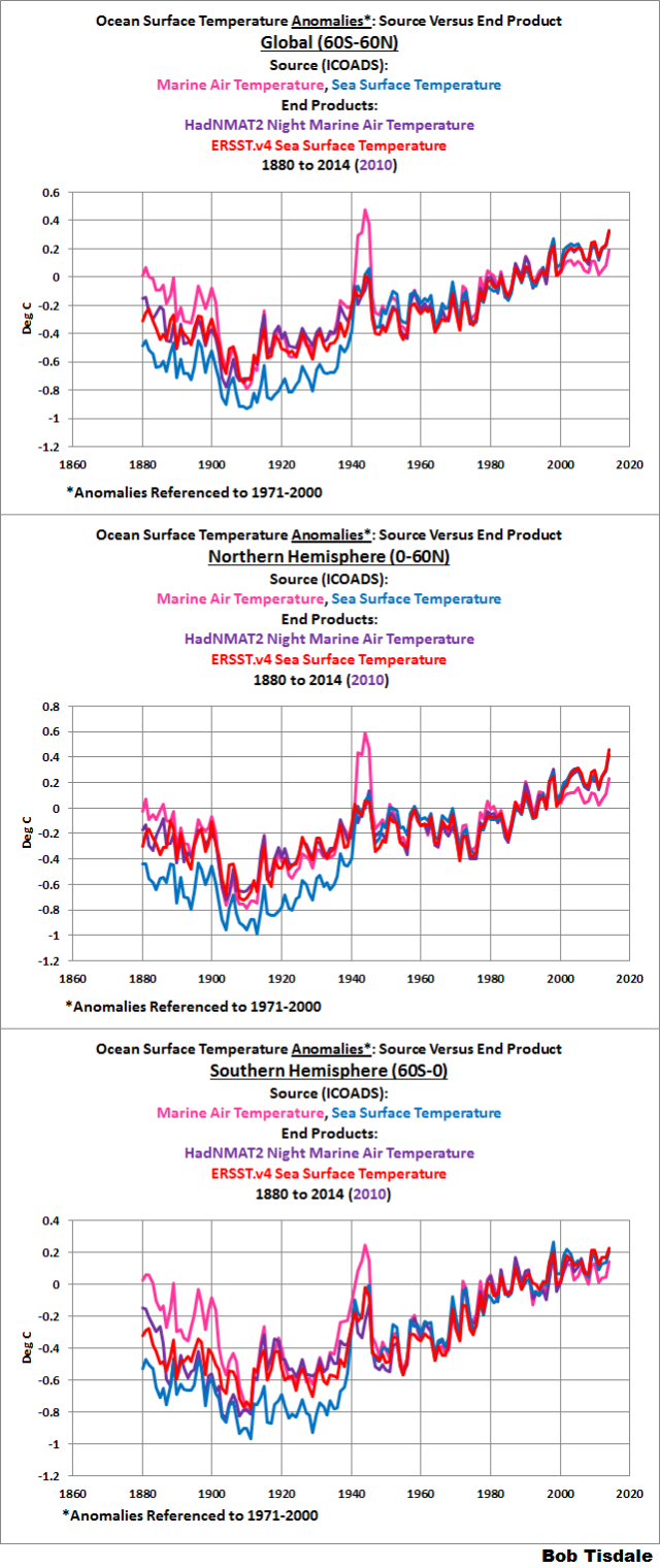
Figure 1
The source of the data in this post is the KNMI Climate Explorer.
The marine air temperature data come in two flavors. The source data include day and night measurements, while the end product includes mostly nighttime observations. The UKMO deletes most of the daytime marine air temperature observations because of the heating of ship surfaces by sunlight. Let me explain the “mostly” and “most of”.
The spike in the marine air temperature (day and night) data from the early- to mid-1940s stands out in Figure 1. But the spike is more prevalent in the nighttime samples than daytime. See Figure 2, which is Figure 9 from Kent et al. (2013). So to minimize the spike, the HadNMAT2 data use daytime marine air temperature data from 1942 to February 1946.
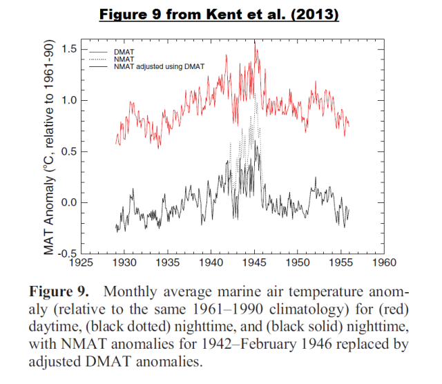
Figure 2
Kent et al. write:
Data from ICOADS Release 2.5 still show additional warmth in their nighttime air temperature anomalies during WW2, from 1942, and the latter part of the adjustment applied by Rayner et al. [2005] is therefore still required and appropriate. Here, we amend it slightly and replace NMAT anomalies between 1942 and February 1946 with DMAT anomalies, adjusted according to the difference between DMAT and NMAT anomalies over the period 1947–1956. Additionally, daytime air temperature anomalies for Deck 195 (U.S. Navy Ships Logs) were anomalously warm compared with data from other Decks and are excluded. An adjustment prior to 1942 appears not to be required due to the addition of many recently digitized measurements for this period. Figure 9 shows time series of monthly unadjusted and adjusted NMAT anomalies for the period 1929–1955, along with the daytime air temperature data used in the adjustment process.
Note: I believe the reference should be Rayner at al. (2003), not Rayner et al. (2005). Rayner at al. (2003) included discussions of bias adjustments for their HadMAT1 night marine air temperature dataset. Rayner et al. (2005) was about the HADSST2 dataset and only mentioned marine air temperature data as they related to the bias adjustments for that sea surface temperature dataset. [End note.]
Over the term of the dataset, HadNMAT2 are also adjusted for other factors such as observation (ship deck) height and wind speed.
The other major difference that stands out in Figure 1 relates to the source ICOADS sea surface temperature data before the 1940s. The source sea surface temperature data run “cooler” than the others. That divergence is attributed to the transitions from different sampling methods: buckets of different types to ship inlets.
For their ERSST.v4 data, NOAA assumed the HadNMAT2 data are correct and used the HadNMAT2 night marine air temperature data for bias corrections (full term) of ship-based observations. NOAA’s reference for the using night marine air temperature to adjust sea surface temperature data was Smith and Reynolds (2002) Bias Corrections for Historical Sea Surface Temperatures Based on Marine Air Temperatures. Thus the ERSST.v4 data mimic the HadNMAT data. See Figure 3.

Figure 3
Note: In more recent decades, NOAA also adjust for ship-buoy biases, but those adjustments do not take place during the post-World War 2 period, which is the subject of this post, so they will not be discussed here. See the other posts linked in the introduction. [End note.]
THE 1945 DISCONTINUITY
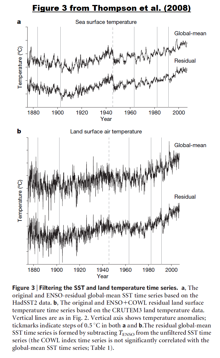
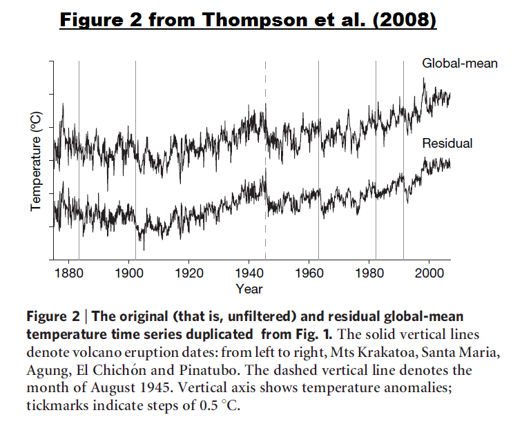
In 2008, Thompson et al. A large discontinuity in the mid-twentieth century in observed global-mean surface temperature (paywalled) brought attention to the sharp drop in sea surface temperatures in 1945, which is the last year of World War 2. They used a number of metrics, including an ENSO index and stratospheric aerosols, to show that the sharp drop-off in sea surface temperatures in 1945 was not caused by volcanos or by the transition from an El Niño to a La Niña. See Figure 4, which uses the same source data and end products as Figure 1, but runs from 1940 to 1975.
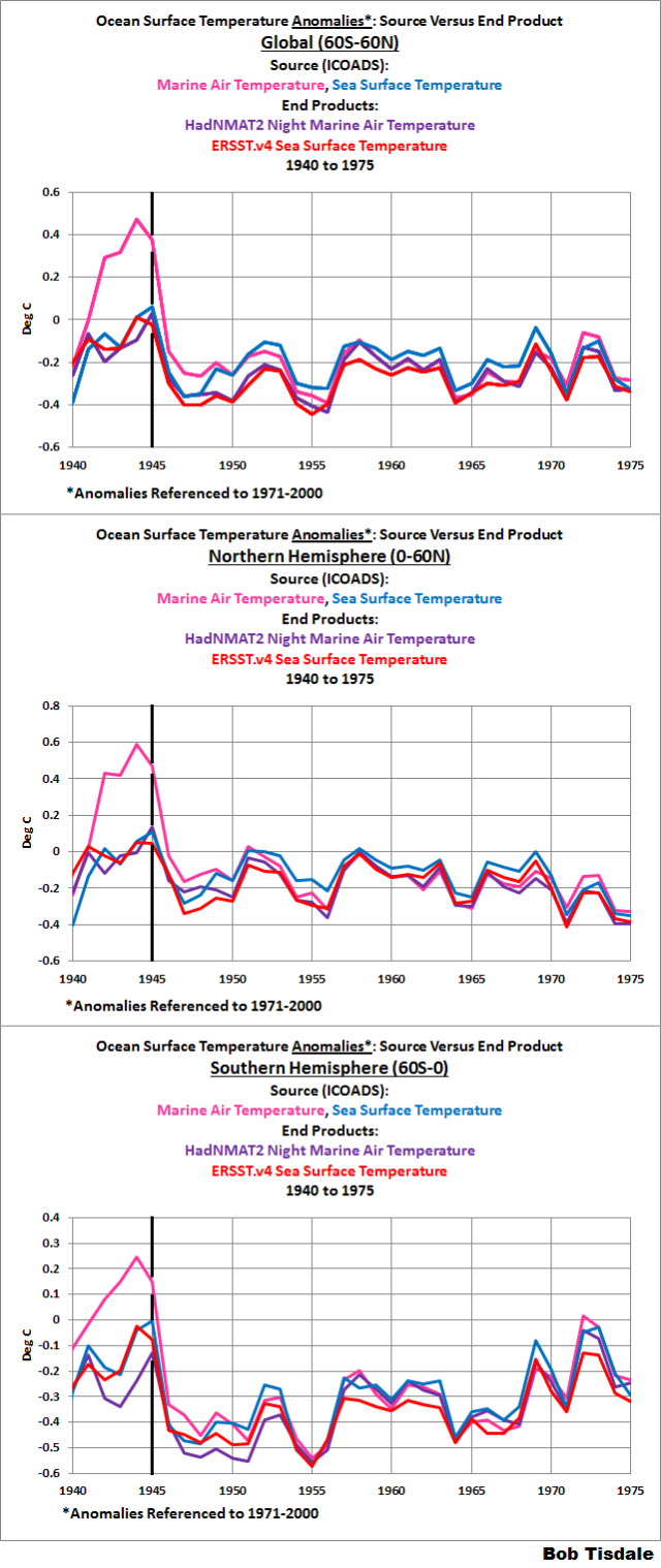
Figure 4
Thompson et al. write about sea surface temperature (SST) data:
The most notable change in the SST archive following December 1941 occurred in August 1945. Between January 1942 and August 1945, ~80% of the observations are from ships of US origin and ~5% are from ships of UK origin; between late 1945 and 1949 only ~30% of the observations are of US origin and about 50% are of UK origin. The change in country of origin in August 1945 is important for two reasons: first, in August 1945 US ships relied mainly on engine room intake measurements whereas UK ships used primarily uninsulated bucket measurements12, and second, engine room intake measurements are generally biased warm relative to uninsulated bucket measurements6,7.
Hence, the sudden drop in SSTs in late 1945 is consistent with the rapid but uncorrected change from engine room intake measurements (US ships) to uninsulated bucket measurements (UK ships) at the end of the Second World War. As the drop derives from the composition of the ICOADS data set, it is present in all records of twentieth-century climate variability that include SST data.
Thompson et al also note the 1945 discontinuity does not exist in the land surface air temperature data (I’ve included links to their Reference 5 and their Figures 2 and 3 in the text):
The step in late 1945 does not appear to be related to any known physical phenomenon. No substantial volcanic eruptions were reported at the time, and the nuclear explosions over Hiroshima and Nagasaki are estimated to have had little effect on global-mean temperatures: ~100 Hiroshima-sized explosions are predicted to lead to a global-mean cooling of ~1.25 deg C (ref. 5), thus two such explosions might be expected to lead to a cooling of less than 0.03 deg C. Furthermore, ocean and land areas should both respond to an external forcing, but the step is only apparent in SSTs (Fig. 3). The global-mean land time series does not exhibit warming from the middle of the century until about 1980, but there is no large discrete drop in late 1945 in the unfiltered land series and only an indistinct drop in the residual land series (Fig. 3b). As is the case for the global mean time series in Fig. 2, the drop is apparent in the unfiltered global-mean SST time series but is highlighted after filtering out the effects of internal climate variability.
You may be noting in Figure 4 that the discontinuity also appears in the HadNMAT2 night marine air temperature data. The support paper for HadNMAT2, Kent et al. (2013), discussed the World War 2 and post-war periods in their Key Results and Remaining Issues (my boldface):
It is possible though that the adjustments applied to the data after WW2 are not applicable to the data in the region 15 to 55S, since there is a relative cool bias of about 0.4 C here during the mid-1940s to mid-1950s, as compared to the HadSST3 ensemble median.
The HadNMAT2, unlike MOHMAT4 and HadMAT1 is not dependent on time-varying SST for any adjustment, although at the cost of a shorter data set. The requirement for the Suez adjustment was removed by the exclusion of observations rather than using SST anomalies. WW2 biases in NMAT are adjusted using daytime marine air temperature anomalies, as in previous data sets. The adjustment appears to have slightly better results than that used in MOHMAT4 and is applied over a shorter period. However, comparisons with collocated land anomalies suggest that HadNMAT2 remains too warm during WW2. Further investigation of the daytime marine air temperatures is therefore required. Additionally, our analysis suggests that the data prior to 1886 are also erroneously warm and should not be relied upon.
In other words, the discontinuity in the night marine air temperature may also result from observation biases, which then get passed on to the NOAA ERSST.v4 data. Regardless, Thompson et al. (2008) found there was no basis for the 1945 discontinuity, yet NOAA did not correct for it in their ERSST.v4 “pause(s)-buster” data.
FURTHER INFORMATION ABOUT THE WORLD WAR 2 AND POST-WAR PERIODS
In addition to changes in temperature-sampling practices, there are a couple of other things to consider when looking at sea surface and marine air temperature data during the 1940s and 50s.
First, the number of source (ICOADS) sea surface temperature observations drops off drastically in some ocean basins during the early 1940s, while in others the sampling was so poor to begin with that the wartime decreases in ship traffic appear to have had little impact on the number of observations there. See Figure 5, which includes the number of observations per 2-deg latitude by 2-deg longitude grid, for the North Atlantic (0-60N, 80W-0), South Atlantic (60S-0, 70W-20E), Indian (60S-30N, 20E-120E), North Pacific (0-60N, 100E-90W) and South Pacific (60S-0, 120E-70W) basins. (The number of observations for the ICOADS v2.5 sea surface and marine air temperature data are available from the KNMI Climate Explorer.) The top graph runs from January 1880 to November 2015, and, in the bottom graph, I’ve shortened the time to January 1900 to January 1960 so that the world war periods are easier to see.
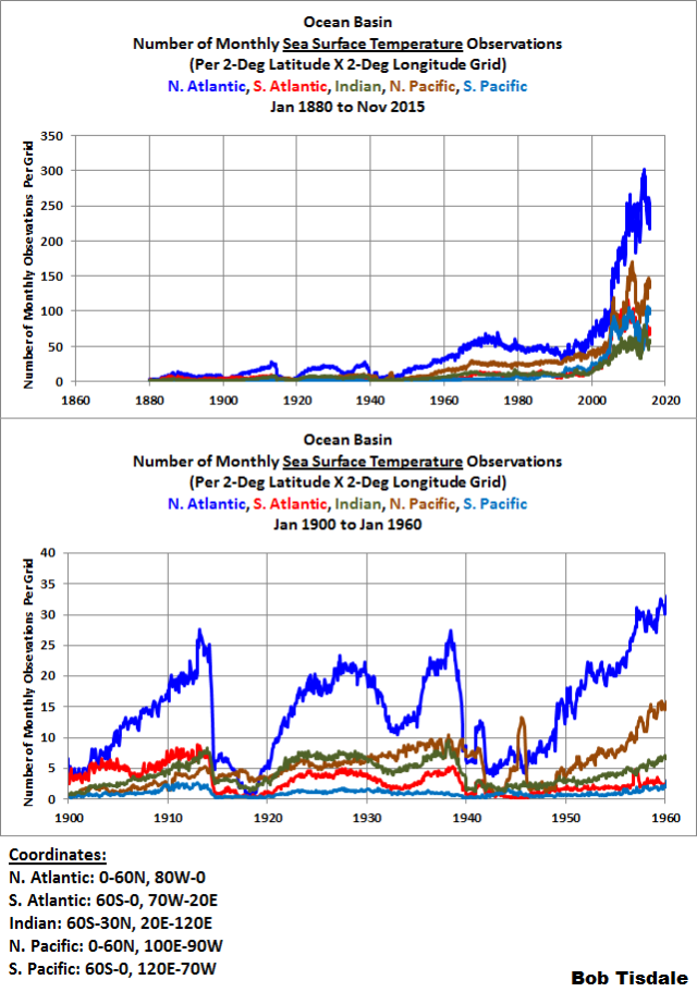
Figure 5
The same holds true for the ICOADS source marine air temperature (day and night) data. The number of source (ICOADS) marine air temperature observations drops off drastically in some ocean basins during the early 1940s, while in others the sampling was very poor before, during and after World War 2. See Figure 6. Now consider, for the HadNMAT2 data, the number of observations is roughly half of what’s shown because they use only nighttime observations (except during World War 2, as discussed above, when they use only daytime observations).

Figure 6
Figure 7 includes the number of marine air temperature (MAT) and sea surface temperature (SST) observations for the Northern (0-60N) and Southern (60S-0) Hemispheres per 2×2 deg grid. I’ve provided it to better show the disparity between the hemispheres in the number of observations. It indicates the number of sea surface and marine air temperature observations are similar until the 1990s, when, assumedly, the deployment of moored and drifting buoys provided a marked increase in the number of sea surface temperature observations…which then skyrocketed in 2005.

Figure 7
But the number of observations per grid doesn’t tell the entire story. The spatial coverage of the global oceans also declined drastically during World War 2. My Figure 8 is Figure 2 from Woodruff et al. (2011), which was the support paper for the current version of the ICOADS source data. We’re interested in the red curve (Release 2.5) which relates to the right-hand scale. It shows that during the Second World War the 2×2-deg latitude-longitude grids with sea surface temperature observations covered only roughly 20% of the surface of the global oceans.
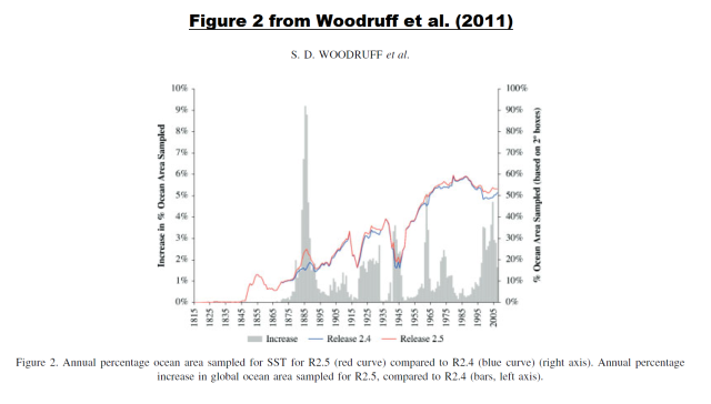
Figure 8
Something else to consider: the grids with data do not remain constant. They obviously depend on where ships traveled, which changed from month to month. To help you visualize this, the maps in Animation 1 show the grids with data, running from January 1935 to December 1950. I’ve also included notes on some months (and paused the animation) to indicate when World War 2 started and ended and to highlight the month with what appears to be the poorest spatial coverage (December 1941, associated with Pearl Harbor).
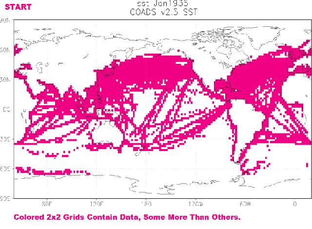
Animation 1
TO INFILL OR NOT TO INFILL GRIDS WITH MISSING DATA
As discussed and illustrated above, many of the ocean grids do not contain data. For datasets that did not incorporate satellite-based data starting in the early 1980s, this problem of poor spatial coverage remained until recent decades when drifting buoys (not ARGO floats) were deployed. That is, coverage improved since the 1950s, but there were still many portions of the Southern Hemisphere (south of 30S) with little source data until the drifters.
There are a number of different statistical methods that suppliers use to fill in the blank grids…if they elect to infill them.

Figure 9
Figure 9 includes maps of ocean surface temperature-related data for the month of December 1941…a worst-case example during World War 2, but could be considered a best-case example before 1900. (See my Figure 8 again.) Now consider that ICOADS showed that grids with source data covered roughly only 20% of the surface area of the global oceans. That means, in these examples, roughly 80% of sea surface temperature data in the infilled datasets (Cowtan and Way, ERSST.v4 and HadISST) are make-believe…created using statistical methods that provide strikingly different results in the patterns of sea surface temperature anomalies. See Animation 2.

Animation 2
I’ve also included the Cowtan and Way surface temperature anomalies as a reference for another method of infilling. (Cowtan and Way infill the UKMO HadCRUT4 data, which is made up of HADSST3 and CRUTEM4 data.) Because the KNMI Climate Explorer does not include a mask for land surfaces for the Cowtan and Way surface temperature product, that map originally included land surface temperature anomalies. So I “whited out” the data over land surfaces for Figure 9 and Animation 2. As a result, any carry-over from ocean to land that appears in the HADSST3 map (the basis for the Cowtan & Way data) will be lost. I also did not bother to “white out” the polar oceans in the Cowtan & Way data, where land surface air temperature data are extended out over the oceans. The other maps are for sea surface and marine air temperatures products only. (For those interested, an animation that compares maps of the Cowtan and Way data for December 1941 to the source HadCRUT4 data is here.)
The top two graphs show the grids with source data for the ICOADS source sea surface temperature (Cell a) and marine air temperature (Cell b) datasets. Directly below them are maps of the sea surface temperature anomalies for the not-infilled UKMO HADSST3 sea surface temperature (Cell c) and the infilled NOAA ERSST (Cell d) products. On the left of the third tier is the December 1941 temperature anomalies of the Cowtan and Way product (Cell e), which infills UKMO HADSST3 data, and to the right (Cell f) is HadISST data (not the same as HADSST3), which are infilled using yet another method.
The UKMO elects not to fill in grids without source data for their HADSST3 data (used in their HadCRUT4 global surface temperature product) or its HadNMAT2 data (used by NOAA for ship-bias corrections). But referring to the maps in Figure 9, we can see that more of the oceans are covered with the HADSST3 (Cell c) than its sea surface temperature (Cell a) source data. (The same would hold true for the HadNMAT2 data, but, unfortunately, the map-plotting feature for the HadNMAT2 data were not available at the KNMI Climate Explorer when I prepared this post.) The UKMO accomplishes this limited infilling in a very simple way. The source data are furnished in 2-deg latitude by 2-deg longitude grids, where the two not-infilled UKMO products are presented in 5-deg latitude by 5-deg longitude grids. A 2×2-deg grid with data has been expanded to a 5×5-deg grid. (See the animation here for the comparisons of the coverage of the ICOADS source and UKMO end products for sea surface temperatures.) Also, the UKMO indirectly fills in their products (by hemisphere) in their monthly and annual time series values. They do this per hemisphere by determining the average value of the grids with data, which then get assigned by default to the grids without data.
The map of the December 1941 ERSST.v4 sea surface temperature anomalies (Cell d) is to the right on the second tier. NOAA uses a statistical tool called Empirical Orthogonal Teleconnections (EOT) to fill in grids with missing data. (See van den Dool et al. (2002) Empirical Orthogonal Teleconnections.) Basically, NOAA uses the spatial patterns found in satellite-based data (due to their better coverage of the global oceans) to infill missing data. (But NOAA does not include satellite-based data in their ERSST.v4 product.)
Directly below the HADSST3 data (Cell c) is the infilled product from Cowtan and Way (Cell e). See Cowtan and Way (2014) Coverage bias in the HadCRUT4 temperature series and its impact on recent temperature trends. Cowtan and Way use a statistical method call Kriging to fill in the blanks. (See the animation here for a comparison of the HADSST3 and Cowtan and Way maps. Again, there are differences along the coasts on land due to my whiting-out of land grids on the Cowtan and Way map.)
The bottom right-hand map includes the sea surface temperature anomalies based on the UKMO’s infilled sea surface temperature dataset called HadISST (Hadley Centre Sea Ice and Sea Surface Temperature data set). HadISST is NOT the same as HadSST3. HadISST is supported by the 2003 Rayner et al. paper Global analyses of sea surface temperature, sea ice, and night marine air temperature since the late nineteenth century. HadISST uses satellite-enhanced sea surface temperature data starting in the early 1980s, and it also uses a statistical tool called Empirical Orthogonal Function (EOF) analysis to infill missing data. Like NOAA and their EOT analysis, the UKMO uses the EOF-found spatial patterns during the satellite era to infill missing data before the satellite era.
I believe the UKMO includes another step for the HadISST data that is not employed by NOAA, whereby the UKMO reinsert in-situ data when there is insufficient source data for the EOF analysis.
Bottom line: There are few similarities between the sea surface temperature anomaly patterns in the maps of the three infilled sea surface temperature datasets (HadISST, ERSST.v4, and Cowtan and Way) in this worst-case month. In more recent times, before the drifters were deployed heavily in the 2000s, you’d still find major differences in those spatial patterns, primarily where in situ-sampling was poor, like south of 30S.
NOTE: Notice the odd-looking “El Niño” in the Cowtan and Way data, Figure 9, Cell e.
Cowtan and Way (2014) discuss the benefits of the Kriging method of infilling:
Kriging offers several benefits. The reconstructed values vary smoothly and match the observed values at the coordinates of the observations. The reconstructed values approach the global mean as the distance from the nearest observation increases, i.e. the method is conservative with respect to poor coverage. Clustered observations are downweighted in accordance with the amount of independent information they contribute to the reconstructed value; thus area weighting is an emergent property of the method, with observations being weighted by density in densely sampled regions and by the region over which the observation is informative in sparse regions.
Cowtan and Way (2014) also discuss the disadvantages of Kriging:
Kriging the gridded data also has some significant disadvantages: information about station position within a cell is lost, cells with a single station receive the same weight as cells with many and (equivalently) no account is taken of the uncertainty in a cell value. The acceptability of these compromises will become apparent in the validation step.
But Cowtan and Way (2014) forgot to discuss a blatantly obvious disadvantage of Kriging: As shown in Figure 9, Cell e, Kriging can also create a spatial pattern that bears no resemblance to known phenomena, like their El Niño that runs diagonally, from the northwest to the southeast across the eastern tropical Pacific.
[End note.]
Kennedy (2014) A review of uncertainty in in situ measurements and data sets of sea-surface temperature (paywalled, but Submitted copy here.) provides a reasonably easy-to-understand overview of the uncertainties associated with infilled data. See the discussion that begins:
Although some gridded SST data sets contain many grid boxes which are not assigned an SST value because they contain no measurements, other SST data sets – oftentimes referred to as SST analyses – use a variety of techniques to fill the gaps. They use information gleaned from data-rich periods to estimate the parameters of statistical models that are then used to estimate SSTs in the data voids, often by interpolation or pattern fitting. There are many ways to tackle this problem and all are necessarily approximations to the truth. The correctness of the analysis uncertainty estimates derived from these statistical methods are conditional upon the correctness of the methods, inputs and assumptions used to derive them. No method is correct therefore analytic uncertainties based on a particular method will not give a definitive estimate of the true uncertainty.
Please read the remainder of that section of Kennedy (2014). In fact, the entire paper provides an excellent detailed discussion of the uncertainties associated with sea surface temperature data.
That’s enough backstory.
HADSST3 HAVE BEEN ADJUSTED TO ACCOUNT FOR THE 1945 DISCONTINUITY AND SUBSEQUENT BIASES, WHILE NOAA’S ERSST.v4 DATA HAVE NOT
HADSST3 data are used for the ocean portion of the UKMO combined land+ocean surface temperature product called HadCRUT4. HADSST3 data are supported by the papers:
- Kennedy et al. (2011) Reassessing biases and other uncertainties in sea-surface temperature observations measured in situ since 1850, part 1: measurement and sampling uncertainties
- Kennedy et al. (2011) Reassessing biases and other uncertainties in sea-surface temperature observations measured in situ since 1850, part 2: biases and homogenisation
The global and hemispheric time series graphs in Figure 10 compare the HADSST3 and NOAA ERSST.v4 sea surface temperature products from 1880 to 2014. Notice the differences between the NOAA ERSST.v4 and UKMO anomalies from the mid-1940s to the mid-1970s. The ERSST.v4 data run noticeably “cooler” than the HADSST3 data.

Figure 10
I’ve highlighted the post-World War 2 (post-discontinuity) differences in Figure 11, which includes the UKMO HADSST3 and NOAA ERSST.v4 data for the period of 1940 to 1975.
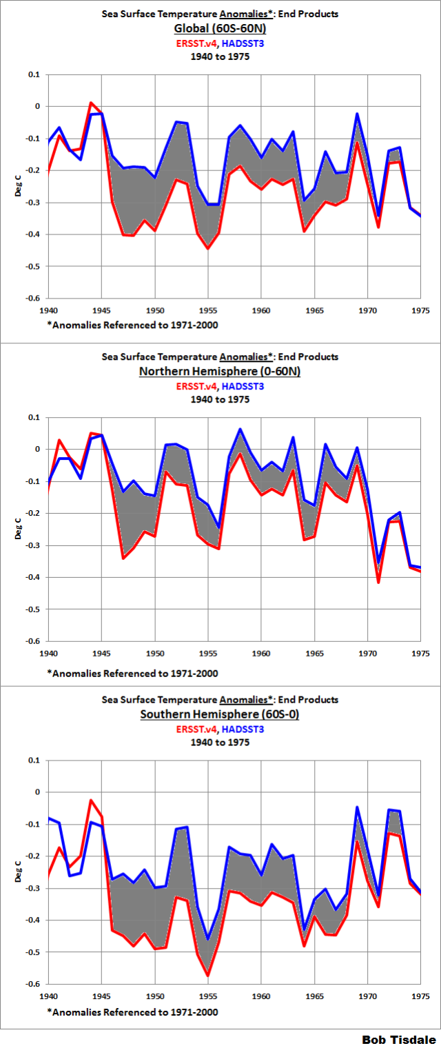
Figure 11
UKMO have corrected the HADSST3 data to account for the 1945 discontinuity and trailing irregularities. NOAA has not made those corrections with their ERSST.v4 data. NOAA elected to use the HadNMAT2 data for bias corrections of ship-based data during this time…even though, as quoted earlier, Kent et al. (2013) expressed concerns about the HadNMAT2 data during the period, and even though Thompson et al. (2008) concluded there was no reason for the discontinuity.
WHY DO YOU SUPPOSE NOAA FAILED TO CORRECT FOR THE 1945 DISCONTINUITY AND SUBSEQUENT BIASES?
For a hint, take a look at a graph of global surface temperature anomalies furnished as part of the press release for Karl et al. (2015). See my Figure 12. (Notice that the anomalies are presented in deg F for U.S. audiences, not deg C as we’ve been using in this post.) The caption reads:
Contrary to much recent discussion, the latest corrected analysis shows that the rate of global warming has continued, and there has been no slowdown.

Figure 12
Note that the trend line starts in 1951. That suggests the recent warming period started in 1951, not the mid-1970s (1975) as has typically been used. In other words, not only has NOAA endeavored to eliminate the slowdown in global warming in recent years, NOAA also appears to be attempting to eliminate the slowdown (or cooling) of global surface temperatures from the mid-20th Century to the mid-1970s.
Let’s return to the global sea surface temperature anomaly data. The top graph in Figure 13 compares the linear trends of the global (60S-60N) NOAA ERSST.v4 and UKMO HADSST3 data for the period of 1951 (NOAA’s start year for their trend line in Figure 12) to 1975 (1975 is often used as the breakpoint between the mid-20th Century pause in global warming and the latest warming period). Globally, the NOAA ERSST.v4 data show warming from 1951 to 1975, while the UKMO HADSST3 data show cooling.
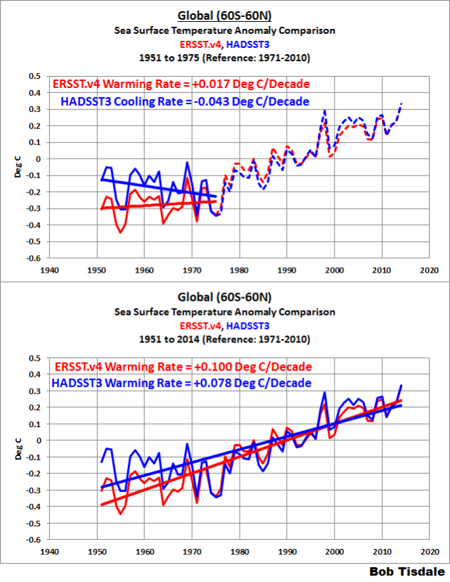
Figure 13
Because the NOAA ERSST.v4 data run “cooler” than the UKMO HADSST3 data during the 1950s and 60s, the warming rate of the NOAA ERSST.v4 data from 1951 to 2014 is noticeably higher than the UKMO HADSST3, globally and in both hemispheres. See the bottom graph in Figure 13.
Since we’ve been discussing the discontinuity starting in 1945, let’s start the comparisons in that year and we’ll end again in 1975, for the top graph in Figure 14. That also provides us with 31 years for the mid-20th Century slowdown (cooling) period. Once again, globally, the UKMO HADSST3 data show cooling from 1945 to 1975, while the NOAA ERSST.v4 data show warming.

Figure 14
And it should go without saying that the global sea surface temperature warming rate of the NOAA ERSST.v4 data from 1945 to 2014 is noticeably higher than the UKMO HADSST3, because the NOAA ERSST.v4 data run “cooler” than the UKMO HADSST3 data during the late-1940s, 50s and 60s. Refer to the bottom graph in Figure 14.
CLOSING
It appears that NOAA is attempting to eliminate another pause in the warming of global surfaces, this time the mid-20th Century slowdown/cooling period.
It definitely cannot be argued that NOAA improved the way they process sea surface temperature data to get scientifically better results, because:
- NOAA’s results oppose the scientific findings of Thompson et al (2008) and
- NOAA overlooked the concerns expressed by the supplier of their reference night marine air temperature data during the post-World War 2 period.
I included the following in the closing to the post Pause Buster SST Data: Has NOAA Adjusted Away a Relationship between NMAT and SST that the Consensus of CMIP5 Climate Models Indicate Should Exist?:
I suspect, when Congressman Lamar Smith’s whistleblowers are concerned about rushing the Karl et al. (2015) study “before appropriate reviews of the underlying science and new methodologies used”, they’re discussing:
- the uncertainties of the bias adjustments,
- the uncertainties of the data,
- the basic methodologies, including how NOAA distributed those adjustments around the oceans, and
- most importantly, for the “underlying science”, how NOAA appears to have adjusted out a difference between ship temperature measurements and night marine air temperature that should exist according to the consensus of the newer climate models—once again assuming that NOAA’s other grand assumption…“The model SAT is used since the model bias is assumed to be the same during daytime and nighttime”…is correct.
We can now add another bullet point:
- NOAA failed to make the necessary mid-20th Century adjustments to their ERSST.v4 sea surface temperature datasets—corrections that would have been supported by Thompson et al. (2008). Likely reasons: (1) NOAA did not want to decrease the warming rate starting in 1950 that would have resulted if they had made those corrections and (2) NOAA wanted to show a more continuous warming since 1950, which would not have existed if they had made those corrections.
Once again, maybe, in time, Dr. Sullivan of NOAA will produce the emails requested by Representative Smith so that we can confirm my suspicions and the suspicions of many others.
Last, I suspect some persons will argue that there is too much uncertainty during this period for the results shown in this post to have any merit. I will counter with the argument that, as a whole, climate science as practiced by NOAA is not focused on uncertainties in their presentations to the public. Do we see any uncertainties expressed in any way in NOAA’s press release for Karl et al. (2015) Science publishes new NOAA analysis: Data show no recent slowdown in global warming? A new paper by Huang et al (2015) Further Exploring and Quantifying Uncertainties for Extended Reconstructed Sea Surface Temperature (ERSST) Version 4 (v4) is in press (preliminary accepted version is paywalled). Will NOAA demonstrate a commitment to honestly communicating with the public by producing an easy-to-understand press release for it…showing the wide ranges of uncertainties in the warming rates?
“Will NOAA demonstrate a commitment to honestly communicating with the public by producing an easy-to-understand press release for it…showing the wide ranges of uncertainties in the warming rates?”
Seems hardly likely, considering Dr. Sullivan’s response to Representative Smith’s request and the previous press release.
“Will NOAA demonstrate a commitment to honestly communicating with the public by producing an easy-to-understand press release for it…showing the wide ranges of uncertainties in the warming rates?”
NO, and most certainly NO.
Anyone having hope of the truth from government agencies at this point, should watch Sen. Ed Markey’s performance during the recent Senate hearings (covered here at WUWT.) The truth about matters climate, does not fit the agenda of those who would increase their control over you and stick their hands further into your pocket.
This is thorough and detailed. Requires an answer from Karl, but it will never surface.
ristvan was not slow in getting his punch line in over at Judith Curry
“ristvan | December 21, 2015 at 11:32 am | Reply
Concerning the closing section uncertainties bullet, it is worth repeating that Karl 2015 used Huang 2015 SST. Huang used the method of Kennedy 2011 to compute a 0.1C adjustment. But neither Karl nor Huang reported the uncertainty in this adjustment. Kennedy did, 0.1C +/- 1.7C. Absolutely unfit for purpose.”
So the uncertainty greatly exceeds the adjustment, but not disclosed so as not to affect the impact of the paper.
“So the uncertainty greatly exceeds the adjustment”
I cannot find those figures in Kennedy’s paper, and it seems ristvan can’t either.
Nick, go back under your bridge and have a great day!
Professor Robert Brown has an interesting post here:
http://wattsupwiththat.com/2015/11/06/is-climate-science-settled-now-includes-september-data/#comment-2068737
The following graphic showing GISS going up and Hadcrut4 going down from that post is very revealing:
http://www.woodfortrees.org/plot/hadcrut4gl/from:1960/to:1979/offset:-0.32/plot/gistemp/from:1960/to:1979/offset:-0.465/plot/hadcrut4gl/from:1960/to:1979/offset:-0.32/trend/plot/gistemp/from:1960/to:1979/offset:-0.465/trend
Here’s another example of GISS being out of step with reality.
Correction : satellite temperatures (as they are recorded in your system) are out of step with reality, as we can feel it on the the earth’s surface, where we all live : phrenology, animals behaviour etc.
Francois,
I suggest you study a little more from what I’ll presume is your climate-controlled environment that has separated many on the planet from what is actually happening outside. I have a number of relatives who were alive in the scorching 1930-1940 era in the US who simply laugh at the comparisons between now and then.
We have butterfly studies that are faked. We have penguins that didn’t die, but rather they moved because they were being accosted and abused by biologists. We have polar bears increasing in numbers over the last 50 years and very healthy, feeding off plentiful seals in the Spring when it matters. We have sea ice extent records in the Antarctic over the last few years. We have land ice mass increasing overall in the Antarctic. We have sea ice mass increasing over the last 3 years in the Arctic. We have sea ice extent in the Arctic at about the same place that it was a decade ago. We have reportedly “extinct” snails that have been rediscovered (please name a single species that has gone extinct due to global warming in the last 60 years). We have no trends in extreme weather events (no significant trends in global cyclonic energy, US tornadoes, global drought, global flooding). I could go on and on…
You’re largely being lied to, Francois.
And oh by the way, yes it does appear that the globe is warming slightly over the last century and there was a period of warming in the 1980-2000 timeframe (which is completely in line with earlier periods in the late 1800’s and mid 1900’s; not unprecedented at all). Where is the evidence that refutes the null hypothesis that this was largely natural cycles? Nope, sorry, models are not evidence. Sorry, it is getting clearer all the time that CO2 is not the significant control knob that you’ve been told repeatedly that it is. What you have is faith, not evidence.
Let’s get back to dealing with local pollution issues, back to nuclear energy as the transitional energy source, back to getting more efficient with resource use, and let’s spend our precious resources dealing with actual slow climate change effects by modifying our infrastructure where needed. Let’s stop lining the pockets of enviro-terrorists, liberal politicians and liberal industry leaders through corrupt carbon trading schemes, corrupt subsidies to the green energy industry house of cards, and taxation/penalties which simply steal from the poor in rich countries to give to rich people in poor countries.
The warming that we’ve seen over the last century and even over the last 30 years appears to be largely beneficial to plants, animals and people. Slowly, that evidence and story is coming out as it becomes so painfully obvious to most of us that the agenda increasingly becomes an obvious inane comedy.
The saddest part of this whole thing for me is that policies from enviro-whackos keep killing real people who need our help the most—and seeing these whackos then try to take credit for saving the planet.
François says:
…we can feel it on the the earth’s surface, where we all live : phrenology, animals behaviour etc.
You can ‘feel it’? Like you can feel the rise in CO2?
No, you’re just being told, and now you’re head-nodding along with the people who are telling you that. But you don’t really ‘feel’ any unusual changes. You just think you do. Your belief is real to you, but it’s not real. It’s in your head, which is in the lower troposphere.
Your specious “surface” argument fails because satellites measure the lower troposphere — where you live. The troposphere begins at the surface. Furthermore, the question has never been the temperature; it has always been the temperature trend, which satellites accurately show.
The ‘earth’s surface’ argument is just the latest in a series of failed attempts to try and claim that satellites are no good, and that global warming is continuing like it always has. That is not true.
Satellite data is the most accurate there is. It shows that global warming — the trend — stopped many years ago.
You’re being lied to, François. But there’s a cure: don’t let others do your thinking for you. Start thinking for yourself.
I thought one was supposed to recognize the flaws in data sets, not “correct” the data set and then base an argument on the “corrected” data set.
The data are “adjusted”, but that does not mean they have been “corrected”. If the sensors are in calibration, the data are correct, if perhaps depicting “An Inconvenient Truth”.
Why not using satellite data, thus eliminating weather station related biases, and covering evenly the whole sea surface ?
http://climate.mr-int.ch/index.php/en/observations/temperature
Because the satellites prove the AGW crowd wrong. Far easier to add a mass of “adjustments” to the data from the buckets and buoys to get the desired result.
http://climate.mr-int.ch/images/graphs/SatelliteUAH.png
“UAH dataset version 6.0”
Yet as seen in the latest lower troposphere numbers, the dataset currently runs 12/1978 to 11/2015. So where did you pull out the data for “base period 1961-1990”?
UAH follows the commonly admitted reference average temperature 1961-1990 as the “zero anomaly”.
Given that during the Second World War most shipping in the North Atlantic travelled in convoy, it would be interesting to compare readings taken by different ships at the same time of day in the same convoy.
Not sure if any of the hard data in the form of the observation records survives, though.
Greenwich Maritime Museum?
There’s a great history to be written here. Worth a paper on its own, OSD. That ‘spike’ 1941-1945 tells a story on many levels. Terrific research by Bob T, as usual
How come there is never any discussion on this blog about the affects of geo-engineering, and I mean the spraying of the atmosphere via the plane??. Please, no comments suggesting the opposite, because I have a Government Act that suggests it has happened/happening or will happen. There are also Corporate websites who openly admit to providing such a service; for insurance companies, municipalities/cities etc.
I believe this is a very important subject, given how it would INFLUENCE the numbers in favor of warming or against it. Some say the pause in warming coincides perfectly with the timing of geo-engineering, that some say aggressively began in the late 90’s. With regards to the last statement; this I cannot prove as I haven’t looked into the timing of such missions.
FYI: I’m strongly against any tampering of Gods beautiful atmosphere. I love it the way it is.
thank you
Chem trails?
rolls the eyes*
What the hell does that mean?
Do you have anything or say or what?
(Reply: ‘Chemtrails’ is a forbidden subject here, per site Policy. -mod)
Remember when a person could just look up at the clouds and remark on how beautiful and awe-inspiring the sky seemed.
Alas, those days are now gone.
A large section of the public now immediately form some unjustified interpretation involving either “chem-trails” or “extreme-weather”.
For those people something is always slightly wrong and worrying.
At least there are still a few minds in which – it’s just the sky – doing what it’s always done.
With a few extra con-trails thrown in, due to the increase in air traffic.
Maybe one day, people will learn to regain their innocent enjoyment of the weather.
I’m NOT the one who used that word Alan! It was one of your followers. Is geo-engineering forbidden from subject matter? I believe this issue is geo-engineering. You people are so quick to disregard those trails and make me look like i’m the nut, but yet there’s no discussion about why you forbid such subject or why you or anyone else haven’t made a case for why it isn’t happening.
I think your tin foil hat is just a little too tight…
Again, no substance, just trolling as usual. Whenever you want the proof coward, just say when. Otherwise you’re just another online sock puppet. Clearly you and your confederate have nothing to say in favor or against. Got any proof or brains?
If you have ” proof ” , why didn’t you link to it ????
http://laws-lois.justice.gc.ca/eng/acts/W-5/page-1.html
make sure you read the interpretation. Now why would Canada (Her Majesty) need to write up an act?
Preventive medicine….You don’t have to wait for something to happen BEFORE you act !!! Very simple…..
Cloud seeding is old technology and not very useful. The Canadian Statute refers to this practice.
https://en.m.wikipedia.org/wiki/Cloud_seeding
Also, you are trolling as you are off topic.
Your answer: “Preventive medicine….You don’t have to wait for something to happen BEFORE you act !!! Very simple”…..
I guess you’re not familiar with government. That’s probably the strangest response I’ve ever seen
Whether on a small scale or not, inert or not; do you believe that various corporations and or government agencies either have, currently are, or are planning to engage in weather modification?
Anyways i’m done. Weather mod is happening all over America and Canada- benign or not, I don’t give a damn, its retarded! Its not some covert operation, its out in the open.
See Go Canucks ( Canuck, that’s me ) reply to you….It has nothing to do with Global temperatures !!!
Go Canucks!!
Its not off topic, its directly related to the climate change/global warming topic. You cannot have a discussion about climate change and not take into account weather modification- small scale or large, it all has some affect.
Maybe its not very useful, but it still doesn’t excuse the fact that they are doing it. Why? Why go around spraying salts and silver?
I’m trolling……… give me a break!!!!!
(Reply: Once again, ‘chemtrails’ is a forbidden topic here, per site Policy. -mod)
I think kenin is right, and WUWT et al, is wrong about this topic..
@kenin
The act you refer to was designed to cover cloud seeding basically. The use of silver halides to provide a nucleus for water condensation leading to rainfall. That is not chemtrails etc. just a bit of 50 year old technology that is a bit iffy at best.
Bob,
Ayup, makes sense.
Yes note that the trendline starts in 1951 and review from above: … between late 1945 and 1949 …
I think not. Review your quote from Thompson (2008):
WW2 biases in NMAT are adjusted using daytime marine air temperature anomalies, as in previous data sets. The adjustment appears to have slightly better results than that used in MOHMAT4 and is applied over a shorter period. However, comparisons with collocated land anomalies suggest that HadNMAT2 remains too warm during WW2. Further investigation of the daytime marine air temperatures is therefore required.
IOW, it’s not just the drop from 1945-49 which may be spurious, but the runup from 1938-44 as well.
Brandon Gates says: “Yes note that the trendline starts in 1951 and review from above: … between late 1945 and 1949 …”
Nice try, Brandon. Can you see the difference in the 1951 starting point in Figure 13? How else would you explain the disparity between the ERSST.v4 and HADSST3 data?
If you had read Thompson el al. you would have noted that the problems continued into the mid-1960s. Sorry, I should also have included the following quote from Thompson et al.as well:
“The Met Office Hadley Centre is currently assessing the adjustments required to compensate for the step in 1945 and subsequent changes in the SST observing network. The adjustments immediately after 1945 are expected to be as large as those made to the pre-war data (,0.3 uC; Fig. 4), and smaller adjustments are likely to be required in SSTs through at least the mid-1960s, by which time the observing fleet was relatively diverse and less susceptible to changes in the data supply from a single country of origin9.”
Brandon Gates says: “IOW, it’s not just the drop from 1945-49 which may be spurious, but the runup from 1938-44 as well.”
See Figure 11. The 1938-1944 “runup” in the ERSST.v4 data certainly looks odd, especially in the Southern Hemisphere. Looking at Figure 3, the HadNMAT2 data do not support the ERSST.v4 data during that time either. Also, that still doesn’t explain the difference starting in 1951.
Cheers.
Bob,
What I think is that the spike at 1943 is spurious and that neither team have adequately corrected it. I can only speculate why that would be the case, and must also consider that I’m quite wrong about the corrections being inadequate.
True.
Also true, thank you. Noting that they say the required adjustments are smaller, further noting that “smaller” isn’t quantified, and even further noting that the MET is still reviewing this, I think it would be wise to wait for the results to come back before drawing any conclusions. That all said, I think you’re reaching on this one …
http://1.bp.blogspot.com/-HGT605CXR7w/VNoo9mjLeuI/AAAAAAAAAg8/QK_0C_L-hYc/s700/ocean%2Braw%2Badj.png
… since net adjustments for HADSST3 over the entire interval are in the cooling direction. I have difficulty imagining that the net adjustments to ERSST don’t exhibit a similar net negative from raw to final product.
Brandon, blogger AK over at Judith Curry’s found a link to a not-paywalled copy of Thompson et al.
https://www.researchgate.net/profile/P_Jones/publication/200033638_A_large_discontinuity_in_the_mid-twentieth_century_in_observed_global-mean_surface_temperature/links/00b7d53959e7ae33e7000000.pdf
Cheers.
Isn’t the main point that we are looking at less than 1 degree C increase since 1880?
The appearance of rising, flat, or cooling temperatures depends on which length of time you choose for your graph. Recent experience is the most relevant- 1/3 of the anthropogenic influence on climate since 1750 has occurred in the past 18 years 8 months yet temperatures have not risen in that time.
But at the end of the day it has risen less than 1 degree.
Many of the early temperature readings have been adjusted and there is uncertainty as to their accuracy.
Measurement of temperature in terms of variation from an average rather than plotting the baseline temperature creates the illusion of significant increases and this has happened because of the newness of climate science and the lack of defined procedures.
Does a world average temperature have any real meaning at all?
This possible small increase in temperature has not resulted in any increase in natural disasters so why are we about to spend so much money on a misdirected effort to stop further warming?
Because some people really get it hard when they see a windmill or a solar panel and demand the rest of us destroy all our present forms of power to satisfy their utopian fantasies.
Some people look at the guaranteed monetary returns from subsidy farms and in today’s economy they are the only guaranteed high return. Threaten to take away that trough and they will pull all the strings at their disposal. Similarly, politicians look at the ability to control world energy usage and salivate at the taxation and power possibilities. So bankers and politicians have yet again formed an alliance to make money and take power. Of course they will be upset if anyone throws any grit in the gears. Hence Senator Markey’s strange performance.
In a post like this, you ought to include the rate of warming for the period ~1910 to ~1945.
This was before there was significant emissions of manmade CO2, and even the IPCC does not suggest that that warming episode was anthropogenic in origin.
The rate of warming for the period ~1910 to ~1945 is equal if not greater than the rate of warming between 1950 to date in the NOAA plot (figure 12)
The fact that manmade CO2 emissions post 1950 have not caused the rate of warming seen between ~1910 to ~1945 to increase suggests that CO2 at current levels does not have a material impact.
Until the warming episodes between ~1910 to ~1945, and the earlier warming episode in the 1860s can be adequately explained, it would appear that all the warming seen in the 20th Century is nothing other than that driven by natural variation.
Bob
The NOAA plot figure 12 is very revealing. Whilst it is used to help promote the cause by claiming that there is no slow down in the rate of warming into the 21st century, it is damning in that is clearly shows that there has been no increase in the rate of warming that was seen in the warming episode between ~1920 to ~1945.
I consider that in a post like this, you ought to include the rate of warming for the period ~1910 to ~1945 since this was before there was significant emissions of manmade CO2, and even the IPCC does not suggest that that warming episode was anthropogenic in origin.
The rate of warming for the period ~1910 to ~1945 is equal if not greater than the rate of warming between 1950 to date in the NOAA plot (figure 12)
The fact that manmade CO2 emissions post 1950 have not caused the rate of warming seen between ~1910 to ~1945 to increase suggests that CO2 at current levels does not have a material impact.
Until the warming episodes between ~1910 to ~1945, and the earlier warming episode in the 1860s can be adequately explained, it would appear that all the warming seen in the 20th Century is nothing other than that driven by natural variation.
Richard, the early warming period is another topic of discussion.
Cheers.
I understand that, but it is relevant to the revised NOAA (fig 12) plot.
NOAA claim that the warming has not stopped, well Yes according to their plot, but then that immediately begs the question that the earlier warming episode has the same or greater rate of warming and was not manmade in origin.
What other field of physical science would dare claim any degree of precision in their data, considering the uncertainties inherent in past measurements of “global temperature and the huge gaps between data points?
You have to wonder how there can be any conclusion from any of it beyond, “it has probably warmed some in the last 100 years or so.”
Folks like Bob Tisdale deserve all the credit for using their genius level understanding of numbers and statistics to navigate through the mess, and explain it to us, but consider this – if mere “technical adjustments” to the data can result in a significant change in overall global temperature trends, what does that say about the underlying process and the significance of any conclusions? Nothing positive from my admittedly intuitive and naive perspective. Am I missing something or is it all like trying to split hairs with a dull pocket knife?
You’re absolutely right. I looked at the Hansen study that’s at the heart of the “land-based” temperature record and most of it is made up out of thin air…..yet government agencies use that as the core of their “scientific” pronouncements of doom.
What we are looking at is very bad science. Their hypothesis has failed over and over yet they continue to beat it as the drum of fact. In a media culture that sells fear on every level, these guys have found a very warm place to insulate their scientific incompetence from the cold light of reason. The politicians and media love them. They provide an excellent source of fear to keep the masses in a state of consumeristic anxiety, especially since all their scenarios of horror occur in the future, always in the future, always beyond the grasp of present reality. “If you want to control people, lie to them.”…L. Ron Hubbard.
So a new cult religion is born: the Church of Anthropogenic Global Warming. In CO2’s highly exaggerated forcing they trust. Their religious symbol is a windmill. Their Satan is a lump of coal. True science is their sworn enemy. Madmen on a mission of world salvation.
Thanks for a very informative and well illustrated article, Bob
Recognition that there is nothing to cause true significant rise in global temperature raises suspicion of any assertion that global temperature is actually rising.
Carbon dioxide has been erroneously suspected of being a forcing on global temperature. Compelling evidence, CO2 has no effect on climate requires only (1) Understanding that temperature changes with the integral of the net forcing (not directly with the instantaneous value of the forcing itself). And (2) all life depends ultimately on photosynthesis which requires CO2.
The 542 million years of evolution on land required substantial atmospheric CO2. The integral of CO2 (or a function thereof) for 542 million years could not consistently result in today’s temperature. Documented in a peer reviewed paper at Energy & Environment, vol. 26, no. 5, 841-845 and also at http://agwunveiled.blogspot.com which also identifies the two factors that explain climate change (97% match since before 1900).
Thanks, Bob Tisdale.
Your sharing of relevant data shows the real world.
All of the individuals involved in climate data collection (excluding the UAH folks Christy and Spencer) have staked their careers on the global warming theory.
We are talking about substantial salaries and substantial prestige and power here.
If you were in that position and were also allowed to just change your assumptions whenever the numbers didn’t work for your theory anymore (ie. just write a paper about a possible way of looking at it and then double the adjustments you implement versus what your paper said was possible), would you do it – protect your career and prestige?
You might and they did.
Nobody can fix it now.
We can only stop using these adjusted numbers now and just note to everyone who uses them, that they are completely unreliable and shouldn’t be used anymore.
Karl 2015 is just unreliable musings about what the climate would be if we wanted unreliable numbers.
I wonder what short term gain can cause people, not one but several, to take actions knowing that the history of science will group them with Trofim Lysenko.
somehow i do see a rend at each revision that seems to occur “cool the past and warm up the actual to create more warming…
the more it gets adjusted the less i start to trust it as “valid data”
…If you torture the data long enough it will confess to anything !!!
Agree. Somewhat OT but whoa, what a gnarly Gulf of Alaska “blob” in 1911! Makes the last couple year’s efforts milktoast. Dec. 1941 HadSST1 shows blob about equal to this year, but contradicted by HADCRUD.
Quality Control of ERSST4: One first step could be to calculate the year-to-year differences of the global record and the 2-sigmas of this record. I’ve done it: http://kauls.selfhost.bz:9001/uploads/ersst4qm.png .
So the years 1916,1946 and 1999 are very suspicious ( more than -2 sigma) and the years 1972 and 1977 ( more than +2 sigma). The ERSST4 would not pass one of the 1st steps of QM. It did. Nothing more to say!
Can I ask a stupid question that has been bugging me for a while?
Why are historic temperature graphs so jagged?
I mean, I can understand some seasonal temperature fluctuations over the course of the year. After all, the part of the earth that is most directly facing the sun is changing throughout the year therefore the effective albedo of the earth is changing too. Depending on the time of the year, the ratio of land-to-water that is getting the most sunlight is going to change as well. Therefore you might get some times of year where the whole of the earth’s oceans may be warmer than other times, etc. Maybe other times of the year the whole of the earth’s land surface temperatures are hotter or colder too.
But I would expect these changes to be gradual over the course of the year and to be pretty regular from year to year. In general, I would expect all of the heat sources and sinks that affect global temperature to average out and thus aggregate measurements like “global surface temperature” or “southern sea surface temperatures” to be pretty static in the short term. So it seems like temperature graphs should be much smother than they are. More like the charts we tend to see for atmospheric CO2 content. Basically, a regular-looking sine wave that doesn’t vary much from one year to the next but may show some more significant trends over the long term (if for example, the sun’s irradiance is increasing or if CO2 content does have the forcing effect that is claimed).
Instead if you look at these charts you see all these jagged peaks and valleys where temps go up and down by .2 degrees her .4 degrees there, which seem to happen on multi-year cycles. E.g., some of these charts show a huge increase in the 40s followed by a huge drop off. What would cause that?
I can’t help but wonder if we are kidding ourselves that all these peaks and valleys are meaningful at all. To me it suggests that our ability to truly measure these aggregate temperature values isn’t quite as good as we would like to believe and that these peaks and valleys really represent noise.
I would not be surprised if we are kidding ourselves. In my opinion there is no proper assessment of the error bounds of these data sets.
Someone needs to explain the large variation. What caused it? Eg., different patterns in cloudiness? different patterns in jet stream circulation? different patterns in water cycle/precipitation? different patterns in ocean heat content and circulation of currents?
In particular, what is the difference in the forcing required to create these changes and where has that forcing come from, or how has it been subdued? etc etc.
Until we can explain what is going on naturally, we have little prospect in reasonably estimating what drives climate and future changes thereto.
Mr. Tisdale,
Amazing work here . .. thank you.
Bill Illis is spot on. Scientists are subject to the same motives and weaknesses as mere mortals–Gasp! They are driven by ego, by the need to fit in with their peers and even driven by what affects their pocketbooks–Double Gasp!! Science progresses through the process of peer review and from contrary opinions. It is often somewhat messy and cloudy as to how to interpret data. But many would rather claim infallibility and promote the idea that the matter is settled rather than honestly acknowledge the give and take that any scientific idea must embrace and proceed through.