Guest Post by Bob Tisdale
Yesterday, NOAA published its weekly update of the sea surface temperature data for the NINO regions (data here), and because the sea surface temperature anomalies for “a key region” of the equatorial Pacific (the NINO3.4 region) exceeded the weekly values in 1997, alarmists from around the world are claiming the 2015/16 El Niño is the strongest ever, exceeding the strength of the 1997/98 El Niño. Example: the LA Times headline reads El Niño temperatures in Pacific Ocean break 25-year record. The article by Rong-Dong Lin II and Roxanna Xia begins:
Temperatures in a key location of the Pacific Ocean are now hotter than they ever were in the record 1997 El Niño.
There are numerous other articles with the same underlying alarmism, including:
- The Washington Post: By one measure, this wicked El Niño is the strongest ever recorded: What it means
- Mashable: The 2015 El Niño just crossed into record territory
- UN News Centre: El Niño on track to be among worst ever, but world better prepared for fallout – UN
- Ars Technica: El Niño reaches record level for a single week period
- BBC News: ‘High impacts’ from globally stronger El Nino
- The Weather Channel: Strenthening [sic] El Niño Will Be Strongest on Record, WMO Says
The articles are focused on the sea surface temperature anomalies of the NINO3.4 region, which is bordered by the coordinates of 5S-5N, 170W-120W. See Figure 1. But as shown, the NINO3.4 region is only one of 4 often-used NINO regions.

Figure 1
The NINO3.4 region was created because it was better correlated to the “core of the ENSO phenomenon” than other NINO regions. See Barnston et al. (1996) Documentation of a highly ENSO‐Related SST Region in the Equatorial Pacific: Research Note. In other words, the NINO3.4 region better reflected the typical El Niño and La Niña.
But it will be obvious to you that the NINO3.4 region does not capture the full strength of the 1997/98 El Niño! Why? Because the 1997/98 El Niño was not at its strongest in the central Pacific. The 1997/98 El Niño was an East Pacific El Niño, and it was strongest east of the NINO3.4 region. The 1997/98 El Niño was unlike any El Niño that had been studied by Barnston et al. (1996). And the current El Niño is also unlike the one in 1997/98.
ALL THE HUBBUB IS ABOUT THE NINO3.4 REGION SEA SURFACE TEMPERATURE ANOMALIES
Figure 2 compares the evolutions of the weekly NINO3.4 sea surface temperature anomalies for the years 1997 and 2015. The sea surface temperature anomalies in this east-central region are obviously higher in 2015 than they were in 1997. So from that one metric, the alarmists are claiming the El Niño in 2015 is strongest ever.

Figure 2
Unfortunately, NOAA does not provide the uncertainties associated with that data.
BUT THE 1997/98 EL NIÑO EXCEEDED THE GOINGS-ON IN 2015 EAST OF THE NINO3.4 REGION
Figure 3 includes the evolutions of the 1997 and 2015 sea surface temperature anomalies for the NINO3 and NINO1+2 regions, which are east of the NINO3.4 region. In 2015, sea surface temperatures in these eastern-most regions have not reached the values seen in 1997.

Figure 3
The farther east an El Niño is taking place, the greater impact it has on “normal” global weather patterns.
WHICH EL NIÑO LOOKS STRONGER TO YOU?
Figure 4 includes Hovmoller diagrams of equatorial sea surface temperature anomalies for the 1997 and year-to-date 2015 from the NOAA GODAS website. I’ve highlighted the longitudes of the NINO3.4 region on both Hovmollers.
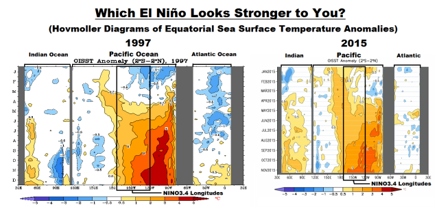
Figure 4
The vertical (y) axis in the Hovmollers is time with the Januarys at the top and Decembers at the bottom. The horizontal (x) axis is longitude, so, moving from left to right in each of the Hovmoller diagrams, we’re going from west to east…with the Indian Ocean in the left-hand portion, the Pacific in the center and the Atlantic in the right-hand portion. We’re interested in the Pacific. The data are color-coded according to the scales below the Hovmollers. (Sorry about the different sizes of the Hovmollers, but somewhere along the line NOAA GODAS changed them, but they are scaled, color-coded, the same.)
In 1997, sea surface temperature anomalies east of the NINO3.4 region had reached 4.0 deg C as early as June, but we have yet to see those levels in 2015.
THE DATA PRESENTED IS NOT BASED ON THE “OFFICIAL” SEA SURFACE TEMPERATURE DATASET USED BY NOAA TO DEFINE EL NIÑO EVENTS
The data presented above and discussed in the linked articles are based on NOAA’s Optimum Interpolation sea surface temperature dataset (a.k.a. Reynolds OI.v2). However, NOAA uses their “pause buster” ERSST.v4 sea surface temperature data for their “official” Oceanic NINO Index. And as you can see there, this El Niño is running well behind the 1997/98 El Niño. Also see Figure 5, which was presented in the November 12, 2015 blog post by Emily Becker November El Niño update: It’s a small world at the NOAA ENSO Blog.

Figure 5 (Source here.)
Their caption reads:
Ranking of August-October average sea surface temperature departures from the mean for all El Niño episodes since 1950. This measurement, the Oceanic Niño Index, uses ERSSTv4 data. Figure by climate.gov, data from CPC.
And their introduction to it reads:
First, a quick update on the recent El Niño indicators
The average anomaly in the Niño3.4 region during August-October of this year was 1.7°C, second to the same period in 1997 (1).
CLOSING
Please do not misinterpret what I’ve presented in this post. I am not saying that the 2015/16 El Niño is not a strong event. By all measures, we are in the midst of a strong El Niño. I’ll provide a full ENSO update next week.
-However-
Contrary to all of the alarmism, the 2015/16 El Niño is simply is not as strong as the 1997/98 El Niño based on the sea surface temperature anomalies of the eastern Pacific, east of the NINO3.4 region.
FOR THOSE NEW TO DISCUSSIONS OF EL NIÑO EVENTS
I discussed in detail the naturally occurring and naturally fueled processes that cause El Niño events (and their long-term aftereffects) in Chapter 3.7 of my recently published free ebook On Global Warming and the Illusion of Control (25 MB). For those wanting even more detail, see my earlier ebook Who Turned on the Heat? – The Unsuspected Global Warming Culprit: El Niño-Southern Oscillation.
As Hilliary Clinton would say. “What difference does it make anyway”. So we get more snow in California – this is a good thing, particularly if you enjoy skiing. The MSM is treating El Nino as if it was a series of tornadoes or hurricanes on the way.
“Warmest ever”!… “Hottest ever”!… “Worse ever”!… Is there a pattern here?
Classic ‘chicken little’ syndrome.
Not only are they inclined to run around shrieking that ‘the sky is falling’, desperately trying to cause as much mob fear and confusion as possible.
The ‘pattern’ is that so many debased pitiful news sites were so ready to print ‘the sky is falling’ fear messages so quickly.
News sites so deep in the muck they can’t see, hear or read properly.
Kenny.
Yep.. we are getting warmer.
Simon,
You’re getting …warmer …warmer …you’ve almost got it …YES!
…global warming has stopped!
“Yep.. we are getting warmer THIS YEAR” – Fixed it for ya. Enjoy the second warm winter in a row if you live out in the west of North America and get your snowblowers ready if you live in the east.
Enjoy it while it lasts because unless we get the extremely rare 3 years in a row el-nino we are getting a la-nina and the cold will return big time.
DB
You are kidding right?
http://blogs.discovermagazine.com/imageo/files/2015/11/oct_wld_png__800%C3%97750_.jpg
Simon,
You accepted that completely fabricated McKibben graph at face value??
That fraudulent graph is deconstructed here.
The straight trend line is correct. But the scary jump at the end is bogus. And you fell for it.
Here is a real chart. Or if you want the most accurate data, here is RSS satellite data.
And if you want satellite data vs IPCC “projections”:
Oh, Simon, how can we trust anything from those alarmist Japanese? They are the ones behind Agenda 42, I believe. Expect a follow-up from Tim Ball shortly.
Simon,
Thanx for verifying that global warming is natural.
Most all of the CO2 emitted since your chart started was emitted after 1949. And thanx for including the straight trend line, which shows there has been no acceleration in natural global warming, so…
…where is your god now?
Ugh. Surface data.
dbstealey
“And thanx for including the straight trend line, which shows there has been no acceleration in natural global warming, so”
Ha ha ha. You are a funny guy. And I must say of all the funny things you have said, that is probably the funniest. DB its a trend line (face plant into hand)…. they are always straight. It’s the angle of the line that matters…. oh never mind.
Sure Simon, you just point out the bend in that red line between 1890 and 2015. heh
I just love it when some inept blunderer gets tangled up in his own shoelaces. And it’s right there, Simon, for all the world to seee. ☺
Simon,
Your trend would play better if you split the trend between the supposed beginning of Mans influence, Circa 1960.
Careful though, you might let your agenda show
So Simon, would you say that your graph shows any sort of accelerating trend over the time period?
Or would you say that your graph demonstrates a harmonic variation superimposed over a reasonably constant temperature rise?
If the latter, then how do you reconcile this with the idea of CO2 driving the the rise in temps? Isn’t a more logical explanation that the temperature increase is natural?
Look in the graph Simon posted. It says:
The red line indicates the long term linear trend.
No wonder Simon has skedaddled. Refuted by his own chart, LOL!
Well it did rapidly DE-accelerate in 1900, 1945, 1965 annnnnnd, any year now……..
JohnB
“If the latter, then how do you reconcile this with the idea of CO2 driving the the rise in temps? Isn’t a more logical explanation that the temperature increase is natural?”
It has been said many times that AGW does not mean every year will be warmer than the next. There are a number of factors that affect the average temp in any one year, but your statement the temp increase is natural needs to be backed with evidence of another forcing, that just isn’t present. But if you have an idea backed by as many lines of evidence as there are for CO2, let’s have it?
Simon,
There exist no “lines of evidence” that CO2 drives climate. Only speculation and conjecture.
There ARE lines of data analysis and strong evidence that this driver has a significant effect on shifts in earth’s climate zones:
The Ocean (youtube)
It covers over 70% of the surface of the planet.
Selah.
Janice
Simon, the Japanese graph you present shows that the rate of global temperature rise was the same or perhaps greater between 1910 and 1940 than between 1975 and the present. It looks like all the CO2 produced recently has had no effect on the long term trends.
http://www.ncdc.noaa.gov/sotc/service/global/lo-hem/201510.gif
It is just one data set after another now.
Simon,
You are being brainwashed. That NOAA chart uses an arbitrary zero line, which makes the viewer believe there has been a rapid warming occurring.
But there hasn’t been; the extremely mild global warming is actually unprecedented in its minimal change. But by using a ‘zero baseline’ chart, they make it look like something scary is happening.
It’s not; NOAA is simply using a graphics trick that fools your eye. You can see the result in the comparison below: by using a trend line chart, we see that nothing unusual or unprecedented is happening:
http://oi56.tinypic.com/2reh021.jpg
The NOAA uses deceptive charts just like others lie with statstics. But other sources, like the WoodForTrees database, shows that global T has been steadily rising since way before CO2 emissions began their fast rise.
Now that you can see what they’re doing, the next decision is up to you: you can either realize that they’re using a bogus chart trying to fool you, or you will double down even though you are now on notice that NOAA is leading you by the nose in the direction they want you to go. The choice is yours.
The rest of us know that the rise in global T over the past century+ has been only ≈0.7ºC. That is flatter than any comparable time period found in the entire geological record.
The alarmist crowd is actually complaining about a 0.7º wiggle! What do they want? a 0.00º temperature change? The climate always changes. But by their argument, they want no change at all! That is impossible.
DB
“It’s not; NOAA is simply using a graphics trick that fools your eye”
So tell me, are all the other mainstream earthbound data sets Hadcrut, Nasa giss, Japanese Met, using the same trick? If so then they must be all in a conspiracy to fool the world. Lucky you are not fooled aye DB. And lucky we have those satellite figures to put everyone right.
Simon, did you know those datasets aren’t independent? They all come from NOAA GHCN data.
Well the trouble with the Nothing In Nothing Out 3.4 region, is the damn Galapagos sea Iguanas, eating all the bottom grass. They shoulda stayed on land.
g
Dr. Kevin Trenberth agrees:
Bob Tisdale
George E. Smith! (grr — okay, okay, it wasn’t your fault (smile)) — My 6:47pm today post was to follow immediately upon my 6:41pm today post addressed to Simon.
And El Ninos have been observed for hundreds of years
Somebody needs to fix Figure 4 pronto. By making the 2015 graph physically smaller, it looks like crude propaganda, and helps the Mist of War crowd to “la-la-la!” the data it shows.
BillK, I discussed the differences in the sizes of the Hovmollers shown in Figure 4 in the post. There I wrote:
Sorry about the different sizes of the Hovmollers, but somewhere along the line NOAA GODAS changed them, but they are scaled, color-coded, the same.
In other words, that’s the way they’re supplied. People would squawk more if I altered the images in any way.
Cheers.
After my immediate response, I went back and read the whole article. But I think you are very wrong, and I offer my response (and I am obviously on your side) as evidence. It does look like crude propaganda at first glance, and many people will not go beyond that first glance — especially after prompting by the war-mists.
When you combine data from two sets, you must calibrate so they are in the same units. That goes for presentation (if you prefer that euphemism for propaganda) as well. What, you are worried about explaining how you changed the physical size of one chart to match the other, and leaving blatant in-your-face low-hanging-fruit on the front page of WUWT?
With all due respect, gnat … camel …
Interesting to see the more subtle differences in the charts, beyond reworded labels and fonts…
The quantity labels for the negative anomalies are missing from the 2015 chart.
Okay, please at least put “original sizes” in the caption so it accompanies the figure. I fear that the window of opportunity is closing for truth to put on its boots.
I sincerely hope I am wrong that this is a friendly-fire incident.
Thanks Bob. For the post.
~~~~~~~
And I agree, with you about the charts, because such charts are produced by the thousands every year and scaling them also changes the quality/resolution. Sometimes there is poor choice of colors and/or categories, and on and on. Once set up, further ones are automated and the original decisions may not be the best for new situations.
Having read “How to lie with statistics” – By Darrell Huff [1954] and “How to Lie with Maps” – By Mark Monmonier a person learns to look for the issues.
(One issue I enjoy seeing is using a drawing of a 3D object — say a bag of money — making an illusion of a comparison of number of $$ way out of proportion to the fact.)
Anyway, cheers and carry on.
I think Bill makes a valid point, but it is Bill who is “straining at a gnat,” here.
The key to those two graphics is NOT their relative size, but the color-coding. There is no red at all in the 2015 graphic. THAT is the important information.
Arguing over size is ridiculous, for it is so obvious a kindergartener would not be misled.
Yes, yes, Bill, I realize that those poor AGWers are pretty dimwitted, but…. if they can’t understand Figure 4 for what it is, they are simply blind (and, granted, many of them willfully are — but, they will not see the significance of ANY fact-based graph).
Okay, okay, BillK, not “ridiculous.” Just pointlessly pedantic. And I am hopelessly impulsive in my writing! Please forgive the overly blunt tone.
Re: “otwh” (me at 1:22pm today) — THAT is ridiculous 🙂 …. I MEANT to type (now, let’s see if I CAN): “otoh.”
BillK, I, unlike you, am not concerned about the sizes of the Hovmoller plots in Figure 4. More to the point, I am not concerned about the opinions of people who do not have the courtesy to read the post, in the same way I am not concerned about the opinions of people who quote me out of context.
I have wrapped up my posting on this thread, unless another issue comes up here.
Completely agree with this. Especially in this particular case where it looks like someone is trying to pull a fast one.
Why not match these up by scaling one (or the other) so the visual comparison is apples to apples? Doing so does not alter the data in any way, yet makes it MUCH easier to immediately grasp the difference in events.
IMHO, this is not much different than changing a degF to degC (if one of the sources differed) so that a casual reader can make a fast and fair comparison without resorting to mental gymnastics.
Exactly. The first filter a “casual reader” encounters is the question “why are they different sizes?”. How many of the undecided will, in that first five seconds, decide to drill down beyond the obvious “answer” (manipulation) to the barefoot truth?
Especially if the graphic is linked or presented in the war mist, along with that “answer” … “See, they do it too!”.
Well this one appears to be peaking and will be hitting the skid pretty soon more than likely. The SOI is not looking good for further development.
If I had to say that the current El-Nino influenced autumn resembles any earlier autumn here in Southern Wyoming, that autumn would be the one of 1965. Interesting.
Thanks as always Bob for presenting the data so clearly. Up here in the Canadian Rockies, we are all a pleasantly surprised how much snow we are getting so far during this super El Niño. We were bracing for a low snow year as theory would suggest. Still lots of time for a bad winter though! (For those who may be bewildered, a “bad”winter for most mountain people is warmer and not snowy!)
Dave in Canmore: Remember last year in Banff and Lake Louise (and Canmore)? We had great snow in November and December then almost nothing from the second week of January to the end of February. I went skiing in early December last year then stopped the second week of January until the big spring snows in March, April and May. I went and skied some great POW at Sunshine today and it was still puking this evening. Revelstoke has had over 3 metres so far, Kicking Horse is opening two weeks early, the interior of BC is getting lots of snow. I expect we’ll have a similar winter to last year (could be wrong). Weatherbell is forecasting above normal temperatures and low snowfall in the northwest. As a guess, I would expect they are correct. We’ll see. It’s hard to forecast the future.
And yes, I agree with you. Warmer and not snowy IS a bad winter. I like it not to get above zero out riding horses in the winter plus I have been a skier for over 60 years. Today was a great day!
Reckon you’ll be shoveling your walk tonight. 🙂
Hmmmm. Seems this ‘key region’ emphasis used by NOAA is just parlor-trick misdirection…
And unlike the La Nina of 1999-2001, which coincided with solar cycle 23 maximum, the sure-to-come La Nina of 2016-17 will coincide with decidely less active solar UV output as cycle 24 closes out. Warmist alarmists need to get their licks in while they can.
Yea I’m planning on enjoying this el-nino as it could be a while before the cold lets up after this. Sigh, it was nice while it lasted.
This El NINO is out of season and it is not going to have the temperature blip everyone on the global warming side of things is wanting or lasting power.
Once this El Nino ends(which will be soon probably by Jan. or at least by then on the decline) the global temperatures will be lower then they were following all earlier El Nino episodes , because we are in a long term global temperature decline which has been going on since the Holocene Optimum ,interrupted with spikes of warmth such as what has taken place since the Little Ice Age but each spike of warmth not disrupting the overall global temperature trend which has been and is going to be down.
This sham AGW theory should meet it’s ending before this decade is out.
The more intelligent climate alarmists probably understood they had a 30 year climate window (1990-2020) in which to carry out their scam and further their Agenda 21.
Agree with you Salvatore that global cooling will become apparent after the current El Nino runs out and (probably) before 2020.
The question is how long after that the warmists will be able to continue propagating their global warming fantasy.
Depends on your data set choice. I suspect a wavy jet stream will scoop up heat and moisture and dump it in the northern latitudes. There will be a significant rise in the mid-upper troposphere northern latitudes as latent heat is released and this will slowly dissipate over the year. Satellites will run a little warm and we’ll have a record year with re-analysis that include satellite troposphere data. Surface temp only; not so much.
I don’t know about feb dissipating, global temps for 97-98 didn’t really spike until december and january (UAH). I think we still might see a big bump in temps. The we’ll drop and plataeu near the current decadale avaerage. It will be very interesting if we end up below in 2-3 years.
Aaron I do expect a further big bump in temperatures, including in the LT, during the current El Nino..
Then after the El Nino is over I expect LT temps to fall below current levels and natural global cooling to begin..
Also aaron, I only use the satellite temperatures, whether UAH or RSS. The ST data from most or all sources is unreliable.
Thanks for the reply. Nice to know we are on the same page.
https://www.longpaddock.qld.gov.au/seasonalclimateoutlook/southernoscillationindex/30daysoivalues/
Look at January. The year started out much warmer, so a weaker warming is able to reach high levels in one region. This year’s warming pattern is weaker, but it started from a warmer base so it is presently kind of warm. The past El Nino was definitely stronger.
Does this mean I can put off repairing a hole in my roof in Ventira, Ca?
vEntura
venUra. What’s that law which states the more you try to correct an error in a post, the more you make a mess of it?
That ‘sMurphy’s Law.
Why does 2010 not show up in the Aug. – Oct bar graph? Is that what the 2009 is?
billw1984, NOAA is showing El Nino development years in my Figure 5. 2010 was an El Nino decay year.
Thanks Bob!
It looks like the 1997 El Niño has expanded the Pacific ocean more in your maps. Maybe that’s why it was so powerful.
Trafamadore has plunged in to hand me a perfect example. Not only is the 1997 graph larger, its aspect (width to height) ratio is greater. So the same data looks different.
The fog rolls in.
I think…. that trafamadore was having fun …
(perhaps, given BillK’s preceding remarks, a “sarc” tag might have been helpful, here)
I think that trafam. was having fun at 8:37am today…
(guess a sarc tag might have been good there, given BillK’s earnest remarks above your post… otwh… not 🙂 No sarc warning ended up making it much funnier given BillK’s earnest reaction)
Does Trafamadore’s posting history suggest he was being sarcastic? I Vonnegut feel for that. At any rate, The Importance of the subject is Being shown by how Earnest I am; it is not a Wilde over-reaction .
I have wrapped up my posting on this thread, unless another issue comes up here.
And on the other side of the Northern hemisphere, we’re two weeks from the end of the Atlantic hurricane season and – GOSH! – I don’t recall hearing much about the forecast never-ending stream of bigger-than-ever monster hurricane-apaloozas that are destroying civilization as we know it!
Hmmm, climate “news” always seems to be about what MIGHT happen, rather than what’s actually going on
Climate news Is what MIGHT happen…Weather news is what IS happening. Don’t forget, If it is warming predictions, it’s climate and if it is Cold temperatures… well… that’s just weather
Does any rational person still believe anything NOAA or NASA put out ?? You will see them change their observations as soon as Trump is elected and the garbage in charge is FIRED !!!!
The problem is the only way to fix it is to defund the offices. Civil Servants are notoriously hard to fire and none of the miscreants are political appointees who can be fired.
why NOAA and other rely so heavy on the Temperature anomaly, when K.Trenberth in two articles one in 2002 and the other in 2009 has schown, that El Nino is driven by sunlight and not by CO2. Bob you always said this too.
Exactly. Has any “scientist” ever put forward a hypothesis that the current El nino could be greater then the 1997 one by virtue of the fact that there is ~30 ppm more CO2 in the atmosphere now.
How can the propagandists intimate that this is the case, and where is the math ??
This, in fact, is another nail in the coffin of AGW, not supporting data.
Not even close. And I’m worried. Here in Nor Cal we’re getting mid latitude systems coming down from the Gulf of Alaska and points NE of there. Systems prog’d for the next few days will be out of Yukon and dry. One prog’d next week may have a tap but will be short lived. This is not going to be a drought busting El Nino if the current pattern persists into December or later.
BillK: Do you like this figure with the same size of both figures? http://kauls.selfhost.bz:9001/uploads/hov9715.JPG
It changes nothing I’m afraid 🙂
Bob: I made a simple operation: I calculated the monthly differneces between Nino 3,4 und Nino 1,2. anomalies A “Right” , also East-Pacific ElNino, has a greater Anomaly in Nino 1,2 and the difference is positive almost in Synch. with ElNino 3,4 ( upper graph, lifted with 3K for better reading). A “modoki” just like in 2010 shows another behaviour: The Nino 3,4 anomaly is warmer during the whole event, so the difference is negative. In 1983 there was a “late awakening” with a delay of about 7 month. In 2015 there is still not a sign in which direction it will go.
PS: The figure: http://kauls.selfhost.bz:9001/uploads/ce.png .
Sorry 4 my old mind 🙂
The winds are currently veering South westerly as they cross the equator from the South toward the ICTZ which is still North of the equator. Once the ICTZ crosses South of the equator the winds will be mainly easterlies and the EL Nino could fade as there are no locked in westerlies in the Pacific.
It changes everything, and I’m afraid because you (inclusive) can’t see that.
When you remove the distraction of the first filter (the size difference), then the graphic communicates the data difference, as the first reaction of a naive (undecided) viewer.
That distraction is a potent card in the war mist hand. The data is on our side. Why help them fog the vision of our browsience (browsing audience)?
I don’t understand why “they” can’t get this. There is ZERO excuse for not normalizing the graphics. Do you honestly think anyone would make an issue out of a “re-size to match” let alone even notice it was done?
Whereas I could see MANY would scratch their head (or raise an eyebrow) as it is…and it is EXACTLY the kind of thing the other side does (to mislead) on a consistent basis.
Someone mentioned color being the key, but isn’t the area occupied by each color just as important?
Pretty hard to compare area when your charts are different sizes.
Who is your audience? Who are you trying to convince? Why risk this?
Vewwy — there is NO OTHER RED PATCH TO COMPARE WITH. Thus: color is the controlling variable and the size is meaningless for comparison purposes.
Yes, it makes it clear that the 97 graph was not merely bigger but definitely angrier too. That isn’t anything you can’t determine from a second look but the different sized graphs are instantly noticeable and tend to disorient. The equal size makes it clear at glance. Frankly a lot of people are just going to glance.
Please Anthony help me.
I say that we are in a propaganda war for the attention of the undecided intellect, in which WUWT is a big — perhaps the biggest — gun. The purpose of posting is to communicate data; while the size of a graphic is irrelevant to the data, it is not irrelevant to the process of communication, which is the point of my behavior on this thread. (Except for the one “Smurph” wisecrack.)
Should WUWT have a thread explicitly on this subject? (One issue, for example is that when I say “undecided” I mean “whether to objectively examine the data”, so most people posting here have already decided that.)
I feel like a scout at Little Big Horn enduring Custer’s comtemptuous amusement (Janice Moore) and indignation (Bob Tisdale). On such a thread, as on this one, my approach would be not “pointlessly pedantic” but pointedly military.
I don’t know how much more explicit a point can be made to be.
Spelling starts to atrophy when I am comtemptuous[sic] enough to turn off my checker. Sorry.
There’s a £101,000,000 jackpot on the EuroMillions jackpot tonight. If I win, 90% is going on climate realism research and PR.
I am a “climate realism researcher” and PR spokes person so please do send the 90% my way.
Thanks in advance for winning the lottery.
P.S. That “Big Oil” check never arrived
As was pointed out on the Solarcycle24 board.
El Nino was so named after the failure of the Anchovy catch. The catch was very good this year so under the fisherman’s metric there is no El Nino this year.
This raises the query that those people going back in history using anchovy catch as a proxy for what NOAA now calls “El Nino’ based on SSTs in precise ocean areas, may be completely deceived.
http://www.fis.com/fis/worldnews/worldnews.asp?l=e&id=80363&ndb=1
less than 50% chance of a strong el nino from the people that actually have to deal with the physical aspects of the natural phenomena.
I have noticed another oddity regarding this current El Nino. Austrlia has been getting a good bit of rain over the last month, which is not supposed to happen during an El Nino event. I go to Weather Zone every day to view their ssta chart. On the right margin of the page they always have 3 headlines discussing current weather in different regions of Australia. In the last month there quite a few headlines discussing the rain and how unusual it was given the ENSO conditions, but they would end with “:..just wait, it will all change back to drought shortly..”. That along with other “out of the ordinary” conditions for a strong El Nino made me wonder if the changing solar conditions are responsible for the unexpected behavior seen in different regions.
Another thought, though, would be does NOAA have their finger on the scale as they measure what is going on in the ENSO regions. I have noted disparities in the ssta daily charts several times this year between WeatherZone and Tropical Tidbits, which I had never before seen in the two years prior of viewing their output. Region 1+2 for multiple days was running warm on one and shown as cooling on the other. Then around a week later this reversed. Lately, they have finally synchronized once again to show the same detail.
The SOI values are only currently only just stronger than neutral. It looks like October will have been the peak..
https://www.longpaddock.qld.gov.au/seasonalclimateoutlook/southernoscillationindex/index.php
Hi Bulaman….I have been watching this site since early October, when our spring rainfall didnt materialise as usual….it turned up 3 weeks late.
It is far more indicative of what is really happening in Australia, because it shows the preliminary data, before the BoM “interpenetrate” the figures.
For example on the BoM website, The 30-day SOI value to 8 November was −15.6. The actual figure from the Long Paddock data was -15.49.
BoM….”Sustained positive values of the SOI above +7 typically indicate La Niña, while sustained negative values below −7 typically indicate El Niño. Values of between about +7 and −7 generally indicate neutral conditions”.
You mean like this?
http://s14.postimg.org/nimi5q0y7/Troup_SOI.png
While less pronounced, 2002 is the best SOI match for the timing of this year’s event. Given current SSTs that might mean it’ll grumble along well into next year but I’m inclined to think it’s a lot more unpredictable than that.
When central based El Nino should use NINO3.4, but when eastern based El Nino should use NINO3. The current strong El Nino is central based and the 1997/98 was eastern based.
When comparing corresponding Novembers so far 2015/16 NINO3.4 (+3.0) to 1997/98 NINO3 (+3.6), the latter so far is the strongest event by quite a distance.
When you compare 1997/98 with 2015/16 NINO3, NINO1+2 are significantly cooler, but NINO4 are significantly warmer. Comparing central and eastern based El Ninos by only one NINO region is like comparing apples with oranges.
For especially UK viewers, central based El Ninos are likely to lead to colder winters. Eastern based like the one in 1997/98 are likely to lead to mild winters. The reason down to how the relative oceans around the continents warm and cool compared to being either central or eastern based El Nino.
With central based El Nino likely to see warm SST’s like the blob referred to on here before around eastern Pacific USA coast and warmer SST’s off the Atlantic coast between Florida and Newfoundland.
With eastern based El Nino likely to see less warm SST’s off the western coast of USA and cooler SST’s off the Atlantic coast between Florida and Newfoundland.
This changes the positioning of troughs and high pressure systems generally based around the northern hemisphere and leads to different behavior in winters across USA and Europe.
Matt, from what I see the North Pacific “Blob” and the Ridiculously Resilient Ridge have both disappeared.
The blob is clear back in July 2015 off the western USA coast.
http://weather.unisys.com/archive/sst/sst_anom-150705.gif
I agree the blob has faded significantly and moved, but there are still large areas off the USA Pacific coast with warm SST’s. Warm SST’s off the Pacific coast like shown below are a sign of the central based El Nino. The blob I included previously because I knew Bob had featured this, so people on here had a little idea of what I meant.
http://weather.unisys.com/archive/sst/sst_anom-151115.gif
Not forgetting the North Atlantic is colder this time around too.
The differences between the strong El Ninos (97/98 & 15/16) in the North Atlantic ocean are huge.
I keep telling my children to go outside, this is the last day it’s going to be this nice. They no longer believe me.
Still strikes me as odd that AGW proponents get so excited about rising temps due to El Nino. You would think that they would not be happy that temps are rising due to a purely natural phenomenon that has no links to the level of CO2 in the atmosphere. If anything it shows how utterly impotent CO2 is relative to natural processes.
Remember, these people would blame the wilted lettuce on their sandwiches on CO2. There’s nothing they won’t try to blame on AGW.
dccowboy, for any of these sad people, it makes no difference if the warming occurred naturally or anthropogenically. Any warming is considered evil.
True-but I always ask them for their proof (rather than speculation) that the alleged warming will be dangerous…….crickets
“Any warming is considered evil.”
Slightly misstated as cold or even an ice age will be blamed on (previous) globull warming. It’s really about the grant monies and the fact that these climatastrologists really have no other skills and so are mired in their present rut.
dccowboy I have been puzzled by this for years myself!! That goes for any short-term regional sea surface temperature increase. I suspect it’s related to a lack of understanding that air temperature follows sea surface temperatures and not the other way around.
I agree.
I have been making that point many times over the years when there have been articles on strong El Ninos. I consider it makes it more difficult for those ‘Climate Scientists’ who claim that there is a strong anthropogenic signal to the warming since the late 1800s if this warming is not linear, corresponding to the change in forcings due to rising levels of atmospheric CO2, but instead appears to happen in fits and starts coincident with natural phenomena (change in oceanic cycles, El Ninos and the like).
It is not part of the basic physics of the CO2 molecule that it causes El Nino, or causes El Ninos to be stronger. There has been no laboratory test showing that this is part of the so called ‘basic physics’ of CO2, and this was never suggested by the likes of Fourier, Arrhenius, Tyndall, Callendar etc.
So, 4 of the least severe Aug-Oct events have occurred since 2000 and only one of the more severe events. No relationship between the number or severity of events and year or actual global temperature that I can see.
I saw the headlines this morning and I didn’t even bother clicking. They claimed this very same thing on the same false premise just a few months ago. As we know, it’s not about news, information, education, enlightenment, or truth, it’s purely 100% ORGANIC propaganda.
From my vantage point in Hawaii, I am of the opinion that the Great El Nino of 2015/16 has already peaked and is beginning to fizzle. I will not be surprised to see space heaters appearing at retailers like Costco, Loewes, Walmart, etc over the next few months. I remember having to use one back in the early 70s when I lived on the windward side of Oahu.
Already make liberal use of space heaters. Close to 100% efficient compared to a gas furnace (mine about 80% neglecting suction losses thru house air entry, air duct losses and unused room heating). Unfortunately if used abundantly, they require dis-assembly to clean the entry fuzz dust off the ceramic grid. And if in the country and on propane, they are a big money saver.
At the moment the current SOI is approx -20. That is still a long way off the -30s achieved in 1997-98. So yeah no where near stronger.
Steve look again now !!!
Steve B, the 30-day average for the SOI on 17 Nov 2015 is -8.49
https://www.longpaddock.qld.gov.au/seasonalclimateoutlook/southernoscillationindex/30daysoivalues/
I looked at absolute values on the BOM charts not the running average.
The people yelling and shouting about this El Nino being the hottest ever clearly after scientists, because any scientist would have to discount the El Nino effect that tends to warm global temperatures and say that BECAUSE of the El Nino, it not possible to say if it has been warming or even colder.
Only someone with no science training as well as a desperate desire to manufacture false alarm could see this as “good” for the alarmist agenda.
3 million years ago the Panama Current was shut down when North and South America attached together at the isthmus. At the same time the ice cap on the Artic Ocean formed. Since El Nino is hot water butting up against the continents from the west, could this have been the heat that was flowing into the Atlantic through the Panama Current and keeping the Artic ice free before 3mya?
Interesting! +1
http://www.whoi.edu/oceanus/feature/how-the-isthmus-of-panama-put-ice-in-the-arctic
I had a look at the TAO Bouy at 0N 155W, right in the middle of the Nino 3.4 Index region and it is higher than the 1997 peak. So I tend to think this is a real Super-El Nino that could eclipse the 1997-98 one yet.
http://s12.postimg.org/dm6weu5i5/TAO_Bouy_SST_0_N_155_W.png
Data at (not sure if this link will hold up for long but anyway ..)
http://tao.ndbc.noaa.gov/tao/data_download/cache/201511/d18-694/TAO_T0N155W_M_SST_daily.ascii
Dear Bill Illis,
A man in a toga just ran in, picked up my pen, wrote this (I’d have published it sooner, but I had to work out the ancient Greek), grinned, and dashed back out into the night:
Fine data reporting!
However, remember, … one {buoy} does not a {super El Niño} make… .
Your friend,
Aristotle
************************
Oh, yes, indeed, Mr. Illis — Aristotle considers you a colleague and friend — he highly admires your intellectual abilities and integrity… and he likes my …… pens… took it with him (sigh).
At the moment, we are all merely speculating. Until this El Nino runs its course we will not know. I see no point in speculating, although I am conscious how these current temperatures will be spun in the run up to Paris.
Even IF this current El Nino causes temperatures to peak at a level higher than that of the Super El Nino of 1997/8, the test of this El Nino will be whether there is a long lasting step change in temperatures coincident with it, just as there was a long lasting step change in temperatures coincident with the Super El Nino of 1997/8 (I mentioned this in the Godzilla/Dudzilla article some weeks ago) .
I suspect that we cannot judge the impact of this current strong El Nino until 2019/20. The question to be answered at that date is whether this current strong El Nino merely produces a high temperature short term blip peaking high around late 2015/early 2016, but thereafter a following La Nina brings temperatures right back down, and following that La Niina temperatures then return back to around the 2001 to 2003 anomaly level (as viewed in the satellite data set)? IF (and that is an IF) that is the case, no matter whether this current strong El Nino peaks at a higher anomaly than the Super El Nino of 1997/8, this current strong El Nino will be a dud since it will not break the ‘pause’ and the ‘pause’ will in this scenario continue to be seen and will in this scenario have extended in duration to more than 21 years (it could be around 25 years in duration).
IF on the other hand, there is a long lasting step change in temperatures coincident with this strong El Nino, just like there was with the Super El Nino of 1997/8, then this will break the ‘pause’ and this current El Nino will become significant. Science will then have to consider whether the globe appears to warm in fits and starts coincident with the turn of ocean cycles and super El Ninos, and if so why that is the case.
The point is, of course, that this El Nino is the result of a natural phenomena, and not the result of the basic physics of the CO2 molecule. It is not the basic physics of CO2 that it causes and/or drives El Ninos, and there has been no laboratory experiment showing that that is part of the basic physics of CO2.
Whilst the info you set out is of interest, I agree with Janice. Further, whilst I can just visually see that the peak of 2015 is higher than 1997, we are talking here of fractions of a degree, probably not even a tenth of a degree, and that raises the issue of error margins. For example, could it simply be that 1997 has been measured too cool by about 0.05degC whereas 2015 has been measured too warm by 0.05degC?
Personally, I would want to see not simply data from more than 1 buoy, but also I would want to see the temperature being busted by more than the small fraction that appears in your plot before coming to any firm conclusions..
That said, your plot is of interest and the situation should be continued to be reviewed.
Bob,
Thank you for this timely and useful report!
No alarmism – the planet’s about to finish its second consecutive “warmest year in the instrument record” while this isn’t the strongest El Niño ever recorded. And while people here warn about the decreasing solar output that started a few years back.
So it proves carbon emissions are continuing to warm the climate, setting a dozen new ‘warmest year’ records, and well on our way to second consecutive “warmest decade” record since AFTER the biggest El Niño. After all, it’s not the sun, and this El Niño isn’t the biggest, yet still the records fall.
… it proves carbon emissions are continuing to warm the climate… .
Evidence provided: B. Fagan’s unsupported-by-proof conclusion at 7:21pm this evening.
That’s it.
Just: “Correlation = Causation.”
Just: “because B. Fagan says so.”
And, btw, you need to check your Almanacs from the 1930’s — that is where most of the temperature records still are.
Oh, and, B. Fagan? If you’re going to jump on the “correlation = causation” calliope, at least pick the one driven by the logical clowns:
CO2 UP. WARMING STOPPED.
Therefore: CO2 stops global warming.
It “proves” no such thing.
After 17 years of no air warming, it’s not a surprise that earth should discharge pent up heat from the tropical Pacific.
It has nothing whatsoever to do with man-made GHGs.
b fagan, read a book. Maybe you’ll come to understand that there are natural causes for the warming we’ve experienced:
https://bobtisdale.files.wordpress.com/2015/11/tisdale-on-global-warming-and-the-illusion-of-control-part-1.pdf
See:
General Discussion 2 – On the Claims of Record-High Global Surface Temperatures in 2014
And:
General Discussion 3 – On the Reported Record High Global Surface Temperatures in 2015 – And Will Those Claims Continue in 2016?
And all of Section 3 – Natural Variability
Coming here and claiming that greenhouse gases are responsible for the warming only makes us laugh.
Cheers
Thanks, Bob. I’ll pass, got a lot of other reading to get done. Partway through “The Sun’s Influence on Climate” by Joanna D. Haigh and Peter Cargill. It’s the latest of the Princeton Primers on Climate series and I recommend them all – though you’ve probably read them.
I also recommend “A Vast Machine Computer Models, Climate Data, and the Politics of Global Warming” by Paul N. Edwards. Great overview of the history of the global weather data collection and processing system. The Warming Papers is a great collection of the early work in the climate field.
Principals of Planetary Climate by Ray Pierrehumbert is a bit more than I can get through, but worthwhile sometimes.
But people said there’s no proof – I’ll just post a couple links starting from 1975 – short-term, I know, but that’s all the satellites can give so far. Not as short-term as the USCRN series, but gotta start somewhere.
Anyway – here’s surface – you might have to adjust the start time on the Options for trend, but since 1978 it’s been warming at a 1.5C per century rate.
http://www.ncdc.noaa.gov/cag/time-series/global/globe/land_ocean/ytd/12/1978-2015?trend=true&trend_base=100&firsttrendyear=&lasttrendyear=
And here’s the satellite stuff – the “air” has been warming at a 1.22C per century rate, even with the recent slowdown. That’s why you have to look at longer stretches than just a decade or two.
http://images.remss.com/msu/msu_time_series.html
So the reason we’re having so many “warmest years in the instrument record” since the giant 1998 El Nino is that it never cooled down after it. Something’s keeping the heat in. Otherwise, where’d the heat for this run come from? You can’t spin up a hurricane from Category 1 to Category 5 without an awful lot of hot water.
Janice, the 1930s were warm in the lower 48, but globally the 40s were warmer. In fact prior to the 80s they were the warmest decade on record. Then the 80s were, then the 90s, then the 00s, and right now it’s 50-50 that we’re going to have a 4th consecutive warmest decade in a row.
https://en.wikipedia.org/wiki/Instrumental_temperature_record#Warmest_decades
And don’t forget, all this while solar output’s declined a little bit.
Seems there is a lot still to be learned about El Niño and the weather spawned by the great inscrutable Pacific Ocean.
In October the Climate Prediction Center put up a map suggesting WA, OR, & CA could expect warmer than normal temps in Nov. and equal or below precip.
See here.
One might ask how that’s working out.
Well, we’ve been cool, windy and wet.
Bob – could the Hovmoller for ’98 be “extended” downwards so we could see the evolution over following year? No real reason to constrain to 12 months (except convention). Would be interesting to see the entire event duration…
Sensorman, the NOAA GODAS website…
http://www.cpc.ncep.noaa.gov/products/GODAS/pentad.shtml
…only produces them in 1-year blocks. Extending it would require me to splice (cut and paste) the 1998 Hovmoller to the bottom of the one for 1997.
Cheers
Bob, where can I get data I can understand (hopefully) for Pacific temps below the surface overturning layer. So we can get some idea what is coming…..
Brett, the TAO website has subsurface temperature anomaly data for the equatorial Pacific to depths of 300 meters (aka T300 data) here:
http://www.pmel.noaa.gov/tao/elnino/wwv/data/
300 Meters captures the vast majority of the ENSO-related variations.
Sorry but the ENSO 3.4 region is the main one that *defines* the El Niño and La Niña conditions and episodes. It is scientifically fallacious to claim that the ENSO 3.4 index doesn’t matter because “something else elsewhere”. Whatever happens “somewhere else” is not directly relevant for El Niño episodes in the scientific sense.
The ongoing El Niño’s peak has already exceeded the 1997-98 El Niño when properly defined.
I guess the argument here is that if you are correct, then Bob should be arguing not that the El Nino as defined is not bigger than 1997/8, but that the definition of El Nino is not a very good description of the energies involved in the phenomenon.
Lubos says, “Sorry but the ENSO 3.4 region is the main one that *defines* the El Niño and La Niña conditions and episodes.”
According to whom, Lubos? Are you aware that JMA uses the NINO3 region? Are you aware that the MEI uses NINO3 region along with numerous other metrics?
Lubos says, “The ongoing El Niño’s peak has already exceeded the 1997-98 El Niño when properly defined.”
Only with the Reynolds OI.v2 data and possibly the HADISST data. The ongoing El Niño lags the 1997-98 El Niño with ERSST.v3b, ERSST.v4, HADSST3, and the ICOADS source data.
Lubos says, “Whatever happens “somewhere else” is not directly relevant for El Niño episodes in the scientific sense.”
You have exposed your lack of understanding of ENSO and its impacts. Maybe you should study Ashok et al. 2007:
http://www.jamstec.go.jp/frcgc/research/d1/iod/publications/modoki-ashok.pdf
Cheers
tell that to the peruvian fishermen 😉
This statement in the article: “The farther east an El Niño is taking place, the greater impact it has on “normal” global weather patterns.” is incorrect. Strong tropical rainfall in the Pacific, which affects the jet streams in higher latitudes, follows the warmest water east and west along the equator, not the warmest anomalies of the water. This is a result of the nonlinear Claussius-Clapeyron relationship between air temperature and its saturation specific humidity. 4C anomalies off Ecuador may yield 27C water, barely warm enough for tropical deep convection. The water in the central equatorial Pacific is 29-30C now, yielding much greater convective potential energy, even with a much smaller warm departure from the long term average for this month. The warmest water in the central Pacificis where the strongest Pacific-North American atmospheric teleconnection is forced.
RL: The following are a few gif animations to help illustrate my statement.


Regardless of whether we look at NOAA’s Reynolds OI.v2 sea surface temperature data…
…or NOAA’s ERSST.v4 data…
…the sea surface temperatures (absolute) were warmer to the east during October 1997 than they are in October 2015.
As a result, the precipitation (and assumedly convection) was occurring farther to the east in October 1997 than they are in October 2015:
Cheers.
Excellent posting thank you BT
Trouble too is that now we cannot believe anything NOAA, NASA,NCDC, ect spew out including above data because it has been without doubt been doctored LOL
When is it not standard operating procedure for alarmists to jump to wild conclusions based on flimsy questionable evidence? They are like the plaintiff who sued a mechanic for causing their water-pump to break two years after the mechanic replaced the battery in their car. Yes that is a real small claims court case.
Rong Dong Wong again.
That’s funny. In just about every posting and publication that Bob has put together over the years, he always used graphs of El Nino 3.4 most often in comparison to global temperatures whenever he made his arguments against AGW. He placed so much more emphasis and importance on El Nino 3.4 in his comparison plots above all others choices.
But now all of a sudden when the El Nino 3.4 reaches new highs and begins to go beyond the normal “natural” upper bound of past events, all of a sudden he quickly diverts away and places some more emphasis on the other aspects of El Nino. Why?
Mainly down to our understanding of ENSO changes with time, the more data you collect. It has become apparent NINO3.4 doesn’t reflect Pacific tropical SST’s very well. Why some organisations prefer to use NINO3 instead. In fact if you look at the surface areas these grids cover, NINO3 has always been in the best position to deduce a strong El Nino or La Nina. The reason is down to region NINO4 hardly changes between different ENSO events and doesn’t reflect the strength of them accurately.
If you are still unsure I have made up a new NINO region called 4.321 and it covers all the surface areas to scale of all NINO4, NINO3 and NINO1+2.
11Nov2015 NINO4.321 +2.3
12Nov1997 NINO4.321 +2.4
These values reflect the mean surface temperature for all regions NINO4, NINO3 and NINO1+2. This shows that the 1997 El Nino was the strongest event at around the same stage of the year.
The reason NINO3.4 is not reflecting well is because of it using part of NINO4. NINO4 is a poor indication of ENSO full stop and could argue not worth including because it changes depending on the position of the El Nino or La Nina along the tropical ocean.
11Nov2015 NINO4 +1.7
12Nov1997 NINO4 +0.8
This just highlights how pointless NINO4 can be.
13FEB2002 NINO4 +0.8
The year 2002 must have had a strong El Nino then? No, there wasn’t an El Nino or La Nina.
13FEB2002 NINO1+2 (25.9)-0.1 NINO3 (26.2)-0.2 NINO3.4 (27.0)+0.3 NINO4 (28.9)+0.8
With NINO4 being a poor representative of ENSO, could even use the new NINO3.21. NINO3.21 represents averages surface temperatures in regions NINO3 & NINO1+2.
I personally believe this reflects the true strength of El Nino’s and La Nina’s over recent decades in the tropical oceans.
11Nov2015 NINO3.21 +2.8
12Nov1997 NINO3.21 +3.7
This isn’t the first time, so do try to keep up.
Also, others use broader or other measures to try to understand
the great inscrutable Pacific Ocean [GIPO].
Good luck to all of them.
Matt G, thanks for replying to Dennis Hlinka. If you’re not aware of it, he’s a troll.
Dennis Hlinka says: “That’s funny. In just about every posting and publication that Bob has put together over the years, he always used graphs of El Nino 3.4 most often in comparison to global temperatures whenever he made his arguments against AGW…”
That’s right, Dennis. And when I do, I usually include the text that the sea surface temperature anomalies of the NINO3.4 region are a “commonly used” index for the strength, frequency and duration of El Niño and La Niña events…or something to that effect. The phrase “commonly used” does not mean it’s an ideal index for determining the differences between strong El Niño events.
Have a good day.
Is your ENSO meter updating correctly? It seems to have been on 2.4 for a couple of weeks. Should this be on 3 now, or is it indicating something different?
Can anyone tell me where the ocean heat for an El Nino comes from please? Is it global warming or wind blowing away the cool upper water?
The upper ocean 300 m fuels the surface regions of ENSO, caused by solar energy warming the tropical regions more when the trade winds ease.
http://www.cpc.ncep.noaa.gov/products/GODAS/mnth_gif/xz/movie.temp.0n.mon.gif
When the trade winds are strong, cold upwelling water reaches the surface and solar energy is mixed within in it’s increased flow.
The difference between the two enable energy to be lost much quicker from the ocean to the atmosphere than the other. Energy in the other instead is retained in the world ocean currents during La Nina, originally from the upper Tropical Ocean and both natures way of circulating excess solar energy around the planet.
Littleoil: ENSO is a sunlight-fueled process. For an overview of those processes using cartoon-like graphics, see the post:
https://bobtisdale.wordpress.com/2014/01/10/an-illustrated-introduction-to-the-basic-processes-that-drive-el-nino-and-la-nina-events/
Also, I go into much more detail in Chapter 3.7 of my recent book, which is free:
https://bobtisdale.files.wordpress.com/2015/11/tisdale-on-global-warming-and-the-illusion-of-control-part-1.pdf
Cheers.
Matt G, thanks from Australia for your very fast reply!! Will send you some oil funding.
“The Uk37 signals of individual El Niño events were substantially attenuated in the sediments we examined, and periods of frequent ENSO activity (e.g., 1870–1891) were more readily identified than isolated ENSO events in periods of less frequent ENSO activity.”
http://www.sciencedirect.com/science/article/pii/0016703790903996
“Here we present a high-resolution marine sediment record from the El Niño region off the coast of Peru spanning the last 20,000 years.”
“The onset of stronger El Niño activity in Peru started around 17,000 calibrated years before the present, which is later than modeling experiments show but contemporaneous with the Heinrich event 1. Maximum El Niño activity occurred during the early and late Holocene, especially during the second and third millennium B.P. The recurrence period of very strong El Niño events is 60–80 years. El Niño events were weak before and during the beginning of the Younger Dryas, during the middle of the Holocene, and during medieval times.”
http://onlinelibrary.wiley.com/doi/10.1029/2004PA001099/full
According to the latest data for October the MEI ENSO index is now turning around.
This fit well with my MEI ANN forecast which is based on lunar cycles, Kp, Ap and solar wind data which are the main underlying dominant drivers of ENSO.
http://www.global-warming-and-the-climate.com/images/ENSO-forecast-Oct-2015-2020.jpg
I have also looked at the NINO3+4 temperature anomaly to see if I could get similar correlation and forecast. This didn’t work. Of course there are correlations between MEI and the temperature anomaly at NINO3+4, but this doesn’t mean that the lunar cycles and variations in solar electromagnetic activity can directly be analyzed through my ANN. I think the reason is that the MEI index includes other parameters which are better linked to these factors.
[For the other readers, please explain what MEI is abbreviating. .mod]
Sure, sorry about that.
MEI is abbreviating of Multivariate ENSO Index which is an ENSO index from NOAA which uses a combination of several parameters to calculate a monthly ENSO value.
After this Strong Hybrid El Nino. We will likely see a very strong La Nina next fall and probably will last for 3-5 years.