Guest Post by Werner Brozek, Edited by Just The Facts
 - 1979 to Present")
Image Credit: Ken’s Kingdom
 - 1979 to Present")
Image Credit: RSS
As can be seen in the above graphs, the south polar region has been cooling for the whole satellite record. The cooling is not statistically significant, however over the complete time span of the satellite record of almost 37 years, it should not be happening if we have global warming. Since the cooling is over the whole satellite record, it could be much longer if we had earlier records.
It is understandable that if carbon dioxide is really the control knob, that all places on Earth would not warm at the same rate. It is also understandable that for short periods of time, there may be cooling in some areas where other factors have a stronger influence than carbon dioxide.
It is also understandable that if carbon dioxide goes from 0.028% to 0.040%, that the effect would be greatest at the poles where the additional carbon dioxide does not have to compete with 2% to 4% water vapor as may be the case in the tropics. Since very cold temperatures can hold very small amounts of water vapor, the relative affect of more carbon dioxide should be largest in the polar regions. But why are just the northern polar regions showing larger amounts of warming? It is not as if the carbon dioxide is upside down in the south. ☺
The time of almost 37 years is also significant. Sometimes, climate is defined as to what happened over the last 30 years. And some may feel that the global standstill of almost 19 years is not enough time to draw the correct conclusions. Since 37 years is above 30 years, this cooling over a relatively large part of the Earth requires an explanation. By the way, Ken’s Kingdom and RSS also show several other time periods of no slope for different parts of the Earth.
In the sections below, as in previous posts, we will present you with the latest facts. The information will be presented in three sections and an appendix. The first section will show for how long there has been no warming on some data sets. At the moment, only the satellite data have flat periods of longer than a year. The second section will show for how long there has been no statistically significant warming on several data sets. The third section will show how 2015 so far compares with 2014 and the warmest years and months on record so far. For three of the data sets, 2014 also happens to be the warmest year. The appendix will illustrate sections 1 and 2 in a different way. Graphs and a table will be used to illustrate the data.
Section 1
This analysis uses the latest month for which data is available on WoodForTrees.com (WFT). All of the data on WFT is also available at the specific sources as outlined below. We start with the present date and go to the furthest month in the past where the slope is a least slightly negative on at least one calculation. So if the slope from September is 4 x 10^-4 but it is – 4 x 10^-4 from October, we give the time from October so no one can accuse us of being less than honest if we say the slope is flat from a certain month.
1. For GISS, the slope is not flat for any period that is worth mentioning.
2. For Hadcrut4, the slope is not flat for any period that is worth mentioning.
3. For Hadsst3, the slope is not flat for any period that is worth mentioning.
4. For UAH, the slope is flat since May 1997 or 18 years and 4 months. (goes to August using version 6.0)
5. For RSS, the slope is flat since January 1997 or 18 years and 8 months. (goes to August)
The next graph shows just the lines to illustrate the above. Think of it as a sideways bar graph where the lengths of the lines indicate the relative times where the slope is 0. In addition, the upward sloping blue line at the top indicates that CO2 has steadily increased over this period.
Note that the UAH5.6 from WFT needed an offset to show the slope is zero for UAH6.0.
 - 1979 to Present")
When two things are plotted as I have done, the left only shows a temperature anomaly.
The actual numbers are meaningless since the two slopes are essentially zero. No numbers are given for CO2. Some have asked that the log of the concentration of CO2 be plotted. However WFT does not give this option. The upward sloping CO2 line only shows that while CO2 has been going up over the last 18 years, the temperatures have been flat for varying periods on the two sets.
Section 2
For this analysis, data was retrieved from Nick Stokes’ Trendviewer available on his website <a href=”http://moyhu.blogspot.com.au/p/temperature-trend-viewer.html”. This analysis indicates for how long there has not been statistically significant warming according to Nick’s criteria. Data go to their latest update for each set. In every case, note that the lower error bar is negative so a slope of 0 cannot be ruled out from the month indicated.
On several different data sets, there has been no statistically significant warming for between 11 and 22 years according to Nick’s criteria. Cl stands for the confidence limits at the 95% level.
The details for several sets are below.
For UAH6.0: Since December 1992: Cl from -0.014 to 1.694
This is 22 years and 9 months.
For RSS: Since February 1993: Cl from -0.010 to 1.633
This is 22 years and 7 months.
For Hadcrut4.4: Since December 2000: Cl from -0.013 to 1.326
This is 14 years and 9 months.
For Hadsst3: Since October 1995: Cl from -0.017 to 1.888
This is 19 years and 11 months.
For GISS: Since September 2004: Cl from -0.065 to 2.023
This is exactly11 years.
Section 3
This section shows data about 2015 and other information in the form of a table. The table shows the five data sources along the top and other places so they should be visible at all times. The sources are UAH, RSS, Hadcrut4, Hadsst3, and GISS.
Down the column, are the following:
1. 14ra: This is the final ranking for 2014 on each data set.
2. 14a: Here I give the average anomaly for 2014.
3. year: This indicates the warmest year on record so far for that particular data set. Note that the satellite data sets have 1998 as the warmest year and the others have 2014 as the warmest year.
4. ano: This is the average of the monthly anomalies of the warmest year just above.
5. mon: This is the month where that particular data set showed the highest anomaly. The months are identified by the first three letters of the month and the last two numbers of the year.
6. ano: This is the anomaly of the month just above.
7. y/m: This is the longest period of time where the slope is not positive given in years/months. So 16/2 means that for 16 years and 2 months the slope is essentially 0. Periods of under a year are not counted and are shown as “0”.
8. sig: This the first month for which warming is not statistically significant according to Nick’s criteria. The first three letters of the month are followed by the last two numbers of the year.
9. sy/m: This is the years and months for row 8. Depending on when the update was last done, the months may be off by one month.
10. Jan: This is the January 2015 anomaly for that particular data set.
11. Feb: This is the February 2015 anomaly for that particular data set, etc.
18. ave: This is the average anomaly of all months to date taken by adding all numbers and dividing by the number of months.
19. rnk: This is the rank that each particular data set would have for 2015 without regards to error bars and assuming no changes. Think of it as an update 40 minutes into a game.
| Source | UAH | RSS | Had4 | Sst3 | GISS |
|---|---|---|---|---|---|
| 1.14ra | 5th | 6th | 1st | 1st | 1st |
| 2.14a | 0.188 | 0.255 | 0.564 | 0.479 | 0.75 |
| 3.year | 1998 | 1998 | 2014 | 2014 | 2014 |
| 4.ano | 0.482 | 0.55 | 0.564 | 0.479 | 0.75 |
| 5.mon | Apr98 | Apr98 | Jan07 | Aug14 | Jan07 |
| 6.ano | 0.742 | 0.857 | 0.832 | 0.644 | 0.97 |
| 7.y/m | 18/4 | 18/8 | 0 | 0 | 0 |
| 8.sig | Dec92 | Feb93 | Dec00 | Oct95 | Sep04 |
| 9.sy/m | 22/9 | 22/7 | 14/9 | 19/11 | 11/0 |
| Source | UAH | RSS | Had4 | Sst3 | GISS |
| 10.Jan | 0.277 | 0.367 | 0.688 | 0.440 | 0.82 |
| 11.Feb | 0.174 | 0.327 | 0.660 | 0.406 | 0.88 |
| 12.Mar | 0.165 | 0.254 | 0.681 | 0.424 | 0.91 |
| 13.Apr | 0.087 | 0.175 | 0.656 | 0.557 | 0.75 |
| 14.May | 0.285 | 0.309 | 0.696 | 0.593 | 0.79 |
| 15.Jun | 0.333 | 0.391 | 0.730 | 0.575 | 0.78 |
| 16.Jul | 0.183 | 0.288 | 0.696 | 0.637 | 0.75 |
| 17.Aug | 0.276 | 0.390 | 0.740 | 0.664 | 0.81 |
| 18.ave | 0.223 | 0.313 | 0.693 | 0.537 | 0.81 |
| 19.rnk | 3rd | 6th | 1st | 1st | 1st |
If you wish to verify all of the latest anomalies, go to the following:
For UAH, version 6.0beta3 was used. Note that WFT uses version 5.6. So to verify the length of the pause on version 6.0, you need to use Nick’s program.
http://vortex.nsstc.uah.edu/data/msu/v6.0beta/tlt/tltglhmam_6.0beta3.txt
For RSS, see: ftp://ftp.ssmi.com/msu/monthly_time_series/rss_monthly_msu_amsu_channel_tlt_anomalies_land_and_ocean_v03_3.txt
For Hadcrut4, see: http://www.metoffice.gov.uk/hadobs/hadcrut4/data/current/time_series/HadCRUT.4.4.0.0.monthly_ns_avg.txt
For Hadsst3, see: http://www.cru.uea.ac.uk/cru/data/temperature/HadSST3-gl.dat
For GISS, see:
http://data.giss.nasa.gov/gistemp/tabledata_v3/GLB.Ts+dSST.txt
To see all points since January 2015 in the form of a graph, see the WFT graph below. Note that UAH version 5.6 is shown. WFT does not show version 6.0 yet. Also note that Hadcrut4.3 is shown and not Hadcrut4.4, which is why the last few months are missing for Hadcrut.
 - 1979 to Present")
As you can see, all lines have been offset so they all start at the same place in January 2015. This makes it easy to compare January 2015 with the latest anomaly.
Appendix
In this part, we are summarizing data for each set separately.
RSS
The slope is flat since January 1997 or 18 years, 8 months. (goes to August)
For RSS: There is no statistically significant warming since February 1993: Cl from -0.010 to 1.633.
The RSS average anomaly so far for 2015 is 0.313. This would rank it as 6th place. 1998 was the warmest at 0.55. The highest ever monthly anomaly was in April of 1998 when it reached 0.857. The anomaly in 2014 was 0.255 and it was ranked 6th.
UAH6.0beta3
The slope is flat since May 1997 or 18 years and 4 months. (goes to August using version 6.0beta3)
For UAH: There is no statistically significant warming since December 1992: Cl from -0.014 to 1.694. (This is using version 6.0 according to Nick’s program.)
The UAH average anomaly so far for 2015 is 0.223. This would rank it as 3rd place. 1998 was the warmest at 0.483. The highest ever monthly anomaly was in April of 1998 when it reached 0.742. The anomaly in 2014 was 0.188 and it was ranked 5th.
Hadcrut4.4
The slope is not flat for any period that is worth mentioning.
For Hadcrut4: There is no statistically significant warming since December 2000: Cl from -0.013 to 1.326.
The Hadcrut4 average anomaly so far for 2015 is 0.693. This would set a new record if it stayed this way. The highest ever monthly anomaly was in January of 2007 when it reached 0.832. The anomaly in 2014 was 0.564 and this set a new record.
Hadsst3
For Hadsst3, the slope is not flat for any period that is worth mentioning. For Hadsst3: There is no statistically significant warming since October 1995: Cl from -0.017 to 1.888.
The Hadsst3 average anomaly so far for 2015 is 0.537. This would set a new record if it stayed this way. The highest ever monthly anomaly was in August of 2014 when it reached 0.644. This is prior to 2015. The anomaly in 2014 was 0.479 and this set a new record. The August 2015 anomaly of 0.664 also sets a new record.
GISS
The slope is not flat for any period that is worth mentioning.
For GISS: There is no statistically significant warming since September 2004: Cl from -0.065 to 2.023.
The GISS average anomaly so far for 2015 is 0.81. This would set a new record if it stayed this way. The highest ever monthly anomaly was in January of 2007 when it reached 0.97. The anomaly in 2014 was 0.75 and it set a new record.
Conclusion
Different regions of the Earth are either warming at different rates or even cooling. Then the various regions contradict each other as to what is really occurring. With so much uncertainty, perhaps we should wait to really see what is really occurring before spending trillions on a problem that may not even exist?
Question: Wouldn`t energy radiated by a black body with uneven energy distribution (like say…warm at the equator and cool at the poles)…change when the distribution of energy changed? If so, how would a simple redistribution of energy change the “average temperature”? (like say…those caused by circulation changes resulting in more energy at the poles)
Yes, so if the range was from -70 to +30, much less energy would be radiated away than if the range was -100 to +60. So a simple redistribution would lower the average temperature.
Of course, much more is always happening than only one thing such as a “ simple redistribution of energy”.
Antarctica is a pretty big place. How many land based measurement stations are there? And for the UAH does that cover the entire continent?
Somewhere around six or seven …I think..
UAH covers the Antarctic from 60 to 85 degrees S. Therefore there is very little that is not covered.
” Land based ” was his question..
He had two questions. Since you replied to the first, I replied to the second (where I knew the answer).
There are about eight land measurement stations, and most are on or very near the coast where it is relatively warmer, to my knowledge.
The coastal stations are also lower in elevation. The South Pole is at, as I recall 9000ft (roughly 3km). The all time record High temp there is -15F/-26C
It looks there are 4 inland stations. I checked the South Pole and it showed elevation of 9,285 ft. with current temp of -45F. I checked Davis and it showed elevation of 7,723 ft. with current temp of -71F. There looks to be about a dozen coastal stations with 8 currently reporting temps between -4F to 11F.
While researching magnet pole shift I discovered this web site.
http://oregonstate.edu/ua/ncs/archives/2005/dec/movement-earths-north-magnetic-pole-accelerating-rapidly
I have known for over fifty years that it moves around but this article claims it is now moving very rapidly. It appears to me that the magnetic poles have shifted enough to be in a location that could be affecting global temperature. Is anyone looking at this effect? With the information about cosmic particles changing cloud cover wouldn’t the movement of the magnetic poles have some effect? Also isn’t the location of the ozone hole also affected by the location of the magnetic poles?
Good questions! Perhaps the shift in magnetic poles has more to do with polar temperatures than carbon dioxide.
And, is that polar shift a response to solar influence?
i’ve wondered if the anomalies in the magnetic field have an effect – a la Svensmark’s theory – there is/was a huge magnetic reversal over the South Atlantic & South America
That is one thing. But what about the time in between the reversal where there is no field? Would there not be many more charged particles above the equator to act as nucleation sites for clouds?
@Werner Brozek
AFAIK there is no “pause”. The field strength reduces to a certain point and then suddenly reverses.
Like many studies say, there’s no complete dissipation.
Here is the GHCN data for the South Pole, Amundsen-Scott station:
ftp://ftp.ncdc.noaa.gov/pub/data/ghcn/v3/products/stnplots/7/70089009000.gif
It’s dead flat since 1955.
And remember, the theory predicts greater warming at the poles.
Thank you! And this is the period where CO2 was really expected to have an influence.
If it weren’t for CO2, it would be a lot colder in Antarctica and all the ice would have melted and we would all have drowned. Or maybe the other way round. But, anyway, you can be sure that CO2 had an influence. And it’s your fault.
Do you mean that it could have been warmer and more ice would have formed? That does not sound right either.
Werner,
Accept the scientifically proven fact that global warming causes colder temperatures and it will all make sense.
(/sarc) <–[for those born without a funny bone]
British Antarctic Survey maintained readily available graphs:
http://www.nerc-bas.ac.uk/icd/gjma/amundsen-scott.ann.trend.pdf
http://www.nerc-bas.ac.uk/public/icd/gjma/vostok.ann.trend.pdf
which went silent last year.
Hmm! I hope it wasn’t because the message was not politically correct.
There is something else remarkable at those graphs. The average annual temperature is -50C in one place, and -55C in the other. The average annual temperature at the cost is below zero, as well. Yet, ice shelves are somehow disintegrating “fast”. Apparently, there is an current beneath ice shelf, which warmed up recently. This evil current travels 1000 miles or so underneath expanding sea ice cover, and undermines the entire WAIS. Or it is increased salinity due to 150 cubic kilometers of melted ice — diluted in a billion cubic kilometers of Southern Ocean…
The current is a current of molten rock. It’s an area of geothermic activity.
Antarctica rules the globe! The Arctic is more susceptible to warm ocean influences, because of the confines of the Arctic Ocean, but Antarctica shrugs off the warmth of the rest of the planet’s oceans.
They are even now trying to work out how to fix this problem – so shortly the satellites will show the “correct” warming.
And if they are successful here, they will have to rework the balloons next.
Isn’t one of the arguments about the MWP that it wasn’t global and didn’t include the Antarctic? It seems the modern warm period is following suit. Makes you wonder how warm it has to be for the Antarctic to see it and what that means for global proxy temperatures.
Sigh. Yes. You know, the definition of ‘global’ varies. Global, as of today, means an average modelled temperature min-max mean around the globe. Global, as of in proxy sequences means a carefully crafted collection of tree barks that can be tuned to ‘be not inconsistent with’ the direst models. Got it?
Proxy studies about this aspect are available at
http://wattsupwiththat.com/2013/04/11/evidence-for-a-global-medieval-warm-period/
It seems to me that comparing different planets a “global” temperature would be appropriate. When looking at details within a planet, average global temperature is not too useful. There might be a trend, sure. But far too many factors affect the climate of any particular region for the global mean to be useful at the 0.2 degree K per decade scale.
I agree. But if anyone is to have an influence on Paris, they need to speak their language. And if we can say the satellites show no warming at all for almost 20 years, that is significant. “No warming”, extended to 1000 years, would not be catastrophic. However 0.2/decade could be catastrophic if extended for 1000 years. However over 100 years, it would be no big deal in my opinion, however others may differ.
I see no great problem in the world being 2 or even 5 degrees warmer than today. It is likely that it would be a godsend.
I see no justification in extrapolating out to a 1000 years. It is all but inconceivable that unless science stagnates we will still be using fossil fuels to produce energy in 2125. In fact, if the amount of money that has been poured into climate science (and I would suggest wasted) had instead been poured into nuclear fusion, it is quite conceivable that we would by now be rolling out fusion reactors at least on experimental level.
This is like the horse shit scare. In the late 1800s town planners were concerned as how to deal with all the horse shit. Within 25 years the motor car became a viable means of transport and peak horse shit was reached and never became a problem. It is almost certainly the case that the same will happen with large scale viable energy production such that we will not have to consider the consequences of manmade CO2 emissions in the 22nd century..
I think you are wrong about that peak horseshit.
It just took longer.
With the Paris climate liars dealio coming up, we are rapidly approaching peak horseshit, even as we speak.
Peak bullshit at Paris
The missing horse shit is hidden. In the ocean? In cranial voids?
This is how a lot of liberal policies work. They treat “average” as if it’s what everyone and everything is supposed to be. And worse, they use the assumption that correlation is causation (the “proper” driving correlation is the one that’s convenient to your political goals) Treat solar as if the sun was shining at average amounts every day. Treat wind as if the wind always blows at average speeds. Forget that there are hourly changes. Forget that there are bad days. Forget that there are seasons. Forget that there are long term climate cycles…we can totally do it because the math that assumes average output says we’re fine.
Here’s a sobering thought…the ice cores and various other proxies are smoothed to the CENTURY SCALE. The current warm period would show up as .2-.4C blip at this point, and by “warm period” I mean since coming out of the little ice age. There was one ocean warming study that showed it was “warming” deep in the oceans using data with…I kid you not…a signal to noise ration of 1 to 60. (yes, 1 signal to 60 noise). There are scientists putting out papers on “extinctions”, by which they mean “local extinctions”…by which they mean areas smaller than a football field (but hey, that are isn’t up to “average” populations, so it must be bad, right?)
Almost all current policy “science” is crap like that. They assume that carcinogen studies and toxicity studies mean everyone is the same and that it’s merely random chance that caused the worst cases…not the fact that a small percentage of the population is just much more sensitive to X carcinogen, or Y toxic compound. It’s the equivalent of saying anaphylactic shock on exposure to peanuts is something EVERYONE has a chance to suffer….instead of just acknowledging that some people are just WAY more sensitive. And of course when they push their gloom and doom they extrapolate to tell you about all the imaginary people that could be saved …well, if we assumed it’s a random chance instead of few individuals with a 100% chance of having those specific issues.
I have a large extended family.
No one in our family has been able to find a single instance of cancer in any of our relatives of ancestors, going back to the mid-1800’s, and including hundreds of people.
Never seen a study along those lines…that some people/families, genetic combinations prevent or are not susceptible to this disease.
Of course, dying of a stroke is no picnic…but just sayin’.
…relatives or ancestors…
You might as well throw out land based surface temperaures for both poles as there is virtually no coverage there and it is all compiled in current models by infilling.
The few stations they have there are all crowded on the N.W. shoreline !!!
Is that not what Cowtan and Way more or less did? The interesting thing is that then only one pole would have contributed to extra global warming.
The average annual surface temperature of Antarctica, based upon our measurement systems, is -47 C. Yet, there are models from scientific papers which claim there has been massive ice loss upon the continent. Go figure. The models must be right, eh?
Global Warming is now renamed: Northern Hemisphere Warming.
According to:
https://kenskingdom.wordpress.com/
the northern hemisphere is 18 years and 2 months and the southern hemisphere is 19 years and 8 months.
P.S. The south polar has been updated here to 36 years and 10 months.
The real renaming is to – Northern Hemisphere Temperature change
The Arctic warming is likely a side effect of the warm modes of the AMO and PDO reducing ice cover which allows the ocean waters to warm the air. This will be changing over the next few decades which should mean the Arctic will cool.
The Antarctic really should be the canary in the coal mine since it is virtually cut off from external influences by the circumpolar currents. What could possibly be countering the greenhouse effect? If the answer is nothing then the greenhouse effect must be trivial at best.
Ding, Ding, Ding we have a winner!
More CO2 radiation to space at altitude giving a coincidental net neutral effect perhaps? Can’t think of anything else. Most likely “trivial” is the correct answer though.
Except you would “see” the downwelling portion slowing nightly cooling, there doesn’t seem to be any of that. in 8-14u looking up from the ground, the clear sky is very cold. Just after dusk the cooling rate is the highest, but drops off as rel humidity goes up, either optical saturation from the ground, or just a limit to space from all of the heat as water condenses from vapor.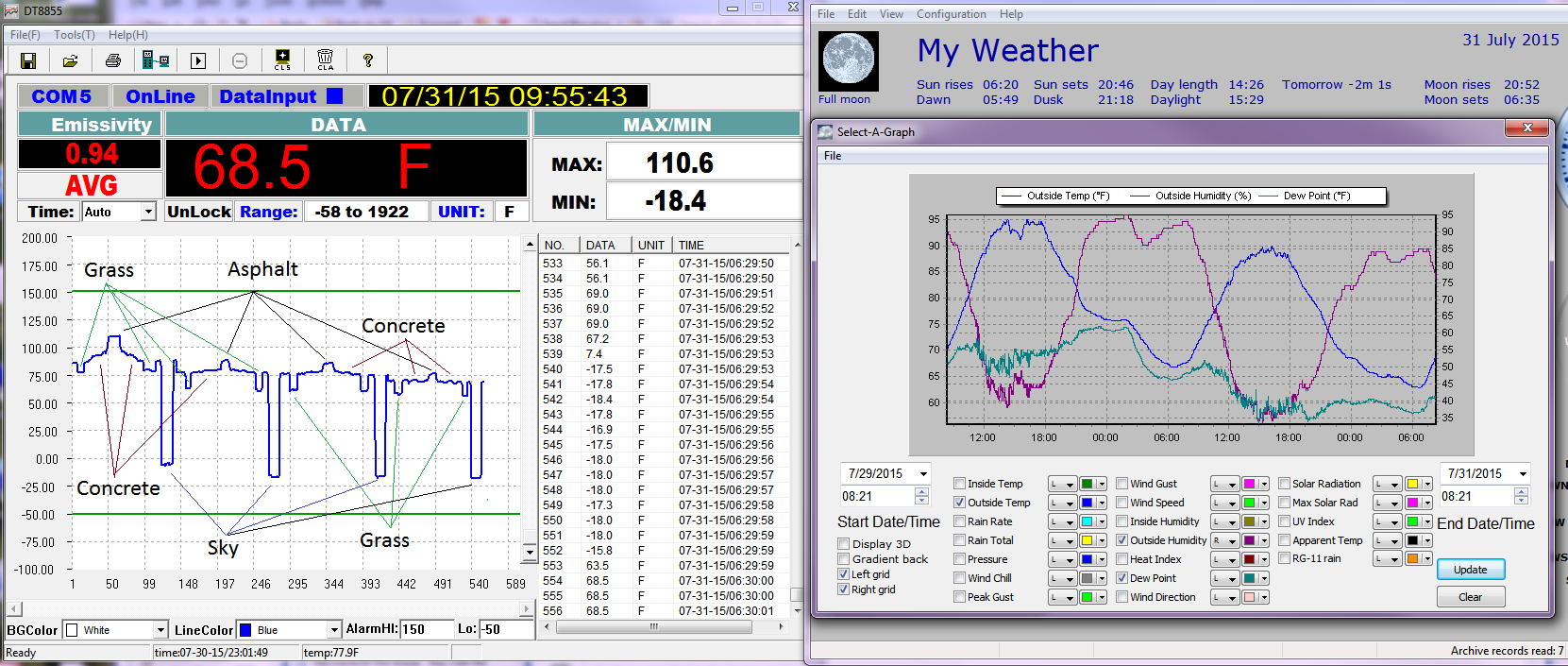
But the end result is the ground is slow to cool.
You can see this here.
temps drop until sunrise, and the ground(asphalt) is still cooling. Note grass normalizes to air temps first, then concrete, lastly asphalt.
Northern Hemisphere warming is land use changes, regional changes is caused by changes to down wind water vapor transport due to changes to the ocean surfaces temps from the AMO and PDO.
And then when taken all together the total heat content of the planet isn’t really changing, it just ends up in different places for a few decades, and then moves somewhere else.
But it’s maybe about to get worse than you think …
http://s13.postimg.org/b7rxq0hed/Polar_Oceans.png
Yep, different regions of the Earth are either warming or cooling at different rates. None of them significant over extended time and all of them autocorrelated to hell and back.
http://s13.postimg.org/95rgbrjf9/Rate.png
But you’re only supposed to look at the global anomaly and governance opportunity at the very bottom with rulers in hand …
http://s13.postimg.org/6aed4wff9/Anom.png
Thank you! However I note that you regularly go from 90 N to 90 S. Has there been an official change from 85 N and S?
See text at the bottom here: http://vortex.nsstc.uah.edu/data/msu/v6.0beta/tlt/uahncdc_lt_6.0beta3.txt
Thank you! I do not know what to say now since it contradicts:
http://www.climate4you.com/GlobalTemperatures.htm#Zonal air temperature changes
The MSU is not accurate over ice which is why RSS don’t cover the poles, UAH shouldn’t either.
Werner, I don’t know what to say either. The 5.6 time series has different latitude bands. I merely replicate what is stated at the bottom of each time series. Perhaps you should ask Dr Spencer or Dr Christy for clarification.
Fair enough. I believe that Judith Curry also said that high latitude values are a problem for some reason. In the end, it makes little difference if we have 60 to 90 or 60 to 85. If 60 to 85 shows cooling, then I really doubt if 60 to 90 would show anything really different.
MSU channel 2 was used before 1998 and AMSU channel 5 is used in the record since August 1998 and it’s technically not the ice that’s the problem. The problem is indirectly caused by ice in Antarctica, but only because of the significant heights above sea level. Satellites have a little difficulty over very high mountainous regions or very high glaciers. (2 km+ ASL for example) If satellites had difficulty with ice on low ground it would affect huge areas with winter snow cover and it doesn’t’.
Sorry for the massive dump, mod cut what you want, but they all fit together showing nightly cooling has not change and temps show no accumulating increase from Co2.

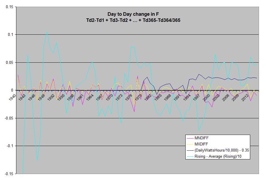


Day to Day Temperature Difference
Surface data from NCDC’s Global Summary of Days data, this is ~72 million daily readings,
from all of the stations with >360 daily samples per year.
Data source:
ftp://ftp.ncdc.noaa.gov/pub/data/gsod/
Code:
http://sourceforge.net/projects/gsod-rpts/
y = -0.0001x + 0.001
R² = 0.0572
This is a chart of the annual average of day to day surface station change in min temp.
(Tmin day-1)-(Tmin d-0)=Daily Min Temp Anomaly= MnDiff = Difference
For charts with MxDiff it is equal = (Tmax day-1)-(Tmax d-0)=Daily Max Temp Anomaly= MxDiff
MnDiff is also the same as
(Tmax day-1) – (Tmin day-1) = Rising
(Tmax day-1) – (Tmin day-0) = Falling
Rising-Falling = MnDiff
Average daily rising temps
(Tmax day-1) – (Tmin day-1) = Rising
Normalized Day to day difference with Daily Solar Forcing(WattHrs) and Rising temps
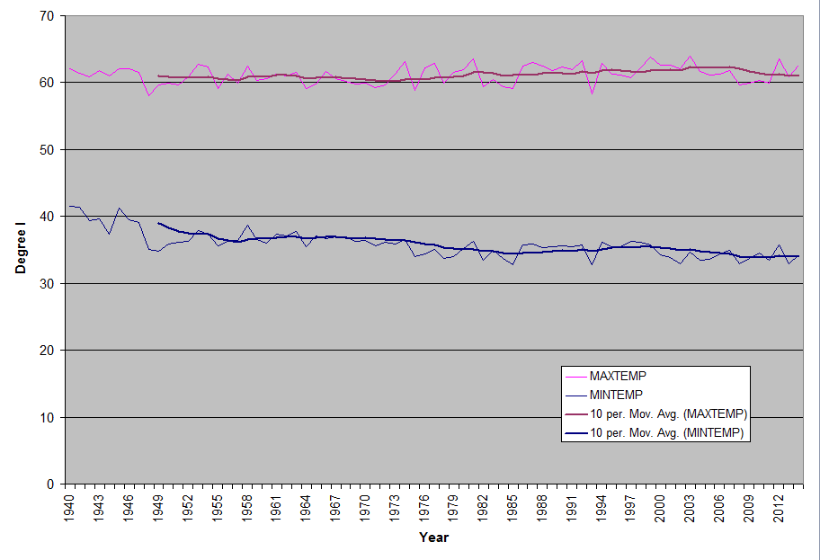
Yearly Average Min and Max Diff w/trend line Plus Surface Station count.
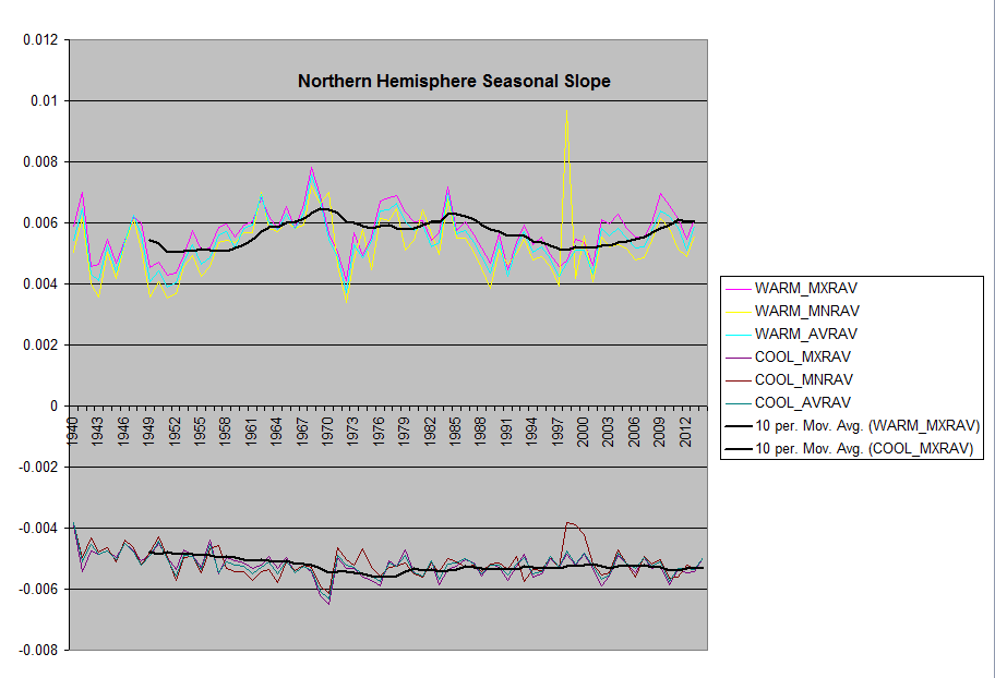
Day to Day Seasonal Slope Change
Throughout the year, especially in the extratropics, the length of time the Sunshines overhead changes.
Many have wished for some way to turn the Sun off for a while to see what surface temps do, well this happens daily.
You can see the balance of energy in the Earth system as the day becomes shorter, as well as see the length of day increase.
The surface temp responds to this with a change in temp, you can plot the rate of change for each station and look to see
if Co2 has altered the slope over the years.
If you plot daily MnDiff daily for a year, it’s a sine wave.
You can take the slope of the months leading up to and past the zero crossing,
both for summer (cooling) and winter (warming)
and plot thoses.
Global
Southern Hemisphere
is flat, other than some large disturbances in the 70’s and 80’s, and then again 2003.
Northern Hemisphere has a slight curve. A disturbance in 1973 when surface stations were changed,
And 1988
There are a number of regions with few stations, making some areas susceptible to large fluxuations,
or it could be a real disturbance in temps, they are timely to the transistions in the
Ocean cycles and the warm cycle and the start of the cooling cycle.
US Seasonal Slope
The US has the best surface station coverage in the world.
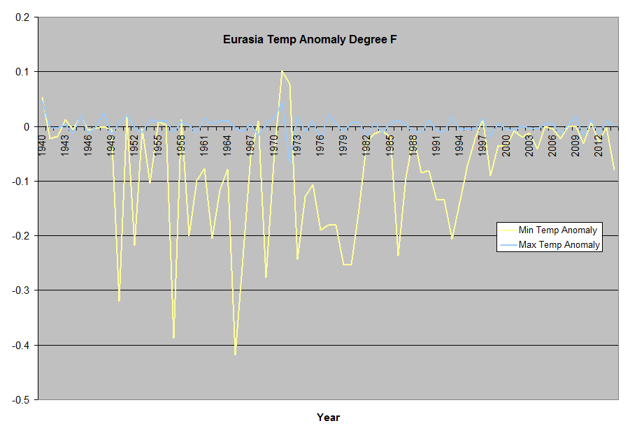
Eurasia Seasonal Slope
Northern Hemisphere w/trend line
Southern Hemisphere w/trend line
IR
Here is a sample of IR readings from a clear sky day, starting at 6:30pm, 11:00pm, 12:00pm, then 6:30am.
You can see how cold the sky is in 8u-14u, and how the surface warms and cools.
The ground cools until Sunrise.And the Grass acts as if it’s insulation,
ie trapped air allows the top surface to warm and cool quickly.
Yes this doesn’t show the impact of Co2, but you can add it back in, but even at that there is a big window open to space that is cold.
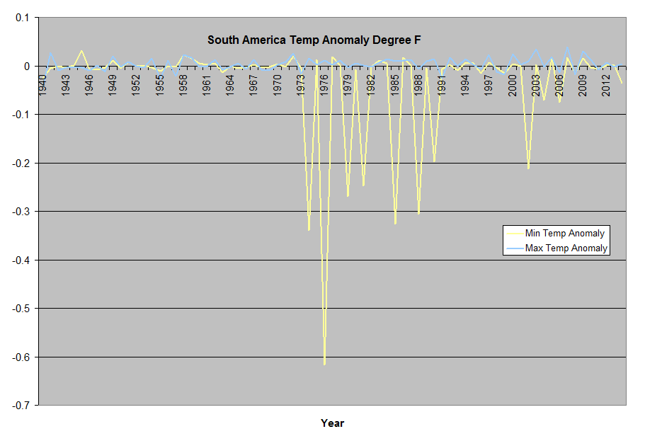
Regional Graphs
Regional annual averaged daily differences.
(Tmin day-1)-(Tmin d-0)=Daily Min Temp Anomaly= MnDiff
(Tmax day-1)-(Tmax d-0)=Daily Max Temp Anomaly= MxDiff
Global Average
US +24.950 to +49.410 Lat: -67 to -124.8 Lon
Tropics -23.433 to +23.433 Lat
Southpole -66.562 to -90 Lat
Southern Hemisphere -23.433 to -66.562 Lat
South America -23.433 to -66.562 Lat: -30 to +180 Lon
Northpole +66.562 to +90 Lat
Northern Hemisphere +23.433 to +66.562 Lat
Eurasia +24.950 to +49.410 Lat: -08 to +180 Lon
Australia -23.433 to -66.562 Lat: -100 to -180 Lon
Africa -23.433 to -66.562 Lat: -100 to -30 Lon
Max Rel Humidity limiting surface humidity.
At night, days of high humidity, as it cools off, Rel humidity
reaches 100% at which point water condenses out, some of which ends up in the water table
and does not reevaporate the following day.
You can see this effect at my location (N41,W81) Depending on the path of the jet stream we either get tropical air from the gulf, or polar air from Canada.
This is good for a 10-20F swing in temps, and it is my opinion the oceans act as pins for the jet stream, which then effects the flow over the continents,
and these changes show up in the temperature record.
Regional annual averaged daily differences.
(Tmin day-1)-(Tmin d-0)=Daily Min Temp Anomaly= MnDiff
(Tmax day-1)-(Tmax d-0)=Daily Max Temp Anomaly= MxDiff
Southpole -66.562 to -90 Lat
Northpole +66.562 to +90 Lat
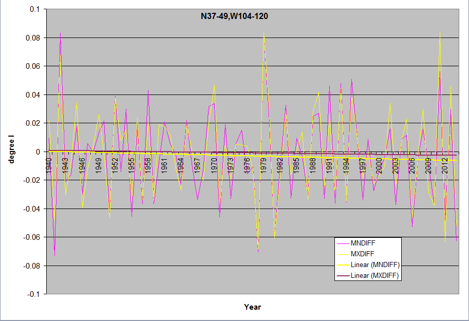
This is a chart of the annual average of day to day surface station change in min temp for N37-49,W104-120 the US Southwest deserts.
(Tmin day-1)-(Tmin d-0)=Daily Min Temp Anomaly= MnDiff = Difference
For charts with MxDiff it is equal = (Tmax day-1)-(Tmax d-0)=Daily Max Temp Anomaly= MxDiff
MnDiff is also the same as
(Tmax day-1) – (Tmin day-1) = Rising
(Tmax day-1) – (Tmin day-0) = Falling
Rising-Falling = MnDiff
Average daily rising temps
(Tmax day-1) – (Tmin day-1) = Rising
(Tmax day-1) – (Tmin day-0) = Falling
If you get this far, paid attention, and still think Co2 has done anything in the last 60+ years, I’ll pull a Willis, tell em the exact bit of data that makes you disagree with this conclusion, Please, I’d really like to know!
Thank you! However the above would be more suitable for its own post.
True, but I have no time, and it does support this threads no warming for a long period.
A lot of work has gone into your compilation, for which I thank you.
This is the sort of analysis that should be presented, not simply some global average anomaly, but rather a detailed analysis region by region, looking at daytime highs, night time lows, average daily temperatures, dealing with each month in question.
A similar exercise should be done with other climate parameters such as humidity, precipitation, snow, wind etc.
It would be interesting to see what is actually going on in the globe and where and when things are happening and whether there is any significant trend that can be ascertained.
But you have to remember that this is political, not science based. It is necessary to claim that the issue is a global one, since if each region looked solely at itself, then self interests would arise since climate change (if that is happening) would be of significant benefit to some, not of much concern to others, and a problem for some. One cannot get world governance if each region succumbs to its own self interests.
Richard, I’ve done this as well, 10 degree lat bands, and 1×1 cells, all of this data is at the sourceforge site
http://sourceforge.net/projects/gsod-rpts/
i like the description of the oceans acting as pins for the jet stream .i have been looking at data for fish species recruitment in the north east atlantic,mainly the gadoid species to see if there is a regional influence from shifting patterns of the jet stream . not being the most academically minded person it may take a while to get anywhere with it.
RSS and UAH update with September numbers.
With an average of 0.320, 2015 is tied for 4th place so far for RSS. However third place is at 0.33 which I expect RSS to break by the end of 2015. However to break second place which was in 2010 with an average anomaly of 0.472, it would require an average of 0.928 over the last three months. This is higher than the highest anomaly ever recorded which was in April 1998 at 0.857.
UAH is in third place after 9 months with an average of 0.226. It would take a huge spike over the next three months to reach second place however. The average needs to be 0.698 so the September value of 0.253 really needs to go up fast which I think is extremely unlikely. The highest ever anomaly for UAH was in April of 1998 at 0.742.
As for the pause, the zero line for RSS is 0.24, and even an anomaly as high as 0.382 in September did not shorten the pause, but it merely changed the start and end by one month to leave the total length unchanged. It would take a huge spike to actually shorten the pause. This could happen, but it is too late for the pause to be shortened by more than a month or two in 2015.
Something similar could be said for UAH with respect to the pause.
When the big meeting starts in Paris on November 30, the representative from Burma☺ should have a good case to make.
And if a La Nina follows in late 2016/17, the ‘pause’ will once again lengthen.
Unless the El Nino of 2015/16 turns out to be like the Super El Nino of 1997/9 which resulted in a long lasting step change in temperatures of about 0.25degC, we can reasonably envisage that by the time AR6 is being prepared, the ‘pause’ will be 20 (or more years) in duration. In these circumstances, AR6 will face two difficulties. First dealing with the ‘pause’ Second, dealing with model divergence since all the models will be 2019 be running outside their 95% confidence level.
If Paris does not reach a worthwhile binding commitment and with India and China not playing ball and the fact that the developed nations have no spare case being in the throws of a debt crisis , this looks unlikely, then the wheels will begin to fall off the wagon as AR6 will find it difficult to convincingly deal with the two fundamental problems noted above.
It could even happen without a La Nina. For example, 2013 was a neutral year and the average anomaly was 0.22. Since this is below the zero line of 0.24, even a neutral year can increase the pause by a month per month. Of course, a La Nina would increase the pause much faster.
There won’t be an AR6, either because a deal is reached at Paris or because a deal isn’t reached.
That table really shows the GISS data to be a significant outlier!
So far, GISS is 0.06 C above its 2014 record, but Hadcrut4 is 0.13 above its 2014 record! So if we assume an error bar of 0.10, then only Hadcrut4 can claim a 2015 record with over 95% certainty if things stay as they are.
The satellites will not go above third place however since they will not reach 1998 nor 2010.
Yet the divergence between the satellites and the surface continues to grow. If the mean global lapse rate is not changing, then one of them is wrong. For many good scientific reasons I believe the satellite record to be far more accurate.
Also, the difference between 1st and third place in the satellite record is far greater then the difference between first and third in the surface record.
The 0.13 c is an artifact from the change between HADCRUT3 and HADCRUT4. There is no record in HADCRUT3 when this is taken into account. HADCRUT4 on average is at least 0.1 c warmer than HADCRUT3, so the record if it happens is only because of the data set change. The error claim of 0.1 c by HADCRUT is nonsense and is significantly greater than that with just the different data sets showing at least this difference over recent couple of decades.
Further 0.1 c for instrumental station data and around 0.3 c to 0.4 c for changing the data sets during numerous decades using different stations/places. Overall the 0.13 above 2014 record is more like 0.13. +/- (0.5 c to 0.6 c) Just one month had difference of nearly 0.4 c by switching between HADCRUT3 and HADCRUT4. To change global temperatures by 0.4 c requires a huge change in some regions. Just this highlights why the larger error ranged quoted is backed up.
This is an example for the northern hemisphere.
http://i772.photobucket.com/albums/yy8/SciMattG/NHTemps_Difference_v_HADCRUT43_zps8xxzywdx.png
I am well aware of the fact that Hadcrut3 was way lower than Hadcrut4. As well, Hadcrut4 has had at least three revisions since then with each revision making the warming steeper.
Hadcrut3 ended in May of 2014, so we do not even have a complete 2014 number.
Whatever its faults, I was just comparing 2014 of Hadcrut4 with 2015 of Hadcrut4 so far. Take their numbers with a large a grain of salt as you wish, but they will claim that 2015 is warmer than the error bar as compared to 2014 if things stay as they are, and I see no reason for the difference in the end to be less than 0.13. It may even be greater than this.
I know version 3 ended in 2014, the average recent decadal trend difference projected into the future, results in this conclusion made before.
If anything due to the strong El Nino global temperatures should rise a little more during November and December.
GISS and HADCRUT4 will 99-100% claim record year for 2015.
I agree. The following at Nick’s site does not reflect GISS completely accurately, but it is the best that I know of:
http://www.moyhu.blogspot.com.au/p/latest-ice-and-temperature-data.html#NCAR
It shows October up to October 24 to be 0.226 above September. Since September was 0.81 on GISS, October could be 1.04. Of course, October is not over yet and it will be not exact, but I expect a huge jump in October for GISS. So Hadcrut4 should not be too different either, but you never know. Sometimes they go in opposite directions as I showed here:
http://wattsupwiththat.com/2013/12/22/hadcrut4-is-from-venus-giss-is-from-mars-now-includes-november-data/
The satellite should show a significant rise in November 2015 and greater than the surface data sets. If this doesn’t happen than the extra aerosols in the atmosphere from the volcanic eruption back in April, highlighted with the recent red looking full moons will likely have had a little affect. The last option depending on how much the SAOT increases, will likely have shown the energy in tropical oceans have peaked and the strong El Nino is in balance between causing an future overall global temperature step up or overall step down. Hence, if neither of these the next strong El Nino should cause a future global step down in temperatures.
The strong El Nino in 1972 actually caused a step down in global temperatures 2 years after it started.
http://www.woodfortrees.org/plot/hadcrut4gl/from:1972/to:1975
The sudden peak in January 1998 is equivalent to same month for the current strong El Nino for November 2015, being around 2 months in front.
http://www.woodfortrees.org/plot/uah-land/from:1997/to:1998.5/plot/rss-land/from:1997/to:1998.5
That is certainly possible. But two things are reasonably certain: The 1998 record will not be beat in 2015 by either satellite data set, and the pause will be over 18 years on both data sets with the December numbers. So the people in Paris cannot point to satellite data to make their cases.
Professor Valentina Zharkova of Northumbria gave a presentation at the National Astronomy Meeting on 09 July 2015. Earth awaits ‘mini ice age’ in 15 years, a solar cycle study suggests.
http://astronomynow.com/2015/07/09/royal-astronomical-societys-national-astronomy-meeting-2015-report-4/
To ensure the grant money keeps rolling in.
“However, Zharkova ends with a word of warning: not about the cold but about humanity’s attitude toward the environment during the minimum. We must not ignore the effects of global warming and assume that it isn’t happening. “The Sun buys us time to stop these carbon emissions,” Zharkova says. The next minimum might give the Earth a chance to reduce adverse effects from global warming.”
http://www.iflscience.com/environment/mini-ice-age-not-reason-ignore-global-warming
More links:
https://www.google.co.uk/search?q=Professor+Valentina+Zharkova&rlz=1C1CHFX_en-GBGB547GB547&oq=Professor+Valentina+Zharkova&aqs=chrome..69i57j0j69i60.1419j0j4&sourceid=chrome&es_sm=93&ie=UTF-8
No doubt he has to give the usual high five to AGW in order,to keep the grant money flowing.
Perry
October 23, 2015 at 8:57 am
Professor Valentina Zharkova of Northumbria gave a presentation at the National Astronomy Meeting on 09 July 2015. Earth awaits ‘mini ice age’ in 15 years, a solar cycle study suggests.
http://astronomynow.com/2015/07/09/royal-astronomical-societys-national-astronomy-meeting-2015-report-4/
———————————————————————————————————————————–
Zharkova has written pretty extensively on solar magnetics/reconnection and such…
A list of Zharkova Publications
http://computing.unn.ac.uk/staff/slmv5/kinetics/publications.php
Now we have “magnetic waves,” hmmm…very interesting…
Has William Astley seen this yet?
In the article above it mentions periods of “cancelling out.”
Not interuption but a “cancelling out.”
From the article..
“””” “We found magnetic wave components appearing in pairs; originating in two different layers in the Sun’s interior. They both have a frequency of approximately 11 years, although this frequency is slightly different [for both] and they are offset in time,” says Zharkova. The two magnetic waves either reinforce one another to produce high activity or cancel out to create lull periods.””””
http://astronomynow.com/2015/07/09/royal-astronomical-societys-national-astronomy-meeting-2015-report-4/
All the South Polar scientists are shouting ‘Opposite Day!” ?
“It is understandable that if carbon dioxide is really the control knob, that all places on Earth would not warm at the same rate. It is also understandable that for short periods of time, there may be cooling in some areas where other factors have a stronger influence than carbon dioxide.”
////////////////////////////////////
Whilst I have long been banging on that there is no such thing as global warming, that climate is regional and responses are regional, I question whether you are being too gracious to the CO2 warming theorem. If CO2 is a well mixed gas, and if feedbacks are well understood, the theorem should be able to fairly accurately predict the warming response to CO2 in different regions. We know that models do not do regions at all well, and this is not because as a matter of theory, the regional response cannot be adequately well predicted, but rather is due to problems with the model, the quality of input data, and perhaps a lack of understanding of the basic science that underpins the theory.
The basic tenet of the theory is that with an increase in CO2 there will always (not sometimes) be a corresponding warming as set by the Climate Sensitivity to CO2. I accept that there may be shorty periods when there is no apparent warming, but if that is the case, there must always be an explanation as to why the predicted warming did not occur, during the period in question, and that explanation must be consistent with the general tenet of the theory. If the lack of warming cannot reasonably be explained, the theory is at best suspect, if not disproven.
We know that deserts (whether these are warm deserts of cold deserts) have less water vapour and that CO2 is therefore a greater proportionate part of the so called GHGs in the atmosphere above deserts. Why cannot the predicted response over deserts be made so as to test the theorem?
We know that some areas of the globe have high levels of humidity such that CO2 is a lesser proportion of the so called GHGs over these reasons. We know the claimed water feedback response to CO2. Why can’t the theorem predict the warming over such regions?
I accept that energy/heat is constantly being pumped around the planet by ocean currents and jet streams etc. so that warming in one region may be felt in another. But again, if we understand the basic system, this too can be taken into account.
Why should the theory be let off by giving it a grace period of 5 or 10 or 15 or 20 or 30 years etc? What is the scientific justification for this grace period?
There are few issues with time, these being mainly centred upon the Climate Sensitivity to CO2 (the higher the sensitivity the more difficult it will be for no observable warming to be justified), the uncertainties surrounding natural variation (which is just another way of saying that we do not presently know or understand enough about the system we are dealing with), and the limitations of our measuring equipment including their sensitivity and their accuracy which impinge upon the resultant data set that that equipment produces.
This ‘science’ has been going on for long enough to expect it to come up with some firm predictions so that the theory can be tested and held to account. Personally, I do not consider that sceptics should buy into this drivel that we can only deal with generals and not particulars, and that after more than 30 years it is not possible to narrow Climate Sensitivity (if any at all) to CO2. It is about time that the ‘science’ is held to account. Put up, or shut up.
richard verney,
…I question whether you are being too gracious to the CO2 warming theorem.
Theorem? So far, it’s just a conjecture; not even an hypothesis.
Thank you for your comments!
Is the above how I came across? Let me put it this way: CO2 could be important despite periods of 5 of 10 years of cooling in the Antarctic, but with no warming in 37 years, that is another matter and the CO2 theorem needs to be really questioned.
I’m not sure that logic is sound.
If you take a look at ERBE, it shows that the arctic regions radiate to space considerably more energy than they absorb from solar. On an annual basis, the deficit ranges from 60 to 90 w/m2.
http://eos.atmos.washington.edu/erbe/
This energy difference has to be made up from energy xferred via air and water currents from the warmer parts of the earth. So, while we’re looking for a “signal” from CO2 in the range of 1 or 2 w/m2 or so in the last 37 years at the poles, it is buried in an energy xfer that is 30 to 45 times as big. A small variation in that would swamp any signal we see from CO2.
Thank you! I am sure we can greatly expand on this globally by saying for example: A small variation in sunlight, clouds, albedo, ENSO, etc would swamp any signal we see from CO2.
A small variation in sunlight, clouds, albedo, ENSO, etc would swamp any signal we see from CO2.
Yes.
But I forgot one other point, which is that (I think) the CO2 sensitivity in the arctic regions is probably much lower than the rest of the planet. True, it doesn’t have to compete as much with water vapour like it does in the tropics, but:
@ 30 deg C the tropics would be radiating about 478 w/m2 toward space
@ -40 deg C the Antarctic would be radiating about 167 w/m2 toward space
So we tend to refer to CO2 doubling = +3.7 w/m2 = +1 degree C, but that’s an average. I’m not sure that rule of thumb is accurate for cold places which simply aren’t radiating as much to space for CO2 to absorb as warmer regions do. On the other hand, it takes fewer w/m2 to raise the temp of something that is cold in the first place….
David I’ve had the exact same thought on all points.
Deserts would be the key test site, but in my search of global surface station data I have found no point that doesn’t return to more nightly cooling than prior day’s warming.
There places that violate this, and It took me a while to understand it, then I realize water vapor coming off the oceans, transport a lot of energy that has to cool to space as it moves poleward.
Werner B says:
…the CO2 theorem…
Werner, it’s not a “theorem”. A theorem is usually used in mathematics, but it can apply here, in which case it’s more of a lemma.
A theorem is a general proposition proved by a chain of reasoning (a lemma is a minor step in the proof). So your statement:
…the CO2 theorem needs to be really questioned actually makes no sense. A theorem is unquestioned (other than the usual caveat: there is no ultimate proof in science).
But CO2=AGW (which I assume you’re referring to) is not a theorem. Or a lemma. It’s only an unproven conjecture.
In fact, many scientists would say that CO2=AGW is a falsified conjecture, since there is no empirical evidence showing that the rise in CO2 has caused any global warming.
Not trying to argue here, I’m just picky about the terms. Language debasement is often a deliberate tactic (cf: Orwell).
You are right. I quoted some else and used his terminology without a second thought.
I believe the term ‘hypotheses’ is appropriate for the CAWG idea.
Falsified is a bit strong at this point, I feel, and with climate science in the politicized condition it’s in these days, that may be virtually impossible to do . . by design.
JohnKnight,
I wrote that CO2=AGW is:
…only an unproven conjecture.
Others say it’s falsified, but I’ll go with ‘unproven conjecture’. It isn’t a hypothesis, because even a hypothesis must be able to make repeated, accurate predictions to keep it from being falsified. But as we know, no alarmist was able to predict the years-long stasis in global temperatures. So the CO2=AGW conjecture failed to accurately predict.
You are right that this whole debate is political. Skeptics try to argue science, but we’re always met with emotional and political arguments.
If it was just based on science, skeptics would have won the debate long ago.
Yes, CO2=AGW is definitely not an hypothesis in the mathematical sense. In mathematics, an hypothesis has status underneath that of a proven theorem, (“hypo” = under). An hypothesis covering an infinite number of cases does exhibit truth for all of a finite number of cases, but a proof extending to all cases is either not possible or currently not found – for example Riemann’s Hypothesis. Sometimes hypotheses are so strongly believed that they are even used in the proof of theorems. For example, “Assuming Riemann’s Hypothesis, …” etc.
Thanks guys, I meant hypothesis in the most general sense (not math or scientific sense) and tried to echo that sense with ‘idea’ later in the sentence. It was an attempt to “correct” the use of ‘theorem’, which to my mind implied a math sense . . fool that I am ; )
J. H. MERCER, Nature, 1978, > 660 citations
West Antarctic ice sheet and CO2 greenhouse effect: a threat of disaster
“Climatic models suggest that the resultant greenhouse-warming effect will be greatly magnified in high latitudes. The computed temperature rise at lat 80° S could start rapid deglaciation of West Antarctica, leading to a 5 m rise in sea level.”
There are more concrete predicted numbers in that paper. “Some models” expected 5-10 C temperature rise at lat > 80° S during next 50 years. So almost 40 years went by, and some recerchers still parrot this WAIS disintegration myth?
Nice plots!
🙂
The fact that, over a prolonged period of time, the antarctic temperature remains the same, whilst the CO2 increased from 340 to 400 ppm(v) gives rise that the impact is negligible.
The question why the arctic shows some warming can be attributed mainly to changes in albedo and direct heat effects, although small they are incremental and the polar region represent only 4% of the northern hemisphere. Energy is dissipating to the poles as usual.
So if the south polar temperature has not changed in 30+ years, why is there evidence for accelerated ice melting in Antarctica? Should such evidence be taken seriously and if so, what is the explanation?
Overall, there is no accelerated ice melting there. It was in the Arctic that ice was lower than the long term average. See:
http://wattsupwiththat.com/reference-pages/sea-ice-page/
Thanks! One certainly wouldn’t get the idea that Antarctic ice is slowly growing from constant press releases about collapsing ice shelves!
Quote:
But why are just the northern polar regions showing larger amounts of warming? It is not as if the carbon dioxide is upside down in the south. ☺
______________________________________
Traditionally, the southern polar temperature is less sensitive to wold climate than the northern polar temperature. Check the difference between the Vostok and Greenland ice cores…
http://s18.postimg.org/4awjdwew9/New_Neem_Temps_vs_NGRIP_Antarctica.png
Fair enough. But as was pointed out here:
http://wattsupwiththat.com/2015/10/23/polar-puzzle-now-includes-august-data/#comment-2054821
there is no reaction at all since 1955 to increased CO2 since 1955. It seems as if CO2 is just not as strong a greenhouse gas as some would have us believe.
Absolutely.
I have proved to my satisfaction that the primary terrestrial feedback is albedo, not CO2. See my article here:
https://www.academia.edu/16866736/Albedo_regulation_of_Ice_Ages_with_no_CO2_feedbacks
Thank you! This is another comment that should have a post of its own.
Polar temperatures are not controlled by the earths atmosphere or biosphere. They are controlled by the cold ions and neutrals coming down from space. The warm air from the earth keeps “the cold air out or at bay via a circulation wall that surrounds most of the Antarctic and Arctic…. Warm air is from the hot spot in the oceans and cold air is from the “polar vortex” which is really the footprint of the magnetosphere in the act of guiding cold(plasma) down to the ground….
“High-latitude plasma convection from Cluster EDI: variances and solar wind correlations”
“The magnitude of convection standard deviations is of the same order as, or even larger than, the convection magnitude itself. Positive correlations of polar cap activity are found with |ByzIMF| and with Er,sw, in particular. The strict linear increase for small magnitudes of Er,sw starts to deviate toward a flattened increase above about 2 mV/m. There is also a weak positive correlation with Pdyn. At very small values of Pdyn, a secondary maximum appears, which is even more pronounced for the correlation with solar wind proton density. Evidence for enhanced nightside convection during high nightside activity is presented.”
‘Low to Moderate values in the solar wind electric field are positively correlated to convection velocity.”
“A positive correlation between Ring current and convection velocity.”
http://web.ift.uib.no/Romfysikk/RESEARCH/PAPERS/forster07.pdf
Low Energy ion escape from terrestrial Polar Regions.
http://www.dissertations.se/dissertation/3278324ef7/
“he cooling is not statistically significant, however over the complete time span of the satellite record of almost 37 years, it should not be happening if we have global warming”
where did you get that idea.. Global warming doesnt mean warming everywhere.
the south pole cooling is an interesting story…. guess what happens if you DONT interpolate
“Global warming doesnt mean warming everywhere”
/////
Well you are right if global does not mean global. And this is the deliberate mis-selling of the scam.
There is no such thing as global warming. There are some regions of the globe that may be warming, some may be cooling, and some regions may be undergoing no measurable change. But of course, if the true position is told then it would undermine global response and action and plans for global government,
Climate is regional, not global. The consequences of change are felt on a regional basis. For many regions/countries, moderate warming (about 3 degrees C) would be a godsend. For other regions/countries it would have little impact. And for some it may create a problem.
Even sea level rise is not a global issue. Some countries have no coast line. Some have a very rocky/cliff like coast line where sea level rise would have little impact. Even countries like Germany have their major cities not on the coast. It is only a few countries which would be significantly adversely impacted by sea level rise.
As soon as one recognises that Climate Change (if any) is not global, but regional, and soon as one realises that the impact of Climate Change 9if any0 is felt to different extents region by region, one immediately appreciates that mitigation is stupid, and adaption is the sensible policy. Adaption allows those regions to benefit from Climate Change, and allows those countries which are negatively impacted by Climate Change to deal with the negative consequences.
It is a great pity that it is not shouted louder; there is no such thing as global warming, the claim of global warming is a con.
Perhaps you at BEST can make it clear that there is no such thing as global warming, and you could clearly detail which parts of the globe are warming, which parts of the globe are cooling (such as the US has been cooling since the late 1930s/early 1940s), and which parts of the globe are under going no significant change (the Antarctic, and many places in the tropics).
The warming in fact appears to be mainly a northern hemisphere phenomena.
But even if this is done over whatever time period you choose, it does not mean that any drastic action needs to be taken. Most changes are very slight and they may even reverse in some regions over the coming years.
Richard I have to agree with you and wish it were possible to explain this basic wisdom to the folks so passionately engaged in modeling global climate. I’m new around here, not new to the topic but new to reading the transactions on this site and I should say it’s been sort of an intellectual oasis for me after years of trudging through a swamp of antagonistic, arrogant, misinformed folks. It really is very refreshing.
While I appreciate the diligence and effort (and down right genius level creativity) I see in folks trying to model the global climate, I have to admit that I came into the field during the mid 80’s when quite a few people were convinced modeling complex thermodynamic systems was a fundamental challenge to contemporary physics and were calling those systems “chaotic”. We were engaged in developing what we thought to be entirely new methods more akin to quantum or statistical mechanics to deal with the problems they present. In fact this is what initially drew me into the field since I had been exploring applications of chaos theory and statistical mechanics to artificial intelligence at the time.
I find the simple mechanistic models based on the work of physicists of the 1800’s inadequate for the task and I’m of the opinion that, baring a major breakthrough in our understanding of chaotic systems, we’ll have to suffer with being adaptive and reactive rather than predictive. I tend to agree with your analysis that we’re best off treating this as a regional problem, if it’s a problem at all.
There is no global warming especially in Antarctica even though it’s the coldest and driest classic place on Earth, that CO2 must have an affect. There is no warming here because CO2 has no noticeable affect. The reason why some other paces are warming is because of the oceans influencing them. They have warmed by solar energy via ENSO with reduced albedo and increased water vapor with energy loss. These have no influence in Antarctica and gives an opportunity to show CO2 trues colors and it fails. Antarctica has virtually no influence from warming oceans away from the Antarctic Circumpolar Current. (ACC)
Antarctica is a classic Earth experiment that shows ocean warming has had nothing to do with CO2. This is not surprising one bit with CO2 not being able to warm the oceans because it is nearly a million times smaller. There are always places on Earth warming, cooling or stable and overall balloon data and satellites shows no warming. The surface with especially recent changes had only started warming at least partly due to cherry picking more spots with warming and less with cooling or stability. This tampering of data gives a false impression of a bit of warming when in fact caused by biased selection, homogenization, interpolation, estimating with bias model and weighting of surface station data.
Regional graphs


Regional Graphs
Regional annual averaged daily differences.
(Tmin day-1)-(Tmin d-0)=Daily Min Temp Anomaly= MnDiff
(Tmax day-1)-(Tmax d-0)=Daily Max Temp Anomaly= MxDiff
Global Average
US +24.950 to +49.410 Lat: -67 to -124.8 Lon
Tropics -23.433 to +23.433 Lat
Southpole -66.562 to -90 Lat
Southern Hemisphere -23.433 to -66.562 Lat
South America -23.433 to -66.562 Lat: -30 to +180 Lon
Northpole +66.562 to +90 Lat
Northern Hemisphere +23.433 to +66.562 Lat
Eurasia +24.950 to +49.410 Lat: -08 to +180 Lon
Australia -23.433 to -66.562 Lat: -100 to -180 Lon
Africa -23.433 to -66.562 Lat: -100 to -30 Lon
Thank you! With all of those huge differences in minimum temperature anomalies, I am left wondering if the people did not want to get up in the middle of the night to take readings or if was too cold for them. Either way, it indicates to me that only satellites should be trusted since sleep or cold temperatures would not affect their readings.
Thanks for regional graphs.
It shows what I already thought regarding temperature, where the main difference has been minimum temperatures not maximum temperatures. This only further highlights that adjustments to surface temperatures creating false warming are certainly dishonest. Minimum temperatures usually when they is no/little sun should never have exposure problems during these periods quoted. I do not trust the surface data one little bit and will only go on satellite data from now on regarding climate.
Even HADCRUT have highlighted there incompetence when changing the coldest December recorded in the UK to being only very slightly below normal in grid data for the usual global temperature surface data set. The grid data even showed a positive anomaly at first until I complained later. These regional graphs also show the same behavior during the CET, where the main difference between warmer and cooler periods are mainly minimum temperatures during winter.
It is blatantly obvious with maximum temperatures hardly changing at all and minimum temperatures becoming less cold in winter is a huge benefit to all human society.
“the south pole cooling is an interesting story…. guess what happens if you DONT interpolate”
You an answer based on actual measurements? As opposed to answers based on linear averages over a nonlinear field?
Steve, you’ve been drinking too much koolaid.
Mosher writes
Interpolate what exactly?
“With so much uncertainty, perhaps we should wait to really see what is really occurring before spending trillions on a problem that may not even exist?”
Too late – others with more clout than you and who dither less have already decided. You must have noticed that the Paris train has already left the station – though chances are that it won’t reach it’s final destination
“It is also understandable that if carbon dioxide goes from 0.028% to 0.040%, that the effect would be greatest at the poles where the additional carbon dioxide does not have to compete with 2% to 4% water vapor as may be the case in the tropics.”
Actually, Polar Amplification has more to do with ice albedo feedbacks and (probably most importantly) the Stefan-Boltzmann law. The forcing from CO2 isn’t really hugely stronger at higher latitudes, in fact I think it’s actually weaker.
logic (gates)
A & B (AND, &, . )
0 & 0 = 0
0 & 1 = 0
1 & 0 = 0
1 & 1 = 1
A + B (OR)
0 + 0 = 0
0 + 1 = 1
1 + 0 = 1
1 + 1 = 1
only looking at input A or input B does not correlate with output, i.e. output can be 1 when A (or B) is 0 or 1 in both gates.
for several inputs i.e. say A,B,C,D,E, and perhaps many more for global temperature effects, the output could look something like…
A & (B+C) & (C&D+E) & (A&C+E) = 1
add into this that the input can be going up/increasing (1), going down/decreasing (0) or staying the same (?) adds more combinations. Output 1 is warming, 0 cooling (or ? staying same)
possible inputs:
distance from sun
sunspots
volcanic activity
deforestation
temperature (yes feedback)
ice/snow cover
soot from coal, oil
exotic gases
number of fish in the sea
oxygen level
co2 level
maybe number of oxygen breathing land based creatures
high energy cosmic radiation
number of ships
add more here….
conclusion
God knows!
” if carbon dioxide is really the control knob, that all places on Earth would not warm at the same rate.”
Has anyone done the experiment of using temperature records in the Sahara, the ‘Outback’, Gobi desert, Namib, etc. where water vapour is not a confounding factor to get a better estiimate of the effect of CO2 alone on temperature? This would be as close to an actual experiment as one could get on earth. Indeed, what do temperature records show in these places?
That sounds good. But what about these from the reply above yours:
“possible inputs:
distance from sun
sunspots
volcanic activity
deforestation
temperature (yes feedback)
ice/snow cover
soot from coal, oil
exotic gases
number of fish in the sea
oxygen level
co2 level
maybe number of oxygen breathing land based creatures
high energy cosmic radiation
number of ships”
Can I add:
Transient dust/gas clouds between the Earth and Sun.
Transits of the inner planets.
Eccentricities in precession.
Sorry, I did high altitude infrared astronomy in a previous life…
OMG! Now you have me doing it.
Seriously though, I wonder if you could point the Keck at where the solar system was during the last ice age to see if we may have spent a few hundred thousand years passing through some murky space? You wouldn’t know exactly where the muck had been going or how fast, but searching the general area might throw up a clam or two?
Number of fish in the sea? We’re not talking fish farts here are we? 🙂
Why stop there? See:
http://wattsupwiththat.com/reference-pages/research-pages/potential-climatic-variables/
by “Just The Facts”.
Well then, I’ll just step back into my chaos hole 🙂
I did notice no one seems to mention the possibility of the solar system traveling through extended periods of muck. Don’t I get a prize for that, or is it mentioned under a different heading?
Sorry! No prize for you. See the following from the above site:
“6. Outer Space/Cosmic/Galactic Effects;
http://en.wikipedia.org/wiki/Outer_space
http://en.wikipedia.org/wiki/Cosmos
http://en.wikipedia.org/wiki/Galaxy
including Asteroids;
http://en.wikipedia.org/wiki/Asteroid
Meteorites;
http://en.wikipedia.org/wiki/Meteorite
and Comets;
http://en.wikipedia.org/wiki/Comet”
Werner writes: “Sorry! No prize for you.”
You scoundrel. No prize? Al got a prize and he didn’t say anything original either! I demand a recount! Hanging chads! Empty food dishes at 5 p.m. All manner of slights! I’m calling the Queen of America. She’s a friend of mine you know and she gave me this scarf. You’re gonna be sorry about this…
🙂
“Sorry! No prize for you.”
Not even a Participation Medal?
Could it be that WUWT has higher standards?
Why would they do that? It doesn’t require extra time and expense to get there. And, they wouldn’t have much to do except sit around in a tent. Sounds so much more exciting to go to poles or some mountain and watch the ice melt. They probably started around the time valleys were packed with snow in France. Maybe they could take a voyage to prove how ice free the great lakes are in summer.
You just have to ask yourself what is the obvious reason they didn’t do that. They already know the answer. You don’t see them talking about that. It’s also much easier to verify. I can drive to any desert here. Much like Live Science had a picture of Pueblo, CO reservoir being dry on the same day as they were having a flood. Oh wow, why are they releasing water from the dams? ( I went to go look, proof of global warming so they say) I’m sure you were invited to go to Antarctica at taxpayer expense.
This is a chart of the annual average of day to day surface station change in min temp for N37-49,W104-120 the US Southwest deserts.

(Tmin day-1)-(Tmin d-0)=Daily Min Temp Anomaly= MnDiff = Difference
For charts with MxDiff it is equal = (Tmax day-1)-(Tmax d-0)=Daily Max Temp Anomaly= MxDiff
MnDiff is also the same as
(Tmax day-1) – (Tmin day-1) = Rising
(Tmax day-1) – (Tmin day-0) = Falling
Rising-Falling = MnDiff
Average daily rising temps
(Tmax day-1) – (Tmin day-1) = Rising
(Tmax day-1) – (Tmin day-0) = Falling
Beautiful work Werner. Well done.
Thank you!
Werner Brozek writes: “It is also understandable that if carbon dioxide goes from 0.028% to 0.040%, that the effect would be greatest at the poles where the additional carbon dioxide does not have to compete with 2% to 4% water vapor as may be the case in the tropics.”
Werner, when I read this I recalled a account of the Greenhouse Effect that described CO2 radiation and the mechanism of propagating accumulated heat to the upper atmosphere by molecular collision, then finally into radiant IR transmitted to space. In that description it was mentioned that CO2 may give up a photon by colliding with H2O or another GHG in the lower atmosphere, with high probability. A chain of collisions is then required to transfer the IR successively until eventually the radiation makes it into the stratosphere where it escapes.
If we assume a very low to nonexistent density of H20 in the Antarctic as you describe, what effect would that have on the rate of IR propagation into the stratosphere as compared with the tropics? It seems to me the rate may be increased by a lack of H20 in the Antarctic atmosphere, perhaps explaining the lack of effect increased CO2 densities in that region as you’ve observed?
Things are often much more complicated than we imagine! A few years ago, Ira Glickstein, PhD, had an interesting series on this topic. See:
http://wattsupwiththat.com/2011/05/07/visualizing-the-greenhouse-effect-light-and-heat/
The thing that really stood out for me in this treatment was the first comment, which describes the difference between transfer of IR by convection and transfer by stimulated emission. I don’t think either the article itself or the comment discuss the effect reduced H2O may have on the propagation rate of IR in the atmosphere, but the comment seemed relevant in a different way.
I hadn’t considered stimulated emission at all (which is a real oversight for me since I have a background in laser physics). Of course, a very large difference between the tropical and Antarctic region is direct insolation, with the Antarctic being the poor cousin of the tropics in that respect. It would stand to reason then that the relative dominant direction of Antarctic IR would be up rather than down when compared with the tropics. Very little direct IR is transmitted to the Antarctic, the majority of radiated heat will come from the Earth, not space. This would cause the dominant radiance to be towards space I would think?
If IR has a nearly equal probability of radiating up or down, or arguably a dominant probability of being radiated down (due to solar radiation) by stimulated emission in the tropics, we should observe greater heat retention in that region as compared with the Antarctic?
Regardless which radiation is dominant over Antarctica for whatever reason, the question in my mind is what affect should an additional 100 ppm of CO2 have on Antarctic temperatures?
Scott
October 24, 2015 at 9:29 pm
Seriously though, I wonder if you could point the Keck at where the solar system was during the last ice age to see if we may have spent a few hundred thousand years passing through some murky space? You wouldn’t know exactly where the muck had been going or how fast, but searching the general area might throw up a clam or two?
———————————————————————————————————-
We are looking back in time wrt to the solar journey thru the galaxy. And yes, we are finding smaller scale so called “murky regions of space.” Cloudlettes, mini clouds, measured in AU for size.
But because you asked, I googled Seth Redfield. And low and behold, something new again……from Redfield and Linsky. Hot off the press too, so to speak.
Evaluating the Morphology of the Local Interstellar Medium:
Using New Data to Distinguish Between Multiple Discrete Clouds
and a Continuous Medium
8 Sep 2015
Seth Redfield and Jeffrey L. Linsky
But you might find this article more interesting…
The local ISM in three dimensions: kinematics, morphology
and physical properties
http://sredfield.web.wesleyan.edu/papers/linsky14.pdf
Jeffrey L. Linsky · Seth Redfield
Received: 15 January 2014 / Accepted: 21 April 2014 / Published online: 13 May 2014
Abstract We summarize the results of our long-term program
to study the kinematics, morphology, and physical
properties of warm partially ionized interstellar gas located
within 100 pc of the Sun. Using the Space Telescope Imaging
Spectrograph (STIS) and other spectrographs on the
Hubble Space Telescope (HST), we measure radial velocities
of neutral and singly ionized atoms that identify comoving
structures (clouds) of warm interstellar gas. We have identified
15 of these clouds located within 15 pc of the Sun. Each
of them moves with a different velocity vector, and they have
narrow ranges of temperature, turbulence, and metal depletions.
We compute a three-dimensional model for the Local
Interstellar Cloud (LIC), in which the Sun is likely embedded
near its edge, and the locations and shapes of the other
nearby clouds…..
Wishing Dr. S., would do something with his blog. So much info, so little time.
Wonder what he though about;
The two-hearted Sun beckons new ‘mini ice-age’
“””Their predictions using the model suggest an interesting longer-term trend beyond the 11-year cycle. It shows that solar activity will fall by 60 percent during the 2030s, to conditions last seen during the Maunder Minimum of 1645-1715. “Over the cycle, the waves fluctuate between the Sun’s northern and southern hemispheres. Combining both waves together and comparing to real data for the current solar cycle, we found that our predictions showed an accuracy of 97 percent,” says Zharkova.
The model predicts that the magnetic wave pairs will become increasingly offset during Cycle 25, which peaks in 2022. Then during Cycle 26, which covers the decade from 2030-2040, the two waves will become exactly out of synch, cancelling one another out. This will cause a significant reduction in solar activity. “In cycle 26, the two waves exactly mirror each other, peaking at the same time but in opposite hemispheres of the Sun. We predict that this will lead to the properties of a ‘Maunder minimum’,” says Zharkova.”””
http://astronomynow.com/2015/07/09/royal-astronomical-societys-national-astronomy-meeting-2015-report-4/
Carla –
This is incredible stuff, exactly what I’d been thinking. It continues to amaze me that, if I know the right keywords, I can find most of the stuff I can think of has already been done by someone.
I haven’t read the paper a second time yet, but one section in particular caught my eye:
“If the Sun is indeed located inside of the LIC [Local Interstellar Cloud], then the Sun’s velocity away from the LIC in the upwind direction toward 36 Oph, the upper limit of N (HI) < 6 × 1016 cm− 2 at the predicted LIC radial velocity for this line of sight, and the assumption that n(HI) = 0.20 cm− 3 imply that the Sun will leave the LIC in less than 3700 years (Wood et al. 2000)."
I plan do follow this research to get a better idea of the absorption spectra of the LIC and investigate its effect on solar energy reaching the Earth (if any); it would seem there's a possibility it could change noticeably in the next 3700 years. It was exactly this situation that caused me to ask the question, and it looks as if Redfield & Linsky have been providing the answers.
Thanks very much for the lead,
Scott.
On a more personal note, I stayed at the conference center in Llandudno where the held the NAM2015 meeting back in 1978 when I was VP of my student union. Several fond memories of that place…
The solar magnetic flux model Zharkova presents is certainly interesting, it would be even more interesting if we knew the period of effect. She mentions a “longer-term trend beyond the 11-year cycle” that she predicts will peak again in 2030, but the news article doesn’t mention it’s period and leaves the reader to believe the last time this happened was during the Maunder Minimum (~1650), so maybe every 500 or so years? I’ll have to find a copy of the paper.
Wouldn’t it be a hoot if AGW really existed and the effect saved the planet from a 100 year freeze that killed off crops and destroyed civilization as we know it?
””…“If the Sun is indeed located inside of the LIC [Local Interstellar Cloud], …””
I think there is already reason to believe we are near the edge of the LIC and transitioning. There was a noticeable change in the direction of the incoming interstellar winds.
””…She mentions a “longer-term trend beyond the 11-year cycle” that she predicts will peak again in 2030,…”””
We do see a longer term trend in solar cycle. It is called the Gleissburg Cycle of approx. 100 years in which the solar cycle rises and falls. And also has a hemispheric component in which either the N. hemisphere leads in solar activity for several cycles then switches and S. hemisphere then leads in activity.
We now have simulations of what the effects of a variable 1 to 4 u gauss interstellar magnetic field would have on the shape and compression of the heliospheric bubble. Surprise, lower gauss produced S. hemispheric magnetic pressures on the nose of the heliosphere and magnetic tension on the N. hemispheric tail region downwind. With less activity due to magnetic reconnection between the two regimes of solar and interstellar. The same article also notes:
THE EFFECT OF NEW INTERSTELLAR MEDIUM PARAMETERS ON THE HELIOSPHERE AND ENERGETIC
NEUTRAL ATOMS FROM THE INTERSTELLAR BOUNDARY
“””…Finally, we note that within the spatial dimensions and resolution
of our steady-state simulations the heliospheric current
sheet is flat and “flips” to either the northern hemisphere
for the 2μG, 3μG, and 4μG cases, or the southern hemisphere
in the 1μG case…”””
http://iopscience.iop.org/article/10.1088/0004-637X/784/1/73;jsessionid=4C587630750ED5B32E876E478B64FA38.c4.iopscience.cld.iop.org
Published 2014 March 5 • © 2014. The American Astronomical Society
My understanding is the heliospheric current sheet is flat during solar maximum when all the sunspots (magnetic activity) are hanging out around the equator and the polar fields are near zero.
…”””Wouldn’t it be a hoot if AGW really existed and the effect saved the planet from a 100 year freeze that killed off crops and destroyed civilization as we know it?…”””
Too late, they say that if the sun doesn’t warm up the CO2 for us that uh it contributes to cooling..no win..
So much info so little time..
The polar puzzle..
I’m still stuck on the size, extent and more circular shape that the Southern hemispheres vortex displays each year, compared to the wobbly elongated Northern hemispheres vortex. With a prediction of even lower solar activity our earths own magnetosphere will not be experiencing as much friction and compressions during our orbit about the sun.
Here’s the Zharkova article, Scott.
PCs = principle components
SBMF = solar background magnetic field
PREDICTION OF SOLAR ACTIVITY FROM SOLAR BACKGROUND MAGNETIC FIELD
VARIATIONS IN CYCLES 21–23
Simon J. Shepherd1, Sergei I. Zharkov2, and Valentina V. Zharkova3
http://computing.unn.ac.uk/staff/slmv5/kinetics/shepherd_etal_apj14_795_1_46.pdf
From the conclusions sections;
Furthermore, by using the Eureqa technique based on a
symbolic regression, we managed to uncover the underlying
mathematical laws governing the fundamental processes of
magnetic wave generation in the Sun’s background magnetic
field. These invariants are used to extract the key parameters of
the PCs of SBMF waves, which, in turn, are used to predict the
overall level of solar activity for solar cycles 24–26.
We can conclude with a sufficient degree of confidence
that the solar activity in cycles 24–26 will be systematically
decreasing because of the increasing phase shift between the
two magnetic waves of the poloidal field leading to their full
separation into opposite hemispheres in cycles 25 and 26. This
separation is expected to result in the lack of their subsequent
interaction in any of the hemispheres, possibly leading to a lack
of noticeable sunspot activity on the solar surface lasting for a
decade or two, similar to those recorded in the medieval period.
Using the modulus summary curves derived from the principal
components of SBMF, we predict a noticeable decrease
of the average sunspot numbers in cycle 25 to ≈80% of that in
cycle 24 and a decrease in cycle 26 to ≈40% which are linked
to a reduction of the amplitudes and an increase of the phase
between the PCs of SBMF separating these waves into the opposite
hemispheres. We propose using the PCs derived from
SBMF as a new proxy for the solar activity which can be linked
more closely to dynamo model simulations.
Further investigation is required to establish more precise
links between the dynamo waves generated by both poloidal and
toroidal magnetic fields as simulated in the dynamo models and
the waves in the solar background (SBMF) and sunspot (SMF)
magnetic fields derived with the PC and symbolic regression
analysis presented in the current study which will be the scope
of a forthcoming paper……
magnetic waves are most interesting, seem to be ubiquitous…