Guest Post by Professor Robert Brown from Duke University and Werner Brozek, Edited by Just The Facts:
 - 1979 to Present")
The above graphic shows RSS having a slope of zero from both January 1997 and March 2000. As well, GISS shows a positive slope of 0.012/year from both January 1997 and March 2000. This should put to rest the notion that the strong El Nino of 1998 had any lasting affect on anything. Why is there such a difference between GISS and RSS? That question will be explored further below.
The previous post had many gems in the comments. I would like to thank firetoice2014 for their comment that inspired the title of this article.
I would also like to thank sergeiMK for very good comments and questions here. Part of their comment is excerpted below:
“@rgb
So you are basically stating that all major providers of temperature series of either
1 being incompetent
2 purposefully changing the data to match their belief.”
Finally, I would like to thank Professor Brown for his response. With some changes and deletions, it is reproduced below and ends with rgb.
“rgbatduke
August 14, 2015 at 12:06 pm
Note well that all corrections used by USHCN boil down to (apparently biased) thermometric errors, errors that can be compared to the recently discovered failure to correctly correct for thermal coupling between the actual measuring apparatus in intake valves in ocean vessels and the incoming seawater that just happened to raise global temperatures enough to eliminate the unsightly and embarrassing global anomaly “Pause” in the latest round of corrections to the major global anomalies; they are errors introduced by changing the kind of thermometric sensors used, errors introduced by moving observation sites around, errors introduced by changes in the time of day observations are made, and so on. In general one would expect measurement errors in any
given thermometric time series, especially when they are from highly diverse causes, to be as likely to cool the past relative to the present as warm it, but somehow, that never happens. Indeed, one would usually expect them to be random, unbiased over all causes, and hence best ignored in statistical analysis of the time series.
Note well that the total correction is huge. The range is almost the entire warming reported in the form of an anomaly from 1850 to the present.
Would we expect the sum of all corrections to any good-faith dataset (not just the thermometric record, but say, the Dow Jones Industrial Average “DJIA”) to be correlated, with, say, the height of my grandson (who is growing fast at age 3)? No, because there is no reasonable causal connection between my grandson’s height and an error in thermometry. However, correlation is not causality, so both of them could be correlated with time. My grandson has a monotonic growth over time. So does (on average, over a long enough time) the Dow Jones Industrial Average. So does carbon dioxide. So does the temperature anomaly. So does (obviously) the USHCN correction to the temperature anomaly. We would then observe a similar correlation between carbon dioxide in the atmosphere and my grandson’s height that wouldn’t necessarily mean that increasing CO2 causes growth of children. We would observe a correlation between CO2 in the atmosphere and the DJIA that very likely would be at least partly causal in nature, as CO2 production produces energy as a side effect and energy produces economic prosperity and economic prosperity causes, among other things, a rise in the DJIA.
In Nicholas Nassim Taleb’s book The Black Swan, he describes the analysis of an unlikely set of coin flips by a naive statistician and Joe the Cab Driver. A coin is flipped some large number of times, and it always comes up heads. The statistician starts with a strong Bayesian prior that a coin, flipped should produce heads and tails roughly equal numbers of times. When in a game of chance played with a friendly stranger he flips the coin (say) ten times and it turns up heads every time (so that he loses) he says “Gee, the odds of that were only one in a thousand (or so). How unusual!” and continues to bet on tails as if the coin is an unbiased coin because sooner or later the laws of averages will kick in and tails will occur as often as heads or more so, things will balance out.
Joe the Cab Driver stopped at the fifth or sixth head. His analysis: “It’s a mug’s game. This joker slipped in a two headed coin, or a coin that it weighted to nearly always land heads”. He stops betting, looks very carefully at the coin in question, and takes “measures” to recover his money if he was betting tails all along. Or perhaps (if the game has many players) he quietly starts to bet on heads to take money from the rest of the suckers, including the naive statistician.
An alternative would be to do what any business would do when faced with an apparent linear correlation between the increasing monthly balance in the company presidents personal account and unexplained increasing shortfalls in total revenue. Sure, the latter have many possible causes — shoplifting, accounting errors, the fact that they changed accountants back in 1990 and changed accounting software back in 2005, theft on the manufacturing floor, inventory errors — but many of those changes (e.g. accounting or inventory) should be widely scattered and random, and while others might increase in time, an increase in time that matches the increase in time in the president’s personal account when the president’s actual salary plus bonuses went up and down according to how good a year the company had and so on seems unlikely.
So what do you do when you see this, and can no longer trust even the accountants and accounting that failed to observe the correlation? You bring in an outside auditor, one that is employed to be professionally skeptical of this amazing coincidence. They then check the books with a fine toothed comb and determine if there is evidence sufficient to fire and prosecute (smoking gun of provable embezzlement), fire only (probably embezzled, but can’t prove it beyond all doubt in a court of law, continue observing (probably embezzled, but there is enough doubt to give him the benefit of the doubt — for now), or exonerate him completely, all income can be accounted for and is disconnected from the shortfalls which really were coincidentally correlated with the president’s total net worth.
Until this is done, I have to side with Joe the Cab Driver. Up until the latest SST correction I was managing to convince myself of the general good faith of the keepers of the major anomalies. This correction, right before the November meeting, right when The Pause was becoming a major political embarrassment, was the straw that broke the p-value’s back. I no longer consider it remotely possible to accept the null hypothesis that the climate record has not been tampered with to increase the warming of the present and cooling of the past and thereby exaggerate warming into a deliberate better fit with the theory instead of letting the data speak for itself and hence be of some use to check the theory.
The bias doesn’t even have to be deliberate in the sense of people going “Mwahahahaha, I’m going to fool the world with this deliberate misrepresentation of the data”. Sadly, there is overwhelming evidence that confirmation bias doesn’t require anything like deliberate dishonesty. All it requires is a failure in applying double blind, placebo controlled reasoning in measurements. Ask any physician or medical researcher. It is almost impossible for the human mind not to select data in ways that confirm our biases if we don’t actively defeat it. It is as difficult as it is for humans to write down a random number sequence that is at all like an actual random number sequence (go on, try it, you’ll fail). There are a thousand small ways to make it so. Simply considering ten adjustments, trying out all of them on small subsets of the data, and consistently rejecting corrections that produce a change “with the wrong sign” compared to what you expect is enough. You can justify all six of the corrections you kept, but you couldn’t really justify not keeping the ones you reject. That will do it. In fact, if you truly believe that past temperatures are cooler than present ones, you will only look for hypotheses to test that lead to past cooling and won’t even try to think of those that might produce past warming (relative to the present).
Why was NCDC even looking at ocean intake temperatures? Because the global temperature wasn’t doing what it was supposed to do! Why did Cowtan and Way look at arctic anomalies? Because temperatures there weren’t doing what they were supposed to be doing! Is anyone looking into the possibility that phenomena like “The Blob” that are raising SSTs and hence global temperatures, and that apparently have occurred before in past times, might make estimates of the temperature back in the 19th century too cold compared to the present, as the existence of a hot spot covering much of the pacific would be almost impossible to infer from measurements made at the time? No, because that correction would have the wrong sign.
So even like this excellent discussion on Curry’s blog where each individual change made by USHCN can be justified in some way or another which pointed out — correctly, I believe — that the adjustments were made in a kind of good faith, that is not sufficient evidence that they are not made without bias towards a specific conclusion that might end up with correction error greater than the total error that would be made with no correction at all. One of the whole points about error analysis is that one expects a priori error from all sources to be random, not biased. One source of error might not be random, but another source of error might not be random as well, in the opposite direction. All it takes to introduce bias is to correct for all of the errors that are systematic in one direction, and not even notice sources of error that might work the other way. It is why correcting data before applying statistics to it, especially data correction by people who expect the data to point to some conclusion, is a place that angels rightfully fear to tread. Humans are greedy pattern matching engines, and it only takes one discovery of a four leaf clover correlated with winning the lottery to overwhelm all of the billions of four leaf clovers that exist but somehow don’t affect lottery odds in the minds of many individuals. We see fluffy sheep in the clouds, and Jesus on a burned piece of toast.
But they aren’t really there.
rgb”
In the sections below, as in previous posts, we will present you with the latest facts. The information will be presented in three sections and an appendix. The first section will show for how long there has been no warming on some data sets. At the moment, only the satellite data have flat periods of longer than a year. The second section will show for how long there has been no statistically significant warming on several data sets. The third section will show how 2015 so far compares with 2014 and the warmest years and months on record so far. For three of the data sets, 2014 also happens to be the warmest year. The appendix will illustrate sections 1 and 2 in a different way. Graphs and a table will be used to illustrate the data.
Section 1
This analysis uses the latest month for which data is available on WoodForTrees.com (WFT). All of the data on WFT is also available at the specific sources as outlined below. We start with the present date and go to the furthest month in the past where the slope is a least slightly negative on at least one calculation. So if the slope from September is 4 x 10^-4 but it is – 4 x 10^-4 from October, we give the time from October so no one can accuse us of being less than honest if we say the slope is flat from a certain month.
1. For GISS, the slope is not flat for any period that is worth mentioning.
2. For Hadcrut4, the slope is not flat for any period that is worth mentioning.
3. For Hadsst3, the slope is not flat for any period that is worth mentioning.
4. For UAH, the slope is flat since April 1997 or 18 years and 4 months. (goes to July using version 6.0)
5. For RSS, the slope is flat since January 1997 or 18 years and 7 months. (goes to July)
The next graph shows just the lines to illustrate the above. Think of it as a sideways bar graph where the lengths of the lines indicate the relative times where the slope is 0. In addition, the upward sloping blue line at the top indicates that CO2 has steadily increased over this period.
 - 1979 to Present")
When two things are plotted as I have done, the left only shows a temperature anomaly.
The actual numbers are meaningless since the two slopes are essentially zero. No numbers are given for CO2. Some have asked that the log of the concentration of CO2 be plotted. However WFT does not give this option. The upward sloping CO2 line only shows that while CO2 has been going up over the last 18 years, the temperatures have been flat for varying periods on the two sets.
Section 2
For this analysis, data was retrieved from Nick Stokes’ Trendviewer available on his website <a href=”http://moyhu.blogspot.com.au/p/temperature-trend-viewer.html”. This analysis indicates for how long there has not been statistically significant warming according to Nick’s criteria. Data go to their latest update for each set. In every case, note that the lower error bar is negative so a slope of 0 cannot be ruled out from the month indicated.
On several different data sets, there has been no statistically significant warming for between 11 and 22 years according to Nick’s criteria. Cl stands for the confidence limits at the 95% level.
The details for several sets are below.
For UAH6.0: Since November 1992: Cl from -0.007 to 1.723
This is 22 years and 9 months.
For RSS: Since February 1993: Cl from -0.023 to 1.630
This is 22 years and 6 months.
For Hadcrut4.4: Since November 2000: Cl from -0.008 to 1.360
This is 14 years and 9 months.
For Hadsst3: Since September 1995: Cl from -0.006 to 1.842
This is 19 years and 11 months.
For GISS: Since August 2004: Cl from -0.118 to 1.966
This is exactly 11 years.
Section 3
This section shows data about 2015 and other information in the form of a table. The table shows the five data sources along the top and other places so they should be visible at all times. The sources are UAH, RSS, Hadcrut4, Hadsst3, and GISS.
Down the column, are the following:
1. 14ra: This is the final ranking for 2014 on each data set.
2. 14a: Here I give the average anomaly for 2014.
3. year: This indicates the warmest year on record so far for that particular data set. Note that the satellite data sets have 1998 as the warmest year and the others have 2014 as the warmest year.
4. ano: This is the average of the monthly anomalies of the warmest year just above.
5. mon: This is the month where that particular data set showed the highest anomaly. The months are identified by the first three letters of the month and the last two numbers of the year.
6. ano: This is the anomaly of the month just above.
7. y/m: This is the longest period of time where the slope is not positive given in years/months. So 16/2 means that for 16 years and 2 months the slope is essentially 0. Periods of under a year are not counted and are shown as “0”.
8. sig: This the first month for which warming is not statistically significant according to Nick’s criteria. The first three letters of the month are followed by the last two numbers of the year.
9. sy/m: This is the years and months for row 8. Depending on when the update was last done, the months may be off by one month.
10. Jan: This is the January 2015 anomaly for that particular data set.
11. Feb: This is the February 2015 anomaly for that particular data set, etc.
17. ave: This is the average anomaly of all months to date taken by adding all numbers and dividing by the number of months.
18. rnk: This is the rank that each particular data set would have for 2015 without regards to error bars and assuming no changes. Think of it as an update 35 minutes into a game.
| Source | UAH | RSS | Had4 | Sst3 | GISS |
|---|---|---|---|---|---|
| 1.14ra | 6th | 6th | 1st | 1st | 1st |
| 2.14a | 0.170 | 0.255 | 0.564 | 0.479 | 0.74 |
| 3.year | 1998 | 1998 | 2014 | 2014 | 2014 |
| 4.ano | 0.482 | 0.55 | 0.564 | 0.479 | 0.74 |
| 5.mon | Apr98 | Apr98 | Jan07 | Aug14 | Jan07 |
| 6.ano | 0.742 | 0.857 | 0.832 | 0.644 | 0.96 |
| 7.y/m | 18/4 | 18/7 | 0 | 0 | 0 |
| 8.sig | Nov92 | Feb93 | Nov00 | Sep95 | Aug04 |
| 9.sy/m | 22/9 | 22/6 | 14/9 | 19/11 | 11/0 |
| Source | UAH | RSS | Had4 | Sst3 | GISS |
| 10.Jan | 0.277 | 0.367 | 0.688 | 0.440 | 0.81 |
| 11.Feb | 0.175 | 0.327 | 0.660 | 0.406 | 0.87 |
| 12.Mar | 0.165 | 0.255 | 0.681 | 0.424 | 0.90 |
| 13.Apr | 0.087 | 0.174 | 0.656 | 0.557 | 0.73 |
| 14.May | 0.285 | 0.309 | 0.696 | 0.593 | 0.77 |
| 15.Jun | 0.333 | 0.391 | 0.728 | 0.575 | 0.79 |
| 16.Jul | 0.183 | 0.289 | 0.691 | 0.636 | 0.75 |
| Source | UAH | RSS | Had4 | Sst3 | GISS |
| 17.ave | 0.215 | 0.302 | 0.686 | 0.519 | 0.80 |
| 18.rnk | 3rd | 6th | 1st | 1st | 1st |
If you wish to verify all of the latest anomalies, go to the following:
For UAH, version 6.0beta3 was used. Note that WFT uses version 5.6. So to verify the length of the pause on version 6.0, you need to use Nick’s program.
http://vortex.nsstc.uah.edu/data/msu/v6.0beta/tlt/tltglhmam_6.0beta3.txt
For RSS, see: ftp://ftp.ssmi.com/msu/monthly_time_series/rss_monthly_msu_amsu_channel_tlt_anomalies_land_and_ocean_v03_3.txt
For Hadcrut4, see: http://www.metoffice.gov.uk/hadobs/hadcrut4/data/current/time_series/HadCRUT.4.4.0.0.monthly_ns_avg.txt
For Hadsst3, see: http://www.cru.uea.ac.uk/cru/data/temperature/HadSST3-gl.dat
For GISS, see:
http://data.giss.nasa.gov/gistemp/tabledata_v3/GLB.Ts+dSST.txt
To see all points since January 2015 in the form of a graph, see the WFT graph below. Note that UAH version 5.6 is shown. WFT does not show version 6.0 yet. Also note that Hadcrut4.3 is shown and not Hadcrut4.4, which is why the last few months are missing for Hadcrut.
 - 1979 to Present")
As you can see, all lines have been offset so they all start at the same place in January 2015. This makes it easy to compare January 2015 with the latest anomaly.
Appendix
In this part, we are summarizing data for each set separately.
RSS
The slope is flat since January 1997 or 18 years, 7 months. (goes to July)
For RSS: There is no statistically significant warming since February 1993: Cl from -0.023 to 1.630.
The RSS average anomaly so far for 2015 is 0.302. This would rank it as 6th place. 1998 was the warmest at 0.55. The highest ever monthly anomaly was in April of 1998 when it reached 0.857. The anomaly in 2014 was 0.255 and it was ranked 6th.
UAH6.0beta3
The slope is flat since April 1997 or 18 years and 4 months. (goes to July using version 6.0beta3)
For UAH: There is no statistically significant warming since November 1992: Cl from -0.007 to 1.723. (This is using version 6.0 according to Nick’s program.)
The UAH average anomaly so far for 2015 is 0.215. This would rank it as 3rd place, but just barely. 1998 was the warmest at 0.483. The highest ever monthly anomaly was in April of 1998 when it reached 0.742. The anomaly in 2014 was 0.170 and it was ranked 6th.
Hadcrut4.4
The slope is not flat for any period that is worth mentioning.
For Hadcrut4: There is no statistically significant warming since November 2000: Cl from -0.008 to 1.360.
The Hadcrut4 average anomaly so far for 2015 is 0.686. This would set a new record if it stayed this way. The highest ever monthly anomaly was in January of 2007 when it reached 0.832. The anomaly in 2014 was 0.564 and this set a new record.
Hadsst3
For Hadsst3, the slope is not flat for any period that is worth mentioning. For Hadsst3: There is no statistically significant warming since September 1995: Cl from -0.006 to 1.842.
The Hadsst3 average anomaly so far for 2015 is 0.519. This would set a new record if it stayed this way. The highest ever monthly anomaly was in August of 2014 when it reached 0.644. The anomaly in 2014 was 0.479 and this set a new record.
GISS
The slope is not flat for any period that is worth mentioning.
For GISS: There is no statistically significant warming since August 2004: Cl from -0.118 to 1.966.
The GISS average anomaly so far for 2015 is 0.80. This would set a new record if it stayed this way. The highest ever monthly anomaly was in January of 2007 when it reached 0.96. The anomaly in 2014 was 0.74 and it set a new record.
Conclusion
There might be compelling reasons why each new version of a data set shows more warming than cooling over the most recent 15 years. But after so many of these instances, who can blame us if we are skeptical?
Fraud, often seen on Wall Street over the years, is apparently not limited to the financial world. This is a sad, dark period for science.
One alternative is that the satellite and surface data sets represent reality. Assuming this, I hope that some clever climate scientists are busy figuring out how to modify the current understanding of heat flow in the atmosphere to explain why, for almost two decades, the surface warms while the troposphere does not.
These sorts of ‘ultraviolet catastrophe’ moments in science can lead to tremendous new understanding of our world.
When there are constant adjustments every year, I think the explanation lies elsewhere.
“Those who control the present, control the past and those who control the past control the future.”
― George Orwell, 1984
The Urban Heat Island Effect could be a possible explanation of warmer surface temperatures couldn’t it?
Cal.
“The Urban Heat Island Effect could be a possible explanation of warmer surface temperatures couldn’t it?”
The UHI is not an explanation for the rise in the global average temperature.
There has to be more than ideology behind this. Those who are making money out of this or who intend to make money out of it should be named and shamed.
One has to have a conscience for shaming to be effective.
Don’t underestimate the power of ideology. It’s quite sufficient on its own for True Believers.
I’d put the point a different way. Ideological choices and choices for making money are both influenced by the existing incentive structure.
In the public space, moral preening, boasting of good intentions, and “praying in public” are strongly incentivized. Skillful praying in public is closely correlated with increased status and increased personal power. That has always been true, right back to biblical times.
It is true that the specific ideology used to make the point of personal “good intentions” changes over time. Nonetheless there are common elements throughout history. The key one is a strong claim of altruistic intent. “I deserve status, because I’m dis-interested. If you disagree with me, it must be because you are not well intended. Thus you should be on the moral defensive and silent in my presence while my ideas, and I, take precedence.”
Liberalism and environmentalism are extremely powerful tools for this sort of praying in public, despite being highly defective guides to workable policies. Hence the dominance of liberalism/environmentalism in the media, academia, and the arts.
The people at the very top want an excuse to tax us.
Agreed but It’s not just those at the top, a great many citizens want to pay a carbon tax.
In my lifetime I never thought I’d see regular folks actively campaigning for higher taxes, it is entirely counterintuitive, but this is what we are seeing.
It’s astonishing and deeply troubling to me.
Klem October 1, 2015 at 6:49 am
“Agreed but It’s not just those at the top, a great many citizens want to pay a carbon tax. ”
And that highlights their fraud. Any person can voluntarily pay extra taxes any time they wish.
Klem, remember that the Spanish-American War was based on a set of fables generated by a NYC newspaper and repeated across the nation. Eventually real bullets flew and real people died for reasons fabricated from whole cloth. There was literally nothing behind it.
More recent encounters may have had a similar provenance.
The war on carbon doesn’t have to have a sinister mind looking for fame and other people’s money. Sometimes people do things for baseless or indiscernible or frivolous reasons. Some things were done ‘because they could’.
And a tax for what? A tax that has nothing to actually show for it is money that very easily finds its way into the hands of the “ideologists.”
Oh n-e-v-e-r !
FOUR BILLION DOLLARS PER DAY……buys a lot of ideology.
Buys a lot of naive folks too, apparently ; )
And explains why there are so many pigs at the trough.
Many of them believe that they are saving the world, and this justifies their behavior.
10 years ago that might have been true, but today they just have their snouts so deep in the trough of public money that they cannot see anything beyond the dosh at the end of their snout.
“There has to be more than ideology behind this. Those who are making money out of this or who intend to make money out of it should be named and shamed.”
First, why does there need to be more than ideology behind this? Ideology is a powerful force. See all the true-believing Chicken Littles running around denigrating realists. They’re not making money on it. But they do feel they are “superior” and living on a higher moral plane than all of us mouth-breathing “deniers.”
Second, you should subscribe to Tony Heller’s blog: Real Climate Science. He calls out the scammers by name every day.
Tony has been naming and shaming loudly and clearly for years. WUWT is sheepishly pretending that Tony does not exist.
He does, and he has the scammers by the tail. He’s not interested in being accepted by them, nor in having a peer reviewed paper published. Tony is the climate data fraud whistleblower responsible for this entire discussion.
http://realclimatescience.com/
Tony is falsifying flawed ideas and false claims in brilliant ways, at a tremendous rate – that is science.
The internet never forgets.
The “it’s the money” explanation should itself be examined. There seems to be an intrinsic appeal to explanations of this sort as opposed to ‘force-of-belief’ explanations. But only the latter explains the near-suicidal activities of the current political and intellectual elites. (Among other references, check out the Roosters of the Apocalypse book – that wasn’t done for the money.)
Kent,
“First, why does there need to be more than ideology behind this?”
An odd way to put the question, to my mind. Why not; Why must there be little more than ideology behind this? There are more forces in the world than ideology (and I don’t doubt some of them shape ideologies).
This hardly looks like the work of a few climate modelers, that’s one force that is not exactly overpowering. I see no reason to mock or belittle those who smell a bigger rat than you . . it’s not like such things don’t happen on this planet, ya know? ; )
John,
““First, why does there need to be more than ideology behind this?”
An odd way to put the question, to my mind. Why not; Why must there be little more than ideology behind this? There are more forces in the world than ideology (and I don’t doubt some of them shape ideologies).
This hardly looks like the work of a few climate modelers, that’s one force that is not exactly overpowering. I see no reason to mock or belittle those who smell a bigger rat than you . . it’s not like such things don’t happen on this planet, ya know? ; )”
I apologize for the lack of clarity.
What I meant was: The entire scam is based on ideology!
The ideology is Politically Correct Progressvism.
This ideology is based on a hatred of Normal-America. See here for a brief explanation of its belief system:
http://intelctweekly.blogspot.com/2014/07/politically-correct-progressive-belief.html
While the scammers have figured out how to divert money into their pockets, 99% of true believers make not a penny from the scam. Their reward is social–they feel better than you. They feel superior. They are members of a support network of fellow hate-mongers, reaping the benefits of being the “in-crowd.”
It is pure, 100% ideological.
Those in the realist group who constantly harp, “It’s all about the money.” are missing the power of the anti-civilization PC-Progressive ideology.
Thanks for the thoughtful reply, Kent, and perhaps I should have been clearer myself. Though these days language itself is treacherous it seems, and virtually bound to lead to confusion.
“The entire scam is based on ideology!
The ideology is Politically Correct Progressvism.”
I don’t doubt that many people have some sort of faith in something along the lines of what you named, it’s that I think it’s pretty much a scam too, which the perps and their front-men are hiding behind. A rubbery conceptual hodgepodge that stretches and shifts to suit the propaganda of the day., not a true ideology.
To my mind, you are essentially saying the same thing when you say something this;
“While the scammers have figured out how to divert money into their pockets, 99% of true believers make not a penny from the scam. Their reward is social–they feel better than you. They feel superior. They are members of a support network of fellow hate-mongers, reaping the benefits of being the “in-crowd.”
Perhaps ‘feeliology’ is a better word for such a “movement” ; )
John,
The short description of the PC-Prog ideology is a summary of my extensive research and analysis of the origins of this belief system. I’ve written a book on it, in fact.
For full details, see this short video:
http://willingaccomplices.com/willing_accomplices/videos
Suffice it to say that you’re on the right track (“feelology”), but are missing the historical background of this ideology of hate, destruction, and devastation.
kentclizbe,
Thanks, for the video and your loyal service, past and present.
I agree by and large with your research and it’s implications, and the significant impact on our society what you’ve exposed has had, though I believe this “movement” began long before the Soviet Union existed, and indeed was responsible to no small extent for it’s establishment.
Have you looked into Albert Pike, Blavatsky/theosophy/luciferianism and so on? If not I suggest you do so, for I think this toxic dark cloud on our world can be traced way back to . . well, I’m a follower of certain Jesus, so, a certain garden long ago.
John,
Sorry, all the Theosophists, occultists, and other whacky cults are but pimples on a gnat compared to the Comintern.
The Comintern ran a massive, global covert operation designed to destabilize, denigrate, disorganize, and destroy its enemies. The Number One Enemy, and the greatest obstacle to its domination of the world was the exceptionalism of America and America’s rugged individualism based in capitalism, freedom and liberty.
The operations run by the Comintern had many different objectives, but the most successful, echoing through the decades through the mouths of Willing Accomplices like Gavin Schmidt, Michael Mann, and their allies, was the covert influence operation designed to denigrate American capitalism.
Its objective was to make Americans hate the system that created our greatness.
The key to the operation was Willi Muenzenberg’s popular front approach. He built, using Comintern money, front organizations across the US. These organizations, which are very much like today’s Greenpeace, PETA, and others made their members feel special, smart, cool, better than the mouth-breathers.
That was the genius in the operations–this “coolness” is what gave this anti-Normal-America attitude a life of its own. This attitude continues till today. It is reflected in the beliefs of PC-Progressives. It is our President’s belief system. It is the belief system of the Democrat Party.
Kent Clizbe,
I think this guy reported exactly what’s going on.
(1-page transcript.)
DBS,
“Bezmenov”
Unfortunately Bezmenov is in the category of “fake but accurate.”
He was a project of the John Birch Society–who meant well, but were easily fooled, and played very loosely with the truth and facts.
My extensive research into the KGB ops, including interviews with as many living KGB operators as possible, confirmed my assessment of Bezmenov.
He was actually a journalist for TASS. He was NOT a KGB operator. As KGB used TASS extensively for cover, the journalists saw the KGB ops, and were frequently co-opted for specific uses. But they were not privy to what was happening in the espionage operations.
Interestingly, because of compartmentation of operations, most KGB operators had no understanding of the overall ops and goals of Soviet espionage. Even an actual operator would not have discussed the strategic goals and implications of their covert actions. They were focused on the operational level–recruiting an agent, inserting a piece of misinformation in a paper, at a low level.
Bezmenov, like a trained monkey, just told the story that John Birch wanted told. He was playing a role, not totally out of character, but not who he was. And the script he read, while very close to reality, was also not the truth.
I discuss these issues in detail in my book: Willing Accomplices: How KGB Covert Influence Operations created Political Correctness.
http://www.willingaccomplices.com
kentclizbe,
I’m not denying in any way that the things you speak of have happened, but rather, am suggesting that there aren’t really many communists among the movers and shakers of this world. Instead, the goal is elitism, with a tiny group of “elites” ruling over an essentially captive humanity. Communism is just a cover, a sort of cloak which allows some hyper-wealthy psychopaths to avoid detection.
These folks will use any and all ideologies in whatever way suits they’re purposes, because once you’ve got total control, it really doesn’t matter what you promised anyone. What they have in mind is no more communism than a slave plantation is, even if all the slaves got treated roughly the same, I suggest.
PS~ The current reigning political cloak is socialism, it seems clear to me, and what some call the “social justice” meme in particular, of which the CAWG shake-down is a fine example.
PPS1 From the article you linked to,
“Yuri Bezmenov: The immediate thing that comes to my mind, of course, there must be an immediate, very strong national effort to educate people in the spirit of real patriotism, number one. Number two, explain the real danger of socialist, Communist, whatever welfare state, big brother government. If people will fail to grasp the impending danger of their development, nothing ever can help United States. You might kiss goodbye to your freedoms, including freedoms to homosexuals, prison inmates, all this freedom will vanish, evaporate in five seconds, including your precious life.”
He sees what I see, it seems to me.
John,
Sorry to be redundant, but, regardless of the content of Bezemenov’s comments, he is fake.
His commentary is almost exactly like Dan Rather’s case against George W. Bush: “Fake but accurate.”
Bezemenov is NOT what he claims to be. His commentary is just a regurgitation of the John Birch point of view. His story is actually sort of pitiful. All defectors are pitiful. They usually have minimal actual useful information. Bezemenov clearly had virtually NO useful information, and therefore was sent out to pasture pretty much immediately.
The John Birchers picked him up after he was pumped dry by the USG. And he began reading the script they wanted him to read. His accent gave him credibility.
What you’re seeing as accurate is accurate, to an extent. Exactly like Rather’s info on Bush’s National Guard experience was accurate–but fake.
I’d be happy to send you a copy of Willing Accomplices so you can read the whole story. The context of KGB officers’ access, knowledge, and experience with their own agency’s legacy operations is important: Even actual KGB officers do NOT have knowledge of strategic goals, and historic operations.
Bezmenov was NOT KGB. His “insights” are just regurgitated John Birch talking points.
kentclizbe,
To me, it’s as though we were discussing a snake oil salesman, and you were telling me the guy really believes the stuff in the bottles will cure all sorts of diseases. We agree that stuff won’t cure squat, but I believe the guy knows that, and is not himself a true believer in the miracle of snake oil . . he’s a true believer in lying to get what he wants, I say.
Or we were discussing the drive to ban guns, and you were telling me those behind it were overly concerned about the dangers gun pose to innocent children, and I was trying to explain that’s just a cover, they are faking that concern to get the citizenry disarmed for other reasons.
Kent C,
I agree with your point of view, and I really would like to be 100% on board. But when you write:
…regardless of the content of Bezemenov’s comments, he is fake.
That’s an ad hominem logical fallacy. It doesn’t matter who said it, what matters is if it is factual or not. And he isn’t the only one saying the same thing. Further, it detracts from anything we can do to counter the threat.
Bezmenov’s interviews were made in the 1980’s. They have been amazingly prescient. I don’t give a hoot if he was KGB, or merely was acquainted with the KGB. The things he said would happen have now taken place.
Do you dispute that the country has been ‘demoralized’? Do you dispute that ‘demoralized’ means that the country has lost its moral compass? Just look at all the incessant lionizing of the LBTG&etc. groups, the demonizing of the Boy Scouts, which was built based on morality, the vicious tribalism, promoted even by the President, the government’s flagrant ignoring of our immigration laws, the ‘politically correct’ movement, the attacks on the 1st and 2nd Amendments and the Constitution itself, the intolerance of free speech on campus, and I could go on for about six more paragraphs. You get the point, I’m sure.
Bezmenov accurately outlined the KGB’s plan, in detail. When the Soviets realized they could not defeat the West militarily, they switched tactics and targeted what they called the ‘organs’ of society: the media, the education complex, churches, and now the scientific establishment.
Their plan has been amazingly successful. What they were incapable of doing with force, they have done relatively easily by infiltrating the ‘organs of society’.
Prof Richard Lindzen has written about the corruption of science (see Sec. 2). All it takes is one or two activists on a Board to sharply re-direct the organization. I have been on such boards, and I know how easy it is to plan out a change in direction. Everyone on the Board wants something, so votes are easy to trade. Eventually, a majority of the Board (typically six individuals) agrees to take a public position on ‘climate change’.
Isn’t it amazing that several dozen national professional organizations have all used almost identical language warning of “dangerous climate change” in their position statements? What are the odds of that? Organizations are like people: no two are exactly alike. Certainly a good fraction of those organizations should be voicing the position of scientific skeptics of the ‘dangerous AGW’ alarm. They should at least be saying, “More study is needed.” Or, “The evidence shows that the rise in CO2 is caused by rising temperatures, not vice-versa”. Or, “Global warming stopped many years ago, so those who put forth the man-made global warming hypothesis must reconsider”. Or any number of skeptical positions.
But, no. They all say exactly the same thing: that human emissions are causing climate change. That gives the average person pause: ‘If all the professional organizations are warning us about “carbon”, maybe we should listen.’ Even organizations that have little or nothing to do with science, or with the question of AGW have issued official opinions, and those opinions are all the same.
But human nature being what it is, there will always be disputes, among scientists in particular. A rational person does not accept that because there are still no measurements quantifying what they all insist must be happening, that there are simply no dissenting organizations skeptical of the CAGW narrative.
That is not reasonable. The total agreement on something that lacks evidence, and which many eminent scientist strongly dispute, indicates that the unanimous chorus of professional organizations’ statements must have an external cause. Only credulous, naive people would believe that they all agree on something for which there is no measurable scientific evidence whatever, and which has been flatly contradicted by the absence of any global warming for nearly twenty years.
You can call me a ‘conspiracy theorist’ if you like. But to me it just does not make sense that everything observed in this regard is only a coincidence. Always ask yourself: “Cui bono?” The answer will be pretty clear.
DBS,
“Accurate but fake” won’t cut it.
I’m saying that as an expert on Comintern/KGB covert influence operations designed to destroy America’s culture.
In fact, I wrote a book on this subject.
Here’s a brief overview, in a short video:
http://willingaccomplices.com/willing_accomplices/videos
Bezmenov read John Birch scripts. Their scripts were pointing in the right direction, but could be inaccurate, and based on much fakery. Their bad faith gave the movement to counter-act the destruction a bad name. With very bad results.
My book covers these issues, providing the who/what/where/when/why/how of the ACTUAL operations run by the Comintern.
Would be happy to send you a copy. It’s on Amazon.
Kent,
I have the feeling that my point didn’t register. It doesn’t matter who said what. That only makes the discussion an ad-hom digression.
What matters is: was the prediction accurate? It appears to me that it was very accurate. Morality is under attack from every angle, thus: demoralization. A very effective tactic in a democracy like ours.
I don’t care if Pee Wee Herman said it, the question is, what do we do about it? Any answers?
“I have the feeling that my point didn’t register. It doesn’t matter who said what. That only makes the discussion an ad-hom digression.”
DBS,
The first rule of vetting, sourcing, intelligence collection and reporting, researching is always: Consider your source. That’s not what ad hominem is. A fraud is a fraud. A bad source is a bad source. I’d be happy to provide some lessons on this. I did it for a living.
If your source is a fraud, it does not matter how achingly attractive his sweet words are. He is a bad source, and is making it up.
However much it pains you, you must reject that source.
I’d highly recommend you read my book, Willing Accomplices. It is the true story of the Comintern covert action operations against American culture.
It’s the real who/why/what/where/when/how of the operations.
Suffice it to say that Bezmenov’s imaginings were on the right track, but reality is always stranger than fiction.
http://www.willingaccomplices.com
Kent,
We’re talking about two different things. You’re trying to trash someone, and I’m saying that when someone makes accurate predictions, he has credibility. Rather than argue about it, I’ll just wish you well selling your book.
DBS,
This is not about selling my book. I’ll GIVE you a copy. Send me an email with your address, and you’ll have one asap. kent@kentclizbe.com
This is about sourcing. Proper sourcing. It’s crucial in research. Just because you found a video on the internet, and a guy with a cool accent says stuff you agree with does not make it accurate, or true.
You talk about logical fallicies. You are caught in one yourself. It’s the Dan Rather, “fake but accurate” syndrome.
Wanting it to be so does not make it so.
“Defenders of CBS claimed that while the memos themselves were fakes, the story was nonetheless still true, a laughingstock of an argument that came to be known as “fake but accurate,” and sometimes as “truthiness.” This impulse to dismiss fakery in the service of larger truths…”
http://hotair.com/archives/2012/03/22/the-return-of-fake-but-accurate/
“Bezmenov himself is a fake, but the story he tells is nonetheless still true….”
It’s an easy trap to fall into. And one which should always be avoided, should one wish to remain on the side of truth and rightness.
As Ed Morrissey said above, that’s “a laughingstock of an argument.” Don’t be that guy!
Drop me a note. Happy to send you one.
All the best.
It would consume less space to list the names of those that are not deliberately doing this for the money. But it would ruin their chances of getting funded.
Is the raw data being saved? That is the most important thing.
I wonder why – if we have the raw data – we never see a raw data graph…?
Certainly wasn’t in office moves at the UEA CRU during the 1990’s. Only adjusted data exists now.
Surely raw data exists in the original reports from Met stations? A particular UEA collection may have been lost, but it would be hard to lose ALL the original data. Wouldn’t it?
Apparently not as it, still to this day, cannot be presented as the raw data.
The two MMs have been after the CRU station data for years. If they ever hear there is a Freedom of Information Act now in the UK, I think I’ll delete the file rather than send to anyone.
from: Phil Jones
subject: Re: For your eyes only
to: “Michael E. Mann”
All the raw data still exists.
If you use raw data then the global warming is worse.
The net effect of all adjustments to all records is to COOL the record
The two authors of this post don’t get it.
Adjustments COOL the record..
Cool the record. Period. [snip]
Mosher. You keep saying that. Bring data.
In God we trust, all others bring data
– W. Edwards Deming
See previous posts here:
http://wattsupwiththat.com/2014/11/05/hadcrut4-adjustments-discovering-missing-data-or-reinterpreting-existing-data-now-includes-september-data/
and
http://wattsupwiththat.com/2013/05/12/met-office-hadley-centre-and-climatic-research-unit-hadcrut4-and-crutem4-temperature-data-sets-adjustedcorrectedupdated-can-you-guess-the-impact/
Whether the adjustments cool or warm the overall record is not what this post is about. What is very clear is that the latest 16 years always seem to show warmer anomalies with each revision.
Mosher,
Dave in Canmore, below, has the perfect response to you: “Zeke’s “excellent discussion on Curry’s blog” is most interesting. To highlight the need for adjustments to the original observations, Zeke describes at length what poor quality the data is due to station moves and all manners of problems. What amazes me is why the discussion doesn’t just end there?
The discussion amounts to “of course we have to adjust the data- look how awful it is!”
That they have convinced themselves they can convert bad data to good is the real problem.”
Is that not what we should expect, Mosh? If I were going to try and fool someone with temp. data I would flatten and cool almost the entire record. The only part that needs a little warm bias (or less cold bias) is maybe the last 50 years but certainly the last 15. As today’s data aged it would be cooled and flattened. This not only achieves the desired result but has the added bonus of allowing me to say things like “Cool the record. Period.” Unfair? Probably. But, I consider your post little more than misdirection as is. Maybe all the supporting points were in the snip.
No, the [snip] on Mosher was an insult. I saved him from himself and his poor choice of words.
Mr. Moshers comment seems to be the literary equivalent of the pretty girl, scantily clad, in a magic act.
* raises arms fetchingly…look over here, boys…look over here.*
Patrick [October 1, 2015 at 3:30 am] says that only adjusted data exists now. And then comes Steven Mosher [October 1, 2015 at 7:06 am] and says that “All the raw data still exists.” Who is right?
I certainly would like to know because the biggest temperature theft of all took place in the eighties and nineties when an entire hiatus (warming pause) was covered up by introducing a fake warming into official temperature curves. I discovered this in 2008 while doing research for my book “What Warming?…” There was a no-warming period that lasted from 1979 to 1997, an eighteen year stretch. The raw data still exist in UAH and RSS satellite databases. But when I went to cross check with official temperature records they were gone and in their place was a so-called “late twentieth century warming.” I traced the origin of this false warming to HadCRUT3 and even put a warning about it into the preface of my book when it came out. But absolutely nothing happened. They have been using that fake temperature record with impunity since 1997, the end year of the hiatus. It makes the warming of the eighties and nineties look a lot more formidable than it actually is. Since then I have also determined that GISS and NCDC were co-conspirators with HadCRUT3 in this coverup. All three had their databases adjusted by the same computer and the computer left its footprints on all three publicly available temperature curves, in exactly the same places. This is an actual scientific crime, data falsification to give the wrong impression of global temperature in the eighties and nineties. Recently we heard that twenty pseudo-scientists have written a letter to the President asking him to use the RICO law to prosecute those whose science does not agree with theirs. That is an outrage as wall as a stupidity because they obviously do not know (or pretend not to know) how science works. But having brought up the RICO law, I think there really is something to apply it to. It should be used to investigate how the fake warming in the eighties and nineties was created, who authorized it, who did it, and why they took no action to desist when I exposed their criminal activity. Needless to say, it should be under the criminal and not the civil section of the law and appropriate penalties should be applied.
Mosher, even setting aside the credentials of rgb, after observing the writings of both of you for a few years I would always put my money on him “getting it” before you. Just like instinctively knowing who one would rather share a foxhole with, there is enough evidence to trust rgb implicitly on any of the science he presents.
When you are outclassed Steven, it is best to simply accept it.
“The net effect of all adjustments to all records is to COOL the record” – Steven Mosher
That’s because the past is longer than the present. If you cool the past and warm the present, then of course the “net effect” will be to COOL the record. If that’s not what you mean, you can demonstrate it by showing a side-by-side graph of raw vs adjusted temperature data for recent years. If the raw data for this century is warmer than the adjusted data, you will be proven right. But if not, you are deliberately trying to deceive us.
“To highlight the need for adjustments to the original observations, Zeke describes at length what poor quality the data is due to station moves and all manners of problems. What amazes me is why the discussion doesn’t just end there?
The discussion doesnt end there because your knowledge doesnt end there.
Take TOBS.. easy to detect, easy to correct. Same as correcting for inflation or stock splits.
“Is that not what we should expect, Mosh? If I were going to try and fool someone with temp. data I would flatten and cool almost the entire record. The only part that needs a little warm bias (or less cold bias) is maybe the last 50 years but certainly the last 15. As today’s data aged it would be cooled and flattened. This not only achieves the desired result but has the added bonus of allowing me to say things like “Cool the record. Period.” Unfair? Probably. But, I consider your post little more than misdirection as is. Maybe all the supporting points were in the snip.”
First you argue that the adjustments warm the record
When you find out they actually cool the record,,
pretty funny.
Different groups, different methods, different data sources.
raw data is warmer than adjusted data.
adjustments cool the record..
Unless you cherry pick the 2% of the world with the worst practice ( US ).
but if you look at 100% of the data— adjustments cool the record.
doesnt take a phd to see that
Very fetching Mosh.
Hubba hubba.
To a limited extent, these .PDF files are probably unmolested; the collection is USDA, held at Cornell.
This is one PDF http://usda.mannlib.cornell.edu/usda/waob/weather_weekly//2010s/2012/weather_weekly-12-27-2012.pdf
“That’s because the past is longer than the present. If you cool the past and warm the present, then of course the “net effect” will be to COOL the record. If that’s not what you mean, you can demonstrate it by showing a side-by-side graph of raw vs adjusted temperature data for recent years. If the raw data for this century is warmer than the adjusted data, you will be proven right. But if not, you are deliberately trying to deceive us.”
The past isnt cooled.
https://twitter.com/hausfath/status/564921572096348160
Here is 70% of the data.
See Part 2, Figure 4
red line is raw
black line is adjusted
The past is WARMED!!!
That gives you a lower slope
http://www.metoffice.gov.uk/hadobs/hadsst3/diagrams.html
So
CRU, WARM the past for 70% of the data.
with the land record ( 30%) of the data
The past is cooled
and the NET EFFECT of both is to WARM THE PAST see Zeke figures
Land data
https://twitter.com/hausfath/status/564921572096348160
ocean data
https://twitter.com/hausfath/status/564921572096348160
The ocean which is 70% of the globe has the past warmed by adjustments
The land which is 30% of the globe has the past cooled by adjustments.
The NET of all adjustments is to warm the past… a lower slope
Now, all skeptics got is a cherry pick of the US, USHCN, which we dont even USE.!!!!!
So guess what. If you take a distribution of adjustments you will find that they run from negative to positive
The Mean adjustment COOLS the record.
But because there is a distribution of adjustments, people with Phds can look at one tiny slice
and show “postive” adjustments. almost Mannian
Can you point to a specific newer version of GISS or HadCrut that showed a lower global warming trend than the previous version?
Steven Mosher October 2, 2015 at 10:35 am finally shows us graphs of temperature corrections. Good idea. It might have eliminated some nitpicking in the past. I find that now I can agree with Zeke Hausfather (5:59 PM – 9 Feb 2015) whom Mosher quotes saying that:
“… global temperature adjustments actually reduce the long-term warming trend, mostly due to oceans.”
This does not mean that I am all for corrections. Michael Critchton (thatJurassic guy) gave a talk to the Congress in which he was strongly opposed to correcting any original data. You should read his comments on how this is handled in the bio-medical field. My chief interest at the present time is that the corrections that are huge in the early twentieth century drop to practically nothing after 1980. It so happens that 1980 is the beginning of the hiatus I referred to in my previous comment. I smell a connection, not a coincidence. In the real world the temperature curve turns right at that point and becomes horizontal until the beginning of 1997, the start of the super El Nino of 1998. But the temperature on his graph turns upward instead and by 1997 the temperature rise has reached 0.3 to 0.4 degrees Celsius. This rise is fictional as explained in my previous comment. There are also five El Nino peaks on that interval but they are all wiped out by using his 5-year smoothing factor. Supposedly smoothing is meant to get rid of noise but El Nino is not noise, it is an integral part of global temperature change. Its natural frequency is five years, nicely gotten rid of by 5-year To show El Nino properly you should create a temperature curve with one week intervals. At such high resolution the cloudiness variable becomes visible and makes it necessary to use a magic marker to show the global trend. Only that way will you know what the temperature is really doing. And that is what you will find in my book. Looking at other graphs where they did not wipe out the El Ninos, such as HadCRUT, I have already seen that they raised up the entire curve including all the El Ninos to create the temperature rise in the eighties and nineties. In eighteen years since the fake warming was completed there has been time for this fake warming to contaminate all the so-called “official” temperature records. I have spoken of this forgery periodically for five years but got no response until a week ago. One of my readers has just unearthed a NASA document proving that they knew about the lack of warming in 1997. By a coincidence, the boss at NASA in 1997 was James Hansen. Hansen at one time opined that the real temperature should follow the high points of the observed temperature curve.
“Surely raw data exists in the original reports from Met stations? A particular UEA collection may have been lost, but it would be hard to lose ALL the original data. Wouldn’t it?”
Yes Jones says as much in the mails.
he lost SOME of his copies of the 5% of the data that didnt come from GHCN
he lost his LOCAL COPIES of NWS data.
tin foil hats here are getting annoying
Steven Mosher
Which temperature data product has produced the cuves you are showing?
Are these curves available any other place and followed by more text than the 140 character comment by Zeke at Twitter?
Not sure if the raw is available, but their reports are. I have been updating my list after a H/T from Nick at WUWT for the find. http://wattsupwiththat.com/2015/02/09/warming-stays-on-the-great-shelf/#comment-1856325
Now with August.
August 2015 – The combined average temperature over global land and ocean surfaces for August 2015 was 0.88°C (1.58°F) above the 20th century average of 15.6°C (60.1°F) => 0.88°C (1.58°F) + 15.6°C (60.1°F) = 16.48°C (61.68°F)
http://www.ncdc.noaa.gov/sotc/global/201508
July 2015 – The combined average temperature over global land and ocean surfaces for July 2015 was the highest for July in the 136-year period of record, at 0.81°C (1.46°F) above the 20th century average of 15.8°C (60.4°F), surpassing the previous record set in 1998 by 0.08°C (0.14°F).
=> 0.81°C + 15.8°C = 16.61°C or 1.46°F + 60.4°F = 61.86°F
http://www.ncdc.noaa.gov/sotc/global/201507
May 2015 – The combined average temperature over global land and ocean surfaces for May 2015 was the highest for May in the 136-year period of record, at 0.87°C (1.57°F) above the 20th century average of 14.8°C (58.6°F),
=> 0.87°C + 14.8°C = 15.67°C or 1.57°F + 58.6°F = 60.17°F
(1) The Climate of 1997 – Annual Global Temperature Index “The global average temperature of 62.45 degrees Fahrenheit for 1997” = 16.92°C.
http://www.ncdc.noaa.gov/sotc/global/1997/13
(2) 2014 annual global land and ocean surfaces temperature “The annually-averaged temperature was 0.69°C (1.24°F) above the 20th century average of 13.9°C (57.0°F)= 0.69°C above 13.9°C => 0.69°C + 13.9°C = 14.59°C
http://www.ncdc.noaa.gov/sotc/global/2014/13
16.48°C >> 16.61 >> 15.67 >> 16.92 << 14.59
Note to RBG on your “average anomaly” report. They cannot even keep the same 20th century average of 15.6°C or 15.8°C or 14.8°C or 13.9°C the same 15 years after it was over?
Some fudging you may want to also look into?
Since 1997 was not even the peak year, which number do you think NCDC/NOAA thinks is the record high. Failure at 3rd grade math or failure to scrub all the past. (See the ‘Ministry of Truth’ 1984).
Those are averages and anomalies for those particular months…
The cooling I have noted is the cooling of the temperature spike in the late 30’s-early 40’s, bringing it under the current temp. The second effect is to change the slope of the trend from about 1920 to 1940. This shows a new reader that there was no ‘faster temperature rise’ in the 20’s than there has been in the 1976-1996 period.
Mosher claims that the TOB and station movements have to be corrected for. Well, OK as long as the raw data is available for people to try other corrective measurements. Were there so many changes between 1920 and 1940 that it requires these adjustments?
I train lab staff to process raw data. They are not allowed to delete or modify raw data, but have to show their work on a copy file so reviewers can render their own version from the raw data to see how the overall result is modified, if, or at all. Judgement is frequently required. That is the real world. But there is no good support the climate catastrophism that pervades the media. The temperature record sucks, the models suck, the ad hominem sucks, the profligate waste sucks, the subsidy farming sucks, the destruction of the environment by wasteful green projects sucks. There is nothing about the CAGW movement that makes sense to anyone who has reviewed the data with a knowing eye.
Vuc’s chart showing the modification of temperatures over the past 15 years shows clearly that a steady or tapering-off trend was turned into an accelerating surface temperature trend. That is simply too ‘convenient’ to be believed. Colour me skeptical. Recent claims for the ‘hottest year evah’ are simply too small a margin to be believed. Colour me unconvinced. The surface temperature record is of such poor quality that nothing substantial can be based upon its numbers or trends. Why are so many people dicking around pretending that it can?
Quite right.
The idea that there must be a nefarious plot for these adjustments to always make the record scarier and scarier… it’s ridiculous.
All that’s needed is the kind of thing that proper science avoids with double-blind trials.
The Greens want to avoid such safety precautions. And that is where we must ask why?
It’s good enough to avoid MMR fiascos so why not to avoid AGW fiascos?
“The idea that there must be a nefarious plot for these adjustments to always make the record scarier and scarier… it’s ridiculous.”
Well when considering that anyone in that sector that disagrees (sometimes even a little) is smartly “tarred and feathered” sometimes to the point of leaving the field, just why would anyone NOT think otherwise, especially considering the huge losses to income that would occur if they said otherwise.
Dr Brown.
Thank you for this interesting post. You state:
“This should put to rest the notion that the strong El Nino of 1998 had any lasting affect on anything”
///////////////
I do not understand that statement. One needs to look at the satellite data for the period 1979 (inception) through to the run up to the 1998 Super El Nino. There is no trend, the temperatures are essentially flat between these periods.
http://woodfortrees.org/plot/rss/from:1979/to:1996
It will be noted that the trend is essentially a flat line at around the 0degC level.
Post the 1998 Super El Nino of 1998 to date, once again we see essentially a no trend flat line, but this time lying on the about +0.23degC level;
http://woodfortrees.org/plot/rss/from:1999/to:2014
It seems to me that the correct interpretation of the satellite data is that temperatures were flat as from launch in 1979 through to the run up to the Super El Nino of 1998, and have once again been flat as from the end of that Super El Nino to date.
However, to say that “the strong El Nino of 1998” has not had a lasting affect, seems to fly in face of the data that shows that there has been a step change in the temperature of about 0.23degC coinciding with the 1998 El Nino.
Is that step change caused by the El Nino? well I don’t know, because a temperature data set cannot answer cause 9it can only show what has happened to temperature, not why there has been any change to temperature). But one thing is sure, there is zero first order correlation between rising levels of CO2 and the satellite data set which shows a one off and isolated warming coincident upon the 1998 Super El Nino, which El Nino would appear to be an entirely natural event..
Your further views would be appreciated.
Agree, a step change took place during 1997/1998.
” that there has been a step change in the temperature of about 0.23degC coinciding with the 1998 El Nino. ”
I make it 0.26ºC, and that was the only warming in the whole of the RSS data.
The slight+ trend before has been cancelled by the slight negative trend since.
http://woodfortrees.org/plot/rss/from:1979/plot/rss/from:2001.2/trend/plot/rss/from:1979/to:1996/trend/plot/rss/from:2001.2/trend/offset:-.26
I am responsible for that statement. I agree that you do have a point about the step change. My perspective was on the fact that so many people criticize us for cherry picking times just prior to the 1998 El Nino to get a pause. I was merely trying to show that the pause exists right after the El Nino just as it did before.
On RSS, the slope is 0 from January 1997, but it is also 0 from April of 2000 now.
And for GISS, it is the same, only we have the same positive slope starting before as well as after the 1998 El Nino.
A) You will note that my words are quoted in the article. The specific phrase used was one due to Werner. So in some sense, I can’t reply to your question as it does not necessarily reflect my own view.
B) I think what Werner was referring to is that people who wish to “deny” the pause that had an entire box devoted to it in AR5 (so that the IPCC lead authors of chapter 9 clearly thought that the pause/hiatus was real) often accuse people like Monckton of cherrypicking endpoints to show a flat interval. Werner was showing that the zero slope obtained in UAH/RSS is rather robust. He isn’t addressing the rise on the left side associated with the ENSO event that lifted temperatures to the current near-plateau.
C) As for temperatures before 2000. It is not all that clear that the 1997/1998 ENSO was “the” proximate cause of the comparatively strong warming from 1983 to 1998. For one thing, the warming stretched from 1983 to 1998, a fifteen year period, and one could at least imagine that it started five years earlier in 1978, which is a reasonable end point for the near-neutral “hiatus” that stretched from roughly 1945 through at least 1975 (a period across which CO2 rose by over 10%, from around 310 ppm to around 350 ppm). Obviously causes have to precede effects, so attributing all of the warming in this stretch to ENSO is hardly reasonable. Note:
http://www.woodfortrees.org/plot/hadcrut4gl/from:1943/to:2013/plot/hadcrut4gl/from:1943/to:1983/trend/plot/hadcrut4gl/from:1975/to:2003/trend/plot/hadcrut4gl/from:2002/to:2015/trend
In this plot I deliberately chose overlapping ranges where the character of the data trend is apparently quite different. From 1943-ish through the mid 1980’s, the “linear trend” (whatever that word means, which IMO is “not much”) is clearly flat to slightly negative, depending (obviously) on just where you pick your endpoints. The point of this is qualitative — if you eyeball the data, your eyes will agree with the green line — there is little evidence of warming across this period, and if you couldn’t see the sudden rise in the next fifteen years — if this were the year 1983, for example — you would have no reason whatsoever to think that temperatures were about to spike up based on examination of the data itself. On the contrary, you’d expect them to continue flat, because the weather tomorrow is likely to be like the weather today — one of the most elementary forms of weather prediction and still highly accurate today (asserting the autocorrelation of weather out to around 3 days).
In the next range, if one were only presented with the data from 1975 through anywhere in the early 2000’s, you’d go “Holy S**T! We’re gonna roast!” HadCRUT4 rose by ballpark 0.6 C in no more than 30 years, a rate of at least 0.2 C/decade, 2 C per century. The blue line is still at most marginally “catastrophic” — it certainly caused zero catastrophes, worldwide, to have global temperatures rise by 0.6C across this time frame, and if the media weren’t hammering humanity to make sure they knew about it nobody would have even noticed it as this sort of change is indistinguishable from the “climate shift” associated with driving thirty or forty miles away from your house in any direction.
Then the next range shows that even after all of the late stage adjustments there is a solid range of HadCRUT4 where the temperatures are pretty much flat. I’m not playing the “pick the endpoint” game, again, I’m just noting that the eye can see that temperatures haven’t changed much from somewhere between 1996 and 2003 to the present, in the specific sense that if you were given the data only from 1996 to the present and then asked to predict what the temperatures looked like in the 1980’s or 1950’s, you would never ever guess at the 0.6 rise per 25 years or the complete lack of noticeable change over the 40 years before that.
There are plenty of ways we can try to “explain” this data — for example, CO2 was trying to cause global warming during the green part but our industrial activity was producing smoggy pollution as fast as it was producing CO2 and the aerosols canceled the warming, until, during the 1970’s we cleaned up pollution which paradoxically unmasked the CO_2 forcing so temperatures rose double time to catch up. Or (to be charitable to all hypotheses) there is a 67 or so year natural cycle of temperatures and during the green period we were in the down cycle, which canceled pretty much all of the CO2 driven warming, but in the blue period we were in the up cycle and the two heterodyned to produce the double-time rise. We can even be ecumenical and embrace both at the same time — come, brothers, into my church, if the farmer and the cowman can be friends, why not the denier and the believer in global catastrophe due to CO2?
Of the two, the natural cycle explanation fits a bit better with the purple “hiatus” trend — it is right out there at the 67 year period that I find best fits the data around a CO2-only hypothesis — but OTOH China is polluting like crazy right now so who knows, maybe we have heterodyning again of multiple causes?
The actual science suggests that aerosols have a much smaller effect than the CMIP5 models have used parametrically to cancel the CO2 warming up to the rapid warming trend, which is one reason they are overshooting now — since aerosols haven’t changed and they attributed all of the cancellation to aerosols, we should be warming rapidly. If there are omitted causes, or if aerosols are in fact much less of a factor, one has to adjust CO2 sensitivity down and this is exactly what is happening, in many papers. It seems likely enough to come down to roughly half of the estimates in AR1-AR5, somewhere between 1 and 2 C per doubling, but of course this depends on the future as in any event there is so very little data available, especially reliable, precise data, to try to prognosticate with. The science has yet to address the possibility of non-atmospheric-chemistry cycles associated with e.g. the multidecadal oscillations, dissipation efficiency, ocean-atmosphere-solar coupling, modulation of albedo, and more. Again, there are hypotheses but the data is far, far away from where we can properly support or reject them on the basis of successful predictions of futures that are unlikely according to the competing hypotheses.
rgb
It is my understanding that the variations of ENSO do not create or destroy heat. The heat “released” by ENSO might shift joules from the ocean to the atmosphere, or the reverse. Therefore, it seems prudent to say that the strong El Niño of 1998 didn’t have any lasting affect on anything.
Now let’s try that top fig with UAH vs GISS
http://www.moyhu.org.s3.amazonaws.com/2015/10/WFTuah.png
The troposphere measure is now rising faster than GISS. Of course, WFT still has UAH5.6. Ver 6 would look like RSS. But one should be slow to say that GISS is wrong on the basis UAH changing its mind. And remember the advice of RSS’ Mearns that the surface indices are more reliable than the satellite.
And then there is the issue that the surface and troposphere are very different places. If you do see a difference, it doesn’t have to mean that one is wrong. It’s just a different place.
The physics of the theory of CAGW demand that the troposphere rise considerably faster than the surface.
Instead the surface T is rising faster. Indeed, you include the old UAH and still this clearly shows no warming in the troposphere since 1997 and certainly since 2003. (your picked time line includes the one time bump up in the troposphere) From there the surface record rapidly rises and the divergence increases. Whatever is causing the surface warming, confirmation bias or not, it is not CO2 per the physics of how CO2 warming would manifest.
“The physics of the theory of CAGW demand that the troposphere rise considerably faster than the surface.”
Links? References?
There is theory that warming of any origin should produce a tropical hotspot over some time. But the global average?
“Links? References?”
http://pubs.giss.nasa.gov/docs/2005/2005_Santer_etal_1.pdf
“There is theory that warming of any origin should produce a tropical hotspot over some time.”
No, not “any”.
https://www.ipcc.ch/publications_and_data/ar4/wg1/en/ch9s9-2-2.html
Your Santer link is about tropical warming. It doesn’t say what you’d expect for the global average. And it says that while models predict tropical amplification, there is not much observed. To explain this, they say:
“These results suggest either that different physical mechanisms control amplification processes on monthly and decadal time scales, and models fail to capture such behavior; or (more plausibly) that residual errors in several observational data sets used here affect their representation of long-term trends.”
Mears of RSS was one of the authors.
Also http://www.ipcc.ch/publications_and_data/ar4/wg1/en/faq-3-1.html.
“For global observations since the late 1950s, the most recent versions of all available data sets show that the troposphere has warmed at a slightly greater rate than the surface, while the stratosphere has cooled markedly since 1979. This is in accord with physical expectations and most model results, which demonstrate the role of increasing greenhouse gases in tropospheric warming and stratospheric cooling; ozone depletion also contributes substantially to stratospheric cooling.”
Nick,
I am aware of what it says. The comment you wanted reference for was “The physics of the theory of CAGW demand that the troposphere rise considerably faster than the surface” and this study and many others show that to be the case. The troposphere should be warming faster than the surface, and this is not controversial. If you want to change the question about global average then I suggest you do your own searching. It’s not hard to find.
WRT to their 2005 conclusion, the divergence has only gotten considerably larger since then, especially after surface adjustments.
Nick Stokes
“Mears of RSS was one of the authors»
Carl Mears is Vice President / Senior Research Scientist at RSS
Here is a quote by Carl Mears»:
“(The denialists really like to fit trends starting in 1997, so that the huge 1997-98 ENSO event is at the start of their time series, resulting in a linear fit with the smallest possible slope.)»
It is remarkable that he uses the term «denialists». A term which can be regarded as nothing else than name calling.
http://www.remss.com/blog/recent-slowing-rise-global-temperatures
Wikipedia: “Name calling is abusive or insulting language referring to a person or group, a verbal abuse. This phenomenon is studied by a variety of academic disciplines from anthropology, to child psychology, to politics. It is also studied by rhetoricians, and a variety of other disciplines that study propagandatechniques and their causes and effects. The technique is most frequently employed within political discourse and school systems, in an attempt to negatively impact their opponent.”
Whoever is careless with the truth in small matters cannot be trusted with important matters.
– Albert Einstein
Carl Mears is involved in this current project:
“Improved and Extended Atmospheric Temperature Measurements from Microwave Sounders. The purpose of this project is to completely redo the current MSU and AMSU atmospheric data records using more advanced and consistent methods. This project is funded by the NASA Earth Sciences Directorate.”
As a Vice Precident I imagine that Carl Mears is quite influential in that project.
My guess is that we will soon see dramatic changes in the RSS temperature data series.
I will be greatly surprised if these changes will show a tendency of more cooling.
Now that UAH has found their errors and basically agree with RSS, I would be very surprised to see any real change in either direction. If there is, then they need an explanation as to why the new UAH is wrong that Dr. Spencer would agree with.
The fact that Nick Stokes had to ask for references and links to the relationship of warming trends in the middle troposphere versus the surface is clear evidence the fellow is being disingenuous or is so ignorant of the core scientific claims that he should NOT be presenting his own claims and arguments as authoritative. It is really hard not vomit with this guy.
“The physics of the theory of CAGW demand that the troposphere rise considerably faster than the surface.”
Not so.
1. The physics dont demand it
2. When you create simulations of the climate in line with the theory, those
simulations show some amplification.
3. If observations are in conflict with this then you have these choices
A) the observations are innaccuarate — there is evidence of this
B) the implementation of the theory INTO CODE is incomplete, wrong, inaccurate–
lack of agreement points here.
C) the underlying theory requires modification
D) some or all of the above.
One thing that would be helpful; is the following. Sample the GCM output the same way the observations
are sampled.
or just stay current
http://theconversation.com/climate-meme-debunked-as-the-tropospheric-hot-spot-is-found-42055
“This result comes hot on the heels of a new University of Washington study which overcomes one of the key obstacles to obtaining an accurate satellite-based record of atmospheric warming. The problem is that temperatures vary during the day, and when a new satellite is launched (which happens every few years), it observes the Earth at an earlier time of day than the old one (since after launch, each satellite orbit begins to decay toward later times of day).”
Nick Stokes says:
Now let’s try that top fig with UAH vs GISS
As Werner Brozek points out, that’s not the current version, and also RSS and UAH are converging:
http://woodfortrees.org/plot/rss/from:1997/plot/rss/from:1997/trend/plot/uah/from:1997/plot/uah/from:1997/trend/plot/rss/from:1997/trend/plot/uah/from:1997/trend
From Steven Mosher’s link, this says it all:
…a new University of Washington study which overcomes one of the key obstacles to obtaining an accurate satellite-based record of atmospheric warming. The problem is that…&etc.
So a “key obstacle” is the fact that satellite measurements — the most accurate global temperature data we have — does not show sufficient warming.
Could they be any more blatantly biased?
I wouldn’t be so cynical, except for the endlessly documented fact that just about every “adjustment” ends up showing more global warming, not less warming. What are the odds of that?
It’s hard for me to understand how anyone could just assume that is a coincidence, or that it can be explained in any other way than deliberate mendacity.
I would not use that argument since the apparent convergence is merely an artifact of the two slopes and their different base periods. For example, if I take the graph at the top of this article and offset them in such a way that the ends meet instead of the start, then it looks as if GISS and RSS are also converging, but that is not the case. See:
http://www.woodfortrees.org/plot/rss/from:1997/offset:0.238926/plot/rss/from:1997/trend/offset:0.238926/plot/rss/from:2000.1/trend/offset:0.238926/plot/gistemp/from:1997/offset:-0.251127/plot/gistemp/from:1997/trend:1997/offset:-0.251127/plot/gistemp/from:2000.1/trend:2000.1/offset:-0.251127
I would not want a weak point to detract from the otherwise excellent points you regularly make! Besides, RSS and UAH6.0beta3 are basically the same now.
Regards
Steven Mosher and the Hot Spot:
“A) the observations are innaccuarate — there is evidence of this”
Let’s examine the evidence, as there is some.
The evidence I have is directly, and with expressed shock, from an expert reviewer of AR5 – one of the insiders. He told me that the data quality for the Hot Spot was very good, there were millions of readings and they clearly show it is not there. Everyone knows it is a necessary and tell-tale sign of the GHE. This is confirmed by the IPCC, 2007, p. 675, based on Santer et al, 2003 which explains why there has been so much effort put into finding it, elusive though it has proven to be. “See also IPCC, 2007, Appendix 9C” [1]
He further told me that to hide this inconvenient fact, and to make the false claim presented in the draft and final reports, the raw data was ‘homogenised’ by IPCC staff vertically, both upwards and downwards into other data sets so that the clear ‘null’ signal in the relevant 8-16 km altitude was muddied beyond trace.
The text in AR5 then reported that the signal was not clear due to ‘data quality problems’ – created deliberately by those trying to hide the reality that there is no hot spot – then baldly states without evidence it is ‘probably there’.
This is the sort of thing I have come to expect from climate alarmists including the lead authors of IPCC reports. When conclusive evidence is destroyed by ‘homogenisation’ in order to deliberately degrade the quality of the data to the point that it is no longer clear whether or not there is a hot spot, and then the claim is made it is ‘probably there’ is what underwrites the drivel that is climate alarmism.
It is not the observations of the non-existent hot spot that are inaccurate. Suggesting they are is an insult to the fine work performed by dozens of competent researchers. Temperatures don’t lie. People do.
For those unfamiliar with the topic, a comprehensive investigation into the fabulous hot spot was conducted by Lord Monckton and can be read here:
[1] http://scienceandpublicpolicy.org/monckton/greenhouse_warming_what_greenhouse_warming_.html
It includes the predictions of four general-circulation models (Lee et al., 2007) showing its shape, altitude and magnitude. It is not there, the models were and are wrong. The validity of hypothesis is undermined.
Gees you are a shoddy salesman.
You LIE by relying purely on the fact that the troposphere always see a bigger spike than the land surface, and CHERRY PICK your starting point accordingly.
Its shoddy, deceitful and underhanded …. and so, so, you !!
“CHERRY PICK your starting point accordingly”
????
I simply made the same graph replacing RSS with UAH.
UAH changed its mind and became more like RSS. And very recently, GISS changed its mind and became more like NOAA. They went in opposite directions.
Could Mearns be biased with respect to his views?
See my previous post here:
http://wattsupwiththat.com/2015/08/14/problematic-adjustments-and-divergences-now-includes-june-data/
Dr. Brown says: “The two data sets should not be diverging, period, unless everything we understand about atmospheric thermal dynamics is wrong.”
“But one should be slow to say that GISS is wrong on the basis UAH changing its mind.”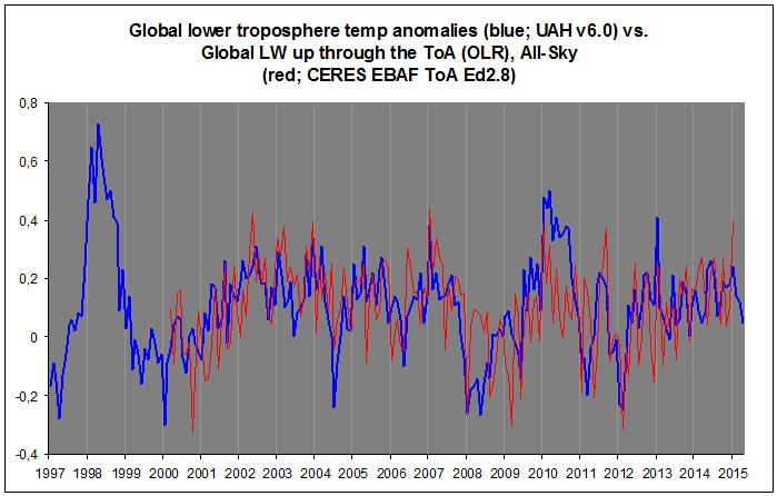

Sorry, Nick, but UAH did absolutely right in changing their mind. For one, their v5.6 had a huge error in their tlt land product:
https://okulaer.wordpress.com/2015/03/08/uah-need-to-adjust-their-tlt-product/
RSS (and now UAH v6) also fits very well with the OLR at the ToA (CERES) curve, which makes a lot of sense, since Earth’s emission to space is mostly a radiative effect of tropospheric temps:
Watch also how it fits (especially trendwise) with absorbed solar at the ToA (also CERES):
You will notice how troposphere temps lag solar input (by 2-4 mths), but lead OLR (by 0-1 mth).
We don’t always agree Kristian, but you are dead on the money when you look at CERES. As I’ve often posted on WUWT in DEFENSE of the theory of greenhouse warming, the strongest evidence in favor of it is not the global anomaly which at best has enormous error bars as one moves back in time, limiting its practical utility as a means of detecting anything at all, it is TOA and BOA spectrographs, which any physicist would accept as direct evidence of the greenhouse effect. Most physicists would also accept the theory of atmospheric radiation and the arguments that predict such an effect, although those arguments do leave a fair margin of error in the quantitative prediction of the magnitude, and even that only in a reductionist view of the cilmate where the effect of a single knob is viewed independent of the underlying chaotic dynamics and all other knobs. But in the end, the only hard measurement that matters is the CERES data. If one views the Earth as a “box”, solar radiation hits the box, is partially reflected by the box and partially absorbed by the box, while the box itself emits thermal radiation to infinity. The equilibrium temperature of the box in this vastly oversimplified picture is determined by detailed balance between total incoming power and total outgoing power, where to leading order we can completely neglect contributions from things like the tides or burning stuff or geothermal energy (from internal fission processes plus simple conduction from the hot interior).
CERES is not without its problems. One of the biggest ones is that it lacks (last time I looked) anything like a reference, so that we actually do not know whether incoming radiation is in or out of balance with outgoing radiation. What they use for an “anomaly” is generated by models that assume an imbalance and should not be confused with a measured anomaly. However, its absolutely trend is independent of this. And that is simply amazing.
What is interesting isn’t that CERES is strongly correlated with troposphere temperatures — that as you note makes sense. It is that thermal output radiation as measured by CERES is basically flat across the entire time it has been up there making measurements. Solar input as measured by CERES is also remarkably flat across this period. This is phenomenally difficult to explain with any of the naive/simple single layer models for greenhouse warming. At the very least it refutes ceteris paribus assumptions, that on average the climate follows greenhouse gas concentrations, as across the admittedly too-short interval, greenhouse gas concentrations have increased from ballpark 370 ppm to around 400 ppm, just under a 10% increase. And this is not the only time that temperatures have remained approximately flat into the long-term trend of increasing CO2 — from 1943 to 1975 CO2 increased by over 10% but global temperatures remained flat to decreased. If the first law of thermodynamics has any meaning whatsoever, one has to expect that CERES, had it existed in that era, would have shown more outgoing radiation than incoming radiation unless somebody wishes to assert that joule-eating gremlins exist in the Earth’s climate system.
With all due respect to defenders of the surface temperature record, the failure of detailed balance is the entire scientific basis of climate shifts. At the very least, the flatness of the CERES in vs out records across a time of substantially increasing CO2 suggests that whatever is going on inside of the “box” inside CERES’ orbit, it is not simple and cannot be reduced to anything like a naive model of increased CO2 and the imbalance one expects to drive the warming.
To explain (in words of one syllable) right now the so called “missing heat” associated with the hiatus/pause is supposedly going into the oceans (among other even less plausible explanations). That’s all well and good, but the only way to make that consistent with CERES is deliberately shift the absolutely unknown vertical axis of outgoing CERES measurements to where it lies below the incoming CERES measurement for solar input, creating an “anomaly” that is the supposed source for the missing heat. This still doesn’t explain why CERES is flat with increasing CO2, but at least it says that the earth is absorbing heat, which is the prevailing belief even if the heat isn’t increasing global temperatures they way the models say it should.
It is worth reading what CERES itself says about their data product, since nobody ever presents data with error bars:
http://ceres.larc.nasa.gov/science_information.php?page=EBAFbalance
I only quote three parts:
and
and
To translate this into everyday language. IF ins equal outs, the Earth is in balance and one does not expect its total energy to change, so any temperature shifts are the result of heat moving around, not an actual accrual or loss process. CERES satellites quite literally are incapable of detecting an imbalance however often they are cited as proof that one exists. The specific EBAF-TOA product is adjusted to agree with a presumed rate of energy storage in the oceans that is presumed to exist to presumably balance a radiative imbalance that presumably exists due to CO2 and water vapor and aerosols so that — and note this carefully: climate modelers can evaluate their models, specifically the relative heat transport output of the models and whether or not they agree with the changes observed in the CERES measurements on a non-absolute basis.
The last quote makes this absolutely clear. Instrument calibration error is 2% for incoming solar, and 1% on outgoing LW thermal. Compare the scales. We’re talking about overall budgets of at least hundreds of watts/m^2 (total incoming solar is over 1000 W/m^2). The fluctuations in solar are indeed around 0.1% (we know solar output pretty precisely). The fluctuations in OLR, much less precisely known in the first place, are similar in scale, and are surely at most a tenth or so of a percent as the Earth has to be close to being in balance. The combined uncertainty in the vertical scales mean that we have no objective idea which curve lies above which — we aren’t talking about 95% confidence, we are talking about no meaningful confidence either way.
It also makes it clear that CERES is not being used for its intended purpose. I have not heard that one single model has been thrown out of CMIP5 for egregiously disagreeing with CERES measurements, which except for the location of the vertical scales are pretty reliable as measurements of an unscaled anomaly relative to a meaningless zero. Why are models that fail to reproduce balanced incoming and outgoing radiation not being removed from CMIP5? Could it be because they produce the greatest predicted warming, and as they are removed, the meaningless MME mean prediction comes down in the direction of sanity to a much lower total climate sensitivity? Or is it just laziness? Or is the fact that if one throws out the bad models, you put a lot of modelers out of work, a kind of jobs program for programmers as it were?
Let me make my own position on this pristine. I absolutely love modeling. I’ve done decades worth of it myself. I’ve written reams of computer code for that purpose. For a while, I was absolutely obsessed with large scale (beowulf-style) computing, the exact kind of computing that is used in the models, and even knew a few of the modelers peripherally from our overlapping interest. I think that there is substantial virtue in computer modeling of physical processes too difficult to analytically compute, although modeling climate change as a CFD problem is beyond our reach and will remain so for decades yet.
However, it does no good to write computer models for something, come up with some perfectly good data that can be used as a gold standard to test the models against, and then not use it to reject models that cannot come close to reproducing it. It doesn’t do any good to have HadCRUT4 — whether or not you think it is biased or the best we can do given the data — if we do not use it to hold the models to a rigorous standard of success, using good statistics as a basis rather than unfounded and unproven assumptions galore. And I absolutely think it does nobody any good to have the results of an average of averages of these models presented to the world’s political leadership and the press as if it is in some sense a scientifically defensible prediction of the future, especially when models that would easily fail any number of statistical tests against reality are stubbornly retained for the warming and hence alarm that they produce.
rgb
I think most of the problem with the surface data isn’t the data at all, it’s all of the processing based on what it’s suppose to be , same as the TOA balance, it’s adjust based on what they think it’s suppose to be, every piece of evidence that’s specific to the “why” and “how much” of warming, all get adjusted based on what they think it should be. But the station data itself shows as a collective of the stations we have (not all of the place that have never been measured) it too should good regulation of average temperatures, in fact land based thermometers show a slight cooling, but is basically 0.0F+/-0.1F, it also shows warm areas moving around the world.
“However, its absolutely trend is independent of this. And that is simply amazing.”
Sorry, I just don’t get this. Your saying that zero trend over about 15 years is evidence of lack of imbalance? Why can’t it just mean a constant non-zero imbalance (over 15 years)?
Nick, I think RGB’s
“However, its absolutely trend is independent of this. And that is simply amazing”
=================================================
I think “absolute” trend was meant, and is an observation of no change despite increasing GHGs over the period of study.
” is an observation of no change despite increasing GHGs”
OLR isn’t expected to increase because of GHGs. Long term balance must continue. Surface temperatures rise, but upward IR is hindered. What is expected is that for some time, OLR will be less than incoming, the imbalance being the finite heat needed to go from one state to a warmer one. There is no reason to expect the flux of that to be proportional to GHG conc. It’s a time varying thing.
Nick Stokes says, October 1, 2015 at 6:29 pm:
“OLR isn’t expected to increase because of GHGs. Long term balance must continue. Surface temperatures rise, but upward IR is hindered.”
Nick, now you’re being disingenuous. Since OLR at the ToA is mostly an effect of tropospheric temps, not of surface temps, then what the notion of the “enhanced rGHE” predicts is a monotonic increase in tropospheric temps while OLR stays flat. The idea is that just as much is coming up from below (the surface) as before, but less is going out through the ToA (with more CO2 and H2O in the troposphere), and so the troposphere will warm and the OLR returns to its previous intensity as a result. This happens incrementally, so we will not be able to observe this drop-rise, drop-rise cycle, the OLR trend will appear flat. But all the while, the tropospheric temps in this scenario will rise slowly, but steadily.
But this is not what’s happening. Tropospheric temps aren’t increasing. Not since 1997. So we see a flat trend in tropospheric temps AND a corresponding flat trend in OLR at the ToA. The temps control the OLR, not the other way around.
Which tells us that the suggested “enhanced rGHE” mechanism is not at work at all. The opposite thing is happening. The hypothesis of the “enhanced rGHE” effectively claims that the OLR at the ToA controls tropospheric temps (and, by extension, the surface temps), but in reality it’s the other way around.
The whole idea of the “enhanced rGHE” turns reality on its head and tries to promote a simple temperature effect as somehow the cause of the temperature that causes it …
“AND a corresponding flat trend in OLR at the ToA. The temps control the OLR, not the other way around.”
You don’t know that. You said a flat trend in OLR was expected, even with rising temp, and that is what is observed in CERES. CERES doesn’t tell you the temperature. That is why I asked why the CERES trend was “amazing”.
CERES adds nothing unexpected there. It comes back to whether average global TLT temperature really isn’t rising, and whether that is the right measure to relate to GHE. And since UAH was, only a few months ago, saying that TLT was rising just as strongly as GISS, I think TLT stasis can’t be regarded as a certainty.
@rgb, I want to thank you for this statement you made earlier, I have only one word for it it is “Honesty”
However, it does no good to write computer models for something, come up with some perfectly good data that can be used as a gold standard to test the models against, and then not use it to reject models that cannot come close to reproducing it. It doesn’t do any good to have HadCRUT4 — whether or not you think it is biased or the best we can do given the data — if we do not use it to hold the models to a rigorous standard of success, using good statistics as a basis rather than unfounded and unproven assumptions galore. And I absolutely think it does nobody any good to have the results of an average of averages of these models presented to the world’s political leadership and the press as if it is in some sense a scientifically defensible prediction of the future, especially when models that would easily fail any number of statistical tests against reality are stubbornly retained for the warming and hence alarm that they produce.
rgb
They had some credibility when they were squirming from the pause.
Fabricating the data to get rid of the pause hasn’t got rid of the pause, only their credibility.
NASA made very serious error when they left up the 1997 Global Analysis Summary which showed the Actual Annual Temperature as 62.45 degrees Fahrenheit, far higher than anything since.
They have added a note that says
“the estimate for the baseline global temperature used in this study differed, and was warmer than, the baseline estimate (Jones et al., 1999) used currently. This report has been superseded by subsequent analyses. However, as with all climate monitoring reports, it is left online as it was written at the time.”
This makes absolutely no difference to the actual temperature quoted. The baseline is used to “calculate” all the individual anomalies in the first place which are then gridded etc and averaged and then added back to the baseline to provide the actual temperature.
So a change to a later baseline SHOULD also change all of the anomalies as well and SHOULD maintain the 62.45 F temperature.
The fact that it doesn’t shows that not only the baseline changed but also the anomalies that went with it to provide a different answer to the original.
In other words the Algorithm was changed along with the baseline.
They are not comparing oranges with oranges and haven’t been doing so for a long time.
The confirmation of this is that the Satellites, Radiosondes, balloons and the USHCN temperature data all show no warming since 1998 or over their respective periods of service.
‘The baseline is used to “calculate” all the individual anomalies’
They aren’t talking about the baseline for calculating anomalies. They are talking about the global average climatology, to which the anomalies are added. This is a very poorly established quantity, and yes, I think NOAA made a mistake in invoking it. No-one else does in that way. But anyway, it’s true that Jones et al, 1999 came up with a much lower climatology, which they then used.
For all those saying that a conspiracy can’t possibly exist should consider the situation in Australia.
Due to very active work by sceptics and one or two friendly media outlets pressure was put on the Government (assisted by Tony Abbott) to hold an unbiased Audit of the BOM Temperature calculations.
The response was an immediate replacing of Abbott and his team for a Goldmann Sachs supported politician who is an ardent warmist.
The Audit has been cancelled with this statement from Greg Hunt, “In doing this, it is important to note that public trust in the Bureau’s data and forecasts, particularly as they relate to bushfires and cyclones, is paramount.” as justification.
They already had one review this year, enthusiastically welcomed here by the Murdoch Australian. It got the wrong answer, apparently. So Abbott wanted another one.
It looks like you need to be subscribers for both.
Ho this Report you mean.
http://jennifermarohasy.com/2015/09/you-dont-know-the-half-of-it-temperature-adjustments-and-the-australian-bureau-of-meteorology/
A review is hardly an audit.
I will swear black and blue that BOM are following best practice but who says that such algorithms give best answers? The problems arise that whole sites throw up unanswerable issues for the ensuing historical changes, some going back some 80 years.
Have these algorithms been tested against some standard? Pointless if they simply iterate against some theoretical concept, which is what I suspect happens, and hence individual stations/sites’ history make little sense subsequently.
I think the key point being made is that if these were unbiased adjustments then the average adjustments for periods should be zero by homogenizing. This is not what is happening; past is negative and present is positive usually. Much like GISS!
Intuitively 1200km T homogenization is a stretch when I have seen prolonged T difference of some 8K with stations less than 10km apart.
For the links, which are from the Australian, you can access via google. Searching for “Sandland bom review Lloyd” puts them near the top.
In the first link, Graham Lloyd said in Jan
“AN independent panel of experts has been appointed to review the Bureau of Meteorology’s official national temperature records to improve transparency and boost public confidence in the wake of concerns about the bureau’s treatment of historic data.”
In the second, in June, he ler Jennifer Marohasy do the talking:
“However, the failure to address specific issues, such as the exaggerated warming trend at Rutherglen in northeast Victoria after homogenisation, had left important questions unresolved, she said.”
The report itself said:
“The Forum concludes that ACORN-SAT is a complex and well-maintained dataset. In fulfilling its role of providing advice on the ongoing development and operation of ACORN-SAT, the Forum also concludes that there is scope for improvements that can boost the transparency of the dataset and increase its usefulness as a decision-making tool. “
Thank you!
Nick do you mean like the BOM and the adjusted mess they send in?
The Australian Bureau of Meteorology have been struck by the most incredible bad luck. The fickle thermometers of Australia have been ruining climate records for 150 years, and the BOM have done a masterful job of recreating our “correct” climate trends, despite the data. Bob Fernley-Jones decided to help show the world how clever the BOM are. (Call them the Bureau of Magic).
Firstly there were the Horoscope-thermometers — which need adjustments that are different for each calendar month of the year – up in December, down in January, up in February… These thermometers flip on Jan 1 each year from reading nearly 1°C too warm all of December, to being more than 1°C too cold for all of January . Then come February 1, they flip again.
http://joannenova.com.au/2015/09/scandal-part-3-bureau-of-meteorology-homogenized-the-heck-out-of-rural-sites-too/
“Chiropractor Data Recorders” , always needing a small adjustment.
Nick Stokes October 1, 2015 at 8:10 am
Did you miss the point that I too would defend BOM; it is not deliberately distorting data. I too would endorse the review finding if on the panel much like exonerating Dr M Mann from any ethical wrongdoing. BOM follow best practice but who is there to judge that this “best practice” is much good in actual practice?
Contrary to the suggestion, the ACORN system is NOT very transparent at all. BOM has basically said it is difficult to explain.
If you are going to quote Jennifer Marohasy then be balanced with what you choose. I quote from her site a few days ago:
“It is so obvious that there is an urgent need for a proper, thorough and independent review of operations at the Bureau. But it would appear our politicians and many mainstream media are set against the idea. Evidently they are too conventional in their thinking to consider that such an important Australian institution could now be ruled by ideology.”
There is more there; she is in a position to know the practical implications of poor data.
http://jennifermarohasy.com/2015/09/you-dont-know-the-half-of-it-temperature-adjustments-and-the-australian-bureau-of-meteorology/
And this was a coup from the people at the very top of the economic pyramid.
yeah and greg hunt… that old joke bout .unts springs to mind
and he…is the silly one
as for BoM and Csiro
both of em have screwed their rep and validity and dont deserve funding till the cage gets cleaned out.
abc got funding cut and hand in glove with gaurdian inc using their reportage and commenters like 1st dog on moon to spew vitriol on TA unendingly.. and rave up the bad polls
now fawning all over turncoat as if hes a green..
it’d be amusing if we werent paying their wages for them to psyop n bullshit the sheeepies.
Further to my above comment, it is important to appreciate that there are TWO ‘pauses’ to be seen in the satellite data set, both of approximately the same duration (ie., both ‘pauses’ lasting about 17 or so years).
According to the satellite data set there was NO warming between 1979 and the run up to the strong El Nino of 1998 (that El Nino started in 1997). Michael Mann’s notorious trees rings (well Briffas) also showed no warming during this period, and hence the reason why Michael Mann ditched the tree ring data, and spliced in its place the thermometer record;. had Michael Mann spliced on the satellite data (rather than the land thermometer data), he would not have got the hockey blade.
There is strong reason to suspect that artefacts of station drop out, homogenisation and UHI (not properly accounted for) started distorting the land thermometer temperature record/data set so that such warming that is seen in that data set (or the greater part of that warming) for the 1980s and late 1990s is just an artefact of the foregoing, not due to any factual warming.
I think more important is to note that the overall period between 1979 and 2015 has been warming, but nothing suggests the warming were speeding up or that it would be bigger than natural fluctuation in decadal scale. It is also important to note a linear model trend line makes violence to the system below.
Richard, youand I are talking about the same two hiatuses we each independently studied. I discovered the one in the eighties and nineties in 2008 before there was any talk of hiatuses or warming pauses. Nevertheless, I determined that there was no warming either to the left or to the right of the super El Nino pf 1998 and drew in horizomntal lines to show lack of warming in figure 15 of my book. The super El Nino clearly was not part of ENSO and I left out the red band to indicate this. Its origin was mysterious and at first I thought it could be a storm surge from the Indian Ocean but now I am not sure. Maybe a crossovwer from south of the equator but I do not know. They are rare, however, maybe centenarian in scale. I was interested to learn also that the earlier hiatus may have influenced how the hockey stick was assembled. You are completely right about that step change following the super El Nino. We differ slightly though because you see a temperature rise of 0.23 degrees and I estimated it to be about a third of a degree. I thought at first that it might be temporary, caused by the huge amount of warm waster that the super El Nino brought over but temperature has been quite steady, maybe just a slight cooling over time. For the first six years of the century the ENSO peaks were absent but then a La Nina appeared in 2008 and an El Nino followed in 2010. I thought that a regular ENSO sequence was beginning but I was wrong. What followed the 2010 El was some more of the messiness we saw at the beginning of the century. This puts the El Nino that is expected this winter into jeopardy. It may be reduced or even washed out. When you look at my figure 15 you will also see dots that mark the progression of the global mean temperature. The wave train in the eighties and nineties was comprised of alternating El Ninos and La Ninas. The half-way point along a line connecting an El Nino peak with its neighboring La Nina valley in each case marks the current location of the global mean temperature. Most of the time this regularity is disturbed by other actions in the ocean but the dots from these five peaks line up in a horizontal straight line. They serve to self-calibrate the lack of warming in the eighties and nineties. The warmists have questioned this lack of warming in the eighties and nineties and are still showing their false warming there. Fortunately one of my readers unearthed a NASA doicument from 1997 proving that NASA knew about the lack of warming then. To even out with the twenty pseudo-scientist who asked the President to use RICO against us we ought to demand a RICO investigation of those crooks who covered up the hiatus of the eighties and nineties. They have gone scot free for 18 years and are still peddling their falsified temperature record.
My question is as always:
i can understand that adjustments need to be made for errors or other inconsitencies (TOBS, changes of instruments, relocation,….)
but why is there no raw data available, and this by location of the station, by instrument category and by TOBS category? It’s not that hard to put this online?
reason since the pausebuster change i really became super sceptical about the adjustments made as this handles about a time period where all parameters were harmonized to avoid discrepancies and errors.
to me they don’t correct the UHI effect correctly: here in belgium they studied it and they found out that differences between urban zones and rural zones can be as large as 8°C! For a running mean this difference is huge! this difference was mesured in and around Gent, For a lot of other countries a medium-small town (inhabitants around 200.000).
this incorrect correction indeed biases the adjustments upwards i am pretty sure of that.
Fredrick, further to your point, by reducing the total number of stations, (the great dropping of thermometers)and by further reducing the number used through homogenization, those few remaining stations (often less then 50 percent of the total “official stations”) now can spread their UHI to a far greater land mass, up to 1200 K away. They thus exponentially increase the power of UHI.
That may well be true, but it misses the main point which is how much has changed. For example, if it was 7 C a hundred years ago and 8 C now, then the change is only 1 C.
Your answer assumes the impact is constant at a particular station over 100 years. Rurals don’t stay rural and urbans change as to the amount of UHI. See the pic for the station at the university in Arizona.
I am not arguing against this point. I am just suggesting that it is the change over decades that is important and not the fact that urban is warmer than rural.
Werner this is true, unless the urban becomes the station of choice, and nearby rural stations are dropped.
Also I remember a study done that showed UHI can happen in a small rural location with new growth.
@ frederik, You also have to account for the place the rural station would be . Up or down wind from the prevailing weather, lower, higher, northern exposure , southern exposure. The station we have been looking after 20 years) has been in our area for over a 100 years and has been in three very close ( less than a km) locations. The micro climates involved with all three are astounding.
@ David A. You are right when we started our obs 20 years ago there were no other houses/ driveways etc . The last few years there has been some development, changes in the Ag landscape etc. But it is very difficult to tie together what I said to Frederik and your obs and what we have seen. The actual location changes seemed to have a larger impact.
“Is There Evidence of Frantic Researchers “Adjusting” Unsuitable Data?”
Well, GWPF said it wanted to find out. A panel of experts was assembled. Submissions were requested, due June 30. So what happened? Three weeks after that deadline, the team decided, no report would be made. Doesn’t sound like they found evidence.
Or they simply did not WANT to find any.
Wow, way to misrepresent. The link you provided says “The team has decided that its principal output will be peer-reviewed papers rather than a report.” So, yes…No report is being made. Instead, they are going to publish in a peer-reviewed journal.
Why are you misrepresenting the facts?
From their manifesto, as per WUWT:
” the Global Warming Policy Foundation has invited a panel of experts to investigate and report on these controversies.”
They were given terms of reference on which to report. But now, no report will be made. Instead, they say, some one will some day write some papers about something. Which may or may not be accepted for publication, after amendment per refereeing. Not quite the same thing.
They could have written papers any time. You don’t set terms of reference, call for submissions, with a big promo on the Tele, just to write a paper.
In other words, you can only offer semantics and a personal feeling of iniquity for why you misrepresent the facts? How they decide to publish their findings is really immaterial to the findings themselves. Which, of course, you have immediately assumed to be “Doesn’t sound like they found evidence.” without any additional information other than the fact that they want to have their findings peer reviewed.
But feel free continue feeling bad about things you don’t like and casting aspersions that have no substance while cherry picking on the part of a message that suits your interpretation of it. I hear that’s popular, these days.
Nick, they sort of said “no report would be made”. But they also said they would publish peer-reviewed papers.
Your link provides this:
“ITDR progress report /July 22, 2015
A number of parties have inquired about the status of the International Temperature Data Review. Progress has been steady and the team is holding regular internal videoconferences as well as discussions with third parties. The team has decided that its principal output will be peer-reviewed papers rather than a report.”
And again here:
http://www.tempdatareview.org/news/
September 29, 2015
“The panel has decided that its primary output should be in the form of peer-reviewed papers rather than a non-peer reviewed report. Work is ongoing on a number of subprojects, each of which the panel hopes will result in a peer reviewed paper.”
Not quite the same as “no report would be made”.
It sounds like powerful reasons for not going ahead came to some people’s attention.
Read that any way you want.
It amounts to the same thing.
The failure to go ahead with that audit in no way negates any of the other (IMO) valid points raised in this post, the previous one by Drs. Brown and Brozek, and in this and the other comments sections.
In the scenario described in the lead post, this would be like if the auditors hired to review the books of the company decided to retire just prior to proceeding.
This is all a conspiracy to pull a fraud so the rulers can tax thin air.
It is, in other words, a criminal operation using ‘scientists’ to fool people into thinking this last three years are the Hottest Years Evah. And like all frauds, it depends on silencing and abusing anyone who points out the obvious lies.
The ‘pause’ which was actually the peak of the recent warm cycle coming on the heels of the previous cool cycle, is now going into another cooling cycle and the fraudsters anxious to tax thin air for their own profit are very anxious and fearful their fraud will be exposed to everyone paying these useless taxes so they think if they continue to tinker with the data, this will fool people who are freezing to death.
This is insanity. And yes, our rulers are insane like previous despotic rulers!
Thank you RGB. It is quite a miraculous coincidence that all the adjustments are in one direction.
except they aren’t
“Except they aren’t”
I keep looking for one example where “they aren’t”. Maybe you are right. So, I’ll ask again….
Can you point to a specific newer version of GISS or HadCrut that showed a lower global warming trend than the previous version?
Yes GISS 2010
Link to the data please…before and after.
I assume you meant “Link”. Thank you for asking. I will also be watching for a reply. And the first thing I will do then is average the latest 15 years with the previous 15 years, both before and after. I am very puzzled as to why 1980 to 1995 would be very different from 1995 to 2000. Or even why the last 30 years should be different than the 30 years before that.
[Yes, ‘link’ fixed. ~mod.]
Reviewing the post at Judith Curry’s site from July confirms my basis position that the ground based temerature record from all those thermometrers is simply comletely and utterly unfit for purpose due to all the modifications to the data collection devices and regime 8 location, time, equipment etc) and the known heat island effect which is a consistant warming bias.
The ocean survafe record similarly compromised beyond utility for determining any sort of meaningful surface temperature trend to the sort of accuracy sought.
Accordingly the only records worth considering are the ballon and satellite sets as well as a selected sub set of the surface data where continuity and quality are highest.
There is no valid basis for teh CAGW extrapolation. It is simply fraudulent and alarmist relying on that old human bogey man, the notion of aramgeddon.
One way to moderate the effect of temperature adjustments on the trend is to employ robust tests for OLS trends. http://papers.ssrn.com/sol3/papers.cfm?abstract_id=2631298
How can such a significant divergence between official datasets pass unquestioned at official level? They can’t both be right, so something somewhere is badly wrong. Professional pride should have all 5 data-managers scurrying to compare everything they have to try and explain the divergence. Yet from the crack climate experts tasked with delivering the most accurate data known to mankind…….silence.
It’s like the dog that didn’t bark.
“How can such a significant divergence between official datasets pass unquestioned at official level? They can’t both be right, so something somewhere is badly wrong. Professional pride should have all 5 data-managers scurrying to compare everything they have to try and explain the divergence.”
the divergences are due to
1. different datasets
2. different adjustment algorithms
3. different estimation approaches.
basically structural uncertainty.
Pick whatever data you like, pick whatever adjustment approach you like, pick whatever estimation
approach you like.
the planet is still warming.
there was an LIA
@ Steven Mosher, you said:
the planet is still warming.
there was an LIA.
As far as I can tell nobody on this site has
1. ever denied there has been warming.
2. most of them have tried to use honest data sets.
3. but no one here has tied it in with CO2 as the main component. It is a non starter.
And that to me is why the AGW crowd has now changed it to Climate Change. Climate Change btw is a given no matter how you slice it. Have you read the ludicrous report on BBC today (BBC Science ) that the West has to fork over trillions before third world countries sign any accord in Paris in a few weeks? How can you support that nonsense?
asybot,
You got it. Climate alarmists keep trying to paint skeptics into a corner like that. They’re trying to re-frame the debate so they can win it.
They sure can’t win based on AGW measurements, because there aren’t any.
It is extremely difficult to measure anomalies over time when the measurement tools and approach is in a constant flux.
As knowledge and environment changes, approaches and process change. You end up comparing apples to oranges to watermelons. “Global temperature” 100 years ago is an indicator much different than what it is today, so adjustments are made to try to normalize the data, to make it comparable. It doesn’t work, it is a fools errand, it ends up being no more than an exercise in exposing ones bias.
As the article points out, this is evident in that error correction consistently cools the past and warms present. In an environment where there is constant flux, there is much room for different types and amounts of error. Up or down corrections aligned specifically to when the measurements were taken are indications of blind bias.
Or indications of intentional fudging of the data to match the climate change narrative.
” It doesn’t work, it is a fools errand, it ends up being no more than an exercise in exposing ones bias.”
actually it does work. you can test it.
I’m still lookinf for data… any kind of link… to data that shows a newer version of Hadcrut or GISS that has a smaller warming trend than the older version.
The skeptics claim…paraphrase… “All the adjustments create net warming to the trend”
Mosher (and Zeke) insist that “The adjustments overall reduce the trend” (paraphrase)
Can’t both be true.
I checked the Hadcrut and GISS major version revisions and they definitely warmed the trend.
Werner Brozek calculated some trends from various updates and all showed a warmer trend including across the time frame where Mosher says UHI adjustments “cooled the trend”
Unlike many here, I personally believe adjustments are justified and necessary and can be done well. But, as RGB points out, when the data is adjusted, it gets warmer. Every time. Against all statistical odds.
I would feel a lot better if I could just find actual before and after data of just one update that net cooled the trend.
Mary,
Not too sure why you waste your time (how many times have you asked them the same question?) trying to get scammers to be straight?
These guys are like three card Monte sleight of hand artists. They require suspension of disbelief and distraction.
Notice all the hand-waving and digressions down irrelevant cul de sacs, and ad hominem attacks when they are asked a straight question.
Do you know about Tony Heller’s work on this issue?
Tony is the one who first broke the story. And he’s also the only one who calls a spade a spade. He has a website, Real Climate Science. He shares frequent analyses of the data tampering issue.
Here’s a good overview:
https://stevengoddard.wordpress.com/data-tampering-at-ushcngiss/
In the meantime, you might want to avoid the whole 3-card Monte huckster clan. They are worse than a waste of time.
Thanks. I’m familiar with Tony Heller’s site but have had issues trusting the data there. I am skeptical of skeptics…LOL… and have tried to give the “data adjusters” a clear cut chance to demonstrate their case. Apparently, they can’t.
Yes, I asked the question over and over. It is a simple question and I just want a simple answer. Apparently Mosher has moved on to his next thread to fire insults. I’ve tried to be pleasant and patient. I simply would like to see one case where a data set was updated and the warming trend was reduced.
Mary,
God bless you for your patience.
Has it crossed you mind that possibly there is a simple reason that there is no “simple answer” forthcoming?
As Gomer Pyle said: “Fool me once, shame on you. Fool me twice, shame on me.”
Brazen con-artist tactics should tell you all that you need to know.
Here’s a somewhat useful guide to con-men and scam artists.
http://www.ryanhealy.com/psychopaths-scam-artists-con-men/
As for Heller, what issues do you have with his data?
He’s made some mistakes (as have our hosts here). But it’s safe to say that he’s 99.9% accurate.
Thanks, RGB and Werner.
Cheers.
@RGB
but RGB never answered my questions:
1. How can so many intelligent educated people be so incompetent. This seems very unlikely. Have you approached the scientists concerned and shown them where they are in error. If not, Why not?
2. This is a serious accusation of scientific fraud. As such have you approached any of the scientists involved and asked for an explanation? If not, why not? You are, after all, part of the scientific community.
Can you give reasons why you think 1000s of scientists over the whole globe would all be party to this fraud. I do not see climate scientists living in luxury mansions taking expensive family holidays – perhaps you know differently?. What manages to keep so many scientists in line – are there families/careers/lives threated to maintain the silence. why is there no Julian Assange or Edward Snowden, willing to expose the fraud?
—-
By standing on the side-lines with your certain statements of discovered purposeful impropriety and not challenging the scientists you are accusing of incompetence you are allowing this to continue. :.
“especially data correction by people who expect the data to point to some conclusion”
“GISS is even worse. They do correct for UHI, but somehow, after they got through with UHI the correction ended up being neutral to negative. … Learning that left me speechless, ”
etc…
Where are your papers showing the errors for others to debate (surely the first step in a scientific dispute,) Where are your figures and calculations for the necessary adjustments (for there certainly must be some required).
Where is your independent assessment of the satellite derived temperature data. (this should be in your competence area, being a physicist). If you have no independent proof then being a sceptic you should disbelieve the figures until an independent judges them valid.
Inserting your scientific sounding comments on this blog hyped by your real name and use of your scientific qualifications does not constitute a scientific debate
Your righteous indignation and appeals to authority are wasted on here.
If you had been following this site for any length of time you would know that those questions have been asked of those organisations by more tyhan one person and absolutley no adequate response was received.
The main responses have been from “BEST’s” Zeke and Mosher with comments from Nick Stokes thrown in for good measure.
History is full of masses of people, even very smart people, being utterly incorrect or going along with something that was immoral, harmful, or just silly. Why do you presume it is only incompetence?
Surely some of the AGW “scientists” are nothing but hype-generating media phonies, and reading this blog long enough will alert you to them. They will do anything for fame, and they do. Another set of people go along to get along, and why? Their grant money comes from the government. They need to pay bills. They want to get published. They are afraid of rocking the boat. Scientists are human after all – not dispassionate truth-tellers, as a rule. They are governed by very human emotions. The last set are scientists who are out of their league – they have been promoted to their level of incompetence (the Peter principle), and you’ll see this in every field.
In short, you have a very idealized view of science which is sadly laughable, if it weren’t so tragic. I hate to disabuse you of your fantasies, but it is needful. Why don’t you spend some time among college professors, and see how long the groupthink, the boundaries, and the accepted answers take to wear in on you?
Rumor, fear,and the madness of crowds. History is replete with mass delusions, aided and abetted by the leaders of the day. A cynic might conclude that massive fraud is a key level of power, being much easier to maintain than “reality”. A cynic might note that science and observation often hold little sway in the fighting on myth until the evidence is sufficiently overwhelming that the dam breaks, a social discontinuity occurs, and the former orthodoxy is left on the trash heap of history. There may well be no overt conspiracy, just the usual profiteers jumping on an income and power enhancing trend. Today, the tulips of global warming are golden eggs. Tomorrow, they might just be flowers again. Those floating with the tide never understand those swimming against it. Here, at least, and almost uniquely, both are allowed to speak.
Yes,
there are CAGW advocates making lots of money from the warming scam gravy train.
Have you followed the RICO letter news?
http://wattsupwiththat.com/2015/09/29/the-rico-20-letter-to-obama-asking-for-prosecution-of-climate-skeptics-disappears-from-shuklas-iges-website-amid-financial-concerns/
Dr. Shukla seems to be funding his family’s careers based on research grants to advance the global warming agenda. The publication of a letter to use RICO laws to stop honest investigation of the CAGW industry is probably illeagal and certianly counter to free and open debate.
So there are lots of people’s funding that depends on continued alarmism and stopping any critical inquiry into the data and real climate behavior.
sergeiMK, where you say:
Have you seen the “Shukla’s Gold” post over at Climate Audit (http://climateaudit.org/), or the multiple posts here and at other sites covering the (world wide) climate conferences attended several times a year by the original ‘hockey team’ and their ilk?
“1. How can so many intelligent educated people be so incompetent. This seems very unlikely. Have you approached the scientists concerned and shown them where they are in error. If not, Why not?”
Nope. Never been approached. The bottom line is brown is wrong. The net effect of all adjustments
is to cool the record. sorry
2. This is a serious accusation of scientific fraud. As such have you approached any of the scientists involved and asked for an explanation? If not, why not? You are, after all, part of the scientific community.
Can you give reasons why you think 1000s of scientists over the whole globe would all be party to this fraud. I do not see climate scientists living in luxury mansions taking expensive family holidays – perhaps you know differently?. What manages to keep so many scientists in line – are there families/careers/lives threated to maintain the silence. why is there no Julian Assange or Edward Snowden, willing to expose the
fraud?
Crap, we posted all our code, we tested our algorithms in double blind experiments.
They definately are not perfect but all the testing says they move the answer toward the truth.
Psst we had no less than three “skeptics/lukewarmers” working on the project..
Thanks Steve (and Nick and Zeke and others who post here despite abuse from some contributors). All contributions get reviewed and are appreciated by some of us, whether we agree, disagree or are just looking to see where this mass hysteria is taking us (IMHO). Frankly with snow in the forecast for this weekend and my aging aching body, a degree or two of warming would be welcome. But the data I look at just (Environment Canada) just isn’t doing it for me. Less cold, yes, Warming? Nope. But that’s just my opinion.
So thanks to all. I enjoy the different perspectives. 10 people, 20 solutions.
Check the article on this site re Shukla earlier to day it may have your answer.
“I do not see climate scientists living in luxury mansions taking expensive family holidays – perhaps you know differently?. What manages to keep so many scientists in line – are there families/careers/lives threated to maintain the silence. why is there no Julian Assange or Edward Snowden, willing to expose the fraud?”
Can you be serious?
“Climate scientists” are flown around the world, treated as rock stars, and celebrated at their cult get-togethers. This is millions of dollars worth of travel, and public relations, separate from the billions in grant dollars that flow to them.
Just look at one: Michael Mann. Here’s his presentations (from his CV, link below) in just 5 years:
http://www.meteo.psu.edu/holocene/public_html/Mann/about/cv.php
“Keynote Presentation on Climate Change and the Earth System Science Center, GEMS Earth and Environmental Systems Institute Showcase Event, Obelisk Weekend, College of Earth and Mineral Sciences, Penn State University, Sep 25, 2015.
· Invited lecture, “Dire Predictions: Understanding Climate Change”, Nuclear Engineering Seminar Series, Penn State University, University Park, PA, Sep 24, 2015.
· Invited lecture, “The Hockey Stick and the Climate Wars: The Battle Continues”, Solutions and You lecture series, Simon Fraser University, Vancouver, BC, Canada, Sep 17, 2015.
· Invited lecture, “The Past as Prologue: Learning from the Climate Changes in Past Centuries”, Department of Atmospheric and Oceanic Sciences, Simon Fraser University, Burnaby BC, Canada, Sep 16, 2015.
· Panel discussion following showing Merchants of Doubt, State Theatre, State College, PA, Sep 9, 2015.
· Invited participant, Workshop on Frontiers in Decadal Climate Variability, National Academy of Sciences, Woods Hole, MA, Sep 3-4, 2015
· Invited presentation, Climate Downscaling 201 (with applications to Florida precipitation), USGS-FAU Precipitation Downscaling Technical Meeting, Florida Atlantic University-Davie, Davie, FL, Jun 22, 2015.
· Introductory lecture, “Dire Predictions: Understanding Climate Change”, Penn State Research Experience for Undergraduates (REU) on Climate Science, Penn State University, University Park, PA, Jun 9, 2015.
· Invited lecture, “Dire Predictions: Understanding Climate Change”, Junior Academy Program (Vienna region High Schools), Vienna, Austria, May 28, 2015.
· Invited lecture, “The Hockey Stick and the Climate Wars: The Battle Continues”, Suess Lecture, Austrian Academy of Sciences, Vienna, Austria, May 27, 2015.
· Keynote lecture and book signing, “The Hockey Stick and the Climate Wars: The Battle Continues”, American Association of University Professors (AAUP) Centennial Celebration, Johns Hopkins University, Baltimore, MD, Apr 25, 2015.
· Invited lecture and book signing, “The Hockey Stick and the Climate Wars: The Battle Continues”, Virginia Tech, Blacksburg, VA, Mar 20, 2015.
· Invited lecture and book signing, “Understanding Global Warming and Envisioning Local Impacts”, Florida International University, Miami, FL, Mar 16, 2015.
· Panel discussion (w/ B. Inglis and K. Hayhoe) following premier of Merchants of Doubt, Landmark E Street Cinema, Washington DC, Mar 13, 2015.
· Invited lecture “The Hockey Stick and the Climate Wars: The Battle Continues”, Bucknell University, Lewisburg, PA, Mar 4, 2015.
· Invited lecture and book signing, “The Hockey Stick and the Climate Wars: The Battle Continues”, Florida Atlantic University, Boca Raton, FL, Feb 27, 2015.
· Invited lecture, “Internal and Forced Low-Frequency Surface Temperature Variability at Global and Regional Scales”, Department of Geosciences, Florida Atlantic University, Boca Raton, FL, Feb 27, 2015.
· Invited presentation, AAAS Annual meeting: “The Hockey Stick & the Climate Wars: The Battle Continues”, San Jose, CA, Feb 14, 2015.
· Panel discussion, “Severe Weather in a Changing Climate: Informing Risk”, AAAS Annual Meeting, San Jose, CA, Feb 13, 2015.
· Invited presentation, AAAS Annual meeting: “On the Front Lines in the Legal Battles Over Climate Change”, San Jose, CA, Feb 13, 2015.
· Invited lecture and book signing, “The Hockey Stick and the Climate Wars: The Battle Continues”, Trinity College, Dublin, Ireland, Jan 19, 2015.
· Invited participant, European Observatory of the New Human Condition Workshop, Trinity College, Dublin, Ireland, Jan 18-19, 2015.
· Keynote Speaker, Climate Science Legal Defense Fund (CSLDF) Benefit Dinner, San Francisco, CA, Dec 18, 2014.
· Invited presentation (co-authors B.A. Steinman, S.K. Miller), AGU Fall meeting: “Internal and Forced Low-Frequency Surface Temperature Variability at Global and Regional Scales”, San Francisco, CA, Dec 17, 2014.
· Invited presentation, AGU Fall meeting: “Fighting a Headwind: Communicating the Science of Climate Change in a Hostile Environment”, San Francisco, CA, Dec 16, 2014.
· Invited presentation (K. Peacock & M.E. Mann), AGU Fall meeting: “Professional Ethics for Climate Scientists”, San Francisco, CA, Dec 15, 2014.
· Keynote lecture, “The Hockey Stick and the Climate Wars: The Battle Continues”, Pennsylvania Environmental Research Consortium (PERC) Annual Conference, Penn State University, University Park PA, Nov 12, 2014.
· Invited lecture, “Dire Predictions: Understanding Global Warming”, Climate Change and the Archaeological Record: Implications for the 21st Century, Society for Pennsylvania Archaeology, State Museum of Pennsylvania, Harrisburg PA, Nov 8, 2014.
· Invited lecture, panel discussion and book signing, Tackling Climate Change Nationally and Globally (Hammer Forum), Hammer Museum, University of California-Los Angeles, Los Angeles CA, Oct 23, 2014.
· Invited lecture, “The Hockey Stick and the Climate Wars: The Battle Continues”, CAPR Brown Bag seminar, Department of Political Science, Penn State University, University Park PA, Oct 13, 2014.
· Invited lecture and book signing, “The Hockey Stick and the Climate Wars: The Battle Continues”, Fifth Annual Robock Lecture, University of Minnesota, Duluth, MN, Oct 10, 2014.
· Invited lecture, “The Past as Prologue: Learning from the Climate Changes in Past Centuries”, Department of Atmospheric and Oceanic Sciences, University of Minnesota, Duluth MN, Oct 10, 2014.
· Invited participant, Penn State PSIEE/EESI Workshop on Science Communication, Penn State University, Bald Eagle State Park, Howard, PA, Oct 3 2014.
· Invited lecture and panel discussion, Climate Wars: Propaganda, Debate, and the Propaganda of Debate, Queens Museum, Queens NY, Sep 27, 2014.
· Invited lecture, “The Hockey Stick and the Climate Wars: The Battle Continues”, Cabot Institute Lecture/Bristol Festival of Ideas, University of Bristol, Bristol UK, Sep 23, 2014.
· Invited participant, Workshop on Responding and adapting to climate change, University of Bristol, Bristol, UK, Sep 22-23, 2014.
· Invited lecture, “The Hockey Stick and the Climate Wars: The Battle Continues”, Cabot Institute Lecture/Bristol Festival of Ideas, University of Bristol, Bristol UK, Sep 23, 2014.
· Invited lecture, “Dire Predictions: Understanding Global Warming”, Bryn Mawr College & Philadelphia Geological Society, Bryn Mawr PA, Sep 18, 2014.
· Invited overview, “Dire Predictions: Understanding Global Warming”, Green Corps classroom training program, Boston, MA (view remote link), Aug 7, 2014.
· Keynote lecture, “The Battle to Communicate Climate Change”, Environment California Spring Event, Culver City CA, Jun 8, 2014.
· Introductory lecture, “Dire Predictions: Understanding Global Warming”, Penn State Research Experience for Undergraduates (REU) on Climate Science, University Park, PA, Jun 5, 2014.
· Invited presentation, “The Hockey Stick and the Climate Wars: The Battle Continues”, Momentus Leadership Summit, Chicago Il, May 22, 2014.
· Keynote lecture and book signing, “The Hockey Stick and the Climate Wars: The Battle Continues”, Healthy Environment Alliance of Utah 11th Annual Spring Breakfast, University of Utah, Salt Lake City, UT, May 14, 2014.
· Invited lecture, “The Hockey Stick and the Climate Wars: The Battle Continues”, Polar Center Talks Series, Penn State University, University Park, PA, May 9, 2014.
· Keynote lecture, “Dire Predictions: Understanding Global Warming”, Leadership Centre County Environment Day, State College, PA, May 7, 2014.
· Invited lecture, “The Physics of Climate Change”, Department of Physics, Fordham University, New York, NY, Apr 30, 2014.
· Invited lecture, “The Past as Prologue: Learning from the Climate Changes in Past Centuries”, Department of Atmospheric and Oceanic Sciences, University of Wisconsin, Madison, WI, Apr 18, 2014.
· Invited lecture and book signing, “The Hockey Stick and the Climate Wars: The Battle Continues”, Fifth Annual Robock Lecture, University of Wisconsin, Madison, WI, Apr 17, 2014.
· Invited lecture and book signing, “The Hockey Stick and the Climate Wars: The Battle Continues”, Earthweb Foundation Annual Symposium, Rollins College, Winter Park, FL, Apr 12, 2014.
· Keynote Plenary lecture, “Dire Predictions: Understanding Global Warming”, Association of American Geographers, Tampa, FL, Apr 10, 2014.
· Featured banquet lecture, “The Hockey Stick and the Climate Wars: The Battle Continues”, American Meteorological Society West Central Florida Chapter annual meeting, Tampa, FL, Apr 7, 2014.
· Invited lecture, “The Hockey Stick and the Climate Wars: The Battle Continues”, Annual Kirkland/Spizuoco Memorial Science Lectureship, Shippensburg University, Shippensburg, PA, Apr 2, 2014.
· Keynote lecture, “The Hockey Stick and the Climate Wars: The Battle Continues”, Sustainability Summit and Exposition, Milwaukee, WI, Mar 26, 2014.
· Invited lecture and panel discussion, Climate Wars: Global Warming and the Attack on Science, University of Pennsylvania, Mar 19, 2014.
· Keynote lecture, “The Hockey Stick and the Climate Wars: Dispatches from the Front Lines”, Climate Science and Policy through the Looking Glass, UC Santa Cruz, Mar 1, 2014.
· James H. Lemon Lecture, Distinguished Lecture Series, Northwest Missouri State University, Maryville, MO, Feb 19, 2014.
· Panel discussion, “A Conversation on the Latest Climate Science Projections and Implications”, Climate Leadership Conference, San Diego, CA, Feb 26, 2014.
· Invited lecture, “The Hockey Stick and the Climate Wars: Dispatches from the Front Lines, James H. Lemon Lecture, Distinguished Lecture Series, Northwest Missouri State University, Maryville, MO, Feb 19, 2014.
· Invited lecture, “The Hockey Stick and the Climate Wars: Dispatches from the Front Lines”, Scholarship and Research Ethics talk series, Office for Research Protection, Penn State University, Feb 10, 2014.
· Panel Discussion, “Right Now!” fundraiser event, presented by We Are Music, Somerville MA, Feb 1, 2014.
· Invited lecture, “The Past as Prologue: Learning from the Climate Changes in Past Centuries”, Department of Astronomy and Astrophysics, Penn State University, University Park, PA, Jan 29, 2014.
· Invited presentation “IPCC AR5 Science Update”, South Florida Water Sustainability and Climate Project 2014 Annual Meeting, Haines City, FL, Jan 19, 2014.
· Invited lecture, “The Physics of Climate Change”, Department of Physics, Case Western Reserve University, Cleveland, OH, Jan 16, 2014.
· Invited lecture and book signing, “The Hockey Stick and the Climate Wars: Dispatches from the Front Lines”, Cleveland Natural History Museum, Cleveland, OH, Jan 15, 2014.
· Panel discussion, “Facing legal attack, scientists tell their story”, AGU Fall Meeting Dec 12, 2013.
· Invited presentation (co-authors M.E. Kozar, K. Emanuel), AGU Fall meeting: “Relationships Between Basin-Wide and Landfalling Atlantic Tropical Cyclones: Comparing Long-term Simulations with Paleoevidence”, San Francisco, CA, Dec 11, 2013.
· Presentation “Challenges of effectively communicating climate change science to lay audiences”, Physical Geography Focus Group, Oxford University Press, AGU Fall Meeting, Dec 11, 2012.
· Book signings, “The Hockey Stick and the Climate Wars: Dispatches from the Front Lines”, AGU Fall Meeting, San Francisco, CA, Dec 10 & Dec 12, 2013.
· Invited speaker, “The Imperative for Taking Action on Climate Change”, Virginia Interfaith Center for Public Policy” (webinar), Nov 25, 2013.
· Invited lecture and book signing, “The Hockey Stick and the Climate Wars: Dispatches from the Front Lines”, Annual E.T. York Distinguished Guest Lecture, University of Florida, Gainesville, FL, Nov 19, 2013.
· Invited lecture, “The Hockey Stick and the Climate Wars: Dispatches from the Front Lines”, 29th Annual Brossman Foundation and Ronald E. Frisbie Science Lectureship, Millersville University, Millersville, PA, Nov 7, 2013.
· Invited lecture, “Dire Predictions: Understanding Global Warming”, 29th Annual Brossman Foundation and Ronald E. Frisbie Science Lectureship, Millersville University, Millersville, PA, Nov 7, 2013.
· Introduced President William J. Clinton and Virginia Gubernatorial Candidate Terry McAuliffe at McAuliffe Campaign Event, Paramount Theater, Charlottesville, VA, Oct 30, 2013.
· Moderated public question-and-answer session, “Climate Change and American Values”, 2013 E. James Holland University Symposium on American Values, Angelo State University, San Angelo, TX, Oct 28, 2013.
· Invited lecture, “The Hockey Stick and the Climate Wars: Dispatches from the Front Lines”, 2013 E. James Holland University Symposium on American Values, Angelo State University, San Angelo, TX, Oct 28, 2013.
· Invited lecture and book signing, “The Hockey Stick and the Climate Wars: Dispatches from the Front Lines”, Sagan National Colloquium, Ohio Wesleyan University, Delaware, Ohio, Oct 22, 2013.
· Invited lecture and book signing, “The Battle to Communicate Climate Change”, A Conversation About Climate with Senator Angus King, The Natural Resources Defense Council of Maine, Portland, ME, Oct 16, 2013.
· Invited lecture, “The Hockey Stick and the Climate Wars: Dispatches from the Front Lines”, Bowdoin
College, Brunswick, ME, Oct 16, 2013.
· Invited lecture and book signing, “The Hockey Stick and the Climate Wars: Dispatches from the Front Lines”, Symposium on Climate Science and Climate Communication, University of Iceland, Reykjavik, Iceland, Oct 5, 2013.
· Invited lecture “The Hockey Stick and the Climate Wars: Dispatches from the Front Lines”, Conference on Cinema and Climate Change, Reykjavik, Iceland, Oct 3, 2013.
· Award Ceremony followed by Lecture and book signing for “The Hockey Stick and the Climate Wars”, PennFuture 15th Anniversary Event: The Science and Psychology of Climate Change, Harrisburg, PA, Sep 25, 2013.
· Invited lecture, “The Past as Prologue: Learning from the Climate Changes in Past Centuries”, Department of Atmospheric & Oceanic Science, University of Maryland, College Park, MD, Sep 19, 2013.
· Invited lecture and book signing, “The Hockey Stick and the Climate Wars: Dispatches from the Front Lines”, West Virginia University, Morgantown, WV, Sep 17, 2013.
· Invited lecture, “The Past as Prologue: Learning from the Climate Changes in Past Centuries”, Division of Forestry and Natural Resources, West Virginia University, Morgantown, WV, Sep 17, 2013.
· Invited lecture, “The Hockey Stick and the Climate Wars: Dispatches from the Front Lines”, School of Forestry and Environmental Studies, Yale University, New Haven, CT, Sep 4, 2013.
· Co-Convener, Penn State PSIEE/EESI/EMS Workshop “Climate Change and Impacts Downscaling”, Bald Eagle State Park, Howard, PA, Aug 27-29, 2013.
· Invited Panel discussion, “Credibility, Trust, Goodwill & Persuasion””, Science Online Climate, Washington, DC, Aug 16, 2013.
· Invited presentation, “The Battle to Communicate Climate Change: Lessons from The Front Lines”, Science Online Climate, Washington, DC, Aug 16, 2013.
· Invited lecture and book signing, “The Hockey Stick and the Climate Wars: Dispatches from the Front Lines”, The Amazing Meeting (James Randi Foundation), Las Vegas, NV, Jul 13, 2013.
· Book signing, “The Hockey Stick and the Climate Wars: Dispatches from the Front Lines”, NetRoots Nation, San Jose, CA, Jun 21, 2013.
· Invited Panel discussion, “Science Under the Rug: How Government and Industry Hide Research and How to Fight Back”, NetRoots Nation, San Jose, CA, Jun 21, 2013.
· Invited presentation, “The Battle to Communicate Climate Change: Lessons from The Front Lines”, AGU Chapman Conference on Communicating Climate Science, Granby, Colorado, Jun 9, 2013.
· Invited presentation, “Dire Predictions: Understanding Global Warming”, The Truth, The Whole Truth, And Nothing But The Truth: Our Global Climate And The Insurance Industry’s Response.”, Loss Executives Association annual meeting, Philadelphia, PA, Jun 6, 2013.
· Invited keynote lecture and book signing, “The Hockey Stick and the Climate Wars: Dispatches from the Front Lines”, “Scientifically Speaking” Gala Fundraiser Event & Auction, The Science Factory, Eugene, OR, May 30, 2013.
· Invited lecture, “Dire Predictions: Understanding Global Warming”, Edison International Elementary School, Eugene, OR, May 30, 2013.
· Invited lecture and book signing, “The Hockey Stick and the Climate Wars: Dispatches from the Front Lines”, The Cosmos Club, Washington, DC, May 16, 2013.
· Discussion and book signing, “A Conversation with Climate Scientist Michael Mann”, Climate Desk Live, Washington, DC, May 15, 2013.
· Invited lecture, “The Past as Prologue: Learning from the Climate Changes in Past Centuries”, City University of New York Graduate Center, New York, NY, May 9, 2013.
· Invited public lecture, “The Hockey Stick and the Climate Wars: Dispatches from the Front Lines”, Sigma Public Lecture series, NASA Langley Research Center, Hampton, VA, May 7, 2013.
· Invited lecture, “The Past as Prologue: Learning from the Climate Changes in Past Centuries”, NASA Langley Research Center, Hampton, VA, May 7, 2013.
· Invited public lecture and book signing, “The Hockey Stick and the Climate Wars: Dispatches from the Front Lines”, Mid-Atlantic Renewable Energy Association (MAREA), Breinigsville, PA, Apr 30, 2013.
· Invited public lecture and book signing, “The Hockey Stick and the Climate Wars: Dispatches from the Front Lines”, Dickinson College, Carlisle, PA, Apr 22, 2013.
· Invited public lecture and book signing, “The Hockey Stick and the Climate Wars: Dispatches from the Front Lines”, Lynchburg College, Lynchburg, VA, Apr 8, 2013.
· Invited lecture, “Dire Predictions: Understanding Global Warming”, Senior Symposium, Lynchburg College, Lynchburg, VA, Apr 8, 2013.
· Invited presentation, ORI at 20: Reassessing Research Integrity: “The Hockey Stick and the Climate Wars”, Baltimore, MD, Apr 3, 2013.
· Invited lecture, “Dire Predictions: Understanding Global Warming”, Kiski School, Saltsburg, PA, Apr 1, 2013.
· Invited lecture, “The Past as Prologue: Learning from the Climate Changes in Past Centuries”, ”, College of Wooster, Wooster, OH, Mar 28, 2013.
· Invited public lecture and book signing, “The Hockey Stick and the Climate Wars: Dispatches from the Front Lines”, College of Wooster, Wooster, OH, Mar 27, 2013.
· Invited public lecture and book signing, “The Hockey Stick and the Climate Wars: Dispatches from the Front Lines”, Appalachian State University, Boone, NC, Mar 21, 2013.
· Invited lecture, “Dire Predictions: Understanding Global Warming”, Appalachian State University, Boone, NC, Mar 21, 2013.
· Invited public lecture and book signing, “The Hockey Stick and the Climate Wars: Dispatches from the Front Lines”, Iowa State University, Ames, IA, Mar 7, 2013.
· Keynote lecture, “Dire Predictions: Understanding Global Warming”, Sustainability Summit and Exposition, Milwaukee, WI, Mar 6, 2013.
· Invited lecture, “The Past as Prologue: Learning from the Climate Changes in Past Centuries”, School of Earth and Ocean Sciences, University of Victoria, Victoria, BC, Mar 5, 2013.
· Invited lecture, “The Hockey Stick and the Climate Wars: Dispatches from the Front Lines”, University of Victoria, Victoria, BC, Mar 4, 2013.
· Invited public lecture and book signing, “The Hockey Stick and the Climate Wars: Dispatches from the Front Lines”, Oklahoma State University, Stillwater, OK, Feb 22, 2013.
· Keynote Panel discussion, “Conducting Research on Politically Sensitive Issues: Climate Change and Climate Change Denial”, 2013 Annual Sociology Symposium, Oklahoma State University, Stillwater, OK, Feb 21, 2013.
· Invited lecture, “The Hockey Stick and the Climate Wars: Dispatches from the Front Lines”, Physics Department, Penn State University, University Park, PA, Jan 31, 2013.
· Keynote lecture, “The Hockey Stick and the Climate Wars: Dispatches from the Front Lines”, Sports Turf Managers Association Annual Meeting, Daytona Beach, FL, Jan 18, 2013.
· Invited public lecture and book signing, “The Hockey Stick and the Climate Wars: Dispatches from the Front Lines”, Valencia College, Orlando, FL, Jan 17, 2013.
· Invited presentation (co-authors A. Schurer, G. Hegerl, S. Tett, S. Phipps), AGU Fall meeting: “Separating forced from chaotic climate variability over the last millennium”, San Francisco, CA, Dec 5, 2012.
· Invited presentation, AGU Fall meeting: “The Past as Prologue: Learning from the Climate Changes in Past Centuries”, San Francisco, CA, Dec 5, 2012.
· Invited presentation, AGU Fall meeting: “Using Blogs and Social Media in the Battle to Communicate Climate Change: Lessons from The Front Lines”, San Francisco, CA, Dec 4, 2012.
· Invited presentation, AGU Fall meeting: “The Battle to Communicate Climate Change: Lessons from The Front Lines”, San Francisco, CA, Dec 4, 2012.
· Panel discussion, “Political Science” at ClimateOne Stephen Schneider Climate Science Communication Award event, Commonwealth Club, San Francisco, CA, Dec 4, 2012.
· Invited lecture, “The Past as Prologue: Learning from the Climate Changes in Past Centuries”, Earth and Ocean Sciences seminar series, Duke University, Durham, NC, Nov 9, 2012.
· Invited presentation (co-authors M.E. Kozar, K. Emanuel), GSA Annual meeting: “Relationships Between Basin-Wide and Landfalling Atlantic Tropical Cyclones: Comparing Long-term Simulations with Paleoevidence”, Charlotte, NC, Nov 7, 2012.
· Invited presentation, GSA Annual meeting: “The Battle to Communicate Climate Change: Lessons From the Front Lines”, Charlotte, NC, Nov 6, 2012.
· Invited public lecture and book signing, “The Hockey Stick and the Climate Wars”, Fairchild Lecture, Meliora Weekend, University of Rochester, Rochester, NY, Oct 12, 2012.
· Invited public lecture and book signing, “The Hockey Stick and the Climate Wars: Dispatches from the Front Lines”, Union College, Schenectady, NY, Oct 10, 2012.
· Lecture and panel discussion, “Leaving Your Comfort Zone: a Scientist and a Journalist Take Risks to Address Climate Change”, Fourth Annual Climate Change Teach-In, University of Massachusetts-Lowell, Lowell, MA, Oct 9, 2012.
· Invited lecture, “The Past as Prologue: Learning from the Climate Changes in Past Centuries”, Department of Geography, Texas A&M University, College Station, TX, Oct 5, 2012.
· Invited public lecture and book signing, “The Hockey Stick and the Climate Wars: Dispatches from the Front Lines”, Texas A&M University, College Station, TX, Oct 4, 2012.
· Book signing, “The Hockey Stick and the Climate Wars: Dispatches from the Front Lines”, SXSW-Eco Conference, Austin, TX, Oct 3, 2012.
· Panel discussion, “The Science Communicators”, SXSW-Eco Conference, Austin, TX, Oct 3, 2012.
· Panel discussion, “A Conversation with Mike Mann: Dispatches from the Front Line”, SXSW-Eco Conference, Austin, TX, Oct 3, 2012.
· Invited public lecture, “The Hockey Stick and the Climate Wars: Dispatches from the Front Lines”, University of Texas-Austin, Austin, TX, Oct 1, 2012.
· Guest lecture, “The Past as Prologue: Learning from the Climate Changes in Past Centuries”, Department of Geological Sciences, University of Texas-Austin, Austin, TX, Oct 1, 2012.
· Invited public lecture and book signing, “The Hockey Stick and the Climate Wars: Dispatches from the Front Lines”, St. Lawrence University, Canton, NY, Sep 25, 2012.
· Round-table climate change discussion with honors students, Keystone College, La Plume, PA, Sep 20, 2012.
· Invited public lecture and book signing, “The Hockey Stick and the Climate Wars: Dispatches from the Front Lines”, King’s College, Wilkes Barre, PA, Sep 19, 2012.
· Invited public lecture and book signing, “The Hockey Stick and the Climate Wars: Dispatches from the Front Lines”, Rutgers University, New Brunswick, NJ, Sep 6, 2012.
· Invited lecture, “The Past as Prologue: Learning from the Climate Changes in Past Centuries”, Department of Earth and Planetary Sciences, Rutgers University, New Brunswick, NJ, Sep 6, 2012.
· Invited lecture, “The Hockey Stick and the Climate Wars: Dispatches from the Front Lines”, Communicating controversial science: A symposium honoring Rudy M. Baum, American Chemical Society Annual Meeting, Philadelphia, PA, Aug 21, 2012.
· Plenary lecture and book signing, “The Hockey Stick and the Climate Wars: Dispatches from the Front Lines”, Astronomical Society of the Pacific Annual Meeting, Tucson, AZ, Aug 9, 2012.
· Book presentation and signing for “The Hockey Stick and the Climate Wars”, Harvard COOP, Cambridge, MA, Jun 28, 2012.
· Invited presentation, Workshop on Coastal Inundation Science and Planning Needs in the Northeast US, “Dire Predictions: Understanding Global Warming”, Woods Hole Oceanographic Institution, Woods Hole, MA, Jun 27, 2012.
· Coastal Inundation Science and Planning Needs in the Northeast US
· Invited public lecture and book signing, “The Hockey Stick and the Climate Wars: Dispatches from the Front Lines”, Florida Atlantic University, Boca Raton, FL, Jun 22, 2012.
· Summary keynote presentation, Risk and Response: 2012 Sea Level Rise Summit, Florida Center for Environmental Studies at Florida Atlantic University, Boca Raton, FL, Jun 22, 2012.
· Invited presentation, AGU Chapman Conference on Volcanism and the Atmosphere, “Underestimation of Volcanic Cooling in Tree-Ring Based Reconstructions of Hemispheric Temperature”, Selfoss, Iceland, Jun 14, 2012.
· Invited public lecture and book signing, “The Hockey Stick and the Climate Wars: Dispatches from the Front Lines”, University of Iceland, Reykjavik, Iceland, Jun 13, 2012.
· Book signing for “The Hockey Stick and the Climate Wars”, Book Expo America, New York, NY, Jun 5, 2012.
· Invited key note lecture and book signing, “The Hockey Stick and the Climate Wars: Dispatches from the Front Lines”, Annual meeting of the American Association of University Professors (AAUP; Michigan Chapter), University of Michigan, Ann Arbor, MI, May 25, 2012.
· Book presentation and signing for “The Hockey Stick and the Climate Wars”, Nicola’s Books, Ann Arbor, MI, May 24, 2012.
· Invited public lecture and book signing, “The Dangers of Climate Change Denial”, Tom Ridge Environmental Center, Presque Isle, PA, May 21, 2012.
· Invited lecture, “Dire Predictions: Understanding Global Warming”, The 5th Annual Orange County Water Summit, Anaheim, CA, May 18, 2012.
· Invited lecture, “The Hockey Stick and the Climate Wars: Dispatches from the Front Lines”, The Science, Politics, and Ethics of Climate Change, FEMMSS4, Penn State University, University Park, PA, May 12, 2012.
· Invited public lecture and book signing, “The Hockey Stick and the Climate Wars: Dispatches from the Front Lines”, Suffolk County Community College, Selden, NY, May 8, 2012.
· Invited speaker and panel participant, “Changing the Moral Climate on Climate Change”, Penn State University, University Park, PA, Apr 30, 2012.
· Invited lecture, “The Past as Prologue: Learning from the Climate Changes in Past Centuries”, Oeschger Medal Lecture, EGU General Assembly, Vienna, Austria, April 24, 2012.
· Invited lecture, “The Hockey Stick and the Climate Wars: Dispatches from the Front Lines”, 2012 Sustainable Operations Summit, New York, NY, Apr 19, 2012.
· Invited public lecture and book signing, “The Hockey Stick and the Climate Wars: Dispatches from the Front Lines”, School of Public and Environmental Affairs, Indiana University, Bloomington, IN, Apr 17, 2012.
· Invited public lecture and book signing, “The Hockey Stick and the Climate Wars: Dispatches from the Front Lines”, Department of Geology and Planetary Science, University of Pittsburgh, Pittsburgh, PA, Apr 13, 2012.
· Invited lecture, “Past as Prologue: What we can Learn About our Future from Studying the Climate Changes of Past Centuries”, Department of Environmental Sciences, University of Virginia, Charlottesville, VA, April 6, 2012.
· Invited lecture, “The Climate Wars”, Cooperative Institute for Climate and Satellites, NOAA National Climate Data Center, Asheville, NC, April 4, 2012.
· Invited public lecture and book signing, “The Hockey Stick and the Climate Wars: Dispatches from the Front Lines”, Warren Wilson College, Asheville, NC, Apr 3, 2012.
· Invited public lecture, “The Hockey Stick and the Climate Wars: Dispatches from the Front Lines”, University of North Carolina-Asheville, Asheville, NC, Apr 3, 2012
· Invited public lecture and book signing, “The Hockey Stick and the Climate Wars: Dispatches from the Front Lines”, Edwin Way Teale Lecture Series, University of Connecticut, Storrs, CT, Mar 29, 2012.
· Book presentation and signing for “The Hockey Stick and the Climate Wars”, Virginia Festival of the Book, Charlottesville, VA, Mar 24, 2012.
· Invited presentation, “Dire Predictions: Understanding Global Warming”, Bishop O’Connell High School, Arlington, VA, Mar 16, 2012.
· Book presentation and signing for “The Hockey Stick and the Climate Wars”, Politics & Prose bookstore, Washington, DC, Mar 15, 2012.
· Book signing for “The Hockey Stick and the Climate Wars”, Ben McNally’s books, Toronto, CA, Mar 12, 2012.
· Invited panel participant, “Climate Change, Wise Energy, and Regular Folks”, Fourth Street Forum event, Milwaukee Public Television, Frontier Airlines Center, Milwaukee, WI, Mar 8, 2012.
· Keynote lecture, “The Hockey Stick and the Climate Wars: Dispatches from the Front Lines”, 2012 Green Energy Summit and Exposition, Frontier Airlines Center, Milwaukee, WI, Mar 8, 2012.
· Invited poster, “Using paleo-climate model/data comparisons to constrain future projections: Workshop summary”, Gavin A. Schmidt, Valérie Masson-Delmotte, Michael Mann, Masa Kageyama, Eric Guilyardi, Axel Timmermann, WCRP Workshop on Coupled Model Intercomparison Project Phase 5 (CMIP5) Model Analysis, Honolulu, Hawaii, Mar 5, 2012.
· Invited participant, Workshop on using paleo-climate model/data comparisons to constrain future projections, The Bishop Museum, PAGES/CLIVAR, Honolulu, Hawaii, Mar 1-3, 2012.
· Invited presentation, “The Hockey Stick and the Climate Wars: Dispatches from the Front Lines”, Suzuki Foundation, Vancouver, BC, Feb 20, 2012.
· Invited public lecture, “The Hockey Stick and the Climate Wars: Dispatches from the Front Lines”, Pacific Institute for Climate Solutions, Vancouver, BC, Feb 19, 2012.
· Invited public lecture and book signing, “The Hockey Stick and the Climate Wars: Dispatches from the Front Lines”, Aquarium of the Pacific, Long Beach, CA, Feb 15, 2012.
· Invited presentation and book signing, “The Hockey Stick and the Climate Wars: Dispatches from the Front Lines”, Climate Resolve LA, Los Angeles, CA, Feb 14, 2012.
· Invited public lecture and book signing, “The Hockey Stick and the Climate Wars: Dispatches from the Front Lines”, Emmett Center on Climate Change and the Environment, School of Law, University of California Los Angeles, Los Angeles , CA, Feb 13, 2012.
· Invited public lecture and book signing, “Confronting the Climate Change Challenge”, ‘Penn State Forum Speaker Series, Penn State University, University Park, PA, Feb 9, 2012.
· Invited public lecture, “The Hockey Stick and the Climate Wars: Dispatches from the Front Lines”, ‘EarthTalks’ Seminar Series, Earth and Environmental Systems Institute, Penn State University, University Park, PA, Jan 23, 2012.
· Invited public lecture, “Dire Predictions: Understanding Global Warming”, Rector’s Forum, St. Marks Church, Amherst, VA, Jan 18, 2012.
· Book presentation and signing for “Dire Predictions: Understanding Global Warming”, University of Virginia, Charlottesville, VA, Jan 17, 2012.
· Keynote lecture, “The Hockey Stick and the Climate Wars: Dispatches from the Front Lines”, Enviroday Research Symposium, University of Virginia, Charlottesville, VA, Jan 17, 2012.
· Invited presentation, AGU Fall meeting: “The Hockey Stick and the Climate Wars: Dispatches From The Front Lines”, San Francisco, CA, Dec 6, 2011.
· “Town Hall” participant, AGU Fall meeting: “Directions in Climate Change Education and Communication”, San Francisco, CA, Dec 5, 2011.
· Invited presentation, AGU Fall meeting: “Communicating Climate Change to the Public: The Challenges and Potential Pitfalls”, San Francisco, CA, Dec 5, 2011.
· Speaker at TEDxPSU: “The Hockey Stick and the Climate Wars”, Penn State University, University Park PA, Nov 13, 2011.
· Keynote lecture, “The Hockey Stick and the Climate Wars: Dispatches from the Front Lines”, Transatlantic Policy Consortium, George Mason University, Arlington, VA, Oct 31, 2011.
· Invited public lecture, “The Hockey Stick: On the Front Line in the Climate Wars”, St. Mary’s College, St. Marys City, MD, Oct 26, 2011.
· Invited panel participant, “Catastrophe and the Development of Environmental Law”, State Bar of California Environmental Law Conference, Yosemite, CA, Oct 22, 2011
· Invited presentation, GSA Annual meeting: “Climate Scientists In The Public Arena: Who’s Got Our Backs?”, Minneapolis, MN, Oct 12, 2011.
· Invited lecture, “Climate Change: What We Can Learn from The Climate Changes of Past Centuries”, Program in Atmospheres, Oceans, and Climate, Massachusetts Institute of Technology, Cambridge, MA, Oct 3, 2011.
· Invited public lecture and book signing, “Dire Predictions: Understanding Global Warming”, University of Dayton, Dayton, OH, Sep 22, 2011.
· Invited Speaker, Summer Institute on Sustainability and Energy (SISE), University of Illinois at Chicago, Chicago, IL, Aug 8, 2011.
· Invited presentation, 7th International Congress on Industrial and Applied Mathematics (ICIAM), “Climate Global Signatures of the “Little Ice Age” and “Medieval Anomaly””, Vancouver, BC, Canada, July 20, 2011.
· Invited public lecture and book signing, “Dire Predictions: Understanding Global Warming”, Cary Institute of Ecosystem Studies, Milbrook, NY, July 15, 2011.
· Featured event speaker, “Climate Change: Learning From Centuries Past”, Earth Science Teacher Workshop on Ancient Climate Change, State College, PA, June 16, 2011.
· Invited plenary luncheon lecture, “On the Front Lines in the Climate Wars”, Annual meeting of the American Association of University Professors (AAUP), Washington, DC, June 10, 2011.
· Invited lecture, “Climate Change: What We Can Learn from Past Centuries”, NOAA Geophysical Fluid Dynamics Laboratory, Princeton, NJ, May 19, 2011.
· Featured event speaker, “The Role of Meteorology in Climate Change”, Chi Epsilon Pi, Penn State University Chapter, Forty-second Annual Spring Banquet, Penn State University, State College, PA, April 26, 2011.
· Invited public lecture, “The Hockey Stick: On the Front Lines in the Climate Wars”, Five Colleges Geology Lecture Series, Mt. Holyoke College, South Hadley, MA, April 21, 2011.
· Invited lecture, “Climate Change: What We Can Learn from Past Centuries”, Stout Lecture Series, Department of Earth and Atmospheric Sciences, University of Nebraska, Lincoln, NE, April 8, 2011.
· Invited public lecture and book signing, “Dire Predictions: Understanding Global Warming”, School of Natural Resources Public Lecture Series, University of Nebraska, Lincoln, NE, April 7, 2011.
· Keynote lecture, “Dire Predictions: Understanding Global Warming”, Joint Annual Meeting of the Pennsylvania Academy of Science and Pennsylvania Wildlife Society, Penn State-Altoona, Altoona, PA, April 2, 2011.
· Invited participant, NASA-NOAA-NSF Climate Change Education Principal Investigators Meeting, George Mason University, Fairfax, VA, Feb 28-Mar 2, 2011.
· Invited presentation, AGU Fall meeting: “Climate Scientists In The Public Arena: Who’s Got Our Backs?”, San Francisco, CA, Dec 16, 2010.
· Invited presentation, AGU Fall meeting: “Weathering the Climate Change Communication Storm”, San Francisco, CA, Dec 16, 2010.
· Panel discussion on climate change and polar bears (webcast) sponsored by Polar Bears International (for Pittsburgh Zoo), Churchill, MB, Canada, Nov 13, 2010.
· Invited presentation, “Climate Research, Politics, and Communicating Science”, New Horizons in Science, Council For the Advancement of Science Writing, New Haven, CT, Nov 7, 2010
· Invited presentation, “Beyond the Hockey Stick”, National Climate Seminar, Bard Center for Environmental Policy, (teleconference) Bard College, Nov 3, 2010
· Invited presentation, GSA Annual meeting: “Fighting A Strong Headwind: Challenges in Communicating the Science of Climate Change”, Denver, CO, Nov 2, 2010.
· Invited public lecture and book signing, “Dire Predictions: An Evening with Michael Mann”, Briar Bush Nature Center, Abington, PA, Oct 14, 2010
· Invited public lecture, “Dire Predictions: Understanding Global Warming”, Libraries Fall Public Program, Temple University, Philadelphia, PA, Oct 13, 2010.
· Invited presentation, Symposium: The Medieval Warm Period Redux – Where and when was it warm?, Lisbon Portugal, Sep 22-24, 2010.
· Invited presenter, Polar Bears International Panel Discussion, Annual Meeting of the Association of Zoos and Aquariums (AZA), Houston, TX, Sep 13, 2010.
· Invited plenary presentation, 11th International Meeting on Statistical Climatology, “Global Signatures of the ‘Little Ice Age’ and ‘Medieval Climate Anomaly’ and Plausible Dynamical Origins”, University of Edinburgh, Edinburgh, Scotland, July 13, 2010.
· Invited Panel Member, “Climate Science in an Impolitic World”, Climate & Sustainability: Moving by Degrees, Marketplace from American Public Radio, Pasadena, CA, Jun 9, 2010.
· Invited public lecture, “Dire Predictions: Understanding Global Warming”, Jane Claire Dirks-Edmunds lecture in ecology, Department of Biology, Linfield College, McMinnville, OR, May 11, 2010.
· Invited public lecture and book signing, “The Facts Behind Global Warming”, PennFuture’s Global Warming Conference: “Creating a Climate for Justice”, Pittsburgh, PA, May 2, 2010.”
And why did the worlds’ sea-level-monitoring organizations decide it was time to swap sea level for oceanic volume? For the same reason: to make the data less out of line with the models’ predictions.
(Would those organizations have made that swap if the volume had been shrinking instead of rising? To ask the question is to know the answer.)
How in the name of #$%^# does one calculate ocean volume when large tracts of the ocean floor are unexplored and having continuous geologic activity, when the high latitude plates are still performing isostatic rebound from the last glaciation, and the general errors in our knowledge of the ocean floors are incalculable to any degree of certainty So basically they went from an adjusted but at least somewhat measurable quantity to an absolute WAG? This is not science!
How to calculate ocean volume?
First, get you some ” climate science” credentials and a fat grant.
Then, just follow the playbook.
Thank you RGB, This one one of the most informative posts I’ve read.
Note well that the total correction is huge. The range is almost the entire warming reported in the form of an anomaly from 1850 to the present.
=======================================
This single statement is the crux of the matter. Without the adjustments there is no difference in the warming rate as compared to the post LIA warming rate. Quite simply, in the raw data there is no observed effect from industrial CO2 production on climate.
There is a Law in Nature, the name escapes me. Any change in a system will result in a shift in the system to oppose the change. The earth heats up, clouds increase, cooling the earth. CO2 increases, plant production increases, more CO2 is removed and converted to life.
As such, the odds of all adjustments going in one direction and being correct are astronomically small. The failure of climate science to apply double blind controls is a black spot on the history of science.
You are thinking of Le Chatelier’s Principle. See my earlier post on it here:
http://wattsupwiththat.com/2015/05/03/le-chatelier-and-climate-change-now-includes-march-data/
t’s not a law of nature, but outside of Le Chatlier’s principle, a more modern version (in case anyone is still reading this thread) is Prigogene’s Self-Organization of dissipative systems.
https://en.wikipedia.org/wiki/Self-organization
Self-organization as a concept preceded Prigogene, but he quantified it and moved it from the realm of philosophy and psychology and cybernetics to the realm of physics and the behavior of nonlinear non-equilibrium systems.
To put it into a contextual nutshell, an open, non-equilibrium system (such as a gas being heated on one side and cooled on the other) will tend to self-organize into structures that increase the dissipation of the system, that is, facilitate energy transport through the system. The classic contextual example of this is the advent of convective rolls in a fluid in a symmetry breaking gravitational field. Convection moves heat from the hot side to the cold side much, much faster than conduction or radiation does, but initially the gas has no motion but microscopic motions of the molecules and (if we presume symmetry and smoothness in the heated surface and boundaries) experiences only balanced, if unstable, forces. However, those microscopic motions contain small volumes that are not symmetric, that move up or down. These small fluctuations nucleate convection, at first irregular and disorganized, that then “discovers” the favored modes of dissipation, adjacent counterrotating turbulent rolls that have a size characteristic of the geometry of the volume and the thermal imbalance.
The point is that open fluid dynamical differentially heated and cooled systems spontaneously develop these sorts of structures, and they have some degree of stability or at least persistence in time. They can persist a long time — see e.g. the great red spot on Jupiter. The reason that this is essentially a physical, or better yet a mathematical, principle is evident from the wikipedia page above — Prigogene won the Nobel Prize because he showed that this sort of behavior has a universal character and will arise in many, if not most open systems of sufficient complexity. There is a deep connection between this theory and chaos — essentially that an open chaotic system with “noise” is constantly being bounced around in its phase space, so that it wanders around through the broad stretches of uninteresting critical points until it enters the basin of attraction of an interesting one, a strange attractor. At that point the same noise drives it diffusively into a constantly shifting ensemble of comparatively tightly bound orbits. At that point the system is “stable” in that it has temporally persistent behavior with gross physical structures with their own “pseudoparticle” physics and sometimes even thermodynamics. This is one of the things I studied pretty extensively back when I did work in open quantum optical systems.
There is absolutely no question that our climate is precisely a self-organized system of this sort. We have long since named the observed, temporally persistent self-organized structures — ENSO, the Monsoon, the NAO, the PDO. We can also observe more transient structures that appear or disappear. The “polar vortex”. “The Blob” (warm patch in the ocean off of the Pacific Northwest). A “blocking high”. Currently, “Hurricane Joaquin”. Anybody can play — at this point you can visit various websites and watch a tiny patch of clouds organize into a thunderstorm, then a numbered “disturbance with the potential for tropical development”, then a tropical depression, and finally into a named storm with considerable if highly variable and transient structure.
All of these structures tend to dissipate a huge amount of energy that would otherwise have to escape to space much more slowly. They are born out of energy in flow, and “evolve” so that the ones that move energy most efficiently survive and grow.
Once again, one has to bemoan the lack of serious math that has been done on the climate. This in some sense is understandable, as the math is insanely difficult even when it is limited to toy systems — simple iterated maps, simple ODE or PDE systems with simple boundary conditions. However, there are some principles to guide us. One is that in the case of self-organization in chaotic systems, the dynamical map itself has a structure of critical points and attractors. Once the system “discovers” a favorable attractor and diffuses into an orbit, it actually becomes rather immune to simple changes in the driving. Once a set of turbulent rolls is established, as it were, there is a barrier to be overcome before one can make the number of rolls change or fundamentally change their character — moderate changes in the thermal gradient just make the existing rolls roll faster or slower to maintain heat transport. However, in a sufficiently complex system there are usually neighboring attractors with some sort of barrier in between them, but this barrier is there only in an average sense. In many, many cases, the orbits of the system in phase space have a fractal, folded character where orbits from neighboring attractors can interpenetrate and overlap. If there is noise, there is a probability of switching attractors when one nears a non-equilibrium critical regime, so that the system can suddenly and dramatically change its character. Next, the attractors themselves are not really fixed. As one alters (parametrically for example) the forcing of the system or the boundary conditions or the degree of noise or… one expects the critical points and attractors themselves to move, to appear and disappear, to get pushed together or moved apart, to have the barriers between them rise or fall. Finally (as if this isn’t enough) the climate is not in any usual sense an iterated map. It is usually treated as one from the point of view of solving PDEs (which is usually done via an iterated map where the output of one timestep is the input into the next with a fixed dynamics). This makes the solution a Markov Process — one that “forgets” its past history and evolves locally in time and space as an iterated map (usually with a transition “rule” with some randomness in it).
But the climate is almost certainly not Markovian, certainly not in practical terms. What it does today depends on the state today, to be sure, but because there are vast reservoirs where past dynamical evolution is “hidden” in precisely Prigogene’s self-organized structures, structures whose temporal coherence and behavior can only be meaningfully understood on the basis of their own physical description and not microscopically, it is completely, utterly senseless to try to advance a Markovian solution and expect it to actually work!
Two examples, and then I must clean my house and do other work. One is clearly the named structures themselves in the climate. The multidecadal oscillations have spatiotemporal persistence and organization with major spectral components out as far as sixty or seventy years (and may well have longer periods still to be discovered — we have crappy data and not much of it that extends into the increasingly distant past). Current models treat things like ENSO and the PDO and so on more like noise, and we see people constantly “removing the influence of ENSO” from a temperature record to try to reductively discern some underlying ENSO-less trend. But they aren’t noise. They are major features of the dynamics! They move huge amounts of energy around, and are key components of the efficiency of the open system as it transports incident solar energy to infinity, keeping a reservoir of it trapped within along the way. It is practically speaking impossible to integrate the PDEs of the climate models and reproduce any of the multidecadal behavior. Even if multidecadal structures emerge, they have the wrong shape and the wrong spectrum because the chaotic models have a completely different critical structure and attractors as they are iterated maps at the wrong resolution and with parameters that almost certainly move them into completely distinct operational regimes and quite different quasiparticle structure. This is instantly evident if one looks at the actual dynamical futures produced by the climate models. They have the wrong spectrum on pretty much all scales, fluctuating far more wildly than the actual climate does, with the wrong short time autocorrelation and spectral behavior (let alone the longer multidecadal behavior that we observe).
The second is me. I’m precisely a self-organized chaotic system. Here’s a metaphor. Climate models are performing the moral equivalent of trying to predict my behavior by simulating the flow of neural activity in my brain on a coarse-grained basis that chops my cortex up into (say) centimeter square chunks one layer thick and coming up with some sort of crude Markovian model. Since the modelers have no idea what I’m actually thinking, and cannot possibly actually measure the state of my brain outside of some even more crudely averaged surface electrical activity, they just roll dice to generate an initial state “like” what they think my initial state might be, and then trust their dynamics to eventually “forget” that initial state and move the model brain into what they imagine is an “ensemble” of my possible brain states so that after a few years, my behavior will no longer depend on the ignored details (you know, things like memories of my childhood or what I’ve learned in school). They run their model forward twenty years and announce to the world that unless I undergo electroshock therapy right now their models prove that I’m almost certainly destined to become an axe murderer or exhibit some other “extreme” behavior. Only if I am kept in a dark room, not overstimulated, and am fed regular doses of drugs that essentially destroy the resolution of my real brain until it approximates that of their model can they be certain that I won’t either bring about World Peace in one extreme or cause a Nuclear War in the other.
The problem is that this whole idea is just silly! Human behavior cannot be predicted by a microscopic physical model of the neurons at the quantum chemistry level! Humans are open non-Markovian information systems. We are strongly regulated by our past experience, our memory, as well as our instantaneous input, all folded through a noisy, defect-ridden, and unbelievably complex multilayer neural network that is chemically modulated by a few dozen things (hormones, bioavailable energy, diurnal phase, temperature, circulatory state, oxygenation…)
As a good friend of mine who was a World’s Greatest Expert (literally!) on complex systems used to say: “More is different”. Emergent self-organized behavior results in a cascade of structures. Microscopic physics starts with quarks and leptons and interaction particles/rules. The quarks organize into nucleons. The nucleons organize into nuclei. The electrons bond to the nuclei to form atoms. The physics and behavior of the nuclei are not easily understood in terms of bare quark dynamics! The physics and behavior of the atoms are not easily understood in terms of the bare quark plus lepton dynamics! The atoms interact and form molecules, more molecules, increasingly complex molecules. The molecules have behavior that is not easily understood in terms of the “bare” behavior of the isolated atoms that make them up. Some classes of molecular chemistry produce liquids, solids, gases, plasmas. Again, the behavior of these things is increasingly disconnected from the behavior of the specific molecules that make them up — new classes of universal behavior emerge at all steps, so that all fluids are alike in certain ways independent of the particular molecules that make them up, even as they inherent certain parametric behavior from the base molecules. Some molecules in some fluids become organic biomolecules, and there is suddenly a huge disconnect both from simple chemistry and from the several layers of underlying physics.
If more is different, how much is enough? There is a whole lot of more in the coupled Earth-Ocean-Atmosphere-Solar system. There is a whole lot less, heavily oversimplified and with the deliberate omission of the ill-understood quasiparticle structures that we can see dominating the weather and the climate, in climate models.
Could they work?
Sure. But one really shouldn’t expect them to work, one should expect them to work no better than a simulated neural network “works” to simulate actual intelligence, which is to say, it can sometimes produce understandable behaviors “like” intelligence without ever properly resembling the intelligence of any intelligent thing and without the slighest ability to predict the behavior of an intelligent thing. The onus of proof is very much on the modelers that wish to assert that their models are useful for predicting long term climate, but this is a burden that so far they refuse to acknowledge, let alone accept! If they did, large numbers of climate models would have to be rejected because they do not work in the specific sense that they do not come particularly close to predicting the behavior of the actual climate from the instant they entered the regime where they were supposed to be predictive, instead of parametrically tuned and locked to match up well with a reference interval that just happened to be the one single stretch of 15-25 years where strong warming occurred in the last 85 years. There are so very, very many problems with this — training any model on a non-representative segment of the available data is obviously likely to lead to a poor model — but suffice it to say that so far, they aren’t working and nobody should be surprised.
rgb
To Ferdberple: In chemistry we refer to that as Le Châtelier’s principle. I’m not sure if there is some sort of broader principle to which you refer.
If there isn’t a name for this outside of chemistry there should be, because you see it everywhere. I think of it in terms of energy levels. You change a system and this changes the energy level of the system. The system will then change itself to try and seek the lowest possible energy level, thereby minimizing the effects of the change.
For example: A boat when stopped will turn broadside to the waves and try and roll its guts out. Adding a flopper stopper doesn’t actually stop the roll, it changes the energy of the system such that the boat will turn end-to the waves, minimizing the roll at the expense of increased pitch.
The end result is what you want, but the mechanism by which it is achieved is surprising and not at all predictable. Somehow damping the roll causes the boat to turn 90 degrees. It is now stable end-to the waves, where previously it was not.
From a mathematical point of view Le Chatelier’s Principle is just the definition of a local minimum.
For every action there is an equal and opposite reaction -comes to mind.
I’ve been suggesting for some time that you can’t assume a linear response from CO2 without taking this basic principle into account.
To me, that is the real question to be asked. What double blind controls were applied to adjustments to prevent bias? Were the results of the adjustments used to decide if the adjustments were valid or not?
Double blind controls require that the adjustment results NOT be used to determine if the adjustments are valid or not. The problem is that computer testing requires the opposite, that you look at the results to determine if the code is working correctly.
As such, temperature adjustments work very much like bar code scanning in the super market. The store never catches errors that price items too high. It only catches errors that price them too low. It is up to the customer to catch errors that price items too high, but the customer lacks the tools to do this, so the stores benefit greatly from “random” errors, because they are not random.
When was the last time you went to a store and the scanner priced the item too low? Have you ever seen this? Yet for sure you have seen the scanners price the item too high, at least if you have been paying attention. Thus, errors that should be random plus or minus end up being biased in one direction only, increasing the stores profits.
This effect is found in store after store, yet there is no conspiracy involved or required to create the effect. Similarly, hundreds or billions of dollars in climate science funding rest on temperature adjustments being one sided as well.
Oh, man. I never check my receipts!
Doh!
The algorithms were tested in a double blind study.
sorry to squash the conspiracy
Please describe this ‘double blind study’
Read our web site
Read williams 2012
read more comment less
I am not your personal google
We used to call this the Chinese restaurant takeout syndrome. When you are in a hurry and want to eat takeout, you call ahead and place your order. You go to pick it up, there are numerous items in identical boxes all waiting for you. The food smells great, you can’t wait to get home and eat. You have your keys in hand, your wallet in hand, juggling the boxes all back to the car. When you get home, you find that the shrimp you ordered is missing. Do you call, reorder and drive back to remedy the mistake or chalk it up, stay home and eat the rest of the food? Mistakes happen, mistakes can be corrected. Its up to you to decide.
But what if your orders over time and from different restaurants have a pattern to them. Like they frequently get your takeout order wrong. Why is it the shrimp is always missing and not the vegetables? Why aren’t there ever any extra items inadvertently packed? They always apologize when you do come back and they never argue, they just apologize, replace it, and apologize again.
Of course, if you make them unwrap and verify your order before paying and leaving, they’ll still apologize and fill your order immediately if something’s missing. But if you tell them before hand the missing item will be the shrimp, the apologies stop and the cold stare begins because they know that you know the jig is up.
“To me, that is the real question to be asked. What double blind controls were applied to adjustments to prevent bias? Were the results of the adjustments used to decide if the adjustments were valid or not?”
ftp://ftp.ncdc.noaa.gov/pub/data/ushcn/v2/monthly/algorithm-uncertainty/williams-menne-thorne-2012.pdf
Let’s see if I can help you.
First let’s acknowledge what we have to start with
1) incomplete and tough to verify metadata
2) evidence of changes to the method of observation.
3. data series with bad values.
Now the naive approach is to assume that you just look the other way and pretend that the observing practice didnt change. When you do this, when you use RAW DATA and only RAW DATA for ALL
your analysis, then you end up with a time series that shows greater warming than an adjusted dataset.
The second naive approach is to use only “good” data. problem here, people snoop the data and the metadata and decide after they have looked at the data which data is “good”
The third approach is to try to identify change in practice ( station moves, sensor changes, observation
changes TOB etc ) and derive a “adjustment” for each of these types of biases. Note all these depend
on trusting metadata.
A forth approach is to design an algorithm to identify and correct anomalous behavior in a time series.
for example, when 20 stations within 5 miles of each other all show NO CHANGE and one station
shows a 20 degree Jump… your algorithm sees that and estimates that the oddball is wrong.
A fifth approach is to do every station by hand.
I’ll concentrate on the 4th approach because NCDC and BE use something like that approach.
How do you test it? If the historical record is ‘dirty’ how do you clean it up without a reference to
the ‘actual truth’?
Well, after you build your algorithm you test it. And you test it in a blind manner.
In the paper above and in our testing here is what we did.
Somebody outside the project creates a SYNTHETIC COLLECTION OF TIME SERIES
you can do this a couple of ways.
A) you take an existing station and you create a time series simulation of it. It spits out
realistic looking temperature time series ( skeptic jeffId did this kind of testing on
Mann’s algorithms to BUST them
B) you take GCM output for hourly records.
The key is you want time series that look like ( autocorrelation, variance, etc ) real temperatures.
With that in hand your create a World of temperatures say 10,000 stations at difefrent locations.
This is known as the “ground truth” for the excerise
next you have an independent team Add BIASES and CORRUPTION to that data. so in one study we did we had 7 other worlds.. big jumps, little jumps, drifts… etc You create bias in the record.
Last you give the algorith teams the 8 worlds; 1 true, 7 all messed up.
the teams dont know which world is the truth and which worlds are corrupt. the team then applies
its correction code to the 8 worlds
A) did your correction code SCREW UP the true world?
B) did your correction code move the ‘bad” worlds toward the truth… did you reduce the error?
The test results?
the algorithms correct errors. they do better if you trust the metadata.
In the end you have a collection of series that is IMPROVED.. not perfect, not without error, not without
some oddballs ( see our version of antarctica for an odd ball– we get it wrong there I think)
That is how its done.
There is no conspiracy to only make warm adjustments.
There is no “observer bias” to only accept code that does warm adjusting.
The codes were tested.
The codes were tested in a way recommended by skeptics and practiced by skeptics in other areas
( see steve mcintyres generation of synthetic tree ring series to BUST MANN )
The codes work.
Now of course you could suggest harder tests! you code suggest that getting with 10% of the truth is not good enough! you could whine and say only use perfect data..
But what you cant do is lie about the research
1. Net adjustments cool the record
2. SST adjustments cool the reccord
3. SAT adjustments warm the record
4. the US is the worse of the lot, a big outlier
5. Correction codes work
6. Correction codes have been tested and passed.
7. We landed on the moon
What are we to understand from the second graph, i.e., the one that has only the three straight lines? In particular, why is 0.169 K/yr subtracted from the UAH trend before it gets plotted? Where did that number come from?
This graph shows that while RSS and UAH6.0 have a slope of 0 since 1997, the CO2 has been going up steadily. As for the 0.169, I am forced to use WFT and this only has version UAH5.6. And UAH5.6 has a positive slope from April 1997. However Nick’s site gives the slope of 0 for UAH6.0. So I plot the UAH5.6 line and I need to apply 0.169 to make it straight to give the true UAH6.0 picture.
Thanks for the reply.
I had speculated something like that might have been the reason for the 0.169. Still, you may want to consider making that more explicit in the head post.
A good idea! I have added the following for my next post:
“Note that the UAH5.6 from WFT needed an offset to show the slope is zero for UAH6.0.”
Werner,
I think all your graphs should refer to the same version of each dataset, in order to avoid unnecessary confusion. The most recent version of the UAH data is the catchily-named V6.0 beta3, and is readily available for download for inclusion in your graphs.
The “beta3” suffix indicates that the dataset has undergone a series of revisions since it was released, and presumably there will be more adjustments as the process of producing a tropospheric temperature average from a series of satellite radiation readings is perfected.
The most recent figure available is for August 2015. I notice that your analysis only goes up to July. In a couple of days the September figure will be available, and I look forward to the next analysis.
I completely agree! I just wish WFT had beta3. The next post should be up soon.
Up until the latest SST correction I was managing to convince myself of the general good faith of the keepers of the major anomalies. This correction, right before the November meeting, right when The Pause was becoming a major political embarrassment, was the straw that broke the p-value’s back.
==============
Politically Correct Science.
PC speech has replaced freedom of speech as the basis of discussion in society. At that point it became impossible to question any scientific result that contradicts political belief.
There is no reason to believe any information that comes from the government anymore than unemployment statistics, inflation statistics, cost of living statistics. All of these statistics are rigged, either by data collection bias or by the methodology itself. I doubt any supermarket would let you pay n times the geometric mean of the prices of the articles in your basket. However, that is how the Consumer Price Index is calculated.
If you are funded to study cars, but only look at red cars then publish science about cars, your results will be scientifically valid, but logically wrong.
So the science says….
It was peer reviewed….
The consensus suggests…
These are all correct statements. However trying to convince people they are logically incorrect is neigh impossible.
I believe that a paper that reviews version of surface data sets and whether they are judged enhance the trend would be most welcomed by the doubter community, but not the believer community.
The trend of annual global land temperature anomalies since 2005 or the last 10 years has been flat or in a pause, but regionally there is cooling in Asia and North America and warming in Europe
Global -0.02 C/decade (flat)
Northern Hemisphere -0.05 C/decade (flat)
Southern Hemisphere +0.06 C/decade (flat)
North America -0.41 C/decade (cooling)
Asia -0.31 C/decade (cooling)
Europe + 0.39 C /decade (warming)
Africa + 0.08 C/decade (flat)
Oceania + 0.07C /decade (flat)
All data per NOAA CLIMATE AT A GLANCE
What does this information do to the claim that we can legitimately extrapolate up to 1,200 km from a station?
BTW, I think here is the first attempt to justify that extrapolation:
http://pubs.giss.nasa.gov/abs/ha00700d.html
With satellite data, this should not be necessary any more. Then we do not have to worry about how legitimate it is.
North America land temperature anomalies show the greatest trend down since 1997 except summers. North America is actually cooling, not warming
WINTER -0.54 C/ decade (cooling)
SPRING -0.08 C/ decade (flat)
SUMMER +0.23 C / decade (warming)
FALL -0.03 C/ decade (flat)
ANNUAL -0.10 C/ decade (cooling)
US temperature anomalies have been trending down the most since 1998 or 18 years except spring and summers
ANNUAL -0.48 C/decade (cooling)
WINTER -1.44 C/decade (cooling)
SPRING +0.11C/decade (warming)
SUMMER +0.23 C/decade (warming)
FALL -0.50 C/ decade (cooling)
All above data per NOAA CLIMATE AT A GLANCE web page)
Canada like US has been mostly cooling since 1998
REGIONAL PATTERN FOR ANNUAL TEMPERATURE ANOMALIES TREND SINCE 1998
• ATLANTIC CANADA – FLAT
• GREAT LAKES & ST LAWRENCE -DECLINING
• NORTHEASTERN FOREST –DECLINING
• NORTHWESTERN FOREST –DECLINING
• PRAIRIES – DECLINING
• SOUTH BC MOUNTAINS – DECLINING
• PACIFIC COAST- RISING ( RISING DUE TO EXTRA WARM NORTH PACIFIC LAST FEW YEARS)
• YUKON/NORTH BC MOUNTAINS – DECLINING
• MACKENZIE DISTRICT- DECLINING
• ARCTIC TUNDRA-RISING ( ANOMALIES HAVE DROPPED 3 DEGREES SINCE 2010
• ARCTIC MOUNTAINS & FIORDS -RISING ( ANOMALIES HAVE DROPPED 3 DEGREES SINCE 2010)
TOTAL ANNUAL CANADA – DECLINING
Canadian data per Environment Canada
Couple the cooling trend with the data coming from the surfacestations.org project, and the TRUE cooling in the US Lower 48 is likely much higher than -.48 C/decade
RBG – There are a lot of competent scientists in the world. Why are there only a few that feel/share your outrage against such raw data corruption/treatment?! I find this anomaly the most disturbing, in regards to the climate scientific community. It trashes all scientist’s integrity and renders careers effectively useless. GK
I would assume that one reason is the increased specialization in academia. It is not considered proper to criticize someone outside your specialty. You should defer their ‘authority’ unless or until you have published as many pier review papers a they have on the same subjects. /sarc
Sort of a chicken and the egg dilemma, Physics, Astronomy and Chemistry have linages that go back around 4 millennia, Climatology is barely decades and at that it is more of an area of interest for Scientists in other specialities; We’ve had Psychologists publishing papers embraced by Climatologist like “Recursive fury: Conspiracist ideation in the blogosphere in response to research on conspiracist ideation,” by Stephan Lewandowsky, John Cook, Klaus Oberauer, and Michael Marriott.
The problem is how do you get a Climatology Paper peer reviewed, when there are almost nobody formally credential in the speciality?
+1
I had this exact argument with my sister who is an accomplished doctor (Gen Practice) . She must “trust” the experts as a mandate in her profession. Since the “experts” in climate science profess warming, it must be true.
Of course, the climate experts are financially corrupted politicians, but they still wear the cloak of credibility to other experts.
Why do you think there are only a few? I think there are many. I just don´t think there are economic, career and social incentives for a scientist to expose published papers to severe testing and extensive criticism. The perspectives on the issues at hand are governed or heavily influenced by the funding processes. Processes governed by the grantors. There are few incentives to expose own and other´s ideas, hypothesis and theories to the fiercest struggle for survival – even though that is fundamental to the scientific process – fundamental to the accumulation of knowledge. Theories are merited by the severity of the tests they have been exposed to and survived – and not at all by inductive reasoning in favor of them.
“Review unto others as you would have them review unto you.”
https://twitter.com/AcademicsSay/status/647806270934638594
there are so few because scientists are smart
At least you made me chuckle, as that reply can be interpreted, in a couple of ways. I wonder which way you implied. GK
G.Karst, because the science is settled and 97% of ” climate scientists” agree. rgb is part of the 3% (the 97% get most of the grants).
Zeke’s “excellent discussion on Curry’s blog” is most interesting. To highlight the need for adjustments to the original observations, Zeke describes at length what poor quality the data is due to station moves and all manners of problems. What amazes me is why the discussion doesn’t just end there?
The discussion amounts to “of course we have to adjust the data- look how awful it is!”
That they have convinced themselves they can convert bad data to good is the real problem.
“The discussion amounts to “of course we have to adjust the data- look how awful it is!”
Actually, its more like, “we’ve merged our awful historical thermometer data to even more awful proxies, and run these through models that are even more awful than the proxies. What we need is another term for awful. Let’s go with “the best available data in the hands of the best climate scientists”.
If I “homogenized” measurements in my profession, in the same manner as is done with temperature measurements, I would end up in jail.
I work in a slightly less complicated world than climate science (health care data). I was trying to explain to a warmist (debate is the incorrect word) that I was on a project where we were no better than 60% certain the data was correct – and that was being optimistic. Most of us thought that it was closer to 50%, i.e., flip a coin.
Of course, by the time Pointy-Haired Boss had slimed all over it, we were confident (and that’s the Royal “we” of course) in the 75 to 80% range. What changed? Possibly a performance contract that wouldn’t give a bonus for 60%. We never knew, just laughed quite a bit when the data moved forward, acquiring more and more consensus as time went on. Forecasts piled on assumptions piled on tortured data.
We still have the raw data, and the emails (hello Climategate). All just in case the Auditor General asks why the numbers don’t add up…after all, we didn’t get a bonus.
do you adjust for stock splits?
inflation?
historical observationla data has to be corrected when the method of observation changes
on the other if we use raw data the record will be WARMER…
Thats right.. raw data is WARMER than adjusted data.
Mosher – I have asked the source and never got an answer. You say the raw data is warmer. Since you have worked on “world wide data” maybe you can answer this question for me. I have downloaded a lot of locations for Environment Canada for their “posted” publicly available data. It appears to be unadjusted but there is no way to tell. I don’t see warming except from LESS cold which affects the mean temperature. I have looked from 85 N TO 49 N. All much the same. Extreme Maximums and Extreme Minimums and Mean Max and Mean Min all appear to have moderated over the last 50 to 100+ years. I can think of several reasons for this, but I respect your opinion. So where is the warming?
Wayne debelke, My wife and I am are observers (20 years) we check at times to see and compare, we have not seen any deviations from our observations to what is published. Actually only once we had to correct a missed decimal, (well their 4 cm of snow was in reality 40 cm but they corrected that one in a hurry it was a big, almost record dump!)
“Mosher – I have asked the source and never got an answer. You say the raw data is warmer. Since you have worked on “world wide data” maybe you can answer this question for me. I have downloaded a lot of locations for Environment Canada for their “posted” publicly available data. It appears to be unadjusted but there is no way to tell. ”
Call me steven.
I wrote a package to get all the ENV canada data. all of it.
Its been qc’d. there is an adjusted version of it as well
Steven Mosher
That is nice to know – But where is the data?
Many years ago when I was a young engineer, a statistician I was working with, said to me “Too many engineers think that statistics is a black box into which you can pour bad data and crank out good answers.” Apparently that applies to most climate scientists also.
Basic stuff , you cannot correct for error is you do not know the magnitude and direction of the error , you can guess what the correct should be therefore running the risk of added to rather reducing the error .
That is true even in ‘magic climate ‘science ‘ so having ideas there are errors in no way justifies claiming you can correct for them when you have no or little idea of the nature of these errors.
Of course it is just ‘lucky chance ‘ that theses ‘guess ‘ always mean the error correct results in data which is more favourable to professional of climate ‘scientists’ , in the same way chicken pens designed by Fox co chicken pen designers ltd tend to poor for protecting chickening’s but good for those animals that like to eat chickens.
You mean like these guys?
What they say.
Climate Etc. – Understanding adjustments to temperature data by Zeke Hausfather All of these changes introduce (non-random) systemic biases into the network. For example, MMTS sensors tend to read maximum daily temperatures about 0.5 C colder than LiG thermometers at the same location.
http://judithcurry.com/2014/07/07/understanding-adjustments-to-temperature-data/
What He measured
Interviewed was meteorologist Klaus Hager. He was active in meteorology for 44 years and now has been a lecturer at the University of Augsburg almost 10 years. He is considered an expert in weather instrumentation and measurement.
One reason for the perceived warming, Hager says, is traced back to a change in measurement instrumentation. He says glass thermometers were was replaced by much more sensitive electronic instruments in 1995. Hager tells the SZ
” For eight years I conducted parallel measurements at Lechfeld. The result was that compared to the glass thermometers, the electronic thermometers showed on average a temperature that was 0.9°C warmer. Thus we are comparing – even though we are measuring the temperature here – apples and oranges. No one is told that.” Hager confirms to the AZ that the higher temperatures are indeed an artifact of the new instruments.
http://notrickszone.com/2015/01/12/university-of-augsburg-44-year-veteran-meteorologist-calls-climate-protection-ridiculous-a-deception/
Or just call it something else.
Steven Mosher | June 28, 2014 at 12:16 pm | [ Reply in ” ” to a prior post ]
“One example of one of the problems can be seen on the BEST site at station 166900–not somempoorly sited USCHN starion, rather the Amundsen research base at the south pole, where 26 lows were ‘corrected up to regional climatology’ ( which could only mean the coastal Antarctic research stations or a model) creating a slight warming trend at the south pole when the actual data shows none-as computed by BEST and posted as part of the station record.”
The lows are not Corrected UP to the regional climatology.
There are two data sets. your are free to use either.
You can use the raw data
You can use the EXPECTED data.
http://judithcurry.com/2014/06/28/skeptical-of-skeptics-is-steve-goddard-right/
See how easy it is.
If a fully automated, staffed by research scientists has to be adjusted. Anything for the cause.
The issues is that all the old issues that feed into why it hard to make accurate weather predictions , including the problems with taken measurements , never went away just because they decided to claim ‘settled science ‘ for political or ideology reasons . Indeed despite the vast amount of money throw at the area , it remains an oddity that or ability to take such measurements in a meaningful way has not , beyond the use of satellite , not made any real progress for some time.
” I no longer consider it remotely possible to accept the null hypothesis that the climate record has not been tampered with”
Perversely, the fact they were squirming as a result of the pause, gave them some credibility.
But now I just can’t wait until the investigations start an they start being locked up.
I agree. I think this figure alone is sufficient to suspend the immensely costly actions promoted by United Nations to curb CO2 emissions. Credit to Ton Heller who did the brilliant test and produced this curve. The best correlation which has ever been seen within climate science. Unfortunately for the proponents of the United Nations climate theory it demonstrates a correlations between adjustments and CO2:
http://www.sott.net/image/s10/209727/large/screenhunter_3233_oct_01_22_59.gif
We can use that graph to predict what the USHCN adjustments will be in the future – I’m expecting 0.4° of adjustment when CO2 hits 410 ppm.
I think a good determination of the breakpoint between the rapid warming period and the pause is to find where linear trends of the two periods meet each other. When I try this on global temperature datasets in WFT that I consider more reliable (RSS and HadCRUT3), I find this is around 2003. As for how close linear trend lines come to each other if one tries for the leading edge or the trailing edge of the 1997-1998 spike as a breakpoint (two choices where sum of standard deviation from them is minimized), they come a lot closer together when considering the 1997-1998 spike as part of the rapid warming period rather than part of the pause.
Keep in mind that Hadcrut3 has not been updated since May, 2014. And with the 2014 record in Hadcrut4 as well as a potential record in 2015, that point may not be valid.
There is plenty of scientific fraud out there, it is hardly a new thing. If your career, income and prestice depend on getting a positive result, rather than another failied theory/experiment, there is a lot of pressure to get ‘the right result’. Somif there is widespread fraud in climate ‘science’ this would hardly be new. Here are a few examples. Google has hundreds of them.
http://www.the-scientist.com/?articles.list/tagNo/2642/tags/scientific-fraud
Anyone in favor of 100% renewables by 2030, apart from Naomi? The 15,000 people that died in the last UK winter from lack of heating might have disagreed.
http://www.rt.com/uk/317043-carney-warns-climate-chaos/?utm_source=browser&utm_medium=aplication_chrome&utm_campaign=chrome
There is a thread over at Dr Spencer’s regarding the State of MN holding a court case on the negative effects of fossil fuels. Wonder how they will do under a solar panel in -40 conditions.
I find it ironic that the State of MA sued to have the federal government enforce CO2 restrictions due to its risk from global warming. A short time later it was under 9 feet of snow.
I always have to chuckle a bit when a warmist will go on about the almost saintly climate scientist plugging away for a pittance, while his or her oil-insustry funded opponent reels in copious amounts of cash.
Its as if climate science exists on its own little island of purity. No other discipline is put on such a high pedestal, probably because, compared to say, medicine, warmists don’t equate Big Green with Big Pharma.
I had never heard of Big Plant before, the greedy bastards apparently have deep pockets:
“A nearly ten-year-long series of investigations into a pair of plant physiologists who received millions in funding from the U.S. National Science Foundation has resulted in debarments of less than two years for each of the researchers.”
http://retractionwatch.com/2015/09/02/nsf-investigation-of-high-profile-plant-retractions-ends-in-two-debarments/
I believe the climate science of being able to predict what they are going to achieve given their fraud is probably becoming as (if not more) important than exposing any fraud.
In my estimate I place an increase on taxes and regulations to any new startup companies in the West.
As would be the natural inclination response to shipping large crates of imports from China and India with their heavy latent CO2 loads and pollution, more local production would be the answer, also given the current blight filled eco-nomic situation globally.
However those new and local production facilities shall not be made organically… nor given the power to be instituted organically by local peoples. Therefore! all production will remain in the East with China and India, while “global-politics” are given more direct access by a world consensus upon those sovereign nations .
Yes, large amounts of fossil type fuels will still need be consumed to ship all those consumer household items to doors in the west in the interim Until long term ubernatural political/economic conversion energy plans away from fossil type fuels with investment time and money coming directly controlled from those same fossil producers.
Conclusion: CO2 has virtually nothing to do with climate change and human CO2 emissions even less so (lets keep our eve on the ball).
Confirmation bias is extremely difficult thing to defeat. For instance, consider the adjustments for changes in sensors. Studies have concluded that LiG sensors introduce a cooling bias compared to MMTS and adjustments are made accordingly. But how much of that is due to the housing of the sensors? If some or all of the differences relate to the fading of latex paint in MMTS sensor housing that leads to more sun absorption, then old MMTS sensor units would be warmer than new LiG sensors. The problem is that the fading would have led to a warming bias due to a slow increase of temperatures over time that then get locked in when a switch is made to LiG sensors that benefit from an adjustment.
This one of many many potential issues that may be resolved unsatisfactorily because of confirmation bias.
Please, remind us what UAH and RSS measure. I know it is not instrument temperature , but irradiance. OK. but 1), is it a mean temperature you obtain for the “lower troposphere” (from ground surface to approwimately 12 000 m) and then, what is the relevance to the altitudes where we live? You give us “anomalies”, but what is the yearly average temperature they refer to?
2) how come there is such a huge difference from one month to the next, one would think there is some amount of inertia in the system?
Please see:
http://wattsupwiththat.com/2015/09/04/the-pause-lengthens-yet-again/
The temperature of the lower troposphere would vary with height, however the change from one month to the next is what we are really interested in. In general, as the anomaly of the troposphere warms, the surface anomaly should also warm. Unlike oceans with a huge volume and a huge heat capacity, the air can warm and cool quickly. When the sun goes down, it can very quickly cool off, especially if the relative humidity is low.
Anomaly relative to what? In other terms, please give me the absolute temperature of the “lower troposphere”, which is a rather thick slice of the whole atmosphere :above, it is mostly “thin air”!.
Here is a sample of IR readings from a clear sky day, starting at 6:30pm, 11:00pm, 12:00pm, then 6:30am.
You can see how cold the sky is in 8u-14u, and how the surface warms and cools.
The ground cools until Sunrise.And the Grass acts as if it’s insulation,
ie trapped air allows the top surface to warm and cool quickly.
Yes this doesn’t show the impact of Co2, but you can add it back in, but even at that there is a big window open to space that is cold.
UAH says “The global, hemispheric, and tropical LT anomalies from the 30-year (1981-2010) average”. So since the August 2015 anomaly was 0.28 C, that means that August 2015 was 0.28 C warmer than the average August value for the 30 year period from 1981 to 2010.
There would be a huge range of values for different heights.
For example, at 7.5 km, the temperature averages about -36 C during the year. See: https://ghrc.nsstc.nasa.gov/amsutemps/amsutemps.pl?r=003
And this is why some people consider possibly mistakenly that clouds are ‘warming’
I would like to see a study of night time cloudiness and relative humidity.
I suspect that on cloudy nights the humidity is higher such that the atmosphere contains more energy, and therefore takes longer to give up that energy thus staying warmer for longer. I suspect that it is not so much that clouds increase the DWLWIR and this increased back-radiation inhibits the rate of cooling, but rather a facet of two natural processes; higher humidity, and clouds inhibiting convection, and both of these natural processes slow down the rate of cooling.
rgb
From the previous post on the subject, August 14th, 2015:
http://wattsupwiththat.com/2015/08/14/problematic-adjustments-and-divergences-now-includes-june-data/#comment-2007402
The smoking gun that this egregious alteration of the USHCN is malfeasance is glaringly in the graph credited to Steve Goddard that shows the value of temperature adjustments (-1 to +0.3C(?)) from the 1880s to present in a straight line relationship with R^2 of ~0.99!!! Since delta T should be a logarithmic relationship with delta CO2, an honest, real adjustment should not track CO2 linearly at the levels of CO2 already in the atmosphere. This is virtually prima facie evidence that they constructed the adjustment (their algorithm) directly from such a relationship and that it has nothing to do with the rationalizations they present. Am I wrong here?
Steve Goddard’s T adjustments/CO2 growth for USHCN should become the iconic graph for skeptics that Mann’s now discredited hockey stick was for the IPCC and Algor(ithm)’s “Inconvenient Truth”. We should call it the “Pool Cue”- it puts the Adjusters behind the 8-ball.
Nah, let’s suppose in good faith, surface temperature datasets are correct. Even then there is some serious explaining to do. I mean warming at the surface is much faster than that of the bulk troposphere, measured by satellites.
And that’s a huge problem for theory. It means average environmental lapse rate is decreasing. That’s the opposite of all model predictions, so no, exaggerating surface warming rate can’t be done in order to make a better fit with theory, because it actually makes things worse. Much worse.
Scale height of satellite measured lower troposphere temperature is about 3.5 km, but it includes much of the troposphere from the surface up to 8 km or so. If rate of surface warming is faster than average temperature increase in this thick layer, that is, the bottom of it, the boundary layer warms faster than the whole, the top layers are certainly warming less than that or even cooling. That means temperature difference between top and bottom is decreasing with time.
According to theory the upper troposphere should warm some 20% faster than the surface globally and 40% faster in the tropics (a.k.a. “hot spot”). However, all datasets as they are presented show it is the other way around. If anything, there is a “cold spot”, not a hot one.
Therefore those exaggerating surface warming are doing a disservice to the warmist cause. They are like a guy sitting on a branch, using a chainsaw from the inside and grinning widely. It goes rather smoothly, until the whole thing, including him, comes crashing down.
Uh oh. I was wrong. Don’t know why, tired perhaps. Or was just testing if anyone paid attention.
As higher up in the troposphere it is inherently colder, if the surface warms faster, temperature difference between bottom and top and lapse rate with it is, of course, increasing, not decreasing, as stated above.
And that’s exactly the problem for theorists. The more humid the atmosphere, the smaller the lapse rate. Therefore an increasing lapse rate indicates a troposphere which is getting drier. However, with increasing surface temperature, especially over oceans, rate of evaporation surely increases, which means more humidity, not less.
The only solution to this puzzle is that while humidity does increase in the boundary layer, it is decreasing higher up, because precipitation is becoming more efficient.
This is a strong negative water vapor feedback, as H2O is a powerful greenhouse gas and its concentration is decreasing exactly where it matters, in the upper troposphere.
No computational general circulation climate model replicates this result.
But there is a limit to how much water vapor a cubic volume of air will hold, and every night any excess water is removed.
If this hurricane hit land, consider the volume of water that storm was carrying.
Linear regression of yearly temperature averages shows that LT variability, as shown by satellites, is only ~0.7 as large as surface variability, as shown by properly vetted stations. The straightforward physical interpretation is, of course, that thermalization takes places largely at the surface and only a muted version of the surface record is seen aloft. A similar diminution with altitude is also seen in the diurnal cycle. I’m not sure that present-day GCM’s are at all realistic.
@1sky1,
The continental land masses are the cooling surfaces for warm tropical air that’s full of water vapor. And this hurricane is carrying a lot of water, I estimated David (iirc) dropped about 1/3 of the water in Lake Erie on North America 5-10 years ago.
micro6500:
My remark about disparate scales of temperature variability aloft was intended to point to the importance of moist convection in heating the real atmosphere, rather than the radiation processes so prominently featured in GCM calculations. This mechanism operates over both oceans and continents and is not reliant upon any supposed “cooling surface” provided by land.
The evidence of adjusting data is here and GISS is nothing like RSS or UAH which are almost identical in the precision of data. The precision of data using GISS is hugely different and changed by estimated and infilling. GISS global temperatures are increasingly deliberately changing to be similar to the 1997/98 El Nino, almost on a yearly basis.
http://i772.photobucket.com/albums/yy8/SciMattG/GlobalvDifference1997-98ElNino_zps8wmpmvfy.png
Global temperatures never warm or cool gradually to fit an almost perfect slope like shown in the above graph, so this is deliberate human adjustments added not representing true global temperatures. I am extremely convinced this is down to tampering of data and becomes significant after 2001.
[SNIP Fake commenter, multiple identities, we are on to you David. -mod]
That’s just another reason why satellite are more accurate than surface measurements because they don’t measure two different things.
[SNIP Fake commenter, multiple identities, we are on to you. -mod]
Tell me why they don’t use surface measurements for sea level rise, sea ice extent, snow coverage in NH or glacial coverage of Greenland then if surface is more accurate?
Firstly you need to convince me why 0.1% coverage of the planets surface is more accurate than satellite data. How would you measure the things mentioned above by 0.1% coverage?
They don’t use satellite for temperature because it is not supporting their political government agenda.
Temperatures in the CET showed least variability during the 17th century because the resolution was only 1 c. Later they showed more variability because the accuracy went down to 0.5 c.
correction – “accuracy went up”
[SNIP Fake commenter, multiple identities, we are on to you David. -mod]
The El Nino should start warming the continental land masses sometime in November. (2 months in front of El Nino 1997/98)
http://i772.photobucket.com/albums/yy8/SciMattG/RSS%20Global_v1997-01removal_zpszk83g0xi.png
The liberal Eco-Terrorists are getting desperate !!!!!
[SNIP Fake commenter, multiple identities, we are on to you. -mod]
http://www.scientific-alliance.org/scientific-alliance-newsletter/observer-bias
The tampering is obvious just looking at the difference between Northern and Southern hemispheres:
http://i1136.photobucket.com/albums/n488/Bartemis/temperatures_zpsk5yjxh2s.jpg
For over 100 years, Northern and Southern were in lock step. But, since 2000, the Northern diverges prominently from the Southern.
Satellite temperatures agree with the Southern data set.
What’s even worse is the station data is much better quality overall in the NH and the difference to cause that much extra warming can’t be explained by the lack of polar coverage excuse. It is sticking out like a sore thumb that deliberate tampering of data has caused the recent pause to warming in the surface data sets.
The difference between NH HADCRUT 3 & 4 also shows the confirmation bias.
http://i772.photobucket.com/albums/yy8/SciMattG/NHTemps_Difference_v_HADCRUT43_zps8xxzywdx.png
totally different data sources. CRU3 uses CRU adjustments
CRU4 uses different data and CRU do NO ADJUSTMENTS to the data.
Why? because of climategate.
“totally different data sources. CRU3 uses CRU adjustments
CRU4 uses different data and CRU do NO ADJUSTMENTS to the data.
Why? because of climategate.”
Climategate has nothing to do it although it did highlight their intentions and agenda.
You are correct CRU do not do adjustments to the data like GISS, uses some different data, but also still adjusts data. Although the changes since the 1980’s have reduced cooling in the NH during between the 1940’s and 1970’s by over half. The peak warming in late 1930’s and early 1940’s has been reduced relative to 2000’s. Cooler periods after the 1940’s has been warmed and also the 1990’s onward have been warmed.
The reason for the confirmation bias was due to CR4 using especially added different data including homogenized model that does adjust data. Hundreds of extra stations were also added after previously reducing them by thousands. Just adding more stations causes a warm bias during warmer periods and cooler bias during cooler periods. It adds the chance that one of them will hit a hot spot and there is no coincidence that numerous extra stations have been added were satellite data have been showing warm regions. Numerous added stations were unavailable during some of the warmer periods in the past so this enhances the warm bias recently. With El Nino’s occurring more often over the last few decades there was only going to be one result, especially when we hit a strong one comparing different sampling now, compared to the past.
“2.2. The Land Surface Station Record: CRUTEM4
[15] The land-surface air temperature database that forms the land component of the HadCRUT data sets has recently been updated to include additional measurements from a range of sources [Jones et al., 2012]. U.S. station data have been replaced with the newly homogenized U.S. Historical Climate Network (USHCN) records [Menne et al., 2009]. Many new data have been added from Russia and countries of the former USSR, greatly increasing the representation of that region in the database. Updated versions of the Canadian data described by Vincent and Gullett [1999] and Vincent et al. [2002] have been included. Additional data from Greenland, the Faroes and Denmark have been added, obtained from the Danish Meteorological Institute [Cappeln, 2010, 2011; Vinther et al., 2006]. An additional 107 stations have been included from a Greater Alpine Region (GAR) data set developed by the Austrian Meteorological Service [Auer et al., 2001], with bias adjustments accounting for thermometer exposure applied [Böhm et al., 2010]. In the Arctic, 125 new stations have been added from records described by Bekryaev et al. [2010]. These stations are mainly situated in Alaska, Canada and Russia. See Jones et al. [2012] for a comprehensive list of updates to included station records.”
“Note that the formulation of the homogenization model used to generate ensemble members is designed only to allow a description of the magnitude and temporal behavior of possible homogenization errors to contribute to the calculation of uncertainties in regional averages. Change times are unknown and chosen at random, so realizations of change time will be different for a given station in each member of the ensemble. Additionally, the model used here does not describe uncertainty in adjustment of coincident one-way step changes associated with countrywide changes in measurement practice, such as those discussed byMenne et al. [2009] for U.S. data.”
http://onlinelibrary.wiley.com/doi/10.1029/2011JD017187/full
As someone in the Southern Hemisphere this is a worry, I mean if this continues it looks like we may be flooded by NH Climate Change™ refugees.
For UAH6.0: Since November 1992: Cl from -0.007 to 1.723
This is 22 years and 9 months.
For RSS: Since February 1993: Cl from -0.023 to 1.630
This is 22 years and 6 months.
For Hadcrut4.4: Since November 2000: Cl from -0.008 to 1.360
This is 14 years and 9 months.
For Hadsst3: Since September 1995: Cl from -0.006 to 1.842
This is 19 years and 11 months.
For GISS: Since August 2004: Cl from -0.118 to 1.966
This is exactly 11 years.
Don’t these numbers show that – even though the time spans are different – the linear fits have such large uncertainties that there is no significant difference between all 5 data sets?
What the numbers show me is that the satellites are in a completely different league than GISS and Hadcrut4. And I do not see how both can be right.
Well, apart from them not measuring the same thing, I don’t see how you can argue about any difference if the uncertainties in the analysis are this big. Which criterion defines your “different league”?
There is no formal definition, but in my opinion, if RSS and UAH say there is no warming at all for over 18 years (slope of 0) and others say we have statistically significant (at 95%) warming for over 15 years, then I believe they are in a different league.
Well that does not seem a valid inference based on the numbers above. RSS and UAH actually say that the warming over the past 20+ years might well be higher than what Hadcrut allows it to be over the last 14 years.
Good point!
Hooray!
The end of the world is cancelled!
Good night folks.
Drive safely.
And if someone comes up (probably again) with a cure for cancer, then they had better watch out for the assassins hired by the drug industries who are estimated to pull in around 100 billion dollars in treatments over the next twelve months in the US alone (Just think about what happened to the person who invented 1, The everlasting razor blade 2. The everlasting match 3. The rubber tyre that never wears down etc etc etc!).
That various adjustments to observed temperatures made by UHCN have the net effect of producing a significant “global” upward trend is unmistakably evident to anyone who has been tracking station data world-wide for more than just recent decades. But the reasons why AGW salesmen and their devotees persist in their faith in being able to make patently unsuitable data into something more realistic are far less clear. They seem to be rooted in the premise that all temperature time-series should conform to the simplistic model of deterministic trend plus random noise. This mind-set prompts a suspicion of any data that exhibits strong oscillatory components or fairly abrupt “jumps” is somehow faulty and needs to be “homogenized.”
Meanwhile UHI-corrupted data, which tends to conform to their model, is taken at face value. What they wind up producing are manufactured time series that exhibit bogus trends while concealing natural variability–both temporal and spatial.
“That various adjustments to observed temperatures made by UHCN have the net effect of producing a significant “global” upward trend is unmistakably evident to anyone who has been tracking station data world-wide for more than just recent decades. :
USHCN is 1200 stations in the US.
A berkeley earth we dont use it.
The NET EFFECT of ALL adjustments is to cool the record
Steven Mosher claims “net effect is to lower temperatures”
If so, why is BEST warmer than HADCRU3 since 1850?
http://woodfortrees.org/plot/hadcrut3gl/trend/plot/best/from:1850/trend
And plotting BEST data I now see it begins in 1800 rather than 1850 like HADCRU. Where did you dig up those extra thermometers Steven Mosher, and how many were in the Southern Hemisphere in 1800?
Please provide a plot by year showing net effect of adjustments by year is cooling.
Mosh:
what exactly do you mean?
If I reduce the temperatures over the period of time going from say, 150 years ago to ten years ago, and leave the remaining data unchanged, it may be true that I have “cooled the record” while at the same time, increased the rate of warming my corrected data implies..
So, i find your use of language to be imprecise… what exactly do you mean when you write
“cool the record”?
just asking, since your use of language, to me, at least, is notoriously imprecise…more like a sonnet than scientific literature.
Just saying.
That claim needs proof. Please plot the trends on the adjusted and unadjusted data for the same periods that Brown and Wozcek have use above.
Hint: Cooling the past warms the present.
Sorry Werner I seem to have got your surname and forename melded together in my head. I blame my extreme age and pickled brain.
mods – feel free to correct the last post to read Brozek.
“UHCN” was simply mistyped for GHCN. That the net effect of adjustments upon “global average” temperatures is an increase in trend is obvious from the different “versions” of such averages produced over the decades by NOAA. Berkeley Earth’s methodology suffers from similar problems, but with additional peculiarities. The claim that there’s a net COOLING effect upon actual century-long records is rubbish.
I am curious if we are not understanding each other properly. See the post here by Zeke Hausfather:
http://wattsupwiththat.com/2015/10/01/is-there-evidence-of-frantic-researchers-adjusting-unsuitable-data-now-includes-july-data/#comment-2039768
His graphs clearly show two different things.
One is that if you take the average temperature before adjustments and compare that to temperatures after adjustments, the average afterwards is indeed colder over the entire record.
The second thing to note is that the most recent 15 years are warmer after the adjustments. So exactly what are we talking about when we talk about cooling?
I believe some are talking about the average temperature over the last 135 years while others are talking about the slope changes over the last 15 years.
This article deals with slope changes over the last 15 years and getting rid of the pause by NOAA and GISS.
‘Mosh:
what exactly do you mean?”
I mean this.
if you look at ALL OF THE DATA, land and ocean
if you look at all the adjustments done to all of the data.
1. The NET EFFECT is to DECREASE the warming trend from the begining of the records to today.
Nobody is adjusting data to make the warming appear worse than it is.
SST are adjusted down
SAT is adusted up
the net effect is a downward adjustment.
take off the tin foil hats
OK Let us take Hadcrut3 and Hadcrut4 from 1850 to today. And let us take the slopes of each from 1850 to today as well as from 2000 to the latest. Here are the results:
Hadcrut3 from 1850: 0.0046
Hadcrut4 from 1850: 0.0048
Hadcrut3 from 2000: 0.0022
Hadcrut4 from 2000: 0.0081
See:
http://www.woodfortrees.org/plot/hadcrut3gl/from:1850/plot/hadcrut3gl/from:1850/trend/plot/hadcrut4gl/from:1850/plot/hadcrut4gl/from:1850/trend/plot/hadcrut3gl/from:2000/trend/plot/hadcrut4gl/from:2000/trend
Please explain the apparent contradiction.
But Mosher says…
“If you use raw data then the global warming is worse.
The net effect of all adjustments to all records is to COOL the record
The two authors of this post don’t get it.
Adjustments COOL the record..
Cool the record. Period. [snip]”
Fine. Mosher has made that point here many times. It should be easy to produce a prior version of HadCrut or GISS that has a greater warming trend than the current version. After all, adjustments make the warming trend weaker.
I’ve asked for somebody to produce an example. Any example of an older version with a stronger warming signal. Nobody has. I’m still waiting. Frankly, I don’t know if it exists or not.
Werner:
No doubt there’s plenty of room for ambiguity and misunderstanding here. I am speaking strictly about the adjustments made by NOAA relative to original station data in nearly-intact, century-long records while producing GHCN versions 2 and 3. (This excludes very short, gap-riddled series that carry little useful information which some nevertheless insist upon including.) My experience is that, almost invariably, the trend of such records was progressively increased in the aggregate by the adjustments, IIRC, a few years ago WUWT commenter “smokey” posted numerous “flash” comparisons exhibiting precisely such changes in version 3.
It’s not entirely clear what data Zeke is using, but it’s obvious that, by any sensible use of the term, the past has been warmed–not cooled–by adjustments. This appears contrary to the trend-increasing effect produced by NOAA. Given the oscillatory spectral signature of surface temperatures, it is not very meaningful to think of “trends” much shorter than a century. Nevertheless, it’s sheer polemical cant to ignore UHI while using the apples and oranges of hybrid indices to claim that: “Nobody is adjusting data to make the warming appear worse than it is. SST are adjusted down, SAT is adusted up; the net effect is a downward adjustment.” That’s the legendermain of salesmen who are disinterested in carefully vetted data.
I have no problem believing the past was cooled. If the past is cooled, but the present is unchanged, then the slope or warming rate increases. However if the past is cooled and the most recent 15 years are warmed, then the warming trend is even faster.
Werner:
But Zeke’s mysterious anomaly graph shows warming–not cooling–of the past due to adjustments.
True. I note it shows warming before 1945, cooling from 1945 to 1975, and warming from 1975 to date. Presumably, the carbon dioxide was not a significant factor before 1945. And if you wanted to make adjustments to show it was a factor after 1945, you would cool 1945 to 1975 and warm 1975 to date. Was this intentionally done?
Mary Brown says:
It should be easy to produce a prior version of HadCrut or GISS that has a greater warming trend than the current version. After all, adjustments make the warming trend weaker. I’ve asked for somebody to produce an example… of an older version with a stronger warming signal.
Good point.
But we know that about 97% of all adjustments result in greater apparent warming, not less. And certainly not cooling.
But Mosher and Zeke are insisting that the adjustments actually reduce the global warming trend.
If that is the case, why does GISS v3 show a greater warming trend than GISS v2 ?
If that is the case, why does Hadcrut v4 show a greater warming trend than Hadcrut v3 ?
There must be a simple explanation.
MB,
If there is, I haven’t seen it.
“And plotting BEST data I now see it begins in 1800 rather than 1850 like HADCRU. Where did you dig up those extra thermometers Steven Mosher, and how many were in the Southern Hemisphere in 1800?”
1. HADCRUT 4 doesnt use all the extant data.
2. We use data from GHCN-D, GCOS.. wait where did I put that
http://berkeleyearth.org/source-files/
OPPS I put all 14 data sources on the web..
3. Our data starts in 1750
4. Southern hemisphere
http://berkeleyearth.lbl.gov/auto/Regional/TAVG/Figures/southern-hemisphere-TAVG-Counts.pdf
BUT WAIT there is more
historical archives are being digitized for the southern hemisphere
That new data will be “out of sample” so you can test the prediction we made with a few stations.
http://www.surfacetemperatures.org/databank/data-rescue-task-team
And
http://www.ncdc.noaa.gov/climate-information/research-programs/climate-database-modernization-program
http://www.omm.urv.cat/MEDARE/index.html
For my taste these programs are not getting enough funding
this one was really cool
http://www.met-acre.org/
“If that is the case, why does GISS v3 show a greater warming trend than GISS v2 ?
If that is the case, why does Hadcrut v4 show a greater warming trend than Hadcrut v3 ?
There must be a simple explanation.”
There is no such thing as GISS v3 or v2
Hadcrut 4 is warmer because they included more data.
There allgorithms were changed also. They no longer use the “value added” CRU adjustments.
Yup, legacy of climategate. we wanted their data and code to see what their adjustments were.
Instead, they STOPPED doing the CRU adjustments. They now source data from NWS and dont touch
it. No more ‘value added” CRU adjustments..
So ya, CRU dropped their adjustment code and the record warmed.
Goodbye tin foil hats.
“There is no such thing as GISS v3 or v2”
This is what I am referring to.
http://data.giss.nasa.gov/gistemp/tabledata_v3/GLB.Ts.txt
http://data.giss.nasa.gov/gistemp/tabledata_v2/GLB.Ts.txt
As they went from v2 to v3, the global warming trend got stronger.
I am lonoking for similar type of data I can link to where the trend did not get stronger.
WordPress doesn’t allow replies to deeply indented comments. Re your post October 2, 2015 at 8:45 pm
The first recorded landing on Antarctica in the modern era is 1821 (no, I don’t want to get into arguments about Piri Reis map and “knowledge of the ancients”). Members of the crew of an American sealing ship set foot on shore for an hour or so https://archive.org/stream/voyageofhuronhun00stac/voyageofhuronhun00stac_djvu.txt on page [50]
It would be many more years before anybody actually got on top of the ice shelf which covers most of Antarctica. When does decent coverage of Antarctica really begin? Or for that matter the sea surface temperature of the southern oceans?
Werner:
Actually, none of the “global” index manufacturers deliberately cools the period 1945-1975, during which there was a natural deep dip in temperatures throughout the globe. On the contrary, they either conceal it by burying valid non-urban records in a plethora of UHI-afflicted airport stations newly created after WWII or by cooling the data prior to the war. The effect in both cases is to straighten the time-series of anomalies into one that shows only a post-war “hiatus” and a steeper “trend.” All of this is done in the name of “homogenization,” whereby the data are deliberately altered to conform to the aggregate properties of the entire UHI-corrupted data base. Black barbers have a term for such cosmetic alterations; they call it “conking.”
Granted, it depends on the data set. I was talking about:
http://wattsupwiththat.com/2015/10/01/is-there-evidence-of-frantic-researchers-adjusting-unsuitable-data-now-includes-july-data/#comment-2039768
where the black line is below the blue line from 1945 to 1975.
Werner:
Compared to truly egregious adjustments, the discrepancy you point to is miniscule.
True. I should have pointed this out:
It is found here:
http://wattsupwiththat.com/2015/07/09/noaancei-temperature-anomaly-adjustments-since-2010-pray-they-dont-alter-it-any-further/
Looking at the last graph in the original post which compares trends since January 2015, what struck me was the complete divergence in the direction of the trends between different data sets. Throw out the SST line since that measures something different from the rest, and even throw out the satellite data for the moment. The divergence between GISS and HadCrut tops off at about 0.1C. Doesn’t this mean that the uncertainty of the adjustment process has to be at least 0.1C – and that’s not even considering instrumentation errors or biases in the adjustment process.
If you assume that the satellite trends and the surface temperature trends should match up, which is I think a sound assumption, then the uncertainty jumps to a minimum of 0.2C. In other words, starting from the common base of January 2015, some scientists say “we’ve warmed 1.5C by our adjusted data” while others say we’ve cooled by 0.5C. This 2.0C discrepancy covers between about 25-40 percent of the anomalies in the years that the surface temps say achieved the record temperatures, making the “record temperature” claim worthless. This 2C discrepancy covers all the warming shown by RSS since it started and about 2/3 of all the warming shown by UAH.
You may be interested in this earlier post of mine where I pointed out a difference of almost 0.2 C. See:
http://wattsupwiththat.com/2013/12/22/hadcrut4-is-from-venus-giss-is-from-mars-now-includes-november-data/
(Snipped because sockpuppetry is frowned upon. -mod)
Well I can’t be held accountable for what you believe.
I had to start using a different WordPress account because my original account no longer works on this forum.
Others have commented in other forums about the mysterious censorship that happens on this forum, so I probably should not be surprised. Some find true skeptics confronting.
[it goes with your mysterious shape shifting multiple identities here -mod]
I responded here:
http://wattsupwiththat.com/2015/10/01/is-there-evidence-of-frantic-researchers-adjusting-unsuitable-data-now-includes-july-data/#comment-2039214
However Steven Mosher appears to have missed it, since he repeated that assertion about cooling at least 3 times since then. So I will repeat below exactly what the “ two authors of this post” are talking about. And I challenge Mosher to find a new adjustment in which the last 16 years were cooler than before the adjustment.
In the following post:
http://wattsupwiththat.com/2014/10/05/is-wti-dead-and-hadcrut-adjusts-up-again-now-includes-august-data-except-for-hadcrut4-2-and-hadsst3/
I wrote:
“From 1997 to 2012 is 16 years. Here are the changes in thousandths of a degree with the new version of HadCRUT4 being higher than the old version in all cases. So starting with 1997, the numbers are 2, 8, 3, 3, 4, 7, 7, 7, 5, 4, 5, 5, 5, 7, 8, and 15. The 0.015 was for 2012. What are the chances that the average anomaly goes up for 16 straight years by pure chance alone if a number of new sites are discovered? Assuming a 50% chance that the anomaly could go either way, the chances of 16 straight years of rises is 1 in 2^16 or 1 in 65,536. Of course this does not prove fraud, but considering that “HadCRUT4 was introduced in March 2012”, it just begs the question why it needed a major overhaul only a year later.”
And how do you suppose the last 16 years went prior to this latest revision? Here are the last 16 years counting back from 2013. The first number is the anomaly in Hadcrut4.2 and the second number is the anomaly in Hadcrut4.3: 2013(0.487, 0.492), 2012 (0.448, 0.467), 2011 (0.406, 0.421), 2010(0.547, 0.555), 2009 (0.494, 0.504), 2008 (0.388, 0.394), 2007(0.483, 0.493), 2006 (0.495, 0.505), 2005 (0.539, 0.543), 2004(0.445, 0.448), 2003 (0.503, 0.507), 2002 (0.492, 0.495), 2001(0.437, 0.439), 2000 (0.294, 0.294), 1999 (0.301, 0.307), and 1998(0.531, 0.535). Do you notice something odd? There is one tie in 2000. All the other 15 are larger. So in 32 different comparisons, there is not a single cooling. Unless I am mistaken, the odds of not a single cooling in 32 tries is 2^32 or 4 x 10^9. I am not sure how the tie gets factored in, but however you look at it, incredible odds are broken in each revision. What did they learn in 2014 about the last 16 years that they did not know in 2013?
“However Steven Mosher appears to have missed it, since he repeated that assertion about cooling at least 3 times since then. So I will repeat below exactly what the “ two authors of this post” are talking about. And I challenge Mosher to find a new adjustment in which the last 16 years were cooler than before the adjustment.”
Simple the GISS change in 2010 to the UHI adjustment. Cooled the trend.
here is clue.
NEVER ask a question in an interrogation when you dont know the answer or when you cant torture
the person you are interrogating.
Is my interrogation over? . GISS 2010, changed the adjustment for UHI, trend result? the trend was nudged down… not up. down.. not up. got that?
And now you will ask for an adjustment in the last 4 years….
or ask for a big adjustment that goes down not up
nice game.
Thank you for that! But are we talking about 1 in 10 where the slope was lower? See the following where the combined adjustments are clearly giving a higher slope over the most recent years.
Sorry! The above is from:
http://wattsupwiththat.com/2015/07/24/impact-of-pause-buster-adjustment-on-giss-monthly-data/
“Simple the GISS change in 2010 to the UHI adjustment. Cooled the trend.”
Can you link to the data before and after the change?
The only data I can find on GISS shows each new version is warmer.
I have just received information from WD for GISS:
Slope January 2000 to January 2010 using data set ending at January 2010,
downloaded mid-February 2010 = 0.003046847166680871
Slope January 2000 to January 2010 using data set ending at January 2011,
downloaded mid-February 2011 = 0.003834128128554841
So the slope is higher using 2011 numbers than using 2010 numbers. Which years were picked to show a cooling?
The best points in this thread are the obvious equatorial hot spots that are no evidence of.
Their absence backs the good data and places weight rueful wantonness onto the fraudsters.
“Note well that the total correction is huge. The range is almost the entire warming reported in the form of an anomaly from 1850 to the present.”
=======================================
This really is not the case, no matter how you look at it. Here is the net effect of all adjustments to temperature data (both land and ocean):
http://www.yaleclimateconnections.org/wp-content/uploads/2015/06/0615_Fig_5_576.png
If you want to look only at land records (and ignore the 2/3rds of the earth where adjustments actually reduce global warming), the effect of adjustments is somewhere on the order of 20% of the century-scale trend, mostly concentrated in the period before 1950. During the period of satellite overlap the effect of land temperature adjustments is negligible globally:
http://1.bp.blogspot.com/-lwQfxPaXFd0/VNoo9h7vUhI/AAAAAAAAAhA/iW8rexGjbgU/s1600/land%2Braw%2Badj.png
Only in the U.S. to adjustments account for a large portion of the trend (~50%), and the U.S. is subject to some large systemic cooling biases due to TOBs changes and LiG to MMTS instrument transitions.
If you want to test adjustments, do what Williams et al did. Use synthetic data with various types of biases added (in both directions), and see how the algorithm performs. Bonus points if you design it as a blind study like they did: ftp://ftp.ncdc.noaa.gov/pub/data/ushcn/papers/williams-etal2012.pdf
Viola the global warming pause has vanished! And here people were debating for the last 10 years on the subject of a pause…
Absolutely.
If one looks at the unadjusted data for the period 1910 to 1940 and compare that to the adjusted data for the same period, they have removed about 0.3degC of warming.
Look at the rate of warming between about 1935 to 1940. In the unadjusted data, the rate is very steep, and in the adjusted data the rate of warming is significantly less.
All of this diminished the bounds of natural variation and what temperature changes can be wrought by natural variation. It no doubt assists the warmists argument that natural variation cannot account for the warming post 1950 and therefore that warming must be due to CO2.
Whether that is the unwitted outcome of the adjustments made, or whether the adjustments were deliberately made to such end is a different matter, but it seems to me to be impossible to objectively argue that these adjustments do not have a significant impact of the rate of warming over the last century and in particular the rate of change in temperatures prior to 1950 which even the IPCC accepts was down to natural variation, not driven by CO2.
Isn’t cooling the past effectively the same as warming the present? If so, pointing to the timing of the adjustments as an argument against them being a problem would seem disingenuous.
This is an issue that I feel Steve Mosher (upstream) glosses over: [..]The net effect of all adjustments to all records is to COOL the record[…] and similar statements.
As usual these days he doesn’t elaborate. Surely the real measure, if you care about this kind of thing, is the trend. Cooling the past increases the trend regardless of whether a final value is ‘cooler’ or ‘hotter’. If for example we remove the 20’s/30’s/40’s ‘blip’ and keep constant the pre-90’s rise then we have a ‘significant’ recent trend.
Another ‘play’ might be to ‘adjust’ values focusing on your chosen baseline period eg 1951-1980 (GISS). Or simply choose a different ‘baseline’ (more difficult).
The SM assertion that we would end up warmer using ‘raw’ data tells me nothing as with many of his one line cryptic comments or his ‘sceptics believe’ monologues.
Also ‘timing’ is a huge issue.
That the ‘pause’ gets removed just in time for Paris is simply something I expected. I just had no idea who would do it or how they would do it. I did know that a thousands of folk sitting around in some Paris meeting hall talking about a non-existent problem was never going to happen. One had to give and my bet was on the ‘pause’.
And lo…
Exactly! And as was shown above, RSS has a slope of 0 from January 1997, but GISS has a slope of 0.012/year from that point. So the question that someone needs to answer is how much of the 0.012/year for GISS is real and how much is due to a huge number of adjustments?
The average of the daily rate of change in min and max temperature from the NCDC GSoD data set from 1940 to 2013 is 0.0+/-0.1F
Day to Day Temperature Difference
Surface data from NCDC’s Global Summary of Days data, this is ~72 million daily readings,
from all of the stations with >360 daily samples per year.
Data source:
ftp://ftp.ncdc.noaa.gov/pub/data/gsod/
Code:
http://sourceforge.net/projects/gsod-rpts/
y = -0.0001x + 0.001
R² = 0.0572
This is a chart of the annual average of day to day surface station change in min temp.
(Tmin day-1)-(Tmin d-0)=Daily Min Temp Anomaly= MnDiff = Difference
For charts with MxDiff it is equal = (Tmax day-1)-(Tmax d-0)=Daily Max Temp Anomaly= MxDiff
MnDiff is also the same as
(Tmax day-1) – (Tmin day-1) = Rising
(Tmax day-1) – (Tmin day-0) = Falling
Rising-Falling = MnDiff
Brandon,
It is indeed. However, globally adjustments -warm- the past, they don’t cool it:
http://www.yaleclimateconnections.org/wp-content/uploads/2015/06/0615_Fig_5_576.png
Zeke Hausfather, um, okay? I guess if you have to keep pressing that message, you can, but that really doesn’t have anything to do with my question. I just asked about a simple relationship which goes to remarks like:
Because graphs like those could well be showing “the effect of adjustments” are being “mostly concentrated in the period before 1950” due to the choice of baseline. You aren’t actually showing where the effects of adjustments are when you show an anomaly chart unless you explicitly state you’ve left the baseline unchanged, something nobody’s ever stated. And given what I know of the methodologies being used, I’m relative certain you can’t make that guarantee. That’s why I called it disingenuous.
If I replotted those series, shifting one up or down to make it appear the effect of adjustments actually took place in modern times, I know of no reason that would be any less valid than the plots you’ve provided. Do you know of one?
Baseline effects the appearence of the graph, but not the trend. Land adjustments have little impact on 1970-present trends globally, and larger adjustments on 1900-present trends. That’s what I meant by most land adjustments cooling the past.
Zeke Hausfather:
Sure, but you’re not plotting a trend. You’re showing a graph whose appearance is affected by an arbitrary baseline, the choice of which helps create a visual impression which reinforces the point you want to make. That’s what I labeled disingenuous. You seem to be acknowledging my point.
I don’t dispute the point you now make, but that point is not the point you’re conveying in your graphs. The point you’re conveying in your graphs is a totally different point, a point which appears entirely dependent upon an arbitrary choice of baselines.
In other words, you’re making a bad argument by over-simplifying things with your responses to people. Anyone could rebut your graphs by simply replotting them with the baselines shifted, and you’d have no viable response because their versions would be as legitimate as yours. You would, of course, want to respond by talking about trends like you’ve done with me, but they’d just point out that’s not what you were talking about before. They’d point out you’re just changing the subject now that things have gotten inconvenient. And they’d be right.
If you want to talk about the effect of adjustments being “mostly concentrated in the period before 1950,” you cannot show people a graph where the baselines are forced to match in a period sometime after 1950. The series would be forced to align with one another even if there were meaningful adjustments post-1950 because the baselines are forced to match in that period. Your claim may be true, but the evidence you’re offering for it is completely disingenuous.
“As usual these days he doesn’t elaborate. Surely the real measure, if you care about this kind of thing, is the trend. Cooling the past increases the trend regardless of whether a final value is ‘cooler’ or ‘hotter’. ”
Cooling the past can be a slopppy way of describing what is going on, but it’s something that we’ve been talking about since 2007 or so.
Skeptics are fond of the phrase because the argument goes that we are somehow changing historical data.
As brandon notes IF you pick a different baseline you get a different looking chart. BUT GISS and HADCRUT CANT PICK DIFFERENT BASELINES ..there methods depend on picking a time period where dataset coverage is at a maximum. You could rebaseline afterwards..
That said… techically we should talk about adjustments increasing the trend and decreasing the trend.
But in skeptic land we tend to pick up your lingo. sorry,
Will you in very simple terms explain why when dealing with large series data sets in which only the maximum/minimum temperature over the preceding 24 hours is being ascertained, TOB is necessary adjustment outside cases where stations report observations in and around the warmest (or coldest0 part of the day.
Of course, there may be some unusual weather phenomena which occasionally means that a day will not follow the usual temperature profile, but these are no doubt rare and random.
I can see the need for TOB where a station makes its observations in the period 1 pm to say 3:30 pm, I cannot see the need for TOB when the station makes its observation outside those periods, say at 10am in the morning, or at 6pm at night when dealing with large series data sets.
Obviously if TOB is a moveable feast at a station then TOB would be necessary, but any station that has such a hap hazard approach to data collection should not be included in the combined data set.
I consider that it would be better to dispense with TOB adjustments altogether, and to simply use station data where the station does not make its observations in and around the warmest/coolest part of the day.
Perhaps you could answer how many stations make their observations between 12:30pm and 3:30pm, so that we can have some insight into the number of stations whose data may be significantly influenced by the TOB.
Hi Richard,
I explain TOBs in quite a bit of detail (and empirically test it using hourly data) over here: http://judithcurry.com/2015/02/22/understanding-time-of-observation-bias/
I appreciate your article on adjustments…
http://judithcurry.com/2015/02/22/understanding-time-of-observation-bias/
In the Curry article, you state…
“While the impact of adjustments that correct for these biases are relatively small globally (and actually reduce the century-scale warming trend once oceans are included) ”
And here…
” However, globally adjustments -warm- the past, they don’t cool it:”
According to this, as GISS and HadCrut have been adjusted, new versions must have a lower rate of global warming. Can you please point to data to confirm this?
Hi Mary,
I don’t have access to past versions of those land-ocean records. I only have access to the raw data and the current records, and can compare the two, as in the figure from Karl et al above. Its pretty clear that the century-scale trend in the adjusted land-ocean data is lower than that of the raw, due mostly to ocean adjustments.
Seems every time a new version of GISS or HadCrut are released, the warming trend is stronger. Yet you and Mosher insist the adjustments have reduced the temperature trend.
Do successive versions of HadCrut and GISS have stronger warming trends or do they not? It should be an easy question but I haven’t seen the data. I’m sure “Goddard” probably has it but I don’t trust his numbers.
“Seems every time a new version of GISS or HadCrut are released, the warming trend is stronger. Yet you and Mosher insist the adjustments have reduced the temperature trend.”
Nope The last version of GISS was 2010. The changes to UHI adjustments COOLED the record.
Figure 9a in that paper.. tiny amount, but it cooled the record.
Hadcrut, stopped adjusting data in their last version. temps went up.
Go figure
“Hadcrut, stopped adjusting data in their last version. temps went up. Go figure”
Makes sense. Every new version makes the warming trend stronger. At least that’s what the skeptics tell me. I’m still searching for the ACTUAL DATA that shows a new version with a lower global warming trend.
Then what do you call what happened in June of this year? In my previous post here:
http://wattsupwiththat.com/2015/08/14/problematic-adjustments-and-divergences-now-includes-june-data/
I said:
GISS
The slope is not flat for any period that is worth mentioning.
For GISS: There is no statistically significant warming since August 2003: Cl from -0.000 to 1.336.
The GISS average anomaly so far for 2015 is 0.82. This would set a new record if it stayed this way. The highest ever monthly anomaly was in January of 2007 when it reached 0.97. The anomaly in 2014 was 0.75 and it set a new record. (Note that the new GISS numbers this month are quite a bit higher than last month.)
If you are interested, here is what was true last month:
The slope is not flat for any period that is worth mentioning.
For GISS: There is no statistically significant warming since November 2000: Cl from -0.018 to 1.336.
The GISS average anomaly so far for 2015 is 0.77. This would set a new record if it stayed this way. The highest ever monthly anomaly was in January of 2007 when it reached 0.93. The anomaly in 2014 was 0.68 and it set a new record.
See Lord Monckton’s article here:
http://wattsupwiththat.com/2015/08/04/hadcrut4-joins-the-terrestrial-temperature-tamperers/
“Even though the satellites of RSS and UAH are watching, all three of the terrestrial record-keepers have tampered with their datasets to nudge the apparent warming rate upward yet again.“
2/3rds of the earth , sounds dramatic now tell how many actual measurements that was in practice, for to have a worthwhile value for such a large and diverse area you need a very large number or measurements and not just a few you ‘smug ‘ one across a very wide range which in reality it may poorly represent.
On the hand it could the usual case of ‘better than nothing ‘ which reflects the reality that for long time large parts of the planet had little of no coverage , and poor historic records of change to areas where there was coverage. Hence climate ‘sciences ‘ addiction to ‘magical proxies ‘ such has tree rings .
I am impressed with a “Global Land Temperatures, 5 year Smooth” that not only smooths the past but also forecasts the raw data five years into the future!
The line ends at 2014; the label 2020 is a bit off to the right. Probably should have removed that, but it was the default behavior of the graphing package I was using.
Zeke,
What do you think causes the difference in LiG and MMTS measurements? That could have a significant impact on the proper method of adjustment.
In my opinion BEST missed a golden opportunity.
It should have audited all the stations so that it could have worked with the cream not with the crud.
All stations should have undergone a physical site inspection and a thorough audit of siting, siting changes, equipment used, screen changes, maintenance/calibration of equipment, length of data, approach to data collection and record keeping etc. Only the best sited stations (equivalent to USCRN) should have been used. Any station that made its observations in and around the warmest/coolest part of the day (such that there was a significant risk that its daily records may double record the highs or the lows of the same day, not different days) should have been chucked out. BEST should only have used stations which had the best kept data streams where there was little need for any adjustments.
A reconstruction should then have been made up to the time when LIG ended, and another reconstruction made when LIG measurements were replaced. Preferably there would be no splicing of the two.
Just use the cream.
What we are doing now is simply ascertaining the probity and value of the adjustments, nothing more than that. The land based thermometer record is useless for scientific purposes.
Doing physical site inspections of 40,000 stations was a bit beyond the budget of the Berkeley Earth project.
However, we largely do what you suggest and “cut” each station when a instrument change, station move, or TOBs change is detected and treat everything after as a new station. Turns out it doesn’t really change the results much compared to NOAA’s approach though:
http://berkeleyearth.org/wp-content/uploads/2015/04/Figure1.png
Note that the figure above is for land temperatures. Could have been labeled more carefully.
Doing physical site inspections of 40,000 stations was a bit beyond the budget of the Berkeley Earth project.
Appreciated, at least on my part, but wouldn’t it be better to have 4000 sites with a good traceable and published history rather than have 40,000 sites of questionable history.
If one could point to the meta data of a (each and every chosen) particular site justifying adjustments using all the meta data we have then perhaps this would tend toward silencing critics.
Although I no longer care very much, I believe the work Paul Homewood did on the Icelandic temperature record is a case in point. The Icelandic Met had no idea how or why their ‘stated values’ had been subject to ‘adjustment’. Neither did I and I’m still collecting them, every hour, automatically.
Although Iceland is only a small region of the globe with only a small number of instrumentation sites, I felt that it was important for its strategic position. If the ‘unadjusted’ temperatures of Iceland tell us that it was just as ‘warm’ in 1935 as it is today then I would have thought that that data would be interesting to any ‘non aligned’ Scientist.
“In my opinion BEST missed a golden opportunity.
It should have audited all the stations so that it could have worked with the cream not with the crud.”
1. There are 40K stations. some no longer in existence.
All stations should have undergone a physical site inspection and a thorough audit of siting, siting changes, equipment used, screen changes, maintenance/calibration of equipment, length of data, approach to data collection and record keeping etc.
1. Go ahead.
Only the best sited stations (equivalent to USCRN) should have been used.
1. There is no field tested proof that CRN siting requirements need to be met.
2. Comparing 10 years of CRN to 10 years of bad stations, we find no difference.
Any station that made its observations in and around the warmest/coolest part of the day (such that there was a significant risk that its daily records may double record the highs or the lows of the same day, not different days) should have been chucked out. BEST should only have used stations which had the best kept data streams where there was little need for any adjustments.
1. Presumes you can specify what counts as best
2. There is a trade off between spatial uncertainty and measurement uncertainty
Steven and Zeke.
I am sorry to say that I find your response somewhat disingenuous. As we all know, the weather stations being used in the global land temperature anomaly data set were never designed and intended for the use to which they are now being put. A scientist does not design an experiment in a hap hazard manner not being concerned as to the results that it will deliver taking the view that he will adjust and homogenise poor results being returned with a view to getting something respectable. When designing an experiment, much thought is given to the quality of results that will be returned. If these weather stations are to be used for a task for which they were not designed, one has to give ground up consideration as to how best to constitute a network that will return good quality data fit for purpose. This starts with the stations themselves, their siting, the equipment being used, the method and approach to data collection and the general history of the site and its quality control/approach to data collection. That is the scientific approach to the task that was being undertaken by BEST.
You seem to suggest that because of numbers this was an impossible task, but It only needs some sensible collaboration, and a little imagination.
As you know, there are not 40,000 stations being used in the global temperature data set. As regards the 1880s, there were just a few hundred, eventually it peaked at about 6,500, and today only somewhere between 2,500 to 3,000 stations are being used. You are out by an order of magnitude. It is this distortion of the relevant numbers that I find to be rather disingenuous.
Essentially, one is looking at about a maximum of 3,000 stations. Every University offering a social science course could have conducted a field study involving their local weather station (the one in the 2,500 to 3,000 stations being used in the 21st century) and they could carry out the field study and site audit, examine the history of the station, its equipment, the data collection process etc. It would not be a very onerous task and would make a useful course study. That field study together with the detailed examination of the data from that site could then have been given to a team (at BEST) who could then have reviewed the collected data.
Many stations could quickly be disregarded as not meeting the USCRN siting standards. Indeed, the field study audit would on the first page of their study report detail whether it complied with that standard. So my guess is that the vast majority of stations could have been eliminated in 1 minute, and the team at best could quickly have found a pile of stations that complied with USCRN siting criteria in a matter of hours.
We know from the surface station study that relatively few stations in the US complied with those siting criteria. How many stations do you think there would have been in Europe, Africa (which is sparsely sampled), Australia (which is sparsely sampled), Russia (the Russian plains being sparsely sampled), South America (which is sparsely sampled) etc ? My guess is not many. I would be surprised if one would have been left with 500 stations world wide.
You mention trade off with spatial coverage. i agree that there is a trade off. Of course, there would be an issue with spatial coverage if one was left with only a few hundred stations, but this has never prevented people from claiming a global average temperature anomaly for the late 1800s (when there were less than 500 stations in the data set and the distribution of these stations was not at all global), and even today, the approx 2,500 stations being used provide little global spatial coverage but that does not seem to concern those who love the land thermometer record. Given that the US accounts for approximately 40% of all stations being used, one can see how little and sparsely the globe is sampled.
It is no surprise, and therefore no endorsement, that in the 21st century, that 10 years of USHCN station data follows closely the 10 years of USCRN station data. In the 21st century all the station have been fully saturated by UHI and are using the same sort of equipment. The issue here is what was the last century like when there were fundamental changes, when small hamlets became towns, which then became cities etc. It is the post war changes through to the 1990s which are particularly important (rendered even more significant given that the IPCC only subscribed AGW to the post war period).
The point is a simple one. Any scientist would wish to get the best quality data possible with which to work with, and that is the first task that BEST should have undertaken. It should have separated the cream from the crud, and then worked only with the cream. It is a task that could have been done with a little imagination.
.
“As you know, there are not 40,000 stations being used in the global temperature data set. As regards the 1880s, there were just a few hundred, eventually it peaked at about 6,500, and today only somewhere between 2,500 to 3,000 stations are being used. You are out by an order of magnitude. It is this distortion of the relevant numbers that I find to be rather disingenuous.”
wrong.
You and everyone else continues to focus on GHCN-M. guess what… we dont use that as our only source.
we use GHCN-D, and GCOS, and other sources… actually all publically available sources.
There are 40,000 stations in the dataset. they all get used. Some are very short.. which is actually good
as long stations tend to undergo changes– instruments, locations, land use, obsevers, TOB… ect
Today there are about 10,000 stations that get used… not 2500
here is the northern hemisphere
http://berkeleyearth.lbl.gov/auto/Regional/TAVG/Figures/northern-hemisphere-TAVG-Counts.pdf
Try again.
Or consider this. How is it that the horrible stations in the US MATCH THE PERFECT triple redundant
CRN stations?
splain that and I will answer your next question
Steven
First let me say that I much appreciate you and Zeke commenting on this article, and I expect you both to forcefully defend your corner. However, and this is human nature, there is a tendency to lose objectivity when one comes too closely and personally involved in something.
Second, I was unaware that BEST was working with 40,000 stations in its reconstructions. It would be useful for you to provide details of their localities so we can see how spatial the coverage is on a global basis. If BEST are working with 40,0000 stations then I consider my comment that I found your earlier a little disingenuous to be a bit harsh and I apologize for that.
Third, I remain of the view that y main point stands, namely that it would be better to work with the cream, not the crud. There is no need to have more than a few hundred good quality stations.. Indeed, even you make that point: “… If you had 60-100 OPTIMALLY placed stations.. with good history back to 1750
that would be all you needed.” I fully concur with that, but of course, there never will be optimally placed stations from a global spatial perspective when dealing with the old stations since less than 10% of the globe is measured. The US and the UK have high density coverage, but if you look at other areas the spatial coverage is extremely poor.
Fourth. BEST obviously made a decision to use 40,000 stations. It did not need to go down that route. It could instead have gone down the route of finding the best 100 or so stations and to use the data from only those stations. In my opinion that would have been the better approach.
Fifth, It would be good to go back to the 1750s and see the rebound from the LIA, but that is unrealistic from a global perspective. It is probably unrealistic to back before the turn of last century, which is unfortunate since the 1880s were undoubtedly a warm period and we have the impact of Krakatoa which is worthy of study. But we have to accept that weather stations were thin on the ground, and one cannot create data where none exists.
Sixth, I find the land based thermometer record of little interest for many reasons, not least that it does not even measure the correct metric (ie., energy) and the heat capacity of the atmosphere is dwarfed by that of the oceans. There can be no significant global warming unless the oceans are warming, and the rate of ocean warming will buffer and determine the rate of global warming. So personally, I am only concerned with the ocean data, and if we want to know something about the atmosphere, we have the satellite data (which has its own issues) but at least it has spatial global coverage.
Seventh, and this is not directed at you or BEST, but had this been a serious science, and had the IPCC really desired to get to the bottom of this issue, as soon as it was set up, it would have rolled out on a global basis the equivalent of the USCRN network (ie., reference quality stations worldwide) and ARGO. This would have been the number one agenda, and would have started before FAR.
Eighth. You state: “6. C02 in fact warms the planet” With respect, we do not know whether that is a fact. CO2 is a radiative gas (not a ghg) and its laboratory dynamics are well known, but the Earth’s atmosphere is not laboratory conditions, and how CO2 plays out and what effect it has in the complex interaction of the Earth’s atmosphere is yet to be determined. And the problem here is the quality of the data available since if there was sufficient good quality data, we would be not having a debate as to whether CO2 warms the planet, and if so by so much, but rather would warming be a net positive. Within the limitation of the data available, we can find no signal to CO2, and that is why the IPCC does not set out a plot of the signal and why there is so much uncertainty surrounding Climate Sensitivity to CO2, and why there are numerous models all outputting different projections.
Thus all we can say at this stage is that the signal (climate sensitivity) to CO2 is so small that within the limitations of our best measuring devices and their error bounds, the signal is undetectable over and above the noise of natural variation and cannot be separated therefrom. Given that, can climate sensitivity be large, well that depends upon the width of the error bounds of our best measuring devices (by which I include the lack of data length and the problems with spatial coverage as well as practical issues such as sensitivity etc). If these error bounds are large, the possibility exists that climate sensitivity could be large, but if the error bounds are small then climate sensitivity (if any) must likewise be small.
Personally, I consider the error bounds to be very much underestimated (and as part of that issue, is the comment you make “The skeptics BEST ARGUMENT is the one Nick Lewis does… its about sensitivity”). I agree that sensitivity is one of the issues.
“Appreciated, at least on my part, but wouldn’t it be better to have 4000 sites with a good traceable and published history rather than have 40,000 sites of questionable history.”
Err No.
Lets put it this way. If you had 60-100 OPTIMALLY placed stations.. with good history back to 1750
that would be all you needed.
But we dont have that.
Now you could “define” what you mean by good history and select the best AFTER you made that decision.
Then you could do tests.
basically you can test which is better 4000 “good” stations or 40000 “other stations”
Its a trade off between SPATIAL UNCERTAINITY ( how much temp varies across space ) and measurement uncertainty.
Lots of folks suppose that fewer better stations is “better” they dont actual test this supposition.
here is an easy way
There are 110 CRN stations. Lets call those best.
Got it? HOLD THOSE OUT.. hide them from your analyst
There are 20000 “other” stations in the US.
next:
Take the 20000 and create a expected temperature field for the US
use that field to PREDICT what CRN will say.
use the bad to predict the good
Then take 2000 of those “other” stations and predict what CRN will say
Compare the predictions using 20K sites and 2 K sites.
Which will predict better?
Actually, there are a few score geographically representative, century-long records which, though far from optimally sited, provide a relatively UHI-free glimpse of world-wide temperature variations over the twentieth century. They show virtually no secular trend and strong low-frequency variations that are largely suppressed in BEST’s elaborately rationalized, humongous calculations. I intend to prepare these striking, straightforward results for publication next year.
good luck. most long records are the worst.
Long vetted records are indeed the worst…for concealing actual long-term variations. If you want to play God with climate data, chop up the records into small pieces and re-assemble them according to the preconceptions of academic theory. That how bogus “trends” are manufactured!
“This should put to rest the notion that the strong El Nino of 1998 had any lasting affect on anything.”
Well it depleted ocean heat content, which has a net negative effect on following surface temperatures.
True. Then the pause resumed after a couple of years.
A couple of years later was towards the end of a multi year La Nina which post 2001, raised the running average by around 0.2°C above pre 1998 temp’s, surface temp’s then leveled off after that.
Werner Brozek October 2, 2015 at 5:03 am says:
‘ “Well it depleted ocean heat content, which has a net negative effect on following surface temperatures.” True. Then the pause resumed after a couple of years. ‘
Not quite true. Before it resumed, a step warming intervened and raised global temperature by a third of a degree Celsius in only three years. That is not negative. It made the current hiatus platform that was then created warmer than any twentieth century temp. had been, except for 1998. Even Hansen noticed that and wanted to recruit that warming into his greenhouse brigade. That is quite impossible because such a short warming can in no way be caused by the greenhouse effect.
You are right about the step change, however with respect to the negative, 1998 set a record and is now listed as 0.536 on Hadcrut4, but 1999 is now 0.307 and 2000 is 0.295.
“Figures rarely lie but liars frequently figure”.
I work with a couple of really good stat guys. They can make the data look any way you want. Especially when you have such a huge data set. A tiny tweak here or there can make all the difference.
What I suspect is going on is that adjustments that make the record look warmer are embraced with enthusiasm. The adjustments that make the overall record look cooler are discouraged or ignored.
This could happen pretty easily without malice. Very easy with malice.
Take for example the case of “Painting the Obs Box”…
Start with a nice new thermometer shelter at a nice new airport in the countryside. Average temperature is 50. Slowly, the box gets dirty and the venting clogs with spider webs and gunk. Because of this, the temperature creeps up 0.1 deg per year. Ten years later, the temp is 51. The obs shelter is cleaned, painted or replaced. The temp instantly drops a degree. The adjustment algo finds “break points and snips”. So, the quick drop from 51 to 50 is eliminated but the slow, bogus warming from 50 to 51 is retained. The original temp is adjusted lower to 49.
Cycle and repeat. Imaginary warming created.
This kind of problem can be conveniently ignored or discounted by the adjusters.
“I work with a couple of really good stat guys. They can make the data look any way you want. Especially when you have such a huge data set. A tiny tweak here or there can make all the difference.”
wrong.
take 40,000 sites. you will get one answer. call it 52
take any 5000 of those sites ( we did multiple times) you get ~52
take any 1000 you get ~52
take only the rural sites… you get ~52
take only long series…. you get ~ 52
forget to do QC….. you get ~52
basically the LLN is very forgiving.
if you take only raw data FOR LAND you’ll get abou ~45
That is for the land adjustments range around 10% depending on the time period.
The skeptics BEST ARGUMENT is the one Nick Lewis does… its about sensitivity
Since you clearly know everything, I’ll ask the same question again…
Can you point to a specific newer version of GISS or HadCrut that showed a lower global warming trend than the previous version?
Yes. For GISS their last major update was 2010.
They changed how they adjusted for UHI (and that dropped the warming trend. That’s right, The trend dropped, see figure 9a
For HADCRUT their last major update was the switch to version 4.
for version 4 they included more stations ( less interpolation error ) and they DROPPED their adjustment code.
The effect was to warm the record.
So, there you have it. One set of changes cooled the record, another group warmed the record
Clearly some people did not read the secret memo
Sept 2015 estimated temps will be slightly higher than August. Up by an average of 0.03 Deg
http://postimg.org/image/jrrt7wrdp/47d8dfeb/
In the past 12 months, satellite data has warmed more than surface-based.
http://postimg.org/image/63hi921wx/9b76cef2/
Since 1979, the hourly CFS model initial conditions have closely tracked the satellite data, not the surface based adjusted data.
http://postimg.org/image/pcdha150d/aaffe59f/
Mary,
Agreed. I posted something similar above and it was ignored. That’s another part of confirmation bias–it makes it easy to ignore or gloss over potential problems with the results.
CFS ? oy vey.
That still doesn’t answer her question.
her question is answered
For those who aren’t following along here….
The CFS is “Climate Forecast System”.
http://cfs.ncep.noaa.gov/
To run, the model must be initialized properly.
To initialize models, all available data is gathered and error-checked and gridded into the model to get the best possible initial conditions. This includes sfc obs, balloon data, buoys, satellite info, ship reports, air recon, radar, etc. The initialization is important to a good model run and is objective and automated and done hourly.
Interestingly, it also creates an hourly, global grid of 2m surface temperature which can be found here… http://models.weatherbell.com/temperature.php#!prettyPhoto
I’ve seen the record back to 1979. It closely tracks along with GISS, HadCrut, UAH and RSS as you might expect.
Since 2000, the sfc data and satellite data have diverged. The trend in the CFS data more closely matches the trend from the satellites…showing very little warming.
Mosher is dismissive of this data. That’s fine. There may be good reason to dismiss it. I’d like to hear those reasons. I’ve never heard it discussed before.
Goddard has a new page out to protect himself against Chairman Mao type and Stazi style programs.
https://stevengoddard.wordpress.com/2015/10/01/the-price-of-freedom-is-eternal-vigilance-2/#more-129104
I hope he brought a tinfoil hat…
Zeke,
I read your post at Prof Curry’s blog and appreciate your input here. And I know that you emphasize the need for adjustments based things like the change from MMTS sensors to LiG sensors that lead to messy data sets over time.
However, I haven’t seen any response to questions about the physical reasons for the difference in measurements between MMTS and LiG. As this could impact the way adjustments are made, I’m curious if you have found studies explaining the cause of the differences?
Zeke,
Let’s pretend ‘Goddard’ is crazy, as you imply. Two thoughts:
1. That’s your argument, so you fail, and…
2. Better to be crazy than mendacious.
Climate alarmists are mendacious when they try to argue science, because the debate by now is 97% political. Your ‘science’ is just a thin, 3% veneer.
Honest scientists look at the absence of global warming for many years, and conclude that the original CAGW premise was simply wrong. The others try to rationalize it.
“However, I haven’t seen any response to questions about the physical reasons for the difference in measurements between MMTS and LiG. As this could impact the way adjustments are made, I’m curious if you have found studies explaining the cause of the differences?”
RIF google is your friend
Hi Atkers1996,
I was curious about MMTS adjustments myself a few years back. So I looked at pairs of nearby stations, one of which transitioned to MMTS and the other which did not. The effect is really hard to miss: http://rankexploits.com/musings/2010/a-cooling-bias-due-to-mmts/
There are also a number of studies of side-by-side stations: http://ams.confex.com/ams/pdfpapers/91613.pdf
Thanks, for the response. I agree, the effect seems pretty clear. I’m asking about the cause, though. It seems that determining the reason for the difference is just as important validating the difference. I’ve read the Ft Collins analysis, but it focuses on verifying a constant (or somewhat constant) difference–not on attempting to discern the physical differences that cause the difference.
“All it requires is a failure in applying double blind, placebo controlled reasoning in measurements.”
http://static.berkeleyearth.org/posters/agu-2012-poster.png
What you see above is just one of the double blind tests performed to see if adjustment codes are biased.
1. eight worlds are created. one world is defined as ground truth. 7 worlds have various artifacts added
to the data. jumps, drifts, etc.
2. The teams correcting the worlds have no idea which world is uncorrupted and which are corrupted or how.
3. The teams apply their methodology and the results are scored.
did your adjustments screw up good data? did you correct data in the right direction.
A similar study was done in 2012
The point is this.
A) the methods were tested in a double blind fashion
B) the methods correct the errors– they move the answer closer to the truth.
Stephen Mosher
I appreciate your rigour of sticking to the pure science, But even the most ardent alarmist would, or should, be concerned at the implications of the figure put up by S or F.
http://wattsupwiththat.com/2015/10/01/is-there-evidence-of-frantic-researchers-adjusting-unsuitable-data-now-includes-july-data/#comment-2039301
From a genuinely skeptical point of view (in the scientifc sense) it surely raises some alarm bells if it is real, and I havent run the data myself. But surely it is not just by “chance”
Any comments
Rgds
It’s pretty much garbage.
1. USHCN is 1200 stations.
2. If you did the same chart for african adjustments youd get the opposite answer
3. I personally dont use USHCN in any of my work, I prefer raw daily.
4. Like with solar crap if you look in enough places you will find my shoe size corrrelated with something.
5. The adjustment code has been tested in a blind test.
6. C02 in fact warms the planet
7. S&F doesnt show his data or methods
should I go on?
There ARE REAL PROBELMS in the surface temperature products.. Let me tell you what they are.
A) LOCAL small scale accuracy
B) Potential micro site
C) Potential UHI
That’s it. If people put their brains on the real problems we will get better answers.
otherwise yall look like tin foil hat wearing types
” 6. C02 in fact warms the planet”
Actually, I always thought that “greenhouse gases”, such as CO2, prevented the planet from cooling.
Still trying to find out what is the average yearly temperature (“best estimate”) of the “lower troposphere”, the whole of it, from surface to 12 000 m -whatever that is; over a 30 year span- as per UAH and RSS. If there is an anomaly, there must be an absolute temperature to refer to?
I see that it is about -47 C at 11 000 m and it is about 15 C on the ground as an average. So splitting the difference gives – 16 C half way up. However it probably does not go up uniformly due to the effects of water vapor. As well, I understand that not all parts are weighted equally.
This is not my area of expertise so if you want further details, you will have to ask Dr. Spencer refer you to additional information.
RSS posts absolute.
Thank you, what is then the yearly 30 year average for sea level/ground temperature? FM
Steven
I do not know whether you are still following this article. If you are, I have responded to your Steven Mosher
October 2, 2015 at 8:05 pm comment at richard verney October 3, 2015 at 4:27 am.
You have kindly posted details of the number of stations used by BEST http://berkeleyearth.lbl.gov/auto/Regional/TAVG/Figures/northern-hemisphere-TAVG-Counts.pdf
It would be useful if you would post details of the location and global distribution of these stations. Hopefully, BEST has these details (plotted on a global map) say at 20 or so year interval, such that we can see where the various stations that are used are located in say 1750, 1775, 1800, 1825 etc to date. Let’s see the global/spatial coverage of these stations over time. That would be very useful.
Do you have similar data for the Southern Hemisphere. how many stations and their global distribution over the years? if so, please post those details since I am sure that I am not alone and that there are many who would like to see this important and useful data.
For my part, my earlier comments were based upon: the chart set out in the recent post on WUWT on 24th September: “Approximately 66% of global surface temperature data consists of estimated values”
The main chart:
To me, this chart suggested (and my reading and understanding of that chart may have been wrong) that the global GHCN temperature data set peaked at just under 6000 stations in 1975, and by 1995 was down to only 3000 stations, and by 2005 it was down to only about 2600 stations. As I say, may be I am misunderstanding the significance of that chart, and the role that it plays in the GISS temperature anomaly reconstruction.
Dr Brown
You say “I was managing to convince myself of the general good faith of the keepers of the major anomalies. This correction, right before the November meeting, right when The Pause was becoming a major political embarrassment, was the straw that broke the p-value’s back. I no longer consider it remotely possible to accept the null hypothesis that the climate record has not been tampered with to increase the warming of the present and cooling of the past and thereby exaggerate warming into a deliberate better fit with the theory instead of letting the data speak for itself and hence be of some use to check the theory.”
and
“Why was NCDC even looking at ocean intake temperatures? Because the global temperature wasn’t doing what it was supposed to do! Why did Cowtan and Way look at arctic anomalies? Because temperatures there weren’t doing what they were supposed to be doing!”
//////
But this bias and lack of objectivity is demonstrated earlier, with ARGO. When ARGO initially returned results, it was showing ocean cooling. The oceans were not doing what they were supposed to do, ie., be warming, so NAS looked into this. They would not have looked into this had the oceans been warming.
The result of their enquiry (I would not call it an investigation) was that ‘obviously’ some ARGO floats were faulty showing a cooling bias, and these ARGO floats should be removed from the data series; SEE:
http://earthobservatory.nasa.gov/Features/OceanCooling/page1.php
So raw data which was showing a cooling trend was adjusted by removal of some of the data so that it now showed a warming trend! When have we seen that before!
But this was not at all scientific. Had a scientific approach been adopted, the putative erroneous floats (ie., those showing a cooling trend) would have been identified and a random sample of these would have been returned to the laboratory for testing to see whether the instrumentation was or was not faulty. It appears that this was never done.
Further, if some of the floats had faulty equipment showing a cooling trend, perhaps other floats had faulty equipment erroneously showing a warming (or greater warming) trend. Those floats showing the fasted rate of warming would have been identified and a random sample would have been returned to the laboratory for equipment testing. Again, it appears that that was not done.
Why was there no attempt to test the equipment to see whether the equipment was faulty? Why was it simply assumed to be faulty without proper verification? Why was it thought appropriate to simple remove those floats showing annoyingly a cooling trend without proper investigation to confirm actual equipment failure.
It would appear that the answer is the same as why someone would now seek to adjust ARGO data to bring it in line with ship log data. Ship log data is cr*p. I say this from personal experience having reviewed hundreds of thousands (possibly millions) of ship log data entries covering weather conditions and ocean temperature. No one in their right mind would seek to calibrate ARGO data (which has the potential to be high quality) with cr*ppy ship log data. That is not scientific.
The lead post’s title questions ‘Is There Evidence of Frantic Researchers “Adjusting” Unsuitable Data? (Now Includes July Data)’.
My idea is there are scientists, ones focused on climate, who have an ‘a priori’ premise of a pre-science** nature. That premise is man’s burning of fossil fuels must cause significant unambiguously discernable warming that must cause net harm. The work product of those scientists sought not the determination of the truth / falsity of their ‘a priori’ premise of a pre-science nature because they do not question the truth of their premise. Their work product seeks only the public perception that there is warming and harm. They are working to fulfill the prophecy of their pre-science ‘a priori’ premise.
When confronted with aspects of reality not confirming their ‘a priori’ premise of a pre-science nature then they seek to change the realities to conform or to repress the realities.
** ‘pre-science’ means having has ideological and/or belief basis rather than a logical objective scientific basis.
John
What you’re seeing here is Real Science being turned into a faux religion. My opinion is in the near future you will see it and CERN fall on their faces. Then they’ll hand you a New Green Pope, cause the old one signed on to the Earth is flat and AGW.
18:40 into this video they cover the most outrageous example of data manipulation. The IPCC literally drops established charts that don’t agree with their desired conclusion and replace the existing charts with garbage like the “Hockeystick.”
https://youtu.be/0LbqU3spW90?t=18m40s
I doubt that many are still following this thread, but this is a point that should be made.
The land based thermometer record is a proxy record, and GISS, BEST and the like keep on using different proxies in their reconstruction.
If the record is to show the warming going back to 1880, then one should identify the stations that were returning data in 1880. One then identifies how many of those stations have a continuing and extant record going from 1880 to today. One should then use only those (ie., the ones which have a continuous record from 1880 to date) stations in the reconstruction.
Thus for example, if in 1880 there were only 350 stations and of those stations 100 have fallen by the wayside, one is left with 250 stations and it is these stations and these alone that should be used in the presentation of global temperatures between 1880 to date.
If by 1900 there were say 900 stations of which say 250 have fallen by the wayside then one would have 650 stations which should form the basis of any reconstruction between 1900 to date. Only the 650 stations that have a continuous and existing record throughout the entire period should be used.
If by 1920 there were say 2000 stations of which 450 have fallen by the wayside, one would be left with 1550 stations, and it these stations, and only these stations, that should be used in the temperature reconstruction from 1920 to date.
The land thermometer data should not consist of a constantly changing set of station data in which the siting and spatial coverage (and hence weighting) is constantly changing. This does not produce a valid reconstruction time series.
Those producing the record should present data which contains precisely the same stations throughout the entirety of the time series. What could be presented is a series of plots in 10 year intervals to date, ie., 1880 to date, 1890 to date, 1900 to date, 1910 to date etc etc. On the top of each separate time series the number of stations being used in the reconstruction could be detailed with an explanation as to their split between NH and SH.
That sounds like good logic. +1
Richard:
The index manufacturers, who are all busy in papering over the huge gaps in spatial and temporal coverage provided by (usually urban) station data have indeed lost sight of geophysical fundamentals. In particular, because of highly inconsistent “trends” and distinctly different spectral signatures, one cannot shuffle different sets of stations in and out of the global index calculations and hope to obtain a meaningful result for whatever secular changes may have taken place over times scales of a century or longer. This effectively allows spatial differences to mask and confound temporal ones. The only sure way to control spatial variability is to eliminate it by maintaining the IDENTICAL set of stations throughout entire period of record.