Guest Post by Bob Tisdale
This post provides an update of the values for the three primary suppliers of global land+ocean surface temperature reconstructions—GISS through July 2015 and HADCRUT4 and NCEI (formerly NCDC) through June 2015—and of the two suppliers of satellite-based lower troposphere temperature composites (RSS and UAH) through July 2015. It also includes a model-data comparison.
INITIAL NOTES:
The NOAA NCEI product is the new global land+ocean surface reconstruction with the creatively manufactured warming presented in Karl et al. (2015).
Even though the changes to the ERSST reconstruction since 1998 cannot be justified by the night marine air temperature product that was used as a reference for bias adjustments (See comparison graph here from the post linked above), GISS also switched to the new “pause-buster” NCEI ERSST.v4 sea surface temperature reconstruction with their June 2015 update. Last month after posting its June results, GISS also corrected a bug with how it processed the new ERSST.v4 sea surface temperature reconstruction. The correction has decreased their short-term trends during the global-warming slowdown period. (Thanks for finding that, Nick Stokes.)
The UKMO also recently made adjustments to their HadCRUT4 product, but they are minor compared to the GISS and NCEI adjustments.
We’re using the UAH lower troposphere temperature anomalies Release 6.0 for this post even though it’s in beta form. And for those who wish to whine about my portrayals of the changes to the UAH and to the GISS and NCEI products, see the post here.
The GISS LOTI surface temperature reconstruction, and the two lower troposphere temperature composites are for the most recent month. The HADCRUT4 and NCEI products lag one month.
Much of the following text is boilerplate…updated for all products. It is intended for those new to the presentation of global surface temperature anomalies.
Most of the update graphs start in 1979. That’s a commonly used start year for global temperature products because many of the satellite-based temperature composites start then.
We discussed why the three suppliers of surface temperature products use different base years for anomalies in the post Why Aren’t Global Surface Temperature Data Produced in Absolute Form?
Since the June 2015 update, we’re using the UKMO’s HadCRUT4 reconstruction for the model-data comparisons.
GISS LAND OCEAN TEMPERATURE INDEX (LOTI)
Introduction: The GISS Land Ocean Temperature Index (LOTI) reconstruction is a product of the Goddard Institute for Space Studies. Starting with the June 2015 update, GISS LOTI uses the new NOAA Extended Reconstructed Sea Surface Temperature version 4 (ERSST.v4), the pause-buster reconstruction, which also infills grids without temperature samples. For land surfaces, GISS adjusts GHCN and other land surface temperature products via a number of methods and infills areas without temperature samples using 1200km smoothing. Refer to the GISS description here. Unlike the UK Met Office and NCEI products, GISS masks sea surface temperature data at the poles, anywhere seasonal sea ice has existed, and they extend land surface temperature data out over the oceans in those locations, regardless of whether or not sea surface temperature observations for the polar oceans are available that month. Refer to the discussions here and here. GISS uses the base years of 1951-1980 as the reference period for anomalies. The values for the GISS product are found here. (I archived the former version here at the WaybackMachine.)
Update: The June 2015 GISS global temperature anomaly is +0.75 deg C. It dropped (a decrease of about -0.04 deg C) since June 2015 (based on the new reconstruction).

Figure 1 – GISS Land-Ocean Temperature Index
NCEI GLOBAL SURFACE TEMPERATURE ANOMALIES (LAGS ONE MONTH)
NOTE: The NCEI publishes only the product with the manufactured-warming adjustments presented in the paper Karl et al. (2015). As far as I know, the former version of the reconstruction is no longer available online. For more information on those curious adjustments, see the posts:
- NOAA/NCDC’s new ‘pause-buster’ paper: a laughable attempt to create warming by adjusting past data
- More Curiosities about NOAA’s New “Pause Busting” Sea Surface Temperature Dataset
- Open Letter to Tom Karl of NOAA/NCEI Regarding “Hiatus Busting” Paper
- NOAA Releases New Pause-Buster Global Surface Temperature Data and Immediately Claims Record-High Temps for May 2015 – What a Surprise!
Introduction: The NOAA Global (Land and Ocean) Surface Temperature Anomaly reconstruction is the product of the National Centers for Environmental Information (NCEI), which was formerly known as the National Climatic Data Center (NCDC). NCEI merges their new Extended Reconstructed Sea Surface Temperature version 4 (ERSST.v4) with the new Global Historical Climatology Network-Monthly (GHCN-M) version 3.3.0 for land surface air temperatures. The ERSST.v4 sea surface temperature reconstruction infills grids without temperature samples in a given month. NCEI also infills land surface grids using statistical methods, but they do not infill over the polar oceans when sea ice exists. When sea ice exists, NCEI leave a polar ocean grid blank.
The source of the NCEI values is through their Global Surface Temperature Anomalies webpage. Click on the link to Anomalies and Index Data.)
Update (Lags One Month): The June 2015 NCEI global land plus sea surface temperature anomaly was +0.88 deg C. See Figure 2. It rose slightly (an increase of +0.02 deg C) since May 2015 (based on the new reconstruction).

Figure 2 – NCEI Global (Land and Ocean) Surface Temperature Anomalies
UK MET OFFICE HADCRUT4 (LAGS ONE MONTH)
Introduction: The UK Met Office HADCRUT4 reconstruction merges CRUTEM4 land-surface air temperature product and the HadSST3 sea-surface temperature (SST) reconstruction. CRUTEM4 is the product of the combined efforts of the Met Office Hadley Centre and the Climatic Research Unit at the University of East Anglia. And HadSST3 is a product of the Hadley Centre. Unlike the GISS and NCEI reconstructions, grids without temperature samples for a given month are not infilled in the HADCRUT4 product. That is, if a 5-deg latitude by 5-deg longitude grid does not have a temperature anomaly value in a given month, it is left blank. Blank grids are indirectly assigned the average values for their respective hemispheres before the hemispheric values are merged. The HADCRUT4 reconstruction is described in the Morice et al (2012) paper here. The CRUTEM4 product is described in Jones et al (2012) here. And the HadSST3 reconstruction is presented in the 2-part Kennedy et al (2012) paper here and here. The UKMO uses the base years of 1961-1990 for anomalies. The monthly values of the HADCRUT4 product can be found here.
Update (Lags One Month): The June 2015 HADCRUT4 global temperature anomaly is +0.73 deg C. See Figure 3. It increased (about +0.03 deg C) since May 2015.

Figure 3 – HADCRUT4
UAH LOWER TROPOSPHERE TEMPERATURE ANOMALY COMPOSITE (UAH TLT)
Special sensors (microwave sounding units) aboard satellites have orbited the Earth since the late 1970s, allowing scientists to calculate the temperatures of the atmosphere at various heights above sea level (lower troposphere, mid troposphere, tropopause and lower stratosphere). The atmospheric temperature values are calculated from a series of satellites with overlapping operation periods, not from a single satellite. Because the atmospheric temperature products rely on numerous satellites, they are known as composites. The level nearest to the surface of the Earth is the lower troposphere. The lower troposphere temperature composite include the altitudes of zero to about 12,500 meters, but are most heavily weighted to the altitudes of less than 3000 meters. See the left-hand cell of the illustration here.
The monthly UAH lower troposphere temperature composite is the product of the Earth System Science Center of the University of Alabama in Huntsville (UAH). UAH provides the lower troposphere temperature anomalies broken down into numerous subsets. See the webpage here. The UAH lower troposphere temperature composite are supported by Christy et al. (2000) MSU Tropospheric Temperatures: Dataset Construction and Radiosonde Comparisons. Additionally, Dr. Roy Spencer of UAH presents at his blog the monthly UAH TLT anomaly updates a few days before the release at the UAH website. Those posts are also regularly cross posted at WattsUpWithThat. UAH uses the base years of 1981-2010 for anomalies. The UAH lower troposphere temperature product is for the latitudes of 85S to 85N, which represent more than 99% of the surface of the globe.
UAH recently released a beta version of Release 6.0 of their atmospheric temperature product. Those enhancements lowered the warming rates of their lower troposphere temperature anomalies. See Dr. Roy Spencer’s blog post Version 6.0 of the UAH Temperature Dataset Released: New LT Trend = +0.11 C/decade and my blog post New UAH Lower Troposphere Temperature Data Show No Global Warming for More Than 18 Years. The UAH lower troposphere anomalies Release 6.0 beta through July 2015 are here.
Update: The July 2015 UAH (Release 6.0 beta) lower troposphere temperature anomaly is +0.18 deg C. It dropped sharply (a decrease of about +0.15 deg C) since June 2015.
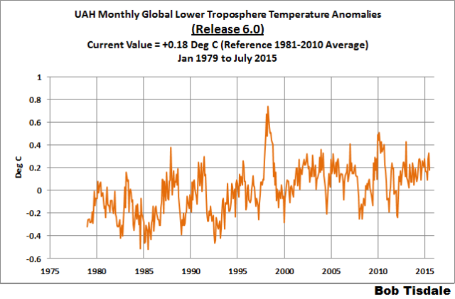
Figure 4 – UAH Lower Troposphere Temperature (TLT) Anomaly Composite – Release 6.0 Beta
RSS LOWER TROPOSPHERE TEMPERATURE ANOMALY COMPOSITE (RSS TLT)
Like the UAH lower troposphere temperature product, Remote Sensing Systems (RSS) calculates lower troposphere temperature anomalies from microwave sounding units aboard a series of NOAA satellites. RSS describes their product at the Upper Air Temperature webpage. The RSS product is supported by Mears and Wentz (2009) Construction of the Remote Sensing Systems V3.2 Atmospheric Temperature Records from the MSU and AMSU Microwave Sounders. RSS also presents their lower troposphere temperature composite in various subsets. The land+ocean TLT values are here. Curiously, on that webpage, RSS lists the composite as extending from 82.5S to 82.5N, while on their Upper Air Temperature webpage linked above, they state:
We do not provide monthly means poleward of 82.5 degrees (or south of 70S for TLT) due to difficulties in merging measurements in these regions.
Also see the RSS MSU & AMSU Time Series Trend Browse Tool. RSS uses the base years of 1979 to 1998 for anomalies.
Update: The July 2015 RSS lower troposphere temperature anomaly is +0.29 deg C. It dropped (a decrease of about +0.10 deg C) since June 2015.

Figure 5 – RSS Lower Troposphere Temperature (TLT) Anomalies
COMPARISONS
The GISS, HADCRUT4 and NCEI global surface temperature anomalies and the RSS and UAH lower troposphere temperature anomalies are compared in the next three time-series graphs. Figure 6 compares the five global temperature anomaly products starting in 1979. Again, due to the timing of this post, the HADCRUT4 and NCEI updates lag the UAH, RSS and GISS products by a month. For those wanting a closer look at the more recent wiggles and trends, Figure 7 starts in 1998, which was the start year used by von Storch et al (2013) Can climate models explain the recent stagnation in global warming? They, of course, found that the CMIP3 (IPCC AR4) and CMIP5 (IPCC AR5) models could NOT explain the recent slowdown in warming, but that was before NOAA manufactured warming with their new ERSST.v4 reconstruction.
Figure 8 starts in 2001, which was the year Kevin Trenberth chose for the start of the warming slowdown in his RMS article Has Global Warming Stalled?
Because the suppliers all use different base years for calculating anomalies, I’ve referenced them to a common 30-year period: 1981 to 2010. Referring to their discussion under FAQ 9 here, according to NOAA:
This period is used in order to comply with a recommended World Meteorological Organization (WMO) Policy, which suggests using the latest decade for the 30-year average.
The impacts of the unjustifiable adjustments to the ERSST.v4 reconstruction are visible in the two shorter-term comparisons, Figures 7 and 8. That is, the short-term warming rates of the new NCEI and GISS reconstructions are noticeably higher during “the hiatus”, as are the trends of the newly revised HADCRUT product. See the May update for the trends before the adjustments. But the trends of the revised reconstructions still fall short of the modeled warming rates.

Figure 6 – Comparison Starting in 1979
###########
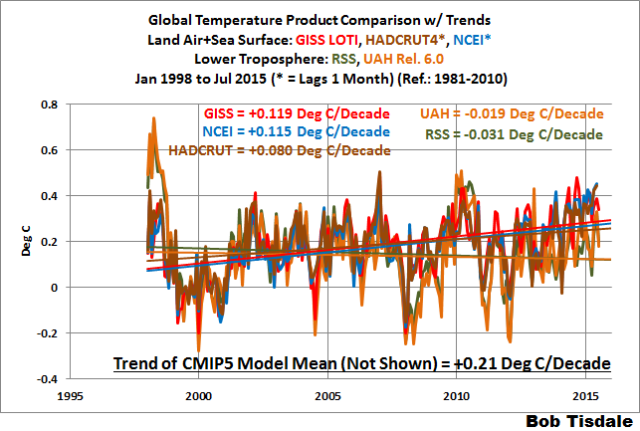
Figure 7 – Comparison Starting in 1998
###########
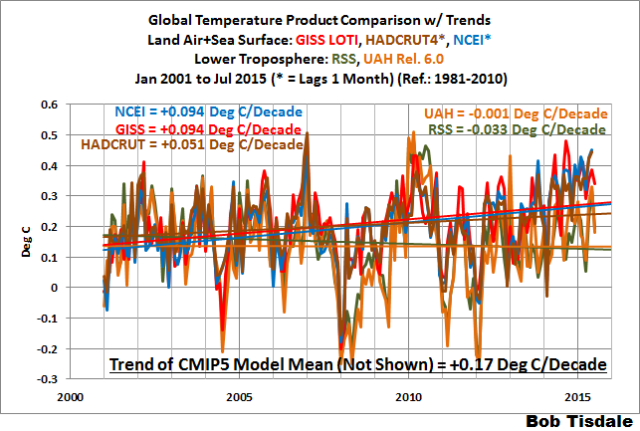
Figure 8 – Comparison Starting in 2001
Note also that the graphs list the trends of the CMIP5 multi-model mean (historic and RCP8.5 forcings), which are the climate models used by the IPCC for their 5th Assessment Report.
AVERAGE
Figure 9 presents the average of the GISS, HADCRUT and NCEI land plus sea surface temperature anomaly reconstructions and the average of the RSS and UAH lower troposphere temperature composites. Again because the HADCRUT4 and NCEI products lag one month in this update, the most current average only includes the GISS product.

Figure 9 – Average of Global Land+Sea Surface Temperature Anomaly Products
MODEL-DATA COMPARISON & DIFFERENCE
Note: The HADCRUT4 reconstruction is now used in this section. I’ll present the model-data comparisons and model-data differences using the GISS and NCEI products (before and after the switch to pause-buster ERSST.v4 reconstruction) in a future post. [End note.]
Considering the uptick in surface temperatures in 2014 (see the posts here and here), government agencies that supply global surface temperature products have been touting record high combined global land and ocean surface temperatures. Alarmists happily ignore the fact that it is easy to have record high global temperatures in the midst of a hiatus or slowdown in global warming, and they have been using the recent record highs to draw attention away from the growing difference between observed global surface temperatures and the IPCC climate model-based projections of them.
There are a number of ways to present how poorly climate models simulate global surface temperatures. Normally they are compared in a time-series graph. See the example in Figure 10. In that example, the UKMO HadCRUT4 land+ocean surface temperature reconstruction is compared to the multi-model mean of the climate models stored in the CMIP5 archive, which was used by the IPCC for their 5th Assessment Report. The reconstruction and model outputs have been smoothed with 61-month filters to reduce the monthly variations. Also, the anomalies for the reconstruction and model outputs have been referenced to the period of 1880 to 2013 so not to bias the results.
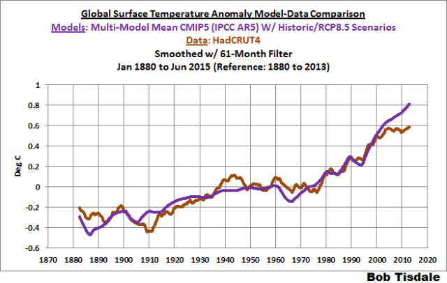
Figure 10
It’s very hard to overlook the fact that, over the past decade, climate models are simulating way too much warming and are diverging rapidly from reality.
Another way to show how poorly climate models perform is to subtract the observations-based reconstruction from the average of the model outputs (model mean). We first presented and discussed this method using global surface temperatures in absolute form. (See the post On the Elusive Absolute Global Mean Surface Temperature – A Model-Data Comparison.) The graph below shows a model-data difference using anomalies, where the data are represented by the UKMO HadCRUT4 land+ocean surface temperature product and the model simulations of global surface temperature are represented by the multi-model mean of the models stored in the CMIP5 archive. Like Figure 10, to assure that the base years used for anomalies did not bias the graph, the full term of the graph (1880 to 2013) was used as the reference period.
In this example, we’re illustrating the model-data differences in the monthly surface temperature anomalies. Also included in red is the difference smoothed with a 61-month running mean filter.
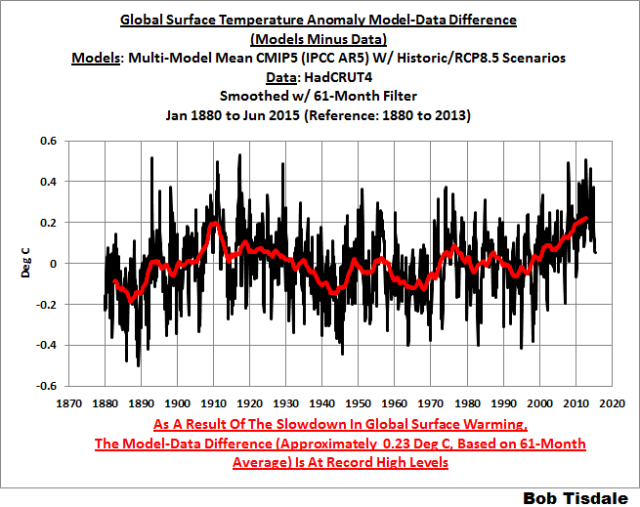
Figure 11
Based on the smoothed version, the greatest difference between models and reconstruction occurs now.
There was also a major difference, but of the opposite sign, in the late 1880s. That difference decreases drastically from the 1880s and switches signs by the 1910s. The reason: the models do not properly simulate the observed cooling that takes place at that time. Because the models failed to properly simulate the cooling from the 1880s to the 1910s, they also failed to properly simulate the warming that took place from the 1910s until 1940. That explains the long-term decrease in the difference during that period and the switching of signs in the difference once again. The difference cycles back and forth, nearing a zero difference in the 1980s and 90s, indicating the models are tracking observations better (relatively) during that period. And from the 1990s to present, because of the slowdown in warming, the difference has increased to greatest value ever…where the difference indicates the models are showing too much warming.
It’s very easy to see the recent record-high global surface temperatures have had a tiny impact on the difference between models and observations.
See the post On the Use of the Multi-Model Mean for a discussion of its use in model-data comparisons.
MONTHLY SEA SURFACE TEMPERATURE UPDATE
The most recent sea surface temperature update can be found here. The satellite-enhanced sea surface temperature composite (Reynolds OI.2) are presented in global, hemispheric and ocean-basin bases. We discussed the recent record-high global sea surface temperatures and the reasons for them in the post On The Recent Record-High Global Sea Surface Temperatures – The Wheres and Whys.
NOTICE A DIFFERENCE IN THE TEXT?
I’ve minimized my use of the word data, because data implies fact to many persons. I’ve used the word reconstruction in place of data for the GISS, NCEI and UKMO products, and composite was used for the satellite-based RSS and UAH products. I’ve also replaced dataset with product, because the reconstructions and composites are the products of suppliers.
In many other spheres ‘reconstruction’ would mean faithful reproduction. I think quasi-data could be also appropriate and telling.
Mannipulated data…
How about “completely made up numbers”?
Or just plain lies?
Stan: “How about “completely made up numbers”?”
AKA “Krigging”?
Or pseudo data?
I prefer the term “synthetic data” when referring to the NOAA,GISS, UKMO adjusted surface temperature anomalies.
The following animation appeared as the Feature Image, but not in the post:
It’s the same As Figure 8, but with the products isolated.
Bob,
I love the chart but can you slow it down for my older friends?
At my age all my friends are old!!
Catcracking,
Many picture-editing programs can do this for you. Being (from the sound of it!) of comparable age, I’ve done it myself from time to time for the same reason. It’s quite straightforward.
On Windows, I used to use Animation Shop Pro (which accompanied my aging copy of Paint Shop Pro), and a quick check on this machine just confirmed that the Gimp (freeware, all normal OS’s) can also open the downloaded animation and work on it. Either increase the time each frame displays for, or go the whole hog – extract the individual frames and make a set of still images.
Glad it’s not in the post. Those animated charts drive me nuts 🙂
“I’ve minimized my use of the word data, because data implies fact to many persons. I’ve used the word reconstruction in place of data for the GISS, NCEI and UKMO products, and composite was used for the satellite-based RSS and UAH products. I’ve also replaced dataset with product, because the reconstructions and composites are the products of suppliers.” Excellent idea!
When I read that, I thought the same thing, ELCore.
It both helps to avoid confusion while and is a more accurate description.
It’s only a matter of time before the observed temperature difference between surface and troposphere becomes so great that the entire surface to 700m atmosphere gets sucked out and we all asphyxiate. Damn you global warming! Damn you to hell!
Oh good, I’ve just been awarded several grants to study this problem. I should have some statistically insignificant results sometime around the year 2350.
That will be entirely too long for us to wait, talldave2.
Perhaps, in the interim, you could provide some modelled projections/predictions?
That way we can all make our conclusions while we wait for the data.
The important questions to think about BEFORE looking at these adjusted, re-adjusted, re-re-re-adjusted, reconstructed, in-filled, massaged “data”, presented on charts scaled to make tiny 0.1 degree variations look like huge mountains and valleys (i.e.; important):
.
(1) Is it possible to estimate the average temperature with enough accuracy to be useful?
(2) What can the average temperature estimate be used for?
– (a) Will it tell us what a “normal” average temperature is?
– (b) Will it tell us if warming is good news, or bad news?
(3) Do 35 years of average temperature data have any value in determining a long-term trend?
.
(4) What are the margins of error?
(I’d suggest +/- 0.5 degrees C. for “adjusted” surface data )
.
(5) Should anyone care about, or jump to conclusions about, variations within a 0.5 degree C. range?
(6) Why do the charts use a vertical scale that makes 0.1 degree changes look huge, implying great importance?
(7) Should we ignore data from the 1800s and early 1900s because:
– They are not close to being global estimates,
– 1800s thermometers consistently read low, and
– Sailors using buckets and thermometers, usually in established Northern Hemisphere shipping lanes, are a “Three Stooges” methodology for accurately estimating the average temperature of all the oceans !
.
In my opinion, any post here that presents so much average temperature data, should include at least one paragraph discussing the accuracy of the data, and any conclusions that can (or can not) be made from the data.
.
In my opinion, not much is known with certainty about what causes the average temperature to change.
In my opinion, the only logical conclusions possible from ALL the climate data available today, that are not speculation about the future, and not likely to be reversed by new data in the future, are:
(Note: climate models are not data):
– Earth’s temperature varies
– A few centuries in the 1350 to 1850 period were cool
– So the slight warming since 1850 is good news for humans
– There’s no CO2 – average temperature correlation
– More CO2 in the air accelerates green plant growth
– Thanks to more CO2 in the air, and slight warming, both humans and plants live in a better climate in 2015,
than they did in 1850
I guess those conclusion make me an “ultra-denier”:
(a) I want more CO2 in the air (speaking for my green plants),
(b) I want more warming, especially greenhouse warming at night, and
(c) I want the climate cult locked up, or at least muzzled and swatted with a rolled up New York Times, so I can fully enjoy the improving climate without their incessant bellowing that the CO2 boogeyman will bring us a global warming catastrophe that will force bankers to use gondolas to get to their Wall Street offices (I’ve been listening to the “greens” bellowing about DDT, acid rain, the hole in the ozone layer, etc., since the 1960s — it’s long past time for them to shut up!)
Climate change blog for the average guy.
Concise, simple, and a climate centerfold too:
http://www.elOnionBloggle.blogspot.com
[Snip. Fake email. ~mod.]
I have the UAH version 6.0 global temperatures in a spreadsheet and get exactly the same trend line slopes as shown above. Also I show no global warming for the last 18 years and 5 months.
Bob,
What variable from the GCMs did you use for the model mean?
The air temp at 2m?
A plea about diagrams: I understand the need for them to be the size they are in the body of the text but, as they are clickable, might it be possible for them to be bigger when clicked? I have a fairly large screen but it is still quite difficult to see what is going on in detail – especially with the thick lines used.
That detail is artificial significance. In reality, the error bars are so large it should look like one big blob… In Matlab/Octave you can use the errorbars() function to remove the numerically insignificant detail. I’ll reply to this post with an example when I get a chance today.
Peter
I think this an example of using errorbars to hide the detail that is insignificant. ?dl=0
?dl=0
You can see a trend but a lot of the variation is purposefully hidden, because it’s well within the errorbars.
Peter
The NOAA NCEI product is the new global land+ocean surface reconstruction with the creatively manufactured warming presented in Karl et al. (2015).
Bob says n the above which ends the story.
UAH,AND RSS data are not manipulated while GISS and NCEI data are and that is why a divergence in global temperatures is occurring and will continue going forward.
As I have suggested to Anthony ,this site should no longer post GISS and NCEI data.
Since the UAH version 6.0 no longer covers the same region of the atmosphere as RSS would it not be a good idea to differentiate them, calling them both ‘lower troposphere’ implies that they are the same.
I don’t see the problem with using “data”, since all measurements are imperfect.
Dr Spencer if all measurements are imperfect what standard would an ethical scientist use to evaluate data? Would it include a Feynman type analysis? Do current results from GISS and NCEI meet an acceptable level of accuracy? If not do scientists working in this area privately acknowledge a problem with the data?
Dr Spencer if all measurements are imperfect what standard would an ethical scientist use to evaluate data?
1. you detail your sources.
2. You characterize the known problems
3. You describe your methodologies for addressing the issues.
4. You explore alternative approaches.
5. you state your assumptions clearly
6. you publish your results
As an example see what Leif does in correcting the corrupted sun spot series.
You read Spencers papers over the years and follow all the twists and turns of trying to
Salvage some knowledge from the utter mess that is is “observational data”
Would it include a Feynman type analysis?
1. there is No well defined canonical “Feynman” type analysis.
2. you dont appeal to experts and you dont ignore them
Do current results from GISS and NCEI meet an acceptable level of accuracy?
1. there is NO SUCH THING as an acceptable level of accuracy.
2. There is only one thing: Your best estimate of the accuracy. The “acceptablity”
of accuracy is a USE DEPENDENT variable. For climate policy all we need to know
is this: The world is getting warmer.
If not do scientists working in this area privately acknowledge a problem with the data?
1. Yes
2. Everyone acknowledges it PUBLICALLY when they publish
So yes, the input data for UAH and RSS sucks. If you had the opportunity to do it all over there are many
things you would change. The Surface temperature inputs suck. If you had a time machine and could
do things differently you would. Sun spot records suck.. again time machines would be a great thing.
Here is the big hint. A large number of grand physics insights came from shitty data.
I want you to imagine where we would today if Roy Spencer and Christy threw up their hands
at the start of their project and screamed… “This data isnt perfect!!!!”
We would be sitting here with less knowledge.
When scientists FIRST tried to measure the speed of light they had a crude measuring systems.
It was grossly inaccurate.
But it was accurate enough to refute the idea that the speed of light was instantaneous.
http://galileoandeinstein.physics.virginia.edu/lectures/spedlite.html
Minimally, plus attribution is very unclear.
So for policy purposes it should be “it’s unclear”.
Steven;
An excellent reply save one piece.
“For climate policy all we need to know is this: The world is getting warmer.”
What time frame are you referring to? 1700-present? 1940-1970? 1998-present?
I’m not sure that your statement’s accuracy can be ascertained from the Spencer/Christy data set. In other words, can we drive policy by what we know at this time?
Warmer? It seems so in some series. And attribution? Out at sea. So your autocratic pen and phone are inappropriate, in fact, a gross error.
You’ll see someday, probably sooner than Obama and the alarmists.
==========
” In other words, can we drive policy by what we know at this time?”
we can drive policy by what we knew in 1896
“All measurements are imperfect”
Some measurements are so imperfect the data should be ignored.
For example, the surface “data” has been “adjusted” so many times, by people who predict warming and are desperate to prove themselves right, that they are no longer data.
The re-re-re-adjusted surface temperature numbers are now just guesses of what the raw data ‘should have been’ if they correlated with CO2 levels, based on a CO2 greenhouse theory.
And the CO2 levels are also “adjusted” by throwing away a majority of the raw Hawaii measurements to create a suspiciously smooth curve on a chart since 1959, and then ignoring pre-1959 real time chemical CO2 measurements, simply because they don’t support the CO2 greenhouse theory … and then using proxy ice core data which may be less accurate, but appear to support the CO2 greenhouse theory.
All we have left worthy of consideration are satellite data since 1979.
At best they tell us CO2 is not likely to be the “temperature controller.
They don’t tell us a long-term trend.
At least the people compiling the satellite data are (I hope) not bribed to predict a global warming catastrophe, do not make scary climate predictions, and then “cook the books” to make it appear their predictions are correct.
This website appears to have the goal of presenting unbiased science, so it should not allow the use of surface data, or CO2 data prior to 1959, without a warning: “Data too inaccurate for use by real scientists — but okay for government work.”
I believe I read somewhere that the collectors of the CO2 data in Hawaii did just what you assert. They threw away data on bad days, because they could “tell” it was bad. In their defense, you could probably not pick a worse place to collect well mixed atmospheric CO2 data, than the Mauna Loa Observatory, which is next to an active volcano, which everyone should realize produces CO2, as one of its erruption “products”. It is too bad, that they did not keep the collection site in Antarctica operational. I think the Mauna Loa “data” might meet the definition of a guess.
I am glad that the validity of the Keeling data is being questioned here. Most of my fellow “deniers” take the Keeling-Mauna Loa data for granted. They shouldn’t. Of course the “curve” looks fishy, and it is not even convincingly a “curve” as the alarmists claim it is, i.e. accelerating. As Sage sagely notes, it is a terrible place to pick as the representative of the entire globe’s proportional mix. Let’s add to that the fact that the Big Island of Hawaii has been experiencing rapid development from all sorts of CO2 emitting sources, cement for hotel construction, constant and increasing helicopter traffic, road traffic, commercial air traffic etc. What do these sources contribute? Are they temporary or permanent sources? Where is the accounting for such obviously confounding sources? Where are the ocean readings? We know or we think we know that the oceans are huge carbon sinks. Well, how huge? and are they accounted for in the Keeling “curves.” Finally, think about this: how come a father and son team (father now deceased) is allowed to claim their data as the sole reliable source for this presumably vital world policy-driving metric when they have a manifest and huge self interest in presenting a particular set of outcomes? Remember the hoopla in the press when “we” passed above 400 ppm? Tell me where I am wrong.
Ronald G. Havelock, Ph.D.
Except none of these are the actual data (nor are they averages of that data either), they are all products of data that is greatly enhanced, infilled, homogenized, and adjusted just because.
off topic- Bob , have you noticed some cool water spots starting to appear in Nino regions 1 and 2?
I think this needs to be monitored carefully.
🙂
They can change the data all they please – it will not change reality. The catastrophic events that are supposed to occur as a result of global warming will still not occur.
cor- Exactly their AGW theory is dead on arrival.
“The catastrophic events that are supposed to occur as a result of global warming will still not occur.”
What you say is correct, but catastrophic events will still occur, and attempts to attribute frequency/intensity to you, me, and other people will occur with each catastrophic event.
Until the money goes away the hype will stay.
“As far as I know, the former version of the reconstruction is no longer available online” More criminal activity liable for prosecution, eventually…
But they can

here’s the average day to day difference, this is surface temps, but if you consider it a metric of cooling, and invert it
It’s a pretty good match to satellite temps, where the differences are these are land based temps, etc.
Bob’s graph. ?w=720
Dr Roy Spencer presents some initial satellite derived tropospheric water vapor vs temp. He then has a second figure graphic that shows how the data shows major feedback differences from the tuned water vapor radiative feedback in one GCM. This data, as Dr Spencer further devops it, could be part of the mechanistic dismantlement of the modeled AGW.
Very important stuff. Ben Santer, Dame S, and Gavin S. will not be pleased if this is consistent in the CMIP ensemble.
Read here:
http://www.drroyspencer.com/2015/08/new-evidence-regarding-tropical-water-vapor-feedback-lindzens-iris-effect-and-the-missing-hotspot/
Between a rock and a hard place. Give up enhanced water vapor feedback and give up the catastrophic temperature rise. We knew this a decade ago; climate alarmists did too, but they seem to be stubborn.
Why, oh why?
Better, when, oh when?
======
Zombie GCMs. Dead, even know it, yet on they stumble wreaking havoc right and left.
==========
I notice the Sea Ice Anomaly page shows that the Antarctic anomaly went negative for the first time in 4 years.
And the Northwest Passage is open for the season.
http://ice-glaces.ec.gc.ca/prods/WIS38CT/20150817180000_WIS38CT_0008423079.gif
A cool website using google maps and Northwest Passage ships this season:
http://thenorthwestpassage.info/
I see lots of work for the Canadian Coast Guard rescuing thoseNW passage fools in the coming weeks.
you can keep up with the 2015 Northwest passage sailors at NorthwestPassage 2015 at http://northwestpassage2015.blogspot.com/
the route 6 just opened up at Bellot Strait
Last year the NW Passage didn’t open until Sept 10. And as of Sept 8, it looked like it wouldn’t open at all and a ship or two turned around. Eight ships made the transit in 2014, one an Ice breaking Bulk Cargo carrier, the Nunavik.
This year there is a ship planning a two-way passage. Given the earliness of the opening this year, it has a chance of making it.
Thank you for pointing out that these aren’t data sets but are in fact products. And products of course are manufactured.
Thanks, Bob.
It seems like keeping up the global warming theme has gotten more and more difficult. Your wide view at the available data is much appreciated by those who value reality over ideology.
Figure 10 says it all.
bob, can you tell me why the north sea surface temperature is currently around 3 degrees lower than last year ?
i have not seen much mention of this anywhere ,yet if it had been an area of land anywhere in the world that had seen an increase of that amount over a one year period i believe there would have been much interest.
above should have read 3 degrees c lower than this time last year.
More typical denier BS coming from Bob Tisdale as he continually fails to include model uncertainty in his model comparison plots. But since he is not a scientist why should I be surprised.
[First and last warning: we do not tolerate others being labeled “deniers”. Read the site Policy. ~mod.]
OK I will stop when Bob Tisdale stops using the word alarmists in his posts here, scientists do not tolerate that label either.
Please then explain why all of your scientist friends ignore the uncertainty in model and surface reconstructions that are far larger than the quoted temp anomaly?
I mean for surface records they infill from as far as 1,200km away, and the oceans are still so undersampled most of the macro scale features aren’t even detected, and don’t get me started on historical temps, most of the planet wasn’t even close to a thermometer, and don’t forget how they mix proxies with measurements, and act like it actually means anything more than the scientists interpretation of what he thinks the temp should be.
So when your team can start acting like the scientist they claim they are, our non-professional scientists will start to include error bars too.
Why can’t you just stay on topic instead of creating all of these side issues? All Bob has to do is include the uncertainty in his model data plots for the most current data (i.e., ~ +/- 0.2C) [http://www.climatechange2013.org/images/report/WG1AR5_Chapter12_FINAL.pdf] and the conclusions will turn out much different. But that would defeat the point of his whole argument and this posting.
I would suggest your claim of the current uncertainty being ~+/-0.2C is exactly my point and highly topical. At best maybe half the planets temps have been measured by a thermometer within a few hundred miles, maybe. The rest is opinion and guessing.
I am referring to the uncertainty of the model data not the actual temps.
If you want to be fair, I suggest you include the word “alarmists” in your site Policy as a word not to be tolerated on your site also.
Dennis H,
There’s a big difference. “Denier” is a reference to Holocaust deniers. There is no doubt, since national columnist Ellen Goodman (who should know better) stated in her column in the 1990’s that the term climate “denier” is used to specifically equate Holocaust deniers with skeptics of dangerous man-made global warming. Her column can still be found online.
So there is a big, big difference. The term “alarmist” is 100% accurate. They are attempting to alarm the public primarily over human CO2 emissions, which they have mistakenly insisted for at least the past 25 years will cause runaway global warming and climate catastrophe.
So there is no comparison between the terms. One is accurate, and the other is a scurrilous attempt to demonize those who simply have a different scientific point of view.
When the word “alarmists” is being used here so frequently, I am pretty sure that it too is based on some “scurrilous attempt to demonize those who simply have a different scientific point of view.” (i.e., the climate scientists”).
What you may consider an accurate label others may not and vice versa. But since fairness to both sides of the argument is not be what this site appears to be about, I suppose I am just wasting my time anyway.
So with that, I will go back to work on my scientific work that has more meaning.
Martin,
Perhaps you can convince the Mod committee more than I can since I am now labeled as being with the “others” and therefore my opinions here have less value.
DH
So with that, I will go back to work on my scientific work that has more meaning
I think you meant to say
“So with that, I will go back to work on my climate computer gaming, which is more lucrative”
(“work” is redundant in your original sentence.)
Dennis,
Why is “alarmist” offensive. Is the current atmospheric condition/situation not, in your opinion, cause for alarm?
If the overall population is not alerted/alarmed into action aren’t you concerned that there will be no change for the better?
There are currently educational activities that are intended to show the public that they should be fearful (alarmed) and concerned about the future. If we don’t get the general public involved emotionally then we are certainly lost … right?
Labeling someone an alarmist who tells the public that a rise in harmless, beneficial carbon dioxide — a tiny trace gas that is as essential to life on earth as H2O — will bring about runaway global warming and climate catastrophe is nothing more or less than truth in advertising. They just don’t like the definition. But it isn’t “name-calling”. It is an accurate label.
And make no mistake: climate catastrophe is the scare. Because if they admitted that global warming stopped many years ago, and that not one scary prediction that side has ever made has ever come true, then there would be no support for the $billions of tax dollars that are shoveled into “climate studies” annually.
They should admit the truth: that all their alarming predictions were wrong. The planet is busy falsifying their ‘CO2=catastrophic AGW’ narrative. But if they admitted that, the money spigot would be turned way down, if not off completely.
So climate alarmism it is. It keeps the money flowing.
Hey wait, July was the warmest month on record, of course they had to jack with SST’S, after years of jacking with the surface records to do it, diligent mutton head’s aren’t they!
Is mutton head an insult?
Reblogged this on 4timesayear's Blog.