Guest Essay By Walter Dnes
There is much interest in the latest temperature anomaly adjustments by NOAA/NCEI (formerly known as NOAA/NCDC). This author has been downloading NOAA monthly temperature anomaly data since 2010. The May 2015 adjustment is not the only one. There appear to have been 8 adjustments between November 2010 and May 2015. Assuming that these changes are legitimate adjustments, one has to wonder, if they got it wrong the last 7 tries, what confidence can we have that they got it right THIS TIME, or will they change it again if Earth doesn’t cooperate? To paraphrase Darth Vader…

Credit and a special thanks to Josh for his incredible artistry and humor!
The NOAA/NCEI monthly raw datasets from January 2010 to May 2015 have been uploaded on WUWT to here for those of you who might wish to do your own analysis. I’ve also included some data documentation in the readme.txt file included in the download. Current NOAA/NCEI data can be downloaded here, click on “Anomalies and Index Data”.
There are 65 months from January 2010 to May 2015. Eight of those months saw significant changes in the anomaly data. There were only very minor changes from January 2010 to October 2010. Note also that the data was originally available to both 2 and 4 significant digits. It is now available to only 2 significant digits. The 2-digit values appear to be rounded-off versions of the 4-digit data.
- The first notable change occurred in November 2010, with most anomalies adjusted upwards over the period of record. Mid 1939 to mid 1946 was not raised. Keeping it unchanged while everything else is bumped up is effectively equivalent to lowering it. Of interest is that for the period 1880-to-1909, anomalies for the two months April and November received the most significant boosts.

Walter Dnes – Click the pic to view at source - The next change occurs in April 2011. The period 1912-to-1946 appears to be depressed relative to the rest of the record. Here is the delta between March 2011 and April 2011.

Walter Dnes – Click the pic to view at source And here is the accumulated change from October 2010 to April 2011.

Walter Dnes – Click the pic to view at source - The next change occurs in October 2011. The periods 1880-to-1885 and 1918-to-1950 appear to be depressed relative to the rest of the record. Here is the delta between September 2011 and October 2011.

Walter Dnes – Click the pic to view at source And here is the accumulated change from October 2010 to October 2011.

Walter Dnes – Click the pic to view at source - The next change occurs in January 2012. The period 1905-to-1943 appears to be depressed relative to the rest of the record. 1974-onwards is raised relative to the rest of the record. Here is the delta between December 2011 and January 2012.

Walter Dnes – Click the pic to view at source And here is the accumulated change from October 2010 to January 2012.

Walter Dnes – Click the pic to view at source - The next change occurs in February 2012. The period 1898-to-1930 is raised relative to the rest of the record. Here is the delta between January 2012 and February 2012.

Walter Dnes – Click the pic to view at source And here is the accumulated change from October 2010 to February 2012.

Walter Dnes – Click the pic to view at source - The next change occurs in August 2012. The period 1880-to-1947 is lower relative to 1948-to-2010. Here is the delta between July 2012 and August 2012.

Walter Dnes – Click the pic to view at source And here is the accumulated change from October 2010 to August 2012.

Walter Dnes – Click the pic to view at source - The next graph is not an adjustment. It’s a sanity check. February 2014 was the last available month of 4-significant-digit data. Starting March 2014, 2-significant-digit data is being used. The comparison between February 2014 and March 2014 confirms that the 2-digit data is a rounded-off version of the 4-digit data. The “jitter” is within +/- 0.01, i.e. roundoff error.

Walter Dnes – Click the pic to view at source - The next change occurs in April 2015. The 2-digit data results in a more jagged, sawtooth graph. The period 1880-to-1905 is slightly raised, and the period 1931-to-1958 is slightly lowered relative to the rest of the record. Here is the delta between March 2015 and April 2015.

Walter Dnes – Click the pic to view at source And here is the accumulated change from October 2010 to April 2015.

Walter Dnes – Click the pic to view at source - Some of the changes from April 2015 data (downloaded mid-May) to May 2015 (downloaded mid-June) look rather wild. A drop of as much as 0.14 C degree in 1939 anomalies and a rise of as much as 0.15 C degree in 1945 anomalies made me do a double-take, and inspect the data manually to insure there was no error in my graph. The raw data confirms what the spreadsheet graph shows…
Data for April 2015 versus May 2015 Data month April 2015 May 2015 Change 1938/11 0.11 0.01 -0.10 1948/12 -0.13 -0.25 -0.12 1939/01 -0.02 -0.16 -0.14 1939/02 0.01 -0.11 -0.12 1944/12 -0.02 0.10 0.12 1945/01 0.01 0.16 0.15 1945/02 -0.13 0.02 0.15
And now for the “pause-buster” adjustment. Here is the delta between April 2015 and May 2015. This adjustment is a roller-coaster ride.
- The period 1880-to-1925 is up-and-down
- 1926-to-1937 is relatively stable, down approximately 0.03 to 0.04 degree from April.
- 1938-to-1939 crashes down to 0.10 degree below April.
- The adjustment spikes sharply up to +0.15 by the end of 1944
- It drops down sharply to 1948.
- Slides gradually down to 1963.
- Stable 1963-to-1973
- Rises 1973-to-1980
- Stable 1980-to-1992
- Falls 1992-to-1998
- Rises 1999 to November 2010 (end of comparison)

And here is the accumulated change from October 2010 to May 2015. Because the May 2015 change is the largest, the accumulated change from October 2010 to May 2015 is similar to the May 2015 monthly change. One thing that stands out… because 5 or 6 of the 8 adjustments pushed down part or all of the years between WWI and WWII, there is a marked drop from 1920 to 1939 in adjusted temperatures. This has the effect of doing to “The Dirty Thirties” what Michael Mann tried to do the Medieval Optimum warm period; i.e. erasing it from the temperature records. So as our friend Daft Bladder says, “I am altering the data. Pray I don’t alter it any further”.

I’m curious as to what they think is so wrong with the raw data obtained in the C21st that they feel the need to make such large adjustments. The only thing that comes to mind is UHI, in which case I hope someone has pointed out to them that they have their adjustment going in the wrong direction.
Bloke down the pub.
The UHI effect is minor when they estimate the global average. Most parts of the globe are not affected by the UHI effect.
There has also been a reverse UHI effect in built up areas. Temperature stations tended to be relocated outside of built up areas over time eg to airports etc. This causes a cooling bias.
Relocating temp stations to airports increases the UHI given that they consist of large areas of black tarmac that will not only be hotter during the day but will increase the night time temperature which is where most of the warming appears to be. The warmists went into meltdown (literally) when at London’s Heathrow airport a ‘record’ temperature was seen, but Heathrow is one of the busiest airports in the World with flights landing every 45seconds at peak times and take offs every few minutes. That a lot of jet heat, so it was rightly called as being rubbish.
“HarryTwinOtter” is incorrect in suggesting that the influence of the urban heat-island effect on global temperature is minor. According to McKitrick & Michaels (2007), temperatures over land in recent decades are shown as having risen twice as fast as they would have done without the urban heat-island effect. The effect is to raise apparent global temperatures by almost 0.1 K.
Most parts of the globe are not affected by the UHI effect.
==========================
surface thermometers are not located in most parts of the globe.
the problem is that they are trying to build a temperature record as though the stations were fixed, and trying to correct for changes at each location.
in reality this is a statistically false model of reality. the underlying station record is biased as to location and time. thus you cannot aggregate them and hope to achieve an unbiased result. worse, you do not know the underlying distribution function, so cannot accurately judge the error.
the correct approach is to use sampling theory, which means just that. you need to build your aggregate using random samples of the underlying data set. this will change your unknown distribution into a standard distribution, allowing you to accurately calculate the error term using standard methods that have survived the test of time against millions if not billions of control samples.
as it is now the adjustments do not use standardized methods. rather they are ad-hoc, with new methods invented with each new release, none of which can be validated except against a very limited control sample. no one can demonstrate conclusively that the adjustments have truly reduced the error, which is what the adjustments are intended to do.
There has also been a reverse UHI effect in built up areas. Temperature stations tended to be relocated outside of built up areas over time eg to airports etc. This causes a cooling bias.
No, it causes essentially no bias if the moved stations are sited correctly.
No adjustment should be made to a properly running, properly sited station, should it?
worse, because the temperature records are being adjusted with the scientists able to look at the end result, subconscious bias cannot help but affect the result.
we know from experiment after experiment, if you allow the person making the changes to see the results of their change to determine if it is correct, personal bias will affect the outcome. the researchers will end up subconsciously choosing the method that best satisfied their internal bias, because all of us see our own bias as being neutral.
yet that is exactly what climate science does. it cherry picks the methods it uses to adjust the temperature record based on the results the adjustments generate, ignoring more than a century of research showing the need for double blind controls in all experimental design.
Clive Best has a post on that very subject. The reason is, some cities have been growing over the last half century, others, like New York and Boston have been urbanized over a century and HAVEN’T grown significantly in the last half century.
http://clivebest.com/blog/?p=6678
“…The reason for this bias is that each station gets normalised to the same 1961-1990 period independent of its relative temperature. Even though we know that a large city like Milan is on average 3C warmer than the surrounding area, it makes no difference to the apparent anomaly change. That is because all net warming due to city growth effectively gets normalised out when the seasonal average is subtracted. As a direct result such ‘warm’ cities appear to be far ‘cooler’ than the surrounding areas before 1950. This is just another artifact of using anomalies rather than absolute temperatures….
Past studies (including mine!) have claimed that the UHI effect is very small partly because they focus on recent trends in temperature anomalies. However this is not the case once the pivot effect of the normalisation period is included. Overall I find that the UHI has increased global warming on land by about 0.2C since 1850 by artificially supressing land temperature anomalies pre-1960.”
ferd: “subconscious bias”. I have a feeling that there is more of a conscious bias?
also I cannot see a hockey stick anywhere, or is the scale of the graphs unable to show this?
@ Gerry, England 5:39
“large areas of black tarmac”
I’ve not got a problem with the idea – just the details. Large modern airports have concrete that is mostly a light-gray.
WUWT – Airplane gets stuck
I have a feeling that there is more of a conscious bias?
==================
there is without a doubt political bias in the adjusted temperature record. however, most scientists do not set out to purposely corrupt the data. they truly believe that what they are doing is noble and right – otherwise they would not do it.
Al Capone did what he did because he believed what he was doing was right. He saw himself as a good guy, providing much needed work, while fighting against an oppressive system. All of us operate the same way. Hitler didn’t see himself as a bad guy. He saw himself as a savior of Germany.
And that is the problem. Scientists believe their white coats are white hats. That whatever they do, they are doing it for the right reasons, so therefore the results must be right.
What research tells us is the exact opposite, when people do things for the right reasons, you cannot trust the result. That is why double blind experimental controls cannot be ignored if you want a correct result.
Most of the globe isn’t affected by UHI, but almost all of the sensors are. Since that’s where they are located.
Come on, can’t you at least think up a new lie?
@ harrytwinotter
As you rightly point out, most parts of the globe are not affected by the UHI effect. However, there’s more to the story. Annoyingly, the term UHI is used ambiguously in ClimateScience(TM) Here’s a common description as at 9 July 2015 https://en.wikipedia.org/wiki/Urban_heat_island “As a population center grows, it tends to … increase its average temperature.”
This additional heat is quite large in the cities, but when the increase is averaged over the whole globe, that extra heat is not really warming the planet much.
However, here’s where the ambiguity comes in. Our thermometers are not measuring the average temperature of the globe; they are measuring the actual temperature where the thermometers are. Thermometers tend to be located where people are. Many of them are in cities, smack in the middle of the effect. In the specific locations of the thermometers, that effect is large and increasing over time.
So to clarify the ambiguity I mentioned:
How much does the extra warmth of cities (UHI) warm the globe? A minuscule amount.
How much does the extra warmth of cities (UHI) warm the temperatures recorded by most thermometers? A substantial amount. http://wattsupwiththat.com/2010/03/03/spencer-using-hourly-surface-dat-to-gauge-uhi-by-population-density/ and http://wattsupwiththat.com/2014/03/14/record-daily-temperatures-and-uhi-in-the-usa/
To choose an alternative restatement; both the additional warmth generated by cities and the higher thermometer readings are each called the UHI.
Many news media report of Climate Science, particularly those that quoted Richard Muller, appear to make no distinction between the two uses of the term, leading to results that are frankly absurd. Subtracting the amount that cities warm the globe from the temperature record of all thermometers, including those in cities, may be ‘adjusting for UHI effect’. But they’re doing it wrong, with a method that will give a ‘warming planet’ signal to what is merely very local increasing UHI. I find it hard to believe Muller could have made such a mistake, but it has certainly been presented that way in the media. And McKittrick’s article does seem to show he’s wrong. http://link.springer.com/article/10.1007%2Fs10584-013-0793-5 Likewise, your reference to UHI and the whole globe appears to indicate that you’ve been informed by articles that fail to make that distinction. Of course I could be wrong; if you have a link to an article congruent with your original claim, that doesn’t conflate the two ideas, I’d appreciate it.
Monckton of Benchley.
A citation would be nice. But I suspect if the study was done by McKitrick it will be biased and suspect.
I still cannot see how the UHI affects temperature measurements over the oceans and in remote areas.
Gerry, England.
If you are basing your reasoning on just one location (Heathrow airport), it means you do not understand what an average is.
And no, an open area like an airport will be windier than a built up area.
ferdberple.
“the problem is that they are trying to build a temperature record as though the stations were fixed, and trying to correct for changes at each location.”
No, they try to correct for non-climatic temp changes such as thermometer changes and site moves. It would be nice if a new station number was allocated with each move, but they cannot guarantee that this will happen. Site changes may not show up in the records. Plus a move of even as little as 100 metres can disrupt the series. They certainly have their work cut out for them.
I recall reading somewhere that a temperature station has a significant change on average once every 10 years. From the temp stations that I have looked at carefully, this seems about right.
johnwho.
No. You cannot move a temperature station and expect the series to remain the same. It is going to be a little cooler or a little warmer than the original station.
In my lifetime I saw one station get moved at least 2 times. Once by a kilometre or two in town, then several kilometres to the local airport. Trust me the airport was a lot windier than in town.
ferdberple.
well you can speculate about a scientist biasing their results without showing any evidence for it if you like.
But the same reasoning would then apply to, say, Roy Spencer and the UAH satellite data set. And to the people who said the hockey stick reconstruction was wrong etc. Hard to know where to stop.
John F. Hultquist.
Large airports maybe – but what about the smaller ones?
It is good they take measurements from many stations, it has the affect of reducing local bias.
Harry, one of the things that few people on this site will admit to is the fact that the raw satellite data is heavily processed in order to generate the anomaly graphs. In fact, with the atmospheric models both RSS and UAH use to transform microwave brightness readings into temperatures, there’s an additional level of manipulation going on. Time series data from surface stations is much easier to average.
harrytwinotter commented: “…Temperature stations tended to be relocated outside of built up areas over time eg to airports etc. This causes a cooling bias.”
You haven’t a clue what you are talking about. That has to be one of the most ignorant statements made on this forum in a long while.
@ harrytwinotter July 9, 2015 at 8:35 am
No again.
If you move a station that is not properly sited (Including it was in a UHI effected location) to a properly sited position you are not introducing either a warm or cool bias to that station – you now have a properly sited, non-biased station.
You can not say that station now has a cool (or warm) bias and requires further adjustment.
Are you really this obtuse? They way they measure temperatures over waters is by averaging the station data surrounding those waters. So, if cities A, B, and C surround a large body of water, than the assumed surface temperature over the body of water will also be artificially elevated by the UHI in cities A, B, and C. It’s funny that you are actually highlighting the problem with the surface data record with your comment.
Harrytwinotter,
I live in a non urban area. I live 1/2 a mile outside a small 6,000 person town. 20 miles away there is a 15,000 person town and it is a good 90 miles to the first city of 100,000 people. I think you assume that little 6,000 person town has no UHI or minuscule, but you’d be completely wrong. Every winter on cold days the difference between where I live, just a 1/2 mile outside of town and in town can be as much as 12 degrees Fahrenheit. A thermometer in town would be labeled as rural according to people like you because it is just a 6,000 person town out in the middle of farm land. But even a town of 6,000 creates a huge UHI. The only true rural thermometers are those outside of any town. How many are there in the world?
Most parts of the globe? That is rather expansive and very disingenuous of you. A rather blatant sophistry on your part.
Most parts of the globe measure temperature where there are people, especially groups of people commonly known as villages, towns and cities; all UHI locations.
Airports are outside of built up areas? Another blatant sophistry, especially the “reverse UHI” part.
Just how does reverse UHI work? Does that mean the temperature is lower than normal? Anomalies are under the norm?
Or is reverse UHI a misdirection meaning for normal temperatures and weather? Which is not what is found at airports.
Airports cover acres of land with black tarmac, tarmac that forms thermals and disrupts normal weather.
Airports install large structures requiring air conditioning, buildings that block normal wind patterns.
Airports are favorite places for many pieces of equipment running million BTU plus equipment, often facing the thermometer placement.
Do not assume that all and very many temp sites have been relocated out of cities. Rather, the trend is for the data changers to raise the rural temps to match the city temps, when all logic says that the city’s UHI effect should be subtracted. They give this lip service by having made a small adjustment many years ago and then ignoring it ever since. Instead, they should be subtracting an ever growing UHI effect over time. Anyhow, always expect them to fudge and alter the data to show warming as that is what they are paid to do.
Most of the temperature data is located in urban areas, then averaged out into grids. Therefore UHI has a big effect. In fact, this is the reason the land stations are diverging so much from satellite data.
Wrong – it causes a warming bias. Remember that an adjustment is made to splice the new instrument record onto the old.The UHI warming observed by the first instrument as it transitioned from rural to urban thus remains in the record, while the UHI warming subsequently observed by the new instrument is then stacked on top of it. Effectively each move of the instrument to the outskirts of the city allows yet another rural-urban UHI temperature transition to be stacked onto the record. The net effect is to multiply spurious UHI warming by a factor of 2 or 3 depending on how many times the instrument has been resited.
That doesn’t make much sense. UHI causes data to be adjusted downwards, whilst non-UHI affected data should not change. And reverse UHI is nonsense – if the station has UHI then you adjust it down. If you move it to a position with no UHI, then it is “right”.
And on what basis are these adjustments being made? Where are the “right” stations that we know are more accurate than the ones we are adjusting? And how do we know they are more accurate?
wobble.
I am not obtuse – but I think you are.
Ocean surface temperature is estimated from the water temperature.
Ian H.
“Wrong – it causes a warming bias”.
No, I think you are wrong.
If the move from an urban centre to an airport caused a cooling bias, they will adjust the prior temperatures down to make it consistent with the new location. This will preserve the integrity of any trend in the anomaly.
At least this is what they do in Australia.
Anyway that is a question you can ask your local climate people – ask them which way they will adjust an existing temperature series to compensate for a cooling bias due to a station move.
Joel D. Jackson.
Satellite data is adjusted a lot, isn’t it. It is not even a measure of temperature until they process it.
I wonder if anyone has ever asked UAH or RSS for their “raw” data so they can compare the data to an older version and make up stories about the changes.
What does raw microwave data from an MSU look like anyway? 🙂
Also false sophistry harrytwinotter!
Slime and muck thrown at a scientific of measuring temperature, as a false attempt to discredit the data?
Go ahead and request the raw data! Find something actually wrong with the data or their analysis of the data!
I am sure the raw microwave data from MSU looks far better than the misadjusted land data frequently abused by aberrant arrogant thermometer keepers.
Dear harry, or can I call you Olivia?
Even a mercury in glass thermometer does not measure temperature. It measures the volume expansion of mercury in response to temperature after compensating for the volume expansion of the glass container in response to temperature. Ignorant sophistry is not really adding to the discussion.
p.s. the reference to Olivia is not an insult, but a reference to the twin otter part of harry’s name. re. Geoffrey and his cousin.
In today’s ‘climate science’, only the future is certain, the past is forever changing.
Of course, that happens in all scientific fields – /sarc off
Well said and so, so true!
Yes the past is forever changing as well as the future. In reality the present controls the past and the future. It does this while the present is in a constant shift from past to future.
That is why if you want to write the history of a conflict make sure and win the conflict. And if you want to set the direction for the future make sure you control the present.
Let’s not over-indulge them. It’s fraud. Nothing less.
4-digits seems entirely unjustifiable. But is 2-digits any better?
Perhaps all we seeing with these adjustments is that the temperature anomalies are too small to be measured and all the iterations are meaningless
Exactly.
When you consider that the thermal capacity of the ocean is roughly 1000 x that of the atmosphere and when the oceans are claimed to be where the ‘missing heat’ of ‘the pause’ has gone……….. how does 0.01C translate into an accurate, measurable figure in the depths of the ocean?
With “adjustments” as large as those discussed above, I would argue that none of the digits are “significant”.
Before the digital age, the temperature measurements were rounded to the nearest degree.
Sounds like they might have felt the sting of ridicule for being so precise, yet so wrong. And if there was rounding to two digits, which way did they go, up or down?
The NOAA adjusts it’s climatic data from time to time.
So what?
The data is statistical. It is not temperatures it is an estimate of a temperature anomaly.
In your article, you ask a rhetorical question that implies a conspiracy involving NOAA.
GHCN-M version 3.3.0 ?
You trolls need to up your game, all data are “statistical”, and anomalies are just temperatures relative to a different fixed reference.
What you should have said was something like the following. There is continuous change to the thermometer systems in use around the world, different technologies, exposures and locations. Temperatures quoted by NOAA and others are “what would have been measured in the past by systems in use today”, so it is not unreasonable for the numbers to change frequently.
So what?
===========
statistical data has no need of adjustment. in statistics you calculate your results based on the underlying data. you don’t feedback the results of your statistics to adjust the underlying data and then recalculate your statistics, because at the moment you feedback your adjustments you have invalidated the most basic, underlying assumption of statistics.
the entire mathematical basis of statistics relies on the assumption that you did not peek at the result in selecting your sample. in the case of adjusted climate data this assumption is false, therefore any statistical inference drawn from the adjusted data must also be false.
you cannot make any meaningful statistical analysis of the adjusted data, because it has been adjusted and no longer satisfies the underlying assumption of statistics. plain and simple, the trend line and error bars drawn on adjusted data is statistically meaningless.
ferdberple.
Statistical data has no need of adjustment? Really? What if it contains an error which they find later? Do they leave the error in there? Nooo they fix it and recalculate their estimates.
It so happens that the computer code used to calculate version 3.2.0 contained errors which they fixed in version 3.3.0. (actually I am amazed none of the climate change dissenter websites have picked up on it yet, they could spin a couple of computer bugs into some great “scandal” and earn some more click-dollars that way).
You are just making claims of fact about statistics off the top of your head – if you are just expressing an opinion that is fine, but the person standing next to you may have another opinion.
For a start the global average temp data in that data set is an estimate. It is also an anomaly calculated from a baseline which in turn is calculated from an average. If any of the baseline values change, or the baseline period changes, then they will recalculate the anomalies.
I never mentioned feedbacks.
It sure isn’t.
Which means that after all future adjustments are completed, there might not be any global warming at all, right?
Great point! We don’t know what future adjustments will bring. It all depends on the bias of the adjuster.
“The NOAA adjusts it’s climatic data from time to time. So What?”
Don’t you understand what constant adjustment of the data means? It means we can’t trust today’s data set because it’s going to change tomorrow. It’s as slippery as an otter and just as unpredictable. All we really know is that the NOAA temperature data set we have today is going to change, but nobody knows how much or how often. That means it is unreliable and virtually worthless for any purpose except propaganda. But I have a feeling that it’s the propaganda, not the truth, that harrytwinotter really cares about anyway. That’s why all these changes don’t bother him in the slightest, as long as they continue to match his expectations.
all you have to do is put a little gif up of the adjustments over time from NOAA and any normal person will question the issue. we shouldnt really interrupt these people pushing their failed propaganda. its a bit like the 10-10 video, its the sort of thing that will help sceptics show that there really is a problem with climate ‘science’.
for the reality of these adjustments, you dont have to look past some of the australian data. the acorn set is based on the same homogenization rules, and you can clearly point out vast areas (the size of small countries) where the average monthly temperature ends up higher than the highest daily temperature of any actual thermometer readings in the area.
Louis Hunt.
“Don’t you understand what constant adjustment of the data means?”.
Yes I do! It took me a couple of nights study and I now know the general principles.
I think people are hung up on the measurements from individual stations. This “raw” data (it is not really raw) is not adjusted, it remains a valuable resource. I am sure it is archived somewhere even if it is no longer on the internet.
The raw data is then used to create a temperature series, the series is adjusted to remove non-climatic influences such as time-of-observation (TOB) changes, station moves, someone building a new skyscraper next to the station (it happened in Melbourne Australia) etc. If you don’t make adjustments to the temperature series any trend will jump up and down due to the non-climatic influences ie create an artificial trend. The statistical adjustments are to minimize the artificial trend.
From the series you can create an anomaly temperature which is what the whole point is – you want to see how the temperature is changing over time compared to a baseline. Day to day temperatures are fine for weather, but they suck at tracking climate change (or even no climate change). The anomalies are the way to go.
The raw data is still around.
[snip -rant -mod]
mobihci.
No, I think the BOMs ACORN-SAT uses a different homogenization algorithm compared to the GHCN.
…estimate of a temperature anomaly?
Good to know it is an estimate, not so good that it is a non-verifiable estimate with vague built in assumptions.
Kind of like estimating how many apples will fit in a football stadium without knowing the size of the apple or the stadium.
Anomalies are good at measuring either exceptions or trends. If ones paycheck varies unusually from the norm it can be considered an anomaly otherwise in common terms known as a mistake. The thinking of alarmists is that the current warming is an exception, except they do not provide a baseline (like a normal paycheck is) for the correct temperature so the anomaly as exception becomes meaningless.
An anomaly describing a trend is also useless unless a baseline is determined. Who knows maybe we are trending toward what the earths ecosystem considers “normal” temperature. Again we don’t know so we come up with vague assumptions and decide it’s B A D.
So no. claiming “we are measuring anomalies” is not a free get out of jail card. Without a definition of “normal” temperature, anomalies are meaningless.
It gets worse, there are the corrections of corrections. It’s like trying to re-write a sentence using pencil and paper by repeatedly writing over the sentence, when the best practice is to erase and start over.
What? So next time you go the doctor and he takes your temperature, better remind him its not data, just a statistic. He can then average it with all the other temperatures in the area – then you won’t be ill.
Perfect eh? No more fevers for anyone.
You would think that a man who has been using HTML since the day it was available would know how to close a tag. You would be wrong.
markstoval:
Likewise with the past experience, yet just made the same error on Climate Etc. This clearly has something to do with climate change.
Surely the fact that the data needs constant adjustment points to systemic errors in the data collection? Can it be that all of the climate data that has been collected is wrong? We seem to be spending an awful lot of time and money on systems that can’t even record the temperature properly, so these very clever and diligent experts have to fix it and make it proper so we can see the “Truth™”.
Blokedownthepub: surely, increase in temperature is the right direction! Increase = good, accurate, trustworthy, decrease = bad, flawed, inaccurate, untrustworthy.
Your sarcasm does not “drip”; it pours. 😉
Unless you are decreasing average temperature in the 1930s. Clearly, since the temperature of the past 15 years is the highest in recorded history, the temperatures recorded in the 1930s must be adjusted down.
Just look at the astrological record for that period. Uranus was in Aries and Mercury was agitated.
At least one person “has got it”.
No no no…..just after 2010
Obviously the older presatellite data in 30’s-70’s never ever needed any ” adjustment ”
How odd!
Sarcasm isn’t to maximum
Sorry…sarcasm set to maximum…now I’m just. Adjusting data…….
One thing is predictable: Mosher will come on here and defend this fraud with a straight face.
Imagine if the people who ran the economy tampered with figures like this…oh hang on…..
I do not have to imagine…
Someone recently looked at the numbers from the other way round. The population of working age vs how many are employed. This catches those newly entering the work force who can not get a job and the older worker forced into early retirement who can’t get a job because he is to costly.
33% of Americans out of workforce, highest rate since 1978
The older more expensive workers are being let go and have no hope of getting another job. This agrees with a statement I finally forced out of a writer from Forbes a few years ago. He was writing about how strong the US economy was based on the stock market. If you devalue the dollar by doubling the amount the ‘value’ of the stocks are going to increase in response. But he refused to agree to that.
Another factor in the rise of the stock market is the abysmally low interest rates. If you have money to invest, who in their right mind will be buying bonds with their near zero rate of return. (It could actually be less than zero if inflation were to be accurately reported.) The only game in town right now is the stock market. Take a few billion out of bonds and put them into the stock market, then naturally the stock market will rise.
A worker is classified as “discouraged” if he/she no longer reports to the state unemployment office; regardless of how hard he/she is working to find employment. After unemployment benefits expire, most people give up on the bureaucracy being able to help them find work, but continue searching on their own. A large (but unreported) number of officially “discouraged” worker are actively looking for work.
“The older more expensive workers are being let go…”
And of course automation and offshoring are simplifying this process due to ever more capable software and reliable internet in places like China and India. Many engineering technical discussion forums are populated with more and more questions that sound like they’re coming from graduate level students/inexperienced people. These questions indicate that these people are running sophisticated programs and are technically capable but evidently lack industry knowledge/know-how/common practices/rules of thumb in their own disciplines.
Gail- I always thought it would be interesting to know what is the real size of underground economy and by that I don’t mean necessarily the drug running or other “hard criminal” activity but work done for cash, or as a consequence of the $ made available to activities outside the criminal underground by the criminals. Sometimes you hear a report on economic activity that simply doesn’t make sense and you wonder ‘how are people affording that?’
The divergence between the satellite data and the mal-adjusted NOAA/NCDC/GISS surface data started IN ERNEST in mid 2013…..
Hansen was “fiddling”.. Schmidt and Karl are going at it hammer and tongs !!
Which I believe is the real reason Hansen left GISS. Despite his activism, he is still old-school in science, where you really hope the data will support your hypothesis and vocal pronunciations of doom unless we change course. With the Obama Regime inplace though, they were not accustomed to hands off let the data speak old-school approach. They demanded outright data manipulation, and that was a bridge too far. Hansen understands there will be a day of reckoning for NOAA’s and NASA’s deep participation in the data fraud, and he wanted out.
I doubt that a guy who was willing to break the law and get arrested for his pet causes would be all that concerned about data fraud. He either wanted to retire or was pressured out.
Similar changes to the USA data:
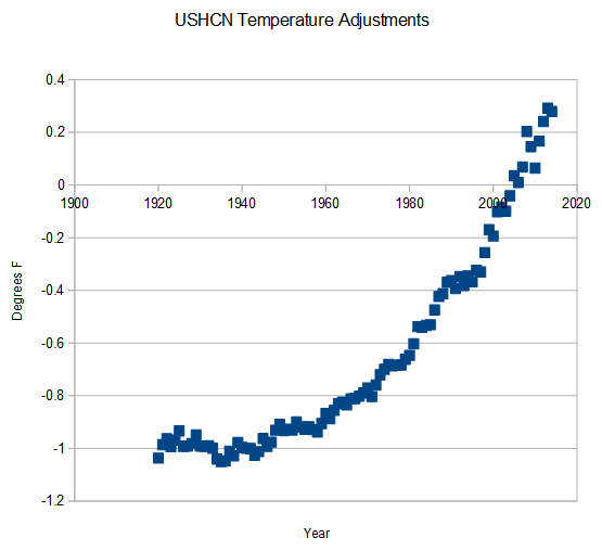
The past was cooled while the more recent was warmed
Steve correlated the magnitude of the tampering with the amount of CO2 in the atmosphere, and found almost perfect correlation – shown below. An R =1 is perfect correlation.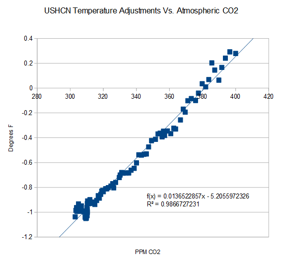
Correlation does not prove cause.
It could be that the Mauna Loa data tampered with as well.
As your father would tell you, the CO2 data was also tampered with link
I left that out so as not to trigger Englebeen and the usual leap to defend the CO2 records.
Gail Combs, yes I ought to phone my father more.
But on topic, that link doesn’t seem to show any fiddling with the Mauna Loa data (which goes back to 1960).
It does show that splicing it on to previous data is a misuse of the Mauna Loa data. We knew that though.
Also, that site is not aesthetically pleasant.
I was taking the mickey, originally. The correlation is so high it’s incredible (almost literally).
good to have you back here but, question –
f(x) = ???? x +- whatever where is y ??
Forcing (and so temperature increase) from CO2 would be expected to go as the natural log of the ratio increase in CO2…. Ln((CO2)/(initial CO2))… not linearly with CO2. The correlation of adjustments and expected forcing from increasing CO2 is not so good.
“Gail Combs
July 9, 2015 at 4:47 am
As your father would tell you, the CO2 data was also tampered with link
I left that out so as not to trigger Englebeen and the usual leap to defend the CO2 records.”
I may be a nutter, but I’m skeptical of the Mauna Loa measurements. In THEORY, our atmosphere would be about 70% nitrogen and 30% CO2 without plants and animals. Our current 28% Oxygen and 0.04% CO2 is brought about by life. During the day, plants are photosynthesizing, reducing the fraction of CO2 in the air, increasing the fraction of O2. At night, with both plants and animals continuing to breath, and no photosynthesis going on, we get an increase in CO2, and a decrease in O2.
A “Natural” background CO2 level, measured at Mauna Loa, is about as believable as a ” Natural” average age for humans, or deer, or yellow bellied sapsuckers. When times are rough, and there’s a high death rate, the average age will go up because it’s tougher to raise offspring, When times are good, and species are reproducing, the average age will go down with more offspring surviving.
Greatest Graph EVER!
Gail Combs.
Which data sets did you use to get your “raw” vs “final” chart?
How did you calculate your average? Technically speaking, it is not possible to use a simple average of stations across a wide area such as the United States.
Sir, your comments here today do everyone a large favor. Thank you for clarifying things so effectively.
Harry, so you don’t also believe in the averages used across the entire globe? I thought that was the issue-global warming.
Hey harrytwinotter, the locations chosen for the USHCN were specifically picked because they were well sited, long lived and were scattered over roughly equal areas. They were chosen in such a way that any adjustments needed would be minimal, and a simple numeric average should be a close approximation of a more complex area-based approach.
A more important question is not how Steven Goddard did his calculations, but is rather, how the official “climatologists” do their calculations. To the best of my knowledge they have yet to completely document, explain or justify their procedures. This means that what they are doing is not science, but is mere assertion.
Leonard Weinstein.
I said it is not possible to use a simple average. But it is possible to use a complicated average to get a results.
They use a weighted geographical grid system I believe. And converting absolute temperatures into anomalies before adding them helps too I believe.
I dare anyone to do that at home in their spare time… I do not think Excel is up to the job.
[What makes you think people exclusively use Excel? Or, is that just part of your overall bias against skeptics? – mod]
Jason Calley.
No, I don’t think the USHCN sites have been chosen like that, they have grown out of existing meteorological stations used for weather I think. I could be wrong on this one.
You are not thinking of the new network? It is all wizbangy but it has not been operating for very long.
The NOAA did document their methods. I looked it up in one evening, and I am not even a citizen of the United States. My hats off to the NOAA for being generous and allowing English-speaking people from all over the globe use their data and computer programs free of charge.
[What makes you think people exclusively use Excel? Or, is that just part of your overall bias against skeptics? – mod]
Sorry to answer a question with a question, but is your comment part of your bias?
My point about the Excel is the processing required is complicated, it is not just a spread sheet and some basic stats functions. I am a computer programmer so I can roughly estimate the amount of computer programming required.
For the record, I AM a skeptic – in the original sense of the word.
[some people have categorized climate skeptics as “amateurs with a spreadsheet”. your statement looked like a continuation of that -mod]
If you are not first going to even read the article, you could at least hover the mouse cursor over the graphs. Gail is not doing “comic book” criticism here. There are “words” accompanying the pictures that explain a great deal, and there are links associated with the charts that point to sources. You could then ask the actual sources what they did rather than making assumptions that a cursory reading would have saved you the embarrassment of making.
Duster.
You strike me as being a little confused.
Gail Combs introduced another set of charts unrelated to the article.
And I asked Gail where the “raw” and “final” data came from. And if someone thinks Steve Goddard, wrong answer – I am sure Steve Goddard did not collect it from thermometers.
They will keep altering it until it agrees with the models and they get a nice smooth hockeystick. They cant accept anything else.
So in their eagenrness to erase the hiatus, they have in fact prolonged it – all the way back to 1980.
Good job.
I had been hoping to see a post such as this on WUWT. May I suggest that its content form the start of a new “reference page”?
I, and others, have done similar articles about GISS and UHCN, etc. in the past. What we probably need is project to go back to day 1 of WUWT, and collect links to those articles. Is it possible to select a “view” or subset of articles in a WordPress blog?
I have been quite busy, but when things settle down I will build a Temperature Adjustment reference page.
What’s the problem? The changes are all manmade. Voila, manmade climate change! It’s undeniable.
GHCN-M version 3.3.0 ? Effective 9th June 2015 I think.
I am puzzled by your reference to “raw” data – how is it raw data?
The data does not appear to be raw data to me. It appears to be an estimate of the global average temperature ie statistical climate data.
The data available now goes up to May 2015. June data will be released in a couple of weeks.
The NOAA adjustments from the 1930s low to now come to about 0.2 degrees. The USHCN adjustments posted by Gail come to about 1.3 degrees. Can someone please explain??
Murray Duffin.
The NOAA chart is a global average.
The USHCN chart is the United States average.
The USHCN chart appears to have left out the homogenization – that would explain the difference. But it is impossible to say exactly without knowing where the “raw” and “final” data came from.
Do you think it’s bad for someone to refuse to tell you where the raw and final data came from?
It’s also funny that warmists are now forced to claim that there’s no such thing a raw observational data.
Harry, I’m finding it funny that there was no global warming until scientists took another look at the data and realized that all the inherent measurement problems happened to be hiding it. That sure was a strange coincidence, but I’m glad they were finally able to fix all the problems with the observational data so that global warming is apparent.
Also, I believe one has ocean temperatures and the other is surface? The ocean is buffered by
its very large heat capacity.
The NOAA adjustment illustrated in this article are only those adjustments made to global data since 2010.
Gail has posted total adjustments (difference between measured and final published) to the U.S. data.
All adjustments are not created equal. Neither are the various techniques available to the adjusters. Obviously, a great deal of subjective judgment is involved at each step.
Nefarious intent is not necessarily implied … unless they drop the error bars at each step of their process.
One would havrcto be credulous beyond all comprehension or reason to see no problem with the sum total of these adjustments. Being that they just coincidentally bring the historical record into agreement with they warmista notions that natural variations are all but nonexistent and CO2 is the temperature knob of the atmosphere.
Erasing the 1030s heat is simply ludicrous. Are we all to believe that everyone in they thirties was simply mistaken that it was incredibly and ruinously hot and dry during that period?
Interestingly, a look at a graph of temperature readings which exceed 90 degrees at all stations still show the thirties as by far the hottest period in the US record.
Sorry! – I may be me to blame for this
I’ve been having great fun pointing out that not one “human-adjusted” dataset has warmed at even the lowest predicted level of the IPCC since 2001.
Not One
As you can imagine the zealots really really really hated the fact that I was right and I sent them away with their tales between their legs every time I encountered them.
So, it was just a matter of time before the zealots altered a dataset to try to win that argument.
At least I now know where these zealots work!
Is this the same “world’s best secret practice” of adjusting and homogenising the historical temperature record UP, that Jo Novas been all over last month in Australia?
After a “stacked” inquiry into our bureau of meteorologys and their “practicing” they realeased their conclusions and recommendations.
Our bureau of meteorology refuse to tell us how they “practice” their adjusting and homogenising because and wait for this, unless your involved in the process, you wouldn’t understand it!
WT.
Leigh.
The homogenization process used by the Australian BOM is explained in documents on their website. Techniques such as Percentile Matching and transfer functions were used.
There was one paper I could not read because it was behind a paywall.
I can’t see any evidence the review was “stacked”. It was a good review and contained sensible recommendations, and the BOM may well publish details of each temperature series homoginization in the future (if someone pays for the work to be done).
“Explanation” and “methodological justification” are very different things. Turning a piece of computer code lose in the “hope” that it can “fix” data without human intervention simply exposes the oversimplified assumptions made by the programmers – or handed to them to implement by the assumers. The trouble with many Australian records that have been challenged by sceptics is that despite stable locations and limited, documented changes in instrumentation and environment, meaning the records should have extra weight in “homogenization,” they are “adjusted” to match expectations of change. So, given a local, stable, and thus trustworthy station and a station that shows instabilities but reflects expected changes, the second station is weighted more in homogenization than the stable station. The major Australian sceptics have been pointing this out for years now, not to mention stations “homogenized” with stations that are 100s of kilometers away when there are no other local stations, in clear violation of the BOM published criteria for the process. This is done in a manner that ignores climatic variation across such distances and effectively treats the homogenization area as a “frictionless sphere.”
Good review for who?
The BOM?
Or the people like me paying the bills?
The people that “reviewed” just what the BOM is doing (without saying how) in adjusting and homogenising our historical temperature record UP, were selected by the BOM at the exclusion of ALL others.
[Their] refusal to cooperate unless those who conducted the review were nominated by them was noted by all.
It’s not the first time the BOM has thumbed it’s bloated noses at it’s masters and certainly won’t be the last.
Till the government appoints a science minister with a little bit of steel they will continue to be answerable to no one but themselves.
Inviromental minister Hunt, an unashamed warmist, is not the man to take on another taxpayer funded behemoth that is “our” BOM.
It was nothing more than a whitewash and was so tipped to be by all interested skeptical partys before the BOM’s own “star chamber” had even sat.
You need to go here and get back to me.
http://joannenova.com.au/2015/06/if-it-cant-be-replicated-it-isnt-science-bom-admits-temperature-adjustments-are-secret/
Duster.
“they are “adjusted” to match expectations of change”.
Really? And your evidence for the BOM doing that is…
[snip – off topic rant -mod]
Serious question here: what constitutes a “legitimate” adjustment, in the present, of a value that was recorded in the past?
All I can think of on my own is, “George in the Past was using X type of measuring device, and Xs compare [thusly] with the Y devices we use today, therefore George’s instrument would have read [thus] in today’s terms.” But why would even that change between 2010 and 2011? And I can imagine how even that is a dubious alteration.
If I recall, my first intro to wuwt was a post saying something on the lines of, “Data is data; as soon as you start ‘adjusting’ the data you’ve stepped into Fairyland.” (not a direct quote) I was so charmed with that, I’ve been reading ever since, as far as I can.
Why do people “adjust” data? What do they think they know better today? Working with the same dosimeters and the same calibration sources for the last 20 years, I know something of how reliable — or, it may be, “un-” — any given calibration may be and no way in hell would I ever go back and “adjust” today the doses I recorded for radiation workers twenty years ago!
???
Sorry, 1930s heat, it should be.A legitimate adjustment to a warmista is one which forces the days to be closer to what their models and meme day should be the case.
To sane rational scientists, or anyone who is not a paid Climateer, “adjustments” to data mean it is no longer data.
Doh, autocorrect!
Sometimes a tall building is constructed next to a site, blocking the sun for part of the day. Sometimes temperature loggers are swapped out. Sometimes the time of day for sampling is changed. Sometimes data is transcribed incorrectly and found later – there is not an automatic system that uplinks data from the 1000s of sites automatically to a central DB.
mellyrn,
Climate scientists view themselves as the modern day, much improved embodiment of Rumpelstiltskin, able not only to spin straw (bad data) into gold (good data), but also to spin nothing (missing data) into gold (good data). It is for this reason that I believe the current status of climate science to be Grimm.
Chris, such things as transcription errors, and most other errors for that matter, would logically tend to be random . Mostly.
The “adjustments” can be seen to be far from random. They appear to be methodical. They cool the past, and warm more recent readings, and also smooth out every single inconvenient trend in the record.
A monkey might accidentally type Shakespeare, but who believes that one ever has?
Is there anyone naive enough to think that if all corrections that “needed” to be made, had the net effect of making the theory of those doing the adjusting to look even more unlikely, that they would have been done anyway?
Mellyrn,
Can you please go back and adjust my exposures (US Navy 1981-87) so I have a less chance of getting cancer? Or is it a higher dose I need to reduce my chance of cancer?
Confused
Macusn
mellyren This is the CORRECT WAY to treat historical data.
http://www.biomind.de/realCO2/bilder/CO2back1826-1960eorevk.jpg
(gray is error range)
……………………..
The product of manipulations is not data and should never be called data. Also the treatment of the data to get the ‘product’ should be meticulously documented or it is not even science!
Also, at least for USA data, the turn of the century error is already known. The original system had two separate thermometers according to the instructions written and given out to the observers in 1882. One mercury for the high temperature and an alcohol thermometer for the minimum temperature.
In the 1918 bookMeteorology: A Text-book on the Weather, the Causes of Its Changes, and Weather Forecasting By Willis Isbister Milham, Milham mentions the Six thermometer and says the accuracy was not good so the US weather service used the two thermometers mentioned above. He also states there are 180 to 200 ‘regular weather stations’ ordinarily in the larger cities, 3600 to 4000 coop stations run by volunteers and 300 to 500 special stations.
On page 68
Milham says a thermometer in a Stevenson screen is correct to within a half degree. It is most in error on still days, hot or cold. “In both cases the indications of the sheltered thermometers are two conservative.”
on Page 70
“The Ventilated thermometer which is the best instrument for determining the real air temperature, was invented by Assman at Berlin in 1887…will determine the real air temperature correctly to a tenth of a degree.”
I also thought it quite interesting that Willis Isbister Milham was talking about 20 years of hourly data in 1918.
As far as I can tell the ClimAstrologists completely ignored the historical information when making their decisions to change data.
I’m sure the rationale and process of each adjustment is clearly and fully documented, and those are available for review by the public.
=====================
kim,
You wouldn’t also just happen to have a bridge for sale in Brooklyn, would you?
This is your government and press at play.
How much longer gonna be that way?
The Bridge has long been sold away,
We’re just waiting for deliveray.
======================
The accumulated adjustments, over the 65-month period, to some of the 21st-Century years are several times larger than the supposed difference in temperature between the last three “hottest” years, 2005, 2010, and 2014.
Pretend precision… arbitrary accuracy… contrived certainty.
Mr. Dnes, could you somehow provide the data that’s plotted in the last graph? It would be nice to be able to plot a comparison between, say, the 21st-Century adjustments and the 21st-Century anomalies. Thanks.
There was a link to the data in the article. Here it is again…
https://wattsupwiththat.files.wordpress.com/2011/07/rawdata.zip
Unzip rawdata.zip into a directory, and read the “readme.txt” file for documentation. The monthly downloads from January 2010 onwards are all there. There is also a summary CSV file, suitable for importing into a spreadsheet. Note that there is a 3-month overlap between the 4-digit data and the 2-digit data. The overlap has been filtered in the CSV file. If you’re doing your own analysis, be sure not to include duplicate 2-digit and 4-digit data.
Ah. I see. Thank you.
Tony Heller has shown that on many occasions temperatures have been adjusted outside of the error bars which previously existed.
And even outside of the error bars given in the graphs after the adjustments!
Don’t think [you’re] on your lonesome with adjustments and homogenisation of historical temperature records.
http://joannenova.com.au/2015/06/if-it-cant-be-replicated-it-isnt-science-bom-admits-temperature-adjustments-are-secret/
Leigh.
The unadjusted (raw) and adjusted NOAA data is available on their website. I downloaded it a couple of hours ago.
As for their processing I think their computer code is also available (must check). If someone has the energy they can always process it using their own homoginization algorithm, there are a number of peer-reviewed studies in the scientific literature.
The problem with releasing code is there are questions around copyright and Intellectual Property – not all agencies will release their code for this reason.
I found the computer code for the Pairwise Homogeneity Adjustment (PHA) algorithm they use. It is on the NOAA website.
Sorry Harry, but in the US if you get government funding and are a Government Agency (NOAA, NASA/GISS, etc.) the data and methods are “supposed” to be public property as long as it doesn’t affect national security. Not sure how they could possibly spin these adjustments as a national secret, but I am sure it will eventually come to that….
harrytwinotter July 9, 2015 at 5:38 am
“The problem with releasing code is there are questions around copyright and Intellectual Property – not all agencies will release their code for this reason.’
The problem with not releasing code – materials and methods – is that you do not have a scientific product or result, that is, one which can be reviewed and checked by anyone, at least in the case of CO2CAGW, where not only is the Public paying for it and commissioning the “study” or process, but also worldwide Political and Legal Policies are at stake. In other words, if you don’t release your materials and methods, which are your “science”, for anyone to check out, criticize and “replicate”, you don’t have a truly scientific result or conclusion. In the case of CO2CAGW copyright and “Intellectual Property” have nothing to do with it.
JPeden.
I think you are making up your own rules on this. OK for you to express your own opinion.
Someone should ask Roy Spencer for the UAH raw data – that would make an interesting article. I am wondering what MSU microwave measurements look like.
[since you are interested, why not ask him yourself rather than expect others to do it for you? his blog is at drroyspencer.com -mod]
https://chiefio.wordpress.com/2015/07/07/gistemp-on-centos-6-3/
harrytwinotter July 9, 2015 at 9:35 am
“I think you are making up your own rules on this.”
Nah, you just made that up. I’m not speaking “on authority” or from the wrong end, You apparently don’t know them, but I do know the rules for practicing real science, which involve complete transparency of “materials and methods”. In that way, everyone can see if I or anyone else is “making up their own rules” in doing their “science”. On the other hand, you seem to be more comfortable with Pre-Enlightenment thinking, which usually favors the “on authority” or “given truth” of the speaker’s bare words. Otherwise, why question the need for complete transparency of anyone’s “materials and methods” in your own assessment of the credibility of their “scientific” results or conclusion? Even if it’s not you who does the “replication”, analysis, or criticism of their “science”?
The rule in real science is that if a “study” doesn’t transparently show “how it got there” – to its results or findings – it is not a truly scientific study on that basis alone, and its results or conclusions are not any more credible than something someone just makes up.
links to data & code would be greatly appreciated.
Part of the final coat of whitewash.
“The Forum considers that the algorithms and processes used for adjustment and homogenisation are scientifically complex and a reasonably high level of expertise is needed to attempt analysis of the ACORN-SAT data. For this reason the Forum had some queries about the ability to reproduce findings by both experts and members of the public.”
That sort of rubbish in reply to skeptical scientists that are not climatologists is what has them pulling their hair out.
They continue on with superior know all trust me attitude.
“It would be useful for the Bureau to provide advice about the necessary level of end-user expertise (notwithstanding a likely tendency for end-users to feel qualified to attempt such an analysis).”
Their scientists for crying out loud.
Explain it to them.
I’m pretty sure their level of education and intelligence would enable them to grasp exactly what your doing.
But that would expose exactly what they are doing.
These other scientists have a pretty fair idea what they are doing and the BOM knows it.
Hence the secrecy.
Eric H.
Well I did say I found the computer code eventually. And I am not even a US citizen!
You might want to review a few case histories I think – you might find that a government agency can own Intellectual Property. But I agree it would be stingy of them not to release it, as long as it is feasible.
There’s no question that they can “own” copyright. Look at a USGS map sometime. They cannot exclude it from public access (well, absent national security).
Leigh July 9, 2015 at 5:28 am
http://joannenova.com.au/2015/06/if-it-cant-be-replicated-it-isnt-science-bom-admits-temperature-adjustments-are-secret/
Yes, a great example of non-science, where the Australian .BOM essentially admits their adjustments to data are simply non-replicable, such that they are operating at a Pre-Enlightenment, non-scientific level. Instead we are supposed to believe the BOM’s self-anointed “Experts”=Seers and High Priests who otherwise can’t explain why they are making the adjustments. Strangely, this ‘method’ sounds exactly like “mainstream”, ipcc Climate “Science”, and as now even warranted by the Pope!
TonyG.
Link to GHCN V3. You need to read the technical docos first. Technical report 15 from memory.
http://www.ncdc.noaa.gov/ghcnm/v3.php
So thankful we can rely on the unaltered, unadjusted satellite data sets to, as a lighthouse, illuminate our pause 😉
[So thankful that we have “idiots” like you to make snark, but not add anything substantive to the argument – Anthony]
Massaging data this way, and over and over, they will make the same end of financial accounting of Enron… We are not talking about revising them once or maybe twice, but several times. As an engineer, if I see such a procedure, I can only think two things: or the data are flawed and unreliable, or the uncertainty is high enough to “cover” these corrections (I would say at least ±0.2°C, at least!) Having both at the same time, reliable data with very low uncertainty, is not possible and it is self-evident, if you have to correct them so often.
It is interesting to watch the likes of “HarryTwinOtter” wriggle as the divergence between predicted and observed warming rates continues to increase. The truth is that one would expect some warming, but on balance not very much. Warming at a rate of, say, 1 K/century equivalent, which is about what has happened since 1979, is too slow to be a danger to anyone, because there is plenty of time to adapt to its consequences.
Fiddling the data, which is what NOAA and others have been doing, will no doubt help the world-government wannabes of the UN to get their dismal climate-based dictatorship set up in Paris this December, but thereafter the new dictators will drop the climate subject almost completely, since they will be ever more embarrassed that the global tyranny was conjured into being on the basis of what is already seen as a manifest lie by those who can do their own math and will eventually be seen as a manifest lie by everyone.
Lord Monckton.
Nice subject change! Another time perhaps…
New World Order, oh boy. Got anything substantial to contribute to the discussion?
It’s a Cowardly New World which can’t tolerate dissent, and oh, boy, it is fragile.
==============
Has NOAA given a detailed explanation of these changes, and why some time periods go up while others go down? They should be REQUIRED to do so, as these changes radically alter the shape of the trends in the record.
I initiated the UK’s Met Office’s CET adjustments nearly a year ago, pointed where they were wrong, proposing new weighting, which they applied from 1st of Jan 2015, but they do not have any info that they’ve done it.
In a private email they admitted to it, but unveiling to give a credit. Fly on the wall at the consultation meeting regarding the matter, notes that the expanse of embarrassment was such that even brand new £97,000,000 computer turned red-faced.
Interesting.
Can you expand on that for a larger article?
How the MET Office corrects itself, how science is self-correcting, is pretty much the theme of this blog.
Hi Mr Courtney
Here are the essentials:
In July of 2014 I discussed the CET data compilation with Tony B, noting a shortcoming in the accuracy, subsequently emailing MetOffice on 30/07/2014
This is extract:
Since monthly data is made of the daily numbers and months are of different length, as a test (1900-2013 data, see graph attached)), I recalculated the annual numbers, using weighting for each month’s data, within the annual composite, according to number of days in the month concerned.
This method gives annual data which is fractionally higher, mainly due to short February (28 or 29 days), see the attachment.
Differences are minor, but still important, maximum difference is ~ 0.07 and minimum 0.01 degrees C.
I am of the view that the month-weighted data calculation is the correct method.
I never received reply to my email.
In early January Mr. Neil Catto wrote an essay for the WUWT that the 2015’s file of the CET’s annual data is not compatible with data file recorded year or two earlier.
This prompted a discussion, and I noticed that the graph presented is identical to one I emailed to MetOffice.
Some days later (on 03/02/2015) I emailed MetOffice again enquiring about data files changes.
This time I got prompt reply:
We have indeed altered the way we calculate annual-mean values of CET, so it is no longer a straight average of the 12 individual monthly values, for the reason you describe…..
So, as you say, looking at the individual monthly values back to 1659, it will be seen that none of the values have changed. However, the annual values have all altered slightly, mostly in an upward direction. Because February is a shorter month than all the others, and is usually colder than most all other months, our previous method, which was giving February equal weight alongside all other months, caused the annual temperature values to be pulled down, i.e. giving estimated annual values which were very slightly too cold (the difference varying between 0.01 and 0.07 degC, as you say).
At the same time, we have re-calculated all long-term averages in the same way, so that quoted annual anomalies remain consistent. This ensures that no artificial trends or discontinuities appear in our historical series.
( XYZ) National Climate Information Centre (NCIC)
Met Office FitzRoy Road Exeter EX1 3PB ……..
A short fruitless discussion about a possible attribution followed, so I went back to my staple diet of ‘geomagnetics’.
Thank you for replying.
And it’s good to see justified adjustment being applied consistently.
That’s how science works.
(Including the refusing to give credit where credit’s due, of course).
This is just flat out fraud – raw data should never be adjusted. All adjustments must be detailed and justified as part of the analysis process. This would never fly in a real scientific discipline. Climate “science” is a disaster for those who would pursue the truth.
For what it’s worth, Gov Moonbeam has gone postal on anyone who doubts that the global warming is going to kill us all. Again.
It seems to me that our current hodge podged together temperature data sets along with their sensors are somewhat of a gravy train. To trash them would essentially end the salaries of many people. Just sayin.
It’s much like a Bernie Madoff fund–it never loses money but no one gets suspicious–or listens to the ones who do: https://books.google.com/books?id=7NeZeQ6qHq4C&printsec=frontcover#v=onepage&q&f=false
–AGF
My take on this is with the raw data constantly overwritten, the actual historical record has been obliterated.
Is this the general feeling of what has happened here at WUWT?
If they alter the data any further we will all, or our parents, have frozen to death 40 years ago.
Looks to be NOAA/NCEI has bought their script-kittens a new Etch-A-Schetch to play with.
Ha ha
As long as we are talking about NOAA destroying the historical climate records, here is a post on NOAA trashing the historical record for the state of Maine. Over at NoTricksZone:
http://notrickszone.com/2015/07/07/noaas-data-debacle-alterations-ruin-120-years-of-painstakingly-collected-weather-data/#sthash.ePhS1ed2.aLJz1M4S.dpuf
Hat Tip to Kate at Small Dead Animals.
At this point I won’t take anything from NOAA/NCEI (NOAA/NCDC) at “face value.”
http://oi57.tinypic.com/11ui0cp.jpg
This is why AGW has no standing because of what they are doing to the data. The data they present is meaningless because it is all manipulated.
This is gong to have to be reckoned with ,but I think the global trend in temperatures going forward is going to make it next to impossible to keep this manipulation going as far as trying to show AGW theory is alive and well. The days for AGW theory are numbered.
They do not “present” data. Data, once “adjusted, cease to be data. They are merely estimates of what the data might have been, had they been collected timely from properly sited, calibrated, installed and maintained instruments.
Well said. And then, from these estimates, we compute a totally fictitious global average. If that trend tilts upward by any discernible amount we declare a climate catastrophe. If the trend is flat or down, we stick our fingers in our ears and scream “the science is settled”.
They’re taking a page right out of corporate accounting, only instead of cooking the books they’re cooking the temperature anomalies…..
How does harrytwinotter have the time to respond to so many comments in this post? Sure makes me wonder….
In reference to large, urban airports harrytw’ot… did you also consider that such places are also populated by large numbers of jet turbines, which we all know, spew out cooling breezes? /sarc
[snip more rants about “conspiracy theory” -mod]
I have a question. The Alarmists will not listen to any of our arguments unless it is based on peer reviewed literature. Why exactly are these adjustments not peer reviewed? All the alarmist peer reviewed literature is based on these non-peer reviewed adjustments. If these were honest adjustments, all their rational and methods would be open to the public for review, allowing other experts to repeat the work, you know like real science.
Maybe these links will help some readers here.
The first link ‘Updates to Analysis’ has interesting sub links,
http://data.giss.nasa.gov/gistemp/updates_v3/
The second one is ‘The Elusive Absolute Surface Air Temperature (SAT)’
A quote from the bottom of the page says “For the global mean, the most trusted models produce a value of roughly 14°C, i.e. 57.2°F, but it may easily be anywhere between 56 and 58°F and regionally, let alone locally, the situation is even worse”.
http://data.giss.nasa.gov/gistemp/abs_temp.html
If they have to keep adjusting the data how on earth can they say one year was hotter or colder than another?
I shoukd clarify that a bit more. How can they say one year was the hottest or coldest with any certainty? If each time they adjust, previous records are shifted from one year to another then they have to concede that one or more of their previous adjustments were flawed
It depends on what you mean by “say”.
For instance, if you really dig into what they were “saying” back in January, they didn’t know which of 2005, 2010, or 2014 was actually the “hottest” year. But that’s not what they “said” in their press releases and to reporters. They just said 2014 was the “hottest” year. And their stenographers in mass media said just that. Of course, if the scientists had said “we don’t know”, it would have been tantamount to telling people that GMST hasn’t changed since 2005, at least,… which, apparently, they were unwilling to do.
But the point you make is legitimate, and similar to what I said above: the cumulative adjustments they have made to some 21st-Century years are several times larger than the supposed difference in GMST between certain 21st-Century years. All of the adjusting, and re-adjusting, and re-re-adjusting, over and over and over again, must call into question any and/or all of the adjustments.
I’m starting to have trouble seeing what they’re doing as anything other than just making it up as they go along.
Darth Vader’s a good image for the Green movement – especially if you remember that the Star Wars Galactic Empire was based on another real-life despot that perverted environmentalism to his purpose back in the nineteen thirties.
The sad thing is that, these days, I talk to high school graduates who have no idea who I’m referring to.
With all the changes to NOAA temperature data, all we really know for sure is that today’s data set is wrong. That’s because it is not logical to claim both that 1) adjustments made so far are correct and 2) adjustments made tomorrow will also be correct. You can’t have it both ways. Either the adjustments made so far are correct and need no further changes, or they are not correct and will need to be adjusted again. But because we know that today’s temperature data set will be changed in the future, it is currently wrong and cannot be relied on. And that’s really all we know about NOAA temperature data.
I hope that senator Inhofe or one of his assistants read this article. Waiting for him to start his investigation into adjustments to temperature records by NOAA & GISS. Cannot start early enough.
Yes, it would be good to see Inhofe with another snowball. Especially in July or August.
Inhofe’s rhetorical ’stunt’ went over the head of most, it was an allusion to Cato the Elder’s warning to the senate of the danger posed by Carthage: “…. it is said that Cato contrived to drop a Libyan fig in the Senate, as he shook out the folds of his toga, and then, as the senators admired its size and beauty, said that the country where it grew was only three days’ sail from Rome …” (Plutarch’s The Life of Cato the Elder).
John Peter commented: “….I hope that senator Inhofe or one of his assistants read this article. Waiting for him to start his investigation into adjustments to temperature records by NOAA & GISS. Cannot start early enough.”
I have sent two letters to my Congressman asking for him to get involved in this travesty and didn’t even receive an acknowledgement. I’m guessing few politicians will openly take the skeptics’ side until after the election.
If possible could the author display the changes to 1998.
The reason I ask is because 1998 was doomsday day. We all know they have been lowing the temp on 1998 I just wonder how much. Further since that data point is important to the cultists can it be matched with the margin of error… aka if the margin of error in 1998 for the the temp data of 1998 was say +/- .15, have they adjusted the data say -.20_the 2015 data on 1998). If so then it like any measurements in the data is proven fake as the fact the margin for error when they release the data is wrong and will effectively always been wrong.
By showing that old measurements were outside the margin of error you always show all current measurements outside the margin of area and debunking the whole concept that they have a margin of error at all.
Sorry, I only started downloading the NOAA data in 2010 as a hobby. That’s all the data I have. A proper records system would have all the monthly versions, but I somehow doubt that’s the case with NOAA. Any American citizens want to go through their FOIA process to see if they do have older uploads on file somewhere?
Re: Uncertainty Analysis?
Has a full uncertainty analysis been performed on this data including full analysis of BOTH Type A and Type B errors? e.g., NIST Technical Note 1297 Guidelines for Evaluating and Expressing the Uncertainty of NIST Measurement Results and
GUM: Guide to the Expression of Uncertainty in Measurement BIPM
Searching for NOAA/NCIE uncertainty temperature leads to: Thomas R. Karl et al., Possible artifacts of data biases in the recent global surface warming hiatus,
The “statistically significant” results use the approach of (25) B. Santer et al. Consistency of
modelled and observed temperature trends in the tropical troposphere International Journal of Climatology Volume 28, Issue 13, pages 1703–1722, 15 November 2008
BUT Santer et al. do not even mention “uncertainty”?! (Nor Type A Nor Type B)
(Neither does IPCC address uncertainty)
Why do we have national and global policies being established impacting $trillions of investments – and denying power to the poor, while EXCLUDING international standards and methods for establishing uncertainty in temperature and in trends? What are they hiding? – Or why so ignorant of international standards?
Re Averaging
W.|M. Briggs politely warns:Do not smooth times series, you hockey puck!
What evidence does NOAA provide that their adjustments are “exogenous”?
Re Rounding
“The comparison between February 2014 and March 2014 confirms that the 2-digit data is a rounded-off version of the 4-digit data. The “jitter” is within +/- 0.01, i.e. roundoff error.”
Keep the data then process.
The 2 digit data shows substantial quantized effects on the graph. It appears to be overly truncated.
Should this data then only be rounded from 4 to 3 digits? rather than throwing information away with 2?
Mae culpa Reading further, Santer et al. does evaluate some statistical parameters and uncertainties. Model trends differed from UAH temperatures at the 1% level. (Still no ref to Type A/B or GUM)
Is climate science not expected to be at the 0.05 level? Nick’s numbers assume 95% significance levels. Has there been an official change here?
Werner
Seeing what they can get away with. Contrast John Christy’s May 13, 2015 testimony to the House showing the CMIP5 mean predicted trend from 1979 is 500% of actual temperature trend!
It’s all about ‘Oversights’
“May 15, 2015: Due to an oversight several Antarctic stations were excluded from the analysis on May 13, 2015. The analysis was repeated today after including those stations”.
http://data.giss.nasa.gov/gistemp/updates_v3/
Sarc.
“I still cannot see how the UHI affects temperature measurements over the oceans and in remote areas.”
Read up on station temperature spatial gridding. Stations that do exist (in hotter UHI areas) “spread” their temperatures into areas where the temperature is unknown and thus assumed. They killed off many of the stations that were in cooler areas.
Yes and keep in mind the vast majority of the human population live near the coasts… making UHI that much worse over the oceans then land areas.
climanrecon (July 9, 2015 at 5:59 am) suggests that
It does however seem unreasonable that these past numbers should change quite drastically overnight, then in a short time again change quite drastically overnight, then in another short time …
These images are part of a blog post still under construction, examining the behaviour of GHCN-M adjustments for past temperatures at Marseille and nearby (in the climate data sense) stations, using saved ghcnm data sets. The choice of Marseille arises from a blog post LE GISS ET LES SÉRIES LONGUES DE TEMPÉRATURES. I have seen similar behaviour closer to home with past data for Irish stations, but illustration using an Irish station would have restricted the choice of nearby stations to a generally easterly direction, while choice of Marseille provides nearby stations around the compass in France, Spain, Italy and Switzerland. There is no special reason for choosing the past temperature values for January 1978 – I simply took a year from the plotted temperature records for Marseille in that blog post, and used that year for other nearby stations as well. I have pointed out to the owners of that blog (the post itself did not provide an opportunity to add comments) that GISS are using the adjusted GHCN-M data as input, and that this, rather than the Gistemp processing, may be the source of the variations discussed in the blog post.
For anyone interested I will publish the blog post in the next day or two once I have added a little more detail, in its still “under-construction” state, then complete the post later. The link will be https://oneillp.wordpress.com/2015/06/23/marseille-jan-1978/, but this link will not be accessible until I have published it, sometime today or Saturday. I will add another comment here when it becomes accessible.
For harrytwinotter (July 9, 2015 at 5:51 am):
The code on the NOAA website appears to be v3.0.0, not the code currently used. I was tempted to download and run this code to try to determine the cause of these erratic adjustments, but thought better of it in the absence of current code. Having downloaded and recoded the Gistemp code with additional diagnostic output, I am aware of the scale of such an undertaking. It may come as a surprise to Harry to find that some of us have “had the energy” to do this, and have contributed by notifying GISS of bugs found in their code – another good reason for making the code available. You can verify that I have done so by looking for my name at http://data.giss.nasa.gov/gistemp/updates/
My images seem to have been lost. the URLs are http://wp.me/aQRhu-Gy and http://wp.me/aQRhu-GV
I think I see why they were lost. Trying again:
in GHCN-M v3″ width=”” />
Note how the January 1978 changes frequently in GHCN-M v3, even overnight, and that the changes include correction for both “urban heating” and “urban cooling”. Anyone willing to suggest station relocations take place this frequently? Problems with Pairwise Homogeneity Adjustment seem more likely.
The detailed blog post is coming soon
And again:
[blank? .mod]
Based on your latest comment, I’m gonna predict that you can’t be wrong.
=============
My blog post is now published at Wanderings of a Marseille January 1978 temperature, according to GHCN-M
I’ll have one more try here posting an image to show the relevance of the post to this topic.
If this fails again,and a moderator sees this (all this comment including image shows correctly in preview in Waterfox before posting – but I see no comment toolbar or preview in Chrome or IE?): the img code above is (left-delimiter)img src=”https://oneillp.files.wordpress.com/2015/06/marseillejan783.jpeg” alt=”Marseille January 1978 temperature” width=”” /(right delimiter), and I’d be grateful if you could reinsert it for me.
The post link is (left-delimiter)a href=”http://wp.me/pQRhu-Gm”(right-delimiter)Wanderings of a Marseille January 1978 temperature, according to GHCN-M(left-delimiter)/a(right-delimiter) if that fails too!
And for some WordPress reason I fail to understand, clicking on the images in those two links to see the full-size images brings up images for other stations in the blog post I am working on instead of the full-size images. Click on the underlined size (1920 x 978) to get the full-size images.
These should have appeared between “then in another short time …” and “These images are part of a blog post still under construction” near the start of my first comment.
To be blunt: It appears the most logical treatment for all these adjustments is to consider them finagle factors promulgated by disciples of Professor Lyon E, Zossov.
Wow! Almost like data hacking.
Did NOAA predict this
They may not need to alter it further. It looks like they do not have much more to prove. You may recall a former quote from NOAA:
”The simulations rule out (at the 95% level) zero trends for intervals of 15 yr or more, suggesting that an observed absence of warming of this duration is needed to create a discrepancy with the expected present-day warming rate.”
Guess how the latest changes affect things? As a result of exchanges in my earlier post on NOAA, I was prompted to check out things on Nick’s site and this is what I found.
Temperature Anomaly trend
Jun 2000 to May 2015
Rate: 1.246°C/Century;
CI from 0.597 to 1.894;
And the first time the lower end of Cl is negative is:
Temperature Anomaly trend
Feb 2009 to May 2015
Rate: 2.372°C/Century;
CI from -0.030 to 4.774;
(Keep in mind that all other times for the other data sets was no statistically significant warming for between 14 and 22 years.)