Guest Post by Bob Tisdale
This post provides an update of the data for the three primary suppliers of global land+ocean surface temperature data—GISS through May 2015 and HADCRUT4 and NCEI (formerly NCDC) through April 2015—and of the two suppliers of satellite-based lower troposphere temperature data (RSS and UAH) through May 2015.
INITIAL NOTES:
I’m still using Release 5.6 of the UAH lower troposphere temperature anomalies for this post, because Release 6.0 is only in beta form. I’ve included the UAH release 6.0 data as a supplemental graph, though. Also, the global land+ocean surface data represented by the Karl et al. (2015) paper have not yet been released by NCEI.
I’ve eliminated the graphs of the long-term running trends (see sample here from the March 2015 update). I’ve been presenting them for a few years and I can’t recall one comment about them. I replaced them with a model-data comparison which shows the growing difference between model simulations of global surface temperatures and data.
For discussions of the annual GISS and NCEI data for 2014, see the posts:
- Does the Uptick in Global Surface Temperatures in 2014 Help the Growing Difference between Climate Models and Reality?
- On the Biases Caused by Omissions in the 2014 NOAA State of the Climate Report
GISS LOTI surface data, and the two lower troposphere temperature datasets are for the most recent month. The HADCRUT4 and NCEI data lag one month.
Much of the following text is boilerplate. It is intended for those new to the presentation of global surface temperature anomaly data.
Most of the update graphs start in 1979. That’s a commonly used start year for global temperature products because many of the satellite-based temperature datasets start then.
We discussed why the three suppliers of surface temperature data use different base years for anomalies in the post Why Aren’t Global Surface Temperature Data Produced in Absolute Form?
GISS LAND OCEAN TEMPERATURE INDEX (LOTI)
Introduction: The GISS Land Ocean Temperature Index (LOTI) data is a product of the Goddard Institute for Space Studies. Starting in early 2013, GISS LOTI uses NCEI ERSST.v3b sea surface temperature data. The impact of that change in sea surface temperature datasets is discussed here. GISS adjusts GHCN and other land surface temperature data via a number of methods and infills missing data using 1200km smoothing. Refer to the GISS description here. Unlike the UK Met Office and NCEI products, GISS masks sea surface temperature data at the poles where seasonal sea ice exists, and they extend land surface temperature data out over the oceans in those locations. Refer to the discussions here and here. GISS uses the base years of 1951-1980 as the reference period for anomalies. The data source is here.
Update: The May 2015 GISS global temperature anomaly is +0.71 deg C. It is unchanged since April 2015.

Figure 1 – GISS Land-Ocean Temperature Index
NCEI GLOBAL SURFACE TEMPERATURE ANOMALIES (LAGS ONE MONTH)
NOTE: As of this writing, the NCEI has not published the data associated with the “pause busting” adjustments presented in the paper Karl et al. (2015). For more information on those curious adjustments, see the posts:
- NOAA/NCDC’s new ‘pause-buster’ paper: a laughable attempt to create warming by adjusting past data
- More Curiosities about NOAA’s New “Pause Busting” Sea Surface Temperature Dataset
- Open Letter to Tom Karl of NOAA/NCEI Regarding “Hiatus Busting” Paper
Introduction: The NOAA Global (Land and Ocean) Surface Temperature Anomaly dataset is a product of the National Centers for Environmental Information (NCEI), which was formerly known as the National Climatic Data Center (NCDC). NCEI merges their Extended Reconstructed Sea Surface Temperature version 3b (ERSST.v3b) with the Global Historical Climatology Network-Monthly (GHCN-M) version 3.2.0 for land surface air temperatures. NOAA infills missing data for both land and sea surface temperature datasets using methods presented in Smith et al (2008). Keep in mind, when reading Smith et al (2008), that the NCEI removed the satellite-based sea surface temperature data because it changed the annual global temperature rankings. Since most of Smith et al (2008) was about the satellite-based data and the benefits of incorporating it into the reconstruction, one might consider that the NCEI temperature product is no longer supported by a peer-reviewed paper.
The NCEI data source is through their Global Surface Temperature Anomalies webpage. Click on the link to Anomalies and Index Data.)
Update (Lags One Month): The April 2015 NCEI global land plus sea surface temperature anomaly was +0.74 deg C. See Figure 2. It dropped (a decrease of -0.11 deg C) since March 2015.

Figure 2 – NCEI Global (Land and Ocean) Surface Temperature Anomalies
UK MET OFFICE HADCRUT4 (LAGS ONE MONTH)
Introduction: The UK Met Office HADCRUT4 dataset merges CRUTEM4 land-surface air temperature dataset and the HadSST3 sea-surface temperature (SST) dataset. CRUTEM4 is the product of the combined efforts of the Met Office Hadley Centre and the Climatic Research Unit at the University of East Anglia. And HadSST3 is a product of the Hadley Centre. Unlike the GISS and NCEI products, missing data is not infilled in the HADCRUT4 product. That is, if a 5-deg latitude by 5-deg longitude grid does not have a temperature anomaly value in a given month, it is not included in the global average value of HADCRUT4. The HADCRUT4 dataset is described in the Morice et al (2012) paper here. The CRUTEM4 data is described in Jones et al (2012) here. And the HadSST3 data is presented in the 2-part Kennedy et al (2012) paper here and here. The UKMO uses the base years of 1961-1990 for anomalies. The data source is here.
Update (Lags One Month): The April 2015 HADCRUT4 global temperature anomaly is +0.66 deg C. See Figure 3. It decreased slightly (about -0.03 deg C) since March 2015.

Figure 3 – HADCRUT4
UAH LOWER TROPOSPHERE TEMPERATURE ANOMALY DATA (UAH TLT)
Special sensors (microwave sounding units) aboard satellites have orbited the Earth since the late 1970s, allowing scientists to calculate the temperatures of the atmosphere at various heights above sea level. The level nearest to the surface of the Earth is the lower troposphere. The lower troposphere temperature data include the altitudes of zero to about 12,500 meters, but are most heavily weighted to the altitudes of less than 3000 meters. See the left-hand cell of the illustration here. The lower troposphere temperature data are calculated from a series of satellites with overlapping operation periods, not from a single satellite. The monthly UAH lower troposphere temperature data is the product of the Earth System Science Center of the University of Alabama in Huntsville (UAH). UAH provides the data broken down into numerous subsets. See the webpage here. The UAH lower troposphere temperature data are supported by Christy et al. (2000) MSU Tropospheric Temperatures: Dataset Construction and Radiosonde Comparisons. Additionally, Dr. Roy Spencer of UAH presents at his blog the monthly UAH TLT data updates a few days before the release at the UAH website. Those posts are also cross posted at WattsUpWithThat. UAH uses the base years of 1981-2010 for anomalies. The UAH lower troposphere temperature data are for the latitudes of 85S to 85N, which represent more than 99% of the surface of the globe.
Update: The May 2015 UAH (Release 5.6) lower troposphere temperature anomaly is +0.32 deg C. It rose (an increase of about +0.16 deg C) since April 2015.

Figure 4 – UAH Lower Troposphere Temperature (TLT) Anomaly Data – Release 5.6
UAH recently released a beta version of Release 6.0 of their atmospheric temperature data. Those enhancements lowered the warming rates of their lower troposphere temperature data. See Dr. Roy Spencer’s blog post Version 6.0 of the UAH Temperature Dataset Released: New LT Trend = +0.11 C/decade and my blog post New UAH Lower Troposphere Temperature Data Show No Global Warming for More Than 18 Years. When the release 6.0 becomes the official dataset from UAH, we’ll include it in the comparisons shown later in this post. The UAH lower troposphere Release 6.0 beta data through May 2015 are here.
Update: The May 2015 UAH (Release 6.0 beta) lower troposphere temperature anomaly is +0.27 deg C. It rose (an increase of about +0.21 deg C) since April 2015.

Figure 4 Supplement – UAH Lower Troposphere Temperature (TLT) Anomaly Data – Release 6.0 Beta
RSS LOWER TROPOSPHERE TEMPERATURE ANOMALY DATA (RSS TLT)
Like the UAH lower troposphere temperature data, Remote Sensing Systems (RSS) calculates lower troposphere temperature anomalies from microwave sounding units aboard a series of NOAA satellites. RSS describes their data at the Upper Air Temperature webpage. The RSS data are supported by Mears and Wentz (2009) Construction of the Remote Sensing Systems V3.2 Atmospheric Temperature Records from the MSU and AMSU Microwave Sounders. RSS also presents their lower troposphere temperature data in various subsets. The land+ocean TLT data are here. Curiously, on that webpage, RSS lists the data as extending from 82.5S to 82.5N, while on their Upper Air Temperature webpage linked above, they state:
We do not provide monthly means poleward of 82.5 degrees (or south of 70S for TLT) due to difficulties in merging measurements in these regions.
Also see the RSS MSU & AMSU Time Series Trend Browse Tool. RSS uses the base years of 1979 to 1998 for anomalies.
Update: The May 2015 RSS lower troposphere temperature anomaly is +0.31 deg C. It rose (an increase of about +0.14 deg C) since April 2015.
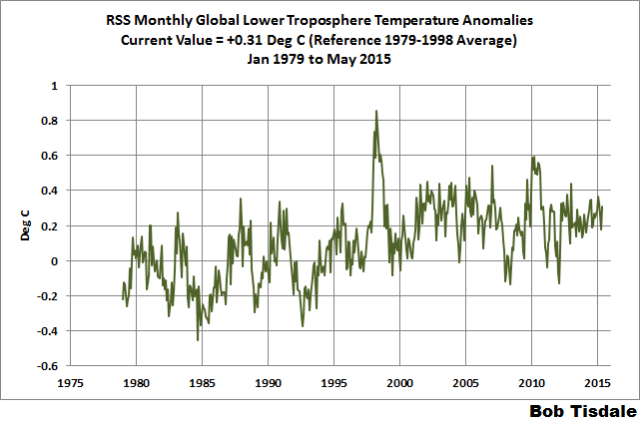
Figure 5 – RSS Lower Troposphere Temperature (TLT) Anomaly Data
A QUICK NOTE ABOUT THE DIFFERENCE BETWEEN RSS AND UAH TLT DATA
THIS NOTE WILL BE REMOVED AS SOON AS THE UAH RELEASE 6.0 DATA ARE MADE FINAL.
There is a noticeable difference between the RSS and UAH lower troposphere temperature anomaly data. Dr. Roy Spencer discussed this in his November 2011 blog post On the Divergence Between the UAH and RSS Global Temperature Records. In summary, John Christy and Roy Spencer believe the divergence is caused by the use of data from different satellites. UAH has used the NASA Aqua AMSU satellite in recent years, while as Dr. Spencer writes:
…RSS is still using the old NOAA-15 satellite which has a decaying orbit, to which they are then applying a diurnal cycle drift correction based upon a climate model, which does not quite match reality.
I updated the graphs in Roy Spencer’s post in On the Differences and Similarities between Global Surface Temperature and Lower Troposphere Temperature Anomaly Datasets.
While the two lower troposphere temperature datasets are different in recent years, UAH believes their data are correct, and, likewise, RSS believes their TLT data are correct. Does the UAH data have a warming bias in recent years or does the RSS data have cooling bias? Until the two suppliers can account for and agree on the differences, both are available for presentation.
Roy Spencer has recently updated his discussion on the RSS and UAH differences in the post Why Do Different Satellite Datasets Produce Different Global Temperature Trends?
COMPARISONS
The GISS, HADCRUT4 and NCEI global surface temperature anomalies and the RSS and UAH lower troposphere temperature anomalies are compared in the next three time-series graphs. Figure 6 compares the five global temperature anomaly products starting in 1979. Again, due to the timing of this post, the HADCRUT4 and NCEI data lag the UAH, RSS and GISS products by a month. Because the three surface temperature datasets share common source data, (GISS and NCEI also use the same sea surface temperature data) it should come as no surprise that they are so similar. For those wanting a closer look at the more recent wiggles and trends, Figure 7 starts in 1998, which was the start year used by von Storch et al (2013) Can climate models explain the recent stagnation in global warming? They, of course, found that the CMIP3 (IPCC AR4) and CMIP5 (IPCC AR5) models could NOT explain the recent halt in warming.
Figure 8 starts in 2001, which was the year Kevin Trenberth chose for the start of the warming halt in his RMS article Has Global Warming Stalled?
Because the suppliers all use different base years for calculating anomalies, I’ve referenced them to a common 30-year period: 1981 to 2010. Referring to their discussion under FAQ 9 here, according to NOAA:
This period is used in order to comply with a recommended World Meteorological Organization (WMO) Policy, which suggests using the latest decade for the 30-year average.
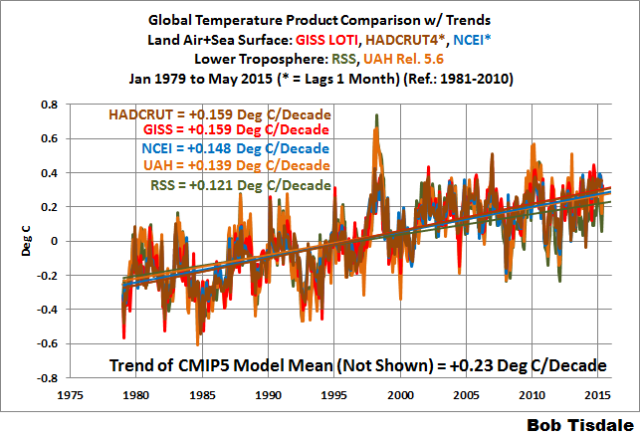
Figure 6 – Comparison Starting in 1979
###########
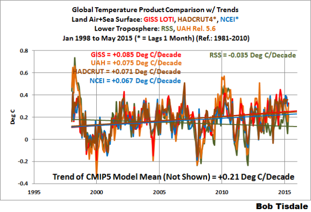
Figure 7 – Comparison Starting in 1998
###########

Figure 8 – Comparison Starting in 2001
Note also that the graphs list the trends of the CMIP5 multi-model mean (historic and RCP8.5 forcings), which are the climate models used by the IPCC for their 5th Assessment Report.
AVERAGE
Figure 9 presents the average of the GISS, HADCRUT and NCEI land plus sea surface temperature anomaly products and the average of the RSS and UAH lower troposphere temperature data. Again because the HADCRUT4 and NCEI data lag one month in this update, the most current average only includes the GISS product.

Figure 9 – Average of Global Land+Sea Surface Temperature Anomaly Products
The flatness of the data since 2001 is very obvious, as is the fact that surface temperatures have rarely risen above those created by the 1997/98 El Niño in the surface temperature data. There is a very simple reason for this: the 1997/98 El Niño released enough sunlight-created warm water from beneath the surface of the tropical Pacific to raise the temperature of about 66% of the surface of the global oceans by almost 0.2 deg C. Sea surface temperatures for that portion of the global oceans remained relatively flat, dropping slowly throughout most of that region, until the El Niño of 2009/10, when the surface temperatures of that portion of the global oceans shifted slightly higher again. Prior to that, it was the 1986/87/88 El Niño that caused surface temperatures to shift upwards. If these naturally occurring upward shifts in surface temperatures are new to you, please see the illustrated essay “The Manmade Global Warming Challenge” (42mb) for an introduction.
MODEL-DATA COMPARISON & DIFFERENCE
Considering the uptick in surface temperatures this year (see the posts here and here), government agencies that supply global surface temperature products have been touting record high combined global land and ocean surface temperatures. Alarmists happily ignore the fact that it is easy to have record high global temperatures in the midst of a hiatus or slowdown in global warming, and they have been using the recent record highs to draw attention away from the growing difference between observed global surface temperatures and the IPCC climate model-based projections of them.
There are a number of ways to present how poorly climate models simulate global surface temperatures. Normally they are compared in a time-series graph. See the example in Figure 10. In that example, GISS Land-Ocean Temperature Index (LOTI) data are compared to the multi-model mean of the climate models stored in the CMIP5 archive, which was used by the IPCC for their 5th Assessment Report. The data and model outputs have been smoothed with 61-month filters to reduce the monthly variations. Also, the anomalies for the data and model outputs have been referenced to the period of 1880 to 2013 so not to bias the results.

Figure 10
It’s very hard to overlook the fact that, over the past decade, climate models are simulating way too much warming and are diverging rapidly from reality.
Another way to show how poorly climate models perform is to subtract the data from the average of the model outputs (model mean). We first presented and discussed this method using global surface temperatures in absolute form. (See the post On the Elusive Absolute Global Mean Surface Temperature – A Model-Data Comparison.) The graph below shows a model-data difference using anomalies, where the data are represented by GISS global Land-Ocean Temperature Index (LOTI) and the model simulations of global surface temperature are represented by the multi-model mean of the models stored in the CMIP5 archive. Like Figure 10, to assure that the base years used for anomalies did not bias the graph, the near full term of the data (1880 to 2013) were used as the reference period.
In this example, we’re illustrating the model-data differences in the monthly surface temperature anomalies. Also included in red is the difference smoothed with a 61-month running mean filter.

Figure 11
The greatest difference between models and data occurs in the 1880s. The difference decreases drastically from the 1880s and switches signs by the 1910s. The reason: the models do not properly simulate the observed cooling that takes place at that time. Because the models failed to properly simulate the cooling from the 1880s to the 1910s, they also failed to properly simulate the warming that took place from the 1910s until 1940. That explains the long-term decrease in the difference during that period and the switching of signs in the difference once again. The difference cycles back and forth nearer to a zero difference until the 1990s, indicating the models are tracking observations better (relatively) during that period. And from the 1990s to present, because of the slowdown in warming, the difference has increased to greatest value since about 1910…where the difference indicates the models are showing too much warming.
It’s very easy to see the recent record-high global surface temperatures have had a tiny impact on the difference between models and observations.
See the post On the Use of the Multi-Model Mean for a discussion of its use in model-data comparisons.
MONTHLY SEA SURFACE TEMPERATURE UPDATE
The most recent sea surface temperature update can be found here. The satellite-enhanced sea surface temperature data (Reynolds OI.2) are presented in global, hemispheric and ocean-basin bases. We discussed the recent record-high global sea surface temperatures and the reasons for them in the post On The Recent Record-High Global Sea Surface Temperatures – The Wheres and Whys.
Well, from here looks like surface warming continues unabated; for those of us living at 14,000 feet, satellite data show a slower trend (the effects of El Niño being stronger here than in the near-surface temperature – inclusion of the ’98er producing the ‘Phantasmal Pause’)
How aptly named. Don’t you have a coloring book somewhere needing colored?
Yes, unabated at a blistering .08 degrees C/decade. By 2115 it’ll be almost a whole degree warmer than it is now! Our poor great-grandkids — how will they survive?!?
Dear Bob, the title of your article suggests, that there is such a thing as ” global surface temperature data” with which the models can agree, or disagree. HadCrut4 etc, etc, are also models. So we simply have agreement, or disagreement, amongst models. But, if you really do insist, that there is a such a thing as “global surface temperature data”, then “the global surface temperature data” tell us, that:-
(a) 14.40°C is the average global surface temperature of the 65 months from January 2010 to May 2015,
and
(b) 16.41°C is the average global surface temperature of the 98 years from 1900 to 1997.
http://year-1997.blogspot.co.uk/
If you disagree, then please feel free to take as many “global surface temperature” measurements as you deem are necessary in order to rule out the possibility, that both (a) and (b) are true.
HadCRUt4 (etc. etc.) aren’t ‘models’, they are manipulated data of the global temperature anomaly. What was the average global surface temperature between 1997 and 2010?
Hello The Ghost of Big Jim Cooley.
For what’s it’s worth, according to a June 2015 edition of NASA’s Global Land-Ocean Temperature Index (GLOTI), (a) the average global surface temperature of the interval from 1997 to 2010 is 0.52°C above the average global surface temperature of the 30 years from 1951 to 1980, and (b) the average global surface temperature of the 30 years from 1951 to 1980 is approximately 14°C.
http://global-land-ocean-temperature-index.blogspot.co.uk/2015/06/a-june-2015-edition-of-gloti-january.html
From this we might reasonably suppose, that the average global surface temperature from 1997 to 2010 is 14.52°C
However, according to NOAA’s document, “The climate of 1997”, the average global surface temperature of the 30 years from 1951 to 1980 is 16.44°C.
http://year-1997.blogspot.co.uk/p/the-year-1997.html
From this we might just as reasonably infer, that the average global surface temperature of the interval from 1997 to 2010 is 16.96°C.
So, what is the real global surface temperature from 1997 to 2010? Is it 14.52°C, or is it 16.96°C, or is it something else altogether? The answer is, NOBODY KNOWS, because nobody has ever actually measured the global surface temperature of the entire earth. Nobody can actually prove, that the 1997 to 2010 average global surface temperature is not 14.52°C, and nobody can actually prove, that it is not 16.92°C. On the other hand, the figures of 14.52°C and 16.96°C are neither outrageously too high, nor too low. A reasonable suggestion might be, that the average global surface temperature of the interval from 1997 to 2010 is 15.74(+/1.22)°C. However, a margin of error of only (+/-1.22)°C is sufficient to swallow whole all of the global warming which (supposedly) has taken place since 1880.
Thus,according to a June 2015 edition of GLOTI, since 1880:- (a) the January to December calendar year 1909 alone has the lowest annual global surface temperature of 0.47°C below the 1951 to 1980 average global surface temperature, and (b) the January to December calendar year 2014 alone has the highest annual global surface temperature of 0.68°C above the 1951 to 1980 average global surface temperature.
http://global-land-ocean-temperature-index.blogspot.co.uk/2015/06/a-june-2015-edition-of-gloti-january.html
However, if the 1951 to 1980 average global surface temperature could be anywhere between 14°C (as per NASA) and 16.44°C (as per NOAA), then (a) the annual global surface temperature of 1909 could be anywhere in between 13.53°C and 15.97°C, and (b) the annual global surface temperature of 2014 could be anywhere in between 14.68°C and 17.12°C, in which case (c) the “coldest year on record since 1880” could have a higher annual global surface temperature than the “hottest year on record since 1880”. If you disagree with this, then please feel free to take as many temperature measurements as you deem are necessary in order to rule out the possibilities, that (i) the annual global surface temperature of 1909 is indeed 15.97°C, and (ii) the annual global surface temperature of 2014 is indeed 14.68°C. Before you get busy with your thermometer, perhaps you might care to take glance at NASA’s publication, “The elusive absolute surface air temperature.”
http://data.giss.nasa.gov/gistemp/abs_temp.html
By the by, I think it is quite appropriate to describe HadCrut4, etc, etc, as “models” of the earth’s climate. Their speculative guesstimates of global surface temperatures certainly are not temperature “data”, unless by a complete redefinition of the term “data”. However, on the other hand, I suppose, that it is possible for one man’s speculative guesstimate to be another man’s datum.
Nick:
Love some of the revealing entries at your ref. site:
http://data.giss.nasa.gov/gistemp/abs_temp.html
“The reason to work with anomalies, rather than absolute temperature is that absolute temperature varies markedly in short distances, while monthly or annual temperature anomalies are representative of a much larger region. Indeed, we have shown (Hansen and Lebedeff, 1987) that temperature anomalies are strongly correlated out to distances of the order of 1000 km.”
The site offers much detail on how absolute temperatures can vary with short local distances, height, vegetation, time of reading and other parameters. Then goes on to say that anomalies, however, are strongly correlated out to 1000kms. Since local details such as vegetation, city environs, weather patterns,etc. can vary enormously, this not only flies in the face of logic even for anomalies but then references an older paper by someone suspiciously global warming oriented (Hansen/1987) as backup.
Then there is this for absolute temperature:
“For the global mean, the most trusted models produce a value of roughly 14°C, i.e. 57.2°F, but it may easily be anywhere between 56 and 58°F and regionally, let alone locally, the situation is even worse.”
In the present case, I assume that the “most trusted model” is whatever one that happens to be the hottest..
Hello BFL.
Temperature “anomalies” vs “absolute” temperatures.
From the way in which NASA writes about temperature “anomalies” and “absolute” temperatures in “The elusive absolute surface air temperature”, it might be supposed, that “absolute” temperatures and temperature “anomalies” are entities so different from one another, that “never the twain shall meet, ’till Earth and Sky stand presently at God’s great Judgement Seat”***. However, if global surface temperature “anomalies” are anythings at all, then they are no more than “absolute” temperatures in disguise. For example, NASA has claimed, that the annual global surface temperature “anomaly” of 2014 is +0.68°C, meaning by this “anomaly”, that the annual global surface temperature of 2014 is 0.68°C above the average global surface temperature of the 30 years from 1951 to 1980. If we say, that the 1951 to 1980 average global surface temperature is X°C, then X°C is an “absolute” temperature, as is (X+0.68)°C, which is the annual global surface temperature of 2014. If anyone deals in temperature “anomalies”, they should always tell you what is the “absolute” temperature of the reference period. If they can’t, or won’t, tell you, that should immediately set the alarm bells ringing.
*** From the “Ballad of East and West”, by Kipling
http://www.bartleby.com/246/1129.html
Nick, thank you for the comprehensive reply. Always appreciated.
There is no such thing as a Global Average Temprrature.
Since temperature is a intrinsic property, any average is NOT a temperature.
https://chiefio.wordpress.com/2011/07/01/intrinsic-extrinsic-intensive-extensive/
That is the first most basic lie that we all ignore. Even me most of the time.
At best, a temperature average is a stastistic ABOUT temperatures, but mostly fundamentally useless.
You may all now return to arguing over how many average temperature Angeles fit on the Global Warming Theorist Pin…head
Yes, Nick Boyce, averaged temperatures derived from models are’nt the real world.
The right adresses for this message are Ban Ki Moon, IPCC and the MSM, *
thei’re still waiting for their heureka. for your good news.
____
Thanks Bob Tisdale for ever clearing the views.
____
* Merkel, Obama, the Pope, Veitstanz contesters.
Does Roy Spencer still think RSS doesn’t match reality? I ask because it appears UAH 6 has moved in their direction. Unless I’m not reading it right?
IPCC models predict based on an alleged connection between GHGs/CO2 ppm & associated RF W/m^2 (aka climate sensitivity) and global temperatures. The hiatus/pause/lull disproves that connection.
End of line.
Let me hammer this home a bit: The models are quite adamant about the idea that they are not predictions. That is, they don’t predict anything based on anything else. Meaning they are not scientific models, and therefore the products that rely on them are likewise not science.
So long as they want to maintain that line, we should acknowledge it. In full.
-‘The world is about to warm 2°C-6°C before 2100.’
-‘Promise?’
-‘No, that was a projection. I think it really warms only one degree.’
Could you do a sigma analysis on that (figure 10)? Just eyeballing the difference between the CMIPS and GISS it would look like they are two standard deviations apart; which would translate to a 95% confidence the models are wrong.
My question is why BOB do you keep alive so much the bogus data provided by GISS and NCDC?
The satellite data is the correct data.
Thank you Nick Boyce!
Good to see some real evidence going back around 135 years and BPBS (BeforePopeBS)
Referring to Figure 10, once again I do wish everyone would make a clear point of distinguishing between the hindcast and the forecast. A bold vertical line at that date would be appropriate.
Anybody can get good agreement when the required answer is in front of them. Real science is about the ability to make successful PREDICTIONS.
You can see how an increase in temperature since 1980 is highly correlated with AMO cycle. ?w=720
http://woodfortrees.org/graph/esrl-amo/from:1950
About the flawed CO2/global warming doctrine … can someone explain how the alarmists explain causation without correlation regarding rising CO2 levels but flattish global average temperature trend?
BOB
Did you notice that NOAA has posted a new ONI based EL NINO chart based on ERSSTv4. The previous 2014/2015 El NIONO has been deleted and replaced with modified NEUTRAL readings from Oct 2104 to the latest current level to end of APRIL/2015
These monthly Tisdale posts use truncated charts that make tiny 0.1 degree (most likely random) temperature variations look like huge mountains and valleys.
That’s bad for communication, so is bad science too.
The charts also don’t show margins of error.
That’s bad for communication, so is bad science too.
Surface “measurements” are actually very rough estimates based on some real measurements, infilling, and (possibly arbitrary) “adjustments”.
.
It’s certainly possible the margins of error are +/- 0.5 degrees C., … making changes on the charts of less than 0.5 degrees meaningless.
Average temperature is an easily manipulated statistic.
Average temperature is also a meaningless number UNLESS there is real evidence humans, animals or plants are being harmed by climate change.
.
But there is no such evidence.
.
With no real evidence of damage caused by climate change, what difference does it make to “know” the average temperature, even if the number was extremely accurate?
.
Taxpayer funds spent to compile the average temperature are a complete waste of money.
The data serve no purpose other than as propaganda to scare the public.
And the types of charts Mr. Tisdale chooses to use, grossly exaggerate tiny changes in average temperature that would be barely visible on charts designed to be visually honest.
.
Question:
How do these 0.1 degree anomaly charts help skeptics make their case that Earth’s climate on the past 150 years has been normal?
Answer:
They don’t, and that’s why the “warmists” love 0.1 degree anomaly charts!
My climate blog for non-scientists:
http://www.elOnionBloggle.blogspot.com
it looks to me (but I am not a scientist) that the red line shows increasing temps I think that the arctic ice will probably keep decreasing also was the flatish line caused by w weak solar?
More excellent work Bob, please keep it coming.