Guest Post by Bob Tisdale
UPDATE
See the end of the post for a copy of it in pdf format.
PREFACE
I comment frankly about the NODC ocean heat content data a number of times in this post. Please do not take those remarks as criticisms about the efforts of the NODC to assemble that data. The following quote includes links to maps of the locations of subsurface ocean temperature measurements at three depths. As you’ll note, the NODC had little source data to work with prior to the introduction of the ARGO floats.
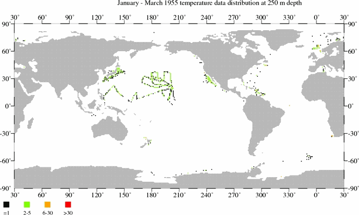
I first presented these maps in the March 2013 post Is Ocean Heat Content Data All It’s Stacked Up to Be? That post provides a very detailed overview of the problems with ocean heat content data. The following is the discussion of the animations from that earlier post (with typos removed). This post focuses on the data for the depths of 0-700 meters, so the first two animations are relevant:
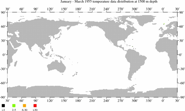
The animations are for the depths of 250, 500 and 1500 meters. Each black dot on a map represents one (1) temperature measurement at that depth for a 3-month period. There is also a scale on the maps that explains the number of readings associated with the green, orange, and red dots. Readings at 250 meters and 500 meters, and other depths, are used in the NODC’s data for the depths of 0-700 meters. As you’ll note, global coverage improves with time until the 1990s, but then it worsens until the ARGO floats are released in the early 2000s. You’ll also note that the sampling is better at the 250 meter level than at 500 meters. It’s much, much worse at 1500 meters.
The files are large, so they may take a few moments to download.
Temperature sample maps at 250 meters (11MB).
Temperature sample maps at 500 meters (9MB).
The NODC recently published a version of their ocean heat content data for the depths of 0-2000 meters. Unfortunately, as you will see, there is little observational data at depths of 1500 meters.
Temperature sample maps at 1500 meters (6MB).
There is so very little observational data at depths greater than 700 meters that the NODC elected not to present the data in 3-month blocks. They used 5-YEAR windows, in one year steps, what they refer to as pentads. That is, for example, a temperature measurement in 1959 will be used for the pentads of 1955-1959, 1956-1960, 1957-1961, 1957 [oops] 1958-1962 and 1959-1963.
[End of quote from earlier post.]
INTRODUCTION
For the past few years, there have been numerous papers that have claimed at least part of the heat missing from the deep oceans, curiously occurring in parallel with the slowdown in global surface warming, has been hiding in the Pacific Ocean, the result of a recent flurry of strong La Niña events. Back in 2013, we illustrated and discussed how the NODC’s vertically averaged temperature data to 2000 meters showed the North Atlantic and the Pacific Ocean as a whole had not warmed to depths of 2000 meters since 2003, and that all of the ocean warming was taking place in the South Atlantic and Indian Oceans. See the post If Manmade Greenhouse Gases Are Responsible for the Warming of the Global Oceans… We updated the primary graph in January 2015, Figure 1, and discussed this problem once again in the post NODC Data Continue to Indicate the Deep Oceans are Warming in Some Basins But Not Others. The data for Figure 1 are found at the NODC webpage here.

Figure 1
We used vertically averaged temperature anomalies, as opposed to ocean heat content data, to show how small the warming is in terms that most people can relate to.
Now the climate science community is attempting to explain the disparity in the warming of two of the ocean basins, with the paper Lee et al. (2015) Pacific origin of the abrupt increase in Indian Ocean heat content during the warming hiatus [paywalled]. The paper also does not address the difference in warming rates of the North and South Atlantic.
There are a number of curious aspects to the new Lee at al. paper. But first, let’s clarify that…
LEE ET AL. (2015) IS NOT ABOUT THE MISSING OCEAN HEAT
Lee et al. (2015) has gotten some recent press. One example is Heat is Piling Up in the Depths of the Indian Ocean at ClimateCentral. It includes a couple of statements from the lead author…and from other scientists who were not part of the paper. Another example was quoted at WattsUpWithThat, with the title Uh, oh: Looks like Lewandowsky and Oreskes will be going after the AGU now for admitting the ‘hiatus’ exists. It is from the EOS.org article Tracking the Missing Heat from the Global Warming Hiatus. Under the heading of “Can the Indian Ocean House All of This Hidden Heat?”, the EOS.org article reminds readers of the problem of the “missing heat”, which was not addressed by Lee et al. That section ends with this quote from Ka Kit Tung of the University of Washington:
“It [Lee et al.] is not a budget calculation,” he explained. “There is a difference between finding some warming in the Indian Ocean and justifying the proposition that the amount of heat storage explains what is needed to account for the global hiatus. [We] not only calculated the heat storage in the Indian Ocean in the upper 700 meters but…calculated it down to 1500 meters and showed that it was not enough.”
The heat missing from the oceans, and the growing difference between modeled and observed global surface temperatures, both strongly suggest that the climate models used by the IPCC are way too sensitive to manmade greenhouse gases like carbon dioxide. (The model-data graph linked above is from the most-recent surface temperature update here.)
INITIAL COMMENTS ON LEE ET AL. (2015)
The illustrations for Lee et al. are here and the Supplementary Information is here. You’ll note in the Supplementary info (See their Figure S1 here.) that Lee et al. are using the latitude of 34S as the southern border of the Indian and Pacific Oceans, not 60S as is more-often used. The lack of source data south of 34S before the ARGO era might be the reason…yet, curiously, they present a model-data comparison for the Southern Ocean in their Supplementary material even though there is little to no source data for ocean heat content data south of 34S before the early 2000s.
The abstract of Lee et al. (2015) reads (my boldface):
Global mean surface warming has stalled since the end of the twentieth century1, 2, but the net radiation imbalance at the top of the atmosphere continues to suggest an increasingly warming planet. This apparent contradiction has been reconciled by an anomalous heat flux into the ocean3, 4, 5, 6, 7, 8, induced by a shift towards a La Niña-like state with cold sea surface temperatures in the eastern tropical Pacific over the past decade or so. A significant portion of the heat missing from the atmosphere is therefore expected to be stored in the Pacific Ocean. However, in situ hydrographic records indicate that Pacific Ocean heat content has been decreasing9. Here, we analyse observations along with simulations from a global ocean–sea ice model to track the pathway of heat. We find that the enhanced heat uptake by the Pacific Ocean has been compensated by an increased heat transport from the Pacific Ocean to the Indian Ocean, carried by the Indonesian throughflow. As a result, Indian Ocean heat content has increased abruptly, which accounts for more than 70% of the global ocean heat gain in the upper 700 m during the past decade. We conclude that the Indian Ocean has become increasingly important in modulating global climate variability.
Lee et al. (2015) confirmed our previous posts in which we noted that the ocean heat content data contradicted the assumption that the missing heat was hiding in the Pacific.
Lee et al. (2015) addressed the warming of the top 700 meters of the Pacific and Indian Oceans, using the NODC ocean heat content data. That is, they did not use the 0-2000 meter data. Curiously, the CO2 obsessed haven’t complained about this breach of alarmist etiquette. Lee et al. explained in their Supplementary Information (my boldface):
For the ocean heat content changes below 700 m, there is no reliable in-situ global deep ocean data before the Argo observations whose spatial coverage over the global ocean reached a mature state only around 2004-2005. Since there is no reliable global deep ocean observation data for the study period (1971-2012), the ocean heat content changes below 700 m were not explored in this study.
How refreshing. We’re seeing some realism from the climate science community. But they’re assuming the pre-ARGO in-situ data above 700 meters are reliable. That’s a big assumption.
Figure 2 is the same format as Figure 1, but in Figure 2, we’re using the data for the depths of 0-700 meters. The data for Figure 2 are also found at the NODC webpage here. You’ll note that the disparity between the ocean basins still exists. For the depths of 0-700 meters, the North Atlantic even shows a slight cooling. This cooling in the North Atlantic was not addressed by Lee et al.

Figure 2
The NODC does not present data separately for the Southern Ocean like Lee et al., so it is likely that the Southern Ocean data are included in the data for the South Atlantic, Indian and Pacific Oceans. That is, Figure 2 includes more of the Pacific and Indian Oceans than were evaluated by Lee et al. (2015).
Lee et al. evaluated ocean heat content from the NODC to depths of 700 meters for two periods that are separated by a few years: 1971-2000 and 2003-2012. This exclusion of data from 2001 and 2002 should also have been disapproved by the CO2 obsessed. Lee et al. explain in the next paragraph in the Supplementary Material (my boldface):
It should be also noted that the OHC700 derived from WOA13 increased sharply during 2001- 2003 in all ocean basins including the Atlantic and Southern Oceans (Figs. 1 and S2). Previous studies have suggested that the changes in the historical observation network from a ship-based system to Argo floats introduced an artificial jump in OHC700 during the initiation of the global Argo array (2001-2003)2,3,4. Therefore, the OHC700 changes derived from WOA13 during 2001- 2003 were not used in this study.
The first referenced paper is Cheng and Zhu (2014) Artifacts in variations of ocean heat content induced by the observation system changes. Its abstract reads (my boldface):
The heat content of the upper ocean is a key climate indicator, contributing to a substantial portion of the global sea level rise. Recent ocean heat content (OHC) calculations have shown a dramatic shift during the period 2001–2003, which is nearly coincident with a major transition in the ocean observation network from a ship-based system to Argo floats. Here we demonstrate that the changes in the spatial sampling of the historical observation network introduced an artificial jump during the initiation of the global Argo array (2001–2003). The start of the Argo program is responsible for such a shift. Considering the sampling bias, new methods to assess long-term trends in the OHC (0–700 m) are proposed that suggest the presence of a continuous upper ocean warming (0.36 ± 0.08 W m−2) since 1966.
That’s something else to keep in mind about the NODC ocean heat content data. Skeptics have been noting that obvious shift—and the reason for it—for years. I’ll be presenting a post about Cheng and Zhu (2014) in a few days.
Those things aside, back to the findings of Lee et al.
Basically, Lee et al. (2015) used a climate model specially programmed for the paper to show that warm waters from the Pacific Ocean had been relocated to the Indian Ocean by way of the ocean current that transports waters from the tropical Pacific to the tropical Indian Ocean—a current called the Indonesian Throughflow. (In other words, Lee et al. did not evaluate the output of a model from the CMIP5 archive, which was used by the IPCC for attribution studies and projections of future climate. They used a model that was specially programmed for this study. It’s commonly done, but I wanted readers to understand that point.)
For the location of the Indonesian Throughflow, see my Figure 3, which is from the ClimateCentral post. Oddly, ClimateCentral attribute that illustration to Lee et al (2015), but that illustration does not appear in the paper or supplementary information. Nice illustration, though. Note that it appears to include color scales for sea surface temperatures, not sea surface temperature anomalies…just in case you’re wondering why everything looks so warm in the tropics.

Figure 3
MODEL FORCINGS
Under the heading of Methods, Lee et al. begin (their boldface):
Model. The global ocean-sea ice coupled model of the NCAR Community Earth System Model version 1 (CESM1; ref. 27) forced with the bias-corrected twentieth century reanalysis (20CR) surface flux variables14 (see Supplementary Information 3) is used as the primary tool in this study.
A reanalysis is a computer model that is forced with observations-based data. But there are few to no long-term observations of surface flux metrics for the oceans such as surface downward shortwave radiation (sunlight) and surface downward longwave (infrared) radiation. Those are computed.
In other words, Lee et al. used the output of one climate model to force a second climate model.
NOTHING MAGICAL ABOUT THE MIGRATION OF WATER ALONG THE INDONESIAN THROUGHFLOW
A primary finding of Lee et al. was:
We find that the enhanced heat uptake by the Pacific Ocean has been compensated by an increased heat transport from the Pacific Ocean to the Indian Ocean, carried by the Indonesian throughflow.
We had discussed this likely explanation for the warming of the Indian Ocean and the absence of warming in the Pacific basin in the March 2013 post Is Ocean Heat Content Data All It’s Stacked Up to Be? I even provided animations so that you could watch the process at work. After showing the disparity between the Indian Ocean warming and the lack of warming in the Atlantic and Pacific Oceans to depths of 700 meters, I wrote in that earlier post (Figure number updated for this post).
Why is the Indian Ocean warming during the ARGO era? [Figure 4] compares ocean heat content data for the Indian Ocean (90S-90N, 20E-120E) to scaled sea surface temperature anomalies for the NINO3.4 region of the equatorial Pacific. Both datasets have been smoothed with 12-month running average filters. The NINO3.4 data is a commonly used index for the timing, strength and duration of El Niño and La Niña events. The ocean heat content for the Indian Ocean warms in response to El Niño events, but it obviously does not cool proportionally during strong La Niñas.
Why?
It’s simply yet another example of what I’ve been noting for a number of years: La Niñas are not the opposite of El Niños.

Figure 4
In the following animations, you can watch warm water that’s left over from the El Niños being passed from the tropical Pacific into the Indian Ocean during the trailing La Niñas by the current called the Indonesian Throughflow. That leftover warm water counteracts any cooling that would result during the trailing La Niñas due to changes in atmospheric circulation.
Animation 1 presents maps of the NODC ocean heat content data for the ARGO-era, using 12-month averages. The first cells are the average ocean heat content from January to December 2003. These are followed by cells that show the period of February 2003 to January 2004, then March 2003 to February 2004 and so on, until the final cell that captures the average ocean heat content from January to December 2012. The 12-month averages reduce the visual noise and any seasonal component in the data. It’s like smoothing data with a 12-month filter in a time-series graph. (You may have to click-start the animation.)
https://bobtisdale.files.wordpress.com/2013/03/argo-era-nodc-ohc-0-700m-12-month-smooth.gif
Animation 1
Due to the resolution of the ocean heat content data, you might be having trouble catching the processes that cause the leftover warm water from 2006/07 and 2009/10 El Niños to be carried into the Indian Ocean. Animation 2 is a gif animation of sea level maps for the tropical Pacific from the AVISO altimetry website. The maps also capture the easternmost portion of the tropical Indian Ocean. I’ve started the animation in January 2003 to agree with the discussion of ARGO-era ocean heat content data. So there are a couple of minor El Niños before the 2006/07 El Niño. At the end of the 2006/07 El Niño, a (cool) downwelling Kelvin wave splits the elevated (warm) sea level anomalies along the equator. The residual warm waters are carried west by Rossby waves to Indonesia, and the stronger-than-normal trade winds in the Pacific during the trailing La Niña help to force the residual warm water past Indonesia into the eastern Indian Ocean. In addition to the Indonesian Throughflow, warm water from the southern tropical Pacific also migrates west into the eastern Indian Ocean through the Torres Strait, between Australia and New Guinea. The same thing happens after the 2009/10 El Niño. (My apologies for the shift in the animation in 2011. Aviso changed the format of the maps.)

Animation 2
[End of quote from earlier post.]
Lee et al. (2015) confirmed that the warm water from the tropical Pacific migrates to the tropical Indian Ocean. But…
LEE ET AL. (2015) OVERLOOKED A FUNDAMENTAL REALITY
Lee et al. (2015) noted the transport of waters from the tropical Pacific to the Indian Ocean was associated with El Niño and La Niña events (where ITF is Indonesian Throughflow):
It has been shown that the ITF volume transport is mainly dominated by interannual variability associated with El Niño/Southern Oscillation (ENSO; refs 18,19). Indeed, in the control experiment, the reduced ITF volume transport during 1997-1998 coincides with the 1997-1998 El Niño. Conversely, the large increase in the ITF volume transport during 2006-2008 coincides with the three near consecutive La Niña events, namely the 2005-2006, 2007-2008 and 2008-2009 events, which contributed significantly to the recent La Niña-like state in the Pacific Ocean. Observational evidence is consistent with the reduced ITF during the 1997-1998 El Niño and the increased ITF during the series of La Niña events from 2006 to 2008. Therefore, it is logical to conclude that a series of long-lasting La Niña events without strong and intervening El Niño events has led to the increased ITF heat transport in the 2000s.
But as we illustrated and showed in the animations earlier, the warm water that migrated into the Indian Ocean was basically the leftovers from El Niño events in the tropical Pacific, supplemented by any additional warm water created during the La Niñas.
Lee et al.’s controlled experiment (climate model) showed increased flow through the Indonesian Throughflow during the 2007/08 and 2008/09 La Niñas. This is basically the explanation for why the ocean heat content of the Indian Ocean did not cool proportionally during those La Niñas. Note, however, in Figure 3 that the ocean heat content of the Indian Ocean did drop during the 2005/06 La Niña, which seems to contradict Lee et al.’s model. The Lee et al. model also did not appear to respond to the 1998-01 La Niña, while the data indicate the warming of the Indian Ocean actually began then, after a drop a few years earlier.
Not surprisingly, there is no mention in Lee et al. (2015) that the warm water for El Niños is furnished by sunlight, not manmade greenhouse gases, during La Niña events. In other words, they likely failed to properly account for the downward shortwave radiation reaching into and warming the tropical Pacific during La Niñas.
In numerous posts over the years, we’ve presented the following quote from Trenberth et al. (2002) Evolution of El Niño-Southern Oscillation and global atmospheric surface temperatures (my boldface):
The negative feedback between SST and surface fluxes can be interpreted as showing the importance of the discharge of heat during El Niño events and of the recharge of heat during La Niña events. Relatively clear skies in the central and eastern tropical Pacific allow solar radiation to enter the ocean, apparently offsetting the below normal SSTs, but the heat is carried away by Ekman drift, ocean currents, and adjustments through ocean Rossby and Kelvin waves, and the heat is stored in the western Pacific tropics. This is not simply a rearrangement of the ocean heat, but also a restoration of heat in the ocean.
That paragraph is the basis for my constant description of ENSO as a chaotic, naturally occurring, sunlight-fueled, recharge-discharge oscillator, where El Niño events act as the discharge phase and La Niña events act as the recharge and redistribution phase.
Trenberth and Fasullo (2009) Tracking Earth’s Energy: From El Niño to Global Warming confirmed the cause of the increased sunlight, and the role it plays, in the tropical Pacific during La Niña events:
Typically prior to an El Niño, in La Niña conditions, the cold sea waters in the central and eastern tropical Pacific create high atmospheric pressure and clear skies, with plentiful sunshine heating the ocean waters. The ocean currents redistribute the ocean heat which builds up in the tropical western Pacific Warm Pool until an El Niño provides relief (Trenberth et al. 2002).
In the post Open Letter to the Royal Meteorological Society Regarding Dr. Trenberth’s Article “Has Global Warming Stalled?”, we confirmed that sunlight provides the warm water that serves as fuel for El Niños. It can’t be downward longwave (infrared) radiation, because infrared radiation decreases during La Niña events, when the ocean heat in the tropical Pacific is replenished. We’ll expand on this discussion in a few moments.
For a further introductory discussion on the natural warming of the global oceans (at the surface and to depth), see the illustrated essay The Manmade Global Warming Challenge (42MB pdf).
In Trenberth and Fasullo (2009) Tracking Earth’s Energy: From El Niño to Global Warming, the authors also describe additional sunlight-based warmings associated with El Niño events outside of the tropical Pacific (my boldface) :
But a major challenge is to be able to track the energy associated with such variations more thoroughly: Where did the heat for the 2009–2010 El Niño actually come from? Where did the heat suddenly disappear to during the La Niña? Past experience (Trenberth et al. 2002) suggests that global surface temperature rises at the end of and lagging El Niño, as heat comes out of the Pacific Ocean mainly in the form of moisture that is evaporated and which subsequently rains out, releasing the latent energy. Meanwhile, maximum warming of the Indian and Atlantic Oceans occurs about 5 months after the El Niño owing to sunny skies and lighter winds (less evaporative cooling), while the convective action is in the Pacific.
Strong blasts of sunlight over the Indian Ocean during El Niños, and strong blasts of sunlight over the tropical Pacific during La Niñas, both contributed to the warming of the Indian Ocean, if we merge the Lee et al. (2015) and the Trenberth and Fasullo (2009) discussions:
- The Indian Ocean warms first during El Niños in response to El Niño-caused increase in sunlight there (Trenberth and Fasullo (2009)).
- The Indian Ocean is prevented from cooling during the trailing La Niñas because sunlight-created warm waters are being transported from the tropical Pacific to the tropical Indian Ocean by the Indonesian Throughflow (Lee et al. (2015)).
By the way, that’s two papers by Trenberth that state very clearly that temporary blasts of sunlight associated with ENSO cause the tropical Pacific, the Atlantic Ocean and the Indian Ocean to warm to depth.
HOW LEE ET AL. (2015) LIKELY FOOLED THEMSELVES WITH THEIR MODELING EFFORTS
This discussion relates to the models presented by Lee et al., and to their data presentation, not necessarily their conclusion that warm water migrates from the Pacific to Indian Oceans through the Indonesian Throughflow.
Lee et al. (2015) presented their model-data comparison of ocean heat content (0-700 meters) globally (top) and for the Indian (middle) and the Pacific (bottom) in their Figure 1. I’ve included it here as my Figure 5. The time-series graphs are on the left (cells a-c) and the heat budgets are on the right (cells d-f). About the global model-data comparison, Lee et al. wrote:
The results from these ensemble experiments can be summarized as two sets of global OHC700 time series (Fig. 1a). The simulated global OHC700 from the control experiment follows the time variability of in situ observations since the 1950s (ref. 9) reasonably well.
Lee et al. did not make that same claim for their modeling (control experiment) of the Pacific and Indian Oceans…and for good reasons.

Figure 5 (click for full-size)
Let’s start with their data presentation, the black curves. The data in cells a through c have obviously been filtered (or smoothed). Yet I have not found any mention of the type of filter used in Lee et al (2015) or their Supplementary information.
Figure 6 compares cell b of Figure 1 for the Indian Ocean from Lee et al. with the annual ocean heat content data for the Indian Ocean, using the coordinates of 34S-30N, 20E-120E). The annual variations are obviously missing. Both depictions show a slight cooling from 1955 to the mid-to-late 1990s, followed a sudden rise (a rise starts well before the model.) Thus for the Indian Ocean, the smoothing doesn’t seem to make much of a difference.

Figure 6
The same cannot be said for the Pacific Ocean (34S-65N, 120E-80W), as shown in Figure 7. Two of the defining features of the ocean heat content data of that Pacific subset were casually removed by Lee et al., the monumental rise in Pacific Ocean heat content from the 1995/96 La Niña and the subsequent drop due to the 1997/98 El Niño. Most of the warming from 1998 to 2001 is actually a recharge from the 1998-01 La Niña, but that would be difficult to observe without the spike from the 1995/96 La Niña serving as reference.
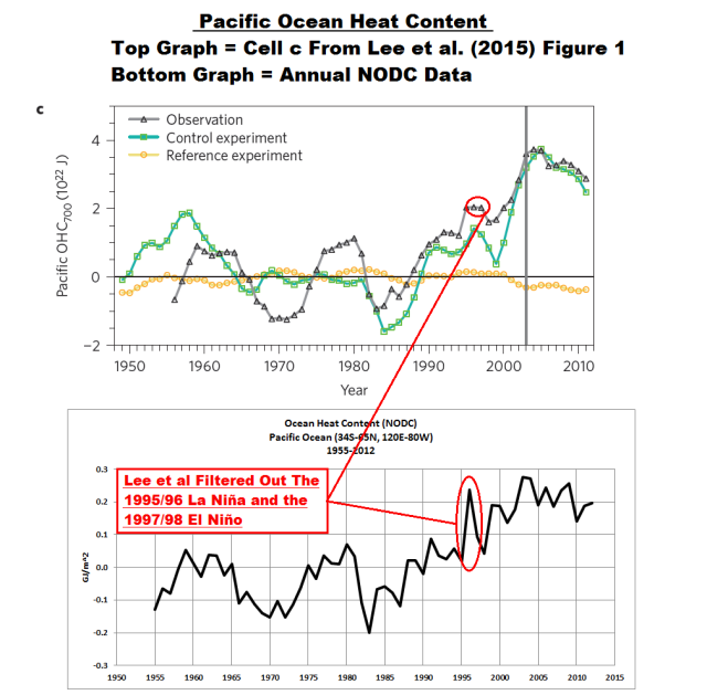
Figure 7
Once again, climate modelers have done away with an inconvenient reality. If the models can’t explain it, the modelers change the data (or their presentation of the data) to meet the models.
We’ll discuss the 1995/96 La Niña further in a few moments, along with the importance of La Niñas in general.
Next, you’ll note that Lee et al. modeled and evaluated the Pacific Ocean (from 34S to 65N) as a whole, as though it warms uniformly as one body of water. Data do not support that assumption.
We know that there are monumental differences between the tropical Pacific and the extratropical North Pacific in how, when and why they warmed to depth. The variations in the ocean heat content of the tropical Pacific are dominated by ENSO, while, in the extratropical North Pacific, they’re impacted primarily by shifts in sea level pressure and associated changes in wind patterns. We’ve been showing and discussing this for more than 5 years, ever since KNMI added the NODC ocean heat content data (0-700 meters) to their Climate Explorer back in 2009. My first introductory discussion of this topic was the September 2009 post ENSO Dominates NODC Ocean Heat Content (0-700 meters) Data.
So let’s breakdown the ocean heat content data for the Pacific into subsets. Normally, we’ve presented them as the tropical Pacific (24S-24N, 120E-80W) and the extratropical North Pacific (24N-65, 120E-80W). But Lee et al. (2015) used 34S for the southern boundary of the Pacific, so we’ll use the coordinates of 34S-24N, 120E-80W and call that subset the “Tropical Pacific Plus”. (It makes no difference to the presentation, as you’ll see.) And we’ll use the normal coordinates for the extratropical North Pacific. For the Indian Ocean, we’ll use coordinates of 34S-30N, 20E-120E, with the southernmost latitude once again dictated by Lee et al. The source of the NODC ocean heat content data (0-700m) for this portion of the post is the KNMI Climate Explorer, so the units are gigajoules per square meter (GJ/m^2).
First, let’s examine the short-term period of 2003-2012. Figure 8 presents the ocean heat content (anomalies) for the global oceans, the Indian Ocean, the extratropical North Pacific and the Tropical Pacific Plus region. The Indian Ocean, of course, has the highest warming rate. The extratropical North Pacific also shows warming, at a rate that is slightly higher than that of the global oceans. The tropical Pacific Plus subset is the only one of this group that shows cooling. Thus, the extratropical North Pacific is unlikely to be the source of the warm water accumulating in the Indian Ocean…that and the fact that the Indonesian Throughflow connects the tropical Indian Ocean to the tropical Pacific, not the Extratropical North Pacific.

Figure 8
The modeling efforts of Lee et al. (2015), therefore, were likely skewed by their failure to study the tropical Pacific in isolation.
It is well known that the NODC ocean heat content data have been adjusted beyond recognition, even during the ARGO era. The UKMO EN3 ocean heat content data, on the other hand, appear not to have been. The UKMO EN3 data used to be available through the KNMI Climate Explorer but were removed from the Monthly observations webpage soon after I presented them during the ARGO era in a post. See the post UKMO EN3 Ocean Heat Content Anomaly Data Disappeared from the KNMI Climate Explorer As Suddenly as It Appeared. So in anticipation of a request in comments to see the unadjusted ARGO-era data, I’ve replicated Figure 8 with the UKMO EN3 data for the depths of 0-700 meters. See Figure 9.

Figure 9
According to the unadjusted ARGO-era ocean heat content data, there had been no warming of the global oceans to depths of 0-700 meters from 2003 to 2012. The extratropical North Pacific shows a very slight warming. And the disparity between the Indian Ocean and tropical Pacific still exists, with the tropical Pacific cooling and the Indian Ocean warming. This confirms the earlier findings that the waters being transported to the Indian Ocean appear to have had little impact on the warming of the extratropical North Pacific.
THE NODC’s CORRECTIONS INSERT A CLIMATE SHIFT IN THE INDIAN OCEAN IN 2001 BUT ELIMINATE ANOTHER IN 2006/07
Figure 10 contains two graphs. The top one compares the NODC and UKMO EN3 ocean heat content data (0-700 meters) for the Indian Ocean (34S-30N, 20E-120E), for the period of January 1995 to December 2012. The bottom graph presents the difference between the two depictions of that ocean heat content subset, with the UKMO EN3 data subtracted from the NODC data.

Figure 10
Compared to the UKMO EN3 data, the NODC data makes an awkward upward shift in 2001. This allows the NODC data to show a relatively continuous warming from 1999 to 2012. The UKMO EN3 data, on the other hand, show two relatively flat periods, separated by an upward shift in 2006/07.
The Lee at al. models for the Indian Ocean presented in their Figure 1b (my Figure 5) show the warming accelerating after 2003. But the NODC data show the warming there begins in 1999, and the UKMO EN3 data show a shift in 2006/07.
WARMING ATTRIBUTION
Lee et al. (2015) note in the 5th paragraph of the body of the paper, after the abstract:
The heat budget indicates that the simulated global OHC700 increase since 1971 was largely driven by an increased downward longwave radiative heat flux, consistent with the thermodynamic effects of increased anthropogenic greenhouse gases in the atmosphere. This flux has accelerated in the most recent decade (that is, 2003-2012) and is damped by both an increased upward longwave radiative heat flux and latent heat flux.
LEE ET AL. CONTRADICT BASIC UNDERSTANDINGS OF ENSO PROCESSES
Let’s examine one of the claims by Lee et al. (2015) once again. With respect to attribution, they stated:
These changes in the Indian Ocean are supported by complementary changes in the Pacific Ocean. The net surface heat flux into the Pacific Ocean increased greatly during 2003-2012 (Fig. 1f), consistent with the La Niña-like condition across the Pacific Ocean6,8.
See my Figure 5 (above) for their Figure 1f. You’ll note the high positive downward longwave radiation flux and negative downward shortwave radiation flux in the bar chart for 2003-2012. So, according to Lee et al., the net surface flux into the Pacific was dominated by the downward longwave radiation during that period (As a reminder, downward longwave radiation is associated with manmade greenhouse gases, and downward shortwave radiation is sunlight.) But we’re not interested in the Pacific as a whole. We’ve already established that the heat uptake in the Indian Ocean had to have come from the tropical Pacific Plus subset, not the extratropical North Pacific.
ENSO dominates the heat uptake and release in the tropical Pacific. During El Niño events, the tropical Pacific releases heat to the atmosphere primarily through evaporation. Due to the increased surface temperatures in the tropical Pacific during El Niños, downward longwave radiation at the surface is higher than normal; but the tropical Pacific is releasing heat at that time. (See Pavlakis et al. 2007 ENSO surface longwave radiation forcing over the tropical Pacific.) Due to the increases in cloud cover over the tropical Pacific during El Niños, downward shortwave radiation (sunlight) at the surface is below normal, which would contribute to the loss of heat from the tropical Pacific. (See Pavlakis et al. 2008 ENSO surface shortwave radiation forcing over the tropical Pacific.)
The reverse occurs during La Niña events. Due to the drop in surface temperatures in the tropical Pacific during La Niñas, downward longwave (infrared) radiation is below normal; but the tropical Pacific is gaining heat at that time. (See the earlier quotes from Trenberth.) And due to the drop in cloud cover, downward shortwave radiation (sunlight) is above normal during La Niñas. Since heat is restored during La Niñas as noted by the Trenberth quotes, the increase in sunlight (downward shortwave radiation at the surface) must be the primary source of energy at those times, not the decrease on infrared radiation (downward longwave radiation).
NOTE: If you were to study the two Pavlakis et al. papers linked above, you’ll notice that the ENSO-caused variations in downward longwave and downward shortwave radiation over the tropical Pacific dwarf any increase possible from manmade greenhouse gases. The NOAA Annual Greenhouse Gas Index lists a total increase of about 0.4 watts/m^2 from 2003 to 2012 in downward longwave radiation from manmade greenhouse gases. On the other hand, for parts of the equatorial Pacific, like the NINO3.4 region, sunlight (downward shortwave radiation) can increase temporarily as much as 40 watts/m^2 during a La Niña. In the same region, downward longwave radiation can decrease as much as 20 watts/m^2 during a La Niña.
The other factor to keep in mind is that sunlight (downward shortwave radiation) penetrates the oceans to depths of 100 meters (with most being absorbed nearer the surface in the top 10 meters or so) while downward longwave radiation is absorbed in the top few microns.
In more simple terms, Lee et al. basically discuss the redistribution of ENSO-related warm waters during La Niña events, but they do not properly address its creation.
Let’s reinforce this discussion: The commonly used ENSO index of NINO3.4 region sea surface temperature anomalies are presented in Figure 11. The horizontal lines are the average sea surface temperature anomalies for the NINO3.4 region during two identified time periods, not the trends. They show that weak-to-moderate El Niño events dominated the tropical Pacific from 2003 to early 2007. Afterwards, moderate and strong La Niña events dominated from early 2007 to 2012.

Figure 11
As a result, the tropical Pacific would have gone from a period of above-normal downward longwave radiation at the surface (2003-2007, when the tropical Pacific was releasing heat) to a period of below-normal downward longwave (infrared) radiation (2007-2012, when the tropical Pacific was replenishing and redistributing heat). This strongly suggests that the heat uptake in the tropical Pacific (and, in turn, the Indian Ocean) could not have come from downward longwave radiation during that time, because it would have decreased over the tropical Pacific.
That heat uptake had to have come from an increase in sunlight at the surface, resulting from the transition from a period of below-normal downward shortwave radiation (sunlight) at the surface (2003-2007, when the tropical Pacific was releasing heat) to a period of above-normal downward shortwave radiation (2007-2012, when the tropical Pacific was replenishing and redistributing heat).
That suggests the Lee at al. representations of downward shortwave and downward longwave radiation fluxes are skewed. Maybe that’s why they presented the Pacific as a whole, instead of where the warm water is generated by and for ENSO events, which is the tropical Pacific.
Models often differ from theory, though. Climate models used by the IPCC are notorious for not properly simulating even the most basic of ENSO-related processes. See Bellenger et al. (2012) ENSO representation in climate models: from CMIP3 to CMIP5. One of the known problems is that they underutilize sunlight (downward shortwave radiation). See Guilyardi et al (2008) Understanding El Niño in Ocean-Atmosphere General Circulation Models: progress and challenges.
Even reanalyses differ from theory. We’ve shown in the past and discussed how the NCEP-DOE Reanalysis-2 showed a significant rise in sunlight reaching the surface of the Earth from 1979 to about 2003/04, which was followed by a sudden drop through 2010. Those variations also extended to the equatorial Pacific. We first presented the NCEP-DOE reanalysis of downward shortwave radiation (sunlight) at the surface in the post The Sun Was in My Eyes – Was It More Likely in the Past 3-Plus Decades? The NCEP-DOE Reanalysis-2 outputs of surface downward shortwave and longwave radiation for the equatorial Pacific were presented as Figure 3 in the post Meehl et al (2013) Are Also Looking for Trenberth’s Missing Heat.
But, the NCEP-DOE Reanalysis-2 is only one of many. Other reanalyses confirm the increase in sunlight reaching the Earth’s surface through the early-to-mid 2000s, while others disagree. How much sunlight actually reached into and warmed the oceans during the recent warming period? No one knows. That was one of the problems discussed by Trenberth and Fasullo (2009) Tracking Earth’s Energy: From El Niño to Global Warming:
But a major challenge is to be able to track the energy associated with such variations more thoroughly: Where did the heat for the 2009–2010 El Niño actually come from? Where did the heat suddenly disappear to during the La Niña?
That, of course, was a replay of one of Kevin Trenberth’s Climategate email to Michael Mann, the follow up to the “travesty” email:
Where did the heat go? We know there is a build up of ocean heat prior to El Nino, and a discharge (and sfc T warming) during late stages of El Nino, but is the observing system sufficient to track it?
One thing is certain: Lee et al. does not specifically address where in the Pacific Ocean the warm waters are being created or the mechanics of how the warm water (that’s carried to the Indian Ocean) is generated in the tropical Pacific. Their attempts to force it with downward longwave radiation contradict basic fundamentals of ENSO processes.
THE LONG-TERM NODC OCEAN HEAT CONTENT DATA FOR THE PACIFIC CONFIRM OUR UNDERSTANDING OF ENSO
Now we’ll discuss why the 1995/96 La Niña is important.
The replenishment of ocean heat during La Niñas is very obvious in the long-term ocean heat content data for the Tropical Pacific. Again, we normally present this for the coordinates of 24S-24N, 120E-80W, but we’ll use the “Tropical Pacific Plus” subset (34S-24N, 120E-80W) because Lee et al. used 34S as their southernmost latitude for the Pacific data.
There are 4 periods highlighted in red in Figure 12. They are the La Niña events that dominated the ocean heat content record for the Tropical Pacific Plus subset. They include the 1954 to 1956 La Niña, the 1973 to 1976 La Niña, the 1995/96 La Niña (which supplied the warm water for the 1997/98 super El Niño) and the 1998 to 2001 La Niña (which replenished the heat released by the 1997/98 El Niño.) You’ll note the ocean heat content for the tropical Pacific plus subset effectively shifted upwards in response to the 1995/96 La Niña, aided by the replenishment during the 1998-01 La Niña.
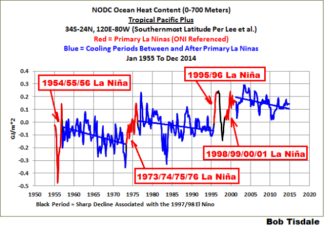
Figure 12
Obviously, the warming of the tropical Pacific Plus subset is dependent on the sunlight-forced warming during La Niñas.
Note: I’ve used the NOAA Oceanic NINO Index (ONI) as a reference for the “official” timing of La Niña events in that illustration. The original Oceanic NINO Index had the 1954 to 1956 La Niña extending into one month in 1957, making it the 1954-57 La Niña, and there are other minor differences, but they have little impact on the presentation in Figure 12.
Between the 1954 to 56 La Niña and the 1973 to 1976 La Niña, ocean heat content in the Tropical Pacific Plus subset decreased, because the tropical Pacific was releasing and redistributing more heat than it was gaining. Then the 1973 to 1976 La Niña not only replenished the heat lost, but it added to the heat content of the Tropical Pacific Plus subset. The 1973 to 1976 La Niña was followed by another multidecadal period of overall heat loss in the tropical Pacific Plus region, with the 1982/83 El Niño appearing as the sharp drop at that time. The 1995/96 La Niña then added more heat, much more heat, to the tropical Pacific, well above the heat that had been lost and redistributed since the 1973 to 1976 La Niña. And, as noted earlier, the 1998 to 2001 La Niña replenished the heat released by the 1997/98 El Niño.
As a reminder, heat is replenished during La Niñas by temporary drastic increases in the amount of sunlight reaching into and warming the tropical Pacific.
Note the negative trend in the ocean heat content for the Tropical Pacific Plus subset after the 1998 to 2001 La Niña. According to Lee et al., the ocean heat content in the tropical Pacific is declining because the ENSO-related waters are being transported to the Indian Ocean.
But the earlier multidecadal declines in the ocean heat content of the tropical Pacific are comparable to the latest decline.
Should the ocean heat content of the Indian Ocean also have decreased during those cooling episodes in the tropical Pacific?
Unfortunately, the data show just the opposite. From the late 1950s, the data for tropical Pacific plus region and the Indian Ocean mimic one another over decadal time periods…until the 1995/96 La Niña. See the two graphs in Figure 13, which present the two ocean subsets smoothed with 12-month and 61-month filters. That’s not too surprising, though, considering how poor the source data are for the NODC ocean heat content data prior to ARGO.

Figure 13
There could be a number of explanations for the initial mimicry and then divergence of the tropical Pacific and Indian Ocean subsets, including:
- The relationship between the tropical Pacific and the Indian Ocean changed after the 1995/96 La Niña.
- The data are so poor, due to the sparseness of source data, they can’t be used for attribution studies.
(I had once thought that the IPCC had made a similar statement to the effect of the ocean heat content data prior to ARGO were so dissimilar among datasets that the data prior to ARGO cannot be used for attribution studies. I can’t find that IPCC statement. If you know where to find it, please let me know.)
THE LONG-TERM EXTRATROPICAL NORTH PACIFIC DATA SHOW THAT CHANGES IN WIND PATTERNS THERE CAN CAUSE SUBSTANTIAL WARMING (AND COOLING) SHIFTS IN OCEAN HEAT CONTENT
Figure 14 presents the NODC-based ocean heat content data (0-700m) for the extratropical North Pacific (24-65, 120E-80W). The extratropical North Pacific is often isolated from the tropical North Pacific in studies, (1) because of the massive effects El Niño and La Niña events have in the tropics, and (2) because the climate of the extratropical North Pacific is strongly impacted by other factors. You’ll note that I divided the data into 4 time periods:
- 1955 to 1988 – The cooling period before the 1989/90 climate shift
- 1989 to 1990 – The climate shift
- 1991 to 2002 – The cooling period after the 1989/90 climate shift
- 2003 to 2012 – The warming period of the adjusted ARGO data.

Figure 14
It should be blatantly obvious to all that the long-term warming to depths of 700 meters in the extratropical North Pacific from 1955 to 2012 is dependent on the upward shift in 1989/90. That is, without that upward shift, the extratropical North Pacific to 700 meters would show cooling over the last 55+ years. The cooling from 1955 to 1988 was caused by a downward shift in the late 1960s. Obviously, something other than manmade greenhouse gases dominates the warming (and cooling) of the extratropical North Pacific.
There are no studies that I’m aware of that address those shifts in the ocean heat content of the extratropical North Pacific. But a similar shift in the sea surface temperatures there in the late 1980s is discussed in the 1994 Trenberth and Hurrell paper Decadal atmosphere-ocean variations in the Pacific. See the discussion of their Figure 6. The sudden uptake in ocean heat in the extratropical North Pacific should be the result of a shift in sea level pressures and resulting wind patterns there.
Bottom line for this heading: The long-term warming of the tropical Pacific plus and the extratropical North Pacific to depths of 0-700 meters are primarily dependent on natural factors, not manmade greenhouse gases. By analyzing the extratropical North Pacific and the tropical Pacific as one subset, Lee et al. overlooked those naturally caused warming events. Lee et al. also smoothed the data for the Pacific subset beyond recognition, allowing the models to appear to have properly simulated the warming, when they had not.
CLOSING
Lee et al. (2015) confirmed our past discussions of the disparity in the warming rates of the Indian and Pacific Oceans to depths of 700 meters during the ARGO era (limited by Lee et al. to 2003 to 2012)…and the reason for that disparity: the recent strong La Niña events were forcing ENSO-created warm water from the tropical Pacific to the Indian Ocean along the Indonesian Throughflow. In that effort, Lee et al. presented data and a specially programmed climate model.
Lee et al. (2015) filtered the data to make it appear as though the models were performing reasonably well at simulating ocean heat uptake, but as noted, I have found no description of that filtering.
The warming of the ocean heat content globally during the ARGO era, of course, depends on the adjustments made to the data. In other words, without the adjustments, ocean heat content data globally from 2003-2012 show no warming.
Lee et al., of course, attributed the long-term and short-term warming of the Pacific Ocean (0-700 meters) to downward longwave radiation (from manmade greenhouse gases). Unfortunately for Lee et al., the data, when broken down into tropical Pacific and extratropical North Pacific subsets, indicate that was not the case. This suggests the simulations of ENSO in the tropical Pacific and the simulations of ocean heat uptake related to variations in sea level pressures and wind patterns in the extratropical North Pacific were both flawed in the model used by Lee et al.
Further to attribution, Lee et al. appear to be following the IPCC’s failed, model-based assumption that only downward longwave radiation from manmade greenhouse gases are responsible for the warming of the oceans to depth. In Chapter 10 of the IPCC 5th Assessment Report, they used the same misguided (almost childish) argument they use for surface temperatures. Their Cell A from Figure 10.14 is presented as my Figure 15.

Figure 15
The caption for Cell A reads:
Figure 10.14 | (A) Comparison of observed global ocean heat content for the upper 700 m (updated from Domingues et al. 2008) with simulations from ten CMIP5 models that included only natural forcings (‘HistoricalNat’ runs shown in blue lines) and simulations that included natural and anthropogenic forcings (‘Historical’ runs in pink lines). Grey shading shows observational uncertainty. The global mean stratospheric optical depth (Sato et al., 1993) in beige at the bottom indicates the major volcanic eruptions and the brown curve is a 3-year running average of these values.
The intent of that illustration is blatantly obvious: Climate models that use only natural forcings as inputs do not simulate the warming of the global oceans to depths of 700 meters, while the climate models that also include anthropogenic forcings can produce the warming. Therefore, as the childish logic concludes, only anthropogenic greenhouse gases (primarily from CO2) could be the cause of ocean warming to depth.
What the IPCC obviously fails to consider is, the climate models they use for attribution studies do not (cannot) properly simulate the naturally occurring ocean-atmosphere processes that can cause the oceans to warm to depth or suppress that warming.
Also relating to the IPCC’s climate models, Lee et al. note:
It has been shown that the ITF [Indonesian Throughflow] volume transport is mainly dominated by interannual variability associated with El Niño/Southern Oscillation (ENSO; refs 18,19).
Yet the climate models used by the IPCC for attribution studies and projections of future warming still do not properly simulate ENSO…its basic processes or its aftereffects. In other words, based on the models used by the IPCC for their 5th Assessment Report, the climate science community cannot explain the disparity in warming between the Indian and Pacific Oceans.
LAST NOTE
And as a reminder, I had included the following comment parenthetically in the post: I had once thought that the IPCC had made a similar statement to the effect of the ocean heat content data prior to ARGO were so dissimilar among datasets that the data prior to ARGO cannot be used for attribution studies. I can’t find that IPCC statement. If you know where to find it, please let me know.
UPDATE
The pdf copy of this post is here.
Note: This post is relatively long. I’ll prepare a copy of it in .pdf form…hopefully later today…for those who would rather read it in that format.
Cheers and enjoy the rest of your long weekend…those of you observing this Memorial Day in the States.
Bob – typo
In the pentads 5 year bands, I suspect 1957-1962 should be 1958-1962. That’s as far as I’ve got so far.
Thanks, Peter. Corrected.
Correcting Ocean Cooling
Bob, what do you exactly mean with “leftover warm water”?
Hi Chris. During the evolution of an El Nino, a monumental volume of warmer than normal warm water can migrate eastward along the equator, with much of it below the surface. An El Nino does not consume all of the subsurface warm water, so it is transported west after the El Nino, during the evolution of the La Nina, most prominently at about 10N. You can actually see it in Animations 1 and 2.
Cheers
Thanks Bob, perhaps you can tell my how to move the pdf files from Adobe Reader to another file. Adobe refuses to cooperate and wants to charge me money. And we also have a long weekend in the UK, Whitsun and typically with UK bank holidays it is cold, grey and about to rain.
John: You can read PDF files with a number of different free PDF readers such as Foxit Reader (as just one example). If you are still having trouble, let me know and I can email you directly the info. in MS Word format, which can also be read with a couple of free word processing applications.
Thanks Spock2009. My gripe is that they used to be downloaded to whatever file I wished but after an “update” they are downloaded to Adobe with an Adobe number as the heading. I keep a set of files on several subjects and now all d/l@s go to Adobe without a real heading. Total crap. So I will try Foxit reader and come back to you.
Well I have Foxit but it would seem that I cannot transfer files from Adobe to Foxit. I might have to invest in a years conversion to Word at near £20. But I have made Foxit my reader preference instead of Adobe. Should be far easier and cheaper. Many thanks for the advice, much apreciated.
“Due to the drop in surface temperatures in the tropical Pacific during La Niñas, downward longwave (infrared) radiation is below normal”
How can temperature influence downward infrared radiation?
Chris, an increase in surface temperature results in an increase in upward infrared radiation. With the greenhouse effect, an increase in upward infrared radiation causes an increase in downward infrared radiation.
…and the whole process acts as a time- delay circuit, or a blanket which postpones, but does not prevent the inevitable loss/transport of energy to outer space.
Got it, thanks
Can anyone explain the supposed calibration error that caused the data to read no warming? I found this pdf file online but I haven’t read it yet. How could such a study make a thermometer calibration error on all their floats and not notice it far all those years?
Actually as I recall, there was an adjustment to the ARGOS float temperature readings a while back that was actually related to the pressure depth sensor showing an error in measured depth. I was (and still am) a little bothered by that adjustment, but the engineers I trust have claimed the problem as plausible, so I will take it as a good adjustment until I see evidence to the contrary. (It bugged me because it was yet another example of upward correction to established data sets. It seems a little too convenient that ALL the corrections lead to an increase in the rate of warming!)
Bob, we just had two posts contradicting each other….
This post quotes a paper from the UofMiami that says the Pacific has been cooling for the past decade…unlike the Atlantic which stores heat
http://wattsupwiththat.com/2015/05/22/uh-oh-looks-like-lewandowsky-and-oreskes-will-be-going-after-the-agu-now-for-admitting-the-hiatus-exists/
and this post quotes a paper from Norway that says the Atlantic has been cooling for the past decade
http://wattsupwiththat.com/2015/05/23/norwegian-observations-confirms-the-gulf-stream-has-been-stable-over-the-past-20-years/
……looks like the missing heat is still missing
Latitude, with respect to your first link, they mentioned a warming at depth in the Atlantic. It’s actually only occurring in the South Atlantic. See Figures 1 and 2 in this post,
In your second post, they’re discussing sea surface temperatures, I believe, in the high latitudes of the North Atlantic. Apples and oranges.
But, yes, there’s still heat missing.
Thanks Bob..
Thanks Bob, I’ve been waiting for your input and it was worth the wait!
“How refreshing. We’re seeing some realism from the climate science community.”
I believe we are seeing the house of cards that is CO2 alarmism beginning to sway. Fundamental science disciplines self-correct in a matter of years. Social sciences will shift away from CAGW when they find a replacement demon. It may take a decade to clear the thorny vines from our political systems, and three or four decades to rid our elementary and secondary schools of this rot. The people that worked so hard to convince others on moral bases will be the last to let go…if ever they do.
Please do not take those remarks as criticisms about the efforts of the NODC to assemble that data.
Spoken like a scientist.
The oceans have cooled overall as they have received less solar energy in the sunlight after 2003, the end year of the modern maximum in solar activity (recent higher temps were due to SC24 peak – now over).
Using SIDC sunspot numbers, for the 68 years from 1936-2003, in terms of sunspot activity, the Sun had 89% more activity than the previous 68 years,1868-1935, (annual SSN of 76 vs 40.2). Using Dr. Svalgaard’s preliminary revised SSNs from 2014 (to be finalized in August), the disparity was 71.7% (73.5 vs 42.8).
The Sun caused global warming!
Correct and this is what they are missing but will see our thinking is correct when the sea surface temperatures decline going forward in response to vey low solar activity.
Bob has showed us through his data this is taking place now.
CAGW sits on that infamous, figurative, three legged stool.
Leg one: Anthropogenic CO2 sources contributing to the atmospheric CO2 concentration between 1750 and 2011 are based on cherry picked assumptions, estimates, and wags to generate the desired result when in fact nobody really knows with certainty. (APS workshop) Could be natural sources, but IPCC’s mandate prohibits consideration.
Leg two: Compared to the climate’s natural ebb & flow of heat/energy over time (i.e. power & watts) the 3.0 W/m^2 of GHGs is inconsequential. Especially when the ocean/water vapor cycle is considered.
Leg three: The dire predictions of warming, ice melting, sea levels rising are based on GCMs (RCP 2.6, 4.5, 6.0, 8.5 W/m^2) which the pause/hiatus has rendered worthless. Even IPCC admits uncertainty about the GCMs value.
These three points are all that really matter and CAGW theory joins cold fusion, phlogiston, and the geocentric flat earth.
The warming of the ocean heat content globally during the ARGO era, of course, depends on the adjustments made to the data. In other words, without the adjustments, ocean heat content data globally from 2003-2012 show no warming.
================
In mid-2008, however, a team of scientists led by Catia Domingues and John Church from Australia’s CSIRO, and Peter Gleckler, from Lawrence Livermore National Laboratory in California, revised long-term estimates of ocean warming based on the corrected XBT data. Since the revision, says Willis, the bumps in the graph have largely disappeared, which means the observations and the models are in much better agreement. “That makes everyone happier,” Willis says.
=================
“corrected XBT data”. the adjustments were made to the observations, not to the models.
Ferd..,
Thanks, I remember reading about adjustments to ARGO a long time age and the hesitance to release data without correction.
Is the raw data available and the justification for the adjustments available?
Thanks
Not really adjustments like you are thinking. They found some buoys that were returning colder readings than they expected so they removed them from the pool. I doubt you can add them back in.
Richard,
Thanks,
I guess that is kinda like using your own server and deleting the stuff you don’t want others to see.
Same level integrity exhibited.
I think I’ve never heard so loud
The quiet message in a cloud.
=======================
I’m torn between thinking Kevin Trenberth must already know this, or that he might possibly be able to learn it from you.
==========================
kim, I suspect Trenberth understands this very well. If you’ll recall, many of my blog posts on this topic used to be linked on his (Media webpage:
https://bobtisdale.wordpress.com/2014/12/02/many-thanks-to-kevin-trenberth-for-being-open-minded/
It took a couple of days, but they were removed. Lucky thing I archived it:
https://archive.is/M5knR
Cheers
I’m afraid you are right. On this point I wish you were wrong.
==================
Thanks again Bob, great and clear work. Yeah, Trenberth must be one of us (sarc off). If he is a Kiwi, about time he proved it. Brett
This is a long post. It’s late here in Oz and I’ve just had a horrendous day dealing with the wonders of government bureaucracy that is the public hospital system, so I haven’t the endurance to read through it all. Maybe tomorrow. The first thought of my tired brain when seeing Ocean temperature discussions is to switch off. Let’s face it, nobody has any reliable, usable data to do any credible science on mean ocean temperatures. Not for the planet, not for individual oceans, not for depth, not even for local area. You can move a couple of feet in the ocean and get a 2C change in temperature. Anybody who has swam or scuba dived can confirm this.
Many would agree with you, but Bob makes a killer point with fairly reliable data.
============
I believe the trend is more important than actual mean temp.
Ahh, but the mean temp over flat periods can show the existence of regime changes, and that is what Bob has shown on his graphs. Also, I believe you will find that all the temperatures reported are anomalies from a stated baseline average rather than absolute measurements.
It’s kind of scary having all those atomic bombs flowing past india.
Actually just deviations…anomic bombs?
It is amazing how puny an atomic bomb is when compared to a cat 4-5 tropical cyclone. Nature is indeed worthy of inducing awe in the observer.
Yes, IIRC a cyclone “expends” the equivalent of 100 days of the entire electric generation capacity of the planet, each day it exists. Some of that energy is emitted into space as IR. Hence the pretty IR imagery. I expect this is one facet of the “thermostat”.
Thanks, Bob.
This is a very detailed view of the Pacific and Indian Oceans, clearly showing the role of sunlight, modulated by ENSO, in determining their heat content.
The Greenhouse theory of climate is again falsified.
Nope, but its effect once again failed to be unveiled.
============
Bob, I always learn from your posts. Thank you.
“The warming of the ocean heat content globally during the ARGO era, of course, depends on the adjustments made to the data. In other words, without the adjustments, ocean heat content data globally from 2003-2012 show no warming”.
Another buried lede…
I am rarely convinced by the animations. They are built from data with such low temporal and spatial resolution that I suspect the resulting display is badly aliased, and features could be moving any direction.
The other side must read you like a hawk looking for a vole in a hayfield. And then they take your straightforward observations and turn them into grant-funded pretzels via statistical methods shopping, making the little vole wriggle its trunk.
Would I a fly on the wall be. One year ago: “Have you seen Bob’s latest? Holy crap we have to get on this! So let’s brainstorm ways to turn this into catastrophic human-driven Earth killing drivers! Who has grants? Can you get an extension of that grant like by Tuesday? And someone needs to inform Al Gore. Come on people! We have work to do!” And then a year or two later, out poops the AGW paper. All because of a vole in a hayfield who continuously refuses to wriggle his trunk.
I’ve noted for several years that climate science skepticism is driving the research of the consensus alarmists. Time after time, lately, alarmists release a paper responding to trenchant criticism from the skeptics, and time after time, lately, the paper gets blown up in days, if not hours, by the likes of JeanS, Steve McIntyre, Nic Lewis, Bob Tisdale, and many others.
They’ve become a mad dog wagged by the tail of doubt. I’d snarl and froth, too.
===========
Not to mention a scientist from the Chinese academy of science who just discovered that the secular change of the Earth’s magnetic field has a component synchronous with the sunspot cycles. Just a coincidence that ‘Vuk’ has been going on about it here on the WUWT for two or three years. Not that Chinese scientists would be reading the reading the WUWT, or would they?
Always include links when referring to research. Otherwise you have done what is becoming all to common in Climate Science: Media release of results without direct reference to the journal article.
lts interesting to note how the North Atlantic has formed a “mini blob” of its own in the middle of the ocean.
Which has been due to a large Azores High sitting over that area for some time now. lt shows that strong sunshine and light winds soon warms up those SST’s.
Bob, your contributions and productivity and the graphics you compile are truly amazing. Thank you so much for your efforts, and please be assured that your work is deeply appreciated by numerous followers, including meself, sitting in Joburg at 5 000 feet above sea level and not too worried about the rising oceans lapping at my door. Our local MSM recently ran with a story from a usually sane and respected academic who said South Africans must embark on an ‘orderly retreat from the coast’ because of the rising ocean. What she is actually talking about is not rising seas, but the idiots that flout regulations and build their mansions as close to ocean as they can. How convenient to cite ‘climate change and rising seas’ when claiming from their insurers when their properties get smashed by spring tides and strong winds!
All the best to you Bob – strength to your fingers!
Dr. T. We really appreciate your professional analysis of these topics.
Donb, thanks for the title, but there’s no Dr. before my name.
I am convinced that the magnetic field (at low solar activity) has an effect on pressure and temperature of the Indian Ocean. The high pressure for long periods of greater influence on absorption of solar radiation.
“ESA’s Swarm mission will unravel one of the most mysterious aspects of our planet: the magnetic field.
Although invisible, the magnetic field and electric currents in and around Earth generate complex forces that have immeasurable impact on everyday life.
The field can be thought of as a huge bubble, protecting us from cosmic radiation and charged particles that bombard Earth in ‘solar winds’. Without this protective shield, the atmosphere as we know it would not exist, rendering life on Earth virtually impossible.”
http://www.esa.int/var/esa/storage/images/esa_multimedia/images/2014/06/magnetic_field_changes/14582173-1-eng-GB/Magnetic_field_changes_node_full_image_2.jpg
Sure there is; I honored you with the award long time passed, Teach. Besides, the volume of your original research dwarfs most PhDs.
================
High ren
‘South’ magnetic pole is a bit further east and a bit further south (63S, 136E).
Strength of about 100 nT is strength of a major geomagnetic storm at the higher latitudes. GM storms last only few days and 3-4 of these leave an imprint on annual numbers of about 20nT.
On the map (see below) it can be seen that the Indian Ocean ‘warm blob’ has a positive anomaly of 105nT (nanoTesla),.
What the coloured ellipsoid doesn’t show, and what should be of far greater interest to the WUWT readers, particular those currently in the US is the even stronger (at 115nT) negative ‘blue blob’ over the US Mid-West. My sympathy is with al those who were recently affected by bad weather in the area.
http://www.ngdc.noaa.gov/geomag/WMM/data/WMM2015/WMM2015_F_SV_MERC.pdf
Science is not currently interested in the climate-geomagnetic link, thus no conclusions should be drawn from the above remarks.
..
Due to the low solar activity that science will be forced to interest. During this period, the Earth’s magnetic field effect on the climate grows.
http://www.antarctica.ac.uk/about_antarctica/geography/images/admap_overview.jpg
We just changed that, O learned teacher!
Bob,
Thanks for your comprehensive effort and outstanding presentations.
I admit that I have yet to digest this particular presentation.
As a suggestion to you and others, who provide comprehensive studies, it would be helpful if you also provided a “Management Digest” summarizing your outstanding effort.
I have a wide list of individuals that I forward WUWT material to, and a brief, concise summary is needed for many who are not as versed in all the complex interactions as you and many others often describe. Sometimes I try to provide such a summary if I can. This is important to more widely distribute the data to technical communities beyond the climatologists and others well versed. I can say that distributing such data rarely leaves an CAGW believer among those who are open minded, which most Engineers happen to be.
Much of your material is more widely distributed than you probably realize in the Engineering community via Engineering Societies (of which I am a part) and they (like myself) are not sufficiently versed in all the complexities to quickly grasp the full essence of all your presentations. I realize they may not have been the focused audience, but where possible could we expand the audience?
I think the skeptic community could improve it’s messaging by not just undertaking comprehensive evaluations; but, also providing a “management digest” summarizing the key points. Could that be the next step to win the “war”?
Again I cannot stress the importance and effectiveness of widely distributing WUWT presentations to Engineers et. al., that is one of my current missions in life, but I hesitate to widely distribute more complex material such as this posting (and others) without a simplified summary; since, while many are well versed in Thermodynamics, radiant heat transfer, etc, many are not sufficiently studied in the more complex aspects of “climatology” you often present.
Again, thanks for your efforts, contact me if you want to be more aware with some examples of how widely some of your and other WUWT material is distributed in the Engineering Societies/ communities. Mr Watts has my e mail address if you would like to contact me, or do you have another suggestion?
All the best,
Figure 11.
There’s so much more variability in the Sea Surface Temperature anomalies when La Ninas are meant be dominant compared to when El Ninos do.
Why?
What makes the heat distribution under La Nina conditions more conducive to heat entering and leaving the system that El Nino conditions.
Clearer skies?
Thanks Bob, great post. As always, thorough and clear.
Sea Surface Temperature Anomalies.
http://weather.gc.ca/data/saisons/images/2015052500_054_G6_global_I_SEASON_tm@lg@sd_000.png
The animated map of water flow neatly explains the dry seasons of 2006-08 in Australia caused by colder than usual water off NW Australia.
How do we tell if such heat transfers between oceans is temporary or a changing cyclical pattern?
There are significantly wetter periods in Austalia’s recent past, what was the driver?
It is not true or even worse, it does not make sense. The “net radiation imbalance at the top of the atmosphere” is not measured, it is calculated using ocean heat content data, see CERES EBAF Net Balancing. Therefore the “net radiation imbalance at the top of the atmosphere” suggests nothing, it is ocean temperature that does.
Which is warming indeed. At a rate of 13.5 mK/decade for global vertical mean temperature anomaly of the upper 2000 m of oceans in the last 60 years. At this rate it takes 740 years to get warmer by 1 degree centigrade.
That’s how an “increasingly warming planet” looks like.
Oh, that means a 274 mW/m² global imbalance over the last six decades, assuming 90% of the heat goes into the upper 2 km of oceans.
There is the following statement at the ARGO website:
http://www.argo.ucsd.edu/global_change_analysis.html
I note that there appear to be almost no reporting ARGO bouys in the Indonesian Throughflow currently.
http://www.argo.ucsd.edu/statusbig.gif
I don’t believe they report in shallow water, and I think that area may be a bit shallow (400 to 1500 meters). Also they don’t spend much time in there as the currents can be up to 8 knots.
I wonder what happens to an ARGOS float at its 1000m sleep depth when it is suddenly thrust through a strait with only a 400m clearance. Do they run aground?
The attrition rate is about 800 a year.
Post in moderation.
Is this the answer to Bob’s question about the IPCC’s view on ARGO data?
“The global Argo dataset is not yet long enough to observe global change signals. Seasonal and interannual variability dominate the present 7-year globally-averaged time series. Sparse global sampling during 2004-2005 can lead to substantial differences in statistical analyses of ocean temperature and trend (or steric sea level and its trend, e.g. Leuliette and Miller, 2009). Analyses of decadal changes presently focus on comparison of Argo to sparse and sometimes inaccurate historical data. ”
2nd paragraph on this page:
http://www.argo.ucsd.edu/global_change_analysis.html
From the horse’s mouth.
Thanks for the quote, It doesn’t add up…
Obviously something that the ARGO site says triggers moderation.
It is important to understand that under the Antarctic there are serious crustal movements which release the heat. Need to more carefully to look at geological structure of Antarctica, to see where there is a rupture of the earth’s crust.
http://emiliajugowiec.w.interia.pl/Antarktyda.jpg
Scientists from British Antarctic Survey (BAS) have discovered previously unknown volcanoes in the ocean waters around the remote South Sandwich Islands. Using ship-borne sea-floor mapping technology during research cruises onboard the RRS James Clark Ross, the scientists found 12 volcanoes beneath the sea surface — some up to 3km high. They found 5km diameter craters left by collapsing volcanoes and 7 active volcanoes visible above the sea as a chain of islands.
http://www.antarctica.ac.uk/images/press/1541/ssi-poster-map_thumb.jpg
Excellent article. We need this kind of data.
It’s 105 F for a week in Phoenix. How come my swimming pool isn’t 105 F?
I like 85 F water. To get that takes heat. If I shut the heat off, the pool gets colder. CAGW theory says that 105 F air should heat that pool.
What am I missing here?
AR5 TS.6 Key Uncertainties
This final section of the Technical Summary provides readers with a
short overview of key uncertainties in the understanding of the climate
system and the ability to project changes in response to anthropogenic
influences. The overview is not comprehensive and does not describe in
detail the basis for these findings.
OHC:
Different global estimates of sub-surface ocean temperatures have
variations at different times and for different periods, suggesting
that sub-decadal variability in the temperature and upper heat
content (0 to to 700 m) is still poorly characterized in the historical
record.
Below ocean depths of 700 m the sampling in space and time is
too sparse to produce annual global ocean temperature and heat
content estimates prior to 2005.
Thanks, John Bills
The rest of TS.6 is well worth a read too.
http://www.ipcc.ch/pdf/assessment-report/ar5/wg1/WG1AR5_TS_FINAL.pdf