By Christopher Monckton of Brenchley
In May 2015, the Pennant, a biannual magazine for retired UK armed forces personnel, carried an article entitled The Earth’s Climate by Rob Varley, chief executive of the Met Office, the world’s oldest national weather bureau.
The Met Office article does not represent a fair or balanced summary of the science on the climate question. This detailed response, prepared at the suggestion of a reader of the Pennant, is illustrated with some 50 well-sourced graphs that are intended to be clear at a glance. The key facts that restore balance to the discussion may be gained from these graphs in five minutes.
The greenhouse effect, with the consequence that (all other things being equal) our returning to the atmosphere some minuscule fraction of the 30,000 μmol mol–1 CO2 formerly resident there may cause some warming, has been posited hypothetically, demonstrated empirically and explained theoretically, even at the quantum scale.
However, the questions whether all other things are equal, and how much warming our sins of emission may cause, and whether the cost of mitigation today is less than that of adaptation the day after tomorrow, are by no means settled.
Are today’s temperature changes unprecedented?
Mr Varley says:
“… warming of the global climate system is unequivocal. Many of the observed changes are unprecedented over decades to millennia. In just over 100 years, the world’s surface has warmed by around 0.85 Cº. This represents a significant rate of increase in mean global temperature …”
Here as elsewhere, Mr Varley’s statement only gives one side of the story. His implication that the warming of five-sixths of a Celsius degree over a century is “unprecedented” is false. The following are among the points he has omitted:
Ø The Central England Temperature Record, which is not a bad proxy for global temperature change, shows warming from 1693-1733 at a rate exceeding 4 Cº/century equivalent – more than twice the maximum rate sustained for 15 years or more in the 20th century. Therefore, there is nothing special about the 20th-century warming rate.
Ø Our associates at co2science.org have compiled a list of some 500 peer-reviewed papers demonstrating by measurement of proxies for pre-thermometer temperatures that the Middle Ages were warmer than the present. As Ljungqvist (2010) shows, the Roman and mediaeval warm periods were at least as warm as the present, and the mediaeval warming rate was not much less than the rate observed in the 20th century:

Was the glacial-to-interglacial global warming as little as 3 Cº?
Mr Varley says:
“To provide some kind of perspective, the global temperature is estimated to have increased by 3-8 Cº over the last deglaciation, occurring in two main steps between 17,500 and 10,000 years ago …”
However, again several balancing considerations have been omitted:
Ø Jouzel et al. (2007) have shown that throughout the past 810,000 years global mean surface temperature has varied by less than 3.5 Cº either side of the long-run mean. The climate object is near-perfectly thermostatic. It is, therefore, difficult to get global temperature to change by much:

Ø At present we are about 1 Cº above that long-run mean, but each of the previous three interglacial warm periods was warmer than the present.
Ø The most recent such warm period was 2.5 Cº warmer than the present. So there is nothing “unprecedented” about present-day temperatures.
Was 2014 “the warmest year on record”? And does it matter?
Mr Varley says:
“The WMO confirmed that globally 2014 was the warmest year on record, with 14 of the 15 hottest years occurring this century.”
Yet again we are given only part of the story. The following are among the relevant considerations omitted or erroneously presented:
Ø When one talks of “the warmest year on record”, the “record” only goes back to 1850 (HadCRUT4), or 1880 (NASA GISS and NCDC), or 1979 (RSS and UAH). The first three depend on the same historical climate data network. They all show 2014 as the warmest year since 1850 (or 1880). So what?
Ø The RSS and UAH satellite datasets do not show 2014 as the warmest year. It would have been fairer if this fact had been mentioned.
Ø The Mediaeval Optimum was warmer than today by up to 3 Cº in some places. The Roman, Minoan and Old Kingdom climate optima were also warmer. The Holocene Climate Optimum was warmer than today for 4000 years.
Ø According to the two satellite datasets, there has been no global warming at all for more than 18 years. The trend is zero. In a briefing on global warming, you should surely have mentioned that fact.

Mr Varley says:
“Closer to home, Met Office statistics show that in 2014 the UK as a whole experienced its warmest year on record with the eight warmest years in this series all occurring since 2002. It was also the warmest year on record in the Central England Temperature series which extends back to 1659.”
Yet again, balancing considerations are omitted:
Ø Cherry-picking an individual year, or a selection of individual years, is not how statistical trends on time-series are determined.
Ø The Central England Temperature Record, is cited, but with no mention of the fact that from 1693-1733 the rate of global warming was twice that which occurred over any period of 15 years or more during the 20th century.
What is the ideal UK and global temperature?
Mr Varley says:
“The UK mean temperature for 2014 was 9.9 ºC, 1.1 Cº above the 1981-2010 long-term average and the warmest year in the UK series …”
The balancing considerations:
Ø Cherry-picking an individual year in an individual territory tells us nothing about the global temperature trend, which has been statistically indistinguishable from zero for at least a quarter of a century on the satellite measures, notwithstanding record increases in CO2 concentration.
Ø In a cold country like Britain, what problems would be caused by the temperature warming up a little? The human body works best at about 19 ºC, yet the U.K. average temperature in 2014 was less than 10 ºC.
Ø And what, in any event, is the ideal global (or, for that matter, UK) temperature? Unless we are told that, we cannot be at all sure that an increase of 1 Cº in UK surface temperature is anything other than welcome.
Stretching the vertical axis of the temperature graph
Next, Mr Varley reproduces a graph of global temperature change since 1850 published by the IPCC in its 2013 Fifth Assessment Report. The IPCC stretched the graph along its vertical axis (and Mr Varley has stretched it a little further):

Ø Such alterations of the aspect ratio by accentuating the vertical axis are calculated to make the actually rather small change in global temperature over the period seem bigger than it was.
Ø In the upper panel of the image, we have restored the aspect ratio of the IPCC’s original graph. In the lower panel, we have reduced the vertical emphasis to show that the apparent steepness of the temperature increase in the IPCC’s graph is merely an artefact of the choice of aspect ratio. Vertical exaggeration, now commonplace in climate science, is a rather less than honest graphical technique.
Imagined effects of global warming
Mr Varley says:
“In addition to the Earth’s surface temperature, many tens of other climate variables are measured, extending from high in the atmosphere to the depths of the oceans. These are analysed at academic and research centres around the world, with thousands of scientists pooling their findings and expertise to build a picture of past and current climate. Emerging from these observations is evidence of change: global and regional temperatures are increasing; Arctic sea ice, mountain glaciers and snow cover are shrinking; warming oceanic waters are expanding, leading to sea level rise; atmospheric humidity is rising as a warmer atmosphere’s capacity to hold water increases; the frequency of rainfall and temperature extremes has increased. These changes are already impacting on natural and human systems.”
Now for the balance:
Ø Of course there is “evidence of change”: the climate has been changing for 4.5 billion years and it will continue to change.
Ø No one denies that the climate changes. The question is whether Man has had or may yet have a significant effect, and whether that effect, if significant, will be beneficial or detrimental.
Ø Mr Varley makes no mention of the real difficulties in distinguishing between natural and anthropogenic climate change.
Ø Mr Varley’s statement that global and regional temperatures are increasing is scientifically meaningless in the absence of a stated start date.
Ø Global temperature has not increased for more than 18 years, and has not increased significantly in the quarter of a century since the IPCC’s First Assessment Report in 1990.
Ø Some regions, such as Antarctica and central Africa, have scarcely warmed, if at all.
Ø Global temperatures are lower than during previous climate optima during the Holocene.
Ø Global temperatures are also lower than in each of the previous four interglacial warm periods.
Ø Mr Varley says Arctic sea ice, mountain glaciers and snow cover are shrinking, but he is silent on the fact that Antarctic sea ice has grown; that mountain glaciers in the Himalayas, in Greenland and in Antarctica show a long-established and unalarming pattern of advance and retreat; and that winter snow cover in the Northern Hemisphere shows no particular trend:

Ø Mr Varley says warming oceanic waters are expanding, leading to sea level rise, but he is very careful not to quantify this. According to the GRACE gravitational-recovery satellites, sea level actually fell from 2003-2008:

Ø According to the ENVISAT sea-level satellite, sea level rose from 2004-2012 at a mean rate equivalent to just 1.3 inches per century:

Ø The inter-calibration errors between the series of laser-altimetry satellites from which the “official” sea-level record is obtained are greater than the sea level rise they purport to show.

Ø Tide gauges and benchmarks show very little sea level rise. And why should there be much sea-level rise? The ARGO bathythermographs show that in the first 11 years of the record, 2004-2014, the ocean to a depth of 1900 m warmed at a rate equivalent to 0.23 Cº per century:

Ø Mr Varley says that atmospheric humidity is increasing: but not all records show this, as the following chart of column water vapor demonstrates:

Ø Mr Varley says the frequency of temperature extremes has increased. However, the weather is like the cricket: new records are set somewhere in the system all the time. It is the nature of the object.
Ø Significantly, there have been just about as many cold-weather records as hot-weather records set in recent years, even though theory would lead us to suspect fewer cold-weather records in a rapidly warming world (though it is not warming by much). And more all-time high temperature records were set in the 1930s than in any decade since:

Ø Mr Varley says the frequency of rainfall extremes has increased. Yet the IPCC, both in its 2012 report on extreme weather and in its 2013 Fifth Assessment Report, draws no such conclusion.
Ø On the contrary, the IPCC says there is little or no evidence that such rainfall changes that have occurred are anthropogenic.
Ø Mr Varley’s own own Met Office records tell a story different from Mr Varley’s. For instance, the longest annual national rainfall record, the quarter of a millennium in England and Wales, shows little change.
Ø There is also very little change in U.S. annual rainfall over the 48 mainland states:


In fact, as the Global Warming Policy Foundation recently concluded, deaths from extreme weather are currently at an all-time low, notwithstanding record increases both in greenhouse-gas concentrations and in global population over the period covered by its graph:

Is sea ice really declining rapidly?
Next, Mr Varley shows a graph of September sea-ice extent in the Arctic similar to the following:

What he does not show is the Antarctic sea-ice extent. It has increased somewhat:

Moreover, in the Arctic as in the Antarctic, the amplitude of the seasonal variation dwarfs the relatively small changes in sea-ice extent:

Mr Varley says:
“Observations of the climate to current day show that the poles have warmed at twice the global average, and computer model predictions suggest this trend will continue.”
Here is a more complete picture:
Ø In recent decades the south polar region has shown little or no warming, as even the IPCC concedes.
Ø The extent of global sea ice shows remarkably little change over the past 35 years:

Ø “Computer model predictions” of 1.4-4.5 Cº global warming per CO2 doubling have remained unchanged for 36 years: yet the IPCC’s medium-term global warming predictions made 25 years ago have proven exaggerated by a factor of two. Would it not have been appropriate at least to mention the models’ continuing exaggerations?
Ø Likewise, there is now a substantial list of papers in the reviewed journals suggesting that climate sensitivity could be as little as one-fifth of the IPCC’s current central estimate of about 3 Cº per CO2 doubling. Mr Varley has given only one side of the climate-sensitivity case.
Rising CO2 concentration and its effect on global temperature
Mr Varley says:
“Since pre-industrial times, the atmospheric concentration of CO2 has risen by 40% to a level unprecedented in at least 800,000 years … This has led to an enhanced greenhouse effect.
“Scientists have calculated that more than half of the observed warming since the mid 20th century was caused by the increase in man-made greenhouse gases.”
Once again, there is plenty of balancing evidence:
Ø Today’s CO2 concentration may be unprecedented in 800,000 years, but, notwithstanding the increase in anthropogenic emissions, to the nearest tenth of one per cent there is no CO2 in the air at all.
Ø In the Neoproterozoic era, 750 million years ago, the atmosphere was 30% CO2 and the planet did not fry.
Ø In the Cambrian era 550 million years ago the concentration was 20-25 times today’s.
Ø In the Jurassic era it was 12-15 times today’s. Yet here we all are.
Ø Mr Varley has mentioned only the theoretical harm that he imagines warmer weather may cause, without mentioning the many benefits of increased CO2 concentration, not least in increasing the net primary productivity of trees and plants worldwide by 2% per decade; increasing the yield of staple crops by up to 40% per CO2 doubling; and increasing the resistance of plants and crops to drought.
Ø Also, cold is a far worse killer than warmth. It is no accident that 90% of all species live in the tropics, and fewer than 1% at the Poles.
Ø Mr Varley says, “Scientists have calculated that more than half of the observed warming since the mid-20th century was caused by the increase in man-made greenhouse gases.” Certainly that is what the IPCC has long maintained. However, in this respect the IPCC is not honoring its obligation to reflect the peer-reviewed scientific literature.
Ø Though propagandists have sought to maintain that there is a “97% consensus” to the effect that recent global warming is mostly manmade, the truth – given in Legates et al. (2013) – is that only 0.3% of climate science papers published in the 21 years 1991-2011 stated that recent global warming was mostly manmade:


Ø The truth is that at present we are unable to distinguish between the respective magnitudes of the anthropogenic and natural components in the global warming that unaccountably stopped more than 18 years ago.
Ø In one sense, however, it might legitimately be said that global warming is manmade. For the terrestrial temperature records have been relentlessly and unidirectionally altered to make early-20th-century temperatures cooler and later temperatures warmer, in a manner calculated falsely and perhaps substantially to overstate the true warming rate in the 20th century:

Ø The NCDC’s adjustments are influential, because all three of the longest-standing terrestrial temperature records rely on its historical climate network for the compilation of their datasets. The changes made by the NCDC to the historical climate network data in just eight years are shown here:

Ø The tampering over the past seven years shows how earlier temperatures have been pushed ever lower and later temperatures pushed ever higher. There may or may not be legitimate reasons for this tampering, which always appears to go in the direction of amplifying Man’s influence on climate (the equivalent GISS “adjustment” is even larger than for NCDC), but it introduces an additional uncertainty to temperature measurements that Mr Varley’s article fails to reflect:

Are the computer models of climate reliable?
Mr Varley says:
“It is through models that we predict future climate, but not until they have been tried and tested to see how well they reproduce historic climate. Simulations of the future point towards further warming, and changes in all components of the climate system, including means and extremes of temperature, more intense and frequent rainfall events over many land areas, increases in sea level, and further ice melt.”
Again, here are some of the balancing considerations omitted by Mr Varley:
Ø First, the models have been “tried and tested”. They have failed. Anyone can re-tune them to match past climate. The real test is whether they can predict future climate. They cannot. In 1990 the IPCC predicted that the rate of global warming would be twice what has occurred in the 25 years since then:

Ø Secondly, the IPCC predicted in 2007 that there should have been significant global warming in the decade since 2005. However, there has been hardly any:

Ø Thirdly, the IPCC in 2007 and again in 2013 predicted short-term global warming, relying on the CMIP3 and CMIP5 computer models, but again the models’ predictions have proven excessive:

Ø Fourthly, the latest models continue to diverge ever farther from observation:

Ø Fifthly, models have also over-predicted regional warming, for instance in the tropics:

Ø Sixthly, warming at the North Pole has also been somewhat over-predicted:

Ø Seventhly, models can be tuned to fit the past but cannot predict the future:

Ø Eighthly, even the oldest weather organization in the world gets it wrong:

Ø Ninthly, even the earliest predictions were exaggerated, and it was on the basis of these exaggerations that urgent action on climate was demanded:

Ø Tenthly, models also over-predict ocean warming, and by a wide margin:

Ø The pre-final draft of the IPCC’s 2013 Fifth Assessment Report showed a graph demonstrating that all four previous Assessment Reports had flagrantly exaggerated their predictions of the increase in methane concentration. The observed trend falls below the prediction interval in all four previous Assessment Reports. However, at the insistence of Hungary and Germany, the graph was removed from the final report not because it was incorrect but because “it might give ammunition to sceptics”.

Ø Twelfthly, the models have been particularly bad at predicting temperature trends in the crucial tropical mid-troposphere about six miles up, and the IPCC’s self-confidence in models’ predictive skill increases as the gap between the models’ exaggerations and observed reality widens:

The IPCC has itself conceded that the models in which it once imprudently placed absolute faith have proven defective, at least in the medium term. In 2013 the IPCC admitted that 111 of 114 models had run hot, explicitly abandoned them, and substituted what it called its “expert assessment” for their output. The effect was dramatic: the IPCC all but halved its predictions of near-term warming:

The models, then, have not proven reliable. Though the chief executive of the Met Office might be forgiven for not mentioning as many failures by the models as have been illustrated here, no account of the supposed threat from global warming will be balanced unless it records that the models have erred, and have very nearly always erred on the side of considerable exaggeration of what may not after all be a threat.
Has climate science become dishonest?
The one-sidedness of Mr Varley’s article raises legitimate questions about whether those who profit from the vast sums paid by panicky governments to climate science are acting not only in a fair and balanced way but also in an honest way. There is evidence of unethical conduct by a small number of influential scientists promoting alarm that, on the evidence, is unjustifiable. Some examples of outright dishonesty will now be given. Mr Varley’s article contains no hint of this unethical conduct.
Ø The IPCC’s 1990 First Assessment Report had stated its “substantial confidence” in the models: yet the warming trend in the quarter-century since 1990 falls substantially below the entire interval that the IPCC had then predicted. Over-claiming certainty about what is uncertain is the central dishonesty in climate.
Ø The pre-final draft of the IPCC’s 1995 Second Assessment Report stated five times that evidence for human influence on climate was lacking, but the IPCC asked a single scientist to rewrite the report to remove all five references, replacing them with a single statement that a human influence on global climate was now discernible. The “consensus” is that of just one man:

Ø The front cover of the World Meteorological Organization’s 1999 State of the Global Climate report showed three attempted reconstructions of 1000 years’ temperature changes derived from tree rings (below left): however, from 1960 onward the true tree-ring data (white inset panel, below right) did not reflect the observed warming. The true data for one of the three (green, below right) showed a decline where thermometers showed an increase. To conceal these divergences, the WMO graph spliced the last 50 years’ measured warming (black, below right) on to the tree-ring data, but without disclosing that that was what had been done. All three tree-ring records were tampered with to conceal the splicing, making it appear that they matched real temperatures. In particular, the pronounced decline in the green tree-ring dataset, a decline that was directly contrary to measured global temperatures and hence establishing that tree-rings are not a suitable way to reconstruct past global temperature change, was eradicated:


Ø The “hockey-stick” reconstruction of the past 1000 years’ global temperatures in the IPCC’s 2001 Third Assessment Report (below right), visibly similar to the WMO’s graph, also purported to abolish the medieval warm period. The IPCC adopted this doctored graph as its logo until independent research showed it was a fabrication. Subsequently, the author of one of the three tree-ring datasets and of the hockey-stick graph denied under oath in court that he was an author of the WMO’s 1999 graph: yet his name appeared on the graph and in the acknowledgements on the inside front cover of the publication:


Ø The hockey-stick graph is inconsistent with empirical reconstructions in some 450 peer-reviewed papers. It is also inconsistent with the sea-level record, and with the previous understanding of the past 1000 years’ temperature change:


Ø The IPCC has refused to correct a major statistical error in its models. An influential graph in the IPCC’s 2007 Fourth Assessment Report showed the temperature record of the previous 155 years overlain by four linear trend lines starting 150, 100, 50 and 25 years previously (below). Each successive trend line was steeper than the last. The offending graph was displayed twice in the report, each time with the conclusion that the rate of global warming was accelerating and that humans were to blame. In fact, the slope of the 25-year trend line had two previous precedents in the temperature data (yellow arrows, below right), so there had been no acceleration in the warming rate. The fact that there has been no global warming for more than 18 years confirms the absence of any acceleration. The IPCC had used a false statistical technique:


Ø A sine-wave (above left) has a zero trend by definition, but the same false technique can be made to show that it has an apparently accelerating uptrend (above right). The IPCC refused to correct the error when one of its own reviewers complained to it.
Ø As noted earlier, there has been systemic tampering with the terrestrial temperature records so as arbitrarily to depress the true temperatures in the early 20th century and to elevate them at the end of the century in a manner calculated artificially to increase the apparent rate of global warming. The satellite records, however, are not so easily tampered with. Since they began in 1979, they show appreciably less warming than the much-altered terrestrial records. In April 2015, Professor Terence Kealey, former vice-chancellor of Buckingham University, announced an independent inquiry into the tampered terrestrial records.
Are floods and droughts worsening and crops failing as predicted?
Mr Varley says there are –
“… implications for flooding, drought, crop production, inundation of coastal communities, and threats to ecosystems unable to adapt quickly enough to the rapid rate of climate change.”
The balancing facts:
Ø CO2 is good for crops. Crop yields have grown with particular rapidity since 1950. There are three main reasons: improved agricultural practices, warmer weather, and CO2 fertilization (nearly all anthropogenic CO2 was emitted after 1950):

Ø Rising CO2 in the air causes a very rapid increase in combined crop yield:

Ø As for droughts, the area of the globe suffering drought conditions has declined throughout the past 35 years:

Ø As for “inundation of coastal communities”, sea level is not rising fast enough to make much difference globally: nor, on present trends, is it at all likely to do so.
Ø As for adaptation of species to “rapid climate change”, the conspicuous feature of the past two decades is the very slow – indeed, almost non-existent – rate of global warming. There is no evidence that the rate of global warming seen in the terrestrial and ocean datasets – equivalent to 0.25 Cº per century – will accelerate tenfold by 2100, as it would have to do to reach the IPCC’s central estimate of 21st-century global warming.
Ø Temperatures vary by as much as 100 Fº between midnight and midday in some places. The notion that species cannot adapt to a warming one-twentieth as big as this diurnal variation is ill founded – and the evidence to date indicates that no warming at that rate is at all likely.
Conclusion
The Met Office makes very large sums every year out of climate change. It is part of an international network of governmental and corporate interests that benefit greatly from giving a narrowly one-sided view of global warming science.
The wider range of scientific facts and results than that which Mr Varley chose to put forward surely demonstrates that – at the very least – there are two sides to the climate question. And it is equally surely the duty of the Met Office to take a neutral, fair and balanced scientific stance.
On the evidence here presented, Mr Varley has misled his readers by not presenting a balanced account of the state of global warming science. He is by no means unique. Profiteers of doom all over the world have taken advantage of the near-universal ignorance of science among politicians, press and public. That ignorance is costly, not only in treasure but also in lives. It is too often falsely claimed that climate change harms the poor. There has not been enough change to harm anyone, nor will there be. However, misguided policies to make the rich richer by addressing the non-problem that was global warming are already making the poor poorer still.
If there is a debate, there’s skepticism. There are scientists who debate and there are warmists. They are mutually exclusive. by definition and by avocation.
And there are the facts. Not unimportant I presume.
By facts I assume you mean empirical instrumental data.
Unfortunately, that has no place in climate science, especially as it completely contradicts the all-important
computer gamesclimate models, which it unequivocally does.“The data doesn’t matter. We’re not basing our recommendations on the data. We’re basing them on the climate models.”
~ Prof. Chris Folland ~ (Hadley Centre for Climate Prediction and Research)
@ oebele bruinsma, in science facts are a result of integration of data (from reproducible experimentation) into the hypothesis. As you are now aware cAGW is not a fact based on science. You CAN make up your own facts with dodgy science but you really can’t make up your own data.
The output of computer models are not facts.
Dear Sun Spot, they make up (adjust/correct/improve) data all the time. Facts will not stop the global juggernaut.
Eric Sincere is wrong. Facts are the only thing that will stop the global juggernaut. It is only when enough of the governing class realize they can’t get away with an anti-scientific stance that they will slowly, belatedly come off the Kool-Aid. Much taxpayers’ money will have been wasted; many poor people who could have been lifted out of poverty will have died; global population will grow fast instead of stabilizing because it is only through prosperity that population stabilizes, and the poor are now to be denied the prosperity that cheap, affordable, fossil-fueled base-load electricity can provide. But, in the end, great is truth, as the apocryphal book of Esdras says, and mighty above all things.
What a splendid presentation! I think this is your best so far.
I would like to see this produced as a pamphlet, both in PDF and paper, and in multiple translations. JoNova has experience in this, and I’m pretty sure she would be glad to help.
“However, the weather is like the cricket”
Both global, both much watched, both very difficult to understand, even for the experts?
And I am pleased to see that you are in favour of open debate rather than censorship of opposing views.
All you climate realists, alarmists, deniers, raise your hands.
A. I l hate San Diego climate, avg temp 17.6, I hate Sidney 17.7.
B. I like SF avg temp 14.1, , I love wearing a peacoat in July.
c. I really like London 12.8..
d. I love Anchorage avg. temp 3.8.
It’s going to get a lot warmer. from an avg global temp cur currently to,we calculate, an average of 17.5.
Nobody wants to live in San Diego temps. Believe me they don’t. ITts too hot there. For example, almost nobody runs AC in summer for more than 200 hours–most San Diegao homeownerssdon’t own AC–and most San Diegaans either d0n’t run a furnace.or do so and run thereat for less than 1000 hours per year.
If global avg. temp goes up tp SD level, the world is doomed. Nobpdy wants to live there.
Let’s say the modelers can figure out where the 17.5 C avg. temp lines in the No and So hemispheres in 2100 will run. Have they done that? Let’s take 2030. Good bet for real estate investment.
Something about fish in a barrel…
1. Not a single scientific fact.
2. TBH, I would prefer London to SD, but I am firmly in the minority. Have you actually asked anyone their preference? Maybe looked at population trends? Studied statistics?
3. “I love wearing a peacoat in July.” If you insist on quoting from Plato’s ‘The Republic’, do include a citation.
That said, are you sure ‘schoolsie’ was a wise choice for a pen name?
Why malign San Diego weather? It is similar to Sydney and lots of people like Sydney’s temperature. Go a few hundred Ks north and you get to Brisbane, which is even better. If you don’t believe me, go live in Perishers. Or worse, Chicago.
What I am trying to say, is that there is nothing wrong with warmer weather. Warmer weather is better for crops. It has been warmer in the past, including when homo sapiens was alive. That’s homo sapiens, as opposed to the species that replaced it: homo true-believer.
Some people like warm, some people like cold.
We aren’t all the same.
Learn to deal with it.
What was the stated purpose of the article in the Pennant entitled The Earth’s Climate by Rob Varley (chief executive of the Met Office)?
Was it introduced as mere entertainment – horror stories to scare the children with?
Or was it implied that it was a balanced piece of journalism? Which it may not achieve.
It’s hard to judge the article without knowing how it was portrayed.
Irrelevant fact. Rob Varley’s cousin was a guest at my wedding last month.
M Courtney
Irrelevant fact. Rob Varley’s cousin was a guest at my wedding last month.
___
Congratulations. To you, not Varley’s cousin.
Hansen’s 1988 graph is quite telling.
His scenario for zero CO2 emitted after 1988 is effectively a graph of “no influence from CO2” in the environment.
It is thus telling that the satellite and radiosonde data follow this prediction quite closely despite CO2 having continued to rise even more that his “worst case scenario. From Hansen’s own graph we can conclude that CO2 has no significant effect on the global climate.
Yes, good of you to point this out.
Monckton’s legend on his portrayal of Hansen’s 1988 graph is incorrect, scenario C is not for “no CO2 emitted after 2000” as Monckton claims.
Actually Phil,
per James Hansens’s own words:
From: Michael Crichton’s “Scientific Method”
“Scenario C was described as “a more drastic curtailment of emissions than has generally been imagined”, specifically greenhouse gases were assumed to stop increasing after 2000.” -James Hansen
Michael Crichton’s “Scientific Method”
http://www.columbia.edu/~jeh1/2005/Crichton_20050927.pdf
Have you sent this to Cardinal Turkson yet?… and every other bishop?
Conclusive proof that more is not better. This is a post for morons. Monckton is pretty much insane; only in a world full of nitwits and sycophants is he not put away. Mr Monckton, its not just ‘Mr Varley’ saying these things, its most of science, government and those who care about the next generation; do please stop making an utter tit of yourself.
[Try to control yourself. Debate facts and evidence if you can. Only people who cannot do that resort to your kind of insulting commentary. ~mod.]
When you read the post you will see the issue was with what Mr Varley did not say.
The complaint was that My Varley was unbalanced.
Yes, no crisis. Carry on bingeing on fossil fuels supplied by [snip] in the industry.
We were planning on it anyway.
Especially since there is no reason to stop.
Mike, by writing thus you just proved yourself to be what you are.
Insults are noted.
Mike has never pretended to be anything other than a Kool-Aid drinking acolyte.
There there, Hammy. Have you taken your meds today?
Yes thanks, Bruce. Hope you’re not one of the sycophants…..
So says the chief sycophant.
Your post contains:
[X] Demanding we “think of the children”
[X] Appeal to authority
[X] Personal insults
A good candidate for the hate mail of the week! Thanks Bert! Heh. 😀
you’re hilarious, no rebuttal, no facts, just an ad-hom, priceless
Titter!
Not quite a full shilling are you, Mike?
The claim that the most of science agrees with Mr. Varley was dealt with in the article.
As to what govts say, govts say whatever is necessary to benefit the politicians running the govt.
Udder tit might have been more apropos.
“those who care about the next generation”
That would be those of us who want to see the benefits of technology – clean water,food, warmth in winter, education, health care, and even a bit of fun – available for all the children of all the people in the world, rather than those things being restricted to a bunch of super-rich money-shufflers.
That was your counterpoint? I would say you have nothing worth saying,therefore would have been wiser to keep it all in your mouth instead.
Mr. Hamblet,
I am very interested to know of the source for your belief that “most of science” is “saying these things”.
(Let us set aside for now the tortured grammar of your statement, and what this might imply about your standing to talk down to morons and nitwits.)
Absent that, perhaps you could at least scrounge up a list of scientists who have signed their names to a petition, or have gone on record as “saying these things”, along with some statistics which might tend to indicate what percentage of “science” these signatories represent?
Any definitive and unambiguous collection of actual names of actual scientists who have expressed a conviction on CAGW, in a public way and for the record, will do.
I myself have a list of well over 30,000 scientists who have signed a public petition stating that you have absolutely no idea what you are talking about.
Here below is a link, so you may begin your journey to the truth, if and when you decide that ignorance is really not a particularly flattering way to present oneself in a public forum.
Even one which is not viewed by millions of people all over the world, and even if it was not preserving your lack of manners and naiveté for all to see, forever and ever.
But especially one that is.
Regarding your list, I hope you understand that it is quite important that you produce one, lest you show yourself to be making these ill-mannered remarks despite having no factual basis for doing so.
One might rightly view a person who would do such a thing as mentally unbalanced. a notion I am sure you would be anxious to dispel.
Thank you in advance.
Here is that link:
http://www.petitionproject.org/index.php
Menicholas. That is a very convincing argument against CAGW, I am not a believer in consensus in science, but when a group of well qualified academics take issue with the greatly exaggerated 97% “consensus” of believers, I think that is a totally different matter. These people have a great deal to lose if they are wrong. namely their reputations. The supporters of the cause have everything to lose if they are (inevitably) proved wrong; jobs, money and reputation. Majority consensual agreement with an established view, is quite often wrong, minority consensual agreement against an established view is quite often correct.
In my view this explains the insulting, rude, dismissive and boorish behaviour of some (not all) of the people that post on this website. They actually know they are wrong!
When decreases the TSI, the CO2 cools the upper troposphere, because drops water vapor.
http://woodfortrees.org/plot/pmod/from:1975
Negative phase of the AMO starts.
http://woodfortrees.org/plot/esrl-amo/from:1800
Thanks, Christopher, Lord Monckton.
This piece exposes the means by which the AGW hoax has been perpetrated.
Dishonesty in every step of way makes the IPCC not only irrelevant to the climate change assessment processes, but also detrimental to humanity.
The Met Office and the WMO share this responsibility, together with many other governmental agencies. Scientists and administrators have been corrupted into using our taxes against us.
http://www.metoffice.gov.uk/research/partnership
Mr Varley is clearly looking to keep his fat taxpayer’s salary and is no doubt looking for a knighthood or more. He wouldn’t let facts get in the way of personal ambition.
Mr Hamblett is understandably angry. The 50 graphs shown in the head posting are indeed designed to be understood even by people like him, who have no scientific training or understanding. Perhaps for the first time, he has exposed himself to the overwhelming and well-sourced body of data, here very clearly and simply but authoritatively presented in visual form, that indicates the value of caution before believing the Party Line on climate. His hate speech here is his initial manifestation of distress and shock as he realizes that “most of science” is not supportive of the Party Line as he has been taught to believe it. And since when did anyone rely upon “government” for scientific truth?
As for “those who care about the next generation”, not the least of their cares is that at present the next generation are being taught the same dumb, long-discredited falsehoods in which Mr Hamblett is rightly furious that he was led to believe. The overwhelming evidence against those falsehoods can no longer be concealed, ignored, or denied.
It is highly unlikely that “Mr” Hamblett even read the article.
Yes, but he might now. 🙂 A great reply from Christopher Monckton.
Has anybody else noticed that the “appeal to authority” argument so beloved on the warmist side (e.g. Mike Hamblet), is a classic positive feedback system?
We must join the consensus BECAUSE there is a consensus. That joining, will of course make us part of the consensus, which then will be used to justify even stronger pressure on the hold-outs.
No actual reference to real world observation is even required! We can push on to 100% agreement using positive feedback alone!
Must…join…the…Collective! Must…join…the…Collective! Borrggg….
My admiration of Lord Monckton knows no bounds, and I am deeply skeptical about CAGW, BUT:
I don’t change my beliefs from just having “facts” and charts flung at me, no matter who is flinging. I may use them as a starting point in my own investigation, but Nullius In Verba applies at all times. I do not “know” something unless I can explain HOW and WHY I know it. My beliefs are based on what I can determine, to the best of my ability, to be actually true. I am personally responsible for recognizing my own biases and not fooling myself.
The spirit of Richard Feynman watches over my shoulder.
In response to Mr Cranch, the value of presenting well-sourced data in visual form is that anyone who is correctly skeptical of all sides in any scientific question is free to go and check the references for himself. He will find that on this side of the debate no one will attempt to “convert” him in some quasi-religious sense. We will merely present the evidence as clearly as we can and allow the facts to speak for themselves.
It is a fact that nearly all the models’ predictions – predictions on which the climate scare was founded – have proven to be exaggerations, and most of them wild exaggerations.
it is a fact that the rate of warming since 1990 is half of what the IPCC had then predicted on the basis of “substantial confidence” that its models had captured the relevant core properties of the climate object.
It is a fact that the rate of terrestrial and of ocean warming over the past decade is equivalent to only 0.25 Celsius per century.
It is a fact that the satellite lower-troposphere datasets show no warming at all for well over 18 years.
it is a fact that deaths from extreme weather have fallen substantially.
it is a fact that most extreme-weather events have not increased their frequency, intensity or duration, and some hace declined.
It is a fact … but you get the point. These facts are at odds with what the mainstream news media are peddling. If Mr Cranch considers any of these facts to be materially incorrect, or if he believes that any of these facts is irrelevant to the question whether Man is ever likely to have a major impact on the climate, he is of course free to say so, with reasons.
Mr. Monckton, first, I am sincerely honored by your personal response. Second, I meant nothing personal and am not disputing your conclusions at all. I quite agree with most of the facts you mention. But I agree with them because I have independently verified them through personal investigation and evaluation of the data, not by accepting them on authority.
The trouble with throwing “facts” at a warmist is that he is under no obligation to accept them, or refute them, and will usually do neither. The same works in the other direction too. Warmist True Believers posting charts and links on WUWT are not “proving” anything.
Richard Feynman: “Have no respect whatsoever for authority; forget who said it and instead look what he starts with, where he ends up, and ask yourself, ‘is it reasonable?'”
Mr Cranch should understand that I was brought up in the Classical tradition, studying grammar, then logic, then rhetoric, and all within the context of an agreed set of moral norms, including respect for the objective truth.
I do not care whether those who do not have eyes to see nor ears to hear will neither look nor listen. I speak the truth as best I can, and I explain where I got it from, and I do my best to make sure that the truth is available to those who are willing to grasp it. That there are some who are of the Devil and will not grasp it is a fact of life, but that will not stop me speaking the truth.
Mr Cranch states that I have flung facts and charts at him. No. I wrote the head posting, in which there are facts and charts. But Mr Cranch was under no obligation to read them. If he already knows the facts and has the charts, good for him. But he is not the only grub under the stone. Others less fortunate will perhaps find the information useful: and just about every graph is referenced, often in some detail, so that those who want to verify the science underlying the graphs can do so. Like it or not, that is not “flinging” facts and graphs: it is how scientific information is exchanged. If Mr Cranch does not like it, he should perhaps not spend any of his time at this scientific website.
Yes, most people here know all of that but perhaps Mr. Cranch’s underlying obstacle is how to navigate around communists, (i.e. liars), in government and leftist media who repeatedly distort, misrepresent and even invert the data being used to ascertain “the facts”. It isn’t good enough to simply source the data either as with, for example, the NCDC who has altered the USHCN data into a bald face lie.
I fully appreciate the amount of effort you clearly have exerted to produce all of the graphical representations that refute the CAGW hoax and, in fact, find them very comforting and reassuring as I would surmise is true for the rest of the choir here.
So what I believe is needed in addition to your work are more irrefutable facts, facts that exist outside the realm of measured data, non-measurement type evidence such as those dug from past geologic investigations for example to serve as logical benchmarks to help convince the Mr. Cranchs of the world to have reason to trust that the data you are using as “the facts” is true because it agrees logically with that non-measured type evidence.
As an example, one of the earlier instances of non-measured evidence I ever heard, Rush Limbaugh described the revelation of how a glacier in the Alps had receded high enough to reveal an ancient silver mine that had not been touched for several hundred years. Most striking in the account was Rush’s description of what exactly was discovered when they examined the mine. Firstly, the opening was sealed up tight. Once inside the tools were found in perfect working order, wrapped and neatly arranged near the front of the mine.
The mine had been worked for a long time, (decades? centuries?), but only in the SUMMER when the snow line receded high enough to allow the workers to climb up there with their provisions. They would open the mine, mine the silver during the summer then close the mine before the return of snow to make it ready for the next summer. Toward the end of the Medieval Warming Period, the summer period they had to work the mine became shorter and shorter until one year – it arrived so late that they decided, it is surmised, that it wasn’t worth the effort of going up there for such a short time.
Perhaps there were some on again and off again summers of silver mining after that but ultimately – the glacier won as global temperatures kept going down and the mine remained there hidden and waiting for their return until now, hundreds of years later and it has become warm enough AGAIN for the glacier to recede up higher than the mine.
Mr. Cranch, I hope stories like that, when confirmed by you, will help you independently decide who is telling the truth and who is lying.
Eustace Cranch, the way I see it, Lord Monckton’s excellent article is not presented to convert rabid alarmists or anyone else on a mission. The article is getting the truth out in the open where regular people currently led astray by MSM can see it.
Before I found WUWT I felt alone in the world, as though I was the only one seeing the nonsense of CAGW for what it was. I couldn’t understand how the “scientists” could be so blind. When I came here, I was delighted to find the data laid out in the open, links and debate and intelligent conversation plus real scientists doing real science. It was a starting place and I come here every day. I have learned so much.
That’s what Christopher Monckton is offering. A starting place, facts and figures, data – the real world. I’m sure many will take advantage of.
If only Richard Feynman were alive today….
Unlike many scientists he always had the courage to speak the truth, however inconvenient.
And many thanks to Christopher Monckton for an excellent piece.
Chris
Memo to Copernicus: Not much has changed over the centuries, fact checking is still a hard thing to do for authorities and those with vested interests. Such effort is still swamped by determined consensus and back room prejudices.
Thank you Monckton for another useful read. Just one thing though that I’ve found to be useful in explaining to folk what’s really being talked about here is to ask them if they are enjoying this beautiful spring day (round these parts spring is making its presence known) when the inevitable affirmative answer is supplied I point out that if they can remember a spring day anytime in the last 40 years that was 1 degree cooler (still in that Fahrenheit mode here in the US) THAT’S the difference that’s the amount of climate change being discussed as bringing on the end of the World as we know it. They could also saddle up into their penny loafers to stand at the high water mark on the beach and be fully protected for the amount of sea level rise in the last ten years.
Professor Moerner says we might see 5 plus or minus 15 cm of sea-level rise over the coming century. So your penny loafers might protectu you from a whole century of sea-level rise. Or you might get your feet a bit wet 50 years from now. Either way, not a crisis.
Yes, no crisis. Carry on bingeing on fossil fuels supplied by Monckton’s friends in the industry.
Mike Hamblett,
Since you brought it up, please post just one verified example of evidence showing that the rise in CO2 is causing a “crisis”.
Make sure it show a crists which is directly attributable to aCO2, and who is being adversely affected (again, directly attributable to the rise in CO2), and the extent of the current ‘damage’ or ‘harm’.
I’ll wait here, while you scoot off to realclimate or wherever for some talking points.
However, if you don’t answer I will assume you’re driving somewhere in your fossil fuel powered car.
Do you ever notice how the acolytes find it impossible to believe that anyone could ever disagree with them, unless they were being paid to.
dbstealey
May 14, 2015 at 3:29 pm
Mike Hamblett,
However, if you don’t answer I will assume you’re driving somewhere in your fossil fuel powered car
===================================================================
Nah, no need to drive, probably lives in his mom’s basement.
Mike the only way I would be politically comfortable in discussing the alternatives is if you are willing to allow nuclear power to be treated as less than an anathema, if so, have on! Lets make the power that human kind needs.
I think it’s somewhat sad that climate science has made so very little progress over so many years with the expenditure of so much money and resources. Think of the CO2 produced by carting hordes of climate scientists and their NGO hangers-on from one resort city to another on a regular basis for more than 20 years.
Mr Varley only did his best to apply some lipstick to a very ugly looking pig. In the words of Wikipedia ‘a futile attempt to disguise the true nature of a product’.
IMO, there has been progress in real climatology, but only in spite of the efforts of “climate scientists” (ie computer gamers) to sabotage and derail the real science.
Sadly, many of the most important advances in climatology have come from outside the discipline, so corrupted has it been by “climate science”. The gamers need to have their supercomputers taken away and be sent out to collect data, if they know how, which I doubt.
The PDO for instance was discovered c. 1997 by a University of Washington fisheries researcher, not a climatologist and surely not a “climate scientist”. The recognition of multi-decadal cycles in oceanic circulation should have made “climate scientists” realize what nonsense their GIGO models were, but nooo! It only made them alter data and squeal louder at the trough.
Thanks for providing such a great resource
Hear, Hear!
Book-marked for future use.
Mr. Moncton does have my absolute admiration based no only the scientific data he provides, but mostly for the courage to do so in the face of assault from those who believe in settled science, which is a travesty unto itself. It is one thing to have a difference of opinion of the science with another scientist, but it is a tremendous battle when the governments, which have unlimited resources, are demanding an agenda be shoved down the throats of its citizens. Authoritarianism indeed.
Many thanks to kokoda, and to many others here, for their very kind comments.
I hope that this article will be sent under registered post to the Met Office, the new DECC minister and the Prime Minister. They really should be made aware of the real world.
I think you might be on another world…..?
I’m afraid you’re right :-((
mh,
The sky is blue here on Earth. What color is it on your planet?
It should also be printed in the next issue of The Pennant.
Why is The Central England Temperature Record not a bad proxy for global temperature change?
..
Do we need only one thermometer and does all the whining about poor coverage of surface temperature records come to naught? Is it possible to have your cake and eat it?
In response to “I couldn’t help it”, the Central England Temperature Record is not a bad proxy for global temperature change for two reasons: one theoretical, one empirical.
Theoretical: Central England is in a temperature latitude about halfway between the negligible temperature change in the tropics and the 2x average temperature change at the Poles, caused by poleward advection of the solar radiation that chiefly arrives in the tropics (this is called “polar amplification”).
Empirical: over the past two PDO cycles (i.e. going back around 120 years) the difference between the global and Central England temperature anomaly trends is 0.01 Celsius degrees, which is negligible. Hope this helps.
Excellent response. Too bad the CET is now being “adjusted” too.
(Another wasted effort by a banned sockpuppet. Comment DELETED. -mod)
“I couldn’t help it” should of course appreciate that now that we have multiple global records of temperature change we are able to study the rate at which the planet is warming. As the head posting makes plain, in the past decade or so the rate of warming both in the terrestrial records and in the ocean record has been equivalent to 0.25 Celsius degrees per century. In other words, we do not really know whether the world is warming at all, and the satellites suggest that for approaching two decades it has not warmed at all.
The central England record nicely reflects the global records in showing little warming from 1979-1997, then a sudden lurch, then little warming from 1999 to the present. That pattern of warming is not consistent with – and is, therefore, not caused by – increases in greenhouse gases.
icouldnthelp…
…putting words in people’s mouth.
Since ‘icouldnthelpit’ has not answered, I suspect he is lying down with a cool wet cloth over his forehead and eyes wondering, what went wrong?
(Another wasted effort by a banned sockpuppet. Comment DELETED. -mod)
Of course you would change the subject, after being solidly put in your place by the Lord.
Mr. Monckton,
That was indeed a large number of excellent points. I was wondering what your source was for the .25C/century figure?
In answer to VikingExplorer, over the past decade or so the rate of warming in the three terrestrial temperature records and in the ARGO bathythermographs has been equivalent to 0.25 Celsius degrees per century. Until I calculated the ARGO trend, no one seems to have determined it, which is why there was so much talk of the “missing heat” hiding in the oceans. Well, if it is hiding, it is hiding below 7500 feet, where the mean ocean temperature is around 3 Celsius. Most likely thing is that during the current mostly negative phase of the PDO, with a slightly less active Sun, there’s very little warming going on. There might be more warming if the PDO goes positive, but on the evidence of the past century that might not happen for another 10-20 years. Either way, I’m not sure we’re even going to see 1 Celsius of warming this century.
Mr Varley says:
“Closer to home, Met Office statistics show that in 2014 the UK as a whole experienced its warmest year on record with the eight warmest years in this series all occurring since 2002. It was also the warmest year on record in the Central England Temperature series which extends back to 1659.”
Paul Homewood has posted here about the impact of increased sunshine on the CET. The clean air acts post war have probably had more impact on temperatures than CO₂
Take a look at Page 236 of the paper. Climate Audit Readers might recognize the following proxies:-
13. Avam-Taimyr – Briffa et al. (2008)
25. Yamal – Briffa (2000)
26. Polar Urals – Esper et al. (2002a)
41. Lake Korttajarvi – Tiljander et al. (2006)
95. Sheep Mountain – ITRDB CA534 – Graybill
Without these the Ljungqvist would have no doubt have concluded that the MWP was warmer than at present.
What time and where? MG From: Watts Up With That? To: mickgreenhough@yahoo.co.uk Sent: Thursday, 14 May 2015, 15:55 Subject: [New post] In the climate debate, hear both sides #yiv2944946309 a:hover {color:red;}#yiv2944946309 a {text-decoration:none;color:#0088cc;}#yiv2944946309 a.yiv2944946309primaryactionlink:link, #yiv2944946309 a.yiv2944946309primaryactionlink:visited {background-color:#2585B2;color:#fff;}#yiv2944946309 a.yiv2944946309primaryactionlink:hover, #yiv2944946309 a.yiv2944946309primaryactionlink:active {background-color:#11729E;color:#fff;}#yiv2944946309 WordPress.com | Anthony Watts posted: “By Christopher Monckton of BrenchleyIn May 2015, the Pennant, a biannual magazine for retired UK armed forces personnel, carried an article entitled The Earth’s Climate by Rob Varley, chief executive of the Met Office, the world’s oldest national weat” | |
“there are two sides to the climate question”, a great point that people on the CO2 alarmist side never seem to grasp…
Lord Monckton does not fall into the trap of binary thinking.
“The wider range of scientific facts and results than that which Mr Varley chose to put forward surely demonstrates that – at the very least – there are two sides to the climate question.”
(My emphasis.)
If time and empirical evidence (observation) proves that CO2 is not the main driver of climate on earth, will we get our carbon tax money back?
Surely you jest!
and don’t call me Shirley
The charts become an overwhelming collage of colors after a few minutes, and overwhelm readers rather than teach.
.
In fact,one could read the entire piece and not learn these climate basics:
(1) Earth’s climate varies,
.
(2) 99.999% of Earth’s climate history is unknown (other than huge changes, such as the multiple ice ages),
.
(3) Average temperature is probably a meaningless statistic — the measurements are rough, with a large margin or error, and small changes may be meaningless random variations that only look like trends because too-short periods of time are studied,
.
(4) No one knows what a “normal” average temperature is, and the concept of “normal” may not make sense since our planet is not in thermodynamic equilibrium,
.
(5) There is no physical evidence of any harm to Earth from more CO2 in the air, and much evidence that green plants are growing faster, and
.
(6) Climate models are near-worthless computer games that waste the taxpayer’s money
.
Nothing unusual has been seen in Earth’s climate in the past 150 years, other than humans with ulterior motives (seeking political and economic power) trying to scare others about a climate boogeyman that can only be “seen” with their silly computer games, or with special 3D “climate” eyeglasses with one red lens and one blue lens.
.
Earth’s climate has improved during the lives of every human alive today — slightly warmer, and green plants grow faster.
.
The coming climate catastrophe is a false boogeyman, just like prior environmental “catastrophes” that never happened: DDT, acid rain, hole in the ozone layer, etc.
Climate analysis for non scientists, including the only climate centerfold in the world at the link below:
http://www.elOnionBloggle.blogspot.com
Mr Greene worries that the head posting might not inform the readers of six facts. All six are made quite clear in the posting. (1) the first two graphs show climate changing; (2) the uncertainties in climate are made clear throughout; (3) the uncertainties in determining mean temperature change, and the tamperings with the data, are made explicit; (4) the point is made that Mr Varley has not specified an ideal mean surface temperature; (5) evidence of CO2 fertilization is shown in several graphs; (6) there are a dozen graphs showing how wrong the models have been.
“””””…..(3) Average temperature is probably a meaningless statistic …..””””
Average Temperature is no different from ANY other average. You sum all the data set values and divide by the number of items in the set.
For example (1+2+3+4+5+6+7+8+9) / 9 = 45 /9 = 5
Works for ANY data set of real numbers; simplest by far of all the algorithms of statistical mathematics.
The meaninglessness is in one’s interpretation of what one thinks it means.
Physically (real universe) it has NO meaning. The real physical universe has already responded to any and all variables exactly when they were. So it doesn’t need to wait around to find out what some ancient mathematician dreamed up to do with numbers.
The numbers in a data set, have only one specification.
They must be real numbers. They need have NO relationship of any kind with each other.
Just walk into any library and go along any shelf, book by book, in any order, and open each book quite randomly at any place, and record the page number (either left or right or both).
The algorithm will give you the exact value of the average of those numbers; ANY (real) numbers.
Just don’t make the mistake of believing that the average means something; it doesn’t.
PS. I omitted to say that I found Christopher’s colorful graphs quite informative.
I personally don’t have time to plot numbers from data sets , but my eye can pick up on what it sees from a graph; and colors are always helpful. Those graphs, are not intended for hanging in The Louvre ; of in the loo !
So I always find reading MofB’s stuff informative and useful , and often entertaining as well; which never hurts.
So thank you for the effort Lord Monckton.
G
And sometimes, “of” is intended to be read as “or” !
Old Kiwi habit, known as typography !
g
My Lord,
I suggest that your paper be sent to “Life and Work”.
They might even print it, and if they don’t then we should be told.
(Life and Work is the magazine published from time to time by The Church of Scotland.))
I’d be delighted if Oldsedog sent the head posting to “Life and Work”.
Christopher, once again many thanks for a logical and well thought out article.
The one thing in all your graphs that struck me though, was the one with regard to “Tampering”. When I first looked at this graph, I thought the blue and red were almost mirror images, when I looked more closely the deviations in the blue were greater than the deviations of the red. If this is so, the opposite may well be happening, global cooling. I appreciate the satellite data does not show this but, the satellite data only shows a small fraction of this time scale. If global cooling is occurring we need to know ASAP!
In response to Andrew Harding, given the very large measurement, coverage, bias and tampering uncertainties in most of the relevant datasets, it is possible that the Earth is cooling: but one cannot say so for certain. What one can say is that even if one takes the datasets at face value, tampering and all, there is certainly nothing like as much warming going on as had been predicted by the now-failed models.
[Policy violation; personal ad hominem attack. ~mod.]
Christopher Monckton,
Your graphics, just from an information transmission perspective, are superb. Kudos to you or whoever constructed them.
Many thanks to Max Photon for his kind words about the clarity of the graphs. We’ve been working on them to try to make them as clear as possible. Field-testing over the years has shown that a heading of a few words is helpful; that labeling should be clear; that trend lines should be very bold; and that a Post-it Note giving a little further information provides a useful orientation.
We have also found that, even for a scientific audience and certainly for a non-scientific audience, conveying most of the information in clear graphical form – though it is time-intensive – punches well above its weight. A couple of years ago, I was giving a talk to several IPCC lead authors at the University of Tasmania. I explained that a particular equation in the models could not possibly apply to the climate. But it was only when I showed the graph of the equation that one of the lead authors – who had until then been sneering all the way through – said; “Have you published this in the journals?” No, I said, I was still working on it (it has been published since). “But you must publish!” he said. “This changes everything.”
On another occasion, I showed graphs like these to a group of sixth-formers in Colombia. Before the presentation, I took a vote. About half the class believed that Thermageddon was at hand. I showed the graphs, explaining each of them briefly, answered their questions, and then took another vote. Not one hand went up in support of the bedwetters’ side of the case.
The form master was fascinated. He arranged for me to do a presentation to 200 trainee intelligence officers in Bogota. I quoted Sun Tzu on all warfare being deception, and I used global warming as an illustration of how a layman could use logic and other techniques to expose a defective argument even in a field with which he was unfamiliar. One of my earliest examples was – of couse – the hokey-stick graph that falsely abolished the medieval warm period. I said to the future Jaime Bonds, “How does one go about checking whether the hokey stick or the IPCC’s original graph showing the medieval warm period and the little ice age was correct?” I said that the bedwetters trumpeted the fact that warmer weather meant sea-level rise; that I had found a graph of 1000 years’ reconstructed sea level; that the graph was poorly correlated with the hokey-stick; but that it was well correlated with the IPCC’s ealier graph showing the medieval warm period (when sea level was 8 inches higher than today) and the little ice age (when it was 8 inches lower than today). The Director of the school was captivated by this graph.He slipped out of the room and returned a few minutes later clutching something in his hand. At the end of the talk, after I had answered questions, he came up on stage and said, “I have never done this before for a single lecture, but this one was so instructive that we have decided to award the Intelligence Medal of the Army of Colombia to Lord Monckton.” It was the graph that did it – you can see it in the head posting. The medal – bling factor 5 – is on my mantelpiece as I write. When I returned to the UK and told my UKIP chairman in Scotland that I’d been awarded an Intelligence Medal, he said, “Intelligence? You?” That’s what friends are for.
¡Enhorabuena! ¿Habla usted castellano?
I much regret having to tell Sturgis Hooper that I have not yet learned Catalan, a Romance language more vigorous than Spanish and akin to the Provencal tongue.
Christopher Monckton,
As an artist I can tell at a glance that you are bringing many tried-and-true methods to bear in your graphics. While many might dismiss being exacting in color (absolute and relative), font type, font size, choice of titles, length of titles, etc., etc., as nit-picky Type A behavior, IT TOTALLY MATTERS! The tiniest changes can have an enormous impact on the viewer’s comprehension. Actually, it’s an entire area that I love, and take to like a duck to water (because I’m nit-picky and Type A).
Incidentally, the very reason I love to cartoon — especially using the single panel format — is that in some instances a well done cartoon can go far beyond even the best graph’s ability to communicate. A picture is worth a thousand words, but a good cartoon … you just can’t beat it 🙂
Sometimes I think an excellent cartoon is maximum data compression.
Anyway, excellent work! Keep it up!!!
” the hokey-stick;”
The c was deliberately omitted, I presume.
RoHa,
Of course it was. In the interest of accuracy.
For everyone who does not know Catalan, there is this incredibly handy resource. It also comes as a smartphone app, which can translate spoken words too:
https://translate.google.com/
¡Enhorabuena! ¿Habla usted castellano? = Congratulations! Do you Castilian Speaks?
You have to work out the syntax a lot of times, but the site also has a place where you can add suggestions to help make it work better in the future.
Max Photon makes the excellent point that one should use cartoons to convey a message. No one does cartoons about global warming better than the inimitable and agreeable Josh – and his cartoons are actually funny, though they also make the serious point.
I am thinking of asking Josh whether he would like to collaborate with me on a book project, where we’d combine his stock of splendid cartoons and my stock of informative but simple graphs. By this method, we’d reach a much larger audience than with a book consisting solely of graphs or solely of cartoons. We might even have a best-seller on our hands.
Menicholas,
Yes, automatic translating software is still far from perfect, but is useful as a start. Even dropping the “Usted” as not needed still produces “Speaks Castilian?” in Google Translate. The English auxiliary verb “do” is tricky, as is our whole system of compound verbs.
Yet Spanish also uses an exact duplicate of our verb “to be” in its auxiliary function with a gerund, as in “What are you doing?”, which in Castillian can be either, “Qué estás haciendo?” or “Qué haces?”. The suffix “-iendo” is clearly cognate with “-ing”, showing the kinship of the two languages despite up to possibly 5000 years of separate evolution (with some “hybridization” largely thanks to the inclusion in English of so many Latin, French and other Romance loan words).
Some specialists consider Catalan a dialect of Occitan, of which Provencal is (or was) a dialect. Others feel it is different enough to merit language status. There is (or was) substantial mutual intelligibility.
In Spain there exists a linguistic continuum, so it’s hard to separate languages from dialects, but “Spanish” includes at least four distinct languages, three Romance and of course Basque. The three Romance tongues are Galician in the NW, which is the ancestor of Portuguese, the Castilian complex in the center and Catalan in the east. Some consider Asturian-Leonese (between Galician and Castilian) and Aragonese (between Castilian and Catalan) to be separate languages rather than dialects of Castilian.
I pay homage to Catalunya every chance I get.
But of course everybody in Catalonia also knows Castilian to some extent or another, so, much as I like the local lingo, I’ve always just gotten by on Castilian.
Some linguists like to joke that a language is a dialect with an army and a navy – see John McWhorter’s popular works (i.e. aimed at the interested layman). It happens in lots of places, of course. He gives France, Germany and Italy, among others, as examples.
We have a house in the Costa del Sol, Spain (we are there at the moment). A few weeks ago we had a long weekend in Barcelona, beautiful city lovely people, I speak some Spanish (not as much as I would like to, but I’m getting there) I had no problem with menus street signs etc. because Catalan is so similar to Spanish and the Spanish translation was nearly always available.
Near the urbanisation where our house is situated there is a huge desalination plant which was built as per the decree of the EU that water is going to be a scarce commodity due to AGW together with more drivel about the desertification of Southern Spain. I am pleased to report that the reservoir supplying our property is full and in the 16 years we have been coming to this part of the world this desalination plant has never been needed to supply fresh water. Another example of taxpayers money being wasted by the AGW scam!
JCR,
So true. A good example is Dutch, which is a Low German dialect with one and a half armies, those of the Netherlands and Belgium (with both Flemish and French speaking personnel).
Some dialects of Occitan (related to Catalan) in the south of France still barely survive. They thrived well into the 19th century before conscription and nationalized education helped extirpate them. St. Bernadette of Lourdes was thought stupid because of her problems at school, but they stemmed from her speaking the most outre, Basque-influenced Gascon dialect of Occitan, but being instructed in French, a northern Gallic “oil” language rather than southern “oc” tongue (“oil” and “oc” are each language group’s word for “yes”, which doesn’t exist in Latin).
Yes, the graphics are superb, but the resolution is quite low.
Mouse wheel scrolling just increases the noise and results in larger, more blurrier images.
Might I suggest a change in the the html code, so that the images on the presentation page, when clicked on, enlarge to their original hi-definition resolution.
Thank you Christopher Monckton for all your work.
Lord Monckton,
Thanks for this graphic summary of the skeptical case.
A few quibbles, which I mention so as to avoid giving ammo to your opponents.
1) A major reason for increased wheat yields has been the Green Revolution, ie the breeding of higher-yielding strains of wheat, with heavier heads and shorter stalks, designed to make better use of chemical fertilizers. The other factors you mention have of course helped, including more plant food in the air. Same goes for other grains.
2) Your figures for past CO2 levels appear too high. At the very least, please cite sources.
While there had been estimates of Neoproterozoic Era concentrations of 90,000 ppm, actual measurement of the cap carbonates from after the Marinoan glaciation (650-635 Ma) of the Cryogenian Period (850-635 Ma), second of the Era, found “only” 3200 ppm, and possibly less. It’s thus unlikely that 750 Ma, “the atmosphere was 30% CO2”. During the glaciation, CO2 was likely to have been lower. So this higher estimate needs a source.
Correct me if wrong, but I assume your 30% comes from beyond the high end (29%) of Pierrehumbert’s calculation of the level of CO2 needed by itself to melt the Marinoan ice sheets, but that’s not how the glaciation ended. He didn’t actually argue that that is what the level really was. It’s actually better for the skeptical case if some other mechanism than CO2-caused warming brought the planet out its Snowball (or Slushball) Earth intervals.
There was however a time early in the history of the atmosphere when CO2 does appear to have been over 300,000 ppm, but that was back in the Archean Eon (~4000 to 2500 Ma), when the sun was substantially weaker.
Similarly your estimate of CO2 concentration for Cambrian Period (not era, as you state) of the Paleozoic Era of Phanerozoic Eon, beginning ~541 Ma (not 550), of 20-25 times today’s is also higher than GEOCARB’s or anyone else’s, so again, a citation would be in order. For the early Cambrian it might have been as high as 7000 ppm, or 17.5 times the present level. Later it fell, so that the average for the period was around 4500 ppm, or over 11 times now.
It appears as if you might have relied upon this graph, the right side of which shows concentration in terms of times the average level for the Quaternary, not “today’s” higher concentration. Better just to go by the estimated parts per million, IMO. With very high error bars, you can get higher multiples of today, but also, IMO, better to stick with the center line estimate.
http://upload.wikimedia.org/wikipedia/commons/7/76/Phanerozoic_Carbon_Dioxide.png
Same goes for the Jurassic Period (not era) of the Mesozoic Era. Again, relying on the best estimate rather than using the highest error bar range from the graph above, levels were about 5.5, not 12-15, times today’s 400 ppm.
The best estimates of past CO2 levels are still plenty high enough to give the lie to Warmunistas’ claims of coming catastrophe, so why make it easier for them to pooh-pooh higher than accepted concentration assertions (without sources), marring an otherwise impressive battery of bullet points and graphs?
A post-Marinoan cap carbonate study from 2011 showing 3200 ppm or less v the up to 120,000 ppm advocated by those who hypothesize that the global glaciation was ended by heroic levels of CO2:
http://www.sciencedaily.com/releases/2011/10/111012083450.htm
The reporting is skewed, but what matters is the concentration found by a valid bio-geochemical method.
A graph of the history of earth’s atmosphere, according to present thinking, showing high Archean CO2 levels (hope it takes):
http://www.google.com/url?sa=i&rct=j&q=&esrc=s&source=images&cd=&cad=rja&uact=8&ved=0CAcQjRw&url=http%3A%2F%2Fwww.scientificpsychic.com%2Fetc%2Ftimeline%2Fatmosphere-composition.html&ei=Zv5UVYHiGceyogT_nIGICg&bvm=bv.93564037,d.cGU&psig=AFQjCNFWzxYbkqDlS_GQow2599x2kwbQ6g&ust=1431719833553446
Sorry it didn’t, but clicking on the link takes you to the graph, regrettably not the original source.
Sturgis Hooper makes some interesting points. As for crop yields, a very large amount of research on CO2 fertilization has been done, and it has been verified by experiment that a doubling of CO2 concentration would, on its own, be likely to increase the yields of most staple crops by 20-40 per cent. Leighton Steward, the ranking expert on this, will be speaking at the upcoming Heartland Conference in Washington DC (10-11 June: be there or be square), so you may like to sit at his feet.
I said that in the Cambrian era CO2 concentration was 20-25 times today’s. That value came from Ian Plimer, though that was five years ago, when CO2 concentration was a little less than today’s. And I decline to be drawn into the often heated dispute among geologists about the nomenclature of past geological eras, eons. epochs, episodes, events, etc. I have just been reading a page from the University of Arizona about arthropods in what it calls the “Cambrian era”, and there is even a song of that name by Faye Wong. I do not call a spade an instrument used in pursuit of agriculture and buried treasure: I call it a spade.
Nor do I propose to quibble about the dating of the Cambrian era. I put it as 550 million years ago, which – to the nearest 25 million years (the convention we use in the UK) seems to me to be near enough. I’m not a quibbler.
As to the Neoproterozoic, it is known that at least 30% of the atmosphere was CO2 in that particular era/epoch/eon, because that was when the dolomitic limestones were deposited, and you can see for yourself by laboratory experiment that one cannot, with the best will in the world, persuade the recalcitrant magnesium ions to party with the superabundant calcium ions and with CO2 to form dolomitic limestone unless the partial pressure of the atmosphere above the ocean is at least 30% CO2.
I have been to Arkaroola Station (I flew Ian Plimer there in a rickety old Cessna) in the Northern Flinders Ranges of South Australia (one might also have gone to Namibia or Sweden) and have seen for myself the curly mallee trees, one of the 600 mallee species. Curly mallees only grow on dolomitic limestone. Sure enough, beneath the trees the dolomitic limestone was present, and we poured some hydrochloric acid on to the rock to liberate the CO2 from it, with a BBC cameraman filming (they edited that bit out, because they didn’t want people to know how much CO2 had once been in the air); and, close by, there was the tillite deposit from a glacier of the same age as the dolomitic limestone, and ripples in the rock surface were consistent with a coastal margin, and that part of Australia was at the Equator at that time. So there was 30% CO2 in the atmosphere at that time, and glaciers a mile high came and went, twice, at equatorial sea level (there are none today): and now, to the nearest tenth of one per cent, there is no CO2 in the air at all. Why all the fuss about global warming?
Lord Monckton,
I agree no fuss about CO2.
As a wheat farmer, I don’t need to sit at any one’s feet to know that the main reason for yield increases is the combo of improved seeds, many developed right here in Pullman, WA, and fertilizers. In my own lifetime, yields have grown from 35 bu/A to 120 on my family’s ranch, primarily because of those factors. Higher CO2 of course hasn’t hurt.
As a geologist, I can tell you that other geologists will tune you out if you use improper terminology. The Cambrian is not an Era, regardless of someone’s misuse of the nomenclature. The terms have precise meanings in geology. The start and end dates of ages (or stages), epochs, periods, eras and eons are set by the International Subcommission on Global Stratigraphy, based upon the first appearance of a characteristic fossil or other marker at a specific site. Why would you not want to follow the nomenclature of the ISGS? It’s as if you called Mammalia a kingdom in biological classification. I might be wrong, but IMO Dr. Plimer would agree.
The convention used by actual geologists is to date as nearly as possible the age of the rock designated as the base of the stratigraphic unit, be it a supergroup, group, formation, member or bed, or time unit, as above. Sorry, but 25 million years for the Cambrian Period is not close enough, even for government work.
If you have a paper showing 30% concentration of CO2 at some point in the Neoproterozoic, please by all means trot it out. Your statement about dolomite formation is incorrect. Dolomite has formed around the world under atmospheric CO2 concentrations much lower than 30%. Most if not all of it, in fact. In the US, I’ve worked on the dolomites of Arkansas and Ohio, laid down in the Ordovician, Silurian and Devonian Periods of the Paleozoic Era of the Phanerozoic Eon, when CO2 was higher than now, but far lower than 30%.
As for the Cryogenian cap dolomite deposits, I would draw your and the esteemed Dr. Plimer’s attention to this 2015 paper explaining their formation, two of the authors of which are at Leeds and Manchester, so you could consult with them:
Rodriguez-Blanco, J.D., Shaw, S. and Benning, L.G. (2015) A route for the direct crystallization of dolomite. American Mineralogist, 100, 1172-1181. doi: 10.2138/am-2015-4963
The direct crystallization of dolomite from an aqueous solution at temperatures between 60–220 °C was followed in situ through time-resolved synchrotron-based energy-dispersive X‑ray diffraction combined with offline high-resolution imaging, X‑ray diffraction, and infrared spectroscopy. Crystalline CaMg(CO3)2 phases form through a three-stage process. In the first stage, a nanoparticulate magnesium-deficient, amorphous calcium carbonate (Mg-ACC) with a nominal formula of Ca0.606Mg0.394CO3·1.37H2O forms. After a temperature-dependent induction time, during stage 2 the Mg-ACC partially dehydrates and orders prior to its rapid (<5 min) crystallization to non-stoichiometric proto-dolomite. This occurs via the dissolution of Mg-ACC, followed by the secondary nucleation of proto-dolomite from solution. The proto-dolomite crystallization proceeds via spherulitic growth that follows a growth front nucleation mechanism with a de-nuovo and continuous formation of nanocrystalline proto-dolomite subunits that form spherical aggregates. In stage three of the reaction, the proto-dolomite transforms to highly crystalline and stoichiometric dolomite on a much longer timescale (hours to days), via an Ostwald-ripening mechanism. Such a three-stage crystallization can explain microbially induced proto-dolomites observed in modern hypersaline settings and may also be the route by which the Cryogenian cap dolomite deposits of the Neoproterozoic formed.
No Archean levels of CO2 required.
Again, please improve your presentation by providing supporting documentation for all your claims, to head off challenges by your opponents, if not simply to practice the best of scientific methods.
There’s also this 2014 paper on formation of the eponymous Dolomites of Italy during the Middle Epoch of the Triassic Period, first of the Mesozoic Era (around the time dinosaurs first appeared), again with CO2 far below 30%:
http://onlinelibrary.wiley.com/doi/10.1111/jpg.12596/full
Abstract
The Pale di San Martino and Pale di San Lucano (referred to together as the “Pale”) are remnants of an originally more extensive carbonate platform in the Dolomite Mountains of northern Italy. The platforms are composed of Middle Triassic dolomites and limestones up to 1.6km thick. Limestones comprise 2–3% of the platform carbonates and are restricted to narrow corridors (tens to a few hundred metres wide, hundreds of metres long and high) within the dolomite. The mainly sucrosic dolomites of the Pale are interpreted as the result of recrystallization of a depositional, nearly stoichiometric Mg calcite under burial temperatures of ca. 40–70°C. The principal arguments are:
The quantitative composition indicates that all platform carbonates are composed mainly of micritic crusts (45%; boundstone fabric prevails) and early cement (35%; microcrystalline, fibrous). The platform carbonates were probably mainly bacterial precipitates and tight at the sediment-water interface (porosities <5%, permeabilities in the micro-Darcy range).
The limestone-dolomite transitions (centimetres to decimetres wide) lack dolomite gradients. The lack of evidence for flowing fluids causing dolomitization suggests stagnant pore waters.
The δ13C of average dolomite is 1.3‰ heavier than that of coeval limestone (666 analyses). The difference corresponds to a primary difference of 50mol% MgCO3 and is interpreted as the result of fractionation. It suggests a dolomite precursor of very high Mg calcite, whereas present-day limestone of the Pale was probably deposited as a basically Mg-free polymorph (aragonite and/or calcite).
The dolomite δ18O (+1 to −11‰ VPDB) values show a scatter over the platform thickness and preserve randomly distributed values around 0‰. The scatter is probably due to selective re-setting of δ18O near pore spaces and is mainly a sampling effect.
The observation that 87Sr/86Sr ratios (77 analyses) of limestone and dolomite are either slightly higher or lower than Middle Triassic seawater, but almost never “normal marine”, suggests that the platform carbonates of the Pale were deposited from seawater contaminated with artesian freshwater. The limestone corridors are probably caused by artesian springs of somewhat higher than ambient depositional temperature, with low Mg calcite and/or aragonite deposited in or near fracture zones. The volumetrically subordinate cycle-cap dolomite is possibly a primary precipitate.
That was great Sturgishooper. I’ve been waiting for geologists to rise above the mannian doormat. Good to know there is at least potential for more.
Jaako,
Despite the AGU, IMO a majority of geologists know that Catastrophic Anthropogenic Climate Change Alarmism is a crock. Not just those in the oil industry, either.
Lord Monckton’s compadre Ian Pilmer is a prime example.
It belatedly occurs to me that a prime instance of dolomite formation under low CO2 levels is right here in my own geological bailiwick. The only time in the Paleozoic Era when CO2 concentration was as low or lower than now occurred during the Karoo Ice Age, the vast glaciation of the southern supercontinent Gondwanaland which began in the Carboniferous Period and lasted into the Middle Epoch of the Permian Period (much of the interval between 360 to 260 Ma). Dolomites in Idaho were laid during this ice age.
Idaho also has Cambrian and Ordovician dolomites, so the US has this type of rock from every Paleozoic period, during which Era CO2 ranged from 7000 ppm or higher early on (Cambrian) to 300 ppm or lower (Carboniferous and Permian) toward its end. The classic dolomite of Italy extends this run into the Triassic, first period of the Mesozoic Era. At that time North America was contiguous with Europe, Africa and South America on ultracontinent Pangaea.
Speaking of Cambrian dolomite, a 2015 petroleum paper:
http://www.sciencedirect.com/science/article/pii/S0264817214002876
Formation mechanism of deep Cambrian dolomite reservoirs in the Tarim basin, northwestern China
Abstract
Well TS1, which is located in the north uplift of the Tarim basin, northwestern China, has a total depth of 8408 m and is the deepest petroleum well in the world. The well penetrates a high-quality Upper Cambrian dolomite reservoir from 6884 m to 8408 m. The porosity of this dolomite increases with increasing depth, reaching 9.1% at a depth of 8407.56 m. A large number of dissolution pores are present in the core retrieved from well TS1. Some of the pores are partially filled with coarse dolomite crystals, which display saddle shapes and undulose extinction. The pore-filling dolomites have high concentrations of Fe and Mn, averaging 3158.1 and 172.5 ppm, respectively. The concentration of Ba is up to 4000.3 ppm. The oxygen isotope composition of the pore-filling dolomites is relatively light, and the δ18O values range from −10.9‰ to −5.1‰. The 87Sr/86Sr values are relatively high, ranging from 0.709361 to 0.709975. The mineralogical and geochemical features demonstrate that the pore-filling dolomites were precipitated from hydrothermal fluids that significantly altered the deep Cambrian dolomite reservoirs during upward migration along faults and fractures in the Permian. According to petrologic, geochemical and seismic features, the dolomite reservoirs were first dissolved by meteoric water during or shortly after deposition and were then significantly altered by hydrothermal fluids during burial. A porosity variation model was proposed for the deep dolomite reservoirs that were influenced by hydrothermal fluids. The model of increasing porosity with increasing depth in well TS1 indicates that there may be high-quality dolomite reservoirs in the deep strata of basins where hydrothermal fluids are active. The small amount of liquid hydrocarbon obtained from cores at a depth of more than 8400 m demonstrates that the deep dolomite reservoir is still suitable for hydrocarbon accumulation due to an unusually low geothermal gradient of approximately 20 °C/km. The deep strata in basins with similar geological parameters may therefore be potential exploration targets elsewhere in the world.
Continuing on through time, here are more dolomite formations at fractions of a percent of 300,000 ppm.
Jurassic dolomite from Germany (about the time of Archaeopteryx, living to the east):
http://www.sciencedirect.com/science/article/pii/S0037073898000773
Cretaceous and Paleocene dolomite from Turkey (across the end Mesozoic mass extinction event boundary):
http://www.sciencedirect.com/science/article/pii/S0037073805002290
Eocene dolomite from Arabia:
http://www.searchanddiscovery.com/abstracts/html/2012/90141geo/abstracts/meddaugh02.htm
Under falling CO2 in the Oligocene and Miocene, from the Caribbean:
http://archives.datapages.com/data/cspg/data/037/037003/0255.htm
From the Pliocene of Spain:
http://pubs.er.usgs.gov/publication/70023706
And even from the low CO2 levels of the glacial Pleistocene (under 200 ppm) and slightly higher of the Holocene of Namibia:
http://jsedres.geoscienceworld.org/content/71/5/800.abstract
[snip – policy violation, hurling insults and libel, if you make one more, you’ll be on permanent moderation – mod]
Lord Monckton
You state:
“The Mediaeval Optimum was warmer than today by up to 3 Cº in some places. The Roman, Minoan and Old Kingdom climate optima were also warmer. The Holocene Climate Optimum was warmer than today for 4000 years.”
//////////////////////////
It is sensible practice to define the expressions used, especially when they are not commonly used in the subject matter under discussion.
I have been a regular visitor to this site since well before Climategate, but I cannot recall having seen expressions such as Mediaeval Optimum or Old Kingdom (Optimum) used as terms of art.
For sure, the Holocene Optimum is a well known and accepted term of art and frequently used. Ditto the Minoan, Roman and Mediaeval Warm Periods but I have never seen the latter catagorised as Roman, Minoan and Mediaeval climate optima. Still less have I ever seen a reference to Old Kingdom. Surely, in the Holocene there is only one optimum that being the Holocene Optimum itself. There have been a number of subsequent warm periods, each one peaking at a temperature somewhat lower than the preceding warm period, and by definition lower than the Holocene Optimum itself 9which is the peak temperature of the Holocene epoch), such that the Minoan Warm Period was warmer than the Roman Warm Period which in turn was warmer than the Mediaeval Warm Period (which in turn is warmer than the current late 20th Century Warm Period).
The expression Old Kingdom to me is a reference to the 3rd to 6th dynastic period in Ancient Egypt (although some people consider it to run through to the 8th dynasty which shows that it does not have an accepted term of art even in Egyptology), but I am unsure whether you are refering to that since i do not understand the expression to be a term of art used in climate science.
If you are going to use expressions such as the above, it may be sensible to insert in parenthesis the date periods to which you are referring. This would conveniently assist the reader. Just a suggestion.
Leaving aside my gripe, an interesting read. Thanks.
In response to Mr Verney, my posting, which was quite long anyway, had to exclude much information that was not central to the argument. However, the Holocene Climate Optimum was about 10,000-6000 years before present; the Old Kingdom Optimum was about 2250 BC; the Minoan Optimum was about 1400 BC; the Roman Optimum was about 300 BC; and the Medieval Optimum was about 1000 years ago. All of these were in varying degrees warmer than the present, for there has been an inexorable and unusually prolonged period of gentle decline in global temperatures.
I am not surprised that Mr Verney has not seen the word “Optimum” used of these periods. In the past, the truth was universally and correctly accepted that a warmer planet is more conducive to the flourishing of life than a colder planet, so the major warm periods were often described as “Optima”. Try Googling them and you will find them thus described.
However, the Orwellian process that has infected climate science now decrees that, for the sake of promoting the profitable climate scare, it must no longer be admitted that warm periods are “Optima”. So the word is quietly being dropped, and is far less often used today than even ten years ago. Childish, really, but this is a measure of the pitch of desperation to which the usual suspects have been reduced as the failure of their predictions becomes ever clearer.
No doubt they will now be praying that the present el Nino, long and slow in the building, will push temperatures up spectacularly in the run-up to the Paris pifflefest at which they will try to impose a global “Governing Body” upon us in the name of Saving a Planet that was triumphantly saved 2000 years ago and does not need to be Saved again. And they will probably get what they pray for, and will get the global government they have spent a generation and more in planning.
But they will not get it for long. It will be like the EU. People will hate it because, even more obviously than the EU, it will serve no good or useful purpose other than the self-aggrandizement and self-enrichment of the ruling elite and their satraps in each subject nation. The people, in the end, won’t stand for it and will simply de-fund it. A global government will only become acceptable when it becomes clear that there is a genuine (rather than a fraudulently trumped-up) reason for its existence, and when its members are elected directly by the peoples of the Earth.
“No one denies that the climate changes”
//////////////////////////////
I have fundamental problems with this.
Climate is not and has never been stasis such that change in itself is not climate change.
Climate is made up of a number of paremters (temperature being only one of many) and there are upper and lower bounds of each of these parameters. At all times, climate meanders throughout the range of these bounds, and may at any time lie towards the upper bound or towards the bottom bound or somewhere between the two. It can lie for a considerable period at one end or other or in the middle of the spectrum.
The problem in this debate is that climate is not and has never been measured on a 30 year time scale. At the very least Climate is a multi-centenial matter, and possibly even to be assessed on a millenial time scale.
Whilst I do accept that there has been some (modest) warming in the latter part of the 20th century (following on from a period of earlier cooling which onset in the late 1930s/early 1940s), I do not accept that there has been any climate change.
I am unaware of any country being on the cusp of changing its Koppen (or equivalent) climate classification which country was not on the cusp between two climate classifications at the time when Koppen set out his classification.
All this talk of global warming or global climate frankly is ridiculous. Climate is a regional phenomena, not a global one. On a global scale we are still in the throws of an ice age, although enjoying the rather benign conditions of an interglacial period. When global climate changes, it will return to a full blown ice age. As far as global warming is concerned, there is no such thing; some parts of the globe appear to be warming, some appear to have undergone little if any change, and some appear to have cooled.
It is about time that this so called science got a sense of history, and a sense of perspective.
richard verney,
Correctomundo:
http://40.media.tumblr.com/9d43cb696ae61d17914cf75c8fa13f8a/tumblr_nnws12QVdb1rzv6rko1_500.jpg
Well I for one experience great difficulty in relating the two words; “climate” and “global”.
Climate to me is entirely local. “Global climate”, makes almost as much sense as “average Temperature”.
“Global climate, ” is like scratching your finger nails on the blackboard .
G
I try to remember to use the phrase “global climate regime” for this reason.
In response to Mr Verney, it is the characteristic of the climate that it changes. That is what makes it interesting. The statement that “no one denies that climate changes” is true. It is also trivial, but it must nevertheless be uttered, because we are falsely labeled “climate change deniers”.
He raises a complaint often raised in these columns: Is there really such a thing as a global climate, rather than merely an aggregation of regional climates? The correct understanding is that some aspects of climate are local (e.g. a thunderstorm); others are regional (e.g. the tropical or arctic climate); others again are global.
The global influences on climate include the anticipated arrival of the M31 Andromeda galaxy (you can see it with the naked eye already and in a mere billion years it will be here, and will be a breathtaking sight); the position of the solar system with respect to the spiral arms of our galaxy; the influence of the major planets on the Sun, and of the Sun on the Earth; the displacement of Eugene Parker’s solar wind by Henrik Svensmark’s cosmic-ray effect; the thermohaline circulation; the Rossby radius; the Coriolis effect; the lunar and other influences on the length of the day; the crustal tectonics of the Earth; the disturbances caused by supervolcanic eruptions and by sufficiently large and rapid asteroid impacts; the Hadley circulation; the ocean oscillations; the Nino/Nina ratio; the concentration of various greenhouse gases in the atmosphere; the extent of global cloud cover; and … well, you get the point: there are many aspects of the climate that are unquestionably global, though their effect will be felt not only globally but also regionally and locally.
Self-evidently, therefore, there is such a thing as a global climate.
Lord Monckton,
Always an enjoyable read. Your experience with in the political arena may help with this question. I do need to give some background first.
Mr. Bert Walker @8:24 am notes the time evolution of global average temperature follows the Hanson zero CO2 projection reasonably well, per your graph supporting your ninth point. A few years ago, a very similar plot was posted on an warmist web site, with a comment equivalent to Bert’s comment posed as a question. The author responded to the effect that such a comparison could not be made, because CO2 emissions were not reduced to zero, and scenario B was the only physicaly-valid option.
When I see the CAGW crowd curling around their CO2 control knob like slugs touched with a twig, I begin to wonder why. I also sense that you are the one with the twig.
Suppose, ad argumentum, that normal scientific practice had been followed, and the models falling multiple standard deviations from measured temperatures had been discarded, leaving INMCN4 and a couple of others in the CMIP camp. The Monckton, et. al. Irreducibly Simple Model, along with Climate Right Stuff, and few others would not have dramatically different empirical support. As Gavin Schmidt likes to point out, the low-lying models still converge to temperatures at 2100 similar to those of the other CMIP models. Thus, it seems the CAGW team could have it’s cake, and eat it too.
So, scientifically and politically, how would the current debate be different in timbre under those circumstances?
EdA the New Yorker May 14, 2015 at 4:12 pm
Mr. Bert Walker @8:24 am notes the time evolution of global average temperature follows the Hanson zero CO2 projection reasonably well, per your graph supporting your ninth point. A few years ago, a very similar plot was posted on an warmist web site, with a comment equivalent to Bert’s comment posed as a question. The author responded to the effect that such a comparison could not be made, because CO2 emissions were not reduced to zero, and scenario B was the only physicaly-valid option.
Bert’s comment was based on a mistake in Monckton’s version of Hansen’s graph, there was no zero CO2 emission scenario.
Hi Phil.,
“Based on a mistake….”
As noted, this is the second time I’ve seen substantially similar graphs with the same notation on websites with vastly dissimilar views on climate change. I’ve also seen the same description of Hanson’s presentation without the graph at least once more. So, this interpretation is evidently wide spread. Could you share your understanding of Hanson’s scenarios B and C to save me the time hunting down the original source?
And Phil.,
Having seen your comments frequently on this site, I would be interested in your views on how the debate may have changed had models with poor short-time temperature evolution been discarded from the CMIP sets.
Cheers
“Phil.”, who is relentlessly wrong about everything, says there is a mistake in my version of Hansen’s now-debunked 1988 graph predicting warming rates far above what has since occurred. In fact, Hansen’s Scenario C assumed that CO2 emissions would decline from 1988-2000 and cease altogether in that year.
We’re it not for the latest ever-upward ‘adjustments” to the GISS temperature dataset, observed warming would be practically coincident with Scenario C. Hansen was wrong, not I.
Could you share your understanding of Hanson’s scenarios B and C to save me the time hunting down the original source?
Certainly, firstly the scenarios are for all trace gases, not just CO2, and in Hansen’s figure 2 it’s clear that trace gases other than CO2 have a major effect. The description of Scenario C is as follows:
“Scenario C….. represents elimination of chlorofluorocarbon (CFC) emissions by 2000 and reduction of CO2 and other trace gas emissions to a level such that the annual growth rates are zero (i.e. the sources just balance the sinks) by the year 2000.”
As you can see Monckton’s description, “Scenario C assumed that CO2 emissions would decline from 1988-2000 and cease altogether in that year.”, is wrong on several counts.
I have had occasion to correct Monckton several times before, as you can see he doesn’t take it well.
“Phil.”, who is relentlessly wrong about everything but loves to find fault – however irrelevant and time-wasting – says I had misrepresented Hansen’s definition of his Scenario C from his 1988 paper, on the basis of which he testified before the U.S. Congress.
Here, from p. 9343 (bottom right) is how Hansen defines all three scenarios portrayed in his graph reproduced in the head posting:
“We define three trace gas scenarios to provide an indication of how the predicted climate trend depends upon trace gas growth rates.
“Scenario A assumes that growth rates of trace gas emissions typical of the 1970s and 1980s will continue indefinitely; this assumed annual growth averages about 1.5% of curent emissions, so the net greenhouse forcing increases exponentially.
“Scenario B has decreasing trace gas growth rates, such that the annual increase of the greenhouse climate forcing remains approximately constant at the present level.
“Scenario C drastically reduces trace gas growth between 1990 and 2000, such that the greenhouse climate forcing ceases to increase after 2000.”
Now, the IPCC says the CO2 residence time is 50-200 years, and the climate extremists say one should make that more like thousands of years. Let us use the correct value, which is about 40 years (actually seven years for a single molecule, but bulk transport involves multiple exchanges between the atmosphere, the biosphere and the hydrosphere). The only way to prevent a continuing increase in greenhouse forcing, therefore, is to cease all greenhouse-gas emissions altogether. Any continuing emissions will – at least for 40 years – increase the forcing. Hansen’s Scenario C, therefore, implied an outright cessation of CO2 and, for that matter, all other greenhouse gas emissions from 2000, exactly as the head posting correctly said.
The more serious question – which “Phil.” somehow failed to address – is which of the three Hansen scenarios is closest to what has happened since 1988. Since then, the exponential growth of CO2 concentration has continued, so that Hansen’s Scenario A is what has happened, as far as emissions are concerned. But even after the serious tamperings with the GISS temperature data to increase the recent warming rate, the observed temperature trend is far closer to Scenario C than to Scenario A. Hansen’s prediction, therefore, has proven to have been a wild and absurd exaggeration. His model failed, exactly as the head posting says. It was by no means the sole failure, but it was one of the earliest, and one of the most influential, and one of the most abject.
Monckton of Brenchley May 15, 2015 at 6:12 am
Now, the IPCC says the CO2 residence time is 50-200 years, and the climate extremists say one should make that more like thousands of years. Let us use the correct value, which is about 40 years (actually seven years for a single molecule, but bulk transport involves multiple exchanges between the atmosphere, the biosphere and the hydrosphere). The only way to prevent a continuing increase in greenhouse forcing, therefore, is to cease all greenhouse-gas emissions altogether. Any continuing emissions will – at least for 40 years – increase the forcing. Hansen’s Scenario C, therefore, implied an outright cessation of CO2 and, for that matter, all other greenhouse gas emissions from 2000, exactly as the head posting correctly said.
Glad to see that you’ve finally read the paper and confirmed that my statement is correct. Unfortunately you continue to misunderstand it. An ‘outright cessation of CO2 emission’ is not implied, in fact it is explicitly excluded. Hansen said “reduction of CO2 and other trace gas emissions to a level such that the annual growth rates are zero (i.e. the sources just balance the sinks) by the year 2000.” Presently the imbalance between source and sink for CO2 is about half the annual emissions due to fossil fuel use, thus to a first approximation halving FF use should lead to Hansen’s zero growth scenario, outright cessation would lead to a steady reduction in CO2. The only trace gas emissions which Hansen envisions being completely eliminated are those of CFCs, which actually occurred ahead of schedule.
The more serious question – which “Phil.” somehow failed to address – is which of the three Hansen scenarios is closest to what has happened since 1988. Since then, the exponential growth of CO2 concentration has CONTINUED, so that Hansen’s Scenario A is what has happened, as far as emissions are concerned.
It is a more serious question and one which your repeated misrepresentation of, despite your error having been pointed out to you, does you no credit. I have in fact addressed this with you before and will do so again. Despite Hansen’s explicit reference to trace gases throughout the paper, Monckton, as he has done here, always shifts to CO2 only. If he’d actually read the paper and understood it he would see in fig 2 that by 2020 Hansen shows an increase in equilibrium greenhouse warming of ~0.7ºC for scenario A compared with scenario C due to “CO2+ trace gases”, only ~0.2ºC of that increase is due to CO2.
Scenario A is quite definitely not what has happened since the anticipated changes in the trace gases, CFCs, methane etc. did happen. As McIntyre realized on Climate Audit in 2008 as a result of discussions on this subject “Scenario A increases are dominated by CFC greenhouse effect”, just as a result of the Montreal Protocol Scenario A is not what has happened.
the observed temperature trend is far closer to Scenario C than to Scenario A.
As Hansen stated he expected scenario B to be the most likely, however the actual changes in the trace gases, the source of the majority of the temperature rise, turned out to fit scenario C better.
One of the problems of Monckton’s posts like this one is that he likes to extract and alter the figures from papers without understanding (or reading?) the associated text. Take the reference to Ljunqvist (10) at the beginning of this post.
Firstly, we are not given a reference to the paper, making it harder to check the facts.
Secondly, despite labeling the graph as Ljungqvist (10), the caption has been omitted, the graph has been edited, the axis legends have been changed and an inaccurate line labelled ‘Today’s temperature’ has been added.
Taking them in order.
The caption is:
Fig. 3. Estimations of extra-tropical Northern Hemisphere (90-30ºN) decadal mean temperature variations (dark grey line) AD 1-1999 relative to the 1961-1990 mean instrumental temperature from the variance adjusted CRUTEM3+HadSST2 90-30ºN record (black dotted line showing decadal mean values AD 1850–1999) with 2 standard deviation error bars (light grey shading).
The ‘black dotted line’ has been erased.
The omitted legend tells us that what we’re looking at is the anomaly wrt the 1961-1990 mean
The line labelled ‘Today’s temperature’ is actually the 1961-1990 instrumental mean.
As well as not telling us what he has plotted and making inaccurate additions he also misrepresents the findings:
“As Ljungqvist (2010) shows, the Roman and mediaeval warm periods were at least as warm as the present,”
Whereas Ljungqvist writes:
“Since AD 1990, though, average temperatures in the extra tropical Northern Hemisphere exceed those of any other warm decades the last two millennia”
The moral of this is to carefully check the original of any graph that Monckton posts!
Phil. says:
…in Hansen’s figure 2 it’s clear that trace gases other than CO2 have a major effect.
Oh, goody, I’ve been asking someone to please quantify the warming effect of aCO2. It’s really tedious constantly hearing, “Trust us, there is dangerous man-made global warming happening. Just take our word for it,” when we ask them to produce measurements quantifying the fraction of global warming attributable to human CO2 emissions. I’m sure Phil. understands that in science, DATA IS ESSENTIAL. Measurements are data.
So now Phil. seems to be saying he knows the answer.
Fire away, Phil. I can hardly wait! Because constantly hearing, “Trust us, dangerous MMGW is happening” is a bit unsatisfactory, you know? It almost sounds like witch doctor juju.
“Phil.”, who gets things relentlessly wrong, wriggles like a stuck pig when corrected. At present, half of what we emit disappears from the atmosphere within a year. If we emit nothing, half of nothing disappears from the atmosphere within a year. If we add further CO2, half of that will disappear and half will remain. Since the CO2 that remains will do so for 40 years, one would have to cease emitting CO2 altogether to achieve stability.
Then “Phil.” attempts to say that Hansen’s Scenario B is closer to what has happened since 1990 than Scenario A, pleading, more than a little implausibly, that the earlier-than-expected implementation of the Montreal Protocol made most of the difference. However, CFCs were never a big deal compared with CO2, which is the big enchilada, and which, whether “Phil.” likes it or not, has risen according to the Scenario A profile. Hansen’s model was wildly exaggerated, like all the others. Indeed, one needs only to go a couple of years forward to see the IPCC’s projection of warming on its own “business-as-usual” Scenario A. Its central warming prediction for the medium term was twice what has actually occurred since (or even more than twice, if one takes the medium-term prediction of 1.8 K to 2030 instead of 1.0 K to 2025)..
Finally, “Phil.”, by now in full quibble mode, says I have misinterpreted Ljungqvist’s graph. He draws a distinction between today’s temperature and – er – today’s temperature, or at any rate the mean temperature from 1961-1990. One has only to look at Ljungqvist’s graph to see that the medieval warm period was warmer than that mean. The question, then, is how much warming has occurred since then. The answer is that there has been around 0.2 K warming compared with that period (taking the mean of the three longest-standing terrestrial datasets). Move up that “today’s temperature” line by 0.2 K and you come just shy of the peak of the medieval warm period. And what did I actually say about that period? That his graph showed it to be “at least as warm as the present”.
There’s really no point in picking nits, “Phil.”, baby. The reality, amply demonstrated by the graphs, including that of Ljungqvist, is that the predictions of the models – including that of Hansen – were wild exaggerations. We’re likely to see some warming, all other things being equal, for that is what theory dictates. But there is no basis for the exaggerated predictions more of which fail abjectly with each month that passes. “Phi.”, instead of taking his characteristic, sneering political tone, should direct his attentions to persuading the modelers to stop the exaggerations.
And don’t pick nits.
EdA the New Yorker (go the Mets) raises the interesting question whether the very few models whose short-term global-warming predictions have proven to be within shouting distance of the observed outturn nevertheless predict scarcely less warming than the great majority of the models that have been proven to have made exaggerated – and sometimes wildly overdone – predictions.
Our own simple model (see our recent paper at scibull.com: click on “most read articles” and ours is the all-time no. 1 in the 60-year archive of the Science Bulletin of the Chinese Academy of Sciences) predicts 0.9 K global warming by 2100; 1 K global warming per CO2 doubling; and 2.2 K global warming to the point where all affordably extractable fossil fuels have been combusted.
Only time will tell whether we or the billion-dollar brains are right. But we have no vested interest in maintaining a stream of grant funding. So we have genuinely tried our best shot at working out what will happen. For this reason, it is by no means impossible that our simple model may yet prove more reliable (though a whole lot less costly) than the general-circulation models. On verra.
Actually the coolest models do not predict as much future warming as the others. That’s because they use more reasonable, yet still too high, ECS estimates. The lowest two assume 2.1 degrees C per doubling of CO2 level.
The worst model predicts warming by AD 2030 of 1.6 degrees above the baseline reference period (1979-83). The least bad one forecasts only 0.5 degrees, which is just about 0.2 degrees above now.
“Phil.”, who gets everything relentlessly wrong, is now squealing and wriggling even more than before. Conduct unbecoming a “professor”, but there you go.
First, he maintains that if we added no CO2 to the air after 2000 the concentration would immediately fall. Yes, but by how much? Sigh: he should have done the math rather than spouting generalizations. From 1958-2000 some 53 micromoles per mole of CO2 were added to the atmosphere. If emissions stopped in 2001, at a 40-year residence-time it would take roughly 40 years for most of that to disappear from the atmosphere. But the effect on temperature would not become noticeable for at least three decades because the climate (for whatever reason) warmed over the period, causing some significant fraction of the CO2 to remain resident when otherwise it would have declined in accordance with the 40-year residence time. Thus, even a very small increment of CO2 would continue to maintain the concentration. And that is why Hansen’s scenario C implies no CO2 emitted after 2000. And the conclusion is true a fortiori if one assumes the absurd exaggeration of CO2’s residence time in the Bern climate model and consequently in the IPCC’s documents. And if, as the bedwetters would like us to believe, the residence time of CO2 is thousands of years, then a fortiori again.
Next, “Phil.” asserted that “Hansen himself” had “said that Scenario B was the most likely one”. But which scenario did Hansen say was the “business as usual” scenario? He specifically stated in his Congressional testimony that his “business as usual” scenario was Scenario A. And CO2, which actually accounts for some five-sixths of all greenhouse-gas warming according to the IPCC’s latest report, has run ever since 1990 at somewhat above the Scenario A business as usual rate predicted by IPCC in 1990, the bilious rhetoric of the profiteers of doom having made no discernible difference. Now, IPCC’s Scenario A was not quite as exaggerated as Hansen’s, but it was not far below it.
“Phil.”, however, says “Hansen … showed clearly that the effect of the trace gases was 2.5 times that of CO2”. Well, if his model showed that, it was wrong to show it, at least according to the IPCC. “Phil.” here merely confirms the outrageous extent of the exaggeration in Hansen’s Scenario A.
“Phil.” digs Hansen and himself still deeper into the doo-doo by saying that in Hansen’s Scenario A CFCs were the major player. But even if the Montreal Protocol had been put in place when Hansen had predicted, the CFCs would have made remarkably little difference. Hansen was simply wrong about them – and, as usual, wildly wrong in the direction of exaggerating Man’s influence on climate.
Next, “Phil.” says CO2 concentration has risen since 1988 in accordance with Hansen’s Scenario B. Well, that merely indicates how absurd his Scenario A was. For the fact is that the rate of CO2 emissions since 1988 has been the business-as-usual rate, and – like it or not – Scenario A was Hansen’s business-as-usual scenario. And – like it or not – our emissions, especially of CO2, have not been reduced at all, China’s emissions growth having dwarfed the paltry reductions in the West. Nor have our methane emissions been asppreciably reduced: yet the rate of increase in methane concentration has greatly slowed.
Next, “Phil.” says methane followed Hansen’s Scenario C. Actually, it was well below his Scenario C. All of Hansen’s scenarios exaggerated the growth in methane concentration, a mistake faithfully reproduced in the first four IPCC reports. His Scenarios A and B were particularly exaggerated.
In one of my answers to “Phil.”, I had said that Scenario A is what has happened, as far as emissions are concerned. What I should have said is that Scenario A was Hansen’s business-as-usual scenario, and that business as usual is what has happened as far as our emissions particularly of CO2 are concerned, and yet the temperature has followed Hansen’s Scenario C, which implied – on any view – a reduction in CO2 emissions that has not occurred. I had certainly not appreciated how absurdly Hansen had overvalued the non-CO2 greenhouse gases. His Scenario A is even wilder and more unsoundly based than I had thought.
So to Ljungqvist. “Phil.” says I had “misrepresented” a graph by Ljunqvist, in that I had truncated part of it at the right-hand side to conceal the increase in global temperature in the 1990s, and that I had made unspecified “additions” to it. An allegation of “misrepresentation” is a serious libel, so let us see if “Phil.” is man enough to withdraw it on being given a fair chance to do so.
First, it is self-evident that I did not truncate the graph at all. For, if “Phil.” is correct in saying, as he does, that Ljungqvist’s graph “ends in the 1990s”, then even a schoolboy could work out that it was Ljungqvist, not I, who had truncated the graph in the 1990s.
Secondly, the graph is from Ljungqvist (2010), whereas “Phil.” seems to have been citing from Ljungqvist and Christiansen (2012). For otherwise, no genuine scientist would have omitted to record the following passages relevant to this discussion that Ljungqvist actually wrote in his 2010 paper:
“Decadal mean temperatures in the extra-tropical Northern Hemisphere seem to have equaled or exceeded the AD 1961-1990 mean temperature level during much of the Roman Warm Period and the Medieval Warm Period.” Which is what the head posting had said.
“The second century, during the Roman Warm Period, is the warmest century during the last two millennia.”
“The highest average temperatures in the reconstruction are encountered in the mid to late tenth century.” The head posting did not even go this far in what it said..
True, Ljungqvist also says the temperature of the last two decades “is possibly higher than during any previous time in the past two millennia.” However, he adds a cautionary note quite absent, like all three quotations above, from “Phil.’s” account: “This is only seen in the instrumental temperature data and not in the multi-proxy reconstruction itself.” And my graph was the graph of Ljungqvist’s proxy temperature reconstruction.
Seems to me that my characterization of the graph was in all respects fair, reasonable, proportionate, accurate, and in accordance with what the author of the graph had written in the paper that accompanied it. In short, I had not “misrepresented” it in any way.
Nor did I add anything to the graph, with the possible exception of the trend line, which is as it was when the graph came to me from a scholarly source. I cannot check the original because Wiley’s online library is down for maintenance at present. But the trend does not look implausible.
“Phil.” Badly needs to raise his game. A false accusation of “misrepresentation” is a serious matter, and, under the rules of his university, it constitutes research misconduct. He had better withdraw.
Monckton of Brenchley May 16, 2015 at 7:07 am
So to Ljungqvist. “Phil.” says I had “misrepresented” a graph by Ljunqvist, in that I had truncated part of it at the right-hand side to conceal the increase in global temperature in the 1990s, and that I had made unspecified “additions” to it. An allegation of “misrepresentation” is a serious libel, so let us see if “Phil.” is man enough to withdraw it on being given a fair chance to do so.
While I appreciate the offer to withdraw my statements I won’t be doing so since they are correct and therefore not libelous.
Firstly the statement above is not a true representation of what I said, I did not say that Monckton had ‘truncated part of’ the graph, I said “the graph has been edited”, precision is important in these matters.
Monckton clearly claimed authorship of the version of the Ljungquist graph used in the original post:
“Many thanks to Max Photon for his kind words about the clarity of the graphs. We’ve been working on them to try to make them as clear as possible. Field-testing over the years has shown that a heading of a few words is helpful; that labeling should be clear; that trend lines should be very bold; and that a Post-it Note giving a little further information provides a useful orientation.“
Monckton makes the following claim:
Secondly, the graph is from Ljungqvist (2010), whereas “Phil.” seems to have been citing from Ljungqvist and Christiansen (2012).
Not true, I have been citing from Ljungqvist (2010), this graph in fact:
http://wattsupwiththat.files.wordpress.com/2010/09/loehle_v_fig1.png
With the following caption:
Fig. 3. Estimations of extra-tropical Northern Hemisphere (90–30°N) decadal mean temperature variations (dark grey line) AD 1–1999 relative to the 1961–1990 mean instrumental temperature from the variance adjusted CRUTEM3+HadSST2 90–30°N record (black dotted line showing decadal mean values AD 1850–1999) with 2 standard deviation error bars (light grey shading).
Note that Monckton did not follow his own guidelines re the heading (there isn’t one in his graph).
What I actually said that Monckton had done was as follows:
“I said you’d misrepresented it, you removed part of it, didn’t say what was being plotted, made additions to it and still tried to claim that what you presented was Ljungquist’s graph.”
which referred back to my earlier statement:
“despite labeling the graph as Ljungqvist (10), the caption has been omitted, the graph has been edited, the axis legends have been changed and an inaccurate line labelled ‘Today’s temperature’ has been added.”
As shown above Monckton had omitted the caption, in fact he didn’t tell us what was plotted at all and misled by inserting one of his Post-It notes referring to ‘global temperatures’, whereas the graph is of N-Hemisphere extra-tropical temperature. So my first statement was correct
Monckton also claimed: “Nor did I add anything to the graph, with the possible exception of the trend line,”
Clearly this is untrue, since ‘someone’ has added one of his characteristic Post-Its.
So my claim that Monckton had made additions to the graph was correct, despite his subsequently denying it.
Also the “inaccurate line labelled ‘Today’s temperature’ has been added.
Not only was it added despite Monckton’s denying that he had added anything, it is also incorrect since as indicated in Ljungquist’s graph the 0º line refers to the 1961-1999 mean. Monckton obscured this both by omitting the caption (see above) and by changing the axis legends,
Thus my statement to that effect is proven correct.
Regarding the editing of the graph (Monckton referred to this as ‘truncation’), I said
“The ‘black dotted line’ has been erased”, clearly it has, so this statement is also correct
Monckton concludes as follows:
I cannot check the original because Wiley’s online library is down for maintenance at present. But the trend does not look implausible.
“Phil.” Badly needs to raise his game. A false accusation of “misrepresentation” is a serious matter, and, under the rules of his university, it constitutes research misconduct. He had better withdraw.
I had no trouble reaching the Wiley site yesterday (onlinelibrary.wiley.com) but the original graph without any changes is available at WUWT as linked above.
Indeed a false accusation is a serious matter, but as indicated above all the statements I made in support of my statement that “you’d misrepresented it, you removed part of it, didn’t say what was being plotted, made additions to it and still tried to claim that what you presented was Ljungquist’s graph”, have been proven true.
Clearly it’s not I who needs to raise my game, I await your apology and suggest that you withdraw your claims of misconduct.
I have now obtained from my academic source the details of how the graph labeled “Ljungqvist 2010” came to be generated. It was generated directly from the data that Ljungqvist himself had gathered from the various proxy datasets. His data did not, however, include the thermometer data, so these were not plotted. The graph was labeled “Ljungqvist 2010” by my academic source, and indeed fairly represents in all respects the proxy reconstruction he carried out.
I did not, therefore, remove any data from the graph, nor did I truncate it as “Phil.” had falsely alleged. The relevant material will be put before his university when my complaint of misconduct will be conidered. There will be dozens of further items, so that his university can form a view of the dishonesty to which so many of us here have been subjected for so long.
“Phil.” made allegations to the effect that I had intentionally truncated a graph. I do not propose to quibble about the meaning of the word “truncated”: that, in effect, is what he had accused me of. In fact I had not truncated it: nor had I removed any dotted lines from it. His allegation was false.
Furthermore, in his eagerness to find faults that did not exist, he gave a highly selective and partial quotation from Ljunqvist’s paper. The full text makes it quite plain that my statement about the graph in the head posting was correct. That dishonesty is intolerable and I no longer propose to tolerate it. Higher standards than this are expected of a Professor.
This matter, and too many others like it, will now be dealt with under his university’s disciplinary procedures.
Monckton of Brenchley May 18, 2015 at 3:05 am
“Phil.” made allegations to the effect that I had intentionally truncated a graph. I do not propose to quibble about the meaning of the word “truncated”: that, in effect, is what he had accused me of. In fact I had not truncated it: nor had I removed any dotted lines from it. His allegation was false.
You claimed that the graph was from Ljungquist (2010), it was not, one of your cohorts produced a graph using some of the data from Ljungquist but omitted the ‘dotted line’ included in the original. Whether it is described as ‘erasing’ the line or ‘omitting’ it is immaterial since the result is the same. You didn’t acknowledge the source of the data as required by the database from which it was obtained. In your version of the graph you also included incorrect labeling such that anyone unfamiliar with the original would be misled as to what was plotted. Such an amateur production deserves to be criticized and those who see your material here need to be warned to be vigilant against such behavior.
This matter, and too many others like it, will now be dealt with under his university’s disciplinary procedures.
If you wish to make yourself foolish go ahead.
Monckton of Brenchley May 15, 2015 at 11:25 am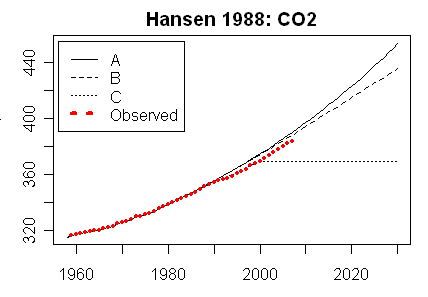
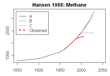
“Phil.”, who gets things relentlessly wrong, wriggles like a stuck pig when corrected.
Well you’re the one who’s wrong and you certainly are wriggling!
At present, half of what we emit disappears from the atmosphere within a year. If we emit nothing, half of nothing disappears from the atmosphere within a year. If we add further CO2, half of that will disappear and half will remain. Since the CO2 that remains will do so for 40 years, one would have to cease emitting CO2 altogether to achieve stability.
Completely wrong, absorption of CO2 is a function of pCO2 and Temperature, next year if the CO2 and temperature remain the same the same amount of CO2 will be absorbed, if we only emit half as much CO2 it will be approximately in balance. You appear to have a strange concept of a residence time, it does not mean that all the CO2 in the atmosphere remains for 40 years and then disappears, rather about 1/40th of it disappears each year.
Then “Phil.” attempts to say that Hansen’s Scenario B is closer to what has happened since 1990 than Scenario A, pleading, more than a little implausibly, that the earlier-than-expected implementation of the Montreal Protocol made most of the difference.
It was Hansen himself who said that scenario B was the most likely one. It was also Hansen who showed clearly that the effect of the trace gases was 2.5 times that of CO2, just read the paper and pay particular attention to fig 2.
However, CFCs were never a big deal compared with CO2, which is the big enchilada, and which, whether “Phil.” likes it or not, has risen according to the Scenario A profile.
As shown in Hansen’s paper that is not the case, in scenario A CFCs were the major player.
CO2 alone has fallen short of scenario B as shown for example by McIntyre:
Methane followed Hansen’s scenario C:
Finally, “Phil.”, by now in full quibble mode, says I have misinterpreted Ljungqvist’s graph.
No, I said you’d misrepresented it, you removed part of it, didn’t say what was being plotted, made additions to it and still tried to claim that what you presented was Ljungquist’s graph.
He draws a distinction between today’s temperature and
– er – today’s temperature, or at any ratethe mean temperature from 1961-1990. One has only to look at Ljungqvist’s graph to see that the medieval warm period was warmer than that mean. The question, then, is how much warming has occurred since then.I did look at Ljungquist’s graph and he shows 0.4ºC warming since then, you know the part of the graph you didn’t want anyone to see, so you erased it!
There’s really no point in picking nits, “Phil.”, baby. The reality, amply demonstrated by the graphs, including that of Ljungqvist, is that the predictions of the models – including that of Hansen – were wild exaggerations.
Ljungquist’s graph doesn’t tell us anything about Hansen’s model since it ends in the 90’s.
Owing to the failure of the current version of WordPress to display comments chronologically, my answer to “Phil.’s” libellous allegation that I had “misrepresented” a graph by Ljungqvist appears above the comment in which he made the allegation. Readers will see that the allegation was false, and that in order to make it the Professor had quoted selectively from Ljungqvist’s paper.
This claim of libel by Monkton has been completely refuted above
Phil. May 17, 2015 at 6:28 am
Readers will see that all my statements about his version of the graph are shown to be correct, and Ljungquist’s original graph is linked.
“Phil.”, far from apologizing for his libel to the effect that I had truncated the graph from Ljungqvist 2010, repeats this false allegation. The graph, as it came to me, had no added dotted lines to represent today’s temperatures. The graph as I received and reproduced it was simply the graph of the temperature reconstructions.
“Phil.” has, therefore, falsely accused me of having truncated the graph, when I did no such thing. He has made further silly allegation that I had added things to the graph, and it now turns out that all he is talking about is the heading and Post-It note which had been plainly and visibly by me from the outset.
Finally, he has failed to respond to my quotations from Ljungqvist which demonstrate, quite clearly, that the reconstruction showed the medieval and Roman warm periods to be at least as warm as the present.
My patience is at an end. “Phil.’s” comments on these threads have been relentlessly prejudiced, malevolently expressed, dishonest, and contrary to all the norms of science. My clerk will now prepare a brief for his university, inviting it to find him guilty of prolonged and dishonest research misconduct.
Monckton of Brenchley May 17, 2015 at 10:58 am
“Phil.”, far from apologizing for his libel to the effect that I had truncated the graph from Ljungqvist 2010, repeats this false allegation. The graph, as it came to me, had no added dotted lines to represent today’s temperatures. The graph as I received and reproduced it was simply the graph of the temperature reconstructions.
So it wasn’t Ljungquist’s graph it was a graph prepared from his dataset without the proper acknowledgement?
ftp://ftp.ncdc.noaa.gov/pub/data/paleo/contributions_by_author/ljungqvist2010/ljungqvist2010.txt
NOTE: PLEASE CITE ORIGINAL REFERENCE WHEN USING THIS DATA!!!!!
ORIGINAL REFERENCE:
Ljungqvist, F.C. 2010.
A new reconstruction of temperature variability in the extra-tropical
Northern Hemisphere during the last two millennia.
Geografiska Annaler: Physical Geography, Vol. 92 A(3), pp. 339-351,
September 2010. DOI: 10.1111/j.1468-0459.2010.00399.x
“Phil.” has, therefore, falsely accused me of having truncated the graph, when I did no such thing.
You’re the only one who referred to ‘truncated’, not I. I explicitly referred to your omission of the the dotted line, the data was included in the file so your ‘academic source’ for some reason decided to omit it.
He has made further silly allegation that I had added things to the graph, and it now turns out that all he is talking about is the heading and Post-It NOTE which had been plainly and visibly by me from the outset.
Scientists regard such behavior as leaving off a description of the material plotted, implying that the data is global not Hemispheric extra-tropic in this case, adding a line which misleads as to the scale of the plot etc. as unprofessional. When a scientist like me sees a shoddy piece of work like your attempt you get criticized, live with it! Yes those things you added were plainly visible and were wrong, that’s the point they would mislead anyone who had not seen the original
Finally, he has failed to respond to my quotations from Ljungqvist which demonstrate, quite clearly, that the reconstruction showed the medieval and Roman warm periods to be at least as warm as the present.
Well I’m not at your beck and call and have had a busy day, tough. I responded to your inaccurate paraphrasing of Ljungquist by quoting him, in particular the caveat he made that was relevant to your statement. Do as I say not as I do appears to be your mantra.
My patience is at an end. “Phil.’s” comments on these threads have been relentlessly prejudiced, malevolently expressed, dishonest, and contrary to all the norms of science. My clerk will now prepare a brief for his university, inviting it to find him guilty of prolonged and dishonest research misconduct.
From someone who has no clue about the ‘norms of science’ that’s rich. That should be good, what’s he going to say, that you did a poor job of producing a copy of a graph without the required acknowledgement of the source, added misleading information contrary to the original authors intent, and one of the university’s faculty members had the temerity to criticize you? That should for be good for some laughs.
Dear Mr Monckton,
I am a little puzzled by this part:
Your post is very long but I can’t find any answers to the questions you pose above. You are quite successful in showing that for many of the claims and measurements that have been made, opposing views exist. Which I understand was your main point. But the paragraph above raised many questions with me.
– Which ‘other things’ do you mean? Can you show they have not been equal and caused significant part of the warming during the last century?
– How much warming do you predict our sins of emission will cause?
– What will be the costs of mitigation today and what will be the costs of adaptation the day after tomorrow?
On a small side note, since I have a personal interest in data visualisation, could you expand on your point about the stretching of the y-axis. The way I see it, the IPCC aspect ratio is the generally used one, also by you in almost all other cases. Why do you consider it exaggerated and why is yours, which to me looks like a contracted y-axis, to be the better option?
“Aran” asks for the answer to the questions whether all other things are equal in the climate, how much warming our sins of emission may cause, and whether the cost of mitigation today is less than that of adaptation the day after tomorrow.
However, the head posting had stated that these questions are by no means settled. The data do not provide a definitive answer, or the debate would have been concluded long ago. However, My recent paper with three distinguished colleagues, which will be found at scibull.com (then click on “Most Read Articles and ours is the all-time no. 1 in the 60-year archive of the Science Bulletin of the Chinese Academy of Sciences) presents an irreducibly simple climate model which “Aran” may like to run himself on a pocket calculator. There is a full description of the various initial conditions and parameters that inform the model, and of the intervals appropriate to each.
As for what I mean by “all other things being equal”, it is startlingly evident that the climate object is near-perfectly thermostatic. In such an object, a perturbation in the shape of a positive or negative forcing will not necessarily lead to a warming or a cooling respectively, for countervailing processes may be present to maintain homoeostasis. The only way to know for sure is to wait and see. At least we need not rush to take action to try to prevent global warming, for notwithstanding a substantial increase in anthropogenic greenhouse-gas forcings there has been no global warming for almost two decades.
So your answer – if I may try to summarise – is that we don’t know and we will have to see. Does that mean you consider it a possibility that anthropogenic global warming is actually happening now and that the long-term predictions of the IPCC could come true if CO2 emissions are not reduced? If we keep all possibilities open, should we not at least be concerned about the possibility that the worst case scenario could come true and think of the best (i.e. least harmful) way to mitigate the risks? You appear to be advocating (and correct me if I’m wrong) we do nothing and hope everything will be OK.
As for the thermostatic part. I agree if we are talking about the long term i.e. something like ten thousand of years at the minimum. Again, you seem to claim it may turn out alright, but we have a clear example on Venus that – even without human intervention – it may not.
By the way, why are you writing my name in quotation marks?
“Aran” asks how I justify compressing the “y” or temperature axis on a time-series of global temperature anomalies. I do not justify it: I merely provide it as an illustration of the fact that the steepness or otherwise of a warming rate is independent of the aspect ratio of a graph.
It is surprising how many people do not realize this. I was once debating on Canadian national radio with Richard Littlemore of a more than usually vicious climate-Communist website funded by a convicted internet-gaming fraudster whom a court ordered to repay $185 million in ill-gotten gains. The hapless Littlemore tried to lie to the effect that the crook that funded him had not been convicted of anything, so I called up the court docket and read it out. He did not say much during the rest of the debate.
Before then, though, he had made the remarkable statement that we should worry about global warming because the graph is rising at an angle of 45 degrees”. I had to explain to him that temperature is not measured in degrees of arc but in Kelvin.
I think rather than the aspect ratio of the graph you really mean the y-axis scaling. However you do claim that climate scientists such as the IPCC are using this dishonestly:
Yet I don’t see any problem with the IPCC graph. There is nothing dishonest, nothing is exaggerated. The scaling that is used on the y-axis is very similar to all the others in your post. I therefore fail to see any basis for your accusations of dishonest exaggeration.
Here’s what it looks like if you don’t expand the Y axis (from GISS):
That looks like a farignite temperature scale; please convert it to kelvin for clarity.
g
http://4.bp.blogspot.com/-lPGChYUUeuc/VLhzJqwRhtI/AAAAAAAAAS4/ehDtihKNKIw/s1600/GISTemp%2BKelvin%2B01.png
All temperatures shown on a graph on the “Y” axis, should be shown on a scale of 0 to 330 degrees K.
That will put all this nonsense into perspective and stop this “optical illusion” in its tracks.
To do otherwise, is just playing “mind games”.
Geologists use ‘vertical exaggeration’ in their cross-sections as standard procedure. However, they also DISCLOSE what that vertical exaggeration is. Most climate science appear not to have done so.
Chris,
I just read george’s request and yours, and posted the chart above.
Mr Stealey’s telling graph is definitely one to add to my collection. It’s worse than we ever thought. Hardly any change in absolute mean global surface temperature. How can we go on getting fat government grants if that’s the fact?. I know – let’s stretch the Y axis and then quibble about hundredths of a degree. The sky is falling!
Great article by Viscount Monckton that dots the “i’s” and crosses the “T’s”. Great illustrations also.
This should be REQUIRED reading in every school, college and university, world-wide.
The graphs – and dozens of others in addition – are being prepared for a book intended to give everyone the opportunity to understand why climate skepticism is reasonable and necessary.
This is what you said: “…The greenhouse effect, …. has been posited hypothetically, demonstrated empirically and explained theoretically, even at the quantum scale.”
I beg to differ, your lordship, for the simple reason that it is incompatible with the existence of the current hiatus/pause, and the known previous appearances of no-warming periods such as the one in the eighties and nineties, as well as with the published work of dr. Ferenc Miskolczi. The greenhouse effect cannot be confirmed by laboratory measurements on gases but must be done on actual atmosphere. This is what Miskolczi did [1] and found that it did not exist. The theory that was based on observations of gases turned out not to work in the mixture of gases that is our atmosphere. You may not be familiar with the hiatus in the eighties and nineties because its existence has been successfully hidden by false warming manufactured by GISTEMP, NCDC, and HadCRUT global temperature monopoly. I discovered this hiatus while doing research for my book [2] that came out in 2010. You will find it as figure 15 in the book. I also discovered the false warming and exposed it in figure 32 in the book. This took care of HadCRUT3 and later I added the other two. Had you done your homework and read my book you would now know all about it. But that is what most climate scientists did and that is how wrong science spreads. In their ignorance of the hiatus of the eighties and nineties the opponents of the pause have concentrated in trying to prove the non-existence of the present hiatus by numerous peer-reviewed, scholarly articles. Anthony Watts kept track of them until their number exceeded fifty and then gave up. I love the ones looking for the “lost heat” in the ocean bottom. I am waiting to see what they have to say about the eighties and nineties once they get over that fake warming craze. It is not just a craze but scientific fraud, perhaps worse than the hockey stick because of its influence on climate budgets. For the last five years I have periodically called attention to that historic hiatus but have been totally ignored. Someone has to invent a designation for such stupidity. Now a few technical tidbits. ENSO was active in the eighties and nineties and created a wave train consisting of five El Nino peaks with La Nina valleys in between. The center line of these waves is a straight horizontal line proving that there was no warming from 1979 to 1997. That is an 18 year stretch, comparable to the present hiatus which has reached the same age by now. Being able to draw that line through the centers of waves self-calibrates the non-warming nature of this period. The period ended with the arrival of the 1998 super El Nino which was not part of ENSO. This was quickly followed by a short step warming that raised global temperature by a third of a degree Celsius in only three years and then stopped. By laws of physics it could not be greenhouse warming but had to have an oceanic origin. Bear in mind that the entire twentieth century warming was only 0.8 degrees Celsius and none of that counts as greenhouse warming either. This step warming is the only warming during the entire satellite era. Because of it all twenty-first century temperatures are higher than the twentieth century (except 1998). It ended in 2002 and there has been no warming at all since then. This is disputed by creating fraudulent temperature records that mix twentieth and twenty-first century values. The greenhouse effect dispute goes back to James Hansen in 1988. He thought he had proved its existence with a 100 year temperature curve he presented to the Senate. However, if you check that 100 year temperature curve of his you find that he incorporated non-greenhouse warming to fill it in. Specifically, the segment from 1915 to 1940 which he used can not possibly be greenhouse warming because the laws of physics do not allow it. First, there was no increase of atmospheric carbon dioxide when it started. And a greenhouse warming cannot be suddenly stopped like it did in 1940. To stop it you would have had to remove all carbon dioxide molecules from the air, an impossible task with available technology.
[1] Ferenc M. Miskolczi “The Stable Stationary Value of the Earth’s Global Average Atmospheric Planck-Weighted Greenhouse-Gas Optical Thickness” Energy & Environment 21(4):243-292 (2010)
[2] Arno Arrak “What Warming? Satellite view of global temperature change” (CreateSpace 2010) figures 15, 32
Which “laws of physics” are you referring to as “laws of physics” ??
g
Glad you asked, George. Here is what is what needs to be told about the greenhouse effect. It is maintained by “experts” that what is producing it is absorption of infrared radiation by carbon dioxide in the air. In the process, radiant energy gets converted into heat energy. This is a basic fact drummed into our ears ad nauseam by the global warming gang. So let us take them at their word and see if it works. We know exactly what atmospheric carbon dioxide is doing thanks to the Keeling curve that goes back to 1958. If there is no warming and suddenly you observe warming begin it can only be greenhouse warming if simultaneously there was an increase of atmospheric carbon dioxide. It is not difficult to check the Keeling curve and find out if there was an increase of atmospheric carbon dioxide or not at the particular time when a warming started. In the case of the step warming from 1999 to 2002 that appeared suddenly, raised global temperature by a third of a degree Celsius, and then stopped the answer is a clear no: there was no increase of atmospheric carbon dioxide when it started, nor was there any decrease when that warming stopped in 2002. You might want to bring up the question of whether the Keeling curve is sensitive enough to show such short-term changes as opposed to long term climate-related changes. The answer is that it is quite accurate in picking up seasonal changes associated with growth and shedding of leaves in the northern hemisphere. A three year steady increase of carbon dioxide that would be required to make this warming a greenhouse warming should certainly be observable. But it simply isn’t. There is one further point to note and it is this: how do you stop greenhouse warming once it has started? If you want to stop greenhouse warming it is not enough to turn off your source of carbon dioxide because carbon dioxide already in the air will just keep absorbing. In order to stop that you must actually remove every carbon dioxide molecule from the air, an impossible task either by nature or with current technology. This takes care of this step warming. But as warmings go, it is not even the strongest or the longest warming on record. That honor belongs to the early twentieth century warming. It started suddenly about 1915, kept on going until 1940, and then suddenly stopped when the World War II cold spell arrived. The warming lasted for 25 years and during this period it raised global temperature by half a degree Celsius. And, yes, as you may guess, the Keeling curve extension, based on ice core data, shows absolutely no sign of increase or decrease of atmospheric carbon dioxide during this particular warming period. The IPCC currently does not have the nerve to declare it greenhouse warming and has decided that observable effects of global warming should be counted only from the year 1950 upward. But with that they have lost any chance of proving that global warming started in 1850 as they have been telling us for years. 1950 does save them from having to explain the absence of carbon dioxide increase as well as from having to explain what caused the huge drop in global temperature after that warming was over. That of course is understandable because the theory they are pushing is nothing more than pseudo-science anyway.
Mr Arrak says the greenhouse effect has not been demonstrated. Well, it has. Get over it. He says the current pause is incompatible with the existence of a greenhouse effect. it obviously isn’t: for it is perfectly possible, and I think it likely, that smallish natural negative forcings from the decline in solar activity since 1960, the current largely negative or cooling phase of the Pacific Decadal Oscillation, the reduction in cloud cover since late 2001 and the slight decline in the Nino/Nina ratio since 1998 are exactly offsetting the smallish anthropogenic positive forcing from greenhouse gas emissions, deforestation, cement production, land-use change etc.
Some evidence for natural influences can be detected simply by eyeballing the 20th-century temperature record. The increases in temperature from 1910-1940, before we could have caused them, and from 1976-2001 coincide near-exactly with positive phases of the Pacific Decadal Oscillation – which is perhaps why the 1910-1940 warming ended when it did, and why the 1876-2001 warming ended when it did.
Even if I am wrong about the current balance between net-negative natural and net-positive anthropogenic forcings, there are many non-radiative transports in the atmosphere that may countervail against the greenhouse effect. A proper understanding of Miskolczi’s interesting paper is that he accepts the existence of the greenhouse effect but considers that various compensating, homoeostatic processes in the atmosphere tend to maintain a steady state, in accordance with the Le Chatellier principle.
The atmosphere is fascinatingly complex and, like many complex objects, inherently chaotic and thus, in the absence of perfect information, impossible to predict reliably in the long term. One should not, therefore, put too much weight on unduly simplistic descriptions or predictions.
What can I say? I have nothing to get over because my science is correct. Yours is not and you would be well advised to see where we differ and make corrections accordingly. First, you should realize that your outlook still reflects the views of fake “experts” in high places who pretend that they know something when in fact they do not. Getting lost in side issues like the PDO is characteristic of them. Let’s stay with the main issue – the greenhouse effect. In the science community, politically inclined individuals rise up not because of their science but because of their political skill. Once they reach high office the working scientists become just drones to them and are supposed to follow their lead. This upper crust, so to speak, know each other and socialize also but do not do any science any more. For science they need or pretend to know they depend on their subordinates or friends of like background. They are not receptive to new ideas and when something like the hiatus/pause shows up they do not investigate, they oppose. In this case they have started writing articles opposing it. Anthony used to check for them but gave up when their number exceeded fifty. Your first paragraph would fit in neatly with that trash, I am sorry to say. To get a science movement started one needs to convince this top layer of management to back you. The global warming movement has realized this from the start and has done a superb job of diverting these people into their camp. Here is an example of how far it goes. Since 2001, heads of national science academies have been issuing statements urging nations to adopt a low-carbon economy. In 2001, two groups came out, one consisting of 34 academies and the other one of 17 academies. In 2005, eleven heads of science academies from the G8 countries signed a statement that was reconfirmed twice in the following years. The original signers were heads of science academies from Brazil, Canada, China, France, Germany, India, Italy, Japan, Russia, the United Kingdom, and the United States. They urged immediate action to lower atmospheric carbon dioxide. They concurred with UNFCCC that “…a lack of full scientific certainty about some aspects of climate change is not a reason for delaying an immediate response…” But real scientists do not abandon the scientific method just to serve the ideological goals of these functionaries. These politicized functionaries are obviously prone to groupthink and do not care what science has to say once they have made up their minds. There is nothing you can do if the heads of the National Academy of Science and the Royal Society get together and offer one more copy of this perversion of science. What these people really do is what we used to accuse the Soviet Union of doing – Lysenkoism. It is now running rampant and is in control of what science gets funded and whose work is supported. In the Soviet Union it ruined their agriculture and its contribution to Soviet debt may have hastened the demise of the Soviet Union. Our Lysenkoists are also aiming to destory our economy by stopping the use of fossil fuels. They have adapted the pseudo-science coming out of the global warming movement as truth. Incompetency in high places is another way to look at it. For science functionaries to be herded into supporting an ideological cause that has no scientific value tells me that they do not deserve to be regarded as real scientists. There is no actual thinking going on when groupthink takes over. They would fit in well with Hitler’s braunshirts whom he ultimately murdered when he did not need them any more. Take a look at the greenhouse effect that the global warming argument ultimately rests upon. James Hansen was aware in 1988 that there was no experimental proof of it when he stated that “…climate model simulations indicate that certain gross characteristics of the greenhouse warming should begin to appear soon.” His first viewgraph showed a 100 year global temperature curve which according to him showed that the “…present temperature is the highest…” He followed it up with a thirty year temperature segment about which he was “99 percent certain” that it represented a real warming trend. He was also repetitious and it is not worth following him further. So here is your proof of greenhouse warming: Hansen’s opinion. But this claim of Hansen’s played a big role in justifying the establishment of IPCC. They still belive (or pretend to believe) in the greenhouse effect but the existence of the hiatus/pause says otherwise. This pause we need to take up next. Since you mentioned Miskolczi but did not get it right I want to explain first what his work is about. Miskolczi showed mathematically that there exists a fixed greenhouse-gas optical thickness TauA which controls transmittance in the infrared. He then calculated that its value is1.86756. His measurements using NOAA database of radiosonde observations showed that while TauA remained constant for 61 years, carbon dioxide at the same time increased by 21.6 percent. Since this substantial addition of carbon dioxide to the atmosphere did not increase absorption it did not create any warming either. That makes it an exact parallel to the hiatus/pause we are living through right now: carbon dioxide is increasing but there is no warming. What Miskolczi has done is to show both theoretically and experimentally that the hiatus phenomenon that puzzles us is not only possible but has actually happened in the past as NOAA’s records demonstrate. That being the case, the existence of a second hiatus in the eighties and nineties is going to be very hard to disprove. There is one more very important conclusion that follows from this: the greenhouse theory of Arrhenius, currently used by the IPCC, is invalid. It has been predicting warming, getting nothing, and belongs in the waste basket of history. The correct greenhouse theory to use is the Miskolczi greenhouse theory, MGT, that utilizes the properties of TauA. It predicts that addition of carbon dioxide to air will not warm the air. When it first came out in 2007 the greenhouse gang quickly blacklisted it. You could not mention it and grad students were kept ignorant of it. The latter was easy because I don’t think its opponents understood the math involved. It differs from the Arrhenius theory in being able to handle more than one GHG simultaneously. Arrhenius can handle only one – carbon dioxide. Even the IPCC requirement that atmospheric water vapor will triple the amount of warming from carbon dioxide alone must be added as a special amendment. According to MGT, carbon dioxide and water vapor in the atmosphere will form a joint optimal absorption window whose optical thickness is 1.87, Miskolci’s TauA. If you now add carbon dioxide to the atmosphere it will start to absorb IR, just as Arrhenius says. But this will increase optical thickness. And as soon as this happens water vapor will begin to diminish, rain out, and the the original optical thickness is restored. All this follows from Miskolczi’s observations of NOAA’s database. The added carbon dioxide will of course keep absorbing but the reduction of water vapor keeps total absorption constant and no warming is possible. There will probably be some questions about this which I will try to answer.
******************************************
[1] If you want to see a graph of this look at figure 6 in my Arctic paper in E&E 22(8):1069-1083(2011). While looking at the paper observe that I prove two things about the Arctic. First, that Arctic warming is not greenhouse warming. Second, that it started when a change in the North Atlantic currents at the turn of the twentieth century began to direct warm Gulf Stream water into the Arctic Ocean. Both facts are ignored in fairy tales emanating from IPCC.
Addendum May 19th.
**********************
I forgot to add that MGT gives theoretical constraints on the cloud cover, cloud altitude and Bond albedo which perfectly match observations. I saw the work the Albedo paper of Stephens et al. (Rev. Geophys. 53, 2015) who just reported a surprising hemispheric symmetry that current climate models lack. Miskolczi’s work predates this.
Another notable thing is this just in from Reuters: ” May 19 California and leaders of 11 states and provinces signed an agreement on Tuesday to limit their output of heat-trapping greenhouse gases 80 to 95 percent by 2050, a goal they hope will help prevent runaway climate change.” More insanity is all I can say. These people are worse than the academicians because they control the money, From 1919 to 1933 the United States had a prohibition. What most people don’t know is that it was a state by state creeping monster. By the time it became federal law half the states had already passed their own prohibitions thanks to agitation by the temperance movement. The warmists are following in their footsteps.
consider a few paragraph breaks next time?
According to GRACE the seal levels actually ROSE between 2003 and 2008 rather than fall as you state
https://www.nasa.gov/topics/earth/features/pia16294.html#.VVVaN_mqpBc
If this is from them tampering with the data, what’s the source of your data?
Jon Lonergan,
Skeptics have known for a very long time that sea levels are rising. That isn’t the issue.
The issue is the false claim by the alarmist crowd that the rise in SL is accelerating. The chart you posted shows that isn’t the case; the rise is linear. No scientific skeptics dispute that fact.
What do really know what Sea Level is anymore? Alarmists refuse to use PSMSL tide gauge data, but want everyone to refer to the data collected at the Boulder. Every skeptic that has written papers using the PSMSL data have been debunked, and the Boulder continues to fiddle with the satellite altimetry data.
Regardless though, it is noticed in both data sets that there has been a deceleration in it’s rise, which by itself contradicts all predictions.
Mr Lonergan asks about the source for the fall in sea level shown in the GRACE data for 2003-2008. The source, as shown in the head posting, is Cazenave (2009). The rise in sea level over that period mentioned by Mr Lonergan was achieved only by a large glacial isostatic adjustment.
I’m pretty sure that the rise in seal levels can be attributed to laws that banned the hunting of seals.
All the comments from Mike Hamblet, in order of appearance:
“Conclusive proof that more is not better. This is a post for morons. Monckton is pretty much insane; only in a world full of nitwits and sycophants is he not put away. Mr Monckton, its not just ‘Mr Varley’ saying these things, its most of science, government and those who care about the next generation; do please stop making an utter tit of yourself.”
“Yes, no crisis. Carry on bingeing on fossil fuels supplied by [snip] in the industry.”
“Yes thanks, Bruce. Hope you’re not one of the sycophants…..”
“Yes, no crisis. Carry on bingeing on fossil fuels supplied by Monckton’s friends in the industry.”
“I think you might be on another world…..?”
Then he descends to a point that what ever fact free babble he said gets snipped,
” mike hamblet
May 14, 2015 at 1:31 pm
[Policy violation; personal ad hominem attack. ~mod.]”
” mike hamblet
May 14, 2015 at 1:57 pm
[snip – policy violation, hurling insults and libel, if you make one more, you’ll be on permanent moderation – mod]”
Contrast that mess with Viscount Monckton, that Mike initially commented to:
“Mr Hamblett is understandably angry. The 50 graphs shown in the head posting are indeed designed to be understood even by people like him, who have no scientific training or understanding. Perhaps for the first time, he has exposed himself to the overwhelming and well-sourced body of data, here very clearly and simply but authoritatively presented in visual form, that indicates the value of caution before believing the Party Line on climate. His hate speech here is his initial manifestation of distress and shock as he realizes that “most of science” is not supportive of the Party Line as he has been taught to believe it. And since when did anyone rely upon “government” for scientific truth?
As for “those who care about the next generation”, not the least of their cares is that at present the next generation are being taught the same dumb, long-discredited falsehoods in which Mr Hamblett is rightly furious that he was led to believe. The overwhelming evidence against those falsehoods can no longer be concealed, ignored, or denied.”
Despite being THRICE insulted, The Viscount still replies with this fine cogent comment.
Mike is indeed angry, but what for?
sunsettommy says:
Mike is indeed angry, but what for?
May I? Thank you:
Mike H has been taught for so long by his teachers and the media that dangerous man-made global warming (MMGW) is just around the corner that he believes it, heart and soul. That belief is now a part of him. It has colonized his mind.
But now he sees there is another side to the story. And it’s being debated by highly educated, intelligent readers on a website that has won the internet’s Best Science Award for the past 3 years. A site with more than a million reader comments, and a quarter of a billion unique views. And most of those commenters not only do not buy into the ‘dangerous MMGW’ scare, but they actively disbelieve it. And they use facts and evidence! The horror!
So Mike’s head is about ready to explode. It is reflected in his comments. It’s called cognitive dissonance: trying to maintain two opposing ideas simultaneously.
Mike can either strart thinking critically — or he can take the easy way out, put his hands over his ears, and shout, “LA-LA-LA-LA!! I CAN’T HEEEEEAR YOU-U-U!!”
Time will tell which direction Mike takes.
Mike H and others of his ilk come here because they have no where to go. The blog sites they frequent have so little traffic that they have to come here to troll, data mine, etc.
Real Climate is in disarray, SkS censors or bans most of us, and if any of you follow climate science posts in MSM and witness the comments being made, the skeptic rules the day.
Just saying.
So, now the alarmists are waging war on what to call us.
They want all mainstream media outlets to only use the word “denier” to describe us. Supposedly, we don’t deserve to be called skeptics anymore, and that somehow referring to us as some post-holocaust denier is their only hope to silence us.
Forecast the Facts actually has a on-line petition to coerce websites in ending the use of the word ‘skeptic’.
I posted some comments on the tips and notes page. Go check it out.
The word “denier” counts as hate speech in Scotland and in other European countries where the menace of Nazism and the tragedy of the Holocaust are not forgotten. I have recently used this fact to get a particularly repellent example taken down, and will be writing a posting about it shortly.
“They want all mainstream media outlets to only use the word “denier” to describe us. Supposedly, we don’t deserve to be called skeptics anymore, and that somehow referring to us as some post-holocaust denier is their only hope to silence us.”
Mind boggling.
Hard to believe it is true, but here we are.
I am posting a link to one article on this:
http://www.washingtonexaminer.com/liberals-pressure-ap-to-call-climate-change-skeptics-deniers-bar-word-in-stylebook/article/2564438
Another symptom of the cracking façade the warmistas have built, there are those who, instead of taking the CYA route, or backtracking in their alarmism, choose to become ever more strident and ridiculous. I would imagine the goal is to somehow make all the people who will/would expose the fraud go away, and hence keep the scam alive by dint of having no dissenters left.
Trying to force everyone in the world to adopt hate speech is bad enough, but it seems to be only one salvo in their surge.
These are some very committed warmistas that are apparently really getting their knickers in a twist, and have begun to suggest some things I can only regard as bizarre. Locking up skeptics, calling them murderers when some researchers die, and now a push to force a University to strip a degree from an elected legislator for no other reason than not being on board with climate alarmism.
This cannot possibly be legal, and in fact it should be a crime to suggest such things. Have to follow this one and se how it shakes out.
From the inane to the insane, these people are a menace to free society.
Check these out:
http://www.bellinghamherald.com/2015/05/07/4282892_concerned-about-climate-change.html?rh=1
Maybe he’ll become a cereal killer.
Mickey — Life Cereal Commercial (1978)
The CAGW hypothesis depends entirely upon the impossible existence of a “runway positive feedback loop” involving CO2 and water vapor.
Without this CO2 induced runaway feedback loop, doubling CO2 only has the GROSS potential to increase global temps by around 1C by 2100, which isn’t nearly scary enough to extort the $10’s of trillions the leftist so crave.
Moreover, the physics and empirical evidence suggest any increase in global warming (regardless of the source) creates cooling cloud-cover feedbacks, which ameliorates any natural or manmade global warming effect.
Accordingly, the NET warming effect per CO2 doubling by 2100 could be as little as 0.5C, plus or MINUS whatever the sun and natural variation decides to do over the next 85 years.
Warmunists also face a problem with CO2’s warming effect being logarithmic, which means any incremental increase of CO2 has less and less of a warming effect, which is another reason why their non-existent runaway positive feedback loop is so essential to scare the masses…
CAGW is dead. It’s just a matter of time before it is laughed and eye-rolled onto the trash heap of failed ideas.
Samurai is correct. If the International Satellite Cloud Climatology Project’s data are correct, there has actually been a decline in water vapor in the crucial mid-troposphere over the past decade or so, with no change at all at any other altitude (see the graph in the head posting).
If Paltridge (2009) is correct, subsidence drying in the mid to upper troposphere would prevent the operation of a positive water-vapor feedback: all one would get instead would be a small increase in cloud cover (small because the upper troposphere has a low density), and in precipitation, rather than a large positive feedback and hence a large amplification of the actually rather small direct forcing effect from anthropogenic greenhouse-gas emissions.
Of course, there are other datasets that show column water vapor increasing, but this is a notoriously difficult quantity to measure because water vapor is not a well-mixed greenhouse gas: its concentration varies both by latitude and by altitude. Frankly, the water vapor feedback is guesswork. Yes, the Clausius-Clapeyron relation shows that the space occupied by the atmosphere CAN carry near-exponentially more water vapor as it warms, but the equation does not tell us that it MUST, particularly in the presence of very significant non-radiative transports such as subsidence drying in the upper troposphere and isomewhat ncreased precipitation down here.
I have been startled ever since I began studying climatology at just how much of the climate-extremist case is based on ill-founded speculations of this kind.
The UK Met Office’s previous climate predictions are hardly credible. Fortunately, to back my statement we have YouTube videos of Dr Vicky Pope, Head of Climate Change Advice at the Met Office, talking about Climate Projections 2009 … bum climate predictions. What is concerning is the woman talks of her predictions as though they are definitely going to happen.
As an example of what I say, listen to this woman in the following video:
Our local alarmist Flim Flummery keeps claiming that there is a drying trend in Southeastern Australia. The data says differently:
http://www.bom.gov.au/climate/change/index.shtml#tabs=Tracker&tracker=timeseries&tQgraph=&tQ%5Bgraph%5D=rain&tQ%5Barea%5D=seaus&tQ%5Bseason%5D=0112&tQ%5Bave_yr%5D=T
Great review
Minor point some typos mediaeval for medieval
Sorry I was brought up on the latter spelling, seems you can use either
In response to Mr Kerton, the word “mediaeval” is derived from two Latin words, the second of which, “aevum”, means an age or era. It is spelled with an “ae”. My usual rule when writing for an English audience (in this instance, British retired servicemen) is to follow the spelling that best reflects the origin of the word. If this piece had been written for an American audience, I’d have tried to remember to Americanize the spelling. Sorry for any confusion.
Very interesting discussion between Sturgis Hooper and Lord Monckton on the geological history of atmospheric CO2. That is what a science site is supposed to sound like.
And the lead post by Monckton is, aside from corrections and caveats expressed in this thread, largely unexceptionable. The problem is, of course, that his lucid article will not be seen outside of WUWT. Will even the obscure Pennant, to which it is aimed, publish it?
Unfortunately, we will not know that sanity has returned to the science world until this article, or ones like it, begin to be accepted by the editors of lay publications like Scientific American, Science News, National Geographic,The New York Times, The Times (of London), and so on, and so forth. I suppose it is worth sending to them, just to pose a challenge. Who knows, one timorous editor might succumb to a fit of integrity!
/Mr Lynn
IMO blogs have been a great boon to science. In effect, they open up to the lay public the formerly closed world of conferences and arcane journals in which such issues might have been discussed.
With respect to the formation of cap carbonates and dolomite, science thank God still marches on, despite the roadblocks to it thrown up by the Greenshirt Storm Troopers of the Mannian Mafia.
You are right about the boon for lay folk, and that may be an important part of why as many of them are skeptical of the Climatists’ fear-mongering. My point is that, as far as climate is concerned, there is a large amount of preaching to the choir on skeptical sites. But rationality about climate has yet to break through the wall of ‘official’ science in the academies and the popular press, which remain dominated by blind adherence to the cult.
/Mr Lynn
You are correct about academia and the media. They remain impervious to reality for career and ideological reasons.
However the political class will follow the masses eventually, even though as a group it too benefits from the climate sc*m.
Public policy decision makers will ultimately be forced to recognize reality when their freezing in the dark and starving subject populations demand an end to the madness.
Also, not all media outlets have bought and promote the ho*x.
The simple act of laying down unvarnished facts for all to see is what causes catastrophist beneficiaries the most intense pain. They have no shield against the sword of Truth, nor do they deserve one.
Cheshirered has nicely encapsulated the main point of this posting: to summarize the data in an Augenblick. The challenge that seekers after truth face is to ensure that these data are put into the hands of policymakers in good time for the Paris pifflefest.
There has not been enough change to harm anyone, nor will there be.
Mr Hamblet has drawn what is, on the evidence to date, the correct conclusion.
Dear Lord Monckton, thankyou very much for this post – the information included is a tremendous rebuttal to the AGW case. Will you PLEASE put it up in the form of a paper/pdf/word document so we can download and save it. This would be superb for handing to warmist colleagues – they just don’t take any notice of being told to read a particular post on WUWT. Being able to shove this down their throats (well not literally I know) would be a godsend.
In answer to the useful suggestion from Beejay in UK, I shall work on producing a suitable .pdf and shall invite Anthony to make it downloadable.
“The balancing considerations.”
Beautiful British understatement!
Gish Gallop and cherry-picking followed by a Conspiracy Theory.
This is an excellent article, entitled “Hear Both Sides”. It brings many thoughtful comments, both pro and con.
But then we get a typical ‘harrytwinotter’ drive-by troll comment that adds zero to the discussion.
The alarmist crowd has decisively lost the science debate. Now all they’ve got is ‘harrytwinotter’ pot shots. If he could have contradicted anything in the article he would have. But we see what he’s got, and it is nothing.
Thanx harry, you are the face of the alarmist side. You represent them perfectly.
dbstealey,
you could not be more iconic if you tried.
Far too much hard evidnece to be cherry-picking, and none of it inaccurate, so it isn’t a Gish Gallop.
Can anyone point me to a graph that shows 20th century warming alongside daily (day/night) and/or seasonal temperature changes. The warming must be imperceptible compared to normal cycles.