Guest Post by Bob Tisdale
This post provides an update of many of the ENSO-related variables we presented as part of the 2014-15 El Niño Series. The reference years for comparison graphs in this post are 2009 and 2014, which are the development years of the last two El Niños. I have not included animations in this post. In their place, I’ve compared present-day maps from the NOAA GODAS website to the same time in 2014.
Because this El Niño is now working at becoming a multiyear event, in an upcoming post, we’ll compare the current event to the 1986/87/88 El Niño, which was the only multiyear El Niño during the satellite and TAO project eras.
Note: In addition to the standard time-series presentations of global, NINO3.4, hemispheric and ocean basin sea surface temperature anomalies, I’ve also added an updated graph of the sea surface temperature anomalies for The Blob to the standard format of the monthly sea surface temperature updates at my website, starting with the April 2015 update.
INTRODUCTION – BOM, JAM AND NOAA ALL AGREE AN EL NIÑO IS TAKING PLACE
Much of last year we were getting mixed signals from the BOM, JMA and NOAA because of the weak El Niño conditions and because the agencies use different metrics to define an El Niño.
Australia’s BOM announced on 12 May 2015 that El Niño thresholds have been reached in the tropical Pacific. See their press release Bureau confirms tropical Pacific now at El Niño levels.
The May 12, 2015 update from the Japanese Meteorological Agency (JMA), which uses NINO3 region sea surface temperatures for their definition of El Niño conditions, was noting that the El Niño conditions have reemerged.
Early in March 2015, NOAA announced El Niño conditions in the tropical Pacific. That announcement was necessary because the 2014/15 event later appeared as a very weak El Niño on NOAA’s Oceanic NINO Index (ONI), having begun in the Sep-Oct-Nov “season”. See Part 23 of the 2014/15 El Niño Series.
NOAA’s May 7, 2015 update for their Multivariate ENSO Index (MEI) stated we’re presently in strong El Nino conditions.
WITH THOSE RECENT ANNOUNCEMENTS COME THE TYPICAL NONSENSE FROM AN ALARMIST SCIENTIST
Yesterday’s BloombergNews article Here Comes Trouble: Forecasters Agree El Niño Is Here contains a remarkable quote from NCAR’s Kevin Trenberth—remarkable because it has no basis in reality (my boldface):
The models based on statistical analysis of the Pacific’s past performance have been “bamboozled,” said Kevin Trenberth, a distinguished senior scientist in the Climate Analysis Section at the National Center for Atmospheric Research in Boulder, Colorado. “What we are seeing is unprecedented, a sort of double El Nino.”
Unprecedented? [Yawn] We only have to look back to the El Niño event of 1986/87/88 to see that “a sort of double El Niño” is not unprecedented. See the NOAA Oceanic NINO Index. The 1968/69/70 El Niño also registers as a multiyear El Niño.
After finding that nonsense, I didn’t have the stomach to go looking for additional alarmist misinformation.
ENSO METRIC UPDATES
This post provides an update on the progress of the evolution of the 2015/16 El Niño (assuming one continues into next year) with data through the end of April/early May 2015. The post is similar in layout to the updates that were part of the 2014/15 El Niño series of posts here. The post includes 17 illustrations so it might take a few moments to load on your browser. Please click on the illustrations to enlarge them.
Included are updates of the weekly sea surface temperature anomalies for the four most-often-used NINO regions. Also included are a couple of graphs of the BOM Southern-Oscillation Index (SOI) and the NOAA Multivariate ENSO Index (MEI).
For the comparison graphs we’re using the El Niño evolution years of 2009 and 2014 (the last two El Niños) as references for 2015. The 2009/10 El Niño was moderately strong, while the 2014/15 event was extremely weak and intermittent.
And since there is another downwelling (warm) Kelvin wave making its way east along the equator in the Pacific, also included in this post are evolution comparisons using warm water volume anomalies and depth-averaged temperature anomalies from the NOAA TOA project website.
Then, we’ll take a look at a number of Hovmoller diagrams comparing the progress so far this year to what happened in both 2009 and 2014.
Last, we’ll compare maps and cross sections (2014 and 2015) from the GODAS website of a number of ENSO-related metrics.
NINO REGION TIME-SERIES GRAPHS
Note: The weekly NINO region sea surface temperature anomaly data for Figures 1 and 2 are from the NOAA/CPC Monthly Atmospheric & SST Indices webpage, specifically the data here. The base years for anomalies for the NOAA/CPC data are referenced to 1981-2010.
Figure 1 includes the weekly sea surface temperature anomalies of the 4 most-often-used NINO regions of the equatorial Pacific. From west to east they include:
- NINO4 (5S-5N, 160E-150W)
- NINO3.4 (5S-5N, 170W-120W)
- NINO3 (5S-5N, 150W-90W)
- NINO1+2 (10S-0, 90W-80W)
As of the week centered on May 6, 2015, the sea surface temperature anomalies for all NINO regions were at or above the 1.0 deg C threshold of moderate El Niño conditions. NINO1+2 region anomalies are about 2.0 deg C, the highest they’ve been since the 1997/98 El Niño. Will we see an East Pacific El Niño this year? They’re typically stronger than Central Pacific El Niños, a.k.a. El Niño Modoki.

Figure 1
Note that the horizontal red lines in the graphs are the present readings, not the trends.
EL NIÑO EVOLUTION COMPARISONS FOR NINO REGION SEA SURFACE TEMPERATURE ANOMALIES
Using weekly sea surface temperature anomalies for the four NINO regions, Figure 2 compares the goings on this year with the 2009/10 and 2014/15 events. All of the NINO regions this year are warmer than during the same times of the reference El Niños. And that makes sense because we’re starting this year in weak El Niño conditions, where we weren’t during the two reference years.

Figure 2
Next week, I’m hoping to get the time to redo these comparisons using the 1986/87/88 El Niño as reference.
THE MULTIVARIATE ENSO INDEX
The Multivariate ENSO Index (MEI) is another ENSO index published by NOAA. It was created and is maintained by NOAA’s Klaus Wolter. The Multivariate ENSO Index uses the sea surface temperatures of the NINO3 region of the equatorial Pacific, along with a slew of atmospheric variables…thus “multivariate”.
According to the most recent Multivariate ENSO Index update discussion, strong El Niño conditions exist:
The updated (March-April) MEI has risen by 0.30 standard deviations to +0.95, for a strongly increased ranking, now crossing over the ‘strong’ El Niño threshold (upper 10%ile).
There’s something else to consider about the MEI. El Niño and La Niña rankings according to the MEI aren’t based on fixed threshold values such as +0.5 for El Niño and -0.5 for La Niña. The MEI El Niño and La Niña rankings are based on percentiles, top 30% for the weak to strong El Niños and the bottom 30% for the weak to strong La Niñas. This is difficult to track, because, when using the percentile method, the thresholds of El Niño and La Niña conditions vary from one bimonthly period to the next, and they can change from year to year.
The Multivariate ENSO Index update discussion and data for March/April were posted back on May 7th. Figure 3 presents a graph of the MEI time series starting in Dec/Jan 1979. And Figure 4 compares the evolution this year to the reference El Niño-formation years of 2009 and 2014.

Figure 3
# # #

Figure 4
EL NIÑO EVOLUTION COMPARISONS WITH TAO PROJECT SUBSURFACE DATA
The NOAA Tropical Atmosphere-Ocean (TAO) Project website includes data for two temperature-related datasets for the waters below the equatorial Pacific. See their Upper Ocean Heat Content and ENSO webpage for descriptions of the datasets. The two datasets are Warm Water Volume (above the 20 deg C isotherm) and the Depth-Averaged Temperatures for the top 300 meters (aka T300). Both are available for the:
- Western Equatorial Pacific (5S-5N, 120E-155W)
- Eastern Equatorial Pacific (5S-5N, 155W-80W)
- Total Equatorial Pacific (5S-5N, 120E-80W)
Keep in mind that the longitudes of 120E-80W stretch 160 deg, almost halfway around the globe. For a reminder of width of the equatorial Pacific, see the protractor-based illustration here.
In the following three illustrations, we’re comparing data for the evolution of the 2015/16 “season” so far (through month-to-date May 2015) with the data for the evolutions of the 2009/10 and 2014/15 El Niños. The Warm Water Volume data are the top graphs and the depth-averaged temperature data are the bottom graphs. As you’ll see, the curves of two datasets are similar, but not necessarily the same.
Let’s start with the Western Equatorial Pacific (5S-5N, 120E-155W), Figure 5. The warm water volume data show the Western Equatorial Pacific began 2015 with noticeably less warm water than during the opening months of 2009 and 2014. Depth-averaged temperature anomalies, though, are now comparable to 2014.

Figure 5
Because we started 2015 in El Niño conditions (or near to them), both warm water volume and depth-averaged temperature anomalies in the Eastern equatorial Pacific (5S-5N, 155W-80W) started and continue to be higher at the beginning of this year than in 2009 and 2014, noticeably higher for the T300 data. See Figure 6.

Figure 6
Across the entire equatorial Pacific, Figure 7, in 2015, warm water volume and depth-averaged temperature anomalies in 2015 are higher than they were in 2009 and 2014.

Figure 7
To head off alarmist claims of unprecedented heat in the equatorial Pacific, I’ve provided Figure 7-Supplement. The 1997/98 El Niño is still the one to beat. The source of the heat for the 1997/98 El Niño was the 1995/96 La Niña, of course.

Figure 7-Supplement
SOUTHERN OSCILLATION INDEX (SOI)
The Southern Oscillation Index (SOI) from Australia’s Bureau of Meteorology is another widely used reference for the strength, frequency and duration of El Niño and La Niña events. We discussed the Southern Oscillation Index in Part 8 of the 2014/15 El Niño series. It is derived from the sea level pressures of Tahiti and Darwin, Australia, and as such it reflects the wind patterns off the equator in the southern tropical Pacific. With the Southern Oscillation Index, El Niño events are strong negative values and La Niñas are strong positive values, which is the reverse of what we see with sea surface temperatures. The April 2015 Southern Oscillation Index value is -11.2, which is a greater negative value than the threshold of El Niño conditions. (The BOM threshold for El Niño conditions is an SOI value of -8.0.) Figure 8 presents a time-series graph of the SOI data. Note that the horizontal red line is the present monthly value, not a trend line.

Figure 8
The graphs in Figure 9 compare the evolution of the SOI values this year to those in 2009 and 2014…the development years of the 2009/10 and 2014/15 El Niños. The top graph shows the raw data. Because the SOI data are so volatile, I’ve smoothed them with 3-month filters in the bottom graph. Referring to the smoothed data, the Southern Oscillation Index this year is ahead of the values in 2009 and 2014.

Figure 9
You may be wondering why the BOM announced an El Niño when the Southern Oscillation Index is not showing El Niño conditions. It may have to do with the recent daily values and their impacts on 30-day running average. See the BOM Recent (preliminary) Southern Oscillation Index (SOI) values webpage. For the past week, SOI values have been very low, reaching into the -40s. This has dropped the 30-day running average below the -8.0 threshold of an El Niño based on the Southern Oscillation Index.
COMPARISONS OF HOVMOLLER DIAGRAMS OF THIS YEAR (TO DATE) WITH 2009 AND 2014
NOTE: The NOAA GODAS website has not yet added 2015 to their drop-down menu for Hovmoller diagrams. For the following illustrations, I’ve used the Hovmolller diagrams available for the past 12 months, deleted the 2014 date and aligned the 2015 data with the other 2 years.
Hovmoller diagrams are a great way to display data. If they’re new to you, there’s no reason to be intimidated by them. Let’s take a look at Figure 10. It presents the Hovmoller diagrams of thermocline depth anomalies (the depth of the isotherm at 20 deg C. Water warmer than 20 deg C is above the 20 deg C isotherm and below it the water is cooler). 2015 is in the center, 2009 on the left and 2014 to the right.
The vertical (y) axis in all the Hovmollers shown in this post is time with the Januarys at the top and Decembers at the bottom. The horizontal (x) axis is longitude, so, moving from left to right in each of the three Hovmoller diagrams, we’re going from west to east…with the Indian Ocean in the left-hand portion, the Pacific in the center and the Atlantic in the right-hand portion. We’re interested in the Pacific. The data are color-coded according to the scales below the Hovmollers.

Figure 10
Figure 10 is presenting the depth of the 20 deg C isotherm along a band from 2S to 2N. The positive anomalies, working their way eastward early in 2014 and 2015, were caused by downwelling Kelvin waves, which push down on the thermocline (the 20 deg C isotherm). You’ll note how, early in 2014, the anomalies grew in strength as the Kelvin wave migrated east. (We should expect the same to happen this year.) That does not mean the Kelvin wave is getting stronger as it traveled east; that simply indicates that the thermocline is normally closer to the surface in the eastern equatorial Pacific than it is in the western portion. Note how there were also three downwelling Kevin waves each in 2009 and 2014. The first in 2009 was much later in the year than in 2014. And the last downwelling Kelvin wave in 2009 was much stronger than the first two, helping to reinforce the evolution of the 2009/10 El Niño so that it peaked at its “normal” season. On the other hand, the strongest downwelling Kelvin wave in 2014 happened early in the year, very early in the “normal” ENSO season.
Will an upwelling (cool) Kelvin wave, which normally follows a downwelling (warm) Kelvin wave, suppress the development of the El Niño this year, as it had last year? Or will an upwelling (cool) Kelvin wave be strong enough to flip the tropical Pacific into La Niña conditions?
Figure 11 presents the 2015-to-date along with the 2009 and 2014 Hovmollers for wind stress (not anomalies) along the equator. The simplest way to explain them is that they’re presenting the impacts of the strengths and directions of the trade winds on the surfaces of the equatorial oceans. In this presentation, the effects of the east to west trade winds at various strengths are shown in blues, and the reversals of the trade winds into westerlies are shown in yellows, oranges and reds. To explain the color coding, the trade winds normally blow from east to west; thus the cooler colors for stronger than normal east to west trade winds. The reversals of the trade winds (the yellows, oranges and reds) are the true anomalies and they’re associated with El Niños, which are the anomalous state of the tropical Pacific. (A La Niña is simply an exaggerated normal state.)

Figure 11
The two westerly wind bursts shown in red in the western equatorial Pacific in 2014 are associated with the strong downwelling Kelvin wave that formed at the time. (See the post ENSO Basics: Westerly Wind Bursts Initiate an El Niño.) Same thing with the three westerly wind busts in 2015: they initiated the Kelvin wave this year. Throughout 2009, there was a series of small westerly wind bursts in the western equatorial Pacific, with stronger ones later in the year. We didn’t see the additional westerly wind bursts later in 2014, which suppressed the evolution of the 2014/15 El Niño.
We’ll need more westerly wind bursts this year, too, in order for this El Niño to continue to develop throughout the year.
Figure 12 presents the Hovmollers of wind stress anomalies…just a different perspective. But positive wind stress anomalies, at the low end of the color-coded scale, are actually a weakening of the trade winds, not necessarily a reversal.

Figure 12
NOTE: There are a number of wind stress-related images on meteorological websites. Always check to see if they’re presenting absolute values or anomalies.
And Figure 13 presents the Hovmollers of sea surface temperature anomalies. Unfortunately, the Hovmoller of sea surface temperature anomalies is delayed a few weeks at the GODAS website. But as we’ve seen in the comparison graphs in Figure 2, the sea surface temperature anomalies of the NINO regions in 2015 are well ahead of those in 2009 and 2014.

Figure 13
GODAS MAPS AND CROSS SECTIONS – LATE MARCH 2014 AND 2015
As opposed to presenting animations from NOAA’s GODAS website of maps and cross sections of a number of metrics, I thought it would be better (more informative) to compare the most recent maps and cross sections from this year to those from the same time last year. So let’s start with the cross sections of temperature anomalies along the equator.
Figure 14 compares the subsurface temperature anomalies along the equator (2S-2N) for the pentads (5-day averages) centered on May 6, 2015 (left) and May 6, 2014 (right). The equatorial Indian Ocean is to the left in both Illustrations and the equatorial Atlantic is to the right. We’re interested in the equatorial Pacific in the center. The illustrations confirm what was shown in the depth-averaged temperature anomaly graphs in Figures 5 and 6. The subsurface temperature anomalies in the western equatorial Pacific are cooler this year than last, but in the eastern equatorial Pacific, they’re warmer this year.

Figure 14
Figure 15 presents global maps of the depth-averaged temperature anomalies to depths of 300 meters (a.k.a. T300 anomalies). Looking at the tropical Pacific as a whole, not just the equator, the downwelling Kelvin wave this year, which definitely appears strong than last year, is traveling eastward into a warmer eastern tropical Pacific than last year. That makes sense because El Niño conditions already exist this year according to NOAA. Also note that the western tropical Pacific is much cooler this year than last. Does this mean that the upwelling (cool) Kelvin wave that follows will be much stronger than the one last year? We’ll have to wait and watch.

Figure 15
Sea surface height anomalies, Figure 16, are often used as a proxy for temperature anomalies from the surface to the ocean floor. They are showing lower sea levels in the western tropical Pacific this year than last and showing that the downwelling Kelvin wave is moving into a warmer eastern tropical Pacific.

Figure 16
The sea surface temperature anomaly maps at the GODAS website lag by a few weeks. Figure 17 shows the sea surface temperature anomaly maps for 2014 and 2015 for the pentads centered on March 19th. The sea surface temperature anomalies along the equatorial Pacific are warmer this year than last, concentrated this year just east and west of the dateline. The eastern North Pacific is also warmer this year, with the remnants of the “blob” and the coastally trapped Kelvin wave(s) from last year.

Figure 17
I fear it will take a very strong La Niña to overcome the effects of the “blob” on the North Pacific. Even then, there may have been an upward shift in sea surface temperatures there, which would impact the entire east Pacific. We’ll have to keep an eye on it over the next few years.
EL NIÑO REFERENCE POSTS
For additional introductory discussions of El Niño processes see:
- An Illustrated Introduction to the Basic Processes that Drive El Niño and La Niña Events
- El Niño and La Niña Basics: Introduction to the Pacific Trade Winds
- La Niñas Do NOT Suck Heat from the Atmosphere
- ENSO Basics: Westerly Wind Bursts Initiate an El Niño
Also see the entire 2014-15 El Niño series. We discussed a wide-range of topics in those posts.
WANT TO LEARN EVEN MORE ABOUT EL NIÑO EVENTS AND THEIR AFTEREFFECTS?
My ebook Who Turned on the Heat? goes into a tremendous amount of detail to explain El Niño and La Niña processes and the long-term aftereffects of strong El Niño events. Who Turned on the Heat? weighs in at a whopping 550+ pages, about 110,000+ words. It contains somewhere in the neighborhood of 380 color illustrations. In pdf form, it’s about 23MB. It includes links to more than a dozen animations, which allow the reader to view ENSO processes and the interactions between variables.
Last year, I lowered the price of Who Turned on the Heat? from U.S.$8.00 to U.S.$5.00. And the book sold well.
A free preview in pdf format is here. The preview includes the Table of Contents, the Introduction, the first half of section 1 (which was provided complete in the post here), a discussion of the cover, and the Closing. Take a run through the Table of Contents. It is a very-detailed and well-illustrated book—using data from the real world, not models of a virtual world. Who Turned on the Heat? is only available in pdf format…and will only be available in that format. Click here to purchase a copy.
My sincerest thanks to everyone who has purchased a copy of Who Turned on the Heat? as a result of the 2014-15 El Nino series.
Thanks Bob!…….
So…what’s going on with sea level rise?
Did all the sea level scientists get all their funding for this year….no need for scary stories?
some Australian bloke on the wireless early this morning, with something to do with climate change understanding, was talking about El Nino and forthcoming global catastrophes . He seemed entirely too cheerful for my liking.
He was cheerful because he was thinking about all the public funding coming his way.
“Wireless”. Haven’t heard that term for a radio for a long time. Priceless!
it’s an affectation
Same thing on NPR ( USA) last night – droughts, famines, floods and climate refugees. Yes they sounded deliriously happy. The end of the pause was mentioned several times, know it’s really gonna cook
It reminded me of an old end of the Great war or depression song my grand father would start singing after 3 or 4 pints.
“Happy Days Are Here Again”
A warming plant means we roll in dough again”
The warming hucksters never quite.
[“… never quite”?
Never quit? Never quite quit? Never quietly quit? Never quiet? Never quit quietly?
Decisions, decisions … 8<) .mod]
Never quit quilts quietly as doom approaches?
Lol
Supposedly El Nino years are wet years in Texas, and it sure feels that way so far – where I live, we had 4 inches of rain in 4 hours just the other night. (yeah, it was that tornado system) Our average for the first 5 months of the year is about 16 inches of rain – and so far in 2015, we’ve already had nearly 30.
It’s a floodin’ in Texas! Which is a heck of a lot better than drought, of course, but it still is a mess.
I bet the panhandles are very green right now. Beautiful country…when it rains.
That’s the permanent drought you were promised last year by NOAA et al.
The BOM changed the [thresholds] from + 8 and – 8 to + 7 and – 7:
http://www.bom.gov.au/climate/enso/#tabs=SOI (I don’t know why)
Re john bills and the BoM SOI threshold change. I Read the climate note each week for my work. The latest emotional summary was clearly written by a different person , I can tell believe me. BoM has usually been very conservative in how they write the summary. I wrote them a letter (anyone can, see the ENSO wrapup) and questioned why the change in SOI threshold and why the sudden shift from neutral, where it’s been for months, to a bull blown El Nino. In addition the summary states all the models agree. Well just look at the wrapup, all the models are on a downward track. No response as yet.
“bull blown”?
Was that a Freudian slip?
For pity’s sake, are we in an El Nino or not? Can’t tell from all this verbiage.
Or, in my case, from the graphics either.
hidethedecline (@HidetheDecline) says, “For pity’s sake, are we in an El Nino or not? Can’t tell from all this verbiage.”
Did you miss this? INTRODUCTION – BOM, JAM AND NOAA ALL AGREE AN EL NIÑO IS TAKING PLACE
Bob, please read this carefully – I am hoping you will work at improving your communication.
I am well aware that BOM et al claim we are in an El Nino.
It is what they claim.
I do not believe BOM et al as a starting point. Ever. I do not consider them honest brokers of any climate information, not from their collection of observations to their publication of them to their press releases.
I just want to know, from your post – you hold yourself out as knowing about climate stuff – whether they are correct or not.
So, are we in an El Nino or not?
This El Nino looks to be developing into a large event.
But, as Bob noted, it is about 4 to 6 weeks ahead of the normal seasonal development of an ENSO event, just like last year’s El Nino was which eventually petered out at the end of the day.
One issue with last year, is that there was still a lot of cold water hanging around the eastern Pacific which eventually cooled off the event to near-normal. This year, there is much less cold water in the upwelling areas next to the Galapagos Islands so I don’t think the same cooling off driver is going to happen again.
OLR maps are showing a very large area in the central Pacific of tropical storm development and this is holding a lot of energy in versus the normal situation of excess energy going out to space from the warm equatorial Pacific. These are extremely large numbers over a very wide-area of less OLR going out to space than normal. Global temperatures are going to start responding to this still just developing El Nino very soon if it is not already occurring.
My only observation is this El Nino is occurring during the late spring and early summer and may not influence global temperatures to the same degree as it would if it were occurring during the winter.
Joe Bastardi says that the sea temp around Aus is wrong for a large Niño. Moderate 1.5 – 2.00 most likely with a temperature plunge in about 18 months.
That’s right. Bastardi is sceptical.
I’d add that Australia’s BOM has called 2015 an El Nino year, but apparently it will be one of the rarer wet El Ninos like 1997. And they won’t say how long it will last.
In their media release BOM says this (http://media.bom.gov.au/social/blog/750/were-calling-it-the-2015-el-nio-is-here/) focussing on the scary stuff of course:
“Apart from increasing the chance of drier conditions for many areas, El Niño can also bring higher daytime temperatures to the south, poorer snow seasons, lower streamflows, more heatwaves, longer frost season (cloudless nights in spring), later onset of the northern rains and higher fire danger.”
But when you get to their serious ENSO overview, BOM says this (http://www.bom.gov.au/climate/enso/):
“El Niño is often associated with below-average winter and spring rainfall over eastern Australia, and above-average daytime temperatures over the southern half of the country. However, the current May to July outlook suggests much of Australia is likely to be wetter than average.”
So, wetter than average? Who knows what that portends.
Thanks Bob!
The PDO which spiked higher last year, peaking at +2.51 in December, continues to fall. At +1.44 for April, this is still high. “IF” we are headed back into -PDO territory, there must first be a drop similar to this.
http://research.jisao.washington.edu/pdo/PDO.latest
http://www.ncdc.noaa.gov/teleconnections/pdo/
The analog to the current situation is the late 1950’s. That was also during a predominantly -PDO regime. After over a decade with a mostly -PDO, there was a spike higher to +PDO for a couple of years at the midway point, followed by another ~15 years of predominantly -PDO territory.
The spike higher to +PDO this time has greater magnitude. I’m thinking that our ability to measure the PDO as well as many other things in the Pacific is MUCH better/more accurate this go around, so the greater margin of error in readings almost 60 years ago is a factor.
So would warmer ocean temperatures and many other influencing factors that we haven’t gotten figured out, especially global warming.
If we are not headed back to a -PDO and not on our way to another 15 years in that Regime to match the ~15 years so far that were -PDO before the spike higher(30 years +PDO, followed by ~30 years -PDO has often defined the periodicity of the cycle) then there will be several things learned.
The first one is that the periodicity of the PDO has shortened and/or maybe the previous time frames were just temporary.
In my mind, the previous +PDO regime from the mid/late 70’s to the late 90’s(if that was true) has already suggested only 20 years. But again, this is not to be interpreted and defined based on just knowledge of several PDO regimes and assumptions that the future will continue to match perfectly.
We just get clues along the way and have to follow them as they lead us, tearing ourselves away from our preconceived notions based on our human caused cognitive bias’s.
For me, this means leaving wide open the possibility that during the past 15 years, we were storing heat in the Pacific Ocean and now it will be coming out, like the 1990’s. Maybe the PDO periodicity is shortening.
Going from ~30 years, to ~20 years and now closer to 15 years.
Maybe we see more El Nino’s for the next ?? years. Could that be less than 15 years?
Maybe warming oceans are changing the cycle.
This is not even speculation as much as it is having a mind open to those possibilities. If your mind is closed, it will take years for you to recognize it.
The stronger a belief in something false, the harder it is for the truth to sink in.
Let’s restate my person view, so this is not misleading. I think the physics of CO2, has led to at least half of recent atmospheric warming. If I had to guess, an additional doubling of CO2 might contribute towards another 1 deg. C or warming.
However, it’s pretty absurd to think that all other things will remain unchanged and that all we have to do is dial in the amount of CO2 in parts per million to calculate the future temperature of the planet.
Yes, an El Niño is a heat-shedding mechanism. Warmists look at only the air temps and babble “Global Warming,” but El Niños are global cooling, Trenberth’s travesty of a statement notwithstanding.
jorgekafkazar, an El Nino causes an additional release of heat from the ocean to the atmosphere. But it also (1) causes heat to be redistributed within oceans, and, (2) through teleconnections, also causes changes in atmospheric circulation which permit sunlight to heat the oceans to depth in areas remote to the tropical Pacific.
physics of CO2, although well understand in bell jar in a lab are not well understood in the real world where there various factors involved the knowledge of which is where near has good has claimed, hence the inability of climate models to predict worth a dam. It is not that they do not try , it is that they do not know what ‘to try ‘
so the C-AGW people are saying this El-Nino/ENSO is the big one, as if it would salvage their GW theory/claims/hopes. Of course, if ENSO dominates near term global surface temperature, then CO2 certainly cannot also be the driver. Despite the fact that the direct effect of CO2 is weakish, the claim of C-AGW is built on the argument that the affect of CO2 is amplified via feedback, which can only work if natural variation is nonexistent or weak at most.If in fact nv is strong, then the claim that CO2 effects are amplified is total BS, along with the rest of the claims.
But isn’t this what we want, an El Nino? To me this is a net release of heat stored on our planet being dispersed into the atmosphere and some of it back into space. Perhaps the 1998 did just that and started the pause?
Nik, an El Nino doesn’t only release heat to the atmosphere…and to space. Let me rephrase part of a reply I left above:
An El Nino also (1) causes heat to be redistributed within oceans, and, (2) through teleconnections, also causes changes in atmospheric circulation which permit sunlight to heat the oceans to depth in areas remote to the tropical Pacific.
Additionally, if global surface temperatures respond to this El Nino as they had to the 1986/97/88 El Nino, we should expect another upward shift in the surface temperatures for much of the ocean surfaces (a Trenberth jump), followed by another pause until the next major El Nino.
Or a downward shift after the next major La Nina!
Thanks Bob. I suppose then a La Nina does the opposite? So does the releasing of heat into atmosphere and space from an El Nino and the promoted warming of the deeper oceans balance or is it skewed? Likewise for La Nina and if so in which direction and by home much?
According to the satellite data sets, there has been no uniform rise in temperatures (as would be the case if temperature was driven by CO2) but rather a single one off step change in and around the 1998 Super El Nino.
The satellite data, which covers some 35 years, therefore suggests that there has been only one ‘heating’ event, and that event was of natural origin (not manmade).
The interesting question is why has the ‘heat’ that was released into the atmosphere during the 1998 Super El Nino not disipated and remained in the atmosphere for so long?
If we can answer that question then it will help us better understand whether El Ninos are really cooling events (in the mid to long term) by releasing ‘heat’ stored in the oceans and enabling that ‘heat’ to work its way to TOA whereupon the energy is radiated away to space.
El Nino is a response. The planetary warming was caused by a 5% decrease in cloud cover from 1991-2003.
The Super El Ninos of 82 and 97 were preceded by a climate shift approximately 5 years earlier.
The El Nino initially causes a few positive feedback in the initial stages. It disrupts clouds in the east pacific, and more critically it disrupts the normal evaporation/convection cycle. However once it matures it starts transporting much more energy to the atmosphere than normal, and it causes a spike in humidity(in large events). Eventually it runs out of energy and collapses. At this point the system will tend to flip into La Nina due to energy deficit and increased humidity leading to increased clouds.
The main reason 2014 failed to develop was that it didn’t manage to couple to the atmosphere. This year the atmosphere has coupled and we should see a moderate too strong (but not super) event. The main unknown is whether the previous years weak event has used up a significant amount of the stored energy in the western warm pool thus limiting its size or duration.
Indeed Richard, I would like Bob’s clarification on that point. I hope he reads your comment.
Rob JM
I do not like making predictions but I too think that the 2014 on/off El Nino which resulted in 2014 being one of the top 7 warmest years on the satellite record may have resulted in there being less energy available for this years El Nino (assuming that the El Nino takes hold and couples).
Unless 2015 turns out to be another Super El Nino like that of 1998, all that is likely to happen is that 2015 will find its way into the top 7 or so warmest years on the satellite record, with the probability that a La Nina following in 2016 will extend the ‘pause’ to 20 or so years.
The warmists will no doubt latch onto the 2015 warm mantra (especially in view of Paris at the end of the year) but this is likely to be short lived (unless we have a repeat of the Super El Nino conditions that have resulted in step changes to the temperature record) since it will probably be followed by a La Nina which will show up as a cool year thereby restoring the ‘pause’ and indeed along with it, lengthening the period of the ‘pause’
TO ME… it looks like an almost identical replay of 2014. The same blob of anomalously warm water in the far Southern Pacific. The same (actually larger) blob of cold emissions in the T300 map near Java / Indonesia. Since the Kelvin waves that traverse the Pacific seem to travel West-to-East, well … that cold stuff is going to cut the heat-pipeline to the Peruvian coast warmup. At least common sense would so say.
I get the feeling that this is a bit of a trumped up El Nino event. Trumped up ‘cuz the gaggle of international Nino followers tend to run out of funding a few years after they’re head-and-center in the News with their succession(s) of catastrophic news warnings. So, now an El Nino.
SADLY … this portends nothing good for California’s extraordinary drought. We don’t get summer rain no matter how intense the El Nino event, and the hills are bone dry. Reservoirs near-empty. I’ve been alive for quite some time, and ne’er seen anything quite like it. Is it a 100 year drought? 500? Who knows!
gg
http://geochange.er.usgs.gov/sw/impacts/hydrology/state_fd/cawater1.html
{my bold below}
The first entry in this table has droughts from 1827 through 1916. Therein it claims “particularly extreme” drought in 1863-64.
There are 7 other significant droughts listed from 1917 through 1987 when the table was printed.
I live in California and it’s snowing right now.
“You may be wondering why the BOM announced an El Niño when the Southern Oscillation Index is not showing El Niño conditions. It may have to do with the recent daily values and their impacts on 30-day running average.”
You may well be right …
1. Troupe’s Daily SOI
2. Indices Comparison (2650 x 2250px, 563KB)
[Click on images in browser to expand]
A month ago I was questioning whether an El Niño would emerge, but it clearly has and it looks to be moderate to strong. The already warm water and the westerly’s point to a strong event. Last year the atmospheric feedback didn’t set up properly, but this year it has already. It is out of sync with the seasons, so that may impede development to a super-Niño.
The Earth has warmed consistent with the middle sensitivity estimate. That is clear in any 30 year trend from 1900 to present. We are currently at the start of what looks to be a strong El Nino, where a lot of heat will move from the ocean to the atmosphere, altering weather patterns and breaking global temperature records.
What you mean statistically flat for 18 yrs? That’s “consistent with” ? This will be no more than moderate and will be followed by a temp crash. AMO going cold, PDO in cold mode . No major El Niños.
Francisco, climate models can’t simulate the cooling that took place from 1880 to the early 1910s. As a result, climate models do not simulate the warming that took place from the early 1910s to the mid-1940s, the warming rate of which is comparable to the warming since the mid-1970s. And, of course, the divergence between the models and data since the late 1990s is still growing.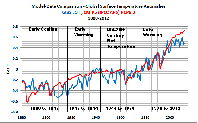

The graph is from this post:
https://bobtisdale.wordpress.com/2013/04/20/model-data-comparison-with-trend-maps-cmip5-ipcc-ar5-models-vs-new-giss-land-ocean-temperature-index/
The fact that global surfaces warmed from the 1910s to the 1940s without being forced to do so indicates the much of the warming since the mid-1970s may also be unforced (aka natural). This strongly suggests that the model sensitivity is at least two times too high.
Additionally, climate models do a reasonably good job of simulating the warming rate of land surfaces over the past 30+ years, but they still almost double the warming rate of the ocean surfaces.
That graph is from the most recent sea surface temperature update:
https://bobtisdale.wordpress.com/2015/05/12/april-2015-sea-surface-temperature-sst-anomaly-update/
The overestimation of ocean surface warming and the fact that the climate science community is still looking for the “missing ocean heat” (they can account for about half of what was predicted by models) both suggest that climate sensitivity in models is at least two times too high.
The model runs only do a reasonably good job between 1963 to 1997. They seem way off at all other times.
So much for hindcasting and back tuning. Perhaps the cooling of past temperatures has not helped. It seems to me that they need to warm the period 1910 to 1935 to bring the temps better in line with the model runs.
Notice the attempt to compare apples to oranges by changing the reference period to 30 years. Longer and shorter periods come up with greatly different numbers.
… but where’s the graph of anchovy concentrations?
Models can never be “bamboozled,” the truth is that only the people that build them and interpret the results are flummoxed.
Kevin Trenberth and friends are really [hoping] that this El Niño will bring with a a whole load of extreme weathers which can used to ‘prove’ they are right and will be tragically disappointed if it does not . The fact that in turn is likley to cause a whole lot of problems to lots or people , shows how much Kevin Trenberth and friends really do care about ‘the people ‘
Always worth remembering that the worst case situation for Kevin Trenberth and friends is the best case situation for the majority of the human race .
And, of course, it would certainly help to sell the story in Paris in December.
Yes, but if El Nino is not driven by mandmade causes, and is natural in origin, it merely confirms the role of natural variability in climate and in extreme weather events.
It undermines the warmist’s case if the only upward temperature years are El Nino driven.
Not really. Why do El-Nino years keep breaking records? Because the natural variability they provide ride on a rising temp trend.
Indeed mark Johnson, but that warming trend is half of that predicted for a 4 deg rise and most of the warming can be clearly be attributed to natural causes such as the 5% decrease in cloud cover observed by satellites. To get high climate sensitivities the models plug in a large natural cooling (based on nothing) to compensate for the lack of warming relative to that expected from sensitivity.
Mark Johnson
Whilst it may be the case that they are riding on top of a ‘rising temp trend’ there is nothing to suggest that the rising temp trend is not in itself of natural origin. The Planet is rebounding from the LIA, and as can be seen from Bob Tisdale (May 13, 2015 at 1:15 pm) plots there was a warming trend from about 1910 to 1945 which even the IPCC accepts was not driven by CO2.
Given that the warming trend (the rate of warming) between about 1910 and early 1940s is the same as the trend between about 1965 and the late 1990s, there is no reason to infer that the driver behind the ‘rising temp trend’ at the end of the century is due to some other cause; it may be, but there is no reason (supported by hard evidence) to consider that that is the case.
If one looks at the temp record what one sees is a series of step changes. At the moment those step changesa are on an upward tradgetery but of course that could change. The problem with Claimate Science is the reliance on a linear straight line fit when the data does not support such a linear straight line approach.
Okay, that’s a lot of comparisons between regional sea surface temperature anomalies of El Nino years.
With all due respect, now that we’ve established that everyone is in agreement about El Nino conditions (something I think we’ve been in since last fall) perhaps we could discuss something more interesting like the regional weather patterns of those years and what we might expect to be the same and different this time around.
May 5/6 is going to be seen as the peak for this current positive ENSO. Both Region 4 and 3 have steadily shed a good portion of their heat in the last 7 days. On the western edge of Region 4 tropical storm Seven which is now Typhoon Dolphin has been steadily dissipating heat from that region for the last 12 days. Typhoon Noul also was drawing the temps down a bit in Region 4 until it moved further west.
Besides the tropical storms in the western region, the easterly winds have steadily regained momentum. This has led Regions 3.4 and 3 to shed heat. The only ‘extra’ warm ENSO region is now Region 1/2, and that also shows a small decline in it,s heat load. The ENSO regions will now steadily lose heat until the end of July when the rate of decline will increase.
Judith Curry’s website has an article on Anchovy, who live and breath/swim in the pacific, and they say nyet to El Nino
Wouldn’t S. American anchovies speak Spanish?
Not necessarily. Anchovies appear to be multilingual …
http://img.21food.com/20110609/product/1305598615656.jpg
This ensures a temperature spike at the Paris GOP meeting later this year and another WMO/GISS temperature announcement of the warmest year on record is guarantied at the days before the opening.
The same procedure as last year at the COP?
The same procedure as every year, James!
Here is the ENSO prediction up until 2020 based on my now much improved ENSO MEI prediction.
http://www.global-warming-and-the-climate.com/images/ENSO-forecast.jpg
A multiyear La Nina for 2016/17/18 would be interesting, Per. If there are additional westerly wind bursts this year, I suspect the MEI might reach higher than 1.5 at its peak this boreal winter.
Cheers.
I thought that, according to last years report about probably being the most likely hottest year on record, but we’re not real sure about it, report, it was unprecedented last year to have such a hot year without an El Nino’s influence. Now Trenberth is saying it’s an unprecedented multi-year El Nino? Which is it Trenberth? Did we have an El Nino that influenced the hottest year on record, or is this a multi-year event? Or can you have it both ways?
At least it may take the edge off this horrible drought.
That depends on which side of the ocean you are.
Well Bob, thanks for your analysis but I would like to ask for a little favor:
Maybe I overlooked it, but if not: A somewhat shorter “Summary” section would be quite helpful for interested people who don’t have the time to study every extended wuwt article completely. Thanks very much in advance for such an adjuvant service the next time.
How much is the Eastern Pacific heat due to the equatorial kelvin wave and how much is due to the great warm spot moving down the US Pacific coast?
I only ask because, even though the BoM has said it’s an El Nino year I’ve been experiencing decidedly La Nina conditions on the East Coast of Australia for the last three months or so – and the water temps are still warm. Usually for an El Nino our ocean temps here plummet.
Someone do a simpleton a favour and tell them whether a moderate to severe El Nino is going to happen?
All these charts and words from Bob, leave a thicky like me totally none the wiser.
Thanks
Like asking a stock broker whether your shares will go up or down. As long as you don’t expect them to match their money with yours, you will get an answer!
This link might belong on this thread:
Role of El Nino in heat build-up in Indian Ocean
http://www.thehindu.com/sci-tech/science/role-of-el-nino-in-heat-buildup-in-indian-ocean/article6591264.ece
Yes, public broadcaster ABC were touting increased risk of drought El Niño just the other day, along with climate change hysteria. Drought is a safe bet for some point in the future, this is Australia after all, but seeming as we are supposedly already in an El Niño the recent flooding, the cooler than average summer, early snows in the Ozzy Alps and other cooler phenomena appear to be singing the climate in a different tune.
Just goes to show that in a non linear chaotic system nothing provides a predictive “sure thing”
when we see it we will believe it .also read this http://www.9news.com.au/national/2015/05/13/21/24/unusual-weather-stuns-bom-veteran
Thanks Bob for the update. As a farmer in Australia the detailed analysis you provide help me plan for the season. Bad news for us it seems but not all El Niño years are deep droughts. I live in hope that the above average heat in the Indian Ocean may provide extra moisture to counteract the cooler West Pacific and at least give us enough rain to grow a crop, even if it is a poor one.
I know WXMaps has been bouncing round like a fart in a bottle but the current 8-14 days looks interesting
The most annoying thing is all those Channel 10 newscasters saying “unpreeeeecedented”.
The “pre” should be pronounced like the “pre” in president.
Thanks, Bob. As always; a wide perspective of what the ocean is doing.
There have been several articles in the UK press suggesting that because of El Nino, the UK is likely to have a colder and snowier winter tnan normal.
They are bracing the UK citizens for a cold winter even though only a decade or so ago, snow was something that children were not going to see anymore. I guess El Nino did not exist in the early 2000s.
Perhaps this press coverage is to help explain to the citizens why the politico elitist class are so worried in Paris about global warming and CO2 reduction whilst little old folk cannot afford to heat their homes and are dying prematurely because of the cold and unaffordable costs of energy. You have to love these politicians.