Guest Post by Bob Tisdale
Dr. Roy Spencer introduced the updated and much corrected UAH atmospheric temperature data in his blog post Version 6.0 of the UAH Temperature Dataset Released: New LT Trend = +0.11 C/decade. The new temperature anomaly data for the lower troposphere, mid troposphere and lower stratosphere are presently in beta form for comment. That is, they’re not official…yet. I suspect the update will not go over well with the catastrophic-anthropogenic-global-warming crowd. Links to the version 6.0 beta data are at the bottom of Roy’s post, which also contains a detailed discussion of the updates. So if you have questions, please ask them at Roy Spencer’s blog through the above link. This post is a simple data presentation.
The version 6.0 beta temperature anomaly data for the lower troposphere used in this post are here.
In this post, we’ll take a quick look at the new UAH version 6.0 beta lower troposphere temperature anomaly data, comparing it to:
- the current UAH version 5.6 data
- the RSS lower troposphere temperature data.
But first…
BASED ON LINEAR TRENDS, THE NEW UAH LOWER TROPOSPHERE TEMPERATURE DATA SHOW NO WARMING FOR 18+ YEARS, LIKE RSS
For Figure 1, I’ve extended the new UAH version 6.0 beta and the RSS lower troposphere temperature anomaly data as far back in time as they could go while showing no warming based on their linear trends. The new UAH data show no warming for 219 months, and for the RSS data, it’s 220 months.

Figure 1
A QUICK OVERVIEW OF LOWER TROPOSPHERE TEMPERATURE DATA
The following is a reprint of the initial discussion of lower troposphere temperature data from the monthly updates. The most recent update is here.
Special sensors (microwave sounding units) aboard satellites have orbited the Earth since the late 1970s, allowing scientists to calculate the temperatures of the atmosphere at various heights above sea level. The level nearest to the surface of the Earth is the lower troposphere. The lower troposphere temperature data include the altitudes of zero to about 12,500 meters, but are most heavily weighted to the altitudes of less than 3000 meters. See the left-hand cell of the illustration here. The lower troposphere temperature data are calculated from a series of satellites with overlapping operation periods, not from a single satellite. The monthly UAH lower troposphere temperature data is the product of the Earth System Science Center of the University of Alabama in Huntsville (UAH). UAH provides the data broken down into numerous subsets. See the webpage here [version 5.6 data]. The UAH lower troposphere temperature data are supported by Christy et al. (2000) MSU Tropospheric Temperatures: Dataset Construction and Radiosonde Comparisons. Additionally, Dr. Roy Spencer of UAH presents at his blog the monthly UAH TLT data updates a few days before the release at the UAH website. Those posts are also cross posted at WattsUpWithThat. UAH uses the base years of 1981-2010 for anomalies. The UAH lower troposphere temperature data are for the latitudes of 85S to 85N, which represent more than 99% of the surface of the globe.
UAH VERSION 5.6 VERSUS UAH VERSION 6.0 BETA
Figure 2 compares the current version 5.6 UAH lower troposphere temperature anomaly data to the recently released version 6.0 beta. The comparisons start in the Januarys of 1979, 1998 and 2001 and run through March 2015. The first full year of the UAH lower troposphere temperature data is 1979, while 1998 and 2001 are commonly used as start years during discussions of the recent slowdown in global surface and global lower troposphere temperatures. They are the same time periods we present in the monthly surface and lower troposphere temperature anomaly updates. See the most recent update here.

Figure 2
Since 1979, the new version (v6.0 beta) of the UAH lower troposphere temperature data show a noticeably lower warming rate than current version 5.6 data. For the periods starting in 1998 and 2001, the new beta version data show cooling of the lower troposphere based on the linear trends, while the current 5.6 version data show warming.
RSS VERSUS UAH VERSION 6.0 BETA
The warming rate since 1979 for the new UAH data is slightly less than (basically the same as) the lower troposphere temperature anomaly data from RSS. The shorter term cooling rates since 1998 and 2001 are also comparable. See the graphs in Figure 3.
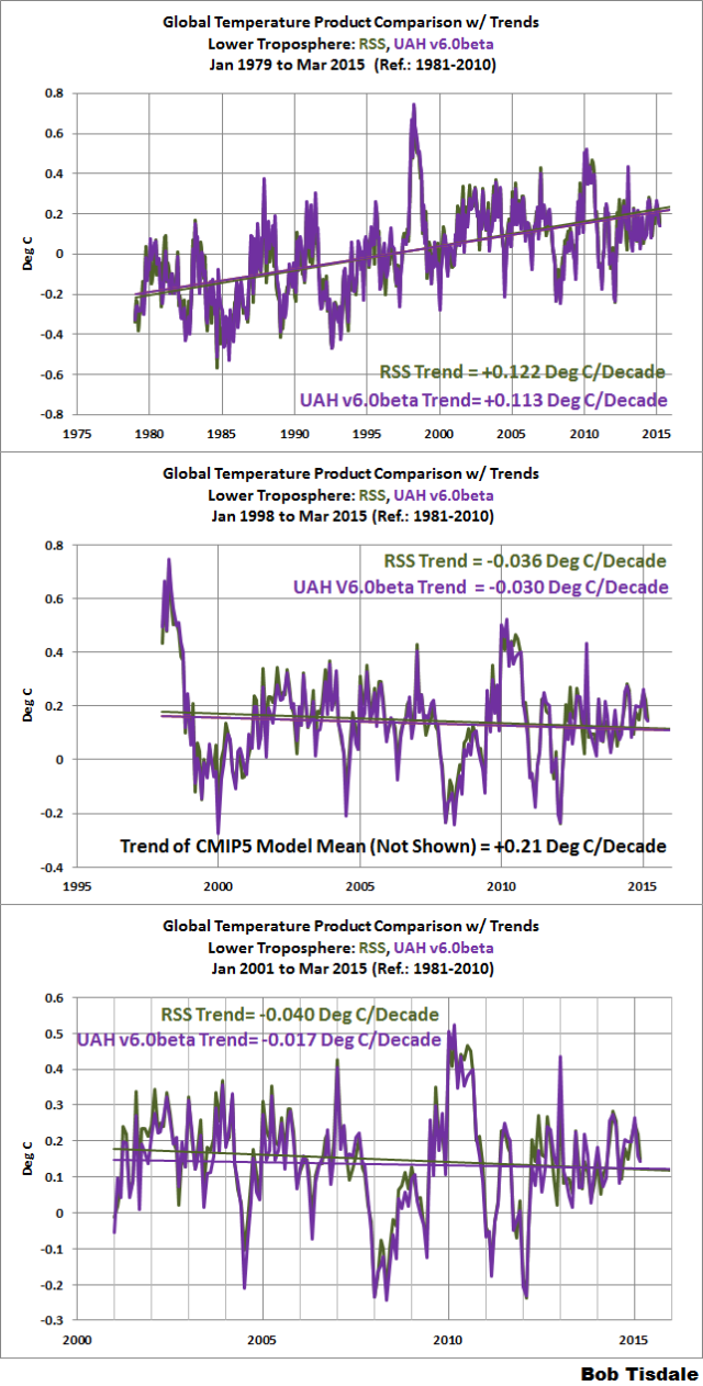
Figure 3
CLOSING
The RSS lower troposphere temperature data used to be an outlier, showing much lower trends than the surface temperature data and the UAH lower troposphere data. That will no longer be the case with the new UAH version 6.0 data.
SOURCES
The UAH version 6.0 beta lower troposphere temperature anomaly data are here.
The UAH version 5.6 lower troposphere temperature anomaly data are here.
The RSS lower troposphere temperature anomaly data are here.
What’s going to happen when the el Niño fades next year, probable record Antarctic ice and the blob off western Canada fades? Plus throw in results from the temperature tampering investigation.
As “hot” as it is, to me the global trend appears to be down. Sooner or later people will finally realize the sky in fact is not falling. When you get to the point of blaming major earthquakes in an area that boasts 30,000′ mountains resulting from one continent slamming into another, you are in fact at the tail end of alarmism.
Or maybe I’m just too optimistic.
Yep, and if you notice the cycle in the data a low point will be hit in early 2016. But what do I know the experts say there are no natural cycles just runaway global warming.
I tried mentally subtracting UAH from RSS by eyeball, with a little success. While I didn’t get a perfect straight line, I did get a message.
These curves are DATA, and not NOISE.
So leave them be and forget the running average 13 month or five year mastication. It adds nothing and merely tows away most if not all of the real data.
Unless of course Dr. Roy wants to do it just for entertainment purposes.
g
I guess we should go over to Dr. Roy’s blog to find out just what discrepancies they corrected to get the new data.
g
lower tropospheres not being in the outlier category just mean that the GW phenomena has expanded to all parts of the atmosphere. We need some real cfc’s training and better designed vehicles. desperately.
http://www.ayeshajamal.com
What?
Excuse #?
I’m sorry- I should have elaborated. My point is simply that cfcs or chlorofluorocarbons have been found to be co-related to the increase in global warming. I’m referring to several studies performed on CFCs as a contributing factor in Global warming.
http://phys.org/news/2013-05-global-chlorofluorocarbons-carbon-dioxide.html
Lower troposphere temperatures have been increasing over the areas. My comment was a general comment that we needed atmosphere friendly vehicles- despite the fact that new UAH data displays a lower warming rate.
http://www.ayeshajamal.com
That would be interesting, if any of it were actually true.
@Ayesha.
The link you provided is to a study that has many documented flaws.
For starters, the paper is based almost entirely on correlation and curve fitting exercises without connection to the relevant underlying physics.
Lu argues that the radiative forcing of CFCs matches global surface temperatures better than that from CO2 over the past decade. This is because due to the Montreal Protocol, CFC emissions (and emissions of hydrofluorocarbons, which replaced CFCs) have been flat over the past decade, and global surface air temperatures have also been essentially flat during that short timeframe, while CO2 emissions have continued to rise.
However, a global energy imbalance doesn’t just impact surface temperatures. In fact, only about 2% of global warming is used in heating the atmosphere, while about 90% heats the oceans. Over the past decade, ocean and overall global heating have continued to rise rapidly, accumulating the equivalent of about 4 Hiroshima atomic bomb detonations per second.
So while CFCs might match surface temperature changes better than CO2 emissions over the past decade, CO2 emissions better match the relevant metric – overall global heat accumulation. Since a global energy imbalance influences global heat content and not just surface temperatures, this by itself is sufficient to falsify Lu’s hypothesis (though the paper contains several other fundamental problems)
Ayesha, you don’t have a clue what you were reading (if at all), do you?
Not clear you are reading this correctly, or perhaps /sarc tag was left off. The fact that this now independently converges with RSS strengthens the legitimacy of both, as well as that of the lack of warming vs. questionable surface temp records. Now up to the weather station guys to show why their data is legitimate.
Taylor
Are you using English, and if so, could you provide some kind of translation for a native English speaker, so I (and other WUWT-ers) could comprehend that comment?
Are you sure there is something vital to comprehend?
pardon me, I’m still a student and generally we’re used to taking notes in ‘shortcodes’. My comment was a general comment on the correlation b/w CFCs and Global warming. That comment was basically a note to self. I wasn’t expecting people to ask me to elaborate my comment 🙂
http://www.ayeshajamal.com
(Please stop linking to your site. A link with your screen name is sufficient, and does not come across as advertising. -mod)
@Ayesha,
Well, that certainly clears things up.
What global warming?
Ayesha, you have a conspicuous and silly looking coolaid smile. Here is the real background on cfc’s from a geologist’s experience:
http://cfc.geologist-1011.net/
As for vehicles, I am all for better gas mileage. However, I also live in a rugged isolated part of the US. Farmland. Out here you can’t plow and plant with a mule and expect to put your kids through college.
Yeah Pamela, let them try to take away my tractor!!! Sure, I have horses. I could plough with them like my grandparents and great grandparents, but I am old and I like the fact I can do what was a day’s work in an hour with a tractor and then go for an afternoon horse ride in the wilderness. (no fossil fuel required – but a lot of my tack is made from petroleum products and the hundreds of miles of trails I use were made by exploration companies. Thanks.)
Don’t worry Pamela, they won’t take away your tracker. Some unelected bureaucrats will make you pay a hefty fee to operate it.
Folks, lets give Ayesha lots of credit for bothering to research both sides of the debate, and not just take the media pronouncements on face value. We want an open and useful debate do we not? I hope this incident has not put her off the skeptical side of the argument.
Good on ya Ayesha – and please don’t be put off. There is no such thing a stupid question, so please ask away ( not that I can answer necessarily of course….)
I was privileged to study under a true gentleman, called Professor Paul Lissberger. He was of German descent, his family having fled Austria under the Nazis. Prof. Lissberger wouod ask questions during his lectures, presumably to ensure we were all engaged and not dozing off. One day in our final year undergrad lectures, he asked a question. The answer came from one chap in my year, and was so catastrophically incorrect it precipitated an audible gasp from the rest of us. We thought Prof L was going to go through this chap for a short cut.
But not so. He replied gently, saying he understood where the chap was coming from but it wasn’t the answer he was looking for. That was the point I decided to join Prof’s group for a my Ph.D. He admired the chap for trying, being engaged and wanting to learn and participate. Being wrong was just a minor, correctable stumble along the way. and I admired Prof for treating the chap with kindness and respect.
I am afraid there is no such thing as “cfc’s training”, however, you may wish to take a course in either elementary chemistry, physics or both.
On the other hand I can see no reason why you should not purchase a “better designed vehicle”, other than price, of course. If that’s not an issue for you, the market is full of wonderful designs.
I know… again “my bad”… My comment was not only wrongly phrased but also contained technical mistakes. I was using my cell phone to comment, so there were typos and auto corrects. As far as “physics and chemistry” are concerned, I received “Straight A’s” in my recent A’ level exams. But of course, I need to write a really good comment to prove my academic credibility… NO?
Which only goes to show the dire state of modern Western education.
This guy got straight ‘A’s? How much did your examiner charge……. ??
Ralf good soul,
I think Ayesha may be a young lady, perhaps a little keener than knowledgeable – but still a teenager, maybe.
And – if so – having several decades to gain the experience (do not confuse with wisdom) that I – and maybe you – have.
‘Guys’ can, in some parts, be synonymous with ‘people’ or ‘folk’ or ‘you souls’.
In some parts, though, it is seen as purely the reserve of those with a ‘Y’ chromosome.
– Like the musical “Guys and Dolls”.
Do have a good one!
Auto
Ayesha,
Thanks for stepping up and for engaging in the conversation. By the way, (vehicles) transportation accounts for only a small part of man’s CO2 emissions, but every little bit helps.
Ask a wheat farmer.
But!?
We are already driving, flying and diving atmosphere friendly vehicles!
Plants absolutely love the increased CO2! Plants have rewarded us for the higher CO2 levels with bumper crops.
What should and eventually must be feared are lower CO2 levels. When plants start suffocating out so will mankind.
Buy a Tesla; it’s a pretty well designed vehicle. but it is not particularly useful in Global Warfare, nor did they use any computational fluid cycles, in the current design. But there are plenty of them available so no need to get desperate.
🙂 like somebody kindly mentioned above, I’m a teenage girl, out to learn more about climate. I’m basicallp a ACCP pro student who knows more about computers and coding rather than the changing temperature. Some of the comments above have really disappointed me in the low patience and tolerance levels of older people.
In addition the guy who made ‘how much did you pay your examiner comment’ was one of the most illiterate persons I’ve chanced across on the internet. Because I’m sure that British council CIE would mind it if it was being implied that they’re an unethical bunch being bribed by student.
Also, English is not my native language, nor is it spoken much in my country. I learnt the language just a few years ago, so it would do people well to be less judgemental, and more tolerant. And of course- stop jumping to wild conclusions like crackpots, like the unfortunate ralphie guy up there.
Finally, make your peace will the world, so that you don’t have time to troll others’ comments and make them feel bad about them.
Ayesha Jamal,
If you’re learning here please let me say welcome. I must apologize for readers assuming you are causing problems. You’re a new name, and a big fraction of new names lately have been people who have a quasi-religious belief in man-made global warming (MMGW; AGW), and they only want to argue but not listen.
So let me give you the skeptics’ argument: Show us MMGW. Quantify it. Show us the fraction of total global warming attributable to human CO2 emissions. Show us it is an emergency. Or even a problem.
We are always asking questions like that, but the climate alarmists cannot give convincing answers. They expect people to take their word for their belief that dangerous MMGW exists, and that it will lead to climate catastrophe. But they have very little evidence, and they have no measurements quantifying MMGW at all. Without empirical (real world) measurements, their belief is only a conjecture, nothing more. A conjecture is an opinion.
Also, many of the arguments are over tenth and hudredth of a degree fluctuations, which are within the error bars. We are not even certain of their accuracy. Statistically, there has been no global warming at all for many years now.
This all began in earnest around 1997 and afterward, because due to a confluence of natural events, global temperature (T) went up unusually fast. But that has been retraced since then, and that one year turned out to be the biggest jump in T since the 1930’s. But as I said, global T has been flat for many years. So the rise in 1997 was an unusual anomaly.
If we look at global T for the past century and a half, on a chart that shows whole degrees instead of tenth or hundredth of a degree changes, this is what we see:
What scientific skeptics are asking for is verifiable, measureable evidence showing that human emissions cause the claimed MMGW. But so far, there is no such evidence. And every alarming prediction, from disappearing Arctic ice, to accelerating sea level rise, to ocean ‘acidification’, to more extreme weather events, to the big scare itself: runaway global warming, has been debunked. Not one prediction they made has ever come true.
So you can decide whether to believe the side that has been 100%, consistently wrong, or you can join us and be skeptical of their conjectures. All true scientists are skeptics. We are willing to change our minds any time, provided someone can produce convincing facts and evidence. But so far, the climate alarmist side has been all opinions, but with no measureable evidence.
I think Ayesha has highlighted the fact that WUWT could be seen as a bit of an old boys network – no doubt its the best place to look for honest scientific analysis and debate but lighten up and give us lightweights a chance to learn without fear of being ridiculed if we make a comment – the trolls are usually obvious and often well-known so no need to treat all new-comers with suspicion.
Mr. dbstealey: This comment is a mere quibble, but I think it amplifies your basic point. For the purpose of analysis temperatures should be reported only in the Kelvin scale where 0 °C = 273.15 K. Your chart seems to be in °F, where 0 °C = 32 °F and 1 °C = 1.8 °F. The Fahrenheit analog to Kelvin is Rankine where −459.67 °F = 0 °R.
The reason for this is that percentage of change comparisons cannot be made on the C or F scales. The thermodynamic change between 1 °C and 2°C is not 100%. It is the change between 274.15 K and 274.15 K which is 0.36%, i.e. almost imperceptible.
As far as global warming is concerned the matter is even murkier. GISS admits that the concept of an absolute surface temperature is not well defined, and concludes that value produced by models is 14°C ±0.45. All claims of warming since the late 19th Century seem to be less than 1°C. This means that the percentage difference on the Kelvin scale is about 0.35%.
You would have to draw a very large chart for that percentage change to be visible.
Walter Sobchak,
I agree completely with you and georgesmith. But as I pointed out above, that’s not my chart.
I have a folder with literally thousands of charts collected from many different sources. I’m a firm believer in visual aids. They get the point across without a lot of text, which often makes readers’ eyes glaze over. Charts very often make the point with a glance, and the one above is a perfect example.
Thanks for your ºKelvin explanation. It makes the tiny fluctuation in global T even smaller.
In Kelvin:
http://4.bp.blogspot.com/-lPGChYUUeuc/VLhzJqwRhtI/AAAAAAAAAS4/ehDtihKNKIw/s1600/GISTemp%2BKelvin%2B01.png
dbstealey,
http://2.bp.blogspot.com/-RqcviJ-LBFo/VTWzaE5AFNI/AAAAAAAAAbk/J2BX64yHG9A/s1600/GISS%2BGlobal%2Bvs%2BCMIP5%2BTemps%2BF.png
Makes the models look better too.
http://1.bp.blogspot.com/-o4vtAlhwkrI/VTrVEyu5ceI/AAAAAAAAAcs/MuA5KTmbm5I/s1600/HADCRUT4%2B12%2Bmo%2BMA%2BForcings%2Bw%2BTrendlines.png
http://sparrowism.soc.srcf.net/home/graph.png
[Please include a few words of explanation when posting a link. ~mod.]
http://i.imgur.com/q54sO25.png
Cage lags not leads.
I think if you take the residual of this it will prove my point nicely. Let alone something that probably has multiple LogN parameters buried in it somewhere.
http://www.howlatthemoon.com/dueling_piano_bar/wp-content/uploads/2013/07/funny-alcohol-graphs.png
[Please include a few words of explanation when posting a link. ~mod.]
I think he was too drunk, mod.
So UAH v6 now converges with RSS. That adds to the credibility and authority of both and simplifies (in a good way) the interpretation of the satellite temperature – one no longer has to choose one or the other.
Problem is that Dr Spencer is seen as a “denier” not to be trusted and I think Carl Mears from RSS recently stated that satellite measurements were less reliable than the surface temperature records. Someone suggested he had been leaned on by the President of NASA.
John Peter,
Administrator of NASA…
…unless you meant the President AND NASA (as it is very likely that President Obama and Administrator Goldin are both in overdrive to get everyone in line and singing from the same CAGW hymnal).
Bruce
Lots of people don’t believe in evolutionary theory because it “denies” creationism. Let’s ignore science and decide to consider what is credible based on what upsets some people the least.
@Will Nitschke – note that you just used the term “evolutionary theory,” emphasis on theory for my part. Until “evolutionary theory” is scientifically proven to be accurate don’t expect creationism to just quietly fade into the night. Both are theories and both sides have used fraud and deception to try to prove they are absolutely right with no explanation possible. So I guess that makes me a skeptic to both sides.
Kind of sounds like the CAGW argument doesn’t it.
Evolution is a “scientific theory” because it has been tested without being falsified by the evidence. Creationism is a theory but inot a scientific theory for it is insusceptible to being tested. Neither theory can be “scientifically proven to be accurate.”
But, firstly, the is a WHOLE MONTH’S difference between them.
Second, this is data after adjustments, isn’t it? It’s cherry picking.
Third, Spencer is a loony Christian denier in the pay of Big Tobacco.
Fourth, …
C’mon, someone give me a hand here. I can’t do this all by myself.
Fourth, he was seen shifting money from his right hand to his left hand, and then pocketing the money into his left pocket. Clear proof that he is in the pay of his right hand, and thus not to be trusted.
And does it mean that UAH also agrees with RSS when we try and measure how long statistically significant warming can be calculated?
Ross McKitrick found that RSS showed no statistically significant warming for 26 years. So is UAH now about the same? Over a quarter of a century is a long, long time for the two satellite data sets if it is the case. So where is their CAGW hiding?
Neville,
97% of it is hiding inside a MOOC owned by Cook, Lewandowsky, Mann, Oreskes et al and located ‘somewhere in Queensland, Australia’. It is dissolved in a state of the art Denial of Reality solution to which the aforementioned hold the patent.
As Judith Curry will confirm, inside the MOOC the agreement between RSS and UAH is considered a psychological disorder. From what I can gather it is punishable by a severe and sequence of raising and lowering of the eyelids delivered by La Lewandowsky via a Youtube video clip while incanting certain CAGW mantras.
I am serious, this is dangerous ground, Neville.
🙂
With respect to statistically significant warming, that is obviously going to increase greatly.
With version 5.6, Dr. McKitrick had it at 16 years while Nick Stokes had it at 18 years and 8 months.
For RSS, Dr. McKitrick had it at 26 years while Nick Stokes had it at 22 years and 3 months.
But with the pause being 18 years and 3 months on version 6, I would say Nick’s time would increase by 4 years to over 22 years.
As for Dr. McKitrick, notice that most of the points for RSS since last April when he made his calculation for RSS are below the trend line. So if he were to calculate RSS today, he could get 27 years. I have no clue about UAH6, but I would not be surprised if it would be similar.
http://www.woodfortrees.org/plot/rss/from:1988/plot/rss/from:1988/trend
Werner,
That explains the reason for the new version. With no actual changes, the new charts will be showing rapid global warming.
Do you mean statistically insignificant warming
You have to go back a long time to get a trend statistically different from zero because, as Dr Spencer says, the errors are large. UAH5.6 said that the trend way back was not significantly different from zero, even though it was quite large. I don’t think the change will make much difference, since it is the error rather than the magnitude that counts.
But anyway, I re-did the back trend plot, now accessible here (trandback button). It shows the trend from the x-axis year to present; the limit of “pause” is where the curve crosses the x-axis. UAH and RSS are now quite similar – UAH slightly shorter “pause”. The surface indices are nowhere near a zero trend anywhere in that range.
http://www.moyhu.org.s3.amazonaws.com/trend/uah6pause.png
Nick,
I don’t know if you looked at what I got from surface stations (http://wattsupwiththat.com/2015/04/29/new-uah-lower-troposphere-temperature-data-show-no-global-warming-for-more-than-18-years/#comment-1921793)?
If you can see how what I did was a pretty decent match to UAH (especially since I have only samples from part of the land’s surface), I can make a good argument it shows that whatever caused temps to change it was not that Co2 altered surface temps.
All of those negative values are the average surface station being slightly colder this morning than it was yesterday morning, which should mean temps would be going down, but I think surface air masses are not being warmed over the land, put over tropical oceans, and the that “hot wet” air is transported poleward, where it cools down, just like the surface stations record.
Without having to infill or do anything other than average the day to day station change.
“If you can see how what I did was a pretty decent match to UAH “
It would match surface temperatures about as well. All it’s saying is that warm years have more changeable morning temperatures. Interesting, maybe, but I can’t see any connection to CO2 or AGW.
When averaged for an entire year, for stations with a min of 360 days of samples, it’s negative for 69 million samples since 1940, 50 of the last 74 years are negative, and 30 of the last 34 years are negative.
Remember this the difference between yesterday’s increase and last night’s falling temps, Co2 is not a factor in over night cooling if it cools more than it warmed.
[Delete dupe? .mod]
When averaged for an entire year, for stations with a min of 360 days of samples, it’s negative for 69 million samples since 1940, 50 of the last 74 years are negative, and 30 of the last 34 years are negative.
Remember this the difference between yesterday’s increase and last night’s falling temps, Co2 is not a factor in over night cooling if it cools more than it warmed.
Oh, one more important note, those large swings in average temp, are not global, they are big regional swings averaged with stations that hardly change at all. Clearly not global.
If you average for long enough; the longer the better, absolutely nothing changes. That’s good isn’t it, you just get a single number.
And the longer you average the less you know about what happened. In the end, nothing happens.
I’m sure that must be good.
g
These are annual averages, I also look at the daily average and pull the slope of the change from the day of max warming to max cooling and back again, and you can the rate of temp change has been changing, but it looks like it might be an inflection point.
I’ve posted it in one of my replies to the threads I’ve posted in the last couple days.
But none of that has anything to do with Co2 if it cools more over night than it warms yesterday.
This is extremely important. The AGW alarmists have been able to dismiss RSS as an outlier when the pause is mentioned. This is no longer an option for them. Since satellite data is so much better than surface data coverage and the two sources are now in better agreement, it will be much easily to make the point that the surface data is poor. Thanks Roy, John and William. Now we need to get woodfortrees update.
In addition, it would be great to have the option to specify regional coordinates (eg. a point plus a radius or four points). We’ve seen a lot of cherry picking of surface data from alarmists and it would be nice to be able to look at satellite data over a similar region.
Satellite data has not been particularly good for measuring regional trends
http://www.drroyspencer.com/2015/04/version-6-0-of-the-uah-temperature-dataset-released-new-lt-trend-0-11-cdecade/#comments
It is often quite difficult to measure that which does not exist; but that problem is solvable by modeling.
g
george,
You have a knack for getting to the heart of the matter.
[i]Since satellite data is so much better than surface data coverage[/i]
somehow, the historic numbers of revisions to the temperature dataset, and the exclusion of others that have been found, indicates that these trends are FAR from reliable.
The adjustments over the last decades to UAH are massive. These adjustments cannot be verified as accurate since there is no baseline. The Weather balloon coverage is too spotty.
I can see why you want to assert that these things are more accurate than actual surface temperature readings but the evidence of continual revision and increased uncertainty due to things like detector degradation, diurnal drift, orbital decay and in situ calibration protocols proves otherwise.
Jai,
Your italics did not show because you used the wrong brackets. Try going to Ric Werme’s guide to WUWT found on the right of these pages – white letters on blue. Go to the end of that.
Alternatively, note that the comment after yours, by Nick S., does get it correct.
Highlight the italicized part of that comment, then right-click and select “Inspect element” – The box that comes up will have the proper code mid-way in the lines of code.
~~~~~
I will also mention that it is cool and breezy here in the Great State of Washington. Tender garden plants froze last week and are dead and black. Global warming doesn’t seem to work for me. I guess it’s a regional thing.
Are you suggesting that surface temperature readings are not spotty. They are recorded at a spot. Weatherballoon radiosondes transmit data at a range of altitudes. Not affected by inappropriate siting. I’m sure that Anthony could give all the details on that subject.
“Since satellite data is so much better than surface data coverage…”
Yes, it’s so much more reliable than it was yesterday.
Nick, unable to make a valid point (as is usual with his for-hire obtuseness) resorts to taunts. EPIC!
Nick Stokes,
Satellite measurements have always been the most accurate measurements, followed by radiosonde balloon data.
And jai mitchell denigrates radiosonde data as being “spotty”, not understanding that balloons cover enormous distances while transmitting temperature and other data. They are much more comprehensive than surface stations, which have been systematically reduced in number over the past twenty years, and which show artificial warming due to the urban heat island effect.
“Satellite measurements have always been the most accurate measurements, followed by radiosonde balloon data.”
Yes, if you want to know the temperature in the lower troposphere, these are the best ways.
The satellite failures were known long ago. Roy made that clear. So, we’ve know UAH was not quite right and that’s why many of us moved to RSS. Now, it appears they both are based on working satellites and they both get about the same answer. Nothing like that can be said for surface stations.
“Yes, if you want to know the temperature in the lower troposphere, these are the best ways.”
Lower and middle tropospheric warming was the most important metric imaginable to warmists while warming was happening there. Then it became rather unimportant once it stopped. David Appell once noted in a comment that what happens in the troposphere was unimportant now because “nobody lives there” but then demanded we worry about the heat accumulation in the deep ocean. I am not joking. These people are so twisted that self contradictions no longer matter to them.
I have a table of serious TSI measurements going back to 1940, which is before most of the satellites were put up. Some of them are within spitting distance of the most recently publicised NASA-NOAA value.
Such as E.G Laue, and A. J. Drummond, 1968 136.1 mw/cm^2 (the units they used.
or C.W Allen 1950 137.4
I grew up on M.P. Thekaekara, R. Kruger and C.H.Duncan 1969 135.1 mw/cm^2
As I recall that was a review paper and a recommended result. in fact Thekaekara is responsible for the whole table I have. Sounds Greek to me.
And he says and he says, “The differences are usually attributed to the difficulty of making corrections for the atmosphere; so all of these were ballon, Rocket and high altitude flights in the atmosphere.
You can find these papers everywhere/ I happen to be reading out of “The Handbook of Optics , sponsored by the Optical Society of America.
ERIM; the Environmental research Institute of Michigan is another great source. They published the invaluable Infra-Red Handbook for the US Navy.
Both of these Handbooks are just crammed with hundreds of references to the peer reviewed literature from before it all went political. So yes it’s a bit dated, but earth’s orbit hasn’t changed a lot in my life time.
g.
Will Nitschke says, April 29, 2015 at 3:15 pm:
“Lower and middle tropospheric warming was the most important metric imaginable to warmists while warming was happening there. Then it became rather unimportant once it stopped. David Appell once noted in a comment that what happens in the troposphere was unimportant now because “nobody lives there” but then demanded we worry about the heat accumulation in the deep ocean. I am not joking. These people are so twisted that self contradictions no longer matter to them.”
The warmists claim that modern global warming/climate change comes as a result of an ‘enhanced greenhouse effect’. Well, the ‘greenhouse effect’ is supposed to be – by definition – a MEAN GLOBAL SURFACE TEMPERATURE effect. It is not about the atmospheric temperature. It is not about the temperature of the bulk ocean. It is specifically meant to be about the surface temperature. The global surface of the Earth is supposed to be warmer, on average, WITH a ‘greenhouse effect’ than WITHOUT. So it follows that an ‘enhanced GHE’ would necessarily need to make the average global surface temps rise.
The problem is that the mechanism for such postulated atmosphere-induced warming of the surface cannot occur without defined layers of the atmosphere itself warming in step with the surface (in reality even before the surface, but one wouldn’t be able to see that). That’s how the ‘raised effective radiating level’ explanation works.
So if the lower troposphere isn’t warming (since 1996/97), then, if the surface still warms over the same period, this cannot be the result of an ‘enhanced GHE’. There must be other processes causing it.
This conclusion is corroborated by surface radiation data from CERES. It shows that global mean DWLWIR from the atmosphere to the surface has diminished in intensity since 2000. At the same time, global mean UWLWIR from the surface up has increased. So the cooling ability of the global surface of the Earth via radiation (its ‘net’ radiation loss (its ‘radiant heat loss’)) has become significantly STRONGER (by about 1.5 W/m2) over the last 15 years, NOT weaker. All the while, global OHC has gone up. And so has the average global surface temp (according to GISS, HadCRU and NOAA).
Kristian says, “The problem is that the mechanism for such postulated atmosphere-induced warming of the surface cannot occur without defined layers of the atmosphere itself warming in step with the surface (in reality even before the surface, but one wouldn’t be able to see that). That’s how the ‘raised effective radiating level’ explanation works.”
======================================
I would add, not just before the surface, but to a greater degree. I think it is projected to warm 1.5 times as fast.
Am I correctly remembering that the new US Reference Network of surface measurements is showing a slight cooling trend?
Correct. 2014 was the coldest year in the record.
Thanks Bob (and Roy)
So now the two major satellite datasets show no warming for the last 18 years, in spite of emissions having increased by over 30% this century and CO2 concentrations being at an all- time high (well, for the last 3 million years).
Both satellites datasets show 1998 to be the warmest year on record; a clear contrast to the land based temperature data which claims every passing year as the warmest ever.
Warmest year on record IN the satellite record.
“Both satellites datasets show 1998 to be the warmest year on record; a clear contrast to the land based temperature data which claims every passing year as the warmest ever.”
There’s no conflict because you can’t quite compare satellite measurements and surface measurements directly like that. I believe even Dr Spencer himself has pointed out that since the satellite measurements are for lower troposphere, rather than surface, they show a much stronger effect from El Nino events. Thus 1998 is warmest on record for the lower troposphere, while the warmest for the surface depends on exactly who you ask (there’s a statistical tie between several years).
Nobody puts thermometers on the ground. “Surface” is typically but not always at 2 meters above ground. This has profound effects due to radiative heating and cooling of the actual surface, which produces dramatic temperature changes as altitude varies centimeter by centimeter.
If thermometers WERE on the ground the whole picture would look quite different; UHI effects would be far more pronounced, and far too obvious to dispute. Data quality of the “surface” thermometers before the 1960’s varies from bad to farcical, so all these pompous pronouncements of “Hottest Year Evah” are just lies.
PS nice work Bob Tisdale!
indeed. SAT is not the same as the lowest channel from satellite data.
indeed no conflict.
Yeah Daniel is back, of course you have only used the difference between UAH and RSS a million times as proof that AGW theory is correct.
Are we surprised by this? The current warming plateau coincides nicely with the negative PDO, just as the 1947-1970 plateau did. If this PDO cycle behaves like the last one, we should have about ten more years of plateau…if we warm before then, that warming may be the effect of AGHG acting on natural variability. It will be interesting to compare the rate of warming when the PDO goes positive to the rate during the last warming period…should give clues to climate sensitivity to AGHG.
You might appreciate all the posts Bob Tisdale has on his site (most cross posted here on WUWT) wherein he presents information on ENSO, PDO and other topics. One has the title “Yet Even More Discussions About The Pacific Decadal Oscillation (PDO)”, with many links, and those have links.
Happy Birthday to the Pause
Interesting POV… The pause ( really halt or inflection) can now get a drivers licence, smoke, in some places drink, get married, buy a house and fill it with little pauses, enter the military and go to war, execute contracts, and be in a licensed profession, even run for public office. Not long before it can be president…
AGW – the little bastard child of the unholy marriage of envros and politicos. Darn kids never do what you want them to do.
According to RSS, 2014 was the 6th warmest and after 3 months in 2015, RSS is on track for 2015 to be 5th warmest.
Version 5.6 had 2014 as third warmest and after 3 months in 2015, 5.6 was on track to be 3rd warmest.
However version 6 now has 2014 to be 6th warmest and after 3 months, version 6 is on track for 2015 to be 5th warmest, exactly like RSS.
I’m not too big on graphs I don’t create myself. Inmost of these graphs i can clearly see that 1998 was the hottest year in recent history. How can the media be printing similar graphs then try tho tell us all these years they came after are the hottest on record. why would they even attempt to pull off such a thing?
They simply refer to a different temperature record, GISS or HADCRUT4 for example, which show 2014 to be the warmest..
i have looked at giss summarized data which clearly doesn’t show 2014 to be the warmest on record. I don’t know where you are getting that information mike
Charlie
From the GISS dataset (where else?)
http://data.giss.nasa.gov/gistemp/tabledata_v3/GLB.Ts+dSST.txt
those would be records that include ground station recordings, correct? Do they provide which ground stations they use or the raw data?
Oh Charlie, that is a loooong story.
See previous post here, earlier this month.
“Inquiry Launched Into Global Temperature Data Integrity ”
That should give you a sense of what may have been going on. Tip: ‘adjustments’, selective adjustments, and station ‘rationalisation’ and such like.
And those ground station records also include ground stations that are actually runway Temperature recording stations at airports, used for the purpose of determining safe aircraft take off conditions.
They don’t care what the Temperature is at 8km altitude, if conditions on the ground don’t make for a safe takeoff.
Time to start watching the Atlantic Oscillation. Now that the Planet is not warming, it must do one of the following: warm, stay the same, or cool. The AO is bring cool waters down to the Gulf of Mexico from the North Atlantic Oceans. Could the Gulf Stream actually cool? Would this be the way Arctic Sea Ice rebuilds: no warmth from the Gulf Stream??
My guess is that it will start to cool eventually. what I don’t know is how they will run the scam if that happens. will they completely cover up the cooling trend. Will they say the small cooling trend doesn’t mean anything? or will they change the narrative to include a rapid cooling planet as a possible catastrophic effect of co2 emissions?
Charlie, it’s been pretty cool in many places in the world over the last 5+ months, and yet this fact barely gets mentioned in the media. They are certainly trying hard to cover it all up and, as you suggest, they’ll blame the cooling on Co2 rather than the Sun. But what will the warmists do when their butts are freezing off? They’ll be glad of good ole fossil fuels. 🙂
The brighter fews in on the CAGW scam realize a cooling is coming. Thus the rush to get their Economic & energy control-wealth redistribution schemes inplace before that happens. They then figure they can claim their schemes are “healing” the climate, and Climate Change indoctrination will further make the population masses resistant to the truth.
The gulf stream headwaters come from the transport of sunlight warmed tropical surface waters northward . This is the tropical Atlantics’, the Gulf Mexico’s, and Caribbean seas’ cooling mechanism, working in conjunction with convective/advective evaporative cooling. Were the Gulf stream to cool, it would represent a cooler source water. This would be counterbalanced by a reduction of lower tropospheric water vapor over those tropical waters, creating less clouds, thus more sunlight warming of those waters. This regulation is an emergent property of many different physical systems inducing many layers of feedback on many different scales of time and space.
The reduction in energy input to the Caribbean and Gulf waters occurs during Ice Ages as Earth’s increasing orbital eccentricity apehelion lines up with NH summer. Currently, the Earth is experiencing a period of low eccentricity. The difference in the Earth’s distance from the Sun between perihelion and aphelion (which is only about 3%) is responsible for approximately a 7% variation in the amount of solar energy received at the top of the atmosphere. When the difference in this distance is at its maximum (9%), the difference in solar energy received is about 30%. Thus the Gulf Stream will cool, but only when the amount of external energy (sunlight), begins to decrease. Eccentricity will remain low for about the next 50k yrs. This will strongly blunt the formation of any deep glacial onset like those seen in the past 400k yrs.
Nail meet CAGW coffin, if you can find room.
Good one
Stake needed.
medium rare please
Let’s discuss ppm.
The IGSS site (Mass of atmos CO2 page) says ppm is volumetric based. I have seen other sources that refer to ppm as volumetric based including references to Mauna Loa. ppmv
Another approach has ppm that is gram weight based. ppmgw
World Bank 4C report says ppm is mole based. ppmmol
Which is it? Which one did IPCC use? Why don’t they specify?
Since the specific volume of CO2 is less than that of air, the anthro CO2 ppm volumetric or mole basis will be even less than the gram weight based. All of these cases use the residual 45% atmospheric component.
IPCC AR5
Year……ppm
1750……278
2011……390.5
Diff…….112.5
Additional CO2 due to man…….555 PgC, 375 PgC due to fossil fuel and cement production.
ppm gram weight based=(grams CO2 added)/(atmospheric grams)
(3.75E+17/ 5.14E+21)*.45 = 32.8 ppm or about 30% of the 112.5 ppm CO2 increase between 1750 and 2011.
ppm volumetric based=((grams CO2 added)/((1.842 grams CO2)/m^3 ))/((grams air)/((1.205 grams air)/m^3 ))
(3.75E+17 * 1.205)/ (5.14E+21 * 1.842)*.45 = 21.6 ppm or about 21.6% of the 112.5 ppm CO2 increase between 1750 and 2011.
ppm mole based=((grams CO2 added)/((44.01 grams CO2)/mole))/((grams air)/((28.97 grams air)/mole))
(3.75E+17 * 28.97)/ (5.14E+21 * 44.01)*.45 = 21.5 ppm or about 21.5% of the 112.5 ppm CO2 increase between 1750 and 2011.
Mankind’s fossil fuel and cement CO2 production contributed about 21.5% of the CO2 ppm increase between 1750 and 2011.
So just over 94ppm of extra naturally created CO2 increase.
Humans emitted more than enough CO2 to account for the increase, and the net effect of nature has been removing some of it. Willis Eschenbach discusses this, including how long CO2 stays in the atmosphere before being naturally removed, in:
http://wattsupwiththat.com/2015/04/19/the-secret-life-of-half-life/
1 PgC, the usual unit for global carbon accounting, is the carbon content in 3.67 Pg of CO2. This is because CO2 has a molar mass of 44.01 grams/mole and carbon has a molar mass of 12 grams/mole. That means anthropogenic CO2 amounted to 2035 Pg, 1375 Pg of which was from fossil fuel combustion and cement production. These quantities have the same volume and the same number of molecules as 1340 and 905 Pg of air respectively, since air has a molar mass of 28.97 grams/mole. Since Earth’s atmosphere’s dry mass is 5,140,000 Pg, these figures mean enough CO2 to increase atmospheric content by 261 and 176 PPMV respectively.
Since the atmospheric increase was only 112 PPMV, nature as a whole has been removing CO2 from 1750 to 2011.
Amazing …. there are young people alive today, old enough to vote, who’s entire life has been in a period when there hasn’t been any global warming.
Yup, like my daughter. She is 18 years and 1 month old. She can vote and through her entire life the global temperature has been flat. No thanks to the educational system, she isn’t concerned about CO2. She believes that we should be careful about polluting the air and water but isn’t too worried about the plant food we are adding to the air when we breathe.
It is of interest that the trends in the UAH v6 are much closer to the RSS data,. In particular they confirm the RSS global cooling trend since 2003 when the natural millennial solar activity cycle peaked.
see
http://www.woodfortrees.org/graph/rss/from:1980.1/plot/rss/from:1980.1/to:2003.6/trend/plot/rss/from:2003.6/trend
It is these satellite data sets which should be used in climate discussions because the land and sea based data sets have been altered and manipulated so much over the years in order to make them conform better with the model based CAGW agenda.
The IPCC climate models are built without regard to the natural 60 and more importantly this 1000 year periodicity so obvious in the temperature record. This approach is simply a scientific disaster and lacks even average commonsense .It is exactly like taking the temperature trend from say Feb – July and projecting it ahead linearly for 20 years or so. The models are back tuned for less than 100 years when the relevant time scale is millennial. This is scientific malfeasance on a grand scale.
The temperature projections of the IPCC – Met office models and all the impact studies which derive from them have no solid foundation in empirical science being derived from inherently useless and specifically structurally flawed models. They provide no basis for the discussion of future climate trends and represent an enormous waste of time and money. As a foundation for Governmental climate and energy policy their forecasts are already seen to be grossly in error and are therefore worse than useless.
A new forecasting paradigm urgently needs to be adopted and publicized ahead of the Paris meeting.
For forecasts of the timing and extent of the coming cooling based on the natural solar activity cycles – most importantly the millennial cycle – and using the neutron count and 10Be record as the most useful proxy for solar activity check my blog-post at
http://climatesense-norpag.blogspot.com/2014/07/climate-forecasting-methods-and-cooling.html
The most important factor in climate forecasting is where earth is in regard to this quasi- millennial natural solar activity cycle which has a period in the 960 – 1020 year range. For evidence of this cycle see Figs 5-9. From Fig 9 it is obvious that the earth is just approaching ,just at or just past a peak in the millennial cycle. I suggest that more likely than not the general trends from 1000- 2000 seen in Fig 9 will likely repeat from 2000-3000 with the depths of the next LIA at about 2650. The best proxy for solar activity is the neutron monitor the count and 10 Be data. My view ,based on the Oulu neutron count – Fig 14 is that the solar activity millennial maximum peaked in Cycle 22 in about 1991. There is a varying lag between the change in the in solar activity and the change in the different temperature metrics. There is a 12 year delay between the neutron peak and the probable millennial cyclic temperature peak seen in the RSS data in 2003.
There has been a declining temperature trend since then (Usually mis-interpreted as a “pause”) There is likely to be a steepening of the cooling trend in 2017- 2018 corresponding to the very important Ap index break below all recent base values in 2005-6. Fig 13. The Polar excursions of the last few winters are harbingers of even more extreme winters to come more frequently in the near future
It is also easy to watch the Penticton, CA 10.7cm Flux. The Flux is a great proxy for energy from the Sun.
Average values:
Flux -> greater than120 sfu -> warming
Flux -> 100 to 120 sfu -> pause
Flux -> les than 100 sfu -> cooling
http://www.spaceweather.ca/solarflux/sx-4a-eng.php
Just to clarity my earlier comment – the millennial temperature cycle peaked in 2003- as mentioned earlier the driving solar activity cycle peaked in 1991.
Not sure that you can fairly claim a millennial peak in 2003, obviously over a thousand years it could still respike higher in the next 20 years without detracting from your view of such a cycle.
Better to express hope that it did indeed peak then.
angech
I agree in general because the cycle seems to fluctuate 960 – 1020. However the main reason for thinking we are past the peak is not the 12 year cooling trend ,but the state of the sun see Figs 13 and 14 in the linked blogpost. The current cooling is consistent with that idea but not yet long enough to be definitive,
Dear mr. Page
thaks for very informative reply. I would like to ask two things. When we look at the model runs from IPCC (see Samurais post below for instance). Do we have any idea what those curves represent? I mean what kind of models were used, what kind of scenarios for CO2, CH4, aerosols etc. Which ECS values were used?
And in the other hand. If we don’t even know the exact value for ECS (AR5 gives 1,5-4,5 C if I remember correctly) how is it possible to predict climate behaviour with any reasonable accuracy? And ECS if of cource only one of many factors.
Ana See Fig 1 at
http://climatesense-norpag.blogspot.com/2014/07/climate-forecasting-methods-and-cooling.html
Also re ECS –
Here is a quote from section 1.3.2
“The key factor in making CO2 emission control policy and the basis for the WG2 and 3 sections of AR5 is the climate sensitivity to CO2. By AR5 – WG1 the IPCC itself is saying: (Section 9.7.3.3)
“The assessed literature suggests that the range of climate sensitivities and transient responses covered by CMIP3/5 cannot be narrowed significantly by constraining the models with observations of the mean climate and variability, consistent with the difficulty of constraining the cloud feedbacks from observations ”
In plain English, this means that the IPCC contributors have no idea what the climate sensitivity is. Therefore, there is no credible basis for the WG 2 and 3 reports, and the Government policy makers have no empirical scientific basis for the entire UNFCCC process and their economically destructive climate and energy policies.
The whole idea of a climate sensitivity to CO2 (i.e., that we could dial up a chosen temperature by setting CO2 levels at some calculated level) is simply bizarre because the response of the temperature to Anthropogenic CO2 is simply not a constant, and will vary depending, as it does, on the state of the system as a whole at the time of the CO2 introduction.”
Dr Page
many thanks for your answer. That has been my thought as well. Thanks for clarification. This was very helpfull.
So globull warming caused the foot of snow we just had 20 miles south of Edmoton? Errrrrr….OK
Opppppssss…mea culpa….Edmonton
Proof read…Proof read…proof read.
In the grand scheme of thing, it probably doesn’t mean as much as a gnat on an elephant’s behind, but “Proof read” is one word.
that would be “in the grand scheme of things”… proof read, proofread, proofreed 😉
This is going to make Leftists’ heads explode, which is always a joy watch.
Once UAH 6.0 becomes official, I can’t wait to see Dr. Spencer’s updated spaghetti graph comparing CAGW 73 model lower troposphere projections vs observed UAH/RSS/weather balloon data.
This revised graph will make headlines around the world and become the icon of CAGW’s utter failure. I just hope it’s ready before the November Paris CAGW conclave….
Here is the current version:
http://www.drroyspencer.com/wp-content/uploads/CMIP5-73-models-vs-obs-20N-20S-MT-5-yr-means1.png
I’ve always wondered why the CO2 is bad graph goes down from 1981 to 1985 and from 1988 to 1994 and then never again – just up, up and away. What math caused the graph to go down during those years and why did it die?
A very exciting development! I do have one question though, the linear trend values of UAH 6.0 and the RSS vary widely as presented at the beginning of the post, roughly +0.22 vs. +0.12, yet when overlayed at the bottom of the post this difference disappears, why? I’m just a lay person in terms of climate science, but as an engineer in the oil & gas industry I’m keenly interested in the subject.
Paul Miller
Paul, please identify the Figure numbers and start dates of the graphs that you’re discussing.
Cheers.
In Figure 1 the RSS values appear to be shifted warmer than they appear to be in Figure 3. Labeling error? Thanks for your hard work, Bob, I enjoy your blogs.
Paul, RSS uses the years 1979 to 1998 for anomalies, while UAH uses the WMO-preferred 1981-2010. I left the RSS and UAH data in Figure 1 with their standard base years. For the comparison graphs in Figure 3, I shifted the base years for anomalies for the RSS data (from 1979-1998 to 1981-2010) so that they agreed with the UAH data.
Cheers.
The new version also demotes 2014 from 3rd warmest year to 6th warmest (as RSS)
The dramatic divergence of surface from satellite data just gets ever greater.
https://notalotofpeopleknowthat.wordpress.com/2015/04/28/uah-release-version-6-0-confirms-cooling-trend-since-1998/
Thanks, Bob.
I was expecting UAH v6 to get closer to RSS because Dr. Spencer had said that would happen.
I am preparing to begin publishing somewhat cooler v6 from April ’15.
Warming stopped? Well, that’s irrelevant. The previous warming is enough for NASA’s Department for Agitation and Propaganda to issue this warning that Earth Has a Fever!:
https://youtu.be/K9kga9c0u2I
Darn, wrong propaganda! Sorry, here’s the ‘correct’ one:
https://youtu.be/nAuv1R34BHA
The normal human body temperature ranges from 97.8 to 99.0 F, a range of 1.2 degrees F. Something NASA is obviously not aware of.
The picture is wrong. According to Mr Sinatra the thermometer should be in Melbourne, Australia for a correct temperature.
Earth’s temperature is now 1 degree above normal.
1) What’s normal? 100 years ago the world was still recovering from the little ice age. The current temperature is still well below the average temperature over the last 10,000 years.
2) The system used to determine the earth’s temperature, prior to the satellite era is only accurate to between 5C and 10C.
what is “normal?” What is Earth ‘s optimal temp? Were the Earth’s temp in late 1700’s “normal” when Washington’s continental army endured a harsh winter at Valley Forge 1777-78? Was normal climate temps when London’s Tymes River froze over 23 times between 1309 and 1814 during the LIA, a period of mass human starvations?
We ‘ve still got about +0.5deg C to go to reach the Roman warm period of 2000 yrs ago? Did the Earth have manmade Fever then?
A “normal” Earth temp is an idea for alarmist propaganda to slather onto an ignorant populace.
izzat at Vostok Station or did they measure it some place else ??
I was wrong about 1°. The video implies that normal is what it was “a century ago.” According to NASA, 1914 was 1.6°F colder on average than 2014.
Not that it makes any difference regarding the stupidity of the analogy. A fever is not determined by averaging high and low temperatures taken at various times at different points on your body along with additional temperatures computed for points in between.
The video is probably intended to be shown to elementary school children, who would not respond as desired if the narrator said AVERAGE temperature and the thermometer showed 58°F. Or if there were thousands of thermometers stuck in the globe, some rising, some falling.
This is a butt-ugly piece of propaganda. The doctor should be using an anal thermometer.
I’ve put the new UAH temp data into my model of lower troposphere temperatures based on the impact of the ENSO, the AMO, Volcanoes, the solar cycle TSI and the Ln(CO2).
The warming rate from 1958 to March 2015 (with 1958 to Nov 1978 supplied by the HadAT lower troposphere numbers equivalent to the UAH level) shows a large reduction in the warming rate now.
Pretty good fit.
http://s8.postimg.org/rs884zydx/UAH_6_0_Had_AT_Model_Mar15.png
The net warming rate declines to just 0.037C per decade (which is only about 20% of that predicted by the global warming theory).
http://s21.postimg.org/khes23ctz/UAH_6_0_Had_AT_Warming_58_to_Mar15.png
If we extend the trends back to 1860 and go out to the year 2100, we see the models of global warming are way, way off. We also see that the lower troposphere data indicates that the historical surface temperature trend has been adjusted by 0.3C to 0.4C from where it likely really was (cooling the past and warming the present). I subsequently, do not believe any of the surface temperature records because they have been faked up by the record keepers who have staked their careers on the global warming theory.
Only 0.4C more of warming to come by the year 2100. Yes, its an emergency.
http://s7.postimg.org/yl43gzc8r/UAH_6_0_Had_AT_Warming_2100_Mar15.png
O yes – revenge is best served cold, and sarcasm, dry!
And, as we all know:
cold and dry are symptoms of Global Warming.
LOL
And of course, when a skeptic adjusts the satelite data, it’s not ‘faked up’.
The reasons for the adjustments and the algorithms used for the adjustments are publicly available. If you can demonstrate that either is invalid, please do.
When the warmest publish either, please let me know.
And the algorithms and data for surface temp datasets have been around for an even longer time. And the adjustments to the surface temp data (combined over land and ocean) have actually lowered the overall rate.
Given the massive adjustment to UAH, after all these years, it seems the satellite data is not all that easy to get correct.
Mark Johnson says:
And of course, when a skeptic adjusts the satelite data, it’s not ‘faked up’.
Mark, the glaring difference is this: when skeptics adjust, everything is transparent, and the reasons for warmer/cooler results are explained. Anyone can go back and see what was done, and why.
But when the government ‘adjusts’ the numbers, nine out of ten times it shows more alarming, scarier global warming. THAT is the difference.
Spencer wrote:
“Anyway, my UAH cohort and boss John Christy, who does the detailed matching between satellites, is pretty convinced that the RSS data is undergoing spurious cooling because RSS is still using the old NOAA-15 satellite which has a decaying orbit, to which they are then applying a diurnal cycle drift correction based upon a climate model, which does not quite match reality. We have not used NOAA-15 for trend information in years…we use the NASA Aqua AMSU, since that satellite carries extra fuel to maintain a precise orbit.”
Now UAH is cooler then RSS. LOL!
Mark Johnson, RSS is still cooling more than UAH since 2001. If anything, Christy was referring to the last 10-15 years of the timeseries, not the entire ones.
Mark,
Are you perhaps the meteorologist Mark Johnson?
Some of the raw data is available. Others have been conveniently lost.
The algorithms used for the adjustments have never been made available.
Fascinating how adjustments to the satellite data make them invalid, however the many times larger adjustments to the surface temperature data make them more perfect.
The diurnal differences between UAH and RSS still exist even with v6.0beta1. RSS warms relative to UAH, as the afternoon drifters moved to later times, by +0.03 C/decade 1984-1999, and cools relative to UAH as the morning drifter moved to earlier times by -0.02 C/decade. Thus, RSS still warms early then cools late relative to UAH, as noted for several years now, but which in the overall picture is a washout. Most have also missed the point that the new weighting function has less impact from land surface skin emissions, which leads to a perceived cooling of -0.01 relative to the original TLT profile of v5.6 and RSS. So, to better compare apples to apples, you can add 0.01 C/decade to UAH v6.0 for a more direct comparison with RSS.
Exactly!
Bill Illis, your revised model (new UAH6.0) produces an important result. You say it suggests surface temp ‘tampering’ of 0.3-0.4C. A presentation at EuroGU 2012 came to the exact same conclusion via very different means. It is available on line at itia.ntua.gr/1212. Basically took all 167 GHCN stations meeting the criteria : >100 years of records, <10% missing records, record ending after 1990. Found 2/3 warmed by homogenization; statistically significant difference from null hypothesis of random error. Raw trend per century 0.42C. Homogenized trend per century 0.76C. Difference is 0.34C, just as you estimate using your model.
Perhaps you can write your finding up, (really just the above post with a little rewriting to include the alternate Steirou and Koutsoyiannis finding, as a submission to the GWPF audit of surface temperature adjustments. Submissions due by 30 June. They will be posted publicly; would give your work the wider recognition it certainly deserves. Email .pdf to admin@tempdatareview.org
Regards
And both match the Watts et al Draft Paper that the Team have kept from being published for 3 years
…and maybe the GWPF audit can explain Bill’s previous post showing the continuing .01 degree cooling of the past, month after month, no explanation. Bill’s previous comment…
“Here are the changes made to GISS temperatures on just one day this February. Yellow is the new temperature assumption and strikeout is the previous number. Almost every single monthly temperature record from 1880 to 1950 was adjusted down by 0.01C.”
http://s2.postimg.org/eclux0yl5/GISS_Global_Adjustments_Feb_14_2015.png
GISS’ data comes from the NCDC so the NCDC carried out the same adjustments. They have been doing this every month since about 1999. So 16 years times 12 months/year times -0.01C of adjustments each month equals -1.92C of fake adjustments.”
“I mean every freaking month is history suddenly got 0.01C colder. What the heck changed that made the records in 1880 0.01C colder. Did the old thermometer readers screw up that bad?”
==============================
I have yet to get any rational explanation for these changes. Nick Stokes made a lame reference to stock values, but that it is. Brandon ignored them entirely even when given the means to reproduce them and check them himself.
This is how to replicate bill’s post regarding multiple monthly .01 adjustments to the surface record…
http://wattsupwiththat.com/2015/03/06/can-adjustments-right-a-wrong/#comment-1877500
David A,
No, I didn’t “ignore” them entirely, I flat out refused to go on that goose chase because it was out of context to the discussion. You’ve already decided that they’re “fake” adjustments, and I know from past experience once your mind is set on something you won’t budge on it. Haggling with you about ONE station out of tens of thousands just isn’t worth the time involved, especially for the very reason that I know on balance, global land + ocean temperature adjustments are negative, not positive:
http://4.bp.blogspot.com/-opy7LoBO__w/VNoo9u5ynhI/AAAAAAAAAg4/_DCE5Rzm9Fw/s1600/land%2Bocean%2Braw%2Badj.png
Want to use the unadjusted data? Fine. It will make things look like they’re warming FASTER.
Don’t combine land and SST’S together, you just make them both worse than they were.
As someone who is a data professional, they aren’t suitable for this.
I think that when attempting to determine global temperature trends, it’s good policy to use as much of the globe as possible.
Sure, and if you could put them together and have it mean something, I’d say it’s a good idea, but I think that the differences make it not one.
They aren’t even measuring the same thing.
Brandon, in the chart you displayed, the data for ocean temps that forms part of that data set shows a large fall and then rise in sea temperature. As has been said many times in recent years as part of an attempted explanation for the “pause”, the oceans absorb 90% of the accumulated heat. I think it would be fair to say that the rapid changes in ocean temps indicated by that data represent a massive amount of energy.
Where did the energy go when ocean temps fell so sharply in the early 20th century, and where did all that energy come from to rapidly rise through to 1950? Why did the oceans cool more rapidly than the land, and where did the energy go?
Given that it is also generally accepted that the increase in CO2 in the atmosphere up to 1950 was insufficient to be a major climatic forcing, it wouldn’t seem plausible for it to be the source of all that energy being delivered into the oceans during the subsequent rise prior to 1950.
I would guess that if there is no plausible explanation for where that amount of energy went prior to 1920 and where it came from prior to 1950, it would seriously call into question the accuracy of the data.
The Ocean SST adjustments prior to 1940 are due to the switch from canvas and wooden buckets which allows the ocean water sampled to cool off before the measurement can be taken.
The effects of this have been carefully measured and the adjustments required were done long ago.
This Land and Ocean adjustment chart has been showing up more frequently lately being posted by the warmists who want to mislead people.
Link to the most important paper about the required pre-1940 Ocean SST adjustments here.
ftp://podaac.jpl.nasa.gov/allData/gosta_plus/retired/L2/hdf/docs/papers/1-crrt/1-CRRT.HTM
Harry,
Couldn’t have said it better myself.
Ocean surface temps. Think about how cold the oceans are at depth relative to the surface.
They’re already quite cold below the surface. Which fluid represents the largest heat sink:
1) The atmosphere
2) The oceans
Dry continental land masses and ice sheets play a part in this as well, but the two major fluids in the climate system are nowhere near equal in terms of specific heat capacity.
All but certainly not. That would have a cooler body transferring heat to a warmer one. In a rising surface temperature regime, the deep oceans lag the surface.
Far be it for you to seriously question your own understanding of the basic physics of heat transfer.
Brandon,
“the oceans absorb 90% of the accumulated heat. ”
the oceans can’t collect 90% , at most it’s 70%
Bill Illis,
Mislead people from what, exactly, Bill? The fruitloop notion that a powerful worldwide cabal of climate scientists are intentionally manipulating land-based surface temperatures but don’t have the gumption to falsify them so as to better match model output? Why do “models” in the first place?
What I think is misleading is “sceptics” who claim that “the adjustments cool the past and warm the present” without taking into consideration that on balance our putative temperature embezzlers are “secretly” adjusting temperature trends down, not up. That’s such an oft-repeated meme that I didn’t believe the plot I posted was correct until I was specifically told that the key to it was looking at the SST adjustments. I then went out, got the data, and verified it for myself.
So sorry, but I just don’t think it is at all “misleading” to consider ALL of the net adjustments for all the relevant data which go into producing the major global temperature time series.
The thing I think is quite interesting is what happened during wartime:
The abrupt change in SST in December 1941 coincides with the entry of the USA into World War II and is likely to have resulted from a realization of the dangers of hauling sea buckets onto deck in wartime conditions when a light would have been needed for both hauling and reading the thermometer at night. The change was made possible by the widespread availability of engine inlet thermometers in 1941 (section 4). Just how widespread and sudden was this change? This is not easy to determine as the size of the jump will depend on the average size of the cooling of uninsulated buckets in a given region, and therefore on climatic conditions, in addition to the abruptness with which practices changed.
Funny how you trust NASA to give you the straight dope on bucket and inlet adjustments, but not TOBS adjustments for USHCN, which is the primary driver of the “warming” adjustments in that network.
micro6500,
It’s blatantly obvious to me that near surface air temperatures over water are going to be more responsive to near surface temperature of the water, not the other way ’round. I don’t see any inherent issue here, please explain.
What’s the programmatic equation to describe air temp 2 meters above the water?
As if an actual thermometer was there.
Sun, wind, clouds, rain……..
micro6500:
At university I studied engineering heat transfer but did not encounter the phrase “the programmatic equation.” What do you mean by this phrase?
If you want to combine SST’s to land air temps (ignoring the poor sampling), how would you take any sea temp and derive the air temp 2 meters away and have it match a real thermometer measuring air temps under real world conditions? What’s the formula, and what parameters do you need with what accuracy and do you have them everywhere SST’S are measured?
micro6500 (May 2 at 9:49 pm)
The applicable “formulas” are differential equations governing flows of heat and of matter. To solve these equations by numerical approximation is what the climatologists’ general circulation models attempt to do.
So then SST’s are not the same as air temps, and are not additive, and there’s no way a gcm would be able to accurately calculate air temps from sea temps, which is what I said in the first place.
micro6500 (May 3 at 9:42 am):
Its true that SSTs are not the same as air temps. As “additivity” is a property of a measure and a temperature is an example of a measure, temperatures satisfy additivity. Whether a gcm would be able to accurately calculate air temps from sea temps depends upon what is meant by “accurately.”
Sure you add them, but you are not adding air temps, adding air and water temps is pointless.
And you’re going to parse “accurate” now?
micro6500:
It sounds as though you have not yet acquired a complete understanding of measure theory. Suppose Ta is the temperature of the air at one point in space and Tw is the temperature of the water at a different point in space. Measure theory says that Tw + (Ta – Tw) = Ta is a true statement.
Well if that leads to a clearer picture of global average temperature, we should add stratosphere temp, bottom of the ocean temps, as well as lava temp for all exposed lava back to say 1900, just think of how clear our understanding of the planet’s average temp we’d have!
Oh I forgot we’d also need the rectal temp for the crew deploying the Argo buoys, we need to through.
/sarc
micro6500:
To add “stratosphere temp, bottom of the ocean temps, as well as lava temp for all exposed lava” is a misrepresentation of the additivity property of a “measure” that seems deliberate.So long.
Terry, Terry, Terry
I am not confused about the theory of measure, my argument is the appropriateness of mixing those measurements (Tair and Twater).
I tried to tell you that a number of time, but you were stuck on the measurement. I finally made it outrageous enough for you to finally see that just because you have a measure, it is not always appropriate to mix them.
Micro6500
That’s not true.
I don’t know why I’m doing this, but what is not true?
Let me note my original remark was regarding the applicability of using Twater from SST’s to augment land based 2 meter air temps as used in a global average air temp calculation. And that there is no way to calculate a 2m Tair temp from a Twater for that specific location without a lot of additional data, which if they actually had, they’d have an actual Tair for that location. You suggested a GCM at this point, totally irrelevant to the actual topic of conversation, but it is representative of my point that there is no programmatic calculation to determine Tair from Twater alone.
However, if they actually had a Tair for that specific Twater, I would have no issue of subtracting them to find the differences, that is a reasonable use of 2 measurements.
WHERE in that extensive link can I find your point?
Yes, I am a university trained statistician.
It’s more applicable to computerized data processing.
micro6500,
How do you figure?
They cover 70 some percent of the planet.
Thanks for your condescending reply Brandon.
I’m sorry, but I really don’t understand what you mean by your reply “All but certainly not.”
It makes little sense in response to the number of points I made in the preceding paragraph.
Your response seemed to lack a number of specifics, where did the large amount of energy come from to lift surface temps so abruptly prior to 1950?
I don’t know why you believe I didn’t know or acknowledge the large temperature delta between the deep ocean and the sea surface. What mechanism do you believe caused the massive loss of surface temperature energy into the deep oceans between the early 1880s and the mid 1910s? What is the evidence that makes this a plausible explanation? Why did it stop?
Was accurate temperature coverage of oceans in the early 20th century mostly restricted to the major sea lanes between the large trading blocs?
PS: It would be nice if you could curb your reflexive abusive tone.
Notably in Dr. Roy Spencer’s article on UAH V. 6.0 at drroyspencer.com, there is Figure 7, showing the weighting curves for lower troposphere, middle troposphere, etc. reports of temperature trend, along with a plot of warming rate as a function of altitude according to radiosonde data. The radiosonde plot shows that the surface-adjacent troposphere is warming at about .03 degree/decade more than the main part of the lower troposphere, and the weighted sampling range for reports of the temperature trend of the lower troposphere.
Will someone please tell me where “global warming” is happening, so that I can relocate there a.s.p.
I think it’s just the Arctic Circle, Alaska. But I haven’t checked. Everywhere else is pretty normal, I think.
It’s in warmunists’ koolaid-soaked, fevered brains, but I don’t think you want to go there.
I especially like the last graph because it starts in Jan 2001. No one can say the negative slope is because you started at a super El Nino year like 1998.
Ralph see comment above
http://wattsupwiththat.com/2015/04/29/new-uah-lower-troposphere-temperature-data-show-no-global-warming-for-more-than-18-years/#comment-1921149
also cooling trend on downslope from the 2003 peak of the millennial cycle at
http://www.woodfortrees.org/graph/rss/from:1980.1/plot/rss/from:1980.1/to:2003.6/trend/plot/rss/from:2003.6/trend
Each August since 1998, Beloit College in Beloit, Wis., has released the Beloit College Mindset List, providing a look at the cultural touchstones and experiences that have shaped the worldview of students entering colleges and universities in the fall.
I’m still waiting for the lack of warming to make it onto the Beloit College Mindset List with some statement like: This year’s freshman have been constantly bombarded with the concept of global warming throughout their lives even though there has been no warming since they were born.
https://www.beloit.edu/mindset/previouslists/
It’s too bad climate science is so tightly coupled to politics. Instead of debating people should be applauding efforts like this to make measurement systems more consistent and models more useful (http://wattsupwiththat.com/2015/04/28/bombshell-scripps-says-arctic-sea-ice-may-return-forecasts-based-on-simplified-arguments/).
New headline
Increases in CO2 cause ‘unnatural’ pause in temperature record.
Bob, using your link to v6.0 I checked to see that the 1981-2010 average of the global temps was 0.0 (as it is for the v5.6 dataset) and came up with -0.02. Doesn’t affect trends but might affect other things such as a comparison with RSS.
looks like he changes the past
You for one, would surely recognise changing the past, you and your Besty’s.
Unlike BEST and GISS. LOL
So UAH v6 now converges with RSS. That adds to the credibility and authority of both.
Well that, and the correlation to weather balloon and radiosonde data. So yes, more credibility.
What credibility does SST data have? Especially when there are no weather stations covering approximately 75% of the Earth, most noteably at the poles where the warming is theorized to take place.
This was an on-message ‘cut and paste’ comment stolen from further up the thread. Just testing if all my posts are consored or only those that are off-message.
Note to self: Make only on-message comments in future
[??? .mod]
VI,
Whatever you’re complaining about now may make sense to you, but it is nonsense to other readers.
Why is it that YOU are always supposedly being “censored”? Do you really think your comments are worth bothering with? Maybe the problem is between your head and your keyboard.
“Maybe the problem is between your head and your keyboard.’
Nope.. it problem is the starting point… not the communication point.
So you are promising never to post again? Cool.
Satellite temperatures have the POTENTIAL to be more reliable than surface datasets, but that doesn’t mean they actually are, at least yet. The raw data they produce needs a lot of processing and adjustment to come up with useable results. Sceptics ought to be just as sceptical of adjustments to UAH/RSS as they are to the adjustments to surface station data. With any RETROSPECTIVE adjustments the extrication of trends becomes questionable, and the adjustments need to be most rigorously justified.
Nevertheless, the convergence of UAH and RSS is rather impressive and I’d like to hear views from informed parties on the degree to which UAH and RSS results are independent, or not, and what differences there are in the methods each uses.
The basic factors affecting satellites are complicated, but consistently known and verified by the weather balloons, which are very PERCISE.
The factors affecting the surface record are far more inconsistent, with very IMPERCISE methodology for assessing constantly changing stations, on-site changes, ever changing methodology, lack of coverage in the early record, lost original data, homogenization ever increasing to the point that perfectly good readings are ignored and replaced by adjusted data, and questionable adjustments for UHI, all creating ample opportunity for confirmation bias and systemic errors. Additionally the satellites cover not only a much greater area of the atmosphere, but, due to the depth of the atmosphere the monitor, they cover a greater percentage then just the two dimensional area coverage.
Thanks, David.
I agree that the adjustments made to satellite data are of a very different nature, and that they have some degree of cross-referencing to the balloons, but Spencer and his team have changed the methodology overall, so that the trend is changed looking back.
Don’t get me wrong, I’m a fan of the satellites, but if you change the trend like that, you’ll have to answer Steve Mosher (comment above ‘looks like he changes the past’) and others. Their view is not just casual sniping. I happen to believe the BEST guys are absolutely straight about the surface temperatures, and they’ve come in for quite a lot of flak over their adjustments, so you have to expect a riposte or two.
That’s why I asked about the comparison between UAH and RSS methodology.
mothcatcher says: April 30, 2015 at 7:59 am :
” I happen to believe the BEST guys are absolutely straight about the surface temperatures, “
The majority of temperature measurements were done in or around human cities. With population growths from 1 billion to 7 billion do you believe that there was no increase in the UHI and thus in the measured temperatures from 1850 to 2000? And that had no influence to the data as BEST says? Really?
David, you say that weather balloons are very precise.
I’ll assume that the thermometers used on those weather balloon borne instruments are very precise (accurate).
I’ll even assume the less assurable; that the thermometer is actually reading the Temperature of the undisturbed atmosphere. that would be there if the weather balloon borne instrument wasn’t there.
So now I have a precise measurement of a single point in the atmosphere; and I’ll even assume that GPS and other means, will tell me to some high precision just exactly where that point is. (not that I think that is too important to know.)
So the only thing we don’t know, is what good such a single point measurement is, even though I might know from an atomic clock, exactly when the reading was taken. (not likely but I’ll take it).
The really big problem is, just how many such weather balloon borne instruments do I have flying at the same time, and just where are they all positioned.
It’s like I bored a hole 18 metres deep in South Africa, and the Cullinan Diamond came up in my core from that depth.
Can I assume that I just tapped into a complete spherical shell of type II-a diamond buried 18 meters below the surface, or is my single point sample, not indicative of anything useful to know ??
What the satellite systems are giving us, even if with less precision (which is not even necessarily true), is a rather decent global sampling of the variable Temperature profiles, which is a darn side more important than measurement precision.
Yes I need repeatability and stability, but proper sampling is far more important than single point accuracy or precision, which simply tells you that you know nothing, but you know it very precisely.
g
Lars –
I didn’t say they were RIGHT, just definitely not part of any conspiracy – even an unconscious one.
I think they’ve made a very good attempt to get it right, though, using genuinely-supportable analysis.
–
But I’m sure that looking at it from space is, in the end, going to be the right way to go. It should neutralise all the historical baggage of the surface measurements, UHI included. Whether we’ve reached that stage yet is what we are now discussing….
George, nobody is claiming that we can determine with any accuracy the temperature of the earth from the balloon readings.
The claim is that when the satellite and balloon readings overlap, they agree.
“PRECISE” as used above has two components. The first is that the reading itself is precise, the second is that we know precisely where the balloon is.
I found something interesting.
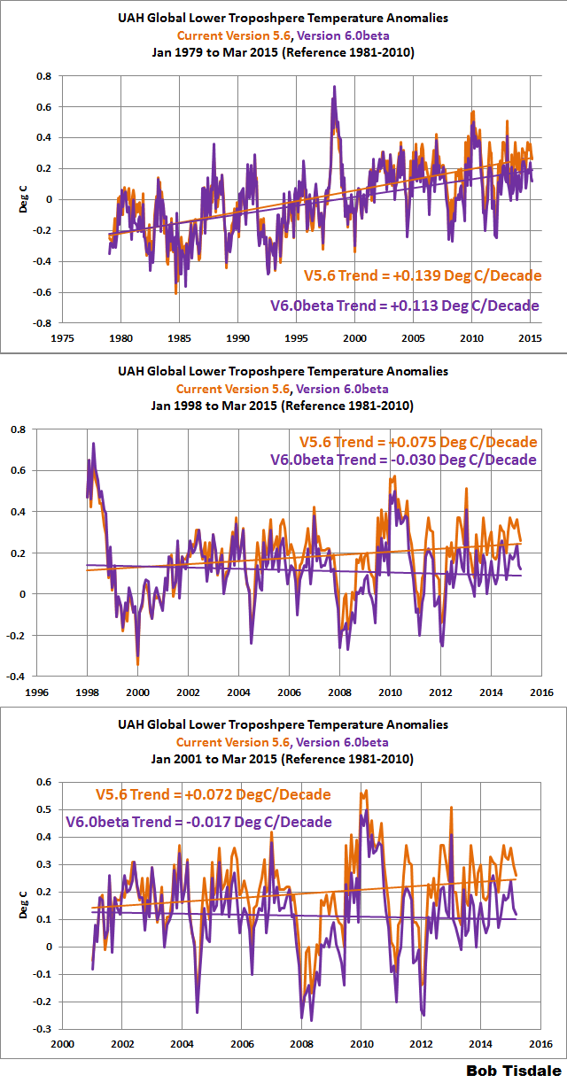
I think the first chart which is from surface data, and the first chart below it from figure 2, are a pretty good fit. I suspect the differences is I have some area’s of the planet that are not well sampled, but the gross shape looks pretty good.
What interesting is this is the difference between yesterday’s rising temp, and last night’s falling temp at each weather station, but it’s inverted, negative means it is cooling more than it warmed up, almost as if this was the energy from the surface that the satellite was detecting in the troposphere on it’s way out to space.
Sorry, but a bit daft today. Please explain again your first graph.
David A commented
The graph is the difference between how much yesterday’s temp went up (Max temp – min temp) that I subtract last nights falling temp (yesterday’s max temp – today’s min temp).
It is the same value as subtracting yesterday’s min temp from today’s min temp.
So now that you have the day to day change in min temp, I select stations that measured temps for at least 360 days. So for a single station if you sum these day to day changes and the temp didn’t change it should sum to zero. Now, take a region of (or all) stations, if they all sum to zero, the annual average would be zero, ie no change in temp.
What I’ve shown, with their own data, without adjusting anything, is that when you look at this it shows that on average for over 69 million daily records, it is slightly colder this morning than it was yesterday morning. And if the loss of night time cooling is the main way Co2 can effect surface temps, this proves that Co2 is not the cause on increasing temperatures, it cooled more than it warmed the prior day.
I found this a long time ago, and have been trying to find a strategy to reduce any error in this process, for instance I have 122 million samples, but the ones I did not include are stations that didn’t sample for a whole year, so say they didn’t have 2 months of cooling days (In NH Peak warming is in Spring, it has the largest positive change for a single day, and in the fall it has the largest loss in temp for a single day), so if you leave off 2 months of cooling, that station will show a warm bias. When I did this same process on all stations with more than 240 day’s per year, the results are pretty much the same, but there was an implied larger error (due to all of the missing measurements), and because one could argue that it was the error that caused the cooling, I’ve redone it so there is almost 0 missing data error (most 360 day stations are actually 365 or 366 days).
It also took me years to figure out how surface stations could all have a cooling trend, yet temps have gone up, until I realize the warming is not happening over land, it’s happening in the tropical oceans, and then that hot air mass moves over land base stations and cools down.
But if they show a cooling bias, there can not be a warming bias from co2.
Oh, I had to invert the data, which shows cooling spikes where UAH shows warming pulses, if my data is from the surface, and UAH is from space, I wonder if UAH is detecting the energy I see getting lost to space at night.
http://www.drroyspencer.com/wp-content/uploads/LT-trend-map-v6.02.jpg
Warmists said hot spots would be over the equator.
Probably near the oceans where the water vapour
was supposed to cause the feedback.
But some of these hot spots are over deserts.
The real fun begins now which is going to be a global temperature decline going forward(2015-2020 and beyond) not a rise. If this happens which is likely because all of the items which govern the climate(those being the PDO,AMO,ENSO SOLAR PRIMERY AND SECONDARY EFFECTS) will be phasing more and more toward a colder mode.
Actually this process started around the year 2005.
Gavin and Nick et al are going to have to start “adjusting” like crazy to maintain even the current zero trend.
Will be funny to watch, that’s for sure. 🙂
I’ve always thought that having a skeptic run the UAH and a “CO2 controls it” run the RSS was a good thing. They both are doing a real service to us all by keeping the data honest and accurate. Good work gentlemen. It is refreshing to see scientists keeping the data honest instead of fixing it to meet a political agenda. I tip my hat to both of you.
The satellite data is the data that is accurate and is showing the true picture of what global temperatures are doing. All the other data I do not consider. It is nothing more then a side show.
Fair enough.
But which is THE acuurate data set?
UAH or RSS? and why?
No, the other data is being collected which is good. Each provides a base to check the other against.
Obviously the sparsity of land/sea based measurement systems means that temp changes due to clouds can be missed, one hopes they average out but with the satellites there is no absolute guessing on this.
Real [raw] data should be used where possible, not just because it needs to be adjusted to fill in the gaps elsewhere then they back adjust the raw data to fit with the synthesized data.
I always thought RSS was the gold standard. Glad to see UAH now agrees.
It doesn’t though.
see
http://journals.ametsoc.org/doi/abs/10.1175/JCLI-D-13-00767.1
I note the sea ice data hasn’t been updated for quite some time. Cryosphere Today data is 11 days old, perhaps they should change their name?
And now the latest update from “Cryosphere Last Week”.
Soon to be renamed “Cryosphere Last Month”.
Here is something of interest. After all of the unprecedented hot temps reported in Australia over the last several years, it would appear that the winds of fortune have changed….http://www.weatherzone.com.au/news/record-april-low-temperatures-overnight-in-parts-of-northern-territory/285378
This morning I did some trend stuff on just the Australian UAH data. (trying to remember the numbers I got, its at home, I’m at work)
From 1979 to 1996, there was a very slight warming trend. +0.009ºC/decade (iirc)
Since [the] start of 1998, there has been basically a zero trend +0.0004ºC/decade (iirc)
The only warming was a small step of about 0.3ºC around 1998… just like in global RSS and UAH data.
Error.. those values are per year.
Still Australia warming since 1998 at 0.0004ºC/year…
How SCARY is that , hey !!!
Orbital decay has been around since the first satellite started circling the Earth.
http://www.ips.gov.au/Category/Educational/Space%20Weather/Space%20Weather%20Effects/SatelliteOrbitalDecayCalculations.pdf
Even Sputnik experienced it, and recorded it. Solar indices have also experienced orbital drift. These are routinely corrected for and follow pretty standard methods. I don’t see any controversy here whatsoever.
The UAH data show that none of the hottest ten years in the measured period have taken place since 2002, and even Christy agrees that 2014 was at least third hottest. Not sure how that disproves warming. http://nsstc.uah.edu/climate/2014/december2014/dec2014GTR.pdf
That was prior to recent correction. Not sure what your point is.
The Earth is five billion years old — the hottest year “eva” recorded is a pretty much meaningless mouth-breathing slogan chant,
Simple question:
If I tell you that my savings account is the “highest it has ever been” every year of my life, can you tell me if I have enough money to retire? No? Why not?
When you ask the wrong question, the answer means nothing.
Hottest year on record means NOTHING. If you don’t understand that, you should not be commenting.
Harry, it has not been warming since 2001, thus the misleading warmest year on record pablum, is shown for what it is, NOISE!
http://www.woodfortrees.org/graph/hadcrut4gl/from:2001/to:2015.3/plot/hadcrut4gl/from:2001/to:2015.3/trend/plot/rss/from:2001/to:2015.3/plot/rss/from:2001/to:2015.3/trend
Poor Harry, he has climbed a molehill, and now thinks he’s on top of the world.
Third hottest may sound quite hot, but the difference between first and third is what is relevant.

The difference between first and third is huge. About .35 degrees C. The difference between 4th through 7th is very small, maybe less then .1 C.
The atmosphere has cooled A LOT since 1998, Get used to that fact.
The cooling from the year 1998 to the year 2014 according to RSS was .295 degree C from the year 1998 to the year 2014, not “about .35 degrees C”. Singling out a month that reports more smacks of cherrypicking, in addition to choosing a start time during a century-class weather event to report a trend over 16 years.
Donald L. Klipstein
I am (charitably) assuming you are confused about “cherry picking points – Not deliberately misstating what was done. The interval (NOT the start time of the flat temperature!) was not “chosen” to produce a “flat line.”
Rather, the last global average temperature measured. Then the process “looks backwards” in time to find what earlier date was last equal to that temperature. Regardless of anything you believe, the global average temperature anomaly before the 1998 El Nino is the same as today’s global average temperature anomaly. Next month? We do not know.
Dates, lengths of time, are not “cherry picked” as you imply. If a satellite temperature measurement was available for 1934, it would have been selected. For 1884, it would have been selected. For 1264 AD, for 264 BC.
Flashy
your the only one
Volatility.
Confirmation of RSS. Damning evidence against the fudged surface data, global warming, “climate change” etc
How ironic.
It’s OK when Sat data is “fudged” but not when surface data is.
And which sat data do you subscribe to UAH of RSS ?
http://journals.ametsoc.org/doi/abs/10.1175/JCLI-D-13-00767.1
Glad you still have just enough brain to realise the difference between unsubstantiated and unexplained “fudges and adjustments” in the surface record, and fully explained and open, scientifically based corrections to the satellite data.
So your quite fine with fudged surface data then, and admit it is happening? not sure how that proves AGW though.
Tone, read the post please. You are embarrassing yourself.
How much over normal is the Antarctic Sea ice extent/area and the Total sea ice. Visually they look to be setting new records Anthony.
Should/Could we be informed?
Just to clarify, we were surprised that the trend went down…even though it was by less than 0.03 C/decade, a pretty small value. We expected it to remain mostly unchanged, still, you just don’t know till you run the numbers. But it is what it is. We are pretty confident that the new LT methodology is better than the old. We will have to wait to see if RSS chooses to retain the old way (which was my original invention) or eventually switches to the new way.
Since RSS and UAH are now more or less showing the same thing isn’t it better that RSS continue to use their independent methods? The two datasets then act to confirm each other.
One could make that argument.
It is not valid to cherry-pick the starting point for a trend without justification, especially when there is a large spike in the data.
Also the confidence interval calculation appears to be missing – is the zero-trend statistically significant?
Not this lie again?
The starting point for the trend is today. If you want to call that cherry picking you are free to do so, but you are just proving yourself to be an idiot by doing so.
The method is, starting today, how far back can one go and still have a trend that is zero or lower.
If you can find the “cherry picking” in that, I challenge you to name it.
MarkW.
I didn’t think you had the intelligence to refute me. And in the end, you accidentally agree with me! I did indeed find cherry-picking.
For any lurkers out there, see if anyone responds to these points:
– it is easy to find all sorts of trends in noisy monthly data. Perhaps it is more meaningful to use an annual average and look at trend lines for whole years, not just cherry-picked months
– the El Nino spike at 1998 will influence any trend lines that pass thru it. This is how the zero trend line trick works.
– confidence interval calculations? Is the zero trend line statistically significant?
harrytwinotter commented
Check!
This NCDC data measurements are said to be +/-0.1F, these are averages of daily station changes, yesterday’s Rising temp, and last night’s Falling temps. You can not directly compare rising and falling between years, as the specific stations change based on their sampling for that year. But Rise and Fall are directly comparable, So the trend to look at is the one marked Difference, and it is over all slightly negative, 50 of the last 74 years are negative, 30 of the last 34 are negative. Negative means it cooled more than it warmed.
YEAR RISING FALLING DIFFERENCE in F SAMPLE COUNT
1940 15.71097157 15.6830136 0.027957973 40450
1941 15.51280724 15.52291128 -0.010104032 37104
1942 17.19708086 17.18970456 0.007376309 50974
1943 18.49100199 18.49760266 -0.006600669 106368
1944 18.09759878 18.09670445 0.000894331 171413
1945 17.1321793 17.12947072 0.002708585 109356
1946 16.5656968 16.58263341 -0.016936611 75818
1947 17.02919548 17.01359006 0.015605421 104547
1948 18.61353831 18.62331222 -0.009773913 196738
1949 18.88868122 18.87702793 0.011653284 274738
1950 18.59500561 18.59388211 0.001123508 294791
1951 18.50607786 18.48544244 0.020635422 301060
1952 18.71132731 18.72543796 -0.014110651 366071
1953 18.42814736 18.43695155 -0.008804188 380160
1954 17.9957428 17.98496993 0.010772869 396199
1955 17.42433676 17.43215448 -0.007817724 361934
1956 17.72695923 17.71825583 0.0087034 355229
1957 17.5963675 17.62517297 -0.028805471 396449
1958 17.92289163 17.91920132 0.003690311 497221
1959 17.95581365 17.95448641 0.001327244 451085
1960 17.9869764 18.01315115 -0.026174748 508024
1961 18.03388368 18.03508739 -0.001203715 511500
1962 18.22151176 18.22907951 -0.007567744 514658
1963 18.34429315 18.33326835 0.011024797 507837
1964 18.15873062 18.15302857 0.005702056 485246
1965 17.3675503 17.35766173 0.009888569 335812
1966 17.50450441 17.52169516 -0.017190748 393037
1967 17.36575907 17.3679094 -0.002150335 397752
1968 17.55711991 17.5692133 -0.012093387 362322
1969 17.40666311 17.40243898 0.004224134 416322
1970 18.07845446 18.08878884 -0.010334386 486444
1971 17.41842199 17.41011975 0.008302247 176121
1972 17.24428991 17.23699402 0.007295899 172782
1973 18.29953951 18.30869743 -0.009157925 564178
1974 18.01006162 18.01329035 -0.003228731 805208
1975 18.61680029 18.63771804 -0.020917758 792671
1976 18.60309034 18.64140958 -0.038319245 1111465
1977 18.55697684 18.53033801 0.026638833 860841
1978 18.23385269 18.25044722 -0.016594529 1093975
1979 18.32688642 18.31058265 0.016303773 1028032
1980 18.25960534 18.27724383 -0.017638483 1129689
1981 18.31705388 18.3222249 -0.005171018 1099474
1982 17.62293309 17.63431024 -0.011377151 1055440
1983 17.42864046 17.4414735 -0.012833048 1166200
1984 17.37740432 17.38125902 -0.003854703 1220950
1985 17.48307532 17.48756305 -0.004487731 1185677
1986 17.58500848 17.58717123 -0.002162743 1254703
1987 17.4050167 17.40805318 -0.003036479 1235016
1988 17.77354186 17.78007015 -0.006528295 1365931
1989 17.55334589 17.5506176 0.002728288 1265629
1990 17.46665232 17.47565155 -0.008999233 1247673
1991 16.8231994 16.83149181 -0.008292409 1171457
1992 17.02449214 17.03832609 -0.01383395 1304978
1993 17.05782469 17.06297818 -0.005153482 1277117
1994 17.68736749 17.67993302 0.007434471 1298317
1995 17.33133396 17.33992032 -0.008586358 1293354
1996 16.91674692 16.9202606 -0.003513682 1318816
1997 17.21316377 17.20476681 0.008396956 1321324
1998 17.43171297 17.45367591 -0.021962934 1169739
1999 17.78586036 17.80618396 -0.020323599 1147533
2000 18.01024792 18.04020913 -0.029961211 1582673
2001 18.47831326 18.48061249 -0.002299226 1455055
2002 18.20320992 18.21497998 -0.011770051 1534148
2003 18.34413085 18.3384575 0.005673355 1562356
2004 18.25971399 18.26013423 -0.000420242 1769217
2005 17.95410103 17.95819944 -0.004098412 1928381
2006 18.31533458 18.3236668 -0.008332224 2058850
2007 18.26982812 18.28168462 -0.011856501 2070282
2008 18.23365477 18.24080168 -0.007146907 2324740
2009 17.87566685 17.88050967 -0.004842814 2401806
2010 17.88415593 17.88582125 -0.001665325 2506477
2011 18.00993136 18.012606 -0.002674635 2529280
2012 18.42713328 18.44643677 -0.019303489 2632177
2013 18.36008308 18.36336279 -0.00327971 2488421
9999 is an All years average.
9999 17.80549016 17.80964193 -0.004151764 69864812
Values are in F.
micro6550.
You are delusional.
I’ve posted all the code here (plus actual reports) http://sourceforge.net/projects/gsod-rpts/
the data is from NCDC’s Global Summary of Days here ftp://ftp.ncdc.noaa.gov/pub/data/gsod/
So feel free to show me how comparing the measured min and max daily temps and showing that they record an excess of cooling (ie’s radiating excess heat away).
The problem is I’m not doing anything a grade school kid couldn’t do, just doing on a lot of data.
harrytwinotter commented
Those that can, do.
Those that can’t, issue cat calls from the sidelines.
Usage of startpoint of an 18 year period being just before a century class global weather event.
Poor little harry, he actually believes I agreed with him.
He also believes he actually understands how these numbers are calculated. They aren’t trend lines and never have been.
Perhaps if you tried to actually understand the science instead of just blindly believing what you are told to believe you begin to understand what a total fool you have been.
Has ‘ANY’ selection of data has to have a starting point they there is simple no why to avoid this issue , unless of course you have means to covering all data that has ever existed , know or unknown.
Meanwhile such claims would have a lot more value if they were also made when climate ‘scientists’ indulge in the very same approach, especially when they want to ‘prove’ its warmer than its ever been.
Funny how most of the charts that seek to prove how much the earth has warmed start during the middle of the little ice age.
Either that or they start in the late 70’s, right after the end of the cold phase of the PDO.
MarkW commented
What!!!, Why that would be Cherry Picking!!!!
No one has responded to my points about the article.
Just the usual insults and attempts at distraction. This is pretty normal for this website.
Your points have been refuted. A few insults thrown in along the way. But then, you are worth that extra effort.
harrytwinotter says:
Just the usual insults and attempts at distraction. This is pretty normal for this website.
harry, you’re the one who has nothing but insults. Instead of producing verifiable evidence, you wrote about Mark W:
“You are delusional.”
And:
MarkW.
I didn’t think you had the intelligence to refute me.
This article is about the lack of any global warming for the past 18 years. The insults from harrytwinotter and othewr climate alarmists demonstrate their consternation at the fact that Planet Earth is falsifying everything they have been predicting. As James Carson wrote:
Harrytwinotter: You are mistaken.
The difference between scientific skeptics — the overwhelming majority of readers and commenters here — and climate alarmists, is this: on the rare occasions when skeptics are wrong, we admit it, and we try to find out why. Knowledge is the goal, not insulting others because someone can’t support their own arguments.
dbstealey:
Additional to the scientific skeptics are pseudoscientific skeptics; like the alarmists they fail to admit it when they are wrong. Among the skeptics it seems to me that the pseudoscientific skeptics are in the majority. They are the skeptics who seek to prove that the magnitude of the equilibrium climate sensitivity is overblown by the alarmists.
“Among the skeptics it seems to me that the pseudoscientific skeptics are in the majority. They are the skeptics who seek to prove that the magnitude of the equilibrium climate sensitivity is overblown by the alarmists.”
It’s only pseudo – scientific if it’s not correct.
micro6500
It’s also pseudoscientific if the equilibrium climate sensitivity is a pseudoscientific concept. This is the case.
If that’s your argument, then it’s the alarmists who are chasing unicorns.
micro6500:
The alarmists are chasing unicorns but so are the pseudoscientific skeptics. The public policy should be to replace pseudoscience with science as soon as possible. If and when this has been accomplished perhaps there will be a basis for controlling Earth’s climate. Until then, governments should not try to accomplish the impossible.
As soon as the idjits stop trying to destroy modern society, they can spend all the time (but not my tax dollars) they want chasing unicorns, I’ll go back to other pastimes.
micro6500
I’m with you!
Terry Oldberg says:
They are the skeptics who seek to prove…
Terry,
As I understand it, skeptics have nothing to prove. The onus is on those who say dangerous man-made global warming is taking place.
The job of skeptics is always to tear down a conjecture; to falsify it. What remains is considered to be the current state of scientific knowledge. It may be right, or not. But it’s as close as we can get, and it is thanks to the efforts of scientific skeptics.
dbstealey:
The distinction that you sometimes make between a “scientific skeptic” and a “skeptic” is a good one as the thinking of most skeptics is pseudoscientific.
dbstealey.
Back in your box.
Is the trend line statistically significant? NO, not even over the whole dataset.
I did some back of the envelope calcs a while back which show the UAH temp dataset to become statistically significant after 25 years, at least to 2 standard deviations.
It will be interesting to see how it reacts to the current El Nino event.
Harrytwinotter: You are mistaken. Do your diagnostics.
Start with the D-W statistic. You will very likely find that it is way under 1.0. To pass, it needs to be above 1.65. Then run an autocorrelation and partial autocorrelation on the residuals of your trend model and you will find highly significant positive partials at the first and second lags. Then, run an ARIMA(1,1,0). The constant is the drift and represents global warming in the model. It will show positive at the 0,15-0,25 degrees C per decade, but it will NOT be statistically significant, not even remotely close. I’ve done the analysis already and posted it here.
http://greenheretic.com/has-warming-been-statistically-significant/
You know…. that was the first thing I noticed fifteen years ago, the lack of standard model diagnostic output. As a statistician, I flip to the ANOVA or regression output pretty early on, but found that the ‘literature’ on global warming lacked such material. So, I found the UAH dataset and looked it over. There’s NOTHING there! There’s no ‘trend’ when you look at the data using conventional time series tools (ARIMA).
James,
If you’re interested I’m working with surface data, and could use some assistance with statistical analysis.
If I could ask some questions, it might be useful.
If you want, you should be able to contact me directly through this page
http://www.science20.com/user/3763/contact
Micro6500: I visited your page, but don’t see anything other than a registration link. Interesting site, but I am parsimonious about where I register. I already receive too many emails. I’d be happy to look at whatever you have. If you want to contact me, fine. Phone would be fine, too.
My email is GreenHeretic@Comcast.net
I have the Berkeley dataset. My first whack confirms my findings wrt the UAH data. Specifically, there has been no statistically significant warming over the period. That is to say, the drift term in an ARIMA model is nil.
Harrytwinotter, are you really this stupid or being deliberately dense? You’ve never contributed anything with the remotest shade of intelligence in all your posts in all threads. Why do you even come here and post, with every post confirming your inteliggence, or rather lack of it?
Ventor. Do you really think insults work? You are not able to respond intelligently to my points either.
So the guy who’s posts are nothing but insults is objecting to insults.
Now that thar is funny.
Yes to both questions.
As the IPCC and governments that rely upon the IPCC’s assessments attach significance to the slope of a linear trend line, it is interesting that the slope of this line is nil when it is fit to data from the UAH time series over the period of 18 years just completed. However, evidence presented by the author does not support his conclusion that the “warming” has been nil for this usage of “warming” implies that the change of the vertical axis along the trend line is the “warming” but this usage is faulty.
After spending 20 years and 200 billion US dollars on global warming research, after lobbying incessantly for actions by governments to combat the “warming” and after cripplingly expensive actions have been taken by some of these governments to combat the “warming,” professional climatologists have yet to tell us what they mean by “warming.” Attempts at drawing a meaningful definition from the context in which the term appears prove fruitless. However, at least one conclusion can be reached: the “warming” is not the change in the vertical axis along the trend line for this usage conflicts with a precept of the mathematical theory of measure aka measure theory.
This conclusion can be reached because the amount of “warming” we have suffered in the past 18 years depends upon the time at the start of of the interval from which the global temperature data are selected for use in establishing the slope of the line. If this time is 18 years ago, the slope is nil. If this time is more than 18 years ago, the slope is non-nil. The slope, then, is a variable rather than being a constant.
As it is a variable, the “warming” is not a “measure” for it is not a mathematical function that maps the sum of the incremental warmings in a specified interval of time to a non-negative real number. However, the term “warming” implies quantity which, like a temperature change, is an example of a measure.
They measure temperature ‘anomaly’. When that anomaly is positive, that is warming. When negative, it is cooling. The UAH has adequately defined temperature anomaly. To argue otherwise is dumb.
James Carson
Your argument is of the form of the fallacy of argument by assertion. That doesn’t work.
James Carson:
The anomaly has the properties of a measure and is not at issue. At issue is whether the “warming” in the title of the article that is under discussion has the properties of a measure. The “warming” and the anomaly are defined differently with the result that the former lacks the properties of a measure while the former possesses them. If you’d like I’ll provide a proof of the assertion that the “warming” lacks these properties.
You are nuts. It’s that simple.
If you look at the first two average temperature charts in the mirror, you will see the hockey stick.
.
Any average temperature chart that does not look like a hockey stock must be wrong, according to climate scientists, whose level of confidence in that statement is 105% (meaning 5% could change their mind and as a group they would still be 100% confident, or perhaps that means 5% of the scientists voted twice on their confidence level).
.
Of course we all know that there is no doubt at a 95% confidence level or higher, so a few extra points of confidence are just icing on the climate cake.
.
For climate charts: To find the hockey stick you may need a mirror, or view the chart while standing on your head, perhaps standing on your head with a mirror … but with the right viewing angle the hockey stick shape will be there.
If there is no hockey stick shape, the numbers on a climate chart are obviously made up by a random number generator somewhere. I am 95.8% confident that last statement is true.
Climate info for non-scientists:
http://www.elOnionBloggle.blogspot.com
.
Let me amplify your point. Going back to the BEGINNING of the UAH dataset, there has never been statistically significant warming. Here is my recently posted analysis.
http://greenheretic.com/has-warming-been-statistically-significant/
….
This article examines lower troposphere temperature anomalies in conjunction with carbon dioxide levels using classical regression methods. These techniques are accessible to anyone with no more than a minor in undergraduate statistics. The technical question to be asked and answered is, has the observed warming to date been statistically significant?
Conclusion. At first blush, the empirical evidence appears to support the assertion that there has been warming. However, after conventional model diagnostics and reformulation, the statistical significance disappears completely and we must conclude that the observed warming does not meet any reasonable criterion of statistical significance. The observed warming could easily be the result of simple chance.
Also, the “warming” is an undefined concept.
“Warming” is a well defined concept. (see item number 1 in following link)
..
http://www.macmillandictionary.com/dictionary/british/warming_2
In the dictionary from which you quote, the “warming” is the change in temperature. However, in the phrase “global warming” this is not the definition.
You may argue that it is “ill-defined”, but “undefined”? No.
Please share with us a citation to the definition or definitions.
Yes the definition I posted did not mention “global”
..
Neither did your post.
..
You posted: Also, the “warming” is an undefined concept.
…
Therefore your post lacks a clear referent.
..
PS since “temperature” is an operationally defined concept, you are on thin ice if you claim that “global temperature” is not defined.
.
http://en.wikipedia.org/wiki/Operational_definition#Temperature
Ollie:
I do not claim either that “temperature” is an undefined concept or that “global temperature is an undefined concept. I do claim that “warming” is an undefined concept in the context of the phrase “global warming,” In this context the “warming” is NOT the difference between two temperatures. Thus, the dictionary definition is inapplicable.
I’m aware of two definitions of the “warming” that are in common use in global warming climatology. In each case, the “warming” has the shortcoming that, unlike the difference between two temperatures the “warming” is not measurable… In the first the “warming” is the change in the global temperature at equilibrium. In the second the “warming” is the change in the value of the Y-axis when a straight line is fit to data that are drawn from a specified global temperature time series and in a specified interval in time.
Look up the definition of anomaly then we can discuss the differences
I’m familiar with the definition of “anomaly.” Go ahead.
Ollie:
“The measured anomaly” is a misnomer as this “measure” lacks properties of a measure defined in the mathematical theory of measure aka measure theory. If unfamiliar with it please brush up on elementary measure theory before continuing with our discussion..
Your argument over semantics is trivial and annoying.
You’ve erected a strawman and knocked it down.
Ollie:
If the “measure” is not a measure then nothing is being measured. This is my claim. That my claim is true follows from the properties of a measure in measure theory.
Terry Oldberg commented
I went and looked at the wiki page, just what specifically is your complaint about the “measure”?
That the several definitions of “global warming” in common use lack the properties of a measure.
Terry Oldberg commented
Can you be more specific about what properties?
And I too have figured out “warming” can mean a lot of different things, and maybe this is what you’re talking about, but I don’t know.
micro6500
Thanks for giving me an opportunity to clarify.
A “measure” is a non-negative real valued function on a class of sets with the property of “additivity”: the measure of the union of disjoint sets is the sum of the measure of the individual sets. A temperature is an example of a measure. A temperature change is another example. Let dT designate an incremental change in temperature at a space point in a solid block of matter. Because a temperature satisfies additivity, the integral of dT between T1 and T2 is T2 – T1.
I’m aware of two definitions for “global warming” aka “warming” in the climatological literature. In one of these, the “warming” is the change in the spatially averaged surface air temperature at equilibrium. Under this definition of it the “warming” it is insusceptible to being measured: as the Earth spins on its axis and orbits the Sun, the spatially averaged surface air temperature fluctuates. For proof, see for example the UAH time series.
In Mr. Tisdale’s article, the definition of “warming” differs from the one given above. The “warming” is the change along a straight line when this line is fit to observed global temperature vs time data from a specified time series and in a selected interval of time. Let t1 designate the time at the beginning of this interval and let t2 designate the time at the end of the interval. Suppose we wish to compute the “warming” in an interval in time that begins at time t3 and ends at time t4 where t3 and t4 share the property of being greater than t1 and less than t2. In other words, the second interval ( the one between t3 and t4 ) lies within the first interval ( the one between t1 and t2 ). We hold t2, t3 and t4 constant but vary t1. The equation describing the straight line is T = a * t + b . As t1 varies we recompute the values for a and b that minimize the squared error. In this way, we find that a is not a constant but rather is a variable. The computed “warming” is a * (t4 – t3) and though t4 and t3 are constants, a is a variable. Thus, the “warming” in the interval between t3 and t4 varies with t1. For it to vary violates additivity.
.
Terry Oldberg commented
So, if I understand this (and I followed this much more than the wiki page, thank you) because a (slope) changes as you move t1 compared to the reference points t2, t3 and t4, right?
micro6500
You left the verb out of your sentence but I think you understand me correctly.
What utter nonsense. You don’t understand where those numbers come from.
There is no such “fitted line” at all. The anomaly is computed as the deviation from a constant that is determined as the average over an arbitrary period. In your function, the coefficient ‘a’ equals zero and ‘b’ equals that average.
[Snip. This commenter is a sockpuppet. ~mod.]
[Snip. ~mod.]
I’m not so sure.


Here is the average daily change plotted by year showing US stations going from maximum daily cooling, to maximum daily warming.
Each line is the linear trend of the rate of daily temperature change. I developed code to measure this slope, then then plotted the slope for both the warming and cooling changes, for the entire world.
This is the global slope of the daily average temperature change plotted by year.
Now, one would expect under climate change, that this should change, which it does (even though it looks like an inflection point) even when this
shows max daily temps to not have changed much over the year at all, I think this shows it’s the rate of change through out the year that’s showing up as warming in the global temp average.
Without digging too deeply into your methodology, it looks to me like it is too broad-brush. Here is a link to some work I did in 2004 for a colloquium at the U-MN Institute for Mathematics and its Applications. Click on the pdf by my name.
http://www.ima.umn.edu/talks/workshops/3-8-13.2004/
What you will find is a modeling methodology for local weather that uses a sine wave. This method would be extremely sensitive to warming trends. Because of the way it operates, it would act to bring warming into high relief if it were present. I have used the method to develop simulation models on something like a dozen locations. BOS, MSP, CVG, IAH, PHL, etc.
What I’ve done is create a set of reporting functions based on a daily and yearly product extracted by lat and longer over a set of selected. The winter slope chart was done by hand, I wrote a function to write it out for all daily products.
I’ve also done 1×1 °, 10×10°, 10° lat bands, approximate Contintents, as well as 60°×20° boxes(many are on SourceForge).
I’m in the process of adding the applied solar forcing for each station lat.
So yes, it is a sine wave in the extra tropics, and I shouldn’t mix hemispheres.
James Carson commented
If I can interpret(helps me know if I understand), the anomaly fit’s the theory of measurement (though I prefer to use the prior day’s station value than some average), if is the trend that is not a “measurement”, since the value of the “trend” is dependent on the start and stop points.
I didn’t get to clarify if the “trend” would just be a calculation or what.
I, too, would prefer to have the original value rather than the anomaly. Nevertheless, if you look up what they used as the average to estimate the anomaly, you can revert the data back. In statistical terms, you could argue that, by starting with an anomaly rather than the raw observation, that you’ve lost one degree of freedom. I could argue both sides of that issue. That might matter if we were talking about <50 observations, say 3-4 years. However, we are using many more obs than that. So, that argument would be pointless.
Oh, the process I came up with uses an anomaly, it’s just not some average, I use the prior day’s value. I care about the evolution of the stations temperature, not how that compares to some made up field.
James Carson ( May 1, 2015 at 1:43 pm):
For the command of social skills thus far exhibited in our exchange of ideas I’ll rate you at 0%. For the command of logic thus far exhibited I’ll rate you at 0%. For skills at defamation thus far exhibited I’ll rate you at 100%.
With a response to your latest insult out of the way, I’ll get on with the issue that was under discussion before you high jacked it with illogical babble.. The anomaly was not the topic of discussion. The topic was the fitted line whose non-existence you assert but do not prove.
As the value of the anomaly fluctuates continuously it is obviously not this value that has not changed in 18+ years. It is the Y value along the fitted line that has not changed. The change in this value is the “global warming” of the title of Mr.Tisdale’s article.
The onus is on YOU to show us any such fitted line.
Here is a link that shows what I am talking about.
http://catalog.data.gov/dataset/noaa-climate-data-record-cdr-of-msu-and-amsu-a-mean-layer-temperatures-uah-version-5-4
“Anomalies are deviations from 1981-2010 mean.”
Duh….
James Carson:
I followed your link but found no support for your position in the evidence that was provided there. Your quote that “Anomalies are deviations from the 1981-2010 mean” may be accurate but is irrelevant as the magnitudes of anomalies are not at issue. The “Duh…” that you appended to your commentary is an example of an illogical ad hominem argument. The logical onus is on you to shape up or ship out.
I gave you a definitive answer that you don’t like. Now it is time for YOU take the time to dig up information that shows that there is some sort of fitted line in there somewhere’s.
And telling me to “ship out” just makes you look dumb.
James Carson:
A citation to “some sort of fitted line in there somewhere’s” follows per your request:
http://wattsupwiththat.com/2013/06/13/no-significant-warming-for-17-years-4-months/. By the way, the construction of the phrase “some sort of fitted line in there somewhere’s” is ungrammatical and inconsistent with your being a university-trained statistician. Do you claim to be one?
Ollie:
I am in receipt of a message that is dated April 30, 2015 at 7:12 pm that is addressed to James Carson and that is from you. If this message is meant for me please inform me of same.
This is to note for the record that olliebourque continues to evade the issue of whether “this ‘measure’ lacks properties of a measure as defined in measure theory.” Instead Bourque erects the strawman that I “persist in playing games with words.” Mr. Bourque: your argument has been disproved. Under this circumstance, the decent thing for you to do is to capitulate. Do you capitulate? If not, what is your argument?
The only thing he is evading is an argument with a nut-job.
James Carson
To issue a disparaging characterization of one’s opponent is an illogical “ad hominem argument.” Have you run through your repertoire of faulty arguments yet?
If by that you mean, have you run through your repertoire of amusing insults, I am just getting warmed up.
Terry Oldberg,
“olliebourque” is a fake sockpuppet, I think. I recognize his juvenile nonsense.
Reblogged this on The GOLDEN RULE and commented:
A large title, full of meaning, inspires yet another CAGW related post. (If you are a follower or frequenter of my blog, or more importantly, WUWT, you will know that CAGW stands for “Catastrophic Anthropogenic Global Warming” or, in other words, “climate change due to man’s increases in atmospheric CO2 that seriously threaten our future well-being”.
A large issue with enormous global ramifications, not necessarily even global temperature-related. This WUWT post offers important scientific information, I stress scientific because so much of the information thrust onto, and believed by the public, is so far removed from scientific reality that it is is often beyond comprehension.
So we “know” the earth is warming because that is what we are told, or is it? We “know” that this warming is caused by increases in CO2 due to man’s industrial by-product generation, or do we? There is much to consider.
This post deals with an aspect of how we calculate the “warming”. This particular article, shows that the atmosphere above us is in fact not warming at the moment and has not since 1998.
We are told that the global warming is due to a green-house effect, predominately due to CO2, which is increasing at a linear rate because of industrial activities. In 1998, a huge positive spike added a substantial increase in the average global temperature, due to an ‘El-Nino’ ocean current effect that certainly was independent of CO2 generation. (Why that created a net global effect is not clear as the heating effect in some areas might have been balanced by cooling elsewhere, but apparently not?).
Prior to 1998, the UAH temperature remained relatively flat for the preceding 8 years, possibly about +0.02 degC/decade. After 1998 there is arguably a cooling trend of about -0.1 degC, certainly not statistically warming. The 1998 positive spike injected a boost of about +0.2 degC.
These values are accepted by the warmist, but their conclusions are that CO2 has created an average trend of +0.12 degC/decade. In simple terms, two relatively flat periods plus a spike which no-one associates with industrial activity, have no correlation to a linearly increasing CO2 .
More importantly, we are currently experiencing a slight cooling at the same time as CO2 levels are still increasing, therefore a reverse relationship. The atmospheric temperature is elevated compared to pre-1998 and this may tend to increase the earth’s heat content slowly, but, not because of increasing CO2 levels!
In other words, the whole thing sounds illogical to me! Nothing simple about the whole issue, my attempt to simplify might not be valid, but that’s the way I see it!
I just hope I live long enough to experience the next decade in order to establish whether ‘The global warming threat is indeed the “world’s greatest ever scam” ‘, and thousands of so-called “deniers” are proven to be scientifically and logically sound analysts, or “vice-versa”.
The high magnetic activity of the sun does not cause temperature fluctuations in the stratosphere over the polar circle.
http://www.cpc.ncep.noaa.gov/products/stratosphere/strat-trop/gif_files/time_pres_TEMP_ANOM_JFM_SH_2015.gif
http://www.bartol.udel.edu/~pyle/thespnplot2.gif
A whole website made to discuss if an increasing trend is infact an increasing trend.
.
Just because a graph shows an increasing trend does not, in fact, mean that there is an increasing trend. Statisticians have tests to determine whether what we see is in fact true. In the case of the global warming data published by the UAH, the apparent warming trend is illusory. It is NOT statistically significant, not even remotely close.
http://greenheretic.com/has-warming-been-statistically-significant/
It was interesting to see the new April global temperature anomaly is 0.07C on the UAH site. Every time these temperatures don’t increase we are all winners. I’m also glad the UAH and RSS came into general agreement. Before UAH showed the highest trend over the past 18 years of all the data sets and RSS was the lowest. This was actually quite disturbing.
Given that the agreement uah/rss/balloons is now so small it can be disregarded, the spotlight now falls on the difference between troposphere and near surface measurements. It is readily conceded that they measure different physical effects, like the microwave emissions from oxygen in the air versus the length of an expanding fluid in a tube. However, scientists tend to choose one or the other as an index of global temperature change, so the differences between the two groups of two sets needs explanation.
The explanation for surface temperatures can extend back in time past the late 70s when satellites became available.
In Australia, people like Jo Nova have started to publicise comparisons between constructions of land surface temperature sets. Others above, working from different starting points, have several times found a somewhat quizzical difference of about 0.3 deg C, with ‘official’ sets being warmer than their reconstructions.
Here, we can see only 0.3 to 0.5 deg C of warming by our private analyses, compared with 0.9-1 deg C of official warming.
We note that Steven Mosher defends the BEST reconstruction, which is in better agreement than our with official. However, Steven’s type of analysis is susceptible to the inclusion of inputs that were modified before he even saw them. Ours, at this link, are not so affected.
We simply took the best quality records we could find in official publications pre-1950s and compared temperatures to the averaged 2000-2014 years. This goes back further in time than the official record that starts in 1910.
As I said, we found only about 0.4 deg C of warming since our reliable records began. Other people in other countries might benefit from this approach with their overlooked historical official records.
http://joannenova.com.au/2015/04/two-thirds-of-australias-warming-due-to-adjustments-according-to-84-historic-stations/
Naturally, we unofficial Australian scientists will be analysing the recent UAH data above Australian land over the next few months. Our computers are more modest.
Geoff Sherrington,
Very good points. I trust your numbers over government numbers, which are self-serving.
Reblogged this on OCCUPYMELBOURNE.NET and commented:
Still no global warming.
I think they got it wrong. The hockey stick blade goes on the right side of the graph, not the left. Someone should call a hockey stick repairmann.
This latest data is irrelevant to the global warming alarmists. They have made up their minds that catastrophic man-made global warming is happening. Their adjusted temperature data tells them it is happening. They can feel it happening. They can see its consequences. They have magical computer models that tell them the future. And that’s really all that matters to them. They believe in all of this because they are determined to have a successful outcome in Paris, come December, and they long for an international agreement to be signed controlling fossil fuel energy use.
Mervyn:
That the magical computer models tell them the future is a politically successful deception that was created through repeated applications of the equivocation fallacy I reach this conclusion by the peer-reviewed argument at http://wmbriggs.com/post/7923/ .
In my post of April 30 at 7:07 I erred in claiming that “measured anomaly” is a misnomer. That the “measured warming” is a misnomer is correct.
I followed your link, Terry Oldberg, but only found an extensive discussion. WHERE is your point there?
Yes, I am a university trained statistician. 1970s.
James Carson:
In your post of May 1 at 8:58 pm you demanded that I “take the time to dig up information that shows that there is some sort of fitted line in there somewhere’s.” I responded with the citation. With less effort you can scroll up to Figure 2 of Mr Tisdale’s article and view two fitted straight lines. One is colored red; it is fitted to the red colored time series. The other is colored purple; it is fitted to the purple colored time series.
What do those fitted lines have to do with your point? Nothing. Your point was that the definition of warming somehow depends on them. That is not true. Those are just trend lines. I repeat, warming is an increasing anomaly.
James Carson:
The title of the article is “New UAH Lower Troposphere Temperature Data Show No Global Warming for More Than 18 Years.” If the “warming” is the change in the anomaly there has repeatedly been warming in the past 18 years contrary to the title. If the “warming” is the change in the anomaly along the trend line then there has been no change in the warming in the past 18 years consistent with the title. Thus, the title defines the “warming” as the change in the anomaly along the trend line.
QED
The April anomaly was only .07. Doesn’t look like its getting warmer. Is climate change still a thing? Or are we still in the “pause”.
Where is Mr Mann when you need him?!? We have a broken hockey stick here in need of repair….