Guest essay by Clive Best
Marotzke & Forster(2015) found that 60 year trends in global surface temperatures are dominated by underlying climate physics. However, the data show that climate models overestimate such 60 year decadel trends after 1940.

The recent paper in Nature by Jochem Maritzke & Piers Forster ‘Forcing, feedback and internal variability in global temperature trends’ has gained much attention because it makes the claim that climate models are just fine and do not overstimate warming despite the observed 17 year hiatus since 1998. They attempt to show this by demonstrating that 15y trends in the Hadcrut4 data can be expected in CMIP5 models through quasi random internal variability, whereas any 60y trends are deterministic (anthropogenic). They identify ‘deterministic’ and ‘internal variability’ in the models through a multi-regression analysis with their known forcings as input.
} + \epsilon")
where 


This procedure was criticised by Nick Lewis and generated an endless discussion on Climate Audit and Climate-Lab about whether this procedure made statistical sense. However for the most part I think this is irrelevant as it is an analysis of the difference between models and not observational data.
Firstly the assumption that all internal variability is quasi-random is likely wrong. In fact there is clear evidence of a 60y oscillation in the GMST data probably related to the AMO/PDO – see realclimate. In this sense all models are likely wrong because they fail to include this non-random variation. Secondly as I will show below the observed 15y trends in Hadcrut4 are themselves not quasi-random. Thirdly I demonstrate that the observed 60y trends after 1945 are poorly described by the models and that by 1954 essentially all of the models predict higher trends than those observed. This means that the ‘deterministic’ component of all CMIP5 models do indeed overestimate the GMST response from increasing greenhouse gas concentrations.
Evidence of regular climate oscillations

Figure 1 shows that the surface data can be well described by a formula (described here) that includes both an net CO2 forcing term and a 60y oscillation as follows:
 = -0.3 + 2.5\ln{\frac{CO2(t)}{290.0}} + 0.14\sin(0.105(t-1860))-0.003 \sin(0.57(t-1867))-0.02\sin(0.68(t-1879))")
The physical justification for such a 0.2C oscillation is the observed PDO/AMO which just like ENSO can effect global surface temperatures, but over a longer period. No models currently include any such regular natural oscillations. Instead the albedo effect of aerosols and volcanoes have been tuned to agree with past GMST and follow its undulations. Many others have noted this oscillation in GMST, and even Michael Mann is now proposing that a downturn in the PDO/AMO is responsible for the hiatus.
15y and 60y trends in observations and models
I have repeated the analysis described in M&F. I use linear regression fits over periods of 15y and 60y to the Hadcrut4 data and also to the fitted equation described above. In addition I have downloaded 42 CMIP5 model simulations of monthly surface temperature data from 1860 to 2014, calculated the monthly anomalies and then averaged them over each year. Then for each CMIP5 simulation I calculated the 15y and 60y trends for increasing start year as described in M&F.
Figure 2 shows the calculated 15y trends in the H4 dataset compared to trends from the fit. For comparison we first show Fig 2a taken from M&F below.

M&F regression analysis then goes on to show that the deterministic effects in the CMIP5 models should dominate for longer 60y trends. In particular the error on the 60y trends as given across models is ± 0.081 C which is 30% lower than random variation. Therefore the acid test of the models comes when comparing 60y model trends to the obervation because now statistical variation is much smaller. These are my results below.
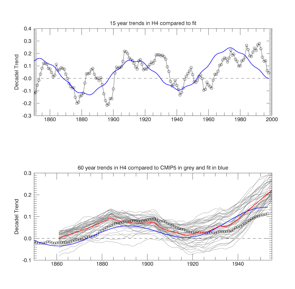
This analysis shows two effects which were unreported by M&F. Firstly the 15y variation in trends of the observed data is not random but shows a periodic shape as is also reproduced by the fit. This is characteristic of an underlying natural climate oscillation. The quasi-random natural variation in the CMIP5 models as shown in Fig 2a above encompases the overall magnitude of the variation but not its structure.
Secondly the 60y trends also show a much smaller but still residual structure reflecting the underlying oscillation shown in blue. The spread in 42 models is of course due to their different effective radiative forcing and feedbacks. The fact that before 1920 all model trends can track the observed trends is partly due to parametric tuning in aerosols to agree with hindcast temperaures. After 1925 the observed trend begins to fall beneath the average of CMIP5 so that by 1947 the observations lie below all 42 model trends in the CMIP5 ensemble. This increase in model trends above the observed 60y trend cannot now be explained by natural variation since M&F argue that the deterministic component must dominate. The models must be too sensitive to net greenhouse forcing. However M&F dismiss this fact simply because they can’t determine what component within the models causes the trend . In fact the conclusion of the paper is based on analysing model data and not the observation data. It is bizarre. They conclude their paper as follows:
There is scientific, political and public debate regarding the question of whether the GMST difference between simulations and observations during the hiatus period might be a sign of an equilibrium model response to a given radiative forcing that is systematically too strong, or, equivalently, of a simulated climatefeedback a that is systematically too small (equation (2)). By contrast, we find no substantive physical or statistical connection between simulated climate feedback and simulated GMST trends over the hiatus or any other period, for either 15- or 62-year trends (Figs 2 and 3 and Extended Data Fig. 4).The role of simulated climate feedback in explaining the difference between simulations and observations is hence minor or even negligible. By implication, the comparison of simulated and observed GMST trends does not permit inference about which magnitude of simulated climate feedback—ranging from 0.6 to 1.8 W m22 uC21 in the CMIP5 ensemble—better fits the observations. Because observed GMST trends do not allow us to distinguish between simulated climate feedbacks that vary by a factor of three, the claim that climate models systematically overestimate the GMST response to radiative forcing from increasing greenhouse gas concentrations seems to be unfounded.
It almost seems like they have reached the conclusion that they intended to reach all along – namely that the models are fit for purpose and the hiatus is a statistical fluke not unexpected in 15y trend data. This way they can save the conclusions of AR5, but only by ignoring the evidence that the observational data support the AMO/PDO oscillation and moderate gloabl warming.
Physics has always been based on developing theoretical models to describe nature. These models make predictions which can then be tested by experiment. If the results of these experiments dissagree with the predictions then either the model can be updated to explain the new data or else discarded. What one can’t do is to discard the experimental data because the models can’t distinguish why they dissagree with the data.
My conclusion is that the 60y trend data show strong evidence that CMIP5 models do indeed overestimate global warming from increased greenhouse gasses. The discrepency of climate projections with observations will only get worse as the hiatus continues for probably another 10 years. The current 60y decadel trend is in fact only slightly larger than that that in 1900. Once the oscillation reverses around 2030 warming will resume, but climate sensitivity is still much less than most models predict.
Hadcrut, very reliable data set, no adjustments, no errors, very close to real temperature globally… right! I would love to see same analysis, compared to more reliable global mean, not artificially adjusted for more warming. Models would be shown even less reliable.
@Simon Filiatrault
What evidence do you have that HADCRUT4 is artificially adjusted for more warming?
I ask because adjustments to the SST component of the analysis actually reduce (cool) the long term trend, as they warm the raw data in the past and cool it in the present. Just compare the red and blue lines.
http://i58.tinypic.com/wapuoh.png
figure 3b from the paper clearly shows the results separate into two groups at the end. They fail to report this and diagnose what the two groups are.
Thus [their] stated conclusion that “climate feedback leaves no traceable imprint on GMST trends ” is therefore unsubstantialed and likely wrong.
They need to address that problem.
Adjustments prior to ~1945 are a distraction.
The adjustments of most concern are between the start of the period when, according to the IPCC, human emissions began to drive the climate (~1950) and the start of the satellite series.
However, post-1980 HadCRUT 4 has adjusted for more warming:
http://woodfortrees.org/graph/hadcrut3vgl/from:1980/trend/offset:0.008/plot/hadcrut4gl/from:1980/trend/plot/rss/from:1980/trend/offset:0.137
Adjustments made to prior-1950 matter a great deal because these ‘cool down the past’ to give a false image that today is ‘hottest year EVAH’ instead of ‘trending towards colder’.
Actually, EMS, Bevan shows that the past is heated up in HADCRUT4 adjusted.
Anyways, at least it’s better than GISS, and does not use dodgy extrapolations to uncovered areas to produce more warming. It is of interest, IMO, that HADCRUT4 NH temperatures currently show a marked decline.
Ah, the ten trillion dollar question.
Clearly, today’s 2000-2010 “mini=peak” (or plateau, or pause) follows 60-66 years after the 1940’s pause, mini-peak, or plateau), and some 120 years after the 1870-1880 pause/plateau as the world gradually warmed up from the Little Ice Age low point of 1630-1650.
If natural patterns repeat – though we may not know “now” WHY they follow that repeating pattern – is today’s 2000-2010 plateau the maximum of the Modern Warming Period – and thus we are doomed to slide inexorably downward into a Modern Ice Age in 2450-2500?
Or do we have “one or two” more 60-66 year short cycles through the Modern Warming Period, and then will begin our 450 year slide to difficult times in in a future low point of 2560 or 2620 ??
A sixty year short cycle, added to a 900 year long cycle, does create the step-stairs we see in the long surface temperature record. Even the Roman Optimum and the Medieval Warming Period has cyclic up-and-downs as they proceeded through their high point, then slid down towards the Dark Ages and LIA. But, will these cycles continue?
Heres hoping they do!
LIA low was centered on 1690, not 1640. Maunder Minimum.
What is most apparent from the first graph is the IPCC pseudo-models’ pathetic attempts at hindcasting. If they can’t even curve fit accurately, it makes their claims of forecasting an even greater farce.
The signal processing engineer in me cringes every time I see phrases like this “calculated the monthly anomalies and then averaged them over each year. ”
This is absolutely the worst horrible way to decimate a signal. It’s what I call a “jumping boxcar average”. It smears energy all over the place in frequency and phase. There are all sorts of possible things that can change over the year that aren’t exact multiples of the year, such as phase the moon, start and end of seasons, etc, and these will alias energy down to lower frequencies if not filtered out cleanly, adding even more distortion to the time-domain signal.
What’s wrong with a nice gaussian filter? Hamming filter? Anything that is a linear phase filter and cuts off high frequency components is fine. Any modern program such as matlab or R has these functions that are pretty easy to set up. (and test please, at least with an impulse).
Modern computers have so much horsepower there’s no need to use such primitive 19th century signal processing techniques as boxcar averaging.
“I calculated the 15y and 60y trends for increasing start year as described in M&F.” . Why not redescribe them here? I shudder to think it’s more of the averaging stuff. I’ll go poke at the paper, assuming it’s not paywalled, and see what they did.
Oh look, it’s paywalled. Please document the procedure. Also, you didn’t post your code or your data. Dropbox is free…
or github, which is even better as your code and data are version controlled.
(when I post to dropbox I post the git database as well)
now the software engineer in me is shuddering…
There is a free downloadable version available here !
“This is absolutely the worst horrible way to decimate a signal. It’s what I call a “jumping boxcar average”. It smears energy all over the place in frequency and phase. There are all sorts of possible things that can change over the year that aren’t exact multiples of the year, such as phase the moon, start and end of seasons, etc, and these will alias energy down to lower frequencies if not filtered out cleanly, adding even more distortion to the time-domain signal.”
Excellent !
When climatologists learn the very basics of data processing instead of splashing about with their running means and “trends” , they may finally get somewhere.
Peter,
I had to do these calculations inj order to compare my results to those of M&F. The raw monthly temperaure data show strong seasonal variations which get subtracted out after subtracting 20 year averages for each mont – so called anomalies. This is also the data that H4 release. Then to do the 60y averages I first had to do 1 year averages – like H4.
You can see the monthly anomalies below
http://clivebest.com/blog/wp-content/uploads/2014/12/CMIPH4.png
You can actually get out the real temperature data from the raw stations used by H4. That way you get the avergae temperature of the earth in deg.C However this is biased by geographic sampling. Supposedly the anomalies aren’t !
Clive Best,
“Then to do the 60y averages I first had to do 1 year averages”
I think you mean 60y trends? I get using anomalies to remove the annual cycle, which otherwise would dominate the variance. But I don’t see why you would average data before analyzing a trend. I suspect that using one year averages in a 60 year trend would make little difference, but still it is bad practice.
Then to do the 60y averages I first had to do 1 year averages – like H4.
You don’t have to do two steps. Averages are associative. With any computer since about 1980 you can average 60*12 numbers or 60*365 numbers faster than you can blink.
The problem isn’t with the 60 year average, the problem is with the what you are using the 1 year average data for later – e.g. like the infamous hockey stick – extrapolation, or if in any way you look at the data as a series (e.g. the overlay plot you show). You need to be using a linear phase filter with proper roll off of < 1/2 your new sample period of 1 year. Did you know moving average leaves a 20% (-14dB) magnitude harmonic above the Nyquist frequency? That up to 20% error can show up all sorts of unexpected ways that depend on what the data is doing (it could even error at a frequency close to your base trendline!). It also does bad things to the phase as documented numerous times on this forum.
I haven't fully analyzed the "jumping boxcar" average being used but it's likely much worse than a moving average.
If you truly wish to get rid of the seasonal variations and get a 1 year final sample rate, you need a low pass filter the most fine grained data you can get your hands on and you need to get rid of (filter out) all frequency components less than the period of 2 years. Pick a linear phase filter that has less than 1% remaining signal above the (-40dB). A Gaussian or Hamming filter will do the job nicely.
I don't know how to embed a picture in wordpress comment sections but here is a link to a picture of a moving average: https://motorbehaviour.wordpress.com/2011/06/11/moving-average-filters/.
Note the big bump up to 0.2 (-14dB) of the original frequency components. If there's a signal above the nyquist frequency (e.g. seasonal variations) 20% of will be left and show up somewhere in your output signal in some bizarre fashion (without knowing the non-decimated data you can't know what's good and what's bad). If you have a seasonal variation of 10degC the error could be as big as 2degC in your plot!. It's probably not that bad, but you don't know how bad it is…
Here's a picture of a properly designed anti-aliasing filter: http://www.dsprelated.com/dspbooks/sasp/Chebyshev_Hamming_Windows_Compared.html
There will be less than 1% remaining signal so your worst case error on the hypothetical 10degC seasonal variation is 0.1degC. Plus phase will be linear so when the decimated and non-decimated data are plotted together you'll notice the valleys and peaks line up together – which they don't when using a moving average.
Personally I'd rather have hourly temperature samples just to be sure – heck have the weather station computer sample once a second and properly decimate on the fly. I've used an 8-bit micro controller to do this before. Storms, lunar cycle, who knows what kind of frequency components are being mixed at up to a 20% aliasing rate by the silly 19th century practice of averaging a signal.. Alas, such high frequency data is not widely available.
Showing that models are even worse in the past than they have been in failing to predict the pause hardly seems encouraging.
“They’ve always been this bad, what’s the problem ? ”
Right !
Clive, there are two reasons for the overestimate, the warm AMO mode, which as far as I can see is a negative feedback to declines in solar activity since the mid 1990’s increasing negative NAO, and the second is related to the effects of the AMO.
Global SST’s and UAH lower troposphere show little divergence, and since a similar AMO phase in the 1940’s, global SST’s have only risen some +0.3°C:
http://www.woodfortrees.org/plot/hadsst3gl/from:1940/mean:13/plot/uah/mean:13/plot/hadsst3gl/from:1979/trend/plot/rss/trend/plot/none
The divergence of land temperatures from SST & UAH, is in detail and trend related to warming of the AMO:
http://www.woodfortrees.org/plot/crutem4vnh/from:1979/plot/uah-land/normalise/plot/esrl-amo/from:1979/mean:13/normalise
Likely due to drying of continental interiors during a warm AMO mode, e.g.:
http://www.atmos.umd.edu/~nigam/GRL.AMO.Droughts.August.26.2011.pdf
Very interesting – especially last 2 links! thanks.
There also appears to be episodes of AMO caused cooling following but not related to the eruptions of Agung and Pinatubo.
The stronger cooling of the AMO and increase of La NIna in the mid 1970’s are symptoms of an increase in forcing of the climate and not of aerosol driven cooling, the fast/hot solar wind through 1973-76. The decline in plasma strength since the mid 1990’s then causing the strong AMO warming, by increasing negative NAO, which slows the AMOC, resulting in warmer water accumulating in the North Atlantic and Arctic rather than overturning.
(note low AMOC events in early summer 2007, mid summer 2012, and cold winter months e.g. Jan+Feb and Dec 2010, and March 2013)
http://www.rapid.ac.uk/
http://snag.gy/HxdKY.jpg
I had been familiar with the AMO drought paper for a while, but it was not until this post that the penny dropped what the implications are with respect to global mean T and climate sensitivity:
http://judithcurry.com/2015/03/04/differential-temperature-trends-at-the-surface-and-in-the-lower-atmosphere/
This suggests to me that only ocean temperatures are a legitimate measure of rates of warming.
Interestingly 65 year trends from cold AMO years 1911 and 1976 and warm AMO years 1945 and 2010 do not indicate any significant acceleration of rates of warming in the latter period:
http://www.woodfortrees.org/plot/hadsst3gl/from:1900/plot/hadsst3gl/from:1911/to:1976/trend/plot/hadsst3gl/from:1945/to:2010/trend
The intersection of UAH global and UAH land only trends at 1995 also reflects the strong warming of the AMO centered at 1995, and the shift from wetter to drier regional continental interiors:
http://www.woodfortrees.org/plot/crutem4vnh/from:1979/trend/plot/uah/trend/plot/hadsst3gl/from:1979/trend/plot/uah-land/trend
Ulric, I agree pretty much with the points you are making, but all of this will be taking place if prolonged minimum solar conditions last long enough in duration in the context of overall cooler global sea surface temperatures.
With all things being equal the longer prolonged solar minimum conditions exist the cooler the sea surface temperatures will be over the globe overall , while the warm AMO and El Nino in response to weak solar conditions will be superimposed upon this but superimposed upon a cooler sea surface temperature regime overall globally if prolonged solar minimum conditions exist long enough.
There would be an ongoing depletion of upper ocean heat content, but the important factor for regional climate, is what regional SST’s do under weaker solar conditions. Increased frequency of El Nino episodes will increase associated regional drought episodes despite falling upper OHC. Which is what analogues show in the colder years of the Dalton and Gleissberg Minima, 1807-1817 and 1885-1895 respectively.
realclimate link quote:
“The much-vaunted AMO appears to have made relatively little contribution to large-scale temperature changes over the past couple decades.”
That’s because they ‘want their cake and eat it’
In other words they(Mann) wants his’ NMO’ to explain the pause but not the warming post 1960 !
Nyquist criteria says you need at least 2 full periods to accurately measure the signal. 4x-8x if the signal is noisy (which it is).
Since we have accurate satellite temperature data since 1979, this means we might have a start at an accurate climate model in 2099.
Nyquist criteria says you need at least 2 full periods to accurately measure the signal. Right. The 2xMaxFreq is well-know: To find high frequencies you need to sample more often. But, in order to find the low freqs, you need to sample for longer.
I believe I’m correct that the Nyquist rule is symmetrical – it’s 2 periods on the low side and 2 periods on the high side. MINIMUM. With noisy measurements and trying to eke out 1/10ths of degrees resolution you probably need 4x or 8x or more. For example sampling oscilloscopes use a minimum of 4x and that gives you up to 30% error at the max frequency spec of the scope….
The original Nyquist paper was trying to see how much information you could pass per period of the fundamental signal. Which is on the low frequency side. So I believe I’m correct. However there’s not a well documented rule I can reference for the low frequency side as nearly everyone else who uses decimation (audio, graphics) is trying to optimize high frequency components, but climate is all about the low frequency component and the signal processing knowledge of climatologists AFAICT is near zero…
While it is indeed grand of them to concede that temperature trends are dominated by underlying atmospheric physics, what exactly might those physics be? To use multiple regression of “known” forcings is clearly circular because the same “known” forcings drive the models.
What we have here is analogous to Ptolemy positing layers of epicycles to explain why “known” circulation of the universe around the earth did not match observations of the outer planets reversing field.
The establishment academic modelers have recently discovered the glaringly obvious 60 year periodicity in the global temperature record and are using it in attempting to account for the pause .
The most important periodicity is however. the 960 year +/- periodicity which is equally obvious. See Figs 5 -9 at
http://climatesense-norpag.blogspot.com/2014/07/climate-forecasting-methods-and-cooling.html
Fig 9 shows clearly that earth is just approaching, just at or just past the peak in the latest millennial cycle.
Fig14 shows that the solar driver peak occurred in about 1991 . Allowing for a 12 year lag in the climate response -the earth has been in a cooling trend since about 2003. see
http://www.woodfortrees.org/plot/rss/from:1980.1/plot/rss/from:1980.1/to:2003.6/trend/plot/rss/from:2003.6/trend
The sharp drop in the Ap index from 2005 -6 seen in Fig 14 should produce significantly sharper cooling in 2017- 18
The simplest working hypothesis is that the general trends from 1000 – 2000 will more or less repeat from 2000- 3000.
Any forecasts from models which ignore this 960 year periodicity are entirely worthless and provide no useful basis for climate discussion. The entire IPCC – UNFCC CAGW circus has no basis in empirical science and
their models are simply drafting tools structured to provide power point slides to support government GHG and energy policy. The grossest scientific error of the modelers is to ignore the millennial periodicity and make straight line projections into the future of a system which has this periodicity.. This is exactly like taking the temperature trend from say Jan – June and projecting it linearly forward for 10 years .
I don.t know what it will take for the MSM and general public to finally awake from their delusions and see that this CAGW emperor has no clothes.
The Green-Socialists will not care if the general public finally awakens from their delusions (after nature makes clear the error) as long as it is after they have seized control of and harnessed the economic bounty from industrialized economies for political power.
If they do seize power, and it is certainly possible, there will quite soon be no ‘economic bounty from industrialized economies’ because there will be no industrialized economies.
These apparent ~1000y cycles are I think called Bond Cycles. Similarly during the last ice age there wer frequent warming spells apparent in the Greenland apparent in both Greenland and Antarctica ice cores.
“This is exactly like taking the temperature trend from say Jan – June and projecting it linearly forward for 10 years.”
A short but excellent description of the whole IPCC circus… 😉
“I don’t know what it will take for the MSM and general public to finally awake from their delusions and see that this CAGW emperor has no clothes.”
These will be the crucial questions when the sun-activity-related cooling will start soon after its usual time-lag of about 10 years:
– Can the MSM awake from their self-chosen “green hysteria” bias and return to a more balanced reporting, or is the current journalistic generation simply to much ideologized?
– Will the public be allowed to realize that coming cooling, or will the skillful “Temperature-Adjustment community” be able to “hide the decline” again?
Dr Page
I just did something that I should have done 5 years ago when I started digging into the AGW issue, I searched the literature on the Minoan, Roman and MWPs. it appears to be extensive and acknowledged by many sources.
I understand the cynical reasons for the warmists discounting these previous warm periods, which given my knowledge of the “climate establishment” are probably fairly accurate, but from your scientific perspective, what are the most common and most legitimate reasons not to believe that we are in fact just returning to the warming levels called for with your 960 year periodicities theory? Is it uncertainty? Is it the recent rate of warming? I have only seen the briefest explanations for not accepting this explanation, and none seemed satisfactory.
When I first learned of these previous warm periods, my immediate reaction was to believe that was the most reasonable interpretation of the last 100 years of warming. I have not seen any argument to dissuade me from my initial thinking.
Thank you in advance
cerescokid. There are no legitimate scientific reasons for ignoring the millennial periodicity. The climategate emails show how the core team worked hard to jeep their grants ,publications and academic advancement coming by giving their supporting clients and the IPCC the proofs of CAGW that they were expecting. Their first efforts wiped out the MWP to their own satisfaction and claimed to show that the current warming was exceptional. Hence the hockey stick and Al Gores Inconvenient Truth propaganda fest.
Modern academic science in many fields is not organized or funded so as to advance knowledge but rather to protect whatever is the currently fashionable paradigm adopted by a few score well positioned ‘in group” researchers . The PhD and tenure system is broken. What Professor is going to take on a PhD candidate whose views might question the research on which the Professors own career and reputation is based?
Academic jobs, Government Honors and Appointments go to those who can be relied on to scratch each others backs and not question the politically ecoleft correct academic party line.
Apart from that – scientific incompetence and basic stupidity provide a solid foundation for the whole UNFCCC – Titanic Ship of Fools which is headed for the icebergs of the coming cooling while the circus propaganda band plays loudly on.
There are no legitimate scientific reasons for ignoring the millennial periodicity.
There are. Do you have 2-8 thousand years of high quality data to get a good idea of what the thousand year signal looks like? We can wait until the year 2279 assuming we keep the polar orbit satellites up…
That however doesn’t mean that 1000 year periodicity doesn’t exist. I just don’t think it’s measurable. It doesn’t mean you can ignore it.. which is why I think the whole basing of models on temperature history is a complete utter waste of time. There is simply not enough data to cover the hypothetical cycles – either to prove or disprove they exist. “we don’t know” is commutative…
ooops I mean wait until 4079.
The “2.5 ln(CO2/290)” term is based on data to 2014, and explicitly states a +1.7º C CO2 climate sensitivity. As time marches forward, this is falling. Already other data shows it is likely < +1.5ºC. So 2.1 ln(CO2/290) is probably a better estimate.at this time. It could still be lower, to around 1.2 ln(CO2/290)
I agree. The longer the pause continues the lower TCR estimates fall.
see also The strange case of TCR and ECS
Clive, I also looked at the conclusions of M/F ( see http://kauls.selfhost.bz:9001/uploads/evaluation%20of%20CMIP5.pdf ) and for your approach it could be also helpful to estimate the failures of every single of the 42 modelruns and to define “better” and “worse” models and calculating in the end the averages of their TCR?
My understanding of the most recent excuses about the models is that they claim failures to predict other cycles or natural variability are irrelevant because the Forcings equation is a constant. So if cycles or random patterns would have made it 2C colder the CO2 and water feedback equation has ensured that we observed only a 1C cooling. We should all thank our lucky stars that the cycle did turn out cooling and that the models got it wrong. Now let’s cut CO2 because soon that equation will add 4C warming to natural variability. 2C cooling will be 2C warming but a natural 2C warming will change into 6C warming! So buy a push bike, turn off the lights a go vegan! (Sarc)
It’s an argument that you cannot counter by showing the discrepancies of the models. Instead you must go to the predictions of the equation and tackle that. Remove all distractions of cycles and natural variability. Does the equation predict changed that can be considered rational?
What does the equation predict if CO2 levels drop to 280ppm, 140ppm? Are these predictions rational? Do they fit within the confines of the first principle assertions of ‘The Greenhouse Effect’? (The greenhouse effect is claimed to cause a total of 33C warming with CO2 responsible for between 3C and 8C) what does the equation predict for 560ppm, 1120ppm, 2240ppm, 10,000ppm? Is that rational? If it is still rational at 10,000ppm is it ‘catastrophic’ at 560ppm? After all, it’s not AGW that is a political problem, it’s Cagw that the tax dollars are being collected for.
First there is the science and then there is the politics.
Green politics, Environmentalism, Climatism are just another ‘ism’. It is an ideology which has attracted many different groups ranging from those with a genuine concern from protecting nature from overpopulation, to ex-Marxists and anti-capitalists. Climate scientists should avoid being politicised.
I’ve come to realize that the collapse of the Iron Curtain may not have been such a blessing. Although most people on the east side of it were staunch freedom and free enterprise people just waiting to be let go, there is a group of professors of economics, politics and psychology, etc of Marxist hue and the apparatchik types, secret service bureaucrats, educationists and the like whose skills were not well suited to a free world (Putin is an example). They found it possible to find positions at universities, NGOs, the green movement where their skills are a match etc and bided their time to be promoted and to argue ideology with skill (they had
3 generations to get it right), to get into protest organizations and to herd useful idiots. Harvard and other lefty stalwart institutions I’m sure embraced some of those as did the UN, an already indoctrinated Cambridge University in UK, etc. No time before the iron curtain fell would you see such open protests against free enterprise and even democracy!! Recall the protests a year ago in San Francisco where communism was seen as a solution – do you think these things were thought up by students who have a modern education on this continent.
I am struck by the number of long-time science fiction fans in the readership. I am one, too. Could it be that we are the ones who live in a fantasy world and not the warmists?
Only when you can imagine a different world is your mind open to new ideas.
Read a thermometer lately? 😎
Most science fiction fans know the difference between the story’s “what if” and “what is”.
Who believes the climate models’ “what ifs” are actually “what is”?
mariner
What would Asimov’s reply to you be?
Can we please not use the alarmist term “hiatus”. It is just pretentious nonsense.
Ouch! Wriggly lines and monstrous equations!
But the conclusion is intelligible. We are not as doomed as we are supposed to be.
Bit of a let-down, actually.
In the second paragraph Jochem Marotzke’s name is misspelled with an ‘i’ in place of the ‘o’ in his last name.
The whole concept of model “data” is bizarre.
Model outputs, OK.
But how do they become data before they are compared with something real?
Also typo in penultimate paragraph – “dissagree”.
When I studied computer science (mid 1970’s) data referred to a raw set of (possibly useless) numbers – information is the usefull product that may or may not be extractable from the data.
So model outputs would be considered data, but may not contain any information.
Ah, so it is a semantic confusion. Computer sciences use “data” in a different way to physical sciences.
The point tin the article is correct then, and I am not.
The criticised paper has confused “data” of a computer science type with “data” meaning “information”.
“Figure 1 shows that the surface data can be well described by a formula (described here) that includes both an net CO2 forcing term and a 60y oscillation as follows:”
Couldn’t the surface data also be well described by superimposing a 60 year cycle with a 0.2 degree amplitude, on top of a 200 year cycle with a 0.6 degree amplitude?
http://clivebest.com/blog/wp-content/uploads/2015/03/Figure1.png
Do we really know the GAT prior to satellite data?
The past s still changing… (Bill Illis comment…
http://wattsupwiththat.com/2015/03/06/can-adjustments-right-a-wrong/#comment-1877173
“Here are the changes made to GISS temperatures on just one day this February. Yellow is the new temperature assumption and strikeout is the previous number. Almost every single monthly temperature record from 1880 to 1950 was adjusted down by 0.01C.
I mean every freaking month is history suddenly got 0.01C colder. What the heck changed that made the records in 1880 0.01C colder.”
http://s2.postimg.org/eclux0yl5/GISS_Global_Adjustments_Feb_14_2015.png
Bill continues….”GISS’ data comes from the NCDC so the NCDC carried out the same adjustments. They have been doing this every month since about 1999. So 16 years times 12 months/year times -0.01C of adjustments each month equals -1.92C of fake adjustments.
Lots of opportunity to create a fake warming signal. In fact, by now it is clear that 1880 was so cold that all of the crops failed and all of the animals froze and all of the human race starved to death or froze to death and we went extinct. 135 years ago today”
So the past is a living breathing document, and they ignored the ENSO cycles (substituting volcanism and particulates) until they needed them. Science will be decades fixing this post normal influence.
I wonder if getting the physics right but the results wrong is the same as getting the logic right but meaningless or irrational results.
If you get the logic right but wacky results it’s because the premises are wrong. “If you have a blue shirt you can fly” is logically correct if the premise is people with blue shirts can fly.
In climate models if the physics are sound then the premises used to exercise the physics is in question. Models are not an analysis of the observational data, models are a test of the premises or presuppositions that go into the model. Which as this article suggests are obviously wrong.
There is already a law describing this perfectly: Garbage in=garbage out.
“The growth in global carbon emissions stalled last year, according to data from the International Energy Agency.
It marks the first time in 40 years that annual CO2 emissions growth has remained stable, in the absence of a major economic crisis, the agency said.
Annual global emissions remained at 32 gigatonnes in 2014, unchanged from the previous year”
http://www.bbc.com/news/science-environment-31872460
(So, does this mean if it continues, that claims will be made for the success of the ‘sustainable’ measures imposed on us? There’s probably models underway to explain it.)
The growth in atmospheric CO2 did not stall at all.
China energy use had stalled, and their economic growth numbers are likely highly inflated to reality. European growth is stagnant. Perhaps the CO2 emission chart is a better indicator of economic conditions then government economic data.
That is claimed in news releases, but we have learned to take news releases with a grain of salt. Does anyone have the actual numbers? CDIAC hasn’t updated since 2010. The EPA only goes to 2008.
Why did they stop reporting? Is it because emissions started to diverge from atmospheric concentration? And, are they now trying to alleviate that by “adjusting” the records to claim emissions have ceased accelerating? If so, it’s too late. The cessation in atmospheric acceleration preceded any cessation in emission growth. A cause has to precede the effect.
Bart,
More likely, the data was put up on the web site and no one thought to devote resources to keeping the site up to dat. Never attribute to mendacity that which can be adequately explained by incompetence.
… unless the person or organization in question has established a clear pattern of evasion and duplicity in the past. Or, the issue itself has a history of persons or organizations acting in evasive or duplicitous manner.
If CO2 emissions stalled in 2014, how come the Mauna Loa atmospheric concentration continues to march upward without even a glimmer of slowdown? And how come the concentration is rising as virtually a straight line, while emissions have increased exponentially? Is the biosphere sucking up exponentially more CO2?
markopanama
Your questions assume the small anthropogenic (i.e. man-made) CO2 emission is a significant addition to the large natural emission. It may be, but it probably is not.
Richard
Anthony, did you et your big oil check this year. The POTUS did.
http://www.politico.com/news/stories/0510/36783.html
Note that the term involving CO2 is really not necessary. A simple trend since 1900 would do, given that and the data are very uncertain before that. There is no empirical evidence that confirms CO2 is actually responsible for any warming at all.
“There is no empirical evidence”. Well, the general upward trend agrees with what is expected from CO2 forcing. That is a long way from proof, but it is evidence.
The general upward
Yhe general upward trend agrees with warming comig out of the little ice age. The observed warming is only 50 to 25 % of what is expected from the modeled mean.
Mike M
“There is no empirical evidence”. Well, the general upward trend in crop failures agrees with what is expected from activities of witches. That is a long way from proof, but it is evidence (or perhaps not).
Richard
Some of the reasons why the models are off are because they neglect or assign wrong relative importance to the following items:
Geo -Magnetic Field Strength Of The Earth.
Solar Variability and Associated Secondary Effects. Way underestimated.
CO2 ‘S Role– far to much importance.
Initial State Of The Climate- probably wrong or incomplete.
Lack Of Understanding Of Feedbacks. Especially clouds.
Aerosols – The models do not address them properly.
This is why even in hindsight the models can not get it right and why basic atmospheric predictions they made such as the hot spot in the lower troposphere in the tropics and a more zonal atmospheric circulation pattern in response to global warming have not come to pass
“Geo -Magnetic Field Strength Of The Earth.” How does that affect climate?
It is hypothesized that it affects cloud seeding cosmic ray flux. At least, I think that’s the connection.
http://jennifermarohasy.com/2013/12/agw-falsified-noaa-long-wave-radiation-data-incompatible-with-the-theory-of-anthropogenic-global-warming-2/
AGW enthusiast are in denial of the data once again.
Clive Best wrote: “climate sensitivity is still much less than most models predict.” But the sensitivity in your fit is 1.7 K which is right in the middle of the IPCC range of 1.0 to 2.5 K for transient sensitivity.
I quote:
“Figure 1 shows that the surface data can be well described by a formula (described here) that includes both an net CO2 forcing term and a 60y oscillation….”
That formula is worthless because it is fitted to a non-existent watming. HadCRUT 4 (and NCDC and GISS) all show the eighties and the nineties as a global warming period when in fact there is no warming for 18 years. That makes it a hiatus period as long as the present one is. I proved this 5 years ago and even put a warning about it into the preface of my book (“What Warming? Satellite view of global temperature change.” See Figure 15) Nothing happened, they kept using that fake warming of the eighties and nineties in their temperature curves and eventually it became a part of AR5. The three data sources actually collaborated in creating that fake warming because unbeknownst to them their cooperative computer processing left identical traces of itself in all three publicly available data-sets. Satellite data are free of this fake warming and free of computer manipulation. I suggest that the only believable temperature data after 1979 are satellite temperature measurements. Do not use the fake ground-based warming from those three – it will lead you into pseudo-science without you even being aware of this.
Correct. The global surface temperature “anomaly” plots from UEA, NOAA, GISS are corrupt.
Theose places need a full audit and recovery of raw temp records.
There are a few well sited long term stations with scientific quality control. Those show zero warming.
Compare the long term land reported by BEST to satellites.
http://www.woodfortrees.org/plot/best/scale:3/plot/rss-land
USCRN temps also shows zero warming.
I spent unnecessarily long time finding out that all blue lines in graphs above are mere distraction. Why are they there at all?
If I disregard blue lines, it seems to me there is clear negative relation between reliability of models fit to observations and CO2 concentrations. It would be nice to see scatter plot of that.
Better than what you want is available from the start of major increased in fossil fuels burning.
We have extremely reliable CO2 concentration measurements since 1958 from Mauna Loa. I would prefer from 1946 or so but the best we have are from 1958.
These measurements are available on a daily, weekly, monthly and yearly basis. Yearly basis is simply nonsense, we know seasonal variations exist. Daily or weakly may be a little too much to ask. But monthly would seem the most appropriate. So, if CO2 is a driving force there should be some correlation between the increase in CO2 measured monthly and temperature measured monthly.
The scatter plot you want is here:
http://www.climate4you.com/images/HadCRUT4%20GlobalMonthlyTempSince1958%20VersusCO2.gif
Here is the CO2 from 1958 to present: http://www.ecology.com/wp-content/uploads/2013/05/Mauna-Loa-Historical-CO2-524.jpg
I see [no] dips or inflections. I saw some good tips upthread about how to chose the right data filter.
@rd50, temperature anomally vs. CO2 increase should be a gradual natural log rise. Since it’s not it needs some explanation like PDO/AMO or other signal.