Global Warming is real and is definitely caused by human-produced carbon . . . pencil lead, that is.
Guest essay by Ralph Park
Global Warming Theory –
An impressive collection of climate scientists and media / public figures are convinced that global warming is a very real threat. The theory originates in sophisticated climate models that demonstrate rising temperatures driven by rising concentrations of CO2. This theory has been confirmed in observational data from instrumental sources which is presented as “anomaly” data for adjusted surface temperatures. The sudden emergence of an unusual pattern of warming is alarming and coincides with the rapid growth of greenhouse gas concentrations, especially CO2, from fossil fuel burning human activities. This is considered as confirmation that humans are causing global warming.

Figure 1 – Comparison of raw and adjusted Tmax Variations
.
Figure 1 reproduces the global warming effect from adjusted Tmax data from the US Historical Climatology Network (US HCN). Adjusted Tmax data can be compared directly with raw (unadjusted) field measurement data. While a distinct warming effect is clearly evident after 1975, no such trend is present in the raw field data. In fact, the variation pattern in raw Tmax is unremarkable, featuring irregular minor variations about the zero temperature change axis.
As Figure 1 makes clear, adjustments are the dominant factor in the global warming trend. Adjustments are easily separated by calculating the difference between the adjusted and raw datasets:
{Adj(Stn,Yr)} = {Tmax(Stn,Yr)_adj} – {Tmax(Stn,Yr)_raw} (**)
Stn refers to station ID and
Yr refers to the year
Figure 2 illustrates the average adjustment bias incorporated into the data. The warming pattern is clearly evident in the pattern of adjustments..

Figure 2 – Adjustment Bias to US HCN Tmax Data
The adjustments constitute a cooling bias applied to past temperatures. The adjustments are then slowly removed, starting in the 1970s. The obvious intent of adjustments is to create the illusion of a dramatic global warming signal in recent times. The sudden warming coincides with the public alarm over rising CO2 levels. Figure 2 displays the net effect of the adjustment process which is sculpt measurement data to conform with global warming alarm. Statistical profiles for the 1930s and 1990s, Figure 3, demonstrate that the net bias is the result of a sophisticated algorithm designed to disguise systematic bias as a natural phenomena. The net effect is a non-random sculpting of temperatures to show a strong global warming trend.

Figure 3 – Sample Adjustment Statistical patterns.
The “Pause” Dilemma
Those of us in the skeptic / non-official science community always thought the adjustments were misguided and scientifically inappropriate. But we never suspected a purposeful effort to manufacture global warming by adroit use of adjustment algorithms. Nevertheless, we now know that global warming is, indeed, human caused by carbon based pencil lead – figuratively speaking, of course. It is based on sophisticated algorithms that artfully sculpt the datasets to fit the theory. As demonstrated, now, global warming confirmation in US HCN data is purely an artifact of the adjustment algorithms.
This, of course, is not proof that all other official data sources are so flagrantly falsified. However, the US HCN sufficiently extensive and credible enough to demonstrate that global warming is not in evidence for the US continent. It would be difficult to sustain a valid scientific argument for global warming when one of the major continents shows no sign of it.
The problem with the adjustment trick is that a real global warming trend might not happen. That means the removal of the artificial adjustments leads to a future dilemma. If raw Tmax data continues to be unremarkably flat, then discontinuing the biasing results in a global warming pause. Continuing the biasing, on the other hand, would lead to a widening gap over reality that risks penetrating into public awareness.
Pause Theory
So, the best fit “pause” theory is that climate science has temporarily exhausted adjustment rationales. Given the past success in convincing the public, it is quite possible that the official science will simply continue the adjustment process.
__________________________
(**) {Adj(Stn,Yr)} data includes only matching records in both datasets. It does not include “ghost” records that are not in the raw dataset.
This makes all other historical beliefs in insane theories pale into comparison – goodnight.
This post needs to be withdrawn until you can provide details on the dataset you used (preferably with the data attached) and can remove the major inconsistencies. For example, Figure 1 shows positive adjustments on the order of +4 to +5 degrees C. Figure 2 shows negative adjustments of a degree or so.
OK, I see that Figure 1 is just a displacement by 4 degrees F (not C) of the adjusted data. Unfortunately, one cannot easily see what the effect is.
You should still show your work. Provide a link to the data. Provide your code that shows how you eliminated “ghost” stations. It should be easy for you to give us a list of the number of real and ghost stations per year. If we can reproduce your results, you will have a stronger argument.
“You should still show your work. Provide a link to the data. Provide your code”
I think we are waiting for some of that from Phil Jones, Mr Mann etal !!!
It took you 25 minutes to totally back out of your original statement, when I get it this wrong I usually just say sorry for the interruption and hide for a week or two.
I see you are built of stronger stuff.
Lance
Wow – good questions…except you should be asking it of the sneaky dudes who originated the data adjustments.
While I’m sure this does not apply to you, some people have (conveniently or otherwise) forgotten the scientific method requires those claiming a set of facts & conclusions to defend them (i.e. it’s bad form to just make stuff up). Skeptics are allowed/encouraged to ask questions (e.g. why the hell did you data collection guys alter the raw data?), and explanations must be given.
Does it ever bother anybody (besides me) that you cannot either phone or e-mail ANY person who, at any real time or real place, actually experimentally observed or measured / recorded / noted / whatever ANY of the numbers that are plotted on these earth shattering graphs about which so much calamity circulates.
None of these graphs contain real time climate information. They are all contrived substituted for real experimental observations; hence the need for “data” and “code”.
The “data” is what someone might have read on a thermometer somewhere at some time, and none of that is available to anyone.
So these graphs are just third cousins twice removed, from anything real that is going on, on this planet.
See why commas are needed. Micro$oft’s rocket scientist English grammar twirp, redlined my second “on” above, as if it isn’t necessary.
That’s why word processors need an “IBM-360” mode, that simply types the key that you actually push, instead of imagining which key you could have pushed instead. Yes I could have used other words, like “happening” for instance. But I choose to not use other words, wherein lies other meaning.
But back when I was starting out in my field, I could actually contact the guy / gal who actually did something, and ask them more about it.
This is why Lord Rutherford said; “If you have to use statistics, you should have done a better experiment.
g
And I typed this in the order that I wrote it.
George E. Smith
Does it ever bother anybody (besides me) that you cannot either phone or e-mail ANY person who, at any real time or real place, actually experimentally observed or measured / recorded / noted / whatever ANY of the numbers that are plotted on these earth shattering graphs about which so much calamity circulates.
I have called and talked to, or written and exchanged questions with, the primary writers of each source document I use as a foundation. The secondary references? Not so often. But primaries? Yes, and it is because of those conversations with those specific people who actually did the measurements that I “trust” only small parts of today’s Global warming “message”. I have seen the internals of the teeth of the gears and wheels and cogs and assumptions that make up the little parts of the propaganda engine.
As a single gear tooth fabricated of stainless steel mounted a brass bearing, lubricated by whale oil and energized by burning unicorn horns, much of the theory of global warming is correct. But each gear tooth (by itself correct, and by itself fabricated by dedicated individuals focused solely on the perfections of their own gear tooth) seemingly drives a clock designed for a 23.56 hour day, on a 363 day calendar, calibrated against a Roman calendar without the months of July and August trying to predict the time of a solar eclipse 85 years from now.
yes, many of the individual parts are correct. In and by themselves, against the assumptions of the specific experiment at that specific day or time of year? Valid. (Within the error bar or limits of that specific experiment.)
But the CAGW theory as a single entity of “vest experience and knowledge” elegantly combined and edited into a seamless “hole” as Wikipedia does against a sterile background of an unbiased “all-seeing” all-knowing” multidisciplinary climate global circulation model?
I guess I didn’t make myself clear. I didn’t mean somebody who CALCULATED some fictitious number using a model (aka algorithm), which is what all of the numbers plotted on say a GISSTemp graph are.
I meant someone who actually read the original thermometers that came up with the raw data that gets poured into the model hopper.
All of them, RSS and UAH included, are plots of Calculated numbers, that derive from some originally measured numbers.
None of the numbers plotted on the usual GISSTemp versus time anomaly graph, were actually observable by anybody anywhere. They are all derived from some model calculations.
@ George Smith… you couldn’t get the original data anyway, it’s in a landfill in Denmark or something. Who throws out original data? The IPCC. So to start with nobody, except a few, knows whether the data has been altered. Would it matter who you talked to if you don’t trust them to start?
AGW has told so many contradictory stories that when I talk to one of them, I think, ” are you insane? “. How would they know?
Agreed. This is just pretty graphs that support a hypothesis.
If you want me to believe this, tell me where to download the source data so I can reproduce your results.
Otherwise, this is hockey stick redux.
Neil
So if I understand properly: you’re ok with the original (unexplained & unjustified) data adjustments, but you’re having a problem when Ralph Park points it out?
Chip,
I understand the existence of the the adjustments, and I’m not ok with them at all. Goddard has shown a consistent warming bias in the adjustments made.
However: in this graph we’re shown two temperature sets: the adjusted and adjusted. It doesn’t look right; especially in light of the discussion. For a start, the first graph looks like one dataset is simply the other one offset. If we’re talking adjustments over time, Goddard has repeatedly shown a pivot point sometime in the 1960’s; ie. pre-1960’s data is cooled whereas post 1960’s data is warmed. I’m not seeing that effect in the graph; unless the graph is showing the absolute value of the adjustments – in which case it detracts from the argument because it’s not the adjustments that are the core issue, it’s the trend. If I have a time series of data and add 10 to every value, the trend remains the same. If I have the same time series of data and subtract 10 from every value before an arbitrary point, and add to to every value after that point, I’ve messed up the trend.
The second graph is slightly harder to comprehend; it seems to imply that all temperatures have been adjusted down. Again, this doesn’t seem to fit with our current understanding of the adjustments. The inflection point seems to have moved to around 1945; again this is at odds with Goddard.
Finally, the Tmax adjustment pattern. Why was 1930 and 1990 chosen? It’s not discussed. One could reasonably suspect cherry picking data. A better graph would be to do the adjustment calculation per year, then show that as a time series graph. You’ve a much better argument on systemic bias then, as you can demonstrate the pattern in the adjustments.
Throughout, I’ve referred back to Steve Goddard’s work. Not because he is the only or best reference source; there’s probably others that are better. Steve McIntyre springs to mind… but my statistics are not good enough to really penetrate his arguments. Goddard’s work is reproducible by the likes of me.
In summary, I’m not happy about the temperature adjustments process at all. Simply saying that standard and approved adjustment processes are run on the raw data is not good enough if those processes are hidden from people. And it is for that reason I’m skeptical of this work: There’s no way I can reproduce it to see how the conclusions were arrived at, and in the case of the last graph I’m downright skeptical of the conclusions because two years are compared against each other, with no discussion as to why they were chosen. I believe I’ve got a better analysis of the data I could perform… but without access to the raw data there’s no way to test.
If we’re going to castigate the likes of Dr Mann for hiding data and processes, we need to hold ourselves up to that same standard. And this work presented here, as interesting as it seems, doesn’t meet that standard and we, the AGW skeptical community, should reject it on those grounds.
The pause is due to the fact that the superimposed 60-year natural cycle is declining for 30 years, whereas the long-term (934-year) cycle is still increasing until about the year 2059, after which nearly 500 years of cooling will lead to another “Little Ice Age” no warmer than the last. These cycles are seen quite clearly in the inverted plot of the scalar sum of the angular momentum of the Sun and all the planets. Glacial cycles are regulated by the roughly 100,000 year cycles in Earth’s eccentricity, due primarily to the gravitational pull from Jupiter. Variations in eccentricity affect the annual mean distance from the Sun, and thus the intensity of insolation. Meanwhile magnetic fields from the planets also affect Sun spot activity and cosmic rays intensity, this affecting the Earth’s albedo due to variations in cloud cover.
So there you have it in a nutshell and carbon dioxide has nothing to do with it. Greenhouse gases like water vapor do not warm the surface by 33 degrees and rain forests are thus not 30 degrees hotter than much drier regions. Instead, gravity induces a temperature gradient (as per the Second Law propensity towards maximum entropy) which enables diffusive and convective heat transfers into the surface that raise its temperature above the effective radiating temperature of Earth, and likewise for other planets and moons with significant atmospheres.
Wendy_Thompson
There are many questions about the superimposed 66-68-70 year short cycles, and the longer 980 year/1000 year/1500 year long cycles the short cycles live on top of. But, too often, too few of these are asked. And, seldom – if ever -are they answered.
in truth, we do not know. But it is worth asking anyway.
Does today 2000-2020 “Shelf” represent the “peak” of the Modern Warming Period?
Does it represent only another “shelf” like the 1930-1940 “short cycle peak” between the 1910 and 1970’s dips?
Will the “long cycle” peak today (during the 2000-2020 Shelf) or at the next short cycle “shelf” in 2070-2080, then decline into a Modern Ice Age?
Will that Modern Ice Age that follows 1000 year after the 1650’s Little Ice Age actually be the start of the (now overdue!) Next Ice Age?
You will find answers in the plot of the scalar sum of the angular momentum of the Sun and all the planets as shown in our group’s website linked elsewhere.
This paper should also be of interest.
Wendy_Thompson
as shown in our group’s website linked elsewhere.
You’ll have to repeat that website link for me please; I don’t know your group_id, affiliation (to do a search) nor is the original website in my list already grouped “Favorites” .
Thanks @ Wendy Thompson,( and your team) that is a great body of work, I read it but it will take a few days to absorb, appreciated, (it always seems there is more to anything, it seems like an onion layer after layer)
Wendy
Planets controlling the sun cycles? Really?
Sounds a bit like the tail wagging the dog to me.
I accept the sun cycles having an influence on the planets and their orbits/cycles and relation to each other as all that is gravity related but the other way around goes a bit far for me.
I have not double checked, but I seem to recall from when I was a kid my dad telling me that the sun accounts for 99% of the mass/matter of the solar system, and the planets inhabit what is really part of the atmosphere of the sun. Indeed, hasn’t Viking only just left the outter reaches of the atmosphere of the sun?
I can’t see how the planets can have any significant impact/effect on the sun and rmain extremely sceptical of such a claim.
See this comment on another WUWT thread.
I’ve read something similar previously- Landscheidt’s papers on solar cycles. At first the argument seemed plausible, Since, from both Galilean and Einstein relativity, the motions of the sun and planets are relative rather than absolute, I don’t see how the orbit of Jupiter can seriously affect the sun. I suspect the orbital periods of the various planets act as sine functions, by combining the orbits of several planets, you’re in effect using Fourier analysis. Use enough cycles- planetary orbits or combinations of orbits, , and you’re bound to get a fairly close approximation to any function.
I’m sorry, but I must strongly protest. The idea that Earth or Venus could affect the Sun’s magnetic cycles, which emanate from deep, deep within the sun’s convective layer… is so far fetched, that it requires extra-ordinary proof for such an implausible supposition.
Yes, it is well understood the Jupiter is the primary driver of the Earth’s eccentricity variations. And some of the other “facts” you throw out.
Take a good soup, add in an equal part of horse manure …. do you still have good soup????
@Joel O’Bryan:
You misread or misunderstood. What Wendy said is that the electro-magnetic effects of Jupiter reach to the Sun, and affect Earth’s insolation … i.e. “reaching to the Sun” necessarily means they encompass the Earth at many points. The Earth moving in and out of that reach will show up somewhere.
Their effects on the Sun itself may be minor or not even measurable, but that’s not germane to her point.
You freely admit that Jupiter’s gravity affects Earth’s orbit, but you deny that a force 39 orders of magnitude greater can be having any effect on earth’s climate?
Seems a bit … i dunno … one-eyed?
The modern physicist/astronomer/cosmologist’s obsession with gravity to the exclusion of all else is a disturbing religious dogma held by otherwise quite sensible people.
joelobryan
Yes. Far-fetched indeed. And Jupiter does gradually influence earth’s eccentricity variations, but only on long timescales — tens of millions of yrs.
Wendy – I think we are almost on the same page.
I agree that the most important factor in climate forecasting is where earth is in regard to the quasi- millennial natural solar activity cycle which I think is in the 960 – 1020 year range. For a complete discussion and forecasts of the coming cooling see :
http://climatesense-norpag.blogspot.com/2014/07/climate-forecasting-methods-and-cooling.html
For evidence of the 960 or thereabouts cycle see Figs 5-9.
From Fig 9 it is obvious that the earth is just approaching ,just at or just past a peak in the millennial cycle.
I suggest that more likely than not the general trends from 1000- 2000 seen in Fig 9 will likely repeat from 2000-3000 with the depths of the next LIA at about 2650.
The best proxy for solar activity is the neutron monitor the count and 10 Be data.
My view ,based on the Oulu neutron count – Fig 14 is that the solar activity millennial maximum peaked in Cycle 22 in about 1991. A sharper secular decline began about 2005 – 6 . See the Ap index break at that time in Fig 13.
There is a varying lag between the change in the in solar activity and the change in the different temperature metrics. There is a 12 year delay between the neutron peak and the probable millennial cyclic temperature peak seen in the RSS data in 2003.
http://www.woodfortrees.org/plot/rss/from:1980.1/plot/rss/from:1980.1/to:2003.6/trend/plot/rss/from:2003.6/trend
There has been a declining temperature trend since then (Usually interpreted as a “pause”)
There is likely to be a steepening of the cooling trend in 2017- 2018 corresponding to the Ap index break in 2005-6.
This millennial cycle is not sinusoidal there is a cooling trend for 650 years followed by a sharper uptrend of about 350 years. These trends are themselves modified by shorter term solar cycles most notably the 60 year cycle.
As to the processes involved the post says
“NOTE!! The connection between solar “activity” and climate is poorly understood and highly controversial. Solar “activity” encompasses changes in solar magnetic field strength, IMF, CRF, TSI, EUV, solar wind density and velocity, CMEs, proton events etc. The idea of using the neutron count and the 10Be record as the most useful proxy for changing solar activity and temperature forecasting is agnostic as to the physical mechanisms involved.
Having said that, however, it is reasonable to suggest that the three main solar activity related climate drivers are:
a) the changing GCR flux – via the changes in cloud cover and natural aerosols (optical depth)
b) the changing EUV radiation – top down effects via the Ozone layer
c) the changing TSI – especially on millennial and centennial scales.
The effect on climate of the combination of these solar drivers will vary non-linearly depending on the particular phases of the eccentricity, obliquity and precession orbital cycles at any particular time.
Of particular interest is whether the perihelion of the precession falls in the northern or southern summer at times of higher or lower obliquity.”
Dr Norman Page
Drat! I was hoping you would absolutely commit to a 2000-2020 peak, a 2070-2080 peak, or a 2120-2130 peak!
Can I pick all three as local peaks – all higher than the 1935-1945 short-term high point? The Medieval Warming Period was [ NOT ] a single high, surrounded by clearly colder years on both sides. It had peaks, troughs, dips and double points as resonances changed. Broadly, it covered 200 years – that would be 1930 – 2130 though.
[“NOT” inserted as a correction by request. .mod]
RACookPE1978
February 15, 2015 at 10:59 pm
Although better than linear projections, pattern matching does not necessarily work on a System of non-linear coupled chaotic subsystems. If any of those subsystems changes to another ‘strange attractor’ nobody knows what the next state of the System will be.
RA and Ian I agree that we cannot precisely forecast the timing and amplitude of the current millennial peak by looking at past patterns alone . Each peak in the millennial series will not be exactly the same as any previous peak because the state of the system as a whole never repeats exactly. Other things are never equal in nature.As you see I then take the simplest possible approach – ie Fig 9 suggests that we are close. Then Figs 14 and 13 suggest that based on recent solar activity ,the driver peak was in 1991 so that the corresponding temperature peak in the RSS data is seen in 2003. The 2005-6 sharp Ap index break in FIg 13 suggests an early test of this working hypothesis in 2017-18. We will see. We won’t really know for sure until we can run a 60 year moving average in about 2090 or so. Mean while we must also keep in mind the short term temporal variabilities about the moving average seen in Fig 9 and the regional differences discussed later in the post.
http://climatesense-norpag.blogspot.com/2014/07/climate-forecasting-methods-and-cooling.html
RA The peaks you refer to are approximate peaks in the 60 year cycle. The 2000- 2010 period is a peak in both the 1000 year and 60 year cycle. The future 60 year peaks you refer to will simply modulate the declining phase of the 1000 year cycle so their peak temperatures will be lower . The amplitude of the 60 year cycle in the NH is about 0.4 +/- and that of [the] Millennial Cycle 1.6 – 2. degrees.
Dr Norman Page
February 16, 2015 at 6:50 am
Quoted and Bookmarked for reference. Thank you.
The scary part about your post is I understand what you’re trying to say, meaning I have spent too much time reading about this subject since the 1990s.
But I don’t agree with you.
The “pause” is probably just a random variation of an ever-changing average temperature of Earth.
Seeing patterns in random variations is a common human mistake.
And if I were you, I would not try to predict the future climate — predictions of the future climate have a strong tendency to be wrong, and make the predictor look … well … like Al Gore … and that’s not a pretty sight.
.
Climate cycles, assuming they are not just a figment of bad climate proxy data, may repeat … but then again they might stop, or they might be overwhelmed by some other climate variable, maybe even something unknown to us today.
.
My own climate “research” since the 1990s has discovered one previously unknown climate variable: My Al Gore Climate Model reveals a strong correlation of Al Gore’s “face time” in the mainstream media — when he’s busy spouting his climate hot air, as in the 1990s, it gets warmer, and when he’s relatively quiet, as since 2000, we have a “hiatus”.
.
I don’t actually know what a “hiatus” is, but a friend said he had one, and he might need surgery, so it must be bad news.
.
I think the most important addition you could make to improve your post would be these closing words:
“But then, I could be wrong”.
.
You seem too confident that you know the “truth” and couldn’t be wrong.
This is common among men, but unusual to be coming from a woman, except for leftist women, who seem to know the “truth” about every subject, and couldn’t be wrong.
But then, I could be wrong
“Who controls the past controls the future; who controls the present controls the past.”
Rather, “Those who control the presents given those who control the presentation of the past, controls the future of the presenters of the future.”
“Those who control the presents given those who control the presentation of the past, controls the future of the presenters of the future.”
“Those who control the peasants given those who control the histroy of the past, controls the future of the peasants of the future.”
Pleasant peasants present past.
Say that three times fast.
Good enough for government.
CAGW is a bureaucratic byproduct.
Created, promoted and protected from scrutiny by..our bureaucrats.
Working together through the wonderfully unaccountable United Nations.
Of course the warming is entirely manmade, this is modern govt practise, policy based data manufacturing.
Ralph, one of the dilemmas for the adjusters is that satellite temperatures for the present take away a ‘degree of freedom’ from the adjusters. To continue, they only have the past to adjust down. This of course makes the pause even more stark.
Climate gravy boaters fall into three categories: old ones that are near retirement – are any of them gutsy enough to make an about face? It would be a brave thing personally to do but they wouldn’t have to worry about the funding issue – they are secure now. Then there are those in the middle of their careers who have to be waffling and looking for ways to shade away from the strident CAGW meme but have to keep their eyes on the funding and advancement factors. Then the young. They will ultimately get out of the muck and safely on the shores of reality but few will take the big initiative. Interesting to see how it shakes out. If one of the big guys opts out (with a paper critical of the tattered theory), the end could come with a rapid collapse.
If they keep adjusting the 20th century will have been in an ice age. CAGW will run into diminishing returns. The more they adjust now, the less they can do so in the future.
“Ralph, one of the dilemmas for the adjusters is that satellite temperatures for the present take away a ‘degree of freedom’ from the adjusters….”
A very good point. There’s a long list of explanations/excuses for the pause, but it seems we can now add a new one:
The pause has been caused by satellites.
Speaking only to recorded temperature records, there are at least three problems.
1. Ocean was never well sampled. Whether it is now is an ARGO discussion. But ARGO launched in 2003, during the sat pause. So before satellites, everything was suspect. And before ARGO, all global surface was suspect (in the sense of BIG error bars).
2. Indisputably, UHI and even rural station siting problems have increasingly warm biased land records. See http://www.surfacestations.org. As big a problem as not knowing oceans.
3. So records have to be homogenized. And indisputably, homogenization has injected more warming bias, rather than remove it. See essay When Data Isn’t in ebook Blowing Smoke. For GISS see US CONUS over time, for NCDC GHCN see Reykjavik, De Bilt, Sulina, and in the US the switch from Drd965x to nClimDiv (see Maine 2013 tp 2014 for indelible proof), for BOM ACORN see Australian station , and so on. For two fundamental logical flaws in all ‘peer reviewed’ contemporary homogenization algorithms, see the last footnote to that essay. BEST station 166900 is particularly illuminating. Left Mosher protesting not a temperature, only a least error qmodel of temp. Right. But still wrong.
Records don’t have to be “homogenized”.
Local temperature station data are not accurate enough, 99.999% of earth’s history has no data so no one knows what a “normal” average temperature is, too many square miles of Earth have no measurements, especially the oceans, not to mention the heating effects of economic growth near temperature stations — the data are not complete enough, or accurate enough, to be homogenized into anything.
Too may people are staring at random variations of an inaccurate tiny anomalies of the average temperature of Earth and claiming they see visions of doom, or a “pause” … after I stared at one anomaly chart for thirty minutes, I thought I saw a vision (in profile) of Jesus Christ.
Ah, now I see the real hockey stick.
but all of global warming is due to adjustments, algorithms, etc
You can’t get 2 degrees of warming…..without 2 degrees of adjustments
Climate proxies suggest a +/- 5 degree F. range has been common between ice ages.
I know proxies are local measurements that only suggest what the average global temperature had been.
Since an ever-changing average temperature is normal for a planet like ours that’s not in thermodynamic equilibrium, I wonder why you would suggest 2 degrees C. of warming could not happen without “adjustments”.
.
Since Earth is always warming or cooling, and the evidence of warming since 1850 is much stronger than evidence of cooling, there is no reason to be a global warming denier — it appears our planet has been warming or cooling 100% of the time for 4.5 billion years, so pick one!
.
If you’re anti-warming then you’re pro cooling — there’s no other choice.
If we had a choice I’d want warming … so I haven’t been happy with the climate for the past 10-15 years because I want warming ! It was below zero last night in Michigan
being on the losing side of the debate must be tiresome, being on the same side as Michael Mann must be soul destroying.
Why can’t we arrange a tetrahedral cage of satellites around the earth that would measure the total–all frequency “bond” albedo–of the earth and also the total solar and stellar imminence as well as total energy from particles coming in from space?[ Electrons, neutrons, meteorites, etc., also possibly contribute some total energy. ]
Then we might actually know whether the earth is gaining more energy than it is emitting and we won’t have to argue forever, and we can go home.
There is one question still: Is there energy entering the biosphere from the mantel? or from tidal flexion of the crust? This should be seen in infrared portions of the albedo, should it not? Or maybe tidal energy is only lost by the moon receding?
Several billions (maybe more than 10) dollars. And who would control those data which, of course, would need to be “corrected”?
Especially when those billions could otherwise be in climate modellers’ pockets /sarc
It never ceases to bother me: WHO determined the “normal” temperature? A dartboard? With all the bluster and ballyhoo about temperature, that issue NEVER gets the fine-toothed comb.
The same people who determined, the Earth’s ideal climate, existed just prior to industrialization. GK
The normal and ideal temperature of Earth was reached on May 3, 1850 at 12:42am, and it has been downhill from there.
.
In coming years complaints about the climate will reach such a high level that people will begin throwing themselves off buildings because they can’t take yet another gloomy climate change prediction.
.
Kind of how we skeptics feel now when we listen to All Gore bloviate about the climate.
Thanks for that Richard. Glad to see someone knows – no-one else seems to.
But I like May 5, 1850 better.
The argument that the heat went into the deep oceans is contradicted by the IPCC’s own report.
…and thermodynamics.
It was the “Heat Of The Moment”. 🙂
Ralph, whilst adjustments to the land data do increase the long term trend relative to the raw data….
http://1.bp.blogspot.com/-lwQfxPaXFd0/VNoo9h7vUhI/AAAAAAAAAhA/iW8rexGjbgU/s1600/land%2Braw%2Badj.png
adjustments to SST data actually reduce the long term trend…quite significantly…
http://1.bp.blogspot.com/-HGT605CXR7w/VNoo9mjLeuI/AAAAAAAAAg8/QK_0C_L-hYc/s1600/ocean%2Braw%2Badj.png
and the net effect is actually a decrease, not an increase, in long term temperature trends….counter to what many here seem to think from reading misleading articles like this one…
http://4.bp.blogspot.com/-opy7LoBO__w/VNoo9u5ynhI/AAAAAAAAAg4/_DCE5Rzm9Fw/s700/land%2Bocean%2Braw%2Badj.png
The logic of this is a little hard to follow. The argument, in this piece and others, is that we have no reason to adjust the observations of the past downwards.
The general account is that this has happened, and happened systematically.
When this is pointed out and questioned, the reply from defenders, including if one understands him correctly, Mr Mosher, is that another series has had its past observations adjusted in a different direction, and when you add these two series together, the result from all the adjustments is to reduce the effect not increase it.
But this does not answer the point, does it? The original point is to say we have no reason to adjust the temperature in a given region or spot for 1932 downwards. The observation is what it is. If the sum of all our adjustments is to lower regional temperatures for 1932, then you have to justify it. Is there some reason why in general observations for the US in 1932 are suspected to be too high? What is the argument?
There could be one. It could be a general use of a certain kind of instrument, for example. I have never seen this argued however. Instead we get complicated algorithms that are supposed to do something else but which end up lowering regional temperatures over land.
What is the physical evidence that this has resulted in a more accurate temperature record?
As to the sea, that’s a whole different question. Get the land record right first.
To answer Michel’s question: Yes, there are good reasons for the adjustments. That does not mean that the adjustments are exactly right, but they are legitimate attempts to remove errors that can be identified.
The biggest correction in the U.S. data appears to be time-of-observation bias. If you want to determine a trend, the temperatures have to be measured at a certain time of day, but the time used has not always been the same. A related error, which I think is the second largest, is changing from measurements at a particular time of day to the recording of maximum and minimum temperatures for each day.
Hi michel,
I discuss U.S.-specific temperature adjustments in great detail here: http://judithcurry.com/2014/07/07/understanding-adjustments-to-temperature-data/
The bulk of them are due to two systemic biases: changes in time of observation and changes in instrumentation (the conversion from liquid-in-glass thermometers to MMTS electronic instruments).
Ah yes, that would be Tom Karl’s pet rat TOBy. Nibbling on raw data since 1985….
TOB adjustment would be fine for two purposes, adjusting for time zones and changes in time of reading of old max/min thermometers (morning/night).
There is a little problem for NOAA’s little games and Tom’s pet rat. There is no excuse for attempting these adjustments using computer algorithm alone without using individual station metadata. NOAA in excusing these games go full “flappy hands”, claiming extensive station meta data exists. They do avoid directly claiming it is used for the TOB adjustments responsible for almost all “warming” in the US record.
Unless station metadata and only station metadata is used for TOB adjustment of individual station records, then the TOB adjustment should be treated as spurious.
When you investigate NOAA and the TOB question, all roads eventually lead back to Tom Karl and TOBy, an algorithm that does not use station metadata.
Mike M
Well, if, as you claim, there are indeed good reason for adjusting raw data, this is a great time to explain it to the rest of us.
Not only is US HCN data “adjusted”, but IPCC data has been “cleansed” several times without adequate explanation.
You’re undoubtedly tired of hearing this by now, but, for the record, in REAL science (say, hunting the Higgs boson, or calculating a transit of Venus) if some weenie tweaked raw data without a full explanation & disclosure, said weenie would be laughed out of the room and his slide rule would be donated to a museum.
It matters not a jot what method was used nor the time of day, the time that a particular method was used should be looked at for trend only. The average sum of all trends with the different methods over time is the trend. No fudging and no complex crap mathematics needed. Removed all records that are not rural and UHI disappears, What is left is the real trend, no fixing of the past is necessary.
@ Konrad.
Any real investigation of the data sets always shows that the “adjustments” are simply to bolster their warmist agenda. There is no real science in them.
Chip Javert wrote: “… in REAL science … tweaked raw data without a full explanation & disclosure …would be laughed out of the room”.
Having done REAL science for over 30 years, I can tell you that NOT “tweaking” raw data would be bad practice, at least in the physical sciences. There are almost always corrections and calibrations to be applied, even in controlled laboratory experiments, and not making them would be irresponsible. With observational studies, there is an even greater need for adjustments, since one does not have the luxury of doing controlled experiments.
Javert is correct as to the need to document the adjustments with an explanation that is adequate for those skilled in the area. Provide me with evidence that such documentation has not been done in the case of the temperature record, and you will have my respectful attention.
This is not my field, so I can not provide the documentation. But Zeke has kindly provided a link (7:42 p.m.) with details and references to the literature.
So I guess you didn’t read Istvan’s previous comment about the accuracy of past ocean temps being highly suspect.
Bevan….first get rid of those blown up temperature graphs, in increments of 1/10th degree made to look scary
http://www.newscientist.com/data/images/ns/cms/dn11639/dn11639-2_808.jpg
…and look at it like we’re used to looking at it……not scary at all
And the ice ages, about 4 C colder than now, would not look like any big deal either.
Lattitude,
I made a similar graph showing the temp record over that same time period using the Kelvin scale. It is even less “scary” than yours.
The usual suspects screamed that I was “distorting the truth”.
It is a testament to the gullibility of humans in general, and the need for a frightening narrative (by the media and political left) in particular, that anyone has given the whole AGW issue anything but a disinterested yawn.
Mike, relax. Latitude is right. Here’s another view of the same thing:
EVERYBODY PANIC!!
…Not.
You should show the graph in Kelvin rather than Fahrenheit.
Has the 0.8C rise in global mean temperature been a big deal? Much of the rise occurred before 1950 too.
http://4.bp.blogspot.com/-lPGChYUUeuc/VLhzJqwRhtI/AAAAAAAAAS4/ehDtihKNKIw/s1600/GISTemp%2BKelvin%2B01.png
You don’t need to use Kelvin to see that the hockey stick isn’t so scary in perspective with the daytime/nighttime temperature swing. This is the hockey stick plotted in scale with a typical USHCN surface station annual max and min temps.
http://www.rockyhigh66.org/stuff/hockey_stick_d_galva2.png
Let’s look at the Earth’s Surface Temperature in Watts/m2 – Looks flat-like.
http://s30.postimg.org/40mvrxtld/Earth_Surface_Temp_Watts_m2.png
If we zoom-in a little and then compare that to what the IPCC says the Watts/m2 should be, we see that by adjusting the temperature up they are moving farther away from the net forcing estimates say should be there (I’m using the real Stefan-Boltzmann equations here and all the feedback estimates less the amount which has been absorbed into ocean heat content, not the fake Hansen forcing –> temperature shortcuts). If you extend these trends out to the year 2100, one would get warming of 1.8C. –> but then the fiddling with the temperature record has made that extension a mute point.
http://s23.postimg.org/w01mfx7d7/Earth_Watts_m2_Zoom_IPCC.png
I would like to personally thank “Latitude”, a person whose uses great charts and few words, yet manages to teach more facts about climate change (and politics) in one brief post … than Al Gore will teach in lifetime.
.
A person that really understands a subject can explain it with a concise, simple sentence or paragraph.
.
After many false starts with other boogeymen, the leftists have really got their latest environmental boogeyman (global warming) working well.
.
That some very smart skeptics, such as Bob Tisdale, fall into the trap of overanalyzing tiny random temperature variations called anomalies saddens me, because a focus on anomalies is just what the warmists want.
.
It keeps our minds off the fact that more CO2 in the air has been good news for plants and slight warming, especially during winter nights, has been good news for humans.
.
The climate has improved in the past 150 years and there is no way to know whether the future will bring us better or worse climate — computer game forecasts certainly won’t tell us — so there is no logical reason to worry about the climate: It’s something we barely understand, can’t predict, and can’t do anything about.
.
Wait a minute … maybe the climate is a perfect subject to worry about for people who frequently check weather forecasts and like to watch the weather channel — beats watching reports on ISIS.
Richard Greene,
I agree with your comment re: Latitude. He sees the big picture.
Nitpicking the temperature record over tenths and hundreths of a degree produces charts that kook scary to the public. That is why they do it. But it’s just another type of propaganda, since the error bars are larger than those tiny increments.
Well, I see a significant warming adjustment pre 1940, and a lesser warming adjustment pre 1980. A refreshing change from the cool the past, warm the recent meme, but what new data justifies revising the past?
The adjustments to raw data of most concern have been lost in the mists of time;
For example comparing Hansen 2007 (red) with Hansen 1981 (also HadCRUT by extension):
http://appinsys.com/globalwarming/Hansen_GlobalTemp_files/image003.gif
Those are remarkably similar. 1981 was before gistemp. Only landstations, clearly fewer stations, most stations from the northern hemisphere. And you are actually comparing land only to land-ocean.
How could anyone believe those two should be similar? Because the data is so different they could very well be more different than they actually are.
(Per site policy, please use only one proxy server. Thanks. –mod.)
As I said the adjustments of most concern predate the introduction of satellite data.
Can rooter explain how this …
http://www.informationliberation.com/files/NHNatGeo76small.jpg
… became this?
http://appinsys.com/globalwarming/Hansen_GlobalTemp_files/image002.jpg
“the net effect is actually a decrease, not an increase, in long term temperature trends …” Bevan at 6:15 pm.
=========================
Watch the pea not the shell.
True, however the ‘unadjusted’ pre-war temperature trend, which was before human influence could have been a significant factor, looks more startling than the post-1980 trend when human influence is said to be dominant.
The raw data doesn’t implicate the A in AGW in that the most recent recent warming period (1980-1998) doesn’t stand out and in fact is smaller peak-trough than the 1910-1945 period which occurred before human activity is thought to have had an impact. That doesn’t mean the adjustments aren’t justified but lets not pretend the net effect hasn’t been to bolster the alarmist argument.
I believe this article to be dishonest. Park writes: “While a distinct warming effect is clearly evident after 1975, no such trend is present in the raw field data.” But the unadjusted data on the NOAA web site show an upward trend, and the corrections shows there amount to 0.5 F, much less than claimed by Park. You can look at the data yourself at
http://www.sustainableoregon.com/webpages/ndp019.html. If Park wants to challenge this, let him show us where he got his data.
Park lies when he says the data are “flagrantly falsified” There is nothing falsified in the data. All the corrections are there for you to look at. The main one (more than half) is the correction for change in time of day for the observations. If you have a problem with that, or with the other corrections, specify the problem and provide the data to justify your claim.
The U.S. is not the globe, in fact, it is less than 2% of the earth’s surface. Most of the planet is water. I am told that the corrections for the oceans reduce the temperature trend, but I have not confirmed that myself. If you have evidence that corrections make any big change for the globe, I would be very interested in seeing it.
Tmax is Tmax. What does the time of day have to do with it? Also, U.S. may be 2% of the globe, but it’s a very much larger % of actual measurements. One measure in thousands of sq. mi. is taken as uniform in many other areas, especially oceans. So the errors in our 2% are very, very much smaller than most of the earth.
The US is about 6 to 7% of the land area, and prior to the 1930s most of the globe was not well sampled (heck, even today much of the land area is not well sampled).
Of high quality data (and I use that expression lightly since these stations were never built to undertake the task that is now being asked of them), the US is a significant data source.
And if (and we all know that this is not the case), there is such a thing as GLOBAL warming (as opposed to merely a collection of different regional variations), then there is no reason to consider that the US would be an outlier, and would not represent a good proxy for the land masses of the globe. It is a large land mass, with 2 of the dominant oceans either side, and its topography and geography is diverse with mountain ranges, valleys, flats, marsh lands, deserts and forests.
It is for Tmax we will see the effect of when the temperatures are recorded. When the tmax is recorded at 4 pm the recording is done close to the tmax of that day. If the temperature will be lower the next day then the tmax recorded from the first day is carried over to the next day. Actually you will not get at tmax from the next colder day, you will record the tmax for the first warmer day. You will have a record that is biased warm compared to a situation when tmax is recorded/read at for example 7 am.
This is well known. Can be shown with data from stations where there are hourly recordings. And it is very strange that you or Park does not know this.
(Per site policy, please use only one proxy server. Thanks. –mod.)
It is for Tmax we will see the effect of when the temperatures are recorded.
==========
Not correct. The min/max thermometer, also known as the Six’s thermometer was invented in 1782; the same basic design remains in use. The thermometer indicates the current temperature, and the highest and lowest temperatures since last reset. It is used to record the extremes of temperature at a location, for instance in meteorology and horticulture.
http://en.wikipedia.org/wiki/Six%27s_thermometer
No one in their right mind would use regular thermometer to record min/max if it is min/max that you are seeking. You would need to sit in front of the bloody thing all day and night long. No one is going to pay wages for 24 hours a day of thermometer watching for something they can get by buying the correct thermometer, and reading once a day.
Also the Six’s thermometer is 2 thermometers in one, with a self-test. If the thermometer is affected by the change in glass over time, this would be apparent in the dual readings:
“The thermometer shows a reading at the top of the mercury section on both the maximum and minimum scales; this shows the current temperature and should be the same on both scales. If the two readings are not the same, then the instrument scales are not correctly positioned or the instrument is damaged.[1]”
The World of Physics By John Avison, page 180, Publisher Nelson Thornes, 1989 ISBN 0-17-438733-4. Accessed April 2011
Our Bureau of Meteorology in Australia has done this systematically in reporting from F to C
Adelaide’s hottest day was 117.7F but this is recorded as 46.1C not 47.6C…mmm
We have a creek that used to be called “17 Mile Creek”. the bureaucrats changed the name of this creek to “27.4 km Creek”, I kid you not.
Since when do you change the name of a place just because you change the official units of measure?
Did we change Fahrenheit 451 by Ray Bradbury to 232.7 Celsius by Ray Bradbury?
There were rationales for the adjustments?
Absolutely. The adjustments have made such a pig’s breakfast of the historical temperature records that, thanks to the induced “quibble” factor, nobody will ever be able to falsify the claims of the climate wizards.
This is confirmed by the NOAA’s own graph of raw vs adjusted temperatures.
http://www.ncdc.noaa.gov/img/climate/research/ushcn/ts.ushcn_anom25_diffs_urb-raw_pg.gif
Feed in a hockey stick, you get a hockey stick…
And the NOAA graph, which is the actual adjustments, shows less than have the adjustments claimed by Park.
I don’t see that – but in any case, a minor quibble about whether it is 0.6c or 1.2c of adjustment still backs the claim that the rise in temperature is largely an artefact of the adjustments.
It would appear to show less, but it may not be a like for like comparison, for example does it include adjustments solely to Tmax, or does it include adjustments to both Tmax and Tmin (I am not saying that makes a difference, but it could do).
But the NOAA graph does show 0.6degC adjustments and this is more than the modern post 1950s cliamed global warming! The NOAA plot is therefore consistent with the argument that perhaps the modern warming that has so greatly concerned the IPCC and activists is nothing more (or little more) than an artefact of adjustments made by humans to the record.
You will notice that the NOAA adjustment graph ends at 2000, where it starts to get really embarrassing how much global warming is due to adjusting. They just haven’t gotten around to deleting it yet.
It certainly is suspicious that the USHCN adjustments are nearly identical in shape and size to reported Global Warming and level off the same time as The Pause.
The graph is a smoking gun. It shows that modern Global Warming and The Pause are most likely caused by data adjustments.
That is because the NOAA graph only goes up to 1999. Since then adjustments have grown much larger.
Even Zeke does not deny that, even if says the adjustments are valid.
What I feel most disappointing is that NOAA themselves have not published the latest version of the graph for all to see.
What I’d really like Zeke to address is the fact that warming adjustments continued past the 1980’s when the majority of stations were supposed to have gone electronic. WUWT?
Clearly this does not include all adjustments to the past data. We know this because of official charts published in the past.
https://stevengoddard.wordpress.com/2015/02/10/the-global-temperature-record-is-meaningless-garbage/
Contrary to some CAGW proponents denial, the amount of infilling at US stations has increased. In addition the station drop is very large. This gives ever greater weight to individual stations, which are further amplified by spreading the warming up to 1200 K. In addition SST near both poles are ignored, and in-filled by land readings.
Here is some even older charts of global T
https://stevengoddard.wordpress.com/2015/02/15/nasa-has-doubled-1880-1980-warming-through-successive-data-alterations/
Also the miss-applied UHI adjustment is clearly a factor in why the surface measurements are diverging from the satelites..https://stevengoddard.wordpress.com/2015/02/13/moshercurry-say-that-there-is-no-urban-heat-island-effect/
It is obvious reading the comments here, how far behind most readers are about the fraud going on in NASA and NOAA altering historic records and fiddling with present data to make a false picture of the past and present so that they can keep the global warming scam running even in the teeth of some of the most ferocious cold winters in the last 100 years hammering half of the nation.
The graph above shows high correlation to the combined Law Dome/Mauna Loa data so we must conclude that rising CO2 concentrations caused the scientists to make these adjustments.
The warming was a pause in the cooling.
n.n,
If we look at the trend during the Holocene, you are absolutely correct.
The alarmist crowd wants people to believe that human emissions are the cause of the warming since the recent LIA. But as we see from Dr. Phil Jones’ chart, warming step changes have been almost identical, whether they happened recently, or in the 1800’s. They are the same whether CO2 was low, or high.
That fact alone shows that Human emitted CO2 does not have the claimed effect. Dr. Jones’ chart:
http://jonova.s3.amazonaws.com/graphs/hadley/Hadley-global-temps-1850-2010-web.jpg
dbstealey presents a graph with the outdated hadcrut3 (the one with most infilling – dbestealey really loves infilling) to show trend for different time periods. Obviously he has not checked what he presents. 0.16 C/decade 1860 – 1880. Really? Make that 0.10. That is hardly statistical significant, even less so considering the error bars given the coverage. Whatever happened to error bars? Forgotten.
The period 1910 – 1940 is barely 0.16 C/dec. And very cherrypicked. Error bars for the coverage disregarded of course. The last period is not updated to present. For the period 1975 – 2009 that trend is 0.17 C/dec. And that is a longer period than the two first periods.
We could of course update this with hadcrut4. Better coverage and less infilling (for those who are not very fond of infilling). 1860 – 1880: 0.10 C/dec 1910 – 1940: 0.13 C/dec, 1975 – 2009: 0.18 C/dec
Practice some skepticism dbstealey. Not everything you find on the internet is necessarily true.
(Per site policy, please use only one proxy server. Thanks. –mod.)
This is the material point, ie., no change in the rate of warming during the warming periods, but I would add three further points that suggest that CO2 has no measurable effect on temperature.
First just as CO2 emissions begin to rise (ie., post 1940) temperatures decrease, not increase.
Second, the 18 year (plus) pause notwithstanding (a) the locked in effect (if any) of the 1940s to 1995 CO2 emissions, and (b) since 1995 CO2 has been emitted on a business as usual basis and about 30% of all post 1940s emissions has taken place during the period of the pause.
Third, the satellite data shows no correlation between temperatures and CO2 emissions. The temperatures were flat post 1979 (date of inception of data) through to 1996/7, and flat post 1998 to date. There is simple a single one off isolated warming event in and around the Super El Nino of 1998 which event appears to be a natural event, and not a CO2 driven event.
Rooter
I agree with the point of error bars. The error in the data is probably in the region of 1 degree and this is one reason why no one has been able to extract the claimed signal from CO2 induced warming. Such warming as CO2 may induce is lost within the errors of the temperature measuring devices.
All one can properly say about the temperature is that we do not know on a Global basis whether it is warmer today than it was in the 1880s or 1930s, but as far as the US is concerned, it is extremely likely that it was warmer in the 1930s than it is today.
No other scientifically justified conclussion can be reached from the data available; which frankly is not fit for purpose.
rooter says:
dbstealey presents a graph with the outdated hadcrut3…
rooter cannot understand that when viewing trends, Hadcrut3 or H4 do not matter at all. It is the TREND that matters.
Therefore, even though rooter is incapable of following the reasoning, Richard Verney understands that CO2 does not matter at all. Verney says:
This is the material point, ie., no change in the rate of warming during the warming periods,.. CO2 has no measurable effect on temperature… No other scientifically justified conclusion can be reached…
That is the central point of the debate, and one which rational readers will understand: whether CO2 was high or low, the trend steps were exactly the same.
@rooter – dbstealey presents a graph with the outdated hadcrut3 (the one with most infilling – dbestealey really loves infilling) to show trend for different time periods. Obviously he has not checked what he presents. 0.16 C/decade 1860 – 1880. Really? Make that 0.10.
You are misreading the graph, easy to do since it is mislabeled. The large red labels should be in units of degC/decade as they are in the detail (lower right).
Jeff Patterson,
I agree with your comment. Thanks.
Time of observation is a statistical red herring. It is not Tmax, Tmin, or Tave. If you want to estimate Tmax, etc. from time observations, fine; but then you have estimates instead of data, and they should be so labeled. If your measurement is +/-0.1 degree, your estimate can not be more precise.
Meaningful analysis needs to be based on Tmax and Tmin, with time of day noted. I know these data are not available, but all else are estimates.
As for average temperatures, they are arithmatic constructs and do not really exist anywhere, any time.
^— for entertainment purposes only
I’d agree but the whole thing wants to make me cry, right now many people are in the need of cheap, affordable energy and not only in the third world just think of the deaths in the UK and other “developed nations” in the past few winters all because coal and nuclear are considered bad for the environment. (don’t get me started on shipping woodchips to the UK).
Time of observation is a statistical red herring.
==========
Because min-max thermometers have been routinely used for hundreds of years. And they are not significantly more complicated than a regular thermometer. And they have a self-test feature to check their accuracy.
http://en.wikipedia.org/wiki/Six%27s_thermometer
Not only that, but TOBS had zero to do with the changes in the 1990s shown here. ?w=640
and the TOB adjustment is a theory only, but when actual time of observations are compared, the chart of US T does not change, the 1930 and 40s warm period is the same..
https://stevengoddard.wordpress.com/2015/02/01/it-is-not-the-tobs-stupid/
Goddard is fun, OK, but the thing is this: it is too difficult to track the reasons why the graphs differ – so this is only circumstantial evidence. Also, one should note this is U.S. temperature, not global temperature, though it appears the global temps might have undergone a similar-looking change.
Now, I think if the reason for the pause is “running out of adjustment fig leaves”, that is good enough. There is no reason to violently hunt people who introduced adjustments that don’t work too well. OTOH, skeptical community and climate scientists belonging to the CAGW contrarian side don’t seem to be very effective in finding algorithmic errors in adjustment code. We just see these comparisons and graphs.
Those are not Goddard’s charts. Those are from GISS. Use the way back site.
There are five noise factors which make it extremely difficult to isolate warming/cooling solar signals from the temperature data:
1) Little Ice Age recovery
2) 30-yr PDO/AMO sinusoidal warm/cool cycles
3) ENSO flux
4) CRU and GISS warm-bias data fiddling
5) Urban Heat Island effect
In particular, 30-yr PDO warm/cool cycles seem to add a great deal of noise to the system, with the past 164 years of warm/cool cycles coinciding perfectly with the PDO cycles (i.e. global warming periods during PDO warm cycles and global cooling periods during PDO cool cycles):
http://www.woodfortrees.org/plot/hadcrut4gl/from:1850/to:1880/plot/hadcrut4gl/from:1850/to:1880/trend/plot/hadcrut4gl/from:1880/to:1921/plot/hadcrut4gl/from:1880/to:1921/trend/plot/hadcrut4gl/from:1921/to:1943/plot/hadcrut4gl/from:1921/to:1943/trend/plot/hadcrut4gl/from:1943/to:1977/plot/hadcrut4gl/from:1943/to:1977/trend/plot/hadcrut4gl/from:1977/to:2005/plot/hadcrut4gl/from:1977/to:2005/trend/plot/hadcrut4gl/from:2005/plot/hadcrut4gl/from:2005/trend
The strongest 63-yr string of solar cycles in 11,400 years occurred from 1933~1996. TSI always remains relatively constant, irrespective of solar-cycle strength, but solar winds, UV flux and Galactic Cosmic Ray flux vary considerably during strong/weak solar cycles. I think it’s highly unlikely these strong solar cycles have had no effect on Earth’s climate, which is supported by the fact that the global warming trend ended the same year these strong solar cycles ended in 1996 (at least according to un-fiddled RSS data).
I also find it interesting that the Little Ice Age (the coldest event in 12,000 years) corresponds nicely with the four Grand Solar Minimum events: Wolf (1280~1350), Sporer (1450~1550), Maunder (1645~1715) and Dalton (1790~1820).
I think the physics is fairly straightforward in determining CO2’s NET contribution to global warming since 1850 at around 0.2C~0.3C ((5.35*ln(400ppm/280)=1.91 watts*.31 (Stefan~Boltzmann constant)*.5 (negative cloud cover feedback)=0.3C).
There is absolutely NO empirical evidence to suggest CAGW’s absurd “runaway positive feedback loop” involving water vapor is occurring, which has effectively disconfirmed the CAGW hypothesis.
The CAGW hypothesis is “facing some severe headwinds” (a favorite BHO bromide) with the following cooling factors all converging at one point of singularity:
1) A 30-yr PDO cool cycle started in 2005 and peaks in 2020.
2) Current solar cycle is the weakest since 1906.
3) The current solar cycle peaked in 2014 and it starts its long slide down from here.
3) The next solar cycle (starting around 2022) may be the weakest since the Maunder GSM in 1715.
4) A 30-yr AMO cool cycle starts around 2020.
5) El Ninos will be weaker and less frequent during the 30-yr cool PDO cycle.
6) La Ninas will be colder and more frequent during the 30-yr cool PDO cycle.
7) Antarctic Ice Extents are setting record sizes.
8) Arctic Ice Extents have been recovering since 2007 (following the peak of the current AMO warm cycle in 2007)
9) Wildcard: We’re due for a major volcanic event.
IMHO, CAGW doesn’t stand a chance of surviving the next 5~7 years with all these cooling factors converging at one time. Discrepancies between CAGW projections vs. reality could be over 3+ standard deviations by 2022, ocean rise rate will taper off, Arctic Ice Extents will continue to recover and winters will become more severe.
This post talks about global warming but is all about U.S. temperature adjustments. While some of my compatriots may at times think otherwise, the U.S. is not in fact the entire world, and not even that large a portion of global land area.
I’d suggest taking a look at the impact of homogenization on global land temperatures. You will it to be much smaller (in fact, the net effect of adjustments on land/ocean temperatures is actually to reduce the century-scale warming trend).
http://judithcurry.com/2015/02/09/berkeley-earth-raw-versus-adjusted-temperature-data/
For reference: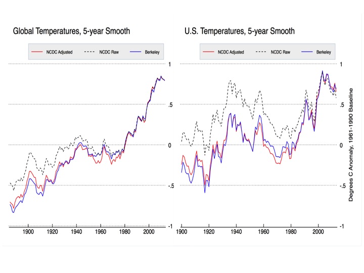
Hey Zeke,
Why don’t you respond to Lattitude’s “alcohol thermometer” post above?
This whole issue is a tempest in a tea pot.
If you choose a large enough y-axis any graph will look flat. I for one find a nearly 1 C (1.8 F) rise in global land temperatures since 1880 notable.
Why is a 1 degree rise since 1180 (1) notable
and (2) so worrisome that millions must die to (not) change a potential future rise in temperature?
Why is a 1-1/2 degree rise between 1650 and 1880 ignored – and ignore-able! – but a 0.9 degree change between 1880 and today so threatening to the world’s Big Finance and Big Government that they want to raise 1.3 trillion in taxes?
This whole issue is a tempest in a tea pot.
If the ACE keeps on the way it’s been headed (i.e., down), we won’t even enough tempests to go around. Teapots around the world will stand empty.
Zeke below says a 1C change is “notable” Really ! I just turned of my air con and the temp rose by 4C. No its a scam and fraud of the first order.
Careful Frank, don’t turn your air con off or you will be in an ice age when the temperature drops 4*C.
Zeke says:
If you choose a
large enoughnormal y-axis any graph will look flat.There. Fixed it for Zeke.
@ Zeke February 15, 2015 at 7:44 pm “If you choose a large enough y-axis any graph will look flat.”
Nice red herring there.
The real difference between Latitude’s graph and the (GISS?) graph to which it is contrasted is this: the former plots GMST while the latter plots anomalies. That is, the former plots the actual temperatures, but the latter plots the change in temperature from one year to the next.
By its very nature, doing the latter (plotting anomalies) drastically amplifies the visual effect of what’s being plotted. The change in temperature, for instance, from the first decade of the 20th century to the first decade of the 21st century covers practically the entire vertical range (Y axis) of the graph. This conveys to the casual viewer the notion of a drastic, dramatic, and rather sudden temperature change.
While anomalies may be useful, or even necessary, for the experts and specialists, they are poorly understood, if understood at all, by the casual observer. Latitude’s graph is, I think, a whole lot closer to a representation that is not misleading to the casual observer.
Zeke Hausfather
February 15, 2015 at 7:44 pm
If you choose a large enough y-axis any graph will look flat
=====
bull sh1t……what does the opposite of that say
RACookPE1978
February 15, 2015 at 7:56 pm.
Hello RACook.
You Say:
“Why is a 1-1/2 degree rise between 1650 and 1880 ignored – and ignore-able! – but a 0.9 degree change between 1880 and today so threatening to the world’s Big Finance and Big Government that they want to raise 1.3 trillion in taxes?”
———————
Now, I fully understand that the above selection is a part of a reply form you to some else and the meaning loaded may have a different purpose than the way I would(or am considering) the reply to it.
The main point is that it is a good proper question, so to speak.
I am not pretending that my following answer to that question is definitely correct, but it is more an answer in the line “for what it could be worth anyway”
Now ,cutting to the chase with no extra acrobatics…….any rise of temps (warming) from 1650 to somewhere between 1800-1850, can not be claimed as a global warming period as it is part of a cooling period known as LIA. LIA is a climatic variation period towards cooling, so the rise of temp means a warming that ends LIA.
As LIA seems only a ~0.5C CLIMATIC variation, I doubt that any one can claim that the warming during 1650 to 1850 is more than ~0.5C. So that ~0.5C WARMING IS ONLY A BOUNCING BACK IN CLIMATE FROM, A COOLING. Regardless of us knowing or not what caused LIA.
That will be the first difference between it and the 0.9C temp rise (the global warming).
Now still at this point, trying to clarify the technicality of this.
Supposing that the GW considered thus far for the last century period, in the aspect that it’s end has already kick-started we still technically will be in a global warming period till that 0.9 C decreases to be below the 0.4C (from 1850) and unless a cooling persist beyond that point and further to a decrease of about 0.3C below the point of 1880 we can not claim as been in a cooling period as in another LIA or Ice Age, always technically speaking.
So the ~0.5C belongs to a period considered as an anomaly, a climatic cooling anomaly in a cooling trend when in the other hand the ~0.9C constitutes as a period of warming and a climatic anomaly of warming in a cooling climatic trend.
A ~0.9C is a bigger variation than ~0.5C BY NEARLY a double and also is more significant by being with an opposite sign towards the climatic trend that it belongs to.
Considering something as in “progressive assessment”, if the 0.9C does not increase further and longer as claimed in the case of the AGW it will be known and named one day as LGW (little) not simply GW.
So in the end of the day the GW either will END UP to be an AGW or a LGW.
Now this far still your question is not satisfactory answered.
As they say this variation of 0.9C is not justified and not explained by the known climatic variations, that is why considered as unprecedented, and while attached to some other “unprecedented” variation, as in the case of CO2 emissions then voila you have the strong bases for a strong start with an AGW and ACC hypothesis.
There is some substance to the unprecedented warming while considering the 0.9C climatic variation.
You see, looking at the paleo climate data for the Holocene period (the Interglacial) the max climatic variation rounds about at 0.3C to 0.5C. In a climatic equilibrium that will be a variation per a millennium scale, while in transient climate or an anomaly transient climate like LIA and YD that will be the amount of variation in max for periods just of above one century mark.
That what makes the 0.9C increase to stand out as an unprecedented anomaly in climate.
Is a higher temp increase
than expected in the most significant natural climatic variation.
The vary bases for the Hansen’s claim of climatic disequilibrium, meaning that climate at such a variation has lost its thermodynamic balance, so to speak.
As this gone too long, will leave it at this point.
Hopefully I am not being annoying thus far.
cheers
Whiten:
Well, uhm, … No.
See you somehow have the impression that a 0.5 degree rise (from the Little Ice Age low in 1650) somehow “stopped” in 1850.
It did not “stop” in 1850.
Further, you compound that impression with an idea paraphrased as “The temperatures rose after the Little Ice Age until 1850, then they would have stopped in 1850 – except mankind added CO2 to the atmosphere beginning in 1850 and so the temperatures kept rising between 1850 and today (2015).”
It did not do that either.
Beyond those two impressions, you also seem to believe that the earth’s global average temperature anomaly is “stable” over long periods of time. That is, the “natural state of the earth’s temperature is a constant, in thermal equilibrium with space over all short (geologically short that is) timeframes. By this assumption, and the logic and language it requires, any change to any outside effect – a “forcing” in the terms invented by the CAGW deists – then, changes the earth’s global average temperature from this equilibrium point.”
That is also wrong. In theory and in practice. The earth is NEVER in thermal equilibrium. External “forcings” never “start” and “stop”: they ALWAYS influence EVERY part of the earth’s energy budget at EVERY part of the temperature cycle (high, low, middle, near-flat, falling, or rising.)
What is your background, your technical or mathematics experience, your degree or your working experience? I will continue this conversation – it certainly is not over yet! – but to continue effective using language you already know, I need to know what you already know, and how you express yourself in that language.
See also Dr Ball’s conversation as we discuss the nominal sizes of earth’s natural variations in global temperature over 1000 and 2000 year-long intervals.
RACookPE1978
February 16, 2015 at 9:56 am
Whiten:
Well, uhm, … No.
See you somehow have the impression that a 0.5 degree rise (from the Little Ice Age low in 1650) somehow “stopped” in 1850.
It did not “stop” in 1850.
————-
First, I am not asking you to believe this, but I am a guy who has worked his had backwards to show to the AGWers at the Guarding that the 0.9C warming is a continuation of the bouncing back from LIA, as somehow you say and claim above.
I think we have a misunderstanding.
My earlier reply to you was simply an answer to your question, where you not me separate these two periods of temp increment and ask why these two are considered differently. Probably my language was not that good and probably my expertize is not up to the point of making me able to explain correctly what I mean.
You see, I do not make or produce Climatology or contribute to it,
Am not a Climatologist or a scientist.
I simply argue and debate about it in blogs concerned with such an issue, at my best without the intent to perverse what already known and accepted in climatology. Still on learning, so to speak.
Also I accept that maybe sometimes I overdo with my critical approach, but believe me, is no malice there.
The only thing I believe at the moment is that you totally misunderstood what I said in my previous reply to you, and I am sure that definitely the fault lies with me, but please do read it more carefully and maybe you get a different point of view about that reply..
The rest of your reply to me is less coherent, to me I mean, and I have no doubt that the problem may very much lie with my luck of expertize, but never the less if you would not mind we can keep “arguing” and debating a little further in this particular point, as I am very much bent on learning more.
You seem to fail and understand that in my earlier reply is shown that I totally disagree with Hansen, but I claim that I do not fail in understanding where he basically comes from with his Expert’s claims.
I hope that you are not entirely dismissing Hansen and Phil as non experts in their field.
Thank you, looking forward for a reply.
cheers
whiten
OK. Let me try again. I do not care what your belief in the apparent religion of CAGW is, nor to whom you have spoken about CAGW before.
What is your field of study, and how much do you know in that field. Once I know what your background is, I can (and will!) talk to you at the level you will be able to understand. Thus, we can communicate. You, in turn, can be educated. (Whether you will choose to learn what is presented is not up to me, but how I present the information to you IS up to me.)
So, again, what is your level of training, in what field and to what degree is your knowledge in that field?
You spent many words above, but you did not answer the question I asked.
RACookPE1978
February 16, 2015 at 9:35 pm
Hello RACookPE
Thanks for your reply.
Good that we somehow still managing to communicate, even when actually it started with arguing and debating in a very specific point about climate, and at this point has ended up with some kind of “claim in authority” or a “pissing content”.
I am sorry that you got annoyed and upset about this whole matter.
Now, you say:
——-
“whiten
OK. Let me try again. I do not care what your belief in the apparent religion of CAGW is, nor to whom you have spoken about CAGW before.”
———
Yes of course you have the full right to not care what my beliefs are or not, but actually, as I said, you are misunderstanding, for not saying misinterpreting, my argument or the explanation given where this all started.
It was basically on the issue that actually what the position of Climatolgy is in answering that question of yours above. Now you could have turned around, as you actually tried at first, and show that that was not the case at all, but saying or implying that climatology is a CAGW religion, that is a CLAIM TOO FAR GONE, actually not helping with any arguing or debating in climate issue.
Also of course, again ,you have the right to not care at all to whom I have spoken about CAGW before.
But it happens to be that I do care. The point that that was served in my argument was simply to show that even while I could agree with you at certain point, still I was showing that whatever established in climatology must not be perversed, even while clearly may very well be wrongly interpreted.
The CAGW religion is a result of the obsession and addiction with the idea “The ARF (Anthropogenic RF) is definitely a climate changer”.
The attitude of “Take it or leave it, IT DOES NOT MATTER, is already established beyond doubt, and whole authority concerned agrees and is in consensus about that” turns the CAGW in a religion.
The other thing you say:
—
Whether you will choose to learn what is presented is not up to me, but how I present the information to you IS up to me.
—
Yes, I learn from what is presented to me, when I am interested or my learning drive is triggered to, and there is not much choice really, depends on my interest to participate and engage, and as I have made it clearly enough is that here will be only concerning climate and climate change.
I am not interested to learn or be educated on every thing.
Also, yes, is entirely up to you how you present the information to others like me. Fully acknowledge that and respect that.
But there is a big but you should not ignore and dismiss, once you do that the rest have the full right to choose whether challenge it and argue about it or not, otherwise that will be no more than another form of religion, so to speak, and when you do this presentations in a place like WUWT then all this arguing and challenging may come from whom ever, regardless of credentials, and you will be wrong on trying to dismiss that by simply waving the ” authority card”
Further more, as far as I can tell, in my opinion, the problem generally does not lie with the information itself, but the way it is represented, served and interpreted.
The way it is represented can tell more some times than the information itself.
That tells me a lot actually, or so I do believe.
The CAGW being a religion, I have learned long before taking part and engaging here at WUWT, simply here I have discovered that most do agree and have learned the same thing ,so to speak.
But the other thing that I have learned, and hopefully is not correct, but as it stands is what I see as the most intriguing thing I have learned here, is that you guys the opposition of the CAGW religion, are running the risk of turning in another form of a AGW cult.
The source of their religion is same as the one that may lead you to a new cult, religion, that of BAGW (benign) but still AGW.
It is the RF (radiative forcing).
While CAGW by putting and A in front of RF ends up in obsession and addiction of inflating and exaggerating to a point that turns them from science to religion, in the other hand you guys here by not being able to do anything about that A put in front of RF turn on trying to totally ignore dismiss and destroy the RF meaning in climate.
While the CAGWers are completely obsessed and addicted to the ARF, you guys are completely turning to phobia and becoming phobic to RF.
That is what the representing of your information tells me.
Tell me that I am wrong, tell me that you have not some kind of phobia towards RF, or Dr. Ball for that matter, or Monckton, when you compile and produce the representing of the information with the intent to inform and educate the rest.
You already on “show me your credentials before you talk- argue or challenge me”.
Now for the last part, the question that I did not answer to you.
Was not actually a question, it was more like a request from you to me, on the point of what credentials or expertise I could show you.
As far as I can tell, I did politely respond to it, by saying amongst so many words that it is irrelevant for you to ask and request for such, as both me and you no Climatologists, and the issue was about climate.
Also, to a degree I explained to you that even while I may forcefully disagree with expert climatologist at given points, especially in conclusions and interpretation, I still learn and draw from climatology to which these experts have contributed to, much more than me you and any body else that disagrees with them.
I try my best not to perverse and deny the most basics and the back-bone of climatology.
Stop asking for credentials and proof of authority.
Is entirely up to you to keep communicating or not with someone like me under such condition, ……………..will completely respect that, no hard feelings there.
I will keep trying with my rumblings here without showing any credentials, with the most polite and reasonable way I can master.
I do not think I am trolling here, even that I am very aware of being annoying at times. It comes with the package.:-)
cheers
“While some of my compatriots may at times think otherwise, the U.S. is not in fact the entire world, and not even that large a portion of global land area.”
If you can’t detect the effects of global warming over a land mass of some 10 million kilometers, you have a rather serious problem with your theory, irrespective of quoting the usual asinine alarmist talking points.
“I’d suggest taking a look at the impact of homogenization on global land temperatures. You will it to be much smaller (in fact, the net effect of adjustments on land/ocean temperatures is actually to reduce the century-scale warming trend).”
Standard sneaky tactic to avoid noting major structural differences in the US temperature measurement network when compared to the rest of the world. Are you claiming that if the rest of the world didn’t have the same station history it wouldn’t be subject to exactly the same homogenization shenanigans?
The U.S. has two big adjustments to its temperature data.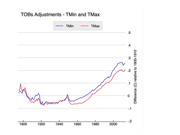

The first is to correct for a systemic change from afternoon to morning observation times since 1960 or so:
http://rankexploits.com/musings/wp-content/uploads/2012/07/TOBs-adjustments.png
The effect of the adjustments needed to correct for this change are shown below:
The second is an automated system for detecting breakpoints by comparing stations to their neighbors. While it nominally accounts for things like station moves, UHI, and other factors, the largest correction by far is for the large-scale change from liquid-in-glass thermometers to electronic MMTS instruments since 1980. The effects of the automated adjustments are shown below:
Note that the automated adjustment had only a minimal effect on the trend prior to 1980. You can check yourself to see the effect of sensor transitions on temperatures; they appear to reduce maximum temperatures by about 0.5C and increase minimum temperatures by about 0.15C:
http://rankexploits.com/musings/wp-content/uploads/2010/04/Picture-227.png
I discuss the MMTS transition bias in more detail here: http://rankexploits.com/musings/2010/a-cooling-bias-due-to-mmts/
No Zeke, it won’t do.
Only actual station metadata should be used for TOB adjustment. If you don’t have individual station metadata don’t adjust.
How could a breakpoint detection algorithm possibly know what caused the break?
Tom Karl’s pet rat TOBy needs a nice big helping of Ratsac.
If there was a fndamental and significant change in observation with a clear and defined cut off point, then the better approach is to consider them as two distinct data sets. The first covering the period say 1850 to 1960, and the second post 1960 to date, but without splicing these two data sets together.
One can then see what, if any warming appears in either data sett,and the periods over which that warming extends.
As a matter of first principle, there should be as few adjustments as possible made to raw data since all adjustments have the potential to lead to error, and one may easily end up with just an analysis of the effect of the adjustment rather than an analysis of what the the true observational data is telling.
Your break point algorithms will look for pattern they are expecting to find, and will of course find them. They will thus confirm exactly what you’re looking for. That’s what it is designed to do.
And what is the adjustment down for urban heat islands?
the use of break points ignores slow, systematic changes that introduce bias in favor of fast acting changes that correct the bias. in this fashion the use of breakpoints introduces bias.
For example, as vegetation grows up around a site, and then is suddenly cut back. Or for example, as a city grows up around a rural weather station, and then the station is relocated.
The breakpoint algorithm ignores the slow change in both cases, and then adjusts the data after correction. While in point of fact there should have been no adjustment after the correction. the adjustment should have been made to the data before the correction.
Thus, the breakpoint algorithm introduces bias 180 degrees out of sync with reality. It all sounds good in the ivory tower, but fails the sniff test.
Zeke Hausfather
February 15, 2015 at 8:03 pm
=========
The ever increasing post 1980 adjustments for min and max point to a serious problem with the pair-wise adjustment algorithm.
I’m amazed that US weather stations didn’t use max/min thermometers which would have made the time of observation irrelevant, simply by indicating the highest and lowest temperatures reached since they were last reset…
[note: they do use a max/min thermometer with a memory, and TOBS is still an issue, though likely over adjusted for – Anthony]
Okay, I need to comment on this,seeing as how I am on a brief break from carefully reviewing our USHCN station ratings. When surfacestations goes back up, it will have hundreds of new images. (Hey, Anthony — shout-out. I’m through South Carolina, now; I’m on the home stretch.)
Anyways, I think you all probably know we have serious dispute with USHCN (and by extension, the entire GHCN). That gripe involves microsite, and the poorly sited stations warm ~60+% faster than the well sited stations. That is not adjusted for.
I have to add, though, that there is one valid reason for “cooling the past”, and that is TOBS. Over all siting ratings (Class 1 – 5) of stations, TOBS-biased (PM-AM) stations definitely run cooler than their non-biased counterparts.
We drop all of these stations from our study, as well as stations that have moved, which leaves us with an unperturbed sample of ~400 stations. (Out of over 1200 — yuk!)
Having said that, however, the demon of the adjustment procedure is the homogenization algorithm. This algorithm takes the surrounding stations and adjusts “outliers”. The problem being that ~80% of the USHCN has non-compliant siting and the site-compliant stations comprise a mere ~20%.
So which stations do you think get adjusted? And in which direction do you suppose they get adjusted?
Unperturbed compliant USHCN stations show ~0.196C/decade for the 1979-2008 period (dominated by warm PDO phase). The Non-compliant stations warm at ~0.325/decade. Adjusted data, after the dust clears, is ~0.324C/decade. Fancy that. And that’s an even even higher trend than the straight average of good and bad stations. So they have adjusted in exactly the wrong direction.
Dr. Venema finds this interesting, but is banking on step-jumps in the well sited stations. But there ain’t any; it’s as smooth as silk. So we are looking very, very good.
As for the stations prior to that period, quien sabe? the metadata is so incomplete and generally horrible that it is very hard to tell what is going on. You have to remember that metadata is key. If you do not have the metadata (moves, and TOBS records), the data really isn’t all that meaningful.
Here’s where Mosh and I depart company: He imagines one can infer metadata, while I imagine that one cannot. Sometimes it gets warm in one neck of the woods precisely because it got cooler in the next. Each sensor sings its individual song. If there is an outlier, it may mean there is an unrecorded move or TOBS flip — or not. There is no way of knowing from the data alone.
It seems to me as if NOAA is making serious presumptions regarding the older data (sans metadata) and are (unintentinally) falling victim to the combo of bad microsite+homogenization. As a result, we are seriously highballing the recent land surface trends This will not affect ocean measurements, obviously, but we are looking at a potential of a quarter to a third exaggeration of the overall global surface temperature trend.
Well, back to my beloved USHCN stations . . . South Dakota beckons . . .
And before anyone asks, the stations we dropped a.) Show much the same difference between poor and good siting, and b.) have even lower trends (across all rating) than the ones we retained.
So we are, most emphatically, not cherrypicking.
So they have adjusted in exactly the wrong direction.
=============
I am glad that finally there is someone on WUWT who can put STOP and absolute STOP to the nonsense that people are deliberately falsifying the record.
================
Much more likely the problem is confirmation bias, which is subconscious and cannot be controlled by human beings, except by very rigorous experimental design.
Our subconscious does not show us the world as it is. Instead, it is always filling in the gaps automatically, so that we cannot see the missing words and transposed letters when we proof read our own work. It hides our errors from us.
We believe we are correct even when we are wrong.
I am glad that finally there is someone on WUWT who can put STOP and absolute STOP to the nonsense that people are deliberately falsifying the record.
Second. Evan gets a gold start for being the first person to agree that metadata is key and that it is also problematic.
Third. Kudos for recognizing that TOBS changes records. Please please please do everything in your power to stop the nonsense that skeptics spread about TOBS.
4th; It is my opinion that there is ONE and only one issue that has any merit: micro site.
Anomalies are a non issue, adjustments are a non issue, or they are mousenut issues. microsite ( and UHI) Are GOOD ISSUES.. with real science to be done. Hopefully that science (your stuff) can be done and published
so that the real issues can be addressed. But as long as some skeptics ( like this post) just throw dirt, Evan, your Good work ( I know youve spent a lot of time) your good work , will not get a fair hearing.
Sad to say but I think some people will just lump your work with the junk that other people sling out.
That’s not fair.
You really need to clearly and forcefully distance yourself from the stupid “hoax” charges and fraud chargers.. Anthony’s issue has been microsite ( and uhi) its a good issue and I hate to see you guys tarred with the same brush as dragon slayers and cherry pickers. You are doing good work and I would hope that people would listen to your experience ( esp about TOBS) and cut the crap so your stuff can be heard in a less polarized enviroment.
5th. Of all the people who have recnetly criticized adjustment codes ( without ever looking at them) Your criticism ( what if the majority is bad) is the ONLY one that I have found may have some merit. all other critcisms pick at the edges. odd ball cases. Your’s is one that deserves investigation. we know oddball cases exist in any statitical correction. my 9-5 job is All about data cleasing with stats.. there allways odd balls. The real question is are there SYSTEMATIC problems. your concern is about a systematic issue.
GOOD problem. tough problem.
6. Can we detect undocumented changes to stations? Thats an emprical question. I think I may be able to anwser it. we can disagree.
In summary. I know you have spent a huge amount of time looking at data. getting to know the facts.
the sources. the REAL problems. For that you get 100% respect.
in simple terms the more time you and Anthony spend calling out the bullshit arguments for what they are, the more credibility you’ll have when speaking about your good arguments.
Thanks, Mosh, I always did say we were much alike in this. We are just barking up somewhat different trees.
I emphasize, the problem does NOT look to be intentional to me. NOAA does not regard microsite as a significant issue (at least to Tmean), and therefore homogenizes both well and poorly sited stations. Since the poorly sited stations are in the majority, the well sited stations are treated as the outliers when it is actually the other way around.
NOAA really, really thinks they are getting the right answers. This is a subtle, unintentional error. It is an error anyone could have missed.
It could only be discerned by a precisely targeted deconstruction. Well, having done that, the error sticks out like a fish in a tree. But you had to know just where to look, or you’d never find it. Anthony knew where to look. And I knew he was right, from the getgo. NOAA simply did not. So we will publish, and independent review and followup will be the final arbiter. This is how science advances.
I think the first step, though, before trying to infer missing metadata is to look at a period with very good metadata and isolate the stations that have no moves and no (or very little) TOBS bias. That allows us to examine microsite without other confounding factors (other than MMTS conversion, which we apply using Menne, 2009, as a guide).
I think that your step via BEST comes after that and in light of that. Easy for me to say, I guess — I am dealing in the sweet spot: A nice warming trend with great metadata and an oversampled set. You do not have that luxury.
Having said that, I will be very interested how our unperturbed subset looks when it is plugged into BEST calculations. I’m prejudiced: I think we got it right and it will be a test of BEST. You will likely be looking at it the other way around. But it’s interesting.
Third. Kudos for recognizing that TOBS changes records. Please please please do everything in your power to stop the nonsense that skeptics spread about TOBS.
All it takes is one look at the record.
“I am glad that finally there is someone on WUWT who can put STOP and absolute STOP to the nonsense that people are deliberately falsifying the record …” Steven Mosher at 8:57 pm.
=====================================
“The trains carrying coal to power plants are death trains. Coal-fired power plants are factories of death” (James Hansen The Guardian Sunday 15 February 2009).
Anyone who genuinely believes such outrageous nonsense would be motivated to deliberately falsify the record, without question.
Anyone who genuinely believes such outrageous nonsense would be motivated
He has his confirmation bias, I have mine. We all have one.
Steven Mosher
February 15, 2015 at 8:57 pm
/////////////////////////////////////////////////
Sorry Steven, two of my posts on this thread directly address metadata. Ie: it is completely unacceptable to make TOB adjustment (other than time zone) to station records without supporting metadata.
NOAA has been using Tom Karl’s pet rat TOBy, an algorithm that does not reference existing station metadata to make TOBs adjustments for individual stations, the source of most warming in the US record.
Would you like to lie to all the current and future readers Steven? Want to try telling them that individual station metadata is used? Want to link back, as The Racehorse infamously did, to the NOAA TOBs page that in one click links to Tom Karl’s 1985 paper?
It’s very simple Steven, anyone applying a TOB adjustment to station data without station metadata is a person not to be trusted. The same goes for BEST. More time in the blender will unscramble the egg?! Any attempt to use microsite degraded surface station data to prove GoreBull Warbling speaks to motive Steven. It speaks very loudly.
Want to answer the AGW question? Forget noisy surface station records, you can do it in the lab.
“Are the oceans a near blackbody or a SW selective surface?”
“given 1 bar pressure, is the net effect of our radiatively cooled atmosphere warming and cooling of the oceans?”
Run to your junk, intentionally corrupted, surface station measurements. It won’t do any good. The “basic physics” of your “settled science” is provably wrong.
You and yours claimed adding radiative gases to the atmosphere would reduce our radiatively cooled atmosphere’s ability to cool our solar heated oceans. Now every activist, politician and journalist of the left gets their public face, metaphorically speaking, punched to custard. Just relax Steven and let the public fists do their work 😉
Third. Kudos for recognizing that TOBS changes records.
============
Not correct. Not since 1782.
http://en.wikipedia.org/wiki/Six%27s_thermometer
Not correct. Not since 1782.
Only ~6% of USHCN observes hourly. The rest, daily.
USHCN originally usually observed in the evening. Over a period of decades, most stations have converted to AM observation, with a few exceptions. The volunteer observers are permitted a certain amount of latitude, here.
If during your given study period your station changed from PM observation to AM, the resulting TOBS offset bias is going to cause a step-jump in your data. A cooling one. I’ve run the trends. I’m not sold on the NOAA “solution” (one fine day I intend to compare their adjustments with the differences I’ve observed), but I am sure as heck aware of the problem. PM-AM TOBs-bias will result in a spuriously lower trend over that given study period. USHCN, with the minor exception of ASOS/AWOS, is entirely a Max-Min kind of a deal taken once per day only, and covering a 24-hour period.
If your TOBS flip happened right at the end or beginning, that will have very little effect. But if it occurs halfway through the study, like wow.
If one must insist on a daily Max-Min deal, then one ought to affix observation at or near a time most likely not to suffer TOBS carryover. Say 11AM or 11PM. Or maybe 10. Namely, smack in between Tmax and Tmin.
I am not even convinced there is no difference between AM and PM observations even if they are consistent throughout. AM-OBS exaggerates Tmin. PM-OBS exaggerates Tmax. That could make a difference, even in trend. I intend to take a look at this at some point.
Off the top of my head, TOBS bias spread all over the study period (USHCN , the average of both more and less severe cases) is on the order of -0.08C/decade, Tmean, and that’s a heck of a lot. It just is.
Evan,
I have a comment held up in moderation that goes into this in more detail, but the vast majority of the net non-TOBs homogenization to U.S. data is to correct for the LiG to MMTS transition after 1980, as MMTS measure max temperatures about 0.5 C cooler (and min temps about 1.5 C warmer) than LiG thermometers as shown by long-term side-by-side studies as well as pair-wise comparisons: http://rankexploits.com/musings/2010/a-cooling-bias-due-to-mmts/
Yes. Quite.
We apply those adjustments, based on HOMR metadata and the average step jumps as described by Menne et al. (2009). We step Tmean trend warmer at the month of conversion.
Most of our data is therefore not raw, but raw+MMTS (a trend-warming) adjustment.
We recognize that raw data, in and of itself, does need some adjustment for equipment conversion even after dropping TOBS-biased stations and moved stations. T
It’s that “pairwise comparison” part, where NOAA goes astray. That’s the homogenization part. And it utterly obliterates the signal of the compliant, non-perturbed stationset.
Again, if there is a change of equipment used to measure temperature, it is a different data set and should be split and kept separate without any splicing of the two data sets one on to the other. These are akin to proxies, one would not wish to compare tree rings with corals and one should not wish to compare MMTS measurements with LiG.
Thus compile a data set comprising exclussively of LiG measurements, and compile a seperate data set comprising solely of MMTS measurements. These should not be spliced together but viewed as two separate and distinct data sets. One can see what periods of warming (if any) exist in either data set.
Again, if there is a change of equipment used to measure temperature,
=========
Agreed. the mistake is in trying to splice any temperature records together. How do you know they person taking the temperature readings didn’t retire, or only works Sun to Wed, and someone else takes the readings Thurs to Sat?
Don’t splice. Sample absolute temperatures. Calculate the trend from the sample. The advantage of sampling is that there is a very good chance the result will actually be a normal distribution, and thus you can calculate the error. No one knows the true distribution of the gridded, averaged, infilled, adjusted, homogenized data. The error calculation is a crap-shoot.
Imagine if we tried to survey people the way academics try to survey global temperatures. We’d be trying to calculate how people living in places that had no people were likely to vote, then we’d average all these different places to calculate a trend. And then we’d claim our results were highly accurate.
You cannot use bad data to correct bad data. It is like trying to mark an examination with an exam key that is full of errors.
“Having said that, however, the demon of the adjustment procedure is the homogenization algorithm. This algorithm takes the surrounding stations and adjusts “outliers”. The problem being that ~80% of the USHCN has non-compliant siting and the site-compliant stations comprise a mere ~20%. ?w=640
So which stations do you think get adjusted? And in which direction do you suppose they get adjusted?
Unperturbed compliant USHCN stations show ~0.196C/decade for the 1979-2008 period (dominated by warm PDO phase). The Non-compliant stations warm at ~0.325/decade. Adjusted data, after the dust clears, is ~0.324C/decade. Fancy that. And that’s an even higher trend than the straight average of good and bad stations. So they have adjusted in exactly the wrong direction.
===================================================================
Thank you for that. Understanding what exactly the homogenization algorithm does to individual stations appears to be quite the Rubik’s cube. As such it may be best to analyze and explain just one station before one explains the entire data base. I have many times challenged Mr. Mosher to explain just this one station, before tackling and defending the entire data base.
I disagree with your assessment that it is not intentional, There is immense political pressure to continue promotion of CAGW. For instance the claim of 2014 being the warmest year on record is an example of political influence on science. Please do not forget this was said…
From: Tom Wigley
To: Phil Jones
Subject: 1940s
Date: Sun, 27 Sep 2009 23:25:38 -0600
Cc: Ben Santer
It would be good to remove at least part of the 1940s blip, but we are still left with “why the blip”.
di2.nu/foia/1254108338.txt
which is exactly what happened in many (not just this Iceland record) as well as in the US as a whole, and in many Australian locations as well.
It is interesting that you say the TOB adjustment is valid. For what time periods? Have you seen the US record for the 1930- early 1940 warm period, using only stations that recorded in the morning or at night?
https://stevengoddard.wordpress.com/2015/02/01/it-is-not-the-tobs-stupid/
I do look forward to seeing the details of your trip. It would appear that well sited stations bring the surface record much more inline with the satellites. I think of a proper UHI analysis was presented, then the may line up almost perfectly. (BTW, it is likely to late, but in your traveling did you check for UHI.)
I
There is immense political pressure to continue promotion of CAGW.
================
political and financial. speak out publicly against CAGW and see what effect this has on your funding and your future job prospects.
Thanks. My trip is entirely virtual, as I swoop down on South Dakota via Google Earth. I’m on to Tennessee by now. I love modernity.
I disagree with your assessment that it is not intentional, There is immense political pressure to continue promotion of CAGW.
Be that as may be, I have been through the mill and I do not think this error is intentional. NOAA accepts that bad siting can affect the offset of the temperature. Leroy (1999, 2010) goes that far. But neither NOAA nor any of the other land surface metrics have never accepted that it can affect trend. They simply weren’t looking there. Especially after Fall et al.
It is interesting that you say the TOB adjustment is valid. For what time periods? Have you seen the US record for the 1930- early 1940 warm period, using only stations that recorded in the morning or at night?
No, and I shudder to imagine the lack of metadata going back that far. But to be clear: TOBS-bias occurs only when the observation time is changed during a given study period. That creates a step-change in the middle of your record, and that (obviously) affects trend.
If TOBS is constant throughout, either AM or PM, there should be no significant effect on trend (but I’ll be testing that hypothesis for a subtle Tmax/Tmin divergence).
From: Tom Wigley
To: Phil Jones
Subject: 1940s
Date: Sun, 27 Sep 2009 23:25:38 -0600
Cc: Ben Santer
It would be good to remove at least part of the 1940s blip, but we are still left with “why the blip”.
By 2009 those guys don’t know it is PDO (etc.) flux? Really? I could have told them that much.
Or if if you choose a small enough y axis any graph will look scary. No one I know of says that CO2 had much of an effect on temperature before 1950 or thereabouts, so what 1880 has to do with it I don’t know.
CO2 was ~300 ppm at the end of WWII. It “took off” almost precisely starting 1950. We have added ~30% to the atmospheric CO2 sink since then. HadCRUt4 clocks the warming since then at 0.7C, and considering the microsite issue, that is probably closer to 0.5C.
There have been a roughly equal number of positive and negative PDO years since then, so the natural A/O flux cancels out well. There is also the question of the “unmasking” of aerosols, which has increased the warming trend by ~25%, but we’ll set that aside for now.
So it appears that we are warming at roughly the rate predicted by Arrhenius (1906) of ~1.1C per CO2 doubling, i.e., raw CO2 forcing only, but without any net positive feedback. We may (possibly) double CO2, but there is no way we will ever, ever redouble.
So I would expect total CO2 forcing to top out at under 2C, when we are still suffering what the IPCC quaintly refers to as “net benefis”. Lukewarming. Not only are we not in crisis, but it appears likely we will break out ahead of the game. After all this fuss.
However, 40% added CO2 since 1880 is not chump change and the warming, while not serious, is not nothing. There are vast unknowns, not only in scale, but in the subject matter itself. So an appropriate measure of caution is advised, as always.
You are attributing all warming to human CO2. Unsupportable.
Remind us again how CO2 concentration was measured before the 50’s?
I am considering that natural warming/cooling via PDO roughly balances. We are left with warming at the rate of Arrhenius. That, at least, is a repeatable experiment.
However, this is mild lukewarming and will likely result in net environmental benefit before and as it tops out. A win-win situation. Warming is only a third the rate of the model projections. Yet it is not nothing.
Wrong. 310 at end of WWII. That will make an increased forcing of 0.54 w/m2 after the industrial revolution. about 1/3 of the forcing increase in this century. That increase of forcing did of course have an effect
In case evan does not know it: Hadcrut4 is land-ocean. Microsite issues from the land stations can never reduce that increase by 0.2 deg. For Crutem4 the increase is somethting like 0.8 degrees after the war. And there is no reason to believe that microsite was uninportant earlier.
(Per site policy, please use only one proxy server. Thanks. –mod.)
Termites produce 10 times the total CO2 that man produces. Dosen’t that mean that reductions in our CO2 will have very little effect. No doubt as the world is warming the termite population is increasing.
Sorry “Rooter”, what “forcing” would that be?
The net effect of our radiatively cooled atmosphere is to cool our solar heated oceans.
Don’t tell me you are one of those drivelling warmulonians that believe the oceans would freeze without DWLWIR?
However, 40% added CO2 since 1880 is not chump change
============
In the same time we have changed our land use from 4% of the land surface to 40%. Our cities alone occupy 4% of the land surface.
But of course a 1000% change in land use doesn’t compare with a 40% change in CO2. It must be CO2.
“I am considering that natural warming/cooling via PDO roughly balances. We are left with warming at the rate of Arrhenius. That, at least, is a repeatable experiment.”
————————————————————————————–
It is repeatable, and the affect of ocean cycles is without question, real. However, we are coming out of the little ice age, so a warming mean over the long term is expected, and makes assignment of all the warming since the 1950 to CO2 problematic. This is particularly true considering the long term increase in insolation during this time; made especially true considering that the oceans are primarily charged during the SH summer, and that increased solar energy flux has a very long residence time, and thus can accumulate within the oceans for decades, before being released to the atmosphere.
So, evanmjones and rooter confirms there were no measurements, outside a lab, before the 1950’s. And, that measurements outside the lab AFTER the mid-1950’s shows an increase. What can we learn from that?
Tom Trevor,
Exactly right, and that is the reason they love their tenth- and hundreth-degree charts. Those charts are designed specifically to scare the public into opening its collective wallets. Then these charlatans will ride in on their white horses to save everyone. Only there is no problem. We are simply observing natural climate variability.
The error bars are far wider than 1/100th of a degree, and in almost all cases, wider than a tenth of a degree. So the whole exercise is bogus.
I like trend charts because the temperature doesn’t matter. The slope of the trend proves that human emissions have no discernable effect. I’d tell that to Zeke, but he is so immersed in his 0.1º and 0.01º nitpicking that I would be wasting my time.
However, we are coming out of the little ice age, so a warming mean over the long term is expected, and makes assignment of all the warming since the 1950 to CO2 problematic.
Yes. That is an open and very poorly understood question.
Our cities alone occupy 4% of the land surface.
Not that much, I think. there are vast uninhabited areas. And you really have to compare it with total global surface. Urban growth is a warming factor, but I am not sure how large a factor it is. But (mostly) Chinese soot on Arctic ice, as of recently, does appear to have a big effect, and solving that problem would not affect CO2 in any way.
Then there is the issue of aerosol unmasking, which has been inorreectly, I think, attributed to CO2.
You-all left out the greatest of variables: Completely unknown factors.
“The theory originates in sophisticated climate models that demonstrate rising temperatures driven by rising concentrations of CO2. “
Untrue. The theory originated with Arrhenius in 1896.
“As Figure 1 makes clear, adjustments are the dominant factor in the global warming trend.”
Untrue, and as Mike M says, dishonest. Fig 1 shows ConUS data.
It’s also most unclear what is actually plotted. They obviously (from y-axis labels) aren’t Tmax. Anomaly? relative to what?
“The obvious intent of adjustments is to create the illusion of a dramatic global warming signal in recent times.”
As Zeke, I and others have pointed out, adjustments have a small effect on global averages, and actually lowers trends over the last fifty years. Here is the effect of GHCN adjustment on the global average trend from past years (x-axis) to present:
http://www.moyhu.org.s3.amazonaws.com/pics/trendback.png
It’s small, and post 1960, negative.
Nick Stokes
February 15, 2015 at 8:18 pm
Well, Racehorse, you are both wrong. The atmospheric radiative GHE is not a working theory, it is an unproven hypothesis.
Tyndall showed in 1859 that CO2 could absorb LWIR. And what did he show in 1860? That co2, if heated by surface conduction, or release of latent heat of water vapour condensing, could emit lWIR.
Funny thing, most squealing warmulonians don’t like to mention 1860. I wonder why…?
Oh, that’s right! Radiative gases play over twice the role in cooling our vertically circulating radiatively cooled atmosphere than they do in warming it!
But, but, but what about DWLWIR slowing the cooling of the surface? Whoops! 71% of the surface is ocean and incident LWIR has no effect on the cooling rate of water free to evaporatively cool.
But, but, but the oceans are a near blackbody, surely they would freeze without DWLWIR? No, the oceans are an extreme SW selective surface. Without atmospheric cooling they would heat to 335K or beyond.
It’s all garbage Nicky baby. You lent your support to the biggest lie in the history of human science.
The glue factory, Nicky. The world needs more 3M PostIt notes, and you hanging onto those hooves is just selfish.
There can be no meaningful global warming unless the oceans are warming. Land based temperature data is all but irrelevant, the only significant data set is ocean temps, and prior to ARGO, there is no reliable data on ocean temps (and ARGO is way too short to draw any scientific conclussion).
You have done some experiments showing that LWIR does not heat water that is free to evaporate.
The issue is why, given that this is fundamantal to the theory, have Climate Scientists not carried out experiments showing how water (say at 289K) is heated by DWLWIR being radiated from a source at say 276K (ie., the temperature at low level cloud height of ~2000 metres) positioned say at 5 metres above the water ?
Heck, let’s see the results for water at 289K being heated by DWLWIR radiated from a source say 5m above the water at say 295K
“The theory originates in sophisticated climate models that demonstrate rising temperatures driven by rising concentrations of CO2. “
Untrue. The theory originated with Arrhenius in 1896.
“As Figure 1 makes clear, adjustments are the dominant factor in the global warming trend.”
Untrue, and as Mike M says, not honest. Fig 1 shows ConUS data.
It’s also most unclear what is actually plotted. They obviously (from y-axis labels) aren’t Tmax. Anomaly? relative to what?
“The obvious intent of adjustments is to create the illusion of a dramatic global warming signal in recent times.”
As Zeke, I and others have pointed out, adjustments have a small effect on global averages, and actually lowers trends over the last fifty years.
So, does this mean that using carbon-based products are about as dangerous as eating foods with cholesterol ?
As always, it depends on how much.
Actually, the primary bottom-line result of the CO2 increase is that poor people are now able to eat — food. Do you imagine you can witness poverty by visiting an American slum? Real poverty is more like going purblind from vitamin deficiency and dying at the age of 35.
Eliminating all that is the result of your analogical “cholesterol”.
I suspect you have not seen real poverty and hunger. Even though we grow more food, more and more people simply do not have their own land (People being forced off their lands in Africa for “carbon sequestration” projects) and cannot afford to buy food due to extreme low wages or no work at all and significant increases in prices.
Of course I haven’t. I am one of the lucky ones. But I know it’s there. And I know the only way out is via fossil-fuels (esp. coal). Unfortunately, the CAGW policy folks act as if they had never heard of it, and if their policies are enacted, it will be an unmitigated disaster for the world’s poor.
Fortunately, it’s out of our hands. China and India will develop, whether we pampered pets of the west like it or not, and in my view they not only should, but must.
Fortunately, it’s out of our hands. China and India will develop, whether we pampered pets of the west like it or not, and in my view they not only should, but must.
=============
The danger is a “legally binding treaty”. What happens when a country fails to meet their legally binding obligations? If history is a guide, first we sanctions, then we get war.
The UN climate treaty is sowing the seeds for the next world war.
Well, when you see it you will notice something common across most countries and cultures. Those suffereing don’t care about the “change in climate” (weather, unless it rains), just where the next meal comes from. Begging, theft, environment destruction etc, a cycle that these people want off of and (You can see it in their eyes) dearly want our lifestyle (Go to the shops, pick up some food, bread and milk rather than having to eek out a living from “nature”).
Don’t go down there, its another minefield of incorrect government advice.
“The theory originates in sophisticated climate models that demonstrate rising temperatures driven by rising concentrations of CO2. “
Untrue. The theory originated with Arrhenius in 1896.
“As Figure 1 makes clear, adjustments are the dominant factor in the global warming trend.”
Untrue, and as Mike M says, not honest. Fig 1 shows ConUS data.
It’s also most unclear what is actually plotted. They obviously (from y-axis labels) aren’t Tmax. Anomaly? relative to what?
“The obvious intent of adjustments is to create the illusion of a dramatic global warming signal in recent times.”
As Zeke, I and others have pointed out, adjustments have a small effect on global averages, and actually lowers trends over the last fifty years. Here is the effect of GHCN adjustment on the global average trend from past years (x-axis) to present:
http://www.moyhu.org.s3.amazonaws.com/pics/trendback.png
It’s small, and post 1960, negative.
Those are trend numbers, not temperatures. All that is saying is that the trend is adjusted upwards less now than in the past. But trend is still being adjusted upward. And since there hasn’t been any trend since ~2001, one is led to wonder why there is a continuing upward adjustment at all.
Okay, I don’t actually wonder. I have been elbow-deep in the data (Min, Max, Mean, Raw, Adjusted) and seen what homogenization does to well sited stations. If you didn’t know where to look (i.e., at microsite), you’d never even know there was a divergence in the first place.
Homogenization, applied across varying microsite, will have a very large effect during genuine warming or cooling trends (it exaggerates both). It will have a lesser effect during a flat trend, of course, because microsite does not cause (additional) divergence during a flat trend.
“Homogenization, applied across varying microsite, will have a very large effect during genuine warming or cooling trends (it exaggerates both)”
I think it damps them. Homogenisation tries to pick up events where a change to station conditions occurs. It can make
Type I errors, thinking station changes are natural
Type II errors, treating natural change as artifact and removing them.
Type I errors would not be expected to correlate with real climate change. They require an underlying station event (move etc). But Type II errors will. In times of rapid warming, some sudden warming will be discounted. Likewise with cooling.
The Type I errors are subject to bias, because the underlying events may not cancel. For example, installing a proper Stevenson screen gives a better radiation shield – cooler temperatures. While Type II errors tend to cancel, except to the extent that there is total nett warming, which they will tend to damp.
You can see this with the Iceland data that some people get excited about. There was sudden cooling in the early 1960’s and then a warming in the ’80’s, and again recently. This was quite widespread. Here is the plot of total Arctic adjustment effects:
http://www.moyhu.org.s3.amazonaws.com/trend/breakdown/break4.png
So yes, in early 60’s, some cooling was likely wrongly rejected. But in the 80’s, some warming was rejected, and again recently. The net effect from 1960 to now is nil.
Nick, the net affect is clear and matches your cooling the past and warming the recent data. ?w=640
What was done to this station, was done to many; Now Nick, explain why this stations was adjusted like this…
Yes Evan, and thank you, they are trend numbers only, and when they adjust down a rural station, it is done like this….
https://stevengoddard.wordpress.com/2015/02/11/basic-math-for-academics/
I think it damps them. Homogenisation tries to pick up events where a change to station conditions occurs.
Bad microsite exaggerates trends (up in warming phase, down in a cooling phase). Homogenization via pairwise comparison takes the 20% of well sited “outliers”, which have lower trends either up or down, and makes them match the already-exaggerated trend. That results in even more of a whipsaw than if a straight average is used, not less. This is not dampening.
Zeke Hausfather write:
Can anyone accurately characterize temperature variability during the recent interglacial? If you think you can, tell me how? If you think you can then what do you believe the interquartile range of temperatures to be over the past 10,000 years? I’m looking for a number. What do you base this on?
Are you hanging your hat on proxy reconstructions? Then how do you characterize the measurement errors?
Oh, I think it’s notable (but a bit under 1C).
I am one of the apostates (to both sides) in that I claim the pause is, in a sense, false: We are in a negative PDO; we should be cooling by now, and we’re not. That is the extent of AGW. But the flip side is that fully half the warming during the positive PDO from 1976 – 2007 was entirely natural.
You can’t have it both ways.
Well, as comforting as it is that you “think” it’s notable but under 1C…
In the cold light of day, the on-going food fight called climate science simply does not have enough accurate and (dare I say it) generally accepted data to support all these fancy world shattering theories.
Not being able to agree on foundational data is absurd and has to be awkward for a field of so-called settled science.
Hum, well both the satellite records show some cooling, and we have been ENSO neutral, with, according to Bob T an El Nino of a different sort. So given your recent observations of well sited stations the true record would much more closely resemble the satellite records, and 1998 would still be the high point, and a five year smoothed chart would make 2002 the likely high point. Add in a corrected UHI adjustment, and you likely have global cooling already starting.
The important question is: is it significant? To answer that question you need to be able to characterize the internal variability of the system. Forget, for the moment, about the causes of natural (non-anthropogenic) variability. It doesn’t really matter. What matters is that there seem to be two quasi-stable sates to our climate. One is a glacial state the other is an interglacial state. During each of these states there is some expected variability. If we can’t quantify that variability (and make no mistake, we can’t) then we can’t say that 1C is significant.
One of the problems of modern, big data science is that we (a) obtain the ability to measure something, (b) collect oodles of data over an infinitesimally short period of time and (c) observe a trend in that something. We then assert that the trend is significant without any knowledge of the long-term variability of the thing we are observing. Yes, we have lots and lots of data, but the data is extremely dense over an infinitesimal duration yet incredibly sparse (or non existent) over the time period necessary to properly characterize the internal variability of the system.
Imagine trying to characterize the variability of the stock market over a 10 year period by collecting and analyzing terabytes of data from a 4 minute trading session. There is no doubt that a trend might exist in the data. So what?
It is FREAKING COLD here and getting colder each year!!
Zero warming, significant fall in temperatures even in summer. The cooling is most definitely happening on half of the entire North American continent and getting worse.
Location of polar vortex and the temperature in the US.
http://oi59.tinypic.com/34y18qe.jpg
There appears to be a large contingent of UHI deniers on both sides of the climate debate. I think we need to start classifying the science deniers.
UHI deniers
Data tampering deniers
Solar minimum deniers
Satellite deniers
Warming hiatus deniers
Broken climate model deniers
Climate history deniers
There are many more. Please add to the list.
https://stevengoddard.wordpress.com/2015/02/16/uhi-deniers-2/#comments
Easier to just call them Climate Liars. They do have quite an array of lies from which to choose though.
I want a new denier category — the BIGGEST denier category of them all — for myself:
Average Temperature Denier
Average temperature data are nearly worthless because 99.999% of historical data are unknown, so no one knows what a “normal” average temperature of Earth is.
.
Since no one knows what “normal” is , or even if there is a “normal”, no one knows if the climate is moving toward “normal”, or moving away from “normal”– although we do know the climate is always changing.
Even if it were possible to derive 100% accurate average temperature statistics since 1850, with no adjustments needed at all, then what would we accomplish with these statistics?
Does anyone live in the average temperature?
Does the average temperature cause weather events?
Can we change the average temperature, or would we want to change it?
UHI shows up only slightly in my findings and appears to be statistically insignificant. Sure, cities ARE warmer. But do they warm FASTER?
Microsite, on the other hand is ubiquitous. A well sited urban station will, on average, warm much slower than a poorly sited rural station.
Besides, only ~9% of the USHCN is urban. But well over half consists of poorly sited non-urban stations. (Small towns run the coolest, actually, but the difference is insignificant.)
Microsite is the new UHI. You heard it here first.
Notable doesn’t mean bad. It just means, well, notable. So I therefore . . . note.
And you should bear in mind that not only I am in the very middle of said food fight, but our team is hitting NOAA flat in the face with a very gnarly custard pie.
noted and appreciated, by me at least.
#B^)
…….The theory originates in sophisticated climate models that demonstrate rising temperatures driven by rising concentrations of CO2. ………….
May I correct this ridiculous claim of the models being sophisticated. The models are light years away from being sophisticated. They are in fact so totally facile they do not even attempt to model the natural CO2 cycle let alone the some thirty or so other basic variables used even in normal weather forecasting.
The models also wrongly assume even distribution of CO2 which satellite data proves conclusively is far from being true.
In short there are basic standards engineering applications have to pass for modelling designs for chips and using the QA procedures for these no climate application would get remotely close to passing those for low grade commercial products as sold in the UK pound shop chains let alone the life critical ones that these should by rights be subjected to. After all we have proof that energy taxation forces people into a life style of cold or hunger that Amnesty has rightly rated as unacceptable torture resulting in hundreds of deaths in the UK alone every winter.
May I correct this ridiculous claim of the models being sophisticated.
They are as unsophisticated — and as complicated — as trying to play the entire Eastern Front using Advance Squad Leader rules. They use a bottom-to-top approach, which is always an epic fail when dealing with situation fraught with chaos and just plain unknowns. One little misstep at the start and you are playing crack-the-whip with your data as your error magnifies down the line. Before you know it, you find yourself “adjusting” machine-gun echo fire factors (in this case, aerosols) until your curve fits. Fudge factor, anyone?
At least if you approach the problem from the top down (preferably with a meataxe), you won’t be leaving out clouds and the PDO (and its cousins), which is like trying to simulate the eastern front — without tanks.
Even Lord Monckton (unless I misunderstand him) does not appear to see this basic error in approach. I can make you a climate model on the back of an old envelope that will give you a more complete and rational set of parameters and projections than these multi-billion dollar jobs. The only difference is that I will not be kidding myself as to what we know and do not know.
These are not game theorists. They have not the training. They do not have a handle on the overall. And furthermore, they do not think they need to.
You are not mistaken. In his latest paper, Viscount Monckton tried running to the ERL or effective radiating level argument (he knows he’ll get buried if the tries “two shell” again). Anyone with a $100 IR instrument can see that the ERL is constantly in change and is nowhere near 5 km. Clouds are the strongest IR emitters in our atmosphere, and they emit in 3D not as a layer.
ERL is a load of the freshest and most steaming BS. Sadly Viscount Monckton bought it.
Correct, Konrad.
ERL (effective radiation level) is one of those AGW theoretical constructs, plausible, but falls apart when one refers to the data. Lots of this sort of stuff in this climate hoopla.
Another is the assertion that CO2 warms SST. Even skeptics swallow that one. There’s more.
Agreed, but the scientific community as a whole is not responding to these problems appropriately. First, the entire climate community does NOT see climate as chaotic and they simply don’t CARE what anyone else says. Second, the climate community already considers all data (adjusted whenever appropriate) to be evidence to support the hypothesis and they don’t CARE about actually establishing causality. Third, the climate community doesn’t see any possibility of curve fitting because they believe that their parameters are perfect analogs of the real system with absolutely NO unknown effects.
In short, the entire climate science community sees themselves as “super scientists” – smarter than every other scientist and above the criticism of every other community. This arrogance is almost universal, because it is driven by an environmental ideology so strong that NOTHING overrides it.
There is only one way out of this, as I see it. These folks MUST be criticized for their poor quality work AT EVERY POSSIBLE occasion. People from outside the discipline that have expertise in, for example, data modeling or statistics, MUST get involved and hold climate scientists accountable for their negligence.
Just to be clear, the pause really refers to the lack of predicted warming so it is not just about the temperature but it refers to the discrepancy between the projected and actual warming.
In 2001 the IPCC projected warming of 1.4 to 5.8 over the next century (or perhaps 110 years?)
Therefore the pause is anything closer to no net warming than the IPCC estimate. So less than 0.07/decade would be considered “pausing” whereas above decadal warming above 0.07 should be considered “warming”. And just for completeness, cooling of greater than -0.07/decade would be “cooling”.
So an explanation of the “Pause” can come in two ways:
1. Explaining why the temperature does not show the predicted warming
2. Explaining why the predicted warming did not fit the temperature
Zeke Hausfather
February 15, 2015 at 7:42 pm
And none of them justifiable. As you have already been told: The adjustment of data after the fact is NOT SCIENCE, IT IS FRAUD
Eric Worrall at February 15, 2015 at 7:14 pm demonstrates clearly that the adjustments have created the rise in Temperature over the US.
But the question remains whether the adjustments are justified.
At its simplest the answer is No as the adjustments aren’t fully documented and risk assessed. But that doesn’t add much.
I suggest that the route of the adjustments is a desire to be more accurate.
And that means more believable.
And that means more like other temperature trends.
More like CET.
And thus the CONUS data is tweaked by confirmation bias to match the Black Country – and that tweaks the whole global surface temperature.
Spelling error – “route” should be “root”.
Oh, and it is obvious that the warming in the CET is largely manmade as it is a result of the numerous clean air acts and reduction in particulates over the time the 20th Century de-industrialisation occurred.
That assumes of course that there never was clean air in Britain before now.
(Per site policy, please use only one proxy server. Thanks. –mod.)
Nope, it assumes that there was smog in the Black Country after the industrial revolution and that the clean air acts fixed that in the late 1950s.
The CET is not a proxy – it is a measurement record that dates back to the LIA. It doesn’t extend back before that into the Middle Ages with its pre-industrial air.
Here’s a link that describes the CET.
That NOAA adjustment graph is quite extraordinary. It shows that pretty well all of the warming comes from the adjustments and not from the raw data. By the way, I wonder if the NOAA still shows that graph on its web site, or has it been disappeared?
This is a perfect illustration of scientific corruption on an industrial scale. Yes, adjustments are sometimes justified in order to refine the result and to reject known bad data. But if adjustment on this massive scale is required then the data is completely worthless. To present this hugely adjusted data and to pretend that it represents real world data is fraudulent. If a company behaved like this the directors would very quickly find themselves behind bars.
One problem is that the people who are doing the adjusting are the very same ones who are pushing the global warming scare. Human nature being what it is, I think it’s inevitable that, over the years, a significant amount of bias has corrupted the data.
I have been startled in various conversations with global warming advocates at what appears to be virtually a denial (I hate to use the term but it seems most apt) of classical statistics. The general approach seems to be that statistics is a box of tools out of which one repeatedly pulls devices until a choice finally gives the result one wants. The notion seems alien that the tremendous value of statistics is not that it allows you to claim things from a given set of data, but that it keeps you from claiming things that the data does NOT support. In can be frustrating for physical scientists who are self selected to want to claim things, to prove points and statistics seems always to keep them from doing what they so earnestly desire. In my experience the most powerful set of data that exists is always the unadjusted data and I am not speaking specifically about climate data. Every time one tweaks and adjusts some data one removes some of the original information in the set and injects, usually unwittingly, biases and outside information in the results. For this reason, in experimental science, adjustments to data are often only reluctantly done and even then minimized as much as possible. I once had a truly bracing experience when I pointed out to a climate scientist who had been merrily tweaking data repeatedly and fitting trends that he should evaluate his regression results and look at some diagnostics on the significance of the results. He replied that he “doesn’t do regression analysis” because that was only used for looking at correlation among variables. For this reason, he said, he did not look at Rsquared, F, or p-values. In fact, the tool he was using did not even generate them. He seemed blissfully unaware and even uncaring that the fitting tool he was using was in fact repeatedly doing regressions. He was also unaware of even the most basic warning signs of artifacts such as high leverage outliers. It is hard to know how to productively continue such a conversation. If one tries to point out some basic statistical concepts that might be considered the reaction seems to be anger and combativeness as if suggesting some classical statistics is a personal attack. I remember reading a paper out of curiosity on an adjustment process NOAA uses with the truly frightening name “empirical orthogonal teleconnections” and a rationale for the model was that it “seemed to fare well in terms of explained variance.” With so many sharp tools to play with it is a miracle someone hasn’t been severely injured.
First, please don’t be a paragraph denier. #B^) But I think you are, in the main, correct.
With so many sharp tools to play with it is a miracle someone hasn’t been severely injured.
Ah, but they have been. Very badly. The blood flows freely, and we are seeing that in the recent literature, with 17 out of 18 of the last CO2 sensitivity studies showing significantly less warming projected than the IPCC CMIP5 models.
Call it the “new consensus”, if you will.
“..climate science has ‘exhausted adjustment rationales’”
Hmmm…I dunno about that as there seems to be plenty more adjustment rationales where they’re coming from-
http://www.adelaidenow.com.au/technology/science/scientists-have-discovered-the-12-risks-that-threaten-human-civilisation/story-fni0c0qr-1227221837029
As for this layman I’ll just soldier on maladjusted until the folks in white coats figure it all out.
Ralph Parker,
‘The theory originates in
sophisticated climate models’
sophisticated: slightly overhauled, rotten under the firnis.
they’ll make their ways. left alone.
Can somebody please define “microsites” for me
Microsite is the immediate siting condition within 100 m. of the sensor. It is most relevant within 30 m. The question is whether heat sinks exist within the immediate range of the sensor. No means good. Yes means bad. If over 10% of the area within 30 m. of the sensor is a heat sink (pavement, structures, anomalous bodies of water), that sensor is out of compliance with NWS’ own siting guidelines.
This is not to be confused with UHI, which is a mesosite issue. Urban stations with proper microsite warm significantly slower than rural stations with poor microsite. I find that Urban stations do warm a bit faster than rural, but the difference is not statistically significant.
A further distinction must be made between heat sink and waste heat. Waste heat is like what you get from a venting air conditioner. Heat sink on the other hand does not generate heat directly, but absorbs it during the day and then releases it.
Waste heat may either amplify or dampen (swamp) the trend. Heat sink is not a warming trend bias, per se. Poor microsite is a trend amplifier, and will increase either a warming trend or a cooling trend (what goes up must come down, you know).
The only reason microsite has caused a spurious increase in temperature trend is that there has been real, genuine warming. If it starts cooling significantly, that cooling will be amplified as well. It works both ways. We see a significant exaggeration of the warming trend from 1979 – 2008, but the cooling period from 1998 – 2008 is also exaggerated.
What happens to the historical record graph if we just use the historical record eliminating all the adjustments? What happens if we only allow corrections that are reasonable due to station changes?
For global land, not too much.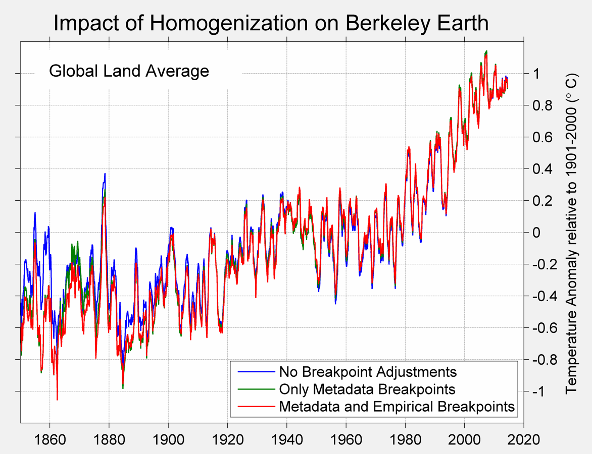
The blue line is no adjustments; the green line is only adjustments that correspond with documented metadata events. The red line is all adjustments.
Well in Oz you’ll run out of Stevenson Screen thermometer records about a hundred years ago and in another 50 you’ll run out of thermometer readings altogether if that helps? Now it’s the year 2015 AD I believe but I seem to have forgotten the original question…?
Excuse my ignorance but exactly what does the station metadata consist of? Does it include temp data other than Tmax/Tmin?
TOBS history, moves, various equipment changes, localized issues, location of equipment vis-a-vis the SRG (helpful for sorting out dots on Google Earth), exposure, various notes, what networks they belong to, etc., etc.
No global warming is not real and it is not a threat.
Whereas I think global warming is real and it is not a threat.
[There] is not, and never has been, a need to adjust data for Time of Observation Bias or TOBS. Zeke claims that pretty much all temperature observations were made in the afternoon prior to 1960, and in the morning after 1960. Who cares? If you are simply recording maximum and minimum temperature at a site using a MAX/MIN thermometer, the TIME THAT YOU TAKE A READING IS COMPLETELY IRRELEVANT.
Further, there are PLENTY of days in the winter (and even during other seasons) when TMAX happens at 12:01 AM and the temperature then falls for the remainder of the day. For example, in much of the Midwest in Winter, it is not at all uncommon to have a temperature of 35F at midnight, and have the temperature fall to -2F by 8:00 AM, after which it stays at -2F for the remainder of that 24 hour period. If you aren’t using a MAX/MIN thermometer, you would probably miss TMAX entirely, regardless of when you took a reading. If you WERE using a MAX/MIN thermometer, it would read TMAX at 35F and TMIN at -2F regardless of when you looked at it.
the TIME THAT YOU TAKE A READING IS COMPLETELY IRRELEVANT.
Unless a change in observation time occurs during your study period, so that one part of the interval is AM-OBS and the other part PM-OBS. Then it is completely relevant, and will wreak havoc on your trends.
And it makes a big difference in terms of offset, in any case.
Why is this so, if a thermometer records maximums?
If you make 365 observations in the course of a year, you will record 365 maximums that that thermometer has experienced in the course of the year.
For US above 90 degree readings it appears to make no difference…
https://stevengoddard.wordpress.com/2015/02/01/it-is-not-the-tobs-stupid/
Why is this so, if a thermometer records maximums?
If you make 365 observations in the course of a year, you will record 365 maximums that that thermometer has experienced in the course of the year.
Okay, I will try to explain TOBS bias. I asked the same question.
I’ll give you an example.
Observation time is 0600 (right around Tmin). On Monday, Temp. is 5C at 6:00, and that is the coldest in the last 24 hours. On Tuesday at 0600, it is 10C. But Tuesday’s Tmin reading is NOT 10C. It is 5C!
Why? Because one minute after the Monday’s observation, the temperature was still 5C. Tuesday’s minimum is the lowest reading within the last 24 hours. So the 10C on Tuesday never even shows up in the record, and 5C shows up for Tmin on both Monday and Tuesday.
Thus the record is artificially cooled. It should by all rights be 5C on Monday and 10C on Tuesday, but instead it is 5C for both days.
For stations whose readings are near Tmax, you get the same phenomenon, but with Tmax rather than Tmin. Thus the record is artificially warmed.
This does not affect trend so much UNLESS the observation time is changed during your given study period. If so, it creates a big step-jump at the point of conversion, so it will affect the trend. If it occurs near the very start or very end of your study period, it matters little. But if it occurs in the middle, the difference is stark.
The pause is evident since 1998, now more importantly what will the future bring?
Every once in a while science reaches a point which I call, THE MOMENT OF TRUTH.
I think that point is now upon us , and by the end of this decade we will know if solar is the main driver of the climate (which I believe 100%) or CO2.
The contrast(low solar (cooling) versus higher co2(warming) ), is now in place for this to play out.
It is a rear opportunity when mother nature will likely reveal which side is correct. We have that distinct possibility now.
In case evan does not know it: Hadcrut4 is land-ocean. Microsite issues from the land stations can never reduce that increase by 0.2 deg. For Crutem4 the increase is somethting like 0.8 degrees after the war. And there is no reason to believe that microsite was uninportant earlier.
Yes, I know Haddy is global. I have always been quite clear that a 60+% exaggeration of land warming does not equate to a 60+% exaggeration of the entire surface trend. But you need to recall that both GISS and Haddy surface stations both extend jurisdiction, as it were, well off the coasts.
Remember the NIWA flap? It was over 7 measly thermometers covering a huge ocean grid, whatever else it wasn’t (although they supposedly had ~100 stations active), nearly all of it ocean. GISS does a 1200km radius. Haddy does 350km. And there are lots and lots of stations on or near coasts.
It would therefore be quite possible for non-compliant microsite to have spuriously pumped up global trends by ~20% or even more. (And even that’s stipulating that the ocean data is up to snuff. But that’s another question.)
should be rare not rear in my previous post.
All this ignores the fact that current temps should be adjusted massively down for UHI. They’re adjusting the past of dirt roads down – why? Oz country downs set all their records before streets were tarred – why? We’re debating tiny differences in a thermometer going from Mercury to electronic, when the surrounds have been heated up to 50C in summer by putting in concrete. (City of Melbourne measured roads at about 84C)
If mesosite changes during the study period, it will affect trend. But if it is constant throughout, the trend is not significantly affected.
But poor microsite will significantly affect trends even if it is constant throughout the study period. That is where we dispute NOAA. To emphasize this point, if we find that a station’s microsite rating (as defined by Leroy, 2010) has changed during our study period, we drop the station.
It would be very useful if someone familiar with the thermometer records (eg., Zeke or Mosher) would provide data on the number of stations used and in which countries each station was situated say for each of the decades that go to make up the GLOBAL thermometer record. Eg:
1880 to 1889
1890 to 1899
1900 to 1909
1910 to 119
1920 to 1929
etc etc. for each decade through to 2010 to 2014.
So for example, if in the deecade 1880 to 1889 there were 3,000 stations, list where these 3000 were situated, eg. 1000 in the US, 400 UK, 250 Germany, 200 France, 4 Finland, 1 Nigeria, 5 Kenya etc
Let’s see exactly what is said to be GLOBAL coverage.
Let’s see how the coverage for the 1880 data compares to the coverage today.
We can then form a view as to how significant the US land thermometer record is in relation to the GLOBAL record..
What’s really funny is how it apparently took the global land mass until after the ‘Great Pacific Climate Shift of 1976/77’ before it realised that it’s supposed to warm (and cool) at about twice the rate of the global ocean due to its much lower heat capacity:
http://woodfortrees.org/graph/hadsst3gl/from:1900/compress:6/plot/crutem4vgl/from:1900/offset:0.03/compress:6
Does it make any sense at all that CRUTEM4gl and HadSST3gl should track each other as tightly as this all the way up to the mid 70s, and only then start warming at different rates?
Of course not.
AND if you look at the satellite data, one sees another temperature shift resulting from the !998 Super El Nino.
Temperatures are not rising steadily in some straight line linear fit. If the data is correct, temperatures are sising in steps, and those steps do not appear to be driven vy CO2 but rather due to natural oceanic phenomena.
Yes. (But CO2 does appear to have a lukewarming effect.)
Judith Curry doesn’t think the adjustments are odd. How can the position be rationalized?
They aren’t — until one considers the microsite issue. But once that intrudes, all bets are off. Not even the raw data is correct. The error is systematic.
In science proper if you demonstrate examples of where a methodology fails, you get sent back to the drawing board. In the dark art of global temperature reconstruction you get to hand wave all the problems. As a bonus, you can lecture the ‘ignorant’ by trotting out the usual carefully selected talking points.
I am well trained in deconstruction and dialectical materialism. I fight with knives in both hands. But I am an apostate. I place my blades where they are most unwelcome, and at the service of the anathema. They made me, but they cannot unmake me.
While you were gone
These spaces filled with darkness
The obvious was hidden
With nothing to believe in
The compass always points to Terrapin
Sullen wings of fortune beat like rain
You’re back in Terrapin for good or ill again
For good or ill again
Why is there never a mention of the ridiculously small (about 13 PPM) size of man’s contribution of CO2 to the atmosphere. This trace amount is not significant enough to cause anything let alone a warming of the Globe. It would appear to make all of this other argument superfluous.
…Because it is false, that’s why. The anthropogenic contribution from the burning of fossil fuels has been something like 200 ppm. Because not all of it remains in the atmosphere, but rather gets rapidly partitioned into the upper ocean and biosphere, the resulting rise in CO2 has “only” been about 120 ppm… bring ingus more than 40% above the pre-industrial baseline of ~280 ppm.
Agreed. CO2 output is split between the atmospheric, soils/biomass, and oceanic sinks. Atmospheric CO2 is up 40% from 1880.
squeeze it hard enough and maybe they’ll get diamonds…. from the graphite.
The 200PPM of anthropogenic contribution of CO2 also does not appear to be significant enough to be the reason for global warming. The recorded periodic increase and pause in global temperature since1880 does not appear to have a connection to a continuing increase of CO2 in the atmosphere.
My recent readings on this website have resulted in my finding information that states that Man has contributed 3.225 percent of the 400 PPM of CO2 in the atmosphere. By my math, 3.225 percent of 400 PPM is 13 PPM.. Where am I wrong and why is it so difficult for the average, non-scientist to obtain a clear statement of the size of Man’s contribution of CO2 to the atmosphere. It would appear to me that this question is one of the first that should be asked and answered in a debate over any role of Man in global warming but I, for one, have had a devil of a time finding an answer to that question. Based on what I have found I can clearly see why the proponents of Man-made global warming don’t want it displayed but you have to wonder about the intellectual honesty of our media. Not really, they have made their shortcoming obvious on many subjects.