‘Warmest Year On Record’ Claims Falling Apart Under Scrutiny
The Nasa climate scientists who claimed 2014 set a new record for global warmth last night admitted they were only 38 per cent sure this was true. Yesterday it emerged that GISS’s analysis – based on readings from more than 3,000 measuring stations worldwide – is subject to a margin of error. Nasa admits this means it is far from certain that 2014 set a record at all. –David Rose, Mail on Sunday, 18 January 2015

Last week, according to our crackerjack mainstream media, NASA announced that 2014 was the hottest year, like, ever. No, really. The New York Times began its report with: “Last year was the hottest in earth’s recorded history.” Well, not really. As we’re about to see, this is a claim that dissolves on contact with actual science. But that didn’t stop the press from running with it. –Robert Tracinsk, The Federalist, 19 January 2015
Despite fears that global warming is harming the Arctic region faster than the rest of the world, Greenland is defying climate scientists and currently growing at its fastest rate in four years. The Danish Meteorological Institute reports that Greenland’s ice sheet has seen more growth so far this year than in the last four years. Greenland’s growth in 2015 is also higher than the mean growth for 1990 to 2011. –Michael Bastasch, The Daily Caller, 14 January 2015
What remains of the original description of this ‘warmest year on record’ news? Nothing but bluff, spin, and the uncritical press-release journalism that dominates mainstream reporting on the climate. It may or may not be the hottest year ever, but this is definitely in the running for the most dishonest year on record. –Robert Tracinsk, The Federalist, 19 January 2015
Regardless of which side of the man-made climate change debate you are on, one thing is clear: The claim that 2014 was the warmest year on record is shaky at best. —Inquisitr, 19 January 2015
If anybody is still in any doubt that it is UNSCIENTIFIC to make claims about hottest years, without taking into account error bars, I would advise what the World Meteorological Organisation had to say on the issue in their report on global temperatures for 2006: “All temperature values have uncertainties, which arise mainly from gaps in data coverage. The size of the uncertainties is such that the global average temperature for 2006 is statistically indistinguishable from, and could be anywhere between, the first and the eighth warmest year on record.” –Paul Homewood, Not A Lot of People Know That, 17 January 2015
Global temperatures will resume their long term growth trend within five to 10 years ending the so called pause in global warming, a leading climate scientist has predicted. The pause – which on some measures has gone on since the mid-1990s – continued into 2014 on the basis of global temperature data released last week by US space agency NASA and the National Oceanic and Atmospheric Administration (NOAA) of the US. However, the warming effect of greenhouse gases such as carbon dioxide will grow sufficiently to overcome the combined impact of various natural climate cooling factors, journalists on a telephone news conference were told last week by Gavin Schmidt, director of NASA’s Goddard Institute of Space Studies. —Reporting Climate Science, 19 January 2015
Wait until tonight’s speech to get the real truth about warming.
sarc
Right. I think it was two SOTU’s ago that he made the astonishing claim that the earth was warming much faster over the past decade than had been predicted. An out and out lie. I know I’m naïve, but it continues to amaze me how in this so called information age the president of the U.S. can essentially say what he wants without any regard at all for the truth.
The big O has been a disappointment but probably less disappointing than one might think. There’s tendency to regard presidents in the US something like the last of the governing monarchs. UK monarchs have little to except support charities and wave out of windows. In reality you should probably regard US presidents as mushrooms. They generally are kept in the dark and fed on post bovine mulch. O’s science advisor seems to have found politics an easier grift than aerospace and physics.
A Big Lie? No, no, I’m sure he honestly and sincerely believes it.
So do I. And George Bush the younger believed the WMD issue too. That’s what presidents are good for. The fellows and gals behind them set agendas and push policies for reasons that are rarely transparent, and presidents have to stand up and be brave little targets for ridicule and embarassment.
Hey get real, he IS A POLITICIAN, if his lips are moving he is tell BS!! 🙂
I won’t be watching the speech tonight. I already know what it’ll be – tax the rich, global warming, …
I hope he says the US is broke, which I heard him say the other day, so that my scorn can begin.
Most of the Taxes he is going to talk about will tax the middle class not the rich.
Nor I.
Aaah! the remote control; one of the truly great inventions.
Most of the Taxes he is going to talk about will tax the middle class not the rich.
Only way to (temporarily) get more revenue. The rich can (and will) vote with their feet. Of course the gain will be temporary, followed by permanent loss, but that’s remedial economics .001, and the president is not quite up to that.
There is a pause in honesty and integrity in the White House which will last at least 8 years
Not a pause . It’s in decline.
2 years to go….. Will we see real ‘climate change’ then, re: honesty and integrity?
One can hope….
Dubya never lied. He was wrong, sometimes, and admitted it, but he was the most honest president since Ford. (Two — hugely — unappreciated presidents.)
You mean the new and improved SOTU Gruber sesson?
That’s 62% sure it is NOT true.
That is normally considered a “landslide.”
George, you asked me a question about error bars on a thread about a week ago. I’m not sure if I fully understood the question, so also not sure if I answered it accurately. In any event, and for the record, the above figure is what I was talking about. Looks like the answer I received to my initial question is the same too – about 0.1 Degrees C.
Actually, in politics a spread of more than 5% is considered a landslide. As in: Candidate A won by 55% – 45%.
The dishonesty referred to here concerns the fact that there was only a only 38% probability, which means ‘probably not’.
Claud Cockburn, a noted British journalist once said:
“Never believe anything until it has been officially denied.”
The corollary is also true of this administration:
“Never believe anything that has been officially stated.”
I have this strange feeling he’s going to mention the ‘hottest year ever’ thing.
Again the media has been armed with charts starting in 1910 that edit down the 1930’s to accompany the announcement. Also they’re wittling away at 1998-2001 every time I look. Grrr.
Just remember, in science, when the data doesn’t fit the model, fix the data.
About one time in ten, if done scrupulously, that actually works. But not in this case.
They can’t keep it up forever. Their “adjustments” will eventually look far too ridiculous and hard questions will be asked, especially when their temp charts go vertical, to something like 60C in the shade.
Similarly, when everyone realises the ice caps still exist and are bigger than normal after years of obvious lies, the whole house of cards will collapse. Hopefully, the liars will get jail time and made to repay their ill-gotten gains.
Now what’s this?
I spent a lot of time Sunday post the link to David Rose’s article in my subset of the web.
One journalist in all of the MSM to think of asking about error bars….
Oh, I should check in to see if Dellers has had a chance to play with this. A few more days and Josh ought be able to come up with a cartoon we should turn into a postcard and mail to all the newspapers that have forgotten to check their information.
I bet next year we will get more of the same: “hottest year in recorded history.”
Don’t matter how untrue, nor how many holes you find in the data. They got their media headlines, and warmest year ever is being repeated ad nauseum everywhere in the world.
“Any dictator would admire the uniformity and obedience of the U.S. media.”
Noam Chomsky
And its dog: the Australian media.
Alas! This is even more true for the MSM in Europe…
Without this disgusting and totalitarian media bias, the CAGW climatism madness would be a thing of the past now.
On the other side: The percentage of people who don’t trust the MSM any longer is growing. So there is some hope for the future…
@The Pompous Git
Every time I hear the current claim in the self-promotion of the Australian ABC News radio channel, it makes me really to die laughing!
It actually says – believe or not – “without bias or agenda” … 🙂
Well, that’s at least so unintentionally funny as the title of the leading newspaper of the old Soviet Union which was – surprise, surprise – “Pravda” (= Truth) … 😉
Exactly!
Here is the most telling sentence in the Daily Mail article. Gavin Schmidt hard at work for the NASA budget.
He appears to then have responded in Twitter in which we find this.
Which lead to this.
http://wattsupwiththat.com/2015/01/19/giss-ncdc-need-to-be-more-open-with-the-public-when-making-proclamations-about-global-warming-records/
Amazing!
According to both these ‘data’-sets, there is a decent chance of about 10 to 18%, that neither of those four years was ‘the warmest on record’ …
And that’s according to their numbers and methods!
“Here is the most telling sentence in the Daily Mail article.”
But what does it tell? Untruth. The plot you have shown is Slide 5 in the NOAA/NASA Joint statement. Not something that turned up on Twitter.
Enough with the hyperventilating, Nick, you’re causing a CO2 spike.
I know it was on the slides in the joint statement. However, it was Tweeted by Gavin in response to a David Rose Tweet. David Rose said:
As you can see it did turn up on Twitter. The image was Tweeted here by Gavin.
Next time you want to respond to me please take your time as I don’t want to waste my time having to rebut your statements. I have better things to do. Thank you for the consideration.
Yep….maddening.
Thank you, Anthony. I am glad to see that this is slowly being walked back. Taking the data from selected weather stations, while ignoring others, does wonderful things.
I have yet to see any weather forecast which uses even one decimal place in its rapidly changing numbers. They know they would be laughed off the planet, yet they seem to think that two decimal places has merit in climate hindsight and predictions.
This is not about numbers, or science, it is about an ideology turned religion. Like all other religions, believers will believe, no matter what evidence can be presented. After all, Climate Changes. Who can dispute that?
This isn’t about a religion, Greg, it’s about an agenda. That “green” agenda is to take the human race as a whole, back 500 years in progress and in population. Never mind that there will be a “core” of the species that will live in the 21st Century and beyond, using all of today’s and tomorrow’s technology. Those supplying the raw materials and food will live in the 16th century in support of “homo sapiens superior” living and moving towards the future.
So who gets to live in ‘The Capital’ and who lives in District 12?
Tom O, Whether that is a conscious desire of the ( Greens, Liberal Progressives or “Environmentalists”) all of whom are patently idealist, and idealism can very easily lead to fascism, I Wholeheartedly agree with you that the consequences of fulfilling [their] desires and aspirations will lead to an inequality of living standards, not only never seen before,even under the pharaohs of ancient Egypt, but may become a cause of species differentiation for Homo sapiens, with The Blessed enlightened ones controlling Everything.
I am possibly very naive, but i have a suspicion that ( Lenin, Stalin,Mao Tse Tung, Ho chi Minh and Pol Pot) All truly believed that they were working for the betterment of Humanity, A little Education goes a long way to corrupting the mind.
We are at a crossroads, we can either give in to Muslim Fundamentalism and reject Science and progress completely,or acquiesce in the domination of the righteous fascists called “Environmentalists” and become there slaves, Or What???
“So who gets to live in ‘The Capital’ and who lives in District 12?”
Don’t be silly, those with with the money, and those without.
Buy insulation, buy ammo, this could get ugly.
Those who want to be Eloi rather then Morlock obviously didn’t read the whole story.
A population reduced to the level of 500 years ago could not sustain a 21st century life-style for anyone, even the well-connected. The specialization and expertise available from 7 billion creates considerable additional resources that simply would not be available from a much smaller population. Life for even the most dedicated environmentalist would be short, brutish and un-medicated.
That’s my conclusion as well exSSNcrew. Roads could not be maintained, planes couldn’t afford to run regular trips (back to once a week), disaster relief would be non-existent, disease and pest control would be a thing of the past.
They really don’t know how the economy works.
There is an error in the figure above. The error bars are plotted on a different scale. It should be easy to fix.
@Unfrozencaveman Hmm. You’re right. I can’t think of a reason why error bars would ever be presented on a different scale. That is strange.
The autoscale “feature” chose a scale of 0-0.8 for the central value, but 0-0.9 for the error bars, because the positive error of 2014 crossed some threshold for going to the next tic mark. You can see it at the right margin. Autocorrect messes with your words. Autoscale messes with your graphs.
Yes, my fault!
I’ve sorted it now.
Far more people saw and heard the original claim of “warmest year…” than will ever hear any rebuttal.
Why all this desperation just because 2014 is the most likely warmest year for the indexes from BEST, JMA, NOAA and Gistemp? Why is that dishonest? Now it is even a dishonest year…
Take comfort. Cowtan & Way will set the record straight. It seems unlikely that C&W will have 2014 as the most likely candidate for the warmest year. Captures better lower anomalies in the Arctic where C&W has the best methodology for infilling.
Stick to that.
The Alarmist’s desperation is evident. When the science and the observational data do not support your belief, it is not unusual for one to cling desparately to anything that even remotely implies your belief has substance.
There is no such thing as “the best methodology for infilling”. Infilling is infilling, and it matters not how you do it, it is still fabrication. If you say one method yields better results, how do you confirm such an assertion? By fabricating some standard of reference?
But this kind of viewpoint is like Greek to you, is it not, rooter?
Give rooter his due; he is very amusing 🙂
κατασκεύασμα
You can test what kind of infilling that will produce the best result. What infilling or interpolation method that gives the best estimate of temperature in a area where there are measurements to check the result. Cowtan & Way did that. Validation tests.
And in case you do not know: All the surface records use some kind of infilling. Gridding is infilling a grid with measurements from that grid. The JMA and Hadcrut method of not interpolating between grids is infillilng with the hemispheric mean. If you prefer that kind of fabrication you too have to show why that fabrication is the best method.
Why don’t you protest when Bob Tisdale use interpolated sea surface indexes? Even prefers Hadisst and not hadsst3. Hadisst is infilled/interpolated. Hadsst3 is gridded.
“You can test what kind of infilling that will produce the best result. What infilling or interpolation method that gives the best estimate of temperature in a area where there are measurements to check the result. Cowtan & Way did that. Validation tests.”
While necessary, that is not sufficient. There is no assurance that, just because a method works reasonably well in known areas, it will work equally well in unknown ones. Especially when the unknown ones are located at the poles, where the atmospheric dynamics are markedly different than in other areas.
Bart:
This is really simple. A method with a better match with observations than another method is the best.
An appeal to uncertainty will not change that.
Why this reluctance to use a method that does not result in 2014 as the warmest year? After all, the temperature anomaly in the Arctic was lower, the Arctic sea ice was somewhat higher than 2010. And the sea ice in the Antarctic hit record hights.
Why ignore that?
Rather than infilling, why not just use the satellite measurements? This avoids all of that messy data manipulation that leads to people thinking that a 0.02C result is significant.
There is no assurance that
========
spot on. two points on each side of a mountain cannot predict the temperature at the peak. however, if you did your test on the praries you would assume they could.
Pat Kelly
…
Satellites don’t do very well at high latitudes. Worse yet, the ice screws their readings up pretty bad.
rooter – you mean simplistic. This is like debating what is the best way of predicting the end of a drought – goat entrails or tea leaves?
Exactly, Ferd.
High latitudes is where a very great deal of infilling takes place. And what reference have they.. satellites?
Rooter says to hell with Greek, he has infilling. And besides “all surface records use” infilling, therefore it’s okay. And Bob Tisdale uses infilled data. So it must be okay, if he uses it, right?
Rooter brand of science.
ferd berple:
So you cannot predict the temperature on the mountain with two measurements at the base?
Very wrong. Actually you will need only one measurement at the base. Keyword for you there is lapse rate. And that is not necessary when dealing with anomalies.
mpainters high latitudes seems to be a problem.
Is that a reason for choosing the hemispheric mean for infilling?
And do you compute the lapse rate from the north side or the south side of the mountain?
Oh boy, more of that wonderful infilling! Don’t need thermometers, don’t need all of that. See what a good scientist I be?
Why fabricate data, rooter?Did no one ever explain to you about fabrication?
mpainter wonders if the lapse rate is computed from the north side or the south side of the mountain.
So do I. That is, how does mpainter compute lapse rate horizontally. Perhaps that explains why he does not need thermometers.
mpainter wonders why fabricate data.
My choice would be to fabricate the data with the best validation. To use the hemispheric mean temperature is not the best fabrication of data for infilling areas sith missing measurements.
What is mpainter choice of fabricated data?
The way the verify your infill method would be to take rich a dataset, and calculate your function on them, then depopulate the dataset randomly, perform your infill algorithm and recalculate your function on the resultant dataset product. Repeated enough, the comparison of the results of the original data result to the infilled data should tell you how much confidence the infilled data product deserves. My suspicion is if Climatologists actually did this, the results would be quite embarrassing to them.
Paul Jackson.
That was what Cowtan & Way did. The result was not embarassing. And much better than to infilling with hemispheric mean. As the gistemp-method. And the NCDC method. And the BEST method.
rooter @ January 21, 2015 at 1:15 am
“Keyword for you there is lapse rate.”
Yeah, the lapse rate will get you accuracy to tenths of a degree. Sure thing.
Maybe +/- 10 deg, if you’re lucky. If the air is still, and the mountain and surrounding region is bare and dry, and a hundred other considerations…
Nice try.
38% is not “most likely” , but completely “unlikely”. That’s 62% chance it isn’t the warmest for the thermometer record, and that is a vey suspect record in recent times due to compounding positive adjustments.
rooter says:
…2014 is the most likely warmest year…
Less than 50% probability deconstructs that statement, rooter.
2014 was just another year of natural climate variability. Nothing special.
“Stick to that,” as you say.
Use Cowtan & Way if you do not like to have 2014 as most likely the warmest year.
Including the natural variability.
What’s wrong with UAH or RSS?
No questions about integrity here. Those NOAA types are disreputable. So is G S at giss. Jones and his crew at CRU infamously so.
mpainter asks what is wrong with UAH or RSS.
Apart from the lower troposphere is not the same as the surface there is a divergence problem.
http://www.woodfortrees.org/graph/gistemp/from:1999/offset:-0.35/compress:12/plot/rss/from:1999/offset:-0.10/compress:12/plot/uah/from:1999/compress:12/plot/gistemp/from:1999/offset:-0.35/trend/plot/rss/from:1999/offset:-0.10/trend/plot/uah/from:1999/trend
I guess that makes Spencer & Christy even more disreputable. Higher trend than gistemp.
Rooter:
Why does NOAA and NASA ignore the temperature data of UAH?
Include that data and the 38% likely hood that 2014 was a record year becomes a 98% likelyhood that it was NOT a record year.
Kinda cuts the legs off of the hype, eh rooter?
Gavin Schmidt’s disrepute has more to do with his public hype than his dubious products at giss. See archives at Climate Audit
But giss is bad enough. Why does Schmidt ignore UAH data? After all, these are NASA satellites, launched and maintained by NASA. So why does Schmidt not include UAH data in his giss product (NASA)?
rooter:
C&W were pretty thoroughly discredited here. Use the search box; find out why, then find a better ‘authority’.
And, what “divergence problem”?
They all diverge from each other; GISS most of all. Now what’s your excuse with satellite data? It is still the most accurate.
Finally, a few tenths of a degrees difference is immaterial. What is of primary importance is the trend — and there is no trend!
Global warming has stopped, so naturally there is no trend, either up or down.
mpainter thinks NASA and NOOA ignores temperature data from UAH.
Ignored it surely is:
http://www.ncdc.noaa.gov/sotc/upper-air/2014/12
And the upper air continues to be the same as the surface for mpainter. Perhaps mpainter would like to include this as well?
http://www.nodc.noaa.gov/OC5/3M_HEAT_CONTENT/heat_content2000m.png
Of course, UAH yields perfectly reliable temperatures for the lower troposphere. And it has the advantage of providing a dataset that is inviolable and unadulterable.
But for rooter, and his kidney, such inviolability is a drawback. That is why rooter tries his best to discredit UAH, and why Gavin Schmidt and his kind ignore this unadulterable data set…because, you see, neither does it allow infilling. See rooter have a fit.
mpainter likes UAH.
Well why not. But that makes med wonder why he does not like gistemp.
http://www.woodfortrees.org/graph/gistemp/from:2000/plot/gistemp/from:2000/trend/plot/uah/from:2000/plot/uah/from:2000/trend
Identical trends after 2000. So if UAH is right and all that. What is gistemp?
you fool none but yourself, rooter. But don’t swell, that’s too easy.
And rooter, fabricated data is your bag, not mine. That is why I prefer the satellites.
Um, did Gavin Schmidt join the ranks of those proclaiming a “pause” in GW since the late 1990’s?
Warmest Year On Record so What! Hippo’s and Elephants used to roam Britain So it aint the Warmest Year Evah?
So how can it be the warmest year on record if you have records such as below that it was much warmer in the past DOH
Extracts below from link
http://www.nhm.ac.uk/about-us/news/2004/july/news_5293.html
“The fossil bones of hippos, hyena, fish and rodents are providing a rare glimpse of the landscape of East Anglia 500,000-780,000 years ago. The fossil remains point towards a unique find of animals living in Britian during a warmer climate, never previously recorded.”
“The hippos and other animals would have lived in the early Middle Pleistocene where exotic species, now found only in African savanna, would have roamed the landscape.
The ancient hippopotamus (Hippopotamus sp.) weighed about six to seven tonnes, much heavier than today’s modern hippos weighing up to four tonnes. The ancient hippos had prominent eyes that acted as periscopes when under water. It is likely the hippos discovered died through natural causes and their bones show evidence of having being gnawed by hyenas.
The site is approximately 15 kilometres from Norfolk’s present-day coast and insect fossils indicate the summer temperature at that time was 2-3°c warmer than today.”
2-3 degrees warmer!!!! You must mean globally. 2-3C warmer in Norfolk would still freeze the pips off of a hippo!
The media who like to [think] they are sceptical, in fact swallow this hook line and sinker. In fact they accept it in full, while they do expose stories on dodgy builders. The big story is facing them and they refuse to see it.
Could someone please plot the GISS Global Temperature Anomalies with Error Bars graph with the actual temperature? Use the scale of a home thermostat, that will demonstrate, to any sane viewer, just how small the difference are each year. (I can’t do it at the moment.) Thanks
[consider] their error bars anywhere from the top to the bottom…
Nice bar chart, however, it does raise a couple of questions:
1) What does each bar represent? I assume “Yearly Global Average Temperature” but the label doesn’t specifically say that so, I might be wrong.
2) Where are the error bars? I assume that the error back in the 1880s would be much greater than today. It would be interesting to see.
Do you have an original link for this?
It amuses The Git that BOM/CSIRO describes a 20% increase in Australia’s rainfall over the last 114 years as “slight” and push the temperature change over the last 104 years (so well illustrated in Latitude’s graph) as “extreme”.
http://www.csiro.au/~/media/CSIROau/Outcomes/Climate/Understanding/SOC14/State%20of%20the%20Climate%202014.pdf
I like this plot.
Latitude, YOU’VE DONE IT! Yes, this is what I’ve argued for 2 years. When we Skeptics use anomalies, we play in their arena. When we show this graph to a [high] schooler, [their] reply is… “What warming!?”
WELL DONE! from the remarks below, do more of it, PLEASE. And tell your friends!
Concerning your error bar remarks? Are the error bars proportional to the absolute temperature, directly from the error bars from the anomaly?
Actually, it is this article that is dishonest, starting from the first quote. Due to other values within recent years that are within the margin of error, 38% is the statistical probability of 2014 being the hottest year on record, which is higher than the probability for any other year. This blog is exploiting scientific ignorance by pretending that “only” 38% somehow makes the conclusions of every major scientific organization invalid.
I didn’t read the rest of the quotes; the first one is a lie, so.
Uh, if it is a 38% probability of being the hottest year on record, wouldn’t that make it a 62% probability that it is not?
Yes, less than 50-50. What were the unadjusted/fixed temperatures from the 1930’s and how do they compare? Have they been sufficiently homogenized to take them out of contention?
the silence of the troll.
“This blog is exploiting scientific ignorance by pretending that “only” 38% somehow makes the conclusions of every major scientific organization invalid. ”
I think it was NASA themselves that applied the statistical probability 38%? And I don’t think “every” major scientific organization came to the same conclusion, so how can they all be invalid?
As a courtesy, It might be wise to read the whole article before you call someone a liar, just my $0.02.
Chris, you might want to read his thread, pay particular attention to the graphic produced by NOAA and NASA. Enjoy!
http://wattsupwiththat.com/2015/01/19/giss-ncdc-need-to-be-more-open-with-the-public-when-making-proclamations-about-global-warming-records/
The point of the article is that at least a few people are not regurgitating a press release meant to alarm the public. The 38% probability means it very well may not have been the hottest year on record regardless of it having the highest probability.
People on this site understand very well that the 2014 temp report is not alarming and that temperatures are still remaining flat despite a large increase in green house gasses over that period.
Since you’ve settled the science, give us your predictions for the next five years, then come back and check in.
Actually, temperatures have been pretty flat for a long, long time. Temperature Anomalies are what have changed and not by much, and even they have been flat for about 18 years. We are in an interglacial warm period and thank God for that. And I don’t buy the 38% probability either. Do the error bars include consideration of all of the “adjustments” which have been made to obtain the growth of the anomaly trend? I don’t think so. Global warming is a tool of the left to gain $$, votes and control and they are masters of the lie. Say it loudly over and over again and it becomes truth.
Chris, stay off the drugs. You talk of lies, but have you ever heard of lies by omission?
Daily Mail – 18 January 2015
“As a result, GISS’s director Gavin Schmidt has now admitted Nasa thinks the likelihood that 2014 was the warmest year since 1880 is just 38 per cent. However, when asked by this newspaper whether he regretted that the news release did not mention this, he did not respond.”
http://wattsupwiththat.com/2015/01/20/2014-the-most-dishonest-year-on-record/#comment-1840266
On Twitter, Gavin says there was not enough room on the press release for these 15 characters:
Probability 38%
Gavin Schmidt before the world; what a reprobate.
Yup! But is it any different from most of those on here? The general purpose of the website is to dissemble, prevaricate and distort, as far as I can tell.
Classical projection to rationalize one’s own malfeasance. Whether a valid criticism or not, have you ever heard the phrase “two wrongs don’t make a right”?
So why did the WMO say after 2006?
All temperature values have uncertainties, which arise mainly from gaps in data coverage. The size of the uncertainties is such that the global average temperature for 2006 is statistically indistinguishable from, and could be anywhere between, the first and the eighth warmest year on record.”
http://www.wmo.int/pages/publications/bulletin_en/archive/56_3_en/56_3_gcs_en.html
This statement covered every year from 1998 to 2006, and the only year that they could definitely say was cooler was 1999.
Using the same logic, 2014 could be anywhere between the 1st and 14th warmest year.
Where to start.
First putting your hands over your ears and going lalala at the first sight of something that does not fit your view is not getting you an award for critical thinking.
Second you didn’t make a case for the first quote being a lie. How sure is NASA of 2014 being the highest year ever? Not very sure, but more sure than other years. And this is satisfying to you as what exactly? Clever obfuscation, clever statistics, maybe noble lying?
Third 38% probability is just that. 38%. Whether other years have a lower probability is moot. I would no more cross a bridge with a 38% probability of not collapsing as a bridge with a 25% probability. You are missing the point of the article and therefore seem to support the need to deceive the public by not mentioning (until forced to) the probability and more importantly the uncertainty of the claim.
If the media had a modicum of intelligence, they would ask, “You mean you can’t even sort out the past with a reasonable degree of certainty and you want us to believe your future predictions?”
BTW it is not every scientific organization with invalid conclusions, it is climate science that consistently makes invalid and/or deceptive claims.
Chris, this might make it more obvious who is being dishonest. The above images together. ?w=720
 ?w=930
Did you notice that one makes it obvious that 2014 is only certainly warmer than 3 other years.
It’s turtles, all the way sideways…
76 Trombones led the big parade…..
“Global temperatures will resume their long term growth trend within five to 10 years ending the so called pause in global warming, a leading climate scientist has predicted.”
What ‘Leading Climate Scientist’ said this? No one in the climate industry predicted this pause. So what skill do they have to predict that the pause will last for 5 to 10 more years and then continue warming?
Sounds to me like they’re just guessing.
so the ‘pause’ will be over 25 years in length possibly? Interesting
The Git predicts that “The Pause” began ~10,000 years ago and will continue until the next major glaciation.
And the AMO has not even turned cold yet!
They’ve been saying that for, oh, 20 years now. Typical of doomsday cults. The Day of Reckoning passes, and a revised schedule is issued, but this time, they really mean it. At some point, the dupes realize they have been had, and the cult dissipates.
To answer your, question Gavin said it.
I admit that the sentence is poorly constructed, but after the part you quoted we get quite a bit of other junk, which I have replaced with dots and then “…………….journalists on a telephone news conference were told last week by Gavin Schmidt, ……………”
Is there a chance that a La Nina event could happen this year? And if so….would this drive down any temp rise that occurred last year?
My Dad, a retired engineer, saw a few graphs on the news and became alarmed. I rescaled the y-axis to our typical change in Nova Scotia, Canada i.e. from -30C to +30C which turned it into a flat line, and he said “all that is about this? This is nothing”. Exactly right.
Plot the global temperatures since the LGM on the same scaled graph and you still won’t see anything too alarming. However, a drop in temperature of a few degrees worldwide can have pretty dramatic consequences.
Thanks for pointing out that cold is much worse than warm. Now, a few degrees in the other direction is pretty insignificant.
The problem remains : the error bars are plotted on a different scale, and not shown as they usually are (i.e. half above, half below the reported figure).
Sorted now thanks.
What is it that causes “progressives” here in America to lie so frequently and so effortlessly.
Hottest year on record
You can keep your doctor
You can keep your plan
A video caused the attack
There is not a smidgen of corruption in the IRS
Maybe it’s something in the diet?
For several decades they’ve been trying to “spin” facts into headlines that favor their point of view. This contempt for reality has over time developed into a taste for stronger stuff: outright lies.
It’s the Ouroboros Alimentary Canal diet. Think about it for a sec…
Yes, progressives are coprophagic…
csanborn,
OACD – a peculiarly progressive disease. I LIKE it!
dbstealey,
Yes, progressives are coprophagic…
Perfect!
It must be the diet. Because their diet advise is also completely backwards.
*eats his 6th egg of the day*
François, agreed. If plotted properly one should be able to extract more information.
There may be a reason for the error bars not being ‘centered’ on the nominal figure – if so, it deserves an explanation.
Perhaps the temps were plotted at maximum of possible range for maximum possible alarm?
SR
Let’s see. There’s a 38 percent chance that a measurement of 2/100s of one degree of warming is an accurate measurement, making 2014 the hottest year on record. Sure. The more ridiculous these claims become, the more desperate the alarmists appear. I’ve talked to quite a few people who don’t even follow this issue who recognize how absurd it all is. The alarmists are losing to Mother Nature and time.
I’m not sure that ‘error bars’ on these graphs are going to add much ‘honesty’. From the one of ‘climategate’ emails comes a warning….
Sorry, MikeB, your comment is irrelevant. If one wants errors bars, one should at least have them centered properly, and not play with the scale..
MikeB;
“They’re sleazier than we think!”
2014 was the most dishonest decade on record and the previous ten years was the most dishonest decade on record. And so it goes with the biggest fraud in human history.
However, Mendacity Central, (ClimateCentral.org) seems to have found reality?
http://www.climatecentral.org/news/study-downgrades-climate-impact-of-fossil-fuel-burning-18553
Or not? 🙂
The temperature scales on the right and left sides of the graphic do not match. Is one of them for error bars, or is it just a misprint? It’s confusing as it is.
Looks like the media is catching on about the initial hyped and bad press release
NBC REPORTS
Not So Hot: 2014 Was Only 34th Warmest Year on Record for U.S.
collapse story
Turns out America’s weather in 2014 wasn’t really that bad. The National Oceanic and Atmospheric Administration announced Thursday that the U.S. average temperature last year was half a degree warmer than normal and weather was less disastrous and drought-struck than previous years. While 2014 was warmer than 2013 in the lower 48 states, it was still only the 34th warmest on record. That contrasts with the experience of the world as a whole. Globally, it will likely go down as the warmest year on record. Japan’s meteorological agency has already calculated 2014 as the warmest year worldwide. NOAA and NASA will announce global 2014 figures next week, but data through November point toward a new record.
The U.S. is only 2 percent of the world’s surface; eastern North America was about the only exception to the hot global rule last year and even that chill was outweighed nationally by record western heat, said NOAA climate scientist Jake Crouch. It was the 18th straight year the U.S. was warmer than the 20th-century average “This fits within the context of a long-term warming trend both here and around the globe,” Crouch said. California, Nevada and Arizona had the hottest year in 120 years of record-keeping, while Washington, Oregon, Idaho, Utah and New Mexico had one of their five warmest years on record. Arkansas, Illinois, Indiana, Louisiana, Wisconsin and Michigan had one of their 10 coldest years on record.
The statement,
“This fits within the context of a long-term warming trend both here and around the globe,” Crouch said is still misleading or plain wrong as the trend of US and Canadian annual temperatures has been declining for nearly two decades(17 years) or since 1998, North America which is cooling, not warming represents 16 % of global land areas
As other commenters have mentioned, the error bars in your graph seem… odd at best.
Perhaps this might be more useful, as it has error bars for each year correctly plotted:
http://i81.photobucket.com/albums/j237/hausfath/ScreenShot2015-01-20at73936AM_zps5dc52258.png
Why does the Berkeley graph show 2014 to be roughly 1/2 degree warmer that 1934?
Because globally 2014 is roughly 1/2 degree warmer than 1934? 1934 was a particularly warm year in the U.S., but not for the globe: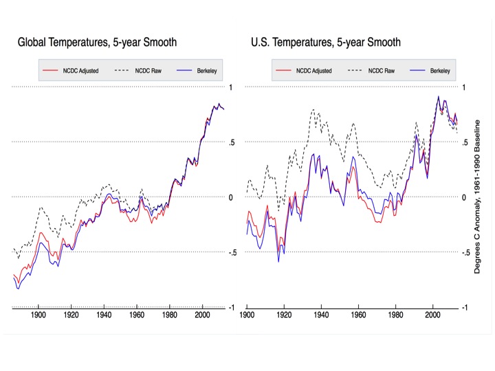
Zeke, the topic is obviously a hot one!
Would it be easy to ‘blow up’ the last few results so we can all play with the rankings of the last 20 or so years, with error bars.
Here you go:
http://i81.photobucket.com/albums/j237/hausfath/ScreenShot2015-01-20at75839AM_zps152e8ef0.png
Note that using a method similar to the one outlined in this paper will serve you much better than “eyeballing”: http://onlinelibrary.wiley.com/doi/10.1002/2013GL057999/abstract
Come on, Zeke. Have you looked at Anth*ny’s surface station classification? Certainly sea-surface measurements are similar or worse.
The “error bars” you show aren’t nearly large enough — they’re fiction.
Please note the anomaly base period!
Zeke,
Thanx for that chart. I noticed that the last 10 – 15 years is flat.
How do you explain that global warming has stopped? Does that not make you question your ‘man-made global warming’ premise?
Or will you invent some ‘reason’ why that particular data should be disregarded?
Also, BEST is not above cherry-picking:
http://wattsupwiththat.files.wordpress.com/2011/10/article-2055191-0e974b4300000578-216_468x4731.jpg
Good point dbstealey. For land temperatures 2014 is not the warmest year. Must because og all all those manipulated station data.
Short term trends in long term noisy data are not immensely meaningful. I’d argue that recent years are pretty consistent with the prior trend:
http://www.yaleclimateconnections.org/pics/0115_ZH_Fig4.png
As far as Berkeley data goes, the top chart shows annual averages and the bottom one shows monthly anomalies (albeit quite dated now). What exactly is being cherry-picked?
Zeke axs:
What exactly is being cherry-picked?
It is not blindingly obvious to you?? The bottom chart is a continuation of the upper chart. They deliberately deleted the last decade of data because it shows that global warming has stopped.
dbstealy,
Its “blindingly obvious” that the top chart shows annual values and the bottom monthly; both cover the same time scale (save for the few months into 2010 shown in the bottom, which can’t be turned into an annual value yet).
@Zeke “Because globally 2014 is roughly 1/2 degree warmer than 1934?” I highly doubt the accuracy of Global temperature estimates of the 30’s . The temperature measurement technology of that era would at BEST give you error bars of 2 degrees F. I imagine the infilling algorithm to cover global areas and sea surface temperatures for the 30’s is a miracle to behold.
Oddly enough, temperatures in the 1930s were measured quite similar to the way they are still measured in many places today: http://en.wikipedia.org/wiki/Six%27s_thermometer
The oceans are a bit more problematic, since you have the while buckets to intake transition, but I’m less familiar with that area so I’d suggest reading some of Kennedy’s work to see how estimated errors are calculated.
@Zeke “Oddly enough, temperatures in the 1930s were measured quite similar to the way they are still measured in many places today”
Globally I don’t thinks so !!
Oooh, that’s a pretty graph. Is it a work of fiction?
How many thermometers were used for each year, and where were they?
And if it’s a different number of thermometers, and if the thermometers are in different places, why would you imagine the annual averages are comparable?
Check this graph:
All curves are parallel up to 2000
Satellite and sea temperature are nearly parallel after 2001
Why is GISSTEMP going up, whereas sea and satellite data are going down? Why has 1998 with the big El Nino shrunken to a dwarf?
http://www.woodfortrees.org/graph/gistemp/from:1979/mean:12/plot/gistemp/from:1979/to:2001/trend/plot/gistemp/from:2001/trend/plot/rss/mean:12/plot/rss/to:2001/trend/plot/rss/from:2001/trend/plot/hadsst2gl/from:1979/mean:12/plot/hadsst2gl/from:2001/trend/plot/none
You just need to put all the data into a computer using the right parameters. That is what they do and even confess on their website.
Otherwise 1998 would have been the hottest year evah.
Here are the changes GISS made just since 2009
http://oi57.tinypic.com/2r38h9v.jpg
Interesting. Lowering the most recent adjustments compared to the previous decade. Result of that is lower trend the latest decade.
GISS is very clearly an outlier. HADCRUT also shows declining temps.
GISS. No contest.
Oh really. Trends close. Thanks for showing that.
Sometime perhaps Bart will discover base periods.
rooter,
Johannes H posted a chart showing the GISS divergence.
You keep arguing ‘divergence’, but they all diverge from each other; GISS most of all.
You need to find a different argument. “Divergence” doesn’t work.
dbstealey:
Try the other surface indexes. Then compare. Of course the lower troposphere will have greater differences during ninjas and ninjos than surface indexes.
And why is it necessary to have updated gistemp and not updated sea surface?
I know. Hide the incline.
And why ignore UAH?
http://www.woodfortrees.org/graph/gistemp/from:1979/mean:12/plot/gistemp/from:1979/to:2001/trend/plot/gistemp/from:2001/trend/plot/rss/mean:12/plot/rss/to:2001/trend/plot/rss/from:2001/trend/plot/hadsst3gl/from:1979/mean:12/plot/hadsst3gl/from:2001/trend/plot/uah/mean:12/plot/uah/from:2001/trend
I know. Hide the outlier. Can dbstealey pick the outlier?
rooter says:
Try the other surface indexes.
No, thanks, rooter. All you are doing is cherry-picking.
GISS does not agree with the other databases. But you are trying to argue that it doesn’t matter — that the only thing that does matter is what you cherry-pick.
That doesn’t work here. Maybe Hotwhopper would be interested.
dbstealey think it is a cherry pick to include SST up to present. And to include UAH. That was what I did.
http://www.woodfortrees.org/graph/gistemp/from:1979/mean:12/plot/gistemp/from:1979/to:2001/trend/plot/gistemp/from:2001/trend/plot/rss/mean:12/plot/rss/to:2001/trend/plot/rss/from:2001/trend/plot/hadsst3gl/from:1979/mean:12/plot/hadsst3gl/from:2001/trend/plot/uah/mean:12/plot/uah/from:2001/trend
Unlike what Johannes H and dbstealey did.
http://www.woodfortrees.org/graph/gistemp/from:1979/mean:12/plot/gistemp/from:1979/to:2001/trend/plot/gistemp/from:2001/trend/plot/rss/mean:12/plot/rss/to:2001/trend/plot/rss/from:2001/trend/plot/hadsst2gl/from:1979/mean:12/plot/hadsst2gl/from:2001/trend/plot/none
Some strange definition of cherrypicking for dbstealey there.
Any particular reason for not including ocean temperatures for 2014?
Hide the incline?
Any particular reason to ignore satellite data in determining temperature status for 2014? Hide the decline?
Rooter:
SST is determined by insolation. CO2 has nothing to do with SST. I’ve explained that to you several times already.
Where is the decline mpainter? Which series do you ignore?
http://www.woodfortrees.org/graph/gistemp/from:1999/offset:-0.35/compress:12/plot/rss/from:1999/offset:-0.10/compress:12/plot/uah/from:1999/compress:12/plot/gistemp/from:1999/offset:-0.35/trend/plot/rss/from:1999/offset:-0.10/trend/plot/uah/from:1999/trend
Rooter:
SST is determined by insolation, not by CO2. Water is opaque to IR rooter.
There is no such thing as “the best methodology for infilling”. Infilling is infilling, and it matters not how you do it, it is still fabrication. If you say one method yields better results, how do you confirm such an assertion? By fabricating some standard of reference?
But this kind of viewpoint is like Greek to you, is it not, rooter?
If I did that (infilling) as a mining engineer, I’d be fired.
On second thought, I’d quit a company before they had a chance to fire me for suggesting such an approach.
It’s that bad.
So far I have looked at 3 press releases of warmest year on record for 2014 and the three data set had the record set by .02, .04 and .08 C. Hardly anyone in the MSM bothers with this part of it. Hundredths of degrees dont boost viewership or sell newspapers. Expect these omissions any time records are broken in the future.
Here is what CBC reported about 2014 in CANADA
HOTTEST YEAR ON GLOBAL RECORD WAS CANADA’S COOLEST YEAR IN 18 YEARS.
Last year broke another global heat record, becoming the hottest since 1880. But did it feel that way to you? Probably not, since it was Canada’s coolest in 18 years.
NASA and the U.S. National Oceanic and Atmospheric Administration (NOAA) announced today that last year broke the global temperature record for the third time in a decade.
■ 2014 was the hottest year in modern record
Dave Phillips, senior climatologist with Environment Canada, acknowledges. Some of us might be surprised.
“I think most Canadians are going to say, ‘Huh?’ We weren’t that warm!”
NOAA reported many corners of the Earth experienced record heat last year, including most of Europe, the western U.S., part of interior South America and swaths of the Pacific, Atlantic and Indian oceans.
But in Canada, it was our coolest year since 1996, Phillips said.
“38% sure” means they polled the guys at work and only 3 of the 8 said ‘Yeah” while the other 5 said “No way.”
Sadly, that is probably not a joke.
So if not 2014, what is the warmest year in the record?
Well, looking at the error bars and the results of homogenization there is not an answer to the question. That is further confirmed by the two satellite records. There is a “pause” though and it would appear to have lasted for at least 15 years. It is anyone’s guess what will happen in the future.
Anyone predicting temperatures say 10 years ahead with influence on policy should be required to deposit $100,000 of their own money to be forfeited if the actual results are outside the error bars of the prediction. Members of teams collating official graphs should be banned from having a view on AGW or CAGW to ensure neutrality when collating and publishing information. Individuals such as Hansen and Now Gavin Schmidt should have no influence on temperature records, with them having pronounced clear beliefs on AGW/CAGW.
Gavin Schmidt now says that the pause that never existed will be over within 10 years.
http://www.reportingclimatescience.com/news-stories/article/pause-over-within-10-years-says-nasas-schmidt.html
They forget the hotter it is, the quicker it cools down.
Who knows?
62% chance it could be anything.
That’s the real news story.
That and that both NASA and NOAA over-stated the limits of their knowledge.
1998, according to the more reliable satellite data. And why is it more reliable? There are several reasons:
1. No UHE to distort the data.
2. No data tampering by biased AGW types.
3. No data fabrication, aka infilling, by AGW bias.
One might wonder why the most reliable data sets are the ones that diverges most.
http://www.woodfortrees.org/graph/rss/mean:12/offset:-0.10/plot/uah/mean:12/plot/rss/to:1997/offset:-0.1/trend/plot/uah/to:1997/trend/plot/rss/from:1997/offset:-0.1/trend/plot/uah/from:1997/trend
Some special kind of reliability. No wonder Mears of RSS says:
“A similar, but stronger case can be made using surface temperature datasets, which I consider to be more reliable than satellite datasets (they certainly agree with each other better than the various satellite datasets do!).”
The lower tropospheric temperature sets are the ones that get the most adjustments too.
Mears, of course, goes out of his way to chant the party mantra, using such terms as “denialist” to keep in good stead with the brethren . His RSS is lower than the UAH. Strange that he does not ” adjust” his data to an instrument data set. Wonder what he really thinks.
Christie and Spencer have different ideas about the value of Satellite data.
Why don’t you quote them?
Do mpainter trust UAH more than RSS? Not for long I guess:
http://woodfortrees.org/graph/uah/from:2000/mean:12/plot/rss/from:2000/offset:-0.10/mean:12/plot/uah/from:2000/trend/plot/rss/from:2000/offset:-0.10/trend
Either, rooter, see above. Your cohorts in the global warming business have made a foul stench of data (invented, adjusted, or otherwise tampered with) from surface instruments. Your avocation is to foist that on the gullible.But you have come to tthe wrong place.Take it to the dupes at SKS.
And the real question is why do the warmers at NOAA and NASA ignore satellite data? If that data were taken into account, no AGW hype. The public is entitled to better than what we are getting, but we are fed a bunch of kawrap.
Rooter sees no problems here.
mpainter thinks satellite data is ignored. mpainter might some day learn that the lower atmosphere is not the same as the surface. But take comfort mpainter. There are also satellite data used for surface temperatures as well. One is a favourite of your friend Bob Tisdale; Oiv2 ocean temperature.
Guess which year is warmest in that series mpainter.
And the answer, of course, is that the satellite data can’t be ” fixed” for AGW propaganda hype.
That is why I like satellite data and rooter hates it.
Holocene optimum followed by Minoan warm period then Roman warm period. Thousands of years warmer than today in our little inter-glacial. If you look at the last 5-6k years you’ll see we are cooling, not warming.
http://en.wikipedia.org/wiki/File:Holocene_Temperature_Variations.png
Uptick at the end means cooling?
2014 could be anywhere between 1st and 14th warmest.
That’s as close you are going to get, even assuming there is such a thing as an “global temperature”
“So if not 2014, what is the warmest year in the record?”
=====================================
AD 50
http://link.springer.com/article/10.1007%2Fs11434-014-0317-3
Nick Stokes:
Satellite data–which alone has truly global coverage with uniform measurement methods and is immune to UHI–shows the highest annual anomalies since 1979 occurred in 1998 and 2010 All of the other indices are more products of ad hoc manufacture with various built-in biases than of reliable measurement.
Manufacture? Here is Roy Spencer describing part of what goes into a satellite measure:
Nick Stokes:
Accounting for the response characteristics and precise positioning of instrumentation is part and parcel of all proper in situ measurement programs. In no way is this comparable to the manufacture of data where no measurements have been taken or the substitution of one measured variable (daily mean land air temperature) with another (instantaneous SST observations) whose sampling method varies, is exceedingly uneven geographically, and no credible, alias-free time-series can be obtained. Mere number-crunching ability does not sound science make.
Moderator:
Where did my response to Nick Stokes disappear?
Moderator:
Why did it take 20 minutes for my comment to post?
[Life happens. It takes a while to read every comment. Yours was not at the top of the list. .mod]
At 1/100th of a degree with error bars of over 1 to 2 degrees who cares.
Only the grifters
Nick Stokes asks, “So if not 2014, what is the warmest year in the record?”
==========================================================
Overall atmospheric T of the planet. https://stevengoddard.wordpress.com/2014/09/18/us-government-agencies-just-cant-stop-lying/
Above average global sea ice, near record NH snow coverage, very cool US, ten year high in Arctic Sea Ice
all support the linked RSS charts.
Almost 1/2 of the worlds land data in-filled, often from warm oceans is a gross distortion. Record infilling of data makes the warmest claim useless.
Here is why infilling from the oceans is so bad… ?w=640
NASA states that the average global surface air temperature between 1951 and 1980 is 14°C, “with an uncertainty of several tenths of a degree”,
http://earthobservatory.nasa.gov/Features/WorldOfChange/decadaltemp.php
This is a bit vague. Several might be anywhere between three and nine. Fortunately NASA also clears thing up a bit, when it tells us that, “For the global mean*, the most trusted models produce a value of roughly 14°C, i.e. 57.2°F, but it may easily be anywhere between 56 and 58°F”.
http://data.giss.nasa.gov/gistemp/abs_temp.html
*This is the global mean from 1951 to 1980, as confirmed by email from NASA. We now have a handle on the meaning of “several”.
Correct to 1dp.
58°F = 14.4°C
56°F = 13.3°C
(14.4+13.3)/2 = 13.9, which is “roughly” 14.
(14.4-13.3)/2 = 0.6
That is to say, on the basis of NASA’s own figures, the global mean for 1951 to 1980 is 13.9(+/-0.6)°C. The cash value of this is, that all of NASA’s estimates of annual mean global surface temperatures come with an uncertainty of +/-(not less than 0.6)°C. NASA publishes its estimates of mean global surface temperatures in the form of anomalies, such that if +X°C is the annual global surface temperature anomaly for year Y, then the mean global surface surface temperature for Y is X°C above the 1951 to 1980 mean global surface temperature of (13.9(+/-0.6))°C. On the basis of the January 2014 edition of NASA’s Global Land-Ocean Temperature Index:-
http://global-land-ocean-temperature-index.blogspot.co.uk/2015/01/the-january-2015-edition-of-gloti.html
the year 1909 alone has the lowest annual global surface temperature anomaly of -0.47°C, and the year 2014 alone has the highest annual global surface temperature anomaly of +0.68°C. Hence on a niggardly small amount of uncertainty of +/-0.6°C, the annual mean global surface temperature for 1909 could be as high as 14.03°C, the annual mean global surface temperature for 2014 could as low as 13.98°C, and all the others years between 1880 could have a mean global surface temperature of somewhere in between 14.03°C and 13.98°C. On this basis, the global warming pause could have lasted all the way from 1880 to 2014. But that’s not the end of the story. According to the May 2008 edition of NASA’s Global Land-Ocean Temperature Index:-
http://global-land-ocean-temperature-index.blogspot.co.uk/2014/05/the-may-2008-edition-of-gloti.html
the annual global surface temperature anomaly for 1909 is -0.35°C. You might very well wonder how it is possible for the mean global surface temperature of the earth in the year 1909 to decline 0.12°C between May 2008 and January 2014. What is the cash value of this? That the annual global surface temperature anomaly for any year from 1880 to the present is such an elusive item, that nobody knows what it is in reality.
“That is to say, on the basis of NASA’s own figures, the global mean for 1951 to 1980 is 13.9(+/-0.6)°C.”
They aren’t NASA’s own figures. They say clearly that they are model results.
They also say very clearly in your link why you shouldn’t do this:
They work out the anomaly. If you want to pick a climatology to add, you’re on your own.
Nick Stokes says:
They say clearly that they are model results.
Stop. There’s your problem, right there…
“There’s your problem, right there”
It’s not my problem. These are the numbers Nick R are attributing to NASA and trying to find a discrepancy.
Putting satellites up there was an expensive endeavour especially if you favour infilled ground temps over the lovely new tech.
What does RSS and UAH say?
Items of note about the 2014 record temperature that I have noted from various comments. .
Satellite records show 2014 temperature is not a record but only the 3rd
Temperature analysis is subject to a margin of error which is greater than the warming , Hence we cannot be certain it is a record at all.
According to NASA, 2014 Annual temperature has only 38% probability of being the warmest year
. According to NOAA , the probability is only 48%
Increase is only few hundreds of a degree, very minor. No statistical difference from previous years
Northern hemisphere temperature was far from being record year. Temperatures were actually cooling
Canadian temperatures declining for 17 years including annual, winter and spring
US temperatures are declining for 17 years including annual, winter, spring and fall
Southern hemisphere oceans are not warming
Global winters are cooling since 1998
Northern hemisphere winters are cooling 1995
Northern Atlantic AMO is declining since 2003 indicating a cooling is taking place in North Atlantic
Southern oceans are cooling
2014 Warming maybe due to near NINO conditions in equatorial Pacific and North West Pacific, No proof that manmade greenhouse gas had anything to do with this warming. Could be just an ocean cycle ?
I see little justification for the NOAA/NASA initial hyped press release without a more balanced and complete report .
Where is the the warming occurring? My guess it is in places where there are few thermometers and lots of infilling. Anyone know?
Rooter; why the desperation over.02 degrees higher then last year??
Don’t know. Baffles me. “2014: The Most Dishonest Year on Record.”
Zeke,
If Berkeley is right and 2014 is roughly 1/2 degree warmer than 1934 what happened to the dispute between 1998 and 1934 being the hottest year?
Did warming since 1998 make the dispute vanish? If that’s the case there’s been no pause or hiatus.
For crying out loud, the 1934 v 1998 dispute was about US Temperatures ONLY. I know you like to think that the USA is the centre of the universe but it only actually covers ~2% of the earth’s surface.
Yes, but the debate should still be remembered as it is relevant.
The same organisation who over-stated their knowledge of the global temperature this year “adjusted” the 1930s US temperature too.
It seems reasonable to suspect that the reason behind both curiosities is the same.
The 2% is a meaningless number, because two thirds of the globe is covered by oceans, of which there weren’t temperature records (of any meaning) in 1934. The relevant number would the the amount of area covered by US stations vs. the amount of global temperature data coverage at the time.
Of course the data has all been adjusted, several times in fact, so were not talking about real numbers anyway.
But John, the US is the center of the universe.
(According to some ideas in astrophysics, so is any other point in the universe.)
Don’t know. If single tree in Siberia can reflect global temperatures of the world for hundreds of years, why can’t temperature of whole continent not have same effect?
/sarc
I ought to have added that Zeke’s already explained about 1934/1998 issue.
The real issue is the unreliability of the surface data sets and the spurious temperatures that result from data tampering. The 2014 “record” high is phoney but serves the CAGW propaganda mill very well and of course, that was the purpose of the data tampering. See Nick Stokes and others pretend that there was no data tampering.
Two things: first, the effect of adjustments for station moves, instrument changes, etc. is relatively small in the global temperature record. Second, independent groups like Berkeley who start with raw data and have their own completely different way of detecting breakpoints and inhomogeneities get nearly identical results. See this post at Judith’s blog for details: http://judithcurry.com/2014/07/07/understanding-adjustments-to-temperature-data/
One thing:
The data sets are in the hands of the global warmers, a much discredited bunch of pseudo-scientists. Their data manipulations are well documented. See Steve Goddard and elsewhere, including this blog.
Satellite temperature data is more reliable, thank you.
Zeke,
Just the fact that people are arguing about a couple of tenths or hundreths of a degree shows that the alarmist clique is trying to sell the world a bill of goods.
If global warming was a problem, there wouldn’t be any arguing about it. The arguments would be about what should be done.
Instead, the alarmist cult is counting angels on a pinhead. Nobody believes their narrative any more. You shouldn’t, either. You only argue MMGW because it pays the bills.
Who is Zeke. Before political motivation the NH T looked like this… ?w=640
But with massive lowering of the past, and warming of the present vs raw, everything changed . Thus I do believe in Mann made climate change.
Here is the mean of RSS and UAH vs the climate models…
http://wattsupwiththat.files.wordpress.com/2015/01/clip_image004_thumb.png?w=605&h=277
They need to ramp up, and double down on the dishonesty, in order to prepare for the big UNFCC Liars’ Talk-Fest in Paris this November. You ain’t seen nothin’ yet.
As I have said the only data that is reliable is satellite data . Their data is meaningless.
As I have also said once solar parameters approach my low value averages I expect global temperature averages will turn down 6 months after those low value solar averages are reached due to primary and secondary solar effects.
Thus far solar activity continues much above the values I think are required to accomplish this. Example solar flux has been running around 150 much above the sub 90 level I call for.
That said sub solar activity in general has been occurring for a good 10 years and this time around when solar parameters decline toward my low solar value averages they should be able to exert an influence on the climate through primary/secondary means.
It could begin this year as I expect the maximum of solar cycle 24 to FINALLY end.
Then I will know how correct or wrong I might be because my theory unlike others has SPECIFIC solar parameters which if reached will cause the climate to move in an x direction.
Easily verified or falsified and direct and to the point.
Please clarify a few things:
What solar parameters do you consider the primary and what do you consider secondary influence (I assume on temperature) and why do you expect a 6 month delay in the secondary temperature influence?
What do you consider an “x direction” for climate?
Which specific solar parameters are you following that, if reached, will cause that movement (a lowering a global average temperatures, right)?
The 2014 record global annual temperature is mostly a NORTH PACIFIC record SST event .
2014 was not a record year for global land area annual temperatures . it was 4th only
Thanks, Anthony. Good article.
We live and are part of nature, our global effects on it are very difficult to observe. We should concentrate on mitigating our local effects, when detrimental.
There are no good reasons to make public policy based on predicted anthropogenic warming,
I look at the past, as recorded, to find a warming off some 1°C since 1910.
I’m thankful for it.
Are the unadjusted temperature data available? Surely someone has plotted these data.
For land data:
ftp://ftp.ncdc.noaa.gov/pub/data/globaldatabank/monthly/stage3/recommended/plots/merged_anomaly.gif
Both unadjusted.
See UAH and RSS, both unadjusted.
mpainter: So you think UAH and RSS are unadjusted.
That must be a joke. RSS even uses a climate model to adjust for diurnal drift.
mpainter, why don’t you ask for the “raw unadjusted” data the receive from the satellites? Coul be fun.
Don’t tell mpainter that the satellites are not measuring surface temps. They are measuring the microwave “brightness” of the first 3 km of air.
Either way, they are much more reliable than any ground based system(s).
Don’t tell Socrats that thermometers are not measuring surface temperatures; they measure the height of a column of mercury (or alcohol).
Don’t have any reason to suspect the integrity of those who provide the satellite data.
However, there are plenty of reasons to suspect the honesty of persons like Schmidt, the NOAA crew, the CRU crooks, et all.
So rooter, some deal in trustworthy science, some turn out crap and crank it through a propaganda mill and then shrug their shoulders when it catches up with them. Your heroes, rooter.
Mr Mpainter
At least the thermometers on the ground measure the surface temperature, and not a 3 km thick column of air
..
PS, you’d better have some suspicion over satellite data……the neither of them agree with the other, Especially since both use mostly the same raw data.
David S, and with global brightening satellites should be reading ‘too hot’?
Sockrats:
See above
Both rooter and scooter seem to think that UAH and RSS are the only temperature data bases that do not agree exactly.
But in fact, every database is unique. They are all different from one another.
And GISS is the outliar of the whole bunch.
LMAO GISS is the outlier…..
..
http://www.woodfortrees.org/graph/gistemp/from:1979/offset:-0.35/compress:12/plot/hadcrut4gl/from:1979/offset:-0.26/compress:12/plot/rss/compress:12/offset:-0.10/plot/uah/compress:12/plot/gistemp/from:1998/offset:-0.35/trend/plot/hadcrut4gl/from:1998/offset:-0.26/trend/plot/rss/from:1998/offset:-0.10/trend/plot/uah/from:1998/trend
Isn’t ‘Socksrates’ cute? Always cherry-picking his factoids to deflect the conversation to where he would like it to go.
Face it: Planet Earth says you’re wrong.
Who should we believe? You? Or the planet?
Because one of you is flat wrong.
Planet earth is on my side. Lots of meteorological agencies are on our side too.
…
What have you got?
My, my. Look at all those ^assertions^.
Honest scientists. Makes a big difference, but I suppose that you don’t know that.
Come on dbstealey, don’t you have a chart in your enormous collection that shows GISS is an outlier?
…
Guess you better find one if you don’t have one.
PS….
..
“And GISS is the outliar of the whole bunch.”
..
Qualifies as an “assertion”
Sox sez:
…don’t you have a chart in your enormous collection that shows GISS is an outlier?
How many times do you have to be debunked before you go away?
Sockrates lost the debate a LONG time ago. Now he’s just backing and filling. But his endless tap-dancing is wasted here, because we know better.
Now, before socks goes into his endless “But what about…” routine, I would like to point out that contrary to his beliefs, I posted a chart directly refuting him. Therefore, he lost this particular argument.
Next, socks says:
Planet earth is on my side.
What a dope. The planet doesn’t tkae sides, only people do that. Planet Earth is simply not corroborrating the alarmist Narrative, and as hard as he tries, sockrates fails again. The planet is simply not doing what was incessantly predicted by socks’s alarmist clique.
The alarmist cult was flat wrong, therefore socksrates has lost the argument and the debate. Now all he’s doing is his usual climbdown; tap-dancing around the fact that thew planet itself is busy debunking his True Belief.
And rooter, give it up. You’re fighting a losing battle here.
– These 2 by statements by Gavin Schmidt just defy reality. Wishful thinking on his part.
“Global temperatures will resume their long term growth trend within five to 10 years ending the so called pause in global warming, a leading climate scientist has predicted.
“However, the warming effect of greenhouse gases such as carbon dioxide will grow sufficiently to overcome the combined impact of various natural climate cooling factors”
A question I like to ask everyone who thinks that CO2 controls the climate. How long with rising CO2 and flat or falling temperatures before you admit your theory is wrong? 20 years? 30? Never?
All 5 of the major datasets (RSS, UAH, HadCRUT4, GISS, NCDC) show no warming for between 14 and 18+ years. In that time CO2 has risen 8-10%.
So Dr Schmidt, how long? You say temps will resume in 5-10 years. That would make the RSS data show 23-28 years of cooling. Will you then admit that the idea of CO2 controlling the climate is wrong? Or will you push it out further and further.
Will it take a full blown resumption of advancing glaciers to convince you that you are wrong?
CO2 has risen over 30% if you use the 1700 base, in that period.
Of course, the real dishonesty behind the “hottest year evah” meme lies in the fact that it is a political statement, not a scientific one. It is a red herring, meant to distract, not inform. They need to distract from the ever-lenthening Halt in warming, which basically blows all their precious GCMs out of the water.
I notice that the reported temperatures are mostly near the top of the error bar, making the most probable temperature lower than the reported value.
Why would the reported value influence the probability of the true or actual error? That makes no sense. Since you are splitting hairs, I will split your split so to speak.
Now sorted.
Thanks
Open Dishonesty!! It’s all mental trick. NASA has a 38% belief in it being the hottest year on record also means NASA has a 62% belief in it not being the hottest year on record. It depend on what you are selling.
How should the GISS/NOAA annual temperatures and probabilities be interpreted?
How about this?
Let’s imagine that it has become possible to determine the mean global SURFACE temperature for each year EXACTLY. Now let’s also imagine that some bookie has decided to open a book so that punters can have a bet on which year will turn out to be the warmest. The bookie is glad of all the publicity so isn’t bothered about the profit margin on this particular event so his odds reflect the true likelihood that any particular year will win.
So what prices would the bookie quote? That would depend on which temperature record he trusted most.
If he went for GISS the odds would be (roughly)
2014 6/4 Fav
2010 7/2
2005 5/1
1998 24/1
If he went for NOAA
2014 EVENS Fav
2010 4/1
2005 13/2
1998 19/1
So, while 2014 is not a certainty, it would still be be a clear (I won’t say ‘hot’) favourite. I’m not sure I’d bet against it.
That makes no sense. If GISS were able to determine exactly what the average global temperature was for any calendar year then you would not need statistical odds and probabilities because there would be no error.
Oh, FFS.
I’ve given the relative odds for each year being the warmest. 2014 is the favourite.
Is that clear enough for you.
quote from the article:
“Global temperatures will resume their long term growth trend within five to 10 years ending the so called pause in global warming, a leading climate scientist has predicted. The pause – which on some measures has gone on since the mid-1990s – continued into 2014 on the basis of global temperature data released last week by US space agency NASA and the National Oceanic and Atmospheric Administration (NOAA) of the US. However, the warming effect of greenhouse gases such as carbon dioxide will grow sufficiently to overcome the combined impact of various natural climate cooling factors, journalists on a telephone news conference were told last week by Gavin Schmidt, director of NASA’s Goddard Institute of Space Studies. ”
really? i expect maybe a small up – small down – flat till 2050 (it all depends how fast the AMO will go negative and how fast the PDO will turn positive but most likely flat
this of course with the assumption that the sun will stay “stable”. we all know that every solar cycle varies so best is to see what cycle 25 will do that will also determine what the next years will bring
Is the leading climate scientist Schmidt? He seems to have mathematics, specialising in modelling; but I don’t see any science.
If we’re talking dishonesty, then WUWT and their followers need to confess to the dishonesty they have been perpetrating about the pause in global temperature increases. Despite the misinformation on this and other sites, global temperatures have continued to increase over the last 16 years.
Cowtan & Way (2013) evaluated global surface warming across the globe using a statistical method known as ‘kriging’ and using satellite data to fill in the gaps where there are no temperature stations. Their study shows that the global surface warming trend for 1997–2012 is approximately 0.11 to 0.12°C per decade.
http://onlinelibrary.wiley.com/doi/10.1002/qj.2297/abstract
So, NASA.NOAA, GISS and RSS etc can measure GLOBAL surface temperature trends to an accuracy of 0.01C to 0.02C per year? Really?
Luke,
I also think that the ‘angels standing on the head of a pin’ discussion about the magnitude or duration of the ‘pause’ is non-productive.
What everyone should be focusing on is the much larger real deviation between IPCC forecasts and reality. This topic would be less clouded by minor deviations between datasets and the magnitude of uncertainties.
Right?
1200km smoothed grids for regions not measured and 13 instances of the words model or modelled? GIOG!
Luke,
Since this blog page began, I have consistently criticized all plot makers because they rarely divulge the certainty of their numbers via error bars. The AGW advocates are the first and worst abusers. Now even when the use the error bars they misuse their meaning. Better one not pick out the splinter in a neighbors finger whilst he suffers a plank in his own eye… or something like that.
Sounds like a very convoluted waste of time when all you really need is the satellite data. If it’s good enough for infilling, then it’s good enough for the lot.
There are many problems with using satellite data to estimate air temperatures over land.
Here are a few:
1. Satellite temperature data have come from a succession of 12 different satellites, requiring a site adjustment for the entire Earth at once for each transition. Further, the orbits of satellites decay over time, requiring a continuous “site move” adjustments for the entire data set. Finally, satellites do not pass over a given point on the Earth at the same time each day (let alone punctually at the time of minimum and maximum temperatures), thereby requiring a continuous Time of Observation adjustment every day. The fact that these adjustments need to be made for the entire record at the same time, rather than for individual instruments as with the surface record, means there are no nearby stations without the adjustments which allow comparisons to check for biases introduced by the adjustment. Consequently, the story of the satellite record is a history of major errors corrected after some time in successive versions. There is currently a peer reviewed paper pointing out a purported additional error that has not been publicly accepted by the authors of the UAH temperature set. They have, however, given notice that a new version is forthcoming which will make a significant difference.
2. As noted by Jim Eager, satellites do not measure surface temperature. In fact, they do not even measure the same portion of the atmosphere over different locations of the globe. About 50% of the signal comes from the first 3000 meters of the atmosphere (including the surface), and 50% from above. Because each altitude band above (approx) 2400 meters contributes less and less, that means the mean altitude of the temperature measurement in the TLT channel is close to, but above 3000 meters.
3. Actual attempts to measure the actual surface temperature using satellites have been made, with the current benchmark for accuracy being +/- 1 K. For comparison, surface instruments read by eye have an accuracy of +/- 0.25 K for mercury thermometers, and 0.05 K for electronic thermometers. UAH can report greater accuracy than that, but only by not actually reporting surface temperatures and not specifying too closely what part of the Earth/atmosphere system they are reporting the temperature of (as it varies by time, season, and geographical location).
Luke, go read Jimbo concerning dishonesty.
I have no problem with satellite data. You invent problems from routines.
Even when satellites go astray and data require recalculations, this is done in an established manner. In fact, such is being done right now, and UAH will be presenting a new version.
I do have a problem with adjusted, fabricated and adulterated data sets of surface temps.. A big problem, honestly. Seems to be no problem for you, though.
So today the hiatus is not real? I’m still confused on when it is real and isn’t real in the warmist’s minds. Is it not real on even days, or does in vary hour by hour? What is it? It’s so confusing when there are dozens of peer-reviewed papers discussing what you deny even exists.
Luke, you talk of dishonesty. Please spread your accusation of dishonesty wider to the scientists below. Please note that according to the Oxford English Dictionary ‘hiatus’ and ‘pause’ mean the same thing.
The following list starts from 2005, when climate scientists first became aware of a lack of surface warming up to January 2015. The last 3 references come with links. Now please take me up on my challenge. Spread your accusation of dishonesty wider to the scientists below. Next time do your research before hitting the send button. Sheesh!
Luke, if you prefer the word pause then here you go. So if sceptics are dishonest then so are a whole tonne of climate scientists mostly on your side who use the words ‘pause’ and ‘hiatus’.
What I see from all these quotes is climate scientists honestly expressing their views about the slow down in warming and considering hypotheses to explain it- which is how science progresses. There have been a number of scientific papers that have examined this question and suggest that when known sources of natural variability are taken into account, the warming trend is very clear. Foster and Rahmstorf (2011) used multiple linear regression to remove the effects of solar and volcanic activity from the surface and lower troposphere temperature data. When removing these short-term effects, the warming trend has barely even slowed since 1998 (0.163°C per decade from 1979 through 2010, vs. 0.155°C per decade from 1998 through 2010, and 0.187°C per decade for 2000 through 2010).
http://iopscience.iop.org/1748-9326/6/4/044022
Ahhh Luke is back.
Some of those ‘views’ were published in the peer reviewed literature.
Oh deary me. In what way does that negate the statement that there has been no global surface warming for 15 years or more? I have read an untold number of reasons to try and explain the standstill, but that is not the issue. You accused some of us of dishonesty in stating OBSERVATIONS about the temperature hiatus. That is what you did. I am aware that there are well over 30 reasons given for the pause. It is not dishonesty to say what is observed. I see “natural variability” being taken into account. I vaguely recall that co2 was being trumpeted as NOW being the main climate driver. I have references for that.
I did not concern myself with the reasons for the pause, I merely make the observation and gave your quotes. We are now being given reasons for the pause but how many of the GCMs predicted 15+ year pause?
The following (which I provided earlier) also give some reasons for the pause,
Dr. Young-Heon Jo et al – American Meteorological Society – October 2014
Climate signals in the mid to high latitude North Atlantic from altimeter observations
“…..Furthermore, the low-frequency variability in the SPG relates to the propagation of Atlantic meridional overturning circulation (AMOC) variations from the deep-water formation region to mid-latitudes in the North Atlantic, which might have the implications for recent global surface warming hiatus.”
http://dx.doi.org/10.1175/JCLI-D-12-00670.1
__________________
Dr. Hans Gleisner – Geophysical Research Letters – 2015
Recent global warming hiatus dominated by low latitude temperature trends in surface and troposphere data
Over the last 15 years, global mean surface temperatures exhibit only weak trends…..Omission of successively larger polar regions from the global-mean temperature calculations, in both tropospheric and surface data sets, shows that data gaps at high latitudes can not explain the observed differences between the hiatus and the pre-hiatus period….
http://dx.doi.org/10.1002/2014GL062596
__________________
Shuai-Lei Yao et al – Theoretical and Applied Climatology – 9 January 2015
The global warming hiatus—a natural product of interactions of a secular warming trend and a multi-decadal oscillation
….We provide compelling evidence that the global warming hiatus is a natural product of the interplays between a secular warming tendency…..
http://dx.doi.org/10.1007/s00704-014-1358-x
__________________
Dr. Hervé Douville et al – Geophysical Research Letters – 2015
The recent global-warming hiatus: What is the role of Pacific variability?
The observed global mean surface air temperature (GMST) has not risen over the last 15 years, spurring outbreaks of skepticism regarding the nature of global warming and challenging the upper-range transient response of the current-generation global climate models….
http://dx.doi.org/10.1002/2014GL062775
CLARIFICATION
…I did not concern myself with the reasons for the pause, I merely make the observation and gave you quotes….
Hello Luke. Where are you? We can disagree whether there has been a pause or not, but your accusation of dishonesty needs to be spread wider. Will you do this from now on? At least post a new comment and call out the dishonest scientists on my list. The choice is yours. Can you actually do this today????? I am waiting. You didn’t hesitate to throw out the word dishonesty on WUWT. Why so shy now?
I hope you have learned a valuable lesson today.
Dishonest? You’ve just listed a whole lot of scientists saying there was a pause, slowdown or whatever, over some period of time. Which quotes are supposed to be dishonest?
Nick Stokes, I was referring to Luke who said:
He accused WUWT and sceptical commenters of dishonesty AND said there was no pause. I gave him a long list of climate scientists who said there has been a pause / hiatus. Soooooooo if we are dishonest for claiming there has been a surface temperature pause then he should be prepared to do the same for those on the list who also claim a surface temperature pause. Fair enough I think, don’t you? Sauce for the goose and all that.
Jimbo, I think that Nick knew that. Nick has his own dishonest methods.
Jimbo,
He can’t respond at the moment due to the severe brainspazfart (a uniquely German condition) you induced…
Bloody good work….
Now publish and make moolah out of it..I know one person at least who will buy.
Andy
Get with the Game, Nick … stop the hyperventilating already !
The problem with people like Luke is that they assume sceptics are being dishonest. Little do they realise that some of us do our research and stand on solid ground, though we don’t always advertise that ground. He felt confident enough to make an accusation of dishonesty about our claim of a global surface temperature pause / hiatus. Had he seen my list before commenting I doubt he would have made that accusation.
We can disagree whether there is a pause or not, but we should not claim other’s dishonesty without first dealing with your own side who also claim a pause / hiatus. You cannot have your cake and eat it Luke. Because of you I will be updating my list for the rest of 2015, just in case you decide to come back with accusations of dishonesty over the pause.
Let us take the mean of RSS and UAH and see if they look like a pause, and how they look compared to 1998, and to the model projections…
http://wattsupwiththat.files.wordpress.com/2015/01/clip_image004_thumb.png?w=605&h=277
Which pretty much make the hype of 2014 supporting the failed theory of CAGW look like pathetic political hype only.
David A, the bottom line is that irrespective of the 15+ year pause or its causes the pause continues.
PS: Luke should know that since over 30 reasons (some say 50) have been given for the pause how can it be dishonest to state there is a pause and leave it at that? The onus is on those who formulated AGW and made their projections / predictions. Sceptics don’t have to give a reason for the pause, sceptics never produced the IPCC’s central surface temperature projections which have failed for previous reports.
Here is an example. If I put forward an idea, and based on that idea I predicted that the US honey bee population would go down by half in 10 years time. Then in 10 years time it is observed that the honey bee population is stable. Then 10 reasons are given for the stable population. Sceptics point out that my theory has failed. I then turn around and accuse those sceptics of dishonesty. This is what Luke is saying.
CORRECTION:
“David A, the bottom line is that irrespective of the CAUSES OF 15+ year pause or its causes the pause continues……..”
Regarding some comments about 2014 not being a record in the satellite data. I’ve just checked the GISS data using 1981-2010 baseline (i.e. same as UAH). The respective mean annual anomalies are
GISS +0.28 deg
UAH +0.27 deg
So the anomalies for the two are almost exactly the same.
The reason UAH is not a record or not close to a record is because of the magnitude of the LT response to the 1998 and 2010 El Nino events. There was a much bigger spike in the satellite temperatures than at the surface. It’s ‘harder’, therefore, for the satellite record to be broken.
What you are saying then, John, is that the past was cooled.
They do not look the same to me.
http://wattsupwiththat.files.wordpress.com/2015/01/clip_image004_thumb.png?w=605&h=277
THE CRITERIA
Solar Flux avg. sub 90
Solar Wind avg. sub 350 km/sec
AP index avg. sub 5.0
Cosmic ray counts north of 6500 counts per minute
Total Solar Irradiance off .15% or more
EUV light average 0-105 nm sub 100 units (or off 100% or more) and longer UV light emissions around 300 nm off by several percent.
IMF around 4.0 nt or lower.
The above solar parameter averages following several years of sub solar activity in general which commenced in year 2005..
IF , these average solar parameters are the rule going forward for the remainder of this decade expect global average temperatures to fall by -.5C, with the largest global temperature declines occurring over the high latitudes of N.H. land areas.
The decline in temperatures should begin to take place within six months after the ending of the maximum of solar cycle 24.
Secondary effects on temperature as a result of prolonged solar activity I think will be the following:
A meridional atmospheric circulation due to less UV Light lower ozone in Lower Stratosphere.
Increase in low clouds due to an increase in galactic cosmic rays.
Greater snow-ice /cover associated with a meridional atmospheric circulation.
Increase in volcanic activity – Since 1600ad data shows 85 % of al major volcanic eruptions associated with prolonged solar minimum conditions. Space and Science Dr. Casey has the data.
Decrease in ocean heat content/sea surface temp due to a decline in visible light near UV light.
That is my take from the studies I have done over the years correct or not.
Good grief!
I just remembered an old kiddy- cartoon image of a cuckoo clock going wild and breaking it’s mainspring.
I’ll say no more…
The reason UAH is not a record or not close to a record is because of the magnitude of the LT response to the 1998 and 2010 El Nino events. There was a much bigger spike in the satellite temperatures than at the surface. It’s ‘harder’, therefore, for the satellite record to be broken.
My reply – that argument does not hold water , because one can also say satellite data responded down to the volcanic activity in the early 1980’s and early 1990’s to a greater degree.
Uh! How does the response to volcanic activity invalidate my assertion that the El Nino events produced a steeper spike in the UAH record.
Where is the study linking El Nino to CO2?
in other words the atmosphere was warmer
Of course temperatures in the troposphere is influenced by volcanic aerosols in the troposphere and stratosphere. In particular for volcanoes in the tropics.
But not since Pinatubo. The claim by Santer et al that volcanic aerosols have had an effect on the temperature of the past decade and half is false.
How do know there has been no volcanic aerosols mpainter?
Your own measurements?
Other measurements. One failure of the Santer study was the lack of comparison with data of the previous years. This made his conclusion no more than a bald assertion, wholly unverified and typical warmer pseudo science.
My standards are higher than that.
You rooter may be satisfied with that, however.
Excellent mpainter. Where are your better standard measurements?
And of course, had he made such a comparison by presenting the data from previous years, it would have refuted and so prevented his conclusions, that volcanic aerosols suppressed the warming.
So, rooter, hero or dubious scientist?
Looks like the volcanoes excuse is a load of hooey … http://wattsupwiththat.com/2015/01/09/volcanoes-once-again-again/
Still no other data from mpainter.
I had high hopes.
rooter once again demonstrates that his wit is inversely proportional to his sarcasm.
For a data link, use streecred’s link immediately above your comment.
All the proof you need rooter to show that Santer, et all falls on its face.
Have a nice day.
Here’s a germ of an idea that might be worth developing:
In the last few days I have seen Gavin Scmidt quoted about when the pause will stop and Michael Mann saying that it doesn’t exist – I’m confused. Here’s a suggestion:
I would like to see Anthony, the Bishop, Judith and Lucia (plus anyone else they would like to include) forward a joint request to Revkin, asking him to contact Mann and Schmidt to together issue a mutually agreed to public one page clarification of the matter in language understandable to lay people. A joint request would have more ‘gravitas’ than a solo act.
Why Revkin? He would be difficult to ignore and should be interested in the answer. Having the response appear in the New York Times would also be fun. If he refuses to play, the request for clarification should still be sent and we’ll have learned a little more about Revkin!
If Schmidt and Mann refuse to ‘help,’ they should be asked why.
Sounds like fun! Any downside to this?
Great idea if you can train a mutt to act against his own self interest. He is a politician/activist and will vet the answer before he asks the question.
Did you happen to read what Mr. Revkin has already said (NYT) about the new “record”?
Read Revkin on the ‘record.’. That’s not the point here – it’s the conflicting ‘pause’ stories between our most respected and esteemed climate scientists!
Notice the volcanic response in the early 1990’s and that satellite data is lower then giss data in general.
Bit not during the EL Nino years it’s not. UAH is higher in 2010 and higher in 1998.
LOOK AT YOUR OWN GRAPH.
This supports what I said the UAH warmest records are harder to break because there is a steeper spike in the ‘record’ years. Basically, the Lower Trop is more responsive to ENSO events.
Error Bars.
Error bars or bands are conspicuously absent from 99.9% of all published public charts concerning temperature trends. I am guilty of being a bit of a nag on this issue.
Interesting to me is the willful inclusion of the error bars in this particular instance. I believe that the science abusers out there come in 2 categories 1) Those who don’t know what error bars mean, and 2) Those who do and choose not to use them because it minimizes their hype of AGW.
In this case the error bars are of some use to the the AGW liars so of course they will include them! According to them, error only ADDS to the anomaly, it doesn’t identify the limits to precision and accuracy and computational dispersion.
I consider this lie a bit of “inside baseball” for disciplined scientists. The oozing mass of the self-interested general public don’t have a clue…. as usual.
I thought the entire error range for NCDC global surface temps was 0.09C +\- 0.045C. (NASA GISS is +\- 0.05C.) But the error bars on the graph in this post show +\- 0.09C which is 0.18C overall range.
Can someone clear that up for me. I want to post a comment about Mann’s reference to the error bars but I want to get my facts right first. (Already searched NCDC site. It’s a warren as usual. If you can give a link with their values, all the better- but it has to be for the global surface temps database, not regional or local). Thanks!
+- 0.09C
http://www.ncdc.noaa.gov/sotc/global/2014/13/supplemental/page-1
Thanks Lee. I hadn’t yet found it. In the meantime I did my comment re Michael Mann at Bob Tiddale’s site under his latest post about honesty in presenting the figures. I did that because I knew he would know the error bars anyway and go with it as a story if he thought it worthwhile. He replied but clearly thought Mann’s Facebook post as the usual alarmist fayre.
I may delete your reply on my blog comments feed. No offence. It’s because it was info for me only and it may confuse my readers as regards to what it could possibly have to do with comet 67P/Churyumov-Gerasimenko stretching.
Of course, you are always welcome to stop by!
Scute
But to be honest I am surprised to see how close GISS and UAH are when the same baseline is used. Much closer then I thought .
Yes – I have been making this point for a long, long time.
Yes, the main difference is that UAH/RSS respond much more strongly to ENSO. Which is why they won’t set a record in a non-Nino year.
They now say it was an ENSO year, some sources, anyway. So BS button on that. High SST in N Pacific.
mpainter’s some sources says that 2014 was a ninjo year.
Well, why is it not the jump in tropospheric temperatures like other ninjo-years?
http://woodfortrees.org/graph/uah/mean:12
After all. Ninjo does not equal high ocean temperatures scattered around the globe. It must include an atmospheric component.
Rooter, Go to the ENSO declarers with your inquiries.
Why does NOAA and NASA ignore the UAH temperature data?
Can you answer that question, rooter?
“Warm?st” Is that with an “I” or an “E”?
I think we’re missing the main point here. NOAA, NCDC, and GISS are government funded SCIENTIFIC organizations and as such they are obligated to adhere to the highest possible level of scientific standards.
The claim that 2014 is the hottest year on record is profoundly unscientific.
NOAA/NCDC knew this but they hid the truth in a link that they fraudulently called “Supplemental Information”—information that disproves your premise is not supplementary! This was not only unscientific, it was deceitful.
NOAA’s claim that 2014 is the hottest year is government sponsored PROPAGANDA. It should not be tolerated.
This isn’t a example of liberal media spin, it’s an example of government-funded scientific agencies intentionally lying about scientific results to push an agenda that will have profound consequences. Congress should investigate and those responsible should be fired or disciplined. We need to send a strong message that we will not tolerate government scientists telling lies or espousing opinions that are not clearly designated as mere opinions with no basis in scientific fact.
I emailed NOAA and demanded an explanation or a formal retraction. I strongly encourage others to do the same.
Someone needs to make sure that the appropriate committee chairs are aware of all of these types of subterfuges.
Another view
http://www.coyoteblog.com/coyote_blog/2015/01/the-2014-temperature-record-no-one-is-talking-about.html
The anointment of 2014 as the ‘warmest ever’ year since 1880 is invalid because the NASA-GISS temperature scale they used is falsified. It is one of three ground-based temperature sources that collaborated to produce a falsely increased global temperature. The other two are NCDC from NOAA and HadCRUT from the Met Office. Their collabration left computer footprints on their publicly available temperatuire curves that consist of sharp upward spikes at the beginnings of most years. Their collaboration is proven by the fact that the computer footprints are in exactly the same locations in all three temperature curves. Comparing them to satellite temperature curves from UAH and RSS we find that satellites are free of these spikes. Comparison with satellite temperatures shows that their temperature goes up starting in the eighties and nineties, and continues to go up during the twenty-first century. It is so bad that the 2010 El Nino is shown higher than the super El Nino of 1998 is, which is impossible according to satellites. Now that babble about 2010 and 2014 being almost neck and neck for the honor of being warmest becomes irrelevant. Without a doubt, the warmest year since 1880 is 1998, the year of the super El Nino, and the other three contestants, namely 2005, 2010, and 2014, are not even close. I became aware of this temperature racket when I wrote my book “What Warming?” four years ago. I was intensely interested in the El Nino phenomenon and noticed a wave train of five El Ninos in a row in the eighties and nineties. They took up the space between the beginning of the satellite era in 1979 and the beginning of the buildup to the super El Nino in 1997. The valleys between the El Nino peaks are La Ninas and if you want to know the global mean temperature you draw a straight line from the tip of an El Nino peak to the bottom of the neighboring La Nina valley. Put a dot in the middle of that line and this is your global mean at that time. I did that with all five El Nino peaks and the dots lined up in a horizintal straight line. That told me that there had not been any warming during the eighties and nineties. This no-warming stretch was 18 years long, the same as the current hiatus is now. Its existence proves that such no-warming periods have existed before the current hiatus and may even be the prevalent mode of global temperature behavior. But then I discovered that HadCRUT3 was showing warming for the duration of this no-warrming period. This could not be real. Close observation showed how they had tortured their data. I had to put a warming about it into the preface of the book when it went to print. Checking further I discovered that NASA and NOAA were doing the same thing but both UAH and RSS satellites showed no warming there. These two satellite groups had been rivals and RSS was specifically established to make sure that UAH did not invent cooling. But by the time I got that far their differences had been resolved and their data had become extremely close to one another. This is why I consider satellite data accurate and the ground-based data a fabrication. There is no excuse for it and it has to be considered a scientific fraud. An independent organization should be set up to determine the extent of the damage this has done to our knowledge of the true global temperature record. Any and all conclusions based upon the use of these fabricated data should be withdrawn. To start with, the claim that 2014 is the warmest year since 1880 is invalid and should be formally withdrawn by NASA-GISS. An explanation of how this fake temperature got into circulation, who authorized it, and who did it should also be made public. If the responsible people can be identified they should be fired. And if you think this has never been done think again. In 1970 president Richard Nixon decided to cancel the last three moon shots. Grumman, the prime contractor for the Lunar Lander module, was forced to lay off ten thousand people in only one month. How do I know this? Very simple. I was one of those ten thousand.
(Note: This comment was too long for its intended original destination)
At 12:06 PM on 20 January, Arno Arrak had recounted:
Hm. Is the validity of this evaluation method confirmed by other investigators, and are the findings similar with regard to the El Niño/La Niña Southern Oscillation during the more recent “hiatus” decades?
This is a bit of a figurative crotch-kicking for the catastrophist charlatans.
Blaming human CO2 emissions in the atmosphere for having ANYTHING to do with the temperature is like blaming the Hindenburg disaster on a child chewing with their mouth open.
So the median of the error bars for 2014 is less than 0.1 degree K greater than for 1998? What will happen to that 0.1 degree when or if GISS goes back and fixes the breakpoints for the 600 or so SNOTEL sites which transitioned between those two years? And if the ocean surface temps can’t contribute a healthy positive delta to the land temps, where will GISS make up the difference next year?
Hold on to that “old” data!
CAGW spinner Holthaus is at it again:
20 Jan: Slate: Future Tense: Eric Holthaus: 2014 Wasn’t the Hottest Year Ever On Land. That’s Terrifying.
(Future Tense is a partnership of Slate, New America, and Arizona State University.)
There was big news on Friday: Earth’s temperature reached new heights last year, according to the National Oceanic and Atmospheric Administration and NASA. Averaged over the entire planet, that means 2014 was likely the hottest year in the history of human civilization.
But on land, where everyone lives, there wasn’t a new record. Global land temperatures ranked only fourth hottest, next to 2005, 2010, and 2007. Instead, 2014’s extreme heat was almost entirely on the backs of the global oceans, which beat 2003 and 1998 by a relatively wide margin. The fact that the oceans—and not the land—were so warm last year should deeply worry us…
There’s evidence the Earth’s oceans are undergoing never-before-seen change…
When you couple 2014’s record-setting oceans with our ever-increasing greenhouse gas emissions, it portends an ominous surge of heat globally—on both land and in the oceans—for years to come.
http://www.slate.com/blogs/future_tense/2015/01/20/_2014_wasn_t_the_hottest_year_ever_on_land_that_s_terrifying.html
remember the MSM has been headlining the “hottest year” meme since at least as far back as september:
Sept 2014: Wired: Eric Holthaus: 2014 Is About to Become the Hottest Year on Record
with Holthaus also getting this headline published by the Australian media back in June 2014:
June: Sydney Morning Herald: Eric Holthaus: May 2014 was world’s hottest May in recorded history
of course, Holthaus’s biggest spin of 2014 was undoubtedly:
Nov 2014: Slate: Future Tense: Eric Holthaus: Global Warming Is Probably Boosting Lake-Effect Snows
In the aftermath of a massive lake-effect snowfall event in western New York state on Tuesday, it’s worth asking: Is climate change playing a role here? Because, I mean, come on. Seventy—seven zero—inches, people. And another huge round is forecast for Thursday, by the way. Buffalo deserves answers.
The short answer is: yes. Global warming is probably juicing lake-effect snows, and we’ve had the data to prove it for quite some time…
http://www.slate.com/blogs/future_tense/2014/11/19/lake_effect_snow_in_buffalo_climate_change_is_making_snowstorms_more_extreme.html
NCDC’s global temperature 1880-2014 dataset has 122 changes from their most recent 1880-2013 dataset it replaced. One of those changes was an increase in 2013 temperature and another was a decrease in 2011.
What would have been a decadal trend over 4 years of about +0.14°C is now +0.51°C, higher that the IPCCs most dire projections.
Presto, change-o! Obama is no longer a liar.
Eureka! http://www.thedailymash.co.uk/news/science-technology/yesterday-most-depressing-day-of-year-say-scientists-disgusted-at-what-theyve-become-2015012094599
The N.Y. Times proclaims that “2014 was the hottest year in Earth’s recorded history”. Why did we not see the headline that “2014 had the most ice in Antarctic in Earth’s recorded history”?
Without adjustments to the temperature record, 2014 probably would not have even cracked the top 10 since 1900. Looking at the error bars in the graph at the top of this post, you could even say that 2014 might have only been the 14th hottest in the last 17 years.
The newspaper headlines also missed this.
http://arctic.atmos.uiuc.edu/cryosphere/iphone/images/iphone.anomaly.global.png
Quibbling over 100ths of degrees is moot. Temperatures are flat, and much lower than was projected. AGW is dead.
Until about 2012, NOAA had charts show global temperature anomalies with error bars all [the] way back to 1880. The error bars have now been removed. Looking at those charts you could say that 2014 may have been only 0.5°C hotter than 1945. But who do they think their kidding with their silly error bars. Does NOAA really know the average temperature of the entire plant +/- 5/100°C in 1880? Of course not. Even +/- 2°C seems unlikely. And the media calls 2014 “extreme” but in reality it was extremely mild. The satellite record shows that no month of 2014 was as hot as many other months in the previous decade. Only by averaging it do we find that it might be, but probably was not, the hottest year of the record. The media also pretend that all the warming was during heat waves but a few degrees of warming during super cold arctic winter nights would also raise the average. They should report average high and average low … but they probably lost the data.
“according to our crackerjack mainstream media”!!! Yet the media quoted here are far less reliable and known to exist for advocacy purposes.
If ocean temperatures are the culprit for the rise in global temperature and thus 2014 as the highest why 1999 & 2000 showed 0.4 oC while it is more than 0.69 for 2014. Which caused the 1999 & 2000 temperature fall??? Is it a manipulation of ocean temperature???
Dr. S. Jeevananda Reddy
THOMAS
You said” I emailed NOAA and demanded an explanation or a formal retraction. I strongly encourage others to do the same.”
Unfortunately NOAA/NASA had and to some extent still have political boss(es) who maybe also global warming alarmists . So any positive change would be difficult to achieve .If more bloggers were to write to the new Majority house leaders, the impact could be more profound.
And this will be trumpeted among the Democrat Party Audiovisual Club (formerly known as “the mainstream media”) precisely not at all.
Is there any possibility of criminal prosecution involving the NOAA/NASA bureaucrats on the grounds of malfeasance in public office?
To quote Dr. Tim Ball’s recent assessment of this yetanother preposterous bogosity on the part of the climate fraudsters:
Goodness me, what would you do if you had to compare apples with apples. 1998 was an El nino year, 2014 wasn’t. How will you explain the spike when the we do get an El Nino year?
LOL … you’d better take that up with the Australian BOM … they think that 2014 was a (weak) el Nino year and have forecast a dry summer for the east coast.
Street cred, not so. I’ve just checked their site. However two points: the graph at the very top shows 2014 as the hottest year. Rather destroys the arguments written underneath. Secondly, the graph also shows how insignificant 1998 was. When next we get an El Niño as strong as that year, their will be a lot of egg on the faces of people who post here.
BoM press releases last year identified an el Nino year based upon their SOI … it was all over our news services … including the obligatory drought warnings.
Silly statement, of course a strong el Nino is going to happen at some time in the future just as it has happened in the past. Predict something for long enough with ever widening definition … global warming, climate change, climate weirding, no snow, more snow, no ice, more ice, hot, cold, etc. … time for warmies to get a real life, they’re all sounding desperate.
So their prediction was wrong. The fact was it was not an El Niño year. Even as a weak one as you suggest it is not an apple an apple comparison. My point stands – you’ll all have egg on your face when we do get an El nino like we had in 1998.
Funny that, BoM’s SOI says el Nino, ENSO indicated neutral to weak el Nino for the entire second half of 2014 … Same dog, same excuses … so obviously CO2 is not the problem anymore ? Where’s that egg ? Your point stands only in your mind. Hast la vista, baby.
[Snip. Labeling others as “deniers” is against site Policy. ~ mod.]
What??? I thought 2015 was already the hottest year on record!
/sarc off
It will be the ‘hottest’ year on the ‘record’. / NO SARC (if you know what I mean) 😉
Isis argue men to. Nobody ever said every year had to be hotter than than the previous ones. It is the trend that is the worry. (A complex idea I know)
It’s also unscientific and dishonest to continue to frame the debate in terms of “global temperature” or any variation thereof. It’s a physically meaningless concept, just a statistical exercise that has no relevance to reality.
I have followed the climate discussion for a great deal of time now. Climate/gate was a seminole moment in recent history. The next most pivotal moment in my opinion was when Gavin Schmidt refused to engage Dr. Roy Spencer. For me personally, I knew the jig was up, right there. We knew they were wrong, but now we knew THEY knew it, too. I think many of you surmised same.
NOAA Sea Level Rise data defies warming conclusions. Consider that in the time period represented by this chart, world population increases 7-fold and yet sea level rose in a straight-line increase:
http://tidesandcurrents.noaa.gov/sltrends/sltrends_station.shtml?stnid=8518750
Where is the acceleration?
Where is it indeed. I keep asking that myself. Add that to the ever increasing list of failed projections. I just had a 70s friend warn me not to buy a house in Florida since it was going to be underwater soon. At our age neither of us should be worrying too far out. I didn’t challenge him since he is a good guy and my golf pigeon, but given his engineering and chemistry background his fear confounds me.
[Snip. Do not label others as “deniers.” ~ mod.]
I think everybody is a little sensitive to the possibility of loosing the precious “Hiatus”which has emboldened our hearts over the last 15+years or so . Is not the average global Temperature (what a joke that is) for 2014 weather ? Something the mean warmist climate scientists have been telling us for years.
:Dr. Phil Jones – CRU emails – 7th May, 2009 (Thanks Jimbo)
‘Bottom line: the ‘no upward trend’ has to continue for a total of 15 years before we get worried.’
If that is is true then does not the same statement apply to an ‘upward trend ‘.
I like most of you do not think it will, but if 2015 proves to be the “Hottest Year Evaaaaar” by another 2/100 of a degree I will not be worried. My view is that the Global temperature has stopped rising 15-18 years ago and the oceans ,particularly the North Pacific are getting rid of the last of its excess heat now. More clouds are slowing this process but along with the Sun going into idle , extra clouds, extra sea ice exposed for longer and vast snow cover it must mean only one thing , Global Cooling.
Judging from Goddards and WUWT sites, I would not trust any surface temperature data from any government site. Its all fabricated to fit the AGW meme. The RSS and UAH satellite data shows nothing zilch nada no change for the short period of 30 years.recording
When one takes into account all the long series of “adjustments” to both raw data and changed “weighing” algorithms that have gone into the GISS temperature compilation and other records under discussion (excluding the satellite records), how can anyone make any claim of what year was the warmest according to those compilations seriously? When both the UAH and RSS satellite records are in general agreement that 2014 wasn’t even close to the record set in 1998, why are we even chirping over whether the 2014 “hottest” claim is (under government agency calculating methodology) 38% certain or 48% certain? The claim seems to me (under common sense methodology) to be ludicrous on its face.
Claude, Your claim is not supported by the graph at the very top of this thread.
38%?
Why not 37.998%?
Or 38.000024?
After reading Black Swan and watching failures of probabilistic projections for the last 50 years, the use of these kinds of numbers for any purpose is beyond a joke. The climate establishment needs to get over themselves. None of it passes the smell test.
Kirk: What would you say the odds are on our getting out of here?
Spock: Difficult to be precise, Captain. I should say approximately seven thousand eight hundred twenty four point seven to one.
Kirk: Difficult to be precise? Seven thousand eight hundred and twenty four to one?
Spock: Seven thousand eight hundred twenty four point seven to one.
Kirk: That’s a pretty close approximation.
Spock: I endeavour to be accurate.
Kirk: You do quite well.
Ah yes….Superb stuff.
That quote is from the episode “Errand of Mercy” .
I’ve tried trawling for the clip but couldn’t find.
However, full episode on youtube…..go to 37.22 (exactly).
.
To Gavin Schmidt: no, it won’t.
http://www.abc.net.au/news/2015-01-21/bom-withdraws-alice-springs-hottest-day-record-advice/6030090
well lookit!
As was previously mentioned , there is a percentage discrepancy between both sets of figures being 10% and 18% respectively , does this mean that several other years ,perhaps 10 or more have a 1% or more chance of being the hottest?
I think we need to see the full percentage distribution so that we can all have a good belly laugh.
BOB TISDALE
An analysis of the 2014 global temperature anomaly record shows that the record 2014 anomaly may not have been a global event at all caused by increased man made greenhouse gases but a regional SST record event in the North Pacific caused by unique ocean/ atmospheric interchange events that may happen from time to time. Perhaps new global atmospheric patterns are developing that we have not seen recently or before. There were near El Nino conditions and impacts that may have moved further north.
2014 was not a record for global land areas[4th only]
2014 was not a record for the entire land oceans for Southern Hemisphere( 2nd only)
It was a record only for Northern Hemisphere oceans SST anomalies and only the North Pacific showed extra warming mostly as shown on Bob Tisdale’s monthly reports of Ocean SST’s
The North Pacific SST has risen steadily from an anomaly of about 0.3 C in 2010 to almost 0.7 C in 2014. That is arise of almost 1C in 4years . A significant rises in the Pacific SST may have happened in the 1870’s, 1890’s and the 1930’s. Is this a periodic happening in the Pacific ? Maybe Bob Tisdale could revisit what has happened historically in the Pacific and more particularly in the North Pacific? .
Bob, are you saying that 2014 was the hottest year?
Should I put my money on Gavin Schmidt? If he says that the long term growth trend will resume in five to 10 years, then that’s a sure bet, right? With a five years’ margin? I’ve seen horse races where five years would make a big difference. I don’t have any money, and I’m not the gamblin’ sort, but if I did, and I wuz, I would. On second thought, no, I wouldn’t. His horses haven’t been finishing.
Further to the 2014 record warm year and the warming events in the North PACIFIC , here is some work that Bob Tisdale did earlier on the North pacific SST
https://bobtisdale.wordpress.com/2013/08/06/about-the-unusual-warming-event-in-extratropical-north-pacific-sea-surface-temperature-anomalies/
One of the graphs shows EXTRATROPICAL NORTH PACIFIC SEA SURFACE TEMPERATURE ANOMALIES9 1981-2013 shows temperature spikes about every 10 years , 1984, 1990, 1984, 2004 and 2014 .. . So could the extra warming globally in 2014 be due to a repeating spike in North Pacific SST and nothing to do with greenhouse gases increase.?,
This graph illustrates the repeating spike in North Pacific sst
Enjoyed the article a lot and will enjoy ALL the comments later.
.
But the focus on anomaly charts of rough measurements always seems to me like meeting Marilyn Monroe in the 1950s and staring at her mole.
.
People here hopefully never jump to conclusions about the future climate, because the future is always unknown, but may forget that arguing about whether 2014 was a new record or not is almost a lost cause.
.
As long as the 1850 Modern Warming continues, because all real-time average temperature measurements have been made DURING that warming trend, there WILL be repeated record hot years UNTIL the Modern Warming ends.
.
We have no idea when the Modern Warming will end, or whether it already ended a decade ago, but ice core studies suggest several hundred years of warming, followed by several hundred years of cooling, are typical of historical climate cycles between the ice ages.
.
A 1,500-year climate cycle was discovered by scientists Willi Dansgaard and Hans Oeschger using Greenland ice cores, and by scientist Claude Lorius working independently with Antarctic ice cores – the three men shared the 1996 Tyler Prize (“environmental Nobel Prize”).
.
The key to changing minds requires convincing people that more CO2 in the air is good news for green plant growth, and even if more CO2 causes a little warming, a little warming is good news too.
.
If we are in a long-term warming trend that will last hundreds of years more, I’m afraid debates about anomaly charts, and whether or not a year set a new record, are mental masturbation — some decades will have warming, other decades will have cooling, but record high average temperatures will occur regularly or irregularly while the Modern Warming temperature uptrend is in progress..
.
The right attitude toward climate change is:
.
“So What? Earth’s climate is always changing. Would you rather have the climate getting warmer or cooler? There’s no other option.”
Of all the years that are competing for the warmest year on record (the list given by the NOAA and NASA) 2014 is the most likely candidate. That’s what they should have said, not more not less.
What this post tells me is that NASA and NOAA overstated their case in the press as to which year is likely to be the warmest. In their minds, they need to make this case because they are still having trouble explaining “the pause,” and because they continue to insist that temperatures are on an ever upward track, rather than operating within a framework of natural variability. It is important to note that this has been their modus operandi since 1988, and they are now getting desperate to get the ear of the public as well as the government. My own interest is in trends. Even if this result is correct, statistically it is meaningless to any recent trend since 1995, as the 2014 result was only 0.02 degrees Celsius hotter. This is hardly significant and is overblown by the media, especially BBC, who we know to be climate charlatans.
If every year will be 0.02 degrees C hotter than the previous one we will end up with a 2 degrees C increase after a century, which is quite significant. Not that I think that this will happen.
One of my pet peeves is the moronic thing Brit newspapers do where they spell things like NASA as “Nasa”. One’s mind boggles at the illiteracy of whoever wrote their style manuals.
0.02 degrees Celsius warmer is an air temperature measurement and knowing the heat capacity of air I calculate the atmosphere has absorbed the heat equivalent from 1234.56 Hiroshima Atomic Bombs which is really scarey !.
Reblogged this on Centinel2012 and commented:
With all the fudging they do with data who knows was the temperature really was? But in any case the 2014 temperature is nowhere close to what the IPCC GCM’s say it should be!