Guest Post by Bob Tisdale
UPDATE (Jan 13, 2015): See the end of the post for a copy in pdf format.
# # #
This post is the annual model-data comparison of satellite-era sea surface temperatures. (For the most-recent longer-term model-data comparison of sea surface temperature data, see the post IPCC Still Delusional about Carbon Dioxide.) We’re taking a slightly new direction by presenting sea surface temperatures (modeled and observed) in absolute form, not anomalies, in the time-series graphs. Sea surface temperature anomalies are still used, however, for the trend maps and for the graphs showing trends on a zonal-mean (latitude-average) basis.
The initial reason for the switch to absolute sea surface temperatures was the unwarranted complaints about the model-data comparison I’ve been presenting recently, in which the models and data are shifted so that the trend lines intersect at zero in the first month of the time-series graph. See Figure 1. As you will soon discover, I’m being kind to the modelers with that graph.
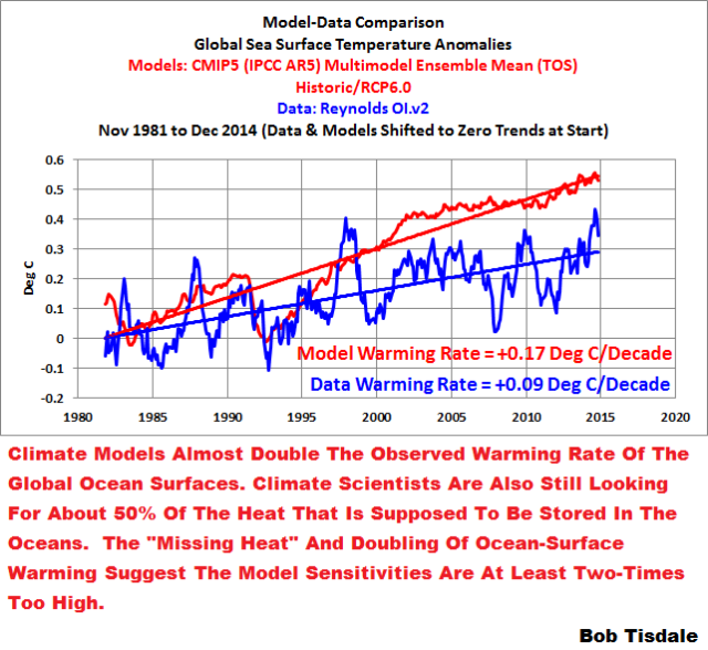
Figure 1
But the use of sea surface temperatures instead of anomalies point to addition problems with the models as you will soon discover.
I’ve also included a note at the end of this post regarding the misinformation about sea surface temperature datasets being spread by the queen of the trolls…guess who?
The title of the post includes a quote from a well-known alarmist…and sometimes troll at my blog ClimateObservations. (See the comment here.) Of course, all predictions of global warming are based on climate models. As we’ve illustrated and discussed numerous times in recent years, climate model simulations of sea surface temperatures are far from reality. That is, they’re modeling the surface temperatures of a virtual planet but those surface temperatures have no similarities to Earth…no similarities at all to (1) the actual warming and cooling rates, (2) the patterns of those trends, and (3), as you’ll discover in this post, the absolute temperatures. It would be nice if climate modeling agencies might try to simulate the surface temperatures of this planet, not some other one. That way, their models might have some value. Right now, they don’t serve any purpose…other than to illustrate how poorly they simulate Earth’s climate.
To that end, I’m going to repeat the opening of last year’s model-data comparison of sea surface temperature anomalies Maybe the IPCC’s Modelers Should Try to Simulate Earth’s Oceans.
The climate models stored in the CMIP5 archive are supposed to be simulations of Earth’s climate, but the simulated sea surface temperatures of the models used by the IPCC for their 5th Assessment Report are definitely not of this planet. 70% of the Earth is covered by oceans, seas and lakes. Because the models show no skill at being able to simulate the rates of warming and cooling of the surfaces of the global oceans over the past 32+ years, and because the models show no skill at being able to reproduce the spatial patterns of that warming and cooling, all of which drive temperature and precipitation patterns on land, any and all projections of future climate are based on modeled worlds that have no similarity to the real world. In other words, the projections are meaningless.
PRELIMINARY INFORMATION
The sea surface temperature dataset being used in this post is NOAA’s Optimum Interpolation (OI) Sea Surface Temperature (SST) v2 (aka Reynolds OI.v2). We’re using it because (1) it is the longest running satellite-enhanced sea surface temperature dataset available, (2) its satellite data are bias adjusted based on temperature measurements from ship inlets and from buoys (both moored and drifting), and (3), most importantly, NOAA’s Reynolds OI.v2 data have been called “a good estimate of the truth”. See Smith and Reynolds (2004) Improved Extended Reconstruction of SST (1854-1997). The authors stated about the Reynolds OI.v2 data (my boldface):
Although the NOAA OI analysis contains some noise due to its use of different data types and bias corrections for satellite data, it is dominated by satellite data and gives a good estimate of the truth.
Additional notes about my choice of sea surface temperature datasets. (1) Though satellite data are not included in the new NOAA ERSST.v4 data, Reynolds OI.v2 data are used for quality control of the new ERSST.v4 dataset. See the post Quick Look at the DATA for the New NOAA Sea Surface Temperature Dataset. (2) Along with HADISST data, Reynolds had been used (past tense) in the GISS Land-Ocean Temperature Index data until early in 2013, but GISS switched to NOAA’s ERSST.v2 data to bring their long-term trends into line with the NCDC and HADCRUT datasets. During the satellite era, the change from Reynolds OI.v2 to ERSST.v3b data had little impact. See the post A Look at the New (and Improved?) GISS Land-Ocean Temperature Index Data. Reynolds OI.v2 data (along with HADISST) are still available for presentations at the GISS Map-Making Webpage. (3) Reynolds OI.v2 data are also used in a number of reanalyses, including CMCC C-GLORS, ECMWF ORAS4, ECMWF ORAS3, GFDL, GLORYS2V1, GMAO and NCEP/GODAS. See the Reanalysis.org webpage Overview of current ocean reanalyses.
Because the NOAA NOMADS website is no longer operational (permanently?) the Reynolds OI.v2 sea surface temperature data presented in this post are from the KNMI Climate Explorer…as are the model simulations of sea surface temperatures.
The climate models presented in this post are those stored in the CMIP5 archive, which was used by the IPCC for their 5th Assessment Report (AR5). The CMIP5 climate model outputs of sea surface temperature are available through the KNMI Climate Explorer, specifically through their Monthly CMIP5 scenario runs webpage, under the heading of Ocean, ice and upper air variables. Sea surface temperature is identified as “TOS” (temperature ocean surface). For consistency with past posts, the “CMIP5 mean” and the Historic/RCP6.0 scenario are being used. The RCP6.0 scenario is the closest to scenario A1B used for the CMIP3 models (used by the IPCC for the 4th Assessment Report). And once again we’re using the model mean because it represents the forced component of the climate models; that is, if the forcings used by the climate models were what caused the surfaces of the oceans to warm, the model mean best represents how the ocean surfaces would warm in response to those forcings. For a further discussion, see the post On the Use of the Multi-Model Mean.
Because the model-data comparisons are in absolute terms, annual data are being presented. The Reynolds OI.v2 data start in November 1981 so the comparisons run from 1982 to 2014…33 years.
The linear trends in the graphs are as calculated by EXCEL. And the trend maps were produced at the KNMI Climate Explorer.
TREND MAPS
Figure 2 presents maps of the modeled and observed warming and cooling rates of the surfaces of the global oceans for the period of 1982 to 2014, the satellite era. The color-coded contour levels are presented in deg C/year. The model mean is presented in the left-hand map and the observed warming rates are presented in the right-hand one. There are no similarities between the spatial patterns of the modeled and observed trends. The models show the greatest warming near the equator, while in the real world, the greatest warming has occurred at mid and high latitudes. The North Atlantic in the real world warmed at the highest rate. That warming of the North Atlantic is associated with the Atlantic Multidecadal Oscillation.

Figure 2
The model mean does not present that additional warming in the North Atlantic, which indicates that the recent additional warming of the North Atlantic has occurred naturally; that is, the Atlantic Multidecadal Oscillation is not a process forced by factors that are used to make the oceans warm in the models. We’ll discuss and illustrate this later in this post.
The observed “C-shaped” pattern of warming in the Pacific is the result of the dominance of El Niño events during this period. El Niño events release sunlight-produced warm water from below the surface of the western tropical Pacific. That warm water temporarily floods into the eastern tropical Pacific, primarily along the equator, during El Niño events. At the end of the El Niños, the leftover warm water is driven west by the renewed trade winds and by other ocean processes. The leftover warm water collects in the Kuroshio-Oyashio Extension (east of Japan) and along the South Pacific Convergence Zone (east of Australia and New Zealand). As a result of that process, the observed sea surface temperatures of the East Pacific Ocean (from the dateline to Panama) and of the tropical Pacific (24S-24N, 120E-80W) show little warming in over 33 years. Because the climate models do not properly simulate El Niño and La Niña processes, they do not create the spatial patterns of warming and cooling in the Pacific. Keep in mind, the Pacific Ocean covers more of the surface of the Earth than all of the continental land masses combined, and the modelers show no skill at simulating how and where or why the surface of the Pacific Ocean warmed.
The spatial patterns of the warming of the ocean surfaces dictate the spatial patterns of warming of the surface air over land, and those patterns of ocean warming and cooling contribute to the precipitation patterns on the continents. Because the climate models cannot simulate the spatial patterns of the warming of sea surfaces, one wonders how the modelers expect to properly simulate the warming of land surface air or the precipitation that occurs there.
For almost two decades, the IPCC has claimed that they have found the “fingerprints” of human-induced global warming. Because they’re using their climate models as the basis for those claims, it looks like they need a new method of fingerprint analysis. There are no similarities between the modeled and observed fingerprints shown in Figure 2.
GLOBAL TIME-SERIES
Figure 3 presents the model-data comparison for global satellite-era sea surface temperatures, not anomalies. It’s obvious that global sea surfaces were warmer in 2014 than they were in 1998, by about 0.04 Deg C, according to the Reynolds OI.v2 data. It should be well known by now that those record highs were caused primarily by an unusual weather event in one ocean basin. This will be confirmed as we continue with this data presentation. (Also see the discussion at the end of the post about the record highs.) The difference between modeled and observed warming rates through 2013 (see graph here) was approximately 0.082 deg C/decade. Now with the 2014 data, the difference is 0.079 deg C/decade. In other words, the uptick in global sea surface temperatures in 2014 did little to reduce the divergence between the models and the real world.

Figure 3
Notice how the trends lines for the models and data in Figure 3 do not quite intersect at the start. As I noted earlier, any complaint about my model-data comparison in Figure 1 is unwarranted.
I’ve also included the same notes in Figure 3 as in Figure 1. The data show the oceans warmed at a rate of 0.087 deg C/decade for the last 33 years (the satellite era), but the models indicate they should have warmed at almost twice that rate if they were warmed by manmade greenhouse gases.
Phrased another way, manmade greenhouse gases in the climate models were expected to warm the surfaces of the global oceans at a rate of 0.166 deg C/decade for the past 33 years, but those anthropogenic greenhouse gases in the real world caused an observed warming of only 0.087 deg C/decade. That’s a monumental difference between hypothesis and reality. Now consider that this time period (1982-2014) includes naturally enhanced warming of the sea surfaces of the North Atlantic and North Pacific (see the post Multidecadal Variations and Sea Surface Temperature Reconstructions) and you’ll begin to understand the full extent of the model failings.
Another fact to consider: the data existed while the modelers were preparing their climate models for the CMIP5 archive. In other words, the modelers knew their goals. And the best the modelers could do was almost double the warming rate of the surface of the global oceans. That’s an atrocious modeling effort.
TRENDS ON A ZONAL-MEAN (LATITUDE-AVERAGE) BASIS PER OCEAN BASIN
Figures 4 through 8 are model-data trend (warming and cooling rate) comparisons of sea surface temperature anomalies for the global oceans and for the Pacific, Atlantic, and Indian Oceans. But they aren’t time-series graphs. Looking from left to right along the horizontal (x) axis, the South Pole is at “-90”, the equator is “0” latitude, and the North Pole is at “90”. The units of the vertical (y) axis are degrees C per decade—based on the calculated linear trends. Each data point represents the linear trend (warming or cooling rate) in degrees C per decade for a 5 degree latitude band, where, for example, the data point at -82.5 (82.5S) latitude represents the linear trend of the high latitudes of the Southern Ocean surrounding Antarctica (85S-80S). The data points representing the trends then work northward (left to right) in 5-degree increments through each of the ocean basins (80S-75S, then 75S-70S, then 70S-65S, and so on) using the longitudes for each ocean basin. The average temperatures of latitude bands are called the “zonal mean” temperatures by climate scientists; thus the use of that term in the title blocks.
Figure 4 presents the modeled and observed warming and cooling rates of the global oceans on a latitude-average (zonal-means) basis. The climate models underestimate the observed warming at high latitudes of the Northern Hemisphere, but they overestimate the warming in the tropics and in the mid-to-high latitudes of the Southern Hemisphere. And the models do not capture the cooling of ocean surfaces at the high latitudes of the Southern Hemisphere. There should be little wonder why models cannot simulate sea ice losses in the Arctic Ocean and sea ice gains in the Southern Ocean surrounding Antarctica.

Figure 4
The differences between modeled and observed warming and cooling rates strongly suggest two things: (1) that ocean circulation processes in climate models are flawed. This will become even more apparent when we look at the trends for the individual ocean basins. (2) that the sensitivity of climate models to carbon dioxide and other forcings is too high.
Figure 5 shows the observed and modeled sea surface temperature trends for the Pacific Ocean (longitudes of 125E-90W) on a zonal-mean basis. At and just south of the equator, observed sea surface temperatures cooled since January 1982. And the highest observed warming occurred at the mid-latitudes of the North and South Pacific. The models, unfortunately, do not create that spatial pattern. The models show much more warming in the tropics than observed. The models also overestimate the warming at the high latitudes of the North Pacific and they show warming in the Pacific portion of the Southern Ocean, while the observations show cooling there over the past 33 years.

Figure 5
How can climate scientists/modelers hope to simulate the patterns of warming on land when they can’t simulate the warming patterns of the largest ocean on this planet?
What causes the mid-latitudes to warm, while the tropics show little warming?
Short answer: El Niño and La Niña processes.
Longer answer: The observed warming trends at mid-latitudes, with no warming near the equator, suggest warm water was distributed poleward in both hemispheres by ocean currents. That happens in the Pacific when El Niño events dominate, which was the case during this period. That is, a period during which El Niño events dominate causes the additional distribution of warm water toward the mid-latitudes. Refer to Figure 6, which is a comparison of Pacific trends on a zonal-mean basis for the periods of 1944 to 1975 and 1976 to 2011. It’s Figure 8-32 from my ebook Who Turned on the Heat? From 1944 to 1975, El Nino and La Niña events were more evenly matched, but slightly weighted toward La Niña. During that period, less naturally (sunlight) created warm water was released from below the surface of the tropical Pacific by El Niños and distributed toward the poles. But from 1976-2011, El Niño events dominated, so more warm tropical waters were distributed from below the surface of the tropical Pacific to the mid-latitudes. I’ve highlighted the differences between the two periods.

Figure 6
Phrased differently, the observed warming pattern in the Pacific is one associated with El Niño and La Niña events (ENSO). ENSO helps the Pacific distribute heat (created by sunlight) from the tropics to the mid latitudes, and into adjoining ocean basins. The differences between the modeled and observed warming patterns should be caused by the failures of the models to properly simulate basic ENSO processes. Those failings are well known to the climate science community. Two papers that present model failings at simulating ENSO are:
- Guilyardi et al. (2009) Understanding El Niño in Ocean-Atmosphere General Circulation Models, and
- Bellenger et al (2012) ENSO representation in climate models: from CMIP3 to CMIP5
And Figures 5 and 6 above help to show why it is important for the models to simulate ENSO processes.
In the post Axel Timmermann and Kevin Trenberth Highlight the Importance of Natural Variability in Global Warming…, we discussed and illustrated how the unusual warming event in the eastern extratropical Pacific was, in fact, a 2-year event and that it had a compounding effect. The impacts of that warming event can be seen in an animation of the plots of zonal mean sea surface temperature trends for the Pacific, for the periods of 1982-2012, 1982-2013 and 1982-2014. See Animation 1. The 30+ year trends at the mid-to-high latitudes of the North Pacific were a little higher in 1982-2013 than they were for 1982-2012, and noticeably higher in 1982-2014. Also note the impact of the El Niño-like conditions this year in the tropical Pacific on the trends for 1982-2014.

Animation 1
It will be interesting to see what the Pacific holds in store for us in 2015 and the effects they will have on the trends there.
Figure 7 shows the modeled and observed trends in sea surface temperature anomalies for the Atlantic Ocean (longitudes 70W-20E) from Jan 1982 to December 2014. The models overestimate the warming in the South Atlantic and underestimate it North Atlantic, especially toward the high latitudes. In fact, the models show just about the same warming trends from 40S to 70N—that is, the models show the Atlantic Ocean should have warmed at about 0.15 to 0.2 deg C/decade for the last 33 years for the latitudes of 40S to 70N—while the observed trends change greatly over those latitudes. Again, how can the climate scientists/modelers hope to create the warming and precipitation patterns on adjoining land masses when they can’t simulate the warming pattern of the surface of the Atlantic?

Figure 7
The last of the trend graphs on a zonal-mean basis is for the Indian Ocean, Figure 8. The models, basically, show way too much warming at most latitudes. As a result, the same problem problems exist in the models for the warming and precipitation patterns on land masses adjacent to the Indian Ocean.

Figure 8
TIME SERIES – TROPICAL AND EXTRATROPICAL SEA SURFACE TEMPERATURES
In earlier model-data comparisons of satellite-era sea surface temperatures (see the posts here and here), I’ve compared the data and model outputs for the Northern and Southern Hemispheres. For this post and the preceding one (here), I’ve divided the global data into three subsets: the tropical oceans (24S-24N), and the extratropical oceans of the Northern Hemisphere (24N-90N) and the Southern Hemisphere (90S-24S).
The reason: In June of 2013, Roy Spencer presented model-data comparisons of the warming of the tropical mid-troposphere prepared by John Christy. See Roy’s posts EPIC FAIL: 73 Climate Models vs. Observations for Tropical Tropospheric Temperature and STILL Epic Fail: 73 Climate Models vs. Measurements, Running 5-Year Means. The models grossly overestimated the warming rates of the mid-troposphere in the tropics. So I thought it would be worthwhile, since the tropical oceans (24S-24N) cover 76% of the tropics and about 46% of the global oceans, to confirm that the models also grossly overestimate the warming of sea surface temperatures of the tropical oceans.
It should come as no surprise that the models did overestimate the warming of the sea surface temperatures of the tropical oceans over the past 33 years. See Figure 9. In fact, the models overestimated the warming by a wide margin. The data indicate the sea surface temperatures of the tropical oceans warmed at a not-very-alarming rate of 0.06 deg C/decade, while the models indicate that, if the surfaces of the tropical oceans were warmed by manmade greenhouse gases, they should have warmed at 3 times that rate, at 0.19 deg C/decade. For 46% of the surface of the global oceans (about 33% of the surface of the planet), the models tripled the observed warming rate.

Figure 9
For the extratropical oceans of the Southern Hemisphere (90S-24S), Figure 10, the observed warming rate is also extremely low at 0.06 deg C/decade. On the other hand, the climate models indicate that if manmade greenhouse gases were responsible for the warming of sea surface temperatures in this region, the oceans should have warmed at a rate of 0.12 deg C/decade, effectively, doubling that observed trend. The extratropical oceans of the Southern Hemisphere cover about 33% of the surface of the global oceans (about 23% of the surface of the planet) and the models double the rate of warming.

Figure 10
And the climate models seem to get the warming rate of sea surface temperatures just about right for the smallest portion of the global oceans, the extratropical Northern Hemisphere (24N-90N). See Figure 11. The extratropical oceans of the Northern Hemisphere cover only about 21% of the surface of the global oceans (about 15% of the surface of the Earth).

Figure 11
Unfortunately for the modelers, they underestimated the warming of the surface of the extratropical North Atlantic (Figure 12), and overestimated the warming in the extratropical North Pacific (Figure 13), so they accomplished the overall warming of the extratropical Northern Hemisphere incorrectly. No surprise there.
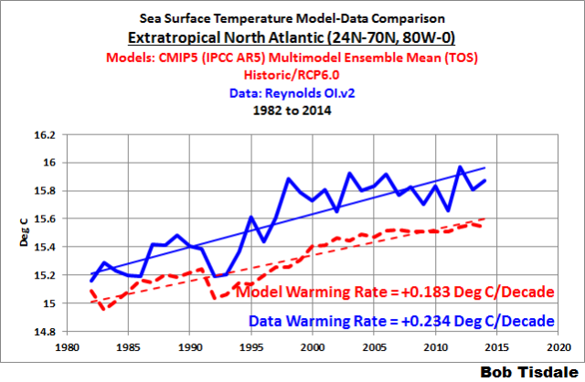
Figure 12
# # # # # # #

Figure 13
Now note the similarities between the modeled and observed surface temperatures (not trends) of the tropical oceans (Figure 9). The average observed tropical sea surface temperatures for the period of 1982 to 2014 are only 0.02 deg C cooler than the models. Now note the differences between the models and observations in the extratropics of the Southern (Figure 10) and Northern (Figure 11) Hemispheres. For the period of 1982 to 2014, the modeled sea surface temperatures in the Southern Hemisphere are too warm by almost 0.8 deg C, and in the Northern Hemisphere, the modeled sea surface temperatures are too cool by 0.4 deg C. Those are further indications that ocean circulation in climate models is flawed.
TIME SERIES – ATLANTIC OCEAN
Figure 14 presents the model-data comparison of the sea surface temperature anomalies for the Atlantic Ocean. They do a reasonable job here. The modeled warming rate is slightly more than the observations. In fact, of the three major ocean basins, the models perform best in the Atlantic. And the difference between the modeled and observed (1982-2014) average sea surface temperatures (not trends) is only about 0.16 deg C, with the models too warm.

Figure 14
But the models accomplish the warming rates and the temperatures incorrectly. While they do a reasonable job of approximating the warming rates of the North Atlantic surfaces (Figure 15), the models overestimate the warming rates of sea surfaces in the South Atlantic (Figure 16) by a huge margin. Note also how the average modeled sea surface temperature for 1982 to 2014 (not trend) in the North Atlantic is too low, and too high in the South Atlantic.

Figure 15
# # # # # # #

Figure 16
Last, note how the sea surface temperatures in the North and South Atlantic, and in the Atlantic basin as a whole, were nowhere close to record highs this year.
TIME SERIES – PACIFIC OCEAN
Figure 17 is the model-data comparison for the sea surface temperatures of the largest ocean on our planet, the Pacific. The models more than double (2.4 times) the warming rate for the surface of the Pacific Ocean…and that’s with the record highs this year.

Figure 17
The Pacific Ocean covers almost 33% of the surface of the globe. It covers more of the Earth than the continental land masses combined. And climate models overestimate the warming there by 2.4 times. Yet somehow we’re supposed to believe all of the IPCC’s predictions of gloom and doom when, after more than 2 decades of modeling efforts, the best the modeling agencies around the globe can do is have their models more than double the warming rate of the surface of the largest ocean on this water-covered planet.
The models perform poorly in the North Pacific (Figure 18), more than doubling the warming rate there, and that’s with the unusual weather event this year that resulted in the extreme sea surface temperatures in the eastern extratropical North Pacific.

Figure 18
In the South Pacific (Figure 19), the models more than tripled the observed warming rate. Also note how the sea surface temperatures of the South Pacific were also nowhere close to record highs. So far, it’s the North Pacific that caused the record high sea surface temperatures in the Pacific, in the Northern Hemisphere and globally.

Figure 19
And like the Atlantic basin, the average modeled sea surface temperatures (not trends) for 1982 to 2014 in the North Pacific are too low, and too high in the South Pacific.
While we’re discussing the Pacific Ocean, let’s confirm a few things that were blatantly obvious in the trend maps in Figure 2.
The model-data comparison for the tropical Pacific (24S-24N, 120E-80W) is shown in Figure 20. The surface of the tropical Pacific shows very little warming in 33 years. According to the models, if manmade greenhouse gases were responsible for the warming of the surface of the global oceans, the tropical Pacific should have warmed at a rate of 0.18 deg C/decade, but the tropical Pacific has warmed very little.

Figure 20
Note also how the sea surface temperatures for the tropical Pacific indicate an El Niño evolved in 2014. This contribution to the record high sea surface temperatures was illustrated and discussed in the post Did ENSO and the “Monster” Kelvin Wave Contribute to the Record High Global Sea Surface Temperatures in 2014?
The last of the Pacific subsets is the East Pacific, Figure 21. For this comparison, I’ve extended the coordinates into the Southern and Arctic Oceans. With the coordinates of 90S-90N, 180-80W, the East Pacific covers about 33% of the surface of the global oceans, or about 23% of the surface of the globe. It, too, shows very little warming in 33 years. Note also how the average sea surface temperature (not trend) for the East Pacific for the period of 1982 to 2014 is too high, by almost 0.3 deg C.

Figure 21
Now consider two things that happened in 2014: (1) the unusual warming event in the eastern extratropical North Pacific (a.k.a. the blob) and (2) the El Niño conditions in the eastern tropical Pacific. (While El Niño conditions did not exist in the NINO3.4 region for much of the year, they did exist in the NINO3 and NINO1+2 regions, both of which are in the East Pacific.) The East Pacific was strongly impacted by those two conditions this year, yet the warming rate there for the past 3+ decades is extremely low. That extremely low warming rate contradicts the models, which indicate that the surface of the East Pacific should have warmed at a rate of about 0.15 deg C/decade…if they were warmed by manmade greenhouse gases.
Not too mysteriously, manmade greenhouse gases have had little impact on two (overlapping) portions of the largest ocean on Earth: the tropical Pacific (Figure 20) and the East Pacific (Figure 21).
TIME SERIES – INDIAN OCEAN
The models also performed poorly at simulating the warming rate of the sea surface temperatures of the Indian Ocean, Figure 22, with the models showing way too much warming.
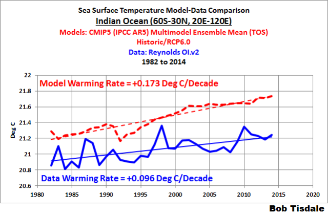
Figure 22
Note also how, on average (1982-2014), the modeled sea surfaces for the Indian Ocean are too warm by about 0.4 deg C.
TIME SERIES – POLAR OCEANS
Figure 23 is the model-data comparison of the sea surface temperatures of the Arctic Ocean. The models captured the warming rate of the Arctic Ocean sea surface temperatures reasonably well, but averaged over the period of 1982-2014, the modeled sea surface temperatures (not trends) were too low, by about 0.66 deg C.

Figure 23
Note also how the sea surface temperatures of the Arctic Ocean were warm but not at record highs this year.
At the other end of the globe, the models failed miserably. The models indicate that the surface of the Southern Ocean (Figure 24) should have warmed over the past 33 years, but the sea surface temperatures there cooled in that time. Note also how the modeled sea surface temperatures are too high, by a little bit more than 0.9 deg C.

Figure 24
The sea surfaces of the Southern Ocean were nowhere close to record highs this year.
THE ATLANTIC MULTIDECADAL OSCILLATION IS NOT A FORCED COMPONENT OF THE CLIMATE MODELS
The North Atlantic has an additional mode of natural variability called the Atlantic Multidecadal Oscillation. We’ve discussed it in numerous posts over the past few years. (See the posts under the category of Atlantic Multidecadal Oscillation here.) If you’re not familiar with the Atlantic Multidecadal Oscillation see the NOAA Frequently Asked Questions About the Atlantic Multidecadal Oscillation (AMO) webpage and the posts:
- An Introduction To ENSO, AMO, and PDO — Part 2
- Multidecadal Variations and Sea Surface Temperature Reconstructions
Over some multidecadal periods, the sea surfaces of the North Atlantic warm faster than the rest of the global oceans, and during other multidecadal periods, the North Atlantic sea surfaces warm slower than the rest of the global oceans and can cool dramatically. For much of the period of November 1981 to December 2014, the sea surface temperatures of the North Atlantic were on one of their naturally occurring upswings.
(I’ll try to head off an argument: The title of Booth et al. (2012) Aerosols implicated as a prime driver of twentieth-century North Atlantic climate variability explains their findings. Refer to the discussion of Booth et al. (2012) under the heading of ON THE HADGEM2-ES AMO SIMULATION in the post here. The HADGEM2-ES model used by Booth et al. (2012) does a pretty poor job of simulating the AMO as shown in the illustration here from that post. Booth et al. also failed to account for a couple of other factors that drive the Atlantic Multidecadal Oscillation.)
There are a number of ways to present the Atlantic Multidecadal Oscillation. The NOAA ESRL simply detrends the North Atlantic sea surface temperature anomalies. That’s the most common way. Another way: Trenberth and Shea (2006) subtracted global sea surface temperature anomalies, excluding the polar oceans, (60S-60N) from sea surface temperature anomalies of the North Atlantic (0-60N, 80W-0). That method accounts for the additional variability of the North Atlantic data above the variations in the global data.
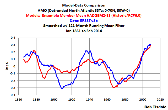
We can use the same long-term sea surface temperature reconstruction used by Trenberth and Shea (2005), HADISST, and subtract the global data (and model outputs) from the North Atlantic data (and model outputs). Like Trenberth and Shea we’ll use latitudes of 60S-60N for the global oceans and the coordinates of 0-60N, 80W-0 for the North Atlantic. But we’ll use modeled and observed sea surface temperatures, not anomalies. See Figure 25. Obviously, the models do not simulate the additional multidecadal variability of the North Atlantic.
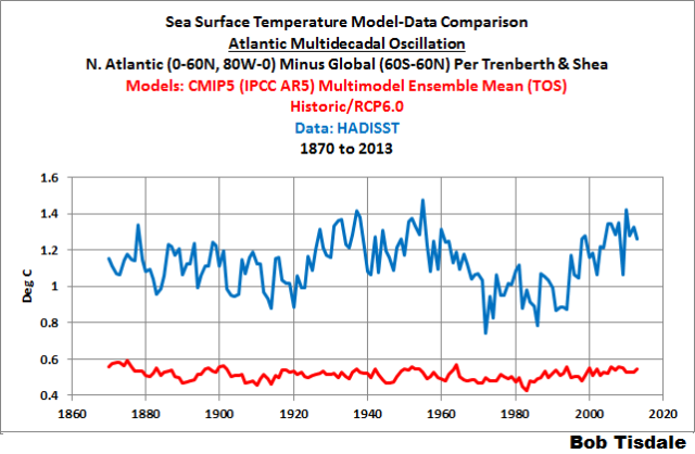
Figure 25
And for those interested, as a forced component, there is no Atlantic Multidecadal Oscillation projected into the future. See Figure 26.

Figure 26
Referring to Figure 25 again, if the model-mean had produced the observed differences in the warming and cooling rates of the North Atlantic and the global oceans, then we would have to conclude that the Atlantic Multidecadal Oscillation was a forced component of the models. Because the model mean does not show the great difference in warming and cooling rates, the additional variability of the North Atlantic has to be caused by naturally occurring factors that are not used force the operation of the models. Thus the heading for this section: The Atlantic Multidecadal Oscillation is Not a Forced Component of the Climate Models.
Curiously, the climate science community acknowledges the importance of the Atlantic Multidecadal Oscillation. The climate scientists who run the blog RealClimate note on their Atlantic Multidecadal Oscillation webpage:
A multidecadal (50-80 year timescale) pattern of North Atlantic ocean-atmosphere variability whose existence has been argued for based on statistical analyses of observational and proxy climate data, and coupled Atmosphere-Ocean General Circulation Model (“AOGCM”) simulations. This pattern is believed to describe some of the observed early 20th century (1920s-1930s) high-latitude Northern Hemisphere warming and some, but not all, of the high-latitude warming observed in the late 20th century. The term was introduced in a summary by Kerr (2000) of a study by Delworth and Mann (2000).
Yet the climate models used by the IPCC for their 5th Assessment Report cannot simulate the additional multidecadal variability of the North Atlantic as shown in Figures 25 and 26. And the modeled difference between the sea surface temperature of the North Atlantic and Global Oceans is too small.
A FOREWARNING TO TROLLS
I’ve already addressed one of the anticipated complaints about my model-data presentation of global sea surface temperature anomalies in Figure 1 by showing when the model-data comparison is presented in absolute terms, Figure 3, the trend lines do not even intersect. I’ve also documented why I presented Reynolds OI.v2 data in this post. Refer to the heading of Preliminary Information.
And I suspect that some of you might link Sou’s (Miriam O’Brien’s) recent HotWhopper post on sea surface temperature trends (archived copy) Bob Tisdale is in a tizz over record hot seas. Once again, Miriam has expressed her misunderstandings about a topic and her willingness, or need, or want, to mislead her readers.
Note the sea surface temperature datasets she presented and that her source was the KNMI Climate Explorer for two of them. In addition to the Reynolds OI.v2 data, Miriam presented NOAA’s ERSST.v3b, and the UKMO’s HADSST3 data. Her intent was to show that the Reynolds OI.v2 data had a cool bias. My Figure 27 is a screen capture of the sea surface temperature datasets available from KNMI Climate Explorer (here).
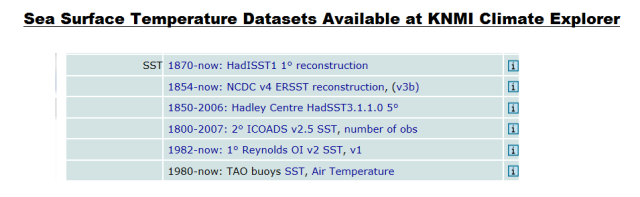
Figure 27
It’s difficult to overlook the first sea surface temperature dataset on the list: HADISST from the UKMO. HADISST dataset is a statistically infilled dataset that incorporates satellite data from 1982 to present. It is preferred by many scientists for short-term and long-term studies of global sea surface temperatures. In fact, if you were to perform a Google Scholar search of HADISST, you’d get about 2900 results, which is more than the 2500 results shown for NOAA’s ERSST dataset. HADSST only returns 319 results.
So why did Sou exclude HADISST from her presentation? See Figure 28. A reasonable guess is that HADISST shows a noticeably lower warming rate than Reynolds OI.v2 data during the satellite era, and the lower trend of the HADISST data would destroy all of her complaints about the Reynolds OI.v2 data. For the period of November 1981 to September 2014 (HADISST updates are delayed a few months), Reynolds OI.v2 global sea surface temperature anomalies show a linear trend of +0.087 deg C/decade, while HADISST shows a warming rate of only +0.073 deg C/decade.

Figure 28
Now, keeping in mind that HADISST data is the sea surface temperature dataset most often used in climate studies, I would be more inclined to use it for my sea surface temperature updates and for posts like this. Obviously, climate models are not going to look better if I were to use HADISST data. Unfortunately, the UKMO is slow to update their HADISST data, with the monthly updates lagging by a few months. Maybe I’ll redo this post in a couple of months with HADISST data, as soon as the data through 2014 is available.
Even though my presentation was of satellite-era data and only satellite-era data, Sou (Miriam O’Brien) then goes on to rant about long-term sea surface temperature data. Obviously, she overlooks the fact that I’ve presented model-data comparisons of long-term sea surface temperature anomalies in posts such as IPCC Still Delusional about Carbon Dioxide.
Also note how Miriam jockeys the end date of the model simulations to try to lower the warming rates of the models. How silly can she be? And how silly can her followers be for not calling her attention to her obvious attempts to mislead?
Miriam shifts to a discussion of the impacts of using the base years of 1961 to 1990, when it is impossible to use those base years for the Reynolds OI.v2 sea surface temperature data (it starts in 1981 because it’s a satellite-era dataset). This is typical of Miriam who often goes off on tangents in an effort to redirect and misdirect her readers.
Last, but not least, Miriam nonsensically misrepresents my argument about the record highs this year by saying “the seas are only getting hotter because they are getting hotter”, when, in fact, my arguments have always been that there are naturally caused, naturally fueled coupled ocean-atmosphere processes that can and do cause ocean warming at the surface and to depth. See the next section. (There are numerous other flaws in her arguments, but this discussion is too long as it is. All of the flaws and misrepresentations by Sou would take another post.)
So, trolls, if you link Miriam’s post to this thread, we’ll likely laugh at you. I know I will, because I thought Miriam O’Brien’s post Bob Tisdale is in a tizz over record hot seas was one of the funniest posts she has written so far to date. Her need to mislead her readers always makes me laugh.
ON THE RECORD HIGH SEA SURFACE TEMPERATURES IN 2014
Again, of the individual ocean basins, only the North Pacific had record high sea surface temperatures this year, and the weather event there was strong enough to cause record warm sea surfaces globally, in the Pacific as a whole and in the Northern Hemisphere.
We’ve been discussing the record high sea surface temperatures since the June Sea Surface Temperature (SST) Update. We identified the location of the unusual weather event, the likely reasons for the record high sea surface temperatures and the fact that climate models could not explain that warming in the post On The Recent Record-High Global Sea Surface Temperatures – The Wheres and Whys. We discussed the topic further in other posts including Axel Timmermann and Kevin Trenberth Highlight the Importance of Natural Variability in Global Warming… Our discussions of the unusual warming event in the eastern extratropical North Pacific were confirmed by the 2014 paper by Johnstone and Mantua (here) which was presented in the post Researchers Find Northeast Pacific Surface Warming (1900-2012) Caused By Changes in Atmospheric Circulation, NOT Manmade Forcings. Jim Johnstone, one of the authors of the paper, joined us on the thread of the cross post at WUWT and provided a link to his webpage. There you can find a link to the paper. Also see his comment here for an update on the recent unusual warming event in the extratropical North Pacific. Under the heading of NE Pacific coastal warming due to changes in atmospheric circulation at his webpage, Jim Johnstone updated one of the graphs from their paper and wrote:
Jan 1980 – Nov 2014. NE Pacific monthly coastal SST anomalies (red) and SST modeled from regional SLP. Recent warming from Jan 2013 to Nov 2014 occurred in response to low SLP over the NE Pacific, consistent with long-term forcing. Gray bars mark data beginning in January 2013 that were not included in the study. Negative SLP anomalies generate anomalous cyclonic winds, reducing the mean anticyclonic flow and winds speeds throughout the Arc. The drop in wind speeds reduces evaporation rates, producing positive surface latent heat fluxes and SST increases.
Also refer to the NOAA summary and FAQ webpage about Johnstone and Mantua (2014) for discussions about the paper in less-technical terms.
As we’ve been saying for years, coupled ocean-atmosphere processes can and do cause regional warming, which, in turn, lead to the warming of sea surfaces globally.
ADDITIONAL READING
This post presented evidence that the hypothesis of human-induced global warming is flawed, because the models that serve as the foundation for the hypothesis are flawed…fatally flawed. Further, as we’ve been illustrating and discussing for more than 6 years, ocean heat content data and satellite-era sea surface temperature data both indicate that natural processes are responsible for the warming of the oceans, at the surface and to depth. An overview of this can be found in my illustrated essay “The Manmade Global Warming Challenge” (42mb). Much more detail about the natural warming of the global oceans can be found in my ebook Who Turned on the Heat? – The Unsuspected Global Warming Culprit: El Niño-Southern Oscillation. See the post here for an introduction to Who Turned on the Heat?
This post presented how poorly climate models simulate sea surface temperatures during the satellite era. Climate models also do not simulate land surface air temperatures properly in many parts of the globe. They do not simulate precipitation well. Climate models also do not properly simulate long-term variations in global surface temperatures. And there are numerous peer-reviewed papers and journal letters by climate scientists that present many other flaws in climate models. These flaws are collected in my ebook Climate Models Fail. See the post here for an additional overview.
And if you enjoyed this post or learned something from it, I would be very thankful for a contribution to my tip jar. It took about a week to prepare it. And if you’re reading this post at WattsUpWithThat, please remember Anthony’s tip jar (here), too.
Work on my new book is progressing very slowly, but it is progressing.
CLOSING
We live on an ocean-covered planet, yet somehow the hows, the whens, the wheres, and the extents of the warming (and cooling) of the surfaces of our oceans seem to have eluded climate modelers. For the past few years, we have been presenting how poorly the climate models (used by the IPCC) simulate sea surface temperatures—long-term comparisons (example here) and for the satellite-era. But in those cases, we presented modeled and observed sea surface temperature anomalies. In this post, we presented satellite-era sea surface temperatures, not anomalies, and this has pointed to other climate model failings, which further suggest that simulations of basic ocean circulation processes in the models are flawed.
Depending on the ocean basin, there can be large differences between the modeled and observed ocean surface temperatures. The actual ocean surface temperatures, along with numerous other factors, dictate how much moisture is evaporated from the ocean surfaces, and, in turn, how much moisture there is in the atmosphere…all of which impact the moisture available globally (1) for precipitation, (2) for water vapor-related greenhouse effect, and (3) for the negative feedbacks from cloud cover. In other words, failing to properly simulate sea surface temperatures impacts the atmospheric component of coupled ocean-atmosphere models. That, of course, is in addition to the poor simulations by models of sea surface warming and cooling rates and their spatial patterns, which also impact atmospheric circulation in models.
As I noted earlier in this post, climate model simulations of sea surface temperatures are far from reality. That is, they’re modeling the surface temperatures of a virtual planet but those surface temperatures have no similarities to Earth…no similarities at all to (1) the actual warming and cooling rates, (2) the patterns of those trends, and (3), as [you’ve discovered] in this post, the absolute temperatures. It would be nice if climate modeling agencies might try to simulate the surface temperatures of this planet, not some other one. That way, their models might have some value. Right now, they don’t serve any purpose…other than to illustrate how poorly they simulate Earth’s climate.
Regards.
PS
Yes, this post was long and there were many illustrations, but there was lots to discuss…and I actually reduced the size of this post before publishing it. Many readers like copies of my longer posts in pdf format. Please check back in a day or two for a link to a pdf copy.
UPDATE
A copy of the post in pdf format is here.
Bizarrely? I’d say that it was more predictable than anything the models themselves could ever achieve.
I’ll ask again. Is there any prediction the models got right?
I’m not sure getting it “right” some of the time is sufficient to consider the model a plausible representation of what’s going on. Wouldn’t you also need some metric to indicate that it was doing better than random?
As far as I can tell, the models are not getting anything right. They are doing worse than random.
“We live on an ocean-covered planet, yet somehow the hows, the whens, the wheres, and the extents of the warming (and cooling) of the surfaces of our oceans seem to have eluded climate modelers.” ~ Bob Tisdale
Yes, and it is a real travesty that the models (or theory) do not account for all that water. There are so very many things the models do not account for.
Thanks for the post Bob.
What is also bizarre is that modelers believe their models are proven more viable by having missed accounting for all of that water. It is like Papal infallibility, no matter what the models do, they were, and are now and forever will be viable models for representing planetary behavior and forecasting.
I will help them out. Climate modelers and climate scientists of integrity and position should step forward and state:
“Our work is a work in progress. We can no more predict climate 100 years from now than predict whether the president of the US, 100 years from now will be a Democrat or Republican. In our continuing studies we are learning more and more of how our planet works and though we cannot predict how or when this knowledge will have practical benefit for humanity, we feel it eventually will bring great benefit.”
I guess that’s not happening though, since politicians and governments would immediately send climate science a Dear John letter and scramble for another crisis that is unsolvable without their leadership and our dollars.
What is most bizarre is when they adjust, parametise, modify everything they can in their models and then say “look they predict the past really well so the future prediction must be perfect”.
Another excellent post, Mr. Tisdale.
Bob –
We use the mean of the climate model projections because the entire spread is impossible to use in discussions or analysis. The IPCC continues to use the entire spread, as do the warmists. Please explain to me how this is reasonably after so many years of observation.
It comes to this: how can the models allow temperatures to follow low level rises and then jump up to the highest level, to support the 4C rise by 2100 worries?
Are there scenarios in which signficant parameters flip from one state to another, particularly “up”?
For my sins I checked out the NOAA FAQ on the AMO. They say:
“Is the AMO a natural phenomenon, or is it related to global warming? Instruments have observed AMO cycles only for the last 150 years, not long enough to conclusively answer this question.”
A cycle is shown to have existed long before humans could have had any effect on climate but they are still uncertain it is natural or not? The mainstream climate community applies their scepticism in oddly and randomly applied circumstances!
Great article as always Bob!
If 150 years of instrument data is not enough to resolve this question, how can it be enough to resolve the cause of global warming?
If you cannot tell if the AMO is natural or related to global warming, how can you tell if global warming is natural or due to humans?
Or does global warming only refer to humans, and all other warming simply does not exist by definition? Any warming that is natural has no name, and thus cannot be happening.
Per the UNFCCC definition, there is no such thing as ‘natural’ climate change. By definition, the natural change is called climate variation.
2. “Climate change” means a change of climate which is
attributed directly or indirectly to human activity that
alters the composition of the global atmosphere and which
is in addition to natural climate variability observed
over comparable time periods.
Definition in article 1, DEFINITIONS on page 7 of
http://unfccc.int/files/essential_background/background_publications_htmlpdf/application/pdf/conveng.pdf
Bob, what is the official “climate science” term for that portion of global warming due to natural causes?
As far as I can determine, the IPCC defines “global warming” as warming caused by human activity.
However, we see other types of global warming. For example, the warming of the globe that occurred from 1900 to 1950, that the IPCC agrees was not the result of human activity?
What is the official climate science term for warming or the globe caused by something other than humans?
The official climate science stance is that there is no natural global warming.
I wish I were making that up.
They claim that, without human activity, the planet should be cooling.
The IPCC definition includes both natural and anthropogenic causes, and specifically notes its’ difference from the UNFCCC definition.
The founding document for the IPCC however uses the UNFCCC definition of climate change, tasking the IPCC to look for climate change which by UNFCCC definition precludes investigating natural or climate variation’s causes
1. A subsidiary body for scientific and technological advice
is hereby established to provide the Conference of the Parties
and, as appropriate, its other subsidiary bodies with timely
information and advice on scientific and technological matters
relating to the Convention. This body shall be open to
participation by all Parties and shall be multidisciplinary.
It shall comprise government representatives competent in the
relevant field of expertise. It shall report regularly to the
Conference of the Parties on all aspects of its work.
2. Under the guidance of the Conference of the Parties, and
drawing upon existing competent international bodies, this
body shall:
(a) Provide assessments of the state of scientific
knowledge relating to climate change and its
effects;
(b) Prepare scientific assessments on the effects of
measures taken in the implementation of the
Convention;
(c) Identify innovative, efficient and state-of-the-art
technologies and know-how and advise on the ways and
means of promoting development and/or transferring
such technologies;
(d) Provide advice on scientific programmes,
international cooperation in research and
development related to climate change, as well as on
ways and means of supporting endogenous capacity-
building in developing countries; and
(e)Respond to scientific, technological and
methodological questions that the Conference of the
Parties and its subsidiary bodies may put to the
body.
Again, this investigative body, per UNFCCC framework is to assess ONLY the anthropogenic component of climate change
The ‘Intergovernmental Panel on Climate Change’ or IPCC is first named on page 29.
Some have questioned the purpose of the #UNFCCC and the #IPCC that it established. This is answered by the #UNFCCC itself at http://unfccc.int/essential_background/convention/items/6036.php To quote
‘Preventing “dangerous” human interference with the climate system is the ultimate aim of the UNFCCC.’
Once again Bob an interesting post, thank you for your hard work. The models are clearly wrong, but as a layman with a great interest in the AGW scam, should the fact that there have been steadily rising temperatures as demonstrated by the data, be cause for concern?
The Berkeley Earth Land + Ocean Data anomaly data set shows no global average temperature increase since 2003.
It shows a warming from 1910 to 1940 of 0.45°C, then a pause to 1975, and a warming to 2003 of 0.55°C.
Note the upward steps caused by El Niño: The Pacific Climate Shift of 1976, the 1986/87/88 El Niño and the 1997/98 El Niño.
In my climate and weather pages it is shown that the other official data sets show the same picture, with minor differences.
The NOAA National Climatic Data Center (NCDC) Annual Global Mean Surface Temperature shows that global warming stopped in 2005.
The HadCRUT4 time series from the Met Office, the UK’s National Weather Service, shows that global warming stopped in 2003.
The HadCRUT4 time series from the Climatic Research Unit, University of East Anglia (UK) shows the same.
The University of Alabama in Huntsville (UAH) – Satellite-Based Global Temperature Record shows that global warming stopped in 2002, after peaking in 1998.
Unless my eyes deceive me the ref pages show the arctic sea ice extent dropping sharply relative to the recent historic mean , and also relative to 2012 , from about 20th Dec 2014. Approx the same time that the Antarctic ice shows a similar sharp increase . Only a coincidence I presume .
I don’t know this is a sharp drop:
http://nsidc.org/data/seaice_index/images/daily_images/N_stddev_timeseries.png
It is within ±2 standard deviations of the averages for 1981-2010.
From http://nsidc.org/data/seaice_index/images/daily_images/N_stddev_timeseries.png
Here you can see why.
http://www.cpc.ncep.noaa.gov/products/stratosphere/strat-trop/gif_files/time_pres_TEMP_MEAN_JFM_NH_2015.gif
http://www.cpc.ncep.noaa.gov/products/stratosphere/temperature/10mb9065.gif
http://www.cpc.ncep.noaa.gov/products/precip/CWlink/daily_ao_index/hgt.ao.cdas.gif
Neutron wave and wave in the stratosphere is preceded by an increase in pressure above the the polar circle.
http://cosmicrays.oulu.fi/webform/query.cgi?startday=01&startmonth=12&startyear=2014&starttime=00%3A00&endday=13&endmonth=01&endyear=2015&endtime=23%3A30&resolution=Automatic+choice&picture=on
http://www.cpc.ncep.noaa.gov/products/stratosphere/strat-trop/gif_files/time_pres_WAVE1_MEAN_JFM_NH_2015.gif
Sorry, it should be precedes an increase in pressure.
Bob Tisdale I’m thinking that this is a topic worthy of your attention.
Pressure anomalies have occurred after a wave in the stratosphere.
http://www.cpc.ncep.noaa.gov/products/stratosphere/strat-trop/gif_files/time_pres_HGT_ANOM_JFM_NH_2015.gif
I think Tisdale is being a big meany, the models are not so much flawed as incomplete, Like students who turns in their test paper thinking it is complete without realizing they needed to turn over the paper to answer the questions on the back and thereby complete the test.
Wait, I take that back, Tisdale is not being a meany since the students (in this case climate modelers) claim that since they did not see the questions on the back of the test paper, the questions are irrelevant and they should only be scored on the questions they answered. This is not only a failure in taking the test, but a failure in character.
As far as modeling other planets, it would be fun to model the climate of Mars in 10,000 years. Who knows if the forecast looks good we can start planning the Mars colonies now.
Thank you Bob. It’s a beautiful, chaotic world.
Tisdale is happy with interpolation.
Good. So am I. That is why Cowtan&Way probably is the the best land-ocean index. So should anyone who dislikes the idea of 2014 is the warmest year. It will probably no be warmest according to C&W. Only second warmest.
(Wonder what will happen when HadIsst will be updated with the same bias-corrections as in hadsst3. Will Tisdale be just as happy then?)
Not according to my heating bill.
Anyone that thinks 2014 is was the warmest year needs only look at GISS 2014 compared to 1998-2006. Sure, if you live in Alaska it is “warm”. But the interior of North America is a different story. That is the problem with averages. One foot in the oven and another in the freezer, you are on average comfortable.
http://www.climate4you.com/images/EQUATOR%202014%2011%20vs%201998-2006%201200km.gif
Well ferdberple: As far as I know, November 2014 does not equal the whole of 2014. Anyhow: November 2014 was 0.11 degrees warmer than 1998-2006:
http://data.giss.nasa.gov/cgi-bin/gistemp/nmaps.cgi?sat=4&sst=3&type=anoms&mean_gen=11&year1=2014&year2=2014&base1=1998&base2=2006&radius=1200&pol=rob
But as I said: If you want a temperature index where 2014 is not the warmest year use Cowtan & Way.
I do.
[More wasted effort by a banned sockpuppet. Comment DELETED. -mod]
Another well researched article. Good one, Bob.
I know this is about sea surface temperatures, but it still bothers me that I see “2014 was the hottest year EVAH!!” everywhere.
From what I’ve been able to find, 2014 was about the 6th warmest year of the new century — the sixth, out of 14 years. That is hardly newsworthy.
Seems like you missed what this post was about dbstealey.
Ocean temperatures.
All the ocean indexes have 2014 as the warmest year. Including Oiv2 and Hadisst1
rooter,
The article mentions ‘AGW’ in the headline.
And as looncraz says above:
The official climate science stance is that there is no natural global warming.
I wish I were making that up.
They claim that, without human activity, the planet should be cooling.
That’s crazy, no?
sounds like the modelers are about as accurate as chicken entrails at predicting the future …
Kaiser,
Right you are. Another official point of view:
Here come de heap big warmy. Bigtime warmy warmy. Is big big hot. Plenty big warm burny hot. Hot! Hot hot! But now not hot. Not hot now. De hot come go, come go. Now Is Coldy Coldy. Is ice. Hot den cold. Frreeeezy ice til hot again. Den de rain. It faaaalllll. Make pasty. [source]
How come that so many know so little about the most important thing of all in regards of writing correct computer models? First of all – if you don’t go for correct (= empiric values) you create a model which is what we back in 1971 when I took my systemprogrammer exam called Bad input – Bad or worse output!
Secondly – If you have any knowledge what so ever of Mathematic Statistic, neither of the so called experts bad “figures”. The problem with IPCC-s so called experts isn’t that they correctly (!) use entire spread (not at all impossible to use on the contrary very easy for everyone who studied more than Second university level of Mathematic Analyse) The problem is that they “correct” the empiric figures from 1860 to 1991! With empiric values their thesis is disproven over and over again.
Thirdly If anyone want to find and write computer program for models where the estimated figures for years to come they have to use at least 40-43 of the most important variables – all from season changes in sea straits saltination, speed (also in some cases small but important changes in direction) to analyse of known sea volcano’s activity under water close to straits and so on…. completed with empiric data (not “corrected”) for 1 m resp 3 m over and under water (at least once a day in every 10 square kilometer IN OCEANS!!!!
To complicated? If you can’t do it, you haven’t knowledge enough. Simple as that. i know. I used 43 variables for such a program analysing waterlevels, temperatures, impact such as landrise, slides etc.
Either you know math and have needed computer skill – or you don’t simple as that.
Where have all the money gone? And why?
Even if the take the “warmest on record” at face value, it is only predicting a 1.7C per century warming. This hardly qualifies as “Catastrophic Anthropological Global Warming”.
Given that the ‘normal ‘ approach to climate ‘science’ could be called ‘tails you lose heads a win ‘ this is to be expected. The idea of doing good work using high quality science and letting the data speak for itself has long left their building . Now all that matters is that the results provide the ‘right ‘ answer to ensure their careers and ‘the cause’ remain on track .
And we are still in the situation that amount of data we have is tiny compared to what is actually being measured and certainly no where near enough nor good enough to support the dramatic claims being made for it . Still has ‘it better then nothing ‘ is also ‘normal ‘ pratice for climate ‘science’ that is hardly a surprise.
Reality is clearly wrong. It was sent wrong by anthropogenic CO2. Any missing heat must have gone into creating the extra number of powerful cyclones that we haven’t had. /sarc off for anyone concerned about my mental health.
This may explain the slow decrease of the temperature.
“There is evidence in the temperature records that there were peaks roughly around the years 1880, 1940 and 2000 indicating a superimposed cycle of just under 60 years which can also be traced further back. We see this cycle (correctly positioned) in the above plot which is derived from angular momentum determined by planetary orbits.
http://climateblogcritique.homestead.com/evidence.html
There is also evidence of previous longer-term maximum and minimum temperatures in periods called Roman warming, Dark Ages cooling, Medieval warming and the Little Ice Age. Again, the above plot shows a long term cycle of 934 years which appears to be correctly positioned also.”
http://climateblogcritique.homestead.com/planetcycles.jpg
Nice graph, but what is it by its units, who drew it, how it is calculated and what it has to do with temperature? What is the theory behind the graph? A graph per se is not evidence.
ren’s graph is obviously not data, unless whoever made it has a time machine. So what is the point of it?
CO2 that is released from the ocean draws energy from water cooled surface.
http://weather.gc.ca/saisons/sea-snow_e.html
It looks like the oceans have cooled overall during the past six months to a rather significant degree.
I had a holiday in Florida in November 2001 just after the twin towers terrorist attack and It was the first time I had flown in an plane.I was struck by the fact that the north Atlantic was obscured by white cloud from Ireland,south of Greenland and all the way down the east coast of USA until I reached Florida where I did not see any clouds during the entire week I stayed there. Atlantic storms are possibly on a huge scale because when I was landing back in the UK we had gale force winds to contend with but I never looked at a weather report,it was a bit scary because as we were approaching the runway we were getting blown around by gust of wind,at one point I was looking down at the ground along the wing.When the plane landed everyone gave the pilot a round of applause.I enjoyed my holiday and I visited the kennedy spacecentre my boyhood ambition after watching the moon landing live on television.I get the feeling that those pushing global warming try to exaggerate the severity of our recent weather in the UK in programs like “wild weather” on channel 5,they are making drama out of some things which were not dramatic at the time,obviously the flooding we have had in the last few years in various parts of the country has not been pleasant for those affected.
Bob,
I have some questions about this plot:
1) What would it look like if you did the appropriate anomaly calculations for the 1986-2005 reference period the IPCC uses when comparing CMIP5 ensemble output to observations?
2) Since climate is the study of long-term weather patterns, why limit the analysis to the period of time covered by Reynolds OI v2 SST (1982-present) when other longer-term observational timeseries are available? For instance the HadISST1 1° reconstruction, available on KNMI Climate Explorer, runs from 1870-present. Like Reynolds OI, the HadISST1 data are available in absolute °C, so if we must dispense with anomalies for this analysis, it might be useful to get the long-term perspective from a product with more temporal coverage.
I’ll be interested to see the results of your further, more representative, analysis. Thanks.
Answers for Brandon Gates January 11, 2015 at 11:28 am
1) Using the 1986-2005 reference frame is idiotic because it crosses the step warming of 1999 and incorporates both sides of it which differ by 0.3 degrees. For the twenty-first century, use a base line that goes back no further than 2002, the end point of the step warming. Using twentieth century values as a base for measuring 21st century warming is like using ice age values as a base to measure the twentieth century warming.
2) Now you want egg in your beer too.
Arno Arrak,
The whole point of using multi decadal reference periods is to get a more representative sampling of variability and REDUCE the sort of issues with sudden spikes and dips you’re alluding to. 30 year baseline periods are the most common, I don’t know why the IPCC uses a 20 year period for this purpose, but I do understand why 2005 is part of it: because that’s when the hindcast portion of the model runs end and the projection portion begins.
If you are looking to compare divergence in model performance against out of sample data, you want the zero point to be in the neighborhood of where the out of sample observations begin. Regardless of the IPCC’s justification for a 20 year reference period, that is how they publish the results of their modeled to observed comparisons. It is most sensible for anyone and everyone doing their own independent investigation to use 1986-2005 as the baseline so that they, and everyone else, knows that apples are being compared to apples. Capice?
Careful, Arno. Gates will nitpick you to death.
Simple explanations will lead to “But why…” comments and often, there is no end.
He’s looking for confirmation bias for his beliefs. If he doesn’t get it, he will pester you.
dbstealey,
Since you think my arithmetic skills suck, what’s 0.166 less 0.087? Does the difference constitute nitpicking or not?
“Natural variability” is not a simple explanation, it’s magical. “Sustained weather event” a la Tisdale is a little better, but not much … though the phrase does have somewhat amusing potential for being used euphemistically.
… by reading WUWT and participating in comments. Please explain to the class how that works.
lol. That’s me just a harmless pest. I’m glad you’re around to tell us these things, DB, otherwise someone might get the wrong idea.
Brandon: (1) Obviously, once again, you did not read or comprehend my post. It’s a really simple post. It presented sea surface temperatures, not anomalies. You’re more than welcome to prepare a blog post presenting anomalies and offer it to Anthony. If you want to replicate each of my graphs using anomalies, feel free, but you could save your time by looking at the post from last year. It’s linked in the post above. Very little has changed, other than the uptick in the extratropical North Pacific.
(2a) Why focus on the past 33 years? you wondered. The answer’s blatantly obvious to most of us. If the models can’t simulate the actual warming and cooling rates of the ocean surfaces, the spatial patterns of those trends, or the absolute surface temperatures of the oceans over the past 33 years, they have no value at predicting future climate.
(2b) I linked a detailed analysis of a long-term sea surface temperature dataset in anomaly form in the post. Obviously you missed it or you wouldn’t have asked. So your request was another indication that you hadn’t bothered to read or comprehend what was written or attached. If you’re not aware, the models performed very poorly over the long term in anomaly form. Do you really think that presenting them in absolute form will make them look better?
Now, please head on back to Miriam and complain so that she can misrepresent my reply to you…and this post in general. I really do find her posts entertaining.
Have a nice day.
Bob,
More than that, your post compared SSTs estimated from observations to simulated SSTs from CMIP5. I am again giving you the opportunity to show me what the comparison would look like as anomalies over the IPCC standard 1986-2005 reference period.
And yet we have more than 33 years of absolute SST estimates from other data products. Again, I am giving you the opportunity to respond to a perfectly relevant skeptical question about CMIP5 model performance looks like over the longer term record.
There are links to 10+ sources in your post. So as to avoid any misunderstandings and further waste anyone’s time, it would help if you did the simple courtesy of telling me which one specifically addresses my question (2).
Up the top is this link, Brandon. Here it is again. https://bobtisdale.wordpress.com/2013/10/07/ipcc-still-delusional-about-carbon-dioxide/
“I am again giving you the opportunity to show me…”
Is that you Anthony?
Robert B,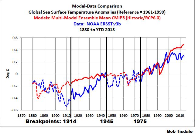 ?w=960&h=663
First plot I come to is this one:
Which shows ERSST.v3b against CMIP5 RCP6.0 TOS. Reference period is 1961-1990. The proper reference period for comparing observation to CMIP5 is 1986-2005. So for the anomaly part of the discussion, the post you refer me to does nothing to address the actual question I have asked.
There isn’t a single plot on that page comparing ERSST.v3b to CMIP5 absolute. No plots for HadISST1 1° absolute. In short, that post answers none of my specific questions to Bob.
I’m giving you the opportunity, Brandon, to do it yourself and show that it makes a difference. Its not as if Bob has any more facilities than you to do this except intelligence.
Robert B,
I could care less how smart I am relative to Bob in anyone’s eyes. This is a test of integrity I’m administering. One that is open-book by the way.
Brandon, don’t administer tests. Its obvious that you have decided not to believe Bob no matter what. Provide the plot for us that you want Bob to show.
Robert B,
One way to decide whether someone can be trusted or not is to ask a skeptical question and see what answer they give. If they avoid a direct answer, there is reasonable cause to suspect they are hiding something.
Brandon, I have no need to repeat my earlier reply to you.
Bob,
Yes, your evasions to my direct questions are already a matter of record, so there is no need to repeat them. At the top of this article you write [empasis mine]:
I’ve read some complaints about your model-data comparisons, but AFAIK those complaints have not been about the use of anomalies per se. You write on your own blog [empasis mine]:
https://bobtisdale.wordpress.com/2014/01/25/why-arent-global-surface-temperature-data-produced-in-absolute-form/
I could not agree more; what you write conforms to my own understanding of why climatologists and the IPCC use anomalies for a number of things, including model-observation comparisons.
Now, I have informed you that standard practice when comparing CMIP5 to observation is to use 1986-2005 as the anomaly reference period because 2006 is when the RCP projection portion of the model output begins. As such, you have the perfect opportunity to do a comparison between CMIP5 RCP6.0 TOS and Reynolds OI.v2 using anomalies in a way that nobody from the IPCC on down could reasonably object to on the basis of non-compliance to standard procedure.
And yet you resist doing such a comparison after having been asked in properly skeptical fashion. Why?
Also, why the continued resistance to showing us how HadISST1 compares to CMIP5 in the absolute from 1870 to present?
Here is the entire warming pattern in single hovmoller diagram (dataset is OI SST V2.0 and data smoothed with 12 month runnin average):
Bob, you have done a tremendous job in putting these data together and I commend you for that. Nevertheless, there are some basic questions I want you to consider. First and foremost is your use of a linear approximation for the entire length of observed data sets. That is only justified if the data are random but they are not, they just look that way. This is particularly important when we know that a physical change has taken place. And that is exactly what did happen at the turn of the century . Jim Steele has suggested that the hiatus is caused by the PDO change from its warm phase to its cool phase when the new century started. After looking at your data I have to agree that he has a point. What you should do is to break up all the linear graphs that cross the century line and treat the two halves independently. And while we are talking of the hiatus, there was another one in the eighties and nineties that is covered up by fake warming in GISS, NCDC, and HadCRUT. That fake warming of the eighties and nineties is present in your last graph. To see the true temperature of this period you have to look at satellite data. There are five El Nino peaks there so that to get the global mean temperature you need to mark the midpoint between each El Nino peak and the bottom of the adjacent valley. I did that and the dots lined up as a horizontal straight line, 18 years long, the same as today’s hiatus. (see my figure 15). Blocking that earlier hiatus with fake warming is a conspiracy among the three temperature sources I listed. It is falsified science they have successfully inserted into most available temperature sources. As a historical note this used to be called late twentieth century warming. The warmest point in history that Hansen spoke of to the Senate is the middle El Nino peak in this wave train.
Did anybody read the whole thing?
I did, numerous times.
Thank you!!!
yup
“Even significant releases of anthropogenic carbon dioxide and methane into the atmosphere do not change average parameters of the Earth’s heat regime and have no essential effect on the Earth’s climate warming. Moreover, based on the adiabatic model of heat transfer, the writers showed that additional releases of CO2 and CH4 lead to cooling (and not to warming as the proponents of the conventional theory of global warming state) of the Earth’s atmosphere. The additional methane releases possess a double cooling effect: First, they intensify convection in the lower layers of troposphere; Second, the methane together with associated water vapor intercept part of the infrared solar irradiation reaching the Earth. Thus, petroleum production and other anthropogenic activities resulting in accumulation of additional amounts of methane and carbon dioxide in the atmosphere have practically no effect on the Earth’s climate.”
http://file.scirp.org/Html/4-4700320_51443.htm
Thanks, Bob. This excellent article will take me a long time to digest.
But it is evident that showing temperatures instead of just anomalies puts the models in an even more unmaintainable position. And they are still acceptable for policy making!
Global Circulation Models (GCMs) are costly simulations of another world, one controlled by CO2.
Very nice article, Bob.
I am curious about the nature of the models in the comparison. Slab ocean models can hardly be expected to do a good job on the details examined here. Are all the models in the ensemble ones with “realistic” oceans?
Even models with “realistic” oceans are not likely to get the timing right for various oscillations. Then when you average those models together, any evidence of the oscillations disappear. The point of averaging all the models together is to do just that, so as to bring out the long term trend. To what extent are the results here dependent on the phase of ENSO, AMO, PDO, etc.? Do some of the individual models show those phenomena in a somewhat realistic manner?
That is part of a bigger issue, which is the complete lack of error analysis in your results. When the disagreements are a factor of two or three, adding error bars to the numbers is probably not going to change the conclusions, but it would still be nice to see the error bars, so as to be sure.
I found your claim that the models display “no skill” to be a bit overstated. Generally, “no skill” means no better than random chance. That would not seem to describe the results. A lack of skill in predicting the phase of the various oscillations could produce glaring errors in an analysis like this, even if there is skill in predicting the long term trends. And I don’t think any of the modellers would claim any skill in that type of prediction. So how much of the lack of skill is due to that?
Mike M: The IPCC has been representing the climate models in the CMIP3 (AR4) and CMIP5 (AR5) archives as fully functional coupled ocean-atmosphere climate models.
You wrote: “Even models with “realistic” oceans are not likely to get the timing right for various oscillations. Then when you average those models together, any evidence of the oscillations disappear.”
Exactly. And that’s what we’re looking for. The average would represent the forced component of the models, which is what I was after. I linked the following post in the introduction:
http://bobtisdale.wordpress.com/2013/10/06/on-the-use-of-the-multi-model-mean/
You wrote: “To what extent are the results here dependent on the phase of ENSO, AMO, PDO, etc.?”
Climate models cannot simulate ENSO. I linked two papers in the post that discussed those failings. (Do a word find of the name Guilyardi or Bellenger.) Since the PDO is an aftereffect of ENSO, climate models don’t simulate the PDO either. And there are numerous papers about the need for future generations of climate models to be able to simulate the AMO, which suggests they presently do not.
With respect to the rest of your concerns, consider my presentations as a first pass. I point out problems. Others are more than welcome to perform a more detailed analysis.
Cheers.
Bob,
I agree that you are looking at the forced component only in the models. The problem I have is that in the observational data you have the forced component plus a significant component of internal variability. So even if the models were perfect, which they surely are not, there would be a significant degree of disagreement, amounting to whatever portion of the natural signal is internal variability, such as ENSO. So it would not seem to be a fair comparison.
I am inclined to agree that you can not model the climate if you can not model the oceans. I get the impression that the modellers would agree that ocean variability is important on short time scales, perhaps even running to a few decades, but not so important on longer time scales. So it is not clear to what extent the problems you illustrate are problems with the longer term projections.
Bob, do they exclude the sea surface temperature covered with ice? It isn’t land, its sea, so do they just leave it out or do they cleverly include the sub-ice temperature of ~-2C? What is the temperature composed of in the polar regions? They go on about polar amplification so it’s important to measure it properly. Are you satisfied with way its is measured? The area above the Arctic and Antarctic circles combine, IIRC, to about 40million km^2 or ~8% of the globe.
Gary, infilled sea surface temperature datasets like HADISST, ERSST.v3b and Reynolds OI.v2 use the freezing temperature of ocean water anytime sea ice exists in a polar ocean grid. It’s only when there’s open ocean that the sea surface temperature value is something other than the freezing point of water. I’ve taken a look at the climate models and they appear to do the same thing. The only dataset that doesn’t work that way is HADSST. It’s an anomaly dataset, without infilling. If there’s no actual sea surface temperature reading in a grid, there’s no data in that grid, and, with how the UKMO addresses the grids without data, the values there are the average anomaly for the hemisphere.
A wave of bad weather is coming down from Wednesday in the Middle East. In the Gaza Strip, hit by wind, rain and snow, the budget is four dead, including three children. Medical sources said quoted by the news agency Maan. The three children are dead: a baby two months, found dead in the cold in a refugee camp in Bet Hanun in the northern Gaza Strip; a child who died of a month for the same reason; and a little girl, she’s a few months, died asphyxiated yesterday in the small village of kuza because of a stove that parents had lit to warm up. The fourth victim is instead a fisherman of 22 years who died of cold while working at the beach.
http://www.meteoweb.eu/2015/01/ondata-freddo-in-medioriente-gaza-4-morti-3-bimbi/375648/
Where is Wednesday?
That’s browser translated Italian to English.
I believe the storm entered N. Europe and has been involving the Middle East since last Wednesday.
I am not a scientist and I am not a modeller. I address this directly to Bob T.
Bob, I just had this blinding flash.
Most of us interested but naïve followers assume that the models are built from the floor up. from scratch.
Therefore it’s valid for us to criticise modelA for being no good on clouds , or ModelB for being no good on ice albedo..etc
but is it the case that the models are not in fact built from scratch, but instead use some sort of climate modelling package ??????
EternalOptimist,
The models are built from the ground up, but are not entirely independent. The models evolve over time both as a result of deficiencies being recognized and because increased computing power allows new levels of detail to be addressed. That leads to particular models having multiple descendents. So each model has a genealogy tracing its decent back to earlier models. They do not all trace back to a single original model, but I think the total number of original models is pretty small.
Full of it bob well done! what a load of crap!
Glad you learned nothing from it, Sparks.
Have a good day.
What on earth? Sorry Bob, I didn’t write that comment! someone has been having a laugh at my expense, as my account stays logged in. I know who it was and they’ll be dealt with payback! All the best 😉
‘For almost two decades, the IPCC has claimed that they have found the “fingerprints” of human-induced global warming. ‘
They have, theirs.
Another informative post Bob, the links to the Bellenger paper and Guilyardi paper confirm your evaluation.
I think you should ignore your detractors from another web location unless they choose to present their rebuttals here or at your site. They are not about observation and science but rather the opposite. I have learned much from you and nothing from them.
“Bob Tisdale
January 11, 2015 at 4:07 pm
Brandon: (1) Obviously, once again, you did not read or (I would have gone with “NOR”)
comprehend my post.”
Mr. Dr. Professor Tisdale,
No one else did either. 29 graphs plus a few more in comments? Graphing sea surface temps to the tenths of a degree, and even to the hundredths of a degree in a couple of these? People tell you “Thank you” but they do not parse your thoughts. Who could?
I repeat my offer to help you with an executive summary, to make clear your points. I do not actually know if you have a point though, and few if any readers do either.
Bob T. wrote:
“There are no similarities between the spatial patterns of the modeled and observed trends. The models show the greatest warming near the equator, while in the real world, the greatest warming has occurred at mid and high latitudes. The North Atlantic in the real world warmed at the highest rate. That warming of the North Atlantic is associated with the Atlantic Multidecadal Oscillation.
In addition there is a paragraph that is underlined. Read that also. This seems to make perfect sense. The rest is documentation.
Sorry, Mikey, but not everything can be expressed in short paragraphs full of monosyllabic words. Bob’s post is indeed long for this format, but it is generally clear and well-explained, and seems to me to be well-suited for the intended audience. Sorry it was too tough for you…
Karl Compton I find you rather poor in comprehension. Reading the comments makes it clear that few if any labored through this prose. Congrats, you must have a lot of time on your hands…
Michael Moon, people can choose to read the post in its entirety or they can choose not to. That’s their choice. The information is there.
Cheers.
Here is quick analysis of the OI SST v2.0 Dataset. It is quite obivious that north and south poles are oscillating in very large scale. Also it seems that if we are not getting El Nino pulses anymore, we are entering in to cooling phase of the Northern Hemisphere.
And for comparasion warming pattern of the RRS MSU TLT -dataset:
Bob, perhaps this is where your nomads data has gone?
http://polar.ncep.noaa.gov/sst/ or http://www.emc.ncep.noaa.gov/
Not sure what was on the nomads server 🙂
Thanks for the links, wmsc. NOMADS allowed users to retrieve time-series data based on user-defined coordinates and to create maps of that data.
The Pinatubo eruption in 1991 shows up on the actual extratropical SST for the NH, and not necessarily the Pacific Ocean. There seems to be absolutely no signature in the tropical data nor the extratropical SH.
The mean of the models, on the other hand, show up to 0.2°C in the tropics and 0.1-0.2°C elsewhere for differences between 1991 and 1992-93. Is this common to all models? Is this because of Pinatubo?
If most of the model results show more than 0.1°C in the tropics and elsewhere (apart form the Arctic and Southern Ocean) rather than just the extratropical NH, they’re rubbish. Trends are off and the effect of the biggest random event is not close to reality. They’re crap.
Wow!, thanks Bob for a comprehensive coverage of model failure.
Look forward to the pdf.
johnmarshall, I just posted the pdf in an update. Thanks for the reminder:
https://bobtisdale.files.wordpress.com/2015/01/pdf-of-alarmists-bizarrely-claim-just-what-agw-predicts-about-the-record-high-global-sea-surface-temperatures.pdf
Cheers.
This is a first-class analysis. It should be turned – urgently – into a reviewed paper in one of the learned journals.
Well, as this post deals with ocean temperatures, how can anyone claim that there has been no waring in 18 years as long as ocean temperatures have never been higher?
…how can anyone claim that there has been no waring in 18 years…
http://www.woodfortrees.org/plot/rss/from:1997/plot/rss/from:1997.9/trend
So ocean temperature does not exist because RSS is the index that deviates the most from the other temperature indexes.
Nice dbstealey.
hi rooter,
No fair putting words in my mouth. I just posted a chart, that’s all. Readers can take it for what it’s worth. But it tells me a lot, it does.
So, is there anything about the climate that cannot be fully explained by natural variability?
Because everything we observe now has happened before. Repeatedly. And to a much greater degree.
I can see no difference between the current climate and previous observations. It’s all the same. Current parameters are all well within past parameters.
So, why the climate scare? Is it money? Politics? Power? Ego?
Because it certainly isn’t science, facts or observations…
“No fair putting words in my mouth.”
What’s good for the goose…………………………………..
danny me boi,
Have you noticed that no one is paying much attention to you?
The reason is simple: you add nothing worthwhile to the debate.
Yep. I noticed. I’m heartbroken. 🙁
But it’s okay. I’m still lernnnin.
Thanks for your input, and for responding………….
Danny, when dbstealey begins to attack you, you’ve made the grade!
..
Congrats.
and welcome to an exclusive club.
The Unemployed Socks says:
…you’ve made the grade!
Yes. Your grade: F – .
“Unemployed?”
…
Again Mr dbstealey is wrong.
..
Tsk, tsk tsk…..you never seem to get it right.
1) You are wrong about “natural variability” ..
Please read: http://www.physics.mcgill.ca/~gang/eprints/eprintLovejoy/neweprint/Anthro.climate.dynamics.13.3.14.pdf
2) This was pointed out to you in the past. Here’s a link to the post so you can refresh your memory. Specifically I direct you to re-read item number 3 .
..
http://wattsupwiththat.com/2015/01/10/portents-in-paris/#comment-1834875
For the 2nd time…
http://wattsupwiththat.com/2015/01/10/portents-in-paris/#comment-1834875
See item #3
Um. Evidence please: “I always get it right about natural variability”.
I suppose that you mean you can prove all changes to climate are SOLELY natural. If one insists on evidence from the AGW side that GHG’s impacts must be “measureable” then does that same standard apply for natural variability? Or are there two standards? (Sure hope this question doesn’t “add” anything of value).
Thank you for the link to the 2014 BEST report.
D. Thomas,
Evidence? ‘Natural variability’ is the evidence! But if you think you have evidence that contradicts nature, then by all means, post it here. Please. I have been asking for a measurement of AGW for years now. But no one seems to have such a thing.
The pal-reviewed link you’re getting so excited about reminds me of a certain UK spy mistress’s quote: “He would say that, wouldn’t he?” Yes, they would say that, wouldn’t they?
The authors say:
“By using CO2 radiative forcings as a linear surrogate for all anthropogenic effects…”
Well, yeah. If they’re gonna use all CO2 emissions, then they can show anything. Further, the large majority of all peer reviewed papers turn out to be wrong. That one is no exception. Because there are no quantifiable anthropogenic effects.
You need to pay attention to words, because they matter: I wrote ‘default’, which you ignored. That means in this case, the starting point, since there is no perceived difference between past natural variability and the current climate.
If anything, the climate now has less fluctuations in T, and other parameters, than it did before human emissions ramped up.
We can only go by the real world, and the real world says that there is nothing either unusual, or unprecendented happening. Everything observed now has happened before — and to a greater degree. No past parameters have been exceeded.
So when you read about the default sitiuation, you need to do a comparison: do the current climate parameters exceed past parameters?
If so, then human emissions could be the reason.
But if not, then human emissions cannot be the reason.
If you accept just that one point, you cannot be a climate alarmist. Because there is nothing alarming happpening. The man-made global warming scare is baseless. Nothing has changed that fact.
Db,
Sir. Please stop superimposing.
I’m not excited about anything. Just being respectful by thanking David for the the link. Simple. And I thank you for a relatively respectful comment here.
I see the surrogacy. I cannot follow the physics as I’m not educated along those lines.
You say the paper is wrong (an opinion) but offer no proof that “there are no quantifiable anthropogenic effects”. This sir, is discomforting. I do not take David’s word, nor yours. I will lean more on the scientist than an anonymous and seemingly angry blog poster lacking evidence. My readings, and even you have indicated this, lead me to at least some confidence (moderately likely?) that man is causing some warming. Quantification and measurement is challenging but wrt other scientific endeavors we were unable to “quantify and measure” things until we could.
You go further and state: ” Further, the large majority of all peer reviewed papers turn out to be wrong.” Once again, an opinion as it lacks evidence and frankly is an insult to scientists everywhere many of whom one can presume might be included within the 31,000 signatories to a consensus document you put for with regularity.
I’ve told you before, yet you refuse to listen as you seem to enjoy the joust with zero concern for other readers here, that I am no alarmist. I’m agnostic. I don’t know (yet). You don’t either, or you would prove and not duck the question I asked earlier. Warming. Yes. Man caused, eh….we tend to modify our environment. Natural. Definitely. Either exclusive? Doubtful.
I do not profess to understand climate, and anyone who indicates they have all the answers and do not provide the evidence is ……..what’s the term……..hand waving? So for my final attempt. Can you prove that the changing climate (stating that as a given) is soley natural? If not, either retract or others can decide your level of credibility. Other than chiding you along as it’s so entirely easy to “spin you up” that only adds entertainment value for me and this is likely an inappropriate format for me to have fun.
The number of warmer than recently typical years peaks my curiosity, and causes me zero fear for now or the near future. It does, however, lead me to desire more information and points of view as something is going on that we do not (yet) understand.
Frankly, some of which I’ve seen you post I’ve found to be of value. Much is insult, ad hom, twisting, and paints a picture of you that might not be so attractive were it a mirror.
So rather than continue the rhetoric, please stick with science (and I look forward to seeing some soon).
Regards,
the trailer park guy
dbstealey still has not discovered the topic of this post. Sea surface temperature. They still exist even if dbstealeychoose temperatures in the lower troposphere. And what is wrong with UAH?
Perhaps the problem is that UAH they do not use a climate model to adjust for diurnal drift?
D. Thomas says:
Um. Evidence please…
Um. After all the reading you’ve done, you still don’t get it: skeptics have nothing to prove.
The onus is entirely upon the alarmist cult, because it is their [failed] conjecture that skeptics are questioning.
Alarmists still improbably claim that global warming is continuing [accelerating, even!] and that CO2 is a problem.
Therefore, the onus is on them to support their Belief.
They have failed. Global warming has stopped, and not just recently. And the only evidence we have regarding CO2 is that it is harmless, and beneficial to the biosphere.
The alarmist crowd can’t even produce evidence of AGW! Everything they believe is based on their assertions. That is why skeptical scientists have absolutely destroyed their conjectures… with the backing of the ultimate Authority: Planet Earth.
The fact that alarmists like socks are still arguing about something that has no measurable basis shows that they are confused.
First, wanted to share this if ya haven’t seen it. Shows warm waters: http://static.berkeleyearth.org/memos/Global-Warming-2014-Berkeley-Earth-Newsletter.pdf?/2014
Second, I knew you’d avoid the question with “skeptics got nutin to prove”. It was your statement sir, so either back it up or back it off. It’s YOUR credibility at stake, not mine. You stated it. Own it!
rooter,
At least your comments make sense, so I will treat them with the respect they deserve. You asked:
…how can anyone claim that there has been no waring in 18 years …
Easy. I simply posted a chart showing that global warming has stopped. There is an enormous lag in ocean temperatures due to inertia. We have discussed this before here, in depth. It’s in the archives.
The basic debate is not over whether there is or isn’t global warming. Of course there is — and it is natural. That is the Occam’s Razor default assumption.
The argument is about whether human-emitted CO2 has caused [or is causing] runaway global warming.
If it is, skeptics say: prove it. Post verifiable measurements showing how much global warming is due to AGW. That’s pretty basic, no? Just post a testable measurement to support your conjecture. If AGW is real, that should be no problem…
Rooter
I will simply posted a chart showing that global warming has not stopped.
Here it is
http://www.woodfortrees.org/plot/uah/from:1997/plot/uah/from:1997.9/trend
…
Now…..which cherry do you like, mine or dbstealey’s ?
Socks says, which one do you like??
Better be careful — the ‘consensus‘ is heavily on the side of skeptics.
Me, I go with facts, not with what I ‘like’. How many databases do you want showing that global warming has stopped?
So, which one do you like?
I got lots more… just ask, and I will post.
1) UAH
http://www.woodfortrees.org/plot/uah/from:1997/plot/uah/from:1997/trend
2) HADCRUT4
http://www.woodfortrees.org/plot/hadcrut4gl/from:1997/plot/hadcrut4gl/from:1997/trend
3) GISS
http://www.woodfortrees.org/plot/gistemp/from:1997/plot/gistemp/from:1997/trend
Here is a classic example of “cherry picking”
…
Here is dbstealey’s first link
http://www.woodfortrees.org/plot/rss/from:1997/plot/rss/from:1997.9/trend
Notice what happens when you plot the OLS trend from the beginning of the data 1997 instead of 1997.9
http://www.woodfortrees.org/plot/rss/from:1997/plot/rss/from:1997.9/trend/plot/rss/from:1997/trend
Care to explain why you picked 1997.9 as the starting point ?
‘socks’ says:
Here is a classic example of “cherry picking”
Wrong, as always. I could post a hundred different charts, from a hundred different sources, and on a hundred different time scales. But none of them would matter to the unemployed ‘socrates’, because his mind is made up and closed tight.
Now that we have that fact settled…
…which is it, socks? Are you an unemployed layabout? Or are you putting one over on your employer?
Here…I fixed the other chart you posted.
http://www.woodfortrees.org/plot/hadcrut4gl/from:1987/to:2014/plot/hadcrut4gl/from:1987/to:2014/trend/plot/hadcrut3gl/from:1987/to:2014/plot/hadcrut3gl/from:1987/to:2014/trend/plot/rss/from:1987/to:2014/plot/rss/from:1987/to:2014/trend/plot/hadsst2gl/from:1987/to:2014/plot/hadsst2gl/from:1987/to:2014/trend/plot/hadcrut4gl/from:1987/to:2014/trend/plot/hadsst2gl/from:1987/to:2014/trend/plot/rss/from:1987/to:2014/trend
Now why did you pick 1997.9 instead of 1997 ?
@ the sockspuppet:
I will answer one question, then ask one question:
Answer: I copied the chart that I posted, just like I have copied thousands of other charts. I do not recall who produced it, but as I stated, I can post as many more charts as you want, with every possible time scale. They all debunk your alarmist nonsense — just like Planet Earth is debunking you.
I copied it just like I copied all the other charts I posted above. In accordance with your incessant and juvelile nitpicking, you are desperately looking for any minor issue to try and show that your view is correct. But of course, your Belief is wrong.
1) So you copy stuff because someone else cherry picked the start point to make it look good. You need to be more selective. For example I did like that chart you posted that showd the model output of CO2 for the past millions of years.
..
2) I already answered your other question.
http://wattsupwiththat.com/2015/01/10/portents-in-paris/#comment-1834875 (item 3)
…
I’m sorry if you don’t like the answer, feel free to keep asking it again and again.
@ socks:
That link brought me to a moderator’s comment, which I had never seen before now:
[Neither is deliberately publicizing only 2 answers out of 5 questions asked from only 75 replies to a form submitted to 13,500 members. But that 97% (75 out of 13,500) you do approve of, eh? .mod]
See, nobody agrees with your anti-OISM nonsense, whether it is the preposterous attempt to conflate the total of everyone in the known universe with the skeptical consensus, or with your incessant nitpicking.
The bottom line is: you’ve got nothin’.
“So the answer is: either cheating your employer, or getting paid to post. Got it. That does not surprise me at all.”
…
Don’t you realize what time it is ? It is 9:37 pm CET in Hamburg Germany.
..
ROFL!
Hamburg, Germany??
But you just said you were in Austrailia! <—[yes, folks, that's how he spelled it].
Falsus in uno, falsus in omnibus
@D. Thomas:
G’wan back to your trailer park. Bring a broom, there’s work to be done. You can post on your own time…☺
So the answer to the question to Db: “is GW only a result of natural variability soley as result of natural variability?”
is (and I quote ya db” @D. Thomas:
G’wan back to your trailer park, jamoke. Bring a broom, there’s work to be done. You can post on your own time…”
Now THAT’s adding value! My education is so much more than before your post. (Oh, and it’s a day off so broom’s over in the corner.)
Db, you’re a hoot! Thanks for entertaining us all.
Read the post very carefully Mr dbstealey
..
http://wattsupwiththat.com/2015/01/10/portents-in-paris/#comment-1834875
It says…“2) “It is Tuesday, right in the middle of the workweek” …..No, it’s Wednesday in Australia”
…
Do you have trouble with comprehension?
(Snip. You are not without fault here. ~ mod.)
@D. Thomas,
It’s pretty easy to see what motivates some folks. In your case, it is your desperate need to be a part; to be noticed. In this case, you are trying to be a part of something you don’t understand.
For example, you tried to use BEST as your “authority”. But we have been through that before you ever appeared here. Go read the archives, you will learn a lot about BEST:
http://wattsupwiththat.files.wordpress.com/2011/10/article-2055191-0e974b4300000578-216_468x4731.jpg
As for socks, he deliberately obfuscated his location. Is it Germany? Or Australia? It still looks to me like he’s saying he’s in Australia. But now that it’s pointed out, I suppose it could be somewhere else.
There might be something to David’s question about your reading comprehension.
I quote myself” First, wanted to share this if ya haven’t seen it. Shows warm waters: http://static.berkeleyearth.org/memos/Global-Warming-2014-Berkeley-Earth-Newsletter.pdf?/2014”
Authority? Okay. Think I just shared a link and stated that it shows warm waters, but whatever. Didn’t use it to support an argument.
In case ya wanna research Berkley here’s a wiki: http://en.wikipedia.org/wiki/Berkeley_Earth
You are a pseudo master of deflection.
As a skeptic with nuthin to prove, you have proven much. I, for one, am convinced.
Bob, Fredberple, or anyone,
I’m late to this party so apologies.
No scientist here. Not even up to calling myself an citizen scientist yet either. But since Fredberple posted the GISS graphic at 10:08 on the 12th it struck me that the Alaska warmth is regionally ‘relatively’ near the area of drought in California making me wonder about the possibility of a connection? There shows a bit of a spike in the East Pacific chart Bob provides, but the GISS graphic doesn’t show the same that I can tell except along the coast. The greater pacific seems a bit cooler.
Thoughts or suggestions. Chasing a squirrel? Might anyone offer how to chase it further (or if it should be chased at all)?
Bob, there appears to be a ton of your energy put in to this offering. Thank you for your sharing.
Hmmm.
Persona non grata? Stupid question? Both?
David,
It’s what one does when one can’t back up what they post. Db hasn’t address your questions or mine. If I lay my broom between those points of data I see a trend there.
I don’t know….the name calling he’s engaged in indicates that you have won the argument.
“Danny” [are you a grown-up, or a kid?] says:
I suppose that you mean you can prove all changes to climate are SOLELY natural.
See, that’s the nonsense we skeptics have to deal with. Sisyphus would understand.
Earth to Danny: you cannot prove a negative, and you cannot prove “all”. You have a notion of the way things should be, and you are trying to re-frame thew debate so it tilts your way. But you have lots to learn.
Natural variability is the default position, per Occam’s Razor. But the alarmist crowd tries to make things more complicated than necessary, because the alternative is too horrible to contemplate:
They would have to admit they are WRONG!
Of course, 99% of WUWT commenters know the peanut gallery here is flat wrong. They cannot even produce a simple measurement. That’s pretty lame, when their entire Belief system depends on it.
Finally, the only reason skeptics have won the argument, and the overall debate, is because… alarmists got nothin’. <—lookin' at you, socks.
Does the proprietor of this site condone your name calling?
So I take it then that the answer to the question is NO, you cannot prove that all changes to climate are solely natural. Hmmm. Makes me wonder why you’d indicate they are as a “default position”. Lots of strength in that. Guess I’ll never know ’cause no matter how many times you’re asked you seem to not answer.
(Since you seemingly must include an attempt at insult in your responses I don’t wanna miss any detail with you).
Oh, and grown up by age, but not maturity. Just ask my trailer park wifey.
You?
Danny, here’s a study that shows the null hypothesis must be rejected.
..
http://www.physics.mcgill.ca/~gang/eprints/eprintLovejoy/neweprint/Anthro.climate.dynamics.13.3.14.pdf
..
In other words, saying it’s “natural variation” is false.
Thank you!
I have to confess that I don’t ordinarily read Mr. Tisdale’s posts. Even less to my credit, I took a look this time only to see what the food fight was about.
But I’m glad I did; this post gives me new perspective on how clueless the models are to which so many give so much credence. From a lurker, thank you, Mr. Tisdale, for this post as well as the other work, which I should no doubt have appreciated more than I did.