Guest Post by Bob Tisdale
The topic of discussion is their new sea surface temperature dataset, ERSST.v4. Based on a breakpoint analysis recently promoted by RealClimate, NOAA appears to have reduced the early 20th Century warming rate to agree with the climate models used by the IPCC.
PRELIMINARY NOTES
NOAA introduced its new and improved sea surface temperature reconstruction ERSST.v4 with the papers (both are paywalled):
- Huang et al. (2014) Extended Reconstructed Sea Surface Temperature version 4 (ERSST.v4), Part I. Upgrades and Intercomparisons, and
- Liu et al. (2014) Extended Reconstructed Sea Surface Temperature version 4 (ERSST.v4): Part II. Parametric and Structural Uncertainty Estimations.
We provided an initial look at the new NOAA ERSST.v4 data, primarily during the satellite era, in the post Quick Look at the DATA for the New NOAA Sea Surface Temperature Dataset. An error was discovered in the November 2014 update of the ERSST.v4 sea surface temperature data supplied by NOAA…a teething problem with the update of a new dataset at NOAA. Subsequent to the correction, KNMI added the new ERSST.v4 dataset to the Monthly observations webpage at their Climate Explorer. After NOAA corrected the error, the new ERSST.v4 data fell back in line with their predecessor ERSST.v3b during the satellite era (November 1981 to present), which means they have a slightly higher warming rate than the NOAA Reynolds OI.v2 satellite-enhanced data.
Regarding the breakpoint years that divide the data into warming versus hiatus/cooling periods in this post, I’ve initially used 1912, 1940 and 1970 from the RealClimate post Recent global warming trends: significant or paused or what? Yes, I realize those breakpoints are controversial. See the BishopHill post Significance doing the rounds. And I also understand (1) those breakpoints are based on GISS land-ocean temperature index (LOTI) data, which includes the ERSST.v3b data, (2) that the breakpoint years are not based on the individual sea surface temperature datasets, and (3) that the breakpoints might change if GISS used the ERSST.v4 data. My use of these breakpoints does not mean I agree with them. I’m simply using them to avoid claims that I’ve cherry-picked them, and to show the impacts of breakpoint years on model-data comparisons.
The headline and initial discussions in this post are based on those 1912, 1940 and 1970 breakpoints. If we were to revise those changepoints to 1914, 1945 and 1975, also determined through breakpoint analysis of GISS LOTI data, then the warming rate of the new ERSST.v4 data during the early warming period of 1914 to 1945 falls back in line with the other sea surface temperature datasets, well above the trend simulated by climate models. We’ll illustrate this also.
I’ve excluded the polar oceans from the data presented in this post. That is, the data are for the latitudes of 60S-60N. This is commonly done in scientific studies because the data suppliers (NOAA and UKMO) account for sea ice differently. See Figure 8 from Huang et al. (2014) for an example.
Unless otherwise noted, anomalies are referenced to the WMO-preferred base years of 1981-2010.
The data and climate model outputs are available through the KNMI Climate Explorer.
For many of the illustrations, as opposed to adding the climate model outputs to the graphs, I’ve simply listed the simulated warming (or cooling) rate of the global sea surface temperatures, excluding the polar oceans, as represented by the multi-model ensemble-member mean of the climate models stored in the CMIP5 archive (historic and RCP8.5 forcings). The worst-case RCP8.5 forcings only impact the last few years and have little impact on the results for the recent warming period. For simulations of sea surface temperatures, there are also more ensemble members (model runs) using the RCP8.5 scenario (73 members) than there are with the RCP6.0 scenario (43 members). Additionally, see the post On the Use of the Multi-Model Mean.
THE EARLY 20th CENTURY WARMING PERIOD (1912-1940)
For years, we’ve been illustrating and discussing how the climate models used by the IPCC do not properly simulate the warming of the surface of the global oceans during the early 20th Century warming period, from the 1910s to the 1940s. They underestimate it by a wide margin. As a reference, Figure 1 illustrates the modeled and observed global sea surface temperature anomalies (60S-60N), without the polar oceans, for the early warming period of 1912 through 1940. Again, those are changepoint years promoted in the recent post at RealClimate. The data are represented by HADSST3 data from the UKMO and by the ERSST.v3b data currently in use by NOAA and GISS. The models are represented by the average of the outputs of the simulations of sea surface temperatures (based on multi-model ensemble-member mean) of the climate models stored in the CMIP5 archive. Those models were used by the IPCC for their 5th Assessment Report.
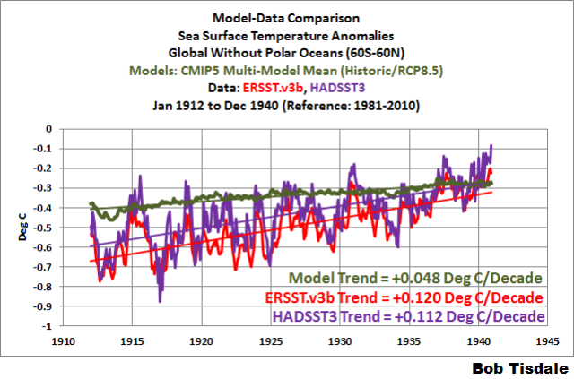
Figure 1
The observed warming based on the HADSST3 and ERSST.v3b data, from 1912 to 1940, was more than twice the rate simulated by climate models. Because the mean of the climate model outputs basically represents the forced component of the climate models, logic dictates that the additional observed warming was caused by naturally occurring, coupled ocean-atmosphere processes.
With the new ERSST.v4 data, the warming rate has been lowered almost to the modeled rate for the period of 1912 to 1940. See Figure 2 for a comparison of the ERSST.v4 data with the ERSST.v3b and HADSST3 data.
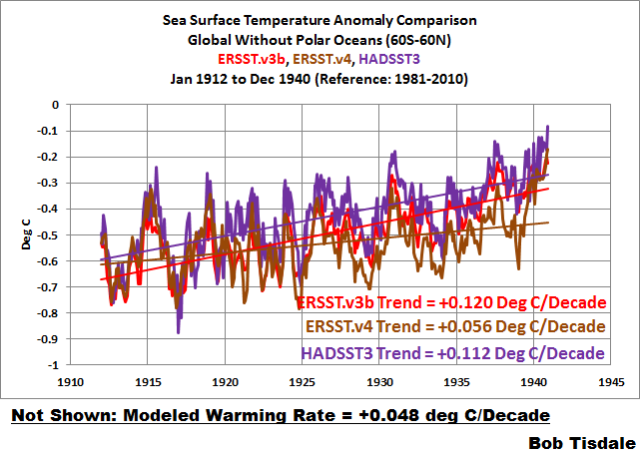
Figure 2
The ERSST.v3b data warming rate for the period of 1912 to 1940 is +0.056 deg C/decade, which is only slightly higher than the modeled rate of +0.048 deg C/decade.
EARLY COOLING PERIOD (1880-1912)
We’ll define the early cooling period as extending from 1880 to 1912. As we can see in Figure 3, the cooling rate of the new ERSST.v4 data is comparable to the ERSST.v3b data currently used by NOAA…both of which are slightly faster than the cooling rate shown by the HADSST3 data. Of course, the models show a slight warming during this period.

Figure 3
The models don’t simulate the warming from 1912 to 1940 shown by the ERSST.v3b and HADSST3 data because they don’t simulate the cooling from 1880 to 1912. But that doesn’t help to explain the slower warming rate of the ERSST.v4 data during the early-20th Century warming period. We’ll return to that discussion in a little while.
MID-20th CENTURY HIATUS (1940-1970)
The new ERSST.v4 data for the global oceans (without the polar oceans), for the period of 1940 to 1970, are compared to the ERSSTv3b and HADSST3 data in Figure 4. Where the ERSST.v3b data showed a very slight warming during this period, the ERSST.v4 data now show cooling…agreeing better with the models and the HADSST3 data.
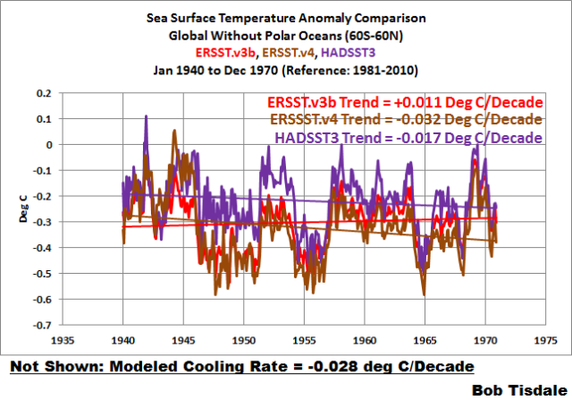
Figure 4
LATE WARMING PERIOD (1970-2014)
As shown in Figure 5, the revisions to the ERSST.v4 data have increased the sea surface warming to a rate that is slightly higher than the ERSST.v3b data during the period of 1970 to present, but the ERSST.v4 data still has a slightly slower warming rate than the HADSST3 data. And, of course, the models show a slightly higher warming rate than the observations. We would expect the models to perform best during this period, because some of the models are tuned to it.
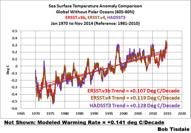
Figure 5
LONG-TERM WARMING RATES
Figures 6, 7 and 8 present the long-term global sea surface warming rates (without the polar oceans) of the new ERSST.v4 data and the ERSST.v3b and HADSST3 data, starting in 1854 (full term of the data), 1880 (full term of the GISS and NCDC combined land+ocean data) and 1900 (start of the 20th Century, give or take a year, depending on how you define it). The data in all have been smoothed with 12-month running-mean filters. The trends shown are based on the raw data.
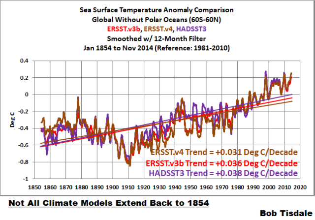
Figure 6
# # #

Figure 7
# # #

Figure 8
As an afterthought, I’ve included a comparison starting in 1915 (the last 100 years). See Figure 8.5. The models, of course, underestimate the warming because they can’t simulate the cooling that took place from the 1880s to the 1910s.

Figure 8.5
YOU MAY BE WONDERING…
How did NOAA manage to decrease the warming rate of its ERSST.v4 data during the early warming period, while maintaining long-term trends that are comparable to the other datasets?
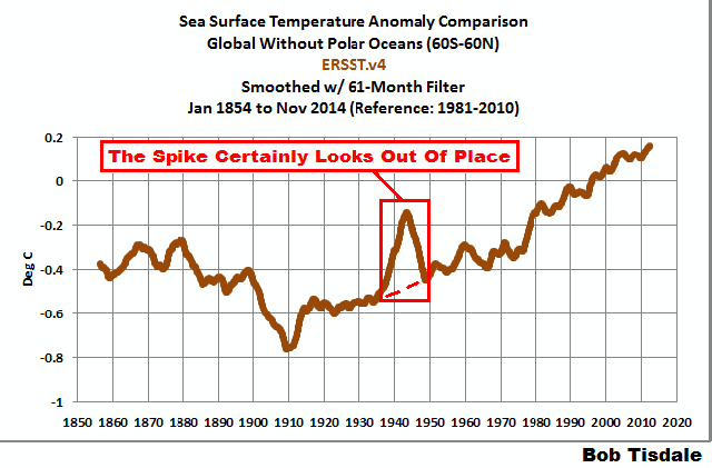
NOAA resurrected the spike in the late-1930s and early-1940s. See Figure 9. The data have been smoothed with a 61-month running-mean filter to minimize the ENSO- and volcano-related volatility. The 61-month filter also helps to emphasize that spike in sea surface temperatures.
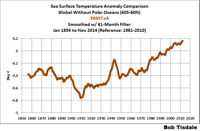
Figure 9
Figure 10 presents the three sea surface temperature datasets, for the period of 1854 to present. Again, all data are smoothed with 61-month filters. For the new ERSST.v4 data, NOAA severely limited the warming from the early-1910s until the mid-1930s and then added an unusual sudden warming.
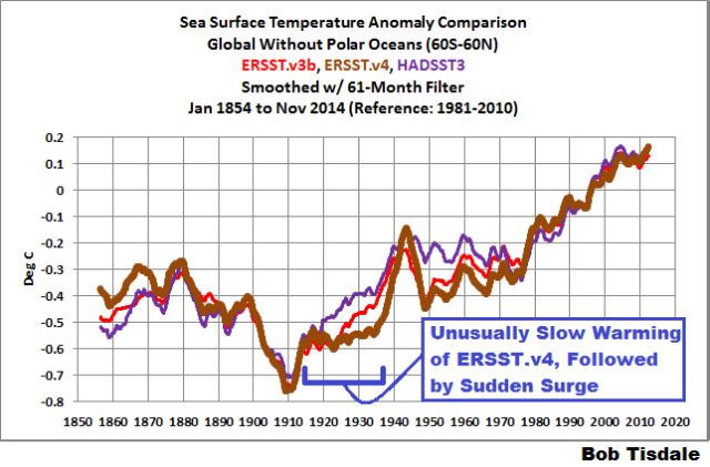
Figure 10
I’ve included the ICOADS source data to the graph in Figure 11. Compared to the ERSST.v3b and HADSST3 data, NOAA appears to have suppressed the pre-1940 “Folland correction” in its ERSST.v4 data. See Folland and Parker (1995) Correction of instrumental biases in historical sea surface temperature data.
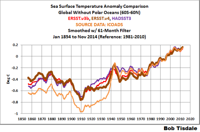
Figure 11
Animation 1 compares the new ERSST.v4 and HADSST3 data, for the period of 1854 to present, with both datasets smoothed with 61-months filters. The UKMO Hadley Centre has worked for decades to eliminate the spike in the late-1930s and early-1940s. NOAA, on the other hand, has enhanced it. (Note: If the animations don’t show on your browser, please click the link. Recently, there has been a problem with gif animations on my WordPress posts.)
Animation 1
THE SPIKE LIKELY COMES FROM A NEWER MARINE AIR TEMPERATURE DATASET THAT IS USED AS A REFERENCE FOR THE NEW ERSST.v4 DATA
Sea surface temperature source data for the older ERSST.v3b data are adjusted before 1941 using an older version of nighttime marine air temperature data, like the one shown in Figure 12. This would help to explain the agreement between those two datasets during the period of 1912 to 1940.

Figure 12
One of the features of the new ERSST.v4 data is the use of a newer and improved UKMO nighttime marine air temperature dataset. (It’s not available through the KNMI Climate Explorer, so I can’t include it in a comparison graph.) The source sea surface temperatures for the new ERSST.v4 data are adjusted for the full term by the new nighttime marine air temperature data, not just prior to 1941 like ERSST.v3b.
Huang et al. (2014) includes:
Firstly, ERSST.v3b does not provide SST bias adjustment after 1941 whereas subsequent analyses (e.g. Thompson et al. 2008) have highlighted potential post-1941 data issues and some newer datasets have addressed these issues (Kennedy et al. 2011; Hirahara et al. 2014). The latest release of Hadley NMAT version 2 (HadNMAT2) from 1856 to 2010 (Kent et al. 2013) provided better quality controlled NMAT, which includes adjustments for increased ship deck height, removal of artifacts, and increased spatial coverage due to added records. These NMAT data are better suited to identifying SST biases in ERSST, and therefore the bias adjustments in ERSST version 4 (ERSST.v4) have been estimated throughout the period of record instead of exclusively to account for pre-1941 biases as in v3b.
I suspect the newer nighttime marine air temperature data and its use as a reference for the full term are the reasons for the delayed warming from the early 1910s to the late 1930s and the trailing sudden upsurge in the ERSST.v4 data in the late 1930s.
SUPPOSE WE USED DIFFERENT BREAKPOINT YEARS
It is pretty obvious that the late-1930s to mid-1940s spike in the ERSST.v4 sea surface temperature data would impact the trends of the early-20th Century warming period and the mid-20th Century hiatus period, depending on the years chosen for analysis.
For my book Climate Models Fail, I used the breakpoints of 1914, 1945 and 1975. The changepoints of 1914 and 1945 were determined through breakpoint analysis by Dr. Leif Svalgaard. See his April 20, 2013 at 2:20 pm and April 20, 2013 at 4:21 pm comments on a WattsUpWithThat post here. And for 1975, I referred to the breakpoint analysis performed by statistician Tamino (a.k.a. Grant Foster).
As you might have suspected, because of that spike in the new ERSST.v4 data, using the 1914, 1945 and 1975 breakpoint years does have a noticeable impact on some of the warming and cooling rates.
For the early cooling period, nothing’s going to help the climate models. The models cannot simulate the cooling if we define that period by the years 1880 to 1914. See Figure 13.
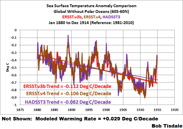
Figure 13
The revised breakpoints have a noticeable impact on the early warming period. See Figure 14. Using 1914 to 1945, the warming rate of the new ERSST.v4 data is slightly lower than that its predecessor and in line with the HADSST3 data…and more than 3 times faster than modeled.

Figure 14
NOTE: With that spike, the warming rates of the new ERSST.v4 data during the early-20th Century warming period depend very much on the choice of end year…while the changes in trends are not as great with the ERSST.v3b and HADSST3 data. Refer again to Figures 2 and 14.
With the breakpoint years of 1945 to 1975, Figure 15, the warming rate of the new ERSST.v4 data is considerably lower than the ERSST.vb data, almost flat, during the mid-20th Century hiatus, but not negative (cooling) as shown by the HADSST3 data and the models.

Figure 15
Last but not least, with the 1975 breakpoint, Figure 16, the warming rates of the ERSST.v3b and ERSST.v4 data are basically the same for the recent warming period, which are less than the HADSST3 data, and in turn, less than the modeled rate.

Figure 16
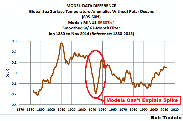
MODEL-DATA DIFFERENCE
Animation 2 includes 2 graphs that show the differences between the modeled and observed sea surface temperature anomalies for the period of January 1880 to November 2014. The model outputs and data are referenced to the period of 1880 to 2013 so that the results are not skewed by the base years. The models are again represented by the multi-model ensemble-member mean of the models stored in the CMIP5 archive (historic/RCP8.5 forcings). And the differences are created by subtracting the data (HADSST3 and ERSST.v4) from the model outputs. The rises from a negative difference (data warmer than models) in 1880 to the substantial positive difference (data cooler than models) in 1910 are caused by the observed cooling that can’t be explained by the models. NOAA tries to recover from that dip in global sea surface temperatures with a sudden upsurge in the late 1930s to early 1940s, which creates the odd looking spike in the ERSST.v4 data.
Animation 2
That spike in the new ERSST.v4 data cannot be explained by the models and stands out like a sore thumb.
CLOSING
Quite remarkably, if the breakpoint years of 1912, 1940 and 1970 are used, the warming and cooling rates of the CMIP5 models and the new NOAA ERSST.v4 sea surface temperature dataset agree reasonably well for the early and late warming periods and for the mid-20th Century hiatus period. That’s three out of four periods. See Figures 2, 4 and 5. On the other hand, if the breakpoint years of 1914, 1945 and 1975 are used, the models can only simulate the warming after 1975 shown in the new ERSST.v4 data. See Figures 13 through 16. During the period of 1945 to 1975, the ERSST.v4 data are closer to the models, which show a slight cooling. Prior to that, with the ERSST.v4 data, the models fail miserably at simulating the cooling of global sea surfaces from 1880 to 1914 and the rebound from 1914 to 1945.
When NCDC starts to include the new ERSST.v4 data in its combined land+ocean surface temperature data, and if GISS uses it, we’ll have to keep an eye on the breakpoints used by climate scientists in their model-data comparisons. In an effort to make models appear as though they can simulate global surface temperatures, I suspect we’ll see breakpoints that flatter the models…and all sorts of arguments about those breakpoints.
Then again, they can argue all they want, but the models still can’t explain that curious spike in the ERSST.v4 data. See Animation 2.
Happy New Year!!!
Many Happy returns to you and yours, Bob, and thanks so much for all the hard work. I look forward to 2015 and reading more of yours, and the others, who post here on WUWT. I hope it’s a good year for you.
Best regards, Eamon.
Enter your comment here…Nice piece of work! There does appear to be a typo in the text following Fig. 2… v3b vs .v4 data ref. (Should the word tuned be in ” ” or handled with tongs ? )
I fully expected NBC News to declare 2014 “the hottest year on record” two days early because of the mass of frigid Arctic air due to cover the country on the last two days. I figured it would ruin their mantra. Sure enough, on Monday night, Lester Holt trumpeted the news and of course it was due to “climate change.” I am curious if the cold wave was enough to disqualify 2014 in their own records, prompting the early call.
Hello Mr. Tisdale, Happy New Year.
Why not use some simple moving average (100 day, 200 day etc..) method (commonly used for stocks) to reduce the influence of the 1914, 1945 and 1975 breakpoints?
Thanks Bob.
We may soon see Congressional inquiries into these “adjusted” data sets. Let the rationalizations (and the whining) begin.
Happy New Year, everyone.
Has NOAA Once Again Tried to Adjust Data to Match Climate Models?
I seem to remember Albert Einstein having something to say about that.
Thanks, and “Happy New Year” to you as well.
Interesting to read this:
…the models still can’t explain…
I personally doubt that they ever will, due to the chaotic nature of these matters and scientists more interested in their sinecures than in science.
So the takeaway from this is that once again they’re changing the data to fit the models so that they can then claim the models fit the data? And nobody is meant to notice or ask questions? It’s amazing the faith that the world puts in those who call themselves scientists!
That’s because doing many runs on super computers is very expensive. While data adjustments can be done on PCs
I wonder what happens to inconvenient runs of models.
If the underlying signal (if present) critically depends upon user selected start and end dates then a wise person should conclude the signal is too small to be of concern!
following on from the above comment, in this case, observing the last animated graphic, the temperature ‘spike’ is shown as -0.15 and -0.2 a difference of 0.05, a very small signal.
I think you’re just looking at the bottom of the spike. Look at the top as well. It starts at about +0.15, spikes down to -0.2 and rebounds to about +0.12.
A spike on a graph is called such because it looks like a big nail (spike). It is a rapid change of amplitude followed immediately by an equally rapid return to the previous level.
The models don’t replicate (or explain) the rapid change down and then back up again.
Scientists who win Nobel prizes see anomalous data, look for an explanation, and discover something great. Hacks decide the data must be bogus, adjust it, discover nothing, and are generally a waste of lab space.
Al Gore will be hard a work to discover the true cause of the spike. Nobel prize in hand, jetting around the world, telling us all to reduce the size of our carbon footprint to match his example. Super-glutton to the rescue.
steverichards1984: Not sure where the 0.05 deg C comes from. The difference between HADSST3 and ERSST.v4b that’s associated with the spike is much greater than 0.05 deg C. See Figure 9 from Huang et al (2014)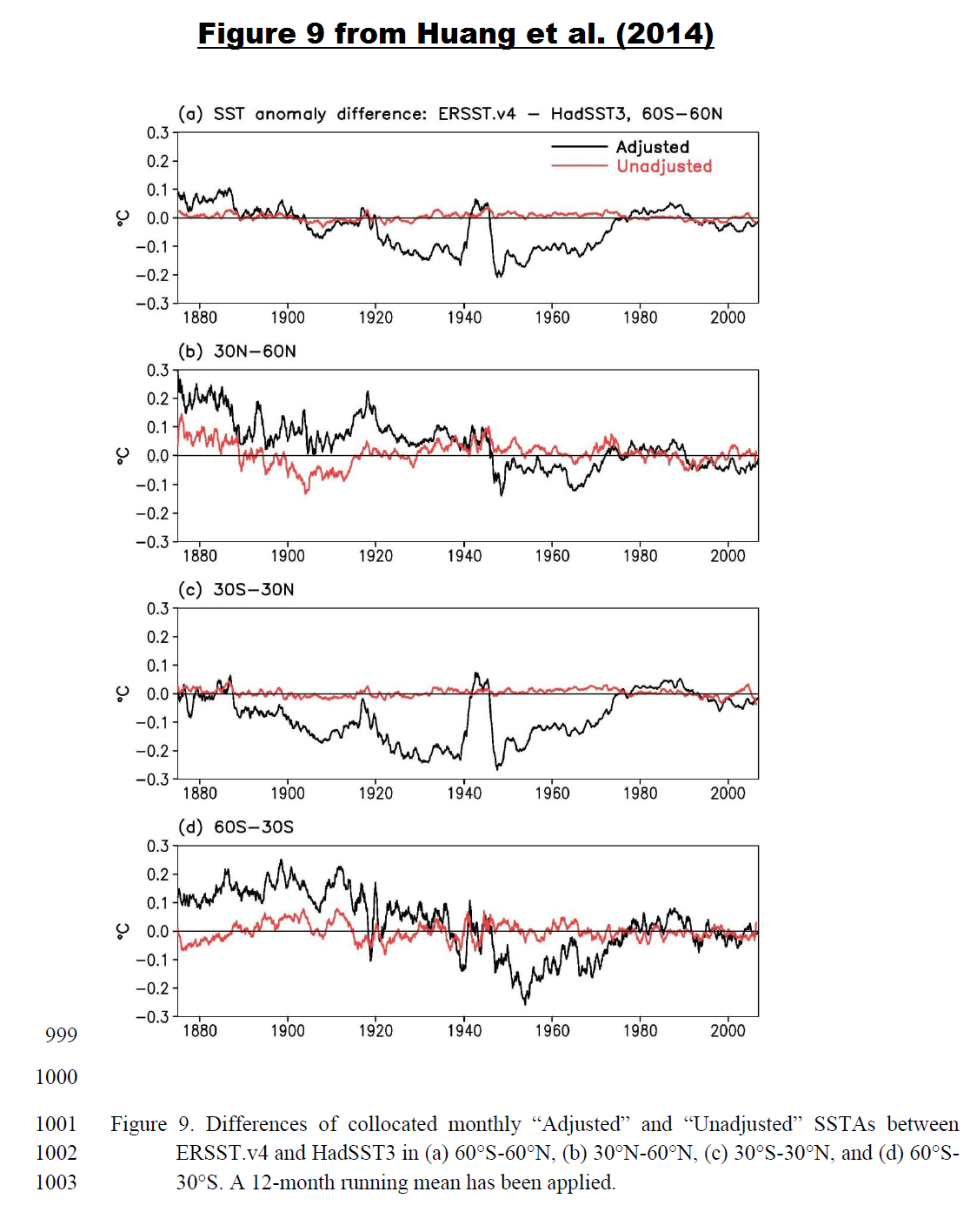
They have to “fudge” the data so that the models “work.” Otherwise they couldn’t write the IPCC reports, which are almost completely dependent on the models. It’s not the first time they’ve done this, and unfortunately it probably won’t be the last time.
Vigilance is the price we must pay in order for science to survive. Otherwise we are going end up back in the dark ages.
I think that it has gone to far to reverse now. I imagine that the data is adjusted because that is how they are taught in the post modern world. The narrative always explains the “Right thing to do”. and all things must conform to this even original raw data. Anybody who does not conform finds themselves on the outside and out of the gravy train. The Politicians will do nothing because they are now all career politicians and no nothing of the real world let alone anything about science. Politicians are also now at the mercy of the bureaucracies and only imagine that they are the decision makers. Any of the elected representatives of the people who start to go outside the narrative are hounded by the bureaucrats,
The next problem is around the too big to fail concept and all of the vested interests that are now plugged into the taxpayer funded gravy train. The rent seekers in all sorts of green industries and the grant grabbers in universities, government funded science organisations and ngos must now run into the 10s of millions of people around the planet. In the CSIRO in Australia, for example, it is my understanding that over half of their staff are now involved some way or another in climate research.
Add to this the greed that is driving the third world dictators and thugs who, along with the socialists in the green NGOs, now control the UN, All of these people and groups still feel that they have a chance to direct billions of dollars from western taxpayers into their pockets for so called climate debt. Take all of this together and you start to see the scope of the problem. Who would be game to take all of this on.
Forecast for North America is still unfavorable. Polar vortex will remain shifted, allowing the flow of air from the Arctic to the south.
http://www.cpc.ncep.noaa.gov/products/stratosphere/strat_a_f/gif_files/gfs_z50_nh_f240.gif
Climate ‘fudge’ anyone?
Or Climate Flocker “sausage” ?
First up happy new year everybody and thanks Anthony for all your great work over the years. Love visiting your site and enjoy reading your work thank you.
I’ve always wondered what it would look like if the graphs like the ones on this page had a extra line a + or – a one hole degree line, a comparison line, like what we see on the weather reports. We don’t see weather reports giving tomorrows weather forecast to one hundredth of a degree now do we. So were use to seeing the temperature in hole degrees, so what does the temperature record show us rounded to the nearest hole degree and what does it look like compared right along side to what the climate scientist show us? Just as a comparison. I’m just taking a guess here but if someone like Anthony rounded the temperature record to the nearest hole degree for as long as we have them for I’m guessing a almost prefect straight line for over a hundred years or so. Just wondering what do you think? A One hundred year straight line comparison line on their temperature graph now that would put it up the Climate Scientists now wouldn’t it. Hope everyone has a great 2015 bye
+1 Ozzie !
I think if you look at the data with less smoothing, it looks a little different.
I’m not sure what they were trying to do. There has always been this “mission” to remove the 1944-45 downblip in the Ocean SST series (or smooth it out somehow – reduce 1940-1944, raise 1945-50 for example). But they didn’t really do that. The peak adjustment down is 1939 and the peak adjustment up is 1945 but they still left the downblip in there and, in fact, they made it an even bigger downspike. I’m glad to see the 1877-1878 Super El Nino impacts put back in after the V3b changes removed some of that.
Monthly SSTs V4 and V3b.
http://s12.postimg.org/g6xt5gby5/ERSST_V4_and_V3b.png
And then, just the monthly changes between each version. Certainly looks unusual. 1935-1947 is wierd. Overall, the change is for less total warming back to 1854 but the most recent period from 2005 is warmed and the 1997-98 Super El Nino period impacts are cooled (all the better for claiming a record year kind-of-thing).
http://s15.postimg.org/m0zh47y6z/ERSST_V4_Changes_from_V3b.png
Thanks, Bill.
Large data-sets representing cash accounts always have to balance to the penny. No one will accept their bank saying we just re-worked the data and you have less money in your account than we thought 1 year earlier. Even in stock market investments where value of a share varies by the minute, at any particular point in time a share is worth a specific amount that cannot be re-jiggered years later. A share at closing on 12/31/2010 but cannot never be a different value than it was at closing on 12/31/2010.
With climate data it is the opposite, there is a continual effort figuring out what the values of a particular environment are at any particular point in time. The reason is the data is inconsistent, enormously imprecise due to continually changing methods of capturing data (which makes models calculating to a hundredths of a degree silly), and often missing (proxy data or extrapolation used instead). There are tons of this inconsistent, imprecise data which is massaged based on the needs and fancy of the day. When the data is so loosey-goosey almost any outcome desired can be had and often is.
So given that,
does the data generally show a global warming trend? Depends on when you choose your start date.
Is a warming trend good or bad? Depends on where you live.
Is there any practical purpose or application from this research. Not yet, unless having an excuse to raise taxes is now considered applied science.
Conjuring up something (a signal) out of nothing (noise) always requires a sojourn through the unreal
but think of all the skill required for 97% of the climate models to get the wrong answer. if you or I tried this, we would have a very hard time being so consistently wrong. to screw up to the degree the climate models have, well that takes years of training and experience.
The average person on the street only manages to be wrong 50% of the time, and to be wrong year after year, the odds are so astronomically small as to defeat even the most gifted of numbskulls.
Every year climate science sets new records in numbskullery. 2014 was without a doubt the highest level ever recorded. And with increased forcings set to continue, 2015 is likely to set new records as well. It will take decade, if not centuries, for anyone outside of climate science to recreate their accomplishments.
A very relevant analogy.
How can NOAA, a publicly funded governmental organization, paywall research that WE paid for? I can understand if a private college or a business contracted NOAA to perform research, the resulting research would be proprietary (minus any public data sets), but to have to pay for something that we already paid for? I’m a bit confused and a bit outraged.
BTW.. A Happy and joyous New Year to all…
The UK Met Office do the same, Mike
paywall research that WE paid for?
============
because only climate scientists are qualified to read what they produce. to the rest of us it would only seem like self-serving nonsense, so we are not encouraged to read it.
Yeh, that’s right.
You people here would only find error in the data.
Happy new year all.
Because if everybody could read it for free the odds of one finding something wrong with it goes up exponentially. We’re “messing with their paychecks” so by charging us for something we’ve already been taxed to pay for they figure they can get a few more bucks, over and above those taxes, before they get shoved out of the trough by truth. Hopefully sooner rather than later.
What I wonder about is the nature of the peak in both Ersst v3b and v4 in 2014. In 1998 we had, everyone agrees a very strong el niño and it had an effect on global sea temperatures. In 2014 we have had a subdued el niño, and according to these curves, it has had an even stronger effect on global sea temperatures. Does that agree with actual Argos data for example? (as opposed to the final NOAA product). Given the meme on 2014 being the warmest year, that 2014 peak looks strange
Keith says: “In 2014 we have had a subdued el niño, and according to these curves, it has had an even stronger effect on global sea temperatures. Does that agree with actual Argos data for example?”
ARGO data are not used to determine sea surface temperatures. ARGO data are used for subsurface ocean temperature-based datasets.
The 2014/15 El Nino only account for part of the 2014 spike in sea surface temperatures. The primary cause was the unusual warming event in the eastern extratropical North Pacific…
https://bobtisdale.wordpress.com/2014/12/04/did-enso-and-the-monster-kelvin-wave-contribute-to-the-record-high-global-surface-temperatures-in-2014/
…which is linked to the “ridiculously resilient ridge” of high pressure there, which is also linked to the California drought.
[Snip. Sockpuppetry not allowed. ~mod.]
Rooter: Check the Niño 3.4 index. There has been a weak El Niño for the last few months and still is, though it seems to be winding down now.
“Why should increased heat loss during ninjo-years lead to global warming?”
Because the heat is lost from the oceans to the atmosphere, and it is the atmospheric temperature we’re measuring.
tty:
The ONI-index has not reached ninjo in 2014.
http://www.cpc.ncep.noaa.gov/products/analysis_monitoring/ensostuff/ensoyears.shtml
“By historical standards, to be classified as a full – fledged El Niño or La Niña episode, these thresholds must be exceeded for a period of at least 5 consecutive overlapping 3 – month seasons.”
Quite a stretch to call 2014 a ninjo year. If it is not ninjo in the beginning of the year, then it is not a ninjo-year.
It seems a lot depends on the new Met Office night-time marine air temperatures dataset. Ideally, I’d like to know more about that.
Where does it come from?
How was it made?
Why wasn’t this data incorporated before?
The take home for me is that we need to know more about this new dataset before we can understand how it has been used.
What we need is better governance of the data sets ideally by someone totally uninvolved and therefore disinterested in politics, global warming, climate change, etc, with guaranteed funding regardless of the output from the users of the data. The governance should be fully reported and open to public view and meet all the international standards requirements for maintenance of high value datasets. The original data should be preserved completely unaltered, any adjustments or modifications would be held as different datasets and could/should be compared with the original with documented reasons for each change. Neutral statisticians could then be used to identify the impacts of changes and document the researchers’ justifications for the changes.
At the moment the researchers who want a particular result are allowed to ‘adjust’ the input data and worse lose or hide the original datasets and the methods that they used to massage the data. Considering the importance and implications of this research this cannot be allowed to continue.
This was exactly why the data program at East Anglia University was created. Problem is the inmates are in charge of the asylum.
Ian W,
Absolutely spot on.
If the tax department adjusted my record in similar fashion, I would be taking direct action for fr**d.
Imagine that the adjusters got a temperature wrong by say 0.2 deg C. When you convert the before and after to absolute and raise to the 4th power as in Stefan Boltzmann, it makes quite a difference.
Thanks Bob, once again, for the interesting info.
So, what exactly does adjusting for increased ship deck height look like?
Did they adjust for additional heads in the bigger ships too?
Heck, the addition friction from larger hulls could account for the warming over a centrury.
Happy day 1 of 2015 to all!
Are you sure these guys aren’t just practicing for presenting $5,000 a head “get rich quick by trading the stock market” seminars?
All these graphs and trend lines. I’m just waiting to hear the words “double top” and “margin calls”.
Parlour tricksters at best, malevolent fraudsters at worst. Oink, oink oink..
Happy and prosperous 2015 (2558 in buddhist calendar) to you all..
“When the President does it, that means that it’s not illegal.” – Richard M. Nixon
All the best in 2015, y’all!
You sure that was not Bubba talking to Monica, while re-zipping himself, just outside the Oval Office
Let us assume that the keepers of the keys are honest and genuinely trying to get the dataset as accurate as they possibly can. No fiddling. No bias. No ulterior motives. Under that scenario the fact that they change it every week, every month, every year ad infinitum simply shows that the data is inadequate for any purpose other than curiosity. Is it not time to stop the stupid before everyone is contaminated by it?
Nineteen charts this time Bob.
Actually 23, he managed to add 4 more in a comment. Illis also added some. Charts galore!!! It all comes down to what kind of canvas was the bucket made from, or how many inches above the sea the deck is, or whether the ship had intakes above or below the thermohaline cline. Dizzying, it is, science, it is not…
Indeed! I appreciate the work of Bod T and many others, and the alarmist answer is to make ever more complicated arm waving adjustments, that consistently require ever more work to debunk. It like they tell skeptics like Bob, here, now do 2000 jumping jacks. Fortunately Bob is in very good shape.
And 2700 words!
Bob
Over on Bishop Hill I had a discussion post about the temperature record, with my first gut feeling being that having an uncertainty of ±0.1 °C was in contrast to my own experience as a scientist and engineer.
Anyway, John Kennedy of the Met Office was very helpful in showing me the papers, methods and metadata that were used to create and adjust the temperature anomalies. This included Folland et al 1995 for the bucket correction. It turns out the actual data is from Folland et al 1991 where the bucket experiments on ships were performed and then matched to an uninsulated canvas bucket model.
Now having read through the data and the papers what struck me was that an initial scientific experiment had been carried out that appeared to match the experiments. The temperature uncertainty model (measurement error + bias + bias error) appeared to be compatible with the findings. But at this point, theory was used in place of more extensive characterisation. For example, using different types of bucket, different measurement processes (drawing methods, pre thermalisation of thermometers etc), using controlled lab experiments that allowed unnatural conditions to be created (much in same way that any hardware gets qualified)
This theoretical correction with only a cursory experimental backing has been used for over 20 years and forms the spine of all subsquent anomaly uncertainty studies and updates. Steve Mc addressed something in a similar vein awhile back.
Of course if the temperature anomaly data was purely a scientific data set then it wouldn’t matter as much that the anomaly correction be characterised to a basic degree but it’s not just a scientific data set – it is being used as if it’s engineering level and fit for policy. Not good.
In particular one of the things I spotted was if the pre-thermalisation process (which the UK Admiralty recommended) was used the actual bucket adjustment may have to be larger, as in it needs to be adjusted up. Pre thermalisation involves getting the thermometer to a temperature similar to the water temp so you take an initial sample, let it sit for a minute or two then throw out the water and resample.
According to the model, the water temperature will cool when sampled due mostly to relative humidity effects. But the thermometer should also do the same (maybe it doesn’t I don’t know). So when you resample is the thermometer even colder. Again I don’t know.
But if there is a compounding effect the actual SST may be higher still – maybe another 0.5 degrees. It would come more into line with the models BUT more importantly it would mean that the 1910 to 1940s would be approaching today’s temperature – hence much less AGW.
Anyway that is just pure speculation but I hope you see how concerning it is that something as important as bucket bias corrections don’t seem to have been given a thorough going over before being applied. Or applied with a very sunny day type error analysis.
The whole AGW story hinges on the start of the 20th century and the 1940s as you point out.
Interesting that the spike seems confined to 30n to 30s.
Happy New Year, Bob!
And thanks for the database excursion. Food for thought.
“Has NOAA Once Again Tried to Adjust Data to Match Climate Models?”
Of course! The left lives by the lie and the ignorance of those who support them.
But, Happy New Year, anyway!
I appreciate the work that people like Watts, Tisdale and Eschenbach perform for this site. Their constant focus on data quality and meaning, add badly needed ties to reality and sanity for this debate.
I have been paying pretty close attention to the global warming debate (I refuse to use the latest approved names) for 35 years, since sticking my toe into the borehole-measured climate record efforts, and I have two general observations that are constants.
First, models are inadequate to supply unbiased guidance for much of this debate. The modeling community have great regard for themselves and their models despite the fact they they continually have to improve their latest and greatest efforts. I am not saying they should never improve their models; I am saying that history and the current model deficiencies ought to be a source of humility and they are not.
Second, observational data, which should drive the debate, is highly suspect because those in charge of this data keep applying more and more “corrections” many of which seem wrong and suspiciously move the observations in the direction of models and preconceived notions. Every data set contains deficiencies, even the satellite data. The data involved here, whether it be temperature measurements or observations of animal populations, is highly confounded by interpretation, bias, and adjustment.
When one has neither a complete theory nor trustworthy and sufficiently accurate data, one does not have science. I’ll bet 35 years from now that the debate over global warming will be right where it is now.
Happy New Year, all.
kevin,
I can’t agree with you more when you said:
In a sane world, data is king and theory is refined to match the data.
Basby, in the real world, which is not sane, data are the unwashed masses and need to be cleaned up before consuming.
What you describe is what Goober tried to pass off with Obobocare.
Babsy, Modest Proposals are often the best.
Except when there’s opportunity for graft, don’t you think?
Babsy,
Naw, eating children is ever so much more fun.
Never met a leftist that wouldn’t pass up toddler du jour to feed at the public trough. It’s what’s for dinner!
Who said anything about public trough? This is haute cuisine for we the elite I’m talking about here. Have you ever tried to make blanquette de veau with regular old cow meat? I’d rather have deep-fried horsemeat with okra.
Yes, yes! I can see that being an elite makes you blind to the concept of feeding at the public trough. When all you have is a hammer, everything looks like a nail.
If they won’t eat each other, let ’em eat cake I always say.
being more conspiratorial, doesnt work
Depends on the end goal, Mosh.
Mosher, being more conspiratorial is certainly working for the warmist alarmists !!
Ya got data to prove it ?
Bob,
Is it just too early for me on New Year’s Day, or have you gone and confused “changepoint analysis” with linear trend endpoints?
He sets the trap, was it the right bait ?
I can’t tell, still too dizzy from the switch.
Brandon Gates asked: “Is it just too early for me on New Year’s Day, or have you gone and confused ‘changepoint analysis’ with linear trend endpoints?”
There’s no confusion on my part at all, Brandon. Maybe you need to go have a cup of coffee or two.
Bob, that’s definitely true of me today having flubbed some simple addition twice on a different thread. But I did review your post again yesterday and still didn’t find much evidence of any change point analysis as described as recently topical over at RealClimate here: http://www.realclimate.org/index.php/archives/2014/12/recent-global-warming-trends-significant-or-paused-or-what/
They’ve got a real pretty graph of the technique as applied to temperature time series, in this case GISTemp:
http://www.realclimate.org/images//TempCP3.png
What it looks like you’ve done is eyeballed the charts and manually selected endpoints for the purposes of calculating linear trends. Which is not a problem per se, but unless you did the kind of analysis as described by the links above let’s just say that invoking the term “change point” analysis to what you appear to actually have done is somewhat confusing.
The title of your post, Has NOAA Once Again Tried to Adjust Data to Match Climate Models? is even more disorienting. Stokes put his finger on it quite well in this comment: http://wattsupwiththat.com/2015/01/01/has-noaa-once-again-tried-to-adjust-data-to-match-climate-models/#comment-1826353
Enquiring minds are curious for an answer because my sense is that Nick drinks pretty some strong Java relative to me.
Annndd …. while we’re talking about hand-selected linear trends, now that you’ve actually calculated them for some of my own periods of interest you may now be better equipped to handle these two questions I had for you some few weeks ago:
1) Why do the hiatuses from 1890-1915, 1940-1975 and 1998-present each successively have a more positive slope than the last?
2) Why does each hiatus begin and end at a higher temperature than the previous one?
The ranges I specify aren’t exactly what you’ve selected in this post, but they’re close enough to be relevant.
The spike in ocean temperatures is a huge problem for climate science. Huge. It shows that temperatures can change naturally by a large amount in a very short period of time without any change in forcings. or that the data is crap.
Not really. What matters is the long-term increase from 1910 to 2014.
This ^^^ is the result of a failed and broken education system.
And the first irony meter of the year dies in CodeTech’s honor. Hip hip huzzah!
What matters more is that there are no meaningful Global SST data until 2005, and even that is suspect.
The long term increase you speak of is nothing more than a “Settled Science Myth”.
Reg Nelson,
Um … what?
http://climexp.knmi.nl/data/iersstv4_-180-180E_60–60N_n_1p19862005a.png
Ah yes, the last line of defense: cry conspiracy and claim to know what’s really going on without a shred of evidence to support it.
Barry says: “Not really. What matters is the long-term increase from 1910 to 2014.”
In a discussion of anthropogenic versus natural global warming, it’s the cause or causes of the long-term increase in surface temperatures that matter. If climate models cannot explain two-thirds of the warming during the early warming period from the 1910s to the 1940s, there’s no reason to believe that manmade greenhouse gases were the primary cause of the warming from the mid-1970s to present. Simple.
Reg Nelson, I suspect the year 2005 you’ve used is based on ARGO floats, but ARGO floats are used to measure subsurface ocean temperature and salinity, not sea surface temperatures. Sea surface temperatures have been measured reasonably accurately using ship inlets, fixed and drifting buoys (not ARGO) and satellites since the early 1980s. Before then, sea surface temperatures are “reconstructed” primarily from bucket (different types) and ship inlet temperature measurements (with some fixed buoys along the coasts starting in the 1970s if memory serves).
Bob,
Yup, causes. Plural. Complex system here.
Why would you of all people look to a GCM to explain what happened over a period of time when observational data exist? Use the observations to explain what happened when they’re available.
The model runs you reference in this post are intended to project future climate based on a slew of assumptions about unknown future emissions, land use changes, ice sheet dynamics and the ever-unpredictable coupled atmosphere/ocean processes you’re so fond of studying. Based on their hindcast performance between 1860-1910, 1940-1980 and projection performance from 2006 to present, I can with much confidence tell you that they’re not presently going to tell us what AMO, PDO, ENSO and other Os will do with any great fidelity for periods of up to 50 years. For all I would know looking only at the historical record, we’re due 30 more years of pause.
Question I’d be asking if I were you is what then? Over 155 years, the CMIP5 RCP8.2 hindcast + 12 years of projection is 33% higher than ERSSTv4 by my calcs (0.22 K over the estimated observed increase of 0.70 K). What’s your over/under bet for the next 85?
It’s the long-term increase in surface temperatures, and their causes, which matter. Simple.
So why do we use ocean temperatures, instead of air temperatures above the ocean? They are most definitely not the same thing. There can be huge differences between ocean temperature and air temperature.
Why don’t we use the temperature of the ground 6 feet down instead of air temperatures 6 feet up, if we are going to use ocean temperatures at engine inlet depth? And what is the standard engine inlet depth? It changes from ship to ship, so that isn’t any sort of a standard.
It looks to me like “global average temperature” is nothing of the sort. It is a combination of apples and oranges, sold to the market as peaches. And every year they adjust the mix of apples and oranges, to improve the taste of the peaches.
we hear that 2 million readings for ocean pH data, going back 105 years had to be thrown out. Instead what had to be used was only “high quality” data. yet we don’t hear the scientific community saying we need to throw out 150 years of low quality thermometer readings in favor of high quality satellite data.
scientific hypocrisy. use only the data that supports your theory. ignore any other data. it is obvious wrong because it doesn’t match theory.
+1
…and add in a dozen or so “past” adjustments, and different measuring methods, throw out 70 percent of the readings, ignore 30 to 40 percent of the data base and replace with in-filling, and pretty soon you have adequate FUBAR in the data, a necessary ingredient to baking the cake you want.
Hike the Spike to Hide the Decline?
“we hear that 2 million readings for ocean pH data, going back 105 years had to be thrown out. Instead what had to be used was only “high quality” data. yet we don’t hear the scientific community saying we need to throw out 150 years of low quality thermometer readings in favor of high quality satellite data”
This was my take away from the pH story. My holiday wish would be an official audit of all temp data quality from all the data sets. Warps my mind that every ordinary company gets external audits done but the claimed proof for transforming our economy gets a pass on external auditing?
Happy New Years to our host and to all the mods, contributors and wise commentors who continue to educate me. Special thanks to the polite and civil contributors who lead the way in an emotional and politically charged atmosphere. I think I’ve learned the most from these people.
So you trust satellite data more than thermometer readings? Do you realize that satellite data has to be calibrated based on thermometer readings?
so we should throw out both the thermometers and the satellites? and every other piece of measuring equipment on the planet? how else can know the 1 foot ruler you are manufacturing is truly 1 foot long, unless you calibrate it against something you know to be 1 foot long.
I thought satellites were calibrated to On-board platinum RTD’s, not thermometers.
Might want to check that.
Ah Barry you are a little clued out here, satellite data is calibrated based on high altitude balloon measurements not 1 foot off the ground surface measurements (this is actual science where the satellite measurements are independently replicated). Barry could you tell us who is independently replication and verifying the surface data ?
You see Barry surface measurements are only measuring continental weather where as Satellite measurements are measuring climate,
That depends on what you mean with “thermometer readings”. The satellite data is completely independent of any “earthly” thermometer readings. The radiometers are calibrated against
a) An onboard “warm target” which is monitored by a number of Platinum Resistance Thermometers, the mos exact temperature measuring devices existing and:
b) The cosmic microwave background at 2.7 K, the most stable temperature in the universe.
Warps my mind that every ordinary company gets external audits done but the claimed proof for transforming our economy gets a pass on external auditing?
=================
not only companies, but individuals as well. nothing like a notice from the tax man asking to see your books for the past 10 years to make your day. please explain why in 2009, on May 5 you deducted 0.3C, but in 2010 on Jun 7 you added 0.3C. Doesn’t this artificially make it look like your income increased from 2009 to 2010?
Adjusting the data to fit the models is certainly one way to settle the science. I wonder what percentage of the 97% consensus scientists agree that adjusting data to fit models is criminally fraudulent and an affront to the scientific method.
Google “why the blip wigley”. The spike is really important, so important that the scientists involved were desperate to get rid of it. Even so, Wigley was enough of a scientist to wonder why it existed.
First the data: from 1940 to ’45 there was a huge and unexplained excursion of temperature. Then the speculation, what could it be? Then the experiments to confirm or deny the various speculations. Then the explanation.
rgb@duke, have you been out on your boat with a litre (OK, one and three quarter pints) of light oil and/or light oil and surfactant mix? Go on, it’s science, they’ll never arrest you for that… I bet you find the coverage and the effects to be intriguing, especially if you do it in a force 4 wind.
JF
I am probably WAAAY of the mark but the variations are tiny ~ 0.5C but remember the human race in the 40-45’s were involved in probably the largest expenditure of energy for that period of time all over the planet, WWII. Could that have any effect on surface temps? Just asking.
The models can explain anything if you guys would just listen and nod your heads. http://grouchyoldcripple.com/wp/wp-content/uploads/2014/12/more-global-warming.jpg
Clearly and without doubt, that spike is the result of Nazism. I asked some of my friends and they nodded their heads, so my theory passes peer review.
Conclusion: Nazism causes ocean temperature changes on a global level. Because, as everyone knows, in climate science all you have to have is a small stretch of correlation in order to prove 90 TRILLION dollars worth of causation financing.
Clearly and without doubt, that spike is the result of Nazism. I asked some of my friends and they nodded their heads, so my theory passes peer review.
Gee and I only asked myself, nodded my head so mine passed peer review as well! Oh right that’s how Gore does it!
The cooling years 1914-1918 and 1939-1945 match with the years of U-Boat wars (see title at http://www.uboat.net/ ). Maybe that has something to do with measured temperatures.
It’s the ozone from them chargin’ all them batteries… at’s wut caused it.
Perhaps the Kaiser and Hitler had a policy of iron-seeding the oceans to cause global cooling.
More to do with the lack of fishing that was prevented by the navel action allowing fish to multiply and rapidly changing the oceans biodiversity, those extra fish had to eat something.
I’ve wondered if the spike could be connected to the fact that most shipping travelled in convoy 1939-45 (1942-45 for the US). Convoys normally consisted of a number of columns of about 5 ships each. This means that most samples during WW II would have been from water that had ben churned up by sevaral other ships and where surface water was probably mixed with water from deeper layers.
Now that is an interesting hypothesis!
I agree that the apparent surface temperature spike happening during the movement of the greatest convoy and fleet maneuvers in history can hardly be a coincidence. Far more tonnage has moved in the SW Pacific than before or after the WWII period It is far more a measurement of the non-random sampling error that is hidden in the data than it is a reliable indication of the earth’s climate change.
Bob,
This post doesn’t make sense. It is headed:
“Has NOAA Once Again Tried to Adjust Data to Match Climate Models?”
and ends
“Then again, they can argue all they want, but the models still can’t explain that curious spike in the ERSST.v4 data”
So ERSSTv4 has introduced a spike which isn’t in model results and isn’t in HADSST3 (or v3b). How is this adjusting data to match modes?
You would think that climate science and modelling being “mature”, and the collection of good data such a priority after about 1990, that we would see very little significant changes in the climate projections or hindcasts. That all we’d see is tweaking of details.
Such things like the “spike” coming and going say that the analysts are still thrashing around with fundamental parameters, both what they do and what they are.
It still comes down to predictive skill. The “hiatus” disappears only if you agree that in 5 years the global temperatures will be at least 0.2C higher than they are (to account for the lack of rise recently plus the “normal” C02 rise).
But in political circles, 5 years is a lifetime. Lots of unnecessary things can be made to happen that the regular guy wouldn’t be happy about.
I have seen simmilar gaps in some sea data – thought to be due to WW2 machinations. Failing to take this into account when formatting data will produce all sorts of weird outcomes.
WW II must definitely have had some effect on ocean chemistry and life in the ocean. For example ocean life is often iron-limited. 1939-45 more than 30,000,000 tons of merchant shipping alone was sunk into the oceans. Including warships the total must have been at least 35,000,000 tons. That is actually about 70 kilos per square kilometer of ocean. Also many millions of tons of other metals and organics from the contents of the ships, plus who knows how many million tons of metal, organics and nitrogenous compounds from aircraft, bombs, rockets, torpedoes, depth charges, sonobuoys, liferafts, paravans, oil, mines, shells and bullets that were lost, blown up or dumped in or over the oceans.
In total it must have amounted to well over 100 kilos per square kilometer, probably a very significant quantity, particularly in nutrient-poor tropical oceans.
I think that the next few years are going to be more informative in how the climate models compare to reality.Solar activity is likely to start falling in 2015 and if we see a fall in global temperatures will the climate models continue to predict increased warming because of rising co2.I am not going to be convinced that climate models can hindcast warming in the past if they don’t forecast correctly from the present.
Bob Tisdale:
http://wattsupwiththat.files.wordpress.com/2015/01/animation-2b.png?w=460&h=260&crop=1
That spike in the new ERSST.v4 data cannot be explained by the models and stands out like a sore thumb.
Mr. Tisdale
In 1940’s the Earth’s magnetic field went through unusual magnetic volatility. I think there may be a natural reason ( See HERE ) for this, but Dr. Svalgaard insists that the geomagnetic data for the 1940s epoch is wrong.
@vukcevic
The three maps at the bottom of your See Here link are showing gradients of the annual change of the vertical intensity. So between the maps we need to infer changes in the dZ/dx = f(x,y) between 20 year epochs has some meaning that affects temperature. Tenuous at best. Even if they are not wrong, so what?
Hi
there are numerous sets of data pointing to correlations (coincidental or causal) between solar activity, secular variability of the earth’s field and climate indices, one example you can see HERE
HNY
“Even if they are not wrong, so what?”
Despite Dr. Svalgaard’s assurances I doubt that there is any reason to suspect the NOAA’s geomagnetic maps; there is no good reason why they would alter geomagnetic data, unlike may be the case with the temperature’s data
Change for 1940’s epoch was sudden, going strong in 1945’s, trailing off by 1955’s. The effect is clear
ftp://ftp.ngdc.noaa.gov/geomag/images/Z_map_sv_1935_large.jpeg
moving in 5 year steps (alter 1935 in the link above to 1940 and so on)
With regards to the change point analysis by Niahm Cahill for the break points, I haven’t looked at what she has done because I’m unfamiliar with the technique. I have, though, had a guess as to what the complicated analysis is hiding.
The waffle in the media about most of the hottest years being in this century sort of gives it away that the CPA was done on the rankings of the years/months. Apparently, this is the best way to do it rather than to use the actual values.
Here is a plot of the months ranked from hottest to coolest, as estimated by GISS LOTI.
http://s5.postimg.org/5w8uhb8iv/LOTI_rankings.jpg
Here are the slopes from moving 20 year linear regression.
http://s5.postimg.org/j1ocnf2ef/derivative_loti_rankings.jpg
The slope over the whole period is about -10/year (-9.5) and where there is a significant cross over from higher to lower than this, or lower to higher, is at about 1913, 1940 and 1970. It crosses again at 2003 but only just before the data runs out.
It really does look like an attempt to shift the goal posts and say that the pause/hiatus/its-effing-stopped-warming needs to be another 10 years longer to be significant.
What it really says is that we can not say for sure that things have changed since our use of fossil fuels has become significant enough to contribute to rising CO2 levels (ca. 1950 or 1970 from the change points). Isn’t that the null hypothesis?
@Robert B
Your first chart is interesting, but since it is a Rank from highest temp =1 to Lowest = 1600, a reverse scale with 0 at the top would have been more appropriate.
But why deal with ranks? Why add more processing to the garbage in?
Scatter Plot the monthly anomalies vs time and be done with it.
Its a technique used by economists so I’m guessing that they see the actual values as containing undecipherable noise. I thought about ranking them the other way but it doesn’t really matter.
I’m also guessing that it was used to get people to look at the thimble with ‘there is no evidence of a pause’ on it when the pea is under the thimble with ‘there is insufficient data to claim a pause using this technique’, rather than being scientifically more robust.
I fully expected NBC News to trumpet 2014 as the “hottest year on record” two days early because of the frigid Arctic air coming in the last two days of the year and due to blanket the country. Sure enough, Lester Holt got it out on Monday night, and of course the reason was “climate change.” Question: Did the year actually finish the hottest (by the alarmists’ records)?
Before we deal with breakpoints, their validity and causes, perhaps we should remember that the error bars are missing.
Come on! Sea Surface temperature anomalies of less that 1 deg in the period 1850 to 1940? It would be hard to justify we know the average temperature of the North Atlantic to 0.2 deg C. But the South Atlantic? The South East Pacific Ocean?
Having no data is no justification for no uncertainty.
Why would we believe anything they say any longer? They are proven frauds.
Dr. Lazardo / Lord John Whorfin cannot connect the dots: http://www.realclimate.org/index.php/archives/2006/11/amqua_aapg/
Ladies and Gentleman please buckle up your safety belts and extinguish all smoking materials.
http://www.ipcc.ch/
Ha Ha
Back in 1981, James Hansen wrote this:
—————————
http://www.atmos.washington.edu/~davidc/ATMS211/articles_optional/Hansen81_CO2_Impact.pdf
“The most sophisticated models suggest a mean warming of 2 to 3.5 C for doubling the CO2 concentration from 300 to 600 ppm. The major difficulty in accepting this theory has been the absence of observed warming coincident with the historic CO2 increase. In fact, the temperature in the Northern Hemisphere decreased by about 0.5 C between 1940 and 1970, a time of rapid CO2 buildup. The time history of the warming obviously does not follow the course of the CO2 increase (Fig. 1), indicating that other factors must affect global mean temperature.”
“[R]ecent claims that climate models overestimate the impact of radiative perturbations by an order of magnitude have raised the issue of whether the greenhouse effect is well understood.”
“Northern latitudes warmed ~ 0.8 C between the 1880s and 1940, then cooled ~ 0.5 C between 1940 and 1970, in agreement with other analyses. Low latitudes warmed ~ 0.3 C between 1880 and 1930, with little change thereafter. The global mean temperature increased ~ 0.5 C between 1885 and 1940, with slight cooling thereafter.”
“A remarkable conclusion from Fig. 3 is that the global mean temperature is almost as high today [1980] as it was in 1940.”
—————————
Graph from the paper showing the global trends (notice 1940 was still about 0.05 C to 0.1 C warmer than 1980):
http://www.giss.nasa.gov/research/features/200711_temptracker/1981_Hansen_etal_page5_340.gif
—————————
Today, NASA’s graph of NH temperature shows only -0.2 C of cooling in the NH between 1940 and 1970 (instead of the -0.5 C NASA’s Hansen identified in 1981), only +0.4 C of warming between 1880 and 1940 (instead of the +0.8 C identified by NASA’s Hansen in 1981):
http://data.giss.nasa.gov/gistemp/graphs_v3/Fig.A3.gif
—————————
And NASA’s graph of global temperatures now shows 1980 as +0.2 C warmer than 1940 rather than -0.05 C to -0.1 C colder as on Hansen’s 1980 graph:
http://data.giss.nasa.gov/gistemp/graphs_v3/Fig.A.gif
—————————-
So
“Has NOAA Once Again Tried to Adjust Data to Match Climate Models?”
(A). Yes
(B). No.
(C). We’re doomed.
(D). All of the above.
The small furry animals want to know.
@Julian Flood 1/1/15 11:00am
Is your meaning that the oil slicks from sunken ships in WWII have a measured effect on sea surface temperatures
on a global scalewhere they are measured by later ships?An interesting theory. I still prefer the explanation that during the wars, the sampling methodology, frequency, and sampling locations are highly different than at other times. But leaking oil from sunken ships might be a real effect on surface temperatures and possibly on evaporation.
I’m skeptical that the volumes of leaking oil would be enough evenly spread to make a difference.From the numbers below, there was enough oil that if spread thin enough, it is a sizable fraction of the Pacific.According to this: measuring thickness of an oil slick some oils can spread to a thickness of 10^-9 meters. The USS Missouri held 2.5 million gallons of fuel oil, and while it never sank, many other battleships did, such as the HMS Prince of Wales.
According to this Nat Geo article, there are 3700 known sinkings in the Pacific. If the average sinking was 5% of the Missouri (and remember, some of them were tankers), keeping to round numbers, call it 100,000 gallons of fuel oil per ship sunk, 100 ships per month. 40 million liters / month of spilled oil. One liter spread to 10^-9 meters will cover 1 km^2. So in theory, 40 million liters could spread as much as 6000 km by 6000 km, or one fifth of the Pacific Ocean. How many days (or hours) would that thin layer last before being eaten by bugs?
Any link to experimental data to what an oil slick does to surface temperatures?
How thick does a fuel oil slick need to be to interfere significantly with evaporation and surface temperatures in the open ocean?
Is the effect the same in the cold North Atlantic vs the hot SW Pacific?
Fixing the links above:
According to this Nat Geo article there are 3700 known sinkings in the Pacific. If the average sinking was 5% of the Missouri (and remember, some of them were tankers), keeping to round numbers, call it 100,000 gallons of fuel oil per ship sunk, 100 ships per month. So 40 million liters / month of spilled fuel oil. If one liter of oil spreads to 10^-9 meters thickness (about one molecule), it will cover 1 km^2. So in theory, 40 million liters of oil could spread as much as 6000 km by 6000 km, or about 1/5 of the Pacific Ocean.
How many days (or hours) would that thin layer last before being eaten by bugs? What fraction of the month does that slick last? This fraction can translate to what fraction of the 40 million sq km of theoretical ocean area is permanently covered by oil slick during the Pacific War?
Any link to experimental data to what an oil slick does to surface temperatures?
Is the effect the same in the cold North Atlantic vs the hot SW Pacific?
How thick does a fuel oil slick need to be to interfere significantly with evaporation and surface temperatures in the open ocean? The numbers above are based upon a thickness of 10^-9 meters.
Any effect would be much more pronounced off the Eastern and Gulf Coasts of the US in the spring-summer of 1942 during the Unternehmen Paukenschlag/Neuland massacre of tankers (at least 63 tankers were sunk from January 14 to June 10, i. e. one per 2.5 days). .
[Snip. You use a lot more sockpuppets than just this one. ~ mod.]
Nope. I have only posted with “rooter” or “wollie” here.
What are you afraid of? Some common sense in the commentaries?
Adjusting data is okay if you can Prove that the data you are adjusting is wrong. But Proof is difficult. It would have to be like we determined sensor was bad. Then you should still keep old data but make make note of what you changed. There must be history log of changes kept, and reasons for change and who signed off on changes.
The dead last thing they want is to keep a record of all their meddling changes. This is typically held as if it is top secret!
Re Stephen Rasey,
I’ve been banging on for years about what I call the Kriegesmarine effect — there are various warming mechanisms in an oil polluted ocean. As for how long a smooth (not a slick, it’s really thin) will last I don’t know, but I’ve seen one covering tens of thousands of miles in the Atlantic north of Madeira — it had formed after a prolonged Azores high — and must have been there some time, weeks probably. I’m trying to persuade rgb to take his boat out with a bottle of oil and carry out an experiment in the sound off his campus, but he’s very reluctant. Lower albedo, smaller waves, less breaking wave droplets, less stirring and nutrient elevation, less air turbulence to engender stratus…. etc etc. I put the whole thing together on Judith Curry’s site. The redoubtable Judith tried to get a friend of hers to check aerosol effects above the big Gulf oil spill, but the aircraft was busy elsewhere. I’m sure that I can see the slick eroding low level cloud cover in the satellite pictures, but that’s just the fond eye of parenthood. Maybe.
If you’re an American you’ll be proud of a prescient experiment carried out by the great Benjamin Franklin — google Franklin Clapham Common pond.
JF
The fact of the matter is that no one is in a position to specify what the global average SST was prior to the satellite era. Prior to that, global coverage is simply not there in shipboard observations, which invariably are instantaneous readings made via a wide variety of methods at regular times at random locations, rather than daily averages at fixed locations. Numerical manipulations of manufactured indices simply reconfigure the shape of conceptual sandcastles built upon inadequate foundation. The academic pretenses of “climate science” notwithstanding, it should be recognized that fiction remains fiction.
Is there anyone with a REAL data/historical background that believes the data used, or alledged or whatever, prior to the Argo’s has ANY merit at all? If you do, I have a bridge to sell you in NYC…cheap.
Completely irrelevant, my good man. Only after adjustment by the climate elites does the data gain merit and become unassailable. And no, you can’t see it, either!
I go by what the satellite data shows which is no added global warming. End of story.
Kinda like the crooked accountant. Someone asks him, âHow much is two plus two?â The accountant answers: âWhat do you want it to be?â
Cheers,
Jim
On 27 March 2006, Prof Phil Jones of Uni of East Anglia sent me an email containing this explanation:'”This shows that it is necessary to adjust the marine data (SSTs) for the change from buckets to engine intakes. If models are forced by SSTs (which is one way climate models can be run) then they estimate land temperatures which are too cool if the original bucket temps are used.”
You can therefore see that the adjustment process, justified to fit the model, has been going on for some years.
There is a backstory around this detailed at
http://climateaudit.org/2007/05/09/more-phil-jones-correspondence/