CMIP5 Model Temperature Results in Excel

Guest Post by Willis Eschenbach

I’ve been looking at the surface temperature results from the 42 CMIP5 models used in the IPCC reports. It’s a bit of a game to download them from the outstanding KNMI site. To get around that, I’ve collated them into an Excel workbook so that everyone can investigate them. Here’s the kind of thing that you can do with them …

42 CMIP5 climate models and HadCRUT4

You can see why folks are saying that the models have been going off the rails …

So for your greater scientific pleasure, the model results are in an Excel workbook called “Willis’s Collation CMIP5 Models” (5.8 Mb file) The results are from models running the RCP45 scenario. There are five sheets in the workbook, all of which show the surface air temperature. They are Global, Northern Hemisphere, Southern Hemisphere, Land, and Ocean temperatures. They cover the period from 1861 to 2100, showing monthly results. Enjoy.

Best to all,

w.

[UPDATE] The data in the spreadsheets is 108 individual runs from 42 models. Some models have only one run, while others are the average of two or more runs. I just downloaded the 42 individual runs data. The one-run-per-model data is here in a 1.2 Mb file called “CMIP5 Models Air Temp One Member.xlsx”. -w.

[UPDATE 2] I realized I hadn’t put up the absolute values of the HadCRUT4 data. It’s here, also as an Excel spreadsheet, for the globe, and the northern and southern hemispheres as well.

[UPDATE 3]

For your further amusement, I’ve put the RCP 4.5 forcing results into an Excel workbook here. The data is from IIASA, but they only give it for every 5-10 year span, so I’ve splined it to give annual forcing values.

Best wishes,

w.

0 0 votes
Article Rating
240 Comments
Oldest
Newest Most Voted
Inline Feedbacks
View all comments
December 22, 2014 9:22 pm

Willis, you’re a champion 🙂

David Norman
Reply to  The Pompous Git
December 23, 2014 3:39 am

I agree… !”it’s a Festivus miracle”!… and now for the “airing of grievances”

ferdberple
Reply to  The Pompous Git
December 23, 2014 5:19 am

They cover the period from 1861 to 2010, showing monthly results. Enjoy.
===========
typo:
They cover the period from 1861 to 2100, showing monthly results

December 22, 2014 9:38 pm

Great work Willis.
Now find the best model. enjoy

Frank
Reply to  Steven Mosher
December 22, 2014 10:30 pm

The red line?

richardscourtney
Reply to  Steven Mosher
December 22, 2014 10:34 pm

Steven Mosher
You instruct

Now find the best model.

but you fail to say what you mean by “best”.
Please say what you want: is it the model with the most misleading output?
Richard

Chris Schoneveld
Reply to  richardscourtney
December 22, 2014 11:52 pm

I suppose he means the model that resembles observations closest, by coincidence or otherwise. After all there are a number of models (with the lowest sensitivity) that almost track actual observations.

Reply to  richardscourtney
December 23, 2014 12:23 am

get off your lazy butt and decide. Then do the work.

richardscourtney
Reply to  richardscourtney
December 23, 2014 4:24 am

Steven Mosher
I asked what you meant by “best” when you wrote

Now find the best model.

and you have answered by saying in full

get off your lazy butt and decide. Then do the work.

OK. I have got off my “lazy butt” and I have decided what you meant on the basis of your past comments.
Obviously, you meant that you don’t have a clue what you are talking about and, therefore, according to you the “best” model is whatever anybody wants it to be.
The “work” was easy: answering your nonsense usually is.
Richard

Chris Schoneveld
Reply to  richardscourtney
December 23, 2014 4:29 am

Steven, due to the limiting nesting I am not sure who you are talking to, `richard or me. You are the one who raised the issue why don’t you give us the answer? I have no Excel on my iPad.

Stephen Richards
Reply to  richardscourtney
December 23, 2014 7:12 am

Mosher
You truly are an inimitable clown. Even if it mattered which model was best, and it doesn’t, all you were asked for was your definition of best. You see that as an occasion to pass intellectual insults from an English teacher to an engineer. When will you grow up?

Reply to  richardscourtney
December 23, 2014 8:02 am

Mosher, why don’t you tell us some more of your “words of wisdom” on modeling, like how you tried to bullshit that the FA-18 fuel tanks were only tested in a computer model,
http://wattsupwiththat.com/2014/12/08/climate-alarmism-secures-a-set-of-warning-signals/#comment-1809809
What a clown. This is why English majors should not comment on STEM subjects.

Reply to  richardscourtney
December 23, 2014 11:26 am

OMG, it’s always priceless when the warmistas tip their hat and show their true colors. This quote from Steven Mosher perfectly encapsulates the climastrologists. He states “get off your lazy butt and decide. Then do the work.”
That, my friends, is how they operate. Decide the outcome first, then lie, contort, obfuscate, lie some more, turture the data, adjust and voila, the work is done and ready for press release!
Thank you Stevie for the chuckle.

cd
Reply to  richardscourtney
December 23, 2014 2:32 pm

Poptech
I don’t think somebody’s qualifications, even if in an unrelated field, should have anything to do with the merit of someone’s arguments.
Although I really don’t think Mosher has made any arguments, just spouted some nebulous nonsense straight out of karate kid: “…to be strong you must first be weak…”. .

markx
Reply to  richardscourtney
December 23, 2014 6:31 pm

The best model, by Mosher’s definition, is the one whic says what you want it to say.
He clearly states elsewhere that the primary purpose of GC models is to justify policy.
He seems to think that is somehow legitimate.

Reply to  richardscourtney
December 24, 2014 12:50 pm

cd, qualifications definitely matter when you want to take someone seriously, as those who lack an education in STEM subjects like Mosher have no business making their uneducated comments about computer modeling. Especially when he has been shown to be repeatedly wrong.

Reply to  Steven Mosher
December 22, 2014 11:18 pm

Quite simply, none can be described as “best” … unless you’re asking for the best of a bad bunch, which still implies that they’re all bad.

Baa Humbug
Reply to  Steven Mosher
December 22, 2014 11:24 pm

Now find the best model

errrr Mosher don’t you mean the least worst?

Reply to  Baa Humbug
December 23, 2014 12:25 am

bonus points.
All models are wrong.
some are useful.
your FIRST task is to define the USE
your second task is to define the allowable error and defend this choice.
your third task is to calculate it.

Reply to  Baa Humbug
December 23, 2014 2:51 am

1 All models are wrong.
2 Some are useful.
Point 1 is true by definition.
Point 2 is not necessarily true at all.

Reply to  Baa Humbug
December 23, 2014 7:57 am

Incorrect Mosher, if the model is wrong it is useless for science, prediction or policy.

catweazle666
Reply to  Baa Humbug
December 23, 2014 8:00 am

Steven Mosher
bonus points.
All models are wrong.
some are useful.

Indeed.
Unfortunately, climate models are not among them.

HAS
Reply to  Baa Humbug
December 24, 2014 11:37 pm

Steven Mosher December 23, 2014 at 12:25 am
“your FIRST task is to define the USE
“your second task is to define the allowable error and defend this choice.”
To help I’ve posed the problem that needs to be addressed at Tamsin Edwards’ blog http://blogs.plos.org/models/love-uncertainty-climate-science (that is sitting in moderation – might take some time given it is Xmas). Did it there (just found the blog from Judith Curry making a reference to it) because well posing the problem from a user’s perspective derives from views of uncertainty, the subject of the current thread over there.
Do take the view that CGCMs used to forecast future weathers aren’t likely to be the best decision support tool.

Reply to  Steven Mosher
December 23, 2014 12:04 am

So BEST is s model!

Reply to  Scott Wilmot Bennett
December 23, 2014 12:13 am

So BEST is a CMIP5 Model!

Reply to  Scott Wilmot Bennett
December 23, 2014 12:32 am

err no. we compare our model of temperature against the model outputs.
there aren’t any observations of temperature, strictly philosophically speaking. real skeptics understand this.

Reply to  Scott Wilmot Bennett
December 23, 2014 7:53 am

Since you are not a real skeptic then you obviously do not understand this at all.

Editor
Reply to  Steven Mosher
December 23, 2014 12:47 am

Steven Mosher : “Great work Willis“. Agreed. “Now find the best model“. Nonsense. None of the models have any understanding of any of the major climate factors over this or any other time-scale – Earth’s orbit, the sun, cloud formation, ocean oscillations, hydrological cycle, etc, etc. None of the models actually models climate at all. You can’t have a “best” of nothing.

Reply to  Mike Jonas
December 23, 2014 1:11 am

In my understanding of Steve McIntyre’s blog article, “Unprecedented” Model Discrepancy, the models have very little in the way of fundamental physics and are largely based upon paramaterization of limited perceived physical interactions.

richard verney
Reply to  Mike Jonas
December 23, 2014 1:55 am

Willis
If the models cannot properly model; the oceans, nor properly model the clouds, it is highly unlikely that they get the hydroligical cycle right.
In fact i would go as far as saying that if a model does not properly model the oceans and/or does not properly model clouds, it cannot possibly get the hydrological cycle right.
One of the major reasons why models do not do regional well is because of the above problems/failings.
It would not surprise me if most of everything in the model is wrong, and they are even tuned to a corrupted temperature data set, causing yet further problems.

cd
Reply to  Mike Jonas
December 23, 2014 4:44 am

It’s worse than that they cannot even hope to model energy transfer through a dynamic atmosphere given the very low resolution they work at:

Even the folks at NASA admit that this is one area where they are stumped due to limitation in computing power.

Editor
Reply to  Mike Jonas
December 23, 2014 12:50 pm

Willis – My words were “None of the models have any understanding of any of the major climate factors“. So yes they have coded stuff for the sun, the hydrological cycle, etc, but because they don’t understand it they get it wrong. For the sun, for example, they include TSI and that’s it. Using their logic over past centuries, the models cannot reproduce anything like past climate. wrt the hydrological cycle, they have remarkably little connection between humidity and precipitation in spite of empirical evidence (Wifffels et al, eg.). Clouds they admit they do not understand at all. ie, they have coding for the sun, clouds, hydrological cycle, etc but no understanding.

davideisenstadt
Reply to  Steven Mosher
December 23, 2014 1:32 am

Steve yours is truly the post of an ass.
why nottry to contribute something… instead of snark.

Alx
Reply to  Steven Mosher
December 23, 2014 4:49 am

Which is the lazy one, the one who makes a meaningless reference to “best” or the one that points out the vacuous comment.
BTW there is no best model, models that are widely inconsistent with each other, and show an obvious bias in one direction in their inconsistency should all be thrown out. You don’t get credit for throwing the dice 100 times and predicting the roll correctly a few times.
There is a thing called a drawing board, climate modelers need to go back to it and forget the super computers for awhile.

DD More
Reply to  Alx
December 23, 2014 12:09 pm

There is a thing called a drawing board, climate modelers need to go back to it and forget the super computers for awhile.
And since they are run, for months on end, on MW powered computers, just think of all the CO2 we could be saving.

davideisenstadt
Reply to  Alx
December 25, 2014 10:28 am

Since you posed the question,I think the lazy one is the person is the one to whom I’m responding just now, thanks.

Reply to  Steven Mosher
December 23, 2014 5:16 am

Meh. All it does is produce results according to the standard CO2 log equation, with arbitrary parameters (mostly aerosols) to somewhat line-up with the real temp data.

rgbatduke
Reply to  Steven Mosher
December 23, 2014 8:17 am

Jeeze guys (addressing the humans replying below, not you, Steve): Give him a break!
He’s not being sarcastic! Can’t we just once not play the “let’s bait Mosher” game and take his words at face value?
I personally plan to do just that. Or well, not exactly just that. Sort-of-that. I plan to play the find the worst models game, the one that the IPCC failed to play in AR5 and steadfastly refuses to even address in the public venue.
The first step is to construct 42 distinct graphs, because sphaghetti graphs are misleading and useless. The second is to use R to assess the models one at a time. That will actually be moderately difficult because one isn’t really comparing distributions (so that the Kolmogorov-Smirnov test e.g. won’t be useful, although a variation of it might work). I may have to crack a stats book to figure out the best way to make a quantitative comparison leading to a useful p-value.
However, certain conclusions can be made instantly, just from looking at the spaghetti graph but then backed by quantitative reasoning. For example, if one computes the cumulants of the data (or the statistical moments, if you prefer) and almost any model in the set, they manifestly are very different. The variance in particular is very different. The autocorrelation appears to be quite different. Most of the models clearly represent incorrect dynamics, as the dynamics is characterized by things like autocorrelation times and variance as much as any “mean” behavior.
One piece of data I’m hoping Willis can provide is: How many model runs go into each curve? Are they Perturbed Parameter Ensemble averages, or are these single tracks from each model? If the latter, how were they selected by the owners of the model for inclusion on the site, since most of those models have been used to generate hundreds of runs? If the former, have they monkeyed at all with the scaling of the variance?
rgb

RACookPE1978
Editor
Reply to  rgbatduke
December 23, 2014 8:36 am

rgbatduke
One piece of data I’m hoping Willis can provide is: How many model runs go into each curve? Are they Perturbed Parameter Ensemble averages, or are these single tracks from each model? If the latter, how were they selected by the owners of the model for inclusion on the site, since most of those models have been used to generate hundreds of runs? If the former, have they monkeyed at all with the scaling of the variance?

Should not Mosher not only be able to answer those questions, but be enthusiastic about answering those questions?

rgbatduke
Reply to  rgbatduke
December 23, 2014 11:22 am

And why do you think he is not? Look, Mosher believes that Carbon Dioxide concentration drives the mean temperature in a monotonic way outside of all other sources of variation. So do I. So does Monckton. So does Anthony, AFAICT since he only rarely personally injects his own perceptions of things into the discussion (which is more a blessing than a curse, given the plethora of sites dominated by the views of the blog owner/manager). So does Nick Stokes. So, do many of the science-educated site participants because there are some really excellent reasons to think that it is so. Reasons that include direct measurements and observations, a fairly straightforward argument (that can and does become a lot more complex as one considers the system as a whole, so it is not certain, merely probable), good agreement with the simplest physically founded computation of its average effect and global observations. It isn’t a matter of “I want to believe” or “I have a dog in the race” it is a comparatively simple matter of physics and observation that makes the “global average temperature all things being equal should be a saturable monotonic function (most likely a natural log) of carbon dioxide concentration in the atmosphere” a probably true statement, better to believe than disbelieve given our sound knowledge of physics and the evidence. This isn’t a religious belief, however often it is argued on WUWT from little more than a religious basis — both ways.
That is a completely distinct issue from whether or not any particular General Circulation Model is an accurate predictor of future temperatures. Here, look, I’ll ask him! Since I personally think his a reasonable human being and not a troll, and since I ask politely, maybe he’ll give me a reasonable answer!
Steve, do you think any or all of the GCMs are accurate predictors of future temperature, beyond all discussion or need to compare to observation?
Who knows, maybe he will surprise you and say that the answer is: of course not! Because that is, in fact, the correct answer for any reasonable scientist or statistician. Models are useful to the precise degree that they a) correspond to past events being modelled and b) predict future events. Steve might disagree with you, or with me, as to whether or not any given model or all of the models collectively have or have not been falsified yet, but until we establish a meaningful statistical basis for a claim for falsification and agree that it is a reasonable if not correct one, we are all just hand-waving. That’s why Willis’ kindness at fighting the KNMI demons for us is so greatly appreciated. Steven McKintyre also has similar directories, but to be honest all of these sites are absolutely miserably designed and make it a royal pain to find and download the data in a usable, well-documented form. I have a directory of my own filled with files named things like “FIO-ESM_rcp45_ave.tab” which turns out to be compressed tabular data that one can, with some effort, unpack and read into R. But a single CSV files is human readable and vastly easier to parse and understand.
There is still the problem of connecting results with time. Global temperature doesn’t vary with time in a greenhouse model, it varies with greenhouse gas concentration (plus some comparatively short relaxation times) and hence one has to have a model for CO_2 as a function of time in order to model future climate or fit past climate. RCP4.5 is already systematically underestimating Mauna Loa (IMO the only reliable data we have on CO_2 concentration) by 2013 (about 1 ppm too low), 395.6 vs 396.5 but that is still within the noise, so the models should have been using CO_2 levels that closely corresponded to measured values across the modern era. I’m about to look at what it claims for 1850 to the present compared to e.g. Siple or Laws Dome data and my own interpolating model. Just eyeballing the data itself it looks to be in pretty good agreement, but then, given a concentration ballpark 285 ppm in 1850 and Mauna Loa starting in 1959 and a requirement of believable smoothness in between, it is difficult to be otherwise.
I should note well that RCP4.5 claims that the total greenhouse CO-equivalent forcing using the standard 5.35*ln(cCO_2/cCO2) formula is already around 403 ppm, and the Kyoto-equivalent forcings neglecting presumed aerosol cancellations is more like 450 ppm. This is very worrisome IMO, because one has to wonder just what is being input into the GCMs — the raw extrapolated concentrations or the now trebly modelled GHG forcing equivalents? Are GCMs the model of a model of a model, or worse? The problem here is straightforward — obviously the authors of RCP4.5 already built a model — really a whole stack of models — that made assumptions about not just CO_2 but about methane, aerosols, nitrous oxide — and extrapolated not just the concentrations indefinitely into the future but the CO_2 concentration equivalent using a presumed model for the CO_2-specific forcing. This is odd beyond compare, presuming knowledge that a) nobody actually has; and b) begs the question, when one uses this presumption in putatively quantitative computations as the basis for future forcing.
And it is all really pretty silly. Anybody can draw a line from 2014 to 2100 and say “behold”, I assume that CO_2 will do this between now and then” and then make a guess as to global average temperature (anomaly) in 2100. There is really only one reliable way to make such an estimate, and it is not building a GCM, or at least not building a GCM until the simple, reliable way to make the estimate fails. That reliable way suggests that the TCS of 3.7 is just about exactly a factor of 2 too high — it does not explain the past data without monkeying far, far too much with other stuff about which we are cosmically ignorant.
But I digress. The point is this. Steven is making a very reasonable statement — Willis has made it very easy to compare CMIP5 models to observed surface temperature. RCP4.5 is adequate as far as CO_2 in particular is concerned between 1850 and the present, hence it should permit models to do a reasonable job of modelling HadCRUT4 if one assumes that HadCRUT4 itself is a reasonable model for the global average surface temperature in between. The game is then fair, with those stipulations. If you want to play, as Willis generally asks — be specific. Which model are you addressing? Why does it succeed or fail? How are you determining success or failure (and what is its quantitative basis and statistical support)?
These are questions I’m all getting ready to ask myself because they are absolutely key to doing science instead of voicing opinions. Sure, we can look at the spaghetti and conclude that something is seriously collectively amiss in that things are not in good agreemen, but is it really amiss or just within the acceptable noise and uncertainty? We cannot answer this “collectively” for exactly the same reason that the MME mean and variance are meaningless. It has to be answered one model at a time, and one has to answer it quantitatively and using an open criterion that is subject to criticism and debate. In the end, all reasonable souls should be able to agree that the proper application of statistics to the models and data either does or does not support the assertion “this model is working to predict the data”. In the end, it all comes down to a p-value of a hypothesis test — what is the probability that model X is correct and and that the real world observation occurred? If p is low, then the null hypothesis “Model X is correct” can correspondingly be rejected with some confidence. If p is anything but low, one cannot assert that Model X is probably incorrect, but (the way hypothesis testing works) neither can one assert this as positive evidence that it is correct, because there can be a near-infinity of models that fit the data over some interval but are utterly false. All we can say is that the data does not falsify it yet, and incrementally increase our degree of belief in it compared to the large number of models that fail the test with low p-values.
So next: How do we compute the p-value of the null hypothesis for just one model curve given the data? I know a fair bit of statistics pretty darn well, but I’m going to have to think about that one. I can think of several ways to do a computation that would lead to a p-value, but they all make certain assumptions, and those assumptions are Bayesian priors for the computation and one has to have some way of defending those assumptions that isn’t just asserting that they “must” be true. Most of them will rely on using the variance of the data itself to determine when it is resolvably separated, but then one has to ask — the variance over what time interval?
This is the really, really difficult problem. There is no good reason to think that the climate is stationary neglecting CO_2. Indeed, we are pretty certain that it isn’t. That implies many time scales and many associated ranges of variation. Again, the usual thing is going to be to assume our ignorance of this dynamic outside of maybe (if we are wise) factoring it into a humble lack of certainty in our final conclusions. This is exactly what the defenders of the GCMs do when they assert that deviation hasn’t lasted long enough to reject the null hypothesis for (fill in the blank — usually for the collective MME mean but also by assumption for each model contributing to the MME mean). There is a clear 67 year harmonic signal with amplitude around 0.1 C, for example, around the general smooth rise in HadCRUT4 — this suggests that we might well be misled about the climate sensitivity if we look at the wrong part of the data and try to fit it. Hence the moving goalposts of 12 years, 15 years, 17 years, whatever, of deviation before we reject the GCMs at least collectively. Sadly, the people that argue in this way fail to recognize that that same clearly observable oscillation caused them to initialize and normalize the models themselves in the worst possible reference period, a stretch in the 1980s where the harmonic contribution produced a transient maximum slope so that now they are strongly deviating now that we are in a transient minimum slope around some sort of mean warming behavior — if one assumes that the observed oscillation is indeed a deviation from a mean warming behavior and not the result of transient phenomena that are depressing the climate from a much warmer trajectory that it “should” be on and will eventually return to!
How can one assign a probability to either one? Clearly there are many reasons to prefer the former, but one can hardly exclude the possibility of the latter. And so they hold on by their fingernails and refuse to let go, hoping that the climate will actually “suddenly” warm up and return to the predicted curve. They know this is increasingly unlikely, but it is — maybe — not yet impossibly unlikely.
Or is it? Again, the only way to tell is one model at a time. But the IPCC seems unwilling to take that step, as it would inevitably lead to throwing out models and further to strongly reducing estimates of climate sensitivity just because, well, the observed temperature is well below the models from 2000 on and is apparently diverging from them. And what about the past? We’ve been told that the models hindcast well. But is this true? Only direct comparison, one model at a time, can tell us.
rgb

maccassar
Reply to  rgbatduke
December 23, 2014 11:51 am

rgb
As is the case every single time, a well reasoned and thoughtful reply. In a lot of cases I am left wondering what the post is really all about, given the absence of some rigorous analysis. An example is the post on acidity. I am not sold on the premise by the author but have no scientific basis to challenge it.
When you weigh in, it all makes some sense.

Reply to  rgbatduke
December 23, 2014 2:19 pm

Thank you rgb.
I am not amused at the vitriol that some folks throw about. I have used some very useful models in engineering and finance that did nothing like “model” or “forecast” what was really going on but simply used empirical, testable, verifiable results to predict an outcome. Fluid dynamics can not model every little vortex, nor every bit of turbulent or laminar flow, but they give adequate information to design a pipeline. Financial models do not have to take every little nuance into account but they do a useful job at predicting income and profit simply using previous years results, backlog, fixed and variable costs.
Mosher, Eisenbach, Tisdale and a host of others provide lots of great input. It is up to the reader to apply the appropriate weighting. Vitriolic comments add little. But sometimes the humour isn’t bad.
Well, just put my skis in the car so have a very MERRY CHRISTMAS everyone and may 2015 be good for everyone – or at least as good as it can be given the climate (pun intended). 😉
Thanks for an entertaining 2014.

Reply to  Steven Mosher
December 23, 2014 3:16 pm

I said this on Finland temperature thread but maybe it belongs here?

Gunga Din
December 23, 2014 at 2:36 pm
I enjoyed the various replies.
But it seems to me that, perhaps, we need to define just what is a “model”.
The first “model” I ever built was a P-61[corrected typo] Black Widow. While it did have twin nacelles, it didn’t require a bra and there was nothing humbug about it’s combat record.
Some engineers build scale models of they are testing, say a building, scaling the strength and stresses the real thing might experience.
Computer programs are used similar design testing. Then a prototype is actually built to see if it performs as expected.
Is putting data points on a graph a globe a model? My understanding is only when the data is extrapolated to predict or project the future.
In the context of climate science, a computer generated climate model is one where something is entered into the extrapolation that will influence the future to the extent the programmer thinks it will.
The programmer may be right or he may be wrong or there may other influences under or over represented or not represented at all.
As I’ve said before, I’m just a layman, one of may that visit this site.
Those of you who aren’t “layman”, am I in the ball park?

Reply to  Gunga Din
December 23, 2014 3:19 pm

I know. Lots of other typos I didn’t correct. Consider it a “model”. 😎

December 22, 2014 10:33 pm

Lots of thanks!

Richard Keen
December 22, 2014 11:04 pm

The best model would be the observations. Nature is the best calculator of physical laws.

Reply to  Richard Keen
December 23, 2014 12:27 am

wrong.
all models are a form of data compression.

Reply to  Steven Mosher
December 23, 2014 11:31 am

Stevie, you are a troll. A trollolololol. There’s got to be a troll song for him somewhere. Maybe his Mom didn’t love him enough when he was a child. So sad.

cd
Reply to  Steven Mosher
December 23, 2014 2:52 pm

Willis hold-on:
he is a sincere, honest scientist
Is he? Even if you use the scientific method and tools of science it doesn’t make you a scientist. If someone picks up a gun does that make them a soldier? Does writing scripts make you a software engineer? Does knowledge of building regulations make you a lawyer?
There is a vast body of knowledge and expertise that is implied when someone presents themselves as a scientist hence the need for professional bodies and accredited qualifications. That doesn’t mean that unqualified persons can’t carryout sound experimental work, but then it doesn’t follow that anyone with a chemistry kit could set themselves up as a pharmacist.

cd
Reply to  Steven Mosher
December 23, 2014 3:35 pm

Willis
If you use a hammer and a saw and the methods and tools of carpentry you build something, yes, it does make you a carpenter.
I’d disagree. If you took on paid work as a carpenter on such a basis, you’d be acting in fraud – why because calling yourself a carpenter imbues a degree of competence and skill; which by any reasonable judgement requires more than being able to use the tools of the trade.
Doesn’t matter if he’s a janitor, a jerk, or a PhD physicist, the only thing that matters is the veracity of his ideas.
I would certainly agree with that. But I’ve still to see or hear anything from, at least on this thread that would suggest veracity.

Robert B
Reply to  Steven Mosher
December 23, 2014 7:07 pm

The reply by Steven Mosher is silly. You would think that there was no such thing as a model before computers. The only thing that Richard said that was wrong was that models are by definition a simpler description than reality. A simple equation (derived from approximations) can be a model.

cd
Reply to  Steven Mosher
December 24, 2014 1:50 am

Willis
At the other end of the scale, I’m a damn good carpenter
Then you’re already – significantly – more useful than about 90% of academics. Yet they seem to think you owe them a living – go figure that.

davideisenstadt
Reply to  Steven Mosher
December 25, 2014 8:16 am

our entire existence is data compression…from sight to hearing to the sensation of touch, smell, taste… so?

richard verney
Reply to  Richard Keen
December 23, 2014 1:57 am

Particularly ones that are unknown and/or not properly and/or fully understood by man.

rgbatduke
Reply to  Richard Keen
December 23, 2014 11:29 am

Hindsight is indeed 20/20, but it is also pretty useless for predicting the future. To predict the future — even so humble a future as “If I jump off of this tall place (an experiment I’ve never performed before) I wonder whether or not I’ll fall to the ground and die?” There the best model is Newton’s Law of Gravitation. Personally, I am a pretty strong believer in its general predictions and have little interesting in climbing to the highest point of my roof over the concrete driveway and testing it.
We just don’t have quite as good a model of the behavior of the future climate as a function of the unknown behavior of the future inputs to the climate and the integral of the future climate over all times between now and then as we do of gravitation. The data we have so far alone cannot tell us what will happen over the next decade or next ten decades without a model to use to extrapolate it. The only real question is whether we have any reliable model with which to perform the extrapolation, or we are back there in time trying to explain the hyperbolic orbit of a comet using Ptolemy’s epicycles or Descartes “vortices” because no Newton has yet had the critical insight required to build a functioning predictive model.
rgb

J.H.
December 22, 2014 11:04 pm

Looking at that, it is quite obvious that the models are more correct than the data.
😉

Reply to  J.H.
December 23, 2014 12:28 am

Logically this is a possibility that can’t be eliminated. every real skeptic understands this

cd
Reply to  Steven Mosher
December 23, 2014 4:47 am

You miss the irony Steven. You cannot disprove observations using models that require validation. Or are you now suggesting a hypothesis (a model) can validate reality.
Furthermore most of these models have been optimised using the same type of data series.

R2Dtoo
Reply to  Steven Mosher
December 23, 2014 10:48 am

Wow- that would be one heck of a model, since we can measure earth’s temperature to 0.01C!

rgbatduke
Reply to  Steven Mosher
December 23, 2014 11:49 am

Also, this is not true. Logically, this is a possibility that can be eliminated. The only question is whether or not it has been eliminated yet. Otherwise, science is a waste of time.
The best way to put it is that if you plotted “probability that TCS to increasing CO_2 is 3.7 C, given the data” as a function of time, there is little doubt that the probability is descending. Because probability over all hypotheses must be conserved (Cox and Jaynes, consistency) as this probability descends and the probability of still higher TCS descends more rapidly still, the probability of lower TCS has to increase.
This reasoning applies to each model, one at a time. If we compute a probability of getting the observational data given a perfect model as being, say, 0.01 for some model, say model X, in CMIP5, every real statistician or scientist recognizes that while we haven’t proven that the model is more correct than the data, we have direct evidence that if the model is correct that the data are remarkably unlikely, that instead of the world following the most probable (bundle of) trajectories, it is out there in a limiting fluctuation in phase space that is very unlikely. We would have to have an enormously good reason (Bayesian prior) to think that the model is a good model in order to continue taking it seriously, as a posterior computation would rather be inclined to decrease the prior probabilities on which the conclusion is founded rather than stubbornly cling to them in the teeth of contrary evidence.
Given an “ensemble” of models to mess with, things are actually rather worse — for the models. Now one cannot rely only a straight-up p-value per model as the basis for rejection of the null-hypothesis, as there is data dredging to consider. One has to reject much more aggressively according to Bonferroni and the number of models. Given models that aren’t independent, one has to be still more aggressive, because the existence of multiple de facto copies of a single approach replicates the error if that approach is, in fact, erroneous and hence leads one to false conclusions regarding variance and reliability. The same thing happens when one model contributes a curve that is averaged over only 3 runs from closely spaced initial conditions (PPE runs), but another model contributes a curve that is averaged over 100 PPE runs. Or if either curve is selected by anything other than random means out of a stack of PPE runs to display or consider.
That’s why I asked Willis about this — all of this stuff is explicitly ignored in AR5 (read chapter 9 of AR5) but it matters. If the curves above are all averages over 10, or 100, PPE runs, then one cannot properly consider whether or not the model contains the correct dynamics because the variance and autocorrelation of the averaged data is completely misleading compared to the variance and autocorrelation of the actual model computation, per run.
The interesting question is then: What p value would you, personally require to reject any particular model in CMIP5 as being sufficiently improbably correct as to be ignorable, at least until such a time as Nature relents and returns to a behavior that doesn’t lead to an appalling low p? The usual 0.05? 0.01? 0.001? Surely you wouldn’t continue to seriously assert that model X could be correct if the probability of observing the data given the model was 0.000001 — a one in a million shot. Yet we both would be disinclined to completely reject a model at p = 0.1, although at least I personally wouldn’t consider this to be strong evidence for the model either.
rgb

Baa Humbug
December 22, 2014 11:20 pm

Good work yet again W
Question: We know the UN IPCC uses all those models purely because of politics, but why do sceptics use all of them (and the silly black average line)?

Baa Humbug
Reply to  Willis Eschenbach
December 23, 2014 1:52 am

Thanks, Baa, but I’m not sure what your objection is.

I’ll try to explain my comment this way….In the real world – say the private sector – when a bunch of modellers present their model findings, the ones that are way off the mark would be discarded. If any are ‘kept’, they would be the ones closest to replicating reality.
The IPCC – being a UN construct – MUST keep all the models purely because of politics, and they do.
My query was why do sceptics keep all the models, why not determine which one(s) replicate reality as near as possible and use those? Averaging makes it seem like the models are closer to reality than they really are.
When I look at that chart, the ‘silly’ black line is barely 0.1 Deg off of reality as of the end of 2014. I’d doubt too many of the models come that close.
Am I being pedantic?

richard verney
Reply to  Willis Eschenbach
December 23, 2014 2:01 am

Willis
I thought that Dr Brown had completely debunked the concept of averaging the models/model runs.
The average is conceptual nonsense.

David A
Reply to  Willis Eschenbach
December 23, 2014 3:41 am

Yes, using the “modeled mean” of a group of models that consistently run wrong in the SAME direction, too warm, is of course scientific nonsense. However it is politically useful.
What happens is “scientists” who know little about the causes of AGW, can now get grant money for predicting future disaster scenarios (increased droughts tornados SL rise , hurricanes, etc) based on a T rise of the “modeled mean”.

Chris Schoneveld
Reply to  Willis Eschenbach
December 23, 2014 4:47 am

Even though models are hopelessly inadequate, it would be interesting to compare the input parameters of the one with the lowest trend (which is almost identical to the actual observations) with the highest trend. Then one can also see in what sense the lowest trend is (or better: appears) right for the wrong reasons.

richardscourtney
Reply to  Willis Eschenbach
December 23, 2014 5:02 am

Baa Humbug
You ask

My query was why do sceptics keep all the models, why not determine which one(s) replicate reality as near as possible and use those? Averaging makes it seem like the models are closer to reality than they really are.

I answer as follows.
Any model of anything is a tool.
The climate models are constructed from existing understandings of climate behaviours and climate mechanisms. Any difference between the behaviour of the climate system and a model’s emulation of climate behaviours demonstrates imperfection(s) in the understandings of climate behaviours and climate mechanisms.
Determination of an imperfection would improve understandings of climate behaviours and climate mechanisms. And any climate model is a potentially useful tool for indication of such imperfection(s). Importantly, there is no reason to suppose that the models which most nearly emulate past climate behaviour(s) are most likely to indicate the imperfect understandings.
As a sceptic I want each and every model to be assessed for the information its behaviour can provide concerning the imperfection(s) in understandings of climate behaviours and climate mechanisms.
This goes to the crux of the stupid demand from Steven Mosher at December 22, 2014 at 9:38 pm. It is imperative to define the intention of a set of models if one is to decide which is the “best” model. Is the “best” climate model that which most closely emulates past climate behaviour, or that which indicates faults in our understandings of a climate behaviour, or that which… etc.?
What can be said is that there is not – and there cannot be – any statistical validity to averaging the outputs of the climate models.
I hope this answer is adequate.
Richard

Alx
Reply to  Willis Eschenbach
December 23, 2014 5:29 am

when a bunch of modelers present their model findings, the ones that are way off the mark would be discarded. If any are ‘kept’, they would be the ones closest to replicating reality.

The issue is these models are used to forecast, you can’t pick the model that happens to work after the fact and then say the the models are good at forecasting. Private business is not inclined to bank their future on widely varying outcomes. They would either throw out the models or wait for proven model results before banking anything or use the average mean of the models.
The IPCC and alarmists have used worst case models and the average mean which is biased warm. I may have missed the IPCC using only the model showing the least warming or closest to observations in their conclusions and recommendations, if so please let me know.
In any case the average mean is way off so any company using the average mean would have had some bad years if not been out of business. I am not sure if the company basing using a model with a decent track record would have done better than the company who threw out the models and adjusted their 5 and 10 year plans annually based on observation and business sense.

Reply to  Willis Eschenbach
December 23, 2014 2:41 pm

Good grief. When I was in business we ran lots of “what if” models for different groups and then aggregated them and analyzed them and made some pretty important decisions based on those models as data came in telling us which track we are on. There are a pile of business models out there with answers to “what ifs”. They are pretty important in business. Climate is much more complex, but like Edison, if you keep trying you might find something useful.
And back to Mosh’s comment: he is absolutely correct that there might be a model out there that is actually better than the “observed” information given the machinations that the raw data has been put through to produce the “observations”.
I actually really liked that comment given I have seen the same thing in business. One of my “business” models was called a “lie detector” by the project managers in my company.

markx
Reply to  Willis Eschenbach
December 23, 2014 6:56 pm

Baa says: “Am I being pedantic?”
You are, Baa.
Willis has kindly presented all that data in a user friendly format so some smart and enthusiastic souls can now embark upon the very analysis you suggest should be done: Detailing which models may be useful, and which ones probably should be thrown out.
He has presented it as it now stands. It will be up to our intrepid analysts as to how the present their results.

richardscourtney
Reply to  Willis Eschenbach
December 26, 2014 10:44 pm

Wayne Delbeke
You say

And back to Mosh’s comment: he is absolutely correct that there might be a model out there that is actually better than the “observed” information given the machinations that the raw data has been put through to produce the “observations”.

You might be correct if Steven Mosher had said “there might be a model out there that is actually better than the “observed” information”, but HE DID NOT.
He said in total

Great work Willis.
Now find the best model. enjoy

And when asked what he meant by “best” he could not.
At no time did he mention
“observations”
or
“machinations that the raw data has been put through”
or
“a model out there that is actually better than the “observed” information” “.
He said Now find the best model.
Your imagination is being used in an attempt to defend Mosher’s meaningless comment.
Richard

December 22, 2014 11:24 pm

42 chimps?

LeeHarvey
Reply to  Santa Baby
December 23, 2014 5:16 am

It was the best of times. It was the blurst of times.

HAS
December 22, 2014 11:46 pm

To help answer Mosher’s question, do they do absolute temps rather than anomalies?

Reply to  HAS
December 23, 2014 12:29 am

good question. as willis points out absolute. and they suck at it.

HAS
Reply to  Steven Mosher
December 23, 2014 11:05 am

Over the 1994-9 base period the min monthly range of model air temps is 2.6K and the max 3.7K. Must be a hard job being a gas deciding when to condense on that range of planets. I guess the physics must be different.

jolly farmer
Reply to  Steven Mosher
December 24, 2014 8:34 pm

“Sounds very sophisticated, Mr Mosher!”
“Pass me the bucket!”
Have you told the politicians that “they suck at it”?
Thought not.

thingadonta
December 23, 2014 12:10 am

According to the UNSW, if you take account of the things the models got wrong, they got it right. It’s called Model Infallibility.

jimmi_the_dalek
December 23, 2014 12:17 am

Two questions:
1) Why start in 1993?
2) Is there a estimate of error bars on the observed temperature?

rgbatduke
Reply to  Willis Eschenbach
December 23, 2014 12:23 pm

I’m not going to replot just HadCRUT4 plus error, but I have a figure that contains it here:
http://www.phy.duke.edu/~rgb/Toft-CO2-PDO.jpg
As Willis says, understated and in the case of the 19th century data, almost certainly absurd. To put it in simple terms, the error bars in the 1800s are only about twice as large as the error bars in the 2000’s. If we assume anything like central limit theorem normality, that means that there is, on average, only 4 times as much “independent” data contributing to modern error bars as there is contributing to measurements made in 1850.
In 1850 Stanley had not yet met Livingstone in the heart of Africa, the Brazilian rainforest was terra incognita, the bulk of the world’s oceans were sailed outside of well-defined sea lanes only by whalers unarmed with thermometers, Antarctica was a big, dangerous whole on the map, Tibet was unexplored, China was mostly closed to westerners, Siberia was a wilderness and the North American continent was populated only around the periphery in the East and West with huge empty lands (and few thermometers) in the middle. Now those areas are positively saturated with official and unofficial weather stations (which are still far too sparse to be actually useful and which still require extensive kriging/interpolation/infilling) but the error is only twice as small? I don’t think so.
It’s actually a shame that W4T doesn’t include error, that Wikipedia replots rarely include error, etc. And it would also be lovely if the “error” that isn’t included were somehow defined in a collectively useful way, since HadCRUT4 (for example) completely neglects the UHI effect, NASA GISS supposedly includes it (but manages to squeeze still more warming out of it), and I’m not sure what BEST does about it. That is, there is statistical/model error and systematic or neglected bias, and the former says nothing at all about the latter.
By the way, this figure is the model to beat. It is a two parameter model, one of which is common and is needed to fit and compare to the CMIP5 absolute temperature models because we Do Not Know the absolute temperature of the Earth within a degree, so HadCRUT4, my CO_2-only plus linear feedbacks and ignore everything else model, and CMIP5 all three have to agree on the zero of the vertical scale. By itself it has a residual standard error of 0.1 on 163 degrees of freedom, which means basically that there is nothing left to explain. So what you want to do (and what I plan to do) is plot this against each model, one at a time, over exactly this interval, no cherrypicking of ANY endpoints in HadCRUT4.
Note well that the blue curve is very close indeed to the CO_2-only curve of rcp8.5, and the purple curve is a bit more aggressive than rcp6.5 (and is the smoothest extrapolation of Mauna Loa that I could build within a particular form, nothing special about it). The rest of the “rcp” assumptions are a bit silly, since the data strongly suggests that all one needs to predict global temperatures is 2.62*\ln(cCO_2) + T_0 for a suitable reference temperature/concentration, accurate across all of HadCRUT4 to within around 0.1 C. In that case, forget RCP-whatever. Dial in what you expect CO_2 concentration to be in some particular year. Plug it into this formula. Congratulations! You now know the probable temperature that year if your guess as to the CO_2 concentration was correct to within about 0.1 C.
I defy anyone to build a physically defensible model of global average temperature that a) beats this model over the full range of the data; b) has one significant parameter — in my case the “2.62” that replaces the “5.35” of the standard forcing model and actually works to explain the data.
rgb

Reply to  Willis Eschenbach
December 23, 2014 3:31 pm

rgb, “If we assume anything like central limit theorem normality…” CLT normality of measurement error is assumed by virtually everyone in the surface temperature business. That’s why the published error bars are so small. Measurement error is assumed to average away.
But every single test of systematic temperature measurement error shows it to be non-normal and variable. The structure of the error violates the assumptions of the CLT. There’s no reason to think measurement error averages away. The error bars on your plot are probably a factor of 2-4 too small.

davideisenstadt
Reply to  Willis Eschenbach
December 25, 2014 8:26 am

rgbatduke:
i was tersely rebuked by richard betts (on CA) for pointing out that a one dimensional model was more accurate than the GCMs being used. His point was that GCMs model a number of climatic phenomena other than temperature. My thought was that they do a poor job of that as well.

Claude Harvey
December 23, 2014 12:18 am

Man works his tail off to give the kiddies something to play with for Christmas. How will they respond? “I wanted a green one…with a tail..and sparkles…and…!”
Merry Christmas, Uncle Willis!

Lance Wallace
Reply to  Willis Eschenbach
December 23, 2014 6:54 am

OK, at the risk of being lumped with the ungrateful kiddies, can I ask how much extra work would it be to add another of the projections, say the 6.5 or even 8.5, one of which may very well be closer to the true CO2 increase? (Maybe your initial effort can save you lots of time on a future one?)
But anyway, many thanks for a neat Christmas present!

The Ghost Of Big Jim Cooley
December 23, 2014 12:34 am

I am fascinated by human behaviour, and I really want to see just how long it will be before the divergence prompts someone, within the AGW belief community, to say something is wrong. If HadCRUt4 falls in 2015, will it be then? By 2017, the divergence could be enormous.

richard verney
Reply to  The Ghost Of Big Jim Cooley
December 23, 2014 2:06 am

If the pause (hiatus/plateau) continues through 2017, all the models will be outside the 95% confidence band so one would hope that there would be at least one scientist, within the fold, who would at that stage, stand up and be counted and acknowledge that there might be something wrong with the models and/or their projections.

The Ghost Of Big Jim Cooley
Reply to  richard verney
December 23, 2014 4:14 am

That’s my hope, yes. I would have thought that at least one person will put his or her head above the parapet by 2017. It has to be someone that is currently firmly entrenched within the idea of man-made global warming though, otherwise it doesn’t count. Even if cooling started, and went decades, people like Grant Foster and Michael Mann would never consider the idea that they might be wrong. But somewhere, there is a well-known scientist (previously voiced his/her opinions on AGW), that is uncomfortable with the divergence between models and observation. The point is, at what point do they voice it? I have had countless discussions about climate change on net forums – people HATE admitting they’re wrong, as I do. But sometimes you just have to – it’s good for the mind afterward.

David Chappell
Reply to  richard verney
December 23, 2014 4:59 am

the Ghost of BJC asks “The point is, at what point do they voice it?”
In their retirement speech when they are no longer dependent on feeding from the grant trough.

Reply to  richard verney
December 23, 2014 3:43 pm

I’ve been trying to publish a paper since April 2013, showing the results of propagating error through climate model air temperature projections. AGU 2013 meeting poster here (2.9 MB pdf).
The objections of the reviewers would be unbelievable, if I didn’t have them in black-and-white. Climate modeler reviewers have dismissed propagated error bars because they suppose the bars represent oscillations of the model between hot-house and ice-house conditions. They flat do not understand propagated physical error. To me, that lack of understanding explains a lot about the certainty with which modelers hold their results.

December 23, 2014 12:41 am

This is interesting in iteself and shows the divergency between measurements and projections.However plotting the values as anomalies hides a lot of the difference – plotting them as degree celsius relative to zero, rather than anomalies relative to the average for given period, shows even more diffeence.

Matt
December 23, 2014 1:32 am

The genitive of Willis is Willis’ – not Willis’s…
Reply: Wrong. Wrong. Wrong. Willis’s usage is correct. You form the genitive with s’ only with PLURAL nouns. Grrrr…if you’re going to be a grammar Nazi, at least be correct when you do. And I should know, if you remember for what name the “c” is an initial. ~ ctm

rogerknights
Reply to  Matt
December 23, 2014 4:29 am

CTM’s usage is the one favored by the “bible”–the Chicago Manual of Style. Also by Fowler’s Modern English Usage.

Will Nelson
Reply to  Matt
December 23, 2014 4:21 pm

Does adding an “s” onto a surname to include a whole family need to be treated as if, or in fact, plural? Like: “We didn’t invite the Nelsons for Christmas dinner, but they came anyway”. Then do we have: “Having uninvited guests for Christmas is bad enough but the Nelsons’ dog is biting the children”?

Steve Jones
December 23, 2014 1:35 am

Mr Eschenbach,
Thank you for this. There is no substitute for real data; shame the climate science community don’t treat it with the respect it deserves.
Your patience and perseverance will pay off as you are merely telling the truth.
Merry Christmas and please keep up the good work.

tonyM
December 23, 2014 1:38 am

Thank you Willis.
Are they serious in presenting results to four decimal places? Crazy.
Is there any way to find out what was forecast and what was hindcast for each run?
Merry Xmas to all.

Scarface
December 23, 2014 1:47 am

This is definetely proof of AGW: Alarmism Gone Wrong. Q.E.D.
Thanks Willis, and Merry Cristmas!

Bill
December 23, 2014 2:22 am

I wonder why the models predict s leveling off of temperatures (reducing rate of increase)at all. From the rhetoric around them by advocates I would have guessed a more linear increase predicted.

Brandon Gates
Reply to  Bill
December 23, 2014 4:53 am

Bill,
The model output Willis provides is from the RCP 4.5 scenario, which calls for emissions to level off and stabilize starting around 2070:
http://en.wikipedia.org/wiki/Representative_Concentration_Pathways#mediaviewer/File:All_forcing_agents_CO2_equivalent_concentration.png
RCP 8.5 is the “nightmare” scenario calling for a geometric increase in emissions which would produce a more linear increase in surface temperature projections.

December 23, 2014 2:33 am

Oiiii, data without interpretation!
Try these data: sea level rise without impact from man:
http://tidesandcurrents.noaa.gov/sltrends/sltrends_station.shtml?stnid=8518750
Where is the impact of man here? Nowhere!

sleepingbear dunes
Reply to  franktrades
December 23, 2014 3:41 am

I always thought of this graph when I used to hear Bloomberg freakout about runaway sea level rise.

DD More
Reply to  franktrades
December 23, 2014 1:09 pm

Frank, your ‘without impact from man:’ might just miss the reduction in width of the Hudson River. Look up a historical map of Manhattan. Now think if the Hudson River has the same flow rate with a reduced cross sectional area, what do you think the height of the water will be. You see this same effect, especially with regards to flooding at Fargo, ND on the Red River, where they keep upping the height of the levy and getting record heights for floods.

Jeef
December 23, 2014 2:41 am

What am I missing? I thought the inexorable feedbacks would lead to a runaway warming post tipping point.
The projections graph looks like temp rate of increase gets flatter.
I assume it’s some feature of the model that’s beyond my comprehension..,

Brandon Gates
December 23, 2014 3:21 am

Willis, I commend you for producing a useful tool for independent investigation. My only critique is that 1991-1994 is an inappropriate baseline period. The proper reference period for comparing CMIP5 to obs is 1986-2005 because 2006 marks the transition from historical forcings to RCPs in the model runs.

Bill
December 23, 2014 3:32 am

I wondered the same thing above. I’ve heard atmospheric carbon is increasing at least linearly, and I’ve never heard any warmists suggest that the atmospheric responce isn’t proportional.

mwh
Reply to  Bill
December 23, 2014 4:32 am

Precisely Bill, if the rate of increase of ACO2 was proportional to the Mauna Loa graph the ‘line’ would be an upward curving exponential one rather than the current nearly straight one. Surely if we are entirely responsible for the increase and mans contribution was steady then there would be a straight line, if however the rate of increase doubles at it has done several times then the amount of increase in CO2 should have similarly doubled several times producing an exponential curve after all a lot of the models have these curves in them. Something is compensating for the increasing rate, probably increasing natural sinks. I have brought this up on warmist sites to huge derision and yet noone seems to give an answer that explains the discrepancy and usually the comments bypass thinking about what I am asking.
As for models I think they are incredibly useful at representing current data and often produce fascinating insights in to our planets dynamic systems. As a predictive tool for climate they have only proved one thing, that they are useless at prediction. This at the very least should have proved a long time ago that CO2 is not the main forcing element, it never seems to be able to hold true for very long before diverging. My education was loosely science based (agriculture), but even I can recognise that the models are not being inputted with the right data and the evidence against CO2 sensitivity is stacking up very quickly (IMO).

Brandon Gates
Reply to  mwh
December 23, 2014 5:26 am

mwh,

Surely if we are entirely responsible for the increase and mans contribution was steady then there would be a straight line, if however the rate of increase doubles at it has done several times then the amount of increase in CO2 should have similarly doubled several times producing an exponential curve after all a lot of the models have these curves in them.

Recall that predicted radiative forcing due to CO2 doubling is a logarithmic relationship:
ΔF = α * ln(C/C0), α = 5.35
ΔT ≈ 0.8 * ΔF

Even with the log relationship, straight lines aren’t guaranteed since emissions aren’t constrained to a constant geometric increase, so it’s best to do some math on actual figures. Plugging in observed values from 1850-2014 we get:
ΔT = 5.35 * ln(398.43/287.40) * 0.8 = 1.4 K
Observed ΔT since 1850 is 0.9 K according to HADCRUT4. Next time someone writes, “there’s another half a degree of warming in the pipeline” or something similar, it may be based on a similar calculation to what I have just done.

Bill
Reply to  mwh
December 23, 2014 5:31 am

But my question isn’t why doesn’t the observed values don’t match co2… It’s why didn’t the model predictions? I mean the models are showing a “pause”… Just less of one than the observed…

Alx
Reply to  mwh
December 23, 2014 5:47 am

All other things being equal a mathematical relationship between CO2 and influence on temperature can be calculated. Unfortunately all other things are not equal and change in precedence and relationship over time.
This is why I find climate science off the rails, it treats CO2 and warming the same way as the polio vaccine and polio. CO2 is not a direct discreet preventative like the polio vaccine and it is childish to think so.

Brandon Gates
Reply to  mwh
December 23, 2014 6:03 am

mwh,
I should add that CO2 forcing isn’t the only game in town. For instance, solar output has increased 0.12 W/m^2 since 1880. Other well-mixed GHGs have contributed 1.85 W/m^2, ozone 0.22, black carbon soot 0.66, snow albedo reduction 0.22.
OTOH, there are offsets; -2.75 for combined aerosol effects and -0.09 for land use changes. The net from 1880, including 1.35 for CO2, is 1.63 W/m^2 * 0.8 = 1.3 K, against 0.74 K observed over the same time period, an apparent discrepancy of 0.56 K.
From observation, it’s estimated that the current energy imbalance is 0.4 W/m^2 in the down direction, times 0.8 implies 0.32 K of warming “in the pipeline”. So my calcs leave about a quarter degree unexplained, which interestingly is roughly the discrepancy between CMIP5 projections for 2014 and presently observed temps.
I saw your reply come in while I was composing this addendum to my original post. I’ll handle your specific questions separately.

Brandon Gates
Reply to  mwh
December 23, 2014 6:34 am

Bill,

But my question isn’t why doesn’t the observed values don’t match co2… It’s why didn’t the model predictions? I mean the models are showing a “pause”… Just less of one than the observed…

I’ll start by saying that present observations don’t “match” the mathematical prediction based on the IPCC’s simiplified forcing expressions. I can regress acutal temps vs. CO2 and get a tidy fit:
https://drive.google.com/file/d/0B1C2T0pQeiaSTFNEekNLWkxkMFk
Bottom graph says ΔT = 2.75 K / 2xCO2, IPCC says 1.4 to 4.5 K with the most likely value being 3 K. Again, reality lags prediction by 0.25 K. There are lots of reasons why that’s the case. I believe the most likely explanation is the thermal inertia of the oceans causing a lag in response to the external forcings.
I know that doesn’t directly answer your question. I bring it up because I think it’s important to understand that function of the oceans first before trying to understand how GCMs in the CMIP5 ensemble model them. Or don’t model them if you like.
The beginning of the answer is this: up to 2005, the GCMs used observational forcing data as input parameters. After 2005 the forward looking RCP assumptions take over as input parameters. Depending on when one starts the clock for the beginning of The Hiatus, that’s 5-7 years of Le Gran Pause the models know about from observation. After that they’re using scenario parameters for input and/or doing more of their own calculations for atmospheric/ocean coupling.
As such, the modeled trends prior to 2005 line up more with the expected long term trend, which falls between the relatively steep upward slope from 1980-2000 and the flat as a pancake trend since 2000.
I stress that I greatly oversimplify here.

Brandon Gates
Reply to  mwh
December 23, 2014 7:06 am

Bill, errata: … modeled trends prior to 2005 …
s/b subsequent to 2005. erg …

george e. smith
Reply to  mwh
December 25, 2014 11:53 pm

“””””…..
Brandon Gates
December 23, 2014 at 6:03 am
mwh,
I should add that CO2 forcing isn’t the only game in town. For instance, solar output has increased 0.12 W/m^2 since 1880. …..”””””
So just how did they measure the solar TSI to that level of precision in 1880 ??
55 years ago, the accepted best value for the value of TSI was 1353 W/m^2. It is now around 1362, and even that number has dropped from around 1366 since satellite measurements have been taken.
In 1880, there still was no satisfactory theory of Black Body radiation, So It seems quite unreasonable that they could measure TSI with that precision, back in 1880.
And now, I suspect you are going to tell us, that we can deduce what it was then from proxy’s we can evaluate today ?

Brandon Gates
Reply to  mwh
December 26, 2014 7:37 am

george e. smith,
If you know what I’m going to write before I write it, why ask the question?
It’s a rhetorical question of course. No, I wouldn’t trust TSI estimates from the 1880s over more recent estimates, but back then they could, and did, count sunspots (since 1610 according to Wikipedia, so it must be true). C14 from tree rings and Be10 from ice cores are other proxies (according to ClimateAudit, so it really must be true). KNMI has a nice plot of sunspot counts since 1750:
http://climexp.knmi.nl/data/isunspots.png
And a TSI reconstruction from 1610 through 2008 here:
http://climexp.knmi.nl/data/itsi_wls_ann.png
Regressing those two series together we get a slope of 0.0059 sunspots/Wm^-2, R^2 = 0.65. Not a … stellar … correlation but not shabby either. You can read all about what else Wang, Lean and Sheeley (2005) did here: http://sun.stanford.edu/LWS_Dynamo_2009/61797.web.pdf “Modeling the Sun’s Magnetic Field and Irradiance Since 1713”. Oh no, models, that will never do. Well, I tried.
Annnyway, reviewing the above data, the better calculation for me to have done is the linear trend from 1880-2013, which works out to 0.44 Wm^-2/century, implying a positive change of 0.58 Wm^-2 over the interval. (Ouch, five times higher than what I quoted in my previous post.) Multiply by 0.8 K/Wm^-2 and we get an implied ΔT = 0.47 K from change in solar output alone. That should make you happier, yes?

Steve from Rockwood
December 23, 2014 4:09 am

Willis, from your graph it looks the slope changes on the model graphs around 2001 in favor of less warming. Why would climate scientists hind cast their models to closely follow measured temperatures and then lower future warming forecasts (why from a science point of view)?

Manny
December 23, 2014 4:13 am

Great graph, thanks.

Mark from the Midwest
December 23, 2014 4:29 am

But wait, my first read on this data set is that it is totally inconsistent with the opinion of a number of relatives and friends that are trained in sociology, social psychology, journalism, political science, and secondary education. How could all those brilliant minds be wrong? Could my PhD, with a mere 48 semester hours of graduate level course work in statistics, be failing me? At the very least this will make for some lively holiday conversation.

JamesS
December 23, 2014 4:52 am

Models be damned, I still don’t see any physical evidence that CO2 is behind any of the warming we’ve seen to this point. From my point of view, it appears that climate science took a slight correlation between increased CO2 and increased temps (possibly exaggerated increased temps, at that), stated “This must be the cause,” and “ad’d” ever-increasing levels of “absurdium.”
Other periods of warming, identical in length and amplitude, that occurred before the possibility of CO2-induced warming, were ignored. Other possible causes were ignored. The entire line of reasoning reminds me of “the God of the gaps” of creationism, with CO2 standing in for the deity: “We don’t know what caused it, but here’s our favorite Prime Mover, so that must have been the cause.” The fact that this Prime Mover was a result of wasteful and non-sustainable Western Civilization only added to its attraction among a certain percentage of the population.
So we end up with an entire body of “science” built around a slight correlation, with no other possible causes investigated, and WE’RE the crazy ones?
To quote Brigadier General Anthony McAuliffe on the eve of the 70th anniversary of his famous reply to the Germans surrounding Bastogne and the 101st Airborne: “Nuts!”

Brandon Gates
Reply to  JamesS
December 23, 2014 6:57 am

JamesS,

Models be damned, I still don’t see any physical evidence that CO2 is behind any of the warming we’ve seen to this point.

What physical evidence have you observed?

From my point of view, it appears that climate science took a slight correlation between increased CO2 and increased temps (possibly exaggerated increased temps, at that), stated “This must be the cause,” and “ad’d” ever-increasing levels of “absurdium.”

Were the temperature records being jiggered in 1896 when Svante Arrhenius did his correlation analysis, yielding up a remarkably prescient prediction?
http://www.rsc.org/images/Arrhenius1896_tcm18-173546.pdf

Other periods of warming, identical in length and amplitude, that occurred before the possibility of CO2-induced warming, were ignored.

Which periods of warming? For how long? If they’ve been ignored, how is it you know of them in the first place?

Other possible causes were ignored.

Like what?

So we end up with an entire body of “science” built around a slight correlation, with no other possible causes investigated, and WE’RE the crazy ones?

I’ll reserve judgement on that until I see your list of possible causes which have gone ignored.
PS: send more Germans.

Reply to  Brandon Gates
December 23, 2014 11:23 am

Why bet the world’s economy on unsupported allegations of spurious correlations?

I said, “All we have is an assumed correlation between (change in temperature) and (the effect of CO2) + (the unknown causes). ” That supports the allegation of a spurious correlation between Temperature and the effect of CO2 alone.
The proposed green policies (that every Government rightly rejects) would gamble the world’s economy on trying to deal with CO2 – alone.
We agree that “The effect existed so the causes (whatever they were) must exist “.
We agree that “The effect of CO2 could be zero for all we know”.
We agree that “the null hypothesis here is still that humans are NOT causing warming”.
That’s pretty good agreement for anyone on any subject on the internet.
Guesses on the effects of Ocean movements are not that important. The models have no predictive power and thus no explicatory power. They may be about as wrong now as 100 years ago or as right… but who cares? They advance human understanding nought and won’t until the UNFCCC is abandoned with its predetermined assumption that man is responsible. The field of Climatology is in big trouble because the null hypothesis was reversed by the politicians (and Kevin Trenberth).

Brandon Gates
Reply to  Brandon Gates
December 23, 2014 2:06 pm

MCourtney,

I said, “All we have is an assumed correlation between (change in temperature) and (the effect of CO2) + (the unknown causes). ” That supports the allegation of a spurious correlation between Temperature and the effect of CO2 alone.

Supporting an allegation with an allegation is not support. What we have is a non-assumed correlation between temperature and CO2 alone. The question at this point is whether that correlation is strong enough to reject the null hypothesis.

The proposed green policies (that every Government rightly rejects) would gamble the world’s economy on trying to deal with CO2 – alone.

Another circular argument, this time with an appeal to popularity.

We agree that “The effect existed so the causes (whatever they were) must exist “.
We agree that “The effect of CO2 could be zero for all we know”.
We agree that “the null hypothesis here is still that humans are NOT causing warming”.
That’s pretty good agreement for anyone on any subject on the internet.

I suppose so. It’s rare that I think someone is wrong about everything.

Guesses on the effects of Ocean movements are not that important.

You know this how?

The models have no predictive power and thus no explicatory power.

Model skill is not assessed in such binary fashion. In any field.

They may be about as wrong now as 100 years ago or as right… but who cares?

I didn’t realize we’d elected you spokesperson of the planet … 😉
The rest of your comments are opinion about the UN, etc., not the science. My order of operation is decide on the factual basis first, then delve into policy, not the other way ’round. Otherwise the decision-making process goes less than nowhere real quicklike.

Reply to  JamesS
December 23, 2014 8:08 am

Brandon Gates, I think you missed his point. The correlation is spurious so why bet the world’s economy on it? All the world’s governments keep discussing this and keep coming to the same conclusion. You don’t take that bet.
The rise in T in the first half of the 20thC was the same rate as the second half – what caused the rise in the first half?
Who knows?
But it happened. it was real. A lack of imagination about causes doesn’t mean you can stretch your imagination and say it didn’t happen. It did. So we don’t need to know what the causes are to say they exist. The effect existed so the causes (whatever they were) must exist too.
The correlation in the second half of the 20thC doesn’t matter if the unknown causes can explain all the warming. The effect of CO2 could be zero for all we know.
All we have is an assumed correlation between (change in temperature) and (the effect of CO2) + (the unknown causes). Saying that the correlation proves the importance of the known CO2 rise is a bit of a logic failure, as has been pointed out by JamesS.
You also point out that Arrhenius first speculated about the warming effect of CO2. Yet he got the numbers wrong too. A venerable history of rubbish calculations does not inspire confidence in a glorious future.

Reply to  M Courtney
December 23, 2014 8:13 am

Sorry, you asked for which periods and I didn’t show my working. Here is a graph showing the rise in Temperature pre-1950 and after.
The emissions kicked in after 1950 – so that is curious.

Brandon Gates
Reply to  M Courtney
December 23, 2014 10:56 am

M Courtney,

The correlation is spurious so why bet the world’s economy on it?

Why bet the world’s economy on unsupported allegations of spurious correlations?

The rise in T in the first half of the 20thC was the same rate as the second half – what caused the rise in the first half?

A bunch has been written about ocean/atmosphere couplings. Check out AMO:
http://climexp.knmi.nl/data/iamo_ersst.png
That has some familiar looking wiggles in it I think.

The effect existed so the causes (whatever they were) must exist too.

On that much we agree.

The correlation in the second half of the 20thC doesn’t matter if the unknown causes can explain all the warming.

Until those putative causes become known, we can’t explain anything by them. You’re getting the cart before the horse here.

The effect of CO2 could be zero for all we know.

A logical possibility, yes.

Saying that the correlation proves the importance of the known CO2 rise is a bit of a logic failure, as has been pointed out by JamesS.

Careful now. I said nothing about proof, nor would I. Proof is for math and logic, not non-trivial empirical science based on statistical inference. Despite some discussions about changing it, the null hypothesis here is still that humans are NOT causing warming.

You also point out that Arrhenius first speculated about the warming effect of CO2. Yet he got the numbers wrong too.

Ya’ think? It was 1896 after all. One of the first papers written on the subject. But see Table VII, carbonic acid = 2.0, the values range from 5.95-6.05 K/2xCO2. So he is off by a factor of about 2 compared to today’s mean estimate. Within an order of magnitude for the first paper published isn’t exactly what I’d call shabby.

Here is a graph showing the rise in Temperature pre-1950 and after.

Man, it really drives me nuts when people strip out the full context of a dataset. Here’s all of HADCRUT4GL, same two linear trends as your original, but with your 0.4 ℃ offset removed from the first interval to show what really happened:
http://www.woodfortrees.org/plot/hadcrut4gl/plot/hadcrut4gl/from:1905/to:1950/trend/plot/hadcrut4gl/from:1969/to:2014/trend
The astute reader will notice that the latter interval ends up about 0.4 ℃ higher than the former. Linear trends are senstitive to endpoints, so they can be fun to play with, and one can tell lots of different stories with them. Let’s split this timeseries exactly in half and see what we can see:
http://www.woodfortrees.org/plot/hadcrut4gl/plot/hadcrut4gl/to:1932/trend/plot/hadcrut4gl/from:1932/trend

cd
December 23, 2014 4:53 am

Willis
I’m surprised at the data scatter of the models. Visually, it looks as if the observations lie within the 95% confidence interval of the spread at any given time (even post 2000) – even if only just.

cd
December 23, 2014 4:54 am

BTW Willis
Your plots always look great so I’m guessing you produced it in something other than Excel ;).

December 23, 2014 5:51 am

What’s the ‘excuse’ for the reduced warming trend (models) since ~2000? CO2 emissions are growing at ~2%/year (since ~2000) and it was ~1% in the 1990s.
http://cdiac.ornl.gov/GCP/images/global_co2_emissions.jpg

ferdberple
December 23, 2014 6:15 am

If you look at the data, the max temperature predicted by the models in 1861 is 286.3 K, while the min temperature predicted by the models in 2100 is 285.5 K
Therefore the models are telling us that it is possible that there will be a 0.8 C drop in temperatures between 1861 and 2100 even if we keep on producing CO2.
The models are also telling us that in the period between 1861 to 2100, on average temperatures the difference between the high and low prediction in any one year is 3.26 C, with a STD of 0.36.
In other words, the models are telling us that global temperatures can vary as much as 3.3 C on average due to natural causes in a single year, and 99% of the time natural variability will be within 4.33 C in a single year.
Thanks Willis. This data is extremely valuable because the models are not just telling us about CO2. They are also telling us about natural variability, which at first glance is huge.
Because we know that CO2 was not an issue before 1950 according to the IPCC and climate science, by analyzing the data from 1861 to 1950, we should be able to firmly establish the range of natural variability.
Once natural variability is nailed down, once can then analyze the data from 1950-2014 to see how likely it is that something other than natural variability is at work. how much difference is there in the std and trend for example.
if the std and trend for example, remains unchanged from 1861-1950 as compared to 1950-2014, then it is hard to see how there could have been any climate change. We would need to see an increase in both the trend and std to be consistent with the predictions of climate science.
A comparison of average temp from 1861-1950 as compared to 1950-2014 is not in itself evidence of climate change, because it could simply reflect a continuing trend. What is required is a change in the trend or the variability.
I’m off to the salt mines. Hopefully some other lazy butt and do the calculations and tell us if the climate models do in fact show evidence of climate change, or is it natural variability we are seeing.

December 23, 2014 7:04 am

This was so interesting so I had to test it.comment image
I took a sample from 1980 and it gives the same trailing off tendency.
My conclusion is that the tendency in the last 15 years indicates a climate sensitivity in the lower end of the IPCC estimate. The estimate in AR5 gives a likely range from 1.5 to 4.5 Celsius, and a value less than 1 Celsius is considered extremely unlikely. The lower end is then around 1 to 2 degrees Celsius.
It also clearly shows the slowdown in the global warming, it does not show a stop as it is often claimed that we have.
/Jan

James Strom
Reply to  Jan Kjetil Andersen
December 23, 2014 7:54 am

Interesting graph. I see that about 1992-93 virtually all the models are significantly below the observed temperatures. Is that Pinatubo at work, indicating that the models overweight the effect of vulcanism?

Reply to  James Strom
December 23, 2014 8:16 am

Yes, you are right James.
Bob Tisdale has described it here earlier: http://wattsupwiththat.com/2013/02/28/cmip5-model-data-comparison-satellite-era-sea-surface-temperature-anomalies/
/Jan

The Ghost Of Big Jim Cooley
Reply to  Jan Kjetil Andersen
December 23, 2014 8:20 am

Jan, it does show a stop (actually a fall), if you pick certain years, like 2002. This is HadCRUt4 since 2002…
http://www.woodfortrees.org/graph/hadcrut4gl/from:2002/plot/hadcrut4gl/from:2002/trend

Reply to  The Ghost Of Big Jim Cooley
December 23, 2014 8:46 am

Ghost,
You can almost always show a decline if you cherry pick the starting points. Even in the end of 80’ies and mid 90’ies when there was a quick warming you can find declining trend lines, see:
http://www.woodfortrees.org/plot/hadcrut4gl/from:1980/mean:3/plot/hadcrut4gl/from:1982/to:1987.5/trend/plot/hadcrut4gl/from:1988/to:1995/trend/plot/hadcrut4gl/from:2001/to:2014.1/trend
/Jan

Ron C.
December 23, 2014 7:15 am

Thanks, Willis, for the gift of this dataset. It appears we have 42 different models, each attempting to estimate a monthly global mean temperature in degrees Kelvin backward to 1861 and forward to 2101. It will be an interesting analysis to see what patterns there are in the different time series.

Lance Wallace
December 23, 2014 7:17 am

Graphing all 42 models from 1881-2100 seems to show discontinuities affecting some (most? all?) models in 1881 and 1961. WUWT?
https://dl.dropboxusercontent.com/u/75831381/Willis%20graph.pptx
Subtracting 1881 from 2100, Model 17 showed the maximum increase of 3.79 K , while Model 19 was the minimum at 1.73 K.
Willis, do you have a key relating your model numbers to the names?

Fredrik
December 23, 2014 7:26 am

In 1965, Marvin Minsky (MIT) said: “To an observer B, an object A∗ is a model of an object A to the extent that B can use A∗ to answer questions that interest him about A”
According to this for computer scientist classic definition of a model, the climate projections are not even worthy of the label models in their current abilities to predict global temperature. They might reliably model other aspects of the climate system, but that is not what they are used for.

Dodgy Geezer
December 23, 2014 7:36 am

There seems to have been a discussion concerning which of these models is the ‘best’.
All things, including models, are made for a reason, an intention.The ‘best’ of anything is that thing which most closely fulfils the reason for its manufacture. Sometimes these intentions are complex balances, sometimes they are very simple single aims – for instance, the aim of an F1 car is to win a championship race, and the ‘best’ car is clearly the one which wins most races.
My understanding of climate models is that they have one very clear aim. This is to obtain grant funding for the team which develops them.
So the ‘best’ model is clearly the one which has attracted the most funding.
I trust that settles the argument…

rgbatduke
December 23, 2014 8:02 am

It’s a bit of a game to download them from the outstanding KNMI site. To get around that, I’ve collated them into an Excel workbook so that everyone can investigate them.
Ah, sir, bless you. A “bit of a game” is a massive understatement, and it became quite clear that I didn’t have time for it while teaching, and I haven’t had a chance over the last four or five days since I (finally) stopped after getting grades in. You have saved me much time, and I will respond by performing the long awaited model by model analysis. In fact, they’ll fit right into the “paper” I’ve been working on.
rgb

catweazle666
December 23, 2014 8:07 am

Good one, Willis, thanks.
And Happy Christmas!

December 23, 2014 8:38 am

Thanks, Willis.
These models of a world controlled by CO2 all behave in quite the same way, they do not even try to emulate Earth’s climate system, but hey want to regulate its politics.

David in Texas
December 23, 2014 8:59 am

Thanks, Wills. I very much appreciate the amount of work involved.

rgbatduke
Reply to  Willis Eschenbach
December 23, 2014 12:40 pm

And it shall be so, but I’m not sure when. I’ve now screwed around all day with this, and have to actually get up and start to make Xmas happen. Sigh. But I expect to have some time over the week or two ahead to maybe finish the post/paper I’m working on centered on the curve plotted (again) up above. Because the big question is how do the CMIP5 models compare to this effectively one parameter model?
Any ideas on what a good measure of performance might be? I think it would be pretty simple to do a pointwise computation of chisquare (given the per point error bars of HadCRUT4, not that they should be taken terribly seriously) not to use Pearson to compute p (as the samples are not independent) but to at least rank the models in terms of their weighted average deviation from the data. A second measure I’ve been thinking about is to examine (obviouly) the skew — form the signed \Delta T = T_{model} - T_{H4} 
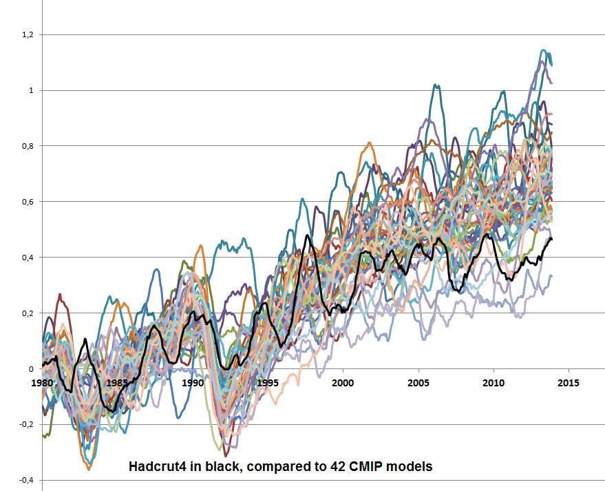
and compare it to a zero-centered symmetric Gaussian. If the model is at least a reasonable candidate, one ought to be able to assert some reasonable limits on the number of “independent samples” in 164 years of data and turn it into a p-value at least for the assertion “this model has zero bias”. I think that one will instantly reject nearly all of the models in CMIP5 all by itself.
The thing I really don’t understand is why I’m doing this, why this isn’t all done in the literature already. Why isn’t there a paper entitled “Why we can reject 40 out of 42 of the models in CMIP5” or whatever it turns out to be?
rgb

Alan Robertson
December 23, 2014 11:01 am

Chaos math teaches us that accurate long term climate predictions can not be made unless:
a) all beginning input conditions are accurately and precisely known and modeled
b) emergent phenomena are also known and modeled
My take is that conditions a) and b) above, dictate that climate models are doomed to yield inaccurate results. Also, existing climate model outputs are regularly “back adjusted” with recent- past data to prevent the model outputs from appearing too wildly divergent from real world measurements.

ferdberple
Reply to  Alan Robertson
December 23, 2014 5:46 pm

and you have infinite precision in your calculations.

Danny Thomas
December 23, 2014 11:28 am

Willis,
Thank you for your work and then for providing the work product. Says much.

rgbatduke
Reply to  Willis Eschenbach
December 23, 2014 1:08 pm

But what we lack almost any evidence for is the idea that the changes in temperature follow the changes in forcing. And I have given a number of reasons to think that such a relationship doesn’t exist. These include the paltry response of global temperatures to volcanoes, the reversion of the temperature to the previous levels (or higher) following eruptions, the lack of any climate response to the 11-year sunspot cycles, the lack of temperature change from the ~ 5% increase in solar strength over the last half billion years, the ~ 30°C maximum of open ocean temperatures, and the like.

This is simply untrue, as the graph I post above makes perfectly clear. Not only is there evidence, but one can actually produce a remarkably accurate fit of the entirety of HadCRUT4 using only cCO_2 as input.
The physical basis for this model is enormously simple. It is the bog-standard radiative model that predicts a temperature forcing somewhere in the ballpark of 1 C per doubling, where I would assert that we don’t know the physics to do much better even with line by line computations e.g Modtran (as it is a hard problem already at this point, involving assumptions about temperature and line broadening and pressure in the entire atmosphere between the ground or sea surface and TOA escape). In addition, I assume that if there are any feedbacks, they are directly proportional to the cCO2 forcing, and hence follow the same logarithmic curve. Maybe water is net positive feedback, maybe it is negative feedback, maybe it can be considered separately from methane or aerosols or soot. I ignore it all. I actively ignore volcanoes as I have done computations (like you) that show that they are awesomely ignorable. I lump it all together and assume that it is some percent modification of the CO_2 driven forcing. It could double it! It could halve it! I don’t assume that I know what it will do, only that it the linear terms in the multivariate Taylor series of any response function are likely the most important and ultimately one has to sum over them and hence lose which medium makes what contribution.
In the end, 2.62 ln(cCO_2) works to describe the data very, very well. This is not a lack of evidence. It is pretty good evidence, as far as it goes. Furthermore, it decribes the data very well with no lag and little room for natural or unnatural variation outside of maybe 0.1 to 0.2 C of “noise” and possible systematic variation around it. It symmetrically splits the data and is neither warm nor cold biased. The big question is why we need any sort of more complex model, especially when the more complex models have many, many parameters and still don’t perform as well. Same reason that I conclude that I don’t need to worry about volcanic aerosols, as even R can barely find a reason to include them, and then only produces a tiny divot in temperatures if the volcano in question is VEI 5 or 6 (or, presumably, higher).
With that said, I am as hampered as you are by two things. One is that HadCRUT4 may be the BEST we can do (pun intended) or maybe BEST is, but our best is mostly likely terrible back to 1850 (neither of us believe HadCRUT4’s error bars in 1850) and probably more terrible across any times prior to that, no matter who is doing the computation and how. Nobody seems willing to acknowledge just how poorly we know global temperatures, global temperature “anomalies”, and how much worse our knowledge of things like specific atmospheric chemistry or state of the ocean in the still more remote past is. So I have no good reason to believe that my enormously simple and successful 164 year model will work all the way back to 1750, 1650, 1000, 0, 9000 BCE, or whatever. Somewhere in there there are truly ponderous things that drive the climate over very long time scales (and possibly, drive it rapidly due to nonlinear feedbacks) and my model accounts for none this and even if I tried to include it, there simply isn’t any reliable data to use to do the model building. At some point the error in the data becomes greater than 1 C, the error in the possible CO_2 concentration exceeds 10 ppm, Milankovitch can no longer be ignored, multivariate stuff we can’t even GUESS at could be dominant, state evolution comes into play…
So I in no way assert that my simple one+one parameter model is correct, only that it works to describe the data it was fit to very convincingly, certainly well enough that you can’t point to it and tell me that it doesn’t work! It does not fail a hypothesis test, although it does leave room for additional hypotheses as long as they are rather smaller in their aggregate effect. But it could be the other way around — the temperature might best be explained by the additional (unspecified) hypotheses and CO_2 could be a much smaller fraction of the total effect. The only thing I can say is that the additional hypotheses are a) unspecified; b) will have more parameters; and hence c) the inferrable “meaning” of the fit will take a hit from covariance as the input parameter list increases. Simple pictures are the best.
rgb

pouncer
December 23, 2014 12:17 pm

Willis has made a great contribution. Mosh poses a great question. RGB makes an great promise. Anthony runs a great site.
Most, but not all, of the comments are great.
I would be interested in seeing the spreadsheet include a run of the numbers out of the “Callendar” simple formula model Steve McIntyre referenced recently. Is a formula output typically closer to the measurement than the grid-cell simulation outputs? One criteria for “best” — pace Mosher — is whether or not the results are worth the money spent to obtain them; are the new results better or more accurately predictive of measurements than the old results? If not maybe the next round of funding ought be allocated to provide more measurements (in harder to reach regions) than on new models.
On balance, life is great. Merry Christmas to all.

December 23, 2014 12:34 pm

Wonderful, it will have a place of honor in a directory somewhere between “Asteroids” and “Zork.”</sarc>
Seriously, thanks for your hard work, it is appreciated by those of use with limited “spare” time.

highflight56433
December 23, 2014 12:36 pm

Lots of energy and resources put into “climate” …maybe spend the resources something useful. The average useful idiot will never see any climate change that is meaningful.

Brandon Gates
December 23, 2014 1:32 pm

ferdberple,

If you look at the data, the max temperature predicted by the models in 1861 is 286.3 K, while the min temperature predicted by the models in 2100 is 285.5 K
Therefore the models are telling us that it is possible that there will be a 0.8 C drop in temperatures between 1861 and 2100 even if we keep on producing CO2.

Oh dear. Well as it happens, HADCRUT4 recorded a 0.88 K range in monthly means for the year 1868. Granted, the error bars get bigger the further back we go, but I’m looking at anomaly data which aims to remove seasonal signals based on means for some reference period — which in the case of HADCRUT4 is 1961-1990.
The data Willis provides is absolute monthly means, not anomaly, so the seasonal variations haven’t been removed. Which is not a bad thing until someone comes along and compares summer of 1861 to winter of 2100 …

The models are also telling us that in the period between 1861 to 2100, on average temperatures the difference between the high and low prediction in any one year is 3.26 C, with a STD of 0.36.

I get the exact same answer. Thing is, that’s against the high/low within any given MONTH, not year. For the annual min/max predictions you should get 3.55 °C range, 1σ = 0.31.

In other words, the models are telling us that global temperatures can vary as much as 3.3 C on average due to natural causes in a single year, and 99% of the time natural variability will be within 4.33 C in a single year.

Well not exactly. Comparing to reality means comparing to anomalies, which means seasonal signals have been reduced by subtracting out monthly means over some reference period. So for HADCRUT4 the range is 0.39 °C, 1σ = 0.15. CMIP5 range is 0.90 °C, 1σ = 0.22. That’s using 1985-2005 for the baseline reference period, and descriptive stats from 1861-2014 for an apples to apples comparison.
Next thing, the min/max values you’ve chosen for CMIP5 are outliers … min/max tends to pick those out, yes? The better thing to do is do the anomaly calcs on each ensemble member, then take the standard deviation of the ensemble members within a given month, then use that to build a confidence interval around the monthly ensemble mean.
Even then, monthly resolution is kind of a mess to look at, so I often do annual averages from there.
Do all that and the results should look like this:
https://drive.google.com/file/d/0B1C2T0pQeiaScmgxQW5nRHFJN2s
Which looks a lot more reasonable than what you describe.

HAS
Reply to  Brandon Gates
December 23, 2014 3:08 pm

I fear that using your anomalies you just needlessly threw away a lot of information. You can control for seasonal variation (and it is worth pausing to think about what that means in a global temp series) without using them.
Of more interest as I noted above is the range of absolute temps being modeled by the various models. This aspect gets diminished when anomalies are used. The problem is that the physical behaviour of the atmosphere and oceans is often a function of absolute temperatures (as an example I mention phase changes above). If different models are running at different temperatures then they will be exhibiting different physical behaviours.

Brandon Gates
Reply to  HAS
December 23, 2014 4:35 pm

HAS,

You can control for seasonal variation (and it is worth pausing to think about what that means in a global temp series) without using them.

Ok, how would you control for seasonal variation?

Of more interest as I noted above is the range of absolute temps being modeled by the various models. This aspect gets diminished when anomalies are used.

I agree it’s quite instructive to look at them in the “raw” because yes, the anomaly calc I used (which I believe to be the “standard” method) does tend to quash annual range.
For comparing to the instrumental record, there’s really no choice but to take anomalies because that’s how the observational data are published. [1]

The problem is that the physical behaviour of the atmosphere and oceans is often a function of absolute temperatures (as an example I mention phase changes above).

Sure. That’s the reason the model output is made available in K. Keep in mind those temperature outputs are the result of whatever physical processes are being simulated in the first place, all of them being temperature-dependent.

If different models are running at different temperatures then they will be exhibiting different physical behaviours.

Yup. The whole idea behind CMIP is to be able to compare model to model in a standardized way so differences in behavior can be readily identified and quantified.
———————
[1] I do have gobs of surface station absolute temperature data, but the less database math I have to do, the less database math I can screw up.

HAS
Reply to  HAS
December 23, 2014 6:00 pm

“How would you control for seasonal variation?”
It depends on the problem you are confronting.
If you are comparing MINs and MAXs then doing it by month as well as annual averages is informative. If you do that for ferdberple calculations you find his point still holds. For each month in 1861 the MAX model is consistently lower then the MIN model for the corresponding month in 2100.
Anomalies are a convenience but you need to be aware of the hidden assumptions you are making. Here in comparing different models you are assuming that the models are invariant under a linear transformation. My point again is that the physics tell us this isn’t so.

Brandon Gates
Reply to  HAS
December 24, 2014 3:36 pm

HAS,
My comments to ferdberple on seasonal variation were an unintentional red herring. The variation in any single model member (monthly or and annual) are far less than range of the absolute means across the entire ensemble. I wasn’t aware, though I should have been, how big that spread is so I’ve not been engaged in the proper discussion.
The case for model ensembles is that they produce similar trends under the same input parameters. The outputted trends are not linear over any arbitrary period of time and neither are the input parameters — there are inflection points all over the place. How they arrive at such similarly shaped curves but at different absolute temperatures is the thing which interests me at the moment, if I may put it so mildly. It is those wide differences in absolute temps which serve as the partial impetus to use anomalies when constructing an ensemble.
Unambiguously yes, there are 1861 max temps greater than or equal to 2100 min temps when looking at the absolute output. That is not meant to be taken as a meaningful result. How I’ve already plotted it — which is how the IPCC does it — is. Whether one thinks that’s method or madness is a different discussion.

Reply to  Brandon Gates
December 23, 2014 3:11 pm

Probably a dumb question Brandon, but above you say: ” Which is not a bad thing until someone comes along and compares summer of 1861 to winter of 2100 …” . But if these are Global Average Temperatures, how can we have a “winter” and a “summer” temperature? Apogee and perigee?

Brandon Gates
Reply to  Wayne Delbeke
December 23, 2014 4:15 pm

Wayne Delbeke,
Actually, that’s a brilliant question. When looking at global averages, the planet is warmer at the surface during the NH summer. This is a function of there being more land area in the NH than SH, and land is more responsive temperature-wise than ocean. This holds true for multi-annual trends as well:
http://www.woodfortrees.org/plot/hadcrut4gl/mean:120/plot/hadcrut4nh/mean:120/plot/hadcrut4sh/mean:120
During cooling cycles, the NH temps decrease more rapidly than the SH. Converse is true during warming cycles.

richard verney
Reply to  Brandon Gates
December 24, 2014 2:09 am

We can be fairly confident that on a global basis, there has been some uneven warming since the 1850s, with the 1880s, the 1930s, and the late 20th century being peaks in that uneven warming trend.
The fact is that we do not know whether, on a global basis, it is warmer today than it was in the 1880s or the 1930s, and anyone who claims that it is warmer today than it was in the 1880s and/or the 1930s is over stretching the bounds of the data..
We can be fairly confident that as far as the US is concerned (and I accept that this is not a global assessment), it is not as warm today, as it was in the 1930s.
There is very little high quality global data in the 19th century, and this means that we just do not know what the position, on a global basis was, and this is compounded by large measurment errors.

ferdberple
Reply to  Brandon Gates
December 24, 2014 6:10 am

then take the standard deviation of the ensemble members within a given month, then use that to build a confidence interval around the monthly ensemble mean
==============
temperature time series are fractals. it has neither a constant average nor deviation. you cannot sample them and arrive at a normal distribution. anomalies have no physical meaning in such a system, because the average is a meaningless illusion. instead they mislead, making the system appear more predictable and less variable than it really is.
the small differences in global temperature that result due to orbital parameters cannot be average away. they are what they are. if the global temperature is warmer some time in 1861 than some time in 2100, it was warmer. plain and simple. what we are looking at is the natural variability. that variability exist in the underlying data for many reasons, such as orbital parameters, and needs to be accounted for, not eliminated in the analysis through artificial averaging.

ferdberple
Reply to  Brandon Gates
December 24, 2014 6:20 am

build a confidence interval around the monthly ensemble mean
==========
and what is your PDF? the problem is that your argument is circular. you are assuming you know the PDF for global average temperature. what I’m saying is that we don’t, so we cannot make any calculations that assume we do, because the confidence levels will be incorrect.
ensemble means work because there is an underlying physical mean that the data is actually trying to converge to. but when you look at paleo history it is plain the earth does not have a global mean temperature, except at the limit, and this mean temperature is closer to 22C than it is to the 15C we use today.

Brandon Gates
Reply to  ferdberple
December 24, 2014 2:32 pm

ferdberple,

temperature time series are fractals. it has neither a constant average nor deviation. you cannot sample them and arrive at a normal distribution.

I understand and agree. I don’t ever do that to a temperature timeseries, and that’s not what I’m doing here. What I am doing is treating each monthly CMIP5 GMT value as an “observation” and doing descriptive stats on the set of those monthly values. They do fit a gaussian normal distribution, quite well it turns out:
https://drive.google.com/file/d/0B1C2T0pQeiaScDVBX29jRTlyV2M
I was flat out wrong I was when I wrote this statement to you: Which is not a bad thing until someone comes along and compares summer of 1861 to winter of 2100 … because that’s NOT what’s going on here at all, and I’m none too happy about missing it: https://drive.google.com/file/d/0B1C2T0pQeiaSSGFhdjlnd3hkX0U
It isn’t seasonal variations causing the wide range of absolute temps, it’s that the range of means for entire ensemble members is so broad. That does warrant some sharp-pointy questions.

Doug Proctor
December 23, 2014 1:49 pm

And yet the warmists still claim that the temperature records support the model expectations.
An interesting article would be why the warmists say that observations support the narrative, while us skeptics do not. If we are to counter their arguments, we must first understand them – and not inadismissive, disrespectful way.

Reply to  Doug Proctor
December 23, 2014 3:15 pm
ferdberple
Reply to  Jan Kjetil Andersen
December 24, 2014 6:25 am

from AR5:
The simulation of clouds in climate models remains challenging.
There is very high confidence that uncertainties in cloud processes
explain much of the spread in modelled climate sensitivity.
=============
this is an interesting turn of phrase. we have very high confidence that our lack of understanding explains our failure to arrive at the correct answer.
why does the lack of understanding not explain the spread between models and observation? why limit your remarks to the spread between models only?

Ron C.
December 23, 2014 2:22 pm

These models can be thought of as 42 “proxies” for global mean temperature change. Without knowing what parameters and assumptions were used in each case, we can still make observations about the models’ behavior, without assuming that any model is typical of the actual climate. Also we assume that the central tendency tells us something about the set of models, without being descriptive of the real world.
So the models are estimating monthly global mean temperatures backwards to 1861 and forwards to 2101, a period of 240 years. It seems that the CHIP5 models include 145 years of history to 2005, and 95 years of projections from 2006 onward.
Over the entire time series, the average model has a warming trend of 1.26C per century. This is compares to UAH global trend of 1.38C, measured by satellites since 1979.
However, the average model over the same period as UAH shows +2.15C. Moreover, for the 30 years from 2006 to 2035, warming is projected at 2.28C. These estimates are in contrast to the 145 years of history in the models, where the trend shows as 0.41C per century.
Clearly, the CHIP5 models are programmed for the future to warm more than 5 times the rate as the past.

DocMartyn
December 23, 2014 5:57 pm

Willis, do you think you could stick a link on WUWT, top right?

rgbatduke
December 23, 2014 6:32 pm

I ask in part because in your graph, log(CO2) is an absolutely smooth curve from start to finish, and I’m not buying that in the slightest. Even the post-1959 curve is incorrect, the MLO data is nowhere near that smooth.

Hmm, maybe we aren’t looking at the same Mauna Loa data? Anyway, here:
http://www.phy.duke.edu/~rgb/cCO2oft.jpg
Note that there are three data sources plotted. Laws (black x’s), Siple (blue circles), and Mauna Loa. (black circles). The blue curve you can’t see under the data points is my the function used to generate the cCO2 used in the fit, as well as the ~rcp8.5 extrapolation to 2100. The red curve is a smoother (and more optimistic) fit to the ML data (but still more pessimistic than rcp6.5).
ML data is actually awesomely smooth. Laws is less so — there are a couple of stretches where it barely goes down in there, but then, Laws claims absurd annual resolution (IMO). Siple is very coarse grained, but probably more believable because of that. It is really a broad approximation that is consequently probably accurate enough.
All three are good enough fits to my curves, IMO. Do you disagree?
rgb

Berényi Péter
Reply to  Willis Eschenbach
December 24, 2014 3:09 pm

There is no issue with isotope ratios in ice itself. However, atmospheric gases, such as carbon dioxide, enclosed in bubbles within the ice is an entirely different matter. It takes lots of time for the ice to get compact enough to prevent communication between gases in it and the atmosphere, depending on rate of accumulation. Which is pretty low in Antarctica, so it can be as long as several millennia in the interior of this continent.
Therefore you can’t date gas inclusions by dating the ice around them.
You also have dust in the ice and microscopically thin supercooled water layers between ice crystals. So gases which readily dissolve in water (like CO2) keep reacting chemically with dust particles, long after they have got trapped. Ultramafic volcanic dust is especially good at absorbing CO2.

December 24, 2014 12:28 am

The IPCC averages the data over a full decade. This gives a better fit.comment image
Here is also each model output averaged over one decade.
We see that three of the models give less warming than observed, but most give more.
/Jan

ferdberple
Reply to  Jan Kjetil Andersen
December 24, 2014 6:44 am

Why stop there? Why limit the averaging to a decade? Why not average the models over a century? I expect the fit will improve dramatically as the length of the average increases.
The problem is that averaging makes you data look “better”, “more uniform”, and “more predictive” than it really is.
A straight trend-line is a form of averaging. In effect you have averaged your data out to infinity at each end, and then chopped it off to hide how silly the answer becomes towards the end points.
No matter what we do, as we straighten the results via averaging, the slightest trend leads to infinity at each end. runaway warming or cooling, as a result of mathematics, not CO2.

Reply to  ferdberple
December 25, 2014 6:42 am

Why stop there? Why limit the averaging to a decade? Why not average the models over a century?

You have a rhetoric point there Ferb, but it is only empty rhetorics. We all know that averaging over a decade makes sense in climatology; a century makes the forecasts less valuable because we will all be dead before we could see any trends.
Concerning the cutoff, I used data from 1970 to 2014 and with a 10-year moving average there has to be a 5-year cutoff in each end.
/Jan

johann wundersamer
December 24, 2014 5:03 am

models are models are models.
….
en.m.wikipedia.org/wiki/Laplace’s_demon
regards – Hans

johann wundersamer
December 24, 2014 5:16 am

models are models are …
ain’t no ‘super’computer able to represent the world.
at the best workarounds.
that’s what we can go for – Hans

johann wundersamer
December 24, 2014 5:24 am

so thanks, Willis Eschenbach,
for showing the tools! Hans

ferdberple
December 24, 2014 6:52 am

One thing I do see in the data is a reduction in variance going forward. In 1860 the range of results is about 4C. By 2040 this is about 3.5C.
So, what the models are showing us is that temperature is predicted to become less extreme, with less variability. The exact opposite of what scientists are telling us in the popular press.

ferdberple
Reply to  ferdberple
December 24, 2014 7:39 am

nope, scratch that. the result was an artifact of averaging the models. remove the averaging and the trend disappears. once again demonstrating that averaging first is a mistake.

Ron C.
December 24, 2014 11:56 am

In presenting the CMIP5 dataset, Willis raised a question about which of the 42 models could be the best one. I put the issue this way: Does one of the CMIP5 models reproduce the temperature history convincingly enough that its projections should be taken seriously?
I have now had time to look at this and can comment based upon analysis of the temperature trends produced by each of the 42 models. To reiterate, the models generate estimates of monthly global mean temperatures in degrees Kelvin backwards to 1861 and forwards to 2101, a period of 240 years. This comprises 145 years of history to 2005, and 95 years of projections from 2006 onwards.
I identified the models that produced an historical trend nearly 0.5K/century over the 145 year period, and those whose trend from 1861 to 2014 was in the same range. Then I looked to see which of the subsets could match the UAH trend 1979 to 2014, and which showed the plateau in the last decade.
Out of these comparisons I am impressed most by the model producing Series 31.
It shows warming 0.52K/century from 1861 to 2014, with a plateau from 2006 to 2014, and 0.91K/century from 1979-2014. It projects 1.0K/century from 2006 to 2035 and 1.35K/century from now to 2101.

Berényi Péter
December 24, 2014 2:25 pm

CMIP5 model outputs are given as absolute temperatures (in K), which is good. Therefore hemispheric climatologies can be calculated, especially monthly differences between average temperatures of the two hemispheres. These functions should not be too sensitive to levels of well mixed atmospheric IR absorbers, because… they are well mixed.
Turns out series 1-42, as a set, is inconsistent according to this measure. It means they can’t possibly describe the same climate, they are too far apart for that. So, some models, included in this set, are provably wrong (possibly all of them).
Unfortunately in HadCRUT4 only anomalies are given, which makes it impossible to pick the worst (or best) model based on this particular set of observations.

Berényi Péter
Reply to  Berényi Péter
December 29, 2014 11:11 am

Well, it is not completely true. The CRU Temperature page has a reference like “Absolute temperatures for the base period 1961-90 (see Jones et al., 1999)”.
It is this one.
Reviews of Geophysics, Volume 37, Issue 2, pages 173–199, May 1999
Article first published online: 14 JUN 2010
DOI: 10.1029/1999RG900002
Surface air temperature and its changes over the past 150 years
P. D. Jones, M. New, D. E. Parker, S. Martin, I. G. Rigor
On page 196 we find Figure 7 (Seasonal cycle of hemispheric and global mean temperatures in absolute degrees Celsius based on the 1961-1990 period).
If it is re-digitized, observed annual cycle (in K) is like this:

Mon  NH     SH      Global
01 281.11 289.53 285.32
02 281.66 289.26 285.46
03 283.74 288.35 286.05
04 287.00 287.18 287.09
05 290.25 285.91 288.08
06 292.79 284.73 288.76
07 294.15 283.92 289.03
08 294.05 283.83 288.94
09 292.25 284.28 288.26
10 288.99 285.55 287.27
11 285.19 287.18 286.18
12 282.29 288.72 285.50

It can be added to anomalies given in HadCRUT4 NH and HadCRUT4 SH respectively (links to metadata are at the HadCRUT Download page).
If it is done, we get something almost directly comparable to CMIP5 model outputs, except HadCRUT is sampled at mid-month while the 42 CMIP5 series given by Willis are sampled at the beginning of each month.
No matter, it can be re-sampled (using cubic interpolation for annual cycles and linear interpolation for anomalies). You get something like this.
If it is compared to CMIP5 output series, global averages do match observations reasonably well for most model outputs from 1861 to Nov 2014 (the last data point in HadCRUT).
Average error is less than 1K for all models and the best one (S1) has only 0.27K.
Unfortunately this may well be an artifact, partly because models are tuned to match past observations, partly because observations are adjusted to match models.
However, there are limits to tuning &. adjustment. If we check how well model runs reproduce monthly temperature difference between the two hemispheres, the most elementary regional skill imaginable and also pretty independent of carbon dioxide forcing, because it is a well mixed gas, model performance turns out to be awful.
Average error is smallest for S33, but it is still as large as 0.87K, comparable to all the warming observed in the last 150 years and larger than errors stated for HadCRUT 4.3.3, while for S34, which is the worst one in this respect, it is 2.1K. Average of this error term over CMIP5 time series is 1.17K.
Therefore all computational models included in CMIP5 are falsified.

David R
December 25, 2014 1:20 pm

Willis,
Are you sure there aren’t some CMIP5 models missing from the KNMI range?
From what I can make out using the data you provided, observations in 2014 will be below all the model forecasts; yet I have seen several charts showing CMIP5 models that are currently running cooler than observations for 2014. For instance, see Ed Hawkins’ chart here: http://www.met.reading.ac.uk/~ed/bloguploads/FIG_11-25_UPDATE.png
According to the CMIP5 site there are 61 models in the range, though that may have been reduced; I don’t know. Perhaps KNMI only has data for 42 of them.
Thanks for the work in getting what you did anyway. Merry Christmas (not too late to say that, is it?)

David R
Reply to  Willis Eschenbach
December 25, 2014 3:47 pm

It seems this whole CMIP5 business is fraught with difficulties. Hard enough to get the data; but even then, it seems, there are so many permutations that nearly any claim re whether observations are hotter or colder or spot on, can be substantiated or refuted!
I enjoyed looking over the data you posted though. Thanks again for that.

December 25, 2014 9:58 pm

While one can compare the global surface temperatures results from the CMIP5 models to the HadCRUT4 global surface temperature time series this comparison is not logically or scientifically meaningful. The logically and scientifically meaningful comparison would be between the predicted and observed relative frequencies of the outcomes of the events underlying the model but such a comparison is not possible as there are no such events!

QV
December 26, 2014 5:30 am

Willis,
I would like to add my thanks to you for posting these files.
I have attempted to obtain the data via the CMIP5 and KNMI websites, so far without success.
However, are you sure that the links to the files are correct?
They both seem to point to the same files (the multiple run one) to me and I can’t download the “one run per model” file.

quaesoveritas
Reply to  Willis Eschenbach
December 26, 2014 10:48 am

Phew!
I thought I was doing something wrong.

Ron C.
December 26, 2014 10:03 am

Further to my comment about Series 31 above, I have looked more into the details, and I am less impressed, though it is probably one of the best in the CMIP set. The historical part of the series does not present any plateau, either last century or this one. Moreover, as is typical of all these models, the future is projected to warm at a rate 3 times that in the history up to 2005.

Lance Wallace
December 26, 2014 11:57 am

For what it’s worth (I think very little), the 10 “best” models according to the highest Spearman correlations vs. HADCRUT4 for the 1847 months from 1861 to November 2014 are as follows:
SERIES SPEARMAN RANK-ORDER COEFFICIENT R
Series 5 0.37
Series 23 0.31
Series 7 0.31
Series 22 0.30
Series 8 0.30
Series 3 0.30
Series 14 0.30
Series 32 0.29
Series 36 0.29
Series 20 0.28
Choosing the median or mean of the CMIP 42 produced a middling Spearman of 0.26. This is an argument against the idea that somehow the mean of the models will perform better than any single model.
By this measure, the 10 “worst” models were
Series 35 0.21
Series 17 0.21
Series 18 0.21
Series 13 0.21
Series 2 0.20
Series 10 0.20
Series 30 0.19
Series 40 0.19
Series 11 0.16
Series 29 0.15
Series 31, by the way, which received some attention above, was low on the list with a Spearman r of 0.22.

Brandon Gates
Reply to  Lance Wallace
December 26, 2014 3:26 pm

Lance Wallace,
I chose my 10 best and worst vs HADCRUT4 over the reference period 1986-2005 and plotted those means against the entire ensemble:
https://drive.google.com/file/d/0B1C2T0pQeiaSa2JfcFF3UVItWTg
Bottom plot is the same analysis for the 10 best individual model runs (members) with similar results, though the 10 worst members are clearly somewhat “worse” than the 10 worst models. In both plots the ensemble mean is closer to the “best” curves. So perhaps this is an argument for “lose the 10 worst” or “keep only the 10 best”. I leave it to the reader to decide.

Lance Wallace
Reply to  Lance Wallace
December 26, 2014 5:22 pm

Whoops, I made an error in these calculations. Should have done this separately for each month. That gives a very different set of “best” vs “worst” models. I’m not sure I have the correct HADCRUT 4.3 data so will not mention the present standings.

Brandon Gates
Reply to  Lance Wallace
December 26, 2014 8:30 pm

It happens. Months are rather noisy, so I’m doing mine against annual means. I’m also doing it against anomalies, not absolute …. been too lazy to do both and compare.

Lance Wallace
Reply to  Lance Wallace
December 27, 2014 3:43 pm

OK, I’ve now carried out the Spearman correlations by year and think I may have it right. Here are the top 10 models (out of 42 CMIP5 models and the mean and median).
SERIES SPEARMAN
MODEL MEAN 0.82
Series 26 0.81
Series 22 0.81
Series 7 0.80
Series 32 0.80
Series 20 0.80
Series 14 0.79
MODEL MEDIAN 0.79
Series 21 0.79
Series 39 0.79
and the bottom 10
SERIES SPEARMAN
Series 12 0.63
Series 19 0.63
Series 40 0.63
Series 10 0.63
Series 2 0.62
Series 1 0.62
Series 18 0.56
Series 17 0.53
Series 29 0.43
Series 11 0.37

Lance Wallace
December 26, 2014 2:43 pm

Looking more closely at the Spearman correlations with HADCRUT 4 averaged across all models by month a curious fact emerges: the correlation coefficients are similar for three seasons but fall off considerably for the winter season (DJF). Has anyone noted that?
https://dl.dropboxusercontent.com/u/75831381/CMIP42%20SPEARMAN%20CORRELATIONS%20BY%20MONTH.pdf

Ron C.
December 27, 2014 8:22 am

Thanks Willis for the HADCRUT4 dataset. It is my first time to look at the trends there. Interestingly, the series change points appear when you calculate the first differences and then scan the decadal averages of the differences.
On that basis, I got the following Global warming and cooling periods, with the linear trends for each:
Periods Decadal Rates
1850-1878 +0.035
1879-1888 – 0.215
1889-1900 +0.099
1901-1910 – 0.177
1911-1921 +0.224
1922-1929 +0.042
1930-1939 +0.139
1940-1954 – 0.055
1955-1976 – 0.040
1976-1986 – 0.004
1987-2002 +0.203
2003-2014 +0.120
Overall
1850-2014 +0.049
A few observations about making comparisons between CMIP5 models and HADCRUT4:
1. None of the models can produce warming and cooling periods at decadal levels. The parameters appear to be at century levels.
2. The significant rise in temperature from 1911 through 1939 does not appear in the models.
3. The significant decline in temperatures from 1940 through 1976 does not show up in the models.
4. HADCRUT4 does not show a plateau since 2002, only a reduced rate of warming.
Conclusions:
CMIP5 models are not able to reproduce HADCRUT4 variability.
The last decade of HADCRUT4 is suspect.

Brandon Gates
Reply to  Ron C.
December 27, 2014 10:09 pm

Ron C.

CMIP5 models are not able to reproduce HADCRUT4 variability.

They don’t attempt to project the precise timing of things like ENSO, AMO, NAO and PDO. The planning horizon for CMIP5 is 50-100 years, not 10-30. Models aren’t gonna do what they haven’t been asked to do.

Ron C.
December 27, 2014 9:17 am

Addendum:
I noticed that excluding 2014 (since it is incomplete) gives a more reasonable rate for HADCRUT4 last decade:
2003-2013 – 0.022

Ron C.
December 28, 2014 9:06 am

Brandon
The estimated global mean temperatures are considered to be an emergent property generated by the model. Thus it is of interest to compare them to measured surface temperatures. The models produce variability year over year, and on decadal and centennial scales. So let’s compare CMIP5 Series 31 and HADCRUT4.
Periods Decadal Rate Rate Differences
HADCRUT4 SERIES 31 31 MINUS HADCRUT4
1850-1878 +0.035 +0.064 +0.029
1879-1888 -0.215 -0.004 +0.211
1889-1900 +0.099 +0.065 -0.034
1901-1910 -0.177 +0.090 +0.267
1911-1921 +0.224 +0.087 -0.137
1922-1929 +0.042 +0.212 +0.170
1930-1939 +0.139 +0.211 +0.072
1940-1954 -0.055 -0.016 +0.039
1955-1976 -0.040 +0.072 +0.112
1977-1986 -0.004 +0.196 +0.200
1987-2002 +0.203 +0.134 -0.069
2003-2013 -0.022 +0.012 +0.034
Overall
1850-2014 +0.049 +0.052 +0.003
2015-2076 +0.154
This analysis shows that Series 31 can be compared to HADCRUT4. While the overall historical rates are close, the model runs hotter than Hadcrut in nine of twelve periods.
The model shows warming in the 1920s and 1930s at a hotter rate. It shows 1940 to 1976 as a slightly warming, rather than cooling period. The warming since 1977 is comparable though it comes earlier in Series 31. The last decade is slightly warming rather than cooling. Finally, the model projects significant warming over the next 60 years.

Ron C.
December 28, 2014 1:17 pm

You can see why the correlation is positive, but poor
http://s6.postimage.org/wd131ao25/Decadal_Rates_Chart1_1.png

quaesoveritas
December 29, 2014 4:58 am

Willis,
Another stupid question.
Can you tell me what convention is used for months in dates?
e.g. does 1861.08333 represent January or February?
It seems logical (to me) that it should be January, but that would make 1861.000 December 1860.
I need this info in order to calculate annual averages correctly.

RACookPE1978
Editor
Reply to  quaesoveritas
December 29, 2014 5:13 am

quaesoveritas (asking willis a question)
Another stupid question.
Can you tell me what convention is used for months in dates?
e.g. does 1861.08333 represent January or February?
It seems logical (to me) that it should be January, but that would make 1861.000 December 1860.
I need this info in order to calculate annual averages correctly.

Not a foolish question at all: Look at it from the simpler day-of-year (Julian date) aspect: January 1 is usually thought of as 001, but what happened to day 0? Also: S we progress through the 4-year Leap Year fisasco, what happens to solar radiation, for example, that does change slowly on a day-to-day basis, but the “day” is 267 3 years, then is 268, then is 267 again.

quaesoveritas
Reply to  RACookPE1978
December 29, 2014 5:51 am

Thanks for your help, but I am afraid I don’t know how that answers my question.

Ron C.
Reply to  quaesoveritas
December 29, 2014 5:58 am

I think if you use the INT function, you will get the years correctly. It simply removes the decimals, resulting in the number of the year.

QV
Reply to  Ron C.
December 29, 2014 6:08 am

Surely that way you get 12 identical “1861’s” and so on.
It doesn’t tell me whether to use 1861.000 or 1861.08333 for January.
If you are saying that 1861.000 is January, it seems slightly illogical to me because 1861.08333 is the end of the month. I might not be explaining this very well.

Ron C.
Reply to  Ron C.
December 29, 2014 6:26 am

The series begins with the 12 months of 1850 and ends with nine months of 2014, so yes, 1850 is January, and 1850.916667 is December.

Ron C.
Reply to  Ron C.
December 29, 2014 6:32 am

If you want to get annual averages, the INT function will give you 12 rows for each year, and a pivot table will produce the annual averages.

QV
Reply to  Ron C.
December 30, 2014 2:04 am

Thanks for the additional clarification.
When you say “The series begins with the 12 months of 1850 and ends with nine months of 2014”, I take it you are referring to HadCRUT4, not CMIP5? My CMIP5 spreadsheet starts with 1861.
I am afraid I never mastered pivot tables!

QV
Reply to  Willis Eschenbach
December 30, 2014 2:05 am

Thanks,
An additional complication!
I don’t use R, only Excel!

Karl-Heinz Dehner
December 29, 2014 12:32 pm

Hi,
I would be glad if I could investigate the provided CMIP5 model output. Unfortunately I haven’t the ability to process XLXS-spreadsheets. Is it possible for you to provide the data as XLS- or CSV-file too?
Many thanks!

QV
Reply to  Willis Eschenbach
December 30, 2014 1:46 am

I don’t know about anyone else, but can’t get the Windoze link to open.
The Macintosh link opens fine.

Karl-Heinz Dehner
Reply to  Willis Eschenbach
December 30, 2014 10:46 am

After consideration I wouldn´t advise to do that, because ìt might be a spam provider.

Karl-Heinz Dehner
Reply to  Willis Eschenbach
December 30, 2014 10:48 am

I give up, always hitting the wrong position …
Zamzar might be a spam provoder, so I don’t recommend it.

Ron C.
December 30, 2014 5:20 am

QV
You should treat yourself–pivot tables are one of the magical things where Excel does all the work for you. Here’s a good tutorial:
http://www.excel-easy.com/data-analysis/pivot-tables.html
This case is a good simple opportunity, since you have only 2 fields. Create a column called Year with the integers next to the column called Globe. Select the 2 columns and ask for a pivot table. Drag and drop the Year into the rows area and Globe into the data area and change the field setting to Average. That’s all there is to it.

Ron C.
December 30, 2014 5:23 am

Regarding my analysis up thread comparing Hadcrut4 and Series 31, one of the best CMIP5 models.
Summary:
In the real world temperatures go up and down. This is also true of Hadcrut4.
In the world of climate models temperatures only go up.

Karl-Heinz Dehner
December 30, 2014 10:25 am

Same for me myself. Maybe this
http://www.zamzar.com/convert/xlsx-to-xls/
is an reliable alternative?

Karl-Heinz Dehner
Reply to  Karl-Heinz Dehner
December 30, 2014 10:50 am

Should be placed above, under
Karl-Heinz Dehner December 29, 2014 at 12:32 pm …
sorry

December 31, 2014 8:28 am

Thanks Willis for your easy-to-use Excel file. Now every layman can choose his favorite climate model. But which is the best of the 42 models? For this I investigated the global air temperature data set ( running 1 yr means, data coverage: 1861 to 2014) I compared the gridded dataset HadCRUT.4.3.0.0.median_ascii.txt (missing data were filled by interpolation) with the 42 CMIP5-models. I used temperatures (in deg C) instead of anomalies. My favorite is series 1, because the mean of the differences between model and data is smallest. (See here). Interestingly, this model doesn’t work not so well for “Air temp Sea” (See here) as for “Air temp Land” (See here) . I hope the climate models will improve in the next year. P.S.You can download a data viewer CMIP5.exe (Windows) for these data sets here .

Karl-Heinz Dehner
December 31, 2014 1:02 pm

Thanks again, Mr Eschenbach, for making the data available!
I´ve downloaded the provided absolute values of the HadCRUT4 data. Fortunately it is an CSV file and not an Excel spreadsheet, so it can easily be processed with R. From this I calculated the average monthly GMTs for the period 1961-1990 which is used by HadCRUT4 as reference period for giving temperature anomalies. Subsequently, I transformed the absolute values in anomalies with respect to the calculated means for the period 1961-1990. However, it turns out that the anomalies calculated this way differ from the HadCRUT4 values, i. e. the medians of its 100 ensemble member realisations.
How could this be explained? Does the provided absolute values correspond to the median of the HadCRUT4 ensemble or its mean or even to a certain member?
Here are my calculated monthly means for the period 1961-1990:
Month GMT average 1961-1990
Jan 12.108
Feb 12.248
Mrz 12.874
Apr 13.859
Mai 14.887
Jun 15.586
Jul 15.867
Aug 15.717
Sep 15.074
Okt 14.084
Nov 13.029
Dez 12.351
Here a comparison of calculated anomalies and HadCRUT4 anomalies ensemble median:
Year Absolute value Calculated anomalie HadCRUT4 median anomalie w.r.t 1961-1990
Jan 2011 12,420 0,312 0,313
Feb 2011 12,579 0,331 0,328
Mrz 2011 13,306 0,432 0,428
Apr 2011 14,348 0,489 0,478
Mai 2011 15,282 0,395 0,383
Jun 2011 16,081 0,495 0,483
Jul 2011 16,379 0,512 0,506
Aug 2011 16,212 0,495 0,487
Sep 2011 15,542 0,468 0,453
Okt 2011 14,558 0,474 0,452
Nov 2011 13,383 0,354 0,344
Dez 2011 12,768 0,417 0,400
Jan 2012 12,417 0,309 0,303
Feb 2012 12,547 0,299 0,295
Mrz 2012 13,235 0,361 0,357
Apr 2012 14,456 0,597 0,575
Mai 2012 15,484 0,597 0,572
Jun 2012 16,165 0,579 0,553
Jul 2012 16,387 0,520 0,503
Aug 2012 16,258 0,541 0,533
Sep 2012 15,640 0,566 0,550
Okt 2012 14,653 0,569 0,553
Nov 2012 13,591 0,562 0,547
Dez 2012 12,623 0,272 0,271
Jan 2013 12,552 0,444 0,440
Feb 2013 12,731 0,483 0,476
Mrz 2013 13,263 0,389 0,385
Apr 2013 14,303 0,444 0,435
Mai 2013 15,431 0,544 0,520
Jun 2013 16,090 0,504 0,481
Jul 2013 16,392 0,525 0,516
Aug 2013 16,265 0,548 0,529
Sep 2013 15,618 0,544 0,529
Okt 2013 14,594 0,510 0,485
Nov 2013 13,688 0,659 0,628
Dez 2013 12,874 0,523 0,506
With best wishes for a prosperous 2015,
Karl-Heinz Dehner

Ron C.
January 1, 2015 5:52 am

Paul Berberich says: “My favorite is series 1, because the mean of the differences between model and data is smallest.”
That series is not my favorite since it runs too cool up to 2005 (history) and too hot afterwards (projections). While the mean of differences may be as you say, it is achieved by offsetting overcooling and overwarming. Its correlation is not as strong as others, and it doesn’t compare well with UAH from 1979 to 2014 (Series 1 decadal rate is +0.25, UAH rate is +0.14).
I am looking into Series 24 and 27 due to their correlations with HADCRUT4 being the highest, and since they come closest to matching HADCRUT4 absolute temperatures. Strangely most of the series generate absolute temperatures from 1 to 2 degrees K less than HADCRUT4.

quaesoveritas
Reply to  Ron C.
January 1, 2015 9:02 am

When comparing AR4 projections I found Mean Absolute Deviations more useful than mean differences because positive and negative deviations don’t cancel each other out.

Ron C.
January 3, 2015 8:10 am

We were able to analyze the temperature estimates of CMIP5 models and compare them with HADCRUT4 (1850 to 2014), as well as UAH (1979 to 2014). The models estimate global mean temperatures (GMT) backwards from 2005 to 1861 and forwards from 2006 to 2101.
Bottom Line:
In the real world, temperatures go up and down. This is also true of HADCRUT4.
In the world of climate models, temperatures only go up. Some variation in rates of warming, but always warming, nonetheless.
The best of the 42 models according to the tests I applied was Series 31. Here it is compared to HADCRUT4, showing decadal rates in degrees C periods defined by generally accepted change points.
Periods HADCRUT4 SERIES 31 31 MINUS HADCRUT4
1850-1878 0.035 0.036 0.001
1878-1915 -0.052 -0.011 0.041
1915-1944 0.143 0.099 -0.044
1944-1976 -0.040 0.056 0.096
1976-1998 0.194 0.098 -0.096
1998-2013 0.053 0.125 0.072
1850-2014 0.049 0.052 0.003
In contrast with Series 31, the other 41 models typically match the historical warming rate of 0.05C by accelerating warming from 1976 onward and projecting it into the future. For example, while UAH shows warming of 0.14/decade from 1979-2014, CMIP5 models estimates avaerage 0.215/decade, ranging from 0.088 to 0.324/decade.
For the next future climate period, 2006-2035, CMIP5 models project an average warming of 0.2C/decade, ranging from 0.97 to 0.375/decade.
The longer the plateau continues, the more overheated are these projections by the models.

QV
January 6, 2015 10:57 am

I noticed that the data in the first spreadsheet (108 individual runs) produces a higher projected temperature than the second spreadsheet (one run per model).
Does anyone know on what basis the single runs were chosen?
Does the single run version have any status in AR5?