Guest Post by Bob Tisdale
This post provides an update of the data for the three primary suppliers of global land+ocean surface temperature data—GISS through November 2014 and HADCRUT4 and NCDC through October 2014—and of the two suppliers of satellite-based lower troposphere temperature data (RSS and UAH) through November 2014.
The three surface data suppliers have been claiming record high monthly values recently. This is, in part, due to the record high sea surface temperatures in the North Pacific, which impact the global data because of the size of the North Pacific and the intensity of the weather-related warming there. For further information about the unusual warming of the North Pacific, see the post On The Recent Record-High Global Sea Surface Temperatures – The Wheres and Whys.
INITIAL NOTES: GISS LOTI, and the two lower troposphere temperature datasets are for the most recent month. The HADCRUT4 and NCDC data lag one month.
This post contains graphs of running trends in global surface temperature anomalies for periods of 13+ and 17+ years using GISS global (land+ocean) surface temperature data. They indicate that we have not seen a warming halt (based on 13+ year trends) this long since the late-1970s or a warming slowdown (based on 17+ year trends) since about 1980. I used to rotate the data suppliers for this portion of the update, also using NCDC and HADCRUT. With the data from those two suppliers normally lagging by a month in the updates, I’ve standardized on GISS for this portion.
Much of the following text is boilerplate. It is intended for those new to the presentation of global surface temperature anomaly data.
Most of the update graphs in the following start in 1979. That’s a commonly used start year for global temperature products because many of the satellite-based temperature datasets start then.
We discussed why the three suppliers of surface temperature data use different base years for anomalies in the post Why Aren’t Global Surface Temperature Data Produced in Absolute Form?
MODEL-DATA DIFFERENCE
Considering the warm sea surfaces this year (mentioned above), government agencies that supply global surface temperature products have been touting record high combined global land and ocean surface temperatures in recent months. Alarmists happily ignore the fact that it is easy to have record high global temperatures in the midst of a hiatus or slowdown in global warming, and they have been using the recent record highs to draw attention away from the growing difference between observed global surface temperatures and the IPCC climate model-based projections of them.
There are a number of ways to present how poorly climate models simulate global surface temperatures. Normally they are compared in a time-series graph. See the example here. In that example, GISS Land-Ocean Temperature Index (LOTI) data are compared to the multi-model mean of the climate models stored in the CMIP5 archive, which was used by the IPCC for their 5th Assessment Report. The data and model outputs have been smoothed with 61-month filters to reduce the monthly variations.
Another way to show how poorly climate models perform is to subtract the data from the average of the model outputs (model mean). We first presented and discussed this method using global surface temperatures in absolute form. (See the post On the Elusive Absolute Global Mean Surface Temperature – A Model-Data Comparison.) The graph below shows a model-data difference using anomalies, where the data are represented by GISS global Land-Ocean Temperature Index (LOTI) and the model simulations of global surface temperature are represented by the multi-model mean of the models stored in the CMIP5 archive. To assure that the base years used for anomalies did not bias the graph, the full term of the data (1880 to 2013) were used as the reference period.
In this example, we’re illustrating the model-data differences in the Meteorological Annual Mean (December to November) surface temperature anomalies.

Figure 00 – Model-Data Difference
The greatest difference between models and data occurs in the 1880s. The difference decreases drastically from the 1880s and switches signs by the 1910s. The reason: the models do not properly simulate the observed cooling that takes place at that time. Because the models failed to properly simulate the cooling from the 1880s to the 1910s, they also failed to properly simulate the warming that took place from the 1910s until 1940. That explains the long-term decrease in the difference during that period and the switching of signs in the difference once again. The difference cycles back and forth nearer to a zero difference until the 1990s, indicating the models are tracking observations better (relatively) during that period. And from the 1990s to present, because of the slowdown in warming, the difference has increased to greatest value since about 1910…where the difference indicates the models are showing too much warming.
It’s very easy to see the recent near record-high global surface temperatures have had a tiny impact on the difference between models and observations. They’ve simply provided a small down tick in the dififference between models and data.
See the post On the Use of the Multi-Model Mean for a discussion of its use in model-data comparisons.
GISS LAND OCEAN TEMPERATURE INDEX (LOTI)
Introduction: The GISS Land Ocean Temperature Index (LOTI) data is a product of the Goddard Institute for Space Studies. Starting with their January 2013 update, GISS LOTI uses NCDC ERSST.v3b sea surface temperature data. The impact of the recent change in sea surface temperature datasets is discussed here. GISS adjusts GHCN and other land surface temperature data via a number of methods and infills missing data using 1200km smoothing. Refer to the GISS description here. Unlike the UK Met Office and NCDC products, GISS masks sea surface temperature data at the poles where seasonal sea ice exists, and they extend land surface temperature data out over the oceans in those locations. Refer to the discussions here and here. GISS uses the base years of 1951-1980 as the reference period for anomalies. The data source is here.
Update: The November 2014 GISS global temperature anomaly is +0.65 deg C. It dropped a good amount (about -0.11 deg C) since October 2014.

Figure 1 – GISS Land-Ocean Temperature Index
Note: There have been recent changes to the GISS land-ocean temperature index data. They have a noticeable impact on the short-term (1998 to present) trend as discussed in the post GISS Tweaks the Short-Term Global Temperature Trend Upwards. The causes of the changes are unclear at present, but they will likely affect the 2014 rankings at year end.
GISS METEOROLOGICAL ANNUAL MEAN DATA SHOWS 2014 WAS CLOSE TO A RECORD WARM YEAR
In addition to monthly and annual (January to December) data, GISS also presents annual data for the months of December to November, what is known as the Meteorological Annual Mean. I’ve presented the GISS Meteorological Annual Mean data for the period of 1997 to 2014,, which is commonly used for a presentation of the hiatus or slowdown in global surface warming. The horizontal red line shows the peak value in 2010.

Supplement Graph
NCDC GLOBAL SURFACE TEMPERATURE ANOMALIES (LAGS ONE MONTH)
Introduction: The NOAA Global (Land and Ocean) Surface Temperature Anomaly dataset is a product of the National Climatic Data Center (NCDC). NCDC merges their Extended Reconstructed Sea Surface Temperature version 3b (ERSST.v3b) with the Global Historical Climatology Network-Monthly (GHCN-M) version 3.2.0 for land surface air temperatures. NOAA infills missing data for both land and sea surface temperature datasets using methods presented in Smith et al (2008). Keep in mind, when reading Smith et al (2008), that the NCDC removed the satellite-based sea surface temperature data because it changed the annual global temperature rankings. Since most of Smith et al (2008) was about the satellite-based data and the benefits of incorporating it into the reconstruction, one might consider that the NCDC temperature product is no longer supported by a peer-reviewed paper.
The NCDC data source is through their Global Surface Temperature Anomalies webpage. Click on the link to Anomalies and Index Data.)
Update (Lags One Month): The October 2014 NCDC global land plus sea surface temperature anomaly was +0.73 deg C. See Figure 2. It is basically unchanged (an increase of +0.01 deg C) since September 2014.

Figure 2 – NCDC Global (Land and Ocean) Surface Temperature Anomalies
UK MET OFFICE HADCRUT4 (LAGS ONE MONTH)
Introduction: The UK Met Office HADCRUT4 dataset merges CRUTEM4 land-surface air temperature dataset and the HadSST3 sea-surface temperature (SST) dataset. CRUTEM4 is the product of the combined efforts of the Met Office Hadley Centre and the Climatic Research Unit at the University of East Anglia. And HadSST3 is a product of the Hadley Centre. Unlike the GISS and NCDC products, missing data is not infilled in the HADCRUT4 product. That is, if a 5-deg latitude by 5-deg longitude grid does not have a temperature anomaly value in a given month, it is not included in the global average value of HADCRUT4. The HADCRUT4 dataset is described in the Morice et al (2012) paper here. The CRUTEM4 data is described in Jones et al (2012) here. And the HadSST3 data is presented in the 2-part Kennedy et al (2012) paper here and here. The UKMO uses the base years of 1961-1990 for anomalies. The data source is here.
Update (Lags One Month): The October 2013 HADCRUT4 global temperature anomaly is +0.61 deg C. See Figure 3. It too increased a very small amount (about +0.02 deg C) since September 2014.
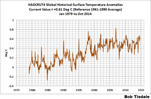
Figure 3 – HADCRUT4
UAH LOWER TROPOSPHERE TEMPERATURE ANOMALY DATA (UAH TLT)
Special sensors (microwave sounding units) aboard satellites have orbited the Earth since the late 1970s, allowing scientists to calculate the temperatures of the atmosphere at various heights above sea level. The level nearest to the surface of the Earth is the lower troposphere. The lower troposphere temperature data include the altitudes of zero to about 12,500 meters, but are most heavily weighted to the altitudes of less than 3000 meters. See the left-hand cell of the illustration here. The lower troposphere temperature data are calculated from a series of satellites with overlapping operation periods, not from a single satellite. The monthly UAH lower troposphere temperature data is the product of the Earth System Science Center of the University of Alabama in Huntsville (UAH). UAH provides the data broken down into numerous subsets. See the webpage here. The UAH lower troposphere temperature data are supported by Christy et al. (2000) MSU Tropospheric Temperatures: Dataset Construction and Radiosonde Comparisons. Additionally, Dr. Roy Spencer of UAH presents at his blog the monthly UAH TLT data updates a few days before the release at the UAH website. Those posts are also cross posted at WattsUpWithThat. UAH uses the base years of 1981-2010 for anomalies. The UAH lower troposphere temperature data are for the latitudes of 85S to 85N, which represent more than 99% of the surface of the globe.
Update: The November 2014 UAH lower troposphere temperature anomaly is +0.33 deg C. It dropped (a decrease of about -0.04 deg C) since October 2014.

Figure 4 – UAH Lower Troposphere Temperature (TLT) Anomaly Data
RSS LOWER TROPOSPHERE TEMPERATURE ANOMALY DATA (RSS TLT)
Like the UAH lower troposphere temperature data, Remote Sensing Systems (RSS) calculates lower troposphere temperature anomalies from microwave sounding units aboard a series of NOAA satellites. RSS describes their data at the Upper Air Temperature webpage. The RSS data are supported by Mears and Wentz (2009) Construction of the Remote Sensing Systems V3.2 Atmospheric Temperature Records from the MSU and AMSU Microwave Sounders. RSS also presents their lower troposphere temperature data in various subsets. The land+ocean TLT data are here. Curiously, on that webpage, RSS lists the data as extending from 82.5S to 82.5N, while on their Upper Air Temperature webpage linked above, they state:
We do not provide monthly means poleward of 82.5 degrees (or south of 70S for TLT) due to difficulties in merging measurements in these regions.
Also see the RSS MSU & AMSU Time Series Trend Browse Tool. RSS uses the base years of 1979 to 1998 for anomalies.
Update: The November 2014 RSS lower troposphere temperature anomaly is +0.25 deg C. It showed a cooling (a decrease of about -0.03 deg C) since September 2014.

Figure 5 – RSS Lower Troposphere Temperature (TLT) Anomaly Data
A QUICK NOTE ABOUT THE DIFFERENCE BETWEEN RSS AND UAH TLT DATA
There is a noticeable difference between the RSS and UAH lower troposphere temperature anomaly data. Dr. Roy Spencer discussed this in his November 2011 blog post On the Divergence Between the UAH and RSS Global Temperature Records. In summary, John Christy and Roy Spencer believe the divergence is caused by the use of data from different satellites. UAH has used the NASA Aqua AMSU satellite in recent years, while as Dr. Spencer writes:
…RSS is still using the old NOAA-15 satellite which has a decaying orbit, to which they are then applying a diurnal cycle drift correction based upon a climate model, which does not quite match reality.
I updated the graphs in Roy Spencer’s post in On the Differences and Similarities between Global Surface Temperature and Lower Troposphere Temperature Anomaly Datasets.
While the two lower troposphere temperature datasets are different in recent years, UAH believes their data are correct, and, likewise, RSS believes their TLT data are correct. Does the UAH data have a warming bias in recent years or does the RSS data have cooling bias? Until the two suppliers can account for and agree on the differences, both are available for presentation.
In a more recent blog post, Roy Spencer has advised that the UAH lower troposphere Version 6 will be released soon and that it will reduce the difference between the UAH and RSS data.
13-YEARS+ (167-MONTH) RUNNING TRENDS
As noted in my post Open Letter to the Royal Meteorological Society Regarding Dr. Trenberth’s Article “Has Global Warming Stalled?”, Kevin Trenberth of NCAR presented 10-year period-averaged temperatures in his article for the Royal Meteorological Society. He was attempting to show that the recent halt in global warming since 2001 was not unusual. Kevin Trenberth conveniently overlooked the fact that, based on his selected start year of 2001, the halt at that time had lasted 12+ years, not 10.
The period from January 2001 to November 2014 is now 167-months long—more than 13 years. Refer to the following graph of running 167-month trends from January 1880 to November 2014, using the GISS LOTI global temperature anomaly product.
An explanation of what’s being presented in Figure 6: The last data point in the graph is the linear trend (in deg C per decade) from January 2001 to November 2014. It is basically zero (about +0.02 deg C/Decade). That, of course, indicates global surface temperatures have not warmed to any great extent during the most recent 167-month period. Working back in time, the data point immediately before the last one represents the linear trend for the 167-month period of December 2000 to October 2014, and the data point before it shows the trend in deg C per decade for November 2000 to September 2014, and so on.

Figure 6 – 167-Month Linear Trends
The highest recent rate of warming based on its linear trend occurred during the 166-month period that ended about 2004, but warming trends have dropped drastically since then. There was a similar drop in the 1940s, and as you’ll recall, global surface temperatures remained relatively flat from the mid-1940s to the mid-1970s. Also note that the mid-1970s was the last time there had been a 167-month period with a global warming rate that low—before recently.
17-YEARS+ (210-Month) RUNNING TRENDS
In his RMS article, Kevin Trenberth also conveniently overlooked the fact that the discussions about the warming halt are now for a time period of about 16 years, not 10 years—ever since David Rose’s DailyMail article titled “Global warming stopped 16 years ago, reveals Met Office report quietly released… and here is the chart to prove it”. In my response to Trenberth’s article, I updated David Rose’s graph, noting that surface temperatures in April 2013 were basically the same as they were in November 1997. We’ll use November 1997 as the start month for the running 17-year trends. The period is now 210-months long. The following graph is similar to the one above, except that it’s presenting running trends for 210-month periods.
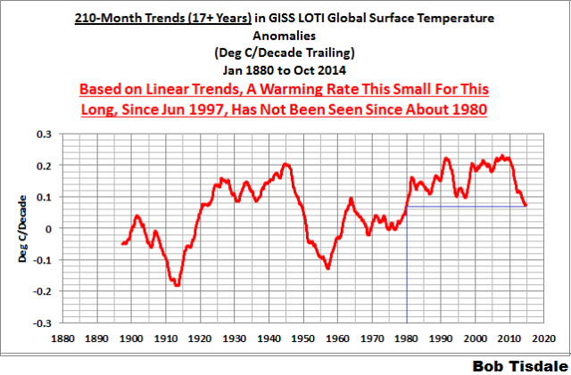
Figure 7 – 210-Month Linear Trends
The last time global surface temperatures warmed at this low a rate for a 210-month period was about 1980. Also note that the sharp decline is similar to the drop in the 1940s, and, again, as you’ll recall, global surface temperatures remained relatively flat from the mid-1940s to the mid-1970s.
The most widely used metric of global warming—global surface temperatures—indicates that the rate of global warming has slowed drastically and that the duration of the slowdown in global warming is unusual during a period when global surface temperatures are allegedly being warmed from the hypothetical impacts of manmade greenhouse gases.
COMPARISONS
The GISS, HADCRUT4 and NCDC global surface temperature anomalies and the RSS and UAH lower troposphere temperature anomalies are compared in the next three time-series graphs. Figure 8 compares the five global temperature anomaly products starting in 1979. Again, due to the timing of this post, the HADCRUT4 and NCDC data lag the UAH, RSS and GISS products by a month. The graph also includes the linear trends. Because the three surface temperature datasets share common source data, (GISS and NCDC also use the same sea surface temperature data) it should come as no surprise that they are so similar. For those wanting a closer look at the more recent wiggles and trends, Figure 9 starts in 1998, which was the start year used by von Storch et al (2013) Can climate models explain the recent stagnation in global warming? They, of course, found that the CMIP3 (IPCC AR4) and CMIP5 (IPCC AR5) models could NOT explain the recent halt in warming.
Figure 10 starts in 2001, which was the year Kevin Trenberth chose for the start of the warming halt in his RMS article Has Global Warming Stalled?
Because the suppliers all use different base years for calculating anomalies, I’ve referenced them to a common 30-year period: 1981 to 2010. Referring to their discussion under FAQ 9 here, according to NOAA:
This period is used in order to comply with a recommended World Meteorological Organization (WMO) Policy, which suggests using the latest decade for the 30-year average.

Figure 8 – Comparison Starting in 1979
###########

Figure 9 – Comparison Starting in 1998
###########
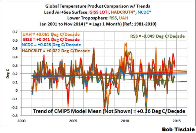
Figure 10 – Comparison Starting in 2001
For those who want to get a rough idea of the impacts of the adjustments to the GISS and HADCRUT4 warming rates, refer to the July update—a month before those adjustments took effect.
AVERAGE
Figure 11 presents the average of the GISS, HADCRUT and NCDC land plus sea surface temperature anomaly products and the average of the RSS and UAH lower troposphere temperature data. Again because the HADCRUT4 and NCDC data lag one month in this update, the most current average only includes the GISS product.

Figure 11 – Average of Global Land+Sea Surface Temperature Anomaly Products
The flatness of the data since 2001 is very obvious, as is the fact that surface temperatures have rarely risen above those created by the 1997/98 El Niño in the surface temperature data. There is a very simple reason for this: the 1997/98 El Niño released enough sunlight-created warm water from beneath the surface of the tropical Pacific to permanently raise the temperature of about 66% of the surface of the global oceans by almost 0.2 deg C. Sea surface temperatures for that portion of the global oceans remained relatively flat until the El Niño of 2009/10, when the surface temperatures of the portion of the global oceans shifted slightly higher again. Prior to that, it was the 1986/87/88 El Niño that caused surface temperatures to shift upwards. If these naturally occurring upward shifts in surface temperatures are new to you, please see the illustrated essay “The Manmade Global Warming Challenge” (42mb) for an introduction.
MONTHLY SEA SURFACE TEMPERATURE UPDATE
The most recent sea surface temperature update can be found here. The satellite-enhanced sea surface temperature data (Reynolds OI.2) are presented in global, hemispheric and ocean-basin bases. We discussed the recent record-high global sea surface temperatures and the reasons for them in the post On The Recent Record-High Global Sea Surface Temperatures – The Wheres and Whys.
I’m in my lunch-hour Bob. I really appreciate your posts, but sometimes I would just love a ‘Conclusion’ or ‘Summary’, so that I could read that, then read it all later when I come home. Cheers.
Yes, Bob’s articles tend to be long, and it takes some time to digest and figure out what he’s trying so say. So an “abstract”, listing the issues (e.g. impressions, conjectures about datasets, theories, new ideas etc) and a summary of findings or conclusions, at the top of the post, would be very helpful.
+1 As I keep requesting I am withholding my next $100 until you do Bob 😉
what articles need is an abstract – a paragraph telling about the article, including what it’s about and what results are evident and what conclusions it draws.
.
Me too. I know they are necessary for specialists, but after the fifth set of wriggly lines my eyes tend to glaze over and my mind gets occupied by small, furry, animals playing simple tunes on fiddles and flutes.
A simple take-home message would be handy. Perhaps one of these:
1. Getting hotter
2. Getting colder.
3. No change.
4. No idea.
Uh, I thought Models explained the past (so they showed what actually happened) and then tried to “predict”/”Project” the future. Yet these models cannot even explain the past? I can see them adjusting past temperatures to fit their models even more now. This is not science. This is shamanism.
philjourdan, you don’t think it would make more sense to falsify the hindcast portion of the model runs to observation, and fake the temperature record going forward to match the model projections?
Is this the BG school of falsification? I thought that science was about finding the facts, not what falsification you can get away with.
philjourdan,
Scientific investigation can only ever demonstrate positive conclusions, and then often only by inference. On the other hand, anyone can dig up dirt and “prove” a conspiracy anecdotally. I can’t provide you or anyone evidence that a conspiracy does NOT exist — that would be attempting to prove a negative — so logical reasoning is my only option. I did not invent this method of critical thinking, but I consider myself well enough versed to apply it to the situation.
Do you really think a ubiquitous conspiracy powerful enough to falsify temperature records would forget to make the predictions convincingly match the “observations”? Why would they change the past records at all, thereby exposing their malfeasance, when all they have to do is falsify the records going forward to match the desired “predicted” output of the models?
Sorry BG, you response is a total non sequitur. Did I ask anything about a conspiracy? Hmmm… I do not see it, can anyone else that can read English see where I mentioned a conspiracy?
Seems only you see conspiracies. And you have problems with the English language as has been pointed out.
So perhaps you want to respond to what I said? It was only 3 short lines, so maybe if you sound it out, you can figure it out. If not, fine.
But keep your scare crows to yourself. No one is interested in your straw men.
B. Gates says:
Do you really think a ubiquitous conspiracy powerful enough to falsify temperature records would forget to make the predictions convincingly match the “observations”?
Naive child, there is money involved! Immense piles of money. It does not require an organized conspiracy to nudge “data” in the direction of keeping that gravy train on track.
As Adam Smith wrote back in 1776:
“People of the same trade seldom meet together, even for merriment and diversion, but the conversation ends in a conspiracy against the public, or in some contrivance to raise prices.”
A wink and a nod, Brandon. That’s all it takes, and voila!, it’s the ‘hottest year evah!’
dbstealey,
Undoubtedly. However, that’s a somewhat different argument from what I was rebutting.
Following the money means following ALL the money. As that can be difficult, if not tedious, to accomplish comprehensively I tend to look more at the research itself and the scientific arguments for and against it. I generally find the arguments against lacking much science. Even so, my own confirmation biases are ever ready to cloud my mind.
In his defence, climatologists are not known for their skill with such sophisticated statistics.
Not criticising anyone, I know what ‘The Ghost of Big Jim Cooley’ is on about. It probably would helpful whenever someone writes an article to give the article structure… start by briefly telling readers what you are about to tell them, then tell them in detail, and then end by briefly telling them what you have just told them i.e. an introduction, ‘the detail’, and then the summary conclusion.
This article by Bob is a very good article.
Bob, thanks for putting all this together! The warmists (whose views I welcome lest we have no one to argue with) seem to have introduced 3 new lines to their propaganda recently. 1) 2014 is set to be the warmest on record, 2) the IPCC are being deliberately conservative and 3) we have to wait for 22nd century before we are fried.
What on Earth is the source for 2014 being the warmest on record?
euanmearns, one would assume they’re basing it on November to October annual temperatures for 2014. If the relationship held out to the end of the year, GISS and HADCRUT would be close in 2014 to 2010, and NCDC would be at a record-high in 2014. See Figures 2, 3 and 4 in:
https://bobtisdale.wordpress.com/2014/12/10/rss-and-uah-meteorological-annual-mean-december-to-november-global-temperatures-fall-far-short-of-record-highs-in-2014/
Thanks Bob, I had a look. So it seems the thermometer records are tending towards their upper bounds while the satellite records have the el nino spikes that puts new records well out of reach at present. I might add that I’m red green colour blind and have a devil of a job reading your splendid charts. One reason why I use a lot of blues and reds and yellows in my own charts that some folks find a bit garish. Do you up-date these charts monthly?
Oops, I missed the NCDC update that wasn’t supposed to be out before the 18th…or so I thought. Their November value was 0.65 deg C, a drop of 0.08 deg C, from 0.73 deg C.
Hi first graph model data difference as there is just one black line how do I detect the difference please?
“…applying a diurnal cycle drift correction based upon a climate model” (UAH TLT).
So the data is readjusted to fit ‘a climate model’. Why is one not surprised?
Confirmation bias at its best.
I feel the UHI/land use adjustments (which warmed recent history rather than cooled it, as would be expected) used findings from a study that made the assumption that reducing CO2 by land use changes would result in lower temperatures… meaning, even more confirmation bias built into the datasets.
Bob, are you recently working in overtime?
Thanks Bob. This is a very clear presentation. I believe that many of us on the lurking end or your posts need a clear reminder from time to time. I certainly do.
I hate these blown up charts…in 10th and 100th degrees
…that’s just a math error
Latitude, I know right? Why is Bob quibbling about a 0.25 °C model to observation discrepancy when that’s probably just a rounding error?
Rounding error? When you have people quibbling about .01ª C? Wow! With rounding like that, I guess we can all call ourselves millionaires.
philjourdan, that was pretty much my point.
[snip – policy violation trafamadore@gmail.edu is a non-existent email address:
MX record about ‘gmail.edu’ does not exist. – mod]
Bob,
Perhaps you can shed some light on what’s going on in these graphs: https://drive.google.com/file/d/0B1C2T0pQeiaSTFNEekNLWkxkMFk
1) Why do the hiatuses from 1800-1915, 1940-1975 and 1998-present each successively have a more positive slope than the last?
2) Why does each hiatus begin and end at a higher temperature than the previous one?
3) Why on earth would I pick a 1986-2005 baseline calculate temperature anomaly?
If you need help with (1) and/or (2), you might want to slap a linear regression line over the entire range of your chart here, and ponder the meaning of an upward-sloping 2nd derivative:
Brandon Gates
If you have something to say then spit it out.
Your questions do not relate to the above article by Bob Tisdale so there is no reason for him to assist your attempted deflection from his article.
Richard
Brandon, we are still recovering from the Little Ice Age.
It is much colder than during the Roman Warm Age. It is much colder than the Middle Age Warm Period.
It is far, far, far colder than the very warm Minoan Warm Period.
This is the coldest ‘warm era’ of the last 10,000 years which makes the howls about ‘global warming’ so infantile.
emsnews,
I’ll grant that it does present somewhat of an attribution problem.
Work with me here. How is it that you know about the Roman Warm Age, Middle Age Warm Period and Minoan Warm Period? I’ll trade your infantile for naive, as in it’s ridiculously absurd to think that the people who gathered the data that tell you about those three warmish periods of time are perfectly clueless about their causes. As for coldest warm era over the past 10k years, no, slightly above dead even according to Marcott 2013. Not that it matters so much as that10k years ago, the planet wasn’t 7.125 billion people using technology and infrastructure optimised to exploit the climate and biosphere of the present climate.
We don’t really know what’s going to happen down the line a degree or two hotter, or even how soon we’ll get there. The models suck, yes? Prudent people faced with that kind of uncertainty and billions of peoples’ well-being at stake don’t just say, “well it was a degree hotter in the MWP, everything will be hunky-dory”.
I’m not advocating alarm or panic. I am saying from a risk-management perspective, “wot, me worry” is, well, a bit irresponsible.
Odd that.
No, NO ONE has ever promoted any theory about why those warming periods started, nor why they ended, nor why they are continuously “sliding down to lower and lower peaks every 950 – 1050 years, nor why they peaked every 950 – 1050 years.
Funny – See, if they did promote such a theory, it would explain why we are in 2000 – 2010 at a Modern Warming Period 1000 years after the last Warming Period. Despite, not because of, the recent addition of CO2 to the earth’s atmosphere since 1945.
RACookPE1978,
Definitional quibbles about the difference between theory and hypothesis aside, great expense is not spent to gather data only to stuff it in a binder and let it gather dust on a sub-basement storage shelf. Given the prevailing mythos here that climate models are wholly disjointed from reality I can’t say I’d be surprised if you have not considered that feeding those models is one of the main ends of gathering the observational data to begin with. It’s models all the way down of course, even the initially published and subsequently reanalyzed data are the product of various models, purely statistical and/or otherwise.
So I often see asserted, hardly ever substantiated. Why do you conclude it must be an either-or proposition?
Mr Gates , Sir, your first link interested me because I am sure that I have seen it here previously , and recently, but I do not recall the person who posted it (my apologies if it was you but I am fairly new to the site and not yet familiar with the regular visitors ) . That person was not hostile to the possibility of a “pause” but wanted to wait 15 years after the global temperature trends had emerged from the model or CO2 2- sigma envelopes before deciding whether or not global temperatures had stabilised , and it does indeed look as if the temperature trends are nudging the CO2 envelope so the count down can begin.
I thought that that was very sensible and in an ideal world that was what we would all do , but unfortunately the politics of climate change move far more rapidly and in 15 years time Parliament’s plan to destroy the industrial and economic structure of the UK will be nearly complete and irreversible . So we have to work with the situation as currently presented and I have to say that whilst the graphs that Bob Tisdale has provided support AGW (in my opinion) they do not persuade that it is of the catastrophic variety :
eg consider the rating of 2014 from the graphs :-
GISS LOTI monthly max at 0.65C – 5th warmest
GISS annual monthly LOTI monthly max at 0.66C – 2nd warmest
NCDC land and sea: monthly max at 0.73C – 5th warmest
HADCRUT 4 monthly max at 0.61C – 4th warmest
UAH LTTA monthly max at 0.33C – 4th warmest
RSS LTTA monthly max at 0.25C – 11th warmest
Of course these are peak values , An integrated mean over the months might give a different ranking – something to do next perhaps .
There was one other point that puzzled me about your original link: the CIMP mean model trend is currently ( well for quite a few years actually) deviating from the CO2 curve as much as the temperature trends . Does this mean that the models are responding to something other than just CO2 ?
The other questions did not seem to correspond exactly to the original article , but you are right in drawing attention to the rate of change of the slope of warming or cooling . Since 2010 the second differential would be have a negative value . Is that what you wanted to draw attention to?
mikewaite,
You’ve read me pretty much correctly, and I will respond in detail later this evening as I don’t have the time to do your questions justice.
mikewaite,
I have posted visually similar versions of that chart here previously and based on your next comment I’m pretty sure what you saw was one of mine.
I’m not at all hostile to the observation of a pause or hiatus. It’s clearly evident that the rate of surface warming over the past two decades has slowed to nearly zero, no statistics of any kind are required to see it in a chart.
I have cause for concern here in the US for politics on both sides of the debate, there is much that I don’t like. That said, I don’t think either side is trying to destroy the country deliberately. I see the present legislative and executive dysfunction as our main bogeymen, with climate policy being just one of the casualties.
Of course I would agree with you that Bob’s plots show evidence of AGW. However, all they really show are rising temperatures over multi-decadal periods of time, and are wholly silent as to causality. No chart will ever speak to catastrophe or no. One cannot simply point to a coordinate on a plot and say that’s the place the wheels come off the carriage.
An intriguing thought. I’m generally dubious as to the actual scientific insight such analyses provide, however. Records can have more psychological (and rhetorical) impact than actual real physical significance. [1] Literature I’ve read more often points to relative frequencies of events above or below some threshold. I think those have potentially more meaning, though again where the thresholds are set may suffer from being so arbitrary that anyone can make a set of data tell whatever story they choose.
As an example, we warmists often focus on highs to a fault and the converse for the not-so-warmists. Minimum, mean, medians and mean min and max show some interesting trends over longer periods of time (multiple decades to centuries). I am not the first to point out that over the past 20 years, annual minima have been rising faster than maxima. That’s too short of a period to have much meaning but similar patterns have been observed over much greater periods of time.
The short answer is very much yes, they do respond to far more than just CO2. I attempted a short list and it got quite long. Suffice it to say, I would not expect my simple CO2 regression to at all track to model ensemble means over any short period of time, and certainly not projected forward with any sort of agreement to a GCM ensemble.
I was deliberately pointing to the average rate of change with my three cherry-picked intervals of 1880-1915 [2], 1940-1975 and 1998-present. My talk trend against Bob’s rate plot (the “2nd derivative”) was directed at the entire 1880-present interval. Two points to hopefully unravel what I mashed together:
1) When looking at short term trends, it pays to look at similar events in the past.
2) Make sure to look at more than just short term trends.
So, trend analysis often sucks in this particular application. Much better to go to the underlying physical theory and do statistics which describe the “normal” range of deviations from some prediction. Even what I have presented is too simplistic to adequately explain much of all we presently think we understand about what’s happening. The things we know we don’t understand, or absolutely cop to not being able to adequately predict, are far more interesting topics than what can be had from these preliminary charting exercises.
———————————
[1] Here I distinguish from significance in the statistical sense, the latter being an abstraction which might tell us some causal mechanism or the other is operative (or not) but which is silent on effect.
[2] I originally wrote “1800-1915”, which was a typo.
What this comes to even with all the “adjustments” the alarmists can get away with, is a matter of some hundredths of a degree per decade. Be very very afraid!!
2014 had to be ‘The Warmest Year Ever!’ due to the IPCC meeting where money was the #1 issue. These guys intend to get this CO2 tax money by hook and crook and pour it into the bank accounts of various dictators and ‘world leaders’.
This has nothing to do with the weather at all. It is a scam. We can prove that this elusive warming isn’t happening until the cows come home and the taxpayer-funded scams will pour out of every university and infect NASA and ruin NOAA rendering it incapable of predicting any weather anymore…and there is nothing we can do about this since this is all about looting someone and bribing everyone.
It has corrupted science, destroyed NOAA, made NASA look stupid and irritates me to death!
Brandon Gates, thanks for asking your three questions.
1) I can’t respond to your question 1 because you haven’t illustrated trends on your graphs. Are you aware that you’ll get different results if you use HADCRUT data, because of the modifications to HADSST3 where they eliminated the “discontinuity” around 1945? So the answer to your question depends on the sea surface temperature dataset, now, doesn’t it, Brandon?
2) I’m surprised you haven’t figured that out the answer to your question 2, Brandon. The obvious answer to your question 2 is, because there is a warming period between the hiatus periods.
3) I didn’t pick 1986-2005 for a baseline. Odd that you should ask about them. I’ve listed the base periods on the graphs, Brandon. Any reason you’re being trollish about base years, Brandon? For Figure 00, I used the base period of 1880 to 2013 so that the base years didn’t bias the difference. The data in Figure 1 and the Supplemental graph that follows it use 1951-1980 (GISS base years). In Figure 2, the base period was 1901-2000 (NCDC base years). The period of 1961-1990 was used in Figure 3 (HADCRUT base years). Figure 4 uses 1981-2010 as a base period (UAH base years), and last but not least, the data in Figure 5 uses 1979-1998 (RSS base years). Those are the base periods selected by the data suppliers. I’m surprised you didn’t know that, too. You’re learning lots today, Brandon. The graphs in Figure 6 and 7 are trend graphs and are not dependent on the base years. And for Figures 8 through 11, I used the base periods of 1981-2010…which are the base years recommended by the WMO, just in case you’re not aware of that also, Brandon.
So you had your three questions for today, Brandon. Now, please go back to Sou at HotWhopper and tell her your findings here. I’m sure you and she will be more than happy to misrepresent what I’ve written. You certainly have never shown you have any capacity to grasp anything I write. Sometimes I think English is a second language for you two and the others there.
Have a good day.
Bob,
1) I figured eyeballs on those trends would be sufficient. Also, you already have trend graphs for GISS, so I figured it would be somewhat redundant. As well, trend analysis is sensitive to endpoints … I did suggest ranges but they were meant to be more “in the vicinity of” so as to let readers’ eyeballs make their own decisions without too much suggestion from me. Finally, today’s main feature is the latest GISTemp LOTI release, so that’s what I plotted; otherwise yes I know there are differences between various products for reasons that seemed too esoteric to delve into for the purpose I asked the question … which you then avoided answering by delving into esoterica. Which is an answer.
2) I was obviously not asking for an obvious answer. Chalk up two non-answer answers.
3) I saw that you listed your baselines on the graph, that’s why I asked you about them. As you point out, for trend plots it makes not a whit of difference. For individual timeseries, it doesn’t matter either but I agree that good practice is to simply not futz with them and use the data as-is. When dealing with CMIP5 model output, especially when comparing to actuals, it can make a difference. I have seen all too many “95% of all observations are wrong” graphs out there with wonky baselining done by people who should know better, copycatted by people who might be clueless or might be trying to pull a fast one. Hard to tell, sometimes both it seems.
Your instinct to take the 1880-2013 so as not to bias things sounds good on the face of it, but there’s no need for anyone to make a judgement call here: there is a published standard in AR5, which is 1986-2005. Reason being that the hindcast portions of the model runs end in 2005 and the projection part begins the year following. Stands to reason you’d want the zero point to be in the neighborhood of when the forward-looking portion begins, but not including it. Am I right? I’m right.
Once pegged to an observational series at 1986-2005, moving the whole kit and kaboodle to 1951-1980 for GISS, or 1981-2010 for UAH, etc. should then be a-ok.
In this case I’m happy to report it doesn’t make much difference, a whopping 0.04 °C with your method coming out on the hot side of the divergence from the “official” method. We here on our side of the fence are a bit fastidious about our hundredths of a degree, but it would be splitting hairs for me to chew on you for it too much when I’ve seen 0.2 °C artificially enhanced discrepancies on some charts out there.
A final shocker for me this morning is that my discrepancy calcs show the models firmly in record wrong hot territory by about a tenth of a degree from 1950, dead even with the last record wrong in 1970. That’s against the RCP8.5 hindcast runs. Could be we’re using different data but I get mine from KNMI same as I think you do. It’s a puzzler, but not all that important to me. When the standard deviation of the residual from the CO2-only regression I did on my plots is +/- 0.11 °C, I’m not about to get bent out of shape with the GCMs rattling around inside the 2-sigma envelope every 10 years.
That said, I do maintain that CMIP5 runs too hot. Specifically they start low and catch up with the present by trending higher than they should. The Met at least apparently agrees with me having bumped down their decadal forecast a few months back.
I hope you don’t mind, Brandon. I didn’t bother to read or reply.
I guess that means I’m imagining I just read your reply.
I guess that means I’m imagining I just read your reply.
That’s certainly what it looks like.
Brandon, it is obvious to a 6 year old what Bob meant. That you feel compelled to answer with a smart-arse comment speaks volumes about you.
PS in case you aren’t that smart, Bob clearly meant he has no intention of reading your post, nor answering to the content of it, I presume because it is wildly off topic. Sou at Hot Whopper would simply slander her detractors by calling them names, accuse them of Gish Gallop, and then delete the post. Bob is more polite.
cheers,
Greig Ebeling
Greig,
The way I see it, Bob is exceedingly disingenuous and dismissive which can be construed as rude. My evident derision by way of response is deliberate and unapologetic.
… that’s not the right word. Unrepentant is the term someone here recently used to describe me. I own that and wear it without complaint.
Hi Brandon, I just reread you three questions to me up-thread. It seems I misread your question 3, which was:
“3) Why on earth would I pick a 1986-2005 baseline calculate temperature anomaly?”
To tell you the truth, Brandon, I personally don’t care why you chose a specific set of base years for a graph, so I have no need to guess. That’s your choice. I chose others.
Have a good day.
Brandon says:
… that’s not the right word.
How about “insufferable”?
Bob,
Fair enough.
True, we both have choices. Personally I like to choose published standard practice, but not first without taking care to understand the rationale behind the standard.
dbstealey,
Pompous, arrogant, condescending, egotistical, self-important, narcissistic, abrasive, stubborn, recalcitrant, know-it-all … too many to list.
BG:
… too many to list.
How about the catch-all: “Wrong”. ☺
dbstealey,
Not even wrong.
Basically wrong. Right on occasion. But on the losing side of the debate. Wrong over all.
And still no measurements of AGW, I see.
Hi Bob, thanks for the graphs, they provide some accuracy and quantification around the current rate of warming (or lack of), which will in time shed some light on TCR to CO2 – an important subject for policy makers.
Bob, don’t worry about Brandon and Slandering Sou at Hot Whopper. It is obvious she is struggling when her retort to your article (which is about quantifying the current hiatus) resorts to discussing 120 year trends, and 2nd order derivatives over 120 year timeframe. She then does a few statistical tricks on the 120 year graphs to try to prove there is no pause. Finally she declares that there is no pause because 2014 is may be a very warm year. All this is supposed to demonstrate that there is no hiatus.
I have tried previously to explain to Sou and her mates that a few record warm years does not mean there is no pause, and besides the IPCC (who are clearly better at basic math than Sou) have already acknowledged the hiatus and the implications of failing to match with with climate modelling. Sou responds by calling me a denier and deleting my posts. She isn’t worth worrying about Bob, she is transparently deceptive, and clearly not willing to engage in a deeper discussion about climate projection accuracy and its impact on policy.
cheers,
Greig Ebeling
Greig,
You’re ahead of schedule. I didn’t expect climate contrarians to remember that a few short years of anything aren’t very significant in climate until after temps climbed above 1998-99 and stayed put for a few years.
Brandon Gates
You say to Greig,
There have been more than 18 complete years of the “pause” which is acknowledged by all who know what climate change is (e.g. it is recognised by the IPCC).
Your attempted redefiniation of “the pause” is daft; it asserts that a “pause” to warming requires temperature to be sustained above its 1998 value. That means – according to you – that cooling from the 1998 value is not a “pause” to warming.
In reality – and as you really do know – the “pause” is a cessation of change to linear global tempeature trend discernible at 95% confidence, and it has existed for more than 18 years.
Richard
Richard S Courtney,
I can see two decades of flat surface temperatures with my own eyes, no stats required. Speaking of, your definition of pause is curious: ” … a cessation of change to linear global tempeature trend discernible at 95% confidence, and it has existed for more than 18 years.” Pray tell, at what point during those 18 years did the pause become significant at 95% confidence and how exactly was that calculated? What do those same calculations say about the pauses between 1880-1915 and 1940-1975? Would those significance tests generated accurate predictions or not?
BG, ?w=613&h=321
Some needed perspective:
dbstealey,
…. and what. Temperatures go up and down? The Holocene has been cooler than the last four interglacial peaks?
The surface temperature anomaly compared to the model-data difference graph will soon resemble a hockey stick. The new hockey stick will be fun to play with.
Thanks, Bob, for a clear view on global surface temperatures data sets.
“[T]he 1997/98 El Niño released enough sunlight-created warm water from beneath the surface of the tropical Pacific to permanently raise the temperature of about 66% of the surface of the global oceans by almost 0.2 deg C.”
I take issue with the use of the word ‘permanently’. It would be more accurate to describe it as having raised temperatures TO THE CURRENT DATE as that is more appropriate of a description. If not, the implication is that it’s inevitable the oceans will continue to heat up significantly and that the upward warming trend since the 1880’s is unrelenting and irreversible. That only plays to the CAGW alarmist claim of impending doom. Am I wrong?
A1971, thanks for noting that. I’ll revise the language.
A1971, I’ve revised the boilerplate to read:
…the 1997/98 El Niño released enough sunlight-created warm water from beneath the surface of the tropical Pacific to raise the temperature of about 66% of the surface of the global oceans by almost 0.2 deg C. Sea surface temperatures for that portion of the global oceans remained relatively flat, dropping slowly throughout most of that region, until the El Niño of 2009/10, when the surface temperatures of
thethat portion of the global oceans shifted slightly higher again.###
The revisions will appear in the next update.
Bob Tisdale I’m just a stupid ren, but I’ll tell you bravo.
[snip – policy violation trafamadore@gmail.edu is a non-existent email address: MX record about ‘gmail.edu’ does not exist. – mod]
So tiresome. Fixed.
What I said was to _not_ set a new warm record this year for the NCDC data, it will take a record cold Dec for the year, colder than the Feb 2014 temp of 0.42. A Dec temp of 0.41 will cause the 2014 yearly average to tie the record warms of 0.65 in the 2005 and 2010 yearly averages.
If the Dec temp is the same as the Nov temp, 2014 will average out at 0.67; If the Dec temp is comes in at 0.50, 2014 will average out at 0.66, still record.
Should be: temperatures went up. Temperatures don”t warm
Chris Schoneveld, thanks for finding it. I’ll correct the boilerplate for the next update.
Bob, here is an updated comparison between the models and observations that includes the uncertainties in the model output and observational data. HadCRUT4 data are within the 5-95% uncertainty bands of the model projections.
http://2.bp.blogspot.com/-6VzzQHTaULQ/VIo-B3jG14I/AAAAAAAAEDA/mqtp0kYJ5p4/s1600/AR5%2Bmodel-obs%2Bcomparison%2BOct%2B14.JPG
from Ed Hawkins (https://twitter.com/ed_hawkins/status/542637005201756160/photo/1)
It now looks like we are tracking somewhere between the lower part of the 95% confidence band and the minimum CMIP5 model.
Obviously, it is too short a periiod to know whether this will continue but if it does then we are in for a littkle less than a further 0.5degC warming through to 2050.
Long ago the high CMIP5 models should have been weeded out from the ensemble. In fact, it seems difficult to understand the case for keeping those models that are running high over the 95% confident band, and it would be interesting to see the arguments for persisting with those models which are so clearly off target..
See Climate Audit for a thorough discussion of the Hawkins “bodge” in the current post there. Lipstick for the pig.
Thanks, Bevan. I understand Lucia is preparing a model-data comparison as well.
Earth is 4.5 billion years old.
.
What could anyone possibly learn, with even the most brilliant analysis of average temperature measurements by Mr. Tisdale, from studying the very brief period from 1979 to 2015, except for supporting the already known fact that the average temperature of Earth varies?
.
What’s the multi-hundred year long-term average temperature trend?
No one knows. Climate proxies are not global and not accurate enough.
Historical anecdotal evidence is somewhat useful, but not precise.
.
What’s a normal average temperature?
No one knows.
.
Are measurements, especially before 1979,
accurate enough to determine the moderate-term (100-year) trend?
Maybe not.
.
Is mild warming good news or bad news?
.
Is more CO2 in the air good news or bad news?
.
Does more CO2 in the air have enough of an effect on the average temperature
so a correlation is easily observed in measurements?
.
Why was it so cold last winter that the water meter in my garage froze and cracked,
for the first time since I moved in (1987), costing me $300, and is there a climate change
victim fund where I can file a $300 claim?
.
These are the important questions for scientists, especially the one about my water meter,
none of which can be answered by playing climate computer games …
or even by a brilliant analysis …. of just 35 years of average temperature data.
..
To his credit, Mr. Tisdale does not spend much time showing measurements before 1979:
– I have seen evidence that (surviving) 1880’s thermometers consistently read low (exaggerating warming since then), and that a huge percentage of the 6,000+ land weather stations in use in the 1960’s are no longer in use today.
.
I think its obvious the land stations still in use today are most likely to be those that were closest to where people lived, and could easily get temperature readings (rather than “inconvenient” stations that are rural, high altitude, and in cold areas).
.
I wonder how many land temperature stations in cold areas are no longer in use … and no longer part of the “global” average” … creating a huge opportunity for “creative accounting”?
.
Reblogged this on Centinel2012 and commented:
Still no warming and the longer this goes on the worse the IPCC will look. My work indicated a slight downward trend leveling off between 2030 and 2035. I’ll be posting my monthly report this morning.
What’s Really Up With The Weather…….!! Here is “What Is UP”!! Study your U.S. History and pay special attention to the year 1804. Our Sun began it’s approx 204 yr cycle. Our Sun has seasons (so to speak) just as we do on Earth. Instead of 4 seasons, which are very short, the Sun has it’s “seasons” as well. In 1804 (well documented) tens of thousands of Americans died of either being “frozen to death” or “starvation”.
HISTORIC Truth. Look it up. That particular Season of Sun hit earth. It so happens that if you add 204 yrs +/- plus 1804 it adds up to 2008. That is approximately when the Sun has gone into it’s “sleep mode”. During the next 30 yrs =/- a few years, the Sun will be cooling down. Already we know that there are very few sun spots. Hint, hint!! In this cycle, temperatures will begin to go down hill. Oh yea, for a while we will have warm summers (but NOT hot) and cooler winters. Over time, maybe 10 yrs hence we may start to really feel
natures worst event. i.e. “A Cold Sun”. Cool summers and freezing winters
even down into the deep south. Forget the Northern States, the lucky ones
will have heard the word and moved South as far as they can. Look at the
early snows the last couple of years… cities/states are already starting to run
out of “salt” to melt the ice. And it is just late Dec…. Each year the freeze
front will be pushing further South. Well before the end of the Sun’s sleep
we humans are going to be changing their whole life just to stay alive. With
this “period” of Sun’s cycle will bring about unbelievable cold weather and
heavy snows in states that never have to worry about that. Our biggest
concern will be our daily food. Obviously, wheat and most everything else
will not be produced enough to squarely feed our population in the U.S. and
the World. Those that are lucky enough to survive will again look like the
population after the “Depression”. We all will be lucky to be able to maintain
our weight. There will be no big stomachs. This is an entire Planet, our Planet,
will have changed. By the end of this “event” we will survive somehow as
a nation and we can then get about moving forward until the next 200yr
cycles again in approx the year 2212 !!