Guest Post by Bob Tisdale
This post provides an update on the progress of the evolution of the 2014/15 El Niño conditions. The post is similar in layout to the earlier updates. (See the entire 2014/15 El Niño series of posts here.) The post includes 3 gif animations and more than a dozen illustrations so the post might take a few moments to load on your browser. Please click on the illustrations and animations to enlarge them.
NEW FOR THIS POST: As you’ll note, much of the text is boiler plate. New discussions are preceded by a boldfaced Update. I’ve also added a “What’s Next?” heading and discussion at the end of the post.
Included are updates of the weekly sea surface temperature anomalies for the four most-often-used NINO regions. Also included are updates of the GODAS map-based animations of sea surface height anomalies, T300 anomalies (depth-averaged temperature anomalies to 300 meters), sea surface temperature anomalies, and the cross sections of temperature anomalies at depth along the equator. These animations start in January 2014 for the full progress of this year’s event(s). Also included are a couple of graphs of the BOM Southern-Oscillation Index (SOI) and a discussion of the NOAA Multivariate ENSO Index (MEI).
We compared data for the evolution of the 2014/15 El Niño to the 1982/83 and 1997/98 El Niños in a number of posts early in this series, back when this El Niño was being compared to those two strong events in new reports. More recently, we changed the reference El Niños for the evolution comparisons to the 2002/03 and 2009/10 El Niños. These reference El Niños are likely stronger than what we might expect in the next few months, but they are far weaker than the ones we used earlier this year.
And since we’ve been watching the downwelling (warm) Kelvin wave as it makes its way east along the equator in the Pacific, also included in this post are evolution comparisons using warm water volume anomalies and depth-averaged temperature anomalies from the NOAA TOA project website.
Then, we’ll take a look at a number of Hovmoller diagrams comparing the progress so far this year to what happened in both 2002 and 2009.
NINO REGION TIME-SERIES GRAPHS
Note: The NOAA NOMADS website is still off-line, so I used the weekly NINO region sea surface temperature anomaly data for Figures 1 and 2 from the NOAA/CPC Monthly Atmospheric & SST Indices webpage, specifically the data here. The data from NOAA NOMADS was provided with oodles of significant figures, while the NOAA/CPC data are provided in tenths of a degree C. The base years for anomalies through NOMADS were 1971-2000, while the NOAA/CPC data are referenced to 1981-2010. So, along with the changes to the reference El Niños, that explains why the graphs are a little different than what you’re used to seeing.
Figure 1 includes the weekly sea surface temperature anomalies of the 4 most-often-used NINO regions of the equatorial Pacific. From west to east they include:
- NINO4 (5S-5N, 160E-150W)
- NINO3.4 (5S-5N, 170W-120W)
- NINO3 (5S-5N, 150W-90W)
- NINO1+2 (10S-0, 90W-80W)
Update: Of the four regions, the NINO3.4 region sea surface temperatures are the most commonly referenced. They are used for the NOAA Oceanic NINO Index, which NOAA uses to identify “official” El Niño and La Niña event. As of last week, NINO3.4 region sea surface temperature anomalies were at the +1.0 deg C threshold of a moderate strength El Nino. NINO3 and NINO4 region temperature anomalies are slightly less than the NINO3.4 region. NINO1+2 region surface temperatures had been elevated for about 6 months, ever since the first downwelling Kelvin wave reached the coast of South America, but they have continued their long-term decline since boreal summer and they are now at 0.4 deg C.

Figure 1
Note that the horizontal red lines in the graphs are the current readings, not the trends.
EL NIÑO EVOLUTION COMPARISONS FOR NINO REGION SEA SURFACE TEMPERATURE ANOMALIES
Using weekly sea surface temperature anomalies for the four NINO regions, Figure 2 compares the goings on this year with the 2002/03 and 2009/10 events.
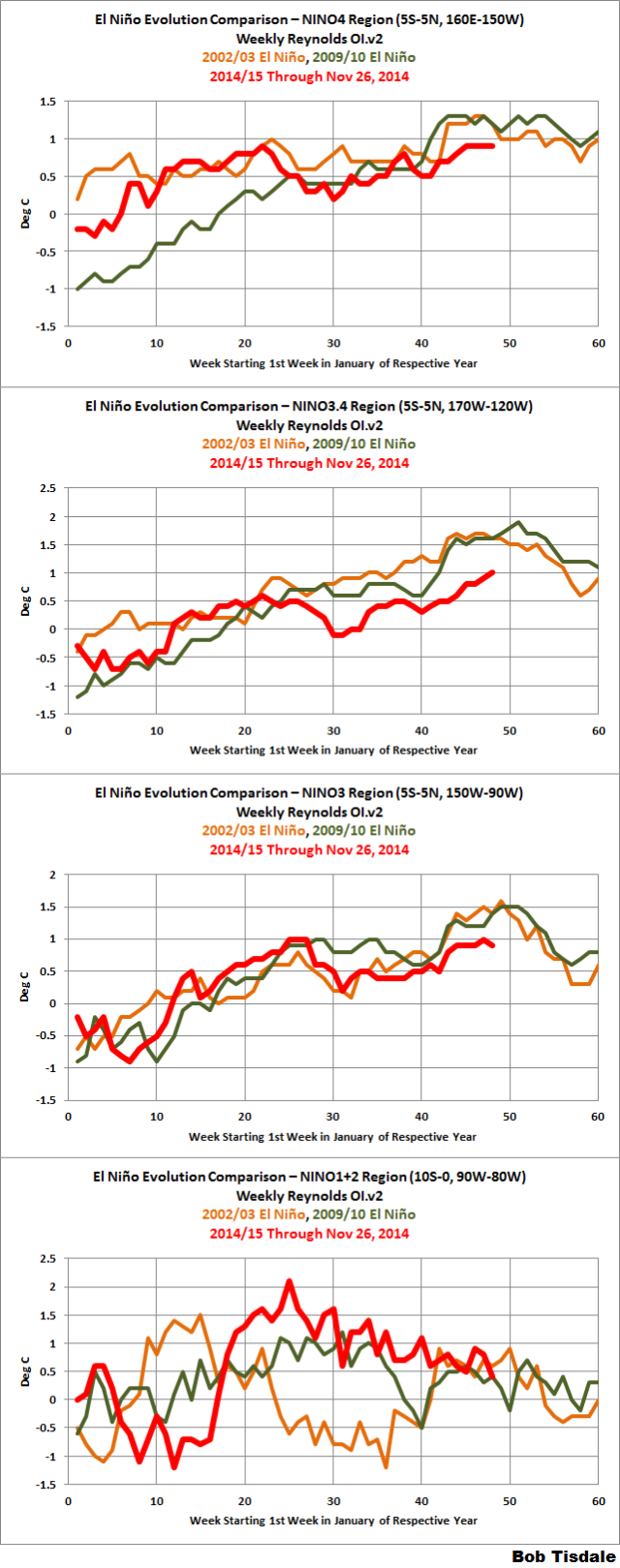
Figure 2
ANIMATION UPDATES
Update: The animations have grown long, so I’ve sped them up.
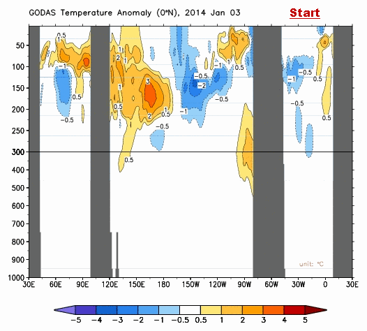
In the first post in this series, we discussed a number of animations of maps and animations of equatorial cross sections that are available from the NOAA Global Ocean Data Assimilation System (GODAS) website. Each cell of the animation is a 5-day (pentadal) average. Those animations ran from January 3rd to March 29th. The following are updates, again starting in January 3rd. GODAS only maintains their animations for 3 months. I’ve stored the maps since the first of the year and have continued to add maps as time progresses.
Animation 1 provides the sea surface height anomalies and the depth-averaged temperature anomalies for the top 300 meters (T300) side by side.

Animation 1
Animation 2 is a similar side-by-side comparison, but on the left are maps of sea surface temperature anomalies and on the right are the T300 maps. My apologies for the shift in the color scaling for the range of +0.5 to +1.0 deg C in the sea surface temperature anomaly maps. That appears to be a quirk in my computer, not the GODAS website.

Animation 2
Animation 3 is an update of the cross sections of temperature anomalies at depth along the equator.
Animation 3
THE MULTIVARIATE ENSO INDEX
The first mention of the NOAA Multivariate ENSO Index in this series was in the recent post The 2014/15 El Niño – Part 19 – Is an El Niño Already Taking Place? I’ve borrowed the preliminary discussion there and expanded on it.
The Multivariate ENSO Index (MEI) is another ENSO index published by NOAA. It was created and is maintained by NOAA’s Klaus Wolter. The Multivariate ENSO Index uses the sea surface temperatures of the NINO3 region of the equatorial Pacific, along with a slew of atmospheric variables…thus “multivariate”.
El Niño and La Niña rankings according to the MEI aren’t based on fixed threshold values such as +0.5 for El Niño and -0.5 for La Niña. The MEI El Niño and La Niña rankings are based on percentiles, top 30% for the weak to strong El Niños and the bottom 30% for the weak to strong La Niñas. This is difficult to track, because, when using the percentile method, the thresholds of El Niño and La Niña conditions vary from one bimonthly period to the next, and they can change from year to year. See the discussion of the MEI in the November update for further information.
Update: The Multivariate ENSO Index update discussion and data for October/November should be available from NOAA in the next few days. Figure 3 presents a graph of the MEI time series starting in Dec/Jan 1979. And Figure 4 compares the evolution this year to the reference El Niño-formation years of 2002 and 2009.

Figure 3
# # #
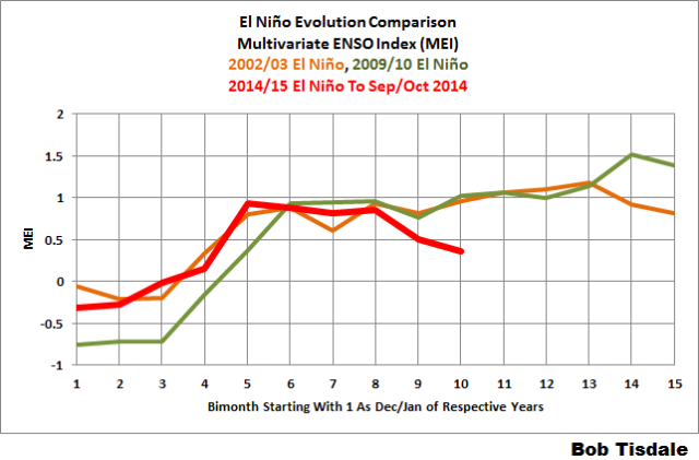
Figure 4
.EL NIÑO EVOLUTION COMPARISONS WITH TAO PROJECT SUBSURFACE DATA
The NOAA Tropical Atmosphere-Ocean (TAO) Project website includes data for two temperature-related datasets for the equatorial Pacific. See their Upper Ocean Heat Content and ENSO webpage for descriptions of the datasets. The two datasets are Warm Water Volume (above the 20 deg C isotherm) and the Depth-Averaged Temperatures for the top 300 meters (aka T300). Both are available for the:
- Western Equatorial Pacific (5S-5N, 120E-155W)
- Eastern Equatorial Pacific (5S-5N, 155W-80W)
- Total Equatorial Pacific (5S-5N, 120E-80W)
Keep in mind that the longitudes of 120E-80W stretch 160 deg, almost halfway around the globe. For a reminder of width of the equatorial Pacific, see the protractor-based illustration here.
In the following three graphs, we’re comparing data for the evolution of the 2014/15 El Niño so far (through the end of November 2014) with the data for the evolutions of the 2002/03 and 2009/10 El Niños. The Warm Water Volume data are the top graphs and the depth-averaged temperature data are the bottom graphs. As you’ll see, the curves of two datasets are similar, but not necessarily the same.
Let’s start with the Western Equatorial Pacific (5S-5N, 120E-155W), Figure 5. The warm water volume and depth-averaged temperature data show the Western Equatorial Pacific had slightly less warm water or was slightly cooler this year than during the opening months of 2009. But 2014 had more warm water or was warmer than 2002. For 2014, the warm water volume and temperature to depth in the west dropped as the initial Kelvin wave this year carried some water east, but it has since rebounded. Recall, some of the warm water from the initial downwelling Kelvin wave has already returned to the west.

Figure 5
Update: As a result, the conditions in the western equatorial Pacific continue to be warmer than they had been during the reference El Niños.
Moving on to the eastern equatorial Pacific: During those 2002/03 and 2009/10 El Niños, the warm water had traveled east by now. We can see that in the warm water volume and depth-averaged temperature data for the eastern equatorial Pacific. This year, early in the year, the eastern equatorial data both rose, a result of the Kelvin wave carrying warm water from the West Pacific Warm Pool to the east. Most of that warm water in the east has now been consumed, released to the atmosphere through evaporation, or distributed away from the equator, or returned to the west.

Figure 6
Update: For month-to-date November, the two metrics are closer to the values during the evolutions of the 2009/10 El Niño than the 2002/03 El Niño.
Now for the entire equatorial Pacific, Figure 7:

Figure 7
Update: For this year, the warm water initially increased across the entire equatorial Pacific, as warm water from off the equator circulated to the equator. Early in the year, the two TAO project indices were above those in 2002 and 2009. Then the warm water decreased as it rose to the surface and evaporated or was redistributed away from the equator. Currently, the warm water volume is comparable to the 2002 value and greater than 2009, and the depth-averaged temperature anomaly above 300 meters is presently comparable to both 2002 and 2009.
SOUTHERN OSCILLATION INDEX (SOI)
The reasons an El Niño did not continue to form this year in response to the Kelvin wave are well established. First, the atmospheric component of ENSO, the “SO” part, refused to cooperate. That is, the trade winds in the western equatorial Pacific did not weaken as expected to help reinforce the El Niño development. (The other reason, of course, was the upwelling (cool) Kelvin that formed in the wake of the downwelling (warm). That trailing cool Kelvin wave helped to counteract the warm Kelvin wave.)
The Southern Oscillation Index (SOI) from Australia’s Bureau of Meteorology is another widely used reference for the strength, frequency and duration of El Niño and La Niña events. We discussed the Southern Oscillation Index in Part 8 of this series. It is derived from the sea level pressures of Tahiti and Darwin, Australia, and as such it reflects the wind patterns off the equator in the southern tropical Pacific. With the Southern Oscillation Index, El Niño events are strong negative values and La Niñas are strong positive values, which is the reverse of what we see with sea surface temperatures. Figure 8 presents a time-series graph of the SOI data. Note that the horizontal red line is the October value, not a trend line.

Figure 8
Update: The November 2014 Southern Oscillation Index value is -10.0, which is El Niño conditions according to the SOI. (The BOM threshold for El Niño conditions is an SOI value of -8.0.)
The graphs in Figure 9 compare the evolution of the SOI values this year to those in 2002 and 2009, the development years of the 2002/03 and 2009/10 El Niños. The top graph shows the raw data. Because the SOI data are so volatile, I’ve smoothed them with a 3-month filter in the bottom graph.

Figure 9
Update: The 2014 values as of November (October for the 3-month smoothed data) are lower than they were in 2002 and 2009.
For those of you interested in keeping a closer eye on the BOM Southern Oscillation Index, see the BOM Recent (preliminary) Southern Oscillation Index (SOI) values webpage.
Update: For the past month, the daily SOI has been very volatile. The 30-day and 90-day running-averages have risen above the -8.0 threshold of an El Niño for more than a week.
COMPARISONS OF HOVMOLLER DIAGRAMS OF THIS YEAR (TO DATE) WITH 2002 AND 2009
In past updates, in the following Hovmoller diagrams, I’ve used the development of the 1997/98 and 1982/83 El Niños as a reference for this year’s El Niño. That now seems to be overkill, because the feedbacks never kicked in this year…where all of the feedbacks freakishly aligned for the 1997/98 El Niño. The 1982/83 El Niño was a late bloomer; that is, it didn’t really start to take off until later in the year, and it was a very strong El Niño too.
Now, it’s unlikely that the El Niño would be a strong El Niño. So I’ve switched reference years for this post.
Hovmoller diagrams are a great way to display data. If they’re new to you, there’s no reason to be intimidated by them. Let’s take a look at Figure 10. It presents the Hovmoller diagrams of thermocline depth anomalies (the depth of the isotherm at 20 deg C. Water warmer than 20 deg C is above the 20 deg C isotherm and below it the water is cooler). 2014 is in the center, 2002 on the left and 2009 to the right. GODAS, unfortunately, furnishes the illustrations (not the data) in different dimensions for some years. Thus the dimensions of the Hovmoller in the left are larger than the other two.
The vertical (y) axis in all the Hovmollers shown in this post is time with the Januarys at the top and Decembers at the bottom. The horizontal (x) axis is longitude, so, moving from left to right in each of the three Hovmoller diagrams, we’re going from west to east…with the Indian Ocean in the left-hand portion, the Pacific in the center and the Atlantic in the right-hand portion. We’re interested in the Pacific. The data are color-coded according to the scales below the Hovmollers.

Figure 10
Figure 10 is presenting the depth of the 20 deg C isotherm along a band from 2S to 2N. The positive anomalies, working their way eastward since the beginning of 2014, were caused by the downwelling Kelvin wave, which pushes down on the thermocline (the 20 deg C isotherm). You’ll note how the anomalies grew in strength as the Kelvin wave migrated east. That does not mean the Kelvin wave is getting stronger as it traveled east; that simply indicates that the thermocline is normally closer to the surface in the eastern equatorial Pacific than it is in the western portion. The secondary (and definitely weaker) downwelling Kelvin wave this year is also visible in the center Hovmoller.
Figure 11 presents the 2014-to-date along with the 2002 and 2009 Hovmollers for wind stress (not anomalies) along the equator. The simplest way to explain them is that they’re presenting the impacts of the strengths and directions of the trade winds on the surfaces of the equatorial oceans. In this presentation, the effects of the east to west trade winds at various strengths are shown in blues, and the reversals of the trade winds into westerlies are shown in yellows, oranges and reds. To explain the color coding, the trade winds normally blow from east to west. Stronger than normal trade winds are associated with La Niñas; thus the cooler colors for stronger than normal east to west trade winds. The reversals of the trade winds (the yellows, oranges and reds) are the true anomalies and they’re associated with El Niños, which are the anomalous state of the tropical Pacific. (A La Niña is simply an exaggerated normal state.)

Figure 11
The two westerly wind bursts shown in red in the western equatorial Pacific in 2014 are associated with the strong downwelling Kelvin wave that formed at the time. (See the post ENSO Basics: Westerly Wind Bursts Initiate an El Niño.) Throughout both 2002 and 2009, there were series of westerly wind bursts in the western equatorial Pacific, with stronger ones later in the year.
Update: We still haven’t had any strong westerly wind bursts to help strengthen the El Niño in 2014.
Figure 12 presents the Hovmollers of wind stress anomalies…just a different perspective. But positive wind stress anomalies, at the low end of the color-coded scale, are actually a weakening of the trade winds, not a reversal.

Figure 12
Other than the two westerly wind bursts at the beginning of the year, the western equatorial Pacific has been quiet this year compared to 2002 and 2009.
NOTE: There are a number of wind stress-related images on meteorological websites. Always check to see if they’re presenting absolute values or anomalies.
And Figure 13 presents the Hovmollers of sea surface temperature anomalies. Unfortunately, the Hovmoller of sea surface temperature anomalies is delayed a few weeks. (They’ve caught up with the sea surface temperature data recently.) But as we’ve seen in the comparison graphs in Figure 2, the sea surface temperature anomalies of the NINO3.4 region in 2014 are behind those of 2002 and 2009, but in the eastern equatorial Pacific, the sea surface temperature anomalies this year in the NINO1+2 region had been well above those in our two reference years.

Figure 13
Update: I’ve highlighted the longitudes of the NINO3.4 region on the Hovmoller for 2014. Note how something curious happened this year. The sea surface temperature anomalies warmed to the east and to the west of the NINO3.4 region. The equatorial Pacific was releasing more heat than normal this year into the atmosphere, just not in the NINO3.4 region, which is the region NOAA uses for its “official” reference.
WHAT’S NEXT?
Figure 14 is a Hovmoller diagram from page 15 of NOAA’s Weekly ENSO Update dated December 1, 2014. It displays the Weekly “heat content” anomalies of the equatorial Pacific starting in December 2013, but their “heat content” is presented in deg C. Regardless, NOAA includes dashed lines to highlight the downwelling (warm) Kelvin waves and dotted lines for the upwelling (cool) Kelvin waves. Notice how the downwelling and upwelling Kelvin waves alternate. An upwelling (cool) Kelvin wave should be next. The questions now: will it be strong enough to cause a La Niña? We’ll find out soon enough.

Figure 14
In the next ENSO update, we’ll discuss the first downwelling Kelvin wave this year, the strong one, and where the warm water from it is making its presence known. It has contributed to the record high global [surface] temperatures this year, but the blob in the eastern extratropical North Pacific is still the primary cause of the record highs.
EARLIER POSTS IN THIS SERIES
- The 2014/15 El Niño – Part 1 – The Initial Processes of the El Niño.
- The 2014/15 El Niño – Part 2 – The Alarmist Misinformation (BS) Begins
- The 2014/15 El Niño – Part 3 – Early Evolution – Comparison with 1982/83 & 1997/98 El Niño Events
- The 2014/15 El Niño – Part 4 – Early Evolution – Comparison with Other Satellite-Era El Niños
- The 2014/15 El Niño – Part 5 – The Relationship Between the PDO and ENSO
- The 2014/15 El Niño – Part 6 – What’s All The Hubbub About?…
- The 2014/15 El Niño – Part 7 – May 2014 Update and What Should Happen Next
- The 2014/15 El Niño – Part 8 – The Southern Oscillation Indices
- The 2014/15 El Niño – Part 9 – Kevin Trenberth is Looking Forward to Another “Big Jump”
- The 2014/15 El Niño – Part 10 – June 2014 Update – Still Waiting for the Feedbacks
- The 2014/15 El Niño – Part 11 – Is the El Niño Dying?
- The 2014/15 El Niño – Part 12 – July 2014 Update – The Feedbacks Need to Kick in Soon
- The 2014/15 El Niño – Part 13 – More Mixed Signals
- The 2014/15 El Niño – Part 14 – Warm Water Recirculated?
- The 2014/15 El Niño – Part 15 – August 2014 Update – An El Niño Mulligan?
- The 2014 15 El Niño – Part 16 – September 2014 Update – Still Seeing Mixed Signals
- The 2014/15 El Niño – Part 17 – Is There Still Hope for a Moderate El Niño?
- The 2014/15 El Niño – Part 18 – October 2014 Update – One Last Chance?
- The 2014/15 El Niño – Part 19 – Is an El Niño Already Taking Place?
- The 2014/15 El Niño – Part 20 – November Update – The Little El Niño That Shoulda’-Woulda’-Coulda’
And for additional introductory discussions of El Niño processes see:
- An Illustrated Introduction to the Basic Processes that Drive El Niño and La Niña Events
- El Niño and La Niña Basics: Introduction to the Pacific Trade Winds
- La Niñas Do NOT Suck Heat from the Atmosphere
- ENSO Basics: Westerly Wind Bursts Initiate an El Niño
A STINKIN’ COMMERCIAL?
My ebook Who Turned on the Heat? goes into a tremendous amount of detail to explain El Niño and La Niña processes and the long-term aftereffects of strong El Niño events. Who Turned on the Heat? weighs in at a whopping 550+ pages, about 110,000+ words. It contains somewhere in the neighborhood of 380 color illustrations. In pdf form, it’s about 23MB. It includes links to more than a dozen animations, which allow the reader to view ENSO processes and the interactions between variables.
I’ve lowered the price of Who Turned on the Heat? from U.S.$8.00 to U.S.$5.00. A free preview in pdf format is here. The preview includes the Table of Contents, the Introduction, the first half of section 1 (which was provided complete in the post here), a discussion of the cover, and the Closing. Take a run through the Table of Contents. It is a very-detailed and well-illustrated book—using data from the real world, not models of a virtual world. Who Turned on the Heat? is only available in pdf format…and will only be available in that format. Click here to purchase a copy.
My sincerest thanks to everyone who has purchased a copy of Who Turned on the Heat? this year as a result of this series. I learned a lot preparing the book. I hope you’ve learned a lot, too, reading it.
Thanks for this. Full of data as usual.
And thank goodness for the Southern Oscillation Index.
Normally, these El Nino reports show nothing sticking out much since the late 90s. Finally, something seems to be happening.
If (big word) I’ve read this right then things are becoming quite interesting.
California seems to be getting a taste of the Pineapple Express bringing warm moist air into the state from the tropics. It would seem that the elevated SST’s in the Eastern Pacific might be having an effect.
The GFS weather model has decent rain continuing in California every few days all the way out on the 16 day forecast.
Animation 3 is interesting. I assume that warm water is either coming from the North and heading South across the equator or coming from the South and heading North across the equator and that’s happening at decreasing depths across the Pacific?
The animation gives the impression the warm water might be moving along the equator but I cant see how the warming might start at 150m below the surface and grow from there.
TimTheToolMan, to understand how and why those anomalies appear as they do, you need to look at the climatology (the reference temperatures for the anomalies). Here’s an example from the first post in the series:
As the “pulse” of warm water moves from west to east, it’s moving into a cooler and cooler environment. As a result, it becomes a greater positive (warm) anomaly. Then, as it is drawn to the surface in the east, where it’s warmer at the surface than at depth, the “pulse” of warm water is not as anomalous, so it’s value as an anomaly decreases.
Bob writes “As the “pulse” of warm water moves from west to east, it’s moving into a cooler and cooler environment.”
Yes, but at the start of the animation the warmth grows at a single location at 150m depth. How do you explain that?
” It has contributed to the record high global temperatures this year, but the blob in the eastern extratropical North Pacific is still the primary cause of the record highs.”
Looking at this Wood for Trees graph from Werner Brozek December 2, 2014 at 9:05 pm comment at preceeding article to this one.
http://www.woodfortrees.org/plot/rss/from:1996.65/plot/rss/from:1996.65/to:2005/trend/plot/rss/from:2005/trend
I fail to identify Bot Tisdale’s “record high global temparatures this year” unless he means truly “man made” record temperatures thanks to NOAA and GISS rather than RSS.
Did I miss something rather important. It would appear that the record global temperatures potentially have been “man made” for Lima. Please correct me if I am wrong.
These may be the reason:
“The Version 5.6 global average lower tropospheric temperature (LT) anomaly for September, 2014 is +0.29 deg. C, up from the August value of +0.20 deg. C.”
“The Version 5.6 global average lower tropospheric temperature (LT) anomaly for October, 2014 is +0.37 deg. C, up from the September value of +0.29 deg. C.”
“The Version 5.6 global average lower tropospheric temperature (LT) anomaly for November, 2014 is +0.33 deg. C, down a little from the October value of +0.37 deg. C.”
See http://www.drroyspencer.com/2014/12/uah-global-temperature-update-for-nov-2014-0-33-deg-c/
John Peter says: “I fail to identify Bot Tisdale’s “record high global temparatures this year” unless he means truly “man made” record temperatures thanks to NOAA and GISS rather than RSS.”
Bot! I’ve been accused of being more than one person before, but never a robot. I like it.
Thanks for pointing out the problem with the post. I’ll added a bracketed correction. I should have been more specific, because, as you noted, my statement was about surface temperatures, not lower troposphere temperatures. RSS is a lower troposphere temperature dataset. There’s a major difference with how the tropical temperatures (surface versus lower troposphere) responded to the 1997/98 El Nino. The lower troposphere warmed because of the surface warming AND because of the additional moisture pumped into the tropical troposphere (when the moisture condenses, it releases heat to the atmosphere). I’ll have to prepare a post about that.
Cheers.
Thanks, Bob. A very deep and wide view of the Pacific Ocean.
Where is the convection and rain on the equator?
El Nino is finally here as evidenced by the rising anchovy price in Peru. So upwelling is being interrupted.
http://www.bloomberg.com/news/2014-11-18/peru-fish-meal-reaches-highest-in-decade-as-anchovy-stocks-drop.html
But this wont be for long. Next year the reactive La Nina will be far more significant than this el Nino.
The persistent absence of el Nino warming in the far east Pacific (Nino 1-2) off Peru means that Modoki el Nino warming in Nino 3.4 will quickly set up the temperature gradients for strong trades to initiate the reactive La Nina, which will snuff out this el Nino early next year.
South east Pacific cold SSTs are strengthening as the Humboldt current brings Antarctic cold equatorwards
http://weather.unisys.com/surface/sst_anom.gif
Meanwhile Pacific temperature anomalies down to 150m show that the ENSO region is the only one where there is any warming. North Pacific “warming” is skin deep and illusory.
http://www.bom.gov.au/fwo/IDYOC001.gif?1297119137
Please tell me that I cant see a red dot hot spot off the coast of Japan near a certain power plant???
There’s always been some hot spots near that area, here’s an SST map showing it from 2005
http://www.ospo.noaa.gov/data/sst/anomaly/2005/anomnight.1.4.2005.gif
This is from well before that event occurred and yet the ‘spot’ is still there.
Thanks Bob!
Still not sure this is going to amount to much. Looks like it is already starting to cool off again. More of a warmish “la nada” still. Trades have picked back up, are basically nominal across the entire equatorial Pacific now (after having slacked a bit the past couple of weeks) and the area of anomalously warm surface water is shrinking again.
I’m still not convinced we are going to see any Nino event. At least nothing significant as far as things look right now.
Winds basically nominal (as of the time of this posting):
http://www.pmel.noaa.gov/tao/jsdisplay/plots/gif/sst_wind_anom_5day_jsd.gif
And area of warm water greater than 0.5 degrees above normal is shrinking:
http://www.cpc.ncep.noaa.gov/products/intraseasonal/tlon_heat.gif
BOB TISDALE
The ENSO sign has been in either in NEUTRAL or LA NINA territory for the last four years . Yet we could potentially have a record warm year globally for 2014 .The atmospheric warming must be coming from sources other than El NINO ( like the North Pacific and North Atlantic ocean and atmosphere interaction ?) Should we not be paying equal attention to these other areas as potential sources or causes of global warming beside just El NIno’s?
herkimer, we have been paying attention to the other areas. First, there was nothing unusually warm about the North Atlantic this year:
Yes, the North Pacific is responsible for the record high surface temperatures. We discussed that in a number of posts this year…in the most detail here:
https://bobtisdale.wordpress.com/2014/08/16/on-the-recent-record-high-global-sea-surface-temperatures-the-wheres-and-whys/
We started this series of posts on the 2014/15 El Nino back in the first half of the year, primarily in response to the predictions of a super El Nino. And there has been a lot of interest in it, so I’ve kept it going. Unfortunately, for me, it has taken a lot of time–not only preparing the posts, but answering questions in the earlier posts. Last month, a blogger reported that he had been saving this series of posts in PDF form and that the series ran for more than 200 pages (I don’t recall the exact number, but I think it was somewhere around 250). I think we learned more from the evolution this year because it failed to turn into a super El Nino than we would have learned from the evolution of one. There were a couple of other curiosities that I’d never seen before. And there are a few more thing I want to report on.
Even though I’ve sold a lot of books (“Who Turned on the Heat?”) this year because of this series, I’m looking forward to ending it.
Cheers
I don’t see 2014 as a record warm year, but maybe a tie with 2013.
http://www.oarval.org/UAH_LT_1979_thru_November_2014_v5.gif
From UAH – Global lower tropospheric temperature anomalies, 1979 thru November 2014, relative to 1981 thru 2010.
Roy Spencer, Ph. D., Principal Research Scientist at the University of Alabama in Huntsville – UAH
[The red curve is the running, centered 13-month average]
See http://www.drroyspencer.com/2014/12/uah-global-temperature-update-for-nov-2014-0-33-deg-c/
BOB
My comments were not intended as any criticism. You are doing a marvelous job in keeping us all informed . My comments were just a realization on my part that perhaps El Ninos’ may not always be the only cause of global warming, Extra warm oceans in other parts of the globe may have a similar effect. We will have to see if this years atmospheric temperature rise is sustained or just a short hicup . PDO has been positive most of the year. North America was cool most of the year including winter and spring
This is how the Multivariate ENSO Index (MEI) looks now:
http://www.oarval.org/MEI_1950-2014-Dec3-ts.Opt.png
See ESRL-PSD: Multivariate ENSO Index (December 3 ’14, Klaus Wolter, NOAA), at http://www.esrl.noaa.gov/psd/enso/mei/
If that’s not a Lorenz attractor I’m the Queen’s mother.
IMO the stillborn El Nino of 2014, so ardently hoped & prayed to Gaia for by the CACA Team, is evidence of the cooling earth. There has not been a super El Nino since 1998, whereas during the prior two allegedly warming decades, they & double Ninos were unusually common. Nor have even normal Ninos been plentiful since 1998. In warm cycles, El Ninos are more common & less so during cool cycles, naturally.
The strange blob of warm water in the NE Pacific this year & last might be the spontaneously aborted ectopic twin of the expected El Nino. Instead of appearing in the equatorial East Pac, the warmth popped up in the temperate zone. Talk about weather weirding. The switch in the PDO this suggests is IMO a temporary swing, not changing the long term shift of the PDO to its cool-inducing “negative” phase, with warmer water in the West Pac.