Guest Post by Bob Tisdale
And maybe it will. Weekly sea surface temperature anomalies last week for the NINO3.4 region were at their highest level for the year. Then again, NINO1+2 region temperature anomalies have dropped to the 0.5 deg C threshold of an El Niño, making them the lowest since the last week of April.
But I have a feeling we’re going to close out this series next month with an overview of an El Niño that failed to form—at least in terms of sea surface temperature anomalies of the east-central equatorial Pacific. As a result, the 2014/15 season won’t show up in the Oceanic Niño Index as an official El Niño. The Southern Oscillation Index, on the other hand, may continue to show weak El Niño conditions.
We’ve got to admit the happenings this year in the tropical Pacific were educational, with:
This post provides an update on the progress of the evolution of the 2014/15 El Niño (assuming one forms) with data through the beginning of November 2014. The post is similar in layout to the earlier updates. (See the entire 2014/15 El Niño series of posts here.) The post includes 3 gif animations and more than a dozen illustrations so the post might take a few moments to load on your browser. Please click on the illustrations and animations to enlarge them.
Included are updates of the weekly sea surface temperature anomalies for the four most-often-used NINO regions. Also included are updates of the GODAS map-based animations of sea surface height anomalies, T300 anomalies (depth-averaged temperature anomalies to 300 meters), sea surface temperature anomalies, and the cross sections of temperature anomalies at depth along the equator. These animations start in January 2014 for the full progress of this year’s event(s). Also included are a couple of graphs of the BOM Southern-Oscillation Index (SOI).
Based on the post The 2014/15 El Niño – Part 19 – Is an El Niño Already Taking Place? I’ve added a discussion of the NOAA Multivariate ENSO Index (MEI).
We compared data for the evolution of the 2014/15 El Niño to the 1982/83 and 1997/98 El Niños in a number of posts early in this series, back when this El Niño was being compared to those two strong events in new reports. More recently, we changed the reference El Niños for the evolution comparisons to the 2002/03 and 2009/10 El Niños. These reference El Niños are likely stronger than what we might expect in the next few months, but they are far weaker than the ones we used earlier this year.
And since we’ve been watching the downwelling (warm) Kelvin wave as it makes its way east along the equator in the Pacific, also included in this post are evolution comparisons using warm water volume anomalies and depth-averaged temperature anomalies from the NOAA TOA project website.
Then, we’ll take a look at a number of Hovmoller diagrams comparing the progress so far this year to what happened in both 2002 and 2009.
NINO REGION TIME-SERIES GRAPHS
Note: The NOAA NOMADS website is still off-line (growling noise heard from me), so I used the weekly NINO region sea surface temperature anomaly data for Figures 1 and 2 from the NOAA/CPC Monthly Atmospheric & SST Indices webpage, specifically the data here. The data from NOAA NOMADS was provided with oodles of significant figures, while the NOAA/CPC data are provided in tenths of a degree C. The base years for anomalies through NOMADS were 1971-2000, while the NOAA/CPC data are referenced to 1981-2010. So, along with the changes to the reference El Niños, that explains why the graphs are a little different than what you’re used to seeing.
Figure 1 includes the weekly sea surface temperature anomalies of the 4 most-often-used NINO regions of the equatorial Pacific. From west to east they include:
- NINO4 (5S-5N, 160E-150W)
- NINO3.4 (5S-5N, 170W-120W)
- NINO3 (5S-5N, 150W-90W)
- NINO1+2 (10S-0, 90W-80W)
As of last week, the sea surface temperature anomalies for all but the NINO1+2 region were well above the 0.5 deg C threshold of El Niño conditions. Will they remain there? That’s the question. Note that the horizontal red lines in the graphs are the current readings, not the trends.

Figure 1
EL NIÑO EVOLUTION COMPARISONS FOR NINO REGION SEA SURFACE TEMPERATURE ANOMALIES
Using weekly sea surface temperature anomalies for the four NINO regions, Figure 2 compares the goings on this year with the 2002/03 and 2009/10 events.

Figure 2
ANIMATION UPDATES
In the first post in this series, we discussed a number of animations of maps and animations of equatorial cross sections that are available from the NOAA Global Ocean Data Assimilation System (GODAS) website. Each cell of the animation is a 5-day (pentadal) average. Those animations ran from January 3rd to March 29th. The following are updates, again starting in January 3rd. GODAS only maintains their animations for 3 months. I’ve stored the maps since the first of the year and have continued to add maps as time progresses.
Animation 1 provides the sea surface height anomalies and the depth-averaged temperature anomalies for the top 300 meters (T300) side by side.

Animation 1
Animation 2 is a similar side-by-side comparison, but on the left are maps of sea surface temperature anomalies and on the right are the T300 maps. The sea surface temperature maps trail the others by a pentad or two, which is why they do not run through July 2. My apologies for the shift in the color scaling for the range of +0.5 to +1.0 deg C in the sea surface temperature anomaly maps. That appears to be a quirk in my computer, not the GODAS website.

Animation 2
Animation 3 is an update of the cross sections of temperature anomalies at depth along the equator.

Animation 3
THE MULTIVARIATE ENSO INDEX
The first mention of the NOAA Multivariate ENSO Index in this series was in the recent post The 2014/15 El Niño – Part 19 – Is an El Niño Already Taking Place? I’ve borrowed the preliminary discussion there and expanded on it.
The Multivariate ENSO Index (MEI) is another ENSO index published by NOAA. It was created and is maintained by NOAA’s Klaus Wolter. The Multivariate ENSO Index uses the sea surface temperatures of the NINO3 region of the equatorial Pacific, along with a slew of atmospheric variables…thus “multivariate”.
According to the most recent Multivariate ENSO Index update discussion, El Niño conditions no longer exist:
The updated (September-October) MEI has decreased by another 0.14 standard deviations to +0.36. Its current ranking has dropped by 2, thus missing the El Niño classification by 3, here defined as the top 20 values since 1950. The long anticipated emergence of El Niño conditions in 2014 appears to have lasted from April-May through July-August, only one month longer than two years ago.
The reference to “two years ago” was the El Niño that also failed to form in 2012.
As you’ll recall, only last month, there was still talk of El Niño in the MEI update discussion:
The long anticipated emergence of El Niño conditions in 2014 has been under way since May-June, despite the lack of signal in Niño 3.4 SST…and its sudden drop in the MEI this month.
Now, 2014 is being compared to the failed El Niño of the 2012 season.
While this wouldn’t help the current conditions, there’s something else to consider about the MEI. El Niño and La Niña rankings according to the MEI aren’t based on fixed threshold values such as +0.5 for El Niño and -0.5 for La Niña. The MEI El Niño and La Niña rankings are based on percentiles, top 30% for the weak to strong El Niños and the bottom 30% for the weak to strong La Niñas. This is difficult to track, because, when using the percentile method, the thresholds of El Niño and La Niña conditions vary from one bimonthly period to the next, and they can change from year to year.
On the thread of the WUWT cross post of part 19 of this series, Willis Eschenbach was very kind and prepared a graph that shows the cyclical nature of the MEI El Niño and La Niña thresholds in his comment here. See Figure 3. (Thanks, Willis.)

Figure 3
In a reply to Willis, I zoomed in on the thresholds over the course of a year. See Figure 4.
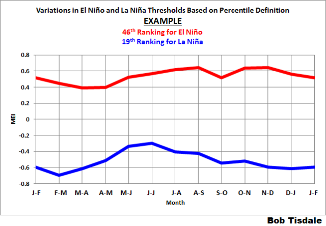
Figure 4
And as I noted then, That’s really awkward. For example, during A-S, it’s more difficult to be in El Niño conditions than it is in S-O.
Regardless, according to the MEI, we dropped out of El Niño conditions in the bi-monthly period of September-October 2014.
EL NIÑO EVOLUTION COMPARISONS WITH TAO PROJECT SUBSURFACE DATA
The NOAA Tropical Atmosphere-Ocean (TAO) Project website includes data for two temperature-related datasets for the equatorial Pacific. See their Upper Ocean Heat Content and ENSO webpage for descriptions of the datasets. The two datasets are Warm Water Volume (above the 20 deg C isotherm) and the Depth-Averaged Temperatures for the top 300 meters (aka T300). Both are available for the:
- Western Equatorial Pacific (5S-5N, 120E-155W)
- Eastern Equatorial Pacific (5S-5N, 155W-80W)
- Total Equatorial Pacific (5S-5N, 120E-80W)
Keep in mind that the longitudes of 120E-80W stretch 160 deg, almost halfway around the globe. For a reminder of width of the equatorial Pacific, see the protractor-based illustration here.
In the following three graphs, we’re comparing data for the evolution of the 2014/15 El Niño so far (through month-to-date November 2014) with the data for the evolutions of the 2002/03 and 2009/10 El Niños. The Warm Water Volume data are the top graphs and the depth-averaged temperature data are the bottom graphs. As you’ll see, the curves of two datasets are similar, but not necessarily the same.
Let’s start with the Western Equatorial Pacific (5S-5N, 120E-155W), Figure 5. The warm water volume and depth-averaged temperature data show the Western Equatorial Pacific had slightly less warm water or was slightly cooler this year than during the opening months of 2009. But 2014 had more warm water or was warmer than 2002. For 2014, the warm water volume and temperature to depth in the west dropped as the initial Kelvin wave this year carried some water east, but it has since rebounded. Recall, some of the warm water from the initial downwelling Kelvin wave has already returned to the west.
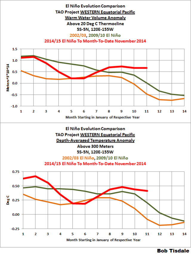
Figure 5
As a result, the conditions in the western equatorial Pacific are currently warmer than they had been during the reference El Niños.
During those 2002/03 and 2009/10 El Niños, the warm water had traveled east by now. We can see that in the warm water volume and depth-averaged temperature data for the eastern equatorial Pacific. See Figure 6. This year, early in the year, the eastern equatorial data both rose, a result of the Kelvin wave carrying warm water from the West Pacific Warm Pool to the east. Most of that warm water in the east has now been consumed, released to the atmosphere through evaporation, or distributed away from the equator, or returned to the west. For month-to-date November, the two metrics are well below the values during the evolutions of the 2002/03 and 2009/10 El Niños.

Figure 6
As a result, across the entire equatorial Pacific, Figure 7, in 2014, warm water volume is lower than, and depth-averaged temperatures are comparable to, those in 2002. Then again, in 2014 warm water volume is higher than, but depth-averaged temperatures are lower than, those in 2009.

Figure 7
For this year, the warm water initially increased across the entire equatorial Pacific, as warm water from off the equator circulated to the equator. Then the warm water decreased as it rose to the surface and evaporated or was redistributed from the equator.
SOUTHERN OSCILLATION INDEX (SOI)
The reasons an El Niño did not continue to form this year in response to the Kelvin wave are well established. First, the atmospheric component of ENSO, the “SO” part, refused to cooperate. That is, the trade winds in the western equatorial Pacific did not weaken as expected to help reinforce the El Niño development. (The other reason, of course, was the upwelling (cool) Kelvin that formed in the wake of the downwelling (warm). That trailing cool Kelvin wave helped to counteract the warm Kelvin wave.)
The Southern Oscillation Index (SOI) from Australia’s Bureau of Meteorology is another widely used reference for the strength, frequency and duration of El Niño and La Niña events. We discussed the Southern Oscillation Index in Part 8 of this series. It is derived from the sea level pressures of Tahiti and Darwin, Australia, and as such it reflects the wind patterns off the equator in the southern tropical Pacific. With the Southern Oscillation Index, El Niño events are strong negative values and La Niñas are strong positive values, which is the reverse of what we see with sea surface temperatures. The October 2014 Southern Oscillation Index value is -8.0, which is right at the threshold of El Niño conditions. (The BOM threshold for El Niño conditions is an SOI value of -8.0.) Figure 8 presents a time-series graph of the SOI data. Note that the horizontal red line is the October value, not a trend line.

Figure 8
The graphs in Figure 9 compare the evolution of the SOI values this year to those in 2002 and 2009, the development years of the 2002/03 and 2009/10 El Niños. The top graph shows the raw data. Because the SOI data are so volatile, I’ve smoothed them with a 3-month filter in the bottom graph. Referring to the smoothed data, the Southern Oscillation Index this year is lagging well behind the values in 2002 but they are ahead of where they were in 2009.

Figure 9
For those of you interested in keeping a closer eye on the BOM Southern Oscillation Index, see the BOM Recent (preliminary) Southern Oscillation Index (SOI) values webpage. For the past month, the 30-day running-average of the SOI went from ENSO-neutral conditions to well into El Niño conditions, and the 90-day running-average remains in El Niño conditions.
COMPARISONS OF HOVMOLLER DIAGRAMS OF THIS YEAR (TO DATE) WITH 2002 AND 2009
In past updates, in the following Hovmoller diagrams, I’ve used the development of the 1997/98 and 1982/83 El Niños as a reference for this year’s El Niño. That now seems to be overkill, because the feedbacks never kicked in this year…where all of the feedbacks freakishly aligned for the 1997/98 El Niño. The 1982/83 El Niño was a late bloomer; that is, it didn’t really start to take off until later in the year, and it was a very strong El Niño too.
Now, it’s unlikely that the El Niño, if it forms, would be a strong El Niño. So I’ve switched reference years for this post.
Hovmoller diagrams are a great way to display data. If they’re new to you, there’s no reason to be intimidated by them. Let’s take a look at Figure 10. It presents the Hovmoller diagrams of thermocline depth anomalies (the depth of the isotherm at 20 deg C. Water warmer than 20 deg C is above the 20 deg C isotherm and below it the water is cooler). 2014 is in the center, 2002 on the left and 2009 to the right. GODAS, unfortunately, furnishes the illustrations (not the data) in different dimensions for some years. Thus the dimensions of the Hovmoller in the left are larger than the other two.
The vertical (y) axis in all the Hovmollers shown in this post is time with the Januarys at the top and Decembers at the bottom. The horizontal (x) axis is longitude, so, moving from left to right in each of the three Hovmoller diagrams, we’re going from west to east…with the Indian Ocean in the left-hand portion, the Pacific in the center and the Atlantic in the right-hand portion. We’re interested in the Pacific. The data are color-coded according to the scales below the Hovmollers.

Figure 10
Figure 10 is presenting the depth of the 20 deg C isotherm along a band from 2S to 2N. The positive anomalies, working their way eastward since the beginning of 2014, were caused by the downwelling Kelvin wave, which pushes down on the thermocline (the 20 deg C isotherm). You’ll note how the anomalies grew in strength as the Kelvin wave migrated east. That does not mean the Kelvin wave is getting stronger as it traveled east; that simply indicates that the thermocline is normally closer to the surface in the eastern equatorial Pacific than it is in the western portion. The secondary (and definitely weaker) downwelling Kelvin wave this year is also visible in the center Hovmoller.
Figure 11 presents the 2014-to-date along with the 2002 and 2009 Hovmollers for wind stress (not anomalies) along the equator. The simplest way to explain them is that they’re presenting the impacts of the strengths and directions of the trade winds on the surfaces of the equatorial oceans. In this presentation, the effects of the east to west trade winds at various strengths are shown in blues, and the reversals of the trade winds into westerlies are shown in yellows, oranges and reds. To explain the color coding, the trade winds normally blow from east to west. Stronger than normal trade winds are associated with La Niñas; thus the cooler colors for stronger than normal east to west trade winds. The reversals of the trade winds (the yellows, oranges and reds) are the true anomalies and they’re associated with El Niños, which are the anomalous state of the tropical Pacific. (A La Niña is simply an exaggerated normal state.)

Figure 11
The two westerly wind bursts shown in red in the western equatorial Pacific in 2014 are associated with the strong downwelling Kelvin wave that formed at the time. (See the post ENSO Basics: Westerly Wind Bursts Initiate an El Niño.) Throughout both 2002 and 2009, there were series of westerly wind bursts in the western equatorial Pacific, with stronger ones later in the year. We continue need a few westerly wind bursts this year if the El Niño is going to strengthen.
Figure 12 presents the Hovmollers of wind stress anomalies…just a different perspective. But positive wind stress anomalies, at the low end of the color-coded scale, are actually a weakening of the trade winds, not a reversal.

Figure 12
Other than the two westerly wind bursts at the beginning of the year, the western equatorial Pacific has been quiet this year compared to 2002 and 2009.
NOTE: There are a number of wind stress-related images on meteorological websites. Always check to see if they’re presenting absolute values or anomalies.
And Figure 13 presents the Hovmollers of sea surface temperature anomalies. Unfortunately, the Hovmoller of sea surface temperature anomalies is delayed a few weeks. But as we’ve seen in the comparison graphs in Figure 2, the sea surface temperature anomalies of the NINO3.4 region in 2014 are behind those of 2002 and 2009, but in the eastern equatorial Pacific, the sea surface temperature anomalies this year in the NINO1+2 region had been well above those in our two reference years.

Figure 13
THANKS
The title of this post is a play off of a comment at my blog by Pamela Grey. Thanks, Pamela.
EARLIER POSTS IN THIS SERIES
- The 2014/15 El Niño – Part 1 – The Initial Processes of the El Niño.
- The 2014/15 El Niño – Part 2 – The Alarmist Misinformation (BS) Begins
- The 2014/15 El Niño – Part 3 – Early Evolution – Comparison with 1982/83 & 1997/98 El Niño Events
- The 2014/15 El Niño – Part 4 – Early Evolution – Comparison with Other Satellite-Era El Niños
- The 2014/15 El Niño – Part 5 – The Relationship Between the PDO and ENSO
- The 2014/15 El Niño – Part 6 – What’s All The Hubbub About?…
- The 2014/15 El Niño – Part 7 – May 2014 Update and What Should Happen Next
- The 2014/15 El Niño – Part 8 – The Southern Oscillation Indices
- The 2014/15 El Niño – Part 9 – Kevin Trenberth is Looking Forward to Another “Big Jump”
- The 2014/15 El Niño – Part 10 – June 2014 Update – Still Waiting for the Feedbacks
- The 2014/15 El Niño – Part 11 – Is the El Niño Dying?
- The 2014/15 El Niño – Part 12 – July 2014 Update – The Feedbacks Need to Kick in Soon
- The 2014/15 El Niño – Part 13 – More Mixed Signals
- The 2014/15 El Niño – Part 14 – Warm Water Recirculated?
- The 2014/15 El Niño – Part 15 – August 2014 Update – An El Niño Mulligan?
- The 2014 15 El Niño – Part 16 – September 2014 Update – Still Seeing Mixed Signals
- The 2014/15 El Niño – Part 17 – Is There Still Hope for a Moderate El Niño?
- The 2014/15 El Niño – Part 18 – October 2014 Update – One Last Chance?
- The 2014/15 El Niño – Part 19 – Is an El Niño Already Taking Place?
And for additional introductory discussions of El Niño processes see:
- An Illustrated Introduction to the Basic Processes that Drive El Niño and La Niña Events
- El Niño and La Niña Basics: Introduction to the Pacific Trade Winds
- La Niñas Do NOT Suck Heat from the Atmosphere
- ENSO Basics: Westerly Wind Bursts Initiate an El Niño
A STINKIN’ COMMERCIAL?
My ebook Who Turned on the Heat? goes into a tremendous amount of detail to explain El Niño and La Niña processes and the long-term aftereffects of strong El Niño events. Who Turned on the Heat? weighs in at a whopping 550+ pages, about 110,000+ words. It contains somewhere in the neighborhood of 380 color illustrations. In pdf form, it’s about 23MB. It includes links to more than a dozen animations, which allow the reader to view ENSO processes and the interactions between variables.
I’ve lowered the price of Who Turned on the Heat? from U.S.$8.00 to U.S.$5.00. A free preview in pdf format is here. The preview includes the Table of Contents, the Introduction, the first half of section 1 (which was provided complete in the post here), a discussion of the cover, and the Closing. Take a run through the Table of Contents. It is a very-detailed and well-illustrated book—using data from the real world, not models of a virtual world. Who Turned on the Heat? is only available in pdf format…and will only be available in that format. Click here to purchase a copy.
My sincerest thanks to everyone who has purchased a copy of Who Turned on the Heat? as a result of this series. I learned a lot preparing it. I hope you’ve learned a lot, too.
Uh-oh. With two big posts in two days, the rumors are going to start again that I’m more than one person. Sorry to say, there’s only one of me. If there were two, I’d let the other one do the work, and I’d sit back and relax.
Bob – I’m glad there’s at least one of you! Thanks for all of your posts – they are very educational.
+1
Readers may have noticed that the ENSO meter (on right sidebar) began moving slowly more positive a few days ago, after being “stuck” just barely positive for some weeks.
——————-
I began watching the meter while keeping up with posts from Bob and the other Bob.
/s
Don’t believe everything you see on the Web, even here! See below.
I believe you’re only one person, but I also think you’re one of those people who doesn’t need to sleep. 🙂
Ric, you know the deal. The closer someone gets to the big sleep, the less someone wants to rest. Another 70 years and I’ll be down to about 10 minutes-per-day.
Hah! Yeah, we’re afraid if we
go to sleep it WILL BE the Big One!
Roger
On other sites, some ‘El Nino commentators’ have gone very, very quiet all of a sudden, coinciding with an up-welling of ‘well, I advised caution from the very start’ comments. Interesting times.
Are we seeing the effect of a cooling PDO? That is, La Ninas form more easily and El Ninos less easily. If this wannabe El Nino had come along in a PDO warming phase, maybe it would have flourished.
Grr here too.
I maintain the famous(?) WUWT ENSO meter which folks see from http://home.comcast.net/~ewerme/wuwt/elninometer-current.gif and it had been reliably updating from the NOMADS data every Monday. I only realized it had been stuck at 0.6 for a few weeks over the weekend. I’m now using http://www.bom.gov.au/climate/enso/nino_3.4.txt which I used for a while before going to NOMADS. The Aussies seem to take ENSO more seriously than we do. (Except for Bob and his clone.)
Recent BOM data (the lines are start, stop, anomaly):
The last datum I got from NOMADS was 0.568199, fetched on Sep 22.
It looks like not all temperature records are created equal, but we knew that.
Ric, supposedly the weekly Reynolds OI.v2 data are available through the IRI website. I’ve spent about an hour (on and off) trying to figure it out. I’m still perplexed.
ROFL! Didn’t know Bob was a Leprechaun too. So now Bob and Leif are in the same category according to many here. Good. I am happy to be their student in their classrooms.
And without that nasty tuition and fees…..pay back? Buy Bob’s E-Book for even more knowledge.
But if an El Nino doesn’t unfold, we won’t be able to use it to explain why 2014 was the warmest year on record.
Barry, go and look at UHA and RSS instead of Giss & NOAA.
Barry: We already know the reason for the record high sea surface temperatures, and it is the unusual warming event in the eastern extratropical North Pacific, aka the blob:
http://bobtisdale.wordpress.com/2014/08/16/on-the-recent-record-high-global-sea-surface-temperatures-the-wheres-and-whys/
Cheers
That was an interesting observation Bob , but it does not explain anything. Maybe in another hot year one could point to it being the Indian ocean that pushed up the average.
Until you can say why it happens, it does not explain anything.
Some could say, for example, that it was caused by AGW and that it is always hotter some place and cooler in others and the fact that the average is higher is what matters.
Now if we look at the massive increase in sea ice over the last two years, that would imply significant latent heat is being dumped somewhere. That may be one possible cause of that hotspot and the higher global annual mean anomalies.
Greg Goodman, again, my apologies for a late reply. I didn’t have internet access for about a day.
No yearly or monthly sea surface temperature anomaly had exceeded the values created by the 1997/98 El Niño, until this year. There was a freakish warming event in the North Pacific, but for some reason you can’t fathom the warming event in the North Pacific is the reason for the record global sea surface temperatures this year.
You replied: “That was an interesting observation Bob , but it does not explain anything.”
In reality, Greg, it does a wonderful job of explaining the record high global seas surface temperatures this year. I’m surprised you haven’t been able to figure it out.
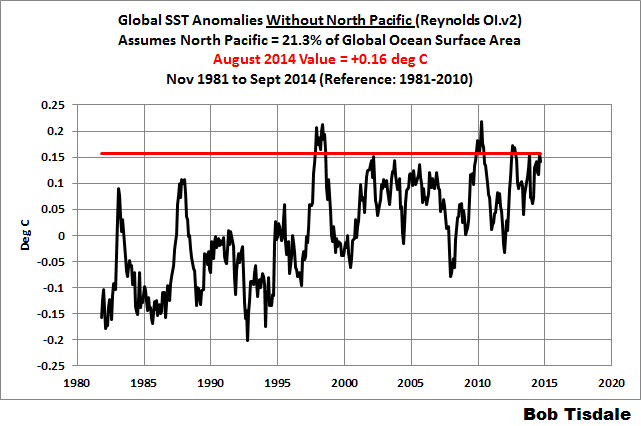
Let’s try presenting it a different way. Here’s a graph of global sea surface temperature anomalies with the peak month (August 2014) value as a horizontal red line. The peak value this year is well above the response to the 1997/98 El Niño:
Let’s remove the North Pacific from the global data and plot that, too. Not too surprisingly there haven’t been any records this year globally once the North Pacific data have been removed. The August value for this subset is warm, I’ll grant you that, but it was nowhere near to record highs values this year.
You continued, Greg: “Maybe in another hot year one could point to it being the Indian ocean that pushed up the average.”
Again, prior to this year there had not been “another hot year” since 1997/98. This year was unusual. If and when there is another unusual warming event somewhere else sometime in the future, we’ll address it. Right now, we can only focus on the North Pacific as an explanation.
Greg says: “Until you can say why it happens, it does not explain anything.”
I explained why it happened. Did you read the post I linked? Here it is again:
http://bobtisdale.wordpress.com/2014/08/16/on-the-recent-record-high-global-sea-surface-temperatures-the-wheres-and-whys/
In papers that came after that post, the unusual warming of the eastern extratropical North Pacific has been linked (chicken and egg) with the persistent ridge of high pressure in the same location…the same ridge of high pressure that is said to be the cause of the California drought.
Because max temp anomaly is and has been flat.
http://www.science20.com/files/images/global_1.png
But the on off El Nino has impacted on global temp anomalies, and if a full blown El Nino does not materialise, the warmist will hype the 2014 temp anomaly as evidence that AGW is alive and well and still happening. And should there be a full blown El Nino in 2015, then one may expect to see the temp anomaly further ramp up in advance of the Paris get together and we can imagine what chorus will then be sung.
That said, to an impartial observer, the evidence coming in suggests that the proponents of CAGW have very much underestimated the role of ocean cycles (and naturally occuring oceanic events such as, but not limited to, ENSO) as driving global temperatures.
I think ENSO is a symptom, an index, not a cause.
since El Nino is a warmer than average period, saying there is global warming when there are more frequent El Ninos is a bit like saying it’s warming when it’s warm more often. It’s not actually informative.
What we need to understand is what is driving ( causing ) ENSO, and I do not believe it just causes itself which seems to be about the best that mainstream can come up with.
I strongly suspect it is deep, slow tidally drive bulk movement of water on a basic wide scale. There are recognised tidal periods of up to 18.6 years
The density difference between water and air at the surface responds most strongly to the 12h period in the solar+lunar tidal forces. If you compare to the density change across the thermocline and scale the 12h accordingly you get something linke 1.7 years IIRC.
I suspect that these Kevlin waves etc are tidal patterns on the thermocline acting on inter-annual time-scales. This is obscured by the traditional equatorial sections like Bob’s figure 3. It reminds me of the story of Flatlanders living in a 2D world and how they would perceive the passage of a sphere through their plane.
They see a spot suddenly appear. It gets bigger for a while, then starts to shrink. Finally magically disappearing as mysteriously at it appeared.
http://demonstrations.wolfram.com/ASphereVisitsFlatland/
Except that Kelvin waves occur due to Westerly Wind bursts. We have the very observable, calculable, and modeled mechanism for Kelvin waves being a consequence of Westerly wind bursts. So you would have to connect the Westerly Wind bursts to your tidal mechanism. How would that work?
You can I believe, see the effects of the oceans on the min temp anomaly around the world
http://www.science20.com/files/images/us.png
http://www.science20.com/files/images/tr.png
http://www.science20.com/files/images/sa.png
http://www.science20.com/files/images/ea.png
http://www.science20.com/files/images/au.png
http://www.science20.com/files/images/af_0.png
http://www.science20.com/files/images/np.png
http://www.science20.com/files/images/sp.png
Oh, my thinking is that the El Nino “cycle”, is a direct result of OHC, and once it reaches it’s triggering threshold the Earth switches to “El Nino” mode, starts pumping warm(er) water to the Arctic, melts the ice, radiates the energy to space, until it discharges the accumulated energy, and the cycle resets back to “La Nina” mode.
Mike, I’m very puzzles by these Tmin anomalies.
The N pole and S pole data don’t look in the slightest bit credible. The rest looks improbable.
How can they look like that ? What is the dataset and who is this “science20.com” ?
Could you explain where this is coming from?
The science 2.0 page I link point to is my page. The data is NCDC’S Global Summary of Days data set. I explain what I do there, the short explanation is I subtract yesterday’s temp from today’s temp for each station, then usually average all of the stations in the analysis area together, with some selection criteria based on number of days per year, with some number of years.
I don’t infill or homogenize the data.
You can find all of the code and output data at the source forge url in my name.
This is the surface data.
And I was rather surprised when I saw it, and have spent a lot of time making sure I didn’t do something stupid.
You nailed one thing (actually several) dead on – your series has been very educational! And I thank you for it.
The series has shown that we are making great strides in learning about El Niño, but still have far to go. Each time we think we have the ingredients just right, something pops up that makes us go back and ask “how was the flour made”? And so others will start to study the failure of the El Niño to form by what did or did not happen. It has been a fascinating educational experience. If I were younger, I may even have decided to make a career out of studying it (and I hope it does inspire some to do just that).
Thanks for the series. And the education.
Stunning contrast of both SST and Sea-Level spring 2014 vs autumn 2014. Maybe we should coin a term “La Niñito” to describe the effect???
THANKS Bob & Anthony for your postings!!!
PS Gender mismatch was intentional!!!
Love it
If there will be an El Nino, it will be a weak one , something like 1958/1959 with its late in the year start and a very short one ( December to February.) The sst for regions 4, 3.4 and 3 have been in the Nino range for a week but the winds are not. The years 2013 also had the SST in the Nino range but did not develop into an El nino. It is still difficult to call yet.. In any case, the global impact could be much reduced and those weather forecasters who counted on an El nino to have an impact may have to modify their projections. It will still be a cold winter for central North America.
” the westerly wind bursts that initiated the big downwelling Kelvin wave”
Bob , I know that you’re well read on the official explanations of ENSO etc, so perhaps you could explain what you mean by that line.
Your fig. 3 here shows the core of the warm anomaly going down to about at least 200m in depth. Now I have a lot of difficultly in accepting that surface wind changes could push water down to that kind of depth when sea height anomalies across the full breadth of the ocean are measured in tens of centimetres and most of that is due to horizontal displacement of water, not vertical.
Now I realise that this is temp anom. not actual temperatures, so this is not a volume of water that is actually plunging to that depth but the central anom. of the Kelvin wave is +5 deg C , that is enormous if you look at the vertical temperature gradient and does not look like it can be explained as water at 200m moving down to 200.4m and showing up as an anomaly.
It seems to me that the whole official line on ENSO causation is woefully inadequate and is mostly speculative hand-waving.
I would be very interested if you can explain, either from your own work, or from official accounts how this Kelvin wave of a 5 degree anomaly can be explained as caused by winds.
Where does the physical volume of water causing this anomaly come from and how is this attributable, in any way, to changes in surface wind direction or magnitude?
Thanks for any light you can shine on this.
Here is just one official statement of such phenomenon. And guess what that wind burst led to?
http://sealevel.jpl.nasa.gov/science/elninopdo/elnino/index.cfm?FuseAction=ShowNews&NewsID=244
Here is just one official record of wind burst phenomenon. And guess what that one led to?
http://sealevel.jpl.nasa.gov/science/elninopdo/elnino/index.cfm?FuseAction=ShowNews&NewsID=244
http://wattsupwiththat.com/2014/11/11/the-201415-el-nino-part-20-november-update-the-little-el-nino-that-shoulda-woulda-coulda/
As I said already the heights here are tens of centimetres. Now that %deg C anomaly in Bob’s animation must correspond to at least 20m of vertical movement, even with the most extreme temperature gradient at the thermocline in mid ocean in 1997.
That’s almost an order of magnitude greater than where they say it is “piling up ” against S.Am.
Now 20cm “pulses” are not going to displace the ocean mass of water down to 200m of depth by 15m or so. There’s an inconsistency.
However, such a movement at depth could trigger a circa 20cm “pulse” or Kelvin wave at that surface. This would take the wind out of the trades.
Where are my replies going to?
[Into the spam folder for some unknown reason. Rescued & posted. ~mod.]
The simple explanation. The downwelling portion is actually a thickening of the warmer mixing layer to deeper and colder layers as the wind burst travels over the ocean surface. On Bob’s maps it shows up as a deeper warm “wave” only because the layered ocean is normally colder at that depth.
http://www.britannica.com/EBchecked/topic/314563/Kelvin-wave
Thanks Pam, that’s a good example of the kind of hand-waving waffle I’m talking about. That’s not the best kind of source for this stuff, but it does seem to sum up the usual official line.
What I’m looking for is a physics based account of where the energy of that massive volume of +5 deg C water comes from. Either warm water has to plunge to 200m ( no wind can do that ) or water that is already warm comes in from somewhere else. In which case, where is that somewhere else and how do the winds move water at depths of 200m sufficient distance to create that kind of anomaly.
Please re-read my previous question if you can contribute something on that.
Greg, try this:
The warm water is deeper in the western Pacific because 1. Its the tropics, 2. There is upwelling off western S. Am. and this is the reason for the contrast in the T profile with depth. There is no “pooling”, that is an absurd notion, as is the notion that wind “piles” water in a heap.
It is the Eckman Pump effect which is left out of these ENSO discussions and I believe that is where we need to be looking.
@mpainter,
Why is the water level on Indonesia 6 ft higher than Peru? (Per Bob Tisdale.)
The same Westerly Wind driven Kelvin wave process set up the super 98 El Nino. For some reason I can’t post that link from NASA.
Then you are not understanding how wind can thicken, or bulge, or pile up, wind driven water, causing the bottom edge of the mixing layer to press down on the thermocline, thus “invading” its warmer mixed water into deeper usually colder depths. You are thinking of a wave sliding under another layer. It isn’t. Wind can pile up ice. It can pile up water too. It only looks like a wave sliding under another layer because the charts are measuring anomalous temperatures at absolute sea levels. The charts are measuring the Westerly Wind driven bulge at it moves from West to East and ends up “unbulging” again at the coastline.
No hand waving needed. It is simple physics.
Ice is a solid and does not flow. Water is a fluid and as such cannot “pile up”. That’s basic physics.
Also “westerly” is an adjective and “wind” is a common noun, so neither should be capitalised. I would have expected better from a member of the teaching profession.
Greg, the water comes from the mixing layer. And that layer is always warmer nearer the West edge of the equatorial Pacific than the East edge because of the constant trade winds that blow to a lesser or greater extent from the East to the West. During lesser Easterly trade wind pressure, storms (pressure systems) along the West pacific edge can cause Westerly (coming from the West and heading East) wind bursts that in essence overcome the trade winds and start a wave “bulge” that travels West to East instead of the other way. Again, this is not hand waving but basic atmospheric science.
OMG , neither west nor east is a proper noun ( except possibly in the political use of “the West”). Western and eastern are adjectives and should never be capitalised except at the beginning of a sentence.
No wonder no one in America seems to be able to use capitals correctly any more if even those who are teaching can’t get it right.
idem for westerly and easterly, except for the town of Westerly , Rhode Is. 😉
greg, you can be such an Unpleasant And Oddly Focused Man.
Greg Goodman: Sometimes it’s better to think in absolutes instead of anomalies. The following cross section shows a “normal” subsurface temperature profile for the equatorial Pacific. It’s the climatology for the anomalies in the animation presented in the post. You’ll note that there’s a lot of warm water in the western equatorial Pacific, and less in the east. In other words, there’s a slope in the thermocline, sloping downward from east to west.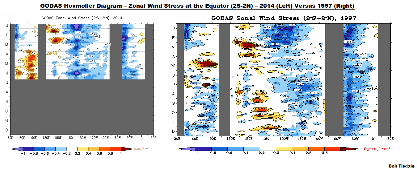
http://bobtisdale.files.wordpress.com/2014/04/figure-2.gif
The trade winds, blowing east to west, cause the surface currents to carry water from east to west in the tropical Pacific, under a tropical sun. The warm water runs into the land masses and “piles up”. Thus that east-to-west downward slope in the thermocline. Now consider that there is a subsurface current (Cromwell Current) slowly carrying water from west to east along the equator. There’s also a small surface current along the equator carrying water from west to east called the equatorial countercurrent. Even with the west-to-east surface and subsurface currents, the warm water “piles up” in the west, driven there by the trade winds and the large north and south equatorial currents. Obviously, there’s more water traveling east to west than there is traveling west to east.
Then there’s gravity. Gravity would prefer that the slope in the thermocline didn’t exist, but the warm water “piles up” in the west, nonetheless.
Then some weather event causes the trade winds along the equator in the western Pacific to reverse for a few days, a week, maybe two, in what’s called a westerly wind burst. On the surface, that westerly wind burst sends a “pulse” of additional warm water from west to east along the equatorial countercurrent. And below the surface, because the trade winds are no longer holding the east-to-west thermocline gradient in place in the west, there’s also a pulse in the Cromwell Current below the surface as the thermocline tries to flatten.
Because the pulse pushes down on the thermocline, the pulse is referred to as a downwelling Kelvin wave.
During the development of the 1997/98 El Niño, there were so many strong westerly wind bursts…
…and there had been so much warm water available as a result of the freakish 1995/96 La Niña, that the slope of the thermocline actually reversed, sloping downward from west to east at the peak of the 1997/98 El Nino.
http://i50.tinypic.com/2yvus1w.gif
Maybe, when looking at the anomalies, like in the animation in the post, it would be better to think of the warm anomalies being caused by a pulse of warm water, traveling along the subsurface current that runs west to east along the equator…a pulse that pushes down on the thermocline.
Cheers.
Me I’m just a grasshopper, Bob is the master at this. His detail and inclusion of other factors sets the record straight in understandable form. Oceanography text books and websites have lots of technical and calculable information and do a great job detailing all this in post-graduate terms. It is a well-researched area of oceanography.
Thanks for the detailed reply Bob. The map of actual temperatures makes things a lot clearer.
A couple of problems:
The warmer water is less dense. This leads to both the higher surface and the depression of the cooler water showing as a dip in the thermocline. The warm water is not “piling up” in defiance of gravity, it is floating because it is less dense.
As you point out, gravity will oppose water “piling up”. In the large oceanic basins, the water will just circulate north and south as it already does because of Coriolis forces. This is different to a lake, where the wind is essentially from one side to the other, not just across the middle. In that case water will “pile up” because it does not have a return path out of the wind.
Put down a dish of water and blow with a straw across the middle. You will not get water piling up on the far side, you will get two counter rotating surface flows.
A Kelvin wave is a very specific , non-dispersive wave propagation. It needs to be constrained on both sides , either by a physical boundary like a coast or canal wall, or by Coriolis forces, as in the case of west-east propagation at the equator. It is surface wave and relies on a density difference in the vertical dimension. I do not see how this can be said to be “downwelling”. I’m sure you are not making this up but suspect it is a gross misuse of the term Kelvin wave.
The 1997 plot helps a lot. We see that it is mid ocean where the isotherms are most closely packed so a , say, 20m deep “pulse” moving across the ocean would create a greater magnitude and more compact anomaly in this region that would disperse as the isotherms spread out again to the east.
The idea of something “downwelling” is largely an illusion caused by the background pattern of the isotherms
The problem with the ‘pulse’ explanation remains. Even in the closely packed central regions in the extreme case of 1997, five degrees would seem to correspond to a depth change of about 15m. That means that the “pulse” has to be 15m deep. AFAIK this is nothing like the total hight differences involved. That’s like a tsunami.
And then where does this water go once it gets “pushed down”? It is incompressible and the ocean floor is not going to move to accommodate it therefore it must move out to N/S or both.
Now this comes back to what I said about tidal displacement. This would seem to be more credibly explained by tidal deviation of water around the thermocline moving water mass north and south and the “pulse” being warmer, lighter surface water flowing in above. This would cause pulse to move west-east and the apparent “downwelling” in the anomaly. This may be accentuated by the positive feedback induced in the winds by changing SST.
Thanks for your explanation and the plots of real temperature. Most helpful.
Are these kinds of animation plots available to for latitudes either side of the equator? That is what is really needed to see what is happening.
Isn’t the western warm pool also higher salinity due to all the evap? More salt makes it denser. Denser warm water could easily overcome warm water buoyancy? as the westerly push on the thermocline gives it a nudge into the east flowing deeper counter current?
What’s the “could easily” in non-climatology science terms?
Is it, or isn’t it. Do you have any data showing W Pac warm pool waters sinking rather that floating?
@Greg Goodman,
Same thing with Indonesia. 6 ft.
Greg Goodman: My apologies for not replying earlier. My modem decided to die last night.
With respect to Kelvin waves, you wrote: “A Kelvin wave is a very specific , non-dispersive wave propagation. It needs to be constrained on both sides , either by a physical boundary like a coast or canal wall, or by Coriolis forces, as in the case of west-east propagation at the equator.”
We’re discussing the equatorial Pacific, Greg. So I fail to see what you’re arguing about.
You continued in the same paragraph: “It is surface wave…”
Apparently not, because it is commonly associated with a deepening of the thermocline. Have you read introductory discussions of the delayed oscillator theory?
http://orca.rsmas.miami.edu/~melicie/dmodel1.htm
There they write: “The red signal is the Kelvin wave which propagates with a positive sea surface height anomaly and thus deepens the thermocline in the eastern Pacific.”
The term “downwelling Kelvin wave” appears in hundreds of scientific papers about ENSO, along with “upwelling Kelvin wave”, so I’m using it (them) properly. You may also find the answers you’re looking for in one of the ENSO-related scientific papers about “downwelling Kelvin waves”. Try Google scholar, Greg.
With respect to my use of the phrase “pile up”, it’s commonly used in ENSO discussions. Try Googling: ENSO warm water pile up.
I’m not going to stop using “pile up” or “downwelling Kelvin wave” in my simple introductory discussions of ENSO simply because you, personally, don’t like them. “Downwelling Kelvin wave” is the proper term, and “pile up” is a great descriptive choice of words.
You asked, “Are these kinds of animation plots available to for latitudes either side of the equator?”
No. I created the animations from equatorial cross sections available from the GODAS website.
If you are able to find cross sections at, say, 5N-10N or 10S-5S (which I have been unable to find in less than a monthly format) you would discover downwelling and upwelling Rossby waves traveling east to west.
The anomalous heat isn’t absolute “added” heat. It is a change in heat measured at various sea level depths. The mixing layer changes its size in lots of places around the globe. It can become thinner or thicker, depending on a number of factors. Anomalous heat at deeper layers of the top portion of the ocean are generally because the mixing layer has bulged downward. The original source of any added heat comes from the Sun which readily warms that top layer. And the only thing that can substantially mitigate the amount of solar energy hitting the equatorial waters would be changes in atmospheric particles (ash, sulfuric acid, clouds, the smoothness of the water, particles in the water, salt spray etc) that reflect some of it away.
Because of the current tidal gravitational forcing effect, any El Niño development during this NH winter is going to be suppressed. This current tidal forcing El Niño break is going to slowly ease after the end of this NH winter season which should cause the formation of El Niño in about a year from now.
The overall trend including wiggles of the ENSO index for the coming years is for an increase, with ENSO either being in neutral or in El Niño conditions. This increase is going to end in 2019, after the big El Niño year of 2018.
However there is a caveat. Within my Artificial Neural Network I have discovered that while improving it with better data over solar electromagnetic indices, that the sun’s influence over ENSO is more important that I previously believed. The recent double peak in solar activity presses the ENSO index upward, so the coming months is going to be interesting for me.
Per, I remember reading your ANN stuff a few years ago. Have you written up anything since, if so, links please.
There seems little point in popping in with assertions like you make above without some explanation of what you base them on.
Maybe you’re right about me writing about it before publishing my research.
However I’m in very good collaborations with academic researchers who are doing work in this field and they are helping me with the process of publishing my research in scientific publication. When this publication is made, I’m going to give within this article my full explanations of the mechanics and the source of the underlining forcing of ENSO variations.
I can assure you that when this information is published, you are going to learn about it, if you follow this debate.
Thanks Per, look forward to seeing that, at which point the assertions may carry a little more weight.
I dont get it. The linkage to the SOI is now developing right on time with the weatherbell.com idea of a later, weaker nino centered in 3.4 ( Modiki) Here is the link. that is the biggest 30 day negative and we are solidly in the 90 day now
https://www.longpaddock.qld.gov.au/seasonalclimateoutlook/southernoscillationindex/
The SOI did come up for a day or two, but has been down again and with big high pressure developing over Australia the next 5 days, another descent to dailies near .20 seems to be on the way.
The MEI will come back up but to levels comparable to the 1976-1977-1978 enso events, which is what SCRIPPS is seeing along with the JAMSTEC, by far superior models to the CFSV2.
The enso events of this nature wait till late to come on. The reason we have had the cold winter since April had this factored into it. The fact that we had the major se pac hurricane season like 1976 and now the November cold like 1976, and N hem October snowcover behind 1976, 2002, should speak volumes as to what is going on here.
We had a garden of Eden cool wet summer for the nations heartland and I tried to get out in May hammering the perma drought people for the rain that was coming to the southwest.
Many of us hold that weak enso signals are already present in the atmosphere and have been using these to help beat the models at their forecasts, which were amazingly bad for November, had blow torch warm when using the analogs of the weak enso years said much colder. My point is many of the physical aspects consistent with the evolving modiki type enso events are there. We are using them. Yet somehow I get the impression that this does not count.
It was I that debunked the super nino with vigor in April, showing the why before the what. I will again state that this enso event is coming on, but in a way consistent with the weaker ones when the PDO is cold overall ( it spikes warm during the enso events) At the very least, the sensible weather, of which I make a living at for the long range clients I have, has responded so far. Does not mean it will continue to do so, but there is reason we had the summer idea we had, the hurricane idea we had ( Pacific too) and were stating that the analogs we were looking at had the cold November similar to 1976.
Most importantly, in the ATMOSPHERIC MEASURING TOOL, the SOI, there is indeed a weak el nino underway as its been below the threshold for over 90 days now.
cheers
Could the start of a lunar nodal peak year be complicating the situation?
Question. Has there ever been an official El Nino without significant Westerly Windbursts? I will readily admit that the storms building North of Australia could trigger enough bursts to get things going. It would be of interest then to look at those Australia storms.
Joe Bastardi of Weatherbell has been saying for months on end exactly what ENSO would be looking like going into this winter and he has been right on the money.
In addition for months he has been calling for significant ridging in the Western U.S.A. and a trough in the East along with a cold winter overall. Once again this is becoming true in opposition to the models which forecasted essentially the opposite a month or two ago.
I say give credit where credit is due. Joe got it right while everyone else has been wrong.
That’s why I now look forward to Joe’s Saturday videos, and I get pi**ed when he dawdles putting them up. 😉
One or two commenters here have been projecting La Nada since early this year. I haven’t been able to come up with the names in a quick search, but it looks like credit is due. If it turns out to be “La Niñito” as Tomwys1 says above, that would be close enough.
ENSO is acting like a very weak El Nino as far as it’s climate impact and that is the point regardless.
Bob, if I buy your book do I have to read the whole thing?
Some monthly variables from the GODAS ocean model.
First, surface currents in October 2014 versus October 1997 (super el-nino). Red at the Equator means the surface current is moving to the East (versus its normal current to the West). Blue is current moving even faster to West than normal.
http://www.cpc.noaa.gov/products/GODAS/mnth_gif/xy/mnth.anom.xy.u15m.2014.10.gif
http://www.cpc.noaa.gov/products/GODAS/mnth_gif/xy/mnth.anom.xy.u15m.1997.10.gif
Then under the ocean. One should think of this as the surface is normally moving West, and at 250 metres depth, the current is flowing the opposite direction to the East (the Pacific Equatorial Under Current, the biggest current on Earth). Red is higher than normal temperatures, blue is lower than normal temperatures. The big Red Spot in October 1997 was the biggest redspot seen in history.
http://www.cpc.ncep.noaa.gov/products/GODAS/mnth_gif/xz/mnth.anom.xz.temp.0n.2014.10.gif
http://www.cpc.ncep.noaa.gov/products/GODAS/mnth_gif/xz/mnth.anom.xz.temp.0n.1997.10.gif
There is not enough going on for El Nino right now. Unlike in 1997 when one could see it developing as early as March 1997. The big red spot moves in the undercurrent to the East and surfaces at the Galapagos Islands some months later, providing for the super El-Nino.
http://www.cpc.ncep.noaa.gov/products/GODAS/mnth_gif/xz/mnth.anom.xz.temp.0n.1997.03.gif
more interesting stuff Bill.
For that Oct 1997 map to show such widespread warming in the east Pac. at levels where the isotherms are widely spaced indicates a massive downward movement of the whole eastern equatorial pacific. There is no way that can be driven by warm water “sloshing back” along the surface.
The more I see of this the more it has to be driven by deep ocean movements, not the surface currents or winds. There is not way 15-25cm of height difference at the surface is shifting waters down at > 250m depth by 20m or more.
This is dog wags tails, big time.
On a previous thread in this series, the disappearance of the Unisys sea temperature anomaly picture was mentioned. Well, it’s back, with a much simpler colouring scheme. But instead of a warm green for the low positives, they’ve gone for a garish yellow (I think a pale yellow would be better next to the intermediate grey). I’m surprised how little grey there is, supposedly between -0.25 and +0.25K.
See http://weather.unisys.com/surface/sst_anom.gif .
Rich.
UNISYS has got it right now. Looks much better.
… and October 2014 is tied with October 2012 as the warmest October in the satellite record.
All without an El Nino apparently.
In that case, there is a huge problem! RSS has October 2014 in 8th place at 0.272. 1998 was first at 0.461. But with UAH, October of 1998 was way lower at 0.291 but October 2014 was higher at 0.367. That is a relative difference of 0.189 + 0.076 = 0.265!
Siberian Husky:
So what?
Global warming has stopped. Deal with it, and quit trying to claim there is a problem. There isn’t.
You don’t seem to know the difference between the word “global” and the words “lower troposphere”.
Yo, doggy,
You said nothing about the troposphere. Or ‘global’, for that matter.
But since you brought it up now, you do know that we live in the troposphere, don’t you?
No?
Well, we do. The troposphere is where we have weather. And where most temperatures are measured.
The troposphere is where global warming is typically measured — the surface of the globe and the atmosphere immediately above it; both land and ocean.
See? You can learn a lot on this site…
…and there still isn’t a problem.
…but global temperatures *are* warming… and so are those in the lower troposphere (where we live apparently). The planet is in a natural cooling phase, yet surface temperatures haven’t been cooling. When the cycle shifts again there will be abrupt heating- just like there has been throughout the last century. Woof.
Mr. Husky,
Since you purport to know, what year will global warming start up again?
The fact is that you don’t know, and neither does anyone else. We may be facing the next great stadial, which would be good for huskies, but no one else will like it.
Why not
man updog up, and just admit it? Global warming has stopped. There’s nothing wrong with acknowledging reality, and you will get respect for admitting what everyone knows.Global warming means “global” not just one section of the earth.
And it’s Dr Husky.
You are no doctor. You are a cipher.
Doggy:
Get with the program. Global warming has stopped.
And as usual you didn’t answer my question.
I have frontal patients that perseverate less.
Siberian_Husky commented
Doc, you do realize the warming over the last 40 years did not happen equally globally, right?
Of course if you look at the published temperature series you don’t really get to see that.
doggy sez:
…but global temperatures *are* warming…
And White is Black, Evil is Good, Ignorance is Strength… &etc.
Thanx for the assertion, pooch, but global temperatures are not rising, as any canine can see. Trying to explain that to you is like teaching trigonometry to a dog…
Sure, beckley. As if.
Thanks, Bob. It seems like this El Niño is so weak it might turn out to be stillborn.
I thought it useful to again show the graphic for the Multivariate ENSO Index (MEI):
http://www.esrl.noaa.gov/psd/enso/mei/ts.gif
From http://www.esrl.noaa.gov/psd/enso/mei/
Nature delivers yet another sucker punch to the chin for AGW hypothesizers.