Guest Post by Bob Tisdale
UPDATE 2: As of Monday November 3, 2014, Unisys is no longer updating their sea surface temperature anomaly maps. See the update at the end of the post.
# # #
UPDATE: A week-old news report from Unisys clarifies a few points. See the update at the end of the post. Thanks, Michele.
# # #
The recent cooling of the sea surfaces in the Northern Hemisphere has caused a lot of comments and questions around the blogosphere…especially when someone displays a sea surface temperature anomaly map from Unisys, Figure 1.
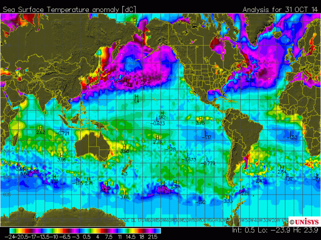
Figure 1 (Looks Ominous)
As you’ll recall, back in June of this year, Unisys had to change sea surface temperature products when NOAA discontinued the dataset they had been using. See Figure 2, which is a screen cap of the Wayback Machine archived edition of the Unisys SSTa webpage for June 25th, while Unisys were updating their product.
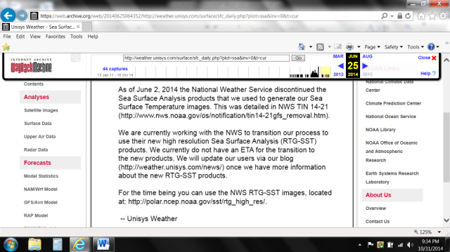
Figure 2
As shown, Unisys advises they were planning to change to the NOAA/NCEP RTG-SST analysis. See the NOAA/NCEP Real-Time, Global, Sea Surface Temperature (RTG-SST) Analysis webpage. It’s probably safe to assume Unisys wound up using the RTG-SST product, when they began displaying the updated maps in July 2014.
If you were to click on the Global SST anomaly map in the left-hand menu on that NOAA webpage, Figure 3 would be displayed. It’s the same day, and it should be the same data, with assumedly the same referenced base years. (I can’t find what base years they’re using, and I can’t see Unisys going to all the trouble to create new daily climatologies for sea surface temperature anomaly maps.)
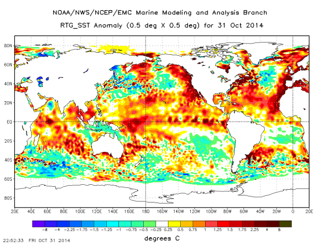
Figure 3 (That looks ominous, too.)
Obviously, the color-coding of the temperature anomaly scales for the Unisys and NOAA presentations is different. NOAA’s color scale is readable. Unisys’s is not in the map above. Though it’s impossible to tell from the color bar below the Unisys map, they have historically used “cool” blue and green colors for positive anomalies, even above +1.0 deg C. See the older map here. The “warmer” yellows don’t appear until the anomalies are about +2.5 deg C. Thus, the tendency for the Unisys maps to look “cooler”.
But there is another significant difference between the two maps. Note the graduations in the latitudes of the NOAA map. They’re linear…equally spaced. Not so for the Unisys map. Unisys appears to use a Mercator projection, which expands the latitudes as they progress from the equator to the poles. That exaggerates the “cool” anomalies at the mid-to-high latitudes of the Northern Hemisphere, making the cooling look even more significant than it truly has been.
We discussed the reasons for the elevated sea surface temperatures in the post On The Recent Record-High Global Sea Surface Temperatures – The Wheres and Whys. And as shown in Figure 4, the “blob” in the North Pacific had a major impact on the sea surface temperatures of the Northern Hemisphere. But the sea surface temperature anomalies in the Northern Hemisphere peaked in August and September, and now they’re coming back down.
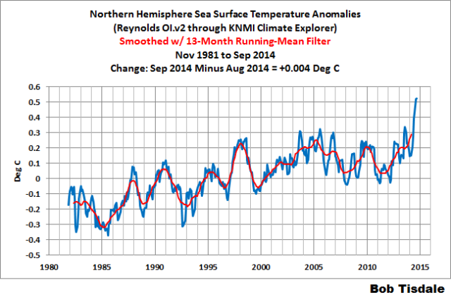
Figure 4
If you were to look at the Unisys animation, Figure 5, you’d think we were heading into a new ice age.
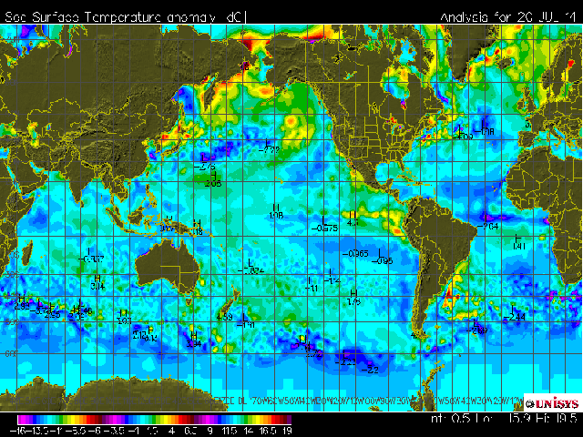
Figure 5
But, if you look at the animations of seasonal sea surface temperature anomaly maps with more subdued color scaling, like the one from NOAA here and the one from CMC Environment Canada here, you’ll be able to catch something else. While the sea surfaces of the high latitudes of the Northern Hemisphere have cooled—no doubt about that—there appears to have been a slight warming at mid latitudes. In other words, the warming of the mid-latitudes should offset some (but not all) of the cooling at higher latitudes.
One would think there will be a noticeable drop in the sea surface temperatures of the Northern Hemisphere in October. Unfortunately, with the NOAA NOMADS system off-line, I don’t have easy access to the weekly Reynolds OI.v2 SSTa data. So we’ll have to wait for a few more days, until NOAA provides their October updates for sea surface temperature data.
As soon as October 2014 sea surface temperature data appears for the NOAA ERSST.v3b or the Reynolds OI.v2 data, I’ll bring you up to date on how substantial (or insignificant) that decline in recent weeks has been in the Northern Hemisphere.
Enjoy your weekends.
# # #
UPDATE: On the thread of the cross post at WUWT, Blogger Michele (in her comment here) provided a link to an October 22, 2014 Unisys news update titled Unisys SST Anomaly Maps. Unisys writes:
Unisys Weather has been receiving reports of incorrect maps of the daily SST contours. The data used to make the maps are the official NOAA RTG-SST and anomaly grids, being pulled directly from the NOAA NWSTG.
We have found an issue with the color scale of the mapping, and this has caused some users to misinterpret the maps. The color scale being used by WXP is wrapping, causing the same color to appear at very low and very high ends of the color table. The color table is also stretched beyond the actual values in the SST anomaly plot. We are working to correct the color table and color bar issue.
A comparison of the Unisys generated map with the NOAA RTG-SST anomaly maps indicate the contours are in line with NOAA’s maps.
# # #
UPDATE 2: Harold Ambler of TalkingAboutTheWeather explains why Unisys is no longer updating their sea surface temperature anomaly maps in his post UNISYS pulls down map showing dramatic ocean cooling. Thanks, Harold.
Great explanation Bob. Thanks!
The Unisys people would flunk a simple chart making class in school. This color legend is unintelligible.
“This color legend is unintelligible”
Good, I was hoping it wasn’t just me.
I agree. You have to wonder about those who would present data in such a manner.
The UNISyS scale covering from minus 24 to plus 21.5 with the same colors (in multiples) on each end of the scale from zero is ridiculous. I have skipped every graphic that has been presented with regards to UNISYS.
I have no opinion with regards to any data presented. Only the poor presentation related to the scaling. Is the graphic showing -17, -6.5, +7.5, +19? Donno, it all looks the same.
Hmm. The “Featured Image” on the front page of a WordPress website does not like .gif images. That’s the same map as Figure 1.
I’m suspicious when things are taken off line for a while. This happened with other data sets, like the sea level data. We had a long pause and then they came out with adjustments for crustal rebound which immediately made the data set no longer actual sea level, they added a component of sea volume! With there new sea temps we will see some adjustment or other that counteracts to some degree ‘unfavorable’ trends. There is strong motivation to make the president happy and to continue getting cash for their work.
“I’m suspicious when things are taken off line for a while.”
As well you should be. But I am suspicious of all government funded data sets. They have been caught over and over and over again fudging the data to support this rubbish of a theory that the magic molecule controls all warming on earth. Ah, and the every compliant mainstream media backs the alarmist’s hand and keeps telling the people, “It is worse that we though!!”
As I am now well past middle age (well, unless I live to 120), I despair of living long enough to see this madness end.
We’ve had some cracking weather here in England. Lovely warm days this past week. Almost 24c yesterday (that’s 74 for all you Americans still using F!). Of course, we’ve also had news reports of “Warmest October 31st ‘ever’ “.
Yes Jim we have, as I explained to some of my warmist friends, it’s just weather, unusual, but not unprecedented! I dare say Mother Nature will bring us all down with a bump before too long!
I can remember in the early 70s, probably 1971 walking down the North Bridge in Edinburgh in shirt sleeves eating an ice cream. Nothing unusual other than it was mid/late October and I did it on more than day.
Only weather as you say,
It’s nothing new. I remember November 1978…it was warm until the 25th and the first frost was on the 26th of the month. I was living in Worcester at the time.
Not a record month as I understand it but a record day in gravesend.
Here, in SW france, we have had around 80°F 27°C for a while now but it is all due to end this coming week. So out to give the grass one last cut before it’s too late.
Unfortunately it snowed in Toronto this morning. Yesterday it snowed in Chicago. In both cases much earlier in the season than normal.
Guess where the weather is concerned you win some and lose some.
Bob, thanks.
Try Jamstec. and /or environment canada.
http://weather.gc.ca/saisons/image_e.html?img=2014103100_054_G6_global_I_SEASON_tm@lg@sd_000&title=daily&bc=sea
They both show cooling in the northern oceans but not as loudly as unysis
You are comparing apples and oranges in the two maps you are using. The Unisys map to use in your comparison is labeled SST Anom NEW which has an entirely different color scale. In the Unisys news release of October 22, they reference the map to use from NASA which shows the same anomalies as your figure 3. Studying those two and allowing for the differences in the two map projections, there are clearly temperature differences in the two maps. The new Unisys map does not show the positive anomaly between the Kamchatka Peninsula and Alaska at all. The NOAA map shows a 0.25 to 1 degree positive anomaly in that region and the Unisys map is showing a negative 1 to 4 degree anomaly. Somebody is wrong, really wrong. I would give NOAA the benefit of doubt, except they were on the October was the warmist October on record band wagon, which is totally wrong.
Good eyes, Ernest. Makes one wonder what Unisys is presenting.
Ernest, I just did a quick check of every daily sea surface temperature anomaly map that I know of, and the only one showing a cool anomaly immediately south of the Kamchatka Peninsula is Unisys. Very odd.
I’ve pretty much decided it is a good, old fashioned glitch, on the part of UNISYS. Someone is at their wit’s end, and is shaking their fist at their computer, in the back rooms. If it was showing higher temperatures I might suspect conspiracy, but lower temperatures? It must be ineptitude, (which is something I am quite familiar with, when it comes to making computers do what I want.)
Ernest, please see the update. They aren’t apples and oranges. Unisys linked the same reference map that I linked in Figure 3. And, yes, I realize that doesn’t explain the differences between the two maps that you pointed out.
I downloaded the SST_ANOM_NEW for the 1st November before taken off-air. It is much easier to read, but has less resolution then the older maps. Compare this new version to Figure 1 at top of the article. It is one day later, but is close enough for map design comparison.
Sorry, messed up adding the image. Here it is. http://s25.postimg.org/ctyfdljen/sst_anom_new_110114.gif
Well Big Jim it was 31 F (that’s slightly below 0 C for the rest of the world-I guess) this morning in the central US. We like to do our part to keep the world average temp low. Never met a Brit that I didn’t like.
The NCDC has screwed up the seasonality in its temperature anomaly figures. I assume this was not just a mistake but something done on purpose so that once per year (in the summer and early fall) they could publicly claim that “look, the last 12 months have been the warmest on record”.
Temperatures are supposed to be adjusted for seasonality. That is what an “Anomaly” means. How is the average Earth temperature changing compared to the “normal” for the period. Well, this is how they changed the record since the first time I saved it in November 2008.
http://s17.postimg.org/i118sk5zj/NCDC_Adjustments_to_Seasonality_2008_vs_Sept14.png
What area was most responsible for the change in this seasonality. High Latitude Ocean SSTs.
Charted just back to 2000 so that one can see this more clearly.
http://s13.postimg.org/ciiwzi0on/Zoom_in_NCDC_Adjustments_to_Seasonality_2008_vs.png
Unisys has been in this game for a long, long time (one of the first I believe) and I think they just got fed-up with the NCDC/NOAA and started using their old seasonality values.
Thanks, Bill. Do you know what base years NOAA are using for the anomalies in the graphs you plotted?
Maybe you’re right. Maybe Unisys does have their own climatology. Curiouser and curiouser.
Readme says anomalies are calculated on the 1971-2000 climatology.
ftp://ftp.ncdc.noaa.gov/pub/data/mlost/operational/products/readme.timeseries
Bill Illis- being relatively new to calculating anomolies- Does “climatology from 1971-2000” use a mean of the total daily temperatures ? Or do they use a daily mean (ie. average of alll OCt 31st in the 30 years) r do they take the mean of each month of the year and subtract this from the temperature? IF you took a mean for the whole 30 years, why wouldn’t it show seasonality? (i.e. what period of time to they use to calculate the mean over the 30 years?) Thanks- just trying to understand this! 🙂
Bill,
Do you think that you could put that 2008-2014 graphic in a different format? Something more readable and obvious?
I saved a chart of the weekly anomaly in the NCDC/NOAA’s OISST.v2 anomaly from 2004 to August 2014 (just before the entire system went down and they have provided no indication of when it will come back up). Maybe someone saw this chart and realized the game was up.
Anomaly temperatures are not supposed to have this type of seasonality remaining (if I was Unisys, I wouldn’t use it). It should look random or have some type of trend or have some ups and downs as in being influenced by the ENSO but it should not be regularly low early in the year and regularly high in August.
And the swing should be nowhere near +/- 0.45C. That is just so far out there it is hard to imagine how this big of a mistake could have happened.
Northern Oceans weekly anomaly from 20N to 90N (just back to 2004 so it is clear).
http://s28.postimg.org/c3st9eiql/Northern_Oceans_20_N90_N.png
There is a discrepancy between satellite and surface air temperature measurements that led NOAA to claim 2014 will be the warmest year on record according to the surface thermometers while the satellites say 2014 is nothing special.
Is there a similar discrepancy with regard to the sea surface measurements?
Bob Clark
I hate the Unisys color key, it is almost completely useless.
Try looking at SST Anom NEW on their website. They could do with less color saturation, but it is very easy to read. Hopefully, they will eventually stop using the old chart.
That is why they put the L and H temperatures across the map. Learn to read the map.
My explanation for the apparently cool northern ocean temperatures is that the baseline for the temperature anomalies is an unusually warm period, the late ’90’s. So, since the northern hemisphere reacts faster to forcings (smaller ocean volumes), the anomalies will appear cooler than the southern hemisphere as we enter a cooling period, especially in view of the anomalously high baseline.
What this highlights is how little the atmospheric science guys understand the ocean. Additionally, deep water measurements are lacking and that is where most of the energy may be stored or released.
http://www.ospo.noaa.gov/data/sst/anomaly/2014/anomnight.10.30.2014.gif
The satellite data above is the best in my opinion.
Salvatore Del Prete, the NOAA/NESDIS is satellite-only data as far as U know, and they exclude daytime satellite observations. The NOAA/NCEP RTG-SST is based on satellites, ships intakes and buoys, as is the Reynolds OI.v2. I know the satellite portion of the Reynolds OI.v2 data are adjusted for satellite biases, but I’m unsure about the RTG-SST data.
Hi Salvatore, you claim that you believe NOAA the most, I would just like to pick up one small detail. On NOAA map Big Lakes in Canada are red in +2C. Though recently there was a lot of fuss about Big Lakes being 6F, ~3C cooler than average. In this point of view UNISYS map is more accurate.
Peter yes, the US Great Lakes should be purple, not red. WUWT?
Yes Peter but the below average temperature great lakes are also showing positive anomalies in the controversial ‘Day after tomorrow’ Unisys map as well. They all seemed to be rubbish or manipulated. Non of them seem to be fit for purpose
O0000HHH!!!! According to the Canadian Map Bob provided, it looks like some of the ski hills are about to open (Snow cover included). November 15 for some of the Banff, Alberta slopes I believe! Thank goodness my hay is covered.
http://weather.gc.ca/saisons/animateweb_e.html?imagetype=images_loop&imagename=……..00_054_G6_global_I_SEASON_tm@lg@sd_000.png&nbimages=1&clf=1&bc=sea
Nakiska is to open next weekend.
http://www.skinakiska.com/
Oh heck, go back and click on “here” in Bob’s post.
Fig 3 shows warm band along the European Atlantic cost, this is reflected in the CET daily min/max temperatures, well above 20 year average
http://www.vukcevic.talktalk.net/CET-dMm.gif
Thanks Bob!
I am blaming those maps for making it Burrrr in Sarasota Florida and snowy in South Carolina today.
Can we change them back now please? ;-]
Cliff Mass has some related observations
http://cliffmass.blogspot.com/2014/10/halloween-tragedy-blob-is-meeting.html
“And now look at the anomaly for yesterday. BLOB is in trouble. The water is now COOLER than normal in a large area of the eastern Pacific and the warm water along the coast has lessened.
So why is our old and welcome friend. the BLOB. in trouble?
It is because the atmospheric circulation has radically changed compared to last fall. Instead of a persistent ridge, we have had a persistent trough, with strong winds, storms, and lots of wave action.”
thanks Steve. Here in NE Oregon we are experiencing wind, rain and snow in the mountains good blog ref.
Bob T. -thanks for all of your hard work . BTW I too am suspicious of the NOAA
NOMAD dataset being down- in the shop for “adjustments” perhaps?
I checked Tollgate cameras. Yep. Snow. So I put my snow tires on. My hunch is that this wet weather and that ridge will result in both Arctic air invasion and lots of moisture. Which equals an early start to snow which will be wet, heavy, and abundant at first.
I did notice that when Siberia built up its first pool of minus-forty air of the winter, (which it does as soon as there is a snow-cover), that air was discharged to the east, out over the Pacific. That might explain some of the cooling.
Thanks Bob as always! When I first started noticing this I assumed it was a base period difference since there were big differences of sign in some areas. Seems like important information to not publish right on the map.
Bob T. mentions the map projection issue in his text. If you are not familiar with this topic, follow the link below for background.
http://geokov.com/Education/map-projection.aspx
Search the site linked above for the word – conformal –
then go to the #3 of 11 hits.
The size of the orange circles shows the distortion – areas exaggerated at high latitudes. Note also that the Unisys map stops at high latitudes.
The next map on the site is an Equirectangular (equidistant cylindrical) projection centered on the Prime Meridian.
Bob’s Figure 3, the NOAA map for 31 Oct, uses this projection centered on 160 W.
Often folks look at Greenland versus South America as a quick check on the areal distortion of a map. One needs a globe to see the actual comparison. If you don’t have a globe handy, see the drawing of a Tangent – Planar projection (upper right in the light blue) search for – Azimuthal – and hit #1 is the one. The map from this concept is the white/blue circle below the drawing that is gray and blue.
Cool! Reading and understanding maps is a staple of late middle school and early high school classes in geography.
Salvatore del Preets map above is probbaly correct. What it does show and makes sense is a pretty massive cooling of the SOUTHERN Hemisphere ocean around antarctica
Thanks Bob, for showing some light on this, pity Nomads is still off line.
Ryan Maue has just posted his Oct 14 global 2m temperature anomaly for Oct as + 0.194C which is no change from Sept at +0.195C. It lists data as NCEP CFSv2, climatology NCEP CFSR 1981-2010.
http://models.weatherbell.com/climate/cfsr_monthly.php
Shows map with navigation on RH side
http://ecowatch.ncddc.noaa.gov/JAG/Navy/data/satellite_analysis/gsncofa.gif?id=77020
I understand the map issue and the colour-scaling issue. What is the bottom line here Bob? What should we believe?
Personally, R2Dtoo, I prefer to look at the time-series graphs.
This one is easier on the eye, but not sure of its data source. I’ll try to embed:
If that doesn’t work: http://vortex.plymouth.edu/mapwall/ssta.png
beng, I like it. The key to that map being easy on the eye is their using one neutral color to span +/- 1 deg C.
Bob,I can only see pink from zero to plus one and light blue from zero to minus one.
This one has white for + and – 0.2° http://www.tropicaltidbits.com/analysis/cdas-sflux_ssta7diff_global_1.png ,seeing white for no change in an anomaly graphic is a good visual base to visualise warmer or cooler changes.
On “recon”,
If you want to know what is going on, you set out sensors and send boots on the ground to implant said sensors. Together with making sure you have the whole area needed covered. Therefore if the U.N. , and or the U.S. Govt. (EPA) (NWS), ect. want to know they should be about world wide data search full time and the money should be no problem. Yet seems the direction is toward grants, toward wind farm tax credits, toward closing coal mines, toward solar tax credits and other matters.
It seems the common sense thing to do. Find out the truth via sensors every where all the time.
Odd they have had what 30 to 40 years to get it in gear and done and na’da so far.
I dont know where Bob finds the “Unisys” mapwith the bizzare repeating color palette. The Unisys map linked here at WUWT is quite different:
http://weather.unisys.com/surface/sst_anom_new.gif
The difference is in the base period not the color palette.
You can find it here. http://weather.unisys.com/surface/sfc_daily.php?plot=ssa&inv=0&t=cur
If NH oceans be cooling, can more Arctic sea ice be far behind?
With apologies to P. B. Shelley’s “Ode to the West Wind” & thanks to Willis’ quotation of “The Cloud”.
Growing Arctic sea ice should take the wind out of the sails of CACA.
Arctic.
http://www.ijis.iarc.uaf.edu/seaice/data/201410/AM2SI20141031IC0.png
Why? It didn’t this year. In fact, low ice is being blamed on 2014-15 winter weather in advance despite record growth.
http://www.opc.ncep.noaa.gov/Loops/GRTOFS/currents/GRtofs_Curr_Atl_03_Day_flash.shtml
The NOAA/NCEP RTG-SST is based on satellites, ships intakes and buoys, as is the Reynolds OI.v2.
From Bob.
I like the product you sent for sea surface temperatures.
Looks like the “The Day After Tomorrow.” Anyone have Dennis Quaid’s phone number?
I’ll agree. That Unisys animation in the post is fascinating to watch.
Thanks, Bob. A clear voice of reason!
If we go to the UNISYS web page and enter ARCHIVES and then SST PLOTS and then go down the INDEX OF ARCHIVES /SST and to the very bottom you will find SST ANOM LOOP.GIF to October 27/2014. One can clearly see an animation of how the large heat ‘”blob” in the North Pacific that used to exist earlier in the NORTH PACIFIC seems to have cooled down or change to a cooler depressions now. The previous post by STEVE OREGON earlier about CLIFF MAAS analysis seems correct . There has been and still is a lot of turbulence, upwelling and major storms in this area plus periodically colder winds coming south from the Arctic as well to cool the Pacific North. On the surface , I see nothing wrong with UNISYS sst plots and agree with Bill ILLIS ‘S comments made ealier as well. The NOAA/NESDIS 50 KM GLOBAL ANALYSIS SST ANOAMLIES plot for October 30 shows part of this cool down as well.
Cliff Mass’ work is a nice addition to Bob Tisdale’s above. Together their work appears to be very informative.
Bob, what do you think of the Mass info?
http://cliffmass.blogspot.com/2014/10/halloween-tragedy-blob-is-meeting.html
For some time Cliff Mass. a lukewarmer, has provided some honest, outstanding and useful analysis.
From Gordon Fulks PhD
“Cliff Mass is a distinguished professor of meteorology at the University of Washington and a Fellow of the American Meteorological Society. He is thoroughly alarmist but smart enough to avoid the worst of the stupidity. We keep challenging him on accountability, and he keeps finding an excuse for avoiding it. Most of the excuses have to do with our allegedly insulting him. He has a very BIG ego and a very thin skin. ANY criticism is an insult!
Cliff is worth pursuing, because he seems to have an independent streak that, for instance, kept him from signing the “Consensus of 50 Professors” document ten years ago that predicted relentless PNW warming @ +1.0 F/decade. That is not a document that they wave around today because PNW temperatures have actually trended downward (@about -1.0 F/decade). That has to be a considerable embarrassment.
For being precisely wrong about PNW temperature, the consensus has taken in about a BILLION dollars, and still uses the +1.0 F/decade prediction. Why not? They were certainly correct about the money that their prediction would generate. 🙂
Since Cliff is more of a meteorologist than a climate fanatic scientist, he apparently does not depend on Federal grants tied to the hysteria. At least that is what he told me. Hence, he is sometimes willing to buck the UW climate tribe. He did so magnificently last year regarding their ‘Ocean Acidification’ hysteria.”
Gordon
http://cliffmass.blogspot.com/search?q=acidification
http://www.oregonlive.com/pacific-northwest-news/index.ssf/2014/09/science_roundup_sept_27.html#incart_related_stories
“Cliff Mass
I have analyzed the two papers in depth. Check my blog:
http://cliffmass.blogspot.com/2014/09/why-is-northwest-us-warming-natural.html
The Johnstone/Mantua paper is quite strong, while the Abatzoglou/Mote/Rupp paper has major problems.
The bottom line is that anthropogenic warming has been weak compared to natural variability over the past 100 years, but this will change later in this century as the global warming signal is enhanced..cliff mass, prof. atmospheric sciences, University of Washington”
http://cliffmass.blogspot.com/2014/10/wimpy-el-nino.html
http://cliffmass.blogspot.com/2014/09/epa-takes-on-oysteracidification.html
I just read Bill Illis’ exposee of NCDC/NOAA seasonality fiddling. This is huge.
Bob,
Here is my AVHRR movie of the last 50 days in North Atlantic SST. It doesn’t show any notable cooling.
Thanks for the link, Nick. I had to switch browsers to make it work.
The cool down that has happened and is still happening in the NORTH PACIFIC has also been happening and is still happening in the NORTH ATLANTIC .The latest Nullschool plots of surface winds in both areas illustrates the atmospheric turbulence that is still happening in both areas and why cool winters are likely for parts of Europe and North America with jet stream blocking and colder air coming further south.
This UNISYS chart is very confusing. It clearly shows a drop of 2 degrees C or more from the long term average around the British Isles and beyond. If this is false it is climate fraud and heads should roll. Is this a trick by the warmists to lead the deniers up the garden path. You would think that the Gulf Stream has completely shut down and a mini ice age or something bigger is imminent.
http://weather.unisys.com/news/?p=391
Posted on 2014/10/22 at 3:28 PM UTC
Unisys Weather has been receiving reports of incorrect maps of the daily SST contours. The data used to make the maps are the official NOAA RTG-SST and anomaly grids, being pulled directly from the NOAA NWSTG.
We have found an issue with the color scale of the mapping, and this has caused some users to misinterpret the maps. The color scale being used by WXP is wrapping, causing the same color to appear at very low and very high ends of the color table. The color table is also stretched beyond the actual values in the SST anomaly plot. We are working to correct the color table and color bar issue.
A comparison of the Unisys generated map with the NOAA RTG-SST anomaly maps indicate the contours are in line with NOAA’s maps.
Thank you, Michele.
You ( now ) have to be careful which link you click on, when at the UNISYS SST page, They do make it clear that you can view the old, with the bizarre color wrapping scale, OR SST_New link to take you to the display that has been based upon the new, clear, non wrapping scale. And, by the way, includes a grey/white around 0 rendition.
This is about changed base period, not color palette, please read the post by Bill Illis:
Bill Illis on November 1, 2014 at 8:08 am
A lot of people here are trying to cover this up. A chorus of “move along nothing to see”.
+1
For years we (coillectively) have complained that such maps are skewed by the use of warm and hot colors to over-emphasize small positive changes in (sea) surface temperatures — now we have complaints that Unisys uses too bold colors for small changes in cooling! Egads!
I personally like this :
http://www.tropicaltidbits.com/analysis/ocean.html
‘Global SST Anomaly 7-day Change’ chart I find it very useful to see SST ‘tendencies’
scroll down to see Nino temperature graphs.
Mick
Thanks for the link, Mick. I haven’t seen that webpage before.
Go to the Forecast Models link and it is really the best outline of the weather model forecasts there is on the Web.
For example, the GFS forecast temp anomalies for North America going out 16 days.
http://www.tropicaltidbits.com/analysis/models/gfs/2014110118/gfs_T2ma_namer.html
Lots of other models, and options are available. It is operated by Levi Cowan, a grad student at the University of Alaska Fairbanks.
Yes Bill, you can see the negative temperature anomalies pulsing from eastern Asia out over the North Pacific.
Thanks for the link Mick. It’s an interesting website on the tropics. Looks like it’s run by a Met.
I wouldn’t stomp on Unisys quite so easily, personally I like their color schema but it took a while to get used to it and it needs to expand and limit the span from say -12 to +12 °C as I think is what Unisys said it is correcting. As for the actual data used I would more look at NCDC/NOAA for the warming distortions, they have been caught in lies constantly and there’s a good saying “once a liar, always a liar”.
Taking the more correct viewing of the Unisys plot and keeping in mind:
blue around the edges of magenta areas — colder when moving internally,
green around the edges of yellow areas — warmer when moving internally,
makes that schema very detailed and easy to read unlike NCDC’s plots and color scale made strictly to instill fear.
Sorry off topic, but this should be a WUWT article http://bravenewclimate.com/2014/08/22/catch-22-of-energy-storage
No. EROEI confuses. Use just money without subsidies and tax breaks.
Look at the anomaly legend in the Unisys loop at fig. 5, it is all over the place.
Just a note to those using the Climate Explorer for NCDC SSTs. They appear to be substantially different than the official NCDC ERSST v3b numbers. (Maybe the climate explorer is using an old database that hasn’t been updated for the newest and greatest adjustments or something else is wrong).
http://s30.postimg.org/5ic1wa0mp/NCDC_Annual_ERSST_v3b_Clim_Exp.png
http://s29.postimg.org/oiu5oz293/NCDC_Monthly_ERSST_v3b_Clim_Exp.png
The link above was to the low resolution RTG. The high resolution RTG (1/12th degree) is at http://polar.ncep.noaa.gov/sst/rtg_high_res One advantage of using that is that you can get regional blow ups of the temperature and anomaly. You would also see that the base period for the sst climatology is 1961-1990.
The base period will be updated to 1981-2010 in the next operational upgrade to the RTG-High Res. The colors shown will then be less angry. The color bar is based on keeping approximately equal areas of ocean in each anomaly band — for the new climatology period.
@Ernest Bush:
It is a good idea to remember that NOAA produces several SST analyses. The one used for deciding warmest month sorts of things comes from NCDC. The RTG comes from NWS. Among other things, the NWS product is aimed at best analysis for weather purposes today. The NCDC is aimed at climate analysis. That difference in goal (and what’s available) leads to differences in detail. The NESDIS analyses have yet another goal (and are satellite-only, as required by their goal).
@Bob Tisdale:
The RTG does adjust for satellite biases — http://polar.ncep.noaa.gov/sst/rtg_high_res/description.shtml
Speaking for myself only, of course.
Thank you Mr. Grumbine!
The base years used for climatology are likely driving our confusion between Unisys and US Gov products. I had been seeking the info on the base years–especially for the NOAA RTG-SST product, and your point out to the 1961-1990 period is much appreciated.
If anyone can determine the base years for the Unisys product, we’ll all be able to calibrate our minds and properly compare the products.
Hifast, as always, is Curious.
My guess on the source of difference is some kind of straight up mistake, rather than different climatologies. The thing is, sea surface temperature changes slowly, and the climatology even slower. With differences of over 4 C in the plotted anomalies showing up in only a few weeks … that’s pretty drastic. As climatology for the seasonal cycle, that’s an awfully rapid change on hemispheric basis.
Looking to change in climatologies, if it were this, it would say the Unisys climatology was showing a 2 or 4 degrees per decade change in temperature relative to the RTG’s 1961 start (depending on whether it started at 1981 or 1971). Maybe a few local areas, near the ice pack or upwelling zones, could pull that off. But on hemispheric basis, that’s just unreasonable.
I’m sure that differing climatologies contribute to differences between the many different SST sites. Not just the base period, but also exactly what sources were used to make the climatology. The JMA uses the JMA analysis in making their climatology. The CMC uses the CMC analysis. And so on. Even if we all use the same time period, there will be differences in detail.
This will not be a warm winter in the northern hemisphere.
http://www.cpc.ncep.noaa.gov/products/stratosphere/strat_a_f/gif_files/gfs_toz_nh_f00.gif
I am likely biased, because I know him to be one of the brightest lights I have seen come onto the scene and he works with us, but Ryan Maues SST, available here
http://models.weatherbell.com/sst/globe_cdas1_anom.png
blows away everything else out there, in my opinion.
BTW what you see on that map has a striking resemblance to the blend of the SST’s in 1976 and 1977 el nino events, which are in our analog package, and the subject of an outstanding paper Joe D Aleo shared with me on those winters SST’s be Dickson and Nemias, 2 huge lights from the past that still shine bright today to many of us
Can’t see anything Joe unless you sign up to weatherbell
Hi everyone…
My name is Brian and I’m the deputy director of Unisys Weather. I want to thank everyone who brought this to our attention. I generated the blog entry at http://weather.unisys.com/news/?p=391 after we started receiving email messages about issues with the SST anomaly maps. After further analysis, today I’ve asked the web team to remove the SST anomaly images indefinitely.
At first, we believed the issue to be purely a mapping issue with the color table and max/min of the look up table as generated by WXP. Comparing some of the larger areas of the SST anomaly with the NOAA RTG-SST anomaly (I tried to compare with the NESDIS SST anomaly but their site was down for a week) it looked as of our product was in general agreement (difficult to make an objective comparison when one is comparing GIF/PNG images visually).
Due to the recent switch by NWS to remove the legacy SST from the NOAAPort feed, we switched to using the RTG-SST. Further investigation indicated that the SST anomaly charts are being generated using a 30 year dataset that has not been updated in a very long time.
I can see from the loops and further analysis that something is causing a large bloom of cooler than normal temps in the NH on our maps even in areas where the NOAA analysis shows an increase (specifically looking off the coast of Newfoundland).
I’m going to ask the products and web team to look into this, so we can generate a quality SST anomaly product that is in line with the official analysis from NOAA and other sources. Thank you all for your patience and understanding. My contact info is below.
-Brian Hughes
Unisys Weather Deputy Director/Weather Program Manager
brian dot hughes at unisys dot com
[Thank you for the reply. Email address spelled out. .mod]
Thanks mod!
Thank you for joining the discussion Brian. Your input is exactly what we needed.
Hi everyone…
We believe we found the root cause of the error in the Unisys SST and are currently evaluating the fix. Hopefully we will have our charts back online either today (11/7) or early next week. An update will be posted to the Unisys Weather News link explaining what we found.
We thank you for your patience!
-Brian Hughes
Unisys Weather
Thank you Brian.