Guest Post by Bob Tisdale
This is a quick update on the status of the sea surface temperatures of the equatorial Pacific, along with a brief discussion of the recent excursion of the daily Southern Oscillation Index into El Niño conditions. Things are NOT looking good if you’ve been looking forward to an El Niño (California), and things are looking up if you don’t want one (Australia).
SEA SURFACE TEMPERATURES
Note: The NOAA NOMADS website is still off-line, so I used the weekly NINO region sea surface temperature anomaly data for Figures 1 and 2 from the NOAA/CPC Monthly Atmospheric & SST Indices webpage, specifically the data here. The data from NOAA NOMADS was provided with oodles of significant figures, while the NOAA/CPC data are provided in tenths of a degree C. The base years for anomalies through NOMADS were 1971-2000, while the NOAA/CPC data are referenced to 1981-2010. So that explains why the graphs are a little different than what you’re used to seeing.
Figure 1 includes the weekly sea surface temperature anomalies of the 4 most-often-used NINO regions of the equatorial Pacific. Of the four regions, the NINO3.4 region is the most widely referenced. From west to east they include:
- NINO4 (5S-5N, 160E-150W)
- NINO3.4 (5S-5N, 170W-120W)
- NINO3 (5S-5N, 150W-90W)
- NINO1+2 (10S-0, 90W-80W)
As of last week, the sea surface temperature anomalies in the NINO1+2 and NINO4 regions were still elevated but not abnormally so. In fact, the NINO1+2 data show a steady decline in sea surface temperature anomalies since their peak in mid-June. The NINO3 and NINO3.4 regions are at the +0.5 deg threshold of El Niño conditions, but they’ve been there before this year.
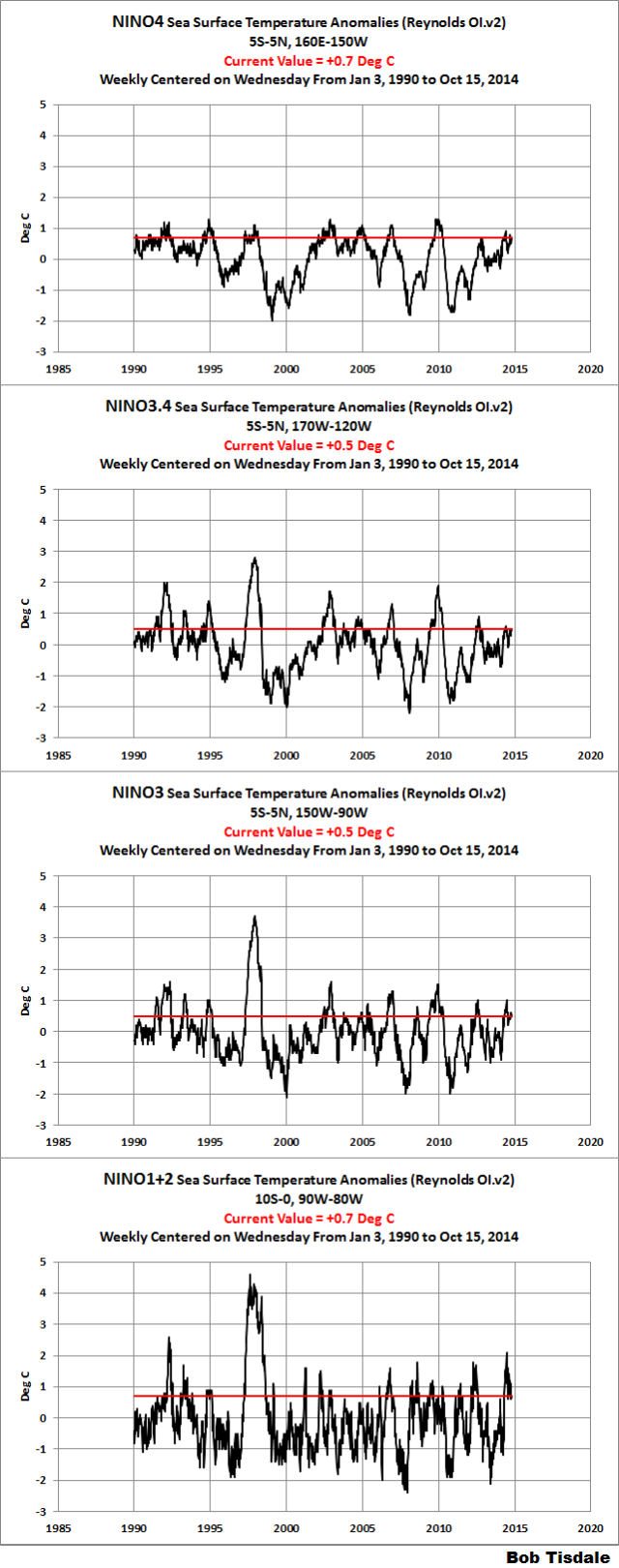
Figure 1
EL NIÑO EVOLUTION COMPARISONS FOR NINO REGION SEA SURFACE TEMPERATURE ANOMALIES
Using weekly sea surface temperature anomalies for the four NINO regions, Figure 2 compares of the evolutions of this El Niño with the 2002/03 and 2009/10 events.
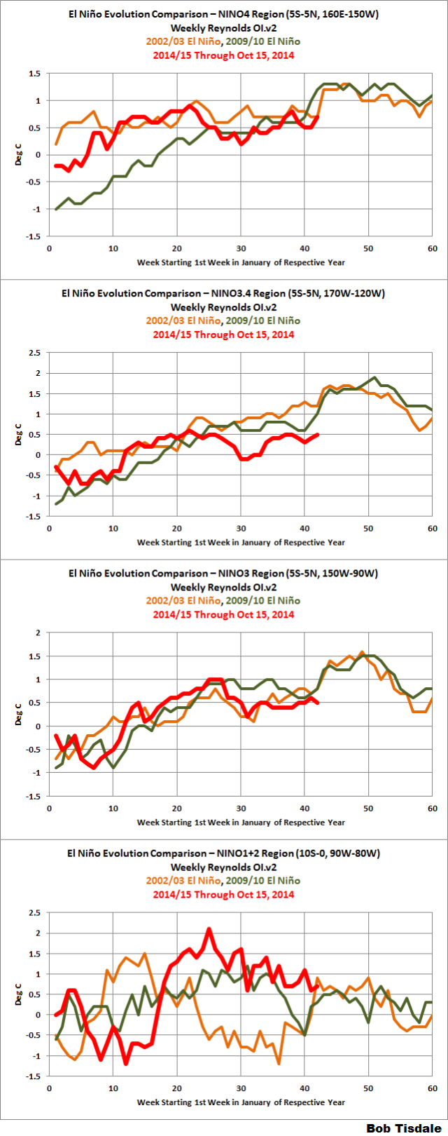
Figure 2
DON’T FORGET THE SOUTHERN OSCILLATION INDEX
The BOM Recent (preliminary) Southern Oscillation Index (SOI) values webpage shows the 30-day running-average of the SOI in ENSO-neutral conditions. However, the last few days are showing large excursions into El Niño territory. Is that evidence of westerly wind bursts in the western equatorial Pacific, or just off-equatorial weather noise?
Every week that goes by without a westerly wind burst along the equator in the western Pacific hurts the chances for an El Niño.
That’s all, folks.
Bob,
Informative as always. Thanks. I was wondering what you make of the huge region of very cold water in the northern Pacific that seems to have replaced the very warm water that was there all summer?
http://weather.unisys.com/surface/sfc_daily.php?plot=ssa&inv=0&t=cur
I don’t recall seeing that much cold water (and that cold either). Will that possibly have any effect on California’s weather (like bring them some rain)?
Still time for a Modoki ?
That sounds kinda dirty…
This is a warning: California is a desert. Always was. Time for all those folks to finally flee to where there actually is water. …and quit taking water from the Colorado river to water plants that should never have been planted in a desert.
It is not just people. We use 20% less water per capita than 20 years ago, but instead of water authorities figuring they should hold back some water because we are now all constantly conserving, the immediately permits for the surplus.
Now we can’t save more. We already have the low flow showers and toilets and clothes/dish wash machines, and many have replaced lawns with low water shrubbery or fake grass, so we no longer have the capacity to save more when there is a drought. Can’t just place a brick in the toilet and water less. It is one of the unintended consequences of “well meaning” conservation legislation, and of course poor government water management.
Most of the water saved by domestic conservation means nothing. Domestic water use makes up only five percent of the total nationally. The other ninety-five percent is used by agriculture and industry. All the water efficient home appliances do is increase government control over your life. In many cities, including mine, water has to be pumped into the mains because there is not enough water coming from households to sustain the flow. Those figures are not much different for California, I bet.
Mike,
Plants like sunshine and water.
California has lots of sunshine and not much water.
I live in a place that has lots of water and not enough sunshine.
It is much more practical to bring water to the sunny places than to bring sunshine to the wet places.
Or, we can all squabble over the small fraction of the world’s surface that is ideally suited to agriculture.
Parts of California, particularly southern California, can be classified as desert. Most of the central valley, particularly the northern is not desert, it is grassland. Were it not for the seasonal nature of precipitation it might well be forest. The Sierras are certainly not desert.
California has plenty of water for it’s population, or it’s farming, or it’s endangered species. It just doesn’t have enough water for all three.
California is next to the really big ocean thingy, always will be. Most people in California live near, within 30 miles or so, of the ocean. California is very rich. If it was its own country, it would be one of the richest in the world. It would be technologically and economically feasible to use desalinated water from the ocean thingy for drinking water. The economic feasibility becomes greater if Californians get their priorities straight and stop some of their nutty liberal ideas, and start focusing on what people really need.
Tom Trevor:
Thanks – but “start focusing on what people really need.”
Now, I guess you live near to California, but mebbe not in Ca.
Are you right when you write –
“California is next to the really big ocean thingy”?
Of course you are: – indeed – it’s the biggest ocean thingy we know of . . . . . . .
And yet the power-to-the-Central-Committee mob desire to tell you how you can shower.
For sure Ca. is water deficient (and has been for ever-so-many days . . . . . )- but adaptation is the way. Not the Ministry of Love [and all that ‘1948’ phraseology].
Auto
Mike- In the interest of accuracy, CA is not a desert, parts of CA are a desert. Northerwestern CA down the coast to around San Luis Obispo get typically get more precipitation (> than 25 cm/year) than is typical for deserts. Include in that the Sierra Nevada mountain range which supplies a good portion of CA with drinking water and hydro electric power. Now if you want to take issue with water use policies in CA that date back to the late 19th and early 20th century please do. There is plenty of fodder for that discussion. Water issues in CA have been a historically huge issue and will be no matter how much precip we get or how many El Ninos favor a “wet” rainy season. However, the water in the Colorado borders 3 states and runs through two others. Where it borders the 3 states is all desert. So your solution of having the people “flee to where there is actually water” seems a bit disingenuous. Where exactly would you have them move? I can, off the top of my head, list several large population centers in other states that aren’t located in places of abundant water, Phoenix for example. Should the people all move as well as they drain the aquifers and rivers from which they get their water?
The Great Lakes, largest fresh water source in the world, it is a shame the weather sux’s there though.
uhhh…yes. they should move.
Why not take water from the Colorado River for agriculture? It will only flow out into the Sea of Cortez if it isn’t used. Of course, currently that doesn’ t happen because what’s left of the river after its used to support U.S. agriculture supports Mexican agriculture, the source of a lot of your fruits and vegetables at certain times of the year. It’s also an important component of the Mexican economy. In the end it either evaporates or winds up in the local aquifer in both countries.
And by the way Mike, more of your food than you apparently realize comes from the Southwest. You would probably be the first to squawk at the shortages and high prices of the fruit, vegetables, and nuts that come from that region if agriculture was closed down. There is a stupid possibility that this may happen in California anyway because there is no proper conservation plan in place for Southern California. You will be amazed at what that will do to fruit and vegetable prices.
There is no water flowing into the Sea of Cortez! Just over the US border in Mexico is one of Mexico’s largest dams. The Morelos Dam impounds the entirety of the Colorado River that reaches Mexico.
http://en.wikipedia.org/wiki/Morelos_Dam
Almost all of the impounded water is routed into irrigation canals {at least 8 canals} that water farm land in Northern Mexico. This region is as developed as the California Imperial Valley producing fresh vegetables for Mexico and the US.
So, to put it simply: El Nino is El No-Show.
so I know far less about El Nino/La Nina/PDO… what I really would love for someone to explain to me is how this impact weather/rain/temp in TEXAS…. cuz thats really the thing that matters to my narcissistic internet avatar….
http://www.cpc.ncep.noaa.gov/products/analysis_monitoring/ensostuff/states/tx.disc.html
Look here:
http://www.cpc.ncep.noaa.gov/products/analysis_monitoring/ensostuff/states/tx.disc.html
El Nino or not: Was it or was it not the hottest september (global sea and land) in history?
It was not…
I forgot… NOAA is foremost among the socialist conspirators that lie about the temperature in order to pollute Americans’ precious bodily fluids.
No doubt part of that huge right wing conspiracy of the Koch funded denial machine to hide that we’re all conspiracy theorists. Who hacked the climategate files. And sent Peter Gleick fake but accurate memos in his writing style.
Pali try the Orange Kool Aide.
GISS has September as the warmest. RSS has it in 13th place.
It was on the BBC news today that this September was the hottest September on record. It was also suggested that this year will be the hottest on record, and that global warming is accelerating.
Surely, a renowned and respected institution such as the BBC can’t be wrong? (Sarc/)
Wait a few years and GISS will adjust back down again so that they can have new “record” high temperatures. It’s a game that can be played almost indefinitely while temperatures are going nowhere.
@richard verney
‘The Science is Settled’
The BBC is error-free, a bit like the better Popes [but eternally so, I understand].
Watermelons @ bbc seem to be doing well with the increase in CO2 [now about four pats in ten-thousand, I hear].
Auto
paRts
Spell check have I one – it sits on my pea-cee – it giveth for mi revue. . . .
Sorry
Auto
RSS like other satellites measures mainly the troposphere. GISS collects the data from the surface, where it has direct impact on ecology. That is an important difference.
Complaining that the data are cooked as some people do, is just plain childish.
Paai
Interesting question. I guess it all depends on which historical temperature trend you look at. If you look at the satellite data, September was not remarkable. The NCDC and GISS show it at the high end of the range it has been in for the last 18 years.
As far as the hottest in history, Our history is quite short. Say from the late 19th century or so. Within that range, the question is the 1930’s. Both the NCDC and the GISS people have be systematically reducing the anomalies between 1980 and 1940. The example given at http://www.climate4you.com/ is the difference in anomalies between January 1915 and January 2000. The NCDC, back in May of 2008, showed a difference in the anomalies of 0.39C. In October 2014 this difference in anomalies grew to 0.51C. This was not cherry picking of the data. By picking different dates, the change could have been much greater.
Similar adjustments have been made by GISS.
Maybe, these adjustments are valid. Maybe they are not. It cannot be determined because neither NCDC nor GISS publish the basis for their adjustments.
” GISS [doesnt] publish the basis for their adjustments.
1. Yes they do.
2. The adjustment is for UHI and it has almost zero effect.
I wish that people would get this, since we clamoroed for and got the FRICKIN CODE!
1. Giss IMPORT data from GHCN and USHCN and SCAR.
2. They dont homogenize or adjust this data.
3. The method they use for combining stations ( the reference station method ) is sensitive
to changes in the underlying data, and is sensitive to new data being added.
4. The ONE adjustment they do do is for UHI. It has no effect to speak of.
Its pretty simple. To estimate the past GISS read in GHCN and USHCN and SCAR data.
When these data sources change, the GISS answer changes. Auto frickin matically..
Next, to do their estimate GISS “stitch” stations to get to create “long records” That
means stations that are close together get stitched into one record.
steve mcintyre
http://climateaudit.org/2008/06/28/hansens-reference-method-in-a-statistical-context/
“Hansen’s “recipe” for his reference period is to start with the longest series, then arrange the other series in descending length. For the second series, in the overlap period where both series have values, he calculates the average difference by month in the overlap period, which is called “bias”. The “bias” is subtracted from the second series and a weighted average of the two series is made according to their weights (the distance from the gridcell center), using whatever values are available. This process is repeated and then the final series is converted to an anomaly centered on 1951-1980.”
Now read that.. Now consider what happens when ‘the longest series’ stops reporting. When a series that used to be the longest series stops reporting, then the stations get combined in a different order and your estimate of the past will change.
Then note, that RomanM and JeffId and tamino actually worked on this problem with Hansens method
and fixed it.
in short, GISS changes to “the past” result from
1. Changes in the input streams they CONSUME. other guys change the data.
2. The effects of the algorithm used. The algorithms combining logic is sensitive
to the choice of “longest station”
@Steven Mosher October 22, 2014 at 10:42 am; “the GISS answer changes. Auto frickin matically..”, yes and Auto frickin matically tha past gets colder !!
“Its pretty simple. To estimate the past GISS read in GHCN and USHCN and SCAR data.”
=========================================
USHCN raw, tracks the satellite data far better then the adjusted surface record. GISS is diverging from the satellite record more then it ever has. GISS in-fills large areas. It is simply true that sometimes this in-filling process is from stations up to 1200 k away. The satellite troposphere data is very often reflected at the surface as well. Recently both central Africa and many parts surrounding Antarctica were in-filled red, by GISS, a strong red, unusually warm. However RSS showed both areas blue, and the SSTs surrounding Antarctica where GISS showed red, were blue as well.
I have on multiple occasions asked Mr. Mosher to please stop for a moment from trying to justify the entire surface data set, which is complicated and hard to explain, and to just explain ONE station, here. http://stevengoddard.wordpress.com/2014/03/01/spectacular-data-tampering-from-giss-in-iceland/
No matter what Mosher claims, NOAA/NASA adjusts the data.
http://stevengoddard.wordpress.com/2014/10/22/ncdc-setting-a-new-record-for-data-fabrication-in-2014/
“Not only does NCDC massively tamper with the measured data, but then they spread their UHI/Homogenization corrupted data around to non-existent thermometer readings. nearly 30% of all reported USHCN data is now imaginary”
In support of my RSS and GISS Africa and Antarctica statements
http://stevengoddard.wordpress.com/2014/09/18/out-of-africa/
Not only does GISS adjust stations, like the Iceland example, the adjust the already adjusted from the sources Mosher mentioned. By changing what stations are used, by writing a very complicated homogenization and in-filling program, by very questionable UHI adjustments, you end up with a surface station record that is FUBAR, and the past is lost, most of the stations used have changed, the station setting is likewise poor, the in-filled areas vary, the past constantly changes long after the initial TOB adjustment (which is itself debatable). The end result is twofold. consistently the past gets cooler, the present warmer, and the surface record is departing from satellite readings at .2 degrees over the past five years, while the raw readings consistently track the satellites. The “warmest year ever” happens when the Arctic ice is recovering and Antarctica is setting records, (Global sea ice has been consistently above average) and the great lakes are 6 degrees below normal.
If you look at this through the end of 2013
http://www.science20.com/sites/all/modules/author_gallery/uploads/1900680434-global.png
You can see Max temp anomaly as measured at surface stations hasn’t changed much at all since the 40’s. “Climate Change” is really changes in regional Min Temp, which I currently believe is due to Ocean SST’s changing regionally, then influencing the land masses that are down wind. Nothing more. There hasn’t been any Co2 warming. GISS, CRU, BEST lie to you, lie to everyone because they use average temps, which BTW are calculated from Min and Max temps.
I mean, what kind of funding would they get for AGW if they showed everyone that max temps haven’t changed for 75 years?
BTW, this is for 95 million station sample from around the world.
Yup. I have only looked at a few dozen stations in Canada and my conclusion is the same. Add precipitation and you see a similar connection to the Pacific Ocean, at least in Western Canada; along with a big influence from the Arctic.
Mi Cro, can you tell me where you got this graph please? Amazing graph!
I created it from the NCDC Global Summary of Days data set.
paai, sea surface temperatures were recently at record highs. I explained the reasons for this a while back:
http://bobtisdale.wordpress.com/2014/08/16/on-the-recent-record-high-global-sea-surface-temperatures-the-wheres-and-whys/
Bob, it has changed like I have never seen before. The first poster asked…”Bob,
Informative as always. Thanks. I was wondering what you make of the huge region of very cold water in the northern Pacific that seems to have replaced the very warm water that was there all summer?
http://weather.unisys.com/surface/sfc_daily.php?plot=ssa&inv=0&t=cur
I don’t recall seeing that much cold water (and that cold either). Will that possibly have any effect on California’s weather (like bring them some rain)?”
======================
I also would love to hear your comments on this.
As I have been maintaining all year, the next El Nino is anticipated to begin next autumn for Australia, and not before. The BoM was always going to be a year out. The east of Australia will go into dry conditions after mid March and very dry conditions after mid June. I make the argument that there is nothing happening now with SSTs that can be used to calculate this. Rather, the cycle of lunar declination in synch with the solar peak is the key to unlocking the SOI. I described it for Yahoo in March: https://nz.news.yahoo.com/opinion/post/-/blog/24748068/dancing-with-the-stars/
Thanks for the link. Completely heretical of course. But great stuff.
Your comparison charts (except for NINO 1+2 region) look like the next 2-4 weeks should show an upward trend if there is to be an El Nino event this time.
It is time to stop complaining “helplessly” about drought anywhere. Humans have the technology to desalinate, store, transport water to wherever it is needed. So what if California is “a desert”. The entire western border is coastline. (Carlsbad is getting smart.) The same should be said for floods; they are more difficult for humans to manage, but much can be done, especially where humans choose to build. So much more needs to be said in terms of facing drought, but we need to get up off our duffs (and quit squandering taxpayer funds) and build for productivity and prosperity at the same time we care for the environment in which we live. We “care” more than Mother Nature does, that’s for sure.
That is all very true but will require a serious outbreak of sanity which I doubt will happen. 🙁
http://weather.unisys.com/surface/sfc_daily.php?plot=ssa&inv=0&t=cur
Bob in your opinion is this map correct? It is such a drastic change for sea surface temperatures. Thanks
The likely physical reason for the cooling of the high latitude ocean and the inhibiting of El Niño events is the solar magnetic cycle changes. There are peer reviewed papers that develop/explain the mechanisms and find correlation of the solar magnetic cycle changes with planetary climate. If I understand the mechanisms and what is happening to the sun we are going to experience significant cooling of high latitude regions (Dansgaard-Oeschger cooling cycle).
The high latitude regions where the ocean surface temperature cooling is occurring are the same regions of the planet that are most strongly affected by the increase in galactic cosmic rays/cosmic ray flux (GCR/CRF, are mostly high speed protons that strike the earth’s atmosphere creating ions) which is occurring due to the sudden change in the solar magnetic cycle and due to the reducing in the electrical wave intensity of the solar wind bursts. As noted below, the solar magnetic cycle changes also affects cloud properties in the tropics which in turn affects can inhibit or amplify El Niño events.
http://weather.unisys.com/surface/sfc_daily.php?plot=ssa&inv=0&t=cur
This graph shows neutron detection (the amount of neutrons detected is proportional to GCR/CRF see comments for explanation of terminology and a Coles note summary of the mechanisms) at high latitude northern region. As the graph show GCR/CRF is the highest ever recorded at a solar magnetic cycle peak.
http://cosmicrays.oulu.fi/webform/query.cgi?startday=17&startmonth=07&startyear=1964&starttime=00%3A00&endday=17&endmonth=08&endyear=2014&endtime=00%3A00&resolution=Automatic+choice&picture=on
Comments:
1. The primary cause of ions in the earth’s atmosphere is GCR/CRF. Due to the strength and orientation of the geomagnetic field changes in GCR/CRF have a greater affect the number of ions in the atmosphere for high latitudes of the planet. The intensity of GCR/CRF and velocity of the GCR/CRF is modulated/reduced or increased (partially blocked) by the solar heliosphere (the solar heliosphere is created by the solar wind and pieces of magnetic flux from the sun that extends well past the orbit of Pluto. When the solar magnetic cycle is stronger the solar heliosphere contains more magnetic flux and extends farther in the solar system so it blocks or defects more GCR/CRF.
2. The solar magnetic cycle is currently the weakest in 150 years and declining at the fastest rate in more than 1000 years. GRF/CRF is the highest ever measured during the peak of solar magnetic cycle.
3. The amount of cloud forming ions in the earth’s atmosphere are also affected by solar wind bursts by a mechanism that the specialists refer to a electroscavenging. Solar wind bursts create a space charge differential in the ionosphere which creates a potential difference from the earth’s high latitude region to the earth’s equator. This potential difference removes charge from the high latitude regions and increase charge at the earth’s equator. (The return path for the electric current is the ocean.) Less ions in the high latitude regions reduces the amount of cloud in that region. The increased charge movement in the tropical region results in more effect/shorter time periods for cumulus nimbus clouds. The effect of single large solar wind burst last for a couple of weeks. This affect on tropical cloud properties appears to be a factor in the magnitude and frequency of El Niño events. The solar wind bursts/electroscavening mechanism confuses the does and how does the solar magnetic cycle change affect the earth’s climate analysis, as the primary cause and most powerful solar wind bursts are created by coronal holes which can and have occurred very, very late in the solar cycle. The coronal hole wind bursts (as they have occurred when there are few sunspots on the sun make it appear that solar magnetic cycle changes do not modulate planetary cloud cover. This is a particular problem as the affect of a single solar wind burst lasts for about two weeks. The coronal holes are also very, very long lasting. So the same coronal hole will create a solar wind bursts multiple times as the sun revolves. What causes coronal holes is curiously not known. The coronal holes move about the sun changing latitude. When the coronal holes are at high latitudes on the sun or at a polar location the wind bursts do not directly affect the earth.
4. Lastly, this is a complicated and interesting story. The solar wind density has for some unexplained reason reduced in density by 40% (announced at the AGU meeting fall of 2013). Due the reduction in the solar wind density, solar wind bursts charge strength/differential has dropped by a factor of two. i.e. How much the solar wind burst affects the high latitude cloud formation and tropical cloud properties is dependent on the both the speed change of the solar wind burst and the density of the solar heliosphere. The reduction in the intensity of the solar wind burst wave would help to explain what is inhibiting El Niño events.
Salvatore: Just seen that linked from Steve Goddard who’s linked from Unysis. Is it genuine are we all misreading the damn thing as other maps show nothing like as dramatic.
http://www.eldersweather.com.au/climimage.jsp?i=sstag
Isn’t as ‘dramatic’ because of the color scheme used. They use white & light yellow
NOAA server isn’t responding. But I think it’s also a ‘color’ mapping issue.
Salvatore, here is a link to a motion graphic of those changes, and they are, from my personal perspective, unprecedented. http://stevengoddard.wordpress.com/2014/10/22/sea-surface-temperatures-in-the-northern-hemisphere-are-plummeting/
I will comment that the North Pacific hot spot has experienced a recent series of low pressure systems, which could explain some of the changes. I also think that some former tropical systems and hurricanes in the Atlantic moved through those now cold regions. ?? I guess RSS will reflect how accurate these changes are.
http://www.esrl.noaa.gov/psd/map/images/reanalysis/aam_total/gltotaam.sig.90day.png
Bob, one more question if I may ,how much of a factor do you consider AM as far as an indicator for the chances for an El Nino ?
Salvatore Del Prete, sorry. I’ve never studied angular momentum data.
Bob, isn’t Christmas typically around the time El Nino can amplify?
Beng, Christmas is typically the time El Ninos reach their peak intensity.
Is this a mistake?
http://weather.unisys.com/surface/sfc_daily.php?plot=ssa&inv=0&t=cur
Surely this overrides ANYTHING about climate at the moment. Never seen this at BOTH hemispheres. Would apprecaite its verification.
Not as far as I know. That has been developing for a good month or more.
What do the color ranges mean on Unisys charts? Are the fuchsia colors hot or cold? The color legend is nutz.
Actually the answer is ‘both’. But Unisys also shows the actual anomaly in the color schemes that are duplicates to avoid confusion. For instance, in the purple/red area in the middle of the North Pacific ocean it shows a -6.5+ temp so you know it isn’t ‘hot’ there.
When you see these kinds of ‘extreme’ anomalies I, out of an abundance of caution, assume ‘software issue’ rather than ‘it’s accurate’ until I see evidence that that is not correct.
Eliz, I no longer have access to weekly Reynolds OI.v2 sea surface temperature data. But the weekly NOAA maps do not appear as extreme:
http://www.emc.ncep.noaa.gov/research/cmb/sst_analysis/images/archive/weekly_anomaly/
The mistake is the color scheme: Just one color can represent -5.5, -17.5, +6.5, and +18.5. That is not only a mistake, but it’s nuts and highly confusing. A better color scale is this, warm colors for warm and cool colors for cool:
http://www.esrl.noaa.gov/psd/map/images/sst/sst.daily.anom.gif
More charts …
Troup’s SOI
Pressures
Indices Comparison
Click on image in browser to expand. Looking at GFS a few days out via nullschool, recently flipped pressure gradient seems to persist. Question is will it blend?
http://weather.gc.ca/saisons/sea-snow_e.html
This is what I think is more correct when it comes to sea surface temperatures. Notice this map also gives present snow coverage.
Unisys SST Anomaly Maps
Posted on 2014/10/22 at 3:28 PM UTC
Unisys Weather has been receiving reports of incorrect maps of the daily SST contours. The data used to make the maps are the official NOAA RTG-SST and anomaly grids, being pulled directly from the NOAA NWSTG.
We have found an issue with the color scale of the mapping, and this has caused some users to misinterpret the maps. The color scale being used by WXP is wrapping, causing the same color to appear at very low and very high ends of the color table. The color table is also stretched beyond the actual values in the SST anomaly plot. We are working to correct the color table and color bar issue.
A comparison of the Unisys generated map with the NOAA RTG-SST anomaly maps indicate the contours are in line with NOAA’s maps.
http://weather.unisys.com/surface/sst.gif
Hard to say. I know that Unisys had to change their software because NOAA stopped publishing the data source they used to create the maps (you’ll remember Unisys was ‘offline’ for a few weeks. it may be a software issue or it could be that the new NOAA source allows them to be more accurate. Don’t know. I suspect the former however until I see evidence otherwise.
Is this SST anomaly map
http://www1.ncdc.noaa.gov/pub/data/oisst/navy-anom-bb.gif
And this one
http://weather.unisys.com/surface/sst_anom_new.gif
generated from the same planet?
Note – the UNISYS map above does not use colour wrapping.
I queried Unisys and this is the response (Alos, thanks to the UNISYS folks for responding so quickly)
Hi Bill,
Thank you for your email. We’ve been looking into this but so far we have found that the actual contours in the map are correct, it’s the color bar that is causing users to misinterpret the maps. We are trying to adjust the color bar at the bottom to restrict it to +/- 10 deg C. Right now, it’s “stretched” between around -20 to +25 deg C, we believe it’s due to anomalous grid points (The plotting software dynamically adjusts the color bar based on the min and max valued in the grid).
In addition, the color enhancement is too compressed and wrapping, causing similar colors to be associated with bad values. For example, the “high” value in the Pacific off the west coast of South America is 2.84 deg C. If one looks at the yellow part of the color bar, it shows the same color as -20.5, -9, 2.84 (the correct value), and 15.5. We are trying to fix that as well.
We’ve been comparing the Unisys map with NOAA (http://polar.ncep.noaa.gov/sst/rtg_high_res/color_newdisp_anomaly_global_lat_lon_ophi0.png ) and found that the plots are in line, visually (can’t get pixel values from GIF or PNG images to be sure)
Hope this helps, and we are working to correct the color bar issues.
Thanks,
-Brian Hughes
Unisys Weather
Unisys plot:
Blue around red tones — cool
Yellow around red tones — warm
heh. Sounds like your trying to tell the difference between a king snake and a coral snake.
Someone posted a loop of this map starting several months ago. It has the stretched color scale. It steps along rapidly. I noted that the color scale changes daily (?) as indicated by (The plotting software dynamically adjusts the color bar based on the min and max valued in the grid).[Brian Hughes; in comment by dccowboy at 12:01 pm]
Mentioning “stretched” introduces the high latitude exaggeration of the map projection. For this sort of information an “equal area” projection ought to be used.
Despite the above info. in the above post UNISYS map for sea surface temp. anomaly is different from other maps showing much colder conditions especially in the North Atlantic and around Alaska .
To which compares the average? See the real temperature.
I’ve lived in Northern California for a long time and vividly remember the 1982-83 and 1998 big El Niños. This is not the kind of winter we really want. Strong El Niños produce floods and lots of storms with destructive high winds. What we need is a few winters in a row with average rainfall. We don’t have to have El Niño conditions to get this. The 2010-11 rainfall year was 150% of average and was a La Niña year.
The 1976-77 drought was almost as bad as the current drought. News stories abounded with predictions that it would take 10 years of average rainfall to recover from the drought. On January 1, 1978 it started raining and it rained for 31 days straight. After that the reservoirs were full and the drought stories disappeared.
I’m hoping that we can manage an average rainfall year.
Bob,
The latest NOAA ENSO update says:
“ENSO Alert System Status: El Niño Watch
ENSO-neutral conditions continue.*
Positive equatorial sea surface temperature (SST) anomalies continue across most of the Pacific Ocean.
El Niño is favored to begin in the next 1-2 months and last into the Northern Hemisphere spring 2015.*”
NOAA/CPC has been pitching that lure for about 10 months. So far …nothing.
Chances are Northern California will not experience an El Nino winter this rain season. Northern California suffered through a 7 year drought back in the 1990s or earlier. I just remember it being dry for a long time.
Carlsbad is definitely on the cutting edge of harvesting water from that big neighboring ocean thingie. Too bad others along the coast aren’t so enlightened.
Northern California may not be a desert but over the last fifty or so years I have watched the encroaching of tumbleweeds along its highways. Some things change.
Just checking the average rainfall for Los Angeles, CA:
The 5 months from May to Sept added together average only 0.43 inches of precipitation.
Just the month of Feb averages 3.92 inches.
The 5 months from Nov to March added together average 12.84 inches of precipitation.
Be patient…
Forgot to include this ref.:
http://www.weather.com/weather/wxclimatology/monthly/USCA0638
How about this:
1) Large Solar output like in the 1960s warmed the oceans causing the El Niño s.
2) Small Solar output like in 2014 does not warm the oceans therefore no El Niño s.
That is wrong. The 60s cooling was a result of the PDO flip in the 50s with the AMO flipping in the 60s, This is a product of the MOC, which Gray has researched exhaustively and commented on. Contrary to your assertion There has been an el nino within a 198 months of the solar min since the 50s. Its opposite of your contention for . Reduction of the incoming radiation over the tropics causes the easteriles to slow and leads to warming for at time. There have been el ninos in 57-58,65-66,76-77,78, 86-88, 97-98, 09-10 an amazing average very close to the time of the solar mins.. Not precise, but enough to refute the idea that the smaller solar output now is going to stop an enso event that we have outlined for you since April, and is coming
The reason there are bounceback enso events after tropical volcanoes has linkage to reduction of radiation over the tropical pacific
You should take a look at when the enso events have occured. While all enso events certainly do not respond to the sun, the fact is that we have had all the decades since the 1950s have enso events very close to the time of the solar min.
Joseph Bastardi commented
And it looks like there are blips in Max temp anomaly for each of these in the South American stations.
http://www.science20.com/files/images/sa.png
THE LINE SHOULD BE 18 MONTHS, NOT 198 MONTHS MY EYESIGHT STINKS
Joseph B,
Weren’t you given fair warning when you were a teenager?
I didn’t pay attention either, and now I have to wear glasses.