NOAA’s State of the Climate Report for June 2014 included the bullet point under global highlights (my boldface):
For the ocean, the June global sea surface temperature was 0.64°C (1.15°F) above the 20th century average of 16.4°C (61.5°F), the highest for June on record and the highest departure from average for any month.
Yikes, it sounds as though it’s a manmade global warming problem. But we know that’s not true because climate models doubled the warming rate of global sea surface temperatures for the past 3+ decades. So even record highs are much better than the temperatures anticipated by the latest and greatest climate models. As an advanced warning, NOAA will be making a similar statement for July 2014. 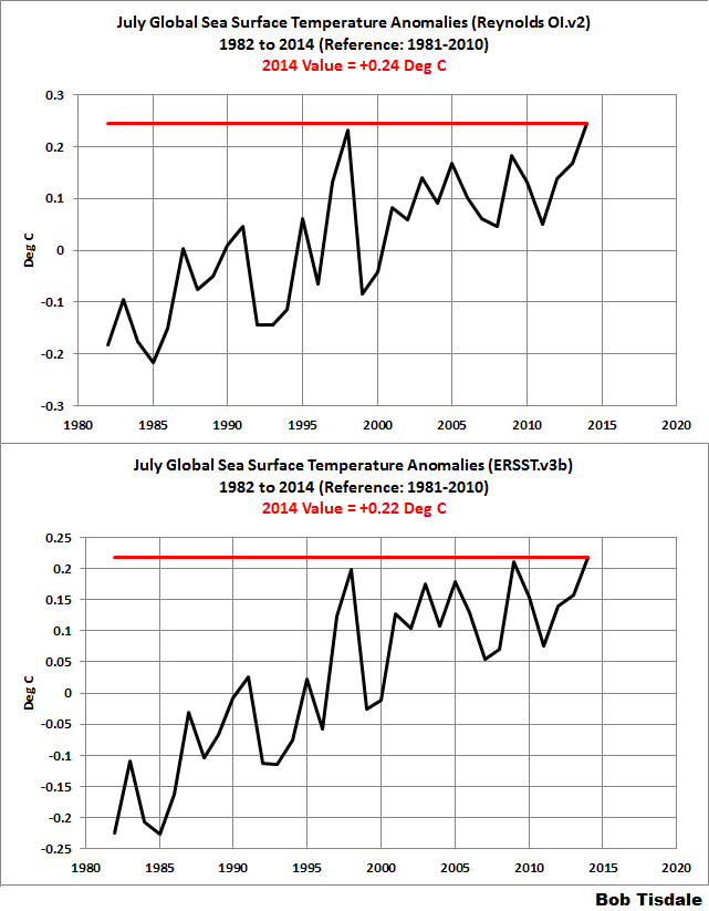 See the graphs to the right. (Click for full size.) The red horizontal lines are the July 2014 values. NOAA bases their discussions on the ERSST.v3b-based data (bottom graph). The satellite-enhanced Reynolds OI.v2 dataset (top graph) serves as a reference. Yup, it’s true. July 2014 global sea surface temperatures are the warmest on record, too.
In this post, we’ll present which ocean basin is showing the elevated sea surface temperature anomalies, and where they’re showing it, and provide what will likely be eventually reported as the reasons for those warm temperatures: strong trade winds and persistent high sea level pressures over eastern Siberia and Alaska.
A QUICK LOOK AT THE TWO NOAA GLOBAL SEA SURFACE TEMPERATURE ANOMALY DATASETS DURING THE SATELLITE ERA
Figure 2 presents the monthly global sea surface temperature anomalies for the period of November 1981 to July 2014. The top graph shows the NOAA Reynolds OI.v2 data, which, as noted above, is a satellite-enhanced dataset. The bottom graph is the NOAA ERSST.v3b data, which NOAA uses in its global land+ocean temperature dataset. ERSST.v3b is a statistically infilled sea surface temperature dataset. Anomalies are referenced to the WMO-preferred period of 1981-2010. The Reynolds OI.v2 and ERSST.v3b data are showing close to all-time-high values recently.
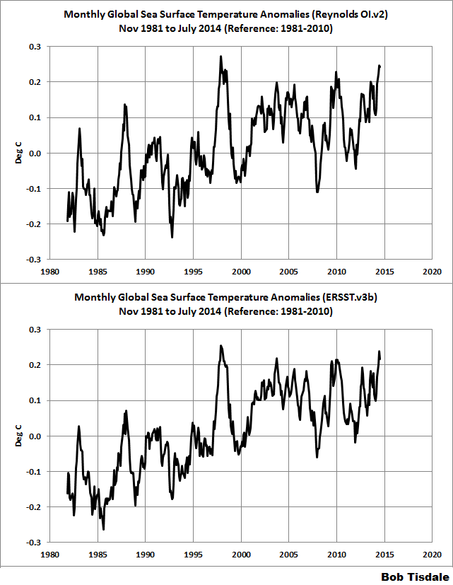
Figure 2
Before we move on to illustrating where and why the sea surface temperatures are elevated, there are a few things to discuss.
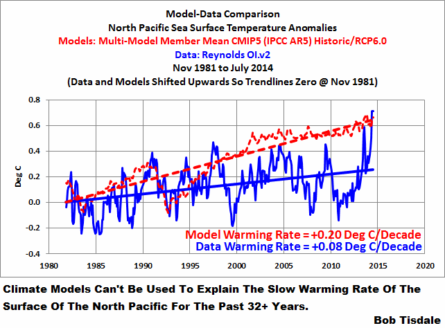
CLIMATE MODELS CANNOT SIMULATE SEA SURFACE TEMPERATURES
It must be kept in mind throughout this post that the climate models used by the IPCC for their 5th Assessment Report basically doubled the observed warming rate of the surfaces of the global oceans. Doubled.

Figure 3
In other words, the model mean represents the central tendency of how the climate science community thinks the oceans should have warmed if they were warmed by manmade greenhouse gases, and, in the real world, the oceans only warmed at half that rate for the past 32+ years. Or to phrase it a little differently, in the models, the warming of the surface of the oceans is forced by manmade greenhouse gases, but in the real world, the ocean surfaces are obviously not as sensitive to manmade greenhouse gases as the climate science community assumes.
Now consider that the data existed before the climate simulations were run. So modelers knew in advance the warming rate of the ocean surfaces for the most of that period. That is, most of simulations from 1981 to present are hindcasts, not forecasts. The modelers knew the answers they were looking for, and somehow doubling the observed warming rate of the surfaces of the global oceans (70% of Earth’s surface) over the past 32 years was the best the modelers could do. That’s climate science in a nutshell.
THE NORTH PACIFIC IS CREATING RESPONSIBLE FOR THE HIGH GLOBAL SEA SURFACE TEMPERATURES
If you were to scroll through all the ocean basins presented in the July sea surface temperature update, you’d find that only the North Pacific has shown exceptional warming over the past year or so. But that one ocean basin has had a major impact on sea surface temperatures for the entire Pacific basin and the Northern Hemisphere, both of which are showing record highs recently. In turn, global sea surface temperatures are at record highs.
The North Pacific sea surface temperature anomalies during the satellite era, along with the July 2014 value, are shown in Figure 4.

Figure 4
According to the NOAA webpage here, the North Pacific covers about 21% of the surface of the global oceans, or about 77 million sq. km. To put that into perspective, the North Pacific covers almost as much of the globe as Asia, Europe and North America combined (78.5 million sq. km.), so the North Pacific is a chunk of real estate.
Notice in Figure 4 how unusual that warming in 2013 and 2014 appears.
BEFORE 2013, THE SURFACE OF THE NORTH PACIFIC HAD NOT WARMED FOR 24 YEARS
To illustrate how unusual that recent warming is, I determine how far back in time from December 2012 we could go without showing any appreciable warming in the sea surface temperature data of the North Pacific. See Figure 5. The sea surface temperature anomalies of the North Pacific showed basically no warming from January 1989 to December 2012. That 2 ½ decade lack of warming is quite remarkable in a world where greenhouse gases are supposed to be warming the surfaces of the oceans.

Figure 5
LET’S DIVIDE THE NORTH PACIFIC INTO FOUR REGIONS
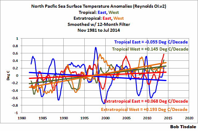
To help present where the North Pacific has warmed, we’ll divide its data into four subsets, separating the tropics from the extratropics and dividing the data east and west at the dateline. See the map in Figure 6.
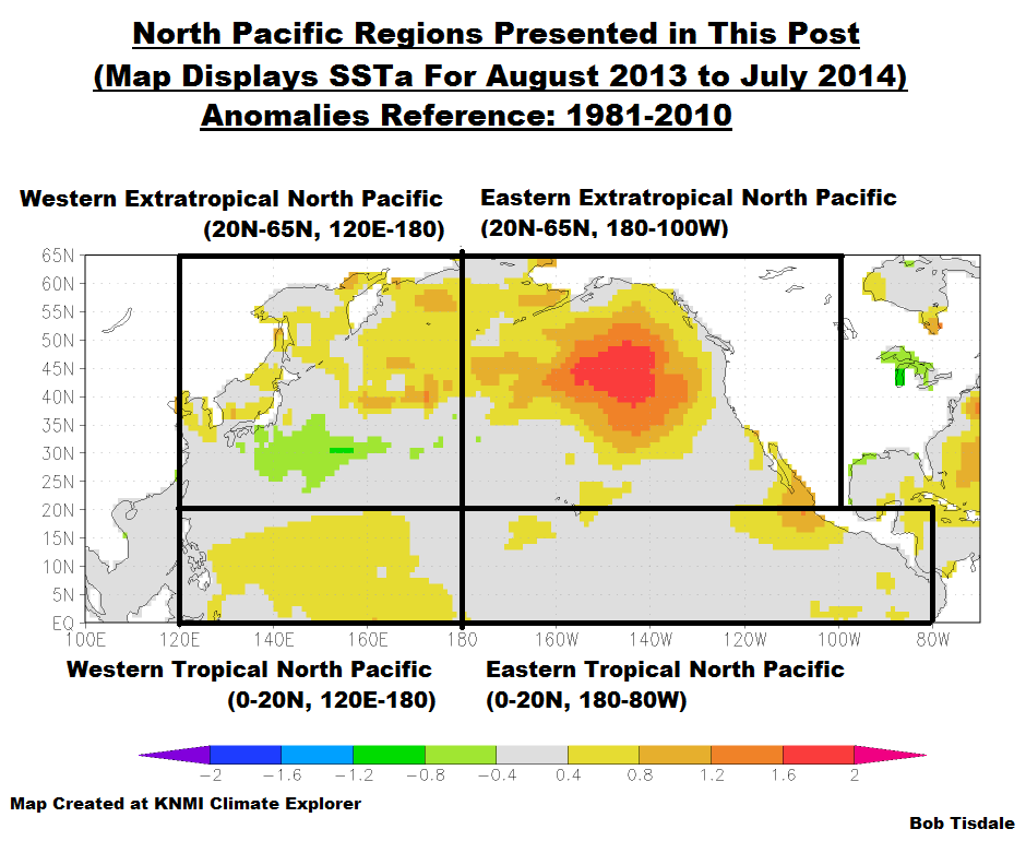
Figure 6
The map also presents the sea surface temperature anomalies for the year of August 2013 to July 2014, referenced to the period of 1981 to 2010. Of the four regions, the eastern extratropical Pacific had the highest anomalies, while the eastern tropical Pacific had the lowest. The two western regions both show elevated sea surface temperatures over the past year, but a region of cooler-than-normal sea surfaces offsets some of the warmth in the western extratropics of the North Pacific.
Let’s look at the sea surface temperature data for the four subsets
, starting with the region with cooling over the past 3+ decades, the…
EASTERN TROPICAL NORTH PACIFIC
Figure 7 presents the sea surface temperature anomalies during the satellite era for the eastern tropical North Pacific (0-20N, 180-80W). Also shown is the cooling rate. The cooling of course was caused by a shift from El Niño dominance to La Niña dominance.

Figure 7
The warming in recent months is higher than we’d expect from the weak off-season El Niño conditions we’ve recently experienced.
WESTERN EXTRATROPICAL NORTH PACIFIC
We’re discussing the northwest subset of the North Pacific under this heading. As shown in Figure 8, the sea surfaces of the western extratropical North Pacific (20N-65N, 120E-180) were above average in July 2014, but not exceptionally warm. There was also a spike a year ago, peaking in August 2013. Will that spike repeat itself this year?
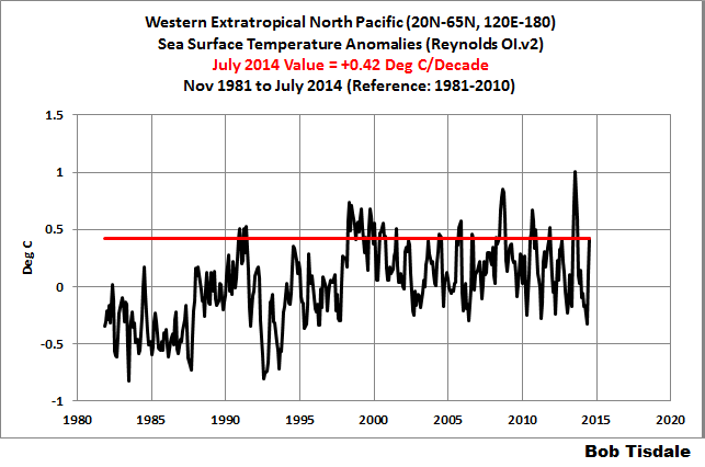
Figure 8
There are very obvious upward shifts in the sea surface temperature anomalies of the western extratropical North Pacific. In Figure 9, I’ve highlighted in red the periods before and after the step-like responses to the 1986/87/88 and 1997/98 El Niño events. Leftover warm water from strong El Niño events (ENSO residuals) make their way into the western extratropical North Pacific during the La Niñas that trail the strong El Niños.

Figure 9
For more than 5 years, we’ve discussed the processes through which strong El Niño events cause upward shifts in surface temperatures of portions of the global oceans. My illustrated essay The “Manmade Global Warming Challenge” (42mb) provides a detailed overview, if that topic is new to you.
Also notice that the surfaces of the western extratropical North Pacific have been cooling since the upward shift in response to the 1997/98 El Niño…even with the spike 2013. Figure 10 confirms that the sea surfaces in the western extratropical North Pacific have cooled since 1998.
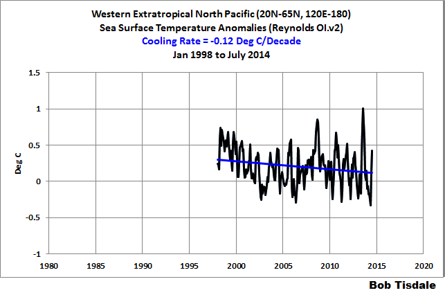
Figure 10
WESTERN TROPICAL NORTH PACIFIC
Now we’ve moved to the western tropical North Pacific (0-20N, 120E-180), Figure 11. Sea surfaces there were much warmer than normal in July 2014 (the red horizontal line), and that’s even after cooling significantly since their peak a month ago in June.
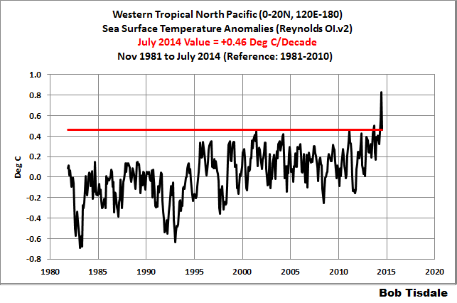
Figure 11
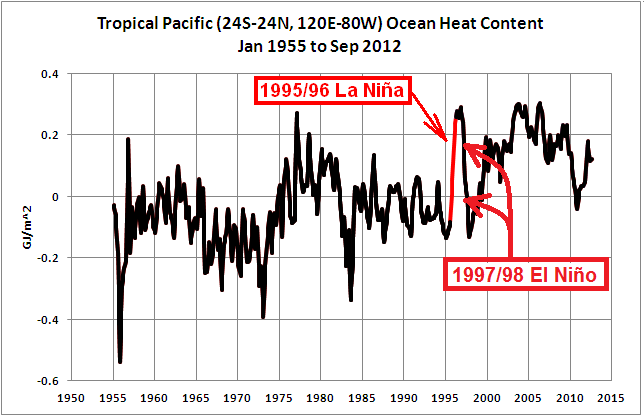
There is also an obvious upward shift in the sea surface temperature anomalies of the western tropical North Pacific. That shift occurred in response to the 1995/96 La Niña. See Figure 12. That’s the same La Niña that caused the upward shift in the ocean heat content of the entire tropical Pacific.

Figure 12
Was there another upward shift in the surface temperatures of the western tropical Pacific in 2013?
EASTERN EXTRATROPICAL NORTH PACIFIC
The last of the regions of the North Pacific, the northeastern one, is where that hotspot resides. The sea surface temperature anomalies of the eastern extratropical North Pacific are shown in Figure 13, with the horizontal red line showing the magnitude of the July 2014 value. It is slightly higher than the June 2014 and August 2004 values.
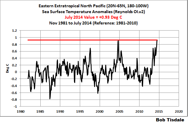
Figure 13
But notice that the surfaces of the eastern extratropical North Pacific cooled from the late 1980s until 2012…and then appear to shift upwards. See Figure 14.
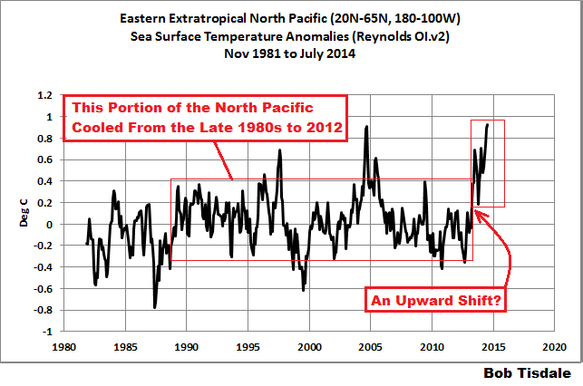
Figure 14
Figure 15 confirms that the sea surfaces of the eastern extratropical North Pacific cooled from the January 1989 until December 2012, and Figure 16 shows that the sea surfaces there show no long-term warming since January 1989, even with apparent upward shift in 2013.
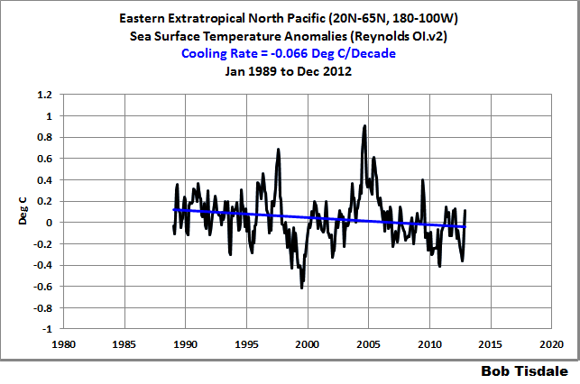
Figure 15
# # #
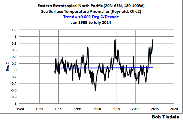
Figure 16
The apparent late 1980s upward shift in the sea surface temperatures of the extratropical North Pacific was discussed in Trenberth and Hurrell (1995) Decadal coupled atmosphere-ocean variations in the North Pacific Ocean. They identified two culprits: a shift in sea level pressure (which alters wind patterns) and the 1986/87/88 El Niño.
SUSPECTED REASONS FOR THE ELEVATED SEA SURFACE TEMPERATURES IN THE NORTH PACIFIC
When the climate science community finally delves into the causes for the elevated sea surface temperatures of the North Pacific, I suspect they’ll present at least two natural causes that have interacted and compounded one another. The shift in surface temperatures in the western tropical Pacific is possibly a response to the sudden strengthening of the trade winds in the eastern tropical Pacific in 2012. See Figure 17. The stronger trade winds, under clearer skies, pushed additional sunlight-warmed water into the western tropical Pacific.
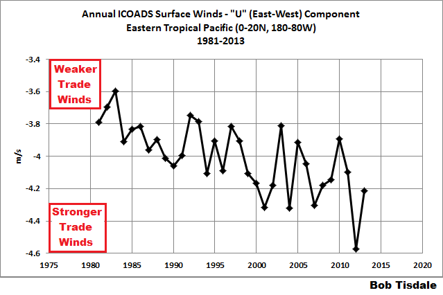
Figure 17
And, of course, there has been a persistent high sea level pressure (north of the eastern extratropical North Pacific) in the Eastern Siberian Peninsula and Alaska, according to the NCAR sea level pressure data, Figure 18. At the KNMI Climate Explorer the dataset is identified as “1899-now: Trenberth’s NH”. The coordinates used for the sea level pressure were 60N-75N, 180-150W.
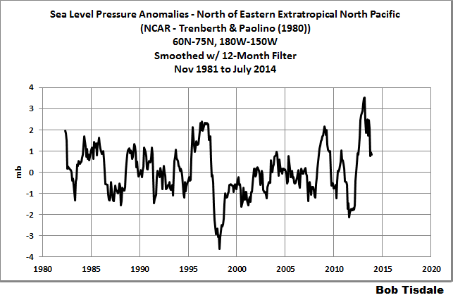
Figure 18
Figure 19 presents a correlation map of the Eastern Siberian Peninsula and Alaska sea level pressures (highlighted on the map) with the sea surface temperatures of the North Pacific, where the sea surface temperature data lag the sea level pressure data by 3 months. So I suspect that hotspot in the North Pacific will be blamed on the sea level pressures in Eastern Siberia and Alaska.

Figure 19
SUBSET TREND COMPARISON
For those interested, the spaghetti graph in Figure 20 compares the warming and cooling rates of the four North Pacific sea surface temperature subsets during the satellite era.

Figure 20
I’ve isolated the individual subsets in Animation 1.
Animation 1
A NOTE ABOUT THE PDO
As you may have noticed, I discussed the warming of the sea surface temperatures of the North Pacific, and the extratropical North Pacific, without once mentioning the Pacific Decadal Oscillation. The JISAO Pacific Decadal Oscillation Index is derived from the sea surface temperatures of the extratropical North Pacific but the PDO Index does not represent the sea surface temperatures of that region. The PDO Index cannot be used to explain the warming of the North Pacific sea surfaces…or global surfaces for that matter. For more on what the PDO does and does not represent, see the post here.
HAS THERE BEEN A CLIMATE SHIFT IN THE PACIFIC?
The 1976 Pacific climate shift preceded a period of strong El Niño events. See Figure 21. In 1976, the sea surface temperatures of the eastern Pacific ocean (about 33% of the surface of the global oceans) shifted upwards by almost 0.25 deg C, according to the NOAA ERSST.v3b dataset. The shift is actually easiest to see with the levels the minimums reached during the La Niña events before and after 1976.
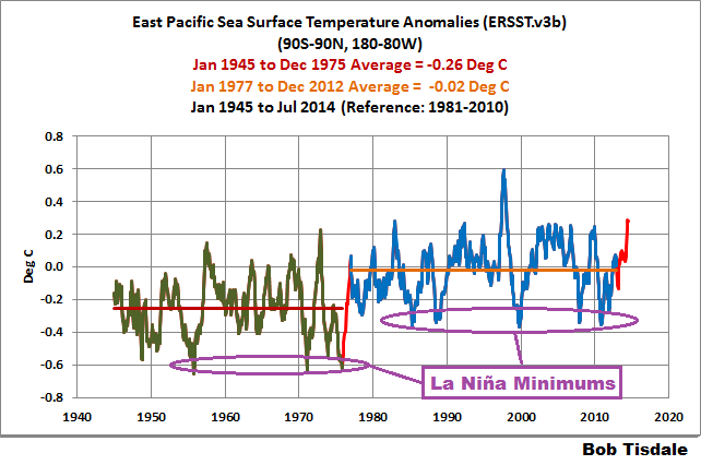
Figure 21
I’ve noted the possible recent shift in a number of graphs in this post. The recent shift also makes its presence known in the sea surface temperature data for the entire tropical Pacific (0-20N, 120E-80W), not just the western portion. Figure 22 shows the satellite-era data for that region until December 2012. Everything looks reasonable. The El Niño and La Niña events are easy to pick out and there has been no long-term warming.
Figure 22
Now, when we add the 2013 and 2014 data to the graph, Figure 23, it looks like there’s a super El Niño taking place now.
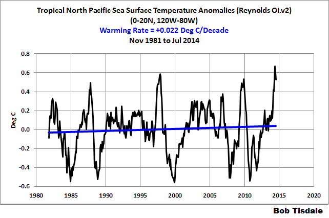
Figure 23
HOW LONG WILL THE HOTSPOT EXIST IN THE EASTERN EXTRATROPICAL NORTH PACIFIC AND WHERE WILL THE WARM WATER GO?
The greatest warming over the past year took place in the eastern extratropical North Pacific. That hotspot in the sea surface temperature anomaly map (Figure 6) stands out. It’s hard to miss. The question now is how long will it persist?
And will the hotspot reemerge again next year? “Reemergence” is a process that causes sea surface temperature anomalies at mid-latitudes from one year to reemerge the next year. See the post here. In the North Pacific, reemergence is believed to occur west of the hotspot in the western extratropical North Pacific. But that hotspot in the eastern extratropical North Pacific is a rarity. So reemergence might be something else to consider.
Ocean currents should eventually carry part of that warm water back to the tropics, warming the California current along the way. Will that warm water influence ENSO when it reaches the tropics?
My Figure 24 is page 26 from the NOAA weekly ENSO update for August 11, 2014. (Click on it for full-sized illustration.) The hotspot can be seen at the top of the Aug-Sep-Oct map, but it disappears by Oct-Nov-Dec, and by next year, they’re showing cooling where the hotspot now resides.
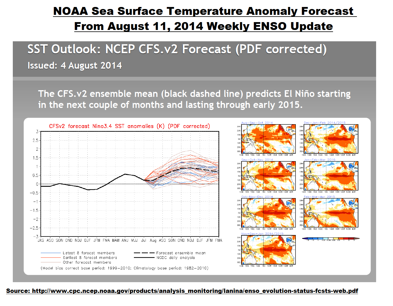
Figure 24
CLOSING
I’ve shown throughout this post that the sea surface temperatures of the North Pacific warm in shifts, the results of naturally occurring processes: ENSO and variations in sea level pressure. Not too surprisingly, those are processes climate models still cannot simulate to this day. Climate models will one day be a valuable resource, but we’ll have to wait until modelers can simulate naturally occurring, sunlight-fueled, coupled ocean-atmosphere processes that can cause warming of sea surfaces and the oceans to depth. We may be in for a long wait.
With the unusual warming events taking place recently in the North Pacific, global sea surface temperatures are at record high levels. Alarmists will attempt to use that to advance a political agenda. Unfortunately for those trying to advance those policies, climate models serve as the only support for human-induced global warming. Their not-very-illustrious climate models cannot explain why sea surface temperatures of the North Pacific have warmed at a much lower rate than anticipated during the satellite era, and the models cannot explain why the surfaces of the North Pacific stopped warming for almost ¼ of a century. See Animation 2.
Animation 2
That, of course, will not stop alarmists from making all sorts of nonsensical claims about the recent sea surface warming, and the mainstream media will join them on the bandwagon.
SOURCE
The data, climate model outputs and the maps presented in this post are available from the KNMI Climate Explorer.
Oops. The hiding heat is beginning to surface.
Thanks for the post. That was very interesting. (Please fix the animation in the closing section.)
As your animation 2, Fig 9 and Fig 16 show we are at the top of a sinodal wave. Our ‘highest ever’ land temps and sea temps both show a “double” length wave form which can only happen in the top or bottom of a sinodal wave pattern.
The eastern tropics may have one more step to reach its top of wave but all others will be cooling by the time it is apparent.
My wife told me it looks like her biological rhythm waves. (LOL) At times they all peak at the same time or they bottom out at the same time (this is a bad thing- moody, irritated,etc = unsafe for me) but each area has its own cycle. Its ok if only one area is low, it is not ok when they all fall close or on top of one another.
My point being, if we plotted the sinodal patters of each area we might get a sense of the earths individual systems and their rhythms. The oceans being one that has at a minimum of 8 or so processes. It would be interesting to place these with the solar magnetism and cycle progress to see if there is in fact correlation even if it is offset by a year or two.
As always your articles are thought provoking for me. Thanks for your postings!
I just think it’s very, very interesting that we keep seeing increasing temperature…
…in locations with no actual inhabitants, or in locations where the observer network is collapsing.
Daryl M says: “Please fix the animation in the closing section.”
Fixed.
“Satellite enhanced” and “statistically infilled” ? What do these mean?
Great Post Bob.
I have a very good feeling the the quiet solar #24 cycle has caused the hot spot. During a strong solar cycles oceans mix more, brining cooler waters to the surface and storing warmer waters below. Now the solar cycle is quiet less mixing is occurring and stored heat from strong solar cycles is escaping and pooling near the surface. Oceans doing what they have always done, regulating tempatures during high and low solar cycles.
The stored heat will only last for so long then it will run out if future solar cycles are as quiet as cycle #24 or lower. Could result in a snow ball effect.
Just my feelings.
Mr. Tisdale,
You do such a fine job of presenting the known facts about the temperature rise in the northern Pacific that you keep the Alarmist speculators pretty much confined in what they can say. At least those who care to know the facts will be able to see where the Alarmists depart from them. Keep up the good work.
Thanks for this post, Bob. Very useful.
Question Bob, the area where the hot spot is, it is one of the deepest locations in the Pacific? If it is my theory must hold some merit
E. Martin says:
“Satellite enhanced” and “statistically infilled” ? What do these mean?
Climate scientist jargon for “making stuff up”, often employed to “hide the decline”.
E. Martin says:
August 16, 2014 at 10:19 am
“Satellite enhanced” and “statistically infilled” ? What do these mean?
=======================================
It means they took temps from the closest sources, averaged and then place that temp in the matrix for that area. When you consider that may be 1,500 miles by 1,500 miles wide or bigger it has a huge potential for massive error bars and erroneous temps. My hope is they would use Satellite based temps to infill as the averaging has massive potential for error creation.
Bob since you seem to be one of the best people putting data in charts, can you make a chart for me?
Can you chart Daily S hemisphere sea ice area from the 2014 minimum and Daily Solar sunspot/ TSI data in one chart.
I did put a chart together but it was not all in one.
Thanks
Chris Beal @njsnowfan
If the oceans are so hot why are we freezing to death on land, in the summer? On the eastern part of North America that is. I guess we are too far away from that hot Pacific. But a friend lives in Northern Mexico closer to the Pacific. It has been a cool summer there also.
Read the NOAA’s revised Hurricane forecast. Below normal season being revised downward due to below normal tropical Atlantic SSTs.
Last year’s hurricanes and this years act like El Nino. Eastern pacific is gangbusters active. I’m beginning to think the link is correlative, not causative and hurricanes are more like watching SST progression and waves.
This post goes to what I have long suspected/claimed: that global warming is actually regionally warming, that “Computational” Reality, not “Representational Reality” is at the heart of the CAGW war: add all the data, divide by the total and you get a change (anomaly) that is absolutely correct by mathematical rules, but completely misinformation if you interpret the change as representing what is happening globally.
The question to be answered is why the specific regions have changed. A corrollary, of course, is why the other regions have NOT changed or, in fact, have changed in the opposite direction. Although we understand that not all areas will change to the same amount, a global cause such as CO2 is “trying” to change equally (or proportionally) everywhere: when it does not happen like this, there must be explanations.
The explanations are said to be in the models. We need to review these explanations more, to see if each model is questionable, such that the group is no more reasonable than each of of the runs.
To illustrate how unusual that recent warming is, I determine how far back in time from December 2012 we could go without showing any appreciable warming in the sea surface temperature data of the North Pacific. See Figure 5. The sea surface temperature anomalies of the North Pacific showed basically no warming from January 1989 to December 2012. That 2 ½ decade lack of warming is quite remarkable in a world where greenhouse gases are supposed to be warming the surfaces of the oceans.
It demonstrates once again that the actual dynamics of heat transport in the system do not conform to any simple models (of “uniformity”, perhaps.) The mean SST has increased, and one region has increased more than the other regions. It would be interesting to know why or how the warming occurred this way, this time. Is something unusual happening somewhere to prevent that warm water from turning into rainfall over the US Pacific Coast inland to the Rockies? If so, what is it? Does all that warm Pacific water portend rainfall later this year? Will it move somewhere else?
As I have said before, there is a truly “ridiculous” amount of seasonality remaining in some parts of the Ocean SST anomaly records now.
This is the North Pacific 20N-65N 120E to 120W sea surface temperature anomalies going back to 2004 (a shorter timeline so one can see just how ridiculous the remaining seasonality that is left in the anomaly numbers). Peaks in August about +0.5C above the trend and bottoms out in January about -0.5C below the trend.
Did they leave this seasonality in on purpose just so that they get to claim during part of the year that temperature ecords are being set? I think they did because any first years stats class student wouldn’t make a mistake this ridiculous (notice how many times I said ridiculous).
http://s18.postimg.org/mquum0249/20_65_N_120_E_125_W_Nor_Pac_SST.png
THE NORTH PACIFIC IS CREATING THE HIGH GLOBAL SEA SURFACE TEMPERATURES
I know that you do not mean to imply that the North Pacific is “creating” the heat content thus measured. It had to have come from somewhere (or ceased going where it usually would.) Is there a good explanation for how this heat has accumulated and where it will go?
Eve: If the oceans are so hot why are we freezing to death on land, in the summer? On the eastern part of North America that is. I guess we are too far away from that hot Pacific. But a friend lives in Northern Mexico closer to the Pacific. It has been a cool summer there also.
As long as I have been reading in this topic, unusually warm epochs in some regions are concomitant with unusually cool epoch in other regions, You have presented another example. With some exceptions (“blocking highs”, etc, which themselves are only partially understood), I don’t think the answers are known. In the lead post, Bob Tisdale addressed the multiyear reductions in the westerly trade winds; a reduction that itself might require a cause; that’s no criticism of Bob Tisdale, but another example of what I calling “unknown” dynamics of the heat flows.
Bob Tisdale, I meant no snark. Thank you again for an illuminating post.
Bill H says:
August 16, 2014 at 10:04 am
============================================
If you can learn to forecast the change, then you can take evasive maneuvers to mitigate the immediate threat.
Matthew R Marler says:
August 16, 2014 at 11:40 am
===================================
A better phrase would be that the No Pacific is causing the higher anomaly vs using the word creating. Other than that, I was wondering if the circulation pattern which runs into the arc of the continent would likely cause a warm pocket to build up on the inside of the circulation, similar to a quiet spot in the eye of a hurricane or any rotational forcing. It would then become a collection spot.
Good work Bob. It is only by breaking things down basin by basin, region by region that we will gain any understanding.
Looking at a direct comparison of the NOAA SST charts from this time last month, the North Pacific was pretty much the only area that warmed noticeably with the rest of the oceanic regions holding steady or cooling.
Regardless of that, it hasn’t meant a boiling Summer for us, and nothing unusually hot either as the extended heatwave now being forecast for the first full week of school is practically an annual event (ie. you can practically set your clock to it).
Bill Illis: Did they leave this seasonality in on purpose just so that they get to claim during part of the year that temperature ecords are being set? ”
That is a very good point but it’s only part of the ‘cry when it’s hot, keep quite when it’s cool” propaganda.
Since the annual swing is apparently greater that the average swing over the reference period they come out shouting about “warmest ever” in June.
That does not refute the fact that JUne has to be hot in actual temperature to have a higher anomaly.
Now since AGW is supposed to warm winters more that summers, shouldn’t we be seeing a smaller anomaly?
Note the much larger swing in Arctic ice coverage since 2007.
Arctic oscillation shows a very close correlation to SST 70N-90N from 1975 to 2000. The lag is more like 1 year and 3mo than 3 mo.
They probably only looked at +6mo to -6mo when picking the lag for their maps.
I think you’ve missed the mark. The real reason that SST is measuring so high is that it is just an artifact of how they do the calculation. Specifically, they count the temperature anomaly of open water only, and exclude ice-covered areas. That means that they are counting open-water parts of the Arctic which by their reckoning are 3C warmer than the ice-covered norm, and they are excluding ice-covered parts of the Antarctic which by their reckoning are 3C colder than the open-water norm, but which are dropped out of the calculation. It is a highly de-normalized count.
I’ve posted this before and suppose I shall have to do so again. Just call me NZ Cassandra.
Thanks again Bob T. for another informative post! I am wondering about the relationship if any between the north east pacific hot spot and the formation of the Aleutian Low? Should sea surface warmth pooling south of Alaska be a cycle , would that be causal to low pressure systems evolving from rising warm moist air? Might that also contribute to increased precipitation further along the jet stream path?
Have hydrothermal vents that are hyper active been absolutely ruled out for the regional warming? There seems to be a lot less known about these events than known
Thank you for a very informative post!
Hadsst3 also set all time records in June (0.563) and July (0.552) which broke the previous record from July of 1998 when it was 0.526.
However something rather odd is happening, or should I say not happening this time. In 1998, when Hadsst3 set the previous record, UAH and RSS also set all time records three months earlier in April of 1998. However this time, the satellite anomalies are no where close to setting any records. Perhaps not all anomalies are created equal. It seems to make a huge difference to the lower troposphere if the tropical Pacific warms up rather than if an equal volume of the north Pacific warms up.
P.S. Typo for Figure 16?: Cooling Rate = +0.002. Should it be negative?
Bill Illis (August 16, 2014 at 11:19 am) wrote:
“As I have said before, there is a truly “ridiculous” amount of seasonality remaining in some parts of the Ocean SST anomaly records now.
[…]
Did they leave this seasonality in on purpose just so that they get to claim during part of the year that temperature ecords are being set? I think they did because any first years stats class student wouldn’t make a mistake this ridiculous (notice how many times I said ridiculous).
http://s18.postimg.org/mquum0249/20_65_N_120_E_125_W_Nor_Pac_SST.png “
Bill, you point this out regularly, but the anomaly-think brainwashing appears permanent & fatal. It’s Livina & Lenton all over again (!), proving once again that the level of (common-sense-coupled) functional numeracy is off the bottom of the scale.
http://s24.postimg.org/cfbs6lxd1/Seasonal_Cycle_Map_ERA40.gif [credit: Dwyer+(2012)]
I sincerely hope you’ll consider strategically volunteering your valuable, sensible insights at The Talkshop from time to time.
Regards
Bob, you say:
There it is in a nutshell, but it leaves open the possibility that some sensitivity exists. I would go further and say there is no mechanism whereby greenhouse gases can meaningfully warm the underlying water. Cold bath water is not warmed by heating the bathroom air with a fan heater. The sun is the only principal factor in warming the ocean, with a little help from geothermal sources.
Since our emissions can’t heat the ocean, we need not apologise for nor try to correct ocean warming. This post is surely interesting, but not for informing public policy.
E. Martin says: “‘Satellite enhanced’ and ‘statistically infilled’ ? What do these mean?”
Buoy- and ship inlet-based sea surface temperature data (the source data) are spatially incomplete. That is, if you were to divide the global oceans into 5-degree longitude by 5-degree latitude grids, not all of the grids would have sea surface temperature measurements from buoys and ship inlets.
Satellite enhanced: Satellite data can be used to calculate the sea surface temperatures globally (but that data are not available where there are clouds), so the satellite data are used to enhance the coverage of the global oceans.
Statistically infilled: For the grids without data, NOAA compares the spatial patterns of sea surface temperatures from past measurements to infill the grids without source data.
njsnowfan says: “Question Bob, the area where the hot spot is, it is one of the deepest locations in the Pacific?”
The Marianas Trench (western North Pacific) is the deepest part. The following is a depth map of the Pacific. The present location of the hotspot is not one of the deepest portions of the eastern North Pacific either. Sorry.
http://media-2.web.britannica.com/eb-media/14/3314-004-F67AD83F.jpg
njsnowfan says: “Can you chart Daily S hemisphere sea ice area from the 2014 minimum and Daily Solar sunspot/ TSI data in one chart.”
Sorry, I’m not being rude with the following, but, I’m not a big fan of doing other people’s research work for them.
Pursuant to my previous comment, I’m looking at the NOAA land & ocean temperature anomaly map from your link. It looks like they exclude the poles entirely, so my previous analysis may not apply here. However, I see very cold anomalies from the few Antarctic stations on the map, but they haven’t infilled any Antarctic areas from those, and they surely could have. Still looks like cherry-picking from NOAA to me, just done a bit differently than elsewhere.
Matthew R Marler says: “I know that you do not mean to imply that the North Pacific is “creating” the heat content thus measured.”
Now that I look at it, I don’t like the word “creating” in that heading, so I’ve crossed it off and replaced it with “responsible for”.
Bill Illis says: “Did they leave this seasonality in on purpose just so that they get to claim during part of the year that temperature ecords are being set?”
Bill, I used the most recent 30-year period to reduce the seasonal component. Also, if you were to download the ICOADS source data in absolute form and determine anomalies from it, you’ll still find what appear to be seasonal components.
But, the base years do impact which months of the year will turn up to be records.
Werner Brozek says: “Typo for Figure 16?: Cooling Rate = +0.002. Should it be negative?”
Nope. It should read “warming rate” but it’s so small I used “trend”. Fixed it.
NZ Willy says: “I think you’ve missed the mark. The real reason that SST is measuring so high is that it is just an artifact of how they do the calculation. Specifically, they count the temperature anomaly of open water only, and exclude ice-covered areas.”
Nope. You’ve missed the obvious. Sea ice does not extend to the location of the hotpot, or to the western tropical North Pacific, or to most of the other portions of the North Pacific that were presented in this analysis. So your argument doesn’t stand up.
sleepingbear dunes says: “Have hydrothermal vents that are hyper active been absolutely ruled out for the regional warming?”
I’d be happy to include that data if it existed in easy-to-use form. but as far as I know, it does not exist.
NZ Willy says: “Pursuant to my previous comment, I’m looking at the NOAA land & ocean temperature anomaly map from your link. It looks like they exclude the poles entirely, so my previous analysis may not apply here.”
The dataset used for most of this post was the Reynolds OI.v2 data, not the ERSST.v3b data used in the NCDC land+ocean data. That still doesn’t change the fact that your earlier comment was flawed.
Cheers.
0.64C above the average, eh? That would make it about 0.3 above the real average. Bob, I wonder if your clearly considerable knowledge in detail of sea surface phenomena extends to an idea of how temperatures would all come down with cooling. Do you think it would similarly descend in steps. We may get to see what the answer is in coming years.
Can some-one help a ‘Layman’ here and put a temperature reading for ‘0’ on the above graphs.No obfuscations please.
Many-thanks in anticipation.
Ye of little faith in the NOAA … give the great NOAA time to ‘adjust’ the data and it will soon have the SST matched with the model output.
Great post. This will come in quite handy. Why does no one ever publish any of this stuff?
I realize that with NOAA this is a possibly stupid question, but they have an inordinately expensive ARGO float system with a rather good distribution ( see http://www.argo.ucsd.edu/About_Argo.html ); was any validation done using the extremely precise ARGO data against the “‘Satellite enhanced’ and ‘statistically infilled'” ‘invented data? If not then why not? A simple validation would be: create the ‘infillled data’ then compare the invented data with the actual data from ARGO floats; it should be the same. If it isn’t the same then those error bars that NOAA never uses, can be put onto the data showing how inaccurate it may be.
Gary Pearse says: “Bob, I wonder if your clearly considerable knowledge in detail of sea surface phenomena extends to an idea of how temperatures would all come down with cooling. Do you think it would similarly descend in steps. We may get to see what the answer is in coming years.”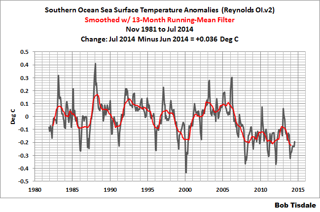

I agree that we’ll have to watch and learn, because there’s evidence of gradual declines and downward steps.
The cooling of the surface of the Southern Ocean appears as a step down over 2 years, 2006 to 2008:
Then again, if we look at the surface temperatures of the Indian Ocean, they shift upwards, then decline slowly:
And with the possible switch of the AMO, we may get to watch how it reacts over the coming years.
D.I. says: “Can some-one help a ‘Layman’ here and put a temperature reading for ‘0’ on the above graphs.”
Are you asking for zero degrees C or zero degrees K on an absolute scale?
If I were to present those graphs in absolute form, they would contain large seasonal components. Here’s my Figure 7 again, which showed the sea surface temperature anomalies of the Eastern Tropical Pacific:
Here’s a graph directly from the KNMI Climate Explorer in absolute form, deg C:
http://climexp.knmi.nl/ps2pdf.cgi?file=data/isstoi_v2_-180–80E_0-20N_n_0p.eps.gz
So, if you’d like that presented with the x-axis running from 0 deg C to 29 deg C, you’d never be able to see any of the year-to year variations.
Cheers.
Ian W says: “I realize that with NOAA this is a possibly stupid question, but they have an inordinately expensive ARGO float system with a rather good distribution ( see http://www.argo.ucsd.edu/About_Argo.html ); was any validation done using the extremely precise ARGO data against the “‘Satellite enhanced’ and ‘statistically infilled’” ‘invented data?”
As far as I can tell, don’t know for sure, the ARGO floats appear as though they are now part of the observations that go into the Reynolds OI.v2 data…shown as “drifters” in the bottom map:
http://www.emc.ncep.noaa.gov/research/cmb/sst_analysis/images/inscol.png
Along with the ship-inlet data, they are then “blended” with the satellite measurements (which have much better spatial coverage):
http://www.emc.ncep.noaa.gov/research/cmb/sst_analysis/images/satcol.png
Those maps are available from the following webpage, under the heading of “Latest Plots and Plot Archives”:
http://www.emc.ncep.noaa.gov/research/cmb/sst_analysis/
This is precisely what We jumped on for the cold US winter last year, direct analog to 1917-1918. And though cooling, when combined with enso 3.4 centered el nino this winter, will make for another big US winter ( in our opinion) which has been our missive since spring on where this is going.
Pure speculation, but could this hot spot provide the extra moisture we’ve seen here in Colorado this year? It’s been a very wet, cool summer. All that rain (moisture condensation) may also explain the cooler temperatures to the east, since the airflow in the continental US is from west to east.
In spite of La Nada / El Ninitito … we’ve had tremendous SSTs off of the CA this summer. It’s resulted in high RH and helped out the SW Monsoon. We’ll take every little extra drop we can get. If somehow the high SSTs can survive into winter it may help to spike the cold fronts with added energy. Again, we’ll take whatever we can get!