 In this post, we’ll discuss more inconsistencies in the recently published paper Risbey et al. (2014). These are major flaws in the paper…above and beyond the faults and curiosities discussed in the last post. As you’ll recall, that paper–about climate model portrayals of ENSO and about modeled versus observed global surface temperature trends–was curiously co-authored by historian Naomi Oreskes and psychologist Stephan Lewandowsky.
INTRODUCTION
In the recent post Lewandowsky and Oreskes Are Co-Authors of a Paper about ENSO, Climate Models and Sea Surface Temperature Trends (Go Figure!), we presented a few of the obvious flaws in Risbey et al. (2014) Well-estimated global surface warming in climate projections selected for ENSO phase [paywalled]. The cross post at WattsUpWithThat is here.
The paper claims to have established a relationship in climate models between how well climate models simulate 15-year trends in the sea surface temperatures of the NINO3.4 region and how well they simulate 15-year trends in global surface temperatures. Rephrased, according to Risbey et al. (2014), the closer the models accidentally simulated the 15-year trends in the sea surface temperatures of the NINO3.4 region, the better the models accidentally simulated the 15-year trends in global surface temperatures, including the hiatus period of 1998 to 2012. And for those new to this discussion, the sea surface temperature anomalies of the NINO3.4 region in the equatorial Pacific are a commonly used index for the timing, strength and duration of El Niño and La Niña events–or–the NINO3.4 region sea surface temperature data represent the effects of El Niño and La Niña events on the sea surface temperatures of a portion of the equatorial Pacific, east of the dateline, that is directly impacted by those events.
The following is a key paragraph from Risbey et al. (2014). It can be found under the heading of “Methods” (Curiously, even though “ocean heat uptake” was repeatedly mentioned (11 times) throughout Risbey et al. (2014) it was never presented—data or model outputs.):
Climate models cannot simulate every ENSO phase transition, but that is not critical here. To approximate the phase of ocean heat uptake in a 15-year period one may need to capture only the general sense of whether the models are El Niño or La Niña dominated over the period. To this end we use Niño3.4 as an index of ENSO phase and calculate the trend in Niño3.4 over the period to indicate the general tendency of the system towards regimes dominated by either ENSO state (similar to PDO phases). Models with a similar Niño3.4 trend to observations are then selected to represent the subset of models from the projection ensemble that just happen to have a similar response of ENSO over the 15-year period. This approach selects models with a statistical similarity that is related to the desired feature (ocean heat uptake). The approach does not guarantee any kind of dynamical consistency between models for each 15-year period.
So for every 15-year time period, Risbey et al. determined the linear trends in the sea surface temperatures of the NINO3.4 region of the equatorial Pacific and then selected climate models that had simulated similar linear trends in the sea surface temperatures of the NINO3.4 region. But “statistically similar” doesn’t tell us much. So we have to look in the body of the paper to determine how “statistically similar”. The text reads:
To select this subset of models for any 15-year period, we calculate the 15-year trend in Niño3.4 index24 in observations and in CMIP5 models and select only those models with a Niño3.4 trend within a tolerance window of +/- 0.01K y–1 of the observed Niño3.4 trend. This approach ensures that we select only models with a phasing of ENSO regime and ocean heat uptake largely in line with observations. In this case we select the subset of models in phase with observations from a reduced set of 18 CMIP5 models where Niño3.4 data were available25 and for the period since 1950 when Niño3.4 indices are more reliable in observations.
So Risbey et al. were looking for the climate models that simulated the sea surface temperature trends for the NINO3.4 region within +/- 0.01 deg C/year (or +/- 0.1 deg C/decade) of the observed trends. (We’ll discuss trends in deg C/year for the majority of this post to remain consistent with that paper, even though we’ll be looking at some incredibly small numbers.) Risbey et al. used NOAA’s ERSST.v3b sea surface temperature data as a reference for the period of 1950 to 2012:
Niño3.4 values for observations were downloaded from NOAA at
There are a number of data source webpages for NINO3.4 data available through that link. The monthly ERSST.v3b-based NINO3.4 sea surface temperature data in absolute form is here, and the NINO3.4 data based on the same dataset is available here in absolute and anomaly form (base years for anomalies are 1981 to 2010). The NINO3.4 sea surface temperature anomaly data are also available for a number of datasets through the KNMI Climate Explorer. Risbey et al. used ERSST.v3b-based NINO3.4 data so we’ll use it primarily in this post.
OVERVIEW USING DATA
So let’s take a look at how Risbey et al. (2014) qualified climate models for each 15-year period, from 1950 to 2012, but we’ll use data in this example.
In addition to NOAA’s ERSST.v3b data, there are a number of sea surface temperature datasets available to the public through the KNMI Climate Explorer, at their Monthly climate indices webpage and at their Monthly observations webpage. Other than the source data (ICOADS), the ones that stretch the full term of Risbey et al. (1950 to 2012) are Kaplan SST (which is a mix of Kaplan SST data and Reynolds OI.v2 data), NOAA’s ERSST.v3b data (which was used by Risbey et al.) and two datasets from the UKMO (HADISST and HADSST3). Figure 1 compares the annual NINO3.4 sea surface temperature anomalies for the hiatus period of 1998 to 2012. The trend of the ERSST.v3b-based NINO3.4 data is +0.0072 deg C/year. So, with the Risbey et al. tolerance of +/- 0.01 deg C/year, that leaves a window of -0.0028 deg C/year to +0.0172 deg C/year. The trends of the other three datasets fall within that window during the hiatus period. But do the 15-year NINO3.4 region trends of the four sea surface temperature datasets always agree that well over the full time period used by Risbey et al.?

Figure 1
Figure 2 presents the running 15-year trends (deg C/year) in NINO3.4 sea surface temperature anomalies for the period of 1950 to 2012, which was the period analyzed by Risbey et al. (Figure 2 is similar to many of the illustrations shown in Risbey et al. (2014), but they used those running-trend graphs for global surface temperature trends.) You’ll note that the units of the vertical axis (y-axis) are deg C/year. Each data point represents the trend in deg C/year for a 15-year period, centered on the 8th year. That is, the first data points at 1957 indicate the trends in deg C/year for the period of 1950 to 1964, and the second data points at 1958 show the trends for the period of 1951-1965, etc., through the last data points at 2005, which indicate the trends for the period of 1998 to 2012.

Figure 2
It appears there can be large differences in trends even between the four NINO3.4 data. Let’s confirm that. Risbey et al. used the NOAA ERSST.v3b data so it will serve as our reference dataset. We’ll subtract 15-year trends of the ERSST.v3b NINO3.4 data from the 15-year trends of the other three datasets. See Figure 3. The heavy black lines indicate the +/- 0.01 deg C/year tolerance used by Risbey et al. for their climate model selection. As shown, even data can fall outside the window used by Risbey et al. (2014) for climate model selection.

Figure 3
This suggests two things: (1) The tolerances used by Risbey et al. (2014) were unrealistic. The subtle differences between datasets can cause the observed trends to fall outside the tolerance range. (2) Depending on the dataset being studied, the results of Risbey et al. could vary for some time periods. Two global surface temperature datasets were presented by Risbey et al: GISS LOTI, and Cowtan and Way. GISS LOTI uses NOAA’s ERSST.v3b data, but Cowtan and Way did not. Cowtan and Way use a modified version of HADSST3. If Risbey et al. had used the sea surface temperature data associated with the Cowtan and Way data, would the results be different? It’s always best to use a sea surface temperature-based index from the dataset that’s part of the global surface temperature data being examined. Otherwise, questions like that arise. But that’s a minor inconsistency.
15-YEAR NINO3.4 SEA SURFACE TEMPERATURE TRENDS DO NOT INDICATE WHETHER EL NIÑO OR LA NIÑA EVENTS DOMINATED
Risbey et al (2014) used NINO3.4 region sea surface temperature anomaly trends to determine if El Niño or La Niña events dominated a given 15-year period. The key word in that sentence is “trends”. They stated:
To approximate the phase of ocean heat uptake in a 15-year period one may need to capture only the general sense of whether the models are El Niño or La Niña dominated over the period. To this end we use Niño3.4 as an index of ENSO phase and calculate the trend in Niño3.4 over the period to indicate the general tendency of the system towards regimes dominated by either ENSO state (similar to PDO phases).
But the trends in the NINO3.4 data do not tell us whether El Niño or La Niña events dominated. Trends reflect the changes in temperatures, not the actual values. Here, I’ll show you.
If the 15-year trends in the NINO3.4 data actually provided a general sense of whether El Niño or La Niña events dominated a given period, then periods with similar trends should consistently show the same phase of ENSO, El Niño or La Niña.
Figure 4 shows the 15-year trends of the NINO3.4 sea surface temperature anomalies for the period of 1950 to 2012, using the NOAA ERSST.v3b sea surface temperature dataset. I’ve highlighted four times on the graph. Two of the 15-year trends have the same positive trends of +0.048 deg C/year, and two periods have the same negative trends 0f -0.048 deg C/year.

Figure 4
So, using time-series graphs of NINO3.4 sea surface temperature data we can see whether the periods with similar trends also show the same ENSO domination.
Counting the numbers of El Niño and La Niña events from a table like the NOAA Oceanic NINO Index table may lead to the wrong conclusion about ENSO dominance, because the numbers of El Niños and La Niñas do not tell how long they lasted or how strong they were. The easiest way to tell if El Niño or La Niña events dominated a period is to average the NINO3.4 region sea surface temperature anomalies. If the average is positive, El Niño events dominated, and La Niña events dominated if the average NINO3.4 anomalies are negative. If the average is at or near zero, then neither phase dominated and ENSO was neutral.
The NINO3.4 data for the two periods with the same positive trends are shown in Figure 5. The top graph is for the period of 1955 to 1969 and it’s clear La Niña events dominated then. But in the lower graph, even though the trends are the same, we can see that El Niño events dominated the period of 1983 to 1997.

Figure 5
We have similar results for the two periods with the same negative trends. See Figure 6. La Nina events dominated the 15-year period of 1962 to 1976, and for the period of 1987-2001, neither El Niños nor La Niñas dominated. ENSO was neutral during that 15-year period. Yet the two periods had the same trends.

Figure 6
Clearly, the trends in NINO3.4 data do not “indicate the general tendency of the system towards regimes dominated by either ENSO state (similar to PDO phases).” Either Risbey et al. used the wrong metric or they made erroneous claims about it.
THE PACIFIC DECADAL OSCILLATION (PDO) REFERENCE
For this part of the post, I’m going to present a few graphs I prepared for my upcoming book.
The term Pacific Decadal Oscillation or PDO can refer to a number of things. Sometimes it is used to represent the decadal and multidecadal variations in the strengths, frequencies and durations of El Niño and La Niña events. And sometimes, when the PDO index data is presented, the PDO refers to the spatial patterns of the sea surface temperature anomalies of extratropical North Pacific. (See the discussion of the PDO index data in the post The 2014/15 El Niño – Part 5 – The Relationship Between the PDO and ENSO.)
It’s impossible to know which way Risbey et al. were using the term “PDO phases”, so I’ll present both the PDO data and NINO3.4 sea surface temperature anomalies for the period of 1950 to 2012. See Figure 7. It shows the same graph with and without my notes. The PDO data in the illustration is the commonly used PDO Index from JISAO, and the NINO3.4 sea surface temperature anomalies are based on the UKMO’s HADISST dataset, which are available through the KNMI Climate Explorer Monthly climate indices webpage. I used the UKMO’s standard base years of 1961 to 1990 for the NINO3.4 anomalies. It’s commonly accepted that 1976 represents the year when ENSO switched from La Niña to El Niño domination, and as a result, the PDO switched from “cool” to “warm” modes. And according to numerous papers, ENSO switched from El Niño to La Niña domination around 1998.
A quick overview of the breakpoints: The year 1976 marked the transition from the multiyear 1973-1976 La Niña to a series of weak El Niño events in 1976/77 and 1977/78, that were then followed by a number of strong El Niño events, like the 1982/83 and 1997/98 El Niños and the multiyear 1986/87/88 El Niño. And 1998 is the transition year from the 1997/98 super El Niño to the 3-year (1998 to 2001) La Niña that followed it.

Figure 7
And in Figure 8, we can see that the period-average NINO3.4 sea surface temperature anomalies confirm that La Niñas dominated before 1976 and after 1998, and that El Niños dominated between 1976 and 1998. So Figures 7 and 8 present both uses of the term Pacific Decadal Oscillation or PDO.

Figure 8
The breakpoints between El Niño and La Niña dominance also coincide with the breakpoints between the warming period of 1976-1998 and the two hiatus periods (1950-1976 and 1998-2012) that preceded and followed the warming period. There are very fundamental reasons for this. During multidecadal periods when El Niño events dominate, the tropical Pacific releases more heat than “normal” from the tropical Pacific to the atmosphere…and the tropical Pacific redistributes more warm water than “normal” from the tropical Pacific to adjoining ocean basins…and through teleconnections, more sunlight than normal reaches into the remote ocean basins like the North Atlantic and Indian Oceans. As a result, global surface temperatures warm during periods when El Niño events dominate. On the other hand, during multidecadal periods when La Niña events dominate, the tropical Pacific releases less heat than “normal” from the tropical Pacific to the atmosphere…and the tropical Pacific redistributes less warm water than “normal” from the tropical Pacific to adjoining ocean basins…and through teleconnections, less sunlight than normal reaches into the remote ocean basins like the North Atlantic and Indian Oceans. As a result, global temperatures warm less and can cool during periods when La Nina events dominate.
Risbey et al. acknowledged that relationship when they wrote:
For any 15-year period the rate of warming in the real world may accelerate or decelerate depending on the phase of ENSO predominant over the period.
But they overlooked the fact that variations in ENSO domination can last for decades.
And during what period did the IPCC’s climate modelers tune their models? They tuned their models to the multidecadal period when El Niño events naturally (using sunlight) contributed to global warming, and that means that the model projections of global warming are way too high. Now add the influence of the Atlantic Multidecadal Oscillation, which also provided a natural contribution to the warming from 1976 to 1998, and the model projections are even farther from reality. Back to Risbey et al. (2014)…
Unfortunately for Risbey et al., the switch-points of the 15-year trends in NINO3.4 sea surface temperature data do not coincide with the 1976 and 1998 switch points in the PDO, regardless of how the PDO is defined. See Figure 9.

Figure 9
Bottom line: Contrary to the representations by Risbey et al., “…the trend in Niño3.4 over the period…” does not “…indicate the general tendency of the system towards regimes dominated by either ENSO state (similar to PDO phases).”
As noted and illustrated earlier, the trends in NINO3.4 data only tell us of the rate of change in that temperature data; they do not, cannot, tell us the actual values of the temperature anomalies.
THE CLIMATE MODELS USED BY RISBEY ET AL (2014) THAT QUALIFIED FOR THE HIATUS PERIOD OF 1998 TO 2012
In my first post about Risbey et al (2014), I noted that the authors did not identify which models were selected for each of the 15-year periods, and as a result, it was impossible to verify their results. My statement generated the expected responses…similar to the one made by David Appell on the thread at my blog:
You’re free to download the CMIP5 results and do their calculation for yourself. See if you find four models.
So I did. And I looked at only the last 15-year period, the hiatus period of 1998 to 2012. Why would I focus on the recent hiatus period? It was the recent hiatus period that caused everyone to question the capabilities of the climate models. In fact, Risbey et al. (2014) would not have been written if the models had performed well during the hiatus. Why would they bother?
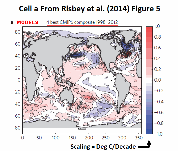
There are actually 5 models that qualified for the hiatus period of 1998 to 2012, according to the recipe provided by Risbey et al. (2014). Risbey et al. then selected the 4 “best” of those 5 to present in the maps of their Figure 5. But as we showed with the gif animation here, those models still poorly simulated the spatial patterns of warming and cooling in the ocean basins.
Now for my replication of the results of Risbey et al. (2014) for the period of 1998 to 2012. Keep in mind that the models selected by Risbey et al. can be different for every 15-year period, because they looked for the models that accidentally got the NINO3.4 trends right for those 15-years. Again, the following results are only for the recent 15-year hiatus period.
Risbey et al. identified which of the CMIP5-archived climate models they used under the heading of Methods. They wrote:
A subset of 18 of the 38 CMIP5 models were available to us with SST data to compute Niño3.4 (ref. 24) indices. The subset of models are indicated in bold in the set below. The reduced set of 18 models provides a similar model ensemble trend distribution to the larger model set. Niño3.4 values for observations were downloaded from NOAA at http://www.esrl.noaa.gov/psd/data/climateindices/list/. Spatial SST trends were calculated from HadISST data31.
The set of CMIP5 models used are: ACCESS1-0, ACCESS1-3, bcc-csm1-1, bcc-csm1-1-m, BNU-ESM, CanESM2, CCSM4, CESM1-BGC, CESM1-CAM5, CMCC-CM, CMCC-CMS, CNRM-CM5, CSIRO-Mk3-6-0, EC-EARTH, FGOALS-s2, FIO-ESM, GFDL-CM3, GFDL-ESM2G, GFDL-ESM2M, GISS-E2-H, GISS-E2-H-CC, GISS-E2-R, GISS-E2-R-CC, HadGEM2-AO, HadGEM2-CC, HadGEM2-ES, INMCM4, IPSL-CM5A-LR, IPSL-CM5A-MR, IPSL-CM5B-LR, MIROC-ESM, MIROC-ESM-CHEM, MIROC5, MPI-ESM-LR, MPI-ESM-MR, MRI-CGCM3, NorESM1-M and NorESM1-ME.
Figure 10 presents the observed and modeled NINO3.4 sea surface temperature anomalies for the period of January 1982 to December 2012, with the models that qualified. The models that qualified for that hiatus period, according to the Risbey et al. recipe, were Access 1-0, CCSM4, CNRM-CM5, CSIRO-Mk3-6-0, and MIROC5. Also shown in the graphs are the modeled and data trends. We can see that the trends of all five models fall within the +/- 0.01 deg C/year tolerance.

Figure 10
For those new to climate model outputs of ENSO-related variables, when there is more than one ensemble member (model run) for a model, we present the average or the ensemble mean. The annual variations in the ensemble mean will be reduced as a result of the averaging, because the El Niño and La Niña events in the models occur at random and they tend to cancel one another.
Note also that the period-average temperature anomalies for the NINO3.4 data are below zero, indicating that, in the real world, La Niña events dominated that period. Also note that the NINO3.4 region period-average temperatures for all of the models are above zero, indicating that El Niño events dominated in the unreal-worlds of the models. (And that’s even using the base years of 1981-2010. Because of the unrealistic long-term trend in the modeled NINO3.4 region temperatures, the models would have shown even higher “El Niño-like” values if I had used the GISS base years of 1951-1980 or the UKMO base years of 1961-1990.) Yet, somehow, we were led to believe by Risbey et al. that using trends was an acceptable way to determine if El Niño or La Niña events dominated a time period. Nonsense.
I’ve presented the NINO3.4 sea surface temperature anomaly results for all 18 models used by Risbey et al., for the period of 1998 to 2012, in my Table 1. (Please click on it for the full-sized illustration.)

Table 1
The first column is the model name. The second column lists the number of ensemble members (model runs) included with the specific models. The third column presents the linear trends (deg C/year) for modeled NINO3.4 sea surface temperature anomalies for the period of 1998 to 2012. The fourth column shows the difference (delta) between the observed trend of +0.0074 deg C/year and the model trends. The fifth column indicates whether the models qualified for use by Risbey et al. for the period of 1998 to 2012, using their +/- 0.01 deg C/year tolerance. The sixth column is the period-average sea surface temperature anomalies (reference 1981-2010) for the NINO3.4 region for each of the models, and because those anomalies were all above zero, the last column indicates that the models were all dominated by El Niño events.
It appears that Access 1-0, CNRM-CM5, CSIRO-Mk3-6-0, and MIROC5 would have been the 4 “best” models selected by Risbey et al. for their Figure 5.
OF THE MODELS USED BY RISBEY ET AL., HOW WELL DID THE QUALIFIED MODELS SIMULATE THE HIATUS-PERIOD GLOBAL SURFACE TEMPERATURE TRENDS?
The key objective of Risbey et al. (2014) was to show that, if the models properly simulated the 15-year trends in the sea surface temperatures of the NINO3.4 region, then the models better simulated the 15-year trends in global surface temperatures.
So I took the analysis a one step farther to see if the models selected by their NINO3.4 trends did in fact provide a better match. Figure 11 shows the model-data comparison for global surface temperatures for the period of 1998 to 2012. The dataset is global GISS Land-Ocean Temperature Index data. The base years for anomalies are the standard 1951-1980 used by GISS. The model simulations of global surface temperatures are also referenced to those base years. You’ll note that I’ve separated the 5 models that qualified by the Risbey et al. recipe from the 13 other models included in their study, and I’ve presented the averages for those two groups of models. During the hiatus period of 1998 to 2012, instead of simulating a warming rate that was about 4 times higher than observed, the 5 qualified models only triple the warming rate. So, yes, the models selected by the Risbey et al. recipe did, in fact, come closer to simulating the actual observed warming rate. Instead of simulating the 15-year trend horribly, the selected models were a little less horrible. “Better” must be in the eyes of the beholders.

Figure 11
BUT WHAT ABOUT THE MODELS EXCLUDED FROM RISBEY ET AL. (2014)?
The above quote about model selection included (my boldface):
A subset of 18 of the 38 CMIP5 models were available to us with SST data to compute Niño3.4 (ref. 24) indices.
That’s very odd. The outputs of the CMIP5 models are available to anyone via the CMIP5 archive and through the KNMI Climate Explorer Monthly CMIP5 scenario runs webpage. They’re available to you, to me and to the authors of Risbey et al…everybody, everywhere. At the KNMI Climate Explorer, modeled sea surface temperatures, including those for the NINO3.4 region (5S-5N, 170W-120W) are listed as TOS under the heading of Ocean, ice & upper air variables, and modeled surface air temperatures, for the global temperature simulations, are listed at TAS under the heading of Surface variables. Of the models excluded by Risbey et al. (2014), 11 more models had sea surface temperature and global temperature outputs available to download, using the RCP8.5 scenario (which is the forcing scenario used by Risbey et al.). Those additional models are BCC-CSM1-1, CESM1-BGC, CESM1-CAM5, CMCC-CM, CMCC-CMS, FIO-ESM, GFDL-ESM2M, GISS-E2-H, IPSL-CM5B-LR, MPI-ESM-MR and NorESM1-ME.
Note: Sea surface temperature and surface air temperatures are available also for the EC-EARTH model, but the sea surface temperature outputs included 6 ensemble members and there were 10 ensemble members for surface air temperatures. Because at the KNMI Climate Explorer, there is no way identify which of the 6 sea surface temperature ensemble members belonged to the 10 surface air temperature ensemble members, I excluded the EC-EARTH outputs from the following analyses. But I will say, the EC-EARTH model would not have qualified for use using the Risbey et al. recipe.
Of those 11 excluded models, for the period of 1998 to 2012, 4 more models would have qualified for Risbey et al. They include BCC-CSM1-1, CMCC-CM, CMCC-CMS, and NorESM1-ME. Figure 12 presents the modeled and observed NINO3.4 sea surface temperature anomalies for the data and the qualified models (excluded by Risbey et al.).

Figure 12
Table 2 is similar to Table 1, but Table 2 presents the 1998 to 2012 results for all the models excluded by Risbey et al.

Table 2
In Figure 13, for the models excluded by Risbey et al., the GISS global surface temperature data for the period of 1998 to 2012 are compared to the average simulations of global surface temperature anomalies of the 4 models that would have qualified for inclusion and the average of the 7 other models.

Figure 13
Isn’t that curious! The excluded models that would have qualified for use during the period of 1998 to 2012 simulated global surface temperatures just as poorly as the 7 other models that were excluded…maybe even a little worse. How convenient! I’ll let you ponder and comment on the implications of that gem for a moment, but don’t get too carried away. We can produce that graph again with all of the CMIP5 models that qualified (whether or not they were used by Risbey et al.) and all of the “other” models that had sea surface temperature and surface air temperature data available with the RCP8.5 scenario. See Figure 14.

Figure 14 (Corrected. Original had a few typos.)
The gap between the qualified models and the others has closed drastically. Of the models used by Risbey et al., the qualified models had a warming rate that was about 72% of the warming rate of the other models used in their study. See Figure 11. But if all CMIP5 models are used, Figure 14, (all the models that actually had sea surface temperature and surface air temperature data available with the RCP8.5 scenario) the warming rate of the qualified models is now 83% of all of the others. The qualified models are still better, but they’re not as good as they had been.
And we’ve only looked at the last of the 15-year periods. There are 48 other 15-year periods addressed by Risbey et al. (2014), and the qualified models can change for each period. How would they be impacted if all of the CMIP5 models were used?
Regardless, it’s very odd that Risbey et al. (2014) overlooked climate models for which sea surface temperature and surface air temperature outputs were obviously available. Very odd indeed.
ABOUT THE CURIOUS OFFSET
You may have noticed in Figure 13 that, for the models excluded by Risbey et al., the average time-series of the qualified models seemed to be shifted or offset above the other models. Animation 1 should make it quite easy to see. It cycles back and forth between the comparison graphs of the simulated global surface temperatures of the models used by Risbey et al. and the models they excluded. Note how the red trend line in the excluded models that qualified is shifted upwards above the red trend line of the models Risbey et al. elected to use.

Animation 1
I double-checked the spreadsheet and what I had downloaded. They were okay. So I investigated a little further. The offset appears to be caused by the BCC-CSM1-1 model simulation of global surface temperatures. See Figure 15. Of the 4 qualified models, it’s trend for the warming period of 1975 to 2012 is well above the other three qualified climate models…and the GISS LOTI data.

Figure 15
So when we limit the model outputs to the hiatus period of 1998 to 2012, Figure 16, the BCC-CSM1-1 resides higher than the other three, and that shifted up the average.

Figure 16
Oddly, a climate model that simulates a trend that is 4.5 times higher than the observed warming rate for the period of 1998 to 2012 would have qualified using the Risbey et al. recipe…if Risbey et al. had bothered to use all of the available climate models. Go figure.
WHAT ABOUT OCEAN HEAT UPTAKE?
We briefly discussed ocean heat uptake in the first post about Risbey et al. (2014).
As noted earlier, Risbey et al. (2014) referred to ocean heat uptake numerous times in their paper but failed to present data or model simulations of it. An example of one of their references to ocean heat uptake is (We’ve presented this quote earlier.):
To approximate the phase of ocean heat uptake in a 15-year period one may need to capture only the general sense of whether the models are El Niño or La Niña dominated over the period. To this end we use Niño3.4 as an index of ENSO phase and calculate the trend in Niño3.4 over the period to indicate the general tendency of the system towards regimes dominated by either ENSO state (similar to PDO phases).
A couple of years ago, Hansen et al (2011) Earth’s Energy Imbalance and Implications used 6-year trends in ocean heat content data for its presentations of ocean heat uptake. (Note: I commented on Hansen et al (2011) in the post here.) Ocean heat content data from the NODC to depths of 2000 meters is only available in pentadal form (similar to but not the same as a 5-year average), so it’s worthless for this discussion. But the NODC does present its global vertically averaged temperature data on an annual basis here for the depths of 0 to 2000 meters. So, we’ll use 15-year trends in vertically averaged temperature data (to 2000 meters) as a proxy for ocean heat uptake and see if it coincides with the 15-year trends in NINO3.4 data. Because the variations in the NINO3.4 sea surface temperature data are so large, and because the variations in the vertically averaged temperature data for the global oceans to 2000 meters are so small, I’ve standardized both dataset for the comparison in Figure 17 (i.e. I divided each dataset by its standard deviation). As shown, there is no relationship between NINO3.4 trends and ocean heat uptake, no relationship whatsoever.

Figure 17
On the other side of the coin, as shown in Figure 18, there is a very obvious relationship between the 15-year global ocean heat uptake and the 15-year ocean heat uptake for the tropical Pacific (where El Niño and La Niña events take place), the latter of which is based on the NODC ocean heat content data (0-700 meters) for the tropical Pacific (24S-24N, 120E-80W).

Figure 18
Curiously, there was a better relationship between the tropical Pacific and global ocean heat uptake before 1999. Must be all of the adjustments to the global data. We’ll have to look into that.
But, there is also no apparently relationship between the trends in NINO3.4 data and the 15-year ocean heat uptake of the tropical Pacific, as shown in Figure 19.

Figure 19
That doesn’t mean that La Niña events don’t recharge the heat released from the tropical Pacific by El Niño events. We can look at the ocean heat content data for the tropical Pacific, Figure 20, and see that the only time there is any significant warming there is during the 3-year La Niña events of 1954-1957, 1973-1976 and 1998 to 2001 and during the freakish 1995/96 La Niña. (Figure 20 is Figure 5-40 from my ebook Who Turned on the Heat?) It’s plainly obvious that the ocean heat content of the tropical Pacific would have cooled over the long term without those La Niñas.

Figure 20
Obviously, we can’t use NINO3.4 sea surface temperature anomalies to capture those variations in tropical Pacific ocean heat content, because the NINO3.4 data only represents the impacts of El Niño and La Niña events on the sea surface temperatures of a portion of the equatorial Pacific. Every La Niña has a different impact on tropical Pacific ocean heat content, independent of the NINO3.4 sea surface temperature data. That is, some La Niña events have greater impacts on the ocean heat content of the tropical Pacific than others. As a result, the impact on ocean heat uptake of each La Niña event has to be studied separately.
Risbey et al. (2014) also conveniently overlooked the fact that sunlight, not downward longwave radiation from manmade greenhouse gases, fuels the tropical Pacific ocean heat uptake during La Niña events. How do we know it’s sunlight? Kevin Trenberth told us so in two papers. The first is Trenberth et al. (2002). They write (my boldface):
The negative feedback between SST and surface fluxes can be interpreted as showing the importance of the discharge of heat during El Niño events and of the recharge of heat during La Niña events. Relatively clear skies in the central and eastern tropical Pacific allow solar radiation to enter the ocean, apparently offsetting the below normal SSTs, but the heat is carried away by Ekman drift, ocean currents, and adjustments through ocean Rossby and Kelvin waves, and the heat is stored in the western Pacific tropics. This is not simply a rearrangement of the ocean heat, but also a restoration of heat in the ocean.
The second paper is Trenberth and Fasullo (2011). They write (my boldface):
Typically prior to an El Niño, in La Niña conditions, the cold sea waters in the central and eastern tropical Pacific create high atmospheric pressure and clear skies, with plentiful sunshine heating the ocean waters. The ocean currents redistribute the ocean heat which builds up in the tropical western Pacific Warm Pool until an El Niño provides relief (Trenberth et al. 2002).
Somehow, it’s not too surprising that Risbey et al., a paper about ENSO and ocean heat uptake, would fail to mention that the ocean heat uptake portion of ENSO is fueled by sunlight, not manmade greenhouse gases.
CLOSING
I included the following bullet points in the first post about Risbey et al (2014).
What Risbey et al. (2014) have said indirectly, but failed to expand on, is:
- IF (big if) climate models could simulate the ocean-atmosphere processes associated with El Niño events, which they can’t, and…
- IF (big if) climate models could simulate the ocean-atmosphere processes associated with longer-term coupled ocean atmosphere processes like the Atlantic Multidecadal Oscillation, another process they can’t simulate, and…
- IF (big if) climate models could simulate the decadal and multidecadal variations of those processes in-phase with the real world, which they can’t because they can’t simulate the basic processes…
…then climate models would have a better chance of being able to simulate Earth’s climate.
It should be blatantly obvious, because climate models cannot simulate those naturally occurring and naturally fueled processes, climate models are not fit for their intended purpose…that, of course, assumes climate models were intended to simulate climate here on Earth.
And as we’ve successfully illustrated and discussed in this post, the 15-year trends in NINO3.4 sea surface temperatures used by Risbey et al. (2014):
- Do not have any relationship to the dominant phase of ENSO, contrary to their claims, and…
- Do not have any relationship to the ocean heat uptake, either globally or in the tropical Pacific, contrary to their claims, and…
- Do not have any relationship with the Pacific Decadal Oscillation, contrary to the claims made by Risbey et al.
And lastly, we showed that additional CMIP5 climate models were available to and could have been used by Risbey et al., and we showed that those models would have impacted their results had they elected to use them. Would the results have been better or worse for the entire term of their study? Dunno. But it’s odd that Risbey et al. overlooked about 1/3 of the available climate models…very odd.
Cool. So if I generate a whole bunch of series of random numbers, and some of the series are “statistically similar” to observations, my series of random numbers is now a model.
It is bizarre that Lewandowsky, a professor of psychology and Naomi Orestes, a historian, have co- authored such a paper. Only in climate science would one see such a mix
I don’t think the authors are concerned with inconsistencies. When a psychologist and a historian write a paper on climate change it can only be for one reason, a grant. Everyone wants to ride on the climate change gravy train.
In fact, Oreskes has a background in earth sciences and science history, so she is qualified to contribute to this study. Lewandowsky is strictly a psychologist.
Follow the money…… instead of practicing Theories of Science…..
I am working on a model for the 6 from 36 lottery. I have made many runs in the simulator and averaged the results. Next weeks winning lottery numbers will be 18,18,18,18,18,18.
Bob, you are rivaling Steve McIntyre concerning forensic auditing, as well as displaying your hard earned mastery of ENSO and ocean cycles. Well done; the selection bias from excluded but available models was a particularly nice find. At a minimum a corrigendum should be demanded for that clear misstatement alone.
I look forward to your next book. Hopefully you can make this a part of it, to provide wider exposure of this now debunked Oreskes/Lewandowsky peer reviewed propaganda.
I suspect Lewandowsky’s on it to lend further credence to his own papers…so he can claim to be a published “climate scientist” when touting his other claims, and others can cite him as such.
Steady on.
There are many reasons why there could be a discrepancy since 1999. We don’t know all of them. But at least one is that the 1999 El Nino was bigger than the rest and so may behave differently.
Of course, that unknown complexity is also why picking model runs that fit an agenda is pseudo-science. It let’s you claim an understanding that you do not have.
(It’s just like fairground astrologers.
The fact that those strangers to the truth Naomi Oreskes and Stephan Lewandowsky were co-authors tells us that has usual in climate ‘science’ its facts be dammed all that matters is the ‘impact’ of the paper .
Sadly as such the author can be entirely right when he comes to pointing out the problems of the paper and entirely wrong in thinking these problems will affect how the paper is viewed. For has so often this is not an argument about reality , facts or science so all the errors in contains in those areas mean nothing .
Their paper seems more like a hustle than rigorous science.
Oreskes is a climate activist in my opinion. Her bio on TED begins “Naomi Oreskes is a historian of science who uses reason to fight climate change denial…”. About 11 minutes into her TED talk about why we should trust scientists, she tries a slight of hand with a graph to try and prove that climate models and real-world observation agree. See if you can spot the parlor trick. She knowingly misleads the audience and demonstrates precisely why I don’t trust climate scientists/activists.
http://www.ted.com/talks/naomi_oreskes_why_we_should_believe_in_science
I suppose in climate science being off by a factor of 3 instead of 4 is considered a huge improvement.
How certain is it that Access 1-1, CNRM-CM5, CSIRO-Mk3-6-0, and MIROC5 are indeed the models Risbey et al. selected for their figure 5? Can the authors be confronted with that?
Well they are perfectly positioned if you think they intend to ignore/rewrite history and openly lie about the science.
Then these two are in both the right place and time.
Who better than a new age historian and a post normal psychologist .
Ok, so it’s easier to get a grip on settled “climate” science if you’re a historian and/or a (shudder) psychologist…
Who knew?
mpainter says:
August 4, 2014 at 1:23 pm
In fact, Oreskes has a background in earth sciences and science history, so she is qualified to contribute to this study. Lewandowsky is strictly a psychologist.
+++++++++++++++++++++++++++++++++++++++++++++++++++++
Google indicates Oreskes had degrees in geology (not necessarily heavy in math & physics). Stanford is a good school, so you’d think she passed an IQ test somewhere along the line.
However, the paper’s quality tells what you need to know about the lack of math & physics background.
Let me get this straight…the model results agree with real-world data if they differ by +/- 0.01 deg C/year over 15 year periods? That’s +/- 1 deg C/century! If a model can’t match that for 100 years, it’s got issues. That’s a huge envelope.
Michael Jankowski says: “Let me get this straight…the model results agree with real-world data if they differ by +/- 0.01 deg C/year over 15 year periods?”
Michael, those are short-term trends in NINO3.4 sea surface temperatures, not global surface temperatures. Those short-terms trends are impacted by El Nino and La Nina events, not by any increase in the long-term surface temperature of the NINO3.4 region. There hasn’t been a long-term trend in that region:
Only in climate models is there a long-term warming of the equatorial Pacific, not the real world.
Cheers.
I will be glad when this post moves down because that Lewandowsky is hard to look at
Whew!
Naomi Oreskes and Erik Conway wrote the following concerning a glimpse into the distant future “The Collapse of Western Civilization: A View from the Future” which appeared in Daedalus.
“A View from the Future” is available online and here’s a brief passage:
‘The thesis of this analysis is that Western civilization became trapped in the grip of two inhibiting ideologies: namely, positivism and market fundamentalism.’
Yup, as you can see, Naomi’s a rigorous scientist alright. I wonder how she graphs positivism and market fundamentalism. In joules perhaps? Science. Yeah.
mpainter
August 4, 2014 at 6:29 pm
says:
‘I will be glad when this post moves down because that Lewandowsky is hard to look at
Whew!’
You think that’s bad. Wait’ll you watch a YouTube video of him talking sometime. His mouth moves exactly the way you think it would from looking at that picture. His whole face is frozen, just those lips moving there. And it’s almost as if his version of conversation is to be sneering at you the whole time he’s talking. And you think: Nature actually created this living organism? I’m not making this up. It was one creepy experience to watch it. I hope I go to my grave before ever seeing him on a YouTube video again. I mean, creepy.
Now, I know it doesn’t seem as if I’m making a scientific contribution right now. But I’m not certain Lewandowsky and Oreskes do either.
Risbey = risible
Talking about ENSO, the side bar meter now shows zero.
Does that mean that it is very likely over for 2014?
I got a reply from the Minister for education, Christopher Pine, and he said the original article had been withdrawn and the custodians UWA need not to release it because it was withdrawn and there was no legislation that could force them to release it. This was the first one.
When I view all these colored lines going up and down, I almost get a migraine. True, they bore me to tears.
Bob Tisdale, suspected typo-
‘The models that qualified for that hiatus period, according to the Risbey et al. recipe, were Access 1-1’.
Graph shows Access 1-0. Access 1-1 appears further down in the text as well.
richard verney says: “Does that mean that it is very likely over for 2014?”
There’s a new warm (couple weeks old) subsurface anomaly in the western equatorial Pacific that might (<–operative word) set one off later in the year:
http://bobtisdale.wordpress.com/2014/07/26/the-201415-el-nino-part-14-warm-water-recirculated/
Is this what one calls contorted cherry-picking?
These people don’t know what they are talking about and it is not science.
Johan says: “How certain is it that Access 1-1, CNRM-CM5, CSIRO-Mk3-6-0, and MIROC5 are indeed the models Risbey et al. selected for their figure 5?”
There was a typo in the text of the post, but not the illustrations. It was the model Access 1-0. If you’re planning on asking the authors, you might want to confirm the trends of those models and a few of the others.
lee says: “Bob Tisdale, suspected typo-”
Thanks, lee. They’ve been corrected.
bushbunny says: “I got a reply from the Minister for education, Christopher Pine, and he said the original article had been withdrawn….”
Are you talking about this paper?
In observing the photos of the co-authors, I am again reminded that unattractive people are always attracted to other unattractive people. Go figure….
Why are these guys still publishing in stead of cleaning up their previous mistakes ? Do they have Oligarch support ?
Charlie Martin says: “my series of random numbers is now a model.”
More precisely if you train a model on data that seems random, you can actually sometimes get the same result using real random data. In this context I assume that “model” is the Fourier Transforms and their coefficients. You discover the coefficients with known data and then using those coefficients project into the future.
In the case of periodic functions this works well enough. The problem is that random data sometimes looks periodic (there’s no rule against it) and so you can inadvertently end up with a fragment of a sine wave that the FFT thinks goes on forever but in fact existed by chance only for that short segment of data used to discover the coefficients in the first place.
Using such a model to make projections will reveal soon enough deviation from observation.
A better strategy is “wavelets” which are similar to FFT but bounded in time, allowing for periodicities to appear and disappear, showing climate to be a mixture of chaos and oscillations, sort of like wind chimes I suppose — the pipes will “ring” (periodicity) but at random intervals (the trigger or impulses that start each pipe ringing).
No Bob, the paper that was withdrawn earlier, if I remember rightly, it was regarding the mind set of skeptics. Sorry for the confusion.
Charlie Martin says:
August 4, 2014 at 1:09 pm
###
Close. It is only a model if it produces the numbers expected by the theory. Real world observations are of little value as they just cloud the issue.
Oh yes with not even a science degree between them?
The value the two bring to the other authors is their efforts to discredit any critics of the paper..
The two get to claim they are published climate scientists
Bob,
You have provided a lot of useful analysis here, but (I think it is fair to say) have still failed to identify the role of psychology professor Stephan Lewandowsky in the paper.
I believe that likely role (in that he was solely responsible for the “analysis of models and observations”) is the smoothed surface temperature data presented in graphs “c” and “d” reproduced at shapingtomorrowsworld. Most curious is that the decadal trend has hardly reduced, despite HADCRUT4 showing a significant reduction in warming trend in the last 15 years, and since 2005 showing a slight cooling trend. So I did a simple model of temperature trends since 1950 and was able to obtain a similar result. Lewandowsky managed to vanish the pause with use of Cowtan & Way 2013 (a re-model of HADCRUT4 examined at climateaudit) and a couple of smoothing tricks. In other words, the smoothed data brings the surface temperature data into line with the models.
I wouldn’t be surprised if Lewandowsky had some hand in it. Academics stick like glue, when one has been exposed as delivering rotten analysis’ . If they don’t publish an academics worth is lessened with their university masters.