 This one:
The title “Battle of the Graphs” certainly lives on, even though it is approaching a decade in age, as there has been a lot of off-topic contention on this WUWT thread as well as a free-for-all bashing over at the “Stoat” a.k.a. William Connolley (who “takes science by the throat”, implying he is some sort of “tough guy”) saying that this graph that appeared in a Telegraph article was erroneous and created by Christopher Monckton.
Based on the simplest available evidence, I was ready to conclude, as were many, that indeed Monckton had created the graph, that it was in error, and that he had refused to admit to any of this. I was ready to censure him myself, just as the over-the-top Stoaters wanted to do, probably so Connolley could direct a new denigrating Wikipedia entry as he is known to do (he’s not allowed to edit Wikipedia pages of living persons anymore, so he directs by proxy). Now, after further investigation I can tell you I was wrong, and so is Connolley.
If Monckton was wrong I certainly would’ve had no trouble pointing this out just as the Stoaters were doing, but I have one advantage that neither Monckton nor the Stoaters have: I have actually worked at a newspaper and I have submitted articles as a guest author to newspapers. So, I am familiar with the artwork process. Further, I have also published a number of articles from Monckton myself here and I am quite familiar with his style of producing graphs.
Thus, I noticed something about the Telegraph article that no one else seemed to.
WUWT commenter Kevin O’Neill, who also frequents Connolley’s website pointed out in this comment the charges against Monckton.
First let’s have a look at the article itself. The URL for it is:
http://www.telegraph.co.uk/news/uknews/1533290/Climate-chaos-Dont-believe-it.html
A screencap of the heading portion is shown below with the highlight done by me in yellow.

Unfortunately the link under the yellow highlight no longer works and so for some it is impossible to check Monckton’s references and calculations that were included with the essay. We’ll get back to that in a moment, please read on.
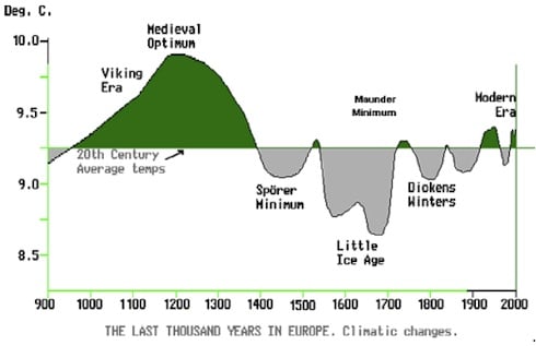
Here is how the article presented the graph that is in contention, I have screen captured a portion of the original Telegraph article:

Several things immediately struck me as being out of place when I first saw the graph after reading about the contention surrounding it, here is a list.
- The style (colors, font, etc) is not anything like I’ve ever seen from Monckton in all the graphs he has submitted to WUWT.
- The horizontal lines on the bottom portion of the graph are
obviously spaced incorrectly(the 20th century average line looks like it is incorrect on left axis) along with other cues in the plot line indicating to me that they were hand-drawn yet I’ve never gotten the graph from Monckton that was hand-drawn. Everything he has ever sent me has always been from a computer program output, thus the idea of havingimproperly spaced lines and coordinatesa hand drawn plot didn’t make sense to me. - My experience with newspapers told me that this was likely a graph that was prepared by the art department of the UK Telegraph. You see, all major newspapers and even some middle and minor ones have an art department. And, when they get some sort of illustration from a guest author, or data from a government report, they almost always redraw it to fit the style and format of the newspaper. Especially the colors and the fonts.
Just look at any major newspaper in the United States like USA Today when they get in data from say, the Labor Department, they produce their own graphs of that data. They can also make grievous mistakes with such data in the way it is presented such as this article from Charles Apple (who watches newspapers and the graphics and photos they produce) demonstrates:
![110706UsaTodayWeatherSnapshot02[1]](https://wattsupwiththat.files.wordpress.com/2014/07/110706usatodayweathersnapshot021.jpg)
Obviously, neither the editor nor the artist saw the sexual suggestion in the imagery. I don’t blame the NWS or the Red Cross who provided the data, I blame Doyle Rice and Julie Snider. Note the references at the bottom of the graphic.
Here, USA Today took data from the National Weather Service and the American Red Cross and turned it into what is obviously a ridiculous graphic. It got past the editor, and made it into the final publication.
I noted such references to internal artists, editors, and sources were missing from the UK Telegraph article as seen in the screen cap further above, and it is this omission that I believe led many people to conclude that Monckton produced that graphic.
If you examine other graphics from the UK Telegraph, you will find that they do have such references but they are also similarly designed and of a similar size with similar fonts and colors. For example, look at this graphic from 2005 that has been redrawn, but no mention given of an internal reference to The Telegraph art department:
 Source: http://www.telegraph.co.uk/news/uknews/4198339/Global-warming-will-bring-cooler-climate-for-UK.html
It is plainly obvious that is a graphic created by the newspaper and not by any scientific entity, otherwise it wouldn’t have the jagged shadow edges. So, the question surrounding the graph allegedly produced by Christopher Monckton is; did he included in the original list of references that he provided the Telegraph in that now missing link at the top of the original article? I’m happy to say I have found that original source file that Monckton provided to the Telegraph. It was lodged in the Wayback machine. I was able to find it simply by putting in the correct URL of the original Telegraph article as shown below:
https://web.archive.org/web/20090301000000*/http://www.telegraph.co.uk/news/uknews/1533290/Climate-chaos-Dont-believe-it.html
When you pull up the archive from 2009, the link appears for the PDF file of Monckton’s references but unfortunately it gives a 404 as seen below:

Oddly though if you click on the LEFT MOST vertical lines (circa 2007/2008) in the timeline above, the PDF will actually download, and that is what I did. For those of you that would doubt this you can go here and try it yourself:
And for posterity, here is a local link to the PDF of the References Monckton provided for the Telegraph article in 2006: warm-refs
If you open that PDF file you will notice a number of graphs and references including the graph from IPCC section 7 graph C. McIntyre speaks of its source here.
But no trace of the exact artwork combination as presented above appears in the Telegraph article is in Monckton’s reference PDF file, clearly indicating that the telegraph art department redrew that 1990 IPCC graph and the hockey stick graph, changing the top-bottom order. Below is page 6 from Monckton’s “warm-refs” PDF file, showing those graphs:

While I was ready to condemn Monckton for producing a sloppy graph like many of these Stoaters, it is now abundantly clear to me that he did not draw it and the claims by these people are erroneous and simply mendacious.
Stoat/Connelley is simply flat wrong, and the website that cited Monckton’s graphic as an example of what not to do needs to clarify that it was the newspaper that made the errors, that the source graphs came from the IPCC, and that Monckton drew none of them.
All this breastbeating over something that can be simply researched as I have done is just a waste of everyone’s time.
Monckton prepared a rebuttal as well which I present below.
=================================================================
There comes a point …
By Christopher Monckton of Brenchley
Those of us who have raised questions about the magnitude of Man’s influence on climate have become used to the expensively funded, often carefully co-ordinated campaigns of personal vilification organized by adherents of the Climatist Party Line. Occasionally we growl a little. More often we refuse to be distracted. We carry on.
The purpose of these relentless attacks on us is not only to do us down but also to frighten off third parties who might otherwise find the courage to speak out and express their own doubts about the Party Line.
But there comes a point when it is necessary to take action. I hope no one will disagree that that point is reached when allegations of lying or fabrication are made; when the allegations are unquestionably false; when they are persisted in despite requests to cease and desist; and when they are widely disseminated in a manner calculated baselessly to cause maximum reputational damage.
Recently a commenter at Jo Nova’s blog posted several comments to the effect that I had “faked” a graph. I quickly asked Jo to replace them with a note to say legal proceedings were in train. Enough, I had decided, was enough.
Here is the diagram I was supposed to have “faked”:

This surely blameless diagram appeared alongside an article I had written for the Sunday Telegraph on 5 November 2006, the first time I ever went public on the climate question. The article went live on the internet at midnight on a Saturday night. Two hours later the Telegraph’s website crashed, for 127,000 people had tried to access the article.
Now, it is not the custom of UK newspapers to ask their contributors to illustrate their articles. As usual, I was not consulted and offered no advice on the matter, and had no hand in their production and no foreknowledge that they were to be used. The graphs are not labeled as having been sourced from the IPCC (indeed, one of the graphs has the shadow of a hockey stick overlaid on it and marked as the “IPCC ‘hockey stick’”, making it blindingly obvious that it is not an official IPCC’s graph).
The Telegraph’s graphs are simple and, it seems to me, harmless schematics illustrating the difference between the representations of 1000 years’ global temperatures as they appeared in the IPCC’s 2001 (top) and 1990 (bottom) reports.
The graph from p. 202 of the IPCC’s 1990 report now looks like this:

With the article I supplied some background material for Telegraph readers on its website. In that material, the IPCC’s 1990 graph also appeared, mistakenly captioned as 1996 rather than 1990. The graph as I reproduced it looked like this:

What I had not realized until very recently was that for several years allegations had been circulated all over the place to the effect that I had fabricated the graphs that had appeared in the Sunday Telegraph article. Yet not one of those who had made these allegations had ever contacted me to verify the facts. And not one of them had said what was wrong with the Telegraph’s graphs anyway.
Perhaps the worst of the many allegations of dishonesty against me appeared on a “science education” website, where an entire section under the bold heading “Misuse of scientific images” was devoted to the Telegraph’s graphs.
The offending section contained the following untruths:
- Ø that in that article I had “disputed the concept of climate change” (Not that old chestnut again! I had accepted the concept but queried its likely magnitude);
- Ø that the Telegraph’s graphs were instances of “poor use of graphical displays” that “can confuse and obscure data” (No, they neatly showed the main point: in 1990 the medieval warm period and little ice age were shown clearly, but by 2001 both had gone, and a sharp uptick in the 20th century had been added);
- Ø that I had “created the [1990] graph on the bottom using different calculations that did not take into account all of the variables that climate scientists used to create the top graph” (No, I had not created either graph or done any calculations for such a graph);
- Ø that I had deployed “common techniques used to distort visual forms of data – manipulating axes, changing one of the variables in a comparison, changing calculations without full explanation – that can obscure a true comparison” (No, none of the above); and
- Ø that the article had been published in the Daily Telegraph (No, the Sunday Telegraph, and that suggests the website had never seen the original article but had picked up the libel from somewhere else).
I only discovered that this spectacularly inaccurate and profoundly damaging infestation of allegations when the commenter at Jo Nova’s site who had accused me of “faking” the graph mentioned on his own blog that I had not objected to the libel as it appeared on the science-education website. I had not objected because I had not known about it. No one at that website had thought to check any of the facts with me, or, as far as one can tell, with anyone else.
In short order a letter before action was sent to the website, which promptly did the right thing and took out the entire section, though there are indications that attempts are being made in some quarters – unsuccessfully so far – to get them to put it back up again.
I gave the commenter at Jo Nova’s website who had accused me of “faking” the graphs several chances to retract and apologize. Instead, he and several others sneeringly doubled down by accusing me of “lying” when I had said the graphs at the Telegraph website had not purported to be, and had not been labeled as, IPCC graphs.
They also alleged that the graph in my background materials accompanying the Telegraph article was “not the same graph” as that from the IPCC’s 1990 report: in effect, that I had “faked” that one as well. Judge that for yourselves from the two monochrome versions of the graph above. There seem to me to be no material differences, and I think it would be hard for the defendants to convince a court that there were any.
So I am going to court. My lawyers say the libels are plain and indefensible. They comment additionally that no judge would regard the schematics in the Telegraph (whoever had drawn them) as significantly misrepresenting the difference between the 1990 and 2001 reports’ images of the past millennium’s global temperature anomalies. As far as they can see, there is not a lot wrong with the graphs in any event.
I have told this story not only because some commenters here have been unwise enough to repeat in threads here the allegations they have made elsewhere but also because I thought it might be time to reveal the steps we have to take on an almost weekly basis to try to stem the tide of false allegations directed at us.
Nor am I by any means the only victim. For years, this shadowy Propagandaamt has been tampering with Fred Singer’s Wikipedia page to allege that he believes in Martians.
Niklas Mörner, the sea-level expert, has had his page got at on the ground that he sometimes dowses for water or other underground treasure. My late father once did that for the Maltese Government, and found three lost Punic tombs and a fine marble head of Seneca from the first century AD. My drawing of it (in the day before digital cameras) is probably still to be found somewhere in the Museum of Classical Archaeology at Cambridge. But I never had the knack for dowsing myself.
A pressure-group founded and funded by Prince Charles is prone to intervene to try (unsuccessfully, the last time they tried it on me) to prevent the publication of skeptical scientific papers in British learned journals.
A team of paid hacks telephones the Chancellor and the Dean of the Faculty at every university at which skeptics are invited to speak. About half the time, they succeed in getting us disinvited.
Journal editors are sacked for printing papers by skeptics.
However much one might hope that scientific discourse can be conducted in an open atmosphere of sensible dialog, the truth is that on the climate it can’t, because the extremists won’t play fair. The Politburo are determined to keep the scare going for just a little longer, till they can get the Treaty of Paris safely signed by all nations in December 2015.
So I am going to court to defend myself and, in so doing against the constant barrage of falsehoods told in support of the Party Line. We went to court against Al Gore because his movie was poisonous political propaganda dressed up as science.
We won. Nothing else but a court case would have worked. It was only when the department of education in London were confronted with 80 pages of scientific testimony, and knew that that testimony would stand up in court against all their falsehoods and evasions, that they caved in and settled, paying $400,000 to the plaintiffs and undertaking to circulate 77 pages of corrective guidance to every school in England.
In the present case, the other side has blinked thrice. On the website of my defamer, there is a nervous little note that he will not give me his name and address unless I answer various impertinent questions of his. The court will have no patience with any nonsense of that sort.
And there are now various postings at the same blog, again rather nervous, saying that perhaps they could plead that I don’t have a reputation and they can accuse me of whatever they like.
They will be unwise to take that line. For if they say I have no reputation they have to be able to come up with evidence that any material detrimental to my reputation on which they may try to rely is true. And most of it is no more accurate than their accusations that I “faked” a graph that I had plainly not faked. If they waste the court’s time with point after point that has nothing to do with the case at hand, they will merely aggravate the damages they will have to pay.
Finally, the perp has been unwise enough to admit that at the time when he made his allegation of “fakery” he did not know whether I had “faked” the graph or not. In the courts, to make a damaging and untrue allegation not knowing whether or not it is true is as culpable as making it when one knows it is not true. And there is no defense once that admission has been made. It has been made.
There is a curious and touching notion among some skeptics that, since the truth will of course prevail in the end, we should persevere with the scientific argument but not take the defamers and the scamsters to court. The feeling is that using the courts somehow isn’t cricket.
Sometimes, though, it’s necessary to play hardball. Being Valiant for Truth is not for wimps.
================================================================
UPDATE:
From comments, Steve McIntyre finds another version of the Lamb/IPCC AR1 1990 graph, which looks to me to be much closer to the graph used in the Telegraph article. This graph does NOT appear in Monkton’s PDF.
The lower panel of the Telegraph diagram appears to have derived from (what appears to be) a variation of the Lamb graphic, a variation that I had not noticed until now. The variation appears in the following blog posts (and visually matches almost exactly):

UPDATE2:
Nick Stokes adds in comments (bold mine):
There is a version of that graph at the John Daly site here. The article does not seem to be dated, but Daly is indicated as the author, which would make it 2004 or earlier. No source given.
Here is the graph from John Daly’s website, listed as figure 4:

And here is the Metadata, dating the creation of it precisely to Feb 10, 2004, two years before Monckton’s article in the Telegraph.
(right click on image at Daly’s website here to verify yourself)

Nick Stokes adds in a second comment:
Steve McIntyre says: July 3, 2014 at 12:12 pm
“The lower panel of the Telegraph diagram appears to have derived from (what appears to be) a variation of the Lamb graphic, a variation that I had not noticed until now.”
Here, on the Wayback machine, is a version from 2001 on the John Daly site.
And the screencap:

Since Daly’s graph is a near perfect match for the one in the Telegraph, and appears as far back as April 21, 2001, and Monckton did not provide it in his PDF to the Telegraph, I’d say “case closed”.
UPDATE3:
There is some whingeing from Kevin O’Neill in comments that Figure 7.1c from IPCC AR1 WG1 chapter 7 (available here: http://www.ipcc.ch/ipccreports/far/wg_I/ipcc_far_wg_I_chapter_07.pdf ) was not “faithfully” reproduced in my article, even though I made a reference to a technical discussion at Climate Audit on that specific graph and the exact figure appears no less than 3 times in the essay split between my own and Monckton’s
If you open that PDF file you will notice a number of graphs and references including the graph from IPCC section 7 graph C. McIntyre speaks of its source here.
To satisfy such whingeing, here is the exact page from IPCC AR1 WG1 chapter 7, followed by a magnified view of figure 7.1 (including graphs A,B, and C) in case Mr. O’Neill wants to claim “a magnified version is needed for readers with poor eyesight” as part of his game. I challenge him and readers to find any material difference between the graphs below taken directly from the IPCC WG1 Chapter 7 page 202 and those in the essay.

Magnified figure 7.1abc:

http://drtimball.com/2011/they-are-still-trying-to-rewrite-climate-to-show-current-conditions-are-abnormal/
http://hockeyschtick.blogspot.ca/2009/12/from-mann-paper-in-nature.html
Neither blog post provides a citation for the figure, but there are clues that should enable its exact provenance to be tracked down fairly quickly. It appears to be from a book about European climate and have been developed by Lamb. It is unclear why the Telegraph would have used this variation instead of the IPCC 1990 variation, but doubtless we will find out in due course.