In part one of this essay which you can see here, I got quite a lot of feedback on both sides of the climate debate. Some people thought that I was spot on with criticisms while others thought I had sold my soul to the devil of climate change. It is an interesting life when I am accused of being in cahoots with both “big oil” and “big climate” at the same time. That aside, in this part of the essay I am going to focus on areas of agreement and disagreement and propose a solution.
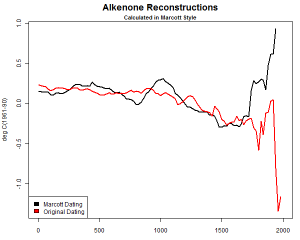
In part one of the essay we focus on the methodology that was used that created a hockey stick style graph illustrating missing data. Due to the missing data causing a faulty spike at the end, Steve McIntyre commented, suggesting that it was more like the Marcott hockey stick than it was like Mann’s:
Anthony, it looks to me like Goddard’s artifact is almost exactly equivalent in methodology to Marcott’s artifact spike – this is a much more exact comparison than Mann. Marcott’s artifact also arose from data drop-out.
However, rather than conceding the criticism, Marcott et al have failed to issue a corrigendum and their result has been widely cited.
In retrospect, I believe McIntyre is right in making that comparison. Data dropout is the central issue here and when it occurs it can create all sorts of statistical abnormalities.
Despite some spirited claims in comments in part one about how I’m “ignoring the central issue”, I don’t dispute that data is missing from many stations, I never have.
It is something that has been known about for years and is actually expected in the messy data gathering process of volunteer observers, electronic systems that don’t always report, and equipment and or sensor failures. In fact there is likely no weather network in existence that has perfect data without some being missing. Even the new U.S. Climate Reference Network, designed to be state-of-the-art and as perfect as possible has a small amount of missing data due to failures of uplinks or other electronic issues, seen in red:

Source: http://www.ncdc.noaa.gov/crn/newdaychecklist?yyyymmdd=20140101&tref=LST&format=web&sort_by=slv
What is in dispute is the methodology, and the methodology, as McIntyre observed, created a false “hockey stick” shape much like we saw in the Marcott affair:
![marcott-A-1000[1]](http://wattsupwiththat.files.wordpress.com/2013/03/marcott-a-10001.jpg)
After McIntyre corrected the methodology used by Marcott, dealing with faulty and missing data, the result looked like this:
McIntyre points out this in comments in part 1:
In Marcott’s case, because he took anomalies at 6000BP and there were only a few modern series, his results were an artifact – a phenomenon that is all too common in Team climate science.
So, clearly, the correction McIntyre applied to Marcott’s data made the result better, i.e. more representative of reality.
That’s the same sort of issue that we saw in Goddard’s plot; data was thinning near the endpoint of the present.

[ Zeke has more on that here: http://rankexploits.com/musings/2014/how-not-to-calculate-temperatures-part-3/ ]
While I would like nothing better than to be able to use raw surface temperature data in its unadulterated “pure” form to derive a national temperature and to chart the climate history of the United States, (and the world) the fact is that because the national USHCN/co-op network and GHCN is in such bad shape and has become largely heterogeneous that is no longer possible with the raw data set as a whole.
These surface networks have had so many changes over time that the number of stations that have been moved, had their time of observation changed, had equipment changes, maintenance issues,or have been encroached upon by micro site biases and/or UHI using the raw data for all stations on a national scale or even a global scale gives you a result that is no longer representative of the actual measurements, there is simply too much polluted data.
A good example of polluted data can be found in Las Vegas Nevada USHCN station:

Here, growth of the city and the population has resulted in a clear and undeniable UHI signal at night gaining 10°F since measurements began. It is studied and acknowledged by the “sustainability” department of the city of Las Vegas, as seen in this document. Dr. Roy Spencer in his blog post called it “the poster child for UHI” and wonders why NOAA’s adjustments haven’t removed this problem. It is a valid and compelling question. But at the same time, if we were to use the raw data from Las Vegas we would know it would have been polluted by the UHI signal, so is it representative in a national or global climate presentation?

The same trend is not visible in the daytime Tmax temperature, in fact it appears there has been a slight downward trend since the late 1930′s and early 1940′s:

Source for data: NOAA/NWS Las Vegas, from
http://www.wrh.noaa.gov/vef/climate/LasVegasClimateBook/index.php
The question then becomes: Would it be okay to use this raw temperature data from Las Vegas without any adjustments to correct for the obvious pollution by UHI?
From my perspective the thermometer at Las Vegas has done its job faithfully. It has recorded what actually occurred as the city has grown. It has no inherent bias, the change in surroundings have biased it. The issue however is when you start using stations like this to search for the posited climate signal from global warming. Since the nighttime temperature increase at Las Vegas is almost an order of magnitude larger than the signal posited to exist from carbon dioxide forcing, that AGW signal would clearly be swamped by the UHI signal. How would you find it? If I were searching for a climate signal and was doing it by examining stations rather than throwing out blind automated adjustments I would most certainly remove Las Vegas from the mix as its raw data is unreliable because it has been badly and likely irreparably polluted by UHI.
Now before you get upset and claim that I don’t want to use raw data or as some call it “untampered” or unadjusted data, let me say nothing could be further from the truth. The raw data represents the actual measurements; anything else that has been adjusted is not fully representative of the measurement reality no matter how well-intentioned, accurate, or detailed those adjustments are.
But, at the same time, how do you separate all the other biases that have not been dealt with (like Las Vegas) so you don’t end up creating national temperature averages with imperfect raw data?
That my friends, is the $64,000 question.
To answer that question, we have a demonstration. Over at the blackboard blog, Zeke has plotted something that I believe demonstrates the problem.
Zeke writes:
There is a very simple way to show that Goddard’s approach can produce bogus outcomes. Lets apply it to the entire world’s land area, instead of just the U.S. using GHCN monthly:
Egads! It appears that the world’s land has warmed 2C over the past century! Its worse than we thought!
Or we could use spatial weighting and anomalies:

Now, I wonder which of these is correct? Goddard keeps insisting that its the first, and evil anomalies just serve to manipulate the data to show warming. But so it goes.

Zeke wonders which is “correct”. Is it Goddard’s method of plotting all the “pure” raw data, or is it Zeke’s method of using gridded anomalies?
My answer is: neither of them are absolutely correct.
Why, you ask?
It is because both contain stations like Las Vegas that have been compromised by changes in their environment, that station itself, the sensors, the maintenance, time of observation changes, data loss, etc. In both cases we are plotting data which is a huge mishmash of station biases that have not been dealt with.
NOAA tries to deal with these issues, but their effort falls short. Part of the reason it falls short is that they are trying to keep every bit of data and adjust it in an attempt to make it useful, and to me that is misguided, as some data is just beyond salvage.
In most cases, the cure from NOAA is worse than the disease, which is why we see things like the past being cooled.
Here is another plot from Zeke just for the USHCN, which shows Goddard’s method “Averaged Absolutes” and the NOAA method of “Gridded Anomalies”:

[note: the Excel code I posted was incorrect for this graph, and was for another graph Zeke produced, so it was removed, apologies – Anthony]
Many people claim that the “Gridded Anomalies” method cools the past, and increases the trend, and in this case they’d be right. There is no denying that.
At the same time, there is no denying that the entire CONUS USHCN raw data set contains all sorts of imperfections, biases, UHI, data dropouts and a whole host of problems that remain uncorrected. It is a Catch-22; on one hand the raw data has issues, on the other, at the bare minimum some sort of infilling and gridding is needed to produce a representative signal for the CONUS, but in producing that, new biases and uncertainty is introduced.
There is no magic bullet that always hits the bullseye.
I’ve known and studied this for years, it isn’t a new revelation. The key point here is that both Goddard and Zeke (and by extension BEST and NOAA) are trying to use the ENTIRE USHCN dataset, warts and all, to derive a national average temperature. Neither method produces a totally accurate representation of national temperature average. Keep that thought.
While both methods have flaws, the issue that Goddard raised has one good point, and an important one; the rate of data dropout in USHCN is increasing.
When data gets lost, they infill with other nearby data, and that’s an acceptable procedure, up to a point. The question is, have we reached a point of no confidence in the data because too much has been lost?
John Goetz asked the same question as Goddard in 2008 at Climate Audit:
How much Estimation is too much Estimation?
It is still an open question, and without a good answer yet.
But at the same time we are seeing more and more data loss, Goddard is claiming “fabrication” of lost temperature data in the final product and at the same advocating using the raw surface temperature data for a national average. From my perspective, you can’t argue for both. If the raw data is becoming less reliable due to data loss, how can we use it by itself to reliably produce a national temperature average?
Clearly with the mess the USHCN and GHCN are in, raw data won’t accurately produce a representative result of the true climate change signal of the nation because the raw data is so horribly polluted with so many other biases. There are easily hundreds of stations in the USHCN that have been compromised like Las Vegas has been, making the raw data, as a whole, mostly useless.
So in summary:
Goddard is right to point out that there is increasing data loss in USHCN and it is being increasingly infilled with data from surrounding stations. While this is not a new finding, it is important to keep tabs on. He’s brought it to the forefront again, and for that I thank him.
Goddard is wrong to say we can use all the raw data to reliably produce a national average temperature because the same data is increasingly lossy and is also full of other biases that are not dealt with. [ added: His method allows for biases to enter that are mostly about station composition, and less about infilling see this post from Zeke]
As a side note, claiming “fabrication” in a nefarious way doesn’t help, and generally turns people off to open debate on the issue because the process of infilling missing data wasn’t designed at the beginning to be have any nefarious motive; it was designed to make the monthly data usable when small data dropouts are seen, like we discussed in part 1 and showed the B-91 form with missing data from volunteer data. By claiming “fabrication”, all it does is put up walls, and frankly if we are going to enact any change to how things get done in climate data, new walls won’t help us.
Biases are common in the U.S. surface temperature network
This is why NOAA/NCDC spends so much time applying infills and adjustments; the surface temperature record is a heterogeneous mess. But in my view, this process of trying to save messed up data is misguided, counter-productive, and causes heated arguments (like the one we are experiencing now) over the validity of such infills and adjustments, especially when many of them seem to operate counter-intuitively.
As seen in the map below, there are thousands of temperature stations in the US co-op and USHCN network in the USA, by our surface stations survey, at least 80% of the USHCN is compromised by micro-site issues in some way, and by extension, that large sample size of the USHCN subset of the co-op network we did should translate to the larger network.

When data drops out of USHCN stations, data from nearby neighbor stations is infilled to make up the missing data, but when 80% or more of your network is compromised by micro-site issues, chances are all you are doing is infilling missing data with compromised data. I explained this problem years ago using a water bowl analogy, showing how the true temperature signal gets “muddy” when data from surrounding stations is used to infill missing data:

The real problem is the increasing amount of data dropout in USHCN (and in Co-op and GHCN) may be reaching a point where it is adding a majority of biased signal from nearby problematic stations. Imagine a well sited long period station near Las Vegas out in a rural area that has its missing data infilled using Las Vegas data, you know it will be warmer when that happens.
So, what is the solution?
How do we get an accurate surface temperature for the United States (and the world) when the raw data is full of uncorrected biases and the adjusted data does little more than smear those station biases around when infilling occurs? Some of our friends say a barrage of statistical fixes are all that is needed, but there is also another, simpler, way.
Dr. Eric Steig, at “Real Climate”, in a response to a comment about Zeke Hausfather’s 2013 paper on UHI shows us a way.
Real Climate comment from Eric Steig (response at bottom)
We did something similar (but even simpler) when it was being insinuated that the temperature trends were suspect, back when all those UEA emails were stolen. One only needs about 30 records, globally spaced, to get the global temperature history. This is because there is a spatial scale (roughly a Rossby radius) over which temperatures are going to be highly correlated for fundamental reasons of atmospheric dynamics.
For those who don’t know what the Rossby radius is, see this definition.
Steig claims 30 station records are all that are needed globally. In a comment some years ago (now probably lost in the vastness of the Internet) we heard Dr. Gavin Schmidt said something similar, saying that about “50 stations” would be all that is needed.
[UPDATE: Commenter Johan finds what may be the quote:
Submitted on 2014/06/26 at 12:57 pmI did find this Gavin Schmidt quote:
“Global weather services gather far more data than we need. To get the structure of the monthly or yearly anomalies over the United States, for example, you’d just need a handful of stations, but there are actually some 1,100 of them. You could throw out 50 percent of the station data or more, and you’d get basically the same answers”
http://earthobservatory.nasa.gov/Features/Interviews/schmidt_20100122.php ]
So if that is the case, and one of the most prominent climate researchers on the planet (and his associate) says we need only somewhere between 30-50 stations globally…why is NOAA spending all this time trying to salvage bad data from hundreds if not thousands of stations in the USHCN, and also in the GHCN?
It is a question nobody at NOAA has ever really been able to answer for me. While it is certainly important to keep these records from all these stations for local climate purposes, but why try to keep them in the national and global dataset when Real Climate Scientists say that just a few dozen good stations will do just fine?
There is precedence for this, the U.S. Climate Reference Network, which has just a fraction of the stations in USHCN and the co-op network:

NOAA/NCDC is able to derive a national temperature average from these few stations just fine, and without the need for any adjustments whatsoever. In fact they are already publishing it:

If it were me, I’d throw out most of the the USHCN and co-op stations with problematic records rather than try to salvage them with statistical fixes, and instead, try to locate the best stations with long records, no moves, and minimal site biases and use those as the basis for tracking the climate signal. By doing so not only do we eliminate a whole bunch of make work with questionable/uncertain results, and we end all the complaints data falsification and quibbling over whose method really does find the “holy grail of the climate signal” in the US surface temperature record.
Now you know what Evan Jones and I have been painstakingly doing for the last two years since our preliminary siting paper was published here at WUWT and we took heavy criticism for it. We’ve embraced those criticisms and made the paper even better. We learned back then that adjustments account for about half of the surface temperature trend:

We are in the process of bringing our newest findings to publication. Some people might complain we have taken too long. I say we have one chance to get it right, so we’ve been taking extra care to effectively deal with all criticisms from then, and criticisms we have from within our own team. Of course if I had funding like some people get, we could hire people to help move it along faster instead of relying on free time where we can get it.
The way forward:
It is within our grasp to locate and collate stations in the USA and in the world that have as long of an uninterrupted record and freedom from bias as possible and to make that a new climate data subset. I’d propose calling it the the Un-Biased Global Historical Climate Network or UBGHCN. That may or may not be a good name, but you get the idea.
We’ve found at least this many good stations in the USA that meet the criteria of being reliable and without any need for major adjustments of any kind, including the time-of-observation change (TOB), but some do require the cooling bias correction for MMTS conversion, but that is well known and a static value that doesn’t change with time. Chances are, a similar set of 50 stations could be located in the world. The challenge is metadata, some of which is non-existent publicly, but with crowd sourcing such a project might be do-able, and then we could fulfill Gavin Schmidt and Eric Steig’s vision of a much simpler set of climate stations.
Wouldn’t it be great to have a simpler and known reliable set of stations rather than this mishmash which goes through the statistical blender every month? NOAA could take the lead on this, chances are they won’t. I believe it is possible to do independent of them, and it is a place where climate skeptics can make a powerful contribution which would be far more productive than the arguments over adjustments and data dropout.


 where
where  is a valid absolute thermodynamic temperature scale.