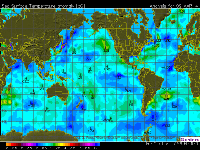
Near the first of this month, the NOAA National Weather Service discontinued the sea surface temperature dataset used by Unisys to create their daily sea surface temperature and sea surface temperature anomaly maps. As a result, Unisys has been unable to update those maps. Many persons enjoyed studying the animations (see current sample to the right) because of the color coding of temperature anomalies, in which blues and greens extended into the realm of positive anomalies.
So where can you turn now for your daily fix of peaceful and calming shades of blue?
THE SITE RECOMMENDED BY UNISYS
The color scalings for the temperature anomalies from the website suggested by Unisys are too harsh. It’s from the NOAA National Weather Service Environmental Modeling Center webpage Real-time, global, sea surface temperature (RTG_SST_HR) analysis. See Map 1. A description of that analysis is here.
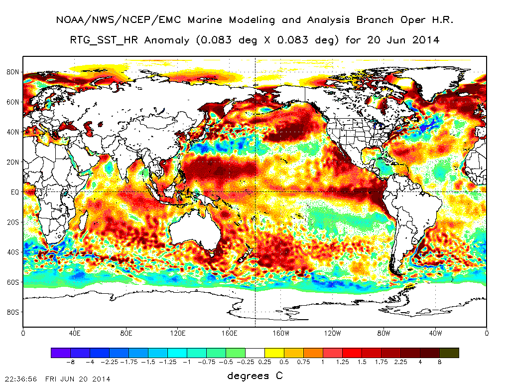
Map 1
The maps from the Environmental Modeling Center have three strikes against them:
- Strike 1: I haven’t found animations of those maps. They may exist, but with the other two strikes, I didn’t see any reason to spend too much time looking.
- Strike 2: While they use white as their neutral color, they only use it for the range of +/- 0.25 deg C. That’s way too narrow, giving too much visual “noise”.
- Strike 3: They use 1961 to 1990 as the base years for anomalies. That’s two decades behind the period (1981 to 2010) recommended by the World Meteorological Organization (WMO). The NOAA Climate Prediction Center updated the climatologies they use for many indices three years ago to 1981 to 2010. The NOAA Environmental Modeling Center should update theirs.
THE BEST I’VE FOUND…SO FAR
There are a number of other suppliers of daily sea surface temperature and anomaly maps, but the one I’ve recently bookmarked as a temporary replacement for those from Unisys come from Environment Canada (EC). See their Sea Surface Temperature Anomalies and Snow Cover – Daily webpage. A recent example is shown in Map 2. Greys are also used on the maps for snow cover and sea ice. Cool.

Map 2
Brrr. The Main Development Region for hurricanes in the tropical North Atlantic (10N-20N, 80W-20W) looks awfully chilly. Unfortunately, hurricanes don’t care about anomalies. Hurricanes only need the seasonal sea surface temperatures to rise to the levels that support their development and sustain them. Hopefully, the present El Niño conditions in the tropical Pacific will suppress them in the North Atlantic.
- Advantage 1: Animations are available from the Environment Canada webpage here. Users can also select the time period for the animation. The menus are below the map.
- Advantage 2: The range they use for neutral white is +/- 0.5 deg C. That reduces weather noise.
- Advantage 3: The base years used by Environment Canada (1995 to 2009) are closer to present. Unfortunately, they’re only 15 years. I suspect the base years are based either on the snow cover or sea ice data, because satellite-based sea surface temperature data extend back to November 1981.
- Advantage 4: You can watch the seasonal variations in sea ice and snow cover, too.
If you know of others, please let me know.
I miss the Unisys map. I have been using NCEP sst map of late, but your CMC link looks real nice. I like that the sea ice is shown, also.
“Strike 3: They use 1961 to 1990 as the base years for anomalies. That’s two decades behind the period (1981 to 2010) recommended by the World Meteorological Organization (WMO).
Advantage 3: The base years used by Environment Canada (1995 to 2009) are closer to present. Unfortunately, they’re only 15 years. I suspect the base years are based either on the snow cover or sea ice data, because satellite-based sea surface temperature data extend back to November 1981.”
So in one case it’s “strike” in the other it’s an “advantage”. Sounds like the same criteria are not being using consistently.
“Many persons enjoyed studying the animations (see current sample to the right) because of the color coding of temperature anomalies, in which blues and greens extended into the realm of positive anomalies.”
Denial is reasuring. Is there any other reason we should “enjoy” such misleading colour schemes that if they were rad biased , WUWT would be ripping the back out of them.
What was the rationale used for the NOAA National Weather Service discontinuing the sea surface temperature dataset used by Unisys, was it because it shows that the sea surface temperatures aren’t doing much and didn’t fit the “Obama story”?
If a site is found that provided still maps with a configurable way to get different dates, it should not be too hard to pull a selection of dates and make an anim. (Provdided not copyright issues exist on the maps).
Go EC. In the NOAA map the sea is angry red and cluttered, there is white both on land and sea so that the land map is hard to discern. It’s horrible.
The EC map is incomparably better, the green continents clear to see distinct from the oceans. It gives the SST picture at a glance.
I went for a paddle today (Winter Solstice) in Coffs Harbour NSW, and the Pacific was indeed boiling.
I used to use the RTG site but they changed the intensity of the colours and now it’s a complete mess.
“If you know of others, please let me know.”
Well, I can’t refrain from suggesting the Moyhu sphere plotting based on NOAA hi-res AVHRR. It’s even fairly blue, because it centers the rainbow on the average of anomalies in the scene, which is usually above zero. It does have an animation capability, which is in principle powerful, but clunky. It keeps up to date, and there are derived movies.
If you’re interested in reanalysis, Cameron Beccario’s pictures are very up to date – even tomorrow’s, if you want. They have animations of current superimposed. Not very blue. There are lots of other things at that nullschools site. It’s minimalist – click on EARTH to get info.
Greg says: “So in one case it’s “strike” in the other it’s an “advantage”. Sounds like the same criteria are not being using consistently.”
Obviously, you overlooked the fact that one is “two decades behind the period (1981 to 2010) recommended by the World Meteorological Organization” while the other is “closer to present”.
Greg says: “If a site is found that provided still maps with a configurable way to get different dates, it should not be too hard to pull a selection of dates and make an anim.”
The object isn’t to find maps so that an individual could create animations. It was to find ready-made animations.
Greg says: “Denial is reassuring…”
No one here is denying that sea surfaces had warmed (past tense), Greg. This is a discussion of sea surface temperature anomaly maps that are easy-on-the-eyes.
One thing is certain, though. Over the past 3 decades, the surfaces of the global oceans have not warmed as hindcast by your beloved can’t-simulate-ocean-processes climate models:
http://bobtisdale.wordpress.com/2014/03/26/maybe-the-ipccs-modelers-should-try-to-simulate-earths-oceans/
Have a good day.
Anth*ny’s right about the “best” map. Neutral temps should be white (empty) to most easily compare the anomalies against.
I guess a team of NOAA propagandists/psychologists came up w/the most alarming-possible colors.
Whilst useful at times I don’t really like the trend towards showing only colour-coded pictures, as they can give a false impression of warming. I prefer good old-fashioned X-Y plots (X = time), often revealing the inconvenient truth that 20th century warming was minimal, and has now stopped.
The temperature anomalies look very different on the two maps, especially in the atlantic. Am I right?
NOAA’s choice of scale colour could also be biassed.
The 1st 5 divisions on the warm side go: yellow, orange, deep orange, shocking pink, red.
The 1st 5 divisions on the cool side go: light green, light green, light green, light blue, light blue.
The Canadian map also has a special colour for uncovered sea-ice. On some other maps uncovered sea-ice appears as a bright red warm anomaly.
The ERSL division of the NOAA has updated their Ocean SST page lately and it provides a more accurate view of SSTs with some animations etc.
http://www.esrl.noaa.gov/psd/map/clim/sst.shtml
Tropical tidbits is a very good site for weather model forecasts etc. The Ocean analysis page has a daily SST map based on the same NOAA data with better color coding. It also has daily ENSO region temperatures (noting that the Nino 3.4 has gone over +1.05C in the last few days as the strong trade winds are blowing the surface water across the Pacific now from the eastern side.) No animations though.
http://www.tropicaltidbits.com/analysis/ocean.html
Weatherzone from Australia has a better color coded hi-res map using the daily NOAA data. No historical or animations though.
http://www.weatherzone.com.au/climate/indicator_sst.jsp?lt=global&lc=global&c=ssta
http://data.theweather.com.au/access/imageserver.jsp?image=grads/sst/sstanom_hires.latest.global.png
The old stand-by from the NOAA coastwatch (the first place to show good SST maps on the net). animations, zoom-ins, lots of other features. Lower resolution though.
http://www.ospo.noaa.gov/Products/ocean/sst/anomaly/index.html
At last Steven Goddard is getting credit for his tremendous gate keeping efforts of climate fraud data
http://www.telegraph.co.uk/earth/environment/10916086/The-scandal-of-fiddled-global-warming-data.html
J Calvert:
“NOAA’s choice of scale colour could also be biassed.
The 1st 5 divisions on the warm side go: yellow, orange, deep orange, shocking pink, red.
The 1st 5 divisions on the cool side go: light green, light green, light green, light blue, light blue.”
Are these equal divisions? If so, very troubling.
.
Disregard, just saw that they are equal
http://bulletin.mercator-ocean.fr/html/welcome_fr.jsp
The white region should be based on the error bar, IMHO. Anyone know what that is or should be?
I miss the Unisys map and since its demise I have been using the “Ocean” “SSTA” function in Earth Wind Map find it very useful to watch systems develop. Typically watching ENSO 1 & 2:-
http://earth.nullschool.net/#current/ocean/surface/currents/overlay=sea_surface_temp_anomaly/orthographic=-107.98,2.03,497
Check out “earth” and about for source data and update schedules
Lots of other info in http://earth.nullschool.net/about.html
“ocean surface temperatures and anomaly from daily average (1981-2011)updated daily
Sea Surface Temperature |Real Time Global SST MMAB / EMC / NCEP”
All this fiddling with data is beginning to look like feng shui practice to ensure a profitable future.
Bob Tisdale says:
June 22, 2014 at 3:16 am
Greg says: “Denial is reassuring…”
No one here is denying that sea surfaces had warmed (past tense), Greg. This is a discussion of sea surface temperature anomaly maps that are easy-on-the-eyes.
One thing is certain, though. Over the past 3 decades, the surfaces of the global oceans have not warmed as hindcast by your beloved can’t-simulate-ocean-processes climate models:
http://bobtisdale.wordpress.com/2014/03/26/maybe-the-ipccs-modelers-should-try-to-simulate-earths-oceans/
Have a good day.
====
Oh, I did not realise “easy-on-the-eyes” was the aim, that was not stated. Though I agree that ” peaceful and calming shades of blue” is hardly scientific. That is why I was critical.
Recent articles here have rightly condemned some of the national data providers for shifting the colour scale to give the visual impression of warming when there has been none. That is valuable and what WUWT is good at. .
Looking for maps with “calming shades of blue” is just trying to counter one bias with another one. That is not more scientific and not more helpful. Playing with colours is misleading whatever direction you are trying to bend things.
BTW your last paragraph is an ignorant attempt to sidestep my criticisms by pigeon-holing me. You have not idea from what I posted what views may be but that does not stop you apparently deciding I am an alarmist because I dared to question certain aspects of your article.
So I’ll clarify I don’t have any climate models myself, neither did I give any mention of any climate models, so I’m not sure what ” your beloved can’t-simulate-ocean-processes climate models:” is supposed to refer to. I consider global climate models to be worthless in their current state, so you could not have been further wrong on that score.
“Obviously, you overlooked the fact that one is “two decades behind the period (1981 to 2010) recommended by the World Meteorological Organization” while the other is “closer to present”.
I did not overlook anything, even the but you disingenuously choose to cut out
Advantage 3: The base years used by Environment Canada (1995 to 2009) are closer to present.
Sure it’s “closer to present”, in fact so “closer to present” to present that it is basically the period of near zero change. The “plateau”. It is not more aligned to WMO standards, in fact it’s not even a 30y period at all.
However, your blinkered vision sees this as an “advantage” while slating the other provider for using an older base period that is 30y.
Like I said you are not applying the same criteria consistently.
“…. the range of +/- 0.25 deg C. That’s way too narrow, giving too much visual “noise”.
It’s not “noise” it’s the data. I find that map more informative than the CE map with basically seems to reduce everything to hot,cold or white. The finer scale with more nuances gives a much better idea of what patterns are forming. (Thought the early base period does make it a bit too red.).
This probably masks some of the detail in the important Nino regions because all the hottest colours seem to blend together.
the noaa chart shows a vast colour change between +0.25 and +0.75, but between -0.25 and -0.75 there is almost no change at all. when you compare with the scale of the canadian chart, you see that the canadian one extents are of equal colour (very dark blue/red) whereas the noaa scale goes to -12 to +12 with the negative anomalies always a lighter shade.
the unisys chart was good for looking at anomalies, this one however crowds the anomalies out with warm bias. if the oceans were cooling then this one would be a good chart to use to look at anomalies, of course the baseline needs to be current though. maybe they are just getting ready for the future the way they see it! heh
I just liked the high and low temperature anomaly values posted on the map. None of the others did that. I think it way too reveling.
I am still ambivalent about the whole thing. Different ocean areas have different widths of standard deviations that are considered normal. Some range quite a ways from average and are still within their 1.5 SD, some have a more narrow SD band. Is there a way to color these areas all light blue if each area is, say, within its own 1.5 SD plus or minus from its average?
As further clarification, I think color coding SST that is only outside the normal SD range would be instructive. It would tell us if normal heating and cooling cycles are out of hand, IE if an ENSO El Nino event were out of the ordinary. I understand the purpose of more finely grained scales to tell us we are heading for normal amounts of cooling or heating, so that we can prepare accordingly (IE agricultural purposes) a few months or weeks in advance. But what we don’t have is any kind of representation of SST’s that are outside the range of SD’s in each general area of the oceans (for example, we DO have SDs for ice extent). My hunch is that it could pop the balloon of AGW wrt SST. Maybe that’s why we don’t have such a metric among our government funded websites.
A search of the internet demonstrates mixed results in terms of SST’s with SD’s clearly identified. The best compilation I could find is in the below link. It is interesting to note that the Standard Deviations used are a value of 1. Statistically speaking, that SD is narrow and would not encompass the full range of normal seasonal as well as normal nonseasonal (IE modes and oscillations) variability. One usually uses a 1.5 or even 2.0 SD metric in order to determine truly significant observed values deviating from average. It is interesting to note that the authors speculate that the AMO is in a warmer warm oscillation because of AGW. They do not say where the anthropogenic warming comes from or how it then got into the Atlantic ocean and specifically into the AMO areas. They also do not say if this state is outside the normal nonseasonal range of the AMO. And I understand why. The AMO is a very long oscillating phenomenon. Reliable records do not cover enough oscillations to tell us what the +/- SD would be for the AMO. To then say it is anthropogenic is a leap too far. As always.
http://www.google.com/url?sa=t&rct=j&q=&esrc=s&source=web&cd=1&cad=rja&uact=8&ved=0CC0QFjAA&url=http%3A%2F%2Fwww.cgd.ucar.edu%2Fcas%2Fcdeser%2FDocs%2Fdeser.sstvariability.annrevmarsci10.pdf&ei=4SSnU6O0KouPyAStx4KYDg&usg=AFQjCNH0-3ld1HeXk_1zLn2ujmdS6djtbQ
Fred Byrne says: “The temperature anomalies look very different on the two maps, especially in the atlantic. Am I right?”
I suspect that’s a result of the use of different base years for anomalies.
Greg Goodman says: “BTW your last paragraph is an ignorant attempt to sidestep my criticisms by pigeon-holing me….”
Read your first comment again, Greg. I was simply replying in kind.
Adios.
Many thanks to everyone who provided links to the websites their using now.
Bill Illis, the Hovmollers on the PSD webpage you linked are great. I hope to use them in a future ENSO update.
Greg Goodman, PS regarding pigeon-holing: You commented as “Greg”, not Greg Goodman, and you used the word denial, which would lead many people to believe you were a troll looking for an argument.
Regards
And on a bright note, I hope to publish a post tomorrow morning with the title question “Is the El Nino Dying?”
Gosh Unisys – haven’t heard of them for ages. Used to be two big old computer companies Sperry and Burroughs i think – I remember they merged in the 1980’s. Both dependent on the mainframe market.
Greg Goodman says:
June 22, 2014 at 7:54 am
…
Oh, I did not realise “easy-on-the-eyes” was the aim, that was not stated. Though I agree that ” peaceful and calming shades of blue” is hardly scientific. That is why I was critical.
The cardinal rule of charting or graphing data is to produce visual displays that are easily read and interpreted. A second, but far less commonly adhered to rule is to produce charts and graphs that are as readily interpreted in black and white or grey scale as they are in color. Since there are known physiological reactions to many colors, color scales should also be chosen with care.
Except color scales are way, way off these days.
With red being dominant. Red is, BY NATURE, a dominant color. It is the color of death, warning, predators killing things, anger, turkeys in rut, baboons seeking love, lipstick on ladies of the night!
Therefore it should be toned down tremendously in relation with the blues.
Blue is cool, quiet, peaceful, pretty, blue bells and blue skies. Making it tiny in earth map models is insane. Making everything very red is crazy. The latest eruption of rage in NOAA was to announce this spring was one of the warmest, ever and they produced this violent, red world map to prove it.
Oh, and it is cold here yet again this week in upstate NY. Feels like March or October nearly all this month. I have almost never opened windows at night due to it going down to the 40’s F. And NOAA is telling me this is one of the warmest times in all history. Feh.
Some comments and in invitation from the creator of the hideous RTG SST anomaly figures. Invitation first: you may email your constructive suggestions to me at ncep.emc.marineweb@noaa.gov
1) The nonlinear color bar is symmetric about zero, cold anomalies have the same intervals as the warm anomalies.
2) The unequal intervals are an attempt to have approximately 5% of the ocean area be of each shade — with respect to the 1981-2010 climatology that we are going to be implementing in our next upgrade to operations. As the 1961-1990 ocean is colder than 1981-2010, this does produce more red than blue for now.
3) The repulsive color bar is what we got by using the default from our graphics software (GrADS). If someone is willing to contribute a better color bar (must release copyright if such a thing may apply to color bars) we’ll be happy to try it out. We’d need RGB values for each interval.
4) The span of white being 0.5 degrees (from minus 0.25 to plus 0.25) is because 0.5 is the RMS error of typical ocean buoys.
5) For the most part, if you hate this one, you would _really_ have hated the one it replaced. Not least, it didn’t white out the values near zero.
There’s some good (or at least better) news involved:
1) You can click on the map, either of the SST or of the anomalies, and get a magnified view of that region of the ocean.
2) If you would like to plot your own anomaly figures, the data are available (non-operationally) at ftp://polar.ncep.noaa.gov/sst/rtg_high_res/anomaly_grb_hr_0.083.YYYYMMDD where YYYYMMDD is the year, month, day (ex. 20140624 today). They are produced about 2300 UTC each day. The temperature grids are also in that directory. Both are in GRIB format. Grids are 1/12th degree in latitude and longitude.