Don Easterbrook has updated his projection graph. Unfortunately, he did not update the graph that I complained about a few weeks ago, shown on the left in Figure 1. In that graph his projections started around 2010. He appears to have updated the Easterbrook projections graph on the right, where the projections started in 2000.

Figure 1
I raised a few eyebrows a couple of weeks ago by complaining loudly about a graph of global surface temperature anomalies (among other things) that was apparently created to show global cooling over a period when no global cooling existed. My loud and persistent complaints were in response to Figure 4 from Don Easterbrook’s post Cause of ‘the pause’ in global warming at WattsUpWithThat. In response to my reaction to his graph (and other things), Don Easterbrook wrote the post Setting the record straight ‘on the cause of pause in global warming’, which did not address my concerns.
It was on the thread of the “Setting the record straight” post that I presented how Don Easterbrook created the cooling of global surface temperatures during a period when no such cooling existed. The cooling effect was created by splicing global lower troposphere temperature anomalies from 1998 to about 2008 onto a graph of NCDC global surface temperature anomalies. See my Figure 2.
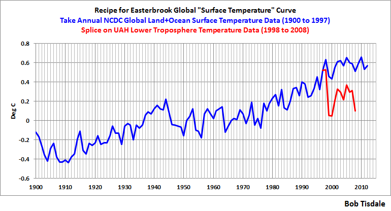
Figure 2
The graph in question was not created by splicing land surface air temperature data from 1998 to 2010 onto the end of the land+ocean surface temperature data as Don had explained in his “Setting the record straight” post (my boldface).
This curve is now 14 years old, but because this is the first part of the curve that I originally used in 2000, I left it as is for figure 4. Using any one of several more recent curves from other sources wouldn’t really make any significant difference in the extrapolation used for projection into the future because the cooling from 1945 to 1977 is well documented. The rest of the curve to 2010 was grafted on from later ground measurement data—again, which one really doesn’t make any difference because they all show essentially the same thing.
There are two errors in the above quote. First, the graph in question could not be 14 years old, because it included TLT data from 1998 to about 2008. Second, land surface temperature data do not show “essentially the same thing” as land+ocean surface temperature data. Land surface temperature data have continued to rise since 1998.
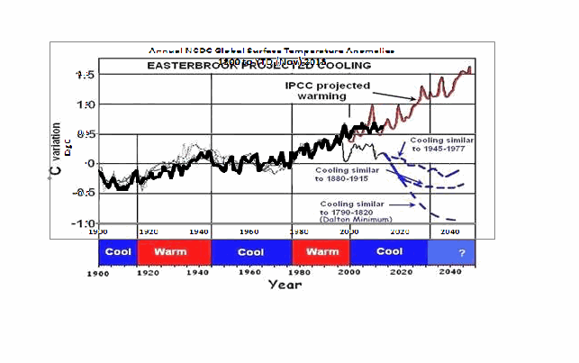
The graph in question also included a curve in red identified as “IPCC projected warming” and a number of Don’s predictions, blue curves, starting around 2010. See the full-sized version of Easterbrook’s projections that started in 2010 here. It’s a cleaner version of Don’s Figure 4 from his two posts.
On the thread of the “Setting the record straight” post, Anthony Watts asked Don Easterbrook to update the graph in question. See Anthony’s January 21, 2014 at 9:26 am comment here. (At that time we were responding to Easterbrook’s statement that he had merged land surface temperature data with land+sea surface temperature data.)
THE NEW EASTERBROOK PROJECTION
About a week after his original post, Don presented an update to his projections. See my Figure 3. As noted in the opening, it was not an update of the graph in question. The graph in question included projections starting around 2010 and it included an “IPCC projected warming” curve. On the other hand, the projection in Don’s newly furnished update starts a decade earlier in 2000 and excludes the “IPCC projected warming”.

Figure 3
Don wrote about the updated graph:
Here is an updated version of my 2000 prediction. My qualitative prediction was that extrapolation of past temperature and PDO patterns indicate global cooling for several decades. Quantifying that prediction has a lot of uncertainty. One approach is to look at the most recent periods of cooling and project those as possibilities (1) the 1945-1975cooling, (2) the 1880-1915 cooling, (3) the Dalton cooling (1790-1820), (4) the Maunder cooling (1650-1700). I appended the temperature record for the 1945-1975 cooling to the temperature curve beginning in 2000 to see what this might look like (see below). If the cooling turns out to be deeper, reconstructions of past temperatures suggest 0.3°C cooler for the 1880-1915 cooling, about 0.7°C for the Dalton cooling (square), and about 1.2°C for the Maunder cooling (circle). We won’t know until we get there which is most likely.
This updated plot really doesn’t change anything significantly from the first one that I did in 2000.
Again, that wasn’t the graph in question.
It is also blatantly obvious that his graph does not include the data from 2000 to 2013. Don has curiously omitted one of the primary reasons for someone to update a projection graph.
Another curiosity, there’s some data missing from his projections. It is supposed to represent “appended 1945-1975 temps”, meaning he spliced 1945-1975 global surface temperature anomalies onto the end of the 1999 data. However, the spike in response to 1972/73 El Niño is missing, and so is the spike in response to the 1957/58 El Niño. There’s also a spike missing in August 1945. The missing spikes stand out in Animation 1.

Animation 1
Or is that what the “appended” means…that he’s modified the 1945-75 data? I’m not sure why he’d delete those spikes, but I noticed it right away.
The little uptick at the end of the Easterbrook update is also a curiosity. It was the response to the Pacific Climate Shift of 1976, so the projection includes data beyond 1975.
And Don Easterbrook presented monthly HADCRUT3 data, as opposed to the annual NCDC data that he had used in his graph in question. I also have no idea why he would use HADCRUT3 data instead of HADCRUT4 data, especially when he wanted to use 1945 to 1975 data to show cooling during his projection. Why? HADCRUT3 data does not show cooling during that period, while HADCRUT4 data does. See Figure 4. That change in trend was a result of the revisions to the HADSST data…the corrections they made to eliminate the 1945 “discontinuity”.

Figure 4
I suspect that Don Easterbrook left out the “IPCC projected warming” curve because of the way he spliced the models onto his abridged and modified data in his graph in question (the one with the projections starting in 2010; i.e. his Figure 4 in both of his posts). See the animation here, from my January 19, 2014 at 6:34 am comment on the first of the Easterbrook threads.
MY REPLICA OF THE NEW EASTERBROOK PROJECTION
Don did not include the recipe for splicing the data starting in 1945 onto the data ending in 1999. Figure 5 is my attempt to replicate his newly updated graph. The January 1945 through December 1977 data was shifted back in time to start in January 2000. Then the relocated data was shifted upwards by 0.354 deg C so that the January 2000 (relocated January 1945) value equaled the December 1999 value. Figure 5 is a reasonable replica of Easterbrook’s revised update.

Figure 5
In Figure 6, I’ve included the surface temperature anomalies from January 2001 through December 2013. The Easterbrook projection looks a little low.

Figure 6
The projection really looks low when the data are presented in annual form, (see Figure 7), which is how Easterbrook presented his projections originally. The warming during the projection stands out like a sore thumb with the annual data.

Figure 7
NEW EASTERBROOK PROJECTION USING HADCRUT4 DATA
Figures 8, 9, and 10 run through the same process as Figures 5, 6, and 7, except that I’ve used HADCRUT4 data in the following three graphs.

Figure 8
# # #

Figure 9
# # #

Figure 10
The cooling in the projection using the HADCRUT4 data would have stood out even more if I had ended the data used in the projection in 1975, as Easterbrook had claimed. But I used the data through 1977 as he included in his graph.
NOTE: To maintain continuity between the monthly graphs and the annual graphs shown in Figures 7 and 10, I converted the monthly data to annual data. That is, I did not start with annual data for Figures 7 & 10 and splice annual data together.
MY UPDATE OF EASTERBROOK GRAPH WITH PROJECTIONS STARTING IN 2010
If Don Easterbrook had used annual HADCRUT4 data for his updated projection graph (black curve), and if he had spliced the 1945-1975 HADCRUT4 data on at 2010 (blue curve), and if he had used the multi-model ensemble mean of the CMIP5-archived models (using the RCP6.0 scenario) for his “IPCC projected warming” (red curve) using the same base years as the HADCRUT4 data, then his update to his graph in question would have looked like Figure 11. (I didn’t bother with his Dalton minimum or his Maunder cooling projections.)

Figure 11
The models look bad enough without having to add non-existent cooling to the data by splicing lower troposphere temperature data onto surface temperature data.
CLOSING
Global warming skeptics will be hurt, not helped, by those who manufacture datasets to create effects that do not exist.
Global warming skeptics do not have to help climate models look like crap. They’re doing a good job of that all on the own. See Figure 12.

Figure 12
SOURCES
The monthly HADCRUT3 data are available here. The monthly HADCRUT4 data are linked here. The annual HADCRUT4 data are available here. And the CMIP5 climate model outputs are available through the KNMI Climate Explorer.
Bob: I have presented to Don on the other thread my updated version (based on HadCrut4) of what he was trying to show.
http://i29.photobucket.com/albums/c274/richardlinsleyhood/HadCrut4MonthlyDonEatserbrookAlternative_zps997c2b44.gif
I agree his figure leaves a lot to be desired but I don’t think that it alone is sufficient to disprove his suggestion that past history may well repeat.
I started preparing this post on Sunday, so it is not a response to Don Easterbrook getting press from CNSNews.com about his projections of cooling. See Anthony’s post here. I had planned to post this on Friday, but considering the attention that post received at WUWT yesterday, I bumped it forward a day.
Oops. Label swapped. Now corrected.
http://i29.photobucket.com/albums/c274/richardlinsleyhood/HadCrut4MonthlyDonEatserbrookAlternative_zps3ddfbe2e.gif
RichardLH says: “I agree his figure leaves a lot to be desired but I don’t think that it alone is sufficient to disprove his suggestion that past history may well repeat.”
“A lot to be desired” is a nice way to put it. My complaints have never been about Don’s suggestion that history may repeat itself. As you’ll recall, I’ve presented something similar:
http://bobtisdale.files.wordpress.com/2013/10/figure-43.png
The graph is from this post:
http://bobtisdale.wordpress.com/2013/10/14/will-their-failure-to-properly-simulate-multidecadal-variations-in-surface-temperatures-be-the-downfall-of-the-ipcc/
Regards
Obviously as it’s a fact that CO2 has little to do with temperatures (Mediaeval Warm Period hotter with much less CO2 as just one example) then natural cycles drive temperature, thus it is logical to assume that past climate cycles will repeat.
As it appears that we are at a Holocene Climactic Optimum based on longer term patterns it is logical to assign a high probability to a cooling trend over the next few decades, especially given the lack of warming over the past 17 years.
It’s admirable of Bob and Anthony to maintain integrity, coherence and scientific accuracy with regard to skeptical articles, this is important given the propensity of the Alarmists to seize on any detail they can to attempt to discredit all skeptical analysis.
Bob Tisdale says:
February 6, 2014 at 3:28 am
““A lot to be desired” is a nice way to put it. My complaints have never been about Don’s suggestion that history may repeat itself. As you’ll recall, I’ve presented something similar:”
I do try very hard to be nice 🙂
I think that Don was the first to suggest that the figures might go down as well as up though.
Look out Bob, you’ll be getting an invite to join the Team before you know it. They could do with someone who can create a graph.
Bloke down the pub, they may need someone who can create a graph, but they do not like to show how model outputs do not agree with data. I don’t think the team will be making any offers in the near future…unless the offer is to stop showing how badly the models perform.
If the temperature actually matches what Figure 11 projects, it will be frustrating to both sides of the debate, because it will mostly go sideways, with fake-out feints up and down. (Fate being the trickster it is, that seems in character.):
2014: Below 2008. Hooray for our side. But the downtrend won’t continue:
2018: Highest yet. Warmists rejoice.
2021: Below 2001-02. Hooray for our side.
2023-27: Plateau’s at a slightly higher level than today’s plateau.
2029: Below 2001-02 again, but not as low as in 2012.
2030-40: Plateau’s at the current level, with wider up-and-down swings.
But, every year, the Growing Gap between reality and projections will undermine the models and the CACA Case they’re built on. The sharp drop in 2021 ought to kill them off.
For a guy that got a day job and was going to reduce his blogging, you’re still blogging a lot !!!
Excellent work Mr. Tisdale
Thanks Bob.
Neither HadCRUT3 nor HadCRUT4 is “data”, as they are referred to above. Rather, both are temperature anomaly records built from data which has been “adjusted”. The anomalies would likely be smaller, if built from the actual “data”. However, that would make the performance of the models appear even worse.
Ed Reid says:
February 6, 2014 at 5:28 am
“Neither HadCRUT3 nor HadCRUT4 is “data”, as they are referred to above. Rather, both are temperature anomaly records built from data which has been “adjusted”. The anomalies would likely be smaller, if built from the actual “data”. ”
You can achieve exactly the same output as Anomalies if you run a 12 month/365 day Low Pass filter over the data. Try it for yourself and you will see. In fact if you use a proper Gaussian Low Pass Filter you will get results that are much more mathematically accurate than the sub-sampling single mean that is often used.
Bob Tisdale:
Thankyou for this clear and lucid exposition of your disagreement with the presented exposition by Don Easterbrook. Excellent!
I now look forward to Don Easterbrook providing a response to your above article.
This is how real science is done: by the clash of understandings openly and honestly expressed. I congratulate you both and look forward to your continued blunt debate.
Richard
Bob, Your call for more accuracy and integrity should be applauded. All sides will make mistakes, but skeptics must bend over backwards to be as accurate as possible. Otherwise we skeptics loose trustworthiness.
The old adage, “let the data speak” should be emblazoned on every forehead. Someone, somewhere, added on to that phrase the following: “…for me.” Don makes the mistake of wanting data to say what he wants it to say. Bob seems devoid of such emotional attachments. Data is neither your friend or your enemy. Your greatest enemy is usually yourself.
Thanks Bob. Good debate!
I hope all skeptics will be careful and accurate when posing arguments.
If 2014 or 2015 is cooler than 2008, that will take the observed trend below IPOCC’s projected 95% confidence envelope, giving our side a huge talking point: “97% of climatologists have been 95% wrong. Don’t let them fool you twice!”
“Your greatest enemy is usually yourself.”
Ain’t that the truth.
To properly make a global surface projection one needs to understand at least the plausible physical cause of the natural oscillations of the climate system so that they can be projected in the future. One needs also to include effect of anthropogenic and volcano forcings.
The correct way to do this is already published in the scientific literature (many times), for example see here:
Scafetta, N. 2013. Discussion on climate oscillations: CMIP5 general circulation models versus a semi-empirical harmonic model based on astronomical cycles. Earth-Science Reviews 126, 321-357.
http://www.sciencedirect.com/science/article/pii/S0012825213001402
or read my web-site
http://people.duke.edu/~ns2002/#astronomical_model_1
Easterbrook’s proposal was a preliminary hypothesis that dates back in 2000 based on the idea that the cooling observed from ~1940s to ~1970s could be repeating from 2000s to 2030s because already several climatic indexes were indicating at the time the existence of a ~60-year climatic oscillation. However, today the things are known in more details.
To better understand the origin of these natural oscillations read my review paper
Scafetta, N., 2014. The complex planetary synchronization structure of the solar system. Pattern Recognition in Physics 2, 1-19.
http://www.pattern-recogn-phys.net/2/1/2014/prp-2-1-2014.pdf
Here it is argued that the solar system is highly synchronized because characterized by a specific set of gravitational and electromagnetic harmonics that are then found in both solar and climate records. This is a kind of extension of the Milankovic theory. These harmonics regulate the natural variability of the climate (and of the Sun) that the current IPCC climate model do not capture. So, these harmonics can be used to produce more accurate temperature projections for the 21st century. These projections imply half of the warming currently projected by the IPCC.
REPLY: “read my website, read my papers” same old stuff Nicola. How about you produce some data and code so a critical review of your work can be done? It has been asked for before, now I’m asking again. I don’t believe your cyclic work can stand up to critical review, as do many others.
So do you have the courage to provide the data and the code to replicate your work?
-Anthony Watts
richardscourtney says:
February 6, 2014 at 5:56 am
<<<<<<<<<<<<<<<<<<<<<<<>>>>>>>>>>>>>>>>>>>>>
DITTO
The fallacy of basing climatic evolution on a temperature record… Just what the creators of Hadcrut and other GISS wanted.
Thanks Bob.
It’s sad that you had to go through all that work to reconstruct what should have been provided as a matter of course by the author.
While you and I may disagree about the causes of global warming, you like Willis, have always made your work open an easily accesssible so that people may either build on it or criticize it.
Others are not so dedicated to openness. They take the attitude of Jones.
They want to protect their years of work from critics.
Bob Tisdale,
You STILL don’t get it–you’re still missing the point! You’ve wasted a huge amount of time dancing on a pin that doesn’t invalidate any of my conclusions in either of my two previous posts on this subject. NOTHING you have said in any of your tirades relates to my conclusions. Your latest rant is a total waste of time–it certainly doesn’t disprove any of my contentions about what the future climate might be. A I said from the start, “My qualitative prediction was that extrapolation of past temperature and PDO patterns indicate global cooling for several decades. QUANTIFYING THAT PREDICTION HAS A LOT OF UNCERTAINTY. One approach is to look at the most recent periods of cooling and project those as possibilities (1) the 1945-1975cooling, (2) the 1880-1915 cooling, (3) the Dalton cooling (1790-1820), (4) the Maunder cooling (1650-1700). I appended the temperature record for the 1945-1975 cooling to the temperature curve beginning in 2000 to see what this might look like.” These several possible scenarios mean that, at best, any quantitative estimate is really just a guess, so it makes little or no real difference where you splice the 1945-1977 data onto the end of a curve.
Your personal vendetta in trying to discredit me is very curious. You’ve said nothing that invalidates any of my work. Take a look at the pages and pages of your tirades–“Methinks thou dost protest too much.” I’m not the enemy–we really don’t have any reason to quarrel.
I need to get back to some serious work, so can’t afford to waste any more time.
I agree with ed and Tom ude above Hadcrut is just that had-crud as is Giss etc all adjusted please refer to Steven Goddards adjusted temp GISS and NOAA graphs. The only reliable ones are CET (no change), global RSS (No change) and global UAH AMSU slight warming maybe….
Don Easterbrook says:
February 6, 2014 at 8:35 am
I need to get back to some serious work, so can’t afford to waste any more time.
<<<<<<<<<<<<<<<<<<<<<<>>>>>>>>>>>>>>>>>>>>>>>>>
Do you really feel that you have wasted your time here?
rogerknights says:
February 6, 2014 at 7:28 am
If 2014 or 2015 is cooler than 2008
I do not know if you have read Walter Dnes article at
http://wattsupwiththat.com/2014/02/01/the-january-leading-indicator/
Nor do I know how accurate it will be for this year. Nor do I know if a La Nina will develop this year since the latest number is -0.7 C. However the January anomaly for RSS was 0.262 so the best “guess” according to my interpretation of Walter Dnes would be an average of 0.205 or a rank of 11 for RSS. 2008 had an average of 0.046 and is ranked 24.
I don’t know. I get what you are saying that the splicing does not match up well and in places it actually contradicts actual measurements. But the salient point I get from Dr. Easterbrook is that past cooling patterns may repeat again (i.e. climate cycles), and his ‘copy/paste’ of those past patterns onto current measurements is simply an illustration of what these cooling cycles may look like in the future. It’s a prediction, and he is on-record. He may very well be wrong .. or, in 30-40 years we may find that the real measured temperatures look remarkably similar to one of his predictions. The important aspect of his prediction, in my opinion, is that it is by-definition precedented; it is based on natural climate cycles. This is very different from IPCC and alarmist predictions which are ‘unprecedented’ and have no consideration for natural cycles.
I suppose it’s valid to pick-apart the specifics of how the prediction was spliced, and point out the contradictions in some of the overlapping portions, but I see that is splitting hairs and is not really counter to his argument.
I suspect the larger concern is with the general idea of making predictions of any kind. Perhaps science should NEVER try to predict the future .. maybe there is merit to that idea, but I doubt it’s very realistic.
Don Easterbrook says: “You STILL don’t get it–you’re still missing the point! You’ve wasted a huge amount of time dancing on a pin that doesn’t invalidate any of my conclusions in either of my two previous posts on this subject. NOTHING you have said in any of your tirades relates to my conclusions…”
Actually, Don, it’s you who does not get it. This post was not about your conclusions. This post wasn’t a tirade. This was a presentation of data.
This post was about your presentation of data and claims you’ve made that contradict themselves. You’ve presented a graph of global surface temperatures that is obviously wrong. The cooling of global surface temperature anomalies during the 1998-01 La Nina was not as you portrayed it in your graph. You, Don, achieved that illusion by splicing TLT anomalies onto global surface temperature anomalies. You’ve tried repeatedly to skirt that issue for very obvious reasons. We all understand those reasons.
I didn’t ask you to update the graph in question, Don. Anthony Watts did. You, Don, elected not to update that graph. You elected to try to redirect the discussion. Unfortunately, your misleading presentation of data won’t disappear, Don, until you make it disappear, and the only way to do that is by admitting the error and correcting the error. The ball’s in your court.
Don Easterbrook says: “I’m not the enemy–we really don’t have any reason to quarrel.”
Did you read my post, Don? Here’s the first of my closing points:
Global warming skeptics will be hurt, not helped, by those who manufacture datasets to create effects that do not exist.
You may not think of yourself as the enemy, Don, but your presentation of manufactured data is hurting the credibility of global warming skeptics. And the fact that you continue to try to misdirect and argue is telling.
An old saying:
I’d rather be approximately right, than precisely wrong.
Bob is saying that it is better still to be precisely right, which is true enough. But with all the incertainies in temperature measurememt and projection, sometimes a rough estimate is all you need to get the point across.
False precision (think models) bugs me just as much as imprecision.
Sigh!!☹
Quite a while back, I made a decision not to get into any dispute between two people. But I feel compelled to say something now.
Don Easterbrook says:
February 6, 2014 at 8:35 am
Your latest rant is a total waste of time
QUANTIFYING THAT PREDICTION HAS A LOT OF UNCERTAINTY.
I respect what you are saying Dr. Easterbrook, and I agree with the general thrust of what you are saying, but as things stand right now, you are about as much below the actual happenings as the IPCC is above. And you can believe me that other sites that I will not name know this and laugh at your expense for in effect throwing stones in a glass house. As Bob says, you do not need to exaggerate how bad the IPCC is as shown below.
In the previous article you say:
http://wattsupwiththat.com/2014/02/05/press-for-a-climate-scientist-who-got-it-right/
“When we check their projections against what actually happened in that time interval, they’re not even close. They’re off by a full degree in one decade, which is huge. That’s more than the entire amount of warming we’ve had in the past century. So their models have failed just miserably, nowhere near close. And maybe it’s luck, who knows, but mine have been right on the button,” Easterbrook told CNSNews.com.
I will apologize in advance if I am wrong, but your “full degree in one decade” is only because your own estimate was way too low. So I do not agree with “but mine have been right on the button”. My understanding is that the IPCC is only about 0.3 C per decade too high, which is bad enough.
Don Easterbrook says:
February 6, 2014 at 8:35 am
————————————-
The issue is not about your conclusions, which many here agree with, that global temps are going to turn downwards. When I read the CNS article, the chart shown in the article made no sense to me. What understanding is an average going to gain from looking at a chart that does not depict reality? The article itself is ok, but the chart should have an explanation as to what is being shown, and why it is being shown in that fashion.
Don should get out of this projection business entirely and realize that the future temperature is flat, period. I said nothing about his idiosyncrasy except to introduce my version based on physics. But here he makes a major mistake trusting the major land-based temperature curves that are all falsified to increase apparent warming. An example of that is the fake warming in the eighties and nineties. I spotted it writing my book and even put a warning about it into the preface. Nothing happened for two years but then the big three of temperature, GISTEMP, HadCRUT3 and NCDC, decided they did not want to show it any more. What they did was secretly and retroactively to line up their data for this period with satellites which do not show the warming and not give any explanation. Interestingly, while HadCRUT3 made the correction, HadCRUT4 is still showing the old version. Just use satellite data from 1979 on and forget these guys entirely. If you wonder why they faked it, bear in mind that this period includes 1988, the year that Hansen told the Senate that greenhouse warming has arrived. Looking at the satellite data you see that the ENSO oscillation was very busy then and produced five El Nino peaks between 1979 and 1997. I advise you to look up Figure 15 in my book. I see no global warming peak there that Hansen spoke about. And yet another mistake Easterbrook makes is to bring in PDO. To me it is an illegitimate construct and has no explanatory power except perhaps for salmon fishery. How can you take anything seriously if its definition requires you to look up twenty diverse quantities that seem to have nothing in common?
Don Easterbrook says:
February 6, 2014 at 8:35 am
“I’m not the enemy–we really don’t have any reason to quarrel.”
Too true. To have the details of a particular potential outcome being used to discredit the whole concept is a step too far I think.
I do also see the point about being open about where the various bits come from though.
Try this for Scenario A,B and C for potential outcomes 🙂
http://i29.photobucket.com/albums/c274/richardlinsleyhood/HadCrut4MonthlyDonEatserbrook3Alternatives_zps2c0e2406.gif
P.S. For the picky – they are all drawn from the one existing data set, just cut and overlaid. If you want to add in Dalton Minimum and the other options you will have to do those on your own.
[snip – Nicola, more “read my papers” with links is not a response. How about data and code in a repository or SI? That would be an appropriate response. If you don’t have any that you can share in such a manner, or refuse to do so, just say say so and I won’t pursue the matter further. – Anthony]
Reply to: Don Easterbrook February 6, 2014 at 8:35 am
Don, I don’t agree either with you or with Bob Tisdale. Tisdale just does not get it together and has written a book claiming that ENSO causes global warming. Told him ENSO is an oscillation that repeats itself but could not get through. The real story of how it works is in my book. Anthony has decided to give Bob a big play even though he does not have the ability required for analyzing issues that come up. At the same time when I offered him my Arctic paper he went crazy and told me he did not want it because I did not use English grammar correctly. Obviously a phony reason. I did put another comment out about your work in here in which I explain why I do not agree with you. What I say has to do with science and is nothing personal. Give it some thought and lets see if we can resolve the issues involved.
Open public debate. That’s what we are seeing.
But that means it can’t be climate science.
Alright it is science — just not climate science.
Should climate science be renamed Catastrophic Anthropological Climate Science? Seems fitting.
My brain is having a slow morning.
Eugene WR Gallun
Arno Arrak says:
February 6, 2014 at 10:39 am
Reply to: Don Easterbrook February 6, 2014 at 8:35 am
“Don, I don’t agree either with you or with Bob Tisdale. Tisdale just does not get it together and has written a book claiming that ENSO causes global warming. ”
I sort of agree with both of them though. Don I agree with in the sense that there is a ~60 year pattern overlaid on a longer pattern that underlying pattern may well have reached its peak and could easily go down now.
http://i29.photobucket.com/albums/c274/richardlinsleyhood/HadCrut4MonthlyDonEatserbrook3Alternatives_zps2c0e2406.gif
Bob in the sense that, given the timescale over which he has mostly analysed the data (i.e. since 1979), it has indeed risen.
http://i29.photobucket.com/albums/c274/richardlinsleyhood/HadCrut4Monthly11575Lowpass1575SGExtensions_zps48569a45.gif
Nicola Scafetta says:
February 6, 2014 at 10:17 am
Nicola: Have you looked at my low pass filter treatments of the Climate series to date? They seem to support your work, at least in part.
Please note that the methodology used will show ANY cycle greater than 15 years. I did not choose the ~60 year cycle, the data demonstrated it was there.
RichardLH says:
February 6, 2014 at 12:00 pm
Yes, Richard. I did not choose the ~60 year cycle either, the data demonstrated it was there.
Everybody looking at the data can see it.
To Anthony. Dear Anthony notice that I did not give any data or code to RichardLH. He simply took that data I am using in my paper and did something similar to what I did, e.g. a low pass filter treatments and found one of my results easily.
nicola
REPLY: Still, you haven’t addressed the question. Where’s your repository/archive of data and code? Why must people reverse engineer your papers? Are you afraid that if you make it too easy you’ll be disproved? As I note that much like Mann, your ego precludes such a possibility, so the explanation must lie elsewhere. – Anthony
Thanks. But even if 2014 is 11th, that’ll still fall through the lower rising line of IPOCC’s 95% confidence envelope.
First let me thank bob Tisdale again for some good work.
Don Easterbrook: You STILL don’t get it–you’re still missing the point! You’ve wasted a huge amount of time dancing on a pin that doesn’t invalidate any of my conclusions in either of my two previous posts on this subject. NOTHING you have said in any of your tirades relates to my conclusions. Your latest rant is a total waste of time–it certainly doesn’t disprove any of my contentions about what the future climate might be.
I think Bob Tisdale made useful corrections to your graphs, and we readers got better information regarding your contentions than were presented in your originals. It’s no fun to be corrected in public but the usual etiquette is to thank those who took the trouble to make good corrections. I think you should thank him for his interest and effort.
Nicola Scafetta: To properly make a global surface projection one needs to understand at least the plausible physical cause of the natural oscillations of the climate system so that they can be projected in the future. One needs also to include effect of anthropogenic and volcano forcings.
The advantage of Don Easterbrook’s method is precisely that it does not depend on hypothetical mechanisms (knowledge of which may be incorrect, or exaggerated) or on assumed exact periodicities. His approach may be found 30 years hence to have made the best projection of all, if what we now call “understanding” of the plausible physical causes turns out to be imprecise, incomplete or worse.
The first discovery of the Temp Plateau (please anyone add earlier papers), was the
Nov 2003 article: L.B. Klyashtonin, A.A. Lyubushin “On the coherence between Dynamics
of the World Fuel Consumption and Global Temperature Anomaly”, Journal
Energy&Environment, 14, nr. 6 (2003). The Russian authors detect Nick Scafettas 60 year
cycle and predict, see their abstract, a cooling 2003-2029 of 0.15 to 1.00 C.
Honour to those who are the first in line. The second in line is Nicola Scafetta.
To Prof. Easterbrook: There is no paper earlier than 2003.
If all of us look, we will find the honoured first author of the Temp Plateau, which
will continue to at least 2040, in line with the 60 year cycle. Suggestions anyone
and lets find out!!
JS
Dear Anthony, there is no need of a repository/archive of data and code that I use.
They can be obtained in Internet, in books and by properly using the information listed in the papers. You need to follow the instruction written in the paper. That is sufficient to replicate everything written in my papers. Of course you need to have the scientific knowledge to do that and, above all, a little bit of good will.
See Anthony, your way of arguing does not make any sense.
If you really want that I lecture you in some way (for example if you want that I send you the HadCRUT4 record I used because you are not able to download it from internet) that cannot be free. How much are you willing to pay?
REPLY: Again, a dodge, equivalent to your “read my papers, read my papers” mantra. Show your code. Pointless to continue with you. – Anthony
‘To Anthony. Dear Anthony notice that I did not give any data or code to RichardLH. He simply took that data I am using in my paper and did something similar to what I did, e.g. a low pass filter treatments and found one of my results easily.”
This ladies and gentleman is Dr. Scaffetta doing his best Michael Mann impersonation.
How many times did we ask Mann for data and code? And what were his answers?
1. Read my papers ( yup Dr. Scaffetta learned that from mann)
2. You can’t understand my work ( yup Dr. Scaffetta stole that excuse as well )
and Finally 3. Mann pointed to other people who “replicated” his Hockey Stick
So here, Scaffetta has accomplished the trifecta. He’s “plagarized” every one of michael mann’s excuses: read my papers, its all in there; you can’t understand my work; other people have done similar things.
None of the these excuse stolen from Mann’s playbook Answer the question. None of them address the simple request. All of them move the shells around in his pea game.
On this, Mr. Mosher and I agree.
Steven Mosher and Anthony: That’s exactly what we’re seeing from Don Easterbrook. Lots of talk (misdirection), no data, and a list of his papers.
Anthony, Anthony, Do you (together with Mosher) really think to fool the readers of this blog? Do you really think that everybody is stupid? You are really behaving like Pinocchio with Mosher behaving as Pinocchio’s friend Lucignolo (Lampwick).
About something more interesting. Read this comment I wrote on Tallbroke
http://tallbloke.wordpress.com/2014/02/06/the-sun-drives-climate-not-co2/comment-page-1/#comment-67524
This has to do with the Copernicus-Censorship-Affair. If you would like to give some positive contribution to humanity, it is better that you focus on the issue that I stress there.
REPLY: Nicola, for the record, your opinion is noted. It will also be the last one you post here until such time that you produce data and code as requested, which is apparently impossible for you, so you go off on conspiracy theory.
– Anthony
This is a great piece of work, in that it attempts to show consistency of data. It is one of the continual pitfalls of people who make projections (whether it is future climate or stock prices!) to discount data that doesn’t fit their previous work.
The thing that is missing from this piece is the overwhelming consensus that a large proportion of the observed cooling from 1945 to 1977 has been attributed to the increase of aerosols, especially the reflective cooling effect of coal-produces sulfur dioxide (the same stuff that tropical volcanoes put into the upper atmosphere to cool the planet).
Unless the author (don) states specifically that he attributes his future cooling trend to be caused by south-east asia air pollution (and therefore analogous to the 1945-1977 causation) then he is simply grabbing a convenient curve and tacking it onto the end of the current record to make a projection, WITHOUT REAL CAUSATION.
link:
Surface incident solar radiation G determines our climate and environment, and has been widely observed with a single pyranometer since the late 1950s. Such observations have suggested a widespread decrease between the 1950s and 1980s (global dimming), that is, at a rate of −3.5 W m−2 decade−1
HADCRUT4 is computer generated fiction. The overwhelming majority of temp data from paleo studies show that the 1930s are the warmest decade since the LIA. There is no evidence that temps since 2000 are warmer than the 1930s.
jai mitchell says:
February 6, 2014 at 2:32 pm
“The thing that is missing from this piece is the overwhelming consensus that a large proportion of the observed cooling from 1945 to 1977 has been attributed to the increase of aerosols, especially the reflective cooling effect of coal-produces sulfur dioxide (the same stuff that tropical volcanoes put into the upper atmosphere to cool the planet).”
So co-incidence is the reason rather than other possible causes?
It is purely down to that and that alone that there is an apparent ~60 year cycle in the data? The bump just happens to be in the right place?
Despite that there are significant papers putting forward other climate observations that also support an ~60 year cycle. Ones that can hardly be attributed to aerosols. Such as AMO, PDO, Polar Vortex, Stadium Wave, etc.
I am sorry. Co-incidence of attribution to a very poorly globally sampled figure is getting very far out on a limb.
Nicola Scafetta says:
February 6, 2014 at 2:15 pm
I did not refer to your paper for the data. This is an independent conclusion based on there being something in the data above 15 years that looks like a ~60 year cycle plus a longer, probably 100+ cycle also.
It is present in most of the climate data, not just HadCrut4. It is even there quite strongly in the SST data as well.
I do not, as yet, have a definite attribution for it. But its presence as a cycle rather than a co-incidental ‘bump’ is, I believe, certain.
The link to my comment above…
http://multi-science.metapress.com/index/Q8G396420R003483.pdf
Anthony, both authors of this paper, Klyashtorin and Lyabushin, identify the 60 year
cycle over 1,400 years. Therefore, the cycle exists. Therefore, the Plateau set in, in
order the next cycle can follow. Now, Willis is the staunch cycle fighter. But why do you not give
credit to Klyashtorin and Lyabushin (2003)? Why has cycle fighter Willis such influence on you?,
He is off-road concerning cycles….Think again…..
Richard,
Please review:
Figure 2
http://www.pnl.gov/main/publications/external/technical_reports/PNNL-14537.pdf
I doubt if there’s even a consensus on this now. It makes no sense. The effect of aerosols is regionally specific. They are short-lived in the atmosphere (unlike CO2). The 1945-77 cooling was dominated by arctic cooling of around 1 degree C over the 30 year period. The NH mid-latitude regions (the regions that provided the source of the aerosol emissions in post-war period) experienced little cooling – and certainly no more than the rest of the world in general.
That’s not to say that a small proportion of aerosols didn’t find their way to the arctic. They did but aerosols in the arctic cause WARMING – not cooling. See Arctic Haze
http://en.wikipedia.org/wiki/Arctic_haze
richardscourtney said:
“Bob Tisdale:
Thankyou for this clear and lucid exposition of your disagreement with the presented exposition by Don Easterbrook. Excellent!
I now look forward to Don Easterbrook providing a response to your above article.
This is how real science is done: by the clash of understandings openly and honestly expressed. I congratulate you both and look forward to your continued blunt debate.
Richard”
Bob Tisdale has laid out time after time exactly what it is he talking about. Don, time after time, has talked about anything except the point Bob has made, and updated a different graph to the one in question, and not provided the data.
Am I suppose to believe that Don doesn’t understand what Bob is talking about, and that his failure to update the correct graphs and provide the data is just a misunderstanding?
The way Bob has dealt with this, providing thorough reasoning, analysis and data speaks for itself, as does Don’s behavior, dodging the point, updating a different graph, and failing to provide data.
RichardLH says: February 6, 2014 at 3:45 pm
I did not refer to your paper for the data.
***********
RichardLH you do not need to refer to my paper for the data. I do not use “special” and “mysterious” data as Anthony is claiming. I have analyzed a lot of data that can be downloaded in Internet by everybody (HadCrut4, HadCrut3, PDO, NAO, AMO, SLR, LOD, Monsoon etc). All these records present a quasi 60 year oscillation and other characteristics highlighted in my papers.
If you have used some of some of these data and used correct mathematical tools you had to find my same conclusion. This is the nice thing of science. People can repeat things independently. As you correctly did.
(Note that Anthony knows well that my data are easily available in Internet, He is just behaving like Pinocchio.)
“See Anthony, your way of arguing does not make any sense.”
It continues to amaze me how intelligent, highly educated people can act with such transparent clownery. It’s really tremendously depressing.
jai mitchell says:
February 6, 2014 at 4:23 pm
“Richard,
Please review:
Figure 2”
I did and can find no correlation between that and a ~60 cycle in the temperature data. Can you demonstrate one?
Bob Tisdale says: “…Global warming skeptics will be hurt, not helped, by those who manufacture datasets to create effects that do not exist….” Like the manufactured Hadcrut whatever? Like these datasets that have the 1930-40 decade, when many of America’s (the world’s?) hottest temperature readings occurred, now look like a period out of the Little Ice Age? (Remember Darwin, Australia, courtesy of Willis?). I’m perfectly happy to have Don present a prospective “SWAG” that merely uses something that sort of gets the shape of the T curve correct, because the point is he is saying the future is “DOWN” while the people who manufacture these datasets and assorted other BS, are saying it’s “Nothing but UP, Baby!” (and they have their thumbs on the scales). If he were to try to publish this in GSA or Science, then I think your l_e_n_g_t_h_y criticisms (and thinly-veiled charge of “Liar”) would be in order.
But Don, it would be wise to rework it to avoid this, if you’re going to promote it somewhere other than here.
“I’m perfectly happy to have Don present a prospective “SWAG” that merely uses something that sort of gets the shape of the T curve correct, because the point is he is saying the future is “DOWN” while the people who manufacture these datasets and assorted other BS, are saying it’s “Nothing but UP, Baby!” (and they have their thumbs on the scales).”
Because after all the actual literal truth isn’t the important thing. The important thing is winning!
” If he were to try to publish this in GSA or Science, then I think your l_e_n_g_t_h_y criticisms (and thinly-veiled charge of “Liar”) would be in order.”
Bollocks. If those criticisms are valid anywhere, they are also valid here.
jai mitchell says:
February 6, 2014 at 2:32 pm
“The thing that is missing from this piece is the overwhelming consensus that a large proportion of the observed cooling from 1945 to 1977 has been attributed to the increase of aerosols, especially the reflective cooling effect of coal-produces sulfur dioxide (the same stuff that tropical volcanoes put into the upper atmosphere to cool the planet).”
That is not true. Every year more and more data is showing how little an impact aerosols have. Climate Modelers themselves have even recently stated that Solar and Aerosols together can only explain, at most, about 20% of their failed projections. Their projections are off by roughly 0.5 Degrees, so that leaves Aerosols & Solar accounting for roughly 0.1 Degree over the past 17 years. That means they feel Aerosols are accountable for fractions of a degree over a pause lasting more then 50% of the cooling during the 70s. (In fact, I am fairly confident that is even the IPCCs started reason for their confidence level rising from 90% to 95%; they found out Aerosols cool much less then they thought.)
“Unless the author (don) states specifically that he attributes his future cooling trend to be caused by south-east asia air pollution (and therefore analogous to the 1945-1977 causation) then he is simply grabbing a convenient curve and tacking it onto the end of the current record to make a projection, WITHOUT REAL CAUSATION.”
His Causation is the effects of La Nina, and the corresponding Negative Cycle of the PDO. During El Nino/Positive periods there is warming. During the La Nina/Negative periods there is cooling. The PDO has switched cycles in 2008, 1977, 1946 and 1915. Take 2 minutes with WFT and Photoshop and you can see what you call merely a “convenient curve” for yourself. But here, I have quickly done it for you to make sure you see it for yourself
http://tinypic.com/m/i2owtl/4
That sure is one hell of a “convenient curve” – I can’t imagine a person could even manipulate the data and come up with such a strong match going all the way back to the 1890s
Note that while doing that, one can also see it is the period prior to 1880 where Warming really took place. Clearly that time frame did not see one of the 4 repeating natural pasterns we have seen since. (and seemingly 5, as we just entered a new one in 2008; the one Eastbrook is projecting outward, witch is so far matching 6 years in) That 1850-1880s anomaly conveniently corresponds with a Negative PDO cycle that really never was (from 1853-1884) and is a portion of what brought us out of the LIA.
But all of that is probably a coincidence, I’m sure.
Two things:
First:
Ed Reid says:
February 6, 2014 at 5:28 am
“Neither HadCRUT3 nor HadCRUT4 is “data”, as they are referred to above. Rather, both are temperature anomaly records built from data which has been “adjusted”. The anomalies would likely be smaller, if built from the actual “data”. However, that would make the performance of the models appear even worse.”
Given that the jiggery-pokery of temp record adjustments all add heat (enough to have shoved 1930s/mid 40s down several tenths thereby anhilating the real record temps), it is highly questionable to be arguing precision here, especially since we are talking about a 2000 prediction before there was a clear hiatus and before there was even HadCrut 4, which was itself done in the hope that the “pause” could be bent up a bit to give continuity – the vain hope being that a little nudge would be enough to bridge to the big rise coming by 2003/5. Don had the decline occur essentially after 2000 – hey, so what? The big news was a prediction that said we weren’t going ever forward and upward.
Bob, who never disputes the Hadcruts (and there will be a desperate flurry of several more if the “hiatus” goes on much longer), takes Don to task for not getting the inflection right and for being worse than the IPCC, only in the other direction. He argues Don used the wrong HadCrut.
Don, who really only had to say, hey, we were talking about the future (in 2000) and my point was that, at that time, to be calling for a decline in temps was the balsy prediction I made. He didn’t need to make it perfect in retrospect by trying out various inappropriate products in recent years to illustrate the earlier prediction. Don thereby robbed himself of a solid place in history; Bob makes firm, aggrieved critical points using the product manufactured by the “We’ve-been-had-and-crudded-4-times Office”
Both you guys are now off on a tangent. I’m curious as to what Mosher has to say about the HadCrut stuff. They jacked up the temps for H-4 because they felt that the arctic was under measured for heat and then, using this idea, made the worst minimum Arctic Ice projection of the 25 or so estimators being a couple of million sq km under the 5Msqkm for a couple of years running.
All of the above post said, I stand with Tisdale in wishing Easterbrook would not manipulate data, ensure he has his dates lined up right, and clarify exactly what he is saying.
As it stands, the evidence is on the side of his argument, but his argument is not going well.
If one calculates out the year over 62nd year anomaly with a 10 year running average, we have been running at a very stable +0.3 since roughly 1945. No warming, no cooling; just a pretty stable +0.3 anomaly trend. That being the case, I think a +0.3-0.4 over the mid 70s is probably likely come 2038/2039, when this Negative PDO cycle is scheduled to end. That means about a 0.3 decrease over the next 25 years.
That all adds up to a pretty strong argument, and it should be playing out much better then it is.
drumphil says:
February 6, 2014 at 5:25 pm: Explain yourself, idiot. What does this mean: “…Because after all the actual literal truth isn’t the important thing. The important thing is winning!…” Which “literal truth” are you going to enlighten us with? We’re all waiting to hear your pronouncement.
Winning in what way? Easterbrook made a projection. If he’s right, then we all lose. If he’s wrong, then he loses. Bollocks back at you.
Gary Pearse says: “Both you guys are now off on a tangent.”
My primary arguments of this post were that (1) Don manufactured a global surface temperature dataset that showed cooling when non existed. (2) He was asked to update it by Anthony. (3) He chose to update another graph, a graph that had no bearing on the discussion. You’ve lost sight of that.
Don has always been off on a tangent. He has acknowledged that he spliced two totally different datasets together for the graph in question, but his explanation was wrong. He has also claimed that mixing two totally different datasets together was okay because they basically showed the same thing, when we all know that’s wrong. Last, he has not acknowledged that his selection of datasets showed cooling over a period when none existed.
drumphil says: “Because after all the actual literal truth isn’t the important thing. The important thing is winning!”
Here’s a great example of getting caught by presenting something other than the “actual literal truth”. For years, people have been told that the last decade was the warmest on record. They expect a graph to show that. They may (or may not) accept the hiatus period, but when they do look at a graph, they expect to see the last decade as the warmest. Easterbrook’s graph…
http://bobtisdale.files.wordpress.com/2014/02/full-sized-easterbook-projection-2010.png
…doesn’t show that, so those people know the graph is something other than the “actual literal truth”.
If you had run through the comments on the thread of the CNSNews article about Easterbrook, you would have noted that Easterbrook got caught numerous times for just that reason.
People can’t win with lies. Lies eventually become visible. It’s only a matter of time.
Bob Tisdale says:
February 6, 2014 at 7:22 pm
“…For years, people have been told that the last decade was the warmest on record. They expect a graph to show that. They may (or may not) accept the hiatus period, but when they do look at a graph, they expect to see the last decade as the warmest. Easterbrook’s graph…
http://bobtisdale.files.wordpress.com/2014/02/full-sized-easterbook-projection-2010.png
…doesn’t show that, so those people know the graph is something other than the “actual literal truth”….”
So what now Bob, bread and circuses? Just because the masses have been lied to by slimebags, we should jump on the bandwagon and continue to try to get their attention by using the lies by the liars as the comparison, except to say that maybe the end isn’t just around the corner, because, well, uhh, the ENSO, you know…. (And the masses aren’t hearing one tittle about this little conflagration in a tin pot that you are stoking).
Easterbrook put out something that isn’t a science paper – it was, I think, a GSA poster session originally. Provocative, but never pretending to be anything other than one man’s guess. Now it’s gone farther out than that, but it is still an opinion that he has to defend and be judged on depending on RESULTS. I don’t see one damned thing that purports to being anything other than matching shapes of curves and making an analysis and stating an opinion. But you want to make a federal case out of it, and throw up the liars’ datasets as the determinative information. Easterbrook is a superb geologist, and he can wave his arms all he wants, in my opinion. Sometimes he gets it right. Like you may have with your “step-wise ENSO analysis”, which is just lines drawn on a fabulous T chart and a bold assertion as to what those lines mean.
A debate as to the precision of the 5th decimal in a field where data is limited to the first decimal at best. Give it a rest. So you don’t like his graph. Like this is the first graph in history that combined various sources of data and we can spit out “data splicing” as an epithet.
In all my readings of Don Easterbrook’s work I see a broad theory proposed, that based on the geologic record sometimes it is warmer and sometimes it is colder, and there is correlation with the PDO, and it is cyclical, and it is about to get colder. See any heavy math in that? Graphs are an illustration, not a proof
Picking nits on the details of graph construction may satisfy a personal need but does nothing to affirm or deny the basic premise, sometimes it is warmer and sometimes it is colder and we are about to get colder based on the geologic record.
Sometimes the techies just simply cannot accept the fact that the conclusion is correct. They have to focus on every statement and slide and graph and vehemently disagree with the presentation and go into crazy attack mode. This is like an argument about choosing a route for a cross country trip, He wants to go north and you don’t, so lets have a blood-letting fight over it.
You have done credible work on Enso, Attacking others for offending your personal sensibilities will not enhance your standing. Yep, we know that is not how you would have done it, but it is his presentation, not yours. Deal with the conclusions and be done with it.
John Finn,
The proportion of sulfates in the atmosphere in the 1945-1977 era was so much greater than the amount of current forcing that it produced a cooling effect. The arctic haze you are talking about is not important in this regard. The reflective cooling comes from the proportion of SO2 that reaches the stratosphere, and lingers there for a decade or so. That is why the link I provided (see figure 3) is so important.
D.S.
Yes, they have a massive effect, Aerosols are the reason for volcanic cooling. You do believe in that don’t you???
If you look at the rate of heat accumulation in the deep ocean you will see that the rate of total heat deposition in the earth is still growing at a near exponential rate. The surface (air and land) temperature increases are miniscule compared to the energy deposition in the oceans.
The next time we get a massive el nino like we did in 1998 we will see another jump in temperatures, right back to the projections. I hope you are ready to admit that you were wrong and will accept that we must take decisive actions to limit CO2 emissions when that happens, because, I am afraid, after that, it may already be too late
jai mitchell says:
February 6, 2014 at 9:04 pm
Yes, they have a massive effect, Aerosols are the reason for volcanic cooling. You do believe in that don’t you???
For how long? Oh yeah…
But anyway, as I told you earlier (but you ignored)
“Trenberth, for example, analyzed their impacts on the basis of satellite measurements of energy entering and exiting the planet, and estimated that aerosols and solar activity account for just 20% of the hiatus.”
So the question becomes; is Kevin Trenberth, who happened to be the lead author of multiple IPCC reports, completely wrong, or are you? (and while I think he is an opportunistic piece of trash riding a wave of fraud perpetrated off peoples gullibility, I’m still more inclined to believe his take on aerosols then yours. In fact I’m a tad shocked he even admitted reality, it hurts his position)
“If you look at the rate of heat accumulation in the deep ocean you will see that the rate of total heat deposition in the earth is still growing at a near exponential rate. The surface (air and land) temperature increases are miniscule compared to the energy deposition in the oceans.”
There is no heat accumulation in the ocean. That is a theory to where maybe the missing heat they think must exist might be. And why do they have this theory? Because they can’t admit they are wrong, they are much too invested at this point (and making a fortune off it!) So they stick to nature having nothing to do with anything since 1950, despite http://oi57.tinypic.com/av1rev.jpg
But if there really was heat building up in the ocean – good! Sediments show our Oceans are currently at least 1 degree lower than they have been most of the past 10,000 years. And while there has been a small increase over the past 400 years (that brought us out of the Little Ice Age) we are still sitting well below what looks to be normal. That means we are still possibly in the danger zone of going right back into another LIA in the near future (this is especially dangerous while we are sitting in a Negative PDO cycle and witnessing what is quite possibly the start of a new Maunder Minimum)
“The next time we get a massive el nino like we did in 1998 we will see another jump in temperatures, right back to the projections. I hope you are ready to admit that you were wrong and will accept that we must take decisive actions to limit CO2 emissions when that happens, because, I am afraid, after that, it may already be too late”
Seeing as we just started the La Nina cycle it will likely be another 30 or so years before we see another strong El Nino like that. Well, one that isn’t merely a response to a La Nina at least. Besides, the El Nino you are going to be waiting for is thought to be the biggest we have seen. It might be another 1,000 years before we see another like it, for all we know. And that is what you are waiting for to find your missing heat?
I do have to say though, it is interesting that CO2, which was supposed to have heated the planet evenly as if it were a blanket on the planet (as we were told for years until they finally admitted to the stall and started looking for any and every excuser the past 2 years. Now it is nature that controls the man made global warming that is controlling nature, apparently.) …getting back to my sentence; so now CO2 doesn’t heat the Atmosphere or the SST, and instead jumps straight down to the deep oceans where we cant measure it? So how does that work exactly? I admit I am not a learned Climatologist and all, but I know if I hold a heat lamp a few feet above the surface of my bathtub, the air and surface heat first. But CO2 generated heat has the ability to decide to go out of its way to bypass reality and cause this magical devastation?
No matter. If you are really worried about CO2, then I will help you. That is, I will help pay for your plane ticket if you feel the need to go cut down the Amazon in your effort to save us all from the evil CO2 it is emitting
http://hockeyschtick.blogspot.com/2014/02/new-paper-finds-amazon-can-be-net.html
Not sure what you will do about the Arctic Tundra though
http://hockeyschtick.blogspot.com/2014/02/new-paper-finds-arctic-tundra-is-net.html
By the way, you want to know what might really hurt crops in Iowa? The extreme Cooling they (like most of the US) have been experiencing since 1998
http://www.ncdc.noaa.gov/cag/time-series/us/13/00/tmp/ytd/12/1998-2013?base_prd=true&firstbaseyear=1901&lastbaseyear=2000&trend=true&trend_base=10&firsttrendyear=1998&lasttrendyear=2013
They are on pace to lose a full 10 degrees by the year 2097! Quick, somebody get that state some more CO2; the CO2 they have been releasing above their state is obviously broken
JimF said:
“Winning in what way? Easterbrook made a projection. If he’s right, then we all lose. If he’s wrong, then he loses. Bollocks back at you.”
What is your understanding of the issues raised by Bob, and the adequacy of the response from Don? I’d love to know how exactly you think my position is bollocks.
Tee Jay said:
“A debate as to the precision of the 5th decimal in a field where data is limited to the first decimal at best. Give it a rest. So you don’t like his graph. Like this is the first graph in history that combined various sources of data and we can spit out “data splicing” as an epithet.
In all my readings of Don Easterbrook’s work I see a broad theory proposed, that based on the geologic record sometimes it is warmer and sometimes it is colder, and there is correlation with the PDO, and it is cyclical, and it is about to get colder. See any heavy math in that?”
Math is required to produce accurate graphs, otherwise you will end up misleading people, and shouldn’t publish the graph in the first place.
“Graphs are an illustration, not a proof”
If what they illustrate isn’t supported by solid science they are misleading.
“Picking nits on the details of graph construction may satisfy a personal need but does nothing to affirm or deny the basic premise, sometimes it is warmer and sometimes it is colder and we are about to get colder based on the geologic record.”
If that is true, the data to support the graph should be easy to show. If you can’t support such a graph with the data, how can you claim to know those things.
“Sometimes the techies just simply cannot accept the fact that the conclusion is correct. They have to focus on every statement and slide and graph and vehemently disagree with the presentation and go into crazy attack mode. This is like an argument about choosing a route for a cross country trip, He wants to go north and you don’t, so lets have a blood-letting fight over it.”
That is weak. We should overlook the accuracy of the supporting data and analysis and focus on the “fact” that the conclusion is correct?? This is madness.
“You have done credible work on Enso, Attacking others for offending your personal sensibilities will not enhance your standing. Yep, we know that is not how you would have done it, but it is his presentation, not yours. Deal with the conclusions and be done with it.”
Who gives a damn about anything except the scientific issue at hand.. everything else is a sideshow distraction.
Tee Jay says: “A debate as to the precision of the 5th decimal in a field where data is limited to the first decimal at best.”
I suggest you take a closer look at the units in the y-axis:
http://bobtisdale.files.wordpress.com/2014/02/figure-2-easterbrook-recipe2.png
Tee Jay says: “Like this is the first graph in history that combined various sources of data…”
Please provide links to all of the examples of graphs on this website where two datasets of completely different variables (like global land+ocean surface temperatures and lower troposphere temperatures) have been spliced together when there was data available for the primary dataset (global surface temperatures in this example).
Tee Jay says: “In all my readings of Don Easterbrook’s work I see a broad theory proposed, that based on the geologic record sometimes it is warmer and sometimes it is colder, and there is correlation with the PDO, and it is cyclical, and it is about to get colder. See any heavy math in that? Graphs are an illustration, not a proof”
It almost sounds as though saying that you condone manufacturing a graph to confirm a theory, when no confirmation exists; that is, Easterbrook’s creating the appearance of cooling when none existed.
Easterbrook didn’t need to splice two incompatible datasets together to confirm his original theory, which included a flattening of surface temperatures, in addition to two cooling curves:
http://bobtisdale.files.wordpress.com/2014/02/agu2.png
Yet he did for reasons known only to him.
Tee Jay says: “You have done credible work on Enso…”
Thank you.
Tee Jay says: “Attacking others for offending your personal sensibilities will not enhance your standing.”
Are you saying that expecting skeptics to adhere to the same high standards we would want from the climate science community will hurt my “standing” here at WUWT? I disagree, and so would others who commented earlier on this thread.
Regards
Jai Mitchell:
Up thread you requested that I look to the published literature for an explanation of the apparent ~60 year periodicity in the Climate temperature record. I have done and responded as you requested.
I can find NO scientific correlation between aerosols and the data curvature at all (as I mentioned above – but you may have missed it).
http://i29.photobucket.com/albums/c274/richardlinsleyhood/HadCrut4Monthly11575Lowpass1575SGExtensions_zps41a6d312.png
To suggest that the period 1945-1970 can be derived from the effects of aerosols is stretching scientific credibility to its limits and beyond.
To have a co-incidental ‘bump’ that reverses the waveform rise and provides an opposing ‘signal’ that is exactly the right length, phase and magnitude to provide the required outcome is down in the very lowest of reasonable statistics. Well beyond them I would say.
Please note that this treatment of the data is mathematically and scientifically valid and sound. It is nothing more than a true ‘Gaussian’ extension of the same mathematics that provides the Day, Month, Year, Decade Means that are the backbone of Climate studies. Even Hansen uses Gaussian at Decadal length in his papers.
As far as I can tell no-one has previously run it at a 15 year corner frequency but have instead preferred FTs and the like to do the heavy lifting for the longer periods. That has many drawbacks and does not, in any case, refute the use of the more primitive tool that Cascaded Triple Running Means provide. Any disparity is down to the inappropriateness of the shiny DSP toy rather the inaccuracy of the Occam’s Razor that CTRMs provide.
So I ask once again, can you provide me with a correlation example that demonstrates the ‘fit’ of aerosols to the HadCrut data in such a way to provide a period, phase and magnitude ‘drop in’ that makes your case?
P.S. I am sure you are aware that Savitzky-Golay is an engineers alternative to LOWESS. They both work on the same basic principles. The parameters in the S-G are constrained by the need to make them match over the ‘training’ overlap period with the unchanging, full kernel, CTRM. I believe that my choice of parameters is correct. Perhaps you would like to choose others?
JimF says: “So what now Bob, bread and circuses? Just because the masses have been lied to by slimebags, we should jump on the bandwagon and continue to try to get their attention by using the lies by the liars as the comparison…”
As I noted in the closing to the post:
Global warming skeptics do not have to help climate models look like crap. They’re doing a good job of that all on the own.
http://bobtisdale.files.wordpress.com/2014/02/figure-12.png
Regards
drumphil says:
February 7, 2014 at 12:56 am
“In all my readings of Don Easterbrook’s work I see a broad theory proposed, that based on the geologic record sometimes it is warmer and sometimes it is colder, and there is correlation with the PDO, and it is cyclical, and it is about to get colder. See any heavy math in that?”
I have roughly the same opinion myself. I fully accept that the actual figures that Don used were very poorly chosen. That poor choice does not refute his underlying premise.
Here is another alternative view that uses the concept but with more modern data and which still comes to the same basic conclusion. Other things than CO2 may well drive climate, on a ~60 year and longer period.
http://i29.photobucket.com/albums/c274/richardlinsleyhood/HadCrut4MonthlyDonEatserbrook3Alternatives_zps2c0e2406.gif
Bob Tisdale says:
February 6, 2014 at 6:59 pm
“he has not acknowledged that his selection of datasets showed cooling over a period when none existed.”
That is probably the most important point to be made. It is the only real untruth that is present in what he said. I think it is a great pity that he did not just repeat his work with modern data (as I have done above) and move on.
Very, very few industrial aerosols teach the stratosphere. Most remain in the atmosphere for a few days – maybe a few weeks – before they are rained out. Volcanic aerosols area different matter. The study you cite is highly questionable and it certainly cannot be used to conclude anything about a change in forcing due to aerosols. Take for example this statement
To put this into perspective, CO2 forcing to date since 1850 is only about 2 watts/m2 in TOTAL. The forcing for CO2 doubling is 3.7 w/m2. Further on we have
I’m not sure where these “selected sites” are but if the rest of the world has only experienced a fraction of the increased solar insolation at these “selected sites” then it would explain all the global warming we’ve seen since 1990 and a lot more.
PS I’m not paying to access the study.
In a nutshell. There was very little cooling after about 1955 across the rest of the world (despite the claimed aerosol increase between 1960 and 1980) . Most of the cooling occurred in the arctic (more than 1 degree C) which is largely unaffected by aerosol cooling.
RichardLH says: “I fully accept that the actual figures that Don used were very poorly chosen. That poor choice does not refute his underlying premise.”
The “graph in question” is not his only poor choice. Easterbrook was somewhat of an illusionist even with his original projections.
I’ve tried a number of ways to make those curves fit, but they don’t.
Bob Tisdale says:
February 7, 2014 at 4:07 am
“I’ve tried a number of ways to make those curves fit, but they don’t.”
I have tried too and they don’t. I can however make a similar treatment to the more modern data as I have shown above. Same logic, different data, similar projections.
RichardLH, your last post quoting me, is a quote of me quoting someone else. My opinion was directly under the bit you quoted…
Of course it would all be a lot clearer if this place used some kind of sensible threaded discussion system.
drumphil says:
February 7, 2014 at 5:18 am
“RichardLH, your last post quoting me, is a quote of me quoting someone else. My opinion was directly under the bit you quoted…
Of course it would all be a lot clearer if this place used some kind of sensible threaded discussion system.”
I do apologize. I did realise that after I posted but the actual comment stood regardless of the originator of the bit I then quoted. I did not mean to imply that you too held that position. Sorry.
Reading through this curent track , two sayings come to mind . One is “the devil is in the detail” and the other is “one cant see the forest due to the trees “ I hope that both parties can see that there are genuine merits and valuable insights in what each was saying to the other . I continue to be a supporter of both despite this extended debate.
Important post at Tallbloke:
http://tallbloke.wordpress.com/2014/02/07/anti-scientic-intimidation-of-journal-editors-and-publishers-by-ipcc-authors/
Anthony, you may consider to re-blog it on WUWT.
To Bob Tisdale says:
February 7, 2014 at 4:07 am
Bob try to understand that the Don’s graph is just a sketch. It was likely based on the idea that you neew to include a millennial oscillation (which you are not considering) and the idea that the observed variability is mostly due to natural oscillations. It was not supposed to be rigorous but to give an idea.
Don’s graph was fine considering the time when it was first produced. You need to study my papers to know more details on the new models. All this waving from you just show your inability to fully understand these issues in their complexity.
Try to understand that there is some difference between a trained senior scientist and somebody that just plays around with scientific issues which is what you and Willis are doing.
RichardLH,
Here, I created a very simple image to sum absolutely everything up. Think you might like it
http://oi59.tinypic.com/9tiw4w.jpg
DS says:
February 7, 2014 at 9:22 am
“Here, I created a very simple image to sum absolutely everything up. Think you might like it”
You might like to add a ‘compress=12’ to each of those to make the cartoon more complete. 🙂
DS
you say that heat isn’t accumulating in the oceans I say yes it is you say that “even if it is, good. . .” and I say, if you are incorrect on even the most basic understanding of the current climate, why should I credit you with valuable knowledge about what the (growing) imbalance of energy at the Top of the Atmosphere means for future generations of human beings?
RichardLH
I think it is pretty funny that you say that you can find no scientific correlation to the increase in sulfate emissions that start in 1945 and then peak in 1975 as a possible causative factor in the cooling (and the PDO) during this period. I especially find this amusing when you then subject the temperature data to a series of low-pass filters, decide that you see a harmonic and, without causation, claim some kind of scientific relevance.
Nicola Scafetta:
At February 7, 2014 at 8:27 am you write to Bob Tisdale saying
Oh, I’m interested in that because I am a “trained senior scientist”: indeed, I was the Senior Material Scientist at the UK’s Coal Research Establishment.
So, I would welcome information on the “difference” you assert.
Does it include lesser skill at tying shoelaces by a “trained senior scientist”? If so then I point out that I am quire good at it.
Richard
Scaffeta plagarizes again
‘Try to understand that there is some difference between a trained senior scientist and somebody that just plays around with scientific issues which is what you and Willis are doing”
How many times did we hear this line from gavin, from Hansen, from Mann?
Scaffetta’s work would not win at the local middle school science fair. Even children know they have to show their work.
So what do make of a trained scientist who wont show his work?
there is a word for that and it starts with F and rhymes with maude
Nicola Scafetta: Dear Anthony, there is no need of a repository/archive of data and code that I use.
Your assertions would gain credibility if you provided your code and data as used. Plus, there is the possibility (some would say probability or likelihood) that any errors would be discovered. Everybody makes errors sometimes — why pretend otherwise?
jai mitchell,
Nutticelli’s graph is an assertion, and a false one at that. This is the problem with the alarmists’ Belief system: it is based on false information. In reality, the 3,351 ARGO buoy array indicates deep ocean cooling.
There is no scientific evidence showing that the planet’s oceans are heating up. Like the planet itself, the oceans stopped warming about 17 years ago. In fact, the ARGO evidence shows recent ocean cooling.
Scientific EVIDENCE consists of either empirical [real world] observations, or verifiable, measurable raw data. Evidence is not computer models, or pal reviewed papers. And it is certainly not an assertion by Dana Nuticelli.
DS: http://oi59.tinypic.com/9tiw4w.jpg
That’s cute.
Nicola Scafetta: Try to understand that there is some difference between a trained senior scientist and somebody that just plays around with scientific issues which is what you and Willis are doing.
This is a standard ad hom argument that some scientists make whenever they are shown to be wrong, to have made a mistake, to have incomplete evidence, to have incomplete understanding, to have unverified computer code, to have inaccurate models or inadequate statistical analyses, or any of the other imperfections that plague us all. The “scientific” approach, abandoned on such occasions as illustrated here by Nicola Scafetta, is to correct the error, address the discrepancy, and otherwise stay focussed on the scientific points that are addressed.
Bob Tisdale and Willis Eschenbach have contributed good data analyses that will in the fullness of time have an impact. I have critiqued a few technical problems, as I have perceived them, and I have also recommended a more formal approach to publication than either one actually aspires to. Whatever. Their contributions are basically sound, and they should be credited rather than blamed that they do this work as amateurs.
jai mitchell says:
February 7, 2014 at 9:56 am
“RichardLH
I think it is pretty funny that you say that you can find no scientific correlation to the increase in sulfate emissions that start in 1945 and then peak in 1975 as a possible causative factor in the cooling (and the PDO) during this period. I especially find this amusing when you then subject the temperature data to a series of low-pass filters, decide that you see a harmonic and, without causation, claim some kind of scientific relevance.”
I see no harmonic. If you see one that is it is because the data says it is there. Anything greater than 15 years periodicity will be present in the output. ANYTHING.
So you believe that you can conjure up a ‘anti-cycle’ from the Fig you referenced that will co-incidentally ‘fit’ the observed periodicity/downward trend in the measured data over the relevant period. Go for it. Good luck on demonstrating that with an overlay.
You just don’t get it do you? I am only using the same mathematics that make the Day, Month, Year Means that you rely on, only with better mathematics and longer periods. Please give me a scientific explanation of why that treatment is not valid.
http://i29.photobucket.com/albums/c274/richardlinsleyhood/GaussianSimpleMeanFrequencyPlots_zps151bdb91.png
For a ‘proof’ of the better response characteristics of a Gaussian filter over a single mean.
And please do tell me why a Gaussian of 10 years as used by Hansen in his published papers is good, but a Gaussian of 15 years as used by me is bad.
jai mitchell says:
February 7, 2014 at 9:56 am
As I don’t want to make too much work for you I have merged the two images in question.
http://i29.photobucket.com/albums/c274/richardlinsleyhood/jaimitchellsulphateoverlay_zpsa4aa248d.gif
I am still unable to derive a correlation. Can you help?
RichardLH says: “I have tried too and they don’t. I can however make a similar treatment to the more modern data as I have shown above. Same logic, different data, similar projections.”
And as I’ve presented in an early comment, I too can show similar long-term projections by splicing the multidecadal variations of surface temperatures to the present value. It’s simply a matter of what period we elect for the start of the repeated signal: the 1880s-1910s cooling period or the 1940s-1970s hiatus period.
Regards
Frankly, I’m sick of Don’s bullshit. Three times now this has been gone over and the best he can do is attempt to shoot the messenger.
Look at his behavior in this thread. One post attacking Bob Tisdale, again, and then he disappears, never having actually addressed the specific issues raised.
I can imagine exactly what would be said about him if he was arguing for “the other side”, but he still gets published on the front page here.
jai mitchell says:
February 7, 2014 at 9:56 am
“you say that heat isn’t accumulating in the oceans I say yes it is you say that “even if it is, good. . .” and I say, if you are incorrect on even the most basic understanding of the current climate, why should I credit you with valuable knowledge about what the (growing) imbalance of energy at the Top of the Atmosphere means for future generations of human beings?”
Okay, so first, let’s both recognize that your supplied graph quits at 2008. (which is an extremely interesting choice to end it, as you will see in just a second). I don’t think you will dispute this, but if you do, let me know.
So, let’s have a good look at your graph
http://oi61.tinypic.com/n695op.jpg
Congratulations, you showed how El Nino and a Positive PDO phase influence the oceans!
Would be nice if to see what has happened now, since their cut-off date was exactly where the PDO switched back. Would also be nice to see it without the 3 year running average, to see just how much impact each event had individually. We can see the impact 3 years (and just short of 48 months) of inactivity from 1979-1981 had – all the Warming went away!
Now that we have seen the effects of the cycles though, how about we start talking about actual Temperatures? Sound good?
http://www.sciencemag.org/content/342/6158/617
“Observed increases in ocean heat content (OHC) and temperature are robust indicators of global warming during the past several decades. We used high-resolution proxy records from sediment cores to extend these observations in the Pacific 10,000 years beyond the instrumental record. We show that water masses linked to North Pacific and Antarctic intermediate waters were warmer by 2.1 ± 0.4°C and 1.5 ± 0.4°C, respectively, during the middle Holocene Thermal Maximum than over the past century. Both water masses were ~0.9°C warmer during the Medieval Warm period than during the Little Ice Age and ~0.65° warmer than in recent decades. Although documented changes in global surface temperatures during the Holocene and Common era are relatively small, the concomitant changes in OHC are large.”
As you can see, ~1,000 years ago temperatures were much warmer. Oh, and over the last 400 years, temperatures have risen roughly 0.25 Degrees C total. So… at this current pace of “catastrophic warming”, we might be back to MWP (circa 1,000AD) temperatures by the year 2814. (Omg!!! Right? I mean, we might be back to the temperatures we were at ~1000 years ago in another nearly 1000 years??? OMG, OMG, OMG! We’re all gonna die!!!)
That is the difference between people knowing what they are actually studying, and doing it purely for Science (my reference,) and people studying something to try and prove their point without having any idea what they are actually studying, or worse, knowing and still trying to use it to mislead the uninformed sheeple of the world (your graph)
And now that we have cleared up the nonsense about deep ocean warming (and made you look like a uninformed sheeple perfect for manipulating) how about we get back to the topic at hand? That is,
http://oi59.tinypic.com/9tiw4w.jpg
So the question remains: Under their/your proven incorrect excuse (“warming is hiding in the deep oceans”) how exactly does the CO2 cause said deep ocean heating without first heating the Air and Surface? (which the entire thought of that is so unbelievably asinine, I am a tad shocked anyone believed it. As I said, go hold a heat lamp above a filled bathtub and see what heats first. They might as well be saying something like “Skeptics are eating all the CO2 out of the air just to prove us wrong” – it really is that idiotic)
RichardLH says
hey! thats pretty cool, Can you extract the 15-year trend from the rest of the data and simply plot that against the SO2 emissions curve? If you do you will clearly see a negative correlation to increases in SO2 emissions both in the 1880-1910 and the 1945-1975 periods. You will also see that, in the absence of increased SO2 emissions, temperatures go up.
If you then plot GHG radiative forcing (not combined forcing that already includes aerosols) you will see that the cooling trends line up with the emission increases for SO2 AND that they are proportional to the relative forcing of GHGs at the time.
Dbstealey
you are not posting global data, you are posting northern hemisphere data. There are reasons that the deep ocean warming is happening in specific regions. The earth is not uniform in its warming and its response to increased GHGs (obviously!)
Here is the actual global data (through 2010). Still think that ARGO doesn’t show ocean warming?
Amen to that.
Bob Tisdale presents data as honestly and truthfully as possible. I suspect that, like me, he hates the thought that some researchers try to exaggerate the significance of their convictions by using misleading data – whichever side of the debate they happen to support.
I don’t necessarily agree with all of Bob’s conclusions but I’ve never felt the need to check any of the data he’s presented to support his arguments.
Thanks, Bob, you provide an invaluable service to those who frequent this blog.
RichardLH
What do you think of this?
http://oi58.tinypic.com/29ws45u.jpg
jai mitchell,
I posted current data. Your [questionable] chart ends in 2010 — ending almost 4 years ago. What are you hiding?
Furthermore, it does not show much warming. And it conflicts with the data I posted, which shows ocean cooling.
Face it, the oceans are doing what the planet is doing: showing no global warming.
Bob Tisdale says:
February 7, 2014 at 2:48 pm
“And as I’ve presented in an early comment, I too can show similar long-term projections by splicing the multidecadal variations of surface temperatures to the present value. It’s simply a matter of what period we elect for the start of the repeated signal: the 1880s-1910s cooling period or the 1940s-1970s hiatus period.”
Agreed. That is exactly what I have done also. The third curve, if you haven’t guessed it, is a straight reversal of the curve that got us here 🙂
jai mitchell says:
February 7, 2014 at 5:19 pm
“hey! thats pretty cool,”
Thank you. I thought so too.
“Can you extract the 15-year trend from the rest of the data and simply plot that against the SO2 emissions curve? If you do you will clearly see a negative correlation to increases in SO2 emissions both in the 1880-1910 and the 1945-1975 periods. You will also see that, in the absence of increased SO2 emissions, temperatures go up.
If you then plot GHG radiative forcing (not combined forcing that already includes aerosols) you will see that the cooling trends line up with the emission increases for SO2 AND that they are proportional to the relative forcing of GHGs at the time.”
As you are obviously not very good at visual data analysis I’ll help you out a bit.
http://i29.photobucket.com/albums/c274/richardlinsleyhood/jaimitchellsulphateoverlay2_zps90677ed8.gif
Here I have highlighted the ‘zero crossing’ points of the signals UNCOVERED by the 15 year and 75 year low pass filters from the previous image. I have labelled these points A,B and C for easy identification.
First to answer an obvious question from you. What are the ‘zero crossing’ points? They are what happens if you run the ‘greater than 75 years’ filter to remove the ~60 year signal uncovered by the ‘greater than 15 years’ filter so as to get whatever residual is then left. This then provides a very nice ‘centre’ around which the higher frequency signal is beating.
So. Before ‘A’ the ~60 year signal uncovered by the ‘greater than 15 years’ and ‘less than 75 years’ combined filter set (.i.e. a nice broadband, flat topped, band bass filter combo) shows a cyclic fall of the ~60 year signal towards ‘A’.
Between ‘A’ and ‘B’ the ~60 year signal is below the residual, again in a cyclic manner. Between ‘B’ and ‘C’ the ~60 year signal is back above the residual, again in a cyclic manner, and is falling towards the ‘zero crossing’ point well before the SO2 data starts to rise significantly. Only after ‘C’ is there any chance for the attribution of SO2 as it being the modulator of temperature as being true. 1 (possibly) out of 3 is just not good enough.
jai mitchell says:
February 7, 2014 at 5:59 pm
“What do you think of this?
http://oi58.tinypic.com/29ws45u.jpg”
Interesting, but not in the way you hoped. Your use of GISS data means a one to one comparison is more difficult. It does show that the ~60 year signal is present in both of the data sets though. So you cannot object to that line in my presentation. It relies on the volcano signal to explain the drop to ‘A’ in the presentation above which is another co-incidental happening. Now we have two co-incidences, first volcano and then SO2 to explain the two downward parts of the cyclic manner of the signal. Stretching it a bit far aren’t you?
Would you like me to add a similar low pass treatment of Mann 2005 to demonstrate that this ~60 year signal is present in the data all the way back to the year 200? In his data. Now finding extra co-incidental reasons for why the ~60 year cycle does not exists is going to be a large challenge. Beyond, I suspect, even you.
jai mitchell says:
February 7, 2014 at 5:19 pm
“Here is the actual global data (through 2010). Still think that ARGO doesn’t show ocean warming?”
Oh PLEASE.
You use 5 years of data to try and prove anything! It takes 4 years for the Earth to return to the Sun being at the same point in the sky at the same time of year. (8 hours shift per year then add a day).
I would EXPECT there to be at least some 4 year pattern to the temperature data given that the acceptance ratio of land to ocean is so different.
DBStealey,
the ocean data you showed had only northern hemisphere oceans, most of the deeper warming has ocurred in the southern hemisphere (where most of the oceans are) The graphic I showed contained ARGO data from 60’south to 60’north latitudes. The rate of deep ocean warming is actually increasing, so later years (2010-2014) would show a higher value than the graphic showed.
https://climatedataguide.ucar.edu/climate-data/ocean-heat-content-10-1500m-depth-based-argo
The information in the bottom of the graphic shows that over this range, the 2010 value of energy being put into the oceans accounts for 0.54watts/meter^2 . This is a value that yeilds an approximation to the TOP of ATMOSPHERE imbalance, the amount of extra energy that global warming is putting into the earth every year. This is a DIRECT MEASUREMENT.
RichardLH
Instead of marking the zero crossings, you need to mark the peaks and troughs.
then mark the peaks and Troughs of the SO2 emissions curves to extract any potential causation. Marking the zero points, as you did provides no indication of effects on temperatures (since the second order derivative is zero)
http://i29.photobucket.com/albums/c274/richardlinsleyhood/jaimitchellsulphateoverlay2_zps90677ed8.gif
you will find that the first peak (1/2 cycle before your point A) begins as the SO2 curve begins to rise. Then the second peak (a trough) between your points A and B happens when the SO2 curve levels off in 1910.
after that, the SO2 curve stays relatively steady until 1945 (corresponding to the peak locted between your points B and C. It should be noted that, during this period, the increase in radiative forcing is beginning to become the dominant signal which is why we see the uptick in temperatures even though there is (a slight) increase in SO2 in the 1938-1941 period.
from the next peak to trough, 1945 to 1977 IN YOUR CURVE lines up DIRECTLY with the SO2 emissions rate of increase.
finally, the last trough (the resumption of warming) in your curve shows how temperatures continued to increase after SO2 emissions were reduced.
This is a very HIGH negative correlation.
RichardLH
go ahead and show the 60-year filter of the mann data, hell, why just stick with the mann data?
why not go with the GISP2 data? The GISP2 data, normalized with the deviation from the mean value (anomaly) reduced by a factor of 4 is a reasonable approximation to the difference in global average temperature anomaly.
Here, Try this (RTF format)
Here is the GISP2 data to play with
jai mitchell says:
February 8, 2014 at 9:46 am
“Instead of marking the zero crossings, you need to mark the peaks and troughs.”
Why? Zero crossing has always considered to be the most reliable form of signal detection. Peaks have always been considered unreliable because of known outlier influences.
“Marking the zero points, as you did provides no indication of effects on temperatures (since the second order derivative is zero)”
As the ‘zero crossings’ track the longer term, residual, function they can hardly be unimportant. Indeed they provide a perfect example of how the shorter term signal is completely uninfluenced by the SO2 figure. This is the main take home here. Short term, ~60 year, cyclic figures are not caused or related to SO2.
If you wish to provide the relevance that you are suggesting can be displayed then please do supply an image marked up to show those point clearly. Preferably using HadCrut data but I can switch to the shorter GISS data if you can’t manage it.
As far as I can see from the various images the SO2 is a nearly constant and gentle rise to point C and only after that point does it in any way become dominant. You should note that the cyclic rise and fall of the ~60 year line is almost exactly the same peak to peak throughout this whole graph, centred nicely around the residual left by running the 75 year low pass. The residual in no way relates to the rise in SO2 either (or to CO2 for that matter).
And then you suggest that we switch to another forcing because the SO2 runs out of steam!
So let me get this right. We have :-
1. Volcanos supply the initial dip because SO2 can’t.
2. SO2 supplies the second dip.
3. CO2 rise overcomes the SO2 and pulls the line back into alignment so the picture is perfect.
And all of this just happens, quite co-incidentally, to conform to time periods that means (pun) the ~60 year cycle doesn’t exist?
P.S. You forgot the rise before ‘A’ and the drop to that point.
“go ahead and show the 60-year filter of the mann data”
OK. (By the way – there is no 60 year filter here. This is all the frequencies between 15 and 75 years and greater than 75 years as red and blue traces). If you see 60 years then that is YOUR call.
http://i29.photobucket.com/albums/c274/richardlinsleyhood/Mann15and75yearlowpass_zps4ad7ca90.gif
Nice ~60 year wriggle. Not fully cyclic but that would have been just too unlikely. Significant regular deviations around the longer term, greater than 75 year, residual signal though 🙂
As the GISP2 data would mean (again pun) that the graphs we are currently using would end up in being some 1/10 inch portion to the very right hand end I am not sure ~60 years will show up that well :-). Using Mann with its 2000 years makes the graphs to date a fairly small sliver.
jai mitchell says:
February 8, 2014 at 10:10 am
“Here is the GISP2 data to play with”
Thanks for that. I may well have a play later.
From the file
1855 -0.2416
1843 -0.25184
1837 -0.24537
1831 -0.24457
1831 -0.24384
1825 -0.26637
1818 -0.28567
1811 -0.29727
1805 -0.31444
1798 -0.325
1798 -0.33827
…
So the data is already sampled below Yearly and appears to not be a monatomic sampling interval. This does tend to play havoc with any attempt an analysis. Jitter is possible the worst of time sampling distortions that can occur in a data stream.
1791 -0.36314
1785 -0.38587
1778 -0.3905
“hey! thats pretty cool,”
Thank you. I thought so too.
“Can you extract the 15-year trend from the rest of the data and simply plot that against the SO2 emissions curve? If you do you will clearly see a negative correlation to increases in SO2 emissions both in the 1880-1910 and the 1945-1975 periods. You will also see that, in the absence of increased SO2 emissions, temperatures go up.
If you then plot GHG radiative forcing (not combined forcing that already includes aerosols) you will see that the cooling trends line up with the emission increases for SO2 AND that they are proportional to the relative forcing of GHGs at the time.”
As you are obviously not very good at visual data analysis I’ll help you out a bit.
http://i29.photobucket.com/albums/c274/richardlinsleyhood/jaimitchellsulphateoverlay2_zps90677ed8.gif
Here I have highlighted the ‘zero crossing’ points of the signals UNCOVERED by the 15 year and 75 year low pass filters from the previous image. I have labelled these points A,B and C for easy identification.
First to answer an obvious question from you. What are the ‘zero crossing’ points? They are what happens if you run the ‘greater than 75 years’ filter to remove the ~60 year signal uncovered by the ‘greater than 15 years’ filter so as to get whatever residual is then left. This then provides a very nice ‘centre’ around which the higher frequency signal is beating.
So. Before ‘A’ the ~60 year signal uncovered by the ‘greater than 15 years’ and ‘less than 75 years’ combined filter set (.i.e. a nice broadband, flat topped, band bass filter combo) shows a cyclic fall of the ~60 year signal towards ‘A’.
Between ‘A’ and ‘B’ the ~60 year signal is below the residual, again in a cyclic manner. Between ‘B’ and ‘C’ the ~60 year signal is back above the residual, again in a cyclic manner, and is falling towards the ‘zero crossing’ point well before the SO2 data starts to rise significantly. Only after ‘C’ is there any chance for the attribution of SO2 as it being the modulator of temperature as being true. 1 (possibly) out of 3 is just not good enough.
jai mitchell says:
February 7, 2014 at 5:59 pm
“What do you think of this?
http://oi58.tinypic.com/29ws45u.jpg”
Interesting, but not in the way you hoped. Your use of GISS data means a one to one comparison is more difficult. It does show that the ~60 year signal is present in both of the data sets though. So you cannot object to that line in my presentation. It relies on the volcano signal to explain the drop to ‘A’ in the presentation above which is another co-incidental happening. Now we have two co-incidences, first volcano and then SO2 to explain the two downward parts of the cyclic manner of the signal. Stretching it a bit far aren’t you?
Would you like me to add a similar low pass treatment of Mann 2005 to demonstrate that this ~60 year signal is present in the data all the way back to the year 200? In his data. Now finding extra co-incidental reasons for why the ~60 year cycle does not exists is going to be a large challenge. Beyond, I suspect, even you.
Oops sorry mods – can you trim the double posted bits – pretty please – after the “hey! thats pretty cool,” in the second post. 🙂
jai mitchell says:
February 8, 2014 at 10:10 am
“Here is the GISP2 data to play with”
Thanks for that. I may well have a play later.
From the file
1855 -0.2416
1843 -0.25184
1837 -0.24537
1831 -0.24457
1831 -0.24384
1825 -0.26637
1818 -0.28567
1811 -0.29727
1805 -0.31444
1798 -0.325
1798 -0.33827
…
So the data is already sampled below Yearly and appears to not be a monatomic sampling interval. This does tend to play havoc with any attempt an analysis. Jitter is possibly the worst of time sampling distortions that can occur in a data stream.
[mods – previous post was an inadvertent copy of part of a previous comment as well – please replace that with this]
RichardLH
The reason that you need to change the data points to the max/min differential between the 15 and 75 year curves (as opposed to the zero point) is that these points show the actual break points of the temperature trend and therefore provides correlation analysis to the SO2 Curve.
And, yes, the amount of influece of SO2 is proportional to the amount of total GHG forcing, so, as the GHG forcing (anthropogenic, absent of volcanic spike) increases in intensity, a greater SO2 delta is needed to produce the same cumulative effect.
Pretty basic stuff if you ask me!
jai mitchell says:
February 8, 2014 at 12:36 pm
“The reason that you need to change the data points to the max/min differential between the 15 and 75 year curves (as opposed to the zero point) is that these points show the actual break points of the temperature trend and therefore provides correlation analysis to the SO2 Curve.”
I am sorry I do not follow your reasoning. The ‘zero crossing’ points are the places where the high frequency signal crosses above or below the lower frequency signal in the data.
What has that to do with correlation with SO2? There are just designations of correlation between the high/low frequency signals.
The Red trace (which shows ALL signals of any period greater than 15 years in any case) will have to do on its own then.
http://i29.photobucket.com/albums/c274/richardlinsleyhood/jaimitchellsulphateoverlay4_zpsae006736.gif
Please state how this correlates to the SO2, both before and after 1970.
jai mitchell says:
February 8, 2014 at 12:36 pm
Despite the fact that I cannot see why your request is valid I have done as you requested and marked up the ‘anything greater than 15 years’ curve at the inflexion points.
http://i29.photobucket.com/albums/c274/richardlinsleyhood/jaimitchellsulphateoverlay5_zps28651e19.gif
Please talk me through how you consider these points, and the changes in the direction of the temperature they designate, are correlated to the SO2 rise. All of them please.
RichardLH
Please state how this correlates to the SO2, both before and after 1970.
I will do better than that, just eyeballing the graphic of course
period between peaks and nunber change in Change in
troughs of the 15-year average of years 15 year curve SO2 emissions
1878-1900 22 -0.1C +8,000Mtonnes
1900-1943 43 +0.3C +10,300Mtonnes
1943-1970 27 0 +68,700Mtonnes
1970-present 40 +0.55 -22,000Mtonnes
Average Annual Average Annual
Temperature Change SO2 Emission Change
-.00454C/yr +363.6Mtonnes/yr
+.0070C/yr +239.5Mtonnes/yr
0 C/yr +2,544Mtonnes/yr
+.0138C/yr -550Mtonnes/yr
There you go, the negative correlation to SO2 as a cooling mechanism (negative forcing) as is well documented by experimental, modeling and physical observation.
so, what is your causation for your percevied 60-year fluctuation? solar cycles??? Planetary alignments???
Having a harmonic in the temperature data is all good and fine, but without causative correlation it doesn’t really mean anything, I am sure you agree.
RichardLH
Thanks for doing that, Can I request one more silly picture, should be easy!
Place 4 simple markers on the SO2 emissions graphs that also show the break points were a large relative rate of increase or decrease of emissions can be eyeballed from the curve.
Just add it to your last one and that should do it.
http://i29.photobucket.com/albums/c274/richardlinsleyhood/jaimitchellsulphateoverlay5_zps28651e19.gif
oh by the way
to be consistent, you will also have to eyeball an approximate 15-year smoothing function for the SO2 curve.
crap, that column formatting didn’t work AT ALL!
Here is the post in graphic format
http://oi59.tinypic.com/2ms0n78.jpg
OK Picture annotated as requested.
http://i29.photobucket.com/albums/c274/richardlinsleyhood/jaimitchellsulphateoverlay6_zps31c45d7f.gif
OK. So what do we have.
Period to 1. Rising temps. Flat SO2.
Period to a. Falling temps. Flat SO2.
Period to 2. Falling temps. Rising SO2.
Period to b. Rising temps. Rising SO2.
Period to c. Rising temps. Falling SO2.
Period to d. Rising temps. Rising SO2.
Period to 3. Level temps. Falling SO2.
Period to e. Level temps. Falling SO2.
Period to 4. Falling temps. Rising SO2.
Period to f. Level temps. Rising SO2.
Period to g. Rising temps. Rising SO2.
Period to h. Rising temps. Falling SO2.
Period to i. Rising temps. Level SO2.
Period to j. Rising temps. Falling SO2.
Period to k. Rising temps. Falling SO2.
I think that covers just about all the possible combinations of Temps and SO2 there are.
So based on that, no correlation between Temps and SO2 at all. YMMV.
Want to try again?
“so, what is your causation for your percevied 60-year fluctuation? solar cycles??? Planetary alignments???”
I don’t know. Do you think that there is a ~60 curve we should be finding an attribution for? No point in looking for something if it does not exist, is there 🙂
“oh by the way – to be consistent, you will also have to eyeball an approximate 15-year smoothing function for the SO2 curve.”
I tell you what. Upload the data as a table (monthly resolution if you can please) and I’ll take the time to load it into R and do just that for you. It’s only a very few lines of R but….. Some people are just so difficult to please.
I am getting really confused now. At the following, we see this quote:
http://wattsupwiththat.com/2014/02/05/press-for-a-climate-scientist-who-got-it-right/
“For the next 20 years, I predict global cooling of about 3/10ths of a degree Fahrenheit, as opposed to the one-degree warming predicted by the IPCC,” said Easterbrook
However the graph with this article shows the y axis in degrees C for what looks to be a 1 C difference between two lines over 20 years.
Then on Dr. Spencer’s site, Dr. Easterbrook says:
“In 2000, I downloaded the IPCC temp prediction to 2100 from the official IPCC website showing a 1 F warming from 2000 to 2010.”
See:
http://www.drroyspencer.com/2014/02/95-of-climate-models-agree-the-observations-must-be-wrong/#comment-103749
Did the IPCC use F at any time?
P.S. If I do run a ‘anything greater than 15 years’ low pass filter on the SO2 curve it may well not present the data in a way you’ll be happy with. I will guess a gently accelerating curve to about 1970 and then an inflexion about there. Which will hardly match to the oscillating temperature curve until then will it?
JM: “Having a harmonic in the temperature data is all good and fine, but without causative correlation it doesn’t really mean anything, I am sure you agree.”
Harmonic! Who said anything about harmonics? Now just because a figure happens to a multiple of something else doesn’t mean it’s a harmonic.
In fact if you look very, very carefully you might just observe that this oscillation is asymmetric. Longer on the negative side than the positive (for now anyway). So I’m not sure which half we should be looking at for the harmonic. Care to help?
jai mitchell:
I don’t know why I’m doing all the pretty pictures but…. Cartoon time it is.
http://i29.photobucket.com/albums/c274/richardlinsleyhood/jaimitchellsulphateoverlay7_zps011f142e.gif
So tell me – where the correlation was again?
I have looked long and hard but I still only get it one in four. I MUST be doing something wrong. Can you help me out with a picture of your own?
Before 1945 or so everything just seems to have no relationship, one to the other. But when we get to 25,000 or so, it does seem to kick in. The massive rise to just over 60,000 does slow things down very slightly – it almost goes flat there, but after 1970 or so things just take off again all on their own.
Now I know you believe that there are other factors that come in, just in time, to save the day but don’t you find that all just a little co-incidental?
Can’t it be the simple, red wriggly line (nearly sine wave) that is doing all this, all on its own? No SO2 at all. Where’s that Occam’s Razor when I want it?
RichardLH,
did you intentionally miss the SO2 inflection point located at 1900?
The break in slope is horribly obvious.
The problem I have with your graphic is that you did not use the same 15-year smoothing that you used for the temperature data, so they are incompatable.
also, you used such a thick line that it obscures the actual data. I see I will have to do it for you.
here, review this graph that I made for you and I will make a correct graphic with the correct inflection points (and I won’t use a VERY thick line to prevent you from being able to see the actual data!)
http://oi62.tinypic.com/p9jco.jpg
ok! that was easy!
here you go,
SO2 Curve with Inflection points
RichardLH
you mislabeled your last graphic:
http://oi58.tinypic.com/ida936.jpg
between 1880 and 1910 you have a temperature decline, not a rise
between 1910 and 1945 you have a temp rise and an SO2 stagnation
between 1945 and 1975 you have a temperature fall and a large SO2 rise
after 1975 you have a large temperature rise and a medium SO2 fall.
JM: Thank you for your first image that can be used as a reasonable comparison and with the particular points you wish to address clearly identified. I have taken the liberty of adding in the temperature curve so as to provide a direct 1:1 overlay. I have only slightly enhanced the lines for clarity and kept the line width down to where we can clearly identify the points to be considered. (smack hand on me).
(I do notice that the request to supply this data in a digital form – via dropbox? – so that a true, proper, professional, comparison without all the other visual clutter has still not been met – I’ll try to work with what we have).
http://i29.photobucket.com/albums/c274/richardlinsleyhood/jaimitchellsulphateoverlay8_zps16eb5410.gif
So to deal with the new amalgam point by point.
1. The time period before 1880.
There is NO association of any form between SO2 and temperature as the SO2 figure is non-existent. Despite this fact the temperature figure displays a rise to about 1875 and then, all on its own, starts to drop. This happens BEFORE the SO2 starts to climb so that cannot be considered to be the cause.
2. The time period between 1880 and 1912.
Here we do have a potential inter-action as the SO2 figure is indeed rising and the temperature is indeed falling. Please note the slopes involved. The temperature figure drops by some 0.2C. The SO figure rises to 18,000 or so.
3. The time period between 1912 and 1942.
I will admit I had missed that as an inflexion point. The slope change is so small. Indeed if you had supplied the data instead of just the image I am fairly confident that a proper low pass treatment (such as you suggested) would make this point difficult to distinguish on the graph. Still, work with what we have.
Now we have a reduced rate of rise in SO2 from 18,000 to 23,000 over that time. The temperature figure now climbs by more than 0.4C however during this period. So this small change in rate of rise of the slope produces a massive rise now in temperature. A very large effect. Considerably more than the effect of the previous drop.
4. The time period between 1942 and 1975.
Now we have a massive rise in SO2 from 23,000 to over 70,000. This is met by a very tiny fall in temperature. A reversal of the effect from the period before where a much smaller rise was met by a large rise in temperature.
5. The time period after 1975.
Now SO2 ceases to have any real effect on temperature. It’s is almost like a switch is turned off. Something else, anything else, must be the driver from now on.
If you like I can pull the two important lines in question out of all of the visual clutter so a more direct comparison can be made. What vertical compression do you suggest to ensure the correct multiplier can be used? Or would you like to pre-plot the SO2 data onto a log scale (or add other factors as required) if that helps. Or you could dropbox the data and I’ll do the work for you.
I also note that you didn’t comment on the fact that the ~60 year wriggle is present in the Mann data as I had previously noted. So temperature does move around on these timescales in a purely natural basis as even suggested by the rather massaged flat Mann data. It is even more strongly present in other proxy data set which I can also supply on demand.
I mean no offence RichardLH, but I think you need to pay closer attention to to what jai mitchell is saying. I think you may be paddling a little outside your depth on these issues.
Are you sure you aren’t pushing for what you already believe rather than what the data suggests?
Of course, I will be happy to eat my words publicly eat my words if the math shows me to be wrong.
And of course you can’t edit anything in this useless communications system… Gawd… why isn’t this place set up like rage3d?
RichardLH,
Thank you for the graphic, I think that the main problem was that you were trying to put the inflection points onto the stretched graphic, making it much harder to see them. I made the inflections points and then stretched the graphic.
Unfortunately, I do not have the raw data used to make the graphic in the report, the best I could find was decadel information that wouldn’t serve the needs, we could eyeball the values and make an annual graphic from a reproduction but I don’t think that is necessary.
I will respond to your post
-First, a statement on the analysis. The important point of the analysis is to look at the periods between the points, not the points themselves. The points represent breaks in the temperature/SO2 emission trend. Without looking at the trends of growth/decline/stagnation between the periods, it will be impossible to extract a correlation.
-Second, Without having read the rest of your post, just looking at your graphic. The correlation is now extremely obvious, the 15-year curve creates a positive convex shape between the points that SO2 either levels or goes down. The 15-year curve creates a negative shape between the points that SO2 has an upward slope. The break points are the locations where the trend reverses on both curves.
Ok, point by point.
1. Time period before 1880
-yes, I agree
2. 1880-1912
-yes I agree, the temperature goes down and the SO2 begins to go up. It should be noted at this point that another major factor has skewed the temperature graph. That is why I provided this image earlier. http://oi58.tinypic.com/29ws45u.jpg The three large stratospheric volcanic eruptions during this period created a larger cooling effect than the SO2 emissions. In view of this, and the fact that in the 30 years prior, temperatures were very stable, I would say that the very slight warming signal ( and SO2 emission effect) are almost indestinguishable. So I would call it inconclusive but likely.
3. 1912-1942
-Yes you are right, the stretching of the graphic made this one harder to extract from the data. The time period shows a large warming effect and the rate of SO2 increase is reduced slightly. I would again refer you to the picture above that indicates that there was a suprisingly quiet volcanic period which also provided an additional warming signal during this time. Another factor, one that I have not yet seen in the literature, is the massive amounts of black carbon that was released due to the burning of europe, the south pacific, japan and china during this time. These things worked to assist the SO2 value in allowing more warming. However what this shows is that the CO2 signal is now becoming much more clear in the trend, beginning to become a dominant factor (though not quite yet). it should also be noted that a volcanic eruption in the late sixties also helped to keep the earth cooler until 1975 (review the picture).
4 1942-1975
-The massive rise in temperature happens when the rate of SO2 emission is reduced significantly. By 1975, the artificial cooling of the earth by SO2 had worked so well to reflect incoming solar energy that the effect of the continuous buildup of CO2 during this time was without effect. This shielding effect was able to hold temperatures steady even though CO2 concentrations exploded during this time. The spring is being compressed as warming potential grows but the blackbody radiation levels are still low since the earth stopped warming.
5 post 1975
-I disagree with your conclusion, the decrease in SO2 emissions directly correlates with a massive jump in the increase in temperatures. This can be clearly seen by the divergence of the two curves. The warming during this period occurs at a rate that has not been previously experienced in over the last 10,000 years. This warming trend, as compared with the GISP2 record is 2 times as fast as any warming trend since before the last glacial maximum.
I do wish I had the data for the annual emissions but I don’t I don’t think that we need to worry about scales since we are only performing a trend analysis.
On the Mann data, I didn’t comment on the 60-year trend because of the large error bars in the Mann data, while he has a best fit curve, the error margins makes your 60-year analysis not really accurate. In addition, without some kind of causation, finding a 60-year trend isn’t really, well, scientific. Do you have an idea why there would be a 60-year trend in the long-term temperature data? what theory do you postulate?
final note–
The argo ocean temperature data is a direct measurement of the amount of extra warming that is currently happening on our planet. The overwhelming majority of global warming energy has always been expected to occur in the oceans where circulation patterns and the much (thousandfold!) higher specific heat capacity keeps the ocean cool while sucking up the energy.
Significant work has been done recently (and is being submitted this week!) that will show how absolutely conclusive the amount of global warming energy imbalance the earth is in. And how it has fit, completely, the models being used to predict future energy imbalances.
–this has been a good exchange. Thanks for your work.
drumphil says:
February 9, 2014 at 6:06 am
“I mean no offence RichardLH, but I think you need to pay closer attention to to what jai mitchell is saying. I think you may be paddling a little outside your depth on these issues.
Are you sure you aren’t pushing for what you already believe rather than what the data suggests?”
I am ONLY dealing with what the data shows. Nothing more. If the data does not align with a theory then no matter how ‘excellent’ the theory – it is dust.
The simple fact is that natural viability with this sort of period and this sort of magnitude occurs during the whole of the temperature record. Including in the proxy record immediately preceding the higher quality thermometer record.
That SO2 is sort as an answer to the variability that has ben observed is stretching credibility to its limits.
I do not seek out the cycle. A simple low pass, broadband, high quality filter shows it is there.
DP:
You do realise that this is a high quality, ‘Gaussian’, low pass, filter with a ‘corner’ at 15 years that uncovers a ‘cycle’ with a period of about ~60 years. Now you can’t just make that sort of stuff up. It is just the data and a summary of that data. Nothing more. It needs explaining. Properly.
The filter is just the logical extension of that used for Day, Month, Year, etc. Just stretched ever so slightly to 15 years to move above decadal. Why is it that short filters are normal (even if they are mathematically inferior such as a single mean) and OK but longer (better?) filters are wrong? It is some form of discrimination?
Multiple, co-incidental, factors in order to come to the same conclusion does not cut it in my book.
Occam’s razor says there is only one explanation needed. Natural variability with a period (at this time at least) of ~60 years and some other underlying function.
That ‘other function’ cannot be (solely?) CO2 because the start point for the rise is too early and in any case it is dropping at the start of the record. Some portion of the rise may be due to CO2. But how much?
JM:
Thank you for your reply. Basically it all comes down to if the variability seen is caused by SO2 or something else (though as I noted you do required multiple other factors as well, it is not just SO2 you are relying on – and they have to fall co-incidentally in the right time frame for the whole thing to hang together).
So to reply on a point by point.
1. You accept that natural variability must be explanation for the rise and drop around 1875. This is in fact the smallest of the peak to peak movement recorded but the record itself is becoming fairly thinly based on measurements at that point so an under-record may well be the reason.
2. You require other co-incidental factors to help the case.
3. Again other factors are required. I should note that the underlying function which is uncovered by the >75 years filter happens to start too early as far as I can tell for it to be CO2 that is the cause. YMMV.
4. Again other factors play a large part of the support for the case for SO2.
The fact that such a small change in slope in 1910 causes such a large change in temperature (and in a different direction as well) is I think the weakest part of the case for SO2.
I will bring in two new images here to help further. First is a very early first pass at extending an aligned temperature record back a further 50 years by including two proxies, Mann and Loehle. The alignment of these is at a very early stage at present and may well change in the future. They do, however show that this sort of natural variability in both range and period occurs before the start of the record we have been dealing with to date.
http://i29.photobucket.com/albums/c274/richardlinsleyhood/Extendedtempseries-firstpass_zpsb3e45db0.gif
I will also add an updated Hansen graphic which seems to show that, for whatever reason, temperatures are in fact following the dotted line drawn by Scenario C on his work. This is a surprise and does throw into question the whole CO2 driven conclusion (as Scenario C was the one with effectively no input from CO2/CO2 change – after 2000).
http://i29.photobucket.com/albums/c274/richardlinsleyhood/HansenUpdated_zpsb8693b6e.png
RichardLH
What we were trying to show is the significance of the SO2 curve and how it related to temperatures. The rate change of temperture showed an inverse correlation to the rate change curve of emissions.
The fact that there are other forces besides GHGs and SO2 that affect the climate (i.e. volcano eruptions and black carbon should not suprise you.
To find out what the most likely set of factors are that affect the amount of heat energy (forcing) that is increasing in our atmosphere, you can find the individual values here
http://www.pik-potsdam.de/~mmalte/rcps/
look for the 20c3m down page to get the xcel databases for emissions and forcings.
jai mitchell says:
February 9, 2014 at 11:31 am
“What we were trying to show is the significance of the SO2 curve and how it related to temperatures. The rate change of temperture showed an inverse correlation to the rate change curve of emissions.”
Indeed we are. The problem is that data from before the SO2 plot shows that natural variability of this range and period is present in the data at that time as well. This severely diminishes that claim that the variations seen since 1850 are ALL (or even mostly) caused by SO2, CO2, Black Carbon, etc. and all the other factors that are bought in to support the claim that pure natural factors are not a significant part (or possibly up to all?) of the data shown.
I understand that there has been significant work done to collect together all of the factors in such a way as to construct the picture shown. I am just observing that another alternative still exists. Within the data available and soundly scientifically based.
Perhaps, as currently suggested by the IPCC, up to 50% of the variability in the figures can be attributed to ‘natural variability’ as shown by the near periodic nature of the temperature signal that I have tried to show. Perhaps more.
As you well know, the temperature figures have failed to follow the climate models recently. The Hansen graphic demonstrates that rather well I think.
So we are getting close to the point that, if the temperatures continue on their current trend, then only a few more years will make it more and more difficult to say that we totally or even partly understand what is going on.
I find the jigsaw/house of cards piecemeal reasoning here that all of the pieces have to fit by co-incidence into the time frame in order to create the overall picture as just too unlikely to be true. If anyone one of them is wrong, then the whole thing comes crashing down.
I believe that this is the first time that anyone has run high quality low pass filters on the data sets to uncover the internal variability frequencies and their distributions. It was a great surprise to me to get such a clear ~60 year signal out of the data. I find no explanation in the literature that says why it is there. The removal of that signal leaves a residual that, again, does not fit with the current view. It starts too early (and is dropping anyway at the start of the record) for it to be caused by CO2 and the like.
The proxy record supports the natural variability case as well. I note that you have not claimed that there is anything wrong in the data treatment I have shown, unlike others who even claimed running means were not FIR filters in the first place!
There are, however, significant papers in the literature that also demonstrate ~60 year periodicity in the climate. Some going back 1000’s of years. Some very recent.
So I will stick to my guns and claim that the ~60 year ‘cycle’ is natural in basis and is not caused by greenhouse gasses in the main or possible even in part.
I would have to agree that, if there is a 60 year cycle that can be accurately tracked back to the proxy data (remember the problem with error margins for that data!) then that 60 year cycle would have to be separate from the CO2 emissions of the last 150 years.
That being said, as the CO2 forcing values go up then the natural variability becomes less inflective. We see that now in the “hiatus” that has been directly measured and attributed to the following:
The recent solar minimum – 5%
Increases in SO2 emissions in south east asia – 20%
increases in the trade winds- 75%
The paper shows that the tradewind effect results in a cooling of .1 to .2C since 2001, that variability is the total amount of heating that occurred in the 1880-1910 period.
jai mitchell says:
February 9, 2014 at 7:48 pm
“I would have to agree that, if there is a 60 year cycle that can be accurately tracked back to the proxy data (remember the problem with error margins for that data!) then that 60 year cycle would have to be separate from the CO2 emissions of the last 150 years.”
As the errors margins track rather well at almost the same boundaries from the central value it becomes a bit difficult to tell of course. One could draw almost any pattern through the data and claim its presence or absence. It is likely that errors in the first few years back into the data are less than those a long way into the past and I am only trying for a 50 year backwards extension in time here. The only logical course is to assume that the central value is correctly capturing these short term patterns IMHO.
“We see that now in the “hiatus” that has been directly measured and attributed to the following:
The recent solar minimum – 5%
Increases in SO2 emissions in south east asia – 20%
increases in the trade winds- 75%”
Two out of three for natural factors I see 🙂 Two of them possibly cyclic to boot and together 80% of the change! Now if we factor that sort of ratio back into the earlier figures 🙂
By the way, my S-G >15 curve, trained as it is by the >15 CTRM filter, does show that we are over a peak and on a downward track into the near future. I place less reliance on this than the full kernel plot as it, like LOWESS, does tend to ‘whip’ around on new data but everybody wants to know what happens next and this is the best guidance I can provide.
http://i29.photobucket.com/albums/c274/richardlinsleyhood/Extendedtempseries-secondpass_zps089e4c7d.gif
I do realise that nothing I present can be considered ‘proof’. But it does raise interesting questions that may allow what we have seen to be derived from factors other than that of greenhouse gasses (in part or in main).
RichardLH says:
“I do realise that nothing I present can be considered ‘proof’.”
Richard, NOTHING, either proven or even very likely, will ever sway jai mitchell, who is a True Believer and thus impervious to facts that do not support his religious belief.
Argue with him for the sake of other readers. But you will never convince jai mitchell that CO2 emissions [the basic issue in all these discussions] are harmless.
The facts show that “carbon” emissions are, in fact, harmless [there being no identified global harm from CO2], but that is one of the real world facts that slide off mr mitchell like water off a duck’s back.
dbstealey says:
February 10, 2014 at 4:21 am
“Richard, NOTHING, either proven or even very likely, will ever sway jai mitchell, who is a True Believer and thus impervious to facts that do not support his religious belief.”
It helps to sharpen ones argument in discussion against a good opponent. He will present all the facts from his side. I can then consider how to rebut them one by one.
Nat Drake PhD proved to be a less worthy opponent. Jai has turned out quite interesting 🙂
Always use a good stone to sharpen a knife.
Suppose,
just suppose,
you don’t believe the physics. You don’t believe the satellite data, you don’t believe the ARGO buoy data. You don’t believe the proxy data from tree rings, you don’t believe the proxy data from seafloor core samples, you don’t believe the proxy data from lakebed core samples, you don’t believe the cooling effect from smokestack emissions, or from volcanoes.
Suppose you don’t believe that our physical measurements of temperatures are done accurately enough to tell if there is a warming trend actually going on.
Just suppose that you choose to discount all of this data, the collective evidence of hundreds of thousands of hours of work, cumulative, in the fields of climate analysis.
then, and ONLY THEN, would you say that CO2 cannot possibly cause global warming.
jai mitchell says:
February 10, 2014 at 8:34 am
“Suppose, just suppose, you don’t believe the physics.”
Suppose, just suppose, you don’t believe the simplest of tools.
A simple extension of same mean used for Hour, Day, Month, Year and Decade, just slightly stretched to only 15 years. Mathematically improved to ‘Gaussian’ to overcome the rather pathetic frequency response characteristics that an ordinary sub-sampled single running means provides with all the distortions and noise it otherwise includes.
A very nicely tuned Occam’s razor of a tool to explore the extremely short temperature (and proxy) data series we have.
Supported by observations from the satellite, through thermometer, through to the proxy since 1800.
All showing a surprisingly regular natural variation to the signal. With a consistent magnitude and period. And not even close to the corner frequency used to uncover it.
Who could ignore such a clear signal? Who indeed!
P.S. I believe ALL of the data. Just not the explanation and hand waving given so far.
JM:
Simple tools rather than complicated ones very time.
http://i29.photobucket.com/albums/c274/richardlinsleyhood/HeathRobinsonPotatoPeeler_zps5197e1e9.png
jai mitchell,
Just suppose you dispense with the strawman arguments. ‘K? Thx.
Now, I do not recall anyone stating that global warming is not happening at all. It is also my thinking that CO2 is one forcing among many. But CO2 is insignificant, therefore it’s effect should be disregarded.
This chart shows why. During the first ≈20ppmv – 100 ppmv, yes, CO2 has a measurable warming effect. But as we see, at current atmospheric concentrations, the effect of CO2 is so minuscule that it cannot even be measured. It is that small. It is too small to measure. The chart shows you that.
Without measurements, there is really no science. Is there? Without measurements, you are in the realm of baseless assertions; witch doctor territory. You see, we need measurements. Without them, all you have is your True Belief. That is fine at church. But you are trying to tell people here that your Belief must be acted upon.
If and when you have any measurements showing that X number of CO2 molecules will cause Y degrees of global warming, then we will have something quantifiable to discuss. But now you are just regurgitating baseless assertions that you get from your thinly-trafficked, censoring alarmist blogs. Not good, because here you will be told to put up or shut up.
So, produce measurements that can be checked and verified — or you will rightly be disregarded as just another Chicken Little, mindlessly clucking about the [repeatedly debunked] “carbon” scare. Your credibility is at stake. In that regard, you have nowhere to go but up.
Climate Scientist: I want a tool to examine Climate Temperatures.
Geek: How do you define Climate?
Climate Scientist: Longer than 30 years.
Geek: So you want a tool that will show how the planet’s temperature responds in periods of more than 30 years?
Climate Scientist: Yes.
Geek: Well basic theory says that a Low Pass filter with a corner frequency of 15 years will do exactly what you want.
Climate Scientist: But that’s not complicated enough and anyway that does not show me what I like to see. It says that there are natural oscillations in the signal and my theory says they don’t exist.
Geek: ??????????
jai Mitchell:
Your thoughts on how this 200+ year temperature combined data series can be reconciled with your SO2 plot?
http://i29.photobucket.com/albums/c274/richardlinsleyhood/200YearsofTemperatureSatelliteThermometerandProxy_zpsd17a97c0.gif