 Not a win, place or show between them. In other words, global surface temperatures are still stalled in the post-1997/98-El-Niño era. They are patiently waiting for another strong El Niño to release a batch of sunlight-created warm water from below the surface of the tropical Pacific before they resume their step-like climb in Trenberth-declared “big jumps”.
Initial Note: This post will serve as the December 2013 Global Surface (Land+Ocean) Temperature Anomaly Update. The standard format for the post follows this introduction of the 2013 annual results.
GISS AND NCDC ANNUAL REPORTS
On January 21st, GISS and NCDC published their 2013 results for global surface temperatures. The UKMO update will follow in a few weeks.
The GISS Global Temperature Update Through 2013 from James Hansen (yes, a retired James Hansen apparently is still involved at GISS), Makiko Sato and Reto Ruedy begins (my boldface):
Summary. Global surface temperature in 2013 was +0.6°C (~1.1°F) warmer than the 1951-1980 base period average, thus the seventh warmest year in the GISS analysis. The rate of global warming is slower in the past decade than in the prior three decades. Slower growth of net climate forcings and cooling in the tropical Pacific Ocean both contribute to the slower warming rate, with the latter probably the more important effect. The tropical Pacific cooling is probably unforced variability, at least in large part. The trend toward an increased frequency of extreme hot summer anomalies over land areas has continued despite the Pacific Ocean cooling. The “bell curves” for observed temperature anomalies show that, because of larger unforced variability in winter, it is more difficult in winter than in summer to recognize the effect of global warming on the occurrence of extreme warm or cold seasons. It appears that there is substantial likelihood of an El Niño beginning in 2014, and as a result a probable record global temperature in 2014 or 2015.
Looks like Hansen is back predicting El Niños again. Considering his poor track record…well. But before we get carried away with comments about Hansen El Niño predictions, the ENSO models are also predicting weak to moderate El Niño conditions by summer. See pages 26 and 27 of NOAA’s Weekly ENSO Update. However, it’s well before the spring prediction barrier, so the models have to be taken with a pinch of salt.
The NOAA/NCDC Global – State of the Climate Report for 2013 includes (my boldface):
The year 2013 ties with 2003 as the fourth warmest year globally since records began in 1880. The annual global combined land and ocean surface temperature was 0.62°C (1.12°F) above the 20th century average of 13.9°C (57.0°F). This marks the 37th consecutive year (since 1976) that the yearly global temperature was above average. Currently, the warmest year on record is 2010, which was 0.66°C (1.19°F) above average. Including 2013, 9 of the 10 warmest years in the 134-year period of record have occurred in the 21st century. Only one year during the 20th century—1998—was warmer than 2013.
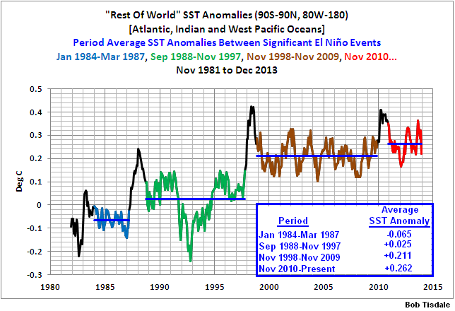
The final sentence is curious, some might think meaningless, one of those “who cares” comparisons. We all know the 1997/98 El Niño released a monumental amount of sunlight-created warm water from below the surface of the tropical Pacific and that the surface temperatures for about 67% of the surface of the global oceans shifted upwards almost 0.2 deg C as a result…and remained there, perfectly happy, until the 2009/10 El Nino. See the illustration here from the December 2013 sea surface temperature update. And, of course, the other 33% of the surface of the global oceans has warmed very little—basically shows no warming—in 32 years, as shown in the graph here.
I’ll include a comparison graph of annual data in the update next month, after the UKMO updates the HADCRUT data for December. It will be very similar to the graph using year-to-date 2013 annual data here that I created for the October 2013 Global Land+Sea Surface Temperature update.
Back to your regularly scheduled update:
Additional Notes: The remainder of this post includes graphs of running trends in global surface temperature anomalies for periods of 13 and 16+ years using HADCRUT4 global (land+ocean) surface temperature data. They indicate that we have not seen a warming halt this long since about 1980 for the 13-year and the 16-years+ trends.
Much of the following text is boilerplate. It is intended for those new to the presentation of global surface temperature anomaly data.
Most of the update graphs in the following start in 1979. That’s a commonly used start year for global temperature products because many of the satellite-based temperature datasets start then.
GISS LAND OCEAN TEMPERATURE INDEX (LOTI)
Introduction: The GISS Land Ocean Temperature Index (LOTI) data is a product of the Goddard Institute for Space Studies. Starting with their January 2013 update, it uses NCDC ERSST.v3b sea surface temperature data. The impact of the recent change in sea surface temperature datasets is discussed here. GISS adjusts GHCN and other land surface temperature data via a number of methods and infills missing data using 1200km smoothing. Refer to the GISS description here. Unlike the UK Met Office and NCDC products, GISS masks sea surface temperature data at the poles where seasonal sea ice exists, and they extend land surface temperature data out over the oceans in those locations. Refer to the discussions here and here. GISS uses the base years of 1951-1980 as the reference period for anomalies. The data source is here.
Update: The December 2013 GISS global temperature anomaly is +0.60 deg C. It cooled (a drop of about -0.18 deg C) since November 2013.

GISS LOTI
NCDC GLOBAL SURFACE TEMPERATURE ANOMALIES
Introduction: The NOAA Global (Land and Ocean) Surface Temperature Anomaly dataset is a product of the National Climatic Data Center (NCDC). NCDC merges their Extended Reconstructed Sea Surface Temperature version 3b (ERSST.v3b) with the Global Historical Climatology Network-Monthly (GHCN-M) version 3.2.0 for land surface air temperatures. NOAA infills missing data for both land and sea surface temperature datasets using methods presented in Smith et al (2008). Keep in mind, when reading Smith et al (2008), that the NCDC removed the satellite-based sea surface temperature data because it changed the annual global temperature rankings. Since most of Smith et al (2008) was about the satellite-based data and the benefits of incorporating it into the reconstruction, one might consider that the NCDC temperature product is no longer supported by a peer-reviewed paper.
The NCDC data source is usually here. NCDC uses 1901 to 2000 for the base years for anomalies.
Update: (Note: the NCDC has been slow with this month’s update at the normal data source webpage, so I’ve used the value listed on their State of the Climate Report for December 2013.) The December 2013 NCDC global land plus sea surface temperature anomaly was +0.62 deg C. It too dropped considerably (about -0.16 deg C) since November 2013.

NCDC Global (Land and Ocean) Surface Temperature Anomalies
UK MET OFFICE HADCRUT4 (LAGS ONE MONTH)
Introduction: The UK Met Office HADCRUT4 dataset merges CRUTEM4 land-surface air temperature dataset and the HadSST3 sea-surface temperature (SST) dataset. CRUTEM4 is the product of the combined efforts of the Met Office Hadley Centre and the Climatic Research Unit at the University of East Anglia. And HadSST3 is a product of the Hadley Centre. Unlike the GISS and NCDC products, missing data is not infilled in the HADCRUT4 product. That is, if a 5-deg latitude by 5-deg longitude grid does not have a temperature anomaly value in a given month, it is not included in the global average value of HADCRUT4. The HADCRUT4 dataset is described in the Morice et al (2012) paper here. The CRUTEM4 data is described in Jones et al (2012) here. And the HadSST3 data is presented in the 2-part Kennedy et al (2012) paper here and here. The UKMO uses the base years of 1961-1990 for anomalies. The data source is here.
Update (Lags One Month): The November 2013 HADCRUT4 global temperature anomaly is +0.60 deg C. Like the other two datasets, it increased (about +0.12 deg C) between October and November 2013.

HADCRUT4
155-MONTH RUNNING TRENDS
As noted in my post Open Letter to the Royal Meteorological Society Regarding Dr. Trenberth’s Article “Has Global Warming Stalled?”, Kevin Trenberth of NCAR presented 10-year period-averaged temperatures in his article for the Royal Meteorological Society. He was attempting to show that the recent halt in global warming since 2001 was not unusual. Kevin Trenberth conveniently overlooked the fact that, based on his selected start year of 2001, the halt had lasted 12+ years, not 10.
The period from January 2001 to November 2013 is now 155-months long. Refer to the following graph of running 155-month trends from January 1880 to November 2013, using the HADCRUT4 global temperature anomaly product. The last data point in the graph is the linear trend (in deg C per decade) from January 2001 to the current month. It is basically zero. That, of course, indicates global surface temperatures have not warmed during the most recent 155-month period. Working back in time, the data point immediately before the last one represents the linear trend for the 155-month period of December 2000 to October 2013, and the data point before it shows the trend in deg C per decade for November 2000 to September 2013, and so on.

155-Month Linear Trends
The highest recent rate of warming based on its linear trend occurred during the 155-month period that ended about 2004, but warming trends have dropped drastically since then. There was a similar drop in the 1940s, and as you’ll recall, global surface temperatures remained relatively flat from the mid-1940s to the mid-1970s. Also note that the about 1980 was the last time there had been a 155-month period without global warming—before recently.
198-MONTH RUNNING TRENDS
In his RMS article, Kevin Trenberth also conveniently overlooked the fact that the discussions about the warming halt are now for a time period of about 16 years, not 10 years—ever since David Rose’s DailyMail article titled “Global warming stopped 16 years ago, reveals Met Office report quietly released… and here is the chart to prove it”. In my response to Trenberth’s article, I updated David Rose’s graph, noting that surface temperatures in April 2013 were basically the same as they were in June 1997. We’ll use June 1997 as the start month for the running 16-year trends. The period is now 198-months long. The following graph is similar to the one above, except that it’s presenting running trends for 198-month periods.

198-Month Linear Trends
The last time global surface temperatures warmed at the minimal rate of 0.03 deg C per decade for a 198-month period was also about 1980. Also note that the sharp decline is similar to the drop in the 1940s, and, again, as you’ll recall, global surface temperatures remained relatively flat from the mid-1940s to the mid-1970s.
The most widely used metric of global warming—global surface temperatures—indicates that the rate of global warming has slowed drastically and that the duration of the halt in global warming is unusual during a period when global surface temperatures are allegedly being warmed from the hypothetical impacts of manmade greenhouse gases.
A NOTE ABOUT THE RUNNING-TREND GRAPHS
There is very little difference in the end point trends of 12+ year and 16+ year running trends if HADCRUT4 or NCDC or GISS data are used. The major difference in the graphs is with the HADCRUT4 data and it can be seen in a graph of the 12+ year trends. I suspect this is caused by the updates to the HADSST3 data that have not been applied to the ERSST.v3b sea surface temperature data used by GISS and NCDC.
COMPARISON
The GISS, HADCRUT4 and NCDC global surface temperature anomalies are compared in the next three time-series graphs. The first graph compares the three global surface temperature anomaly products starting in 1979. Again, due to the timing of this post, the HADCRUT4 data lags the GISS and NCDC products by a month. The graph also includes the linear trends. Because the three datasets share common source data, (GISS and NCDC also use the same sea surface temperature data) it should come as no surprise that they are so similar. For those wanting a closer look at the more recent wiggles and trends, the second graph starts in 1998, which was the start year used by von Storch et al (2013) Can climate models explain the recent stagnation in global warming? They, of course found that the CMIP3 (IPCC AR4) and CMIP5 (IPCC AR5) models could NOT explain the recent halt.
The third comparison graph starts with Kevin Trenberth’s chosen year of 2001. All three of those comparison graphs present the anomalies using the base years of 1981 to 2010. Referring to their discussion under FAQ 9 here, according to NOAA:
This period is used in order to comply with a recommended World Meteorological Organization (WMO) Policy, which suggests using the latest decade for the 30-year average.

Comparison Starting in 1979
###########

Comparison Starting in 1998
###########

Comparison Starting in 2001
AVERAGE
The last graph presents the average of the GISS, HADCRUT and NCDC land plus sea surface temperature anomaly products. Again because the HADCRUT4 data lags one month in this update, the most current average only includes the GISS and NCDC products. The flatness of the data since 2001 is very obvious, as is the fact that surface temperatures have rarely risen above those created by the 1997/98 El Niño.

Average of Global Land+Sea Surface Temperature Anomaly Products
Is it exploding volcano at an altitude of 30 km? No, that solar activity causes changes in the ozone.
http://www.cpc.ncep.noaa.gov/products/intraseasonal/temp10anim.gif
I shouldn’t have encouraged Jan Perlwitz of GISS last week by replying to his comments. He’s back again on the cross post of this post, parroting dogma and misdirecting the topic at hand.
http://bobtisdale.wordpress.com/2014/01/22/also-rans-ncdc-and-giss-global-surface-temperatures-finish-4th-and-7th-for-2013/
So if you’re looking for some entertainment…
Bob,
I admire your tenacity. It is a pleasure to see someone presenting data without apparent bias.
May others learn from your example.
Kurt in Switzerland
I have a feeling that some people are REALLY hoping for a strong El Nino so a new record warm year will finally happen and talk of the pause/hiatus can be silenced.
Has there EVER been a change in GISS methodology that did not produce the effect of lowering earlier temperatures and raising more recent temperatures? Have “shades of cold” been surgically removed from certain craniums so that, for example, “coldest in ten” must be expressed as “tenth warmest in ten”?
I had to laugh at this line from Hansen – “it is more difficult in winter than in summer to recognize the effect of global warming “…
Re: wws says:
January 23, 2014 at 4:50 am
“I had to laugh at this line from Hansen – ‘it is more difficult in winter than in summer to recognize the effect of global warming ‘…”
Winter is a difficult subject for ANYONE who cannot say the word “cold”.
I’m not an expert, but is the GISS base period of 1951-1980 cherry picked? Why is that the chosen “base period”?
As noted above: “Summary. Global surface temperature in 2013 was +0.6°C (~1.1°F) warmer than the 1951-1980 base period average, thus the seventh warmest year in the GISS analysis”
It seems like it changes, or they mix temp datasets. I think it’s intention obfuscation on their part. Just IMHO.
Claude Harvey says:
January 23, 2014 at 4:48 am
Has there EVER been a change in GISS methodology that did not produce the effect of lowering earlier temperatures and raising more recent temperatures?
_____________________________________________
This question could apply not only to all surface temperature data sets but other metrics as well like global mean sea level.
For adjustments like this over time, one would expect a Gaussian distribution on the adjustments. I’ll bet the actual distribution looks like a hockey stick. QED
CO2 sure is finicky about where it decides to absorb and re-emit LW infrared. The next big revelation out of the mouths of watermelons is that CO2 is…sentient. It just knows.
Bob, I think it would put things in better perspective if we compared present temps to 1930/40s as another view of how much warming there has been. The period chosen is indeed covered in cherry juice. Recall that 1937 in the US stubbornly stuck up above the 1998 temperature. GISS, i.e. Hansen and his assistant attacked this aggravating fact, finally chopping the pesky number down several tenths in an effort to find a new all-time high in 1998. They probably saw this as the last chance for some time to do so. Even in Canada, July 1937 remains a record high, with Yellow Grass Saskatchewan at 45C (rivaling all the hyped about temps in Australia’s present summer).
Hansen: ” It appears that there is substantial likelihood of an El Niño beginning in 2014, and as a result a probable record global temperature in 2014 or 2015.”
In my view there is a substantial likelihood of the first half of 2014 seeing a sharp drop in east Pacific temperature and a full-on La Nina. Its the right time for it to happen with respect to the annual phaselocking of ENSO – such falls always happen after the new year. (It could even be starting now.) Thus 2014 could see the opposite of Hansen’s prediction, i.e. a sharp drop in global temperatures. Place your bets…
Gary Pearse says: January 23, 2014 at 5:48 am
I agree, however, it might be difficult coming up with the Actual Temperatures to do the comparisons with as they only appear to have Anomaly data.
Re Perlwitz: Be nice, Bob. He’s a government scientist so he probably doesn’t know how clouds work, either. You can bet that that someone at GISS has sat him down and reviewed the policy on not engaging skeptics, though. Bad for business for “climate scientists” to have their ears directly boxed.
Good interesting post! If as the warmistas claim, the science is settled, how come there are still $Billions being spent on research into it all? Suggests to me they know very little & don’t want to let on!
analysing scripture & dogma is a pointless exercise. we already know that they base their story on lies (giss etc) and conveniently ignore more reliable data (rss etc), so i fail to see the importance in addressing it. in doing so you actually give credence to the story.
an example of the problems addressing scripture are that they do not have to use logic –
“Slower growth of net climate forcings” is one thing they claim to be the cause, most likely due to hansens belief that aerosols cause more cooling than the models show, but co2 is increasing at higher rate now than before AND water vapour which is supposed to be the majority of the warming from co2 in the models has not. so, what is it he believes?
“and cooling in the tropical Pacific Ocean both contribute to the slower warming rate, with the latter probably the more important effect”
so, he supposedly now believes that the ocean is causing the majority of the cooling, but of course the ocean can only absorb heat it seems. I dont remember reading in his testimony that the majority of the warming in the 80s is due to “unforced variability”.
its just a bit of make it up as you go eh. and we are supposed to take it as science, well the fact is we dont. we should not play these idiots game and post about their propaganda, we are interested in the truth.
“Hansen: ” It appears that there is substantial likelihood of an El Niño beginning in 2014, and as a result a probable record global temperature in 2014 or 2015.”
He’s been saying this for 15 years now. Even a broken clock…etc.
This is a big claim. It asserts that the ability to “recognise recognize the effect of global warming on the occurrence of extreme warm or cold seasons is variable”.
Therefore it asserts that the ability to recognize the effect of global warming on the occurrence of extreme warm or cold seasons” is not None.
So which cold seasons were caused by global warmning? And how? And which will be in the future? And where?
(Likewise for the warm seasons)
Peter in MD says:
January 23, 2014 at 5:21 am
I’m not an expert, but is the GISS base period of 1951-1980 cherry picked? Why is that the chosen “base period”?
>>>>>>>>>>>>>>>>>
Yo can look at this and see why 1951-1980 was picked. 1950 to 1980 were the coldest three decades in the 20th century.
This is the Köppen climate classification is from the interior of the USA and should not be as effected by the oceans. The Köppen climate classification is based on plants and should be harder to ‘Adjust’
Thanks Gail! I appreciate your help!
Does anyone know the difference in temperature among the top 10 warmest years? I suspect it’s something less than a tenth of a degree. Hardly enough to continue to measure. Certainly not meaningful enough make the claim that warming is continuing. Anyway, I’m just looking for the number.
>>>>
Peter in MD says:
January 23, 2014 at 5:21 am
I’m not an expert, but is the GISS base period of 1951-1980 cherry picked? Why is that the chosen “base period”?
>>>>>
Jeff Masters avoids that stigma and simply declares that these latest trends are the hottest in earths history (4.5 or so billion years)
“Since 2010, 45 nations or territories have set or tied all-time heat records, but only one nation has set an all-time cold temperature record. Since each of those years was a top-ten warmest year in Earth’s history, and 2010 was the warmest year on record, this sort of disparity in national heat and cold records is to be expected.”
(Just in case Jan visits here rather than over on Bob’s site)
Jan: Off topic probably (sorry Bob) but would you pop along the corridor and get Hansen to update his published work to include the GISS data to date.
I posted an update of my own to the Nature thread and Nate is all hot and bothered about it not coming from the original source.
http://snag.gy/FeWzn.jpg
Well worth visiting the cross post.JP is probably still licking his “stupid marks”…
(self inflicted wounds)…
Earlier this week I made a prediction on the ENSO as I debated with the warmists on an article at the Telegraph. Someone had something similar to ‘wait till the next El Nino for the super warming’. So I replied with a prediction………..”I have been in a predictive mood, recently. So let me try my ‘hand’ on the ENSO. For any further warming to occur, an El Nino will be needed.
Looking at the ENSO chart, one can readily see the cyclic nature
underlying the long term movements of warm and cool. If this is truly
cycles, then we are now into the La Nina as the dominant actor, and it
should remain that way up till 2035/37. There is likely to be a
brief El Nino in the next several years, but after that there is going
to be a strong, 3 to 4 year, La Nina pulse. The next factor that should
come into play at that time is the solar minimum will be nearing, or it
might start at that time. This will further influence and strengthen the
La Nina, and that combination probably has a lot to do with the why of a
GM. The exciting part is that we all get to witness what is coming
around the bend.”….http://www.telegraph.co.uk/earth/environment/climatechange/10586686/Climate-change-will-double-El-Nino-events.html#comment-1211689137
It appears that there is substantial likelihood of
What is a “substantial likelihood“?
Does it mean “most probable”. No it does not, for “most probable” was not used.
Does it mean more likely than not? No, for that would necessarily be most probable..
So “substantial likelihood” is an event that comprises less than 50% of the domain.
Does it mean “most likely” as in the mode of a distribution. Again, it does not because the well known phrases “most likely” and “mode” were not used. It means something else.
“Substantial” means at least “Not insubstantial”. On that basis, I’ll make the leap that “Substantial” also means “not insignificant”. Using common significance tests, a 1%, 2%, 5%, or 10% tail could be considered a lower bound. For argument’s sake, I’ll choose 5%.
So, “substantial likelihood” should be read as event that is more that 5% probability, but less than 50%.
Given the ENSO condition states of the Pacific are {“La Nina”, Neutral, “El Nino”}, at first glance the probability of El Nino should be between 33% and 20% just from categorical semantics. Indeed,
Conclusion: there is ALWAYS a substantial likelihood of an El Nino. Just as there is simulltaneously always a substantial likelihood of La Nina.
“Substantial Likelihood” is a buzzword to make people think you know more about the future than you really do. As in, “there is a substantial likelihood of rolling a 6 on the next throw of a fair die.”
At least that is how it appears to me.
Funny, Hansen is like a homeless guy on the street at NASA. He was there for a long time then you thought he found a new spot to live. He is back in his old spot on the curb with his same old sign.
So easy for them to calibrate the satellite data information to look warmer or colder.
We really need a world net work of surface temp obs data not touched by any Gov.
@wws at 4:50 am
“I had to laugh at this line from Hansen – ‘it is more difficult in winter than in summer to recognize the effect of global warming ‘…”
Is that not in direct contradiction to claims that the effects of global warming will be most easily seen in the rising of minimum temperatures and polar amplification?
Also Homewood: WUWT Feb. 8, 2013
How would the 155 month linear trend compare with Easterbrook’s PDO chart?
Too bad Intrade’s inactive; this would be a good year to pick up more winnings there.
So, it must be in there but I couldn’t find it, where did you say that this is the highest ENSO neutral year? The three higher years (1998, 2005, 2010) were ENSO positive, and so was the tying year 2003.
I do think we will see an El Nino, since weather patterns resemble the run up to 1919 about now, and the forecast models concur. Of course, naturally a perfectly natural event will be trumpeted as evidence for catastrophic anthropogenic warming.
mark wagner says:
January 23, 2014 at 7:58 am
Does anyone know the difference in temperature among the top 10 warmest years?
Here you are.
UAH version5.5: 0.419 – 0.161 = 0.258
UAH version5.6: 0.419 – 0.170 = 0.249
RSS: 0.550 – 0.218 = 0.332
HadCRUT4 (to 2012): 0.547 – 0.445 = 0.102
HadCRUT3 (to 2012): 0.548 – 0.403 = 0.145
GISS: 0.67 – 0.58 = 0.09
HadSST3: 0.416 – 0.346 = 0.070
@ Werner: Thanks! Wow GISS nine one hundreths of one degree between the top 10.
Peter in MD says: “I’m not an expert, but is the GISS base period of 1951-1980 cherry picked? Why is that the chosen ‘base period’?”
I suspect those base years are based on their early efforts to create a global surface temperature dataset, which started in the 1980s, if memory serves.
The WMO says that base years should be updated every decade, but the three surface temperature suppliers choose to ignore that.
Regards
phlogiston says: “In my view there is a substantial likelihood of the first half of 2014 seeing a sharp drop in east Pacific temperature and a full-on La Nina. Its the right time for it to happen with respect to the annual phaselocking of ENSO – such falls always happen after the new year. (It could even be starting now.)”
Check the subsurface temperature anomalies across the equatorial Pacific here…
http://www.cpc.ncep.noaa.gov/products/analysis_monitoring/enso_update/wkxzteq.shtml
There’s still a chunk of warm water in the west Pacific warm pool, though at present it’s not anything excessive..
And see the Hovmoller diagram on page 16 of NOAA’s weekly ENSO update:
http://www.cpc.ncep.noaa.gov/products/analysis_monitoring/lanina/enso_evolution-status-fcsts-web.pdf
The next Kelvin wave should be a downwelling (warm) Kelvin wave, carrying warm water east. It’s just a matter of when.
Last, this is the time of the year when a typical ENSO event peaks and decays, not forms, in response to the seasonal cycle. See the post here:
http://bobtisdale.wordpress.com/2013/03/19/why-do-el-nino-and-la-nina-events-peak-in-boreal-winter/
Regards
Sweet Old Bob says: “Well worth visiting the cross post.JP is probably still licking his “stupid marks” (self inflicted wounds)…”
After his last comment, I had to shut him off. I couldn’t stand it anymore. But he did highlight all of the “strengths” of the climate science community while he graced my blog with his presence.
http://bobtisdale.wordpress.com/2014/01/22/also-rans-ncdc-and-giss-global-surface-temperatures-finish-4th-and-7th-for-2013/
7th place? (tied for 7th, 8th, and 9th) – 4th place? (tied for 4th and 5th)
Comments I made on the “Scientific Mensa” FaceBook group:
NOAA and NASA held a joint press conference, January 21, 2014 on 2013 Global Temperatures.
This data turned out a bit more interesting than I expected – that 7th warmest from NASA was really a tie for 7th, 8th, and 9th. 10th warmest was only 0.02 C° cooler. NOAA’s 4th warmest was tied with 5th, and 10th was only 0.04 C° cooler. 2003 ranks 6th (0.01 C° warmer than 2013) and 4th (tie), a far cry from the IPCC claim we’re warming 0.20 C° per decade.
See http://www.nasa.gov/sites/default/files/files/NOAA_NASA_2013_Global_Temperatures_Joint_Briefing.pdf
http://www.thegwpf.org/nasa-noaa-confirm-global-temperature-standstill-continues/