The following graph is of annual global surface temperature anomalies, including year-to-date 2013 values. The base years for anomalies are 1981-2010. The GISS and NCDC data run through October 2013, and HADCRUT4 runs through September.

Annual Through Year-To-Date 2013
It appears that NCDC may rank 2013 as the 6th warmest year, while 2013 might rank 9th with GISS and HADCRUT4. That, of course, will change with the November and December values. Global warming enthusiasts will attempt, as they always do, to turn those rankings into forecasts of doom and gloom. (See the closing discussion under the heading of “The Silly Season is Upon Us”.)
Back to your regularly scheduled update:
Initial Notes: This post contains graphs of running trends in global surface temperature anomalies for periods of 12+ and 16 years using GISS Land-Ocean Temperature Index (LOTI) data. They indicate that we have not seen a warming hiatus this long since the early-1970s (12-year+ trends) or late-1970s (16-years+ trends).
Much of the following text is boilerplate. It is intended for those new to the presentation of global surface temperature anomaly data.
GISS LAND OCEAN TEMPERATURE INDEX (LOTI)
Introduction: The GISS Land Ocean Temperature Index (LOTI) data is a product of the Goddard Institute for Space Studies. Starting with their January 2013 update, it uses NCDC ERSST.v3b sea surface temperature data. The impact of the recent change in sea surface temperature datasets is discussed here. GISS adjusts GHCN and other land surface temperature data via a number of methods and infills missing data using 1200km smoothing. Refer to the GISS description here. Unlike the UK Met Office and NCDC products, GISS masks sea surface temperature data at the poles where seasonal sea ice exists, and they extend land surface temperature data out over the oceans in those locations. Refer to the discussions here and here. GISS uses the base years of 1971-1980 as the reference period for anomalies. The data source is here.
Update: The October 2013 GISS global temperature anomaly is +0.61 deg C. It cooled (a decrease of about -0.13 deg C) since September 2013.

GISS LOTI
NCDC GLOBAL SURFACE TEMPERATURE ANOMALIES
Introduction: The NOAA Global (Land and Ocean) Surface Temperature Anomaly dataset is a product of the National Climatic Data Center (NCDC). NCDC merges their Extended Reconstructed Sea Surface Temperature version 3b (ERSST.v3b) with the Global Historical Climatology Network-Monthly (GHCN-M) version 3.2.0 for land surface air temperatures. NOAA infills missing data for both land and sea surface temperature datasets using methods presented in Smith et al (2008). Keep in mind, when reading Smith et al (2008), that the NCDC removed the satellite-based sea surface temperature data because it changed the annual global temperature rankings. Since most of Smith et al (2008) was about the satellite-based data and the benefits of incorporating it into the reconstruction, one might consider that the NCDC temperature product is no longer supported by a peer-reviewed paper.
The NCDC data source is usually here. NCDC uses 1901 to 2000 for the base years for anomalies.
Update: (Note: the NCDC has been slow with this month’s update at the normal data source webpage, so I’ve used the value listed on their State of the Climate Report for October 2013.) The October 2013 NCDC global land plus sea surface temperature anomaly was +0.63 deg C. It decreased -0.01 deg C (basically unchanged) since September 2013.

NCDC Global (Land and Ocean) Surface Temperature Anomalies
UK MET OFFICE HADCRUT4 (LAGS ONE MONTH)
Introduction: The UK Met Office HADCRUT4 dataset merges CRUTEM4 land-surface air temperature dataset and the HadSST3 sea-surface temperature (SST) dataset. CRUTEM4 is the product of the combined efforts of the Met Office Hadley Centre and the Climatic Research Unit at the University of East Anglia. And HadSST3 is a product of the Hadley Centre. Unlike the GISS and NCDC products, missing data is not infilled in the HADCRUT4 product. That is, if a 5-deg latitude by 5-deg longitude grid does not have a temperature anomaly value in a given month, it is not included in the global average value of HADCRUT4. The HADCRUT4 dataset is described in the Morice et al (2012) paper here. The CRUTEM4 data is described in Jones et al (2012) here. And the HadSST3 data is presented in the 2-part Kennedy et al (2012) paper here and here. The UKMO uses the base years of 1961-1990 for anomalies. The data source is here.
Update (Lags One Month): The September 2013 HADCRUT4 global temperature anomaly is +0.53 deg C. It increased (about 0.01 deg C) since August 2013.

HADCRUT4
154-MONTH RUNNING TRENDS
As noted in my post Open Letter to the Royal Meteorological Society Regarding Dr. Trenberth’s Article “Has Global Warming Stalled?”, Kevin Trenberth of NCAR presented 10-year period-averaged temperatures in his article for the Royal Meteorological Society. He was attempting to show that the recent hiatus in global warming since 2001 was not unusual. Kevin Trenberth conveniently overlooked the fact that, based on his selected start year of 2001, the hiatus has lasted 12+ years, not 10.
The period from January 2001 to October 2013 is now 154-months long. Refer to the following graph of running 154-month trends from January 1880 to May 2013, using the GISS LOTI global temperature anomaly product. The last data point in the graph is the linear trend (in deg C per decade) from January 2001 to the current month. It is basically zero. That, of course, indicates global surface temperatures have not warmed during the most recent 154-month period. Working back in time, the data point immediately before the last one represents the linear trend for the 154-month period of December 2000 to September 2013, and the data point before it shows the trend in deg C per decade for November 2000 to August 2013, and so on.

154-Month Linear Trends
The highest recent rate of warming based on its linear trend occurred during the 154-month period that ended about 2004, but warming trends have dropped drastically since then. There was a similar drop in the 1940s, and as you’ll recall, global surface temperatures remained relatively flat from the mid-1940s to the mid-1970s. Also note that the early-1970s was the last time there had been a 154-month period without global warming—before recently.
197-MONTH RUNNING TRENDS
In his RMS article, Kevin Trenberth also conveniently overlooked the fact that the discussions about the warming hiatus are now for a time period of about 16 years, not 10 years—ever since David Rose’s DailyMail article titled “Global warming stopped 16 years ago, reveals Met Office report quietly released… and here is the chart to prove it”. In my response to Trenberth’s article, I updated David Rose’s graph, noting that surface temperatures in April 2013 were basically the same as they were in June 1997. We’ll use June 1997 as the start month for the running 16-year trends. The period is now 197-months long. The following graph is similar to the one above, except that it’s presenting running trends for 197-month periods.

197-Month Linear Trends
The last time global surface temperatures warmed at a rate this low for a 197-month period was the late 1970s. Also note that the sharp decline is similar to the drop in the 1940s, and, again, as you’ll recall, global surface temperatures remained relatively flat from the mid-1940s to the mid-1970s.
The most widely used metric of global warming—global surface temperatures—indicates that the rate of global warming has slowed drastically and that the duration of the hiatus in global warming is unusual during a period when global surface temperatures are allegedly being warmed from the hypothetical impacts of manmade greenhouse gases.
A NOTE ABOUT THE RUNNING-TREND GRAPHS
There is very little difference in the end point trends of 12+-year and 16+-year running trends if HADCRUT4 or NCDC products are used in place of GISS data. The major difference in the graphs is with the HADCRUT4 data and it can be seen in a graph of the 12+-year trends. I suspect this is caused by the updates to the HADSST3 data that have not been applied to the ERSST.v3b sea surface temperature data used by GISS and NCDC.
COMPARISON
The GISS, HADCRUT4 and NCDC global surface temperature anomalies are compared in the next three time-series graphs. The first graph compares the three global surface temperature anomaly products starting in 1979. Again, due to the timing of this post, the HADCRUT4 data lags the GISS and NCDC products by a month. The graph also includes the linear trends. Because the three datasets share common source data, (GISS and NCDC also use the same sea surface temperature data) it should come as no surprise that they are so similar. For those wanting a closer look at the more recent wiggles and trends, the second graph starts in 1998, which was the start year used by von Storch et al (2013) Can climate models explain the recent stagnation in global warming? They, of course found that the CMIP3 (IPCC AR4) and CMIP5 (IPCC AR5) models could NOT explain the recent hiatus.
The third comparison graph starts with Kevin Trenberth’s chosen year of 2001. All three of those comparison graphs present the anomalies using the base years of 1981 to 2010. Referring to their discussion under FAQ 9 here, according to NOAA:
This period is used in order to comply with a recommended World Meteorological Organization (WMO) Policy, which suggests using the latest decade for the 30-year average.

Comparison Starting in 1979
###########
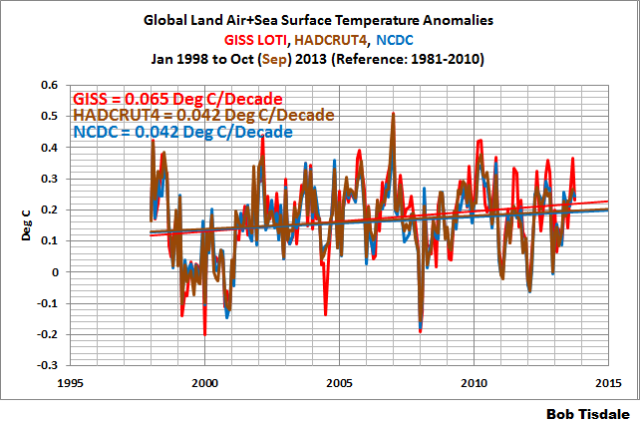
Comparison Starting in 1998
###########

Comparison Starting in 2001
AVERAGE
The last graph presents the average of the GISS, HADCRUT and NCDC land plus sea surface temperature anomaly products. Again because the HADCRUT4 data lags one month in this update, the most current average only includes the GISS and NCDC products. The flatness of the data since 2001 is very obvious, as is the fact that surface temperatures have rarely risen above those created by the 1997/98 El Niño.
Average of Global Land+Sea Surface Temperature Anomaly Products
THE SILLY SEASON IS UPON US
Or some might say the silly season has already begun…or has never ended.
Appearing to have been prepared for the Warsaw Climate Change Conference, the World Meteorological Organization (WMO) recently published its WMO Provisional Statement on Status of the Climate in 2013. It begins:
Global Temperatures in 2013
A preliminary assessment of global temperatures during the first nine months of 2013 indicates that this year will likely be among the 10 warmest years since global records began in 1850. For the year to date, January−September 2013 ties with 2003 as the seventh warmest such period on record, with a global land and ocean surface temperature that was 0.48°C ±0.12°C (0.86°F±0.22°F) above the 1961–1990 average and equal to the most recent 2001–2010 decadal average. This is also higher than both 2011 and 2012, which were 0.44°C and 0.46°C above average, respectively, when La Niña conditions had a cooling influence over the global temperature.
Ten years from now, will the WMO be claiming that 2023 was among the 20 warmest years since global records began in 1850?
Of course, the WMO’s statement about global temperatures is newsworthy to some, especially those who claim it to be proof that man is responsible for that warming through the emissions of manmade greenhouse gases, primarily carbon dioxide.
I will continue to reply that there is nothing in the ocean heat content records or the satellite-era sea surface temperature records to indicate that manmade greenhouse gases had any influence on the warming of the global oceans. Those records indicate the oceans warmed via naturally occurring, coupled ocean-atmosphere processes. The oceans cover 70% of the surface of the planet, and the warming of land surface air temperatures is primarily in response to the warming of the oceans, so much of the global warming (land and ocean) we’ve experienced over the past 3 decades occurred from naturally occurring, sunlight-fueled processes, not from carbon dioxide.
If the subject of the natural (not manmade) warming of the global oceans is new to you, see my illustrated essay “The Manmade Global Warming Challenge” (42MB). Because much of the warming of the oceans is in response to the naturally occurring, sunlight-fueled processes that are associated with El Niño and La Niña events, we have presented and discussed those processes in minute detail here at Climate Observations and at WattsUpWithThat for almost 5 years. A detailed discussion of those processes can be found in the 2-part YouTube video series “The Natural Warming of the Global Oceans”. See Part 1 here and Part 2 here. Also refer to my ebook Who Turned on the Heat? – The Unsuspected Global Warming Culprit: El Niño-Southern Oscillation. (US$8.00 – Please click here to buy a copy.) A free preview is here. The natural warming of the global oceans is also discussed in Section 9 of my more-recent book Climate Models Fail, introduced next.
Further, the political entity known as the Intergovernmental Panel on Climate Change (IPCC) relies on climate models for their predictions of future catastrophe. But we’ve been showing and discussing for about 2 years that the climate models used by the IPCC for their 4th and 5th Assessment Reports cannot simulate surface temperatures, precipitation or sea ice. So why should we believe their forecasts of future climate based on projections of future greenhouse gas emissions? There is no reason to believe them. Climate model failings were discussed in numerous posts at Climate Observations and WattsUpWithThat. I’ve collected and expanded on those discussions in my ebook Climate Models Fail. (It’s available in two formats: Amazon Kindle and pdf, for $9.99.) A free preview is available here.
Global warming enthusiasts are still claiming that I haven’t explained this or that, when I have provided detailed explanations, supported by data. I have even responded to their nonsensical claims with the posts Untruths, Falsehoods, Fabrications, Misrepresentations and Untruths, Falsehoods, Fabrications, Misrepresentations — Part 2. And there will likely be a Part 3 sometime in the future.
And as I noted recently, 30% of my before-tax personal income from the sales of my ebooks (my profits from .pdf edition sales and my royalties from Amazon Kindle edition sales) from November 1, 2013 to December 31, 2013 will be donated to the Philippine Red Cross disaster relief for the victims of Typhoon Haiyan/Yolanda.
I suppose it is futile to observed that a sine wave with a period of approximately 60 years and a magnitude of +-0.2C is looking a better and better fit to the data as presented above.
If that turns out to be a better predictor than a linear fit then things will get interesting :-).
The last time global surface temperatures warmed at the minimal rate of 0.03 deg C per decade for a 197-month period was the late 1970s.
Should it be 0.06?
Werner Brozek says: “Should it be 0.06?”
Thanks. I forgot to change it to “this low” so that I didn’t have to worry about updating the value.
Thanks again.
I suppose it is futile to observed that a sine wave with a period of approximately 60 years and a magnitude of +-0.2C is looking a better and better fit to the data as presented above.
If that turns out to be a better predictor than a linear fit then things will get interesting :-).
If you look at HADCRUT4, the best fit is the sum of a sinusoid around the underlying linear trend in the data. This works for the entire data set:
http://www.woodfortrees.org/plot/hadcrut4gl/from:1800/to:2013/plot/hadcrut4gl/trend
Since the data is an anomaly, this is a three parameter fit — trend slope, amplitude and frequency (phase is irrelevant, as is intercept). The best three parameter fit would be slightly better than what this graph represents, especially if one takes the large data excursions on the left as evidence of large error bars.
This graph emphasizes just how similar the early 20th century warming was compared to the late 20th century warming. One can split the data into two chunks over identical horizontal ranges and on the same MAGNITUDE of vertical scale and it takes a real expert who can pick out specific features such as the 1997-1998 ENSO even to be able to tell them apart. There’s the hint of this cycle extending even further back over on the left, although as I said the error bars over there (if anybody ever bothered to show them) are so great that it is difficult to state ANYTHING conclusive about temperatures at that time.
The last feature of this graph I’m fond of is the fact that Global Average Surface Temperature — GAST — has error estimates that are almost precisely the range drawn. In other words, we could move this entire curve up or down by plus or minus 1 C and still plausibly be describing the true GAST. It is left as an exercise for the studio audience to determine whether or not it is plausible to claim that we know GASTA in (say) 1860 more accurately than we can estimate GAST even today.
I’m amusing myself these days by noticing that the pattern of temperatures we’re having in NC most greatly resemble patterns last seen back in the 1950s. We are going to be coming up close to low temperature nighttime records in a few days (as we did last week as well) that were last set back in 1952 or 1957 — sixty-odd years ago. Last summer a slew of cold records were set all accross the US, and many of the records that were broken were set in the 1950s. This raises some very interesting questions about whether or not the anomaly is being correctly computed from the data. Weather patterns — as opposed to GASTA — appear to be strongly cyclic, and do not seem to be displaying the differences one might expect if GASTA were as different as it is computed to be.
rgb
I suppose it would be useless to point out that the standard error bars and observation (and other error) error are off the scale of all these graphs, perhaps as much as an order of magnitude. The precision assumed by the graphic data representations (tenths and hundreths of degree C) are completely absurd.
There is no spoon….
BioBob – I suppose it would be useless to point out that the standard error bars and observation (and other error) error are off the scale of all these graphs, perhaps as much as an order of magnitude.
Not useless, wrong. If 1000 measurements with a standard error of 1.0 deg C are averaged, the standard error of the mean is about 0.03 deg C. Even if the individual measurements are systemically (not independently) wrong, all in the same direction, the error of the mean is still only 1.0 deg C.
rgbatduke says:
November 20, 2013 at 9:59 am
North Carolina is a rare instance of a medium-sized state with both its record high (1983) & low temperatures from the 1980s. It shares the date of its record low in Jan 1985 with SC. Four days later VA recorded its record low during the same big freeze.
Oregon’s high (119° F, 1898) & low (-54°, 1933) were both recorded in the northeast part of the state, where I live. To the extent that global warming has been observable here, it might be in milder winters than those before 1977. The low in Washington State was set in Dec 1968, which vicious cold snap I remember well.
If the nation is returning to patterns of the 1950s, as you’ve observed for NC, I’ll be glad to be in the Southern Hemisphere during the northern winter.
I notice that all three charts ( NCDC, GISS and HADCRUT 4) of the surface temperature anomalies show that the 1998 peak has since been exceeded. Is this accepted or is this the result of post facto manipulation?
“there is nothing in the ocean heat content records or the satellite-era sea surface temperature records to indicate that manmade greenhouse gases had any influence on the warming of the global oceans.”
Hello Bob, the GHGs simply can’t have, it occurs to me it is not physically possible – the water is extremely opaque for atmospheric IR radiation, which is unable to penetrate deeper than fractions of millimeter into it, so what it can significantly heat is the sea surface skin, where it nevertheless contributes mainly to evaporation due to combination of water/air interface optical properties and the relatively thin heat reservoir dissipates its content fast.
Only what can significantly heat the ocean deeper is the sunlight, which especially in the visible region of the spectrum penetrates water several orders of magnitude deeper than atmospheric IR spectrum and is therefore responsible for vast majority of the ocean heat content and its fluctuations. But I suppose it is nothing new for you.
Only relatively new knowledge is that the visible spectrum mostly varies not in phase with the solar cycle (here I’ve just made a poster showing the SORCE SSI spectral data and different variabilities in different bands !4MB) so the solar spectrum (after partial atmospheric attenuation of mainly its UV part -having highest absolute variability in phase with the solar cycle) has quite a different signal than the TSI and causes quite different heat content signal deeper in the ocean surface layer than is the TOA TSI signal and on the other hand at the very ocean surface the different variabilities signals in different spectral bands of the solar spectrum more or less mutually cancel -so the solar cycle signal is hardly discernible in the SST (although with trend analysis it proves anyway possible) in other way than as a more or less steady (with shorter fluctuations given by variety of factors) rise or descent of temperature with solar activity trend over the timespans longer than the solar cycles. The ocean is chief absorber of the solar radiation, its heat content fluctuates in dependence on insolation and therefore with its immense heat content – many times higher just in the surface layer than that of the atmosphere – it is (together with the sun heating it and atmospheric water bulk of which it creates) clearly the driver of the global surface temperatures (which is even reinforced by its preferably lower latitude occurence (here I recently made a 1° dataset of ocean/land global distribution – which can maybe have some use for you).
There’s no temperature without heat and bulk of the surface heat resides in the ocean created by the SW insolation, not the LW atmospheric radiation, so the GHEs can’t much directly influence it.
Oregon’s high (119° F, 1898)
Really? Sheesh, what could possibly have caused that? You’ll have me thinking of space aliens and heat rays.
OTOH this list:
http://www.infoplease.com/ipa/A0001416.html
suggests that this is far from spurious — indeed, Oregon, Washington and the entire Pacific Northwest all have high temperature records well above those of Alabama, North Carolina (110F), Florida (109F) in the more tropical southeast. More than a bit curious, actually.
The other interesting thing about this list is almost exactly half of the high temperature records were set in a single decade: the 1930s! None</b of them were set in the 2000’s (although the list may have been compiled based on data only through 2007). Six of them occurred in the 1990s. Three of them occurred in the 1980s. Five of them occurred in the 1910’s. Two of them occurred in the 1890’s (three of them in stretch of ten years from 1888, when Colorado set a high temperature record over a mile high of 118F. One shudders to think what it might have been near sea level at that location with the same conditions.
This is, again, pretty serious evidence that either the thermometers of that era were all seriously broken, or were all being hung up against a black painted brick wall back in the 1930s, or there is something seriously wrong with the GASTA record. Half the high temperature records in an entire continent (in states representing over half of the area) were set in a single decade in the 1930s, zero were set in the 2000s by as late as 2007, there is little remarkable about the temperature records set in the late 20th century compared to those set in the early 20th century, yet the planet is supposedly a full degree farenheit warmer? This makes zero sense. Even if you use this:
http://en.wikipedia.org/wiki/U.S._state_temperature_extremes
(which appears to be completely up to date) you still only get three state record high temperature hits in the 13 years post 2000, including in the supposedly hottest year ever.
Low temperatures are more uniformly spread out, but there are still seven record low state temperatures in the 1990s and two in the 2000s — nearly matching the high temperature records for those intervals. It’s harder to eyeball any particular winner in the low temperature olympics — there were only seven low temperature records set in the 1890s, for example.
Note that the 1930s was the exact time that there was a major melt in the Arctic anecdotally recorded (in the absence of satellites or airplanes, the best one could do) so that this northern warmth was not confined to the US. Again, it is enough to make one somewhat doubt all of the latter day adjustments that “prove” that the world is much warmer today than it was in the mid 1930s, and that all sorts of temperature observations are “unprecedented”.
I do not think that word means what they think that it means.
rgb
rgbatduke astutely points out problems with the “data sets”. I always enjoy his dispassionate deconstructions.
Re: western state high temperature records – Remember that the areas of (or entire) states where those records were set are in semi-arid to desert regions. I.e. very little airborne H20 to stabilize temperatures.
And earlier:
Inconcievable!
rgbatduke says:
November 20, 2013 at 9:59 am
“If you look at HADCRUT4, the best fit is the sum of a sinusoid around the underlying linear trend in the data. This works for the entire data set:”
That is only true if you assume that any data before the start of the record continued with the same linear downward slope. There is no evidence of that being true. All the evidence is that the data (if it had been present) would have been close to that in the record rather than the obverse.
Any linear slope fails with the same logical flaw, that is it makes the assumption that data outside or prior to the window is significantly different to the data in the window without any confirmation of that as fact.
Much more likely is that here is another sine wave with a yet longer period still to be discovered or proposed. Nature does not consist of straight lines in almost everything
Frankly I am bored witless by all this as it lacks historical context.
The planet is around 6.5b years old and we move from an inter-glacial Holocene to an Ice Age and back again. All the previous five Holocene’s plus our own have all been warmer than today so just what is going on?
There are some very interesting graphs on ice cores in Greenland covering the last 10,000 years and we are nowhere near warming up to anything significant…we are still way behind the Climatic Optimum…and that is just for this Holocene.
We are engaging in an argument with morons like Trenberth who makes a big deal of about 30 years of data. As Dick Lintzen showed in a graph the temps for the last century…there was very little difference 1900-2000. All they do is expand the graphs to make it look scary.
At the risk of repeating myself…if there is no warming of the Tropical Troposphere there is no AGW.
Nigel Harris says:
November 20, 2013 at 10:39 am
you are incorrect, Nigel
If there were thousands of observations (replicates) each day from calibrated instrumentation at each randomly selected site, then I would agree. Instead the vast majority of the time, there is one minimum and one maximum observations per non-randomly selected site per day. The variance / std dev of n=1 equals infinity. The observational error is infinite since there was no random site selection. The bias errors are unknown. The errors thru time are unknown since they are not measured. Furthermore, the population from which each daily observation is drawn is NOT THE SAME tomorrow as it is today as a consequence of chaotic influences. The data is anectdotal at best and mostly garbage at worst. They are mostly useful to say it sure is hot/cold today, isn’t it. Lastly, ALL of the data from 1700 thru 1970s has a limit of observation of at best only accurate to plus or minus .5 degree, as stated by the makers of the instruments employed. Those are the facts.
You can NOT add apples and oranges and divide by 2. The central limit theorem does not apply to such non-normally distributed trash. Go directly to jail and do not pass go.
Unfortunately you have sucked the koolaid. You need remedial sampling theory education and some stats would help too. If you like your temperatures, you can keep your temperatures…..I will wait for some real science rather than this hocus-pocus.
james griffin says:
November 20, 2013 at 1:39 pm
…………………..
James, the planet is not 6.5 byears old but about 4.5
Holocene is just the geological epoch which began about 11700 years ago. It comes from greek and means “entirely recent”
There have been several glacials and interglacials which have different historical names…
Solomon Green says:
November 20, 2013 at 10:45 am
I notice that all three charts ( NCDC, GISS and HADCRUT 4) of the surface temperature anomalies show that the 1998 peak has since been exceeded. Is this accepted or is this the result of post facto manipulation?
There are several data sets that still have 1998 as the hottest year: RSS, UAH, HadCRUT3, Hadsst2 and Hadsst3.
I’m amusing myself these days by noticing that the pattern of temperatures we’re having in NC most greatly resemble patterns last seen back in the 1950s. We are going to be coming up close to low temperature nighttime records in a few days (as we did last week as well) that were last set back in 1952 or 1957 — sixty-odd years ago. Last summer a slew of cold records were set all accross the US, and many of the records that were broken were set in the 1950s. This raises some very interesting questions about whether or not the anomaly is being correctly computed from the data.
Same her in the US central plains, same here rgb. Summer didn’t even kick off until into July, we are matching low records (12°F, -11.1°C) two weeks ago and that was last seen in the 50’s and it does bring into a question how these adjustments to the temperature datasets are being performed or if it is being performed by one single organization at the base from which all other datasets are derived. Wish I had a bit more statistics under my belt.
It seems to have to do primarily with the time of observance (TOB) adjustments. Into the far past the minimum and maximum temperatures were recorded at midnight but then a rule was passed that moved that observation time to 6 A.M. and this seems to have caused the move of the +0.7°C adjustments starting close to 1940, (or more properly it is a -0.7°C adjustment cooling temperatures from today backwards making those old records seem more and more cooler). Now I have been watching current hourly temperatures for an instance when it really makes a difference whether a reading is taken at midnight of a day of if the minimum is recorded at 6 A.M. of the next day, and that is very rare and when fronts pass through, but it does every now and then make a difference at month boundaries affecting the monthly records if a front passes through on the morning of the 1st or evening of the last day of the month before. But why accumulate?
Just seems there is something up there, I can see a one-time off-base or absolute adjustment to one month singularly but these adjustments are being made accumulative and I can’t see why one month’s adjustment should be accumulate from the month before.
This also seems why if you delve all of the way down to hourly readings there is little or no current warming or cooling far in the past and the records over long periods are flat on a one rural station basis.
Since these are man-made adjustments I guess you can then also say this is Man-made Warming or at least ≈0.7°C of it. You can seen some uptick in large cities over the decades (UHI) as they grew but I was more speaking of just the rural, small city, stations.
For what it’s worth, if you go to woodfortrees and use the woodfortrees average over 400 months (back to 1980 or so), the most recent temp is _over_ the trend line.
Same is true if you use 300, 200 or 100.
I didn’t check other numbers like 397 or 256 because I didn’t have time and anyway it seems like cherry picking.
I always thought that when the last value is above a trend line, it means something more interesting than nothing’s going on.
Esp. with no El Niño at the moment.
http://www.woodfortrees.org/plot/wti/last:400/plot/wti/last:400/trend
Pippen Kool says:
November 20, 2013 at 7:27 pm
For what it’s worth, if you go to woodfortrees and use the woodfortrees average over 400 months (back to 1980 or so), the most recent temp is _over_ the trend line.
…..
I always thought that when the last value is above a trend line, it means something more interesting than nothing’s going on.
And if you open your eyes and look at the graph you posted you will see that 90 % of the last 2 years were below the trend line and only 10 % of the time above. If I may paraphrase you, it must mean something more interesting than confirming the trend line..
***
milodonharlani says:
November 20, 2013 at 10:43 am
North Carolina is a rare instance of a medium-sized state with both its record high (1983) & low temperatures from the 1980s. It shares the date of its record low in Jan 1985 with SC. Four days later VA recorded its record low during the same big freeze.
***
The VA record was set @ Mountain Lake, VA — -30F. Just after that, there was some local media reports that a “reliable” but unofficial thermometer on the Peaks of Otter just NE of Roanoke showed -34F.