The IPCC appears to be ready to make the same presentation of climate model failures as they have in past reports. Figure SPM.5 from the leaked draft of the Summary for Policymakers for the IPCC’s 5th Assessment Report shows the same fatally flawed tactic of presenting model simulations based on only natural (solar and volcanic aerosol) forcings versus those based on anthropogenic and natural forcings. It looks as though the IPCC is content with highlighting the models’ failures to properly simulate natural coupled ocean-atmosphere processes that can cause surface temperatures to warm — or to stop that warming without notice.
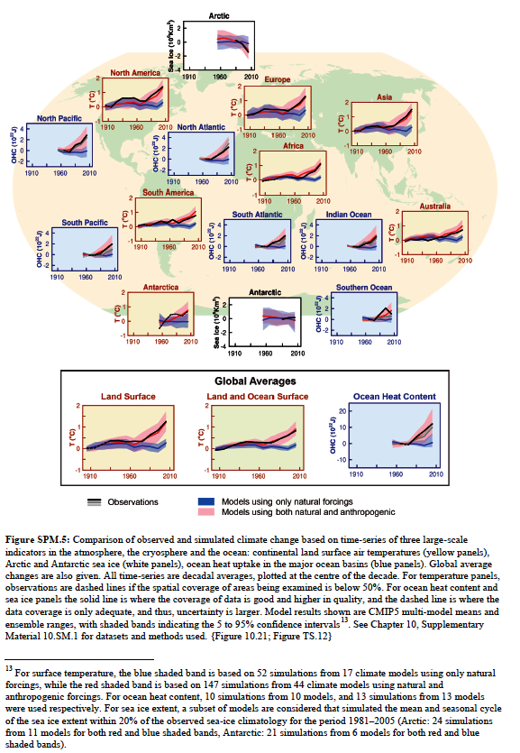
Figure SPM.5 from the leaked draft of the Summary for Policymakers for the IPCC’s 5th Assessment Report
Larger copy is here.
Additionally, note the (blue) ocean heat content graphs. They’re showing ocean heat content data for the Southern Ocean as far back as the 1970s, yet there are only a handful of temperature and salinity samples at depth there before the start of the ARGO era in 2003. Consider this too: there are only a few sea surface temperature measurements in the Southern Ocean before the satellite era of sea surface temperature data, which started in 1982. Altogether, there is little observations-based ocean temperature data before those benchmarks in the Southern Hemisphere, south of about 30S.
And I’m sure you can find other flaws in that bogus illustration.
Once again, the IPCC is presenting misleading illustrations. No surprise there.
As we saw here, http://wattsupwiththat.com/2013/09/18/claim-similuated-satellite-data-back-to-1860-proves-global-warming-caused-by-humans/, all they need is a good looking model to sell the emperor his new clothes.
Have you ever seen this:
http://news.nationalgeographic.com/news/2012/05/120531-groundwater-depletion-may-accelerate-sea-level-rise/
I think it is more significant that the coverage it has received as rising ocean levels are touted as the most serious damage caused by global warming. The difference with the ground water issue is the left can’t regulate it because there isn’t enough water to go around.
amongst other things the graphs stop way before 2013 and seem to be very smoothed. This,of course, would have nothing to do with “hiding the pause”
Another flaw is that they don’t use the same number of simulations and the same models to compare natural models to the full models. See footnote 13 below the charts.
How is it that the full models appear to track observations so closely now? Something doesn’t smell right.
Can anyone provide some background and details on the thier understanding of the model adjustments over the years…from all of the reviews of models published and adjustments that I have seen in the last couple of years, I get the sense that the natural “forcings” are still not well understood so the models are contiually adjusted in the natural forcings to make the model output fit the theories of the amount of CO2 forcing expected….I was wondering if anyone, here on WUWT, or elsewhere, has done a review of this over the major models and adjustments over the last 20 years. It appears more and more that the models are just circular reasoning….natural forcings adjusted to match the AGW Co2 theory and amplitudes?…of course the models still fail for the last 15+ years, but there is so much twisting of data and graphs….
I thought warming of the Arctic was a benchmark of AGW via CO2 and the graph above shows cooling for the model + human input. Did I miss something?
Has anyone checked to see if any of those taxpayer-funded super computers have been used on the sly to run game theory models of maximizing institutional funding in the face of adverse reality from cooling evidence in actual observations? A plug and play system of statement inserts and non-peer reviewed components could be modeled with such a system.
The whole “look” of SPM5 would probably make it suitable as an introduction to graphs for average 1st Graders.
Figure SPM5
Another thought:
The IPCC hasn’t grasped all of the ramifications of the climate model failure to anticipate the warming stoppage. If the public and policymakers hadn’t already figured out that illustrations like the IPCC’s Figure SPM.5 were baseless before the warming stoppage, they will now.
The charts stop in 1996!!! This is up to date? They are ignoring the “pause” completely.
(pssssst.)
(hey you. . .)
(yeah, you.)
(. . .the flooding in Colorado last week was caused by global warming)
http://www.democracynow.org/2013/9/18/the_1_000_year_flood_did
Why do all the graphs stop well before 2010? Is this another case of Hiding the Decline?
edcaryl
I guess if you can’t explain the pause you can try ignoring it. The IPCC crew are just stupid enough to think it may work.
Patchy must be very pleased with his acolytes cutting their graphs off around ten years ago. After all, it would be voodoo science to show the public and policymakers the last decades data.
So, if the flooding in Colorado was caused by global warming, what caused the flooding in Colorado 37 years ago? What caused the flooding that cut the Grand Canyon …. 36,000 years ago? 35,000,000 years ago?
They stop in 1996? Are you sure? Clearly they stop prior to 2010. I must look into this.
AR4 pg 11. This is the same study reported in AR4. The data ends at 2005. Is still does in AR5. No new information or data was added to the graphs. It’s a shampoo, rinse, and repeat maneuver.
http://www.ipcc.ch/pdf/assessment-report/ar4/wg1/ar4-wg1-spm.pdf
“It” still does…
It does look like they stopped prior to 2000. That’s blatantly dishonest.
I’ll bet that the with and without anthropogenics models that begin to diverge with the availability of good observed data around 1980 show that the without models are closer to the observed than the with. I’ll go even further to say they should tune their models with and without CO2 with data before 1980 and see which model comes closer to the truth after 1980.
DOA
It seems like ocean heat content charts above end at about the time good data from ARGO starts. It looks like they focus on only poor data. That way they can make anything they want out of it.
================================================================
(pssssst.)
(hey Jai. . .)
(yeah, you.)
(. . .What Indian tribe kept flood records for Boulder Colorado 1,000 years ago?)
(Oh! And “rain” is “weather”. Not “climate”. Didn’t you get the memo?)
Mods: Make “Indian tribe” “American-Indian tribe” if that will get the comment out of moderation.
Zoom the figure and read the caption. The actual data are 10 year averages with the data point shown on the center year of the 10 year average.
Looks to me like the last data point stops in 2006, so they are showing data through 2011. Really neat trick they’ve used. Think about the combination of 10 year averaging and centered presentation, plus consider that short peak temperature in 1998 from the El Nino being added in to the 10 year averages that include 1998.
Taken altogether, that manner of presentation completely hides the hiatus.
What a piece of work these guys are!!
Ron Scubadiver says:
September 18, 2013 at 7:57 am
The difference with the ground water issue is the left can’t regulate it because there isn’t enough water to go around.
####
Oh ye of little faith
It appears one could easily demonstrate that Observed Temperatures match the “natural forcings” model output, making humankind’s small CO2 contribution indistinguishable as a separate major “forcing” climate factor. And the “natural plus anthropogenic” models are clearly falsified, meaning the feared “anthropogenic forcing” is not detected in the real world.
jai mitchell says:
September 18, 2013 at 8:48 am
(pssssst.)
(hey you. . .)
(yeah, you.)
(. . .the flooding in Colorado last week was caused by global warming)
>>>>>>>>>>>>>>>>>>
And the milk went sour because of global warming
and the chickens are not laying eggs because of global warming
And the crops rotted in the field because of global warming
And the cow went dry because of global warming
And there are more storms because of global warming
And there will be more diseases because of global warming…
….
Sound familiar???
It should those are among the same reasons used for accusing people of being witches.
From WIKI: … to turn milk sour, to strike people dead, to cause diseases, to raise storms, to cause infants to be stillborn, to prevent cows from giving milk, to prevent hens from laying and to blight crops.
I think it’s about time that the IPCC gets an Oscar for special effects?
“Figures don’t lie; but liars do figure.”
Pamela Gray…..and what is even more deceitful is the reworking of the graphs to change the scale to include 2010, even though the same data still only goes up to 2005. And since most CAGW acolytes are oblivious to ‘the pause’ they won’t see anything untoward.
Unless you were particularly suspicious, or sceptical to look closely you would probably be taken in. In most jurisdictions this would be fraudulent, right?
The emperor certainly has mighty fine clothes!
They’re using a strategy: leak & learn.
Hold your best cards in reserve. Save your energy.
Don’t give them advance target lock and don’t be baited into advance fatigue.
The experimental method became successful because it stopped people from just saying and believing whatever they wanted, regardless of observation. Models don’t do that.
Figure SPM.5 presents examples of IPCC-style “evaluations.” “Evaluation” of a model should not be confused with “validation” of this model. That a model has been “validated” signifies that it has been elevated to the ranks of scientific theories. That a model has been “evaluated” signifies no such thing. Though IPCC models are susceptible to being evaluated, none are susceptible to being validated. Thus, none are susceptible to being elevated to the ranks of scientific theories.
Terry Oldberg at September 18, 2013 at 9:39 pm presents examples of oldberg-style “obfuscations.” “Obfuscation” of an argument should not be confused with “assessment” of this argument. That an argument has been “obfuscated” signifies that it has been elevated to the ranks of Oldberg gobbledygook. That an argument has been “assessed” signifies no such thing. Though Oldberg arguments are susceptible to being assessed, none are susceptible to being clarified. Thus, none are susceptible to being elevated to the ranks of intelligible logic.
Richard
This looks interesting.
The phase relation between atmospheric carbon dioxide and global temperature
Ole Humlum
Kjell Stordahl
Jan-Erik Solheim
Department of Geosciences, University of Oslo, P.O. Box 1047 Blindern, N-0316 Oslo, Norway
Department of Geology, University Centre in Svalbard (UNIS), P.O. Box 156, N-9171 Longyearbyen, Svalbard, Norway
Telenor Norway, Finance, N-1331 Fornebu, Norway
Department of Physics and Technology, University of Tromsø, N-9037 Tromsø, Norway
http://www.sciencedirect.com/science/article/pii/S0921818112001658
“…We have used data on CO2 and temperature with a monthly time resolution for the time window January 1980–December 2011, but instead of analyzing the monthly data, we have removed the influence of annual cycles by analyzing DIFF12 values. The average DIFF12 CO2 value for the entire observation period is about 1.7 ppm/yr, which adds up to the entire observed increase of 51 ppm of atmospheric CO2 since January 1980. Therefore, to the degree that the observed DIFF12 atmospheric CO2 values (Fig. 3, Fig. 5, Fig. 7 and Fig. 9) can be explained by temperature changes; the overall increase of atmospheric CO2 since January 1980 (Fig. 1) is also explained.
“The coupling from changes in atmospheric CO2 to changes in temperature appears to be weak. The rate of temperature increase often decreases when the amount of atmospheric CO2 increases (Fig. 2, Fig. 3, Fig. 5, Fig. 7 and Fig. 9). There are even several examples where the DIFF12 temperature change becomes negative (Table 1), corresponding to decreasing temperatures, even though the contemporary DIFF12 CO2 change is positive.”
(pssssssst…. hey you)
(Yeah, jai Mitchell)
(You FAIL)
——
Back in Reality: Do they give ANY explanation why their charts end at least half a decade before the present day?
And, can someone please explain Hindcasting? It has been commented that suddenly the charts somehow more closely match observations, even though they did Not for the last several years at least…….
@ Sasha (September 19, 2013 at 2:11 am)
I would hope that every reader here has already done far more extensive explorations of what those authors write about. The article can easily be substantially improved and condensed down to 1 or 2 pages. Caution: The authors have not understood Tomas Milanovic’s crucial, stern cautions about interpreting mirage correlation (which is not a mirage in the colloquial sense — mirage is a technical term describing real, 100% deterministic correlations). I could count on 1 hand the solar / climate discussion participants with a sufficient handle on aggregation criteria fundamentals to interpret those stats sensibly. (That’s being generous, unfortunately.) Don’t get me wrong. Exploring these relations is important & worthwhile …but be careful interpreting. Sound interpretation can ONLY be based on lucid conceptual awareness of statistical paradox introduced by inadequately constrained aggregation from a multi-axially differentially balanced system. (This is a lot simpler than the technical terms may make it sound. I don’t have time to volunteer a simplified overview, but I make time to volunteer these notes for a few readers already possessing necessary background.) Thanks for pointing out the article. It’s arrival (along with the arrival of similar articles in recent years) indicates awareness growth in the direction that’s prerequisite for sensible interpretation of mirage correlations. (It’s just that the aggregation awareness maturation process is not yet complete, so even progressive peripheral-mainstream perception (e.g. Humlum Stordahl Solheim 2013) of multivariate terrestrial interannual oscillations is still muddled by unrecognized lurking stat paradox — unfortunately this constitutes dark ignorance, something which must be overcome.)
Paul Vaughan says:
Thank you Paul for your amazing insight. I must admit I was unaware of Humlum Stordahl Solheim 2013 until you mentioned it. It would be interesting to know what the Norwegians make of it and the effect of mirage correlations.
jai mitchell says:September 18, 2013 at 8:48 am
(pssssst.)
(hey you. . .)
(yeah, you.)
(. . .the flooding in Colorado last week was caused by global warming)
No it was not, it wasn’t as bad as the 1965 flood, before your warming fantasy.
DN is not a source for facts….
Terry, do you ever get dizzy?
Pamela Gray:
Your question of whether I ever get dizzy sounds like an ad hominem argument. If you have a substantive question I’d be happy to respond.
Pamela Gray:
[trimmed – Cut it out. Mod]
It’s more a summary by Policymakers?
Same old same old. Mindset is ‘railway tracks’ style and impossible to change. It makes it impossible to admit wrongdoings! How long must we wait? 20 years, 40 maybe. It will take a long time to move the IPCC out of the way. In the mean time billions of dollars get squandered.
And the poor suffer more and more!