This is part 2 of the 3-part series. In it, we’ll discuss the recently released UK Met Office paper The recent pause in global warming (2): What are the potential causes? See the UKMO webpage here.
The first post on the UKMO report dealt with their Part 1. In Part 2, they’ve restated a number of points they tried and failed to make in Part 1, so I’m not going to bother with them again in this post.
Let’s start with their first illustration in Part 2.
FIGURE 1 FROM PART 2 OF THE UKMO REPORT
My Figure 1 is Figure 1 from Part 2 of the UKMO report on the recent pause in global warming. It’s curious for a number of reasons. First, the UKMO has presented yet another ocean heat content dataset. In Part 1 of their report, the UKMO included ocean heat content for the depths of 0-700 meters in two illustrations: in Cell W of Figure 1 and in their Figure 18. See the comparison of the two graphs from Part 1 here. Now, in Part 2 of their report, the UKMO has presented an ocean heat content dataset for 0-800 meters. It, too, shows a flattening after the year 2000, but it also includes a curious uptick in 2012. The UKMO cites Smith and Murphy (2007) as the source of the ocean heat content data in this latest graph, but that paper is titled “An objective ocean temperature and salinity analysis using covariances from a global climate model” [paywalled]. The UKMO does not cite Smith and Murphy (2007) on their EN-3 Ocean Heat Content data webpage. So it appears that the ocean heat content “Data” the UKMO presented in their Figure 1 from Part 2 may be a reanalysis and not data. Regardless, it appears the UKMO is picking and choosing ocean heat content datasets in each graph to satisfy a particular point they’re trying to make.

Figure 1
Second, sea level: The third plot in the UKMO’s Figure 1 shows sea level rising at an almost monotonous monotonic rate. The obvious reason they included sea level in Figure 1 was to show that sea level continues to rise even though global temperatures flattened since 1997 (the year the UKMO selected as the onset of the flattening). In fact, later in the paper the UKMO states:
As shown in Figure 1 and discussed in the first report in this series, sea level has continued to rise throughout the period of the recent pause.
What they fail to acknowledge is that sea level is a terrible proxy for global temperatures. In looking at the global temperature plots in the top panel of their Figure 1, global surface temperatures cooled from 1880 to about 1917 and then warmed from 1917 to 1944. As if repeating a cycle, global surface temperatures then cooled from about 1944 to 1976 and warmed once again from 1976 to 1998/2000. But the rise in sea level did not slow during the two cooling periods.
My Figure 2 presents the 30-year linear trends in surface temperature and sea level from 1880 to 2012. Each data point in the graph represents the 30-year trends in mm/decade for sea level or scaled Deg C/decade for global surface temperature, for the period ending in that year. The surface temperature data is the annual UKMO HADCRUT4 data available here. Note that it has been arbitrarily scaled in the graph by multiplying it by a factor of 100. And the reconstructed global mean sea level for 1880 to 2009 as described in Church and White (2011) is available from through the CSIRO webpage here. (CSIRO is Australia’s national science agency.) So we have the global surface temperature and sea level data presented by the UKMO. As shown in Figure 2, there is no agreement in the 30-year linear trends. The 30-year trends in global sea levels increased for the 30-year periods ending in 1940 through 1960, but the 30-trend in global surface temperatures decreased from 1945 to 1960.

Figure 2
In short, based on the 30-year trends, there is no agreement between the rates as which global surface temperatures warm or cool and the rates at which global sea level rises. So there is no reason based on past cooling periods since 1880 to believe that the rise in sea levels would slow during the recent hiatus in global warming. This might lead one to believe the UKMO only included sea level in the graph as a distraction. Global sea level has risen since the end of the last ice age, and based on data presented by the UKMO, the rate at which it has risen during the instrument record has no relationship with the rate at which global temperatures have warmed or cooled.
The third point with respect to the UKMO’s Figure 1 in Part 2 of their report on the pause in global warming: In the bottom panel, they present the 9-year trends in the 3 global surface temperature datasets and in the ocean heat content (reanalysis?). Where did 9 years come from? The UKMO is very specific in the discussion of when the hiatus period started. They wrote:
The start of the current pause is difficult to determine precisely. Although 1998 is often quoted as the start of the current pause, this was an exceptionally warm year because of the largest El Niño in the instrumental record. This was followed by a strong La Niña event and a fall in global surface temperature of around 0.2 deg C (Figure 1), equivalent in magnitude to the average decadal warming trend in recent decades. It is only really since 2000 that the rise in global surface temperatures has paused.
The annual data from 2000 to 2012 cover a period of 13 years, not 9 years. And 1998 to 2012 covers 15 years, not 9 years. It appears the UKMO chose 9 years so that they could claim that there is nothing unusual about a 9-year period without global warming. But 9 years is not the time period in question. They’re 13 years and 15 years. It’s blatantly obvious why the UKMO selected 9 years instead of 13 or 15 years. Refer to my Figure 3. If they had chosen 13 or 15 years, the recent warming rates would look unusual; that is, we haven’t seen global warming trends that low since the late 1970s.
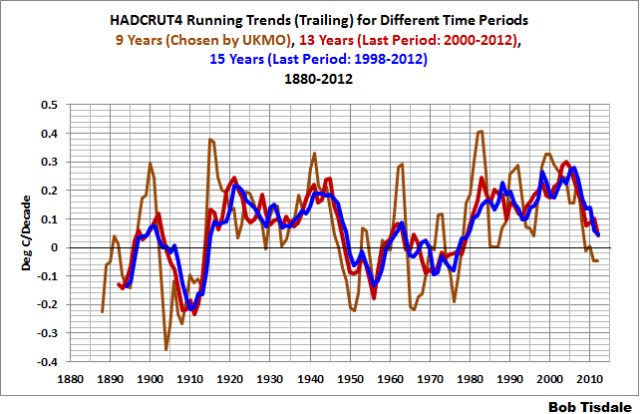
Figure 3
It appears that most of the UKMO’s Figure 1 was intended to misdirect the public, to steer them away from the fact that the recent pause in global warming is unusual in a period when climate models can only simulate warming if they’re forced with manmade greenhouse gases.
THE UKMO CONTRADICTS ITSELF
The Atlantic Multidecadal Oscillation (AMO) is the subject of the next portion. For further information about the Atlantic Multidecadal Oscillation, refer the NOAA Atlantic Oceanographic and Meteorological Laboratory (AOML) Fre
quently Asked Questions webpage here, and to my blog post here and my introduction to the Atlantic Multidecadal Oscillation here.
In their discussion of their Figure 1, the UKMO refers to the multidecadal changes in global surface temperature. They state (my boldface):
It is clear that there have been other periods with little or no surface warming in the relatively recent past, a good example being the period between the 1940s and the 1970s (Figure 1). The trend in warming over that period is well understood, and linked to a substantial increase in the amount of aerosol in the atmosphere.
The UKMO resurrected the aerosols conjecture once again, and claim it’s “well understood”. Then they contradict themselves later in the report. Under the heading of “2.2 Redistribution of energy within the climate system – Storing the heat below the surface”, and as a preface to their discussion of the impact of the Atlantic Multidecadal Oscillation on global surface temperatures, the UKMO writes:
What drives these multi-decadal variations in the North Atlantic temperatures is still unclear and there is a debate about the role of anthropogenic aerosols in forcing the AMO (Booth et al 2012, Zhang et al 2013).
If the UKMO states there’s debate about to the impacts of anthropogenic aerosols on the AMO, and if the AMO is the most dominant mode of multidecadal variations in surface temperatures, then how can UKMO claim it’s “well understood” and that the 1940s-1970s pause in global warming is “linked to a substantial increase in the amount of aerosol in the atmosphere”?
We discussed Booth et al (2012) and Zhang et al (2013) in the March 2013 blog post Blog Memo to Lead Authors of NCADAC Climate Assessment Report. In it, I noted:
Booth et al (2012)—a climate model-based study—claimed in their abstract that a “…state-of-the-art Earth system climate model…” was used “…to show that aerosol emissions and periods of volcanic activity explain 76 per cent of the simulated multidecadal variance in detrended 1860–2005 North Atlantic sea surface temperatures.” Zhang et al (2013), on the other hand, utilized the limited data that is available to dispute those claims. Apparently a “state-of-the-art Earth system climate model” is still inadequate for attribution studies. Do we know what causes the multidecadal variations in North Atlantic sea surface temperatures based on computers models and on very limited data? The realistic answer is no.
Then there’s the recent paper that discusses the many faults with climate model simulations of the Atlantic Multidecadal Oscillation. It’s Ruiz-Barradas et al (2013) The Atlantic Multidecadal Oscillation in twentieth century climate simulations: uneven progress from CMIP3 to CMIP5. The full paper is here. The beginning of the “Concluding remarks” provides an explanation of why it’s important for climate models to be able to properly simulate the Atlantic Multidecadal Oscillation. They write (my boldface):
Decadal variability in the climate system from the AMO is one of the major sources of variability at this temporal scale that climate models must aim to properly incorporate because its surface climate impact on the neighboring continents. This issue has particular relevance for the current effort on decadal climate prediction experiments been analyzed for the IPCC in preparation for the fifth assessment report. The current analysis does not pretend to investigate into the mechanisms behind the generation of the AMO in model simulations, but to provide evidence of improvements, or lack of them, in the portrayal of spatiotemporal features of the AMO from the previous to the currents models participating in the IPCC. If climate models do not incorporate the mechanisms associated to the generation of the AMO (or any other source of decadal variability like the PDO) and in turn incorporate or enhance variability at other frequencies, then the models ability to simulate and predict at decadal time scales will be compromised and so the way they transmit this variability to the surface climate affecting human societies.
The only way Ruiz-Barradas et al could have been clearer would have been to state point blank that climate climate models will only have value if and when they can ever simulate the decadal and multidecadal characteristics of natural ocean processes. Ruiz-Barradas et al (2013) then describe the many problems with climate model simulations of the Atlantic Multidecadal Oscillation. And the paper ends with (my boldface):
The current analysis does not provide evidence on why the models perform in the way they do but suggests that that the spurious increase in high 10–20 year variability from CMIP3 to CMIP5 models may be behind the unsatisfying progress in depicting the spatiotemporal features of the AMO. This problem, coupled with the inability of the models to perturb the regional low-level circulation, the driver of moisture fluxes, seem to be at the center of the poor representation of the hydroclimate impact of the AMO.
If climate modelers cannot simulate the AMO properly, then it’s very obvious that the pause in global surface temperatures from the 1940s to the 1970s is not “well understood”…as the UKMO claims.
NOTE: Figures 2 and 3 above presented variations in trends. In the following, Figures 4 through 7 present variations in temperature anomalies.
THE UKMO THEN PRESENTS THE WRONG DATASET FOR A DISCUSSION OF MULTIDECADAL TEMPERATURE VARIATIONS
Moving on the Pacific Decadal Oscillation: The UKMO starts out well by noting that there are multidecadal variations in the sea surface temperatures of the North Pacific. But then they go off on a tangent by discussing the Pacific Decadal Oscillation (PDO) and other abstract forms of the sea surface temperatures of the Pacific, as if those abstract forms represent the multidecadal variations in the sea surface temperatures of the North Pacific north of 20N or the Pacific Ocean:
The Pacific Ocean also displays longer timescale variations (Figure 5), variously referred to as the Pacific Decadal Oscillation (PDO; Mantua et al. 1997), Pacific Decadal Variability (PDV; Deser et al. 2012) and the Interdecadal Pacific Oscillation (IPO; Power et al. 1999).
Then the UKMO makes a rather surprising admission (my boldface):
The characteristics and mechanisms for the PDO are less well understood than for the AMO and there is some debate whether it just represents low frequency behaviour of ENSO and its influence on mid-latitude atmospheric circulations and surface fluxes (Deser et al. 2012), or whether ocean dynamics are involved too.
Let’s drop back for a moment. The current generation of climate models can’t simulate the Atlantic Multidecadal Oscillation (AMO), there’s also a debate as to whether or not manmade aerosols play a role in the AMO, and now the UKMO is stating that the multidecadal variations of the North Pacific (and the Pacific Ocean as a whole) are even less understood! And the UKMO wants us to believe, “The trend in warming over that period i
s well understood, and linked to a substantial increase in the amount of aerosol in the atmosphere.” That’s actually laughable. (And I’m not laughing with them; I’m laughing at them.) What gall!
Back to the PDO: The UKMO then goes on to discuss the PDO index and illustrate it with their Figure 4. But they’re ignoring (Willingly? Unknowingly?) the fact that the PDO index does not represent sea surface temperatures of the North Pacific—that the PDO index represents an abstract form of the sea surface temperatures of the North Pacific.
Brief description of the PDO index: El Niño and La Niña events create a specific spatial pattern in the sea surface temperatures of the North Pacific, north of 20N. For example, during a strong El Niño, sea surface temperature anomalies are warm in the east portion of the North Pacific and cool in the west and central portions. The PDO index basically represents how closely the spatial pattern in the North Pacific, and its intensity, match the spatial pattern created by El Niño and La Niña events. The PDO index does not relate to the surface temperature of the North Pacific (1) because that spatial pattern could exist at any temperature and (2) because the sea level pressure (and interrelated wind patterns) also impact the spatial pattern and, in turn, the PDO index.
And the UKMO is ignoring the fact that the sea surface temperatures of the North Pacific have multidecadal variations that can be comparable in strength to those in the North Atlantic. This is easy to see by detrending the sea surface temperature anomalies of the North Pacific (north of 20N) in the same fashion as the Atlantic Multidecadal Oscillation Index prepared by the NOAA ESRL. My Figure 4 compares detrended North Atlantic (0-70N, 80W-0) and detrended North Pacific (0-65N, 100E-90W) sea surface temperature anomalies. In this graph, we’re using the UKMO HADSST3 dataset. Both subsets have also been smoothed with 61-month filters to reduce the monthly and annual fluctuations. [Note: I typically present the detrended extratropical North Pacific sea surface temperature anomalies (20N-65N, 100E-100W) in these comparisons because the PDO is derived from it, but in this case I’ve used the entire North Pacific (0-65N, 100E-90W).]

Figure 4
It’s really difficult to miss the multidecadal variations in sea surface temperature in the North Pacific. They can vary in and out of synch with the North Atlantic. But let’s look at the sea surface temperature anomalies of the North Atlantic and North Pacific without the detrending, Figure 5. The sea surface temperatures in the North Atlantic may have peaked, but the plateau is very short. On the other hand, the North Pacific has cooled quite drastically since about 2003.
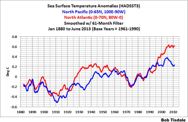
Figure 5
Of the two ocean basins, the North Pacific is the one that is contributing most to the hiatus in warming, but according to the UKMO, the variations in surface temperatures are even less understood in the North Pacific than they are in the North Atlantic, which aren’t understood either. But wait, there’s even more.
The cooling in the North Pacific extends to the entire Pacific basin, but the flattening of the sea surface temperature anomalies in the North Atlantic does not extend to the entire Atlantic Ocean. Refer to Figure 6, which presents the sea surface temperature anomalies for the Pacific Ocean from pole to pole (90S-90N, 120E-80W) and for the Atlantic Ocean from pole to pole (90S-90N, 70W-20E).

Figure 6
Those two basin-wide subsets have been detrended in Figure 7 to show that the multidecadal variability carries over to the entire basins.

Figure 7
Based on the UKMO’s own statements, they and the climate science community in general do not understand the causes of the multidecadal variations in the sea surface temperatures of the Atlantic and Pacific Oceans. This indicates that they also do not understand what caused the global warming from the mid-1970s to about 2000. If they can’t explain the pause, then they surely can’t explain the warming.
It’s very important for the climate science community to be able to model the natural processes that contribute to the warming and cooling of the global oceans. Land surface temperatures mimic and exaggerate the annual, decadal and multidecadal variations in sea surface temperatures. This was presented by Compo and Sardeshmukh (2009) in Oceanic influences on recent continental warming. The abstract begins:
Evidence is presented that the recent worldwide land warming has occurred largely in response to a worldwide warming of the oceans rather than as a direct response to increasing greenhouse gases (GHGs) over land.
We can also use correlation maps to illustrate the influence of sea surface temperatures of the North Atlantic and North Pacific on Northern Hemisphere land surface air temperatures. I’ve used Berkeley Earth Surface Temperature (BEST) data in Figure 8 because CRUTEM4 is not spatially complete, and I’ve used Reynolds OI.v2 data in place of HADSST3 data for the same reason. The data extends from 1982 (the start of the satellite-based Reynolds OI.v2 data) to 2011 (the last full year of the BEST data). The top map shows the correlations of land surface temperature anomalies with North Atlantic sea surface temperature anomalies and the bottom map presents the correlations with North Pacific sea surface temperature anomalies. It’s easy to see why researchers believe the North Atlantic has a strong influence on the surface temperatures of the Northern Hemisphere, but the North Pacific can’t be ignored because it has an impact as well.

Figure 8
The UKMO briefly discussed the possible causes of the multidecadal variations in the sea surface temperatures of the Kuroshio Extension; also known as the Kuroshio-Oyashio Extension or KOE.
There is some evidence that changes in the ocean heat transports associated with the Kuroshio Extension region (an eastward flowing ocean current in the North Pacific Ocean), and the generation of internal ocean circulations called Rossby waves by the surface winds may be contributory factors (e.g. Alexander 2010).
We have discussed the processes through which leftover warm water from strong El Niño events is carried to the Kuroshio-Oyashio Extension during the trailing La Niñas and that this warming following strong El Niños counteracts the impacts of the trailing La Niña events on land surface and sea surface temperatures in the Northern Hemisphere. Refer to the post here.
As noted earlier, the PDO index does not represent the sea surface temperatures of the North Pacific. We’ve discussed this in numerous posts in recent years. See here, here and here. As presented in those posts, the PDO index is inversely related to the sea surface temperatures of the North Pacific. And as shown in Figure 9, the PDO index is also anti-correlated with variations in land surface temperatures for many parts of the Northern Hemisphere. That is, when the PDO index rises, land surface temperatures cool for many parts of the globe and vice versa when the PDO index falls. On the other hand, the sea surface temperature anomalies of the Kuroshio-Oyashio Extension are a measure of sea surface temperature and they are positively correlated the land surface temperatures of similar areas of the Northern Hemisphere.

Figure 9
To sum up this section, the PDO is an abstract representation of North Pacific sea surface temperatures, and as such, it is the wrong dataset to use in discussions of global warming—or a lack thereof.
CLIMATE MODEL REPRESENTATIONS OF DECADAL VARIABILITY
The UKMO then included a discussion of their simulations of sea surface temperatures of the Pacific Ocean with different versions of their climate models, and they presented some maps of the simulations to show the prevalence of a La Niña pattern during the modeled decade-long hiatus periods. The UKMO wrote (my boldface):
The importance of decadal variability in the Pacific Ocean for driving extended periods of surface cooling has also been identified in multi-century simulations with fixed radiative forcing. Figure 6 shows the spatial distribution of the temperature trend averaged over extreme cooling periods from a number of climate model simulations from the Met Office Hadley Centre, including the most recent model (HadGEM2) that has contributed to the IPCC 5th Assessment Report. They all look remarkably like the observed pattern over the most recent decade (Figure 6, lower right panel), and provide fairly robust evidence of the importance of understanding the role of the Pacific Ocean in the current pause in global mean surface warming.
“Fixed radiative forcing” means infrared radiation from manmade greenhouse gases aren’t increasing in the models, there are no temporary decreases in sunlight caused by volcanic eruptions, there are no variations in radiation from the sun, etc. In other words, that’s not the real world. It’s irrelevant.
I’m always amazed that modeling groups will highlight the failings of their models. The UKMO presentation of model outputs with “fixed radiative forcing” strongly suggests that the UKMO’s climate models cannot simulate the pause if the models are forced by real world conditions. Or maybe the only way the UKMO’s climate models can simulate decade-long pauses in sea surface temperatures is by removing the effects of greenhouse gases. Ponder that for a while.
The UKMO then refer to a study by Meehl et al (2011) “Model-based evidence of deep-ocean heat uptake during surface-temperature hiatus periods.” It was a study based on the NCAR CCSM4 climate model. Meehl et al basically searched the future projections of the CCSM4 model for decade-long global warming hiatus periods. During those periods, the models were simulating La Niña-like conditions. But we know that climate models do not properly simulate the processes of El Niño and La Niña. I have used Guilyardi et al (2009) as a reference for these failings in past posts. The following paper is a more recent confirmation of how poorly climate model simulate ENSO. It’s Bellenger et al (2013): ENSO representation in climate models: from CMIP3 to CMIP5. Preprint copy is here. The section titled “Discussion and perspectives” begins:
Much development work for modeling group is still needed in order to correctly represent ENSO, its basic characteristics (amplitude, evolution, timescale, seasonal phaselock…) and fundamental processes such as the Bjerknes and surface fluxes feedbacks.
Additionally, in the post here, we presented and discussed how the NCAR CCSM4 climate model was not capable of simulating the observed warming pattern of the Pacific Ocean for the past 31 years. See Figure 10, which presents modeled and observed sea surface temperature trends for the Pacific Ocean since November 1981 on a latitudinal (zonal means) basis. The fact that those models can occasionally produce decade-land hiatus periods is, therefore, immaterial.

Figure 10
CHANGES IN THE OCEAN HEAT BUDGET
In their discussion of Figure 1, the UKMO states (my boldface):
Furthermore, upper ocean heat content continued to increase for a few years after 1998 (Figure 1). Nevertheless, it is clear that the rate of warming both at the surface and in the upper ocean has declined recently (Figure 1, lower panel). This is despite a continuing rise in atmospheric carbon dioxide concentrations, which act to trap radiation within the Earth system.
The data (maybe a reanalysis?) for the upper ocean in their Figure 1 is for the top 800 meters or about 2600 feet. The UKMO then goes on to discuss ocean heat content data under the heading of “2.3 What do we know about changes in the ocean heat budget?” They state (my boldface):
If indeed the ocean has hidden heat below the surface, then the question is whether changes in heat content, especially in the deeper ocean can be detected. There have been important advances in estimates of ocean heat storage over the last decade due to the correction of biases in conventional soundings, and the deployment of Argo floats.
That’s a big IF to start that paragraph, especially when they admit the data have to be modified, and, of course, those modifications were such that the data showed warming. They continue (my boldface):
The Argo measurements indicate a rapid increase in heat content down to 700m between 1999 and 2004 (Guemas et al, 2013), as indicated in Figure 1, but the rate of increase is lower thereafter. This period does, however, coincide with substantial changes in the observing system due to the rapid introduction of Argo floats. Although Argo floats are increasingly providing robust global measurements of the upper ocean, drawing conclusions from periods during which there are large changes in an observing system must be treated with caution.
The UKMO should be congratulated for noting that “…periods during which there are large changes in an observing system must be treated with caution.” But tha
t was a discussion of the upper ocean. They continued (my boldface):
Measurements of heat content in the deeper ocean are much sparser and hence less certain. Using a combination of satellite and ocean measurements down to 1800m, Loeb et al (2012) estimate the Earth system has been accumulating energy at a rate of 0.5±0.4 Wm-2 from 2001 to 2010, similar to the 0.4Wm-2 from 2005 to 2010 down to around 1500m estimated from Argo floats alone (von Schuckman and Le Traon 2011). Reanalyses3 of ocean data give an average rate of warming from 2000 to 2010 of about 0.9Wm-2 averaged over the globe, with 30% of the increase occurring below 700m (Balmaseda et al. 2013). We conclude that the Earth system has continued to absorb a substantial amount of heat during the last 15 years, despite the pause in surface warming.
We discussed the flaws with Balmaseda et al (2013) in numerous posts over the past few months. See here, here, here, here, and, lastly, here under the heading of Balmaseda et al (2013).
The UKMO footnote 3 reads:
Ocean reanalysis uses a global ocean model, driven by driven by historical estimates of surface winds, heat, and freshwater fluxes, to synthesise historical observations of the ocean from a range of platforms using the process of data assimilation, in order to reconstruct historical changes in the state of the global oceans.
And the Reanalysis used by Balmaseda et al (2013) was the ORAS4 by the European Centre for Medium-Range Weather Forecasts (ECMWF). See the ECMWF webpage here for more information about ORAS4. It includes the following disclaimer (my boldface):
There is large uncertainty in the ocean reanalysis products (especially in the transports), difficult to quantify. These web pages are aimed at the research community. Any outstanding climate feature should be investigated futher [sic] and not taken as truth.
That simple fact does not come across in the UKMO paper, which reads as if Balmaseda et al (2013) are presenting gospel.
Above I congratulated the UKMO for admitting to problems during periods when there are large changes in the observing system, when discussing the ocean heat content data for the upper oceans. They seem now to have forgotten that by agreeing with the data at depths to 2000 meters. In the post here, we recently presented how the subsurface temperatures for the depths of 700 to 2000 meters showed little long-term trend from 1955 to 2002. See Figure 11. Then, as soon as the ARGO floats are introduced, the subsurface temperatures skyrocket. Also keep in mind that ARGO data have to be adjusted to show warming.

Figure 11
The change in the observing system appears to have had a very strong impact on the measurement of ocean temperatures to depths of 700-2000 meters, but it appears the UKMO is willing to overlook that impact because the data supports their conjectures.
The UKMO then introduces radiative imbalance to the discussion:
The sea level budget can also be used to constrain the ocean heat budget. As discussed earlier, the pause in global mean surface warming requires either a reduction in the energy input to the planet of ~0.6Wm-2, or the storage of that amount of energy within the ocean. If an additional heating of 0.6Wm-2 was indeed stored in the ocean, then this would lead to a thermosteric (thermal expansion) rise in sea level of about 1.2mm/year, assuming all the increase in heat is confined to the top 700m. This number would be smaller if some of the heat was mixed below 700m where the coefficient of expansion is smaller.
The assumed radiative imbalance at the surface was also recently presented in Stephens et al (2013) An update on Earth’s energy balance in light of the latest global observations. See their Figure 1. They illustrate an imbalance of 0.6 watts/meter^2 at the surface with an estimated uncertainty of +/- 17 watts/meter^2. We can see why the UKMO failed to discuss that uncertainty.
The UKMO comes to an amazing conclusion for that section. They state with unbelievable certainty:
In summary, observations of ocean heat content and of sea-level rise suggest that the Earth system has continued to absorb heat energy over the past 15 years, and that this additional heat has been absorbed in the ocean.
But they’ve presented nothing to support their certainty.
UKMO KEEPS THE MYTH ALIVE
All in all, the UKMO continues to present the myth that only an assumed energy imbalance caused by manmade greenhouse gases can explain the warming of the global oceans, while the data, when it’s divided into logical subsets, indicate that manmade greenhouse gases had no visible impact on the warming of the global oceans. If this subject is new to you, refer to “The Manmade Global Warming Challenge” [42MB].
CLOSING
As a general note, the UKMO has presented numerous datasets in their efforts to show that global warming continues in theory, even though surface temperatures are no longer warming. Does the general public care about the temperature of the global oceans at depths below 2000 meters? No. Do they care about radiative imbalance? No. People care about what the temperatures and precipitation will be like where they live. And if those people live near shorelines, they care about sea levels. And sea level is probably the biggest concern. But sea levels will continue to rise no matter what we do about greenhouse gases. Does the UKMO address this? No. Then they’ve failed the people who pay the taxes that support their research.
The final paragraph of Part 2 of the UKMO’s report on the warming hiatus reads (my boldface):
The scientific questions posed by the current pause in global surface warming require us to understand in much greater detail the flows of energy into, out of, and around the Earth system. Current observations are not detailed enough or of long enough duration to provide definitive answers on the causes of the recent pause, and therefore do not enable us to close the Earth’s energy budget. These are major scientific challenges that the research community is actively pursuing, drawing on exploration and experimentation using a combination of theory, models and observations.
In other words, based on the limitations of available data, the UKMO does not understand the reason (or reasons) for the pause in global warming, and that strongly suggests that they do not understand the cause of the warming from the mid-1970s to 2000—a period when data are even less certain.
We’ll take a look at Part 3 of the UKMO report in a few days.
Why a ‘pause’? That infers a temporary lull before a continuation of the increase. Might the possibility not exist that it is a ‘plateau’, inferring temperature stability ahead, or even a ‘peak’, inferring a future decline in temperature?
yeah…i am at Trivandrum on the southwest coast of India…the sea level just went up by 2-3 feet because of the monsoon…it happens every year…the sea level changes with the winds and tides…if anybody claims they can measure it to 0.1mm accuracy…they are bullshitting
Thank you Bob.
This is the first opportunity I have had, due to time constraints, to read your earlier post on part one and now this on part 2 from the UKMO. As a British taxpayer your articles have raised a great number of questions about how the UKMO reaches their conclusions and the choices they make in supporting data for those conclusions.
I have decided that I will simply write and ask them. ( not framed in an FOIA request as this always seems to put them in a hostile position, something I encountered when trying amiably ona twitter discourse to get station siting data in a usable manner. They tried to scare me off with all manner of reasons why It would be costly for them and therefore for me, to obtain that data in the format I wanted, but I digress ).
I will await your deconstruction of part 3 before i do this but I may, if you allow, send my letter to you Bob, before I send it to them so that you may give me some pointers as a layman, how better to frame my questions so as not to allow for wiggle-room not immediately obvious to myself.
I may send an FOIA request for all correspondence between the people acknowledged at the end of the papers that the UKMO holds on record regarding this 3 part paper as I’m just curious as to what their motivation and discussions were prior to publication. I may do that tonight after a couple of whiskies have lubricated my cogs 🙂 Suggestions to add to such a request welcome
The UKMO have generally never understood climate, because they have always looked for human influences and not natural ones.
The UKMO myth.
If no warming could be explained by energy 2000m below the ocean surface increasing, then can’t the warming period in the atmosphere before be explained by lower energy at 2000m. A mechanism has always two sides for warming and cooling, one way in science doesn’t exist.
How does warming occur below 2000m but not above 700m, even the sun can’t manage this trick? With declining global cloud levels over recent decades it is awful science by the UKMO to miss this feature out. Increasing solar radiation at the ocean surface thanks to less clouds increases energy in the ocean below the surface. Just highlights my main point at the top, always looking for human influence and why they have performed so poorly.
Its all down to Occam’s Razor. Its the sun.
Bob
As a UK taxpayer I have, for many years, been frustrated by the way in which the Met. Office has ceased to be a useful service and has, instead, declined into being a political pressure group. Analyses such as yours are incredibly useful as a means of trying to sort the facts from the BS. However, I have to say that it will make absolutely no difference – even at a distance of 150 miles from their office I can hear the collective “la-la-la” as they are all sitting down with their fingers in their ears. You’re simply not with the(ir) programme I’m afraid!
Still, keep up the good work anyway; we’re listening even if they aren’t.
Nits:
Should be “monotonic.”
Why the “sic”? “Farther” should only be used for physical distances.
[“Further” most likely. Mod]
” So it appears that the ocean heat content “Data” UKMO presented in their Figure 1 from Part 2 may be a reanalysis and not data.”
ALL OHC “data” is reanalysis !
Sparse bobbing up and down form time to time and drifting around at the will of currents means the actual data is pretty useless as anything other than what it is : very local diving data profiles.
Trying to guestimate the OHC from this sort of data involves huge and irregular interpolations in both space and time.
This will necessarily have huge uncertainties not matter how accurate each individual censor is deemed to be. And like satellite altimetry and sea level the models applied to process the data determine the results as much as the readings do.
This is why “global warming” and its various morphings have now gone to hide in the deep ocean. Well out of the sight of prying eyes.
funny how a pause that has gone on for more than a decade is described as “recent”. As though if happened last week.
the only thing recent is the UKMO’s waking up to the fact that there has been a pause for many years. it is not the pause that it recent. it is their recognition of the pause that is recent.
The Recent UKMO Recognition of the 16 year Pause in Global Warming.
Headlines. After 16 years the UKMO wakes up to the fact that global warming ended 16 years ago and they don’t have a clue when or if it will come back. On this basis they reliably predict it will come back “some day”. Maybe next year, next century, or at the end of the next ice age. But they are confident it will come back..
Thanks once again Bob. It is always good to read your calm and thoughtful articles.
With the best will in the world it is becoming increasingly difficult to see ( parts of ) the UKMO as anything but an activist organisation.
Interesting, as always. Thanks Bob.
W see the approximate 60 year cycle of ocean temps and the resulting global temps. However, the overall global warming trend appears to be tied to the increased solar activity. The question about CO2 is easy to analyse. If the atmosphere is 100% CO2, what would the global climate look like, as apposed the current mix. I suspect the climate would be much colder as CO2 is less a heat absorbent than current H2O, N2, O2 ratio. Not sure how anyone can conclude “our” insignificant activity is influencing the earth sun relationship.
Bob
“So it appears that the ocean heat content “Data” the UKMO presented in their Figure 1 from Part 2 may be a reanalysis and not data.”
I haven’t had a chance to read all your article and I have to go out soon, but I’ll just make a quick comment re the above. I think you will find that the OHC line in the UKMO Figure 1 virtually matches the updated Smith & Murphy 2007 0-700m line in the leaked AR5 WG1 SOD (Fig. 3.2 – cyan line). So it is seem that it is analysed data, not a reanalysis as such.
This reminded me of something curious I read some time back. What do others here think?
I use to read Roger Pielke Sr’s blog. I didn’t understand much of what i was reading, but he seems like a good guy. I saw he left a comment on the video about the boosters on the space shuttle. The following discussion between Rodger, Kevin Trenberth, & Josh Willis took place in early April & continues to mid April 2010. Mr Trenberth sure has solved the OHC data problem he had in 2010.
“We are well aware that there are well over a dozen estimates of ocean heat content and they are all different yet based on the same data.”
” Roger I don’t believe any of the current dozen or so estimates of ocean heat content are correct. The TOA estimates are probably closer to being correct but they too have problems. The data may be robust since 2005 but the analysis methods are not. Kevin”
http://pielkeclimatesci.wordpress.com/2010/04/19/further-feedback-from-kevin-trenberth-and-feedback-from-josh-willis-on-the-ucar-press-release/
Josh Willis has the last comment. It’s worth reading IMO. Yes i know (well i think) it was Josh who was in involved in “adjusting” the Argo data to make it cooler.
I’ll leave the Ocean data to Mr Bob Tisdale. I’m just a dumb guy trying to educate myself. Could Mr Trenberth solved all his concerns with OHC data in 3 years? I have no idea. I do see why there are so many different claims about the OHC. It’s the “analysis method” one uses that causes the disagreements.
Bob, Re: “As shown in Figure 2, there is no agreement in the 30-year linear trends.”
I think the relationship is that sea-level trend is the integral of temperature trend. In your graph the lag is about 20yrs. I noticed the same thing in a plot I did a couple of week ago:
https://sites.google.com/site/climateadj/multiscale-trend-analysis—hadcrut4
If the pattern holds up, then sea-level rise should start to decelerate in 10 yrs or so.
I like figure 1. It may show a variance between SSTs and the Land Temperatures starting in about 1975. My monkey banging on a typewriter plot is here: http://www.woodfortrees.org/plot/hadsst3gl/mean:160/plot/crutem4vgl/mean:160
Is there any significance to the land temperatures breaking out in about 1975? The plot shows 2 rises and 2 stable steps. The first rise to me telegraphs what will happen during the second rise. The lines come close to swapping for the first rise, and succeed in doing that for the second rise. I guess we all see what we want, but I am seeing the SSTs smoothing the Land Temperatures. Some one used a leash example where the strongest factors limit the weaker ones.
Another two hit fight! Tisdale hits the UK Met Office and the UK Met Office hits the floor.
Face it, Met Off, all of you together are not capable of attaining Tisdale’s level of knowledge or analysis.
AJ says: “I think the relationship is that sea-level trend is the integral of temperature trend.”
Through what mechanism are you proposing that the sea level trend is an integral of the temperature trend…with a 20 year lag?
Clyde: Thanks for the Pielke Sr link.
Bob Tisdale says: “Through what mechanism are you proposing that the sea level trend is an integral of the temperature trend…with a 20 year lag?”
Well, in a perfectly cyclical world the integral of sin(x) is -cos(x), which is shifted by a quarter period. On a ~70 year cycle the lag would be 17.5 years, so it looks like this relationship is not complete and a further lag would need to be introduced. I’d have to make something up to reconcile the two. Maybe add in a one-box model with a tau of 2.5 years?
Perhaps I should have elaborated on my reply. If temperatures were perfectly cyclical then I would expect sea-levels to be perfectly cyclical as well, only phase lagged by 1/4 period. That is, I would expect the rate of energy accumulation in the oceans and the accompanying rate of rise to be greatest when the temperatures were at their highest. Also glacial melt rate would also be at it’s highest when temperatures were at their highest. So sea-level would be the integral of temperature and their trends would also have the same relationship.
UKMO is in for more stress. The North of 80 polar area has had the briefest incursion into thawing temperatures, possibly in the DMI record and refreezing has started already. Indeed, arctic temperatures have been below the long term average (since 1958) for more than 3 months.
http://ocean.dmi.dk/arctic/meant80n.uk.php
Also, look at the ice extent curves are flattening unexpectedly:
http://ocean.dmi.dk/arctic/plots/icecover/icecover_current.png
http://www.ijis.iarc.uaf.edu/seaice/extent/Sea_Ice_Extent_L.png
Oh this might still turn south but if it doesn’t, this all by itself, could harpoon the CAGW theory. The wasting away of the arctic is the the last hope still surviving as a bastion of support for CAGW. Will they rediculously blame this on global warming, too.
AJ says:
July 30, 2013 at 6:08 pm
then I would expect sea-levels to be perfectly cyclical as well, only phase lagged by 1/4 period.
===========
Similar to what we see with the seasons. The hottest part of the year in the northern hemisphere is not June 21, although this is roughly when solar energy peaks. Instead the hottest part of the year is typically during July-August, when solar energy is already declining.
The maximum lag should be 1/4 period, if the object has near infinite thermal inertia as do the oceans. For something with less thermal inertia such as the atmosphere, the lag will be less. If the atmosphere/surface had no thermal inertial, then the lag would be zero.
Gary Pearse says:
July 30, 2013 at 6:30 pm
I’ve just checked the entire 55 year record of DMI north of 80 annual temperature graphs and 2013 is the coldest summer temperatures of the lot and the quickest to fall back to freezing (today).
http://ocean.dmi.dk/arctic/meant80n.uk.php
Thanks fred… I should have known that.
MORE excellent research and writing, Bob Tisdale. Thanks!
**********************
Gary Pearse, thank you for that excellent information. Powerful fact!
And, I keep watching for an opportunity to say this, and this likely is not the time, but, your comment about a week ago about the world having real data from a real experiment (several, actually) to disprove the “hypothesis” of socialism/Marxism was well said. Nice insight and PRECISELY correct. Amazing how CAGW dupes and socialist-dupes can look at data and just not “see” it.
And, I DO realize why nuclear power is, often, (for now) not cost-effective: pseudo-science and the forces of anti-truth. I AGREE with you. Nuclear power is an EXCELLENT option with a nearly perfect safety record (where properly constructed/maintained). I only remark on this topic, here, because I don’t want to go back to that disgusting thread (as it became toward the end) again and I like you and admire your scientific integrity and want you to realize that I do not dispute your claims. (It appeared from your slightly annoyed tone that you thought I disagreed.)
AJ, thanks for the replies, but you didn’t answer my question. The key word in my question was mechanism, as in process.
Regards
Excellent post, especially the role of North Atlantic for the whole N. Hemisphere is eye-opening.
http://blog.sme.sk/blog/560/310249/Natlantic.jpg
There is a regular cycle in NA SST, not present in CMIP models, despite ad-hoc plugings for “aerosols”. Steepness of early and late century warming is exactly the same and the difference between warm peaks is mere 0.2 deg C. There is obvious warm peak in 2006, followed by cooling trend.
Bob… For the exact mechanism we’d have to get into thermal dynamics, of which I’m no expert. The concept is pretty easy to understand though. Fred above used the seasonal lag. Another would be to imagine a big pot of water on the stove and then cycling the heat up and down. If your period wasn’t too long, then the heat of the water should lag the forcing by 1/4 the period.
Here’s a plot you can try yourself to test. Quadratically detrend your temperature and sea-level data. Calculate the cumulative sums for the detrended temperature data and linearly detrend the result (this is your integral). Plot both this result and the detrended sea-level data using two y-axes.
I’ve done this using the HadCRUT4 data vs. the PSMSL data available at Climate Explorer over the intersecting period 1850-2002. The relationship seemed pretty obvious (correlation=0.48). There was still a one-year shift, but I just chaulked that up as a “rounding error”.
“Here’s a plot you can try yourself to test.” [A.J. 6:27AM, 7/31/13]
A. J., the customary way to debate another scientist’s assertions is to PRESENT YOUR WORK, not assign the other person homework. YOU show us. The burden of proof is on you to make a prima facie case for your viewpoint, not on Mr. Tisdale to prove your case for you. So far, you are only citing conclusions with no supporting documentation.
“… imagine a big pot of water on the stove… .” Oh, honestly. You have, so far, only convinced me that you have no real data or evidence re: oceans and energy at all.
My apologies Janice… this is all so seat of the pants. I don’t have a proper write up to present. All I have right now is R source code (not sure if this will display correctly):
[code language=”r”]
# read in HadCRUT4 temperature data from Climate Explorer
had_df = read.table("http://climexp.knmi.nl/data/ihadcrut4_ns_avg_mean1a.txt",skip=1)
names(had_df) = c("yr","anom")
# read in Jevrejeva sea-level data from Climate Explorer
sl_df = read.table("http://climexp.knmi.nl/data/igsl_mean1a.txt",skip=1)
names(sl_df) = c("yr","anom")
yrs = intersect(had_df$yr,sl_df$yr) # get intersecting years
yrsq = yrs^2 # square the years
# subset on intersecting years
had_df = subset(had_df,yr %in% yrs)
sl_df = subset(sl_df ,yr %in% yrs)
# quadratically detrend data
had_df$res = resid(lm(had_df$anom ~ yrsq + yrs))
sl_df$res = resid(lm(sl_df$anom ~ yrsq + yrs))
# calculate temperature anomaly cumulative sums
had_df$csum = cumsum(had_df$res)
had_df$csum = resid(lm(had_df$csum ~ yrs))
# plot cross correlations
windows()
acf = ccf(sl_df$res,had_df$csum,lag.max=20)
grid()
# plot detrended temperature cumulative sums and sea-level anomalies
windows()
par(mar = c(5, 4, 4, 4) + 0.3) # Leave space for z axis
plot(yrs, had_df$csum, type=’l’, xlab="Year", ylab="Temperature Anomaly Cumulative Sum")
par(new = T)
plot(yrs, sl_df$res, type = "l", col=2, axes = FALSE, bty = "n", xlab = "", ylab = "")
axis(side=4)
mtext("Sea Level Anomaly", side=4, line=3)
[/code]
Well… the display kinda worked and kinda didn’t. With a little editing it’ll work though. This is the only work I have to show so far. Happy to help 🙂
Bob,
You are right on it, but every rule in nature has exceptions and sometimes the exceptions are more interesting than the rules. Instinct tells me there is a very important lesson in the 1935 deviation.
Sorry Bob… just testing
[code language=”r”]
read.table("http://climexp.knmi.nl/data/ihadcrut4_ns_avga.txt"😉
[/code]\
and again
[code language=”r”]
read.table("xxxx://climexp.knmi.nl/data/ihadcrut4_ns_avga.txt")
[/code]\
[code language=”r”]
read.table("xxxx://climexp.knmi.nl/data/ihadcrut4_ns_avga.txt")
[/code]
blah blah
By Jove… I think I’ve got it.
Thanks for your indulgence.
[Use the “test” thread next time please. Mod]
[Unless otherwise directed the other two “test” posts will be deleted shortly. ]
sorry mod… please delete