INTRODUCTION
I’ve received a number of emails and requests to comment on the recently released 3-part report from the UK Met Office titled “The Recent Pause in Global Warming”. See the UKMO webpage here. This is part 1, corresponding to part 1 of the UKMO report.
For additional discussions of the UKMO’s papers, see Bishop Hill’s post Your ship is sinking. Will spin help? and Judith Curry’s post UK Met Office on the pause.
The UKMO is offering the same old tired excuses. As a result, much of this post discusses topics and presents data that have addressed in past posts. In other words, parts of the following are simply rehashings of topics we’ve discussed previously. And as I try to do in many posts, I’ve saved the best for last: I don’t believe the UKMO wanted to show a slowing of ocean heat content during the last decade or so, since the early 2000s, but they did.
EXECUTIVE SUMMARY OF UKMO REPORT
The Executive Summary reads (my boldface):
A wide range of observed climate indicators continue to show changes that are consistent with a globally warming world, and our understanding of how the climate system works.
Global mean surface temperatures rose rapidly from the 1970s, but have been relatively flat over the most recent 15 years to 2013. This has prompted speculation that human induced global warming is no longer happening, or at least will be much smaller than predicted. Others maintain that this is a temporary pause and that temperatures will again rise at rates seen previously.
This paper is the first in a series of three reports from the Met Office Hadley Centre that address the recent pause in global warming and seek to answer the following questions. What have been the recent trends in other indicators of climate over this period; what are the potential drivers of the current pause; and how does the recent pause affect our projections of future climate?
Weather and climate science is founded on observing and understanding our complex and evolving environment. The fundamental physics of the Earth system provides the basis for the development of numerical models, which encapsulate our understanding of the full climate system (i.e. atmosphere, ocean, land and cryosphere), and enable us to make projections of its evolution.
It is therefore an inherent requirement that climate scientists have the best possible information available on the current state of the climate, and on its historical context. This requires highly accurate, globally distributed observations and monitoring systems and networks. This is also dependent on robust data processing and analysis to synthesise vast amounts of data, properly taking into account observational uncertainty resulting from both measurement limitations and observational gaps, in both space and time. Only through exercising due diligence and applying rigorous, unbiased, scientific assessment, can climate scientists provide the most complete picture on the state, trends and variability of the climate system’s many variables and phenomena. This provides the basis on which the science can advance the evidence and advice required by users.
This document provides a short synthesis of that global picture as it stands today. A fuller briefing is produced in conjunction with vast numbers of scientists each year, and published in a Special Supplement to the Bulletin of the American Meteorological Society (BAMS) (Blunden and Arndt, 2013).
The observations show that:
A wide range of climate quantities continue to show changes. For instance, we have observed a continued decline in Arctic sea ice and a rise in global sea level. These changes are consistent with our understanding of how the climate system responds to increasing atmospheric greenhouse gases.
Global mean surface temperatures remain high, with the last decade being the warmest on record.
Although the rate of surface warming appears to have slowed considerably over the most recent decade, such slowing for a decade or so has been seen in the past in observations and is simulated in climate models, where they are temporary events.
We’ll address each of the boldfaced portions.
THE PAUSE IS UNUSUAL FOR A WORLD WHERE GREENHOUSE GAS WARMING IS SUPPOSED TO HAVE DOMINATED SINCE THE MID-1970s
Let’s begin with the last paragraph of the Executive Summary:
Although the rate of surface warming appears to have slowed considerably over the most recent decade, such slowing for a decade or so has been seen in the past in observations and is simulated in climate models, where they are temporary events.
The UKMO appears to overlooking a couple of points. First, the Intergovernmental Panel on Climate Change (IPCC) presented what they claimed to be climate model-based evidence that only manmade greenhouse gases could have caused the warming over the past 30 years. Refer to their presentation and discussion of Figure 9.5 from their 4th Assessment Report. It’s reproduced here as Figure 1. It is from Chapter 9 Understanding and Attributing Climate Change, under Heading of “9.4.1.2 Simulations of the 20th Century”.

Figure 1
The accompanying text for the IPCC’s Figure 9.5 reads:
Figure 9.5 shows that simulations that incorporate anthropogenic forcings, including increasing greenhouse gas concentrations and the effects of aerosols, and that also incorporate natural external forcings provide a consistent explanation of the observed temperature record, whereas simulations that include only natural forcings do not simulate the warming observed over the last three decades.
The IPCC wanted the people of the world—and, more importantly, lawmakers—to believe that only manmade greenhouse gases could have explained the warming since the mid-1970s.
They then presented the forecasted rise in global surface temperatures based on projections of future greenhouse gas forcings. This was illustrated in Figure 10.4 from AR4, reproduced here as Figure 2.
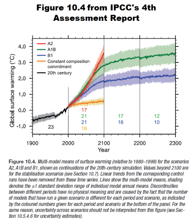
Figure 2
Now the UK Met Office is saying that “such slowing for a decade or so has been seen in the past in observations and is simulated in climate models, where they are temporary events.” There are no decade-long pauses in projected global surface temperatures in Figure 2, for scenarios A2, A1B or B2. Global surface temperatures are, however, responding similarly to the “Constant Composition Commitment”, which according to the IPCC means “greenhouse gas concentrations are fixed at year 2000 levels.” Yet greenhouse gas concentrations continue to climb.
And the surface temperature record not only shows that “such slowing for a decade or so has been seen in the past in observations”, it also indicates that the pause can last for multiple decades. Refer to the observati
ons data (black curves) in Figure 1. They show global surface temperatures pausing or declining from the early-1940s to the mid-1970s.
Does the UK Met Office think people have short memories or that we can’t read time-series graphs?
Second, public awareness of the pause in surface temperature warming skyrocketed with David Rose’s DailyMail article titled “Global warming stopped 16 years ago, reveals Met Office report quietly released… and here is the chart to prove it”. I updated David Rose’s graph in my response to the Royal Meteorological Society’s article by Kevin Trenberth, noting that surface temperatures in April 2013 were basically the same as they were in June 1997. Since then, I’ve used June 1997 as the start month for graphs of running 16-year trends that are updated and extended each month. The period is now 192-months long. Refer to the following graph of running 192-month trends from January 1880 to May 2013, Figure 3, using the HADCRUT4 global temperature anomaly product. The graph shows trends in global surface temperature anomalies—not the surface temperature anomalies. The last data point in the graph is the linear trend (in deg C per decade) from June 1997 to the most current month, May 2013. It is slightly positive, showing a warming rate of about 0.03 deg C/decade. That, of course, indicates global surface temperatures have warmed much slower than predicted by climate models during the most recent 192-month period. Working back in time, the data point immediately before the last one represents the linear trend for the 192-month period of May 1997 to April 2013, and the data point before it shows the trend in deg C per decade for April 1997 to March 2013, and so on. The last time global surface temperatures warmed at the minimal rate of 0.03 deg C per decade for a 192-month period was about 1980.
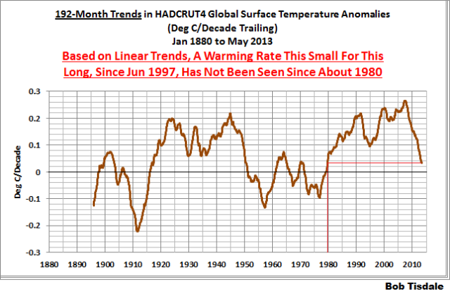
Figure 3
As noted in my post Open Letter to the Royal Meteorological Society Regarding Dr. Trenberth’s Article “Has Global Warming Stalled?”, Kevin Trenberth of NCAR presented period-averaged temperatures for 10-year periods in his article for the Royal Meteorological Society. He was attempting to show that the recent hiatus in global warming since 2001 was not unusual. Kevin Trenberth conveniently overlooked the fact that, based on his selected start year of 2001, the hiatus has lasted 12+ years, not 10.
The period from January 2001 to May 2013 is now 149-months long. Refer to Figure 4, which is a graph of running 149-month trends from January 1880 to May 2013, using the HADCRUT4 global temperature anomaly product. It was prepared similarly to the graph above, but in it, we’re presently the trends for 149-month periods in sequence. The highest recent rate of warming based on its linear trend occurred during the 149-month period that ended in late 2003, but warming trends have dropped drastically since then. Also note that the late 1970s was the last time there had been a 149-month period without global warming—until recently.
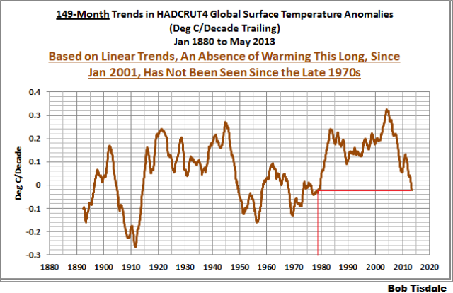
Figure 4
Bottom line: the recent hiatus in warming is unusual. We haven’t seen one since the late 1970s or 1980. And according to the IPCC’s climate models shown on their Figure 12.4 (my Figure 2), no hiatus was predicted.
Figures 3 and 4 are from the blog post June 2013 Global Surface (Land+Ocean) Temperature Anomaly Update.
DOES THE UKMO THINK GLOBAL SURFACE TEMPERATURES WILL MAGICALLY COOL?
Referring to the boldfaced quotes from the UKMO’s Executive Summary, they wrote:
Global mean surface temperatures remain high, with the last decade being the warmest on record.
Of course, “global mean surface temperatures have remain high…” Where has the UKMO stated that global surface temperatures should have cooled over the hiatus period? The UKMO appears to be grasping at straws.
And of course the last decade was the warmest on record. As noted in my Open Letter to the Royal Meteorological Society Regarding Dr. Trenberth’s Article “Has Global Warming Stalled?”, there are three natural events that caused the 1980s to be warmer than the 1970s, and caused the 1990s to be warmer than the 1980s, and caused the 2000s to be warmer than the 1990s.
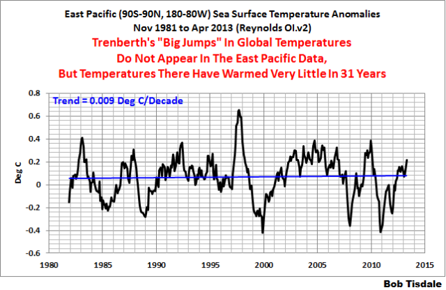
The 1976 Pacific Climate Shift caused the sea surface temperatures of the East Pacific ocean to shift upwards about 0.22 deg C. See Figure 5. There are numerous peer-reviewed papers about that shift, but no overall agreement about the cause. Global surface temperatures around the globe responded to that shift through atmospheric bridges or teleconnections.
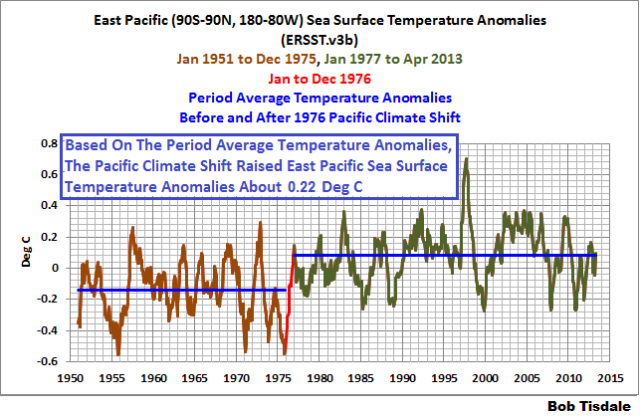
Figure 5
The sea surface temperatures of the Atlantic, Indian and West Pacific oceans (90S-90N, 80W-180) also show upward shifts. For these, though, we understand the causes. See Figure 6. Based on the period-average temperature anomalies, the 1986/87/88 El Niño caused the sea surface temperatures of the Atlantic, Indian and West Pacific to shift upwards by about 0.09 deg C. The sea surface temperatures for that region shifted upwards again about 0.18 deg C in response to the 1997/98 El Niño, and the 2009/10 El Niño appears to have caused a small upward shift of about 0.05 deg C.
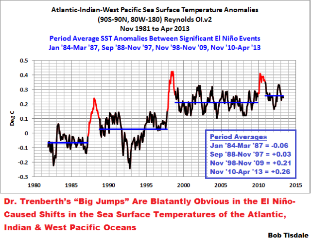
Figure 6
The climate science community has elected to ignore those El Niño-caused upward shifts for two reasons: First, they suggest the sea surface temperatures for the global oceans warmed in response to naturally occurring events. Second, climate modelers even after decades of efforts still cannot simulate the processes of El Niño and La Niña properly.
And there are also two points that are blatantly obvious in Figure 6. First: The warming of the sea surface temperatures of the Atlantic, Indian and West Pacific oceans (or about 67% of the surface of the global oceans) depends on strong El Niño events. Or phrased another way, without those El Niño events, sea surface temperatures of the Atlantic, Indian and West Pacific oceans would show little to no warming. This, of course, suggests that the hiatus in global warming will continue until the next strong El Niño. Second: The La Niña events that trailed the El Niños of 1986/87/88, 1997/98 and 2009/10 did not have a proportional effect
on the sea surface temperatures of the Atlantic, Indian and West Pacific oceans. Only the sea surface temperatures of the East Pacific ocean cool proportionally during those La Niñas, Figure 7, but sea surface temperatures there haven’t warmed in 31-plus years.
Figure 7
As I noted in the above-linked post about Trenberth’s article for the Royal Meteorological Society, if these naturally occurring, El Niño-induced upward shifts in sea surface temperatures are new to you, refer to my illustrated essay “The Manmade Global Warming Challenge” [42MB]. In it, I provide an introductory-level discussion of the natural processes that cause those upward shifts. Basically, the upward shifts are caused by the warm water that’s left over from the strong El Niño events—the warm water released by El Niños doesn’t magically disappear at the end of the El Niños. The essay also includes links to animated maps of data so that you can watch the upward shifts occur and so that you can understand how we know the leftover warm water exists. Most importantly, it will show you why La Niña and El Niño events should be looked on, not as noise in the instrument temperature record, but as a chaotic, naturally occurring recharge-discharge oscillator, with La Niñas acting as the recharge mode and with El Niños as the discharge mode. Sunlight, not infrared radiation, increases in the tropical Pacific during La Niñas. That is, data indicate the El Niños that caused the upward shifts were fueled by sunlight, not greenhouse gases. We’ll discuss this in more detail when we discuss ocean heat content data in a later post.
In that Trenberth-RMS post, I also presented a graph called the Alternate Presentation of Dr. Trenberth’s “Big Jumps” Chart. See Figure 8. I’ve started the graph in 1951 so that the response to the 1976 Pacific climate shift in the East Pacific is visible. And I’ve also altered the time periods to isolate the upward shifts associated with the 1986/87/88 and 1997/98 El Niño events. The natural contributions to the warming of global surface temperatures are blatantly obvious.
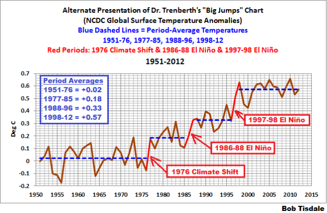
Figure 8
Now let’s look again at the UMKO quote we’ve been discussing under this heading.
Global mean surface temperatures remain high, with the last decade being the warmest on record.
Of course it was. It was the warmest on record because of the leftover warm water from the 1997/98 El Niño counteracted the effects of the trailing La Niña and caused the sea surface temperatures of the Atlantic, Indian and West Pacific Oceans to, in effect, shift upwards. Remember, the Atlantic, Indian and West Pacific oceans (90S-90N, 80W-180) cover a surface area of approximate 67% of the surface of the global oceans. Land surface air temperatures for much of the globe mimic the sea surface temperatures of the Atlantic, Indian and West Pacific oceans.
ON ARCTIC SEA ICE AND SEA LEVEL
Let’s move on to another boldfaced quote from the UKMO Executive Summary of Part 1:
A wide range of climate quantities continue to show changes. For instance, we have observed a continued decline in Arctic sea ice and a rise in global sea level. These changes are consistent with our understanding of how the climate system responds to increasing atmospheric greenhouse gases.
What the UKMO fails to note is that sea level would continue to rise regardless of our present surface temperatures. Let me quote an early paragraph from the introduction of my upcoming book (working title Climate Models are Crap). At present, it reads:
Sea level is also of interest, especially for those living along the coasts and on islands. Unfortunately, climate model outputs for sea level are not available in easy-to-use formats, so there are no model-data comparisons for sea level in this book. Regardless, many readers probably consider rising sea levels a done deal anyway. Sea levels have climbed 100 to 120 meters (about 330 to 390 feet) since the end of the last ice age, and they were also 4 to 8 meters (13 to 26 feet) higher during the Eemian (the last interglacial period) than they are today. (Refer to the press release for the 2013 paper by Dahl-Jensen et al Eemian interglacial reconstructed from a Greenland folded ice core.) Regardless of the cause…better said: regardless of whether or not we curtail greenhouse gas emissions, if surface temperatures remain where they are, or if they continue to warm, or even if surface temperatures were to cool a little in upcoming decades, sea levels will likely continue to rise. Refer to Roger Pielke, Jr.’s post How Much Sea Level Rise Would be Avoided by Aggressive CO2 Reductions? It’s very possible, before the end of the Holocene (this interglacial), sea levels could reach the heights seen during the Eemian. Some readers might believe it’s not a matter of if sea levels will reach that height; it’s a matter of when.
Roger Pielke, Jr.’s post (linked above) is worth a read.
With respect to Arctic sea ice, we first need to discuss sea surface temperatures. We’ve been illustrating and discussing for more than 4 years that the satellite-era sea surface temperature records indicate they warmed in response to naturally occurring events, not manmade greenhouse gases. Again, refer to essay “The Manmade Global Warming Challenge” [42MB] if this discussion is new to you. And we’ve also presented that the Pacific Ocean has a whole hasn’t warmed in almost 2 decades, as illustrated in Figure 9. (Figure 9 is from the post here.)
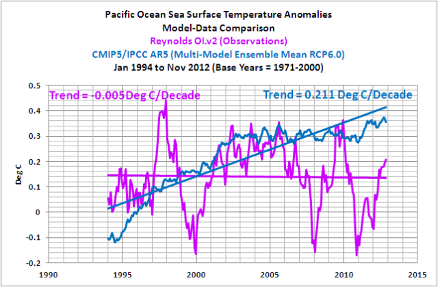
Figure 9
The left-hand map in Figure 10 presents the annual trends in Pacific sea surface temperatures from 1982 to 2012. We can see that some portions have warmed over that period, especially in the central and western mid-latitudes of the North Pacific. However, if we look at the quarterly trends for the peak Arctic sea ice melt season, July through September, the warming rates are quite high in portions of the high latitudes of the North Pacific. Those are shown in the right-hand map.

Figure 10
We’ve also discussed that the sea surface temperatures of the North Atlantic have an additional mode of natural variability called the Atlantic Multidecadal Oscillation. (For further information about the Atlantic Multidecadal Oscillation, refer the NOAA/AOML FAQ webpage here< /a>, and to my blog post here and my introduction to the AMO here.) As a result, since the mid-1970s, the North Atlantic warmed naturally at a rate that was greater than the rest of the global oceans, which have also warmed in response to natural events, not manmade greenhouse gases.
But, as shown in the map of the annual trends of the North Atlantic (the left-hand map in Figure 11), the majority of the warming there took place at high latitudes. And that’s also especially true during the peak Arctic sea ice melt season of July through September, shown in the right-hand map.
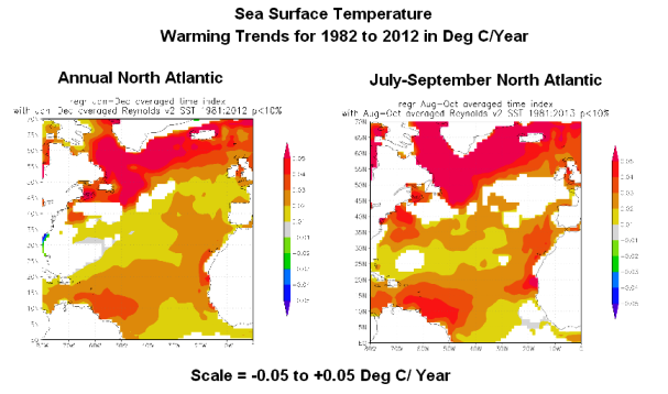
Figure 11
Of the high latitudes of the North Atlantic and North Pacific, the North Atlantic sea surface temperatures clearly had the higher warming rate as a result of the Atlantic Multidecadal Oscillation.
That leads to our discussion of Arctic sea ice. We discussed the impact on sea ice extent of a number of sea surface temperature, lower troposphere temperature and land surface air temperature datasets in the post How Much of an Impact Does the Atlantic Multidecadal Oscillation Have on Arctic Sea Ice Extent? Of the datasets presented, the one with the greatest agreement–the highest correlation–with sea ice extent was the sea surface temperature anomalies of the high latitudes of the Northern Hemisphere (60N-90N). See Figure 12. The Arctic sea ice extent and the sea surface temperatures at the high latitudes of the Northern Hemisphere had reasonably high correlation coefficient: 0.85. The correlations of Arctic sea ice area extent with lower troposphere temperature anomalies and land surface air temperature anomalies (both at high latitudes: 60N-90N) were far lower.
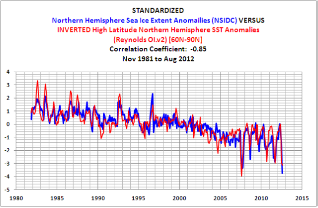
Figure 12
As noted at the end of that post:
Since there is no evidence of a manmade component in the warming of the global oceans over the past 30 years, the natural additional warming of the sea surface temperature anomalies of the North Atlantic—above the natural warming of the sea surface temperatures for the rest of the global oceans—has been a major contributor to the natural loss of Arctic sea ice over the satellite era. Add to that the weather events that happen every couple of years and we can pretty much dismiss the hubbub over this year’s [2012] record low sea ice in the Arctic basin.
CLIMATE MODELS
Let’s discuss another of the boldfaced quotes from the Executive Summary of the UKMO report. They wrote:
The fundamental physics of the Earth system provides the basis for the development of numerical models, which encapsulate our understanding of the full climate system (i.e. atmosphere, ocean, land and cryosphere), and enable us to make projections of its evolution.
We’ve illustrated in a number of posts over the past few months that the climate models prepared for the IPCC’s upcoming 5th Assessment show no skill at being able to simulate:
- Global Land Precipitation & Global Ocean Precipitation
- Global Surface Temperatures (Land+Ocean) Since 1880
- Greenland and Iceland Land Surface Air Temperature Anomalies
- Scandinavian Land Surface Air Temperature Anomalies
- Alaska Land Surface Air Temperatures
- Daily Maximum and Minimum Temperatures and the Diurnal Temperature Range
- Hemispheric Sea Ice Area
- Global Precipitation
- Satellite-Era Sea Surface Temperatures
And we recently illustrated and discussed in the post Meehl et al (2013) Are Also Looking for Trenberth’s Missing Heat that the climate models used in that study show no evidence that they are capable of simulating how warm water is transported from the tropics to the mid-latitudes at the surface of the Pacific Ocean, so why should we believe they can simulate warm water being transported to depths below 700 meters without warming the waters above 700 meters?
The climate science community may believe they understand “the fundamental physics of the Earth system”, but the performance of their models indicate their understandings are very limited and that they have a long way to go before they can “make projections of its evolution”. If they can’t simulate the past, we have no reason to believe their projections of what the future might hold in store.
A QUICK NOTE ABOUT OCEAN HEAT CONTENT
The UKMO has this to say about ocean heat content (my boldface):
Since about 2000, the Argo array of autonomous robotic ocean profiling floats has led to near global coverage with measurements of temperature to 700m (15-20% of the average open ocean depth), with more recent buoys measuring down to 2,000m (the upper 50%). However, the ice-covered and marginal seas still remain a technical challenge. Combining data from the Argo array with XBT and ship measurements, enables relatively long estimates of the heat stored in the upper 700m to be made (Figure 18). Comparing this record to the surface temperature record shows that, despite the surface warming pause since 2000, the ocean heat content in the upper ocean continued to rise.
Figure 18 from UKMO report is presented in the top cell of my Figure 13. I’ve lightened much of the surface temperature data to help highlight the ocean heat content data. The UKMO didn’t identify the ocean heat content dataset for the depths of 0-700 meters; they only indicated in the caption that the surface temperature data is HADCRUT4. In the text of their report, the UKMO referred to Levitus et al (2012). But the top cell in Figure 13 (Figure 18 from the UKMO report) is not the NODC ocean heat content data fo
r 0-700 meters. The NODC ocean heat content data for 0-700 meters does not cool from the late 1980s to 2000 as the UKMO has presented.
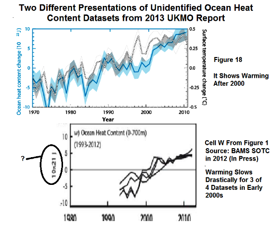
Figure 13
The bottom cell of my Figure 13 is also a graph of ocean heat content data from the UKMO report. It was included as cell W of their Figure 1. The UKMO notes that it is from the “State of the Climate in 2012”, Bulletin of the American Meteorology, Blunden and Arndt (2013). That report is in press so we can’t track down the sources of the ocean heat content data.
As you’ll note in that lower graph, 3 of the 4 unidentified ocean heat content datasets for 0-700 meters show that the warming of the oceans slowed to a crawl, starting in the early 2000s. Those three ocean heat content datasets contradict the UKMO’s statement that “…despite the surface warming pause since 2000, the ocean heat content in the upper ocean continued to rise.”
CLOSING
I’ll have to agree with the title of Bishop Hill’s post about the UKMO report: Your ship is sinking. Will spin help?
We’ll take a look at Part 2 of their report in a few days. In the mean time, I’m going back to writing Climate Models are Crap.
Thank you Bob, that was very informative. I very much appreciate your work which helps get to the nub amongst all the noise.
From the UK Met Ofice report “we have observed a continued decline in Arctic sea ice ”
I know it is only the end of July, but this year there seems to be more sea ice on the Arctic than has been observed recently. I wonder what the UK Met. Office means by “continued decline”, and what data is needed to falsify this. There is so much moving of the goal posts with respect to the pause in the rise of global temperatures, that maybe it would be a good idea to try and nail the Met. Office down on this one now.
Jim, if Arctic sea ice extent starts to increase, UKMET and others will proclaim that the models predicted a “temporary” increase in sea ice and then tweak the models so they show how well the models performed in the past in simulating sea ice extent. The next step will be to adjust past sea ice extent upward, thus, “proving” that the loss of Arctic sea ice is accelerating. I have no words for the despicableness demonstrated by the AGW Nomenklatura.
The warming is hiding deep in the oceans.. but from who?
Txomin its true its next to Atlantis and to the left hand of UFO’s the USA has had all these years but kept hidden , those area 51 people are such fools to look there. Must go tinfoil slipping .
“This is also dependent on robust data processing and analysis to synthesise vast amounts of data…” Yep, that figures with my understanding that the vast amounts of data the Wet Orifice are referring to are almost entirely synthesised, as in “totally made up”.
Thanks once more Bob. They have no explanation of how the heat bypassed the surface. They refuse to see the role that ocean temperatures and flows have in Arctic ice melt. They totally have no explanation for why temperatures aren’t rising so resort to sophistry.
I notice that Dana has a deep antipathy towards your work on ocean temperatures and I think he knows the facts you present give the lie to much of the AGW meme. The models synthesise every bit of “understanding” they have of climate science yet they have failed to correctly predict what is happening. Their “understanding” is wrong and they are slowly coming around to admitting this but in the meantime keep piling on the pressure.
The very first sentence of the executive summary has to invoke the “consistent with” hedging phrase.
So, if your car doesn’t start that’s “consistent with” a host of ailments, but you don’t start replacing components until you’ve narrowed the possibilities down to an economically practicable level.
“Consistent with” does not constitute actionable evidence.
Chuck, you write “Jim, if Arctic sea ice extent starts to increase, UKMET and others will proclaim that the models predicted a “temporary” increase in sea ice”
Yes and no. If nothing happens in the next few months, this is a reasonable scenario. But supposing Lord Lawson rises in the House of Lords and asks a question of the Minister responsible for the Met. Office. This would require the Met. Office to define, NOW, what they mean by “continued decline”, and state what future data would falsify the forecast. Note, there is already a precedent for this sort of question. I am going to write to the GWPF suggesting that they do just this.
Figure 6 also clearly shows a downward step in the early 90s. Are the steps only allowed to move upward? I realize that might be Pinatubo, but it’s a step and was maintained for a while. By only showing upward steps people are left with the idea that temps are only increasing.
the MSM have lapped up the fairy tale that has taken months to devise.
david shukman hasn’t bought it, tho. he ends his 22 July piece on the subject, “Why has global warming stalled?” –
But until the pause can be properly explained, many people will take a lot of convincing – especially if the pause lasts longer than expected.
http://www.bbc.co.uk/news/science-environment-23409404
ok, we know it’s already lasted longer than the CAGW-ers “predicted”/expected whatever, but shukman’s piece is the most honest critique available so far.
“The fundamental physics of the Earth system provides the basis for the development of numerical models, which encapsulate our understanding of the full climate system (i.e. atmosphere, ocean, land and cryosphere), and enable us to make projections of its evolution.”
That statement (if it were true) would apply equally to daily weather forecasts as it does to long term weather/climate forecasts (they are all part of the same “physics”).
The simple fact is that the reason we cannot predict the weather more than a few days in advance with any skill is precisely the same reason we cannot predict the climate. AND IT IS BECAUSE they share the same “fundamental physics of the Earth system” which is essentially chaotic and unpredictable.
Models express a hypothesis only they do NOT do science. Science is a methodology only, science does not give us knowledge it ONLY gives us data/information, a philosophical approach to the data/information gives us knowledge then wisdom.
As the UKME has now revealed. As the surface warms, the deep oceans have started to absorb the excess heat, which has caused the warming to stop. Since it will take centuries for the deep oceans to warm even 0.1C, this limits any future warming due to CO2. Long before then some other fuel will have replaced fossil fuel, as fossil fuel replaced wood.
This represents a HUGE negative feedback not predicted by the climate models and most certainly not made public by the IPCC. We were told that as CO2 rose, so would temperature. Nowhere did the scientists say that heat flowing into the oceans would limit the rise in temperatures. We were told that we would get a runaway greenhouse effect like Venus. Yet none of the scientists involved bothered to consider that Venus has no oceans.
Any child of 5 could have foreseen this, so why didn’t the climate models? Nature has shown that it doesn’t work the way the climate models predicted. Contrary to the alarm raised by Hansen, Gore, etc., there is no reason to worry about CO2 warming because as surface temperatures rise above ocean temps, the excess heat flows from the surface into the oceans, preventing significant warming and limiting the effect of CO2.
Bob,
Regarding the Pacific Ocean temperature shift in the mid 70s, I found it interesting to have a look at Alaska’s temperature anomalies. Sure enough, that shift stands out like a sore thumb. It also appears that shift is the sole basis for claims like “Alaska is warming at twice the rate of the contiguous US.”
This page has the temperature anomalies and what looks like a fairly good description: http://climate.gi.alaska.edu/ClimTrends/Change/TempChange.html
Since the regime shift, Alaska’s temperatures seem fairly stable. And yet, Alaska is apparently “on track for a double apocalypse.” http://grist.org/news/alaskas-latest-climate-worries-massive-wildfires-and-gushing-glaciers/
Don’t forget that all of the “adjustments” and “homogenizations” work together to build in a “warming trend.” The data for the late 1800s and early 1900s for my hometown now show that period to be cooler than the old data showed it to be, as much as 2 degrees for a given year.
Txomin says:
July 25, 2013 at 5:13 am
The warming is hiding deep in the oceans.. but from who?
———————————————————————-
Olly Olly Oxen Free Free Free!
You can come out now, heat.
cn
And soot is known to cause big warming in the Arctic. Even James Hansen used to acknowledge its large effect.
There is another possibility. What if the deep oceans are heated by the earth’s core? This would explain how the warming bypassed the 0-700 m layers. In this case, the theorized 30C warming of the surface due to GHG and black-body radiation would be over estimated. Climate shifts in Bob’s figure 6 above would then be explained terms of “pulses” of water rising from the depths on scales of decades.
The earth has oceans for one reason only. Because of the hot core. Otherwise the oceans would have long ago drained away through any cracks in the crust and flowed towards the core. The earth’s surface would be dry.
Instead, as water seeps through the crust it meets the hot mantle and turns to steam at extremely high pressure. This pressure of steam that prevents the oceans from draining further. Thus, at their true base, the oceans reach a temperature on the order of 600C or higher.
[my bold]
You are not alone. Even BBC’s David Shukman sounded surprised by this oft repeated claim. It’s a pity they didn’t tell us loud and clear over 10 years ago that pauses of 15 years or more are to be expected.
Slowly but surely the message is getting through.
Figure 12 is very telling. I did something similar some time ago:
http://i51.tinypic.com/oqlpxi.jpg
Michael Craig: Thanks for the links. The impact of the 1976 Pacific climate shift really shows like a sore thumb with the colored bar chart. We also discussed the impact of the 1976 Pacific Climate shift on Alaska surface temperatures in two posts. Here:
http://bobtisdale.wordpress.com/2013/05/16/on-hartmann-and-wendler-2005-the-significance-of-the-1976-pacific-climate-shift-in-the-climatology-of-alaska/
And a model-data comparison:
http://bobtisdale.wordpress.com/2013/06/27/model-data-comparison-alaska-land-surface-air-temperatures/
Regards
Bob, the Pacific SSTs in figure 9 seems an excellent proxy for global temps, both flattening after 1998. Surely UKMO and others are not suggesting that the CO2 rise had anything at all to do with that? I think a model based largely on SST plus a temporal factor that elevates land temp from direct insolation would be a good forecasting tool. Even the lags don’t seem to be long. Since we have some sense of the oscillation periods in ocean SSTs we should be able to make an infinitely better forecast than the control-knobbers.
Your unique work on these subjects should make it possible for you to put a model together. I think we could cap max SST at 31C in the equatorial waters (a la Willis Thermostat) and go from there with the geometry of the globe, currents, etc. You seem to be already able to explain the temp record from ENSO, etc. and I think you have many of the tools to present a forecast. Heck, the CO2 junkies show no trepidation in forecasting a century forward even though they have utterly failed to get a 10yr projection anywhere near and in the case of the Met Office, a seasonal forecast a few months out!
CodeTech says: “Figure 6 also clearly shows a downward step in the early 90s.”
Figure 6 shows a volcanic aerosol-related dip and rebound starting in the early 1990s.
The Met Office paper got off to a bad start:
“…It is therefore an inherent requirement that climate scientists have the best possible information available on the current state of the climate, and on its historical context. This requires highly accurate, globally distributed observations and monitoring systems and networks. This is also dependent on robust data processing and analysis to synthesise vast amounts of data, properly taking into account observational uncertainty resulting from both measurement limitations and observational gaps, in both space and time. Only through exercising due diligence and applying rigorous, unbiased, scientific assessment, can climate scientists provide the most complete picture on the state, trends and variability of the climate system’s many variables and phenomena…”
….
Could anyone describe the land based thermometer record as highly accurate given the poor siting issues and/or as robust given the constant adjustment to temperatures and station drop outs? Has there ever been a proper assessment of the true levels of errors and uncertainties in the various data sets and whether they can be relied upon to measure data in hundredths of a degree, and in the case of ARGo to thousands of a degree.
The sentence “Only through exercising due diligence and applying rigorous, unbiased, scientific assessment..” beggars belief.
The real problem in the climate field is that the data is not fit for purpose. It has not been properly measured (only ocean temps give an indication of energy and min/max is in any event too crude), it has become polluted by UHI, poor siting issues, lack of screen maintenance, and bastardised by station dop outs and endless adjustments/homogenisation. The land based thermometer readings were never intended to be used for the purpose for which they are being put.
The first thing that Climate Science should have done was to roll out a new network consisting of stations sited in entirely rural locations, with no tarmac, and which would be wholly uninfluenced by man and development. One does not need thousands of stations, merely good quality stations and good quality data. The stations should be as uniform as possible, ie., standardised in design, instrumentation, callibration and maintenance. These stations should be audited annually just to check that there are no material changes in vegation, eg., a growing tree which may impact on local conditions.
Since oceans rule the roost, in practice, one could have dispensed with land data and just measured ocean data. ARGO should have been rolled out in the late 1970s coinciding with the satellite era. . We would then have more than 30 years of good ocean data and satellite data. Of course, 30 years is not long enough, but we would be well on the way to compiling a useful data set from which proper science could be conducted.
One should only use the raw data, unless there is a known problem and the effect of the problem can be properly determnined and measured.
The Met Office ought to be honest and admit that the data is not fit for purpose, there are too many errors and uncertainties within the various data sets so that we have all but no knowledge of precisely what is going on, still less why. .
After prolonged and careful thought I’ve come to a conclusion as to what global warming really is. Actually, there was no prolonged thought whatsoever on my part. I just laid that out to make it sound like I’m a deep thinker.
Anyway, I’m convinced that what global warming is; it’s the ecologist’s orgasm. I mean, think about it. What do they always talk about? Melting ice? Heat? Everything’s hot, hot, hot? And look at their graphics. The hot spots are always illustrated in red: Of course. I rest my case.
Now, let us think about the pause in global warming and what that must be like for our ecologists. It’s a pause in their orgasm. Think about that. How would you like that: a pause in your orgasm? Pretty tough, huh? And you don’t even know how long that pause will last. Maybe it’ll be permanent. Ee gads! Our climateers may never be able to get back towards their global catastrophe. (And if you use your imagination, the word catastrophe can easily morph into the word, ‘climax.’)
No wonder our global warriors wish to restart the only reciprocating engine they’ll ever like. But like any gigolo they’re not drawing upon their own liquid assets to tease Mother Nature back into action. No, they’re drawing upon her’s in the deep blue sea. And me thinks Mother Nature’s not at all happy with them. After all, after having created a sentient life form that developed the ability to enrich the atmosphere with her very own CO2, so as to keep those green plants a humming, she’s probably a little turned off by the shenanigans of our climateers in trying to take it away. For their own profit.
These past climate pauses are longer than just a decade or two.
No net warming 1870-1930 [an extended 60 years net pause]
Warming 1930-1945 [warming for 15 years]
No net warming 1945 -1980[another 35 year extended pause]
Warming 1980-2000 [warming for 20 years]
No net warming 2000-2010
ferd berple says:
July 25, 2013 at 7:02 am
There is another possibility.
====
Fred, it’s an excuse to cover up a math error
The met office says”approximately90% of the heat trappedin the earth system by increases in atmospheric green house gases will eventually be stored in the ocean”. That statement is factually wrong and that is the nub of the problem. These people do not take into account the existence of surface tension. If you apply heat to the surface of water it will be completely rejected. Try applying heat to the surface of water using say a paint stripping heat gun and you will find that although the gun operates at 450degsC the water accepts NO heat.
The irony of the situation is that if you are serious about heating water through the surface, the only way to do it is to first float pan on the surface and apply heat though that. Because the surface tension under the pan is neutralized the heat will pass into the water. You’ve created an upside down pan and you can heat a pan through its base. Because of the existence of surface tension the ocean can never be a store of “excess” heat from so-called greenhouse gases. The only energy that goes int theocean goes via the sun’s rays.
This is why they are having allthis trouble with the “pause”, because when the sun is active the excess heat does not go into the ocean, so when it goes quiet there is no backup. Somebody tell Trenberth.
help me understand something please? so many of the graph are based on “anomalies”…..which i think are variances from some supposed “normal”?
since the natural state of the climate is constant change how can one arrive at a “normal”?
also most of the graphs are of such a short time span they appear to show BIG movements, when in reality they are only showing tiny fluctuations, if the graphs covered thousands of years they would show almost a flat line with such tiny variances.
Watch out for the rivers of moisture in the air.
http://www.bbc.co.uk/news/science-environment-23455820
PS Send more money.
I need to study this more, but one simple, basic question needs to be answered for me:
What has changed?
When the temperature data showed warming, no mention of deep ocean storing heat energy, but now that the data shows no warming they suddenly constructed a theory of how the heat energy is being stored in the deep ocean, and does not appear in the surface temperature even though it’s fundamentally the same thermodynamic “system” we live on.
Watts up with that?
herkimer says:
July 25, 2013 at 8:26 am
//////////////////////////////////
The first 2 periods were before significant manmade CO2 emissions. They therefore have nothing to do with CO2 and are the rust of natural variation.
The third period (a period of cooling) coincides with when manmade CO2 emissions began to escalate. Obviously, this period does not support the CO2 theory. If CO2 played any role at that time, it was obviously overcome by natural variation, ie., natural variation was stronger than the positive forcing of CO2 when CO2 was acting at 1940, 1950 and into 1960s levels.
The fourth period is the only example where temperature and Co2 levels rise in tandem. But materially, the rate of warming is no greater than the warming at the early part of the century ts suggesting that CO2 does not add anything significant to natural variation.
The final period demonstrates that natural variation is at least as strong as CO2 induced warming when CO2 is at 385/400ppm. It confirms that CO2 is not the dominant driver of temperature.
the upshot is that there is no surprise that one would see a pause for a lengthy period of time, unless one is of the view that CO2 drives temperatures upwards and in particular if one is of the view that CO2 caused the 1980s warmming because by that stage CO2 was the dominant driver of temperature.
Please consider something less blunt, such as these (feel free to recombine phrases as you see fit):
Toying with Us: Climate Models’ Make-Believe World
Make-Believe: Climate Models’ Unreal World
Misled by Models: Climatology Gone Astray
FAIL: Climate Models vs. Climate Data
FAIL: Climate Models Meet the Real World
FAIL: Climate Models Miss the Mark
FAIL: Climate Models’ Poor Performance
Garbage Out: Climate Models Miss the Mark
Gospel in, Garbage Out: Climate Models vs. Climate Data
I Say It’s Spinach: Climate Models Garbage Output
They Say It’s “Sausage”: Climate Models’ Make-Believe World
Sausage-Making Under the Microscope
(More to come after I post this, probably.)
Bill Taylor says: “since the natural state of the climate is constant change how can one arrive at a ‘normal’?”
“Normal”, as you understand, is a relative term. The WMO recommends that the reference period for anomalies be updated every decade, so presently 1981-2010 should be used as the base years for anomalies. Few of the global temperature dataset producers use that period of time, however.
Bill Taylor says: “also most of the graphs are of such a short time span they appear to show BIG movements, when in reality they are only showing tiny fluctuations, if the graphs covered thousands of years they would show almost a flat line with such tiny variances.”
Everyone would be happier if we had observations-based data going back for 1000s of years. But we don’t. I usually limit my sea surface temperature data research to the last 3 decades because that’s the satellite era and we have a more complete coverage of the global oceans then. That 30-year period is also the time when the IPCC says that only manmade greenhouse gases can explain the warming, when the data reveals otherwise, so that’s another reason I concentrate on that period.
Regards
More:
Toying with Us: Climate Model-Makers’ Make-Believe World
Undeceived: Enough of Climate Models Make Believe
Undeceived: Climate Models’ Make-Believe FAILS
Undeceived by Make-Believe–The Toy-World Models of Climatology FAIL
I like the last one the best of the bunch (so far). The rhyme is a grabber and sticks in the mind; “toy” and “make-believe” are slighting insinuations about “models”; “FAIL” bookends the opening premise of “Undeceived”; and “Undeceived” is an intriguing word on its own.
It’s better to have a short “grabber” title (which can be used when referring to the book in comments) and an explanatory sub-title, rather than a do-it-all title like Climate Models are Crap.
ty, for the response, it still seems to me using anomalies as the base for any graph is political and not science, since indeed they are arbitrary at best.
i am not being critical of you in any way Bob, just trying to make the point that TINY changes are being touted as unprecedented events and they quite obviously are not.
Well done. Thanks Bob.
~~~~~~~
A slight issue about word usage, though . . .
There are frequent pro/con comments regarding the phrase “ice age” as used in the part under ‘On arctic sea ice and sea level’. Some say Earth is experiencing an ‘interglacial’ but continues in an ‘ice age’. I was instructed (many years ago) when writing not to introduce something you do not want to defend or something that leads astray. In fiction writing there is the similar idea of not interrupting the willing suspension of disbelief.
Because the phrase “the end of the last ice age” can disrupt the narrative (for some), I try to use the phrases “end of the last glacial advance” or “the beginning of this interglacial.”
PS: “Make-Believe” also insinuates that the consensus has been manufactured (made) and enforced (MAKE–believe).
PPS: If you (Bob) do use Climate Models are Crap, the “are” must be capitalized. (Verbs are capitalized in titles.)
Jim Cripwell says:
July 25, 2013 at 4:58 am
“ I wonder what the UK Met. Office means by “continued decline”, and what data is needed to falsify this.”
The chart here:
http://nsidc.org/data/seaice_index/images/n_plot.png
Seen on this page:
http://nsidc.org/data/seaice_index/
. . . has a Blue circle with “About this graph” in it. Click on that.
A pop-up appears and on the lower left is a link called “Read more” that will take you to information about the data and process.
Note that the chart used is for June and the decline is shown as (minus) -3.6 (+/- 0.6) % per decade. Other months are available.
The idea is that for the satllite time frame there has been a slow loss of sea ice on the Arctic Ocean.
Jimbo says:
July 25, 2013 at 7:07 am
“It’s a pity they didn’t tell us loud and clear over 10 years ago that pauses of 15 years or more are to be expected.”
I doubt they (?) expected this to happen. It was never part of the hypothesis. Then when it did happen a search of the hundreds of scenarios showed a few runs with pauses. I can visualize the person searching for something like this staring at a computer screen while wiping sweat from his/her forehead – the first such find being greeted with a shriek of delight.
herkimer says:
July 25, 2013 at 8:26 am
“These past climate pauses are longer than just a decade or two.”
Yes, but the earlier ones are supposed to be from the era before CO2 was (presumably) relentlessly driving temperatures higher. If CO2 is now in the driver’s seat, you would expect to see its “signal” breaking through the “noise”.
Bob, where do ocean heat content numbers come from? It seems to me that we are only guessing at anything before ARGO started collecting deep water data in 2005. Is there a proxy? Or are they just taking the small samples collected over the previous years. That is, so small they couldn’t possibly be considered robust.
Richard M says: “Or are they just taking the small samples collected over the previous years.”
Smaller samples, primarily from devices called XBTs. I prepared animations of the sampling for a post a number of months ago. They’re large gif files and take a while to load.
Temperature sample maps at 1500 meters:
http://bobtisdale.files.wordpress.com/2013/03/nodc-temp-obs-at-1500m.gif
Temperature sample maps at 500 meters:
http://bobtisdale.files.wordpress.com/2013/03/nodc-temp-obs-at-500m.gif
Temperature sample maps at 250 meters:
http://bobtisdale.files.wordpress.com/2013/03/nodc-temp-obs-at-250m.gif
They’re from this post:
http://bobtisdale.wordpress.com/2013/03/11/is-ocean-heat-content-data-all-its-stacked-up-to-be/
Regards
What the IPCC, the consensus and Hansen & Co. are saying no longer passes a sanity check. http://consensusmistakes.blogspot.com/
Bob, just extremely grateful for your comprehensive, data based and spin free post’s
Thanks, Bob. I have been trying to determine if my idea related to the ocean heat was supported by any data. I can see that the data used today is pretty worthless. Once again, here are my thoughts:
I believe we may very well be seeing ocean warming now. However, it’s not the same kind of warming being put forth by the climate scientists. I believe the warming is due to the switch to a cold PDO which means more La Nina episodes. As you’ve indicated in the past a La Nina is a period of regeneration of heat in the ocean. Consider the possibility that something like an 80-20 rule applies. Around 80% of the energy is returned during the next El Nino while 20% goes into warming the oceans.
Over a complete PDO cold cycle the prevalence of La Nina episodes generally warm the oceans while also cooling the atmosphere. Naturally, the opposite occurs during the warm PDO like we just experienced. Part of the heat returned to the atmosphere during the El Nino episodes was heat originally stored up during the cold PDO. As such the ocean was actually cooling during the warm PDO.
This is just a simple extrapolation of what you have always said about ENSO based on some of the heat (20%) participating in long term changes. I’d be interested in your thoughts.
As I see from Figure 3, the 17-year-trailing-average warming rate appears to me to have a linear trend increasing to almost .1 degree/decade lately from less before. Keep in mind that Earth has multidecadal oscillations, which the Figure 3 graph shows reasonably well.
However, I see this stabilizing soon, due to the sun having recently passed a millennium-class peak and CO2’s effect being logarhythmic rather than linear. I see little more than .1 degree/decade for the current century, and slowing greatly afterwards.
Climate Models Are Crap – subtitle* IS EXCELLENT!!!
Refreshingly unvarnished is how it strikes me.
*“… working title Climate Models are Crap with the subtitle An Illustrated Overview of IPCC Climate Model Incompetence”
[Bob Tisdale in his July 6, 2013 post on bobtisdale@wordpress.com]
Mr. Knights,
I can see your point about the title, however, I think Mr. Tisdale must look at the main title as a marketing tool. Your intelligent, creative, and well-worded titles are fine, but, not likely to catch attention. Your fine, high road, approach is lovely. It won’t sell Mr. Tisdale’s book, unfortunately. The popular culture is quite vulgar. I cannot BELIEVE what is on TV (advertisements) during the time small children might be watching. I wish it were not so.
Further, the IPCC has lied to people. Rebuking calls for blunt language.
I hope that YOU have some outlet for all your wonderful creative writing. Write a book! It could be a book about how to write for scientists — to better communicate-to-be-understood.
With admiration for your mastery of the English language,
Janice
rogerknights says:
July 25, 2013 at 11:53 am
PPS: If you (Bob) do use Climate Models are Crap, the “are” must be capitalized. (Verbs are capitalized in titles.)
Do be silly Roger. Your are only exposing your stupidity to the strong light of intelligent people.
I fear that the word “crap” will not be allowed to appear in many newspapers or spoken on many radio shows, which will inhibit book reviews and other MSM notice.
I’ve been bold in making repeated title suggestions because this was the same prolonged process I went through in suggesting titles for Bob’s prior book, one of which he finally accepted. (Who Turned on the Heat?)
I think my suggestions do a good job of book-marketing, because they’re memorable, especially the rhyming Undeceived by Make-Believe.
Here’s what the bible of the publishing industry, The Chicago Manual of Style (13th ed.), says on the topic, under the headings “Titles of Works: General Rules”:
Thanks, Mr. Knights, for responding. Perhaps, our differences are due not just to personal preference, but to a British (you, I think) versus an American (me) cultural perspective. From the times Mr. Tisdale tends to post, I think he is British, too. I defer to your expertise on what would best promote his book in British lands. If that is the main market, he should ignore my advice which is, perhaps, more appropriate for the selling of his message to Americans.
Just to be clear, it was Mr. Tisdale, not I, who invented his great title, “Climate Models Are __.” I only suggested he not fill in that blank with the babyish (to me) sounding term “Poo” and applauded his substituted word which, in America, is not, apparently, as offensive as it is in the U.K.. In America, these days, “c–p” just means “junk” — it can, but does not generally bring to mind the more disgusting meaning.
Hi Janice,
“Poo” would have been terrible–I’m glad you offered something better. I guess I can live with “Crap” if Bob’s set on it. At worst, I hope my suggestions were an amusing diversion. I enjoy the mental exercise of dreaming them up.
Bob is from the Southern US–I’ve spoken to him in the past. My father was English and I used to have a bit of an English accent when I was a child, but I was born in NYC and live in Seattle.
Says a lot:
http://bobtisdale.files.wordpress.com/2013/07/figure-121.png (0.85 SST / ice extent correlation)
Ice is binary. It’s either there or not, so slide-1 of this 2-slide animation is no mystery:
http://img845.imageshack.us/img845/6451/1xx.gif
UK Met Office:
For the love of God, show some respect for nature.
PS: Here are a couple of other phrases for Bob’s title:
Climate Muddles; Climate Muddlers; Climate Models Are Muddles; Muddled Models . . .
In Yahoo if I type I the word “crap” it is automatically changed to something like “$!#&”. You could select a similar approach in the book title. Climate Models Are $#&! … or whatever. Another possibility is to us a hip word or phrase instead.
Scientifically speaking, the book should be titled “Climate Model Scat Analysis”.
Oh, Ms. Gray, am I GLAD to see YOU. You posted so regularly, then__________________. I was hoping (and, I prayed, too) you were doing okay. Hope all IS well. LOL, “scat” — preeeecisely. Too bad the sh- word is so coarse — in this case, it FITS. It (and crap) have the nice dual connotation of junk and of nonsense, too. Well, what-EVER Mr. Tisdale calls it, his book will be a rose, indeed. Take care. Janice
****************
Mr. Knights, your creativity knows no bounds except common decency. You really MUST write something for publication! “Muddles” makes me think of puddles and ducks and happy animals on an adventure. How about a children’s book about Truth in Science?
****************
Richard M, good idea. If Mr. Tisdale asks for some, I’ll go ask my friends’ kids for ideas.
BTW, you will LAUGH at this, I think: every time I see your name, I think of Richard M (ilhouse) Nixon. He was, though crooked, very bright and mostly on the side of right, so that is, from my perspective, not a bad thing. But, I mentally shake my head and smile and think, “Heh, Richard Milhouse… .” Likely it comes to mind so readily because for the past 5 years or so, ever since Mark Levin coined it, I think of D’oh!bama as “Milhouse.”
– Earth Doesn’t Care about Climate Models
– Earth Versus Climate Models
– Do YOU BELIEVE in Earth or Climate Models?
These titles take the perspective that Earth is what is of interest, and that Climate Models are aniti-earth.
There is definately a great deal to know about this issue.
I like all the points you’ve made.