Update 2: A number of typos were found in this post. I’ve corrected them here and in the pdf version. A revised pdf copy is available here. I’ve removed the old version from WordPress.
####
Note: A typo was found and corrected in the post. I’ll update the pdf version later today.
#####
Dear Members of the Royal Meteorological Society:
On May 22, 2013, the Royal Meteorological Society published at their website an article by Dr. Kevin Trenberth of NCAR titled Has Global Warming Stalled? It concludes with:
So the current hiatus in surface warming is a transient and global warming has not gone away: there is a continuing radiative imbalance at the top of atmosphere. But the global warming is manifested in a number of ways.
A very similar article with only minor differences was also published at TheConversation.com with the title “Global warming is here to stay, whichever way you look at it”, and was subsequently cross posted at ClimateProgress and more recently at SkepticalScience. It likely appears elsewhere, too.
Dr. Trenberth failed to illustrate and discuss a few key points, but I have addressed them in the following with data that’s available to the public. And I’ve provided quotes from and links to Dr. Trenberth’s earlier research, which he now contradicts with speculation.
I’ve included links to the data sources to enable you to confirm what I’ve presented. If you have any questions, please feel free to ask them in the comment section at my blog. Because this discussion is rather long, I’ve also included a copy of it in .pdf form at the end of the post. And if you believe other members of the Royal Meteorological Society would be interested in the following discussion, please advise them of this blog post, or email them a copy of the pdf file.
Also due to the length of this discussion, I’ve included summaries at the ends of each section.
Please also understand, because this is an open letter, it will be read by persons without science backgrounds. As a result, many of the explanations are geared toward those non-technical readers.
GLOBAL SURFACE TEMPERATURES – HAS THE RATE OF WARMING SLOWED?
Global surface temperatures—the merger of global land surface air temperatures and sea surface temperatures—are still the principal metric used in the presentation of global warming. In fact, global surface temperature anomalies were the only data illustrated in the Royal Meteorological Society article. So, to begin, let’s examine what Dr. Trenberth has to say about it.
Coming back to the global temperature record: the past decade is by far the warmest on record. Human induced global warming really kicked in during the 1970s, and warming has been pretty steady since then. But while the overall warming is about 0.16°C per decade, there are 3 10-year periods where there was a hiatus in warming. From 1977 to 1986, from 1987 to 1996, and from 2001-2012. But at each end of these periods there were big jumps.
We’ll get back to those curious “big jumps” in moment, but first, did you notice the typo? Or maybe Dr. Trenberth used a little sleight of hand in that discussion. He writes of “3 10-year periods where there was a hiatus in warming”, but only presents 2: 1977 to 1986 and 1987 to 1996. The third period—2001 to 2012—is 12 years long. To add to the confusion, his graph, my Figure 1, shows the average temperature anomaly for the period of 2001 to 2010 with the dashed blue line, but the period of 2001 to 2012 is highlighted with red diamonds. (And, yes, the horizontal dashed lines do represent the average temperature anomalies of the listed 10-year periods. I’ll confirm that later.)

Figure 1
Let’s take a look at the actual trends since the start of the NCDC global temperature data, and we’ll present a graph of running trends for consecutive 148-month periods. See Figure 2. The 148-month period represents the length of time from January 2001 (the start year selected by Dr. Trenberth for the final period) to April 2013 (the last month of data available at this time). And yes, I could have used 144 months to make it 12 years, but I intend to include the following trend graphs in my monthly surface temperature updates at my blog, using the same starting months, so the trend periods will grow by a month with each update.

Figure 2
An explanation of Figure 2: The last data point in Figure 2 is the linear trend (in deg C per decade) from January 2001 to April 2013. It is slightly negative. That, of course, indicates global surface temperatures have not warmed during the most recent 148-month period. Working back in time, the data point immediately before the last one represents the linear trend for the period of December 2000 to March 2013, and the data point before it shows the trend in deg C per decade for November 2000 to February 2013, and so on.
The highest recent rate of warming based on its linear trend occurred during the 148-month period that ended in late 2003, but warming trends have dropped drastically since then. Also note that the early 1970s was the last time there had been a 148-month period without global warming—before now. The data obviously support one portion, and contradict the other, of Dr. Trenberth’s claims that “Human induced global warming really kicked in during the 1970s, and warming has been pretty steady since then.” The warming did kick in during the 1970s. However, the warming has been anything but steady, and, presently, global warming is not evident in the surface temperature record for a period of about 12 years.
Note: The data used to create Figures 2 through 4 are NOAA’s Monthly Global Surface (land and ocean combined into an anomaly) Temperature Anomaly Index (degrees C). An overview of that dataset can be found here.
Dr. Trenberth also appears to have missed another point, or has elected to ignore it. These days, the discussions about the slowdown or stalling of global warming are not for periods of 10 or 12 years. They’re for 16 years. The debate heated up last year with David Rose’s DailyMail article titled “Global warming stopped 16 years ago, reveals Met Office report quietly released… and here is the chart to prove it”. I’ve updated David Rose’s graph in my Figure 3. And in it, I’ve used the NOAA/NCDC global surface temperature data to be consistent with Dr. Trenberth’s data presentation and to show results similar to David Rose’s using a second dataset. (UKMO and NOAA estimates of global surface temperature anomalies rely primarily on the same source data, but they adjust their products differently.) As shown, the most recent global surface temperature anomaly (+0.52 deg C) is basically the same as it was in June 1997 (+0.53 deg C). I’ve also had my spreadsheet software determine and show the linear warming trend over this period. It’s 0.03 deg C per decade, which is far short of the linear trend of 0.16 deg C per decade presented by Dr. Trenberth for the period of 1971 to 2012.
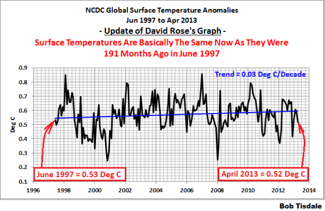
Figure 3
June 1997 to April 2013 covers 191 months. How unusual is a linear trend of 0.03 deg C per decade for a 191-month period? The last time global surface temperatures warmed at the minimal rate of 0.03 deg C per decade for a 191-month period was the late 1970s. See Figure 4. Once again, the data confirms and contradicts Dr. Trenberth’s claim that “Human induced global warming really kicked in during the 1970s, and warming has been pretty steady since then.” It may have kicked in during the 1970s, but it certainly has ebbed.

Figure 4
The most widely used metric of global warming—global surface temperatures—indicates that the rate of global warming has slowed drastically and that the duration of the stall is unusual during a period when global surface temperatures are allegedly warming from the hypothetical impacts of manmade greenhouse gases.
DR. TRENBERTH MENTIONS “BIG JUMPS” IN GLOBAL TEMPERATURES BUT FAILS TO EXPLAIN THEM
I’ll repeat a portion of what Dr. Trenberth wrote in his Royal Meteorological Society article (my boldface):
But while the overall warming is about 0.16°C per decade, there are 3 10-year periods where there was a hiatus in warming. From 1977 to 1986, from 1987 to 1996, and from 2001-2012. But at each end of these periods there were big jumps.
Big jumps? I’ve been studying global warming for quite a while and never before has a climate scientist mentioned periods of no warming followed and preceded by “big jumps” in global temperatures. The first thing that should enter anyone’s mind after reading that is: what caused the “big jumps” in global surface temperatures? Dr. Trenberth identified when they happened: before 1977, around 1986/87, and after 1996. But Dr. Trenberth failed to explain them. On the other hand, for four years, I have been presenting and discussing the natural, not anthropogenic, causes of those “big jumps”. That’s right, Dr. Trenberth admitted to periods of no warming between “big jumps”, and the data show the “big jumps” are caused naturally. One might think that undermines the hypothesis that manmade greenhouse gases caused most of the global warming over the last 3 decades. I don’t believe that was Dr. Trenberth’s intent with his article, but as you will see, that’s what it suggests.
Let’s look first at the cause of the “big jump” before 1977. That coincides with the 1976 Pacific Climate Shift. That shift makes its presence known best in the monthly sea surface temperature data of the East Pacific ocean (90S-90N, 180-80W). See Figure 5. With the color coding in the illustration, it’s tough to overlook that shift, and now that you know it exists, you’ll look for it every time you examine surface temperature data. In fact, if you were to scroll up to Figure 1 again, the 1976 climate shift stands out plain as day in Dr. Trenberth’s graph.

Figure 5
Based on the period-average sea surface temperature anomalies of that region before and after 1976, the Pacific Climate Shift caused the sea surface temperatures of the East Pacific ocean to warm approximately 0.22 deg C in only one year. One year. The shift also stands out clearly in the minimums (downward spikes) that occurred as responses to La Niña events. Before 1976, the La Niña-related minimums cooled to an anomaly of approximately -0.55 deg C, while afterwards, the minimums are not quite reaching -0.3 deg C. The East Pacific data in Figure 5 cover approximately 33% of the surface of the global oceans or about 23% of the surface of the planet. In other words, the East Pacific with those coordinates covers more of the planet than the combined surface area of Europe, Asia, Australia and the Americas. There are numerous peer-reviewed papers about that shift, but no overall agreement about the cause. But as we can see, the sea surface temperature of a major part of the planet simply shifted upwards, warming it by about 0.22 deg C. And of course, through teleconnections, the shift in the East Pacific sea surface temperatures would impact climate for many parts of the globe.
Note: The data in Figure 5 are NOAA’s ERSST.v3b monthly sea surface temperature reconstruction, which is the ocean component of their combined land-ocean global temperature product. It is available through the KNMI Climate Explorer.
We can look at a graph of sea surface temperature anomalies for the NINO3.4 region of the eastern equatorial Pacific—a commonly used El Niño-Southern Oscillation (ENSO) index—to try to identify the reasons for the other “big jumps”. See Figure 6. And for this part and the remainder of the “big jumps” discussions, we’ll use NOAA’s best sea surface temperature dataset, their Reynolds OI.v2 data. It’s based on source data from satellites, ship inlets and buoys (fixed and floating). The dataset starts in November 1981 and gives us more than 31 years of excellent sea surface temperature observations. It’s available to the public through the NOAA NOMADS website and the KNMI Climate Explorer. Referring to Figure 6, the only likely suspects for the “big jumps” in global surface temperatures around 1986/87 and after 1996 are the very strong, but naturally occurring, El Niño events of 1986/87/88 and 1997/98.

Figure 6
Note: If you’re wondering about the other very strong El Niño of 1982/83, it was counteracted by the eruption of El Chichon in 1982.
Let’s start with the East Pacific data again (90S-90N, 180-80W), but this time using the Reynolds OI.v2 data. We’re isolating the East Pacific for a specific reason: the East Pacific is the temporary home of the warm water that is released from below the surface of the western tropical Pacific during an El Niño. During an El Niño, naturally created warm water from below the surface of the western tropical Pacific sloshes into the eastern tropical Pacific, along the equator, and warms the sea surface temperatures there. That warm water may also be carried poleward along the coasts of North and South America, if the El Niño is strong enough. After the El Niño, the warm water sloshes back to the west, out of the East Pacific. And during a La Niña, stronger-than-normal trade winds cause more subsurface waters than normal to be upwelled in the eastern equatorial Pacific, causing sea surface temperatures there to cool. Those effects are visible in the NINO3.4 data in Figure 6 (above) and in the East Pacific data in Figure 7.

Figure 7
Note the large swings in the sea surface temperatures of the East Pacific occur in responses to the El Niños AND La Niñas. That is, the sea surface temperatures in the East Pacific are basically responding proportionally to El Niños and La Niñas, just as we would expect in an area that is only the temporary home of the warm water released by an El Niño—warm water sloshes into the East Pacific during an El Niño, and the warm water sloshes back out during the decay of the El Niño.
Notice also that the sea surface temperatures of the East Pacific, from pole to pole, have not warmed in 31-plus years. That’s unexpected in a world where global temperatures are supposed to be warming, hypothetically, in response to the increased emissions of manmade greenhouse gases. In fact, the multi-model ensemble mean of the climate models prepared for the IPCC’s upcoming 5th Assessment Report have simulated that the sea surface temperatures of the East Pacific should have warmed about 0.5 deg C over the past 31 years, see the graph here, but, in the real world, they have hardly warmed.
(Note: KNMI recently updated their CMIP5 files for sea surface temperature simulations. The modeled warming rate of East Pacific sea surface temperatures for the past 31 years increased with the update from 0.146 to 0.16 deg C per decade.)
An absence of warming in the East Pacific doesn’t explain the “big jumps” in surface temperatures mentioned by Dr. Trenberth. However, the response of the sea surface temperatures for the rest of the global oceans to those El Niño events certainly does explain them. See Figure 8. It shows the satellite-era sea surface temperature data for the Atlantic, Indian, and West Pacific oceans from pole to pole (90S-90N, 80W-180).
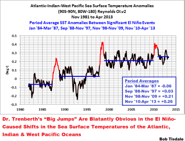
Figure 8
A number of things are very obvious in the time-series graph of the Atlantic, Indian and West Pacific sea surface temperature anomalies, Figure 8:
First, the sea surface temperatures for the Atlantic, Indian and West Pacific Oceans warmed in upward steps or shifts in responses to the 1986/87/88, the 1997/98 and the 2009/10 El Niño events.
Second, there is little warming before, between or after those upward shifts. The horizontal blue lines, which represent the period-average temperatures between the strong El Niños, help to highlight the absence of warming during those periods. Dr. Trenberth presented similar horizontal dashed lines in his graph of global surface temperature anomalies. Note: The dip and rebound starting in 1991 is the response to the explosive volcanic eruption of Mount Pinatubo. And as noted earlier, the response to the 1982/83 El Niño was counteracted by the eruption of El Chichon in 1982. As a result, there is only a minor shift in the sea surface temperatures in response to the 1982/83 El Niño.
Third, the sea surface temperatures of the Atlantic, Indian and West Pacific Oceans do not cool proportionally during the La Niña events that followed those strong El Niños. Refer again to the sea surface temperature data for the East Pacific, Figure 7, which does cool proportionally. Those were pretty strong La Niñas that followed the 1986/87/88 and 1997/98 El Niños, yet the Atlantic, Indian and West Pacific sea surface temperature data hardly acknowledge them. And there are very basic reasons why they don’t cool proportionally during those La Niñas.
Fourth, without those strong El Niño events, there would obviously have been little to no warming of the sea surface temperatures of the Atlantic, Indian and West Pacific Oceans, and, in turn, there would have been little to no warming in Dr. Trenberth’s graph of global land-plus-sea surface temperatures, because the “big jumps” would be gone.
Fifth, or to look at it another way, if the sea surface temperatures of the Atlantic, Indian and West Pacific oceans had cooled proportionally during the La Niña events that followed the strong El Niños, the data would be similar to that of the East Pacific, and the sea surface temperatures in the East Pacific haven’t warmed in 31-plus years.
More detail on Figure 8: The periods highlighted in red correspond to the official months of the 1986/87/88, the 1997/98 and the 2009/10 El Niño events as presented by NOAA in their Oceanic NINO Index, but the periods have been lagged 6 months to account for the response time of the sea surface temperatures in the Atlantic, Indian and West Pacific Oceans to the El Niños.
If these naturally occurring, El Niño-induced upward shifts in sea surface temperatures are new to you, refer to my illustrated essay “The Manmade Global Warming Challenge” [42MB]. In it, I provide an introductory-level discussion of the natural processes that cause those upward shifts. Basically, the upward shifts are caused by the warm water that’s left over from the strong El Niño events—the warm water released by El Niños doesn’t magically disappear at the end of the El Niños. The essay also includes links to animated maps of data so that you can watch the upward shifts occur and so that you can understand how we know the leftover warm water exists. Most importantly, it will show you why La Niña and El Niño events should be looked on, not as noise in the instrument temperature record, but as a chaotic, naturally occurring recharge-discharge oscillator, with La Niñas acting as the recharge mode and with El Niños as the discharge mode. This will become more evident when we discuss ocean heat content data.
In his article, Dr. Trenberth notes:
The second point is that we have found distinctive variations in global warming with El Niño: a mini global warming, in the sense of a global temperature increase, occurs in the latter stages of an El Niño event, as heat comes out of the ocean and warms the atmosphere.
What Dr. Trenberth has failed to account for is the warm water that is left over from the El Niño—naturally created warm water that is redistributed from the East Pacific in the wake of the El Niño. Dr. Trenberth acknowledges what he calls “ENSO residuals” in his paper Trenberth et al (2002) Evolution of El Nino–Southern Oscillation and global atmospheric surface temperatures. There, he and others wrote (my boldface):
Although it is possible to use regression to eliminate the linear portion of the global mean temperature signal associated with ENSO, the processes that contribute regionally to the global mean differ considerably, and the linear approach likely leaves an ENSO residual.
Those upward shifts in the Atlantic, Indian and West Pacific sea surface temperatures, and the “big jumps” in global surface temperatures are caused by those “ENSO residuals”.
In summary for this heading, I was somewhat surprised when Dr. Trenberth mentioned the “big jumps” in global temperature. Up to that point, the climate science community as a whole had failed to acknowledge their existence. Maybe in another couple of decades they will get around to explaining them—or maybe sooner if the warming rate of global surface temperatures continues to fall far below expectations.
A few more notes before we move on to the body of Dr. Trenberth’s article:
Dr. Trenberth presented a time-series graph of NOAA/NCDC-based global surface temperature anomalies in his article. I included it above as Figure 1, and I’ve replicated it in Figure 9. I simply wanted to confirm that Dr. Trenberth was presenting average temperature anomalies for those periods with his horizontal dashed lines. He was, and I’ve listed the average temperature anomalies for the periods on the graph.

Figure 9
With what we discussed so far, I’ve also modified Dr. Trenberth’s “big jumps” graph in my Figure 10. I’ve started the graph in 1951 so that the response to the 1976 Pacific climate shift in the East Pacific is visible. And I’ve also altered the time periods to isolate the upward shifts associated with the 1986/87/88 and 1997/98 El Niño events. The natural contributions to the warming of global surface temperatures stand out quite plainly.

Figure 10
Figure 10 puts what Dr. Trenberth wrote in a different light:
Coming back to the global temperature record: the past decade is by far the warmest on record.
Of course it was. It was the warmest on record because of the leftover warm water from the 1997/98 El Niño counteracted the effects of the trailing La Niña and caused the sea surface temperatures of the Atlantic, Indian and West Pacific Oceans to, in effect, shift upwards. Remember, the Atlantic, Indian and West Pacific oceans (90S-90N, 80W-180) cover a surface area of approximate 67% of the surface of the global oceans.
To return to the periods used by Dr. Trenberth, the 10-year period of 1987-96 was warmer than 1977-1986 because of the similar impact of the 1987/88/89 El Niño on the Atlantic, Indian and West Pacific Oceans. In turn, 1977-1986 was warmer than the preceding multiyear period because of the impact of 1976 Pacific climate shift on the East Pacific ocean. It’s all very simple. Dr. Trenberth’s presentation showed that. He simply elected not to discuss the causes.
POSSIBLE QUESTIONS SO FAR
In my blog posts and essays, I try to anticipate questions readers might have.
Question: Are you saying that the greenhouse effect does not exist and that the additional emissions of manmade greenhouse gases have not contributed to global warming?
Answer: No. I’m presenting ocean heat content data (to be discussed) and satellite-era sea surface temperature data and they show no evidence that manmade greenhouse gases contributed to their warming. The emissions of greenhouse gases may have contributed to the warming of land surface air temperatures, but ocean heat content and satellite-era sea surface temperature data indicate the oceans warmed naturally. One simply needs to divide the data into logical subsets in order to see the natural impacts. Or to put in a different light, the ocean heat content and satellite-era sea surface temperature data suggest that the additional downwelling shortwave longwave radiation from manmade greenhouse gases only adds to the evaporation taking place from the oceans, because it is not contributing to the warming. Keep in mind, infrared radiation can only penetrate the top few millimeters of the ocean surface, and that’s where evaporation takes place.
Now, consider that the vast majority of the warming of land surface air temperatures is in response to the warming of the global oceans. Refer to Compo and Sardeshmukh (2009) Oceanic Influences on Recent Continental Warming. The abstract reads (my boldface):
Evidence is presented that the recent worldwide land warming has occurred largely in response to a worldwide warming of the oceans rather than as a direct response to increasing greenhouse gases (GHGs) over land. Atmospheric model simulations of the last half-century with prescribed observed ocean temperature changes, but without prescribed GHG changes, account for most of the land warming. The oceanic influence has occurred through hydrodynamic-radiative teleconnections, primarily by moistening and warming the air over land and increasing the downward longwave radiation at the surface. The oceans may themselves have warmed from a combination of natural and anthropogenic influences.
Question: How do we know that the bout of strong El Niño events during the 1980s and 1990s weren’t caused by manmade greenhouse gases or how do we know that manmade greenhouse gases aren’t warming the eastern tropical Pacific, causing El Niño events to be stronger?
First, as noted earlier, the sea surface temperature anomalies of the NINO3.4 region in the eastern equatorial are a commonly used index for the strength, frequency and duration of El Niño and La Niña events. Figure 11 shows the average of the NINO3.4 sea surface temperature anomalies from the HADISST, ERSST.v3b, and Kaplan sea surface temperature reconstructions. I’ve also included a linear trend line to show that there has been little to no warming in the eastern equatorial Pacific since 1900.

Figure 11
And in Figure 12, I’ve smoothed the HADISST-based annual NINO3.4 sea surface temperature anomalies with a 121-month filter. (NOAA uses the same smoothing to help show the multidecadal variations in their Atlantic Multidecadal Oscillation data. Refer to the NOAA webpage here.) Clearly, there are decadal to multidecadal components to El Niño and La Niña. During some periods, El Niño events dominate and during others La Niña events are dominant. If the increased emissions of manmade greenhouse gases were responsible for the strong El Niño events of the 1980s and 1990s, why then have we returned toward a period dominated by La Niña events?

Figure 12
Dr. Trenberth referred to this decadal variability with his statement:
This is associated with decadal weather patterns in the Pacific, which are in turn related to the La Niña phase of the El Niño phenomenon.
Second, refer to Ray and Giese (2012) Historical changes in El Niño and La Niña characteristics in an ocean reanalysis. Their abstract reads (my boldface):
The variation of El Niño Southern Oscillation (ENSO) events from the mid-nineteenth century until the beginning of the twenty-first century is explored using an ocean reanalysis. A comparison of the reanalysis with three sea surface temperature reconstructions shows that the timing of events is similar in all four products, however there are important differences in the strength and location of events. The difference between the reconstructions is sometimes larger than the difference between the reanalysis and a given reconstruction. These differences are larger in the first half of the record, a period for which there are relatively sparse observations. The reanalysis is used to explore decadal variability and trends in the frequency, duration, and propagation direction of ENSO events. There is considerable decadal variability of these ENSO characteristics with the time between events ranging from several months to ten years and the duration of ENSO varying from 5 to 27 months. As has been previously shown for the strength and location of ENSO there is little overall trend in the characteristics. Having a three dimensional representation of the ocean from the reanalysis allows exploration of subsurface changes during ENSO. An analysis of subsurface anomalies shows that during ENSO events the subsurface anomalies are highly correlated with the strength of surface anomalies over the 140 year period. Overall, there is no evidence that there are changes in the strength, frequency, duration, location or direction of propagation of El Niño and La Niña anomalies caused by global warming during the period from 1871 to 2008.
Question: How do we know that El Niño events aren’t fueled by manmade greenhouse gases? That was one of the suggestions Dr. Trenberth made in his article.
Answer: I will agree that Dr. Trenberth suggested that El Niños are fueled by manmade greenhouse gases. He wrote after a general discussion of La Niña events and their impact on ocean heat content:
Some of the penetration of heat into depths of the ocean is reversible, as it comes back in the next El Niño.
However, data indicate that the rise in the heat stored at depth of the tropical Pacific, in the form of warm water, was created by temporary increases in sunlight caused by La Niña events—not by an increase in infrared radiation from manmade greenhouse gases. We’ll discuss that later in this post, and I’ll provide a quote from Dr. Trenberth’s earlier research that contradicts his recent speculation.
And that’s a great introduction to the topic of the warming of the global oceans…below the surface.
BALMASEDA ET AL (2013)
INITIAL NOTE: Please understand that I am in no way attempting to downplay the efforts of Magdalena Balmaseda and others at ECMWF who created the ORAS4 reanalysis. It is an extremely valuable product for researchers. The intent of this discussion is to present some of the uncertainties.
The majority of Dr. Trenberth’s article deals with his findings that global warming continues, but that it’s not found at the surface of the oceans or at depths 0-700 meters. His article discusses how one has to look at depths between 700 and 2000 meters to see the continued warming. The metric Dr. Trenberth uses for this discussion is ocean heat content, which is an estimate of the change in the heat stored in the global oceans. The data is typically presented in terms of Joules*10^22, not in temperature, because the amount of heat stored by the oceans is also impacted by the salinity of the water. It should be noted that ocean heat content data are presented as anomalies from a reference time period, not as absolute values. And there’s another reason why this dataset is presented in Joules with all of those trailing zeroes, and we’ll address that later.
In his article, Dr. Trenberth is promoting the findings of the paper Balmaseda et al (2013) Distinctive climate signals in reanalysis of global ocean heat content. He was one of its coauthors. The “in-press” copy of the paper is here. Supporting Information is available here.
The key word in the title is reanalysis. Dr. Trenberth and his associates did not present data. A reanalysis is the output of a computer model that includes data as one of its inputs. The reanalysis is the Ocean ReAnalysis System 4 (ORAS4) from the European Centre for Medium-Range Weather Forecasts (ECMWF). It was introduced with Balmaseda et al (2012), Evaluation of the ECMWF ocean reanalysis system ORAS4. The NCAR webpage about the ORAS4 reanalysis lists the following as its weaknesses:
– First 2 decades should be used with caution (large uncertainties)
– Atlantic Meridional Circulation (AMOC) at 26N is underestimated
– Large surface salinity errors
The dataset starts in 1958, so the first two decades run until the late 1970s.
As noted above, the ORAS4 reanalysis is the product of the European Centre for Medium-Range Weather Forecasts (ECMWF). See their webpage here for more information about ORAS4. It includes the following disclaimer (my boldface):
There is large uncertainty in the ocean reanalysis products (especially in the transports), difficult to quantify. These web pages are aimed at the research community. Any outstanding climate feature should be investigated futher [sic] and not taken as truth.
That simple fact does not come across in Dr. Trenberth’s article, which reads as if he’s presenting gospel.
Why did Dr. Trenberth and his colleagues utilize a reanalysis instead of ocean heat content data in Balmaseda et al (2013)? There are few temperature and salinity measurements at depth, especially below 700 meters, before the ARGO floats were deployed. The ARGO floats had reasonably complete coverage of the oceans starting in 2003. Before then, sampling was sparse, especially in the Southern Hemisphere south of 45S. There are, on the other hand, a few isolated regions of the global oceans where we have a few decades of well-monitored subsurface ocean temperatures.
I recently described in much detail the problems with ocean heat content data in my post Is Ocean Heat Content Data All It’s Stack Up to Be? Please refer to it if the subject of ocean heat content data is new to you. Since the source data is so sparse for much of its term, ocean heat content is best used to identify when changes occurred and why they happened, but one must view the magnitudes of those changes with skepticism. The exception is certain areas where reliable source data has been available for the past few decades—like the tropical Pacific.
The blog post linked above includes two key quotes about ocean heat content data. The first is by Dr. Raymond Schmitt of the Woods Hole Oceanographic Institution. See the WHOI webpage here. The quote is from his testimony before congress in 2000 when the climate science community was looking for funding for the ARGO program. As a preface, when Raymond Schmitt says, “…we have in place a system for monitoring El Niño,” he is referring to NOAA’s Tropical Atmosphere-Ocean (TAO) project. NOAA began installing a group of moored ocean and atmosphere “weather stations” across the tropical Pacific in the 1980s, and they completed it in early 1990s. The TOA buoys monitor numerous variables related to El Niño and La Niña events, including subsurface temperatures at various depths.
In the following, Raymond Schmitt is discussing ocean heat content data during the period before the ARGO program (my boldface):
Observing Deficiencies
While we have in place a system for monitoring El Nino, we have no such ability to observe the motions of thermal anomalies in the mid- and high latitude oceans. Nor do we monitor the salt content of ocean currents, to determine the potential for deep convection or to help understand the vast water cycle over the oceans. But new technology, the vertically profiling ARGO float (Figure 4 [not included].), promises to give us the data we need to begin to understand this largest component of the global water cycle. These are like weather balloons for the ocean, drifting at depth for 10 days then rising to the surface to report profiles of temperature and salinity to a satellite. They then resubmerge for another 10 day drift, a cycle to be repeated 150 times or more.
So, as of 2013, we’ve had in place a “new technology” for about a decade that “promises to give us the data we need to begin to understand this largest component of the global water cycle”. Now consider that there are known ocean processes that portray themselves in the sea surface temperatures of the North Atlantic and North Pacific, and that we have reasonably complete sea surface temperature records stretching back to the late 1800s. These ocean processes portray themselves as modes of natural variability with patterns in time (cycles) that last for 50 to 80 years. Can we hope now, with only 10 years of data, to understand how those multidecadal processes portray themselves below the surfaces of the oceans? The realistic answer is no.
The second quote is from Dr. Trenberth. He was interviewed for an October 2011 article about the recent hiatus in global warming. Paul Voosen’s article Provoked scientists try to explain lag in global warming includes quotes from a handful of well-known climate scientists—each giving a different answer for the slowdown in warming, which suggests that the climate science community doesn’t understand why global temperatures warmed in the first place. That aside, Paul Voosen’s article reads:
Trenberth questions whether the Argo measurements are mature enough to tell as definite a story as Hansen lays out. He has seen many discrepancies among analyses of the data, and there are still “issues of missing and erroneous data and calibration,” he said. The Argo floats are valuable, he added, but “they’re not there yet.”
ARGO floats have provided reasonably complete coverage of the global oceans since 2003-04, and the installation was complete in 2007. But as late as October 2011, Kevin Trenberth’s opinion of ARGO floats was that they provided limited value due to “missing and erroneous data and calibration”.
In summary for this heading, Dr. Trenberth is discussing the recent Balmaseda et al (2013) paper, which is based on a computer-modeled representation of ocean heat content—the ORAS4 reanalysis—not ocean heat content data, because the data has numerous problems before ARGO and during ARGO. However, ocean heat content data is used as input to the reanalysis, as discussed in the ECMWF webpage here. Also, ECMWF cautions researchers that the ORAS4 reanalysis should “not [be] taken as truth”.
Some readers might think Dr. Trenberth relied on the ORAS4 reanalysis for this study simply because it provided him with modified ocean heat content values that better met his expectations, needs and wants.
REANALYSIS VERSUS DATA
One of the very obvious differences between ocean heat content data and the ORAS4 reanalysis used by Balmaseda et al (2013) is in their responses to volcanic eruptions. My Figure 13 is Figure 1 from Balmseda et al (2013). The dips and rebounds associated with the eruptions of Mount Agung, El Chichon and Mount Pinatubo stand out like sore thumbs in the reanalysis, especially with the highlights provided by the authors.
You’d be hard pressed to find similar responses, however, in ocean heat content data.

Figure 13
The caption for the Balmaseda et al Figure 1 reads:
Figure 1. OHC integrated from 0 to 300 m (grey), 700 m (blue), and total depth (violet) from ORAS4, as represented by its 5 ensemble members. The time series show monthly anomalies smoothed with a 12 month running mean, with respect to the 1958–1965 base period. Hatching extends over the range of the ensemble members and hence the spread gives a measure of the uncertainty as represented by ORAS4 (which does not cover all sources of uncertainty). The vertical colored bars indicate a two year interval following the volcanic eruptions with a 6 month lead (owing to the 12 month running mean), and the 1997–98 El Niño event again with 6 months on either side. On lower right, the linear slope for a set of global heating rates (W m-2) is given.
The abstract of Balmaseda et al (2013) includes:
Volcanic eruptions and El Niño events are identified as sharp cooling events punctuating a long-term ocean warming trend, while heating continues during the recent upper-ocean-warming hiatus, but the heat is absorbed in the deeper ocean.
Let’s compare the reanalysis to data, Figure 14. The only up-to-date ocean heat content dataset that is available to the public on a gridded basis through the KNMI Climate Explorer is from the NOAA National Oceanographic Data Center (NODC). The NODC also makes their ocean heat content data available globally and broken down into individual ocean basins at their webpage here. To save myself the trouble of having to replicate the Balmaseda data, I’ve borrowed an illustration from Willis Eshenbach’s post titled Why Reanalysis Data Isn’t… at WattsUpWithThat and presented it here as my Figure 14. Willis has also identified the timing of the eruptions of El Chichon and Mount Pinatubo. As you can see, the NODC’s ocean heat data does not include the major volcanic dips and rebounds shown in the ORAS4 reanalysis used by Balmaseda et al (2013). In fact, the NODC global ocean heat content data rises, not falls, immediately after the eruption of El Chichon in 1982. And the drop in the NODC data after the eruption of Mount Pinatubo is similar in magnitude to all of the other annual variations. Note also that the reanalysis used in Balmaseda et al also had a period of extreme warming from the early 1980s to 1990 that does not exist in the data. It appears that sharp rise was needed to accommodate the dip and rebound in the reanalysis caused by the eruption of Mount Pinatubo—a dip and rebound that is unobserved in the data.

Figure 14
The ocean heat content reanalysis used by Dr. Trenberth and others for the Balmaseda et al (2013) paper includes responses to climate forcings that do not appear in data. This suggests that the reanalysis presents the beliefs of the authors and not necessarily actual ocean dynamics. Do these erroneous responses to climate forcings also impact how the reanalysis reacts to El Niño and La Niña events, which are the subject of the paper?
The title of Balmaseda et al (2013) is “Distinctive climate signals in reanalysis of global ocean heat content”.
As I noted in my first blog post about this paper (here):
I find the title of the paper somewhat odd. The paper is based on the European Centre for Medium-Range Weather Forecasts (ECMWF) Ocean Reanalysis ORAS4. That reanalysis is described in detail in the Balmaseda et al (2012) paper (submitted) Evaluation of the ECMWF Ocean Reanalysis ORAS4. (Update: Sorry. That link no longer functions. UCAR has apparently removed the preprint version of the paper from its website. Refer to the abstract here.) Basically, the reanalysis is the product of a climate model that has data rolled into it. Since volcanic aerosols and sea surface temperatures are used as inputs, it should therefore come as no surprise that the reanalysis will include the “distinctive climate signals” associated with El Niños and volcanic eruptions.
BALMASEDA ET AL (2013) DID NOT PRESENT A MECHANISM FOR THE ADDITIONAL WARMING BELOW 700 METERS
Dr. Roger Pielke Sr. was interviewed by email for David Appell’s recent article W(h)ither global warming? Has global warming slowed down? published at the Yale Forum on Climate Change & The Media. One of the topics of that article was Balmaseda et al (2013). Dr. Pielke was kind enough to forward to me his entire answer to David Appell, which I posted at my blog with the title Even More About Trenberth’s Missing Heat – An Eye Opening Comment by Roger Pielke Sr. The following is a portion of Dr. Pielke, Sr.’s reply. First he quotes Balmaseda et al (2013), with boldface added:
“….that changes in the atmospheric circulation are instrumental for the penetration of the warming into the ocean, although the mechanisms at work are still to be established. One possibility suggested by Lee and McPhaden [2008], is related to the modified subduction pathways in response to changes in the subtropical gyres resulting from changes of the trade winds in the tropics (Figure S04), but whether as low frequency variability or a longer term trend remains an open question. The 2000–2006 warming trend is likely associated with the weakening of the Atlantic Meridional Overturning Circulation (MOC) in both experiments (see BMW13).”
In other words, Dr. Trenberth and his associates have made an observation based on a computer model of much-modified data, but have offered no mechanism for the phenomenon. That, of course, would be difficult because ECMWF cautions researchers about “transports” problems in their reanalysis.
Dr. Roger Pielke Sr. continued (his underlines):
Until we understand how this fundamental shift in the climate system occurred (and if this change in vertical heat transfer really happened, and is not just due to the different areal coverage and data quality in the earlier years), however, we have a large gap in our understanding of the climate system.
To help illustrate Dr. Pielke Sr.’s concern about data quality, I’ve presented Figures 15 and 16. Both graphs compare the NODC’s annual global ocean heat content data for the depths of 0-700 and 0-2000 meters. Figure 15 is for the period of 1955 to 2010. Note how closely the two datasets track one another from about 1970 until the early 2000s when ARGO floats became the dominant temperature and salinity measuring devices.

Figure 15
Figure 16 presents the global ocean heat content data for the period of 1970 to 2003 to show the warming rates for the two depths. From 1970 to 2003, there is basically no difference between warming rates. Keep in mind, before the ARGO floats were introduced, there was little sampling of ocean temperature and salinity in the Southern Hemisphere, south of 45S. Referring back to Figure 15, only after ARGO increased the coverage of the global oceans does the 0-2000 meter data diverge from the 0-700 meter data.

Figure 16
I first presented the graphs in Figures 15 and 16 in my post NODC’s Pentadal Data (0-2000 Meters) Creates Warming that Does Not Exist in the Annual Data – A Lot of Warming.
In summary, Balmaseda et al provided no mechanism for this additional warming below 700 meters. Dr. Pielke, Sr. noted that the recent additional warming could simply be a response to the differences in measuring devices and additional coverage of the global oceans.
NORTHERN HEMISPHERE OCEAN HEAT CONTENT DATA DOES NOT SUPPORT BALMASEDA ET AL
Dr. Trenberth wrote in his article:
However, most (over 90%) of the energy imbalance goes into the ocean, and several analyses have now shown this. But even there, how much warms the upper layers of the ocean, which are linked to the surface, vs how much penetrates deeper into the ocean where it may not have much immediate influence, is a key issue.
We have just published a new analysis showing that in the past decade about 30% of the heat has been dumped at levels below 700m, where most previous analyses stop.
But the much-corrected ocean heat content data for the Northern Atlantic and North Pacific during the ARGO era does not agree that the oceans are continuing to warm below 700 meters. The North Atlantic ocean heat content data directly from the NODC’s website, from the 1st quarter of 2005 to the first quarter of 2013, show very little warming for depths of 0-2000 meters, Figure 17, and cooling at depths of 0-700 meters.

Figure 17
The ocean heat content data from the North Pacific for both depths are presented in Figure 18. Both show cooling, with the 0-2000 meter data cooling at a lesser rate than the 0-700 meter data.

Figure 18
Figures 17 and 18 are from my recent blog post here.
Keep in mind that Balmaseda et al (2013) is attempting to explain the lack of warming of ocean heat content for depths of 0-700 meters since 2004. The first sentence of the abstract reads:
The elusive nature of the post-2004 upper ocean warming has exposed uncertainties in the ocean’s role in the Earth’s energy budget and transient climate sensitivity.
The elusive nature of the ocean warming still exists in the ocean heat content data for the North Atlantic and North Pacific at depths even to 2000 meters.
One might conclude that the peculiar continued warming of the oceans below 700 meters that Dr. Trenberth refers to in his recent study is a characteristic of the reanalysis, because it does not appear in the data for the North Atlantic and North Pacific. Or maybe Dr. Trenberth simply overlooked the regional absence of warming to depths of 0-2000 meters.
THE IMPACTS OF EL NIÑO AND LA NIÑA ON OCEAN HEAT CONTENT
Let’s present and discuss a string of quotes from Dr. Trenberth’s article again:
The first point is that this is fairly new; it is not there throughout the record.
Data before the ARGO era is so sparse and problematic that we wouldn’t expect the old data to respond similarly to the new data. Additionally, according to Dr. Trenberth, the ARGO-era data also has “issues of missing and erroneous data and calibration”.
Dr. Trenberth continues:
The cause of the shift is a particular change in winds, especially in the Pacific Ocean where the subtropical trade winds have become noticeably stronger, changing ocean currents and providing a mechanism for heat to be carried down into the ocean. This is associated with weather patterns in the Pacific, which are in turn related to the La Niña phase of the El Niño phenomenon.
A clarification: What Dr. Trenberth has written may lead some persons to believe that the shift in the trade winds is unusual, when, in fact, variations in trade wind strength are parts of the coupled ocean-atmosphere processes that drive El Niño and La Niña events. I have not found anything in Balmaseda et al (2013) to contradict that interpretation. In other words, we’ve recently transitioned from a multidecadal period when El Niño events dominated to a period when La Niña events are dominant. But, referring back to the graph of our NINO3.4 sea surface temperature anomalies smoothed with a 121-month filter, Figure 12, we can see that La Niña events dominated in the past as well. And that brings us back to the questions about the reliability of the ocean heat content data—old and new—about the transitions from measuring technologies and the differences in spatial coverage.
Dr.Trenberth continues with the topic of El Niño:
The second point is that we have found distinctive variations in global warming with El Niño. A mini global warming, in the sense of a global temperature increase, occurs in the latter stages of an El Niño event, as heat comes out of the ocean and warms the atmosphere…
The fact that an El Niño releases heat from the tropical Pacific is nothing new. Those releases are blatantly obvious in the following comparison graph of ocean heat content data for the tropical Pacific and the global oceans. See Figure 19. The large drops in the ocean heat content of the tropical Pacific have been identified for the 1982/83, the 1997/98 and the 2009/10 El Niños. And yes, they are visible in the global data.

Figure 19
Note: I used the KNMI Climate Explorer as the source of the NODC ocean heat content data in Figure 19 for two reasons: First, the KNMI Climate Explorer allows users to select the desired coordinates, while the NODC website does not offer that option. Second, KNMI presents the data in gigajoules per square meter (GJ/m^2) which allows for direct comparisons between subsets, without the need to scale or normalize the data.
Additionally, since the El Niño- and La Niña-related variations in the ocean heat content of the tropical Pacific occur in the top 300 meters, we capture those changes with the depth range of 0-700 meters.
Also, keep in mind that the TAO Project has had moored buoys in place in the tropical Pacific since the 1980s, with the installation complete in the early 1990s. So the tropical Pacific data is one of the areas where the ocean heat content data should be reasonably accurate, starting in the late 1980s-early 1990s.
But notice in Figure 19 that the drops caused by the El Niños are not the curiosity in the tropical Pacific data. The very unusual warming that precedes the 1997/98 El Niño is what stands out in that graph. That warming occurred naturally during the 1995/96 La Niña. Figure 20 presents the ocean heat content data for tropical Pacific. In addition to the 1995/96 La Niña, I’ve also highlighted the 3-year La Niña events of 1954-57, 1973-76 and 1998-01.

Figure 20
And as I noted in my recent quarterly update of the NODC ocean heat content data:
So far, the climate science community has never presented (or I have never found) a climate model-based peer-reviewed study that explains why ocean heat content in the tropical Pacific (24S-24N, 120E-80W) cools for the multidecadal period between the La Niña events of 1954-57 and 1973-76 and cools for the multidecadal period between the La Niña events of 1973-76 and 1995/96. And they’ve never explained how and why the long-term warming of the ocean heat content data for the tropical Pacific is dependent on the three 3-year La Niña events of 1954-57, 1973-76 and 1998-01 and on the freakish La Niña of 1995/96. It’s plainly obvious that the ocean heat content of the tropical Pacific would cool over the long-term without the 1973-76 and 1995/96 La Niña events.
It’s very tough to claim manmade greenhouse gases are responsible for the warming of the tropical Pacific while it’s cooling for multidecadal periods, and as you’ll note, since the 1998-01 La Niña, there is yet another cooling trend in the tropical Pacific.
Figure 20, combined with Figure 8, provide an introduction to why La Niña and El Niño events are best viewed as a chaotic recharge-discharge oscillator, with La Niñas acting as the recharge mode, and El Niños serving in the discharge (and redistribution) role.
DOWNWARD SHORTWAVE RADIATION VERSUS DOWNWARD LONGWAVE RADIATION DURING LA NIÑA EVENTS
As part of my research into the processes of El Niño and La Niña events, I’ve searched for the explanation of the sudden 1995/96 surge in ocean heat content for the tropical Pacific. The warm water created by that surge served as fuel for the 1997/98 El Niño. And keep in mind that the leftover warm water from the 1997/98 El Niño caused the sea surface temperatures of the Atlantic, Indian and West Pacific oceans to effectively shift upwards by about 0.18 deg C—refer back to Figure 8—and that the sea surface temperatures there remained at that level until the 2009/10 El Niño.
The only paper that attempts to explain the fuel for the 1997/98 El Niño is McPhaden’s (1999) Genesis and Evolution of the 1997-98 El Niño. There McPhaden writes:
For at least a year before the onset of the 1997–98 El Niño, there was a buildup of heat content in the western equatorial Pacific due to stronger than normal trade winds associated with a weak La Niña in 1995–96.
Stronger trade winds would help the west Pacific Warm Pool accumulate more warm water than normal, but that still doesn’t provide all of the explanation. Stronger trade winds cause more upwelling of cool waters in the eastern equatorial Pacific, so something has to heat that cooler-than-normal water as it travels the width of the tropical Pacific, which extends almost halfway around the globe. (The linked illustration is from the post here.)
Dr. Trenberth would like you to believe the additional downward longwave (infrared) radiation from manmade greenhouse gases is causing the warming, but downward longwave radiation decreases during La Niña events, so it must be something else.
First, let’s confirm that downward longwave radiation decreases during La Niñas. Refer to Pavlakis et al (2006) ENSO surface longwave radiation forcing over the tropical Pacific. The abstract begins:
We have studied the spatial and temporal variation of the surface longwave radiation (downwelling and net) over a 21-year period in the tropical and subtropical Pacific Ocean (40 S–40 N, 90 E–75 W). The fluxes were computed using a deterministic model for atmospheric radiation transfer, along with satellite data from the ISCCP-D2 database and reanalysis data from NCEP/NCAR (acronyms explained in main text), for the key atmospheric and surface input parameters…
Basically, with a specialized climate model, they’ve studied satellite-based cloud amount data (the ISCCP-D2) and other reanalysis outputs. Pavlakis et al (2006) was an effort to quantify the variations in downward longwave radiation to aid in modeling El Niño and La Niña processes. We’re more interested in the process-related directions of the changes in downward longwave radiation in response to ENSO phases. The Pavlakis et al (2006) abstract continues:
An excellent correlation was found between the downwelling longwave radiation (DLR) anomaly and the Niño-3.4 index time-series, over the Niño-3.4 region located in the central Pacific.
Refer to my Figure 21, which is Figure 7 from Pavlakis et al (2006). So, in the eastern tropical Pacific, downward longwave (infrared) radiation increases during an El Niño and decreases during a La Niña. Therefore, the decrease in downward longwave radiation in response to a La Niña would not aid in the warming of tropical Pacific waters as they traveled from east to west before reaching the west Pacific Warm Pool.

Figure 21
So we’ll move on to the accompanying Pavlakis et al (2008) ENSO surface shortwave radiation forcing over the tropical Pacific. For those new to the term downward shortwave radiation, it’s visible sunlight. The abstract begins:
We have studied the spatial and temporal variation of the downward shortwave radiation (DSR) at the surface of the Earth during ENSO events for a 21-year period over the tropical and subtropical Pacific Ocean (40S–40N, 90E–75W). The fluxes were computed using a deterministic model for atmospheric radiation transfer, along with satellite data from the ISCCP-D2 database, reanalysis data from NCEP/NCAR for the key atmospheric and surface input parameters, and aerosol parameters from GADS (acronyms explained in main text). A clear anti-correlation was found between the downward shortwave radiation anomaly (DSR-A) time-series, in the region 7S– 5 N, 160 E-160W located west of the Niño-3.4 region, and the Niño-3.4 index timeseries. In this region where the highest in absolute value DSR anomalies are observed, the mean DSR anomaly values range from −45Wm−2 during El Niño episodes to +40Wm−2 during La Niña events.
And my Figure 22 is Figure 6 from Pavlakis et al (2008). Note that downward shortwave radiation (visible sunlight) increases during La Niñas. Or to put that into more basic terms, it’s sunlight, not infrared radiation, that increases during La Niña events and allows the waters of the tropical Pacific to warm as they travel from east to west across the tropical Pacific—where they accumulate in the west Pacific Warm Pool and provide fuel for the trailing El Niño event(s).

Figure 22
In Cell b of Figure 22, which is for the west-central equatorial Pacific, note how strong the downward shortwave radiation anomalies are at the peak of the 1995/96 La Niña.
Let’s discuss El Niño and La Niña events and examine how and why sunlight and infrared radiation over the tropical Pacific respond as they do to ENSO. First we have to discuss the normal conditions of the tropical Pacific. Normal is also referred to as ENSO-neutral, because El Niño or La Niña conditions do not exist then. During ENSO-neutral conditions, there is a large difference in temperatures between the eastern and western equatorial Pacific. Sunlight warms the waters of the tropical Pacific as they travel from east to west, so that it’s about 7 deg C warmer in the west than in the east. Since the water is warmer in the west near Indonesia, there is more evaporation, more cloud cover and more precipitation there than in the east near South America. Now, during an El Niño, warm water from the surface and below the surface of the west Pacific Warm Pool sloshes east along the equator raising the sea surface temperatures of the eastern tropical Pacific—and the tropical Pacific as a whole. The convection, cloud cover and precipitation accompany the warmer water as it travels east. Obviously, if there are now more clouds than normal in the eastern tropical Pacific during the El Niño, then those clouds are blocking sunlight, or, in other words, downward shortwave radiation decreases due to the increased cloud cover during El Niños. Pavlakis et al (2006) “ENSO surface longwave radiation forcing over the tropical Pacific” has a nice summary of why downward longwave (infrared) radiation increases during an El Niño. They write:
The DLR depends mainly on the vertical distributions of temperature and water vapour in the lower troposphere, as well as on the cloud amounts and cloud radiative properties.
In other words, during an El Niño, downward longwave radiation increases in the eastern tropical Pacific because the sea surface temperatures are warmer, which results in warmer lower troposphere temperatures and more water vapor due to the increase in evaporation, which, in turn, results in increased cloud amounts.
On the other hand, during a La Niña, the trade winds are stronger than normal. This causes more cool water to be upwelled in the eastern tropical Pacific. The cooler water in the east results in less evaporation and cloud cover, which allows more sunlight to warm the tropical Pacific waters as they travel from east to west. The stronger trade winds also push the clouds farther to the west, which also allows more sunlight than normal to warm the tropical Pacific. With respect to infrared radiation, cooler surface temperatures in the east cause cooler lower troposphere temperatures and less water vapor due to the decrease in evaporation, which, in turn, results in decreased cloud amounts—all of which cause less downward longwave (infrared) radiation over the tropical Pacific during La Niñas.
Now, I’ve been presenting and discussing these processes at the most-visited blog about global warming and climate change, WattsUpWithThat, for more than 4 years. There, with the helpful comments by physicists, oceanographers, statisticians and lay persons, we have refined our understandings and our presentations of El Niño and La Niña processes.
But experience has taught me that many of you who are reading this are still thinking that the increase in infrared radiation from manmade greenhouse gases has to have contributed to the long-term warming of the tropical Pacific—that you’re still not convinced.
Let’s compare the downward longwave and shortwave radiation flux anomalies for the tropical and equatorial Pacific. Of course, there are no long-term observations-based data readily available for surface radiation fluxes over the tropical Pacific; therefore, we’ll have to rely on a reanalysis. That is, Figures 23 and 24 are the outputs of a reanalysis, not data, so keep that in mind. The NCEP/DOE Reanalysis-2 is available to the public through the NOAA NOMADS website here. It starts in January 1979. The anomalies in Figures 23 and 24 are for the reference period of 1981-2010.
Figure 23 compares downward longwave and shortwave radiation flux anomalies over the tropical Pacific (24S-24N, 120E-80W). The downward longwave radiation flux anomalies (red curve) serve as a reasonable proxy for the timing of El Niño and La Niña events, and that allows us to see how the downward shortwave radiation (blue curve) responds to them. Of course, downward shortwave radiation (sunlight) increases during La Niña events and decreases during El Niños. Note also how the downward shortwave radiation (sunlight) reaches its highest level in the tropical Pacific during the 1995/96 La Niña.

Figure 23
Additionally, the downward longwave (infrared) and shortwave (sunlight) radiation fluxes both have positive trends over the term of the reanalysis, and the trend of the downward longwave radiation anomalies is about 56% higher than the trend of the downward shortwave radiation—however—due to the monumental differences in the abilities of infrared radiation and sunlight to penetrate into the ocean, the contribution of sunlight would be many orders of magnitude greater than that of the infrared radiation, assuming the additional impacts of infrared radiation weren’t simply lost to evaporation.
I presented the downward radiation flux anomalies for the entire tropical Pacific (above) because El Niño and La Niña processes encompass all of the tropical Pacific. The strongest portions of the ENSO processes, however, occur along the equator, so Figure 24 stretches the width of the equatorial Pacific (5S-5N, 120E-80W).

Figure 24
I found the results surprising. According to the NCEP/DOE Reanalysis-2, downward longwave (infrared) radiation decreased over the equatorial Pacific since 1979, and it has dropped at a very significant rate. On the other hand, downward shortwave radiation (visible sunlight) has risen at a very significant rate—though it peaked sometime between 1995 and 2005 and had declined since then.
Recall that this is a reanalysis, but it gives one the impression that key points may not have been presented in Balmaseda et al (2013) and in Dr. Trenberth’s article. The relationships of downward shortwave and longwave radiation over the tropical and equatorial Pacific and their interrelationships with El Niño and La Niña events are major factors. Yet, the Dr. Trenberth failed to mention them is his article for the Royal Meteorological Society.
In summary, the warm water created by La Niña processes, released by El Niños, and redistributed by the trailing La Niñas is warmed in response to increases in sunlight during the La Niñas, not by infrared radiation. Changes in cloud cover associated with the coupled ocean-atmosphere processes of El Niño and La Niña are the primary reasons for the variations in sunlight.
And Dr. Trenberth understands those processes—understands them very well. In Trenberth et al (2002), Evolution of El Niño–Southern Oscillation and global atmospheric surface temperatures, Dr. Trenberth was very clear that, during La Niñas, sunlight recharges (restores) the heat discharged during El Niños. In paragraph 57, Dr. Trenberth and the others write (my boldface):
The negative feedback between SST and surface fluxes can be interpreted as showing the importance of the discharge of heat during El Niño events and of the recharge of heat during La Niña events. Relatively clear skies in the central and eastern tropical Pacific allow solar radiation to enter the ocean, apparently offsetting the below normal SSTs, but the heat is carried away by Ekman drift, ocean currents, and adjustments through ocean Rossby and Kelvin waves, and the heat is stored in the western Pacific tropics. This is not simply a rearrangement of the ocean heat, but also a restoration of heat in the ocean.
That’s a very clear understanding of the processes, and Trenberth et al (2002) is one of the most-detailed data-based (not model-based) examinations of ENSO and its impacts on global climate. But now, Dr. Trenberth is making unsubstantiated claims that greenhouse gases are what fuel El Niños. By doing so, Dr. Trenberth is contradicting his earlier work.
Last, if the additional warming of the oceans below 700 meters actually exists, and if it is occurring as a response to the recent increased frequency of La Niña events as Dr. Trenberth insists, then Dr. Trenberth should also understand that the additional warm water is being created by the additional sunlight associated with the La Niñas, and not by manmade greenhouse gases.
OTHER POINTS OF INTEREST ABOUT THE WARMING OF THE OCEANS AT DEPTH
Under the heading of THE IMPACTS OF EL NIÑO AND LA NIÑA ON OCEAN HEAT CONTENT, we illustrated with data and discussed the how the ocean heat content of the tropical Pacific cooled from 1957 to 1973, it cooled from 1976 to 1995, and since the end of the 1998-01 La Niña, the tropical Pacific has been cooling once again, based on the linear trend over that decade-plus period. And we noted how it’s tough to claim manmade greenhouse gases are responsible for the warming in the tropical Pacific when it’s cooling for multidecadal periods. And we saw how the only times the tropical Pacific warmed was during the three 3-year La Niña events, and during the freakish 1995/96 La Niña. And recall that the tropical Pacific is one of the areas of the global oceans where subsurface temperatures have been monitored continuously for a couple of decades through the TAO project buoys. Then, in the last section, under the last heading of DOWNWARD SHORTWAVE RADIATION VERSUS DOWNWARD LONGWAVE RADIATION DURING LA NIÑA EVENTS, we also discussed and examined the NCEP/DOE Reanalysis-2 outputs of downward shortwave and longwave radiation for the tropical and equatorial Pacific. The reanalysis showed that it was sunlight, not infrared radiation, that warmed the tropical Pacific during La Niña events. And, of course, Dr. Trenberth confirmed in an earlier study that it’s sunlight that warms the tropical Pacific during La Niña events.
Now let’s look at the ocean heat content data (0-700m) for the extratropical North Pacific (24N-65N, 120E-80W). See Figure 25. Because we’re examining a specific area, we’ll again use the NODC data available through the KNMI Climate Explorer. The ocean heat content data for the extratropical North Pacific shows long-term cooling, not warming, until 1988. Again, it’s very difficult to claim manmade greenhouse gases are responsible for the warming when the oceans are cooling for multidecadal periods. After that cooling period, there’s a sudden upward shift in ocean heat content in the extratropical North Pacific. The 24-month period of January 1989 to December 1990 is highlighted in red to help illustrate the shift. After the shift, there was a decade-long cooling followed by a gradual warming. But it’s blatantly obvious that without that 2-year shift, there would be a long-term cooling in the extratropical North Pacific.

Figure 25
The similar shifts are also present in the sea surface temperature and sea level pressure data of the extratropical North Pacific. I discussed that in the post Ocean Heat Content (0 to 2000 Meters) – Why Aren’t Northern Hemisphere Oceans Warming During the ARGO Era? There I noted: Almost 2 decades ago Kevin Trenberth discussed the same wind pattern-based upward shift in the sea level pressure of the extratropical North Pacific. Refer to Trenberth and Hurrell (1995) Decadal coupled atmosphere-ocean variations in the North Pacific Ocean. I’ve provided their Figure 6 as my Figure 26. It shows the sea level pressure of a portion of the extratropical North Pacific. One would think Dr. Trenberth should also know that a similar shift exists in the ocean heat content data for the extratropical North Pacific.

Figure 26
The final paragraph of Trenberth and Hurrell (1995) reads:
Whether the unusual 1976-1988 imbalance can be ascribed to any cause, or is merely a part of natural variability is a very difficult question to answer. The major change that occurred in March-April 1988, with a transition from El Niño to a very strong La Niña (Fig. 17, and Trenberth et al. 1989), apparently ended the climate regime although the underlying ocean currents and heat storage must be still perturbed and the pattern could reemerge. Indeed, the recent 1991-92 ENSO event was noted for exceptionally warm water along the west coast of both North and South America in early 1992.
Is the shift in the ocean heat content of the extratropical North Pacific simply a lagged response to the transition from the 1986/87/88 El Niño to the strong 1988/89 La Niña? If the climate science community would return to examining data, even with the known deficiencies, as they had in the past, they might then understand why the oceans warmed.
In my illustrated essay “The Manmade Global Warming Challenge”, I presented a curious effect that occurs when the ocean heat content data of the tropical Pacific and extratropical North Pacific are combined. I’ll present it here for those who have yet to read that essay. Individually, the ocean heat content data for the tropical Pacific and extratropical North Pacific show long-term periods of cooling followed by short-term bursts of natural warming, but the variations in the two datasets do not coincide. When the two datasets are combined, Figure 27, they present a more gradual long-term warming that is mimicked by the global ocean heat content data. Yet, Dr. Trenberth would like you to believe that the increased emissions of manmade greenhouse gases are the only reason the global oceans are warming.

Figure 27
If manmade global warming does not make it existence known in the ocean heat content data of the tropical Pacific and extratropical North Pacific, then it’s pretty difficult to claim that anthropogenic greenhouse gases caused the warming of the global oceans. Yet that is what Dr. Trenberth would like you to believe in his article.
PUTTING OCEAN HEAT CONTENT IN PERSPECTIVE
The thermal capacity of the oceans is many orders of magnitude greater than that of the atmosphere. Dr. Schmitt of the Woods Hole Oceanographic Institution noted that the oceans “have 1,100 times the heat capacity of the atmosphere” in his 2000 congressional testimony regarding the ARGO program (see here). And there are numerous webpages around the blogosphere reminding us that the top 3 meters (10 feet) of the oceans hold as much heat as the atmosphere.
The changes in the temperature and salinity of the global oceans are therefore very important when trying to identify the causes of global warming. And the units typically used are Joules*10^22. Levitus et al (2012) introduced the NODC’s ocean heat content data for the depths of 0-2000 meters. In the abstract, they estimate that from 1955 to 2010 the oceans to depths of 2000 meters warmed approximately 24.0 (+/- 1.9)*10^22 Joules, which is an astronomically large number over those 55 years. Those large numbers give the impression that it’s something that’s easily measured.
HOWEVER
We need to look at that warming in terms that we are more familiar with so that we can understand what’s being presented, because it is NOT easily measured. And the metric we’ll use is the average temperatures of the oceans to the depths of 0-700 and 0-2000 meters. Let’s also limit the time period to the ARGO era, when there was at least sampling of temperatures at depth for all of the global oceans. Keep in mind, the ARGO data has to be corrected/adjusted/modified/tweaked for it to show any significant warming, even at depths of 0-2000 meters. We’ll use the data directly from the NODC website (here). And we’ll start the data in 2004, because the abstract of Balmaseda et al (2013) begins:
The elusive nature of the post-2004 upper ocean warming has exposed uncertainties in the ocean’s role in the Earth’s energy budget and transient climate sensitivity.
Figure 28 compares the changes in the average temperature anomalies of the global oceans, from 2004 to 2012, for the depths of 0-700 meters and 0-2000 meters. According to the NODC data, the global oceans for both depths have warmed at rates of about 0.021 to 0.026 deg C/decade. That’s 21 one-thousandths and 26 one-thousandths of a deg C per decade. And as I wrote in my recent post here: Does anyone really think that 3300 ARGO floats, which constantly require corrections, are able the determine the temperature changes of the global oceans to that accuracy—to depths of 700 meters (about 2300 feet) and 2000 meters (about 6550 feet or about 1.25 miles)?

Figure 28
To close this section, let me present a quote from Dr. Roy Spencer about the Balmaseda et al (2013) paper. It is from his post More on Trenberth’s Missing Heat, which I have cross posted and added to here. Dr. Spencer writes:
For the reasons outlined above, Trenberth’s view of deep ocean storage of the missing heat is still theoretically possible since increased vertical ocean mixing doesn’t have to be wind-driven. But I remain unconvinced by arguments that depend upon global deep ocean temperature changes being measured to an accuracy of hundredths or even thousandths of a degree.
Finally, as I have mentioned before, even if increased rate of mixing of heat downward is to blame for a recent lack of surface warming, the total energy involved in the warming of the deep oceans is smaller than that expected for a “sensitive” climate system. Plots of changes in ocean heat content since the 1950′s might look dramatic with an accumulation of gazillions of Joules, but the energy involved is only 1 part in 1,000 of the average energy flows in and out of the climate system. To believe this tiny energy imbalance is entirely manmade, and has never happened before, requires too much faith for even me to muster.
A NOTE ABOUT SEA LEVEL
In his article, Dr. Trenberth mentions sea level a number of times, though briefly. He wrote:
Global sea level keeps marching up at a rate of over 30 cm per century since 1992 (when global measurements via altimetry on satellites were made possible), and that is perhaps a better indicator that global warming continues unabated. Sea level rise comes from both the melting of land ice, thus adding more water to the ocean, plus the warming and thus expanding ocean itself.
Once again, he forgot to mention the uncertainties in that data. The break-down of the contributing factors to sea level rise were quantified by Church et al (2011) “Revisiting the Earth’s sea-level and energy budgets from 1961 to 2008”. The Abstract includes:
From 1972 to 2008, the observed sea-level rise (1.8 +/- 0.2 mm yr−1 from tide gauges alone and 2.1 ± 0.2 mm yr−1 from a combination of tide gauges and altimeter observations) agrees well with the sum of contributions (1.8 ± 0.4 mm yr−1) in magnitude and with both having similar increases in the rate of rise during the period. The largest contributions come from ocean thermal expansion (0.8 mm yr−1) and the melting of glaciers and ice caps (0.7 mm yr−1), with Greenland and Antarctica contributing about 0.4 mm yr−1. The cryospheric contributions increase through the period (particularly in the 1990s) but the thermosteric contribution increases less rapidly. We include an improved estimate of aquifer depletion (0.3 mm yr−1), partially offsetting the retention of water in dams and giving a total terrestrial storage contribution of −0.1 mm yr−1.
That is, according to Church et al (2011), dams limit the contribution of the ground water pumping to sea level rise. Other than that, and a few other smaller factors, they estimate that a little more than half of the remaining rise was caused by the melting of glaciers and a little less than half was due to thermal expansion.
On the other hand, Pokhrel et al (2012) “Model estimates of sea-level change due to anthropogenic impacts on terrestrial water storage” found that ground water played a much larger role. Their abstract ends:
We find that, together, unsustainable groundwater use, artificial reservoir water impoundment, climate-driven changes in terrestrial water storage and the loss of water from closed basins have contributed a sea-level rise of about 0.77 mm yr−1 between 1961 and 2003, about 42% of the observed sea-level rise. We note that, of these components, the unsustainable use of groundwater represents the largest contribution.
If the estimate by Pokhrel et al (2012) is correct, then the contributions from the melting of glaciers and thermal expansion must be re-examined. Something’s got to give.
ANOTHER QUOTE FROM DR. TRENBERTH
I understand the eye-opening ClimateGate emails are a sore subject with the climate science community, but I just wanted to remind readers of one of Dr. Trenberth’s statements in his October 14, 2009 email to Michael Mann, which was, I believe, a follow-up to his infamous “travesty” email. Dr. Trenberth wrote:
Where did the heat go? We know there is a build up of ocean heat prior to El Nino, and a discharge (and sfc T warming) during late stages of El Nino, but is the observing system sufficient to track it?
We can see the aftereffects of those El Niños in the naturally caused upward shifts in the sea surface temperatures of the Atlantic, Indian and West Pacific oceans (Figure 8). We can verify that La Niña events cause the large build-ups of heat in the tropical Pacific before El Niño events (Figure 20). And we understand that sunlight, not infrared radiation, was responsible for the warm water created during La Niñas and then released by El Niños (Figure 24).
FURTHER INFORMATION
As noted a few times in the preceding, for more than 4 years, I’ve illustrated and discussed how ocean heat content data and satellite-era sea surface temperature data show no evidence of having been warmed by manmade greenhouse gases—that is, while the oceans have warmed, the data indicates they warmed naturally. If the natural warming of the global oceans is new to you, refer to my illustrated essay “The Manmade Global Warming Challenge” [42MB].
I’ve also prepared a two-part YouTube video series titled “The Natural Warming of the Global Oceans”. Part 1 is here and Part 2 is here.
And if you’re looking for a much more-detailed discussion of the natural warming of the global oceans, refer to my book Who Turned on the Heat? A preview is available here [2MB]. It’s for sale in pdf form for only US$8.00 (Credit/Debit Card through PayPal). You do NOT have to open a PayPal account. Simply scroll down to the “Don’t Have a PayPal Account” purchase option.
Naturally, some readers will think the price is way too low, and they’ll want to pay more for the years of research that went into preparing Who Turned on the Heat?, through a tip or donation to the author. (Wishful thinking on my part.)
CLOSING
Last year we illustrated and discussed how Dr. Trenberth had overlooked, or failed to present, a simple fact in the paper Climate extremes and climate change: The Russian Heat Wave and other Climate Extremes of 2010, of which he was lead author. Refer to the post here. The paper claimed that human-induced global warming had led to warm sea surface temperatures in four specific small regions of the global oceans, and that the warm sea surface temperatures in those small regions were the causes of the extreme weather events the paper evaluated. But what the paper failed to disclose was, based on the HADISST dataset presented in the paper, the sea surface temperatures for the Indian and Pacific Oceans (90S-90N, 20E-70W), which encompass those four small regions, have not warmed in 19-plus years—even though climate models simulate that the sea surface temperatures for the Indian and Pacific Oceans should have warmed more than 0.3 deg C if they were warmed by manmade greenhouse gases—as illustrated in Figure 29.

Figure 29
Dr. Trenberth and other members of the alarmist wing of the climate science community associated with the Intergovernmental Panel on Climate Change (IPCC) are backpedaling, because it’s very obvious to all but the most faithful of believers that the climate-model based hypothesis of human-induced global warming is flawed. We illustrated early in this post how the warming rates of global surface temperatures have in fact slowed to a crawl over the past 12 to 16 years.
As a result, Dr. Trenberth has contributed to and is actively promoting papers like Balmaseda et al (2013), which present faulty excuses for why surface temperatures are no longer warming. And alarmist members of the climate science community, like Dr. Trenberth, have written and will continue to write articles in efforts to redirect attention from their failed modeling efforts. Recently, Dr. Trenberth has crossed a hurdle. His recent essay contradicts decades of his well-documented and often-cited research into natural coupled ocean-atmosphere processes.
Not too surprisingly, Dr. Michael Mann has recently jumped on the bandwagon, too, citing Balmaseda et al (2013) as proof that global warming continues. As I was writing this post, Dr. Mann made his contribution to the cutely titled blog post “It’s hard to sea, but the globe is still warming” at Grist.org.
Last, with what we’ve learned about the Balmaseda et al (2013) and learned about how and why the oceans have warmed, I’ll provide one last quote from Dr. Trenberth. This is from the recent article W(h)ither global warming? Has global warming slowed down? published at the Yale Forum on Climate Change & The Media.
Keep in mind, Dr. Trenberth was a lead author of the IPCC’s 2nd, 3rd and 4th Assessment Reports published in 1995, 2001 and 2007. Also keep in mind that the Pacific Decadal Oscillation is a sea surface temperature-related index of the North Pacific north of 20N and that we’ve shown that the ocean heat content data for depths of 0-2000 meters in the North Pacific are cooling during the ARGO-era (Figure 18). And keep in mind, too, that the Atlantic Multidecadal Oscillation (AMO) is based on the sea surface temperatures of the North Atlantic and that we’ve also shown that the ocean heat content data for depths of 0-2000 meters in the North Atlantic show little to no warming during the ARGO-era, and are cooling at depths of 0-700 meters (Figure 17).
Here’s the final quote:
“One of the things emerging from several lines is that the IPCC has not paid enough attention to natural variability, on several time scales,” he [Dr. Trenberth] says, especially El Niños and La Niñas, the Pacific Ocean phenomena that are not yet captured by climate models, and the longer term Pacific Decadal Oscillation (PDO) and Atlantic Multidecadal Oscillation (AMO) which have cycle lengths of about 60 years.
Is Dr. Trenberth, as a lead author of the IPCC’s reports, blaming himself for failing to pay “enough attention to natural variability, on several time scales”?
PDF COPY
A number of typos were found in this post. I’ve corrected them here and in the pdf version. A revised pdf copy is available here. I’ve removed the old version from WordPress.
Soooo, basically he just admitted you’ve been right all along, Bob?
Well done!
Trenberth: “there is a continuing radiative imbalance at the top of atmosphere.”
Is that so? Now I don’t doubt that it is so in every climate model. But is it currenly being measured? ERBS/ERBE have been retired for nearly a decade now. Has anything replaced it? Anybody know? I tried the wikipedia and Trenberth’s post but nothing to be found.
I also tried finding something new about Earthshine but wikipedia has only non working links. Now I know that warmis government science loves GCMs and doesn’t love measurements.
Is ANY government science program still working on measuring the radiative budget from space or have they all been deep-sixed?
I’ve always wondered how Dr Trenberth accounts for the radiation converted to chemical energy by photosynthesis in his radiation equation. It isn’t all converted to heat, a significant portion is converted to fructose and other carbohydrates!
Bob, your articles just keep getting better and better. I haven’t had time to read and digest all this yet, but your observations on DSR and DLR and the relationship to ENSO seem spot on. I think you’re now able to explain a large share of the multi-year global warming and cooling fluctuations through Pacific cloud cover changes and ENSO variations. In other words: Global climate is mostly governed by exactly those processes that the climate modelers are least good at handling – what an irony that is!
“We’ve ruled out everything else, so it must be anthropogenic CO2”
Uh, maybe that should be:
“We’ve ignored everything else, so it must be anthropogenic CO2”
🙂
Wow. This is enough reading to keep me occupied for a month. What do you expect in the way of a response from the Royal Meteorological Society?
A masterful take-down of a confused and conflicted man trying to save what he can of possibly a wasted professional life, Bob, but you know and most here know that The Royal Met, or indeed any and all of the corrupted and co-opted “learned societies” will react with annoyance, perhaps, or not at all. However, it is a job that has to be done and, like saving the threatened Nile Crocodiles, thanks has to come from other quarters. Remember, when Glieck, Mann and others were disgraced, they were promptly given honors and awards by these crumbling, wagon-circling institutions. Let me predict (with 100% certainty) that Trenberth will be similarly knighted. Oh dear, what a mess to clean up eventually from the foundations up. A makeover isn’t possible.
Good post Bob, many thanks for the pdf copy as well.
Oceans will increase levels also due to sedimentation from rivers, increased delta growth. sand bar growth as well as coastal erosion which also adds to sand bars and deep ocean depths. To what extent I have no idea, I do not think any study has been carried out.
Impressive documentation
Being a EE used to staring at an oscilloscope, I looked at figures 2 and 4 and immediately saw two cycles of a ~60 year periodicity. It’s very apparent to me. Anyone else?
“additional downwelling shortwave radiation from manmade greenhouse gases only adds to the evaporation taking place from the oceans”
Did you intend to say longwave?
Trenberth et al (2002)
Although it is possible to use regression to eliminate the linear portion of the global mean temperature signal associated with ENSO, the processes that contribute regionally to the global mean differ considerably, and the linear approach likely leaves an ENSO residual.
================
What Bob is showing is that Trenberth’s trend in temperature is false, it is a misleading artifact of fitting a straight line to the data, and Trenberth is recognized this in 2002.
The “unit root” problem has been known in economics for quite some time, but largely ignored in climate science. Standard linear regression creates false trends if the system has “memory”.
Unlike a coin toss, where the odds remain the same on each toss, global temperature has “memory”. The climate this year can be warm not simply because of increased forcings, but also because it was warm last year, and the extra heat was carried forward. So, standard regression makes it hard to separate the forcings from the memory effect, which makes straight line analysis misleading.
Espen says: “In other words: Global climate is mostly governed by exactly those processes that the climate modelers are least good at handling – what an irony that is!”
Unfortunately, the modelers can’t (or don’t) properly simulate downward shortwave radiation variations that are associated with ENSO. See Guilyardi et al 2009:
http://bobtisdale.wordpress.com/2012/07/23/guilyardi-et-al-2009-understanding-el-nino-in-ocean-atmosphere-general-circulation-models-progress-and-challenges/
Regards
Alan Watt, Climate Denialist Level 7 says: “What do you expect in the way of a response from the Royal Meteorological Society?”
Formally? Nothing.
Michael Cohen says: “Did you intend to say longwave?”
Yup. Thanks for finding the typo.
All too human to slip back and forth between data and sincere belief when the data don’t provide specific and conclusive proof. The data here specifically and conclusively show that Trenberth substitutes belief for support. He might see that, he might even know that, but he does not accept it.
Please let me know if you find anymore typos. I’ll correct and update the pdf version later today.
Hi Bob – Excellent write up as usual! It is hard to believe that Kevin wrote
“…global warming is manifested in a number of ways.”
He must know that global warming means an accumulation of Joules in the climate system. It is appropriate to diagnose where in the system the Joules have gone (e.g. deeper ocean, atmosphere, melting snow and ice, ect), but the starting point should always be a budget analysis of the Joules that have been added to the global system.
If, as Kevin claims, there is a
“radiative imbalance at the top of atmosphere”
it MUST correspond to a change in Joules. Indeed, when we measure the Joules, we can back diagnose the global average radiative imbalance.
Roger Sr.
It will be interesting to see if Trenberth ignores this post and such comments as the one by Dr. Roger Pielke Sr. If he does, it will confirm that he is hiding from the Awful Truth.
This is terrific. I enjoyed every last word. Thank You Bob.
Wow, that’s awful – Trenberth drew the flat lines around 1977 to 1986 and 1987 to
1996 without mentioning the two major volcanic eruptions in 82 and 91!
I have written to the RMETSoc and Trenberth to complain and ask for an amendment.
As a one-time chemical engineer who has forgotten all of his math, forgive me if I am way off the mark. But it seems to me that the use of anomalies (a second-order measurement) does not measure temperature trends at all. It measures departures from a trend-line of … what? thirty or so years of measurements of temperature. Thus, you could have periods of flat anomalies and still have warming *at the rate defined by the 30-year average.* So actual temperatures could have increased during the last 16 years and still get the flat line shown by anomalies.
All of which is consistent with a warming trend during an interglacial period.
Bob Tisdale wrote
“Please also understand, because this is an open letter, it will be read by persons without science backgrounds. As a result, many of the explanations are geared toward those non-technical readers.”
____________________________________________________________________________
Thank you.
Bob, thanks for the post and your analysis. I find this very important and close to a turning point in the debate. This is the first time (at least to my knowledge) that Trenberth (or the “Team”) officially acknowledges that the empirical global temperature curve may be described as consisting of step changes. I presented an analysis of ALL complete GHCN land station temperatures to that effect here ( http://wattsupwiththat.com/2012/01/05/abrupt-changes-in-station-level-temperature-records-contradict-the-anthropogenic-global-warming-agw-claims/ ).
During the discussion, a troll tried to use an e-mail exchange with Trenberth as a counter argument. Now, Trenberth is himself using this approach to summarise the temperature record. Very interesting indeed.
The discussion now should focus on the causes for the 3 periods of “hiatus”. Bob has given his view based on observational evidence, now Trenberth and others should give us their explanation. Anthony, why not invite Trenberth to give a guest post for the sake of science?
Regards …. jens
Bob Tinsdale, very well done. You have presented you case in an ironclad manner. It is a long post but necessary to provide the understanding required.
Members of the “CAGW Team” are losing out to reasoned evaluations of the data and and their faulty “science” that they have been passing for much too long. You have torpedoed the Sinking Ship CAGW below the waterline and right where Trenberth is standing. One might say from their viewpoint that the sea is certainly rising in the SS CAGW as they are dead in the water and being swamped and their ship is going down at an increasingly rapid rate. How many more volleys of the truth can this scheme withstand?
Thanks Bob, another great piece.
Royal Meteorological Society should commission its resources in understanding the changes in the North Atlantic Sea Surface Temperature – SST, a principal component in the temperature changes not only in the in the kingdom itself, but the rest of the Northwest Europe.
On this day the river Danube has reached highest level in 500 (yes BBC said five hundred) years, with the offending rain originating from the same North Atlantic.
Not that I expect that their eminences to read this blog, or even less to be interested what a minnow has to say, I as a faithful subject of here Majesty, by personal choice and not an accident of birth, am agreeably inclined to share all details of the process and even some insight into future change of the above said North Atlantic’s sea surface temperature, simply calculated as shown in here
http://www.vukcevic.talktalk.net/SST-NAP.htm
What? Not Interested?
Ah well, maybe another time.
Thanks, Bob. Another excellent post.
“…global warming is manifested in a number of ways.” is a admission that even in the face of lowering global temperatures, man-made global warming is going strong by supernatural means and hiding. Will he finally look out his window one day?
Follow the money …..
Bob:
An excellent and very readable account. On the typo front – did you give the incorrect name for your own book? Isn’t it “Who turned ON the heat” (rather than “in”)?
Cheers.
Owen in GA says:
June 4, 2013 at 6:37 am
I’ve always wondered how Dr Trenberth accounts for the radiation converted to chemical energy by photosynthesis in his radiation equation. It isn’t all converted to heat, a significant portion is converted to fructose and other carbohydrates!
——————–
Surprisingly, Photosynthesis isn’t that efficient. Only a couple % of sunlight’s energy is converted to sugars.
Any analysis of biomass energy production must consider the potential efficiency of the processes involved. Although photosynthesis is fundamental to the conversion of solar radiation into stored biomass energy, its theoretically achievable efficiency is limited both by the limited wavelength range applicable to photosynthesis, and the quantum requirements of the photosynthetic process. Only light within the wavelength range of 400 to 700 nm (photosynthetically active radiation, PAR) can be utilized by plants, effectively allowing only 45 % of total solar energy to be utilized for photosynthesis. Furthermore, fixation of one CO2 molecule during photosynthesis, necessitates a quantum requirement of ten (or more), which results in a maximum utilization of only 25% of the PAR absorbed by the photosynthetic system. On the basis of these limitations, the theoretical maximum efficiency of solar energy conversion is approximately 11%. In practice, however, the magnitude of photosynthetic efficiency observed in the field, is further decreased by factors such as poor absorption of sunlight due to its reflection, respiration requirements of photosynthesis and the need for optimal solar radiation levels. The net result being an overall photosynthetic efficiency of between 3 and 6% of total solar radiation.
http://www.fao.org/docrep/w7241e/w7241e05.htm
Based on your version of the David Rose graph, it is easy to see the rapid increase in global temperatures since 2008. Thanks for showing the rapid warming over the last 5 years.
Persuasive but long. Look, I understand that challenge of trying to explain this all in a convincing and thorough manner. Can’t be done in 5 simple paragraphs. Still, how many alarmists do you think will be motivated to undertake what amounts to a pretty “heavy lift?”
I’d at least sum things up in as succinct a manner as possible in the beginning. MAybe a series of bullet points, then go on in depth…
In any case, it’s an admirable job. Thank you for your energy and commitment to the truth.
sceptical says:
“Thanks for showing the rapid warming over the last 5 years.”
Whatever are you talking about??
Well I believe the “imbalance” Dr. Trenberth is complaining about is less than 3% so we may have accounted for his missing heat right there!
A Some suggestions:
1. You need a bulleted abstract/introduction that states what each major section of the paper supports and justifies. “Tell’em what your are going to say. Say it. Tell’em what you said.” Give your readers a road map or they’ll get lost in the trees.
2. Figure 2 needs a Fig. 2a, the actual recorded SST for the 1880-2012 period, immediately followed by the 148 month trailing average Figure 2 (as Fig 2b). It wasn’t immediately obvious to me that I was looking at a 1st derivative metric on your Fig. 2.
3. Issues of Precision: What is the uncertainty in the global SST over the period 1880 to 2013? Establish that early. It will have the shape of a trumpet bell blowing to the left.
3a. By the way, has anyone done a study of ship’s temperature logs contemporaneous with satellite data? I’d love to see that! The error bars on 1940-1990 ship bourn temps could be well quantified by parallel (by-ship, by-sat) measurements from 1990 to 2013. Error bars on SST temps prior to 1940 are embarrassingly large. Let’s not kid ourselves with graphs of immaculate precision when there is no such precision in the raw data.
4. Speaking of unreasonable precision…. The “Heat Content” graphs, Figure 13 thru 18. with Y-axis in “x.x*10^22 Joules” are Exhibit A in over-precision.
How many Joules does it take to raise by 0.1 deg C the 0-2000 m band of ocean?
Go on. Take a guess….
Try 270 ZetaJoules per 0.1 Deg C. 27*10^22 (1*10^22 = 10 ZJ)
The entire Y-Axis range on Figure 16 is only 160 ZJ = 0.006 deg C.
Come on! Angels on the head of a pin are easier to measure!
We have NO IDEA (other than theory) what the average temperature of the 0-2000 depth band was prior to 2003 at the start of ARGO. Even with ARGO we are under sampling it. (first brought up by G. E. Smith re Nyquist in “Decimals of Precision”)
5. Re: Fig 13. As mentioned before in other threads, tacking on the ARGO era data onto the Engine-inlet temps is a mechanical step change in the early 2000’s. It is likely artifact and not real.
My opinion: Ocean Heat content graphs should be shown only if they are annotated by the following:
Time-axis bands for “ARGO”, “Surface Ship inlet Temps”, “Canvas Bag water Temps”
Y-axis band for 0.01 Deg C and 0.1 deg C (if it will fit). Those bands are more important than any volcanic eruption.
6. Given Points 3, 4, 5 above, are the jumps in SST real or are they processing artifacts and adjustments for different measurement techniques? No doubt the jumps have a man-made component — but I suspect the post-measurement component is bigger than pre-measurement component. The heat content jump where ARGO is added in 2003 is proof enough for me.
Excellent post, Bob!
Typos:
In the paragraph after the heading “OTHER POINTS OF INTEREST ABOUT THE WARMING OF THE OCEANS AT DEPTH”, remove the extra “the” before “how” in the phrase “we illustrated with data and discussed the how the ocean heat content …”.
In the second paragraph after Fig. 26, change “transition from the 1986/87/88 to the strong 1988/89 La Niña?” to “transition from the 1986/87/88 El Nino to the strong 1988/89 La Niña?”
Ian had previously noted the book title is incorrect. It should be “Who turned ON the heat”.
ehh, ehhh
scratch my head…
…that was a lot of info…
I summarised my results on maxima here:
http://blogs.24.com/henryp/2012/10/02/best-sine-wave-fit-for-the-drop-in-global-maximum-temperatures/
I think the physics of the weather is very simple
There must be a small window at the top of the atmosphere (TOA) that gets opened and closed a bit, every so often. Chemists know that a lot of incoming radiation is deflected to space by the ozone and the peroxides and nitric oxides lying at the TOA.
now, the UV coming through is what heats the oceans (which are mostly situated in the SH), due to the enormous mass of the water and the absorptive nature of the water in the UV range.
http://www.google.co.za/imgres?imgurl=http://www.lsbu.ac.uk/water/images/watopt.gif&imgrefurl=http://www.lsbu.ac.uk/water/vibrat.html&h=452&w=640&sz=50&tbnid=mqV1VTNQej6nnM:&tbnh=85&tbnw=120&zoom=1&usg=__pmn_KwwocXoudfNjZhvzt-r8oOs=&docid=NrHvwXf4L6-AJM&sa=X&ei=gCKuUcL6F-Ky0QWF6oGoDg&ved=0CDEQ9QEwAA
Currently, the UV coming in TOA is being restricted, because of the sun and in turn that is because of extra terrestrial reasons,
so we are cooling….
We will continue to cool and as we do,
As the temperature differential between the poles and equator grows larger due to the cooling from the top, very likely something will also change on earth. Predictably, there would be a small (?) shift of cloud formation and precipitation, more towards the equator, on average. At the equator insolation is 684 W/m2 whereas on average it is 342 W/m2. So, if there are more clouds in and around the equator, this will amplify the cooling effect due to less direct natural insolation of earth (clouds deflect a lot of radiation). Furthermore, assuming equal amounts of water vapour available in the air, less clouds and precipitation will be available for spreading to higher latitudes. So, a natural consequence of global cooling is that at the higher latitudes it will become both cooler and drier.
As the people in Alaska have noted,
http://www.adn.com/2012/07/13/2541345/its-the-coldest-july-on-record.html
http://www.alaskadispatch.com/article/20130520/97-year-old-nenana-ice-classic-sets-record-latest-breakup-river-1
the cold weather in 2012 was so bad there that they did not get much of any harvests. And it seems NOBODY is telling the farmers there that it is not going to get any better.
HOW CAN WE STOP THIS GLOBAL COOLING?
It looks like all the media and the whole world still believe that somehow global warming will soon be back on track again. Clearly, all current results show that global cooling will continue. As pointed out by me many times before, those that think that we can put more carbon dioxide in the air to stop the cooling are just not being realistic. There really is no hard evidence supporting the notion that (more) CO2 is causing any (more) warming of the planet, whatsoever. On same issue, there are those that argue that it is better to be safe than sorry; but, really, as things are looking now, they are now also beginning to stand in the way of progress. Those still pointing to melting ice and glaciers, as “proof” that it is (still) warming, and not cooling, should remember that there is a lag from energy-in and energy-out. Counting back 88 years i.e. 2013-88= we are in 1925.
Now look at some eye witness reports of the ice back then?
http://wattsupwiththat.com/2008/03/16/you-ask-i-provide-november-2nd-1922-arctic-ocean-getting-warm-seals-vanish-and-icebergs-melt/
Sounds familiar? Back then, in 1922, they had seen that the arctic ice melt was due to the warmer Gulf Stream waters. However, by 1950 all that same ‘lost” ice had frozen back. I therefore predict that all lost arctic ice will also come back, from 2020-2035 as also happened from 1935-1950. Antarctic ice is already increasing.
To those actively involved in trying to suppress the temperature results as they are available on-line from official sources, I say: Let fools stay fools if they want to be. Fiddling with the data they can, to save their jobs, but people still having to shove snow in late spring, will soon begin to doubt the data…Check the worry in my eyes when they censor me. Under normal circumstances I would have let things rest there and just be happy to know the truth for myself. Indeed, I let things lie a bit. However, chances are that humanity will fall in the pit of global cooling and later me blaming myself for not having done enough to try to safeguard food production for 7 billion people and counting.
It really was very cold in 1940′s….The Dust Bowl drought 1932-1939 (due to a change in the direction of the winds) was one of the worst environmental disasters of the Twentieth Century anywhere in the world. Three million people left their farms on the Great Plains during the drought and half a million migrated to other states, almost all to the West. http://www.ldeo.columbia.edu/res/div/ocp/drought/dust_storms.shtml
Danger from global cooling is documented and provable. It looks we have only ca. 7 “fat” years left (2013 – 88 = 1925).
WHAT MUST WE DO?
1) We urgently need to develop and encourage more agriculture at lower latitudes, like in Africa and/or South America. This is where we can expect to find warmth and more rain during a global cooling period.
2) We need to tell the farmers living at the higher latitudes (>40) who already suffered poor crops due to the cold and/ or due to the droughts that things are not going to get better there for the next few decades. It will only get worse as time goes by.
3) We also have to provide more protection against more precipitation at certain places of lower latitudes (FLOODS!),
In terms of #3) my warnings being ignored, they now have severe flooding in Germany,
it was predictable from my results…
Tisdale by a knockout over Trenberth!
@Anthony Scalzi at 9:20 am
Surprisingly, Photosynthesis isn’t that efficient. Only a couple % of sunlight’s energy is converted to sugars.
That is several times more than Trenberth’s “missing heat”.
Bob
Any chance of getting access to the data behind fig.23. I don’t see any anomaly option in the link you gave.
Stephen Rasey says:
June 4, 2013 at 11:15 am
“@Anthony Scalzi at 9:20 am
Surprisingly, Photosynthesis isn’t that efficient. Only a couple % of sunlight’s energy is converted to sugars.
That is several times more than Trenberth’s “missing heat”.”
While photosynthesis is an endothermic process and turns solar energy into chemical binding energy instead of heat, this process is reversed the moment the plant is eaten, burned or rotting away. Only the increase in living plant biomass due to more CO2 could hide some of the energy for as long as the plants live. I don’t know if the increase in biomass is big enough. Anyone able to calculate it?
henry@dirkh
they said in 1974 that about 8x10power18 J/day are consumed by photosythesis
(Roempss Chemie Lexicon: sonnenenergie)
since then I have no figures, but I suspect there has been a big increase in the biosphere??
due to more CO2…mainly
Tremberth’s missing energy is in the peroxides and the nitric oxides TOA that he never ever considered,
probably because nobody measures it?
http://blogs.24.com/henryp/2013/04/29/the-climate-is-changing/
Although photosynthesis would add to any delta between insolation and out going radiation, how significant is the burning of fossil fuels and nuclear power in reducing the delta?
Ian says: “Isn’t it “Who turned ON the heat” (rather than “in”)?”
Thanks. Corrected. That same typo appeared in 3 other posts.
To my last comment, I should add that an increase in vegetation (e.g. Las Vegas) seems to trap warmth (Tmax – Tmin decreasing) whereas in the places where they hacked the trees down (Tandil, ARG) it gets cooler (Tmax-Tmin increasing).
Look at the difference between Tmax – Tmin.
http://blogs.24.com/henryp/2013/02/21/henrys-pool-tables-on-global-warmingcooling/
Ken Gregory: Thanks for finding the others.
I hate typos. They’re invisible.
DirkH says:
June 4, 2013 at 12:04 pm
“While photosynthesis is an endothermic process and turns solar energy into chemical binding energy instead of heat, this process is reversed the moment the plant is eaten, burned or rotting away. Only the increase in living plant biomass due to more CO2 could hide some of the energy for as long as the plants live. I don’t know if the increase in biomass is big enough. Anyone able to calculate it?”
It takes a long time to convert all the plant-stored energy back into heat unless you are burning the plant. Even being eaten doesn’t convert it back into heat all at once. The potential energy stored in fixed carbon might not be all of the 6% calculated as being captured by photosynthesis, but the fact that estimates are that only half of the anthropogenic CO2 emissions are accounted for by the increase in atmospheric CO2 concentrations,means that there is a big sink out there somewhere. Reforestation is taking place in most developed countries and even those countries where old growth forests are still being harvested, they are being replaced by other agricultural production which is much more efficient at harvesting energy, even if only for transient periods. Greening of deserts is being noted by satellites, so I can see that there must be some net increase in energy adsorption by green plants going on.
Is it the missing heat? Well, I guess there are a lot of estimates on both sides of this equation so you can probably make come out to any answer you like. Certainly photosynthesis should be included as 6% is a significant chunk of energy to just hand wave away.
MichaelS says:
June 4, 2013 at 8:24 am
Bob Tisdale wrote
“Please also understand, because this is an open letter, it will be read by persons without science backgrounds. As a result, many of the explanations are geared toward those non-technical readers.”
____________________________________________________________________________
Thank you.
____________
Thank you too, MS for that notice!
Additionally; Great + big THANKS to BobT for this, and more of ‘his’…
Great…!
Cheers from Sweden
//TJ
Owen in GA says:
June 4, 2013 at 10:34 am
Anthony Scalzi says:
June 4, 2013 at 9:20 am
The net result being an overall photosynthetic efficiency of between 3 and 6% of total solar radiation.
Well I believe the “imbalance” Dr. Trenberth is complaining about is less than 3% so we may have accounted for his missing heat right there!
================
There are sharp eyes on this site. I noted this and it was commented on several times before I could post. Late but eyes open for me.
Just so that readers have an appreciation for what the ‘Royal Society’ does …
http://youtu.be/5ixeRWrg0yg
@Rob Potter 1:54 pm
@DirkH 12:04 pm
I don’t know if the increase in biomass is big enough. Anyone able to calculate it?
I haven’t stopped to calculate the energy balance of CaCO3 formation in reefs, but I suspect it is endothermic from Ca++ 2OH- CO2 aqueous solution. Since adding acid will exothermically break down CaCO3, it seem likely that the building of CaCO3 by marine organisms is another endothermic reaction. if so, the “biomass” ought to include a huge mass of marine reef and skeletal building that is difficult to recycle.
and the data show the “big jumps” are caused naturally
I’m still not buying this, and I’ll try and explain why, without going into a long digression on causality.
I have no issue with El Ninos putting the heat into the atmosphere resulting in the surface temperature step changes. My question is, where does that heat come from?
We can consider the world’s oceans as a bounded system. So, either the heat was already in the oceans, or it was heat gained at the boundary of the oceans.
If the heat was already in the oceans, then atmospheric warming was certainly natural. But that requires the heat content of the oceans to drop and we have no evidence this has happened, rather the opposite. So, we can eliminate this possibility.
If the heat was gained at the ocean boundary, the question becomes, how was it gained? Was it gained through some natural process, for example, did the ENSO process itself result in additional heat entering the ocean, or was it gained through a process that has an anthropogenic influence (CO2, aerosols, etc)?
‘I don’t know’ is a legitimate answer to this question, but this question must be answered before you can say the step changes in atmospheric temperatures are natural or not. Because the AGW proponents will argue the heat entered the oceans as a result of increased CO2.
You say,
satellite-era sea surface temperature data suggest that the additional downwelling longwave radiation from manmade greenhouse gases only adds to the evaporation taking place from the oceans, because it is not contributing to the warming.
This is where your error is. ‘Only’ is certainly wrong. Increased downwelling LWR impedes heat loss from the oceans, resulting in a net heat gain from retention of heat that would otherwise have been lost were the increased DW LWR absent.
Thus by your analysis, the atmospheric temperature step increases are anthropogenic in origin.
* note, I don’t agree with this conclusion.
Philip Bradley says:
June 4, 2013 at 6:28 pm
++++++
It’s quite obvious to anyone who “DID READ” Bob’s work answered all of your questions and you are confused, or you have a filter on when someone talks of logic.
It’s peculiar, if you could only see how other’s see you, you’d maybe spend an hour and try to understand how sophomoric you’re being.
Peculiar, perhaps, but this “other” sees strictly ad hominem attacks as more sophomoric than illogical assertions, especially when the attacker pretends to represent the views of people he doesn’t know.
Mario Lento says:
June 5, 2013 at 12:00 am
Philip Bradley says:
June 4, 2013 at 6:28 pm
++++++
I think Philip needs a visual aspect to stimulate his brain cells. Here is one:
http://www.wallsave.com/wallpapers/1920×1440/fish/449061/fish-tropical-hd-449061.jpg
Sunlight, also known as longwave radiation, goes into the water to many meters depth. Sunlight is energy. What part of this is hard to understand?
/\/\/\/\/\/\/\/
Bob T.,
Thanks much. Well done. I had lots of interruptions so it took me awhile. I recall some months ago a comment similar to the Philip B. in this post. Maybe it was a different person, but still very similar. Is he a troll? Or perhaps Dr. T. himself?
John F. Hultquist says
Sunlight, also known as longwave radiation, goes into the water to many meters depth. Sunlight is energy. What part of this is hard to understand?
Henry says
Sorry to correct you there John,
only a part of sunlight is longwave and that part actually does not warm the ocean that much.
Try to understand this spectrum:
http://www.google.co.za/imgres?imgurl=http://www.lsbu.ac.uk/water/images/watopt.gif&imgrefurl=http://www.lsbu.ac.uk/water/vibrat.html&h=452&w=640&sz=50&tbnid=mqV1VTNQej6nnM:&tbnh=85&tbnw=120&zoom=1&usg=__pmn_KwwocXoudfNjZhvzt-r8oOs=&docid=NrHvwXf4L6-AJM&sa=X&ei=gCKuUcL6F-Ky0QWF6oGoDg&ved=0CDEQ9QEwAA
The absorptivity of water is greatest in the UV (and below) region, which is where all the sunlight coming in is converted to warmth, heating mostly the oceans of the SH (where most of the water of earth is).
You have to try to understand this, otherwise you miss the whole show…
http://blogs.24.com/henryp/2012/10/02/best-sine-wave-fit-for-the-drop-in-global-maximum-temperatures/
nutso fasst says: “Peculiar, perhaps, but this ‘other’ sees strictly ad hominem attacks as more sophomoric than illogical assertions, especially when the attacker pretends to represent the views of people he doesn’t know.”
Are you referring to my blog post?
Typical of the utter nonscience which pervades climate science : “there is a continuing radiative imbalance at the top of atmosphere.”
Either your measurements are wrong or you don’t know how the calculate the temperature of a radiantly heated multi-colored ball .
Stefan-Boltzmann and Kirchhoff-Stewart are not optional . Given the power spectrum of the Sun in our orbit , and the absorption spectrum of the Earth+Atmosphere as seen from the outside , If there is a difference between the calculations and the observations , the observations need to be refined . We are about 3% warmer than the 279 of a gray ball in our orbit so we must be about 15% less absorptive=emissive across the IR . That works out to a reflectivity across the IR of about 0.4 . The divergence theorem puts major constraints on the mean temperature over any concentric shell within .
Every undergraduate entering the field should understand those computations and hopefully have tested them themselves in lab exercises .
[ Anthony Scalzi says:
June 4, 2013 at 9:20 am
The net result being an overall photosynthetic efficiency of between 3 and 6% of total solar radiation. ]
http://naldc.nal.usda.gov/download/36097/PDF
[ This reveals the maximum conversion efficiency of solar energy to biomass is 4.6% for C3
photosynthesis at 30C and today’s 380 ppm atmospheric [CO2], but 6% for C4 photosynthesis.This advantage over C3 will disappear as atmospheric [CO2] nears 700 ppm. ]
The FAO figure does not account for increasing efficiency from [CO2] and both sources do not account for algae which consumes greater amounts than terrestrial organisms.
No studies I have seen to date do a good job of accounting for underground storage in roots and organic root exudates, and stomatal evolution of organochemicals.
Brilliant work, Mr. Tisdale. You put the ball near the baseline in Trenberth’s court. The quality of your exposition improves with each item you publish. You provide an excellent model for science writing in this time. Your writing is totally accessible to laymen. You deserve a Presidential Medal of Freedom as one of the great citizen scientists of this time, as do Anthony and Willis. Everyone should order additional copies of your ebooks.
HenryP says:
June 5, 2013 at 9:16 am
Wrong word, sorry.
DOWNWARD SHORTWAVE RADIATION
nutso fasst says:
June 5, 2013 at 6:46 am
Peculiar, perhaps, but this “other” sees strictly ad hominem attacks as more sophomoric than illogical assertions, especially when the attacker pretends to represent the views of people he doesn’t know.
+++++++++++++
I could never represent Bob Tisdale’s work as he can. I know of Bob Tisdale and have read his e-book on the subject. Both in his book and in this post, Bob is logical, patient and thorough. His detective work tracks down “Who Turned on the Heat” (that is also the title of the book I read).
Philip did not agree with Bob’s findings, fair enough. But the reasons Philip gave were not based on anything Bob brought to light. It’s as if he was too lazy to actually read through the material, but still wanted to demerit the post. When someone (let’s call him Philip) attacks someone else with invented assertions, they should expect to be called out. Philip’s response was presented rudely and without any intelligent remarks. Anyone who read through Bob’s post could have found answers to questions regarding where the heat came from –and those answers are perfectly logical.
We should thank Bob for doing this work of seeking truth. I can never understand why some people HATE to be informed and lash out against people who should be held in high regards.
To me, it’s peculiar.
Philip did not agree with Bob’s findings, fair enough. But the reasons Philip gave were not based on anything Bob brought to light. It’s as if he was too lazy to actually read through the material, but still wanted to demerit the post. When someone (let’s call him Philip) attacks someone else with invented assertions, they should expect to be called out. Philip’s response was presented rudely and without any intelligent remarks.
Actually, I didn’t agree with his conclusion that the warming is natural. I have no problem with his ENSO analysis.
Otherwise, accusing me of an ad hominen attack is a bit rich. I merely pointed out that the heat has to come from somewhere and Bob has made the common mistake of equating the fact DLWR does not heat the oceans with DWLR does not cause the oceans to warm. When they are different things.
Roof insulation doesn’t warm your house. It slows the rate at which your house cools. Which is the same effect as DWLR has on the oceans.
And I’ll note, no one has found fault with my analysis.
Philip: When there was an abundance of DWLR, the oceans did not warm, the oceans were shown to have been warmed by short wave radiation during La Ninas. If you can point to anything substantial, with observations to back it up, then please do so. Perhaps you did carefully read the entire post… so where do you find that DWLR doing anything to warm the oceans? If you’re suggesting at the surface, then you’d be correct, and that heat on the surface was lost due to latent heat of vaporization and provided the energy to the air above the oceans, not the oceans. The evaporative cooling effect quells any heat content being stored in the oceans. Right?
Here is Willis Eschenbach on whether DWLR warms the oceans.
http://wattsupwiththat.com/2011/08/15/radiating-the-ocean/
He concludes,
Look, folks, there’s lot’s of good, valid scientific objections against the AGW claims, but the idea that DLR can’t heat the ocean is nonsense. Go buy an infrared lamp, put it over a pan of water, and see what happens. It only hurts the general skeptical arguments when people believe and espouse impossible things …
Willis is brilliant. I never said DLR could not heat water. We’re talking about heat content of oceans. The warming of the surface can happen and it quickly evaporates. The water is heated much much more when short wave length is exposed through cloudless skies for long periods of time. If you integrate the cumulative effects you will see that the oceans build up a lot of heat. That, I believe has been shown through observations.
“Anyone who read through Bob’s post could have found answers to questions regarding where the heat came from … .” [Mario Lento at 2:30 PM, today]
You correctly represented the view of me, someone you do not know. When I read “Philip Bradley’s” first post, I had the same impression as you and thought, “Obviously that guy didn’t read Bob Tisdale’s post carefully.” I did. That’s how I know your above statement is correct.
A Little Reality Comedy Routine
[Note: the following quotes are not verbatim]
Bob Tisdale: The heat comes largely from the sun.
Philip Bradley: Well, my question is, where does the heat come from?
Janice Moore: He just told you — can’t you read, you arrogant stupid head?
Nutcase: Ooo, I just hate people who make ad hominem attacks, not naming any NAMES, of course.
PB: No one is addressing my thoughtful analysis.
Mario Lento: WHAT ANALYSIS?!
************************************************
THANK YOU, SO MUCH, BOB TISDALE, for making your fine post understandable to non-technical people like I.
****************************
Are there no university professors on WUWT who could help Bob Tisdale turn his fine scholarship into a dissertation leading to a Ph.D.? Is there no way to honor such people except for our fervent applause on this website? (and buying his books and making a donation, of course!)
Janice: Thank you for the comic relief and validation here… Phil seems to try to simplify things by leaving out pertinent content. AGW proponents do the same thing. While it was warming and CO2 levels were increasing, they saw only that… and there was no getting them to understand anything more complex than a single parameter meme.
As temperatures stopped cooperating with the warming meme, the goal posts had been moved. Global Warming be came Climate Change. Along with that, AGW proponents called us deniers for not believing that CO2 must be changing the climate regardless of whether it was warming or not. They deny that climate could change unless CO2 changed it.
As data showed that the change in climate (climate always changes) was not unusual or “unprecedented” I started to hear the meme Global Weirding. So any noteworthy negative weather event was proof CO2 negatively affects climate such that it gets weird.
Climate is not simple, yet simple people want a villain. Witches are so old school, so now it’s CO2! It may be that way for a while. Meanwhile, we continue to try to spread the word that CO2 is not “significantly” responsible for the natural changes we’ve been seeing.
Janice Moore: He just told you — can’t you read, you arrogant stupid head?
Barring some heat from nuclear decay within the earth, ALL heat on Earth comes from the sun.
To say the heat that warmed the atmosphere through the ENSO process, comes from the sun isn’t an explanation of why atmospheric temperatures rose.
Causality requires that if something changes (the effect) then something that preceded it must also have changed (the cause).
Bob’s argument comes down to, nothing has changed in the heat input in the oceans, therefore the atmospheric warming is due to internal variability in the oceans (the cause). Thus the atmospheric warming is natural.
I pointed out that the ocean heat data disproves this, and he makes an error in thinking DWLR can’t warm the oceans. He accepts DWLR has increased. Therefore he should conclude the atmospheric warming is anthropogenic.
As I said, I don’t agree with this conclusion, but it is what Bob’s analysis is telling him.
Bob Tisdale, you asked: “Are you referring to my blog post?”
No, I was overreacting to what I thought was an overreaction to a misperception. I had no idea your blog post could be considered an ad hominem attack, particularly a sophomoric one.
I much appreciate your research and clear explanations of conclusions. Many thanks for the education!
Dear Mario Lento,
You are very welcome. (so glad you thought it was, indeed, comic)
“Global Wierding” Wonderful. I think WUWT gets a visit or two from some Global Weirdlings!
Keep up the good fight (for truth in science)!
Janice
Philip Bradley says:
June 6, 2013 at 12:06 am
++++++++++
Sorry Philip. I cannot follow you. Your interpretations and explanations of what other people say are a nightmare. You change what other people have said into your own jibber jabber. And that is not a good platform for debate.
Good day! I just would like to give a huge thumbs up for the good
data you have got right here on this post. I will likely
be coming back to your blog for extra soon.
Under “DR. TRENBERTH MENTIONS “BIG JUMPS” IN GLOBAL TEMPERATURES BUT FAILS TO EXPLAIN THEM”, Bob Tisdale says
Big jumps? I’ve been studying global warming for quite a while and never before has a climate scientist mentioned periods of no warming followed and preceded by “big jumps” in global temperatures.
That’s because, Bob, you do not root around in the gutter enough. Try this.