Sorry about missing the update for March. I waited patiently for the HadCRUT4 data to update on the Met Office’s old webpage (recently deleted), but hadn’t realized they’d posted the March data on a new webpage because of a new revision level. I also made up my mind to present the monthly global surface temperature data in two phases. The first will include the GISS and NCDC data, because they’re both updated around mid-month. The second phase will include the HadCRUT data, which is posted toward the end of the month. Unfortunately, the NCDC data was late this month. They normally update on the 15th.
Note: If the topic of global surface temperature anomaly data is new to you, refer to the general discussion at the end of the post.
GISS LOTI DOWN IN APRIL 2013
The GISS Land-Ocean Temperature Index dropped about 0.08 deg C between March and April 2013—from +0.58 deg C to +0.5 deg C (base years of 1951-1980).

GISS LOTI
NCDC LAND+OCEAN TEMPERATURE INDEX
The NCDC’s Monthly Global Land+Ocean Temperature Anomaly Index also cooled from March to April 2013—from about 0.58 deg C to 0.52 deg C. No surprise there, since GISS and NCDC use the same sea surface temperature dataset (ERSST.v3b) and share the same source land surface air temperature dataset (GHCN). The NCDC uses the period of 1901 to 2000 as the base years for anomalies.

NCDC
COMPARISONS
The GISS and NCDC global surface temperature anomalies (land air and sea surface) are compared in the following two graphs. For the comparisons, the base years for anomalies have been changed to the WMO-recommended period of 1981-2010. Changing the base years alters where the data intersects with zero, and it alters the monthly wiggles slightly—but changing the base years does not impact the relationships of the long-term trends. The first comparison starts in 1979, which is a commonly used start year for global temperature presentations. The second one starts in 2003 to provide a closer look at the last decade plus.
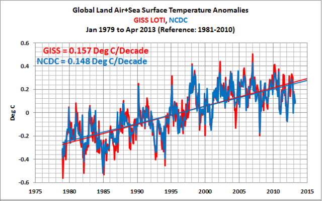
GISS and NCDC Comparison Starting in 1979
########

GISS and NCDC Comparison Starting in 2003
GENERAL OVERVIEW OF GLOBAL TEMPERATURE PRODUCTS
For those new to the presentation of global surface temperature anomalies, the following are a few notes about the datasets.
1. Global surface temperature datasets are a combination of sea surface temperature anomalies for about 70% of the surface of the globe and land surface air temperature anomalies for the other 30%.
2. Land surface air temperatures mimic and exaggerate the variations in sea surface temperatures.
3. Land surface air temperature measurements are not available for all parts of the globe. (Examples: There are few temperature sampling stations in the interiors of Africa and South America.) And the sampling gets poorer as we travel back in time. GISS and NCDC infill grids with missing data using statistical methods, but even so, there are large areas without even infilled data toward the early years of the datasets. The UKMO does not infill grids with missing land surface air temperature data.
4. For sea surface temperature data, the absence of source data is even more of a problem. The temperature sampling of the surfaces of the global oceans depended on ship locations during the decades before the recent stationary or free-floating buoys. In fact, temperature samples from ship inlets are still used today. So the locations of sea surface temperatures measurements depended on where ships traveled, and, unfortunately, ships typically traveled the same paths called shipping lanes. To complicate matters more, sea surface temperatures were sampled using different methods. In addition to ship inlets, buckets of different materials (canvas and wood) were tossed over the sides of ships, then hauled back on board and a thermometer was placed in the bucket of water—not too high tech.
5. GISS and NCDC both use the NCDC’s reconstructed sea surface temperature data called ERSST.v3b, which has been adjusted for the different sampling methods and then infilled. The UKMO uses the HADSST3 dataset in its HadCRUT4 global temperature product. The HADSST3 data have also been adjusted but grids with missing data have not been infilled, other than expanding the 2 x 2 degree longitude and latitude grids of the source data to 5 x 5 grids.
6. Both ERSST.v3b and HADSST3 sea surface temperature datasets are based on source data from ICOADS.
7. For the source of land surface air temperatures, GISS, NCDC and UKMO use the GHCN dataset.
8. Because GISS, NCDC and UKMO all use the same source datasets, they are not independent measures of the changes in global temperatures, as is often claimed.
9. GISS uses data from other sources to capture variations in the Arctic and Antarctic.
10. GISS also masks sea surface temperature data wherever sea ice has existed, and they extend land surface temperature data, with its higher variability, out over the surface of the oceans regardless of whether sea surface temperature data is present during a given month.
11. All of the global temperature suppliers use different reference periods, or base years, for temperature anomalies. GISS uses 1951 to 1980. NCDC uses 1901 to 2000. UKMO uses 1961 to 1990.
12. There are a number of reasons why the suppliers of global temperature products present their data as anomalies—as deviations from a base period. There are significant annual cycles in absolute land surface air temperatures (see example here) and in sea surface temperatures, though the variations in sea surface temperatures are not as great (example here).
13. There is no evidence in the sea surface temperature data to indicate that manmade greenhouse gases were responsible for their warming. Refer to the illustrated essay “The Manmade Global Warming Challenge” [42MB].
I’d say, the trend is broken.
Sell.
One recommendation: Change the last chart “GISS and NCDC Comparison Starting in 2003” to start in 1997. Or 1996 even. (Temperatures now are what they were then, so 1996 is interesting as well.)
It will be much more effective a summary of an even longer trend, and it does include that year’s high point, compared to this past month’s continuing 16 year trend of declining temperatures.
After all, if we’re going to discussing apples and oranges, you might as well begin by picking low-hanging cherries.
“+0.58 deg C to +0.5 deg C (base years of 1951-1980).”
and what is the GISS “adjustment” for most of the 1951-1980 years…
.
.
.
.
.oh.. its about -0.5 degrees. !!!
Just by eyeballing LOTI and NCDC, they both look like a sinusoidal peak around 2005, which is now on the downward sweep.
The first properly explanation as to the limits of the measuring network, the consistency of it, the gaps in it and the implications thereof.
Thank you for writing it.
Thanks for the update and the background Bob. Your point 13 is the key one, because that is really all that the controversy is about: “Yes it’s warming, but is there any evidence in that warming data that suggests it is due at least in part to man-made carbon dioxide emissions”, and you present a very good case that there is not. And really the only way that things could be otherwise, despite your very elegant argument, would be if there were some other natural phenomenon contributing to the data in such a way as to counteract or mask any anthropogenic warming signal. This seems unlikely, particularly given your observation that the oceans are virtually opaque to the low temperature thermal infrared back radiation upon which the CO2/greenhouse gas model depends.
According to NCDC numbers, last month was the 3rd coldest this century.
More significantly, the two previous colder Aprils, 2006 & 2008 were both affected by La Nina conditions.
http://notalotofpeopleknowthat.wordpress.com/2013/05/20/noaa-global-temperatures-out-2nd-coldest-april-this-century/
I once had the job of collecting sea surface temperatures for the UKMO. We hovered at about 20ft in our Wessex 2 and dangled a thermometer into the water, hauled it up after a few minutes and read the temperature. We had free reign as to where we inserted the thermometer and no account was made for evapouration heat loss between sea and aircraft when hauled up. The downwash must have reduced the temperature reading through latent heat use but by how much was probably different on every haul up. So temperature data for the east English Channel in the 70’s is suspect.
Blame me.
johnmarshall says:
May 23, 2013 at 2:41 am
Don’t worry, the Navy had your back. In the 70s with a Wessex 2 you probably didn’t have much of a clue where you were – Decca was great wasn’t it?
I agree with BigYinJames at 2:07 am
When are you going to abandon the fantasy of a straight line and put up a sixty year period sin wave.
The inflection point at 1997 and an amplitude of plus or minus 0.2 will do just fine.
Cheers
JohnMarshall
I wrote about the historic manner of collecting SST’s here.
http://judithcurry.com/2011/06/27/unknown-and-uncertain-sea-surface-temperatures/
The idea that we have an reliable picture of historic data especially from the further flung corners of the world is madness.
Perhaps data from the Satellite era is more consistent but it can’t be compared to historic data as it apples and oranges.
Bob Tisdale wisely tends to steer clear of older SSt’s
tonyb
If you can’t look at those charts and see that the anomaly trend has not only stopped rising but actually started to trend down, then you are 100% blind. In order to cool, you must first stop warming, and that is exactly where we’re at. If these were stocks, I’d be selling everything I had…
“Sinus on the Wall…!” – to the tune of Roger Chapman’s song: “Shadow on the Wall!”
A Crooks says:
May 23, 2013 at 3:21 am
I agree with BigYinJames at 2:07 am
When are you going to abandon the fantasy of a straight line and put up a sixty year period sin wave.
The inflection point at 1997 and an amplitude of plus or minus 0.2 will do just fine.
—————————————————————————————————————–
Yep – that’s a sine wave, if there ever was one.
For anyone interested in doing the maths, I use the data at climate4you aggregate data.
http://www.climate4you.com/images/AllCompared%20GlobalMonthlyTempSince1979.gif
and just looking at the moving average data I see a really neat 60 year sine wave.
A = 0.18*SIN(((YEAR-1993)/60)*2*3.14159)+0.2
On top of that there appears to be a 7.5 year cycle made up of two 3.75 year cycles. Still looking at the moving average there is a repeated 3.75 year plateau followed by a 3,75 year dip. There appears to be 5 of these 7.5 year cycles in a row now starting in a dip at the beginning and coming up for a new dip in 2016? The only disruptions to the cycles occur during known volcanic eruptions – El Chichon in 1982 and Mt Pinatubo in 1991 which knock the shoulders off the plateaus (plateaux?).
Looking at the monthly data – every second trough in the 3.75 year cycle signature is a deep one which causes the dip every 7.5 years in the moving average.
Anyone got any suggestions what the 3.75 year cycle / 7.5 year cycles may be?
To summarize, the global temperature anomaly graph can be characterized by
combining three simple formulae:
A = 0.18*SIN(((YEAR-1993)/60)*2*3.14159)+0.2 (The sixty year cycle)
B = 0.1*COS(((YEAR-1982)/7.5)*2*3.14159 (7.5 year cycle)
C = 0.25*COS(((YEAR -1980)/3.75)*2*3.14159 (3.75 year cycle)
The monthly average = A + (3/4) * B + C
Just a suggestion – see you in twenty years if I’m right.
A Crooks, there’s a ~7 year Chandler wobble cycle.
http://en.wikipedia.org/wiki/Chandler_wobble
You can see the ~7 year cycle in AMO as well:
http://www.climate4you.com/images/AMO%20GlobalMonthlyIndexSince1979%20With37monthRunningAverage.gif
http://www.climate4you.com/images/NOAA%20SST-NorthAtlantic%20GlobalMonthlyTempSince1979%20With37monthRunningAverage.gif
Polar motion is very interesting:
http://hpiers.obspm.fr/eop-pc/products/combined/C04plot.php?date=2&dimx=600&dimy=450&graphe=1&year1=1962&month1=1&day1=1&year2=2027&month2=12&day2=31&langue=1&SUBMIT=Submit+request
http://hpiers.obspm.fr/eop-pc/products/combined/C04plot.php?date=2&dimx=600&dimy=450&graphe=2&year1=1962&month1=1&day1=1&year2=2027&month2=12&day2=31&langue=1&SUBMIT=Submit+request
My best guessed description? Sine wave-ish with somewhat variable peak to peak latencies, zero to peak height, zero to trough height, and peak to trough latencies. Sine-waveish. Reminds me of brain waves, particularly of the evoked kind, at the more complex cortical level.
I would like to see a harmonic signal with a wave length similar to the PDO extracted from a long term temperature data set. That signal could then be backed out of the data sets included in this posting to investigate the resulting temperature trend. This would result in a considerably different and perhaps more insightful slope than fitting a line through harmonically affected data.
If any one could suggest a data set and location, I would be happy to perform the task.
Re sine wave curve
Dr Spencer worked that out years ago check his site for the famous temperature graph LOL
“The idea that we have an reliable picture of historic data especially from the further flung corners of the world is madness.
Perhaps data from the Satellite era is more consistent but it can’t be compared to historic data as it apples and oranges.”
not madness. you can in fact use the land temperature to predict the SST and the SST to predict the land. You can then test these predictions and see what kind of error is present.
you could even do this with your CET series tony.
Also, if you find that satillite SST conforms well to ship bases SST duringthe period of overlap
you can get an iestimate of error for the past.
Its much better than documents.
Surface radiometric monitoring (BSRN) reveals that short wave radiation increased by 3 w/m/decade while long wave increased by 2 w/m/decade. The increase in short wave radiation which is absorbed by the oceans is attributed to global brightening (less clouds) and to a lesser extent to increased TSI. Long wave contribution is very unlikely and not needed to explain the warming. It now seems that the globe with the meandering jet stream, increased frequency of La Nina, and solar TSI decline will result in a decline in SW radiation or global dimming and result in a global temperature decline. LW radiation should also decline as the oceans give up less heat.
http://www.gewex.org/BSRN/BSRN-12_presentations/Wild_FriM.pdf
Mosh
I was primarily referring to historic Sea surface temperatures.
You don’t seriously believe we have an accurate global SST picture to fractions of a degree back to 1850 or so. Where’s your evidence? What is the ‘estimate of error’ for the past you talk about? Even Dr Curry believes anything prior 1950 is suspect
Anecdotal computer data still has to start with someone recording and transcribing a data point accurately and for there to be sufficient of them to form an accurate picture. Have you checked each data point? Are there enough to form a proper scientific view?
With such a time lag between the time it takes to heat the atmosphere and the time taken to heat the ocean (and for it to cool down) using the land temperature to predict the ocean temperature is hardly a rigorous examination.
Surely documentation AND scientific record should go hand in hand?
tonyb
From johnmarshall on May 23, 2013 at 2:41 am:
*groan*
What are the labels of the 11 data columns following the yyyy/mo column in this database? I have tried to google the information and I have looked for information on the web site, to no avail so far. I will continue looking; however, if some kind person has a pointer I would appreciate it.
http://www.metoffice.gov.uk/hadobs/hadcrut4/data/current/time_series/HadCRUT.4.2.0.0.monthly_ns_avg.txt
Thank You
CC Squid says: “What are the labels of the 11 data columns following the yyyy/mo column in this database?”
Sorry. I should have included a link to the following webpage:
http://www.metoffice.gov.uk/hadobs/hadcrut4/data/current/series_format.html
Regards
A warmist problem: if you say 1975 to 2003 is the actual trend, you have an accelerating phenomenon greater than 1.5C/100 yr, but then you have to explain 2003 to 2013 with zero change. If, as Hansen and Gore say, temperatures are indeed still rising, you have to bisect the 2003-2013 period with a straight line, which gives <1.5/100, OR have a curve showing acceleration, which then says 1975 – 2003 was LESS than 1.4C/100, i.e. the worst period was not bad. The advantage of the last option, of course, is to say that the future is where all the terrible stuff is happening, as the curve climbs rapidly, starting in a few more years.
Spin works as long as you aren't accountable for previous statements. Erhlich has been a master at this in the climate game, never having bet on a horse that didn't win or would have won but for some temporary, one-off, extraordinary event.
It is terrible to hope for a cold summer, as cold is bad for food growth and human health, but the only thing that will truly take the wind out of the alarmist sails is an "acute" period of serious cold that can't be attributed to "chronic" conditions as aerosols or open Arctic waters.
BTW: Europe was supposed to be cold this winter because of excess open water, which of course was not open through the winter, just open later in the fall. Still enough, apparently. However, if the oceans freeze at a "normal" time, and Europe is again cold, will this mean that the open water theory is wrong, or just that another spurious condition is to blame?
Again, it is a shame that good things will only come in frozen packages.
Why haven’t you mentioned the adjustments to earlier temperatrues made to GISS data in 1999. Steven Goddard has pointed this out. Is there an expanation for it. He shows that 1936 data moves down and 1998 data moves up after 1999.
With all due respect (really)
I think the drawing of a straight line from one end to the other on the graph and putting a number on the slope, is the sort of sloppy science you might expect from the IPCC.
There are plenty of respectable scientists Soon Scarfetta Akasufu … who have seen a sixty year cycle in the long term data and have noted that the steepest parts of the long term trend coincide with the upswings of that cycle. So to present this short section of data which includes one of these unrepresentative upswings – without recognition of the effect of the cycle – is nonsense.
Once the sixty year cycle has been acknowledged suddenly the “pause” which has so “baffled” the AGWers becomes explained.
And lets face it, even the UK Met Office and Pachauri have talked about 20 to 30 years of pausing which is pretty much a tacit acceptance that the down swing of the sixty year cycle will dominate for the next good while.
What was it Mike Collins said way back in the Climate gate emails ” Hope its not another 1930’s downturn.”
The real question about where the long term climate trend is going needs to be separated from the cyclical trend. The focus should be on what the slope of the real underlying trend out of the Little Ice Age is doing. The AGWers need it to be ramping up – but I dont see any sign of it at all.
Check out Akasofu’s diagram.
http://wattsupwiththat.com/2009/03/20/dr-syun-akasofu-on-ipccs-forecast-accuracy/
“I was primarily referring to historic Sea surface temperatures.
You don’t seriously believe we have an accurate global SST picture to fractions of a degree back to 1850 or so. Where’s your evidence? What is the ‘estimate of error’ for the past you talk about? Even Dr Curry believes anything prior 1950 is suspect
Appealing to Dr. curry will get you no where. First, all data is suspect, incomplete and filled with error. The issue is what is the best information we have and what error can we estimate.
Second, nobody believes the record is accurate to a fraction of a degree. You misunderstand what the fractions mean. We are talking about having an estimate that minimize the error.
I’ve explained this many times.
Anecdotal computer data still has to start with someone recording and transcribing a data point accurately and for there to be sufficient of them to form an accurate picture. Have you checked each data point? Are there enough to form a proper scientific view?
Yep, checked every data point. Its how you find errors. For example, when looking at a ship track you can spot location errors very easily. Are there enough to form a proper scintific view?
there is no such thing as a proper scientific view. There is the data and the error you can calculate from the data. Proper scientific view is meaningless.
With such a time lag between the time it takes to heat the atmosphere and the time taken to heat the ocean (and for it to cool down) using the land temperature to predict the ocean temperature is hardly a rigorous examination.
Have you tried it? If you tell me you are 6 feet tall I can estimate your weight. Go ahead and try this with CET. Take the years 1960 to 2013. Use Land to estimate the SST around england.
Then test that for the 1900 to 1940 period. or do it the other way around. You’ll get big error bounds, but that is different than saying that you know nothing.
Surely documentation AND scientific record should go hand in hand?
tonyb
Look, the case I make is simple, if you accorded as much certainty to the science record as you do to documents you would NOT distrust the science record as much as you do.
its the selective skepticism and changing goalposts that I object to
Mosh
Firstly I do NOT automatically distrust the scientific record. That is a complete nonsense. If I write an article I try to combine documentation with scientific study as they go best together. A one off quote of weather two hundred years ago may be interesting but is anecdotal unless combined with other evidence.
Secondly you say;
“Second, nobody believes the record is accurate to a fraction of a degree. You misunderstand what the fractions mean. We are talking about having an estimate that minimize the error.”
Nonsense, those who make policy do. I was speaking to an MP here just the other day who believes we know temperatures etc to fractions of a degree. It is they who make policy, not you, who might have a more scientific view of data realities
Thirdly you say ‘ First, all data is suspect, incomplete and filled with error. The issue is what is the best information we have and what error can we estimate.’ Yes indeed, and some is so full of all three that they can not begin to give any sort of meaningful figure upon which policy makers can act.
I am currently reading Camuffo for the third time where, as part of the ‘improv’ project, he is taking what he considers highly suspect data and tries to turn it into something meaningful, so please do not say that I am not interested in the science record..
As for your believing that I take documents at face value…. I have been going to the met office regularly for the last six months in order to gather material to write ‘the long slow thaw’; part 2 and in the process am trying to get Latin documents translated showing crop records and weather and marrying that up with scientific papers that examine the era. On my shelf to read in the next fortnight as part of the research I have books by Groves, Jones, ladurie, Lamb and Budyko. It will take me a year to gather all the information and will take me to the other side of the country to CRU to look at their records .
From it all can we infer the tendency of the British climate if not the precision? Yes. Its better than tree rings. Is it as good as sometimes suspect data points? You obviously don’t believe so but some of us might beg to differ
tonyb
Billy Liar,
Decca was OK unless there was a thunderstorm. Luckily we were not often out of the sight of land doing SAR in that part of the world ie. from RAF Manston.
A time-controlled series statistically described with an Ordinary Least Squares type trend line should be reported along with the sum of squared residuals statistic. This statistic helps describe the degree of confidence one can have in an extension of the trend line beyond the actual data. Wide swings above and below the trend line means the extension of the trend line is suspect, while narrow swings provide more confidence. We use this type of data analysis when graphing student improvement. However, many educators do not have even a rudimentary background in statistics and will often state things about rate of improvement that are really not supported by the actual data. Even worse, some educators resort to kindergarten level trend line calculations. It seems to me that climate scientists have their own gallery of researchers that should not even be allowed to enter data, let alone perform statistical analysis on it.
@David Reese:
See:
http://chiefio.wordpress.com/2013/01/04/lunar-cycles-more-than-one/
which has some pointers to prior work in it. Such as:
http://www.appinsys.com/GLobalWarming/SixtyYearCycle.htm
The oceans slop around the planet with a lunar tidal driven cycle. That shows up in sea level and in sea surface temperature cycles (that then shows up in weather and surface temperatures).
The “Global Warming” folks just are clueless about the actual physical changes in the oceans driven by actual physical observable tide cycles.
Hey bob, is that why:
http://www.cru.uea.ac.uk/cru/data/temperature/HadCRUT3v-gl.dat
Still hasn’t been updated?
’cause I sure hope they are still maintaining HadCRUT3…