The recent paper Compo et al (2013) is titled “Independent confirmation of global land warming without the use of station temperatures”. It’s in the preprint phase, and of course it’s paywalled. The abstract is here. It reads:
Confidence in estimates of anthropogenic climate change is limited by known issues with air temperature observations from land stations. Station siting, instrument changes, changing observing practices, urban effects, land cover, land use variations, and statistical processing have all been hypothesized as affecting the trends presented by the Intergovernmental Panel on Climate Change and others. Any artifacts in the observed decadal and centennial variations associated with these issues could have important consequences for scientific understanding and climate policy. We use a completely different approach to investigate global land warming over the 20th century. We have ignored all air temperature observations and instead inferred them from observations of barometric pressure, sea surface temperature, and sea-ice concentration using a physically-based data assimilation system called the 20th Century Reanalysis. This independent dataset reproduces both annual variations and centennial trends in the temperature datasets, demonstrating the robustness of previous conclusions regarding global warming.
In short, Compo et al (2013) recreated global land air surface temperatures without surface station-based temperature measurements. Basically, they used other variables as inputs to a computer reanalysis to infer the land surface air temperature anomalies.
Of course, SkepticalScience has already written a post about the paper, in which Dana1981 throws in his two cents about the significance of Compo et al (2013). SkepticalScience was kind enough to post Figures 1 and 2 from Compo et al (2013). The Compo et al Figure 1 is included here as Figure 1. It illustrates the warming of land surface air temperatures from 1901 to 2010 for the latitudes of 60S-90N. The blue curve is the Compo et al reanalysis. The red curve is the new and improved CRUTEM4 data from the UK Met Office. And the black curve is the average of other land surface air temperature reconstructions, including NCDC, GISS, JMA, and UDEL.

Figure 1 (Figure 1 from Compo et al (2013))
What stands out for you in that graph?
For me, compared to the other datasets, the Compo at al reanalysis has warmer anomalies during the early-to-mid 1970s and cooler anomalies during the late 2000s, which would create a lower trend during the recent warming period. The Compo et al reanalysis also shows a flattening of land air surface temperature anomalies starting in 1995, where the other datasets show a continued warming. Compo at el also show an exaggerated spike in 1943 associated with the multiyear El Niño then. And Compo et al show a later start to the rise during the early warming period.
The choice of 1981-2010 as the base years for anomalies is also a curiosity. While the WMO recommends updating base years periodically, global temperature anomaly data producers such as GISS, NCDC and UKMO use their individually selected base periods.
REPLICATED COMPO ET AL REANALYSIS GRAPH
Using the coordinates function of MS Paint, I replicated the Compo at el (2013) reanalysis output. It’s compared to CRUTEM4 data for the latitudes of 60S-90N in Figure 2, using the base years of 1981-2010. (The CRUTEM4 data is available through the KNMI Climate Explorer on a gridded basis.) I’ve also included the linear trends. My replica produces a linear trend that’s comparable to the 0.09 deg C/decade trend noted in the SkepticalScience post.
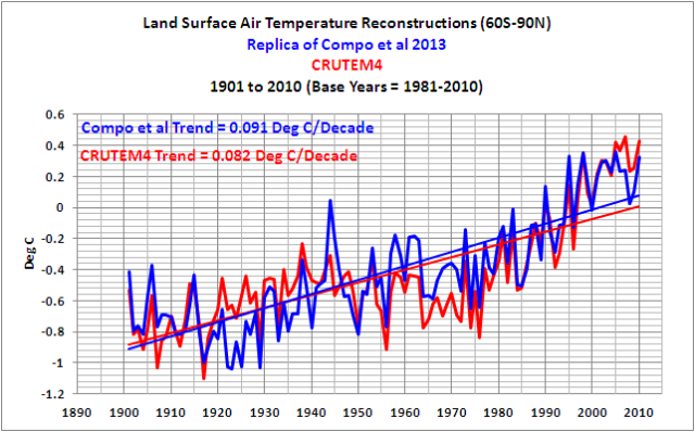
Figure 2
So let’s take a closer look at the recent warming period, and we’ll start the recent warming period in 1976. Figure 3 compares the replicated Compo et al reanalysis to CRUTEM4 data for the shorter term. As suspected, the CRUTEM4 data shows a 32% higher warming trend than the Compo et al reconstruction. The flattening of the warm peaks in the Compo et al reanalysis since 1995 is also much clearer.

Figure 3
USING DIFFERENT BASE YEARS
In Figures 4 and 5, long-term comparisons, I’ve compared the CRUTEM4 and Compo reanalysis using the standard UKMO and GISS base years. Figure 4 shows the UKMO base years of 1961-1990 and Figure 5 shows the GISS base years of 1951-1980. The recent divergence (flattening of the warm peaks in the Compo et al reanalysis versus the continued warming of the CRUTEM4 data peaks) stands out quite clearly in both illustrations. I’ll let you comment on why Compo et al (2013) presented the anomalies using the base years of 1981-2010.

Figure 4
####################

Figure 5
TREND MAPS
My Figure 6 is Figure 2 from Compo et al (2013). Note the differences in trends over Alaska and the mid-to-high latitudes of Russia for the period of 1952-2010 (Cells c and d). Compo et al (2013) could not reproduce the excessive rates of warming there during that period.

Figure 6 (Figure 2 from Compo et al (2013))
CLOSING
Sometimes I get the impression SkepticalScience is unable to read time-series graphs. I’ll let you comment on the rest of the SkepticalScience post.
“…to investigate global land warming over the 20th century. We have ignored all air temperature observations and instead inferred them from”… (indirect measurements of secondary phenomena).
The exact OPPPOSITE of empirical science!
I’m surprised they didn’t mention the Tea Leaves or Tarot Cards.
Looks like a good check step to me.
I find it interesting that their reconstruction graph sometimes leads the station temperature graph and sometimes doesn’t. It implies that the variables within their reconstruction and surface temperatures are fluctuating by something other than an exclusive driver and that the drivers do not have a more prominent or leading effect on land surface temperatures.
Was that paper co-written with Foggy and Clegg?
‘The recent paper Compo et al (2013) is titled “Independent confirmation of global land warming without the use of station temperatures”.’
*
I knew where this was going the moment I read “Independent”.
Compo, et al write:
“We have ignored all air temperature observations and instead inferred them from observations of barometric pressure, sea surface temperature, and sea-ice concentration using a physically-based data assimilation system called the 20th Century Reanalysis. This independent dataset reproduces both annual variations and centennial trends in the temperature datasets, demonstrating the robustness of previous conclusions regarding global warming.”
The first lesson that a good analyst learns is that one’s tools of analysis must never be more complicated than the object to be analyzed.
Their entire paper must be dedicated to explaining why anyone would be interested in investing the time necessary to learn all the components of the 20th Century Reanalysis.
Plot the residuals as a scatter plot. It should end up highlighting exactly where they agree, disagree, diverge and converge.
“What stands out for you in that graph?”
Climate science, so-called, the only field that considers errors bars showing statistical and systematic errors as being irrelevant.
With the errors [quantification of uncertainties] associated with the measurements, it’s meaningless to spend time discussing any differences, as they may, or may not, be significant.
Or the authors claiming that they know what the “global temperature”, a physically dubious quantity, was in 1900 to within +/- 0.01C?
Same old problem, though. PROVENANCE, please.
Do climate “scientists” have fetishes about hockey sticks?
But, basically, like every other measure you care to mention, it confirms that temperatures are rising? Some people won’t like that inconvenient fact.
Could someone explain why the range 90 degrees North to 60 South has been used? It would seem to me to bias the results by keeping in the warming arctic and excluding cooling antarctic.
What stands out for me is the results are presented without any physically valid uncertainty bars. Prior to about 1980, SSTs are mostly from ship intakes, which have a systematic measurement uncertainty of about (+/-)0.5 C. Prior to about 1960, SSTs are mostly bucket temperatures that have an uncertainty of about (+/-)1 C.
As presented, Figure 1 above is meaningless. If proper uncertainty bars were included, it would be conclusionless.
Compos et al 2013 can forever be known as Compost it all 2013.
To Quote from the article: “We have ignored all air temperature observations and instead inferred them from observations of barometric pressure, sea surface temperature, and sea-ice concentration using a physically-based data assimilation system called the 20th Century Reanalysis. This independent dataset reproduces both annual variations and centennial trends in the temperature datasets, demonstrating the robustness of previous conclusions regarding global warming.”
There are some problems with this data set. Sea-ice levels are mainly inferred prior to the satellite age.Many of those who have made the inferences of sea ice levels prior to satellite observation were probably influenced by views of global warming. Second, there are many problems with sea temperature measurements especially going back to 1900. Even today, sea ice measurements are somewhat uncertain and have therefore been adjusted mainly by removing those temperature buoys that appeared to read too cold. I’ve wondered if they checked the data to find buoys that read too warm? Typically, instruments of this type would fail both on the high side and low side.
The algorithm for determining past temperatures is still based on physical measurements. Therefore, the same issues exist for that data as exist for the data from temperature stations. Except, the temperature station data will be more complete. The precision with which the temperature is inferred from the data sets is based on the ability of the algorithm to correctly determine the temperature from this. That precision needs to be determined under various scenarios as a first step. Otherwise, there is no way to make any judgement about it.
The actual data used for determining temperature are barometric pressure, sea surface temperature, and sea-ice concentration. Those are even less likely to be both complete and accurate than temperature station data. Less work has been done on those so it is difficult to determine how accurate the data is especially going back 50 years or more. Given the penchant for adjusting data that climate alarmists have, the data sets used are also very likely to be influenced by the same type of adjustments.
@Alanb says:
April 8, 2013 at 11:55 am
Could someone explain why the range 90 degrees North to 60 South has been used? It would seem to me to bias the results by keeping in the warming arctic and excluding cooling antarctic.
I was going to point this out as well.
Further, what happened to the extreme warming event (and subsequent Drought) that occured in the 1930’s? Or was this just a localized event?
using reanalysis output is a good check. For example, Fall et al 2011 used reanalysis data.
The interesting thing here is not the differences, but rather the similarities.
Looking at the trends from 1976 to present:
A) hadcrut .295
B) Reanalysis .223
Which looks to be a difference of around .07C per decade.
If you want a serviceable first order estimate of the potential bias in A, bias due to
1. spatial sampling
2. site bias ( a sum of say UHI and micro site )
Then, I’d say .07 C per decade is a good first order estimate of that bias.
You’ll get something in the same ballpark by looking at RSS or UAH.
Why is it important to have a good first order estimate of bias in the record?
Because if you are looking for that bias by doing stats on A, then you’ll
understand that a small bias like this will be hard to find. Not impossible, just hard.
It also means that you might look for that bias but never find it. That doesnt make the
bias disappear, it doesnt mean there is no bias, it just means it’s hard to tease out
unless you work really hard to eliminate all confounding factors. On the other hand
a small bias ( like less than .1C per decade ) isnt very interesting when it comes
to understanding the future trajectory of temperatures.
What stands out for me is that the uncertainty in every study confirms the uncertainty trumps all and that none of the people doing the studies cares. Also missing is a certain cause of the temperature over time. And missing again as always there is no certain association that shows positive feedback from human-generated CO2 is involved. Specifically, they don’t know what the temperature was, they don’t know what the temperature is, and they remain convinced that what ever the temperature is, it is wrong. But they also don’t state what it should be. Bad science – no cookie.
J. Murphy says:
April 8, 2013 at 11:52 am
“But, basically, like every other measure you care to mention, it confirms that temperatures are rising? Some people won’t like that inconvenient fact.”
Are you a LIA denier?
My non-expert viewing clearly shows the Compo trend is significantly BELOW the CRUTEM4 therefore it must be documenting flat to cooling temperatures.
J. Murphy says: “But, basically, like every other measure you care to mention, it confirms that temperatures are rising? Some people won’t like that inconvenient fact.”
And like all the other measures, it doesn’t prove human causation. Some people won’t like THAT inconvenient fact.”
All of them should have their crayons impounded and the kindergarden who let them color out side the lines shut down for the good of mankind.
“My replica produces a linear trend that’s comparable to the 0.09 deg C/decade trend…”
I am amazed that we are even bothering with that low a total when in reality, thermometers cannot even measure down to that fractional amount. It does all get very tiring when totals like “0.09” are included as proof of anything happening at all. It is just simply amazing.
Another example of ad hoc science after the facts: how to explain what the settled science did not forecast… http://www.scientificamerican.com/article.cfm?id=oceans-may-explain-slowdown-in-climate
“This independent dataset reproduces both annual variations and centennial trends in the temperature datasets, demonstrating the robustness of previous conclusions regarding global warming.”
Since we know that the “previous conclusions regarding global warming” were wrong, then any work or paper claiming to demonstrate the robustness, must be flawed.
“We have ignored all air temperature observations and instead inferred them from observations of barometric pressure, sea surface temperature, and sea-ice concentration using a physically-biased data assimilation system called the 20th Century Real Anal Lies Assistant. ”
FIXED.
And this one wins the award:
Intensification of winter transatlantic aviation turbulence in response to climate change
Paul D. Williams1 & Manoj M. Joshi2
AffiliationsContributionsCorresponding author Journal name:
Nature Climate Change
Year published:
(2013)DOI:
doi:10.1038/nclimate1866
Received12 November 2012 Accepted05 March 2013 Published online08 April 2013 Article toolsCitationReprintsRights & permissionsMetrics
Atmospheric turbulence causes most weather-related aircraft incidents1. Commercial aircraft encounter moderate-or-greater turbulence tens of thousands of times each year worldwide, injuring probably hundreds of passengers (occasionally fatally), costing airlines tens of millions of dollars and causing structural damage to planes1, 2, 3. Clear-air turbulence is especially difficult to avoid, because it cannot be seen by pilots or detected by satellites or on-board radar4, 5. Clear-air turbulence is linked to atmospheric jet streams6, 7, which are projected to be strengthened by anthropogenic climate change8. However, the response of clear-air turbulence to projected climate change has not previously been studied. Here we show using climate model simulations that clear-air turbulence changes significantly within the transatlantic flight corridor when the concentration of carbon dioxide in the atmosphere is doubled. At cruise altitudes within 50–75° N and 10–60° W in winter, most clear-air turbulence measures show a 10–40% increase in the median strength of turbulence and a 40–170% increase in the frequency of occurrence of moderate-or-greater turbulence. Our results suggest that climate change will lead to bumpier transatlantic flights by the middle of this century. Journey times may lengthen and fuel consumption and emissions may increase. Aviation is partly responsible for changing the climate9, but our findings show for the first time how climate change could affect aviation.
This stuff has every appearance of a joke. Independent evaluations are well known, this is called proxies. They all have an annoying feature, they show no significative trend for the twentieth century.
Let me if I’m wrong here (I’m not a scientist, just an interested reader)…..but ignoring an observation and then not ignoring it by inferring it seems like taking a further step away from accuracy rather than towards it …with the inference I would have thought there would be a bunch of variables including assumptions that are likely to be at least as problematic as those affecting observations …
J. Murphy says “But, basically, like every other measure you care to mention, it confirms that temperatures are rising? Some people won’t like that inconvenient fact.”
The atmosphere is never static. Other people refuse to acknowledge that inconvenient fact.
Well, it is kind of funny that the Compo paper appears to be about 0.2-0.3C lower in the second half of the 20th century than CRUTEM4… which is more of an adjustment than the UHI adjustment they were seeking to avoid in the first place.
J. Murphy says:
April 8, 2013 at 11:52 am
—————————————————
Inconvienient? That temperature has risen since the Little ice Age? Trivial, IMHO, but not inconvenient.
If you have an “inconvenient” fetish, please explain why temperature is lower now than 1000 years ago, when we had agriculture in Greenland, or 2000 years ago when we were making wine (with ease) in Britain, or 8000 years ago at the dawn of the agricultural revolution, even though atmospheric CO2 has been rising steadily through all that time.
Correct me if I’m wrong, but there are error bars on that first graph. That’s what the light blue envelope is, right?
“We have ignored all air temperature observations and instead inferred them…”
I kinda doubt they ignored them completely. I’d guess they used them at least for multivariate analysis for how the pressure etc translates to temperature. But it is likely that these data are not affected by GISS “value added” homogenization so that’s one effect they got rid of.
It might be interesting to compare their result with unadjusted temperature measurements…
Apart of that, I am not entirely convinced that the urban heat island effect is only limited to temperatures.
JMurphy: We are in an interglacial period, in which temperatures will continue warming until they don’t. Why should that bother the skeptics? It is, after all, the * anthropogenic* part that we contest.
Slightly off thread – although I have taken an awful lot of SST bucket temperatures – I note Margeret Thatcher has died. She was the UK’s first female prime ministr, and – perhaps surprisingly – our first prime minister with a BSc [Chemistry at Oxford].
Sad she has died, and the passing of a wonderful rebel, even iconoclast, but she hs had a decade of poor health.
Auto
About as reliable as me grading my students essays by the colour of their socks!
Air travel to get bumpier as CO2 emissions rise, scientists say
Turbulence to become more frequent, stronger by mid-century
http://www.reuters.com/article/2013/04/08/climate-airlines-turbulence-idUSL5N0CQ3CA20130408
Shano 11:58 am
Haha!! Good one!
Eugene WR Gallun
……… sea surface temperatures……. .
In the 1960s when I was Third and Second Mate on weather reporting cargo ships, the SST was taken from the main engine cooling water intake. When loaded the intake was about 30′ below the sea surface, and in ballast about 15′ below the ss; in addition I doubt if the thermometer supplied by the shipbuilder was ever calibrated in any way.
I wonder how much credence can really be given to the numbers that the Radio Officer sent out to Portishead every six hours.
Steven Mosher
“a small bias ( like less than .1C per decade ) isnt very interesting when it comes
to understanding the future trajectory of temperatures.”
Too right! I get a bigger variation than that from one side of my kitchen to the other on a permanent basis.
Even the 0.3C (app) that this work and HadCRUT4 refer to is unmeasurable in any meaningful way. We really are debating how many angels can dance on a pinhead here!
According to the NCAR site, http://climatedataguide.ucar.edu/reanalysis/noaa-20th-century-reanalysis-version-2 the ‘key weakness’ of this method lies ‘in (re)interpreting long-term trends – inconsistencies between 20CR and other data have been reported’ and yet, bizarely the ‘key strength’ lies in the ‘length of the record’. What is the definition of ‘long-term’ here?
As others have commented, how is it demonstrated that barometric pressure is a more reliable and valid measure than temperature? Barometric pressure in daily weather (rather than STP) appears susceptible to a greater range of influences than temperature alone. For example, winter anti-cyclones and sunny weather are associated with low temperature and high pressure. How are the barometric pressure values in this study ‘adjusted’ to reflect standardised conditions – would this not be prone to even more errors than current empirical temperature measures?
J. Murphy says: “But, basically, like every other measure you care to mention, it confirms that temperatures are rising? Some people won’t like that inconvenient fact.”
There’s nothing inconvenient about it. Ocean heat content data since 1955 and satellite-era sea surface temperature data indicate the oceans warmed naturally. See “The Manmade Global Warming Challenge” (42MB):
http://bobtisdale.files.wordpress.com/2013/01/the-manmade-global-warming-challenge.pdf
Regards
The amount of data manipulation that must have gone into the Compo et Al ‘study’ would probably make even his Manniness blush.
Steve McIntyre would doubtless have a field day if the raw data and how it was ‘processed’ was ever made publicly available.
Auto says
In the interests of accuracy, the Chemistry degree at Oxford is a Bachelor of Arts.
Strange I know but Oxford is a lot older than today’s ideas of ‘science’, and they were awarding BAs a long long time ago, they haven’t seen a good reason to change the title of their undergraduate degree.
Sorry to be a pedant.
Alanb says: “Could someone explain why the range 90 degrees North to 60 South has been used? It would seem to me to bias the results by keeping in the warming arctic and excluding cooling antarctic.”
Land surface air temperature measurements didn’t begin in Antarctica until about 1950 and they’ve been sparse since then. Sea surface temperatures in the Southern Ocean surrounding Antarctica were not measured regularly until the satellite era, which started in the early 1980s. I assume the same holds true for many of other variables used as input to the reconstruction.
Bryan A says: “I was going to point this out as well.”
See my above reply to Alanb.
Bryan A says: “Further, what happened to the extreme warming event (and subsequent Drought) that occured in the 1930′s? Or was this just a localized event?”
I believe that was primarily a US event. It wasn’t global by any means.
Rick Powell says: “Correct me if I’m wrong, but there are error bars on that first graph. That’s what the light blue envelope is, right?”
The answer should be yes. I haven’t read the paper due to the paywall, but the text for Figure 1, according to SkepticalScience is:
“Figure 1: Temporal comparison of near-global land (90°N–60°S) 2 meter air temperature anomalies (TL2m) between 20CR and station-temperature based estimates. Red curve: global TL2m anomaly series from CRUTEM4, black curve: the average of five additional station-temperature datasets, and blue curve: the 20CR. 95% uncertainty ranges are shown for CRUTEM4 (yellow fill) and 20CR (blue fill) and their overlap (green fill).”
After the fact PS: Also see the poster:
http://www.geos.ed.ac.uk/research/earthtemp/themes/1_in_situ_satellite/Sardeshmukh_EarthTemp_2012_Edinburgh_Poster.pdf
I’m glad that they’re at least trying to verify how dependable the surface temperature measurements are, but this seems to be their method:
1) Recognize that there is at least the possibility that conventional measurements are wrong.
2) Identify an alternative system of measurements that is more complex and has more intrinsic error.
3) Use the possibly flawed conventional measurements to calibrate the new method.
4) Get the same result with the new method that has been calibrated to the conventional measurements as with the conventional measurements themselves.
By calibrating to the new method to surface temperature measurements, they’ve already built those presumed errors errors into their method. Or to put it another way, their results could be summarized, “Independent Confirmation that Surface Station Temperature Measurements Reflect Surface Station Temperature Measurements”
Outcome Based Education formula:
Data + Climatologist = Hockey Stick
And somewhat on topic, I’ve posted the full March sea surface temperature update, for those interested:
http://bobtisdale.wordpress.com/2013/04/08/march-2013-sea-surface-temperature-sst-anomaly-update/
Independent confirmation of global land warming without the use of station temperatures
“Confidence in estimates of anthropogenic climate change is limited by known issues with air temperature observations from land stations. Station siting, instrument changes, changing observing practices, urban effects, land cover, land use variations, and statistical processing have all been hypothesized as affecting the trends presented by the Intergovernmental Panel on Climate Change and others.”
William: The abstract incorrectly outlines the issue. The extreme AGW theory fails as there is no observed warming in the tropical troposphere at around 10 km, which the theory predicted and which is required for there to be amplification of the CO2 forcing. The extreme AGW theory fails as atmospheric processes are different what was assumed in the theoretical general circulation models. Likely the lack of warming in the tropical tropospheric regions is due to Lindzen and Choi’s finding that clouds in the tropics increase or decrease in the tropics to resist forcing changes, negative feedback. I find it difficult to imagine how it is possible to ignore the multiple observations and analysis that invalidates the extreme AGW theory.
A scientist, as opposed to a fanatic, changes their mind when the data no longer supports the theory. Those pushing the extreme AGW paradigm are having a very difficult time accepting the fact that observations and analysis does not support the extreme AGW theory.
The extreme AGW theory is dead, defunct, invalidated.
The attempt to show the planet is warming when it is not, is the work of fanatics who have a hidden agenda, not scientists. Compo et al (2013) is following in the tracks of Allen and Sherwood (See links below), in that they are trying by analysis to review the defunct, invalid extreme AGW theory.
http://icecap.us/images/uploads/DOUGLASPAPER.pdf
A comparison of tropical temperature trends with model predictions
We examine tropospheric temperature trends of 67 runs from 22 ‘Climate of the 20th Century’ model simulations and try to reconcile them with the best available updated observations (in the tropics during the satellite era). Model results and observed temperature trends are in disagreement in most of the tropical troposphere, being separated by more than twice the uncertainty of the model mean. In layers near 5 km, the modelled trend is 100 to 300% higher than observed, and, above 8 km, modelled and observed trends have opposite signs. These conclusions contrast strongly with those of recent publications based on essentially the same data.
Robert J. Allen & Steven C. Sherwood try to convince people of tropical tropospheric warming by analyzing winds speeds. Direct measurement and satellite measurement indicates there is no warming of the tropical troposphere in the regions predicted by the IPCC general climate models. There also is no evidence of warming in the tropics.
http://www.nature.com/ngeo/journal/v1/n6/full/ngeo208.html
Warming maximum in the tropical upper troposphere deduced from thermal winds
Climate models and theoretical expectations have predicted that the upper troposphere should be warming faster than the surface. Surprisingly, direct temperature observations from radiosonde and satellite data have often not shown this expected trend. However, non-climatic biases have been found in such measurements. Here we apply the thermal-wind equation to wind measurements from radiosonde data, which seem to be more stable than the temperature data. We derive estimates of temperature trends for the upper troposphere to the lower stratosphere since 1970. Over the period of observations, we find a maximum warming trend of 0.65 0.47 K per decade near the 200 hPa pressure level, below the tropical tropopause. Warming patterns are consistent with model predictions except for small discrepancies close to the tropopause. Our findings are inconsistent with the trends derived from radiosonde temperature datasets and from NCEP reanalyses of temperature and wind fields. The agreement with models increases confidence in current model-based predictions of future climate…
http://climateaudit.org/2008/04/26/tropical-troposphere/
Since they aren’t using land based temperature measurements, why aren’t they also comparing their results to the satellite data? I, for one, would like to see that chart for the past 33 years. That will tell us much more than their comparison to CruTemx!
Bill
Well, at least their reanalysis has not disappeared the pause that falsifies all AR4 GCM predictions.
If part of the premise of this work is to call into question air temperature measurements, you would have to call into question the measurements that were used to infer temperature. Really. Seems to me like we are trying to split hairs with a rather dull meat cleaver.
Guys at sks are preoccupied with the “big picture”, they prefer not to putter about factual details (like actual scientists do). It’s a judgement based on genuine personal experience there.
They reckon science is about impressions evoked by pictures somehow, not truth value of propositions having a strict logical structure. This “holistic” approach is characteristic of all varieties of pseudoscience.
Not sure how things like barometric pressure and other atmospheric parameters wouldn’t be affected by urban heat islands themselves. I think back in the 60s or latest the 70s, research directly tied UHI to changes in rainfall patterns around places like St. Louis and Atlanta.
“We have ignored all air temperature observations and instead inferred them from observations of barometric pressure, sea surface temperature, and sea-ice concentration using a physically-based data assimilation system called the 20th Century Reanalysis. This independent dataset…”
————————————————————————–
1) Is pressure independent of temperature ?
The thermal equation of state says otherwise, making pressure as much dependant on siting issues as temperature.
p*V = n*R*T
2) What sea ice concentrations are used before the satellite era ? The usual suspect, an almost constant value pre 1979, would be in contradiction to multiple historic reports.
3) Sea surface temperature has its own issues, among others the disturbing overwriting of post 1941 data
http://climateaudit.org/2011/07/12/hadsst3/
The Cobe-SST appears to be free of that issue, resulting in an increase of just 0.3 deg since the last natural, cyclical high around 1940 and about equal increases in 1910-1940 and 1976-2005.
http://www.ipcc.ch/publications_and_data/ar4/wg1/en/figure-3-4.html
I know my comments are going to annoy just about everybody who knows me – a small circle that – and, uh, just about everybody who doesn’t. But this following statement by Compo et al (2013) has required, compelled, forced (and every other coercive sounding verb I can think of), a response out of my typing finger:
‘We use a completely different approach to investigate global land warming over the 20th century. We have ignored all air temperature observations and instead inferred them…’
Ok, first: full disclosure. I went to an all boys high school. A Catholic high school. An all boys Catholic high school. So I suffer from a repressed memory syndrome. And the memory that is completely unsuccessfully repressed is the memory of never getting any dates. With girls. Ever.
Now, this was back in the late sixties and early seventies when everybody endeavored to ‘find themselves.’ Now, like every kid in school I associated ‘finding myself’ with sex, and drugs, and rock and roll. Unfortunately, that’s not the way the priests viewed it. No. Catholic school; remember? They viewed ‘finding ourselves’ as by inventing a new, expressive language through which to, well, express ourselves. Another words, it was a mind-bendingly stupid exercise in utmost ridiculousness – typical for a high school.
For example (and it’s the only example I’ve chosen to remember of this) we weren’t supposed to refer to a frog as croaking. No, we were supposed to feel as if we were frogs ourselves and feel how a frog would verbalize itself croaking. (Pretty high demands for a frog.) Since this exercise was so thoroughly ludicrous, and therefore impossible, the priest had to teach by example. So there he was, in front of the class, chanting out a verbalized frog croak which I have never ever, try as I might, been able to get of my goddam mind. So here it is:
Kai yi, karodak: Kai (rhymes with eye); yi (rhymes with why – an appropriate word); ka- (rhymes with duh -also an appropriate word) – ro (row) – dak (rhymes with slack).
Altogether now: Kai yi karodak!
Again: Kai yi karodak!
Now try to get that out of your minds for the rest of your lives. I warned you. I told everybody my comments would annoy them.
But you’re wondering, what, for chrissake, does this ever have to do with getting an ‘inferred’ global temperature? Think about it. That priest of our’s had Compo beat by at least 40 years. Kai yi karodak is an ‘inferred’ frog. Just how good a frog do you think that is? Do you think anybody, anywhere is going to mistake a bunch of repressed high school kids chanting Kai yi karodak for a lily pond full of frogs? So, just how good is an ‘inferred’ temperature?
All together: Kai yi karodak!
@Steven Mosher: “a small bias ( like less than .1C per decade ) isnt very interesting when it comes to understanding the future trajectory of temperatures.”
Are you referring to a linear regression through the two temperature sets? It appears to me that the reconstruction changes the shape of the line, not just its slope. And in fact seems to push back the start of The Lull to around 1995. That’s a bad thing for the idea that a linear increase is happening and all we can really debate is how steep is the slope.
Or am I misunderstanding which bias you’re referring to?
Rick Powell, “Correct me if I’m wrong, but there are error bars on that first graph. That’s what the light blue envelope is, right?”
Those are the error bars allowed by UEA/CRU and UKMet; a whopping (+/-)0.2 C in the 19th century, trending to (+/-)0.05 C by the late 1990s. Analyzing the historical methods, they’re about 10x too small.
Bloke down the pub says:
April 8, 2013 at 11:33 am
Was that paper co-written with Foggy and Clegg?
More like Nora Batty.
(P.S. I wonder how many of these good people know what we’re talking about?)
These people lost me when they said they ignored observations and just inferred from them. Can you say “garbage in-garbage out”?
What I would really like to see with all of these climate change horror stories is how the writers (and supporters) are changing their behavior to reduce their impact on the environment.
Do they rise/retire based on the available sunlight? Charge their various batteries using only locally-produced sun or wind power? Walk or use a bike for all of their transportation needs? Grow their own food instead of relying on the food chain that uses all those chemicals, trucks and so on to get the food from farm to market? Use the internet for meetings instead of jetting off to various locales for their climate change meetings? Have they really reduced their own carbon footprint or do they still use everything they want while telling us that we have to change?
Or as a pundit frequently states – “I’ll believe it’s a crisis when the people who tell me it’s a crisis start acting like it’s a crisis.”
Yikes, discard the inconvenient data, infer new data and then re-analyze the lot……..
People get paid for this ????
How about I infer the minimum takeoff speed for an airplane by counting the number of swizzle sticks in the galley…….
Cheers, Kevin
Dr Compo has, at a quick glance, smashed the bucket correction (see CA about Folland and Parker).. The fact that his is a land temp series is irrelevant because sea temp drives land temps. How do I know? Because there’s a ***peer reviewed*** paper which proves it:
A 2008 study – “Oceanic Influences on Recent Continental Warming”, by Compo, G.P., and P.D. Sardeshmukh, (Climate Diagnostics Center, Cooperative Institute for Research in Environmental Sciences, University of Colorado, and Physical Sciences Division, Earth System Research Laboratory, National Oceanic and Atmospheric Administration), Climate Dynamics, 2008)
[http://www.cdc.noaa.gov/people/gilbert.p.compo/CompoSardeshmukh2007a.pdf] states: “Evidence is presented that the recent worldwide land warming has occurred largely in response to a worldwide warming of the oceans rather than as a direct response to increasing greenhouse gases (GHGs) over land.
So the spike in temps during WWII is revived.
Dr Compo. are you now in a position to answer Prof. Wigley’s question? You know, ‘why the blip?’ There is an interesting paper from the FAO about fish productivity during WWII which is a GIF(?) file, and as such unfindable, which details windspeeds during the war: Cuff a passing postgrad and send it to the library. It will repay the search.
JF
Then Google “Kriegsmarine hypothesis”. Good luck. Can I come along to the ceremony when you get the big one?
Worried about an Ice Age? I can give you a cheap boost to global temps: half a degree C for about 100 billion blatts per year. Apply at above address.
I’m thinking this might be a first step to a face-saving walk-back on the part of (some of) the alarmists. The data reinforces that temperature has stabilized over the past 10 to 15 years and also suggests that the climb rate prior to that was lower than previously touted. It could be said “new analysis techniques show that it isn’t as bad as we thought”, without having to really admit that the earlier hoopla was based on faulty assunptions. Migtht be a way to allow the rat out of the corner.
I rather like this. I think it may be possible to reconstruct temperature trends using barometric pressures and oceanic ENSO conditions. My complaint: I wouldn’t use sea ice levels as that is clearly more driven by wind and ocean current than it is with air temperature.
@Green Genes 3:12 pm (and bloke down the pub 11:33am)
Not many! But those that do are still chuckling. I’d trust them above the warmist crowd: the Summer Wine boys did have their own internal logic that, in its way, worked.
Isn’t it inconvenient for those who claimed the following :
“In fact, many climate specialists now agree that actual observations from weather satellites show no global warming whatsoever–in direct contradiction to computer model results.”
Leipzig Declaration
“Instrumental temperature data for the pre-satellite era (1850-1980) have been so widely, systematically, and unidirectionally tampered with that it cannot be credibly asserted there has been any significant “global warming” in the 20th century.”
Surface Temperature Records : Policy-Driven Deception?
“What stands out for you in that graph?”
What I noticed first was that the wiggle matching stank until 1980 is reached. From there to 2010, the wiggles match fairly well. It looks like what they did was create a model, standardize it on recent CRUTEM4 data to make the right hand fit look good, then generate the left hand part. They may have additional knobs and levers in the model, just in case there’s a wild deviation somewhere that they want to tune out.
I think there’s less here than meets the eye. My feeling is that the use of proxies where none are needed* is an act of desperation. What’s next? Speleological temperature proxies based on bat poop accumulations?
iirc, others (Muller et al, etc.) have compared SST’s to global data sets and gotten fairly good correlation**. If so, there’s not much new here. It would be interesting to see how important to the Compo correlation were barometric pressure and arctic ice. It would be even more interesting to see what other input variables they tried, and how many.
* if you believe CRUTEM4 hasn’t been corrupted.
** not terribly surprising, since the oceans have 1100 X the heat capacity of the atmosphere at full depth, and the top 400 meters is still over 100 X.
Pamela Gray says: “I wouldn’t use sea ice levels as that is clearly more driven by wind and ocean current than it is with air temperature.
Doesn’t matter, if they needed something to tweak the correlation in a particular direction.
Julian Flood says: “Dr Compo has, at a quick glance, smashed the bucket correction (see CA about Folland and Parker).”
I’ve already plotted the Compo reanalysis versus the “raw” ICOADS data and will post it tomorrow.
What did I notice? every single cooling period has been removed, and become flat lined.
They’ve used the Land Temperature record to infer the LT relationship with the reanalysis inputs haven’t they?
A circular proof?
Reminds me of Trenberth’s missing heat. If they could help Trenberth find his heat; perhaps, they could understand why their temperatures don’t match actual recorded temperatures.
Readers mystified by the references to Compo, Clegg and Nora Batty may look away now, but I recall a moment in an early script that might appeal.
As I remember, Compo was philosophising in his inimitable way about the wonders of the universe and remarked that when he was in the queue at the chip shop he sometimes stood between the mirror on the customers’ side of the counter and the one above the fryers, from where he could see his reflection and his reflection’s reflection and his reflection’s reflection’s reflection and so on to infinity, but that even so, he knew that he wasn’t somewhere in that infinity because he was actually still in the chip shop.
Some LOTSW geek out there might recognise the episode.
So we have:
One set of temperature data from a metrology system that has not had its reproducibility and repeatability managed (” 70% of the USHCN temperature
25 stations are ranked CRN classification 4 or 5, with nominal temperature uncertainties up
26 to 2C or 5C, respectively” see http://berkeleyearth.org/pdf/station-quality-may-20.pdf)
A second series of proxy measurements from metrology systems that haven’t had their reproducibility and repeatability managed, and which are susceptible to other factors than land temperature.(http://climateaudit.org/2007/03/17/buckets-and-engines/,http://climateaudit.org/2005/06/19/19th-century-sst-adjustments/,http://climateaudit.org/2005/06/24/sst-adjustment-2/)
A declaration that set 2 is independent confirmation of set 1 based on a computer simulation.
Shouldn’t this paper have Dr Sheldon Cooper cited as a co-author so that the whole sorry circle jerk could be concluded with a swift snappy BAZINGA..!!!
Rick Powell wrote:
April 8, 2013 at 12:48 pm
You may be correct.
1/ So the original authors are claiming that one can determine what the “global temperature” was in 1900 to better than +/- 0.3C from proxy data? This not only strains credulity, but tosses it in the blender.
2/ The subsequent linear regression analysis quotes slopes to 3 significant figures, but does not quote any associated error/uncertainty, so one can’t conclude if the differences are meaningful or not.
As far as I can see all these graphs show the same thing: For 40 of the last 70 years since global CO2 production has seen a significant increase, temperatures haven’t bothered to rise. In other words there is no obvious correlation between temperature and CO2 increase.
At EGU, and attended the presentation this morning, Vienna. Not impressed at all. The presenter first stated he would ‘ignore’ all TL(2m) and replicate global land temperatures using ocean reanalysis with a matrix formulation and sea level pressure term. He then showed the graphs, with R-squared, 0.90, then claimed he replicated the “instrumental” TL(2m) and proved the IPCC AR4 land temperature datasets were robust and correct.
Oh dear. Seemed like a children’s magic show with Mr. Magician, a wand, a Top Hat, a cape, and then the rabbit (“IPCC AR4 land temperature datasets are robust and correct”).
The very fact that it matches reasonably well to CruTemp, proves that it is a load of manipulated hogwash !!
AndyG55, look at the graphs again. The Compo et al reanalysis does NOT continue to rise after the 1997/98 El Nino like the CRUTEM4 data.
oldseadog says:
April 8, 2013 at 1:15 pm
/////////////////////////////////////
I frequently note that ship’s figures are based upon the water inlet manifold temp and that the water intake is frquently drawn at 6 to 10 metres below the surface (depending on the design and the configuration of the vessel).
It is important to note that sea surface temperatures will therefore be warmer than that indicated by ship’s data on sea temps. Most people fail to appreciate that ship’s data reads cooler than SST since it is not SST but rather the sea temperature at depth (say 6 to 10m below surface).
Further, I seem to recall that the latest Hadcrut figures adjust the ship’s data downwards. When if they really want to make a meaningful comparison with satelitte sea surface temperatures, they should be adjusting the ship’s temps upwards,
This reconstruction changes little when viewing the running mean for the two uptick periods of ~1910-1940 and 1975-2000, and as pointed out, this new reconstruction plots a flatter climb during the 1975-2000 period. The datasets still indicate a relative equal amount of change both prior to and after accelerated CO2 use (~+0.56 C). The natural variations in the geologic proxy data have much greater short and long term variations than the two recent 20th century warming periods.