
Figure 1
Ocean Heat Content data represents the heat stored of the oceans to specified depths. As such, it is an important global warming metric. The Introduction to Levitus et al (2005) begins:
Based on the physical properties and mass of the world ocean as compared to other components of Earth’s climate system, Rossby [1959] suggested that ocean heat content may be the dominant component of the variability of Earth’s heat balance.
Rossby (1959) is the opening chapter of the book The Atmosphere and Sea in Motion edited by Bert Bolin. That chapter is titled “Current problems in meteorology”. In it, Carl-Gustaf Rossby made two suggestions while discussing ocean processes:
a) The assumption that our planet as a whole stands in firm radiation balance with outer space cannot be accepted without reservations, even if periods of several decades are taken into account.
b) Anomalies in heat probably can be stored and temporarily isolated in the sea and after periods of the order of a few decades to a few centuries again influence the heat and water-vapour exchange with the atmosphere.
I’ll let you ponder the significance of the first suggestion. The second one was the prelude to the mantra “the heat will come back to haunt us sooner or later.” Of course, the persons making those “come back to haunt us” statements fail to disclose that the ocean heat content records for the tropical Pacific indicate a major portion of the warming that has occurred during the recent global warming period is a lagged response to an earlier warming—that is, ocean heat content for the tropical Pacific confirms the latter of Rossby’s suggestions, at least on a multidecadal basis. The 1973-76 La Niña provided the initial ocean heat in the tropical Pacific for a series of strong El Niño events through 1994, with the La Niñas that trailed those El Niños recharging part of heat released by the El Niños. But it was the 1973-76 La Niña that provided the initial charge for them. Then the 1995/96 La Niña delivered the fuel for the 1997/98 super El Niño, and with the help of the recharge during the 1998-01 La Niña, those two La Niña events effectively shifted up the ocean heat content of the tropical Pacific and El Niños have been feeding off that warm water since then, so that process had begun one again, initiated by the 1995/96 La Nina. We’ll be discussing ocean heat content in the tropical Pacific again later in the post.
According to Woods Hole Oceanographic Institution scientist Raymond Schmitt, the oceans have “1,100 times the heat capacity of the atmosphere (99.9% of the heat capacity of the Earth’s fluids).” See the webpage here. Therefore, ocean heat content data is becoming a favored dataset during discussions of human-induced global warming, especially by proponents of human-induced global warming. There are, however, numerous problems with the ocean heat content data. Those problems are the topics of this post.
Of course, proponents of carbon dioxide-driven global warming point to the increase in ocean heat content as proof mankind’s contribution, but the data shows little to no anthropogenic component when the data are broken down into logical subsets. This will once again be presented—but this time at the end of the post. There are lots of other topics to discuss before then.
DATASET OVERVIEW
We’ll be discussing and presenting ocean heat content data from the National Oceanographic Data Center (NODC) primarily for a couple of reasons. First, it’s often cited and presented during discussions of Ocean Heat Content, and second, for the depths of 0-700 meters, it’s available through the KNMI Climate Explorer, where users can select the coordinates of subsets they want to examine. There the data is presented in Gigajoules per square meter (GJ/m^2). In addition to the KNMI Climate Explorer, we’ll also be presenting global data downloaded from the NODC website. There the global data is presented in Joules*10^22.
We’ll also be referring to the UKMO EN3 ocean heat content data, which used to be available through the KNMI Climate Explorer. The UKMO EN3 data is basically an earlier (2005) version of the NODC’s ocean heat content data that’s been kept up-to-date with 2006-2012 data. We’ll be using it for comparisons to the current version of the NODC data.
The current version of the NODC ocean heat content data was accompanied by the paper Levitus et al (2009), and its recent updates were discussed in Levitus et al (2012).
An initial note: I am not criticizing the efforts by the National Oceanographic Data Center (NODC) to assemble data for its ocean heat content data. It was (and is) a monumental (ongoing) task but there’s simply little source data before the ARGO era. The intent of this post is to make readers more aware of the reasons why there are so many concerns about the data.
LOTS OF DEBATE ABOUT THE VALUE OF OCEAN HEAT CONTENT DATA
Two recent posts at WattsUpWithThat (see here and here) about ocean heat content were reminders of how strong the opinions are for and against this dataset. A couple of years ago, a simple model-data comparison like the one shown in Figure 1 (above) could create arguments that lasted for days. Grant Foster, aka the blogger Tamino, would complain about my model-data presentation of ARGO-era global Ocean Heat Content data. See Tamino’s posts here and here, and my replies here and here. My replies were also cross posted at WattsUpWithThat here and here. Tamino didn’t like the point where I showed the model projections intersecting with the Ocean Heat Content data. Then RealClimate corrected their past model-data comparison posts. Refer to the RealClimate post OHC Model/Obs Comparison Errata. As a result, Gavin Schmidt then corrected the ocean heat content model-data comparison graphs in his earlier December 2009, May 2010, January 2011 and February 2012 posts. Refer also to my discussion of the RealClimate corrections here. Now the comparison in Figure 1, which has been updated through December 2012, appears overly generous to the models—that I should be shifting the model projection a little to the left.
Now for the punch line: As if on cue, after the corrections were made by RealClimate, and three days after my presentation of the RealClimate corrections here (WattsUpWithThat cross post here), SkepticalScience continued to claim my graphs were “Inaccurate/Unskeptical Graphs” (whatever that nonsense means) in their post Modeled and Observed Ocean Heat Content – Is There a Discrepancy? If visitors from SkepticalScience can’t visualize where the extrapolation of the modeled trend would intersect with the ARGO-era data, they should refer to the corrected illustrations in the December 2009, May 2010, January 2011 and February 2012 RealClimate posts.
SUBSURFACE TEMPERATURE MEASUREMENTS
Ocean heat content is a product of salinity and temperature measurements, and it’s presented in Joules—typically Joules*10^22 and Gigajoules per square meter (GJ/m^2). Let’s put that into perspective with a variable most people can relate to: temperature. For example, ocean heat content (0-700 meters) warmed about 14.5*10^22 Joules for the period of 1955 to 2008. That equates to a warming of about 0.17 degrees C. See Table T1 in Levitus et al (2009).
There were/are two principle technologies used to measure subsurface ocean temperatures: ARGO floats and XBTs.
ARGO floats were introduced in the 1990s. If ARGO floats are new to you, there’s a video from ARGO Project YouTube Channel illustrating and explaining them here. The floats had reasonably good coverage of the global oceans by 2003/04—especially in the mid-to-high latitudes of the Southern Hemisphere where observations were lacking before ARGO. And the installation of the ARGO floats was completed in 2007. The profiling operation of the ARGO floats is also described in Wikipedia here:
Argo floats drift at a fixed pressure (usually around 1,000 metres depth) for about 9 days. After this period, within the relatively short time of around two hours, the floats move to a profiling pressure (usually 2,000 metres deep) then rise, collecting instantaneous profiles of pressure, temperature, and salinity data on their way to the surface. Once at the surface, the floats remain there for under a day, transmitting the data collected via a satellite link back to a ground station and allowing the satellite to determine their surface drift. The floats then sink again and repeat their mission, which repeats each 10 days.
Figure 2 is a map from the UCSD ARGO website showing the distribution of the ARGO floats in March 2013.

Figure 2
When looking at that map, you also have to keep in mind the size of the Earth’s oceans. The Earth’s oceans and seas cover about 361 million square kilometers or 139 million square miles. There were 3566 ARGO floats in operation in March 2013. If the floats were spaced evenly, then each ARGO float is sampling the temperature at depth for a surface area of approximately 101,000 square kilometers or 39,000 square miles—or an area about the size of Iceland or the State of Kentucky.
Before ARGO, starting in 1969, the majority of the temperature measurements at depth were taken by devices called XBTs, short for eXpendable BathyThermographs. Refer to the NOAA webpage here for more information about XBTs. Basically, an XBT is an electronic thermometer attached to very long and thin wires, which, in turn, are attached to a recording device. The XBTs are dropped over the sides of ships and the wires play out. As NOAA notes:
The [XBT] probe is designed to fall at a known rate, so that the depth of the probe can be inferred from the time since it was launched. By plotting temperature as a function of depth, the scientists can get a picture of the temperature profile of the water.
ARGO floats remain in the oceans for about 5 years, sinking down to 2000 meters and bobbing upwards to the surface every 10 days, recording while they ascend. The XBTs, on the other hand, were used once, falling to the end of the wires.
Samples using XBTs were taken during voyages by research vessels and by ships of opportunity. Therefore, measurements were only taken where the ships traveled, or, written another way, when and where the ocean temperatures were sampled depended on ship locations. The bottom line: there were no temperature measurements at depth for much of the oceans. Further, much of the sampling occurred in the mid-to-high latitudes of the Northern Hemisphere and in the tropics. That is, there are very few temperature measurements in the Southern Hemisphere south of the tropics before ARGO. That area represents roughly one-third of the global oceans, and there are few to no temperature measurements there before ARGO. As you’ll see later, the number of observations and the global coverage gets much worse towards the early part of the data.
COMMENTS BY AN OCEANOGRAPHER AND A CLIMATE SCIENTIST ABOUT OCEAN HEAT CONTENT DATA
Let’s return to the Woods Hole Oceanographic Institution webpage linked earlier. It’s a transcript of Raymond Schmitt’s testimony before congress when the climate science community was looking for funding for the ARGO program. As a preface, when Raymond Schmitt says, “…we have in place a system for monitoring El Niño,” he is referring to NOAAs Tropical Atmosphere-Ocean (TAO) project. NOAA began installing a group of moored ocean and atmosphere “weather stations” across the tropical Pacific in the late 1980s and they completed it in early 1990s. The TOA buoys monitor numerous variables related to El Niño and La Niña events.
In the following, Raymond Schmitt is discussing ocean heat content data during the period when XBTs are in use (my boldface):
Observing Deficiencies
While we have in place a system for monitoring El Nino, we have no such ability to observe the motions of thermal anomalies in the mid- and high latitude oceans. Nor do we monitor the salt content of ocean currents, to determine the potential for deep convection or to help understand the vast water cycle over the oceans. But new technology, the vertically profiling ARGO float (Figure 4 [not included].), promises to give us the data we need to begin to understand this largest component of the global water cycle. These are like weather balloons for the ocean, drifting at depth for 10 days then rising to the surface to report profiles of temperature and salinity to a satellite. They then resubmerge for another 10 day drift, a cycle to be repeated 150 times or more.
So, as of 2013, we’ve had in place a “new technology” for about a decade that “promises to give us the data we need to begin to understand this largest component of the global water cycle”. Now consider that there are known ocean climate processes that portray themselves in the sea SURFACE temperatures of the North Atlantic and North Pacific, and that we have reasonably complete sea SURFACE temperature records stretching back to the late 1800s. These ocean climate processes portray themselves as modes of natural variability with patterns in time that last for 50 to 80 years. Can we hope now, with only 10 years of data, to understand those multidecadal processes? The realistic answer is no.
Note also at that Woods Hole Oceanographic Institution webpage that there were discussions of “missing” heat in 2000. It’s not a new problem for climate scientists.
By 2000, the NODC had presented the 1994 and 1998 World Ocean Atlases. They would publish others in 2001, 2005 and 2009. A few months before Schmitt’s testimony, the Levitus et al (2000) paper Warming of the World Ocean had been published. In other words, the NODC’s ocean heat content data existed prior to Schmitt’s testimony and it seems likely it would have been considered by him in his testimony.
Levitus et al 2000 presented graphs of ocean heat content for the depths of 0-300 meters and 0-3000 meters. Their graphs of global ocean heat content contained the 1970s to 1980s hump, which remained in the NODC’s ocean heat content data until 2009. More on that hump later in the post. Their Figure 1, my Figure 3, is for the depths of 0-300 meters.

Figure 3
Let’s jump ahead to October 2011 to discussions of the recent hiatus in global warming. Paul Voosen’s article Provoked scientists try to explain lag in global warming includes quotes from a handful of well-known climate scientists—each giving a different answer for the slowdown in warming, which suggests that the climate science community doesn’t understand why global temperatures warmed in the first place. That aside, Paul Voosen included quotes from NCAR’s Kevin Trenberth:
Trenberth questions whether the Argo measurements are mature enough to tell as definite a story as Hansen lays out. He has seen many discrepancies among analyses of the data, and there are still “issues of missing and erroneous data and calibration,” he said. The Argo floats are valuable, he added, but “they’re not there yet.”
ARGO floats have provided reasonably complete coverage of the global oceans since 2003-04, and the installation was complete in 2007. But as late as 2011, Kevin Trenberth’s opinion was that they provided limited value due to “missing and erroneous data and calibration”.
Figure 4 is from my blog post UKMO EN3 Ocean Heat Content Anomaly Data Disappeared From The KNMI Climate Explorer As Suddenly As It Appeared. The UKMO EN3 ocean heat content data in the graph (blue curve) presents the unadjusted ARGO-era data to depths of 700 meters. It shows cooling. The much-adjusted NODC data (red curve) shows warming, though it’s far short of the warming suggested by the extrapolation of the GISS modeled trend.
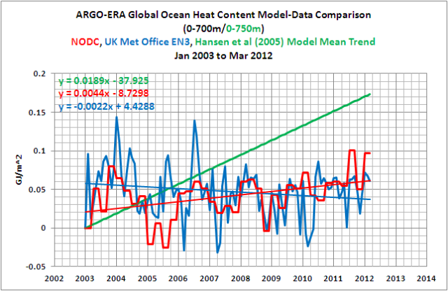
Figure 4
With ocean heat content data before the ARGO era, the measurements are so sparse we are unable “to observe the motions of thermal anomalies in the mid- and high latitude oceans”, and since the introduction of the ARGO floats, there are “issues of missing and erroneous data and calibration”. Phrased other ways: ocean heat content is not a reliable dataset—and—it’s not a dataset in which we should have confidence.
LACK OF OBSERVATIONAL DATA PRIOR TO ARGO
As mentioned earlier, the reason we’re unable “to observe the motions of thermal anomalies in the mid- and high latitude oceans” is because there is too little data based on XBT observations (and other sampling methods) prior to the ARGO era.
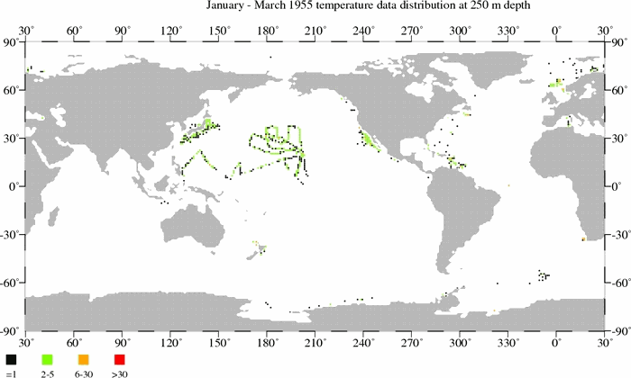
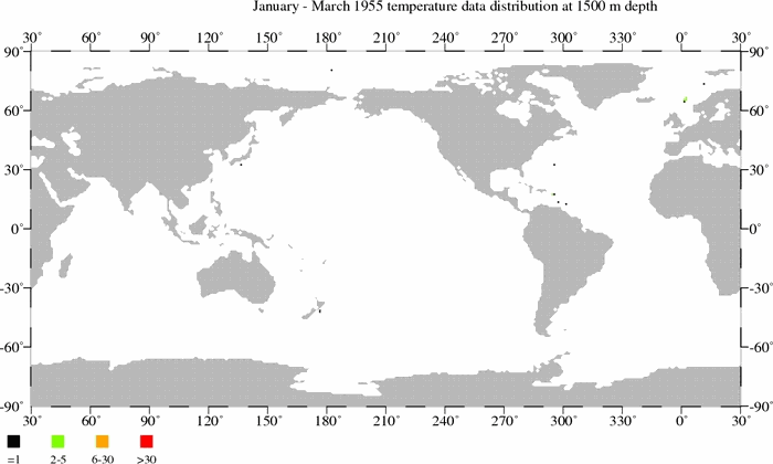
The following are links to 3 animations of maps that present the locations of temperature samples used in the most recent versions of the NCDC ocean heat content data. The animations are for the depths of 250, 500 and 1500 meters. Each black dot on a map represents one (1) temperature measurement at that depth for a 3-month period. There is also a scale on the maps that explains the number of readings associated with the green, orange, and red dots. Readings at 250 meters and 500 meters, and other depths, are used in the NCDC’s data for the depths of 0-700 meters. As you’ll note, global coverage improves with time until the 1990s, but then it worsens until the ARGO floats are released in the early 2000s. You’ll also note that the sampling is better at the 250 meter level than at 500 meters. It’s much, much worse at 1500 meters.
The files are large, so they may take a few moments to download.
Temperature sample maps at 250 meters (11MB).
Temperature sample maps at 500 meters (9MB).
The NCDC recently published a version of their ocean heat content data for the depths of 0-2000 meters. Unfortunately, as you will see, there is little observational data at depths of 1500 meters.
Temperature sample maps at 1500 meters (6MB).
There is so very little observational data at depths greater than 700 meters that the NODC elected not to present the data in 3-month blocks. They used 5-YEAR windows, in one year steps, what they refer to as pentads. That is, for example, a temperature measurement in 1959 will be used for the pentads of 1955-1959, 1956-1960, 1957-1961, 1957-1962 and 1959-1963.
Watching those videos, it’s hard to believe that a handful of samples in the Northern Hemisphere represent the average ocean heat content of the global oceans over the 5-year period of 1955-1959, yet there are persons who use the NODC 0-2000 meter data as proof of human-induced global warming. At best, it’s a fantasy dataset.
PENTADAL DATA IS NOT THE SAME AS DATA SMOOTHED WITH A 5-YEAR FILTER
The NODC ocean heat content data for the depths of 0-700 meters is available in quarterly, annual and pentadal forms. The NODC describes the pentadal data in Levitus et al (2012) as:
Here we present estimates for the upper 2000 m of the World Ocean with additional historical and modern data [Levitus et al., 2005a, 2005b; Boyer et al., 2009] using running pentadal (5-year) temperature analyses [Levitus et al., 2000].
Referring to Levitus et al (2000), they describe the pentadal data as “running 5-year composites.” Not much help.
Regardless, a running 5-year composite is not the same as a 5-year running mean.
Figure 5 is a comparison of the raw NODC quarterly ocean heat content data, the annual data and the pentadal data (0-700 meters) from the NODC website. What caught my eye was how the NODC’s pentadal data diverged from the raw data, especially before 1970. The pentadal data is much “cooler” than the raw data in the early years, highlighted with the green oval. That would obviously contribute to the warming trend of the pentadal data. There are also a couple of other curious divergences during the 1980s and 90s, but the pentadal data strays most from the raw data when the observations are sparsest in the early years.

Figure 5
I’m going to borrow a few graphs from my YouTube video The Natural Warming of the Global Oceans – Part 2. Figure 6 compares the annual NODC ocean heat content to the same data smoothed with a 5-year running-average filter. The linear trends for both are shown, and, as one would expect, they’re very similar. The NODC’s data smoothed with a 5-year running-average filter is then compared to the pentadal data in Figure 7. The pentadal data has a warming rate that’s about 19% higher than the data smoothed with the 5-year filter. I’ve never found an explanation for this additional warming.
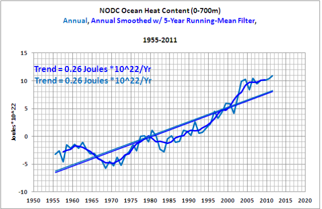
Figure 6
##############

Figure 7
It really makes one wonder how strongly the warming rate of the 0-2000 meter data, which relies on much fewer observations below 700 meters, is impacted by the use of “running 5-year composites.”
WHAT HUMP?
Let’s run through the early history of ocean heat content graphs presented by the series of Levitus et al papers. These are the datasets with the hump from the early 1970s to the early 1980s. Figure 3, above, presented the ocean heat content for the depths of 0-300 meters from Levitus et al (2000). Figure 8 is the graph from that paper for the depths of 0-3000 meters. The data for these deeper depths is provided in pentadal form, again because there’s so little source data. I’ve highlighted the hump in the global data, but it is also very obvious in many of the subsets.

Figure 8
The hump still existed in the updated ocean heat content data presented 5 years later in Levitus et al (2005). My Figure 9 is Figure 1 from that 2005 paper. Note the thick grey curve representing the data to 3000 meters. The ocean heat content to 3000 meters in the late-1970s was comparable to the ocean heat content in the mid-1990s.

Figure 9
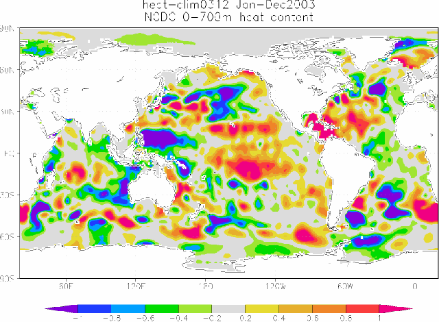
This is even more obvious in their Figure S3, my Figure 10. Note how the ocean heat content data in the Indian and Pacific Oceans were significantly warmer in the 1970s than at the end of the data. The additional warming in the North Atlantic is the only reason the global data were comparable in the 1970s and mid-1990s. Those humps in the Pacific and Indian oceans clearly showed that natural variability was the dominant cause of the warming of ocean heat content to depths of 3000 meters. That’s not too convenient in a world where, according to many proponents of anthropogenic global warming, greenhouse gases are supposed to be the only cause of global warming.

Figure 10
Using the assumed radiative impacts on the oceans of manmade greenhouse gases, climate modelers could not force their models to simulate the same decadal and multidecadal variations. See Figure 11, which is page 8 from a presentation by Gavin Schmidt of GISS titled GISS ModelE: MAP Objectives and Results.

Figure 11
So researchers went in search of possible reasons for the hump, and the perceived problem was erroneous fall-rate calculations for the XBTs. As a result, the ocean heat content data was tweaked, modified, adjusted, corrected—minimizing the inconvenient 1970s to early-1980s hump, until the ocean heat content data better fit the outputs of climate models. See Figure 12, which is Figure 1 from Levitus et al (2009).

Figure 12
COULD THE 1970s-80s HUMP HAVE BEEN EXPLAINED?
Possibly.
The unadjusted versions of North Atlantic and Global ocean heat content are compared in Figure 13. The warming of the ocean heat content is far greater in the North Atlantic than it is globally. One would think it would be more difficult to explain the North Atlantic warming, because its warming rate was so great.

Figure 13
But a January 2008 article in ScienceDaily titled North Atlantic Warming Tied to Natural Variability suggests otherwise. The article refers to the Lozier et al (2008) paper The Spatial Pattern and Mechanisms of Heat-Content Change in the North Atlantic. The article includes:
“We suggest that the large-scale, decadal changes…associated with the NAO [North Atlantic Oscillation] are primarily responsible for the ocean heat content changes in the North Atlantic over the past 50 years,” the authors concluded.
For those not familiar with the North Atlantic Oscillation, I’ll borrow a paragraph from my ebook Who Turned on the Heat?. (See the introductory post here.)
The North Atlantic Oscillation is an atmospheric climate phenomenon in the North Atlantic. Like the Southern Oscillation Index described in Chapter 4.3 ENSO Indices, the North Atlantic Oscillation is expressed as the sea level pressure difference between two points. The sea level pressures in Iceland, at the weather stations in Stykkisholmur or Reykjavik, can be used to calculate North Atlantic Oscillation Indices. Which Iceland location they elect to use as the high-latitude sea level pressure reference depends on the dataset supplier. The other point captures the sea level pressure at the mid-latitudes of the North Atlantic, and there are a number of locations that have been used for it: Lisbon, Portugal; Ponta Delgada, Azores; and Gibraltar. The North Atlantic Oscillation Index is primarily used for weather prediction. The direction and strength of the westerly winds in the North Atlantic are impacted by the sea level pressures in Iceland and the mid-latitudes of the North Atlantic, which, in turn, impact weather patterns in Europe and the East Coast of North America. If you live in those locations, you’ll often hear your weather person referring to the North Atlantic Oscillation. As will be discussed, winds in the North Atlantic can also impact Ocean Heat Content.
Let’s return to the ScienceDaily article. They write:
By contrast, NOA-driven winds served to “pile up” sun-warmed waters in parts of the subtropical and tropical North Atlantic south of 45 degrees, Lozier said. That retained and distributed heat at the surface while pushing underlying cooler water further down.
Now for the best part: Lozier et al (2008) used the old data, the data with the hump. Even so, the warming of the ocean heat content for the North Atlantic, with its high trend and the hump, was explainable with natural factors.
So let’s look at another sea level pressure based index: the North Pacific Index. As described on the NCAR webpage here:
The North Pacific (NP) Index is the area-weighted sea level pressure over the region 30°N-65°N, 160°E-140°W. The NP index is defined to measure interannual to decadal variations in the atmospheric circulation. The dominant atmosphere-ocean relation in the north Pacific is one where atmospheric changes lead changes in sea surface temperatures by one to two months. However, strong ties exist with events in the tropical Pacific, with changes in tropical Pacific SSTs leading SSTs in the north Pacific by three months.
The North Pacific Index data based on the paper Trenberth and Hurrell (1994): Decadal atmosphere-ocean variations in the Pacific. The data is available here.
For Figure 14, I prepared anomalies of the North Pacific Index data, using the base years of 1950 to 2010. I then inverted the data (multiplied it by -1), ended it in 2003 to agree with the ocean heat content presentation in Figure 11, and smoothed the data with a 121-month filter. Does the curve look familiar? Scroll back up to Figure 11, which is Figure S3 from Levitus et al (2005), and examine the ocean heat content curve for the depths of 0-3000 meters in the Pacific, and in the North Pacific.
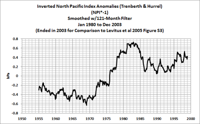
Figure 14
Sure does look like there may have been an explanation for the hump in the ocean heat content—since the hump exists elsewhere.
SHOULD OCEAN HEAT CONTENT TRACK SEA SURFACE TEMPERATURE?
Referring to the ScienceDirect article again: Warm waters tend to “pile up” when winds resist the transport of sun-warmed waters from the tropics to the poles. Wouldn’t we expect that to happen in all ocean basins? As a result, should we expect ocean heat content to track along with sea surface temperatures? Or should we expect decadal or multidecadal differences?
The trade winds “pile up” warm water in the western tropical Pacific. That process is exaggerated during La Niñas. Those warm waters are then used as fuel for El Niño events. As a result, ocean heat content and sea surface temperatures in the tropical Pacific do not agree with one another due to El Niño and La Niña processes. This is evident in comparisons of sea surface temperature anomalies to ocean heat content for the tropical Pacific, regardless of whether we use the much-adjusted NODC data (Figure 15a) or the unadjusted UKMO EN3 data (Figure 15b). (A comparison of tropical Pacific sea surface temperature anomalies with both ocean heat content datasets is here.)
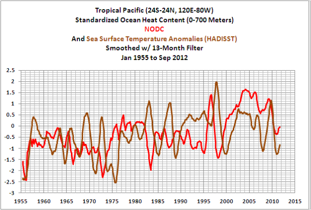
Figure 15a
###############

Figure 15b
Why then should we expect global sea surface temperatures and ocean heat content to track one another? There are decadal variations in sea level pressure, causing decadal variations in winds, which impact the amount of heat stored in the oceans. There are still-to-be-discovered subsurface ocean processes that cause variations in ocean heat content. By eliminating the hump in the global ocean heat content data, researchers have sought to better align the warming of ocean heat content data with global sea surface temperatures. Refer to the comparisons of global sea surface temperature anomalies with ocean heat content anomalies using the adjusted NODC data (Figure 16a) and the unadjusted UKMO EN3 data (Figure 16b). (And a comparison with both ocean heat content datasets is here. Note how awkward the corrections after 2003 appear in the NODC data.)

Figure 16a
###############

Figure 16b
Note: All of the data in Figures 15 and 16 have been standardized.
Regardless of whether we’re looking at the tropical Pacific (Figure 15b) or the global data (Figure 16b) the humps in the 1970s to 80s in the unadjusted data don’t look out of place when compared to the sea surface temperature data. They simply appear different than what we’re used to seeing.
SPEAKING OF STILL-TO-BE-DISCOVERED SUBSURFACE OCEAN PROCESSES
Let’s return to the North Atlantic. Figure 17 compares the NODC’s ocean heat content for the North Atlantic for two different latitudes and for the global oceans. Why are we looking at two different latitudes in the North Atlantic? I typically present North Atlantic data with the coordinates of 0-70N, 80W-0 (the same coordinates used by the ESRL for its Atlantic Multidecadal Decadal Oscillation index), capturing the basin north of the equator. But we’re going to discuss a paper that addresses the warming of the North Atlantic for the latitudes of 20N-66N, and I felt it advisable to show you that the extratropical portion has a slightly higher linear trend than the full basin.

Figure 17
The paper to be discussed is Mauritzen et al (2012) Importance of density-compensated temperature change for deep North Atlantic Ocean heat uptake (paywalled). The bottom line of the paper: the warming of the North Atlantic (20N-66N) at depths of 0-700 meters was partly offset by a cooling at depths below 2000 meters. Further, there was little warming of the ocean heat content for the depths of 700-2000 meters in the North Atlantic. That appears to counter any though that “the heat will come back to haunt us sooner or later.”
The abstract for Mauritzen et al (2012) reads:
The efficiency with which the oceans take up heat has a significant influence on the rate of global warming. Warming of the ocean above 700 m over the past few decades has been well documented. However, most of the ocean lies below 700 m. Here we analyse observations of heat uptake into the deep North Atlantic. We find that the extratropical North Atlantic as a whole warmed by 1.45±0.5×10²² J between 1955 and 2005, but Lower North Atlantic Deep Water cooled, most likely as an adjustment from an early twentieth-century warm period. In contrast, the heat content of Upper North Atlantic Deep Water exhibited strong decadal variability. We demonstrate and quantify the importance of density-compensated temperature anomalies for long-term heat uptake into the deep North Atlantic. These anomalies form in the subpolar gyre and propagate equatorwards. High salinity in the subpolar gyre is a key requirement for this mechanism. In the past 50 years, suitable conditions have occurred only twice: first during the 1960s and again during the past decade. We conclude that heat uptake through density-compensated temperature anomalies will contribute to deep ocean heat uptake in the near term. In the longer term, the importance of this mechanism will be determined by competition between the multiple processes that influence subpolar gyre salinity in a changing climate.
My Table 1 is Table S1c from Mauritzen et al (2012). There is link to the Supplemental material here. Table 1 presents the ocean heat content for the pentads of 1953-57 through 2003-07 in 5-year steps at depths of 0 to 700 meters, 700 to 2000 meters, 2000 meters to bottom and total.

Table 1
And for those interested, Figure 18 is a spaghetti plot of the Mauritzen et al (2012) data from Table 1.

Figure 18
Considering how few measurements there are at depths below 700 meters, the results of Mauritzen et al (2012) have to be looked on with more than a grain of salt.
Let’s assume they’re correct: it’s very obvious in Figure 17 that North Atlantic ocean heat content anomalies for depths of 0-700 meters peaked in 2004-05 and that they’ve been cooling at a relatively fast pace since then. Will this continue for another 2 to 3 decades to bring the warming of the North Atlantic back into line with the global trend—like the effect of the Atlantic Multidecadal Oscillation on sea surface temperatures? If so, will the waters below 2000 meters warm to offset part of the cooling at 0-700 meters? The problem: we’re not actively measuring temperature and salinity at depths below 2000 meters with ARGO floats.
A QUICK ARGO-ERA UPDATE
Figure 19 compares the ARGO-era (2003 to present) NODC ocean heat content (0-700 meters) for the Atlantic (90S-90N, 80W-20E), the Indian (90S-90N, 20E-120E), and the Pacific (90S-90N, 120E-80W) Oceans. Of the three ocean basins, only the ocean heat content data for the Indian Ocean shows any warming since the first quarter of 2003.

Figure 19
Why is the Indian Ocean warming during the ARGO era? Figure 20 compares ocean heat content data for the Indian Ocean (90S-90N, 20E-120E) to scaled sea surface temperature anomalies for the NINO3.4 region of the equatorial Pacific. Both datasets have been smoothed with 12-month running average filters. The NINO3.4 data is a commonly used index for the timing, strength and duration of El Niño and La Niña events. The ocean heat content for the Indian Ocean warms in response to El Niño events, but it obviously does not cool proportionally during strong La Niñas.
Why?
It’s simply yet another example of what I’ve been noting for a number of years: La Niñas are not the opposite of El Niños.

Figure 20
In the following animations, you can watch warm water that’s left over from the El Niños being passed from the tropical Pacific into the Indian Ocean during the trailing La Niñas by the current called the Indonesian Throughflow. That leftover warm water counteracts any cooling that would result during the trailing La Niñas due to changes in atmospheric circulation.
Animation 1 presents maps of the NODC ocean heat content data for the ARGO-era, using 12-month averages. The first cells are the average ocean heat content from January to December 2003. These are followed by cells that show the period of February 2003 to January 2004, then March 2003 to February 2004 and so on, until the final cell that captures the average ocean heat content from January to December 2012. The 12-month averages reduce the visual noise and any seasonal component in the data. It’s like smoothing data with a 12-month filter in a time-series graph. (You may have to click-start the animation.)
Animation 1
Due to the resolution of the ocean heat content data, you might be having trouble catching the processes that cause the leftover warm water from 2006/07 and 2009/10 El Niños to be carried into the Indian Ocean. Animation 2 is a gif animation of sea level maps for the tropical Pacific from the AVISO altimetry website. The maps also capture the easternmost portion of the tropical Indian Ocean. I’ve started the animation in January 2003 to agree with the discussion of ARGO-era ocean heat content data. So there are a couple of minor El Niños before the 2006/07 El Niño. At the end of the 2006/07 El Niño, a (cool) downwelling Kelvin wave splits the elevated (warm) sea level anomalies along the equator. The residual warm waters are carried west by Rossby waves to Indonesia, and the stronger-than-normal trade winds in the Pacific during the trailing La Niña help to force the residual warm water past Indonesia into the eastern Indian Ocean. In addition to the Indonesian Throughflow, warm water from the southern tropical Pacific also migrates west into the eastern Indian Ocean through the Torres Strait, between Australia and New Guinea. The same thing happens after the 2009/10 El Niño. (My apologies for the shift in the animation in 2011. Aviso changed the format of the maps.)

Animation 2
SKEPTICAL SCIENCE POSTS
Let’s start with a January 15, 2013 post by Rob Painting. The title is Ocean Heat Came Back to Haunt Australia. Rob Painting fails to grasp that El Niño events are fueled by the ocean heat content of the tropical Pacific. He also fails to recognize that the warming of the ocean heat content for the tropical Pacific is natural. I’ll borrow a few illustrations from my essay “The Manmade Global Warming Challenge” (42MB).
Figure 21 illustrates the NODC’s ocean heat content data for the tropical Pacific (24S-24N, 120E-80W). The 3-year La Niña events of 1954-57 and 1973-76 are highlighted in red. Also shown are the linear trends between those La Niñas and between the 1973-76 and 1995/96 La Niñas. The tropical Pacific ocean heat content cools significantly between those La Niña events. It’s tough to claim greenhouse gases are responsible for the warming over multidecadal periods while the oceans are cooling.

Figure 21
The 1995/96 La Niña is highlighted in red in Figure 22. It provided the fuel for the 1997/98 El Niño—what has been called a super El Niño. The warm water for that El Niño was created in less than a year. The 1995/96 La Nina was a freak. It took the 1998-01 La Niña 3 years to replace most of the warm water created during the 1995/96 La Niña and discharged by the 1997/98 El Niño. Also note that the 1995/96 La Niña effectively shifted upwards the ocean heat content of the tropical Pacific with the help of the recharge during the 1998-01 La Niña. Ocean heat content in the tropical Pacific has been cooling since then.

Figure 22
Contrary to the falsehoods originated and perpetuated by bloggers from SkepticalScience and elsewhere, I have explained for a number of years the processes that cause ocean heat content in the tropical Pacific to warm during La Niña events. Refer to the discussion under the heading of “The Energy Source That Fuels ENSO-Related Warming” in the post here. That post also discusses how the satellite-era sea surface temperature data further indicate the oceans warmed naturally.
To further illustrate the impact of the La Niña events on the ocean heat content of the tropical Pacific, the impacts of the 1973-76 and 1995/96 La Niñas were removed in Figure 23. Without those two La Niña events, ocean heat content in the tropical Pacific would have cooled since 1957. That is, the warming of the ocean heat content since 1957 relies on only 4 years of data.

Figure 23
To further show how the ocean heat content data contradicts the assumptions made by Rob Painting in his post, let’s look at the data for the North Pacific, north of the tropics, Figure 24. I’ve highlighted in red the blatantly obvious 2-year climate shift in 1989-1990. The ocean heat content for the North Pacific, north of the tropics cooled from 1955 to 1988. It’s tough to claim the warming was human-induced while the North Pacific was cooling. We’ve already discussed how a change in wind patterns can cause warm water to “pile up”. Refer to the ScienceDirect article above.

Figure 24
In fact, without that 2-year shift, the ocean heat content for the extratropical North Pacific would cool since 1955. See Figure 25. Like the tropical Pacific, the warming of ocean heat content depends on only a couple of years of data.

Figure 25
The best part: the tropical Pacific and extratropical Pacific individually show no evidence of human-induced global warming, but when you combine them, they give the misleading appearance of manmade global warming—inasmuch as, the warming of global ocean heat content mimics the warming of the Pacific Ocean north of 24S. See Figure 26.

Figure 26
That’s why SkepticalScience loses any credibility they thought they might still have when they prepare posts that claim the warming of the global oceans was caused by emissions of manmade carbon dioxide. The data contradicts their assumptions.
It took me a couple of weeks to prepare this post. During that time, I received a couple of emails about the recent SkepticalScience post written by Dana Nuccitelli. It’s titled Cherrypicking to Deny Continued Ocean and Global Warming. Dana’s post is a drawn out, name-calling, misguided misrepresentation of a graph in the post Fact check for Andrew Glikson – Ocean heat has paused too by Anthony Watts at WUWT. The WUWT post included two graphs. Anthony presented Figure 1 from Nuccitelli et al (2012), my Figure 27, and a graph of global ocean heat content from the Pacific Marine Environmental Laboratory webpage Upper Ocean Heat Content Anomaly, which I’ve presented as Figure 28 with Anthony’s yellow highlight.

Figure 27
HHHHHHHHH

Figure 28
Anthony highlighted the years when ocean heat content came to a plateau. I usually circle data in red, but Anthony used a simple yellow line. When a blogger at WUWT questioned if Anthony was presenting a linear trend, Anthony replied:
It is a highlighter marker, used to call attention to the area, like I routinely do with text. If I wanted to make a plot trend line, I would have used a plot trend line. – Anthony
Dana Nuccitelli obviously misinterpreted the yellow line and instead of reading the comments, he wasted his time responding to what he thought was a portrayal of a linear trend and, in doing so, misrepresented what Anthony Watts had presented.
It’s well understood that there has been a slowdown in the rate of warming in global ocean heat content data at depths of 0-700 meters. It was even noted in Levitus et al (2009). They wrote:
After 2003, OHC700 increases to a plateau during 2004–2008.
I compared the observed global ocean heat content for the depths of 0-700 meters and the extrapolation of the simulated ocean heat content in Figure 1. If you’d like another portrayal, see Figure 29, which is from the RealClimate model-data comparison post here. I further discussed their corrections to their model-data comparisons of ocean heat content here.

Figure 29
In looking at Figure 29, you might be thinking that the models do a good job of simulating the trend of the data to depths of 2000 meters. Keep in mind the NODC ocean heat content has been adjusted, tweaked, modified, corrected, whatever. Without those corrections, ARGO-era ocean heat content anomalies to 2000 meters show little warming. As a reference, I’ve included the extrapolation of the model outputs for 0-700 meters in Figure 30. That graph is from my post UKMO EN3 Ocean Heat Content Anomaly Data Disappeared From The KNMI Climate Explorer As Suddenly As It Appeared.

Figure 30
A QUICK NOTE ABOUT FIGURE 1 FROM NUCCITELLI ET AL 2012
Please scroll back up to Figure 27, which is Figure 1 from Nuccitelli et al (2012). They present the NODC ocean heat content for 0-700 meters using the pentadal data, which, of course, visually dampens the recent plateau in ocean heat content at those depths. In addition, they place the 0-700 meter data atop the pentadal data for 700-2000 meters and the pentadal heat content data of “Land+Ice+Atmosphere”. This imposes a significant nonexistent trend on the 0-700 meter data, which further obscures the recent plateau. It’s definitely a clever way to present the data.
FURTHER INFORMATION
Over the past 4 years, I’ve gone to great lengths to explain how and why sea surface temperature and ocean heat content data indicate the oceans warmed naturally, including detailed discussions of the natural processes that cause the warming. I’ve attempted to make those presentations as non-technical as possible.
For further information, refer to:
1. My essay “The Manmade Global Warming Challenge” (42MB).
2. My 2-part YouTube videos titled “The Natural Warming of the Global Oceans”. YouTube links: Part 1 and Part 2.
3. My ebook Who Turned on the Heat?, which was introduced in the blog post “Everything Your Ever Wanted to Know about El Niño and La Niña”. Who Turned on the Heat? is available for sale only in pdf form here. Price US$8.00. Note: There’s no need to open a PayPal account. Simply scroll down to the “Don’t Have a PayPal Account” purchase option.
CLOSING
With all of the problems with the ocean heat content data, they still indicate the oceans warmed naturally. And the recent plateau was not anticipated by climate modelers, so there is a growing disparity between the ocean heat content observations and models.
I’m going to end the post with the summary of an early section, where I quoted Raymond Schmitt of the Woods Hole Oceanographic Institution and Kevin Trenberth of the National Center for Atmospheric Research (NCAR).
With ocean heat content data before the ARGO era, the measurements are so sparse we are unable “to observe the motions of thermal anomalies in the mid- and high latitude oceans”, and since the introduction of the ARGO floats, there are “issues of missing and erroneous data and calibration”. Phrased other ways: ocean heat content is not a reliable dataset—and—it’s not a dataset in which we should have confidence.
Biggest WUWT post evvah!
Thanks Bob! A treat for leisuretime. Two points:
Levitus 2000 contained egregious maths flaws spotted by James Annan in 2005. He emailed them, they asked for the math. He sent it. They then ignored him.
When trenberth says their a problem with ARGO calibration, what he means is, he wanted the ARGO team to calibrate ARGO to AGW theory, and the ARGO team has done a half hearted job, leaving the data between a crock and a deep place…
If you attempt to heat the surface of a bucket of water with a source of heat such as a heat gun ,iyou will find that the heat is completely rejected. I can not get heat into water from above. Thats where everybody is going wrong they have forgotten surface tension.
Bob,
I don’t remember if it was you or Willis who included in a post a conversion from Joules to Celsius for the volume of the ocean mentioned. If I am not mistaken, it worked out to have a range between 0.9 to 1.2 degrees Celsius. If it was your conversion, can you identify the range? If not, I’ll probably do a search to re-review.
I hate reading this in Joules because I believe it is intentionally mis-leading because it looks larger/worse than it needs to. Granted, I don’t believe this is your intent as this is a follow up/review of someone’s work, who most certainly has an agenda.
Thanks!
robert barclay says:
March 11, 2013 at 9:05 am
“If you attempt to heat the surface of a bucket of water with a source of heat such as a heat gun ,iyou will find that the heat is completely rejected. I can not get heat into water from above. Thats where everybody is going wrong they have forgotten surface tension.”
I was bored and had a heat gun handy. Water heats up from above just fine. Old wives tales don’t make for good science.
Wow.
My takeaway from this is that uncertainty still dominates the ocean data, just a bit less since about 2003. Couple that with the uncertainty that Anthony and his citizen scientists (among others) have helped demonstrate in the land data, and you see what a slender thread supports the CAGW “threat”.
I understand the conversions from C to joules is not straight forward as you need to make readings and assumptions about other factors. Do you have anything to say about accuracy of these?
RHS says: “I don’t remember if it was you or Willis who included in a post a conversion from Joules to Celsius for the volume of the ocean mentioned. If I am not mistaken, it worked out to have a range between 0.9 to 1.2 degrees Celsius.”
RHS, according the Levitus et al (2009), the rise in ocean temperature(0-700 meters) for the period of 1969 to 2008 was in the neighborhood of 0.168 deg C. See their Table T-1 on page 19.
ftp://ftp.nodc.noaa.gov/pub/data.nodc/woa/PUBLICATIONS/grlheat08.pdf
Regards
Bob – Thanks!
Context and scale are everything.
tallbloke says: “Levitus 2000 contained egregious maths flaws spotted by James Annan in 2005. He emailed them, they asked for the math. He sent it. They then ignored him.”
Do you have a link to where this was discussed, tallbloke?
Regarding what provides the best overview of global temperatures, it was announced from the White House that Argo is best picture.
stacyglen says: “I understand the conversions from C to joules is not straight forward as you need to make readings and assumptions about other factors.”
It’s my understanding that temperature and salinity data are used in the production of this dataset.
This was good work. Thank you.
Silly question that arises from a post about temperature and ocean salinity. Pro-CAGW proponents oft claim that our oceans are increasing in salinity. What is the correct and stable salinity level?
I see based on many posts here at WUWT and from great articles like Bob’s here that salinity varies greatly from latitude and depth. Thus, what is the normative value of salinity that they would be happy to have the oceans stable at?
I’d like to focus on your statements that:
Doesn’t this argue that the strong La Nina events of 2007-2008 will power further El Nino activity for years to come?
Bob, thank you for this easy to understand, well documented paper.
Chris R. says: “Doesn’t this argue that the strong La Nina events of 2007-2008 will power further El Nino activity for years to come?”
Like El Niño events, there are differences between La Niña events. The following graph is Figure 22 from the post. It illustrates tropical Pacific ocean heat content.
http://bobtisdale.files.wordpress.com/2013/03/22-trop-pac-ohc-1995-96-la-nina-and-1997-98-el-nino.png
Compared to the rebound that resulted during the 2010/11 and 2011/12 La Niñas, the 2007/08 and 2008/09 La Niña events had little impact on the ocean heat content of the tropical Pacific.
Why are they different? Dunno. There are few if any studies that examine the differences between individual El Niño and La Niña events. For the last decade or so, researchers have made steps to identify differences between east Pacific El Niños and central Pacific El Niños (El Niño Modoki), throwing them into two categories, but there are even differences in events among the categories.
Also, most research is about El Niños—not La Niñas.
captainfish says: “Silly question that arises from a post about temperature and ocean salinity. Pro-CAGW proponents oft claim that our oceans are increasing in salinity. What is the correct and stable salinity level?”
CAGW proponents are often wrong. They claim precipitation is increasing because climate models say it should be increasing, but satellite- and rain gauge-based precipitation data shows global precipitation decreasing since 1979:
http://bobtisdale.wordpress.com/2012/12/27/model-data-precipitation-comparison-cmip5-ipcc-ar5-model-simulations-versus-satellite-era-observations/
Back to your question: Sorry about answering your question with a question, but…are salinity levels ever stable?
“I was bored and had a heat gun handy. Water heats up from above just fine. Old wives tales don’t make for good science.” – Genghis (March 11 at 10:53 am) in response to robert barclay
Heat guns direct a stream of hot air at temperatures up to 600°C. Applied to the surface of water in a vessel there would be turbulent heating at the surface and mixing of the water within the container.
The experiment is not an old wives’ tale, but has not been correctly described by robert barclay. He should have referred to an infra-red radiator (with maximum psd in the near infra-red range), not a heat gun.
I undertook variants of the experiment myself 25 years ago as part of work for a government authority, when investigating methods of improving the effectiveness of air-conditioning in railway carriages.
Wow! Just wow!! Excellent and very understandable for a layman.
who are El Niños and La Niñas?
are they PhDs at Climate Central.
It would seem that Eccl 1:9 could be the answer, but a lot of people would lose a lot of grant money
What has been will be again,
what has been done will be done again;
there is nothing new under the sun.
Shame on me for bringing such things into the mix
I tried again, but i just do not get the anomaly measure. Compared to what is the standard? What does -ve mean?
Seems the early values of the heat content are not reliable, so is it worth using?
Some of the graphs i do not get. Is it indicating that there is an excess of heat content in the world’s oceans? Was expecting less heat content than predicted (perhaps my expectations are blinding me) also i thought there would be more of an outline of the known currents. Maybe i am not filling in the missing data on the world maps very well.
I wonder if the debris floating in the oceans could affect heat transfer…in and out?
It is probably that i am having trouble following the post and need a beer with a rusty nail.
Bob Tisdale says:
March 11, 2013 at 4:57 pm
================================
Salinity variance is so cool and must imply quite a bit of mechanical energy…heat content?
http://www.ozcoasts.gov.au/indicators/images/salinity_structure.jpg
http://eoimages.gsfc.nasa.gov/images/imagerecords/78000/78250/salinity_aqu_2012154_lrg.png
I do not think that a heat gun is a good analogy since the energy absorbed by the oceans are quantum mechanical in nature and not through hot air convection let alone flowing air. i.e. the energy penetrates to depths
I guess there must be some air/brine convection but i expect that air would be more likely to mix within gradients in the air than between the phase of air and liquid.
Anyways, this layman is lost.
cheers.
Thank you for you very detailed post on ocean heat content, I learned a lot of things, but I still cannot understand why you can write (figure 23 and following) that without El Nina events the ocean heat content would be diminishing, as you say that the SST would be cooling without the El Nino events : the cooling occurs after such events and would surely not happen if the events have’nt themselves happen previously ! You’re very cleraly explaining that El Nino and La Nina events are exchange of heat content or energy between the ocean and atmosphere. So there is no reason not to suppose that after a La Nina event, during which the ocean heat content goes up, the ocean doesn’t give this heat back to atmosphere, with help of El Nino events, and so on.
I really can’t see how El Nino events could be the cause of a “natural warming” : where does the heat come from ? If you say “globaly from the oceans” we should see the ocean heat content diminishing (including La Nina events), which is not the case. If (and I say if) the total heat content of the Earth goes up, either we receive more heat from outside, or we trap more heat from the outside, and the El Nino – La Nina events are just the mechanism that help disseminating this heat.
You very often write : Look, for the SST (resp. OHC), there is less cooling after the El Nino (resp. La Nina) than it has warmed, so it’s not symmetric and these events are the cause. But if there is (were) a “global warming” during the XXth century, meaning the total heat content increased, whatever the cause (CO2, Sun, other) it is rather normal that the cyclic mechanism does not exactly come back to normal and becomes each time a bit warmer. If the heat content of the tropical pacific ocean were the fuel for the observed warming, we should observe a decrease in this tropical pacific heat content, which is apparently not the case (your figure 26).
I’m really not a supporter of dangerous man-made climate change, but I think you making a big logic mistake in your conclusions.
Very impressive Mr. Tisdale. I’m glad the cats got me up early for a change, and look forward to the same this week.
Thanks Bill, good, well researched post.
Ocean heat buildup relies on insolation which affects the top 200m of water, depending on the activity of the living organisms in that top layer, algal growth etc. this growth will reduce solar penetration reducing energy takeup and temperature so this may be a self regulatory temperature control. Warm years produce more life, reduce energy takeup, reduce temperature. Colder years have less life so increasing energy takeup.
Only a thought.
Kajajuk: Thanks for all the links. Here’s one to a video from NASA about salinity around the global oceans, the results of a recently launched satellite:
adrien says: “I really can’t see how El Nino events could be the cause of a “natural warming” : where does the heat come from ?”
Refer to this illustrated essay for a further explanation (42MB):
http://bobtisdale.files.wordpress.com/2013/01/the-manmade-global-warming-challenge.pdf
adrien says: “I’m really not a supporter of dangerous man-made climate change, but I think you making a big logic mistake in your conclusions.”
There are no errors in logic. My understandings of El Niño and La Nina processes are confirmed and supported by sea surface temperature data, ocean heat content data, ocean current data, downward shortwave radiation data, downward longwave radiation data, cloud amount data, depth-averaged temperature data, warm water volume data, thermocline depth data, trade wind strength and direction data, sea level data, lower troposphere temperature data, combined land plus sea surface temperature data, etc. I’ve been documenting this here at WUWT and at my blog for 4 years.
Regards
Great post Bob! Very information-rich. Took me a few days to get through, but the order of the presentation worked to get the information across. Sounds like you have a fully fledged theory now to explain what’s been going on. Terrific.
Thanks Bob T for the clip i very much enjoyed it.
No explanation for the anomaly measure? guess i am too far behind the climate wake to catch up. It makes no sense to me.
Kajajuk: Due to the changes in the number of observations (locations and time) they initially use the base periods of 1955-1964, 1965-1974, 1975-1984, 1985-1994, and 1995-2006. Then the use those anomalies to compute anomalies against the base period of 1955-2006. Refer to the discussions of climatologies in Levitus et al (2012):
http://data.nodc.noaa.gov/woa/PUBLICATIONS/grlheat12.pdf
They also discussed the climatology for temperature in Locarnini et al (2009):
ftp://ftp.nodc.noaa.gov/pub/WOA09/DOC/woa09_vol1_text.pdf
And for salinity in Antonov et al (2009):
ftp://ftp.nodc.noaa.gov/pub/WOA09/DOC/woa09_vol2_text.pdf
Thx Bob T;
My reading assignment will be easier, due to the duplicate reference and one i scanned before, yet still an intense exploration of “alphabet soup” (as). “Climate” is now on the shelf since my latest manic research binge is concerning the distribution and population of the species Homo Sapiens on the 3rd rock from the Sun. Fascinating how many souls are scheduled to arrive in the “third world”, so it is no wonder why B1ll G4t3s is so interested in vacc1nes…but i digress…
I was just scanning through…
Anyways, thx again,
kjjk
johnmarshall says:
March 12, 2013 at 4:29 am
============================================
Glad to see someone made a connection between cyanobacteria and phytoplankton with heat content of the oceans. This has to be part of the heat content of the oceans.
But i disagree with your temperature connection. It cannot be that simple.
O2 & CO2 are less soluble (all gases i suppose) in warmer waters and this can cause stresses on flora and fauna
cyanobacteria and phytoplankton thrive in the cold waters near the poles partially due to the increased carbon dioxide (marine animals love the oxygen) and clear water. In warmer waters there can be large parts of the ocean that are oxygen depleted (anoxic?) these dead zones are catastrophic for marine life; this is one of the problems in the Baltic Sea for cod stocks and the favourite excuse for large marine die offs in the Atlantic ocean.
Furthermore CO2 can be “supersaturated” and affect the pH
I have often wondered if the relative stability of the climate over the last 0.8 Ma was the result of a kind of equilibria between the “climatic” sphere and the biosphere, i hope not.
The 1970s hump in the ocean heat content occurred at roughly the same time as global cooling was being reported in some of the media. They be related, if the heat missing from the atmosphere was accumulating in the ocean instead of on land where most of the temperature measurements were being done. The heat could then be released during the 1980s and 1990s to create the warming observed at that time.