UAH Global Temperature Update for February, 2013: +0.18 deg. C
By Dr. Roy Spencer
Our Version 5.5 global average lower tropospheric temperature (LT) anomaly for February, 2013 is +0.18 deg. C, a large decrease from January’s +0.50 deg. C. (click for large version):

These large month-to-month changes are not that uncommon, especially during Southern Hemisphere summer, and are due to small variations (several percent) in the convective heat flux from the ocean surface to the atmosphere.
The global, hemispheric, and tropical LT anomalies from the 30-year (1981-2010) average for the last 14 months are:
YR MON GLOBAL NH SH TROPICS
2012 1 -0.134 -0.065 -0.203 -0.256
2012 2 -0.135 +0.018 -0.289 -0.320
2012 3 +0.051 +0.119 -0.017 -0.238
2012 4 +0.232 +0.351 +0.114 -0.242
2012 5 +0.179 +0.337 +0.021 -0.098
2012 6 +0.235 +0.370 +0.101 -0.019
2012 7 +0.130 +0.256 +0.003 +0.142
2012 8 +0.208 +0.214 +0.202 +0.062
2012 9 +0.339 +0.350 +0.327 +0.153
2012 10 +0.333 +0.306 +0.361 +0.109
2012 11 +0.282 +0.299 +0.265 +0.172
2012 12 +0.206 +0.148 +0.264 +0.138
2013 1 +0.504 +0.555 +0.453 +0.371
2013 2 +0.176 +0.369 -0.016 +0.169
Related:
Global Microwave Sea Surface Temperature Update for Feb. 2013: -0.01 deg. C
The global average sea surface temperature (SST) update for Feb. 2013 is -0.01 deg. C, relative to the 2003-2006 average: (click for large version)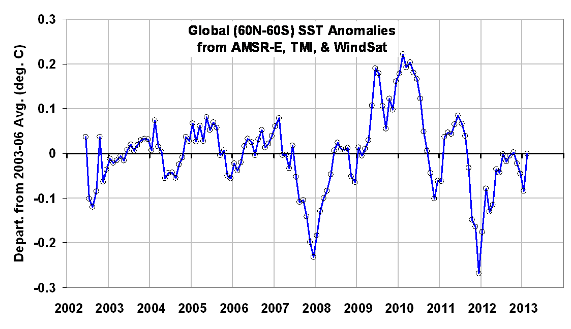
The anomalies are computed relative to only 2003-2006 because those years were relatively free of El Nino and La Nina activity, which if included would cause temperature anomaly artifacts in other years. Thus, these anomalies cannot be directly compared to, say, the Reynolds anomalies which extend back to the early 1980s. Nevertheless, they should be useful for monitoring signs of ocean surface warming, which appears to have stalled since at least the early 2000′s. (For those who also track our lower tropospheric temperature [“LT”] anomalies, these SST anomalies average about 0.19 deg. C cooler over 2003-2006.)
The SST retrievals come from Remote Sensing Systems (RSS), and are based upon passive microwave observations of the ocean surface from AMSR-E on NASA’s Aqua satellite, the TRMM satellite Microwave Imager (TMI), and WindSat. While TMI has operated continuously through the time period (but only over the tropics and subtropics), AMSR-E stopped nominal operation in October 2011, after which Remote Sensing Systems patched in SST data from WindSat. The various satellite datasets have been carefully intercalibrated by RSS.
Despite the relatively short period of record, I consider this dataset to be the most accurate depiction of SST variability over the last 10+ years due to these instruments’ relative insensitivity to contamination by clouds and aerosols at 6.9 GHz and 10.7 GHz.
This is encouraging. The alarmists have ramped up their hysteria lately and even the most devout skeptics must be feeling a trifle challenged. These UAH and SST anomalies show that we’re not such damfools after all.
We’re not skeptics because we want to be difficult, we’re skeptics because we don’t believe in pink unicorns, alien abductions and climate models.
It would appear that January was a bit of an anomaly then… an outlier as it were.
And as I always provide at this time, here’s a link to the preliminary sea surface temperature update for February 2013:
http://bobtisdale.wordpress.com/2013/03/04/preliminary-february-2013-sea-surface-temperature-anomaly-update/
The full update will be posted next Monday.
“Encouraging” for skeptics is data that backs their position. All else needs to be questioned as “unreliable” (like the Jan figures were because they were up).
Its one months data, consistent with short term variations and it shows a +0.18C anomaly cf the 1981-2010 mean for satellite sensing of the lower troposphere.
Look at the 13 month running mean – far more instructive.
Mr Abbott,
Has the lower troposphere warmed in the last 16 years?
That too is instructive.
Clearly, this temperature plot is like looking at brownian motion around a fixed point.
Adding estimated error bars of +/- one degree swamps the “signal”
The SST y-axis is almost 3 times more sensitive than the UAH anomaly.
Increase the Y-axis range by a factor of 10 and you will get a better picture of the real global trend.
For example, the following plot is an example of a realistic global trend line.
http://www.woodfortrees.org/plot/best/to:1980/plot/rss-land/plot/uah-land
If real ocean temps were shown on the same scale, then you would see a flat line.
However, real global SSTs were not measured before the recent technologoy explosion. Even today I would be sceptical of any claim of precise SST measurements on a global scale.
If anyone with any engineering experience regarding signal/noise ratios looked at these charts, they would give a similar response. No trend, or a trend of zero slope.
Here are some trend figures for different time periods, for the current UAH LT data. Not much to write home about warming-wise, until you go back 20 years. The 20-year starting point was during the Pinatubo cooling. Expect the 20-year figure to fall over the next couple of years as the Pinatubo effect (1992-94) drops out of the 20-year window.
Degrees C per decade:
20-year 0.149
18-year 0.094
17-year 0.089
16-year 0.057
15-year 0.016
14-year 0.111
13-year 0.069
12-year -0.004
11-year -0.034
10-year -0.009
bw,
Here is a chart showing a normal y-axis. Not so scary, eh?
@bw
Your line reminds me of this one by Grotch:
http://enthusiasmscepticismscience.wordpress.com/global-temperature-graphs/slgrotchafterlindzen/
Lindzen used it in a lecture once and then compared gmt to daily variations here as the straight red line:
http://enthusiasmscepticismscience.wordpress.com/global-temperature-graphs/lindzendailylocalglobalannualcomparison/
James Abbott is quite correct. We should not take individual months or even years as indicative of overall trends. Unfortunately that is exactly what happens here in Australia as our chief climate commissioner, Tim Flannery, tries his best to keep the lie alive. Hottest summer screamed the BoM but overlooked the blocking high which caused much of the hot weather. After Tim told us we would have a permanent drought we have had three years of rain, rain which according to Tim would not fill our dams because the soil would be too hot. So James the warmists are very adept at using one-offs to “prove” their point. BTW the running average since 1998 looks pretty flat and according to the alarmists that wasn’t an option back in the 90s and earlt 2000s.
What are the +/- values of the statistical and systematic errors on the processed data points?
007 says:
March 4, 2013 at 4:10 pm
Mr Abbott,
Has the lower troposphere warmed in the last 16 years?
That too is instructive.
Er – yes – the plot clearly shows warming. Not a lot, but warming. As others have said it depends on the margins of error, but that why I said look at the running mean which smooths the monthly variations.
BTW the debate on whether the US has had its hottest month/year
http://wattsupwiththat.com/2013/03/03/a-note-about-temperatures/
can now turn to Australia:
The Bureau of Meteorology has confirmed the three summer months ending February 28 were the hottest season ever recorded in Australia, leading the government’s Climate Commission to label it the “Angry Summer” in a new report. “The Australian summer over 2012 and 2013 has been defined by extreme weather events across much of the continent, including record-breaking heat, severe bushfires, extreme rainfall and damaging flooding,” the report said.
Australia experienced its hottest ever average national maximum temperature on January 7 of 40.30 degrees Celsius (104.5 Fahrenheit), while 44 sites, including Sydney and Hobart, recorded all-time high temperatures in the summer. The report said there have only been 21 days in 102 years where the average maximum temperature for the whole of Australia has exceeded 39 Celsius and eight of these happened in the summer just gone.
GlynnMhor says:
March 4, 2013 at 3:39 pm
Strange–the region where I live saw record-setting low temperatures for the month of January. Apparently they’re throwing those away as outliers. And February was warmer than normal–those they probably kept. Obviously where I live is out-of-kilter with the rest of the world.
The head of the Australian Climate Commission Prof Tim Flannery also says….
“90 per cent of the heat that is trapped by the greenhouse gases goes into the ocean, and you look at the whole of the Earth, we’re seeing a very strong warming trend. The atmosphere, you know, it’s a very volatile organ of the planet. Sometimes we get cooler average temperatures, sometimes warmer, it bounces around a little bit on the graph. And you can pick any period in that to show anything you want. But if you look at the whole Earth system, you can see that strong warming trend. And indeed, if you look at the atmospheric record for a long enough period, you see exactly the same trend.”
Flannery is flogging a disgracefully alarmist report on Australia’s “Angry Summer” to account for his previous dud prediction that global warming would stop rivers from flooding and dams from filling. He is clearly spending most of his time in Lala land.
There was a lot of unusual up and down cycles in the last 3 months, (well, not unusual but they lasted just long enough to affect the monthly average numbers in unusual ways).
We are in a general slight cooling trend right now as we transition from the impacts of a small El Nino last summer and fall to a small La Nina right now with the overall ocean cooling slightly.
braddles says (March 4, 2013 at 4:15 pm)
The 20-year starting point was during the Pinatubo cooling. Expect the 20-year figure to fall over the next couple of years as the Pinatubo effect (1992-94) drops out of the 20-year window.
——
Or: Expect the 20-year figure to be cited by the alarmists over the next couple of years until the Pinatubo effect (1992-94) drops out of the 20-year window. Then they’ll cite something else.
@ Abbott……
Your Australian example is junk science/propaganda…the Australian Trick?
According to JoNova,
“the brutally simple average of all the temperatures recorded at 721 weather stations on Jan 7th was 35.1C, not 40.3C. The extra 5 degrees is produced by a form of area weighting to average the thermometers over the entire nation.”….”the average of the hottest 339 stations is 40.3C.”
Apparently the data and methods used by the Australian Bureau are new for this year and not available for inspection. And surprise, we get a bunch of new records this year…..sarc/.
http://joannenova.com.au/
That’s the trouble with BoM, it insists on weighting to average over the entire continent. If it didn’t do that or if they recognised the blocking high and took that two weeks out of the equation, the summer wouldn’t have looked nearly as hot. It’s just fiddling with the data.
Anyway from the look of the chart we are entering a cold phase. Given the arctic ice recovered this past few months, the next few years will start getting really cold before the world ices up again.
The ocean temperature is as flat as the Earth the warmists live on.
Stealey says…
“bw, Here is a chart showing a normal y-axis. Not so scary, eh?”
-I say: stealing a trick from Mann – only showing data up to 2005!
Something to remember, although it might be fun to jam the current low month temperature in the maw of warmists, its meaningless to the question of whether the planet is still warming. The only way to confirm that is to run a linear regression. I find that most posts like this are just as interesting as the data personally. Up or down, its just a fun little data gathering exercise and to think it means anything beyond that and perhaps just irritating “believers in the end of the world via global warming” there is no other point to it.
Of course Abbot is a fool for trying to claim that a record high (for the month, year, decade or whatever) in Australia means anything at all because frankly to even interject something that stupid in a discussion of measurements shows that SOMEONE has zero understanding of statistics and is either ignorant, or is purposely trying to mislead people into actually believing that the world is still warming when Dr. Jones told us otherwise.
In statistics speak, stating that the record high temperature was reached is as interesting as saying that bears #*$& in the woods. Well no duh. But its not interesting at all to the discussion on say Feb. 2013 anomolies and as such Abbot betrays his ignorance at statistics simply by posting here and stating that.
Whether the planet is currently warming or not can only be solved through linear regression on QUALITY DATA. We can argue for instance on whether 15 years is long enough or too long, or perhaps on whether the data is worth anything……. Otherwise, our planet stopped warming 15 years ago and it just freaks people out to no end to hear that they were wrong all along. How else can you explain so many trolls thinking they know more then the actual facts? How else can you explain such a lack of understanding at statistics? Must be some sort of religious belief that people believe CO2 changes the weather and/or climate depending on whether we had a bad weather experience or not recently. Otherwise, remember folks, weather is not climate.
One metric of global warming is to look at how far back we can go with a negative temperature trend. I’ll use data to the end of January 2013. That’s the latest month available for all datasets, and I want to make this an apples-to-apples comparison. The various datasets, and their longest cooling trends back from January 2013 are…
RSS – January 1997 to January 2013
Hadley v3 – April 1997 to January 2013
Hadley v4 – November 2000 to January 2013
NOAA – December 2000 to January 2013
GISS – May 2001 to January 2013
UAH – September 2008 to January 2013 (also September 2008 to February 2013)
The UAH dataset seems to be a warm outlier amongst the major global sets.
thelastdemocrat,
I say: I provided a link to that chart, I didn’t make the chart. If you can find one that goes to 2012 or 2013, post it here. You will find that the flat y-axis looks the same as pre-2007. Global temp is still ≈14ºC.
Anthony,
While reading the weather report for the mid atlantic states one meterologist is comparing the characteristics of storm predicted this week to a “similar” storm in 1962 which devistated the Coast line (40 foot offshore waves) and dumped massive snow inland. I personally remember the difficulty of traveling into Phila to complete a final exam.
This link, For those who are hawking climate change and severe storms, destroys the claim that the recent hurricane Sandy proves climate change.
http://www.accuweather.com/en/weather-news/storm-next-week-could-look-lik/7172141
“No two storms are ever exactly alike, and the case with the storm on the East Coast in March 6-7, 2013, will be no exception to this rule. However, there may be similarities to other storms over the past and particularly one that occurred in 1962 on the same date.
The Ash Wednesday Storm, as it was called, caused everything from feet of snow to high winds and extensive coastal flooding.
The storm which formed on February 5, 1962, stalled along the mid-Atlantic coast and blasted areas with heavy precipitation, gales and storm surge for days. Over 40 people were killed, over 1,000 others were injured and damage reached $200 million 1962 dollars.
Chief Meteorologist Elliot Abrams and the majority of AccuWeather.com meteorologists concur that the storm of 1962 and the storm during the middle of this week bear similarities on the historical weather maps.”
“The storm of 1962 caused extensive damage to boardwalks and beaches and flooding in communities from North Carolina to Long Island with beach erosion as far north as Maine.
According to the National Oceanic and Atmospheric Administration (NOAA), during the Ash Wednesday Storm of 1962, part of Steel Pier at Atlantic City, N.J., was destroyed and NASA’s Wallops Island facility sustained extensive damage. Chincoteague and Assateague islands were completely submerged. Winds reached 70 mph and offshore seas approached 40 feet. Two feet of snow fell from Charlottesville to Winchester, Va., with 18 inches of snow falling as far north as the middle of Pennsylvania. Snow fell as far south as Alabama.”
“The keys to the storm for this week in terms of impact are how strong it becomes, how long it lingers along the mid-Atlantic coast and so being how far north it turns.”
If they would just stop building the windmills, my anger might lessen.
Until then, I view it as bureaucracy out of control.
My rants emanate from this simple ideal.
Really need to start seeing some negative numbers….
They are all anomalies 🙂
Not read all the comments but bw was right. Nothing worthy of comment really. No slope, no trend, nothing.
DaveE.
maybe these “entities” in Calif are getting a clue:
California cancels CO2 permit sale amid no demand
SAN FRANCISCO, March 4 (Reuters Point Carbon) – The California Air Resources Board (ARB) on Friday said that since no covered entities have signaled their intent to purchase high-priced allowances from the state’s reserve, the March 8 sale has been cancelled…
http://www.pointcarbon.com/news/1.2206612?&ref=searchlist
Qalter Dnes says:
March 4, 2013 at 5:38 pm
Hadley v3 – April 1997 to January 2013
UAH – September 2008 to January 2013 (also September 2008 to February 2013)
Would you happen to have the slope for Hadley3? (WFT only goes to November and SkS only goes to December.) Thanks!
As for UAH, WFT says the slope = -0.000609524 per year from July 2008 to January 2013. Am I missing something?
http://www.woodfortrees.org/plot/uah/from:2008.5/plot/uah/from:2008.5/trend
In reply to:
MattN says:
March 4, 2013 at 6:17 pm
Really need to start seeing some negative numbers….
William:
The extreme AGW paradigm gig is up if there is planetary cooling. It will be interesting to listen to the extreme AGW paradigm pushers’ fabrications to explain global cooling.
Past climate cycles correlate with solar magnetic cycle changes. The paleoclimatic record shows there is a 10 to 12 year delay in planetary cooling when the sun changes from a series of very active solar magnetic cycles to a Maunder minimum set of cycles. The sun appears to be rapidly moving to a Maunder minimum. There appears to be early observational evidence of global cooling.
The extreme AGW paradigm pushers appear to have painted themselves into a corner with comments that the time to discuss AGW science is over. The AGW climate science is settled. Scientists that do not support the extreme AGW paradigm are “deniers”.
For example David Suzuki.
http://www.davidsuzuki.org/issues/climate-change/science/climate-change-basics/climate-change-deniers/
David Suzuki
“The debate is over about whether or not climate change is real (William: Suzuki defines the debate to be about climate change, not climate sensitivity to forcing changes, to avoid discussion observations and analysis that does not support the extreme AGW movements agenda which is to reverse industrial development. The climate debate is about the magnitude of the future warming, as current warming is roughly half of what was predicted and has stalled. The debate is also about the IPCC general circulation models that assume the planet amplifies warming which is not correct as satellite analysis of top of the atmosphere radiation vs ocean temperatures indicates the planet resist warming by increasing or decreasing clouds in the tropics).
Irrefutable evidence from around the world—including extreme weather events, record temperatures, retreating glaciers and rising sea levels—all point to the fact that climate change is happening now and at rates much faster than previously thought. (William: Suzuki does not provide facts to support his statements. Actual planetary temperature data indicates the warming has stopped. The IPCC models predict continued warming as atmospheric CO2 increases.)
http://www-eaps.mit.edu/faculty/lindzen/236-Lindzen-Choi-2011.pdf
“On the Observational Determination of Climate Sensitivity and Its Implications
We estimate climate sensitivity from observations, using the deseasonalized fluctuations in sea surface temperatures (SSTs) and the concurrent fluctuations in the top-of-atmosphere (TOA) outgoing radiation from the ERBE (1985-1999) and CERES (2000-2008) satellite instruments. Distinct periods of warming and cooling in the SSTs were used to evaluate feedbacks. An earlier study (Lindzen and Choi, 2009) was subject to significant criticisms. The present paper is an expansion of the earlier paper where the various criticisms are taken into account. ….
….we show that simple regression methods used by several existing papers generally exaggerate positive feedbacks and even show positive feedbacks when actual feedbacks are negative. We argue that feedbacks are largely concentrated in the tropics, and the tropical feedbacks can be adjusted to account for their impact on the globe as a whole. Indeed, we show that including all CERES data (not just from the tropics) leads to results similar to what are obtained for the tropics alone – though with more noise.
… We again find that the outgoing radiation resulting from SST fluctuations exceeds the zerofeedback response thus implying negative feedback. In contrast to this, the calculated TOA outgoing radiation fluxes from 11 atmospheric models forced by the observed SST are less than the zerofeedback response, consistent with the positive feedbacks that characterize these models. The results imply that the models are exaggerating climate sensitivity.”
….However, warming from a doubling of CO2 would only be about 1C (based on simple calculations where the radiation altitude and the Planck temperature depend on wavelength in accordance with the attenuation coefficients of wellmixed CO2 molecules; a doubling of any concentration in ppmv produces the same warming because of the logarithmic dependence of CO2’s absorption on the amount of CO2) (IPCC, 2007). This modest warming is much less than current climate models suggest for a doubling of CO2. Models predict warming of from 1.5C to 5C and even more for a doubling of CO2. Model predictions depend on the ‘feedback’ within models from the more important greenhouse substances, water vapor and clouds….
http://www.spiegel.de/international/world/0,1518,662092,00.html
“Even though the temperature standstill probably has no effect on the long-term warming trend, it does raise doubts about the predictive value of climate models, and it is also a political issue. For months, climate change skeptics have been gloating over the findings on their Internet forums. This has prompted many a climatologist to treat the temperature data in public with a sense of shame, thereby damaging their own credibility.
“It cannot be denied that this is one of the hottest issues in the scientific community,” says Jochem Marotzke, director of the Max Planck Institute for Meteorology in Hamburg. “We don’t really know why this stagnation is taking place at this point.”
Just a few weeks ago, Britain’s Hadley Centre for Climate Prediction and Research added more fuel to the fire with its latest calculations of global average temperatures. According to the Hadley figures, the world grew warmer by 0.07 degrees Celsius from 1999 to 2008 and not by the 0.2 degrees Celsius assumed by the United Nations Intergovernmental Panel on Climate Change. And, say the British experts, when their figure is adjusted for two naturally occurring climate phenomena, El Niño and La Niña, the resulting temperature trend is reduced to 0.0 degrees Celsius — in other words, a standstill.”
http://www.forbes.com/sites/warrenmeyer/2012/02/09/understanding-the-global-warming-debate/
“The problem for global warming supporters is they actually need for past warming from CO2 to be higher than 0.7C. If the IPCC is correct that based on their high-feedback models we should expect to see 3C of warming per doubling of CO2, looking backwards this means we should already have seen about 1.5C of CO2-driven warming based on past CO2 increases. But no matter how uncertain our measurements, it’s clear we have seen nothing like this kind of temperature rise. Past warming has in fact been more consistent with low or even negative feedback assumptions.”
March 4, 2013 at 4:29 pm | James Abbott says:
“[ … ] can now turn to Australia:
The Bureau of Meteorology has confirmed the three summer months ending February 28 were the hottest season ever recorded in Australia, leading the government’s Climate Commission to label it the “Angry Summer” in a new report. “The Australian summer over 2012 and 2013 has been defined by extreme weather events across much of the continent, including record-breaking heat, severe bushfires, extreme rainfall and damaging flooding,” the report said.
Australia experienced its hottest ever average national maximum temperature on January 7 of 40.30 degrees Celsius (104.5 Fahrenheit), while 44 sites, including Sydney and Hobart, recorded all-time high temperatures in the summer. The report said there have only been 21 days in 102 years where the average maximum temperature for the whole of Australia has exceeded 39 Celsius and eight of these happened in the summer just gone.”
————————
Bollocks … you may like to refer to the response here:
This summer the Bureau of Meteorology (BOM) invented a whole new metric to measure average national heat, which might be all very well except no-one (other than the BOM) seems to know what it is.
On January 7th the BOM claimed Australia set a new “average maximum daily temperature record”. Now the headlines are about the “hottest” Australian summer.
With both records, no one outside the BOM team has access to the methods or data. This post is about the new “daily” temperature of Australia used to declare Jan 7th was a record, but the same point applies to the “hottest summer” records, even though they may be a different data set. Where is the data? Where are the methods?
Is the BOM a science agency or a PR bureau?
Source: http://joannenova.com.au/2013/03/mystery-black-box-method-used-to-make-all-new-australian-hottest-ever-records/
James Abbott says:
March 4, 2013 at 4:01 pm
“Encouraging” for skeptics is data that backs their position.
I don’t have a position other than “I don’t like the warmists’ methods.” Skeptics have shown ALL of the methods to be suspect, from the simple (types of thermometers used in gathering data) to the difficult (all things feedback-oriented), and everything in-between (models).
Since all of the above is in question, the conclusions are a joke, scientifically speaking. It’s not science at all. The skeptic position is “Follow the scientific method.” Therefore, in this article, the only thing to check is “Did Spencer report the data properly?” I think that’s pretty simple, lol.
One of the unknown pluses about the climate debate is the increased knowledge of science [see the above comments]. I was trained as an engineer but was a salesman most of my life. Ordinary people posting on WUWT completely lose me with their knowledge and mathamatics. My bad!
“It would appear that January was a bit of an anomaly then… an outlier as it were.”
Not so if you factor in the long-term trend. There are plenty of excursions from the trend line of similar magnitude (both warm and cool)
http://www.woodfortrees.org/plot/uah/plot/uah/from:1979/to:2013/trend
The largest outliers on record occurred in 1998, whether or not the trend is factored. And yet 1998 (or 1997) is often used as a start date for temp trends. I wonder why that is.
Would it be possible for an Australian to submit a FOIA request for their BOM’s new methodology?
“And yet 1998 (or 1997) is often used as a start date for temp trends. I wonder why that is.”
That was an extremely strong El Nino period. However, it was followed, almost immediately, by a 2 year period of La Nina. The La Nina wasn’t as strong as the El Nino, but because it was more than twice as long, it’s effect on the trend was almost equal to the El Nino. Take a look at this table.
http://www.cpc.ncep.noaa.gov/products/analysis_monitoring/ensostuff/ensoyears.shtml
So basically, the effects on the trend of the first El Nino plus the first La Nina period is virtually nil. This basically means that the argument that people pick 97/98 as a starting point may have merit in terms of the motivation, but it has no merit in terms of the effect on the trend. In other words, selecting Jan 98 as your starting point gives a true picture of the trend from that time to the present. This has also been confirmed by people who have ENSO filtered the data before calculating the trend line. The ENSO filtered line has a virtually identical slope to a non ENSO filtered data set.
Bottom line is that there has been no real warming for 15 years.
FOIA has been submitted but they claim they will release it as a peer reviewed paper in the near future.
James Abbott says:
March 4, 2013 at 4:29 pm
Whether or not Oz is having it’s Anthropogenic measured late Holocene whatever thermal excursion I am just having a hard time qualifying this as anomolous as regards typical end-extreme-interglacial norms.
Granted, sea levels are not the same everywhere, but if at the end of the last interglacial, the Eemian, or MIS-5e, sea levels estimated at many places around the globe indicate that temps/sea levels exceeded the late Holocene’s AR4 estimate of +0.59M by one or almost two orders of magnitude….
http://www.uow.edu.au/business/content/groups/public/@web/@sci/@eesc/documents/doc/uow045009.pdf
http://lin.irk.ru/pdf/6696.pdf
…..then I need to understand why the present warming is in any way anomolous.
Without delving at all into what constitutes “anomalous”, we should at least be able to agree that at the very least it has to be more than what tends to happen anyway at an end extreme interglacial……..
And then there is MIS-11, the last time gaia was also at an end-extreme interglacial during an eccentricity minima:
http://si-pddr.si.edu/jspui/bitstream/10088/7516/1/vz_Olson_and_hearty_a_sustained_21m_sea-level_highstand_during_mis_1.pdf
Which brings to mind:
http://www.clim-past.net/6/131/2010/cp-6-131-2010.pdf
Just sayin
“The Bureau of Meteorology has confirmed the three summer months ending February 28 were the hottest season ever recorded in Australia, leading the government’s Climate Commission to label it the “Angry Summer” in a new report.”
And apart from the BOM cooking up a brand you ‘secret weathermen’s business’ metric to conveniently throw out there in the Federal election year ether (yes or no to the carbon tax), you all need to bear in mind the First Fleet rolled up at Sydney Cove in 1788. It was a struggle not to starve for some years before more melanin deprived folks with the odd thermometer began to follow in their path. But let the official Austn Bureau of Statistics 2005 Yearbook take up the tale-
“The Stevenson screen was first introduced to Australia in the 1880s and was installed everywhere, with a few exceptions, by 1910. Prior to this date, thermometers were located in various types of shelter, as well as under verandas and even in unheated rooms indoors. Because of this lack of standardisation, many pre-1910 temperatures in Australia are not strictly comparable with those measured after that date, and therefore must be used with care in analyses of climate change within Australia.”
Now down under the true believers in global warming/climate change/climate disruption/extreme weather have another interesting statistical correlation, namely with a strong belief that the original inhabitants, being much closer to Gaia than themselves, are the font of all wisdom in such matters for the many tens of thousands of years they were here first. That is until they want to talk hysterically about reliable thermometer results and then the statistical correlation totally vanishes into thin air. Something to do with tipping points I’d imagine but the more staistically adept among you could perhaps explain it.
While we here in Australia have to endure the rantings from Flannery and the latest rubbish, sorry report, from the BOM about the “hottest summer evah”, we are now being subjected to the claims that the start of our autumn is looking to be “the hottest evah!” There are comments at the Jo Nava link that completely demolishes the BOM report specifically around weather stations. And if you go to the BOM website and check out station localtion you will notice that most are sites at town/city centres and at airports. Well, if the BOM can “fiddle” with temperature data from NIWA in New Zealand, why not “fiddle” with their own?
D.B. Stealey says:
March 4, 2013 at 4:18 pm
Here is a chart showing a normal y-axis. Not so scary, eh?
—–
Plot that again using zero kelvin as the start of the Y axis on the same graph size and see what that reveals. Why do we look at the top of the graph and blow that line up 1000 times to show the wiggle?
oldfossil says: “This is encouraging. The alarmists have ramped up their hysteria lately”
But it is no longer aimed at us but a last desperate attempt to persuade the lukewarmers who are ignoring them in their droves.
We are better off with the cats doing their thing. Might stay warmer and prevent things like this from happening. It was the cold that got them.
http://www.bbc.co.uk/news/world-asia-21657589
I always thought that degrees Celsius are anomalies with respect to zero Celsius and degrees Fahrenheit anomalies with respect to zero Fahrenheit. Any base line is as good as the base lines from these two gentlemen. For what reason do weather men talk about anomalies and the rest of the world about deviation scores? Do I miss a very profound and interesting story?
The ocean temp fall has caused south east Australia to warm up HA HA http://www.weatherzone.com.au/news/regions-weather-changing/23918
Werner Brozek says:
March 4, 2013 at 7:27 pm
> Qalter Dnes says:
> March 4, 2013 at 5:38 pm
Gack; I can’t even spell my own name right. Q and W are next to each other on the keyboard.
> Hadley v3 – April 1997 to January 2013
>
> UAH – September 2008 to January 2013 (also September 2008 to February 2013)
>
> Would you happen to have the slope for Hadley3? (WFT only goes to November
> and SkS only goes to December.) Thanks!
First of all, Hadley 3 has always had 2 outputs. I prefer the one at http://hadobs.metoffice.com/hadcrut3/diagnostics/global/nh+sh/monthly h*t*t*p*:*/*/*hadobs.metoffice.com/hadcrut3/diagnostics/global/nh+sh/monthly (remove the asterisks to get the real URL). This one has one month per row, so I don’t have to feed it through a shell script to reformat it to plottable CSV data. And it always comes out earlier than the other version (12 months across a row). See http://www.metoffice.gov.uk/hadobs/hadcrut3/diagnostics/time-series.html for the format of the data. Anyhow, the value I get is -0.000251 per year Apr 1997 to Jan 2013.
> As for UAH, WFT says the slope = -0.000609524 per year from July 2008 to
> January 2013. Am I missing something?
> http://www.woodfortrees.org/plot/uah/from:2008.5/plot/uah/from:2008.5/trend
I use the dataset at http://vortex.nsstc.uah.edu/public/msu/t2lt/tltglhmam_5.5 plus I throw in any changes from the posting at Dr. Spencer’s blog at http://www.drroyspencer.com/category/blogarticle/ The UAH EDU site is usually updated a few days after the blog article.
I get Sept 2008 value as -0.005
There’s another version of the file at http://vortex.nsstc.uah.edu/data/msu/t2lt/uahncdc.lt which only goes to 2 decimals. I wonder if WFT is using that one.
William McClenney says:
Which brings to mind:
http://www.clim-past.net/6/131/2010/cp-6-131-2010.pdf
Wow, that’s an interesting link! The similarity to MIS-19 is intriguing. So we may be at the last peak of the Holocene now – before us lie 9000 years of gradual cooling until the next glaciation is upon us. That should be enough time to colonize a friendlier planet if we just stop fooling around with non working AGW “solutions” and other silliness and start making Great Plans again 🙂
D.B. Stealey says:
March 4, 2013 at 4:18 pm
bw, Here is a chart showing a normal y-axis. Not so scary, eh?
Why don’t you use the Kelvin scale. That would make it look even less scary. Mind even a 5 deg departure on the Kelvin scale wouldn’t look too alarming but, as we all know, a 5 deg drop in global average temperatures is enough to cause mile high ice sheets to form across much of the UK.
Rhoda Answer = No way! Australia is a dictatorship run by a tiny politically correct minority who have destroyed the higher education system so you now get guys like Flannery and landwosky ect. BOM will never release the data if they do they will”adjust it” to show hotter than ever
James Abbott posted: “The report said there have only been 21 days in 102 years where the average maximum temperature for the whole of Australia has exceeded 39 Celsius …”
RichardD posted: “the brutally simple average of all the temperatures recorded at 721 weather stations on Jan 7th …
SamC would like to know: How many certified weather stations were there in Australia in 1911 and exactly who was calculating the “1911 daily average maximum temperatures for the whole of Australia”?
Or in 1912, … or 1913, …. or 1914, …. etc.
Using a few dozen highly questionable “daily temperature records” from the early part of the 20th Century, …. that were obtained via use of simple, un-calibrated thermometers at randomly selected “locations”, ….. then extrapolating said data to obtain a “daily average maximum temperatures for the whole of Australia” ….. and then comparing those “fuzzy” results to the calculated results from the less questionable seven hundred twenty one (721) 21st Century weather stations ……. is both silly and asinine.
A warmer climate with higher CO2 is a desired outcome for world food production and living conditions. We really do not want to return to LIA temperatures or CO2 levels.
Without responding to all the replies to my posting individually, just as a gentle reminder I said
“BTW the debate on whether the US has had its hottest month/year
http://wattsupwiththat.com/2013/03/03/a-note-about-temperatures/
can now turn to Australia:”
ie all I said was – have a look at this.
But it had the effect in starting a debate and as would be expected, the main aim from skeptics is to shoot down any data or report which does not fit with their mind set.
The January satellite anomaly gets branded an “outlier” whilst the February figure is “encouraging” and a “big drop in temperature”.
If I had posted a report saying that a given continent had had its coolest summer on record, I have no doubt at all that most skeptics would, without questioning the data, have lapped it up.
The point is that the debate between convinced skeptics and convinced warmists is all about selecting data to suit – which is about as scientific as choosing which doughnuts you like.
It’s not the trend that’s the problem, it’s the lack of statistically significant warming in 15+ years. The reason why these years are important is because of what it tells us about the predictive skil or lack thereof of the models. See below:
I think we are now on 16 years and at 100% level of confidence. 😉
Here’s another that states 17 years. If we pass this then it’s poooooof!
https://www.llnl.gov/news/newsreleases/2011/Nov/NR-11-11-03.html
There’s quite a bit about Flannery on this thread. Well here is Dr. Tim Flannery in a 2007 interview.
Let’s see how this prediction turned out eh.
Jan 2008
Australian Floodwaters Threaten Previously Drought-Struck Towns
Feb 2009
Crocodile risk in Australia flood
Dec 2010
ACT dams full to overflowing
Jan 2011
Unprecedented, "Biblical" Floods Inundate Australia
Feb 2012
Floods create ‘inland sea’ in Australia
Apr 2012
It’s official: Australia no longer in drought
Feb 2013
Warragamba Dam overflows
Mar 2013
Australia invests $100 million in flood mitigation infrastructure
Where are all those mothballed desalination plants when you need them? During the next natural cycle I will ask where are all those flood mitigation structures? What these fools don’t understand is that Australia has always been a land of extremes.
@oldfossil,
read the truly excellent book: “the allagash abductions” by ray fowler.you might change your mind-maybe!
i don’t believe in pink unicorns or climate models though!
cheers,phil
Walter Dnes says:
March 5, 2013 at 1:56 am
Anyhow, the value I get is -0.000251 per year Apr 1997 to Jan 2013.
Thank you very much! Can you also give me the slope for March, 1997 to January 2013? Thanks!
wbrozek says:
March 5, 2013 at 9:36 am
> Thank you very much! Can you also give me the slope for March, 1997
> to January 2013? Thanks!
March 1997 to January 2013
Hadley v3 4.35E-05 i.e. 0.0000435
Hadley v4 0.00394
GISS 0.007472
UAH 0.00733
RSS -0.00124
NOAA 0.003775
I’ve paid for a webpage that I’m not using. I really should put up my spreadsheet there one of these days.
Note for wbrozek
Correction to UAH March/97 to January/13 data. That should be 0.007395; I gave the latest number (i.e. through February) from my spreadsheet. The other numbers are OK, because I don’t have February data for them yet.
Walter Dnes says:
March 5, 2013 at 10:39 am
Thank you very much! I will let you know why I asked. I do not know if you saw my article today. The latest information I had was from SkS from March to the end of December where the slope for Hadcrut3 was 0.000 +/-0.135 with the 0 line at 0.41. So when the January anomaly came in at 0.388, I thought it was a no brainer to conclude there was no warming since March. But they sort of threw a curve ball at me when their original December 2012 anomaly of 0.233 was changed to 0.257 when the January numbers came out. Then when you wrote about the April month, I questioned myself.
So the anomaly from April was -0.000251 and for March it was 0.0000435. So it seems to me that I missed it by only 5 or 6 days when I said the slope was negative since March (1).
I really wish WFT gets up to date!
thelastdemocrat has skedaddled, but someone just posted this chart.
Not so scary, is it?
In fact, the past century and a half has been one of the most benign times in the entire 10,700 year Holocene. It shows that the alarmist crowd are a bunch of blinkered fools, arm-waving over a tiny 0.8ºC temperature fluctuation.
Werner Brozek says:
March 5, 2013 at 11:33 am
> But they sort of threw a curve ball at me when their original December 2012
> anomaly of 0.233 was changed to 0.257 when the January numbers came out.
That prodded me to run the linux “diff” tool on the December/2012 versus January/2013 downloads. It’s not just December 2012. There are other differences for the year 2012. I attribute this to climate data coming in late, as well as corrections. A cynical observer would note that all 9 changes were upwards. At least the changes only went back to March 2012, which sounds reasonable. It’s not like GISS with numbers flip-flopping all the way back into the 19th century every month. Here are the values for the 2 downloads…
Month Dec2012 Jan2013
==============
2012/03 0.290 0.291
2012/04 0.499 0.499
2012/05 0.483 0.484
2012/06 0.482 0.483
2012/07 0.445 0.448
2012/08 0.513 0.514
2012/09 0.514 0.517
2012/10 0.499 0.500
2012/11 0.482 0.487
2012/12 0.233 0.257
Can I contact you offline to discuss this further?
Walter Dnes says:
March 5, 2013 at 1:22 pm
Can I contact you offline to discuss this further?
Sure! Just let the moderator know he has my permission to give you my email address.
Speaking of GISS, in January they made a whole bunch of changes including making the warmest month, January 2007, warmer from 0.89 to 0.93. You can still see the 0.89 on WFT.
Lightrain says:
March 4, 2013 at 11:26 pm
D.B. Stealey says:
March 4, 2013 at 4:18 pm
Here is a chart showing a normal y-axis. Not so scary, eh?
—–
Plot that again using zero kelvin as the start of the Y axis on the same graph size and see what that reveals. Why do we look at the top of the graph and blow that line up 1000 times to show the wiggle?
_________________________________________________________________
I take that as a rhetorical question ;;) but to give it a serious answer:
For the full explanation see “How To Lie With Charts” by Gerald E. Jones (Sybex 1995).
For the short version: Magnifying the wiggle exaggerates er ah accentuates its importance. Truncating the y axis just below the lowest point of wiggle makes it appear to be all there is and looks much more alarming.
All standard chartsmanship, nicht wahr?
Jimbo says:
March 5, 2013 at 7:57 am
It’s not the trend that’s the problem, it’s the lack of statistically significant warming in 15+ years. The reason why these years are important is because of what it tells us about the predictive skil or lack thereof of the models. See below:
Just playing devil’s advocate here but I’m not sure your assumptions are correct. If you want to invalidate the models you need to show that observations are significantly different to the model projections. As far as I can tell – they aren’t.
You cite this NOAA statement as justification for your assertion
Note that they refer to “ zero trends for intervals of 15 yr or more”. But there hasn’t been a ZERO trend for this length of period. There have been non-significant warming trends but that is not the same thing.
The error bars on the model projections probably do rule out the zero trend for intervals of more than 15 years but they probably do still include the observed warming (albeit non-significant) trend.
What this all means is that invalidating the models will take several more years (unless there is rapid cooling). The best you can hope for is to show that the probability that the models are simulating reality (i.e. the observations) is small (e.g. less than 10%). Unfortunately the same logic leads to the conclusion that there is only a small probability that warming has really stopped.
John Finn says:
March 5, 2013 at 4:30 pm
Note that they refer to “ zero trends for intervals of 15 yr or more”. But there hasn’t been a ZERO trend for this length of period.
Not with UAH. But RSS has just come out for February. The anomaly dropped from 0.442 to 0.194. As I said in my report, the 0.442 value ranked 3rd. The 0.194 value ranks 11th to put it into perspective. The average between these two is 0.318 and would rank 5th if it stayed this way.
As well, the longest time for a slope that is not positive goes up from 16 years and 1 month to 16 years and 2 months, going from January 1997 to February 2013. This is 194/204 = 95% of the way to Santer’s 17 years.
Tilo @ here
If ENSO alone was responsible for global temperatures, we would expect to have seen a clear decline in temperatures since 1997 (which includes all of the le Nino period). I calculated the lnear regression for the ENSO SST anomalies you linked to, from 1997 to December 2012.
The trend is -0.12C/decade.
For 1998 to December 2012;
The trend is 0.1C/decade.
That’s a pretty sizable difference for one year.
Doing things crudely, we could subtract the ENSO trend and a get a rough idea of what the surface temp record is for each period, if ENSO was factored out. Here are the trends with no ENSO adjustment.
1997 – 2012
GISS: 0.09C/decade
Had4: 0.04C/decade
RSS: -0.001C/decade
UAH: 0.09C/decade
Subtract the 97 – 12 ENSO trend and you get
GISS: 0.21C/decade
Had4: 0.16C/decade
RSS: 0.12C/decade
UAH: 0.21C/decade
For that period, accounting for the ENSO trend makes a significant difference. There has been much talk about the 97 trend, and this resukt might recommend some circumspection on straight global temp trends without factoring for internal variability.
But the 98 to 12 period is positive for ENSO (0.08C/decade). factoring ENSO, the results look like this:
1998 – 2012
GISS: -0.01C/decade
Had4: -0.05C/decade
RSS: -0.12C/decade
UAH: -0.03C/decade
(we haven’t factored solar, which would skew temps downwards for the period, as there is a peak in 2000, and very low activity in recent times, which has been covered at WUWT – http://sidc.oma.be/html/wolfmms.html)
While I am surprised by the ENSO trend since 98, what the difference with the 1997 trend tells me is that the period is too short for ENSO influences to be evened out.
Also to consider, there is a lag of several months between ENSO peaks and surface/tropospheric temps (also well-covered here). I ran a regression starting from the last 3 months of 97, to the 9th month of 2012 (to avoid any annual signal). the result was -0.08C/decade., which would more properly be consonant with global temperatures. This would make the 98 – 12 trends:
GISS: 0.15C/decade
Had4: 0.11C/decade
RSS: 0.04C/decade
UAH: 0.13C/decade.
In this crude analysis, those last are what I would call the real global temp trends after factoring out ENSO for the period 1998 to 2012. They’d be slightly higher if solar was factored (and the solar/temp lag also accounted for). Finally, the satellite data show higher peaks for ENSO events than the surface records, but this is too difficult for me factor.
The temp difference if I take of one year and only go up to 2011 (accounting for lag) would produce no significantly different result from the temp trends as they stand with no ENSO adjustment. One year less makes a trend difference for ENSO of 0.02C/decade (warmer). This is a trend difference of 0.1C (ENSO data) just from dropping a year. That’s significant, and reinforces the error of looking at a time period this short, or thinking that one year could not make much of a difference.
If you believe in Global WArming or Climate Change you have too much free time on your hands.lol Libturds enough of the Chicken Little the SKY is falling BS i look up in the SKY and i see crystal clean blue skies.Sky aint falling were i live.lol Global Temps have been fallen since 1998 and as far as Climate Change goes well DUH Climate always changes thats why we have 4 seasons and rain,snow,drought,hurricane,tornado’s find a New Pagan Cult Libturds
James Abbot replied: and as would be expected, the main aim from skeptics is to shoot down any data or report which does not fit with their mind set.
James Abbot, it is a perfectly normal, logical, reasonable, intelligent mindset that “shoots down” the “junk science” silliness of anyone claiming an associations, correlations and/or comparison between the extrapolated “average surface temperature” derived from the pre-1960 temperature Records ……. and the post-1960 calculated “surface temperature averages”
No one really cared about “average surface temperatures” until Charles Keeling started getting correct atmospheric CO2 ppm “counts” in 1958. And it was only after 1958 that the interested Climate Scientists had to “back-pedal” into those old Temperature Records and extrapolate out some reasonable sounding “temperature averages” to support their junk science “CO2 causing AGW” claims.
And PS, I am not a “skeptic” of CO2 causing AGW, ….. I am a “denier” of it, …. simply because it is not based in/on actual, factual science & mathematics, logical reasoning and/or intelligent deductions.
james Abbott says:
March 5, 2013 at 7:25 am
I’m with James here. There is far too much groupthink in the WUWT comments threads. The skeptic community can only stand to gain in credibility if we challenge assertions coming from all sides.
For example, look at the second chart presented by Dr. Roy Spencer above. It shows the Global SST anomaly, relative to the average for 2003-2006. But any anomaly will appear to be zero if we just choose the right base period.
I accept that Dr. Spencer’s intention here was not to mislead, but to display SST variability over the last decade. However, the factoid that will stick with the casual reader is the zero anomaly.
oldfossil says:
March 7, 2013 at 2:47 am
“The skeptic community can only stand to gain in credibility if we challenge assertions coming from all sides. For example, look at the second chart presented by Dr. Roy Spencer above. It shows the Global SST anomaly, relative to the average for 2003-2006.”
In reference to the content/context of the above comment, and not to the author of the comment, ….. it is my opinion, that any tit-for-tat challenging, arguments or discussions between AGW proponents and their skeptics that is related to or associated with the above cited chart by Spencer is, …. in actuality, …. much ado about nothing. Absolutely nothing of any value to anyone other than maybe a “feel good feeling” about their own importance.
Thus said, I would think that anyone in their right mind would be asking …. “Who the ell cares what those Global Average SST anomalies currently are or have been over the past 11 years”?
And if you don’t agree with my above assessment then, ….. while looking at the above cited graph of global average sea surface temperatures (SST) from July 2002 to Feb. 2013, …. pretend or imagine that it is now say Jan 2005 …. and then ask yourself just what challenges or arguments the above “comments thread” would contain?
Then do the same thing again for Jan 2008. Then again for Feb 2010. And again for Dec 2012.
And when you are all done, include the above Feb 2013 “comments thread” and then tell me, …. just what the ell has been accomplished, proven, disproved, justified, resolved, settled and/or factually confirmed ….. that is related to the “cause & effect” claims of CO2 causing Anthropogenic Global Warming climate change.
You might as well create a similar graph for the “passing yards gained” by one of the NFL Teams, …. between Jan 2002 and Jan 2013, …… and then get in a “heated” argument about how those past PYG “averages” are going to directly affect and/or determine the number of “passing yards gained” during their 2013 Fall Football Season.