Guest post b y Bob Tisdale
As we’ve seen in numerous model-data comparisons, there are few similarities between modeled and observed surface temperatures and precipitation. See here, here, here, here, and here for examples. We’ve compared satellite-era sea surface temperature to model outputs in past posts (examples here, here and here), but we used model outputs from climate models stored in the CMIP3 archive, which was prepared for the 2007 4th Assessment Report from the IPCC. In this post, we’re using the outputs of newer CMIP5 models, prepared for the IPCC’s upcoming 5th Assessment Report. Scenario RCP6.0 for the CMIP5 models is presented because it most closely matches the climate forcings of the scenario called SRES A1B, which was widely cited in the past.
Preliminary Note: We’re looking at the multi-model ensemble mean (the average of all of the individual simulations in the respective archives) because the model mean is the best representation of how the models are programmed and tuned to respond to man-made greenhouse gases. Phrased another way, if the sea surface temperatures were warmed by greenhouse gases, the multi-model mean presents how those sea surface temperatures would have warmed, according to the models. That’s what we’re interested in seeing. More on this later.
A QUICK LOOK AT THE DIFFERENCE BETWEEN CMIP3 AND CMIP5 OUTPUTS
In general, the multi-model mean of the CMIP5 simulations of global sea surface temperature anomalies have a slightly higher linear trend than the CMIP3 models. See Figure 1. The CMIP5 models have a stronger and more prolonged dip in response to the eruption of Mount Pinatubo in 1991. They also have a curious additional warming from 2000 to 2010 that almost appears to be an over-response, a kind of excessive rebound, from that volcano.

Figure 1
Two notes: First, now consider that the observed trend in global sea surface temperature anomalies is almost half the trend shown by the CMIP5 models. That’s a major difference, suggesting that researchers haven’t yet figured out how and why sea surface temperatures warm.
Second, when looking at the sea surface temperature outputs of climate models, keep in mind that different radiative forcings have different impacts on the oceans. First, let’s discuss downward shortwave radiation. It’s also known as visible sunlight and penetrating solar radiation, the latter because sunlight penetrates the oceans to depths of 100 meters, decreasing in strength with depth. The dips and rebounds seen in Figure 1, beginning in 1991, are caused by the sun-blocking aerosols spewed into the stratosphere during the explosive volcanic eruption of Mount Pinatubo. They are related to downward shortwave radiation. Downward shortwave radiation from the sun is not to be confused with downward longwave radiation, infrared radiation, from manmade greenhouse gases. Infrared radiation can only penetrate the top few millimeters of the ocean, and that’s where evaporation takes place, leading some oceanographers and physicists to believe that the increases in manmade greenhouse gases could not have caused the oceans to warm. The data supports that. In summary, the observed and modeled sea surface temperatures both show dips in responses to volcanic eruptions, which are responses to decreases in sunlight, but that doesn’t mean the modelers are correct in their assumptions that infrared radiation from greenhouse gases caused the warming of sea surface temperatures.
OCEAN BASIN TREND COMPARISONS ON A ZONAL-MEAN (LATITUDINAL) BASIS
Figures 2, 3 and 4 are model-data trend comparisons of sea surface temperature anomalies for the Pacific, Atlantic and Indian Oceans, respectively. But they aren’t time-series graphs. Looking from left to right along the horizontal (x) axis, “-90” represents the South Pole, “0” the equator, and the North Pole is at “90”. The units of the vertical (y) axis are degrees C per decade—based on the calculated linear trend. Each data point represents the linear trend in degrees C per decade for a 5 degree latitude band, where, for example, the data point at -82.5 (82.5S) latitude represents the linear trend of the latitudes of 85S-80S. The data points representing the trends then work northward in 5 degree increments, 80S-75S, 75S-70S, and so on, using the same longitudes. The average temperatures of latitude bands are called the “zonal mean” temperatures by climate scientists, hence the use of that term in the title blocks.
Figure 2 shows the observed and modeled sea surface temperature trends for the Pacific Ocean (longitudes of 125E-90W) on a zonal-mean basis. At and near the equator, observed sea surface temperatures cooled since November 1981, the start of the dataset. And the highest observed warming in both hemispheres occurred at the mid-latitudes of the Pacific.
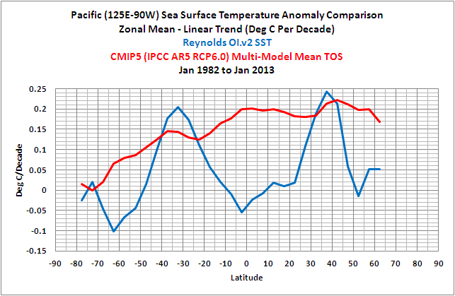
Figure 2
The observed warming trends at mid-latitudes, with no warming near the equator, suggest that warm water was distributed poleward by ocean currents. In the Pacific, that happens when El Niño events dominate, which was the case during this period, causing the excessive distribution of warm water toward those latitudes. Refer to this comparison of Pacific trends on a zonal-mean basis for the periods of 1944 to 1975 and 1976 to 2011. It’s Figure 8-32 from my ebook Who Turned on the Heat? From 1944 to 1975, El Nino and La Niña events were more evenly matched, but slightly weighted toward La Niña. During that period, less warm water was released from the tropical Pacific by El Niños and distributed toward the poles. But from 1976-2011, El Niño events dominated, so more warm tropical waters were distributed to the mid-latitudes.
In looking at the unrealistic trends presented by the models, consider that climate models do not simulate the processes of El Niño and La Niña properly. See the discussion of Guilyardi et al (2009) here.
To overcome those failings, the sea surface temperatures in climate models have to be forced by greenhouse gases to create very high warming trends in the tropics, where observations show little warming. Now consider that the Pacific Ocean stretches almost halfway around the globe at the equator and you’ll understand the magnitude of those failings.
Sunlight is intense in the tropics, and logically the sea surface temperatures (absolute) are warmest there. (That linked illustration is Figure 2.5 from Who Turned in the Heat?) And because sunlight is less intense at the poles, the sea surface temperatures are cold at high latitudes, to the point where the sea surface freezes at the poles. It almost appears as though the climate models show significant warming in the tropical Pacific over the past 31 years because the sea surface temperatures (absolute) are warm there.
Again on a zonal-mean basis, Figure 3 shows the modeled and observed trends in sea surface temperature anomalies for the Atlantic Ocean (longitudes 70W-20E). The models overestimate the warming in the South Atlantic and underestimate it North Atlantic, especially towards the high latitudes. In fact, the models show just about the same warming trends from 40S to 70N, while the trends of the observations change greatly over those latitudes.

Figure 3
The last trend comparison on a zonal-mean basis is for the Indian Ocean (20E-120E), Figure 4. Basically, the models show too much warming at most latitudes.

Figure 4
GLOBAL TIME–SERIES MODEL-DATA COMPARISON
Note: The base period for anomalies is 1971-2000, the standard at the NOAA NOMADS website for the Reynolds OI.v2 data.
For the rest of the model-data comparisons in this post, we’re resorting to standard time-series graphs for the monthly anomalies, with time in years as the x-axis and sea surface temperature anomalies in deg C as the y-axis.
As illustrated in Figure 5, the models inidicate that if greenhouse gases warmed sea surface temperatures, they should have warmed globally at a rate that’s almost twice the observed warming. In the Northern Hemisphere, Figure 6, the sea surface temperatures warmed faster due to multidecadal variations in the North Atlantic and North Pacific (Figure 10 from this post), so the models are exploiting the natural variations to acquire a better match. But the sea surface temperatures in the Southern Hemisphere warmed at a much lower rate, Figure 7, so the disparity there is much greater. Apparently, the modelers still have no idea how to simulate the warming of the oceans. This will be even more obvious in individual ocean basins that follow.

Figure 5 – Global

Figure 6 – Northern Hemisphere

Figure 7 – Southern Hemisphere
OCEAN BASINS AND OTHER SUBSETS
The following graphs present the comparisons for the individual ocean basins per hemisphere, and a couple of subsets related to El Niño-Southern Oscillation. They’re being provided without commentary. The coordinates are listed in the title blocks of the graphs.

Figure 8 – NINO3.4 Region

Figure 9 – East Pacific

Figure 10 – North Atlantic

Figure 11 – South Atlantic

Figure 12 – Pacific

Figure 13 – North Pacific
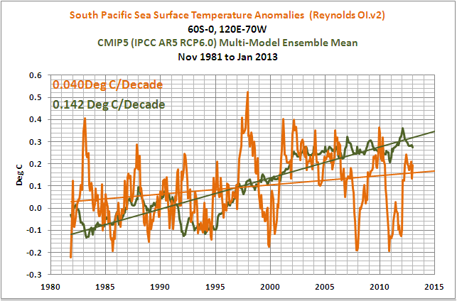
Figure 14 – South Pacific

Figure 15 – Indian

Figure 16 – Arctic

Figure 17 – Southern
MODEL-DATA TREND COMPARISON TABLE
Table 1 presents the observed and modeled linear trends for the sea surface temperature subsets presented in the post, for the period of November 1981 to January 2013. I’ve also included the differences between the modeled and observed trends and the differences as a percentage of the observed trends. [Difference as a Percentage of Observed = ((Model Trend – Obs. Trend)/Obs. Trend)*100]. Click on Table 1 for a full-sized version.

Table 1
CLOSING
About 70% of the planet Earth is covered by water: oceans, seas and lakes. As illustrated in this post, the manmade greenhouse gas-forced component (the multi-model mean) of the climate models prepared for the IPCC’s upcoming 5th Assessment Report shows no similarity to the warming of the sea surface temperatures exhibited by those oceans over the past 31 years. In other words, the models show no skill at being able to simulate the sea surface temperatures of the global oceans for the past 3+ decades—and since the start of the 20th Century, that’s the period when climate models perform at their best.
One of the biggest problems facing the climate science community is the fact that ocean heat content and satellite-era sea surface temperatures indicate the oceans warmed naturally. This was illustrated and discussed in detail in my essay titled “The Manmade Global Warming Challenge”. The introductory blog post is here and it can be downloaded here (42MB). This was also presented in my 2-part YouTube video series titled “The Natural Warming of the Global Oceans”. YouTube links: Part 1 and Part 2. And it was illustrated and discussed, in minute detail, in my ebook Who Turned on the Heat? which was introduced in the blog post “Everything Your Ever Wanted to Know about El Niño and La Niña”. Who Turned on the Heat? is available for sale only in pdf form here. Price US$8.00. Note: There’s no need to open a PayPal account. Simply scroll down to the “Don’t Have a PayPal Account” purchase option.
ON THE USE OF THE MODEL MEAN
We’ve published numerous posts that include model-data comparisons. If history repeats itself, proponents of manmade global warming will complain in comments that I’ve only presented the model mean in the above graphs and not the full ensemble. In an effort to suppress their need to complain once again, I’ve borrowed parts of the discussion from the post Blog Memo to John Hockenberry Regarding PBS Report “Climate of Doubt”.
The model mean provides the best representation of the manmade greenhouse gas-driven scenario—not the individual model runs, which contain noise created by the models. For this, I’ll provide two references:
The first is a comment made by Gavin Schmidt (climatologist and climate modeler at the NASA Goddard Institute for Space Studies—GISS). He is one of the contributors to the website RealClimate. The following quotes are from the thread of the RealClimate post Decadal predictions. At comment 49, dated 30 Sep 2009 at 6:18 AM, a blogger posed this question:
If a single simulation is not a good predictor of reality how can the average of many simulations, each of which is a poor predictor of reality, be a better predictor, or indeed claim to have any residual of reality?
Gavin Schmidt replied with a general discussion of models:
Any single realisation can be thought of as being made up of two components – a forced signal and a random realisation of the internal variability (‘noise’). By definition the random component will uncorrelated across different realisations and when you average together many examples you get the forced component (i.e. the ensemble mean).
To paraphrase Gavin Schmidt, we’re not interested in the random component (noise) inherent in the individual simulations; we’re interested in the forced component, which represents the modeler’s best guess of the effects of manmade greenhouse gases on the variable being simulated.
The quote by Gavin Schmidt is supported by a similar statement from the National Center for Atmospheric Research (NCAR). I’ve quoted the following in numerous blog posts and in my recently published ebook. Sometime over the past few months, NCAR elected to remove that educational webpage from its website. Luckily the Wayback Machine has a copy. NCAR wrote on that FAQ webpage that had been part of an introductory discussion about climate models (my boldface):
Averaging over a multi-member ensemble of model climate runs gives a measure of the average model response to the forcings imposed on the model. Unless you are interested in a particular ensemble member where the initial conditions make a difference in your work, averaging of several ensemble members will give you best representation of a scenario.
In summary, we are definitely not interested in the models’ internally created noise, and we are not interested in the results of individual responses of ensemble members to initial conditions. So, in the graphs, we exclude the visual noise of the individual ensemble members and present only the model mean, because the model mean is the best representation of how the models are programmed and tuned to respond to manmade greenhouse gases.
SOURCES
The Reynolds Optimally Interpolated Sea Surface Temperature Data are available through the NOAA National Operational Model Archive & Distribution System (NOMADS) website.
http://nomad3.ncep.noaa.gov/cgi-bin/pdisp_sst.sh
The CMIP5 Sea Surface Temperature simulation outputs (identified as TOS, assumedly for Temperature of the Ocean Surface) are available through the KNMI Climate Explorer Monthly CMIP5 scenario runs webpage.
Thanks, Anthony.
Was Figure 1 also supposed to show the ‘observed trends’? (or am I missing that?)
Thanks
The matches for the North Atlantic and the Arctic oceans aren’t too bad (the model mean is less “noisy” for then North Atlantic, but then it’s a mean after all). But I guess that’s simply because they’re the only ocean basins that are not climate change deniers? 😉
The Arctic Ocean graph is curious.
And, as usual, right on, Bob.
=======================
It’s interesting that the only oceans showing anything close to the models is the north Atlantic and the Arctic. Both of these are influenced by the currently warm AMO. And, this also perfectly explains the reduced sea ice in the Arctic.
If cAGW were true then most of the oceans should fit the model. The only warming oceans fits a well known oscillation. What’s more, most climate scientists SHOULD know this … raising questions about their honesty.
Richard M: The usual mantra is that AMO is effect and not cause of global warming (see e.g. a certain closed mind here ). But actually, I don’t think it matters whether AMO is an independent oscillation or just follows global temperature. What matters, IMHO, is the chart for the Pacific:
The whole idea of high climate sensitivity stands or falls by the models, and we would expect the models to at least get the Pacific Ocean right, wouldn’t we? After all it covers about a third of the earth’s surface! So I think Bob Tisdale’s Pacific graph here is good enough evidence that models are wrong. If climate science were a real science, the consequence should be to admit that climate modeling is basically a failure, and that the null hypothesis that climate sensitivity is ~1.2 C (what you get without feedbacks) still is our best guess. Or, in other words: Global warming is benign (and maybe even of net benefit).
S. Geiger says: “Was Figure 1 also supposed to show the ‘observed trends’?”
Nope. I wanted to isolate the simulations from the two archives first. The observations appear in Figure 5, and they confirm the comment “now consider that the observed trend in global sea surface temperature anomalies is almost half the trend shown by the CMIP5 models” after Figure 1. Maybe I should have added a note there to see Figure 5.
Regards
Great synopsis of the latest and greatest models. We’ll probably have to live with these for some time. I wonder how much we paid for them.
Models I’ve written for complex systems have been stochastic or determinate. When any part of the system can’t be described mathematically, I can use empirical data to create a model that is system-like, but has little or no validity overall. It may emulate the actual system over short durations, but the empirical data itself introduces an element of randomness in that it represents the system’s response over a relatively short selected period. Unless the entire system is well understood, no number of ensembles, no tweaking of internal coefficients, no validation procedure can produce a model that will predict the true behavior of the system over the long run. Garbage in, garbage out. Garbage in averaged, garbage out. I suspect the modelers have merely constructed algorithm assemblies that are sufficiently complex to fool themselves for longer and longer periods.
Why does fig 6 and fig 16 have that unusual rapid dog tooth effect? Is it something anomolous to the NH?
Excellent! Thank you!
It seems as if a couple of typos crept in. Fig 1, should that be to January 2013 and not 2012?
Table 1 presents the observed and modeled linear trends for the sea surface temperature subsets presented in the post, for the period of November 1981 to January 2012. 2013?
Espen says:
February 28, 2013 at 8:03 am
Richard M: The usual mantra is that AMO is effect and not cause of global warming (see e.g. a certain closed mind here ).
I understand. However, smart folks would ask why none of the other oceans show the same “effect”?
The cooling Southern Ocean and the increase in Antarctic sea ice supports the “oceans did it” theory as well … unless we believe that global warming caused that cooling as well. Wouldn’t surprise me that a few SkS folks might actually believe that.
As a layman I don’t always fully understand some of the more technical posts. One of the things I do love about WUWT, though, is the way the more knowledgeable participants proceed to carry out a “Citizens’ Peer Review”, often adding to the general understanding in the process. Valid criticism isn’t discouraged. Some of the more alarmist sites should learn from this.
Thanks, Bob!
Always trying to shed some light into the dark, deep oceans.
The quote from Gavin Schmidt about climate models,
“Any single realisation can be thought of as being made up of two components – a forced signal and a random realisation of the internal variability (‘noise’). By definition the random component will uncorrelated across different realisations and when you average together many examples you get the forced component (i.e. the ensemble mean).,”
suggests that each climate model result is a sum of a deterministic component plus a random component. Since the models are human constructs, why should we believe that the random component’s observed from models is at all related to climate statistical variability? Why should we believe that the mean value of these models (this particular set and not some other) is in any way related to the average climate? Since the “deterministic part” represents the future expected climate, why not extract this part from the models and publish that result in equation form so we can see the impact on climate from equation coefficients and their relation to observables. This equation could also save a lot of computer time and cost for climate analysis.
Actually, it is nonsense to expect averaging garbage gives anything but garbage — GIGO lives in climate modeling.
A couple of thoughts:
1) If you are comparing the models to the reality, you should use the forcing scenario that is closest to reality. Is this RCP6.0? Mind you, they’re so close in the early years it won’t make a whole lot of difference.
2) I think it is about 20 years too early for this exercise. All the new models will always track approximately well over history – it’s what happens next that is interesting. See the increasingly piss-poor performance of the Hansen 1988 model, for example.
Galvanze says: “Why does fig 6 and fig 16 have that unusual rapid dog tooth effect? Is it something anomolous to the NH?”
For the Arctic data, Figure 16, the rabid dog teeth (good description, BTW) in more recent years result from sea ice loss. Portions of the Arctic Ocean are being exposed now that were sea ice during the base years of 1971-2000. When new areas are exposed, the anomalies there are the sea surface temperature for a month minus the freezing temperature of sea water.
For Figure 6, I can make a good portion of the seasonal wiggles in recent years disappear by shifting the base years for anomalies to 1981-2010 (from NOAA’s 1971-2000), so some of those wiggles are a product of the base years used for anomalies. NOAA shifted the base years for a lot of their other datasets to 1981-2010. Hopefully they’ll change them soon on the NOMADS website, which is the source of the sea surface temperature data.
Werner Brozek: I hate typos, especially in the Figures. Thanks for catching them. I’ll fix them on the cross post at my blog.
Regards
I quote: “The dips and rebounds seen in Figure 1, beginning in 1991, are caused by the sun-blocking aerosols spewed into the stratosphere during the explosive volcanic eruption of Mount Pinatubo.” No, only the dip in 1992 goes with Pinatubo. The one in 1983 goes with El Chichon. CMIP5 retains this from CMIP3. It is an unfortunate error because volcanic cooling does not exist as I have proved (see What Warming? pp. 17-21). And what passes for “volcanic cooling” in the temperature record is a fortuitous coincidence of La Nina cooling with eruption timing that puts the eruption at the beginning of a normal La Nina period. All such volcanic coolings are nothing more than misidentified La Nina coolings. And this is exactly what happened with Pinatubo. But the timing can also be wrong when the eruption coincides not with the start of a La Nina but with the start of an El Nino. This is what happened to poor El Chichon who got gypped out of its cooling entirely. It was El Nino warming instead of La Nina cooling that followed El Chichon and volcanologists are still scratching their heads about it. But CMIP5 pays no attention to this reality and mechanically locates cooling to every volcano it knows about. I published this in 2010 but these climate “scientists” who compile temperature records are too lazy to read scientific literature in their own field.
Sunlight is intense in the tropics, and logically the sea surface temperatures (absolute) are warmest there. And because sunlight is less intense at the poles,
Perhaps surprisingly, the place on Earth that gets the most intense sunlight on a daily basis (watts/sq meter) (ignoring clouds and atmospheric diffraction) is the region of the South Pole at summer solstice, followed by the region of the North Pole at summer solstice there. Including clouds, the areas that get the most sunlight would be around 20 degrees south and north under the Hadley Cells. The sunniest place on Earth is reckoned to be the Atacama Desert at 22 degrees south.
http://fallmeeting.agu.org/2012/eposters/eposter/a11i-0169/
Bob,
Re fig.2. You will love this, not 🙂
What we are observing is the fingerprint of positive PDO, or negative NPI (which I usualy prefer). Proof: Negative PDO gives the ‘exact’ inverted pattern.
http://virakkraft.com/PDO%20fingerprint.png
And since the model makers are still choosing to ignore the natural cycles they of course get it all so terribly wrong.
[Please define the term PDI. Mod]
Good post. Thank you.
Seems to me, no matter which way the alarmists turn now, something jumps up and bites them on the bum. They are running out of room to move. On top of that, more of the general public are becoming aware of the discrepancies and are turning to watch the show – just in time for the finale, too.
jorgekafkazar says:
February 28, 2013 at 8:16 am
Amen. It is good to hear from someone who uses models to achieve something in the real world.
Philip Lee says:
February 28, 2013 at 9:22 am
I, too, am intrigued by this aspect. How is randomness introduced into the models? Is the same approach used in all models? Has this modelled randomness been demonstrated to be physically realistic?
Arno Arrak says: “It is an unfortunate error because volcanic cooling does not exist as I have proved (see What Warming? pp. 17-21). And what passes for “volcanic cooling” in the temperature record is a fortuitous coincidence of La Nina cooling with eruption timing that puts the eruption at the beginning of a normal La Nina period.”
All anyone has to do to convince themselves that you’re wrong here, Arno, is go to an ENSO index like ONI and look to see if there was a La Niña in 1991-94.
http://www.cpc.ncep.noaa.gov/products/analysis_monitoring/ensostuff/ensoyears_1971-2000_climo.shtml
There was no La Niña during that period. La Niñas do not follow every El Niño and El Niños don’t follow every La Niña.
lgl says: “What we are observing is the fingerprint of positive PDO, or negative NPI (which I usualy prefer). Proof: Negative PDO gives the ‘exact’ inverted pattern.
http://virakkraft.com/PDO%20fingerprint.png”
Please explain what are you showing in the graphs, lgl. Then I can decide if I like it or not.
It looks like the models get the highs not high enough, and the lows not low enough, with the general trend of rising greater that actual. So when temps rise, they don’t fall enough in the model to do the step-backward, while everything (highs and lows both) continue to rise too much in the models.
Looks like two things:
1) general trend, i.e. CO2 forcing, is exaggerated, and
2) the “natural” variables are underestimated.
Sound familiar?
(Except for the Arctic: but with the numbers of areas, you should be right some of the time. Confirmation bias, anyone? The dead clock showing the right time and all that.)
Bob Tisdale states:”Infrared radiation can only penetrate the top few millimeters of the ocean, and that’s where evaporation takes place, leading some oceanographers and physicists to believe that the increases in manmade greenhouse gases could not have caused the oceans to warm.”
It is unfortunate that Mr. Tisdale’s valuable posts continue to be confused concerning the role played by L.W.radiation heating the ocean. The correct physics has been presented in a number blog posts in recent years,but has not convinced Mr. Tisdale and others. As an academic and researcher in heat transfer for fifty years, let me try to resolve the issue.
During daytime the ocean near the surface (within meters)absorbs S.W. solar radiation.During both day and night,L.W.”back”radiation from the atmosphere is absorbed within millimeters of the surface. This absorption yields source terms in the differential equation governing conservation of energy in the ocean, which we need to solve in order to obtain the resulting temperature distribution and heat fluxes. The boundary condition at the ocean-atmosphere interface balances convective heat transfer out of the ocean with evaporative, sensible and raiative heat loss into the atmosphere. The heat transfer problem can be solved by methods of varying degrees of rigor. The result is always that the effect of an increase in L.W. radiation due to increased CO2 is to increase the interface temperature, thereby reducing the convective heat loss from the bulk ocean. Of course, the heat loss to the atmosphere also increases as the interface temperature increases. Numerical calulations show that the decrease in heat loss from the ocean is about nine times the increase in heat loss to the atmosphere. That is, ninety percent of the back radiation increase due to CO2 goes to “heat” the ocean, and only ten percent goes to evaporative, sensible and radiative heat losses into the atmosphere. This partitioning is due to the relatively large convective heat transfer coefficients that characterize convective heat transfer rates from the bulk ocean to the interface.
I also note that the fact that L.W. radiation is absorbed so close to the interface is irrevalent: in engineering analysis of evaporative heat transfer we can simply assume that this radiation is absorbed indefinitely close to the physical interface.
(See, for example, A.F. Mills “Basic Heat and Mass Transfer” 2nd edition Prentice Hall 1999, Section 9.5)
“Downward shortwave radiation from the sun is not to be confused with downward longwave radiation, infrared radiation, from manmade greenhouse gases.”
How does IR know the difference between the manmade molecules and the natural ones? 😉
Anthony Mills: Thank you for your discussion of the hypothetical impacts of DLR on sea surface temperatures. Unfortunately for the hypothesis, there is no evidence that the increased DLR from manmade greenhouse gases has had any impact on satellite-era sea surface temperatures. A brief overview:
The sea surface temperatures of the East Pacific haven’t warmed over the term of the dataset, the last 31 years:
http://oi47.tinypic.com/hv8lcx.jpg
And the South Atlantic, Indian, and West Pacific sea surface temperatures would have cooled without the warm water released by the 1986/87/88, 1997/98 and 2009/10 El Niño events:
http://oi47.tinypic.com/24zgfgk.jpg
Also, ocean heat content for the tropical Pacific indicates El Nino events are fueled naturally as well:
http://oi47.tinypic.com/2coogo7.jpg
Refer to the full discussion here (42MB):
http://bobtisdale.files.wordpress.com/2013/01/the-manmade-global-warming-challenge.pdf
And to my book introduced here:
http://bobtisdale.wordpress.com/2012/09/03/everything-you-every-wanted-to-know-about-el-nino-and-la-nina-2/
Regards
Your essay, Mr. Tisdale, is clear, concise, and to the point. It is a very valuable piece of work.
Unfortunately, Alarmists will not be able to understand it because it reports observations of sea surface temperatures. Alarmists don’t do the empirical.
I have watched your body of work grow for years and your achievements continue to surprise me with their ever increasing quality.
Regarding figures 2 and 3, I hope that some genius graphic artist will invent a better method of representation for that information.
Very nice work.
jorgekafkazar states clearly the primary reason why the models are useless garbage at best.
By themselves, the models are innocent fantasies in that they provide some bright people from getting into real world mischief.
But the danger is that political types mis-use the models as if they have some predictive value.
It is a shame that the models then become a kind of evil strawman in the hands of the greenshirts. Then good people like Tisdale and Watts have to spend time de-bunking the various interpretations of the models.
Regarding plots 5 to 17. The Y-axis is always changing for easy observation of the plot. This is often confusing to many readers lacking experience in looking at charts. The solution is to “zoom out” to a consistent vertical scale.
For example, charts 5 and 7 have a vertical range of 0.6 degrees, while figure 8 has a total vertical range of 6 degrees. A factor of 10 difference.
Putting all plots 5 to 17 on the same scale of figure 8 would show a more realistic comparison of scales.
This is a common problem, and requires judgement calls. I say this because one of the major problems of “global warming” claims is the exaggeration of small temperature changes to suit an agenda. It is easy to “zoom in” a nearly flat line to exaggerate small changes.
Note how the “global warming” story looks when looking at a realistic plot, with a larger scale view.
http://www.woodfortrees.org/plot/best/to:1980/plot/rss-land/plot/uah-land
I don’t see a big discrepancy with Mills statement vs Tisdale. Mills includes a very underestimated boundry layer intereaction that is not fully quantified. Many approaches to trying. See Pielke’s paper from 2005 or 2006. Tisdale shows observations that deserve verification from other sources. I esp question the quantification of any NET Global ENSO energy impact from a thermodynamic point of view.
Keep up the fight.
Bob,
I am showing the trends using this; http://data.giss.nasa.gov/gistemp/maps/
bw says: “Regarding plots 5 to 17. The Y-axis is always changing for easy observation of the plot. This is often confusing to many readers lacking experience in looking at charts. The solution is to “zoom out” to a consistent vertical scale.”
Unfortuntely. “zooming out” to the constant y-axis makes the majority of the graphs illegible.
.
lgl says: “I am showing the trends using this; http://data.giss.nasa.gov/gistemp/maps/”
Thanks lgl. But you still haven’t explained what you’re showing us. How do those time periods relate to the PDO? How did you select the start and end years? Isn’t 1976 the switch year for the PDO? Then why do you end one trend graph in 1970 and start the other one in 1982? Why have you inverted the one? To show how dissimilar the graphs are? Why haven’t you downloaded and plotted the data GISS creates and makes available beneath those trend graphs so that you can plot them on a single comparison graph? Which SST dataset are you using?
Regards
Bob
The periods are the troughs and peaks of the -NPI. (76 is the transition so not a good place to start)
http://virakkraft.com/Hadcrut4gl-derivative-NPI.png
But I also have this one for rising and falling PDO:
http://virakkraft.com/PDO-phases.pptx
I have inverted one to show how inverse-correlated they are.
The whole point is to show that -NPI gives the opposite pattern of +NPI. (or PDO)
Reynolds SST.
Bob, can you point to any daily ENSO time series going back to 1960 or earlier?
Paul Vaughan says: “Bob, can you point to any daily ENSO time series going back to 1960 or earlier?”
I’ve never heard of one, sorry.
lgl says: “The periods are the troughs and peaks of the -NPI.”
Well then, why did you start your original comment with “What we are observing is the fingerprint of positive PDO, or negative NPI (which I usualy prefer). Proof: Negative PDO gives the ‘exact’ inverted pattern”?
Also how can you claim it’s the “fingerprint” when you haven’t described a process that causes the PDO or NPI to vary global temperatures? All you’ve done is shown are dissimilarities in trends in zonal means plots.
Werner Brozek: Typos have been corrected. Thanks.
Bob Tisdale,February 28,2013 at 6.20 pm:
I am afraid you miss the point in my discussion of the quote abstracted from your post. The assertion that increased DLR due to manmade gases cannot “warm” the oceans is false. It is inconsistent with the fundamental laws of physics that govern heat transfer. It is no more valid than,for example,an assertion that violates Newton’s laws of motion. An instantaneous energy balance at the ocean surface shows that about 90% of an increase in DLR goes to “warm” the ocean by reducing the convective heat loss from the bulk ocean to the atmosphere. The exact percentage depends primarily on the wind conditions as it affects the various convective transfer coefficients involved, as well as on ambient conditions.
If sea surface temperatures have not increased in the last thirty years, it means that other heat transfer processes in the ocean have had an offsetting “cooling” effect (or the accepted DLR fluxes due to manmade greenhouse gases are incorrect). I presented no hypotheses regarding this issue, and the challenge is to resolve it.
Looking at all the graphs in this posting the last seven years seems to show a rapid cooling of the oceans. The sun being on holidays is starting to show a large change. Obviously the models have no real concept of what the sun actually does to our climate.
@wayne Job
precisely. as cloud formation and convective forces generally are being revealed as an electrical phenomena of water. IMHO
go to the Thunderbolts Project channel and scroll down to Gerald Pollack’s 2-part lecture on Electrically Structured Water – the implications to me seem obvious but then again I failed grade 10 math. To wit: – anything and everything that Sol is doing to us or we and our planetary neighbours do in interaction with Sol, has both direct and indirect effects on our weather and climate that are orders of magnitude (is that the expression?) larger than ppm’s of CO2. TSI is a myopic view of the scope of these interactions. IMHO.
Bob
~1980-2000 is a period where positive PDO/ negative NPI is dominating so your fig.2 is showing the fingerprint of positive PDO
~1950-1970 is predominantly negative PDO/ positive NPI. Reproduce your fig.2 using Reynolds data for 1950-1970 and you will see the fingerprint of negative PDO. If you dare? The GISS tool does not allow me to set ‘Land’ to ‘none’ unfortunately.
Describing the process is a job for the climate scientists (who unfortunately are busy producing junk), but I do not find it any strange at all that reversing the wind anomalies all over the Pacific (and maybe most of the world) is affecting temperature, http://www.climate4you.com/images/PDO%20PositiveAndNegative.gif
lgl I should have indicated earlier that I immediately got what you’re saying. I don’t find it inconsistent with Bob’s general ENSO “after effects” (western boundary spin up) message. For example, see the Jean Dickey articles I reference here. All of Bob’s observations are consistent with Jean’s.
One thing you should be careful about is the mismatch in the deep south (below ~45S). This has been pointed out by numerous authors and commentators, including Bill Illis who has a good appreciation for the geographical component of deep south circulation. The PDO is shaped by land-ocean boundaries and their role in circulation. There’s a wide band in the south that’s currently configured fundamentally differently. Bill proposes a “Southern Multidecadal Oscillation” index. I like the proposal because it can help stimulate more careful thinking, but I would advise Bill to carefully rethink his latitude band choice.
Ok Bob, done it for you,
http://virakkraft.com/PDO-fingerprint-Pacific.png
Paul
No need for a “Southern Multidecadal Oscillation”. The PDO index is just one fingerprint of an all-Pacific oscillation, quite symmetrical around equator.
lgl: The Southern Ocean record differs substantially. (I suppose some might argue it’s a problem with the record.) Anyway, whatever. Other things to do…