Guest Post by Willis Eschenbach
Anthony Watts, Lucia Liljegren , and Michael Tobis have all done a good job blogging about Jeff Masters’ egregious math error. His error was that he claimed that a run of high US temperatures had only a chance of 1 in 1.6 million of being a natural occurrence. Here’s his claim:
U.S. heat over the past 13 months: a one in 1.6 million event
Each of the 13 months from June 2011 through June 2012 ranked among the warmest third of their historical distribution for the first time in the 1895 – present record. According to NCDC, the odds of this occurring randomly during any particular month are 1 in 1,594,323. Thus, we should only see one more 13-month period so warm between now and 124,652 AD–assuming the climate is staying the same as it did during the past 118 years. These are ridiculously long odds, and it is highly unlikely that the extremity of the heat during the past 13 months could have occurred without a warming climate.
All of the other commenters pointed out reasons why he was wrong … but they didn’t get to what is right.
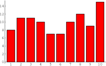
Let me propose a different way of analyzing the situation … the old-fashioned way, by actually looking at the observations themselves. There are a couple of oddities to be found there. To analyze this, I calculated, for each year of the record, how many of the months from June to June inclusive were in the top third of the historical record. Figure 1 shows the histogram of that data, that is to say, it shows how many June-to-June periods had one month in the top third, two months in the top third, and so on.
 Figure 1. Histogram of the number of June-to-June months with temperatures in the top third (tercile) of the historical record, for each of the past 116 years. Red line shows the expected number if they have a Poisson distribution with lambda = 5.206, and N (number of 13-month intervals) = 116. The value of lambda has been fit to give the best results. Photo Source.
The first thing I noticed when I plotted the histogram is that it looked like a Poisson distribution. This is a very common distribution for data which represents discrete occurrences, as in this case. Poisson distributions cover things like how many people you’ll find in line in a bank at any given instant, for example. So I overlaid the data with a Poisson distribution, and I got a good match
Now, looking at that histogram, the finding of one period in which all thirteen were in the warmest third doesn’t seem so unusual. In fact, with the number of years that we are investigating, the Poisson distribution gives an expected value of 0.2 occurrences. In this case, we find one occurrence where all thirteen were in the warmest third, so that’s not unusual at all.
Once I did that analysis, though, I thought “Wait a minute. Why June to June? Why not August to August, or April to April?” I realized I wasn’t looking at the full universe from which we were selecting the 13-month periods. I needed to look at all of the 13 month periods, from January-to-January to December-to-December.
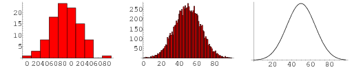
So I took a second look, and this time I looked at all of the possible contiguous 13-month periods in the historical data. Figure 2 shows a histogram of all of the results, along with the corresponding Poisson distribution.
 Figure 2. Histogram of the number of months with temperatures in the top third (tercile) of the historical record for all possible contiguous 13-month periods. Red line shows the expected number if they have a Poisson distribution with lambda = 5.213, and N (number of 13-month intervals) = 1374. Once again, the value of lambda has been fit to give the best results. Photo Source
Note that the total number of periods is much larger (1374 instead of 116) because we are looking, not just at June-to-June, but at all possible 13-month periods. Note also that the fit to the theoretical Poisson distribution is better, with Figure 2 showing only about 2/3 of the RMS error of the first dataset.
The most interesting thing to me is that in both cases, I used an iterative fit (Excel solver) to calculate the value for lambda. And despite there being 12 times as much data in the second analysis, the values of the two lambdas agreed to two decimal places. I see this as strong confirmation that indeed we are looking at a Poisson distribution.
Finally, the sting in the end of the tale. With 1374 contiguous 13-month periods and a Poisson distribution, the number of periods with 13 winners that we would expect to find is 2.6 … so in fact, far from Jeff Masters claim that finding 13 in the top third is a one in a million chance, my results show finding only one case with all thirteen in the top third is actually below the number that we would expect given the size and the nature of the dataset …
w.
Data Source, NOAA US Temperatures, thanks to Lucia for the link.
I’m impressed at how nicely your 13 month samples fit the Poisson distribution. Nice review.
Lucia has an update based on low serial autocorrelation data for the 48 states. It’s apparently a lot closer to white noise than she thought previously.
As always, astounding reasoning, Willis. I find your conclusion flawless. I find that it also supports something that I have long suspected — few people are actually qualified to work with statistics or make statistical pronouncements. From what I recall, Jeff was only quoting some ass at NOAA, so perhaps it isn’t his fault. However, you really should communicate your reasoning to him. I think that there is absolutely no question that you have demonstrated that it is a Poisson process with significant autocorrelation — indeed, from the histogram (exactly as one would expect) and that as you say if anything it suggests that there have (probably) been other thirteen month stretches. It is also interesting to note that the distribution peaks at 5 months. That is, the most likely number of months in a year to be in the top 1/3 is between 1/3 and 1/2 of them! . They seem to think that every month is an independent trial or something.
Yet according the reasoning of the unknown statistician at NOAA, the odds of having any interval of 5 months in the top third are
Sigh.
rgb
1 in 2.6 is close enough to 1 in 1.6 million for the average climate alarmist; what’s your beef? Nothing that a little data adjustment won’t fix.
Willis, Can I please borrow your brain for a few days.. I could make a gazillion dollars with all that extra smarts and speed of thought. I can’t even comprehend the amount of work and effort that it even took to come up with the line of analysis, let alone sit down with the data. But then, I still don’t have your brain. But then, unfortunately, not many scientists do either.
Thank you, Sir.
Say you investigate a sample of teen age boys. You will find that each has a height. Do the measurements. Run the numbers.
Now investigate a sample of time intervals with lightening strikes. Not every time interval has a strike. There’s the rub!
Your example (people lined up at a bank teller’s window) is the same idea. Somewhere (long ago), I believe hearing or reading that this is exactly why the Poisson distribution was invented. Not that many folks make it that far in their education.
Willis, I think you are one of the most clever people I have ever read……very well done and keep up the good work,
Robert
This whole 1 in 1.6 million issue has been great entertainment. It’s also been an eye opener, to see so many climate scientists struggling with a fairly basic statistical concept.
Nice work, Willis – I can’t see a flaw in your work but it’s been a long day so I’ll look again for the sake of due diligence in the morning. The data has Poisson written all over as I head off to bed, and that doesn’t leave a lot of wiggle room.
I’m not getting the controversy. We’re not dealing with a stationary process here. The guy said: “These are ridiculously long odds, and it is highly unlikely that the extremity of the heat during the past 13 months could have occurred without a warming climate.” No kidding. And, we are currently at a plateau in temperature which is the result of combining the steady warming since the LIA with the peak of the ~60 year temperature cycle. So, what’s the gripe? The globe has been warming. Everyone knows it’s been warming. The disagreement is over the cause.
It would appear that inadvertently Mr. Masters, or whoever provided him with his numbers, has arrived at a ratio that is quite correct, the only problem being the ratio is applied to the wrong query. If you ask “what are the odds of a story about a human caused plague of horrendous heatwaves, which appears in any Lamestream Media source, NOT being complete BS?” the ratio of 1 in 1.6 million appears, to my eye at least, to be just about spot on.
Brilliant work, Willis.
Bart: The point is that the claimed 1 in 2.6 million chance that this June to June “event” is BS. and regardless of whether there has been warming or not, this “event” is indistinguishable from random.
as in the song:
You may have it warm in the US. Here in Europe we have a rather cold and wet early summer.
Is there also a 1 in 2.6 probability to experience a series of coldest 13 continuous months within a 116 years period? of wettest? of windiest? of cloudiest? of …?
Anthropogenic warming seems to be more frequent in Northern America than elsewhere (or there are more blogs telling this there than elsewhere).
Robert Brown says:
July 10, 2012 at 10:24 pm
Thanks as always for your comments, Robert. I actually feel sorry for Jeff Masters, because I’ve made foolish public errors myself. It’s not easy, it’s painful, and it is the risk we all take when we blog. So I’ll pass on contacting him, it would look like kicking a man when he’s down.
I suspect he will hear about my analysis in any case. Most people who are truly interested in climate science read WUWT, regardless of their position on the AGW supporter/skeptic continuum, if only to find out what fools these mortals be today.
However, I doubt that in general I am “actually qualified to work with statistics”, as my knowledge of statistics (as with many things) is quite wide but is only deep in some places. However, I am well served by my habit of starting (and perhaps even finishing) by using my Mark One Eyeballs. I get as much data as I can, stretching back as far as I can, and then I put it up on the silver screen and I just think about it. I give it the smell test. I re-plot it from some other angle, I’m a graphical thinker. I give it the laugh test. I use color to give it another dimension. If necessary, I look at and consider each and every case or station record or proxy of the data individually. The work is often very boring, but also has flashes of fire and insight.
I look at the data first, before theorizing about the data, or calculating the statistics of the data, or analyzing the situation using pseudo data or red noise, or doing a monte-carlo analysis. I just look at the data in as many graphical representations as I can dream up. Then I look at it again.
I look because at the core, I’m trying to understand the data, not to measure its waistline. Oh, I may get around to that, but before I pull out the cloth tape and start taking the measurements, I want to know the habits and the relationships and the linkages and the interactions and ultimately the very form and meaning of the data.
Because at the end of the day, statistics are a model of reality. As a result, picking the appropriate model for the situation is the central, crucial, indispensable, and often overlooked first step of any statistical analysis. If you don’t start out with the correct understanding of what’s going on, all the statistics in the world won’t help you. And for me, the only way to get that understanding is to look at the longest dataset I can find, from as many angles as I can, and to think about the data in as many ways as I can.
All the best to you,
w.
Damn, a poisson distribution. I always new these climatologists were hiding something fishy !
Very good analysis Willis. It’s a shame that some of these cargo cult scientists are not capable of applying appropriate maths.
Doesn’t this analysis basically point out that the warming trend far smaller than the magnitude of variations? The fact that it peaks between 4 and 5 months tells us that the dominant variation is of that timescale. This is what we commonly call seasons.
None of this is surprising but it still does a very good job of pointing out how rediculous and inappropriate Masters’ comment was.
Maybe he should have thought about it before using it. The fact he apparently got it from someone at NOAA does not excuse his need to think whether it makes sense before using it himself.
AWG: a chance of 1 in 1.6 million of being close to a correct analyze …
Six months of record recent heat wave was a once in 800,000 year event????
There have been 372,989 correctly recorded daily high temperature records in the US since 1895. 84% of them were set when CO2 was below 350ppm.
http://stevengoddard.wordpress.com/2012/07/08/heatwaves-were-much-worse-through-most-of-us-history/
http://stevengoddard.wordpress.com/2012/07/08/ushcn-thermometer-data-shows-no-warming-since-1900/
Lots of things are very rare….
ttp://stevengoddard.wordpress.com/2012/07/11/1970s-global-cooling-was-a-one-in-525000-event/
http://stevengoddard.wordpress.com/2012/07/11/last-ice-age-was-a-one-in-a-google-event/
sheesh!
Poisson is by far the most important and least known mathematician for all aspects of real (non-relativistic) life.
Bart says:
July 10, 2012 at 11:32 pm
The controversy is that the “ridiculously long odds” he refers to are wildly incorrect …
w.
Robert Brown
I think you make a very good point when you say that few people are qualified to talk about statistics. That is so even on quite simple statistics, but at the sort of level of tree ring analysis and many other facets of climate science I think the maths is quite beyond most scientists as it is a special separate field that they are unlikely to have learnt in detail.
It would be interesting to know who is actually qualified to interpret statistics arising from their work or whether they get in genuine experts to check it through. I suspect the number that do is very small indeed.
tonyb
Willis
I have to be a pedant here but what you plotted is a bar chart not a histogram 😉
I think the main problem with pushing out the trite case of probability with a time series is that you have no base. For example where, and at what length of time, would you determine a norm. He assumes that time series are not second order stationary (why?) and hence you can get a change in the distribution with time (dirft) which is implicitly suggested in his (paraphraising) “…you can only get this if you’re in a warming world…”. This assumption is only the result of incomplete information as it only appears as such when choosing a small portion of the time series. So absolute nonsense, there is no need for any more statistics in my view as it is completely flawed because of incomplete data although you make a more appropriate case here.
Since, as you say, “one case with all thirteen in the top third is actually below the number that we would expect given the size and the nature of the dataset …” it follows that warming climate reduces the likelihood of severe weather. Which is what the “heat gradient flattening” POV (mine) predicts.
What Willis missed is that Jeff sold his website to the weather channel for some beaucoup buxes and he needs to deliver this sort of bs in a technical fashion so they can feel they are getting a good deal. Model that in your Poisson distribution. big guy!
Just pulling your leg, Willis.
Willis
Nice work. As Phil Jones is unable to use a spreadsheet I doubt if his high profile work is statistically sound. Don’t know about others like Mann as there is so much sound and light surrounding his work. I see him as the lynch pin so his expertise in statistics and analysis is obviously highly relevant
tonyb
Mr Masters is an intelligent weatherman, so he must already know that the US heatwave is primarily due to blocking, as was the Moscow heatwave a couple years ago.
Therefore the real question is “does CO2 cause an increase in blocking events?”.
Mr Masters may be able to tell me otherwise, but I’ve seen no hint that this is the case from the literature. But I’ve seen many times that low solar activity is linked with increased jet stream blocking.
I would therefore put the onus on Mr Masters to show that the null hypothesis is false: ie this event is related to solar activity, given the Ap index recently hit its lowest value for over 150 years.
It surely looks like a Poisson process and the 1 in 1.6 million figure is absolutely bollocks, but isn’t the interesting question how / if the lambda has changed over the years? Let’s say calculated from the data of a 30-year-or-so sliding period?
Unless you are certain of the underlying distribution, curve fitting and reading off the tails may lead to large errors. For example, you might try fitting a Burr distribution. It would be interesting to see if you get a similar result.
2.6 times in 1374 trials is a 1 in 528 chance.
Curiously, I happen to turn 44 years old this year which is also 528 months. (12 * 44)
cd_uk says:
July 11, 2012 at 1:45 am
Naw, you don’t have to be a pedant, cd_uk, it’s a choice, and one I’d advise you to give a miss.
But if you are going to be a pendant, you should at least be a good one. Mathworld says a histogram is:
Since that is exactly what I’ve done, it is indeed a histogram. Take a look at the Mathworld example, looks like mine.
w.
PS—By the way, what I believe you are talking about is generally called a “column chart”. In a “bar chart” the bars run horizontally, while in a column chart they run vertically.
The original mis-use of statistics is the sort that landed an innocent woman in prison for child abuse. Though eventually exonerated and released, she died by suicide. That’s how dangerous these people are!
It looks like a very nice analysis, thanks for it.
I’d just like to see a somewhat more solid proof that poisson distribution is the correct one to use in this case than “The first thing I noticed when I plotted the histogram is that it looked like a Poisson distribution.”. Both number of extreme records and number of their streaks is going to decline over time on normal data, but I suspect streaks are going to decline way faster because we’re working with fixed interval rather than portion of the record. Is the poisson distribution invariant to that?
Reading Willis’ response to rgb at 12:02 above puts me in mind of Richard Feynman talking about what his wife said with regard to Feynman joining the team to find out what happened to bring Challenger down….something along the lines of “You better do it…you won’t let go….you’ll keep circling around, looking at it from a different perspective than others…and it needs doing.” Ah, Willis, what a treasure you are….and in such good company.
I do agree with the general feeling that the “ridiculously long odds” are on very shaky ground, But I don’t agree with Willis’ statistical model. It may be that for n distinctly smaller than n the distribution of “n months in top third out of 13” is roughly approximated by a Poisson distribution, but it’s a leap of faith that the approximation is valid for n equal to 13. There is bound to be edge phenomenons.
For instance, the model predicts that “14 months out of 13 would be in the top third” happens about once in 1374 tries. On the other hand, we can be absolutely sure that this won’t happen until we get two Mondays in a week. This is an edge effect, The model breaks down for completely trivial reasons as soon as n is greater than 14, so we should not trust it too much for n equal to 13.
Great analysis. What really saddens me is that so many after years of study appear to have not done so well at basic statistics which is part of most courses where some analysis is likely to be required. May be it is just that many climatologists just can’t do statistics. I don’t know just looking for some rational explanation for the outrageous claims of so many over the last few years.
Willis – Beautiful work simply and elegantly explained. Entirely as we’ve come to expect from you.
Such calculations as p^N are based on independent random events which this is not.
With 20 and 60 year oscillations high event will occur roughly 60 years apart and the change of one being higher than the next is 1 / [the number of such events].
Over the last “118 years” there have been 3 (maybe even only 2) such events. Placing the odds of a 13 months of such significant highs occurring (without warming) at close to – 1 in 3 – sometime over this short time period at the height of the harmonic cycle.
With a small natural warming such has been going on since the LIA the chance is very close to 100%.
So if there is a claim that 13 months of co-joined, not independent, warm whether at the peak of this 60 year cycle is proof of a small natural warming trend (since 1895 or even the LIA) – the chances of that are approximately 66% likely.
To be fair though such limited datasets are usually rated against [N-1] events making even that an overstatement of the chance: more like 50% likely.
Statistics is for those who understand its intricacies, and I do not. It appears to me that extreme events may happen (but not necessarily) if certain principal conditions are satisfied. From my (non-climate related) experience this is most likely happen with cyclical events when one of two extreme plateaux (plural ?) is reached. If there is a 65 year cycle in the climate events (AMO at peak etc) , than it looks as the conditions are right for such events to be more frequent than usual.
Just a speculation of an idle mind.
So just to clarify – the actual odds of a running 13 month “month in top third” based on historical observational data is 2.6 out of 1374, or 1:528 (ish) ?
Maybe I should wait on Jeff opening a betting shop.
Willis, you say that picking the appropriate model for the situation is the central, crucial, indispensable, and often overlooked first step of any statistical analysis.
But the Poisson distribution is unbounded at the upper end. So the distribution that you fitted to your histogram also suggests that we should expect to find one instance (0.939) of a 13-month period in which 14 of the temperatures are in the top third. And it wouldn’t be that surprising to find a 13-month period with 15 (expected frequency 0.326) or 16 (expected frequency 0.106) of the individual months in the top third.
Does this really sound like the appropriate model?
Also, lambda in the Poisson distribution is the expected value of the mean of the data. So if you fit a Poisson distribution, you are determining that the mean number of months falling in their top third in a 13-month period is 5.213. (Note: the fact that you arrive at 5.213 seems odd to me, as I’d expect only 4.333 months out of every 13 on average to be in the top third. Am I missing something here?). However, it seems to me that your discovery that the mean of your distribution (5.213) remains the same when you oversample the same dataset is unsurprising. And it doesn’t really endorse the choice of Poisson as a distribution.
Nice work Willis. I like your approach.
So in over 1300 13 month periods, there has been just one where every month is in the top 3rd.
Yes, this was the right way to do the math (critic of earlier posts).
Have to look at the details more, like the reasoning for using 13 months, and using The warmest third instead of, say, warmest 10 percent, but at least the tools are good.
Willis, is your and his data Raw or after it has been mangled by Quality Control algorithms?
This sort of statistical mistake is reminiscent of certain other problems that do not necessarily follow simple intuition about stochastic events. The famous ‘birthday’ problem comes to mind– in a group of 50 people, there is about a 95% probability of two having the same birthday. In the case of the birthday problem, it is the difference between the probability of two particular people having the same birthday compared with any two people in a larger group. It raises the interesting question: If you included all possible combinations of six months out of a sequence of thirteen (rather than sequential months), would you arrive at an even higher probability? I suspect so, despite the fact that you would be reducing the correlations by spreading out the sample.
Major cities might almost have been designed to set higher max and higher min temperatures. Paint them black and carbon-dioxide could be awarded anothers recordbreaker’s medal – by dumb judges.
Willis Eschenbach says:
“I look because at the core, I’m trying to understand the data”
And that makes all the difference! It seems to me that the climate change action advocates are not trying to understand the data but are trying to understand how to use the data to promote the cause.
Nice work debunking this “wolf cry”.
Also, even if he were right about the stats, evidence for a warming climate is not proof it’s man made nor quantify how dangerous it might be.
Good job Willis.
The same weather pattern has been in place in the south for at least 30 years.
I recall my wife getting her citizenship on the steps of Tom Jefferson’s house in 1977 in 105 degree heat. Happens every year just a little more intense this year. Shade is strategic terrain.
Willis
I can see you’re conversational skills are as about as an inept as your stats.
Histograms deal in bins not categories: i.e. ranges 0-1, 1-2, 2-3 hence the x-axis labelling should be at each tick not between ticks you are plotting categories (0, 1, 2, 3, 4) where’s the bin range. As for Mathsworld it should know better. If you don’t believe me you can look at even elementary statistical packages such Excel: histogram vs bar chart functionality – note they are not the same.
This analysis seems useful, but needs to be improved. Presumably the data include temperatures from the last 50 years, which should show a signal from increasing global warming. It seems to me the appropriate analysis would be to fit the Poisson distribution to an unbiased sample, early in the 20th century, and use that fit to predict how often you would expect a 13 month consecutive warm period. I would imagine the odds would be small.
BTW Willis according to Mathworld the bar charts look a lot like yours too, oh yeah and they are plotted both vertically and horizontally.
http://mathworld.wolfram.com/BarChart.html
REPLY: And their histograms look like Willis’ too: http://mathworld.wolfram.com/Histogram.html
The grouping of data into bins (spaced apart by the so-called class interval) plotting the number of members in each bin versus the bin number. The above histogram shows the number of variates in bins with class interval 1 for a sample of 100 real variates with a uniform distribution from 0 and 10. Therefore, bin 1 gives the number of variates in the range 0-1, bin 2 gives the number of variates in the range 1-2, etc. Histograms are implemented in Mathematica as Histogram[data].
See also: Frequency curve http://mathworld.wolfram.com/FrequencyCurve.html
A smooth curve which corresponds to the limiting case of a histogram computed for a frequency distribution of a continuous distribution as the number of data points becomes very large.
Care to continue making of fool of yourself? – Anthony
Thomas
I think we’re both arguing the same point.
Standard stats and probabilities – derived therefrom – are often carried out on time series with little regard given to the degree of stationarity, drift and/or periodicity. To suggest that an event is somehow more probable in one part of the series than another would suggest that it is not second order stationary (pdf changes along time). But this can only be ascertained if one has enough data in order to identify drift or periodicity. We don’t, so these types of stats aren’t really appropriate because we can’t really workout the frequency of the events. Willis has given this a go and it does look as if one could question the whole argument.
“However, it seems to me that your discovery that the mean of your distribution (5.213) remains the same when you oversample the same dataset is unsurprising. And it doesn’t really endorse the choice of Poisson as a distribution.”
A poisson is close enough for the task, and oversampling is fine for the task. The task is rhetorical: to illustrate that when you shop through a dozen possible 13-month spans, there will be one of the 13 that happens to stray in the direction of your pet theory, as well as a few that stray in the opposite direction. You pick the one of 12 that best fits your pet theory, then run with it. If the news report had come out with calendar years, Dec-Dec, and said the Dec-Dec years were trending toward global warming most of us would accept a Dec-Dec span as not-eyebrow-raising.
June-June sounds OK because we are thinking “summer.”
If the analysis had said “Nov-Nov,” it would be a bit more odd, and we would be thinking, “why examine a Nov-Nov year? Why not Dec-Dec, which is nearly the same span just more natural-sounding, or why not Jan-Jan?”
when you go the extra mental step and think, “what is the justification for Jun-Jun,” then it should occur in your mind that, among other reasons for selecting Jun-Jun, it might be cherry-picking.
Then, to test this “cherry-picking” hypothesis, all you have to do is take one of two alternate analyses, and see whether the data remain similar, or stray away from the pet theory.
You can then either calculate all other or a few oher 13-month spans, or run all 13-month spans.
Either way serves the purpose of seeing whether Jun-Jun is the most favorable 13-month, out of the 12 avaiable, to select in order to cherry-pick, or whether the Jun-Jun finding happens to be robust.
So, the RMSEA could be calculated for all possible 13-month spans, and compared to the Jun-Jun.
Also, it would be nice to see the Poisson parameters and RMSEA for each of the 12 13-month spans. And, to x2 test for significant differencs between a few match-ups.
For the purposes of testing whether there is a warming trend, either way is sufficient to test Jun-Jun as either a fluke on the high end or as actualyl representative. Choice of Poisson is also not mission-critical for this.
The truth is that there may be distributions that fit the data better, and even theroetically match better, such as having an upper bound. But the reality is that nature follows her own course, and is not bound by the limits of any of our mathematical models. We will always have an error of approximation when developign a model to maximally account for distributions of data from nature. We bring our models in to help proxy nature. Nature does not “follow” our models, as much as we might get seduced into believing this. Not even fractals.
The Eastern US makes up about 1% of earth’s surface, and about 3% of earth’s land surface.. The real problem to be tackled was, What is the probability that an arbitrary area making up
3% of earth’s land surface will have a period of 13 months ( why not 12 months or 17 months?) with all temperatures in the top 1/3 (not 1/6 or 2/5) of temperatures for that month over the period 1895 to 2012 ( why not 1860 to 2012?). Jeff Master’s computation was total data snooping.
As I sadly learned many years ago, when I was single and had money to blow on horse racing, it’s easy to get estimated probabilites of 1 in 10,000 or one in a million by looking for all imaginable correlations of PAST data- the calculations are futile unless they can reliably predict FUTURE data.
Thanks Anthony
Yip that’s right, that was a response to WIllis citing of the Mathworld. So tell me did you get your stats training from a website as well.
Here’s a few:
http://en.wikipedia.org/wiki/Histogram
Tell me, because they don’t look like Willis’ is Willis wrong?
Your other sets of graphs are histograms, you’re curve is a probability distribution function, which is computed from the standard deviation and the mean – go look it up and you don’t need a histogram to plot it. But what is plotted above is not a histogram, try using the histogram in excel and see what the plot looks like – not like the ones above.
Otherwise don’t take my word for it ask another statistician.
REPLY: Well I think you are being pedantic. Some comic relief might help:
Replying to Nigel Harris:
Also, lambda in the Poisson distribution is the expected value of the mean of the data. So if you fit a Poisson distribution, you are determining that the mean number of months falling in their top third in a 13-month period is 5.213. (Note: the fact that you arrive at 5.213 seems odd to me, as I’d expect only 4.333 months out of every 13 on average to be in the top third. Am I missing something here?)
Willis has this whole thing upside down. He’s fitting lambda to the data, rather than comparing the data to the known lambda (lambda is simply the probability of success times the number of events, and thus has by definition to be 13/3). That means his conclusion is exactly backwards.
Reasoning correctly, we know that if there is no autocorrelation between hot months, then we should get a Poisson distribution with lambda = 4.3333. We don’t, instead we have a significant excess of hot streaks. All this proves that it’s a non-Poisson process, i.e. that there is some autocorrelation, and the temperature in a given month is not independent of the temperature of the surrounding months! Having thus proved it’s non-Poisson, you can’t then draw further conclusions using the Poisson distribution.
It doesn’t prove anything about global warming one way or the other.
Put another way, if he does the same for cold streaks, he’ll find the same thing – an apparent lambda > 4.333, indicating autocorrelation in the data set. And that won’t say anything about global warming either.
If, on the other hand, he were to do some further analysis – say take the dates of all cold streaks >9 months and all hot streaks > 10 months, and see if there’s a consistent trend towards more hot streaks of cold streaks, that would be an actual result.
Willis,
I’m still puzzled why your distribution has such a high mean value. You haven’t provided a link to your data but the first chart is easy enough to parse: there was one 13-month period with no top-tercile months, six with one month in the top tercile, nine with two top-tercile months and so on. By my calculations, you show a total of 597 months in the top tercile. And that’s out of 116 13-month period = 1508 months in total. But this implies that 39.6% of months were in the top tercile, which surely cannot be so.
Nigel
We should remember we are dealing with the “Adjusted” data here.
The adjustments have moved the 1930s temperatures down by about 0.49C in the most recent analysis of how this varies over time.
So here is what the Raw and Adjusted US temperatures look like over time (using an 11 month moving average given how variable the monthly records are)
http://img692.imageshack.us/img692/6251/usmonadjcjune2012i.png
And then the Adjusted version of monthly and 11 month moving average. The monthly temperature anomaly for the US can be +/- 4.0C. June 2012 was only +1.03C so much less than the historic level of variability.
[But it was warm over the last year, although the Raw temperatures were just as warm in 1934, close in 1921, 1931, 1953 and 1998].
http://img535.imageshack.us/img535/8739/usmoncjune2012.png
“What Willis missed is that Jeff sold his website to the weather channel for some beaucoup buxes and he needs to deliver this sort of bs in a technical fashion so they can feel they are getting a good deal. Model that in your Poisson distribution. big guy!”
🙂 Alas, some things even Willis can’t calculate!
Willis,
Ah, I see my error: every June is counted twice. So if 94 out of 116 June months were all in the top tercile, then that would explain how you could have 597 top-tercile months.
But that seems to imply that you have analysed a slightly different issue to the one the ridiculous Jeff Masters quote was about.
What Jeff Masters actually said was: *Each* of the 13 months from June 2011 through June 2012 ranked among the warmest third of *their* historical distribution for the first time in the 1895 – present record.
In other words, June 2011 was in the top tercile of all Junes, July 2011 was in the top tercile of all Julys and so on.
You seem to have looked at the probability of finding a 13-month period in which all 13 months are in the top tercile of all historical monthly temperatures (which most Junes will be), rather than each month being in the top tercile of its own monthly history.
I don’t need the data to say what the result would be. If we define the problem as finding the probability of a 13-month period with all 13 months in their respective top terciles, then the best fit Poisson distribution will (by definition) have lambda of 13/3 or 4.333, which means the expected number of 13-month periods with N=116 is not 0.2 but 0.05. And with N=1374 it is 0.55.
Although the Poisson distribution is clearly not a “correct” model, as it allows for logically impossible results such as 14 top-tercile months out of 13, it does describe the data pretty well as far as it goes. (The cumulative probability of all the logically impossible outcomes happens to be very small indeed).
But in the end, all this analysis says is that an event which happens to have occurred just once in this particular historical dataset is statistically expected to have occurred about once, based on the characteristics of this particular historical dataset.
Lucia on the other hand, has attempted to answer the correct question, and although she seems to have gotten into something of a muddle, she seems to now be of the opinion that the likelihood of 13 top-tercile months in a row (each in the top tercile of their own distributions, that is), in a dataset with the same general characteristics as the US lower 48 temperature record, but in the *absence of a forced trend*, is perhaps around 1 in 134,000. So Masters was indeed ludicrously wrong, but not perhaps by nearly as much as you suggest.
This is a keeper. Please add this to the Climate Fail List in the main menu.
Okay on second thought…
In this analysis, each “record” month is added to 13 different consecutive intervals. For instance, if there is an isolated streak of three consecutive record months, it will add to the statistic:
– two 13-month intervals with 1 record month
– two 13-month intervals with 2 record months
– ten 13-month intervals with 3 record months
Each streak is therefore added to the statistic with all of its “heads” and “tails” which definitely affects the shape of the resulting histogram. This does not mean your approach is wrong but I definitely think that it deserves a solid mathematical proof that poisson distribution is appropriate here.
In my personal opinion, the analysis should concentrate on streaks of “record” months and evaluate their relative frequency, i.e. “if there is N streaks of M consecutive record months then we can expect X streaks of (M+1) consecutive record months. And of course it would still deserve solid mathematical proof for whatever function is used for the approximation.
Next step should probably be to evaluate evolution of these proportions over increasing length of the record. But that may actually lead you to conclusions you don’t want to see – such as that the chance to see a 13-month streak early on the record is in fact much higher than to see the same streak late in the record. Or, we can say, the chance to see a 13-month streak late on the record is way lower than the chance to see it anywhere on the record.
And I won’t even mention the hell you could get to if you tried to perform the same analysis with record lows and compared these distributions and evolutions with each other.
Returning to the original claim, I think the problem lies in the statement “assuming the climate is staying the same as it did during the past 118 years”. What does it mean “staying the same”? Does it mean temperature will continue to rise at the same speed? Or does it mean it will stay within the same boundaries? Depending on which interpretation of this confusing statement you use you can get to very similar or very different results.
Steve R says:
Bart: The point is that the claimed 1 in 2.6 million chance that this June to June “event” is BS. and regardless of whether there has been warming or not, this “event” is indistinguishable from random
Whatever that means, that is not what Willis has shown.
To demonstrate that this event is indistinguishable from randomness about a non-warming trend, one would have to demonstrate that such an event is likely, given a random dataset with zero trend. The question then arises as to what version of a random dataset is appropriate to use to estimate the “random” likelihood from. Masters used white noise with zero trend. Lucia initialy favored something redder, with a high degree of autocorrelation, still with zero trend. These lead to very different estimates of the probability of such an event being the result of randomness about a zero trend. Lucia has since decided that a more pinkish hue is probably more in tune with the assumptions of the problem, leading to an estimate that is closer to Master’s original.
Apart from their quibble over how much autocorrelation to use, both of those analyses are incorrect formulations of the question. They both compare the probability of the current event against the assumption of zero change in climate, none whatsoever, over the last 118 years. The only people that claim that there has be no change whatsoever in global temp over 118 years live in the vivid imaginations of the alarmist profiteers. Zero change is not on the table, so drawing comparison to the probability of an event from a zero change model is … well … pointless. Unless your point is to make alarmist propaganda aimed at people who dont understand statistics. In that case it is effective, just grossly dishonest.
That was what Masters was doing. In an attempt to win a minor battle over geeky stats territory, Lucia’s acceptance of Master’s comparison to an absolutely unchanging climate ceded him victory in the propaganda war. Turns out, she mostly lost the geeky stats battle, too. The better choice would have been to demonstrate the pointless nature of his assumptions, rather than accepting them for the sake of a losing argument. But at least her approach was to pick a model of randomness associated with a cliam about how climate works, and calc the odds of that particular randomness producing the observed result. That is how “distinguishing observed events from randomness” is properly done.
Masters got that part right, too. His fault is that he modeled a claim that no one is making – zero climate change whatsoever. The claim he modeled holds that there is no trend in surface temp, nor even any non-random variation in temp (like a cycle), for the last 118 years. It is a strawman claim. He then proceeds to compound his offense by pretending that:
1. “has warmed in the past” means “is warming now” and
2. ruling out “no climate change wahtsoever” means “catastrophic man made global warming we are all going to die if we dont follow what Glorious Leader wants us to do”.
Whereas Lucia addressed Master’s argument ineffectively, Willis simply ignores it altogether. He didn’t analyze a model of a claim about how climate works, to determine if the observed event was consistent with that claim. He just fit a curve to the observed events, and found that one of the the observed events is near to the curve that he fit to the observed events. Doesn’t say anything whatsoever about the validity of Master’s claim.
w.-
Have you seen http://dotearth.blogs.nytimes.com/2012/07/10/cool-pacific-pattern-shaped-2011-weather-extremes-heat-dominates-u-s-in-2012/ which contains these quotes from the National Climate Extremes Committee’s latest report?
” La Niña-related heat waves, like that experienced in Texas in 2011, are now 20 times more likely to occur during La Niña years today than La Niña years fifty years ago.
– The UK experienced a very warm November 2011 and a very cold December 2010. In analyzing these two very different events, UK scientists uncovered interesting changes in the odds. Cold Decembers are now half as likely to occur now versus fifty years ago, whereas warm Novembers are now 62 times more likely.”
This sets off my BS alarm — clanging! I don’t think it is even statistically possible to develop a method to arrive at such conclusions, certainly not ‘predictive odds’.
Can you comment? clarify?
After reading this, I can not get over the idea that Jeff Masters is the Maxwell Smart of Climate Science…
Another nice job by Willis, but I am not sure saying he is smarter than a climate scientist is high praise. 🙂
One man’s meat is another man’s Poisson.
A poisson distribution is likely only if the occurrences are near to random. Random is not a thing that the “consensus” would entertain for warming periods
Without having much of a stats background, but some measure of common sense, I give 4 stars (out of 5) to Nigel’s 3:42 am post for explaining the obvious problem with calling the distribution a Poisson distribution, and 5 stars to pjie2’s post at 6:21 am for his confirmation of Nigel’s post and his further elaboration of the consequences.
With but limited stats knowledge, clearly if you assign a 1/3 probability to Outcome A and test the event 13 times, you will get 1/3 x 13 = 4.33 occurrences of Outcome A on average over time. That is, on average, every three events will yield one Outcome A. Nigel made the point that the data therefore does not fit a Poisson distribution, and he also pointed out the problem with the endpoints.
pjie2 clarified Nigel’s point about it not being a Poisson distribution and then went on to explain the implication, i.e., that there must be autocorrelation between the months, since (I presume from his explanation) if there were not, the distribution would indeed show a better fit to a Poisson distribution if the data were in fact random. That is, the mean would approximate the expected 4.333.
As for the original analysis by NCDC, that I do understand. Assuming randomness, there’s a 1/3 chance of a month falling in the top third of all events, by definition, and the chance of 13 consecutive positive outcomes (defined here as a Success) is 1/3 to the 13th power, or .0000006272. This is 6.272 Successes in 10 million, or 10,000,000 divided by 6.272 = 1 Success in 1,594,400 attempts. (NCDC’s calculator obviously goes to more decimal places than mine.)
Since another attempt is made each month, there are 12 attempts per year and one Success will be expected to occur every 132,833 years, assuming randomness. So Jeff Masters’ 124,652 AD should be 134,845 AD, and he was being conservative (because he divided by 13 instead of 12 to reach his result, but there are only 12 new datapoints per additional year.)
That said, if, per pjie2, it’s not a random distribution, all bets are off and we’re playing with a loaded die. Furthermore, since we skeptics have (most of us anyway) always been willing to concede that warming has occurred, and even that it is to some extent likely to be manmade, why would we expect the die to be anything but loaded when performing such an analysis?
If the earth now begins to cool, we will not have to wait thousands of years before we get 13 consecutive months in the coolest third either, I’d wager. Given the relatively short time span of 116 years (or 118?) in this situation, it might easily occur in the first or second decade of a significant cooling if monthly temps drop fairly rapidly and end up running consistently below the 116-year average.
Willis is a ‘conversational skill’?
Who woulda thunk it … (Perhaps you meant “I can see your conversational skills …” yes, I know pedantic, particularly when it comes to your and you’re [literally: “you are”])
.
Lucia’s update:
“Update Wow! I didn’t realize the US temperatures had such low serial auto-correlation! I obtained data for the lower 48 states here:
http://www7.ncdc.noaa.gov/CDO/CDODivisionalSelect.jsp
Based on this, the lag 1 autocorrelation is R=.150, which is much lower than R=0.936. So ‘white noise’ isn’t such a bad model. I am getting a probability less than 1 in 100,000. I have to run the script longer to get the correct value! ”
Eschenbach’s method doesn’t appear to differentiate what we would expect without warming from what we would expect with warming. It might be slightly more meaningful if he did similar calculations for the first and second halves of the record and then compared the two. But it’s still a weird way to look at the issue. Lucia’s makes more sense.
Clearly 1/3^13 is incorrect because a month being in the top 1/3 warmest is not an independent event – it is much more likely to occur if the entire year in question is a warm year for instance.
What would be more meaningful, but I lack the maths to be able to do it, it to look at how likely a run of 13 months in the top 1/3 is using conditional probability – ie how likely is it that a month is in the top 1/3 given that the previous month was also in the top 1/3? And then extrapolate this to 13 in a row.
The NY Times just published an article in their science section linked on their main page:
http://www.nytimes.com/2012/07/11/science/earth/global-warming-makes-heat-waves-more-likely-study-finds.html?hpw
Some of the weather extremes bedeviling people around the world have become far more likely because of human-induced global warming, researchers reported on Tuesday. Yet they ruled it out as a cause of last year’s devastating floods in Thailand, one of the most striking weather events of recent years.
A new study found that global warming made the severe heat wave that afflicted Texas last year 20 times as likely as it would have been in the 1960s. The extremely warm temperatures in Britain last November were 62 times as likely because of global warming, it said.
The findings, especially the specific numbers attached to some extreme events, represent an increased effort by scientists to respond to a public clamor for information about what is happening to the earth’s climate. Studies seeking to discern any human influence on weather extremes have usually taken years, but in this case, researchers around the world managed to study six events from 2011 and publish the results in six months.
Some of the researchers acknowledged that given the haste of the work, the conclusions must be regarded as tentative.
“This is hot new science,” said Philip W. Mote, director of the Climate Change Research Institute at Oregon State University, who led the research on the Texas heat wave and drought. “It’s controversial. People are trying different methods of figuring out how much the odds may have shifted because of what we have put into the atmosphere.”
The general conclusion of the new research is that many of the extremes being witnessed worldwide are consistent with what scientists expect on a warming planet. Heat waves, in particular, are probably being worsened by global warming, the scientists said. They also cited an intensification of the water cycle, reflected in an increase in both droughts and heavy downpours.
The study on extreme weather was released along with a broader report on the state of the world’s climate. Both are to be published soon in the Bulletin of the American Meteorological Society. The broad report found no surcease of the climate trends that have led to widespread concern about the future.
The Arctic continued to warm more rapidly than the planet as a whole in 2011, scientists reported, and sea ice in the Arctic was at its second-lowest level in the historical record. In 2010, rains were so heavy that the sea level actually dropped as storms moved billions of gallons of water onto land, they said, but by late 2011 the water had returned to the sea, which resumed a relentless long-term rise.
So far this year in the United States, fewer weather disasters seem to be unfolding than in 2011. But it is still turning out to be a remarkable year, with wildfires, floods, storms that knocked out electrical power for millions and sizzling heat waves in March and June.
Globally, the new research makes clear that some of the recent weather damage resulted not from an increased likelihood of extremes, but from changes in human exposure and vulnerability. The 2011 floods in Thailand are a prime example.
An analysis by Dutch and British scientists found that the amount of rain falling in Thailand last year, while heavy, was not particularly unusual by historical standards, and that “climate change cannot be shown to have played any role in this event.”
More important, the researchers said, was rapid development in parts of Thailand. Farm fields have given way to factories in the floodplains of major rivers, helping to set the stage for the disaster.
In the new report, researchers in Oregon and Britain found that natural climate variability played a big role in setting the stage for the heat wave in Texas. The weather in 2011 was heavily influenced by a weather pattern called La Niña, which has effects worldwide, including making drought in the American Southwest more likely.
But even taking that into account, the researchers found, the overall warming of the planet since the 1960s made it about 20 times as likely that such a heat wave would occur in Texas in a La Niña year.
Martin P. Hoerling, a meteorologist with the National Oceanic and Atmospheric Administration who was not involved in the new study but is conducting his own research on the Texas disaster, agreed that human-induced global warming had probably made the odds of record-setting heat somewhat more likely. But he said his research showed that the rainfall deficits were unrelated to global warming.
He said he was skeptical about several aspects of the new paper, including the claim of a 20-fold increase in likelihood.
More broadly, he said he was worried that the newly published studies had been done so hastily that the conclusions may not stand the test of time. “We need to think carefully about what kind of questions we can credibly pursue with this sort of rapid turnaround,” Dr. Hoerling said.
The post on Lucia’s blog which I found most accessibly to demolish Masters’ statistical simpemindedness (or ignorance) is by Climatebeagle. It demonstrates the mental & math error underlying the 1:1.6 million assertion so ably that a complete statistical stupe could grasp it:
climatebeagle (Comment #99257)
July 10th, 2012 at 2:54 pm
Using the same logic as Jeff Masters and looking at the US data:
5 consecutive months in top-third should occur every 20 years but have occurred 18 times in 116 years.
6 consecutive months in top-third should occur every 60 years but have occurred 11 times in 116 years.
7 consecutive months in top-third should occur every 182 years but have occurred 4 times in 116 years.
8 consecutive months in top-third should occur every 546 years but have occurred 3 times in 116 years.
@Nigel Harris, you said “What Jeff Masters actually said was: *Each* of the 13 months from June 2011 through June 2012 ranked among the warmest third of *their* historical distribution for the first time in the 1895 – present record.”
No, Jeff Masters was looking at a thirteen month period, not individual months compared to the same months over a period. To quote from the original – “Thus, we should only see one more 13-month period so warm between now and 124,652 AD”.
I take this as a reasonable person to mean a period of 13 consecutive months.
Willis Eschenbach says:
July 11, 2012 at 12:51 am
“The controversy is that the “ridiculously long odds” he refers to are wildly incorrect …”
Yes, well, that much is obvious. But, I don’t think yours is necessarily far better, as it is still treating the data as if it were stationary random data. Lots of distributions look a lot like the Poisson distribution. My point is, this isn’t a fight worth fighting. All he is saying is that temperatures have risen. They have, though they no longer are. It says nothing about attribution.
JJ says:
July 11, 2012 at 7:39 am
“They both compare the probability of the current event against the assumption of zero change in climate, none whatsoever, over the last 118 years. “
Exactly.
AGW heatwave downed by a poisson pen.
I work in the private sector, and actually get paid to do things like apply Poisson and Negative Binomial distributions correctly.
I would hire pjie2 to do this work with me. Willis, not so much.
In this case, lambda is known by definition, and the data are not independent.
Willis’s analysis demonstrates nothing other than this. In his own words: “picking the appropriate model for the situation is the central, crucial, indispensable, and often overlooked first step of any statistical analysis”. As Willis demonstrates here- by picking the wrong model.
As much as I despair about errors such as these, I despair more about those people who eat it up, uncritically.
John West said: “It seems to me that the climate change action advocates are not trying to understand the data but are trying to understand how to use the data to promote the cause.”
Pot, meet the kettle.
I mean, even if we take Willis’ argument at face value, the odds are still 2.6 in 1374, or about 0.2%. Those are still long odds. Does that in any way lend credence to the argument that observed warming of the globe in the latter third of the 20th century can be blamed on humans? Not in the slightest.
Willis,
Any comment on Lucia’s updated estimate, and the estimate calculated by Tamino?
http://tamino.wordpress.com/2012/07/11/thirteen/#more-5309
BCC says:
July 11, 2012 at 9:50 am
“I work in the private sector, and actually get paid to do things like apply Poisson and Negative Binomial distributions correctly. I would hire pjie2 to do this work with me. Willis, not so much.”
This is why I enjoy this site so much. Eventually someone shows up who understands the issue. It doesn’t ever seem to matter what the issue is either, as they range from logging, to fire suppression, to nuclear reactors, to tsunamis, and here, to statistical analysis.
As for all those kudos extended to Willis for his analysis, I’ve always found that it’s better to wait until the Nigels, pjie2s, and BCCs show up before jumping into unknown waters too quickly. Regardless, this site is, I believe, unequaled for its ability to draw out explanations from those intimately involved whatever issue is being discussed. The comments are nearly always as valuable a read as the original article, and often more so.
(To BigBadBear at 8:55 am: The 1/3 to the 13th power is correct assuming randomness, which was my assumption. I was just explaining the derivation of the NCDC calculation. Their assumption of randomness was incorrect, however.)
Willis,
You have a good start on the analysis, but you need to take an extra step – you need to de-trend the data. Find the best linear fit to your data set – temperature vs. time. Then subtract that trend from each month’s temperatures – this is the data that you need to analyze for the expected frequency of top thirds. The odds you calculated, 2.6 / 1374 are the odds given whatever linear trend exists in the data – your number may or may not be influenced by the trend.
A much more useful exercise would be to split the data into two periods – the first half and the second half. For each half, figure out how many months in each contiguous year are in the top third of the whole data set. Figure out if the odds of seeing a contiguous year in the top third has changed from the first ~58 years to the second ~58 years. So, for example, if the first half yields 2.6 and the second half gives the same number, then the probability of setting this record hasn’t changed.
For those worrying why lambda = 5.2+ and not *exactly* 4.333, I want to remind you that this is not continuous data. This study involves discrete data, in which monthly readings fall into ‘buckets’ that do not permit fractions. For example, given the set of four numbers [1,2,2,3], one finds that there are three data points in the top *half* of the distribution, because the #2 bucket cannot be subdivided. For the same reason a ‘tie’ to an old temperature record counts as a new temperature record.
@Bart: Correct. Masters’ point is this:
These are ridiculously long odds, and it is highly unlikely that the extremity of the heat during the past 13 months could have occurred without a warming climate.
Where “a warming climate” means a climate that has warmed recently (at least, that’s what it means in terms of the math we’re using to analyze it).
We don’t see many people still claiming that the US isn’t warming (or, hasn’t warmed), but if you do: well, here’s another piece of evidence which would indicate that they’re wrong.
I haven’t had time to read all the comments and I really need to re-read/digest the article, but I was under the impression that a Poisson Distribution applies only when the event in question occurs at a known average rate and is not dependent on the time since the previous event (the degree of randomness?). I’m not sure this applies in a valid way to Willis’ argument from a brief read through?
I think it was really the NCDC that did the original 1,594,323 calculation (and it is for 13 months not 12 months which is ). They wrote:
“Warmest 12-month consecutive periods for the CONUS
These are the warmest 12-month periods on record for the contiguous United States. During the June 2011-June 2012 period, each of the 13 months ranked among the warmest third of their historical distribution for the first time in the 1895-present record. The odds of this occurring randomly is 1 in 1,594,323. The July 2011-June 2012 12-month period surpassed the June 2011-May 2012 period as the warmest consecutive 12-months that the contiguous U.S. has experienced.”
Here: click on “Warmst 12 month consecutive periods for CONUS”
http://www.ncdc.noaa.gov/sotc/national/2012/6/supplemental
In the raw records, of course, 1934 would tie the current 13 month average.
Bart says:
I mean, even if we take Willis’ argument at face value, the odds are still 2.6 in 1374, or about 0.2%. Those are still long odds.
In order to take Willis’ argument at face value, one has to understand what Willis’ argument is. I dont think most here understand it, and that includes Willis.
The gist of the argument presented is that if you find a Poisson distribution that approximates some observations, then those observations are likely to fall near that Poisson distribution. That isnt a particularly interesting argument, being a tautology. It says nothing about the climate, nor about the claims made by Jeff Masters. The odds claimed by Masters and the odds claimed by Willis are irrelevant to each other. Comparing them is meaningless, and neither of them is individually of any interest to the question at hand.
JJ
mb says:
July 11, 2012 at 3:21 am
Thanks, mb. The model is not predicting how many months will come up out of 13. It is predicting how many months will come up. You are correct that there will be an “edge effect”, since we are only looking at 13-month intervals. But since it only affects ~ one case in 1400, the effect will be trivially small.
Suppose that in fact there is one run of 14 in the data. Since we are counting in 13-month intervals, in the first case (June to June only) it will be counted as a run of 13. And in the second case (all 13 month intervals) it will be counted as two runs of 13 … but in neither case does that materially affect the results shown above.
So in practice, the edge effect slightly increases the odds of finding a run of 13.
w.
Nigel Harris says:
July 11, 2012 at 3:42 am
See my response above. Your objection is real but makes no practical difference.
w.
cd_uk says:
July 11, 2012 at 5:41 am
OK, great, you’re right. And Mathworld is wrong …
Keep believing that, cd_uk, hold tight to that, it seems important to you. Meanwhile, in the real world, such trivial differences as you point out are roundly ignored.
w.
Is this not like the game of the extreamly high probability of finding two people born on the same day of the month (not same month) (any two people born on the same date, e,g the 13th) in a room of more than 15 people?
Maybe he punched in seconds- close enough for government work.
I note that cd_uk’s use of punctuation is as sloppy as his reasoning.
Nigel Harris says:
July 11, 2012 at 6:39 am
I have assumed all along that it has a high mean value because the data is autocorrelated. This pushes the distribution to be “fat-tailed”, increasing the probability that we will find larger groups and decreasing the probability of smaller groups.
pjie2 says:
July 11, 2012 at 6:21 am
I disagree. We have not shown it is not a Poisson distribution. We have shown that it is a special kind of Poisson distribution, a “fat-tailed” Poisson distribution where all results are shifted to somewhat higher values.
Can we draw conclusions from that? Because of the agreement of the calculated “lambda” in the smaller and larger datasets, along with the smaller RMS error in the larger datasets, I say that we can, because the distribution actually represents and accurately describes the data.
And since the distribution and the data agree, since the distribution accurately describes the data, it doesn’t matter how we arrived at that distribution, or how it is calculated.
My thanks to both of you,
w.
PS—Upon reflection, I see that you are right, that I shouldn’t have fit the value of lambda. I should have used the mean of the actual data … and in fact, the mean of the first analysis (June to June) is 5.15, while the mean of the second data is 5.17. By fitting, I had gotten a value of 5.21 for both, a trivial difference … which shows definitively that it is indeed a Poisson process, and so your objections in both cases do not apply. I’ve added an update to the head post acknowledging my error, and thanking you both for pointing it out.
Nigel Harris says:
July 11, 2012 at 7:21 am
No, that’s not what I looked at at all. I looked to see whether June of year X was in the top third of Junes, July of year X was in the top third of Julys, and so on. That’s why I got the same answer that Jeff Masters got, that June 2011 to June 2012 was the only interval with 13 months all in the warmest third. If I’d done what you claim above, I wouldn’t have found that.
w.
Rod Everson says:
July 11, 2012 at 8:26 am
Sorry, but your common sense has failed you, and your lack of a stats background is showing. See my post above.
w.
verbal1 says:
July 11, 2012 at 8:35 am
Why would I want to differentiate between “what we would expect without warming from what we would expect with warming.” I’m just looking at the data, and seeing from the data what the distribution is. Yes, the distribution would be different if the globe hadn’t been warming for centuries … so what? I’m looking simply at the odds of finding 13 out of 13 months in the warmest third.
w.
BCC says:
July 11, 2012 at 9:50 am
Sorry, BCC, but in fact I have shown above that this is the right model. How have I shown it? Because the value that I got from iteratively fitting lambda is almost exactly that of the theoretical lambda, which as you point out is “known by definition” in both cases. I have added an update to the head post discussing this.
You would have known this, BCC, if you had bothered to download the data and do the math yourself before uncapping your electronic pen … me, I wouldn’t hire you to do any work with me, you give opinions without first doing your homework.
w.
John@EF says:
July 11, 2012 at 9:54 am
Nope. I’ll leave them to their methods. In Tamino’s case, I’ve been banned from his blog for years for asking inconvenient questions, so he can rot for all I care, I wouldn’t increase his page view count by one.
w.
Mark from Los Alamos says:
July 11, 2012 at 10:32 am
Absolutely not. I’m not looking to find what the odds are of finding 13 in some imaginary detrended world. I’m interested in finding the odds in this world, the real world.
w.
You also have to consider that a continuous period of warmth in the USA is actually no more surprising than a continuous period of warmth in any other 8,000,000 square km of land area in order assess the probability of noting a 13-month period of high temperatures. Masters is using sampling bias with his post-hoc choice of the USA as his area of study.
The sheer number of data points we track means that statistically records will be broken more frequently than the average person would guess. Is your town having it’s hottest ever day? What about the next town over, or another in the area? Your county? Your region / state? Your country? What about the hottest week? Hottest month? Hottest year? What about the coldest? Wettest? Driest? Windiest? Sunniest? Cloudiest? that list gives 112 statistics that could apply just to you, at this time.
Willis E says:
I don’t follow. A Poisson distribution is (by definition) for independent events, right? And we know that the temperature series is auto-correlated, so, not independent?
So how can an auto-correlated series follow a Poisson distribution?
(Sure, you might approximate a lightly auto-correlated series by a Poisson distribution, but that approximation is going to give you some healthy-sized errors on the fringes).
>Willis Eschenbach:
>
>Thanks, mb. The model is not predicting how many months will come up out of 13. It is predicting >how many months will come up. You are correct that there will be an “edge effect”, since we are >only looking at 13-month intervals. But since it only affects ~ one case in 1400, the effect will be >trivially small.
I don’t agree. The data you want to describe, and which you have graphed, is: For each n, the “The number of 13 month intervals with n months in the top third”. This gives a number C(n), which you label as “count” in your graph. C(n) is certainly zero if n is greater or equal to 14.You claim that C(n) is approximated by a Poisson distribution P(n), and finally use this to estimate the expected frequency C(13) by P(13), Actually you estimate the inverse of P(n) by the inverse of P(n). You do not graph or estimate how many month will come up.
The edge is the number 13. My argument is that since it is obviously not a good idea to estimate the frequency C(14) by P(14), Even if C(n) is approximated well by P(n) for n less than say 7, I doubt that it’s a good idea to approximate C(13) by P(13).
>Suppose that in fact there is one run of 14 in the data. Since we are counting in 13-month >intervals, in the first case (June to June only) it will be counted as a run of 13. And in the second >case (all 13 month intervals) it will be counted as two runs of 13 … but in neither case does that >materially affect the results shown above.
>So in practice, the edge effect slightly increases the odds of finding a run of 13.
I agree, but it is irrelevant to my argument. The point is not that some 14 month sequences show up as pairs of 13 month sequences. The point is that the model definitely breaks down for n equal to 14, so why should we believe it for 13, 13 being so close to 14.
>w.
Willis,
Thanks for your responses.
I still can’t see how, if you’ve done what you say you’ve done, you can have 597 out of 1508 months that fall into the top tercile. Your sample set consists of essentially all 116 years of data, barring possibly a handful of months at the start of the series. Surely by definition 1/3 of all months will fall into the top tercile for their month. The fact that all the Junes are counted twice shouldn’t matter. And no matter how they’re distributed across the groups of 13 months, I think the mean should be close to 4.33 not 5.15.
Am I being thick?
Nigel
Anthony
The point regarding the histogram was a rather lighthearted throwaway, hence the smiley but Willis seems to have thrown his toys out of his pram at this.
As for the clip, how did you know I worked with dirt people [SNIP: Right in one, but let’s not be giving away our trade secrets, Dr. D. I, for one, am very impressed with the caliber of our commenters. -REP]. Anyways I’ll take it on the chin, but as a geophysicist aren’t you running the risk of being tarred with the same brush 😉
So, if I understood correctly, ‘One man’s mean, is another man’s Poisson?’
Windchaser – wrong – according to NOAA the continental US has cooled over the last decade, in all zones but one, I seem to remember. That the world is warmer this decade than last is not surprising as we are still probablyrecovering from the Little Ice Age and will be until we are not. No controversy therefore and no surprise that “extreme events” are happening.
If you believe that trees are thermometers, the recent paper (“This is what global cooling really looks like – new tree ring study shows 2000 years of cooling – previous studies underestimated temperatures of Roman and Medieval Warm Periods – as seen on WUWT) suggests that the medieval and Roman warm events were more “extreme” than our present warm period. But why trust proxies when we have lots of evidence that these warm periods were real and global. Unfortunately we had no idiot MSM to record those events, but if you read Roman accounts of the time they also had ridiculous and unscientific beliefs about what was driving their weather. Plus ca change……..
Jim
Fair enough, a bit sloppy – but then it is a blog.
Upon reflection, I see that you are right, that I shouldn’t have fit the value of lambda. I should have used the mean of the actual data
No, you should have used the known probability of any given month being in the top 1/3, i.e. 33.3%, times the number of events (13), i.e. a lambda of 4.3333. A Poisson distribution is only appropriate if the probabilities for non-overlapping time intervals are independent.
In fact, your analysis is even weaker than I thought, since all you’ve shown is that Poisson is the wrong model, i.e. that hot months “clump” together more than would be expected by random chance. That could be for several different reasons, most notably (1) if there is a trend over time, or (2) if there is autocorrelation between successive months. Note that those are independent – you could have a non-stationary dataset without autocorrelation, or a data set with autocorrelation but no net trend.
In point of fact, for temperature data both (1) and (2) are already known to be true, so a Poisson model is doubly wrong. The fact that the combination of an upward trend and a certain degree of autocorrelation has resulted in something that looks a bit like a different Poisson distribution with a larger mean is irrelevant.
@Nick in Vancouver:
Even if the US has cooled over the last decade (which it hasn’t, or at least I doubt it after the last 13 months), it could still be significantly warmer than average for the period we’re looking at (the last 110 years). And even last year, when the US was “cooling”, this was the case. Obviously, we have a much greater chance of hitting hot records after the temperature has gone up than not.
As a side note, if your cooling or warming trend is weak enough that a couple hot or cold years can completely upset it, then it’s not really very useful. So I’m kind of skeptical of things like 10-year plots that show we’re cooling, and then the next year we’re warming, and then the year after that, we’re cooling again. That’s noise, not a real, statistically-significant trend.
So looking at longer-term trends: Yes, the US is warmer than average, and has been for at least the last decade. Moreover, the warming is big enough that we see things happening that we wouldn’t expect to see if the US had not been warming.
Nigel Harris says:
July 11, 2012 at 1:17 pm
My understanding is that the record is counted if it is in the top third of all records up to that date, not if it is in the top third of all historical records for all time. It doesn’t make sense any other way, to me at least.
w.
The maximum likelihood estimator for lambda for a Poisson population is:
lambda(MLE) = 1/n sum[i=1 to n](Ki) (http://en.wikipedia.org/wiki/Poisson_distribution#Maximum_likelihood)
not a least squares Excel fit as Eschenbach apparently performed. In addition, Poisson populations are by definition collections of independent events, while temperatures display autocorrelation – meaning that a Poisson distribution is the wrong model to start with. The apparent appearance of a Poisson distribution can be seen in the sum of a changing normal distribution with changing standard deviation, such as in Hansen et al 2012 (http://www.columbia.edu/~jeh1/mailings/2012/20120105_PerceptionsAndDice.pdf), Figure 4, where they demonstrate both that mean temperature has risen and the standard deviation has increased as well. The sum of this distribution displays a longer tail on the high end, but is most definitely not Poisson.
Monte Carlo estimation using observed statistics is a reasonable (and quite robust) method to use here – Lucia’s (re-)estimate is less than a 1:100,000 chance for the 13 month period being entirely in the upper 1/3, using an AR(1) noise model and the autocorrelation seen in US records.
Masters made the mistake of not accounting for autocorrelation, and appears to be off by at least an order of magnitude as a result. Eschenbach is using the wrong model, and appears to be off by perhaps five orders of magnitude as a result.
Windchaser says:
July 11, 2012 at 1:59 pm
Why on earth are you guys arguing over what you think has happened when there is a link to the actual data at the end of my post? Go get the numbers so you can cease your endless speculation on what the US might have done …
w.
PS—The actual US trend for the last 120 months is .3°C ± 1.4°C (95%CI) … so not statistically different from zero. As a result, we cannot say whether the US is warming or cooling over the last decade. From the first of last year up to the middle of last year, the previous 120 months were in fact cooling (statistically significant), but this latest warm 13 months has pushed it back into neutral. A decade is a short time span in which to find statistically significant results.
Willis Eschenbach says:
July 11, 2012 at 11:30 am
Nigel Harris says:
July 11, 2012 at 6:39 am
Willis,
I’m still puzzled why your distribution has such a high mean value.
I have assumed all along that it has a high mean value because the data is autocorrelated. This pushes the distribution to be “fat-tailed”, increasing the probability that we will find larger groups and decreasing the probability of smaller groups.
pjie2 says:
July 11, 2012 at 6:21 am
Willis has this whole thing upside down. He’s fitting lambda to the data, rather than comparing the data to the known lambda (lambda is simply the probability of success times the number of events, and thus has by definition to be 13/3). That means his conclusion is exactly backwards.
Reasoning correctly, we know that if there is no autocorrelation between hot months, then we should get a Poisson distribution with lambda = 4.3333. We don’t, instead we have a significant excess of hot streaks. All this proves that it’s a non-Poisson process, i.e. that there is some autocorrelation, and the temperature in a given month is not independent of the temperature of the surrounding months! Having thus proved it’s non-Poisson, you can’t then draw further conclusions using the Poisson distribution.
I disagree. We have not shown it is not a Poisson distribution. We have shown that it is a special kind of Poisson distribution, a “fat-tailed” Poisson distribution where all results are shifted to somewhat higher values.
No, you’ve shown that it isn’t a Poisson distributed variable.
Strictly the Poisson distribution is a limiting case of the binomial distribution where p is very small and approaches zero and N is very large. (where p is the probability of success and N the number of trials. If that were the case the mean would be Np, and the variance Np, which in this case would both be 4.33.
You’ve shown that it is not, this could mean that there is autocorrelation but Lucia has shown that this is low so a more likely explanation is an increase in temperature over the course of the trials (either way it’s not a Poisson distributed variable).
Since it strictly doesn’t meet the criteria for a Poisson for a binomial distribution the mean is still 4.33 but the variance is Np(1-p) or 13*0.3*0.7= 2.73, in that case the probability of 13 successes out of 13 would be: 13!/(13!*0!)*p^13*(1-p)^0= 1/3^13
However, it doesn’t meet the criteria for a Binomial distribution either.
The probability of the event success varies with where you are in the series, i.e. p isn’t constant.
Each of the 13 months from June 2011 through June 2012 ranked among the warmest third of their historical distribution for the first time in the 1895 – present record.
If we assume that this particular 13 month period was the tenth warmest on record globally, I would think that almost no months would be colder than one of the warmest 39 in the 118 year old global record.
Willis,
You claim “it is indeed a Poisson process”. Don Wheeler, one of the world’s leading statisticians points out “The numbers you obtain from a probability model are not really as precise as they look.” A Burr distribution can be made to look almost identical to a Poisson but give very different results in the tails.
KR says:
July 11, 2012 at 2:12 pm
Thanks, KR. As I pointed out above, but apparently you didn’t read, the answer when doing it your way is only trivially different from the answer when I do it as a least squares fit. Least squares gave me lambda = 5.21 for both methods. Your way gives me 5.15 for June-to-June and 5.17 for all 13-month intervals.
I checked on that by seeing if my results were autocorrelated. They were not, in fact they were slightly negatively correlated (-.15). That’s my general method for checking to see if autocorrelation is an issue, do you have another method?
I also hold that the excellent agreement between the theoretical lambda and the lambda obtained by an iterative fit is strong evidence that the data actually has a Poisson distribution.
Finally, I’m not sure why you think that autocorrelation is a problem for a Poisson population. I say this because the order in which the Poisson events occur does not affect the calculations.
For example, suppose I take the number of people standing in the line at the bank, which is known to be a Poisson variable. I measure it at 10 minute intervals, and I get the following values for the numbers of people in the line:
1 2 3 2 4 3 3 3 4 3 4 4 2
The lag-1 autocorrelation of these is about 0.1. Now suppose I measure the lines again, and business happens to be steadily picking up, and I get the following results:
1 2 2 2 3 3 3 3 3 4 4 4 4
Note that the distribution of this group is identical to the previous group … but the autocorrelation of this group is 0.65.
So should I throw out my second set of data, or say that the distribution of the second set is not Poisson? The second set is identical to the first set, just in a different order … how can the second one not be a Poisson distribution, while the other one is a Poisson distribution?
Perhaps … me, I’m always more partial to looking at the real dataset rather than depending on pseudo data.
Five orders of magnitude? Get real. LOOK AT THE ACTUAL DISTRIBUTION. We have a host of high values in the dataset, it’s not uncommon to find occurrences of ten and eleven and twelve months being in the warmest third. The idea that these are extremely uncommon, five orders of magnitude uncommon, doesn’t pass the laugh test.
w.
pjie2 says:
July 11, 2012 at 1:44 pm
Why on earth would I do it that way? That assumes a whole host of things about the dataset that obviously aren’t true, since the mean of the data is not 4.333. I’m not investigating your imaginary data, I’m investigating this actual dataset.
w.
How do we know that we have not seen a Black Swan? Isn’t it possible that we have seen an event that completely changes our knowledge of the distribution of temperatures in the US?
If this event was indeed a “Black Swan” then it seems to me that the if the temperatures next year are exactly the same as the temperatures this year then a lot of the statistics that are being applied should actually predict that the second occurrence was more likely than the first. Of course then you could start doing math for a 26 month period…. but the example still holds because we could add an intervening year with non-record temperatures.
Mr Masters may be able to tell me otherwise, but I’ve seen no hint that this is the case from the literature. But I’ve seen many times that low solar activity is linked with increased jet stream blocking. times the area at that temperature — this is part of why the moon is cooler on average than the Earth, because its hot side is very hot when it is hot and its cold side never receives any part of the hot side heat to radiate away more slowly.
Where? That is a fascinating datum, if true!
Jet stream blocking reduces atmospheric mixing. Reduced mixing causes hot spots to get hotter and cold spots to not be warmed by the hot spots. Less mixing increases cooling efficiency as one radiates energy at
The next question (again, if true) is why does decreased solar activity lead to increased jet stream blocking, hotter hots and colder colds, and overall cooling. This alone could be an undiscovered mechanism for why periods of low solar activity seem to be net global cooling periods.
rgb
Willis Eschenbach says:
July 11, 2012 at 2:51 pm
pjie2 says:
July 11, 2012 at 1:44 pm
Upon reflection, I see that you are right, that I shouldn’t have fit the value of lambda. I should have used the mean of the actual data
No, you should have used the known probability of any given month being in the top 1/3, i.e. 33.3%, times the number of events (13), i.e. a lambda of 4.3333.
Why on earth would I do it that way? That assumes a whole host of things about the dataset that obviously aren’t true, since the mean of the data is not 4.333. I’m not investigating your imaginary data, I’m investigating this actual dataset.
Which is precisely why it is not Poisson, we know p for the dataset, it’s 1/3, for a Poisson distribution p must be constant, we know the number of events N, it’s 13, so if that dataset is Poisson the mean must be Np, i.e. 4.33.
Your dataset, if it’s Poisson is for a process where the overall probability of being in the top third is ~0.40!
Dr Burns says:
July 11, 2012 at 2:32 pm
Yes, I know, and there are other distributions that are similar as well … but in this particular case, the Poisson distribution gives very good results in the tails.
w.
It seems to me that if the the previous 13 months were really such a rare event it would stick out like a sore thumb on a time series chart. Would someone be willing to put up the monthly averages of the data under discussion over the past 116 years?
Willis Eschenbach says:
July 11, 2012 at 3:54 pm
Dr Burns says:
July 11, 2012 at 2:32 pm
Willis,
You claim “it is indeed a Poisson process”. Don Wheeler, one of the world’s leading statisticians points out “The numbers you obtain from a probability model are not really as precise as they look.” A Burr distribution can be made to look almost identical to a Poisson but give very different results in the tails.
Yes, I know, and there are other distributions that are similar as well … but in this particular case, the Poisson distribution gives very good results in the tails.
But gives a mean of 5.2 instead of the known mean for that process, if it were Poisson, of 4.33, an error of 20%.
1 in 1.6 million is extremely common. Everytime they draw the lottery of 6 numbers from 49 in the UK the winning streak is about 1 in 14 million chance but it happens every week ;>)
Nice one Willis.
KR says:
July 11, 2012 at 2:12 pm
“…Lucia’s (re-)estimate is less than a 1:100,000 chance … Masters made the mistake of not accounting for autocorrelation, and appears to be off by at least an order of magnitude as a result. Eschenbach is using the wrong model, and appears to be off by perhaps five orders of magnitude as a result.”
Eschenbach is 2.6 in 1374. Compared to 1 in 100,000, that is off by two orders of magnitude. However, Lucia said “less than”, so assuming she is right, you still can’t say for sure. I wouldn’t have bothered commenting because, as I have stated preciously, this is a tempest in a teapot. But, the snark was kind of annoying.
Willis Eschenbach says:
July 11, 2012 at 2:47 pm
“I checked on that by seeing if my results were autocorrelated. They were not, in fact they were slightly negatively correlated (-.15).”
That said, this was painful to read. An autocorrelation is generally a multi-valued function comprised of expected values of lagged products.
Phil Said…..But gives a mean of 5.2 instead of the known mean for that process, if it were Poisson, of 4.33, an error of 20%.
This depends…Was each month ranked into Terciles based only on the months preceding it? Or was it ranked based on all of the data?
Willis
please don’t bite my head off I’m only trying to help.
On the method of autocorrelation can I suggest:
1) Create a data series where the number of months that satisfy your criteria (top third) are recorded for each year.
2) Run an autocorrelation function (e.g. http://en.wikipedia.org/wiki/Correlogram):
3) Alternatively if you don’t want to go through step 2 (long winded or write your own code). If you’re familiar with Excel you could do an FFT of data series outlined in 1. This will give you a series of complex numbers. Then using the IMABS() function get the power of each output. If you then take these cells and compute another FFT for this you will get the correlogram and again you’ll be looking for the characteristic autocorrelated signature. See add-ins in Excel for FFT.
You put so much work into your posts and people seem to spend most of the time nit-picking so I’m just trying to help. I do try to give support but something always seems to get lost in translation.
Anyways off to bed. Good night. But look forward to hearing from you if this helps.
Willis Eschenbach – Again, the wrong model. A Poisson distribution is for the number of events occurring in independent sampling intervals, and you haven’t defined a sampling interval – in fact, you have different sampling intervals for each bin. A binomial distribution for successive runs would be closer, but still not account for autocorrelation.
Masters computed straight probabilities, without autocorrelation, for 13 successive months to be in the top 1/3 of temperatures – 1:1.6×10^6 is definitely too high. Tamino calculated for normalized distributions and got 1:5×10^5, which he notes is certainly a bit high due to inter-month correlations, but is probably at least close. Lucia ran a Monte Carlo simulation, and got values around 1:1×10^5, although if you give a generous helping of uncertainty to early temperature records she feels it might fall as low as 1:2×10^3 – and that’s almost certainly too low an estimate.
What you have done, essentially, is to state that the observations fall very close to a curve that is fit … to those very same observations, with a ratio near 1:1. That’s not a probability analysis, Willis, it’s a tautology. And it says exactly nothing.
Forgot to mention that you’ll obviously need powers of two data series to run the FFT tool. You can just simply pad your series out to this if it isn’t. Or use a DFT instead. You’ll need to find one or I can write something for you if you supply the data (not on work time I hasten to add).
Bart – That 2.6 in 1374 means only slightly over a 1:1 probability during the period of observation.
Of course, since that’s a prediction of observations made from a curve fit to those observations, the fact that the observations fall close to that curve is totally unsurprising. What it is not, however, is an estimate of the probability of 13 months of successive top 1/3 range months in a row in a stationary process with stochastic variation.
I’m going to go with Lucia’s Monte Carlo estimates on this one – a 1:166,667 chance for this occurrence for evenly supported data, with a fairly hard lower bound of 1:2000 if you assume that all of the early data is rather horribly uncertain.
Willis says:
To make sure I understand correctly:
The second plot above is for the number of months within a 13-month period that fall in the warmest 1/3, correct? Not the number of *contiguous* months which each fall into the top 1/3rd?
If so, then no, it doesn’t show the occurrences of ten and eleven and twelve months being in the warmest third. Because that 10 warms months could be 3 warm months, 3 cool ones, then 7 more warm ones. (Etc.). Obviously, periods like that will be more common than periods of 10 strictly consecutive months.
Hmm. I think that if you’re measuring the number of months within the top 1/3rd of months so far, instead of within all months, that you’re going to get skewed numbers. Or, numbers with a different purpose than these, at least.
Here’s the simplified example. Let’s say we have a linear, positive trend with a small bit of noise. Then every few years, we’ll hit new records. Likewise, we’ll have a disproportionately high number of months within the top third. If the noise is small enough, then nearly *every* month will be in the top third, as the temperature trends higher and higher. And because of the positive trend, you’ll have an insanely high number of 5- or 10- or however-long periods of consecutive months within the top 1/3rd.
Obviously, you couldn’t look at the high frequency of, say, 9-month hot streaks in this scenario and say “this means that 10-month hot streaks would be uncommon if the temperature was flat”. Because those 9-month hot streaks came from an ever-rising trend (which distorts their probability), they tell you nothing about the probability of 10-month hot streaks within a flat trend.
Phil. says:
July 11, 2012 at 3:41 pm
What we know is that the mean of the data is 5.2. But all that means is that p is not 1/3 as you claim, it’s some larger number, to wit, 5.2/13. It doesn’t mean that we are not looking a Poisson distribution. It just means that your estimate of p is incorrect.
Why? Because the earth is warming, obviously, so the chances of being in the warmest third are greater than if it were stationary. But again, that doesn’t mean the distribution is not Poisson. It just means that your estimate of “p” is wrong.
Finally, my finding that an iterative fit gives a value of lambda almost identical to the mean of the dataset itself is strong evidence that the dataset does in fact have a Poisson distribution.
w.
It’s rather common for people to underestimate the true probability of streaks. While it is true that for p = 1/3, the probability of any particular streak is (1/3)^13, that is not the cumulative probability for all possible streaks over the long run (refer to http://en.wikipedia.org/wiki/Gambler%27s_fallacy#Monte_Carlo_Casino). As Willis correctly points out, we cannot choose our start and end points arbitrarily.
The correct calculation algorithm for independent events is quite a bit more complicated and is described here: http://marknelson.us/2011/01/17/20-heads-in-a-row-what-are-the-odds/. We can use an on-line calculator here: http://www.pulcinientertainment.com/info/Streak-Calculator-enter.html.
If we define a “win” as an event in the top third historically (i.e. p = 1/3), then over 1392 consecutive trials (months), the probability of 13 consecutive wins would be 0.06% or 1 in about 1730. Clearly, Jeff Masters vastly underestimates the streak probability. Remember, this approach assumes perfectly independent trials akin to the expected probability of win streak while making only column bets on a roulette wheel). Considering that weather patterns are not independent events, we should be able to safely conclude that this calculation provides the lower bound for the true probability.
Using the Poisson distribution on these data tells us that there is a probability of about 0.07% of a random 13-month period having 14 months that are in the top 1/3. This is clearly not possible. Also, the calculated value of lambda (5.213) is wildly different from the mean (4.333). Both of these should have been sufficient taken alone to convince you that the Poisson distribution is not an appropriate model.
There is an endless stream of alarmist climate stories in the MSM. What are the odds of that if the journalism is fair? You can fool all of the MSM journalists, all of the time.
Then I’m unsure that you’re calculating the same thing as Lucia and Masters. They were considering what the probability of this streak would be in a non-warming world. In such a world, p=1/3.
Again, you can’t fit data to a warming-world scenario, then use that for the probability in an untrended world.
Bart says:
July 11, 2012 at 4:34 pm
Yes, I know that. However, the lag(1) autocorrelation is what is generally quoted to indicate the overall degree of autocorrelation, so I was just following what is common practice in the field. For example, see Lucia’s comment, where she simply quotes the lag(1) autocorrelation rather than specifying the full autocorrelation vector.
w.
Steve R says:
July 11, 2012 at 4:38 pm
Based only on the historical record of the months preceding it, and not based on the future temperatures yet to come …
w.
KR says:
July 11, 2012 at 4:56 pm
Thanks, KR. I thought that the sampling interval is the month in question plus the 12 preceding months … how is that not a sampling interval? And how is an interval that is always 13 months long a “different sampling interval for each bin”?
No. What I have done is to state that the observations fall very, very close to the numbers we would expect if the data were Poisson distributed.
I then used that distribution to try to understand the odds of finding 13 months that fall into the warmest third.
Consider the numbers of occurrences of 10 and 11 and 12 months in the warmest third. Respectively, there are 31, 14, and 6 of these in 1,374 different 13-month intervals in the record. Not only that, but they (and all of the results) are very close to the numbers we would expect if the distribution is Poisson.
Now, the 10, 11, and 12 cases occurred 2.9%, 0.9%, and 0.1% of the time. The Poisson distribution says that they would be expected to occur 2.1%, 1.0%, and 0.4% of the time.
I don’t know what claims you want to make for your method, because you haven’t yet said what your method is. But whatever method it is, it needs to predict the 10, 11, and 12 cases better than my method. My method is bozo simple, I admit that. But it also is very good at predicting how many of a certain result you will find.
For example, knowing just the June results, I can accurately predict the prevalence in the entire dataset of occurrences of 12 in the warmest … despite the fact that there are no occurrences in the June dataset of 12 in the warmest. Can your method do that?
And no, that prediction for 12 in the warmest is not one in a million or one in a hundred thousand or anything like that. It’s about four in a thousand. So why on earth would you expect the estimate for 13 in the warmest to be on the order of 1:10^4 or 1:10^5?
It seems to me that you are trying to calculate the odds of something other than the actual dataset that we are examining. As a result, you are making assumptions which are not true for this dataset.
I, on the other hand, am saying “given what we know about this dataset, what are the odds this dataset would contain 13 months in the warmest third?” It turns out that, for this dataset, the odds are not that bad, and they certainly are not one in 1.6 million.
In fact, for this dataset, there is better than a 50/50 chance that by now we would have found one or more groups of 13 months in the top third.
w.
Willis Eschenbach – If you have used 13 month intervals for each bin, then I would have to say I misinterpreted your post in that respect. But that’s really pretty irrelevant to the core problem.
You have fit a Poisson distribution (which is prima facie invalid, as what you are looking at is the expectation of a normal distribution of temperatures and the co-occurrence of 13 autocorrelated months in a row in a particular range, rather than collections of independent Poisson events in evenly sampled bins) to observations, and then used that fit to describe the observations.
Amazingly, the observations fit the curve that is matched to the observations – a tautology since any set of observations will closely match a curve fit directly to them. It doesn’t matter if you have fit a Poisson distribution, a binomial distribution, or the shape of your favorite baseball cap or a for that matter a 1967 VW Beetle. This says exactly nothing about a stationary process with stochastic noise, which is what Masters compared the last 13 months to. You cannot fit observations to a descriptive curve and then make judgements about the observations without looking at those expectations of the observations and how they behave in respect to those expectations. Which is something you have not done.
Have you analyzed expectations of a stochastic process? No. You have only compared the observations to the observations, and come up with a nearly 1:1 relationship. Not surprising.
I hate to say it, but your analysis has absolutely nothing to do with a process with stochastic, normally distributed variations, such as the temperature record.
Word of the day: Tautology
I am inordinately fond of of this thread. It is a microcosm of the model verses reality discussion. I think the streak post by ZP at 5:43 is very on-point. It has been 32 years since my last statistics class and I do not use statistics in my work. I finally settled on this analysis to form my own opinion on the “truth”.
The N in M problem for a binomial distribution was pretty standard. So if you take a probability for an event (1 in 1.5 millionish) and run x number of trials (1374), then the probability of the event occurring increases with each trial. Cranking the numbers through the binomial formula gives 1 in 1161 (and I probably have an error somewhere) of the event occurring once and only once. Note that this answer describes a different problem from all of the other answers discussed but it illustrates Dr. Master’s and NCDCs original error – they only considered one trial. The error is of course compounded by projecting out a gazillion years.
The streak calculator ZP points to is also a binomial view of the world and attacks the problem in a more sophisticated way than my sanity check and yields a 1 in 1964 chance. I have no idea why the streak result is different than my sanity check.
Lucia addresses different questions based in a couple of different models. The key point is that the calculations are models. In addition, they were based on a real world temperature trend of 0 and a modeled auto-correlation factor.
Willis addresses a somewhat different question – given the real world properties of this data, what is the probability of the event. He does not try to take out any real world temperature trend nor define an auto-correlation factor. He looks at the curve.
I would be interested in the curves for 12 in 12, 11 in 11, 10 in 10 and 9 in 9 to see if the 13 in 13 curve properties holds for them. Not interested enough to do the work myself of course…..
p.s. I think Willis’s analysis compared to Lucia’s reasonable model confirms a real world temperature trend.
KR says:
July 11, 2012 at 7:38 pm
All are 13 months.
Perhaps you are under the mistaken impression that we are looking at a “normal distribution of temperatures”. Me, I have found that climate datasets are rarely normally distributed. In this case, the Jarque-Bera test resoundingly rejects your idea that the dataset is normal.
So does the Shapiro-Wilk test
I have examined the results to see if they have a Poisson distribution, with lambda equal to the mean of the data. The mean of the data is 5.17. That fits the data quite well. An iterative fit of the Poisson distribution to the data gives a lambda of 5.2.
In addition, the Kolmogorov-Smirnov test strongly rejects the results (not the data but the results) having a normal distribution:
It also rejects it being a binomial distribution:
But it fails to reject it being a Poisson distribution:
So I’m using a bog-standard Poisson distribution, with lambda equal to the mean of the results … and as you can see from the graph, a bog-standard Poisson distribution fits the data exactly.
Nonsense. Try an experiment. Take a normal Gaussian dataset, and use the mean of that dataset as “lambda” to define a Poisson distribution. Or since you’ll find that the mean won’t work, try to use an iterative fit to shoehorn a Gaussian distribution into a Poisson curve … come back and tell us how absurdly bad the fit is. So it is not the case that “any set of observations will closely match a curve fit directly to them”. You can’t fit a Poisson distribution to a normal dataset and get a “close match”, no matter how directly you fit it.
Perhaps you and Jeff are foolish enough to think that we are looking at a “stationary process with stochastic noise”. I’m not.
I’m also not foolish enough to think that it doesn’t matter what kind of distribution you are using.
I have not “fit observations to a descriptive curve”. I have gone through the normal process of trying to determine what kind of a distribution we’re looking at, something that you have given far too little thought to. I have determined that the distribution is best described as a Poisson distribution, although I’m happy to be shown wrong.
So … how about you quit claiming I’m wrong when I say the data has a Poisson distribution, and instead show that I’m wrong. What distribution do you think we’re looking at? Not the distribution of the data, of course, but the distribution of the results. Because thats all I’m doing, answering that question. I’m not “fitting” anything. I’m trying to understand the distribution of the answers, so I can see how likely certain answers might be.
You are 100% right that my analysis has nothing to do with “stochastic, normally distributed variations” … but you are way wrong if you think that describes the temperature record. It is not normally distributed, it is not stochastic, and most important, it is not stationary.
Words of the day: Unpleasantly Patronizing.
You haven’t thought this all the way through, and yet you want to lecture me as though I were an idiot. We could be having a discussion about it, but instead, you babble about “tautologies” without realizing that determining the distribution of the answers is a hugely important step. You make inane claims about “stochastic, normally distributed variations” without making the most rudimentary checks to see if we actually are dealing with stochastic normally distributed variations (protip: we’re not) … and yet you want to lecture me? Medice, cura te ipsum!
w.
Something just seems wrong. 10’s of thousands left their farms and lives behind to escape the dust bowl conditions of the 30’s. We’ve all seen the pictures of the total devastation. I find it extremely difficult to believe that the past 13 months are anywhere close to the conditions in those days. I mean yes, its been hot, but even in my 50 year experience, I would hesitate to say this is the worst I’ve seen. Have we actually blown away all the record high’s set back in those days? Somehow I doubt it.
Willis,
Your choice of a Poisson distribution has been criticised, not least because it gives a finite probability for getting 14 months out of 13. And if it gets that tail value wrong, 13/13 is a worry too.
In fact, the Poisson is just the limiting form of the binomial for events of low probability. So the binomial for 13 would look quite like a Poisson anyway, and doesn’t have this issue. So you might as well use it.
In fact, that’s just what Masters did, with p=1/3. In effect, you’re regarding this p as a fittable parameter, rather than understood from first principles. And when fitted, it comes out to something different.
That discrepancy is an issue, but I think in any case if you do want to fit a distribution, the binomial is better.
Then I’m unsure that you’re calculating the same thing as Lucia and Masters. They were considering what the probability of this streak would be in a non-warming world. In such a world, p=1/3.
Again, you can’t fit data to a warming-world scenario, then use that for the probability in an untrended world.
This was discussed some on today’s thread on John N-G’s blog. I objected, fairly strenuously, to the claim, as being a lousy use of statistics. John explained to me that the reason it was published was that 10-35% percent of all (Americans? Humans?) still don’t believe that there has been a warming trend over the last 150 years at all. Lucia and Masters, as you say, assumed no warming trend — more or less straight up independent trials and no autocorrelation, which will then damn skippy make the result very unlikely — results that hold for an imaginary planet with temperatures per month that are pulled out of a hat around some mean from a distribution with some width, which is even more unlikely.
So the “point” is to convince those holdouts that the Earth is in a warming trend at all.
To me this is bizarre in so very many ways. I pointed out that Willis was if anything too kind. To even begin to estimate the correct probability of the outcome, one has to do many things — account for a monotonic or near monotonic warming or cooling trend, both of which would make runs in the top 1/3 more likely depending on the noise (at one or the other end of the trended data). At the moment, following 150 years of global warming post the Dalton minimum, of course it isn’t even close to as unlikely as a flat temperature plus noise estimate will produce. Then, just as Willis averaged over all possible starting months, one similarly has to average over all possible US sized patches of the Earth’s surface (and all possible starting points). The US is roughly 1/50 of the Earth, so even if you do a mutually exclusive partitioning, you get fifty chances in a year right there, and if you use sliding windows looking for any patch where it is true you get far more.
Then, there are places on the Earth’s surface that beat the flat odds all the time. The patch of ocean where El Nino occurs, for example, is roughly the area of the US. Very roughly once a decade it warms up by 0.5-0.9C (compared to the usual monthly temperature the rest of the time) on the surface, and typically stays that way for 1-2 years. It therefore produces this “unusual” event approximately once a decade, very probably almost independent of any superimposed warming or cooling trends.
Curiously, John agreed with me on basically everything, including the fact that the observation is basically meaningless except as proof that we are in a warming trend, which anybody that can actually read a graph can see anyway (and the ones that are going to “deny” that graph aren’t going to be convinced by a little thing like bad, almost deliberately misleading statistics).
Have we really reached the point in climate science where the ends justify the means? Should we be trying to convince young earth creationists that evolution is true and the Universe is old by making egregious and irrelevant claims now, or should we rely on things like radiometric dating and measuring distances to distant stars and galaxies?
This is really a lot more like their arguments with evolutionary biologists. If we shake a box full of “stuff”, it is absurdly improbable that a fully formed organism will fall out, therefore God is necessary. The former is true, and yet horribly misleading and certainly neither proves the consequent nor disproves the mechanism of evolution in any way, but it certainly does emphasize the surprising difference between randomness and structure.
Is this not the exact same argument? In conditions that everybody knows do not hold or pertain to the issue of climate we make an egregious but true statement that is phrased in such a way as to make one think that something important has been proven, that the event in question was really unlikely at the level indicated given the actual data of a near monotonic increase in temperature across the entire thermal record! As if it mattered.
So in retrospect, I will withdraw my earlier conclusion that the result was erroneous. It is perfectly correct.
Which is worse. Being mistaken is forgivable. Deliberately using statistics to mislead people in a political discussion is, well, less forgivable.
So Willis, a question. Suppose you take the data and (say) chop it off at the end of the flattened stretch from the 40’s through the 70s. That’s thirty years or so when the temperature was fairly uniformly in the top third of the shorter data set. You might get lucky and find a stretch of 13 consecutive months in there that are all in the top third too — just not in the current top third. I wonder what one could say to that — the same miracle occurring twice in one single dataset (and quite possibly in a stretch where the temperature was steady or decreasing from the 40’s peak).
rgb
“So Willis, a question. Suppose you take the data and (say) chop it off at the end of the flattened stretch from the 40′s through the 70s. That’s thirty years or so when the temperature was fairly uniformly in the top third of the shorter data set. ”
Well, the limiting case is to truncate the data to 13 months for a probability of 1. Also 1 for all 13 years in the middle and lower thirds. So the nature of the distribution changes over time even if the trend is flat. My head started to hurt so I dropped back to simple N of M analysis.
Just as an FYI, I have tried all the above methods to predict the winner of a horse race, and have come to the realization, that 81% of the time my picks are wrong (maybe 90 %), so now I realize that I need to work on my stats, thanks 🙂
Where were you guys 30 years ago ?
u.k. (us) says:
July 11, 2012 at 10:01 pm
If you’ve come up with a system which allows you to say a given horse is 81%-90% unlikely to win, that could be considerably valuable. Pick races with two strong contenders, then eliminate one of them with your algorithm, and Bob’s your uncle.
KPR
Is the Poisson distirbution not a bit of misnomer here? Perhaps Willis can correct me if I’m wrong. You are assuming he is doing a Poisson experiment (perhaps it doesn’t matter to your point) – he doesn’t appear to be. He appears to have found a distribution with a positively skewed distribution and has tried to parameterise it with a Poisson model. I think for a blog that’s ok (I’ve seen worse in peer reviewed articles). Sure a pure statistical approach would be to carry out a normal score transformation, then you can carry out your analysis in “Gaussian space” and for each output back transform into your “data space”. But it is a blog and you’d probably have people switch off at that point.
Sorry KR…
Willis,
You say:
In fact, *for this dataset* the probability of having found one or more groups of 13 months in the top third is 100%. It has already happened. Exactly once. Of course the odds *for this dataset* are certainly not one in 1.6 million!! As several commenters have pointed out (with greater or lesser degrees of condescension), your analysis is tautologous.
Any distribution that fits the data well will give the same result. The better the distribution fits, the closer it will come to telling you what we already know: that *for this dataset* the expected frequency of groups of 13 months in the top third is excatly one in 116 (June to June) or one in 1374 if you sample all 13-month groups. Because that’s what the actual frequency in this dataset is.
The fact that the distribution looks a bit like a Poisson distribution is neither here nor there. It is very clearly NOT a Poisson distribution, because it can never have a value above 13. So the fact that it looks like a Poisson distribution tells you exactly nothing.
I think it is time to stop digging.
And as for those commenters who wrote such glowing assessments of Willis’s brilliant analysis, you should be ashamed of yourselves. You clearly aren’t skeptics!
As I was saying to Willis on another thread last week, a huge proportion of the comments on WUWT (and a fair number of the main posts) strongly suggest that the main form of argument being employed here is: I don’t want AGW to be true, so any argument that suggests it isn’t is fine for me, and I will uncritically accept it and laud it with praise.
I think the main point of Willis’s post was to show how stupid and ridiculous some of the statements made by climate scientists and mainstream commenters are. This is true. But Jeff Masters made a mistake and he publicly admits it. And according to analysis by people who really do understand statistics, he wasn’t actually that far off anyway. But I have seen very little that is quite as stupid and ridiculous as this “analysis” coupled with the somewhat pompous and dismissive attitude displayed in the author’s comments.
It’s sad to see that what’s happening on these pages exactly matches what Al Gore was complaining about in his famous “They pay pseudo-scientists…” monologue. No, I don’t think Mr. Eschenbach is paid by anyone for the “science” he’s presenting here but over time I’ve come to conclusion that what’s he presenting here is not science. It looks like science and it gives results likely everybody here wants to see but so far every single such result was mathematically unfounded and questionable at best.
I understand and share Mr. Eschenbach’s approach of ‘looking at and understanding the data’. But there is one more step he’s refusing to do – ask myself ‘okay, now after I got this result, let’s find out why is it wrong’, find all possible loopholes in the approach and prove that they don’t affect the result. Instead, he lets others to find out and when they do he steps up to defend his approach regardless how much evidence is against him.
I’ve been doing some analyses in climate data myself and I know it’s HARD. There are many ways how to process the data and by careful selection you can always find a way to get the conclusion you want to see. The real science is not in the conclusion – it is the art of using the right approach. And sure enough, the position “I’m right because you have not convinced me that I’m wrong” is not scientific at all.
What we know is that the mean of the data is 5.2. But all that means is that p is not 1/3 as you claim, it’s some larger number, to wit, 5.2/13. It doesn’t mean that we are not looking a Poisson distribution. It just means that your estimate of p is incorrect.
Why? Because the earth is warming, obviously, so the chances of being in the warmest third are greater than if it were stationary. But again, that doesn’t mean the distribution is not Poisson. It just means that your estimate of “p” is wrong.
So, you’ve proved that in a warming world there is a reasonably high likelihood of getting a hot streak of 13 consecutive months in the top tercile, while that would be extremely unlikely if the world were not warming. Congratulations, that was precisely what Jeff Masters was setting out to show in the first place!
I have no idea what you mean by an “estimate of p”. p is not estimated, it is specified in the problem definition. The probability of being in the top 1/3rd is 1 in 3. Period. The fact that retrofitting a Poisson curve to the data gives you the wrong p is conclusive proof that the data are not derived from a Poisson process. I’m mystified that this seems to be so difficult to grasp.
pjie2
As I said to KR, in the purist sense he should’ve normal score transformed the distribution into Gaussian space, interrogate the data there and then back transfrom the outputs. But phew, that would make for an incredibly boring post. It’s just a blog, lighten up. Your point is probably correct, but then he isn’t running a Poisson experiment just waht looks like an attempt to parameterise his distribution. I think for “here’s something that might be of interest” stuff, it isn’t too bad – you’ll see a lot worse in peer reviewed literature.
cd_uk says “you’ll see a lot worse in peer reviewed literature”.
I challenge you to find a single example of peer reviewed literature in any non-vanity journal that includes an analysis that is as bad (on so many levels) as this is. This is cargo cult science at its finest.
It would appear that most commenters on WUWT really have no critical faculties at all. The thought process seems to go: Willis seems like a good bloke and he writes lots of sciency-looking stuff that always comes to the conclusions I want to hear, so everything he writes must be great, and anyone pointing out the glaring flaws in his circular argument should “lighten up”.
Well, the limiting case is to truncate the data to 13 months for a probability of 1. Also 1 for all 13 years in the middle and lower thirds. So the nature of the distribution changes over time even if the trend is flat. My head started to hurt so I dropped back to simple N of M analysis. , which is the mean lifetime of a snowball in hell. Now make
  , so that the jump to the top third is a once sided
  . Now our Bernoulli trial probability is around 1/3 (finally) and we get approximately
  and we are as good as the Masters etc prediction — for this point at the boundary of the bottom third.
 larger, we increase this (for this point) until we reach the limit for
  of
of  — now a true coin flip Bernoulli trial and still a sucker bet (for this point).
 guarantees that it will be a thirteen month run. In fact, you have to make
  quite large to have a good chance of making the thirteen trial run back to the second third. However, it is indeed a lot easier to fall back (given a large
  than it was to move forward, because to move forward you had to win thirteen flips in a row, to lose and fall back you only have to lose one time in thirteen tries.
No, 13 months means a probability of zero that all of them are in the top third of 13 months. Also, it is by no means 1 for years in the upper third, because we’re looking at months, not years. Even a warm year can (and “usually” does) have a cold, or at least a normal, month). Under most circumstances, but in particular under the circumstance of non-trended data with gaussian fluctuations of some assumed width around some assumed mean, the probability of encountering one is zero until one hits month 39 (so one CAN have 13 in a row) and then monotonically increases with the size of the sample (but is very small initially and grows slowly).
If the data is trended everything is very different. Suppose the trend is perfectly linear with slope 0.01, which is a decent enough approximation to the 100 year actual data. Suppose that the noise on the data is — ah, we discover a key parameter — is the noise gaussian? Is it skewed? What’s its kurtosis? And above all, what is its width? Let’s say the noise is pure gaussian, width 0.1. In that case the probability of finding a hit in the first half of the data is essentially zero. In year 33 for example, the data mean for each month is exactly at the lower third boundary. You then draw 13 marbles from the gaussian hat. Each marble has to add 0.33 to barely make it to the top third. That is 3 sigma, so you are basically looking at rolling a 0.001 uniform deviate 13 times in a row in a Bernoulli trial. Your odds of winning the lotter or the Earth being struck by a civilization-ending asteroid are higher. Now suppose sigma is 0.33. Now it is a 1 sigma jump to the top third. This is good — your chances of making it are up to a whopping
Note that as we make
Now consider the top point. It is there sitting at the top of the top third. Now small
Now consider the latest 13 month run as a datum. Suppose you reach into the hat and pull out a thirteen month rabbit. Forget all modeling, it’s a real rabbit, sitting there looking at you. What does it teach you?
Well, one thing it does is it tells you something important about sigma and/or autocorrelation, or it tells you something about the data itself. What it does not do is tell you anything about the trend itself — it only tells you something about the trend compared to sigma!.
Either it is a random rabbit, p happens, bad/good luck pip pip, or else — and I’m just throwing this out there — it tells you something about the underlying temperature trend.
For example, suppose that the real temperature trend were just 0.066 per year, but I was nefarious and adjusted data (or failed to correctly account for instrumentation) so that my reported trend were much higher, and strongly biased at the end so that it was highest at the end. In that case the trend might well overrun sigma so that it becomes a lot more likely that the rabbit is pulled! Observing the rabbit is thus indicative of a problem with the data.
There is a lovely example in The Black Swan, where Taleb describes two people who are asked almost exactly this question. Moe (or whatever, book not handy) the taxi driver is asked what the chances are of flipping heads on a coin, given the information that the last 100 flips here heads. Dr. Smartaass (again, wrong name, but you get the idea) who is a Real Scientist is asked exactly the same question. Dr. S replies “Fifty percent, because the coin has no memory”. Moe says “It’s a mugs game. The coin has two heads, because there is no friggin’ way you can flip 100 heads in a row on a two sided coin.”
Bayes, Jaynes, Shannon, Cox all agree with Moe, not Dr. S! It’s a mug’s game. What one should conclude from the observation of 13 months in a row given precisely the presented analysis is that the temperature series used to compute it is seriously biased!
We will now return to your regular presentation.
rgb
I made an interesting discovery.
According to my latest calculations, on the development of the speed of warming and cooling,
– looking at it on what energy we get from the sun -, ie. the maximum temperatures,
(which nobody who is anybody in climate science is plotting)
I get that global warming started somewhere in 1945 and global cooling started in 1995.
That is a cycle of 50 years.
Does that ring a bell somewhere?
There is very likely an ozone connection.
http://www.letterdash.com/henryp/global-cooling-is-here
Willis Eschenbach – The question Masters was investigating was how likely the 13 months in a row of top 1/3 temperatures was absent a trend? And to do that he (and Tamino, and Lucia) looked at the variance and behavior of the monthly data and estimated how likely the observations are give that behavior.
[Incidentally, insofar as the Shapiro-Wilk test goes, monthly anomalies standardized by their SD (which is reasonable considering that the top 1/3 check is on a monthly basis) do follow the normal distribution. See http://tamino.wordpress.com/2012/07/11/thirteen/%5D
The question you asked (and answered) is how much do the observations look like the observations? You fit a Poisson distribution – you might as well have fit a skewed Gaussian, a spline curve, or a Nth order polynomial; each would be in that case descriptions of the observations. And, oddly enough, the observations match that description at 1:1, +/- your smoothing of those observations. You have no expectations in your evaluation, and hence nothing to compare the observations or their probability to.
You’ve put the observations in a mirror – and they look just like that reflection. You haven’t compared them to any expectations, or you would notice the antenna and extra limbs, and perhaps find them a bit unlikely…
—
As said by multiple posters here and elsewhere – the 13 month period of high temperatures is extremely unlikely without a climate trend. With the warming trend, it goes from a 5-6 sigma event to a 2-3 sigma. And that is the point that Masters was making.
pjie2 says:
In fact, your analysis is even weaker than I thought, since all you’ve shown is that Poisson is the wrong model, i.e. that hot months “clump” together more than would be expected by random chance. That could be for several different reasons, most notably (1) if there is a trend over time, or (2) if there is autocorrelation between successive months. Note that those are independent – you could have a non-stationary dataset without autocorrelation, or a data set with autocorrelation but no net trend.
One example of a dataset with autocorrelation but no net trend is data derived from a cyclic process. High values clump near the peaks, low values near the valleys, and middle values near the nodes. Many alternatives to the IPCC climate narrative of catastrophic, monotonic, anthropogenic ‘global warming’ propose that surface temps operate on a 60ish year cycle. Those alternatives also tend to include a modest net warming trend, explained as representing non-catastrophic, moslty natural warming – such as that from LIA recovery.
One could calculate the odds of seeing 13 consecutive upper third months given those assumptions, when sampled near one of the cyclic peaks. Masters did not do that, because the odds would be nowhere near as low as what you get when assuming an absolutely invariate climate as he did. Masters performed the correct analysis, but used a strawnam model that doesn’t represent actual skeptic positions. He then compounds the offense by making a false dichotomy (if it isnt no change in climate whatsoever then it must be ‘global warming’ doom and gloom) and other egregious propaganda driven errors (like conflating ‘warm’ with ‘warming’). Amatuer statisticians are too busy perseverating over minor errors in practice to call Masters on the big lies.
Masters compares the observations to the wrong stochastic model, and cliams he’s found something. Willis compares the observations to themselves, and claims he’s refuted Masters. Flailing about in a dark room, two men will periodically bump their heads together.
Not at all Nigel
As I said I would’ve done things differently, but it is a blog; it isn’t being used to inform decision makers, and he hasn’t stated that he’s a statistician. I don’t think he’s right but then as I’ve stated many times above doing any type of statistical analysis such as this on a time series without determining whether its first and second order stationary is a waste of time (in both pro and anti camps). But it is just a blog post where at least he’s making an attempt to approach the issue “casually” without dismissing things out-of-hand.
I think everyone seems to be getting a bit hot under the collar. Make your criticism, suggest a better way and move on.
JJ excellent post!
Coming at it from a slightly different angle. It is summer, close to the summer solstice (June 20th) given the observed change in the Jet Streams over the past couple of years, blocking highs with consecutive high temperatures are to be expected.
This article also states:
In other words given a low zonal index, that is a loopy jet stream, the chances of having a blocking high with several days of hot dry weather (here in NC humidity was often below 50%) is to be expected. Also to be expected is the cool rainy weather in the UK.
Of interest is this statement from Astronomy Online: The Tropopause can shift position due to seasonal changes, and marks the location of the Jet Streams – rivers of high winds energized by UV radiation.
And is echoed here:
Sounds a little like Stephen Wilde doesn’t it?
And finally we have NASA on the sun:
As the solar wind and the sun’s magnetic field weaken the amount of cosmic rays striking the earth increase. However the current theory is cosmic rays DESTROY the ozone not create it, but not all agree.
New theory predicts the largest ozone hole over Antarctica will occur this month – cosmic rays at fault
Whether or not it is cosmic rays causing an increase in ozone or the “less puffed up” atmosphere, a negative PDO or something else, the pattern of the Jet Stream has changed from a high zonal index to a low zonal index. Even a lowly farmer would notice the winds are no longer steady out of the west in NC but from all points of the compass including from the east and this has been going on for a couple of years now. Therefore the possibility of blocking highs with record breaking consecutive temperatures is not 1 in a million but an expected occurrence.
Data has been fit to a Poisson Distribution. How do we know that the sampling period is long enough to have fully encountered ever singe possible even that could occur at the tails? One of the posters above notes that if you look at a 5 year non-ElNino/LaNina period of time in the east Pacific that once an El Nino occurs it will appear to be a one-in-a million chance.
There is simply no way to determine if what we are seeing is a Black Swan that could have occurred in an unchanging climate. Thu,s just because you can fit the data to a Poisson curve (sorta) doesn’t mean that this is the proper model because we don’t have a long enough period of time to determine what the tails of the distribution should actually look like.
– Looks like some good work and analysis here. A few hot months are to be expected. I’d only add that a Kolmogorov-Smirnov test could be useful to see how well the Poisson distribution is fitting the data. (e.g. http://mathworld.wolfram.com/Kolmogorov-SmirnovTest.html)
rgbatduke says:
That’s an autocorrelation problem again. El Nino is a short-term trend, and the distribution of warm months isn’t random. Remove the autocorrelation, though, and you can get a real estimate of the probability of a streak.
But yeah, once you add a long-term trend, or even just multidecadal variability that hasn’t yet been properly sampled in the historical series, then this all goes to pot. Which is what we have in the US.
Excellent post, btw. I agree almost completely. I do keep encountering people (in this case, I wouldn’t call them “skeptics”, since they’re not looking rationally at data) who deny that the US has warmed. Sure, if we were looking at a patch of space around Bolivia or the Indian Ocean, I’d agree that we’d be cherry-picking.. but for some reason, some people on both sides seem to be fixated on the US temperatures. /shrug. The only reason why, I could imagine, is that US temperatures will drive US opinions.. but is that a good thing to encourage? Probably not.
Still, a “yes, the US has warmed, and no, it doesn’t matter except in a global context” might be more effective at educating people.
Nigel Harris says:
July 12, 2012 at 1:53 am
“As several commenters have pointed out (with greater or lesser degrees of condescension), your analysis is tautologous. “
That’s not quite right either, though. IF these data fit the requirements for the particular distribution, it would be quite possible to estimate a non-trivial probability for an event which had not been observed, and the mean frequency of such events in any case.
JJ says:
July 12, 2012 at 6:42 am
IME, your posts are always perspicuous and perspicacious.
rgbatduke says:
July 12, 2012 at 6:04 am
“Well, the limiting case is to truncate the data to 13 months for a probability of 1. Also 1 for all 13 years in the middle and lower thirds. So the nature of the distribution changes over time even if the trend is flat. My head started to hurt so I dropped back to simple N of M analysis.”
No, 13 months means a probability of zero that all of them are in the top third of 13 months.
Actually after 13 months the probability is meaningless, every month is simultaneously the highest and lowest for that month! You’d have to have at least 39 months for the statistic to have any real meaning.
pjie2 says:
July 12, 2012 at 2:48 am
If that was what Jeff Masters was trying to show, then he’s a fool … why not just look at the temperature record? But he was NOT trying to show that the climate was warming. I can prove that by looking at what he said. He’s changed the post now, but he quotes from the old post:
In other words, no, he is not using that to say the earth is warming. He is claiming that in a warming climate (which he describes as “the climate is staying the same as it did during the past 118 years”) we should only see one more 13-month period between now and 124,652 AD. Note that well. His forecast does not set out to prove it is warming as you claim. His forecast specifies that the assumption is that it is warming, and his odds assume that it will continue to do so.
That was what I objected to. You and KR and other folks say that he was using his calculation to show the climate was warming. But he specifically made the claim that he was talking about the odds in a warming climate, not that he was using those odds to show that the climate was warming.
Now, what I have done is that show that the odds, not in your claimed theoretical world but in the current warming climate that he himself specified, or as he said “assuming the climate is staying the same as it did during the past 118 years”, that those odds were nothing like what he claimed. If we assume (as he did) the climate continues as it was in the last 118 years, then my result gives the correct odds for it happening.
So no, Masters was NOT setting out to prove the climate was warming, that’s totally contradicted by his own words. He was claiming that in the current, warming climate, the odds were greatly against 13 being in the warmest third. They are not, it’s about a 50/50 bet.
w.
Mods, any idea where my response to this post is?
KR says:
July 12, 2012 at 6:31 am
Willis Eschenbach – The question Masters was investigating was how likely the 13 months in a row of top 1/3 temperatures was absent a trend? And to do that he (and Tamino, and Lucia) looked at the variance and behavior of the monthly data and estimated how likely the observations are give that behavior.
As said by multiple posters here and elsewhere – the 13 month period of high temperatures is extremely unlikely without a climate trend. With the warming trend, it goes from a 5-6 sigma event to a 2-3 sigma. And that is the point that Masters was making.
And I agree (although what the sigma is depends, as noted, on parameters of the model estimation process and their best interpretation is that the data fails the null hypothesis of unbiased data, BTW, precisely because it is a 2-3 sigma event, infinitely more so as a 5-6 sigma event).
A secondary, but absolutely fascinating possibility is that the natural variance of the weather was strongly suppressed in the US for that period by an equally natural process. This reduces the probability of the event to “completely irrelevant” as it is a consequence of complicated chaotic non-Markovian dynamics with no predictive value whatsoever (it is a “black swan”).
As noted above, as a demonstration of warming trend it is a big “so what” point. One can visit:
http://commons.wikimedia.org/wiki/File:Holocene_Temperature_Variations.png
on up (any of the figures linked therein) and the mere thermometric data shows the roughly 0.01 C/year trend over the last 100-150 years. And anybody too stupid or paranoid to believe the mere thermometric data isn’t going to understand, or believe, Masters’ argument.
Don’t get me wrong — I’m a long time WU subscriber, and generally I like Masters’ blog, especially when he waxes on about tropical storms (something of his specialty and the main reason I subscribed originally, as I’m sitting here looking out my window in the direction of Cuba across the Atlantic and tropical storms sometimes roll right up to the back door of the house I’m living in). But comparing apples to oranges to prove that bananas attract flies? Not good. Overtly bad if it is done to fool those too ignorant to be able to understand the inanity of the argument that bananas attract flies. Where the bananas bit isn’t to establish that there is a warming trend, it is to establish that there is an anthropogenic warming trend that will lead to catastrophe if we fail to spend lots of money in certain specific ways.
rgb
Willis Eschenbach says:
July 12, 2012 at 10:33 am
That was what I objected to. You and KR and other folks say that he was using his calculation to show the climate was warming. But he specifically made the claim that he was talking about the odds in a warming climate, not that he was using those odds to show that the climate was warming.
Now, what I have done is that show that the odds, not in your claimed theoretical world but in the current warming climate that he himself specified, or as he said “assuming the climate is staying the same as it did during the past 118 years”, that those odds were nothing like what he claimed. If we assume (as he did) the climate is as it was in the last 118 years, then my result gives the correct odds for it happening.
No it doesn’t because as pointed out before your assumption that it is the result of a Poisson process is wrong because you can’t use a Poisson process when there is a trend. Not only that but your own results show that it’s inappropriate because the mean for the statistic is defined to be 4.33 not the arbitrary fitted 5.2 that you found. So even if it were a Poisson process you don’t get the right odds because you use the wrong data.
So no, Masters was NOT setting out to prove the climate was warming, that’s totally contradicted by his own words. He was claiming that in the current, warming climate, the odds were greatly against 13 being in the warmest third. They are not, it’s about a 50/50 bet.
And I almost agree, except that (as I explained in some detail) it’s more subtle than that. I don’t really object to your histogram and projected probability (as I pointed out in my very first post) I think it is actually very persuasive.
What I disagree with is that the observation is actually far more interesting than that — if it is properly analyzed. It can always be “p happens” (or “a black swan event”) but in truth it remains unlikely even in trended data with noise! unless the data either has substantial autocorrelation, substantial skew/kurtosis, or (almost the same thing) something happened to sigma. Or, of course, unless there is undetected bias in the underlying data set!
Random number generator testing is my thing. So here’s a formal null hypothesis.
a) The data being fit (shall we say GISS) to determine both trend and sigma is unbiased.
b) Given the trend and sigma from the data, the probability of obtaining 13 months in a row in the top 1/3 of all of those particular months in the dataset is small, say p = 0.001.
c) We observe a string of 13 months in a row in the very first/only experiment we conduct. The probability of obtaining this is 0.001
Most people who do hypothesis testing would at least provisionally reject the null hypothesis, would they not? Or they would look at the data more carefully and recompute the probability, perhaps slapping themselves on the forehead and going “Doh!” at the same time. What they would not do is use this to conclude anything egregious based on their computation of 0.001, because the very smallness of the probability is strong Bayesian evidence that it is wrong!, especially when it happens in the one-trial sampling of 100 years.
Yes, sometimes random number generator testers produce results where p = 0.001 (or less) for good random number generators. My own tester sometimes does. Roughly one time in a 1000, for a good generator and a good test. But if it happened the first and only time I could run a known good test on a presumed good (null hypothesis) generator, I would hesitate to use that generator anywhere I really counted on the results being unbiased.
rgb
Willis,
So no, Masters was NOT setting out to prove the climate was warming, that’s totally contradicted by his own words. He was claiming that in the current, warming climate, the odds were greatly against 13 being in the warmest third.
That statement is completely false.
Quoting you, quoting Masters:
“These are ridiculously long odds, and it is highly unlikely that the extremity of the heat during the past 13 months could have occurred without a warming climate.”
You left that conclusory sentence out of your most recent post, though you did include it up top. Odd.
Masters point was that the recent 13 observations are so unlikely to have occured in an unchanging climate that the climate must be warming. That is a non-sequitur built on a strawman, but it is what he meant to do. You don’t appear to understand what he was getting at, which likely explains the irrelevance of your post.
Masters was very wrong in the argument he made, but what you have presented above does not engage it.
Nick Stokes says:
July 11, 2012 at 9:10 pm
Nick, as always good to hear from you. You are correct, but the difference is trivially small. The cumulative poisson distribution for the lambda in question (5.17, the mean of the data) from 0 to 13 is 0.9990. As a result, the largest difference it could make is 0.001 …
As I showed above, the Kolmogorov-Smirnov test resounding rejects the binomial distribution for the results, while it fails to reject it being a Poisson distribution.

In addition, the histogram of a binomial for 13 with 1374 trials looks nothing like that of a poisson distribution for the same number of trials. In particular, the frequencies at the higher end are much greater for the Poisson case … here’s a typical random Poisson (red) vs. binomial (blue) (1374 trials, lambda = 5.17 for Poisson, p=5.17/13 for binomial) :
No, I’m not. I’m using the mean of the data as the lambda in a Poisson distribution. I’m not doing anything with p.
Kolmogorov and Smirnov beg to differ …
w.
JJ says:
July 12, 2012 at 11:29 am
He said, and I quote:
So no, he is not trying to show that the climate is warming. He specifically said that those are the odds ASSUMING THAT THE CLIMATE IS WARMING.
w.
Gail says (quoting somebody-who)
“What we’re seeing is a long term trend, a steady decrease in pressure that began sometime in the mid-1990s,” explains Arik Posner, NASA’s Ulysses Program Scientist in Washington DC.
Henry says
Well, what did I tell you
http://wattsupwiththat.com/2012/07/10/hell-and-high-histogramming-an-interesting-heat-wave-puzzle/#comment-1030645
I am still puzzling about the connection with ozone
I am sure I will still find out
Willis,
He said, and I quote:
You need to read what you quote. For your convenience, I have bolded the parts that don’t comport with your misunderstanding.
“Thus, we should only see one more 13-month period so warm between now and 124,652 AD–assuming the climate is staying the same as it did during the past 118 years.”
So no, he is not trying to show that the climate is warming. He specifically said that those are the odds ASSUMING THAT THE CLIMATE IS WARMING.
Masters was parroting NCDC’s talking point that the 13 recent observations demonstrate that the climate is not static, and thus must be warming. That was their whole point. I am at a loss to explain how a person whose mother tongue is English cannot understand this. Read the whole paragraph, in toto:
U.S. heat over the past 13 months: a one in 1.6 million event
Each of the 13 months from June 2011 through June 2012 ranked among the warmest third of their historical distribution for the first time in the 1895 – present record. According to NCDC, the odds of this occurring randomly during any particular month are 1 in 1,594,323. Thus, we should only see one more 13-month period so warm between now and 124,652 AD–assuming the climate is staying the same as it did during the past 118 years. These are ridiculously long odds, and it is highly unlikely that the extremity of the heat during the past 13 months could have occurred without a warming climate.
Lucia gets it. Here is how she summarized her replication of Master’s calc, using improved stats. For your convenience, I have bolded the parts where she refers to the conclusion Masters draws from his calc, and the assumption his calc is based on:
So, what does the 10% probability this mean about global warming?
Nothing. Absolutely nothing. What this means is that trying to demonstrate global warming by estimating the odds of getting 13 months of temperatures in the top 1/3rd of historic records under the assumption that the climate has not changed is often a stoooopid way of proving or disproving global warming.
Once again, Masters is wrong but your post does not engage his thesis.
rgbatduke says:
July 12, 2012 at 11:09 am (Edit)
I always hate to disagree with you, Robert, because your science-fu is strong. But no, that’s not the point he was making. He specifically said that those odds of 1 in 1.6 million are “assuming the climate is staying the same as it did during the past 118 years”. His full quote:
Since virtually everyone agrees that the climate has warmed over the past 118 years, he is specifically stating that those are the odds assuming a warming climate, and thus he is not claiming that those odds show that the climate is warming.
Finally, I wish to make it clear that the issue is not the autocorrelation, which is quite small (0.15). It is the non-stationarity of the dataset that has tripped him up.
w.
Phil. says:
July 12, 2012 at 11:12 am
Since by every measure that I can find the results have a Poisson distribution, I fear you are going to have to take that claim up with Mother Nature. I’m just following the observations, and as near as I can tell, they have a Poisson distribution.
I have said several times that if folks think that the results have a different distribution, they need to say what that distribution is … no takers so far. However, you seem convinced that it’s not a Poisson distribution, so how about you give us some idea of what distribution we’re looking at.
The “unbiased estimator” for the variable lambda in a Poisson distribution is known to be the mean of the distribution. That is what I have used. It is not “arbitrarily fitted”, although an iterative fit gives the same answer … which is further evidence that it is in fact a Poisson distribution.
But heck, if you think it is something else, let us know what you think it is. I have shown above that the Kolmogorov-Smirnov test rules out a normal distribution and a binomial distribution … so what do you think the distribution is?
w.
Bart says:
July 12, 2012 at 9:11 am
Thank you, Bart. At least someone gets it. And indeed, as you point out it is “quite possible to estimate a non-trivial probability for an event which had not been observed”. We know this because it is possible to estimate the non-trivial probability of finding 12 out of 13 in the full dataset, merely by looking at the June-to-June data, despite the fact that such an event had not been observed in the June-to-June data.
So your theoretical claim is borne out by the observations.
w.
Willis Eschenbach says:
July 12, 2012 at 11:43 am
Nick Stokes says:
July 11, 2012 at 9:10 pm
“In fact, that’s just what Masters did, with p=1/3. In effect, you’re regarding this p as a fittable parameter, rather than understood from first principles. And when fitted, it comes out to something different.”
No, I’m not. I’m using the mean of the data as the lambda in a Poisson distribution. I’m not doing anything with p.
That’s right you’re using an arbitrary value for p obtained from fitting a distribution as the parameter governing a controlling Poisson process, which it can’t be since the required conditions for a Poisson process aren’t met. If they were, p for the process is 1/3 and the mean it gives is 4.33 not 5.2. When the correct value is used the probability for 13 out of 13 is approx. 1/2500. Masters’ statement that, using a binomial distribution, the odds of it happening again were about 1/1.5million in any given month, hence in an unchanging climate not likely to occur for a long time, was overestimated because of the failure to account for autocorrelation, although as shown by Lucia only by about a factor of ten. As I posted before but apparently got lost, the reason you got a false mean is because of the trend, so your fitted value has no predictive value.
A simple illustration is if the data can be divided into two parts, the early part with a mean temperature of say 15º which is governed by a Poisson process the mean of which is 4.33, the second part with a mean temperature of say 15.5º which is also governed by a Poisson process with a mean of 4.33. If you look at the resultant composite distribution produced it is still a Poisson distribution but with a mean of 8.67, however that parameter has no predictive value!
Nigel Harris says:
July 12, 2012 at 5:42 am
Nigel, I believe I have replied in detail to every single issue that you have raised. Are you right? Am I right? That question is still not answered. Some people have agreed with you, and some with me.
As a result, your claim that people here have “no critical facilities” has nothing to support it … other than the fact that you are not showing much in that line, I suppose.
What’s not clear to me is why you have decided to go on a rant abusing almost everyone’s critical facilities … I thought we were discussing distributions.
Unilaterally declaring victory and insulting “most commenters” doesn’t raise your reputation in anyone’s opinion, it just makes you look like a sore loser.
I have asked several times for people who do not think this is a Poisson distribution to identify what kind of distribution it is, and to verify that statistically. I have shown that K-S rejects normal and binomial distributions, and fails to reject Poisson. So if you’re so damn smart, how about you tell us what kind of distribution it is, and give us the Kolmogorov-Smirnov results that support your claim?
Because so far, all you’ve shown us is a smart mouth … and that’s a whole lot different than a smart mind.
w.
KR says:
July 12, 2012 at 6:31 am
Masters said:
That means that he is giving the odds assuming the climate is warming, unless you are claiming that Masters thinks the climate was not warming over the past 118 years.
However, that is a very peripheral issue to the question of the correct odds of finding the 13 in the warmest third.
I’m supposed to be impressed because you can transform something which is not a normal distribution into a normal distribution? I’m not. But in any case, the question is the distribution of the results, not the distribution of the data.
How many times do I have to say it? I looked to see if the data had the form of a standard Poisson distribution. It does have that form, with lambda equal to the mean of the data just as you would expect. I didn’t tweak the data, I didn’t skew a gaussian to make it agree, I didn’t fit a polynomial. I looked to see if it fit a bog-standard Poisson distribution, and it does fit it to a T. Not only that, but the K-S test rejected both normal and binomial distributions, but it failed to reject a Poisson distribution.
Your claim that I can’t apply Poisson statistics to these results is like looking at results that follow a bog-standard binomial distribution, say results from flipping a coin, and saying “Hey, you can’t apply binomial statistics to coin flipping! You’ve fit your results to a binomial distribution”.
No, flipping coins is not “fit” to a binomial distribution, any more than the data in this case is “fit” to a Poisson distribution. As near as I can tell, that’s what the distribution actually is, or at least is indistinguishable from.
If you think it is following another distribution, what distribution is it following, and what does the K-S test say about your claim?
w.
Willis Eschenbach says:
July 12, 2012 at 12:36 pm
Bart says:
July 12, 2012 at 9:11 am
Nigel Harris says:
July 12, 2012 at 1:53 am
“As several commenters have pointed out (with greater or lesser degrees of condescension), your analysis is tautologous. “
That’s not quite right either, though. IF these data fit the requirements for the particular distribution, it would be quite possible to estimate a non-trivial probability for an event which had not been observed, and the mean frequency of such events in any case.
Thank you, Bart. At least someone gets it. And indeed, as you point out it is “quite possible to estimate a non-trivial probability for an event which had not been observed”. We know this because it is possible to estimate the non-trivial probability of finding 12 out of 13 in the full dataset, merely by looking at the June-to-June data, despite the fact that such an event had not been observed in the June-to-June data.
The most important word in Bart’s post being “IF”, unfortunately as pointed out before the requirements for a Poisson process are not met and the probability estimate you make will not be accurate. Regardless of the form of the distribution it’s trivial to predict that in the full dataset there must be at least two 12 out of 13 samples.
I’m so freakin mixed up. Is Masters really right? Are we really not going to see another 13 month heat wave for 1.6 million months? WUWT?
Phil. says:
July 12, 2012 at 4:32 pm
‘The most important word in Bart’s post being “IF”’
Indeed it is. I am not taking sides in this debate. That would require me to do work of my own to investigate the issues, and I’m not motivated to do so due to the triviality of its impact on the larger AGW debate. So much heat generated for so little light in this thread…
“…unfortunately as pointed out before the requirements for a Poisson process are not met and the probability estimate you make will not be accurate.”
Poisson or not, the general morphology is reasonably close. It could easily be accessible to the field of non-parametric statistical methods, which I’d imagine might well yield similar conclusions.
Bart I’m interested that you think the ‘morphology is reasonably close’ since Willis’s fit of a Poisson says that there is an approximately 40% probability of an event being in the top third of it’s historical range!
Willis Eschenbach
KR: Masters said:
“Thus, we should only see one more 13-month period so warm between now and 124,652 AD–assuming the climate is staying the same as it did during the past 118 years.”
WE: “That means that he is giving the odds assuming the climate is warming, unless you are claiming that Masters thinks the climate was not warming over the past 118 years.”
Masters quoted 1:1,594,323, which is the value given by 1/3^13, or the chance of 13 successive months being in the top 1/3 of their historic range assuming no auto-correlation. Not their recently trending range, but the range over the last 117 years. Those are the odds for a non-trending climate.
He then stated (as you quoted in the opening post!!!): “These are ridiculously long odds, and it is highly unlikely that the extremity of the heat during the past 13 months could have occurred without a warming climate.”
Masters quoted the odds for a non-trending climate as an illustration of the trend. I’m really scratching my head over how anyone could interpret his words otherwise.
—
The other issue I have with this thread is that your Poisson fit is purely descriptive – the observations fit a curve which predicts the observations, in a dog-chasing-tail fashion. I got roughly the same quality of fit with a cubic spline, and with a skewed Gaussian. In each and every case that description of the data has a close to 1:1 match to the observations it’s derived from.
But the whole discussion is about how likely those observations would be given the full record and the observed variance. For that you need a prediction (not a derivation) from the statistical qualities of the data, and you have not done that half of the investigation. The only thing you have stated is The observations closely resemble… the observations. That’s not a probability test.
Have you looked at Lucia’s Monte Carlo tests? The ones that from the data variance predict odds of ~1:150,000 of this 13 month streak occurring without a trend?
Willis says:
That is rather a tortured reading of what Masters actually said. Furthermore, if virtually everyone agrees on this, then why does Anthony regularly post stuff claiming that the heat wave cannot in any way be related to global warming or that the U.S. was just as hot back in the 1930s or other such stuff.
And, furthermore, if that was what Masters was trying to show, why would he argue that this likelihood is so small in a warming climate? Is he trying to prove it is not warming? Your interpretation basically makes no sense at all.
joeldshore says:
July 12, 2012 at 7:11 pm
“… why does Anthony regularly post stuff claiming that the heat wave cannot in any way be related to global warming or that the U.S. was just as hot back in the 1930s or other such stuff.”
A) We’re talking extreme weather events in that case, not the fractions of a degree of observed warming according to the global temperature metric.
B) Why do people on your side regularly post stuff claiming extreme cold weather we experience in no way refutes AGW? If extreme hot proves AGW, surely extreme cold refutes it.
But, thanks for crystallizing the debate for me. I now realize that, for categorizing temperatures into bins, the modest warming we had in the early and latter thirds of the 20th century are relatively small with little impact on extreme weather, and Willis is probably on the right track after all.
Not quite, the 1:1.6 million corresponds to the probability of this particular 13-month stretch will be in the top 1/3 of historical temperatures. However, the real question that we want to answer is what is the probability that we will observe at least one 13-month stretch that is in the top 1/3 of the historical range. To answer this question, you must evaluate the probability of observing this streak against all possible outcomes. For independent trials, the probability of this occurring is 1 in 1730.
KR says:
July 12, 2012 at 7:10 pm
Thanks, KR. Since you have neglected to give us the Kolmogorov-Smirnov results for your distributions, I can only assume that you haven’t calculated them or you aren’t saying. Until you do, I won’t comment on your claims, they’re purely anecdotal. In any case, I was unaware that “cubic spline” was a distribution …
That’s the theoretical way to find out “how likely those observations would be given the full record and the observed variance”, and it’s a good way to do it. In that method, you look at the distribution of the data, and from that you draw your conclusions about what results you might find.
But it’s not the only way to find out “how likely those observations would be given the full record and the observed variance”. In the other method, the one I’m using here, you look at the distribution of the results, and from that you draw your conclusions about what further results you might find.
You keep saying I can’t look at the distribution of the results and draw conclusions, that somehow that is “fitting” the results. But you are advising me to do the same thing with the data—to look at the distribution of the data and draw conclusions.
Yes, and the only thing that you have stated is that The data closely resembles … the data. Here’s the difference in our methods.
You are looking at the distribution of the underlying data.
I am looking at the distribution of the actual results.
Perhaps it would make more sense if you think of it as a “black box” type of analysis. In that type of analysis, you have have a black box, which has outputs, but you don’t know what goes on in the black box. All you know are the outputs of the black box. You have to study the outputs because you don’t know the details of what’s in there. The goal is to figure out what kind of process is going on inside the black box.
So for example if we determine that what comes out of the black box are numbers in a Gaussian distribution, we can say that the mystery process is Gaussian. And based on that fact alone, we can make predictions about what numbers will come out of the black box in the future. Now, we don’t know what the process is in the black box. It might be a speck of nuclear material with a counter that spits out a “1” when it detects a nuclear decay. It might be a computer generating random numbers.
But regardless of the process, once we have observed a thousand or so outcomes, we can make a very good guess about what the odds are of a given number coming up … without understanding the guts of the black box in the slightest.
That is the method that I am using. I understand that it is anathema to theoreticians, but I assure you, that doesn’t mean it is wrong or weak. In fact, it is a very powerful technique when used wisely.
Now, I don’t know why it is that the results of this particular mathematical operation on particular climate dataset has a Poisson distribution … but that’s the nature of black boxes. That doesn’t stop me from calculating the odds of finding a given outcome in the output of this particular black box.
As with any technique, it has to be used judiciously. You can’t, as you point out, just fit it to an arbitrary shape, or use a cubic spline. You need to use actual distributions, and use the usual statistical tests to determine whether it actually is the distribution that you think it might be. You need to sub-sample it and see if the statistical tests are still valid, or if it’s just an oddity.
Once you do know what the distribution is, though, then you should be able to establish the odds of any given result.
All the best,
w.
PS—Is this a “real” Poisson distribution, generated by a “real” Poisson prices? Here’s the thing. If it is statistically indistinguishable from a real Poisson distribution, in both the whole and the parts, it doesn’t matter … the statistics of the Poisson distribution are applicable to it.
In that regard, here are the Kolmogorov-Smirnov results for the months individually:
Month, p-value
Jan, 0.79
Feb, 0.80
Mar, 0.79
Apr, 0.79
May, 0.86
Jun, 0.90
Jul, 0.86
Aug, 0.84
Sep, 0.81
Oct, 0.74
Nov, 0.83
Dec, 0.76
Note that in all cases the K-S test strongly fails to reject the Poisson distribution. As further evidence of the stability of the distribution, the average for the individual months (which is the unbiased estimator of lambda for the Poisson distribution of each individual month’s results) is as follows.
Jan, 5.07
Feb, 5.12
Mar, 5.17
Apr, 5.16
May, 5.11
Jun, 5.12
Jul, 5.18
Aug, 5.16
Sep, 5.12
Oct, 5.10
Nov, 5.18
Dec, 5.22
Average, 5.14
Std. Dev, 0.04
Ao s I said above, I don’t know why the results from this particular climate black box have a Poisson distribution … but assuredly, they do.
Phil: Bart I’m interested that you think the ‘morphology is reasonably close’ since Willis’s fit of a Poisson says that there is an approximately 40% probability of an event being in the top third of it’s historical range!
While I agree that Willis has inappropriately used a model which requires independent events, I do agree with inference that there is an approximately 40% chance that an event will be in the top third of its historical range given that the previous month was also in its top third.
http://rhinohide.wordpress.com/2012/07/12/eschenbach-poisson-pill/
Willis,
“That means that he is giving the odds assuming the climate is warming, unless you are claiming that Masters thinks the climate was not warming over the past 118 years. “
Dont be silly.
Masters clearly thinks that the climate has warmed over that past 118 years, and that is why the odds he gave assume that the climate has not warmed. His whole point (parroted from the NCDC original) is that the long odds of the current 13 month streak assuming the climate has not warmed are proof that the climate is warming. How can you be blind to this?
The method that NCDC/Masters used (and the method that Lucia replicated) is the standard method of statistical hypothesis testing:
Step 1 – Assume that the opposite of your favored hypothesis is true. In statistics, this is opposite is called the null hypothesis.
Step 2 – under the assumption that the null hypothesis is true, calculate the odds that some observed phenomenon could have occurred.
Step 3 – If those odds are very small, then declare thee null hypothesis to be rejected. Declare support for your favored hypothesis (in statistics called the alternate hypothesis).
This is exactly what NCDC/Masters did:
Step 1 – Being flaming warmists, their favored hypothesis is that the climate is warming, so they assumed that climate has not changed whatsoeve in 118 years.
Step 2 – They calculated (incorrectly) the odds that the current 13 month streak of warm temps could have occurred, assuming that the climate has not changed whatsoever in 118 years
Step 3 – The odds that they calculated (incorrectly) were very small, so they claimed that this disproves the assumption that the climate has not changed whatsoever in 118 years. They then claim that this proves their favored hypothesis – that the climate has warmed, and (by implicit over-reaching) that it is all our fault, and we are all going to die if we don’t sign over our lives to GreenPeace.
You’re a bright guy. Having had this pointed out to you several times now, you have to understand your error. Isn’t it about time you fessed up?
As with any technique, it has to be used judiciously. You can’t, as you point out, just fit it to an arbitrary shape, or use a cubic spline. You need to use actual distributions, and use the usual statistical tests to determine whether it actually is the distribution that you think it might be.
Unless you know the underlying process is a Poisson one (successive independent events), then the Poisson curve is an “arbitrary shape”. As you say yourself, you have no idea “why the results from this particular climate black box have a Poisson distribution”. More correctly, you should say you have no idea why they resemble a Poisson distribution – the key word being “resemble”, because there is no reason whatsoever to suppose that they necessarily are a Poisson distribution. It could easily be “Poisson-like, except at the extreme tails”, for example.
So, in summary, you have:
1) Missed Jeff’s entire point, which was to prove that the climate is warming, by showing how unlikely a given streak is if you assume the climate is not walking.
2) Fitted an inappropriate model by noticing that the distribution of results looks somewhat like a Poisson distribution.
3) Applied it incorrectly. If you want to test how unusual the recent string of 13 months is, then you have to fit a distribution to the rest of the data set excluding the most recent 13 months. Then, having generated your prediction from the Poisson model, you would at least have a properly-derived expected value to which you could compare the current streak.
JJ says:
July 12, 2012 at 11:58 pm
So you are saying that he did all of that just to prove that the climate is warming? That’s it? That whole prediction was just to establish warming? That interpretation has seemed so incredible to me that I have resisted it, I thought no one could seriously be doing that.
But I suppose anything’s possible. OK, Masters has set out to conclusively prove what everyone else accepted long, long ago—the earth has been warming, in fits and starts, for at least the last two and perhaps three centuries.
To do so he has assumed a white-noise Gaussian temperature distribution, with no Hurst long-term persistence, no auto-correlation or ARIMA structure, and no non-stationarity.
And to no one’s shock, he has shown that those assumptions are false.
You were right, I was wrong, and to my surprise, Masters is foolishly proving what is well established.
Got it.
Thanks,
w.
As Willis has apparently unequivocally established that this particular distribution is *in fact* a Poisson distribution, I am looking forward with great anticipation to the first period of 13 consecutive months within which FOURTEEN of the months fall into the top 1/3 of their historical temperature distributions. His Poisson distribution tells us this is not very improbable, so we shouldn’t have too long to wait.
I could really use the extra time that having fourteen warm months in a 13-month period would give me. And think what a boost to the US economy it would be! Good to see a desirable outcome emerging from the warming temperature series.
Willis Eschenbach says:
So you are saying that he did all of that just to prove that the climate is warming?
Yes. That is what warmists do.
But I suppose anything’s possible.
And blatantly obvious.
OK, Masters has set out to conclusively prove what everyone else accepted long, long ago—the earth has been warming, in fits and starts, for at least the last two and perhaps three centuries.
To be completely accurate, it wasn’t Masters who cooked up this erroneous statistic to prove that the climate is warming. It was NCDC. They are the ones who set out to give the statistically illiterate some “statistical proof” of global warming. Masters is just one of the idiots who bought it, and passed it on to a wider audience. That is his role.
To do so he has assumed a white-noise Gaussian temperature distribution, with no Hurst long-term persistence, no auto-correlation or ARIMA structure, and no non-stationarity.
Yes, NCDC did that. And more. They also assumed the strawman argument of no change whatsoever in surface temp over 118 years. And they invited overreach of conclusion – an invitation that Masters happily accepted when he erroneously claimed that the long odds necessitate warming. And the NCDC/Masters team also conflate “has warmed” with “is warming” – their favorite charade since it became inconveniently apparent that warming ceased more than a decade ago.
And to no one’s shock, he has shown that those assumptions are false.
No.
Others have shown that those assumptions are false. To his credit, Masters accepted the criticism and admitted the error. Unfortunately, because the critics spent so much time perseverating over the (turns out relatively minor) errors in NCDC assumptions and methods (and on irrelevant Poisson distribution schemes intended to counter a grossly misunderstood position), they failed to call NCDC/Masters on the egregious errors in their conclusions. This hands NCDC the propaganda win.
You were right, I was wrong, and to my surprise, Masters is foolishly proving what is well established.
Not foolish. If people walk away from this believing that NCDC/Masters have given “statistical proof” of ongoing ‘global warming’, and that this is “proving the well established” then they have accomplished their goal. Deceitful. Evil. Not foolish.
JJ
Willis Eschenbach – You claim support from the Kolmogorov-Smirnov test, which is one way to evaluate the distance between the measured distribution function of the sample, and the the reference distribution.
It should be noted, however, that “If either the form or the parameters of F(x) [reference distribution] are determined from the data Xi the critical values determined in this way are invalid. In such cases, Monte Carlo or other methods may be required…” (http://en.wikipedia.org/wiki/Kolmogorov%E2%80%93Smirnov_test#Test_with_estimated_parameters for easy reference). Hence your K-S test is not a valid one.
This is a critical issue with your Poisson distribution, and quite frankly cuts to the core of the problems with your post. You generated your reference (Poisson) distribution directly from the sample itself, and hence comparing that reference to the sample is an invalid, self-referential exercise.
Masters took a reference distribution (normal distributions, consistent with the physics of the issue, which Poisson statistics notably are not), and examined how closely the observations meet the reference (with the error of not including auto-correlation). From that he was able to consider the reference distribution as the null hypothesis, and rejected it. Tamino incorporated auto-correlation in the sequential statistics, although not a consideration of a full 12-D normal distribution (hence an estimate he considers too small), and again considers the behavior of that reference distribution as his null. Lucia ran Monte Carlo distributions as her null.
You, on the other hand, are making invalid tests of sample versus a distribution generated directly from the sample. This means you have no null hypothesis to test against, you are comparing your sample with your sample, and (as said before) your consideration of these observations against the observations is statistical tautology.
KR says:
July 13, 2012 at 9:14 am (Edit)
Thanks, KR. Here’s my problem. You look at the data, and you say “It has all the characteristics of a normal distribution”. You test it statistically to see if it has the form of a normal distribution, and if it passes the tests, you draw conclusions from that fact.
I look at the results, and I say “It has all the characteristics of a Poisson distribution”. I test it statistically to see if it has the form of a Poisson distribution, and if it passes the tests, I draw conclusions from that fact.
You keep saying that your procedure is legitimate, and mine is not … I’m not following that argument.
In this case, if I understand your quoted material, you (and Wikipedia) claim that if I use the K-S test and I choose to test the data against any kind of Poisson reference distribution, the test is invalid.
Why? Because, according to you, I’ve looked at the results and used it to choose the form (Poisson) of the reference distribution.
I fear that I’m not seeing the logic of that. Perhaps you can explain it. I can understand the part about the parameters, but not the part about the form.
In any case, I’m using the two-sample K-S test, and according to Wikipedia that consideration applies to the one-sample K-S test … and the same statement is made concerning the R function that I am actually using, viz (emphasis mine):
However, it says nothing about the form of the distribution, so I’m gonna say that Wikipedia got that one wrong.
Next, I have used the same two-sample K-S test, using parameters estimated from the results, to test whether the distribution is Gaussian or is Binomial. In both cases the test strongly rejected the distributions.
w.
PS—Despite your objections to the tests that I have done, I note that you have not submitted the K-S or any other tests for the distributions that you claimed were of the “same quality of fit” as the Poisson distribution. I also note that you have not found any test that rejects the idea that the results have the form of a Poisson distribution.
Nigel Harris says:
July 13, 2012 at 6:33 am
You may be right, or you may be wrong. But, you haven’t demonstrated anything, either analytically or through simulation, to prove it. Personally, I see that the statistic is closely related to others which are Poisson distributed, so it isn’t much of a stretch to expect that the variable should have something at least semi-closely related, and it therefore might well give results which are close to reality. So, at the least, you can consider it a sort of parametric curve fit to the actual distribution. It may or may not be a particularly accurate curve fit, but I have not seen anyone demonstrate it one way or the other. It certainly looks reasonably close to the histogram.
It is fairly easy to do a monte carlo with independent samples (which may not be quite appropriate for the real world, but at least is a starting point, and can be used to check how far off Masters was). Just generate a 1392 by 3 grid of random numbers in the range zero to 3 and take the integer value. Assign the values of “2” the distinction of being in the upper 1/3. Repeat Willis’ procedure, and check and see if the probabilities you get for 14 contiguous, 15 contiguous, etc… are reasonable.
BTW, it is very easy to give a very conservative lower bound on the probability of 13 consecutive temperatures in the upper 1/3 for independent samples, which at least shows Masters’ estimate to be wildly inaccurate. You have something like 9 non-overlapping independent 13 point windows. The odds for all of them be high in each one are p = 1/3^13 (Masters’ estimate). The odds of that not happening are q = 1 – 1/3^13. The odds of none of the 9 having all high values is q^9. So, the odds of having at least one with all high values is 1 – q^9, which is approximately 9/3^13, almost ten times greater than Masters’ estimate. And, that is ignoring streaks which occur across the non-overlapping window boundaries and looking only at 13 long streaks, not 13+.
Willis Eschenbach says:
July 13, 2012 at 3:04 am
“…Masters is foolishly proving what is well established.”
I’m no longer entirely of that opinion. We are talking about extreme weather events here. I was originally of the opinion that JJ @ July 12, 2012 at 6:42 am had the right idea, of regressing out the long term components of known warming. But, that warming signal is fairly small, and I think it should not change the range of the 1/3 bands very significantly.
The key thing about the actual distribution is that, a Poisson distribution assumes that events occur with an average rate independently of the time of since the last event. But we are surely looking at a variable which is correlated in time such that the occurrence of an event makes succeeding such events more likely. So, perhaps a more appropriate distribution is a Conway–Maxwell–Poisson type.
“You have something like 9 non-overlapping independent 13…”
‘Scuse me. You have over 100. So, that’s about 100/3^13 or 100 times less than Master’s estimate.
“…or 100 times greater thanthan Master’s estimate.”
Willis,
I look at the results, and I say “It has all the characteristics of a Poisson distribution”. I test it statistically to see if it has the form of a Poisson distribution, and if it passes the tests, I draw conclusions from that fact.
The problem is, you are drawing conclusions that are not supported by your methods. If you find that you can fit a Poisson distribution to the observations, the only conclusion that you can legitimately draw from that is: that you can fit a Poisson distribution to the observations. When you attempt to draw other conclusions above, all you are really doing is comparing the observations to themselves, and finding that they are comparable. The professional term for this phenomenon is called: Well, duh.
You keep saying that your procedure is legitimate, and mine is not … I’m not following that argument.
Because you are not recognizing the difference between what you are doing and what others are doing. Look at what NCDC did (and what Masters blindly parroted, and Lucia and Tamino reanalyzed, etc) NCDC did this:
1. They assumed something that they wished to disprove. In this case they assumed the climate for the last 118 years has not changed one tiny little bit.
2. They made a statistical model of their assumption. In this case, their statisitical model is stochastic variation about an average climate that for the last 118 years has not changed one tiny little bit.
3. They compared observations against the expectations of the statistical model of their assumption, found them to be incompatible (very long odds), and on that basis rejected the assumption. This is standard hypothesis testing, which is a variant of the “proof by contradiction” method of standard logical reasoning.
That is what they did. This is what you did:
1. You attempted to disprove a position that you misunderstood 100%.
2. You made a statistical model of some observations. In this case a jiggered Poisson distribution.
3. You compared the observations to the descriptive statistics derived from those same observations, found them to be compatible (well, duh) and on that basis rejected the position that you didn’t understand in the first place. In the discourse of formal logic, the term for this is WTF.
The fundamental problem is that you completely misunderstood what NCDC/Masters were saying. Everything that follows – this entire blog post – is rendered irrelevant or invalid by that misunderstanding. Having been made aware of the error, you should return to first principles and begin again under the proper understanding of what it is you are responding to. There is plenty of crap wrong with what NCDC/Masters actually said, and thus far none of the bloggers has managed to address most of it.
JJ
“Just generate a 1392 element array of random numbers in the range zero to 3 and take the integer value.”
I’m in a hurry, please forgive my sloppiness.
Ron Broberg says:
July 12, 2012 at 9:33 pm
Phil: Bart I’m interested that you think the ‘morphology is reasonably close’ since Willis’s fit of a Poisson says that there is an approximately 40% probability of an event being in the top third of it’s historical range!
While I agree that Willis has inappropriately used a model which requires independent events, I do agree with inference that there is an approximately 40% chance that an event will be in the top third of its historical range given that the previous month was also in its top third.
http://rhinohide.wordpress.com/2012/07/12/eschenbach-poisson-pill/
Agreed, and a similarly enhanced chance that an event will be in the bottom two-thirds if the previous month is in the bottom two-thirds, but Willis’s analysis infers that 40% of all the events will be in the top third. Overall for the entire dataset the probability that an event will be in the top third is one-third, i.e. p=0.333.
What we are looking at here is the probability distribution of the number of occurrences of an event being in the top third of its range taken 13 at a time, so p=0.333 and N=13. If this is a Poisson process the mean of the distribution function will be N*p or in this case 4.333, this is fixed, you can’t arbitrarily fit a value to it. This is what Willis doesn’t understand, the mean of the generated Poisson distribution is not a free parameter, it’s defined by the process.
To test this properly Willis should have superimposed a Poisson distribution with a mean of 4.333 on the dataset. Having done so he would see that the fit was not good and realized that this was not a Poisson process, and since there was a higher probability of longer sequences perhaps come to the conclusion that there was a degree of autocorrelation present (i.e. the data are not independent, a requirement of a Poisson process).
Yes you can fit a Poisson-like distribution to the data and let the mean be a free parameter with the result that you conclude that there is a 40% chance of being in the top third of the distribution, that should also be a clue that you’re doing something wrong!
Nigel Harris says:
July 13, 2012 at 6:33 am
As Willis has apparently unequivocally established that this particular distribution is *in fact* a Poisson distribution, I am looking forward with great anticipation to the first period of 13 consecutive months within which FOURTEEN of the months fall into the top 1/3 of their historical temperature distributions. His Poisson distribution tells us this is not very improbable, so we shouldn’t have too long to wait.
I could really use the extra time that having fourteen warm months in a 13-month period would give me. And think what a boost to the US economy it would be! Good to see a desirable outcome emerging from the warming temperature series.
Well I can’t promise you that but I will say that there is about a 40% chance that by the end of this month we will have the first occurrence in the record of the first period of 14 consecutive months within which 14 of the months fall into the top 1/3 of their historical temperature distributions. 😉
Willis Eschenbach – “Despite your objections to the tests that I have done, I note that you have not submitted the K-S or any other tests for the distributions that you claimed were of the “same quality of fit” as the Poisson distribution.”
The tests I performed were of least-squares error fit, as you apparently did in your initial Poisson fitting. I have not performed K-S tests, as the form and parameter of my fits (and yours) are derived from the observational data, and hence the K-S test of observations, requiring comparing against an independent reference distributio,n would be wholly inappropriate.
“I also note that you have not found any test that rejects the idea that the results have the form of a Poisson distribution.”
Poisson: Used for counts of events in fixed sampling periods, that are independent of previous events. This is inappropriate due to the same auto-correlation that so many (including you) have noted, as that violates the successive independence criteria. Your distribution also predicts a non-zero probability of 14 events in 13 months, which is absurd – another indication of a inappropriate distribution, one that cannot describe the data. And, as noted before by JJ, myself, and others, you have generated the Poisson distribution from the sample data to be tested, hence it is not an independent reference distribution, and it provides no null hypothesis for comparison.
A more appropriate (although not exact) distribution would be the 13 of 13 appearance in a binomial distribution with autocorrelation dependence. That ends up (see http://tamino.wordpress.com/2012/07/11/thirteen/ as he’s already done the work) as 1:458,000. And it is clearly independent, meaning it provides a reference distribution for a null hypothesis.
You simply have not performed proper hypothesis testing.
Willis Eschenbach – Additional note: while the K-S test can be performed against two samples and used to check consistency between them, they must be two independent samples. Performing a two-sample test between a set of observations and a curve fit directly to those observations again provides no independent null hypothesis – you are testing the data against itself.
Bart,
I was originally of the opinion that JJ @ July 12, 2012 at 6:42 am had the right idea, of regressing out the long term components of known warming. But, that warming signal is fairly small, and I think it should not change the range of the 1/3 bands very significantly.
Here’s how I think about it:
NCDC/Masters’ odds vs null hypothesis was calc’d from this model: weather without any change at all in climate. In other words, stochastic variation around a flat line.
To conceptualize those odds, consider the two components separately. Start with a flat line climate only, no weather. What are the odds that the final 13 months of 118 years of unchanging climate temp observations are going to be “in the upper third of the distribution”?
Zero. No chance at all. The question doesn’t even really make sense, as there isnt an “upper third” that is distinct from a “middle third” or a “lower third” of those observations.
Now, add in stochasitic variation, i.e. weather. Keep the flat line. Now what are the odds that the final 13 months of 118 years of unchanging climate temp observations are going to be “in the upper third of the distribution”?
Pretty damn close to zero. Almost no chance at all. This is the NCDC/Masters statistic. 1,600,000:1, if you ignore persistance, etc.
Now, start over with just the flat line. Then change it ever so slightly. Give it a warming trend of 0.00000000001C per century. Given that teeny, tiny warming trend, what are the odds that the final 13 months of 118 years of *almost* unchanging climate temp observations are going to be “in the upper third of the distribution”?
100%. Given any slope at all the final 13 months of 118 years worth of observations will not only all be in the upper third, they will be the thirteen highest observations.
Now add stochastic variation to a climate with a moderate (natural, non-catastrophic) warming trend. Now what are the odds are the odds that the final 13 months of 118 years of moderately changing climate temp observations are going to be “in the upper third of the distribution”?
Pretty damn good. Not the 100% of the “no weather” state, but certainly not zero. The actual value depends on the relationship between the magnitude of the trend and the magnitude of the “weather” variation. If the overall trend in degrees per century is in the same ballpark as the magnitude of the same-month annual variation, such “extreme” events will be quite common after a century.
The detrended annual variation of same-month temps is what? A couple of degrees C? And we’re aiming for a probability that produces 1 qualifying 13 month event in 118 years? Kids games, and that doesn’t even factor in the substantial bump in the odds that would accompany any cyclic component to climate.
There is a reason that those twits stick to their strawman…
JJ
JJ says:
July 13, 2012 at 12:35 pm
“100%. Given any slope at all the final 13 months of 118 years worth of observations will not only all be in the upper third, they will be the thirteen highest observations.”
You can’t go from effectively 0% to 100% with a tiny change like that, though. Let me give an example, a simple analogy, if you will. I have stationary random data normally distributed about zero with some uncertainty parameter “sigma”. I calculate the sample mean, and find generally that it is non-zero with a standard deviation of sigma/sqrt(N), where N is the number of points. Now, I take another data set from the ensemble, and add in a small positive bias much less than sigma. Are the odds going to change greatly from 50/50 that I will estimate a negative mean value?
No. In fact, the delta likelihood should be approximately equal to the bias divided by the sigma divided by sqrt(2*pi) (additional x-axis displacement times the peak of the probability distribution is basically a rectangular integration of the additional area of the distribution displaced to the positive side). Thus, if bias/sigma is small, the change in probability is small.
Thus, I have decided I do not even believe that the result necessarily indicates warming at all, because the warming has been quite small relative to the range of the 1/3 bands.
“What are the odds that the final 13 months of 118 years of unchanging climate temp observations are going to be “in the upper third of the distribution”?”
That is the wrong question. The right question is, how likely is a 13 month stretch to be in the top 1/3 at some time within the data record? As I showed previously, it is at least 100X the value Masters got, and probably more like 1000X, and that is if you consider each point to be independent of all the others. Add in the correlation between adjacent samples (if you can!), and I expect it will go higher, still.
But, this is a difficult problem, because we do not know if the process is even stationary in time (it probably isn’t), so even trying to estimate an autocorrelation function is hazardous. I’d bet the odds are actually quite reasonable and, indeed, the fact that we have observed such a stretch suggests it may not be particularly unlikely at all.
JJ says:
July 13, 2012 at 11:11 am
Emphasis mine
First, I did not “fit a Poisson distribution to the observations”. I note that the results, not the observations but the results, have the form of a Poisson distribution. This is no different than you noting that the underlying observations have (or don’t have) a Gaussian distribution. It is not a “fit” of any kind.
Next, my analysis of the June-to-June results allowed me to accurately estimate the number of instances of “12 of 13 in the warmest third” in the full dataset, despite the fact that there were no instances of “12 of 13” in the June-to-June dataset.
How is this not a “conclusion that I can legitimately draw from that”?
You clearly understand that if you know the distribution of the underlying data and the operations being done to them, you can draw conclusions about the results.
What you still don’t seem to have grasped is that if you know the distribution of the results, you can draw conclusions about the underlying data and/or the operations being done to them.
For example. Suppose a guy hands you a die, and wants to know if it is loaded. You throw the die 10,000 times, and get the following results for the faces 1 through 6:
[1] 1320
[2] 2842
[3] 2748
[4] 1779
[5] 811
[6] 490
Is the die loaded? Bear in mind that if you say “yes”, that means that you have drawn a conclusion from the results regarding the underlying process generating the numbers … and yet you have claimed above that I can’t do that by just analyzing the results.
Which is my point. From analyzing the distribution of the results, we can draw valid conclusions about the underlying process, as well as using the analysis of results to accurately calculate the probability of events that have not yet occurred.
Finally, the underlying question in this thread is “is the occurrence of 13 out of 13 an unexpected, unpredictable, unusual event”. Suppose the question had been asked last year before it actually occurred, “if it hits 13 of 13, is that an anomaly or an expected result”?
If I had analyzed the records in this manner last year, I would have gotten essentially the same answer I get now—that it would not be unusual or unexpected in any way.
How is that not a valid conclusion?
All the best,
w.
People,
The fact that Willis’s distributions have a mean around 5.15 instead of the “expected” 4.33 is (as he explained to me in a comment above) has nothing to do with distribution shapes or fat tails. It’s because he didn’t do the analysis that you think he did. His definition of a month that is “in the top third of its historical record” is a month that is in the top third of observations that occurred *prior to* (and presumably including) that point in the record.
I have no idea how he handled the first two years of data but from the third year on, he presumably counted each June as top 1/3 if it was above 2/3 of previous June temperatures. And in a steadily rising dataset, this is going to result in a rather large number of months being counted as in the top 1/3 of their historical records. Around 40% of them, it seems, in the case of US lower 48 temps.
If the data were a rising trend with no noise, then 100% of months would be in the top 1/3 of their historical record by Willis’s criterion.
In the comment where he revealed this method, he stated “It doesn’t make sense any other way, to me at least”. However, it has apparently not occurred to any other observers to treat the data this way.
Willis Eschenbach – “Is the die loaded?”
From the data you provided, and an independent reference distribution with the expectation of uniform random numbers, you can conclude yes. Your example ignores the fact that most people have sufficient experience to expect a uniform random distribution. ‘Tho there are always those with wishful thinking or poor statistical knowledge who continue to get into dice games…
You need both a null hypothesis (uniform random values) from a reference distribution and the observations to perform hypothesis testing (how likely are the observations given the reference distribution). Your Poisson distribution is simply a smoothed version of the observations. The two are not independent, and you cannot use self-referential data for hypothesis testing.
Nigel Harris says:
July 13, 2012 at 2:22 pm
People,
The fact that Willis’s distributions have a mean around 5.15 instead of the “expected” 4.33 is (as he explained to me in a comment above) has nothing to do with distribution shapes or fat tails. It’s because he didn’t do the analysis that you think he did. His definition of a month that is “in the top third of its historical record” is a month that is in the top third of observations that occurred *prior to* (and presumably including) that point in the record.
A truly bizarre way to do it!
I have no idea how he handled the first two years of data but from the third year on, he presumably counted each June as top 1/3 if it was above 2/3 of previous June temperatures. And in a steadily rising dataset, this is going to result in a rather large number of months being counted as in the top 1/3 of their historical records. Around 40% of them, it seems, in the case of US lower 48 temps.
No, for the ones near the end of the series the results will be the same as if the whole series had been chosen, i.e. 4.333. In fact once you’ve reached about 100 months in the end effect should have disappeared so you should still get 4.333 from there on. It is, inter alia, the autocorrelation that leads to the increased number of long sequences.
Bart says:
“100%. Given any slope at all the final 13 months of 118 years worth of observations will not only all be in the upper third, they will be the thirteen highest observations.”
You can’t go from effectively 0% to 100% with a tiny change like that, though.
You can (and do) under the “no weather” assumption. The purpose of that case is to demonstrate the dramatic effect of any trend whatsoever on the odds. Many find that result counter intuitive.
Adding back in the weather brings the odds down from 100%, in manner related to the relative magnitude of the “weather” variation vs the magnitude of the trend. If the two are similar (say, same order of magnitude) the odds can be quite high for some periods on the trend.
Let me give an example, a simple analogy, if you will. I have stationary random data normally distributed about zero with some uncertainty parameter “sigma”. I calculate the sample mean, and find generally that it is non-zero with a standard deviation of sigma/sqrt(N), where N is the number of points. Now, I take another data set from the ensemble, and add in a small positive bias much less than sigma. Are the odds going to change greatly from 50/50 that I will estimate a negative mean value?
No. In fact, the delta likelihood should be approximately equal to the bias divided by the sigma divided by sqrt(2*pi) (additional x-axis displacement times the peak of the probability distribution is basically a rectangular integration of the additional area of the distribution displaced to the positive side). Thus, if bias/sigma is small, the change in probability is small.
Yes! But a change in the mean of stationary data is harder to effect than a change in the same data subject to a trend over time. Add a small positive bias once, the change will be hard to detect. Add it 118 times, and the change will be two orders of magnitude higher. 🙂
“What are the odds that the final 13 months of 118 years of unchanging climate temp observations are going to be “in the upper third of the distribution”?”
That is the wrong question. The right question is, how likely is a 13 month stretch to be in the top
1/3 at some time within the data record?
I disagree. We are not concerned with the odds that any 13 month event could occur under the null hypothesis. We are interested in the odds that the observed 13 month event could occur. In any climate other than the completely unrealistic “climate that doesn’t change at all” strawman, the probability that an upper third 13 month event could occur is not uniform over time.
For example, given any net trend the odds of such an event occurring are higher at the point along the trend where the accumulated trend effect approximates the magnitude of the “weather” variation, and lower earlier in the trend.
The same it true of cyclic components and other sources of auto-correlation not considered by the “climate that doesn’t change at all” strawman assumption used by NCDC. The odds of a qualifying “upper third” 13 month event are higher near the peaks of a cycle. The observed event occured near the peak of cycle. Any calculation of the odds of that particular event occurring would underestimate those odds if it included the probability of similar events occuring near the low spots in the cycle.
Removing the contributory effects on the odds of the temporal component of an actual climate is one of the tricks of the NCDC “climate that doesn’t change at all” strawman.
As I showed previously, it is at least 100X the value Masters got, and probably more like 1000X, and that is if you consider each point to be independent of all the others. Add in the correlation between adjacent samples (if you can!), and I expect it will go higher, still.
Exaclty!
In constructing their strawman, NCDC has eliminated any and every component of a natural climate system that tends to increase the odds of a 13 month “upper third” event occurring, thus skewing the odds waaaaaaaaayyyyyyyyyyy low. Add those components back in… consider the universe of all ‘non-catastrophic-global warming’ null hypotheses … and the odds aren’t so long.
JJ says:
July 13, 2012 at 11:11 am
Thanks, JJ. Please read the head post again. Right near the start you’ll find:
Note that this means I’m not attempting to disprove anything. I’m not going to advance “reasons why he was wrong”.
To the contrary, I was clearly setting out to do something different—to answer the question of whether the 13-out-of-13 result was an anomaly, a low-odds result, something different from the past, a highly unlikely event, something unexpected or out of the ordinary, a cause for concern … or on the other hand whether it was a ho-hum, expected event. That is to say, I wanted to establish the true odds of the occurrence of 13-out-of-13 coming up in the global temperature record.
So no, I was not attempting to “disprove a position”, to show reasons why someone was wrong, and I said so quite clearly … but clearly not clearly enough.
All the best,
w.
Willis Eschenbach says:
July 13, 2012 at 2:20 pm
For example. Suppose a guy hands you a die, and wants to know if it is loaded. You throw the die 10,000 times, and get the following results for the faces 1 through 6:
[1] 1320
[2] 2842
[3] 2748
[4] 1779
[5] 811
[6] 490
Is the die loaded? Bear in mind that if you say “yes”, that means that you have drawn a conclusion from the results regarding the underlying process generating the numbers … and yet you have claimed above that I can’t do that by just analyzing the results.
No, you know that if the die is fair then it will result in a uniform distribution i.e. about 1667 for each score, clearly the die is loaded but that’s all we know.
In the case of the number of months in the top third of 13 months taken at a time we know that if the events are a result of a Poisson process then the PDF will be a Poisson distribution with a mean of 4.333. Therefore by comparison with the observations we can see that they were not generated by a Poisson process, the observation that the probability of longer sequences is higher than expected could lead you to deduce that there might be some autocorrelation.
Which is my point. From analyzing the distribution of the results, we can draw valid conclusions about the underlying process, as well as using the analysis of results to accurately calculate the probability of events that have not yet occurred.
Mostly we can deduce what it isn’t! We still have no way to make accurate predictions about future events because we don’t know what the generating process is.
JJ says:
July 13, 2012 at 2:51 pm
“If the two are similar (say, same order of magnitude) the odds can be quite high for some periods on the trend.”
But, they’re not. The warming is on the order of 0.1 degC. The 1/3 bands are what, maybe 20 deg or so wide? That’s more than two orders of magnitude.
“We are interested in the odds that the observed 13 month event could occur.”
I’m not interested in that. The question is whether it is an ordinary or extraordinary event. And, determining whether it is ordinary or not requires establishing just what is ordinary.
Phil. says:
July 13, 2012 at 2:46 pm
That’s what “in the historical record means”, it means you’re not comparing them to future years. There’s no other way to do it than to compare it to the historical record that existed at that point, unless you want to compare events that have actually occurred with events that haven’t happened. For example, consider the most recent month … can we compare it to the future months? No, not possible, we can only compare it to previous months … nor should we compare to the future for previous months.
The other thing you seem to have overlooked is that if we do it your way, and temperatures continue on their centuries long slow rise … then very soon this current June-to-June won’t have 13 in the top 13 …
Think about it in terms of the oft-repeated claim that “this is the warmest year in the historical record” … they are not comparing this year to future years. Nor should we in this case.
w.
KR says:
July 13, 2012 at 2:41 pm
Thanks for the answer, KR. With the die, the null hypothesis is that the outcome has the form of a Gaussian distribution. As you point out, we can reject that hypothesis.
My null hypothesis is that this outcome has the form of a Poisson distribution. I am testing how likely the observations are given that particular reference distribution. I have not been able to reject that hypothesis.
When I take an alternate null hypothesis, that this outcome has the form of a Gaussian distribution, I am able to reject that. In other words, I can say that these dice are loaded. This is important information if I wish to establish probabilities of a given occurrence.
When I take another alternate null hypothesis, that it has the form a binary distribution, I am able to reject that one as well.
So I have a null hypothesis, actually several … where is the problem?
A mathematical distribution is not a “smoothed version” of a given dataset. A Gaussian distribution is not a “smoothed version” of any aspect of reality. It is a mathematical construct describing one of many ways that data can be distributed, and it exists independent of any given set of observations.
The same is true of a Poisson distribution. It is not a “smoothed representation of the observations”. It is a mathematical description of a particular type of a dataset, which some actual datasets resemble (to a greater or lesser degree) and some datasets do not resemble.
This one does resemble a Poisson distribution, to a very good degree, both in aggregate and also each and every one of the 12 monthly subsamples. Not only that, but the theoretical value for lambda (the mean of the observations) is almost identical to the value for lambda I get from an iterative fit, which strongly supports the idea that the data very, very closely resembles a Poisson distribution. In fact, it strikes me that you should be able to use the difference between the mean, and lambda determined by an iterative fit, to do hypothesis testing for a Poisson distribution … but I digress. I do plan to look into that, however.
Is it actually a Poisson distribution? It can’t be, because a Poisson distribution is open ended. What happens is that the very final part of the tail of the Poisson distribution is folded back in, because a run of 14 gets counted as a run of 13. However, this is only about one thousandth of the data, and for the current purposes it is a third-order effect that can safely be ignored.
w.
PS—What are my “current purposes”? Let me quote from above:
Willis Eschenbach
Dice: more than one. Die: singular.
And a single die has an expectation (null hypothesis) of a uniform distribution on tosses (each face equally likely), not a Gaussian distribution as seen with multiple dice.
So I have a null hypothesis, actually several … where is the problem? If you test against multiple independent distributions, no problem at all – those are indeed multiple hypotheses.
A mathematical distribution is not a “smoothed version” of a given dataset. It is if it is wholly generated from the dataset. As was your Poisson distribution. As were my spline fit, and any number of possible skewed Gaussians that can be generated by least square fits to the observations.
And – none of those provide a null hypothesis, an independent distribution (a critical requirement!) that can be checked against the observations to see if the observations meet that null hypothesis, or whether it can be rejected. All you have been able to conclude is that the data looks like a curve generated from the data. Which tells us very little indeed, and has nothing whatsoever to do with Masters or Tamino or Lucia actually performing hypothesis testing.
If you cannot recognize the limits of stating that the data looks like a curve generated from the data, of agreeing with a tautology, there’s very little I can say.
Willis,
To compare monthly deviations, I think you need to determine how a particular deviation in one month translates into a deviation in the next month then determine the probable positive deviantion range in the leading month that would result in a top range temperature in the following month. You also need to determine the probability of the preceding month’s deviation. You also need to determine the probabilty of the preceding month’s deviation.
Looking at just the relative position of the temperatures with regard to the normal range of a given month seems to be comparing apples and oranges as it’s not clear how much of a temperature rise in the preceding month is needed to produce a similar in the next let alone its probability of occurring not to mention the arbitrainess of the monthly divisions with respect to temperature.
I may also depend on which months you are considering. If you look at the data from National Climate Data Center, the most stable months (i.e., least deviation) are July and August. The least stable are February or March. A top excursion in January seems less likely to end in the top readings for February while one in June perhaps more so in July’s record. But without knowing how much is translated from one to the next, you will have difficulty in determining the probabilities. Your analysis appears to be treating each month as if they had equal variance.
It might be better to view the problem as a pulse moving through the months with some decay.
Phil. says (emphasis mine):
July 13, 2012 at 3:25 pm
Gosh, if all we know is that the die is loaded and we know nothing else, then how about you bet on the number 6 coming up and I’ll bet on the number 2 coming up … what’s that? You don’t want to bet? I thought all we knew was that the die was loaded, why isn’t that a fair bet?
Obviously, it’s not a fair bet because as a result of our analysis, we not only know that the die is loaded, we know exactly how it is loaded.
And as a result, we can calculate the correct odds that the next throw will be a 6, which we could not do until we analyzed the results. So we know much more than your simplistic “the die is loaded”.
And that’s all I’ve done here. I’ve analyzed the results so that I can calculate the correct odds for various outcomes.
w.
KR says:
July 13, 2012 at 4:29 pm
You test the observations to see if they have a normal distribution, and you claim that’s legitimate. I agree, it is.
I test the results to see if they have a normal distribution, and you claim that that is a forbidden operation, that it is some kind of “fit” to the data, that it is a tautology, that it is just a “smoothed curve” … why?
What is the difference between you testing the observations to see if they are normal, and me testing the results to see if they are normal? Why is one a “tautology” and not the other?
That’s the question I keep asking and asking, and you keep not answering. What is the difference?
Thanks,
w.
Phil., commenting on Willis’s interpretation of within top 1/3 of historical record, says
Not so, If the temperature rises monotonically, every month sets a new record and 100% of observations are in the top third of their historical record (which does not include any future values).
Under the null hypothesis of no trend, you’d expect 4.333, but Willis isn’t making that assumption.
Willis, you say:
The equivalent of the NCDC / Jeff Masters analysis in this case is to say:
If the die were unbiased, with equal probability of throwing any of the six numbers, then the probability of seeing over 2,500 instances of 2 and 3 while also seeing fewer than 500 instances of 6 in a total of 10,000 throws is about 1 in a gaziliion. The implication is that the die is clearly biased.
It seems to me that the equivalent of your analysis is to say:
The above is a ridiculous straw man. Nobody serious claims the die is not biased. The question is: is the occurrence of over 2,500 2s and 3s, and less than 500 6s a grossly improbably event, as claimed. Let’s look at the actual data. So you draw a histogram of the outcomes and notice that they look uncannily like a Poisson distribution. You fit a Poisson distribution to the outcomes and find that the fit is indeed astonishingly close. All standard statistical tests show the distribution is consistent with Poisson and not with alternatives such as equal probabilities or binomial.
On the basis of having fitted a Poisson curve to the data, you conclude that not only is finding over 2,500 instances of 2 and 3 while fewer than 500 instances of 6 NOT a highly improbable event, it is an EXPECTED event given the characteristics of this die.
Your analysis does not address the issue of whether or not the die is biased. And it is clearly tautologous.
Am I wrong?
And as a result, we can calculate the correct odds that the next throw will be a 6, which we could not do until we analyzed the results.
Yes. So, having fitted a Poisson curve to the historical record, you can calculate the odds that the NEXT 13 months will be all in the top tercile. What you cannot do is make any statement about the existing data to which the distribution was fitted.
If you want to do this properly, you could fit a Poisson distribution to the data set up to and including May 2011, and then use it to calculate the probability that the next 13 months would be a 13-month hot streak.
Peter Ellis says:
And that probability is, apparently, 2.6 out of 1374, or 1:528. So Willis would presumably be quite happy to enter into a bet that the 13 month period ending July 2012 will NOT contain all 13 months in the top 1/3 of their historical distributions. I will generously offer to bet at odds of only 50:1. $50 to me if July 2011 to July 2012 contains 13 top-tercile months; $1 to Willis if it doesn’t. Willis would you take this bet? Your analysis says you should.
If one assumes temperature variation has been a random walk from July 1894 to June 2012,, it would have been more appropriate to apply the arcsine rule rather than the possson distribution.
http://journals.ametsoc.org/doi/abs/10.1175/1520-0442%281991%29004%3C0589%3AGWAAMO%3E2.0.CO%3B2
Willis Eschenbach – This has been a very interesting discussion, despite the frustration various folks have felt with each others views.
(1) What you have done with your Poisson distribution (and I with my spline fit, skewed Gaussian, etc) is properly known as descriptive statistics. They describe the data, which can be in and of itself very useful – where is the mean, the median, the mode? Skew and kurtosis? In many cases these descriptions can be used in further investigation.
(2) Inferential statistics involves looking at data which has some level of stochastic variation, and using the statistics to draw some additional conclusions, such as likelyhoods of _future_ occurrences given the observations. That does, I’ll note, require using statistics that actually describe the physical process under discussion, and as previously discussed there are several reasons why Poisson statistics are a poor match. These, however, are statistical predictions, not hypothesis testing.
(3) What Masters did went one step further – testing against a null hypothesis. He compared observations to a separate, independent distribution function, his null hypothesis of non-trending climate, and considered the odds of the observations occurring under that reference distribution. Based on the extremely low odds he (with errors he has since acknowledged due to not considering autocorrelation), he concluded that observations reject the null hypothesis quite strongly. No surprise there, we know that the climate is trending/warming, it’s an interesting but fairly minor item to note that we’ve had a 13 month period in the upper tercile in a warming climate.
Descriptive statistics can be very useful in hypothesis testing – comparing the descriptive statistics of your observations to statistics of your null hypothesis description. But they are not in and of themselves sufficient for a hypothesis test. You must have an independent reference distribution and/or statistic to compare to. Hence your discussion of your descriptive statistics is apples/oranges wrt Masters – you’re not discussing the same issue at all.
What you have in essence discussed comprises variations on “the descriptive statistics describe the observations quite well” – that’s the tautology. You have not investigated whether or not an independent reference distribution is supported or rejected by the observations, which is what Masters/Tamino/Lucia have done.
Again – descriptive statistics are quite useful. For example, trying multiple statistics (binomial, Poisson, Gaussian, etc) to investigate an unknown process – something I do quite frequently to establish the relative levels of Poisson and Gaussian noise in a system. And you can do hypothesis testing between various functions to make those distinctions. However, you have not performed anything like the test Masters did, and your work says exactly nothing about the likelyhood of this 13 month event given a non-trending climate.
Nicely done. It’s good to see a graphical representation of why Jeff Masters is wrong.
Nigel Harris says:
July 13, 2012 at 11:59 pm
Phil., commenting on Willis’s interpretation of within top 1/3 of historical record, says
No, for the ones near the end of the series the results will be the same as if the whole series had been chosen, i.e. 4.333. In fact once you’ve reached about 100 months in the end effect should have disappeared so you should still get 4.333 from there on.
Not so, If the temperature rises monotonically, every month sets a new record and 100% of observations are in the top third of their historical record (which does not include any future values).
Under the null hypothesis of no trend, you’d expect 4.333, but Willis isn’t making that assumption.
Willis doesn’t understand what he’s doing at all so leave his analysis out of it.
In the example you pose Poisson processes don’t apply, the probability of being in the top third is 1 and every 13 month period in the record satisfies the the requirement so the PDF is a single spike at 13. A Poisson process requires that p be small, a Poisson distribution has a mean and variance equal to N*p! For a process where the trend is small compared with the fluctuation and there is no autocorrelation a Poisson process might apply in which case 4.333 is the appropriate mean, anything else means that one of the conditions has not been met and it’s not Poisson.
KR says:
July 14, 2012 at 7:51 am
Thanks as always for your clear and interesting response, KR.
I used the June-to-June statistics to draw an additional conclusion, which was the likelihood of finding 12-of-13 in the full dataset, despite there being no occurrences of 12-of-13 in the June-to-June dataset.
And if I were given the problem last year, before it occurred I could have told you the likelihood of finding 13-of-13 in the future. Not only that, but in both cases my calculations would have been quite accurate.
So your claim, that I’m doing “descriptive statistics”, doesn’t agree with the facts. I am clearly drawing additional conclusions and inferences about the likelihood of future events.
You say that this requires statistics that “actually describe the physical process under discussion, and as previously discussed there are several reasons why Poisson statistics are a poor match.”
First, statistics are never perfect, no real distribution is ever a pure perfect Poisson distribution. But they don’t need to be perfect, they only need to be a good enough match to reality for whatever purposes we plan to put them to.
Yes, as I have said, these results can’t be a true Poisson distribution because any result over 13 is folded back in, that is to say, it is counted as a lower number. That affects about 1/1000 of the results … ask me if I care. Statistics don’t need to be perfect, only good enough for the task at hand.
By the same token, it is not necessary that they “actually describe the physical processes”. Take my example of the loaded die … are you claiming that I have to know the exact physical processes that lead to the results, that I have to know did they load the die with mercury or lead, or are they using an iron load plus a magnet, before I can use the analysis of the results?
The loaded die is an excellent example of how you can use an analysis solely of the results, with no idea of the physical processes, to draw inferences about the likelihood of future occurrences. If I have the results I described above, I can calculate with good accuracy the likelihood that I will throw a row of three sixes in the next 100 throws … how is that not using an analysis solely of the results to predict the likelihood of future occurrences?
So while I am aware of the difference between inferential and descriptive statistics, your claim that analyzing results (as I have done) is only and always descriptive statistics, and cannot be inferential statistics, underestimates the power of the “black box” type of analysis.
For a discussion and an example of the strength of the “black box” type of analysis, where we don’t know the physical processes, you might enjoy my earlier post, “Life Is Like a Black Box of Chocolates“.
My best to you,
w.
Willis Eschenbach says:
July 13, 2012 at 4:09 pm
Thanks for the answer, KR. With the die, the null hypothesis is that the outcome has the form of a Gaussian distribution. As you point out, we can reject that hypothesis.
No it’s a uniform distribution, which we can reject.
My null hypothesis is that this outcome has the form of a Poisson distribution. I am testing how likely the observations are given that particular reference distribution. I have not been able to reject that hypothesis.
Actually you have conclusively rejected that hypothesis! The Poisson process for the number of successes out of 13 tries (success being in the top third) requires that the mean is 4.333, you have demonstrated that it is not, therefore the distribution isn’t the result of a Poisson process and one of the requirements has not been met, so as in the case of the die the hypothesis is rejected. As someone pointed out up-thread there is a modification to Poisson which allows for persistence (Conway-Maxwell-Poisson) but that is not a very simple case to apply.
This one does resemble a Poisson distribution, to a very good degree, both in aggregate and also each and every one of the 12 monthly subsamples. Not only that, but the theoretical value for lambda (the mean of the observations) is almost identical to the value for lambda I get from an iterative fit, which strongly supports the idea that the data very, very closely resembles a Poisson distribution.
Absolutely not, this is your fundamental error, the theoretical value for lambda is 4.333, not the value you get for curve-fitting your data, which despite your protestations is all you’ve done. You’ve shown that the experimental distribution resembles the distribution you’d expect from a Poisson process for the number of successes out of 13 tries (success being in the top ~40%), oops!
In fact, it strikes me that you should be able to use the difference between the mean, and lambda determined by an iterative fit, to do hypothesis testing for a Poisson distribution … but I digress. I do plan to look into that, however.
Is it actually a Poisson distribution? It can’t be, because a Poisson distribution is open ended. What happens is that the very final part of the tail of the Poisson distribution is folded back in, because a run of 14 gets counted as a run of 13. However, this is only about one thousandth of the data, and for the current purposes it is a third-order effect that can safely be ignored.
Actually a run of 14 would be counted as 2 runs of 13 the way you do it. In fact if you had a dataset with enough events to have some longer runs you’d start to see a spike at a value of 13. There’s a good chance that at the end of this month this will happen. That’s why you limit the analysis to June-June so that won’t happen!
Willis Eschenbach says:
July 14, 2012 at 10:51 am
And if I were given the problem last year, before it occurred I could have told you the likelihood of finding 13-of-13 in the future. Not only that, but in both cases my calculations would have been quite accurate.
You would (based on your faulty analysis) have predicted about a 1 in 500 chance, how would the actual occurrence this year have validated that?
Willis Eschenbach says:
July 13, 2012 at 3:35 pm
Phil. says:
July 13, 2012 at 2:46 pm
Nigel Harris says:
July 13, 2012 at 2:22 pm
People,
The fact that Willis’s distributions have a mean around 5.15 instead of the “expected” 4.33 is (as he explained to me in a comment above) has nothing to do with distribution shapes or fat tails. It’s because he didn’t do the analysis that you think he did. His definition of a month that is “in the top third of its historical record” is a month that is in the top third of observations that occurred *prior to* (and presumably including) that point in the record.
A truly bizarre way to do it!
That’s what “in the historical record means”, it means you’re not comparing them to future years. There’s no other way to do it than to compare it to the historical record that existed at that point, unless you want to compare events that have actually occurred with events that haven’t happened.
No it doesn’t, it means comparing it to the totality of the record, as correctly stated by Masters:
“Each of the 13 months from June 2011 through June 2012 ranked among the warmest third of their historical distribution for the first time in the 1895 – present record.”
So perhaps you should repeat your analysis using the correct procedure, although I suspect that won’t change things much. When you did it your way how did you deal with the first year?
Willis Eschenbach says:
July 13, 2012 at 3:35 pm
Some clarification, please: You are using the same threshold throughout for the upper 1/3, based on the statistics of the entire data set, are you not? The discussion makes it sound like you have a variable threshold, and I would agree that would be curious and questionable.
Phil. says:
July 14, 2012 at 10:38 am
The distribution in Willis’ histogram is Poisson-like, but the data are correlated in time, and the distribution is skewed from the ideal. Whether a more appropriate distribution model would increase or decrease the probability of a 13 month streak or not has not been assessed by anyone here that I have seen, but if past states are positively correlated with the current state, I would expect an increase.
Phil. says:
July 14, 2012 at 11:59 am
It is important to remember that Masters’ miniscule probability is unenlightening because, under the premises, it is trivial – it applies an a priori statistic to an ex-post facto observation. It is the equivalent of dealing out a deck of playing cards, and then noting that the odds were an incredible one in 52! that you would have dealt that particular order. A singleton observation does not establish a trend.
Bart says:
July 14, 2012 at 1:09 pm
Phil. says:
July 14, 2012 at 11:59 am
It is important to remember that Masters’ miniscule probability is unenlightening because, under the premises, it is trivial – it applies an a priori statistic to an ex-post facto observation. It is the equivalent of dealing out a deck of playing cards, and then noting that the odds were an incredible one in 52! that you would have dealt that particular order. A singleton observation does not establish a trend.
I think you should read what Masters actually said, you appear to misunderstand him.
It’s more like dealing 4 aces from a pack (shuffled of course) and commenting on how long it would be before you could expect such a hand again.
KR says:
July 13, 2012 at 9:14 am
KR, I realized that I had only half-answered this objection. You are right that you cannot use a single-sample K-S test to compare a sample to a reference distribution if the parameters of the reference distribution are determined from the data. Here’s how I use a two-sample K-S test to get around that.
I sweep the K-S test across a host of random Poisson distributions with different lambdas. Then I graph up the results. Here’s that graph:
What I have done is started with a lambda of 4.5. I generated 1,000 random poisson values with a sample length of 1374, which is the length of the dataset of “warmest of 13” results. Then I performed a K-S test of the results versus each of the 1,000 random datasets. I averaged the 1,000 results, and that is the point on the black line directly above the “4.5” on the “Lambda” axis. I repeated this over and over, increasing lambda by 0.01 each time, until I reached lambda = 6.
Then I graphed up the results. I added the mean of the actual “warmest-of-13” dataset (red), and lines representing plus/minus the standard error of the mean.
This particular dataset is right smack in the middle of the range of Poisson distributions that the K-S test fails to reject. It’s not on the outskirts, it is right at the peak rejection, exactly where a Poisson distribution should be.
Now, you’d think going in (or at least I’d think) that you would get a binomial distribution from this procedure. And indeed, this is the assumption under which Masters made his calculations. But here’s a K-S sweep testing the binomial distribution:
Note that the K-S test firmly rejects the null hypothesis that the results have a binomial distribution, no matter what the probability. So the problem with Jeff Masters’ analysis is not that he used the wrong percentage in his calculations. It is that for whatever reasons it is not a binomial process.
KR, note that this is another kind of inference that one can draw by analyzing the results, an inference about how to actually use the observations to calculate the odds. In this case, it shows that calculating the odds using a binomial calculation won’t work.
Anyhow, that’s how I do the K-S test without using reference parameters generated from the data …
Now, I’m the first one to admit that I don’t understand why the results should have a Poisson distribution, it’s still a black box to me. As I said, I’d expect a binomial distribution, and indeed I’ve tried a variety of modified binomial distributions, but with a uniform lack of success.
Again, let me say that it is obvious that this is not a “real” Poisson distribution, that is to say a Poisson distribution generated from independent stationary uncorrelated occurrences. But as far as I can tell it is statistically indistinguishable from a Poisson distribution, both in toto and for each month when subsampled by month. The Poisson two-sided dispersion test fails to reject, both in toto and for each month when subsampled by month. Lambda from an iterative fit is only three-tenths of a percent different from the mean. I can’t find a single test to show that it is not a Poisson distribution.
As a result, we are justified in using Poisson statistics to describe it and to draw inferences from it.
We do the same thing all the time. We observe a phenomenon, and we want to find out if it is the result of some unknown gaussian normal process. So we subject it to a variety of statistical tests, and if it passes them all, despite not understanding the details of the underlying process we assume it is normal and proceed to draw inferences under that assumption.
w.
Bart says:
July 14, 2012 at 12:56 pm
The threshold is always the same. It is the upper third of all observations previous to the month in question. So if a given month is November, the question is whether that month in the upper third of all previous Novembers? See my comment above.
If you don’t do it that way, then as months are added to the dataset, the entire results dataset will change beginning to end, and so you have constantly changing results … and soon this latest June-to-June will not have 13 months in the warmest third. I can’t see any justification for comparing months to future months, or for having a dataset of results that changes root and branch every month, so I only used historical months.
It is of the same nature as a “trailing average”, a calculation involving only previous months and not future months.
w.
Willis Eschenbach says:
July 14, 2012 at 2:40 pm
Now, you’re confusing me even more. It’s always the same, but it isn’t?
What I would like to see is a statistic where, for each month over the entire data set, you compute the range of temperatures, divide it into three bins, and assign the threshold to be the lower level of the top bin. That will be the threshold for that month, to be applied uniformly to all the data.
If, as you suggest, doing that will eliminate any stretch of 13 months, then we’ve never had a stretch of 13 months in the top 1/3 in the first place, and what precisely is the entire controversy about?
Willis, of course one can convert a poisson distribution to an approximate binomial distribution if you divide the time interval into subintervals such that either one or zero “hits”occurs in each subinterval: and treat them as a Bernoulli trial: with p=Lambda*t/n. If n is large (and p small), the difference (all but) disapears. The Poisson can be used to estimate the Binomial when n is large and p small. I don’t suppose this is much use to you, but interesting perhaps
Given that June 1895 to June 2012 was 1405 months, and assuming monthly temperature changes constitute a random walk comparable to a coin flip,,
http://journals.ametsoc.org/doi/pdf/10.1175/1520-0442%281991%29004%3C0589%3AGWAAMO%3E2.0.CO%3B2
Arcsine rule no 1 gives
P =( 4/pi) arcsin (a^0.5), where a is the fraction of time in the lead enjoyed by the loser.
The probabilty that the loser is in the lead 13 months or less is about
(4/3.14159)* arcsin ( (13/1405)^0.5) = 0.002, or about 1 in 500.
Given a random walk, the last 13 temperatures in a row out of a 1405 month walk is not so easy to compute, but the standard deviation in temps for 1405 months is equal to
the standard deviation for 1 month *(1405^0.5) = 37.48 times the deviation for 1 month.
That means, from a random walk of 1405 months, you can expect an average spread of
37.48 units from low to high.
Using arcsine law 2, the probability of finding the firs maximum at 2K or 2K+1 is the same as the probability that the loser wil lead 2K/2N of the time, which was worked out with equation 1.
With the last 13 months, the standard deviation will be sqrt (13/1405 ) * 37.48,= 3.61, much LESS than
12.49 , which would be the top 1/3 of all temperatures. 12.49/3.61 gives 3.45 standard deviations, The probability the one of the last 13 month’s temperatures drops below +12.49 SDs less than 1%..
Assuming that monthly temperature changes act as a random walk, the probability that one of the
last 13 months contains a record high ( or record low), would be greater than 0.002., significantly greater than 1 in 1.6 million. Given that the eastern Us makes up about 3% of Earth’s land surface, the probability that SOME area on earth would experience such a warm streak in the last 13 months is greater than 0.002/0.03 = 6.7%., not significant at the 5% level.
Given that the last 13 months contain a record high (or record low), the probability that ANY month
in that 13 month period is more than (37.48/3) BELOW(above) that maximum high(minimum low), is less than 0.01. I believe my computation significantly UNDERESTIMATES the probability
of all of the last 13 months are all in the top 1/3 of all monthly temperatures for the last 1405 months.
Willis Eschenbach – Masters (and Tamino, and perhaps with the best approach Lucia) have asked the question “How likely are the observations given a non-trending climate”. You have not – you lack that null hypothesis. That, and that alone, means your post does not relate to the question you tried to discuss. You have only compared descriptive statistics to descriptive statistics, not a null hypothesis and the probabilities of the observations given that hypothesis, as I stated in my last post.
Apples and oranges, two different discussions.
KR says:
July 14, 2012 at 10:14 pm
I have no clue what Tamino did, nor do I care. I don’t deal with or visit web sites that ban people for asking scientific questions, or that censor those questions. If other people took the same action, those sites would wither and die. And in fact that’s what they seem to be doing, both Tamino’s site and RealClimate have fallen entirely out of the Alexa ratings, because their readership is too low, and deservedly so … while ClimateAudit and WUWT are doing well. But I digress.
I said from the start that I was not answering the same question that Masters and Lucia were answering, viz:
I guess that wasn’t clear enough for you, so let me say it again. I’m not attempting to answer the question they asked, which relates to some imaginary climate with no trend. I try to avoid theoretical questions about imaginary climates. Instead I looked at what the real odds were of there being 13 out of 13 in the real climate.
Yes, they are two different discussions. I said that coming in. That’s what “let me propose a different way of looking at the situation” means.
w.
Bart says:
July 14, 2012 at 2:56 pm
Willis Eschenbach says:
July 14, 2012 at 2:40 pm
For month X, I compared it to the historical record at that point in time. I assumed that’s what Masters meant when he said:
I took the term “historical distribution” to mean that he was not going to use future temperatures, just the historical temperatures.
Why would I want to do that? It would totally distort the record, because all of the high numbers would be clustered in the recent times. The way I did it, the individual months are not compared to warmer months that might or might not happen in the future, but only to the actual record up to that data. In addition, it makes the entire record change when you add more months. So you don’t have a stable dataset to analyze, using that method, so it’s quite possible that in a few years this June-to-June will no longer have 13 months in the top third.

However, we are nothing if not a full service website:
Clearly, it’s not a binomial distribution …
I don’t recall suggesting that it will eliminate any 13 month sequence, just that this current one will soon no longer have 13 in the top third if the three century warming trend continues.
Doing it the way you suggest means that the most recent year deals only with past temperatures, while previous years are measured against future temperatures that hadn’t even happened at that time. So you are judging different years by different metrics.
w.
Phil. says:
July 14, 2012 at 12:12 pm
Thanks, Phil. That part you bolded doesn’t mean that they have compared each one to the 1895-present record. They distinguish between the “historical record”, which I take to mean historical rather than future temperatures, and the 1895-present record.
All he said about the bolded part was that this was the first time in the 1895-present record that 13 months had been among the third warmest in the historical record. I read this as meaning that they were NOT in the warmest third the 1895-present record, they were in the warmest third in the historical record.
w.
Willis Eschenbach says:
July 15, 2012 at 12:58 am
Thank you. Now, we see the mean of 4.33.
Is there actually even one stretch of 13 in the data now? Clearly, there is not a significant deviation from the binomial distribution overall. This is reasonable to expect because, as I have pointed out, the modest warming which was observed over the 20th century should have a relatively small impact on the distribution of the relatively wide 1/3 temperature bands.
So, in the end, we conclude that there is no evidence that what we have seen recently is in any way out of the ordinary, and the entire hullabaloo has been over a trivial matter of a singleton observation.
Oops… I meant there is not a significant deviation from the Poisson distribution.
1) Setting stats aside, if their is an uptrend in temp during the period, why should it be surprising if a recent period had more warm months in it than an earlier period. I know detrending has been discussed, but it would be interesting to determine the the probability of occurrence of a string of 13 months (I’d make it 12 – I know this would be an issue for the CAGW group) in detrended data to see the probability considering natural variation. One could add on the slope of 0.5C or whatever the forced warming is thought to be.
2)Regarding the 13 months, I’m sure somewhere you have accounted for the double counting that there would be for every June that is in the top 1/3. It is a ridiculous proposition.
But, under the assumption of no significant deviation from uniformly distributed events, it should be more binomial, shouldn’t it? That bothered me, so I set up a Monte Carlo run. I found that the histograms for this number of data points are fairly variable. Sometimes they look more binomial, sometimes they look more Poisson. Meh.
Gary Pearse says:
July 15, 2012 at 1:09 pm
“…if their is an uptrend in temp during the period, why should it be surprising if a recent period had more warm months in it than an earlier period.”
The uptrend has been very modest relative to the width of the bands. Hence, it should have very little effect at all. And, in fact, it doesn’t. The histogram is well within the range of variability for an order 13 binomial distribution with this many samples. This has been much ado about nothing.
Bart says:
July 15, 2012 at 1:23 pm
That’s why we have statistical tests. In this case (using all data rather than historical data) it strongly rejects binomial, and fails to reject Poisson (although not as decisively as in the prior case using historical data rather than past and future data).
Let me add that doing a Monte Carlo analysis is a very, very tricky thing to do, and is often done without enough prior thought. It is critical that you investigate the distribution of the observations very, very, closely, and you need to match your pseudo-data to whatever it is that you find.
w.
PS—Why are you making the assumption of “no significant deviation from uniformly distributed events”?
Bart says:
July 15, 2012 at 4:57 pm
Not true at all. The KS test strongly rejects binomial distribution for this data. By strongly, I mean I swept all probabilities, and the largest p-value, for the binomial probability of 0.32, was 2e-05, which is about as strong as it gets. Bear in mind that in my method, the value of 2e-05 is the average of the Kolmogorov-Smirnov test comparing the test data to 1000 random binomial datasets with a probability of 0.32 … so no, it is not anywhere near a binomial distribution with this many samples.
w.
Willis Eschenbach says:
July 15, 2012 at 11:35 pm
That’s why we have statistical tests.”
Statistical tests are overrated. Their greatest function is confirming what you can usually see with your own eyes. Indeed, looking at your plot, it is clear that the binomial distribution with n = 13 does not look so good.
“Let me add that doing a Monte Carlo analysis is a very, very tricky thing to do…”
Try it yourself if you don’t believe me. Here’s one I made by creating a length 1392 sequence of uniformly distributed 0, 1, and 2’s and dividing it up into overlapping segments of 13 per your description of what you did, calling the 2’s the “upper 1/3”. Is it Binomial, or Poisson? Here’s a more usual sample run which is clearly more Binomial.
“Why are you making the assumption of “no significant deviation from uniformly distributed events”?”
Because, as I keep saying, the bands are much wider than any trends. The data should be pretty random and the threshold exceedances should come at a roughly average rate.
With all that said, on further consideration, I think the overlapping of the intervals likely could indeed be skewing the distribution. With overlap, you are capturing every 13 point streak possible and, in fact, it captures streaks of anything greater than 13 as well and marks them all as 13. So, it kind of makes sense that, at least in the upper levels, you might more closely approach a binomial distribution with n = 1374 rather than n = 13, which would be pretty close to a Poisson distribution.
Maybe it is possible to derive the distribution for overlapping intervals. Or, maybe it is so messy, that is precisely why they always talk about non-overlapping intervals when discussing the Poisson distribution, at least in every web reference I googled looking for where someone addressed overlapping intervals.
Whatever. It’s a distribution with a mean of 4.33 which is something in the Poisson/Binomial family. It looks pretty common and ordinary, and a singleton observation does not make or break it.
Willis Eschenbach says:
July 15, 2012 at 12:58 am
Bart says:
July 14, 2012 at 2:56 pm
Willis Eschenbach says:
July 14, 2012 at 2:40 pm
Now, you’re confusing me even more. It’s always the same, but it isn’t?
For month X, I compared it to the historical record at that point in time. I assumed that’s what Masters meant when he said:
Each of the 13 months from June 2011 through June 2012 ranked among the warmest third of their historical distribution …
I took the term “historical distribution” to mean that he was not going to use future temperatures, just the historical temperatures.
Which was an incorrect assumption.
“What I would like to see is a statistic where, for each month over the entire data set, you compute the range of temperatures, divide it into three bins, and assign the threshold to be the lower level of the top bin. That will be the threshold for that month, to be applied uniformly to all the data.”
Why would I want to do that?
Because it’d the right way to do it. If you were going to examine the possibility of a sequence of a certain length occurring in say 1000 throws of a die you wouldn’t make the comparison with only the throws which preceded a particular throw. In the case considered here you have about 116 periods, let’s say we start at the 16th because then you’ll have a reasonable value for the mean temperature, T1, and the threshold for the top third, Tt1. By the time you get to the last period you’ll have a different threshold, Tt100, so you’ve built a distribution as a composite of 100 Poissons (we’ll assume that they are Poisson processes for the sake of argument) each of which will have a mean of 4.333 but with different thresholds, Ttx, the composite will not have a mean of 4.333 because of the way you have compiled it. When you do it correctly by using a single threshold you might still get a Poisson which should have a mean of 4.333.
It would totally distort the record, because all of the high numbers would be clustered in the recent times. The way I did it, the individual months are not compared to warmer months that might or might not happen in the future, but only to the actual record up to that data. In addition, it makes the entire record change when you add more months. So you don’t have a stable dataset to analyze, using that method, so it’s quite possible that in a few years this June-to-June will no longer have 13 months in the top third.
See above
However, we are nothing if not a full service website:
Clearly, it’s not a binomial distribution …
No I wouldn’t expect it to be, N isn’t large enough. But upon examination when done properly as you appear to have done here the mean of the Poisson distribution looks very close to the theoretically expected 4.333. What was it exactly, you omitted to tell us?
“No I wouldn’t expect it to be, N isn’t large enough.”
Strike that. Reverse it. The Poisson distribution is the limit as N gets large.
Phil. says:
July 16, 2012 at 12:23 pm
“The right way to do it”? Well, aren’t you full of yourself. There are two ways to do it, and neither one can be claimed to be “the right way”. In particular, your example is not anywhere near a parallel to the question. Throws of a die are known to be stationary, where time series of temperature are not. So it doesn’t matter with a die if you include future and past events, but it most assuredly does matter with time series of temperature.
If you had been paying attention, you would have noticed I was responding to someone claiming it was a binomial distribution.
I haven’t a clue, but it might have been that you are acting like a puffed-up jerkwagon convinced of his own infallibility. Truly, it’s not necessary to act like that to make your point.
w.
Bart says:
July 16, 2012 at 1:19 pm
The reverse of that is
Not sure that’s what you mean. Or perhaps you mean
w.
Willis Eschenbach says:
July 16, 2012 at 1:31 pm
I was just trying to add some levity by channeling Willy Wonka.
July 16, 2012 at 2:00 pm
My bad, I missed the reference totally and completely … guess I should watch more movies.
w.
Willis Eschenbach says:
July 16, 2012 at 1:28 pm
Phil. says:
July 16, 2012 at 12:23 pm
“Because it’d the right way to do it. If you were going to examine the possibility of a sequence of a certain length occurring in say 1000 throws of a die you wouldn’t make the comparison with only the throws which preceded a particular throw.”
“The right way to do it”? Well, aren’t you full of yourself. There are two ways to do it, and neither one can be claimed to be “the right way”. In particular, your example is not anywhere near a parallel to the question. Throws of a die are known to be stationary, where time series of temperature are not. So it doesn’t matter with a die if you include future and past events, but it most assuredly does matter with time series of temperature.
As pointed out above by doing it your way you’re comparing each event to a different threshold, whereas I’m talking about making the comparison to the single threshold for the whole series. The latter gives a predictable mean based on the process if it is indeed Poisson. If you wanted to estimate the probability of 13 events in the top third occurring in the next 13 months your method gives a wrong value for the mean which overestimates the probability whereas the theoretical 4.333 will give the correct probability. This is the test that was proposed initially by Masters which started this whole thing off.
Clearly, it’s not a binomial distribution …
“No I wouldn’t expect it to be, N isn’t large enough. But upon examination when done properly as you appear to have done here the mean of the Poisson distribution looks very close to the theoretically expected 4.333.”
The point being was that a Poisson and Binomial are the same for sufficiently large values of N so given that this data has a Poisson shape it wouldn’t be a binomial as well because of the value of N.
If you had been paying attention, you would have noticed I was responding to someone claiming it was a binomial distribution.
“What was it exactly, you omitted to tell us?”
I haven’t a clue, but it might have been that you are acting like a puffed-up jerkwagon convinced of his own infallibility. Truly, it’s not necessary to act like that to make your point.
I assumed that since you’d fitted a Poisson distribution you’d know what the mean was, I was just asking what it was. By eye it looks fairly close to the theoretical value of 4.333, which would be interesting.