
Guest post by Bob Tisdale
SkepticalScience recently published a post titled Mercury rising: Greater L.A. to heat up an average 4 to 5 degrees by mid-century. It’s a cross post of a UCLA press release with the same title. It struck me odd, because we recently showed that Western North American land surface temperatures have declined in recent years. Refer to Figure 6 in the post IPCC Models vs Observations – Land Surface Temperature Anomalies for the Last 30 Years on a Regional Basis.
The press release is based on the Hall et al (2012) climate model study Mid-Century Warming in the Los Angeles Region published at the website C-Change.La.
So, does a 4 to 5 deg F rise in Greater Los Angeles land surface temperature anomalies by 2050 sound realistic? That equates to a rise of 2.5 to 2.8 deg C. Considering that, based on a preliminary look at the data, greater Los Angeles land surface temperature anomalies have been cooling for the 3-plus decades, it seems to be a real stretch of the imagination.
The GHCN-CAMS land surface temperature dataset comes in a number of resolutions, including 0.5 degree latitude and longitude. Lucky for us, it’s available through the KNMI Climate Explorer. And that means we can capture data for some reasonably small geographical areas. The GHCN-CAMS land surface temperature dataset was presented in the Fan and Dool (2007) paper A global monthly land surface air temperature analysis for 1948-present. It will allow us to get an idea of what Greater Los Angeles surface temperatures have been doing since 1948.
The UCLA press release states (my bold face):
Some of the smallest changes predicted, yet still nearing a 4-degree increase, are in Oxnard (3.68 degrees), Venice (3.70), Santa Barbara (3.73), Santa Monica (3.74), San Pedro (3.78), Torrance (3.80), Long Beach (3.82) and Santa Ana (3.85). Among the highest predicted increases are Wrightwood (5.37), Big Bear Lake (5.23), Palm Springs (5.15), Palmdale (4.92), Lancaster (4.87), Bakersfield (4.48) and Santa Clarita (4.44). Table 2 in the study calls out 27 distinct locations, such as downtown Los Angeles (3.92), San Fernando (4.19), Woodland Hills (4.26), Eagle Rock (3.98), Pasadena (4.05), Pomona (4.09), Glendale (3.99) and Riverside (4.23).
So they’ve made predictions for an area larger than the City or County of Los Angeles. For the sake of discussion, let’s say it represents the area bordered by the coordinates of 33N-35.5N, 121W-117W. See Figure 1. Those coordinates fit with the 0.5 degree grids. And we’ll call that dataset Santa Barbara-Ventura-Los Angeles-Orange Counties.

Figure 1
Figure 2 presents a time-series graph of the Santa Barbara-Ventura-Los Angeles-Orange Counties land surface temperature anomalies since January 1948. The data has a linear trend of 0.177 deg C/decade. In order for the land surface temperatures for that dataset to rise 2.5 deg C by 2050, the linear trend of the data has to change drastically to about 0.667 deg C/decade from June 2012 through December 2050.

Figure 2
In Figure 3, I’ve smoothed the Santa Barbara-Ventura-Los Angeles-Orange Counties land surface temperature anomalies with a 13-month running-average filter to reduce some of the variability. What caught my eye was the shift in 1976 that coincides with the Pacific Climate Shift. Curiously, it appears the dataset has been cooling since that shift.
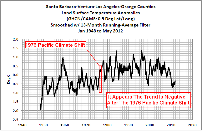
Figure 3
Let’s take a look at the linear trends before and after the 1976 Pacific Climate Shift. We’ll switch back to the “raw” data. Before the climate shift, January 1948 to December 1975, the Santa Barbara-Ventura-Los Angeles-Orange Counties land surface temperature anomalies rose at a rate of only 0.108 deg C/decade, and after, from January 1977 to May 2012, they’ve cooled at a rate of -0.082 deg C/decade.

Figure 4
In Figure 5, I’ve added the projection of about 2.5 deg warming by 2050 to the graph to show how unrealistic that projection looks, especially when we consider that surface temperatures for the Santa Barbara-Ventura-Los Angeles-Orange Counties data have been dropping for 3+ decades.

Figure 5
Maybe I looked at too large an area. Let’s take a look at the data for the coordinates of 33.5N-34.5N, 118.5W-117.5W. See Figure 6 for the location. We call that dataset “Los Angeles Plus.”

Figure 6
As shown in Figure 7, the pre-1976 warming rate for the “Los Angeles Plus” land surface temperature anomalies is greater than the larger dataset, at about 0.33 deg C/decade. But the post-1976 trend is still negative at -0.074 deg C/decade.

Figure 7
One last try: Let’s decrease the area of the data again, Figure 8, this time looking at the land surface temperature anomalies for the coordinates of 34N-34.5N, 119W-118W. That captures Malibu, the Valley and much of the City of Los Angeles.

Figure 8
Doesn’t help. As shown in Figure 9, the trend after the 1976 Pacific Climate Shift for the Malibu-The Valley-Los Angeles land surface temperatures is negative at -0.086 deg C/decade.

Figure 9
CLOSING
Based on this quick look at land surface temperature data for the Greater Los Angeles area, the Hall et al (2012) study referred to in the UCLA press release appears to have no basis in reality.
SOURCE
The GHCN-CAMS land surface temperature data presented in this post is available through the KNMI Climate Explorer.
As with the Warmista attack on the North Carolina legislature,
actual scientific data is irrelevant compared to the consensus computer projections.
After all, today’s CO2 level is ‘unprecedented’,
so therefore the future warming and sea-level hike will be unprecedented too!
And you thought Word Magic was only for medievals!
Thanks for taking a look at this “Study.” I heard about it in passing and was just floored. The LA mayor is taking this info and running with it, talking about saving the planet by using green energy.
The defense of models in such cases is always that they aren’t intended to simulate regional variation. But if that is the case, why is it that so many use them to simulate regional variation?
Will the defenders of models step forward to repudiate the attempts to use models to create scary scenarios on regional scales? Doubtful.
But…but…but…decadal ENSO oscillation parameters on weather variations -and sensors- don’t matter. C02 effects will simply overwhelm and outdo whatever that little ol’ pond can throw at ya.
L.A. summers used to be hot; looking at Pasadena in particular, we’re talking a majority of the summer days over 90°F, and many over 100. But those who live there have noticed a dramatic change, as the last 4 summers — in a row — have been cool. 90° has been a virtual ceiling, with just a handful of days going over 90, and literally just a couple of days reaching 100. This is seemingly and obviously inconsistent with the notion that we are in a period of acute global warming. Instead, if we were actually living in the hotest period of history, nearly all the days should be over 90, and a near majority over 100. But it’s the opposite… And now, to predict that temps are going to skyrocket in L.A., it’s just ludicrous, laughable. Makes you shake your head in disbelief. The warmists are full of it.
Do you mean that we DON’T have to send Gore all that cash?
This appear on the surface to just be silly – I have either lived or visited regularly in the Carmel to San Diego area and have always found the Sea temperatures to control the biggest amount of the climate or weather. Do they predict a increase of the Pacific ocean of 5% + if not they must be wrong = huge heat sink is the ocean and it dominates the coastal climates.
“CLOSING
Based on this quick look at land surface temperature data for the Greater Los Angeles area, the Hall et al (2012) study referred to in the UCLA press release appears to have no basis in reality.”
Sure it does. You see, 2050 is 38 years away. That means that next year their prdiction will be for 2051. The year after that the prediction will be for 2052. The year after that ……..
Their point is we have to do something now!!!!!!!!
As ever, the strategy seems to be to throw as much #$%^ at the wall, figuring that a good percentage will stick to the public mind. If sheer volume were determinant, this debate would have ended long ago.
When it comes to history…the first impulse of the Climatists of warming alarmism was to ignore history. Not the Climatists believe they could use statistics to predict the future. However, we cannot say that what the authors of the study are saying, appears to have no basis in reality. Unfortunately, all of the previous instances are examples of political propaganda not science.
http://evilincandescentbulb.wordpress.com/2012/06/24/1887/
This study is just a projection based on Hansen’s data manipulation. Now Hansen will fraudulently cool the past and warm the present more to comply.
No matter what some might say, a ‘global’ temperature is an unnatural beast. Looking at individual country/city temperatures don’t support this sort of alarmist temperature increase mentioned here.
Here is the longest temperatrutre dataset in the world which has been falling steadily
http://www.metoffice.gov.uk/hadobs/hadcet/
Anecdotally it has been impossible to grow tomatoes out of doors here the last four summers and all my garden succulents have died during the last few winters . The current anomaly brings us back to the same temperatures that England had in the 1730’s. .
tonyb
Yes, another study that is “models all the way down”. Why would someone play computer games when there is real data that can be looked at and analyzed? I have said it many times, computer models are only really useful in telling the scientist what to go measure in the real world to confirm or disprove a hypothesis. Any other use is political science.
SkepticalScience would say anything to create support for their smug self important musings.
The problem is that with climatology there is nothing to lose by making alarming predictions. Indeed there is everything to gain – notoriety and more funding which encourages more high pitched and alarming predictions. Whereas a meteorological forecaster has an almost immediate feedback to their forecasts. If a forecaster is wrong it results as a minimum in loss of ‘face’ and often in loss of employment.
It is a pity that there is no way that a ‘downside’ could be applied to climate modelers; it would be nice to impose retrospective refund of the grant/funds made to them for the research and modeling (plus interest they would have accrued) at the time their forecast/projection is shown to have been untrue. As it is they can be feted by the politicians and draw huge income from forecasting the flooding of New York say, or the inundation of Southern Florida in ’15 years time’ – but when that date is reached, there is no reckoning rather the opposite as main-stream-media expects everyone to be spellbound by their next “in 15 years….. prediction.
Therefore, as we pass these predicted but non existent ‘tipping points’ – refugees – species extinctions – inundations – and nothing happens at the very least we should be able to publish a you were totally wrong like the climate fail files but FAR more public. Perhaps a table of climate ‘scientists’ together with a ‘skill’ score or believability ratio based on forecasts that came to pass or failed. This could even be extended to institutions or research establishments as well as individuals. Imagine – UEA skill 0., NASA Skill 5% Willis Eschenbach 80% Joe Bastardi (Weather Bell) 95% (purely example figures of course – but close to the truth). This would provide stats that could be given to the MSM – why quote that climate ‘scientist’ as they are totally unreliable? More importantly, to the funding authorities such as the NSF – Why are you funding failures?. Only attributed and documented forecasts would be used, but it is time that the irresponsibility was curbed.
I suggest keeping a close eye on your utility bills if you live in LA. The city’s utlity is struggling with trying to meet all of the state and local mandates being forced on it. Guess where they are going to get the money to meet these mandates.
Note: By struggling I mean they are facing a significant challenge. From my limited experience with their people, they are very good.
Are the slopes before and after 1975 significantly different from the slope from 1950 to 2010? Looking at the data, it seems barely plausible to say that it’s two slopes rather than just one.
“So, does a 4 to 5 deg F rise in Greater Los Angeles land surface temperature anomalies by 2050 sound realistic?”
Ultimately truth in science comes down to what observation or experiment says, I could care less about the computer models. Los Angeles shows no evidence of a warming trend according to the real data which I got from NOAA and posted here: http://reasonabledoubtclimate.wordpress.com/2012/06/25/hey-california-hot-enough-for-ya-just-wait-maybe/
Sounds like a great set up for the introduction of a mitigation tax on current power bills in order to develop a future fund for a watermellon committee to develop policies and papers on how to live with Gaia in sustainable harmoneous interdependent trifectas. That last part has to do with their twisted notion of betting on scenario A, B, AND C.
The acronym just rolls off the tongue: FFFWCTDPPOHTLWGSHIT.
“the UCLA press release appears to have no basis in reality”
Of course not, it has a basis in computer models. I bet no one bothered to look and see if the model predictions appeared realistic. It’s just assumed the models are right.
So what do the models of L.A. temp. show if adjusted for the fires caused by gang violence and riots? I bet that flattens out the graph something fierce….
THIS IS HUGE: NEW NORWEGIAN SCIENTIFIC RESEARCH: SOUTH POLE NOT MELTING
Twenty-year-old models which have suggested serious ice loss in the eastern Antarctic have been compared with reality for the first time – and found to be wrong, so much so that it now appears that no ice is being lost at all.
“Previous ocean models … have predicted temperatures and melt rates that are too high, suggesting a significant mass loss in this region that is actually not taking place,” says Tore Hattermann of the Norwegian Polar Institute, member of a team which has obtained two years’ worth of direct measurements below the massive Fimbul Ice Shelf in eastern Antarctica – the first ever to be taken.
According to a statement from the American Geophysical Union, announcing the new research:
It turns out that past studies, which were based on computer models without any direct data for comparison or guidance, overestimate the water temperatures and extent of melting beneath the Fimbul Ice Shelf. This has led to the misconception, Hattermann said, that the ice shelf is losing mass at a faster rate than it is gaining mass, leading to an overall loss of mass.
The team’s results show that water temperatures are far lower than computer models predicted …
Hatterman and his colleagues, using 12 tons of hot-water drilling equipment, bored three holes more than 200m deep through the Fimbul Shelf, which spans an area roughly twice the size of New Jersey. The location of each hole was cunningly chosen so that the various pathways by which water moves beneath the ice shelf could be observed, and instruments were lowered down.
The boffins also supplemented their data craftily by harvesting info from a biology project, the Marine Mammal Exploration of the Oceans Pole to Pole (MEOP) effort, which had seen sensor packages attached to elephant seals.
“Nobody was expecting that the MEOP seals from Bouvetoya would swim straight to the Antarctic and stay along the Fimbul Ice Shelf for the entire winter,” Hattermann says. “But this behaviour certainly provided an impressive and unique data set.”
Normally, getting sea temperature readings along the shelf in winter would be dangerous if not impossible due to shifting pack ice – but the seals were perfectly at home among the grinding floes.
Overall, according to the team, their field data shows “steady state mass balance” on the eastern Antarctic coasts – ie, that no ice is being lost from the massive shelves there. The research is published in the journal Geophysical Research Letters.
http://astuteblogger.blogspot.com/2012/06/this-is-huge-new-norwegian-scientific.html
Chris says: “Are the slopes before and after 1975 significantly different from the slope from 1950 to 2010?”
The trend for the full term of the Santa Barbara-Ventura-Los Angeles-Orange Counties land surface temperature anomalies is shown in Figure 2 to be 0.177 deg C/decade, while the trend for the pre-1976 data (shown in Figure 4) is 0.108 deg C/decade and the trend for the post 1976 data is negative at -0.082 deg C/decade.
Here’s the graph of the full term data for the “Los Angeles Plus” region.
http://i48.tinypic.com/166ako6.jpg
It has a long-term trend of 0.233 deg C/decade. But the pre-1976 data (shown in Figure 7) is 0.329 deg C/decade and the trend for the post 1976 data is negative at -0.074 deg C/decade.
And for the full term of the “Malibu-The Valley-Los Angeles” region…
http://i45.tinypic.com/152fiog.jpg
…the long-term trend is 0.205 deg C/decade. The trend for the pre-1976 data (shown in Figure 9) is 0.202 deg C/decade. So that one’s basically the same as the long-term trend. Yet the trend for the post 1976 data is negative at -0.086 deg C/decade.
Even Gavin at RC concedes that forecasting regional climate is a crap shoot. Models can’t forecast it. If they could, climate scientists would all be winning big at Monte Carlo.
Gavin writes
“The basic issue is that for short time scales (in this case 1979-2000), grid point temperature trends are not a strong function of the forcings – rather they are a function of the (unique realisation of) internal variability and are thus strongly stochastic”
http://www.realclimate.org/index.php/archives/2012/06/unforced-variations-june-2012/
Ian W says:
June 25, 2012 at 3:33 pm
The problem is that with climatology there is nothing to lose by making alarming predictions.
========
Unlike almost every other profession, where a prediction that turns out to be significantly wrong is liable for law suit.
LA residents brace yourselves for zillions of $$ in higher taxes, fees and insurance rates as a result of this report.
Time to pass a law as has been done in other states, that costs can only be increased based on observations, not based on models. Otherwise there is a huge incentive for model builders to incorporate all sorts of nonsense to make money.
Jason Bair says:
June 25, 2012 at 1:55 pm
The LA mayor is taking this info and running with it, talking about saving the planet by using green energy.
========
Mayors love to talk about saving the planet, in the distant future. It deflects attention from the problems at home, today, in their own city that they were elected to solve.
These are probably the brightest climatologists around. If I were a climatologist or a preacher I would sure gravitate to the audience with the most cash and the most guilt.
The audience for these scary scenarios is dwindling in other regions where folks work hard, and suffer no guilt, for their earnings.
June 25, 2012 at 2:43 pm | Gunga Din:
——————————————————–
Sign in the bar says, “FREE BEER TOMORROW” just like the model predictions.
Chris says:
Are the slopes before and after 1975 significantly different from the slope from 1950 to 2010? Looking at the data, it seems barely plausible to say that it’s two slopes rather than just one.
Given the cooling after 1976, the slope for 1948 to 2010 would only be lower than the slope from Jan.1948 to Dec.1975. And even then, prediction still exceeds the higher slope.
But if you take a trend from January 20, 2009, it works!
Bob, I would appreciate your comments on a few things. It was not all that long ago I remember reading that GCMs simply could not be predictive on the regional scale. I presume that such a conclusion means that GCMs are predictive on the global scale, a presumption that would seem to not include climate facts in evidence over the past 10-15 years, not to mention when the starting point or, for that matter, hindcasts….. Yet here we are apprised that an NCAR regional model now exists. Wow, that was quick! Would this mean that not only are regional models reliable, but that the epiphanies that made such a leap possible now back-populate the global climate models?
I truly hesitate to ask this next question, but to your knowledge, are there any references documenting this LEAP?
(“So be ever thoughtful of both facts and predictions before LEAPing to a conclusion. It was in fact a LEAP that terminated the last interglacial, the cold Late Eemian Aridity Pulse which lasted 468 years and ended with a precipitous drop into the Wisconsin ice age. And yes, we were indeed there. We had been on the stage as our stone-age selves about the same length of time during that interglacial that our civilizations have been during this one.” from something I wrote a long time ago summarizing Sirocko et al [Nature, Vol 436, 11 August 2005, doi: 10.1038/nature03905] http://www.particle-analysis.info/LEAP_Nature__Sirocko+Seelos.pdf )
This appears to be an example of “embrace and extend” – a common practice in the software industry to monopolize a technology. It appears the Team has adopted the UHI effect, once just an annoying or sometimes embarrassing irregularity in raw data, and it is now one of the newest climate exploitables in the climate PR race. Coastal subsidence appears to be another according to Willis’ sea level anomaly post. Yet another, of you are paying attention, is the great sensitivity of the Arctic to climate change – even if that change is natural.
We just have to do something, don’t you see.
A base on the moon would be unaffected by climate change and rising sea levels. Installing in a crater would block solar wind.
It’s so much safer up there. Maybe we could sell the idea as mankind’s “insurance policy” against any variety of climate change (hotter/colder/natural/anthropogenic) and get NASA funded for the project.
Maybe we could send Richard Branson to be Mayor of the new sustainable, climate controlled society.
http://climate.jpl.nasa.gov/files/LAHeatWaves-JournalArticle.pdf
Saw this on the news last night and thought, “How can they be reporting this with a straight face??” Fortunately, nobody pays any attention to the Mayor any more.
Gunga Din says:
June 25, 2012 at 2:43 pm
Sure it does. You see, 2050 is 38 years away.
Waitaminnit, they said 10 — ooops — 12 — I mean 15 — uhhhh — 17 years from now would be the proper time length to assess their predictions…
Maybe that should be a mantra we keep repeating : “Where is the basis in reality ?”
I ran the report for a few GHCN/CAMS graphs at http://climexp.knmi.nl/get_index.cgi and all of the graphs I see point up and to the right. What parameters are you using to generate your time series?
http://postimage.org/image/tphn7zugt/
Chris on June 25, 2012 at 4:18 pm said:
“Are the slopes before and after 1975 significantly different from the slope from 1950 to 2010? Looking at the data, it seems barely plausible to say that it’s two slopes rather than just one.”
Think about what you are saying would imply or it were the case. If the single trend’s statistical uncertainty is large enough to admit the latter period trend, then the single trend couldn’t be statistically significantly distinguishable from zero.
TexEd says:
“Do you mean that we DON’T have to send Gore all that cash?”
Sorry Ted, but, yes we do.
Y’see, none of this was ever about global warming, that was just the pretext for the scam!
Humanity has been conned big time, and the green-mongers have done very well out of it.
Time for the next big round of scares, maybe something along the lines of.. “gees we need to be more sustainable” or something like that.
Anything to try to grab control.
i have no doubt that the temps here in Lost Angels will rise over the next few years…
what with Mayor Villarboboso and his idiot pals in the City Council wanting to hang solar panels on every surface they can find to produce “green energy” so we can kick start our economy with “green j*bs”, all that waste heat will go towards heating the air near each installation.
I have lived in the Los Angeles area all my life, and this article’s descriptions of current and past weather bears no resemblance to reality. If the predictions came true, residents would be wondering what happened to summer.
One portion of the article compares the number of days when the temperature exceeds 95 degrees, both currently and predicted in the years 2041-2060. For example, in Woodland Hills, the article states the number of annual days over 95 degrees will increase from 4.2 to 16.7. A quick check at a site like intellicast.com shows the average high in Woodland Hills currently is 95 degrees or higher from July 11 to August 31 – 50 straight days. Also, the monthly record highs exceed 95 degrees in every month but January and February, where they are 93 and 94 degrees respectfully. I did not look at actual annual daily records, but it is impossible that these averages were achieved with only 4.2 days per year over 95 degrees.
Spot checking other cities cited shows similar deviations from reality. Summers have been MUCH hotter in the recent past than the article claims, and even the number of days over 95 degrees predicted for 2041-2060 are far less than they already are.
Recent summers have been cooler than average, as residents can see by our air conditioner usage and reading the weather reports. Yet the number of “hot” days still is higher than cited. In 2010, when Los Angeles set its all-time record high of 113 degrees, we actually had had a very cool summer until the late season heat wave.
I doubt the researchers have spent a summer in the Los Angeles area, or they would know what our summers are like.
The effort to use 2,500 more data points and a super computer has proven Garbage In Garbage Out (GIGO) once again; now we have incorrect data on1.2 mile grids rather than larger ones.
To think that Los Angeles spent almost $1.1 million on this study should be a criminal offense.
Ian W says:
June 25, 2012 at 3:33 pm
Therefore, as we pass these predicted but non existent ‘tipping points’ – refugees – species extinctions – inundations – and nothing happens at the very least we should be able to publish a you were totally wrong like the climate fail files but FAR more public.
Paul Ehrlich has been very publicly getting it bass-ackwards since 1968 and he’s still a superstar in the eyes of the MSM – he’s good for “In 10 years, we’re all gonna die of thirst while being bombarded by drowning polar bears” sound bites, which fits the “If it bleeds, it leads” dictum.
Pamela Gray says:
June 25, 2012 at 4:27 pm
The acronym just rolls off the tongue: FFFWCTDPPOHTLWGSHIT.
I think you just summoned one of the Great Old Ones…
redc1c4 says:
June 25, 2012 at 11:23 pm
i have no doubt that the temps here in Lost Angels will rise over the next few years…
what with Mayor Villarboboso and his idiot pals in the City Council wanting to hang solar panels on every surface they can find to produce “green energy”…
I went home on leave in 2009 to find that Hizzonner Da Mayor had purchased and stuck solar panels on every telephone/utility pole in town. When I went back again in 2011, some had been radically skewed by the wind, some were shaded out by nearby tree limbs. and all were serving as guano collection points for the ickle birdies…
Dan says: “I ran the report for a few GHCN/CAMS graphs at http://climexp.knmi.nl/get_index.cgi and all of the graphs I see point up and to the right. What parameters are you using to generate your time series?”
Dan, sorry, the west longitudes are input as negative numbers. The coordinates for the LA area should be entered intoo the fields as:
33 & 35.5
-121 & -117.
William McClenney: First, the presumption is incorrect. The model mean of the CMIP3 climate models used by the IPCC in AR4 are not capable of hindcasting the GLOBAL surface temperature record over the 20th Century. I published a series about that starting in November last year. I also took a look at the CMIP5 models being used in the upcoming IPCC AR5 and they perform no better on a global basis:
http://bobtisdale.wordpress.com/2012/04/05/preview-of-cmip5ipcc-ar5-global-surface-temperature-simulations-and-the-hadcrut4-dataset/
The papers I’ve seen recently discussing the current state of the models show a lack of skill at being able to hindcast and project regional climate.
When several million LA residents become incandescent with rage at their escalating power bills it will make this prediction look very small beer.
He has temperatures and taxation confused!
An interesting video here, relates to accuracy of predictions:
http://www.glennbeck.com/content/blog/stu/please-don%E2%80%99t-print-this-blog/
Huge indeed! This should be elevated to a lead post.
/Mr Lynn
As a process improvement specialist, I have spent a lot of time looking at what we call run charts. Basically a plot of some single metric against time, which is what we have here. So while I have zero expertise in climate or weather, as an American Society for Quality Certified Quality Engineer, I have considerable knowledge of how to look at and interpet a run chart.
First, to draw a linear trend line for the entire run of data since 1948 is essentially meaningless. When one end of the data has an increasingly bad fit to a line, either there is more than one trend, or the data is not well represented by linear trends. econd, looking at figure 3, I think one could make a case for the temperature to have two “stable” albeit very noisy states. One centered at -0.5C, from <1948-1958, 1961-1976, and 2009-present. The other, centered at about +0.5C, from 1959-1960 and 1977-2008. The clearest shift is 1976, but if current temps continue, what we have is a shift back. It is a VERY noisy signal, but it really looks more like several shifts, than any kind of "trend" to me.
Is that UHI effect?
Just for informational reference. The two VERY RED blocks over the ocean represent an area of the coast that consistently has the highest winds of any area in Southern California. The winds get so high in that little “channel” that yachters avoid it like the plague. It seems very strange to me that the area with the highest wind would have the largest temperature increase.
It’s pretty obvious that the climate in most of CA has been cooling and drying since the late 1990s. It’s a general decline. It’s interesting in that it seems to be opposite of much of the Eastern half of the US. The question of phasing must be asked.
Eric Simpson:
They are probably relying on the “Regression to the Mean” falacy. If it is currently cooler than usual, it is almost certain that it will get warmer in the next few years.
If it was 1980 right now and they ran the same model what would the 2012 temperature be? It’s been 32 years so we’re closing in on the 38 year time frame. Oh wait, we must not have added any Co2 to the atmosphere during the past 32 years. That’s the only explanation. /sarc
As I said. 1994 was the turning point from cooling to warming.
mizimi said on June 26, 2012 at 2:06 am:
Last I heard that had been virtually totally outlawed. LA residents would have to become fluorescent with rage.
A few years or so from now, they may have to become LED’d with rage.
This will lead to an unfortunate trend where increasing numbers of evermore enraged LA residents will want the responsible bureaucrats to be “leaded”. I’m hard pressed to not just write that off as “reap what you have sown”.
It’s all about linear extrapolations of sinusoidal variations.
In support of what Bob is saying but slightly further north, the area of Canada that faces the Pacific has shown annual temperature departures linear trend to be dropping from the 1961-1990 averages since 1998. This includes South BC Mountains , Pacific Coast and North BC Mountains and the Yukon. There are fluctations but there is no warming trend here except when El Nino events happen like 2009/2010.
According to NCDC CLIMATE AT A GLANCE web page , the annual temperatures in the US WEST region have been dropping since 1996 and US NORTH WEST region have been dropping since 1992. So the annual temperatures for the entire US western region are dropping for the last 2 decades like in Canada . There are isolated pockets or regions and isolated periods where things are different , but the general trend for entire North American west coast is a slow cooling trend .Bob’s charts for the EASTERN PACIFIC SST ANOMALIES shows a declining temperature trend since 1981, more colder water along the eastern coast of the Pacific than the western part. Is this not what a declining PDO signifies .?
Bob, although a long time ago I wrote numerous hi-end models for potential fields geophysics, later used a number of hydrogeologic models, I just haven’t taken the time to get acquainted with climate models. Are their public versions of the IPCC models that are executable on PCs under Windows 7? If so, a list with links to software and data would be much appreciated. Getting my feet wet and not having to write the code is looking interesting.
The readership please chime in with cogent lists (if such exist).
WC;
Sorry, the models are secret, and numerous, and not for your eyes.